Embed Size (px)
Citation preview
Complementary Colors
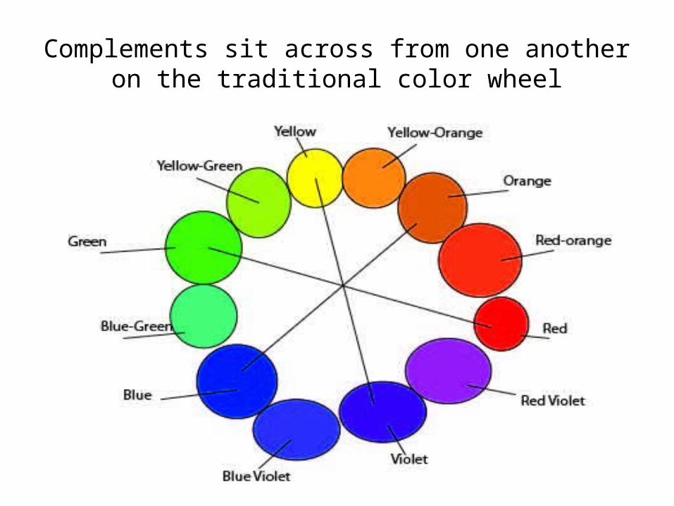
Complements sit across from one another on the traditional color wheel
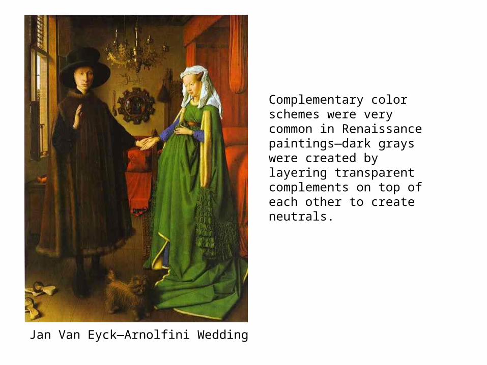
Jan Van Eyck—Arnolfini Wedding
Complementary color schemes were very common in Renaissance paintings—dark grays were created by layering transparent complements on top of each other to create neutrals.
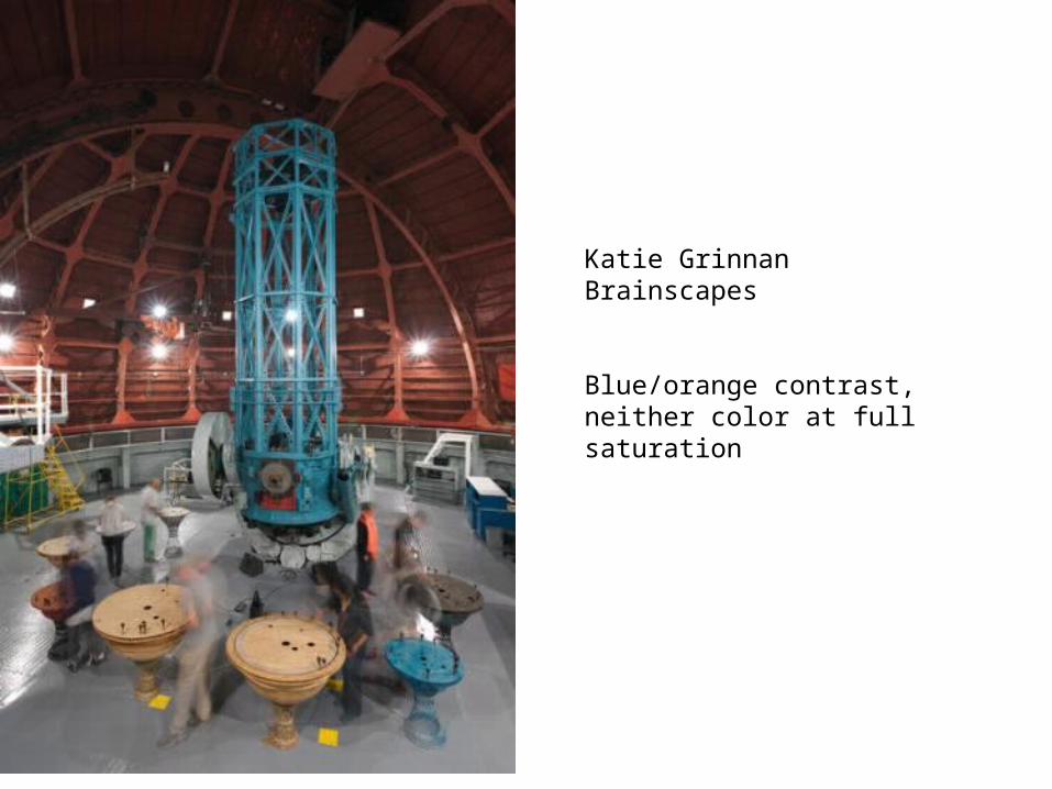
Katie Grinnan Brainscapes
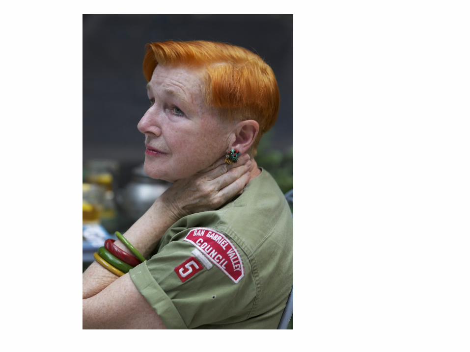
Blue/orange contrast, neither color at full saturation
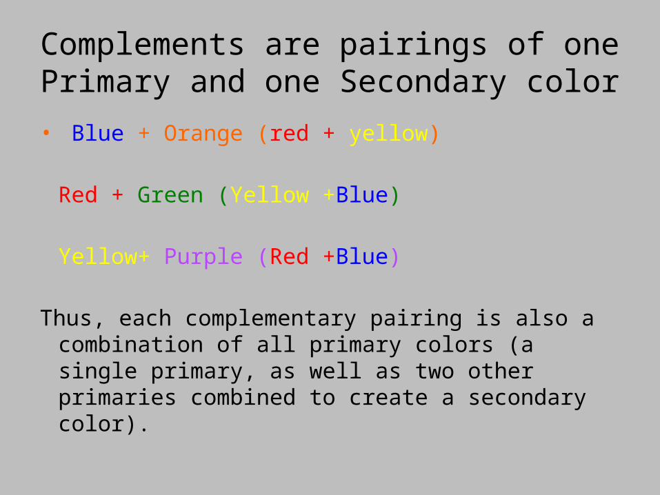
Complements are pairings of one Primary and one Secondary color
• Blue + Orange (red + yellow)
Red + Green (Yellow +Blue)
Yellow+ Purple (Red +Blue)
Thus, each complementary pairing is also a combination of all primary colors (a single primary, as well as two other primaries combined to create a secondary color).
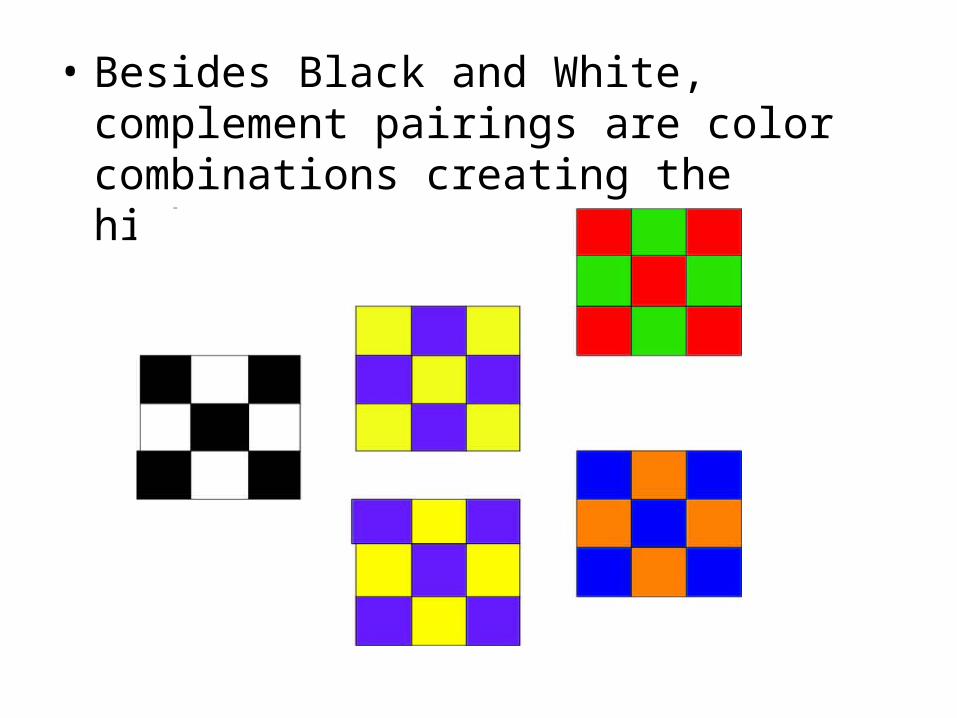
• Besides Black and White, complement pairings are color combinations creating the highest contrast
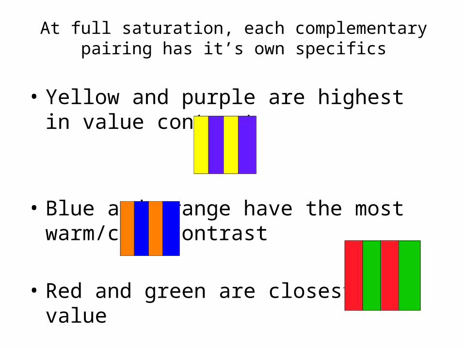
At full saturation, each complementary pairing has it’s own specifics
• Yellow and purple are highest in value contrast
• Blue and orange have the most warm/cool contrast
• Red and green are closest in value
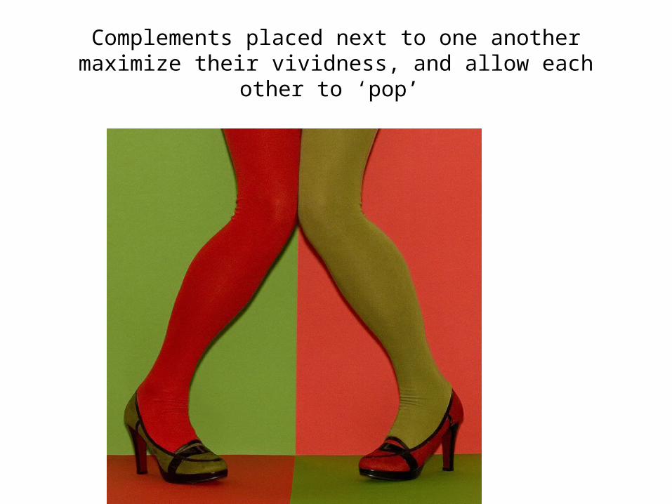
Complements placed next to one another maximize their vividness, and allow each other to ‘pop’
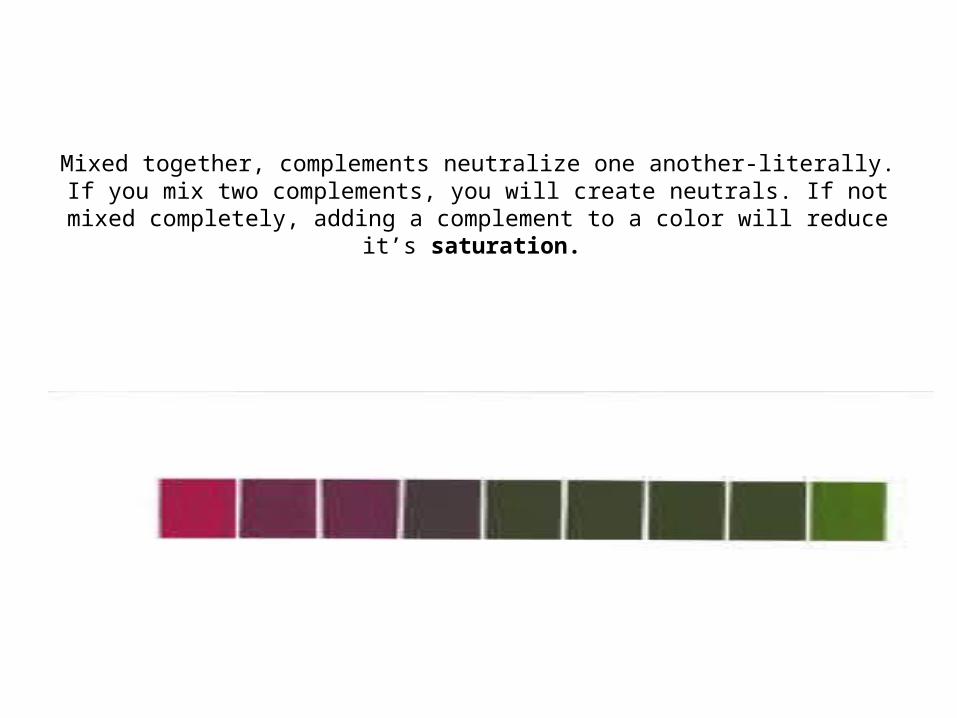
Mixed together, complements neutralize one another-literally. If you mix two complements, you will create neutrals. If not mixed
completely, adding a complement to a color will reduce it’s saturation.
• Mixing complements is a way to create Chromatic Neutrals---Neutrals mixed from colors rather than black and white.
• Color schemes based on complements and the neutrals mixed from complements can be very harmonious—the complements pop, and the range of neutrals keeps everything unified.
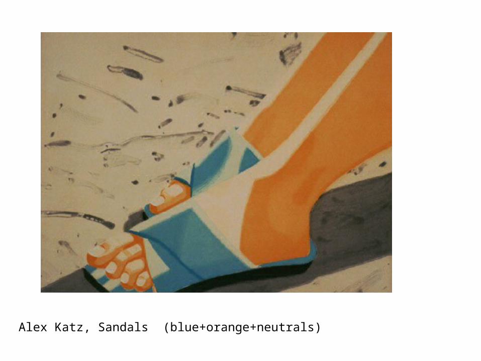
Alex Katz, Sandals (blue+orange+neutrals)
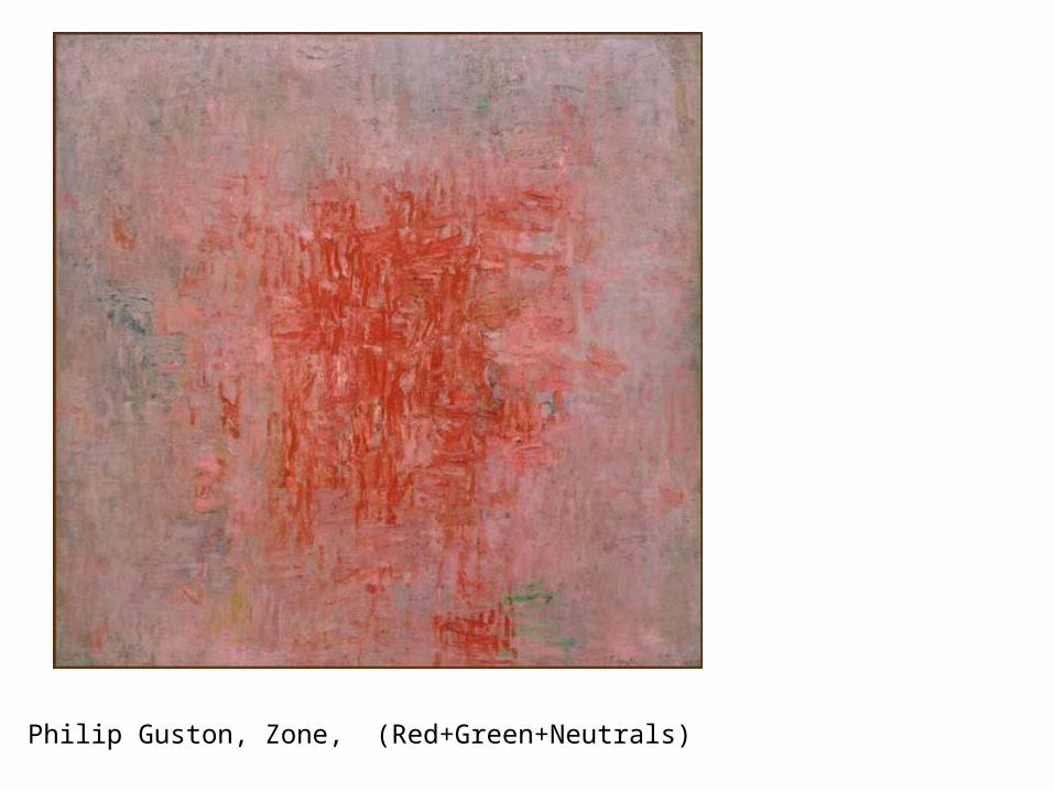
Philip Guston, Zone, (Red+Green+Neutrals)
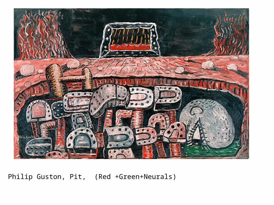
Philip Guston, Pit, (Red +Green+Neurals)
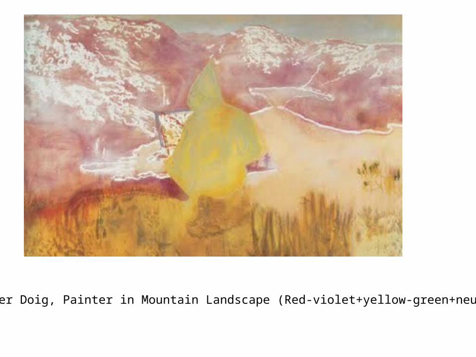
Peter Doig, Painter in Mountain Landscape (Red-violet+yellow-green+neutrals)
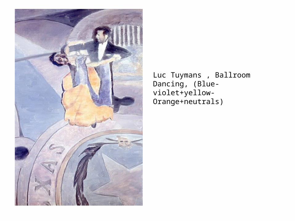
Luc Tuymans , Ballroom Dancing, (Blue-violet+yellow-Orange+neutrals)
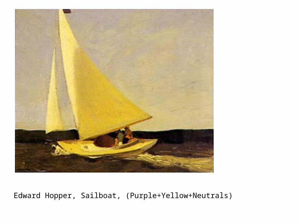
Edward Hopper, Sailboat, (Purple+Yellow+Neutrals)
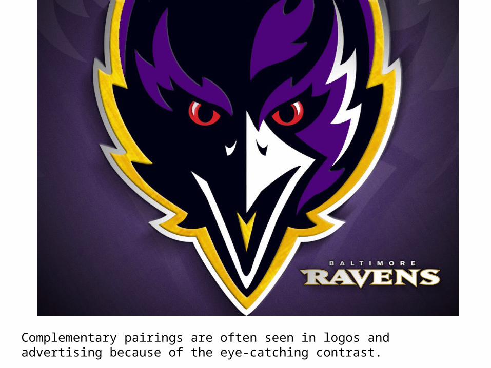
Complementary pairings are often seen in logos and advertising because of the eye-catching contrast.
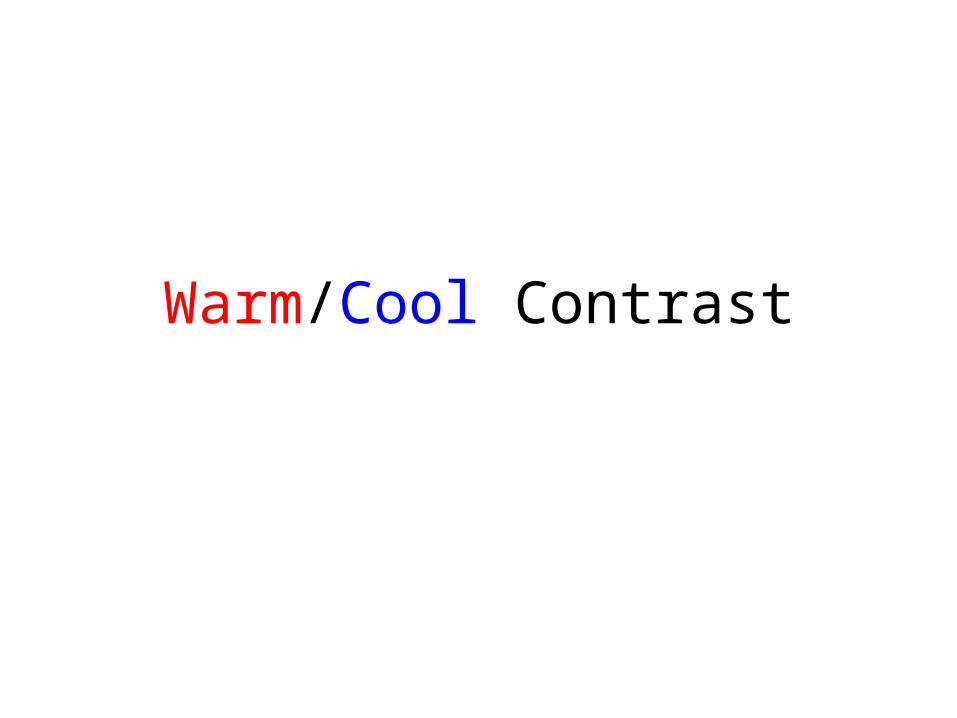
Warm/Cool Contrast
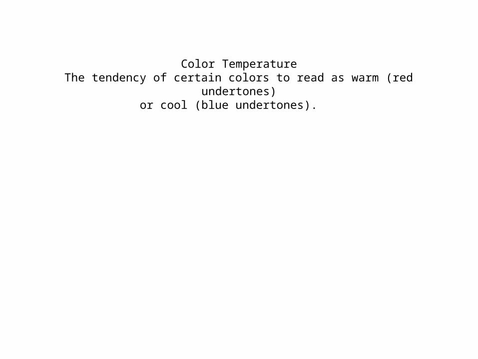
Color TemperatureThe tendency of certain colors to read as warm (red undertones)
or cool (blue undertones).
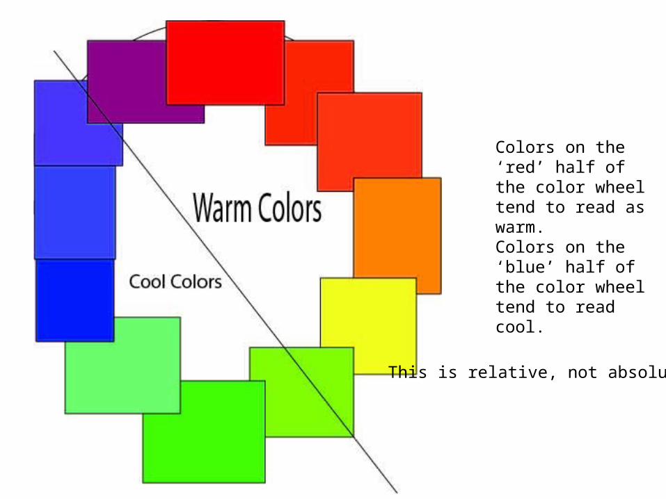
Colors on the ‘red’ half of the color wheel tend to read as warm.Colors on the ‘blue’ half of the color wheel tend to read cool.
This is relative, not absolute!!
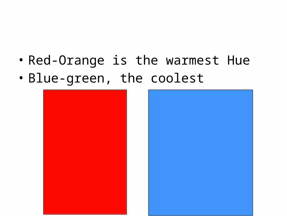
• Red-Orange is the warmest Hue• Blue-green, the coolest
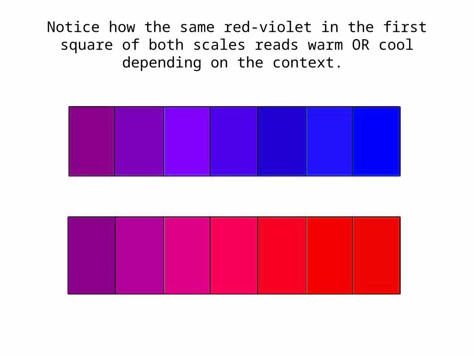
Notice how the same red-violet in the first square of both scales reads warm OR cool depending on the context.
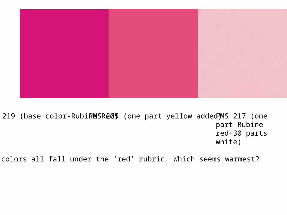
PMS 219 (base color-Rubine Red) PMS 205 (one part yellow added) PMS 217 (one part Rubine red+30 parts white)
These colors all fall under the ‘red’ rubric. Which seems warmest?
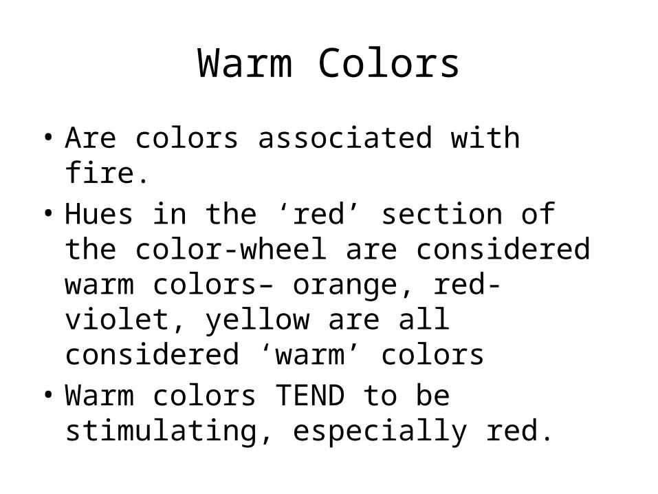
Warm Colors
• Are colors associated with fire.• Hues in the ‘red’ section of the color-wheel
are considered warm colors– orange, red-violet, yellow are all considered ‘warm’ colors
• Warm colors TEND to be stimulating, especially red.
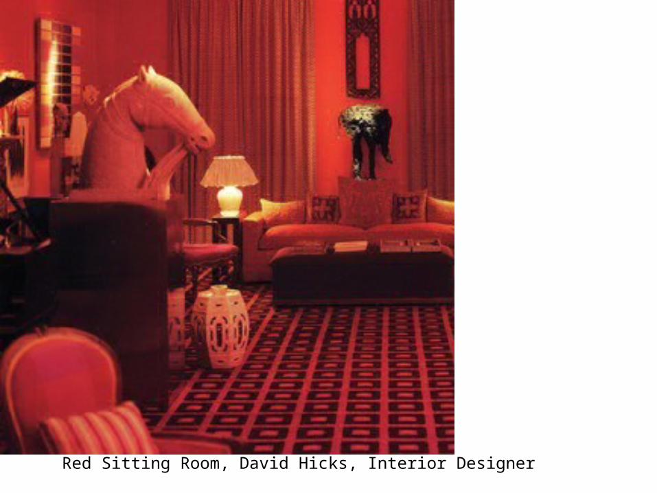
Red Sitting Room, David Hicks, Interior Designer
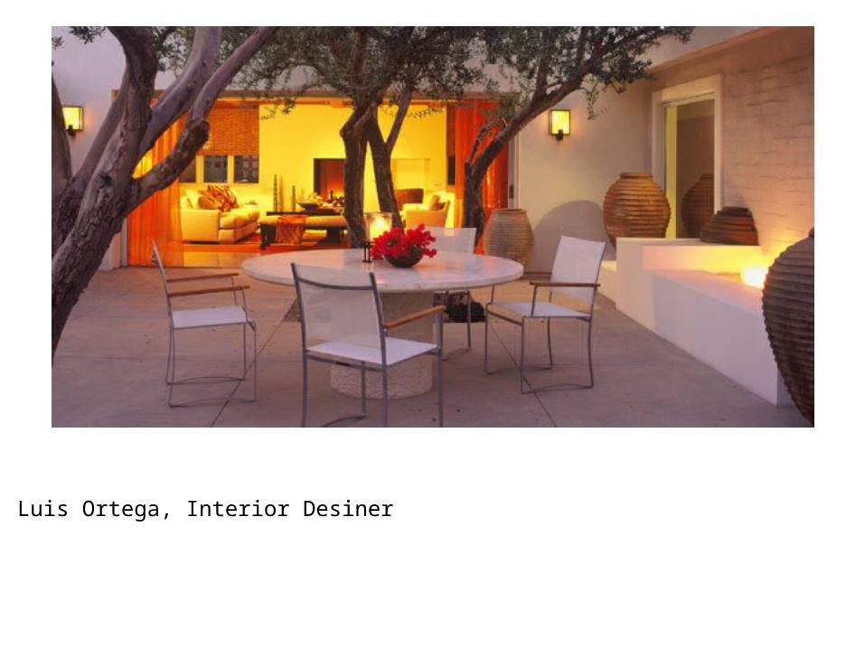
Luis Ortega, Interior Desiner
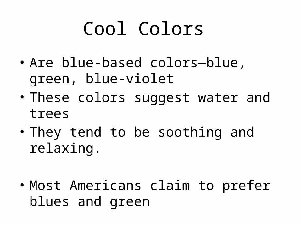
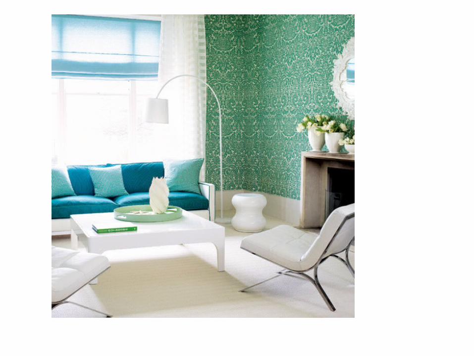
Cool Colors
• Are blue-based colors—blue, green, blue-violet
• These colors suggest water and trees• They tend to be soothing and relaxing.
• Most Americans claim to prefer blues and green
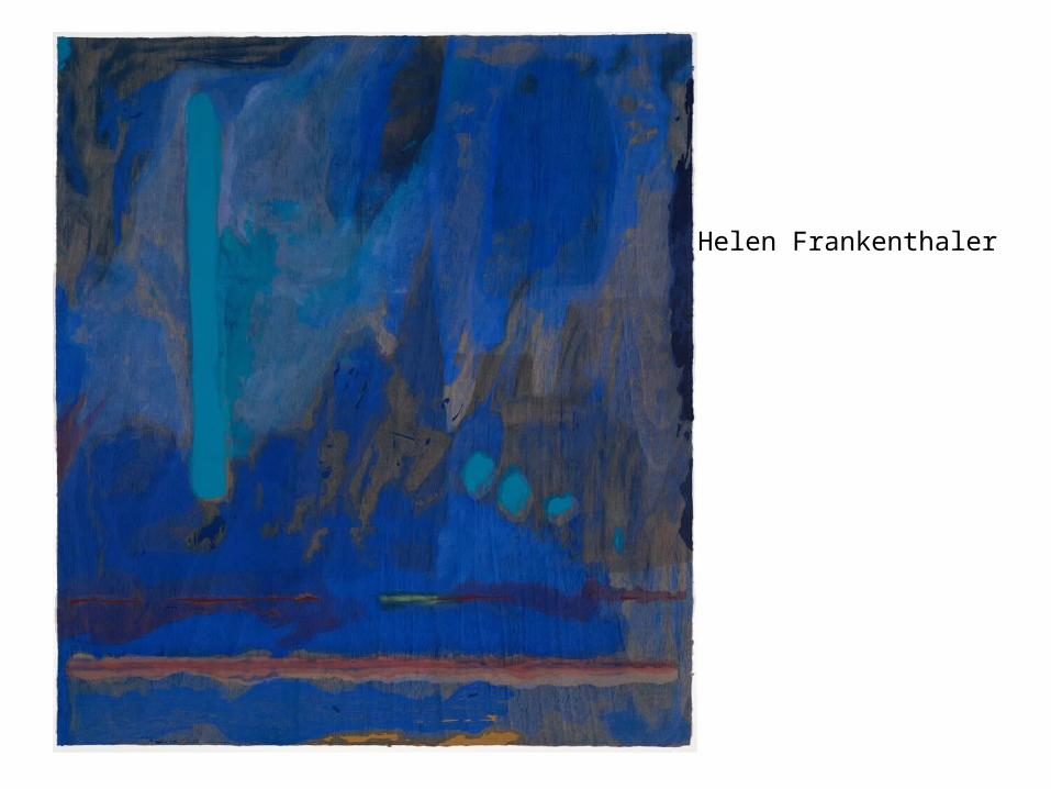
Helen Frankenthaler
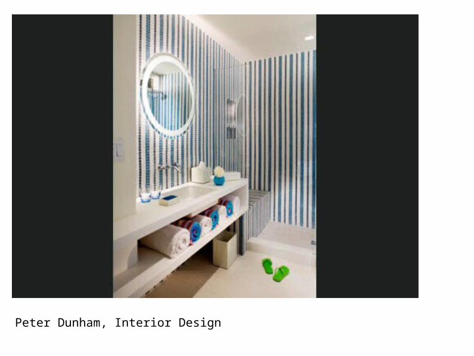
Peter Dunham, Interior Design
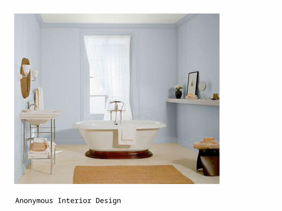
Anonymous Interior Design