Embed Size (px)
Citation preview

ComponentOne
OrgChart for WPF
By GrapeCity, Inc.

Copyright 1987-2012 GrapeCity, Inc. All rights reserved.
Corporate Headquarters
ComponentOne, a division of GrapeCity
201 South Highland Avenue
3rd Floor
Pittsburgh, PA 15206 ∙ USA
Internet: [email protected]
Web site: http://www.componentone.com
Sales
E-mail: [email protected]
Telephone: 1.800.858.2739 or 1.412.681.4343 (Pittsburgh, PA USA Office)
Trademarks
The ComponentOne product name is a trademark and ComponentOne is a registered trademark of GrapeCity, Inc. All other
trademarks used herein are the properties of their respective owners.
Warranty
ComponentOne warrants that the original CD (or diskettes) are free from defects in material and workmanship, assuming normal use, for a period of 90 days from the date of purchase. If a defect occurs during this time, you may return the defective
CD (or disk) to ComponentOne, along with a dated proof of purchase, and ComponentOne will replace it at no charge. After 90 days, you can obtain a replacement for a defective CD (or disk) by sending it and a check for $25 (to cover postage and
handling) to ComponentOne.
Except for the express warranty of the original CD (or disks) set forth here, ComponentOne makes no other warranties, express
or implied. Every attempt has been made to ensure that the information contained in this manual is correct as of the time it was
written. We are not responsible for any errors or omissions. ComponentOne’s liability is limited to the amount you paid for the product. ComponentOne is not liable for any special, consequential, or other damages for any reason.
Copying and Distribution
While you are welcome to make backup copies of the software for your own use and protection, you are not permitted to make
copies for the use of anyone else. We put a lot of time and effort into creating this product, and we appreciate your support in seeing that it is used by licensed users only.
This manual was produced using ComponentOne Doc-To-Help™.

iii
Table of Contents
ComponentOne OrgChart for WPF Overview.................................................................................................... 5
Help with ComponentOne Studio for WPF ....................................................................................................... 5
Key Features ...................................................................................................................................................... 5
OrgChart for WPF Quick Start ........................................................................................................................... 7
Step 1 of 3: Creating the C1OrgChart Application ............................................................................................ 7
Step 2 of 3: Adding Content to the C1OrgChart Control ................................................................................ 10
Step 3 of 3: Running the C1OrgChart Application .......................................................................................... 17
Working with OrgChart for WPF ..................................................................................................................... 19
C1OrgChart Core Properties ............................................................................................................................. 19
Using Bindings in C1OrgChart Properties ........................................................................................................ 20
Advanced Binding Scenarios ............................................................................................................................. 22
OrgChart for WPF Layout and Appearance ..................................................................................................... 25
Layout in a Panel ................................................................................................................................................ 25
OrgChart for WPF Appearance Properties ....................................................................................................... 25
Orientation ............................................................................................................................................ 25
FlowDirection ....................................................................................................................................... 26
ChildSpacing ......................................................................................................................................... 26
Connector .............................................................................................................................................. 27
Alignment ............................................................................................................................................. 27
OrgChart Templates ........................................................................................................................................... 29
C1OrgChart Styles and Templates .................................................................................................................... 29
C1OrgChart Visual States .................................................................................................................................. 30
OrgChart for WPF Task-Based Help ................................................................................................................ 31
Adding C1OrgChart to the Application ............................................................................................................ 31
Changing C1OrgChart Orientation ................................................................................................................... 32
Changing C1OrgChart Flow Direction ............................................................................................................. 32
Customizing the C1OrgChart Item Connector ................................................................................................ 32
Expanding and Collapsing C1OrgChart Nodes ............................................................................................... 33
Using a Hierarchical Data Template ................................................................................................................. 46

iv
5
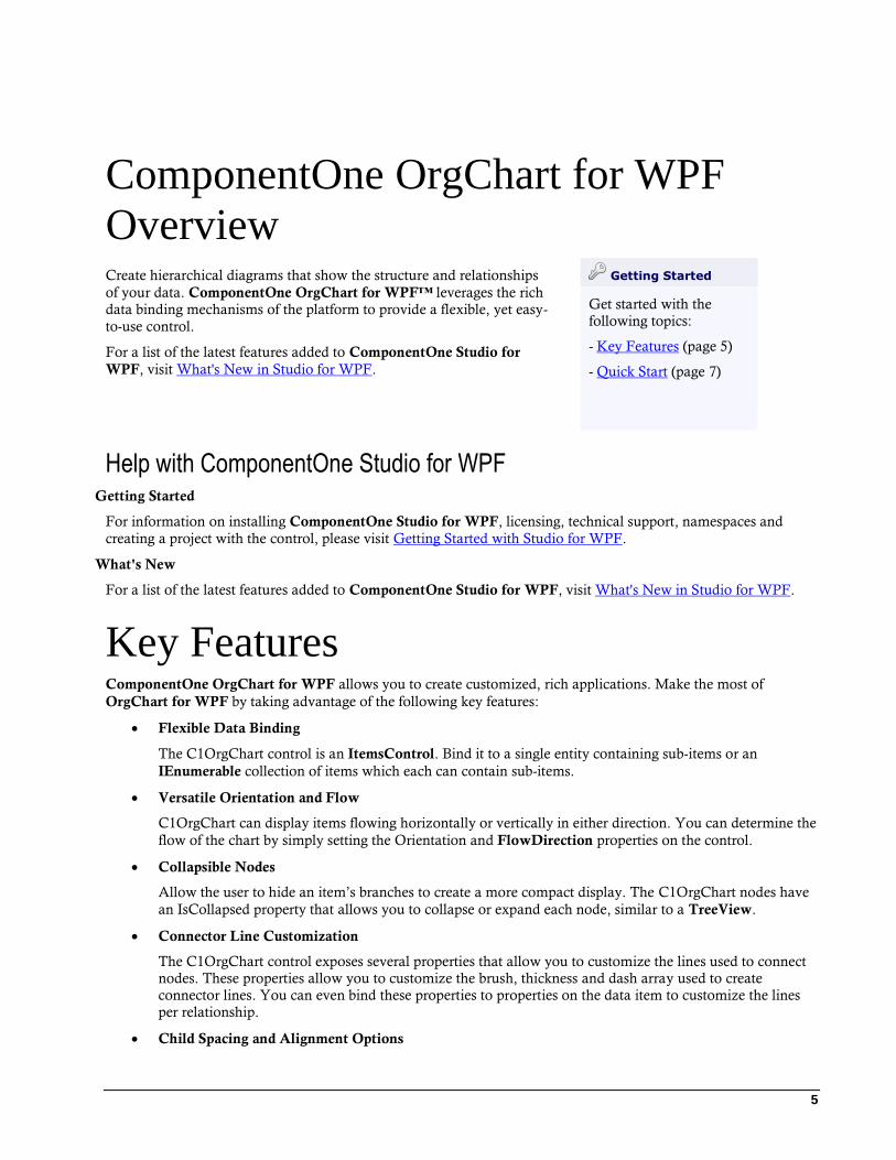
ComponentOne OrgChart for WPF
Overview Create hierarchical diagrams that show the structure and relationships
of your data. ComponentOne OrgChart for WPF™ leverages the rich
data binding mechanisms of the platform to provide a flexible, yet easy-
to-use control.
For a list of the latest features added to ComponentOne Studio for
WPF, visit What's New in Studio for WPF.
Getting Started
Get started with the
following topics:
- Key Features (page 5)
- Quick Start (page 7)
Help with ComponentOne Studio for WPF Getting Started
For information on installing ComponentOne Studio for WPF, licensing, technical support, namespaces and
creating a project with the control, please visit Getting Started with Studio for WPF.
What's New
For a list of the latest features added to ComponentOne Studio for WPF, visit What's New in Studio for WPF.
Key Features ComponentOne OrgChart for WPF allows you to create customized, rich applications. Make the most of
OrgChart for WPF by taking advantage of the following key features:
Flexible Data Binding
The C1OrgChart control is an ItemsControl. Bind it to a single entity containing sub-items or an
IEnumerable collection of items which each can contain sub-items.
Versatile Orientation and Flow
C1OrgChart can display items flowing horizontally or vertically in either direction. You can determine the
flow of the chart by simply setting the Orientation and FlowDirection properties on the control.
Collapsible Nodes
Allow the user to hide an item’s branches to create a more compact display. The C1OrgChart nodes have
an IsCollapsed property that allows you to collapse or expand each node, similar to a TreeView.
Connector Line Customization
The C1OrgChart control exposes several properties that allow you to customize the lines used to connect
nodes. These properties allow you to customize the brush, thickness and dash array used to create
connector lines. You can even bind these properties to properties on the data item to customize the lines
per relationship.
Child Spacing and Alignment Options

6
Customize the alignment and spacing of items in your OrgChart by simply setting a few properties. The
control includes a ChildSpacing property that controls the separation between items (in pixels), as well as
horizontal and vertical alignment properties which can give dramatic changes to the visualization.
Complex Hierarchical Displays
In addition to the flexibility provided by data templates and bindings, the C1OrgChart control also
supports advanced binding scenarios to create complex hierarchical displays. Use different templates for
certain nodes based upon properties of specific data items like conditional formatting. For example, you
could use different templates to visually distinguish among directors, managers, and clerical staff in an
employee organization chart.
7
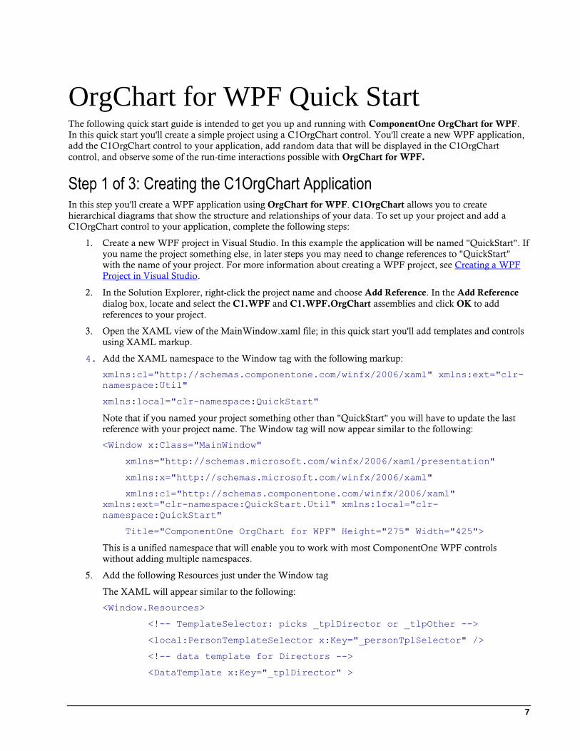
OrgChart for WPF Quick Start The following quick start guide is intended to get you up and running with ComponentOne OrgChart for WPF.
In this quick start you'll create a simple project using a C1OrgChart control. You'll create a new WPF application,
add the C1OrgChart control to your application, add random data that will be displayed in the C1OrgChart
control, and observe some of the run-time interactions possible with OrgChart for WPF.
Step 1 of 3: Creating the C1OrgChart Application In this step you'll create a WPF application using OrgChart for WPF. C1OrgChart allows you to create
hierarchical diagrams that show the structure and relationships of your data. To set up your project and add a
C1OrgChart control to your application, complete the following steps:
1. Create a new WPF project in Visual Studio. In this example the application will be named "QuickStart". If
you name the project something else, in later steps you may need to change references to "QuickStart"
with the name of your project. For more information about creating a WPF project, see Creating a WPF
Project in Visual Studio.
2. In the Solution Explorer, right-click the project name and choose Add Reference. In the Add Reference
dialog box, locate and select the C1.WPF and C1.WPF.OrgChart assemblies and click OK to add
references to your project.
3. Open the XAML view of the MainWindow.xaml file; in this quick start you'll add templates and controls
using XAML markup.
4. Add the XAML namespace to the Window tag with the following markup:
xmlns:c1="http://schemas.componentone.com/winfx/2006/xaml" xmlns:ext="clr-
namespace:Util"
xmlns:local="clr-namespace:QuickStart"
Note that if you named your project something other than "QuickStart" you will have to update the last
reference with your project name. The Window tag will now appear similar to the following:
<Window x:Class="MainWindow"
xmlns="http://schemas.microsoft.com/winfx/2006/xaml/presentation"
xmlns:x="http://schemas.microsoft.com/winfx/2006/xaml"
xmlns:c1="http://schemas.componentone.com/winfx/2006/xaml"
xmlns:ext="clr-namespace:QuickStart.Util" xmlns:local="clr-
namespace:QuickStart"
Title="ComponentOne OrgChart for WPF" Height="275" Width="425">
This is a unified namespace that will enable you to work with most ComponentOne WPF controls
without adding multiple namespaces.
5. Add the following Resources just under the Window tag
The XAML will appear similar to the following:
<Window.Resources>
<!-- TemplateSelector: picks _tplDirector or _tlpOther -->
<local:PersonTemplateSelector x:Key="_personTplSelector" />
<!-- data template for Directors -->
<DataTemplate x:Key="_tplDirector" >
8
<!-- the margin defines the distance between nodes -->
<Border
Background="Gold" BorderBrush="Black"
BorderThickness="2 2 4 4" CornerRadius="6"
Margin="40" MaxWidth="200" >
<!-- node content -->
<StackPanel Orientation="Vertical" >
<Border CornerRadius="6 6 0 0" Background="Black" >
<StackPanel Orientation="Horizontal">
<Ellipse Width="12" Height="12" Fill="Gold"
Margin="4" />
<TextBlock Text="{Binding Name}"
FontWeight="Bold" FontSize="16" Foreground="Gold" />
</StackPanel>
</Border>
<TextBlock Text="{Binding Position}" Padding="6 0"
FontSize="14" FontStyle="Italic" HorizontalAlignment="Right" />
</StackPanel>
</Border>
</DataTemplate>
<!-- data template for everyone else -->
<DataTemplate x:Key="_tplOther" >
<!-- the margin defines the distance between nodes -->
<Border
Background="WhiteSmoke" BorderBrush="Black"
BorderThickness="1 1 2 2" CornerRadius="6"
Margin="20" MaxWidth="200" >
<!-- node content -->
<StackPanel Orientation="Vertical" >
<Border CornerRadius="6 6 0 0" Background="Black" >
<TextBlock Text="{Binding Name}" FontWeight="Bold"
FontSize="14" Foreground="WhiteSmoke" Padding="4 0 0 0" />
</Border>
<TextBlock Text="{Binding Notes}" Padding="6 0"
FontSize="9.5" TextWrapping="Wrap" />
<TextBlock Text="{Binding Position}" Padding="6 0"
FontSize="12" FontStyle="Italic" HorizontalAlignment="Right" />
9
</StackPanel>
</Border>
</DataTemplate>
</Window.Resources>
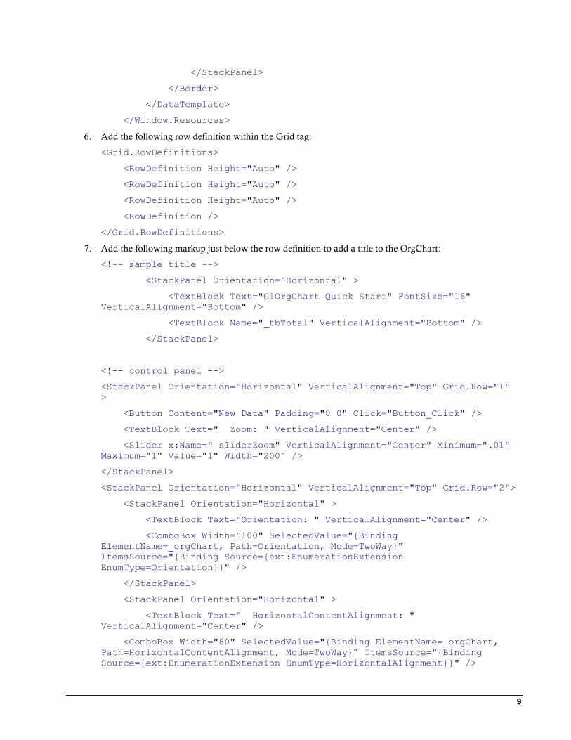
6. Add the following row definition within the Grid tag:
<Grid.RowDefinitions>
<RowDefinition Height="Auto" />
<RowDefinition Height="Auto" />
<RowDefinition Height="Auto" />
<RowDefinition />
</Grid.RowDefinitions>
7. Add the following markup just below the row definition to add a title to the OrgChart:
<!-- sample title -->
<StackPanel Orientation="Horizontal" >
<TextBlock Text="C1OrgChart Quick Start" FontSize="16"
VerticalAlignment="Bottom" />
<TextBlock Name="_tbTotal" VerticalAlignment="Bottom" />
</StackPanel>
<!-- control panel -->
<StackPanel Orientation="Horizontal" VerticalAlignment="Top" Grid.Row="1"
>
<Button Content="New Data" Padding="8 0" Click="Button_Click" />
<TextBlock Text=" Zoom: " VerticalAlignment="Center" />
<Slider x:Name="_sliderZoom" VerticalAlignment="Center" Minimum=".01"
Maximum="1" Value="1" Width="200" />
</StackPanel>
<StackPanel Orientation="Horizontal" VerticalAlignment="Top" Grid.Row="2">
<StackPanel Orientation="Horizontal" >
<TextBlock Text="Orientation: " VerticalAlignment="Center" />
<ComboBox Width="100" SelectedValue="{Binding
ElementName=_orgChart, Path=Orientation, Mode=TwoWay}"
ItemsSource="{Binding Source={ext:EnumerationExtension
EnumType=Orientation}}" />
</StackPanel>
<StackPanel Orientation="Horizontal" >
<TextBlock Text=" HorizontalContentAlignment: "
VerticalAlignment="Center" />
<ComboBox Width="80" SelectedValue="{Binding ElementName=_orgChart,
Path=HorizontalContentAlignment, Mode=TwoWay}" ItemsSource="{Binding
Source={ext:EnumerationExtension EnumType=HorizontalAlignment}}" />
10
</StackPanel>
<StackPanel Orientation="Horizontal" >
<TextBlock Text=" VerticalContentAlignment: "
VerticalAlignment="Center" />
<ComboBox Width="80" SelectedValue="{Binding
ElementName=_orgChart, Path=VerticalContentAlignment, Mode=TwoWay}"
ItemsSource="{Binding Source={ext:EnumerationExtension
EnumType=VerticalAlignment}}" />
</StackPanel>
</StackPanel>
8. Add the following XAML markup just after the last StackPanel to add a C1OrgChart control within a
ScrollViewer to the application:
<!-- org chart -->
<ScrollViewer Grid.Row="3" HorizontalScrollBarVisibility="Auto"
VerticalScrollBarVisibility="Auto" Padding="0">
<c1:C1OrgChart x:Name="_orgChart" Grid.Row="1"
Orientation="Horizontal" ItemTemplateSelector="{StaticResource
_personTplSelector}" ConnectorStroke="Black" ConnectorThickness="2" >
<!-- scale transform bound to slider -->
<c1:C1OrgChart.RenderTransform>
<ScaleTransform ScaleX="{Binding Value, ElementName=_sliderZoom}"
ScaleY="{Binding Value, ElementName=_sliderZoom}" />
</c1:C1OrgChart.RenderTransform>
</c1:C1OrgChart>
</ScrollViewer>
This will add a C1OrgChart control named "_orgChart" to the application.
You've successfully set up your application's user interface, but the C1OrgChart control currently contains no
content. In the next steps you'll add content to the C1OrgChart control, and then you'll observe some of the run-
time interactions possible with the control.
Step 2 of 3: Adding Content to the C1OrgChart Control In the previous step you created a WPF application and added the C1OrgChart control to your project. In this step
you'll add content to the C1OrgChart control. Note that in this step you will add code files that are included with
the ComponentOne Studio for WPF samples, which are by default installed in the Documents or MyDocuments
folder in the ComponentOne Samples\Studio for WPF\ C1WPFControlExplorer\OrgChart_Demo directory.
The code is included here as well, or you can locate and add the code file as a shortcut. To customize your project
and add content to the C1OrgChart control in your application, complete the following steps:
1. In the Solution Explorer, right-click the MainWindow.xaml file and select View Code. The code file will
open.
2. Edit the code file so that it appears similar to the following:
Visual Basic Partial Public Class MainWindow
Inherits Window
Public Sub New()
InitializeComponent()
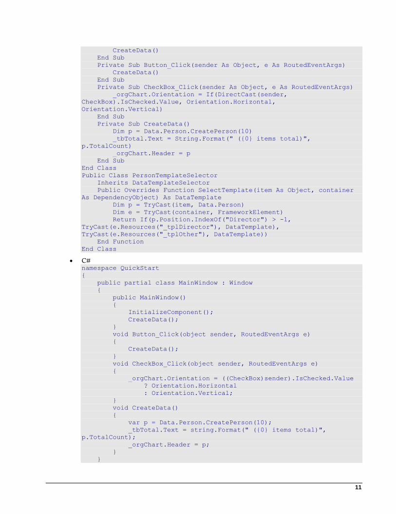
11
CreateData()
End Sub
Private Sub Button_Click(sender As Object, e As RoutedEventArgs)
CreateData()
End Sub
Private Sub CheckBox_Click(sender As Object, e As RoutedEventArgs)
_orgChart.Orientation = If(DirectCast(sender,
CheckBox).IsChecked.Value, Orientation.Horizontal,
Orientation.Vertical)
End Sub
Private Sub CreateData()
Dim p = Data.Person.CreatePerson(10)
_tbTotal.Text = String.Format(" ({0} items total)",
p.TotalCount)
_orgChart.Header = p
End Sub
End Class
Public Class PersonTemplateSelector
Inherits DataTemplateSelector
Public Overrides Function SelectTemplate(item As Object, container
As DependencyObject) As DataTemplate
Dim p = TryCast(item, Data.Person)
Dim e = TryCast(container, FrameworkElement)
Return If(p.Position.IndexOf("Director") > -1,
TryCast(e.Resources("_tplDirector"), DataTemplate),
TryCast(e.Resources("_tplOther"), DataTemplate))
End Function
End Class
C# namespace QuickStart
{
public partial class MainWindow : Window
{
public MainWindow()
{
InitializeComponent();
CreateData();
}
void Button_Click(object sender, RoutedEventArgs e)
{
CreateData();
}
void CheckBox_Click(object sender, RoutedEventArgs e)
{
_orgChart.Orientation = ((CheckBox)sender).IsChecked.Value
? Orientation.Horizontal
: Orientation.Vertical;
}
void CreateData()
{
var p = Data.Person.CreatePerson(10);
_tbTotal.Text = string.Format(" ({0} items total)",
p.TotalCount);
_orgChart.Header = p;
}
}
12
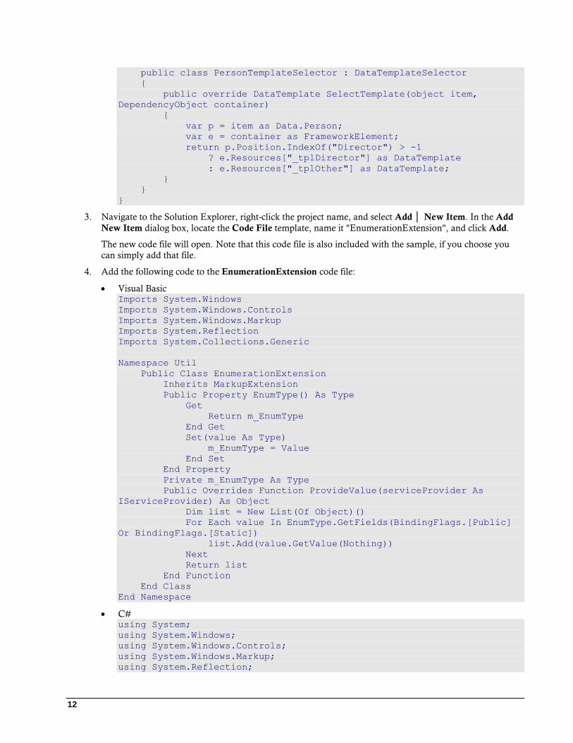
public class PersonTemplateSelector : DataTemplateSelector
{
public override DataTemplate SelectTemplate(object item,
DependencyObject container)
{
var p = item as Data.Person;
var e = container as FrameworkElement;
return p.Position.IndexOf("Director") > -1
? e.Resources["_tplDirector"] as DataTemplate
: e.Resources["_tplOther"] as DataTemplate;
}
}
}
3. Navigate to the Solution Explorer, right-click the project name, and select Add │ New Item. In the Add
New Item dialog box, locate the Code File template, name it "EnumerationExtension", and click Add.
The new code file will open. Note that this code file is also included with the sample, if you choose you
can simply add that file.
4. Add the following code to the EnumerationExtension code file:
Visual Basic Imports System.Windows
Imports System.Windows.Controls
Imports System.Windows.Markup
Imports System.Reflection
Imports System.Collections.Generic
Namespace Util
Public Class EnumerationExtension
Inherits MarkupExtension
Public Property EnumType() As Type
Get
Return m_EnumType
End Get
Set(value As Type)
m_EnumType = Value
End Set
End Property
Private m_EnumType As Type
Public Overrides Function ProvideValue(serviceProvider As
IServiceProvider) As Object
Dim list = New List(Of Object)()
For Each value In EnumType.GetFields(BindingFlags.[Public]
Or BindingFlags.[Static])
list.Add(value.GetValue(Nothing))
Next
Return list
End Function
End Class
End Namespace
C# using System;
using System.Windows;
using System.Windows.Controls;
using System.Windows.Markup;
using System.Reflection;
13
using System.Collections.Generic;
namespace Util
{
public class EnumerationExtension : MarkupExtension
{
public Type EnumType { get; set; }
public override object ProvideValue(IServiceProvider
serviceProvider)
{
var list = new List<object>();
foreach (var value in
EnumType.GetFields(BindingFlags.Public | BindingFlags.Static))
{
list.Add(value.GetValue(null));
}
return list;
}
}
}
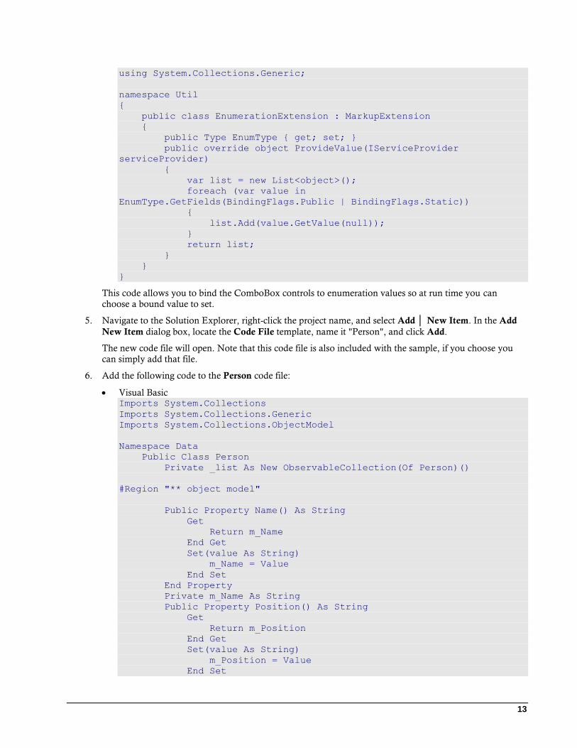
This code allows you to bind the ComboBox controls to enumeration values so at run time you can
choose a bound value to set.
5. Navigate to the Solution Explorer, right-click the project name, and select Add │ New Item. In the Add
New Item dialog box, locate the Code File template, name it "Person", and click Add.
The new code file will open. Note that this code file is also included with the sample, if you choose you
can simply add that file.
6. Add the following code to the Person code file:
Visual Basic Imports System.Collections
Imports System.Collections.Generic
Imports System.Collections.ObjectModel
Namespace Data
Public Class Person
Private _list As New ObservableCollection(Of Person)()
#Region "** object model"
Public Property Name() As String
Get
Return m_Name
End Get
Set(value As String)
m_Name = Value
End Set
End Property
Private m_Name As String
Public Property Position() As String
Get
Return m_Position
End Get
Set(value As String)
m_Position = Value
End Set
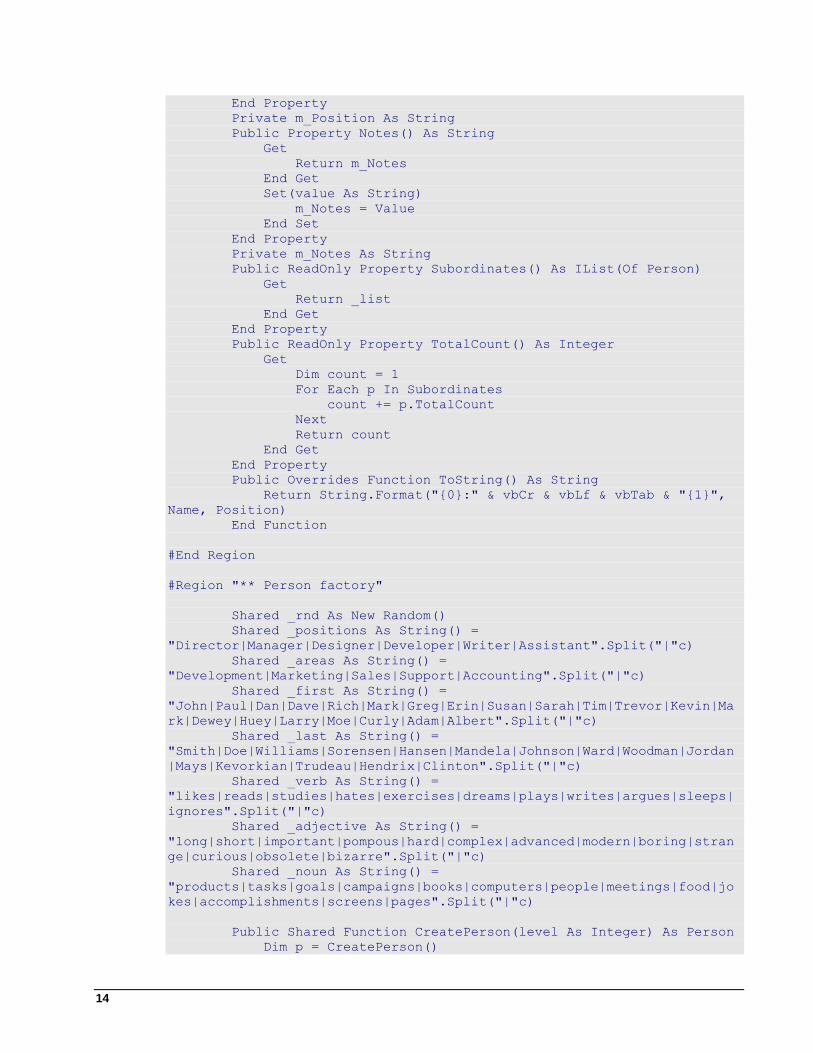
14
End Property
Private m_Position As String
Public Property Notes() As String
Get
Return m_Notes
End Get
Set(value As String)
m_Notes = Value
End Set
End Property
Private m_Notes As String
Public ReadOnly Property Subordinates() As IList(Of Person)
Get
Return _list
End Get
End Property
Public ReadOnly Property TotalCount() As Integer
Get
Dim count = 1
For Each p In Subordinates
count += p.TotalCount
Next
Return count
End Get
End Property
Public Overrides Function ToString() As String
Return String.Format("{0}:" & vbCr & vbLf & vbTab & "{1}",
Name, Position)
End Function
#End Region
#Region "** Person factory"
Shared _rnd As New Random()
Shared _positions As String() =
"Director|Manager|Designer|Developer|Writer|Assistant".Split("|"c)
Shared _areas As String() =
"Development|Marketing|Sales|Support|Accounting".Split("|"c)
Shared _first As String() =
"John|Paul|Dan|Dave|Rich|Mark|Greg|Erin|Susan|Sarah|Tim|Trevor|Kevin|Ma
rk|Dewey|Huey|Larry|Moe|Curly|Adam|Albert".Split("|"c)
Shared _last As String() =
"Smith|Doe|Williams|Sorensen|Hansen|Mandela|Johnson|Ward|Woodman|Jordan
|Mays|Kevorkian|Trudeau|Hendrix|Clinton".Split("|"c)
Shared _verb As String() =
"likes|reads|studies|hates|exercises|dreams|plays|writes|argues|sleeps|
ignores".Split("|"c)
Shared _adjective As String() =
"long|short|important|pompous|hard|complex|advanced|modern|boring|stran
ge|curious|obsolete|bizarre".Split("|"c)
Shared _noun As String() =
"products|tasks|goals|campaigns|books|computers|people|meetings|food|jo
kes|accomplishments|screens|pages".Split("|"c)
Public Shared Function CreatePerson(level As Integer) As Person
Dim p = CreatePerson()
15
If level > 0 Then
level -= 1
For i As Integer = 0 To _rnd.[Next](1, 4) - 1
p.Subordinates.Add(CreatePerson(_rnd.[Next](level \
2, level)))
Next
End If
Return p
End Function
Public Shared Function CreatePerson() As Person
Dim p = New Person()
p.Position = String.Format("{0} of {1}",
GetItem(_positions), GetItem(_areas))
p.Name = String.Format("{0} {1}", GetItem(_first),
GetItem(_last))
p.Notes = String.Format("{0} {1} {2} {3}", p.Name,
GetItem(_verb), GetItem(_adjective), GetItem(_noun))
While _rnd.NextDouble() < 0.5
p.Notes += String.Format(" and {0} {1} {2}",
GetItem(_verb), GetItem(_adjective), GetItem(_noun))
End While
p.Notes += "."
Return p
End Function
Private Shared Function GetItem(list As String()) As String
Return list(_rnd.[Next](0, list.Length))
End Function
#End Region
End Class
End Namespace
C# using System;
using System.Collections;
using System.Collections.Generic;
using System.Collections.ObjectModel;
namespace Data
{
public class Person
{
ObservableCollection<Person> _list = new
ObservableCollection<Person>();
#region ** object model
public string Name { get; set; }
public string Position { get; set; }
public string Notes { get; set; }
public IList<Person> Subordinates
{
get { return _list; }
}
public int TotalCount
{
get
16
{
var count = 1;
foreach (var p in Subordinates)
{
count += p.TotalCount;
}
return count;
}
}
public override string ToString()
{
return string.Format("{0}:\r\n\t{1}", Name, Position);
}
#endregion
#region ** Person factory
static Random _rnd = new Random();
static string[] _positions =
"Director|Manager|Designer|Developer|Writer|Assistant".Split('|');
static string[] _areas =
"Development|Marketing|Sales|Support|Accounting".Split('|');
static string[] _first =
"John|Paul|Dan|Dave|Rich|Mark|Greg|Erin|Susan|Sarah|Tim|Trevor|Kevin|Ma
rk|Dewey|Huey|Larry|Moe|Curly|Adam|Albert".Split('|');
static string[] _last =
"Smith|Doe|Williams|Sorensen|Hansen|Mandela|Johnson|Ward|Woodman|Jordan
|Mays|Kevorkian|Trudeau|Hendrix|Clinton".Split('|');
static string[] _verb =
"likes|reads|studies|hates|exercises|dreams|plays|writes|argues|sleeps|
ignores".Split('|');
static string[] _adjective =
"long|short|important|pompous|hard|complex|advanced|modern|boring|stran
ge|curious|obsolete|bizarre".Split('|');
static string[] _noun =
"products|tasks|goals|campaigns|books|computers|people|meetings|food|jo
kes|accomplishments|screens|pages".Split('|');
public static Person CreatePerson(int level)
{
var p = CreatePerson();
if (level > 0)
{
level--;
for (int i = 0; i < _rnd.Next(1, 4); i++)
{
p.Subordinates.Add(CreatePerson(_rnd.Next(level /
2, level)));
}
}
return p;
}
public static Person CreatePerson()
{
var p = new Person();
p.Position = string.Format("{0} of {1}",
GetItem(_positions), GetItem(_areas));
17
p.Name = string.Format("{0} {1}", GetItem(_first),
GetItem(_last));
p.Notes = string.Format("{0} {1} {2} {3}", p.Name,
GetItem(_verb), GetItem(_adjective), GetItem(_noun));
while (_rnd.NextDouble() < .5)
{
p.Notes += string.Format(" and {0} {1} {2}",
GetItem(_verb), GetItem(_adjective), GetItem(_noun));
}
p.Notes += ".";
return p;
}
static string GetItem(string[] list)
{
return list[_rnd.Next(0, list.Length)];
}
#endregion
}
}
This code creates a simple class with a recursive ObservableCollection for items to be displayed in
C1OrgChart and creates a method to build a simple organization chart. Note that the C1OrgChart
control's default template uses the ToString method to dictate what text is displayed. You will need to
override this method (as in the above code) if you're not using a DataTemplate (if you are using a
DataTemplate, you can just set your bindings in that and ignore the ToString).
In this step you added content to the C1OrgChart control. In the next step you'll view some of the run-time
interactions possible in the control.
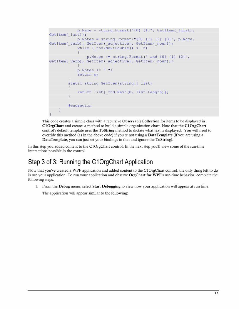
Step 3 of 3: Running the C1OrgChart Application Now that you've created a WPF application and added content to the C1OrgChart control, the only thing left to do
is run your application. To run your application and observe OrgChart for WPF's run-time behavior, complete the
following steps:
1. From the Debug menu, select Start Debugging to view how your application will appear at run time.
The application will appear similar to the following:
18
The application contains a control panel area and a random organizational chart.
2. Drag the slider's thumb button to set the zoom level of the C1OrgChart control.
3. Change the orientation of the control by clicking the Organization drop-down box and selecting Vertical.
The grid will appear vertically orientated.
4. Set the control's alignment by selecting options from the HorizontalContentAlignment and
VerticalContentAlignment drop-down boxes.
5. Click the New data button to load the control with different data.
Congratulations! You've completed the OrgChart for WPF quick start and created a simple WPF application,
added and customized a OrgChart for WPF control, and viewed some of the run-time capabilities of the control.
19
Working with OrgChart for WPF Organizational charts (often called organization chart, org chart, or organogram) are diagrams that show the
structure of an organization and the relationships and relative ranks of its parts and positions/jobs. The term is also
used for similar diagrams, for example ones showing the different elements of a field of knowledge or a group of
languages.
The C1OrgChart control allows you to create organizational charts that show any type of hierarchical data. The
control leverages the rich data binding mechanisms in WPF and Silverlight to provide a flexible, yet easy-to-use
tool.
C1OrgChart Core Properties The C1OrgChart control is an ItemsControl. To use it, you will normally populate the control with the Header or
ItemsSource properties and define the appearance of the items using the ItemTemplate property.
Use the Header property if you have a single data item that contains sub-items. Use the ItemsSource property if
you have a collection of items with sub-items.
Either way, the data items must contain sub-items. In most cases, the sub-items are of the same type as the main
items. For example, an Employee class may contain properties about the employee and a Subordinates property
that contains a list of employees who report to the parent Employee:
public class Employee
{
List<Employee> _list = new List<Employee>();
public string Name { get; set; }
public string Position { get; set; }
public string Notes { get; set; }
public IEnumerable<Employee> Subordinates{ get; set; }
}
If you assign an Employee object to the Header property, the C1OrgChart will automatically detect that the
Subordinates property contains a collection of Employee objects, and that is enough to establish the hierarchy of
the data.
If your data class contains multiple collection properties, or if the collection is of a generic type (for example
IEnumerable), then you should use the ChildItemsPath property to specify the name of the property that contains
the child (subordinate) items.
If the items contain sub-items of different types, then you should use a HierarchicalDataTemplate to specify the
items at each level. This is discussed later in this document.
The ItemTemplate property specifies how the C1OrgChart control should display the data items. This is a
standard Silverlight/WPF DataTemplate, which you can define in XAML as follows:
<Window.Resources>
<!-- C1OrgChart node content -->
<DataTemplate x:Key="EmployeeTemplate" >
<Border
Background="WhiteSmoke" BorderBrush="Black"
BorderThickness="1 1 2 2" CornerRadius="6"
MaxWidth="200" >
<StackPanel Orientation="Vertical" >
<TextBlock Text="{Binding Name}" FontSize="14" />
<TextBlock Text="{Binding Notes}" FontSize="9.5" />
20
<TextBlock Text="{Binding Position}" FontSize="12" />
</StackPanel>
</Border>
</DataTemplate>
</Window.Resources>
Once you have a DataTemplate defined as a resource, you can use it in a C1OrgChart control as follows:
<c1:C1OrgChart
x:Name="_orgChart"
ItemTemplate="{StaticResource EmployeeTemplate }" >
</c1:C1OrgChart>
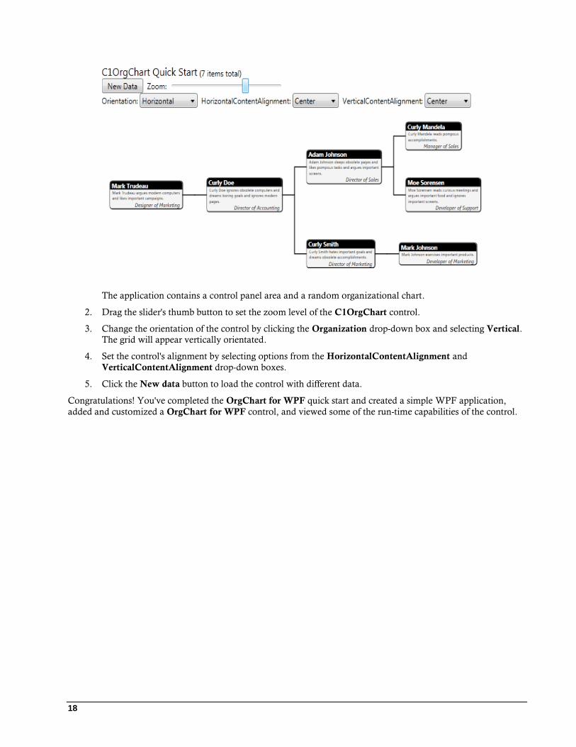
To illustrate, the chart below was created with a slightly enhanced version of this template and some randomly-
generated employees:
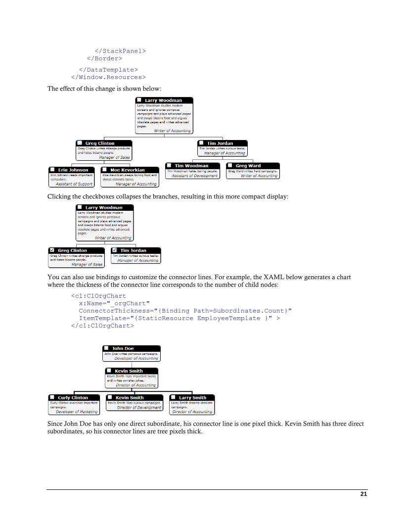
Using Bindings in C1OrgChart Properties The ItemTemplate used in the examples above use bindings to show properties of the Employee class as visual
elements. But you can also bind elements to properties of the C1OrgChart.
The most useful of these scenarios is binding a CheckBox.IsChecked property to the C1OrgChart’s IsCollapsed
property. This allows you to create collapsible C1OrgCharts that behave similarly to a TreeView control.
For example, here is a slightly modified version of the data template we assigned to the C1OrgChart’s
ItemTemplate property:
<Window.Resources>
<!-- C1OrgChart node content -->
<DataTemplate x:Key="EmployeeTemplate" >
<Border
Background="WhiteSmoke" BorderBrush="Black"
BorderThickness="1 1 2 2" CornerRadius="6"
MaxWidth="200" >
<StackPanel Orientation="Vertical" >
<!-- CheckBox bound to C1OrgChart's IsCollapsed property -->
<CheckBox Margin="4 0"
IsChecked="{Binding IsCollapsed, Mode=TwoWay,
RelativeSource={RelativeSource AncestorType=c1:C1OrgChart}}"/>
<TextBlock Text="{Binding Name}" FontSize="14" />
<TextBlock Text="{Binding Notes}" FontSize="9.5" />
<TextBlock Text="{Binding Position}" FontSize="12" />
21
</StackPanel>
</Border>
</DataTemplate>
</Window.Resources>
The effect of this change is shown below:
Clicking the checkboxes collapses the branches, resulting in this more compact display:
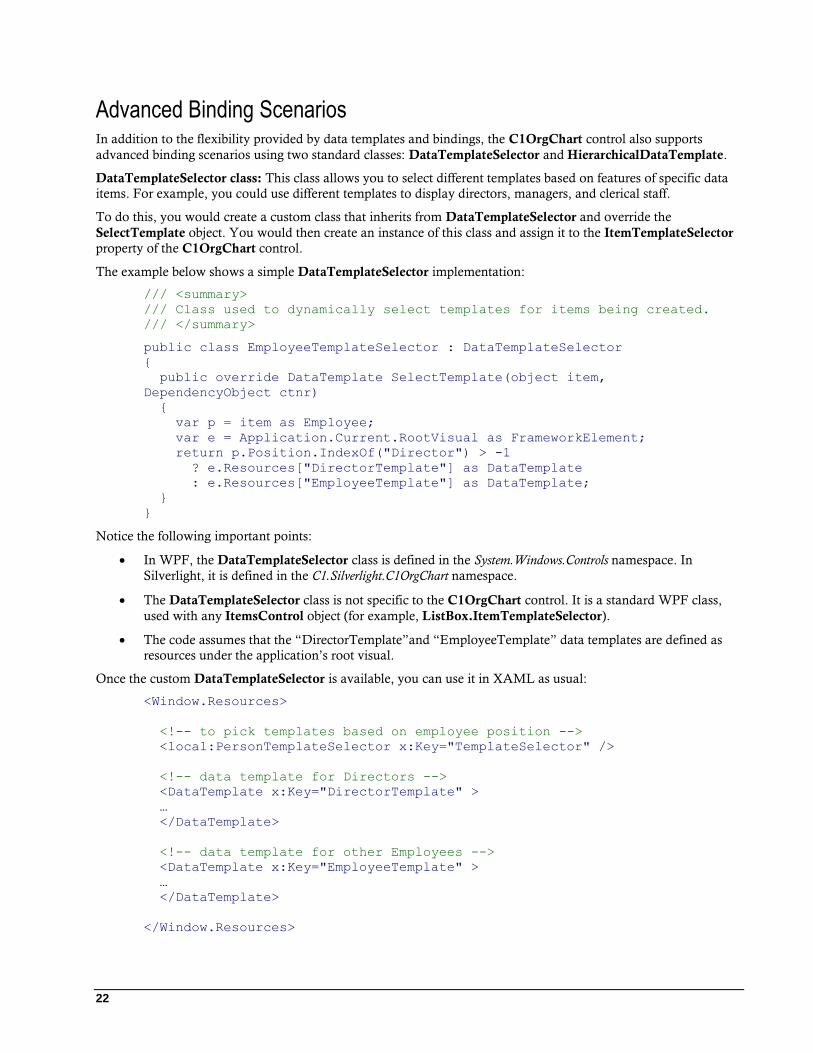
You can also use bindings to customize the connector lines. For example, the XAML below generates a chart
where the thickness of the connector line corresponds to the number of child nodes:
<c1:C1OrgChart
x:Name="_orgChart"
ConnectorThickness="{Binding Path=Subordinates.Count}"
ItemTemplate="{StaticResource EmployeeTemplate }" >
</c1:C1OrgChart>
Since John Doe has only one direct subordinate, his connector line is one pixel thick. Kevin Smith has three direct
subordinates, so his connector lines are tree pixels thick.
22
Advanced Binding Scenarios In addition to the flexibility provided by data templates and bindings, the C1OrgChart control also supports
advanced binding scenarios using two standard classes: DataTemplateSelector and HierarchicalDataTemplate.
DataTemplateSelector class: This class allows you to select different templates based on features of specific data
items. For example, you could use different templates to display directors, managers, and clerical staff.
To do this, you would create a custom class that inherits from DataTemplateSelector and override the
SelectTemplate object. You would then create an instance of this class and assign it to the ItemTemplateSelector
property of the C1OrgChart control.
The example below shows a simple DataTemplateSelector implementation:
/// <summary>
/// Class used to dynamically select templates for items being created.
/// </summary>
public class EmployeeTemplateSelector : DataTemplateSelector
{
public override DataTemplate SelectTemplate(object item,
DependencyObject ctnr)
{
var p = item as Employee;
var e = Application.Current.RootVisual as FrameworkElement;
return p.Position.IndexOf("Director") > -1
? e.Resources["DirectorTemplate"] as DataTemplate
: e.Resources["EmployeeTemplate"] as DataTemplate;
}
}
Notice the following important points:
In WPF, the DataTemplateSelector class is defined in the System.Windows.Controls namespace. In
Silverlight, it is defined in the C1.Silverlight.C1OrgChart namespace.
The DataTemplateSelector class is not specific to the C1OrgChart control. It is a standard WPF class,
used with any ItemsControl object (for example, ListBox.ItemTemplateSelector).
The code assumes that the “DirectorTemplate”and “EmployeeTemplate” data templates are defined as
resources under the application’s root visual.
Once the custom DataTemplateSelector is available, you can use it in XAML as usual:
<Window.Resources>
<!-- to pick templates based on employee position -->
<local:PersonTemplateSelector x:Key="TemplateSelector" />
<!-- data template for Directors -->
<DataTemplate x:Key="DirectorTemplate" >
…
</DataTemplate>
<!-- data template for other Employees -->
<DataTemplate x:Key="EmployeeTemplate" >
…
</DataTemplate>
</Window.Resources>
23
…
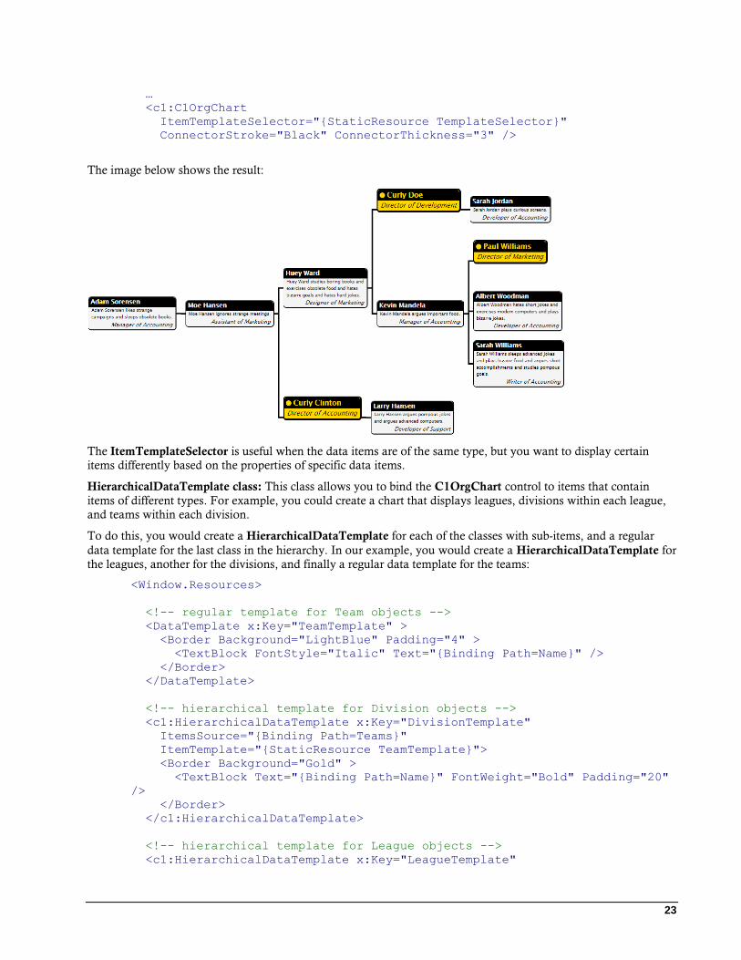
<c1:C1OrgChart
ItemTemplateSelector="{StaticResource TemplateSelector}"
ConnectorStroke="Black" ConnectorThickness="3" />
The image below shows the result:
The ItemTemplateSelector is useful when the data items are of the same type, but you want to display certain
items differently based on the properties of specific data items.
HierarchicalDataTemplate class: This class allows you to bind the C1OrgChart control to items that contain
items of different types. For example, you could create a chart that displays leagues, divisions within each league,
and teams within each division.
To do this, you would create a HierarchicalDataTemplate for each of the classes with sub-items, and a regular
data template for the last class in the hierarchy. In our example, you would create a HierarchicalDataTemplate for
the leagues, another for the divisions, and finally a regular data template for the teams:
<Window.Resources>
<!-- regular template for Team objects -->
<DataTemplate x:Key="TeamTemplate" >
<Border Background="LightBlue" Padding="4" >
<TextBlock FontStyle="Italic" Text="{Binding Path=Name}" />
</Border>
</DataTemplate>
<!-- hierarchical template for Division objects -->
<c1:HierarchicalDataTemplate x:Key="DivisionTemplate"
ItemsSource="{Binding Path=Teams}"
ItemTemplate="{StaticResource TeamTemplate}">
<Border Background="Gold" >
<TextBlock Text="{Binding Path=Name}" FontWeight="Bold" Padding="20"
/>
</Border>
</c1:HierarchicalDataTemplate>
<!-- hierarchical template for League objects -->
<c1:HierarchicalDataTemplate x:Key="LeagueTemplate"
24
ItemsSource="{Binding Path=Divisions}"
ItemTemplate="{StaticResource DivisionTemplate}">
<Border Background="LightCoral" >
<TextBlock Text="{Binding Path=Name}" FontWeight="Bold" Padding="40"
/>
</Border>
</c1:HierarchicalDataTemplate>
</Window.Resources>
The top-level template is the LeagueTemplate. In addition to defining how League object should be displayed (as
regular templates do), its ItemsSource property specifies that subordinate objects should be retrieved from the
League.Divisions property. Finally, the ItemTemplate property specifies the template that should be used to
display the subordinate objects.
In this case, the ItemTemplate is DivisionTemplate, another HierarchicalDataTemplate that specifies how
Division objects should be displayed, that the Division.Teams property exposes subordinate objects, and that the
subordinate objects should be displayed using the TeamTemplate, which is a regular (non-hierarchical) data
template.
Notice the following important points:
In WPF, the HierarchicalDataTemplate class is defined in the System.Windows namespace. In Silverlight,
it is defined in the C1.Silverlight.C1OrgChart namespace. (In Silverlight, you can also use the
HierarchicalDataTemplate classes defined in the Microsoft SDK or in the C1.Silverlight.dll assembly).
The HierarchicalDataTemplate class derives from the standard DataTemplate class and adds two
properties: ItemsSource specifies the property that contains sub-items, and ItemTemplate specifies the
template that should be used for the subordinate items.
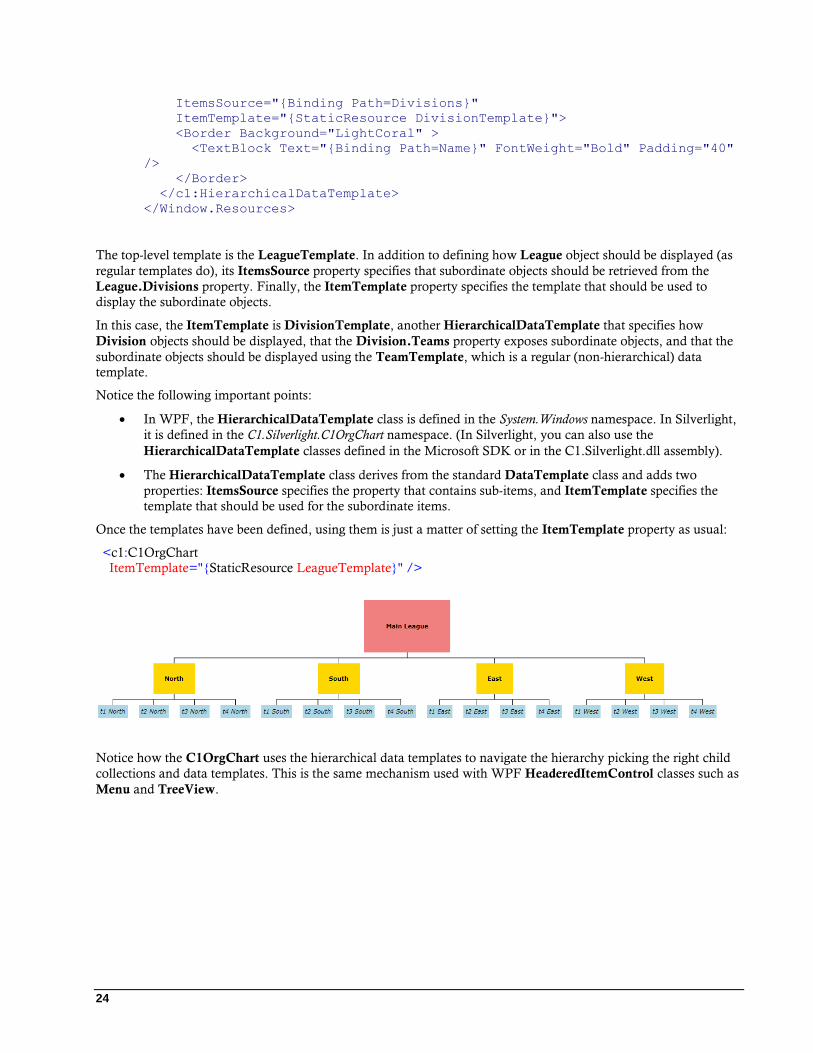
Once the templates have been defined, using them is just a matter of setting the ItemTemplate property as usual:
<c1:C1OrgChart
ItemTemplate="{StaticResource LeagueTemplate}" />
Notice how the C1OrgChart uses the hierarchical data templates to navigate the hierarchy picking the right child
collections and data templates. This is the same mechanism used with WPF HeaderedItemControl classes such as
Menu and TreeView.
25
OrgChart for WPF Layout and
Appearance The following topics detail how to customize the C1OrgChart control's layout and appearance. You can use built-
in layout options to lay your controls out in panels such as Grids or Canvases. Themes allow you to customize the
appearance of the grid and take advantage of WPF's XAML-based styling. You can also use templates to format
and lay out the control and to customize the control's actions.
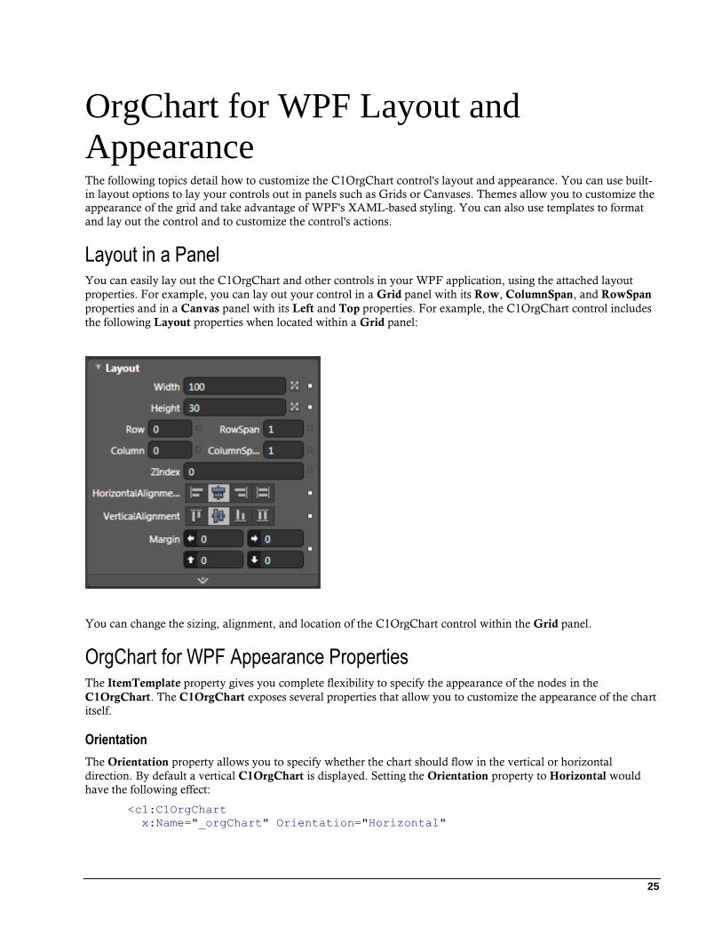
Layout in a Panel You can easily lay out the C1OrgChart and other controls in your WPF application, using the attached layout
properties. For example, you can lay out your control in a Grid panel with its Row, ColumnSpan, and RowSpan
properties and in a Canvas panel with its Left and Top properties. For example, the C1OrgChart control includes
the following Layout properties when located within a Grid panel:
You can change the sizing, alignment, and location of the C1OrgChart control within the Grid panel.
OrgChart for WPF Appearance Properties The ItemTemplate property gives you complete flexibility to specify the appearance of the nodes in the
C1OrgChart. The C1OrgChart exposes several properties that allow you to customize the appearance of the chart
itself.
Orientation
The Orientation property allows you to specify whether the chart should flow in the vertical or horizontal
direction. By default a vertical C1OrgChart is displayed. Setting the Orientation property to Horizontal would
have the following effect:
<c1:C1OrgChart
x:Name="_orgChart" Orientation="Horizontal"
26
ItemTemplate="{StaticResource EmployeeTemplate }" >
</c1:C1OrgChart>
FlowDirection
The FlowDirection property allows you to specify whether the chart should flow right to left or left to right. By
default, the C1OrgChart flows left to right. You can change the FlowDirection property to RightToLeft with the
following markup:
<c1:C1OrgChart
x:Name="_orgChart" FlowDirection="RightToLeft"
ItemTemplate="{StaticResource EmployeeTemplate }" >
</c1:C1OrgChart>
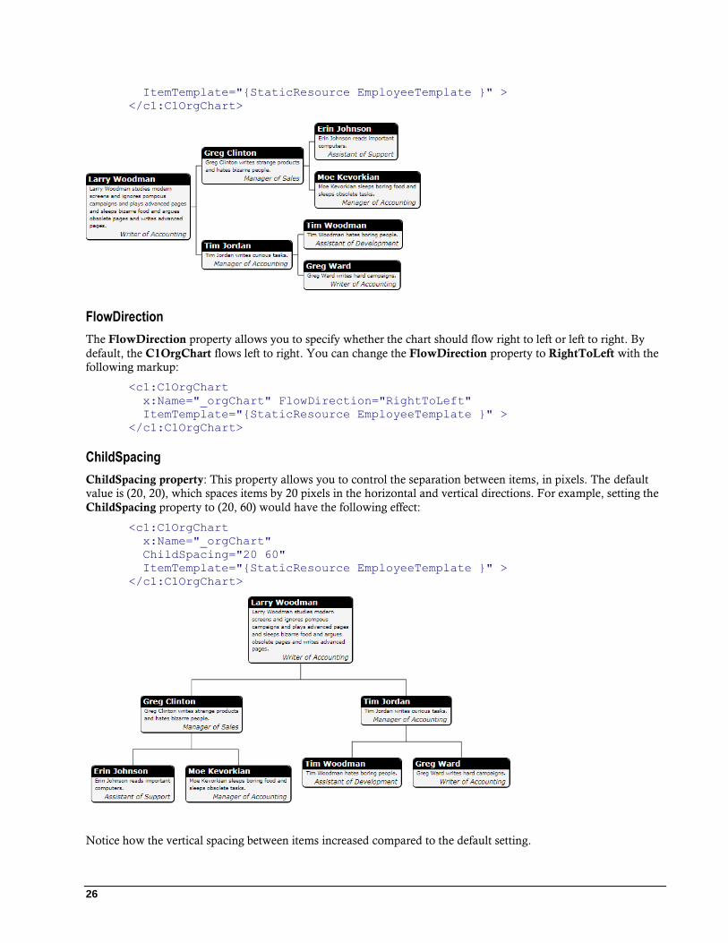
ChildSpacing
ChildSpacing property: This property allows you to control the separation between items, in pixels. The default
value is (20, 20), which spaces items by 20 pixels in the horizontal and vertical directions. For example, setting the
ChildSpacing property to (20, 60) would have the following effect:
<c1:C1OrgChart
x:Name="_orgChart"
ChildSpacing="20 60"
ItemTemplate="{StaticResource EmployeeTemplate }" >
</c1:C1OrgChart>
Notice how the vertical spacing between items increased compared to the default setting.
27
You can also control the spacing between items by specifying a Margin value in your ItemTemplate. This
approach is slightly more flexible because it allows you to specify the amount of space to be left on each side of the
node elements.
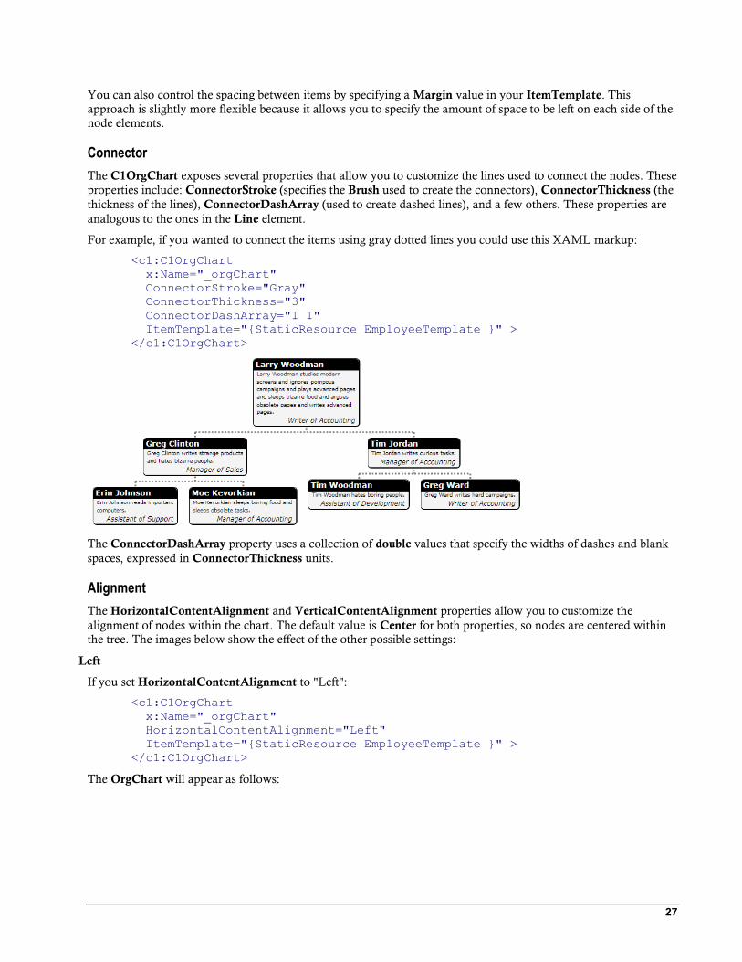
Connector
The C1OrgChart exposes several properties that allow you to customize the lines used to connect the nodes. These
properties include: ConnectorStroke (specifies the Brush used to create the connectors), ConnectorThickness (the
thickness of the lines), ConnectorDashArray (used to create dashed lines), and a few others. These properties are
analogous to the ones in the Line element.
For example, if you wanted to connect the items using gray dotted lines you could use this XAML markup:
<c1:C1OrgChart
x:Name="_orgChart"
ConnectorStroke="Gray"
ConnectorThickness="3"
ConnectorDashArray="1 1"
ItemTemplate="{StaticResource EmployeeTemplate }" >
</c1:C1OrgChart>
The ConnectorDashArray property uses a collection of double values that specify the widths of dashes and blank
spaces, expressed in ConnectorThickness units.
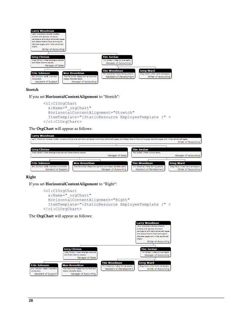
Alignment
The HorizontalContentAlignment and VerticalContentAlignment properties allow you to customize the
alignment of nodes within the chart. The default value is Center for both properties, so nodes are centered within
the tree. The images below show the effect of the other possible settings:
Left
If you set HorizontalContentAlignment to "Left":
<c1:C1OrgChart
x:Name="_orgChart"
HorizontalContentAlignment="Left"
ItemTemplate="{StaticResource EmployeeTemplate }" >
</c1:C1OrgChart>
The OrgChart will appear as follows:
28
Stretch
If you set HorizontalContentAlignment to "Stretch":
<c1:C1OrgChart
x:Name="_orgChart"
HorizontalContentAlignment="Stretch"
ItemTemplate="{StaticResource EmployeeTemplate }" >
</c1:C1OrgChart>
The OrgChart will appear as follows:
Right
If you set HorizontalContentAlignment to "Right":
<c1:C1OrgChart
x:Name="_orgChart"
HorizontalContentAlignment="Right"
ItemTemplate="{StaticResource EmployeeTemplate }" >
</c1:C1OrgChart>
The OrgChart will appear as follows:
29
OrgChart Templates One of the main advantages to using a WPF control is that controls are "lookless" with a fully customizable user
interface. Just as you design your own user interface (UI), or look and feel, for WPF applications, you can provide
your own UI for data managed by ComponentOne OrgChart for WPF. Extensible Application Markup Language
(XAML; pronounced "Zammel"), an XML-based declarative language, offers a simple approach to designing your
UI without having to write code.
Accessing Templates
You can access templates in Microsoft Expression Blend by selecting the C1OrgChart control and, in the menu,
selecting Edit Template. Select Edit a Copy to create an editable copy of the current template or Create Empty, to
create a new blank template.
Once you've created a new template, the template will appear in the Objects and Timeline window. Note that you
can use the Template property to customize the template.
Note: If you create a new template through the menu, the template will automatically be linked to that template's
property. If you manually create a template in XAML you will have to link the appropriate template property to the template you've created.
Additional Templates
In addition to the default template, the C1OrgChart control includes a few additional templates. These additional
templates can also be accessed in Microsoft Expression Blend – in Blend select the C1OrgChart control and, in the
menu, select Edit Additional Templates. Choose a template, and select Create Empty.
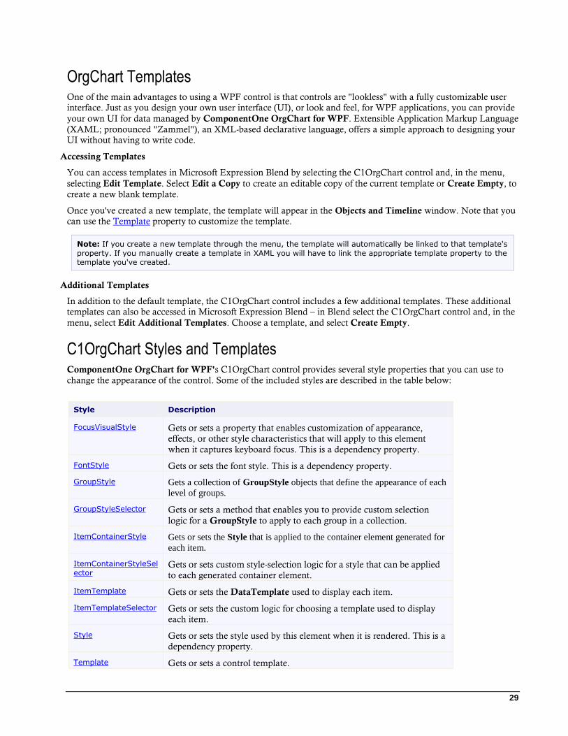
C1OrgChart Styles and Templates ComponentOne OrgChart for WPF's C1OrgChart control provides several style properties that you can use to
change the appearance of the control. Some of the included styles are described in the table below:
Style Description
FocusVisualStyle Gets or sets a property that enables customization of appearance,
effects, or other style characteristics that will apply to this element
when it captures keyboard focus. This is a dependency property.
FontStyle Gets or sets the font style. This is a dependency property.
GroupStyle Gets a collection of GroupStyle objects that define the appearance of each
level of groups.
GroupStyleSelector Gets or sets a method that enables you to provide custom selection
logic for a GroupStyle to apply to each group in a collection.
ItemContainerStyle Gets or sets the Style that is applied to the container element generated for
each item.
ItemContainerStyleSel
ector Gets or sets custom style-selection logic for a style that can be applied
to each generated container element.
ItemTemplate Gets or sets the DataTemplate used to display each item.
ItemTemplateSelector Gets or sets the custom logic for choosing a template used to display
each item.
Style Gets or sets the style used by this element when it is rendered. This is a
dependency property.
Template Gets or sets a control template.

30
C1OrgChart Visual States In Microsoft Expression Blend, you can add custom states and state groups to define a different appearance for
each state of your user control – for example, the visual state of the control could change on mouse over. You can
view and edit visual states by creating a new template. Once you've done so the available visual states for that part
will be visible in the States window.
31
OrgChart for WPF Task-Based Help The following task-based help topics assume that you are familiar with Visual Studio and Expression Blend and
know how to use the C1OrgChart control in general. If you are unfamiliar with the ComponentOne OrgChart for
WPF product, please see the OrgChart for WPF Quick Start (page 7) first.
Each topic in this section provides a solution for specific tasks using the ComponentOne OrgChart for WPF
product. Most task-based help topics also assume that you have created a new WPF project and added a
C1OrgChart control to the project – for information about creating the control, see Adding C1OrgChart to the
Application (page 31).
Adding C1OrgChart to the Application Complete the following steps to add a C1OrgChart control to your application:
1. From the Visual Studio File menu select New and choose Project.
2. In the New Project dialog box choose a language in the left-side menu, choose .NET Framework 4 in the
Framework drop-down list, and enter a name for the project.
3. In the Solution Explorer, right-click the project name and choose Add Reference. In the Add Reference
dialog box, locate and select the following assemblies and click OK to add references to your project:
C1.WPF
C1.WPF.OrgChart
4. Open the XAML view of the MainWindow.xaml file and add the XAML namespace to the Window tag
with the following markup:
xmlns:c1="http://schemas.componentone.com/winfx/2006/xaml".
The namespaces will now appear similar to the following:
<Window x:Class="MainWindow"
xmlns="http://schemas.microsoft.com/winfx/2006/xaml/presentation"
xmlns:x="http://schemas.microsoft.com/winfx/2006/xaml"
xmlns:c1="http://schemas.componentone.com/winfx/2006/xaml"
Title="MainWindow" Height="350" Width="525">
This is a unified namespace that will enable you to work with most ComponentOne WPF or Silverlight
controls without adding multiple namespaces.
5. Add the <c1:C1OrgChart x:Name="C1OrgChart1" /> tag within the Grid tags on the page to add
the C1OrgChart control to the application.
The XAML will appear similar to the following:
<Grid x:Name="LayoutRoot" Background="White">
<c1:C1OrgChart x:Name="C1OrgChart1" />
</Grid>
This will add a C1OrgChart control named "C1OrgChart1" to the application.
You've successfully set up your application, but if you run your application now you'll see that application is
currently blank.
32
Note: If the C1OrgChart control was installed to the Visual Studio Toolbox, simply dragging the control onto a
page will automatically perform all the steps above.
Changing C1OrgChart Orientation C1OrgChart can be displayed with the chart flowing in either a horizontal and vertical direction. You can set the
property either in XAML or in the Properties window.
In XAML
Insert Orientation=Vertical into the <c1:C1OrgChart> opening tag. The XAML markup for the
C1OrgChart control should resemble the following:
<c1:C1OrgChart x:Name="_orgChart" Orientation="Horizontal">
In the Properties Window
Complete the following steps to change the C1OrgChart's Orientation property:
1. Locate the Orientation property in the Properties window.
2. Use the drop-down list to change the value to "Vertical"
Changing C1OrgChart Flow Direction You can specify whether the chart shows from right to left or from left to right using the FlowDirection property.
In XAML
Locate the opening <c1:C1OrgChart> tag and insert FlowDirection="RightToLeft" into the tag. The
<c1:C1OrgChart> markup should resemble the following:
<c1:C1OrgChart x:Name="_orgChart" Orientation="Horizontal"
FlowDirection="RightToLeft">
In the Properties Window
1. Locate the FlowDirection property in the Properties window.
2. Use the drop-down list to change the value to "RightToLeft".
Customizing the C1OrgChart Item Connector You can use several properties to customize the lines used to connect the nodes of the C1OrgChart, including
ConnectorStroke, ConnectorThickness, and ConnectorDashArray. These properties can be set in the XAML
markup or in the Design View Properties window.
In XAML
To change the Item Connector color, insert ConnectorStroke="#FF970014" into the opening
<c1:C1OrgChart> tag.
To change the Item Connector thickness, insert ConnectorThickness="3" after the Connector Stroke markup.
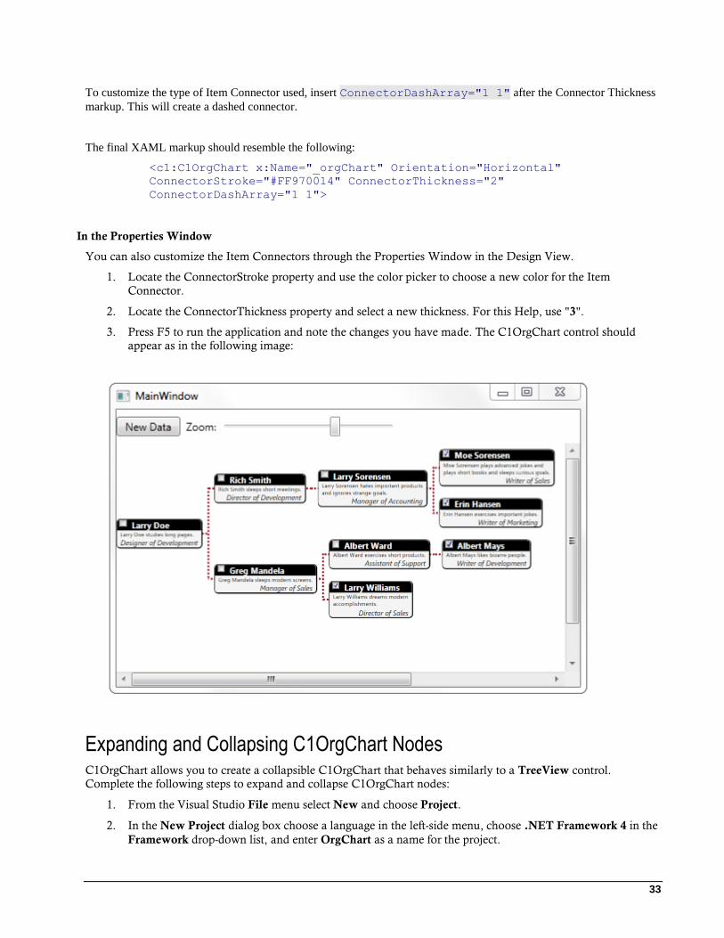
33
To customize the type of Item Connector used, insert ConnectorDashArray="1 1" after the Connector Thickness
markup. This will create a dashed connector.
The final XAML markup should resemble the following:
<c1:C1OrgChart x:Name="_orgChart" Orientation="Horizontal"
ConnectorStroke="#FF970014" ConnectorThickness="2"
ConnectorDashArray="1 1">
In the Properties Window
You can also customize the Item Connectors through the Properties Window in the Design View.
1. Locate the ConnectorStroke property and use the color picker to choose a new color for the Item
Connector.
2. Locate the ConnectorThickness property and select a new thickness. For this Help, use "3".
3. Press F5 to run the application and note the changes you have made. The C1OrgChart control should
appear as in the following image:
Expanding and Collapsing C1OrgChart Nodes C1OrgChart allows you to create a collapsible C1OrgChart that behaves similarly to a TreeView control.
Complete the following steps to expand and collapse C1OrgChart nodes:
1. From the Visual Studio File menu select New and choose Project.
2. In the New Project dialog box choose a language in the left-side menu, choose .NET Framework 4 in the
Framework drop-down list, and enter OrgChart as a name for the project.
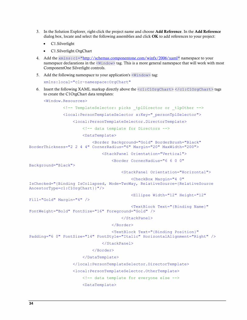
34
3. In the Solution Explorer, right-click the project name and choose Add Reference. In the Add Reference
dialog box, locate and select the following assemblies and click OK to add references to your project:
C1.Silverlight
C1.Silverlight.OrgChart
4. Add the xmlns:c1="http://schemas.componentone.com/winfx/2006/xaml" namespace to your
namespace declarations in the <Window> tag. This is a more general namespace that will work with most
ComponentOne Silverlight controls.
5. Add the following namespace to your application's <Window> tag:
xmlns:local="clr-namespace:OrgChart"
6. Insert the following XAML markup directly above the <c1:C1OrgChart> </c1:C1OrgChart> tags
to create the C1OrgChart data templates:
<Window.Resources>
<!-- TemplateSelector: picks _tplDirector or _tlpOther -->
<local:PersonTemplateSelector x:Key="_personTplSelector">
<local:PersonTemplateSelector.DirectorTemplate>
<!-- data template for Directors -->
<DataTemplate>
<Border Background="Gold" BorderBrush="Black"
BorderThickness="2 2 4 4" CornerRadius="6" Margin="20" MaxWidth="200">
<StackPanel Orientation="Vertical">
<Border CornerRadius="6 6 0 0"
Background="Black">
<StackPanel Orientation="Horizontal">
<CheckBox Margin="4 0"
IsChecked="{Binding IsCollapsed, Mode=TwoWay, RelativeSource={RelativeSource
AncestorType=c1:C1OrgChart}}"/>
<Ellipse Width="12" Height="12"
Fill="Gold" Margin="4" />
<TextBlock Text="{Binding Name}"
FontWeight="Bold" FontSize="16" Foreground="Gold" />
</StackPanel>
</Border>
<TextBlock Text="{Binding Position}"
Padding="6 0" FontSize="14" FontStyle="Italic" HorizontalAlignment="Right" />
</StackPanel>
</Border>
</DataTemplate>
</local:PersonTemplateSelector.DirectorTemplate>
<local:PersonTemplateSelector.OtherTemplate>
<!-- data template for everyone else -->
<DataTemplate>
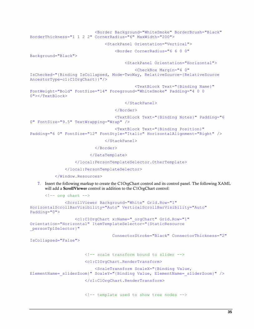
35
<Border Background="WhiteSmoke" BorderBrush="Black"
BorderThickness="1 1 2 2" CornerRadius="6" MaxWidth="200">
<StackPanel Orientation="Vertical">
<Border CornerRadius="6 6 0 0"
Background="Black">
<StackPanel Orientation="Horizontal">
<CheckBox Margin="4 0"
IsChecked="{Binding IsCollapsed, Mode=TwoWay, RelativeSource={RelativeSource
AncestorType=c1:C1OrgChart}}"/>
<TextBlock Text="{Binding Name}"
FontWeight="Bold" FontSize="14" Foreground="WhiteSmoke" Padding="4 0 0
0"></TextBlock>
</StackPanel>
</Border>
<TextBlock Text="{Binding Notes}" Padding="6
0" FontSize="9.5" TextWrapping="Wrap" />
<TextBlock Text="{Binding Position}"
Padding="6 0" FontSize="12" FontStyle="Italic" HorizontalAlignment="Right" />
</StackPanel>
</Border>
</DataTemplate>
</local:PersonTemplateSelector.OtherTemplate>
</local:PersonTemplateSelector>
</Window.Resources>
7. Insert the following markup to create the C1OrgChart control and its control panel. The following XAML
will add a ScrollViewer control in addition to the C1OrgChart control:
<!-- org chart -->
<ScrollViewer Background="White" Grid.Row="1"
HorizontalScrollBarVisibility="Auto" VerticalScrollBarVisibility="Auto"
Padding="0">
<c1:C1OrgChart x:Name="_orgChart" Grid.Row="1"
Orientation="Horizontal" ItemTemplateSelector="{StaticResource
_personTplSelector}"
ConnectorStroke="Black" ConnectorThickness="2"
IsCollapsed="False">
<!-- scale transform bound to slider -->
<c1:C1OrgChart.RenderTransform>
<ScaleTransform ScaleX="{Binding Value,
ElementName=_sliderZoom}" ScaleY="{Binding Value, ElementName=_sliderZoom}" />
</c1:C1OrgChart.RenderTransform>
<!-- template used to show tree nodes -->
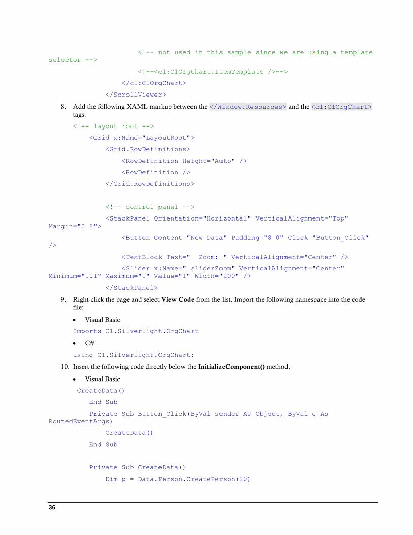
36
<!-- not used in this sample since we are using a template
selector -->
<!--<c1:C1OrgChart.ItemTemplate />-->
</c1:C1OrgChart>
</ScrollViewer>
8. Add the following XAML markup between the </Window.Resources> and the <c1:C1OrgChart>
tags:
<!-- layout root -->
<Grid x:Name="LayoutRoot">
<Grid.RowDefinitions>
<RowDefinition Height="Auto" />
<RowDefinition />
</Grid.RowDefinitions>
<!-- control panel -->
<StackPanel Orientation="Horizontal" VerticalAlignment="Top"
Margin="0 8">
<Button Content="New Data" Padding="8 0" Click="Button_Click"
/>
<TextBlock Text=" Zoom: " VerticalAlignment="Center" />
<Slider x:Name="_sliderZoom" VerticalAlignment="Center"
Minimum=".01" Maximum="1" Value="1" Width="200" />
</StackPanel>
9. Right-click the page and select View Code from the list. Import the following namespace into the code
file:
Visual Basic
Imports C1.Silverlight.OrgChart
C#
using C1.Silverlight.OrgChart;
10. Insert the following code directly below the InitializeComponent() method:
Visual Basic
CreateData()
End Sub
Private Sub Button_Click(ByVal sender As Object, ByVal e As
RoutedEventArgs)
CreateData()
End Sub
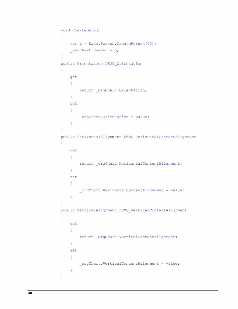
Private Sub CreateData()
Dim p = Data.Person.CreatePerson(10)
37
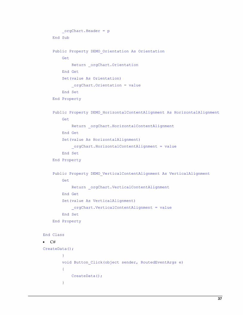
_orgChart.Header = p
End Sub
Public Property DEMO_Orientation As Orientation
Get
Return _orgChart.Orientation
End Get
Set(value As Orientation)
_orgChart.Orientation = value
End Set
End Property
Public Property DEMO_HorizontalContentAlignment As HorizontalAlignment
Get
Return _orgChart.HorizontalContentAlignment
End Get
Set(value As HorizontalAlignment)
_orgChart.HorizontalContentAlignment = value
End Set
End Property
Public Property DEMO_VerticalContentAlignment As VerticalAlignment
Get
Return _orgChart.VerticalContentAlignment
End Get
Set(value As VerticalAlignment)
_orgChart.VerticalContentAlignment = value
End Set
End Property
End Class
C#
CreateData();
}
void Button_Click(object sender, RoutedEventArgs e)
{
CreateData();
}
38
void CreateData()
{
var p = Data.Person.CreatePerson(10);
_orgChart.Header = p;
}
public Orientation DEMO_Orientation
{
get
{
return _orgChart.Orientation;
}
set
{
_orgChart.Orientation = value;
}
}
public HorizontalAlignment DEMO_HorizontalContentAlignment
{
get
{
return _orgChart.HorizontalContentAlignment;
}
set
{
_orgChart.HorizontalContentAlignment = value;
}
}
public VerticalAlignment DEMO_VerticalContentAlignment
{
get
{
return _orgChart.VerticalContentAlignment;
}
set
{
_orgChart.VerticalContentAlignment = value;
}
}
39
}
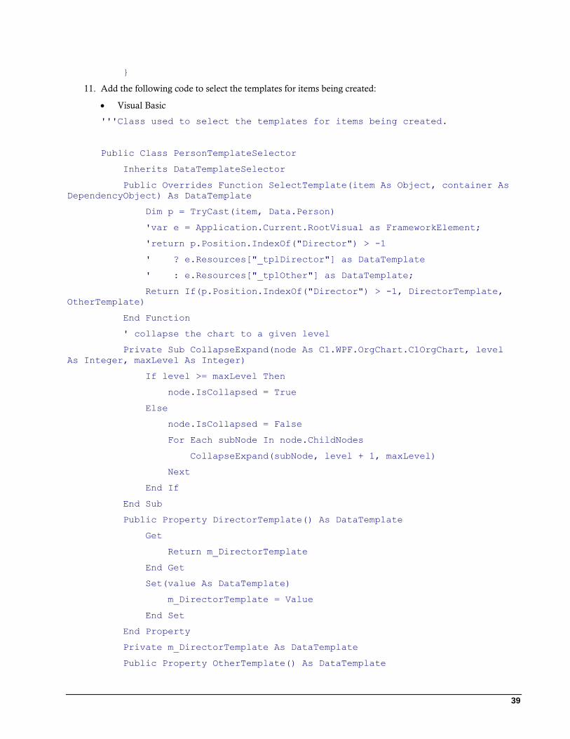
11. Add the following code to select the templates for items being created:
Visual Basic
'''Class used to select the templates for items being created.
Public Class PersonTemplateSelector
Inherits DataTemplateSelector
Public Overrides Function SelectTemplate(item As Object, container As
DependencyObject) As DataTemplate
Dim p = TryCast(item, Data.Person)
'var e = Application.Current.RootVisual as FrameworkElement;
'return p.Position.IndexOf("Director") > -1
' ? e.Resources["_tplDirector"] as DataTemplate
' : e.Resources["_tplOther"] as DataTemplate;
Return If(p.Position.IndexOf("Director") > -1, DirectorTemplate,
OtherTemplate)
End Function
' collapse the chart to a given level
Private Sub CollapseExpand(node As C1.WPF.OrgChart.C1OrgChart, level
As Integer, maxLevel As Integer)
If level >= maxLevel Then
node.IsCollapsed = True
Else
node.IsCollapsed = False
For Each subNode In node.ChildNodes
CollapseExpand(subNode, level + 1, maxLevel)
Next
End If
End Sub
Public Property DirectorTemplate() As DataTemplate
Get
Return m_DirectorTemplate
End Get
Set(value As DataTemplate)
m_DirectorTemplate = Value
End Set
End Property
Private m_DirectorTemplate As DataTemplate
Public Property OtherTemplate() As DataTemplate
40
Get
Return m_OtherTemplate
End Get
Set(value As DataTemplate)
m_OtherTemplate = Value
End Set
End Property
Private m_OtherTemplate As DataTemplate
End Class
C#
/// Class used to select the templates for items being created.
/// </summary>
public class PersonTemplateSelector : DataTemplateSelector
{
public override DataTemplate SelectTemplate(object item,
DependencyObject container)
{
var p = item as Data.Person;
//var e = Application.Current.RootVisual as FrameworkElement;
//return p.Position.IndexOf("Director") > -1
// ? e.Resources["_tplDirector"] as DataTemplate
// : e.Resources["_tplOther"] as DataTemplate;
return p.Position.IndexOf("Director") > -1
? DirectorTemplate
: OtherTemplate;
}
// collapse the chart to a given level
void CollapseExpand(C1OrgChart node, int level, int maxLevel)
{
if (level >= maxLevel)
{
node.IsCollapsed = true;
}
else
{
node.IsCollapsed = false;
foreach (var subNode in node.ChildNodes)
{
41
CollapseExpand(subNode, level + 1, maxLevel);
}
}
}
public DataTemplate DirectorTemplate { get; set; }
public DataTemplate OtherTemplate { get; set; }
}
}
12. Locate your application name in the Solution Explorer. Right-click on the name and select Add | New
Item from the list. Select Code File from the template window and name the code file Person.cs or
Person.vb.
13. Add the following namespaces to the Person code file:
Visual Basic
Imports System
Imports System.Collections
Imports System.Collections.Generic
Imports System.Collections.ObjectModel
C#
using System;
using System.Collections;
using System.Collections.Generic;
using System.Collections.ObjectModel;
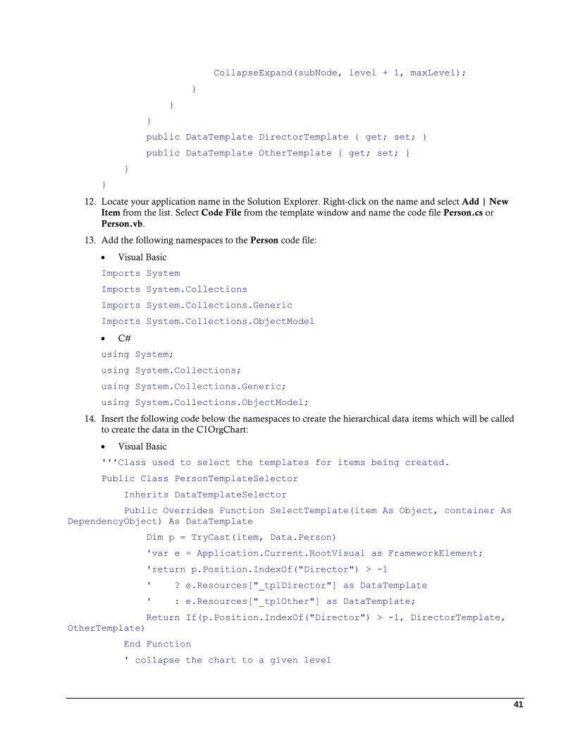
14. Insert the following code below the namespaces to create the hierarchical data items which will be called
to create the data in the C1OrgChart:
Visual Basic
'''Class used to select the templates for items being created.
Public Class PersonTemplateSelector
Inherits DataTemplateSelector
Public Overrides Function SelectTemplate(item As Object, container As
DependencyObject) As DataTemplate
Dim p = TryCast(item, Data.Person)
'var e = Application.Current.RootVisual as FrameworkElement;
'return p.Position.IndexOf("Director") > -1
' ? e.Resources["_tplDirector"] as DataTemplate
' : e.Resources["_tplOther"] as DataTemplate;
Return If(p.Position.IndexOf("Director") > -1, DirectorTemplate,
OtherTemplate)
End Function
' collapse the chart to a given level
42
Private Sub CollapseExpand(node As C1.WPF.OrgChart.C1OrgChart, level
As Integer, maxLevel As Integer)
If level >= maxLevel Then
node.IsCollapsed = True
Else
node.IsCollapsed = False
For Each subNode In node.ChildNodes
CollapseExpand(subNode, level + 1, maxLevel)
Next
End If
End Sub
Public Property DirectorTemplate() As DataTemplate
Get
Return m_DirectorTemplate
End Get
Set(value As DataTemplate)
m_DirectorTemplate = Value
End Set
End Property
Private m_DirectorTemplate As DataTemplate
Public Property OtherTemplate() As DataTemplate
Get
Return m_OtherTemplate
End Get
Set(value As DataTemplate)
m_OtherTemplate = Value
End Set
End Property
Private m_OtherTemplate As DataTemplate
End Class
C#
namespace Data
{
/// <summary>
/// Our hierarchical data item: A Person has Subordinates of type
Person.
/// </summary>
public class Person
43
{
ObservableCollection<Person> _list = new
ObservableCollection<Person>();
#region ** object model
public string Name { get; set; }
public string Position { get; set; }
public string Notes { get; set; }
public IList<Person> Subordinates
{
get { return _list; }
}
public int TotalCount
{
get
{
var count = 1;
foreach (var p in Subordinates)
{
count += p.TotalCount;
}
return count;
}
}
public override string ToString()
{
return string.Format("{0}:\r\n\t{1}", Name, Position);
}
#endregion
#region ** Person factory
static Random _rnd = new Random();
static string[] _positions =
"Director|Manager|Designer|Developer|Writer|Assistant".Split('|');
static string[] _areas =
"Development|Marketing|Sales|Support|Accounting".Split('|');
static string[] _first =
"John|Paul|Dan|Dave|Rich|Mark|Greg|Erin|Susan|Sarah|Tim|Trevor|Kevin|Mark|Dewey|
Huey|Larry|Moe|Curly|Adam|Albert".Split('|');
static string[] _last =
"Smith|Doe|Williams|Sorensen|Hansen|Mandela|Johnson|Ward|Woodman|Jordan|Mays|Kev
orkian|Trudeau|Hendrix|Clinton".Split('|');
44
static string[] _verb =
"likes|reads|studies|hates|exercises|dreams|plays|writes|argues|sleeps|ignores".
Split('|');
static string[] _adjective =
"long|short|important|pompous|hard|complex|advanced|modern|boring|strange|curiou
s|obsolete|bizarre".Split('|');
static string[] _noun =
"products|tasks|goals|campaigns|books|computers|people|meetings|food|jokes|accom
plishments|screens|pages".Split('|');
public static Person CreatePerson(int level)
{
var p = CreatePerson();
if (level > 0)
{
level--;
for (int i = 0; i < _rnd.Next(1, 4); i++)
{
p.Subordinates.Add(CreatePerson(_rnd.Next(level / 2,
level)));
}
}
return p;
}
public static Person CreatePerson()
{
var p = new Person();
p.Position = string.Format("{0} of {1}", GetItem(_positions),
GetItem(_areas));
p.Name = string.Format("{0} {1}", GetItem(_first),
GetItem(_last));
p.Notes = string.Format("{0} {1} {2} {3}", p.Name,
GetItem(_verb), GetItem(_adjective), GetItem(_noun));
while (_rnd.NextDouble() < .5)
{
p.Notes += string.Format(" and {0} {1} {2}",
GetItem(_verb), GetItem(_adjective), GetItem(_noun));
}
p.Notes += ".";
return p;
}
static string GetItem(string[] list)
45
{
return list[_rnd.Next(0, list.Length)];
}
#endregion
}
}
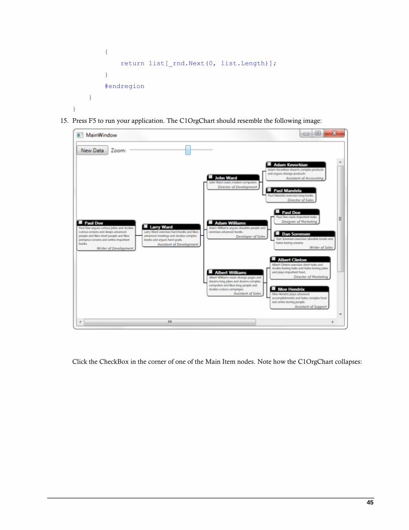
15. Press F5 to run your application. The C1OrgChart should resemble the following image:
Click the CheckBox in the corner of one of the Main Item nodes. Note how the C1OrgChart collapses:
46
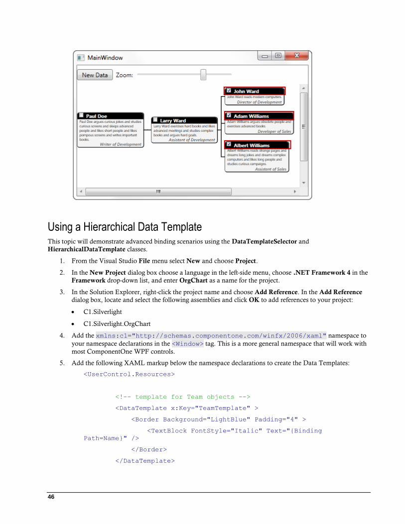
Using a Hierarchical Data Template This topic will demonstrate advanced binding scenarios using the DataTemplateSelector and
HierarchicalDataTemplate classes.
1. From the Visual Studio File menu select New and choose Project.
2. In the New Project dialog box choose a language in the left-side menu, choose .NET Framework 4 in the
Framework drop-down list, and enter OrgChart as a name for the project.
3. In the Solution Explorer, right-click the project name and choose Add Reference. In the Add Reference
dialog box, locate and select the following assemblies and click OK to add references to your project:
C1.Silverlight
C1.Silverlight.OrgChart
4. Add the xmlns:c1="http://schemas.componentone.com/winfx/2006/xaml" namespace to
your namespace declarations in the <Window> tag. This is a more general namespace that will work with
most ComponentOne WPF controls.
5. Add the following XAML markup below the namespace declarations to create the Data Templates:
<UserControl.Resources>
<!-- template for Team objects -->
<DataTemplate x:Key="TeamTemplate" >
<Border Background="LightBlue" Padding="4" >
<TextBlock FontStyle="Italic" Text="{Binding
Path=Name}" />
</Border>
</DataTemplate>
47
<!-- template for Division objects -->
<sdk:HierarchicalDataTemplate x:Key="DivisionTemplate"
ItemsSource="{Binding Path=Teams}"
ItemTemplate="{StaticResource TeamTemplate}">
<Border Background="Gold" >
<TextBlock Text="{Binding Path=Name}" FontWeight="Bold"
HorizontalAlignment="Center" VerticalAlignment="Center" Padding="20" />
</Border>
</sdk:HierarchicalDataTemplate>
<!-- template for League objects -->
<sdk:HierarchicalDataTemplate x:Key="LeagueTemplate"
ItemsSource="{Binding Path=Divisions}"
ItemTemplate="{StaticResource DivisionTemplate}">
<Border Background="LightCoral" >
<TextBlock Text="{Binding Path=Name}" FontWeight="Bold"
HorizontalAlignment="Center" VerticalAlignment="Center" Padding="40" />
</Border>
</sdk:HierarchicalDataTemplate>
6. </UserControl.Resources>Insert the XAML markup below to create your Grid layout, the
C1OrgChart control, and the ScrollViewer control:
<Grid.RowDefinitions>
<RowDefinition Height="Auto" />
<RowDefinition Height="118*" />
<RowDefinition Height="158*" />
</Grid.RowDefinitions>
<!-- sample title -->
<StackPanel Orientation="Horizontal" >
<TextBlock Text="C1OrgChart: HierarchicalDataTemplate"
FontSize="16" VerticalAlignment="Bottom" />
<TextBlock Name="_tbTotal" VerticalAlignment="Bottom" />
</StackPanel>
<ScrollViewer Grid.Row="1" HorizontalScrollBarVisibility="Auto"
VerticalScrollBarVisibility="Auto" Padding="0" >
<c1:C1OrgChart
Name="_chart" ItemTemplate="{StaticResource
LeagueTemplate}"
ConnectorDashArray="1 2" ConnectorStroke="Gray"
48
HorizontalAlignment="Center" VerticalAlignment="Center"
/>
</ScrollViewer>
7. Locate a general TreeView control in your ToolBox and add that to your application below the
<ScrollViewer> </ScrollViewer> tags. Insert the following into the <sdk:TreeView> tag:
Name="_tree" Grid.Row="2" ItemTemplate="{StaticResource
LeagueTemplate}"
8. Switch to your code view by right-clicking your application and selecting View Code from the list.
9. Add the following code directly below the InitializeComponent() method:
Visual Basic
' create data object
Dim league__1 = League.GetLeague()
' show it in C1OrgChart
_chart.Header = league__1
' this has the same effect:
'_chart.ItemsSource = new object[] { league };
' show it in TreeView
_tree.ItemsSource = New Object() {league__1}
C#
// create data object
var league = League.GetLeague();
// show it in C1OrgChart
_chart.Header = league;
// this has the same effect:
//_chart.ItemsSource = new object[] { league };
// show it in TreeView
_tree.ItemsSource = new object[] { league };
}
}
10. Insert the following code to create the teams, Leagues, and Divisions that will appear in the C1OrgChart
and in the TreeView control:
Visual Basic
Public Class League
Public Property Name() As String
49
Get
Return m_Name
End Get
Set(value As String)
m_Name = Value
End Set
End Property
Private m_Name As String
Public Property Divisions() As List(Of Division)
Get
Return m_Divisions
End Get
Set(value As List(Of Division))
m_Divisions = Value
End Set
End Property
Private m_Divisions As List(Of Division)
Public Shared Function GetLeague() As League
Dim league = New League()
league.Name = "Main League"
league.Divisions = New List(Of Division)()
For Each div In "North,South,East,West".Split(","c)
Dim d = New Division()
league.Divisions.Add(d)
d.Name = div
d.Teams = New List(Of Team)()
For Each team In "t1,t2,t3,t4".Split(","c)
Dim t = New Team()
d.Teams.Add(t)
t.Name = String.Format("{0} {1}", team, div)
Next
Next
Return league
End Function
End Class
C#
public class League
{
50
public string Name { get; set; }
public List<Division> Divisions { get; set; }
public static League GetLeague()
{
var league = new League();
league.Name = "Main League";
league.Divisions = new List<Division>();
foreach (var div in "North,South,East,West".Split(','))
{
var d = new Division();
league.Divisions.Add(d);
d.Name = div;
d.Teams = new List<Team>();
foreach (var team in "t1,t2,t3,t4".Split(','))
{
var t = new Team();
d.Teams.Add(t);
t.Name = string.Format("{0} {1}", team, div);
}
}
return league;
11. Add the code below to create the Public Class that will Get and Set the values for the Teams, Divisions,
and Leagues:
Visual Basic
Public Class Division
Public Property Name() As String
Get
Return m_Name
End Get
Set(value As String)
m_Name = Value
End Set
End Property
Private m_Name As String
Public Property Teams() As List(Of Team)
Get
Return m_Teams
End Get
51
Set(value As List(Of Team))
m_Teams = Value
End Set
End Property
Private m_Teams As List(Of Team)
End Class
Public Class Team
Public Property Name() As String
Get
Return m_Name
End Get
Set(value As String)
m_Name = Value
End Set
End Property
Private m_Name As String
End Class
C#
public class Division
{
public string Name { get; set; }
public List<Team> Teams { get; set; }
}
public class Team
{
public string Name { get; set; }
}
}
12. Run your application. Your application should resemble the following image:
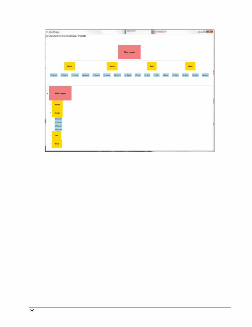
52