Embed Size (px)
Citation preview
Computers & Graphics (2017)
Contents lists available at ScienceDirect
Computers & Graphics
journal homepage: www.elsevier.com/locate/cag
Visual Analytics of Time-varying Multivariate Ionospheric Scintillation Data
Aurea Soriano-Vargasa,∗, Bruno C. Vanib, Milton H. Shimabukurob, Joao F. G. Monicob, Maria Cristina F. Oliveiraa, BerndHamannc
aInstituto de Ciencias Matematicas e de Computacao (ICMC), University of Sao Paulo (USP), Sao Carlos, Brazil.bFaculdade de Ciencias e Tecnologia (FCT), Sao Paulo State University (UNESP), Presidente Prudente, Sao Paulo, Brazil.cDepartment of Computer Science, University of California, Davis, CA 95616, U.S.A.
A R T I C L E I N F O
Article history:
Visual Analytics; Time-varying Multi-variate Data; Visual Feature Selection;Data Visualization; Ionospheric Scintil-lation.
A B S T R A C T
We present a clustering-based interactive approach to multivariate data analysis, mo-tivated by the specific needs of scintillation data. Ionospheric scintillation is a rapidvariation in the amplitude and/or phase of radio signals traveling through the iono-sphere. This spatial and time-varying phenomenon is of great interest since it affectsthe reception quality of satellite signals. Specialized receivers at strategic regions cantrack multiple variables related to this phenomenon, generating a database of observa-tions of regional ionospheric scintillation. We introduce a visual analytics solution tosupport analysis of such data, keeping in mind the general applicability of our approachto similar multivariate data analysis situations.
Taking into account typical user questions, we combine visualization and data miningalgorithms that satisfy these goals: (i) derive a representation of the variables monitoredthat conveys their behavior in detail, at multiple user-defined aggregation levels; (ii) pro-vide overviews of multiple variables regarding their behavioral similarity over selectedtime periods; (iii) support users when identifying representative variables for character-izing scintillation behavior. We illustrate the capabilities of our proposed framework bypresenting case studies driven directly by questions formulated by collaborating domainexperts.
c© 2017 Elsevier B.V. All rights reserved.
1. Introduction
Ionospheric scintillation is an atmospheric phenomenon thataffects measurements obtained by Global Navigation SatelliteSystems (GNSS) such as the Global Positioning System (GPS,U.S.A.), Global Navigation Satellite System (GLONASS, Rus-sia), Galileo (European Union) and BeiDou Navigation Satel-lite System (BDS, China). It results from amplitude attenua-
∗Corresponding authore-mail: [email protected] (Aurea Soriano-Vargas ),
[email protected] (Bruno C. Vani), [email protected](Milton H. Shimabukuro), [email protected] (Joao F. G. Monico),[email protected] (Maria Cristina F. Oliveira),[email protected] (Bernd Hamann)
tion and phase shifts in GNSS radio signals as they propagatethrough regions of the ionosphere with irregular electron densi-ties [1]. When scintillation occurs GNSS receivers may expe-rience a complete loss of lock on the affected signals, i.e, therecan be a discontinuity in the phase tracking loop [2], as well asa degradation in the accuracy of the measurements from a givensatellite [3]. Such effects preclude satellite availability for posi-tioning purposes, degrade the positional accuracy and may leadto service outages at critical circumstances, losing track of oneor more satellites. In critical circumstances, the positioning ser-vice can be lost when a minimum number of satellites are notsuccessfully tracked by the receiver [4].
Latin America, and in particular regions in Brazil locatedaround the magnetic equator are severely affected by a frequent
2 / Computers & Graphics (2017)
and strong amplitude scintillation [5, 6]. Consequently, applica-tions that rely on GNSS technology and require full availabilityand accuracy for their operation – such as Precise Point Posi-tioning (PPP), Real Time Kinematic (RTK) applied to land sur-veying in agriculture and differential GNSS applied to offshoreoil surveying – may face significant and potentially damagingissues. Analyzing the occurrence patterns of scintillation andunderstanding their causes is essential in order to gather ele-ments for addressing its effects.
A network of Ionospheric Scintillation Monitor Receivers(ISMRs) has been operating in Brazil since 2011 to monitor thephenomenon [2], supported by projects CIGALA (Concept forIonospheric Scintillation Mitigation for Professional GNSS inLatin America) and CALIBRA (Countering GNSS high Accu-racy applications Limitations due to Ionospheric disturbancesin Brazil)1.
The ISMRs include GNSS capabilities specially designed toprovide scintillation metrics. A typical receiver - PolaRxS PRO,manufactured by Septentrio - monitors 62 variables computedevery minute from data sampled at high rates (50 Hz), pluseight additional variables are calculated every minute. Thus, 70variables related to scintillation are continuously measured andcomputed every minute for all 187 satellites tracked, which in-clude 32 GPS satellites. Data collection occurs at 12 monitoringstations spatially distributed in Brazil. The resulting databaserecords an expressive volume of historical observations of thetemporal behavior of scintillation indices and related variables,where each observation consists of measurements of multiplevariables at a particular time.
This data, which we refer to as the ISMRs database, has beenavailable to experts for some time and visualization tools havealready been developed to support data analysis [4]. Nonethe-less, domain experts still lack additional support for exploratorydata analysis to study the interplay between the multiple vari-ables and their role in characterizing scintillation behavior [7].We introduce a visual analytics approach to support explorationof historical ionospheric scintillation data. It integrates multi-ple visualization and data mining techniques into a visual ex-ploration loop that allows scintillation scientists to gain an un-derstanding of how the multiple variables tracked are relatedover short and extended time periods, and how they relate toobserved behavior of scintillation measures.
The driving requirements guiding the design and develop-ment of our solution approach were: (i) to define a represen-tation of the variables monitored that conveys their behavior indetail, at multiple user-defined aggregation levels; (ii) to pro-vide overviews of multiple variables regarding their behavioralsimilarity over selected time periods; (iii) to support users whenidentifying representative variables for characterizing scintilla-tion behavior. These requirements have been addressed by inte-grating various visualization techniques and mining algorithms.
A so-called time matrix visualization shows the behavior ofa particular variable over a time period, while still allowing a
1Both projects have been funded by the European Commission under theframework of the FP7-GALILEO-2009-GSA and FP7-GALILEO-2011-GSA-1a, respectively.
user to inspect specific individual values. The visualization canbe created directly from the recorded values or from values ag-gregated for user-defined temporal units, to support observationof extended time periods. A small multiples time matrix visual-ization simultaneously depicting a subset of user-selected targetvariables is also shown, where the individual matrix views arespatially grouped to highlight the similar/dissimilar temporalbehaviors of groups of variables. A similarity map visualizationof the variables is provided as well, complementing and sum-marizing the small multiples view. These multiple views arecoordinated and analysts can explore them jointly to identifyrepresentative subsets of variables to characterize scintillationbehavior, and assess feature subspaces in relation to scintilla-tion measures by means of classification algorithms.
We contribute new strategies for visualizing time-varyingmultivariate data sets. These strategies allow experts studyingthe ionospheric scintillation phenomenon to utilize alternativeapproaches for exploring a large database of historical obser-vations. Our approaches complement existing ones [4] by fo-cusing on the global temporal relationships between the multi-ple variables tracked, rather than on their individual behavior inisolation.
The paper is structured as follows: Section 2 discusses re-lated work on visual analytics applied to feature selection prob-lems and in visual analytics of time-varying multivariate data.We also review previous contributions that addressed analy-sis of collected scintillation data. In Section 3 we describe indetails the ionospheric scintillation data and the preprocessingsteps. Our visual analytics approach, comprising feature ex-traction, clustering, individual visualization and global visual-ization of data variables is described in Section 5. In Section 6we illustrate possible applications of the proposed visual explo-ration solution to plausible data analysis scenarios and assess itscapability to inform the relevant variables for explaining iono-spheric scintillation. Conclusions and a discussion are providedin Section 7.
2. Related Work
Previous research efforts related to the topics addressed inthis paper are found in the fields of feature selection assistedby visualization and visualization of multivariate time-varyingdata. Also relevant is previous work in mining and visualizationof ionospheric scintillation data.
2.1. Visual Feature Selection
Algorithms for analysis and visualization of multidimen-sional data typically face the problem known as the curse ofdimensionality [8], which hampers a clear interpretation of therole of individual variables (data features) and their interactionin producing the data patterns. High-dimensional data is likelyto be described by redundant variables and feature selection al-gorithms are widely employed for dimension reduction. Thechallenge is to identify a reduced subset of features sufficientto describe the intrinsic data space and determine data behavior[9]. The best possible subset would include a minimum number
/ Computers & Graphics (2017) 3
of features that contribute mostly to accuracy of a classifier or aregressor [10].
Razente et al. [11] advocate that integrating dimension re-duction techniques with visualization strategies offers great po-tential to support analysts in tasks of identifying representativedata attributes. Several research contributions couple interac-tive graphical representations with feature selection processesin favor of improved understanding of data behavior.
Some authors approach visual feature selection relying onstatistical techniques and distances combined with visualiza-tions [12, 13, 14, 15]. Whereas some contributions are domainspecific, e.g., the VIDEAN system [15] integrates several co-ordinated visual representations to assist feature selection in achemoinformatics problem, others provide general-purpose vi-sual interfaces for feature subset selection. One example isSmartStripes [14], developed for diagnostic purposes, provid-ing interactive refinement of automatic feature subset selectiontechniques, considering the interplay between different featureand entity subsets. Some systems [12, 13] implement ranking-based visual strategies to identify similarities among variables.
Other contributions [16, 17, 18] concern the problem of an-alyzing and comparing different variable subspaces, and sub-space clustering for the analysis of high-dimensional data, asreviewed by Liu et al. [19]. Approaches such as representa-tive factor generation [17] and dimension projection matrix/tree[18] allow interactive exploration of both data variables anddata observations in order to investigate how variables are re-lated. Typically, time-varying multivariate features are not ex-plicitly handled.
Our approach is also a contribution in visual feature selec-tion and analysis of feature subspaces, but it incorporates thedynamics of temporal variations into the process. As scintilla-tion is a seasonal phenomenon, the role of different variables incharacterizing its behavior changes along time. We contributea solution for visual feature subspace analysis in time-varyingdata sets, which also gives analysts the capability of includingtheir domain knowledge into the investigation.
2.2. Visualization of Time-varying Multivariate Data
Multivariate time-varying data plays an important role inmany application domains and poses multiple challenges to vi-sualization designers [20]. The continuous collection of mul-tiple variables typically results in bulky data sets that exhibitcomplex behavior, making the design of visual interfaces toguide specialists in search of relevant data patterns particularlychallenging.
Several classical multivariate visualization techniques havebeen employed to convey time-related information, e.g., Par-allel Coordinates [21] used in connection with an algorithm toidentify important temporal trends in multivariate scientific datasets [22], or combined with histograms to quantify visual prop-erties and reduce visual overload in time-varying volume data[23].
Small multiple visualizations rely on the repetition ofthe same design structure to summarize and compare vari-ables [24]. Correlated multiples [25] is a method that adoptsa spatially coherent placement of the multiples views, where
their relative distances reflect their dissimilarities. It has beenapplied to univariate data from three different domains, namelystock market trends, census demographics and climate model-ing, in order to assess changes over the years and identify com-mon trends and similar years. TimeSpiral [26] is a visualizationsystem combining multiple views to assist users in analyzingand exploring periodic trends and correlations in multivariatetime-series data. It supports data aggregation at multiple levels,e.g., changing a time interval, time span or time granularity.These systems are suitable for simultaneous investigation of areduced number of variables.
VIMTEX has been designed to assist geologists observingtemporal relationships in multivariate data describing concen-trations of chemical compounds [27]. It uses Parallel Coordi-nates for a multivariate, time-varying view of the data, com-bined with a density view to show univariate temporal distribu-tion and a small multiples matrix view which shows bivariatecorrelations as time-series. The interactive system Falcon [28]coordinates time-oriented and statistical views for users to ex-plore temporal and statistical patterns in multiple time-varyingvariables associated with 3D printing processes.
Several systems have been introduced for climate and climatemodeling data analysis. Vismate is a visual analytics systemfor exploring climate changes in P.R. China at different spatio-temporal scales [29]. It uses land surface observations collectedby meteorological observation stations, and combines three vi-sualizations: (i) a Global Radial Map using K-means cluster-ing; (ii) a Time-Series Discs using multiple time-series and tri-angular HeatMaps around a center point; and (iii) an AnomalyDetection Scatterplot based on Principal Components Analy-sis. The Similarity Explorer [30] combines small multiples vi-sualizations and coordinated views for visual comparison of theoutputs resulting from simulations of multiple climate models.The tool supports spatio-temporal exploration focusing on theanalysis of correlations between climate models with respect toany variable.
We also present a domain-specific solution for scintillationdata that includes several strategies available in existing sys-tems. For example, similarly to known solutions [25, 30] weadopt a small multiples visualization and a consistent placementstrategy to display groups of related variables; and we considerarbitrary time periods of different granularity levels by meansof user-defined data aggregations [26]. Our solution, however,supports the simultaneous investigation of many variables andsatisfies specific requirements of scintillation experts. It pro-vides the ability to inspect and explore scintillation data aggre-gated over different temporal scales, to investigate the behaviorof variables individually or in groups, and to explore alternativefeature spaces for characterizing the scintillation phenomenon.Although the introduced system is domain-specific, it supportstasks that are also applicable to the analysis of other multivari-ate time-varying data in other domains, as discussed in Section7.
2.3. Analysis of Ionospheric Scintillation Data
The so-called S4 index of scintillation amplitude is oftenused to measure the intensity of ionospheric scintillation. It is
4 / Computers & Graphics (2017)
computed as the standard deviation of the signal intensity nor-malized by its mean [31]. Signal intensity must be measuredat high rates for the index to detect rapid fluctuations. Cur-rently, there is no consistency concerning the categorization ofthe severity of scintillation as measured by the S4 index, Table1 describes one well-accepted categorization.
Table 1. Categorization of S4 index intensity by Tiwari (2011) [32].
S4 values Scintillation CategorizationS 4 ≥ 1.0 high
0.5 < S 4 < 1.0 moderateS 4 ≤ 0.5 low
Several authors applied data mining techniques to collectedscintillation data, e.g., Rezende et al. [7] devised a method thatcombines a bagging method, which uses bootstrap to randomlygenerate several samples from an original sample, with deci-sion trees to predict the S4 index with one or more hours ofantecedence. Lima et al. [33] presented a correlation analy-sis of occurrences of ionospheric scintillation registered in twostations at different locations in Brazil. They used a classifi-cation and regression decision tree (CART) from the S4 in-dex. Another recently published technique [34] uses neural net-works to predict two levels of scintillation: strong or not strong(low/moderate). Analyses are typically supported by simpleunivariate time series visualizations.
Ackah et al. [35] investigated records of the S4 and verticalTEC (VTEC) indices in a West African equatorial region. Thepresented method visually represents the time series as gridswhere a column represents a daily hour, a row represents a par-ticular day, and grid cell color maps an index (S4 or VTEC) atthe corresponding day/hour. We have adopted similar grid rep-resentations as well to convey variable values measured over atime range.
The ISMR Query Tool [36, 4] is an integrated software plat-form specifically developed for the ISMRs database. It includesfour visualizations of the S4 index: a scatter-plot view of datafrom one or multiple satellites over a time period, a calen-dar view, a Ionospheric Pierce Point (IPP) representation, ag-gregated time series visualizations obtained with the SAX ap-proach; and a horizon chart visualization of one or multiplevariables. However, it does not focus on multivariate analy-sis or on the interplay of the many variables characterizing thescintillation phenomenon. Our solution complements that pre-vious effort by providing strategies to inspect and compare thehistorical behavior of multiple variable subspaces in relation toseveral ionospheric indices, including, but not limited to, the S4index.
3. Data description and processing
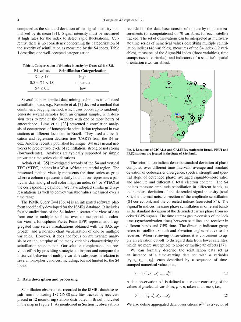
Scintillation observations recorded in the ISMRs database re-sult from monitoring 187 GNSS satellites tracked by receiversplaced in 12 monitoring stations distributed in Brazil, indicatedin the map in Figure 1. As mentioned in Section 1, observations
recorded in the data base consist of minute-by-minute mea-surements (or computations) of 70 variables, for each satellitetracked. The set of observations can be interpreted as multivari-ate time series of numerical values describing multiple scintil-lation indices (46 variables), measures of the S4 index (12 vari-ables), measures of the SigmaPhi index (three variables), timestamps (seven variables), and indicators of a satellite’s spatialorientation (two variables).
Fig. 1. Locations of CIGALA and CALIBRA stations in Brazil. PRU1 andPRU2 stations are located in the State of Sao Paulo.
The scintillation indices describe standard deviation of phasecomputed over different time intervals; average and standarddeviation of code/carrier divergence; spectral strength and spec-tral slope of detrended phase; averaged signal-to-noise ratio;and absolute and differential total electron content. The S4indices measure amplitude scintillation in different bands, asthe standard deviation of the detrended signal intensity (totalS4), the thermal noise correction of the amplitude scintillation(S4 correction), and the corrected indices (corrected S4). TheSigmaPhi indices measure phase scintillation in different bandsas the standard deviation of the detrended carrier phase from re-ceived GPS signals. The time stamps group consists of the locktime (synchronization time) between satellites and receiver indifferent bands and GPS time. The direction indicator grouprefers to satellite azimuth and elevation angles relative to thereceiver. When retrieving observations it is convenient to ap-ply an elevation cut-off to disregard data from lower satellites,which are more susceptible to noise or multi-path effects [37].
We can formally describe the scintillation data set asan instance of a time-varying data set with n variables{x1, x2, x3, ..., xn}, each described by a sequence of time-stamped numerical values, i.e.,
xi = {xt1i , x
t2i , x
t3i , ..., x
tki }. (1)
A data observation o(t) is defined as a vector consisting of thevalues of p selected variables, p ≤ n, taken at a time t, i.e.,
o(t) = [xt1, x
t2, x
t3, ..., x
tp]. (2)
We also define aggregated data observations o(tse) as a vector of
/ Computers & Graphics (2017) 5
p values, i.e.,
o(tse) = [xtse1 , x
tse2 , ..., x
tsep ], (3)
but now each xtsei is a value resulting from an aggregation func-
tion f applied to the values of xi in a time interval [ts, te], i.e.,
xtsei = f (xts
i , xts+1i , x
ts+2i , ..., x
tei ). (4)
Many aggregation functions are possible, e.g., maximum,minimum, average, median or standard deviation. From the pre-vious definitions, scintillation observations (aggregated or not)can be described by distinct variable subspaces, according tothe interests of the analyst.
Since variables have values on different dynamic ranges, withmeans and variances on different orders of magnitude, dataranges are linearly normalized to the interval [0,1] prior to per-forming any further processing.
The case studies presented in Section 6 consider datarecorded at two stations, PRU1 and PRU2, located at PresidentePrudente, in the State of S£o Paulo, see Figure 1. For practicalreasons, we downloaded data from the ISMRs database to a lo-cal relational database. So far we have explored data from the32 satellites in the GPS constellation, which is currently theworld’s most widely employed satellite navigation system [38].Nonetheless, the solution we describe is applicable to observa-tions provided by any satellite or monitoring station.
Missing values are quite common and need special treatment.In some cases, they characterize satellite behavior, due to satel-lites having different orbital periods, and sometimes they aredue to reception errors. We consider one of three strategies forhandling the missing-value problem: (i) if a value at a particulartime point is missing, but values are known for its previous andsubsequent time points, its value will be linearly interpolatedfrom the neighboring values; (ii) if values for a whole day aremissing, but values are known for its previous and subsequentdays, values for the day will be linearly interpolated from thecorresponding neighboring values from the previous and sub-sequent days, accounting for the time shift; (iii) if the previouscases do not apply, values will not be estimated and the respec-tive entries remain unknown.
4. Driving Questions and Goals
In partnership with domain expert collaborators we identifiedprototypical data analysis questions that cannot be answeredwith existing tools. These questions, listed in Table 2, suggestthat analysis should be able to inspect the temporal behavior ofboth individual variables and of groups of related variables, aswell as investigate which variables are most relevant to charac-terize the behavior of the diverse scintillation indices measured.
The ability to provide answers to these questions defined therequirements for visualization design. Our collaborators wereinterested not only in inspecting a global overview of variables’behavior, but wanted to be able to identify specific values andtime points along the exploration. Thus, it was important to cap-ture the multivariate nature and temporal behavior without los-ing detail, e.g., being able to probe specific values. Keeping thisin mind, each matrix visualization uses enough display space to
convey the details over time, whereas the small multiples viewprovides the overview and ability to compare variables in termsof their behavior. The similarity maps are also a proper choiceto convey a global view of the relationships between variables interms of their temporal behavior. Therefore, our design effortsconcentrated on providing complementary views of multivari-ate relationships and allowing users to explore representativevariable sub-spaces in relation to scintillation behavior. In Sec-tion 6, we demonstrate the system’s resources by means of threeexploration cases conducted to exemplify how it can be helpfulto finding answers to such questions.
Table 2. High-level analysis questions identified in collaboration with do-main experts.
Q1 Which variables tracked show similar behavior overa target time period?
Q2 How do variables relate to each otherand to the scintillation indices?
Q3 Besides the S4, what (minimal) subset of variablessuffices to characterize scintillation?
Q4 Do the same variables tracked by different satellitesshow similar behavior?
5. Visual Analytics Solution
We have integrated mining and visualization techniques intoa framework to support experts in the investigation of the tem-poral behavior of data observations, as defined by Equations 2or 3 in Section 3. Observations described by alternative vari-able subspaces can be inspected focusing on the time-varyingbehavior of either individual variables or groups of variables.This flexibility is a key strength in supporting extensive data ex-ploration tasks considering multiple time periods and temporalscales, as well as alternative variable subspaces for characteriz-ing the phenomenon.
The introduced system combines a small multiples visual-ization component that conveys the temporal behavior of eachvariable with clustering and multidimensional projection tech-niques in a consistent representation of the data observations, inorder to convey temporal patterns and highlight representativevariables for characterizing the observed scintillation behavior,as measured by the pertinent indices.
The system is provided as a web application developed us-ing Java and Java Server Pages (JSP) on the server-side, Post-greSQL 9.3.9 as database, and HTML5, CSS and Javascript onthe client-side. SQL functions with subscripts are employed toretrieve aggregated data values relative to a specified time pe-riod.
In the following, we provide an overview of the data ex-ploration functionalities and describe the visualizations and thesteps involved in creating them.
5.1. Overview of the Visual Analytics System
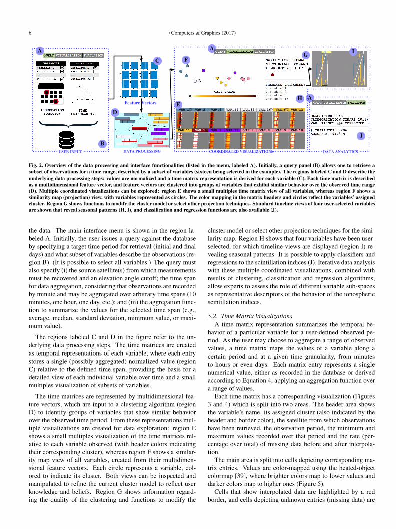
Figure 2 provides an overview of the steps involved in creat-ing the visualizations and the interface functions for exploring
6 / Computers & Graphics (2017)
Fig. 2. Overview of the data processing and interface functionalities (listed in the menu, labeled A). Initially, a query panel (B) allows one to retrieve asubset of observations for a time range, described by a subset of variables (sixteen being selected in the example). The regions labeled C and D describe theunderlying data processing steps: values are normalized and a time matrix representation is derived for each variable (C). Each time matrix is describedas a multidimensional feature vector, and feature vectors are clustered into groups of variables that exhibit similar behavior over the observed time range(D). Multiple coordinated visualizations can be explored: region E shows a small multiples time matrix view of all variables, whereas region F shows asimilarity map (projection) view, with variables represented as circles. The color mapping in the matrix headers and circles reflect the variables’ assignedcluster. Region G shows functions to modify the cluster model or select other projection techniques. Standard timeline views of four user-selected variablesare shown that reveal seasonal patterns (H, I), and classification and regression functions are also available (J).
the data. The main interface menu is shown in the region la-beled A. Initially, the user issues a query against the databaseby specifying a target time period for retrieval (initial and finaldays) and what subset of variables describe the observations (re-gion B). (It is possible to select all variables.) The query mustalso specify (i) the source satellite(s) from which measurementsmust be recovered and an elevation angle cutoff; the time spanfor data aggregation, considering that observations are recordedby minute and may be aggregated over arbitrary time spans (10minutes, one hour, one day, etc.); and (iii) the aggregation func-tion to summarize the values for the selected time span (e.g.,average, median, standard deviation, minimum value, or maxi-mum value).
The regions labeled C and D in the figure refer to the un-derlying data processing steps. The time matrices are createdas temporal representations of each variable, where each entrystores a single (possibly aggregated) normalized value (regionC) relative to the defined time span, providing the basis for adetailed view of each individual variable over time and a smallmultiples visualization of subsets of variables.
The time matrices are represented by multidimensional fea-ture vectors, which are input to a clustering algorithm (regionD) to identify groups of variables that show similar behaviorover the observed time period. From these representations mul-tiple visualizations are created for data exploration: region Eshows a small multiples visualization of the time matrices rel-ative to each variable observed (with header colors indicatingtheir corresponding cluster), whereas region F shows a similar-ity map view of all variables, created from their multidimen-sional feature vectors. Each circle represents a variable, col-ored to indicate its cluster. Both views can be inspected andmanipulated to refine the current cluster model to reflect userknowledge and beliefs. Region G shows information regard-ing the quality of the clustering and functions to modify the
cluster model or select other projection techniques for the simi-larity map. Region H shows that four variables have been user-selected, for which timeline views are displayed (region I) re-vealing seasonal patterns. It is possible to apply classifiers andregressions to the scintillation indices (J). Iterative data analysiswith these multiple coordinated visualizations, combined withresults of clustering, classification and regression algorithms,allow experts to assess the role of different variable sub-spacesas representative descriptors of the behavior of the ionosphericscintillation indices.
5.2. Time Matrix VisualizationsA time matrix representation summarizes the temporal be-
havior of a particular variable for a user-defined observed pe-riod. As the user may choose to aggregate a range of observedvalues, a time matrix maps the values of a variable along acertain period and at a given time granularity, from minutesto hours or even days. Each matrix entry represents a singlenumerical value, either as recorded in the database or derivedaccording to Equation 4, applying an aggregation function overa range of values.
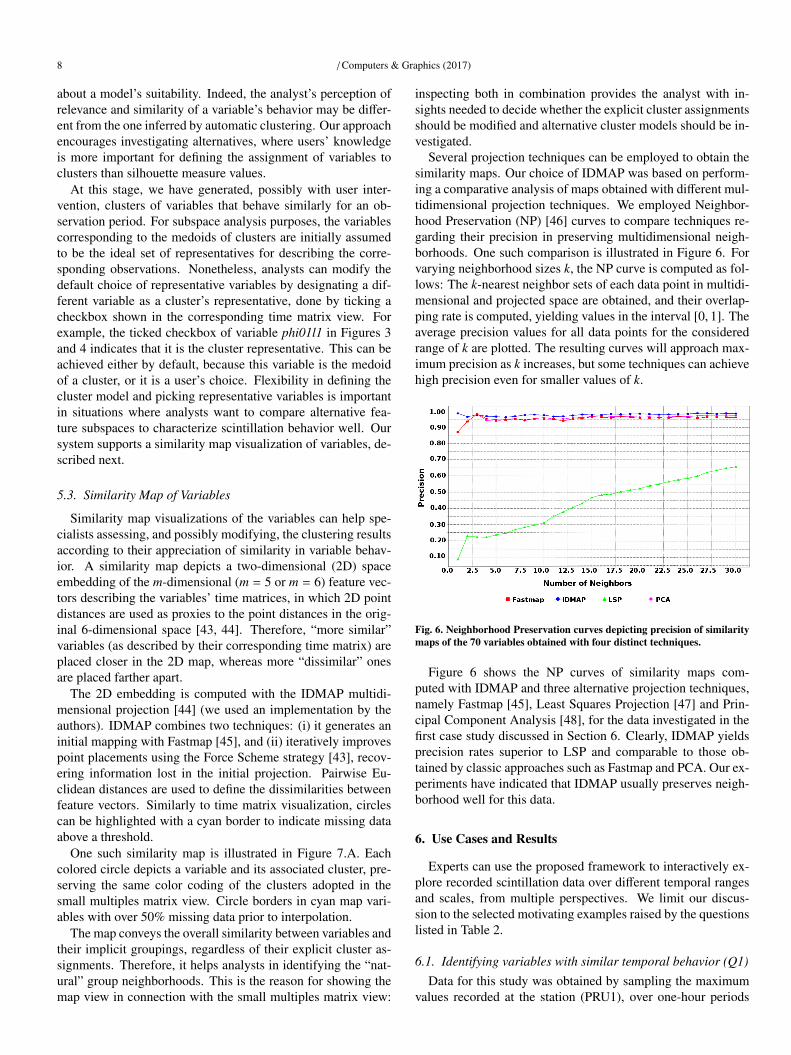
Each time matrix has a corresponding visualization (Figures3 and 4) which is split into two areas. The header area showsthe variable’s name, its assigned cluster (also indicated by theheader and border color), the satellite from which observationshave been retrieved, the observation period, the minimum andmaximum values recorded over that period and the rate (per-centage over total) of missing data before and after interpola-tion.
The main area is split into cells depicting corresponding ma-trix entries. Values are color-mapped using the heated-objectcolormap [39], where brighter colors map to lower values anddarker colors map to higher ones (Figure 5).
Cells that show interpolated data are highlighted by a redborder, and cells depicting unknown entries (missing data) are
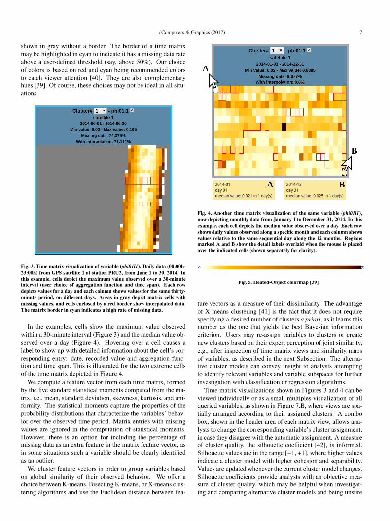
/ Computers & Graphics (2017) 7
shown in gray without a border. The border of a time matrixmay be highlighted in cyan to indicate it has a missing data rateabove a user-defined threshold (say, above 50%). Our choiceof colors is based on red and cyan being recommended colorsto catch viewer attention [40]. They are also complementaryhues [39]. Of course, these choices may not be ideal in all situ-ations.
Fig. 3. Time matrix visualization of variable (phi01l1). Daily data (00:00h-23:00h) from GPS satellite 1 at station PRU2, from June 1 to 30, 2014. Inthis example, cells depict the maximum value observed over a 30-minuteinterval (user choice of aggregation function and time span). Each rowdepicts values for a day and each column shows values for the same thirty-minute period, on different days. Areas in gray depict matrix cells withmissing values, and cells enclosed by a red border show interpolated data.The matrix border in cyan indicates a high rate of missing data.
In the examples, cells show the maximum value observedwithin a 30-minute interval (Figure 3) and the median value ob-served over a day (Figure 4). Hovering over a cell causes alabel to show up with detailed information about the cell’s cor-responding entry: date, recorded value and aggregation func-tion and time span. This is illustrated for the two extreme cellsof the time matrix depicted in Figure 4.
We compute a feature vector from each time matrix, formedby the five standard statistical moments computed from the ma-trix, i.e., mean, standard deviation, skewness, kurtosis, and uni-formity. The statistical moments capture the properties of theprobability distributions that characterize the variables’ behav-ior over the observed time period. Matrix entries with missingvalues are ignored in the computation of statistical moments.However, there is an option for including the percentage ofmissing data as an extra feature in the matrix feature vector, asin some situations such a variable should be clearly identifiedas an outlier.
We cluster feature vectors in order to group variables basedon global similarity of their observed behavior. We offer achoice between K-means, Bisecting K-means, or X-means clus-tering algorithms and use the Euclidean distance between fea-
Fig. 4. Another time matrix visualization of the same variable (phi01l1),now depicting monthly data from January 1 to December 31, 2014. In thisexample, each cell depicts the median value observed over a day. Each rowshows daily values observed along a specific month and each column showsvalues relative to the same sequential day along the 12 months. Regionsmarked A and B show the detail labels overlaid when the mouse is placedover the indicated cells (shown separately for clarity).
Fig. 5. Heated-Object colormap [39].
ture vectors as a measure of their dissimilarity. The advantageof X-means clustering [41] is the fact that it does not requirespecifying a desired number of clusters a priori, as it learns thisnumber as the one that yields the best Bayesian informationcriterion. Users may re-assign variables to clusters or createnew clusters based on their expert perception of joint similarity,e.g., after inspection of time matrix views and similarity mapsof variables, as described in the next Subsection. The alterna-tive cluster models can convey insight to analysts attemptingto identify relevant variables and variable subspaces for furtherinvestigation with classification or regression algorithms.
Time matrix visualizations shown in Figures 3 and 4 can beviewed individually or as a small multiples visualization of allqueried variables, as shown in Figure 7.B, where views are spa-tially arranged according to their assigned clusters. A combobox, shown in the header area of each matrix view, allows ana-lysts to change the corresponding variable’s cluster assignment,in case they disagree with the automatic assignment. A measureof cluster quality, the silhouette coefficient [42], is informed.Silhouette values are in the range [−1,+1], where higher valuesindicate a cluster model with higher cohesion and separability.Values are updated whenever the current cluster model changes.Silhouette coefficients provide analysts with an objective mea-sure of cluster quality, which may be helpful when investigat-ing and comparing alternative cluster models and being unsure
8 / Computers & Graphics (2017)
about a model’s suitability. Indeed, the analyst’s perception ofrelevance and similarity of a variable’s behavior may be differ-ent from the one inferred by automatic clustering. Our approachencourages investigating alternatives, where users’ knowledgeis more important for defining the assignment of variables toclusters than silhouette measure values.
At this stage, we have generated, possibly with user inter-vention, clusters of variables that behave similarly for an ob-servation period. For subspace analysis purposes, the variablescorresponding to the medoids of clusters are initially assumedto be the ideal set of representatives for describing the corre-sponding observations. Nonetheless, analysts can modify thedefault choice of representative variables by designating a dif-ferent variable as a cluster’s representative, done by ticking acheckbox shown in the corresponding time matrix view. Forexample, the ticked checkbox of variable phi01l1 in Figures 3and 4 indicates that it is the cluster representative. This can beachieved either by default, because this variable is the medoidof a cluster, or it is a user’s choice. Flexibility in defining thecluster model and picking representative variables is importantin situations where analysts want to compare alternative fea-ture subspaces to characterize scintillation behavior well. Oursystem supports a similarity map visualization of variables, de-scribed next.
5.3. Similarity Map of Variables
Similarity map visualizations of the variables can help spe-cialists assessing, and possibly modifying, the clustering resultsaccording to their appreciation of similarity in variable behav-ior. A similarity map depicts a two-dimensional (2D) spaceembedding of the m-dimensional (m = 5 or m = 6) feature vec-tors describing the variables’ time matrices, in which 2D pointdistances are used as proxies to the point distances in the orig-inal 6-dimensional space [43, 44]. Therefore, “more similar”variables (as described by their corresponding time matrix) areplaced closer in the 2D map, whereas more “dissimilar” onesare placed farther apart.
The 2D embedding is computed with the IDMAP multidi-mensional projection [44] (we used an implementation by theauthors). IDMAP combines two techniques: (i) it generates aninitial mapping with Fastmap [45], and (ii) iteratively improvespoint placements using the Force Scheme strategy [43], recov-ering information lost in the initial projection. Pairwise Eu-clidean distances are used to define the dissimilarities betweenfeature vectors. Similarly to time matrix visualization, circlescan be highlighted with a cyan border to indicate missing dataabove a threshold.
One such similarity map is illustrated in Figure 7.A. Eachcolored circle depicts a variable and its associated cluster, pre-serving the same color coding of the clusters adopted in thesmall multiples matrix view. Circle borders in cyan map vari-ables with over 50% missing data prior to interpolation.
The map conveys the overall similarity between variables andtheir implicit groupings, regardless of their explicit cluster as-signments. Therefore, it helps analysts in identifying the “nat-ural” group neighborhoods. This is the reason for showing themap view in connection with the small multiples matrix view:
inspecting both in combination provides the analyst with in-sights needed to decide whether the explicit cluster assignmentsshould be modified and alternative cluster models should be in-vestigated.
Several projection techniques can be employed to obtain thesimilarity maps. Our choice of IDMAP was based on perform-ing a comparative analysis of maps obtained with different mul-tidimensional projection techniques. We employed Neighbor-hood Preservation (NP) [46] curves to compare techniques re-garding their precision in preserving multidimensional neigh-borhoods. One such comparison is illustrated in Figure 6. Forvarying neighborhood sizes k, the NP curve is computed as fol-lows: The k-nearest neighbor sets of each data point in multidi-mensional and projected space are obtained, and their overlap-ping rate is computed, yielding values in the interval [0, 1]. Theaverage precision values for all data points for the consideredrange of k are plotted. The resulting curves will approach max-imum precision as k increases, but some techniques can achievehigh precision even for smaller values of k.
Fig. 6. Neighborhood Preservation curves depicting precision of similaritymaps of the 70 variables obtained with four distinct techniques.
Figure 6 shows the NP curves of similarity maps com-puted with IDMAP and three alternative projection techniques,namely Fastmap [45], Least Squares Projection [47] and Prin-cipal Component Analysis [48], for the data investigated in thefirst case study discussed in Section 6. Clearly, IDMAP yieldsprecision rates superior to LSP and comparable to those ob-tained by classic approaches such as Fastmap and PCA. Our ex-periments have indicated that IDMAP usually preserves neigh-borhood well for this data.
6. Use Cases and Results
Experts can use the proposed framework to interactively ex-plore recorded scintillation data over different temporal rangesand scales, from multiple perspectives. We limit our discus-sion to the selected motivating examples raised by the questionslisted in Table 2.
6.1. Identifying variables with similar temporal behavior (Q1)Data for this study was obtained by sampling the maximum
values recorded at the station (PRU1), over one-hour periods
/ Computers & Graphics (2017) 9
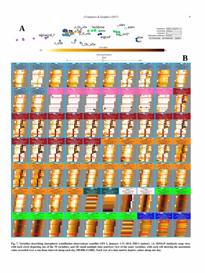
Fig. 7. Variables describing ionospheric scintillation observations (satellite GPS 1, January 1-31 2014, PRU1 station): (A) IDMAP similarity map view,with each circle depicting one of the 70 variables; and (B) small multiple time matrices view of the same variables, with each cell showing the maximumvalue recorded over a one-hour interval along each day (00:00h-11:00h). Each row of a time matrix depicts values along one day.
10 / Computers & Graphics (2017)
each day in January 2014 (00:00h-11:00h), with an elevationcutoff of 30 degrees, yielding 354,727 observations describedby 70 variables. We considered data from satellite GPS 1. TheX-means clustering of all 70 variables generated six clusters,with a silhouette coefficient of 0.478, which indicates a high-quality clustering result. The composition of the clusters maybe observed inspecting both the similarity map of variables andthe small multiples time matrices views, shown in Figure 7, inwhich the cluster assignment is indicated by the color of circlesor time matrices, respectively.
While the map provides an overview of the variables’ globalsimilarities, the small multiples view details their temporal be-havior, making it possible to verify the actual behavior of clus-ter members and assess their (dis)similarities. Cluster C1 (lightblue) contains 12 variables, and it is possible to observe twosub-groups in the map: a cohesive group of nine variables andanother sub-group of three variables t l1, t l2c e5a and t e5bnot very close to each other, but their time matrices show-ing quite similar behavior. In the pink cluster (C2, with 7variables), variables sigmaccd l1, sigmaccd l2c e5a and sig-maccd l5 e5b show similar behavior, slightly different fromother cluster members. The time matrices of the 16 variablesin the red cluster (C3) show remarkably similar behavior. Incluster C4 (orange), which groups 19 variables, we notice thatp l1, p l2c e5a and p l5 e5b behave differently from the oth-ers. This can be also observed in the similarity map, wherethe circles representing these three variables are slightly apartfrom the main group of orange circles. Cluster C5 (dark green)groups two variables related to time (day of week and weeknumber), whereas the variables azim and elevation, which indi-cate spatial orientation of satellites, are grouped together intocluster C6 (light rose). The neon green cluster (C7, withnine variables), observed in the map, is also split into twosubgroups: one formed by variables avg cn0 l1, avg cn0 l2,avg cn0 l5 e5b and f2nd tec cn0; another formed by variablesl1 locktime, l2 e5a locktime and l5 e5b locktime. When ob-serving their corresponding time matrices one notices that theselatter variables show a distinct behavior from the others in thiscluster. Also distinctive in this group is the time variable tow,placed in the map somewhere in between this subgroup and thedark blue cluster C8. The time matrices of variables in clusterC8 show that they behave similarly, and they are indeed placedclose in the map.
These two visualizations when viewed in combination pro-vide useful information for the analyst to adjust the clustermodel obtained with X-means. The variables’ cluster assign-ment can be modified using the combo box provided in its timematrix view. The ability to identify clusters of variables withsimilar behavior is important when investigating answers to thequestions discussed next.
Considering the remarks above, the cluster model was mod-ified as follows: cluster C1 (light blue) was split into twosubgroups formed by the cohesive group of nine variablesand by the three disperse variables, respectively; cluster C2(pink) was also split into two groups (formed by variables sig-maccd l1, sigmaccd l2c e5a and sigmaccd l5 e5b in a group;and the remaining variables in the other); cluster C4 (orange)
was split into two groups (one sub-group with variables p l1,p l2c e5a and p l5 e5b and another sub-group with the remain-ing variables); cluster C7 was split into two subgroups (oneformed by variables avg cn0 l1, avg cn0 l2, avg cn0 l5 e5band f2nd tec cn0 and the other by the remaining variables); andvariable tow was re-assigned to cluster C8 (blue). The adjustedcluster model, shown in Figure 8, is formed by 12 clusters andhas an improved silhouette coefficient of 0.597. This modifiedclustering more appropriately represents a user’s “vision” of thescenario, and can yield better classification results, as discussednext.
Fig. 8. IDMAP similarity map view of the same 70 variables depictedin Figure 7.A, in which circle colors reflect an alternative (user-adjusted)cluster model (12 clusters).
6.2. Identifying the relationships between S4 indices and othervariables (Q2) and relevant variables to scintillation (Q3)
Proceeding from the previous study and in order to investi-gate how the multiple tracked variables relate with the S4 in-dices, we compared the results of classifiers on the set of obser-vations described by three alternative subspaces of variables,taking S4 corrected as target variable and the Tiwari catego-rization as ground truth. The three sub-spaces considered fordescribing the observations are formed by (a) all 58 monitoredvariables that are not directly derived or theoretically associ-ated with measures of the S4 index (obtained discarding the 12variables included in Cluster C4, depicted in Figure 7); (b) therepresentative variables defined by the cluster medoids result-ing from X-means (eight variables) clustering, also depicted inFigure 7; and (c) the representative variables (medoids) definedby the user-adjusted cluster model, shown in Figure 8, obtainedafter observing and interacting with the visualizations.
The X-means clustering of all 70 variables (Figure 7) gen-erated eight clusters, and their corresponding medoids arethe variables: si l5 e5b, dtec 6045, phi03l1, wn, azim, tow,avgccd l2c e5a and numerator si l2c e5a. The user-adjustedclustering (Figure 8) has twelve clusters, with medoids:si l5 e5b, dtec 6045, phi03l1, wn, azim, avgccd l2c e5a,numerator si l2c e5a, sigmaccd l5 e5b, f2nd tec locktime,avg cn0 l2, p l5 e5b and t l2c e5a.
Classifier accuracy is summarized in Table 3, confirming thatboth subspaces of variables derived with X-Means and user-adjusted are indeed appropriate to characterize scintillation be-havior. According to the scintillation experts, this is a relevantresult, as e.g., the eight variables from subset (b) could be moni-tored using conventional geodesic receivers available, for exam-ple, from the Brazilian Network for Continuous Monitoring ofthe GNSS Systems (RBMC), rather than the highly specializedand more costly ISMRs. In other words, it would be possibleto track scintillation with good precision monitoring a reduced
/ Computers & Graphics (2017) 11
number of variables that may be tracked with cheaper receivers.
Table 3. Classification accuracy of observations described by three distinctvariable subspaces.
Technique 58 var. (a) 8 var. (b) 12 var. (c)J48 96.43% 97.50% 97.69%
Mult. Percep. 96.42% 97.52% 97.85%
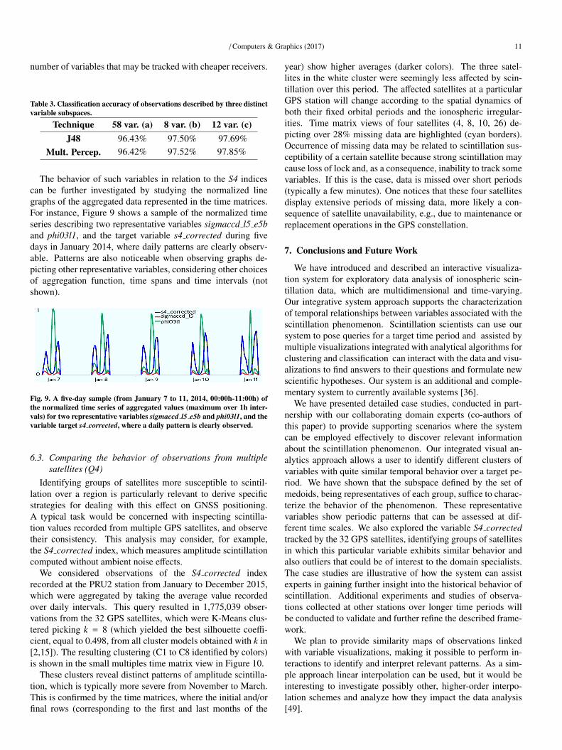
The behavior of such variables in relation to the S4 indicescan be further investigated by studying the normalized linegraphs of the aggregated data represented in the time matrices.For instance, Figure 9 shows a sample of the normalized timeseries describing two representative variables sigmaccd l5 e5band phi03l1, and the target variable s4 corrected during fivedays in January 2014, where daily patterns are clearly observ-able. Patterns are also noticeable when observing graphs de-picting other representative variables, considering other choicesof aggregation function, time spans and time intervals (notshown).
Fig. 9. A five-day sample (from January 7 to 11, 2014, 00:00h-11:00h) ofthe normalized time series of aggregated values (maximum over 1h inter-vals) for two representative variables sigmaccd l5 e5b and phi03l1, and thevariable target s4 corrected, where a daily pattern is clearly observed.
6.3. Comparing the behavior of observations from multiplesatellites (Q4)
Identifying groups of satellites more susceptible to scintil-lation over a region is particularly relevant to derive specificstrategies for dealing with this effect on GNSS positioning.A typical task would be concerned with inspecting scintilla-tion values recorded from multiple GPS satellites, and observetheir consistency. This analysis may consider, for example,the S4 corrected index, which measures amplitude scintillationcomputed without ambient noise effects.
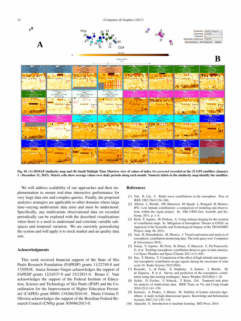
We considered observations of the S4 corrected indexrecorded at the PRU2 station from January to December 2015,which were aggregated by taking the average value recordedover daily intervals. This query resulted in 1,775,039 obser-vations from the 32 GPS satellites, which were K-Means clus-tered picking k = 8 (which yielded the best silhouette coeffi-cient, equal to 0.498, from all cluster models obtained with k in[2,15]). The resulting clustering (C1 to C8 identified by colors)is shown in the small multiples time matrix view in Figure 10.
These clusters reveal distinct patterns of amplitude scintilla-tion, which is typically more severe from November to March.This is confirmed by the time matrices, where the initial and/orfinal rows (corresponding to the first and last months of the
year) show higher averages (darker colors). The three satel-lites in the white cluster were seemingly less affected by scin-tillation over this period. The affected satellites at a particularGPS station will change according to the spatial dynamics ofboth their fixed orbital periods and the ionospheric irregular-ities. Time matrix views of four satellites (4, 8, 10, 26) de-picting over 28% missing data are highlighted (cyan borders).Occurrence of missing data may be related to scintillation sus-ceptibility of a certain satellite because strong scintillation maycause loss of lock and, as a consequence, inability to track somevariables. If this is the case, data is missed over short periods(typically a few minutes). One notices that these four satellitesdisplay extensive periods of missing data, more likely a con-sequence of satellite unavailability, e.g., due to maintenance orreplacement operations in the GPS constellation.
7. Conclusions and Future Work
We have introduced and described an interactive visualiza-tion system for exploratory data analysis of ionospheric scin-tillation data, which are multidimensional and time-varying.Our integrative system approach supports the characterizationof temporal relationships between variables associated with thescintillation phenomenon. Scintillation scientists can use oursystem to pose queries for a target time period and assisted bymultiple visualizations integrated with analytical algorithms forclustering and classification can interact with the data and visu-alizations to find answers to their questions and formulate newscientific hypotheses. Our system is an additional and comple-mentary system to currently available systems [36].
We have presented detailed case studies, conducted in part-nership with our collaborating domain experts (co-authors ofthis paper) to provide supporting scenarios where the systemcan be employed effectively to discover relevant informationabout the scintillation phenomenon. Our integrated visual an-alytics approach allows a user to identify different clusters ofvariables with quite similar temporal behavior over a target pe-riod. We have shown that the subspace defined by the set ofmedoids, being representatives of each group, suffice to charac-terize the behavior of the phenomenon. These representativevariables show periodic patterns that can be assessed at dif-ferent time scales. We also explored the variable S4 correctedtracked by the 32 GPS satellites, identifying groups of satellitesin which this particular variable exhibits similar behavior andalso outliers that could be of interest to the domain specialists.The case studies are illustrative of how the system can assistexperts in gaining further insight into the historical behavior ofscintillation. Additional experiments and studies of observa-tions collected at other stations over longer time periods willbe conducted to validate and further refine the described frame-work.
We plan to provide similarity maps of observations linkedwith variable visualizations, making it possible to perform in-teractions to identify and interpret relevant patterns. As a sim-ple approach linear interpolation can be used, but it would beinteresting to investigate possibly other, higher-order interpo-lation schemes and analyze how they impact the data analysis[49].
12 / Computers & Graphics (2017)
Fig. 10. (A) IDMAP similarity map and (B) Small Multiple Time Matrices view of values of index S4 corrected recorded at the 32 GPS satellites (January1 - December 31, 2015). Matrix cells show average values over daily periods along each month. Numeric labels in the similarity map identify the satellites.
We will address scalability of our approaches and their im-plementation to ensure real-time interactive performance forvery large data sets and complex queries. Finally, the proposedanalytics strategies are applicable to other domains where largetime-varying multivariate data arise and must be understood.Specifically, any multivariate observational data set recordedperiodically can be explored with the described visualizationswhen there is a need to understand and correlate variable sub-spaces and temporal variation. We are currently generalizingthe system and will apply it to stock market and air quality datasets.
Acknowledgments
This work received financial support of the State of S£oPaulo Research Foundation (FAPESP) grants 11/22749-8 and17/05838. Aurea Soriano-Vargas acknowledges the support ofFAPESP grants 12/24537-0 and 15/12831-0. Bruno C. Vaniacknowledges the support of the Federal Institute of Educa-tion, Science and Technology of S£o Paulo (IFSP) and the Co-ordination for the Improvement of Higher Education Person-nel (CAPES) grant 88881.134266/2016-01. Maria Cristina F.Oliveira acknowledges the support of the Brazilian Federal Re-search Council (CNPq) grant 305696/2013-0.
References
[1] Yeh, K, Liu, C. Radio wave scintillations in the ionosphere. Proc ofIEEE 1982;70(4):324–360.
[2] Alfonsi, L, Wernik, AW, Materassi, M, Spogli, L, Bougard, B, Monico,JFG. Low latitude scintillations: a comparison of modeling and observa-tions within the cigala project. In: 30th URSI Gen. Assemb. and Sci.Symp. 2011, p. 1–4.
[3] Kieft, P, Aquino, M, Dodson, A. Using ordinary kriging for the creationof scintillation maps. In: Mitigation of Ionospheric Threats to GNSS: anAppraisal of the Scientific and Technological Outputs of the TRANSMITProject; chap. 06. 2014,.
[4] Vani, B, Shimabukuro, M, Monico, J. Visual exploration and analysis ofionospheric scintillation monitoring data: The ismr query tool. Computers& Geosciences 2016;.
[5] Sreeja, V, Aquino, M, Forte, B, Elmas, Z, Hancock, C, De Franceschi,G, et al. Tackling ionospheric scintillation threat to gnss in latin america.J of Space Weather and Space Climate 2011;1(1):A05.
[6] Jiao, Y, Morton, Y. Comparison of the effect of high-latitude and equato-rial ionospheric scintillation on gps signals during the maximum of solarcycle 24. Radio Science 2015;50(9).
[7] Rezende, L, de Paula, E, Stephany, S, Kantor, I, Muella, M,de Siqueira, P, et al. Survey and prediction of the ionospheric scintil-lation using data mining techniques. Space Weather 2010;8(6):1–10.
[8] Jackle, D, Fischer, F, Schreck, T, Keim, DA. Temporal mds plotsfor analysis of multivariate data. IEEE Trans on Vis and Comp Graph2016;22(1):141–150.
[9] Kalousis, A, Prados, J, Hilario, M. Stability of feature selection algo-rithms: A study on high-dimensional spaces. Knowledge and InformationSystems 2007;12(1):95–116.
[10] Alpaydin, E. Introduction to machine learning. MIT Press; 2014.
/ Computers & Graphics (2017) 13
[11] Razente, HL, Chino, FJT, Barioni, MCN, Traina, AJ, Traina Jr, C. Vi-sual analysis of feature selection for data mining processes. In: BrazilianSymp. Databases (SBBD). 2004, p. 33–47.
[12] Seo, J, Shneiderman, B. A rank-by-feature framework for unsupervisedmultidimensional data exploration using low dimensional projections. In:IEEE Symp. Inf. Vis. 2004, p. 65–72.
[13] Piringer, H, Berger, W, Hauser, H. Quantifying and comparing featuresin high-dimensional datasets. In: IEEE 12th Int. Conf. on Inf. Vis. 2008,p. 240–245.
[14] May, T, Bannach, A, Davey, J, Ruppert, T, Kohlhammer, J. Guidingfeature subset selection with an interactive visualization. In: IEEE Conf.on Visual Analytics Science and Technology. 2011, p. 111–120.
[15] Martınez, MJ, Ponzoni, I, Dıaz, MF, Vazquez, GE, Soto, AJ. Visual an-alytics in cheminformatics: user-supervised descriptor selection for qsarmethods. J of cheminformatics 2015;7(1).
[16] Schreck, T, Fellner, D, Keim, D. Towards automatic feature vector opti-mization for multimedia applications. In: Proc. ACM Symp. on Appliedcomputing. 2008, p. 1197–1201.
[17] Turkay, C, Lundervold, A, Lundervold, AJ, Hauser, H. Representativefactor generation for the interactive visual analysis of high-dimensionaldata. IEEE Trans on Vis and Comp Graph 2012;18(12):2621–2630.
[18] Yuan, X, Ren, D, Wang, Z, Guo, C. Dimension projection matrix/tree:Interactive subspace visual exploration and analysis of high dimensionaldata. IEEE Trans on Vis and Comp Graph 2013;19(12):2625–2633.
[19] Liu, S, Maljovec, D, Wang, B, Bremer, PT, Pascucci, V. Visualizinghigh-dimensional data: Advances in the past decade. IEEE Trans on Visand Comp Graph 2015;23(3):1249–1268.
[20] Livingston, MA, Decker, JW, Ai, Z. Evaluating multivariate visual-izations on time-varying data. In: Conf. of Vis. and Data Analysis; vol.8654. 2013, p. 86540N.
[21] Inselberg, A, Dimsdale, B. Parallel coordinates: a tool for visualizingmulti-dimensional geometry. In: Proc. of 1st Conf. Vis. 1990, p. 361–378.
[22] Lee, TY, Shen, HW. Visualization and exploration of temporal trendrelationships in multivariate time-varying data. IEEE Trans on Vis andComp Graph 2009;15(6):1359–1366.
[23] Akibay, H, Ma, KL. A tri-space visualization interface for analyzingtime-varying multivariate volume data. In: Proc. of the 9th Joint Euro-graphics/IEEE VGTC Conf. Vis. 2007, p. 115–122.
[24] Tufte, ER. Envisioning information. Optometry & Vision Science1991;68(4):322–324.
[25] Liu, X, Hu, Y, North, S, Shen, HW. Correlatedmultiples: Spatiallycoherent small multiples with constrained multi-dimensional scaling. In:Comp. Graph. Forum. 2015,.
[26] Zhang, D, Zhu, L, Wang, C, Zhang, L. Timespiral, an enhancedinteractive visual system for time series data. In: 2nd Int. Conf. on Inf.Management (ICIM). 2016, p. 127–133.
[27] Dasgupta, A, Kosara, R, Gosink, L. Vimtex: A visualization interfacefor multivariate, time-varying, geological data exploration. In: Comp.Graph. Forum; vol. 34. 2015, p. 341–350.
[28] Steed, CA, Halsey, W, Dehoff, R, Yoder, SL, Paquit, V, Powers,S. Falcon: Visual analysis of large, irregularly sampled, and multivariatetime series data in additive manufacturing. Comp & Graph 2017;63:50–64.
[29] Li, J, Zhang, K, Meng, ZP. Vismate: Interactive visual analysis ofstation-based observation data on climate changes. In: IEEE Conf. VisualAnalytics Science and Technology (VAST). 2014, p. 133–142.
[30] Poco, J, Dasgupta, A, Wei, Y, Hargrove, W, Schwalm, C, Cook, R,et al. Similarityexplorer: A visual inter-comparison tool for multifacetedclimate data. In: Comp. Graph. Forum; vol. 33. 2014, p. 341–350.
[31] Van Dierendonck, A, Klobuchar, J, Hua, Q. Ionospheric scintillationmonitoring using commercial single frequency c/a code receivers. In:Proc. of ION GPS; vol. 93. 1993, p. 1333–1342.
[32] Tiwari, R, Skone, S, Tiwari, S, Strangeways, H. Wbmod assisted pll gpssoftware receiver for mitigating scintillation affect in high latitude region.In: 30th URSI Gen. Assemb. and Sci. Symp. 2011, p. 1–4.
[33] Lima, G, Stephany, S, Paula, E, Batista, I, Abdu, M, Rezende, L, et al.Correlation analysis between the occurrence of ionospheric scintillation atthe magnetic equator and at the southern peak of the equatorial ionizationanomaly. Space Weather 2014;12(6):406–416.
[34] Lima, G, Stephany, S, Paula, E, Batista, I, Abdu, M. Prediction of thelevel of ionospheric scintillation at equatorial latitudes in Brazil using aneural network. Space Weather 2015;13(8):446–457.
[35] Ackah, JB, Obrou, O, Groves, K. Study of the ionospheric scintilla-tion and tec characteristics at solar minimum in a west african equatorialregion using global positioning system (gps) data. In: 30th URSI Gen.Assemb. and Sci. Symp. 2011, p. 1–4.
[36] Vani, B, Galera Monico, J, Shimabukuro, M, Pereira, V, Aquino, M.Exploring the cigala/calibra network data base for ionosphere monitoringover Brazil. In: AGU Fall Meeting Abstracts; vol. 1. 2013,.
[37] Warnant, R, Pottiaux, E. The increase of the ionospheric activity asmeasured by gps. Earth, Planets and Space 2000;52(11).
[38] Liu, H, Shu, B, Xu, L, Qian, C, Zhang, R, Zhang, M. Accounting forinter-system bias in dgnss positioning with gps/glonass/bds/galileo. J ofNavigation 2017;:1–13.
[39] Levkowitz, H. Color theory and modeling for computer graphics, vi-sualization, and multimedia applications; vol. 402. Springer Science &Business Media; 1997.
[40] Samara, T. Design elements: A graphic style manual. Rockport publish-ers; 2007.
[41] Pelleg, D, Moore, AW. X-means: Extending k-means with efficientestimation of the number of clusters. In: Proc. 17th Int. Conf. on MachineLearning. 2000, p. 727–734.
[42] Rousseeuw, P. Silhouettes: A graphical aid to the interpretation and val-idation of cluster analysis. J of Computational and Applied Mathematics1987;20(1):53–65.
[43] Tejada, E, Minghim, R, Nonato, LG. On improved projection tech-niques to support visual exploration of multi-dimensional data sets. InfVis 2003;2(4):218–231.
[44] Minghim, R, Paulovich, F, de Andrade Lopes, A. Content-based textmapping using multi-dimensional projections for exploration of docu-ment collections. In: Proc. of Int. Society for optics and photonics (SPIE),Vis. and Data Analysis; vol. 6060. 2006, p. 60600S.
[45] Faloutsos, C, Lin, KI. FastMap: A fast algorithm for indexing, data-mining and visualization of traditional and multimedia datasets; vol. 24.ACM; 1995.
[46] Paulovich, F, Minghim, R. Hipp: A novel hierarchical point placementstrategy and its application to the exploration of document collections.IEEE Trans on Vis and Comp Graph 2008;14(6):1229–1236.
[47] Paulovich, F, Nonato, L, Minghim, R, Levkowitz, H. Least squareprojection: A fast high-precision multidimensional projection techniqueand its application to document mapping. IEEE Trans on Vis and CompGraph 2008;14(3):564–575.
[48] Jolliffe, I. Principal component analysis. Wiley Online Library; 2002.[49] Boyles, S. Comparison of interpolation methods for missing traffic vol-
ume data. In: Transportation Research Board 90th Annual Meeting. 11-3757; 2011,.