Embed Size (px)
DESCRIPTION
Connect to the Mid-Century Modernist by exploring their contributions to graphic design and trace their influence into many other areas. With their work to inspire you, what will you do?
Citation preview
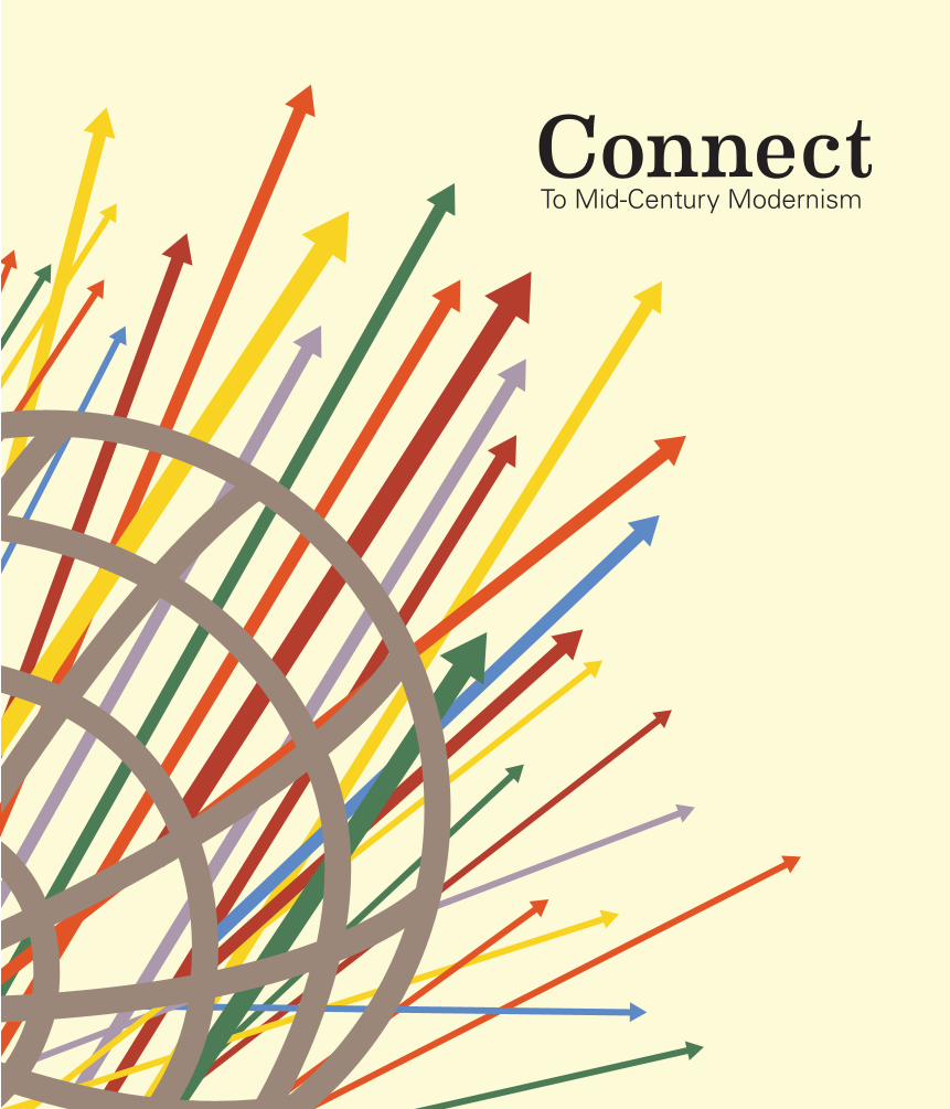
ConnectTo Mid-Century Modernism

ConnectTo Mid-Century Modernism
“Eventually everything connects - people, ideas, objects. The quality of the connections is the key to quality per se.” –Charles Eames
Publisher’s NoteThe Birth of the Modern Movement
2
America was booming in the middle of the 20th century. There was a spirit of optimism that swept the air from the recent victory in World War II. This optimism influenced every industry especially graphic design. A change in graphic design can be contributed to the rise of the machine. The modern technology paired with extra income resulted in a transformation towards streamline design. A new design movement known as Mid-Century Modernism emerged in America allowing for significant progress towards the design standards of Europe. Some of the biggest developments in graphic design were the simplification of advertising, exploring new printing techniques, and the creation of the type family. The advancements made in graphic design also connect to other industries like architecture, film, and fashion. Not only did the work of Mid-Century modernists influence people of the day, their influence can be traced to contemporary design. As we journey back to the mid-Century, we hope to inspire the designers of today. By tracing the influence of legendary designers like Leaster Beall and Robert Brownjohn to other industries, we hope that their work inspires you. Their influence does not have to stop with the pages of this magazine. Take this and run with it. There are no limits to what you can do. With the Mid-Century modernists as inspiration, what will you do with it?
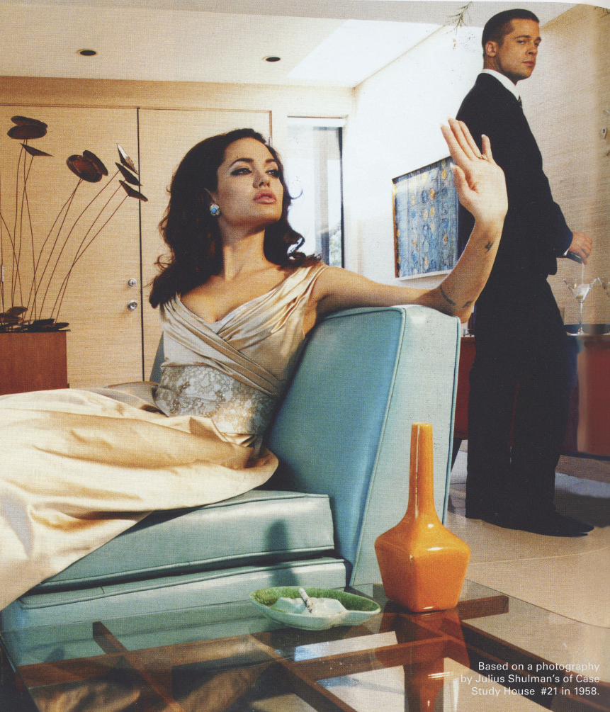
Based on a photography by Julius Shulman’s of Case
Study House #21 in 1958.
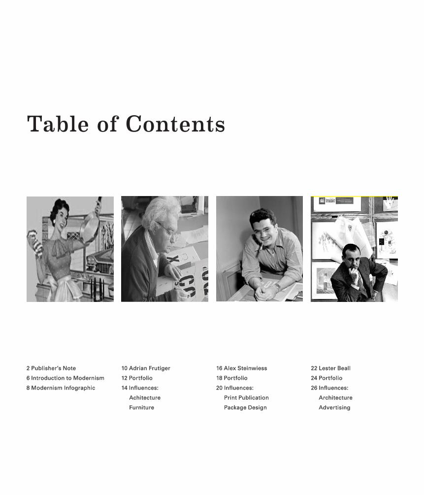
Table of Contents
10 Adrian Frutiger
12 Portfolio
14 Influences:
Achitecture
Furniture
2 Publisher’s Note
6 Introduction to Modernism
8 Modernism Infographic
16 Alex Steinwiess
18 Portfolio
20 Influences:
Print Publication
Package Design
22 Lester Beall
24 Portfolio
26 Influences:
Architecture
Advertising
10 Adrian Frutiger
12 Portfolio
14 Influences:
Achitecture
Furniture
2 Publisher’s Note
6 Introduction to Modernism
8 Modernism Infographic
16 Alex Steinwiess
18 Portfolio
20 Influences:
Print Publication
Package Design
22 Lester Beall
24 Portfolio
26 Influences:
Architecture
Advertising
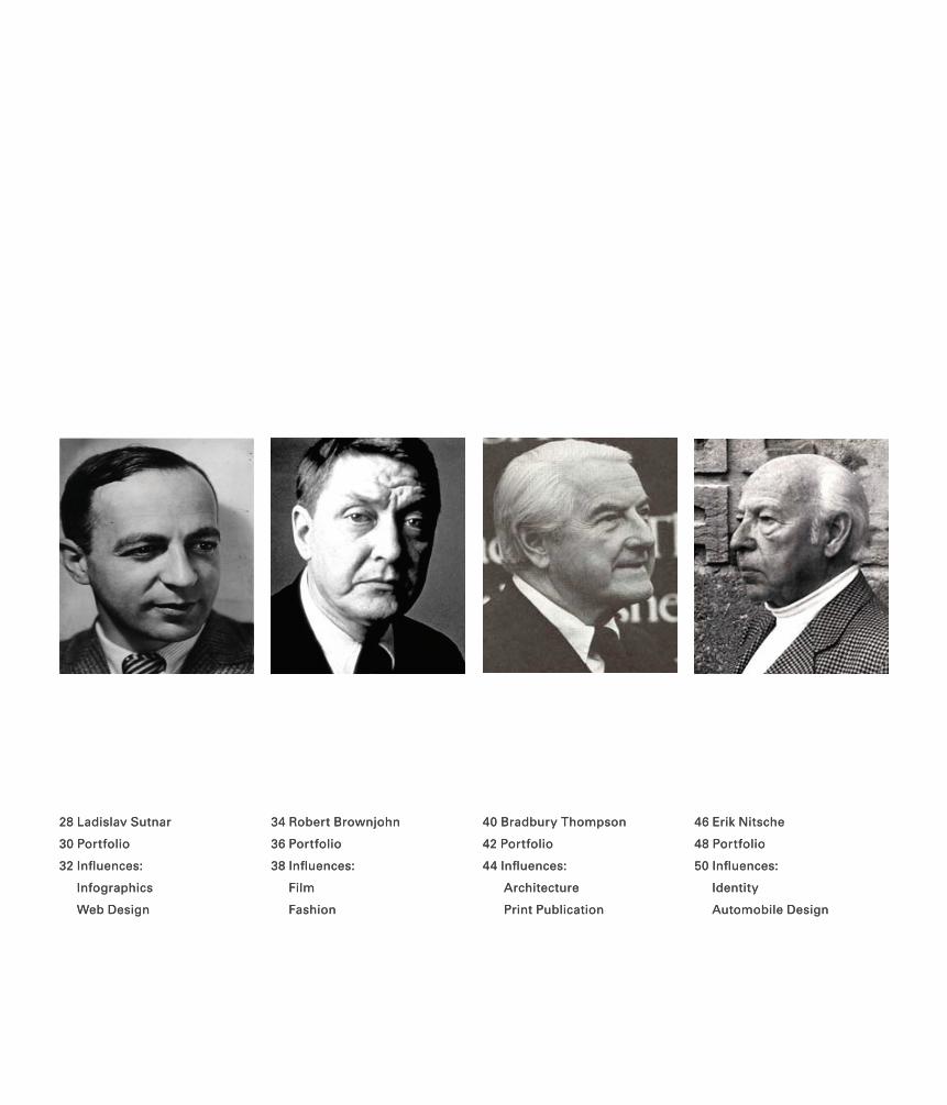
28 Ladislav Sutnar
30 Portfolio
32 Influences:
Infographics
Web Design
34 Robert Brownjohn
36 Portfolio
38 Influences:
Film
Fashion
40 Bradbury Thompson
42 Portfolio
44 Influences:
Architecture
Print Publication
46 Erik Nitsche
48 Portfolio
50 Influences:
Identity
Automobile Design
28 Ladislav Sutnar
30 Portfolio
32 Influences:
Infographics
Web Design
34 Robert Brownjohn
36 Portfolio
38 Influences:
Film
Fashion
40 Bradbury Thompson
42 Portfolio
44 Influences:
Architecture
Print Publication
46 Erik Nitsche
48 Portfolio
50 Influences:
Identity
Automobile Design
The 1950s was a period of renewal and optimism that saw post-war austerity gradually replaced by an exceptional consumer boom. Turmoil filled the previous decade eventually lead to peace and freedom in the West. Vast energies were spent on improving the world socially, politically, economically, and materially. In decorative arts, the national characteristics that were so prevalent prior to World War II became almost obliterated by “Constructive Pacifism” along with the pursuit of universalism and quality. Architecture and design benefited from new methods of wartime research, from anthropometrical data to state of the art materials and methods of construction. New materials like plastic laminates, fiberglass, and latex foam quiet literally shaped the look of the 1950s. Designers were inspired by a wide range of themes such as molecular chemistry, nuclear physics, science fiction, African art, and abstract contemporary sculpture created by artists like Alexander Calder and Hans Arp. The spiky and angular forms of the early 1950s gave way too more organic and biomorphic shapes as the decade progressed.
By the early 1950s, America had recovered from the despair and insecurity that had been associated with the Great Depression and began to experience a period of abundance, driven by a new culture of consumerism. The prosperity of metropolitan areas overshadowed poverty found in many rural communities especially among immigrant and ethnic populations. Both designers and manufacturers appealed to consumers growing aspirations by producing streamlined and forward-looking products that embodied the “American Dream.” These objects were the very antithesis of the “make do and mend” ethos of the 1930s and 1940s. The newly
Introduction to ModernismThe Great Contributors
manufactured products were built increasing consumption and thereby, productivity and prosperity. During this time, most people aspired to live the American dream which consisted of a secure job (preferably in a large corporation), a neatly kept house for a large family, a large car, and an array of labour-saving appliances. The home became the focus of the American Dream and manufacturers ruthless targeted this new generation of “homemakers” and consumers.
In many European countries such as Britain and Italy, Post war austerity was overcome by common-sense, knowledge, and inventiveness. As in America, the home had a special significance during the 1950s as a place of refuge from a world of rapidly advancing technologies. The home became a haven where one could forget the constant threat of nuclear war. In Britain, over 350 schools were provided with model apartments to teach “homecraft” to the new generation of homemakers.
Mid-Century style is unique because it is driven by innovative mass-produced furniture and accents to the home. This period produced a incomparable volume of hosehold-name artists and designer as this era: George Nelson, Ray and Charles Eames, Eero Saarinen and many more. Mid-Century modern’s emphasis on pared-down forms, contemporary patterns, natural materials and a seamless flow between the indoors and outdoors creates a medley of functional comfort and streamline style. The look bridges the gap between the organic and the man-made, with one foot planted in the natural world and the other in brave new territory that still has the power to surprise us today.
6
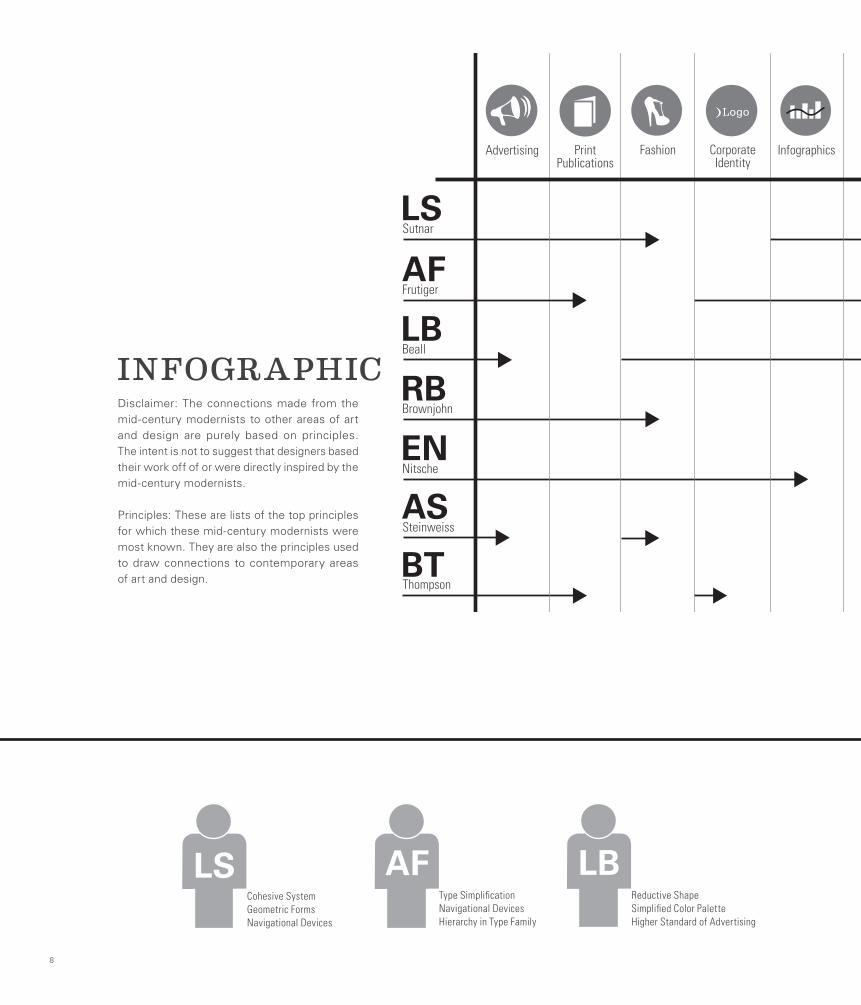
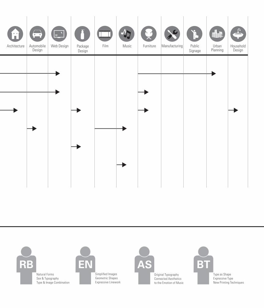
INFOGRAPHIC
8
LS
EN
AS
Sutnar
LBBeall
Nitsche
Steinweiss
BT
RBBrownjohn
Advertising Print Publications
Fashion Corporate Identity
Infographics Architecture Automobile Design
Web Design PackageDesign
Film Music Furniture Manufacturing Public Signage
Urban Planning
Household Design
AFFrutiger
Thompson
AFType SimplificationNavigational Devices Hierarchy in Type Family
LSCohesive SystemGeometric FormsNavigational Devices
LBReductive ShapeSimplified Color PaletteHigher Standard of Advertising
Disclaimer: The connections made from the mid-century modernists to other areas of art and design are purely based on principles. The intent is not to suggest that designers based their work off of or were directly inspired by the mid-century modernists.
Principles: These are lists of the top principles for which these mid-century modernists were most known. They are also the principles used to draw connections to contemporary areas of art and design.
LS
EN
AS
Sutnar
LBBeall
Nitsche
Steinweiss
BT
RBBrownjohn
Advertising Print Publications
Fashion Corporate Identity
Infographics Architecture Automobile Design
Web Design PackageDesign
Film Music Furniture Manufacturing Public Signage
Urban Planning
Household Design
AFFrutiger
Thompson
RBNatural FormsSex & TypographyType & Image Combination
ENSimplified ImagesGeometric ShapesExpressive Linework
ASOriginal TypographyConnected Aesthetics to the Emotion of Music
BTType as Shape Expressive TypeNew Printing Techniques
Adrian FrutigerCreator of Type Super Families
Adrian Frutiger has created some of the most used typefaces of the 20th and 21st century. Athough interested in many fields including woodcut and paper sillhouettes, Frutiger has been passionate about typography for his entire life. Spending most of his career working for Deberny & Peignot updating typefaces and preparing them for photo-typesetting, as well as designing typefaces of his own accord, he has created almost 30 typefaces.
Some of his most famous typefaces include Univers, Frutiger (created for the Charles de Gaulle airport), Egyptienne, Serifa and Avenir. Frutiger is one of only a few typographers whose career spans across hot metal, photographic and digital typesetting. He has also been instrumental in refining his own typefaces to include more weights and true italics, some eamples are Frutiger Next and Avenir Next.
10
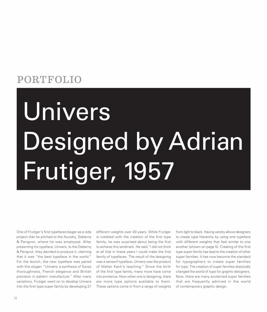
PORTFOLIO
One of Frutiger’s first typefaces began as a side project that he pitched to the foundry, Deberny & Perignot, where he was employed. After presenting his typeface, Univers, to the Deberny & Perignot, they decided to produce it, claiming that it was “the best typeface in the world.” For the launch, the new typeface was paired with this slogan: “Univers: a synthesis of Swiss thoroughness, French elegance and British precision in pattern manufacture.” After many variations, Frutiger went on to develop Univers into the first type super family by developing 21
different weights over 40 years. While Frutiger is credited with the creation of the first type family, he was surprised about being the first to achieve this landmark. He said,”I did not think at all that in these years I could make the first family of typefaces. The result of the designing was a sanserif typeface. Univers was the product of Walter Kach’s teaching.” Since the birth of the first type family, many more have come into existence. Now when one is designing, there are more type options available to them. These options come in from a range of weights
from light to black. Having variety allows designers to create type hierarchy by using one typeface with different weights that feel similar to one another (shown on page 5). Creating of the first type super family has lead to the creation of other super families. It has now become the standard for typographers to create super families for type. The creation of super families drastically changed the world of type for graphic designers. Now, there are many acclaimed super families that are frequently admired in the world of contemporary graphic design.
12
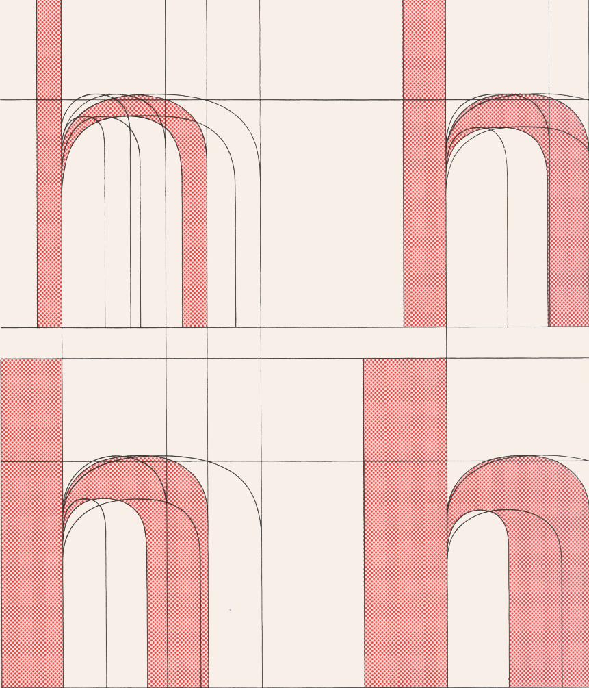
UniversDesigned by Adrian Frutiger, 1957
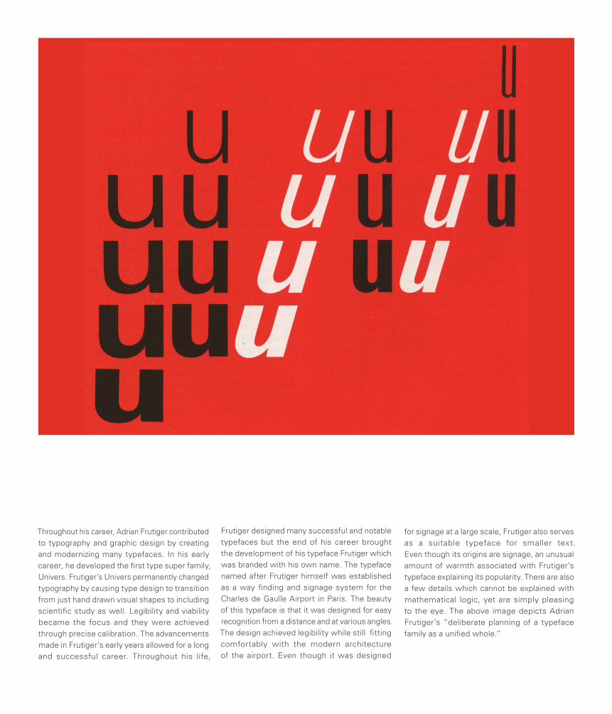
Throughout his career, Adrian Frutiger contributed to typography and graphic design by creating and modernizing many typefaces. In his early career, he developed the first type super family, Univers. Frutiger’s Univers permanently changed typography by causing type design to transition from just hand drawn visual shapes to including scientific study as well. Legibility and viability became the focus and they were achieved through precise calibration. The advancements made in Frutiger’s early years allowed for a long and successful career. Throughout his life,
Frutiger designed many successful and notable typefaces but the end of his career brought the development of his typeface Frutiger which was branded with his own name. The typeface named after Frutiger himself was established as a way finding and signage system for the Charles de Gaulle Airport in Paris. The beauty of this typeface is that it was designed for easy recognition from a distance and at various angles. The design achieved legibility while still fitting comfortably with the modern architecture of the airport. Even though it was designed
for signage at a large scale, Frutiger also serves as a suitable typeface for smaller text. Even though its origins are signage, an unusual amount of warmth associated with Frutiger’s typeface explaining its popularity. There are also a few details which cannot be explained with mathematical logic, yet are simply pleasing to the eye. The above image depicts Adrian Frutiger’s “deliberate planning of a typeface family as a unified whole.”
ARCHITECTURE
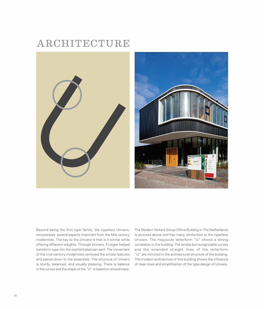
Beyond being the first type family, the typeface Univers, incorporates several aspects important from the Mid-century modernists. The key to the Univers is that is it similar while offering different weights. Through Univers, Frutiger helped transform type into the sophisticated san serif. The movement of the mid-century modernists removed the ornate features and paired down to the essentials. The structure of Univers is sturdy, balanced, and visually pleasing. There is balance in the curves and the shape of the “U” is based on smoothness.
The Modern Verkerk Group Office Building in The Netherlands is pictured above and has many similarities to the typeface Univers. The majuscule letterform “U” shows a strong correlation to the building. The simple but recognizable curves and the extended straight lines of the letterform “U” are mirrored in the architectural structure of the building. The modern architecture of this building shows the influence of clean lines and simplification of the type design of Univers.
14
U
FURNITURE
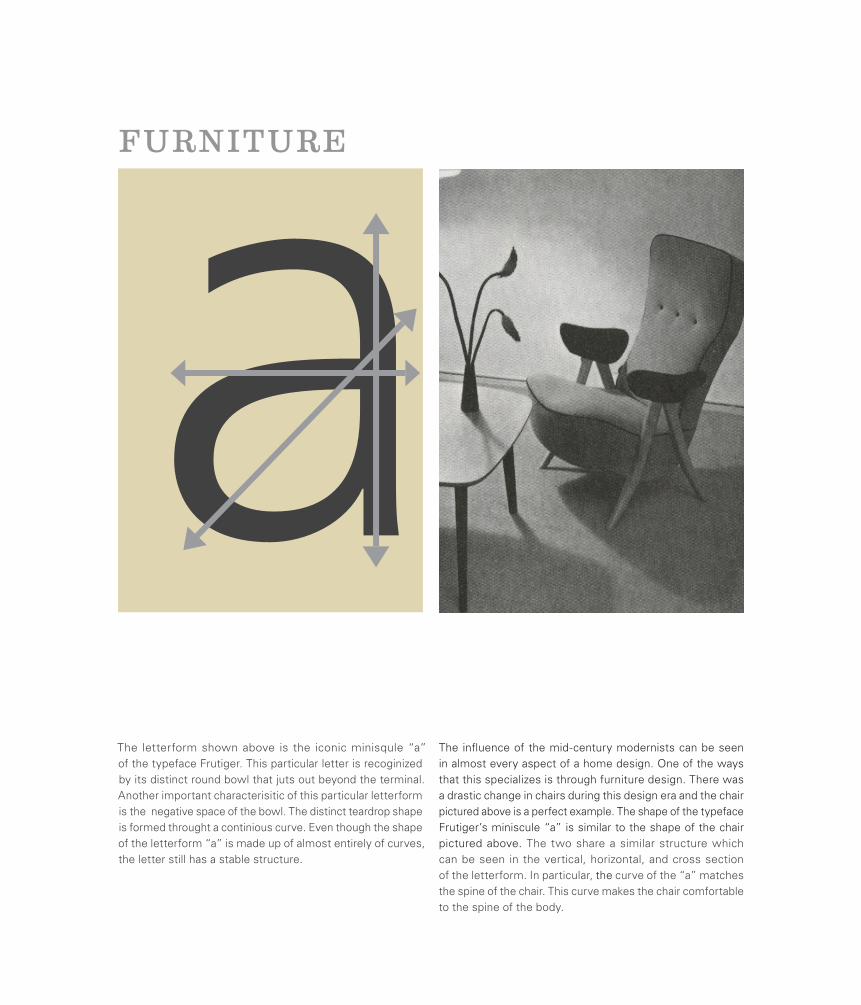
The letterform shown above is the iconic minisqule “a” of the typeface Frutiger. This particular letter is recoginized by its distinct round bowl that juts out beyond the terminal. Another important characterisitic of this particular letterform is the negative space of the bowl. The distinct teardrop shape is formed throught a continious curve. Even though the shape of the letterform “a” is made up of almost entirely of curves, the letter still has a stable structure.
The influence of the mid-century modernists can be seen in almost every aspect of a home design. One of the ways that this specializes is through furniture design. There was a drastic change in chairs during this design era and the chair pictured above is a perfect example. The shape of the typeface Frutiger’s miniscule “a” is similar to the shape of the chair pictured above. The two share a similar structure which can be seen in the vertical, horizontal, and cross section of the letterform. In particular, the curve of the “a” matches the spine of the chair. This curve makes the chair comfortable to the spine of the body.
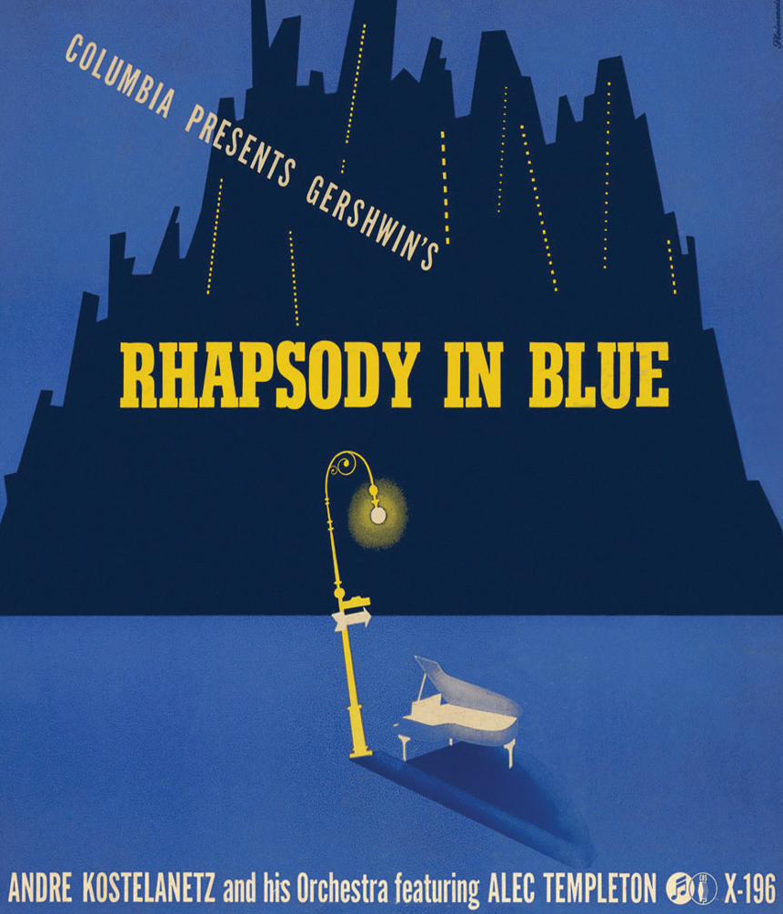
Alex SteinweissInventor of the Modern Album Cover
Alex Steinweiss has a massive body of design work that spans several different media. Some of his clients have included the U.S. Navy, PRINT, Fortune and Columbia Records. However, he is most recognized for inventing the modern album cover and much of his work lies in the poster-like images that he created while he was an art director at Columbia records.
Before Steinweiss the only album covers that existed were brown paper wrappers that served to protect the album you had just purchased. His idea to create artwork to entice the buyer to purchase the album was an instant success. From 1939 to 1945 he designed record covers for Columbia, during which time he turned out hundreds of distinct designs. After 1945 he began working for other clients including several other record companies and in 1974 he retired to Florida to paint and work on occasional commission pieces.
16
Alex Steinweiss
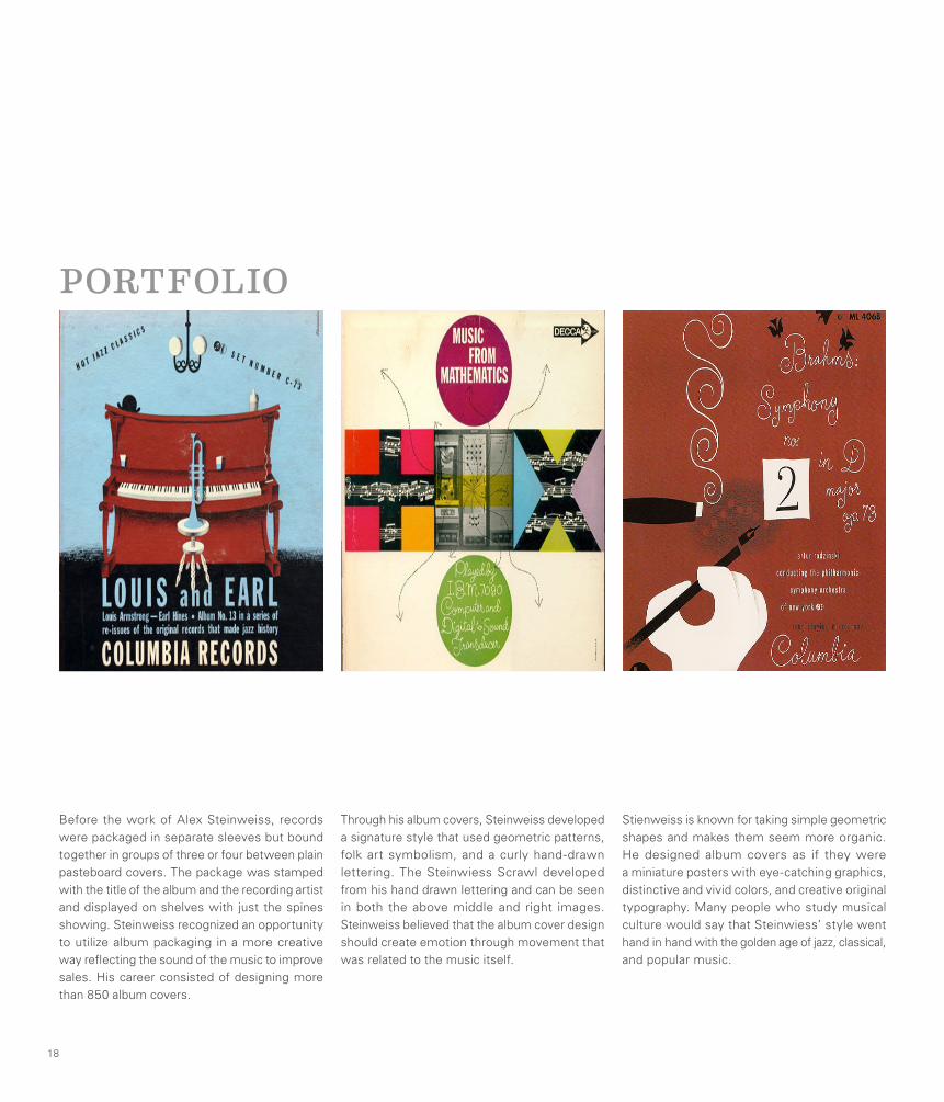
Before the work of Alex Steinweiss, records were packaged in separate sleeves but bound together in groups of three or four between plain pasteboard covers. The package was stamped with the title of the album and the recording artist and displayed on shelves with just the spines showing. Steinweiss recognized an opportunity to utilize album packaging in a more creative way reflecting the sound of the music to improve sales. His career consisted of designing more than 850 album covers.
Through his album covers, Steinweiss developed a signature style that used geometric patterns, folk art symbolism, and a curly hand-drawn lettering. The Steinwiess Scrawl developed from his hand drawn lettering and can be seen in both the above middle and right images. Steinweiss believed that the album cover design should create emotion through movement that was related to the music itself.
Stienweiss is known for taking simple geometric shapes and makes them seem more organic. He designed album covers as if they were a miniature posters with eye-catching graphics, distinctive and vivid colors, and creative original typography. Many people who study musical culture would say that Steinwiess’ style went hand in hand with the golden age of jazz, classical, and popular music.
18
PORTFOLIO
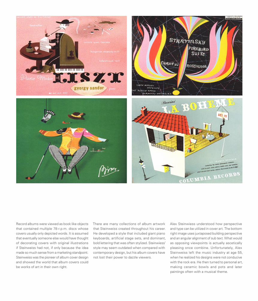
Record albums were viewed as book like objects that contained multiple 78-r.p.m. discs whose covers usually only depicted words. It is assumed that eventually someone else would have thought of decorating covers with original illustrations if Steinweiss had not, if only because the idea made so much sense from a marketing standpoint. Steinweiss was the pioneer of album cover design and showed the world that album covers could be works of art in their own right.
There are many collections of album artwork that Steinweiss created throughout his career. He developed a style that included giant piano keyboards, artificial stage sets, and dominant, bold lettering that was often stylized. Steinwiess’ style may seem outdated when compared with contemporary design, but his album covers have not lost their power to dazzle viewers.
Alex Steinwiess understood how perspective and type can be utilized in cover art. The bottom right image uses juxtaposed building perspective and an angular alignment of sub text. What would as opposing viewpoints is actually ascetically pleasing once combine. Unfortunately, Alex Steinweiss left the music industry at age 55, when he realized his designs were not conducive with the rock era. He then turned to personal art, making ceramic bowls and pots and later paintings often with a musical theme.
PRINT PUBLICATION
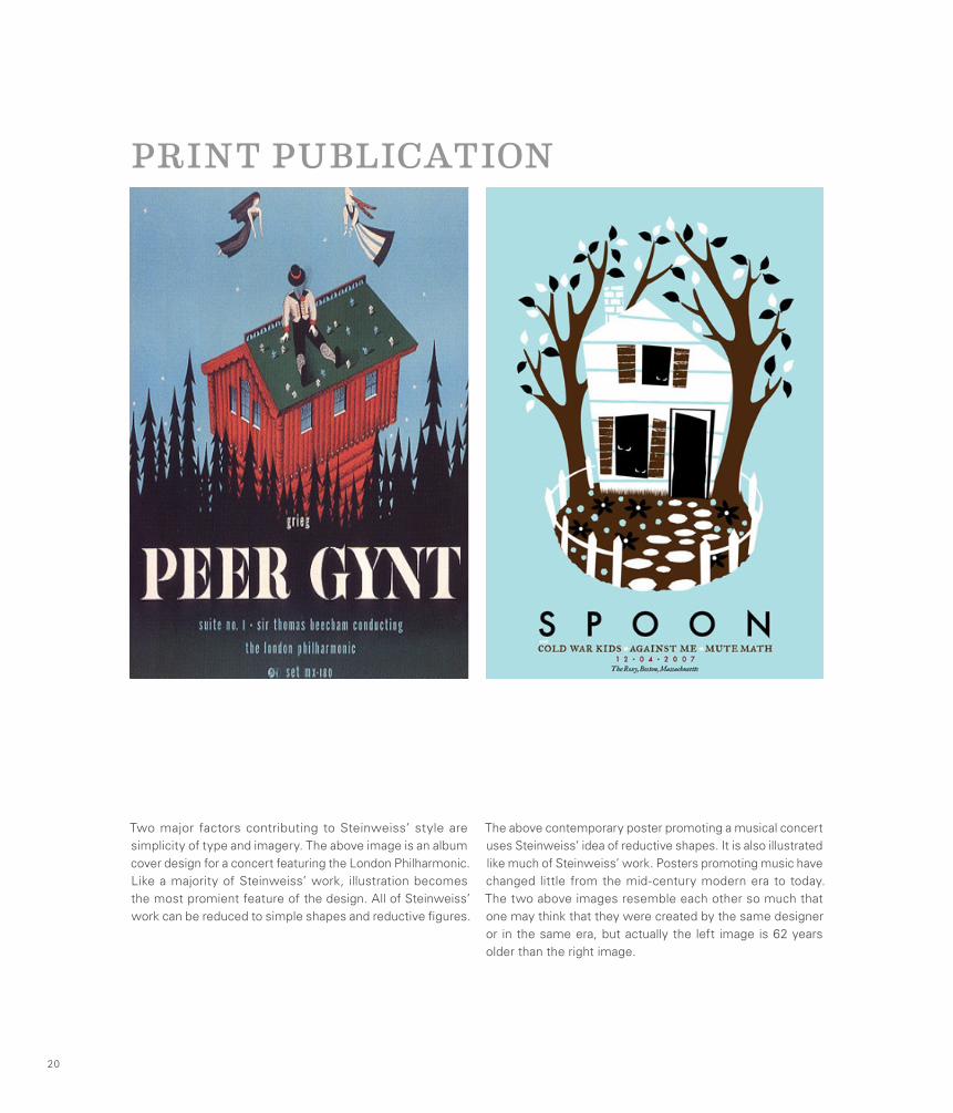
Two major factors contributing to Steinweiss’ style are simplicity of type and imagery. The above image is an album cover design for a concert featuring the London Philharmonic. Like a majority of Steinweiss’ work, illustration becomes the most promient feature of the design. All of Steinweiss’ work can be reduced to simple shapes and reductive figures.
The above contemporary poster promoting a musical concert uses Steinweiss’ idea of reductive shapes. It is also illustrated like much of Steinweiss’ work. Posters promoting music have changed little from the mid-century modern era to today. The two above images resemble each other so much that one may think that they were created by the same designer or in the same era, but actually the left image is 62 years older than the right image.
20
PACKAGE DESIGN
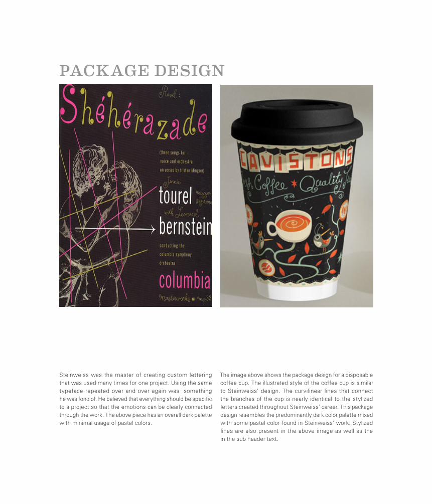
Steinweiss was the master of creating custom lettering that was used many times for one project. Using the same typeface repeated over and over again was something he was fond of. He believed that everything should be specific to a project so that the emotions can be clearly connected through the work. The above piece has an overall dark palette with minimal usage of pastel colors.
The image above shows the package design for a disposable coffee cup. The illustrated style of the coffee cup is similar to Steinweiss’ design. The curvilinear lines that connect the branches of the cup is nearly identical to the stylized letters created throughout Steinweiss’ career. This package design resembles the predominantly dark color palette mixed with some pastel color found in Steinweiss’ work. Stylized lines are also present in the above image as well as the in the sub header text.
Lester BeallThe Father of Modern Advertising
A man with a very technology-oriented background, Beall grew up playing with Ham radios and creating his own wireless sets. He graduated with a Ph.D in the History of Fine Art and the years following his graduation found him expressing an interest in modern art movements such as Surrealism, Constructivism and Dadaism. His work as an advertiser and graphic designer quickly gained international recognition and the most productive years of his career, during the 1930s and 40s, saw many successes in both fields.
His clear and concise use of typography was highly praised both in the United States and abroad. Throughout his career he used bold primary colors and illustrative arrows and lines in a graphic style that became easily recognizable as his own. He eventually moved to rural New York and set up an office, and home, at a premises that he and his family called “Dumbarton Farm”. He remained at the farm until his death in 1969.
22
Lester Beall
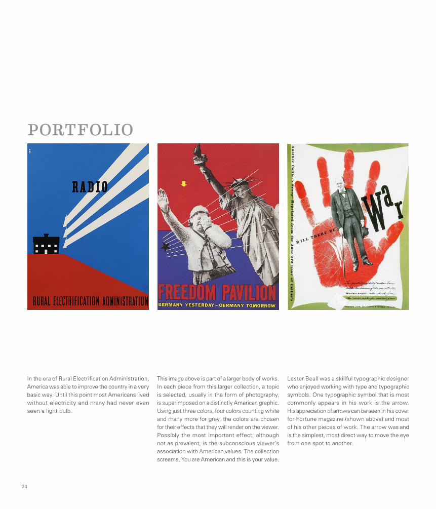
In the era of Rural Electrification Administration, America was able to improve the country in a very basic way. Until this point most Americans lived without electricity and many had never even seen a light bulb.
Lester Beall was a skillful typographic designer who enjoyed working with type and typographic symbols. One typographic symbol that is most commonly appears in his work is the arrow. His appreciation of arrows can be seen in his cover for Fortune magazine (shown above) and most of his other pieces of work. The arrow was and is the simplest, most direct way to move the eye from one spot to another.
24
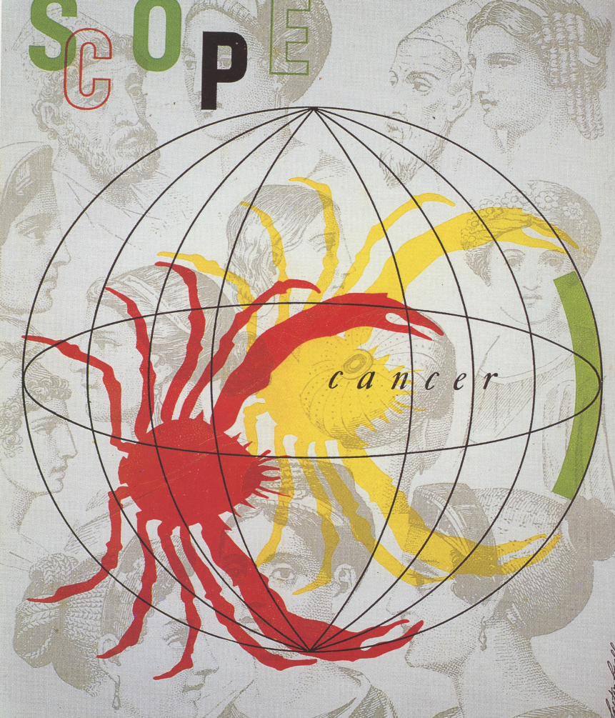
This image above is part of a larger body of works. In each piece from this larger collection, a topic is selected, usually in the form of photography, is superimposed on a distinctly American graphic. Using just three colors, four colors counting white and many more for grey, the colors are chosen for their effects that they will render on the viewer. Possibly the most important effect, although not as prevalent, is the subconscious viewer’s association with American values. The collection screams, You are American and this is your value.
PORTFOLIO
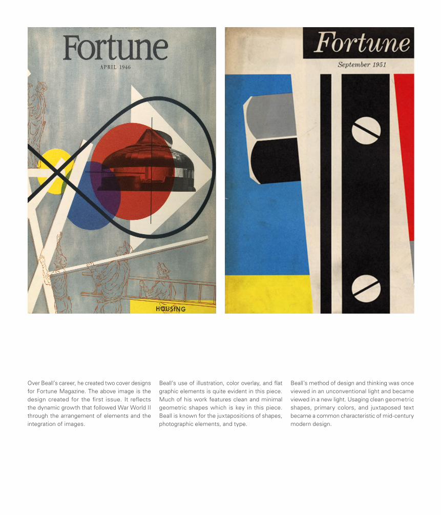
Over Beall’s career, he created two cover designs for Fortune Magazine. The above image is the design created for the first issue. It reflects the dynamic growth that followed War World II through the arrangement of elements and the integration of images.
Beall’s use of illustration, color overlay, and flat graphic elements is quite evident in this piece. Much of his work features clean and minimal geometric shapes which is key in this piece. Beall is known for the juxtapositions of shapes, photographic elements, and type.
Beall’s method of design and thinking was once viewed in an unconventional light and became viewed in a new light. Usaging clean geometric shapes, primary colors, and juxtaposed text became a common characteristic of mid-century modern design.
ARCHITECTURE
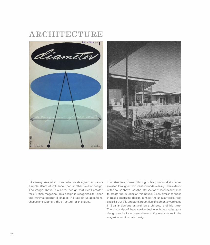
Like many eras of art, one artist or designer can cause a ripple effect of influence upon another field of design. The image above is a cover design that Beall created for a British magazine. This design is recognized for clean and minimal geometric shapes. His use of juxtapositional shapes and type, are the structure for this piece.
This structure formed through clean, minimalist shapes are used throughout mid-century modern design. The exterior of the house above uses the intersection of rectilinear shapes to create the exterior of this house. Lines similar to those in Beall’s magazine design connect the angular walls, roof, and pillars of this structure. Repetition of elements were used in Beall’s designs as well as architecture of his time. The similarities of the magazine design with the architectural design can be found seen down to the oval shapes in the magazine and the patio design.
26
ADVERTISING
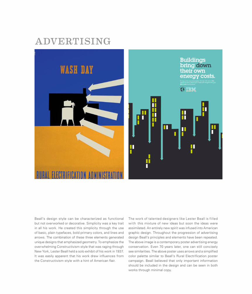
Beall’s design style can be characterized as functional but not overworked or decorative. Simplicity was a key trait in all his work. He created this simplicity through the use of basic, plain typefaces, bold primary colors, and lines and arrows. The combination of these three elements generated unique designs that emphasized geometry. To emphasize the overwhelming Constructivism style that was raging through New York, Lester Beall held a solo exhibit of his work in 1937. It was easily apparent that his work drew influences from the Constructivism style with a hint of American flair.
The work of talented designers like Lester Beall is filled with this mixture of new ideas but soon the ideas were assimilated. An entirely new spirit was infused into American graphic design. Throughout the progression of advertising design Beall’s principles and elements have been repeated. The above image is a contemporary poster advertising energy conservation. Even 70 years later, one can still concisely see similarities. The above poster uses arrows and a simplified color palette similar to Beall’s Rural Electrification poster campaign. Beall believed that only important information should be included in the design and can be seen in both works through minimal copy.
Ladislav SutnarThe Father of Infographics
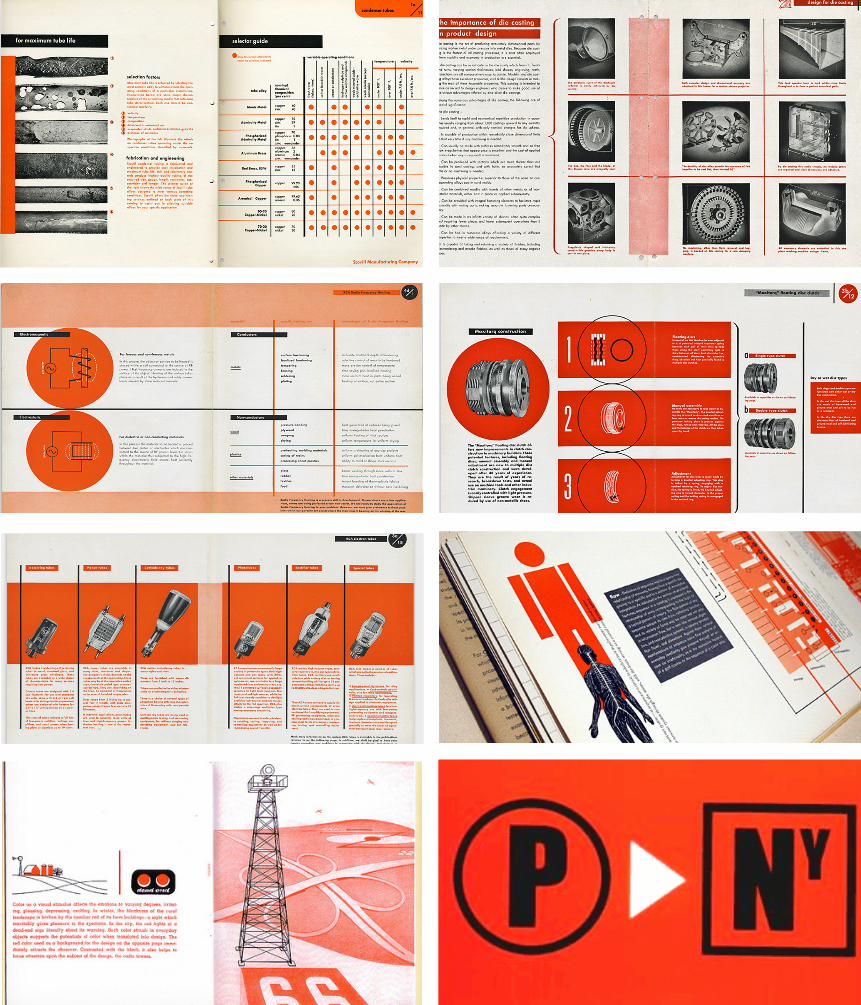
Sutnar, a Czech designer born in 1897, was one of the first designers to actively practice the field of information design. His work was rooted in rationality and the process of displaying massive amounts of information in a clear and organized manner for easy consumption by the general viewer. He placed a heavy emphasis on typography and primarily used a limited color palette. While he often used punctuation symbols to help organize information one of his signature creations was the idea to place parentheses around the area codes in telephone books.
For nearly 20 years he served as the art director for Sweet’s catalog services where he created information graphics and catalog layouts for a wide range of manufactured items. Before working for Sweet’s he taught at the State School of Graphic Arts in Prague. He was heavily influenced by the ideas of Modernism and his work was so well structured that he had no problems communicating information clearly to an American audience, even though English was not his primary language.
28
Ladislav Sutnar
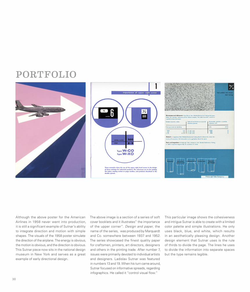
The above image is a section of a series of soft cover booklets and it illustrates” the importance of the upper corner”. Design and paper, the name of the series, was produced by Marquardt and Co. somewhere between 1937 and 1952. The series showcased the finest quality paper for craftsmen, printers, art directors, designers and others in the printing trade. After number 7, issues were primarily devoted to individual artists and designers. Ladislav Sutnar was featured in numbers 13 and 19. When his turn came around, Sutnar focused on informative spreads, regarding infographics. He called it “control visual flow.”
Although the above poster for the American Airlines in 1958 never went into production, it is still a significant example of Sutnar’s ability to integrate direction and motion with simple shapes. The visuals of the 1958 poster simulate the direction of the airplane. The energy is obvious, the motion is obvious, and the direction is obvious. This Sutnar piece now sits in the national design museum in New York and serves as a great example of early directional design.
This particular image shows the cohesiveness and intrigue Sutnar is able to create with a limited color palette and simple illustrations. He only uses black, blue, and white, which results in an aesthetically pleasing design. Another design element that Sutnar uses is the rule of thirds to divide the page. The lines he uses to divide the information into separate spaces but the type remains legible.
30
PORTFOLIO
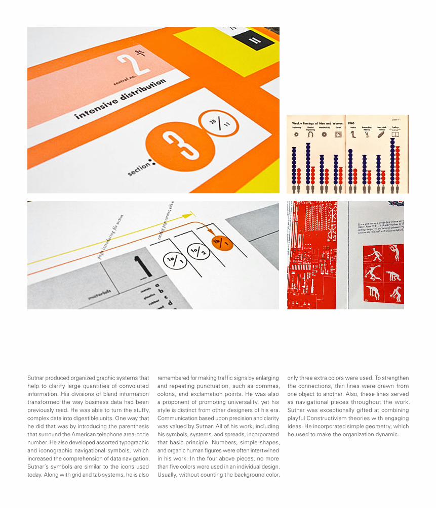
Sutnar produced organized graphic systems that help to clarify large quantities of convoluted information. His divisions of bland information transformed the way business data had been previously read. He was able to turn the stuffy, complex data into digestible units. One way that he did that was by introducing the parenthesis that surround the American telephone area-code number. He also developed assorted typographic and iconographic navigational symbols, which increased the comprehension of data navigation. Sutnar’s symbols are similar to the icons used today. Along with grid and tab systems, he is also
remembered for making traffic signs by enlarging and repeating punctuation, such as commas, colons, and exclamation points. He was also a proponent of promoting universality, yet his style is distinct from other designers of his era. Communication based upon precision and clarity was valued by Sutnar. All of his work, including his symbols, systems, and spreads, incorporated that basic principle. Numbers, simple shapes, and organic human figures were often intertwined in his work. In the four above pieces, no more than five colors were used in an individual design. Usually, without counting the background color,
only three extra colors were used. To strengthen the connections, thin lines were drawn from one object to another. Also, these lines served as navigational pieces throughout the work. Sutnar was exceptionally gifted at combining playful Constructivism theories with engaging ideas. He incorporated simple geometry, which he used to make the organization dynamic.
WEB DESIGN
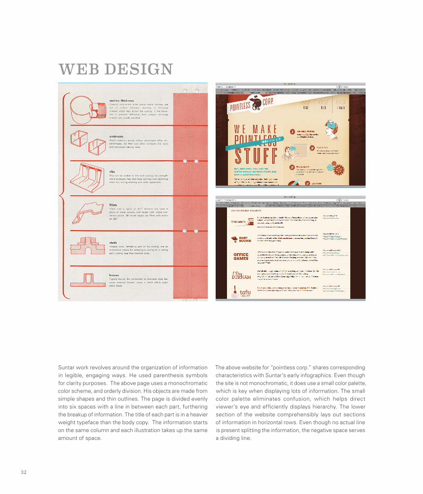
Suntar work revolves around the organization of information in legible, engaging ways. He used parenthesis symbols for clarity purposes. The above page uses a monochromatic color scheme, and orderly division. His objects are made from simple shapes and thin outlines. The page is divided evenly into six spaces with a line in between each part, furthering the breakup of information. The title of each part is in a heavier weight typeface than the body copy. The information starts on the same column and each illustration takes up the same amount of space.
The above website for “pointless corp.” shares corresponding characteristics with Suntar’s early infographics. Even though the site is not monochromatic, it does use a small color palette, which is key when displaying lots of information. The small color palette eliminates confusion, which helps direct viewer’s eye and efficiently displays hierarchy. The lower section of the website comprehensibly lays out sections of information in horizontal rows. Even though no actual line is present splitting the information, the negative space serves a dividing line.
32
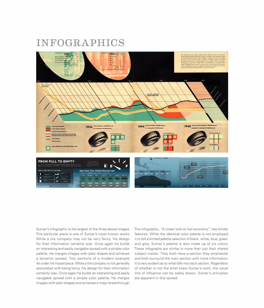
INFOGRAPHICS
Suntar’s infographic is the largest of the three above images. This particular piece is one of Suntar’s most known works. While a tire company may not be very fancy, his design for their information certainly was. Once again he builds an interesting and easily navigable spread with a simple color palette. He merges images with plain shapes and achieves a dynamic spread. Two sections of a modern example lie under his masterpiece. While a tire company is not generally associated with being fancy, his design for their information certainly was. Once again he builds an interesting and easily navigable spread with a simple color palette. He merges images with plain shapes and achieves a major breakthrough.
The infographic, “A closer look at fuel economy”, has similar features. While the identical color palette is not employed, it is still a limited palette selection of black, white, blue, green and grey. Sutnar’s palette is also made up of six colors. These infographs are similar in more than just their shared subject matter. They both have a section they emphasize and both surround the main section with more information. It is very evident as to what falls into each section. Regardless of whether or not the artist knew Suntar’s work, the visual line of influence can be safely drawn. Sutnar’s principles are apparent in this spread.
Robert BrownjohnPioneer of Motion Typography
Brownjohn was born to British parents in New Jersey and had a successful career in both America and Great Britain during the 1950s and 60s. He immediately showed promise as a young design student at the Institute of Design in Chicago, previously The New Bauhaus, where he studied closely with Laszlo Moholy-Nagy. His career ramped up to an early start when he formed the design firm BCG with Ivan Chermayeff and Thomas Geismar. However, that career came to an early end in 1959 with Brownjohn heading to London, the firm became Chermayeff & Geismar.
His career in London proved as successful as his early career in the US with his most notable contributions coming in the film industry. He also worked within several other industries, creating moving graphics for Pirelli and Midland bank and created the cover for the Rolling Stones album Let It Bleed.
A 240 page catalogue by Emily King that was produced for an exhibition detailing Brownjohn’s career entitled “Robert Brownjohn: Sex and Typography” held at the Design Museum in London was also published as a book of the same name. Sex and Typography details the adventures of Brownjohn through detailed information provided by friends and family as well as chronicling his career and the work that he produced.
34
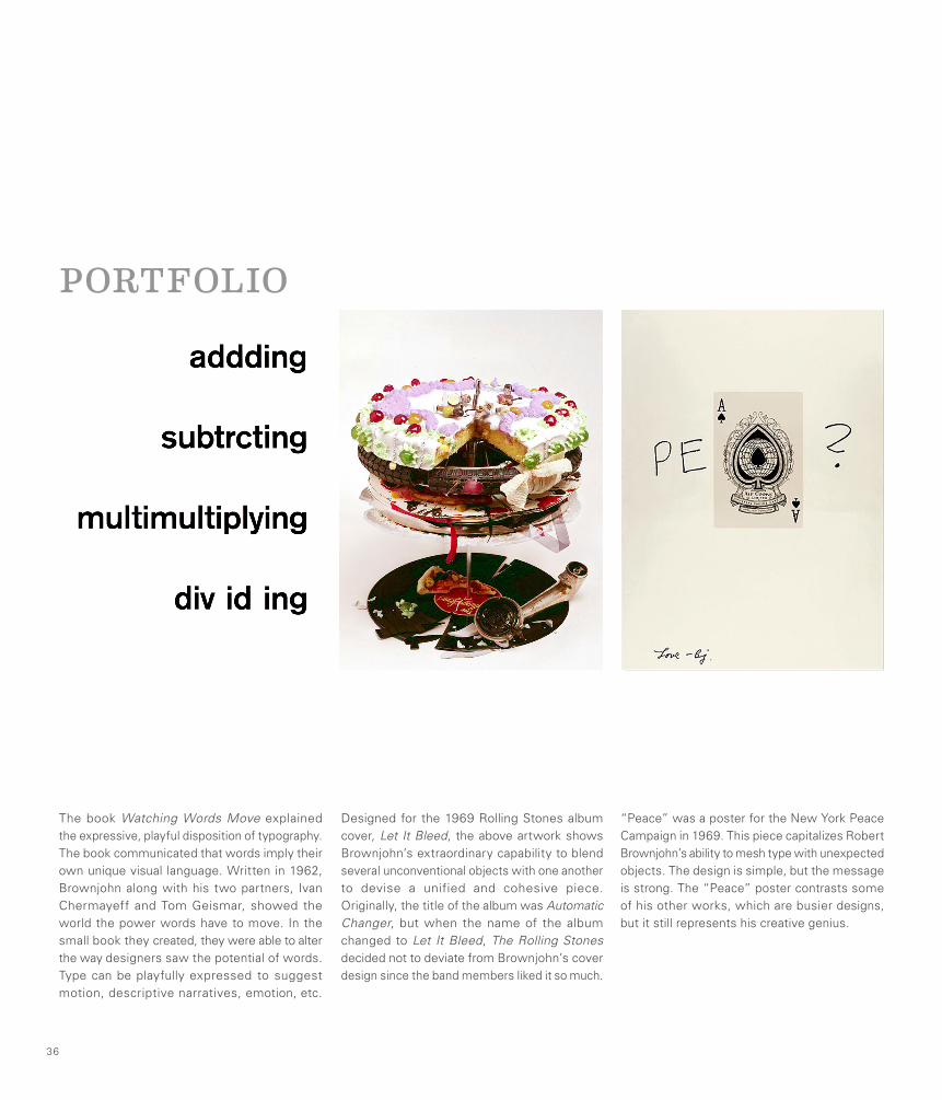
“Peace” was a poster for the New York Peace Campaign in 1969. This piece capitalizes Robert Brownjohn’s ability to mesh type with unexpected objects. The design is simple, but the message is strong. The “Peace” poster contrasts some of his other works, which are busier designs, but it still represents his creative genius.
Designed for the 1969 Rolling Stones album cover, Let It Bleed, the above artwork shows Brownjohn’s extraordinary capability to blend several unconventional objects with one another to devise a unified and cohesive piece. Originally, the title of the album was Automatic Changer, but when the name of the album changed to Let It Bleed, The Rolling Stones decided not to deviate from Brownjohn’s cover design since the band members liked it so much.
The book Watching Words Move explained the expressive, playful disposition of typography. The book communicated that words imply their own unique visual language. Written in 1962, Brownjohn along with his two partners, Ivan Chermayeff and Tom Geismar, showed the world the power words have to move. In the small book they created, they were able to alter the way designers saw the potential of words. Type can be playfully expressed to suggest motion, descriptive narratives, emotion, etc.
36
PORTFOLIO
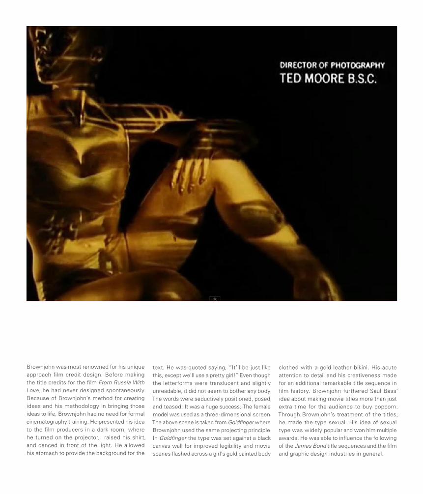
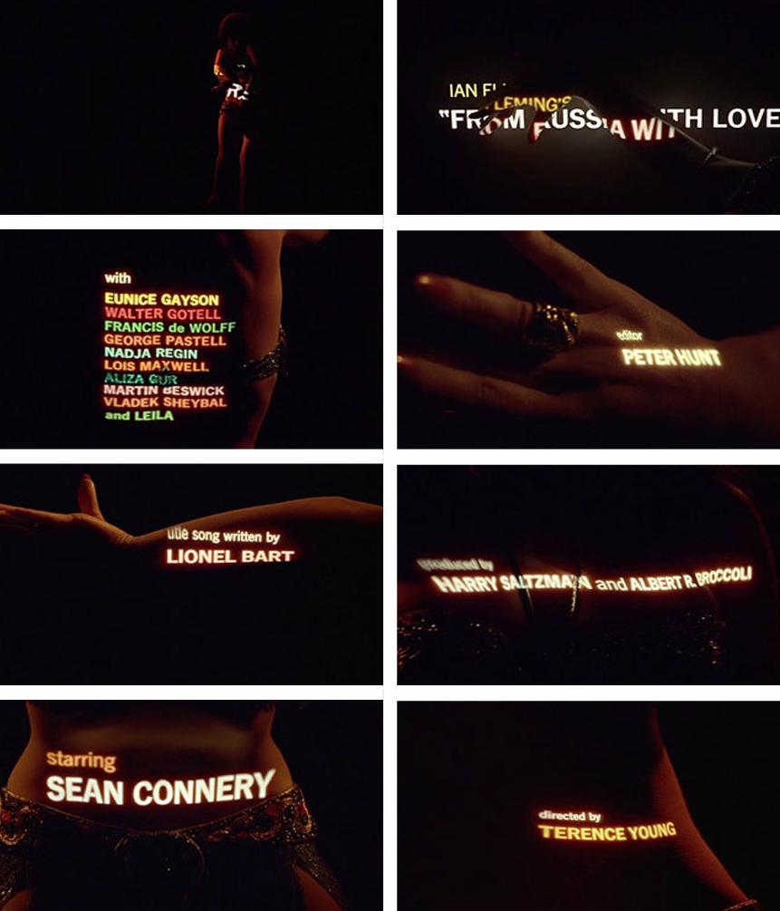
Brownjohn was most renowned for his unique approach film credit design. Before making the title credits for the film From Russia With Love, he had never designed spontaneously. Because of Brownjohn’s method for creating ideas and his methodology in bringing those ideas to life, Brownjohn had no need for formal cinematography training. He presented his idea to the film producers in a dark room, where he turned on the projector, raised his shirt, and danced in front of the light. He allowed his stomach to provide the background for the
text. He was quoted saying, “It’ll be just like this, except we’ll use a pretty girl!” Even though the letterforms were translucent and slightly unreadable, it did not seem to bother any body. The words were seductively positioned, posed, and teased. It was a huge success. The female model was used as a three-dimensional screen. The above scene is taken from Goldfinger where Brownjohn used the same projecting principle. In Goldfinger the type was set against a black canvas wall for improved legibility and movie scenes flashed across a girl’s gold painted body
clothed with a gold leather bikini. His acute attention to detail and his creativeness made for an additional remarkable title sequence in film history. Brownjohn furthered Saul Bass’ idea about making movie titles more than just extra time for the audience to buy popcorn. Through Brownjohn’s treatment of the titles, he made the type sexual. His idea of sexual type was widely popular and won him multiple awards. He was able to influence the following of the James Bond title sequences and the film and graphic design industries in general.
FILM
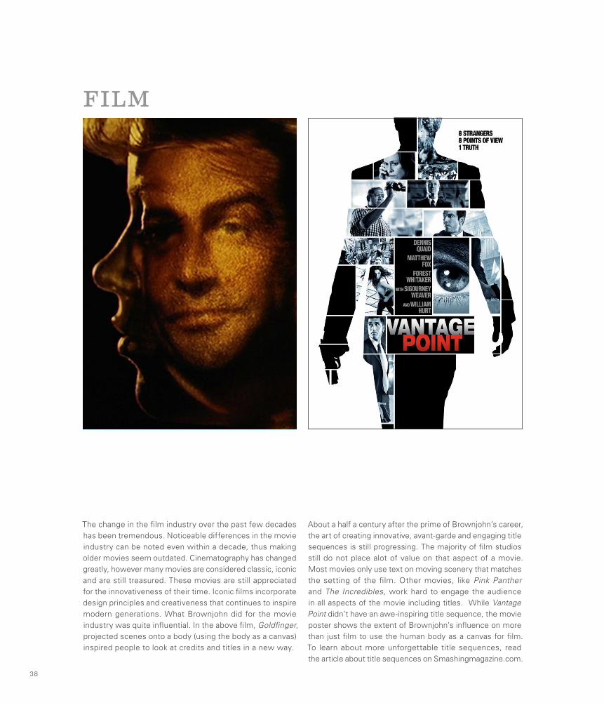
The change in the film industry over the past few decades has been tremendous. Noticeable differences in the movie industry can be noted even within a decade, thus making older movies seem outdated. Cinematography has changed greatly, however many movies are considered classic, iconic and are still treasured. These movies are still appreciated for the innovativeness of their time. Iconic films incorporate design principles and creativeness that continues to inspire modern generations. What Brownjohn did for the movie industry was quite influential. In the above film, Goldfinger, projected scenes onto a body (using the body as a canvas) inspired people to look at credits and titles in a new way.
About a half a century after the prime of Brownjohn’s career, the art of creating innovative, avant-garde and engaging title sequences is still progressing. The majority of film studios still do not place alot of value on that aspect of a movie. Most movies only use text on moving scenery that matches the setting of the film. Other movies, like Pink Panther and The Incredibles, work hard to engage the audience in all aspects of the movie including titles. While Vantage Point didn’t have an awe-inspiring title sequence, the movie poster shows the extent of Brownjohn’s influence on more than just film to use the human body as a canvas for film. To learn about more unforgettable title sequences, read the article about title sequences on Smashingmagazine.com.
38
FASHION
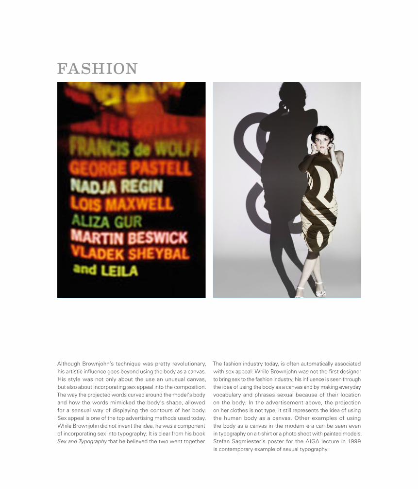
Although Brownjohn’s technique was pretty revolutionary, his artistic influence goes beyond using the body as a canvas. His style was not only about the use an unusual canvas, but also about incorporating sex appeal into the composition. The way the projected words curved around the model’s body and how the words mimicked the body’s shape, allowed for a sensual way of displaying the contours of her body. Sex appeal is one of the top advertising methods used today. While Brownjohn did not invent the idea, he was a component of incorporating sex into typography. It is clear from his book Sex and Typography that he believed the two went together.
The fashion industry today, is often automatically associated with sex appeal. While Brownjohn was not the first designer to bring sex to the fashion industry, his influence is seen through the idea of using the body as a canvas and by making everyday vocabulary and phrases sexual because of their location on the body. In the advertisement above, the projection on her clothes is not type, it still represents the idea of using the human body as a canvas. Other examples of using the body as a canvas in the modern era can be seen even in typography on a t-shirt or a photo shoot with painted models. Stefan Sagmiester’s poster for the AIGA lecture in 1999 is contemporary example of sexual typography.
Bradbury ThompsonExplorer of New Printing Techniques
Bradbury Thompson was truly a master of almost every aspect of the design profession. He studied printing production, was an art director for Mademoiselle magazine, designed books, pushed the boundaries of conventional typography and taught design at Yale University. He designed 60+ issues of Westvaco Inspirations for the Westvaco Paper Corporation. His designs reached thousands of designers, printers and typographers.
Born in 1911 in Topeka, Kansas and educated at Washburn University Thompson stayed in touch with the university throughout his career. From 1969-1979 Thompson worked together with Washburn to create the Washburn Bible. The book was the most significant development in Bible typography since Gutenberg first published his masterpiece in 1455. Another significant point in his career, in the field of typography, was his publication of Alphabet 26, which was labeled as a monoalphabet. It contained only 26 unique characters, case was established by size only instead of entirely new characters (i.e. r/R, e/E, a/A). Thompson’s work garnered him the highest award of every major design organization including AIGA, the Art Directors Club and the Type Directors Club. He died in 1995.
40
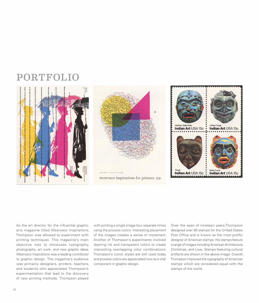
As the art director for the influential graphic arts magazine titled Westvaco Inspirations, Thompson was allowed to experiment with printing techniques. This magazine’s main objective was to showcase typography, photography, art work, and new graphic ideas. Westvaco Inspirations was a leading contributor to graphic design. The magazine’s audience was primarily designers, printers, teachers, and students who appreciated Thompson’s experimentation that lead to the discovery of new printing methods. Thompson played
with printing a single image four separate times using the process colors. Interesting placement of the images creates a sense of movement. Another of Thompson’s experiments involved layering ink and transparent colors to create interesting overlapping color combinations. Thompson’s iconic styles are still used today and process colors are appreciated now as a vital component in graphic design.
Over the span of nineteen years,Thompson designed over 90 stamps for the United States Post Office and is known as the most prolific designer of American stamps. His stamps feature a range of images including American Architecture, Christmas, and Love. Stamps featuring cultural artifacts are shown in the above image. Overall, Thompson improved the typography of American stamps which are considered equal with the stamps of the world.
42
PORTFOLIO
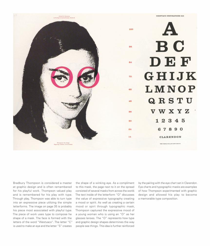
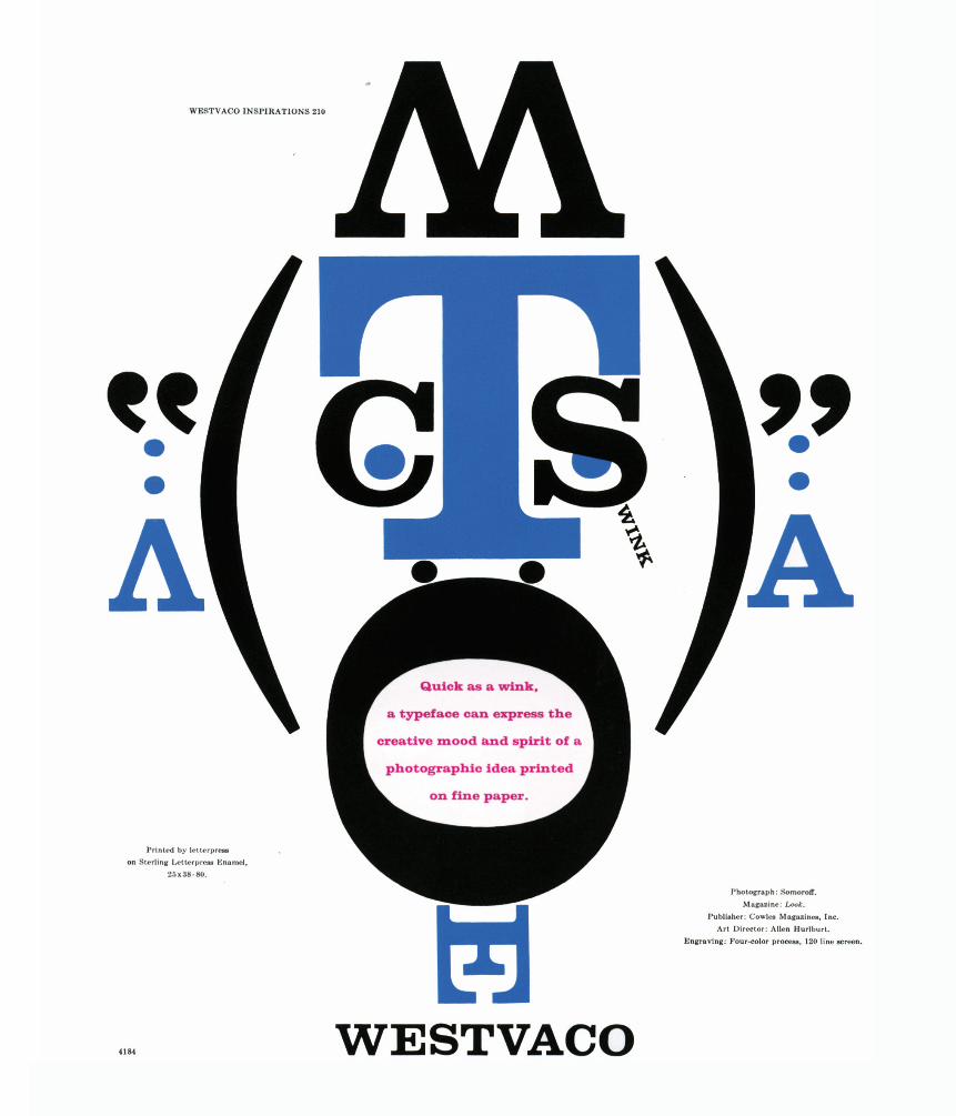
Bradbury Thompson is considered a master at graphic design and is often remembered for his playful work. Thompson valued play and is remembered for his play with type. Through play, Thompson was able to turn type into an expressive piece utilizing the simple letterforms. The image on page 35 is probably his piece most associated with playful type. The piece of work uses type to compose he shape of a mask. The face is formed with the letters of the word “Westvaco”. The letter “C” is used to make an eye and the letter “S” creates
the shape of a winking eye. As a compliment to this mask, the page next to it on the spread consisted of several masks from across the world. The text inside of the letterform “O” discusses the value of expressive typography creating a mood or spirit. As well as creating a certain mood or spirt through typographic mask, Thompson captured the expressive mood of a young woman who is using an “O” as her glasses lenses. The “O” represents how type and graphic design shapes determines the way people see things. This idea is further reinforced
by the pairing with the eye chart set in Clarendon. Eye charts and typographic masks are examples of how Thompson experimented with graphic design and allowed his play to become a memorable type composition.
ARCHITECTURE
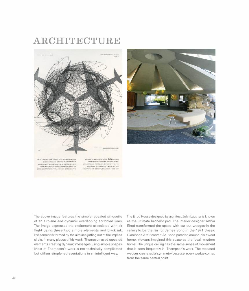
The above image features the simple repeated silhouette of an airplane and dynamic overlapping scribbled lines. The image expresses the excitement associated with air flight using these two simple elements and black ink. Excitement is formed by the airplane jutting out of the implied circle. In many pieces of his work, Thompson used repeated elements creating dynamic messages using simple shapes. Most of Thompson’s work is not technically complicated but utilizes simple representations in an intelligent way.
The Elrod House designed by architect John Lautner is known as the ultimate bachelor pad. The interior designer Arthur Elrod transformed the space with cut out wedges in the ceiling to be the lair for James Bond in the 1971 classic Diamonds Are Forever. As Bond paraded around his sweet home, viewers imagined this space as the ideal modern home. The unique ceiling has the same sense of movement that is seen frequently in Thompson’s work. The repeated wedges create radial symmetry because every wedge comes from the same central point.
44
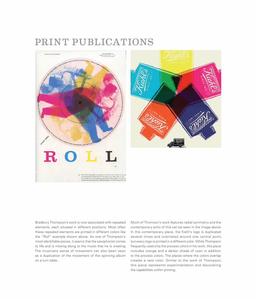
PRINT PUBLICATIONS
Bradbury Thompson’s work is now associated with repeated elements, each situated in different positions. Most often these repeated elements are printed in different colors like the “Roll” example shown above. As one of Thompson’s most identifiable pieces, it seems that the saxophonist comes to life and is moving along to the music that he is creating. The musicians sense of movement can also been seen as a duplication of the movement of the spinning album on a turn table.
Much of Thomson’s work features radial symmetry and the contemporary echo of this can be seen in the image above. In this contemporary piece, the Kiehl’s logo is duplicated several times and orientated around one central point, but every logo is printed in a different color. While Thompson frequently used only the process colors in his work, this piece includes orange and a darker shade of cyan in addition to the process colors. The places where the colors overlap creates a new color. Similar to the work of Thompson, this piece represents experimentation and discovering the capabilities within printing.
Erik NitscheExplorer of Everything
Erik Nitsche left an unmistakable mark on the world of design in his approximately 60 year career. Leaving almost no field untouched, he worked as an art director, book designer, illustrator, typographer, graphic designer, photographer, advertiser, and packaging designer. His graphic design work included magazine covers, signage, film, exhibitions, posters and many other advertising mediums. Before emigrating to the United States in 1934 Nitsche studied at the Collège Classique in Switzerland and the Kunstgewerbeschule in Munich.
His work has a distinctly modernist aesthetic and although he never had the opportunity to attend the Bauhaus Laszlo Moholy-Nagy has been quoted as saying, “Who is this guy that is doing the Bauhaus in New York?” He designed promotional and advertising campaigns for a host of different clients including department stores, feature films, record companies and the New York Transit Authority. Nitsche greatly influenced the young generation of designers in America in the mid-20th century including the legendary designers Walter Bernard and Seymour Chwast.
46
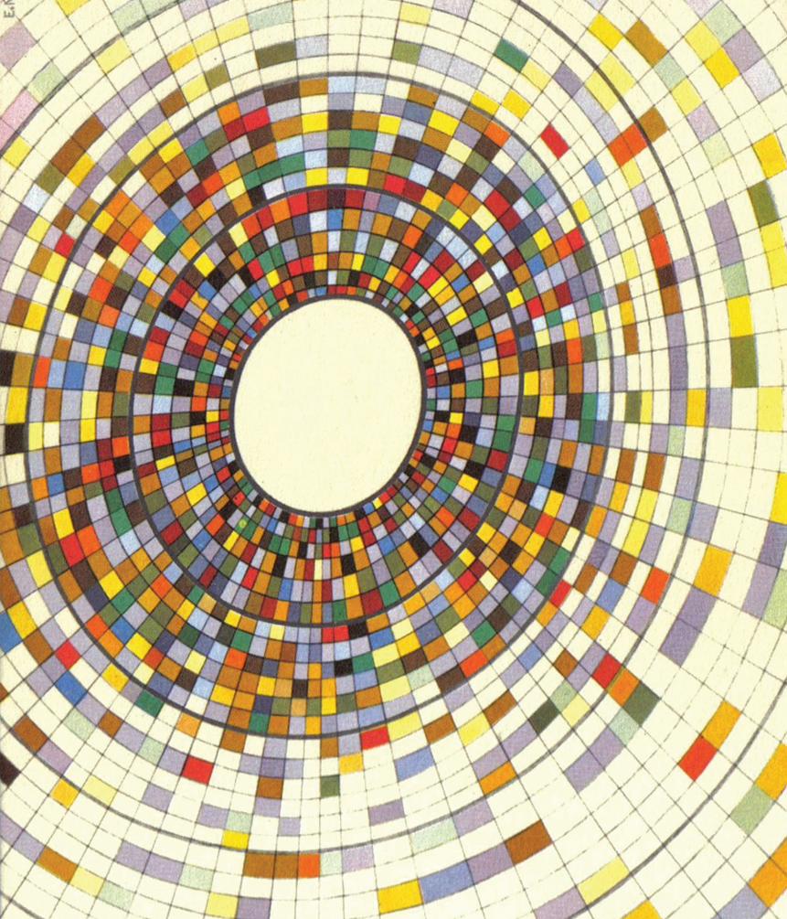
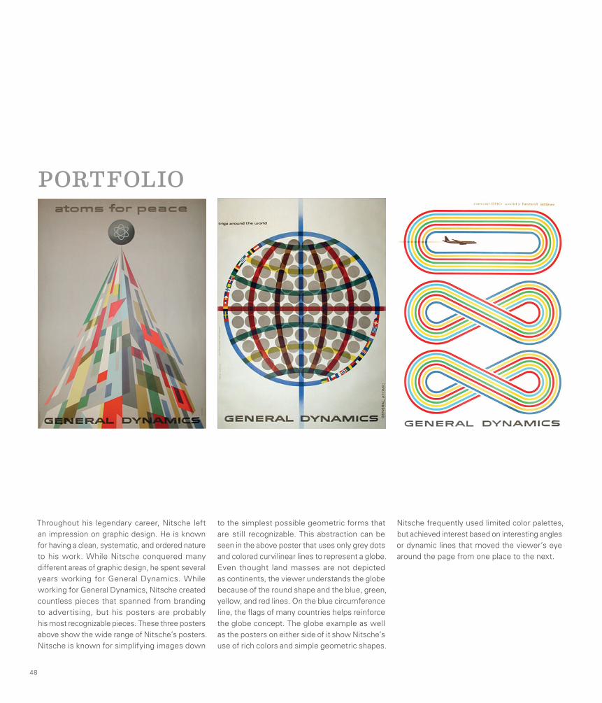
Throughout his legendary career, Nitsche left an impression on graphic design. He is known for having a clean, systematic, and ordered nature to his work. While Nitsche conquered many different areas of graphic design, he spent several years working for General Dynamics. While working for General Dynamics, Nitsche created countless pieces that spanned from branding to advertising, but his posters are probably his most recognizable pieces. These three posters above show the wide range of Nitsche’s posters. Nitsche is known for simplifying images down
to the simplest possible geometric forms that are still recognizable. This abstraction can be seen in the above poster that uses only grey dots and colored curvilinear lines to represent a globe. Even thought land masses are not depicted as continents, the viewer understands the globe because of the round shape and the blue, green, yellow, and red lines. On the blue circumference line, the flags of many countries helps reinforce the globe concept. The globe example as well as the posters on either side of it show Nitsche’s use of rich colors and simple geometric shapes.
Nitsche frequently used limited color palettes, but achieved interest based on interesting angles or dynamic lines that moved the viewer’s eye around the page from one place to the next.
48
PORTFOLIO
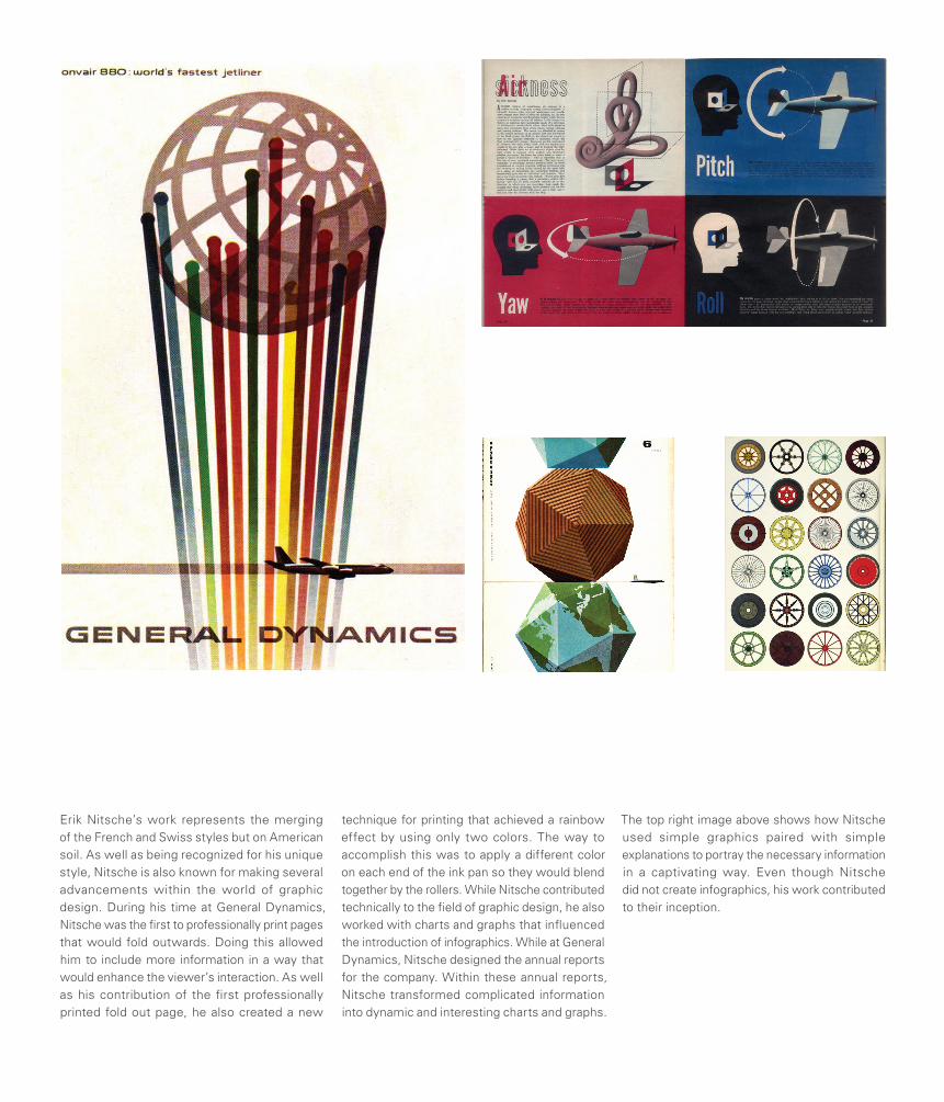
Erik Nitsche’s work represents the merging of the French and Swiss styles but on American soil. As well as being recognized for his unique style, Nitsche is also known for making several advancements within the world of graphic design. During his time at General Dynamics, Nitsche was the first to professionally print pages that would fold outwards. Doing this allowed him to include more information in a way that would enhance the viewer’s interaction. As well as his contribution of the first professionally printed fold out page, he also created a new
technique for printing that achieved a rainbow effect by using only two colors. The way to accomplish this was to apply a different color on each end of the ink pan so they would blend together by the rollers. While Nitsche contributed technically to the field of graphic design, he also worked with charts and graphs that influenced the introduction of infographics. While at General Dynamics, Nitsche designed the annual reports for the company. Within these annual reports, Nitsche transformed complicated information into dynamic and interesting charts and graphs.
The top right image above shows how Nitsche used simple graphics paired with simple explanations to portray the necessary information in a captivating way. Even though Nitsche did not create infographics, his work contributed to their inception.
IDENTITY
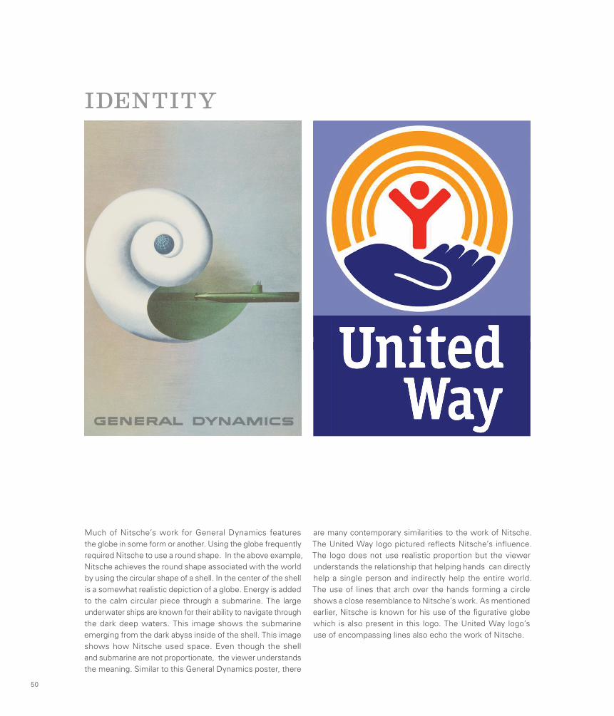
Much of Nitsche’s work for General Dynamics features the globe in some form or another. Using the globe frequently required Nitsche to use a round shape. In the above example, Nitsche achieves the round shape associated with the world by using the circular shape of a shell. In the center of the shell is a somewhat realistic depiction of a globe. Energy is added to the calm circular piece through a submarine. The large underwater ships are known for their ability to navigate through the dark deep waters. This image shows the submarine emerging from the dark abyss inside of the shell. This image shows how Nitsche used space. Even though the shell and submarine are not proportionate, the viewer understands the meaning. Similar to this General Dynamics poster, there
are many contemporary similarities to the work of Nitsche. The United Way logo pictured reflects Nitsche’s influence. The logo does not use realistic proportion but the viewer understands the relationship that helping hands can directly help a single person and indirectly help the entire world. The use of lines that arch over the hands forming a circle shows a close resemblance to Nitsche’s work. As mentioned earlier, Nitsche is known for his use of the figurative globe which is also present in this logo. The United Way logo’s use of encompassing lines also echo the work of Nitsche.
50
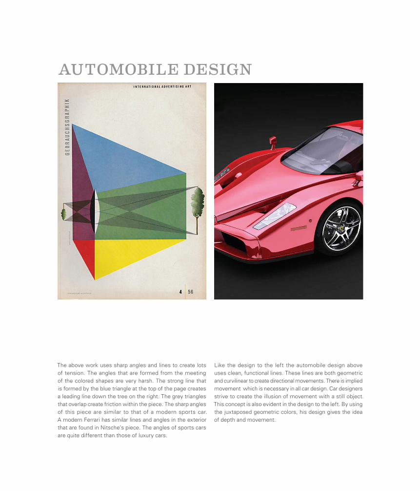
The above work uses sharp angles and lines to create lots of tension. The angles that are formed from the meeting of the colored shapes are very harsh. The strong line that is formed by the blue triangle at the top of the page creates a leading line down the tree on the right. The grey triangles that overlap create friction within the piece. The sharp angles of this piece are similar to that of a modern sports car. A modern Ferrari has similar lines and angles in the exterior that are found in Nitsche’s piece. The angles of sports cars are quite different than those of luxury cars.
AUTOMOBILE DESIGN
Like the design to the left the automobile design above uses clean, functional lines. These lines are both geometric and curvilinear to create directional movements. There is implied movement which is necessary in all car design. Car designers strive to create the illusion of movement with a still object. This concept is also evident in the design to the left. By using the juxtaposed geometric colors, his design gives the idea of depth and movement.
Credits
Dixie Hemingway:
Jacob Mahaffey:
Heidi Pettit:
Collaboration:
Special Thanks:
Publisher’s Note
Adrian Frutiger
Bradbury Thompson
Erik Nitsche
Introduction to Modernism
Table of Contents
Credits
Alex Steinwiess
Lester Beall
Ladislav Sutnar
Robert Brownjohn
Modernism Infographic
LayoutCoverType SettingCopywriting for Responsible Spread
Tim Speaker
Jane Dorn
Emily Weiland
Caryn Scheving
Pip Printing
DesignIsHistory.com
Google Images
Flickr
Jesus Christ


ConnectTo Mid-Century Modernism