Embed Size (px)
Citation preview

© H
oug
hton
Mif
flin
Har
cour
t Pub
lishi
ng
Com
pan
y
Name Class Date
Explore Identifying Attributes of a Function from Its GraphYou can identify several attributes of a function by analyzing its graph. For instance, for the graph shown, you can see that the function’s domain is {x|0 ≤ x ≤ 11} and its range is {y| −1 ≤ y ≤ 1}. Use the graph to explore the function’s other attributes.
AThe values of the function on the interval {x|1 < x < 3} are positive/negative.
B The values of the function on the interval {x|8 < x < 9} are positive/negative.
A function is increasing on an interval if ƒ( x 1 ) < ƒ( x 2 ) when x 1 < x 2 for any x-values x 1 and x 2 from the interval. The graph of a function that is increasing on an interval rises from left to right on that interval. Similarly, a function is decreasing on an interval if ƒ( x 1 ) > ƒ( x 2 ) when x 1 < x 2 for any x-values x 1 and x 2 from the interval. The graph of a function that is decreasing on an interval falls from left to right on that interval.
CThe given function is increasing/decreasing on the interval {x|2 < x < 4}.
DThe given function is increasing/decreasing on the interval {x|4 < x < 6}.
For the two points ( x 1 , ƒ( x 1 )) and ( x 2 , ƒ( x 2 )) on the graph of a function, the average rate of change of the function is the ratio of the change in the function values, ƒ( x 2 ) - ƒ( x 1 ), to the change in the x-values, x 2 - x 1 . For a linear function, the rate of change is constant and represents the slope of the function’s graph.
E What is the given function’s average rate of change on the interval {x|0 ≤ x ≤ 2}?
A function may change from increasing to decreasing or from decreasing to increasing at turning points. The value of ƒ(x) at a point where a function changes from increasing to decreasing is a maximum value. A maximum value occurs at a point that appears higher than all nearby points on the graph of the function. Similarly, the value of ƒ(x) at a point where a function changes from decreasing to increasing is a minimum value. A minimum value occurs at a point that appears lower than all nearby points on the graph of the function.
F At how many points does the given function change from increasing to decreasing?
1.2 Characteristics of Function Graphs
Essential Question: What are some of the attributes of a function, and how are they related to the function’s graph? Resource
Locker
x
y
1 2 3 4 5 6 7 8 9 10 11 12-0.5-1
-1.5
00.51
1.5
3
f(2) − f(1) ______ 2 − 1 = 1 − 0 _____ 2 − 1 = 1 __ 1 = 1
Module 1 17 Lesson 2
DO NOT EDIT--Changes must be made through “File info” CorrectionKey=NL-B;CA-B
A2_MNLESE385894_U1M01L2.indd 17 5/14/14 3:29 PM
Common Core Math StandardsThe student is expected to:
F-IF.B.4
For a function that models a relationship between two quantities, interpret key features ... and sketch graphs showing key features… . Also A-CED.A.2, F-IF.B.6, S-ID.B.6
Mathematical Practices
MP.7 Using Structure
Language Objective Explain to a partner where the local maximum and minimum values are on a graph of a function, and where the zero of a function is located on its graph.
COMMONCORE
COMMONCORE
HARDCOVER PAGES 1322
Turn to these pages to find this lesson in the hardcover student edition.
Characteristics of Function Graphs
ENGAGE Essential Question: What are some of the attributes of a function, and how are they related to the function’s graph?Possible answer: A function may have positive or negative values, indicating whether the graph lies above or below the x-axis. It may increase or decrease on an interval, indicating where the graph rises or falls. It may have local maximum or minimum values, which are the y coordinates of the graph’s turning points. It may have zeros, which are the x coordinates of the points where the graph crosses the x-axis.
PREVIEW: LESSON PERFORMANCE TASKView the online Engage. Have students compare the historical variation in the area/extent of Arctic sea ice with current variation. Then preview the Lesson Performance Task.
17
HARDCOVER
Turn to these pages to find this lesson in the hardcover student edition.
© H
ough
ton
Mif
flin
Har
cour
t Pub
lishi
ng C
omp
any
Name
Class Date
Explore Identifying Attributes of a Function from Its Graph
You can identify several attributes of a function by analyzing its
graph. For instance, for the graph shown, you can see that the
function’s domain is {x|0 ≤ x ≤ 11} and its range is {y| −1 ≤ y ≤ 1}.
Use the graph to explore the function’s other attributes.
The values of the function on the interval {x|1 < x < 3}
are positive/negative.
The values of the function on the interval {x|8 < x < 9} are positive/negative.
A function is increasing on an interval if ƒ( x 1 ) < ƒ( x 2 ) when x 1 < x 2 for any x-values x 1 and x 2 from the interval.
The graph of a function that is increasing on an interval rises from left to right on that interval. Similarly, a function
is decreasing on an interval if ƒ( x 1 ) > ƒ( x 2 ) when x 1 < x 2 for any x-values x 1 and x 2 from the interval. The graph
of a function that is decreasing on an interval falls from left to right on that interval.
The given function is increasing/decreasing on the interval {x|2 < x < 4}.
The given function is increasing/decreasing on the interval {x|4 < x < 6}.
For the two points ( x 1 , ƒ( x 1 )) and ( x 2 , ƒ( x 2 )) on the graph of a function, the average rate of change of the function
is the ratio of the change in the function values, ƒ( x 2 ) - ƒ( x 1 ), to the change in the x-values, x 2 - x 1. For a linear
function, the rate of change is constant and represents the slope of the function’s graph.
What is the given function’s average rate of change on the interval {x|0 ≤ x ≤ 2}?
A function may change from increasing to decreasing or from decreasing to increasing at turning points. The value
of ƒ(x) at a point where a function changes from increasing to decreasing is a maximum value. A maximum value
occurs at a point that appears higher than all nearby points on the graph of the function. Similarly, the value of ƒ(x)
at a point where a function changes from decreasing to increasing is a minimum value. A minimum value occurs at a
point that appears lower than all nearby points on the graph of the function.
At how many points does the given function change from increasing to decreasing?
1 . 2 Characteristics of
Function Graphs
Essential Question: What are some of the attributes of a function, and how are they related
to the function’s graph?
Resource
Locker
F-IF.B.4 For a function that models a relationship between two quantities, interpret key features
… and sketch graphs showing key features… . Also A-CED.A.2, F-IF.B.6, S-ID.B.6
COMMONCORE
x
y
1 2 3 4 5 6 7 8 9 10 11 12
-0.5-1-1.5
00.51
1.5
3
f(2) − f(1)
______ 2 − 1
= 1 − 0 _____ 2 − 1
= 1 __ 1 = 1
Module 1
17
Lesson 2
DO NOT EDIT--Changes must be made through “File info”
CorrectionKey=NL-B;CA-B
A2_MNLESE385894_U1M01L2 17
5/15/14 4:06 AM
17 Lesson 1 . 2
L E S S O N 1 . 2
DO NOT EDIT--Changes must be made through “File info”CorrectionKey=NL-C;CA-C

© H
oug
hton Mifflin H
arcourt Publishin
g Com
pany
What is the function’s value at these points?
At how many points does the given function change from decreasing to increasing?
What is the function’s value at these points?
A zero of a function is a value of x for which ƒ(x) = 0. On a graph of the function, the zeros are the x-intercepts.
How many x-intercepts does the given function’s graph have?
Identify the zeros of the function.
Reflect
1. Discussion Identify three different intervals that have the same average rate of change, and state what the rate of change is.
2. Discussion If a function is increasing on an interval {x|a ≤ x ≤ b}, what can you say about its average rate of change on the interval? Explain.
Explain 1 Sketching a Function’s Graph from a Verbal Description
By understanding the attributes of a function, you can sketch a graph from a verbal description.
Example 1 Sketch a graph of the following verbal descriptions.
Lyme disease is a bacterial infection transmitted to humans by ticks. When an infected tick bites a human, the probability of transmission is a function of the time since the tick attached itself to the skin. During the first 24 hours, the probability is 0%. During the next three 24-hour periods, the rate of change in the probability is always positive, but it is much greater for the middle period than the other two periods. After 96 hours, the probability is almost 100%. Sketch a graph of the function for the probability of transmission.
Identify the axes and scales.
The x-axis will be time (in hours) and will run from 0 to at least 96. The y-axis will be the probability of infection (as a percent) from 0 to 100.
x
y
24 48 72
Time tick attached (h)
Probability of Transmissionfrom Infected Tick
96 1200
102030405060
Prob
abili
ty (%
)
708090
100
1
2
-1
6
1, 3, 5, 7, 9, 11
Possible answers: The intervals {x|0 ≤ x ≤ 2}, {x|4 ≤ x ≤ 6}, and {x|8 ≤ x ≤ 10} all have
a rate of change of 1. The intervals {x|2 ≤ x ≤ 4}, {x|6 ≤ x ≤ 8}, and {x|10 ≤ x ≤ 11} all
have a rate of change of −1.
The average rate of change is positive, because the change in function values, f(b) − f(a),
must be positive. Since the change in x-values, b − a, is also positive, the ratio of f(b) −f(a)
to b − a is positive.
Module 1 18 Lesson 2
DO NOT EDIT--Changes must be made through “File info”CorrectionKey=NL-B;CA-B
DO NOT EDIT--Changes must be made through “File info”CorrectionKey=NL-B;CA-B
A2_MNLESE385894_U1M01L2 18 10/17/14 3:02 PM
Integrate Mathematical PracticesThis lesson provides an opportunity to address Mathematical Practice MP.7, which calls for students to find different ways of seeing situations by looking for patterns and making “use of structures.” Students learn how the attributes of functions are represented graphically. They also learn how the graph of a set of data can be used to generate a function that approximates the data and can be used to make predictions about additional data points. Through these processes, students learn to make connections between functions and the situations they represent.
PROFESSIONAL DEVELOPMENT
EXPLORE Identifying Attributes of a Function from its Graph
INTEGRATE TECHNOLOGYStudents have the option of completing the Explore activity either in the book or online.
QUESTIONING STRATEGIESWhat types of functions have no maximum or minimum values? linear functions of the
form f (x) = mx + b
What types of functions have either a maximum value or a minimum value, but not
both? functions whose graphs are U-shaped (or ⋂-shaped), such as quadratic functions
EXPLAIN 1 Sketching a Function’s Graph from a Verbal Description
QUESTIONING STRATEGIESHow does a graph depict an increase or decrease in the rate of change of a function?
If the rate of change increases, the graph becomes steeper. If it decreases, the graph becomes less steep.
Characteristics of Function Graphs 18
DO NOT EDIT--Changes must be made through “File info”CorrectionKey=NL-C;CA-C
© H
oug
hton
Mif
flin
Har
cour
t Pub
lishi
ng
Com
pan
y
Identify key intervals.
The intervals are in increments of 24 hours: 0 to 24, 24 to 48, 48 to 72, 72 to 96, and 96 to 120.
Sketch the graph of the function.
Draw a horizontal segment at y = 0 for the first 24-hour interval. The function increases over the next three 24-hour intervals with the middle interval having the greatest increase (the steepest slope). After 96 hours, the graph is nearly horizontal at 100%.
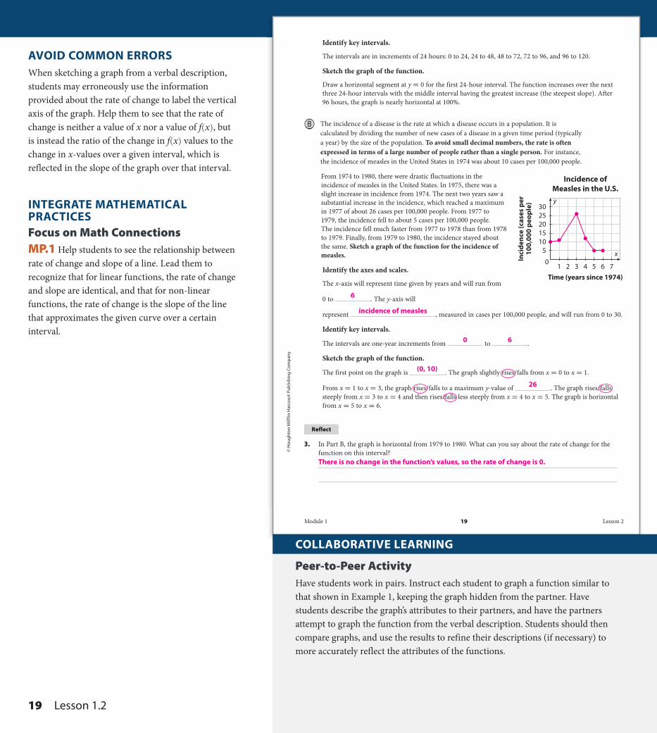
B The incidence of a disease is the rate at which a disease occurs in a population. It is calculated by dividing the number of new cases of a disease in a given time period (typically a year) by the size of the population. To avoid small decimal numbers, the rate is often expressed in terms of a large number of people rather than a single person. For instance, the incidence of measles in the United States in 1974 was about 10 cases per 100,000 people.
From 1974 to 1980, there were drastic fluctuations in the incidence of measles in the United States. In 1975, there was a slight increase in incidence from 1974. The next two years saw a substantial increase in the incidence, which reached a maximum in 1977 of about 26 cases per 100,000 people. From 1977 to 1979, the incidence fell to about 5 cases per 100,000 people. The incidence fell much faster from 1977 to 1978 than from 1978 to 1979. Finally, from 1979 to 1980, the incidence stayed about the same. Sketch a graph of the function for the incidence of measles.
Identify the axes and scales.
The x-axis will represent time given by years and will run from
0 to . The y-axis will
represent , measured in cases per 100,000 people, and will run from 0 to 30.
Identify key intervals.
The intervals are one-year increments from to .
Sketch the graph of the function.
The first point on the graph is . The graph slightly rises/falls from x = 0 to x = 1.
From x = 1 to x = 3, the graph rises/falls to a maximum y-value of . The graph rises/falls steeply from x = 3 to x = 4 and then rises/falls less steeply from x = 4 to x = 5. The graph is horizontal from x = 5 to x = 6.
Reflect
3. In Part B, the graph is horizontal from 1979 to 1980. What can you say about the rate of change for the function on this interval?
y
x
1 2 3 4 5 6 7Time (years since 1974)
0
51015202530
Inci
denc
e (c
ases
per
100,
000
peop
le)
Incidence ofMeasles in the U.S.
There is no change in the function’s values, so the rate of change is 0.
6
0 6
26
(0, 10)
incidence of measles
Module 1 19 Lesson 2
DO NOT EDIT--Changes must be made through “File info” CorrectionKey=NL-B;CA-B
A2_MNLESE385894_U1M01L2.indd 19 5/14/14 3:29 PM
COLLABORATIVE LEARNING
Peer-to-Peer ActivityHave students work in pairs. Instruct each student to graph a function similar to that shown in Example 1, keeping the graph hidden from the partner. Have students describe the graph’s attributes to their partners, and have the partners attempt to graph the function from the verbal description. Students should then compare graphs, and use the results to refine their descriptions (if necessary) to more accurately reflect the attributes of the functions.
AVOID COMMON ERRORSWhen sketching a graph from a verbal description, students may erroneously use the information provided about the rate of change to label the vertical axis of the graph. Help them to see that the rate of change is neither a value of x nor a value of f (x) , but is instead the ratio of the change in f (x) values to the change in x-values over a given interval, which is reflected in the slope of the graph over that interval.
INTEGRATE MATHEMATICAL PRACTICESFocus on Math ConnectionsMP.1 Help students to see the relationship between rate of change and slope of a line. Lead them to recognize that for linear functions, the rate of change and slope are identical, and that for non-linear functions, the rate of change is the slope of the line that approximates the given curve over a certain interval.
19 Lesson 1 . 2
DO NOT EDIT--Changes must be made through “File info”CorrectionKey=NL-C;CA-C
© H
oug
hton Mifflin H
arcourt Publishin
g Com
pany
Your Turn
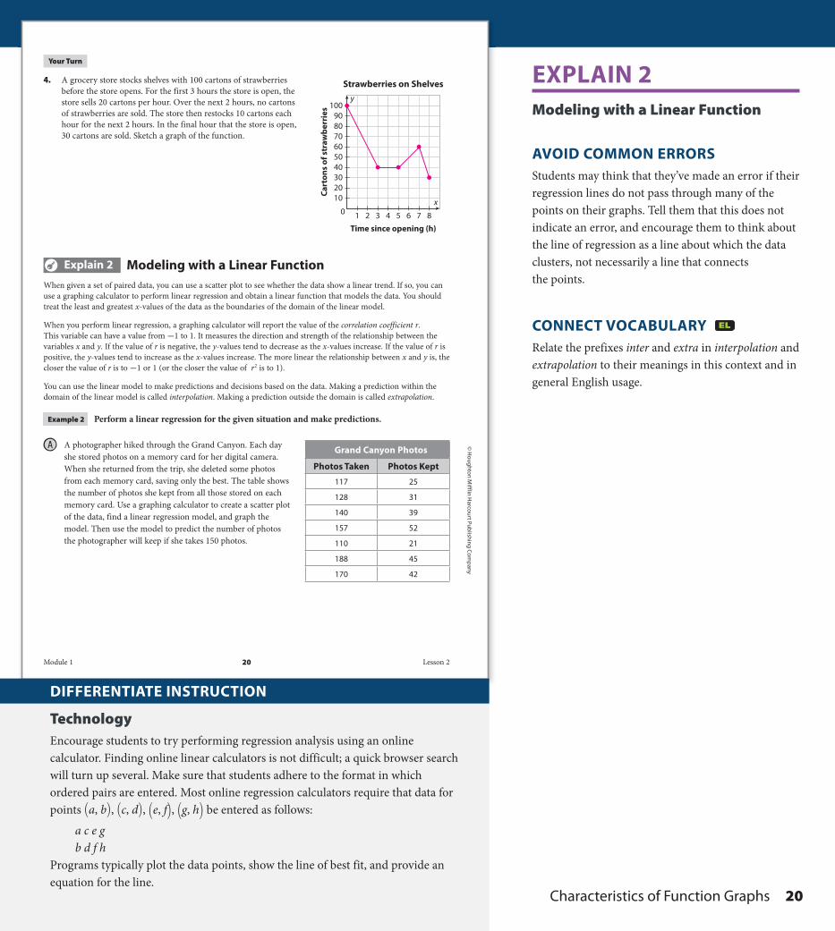
4. A grocery store stocks shelves with 100 cartons of strawberries before the store opens. For the first 3 hours the store is open, the store sells 20 cartons per hour. Over the next 2 hours, no cartons of strawberries are sold. The store then restocks 10 cartons each hour for the next 2 hours. In the final hour that the store is open, 30 cartons are sold. Sketch a graph of the function.
Explain 2 Modeling with a Linear FunctionWhen given a set of paired data, you can use a scatter plot to see whether the data show a linear trend. If so, you can use a graphing calculator to perform linear regression and obtain a linear function that models the data. You should treat the least and greatest x-values of the data as the boundaries of the domain of the linear model.
When you perform linear regression, a graphing calculator will report the value of the correlation coefficient r. This variable can have a value from -1 to 1. It measures the direction and strength of the relationship between the variables x and y. If the value of r is negative, the y-values tend to decrease as the x-values increase. If the value of r is positive, the y-values tend to increase as the x-values increase. The more linear the relationship between x and y is, the closer the value of r is to -1 or 1 (or the closer the value of r 2 is to 1).
You can use the linear model to make predictions and decisions based on the data. Making a prediction within the domain of the linear model is called interpolation. Making a prediction outside the domain is called extrapolation.
Example 2 Perform a linear regression for the given situation and make predictions.
A photographer hiked through the Grand Canyon. Each day she stored photos on a memory card for her digital camera. When she returned from the trip, she deleted some photos from each memory card, saving only the best. The table shows the number of photos she kept from all those stored on each memory card. Use a graphing calculator to create a scatter plot of the data, find a linear regression model, and graph the model. Then use the model to predict the number of photos the photographer will keep if she takes 150 photos.
Grand Canyon Photos
Photos Taken Photos Kept
117 25
128 31
140 39
157 52
110 21
188 45
170 42
x
y
1 2 3 4 5 6 7 8
Time since opening (h)
0
102030405060708090
100
Cart
ons
of s
traw
berr
ies
Strawberries on Shelves
Module 1 20 Lesson 2
DO NOT EDIT--Changes must be made through “File info”CorrectionKey=NL-B;CA-B
DO NOT EDIT--Changes must be made through “File info”CorrectionKey=NL-B;CA-B
A2_MNLESE385894_U1M01L2.indd 20 5/14/14 3:30 PM
DIFFERENTIATE INSTRUCTION
TechnologyEncourage students to try performing regression analysis using an online calculator. Finding online linear calculators is not difficult; a quick browser search will turn up several. Make sure that students adhere to the format in which ordered pairs are entered. Most online regression calculators require that data for points (a, b) , (c, d) , (e, f) , (g, h) be entered as follows:
a c e gb d f h
Programs typically plot the data points, show the line of best fit, and provide an equation for the line.
EXPLAIN 2 Modeling with a Linear Function
AVOID COMMON ERRORSStudents may think that they’ve made an error if their regression lines do not pass through many of the points on their graphs. Tell them that this does not indicate an error, and encourage them to think about the line of regression as a line about which the data clusters, not necessarily a line that connects the points.
CONNECT VOCABULARY Relate the prefixes inter and extra in interpolation and extrapolation to their meanings in this context and in general English usage.
Characteristics of Function Graphs 20
DO NOT EDIT--Changes must be made through “File info”CorrectionKey=NL-C;CA-C
© H
oug
hton
Mif
flin
Har
cour
t Pub
lishi
ng
Com
pan
y
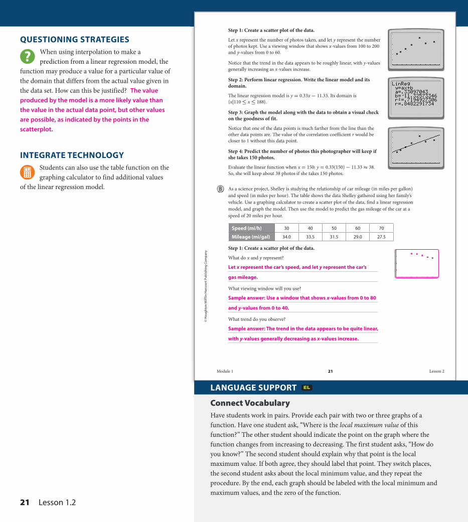
Step 1: Create a scatter plot of the data.
Let x represent the number of photos taken, and let y represent the number of photos kept. Use a viewing window that shows x-values from 100 to 200 and y-values from 0 to 60.
Notice that the trend in the data appears to be roughly linear, with y-values generally increasing as x-values increase.
Step 2: Perform linear regression. Write the linear model and its domain.
The linear regression model is y = 0.33x - 11.33. Its domain is {x|110 ≤ x ≤ 188}.
Step 3: Graph the model along with the data to obtain a visual check on the goodness of fit.
Notice that one of the data points is much farther from the line than the other data points are. The value of the correlation coefficient r would be closer to 1 without this data point.
Step 4: Predict the number of photos this photographer will keep if she takes 150 photos.
Evaluate the linear function when x = 150: y = 0.33(150) - 11.33 ≈ 38. So, she will keep about 38 photos if she takes 150 photos.
As a science project, Shelley is studying the relationship of car mileage (in miles per gallon) and speed (in miles per hour). The table shows the data Shelley gathered using her family’s vehicle. Use a graphing calculator to create a scatter plot of the data, find a linear regression model, and graph the model. Then use the model to predict the gas mileage of the car at a speed of 20 miles per hour.
Speed (mi/h) 30 40 50 60 70
Mileage (mi/gal) 34.0 33.5 31.5 29.0 27.5
Step 1: Create a scatter plot of the data.
What do x and y represent?
What viewing window will you use?
What trend do you observe?
Let x represent the car’s speed, and let y represent the car’s
gas mileage.
Sample answer: Use a window that shows x-values from 0 to 80
and y-values from 0 to 40.
Sample answer: The trend in the data appears to be quite linear,
with y-values generally decreasing as x-values increase.
Module 1 21 Lesson 2
DO NOT EDIT--Changes must be made through “File info”CorrectionKey=NL-A;CA-A
A2_MNLESE385894_U1M01L2.indd 21 3/27/14 10:09 AM
QUESTIONING STRATEGIESWhen using interpolation to make a prediction from a linear regression model, the
function may produce a value for a particular value of the domain that differs from the actual value given in the data set. How can this be justified? The value produced by the model is a more likely value than the value in the actual data point, but other values are possible, as indicated by the points in the scatterplot.
INTEGRATE TECHNOLOGYStudents can also use the table function on the graphing calculator to find additional values
of the linear regression model.
LANGUAGE SUPPORT
Connect VocabularyHave students work in pairs. Provide each pair with two or three graphs of a function. Have one student ask, “Where is the local maximum value of this function?” The other student should indicate the point on the graph where the function changes from increasing to decreasing. The first student asks, “How do you know?” The second student should explain why that point is the local maximum value. If both agree, they should label that point. They switch places, the second student asks about the local minimum value, and they repeat the procedure. By the end, each graph should be labeled with the local minimum and maximum values, and the zero of the function.
21 Lesson 1 . 2
DO NOT EDIT--Changes must be made through “File info”CorrectionKey=NL-C;CA-C

© H
oug
hton Mifflin H
arcourt Publishin
g Com
pany
Step 2: Perform linear regression. Write the linear model and its domain.
Step 3: Graph the model along with the data to obtain a visual check on the goodness of fit.
What can you say about the goodness of fit?
Step 4: Predict the gas mileage of the car at a speed of 20 miles per hour.
Reflect
5. Identify whether each prediction in Parts A and B is an interpolation or an extrapolation.
Your Turn
6. Vern created a website for his school’s sports teams. He has a hit counter on his site that lets him know how many people have visited the site. The table shows the number of hits the site received each day for the first two weeks. Use a graphing calculator to find the linear regression model. Then predict how many hits there will be on day 15.
Day 1 2 3 4 5 6 7 8 9 10 11 12 13 14
Hits 5 10 21 24 28 36 33 21 27 40 46 50 31 38
Evaluate the linear function when x = 20:
y = −0.175(20) + 39.85 ≈ 36.4. So, the car’s gas
mileage should be about 36.4 mi/gal at a speed of 20 mi/h.
Sample answer: As expected from the fact that the value of r from
Step 2 is very close to -1, the line passes through or comes close
to passing through all the data points.
In Part A, the prediction is an interpolation. In Part B, the prediction is an extrapolation.
The linear regression model is y = 2.4x + 11 where x represents the day and
y represents the number of hits. The model predicts that on day 15 there will be
y = 2.4(15) + 11 = 47 hits.
The linear regression model is y = −0.175x + 39.85. Its domain
is {x|30 ≤ x ≤ 70}.
Module 1 22 Lesson 2
DO NOT EDIT--Changes must be made through “File info” CorrectionKey=NL-A;CA-A
DO NOT EDIT--Changes must be made through “File info” CorrectionKey=NL-A;CA-A
A2_MNLESE385894_U1M01L2.indd 22 3/27/14 10:10 AM
Characteristics of Function Graphs 22
DO NOT EDIT--Changes must be made through “File info”CorrectionKey=NL-C;CA-C
© H
oug
hton
Mif
flin
Har
cour
t Pub
lishi
ng
Com
pan
y
Elaborate
7. How are the attributes of increasing and decreasing related to average rate of change? How are the attributes of maximum and minimum values related to the attributes of increasing and decreasing?
8. How can line segments be used to sketch graphs of functions that model real-world situations?
9. When making predictions based on a linear model, would you expect interpolated or extrapolated values to be more accurate? Justify your answer.
10. Essential Question Check-In What are some of the attributes of a function?
If a function is increasing on an interval, then the average rate of change will be positive.
If a function is decreasing on an interval, then the average rate of change will be negative.
A maximum value occurs when the function changes from increasing to decreasing.
A minimum value occurs when the function changes from decreasing to increasing.
Line segments can be used to connect known data points. Connecting the points will
provide a rough sketch of the function represented.
Interpolated values would be more accurate because they are within the domain of the
model. Extrapolated values assume that the model still applies outside its domain, but
that assumption may be incorrect.
Possible answer: A function may have positive or negative values on specific intervals. It
also may be increasing or decreasing on specific intervals. A function may have maximum
or minimum values as well as zeros.
Module 1 23 Lesson 2
DO NOT EDIT--Changes must be made through “File info” CorrectionKey=NL-B;CA-B
A2_MNLESE385894_U1M01L2.indd 23 5/14/14 3:30 PM
ELABORATE INTEGRATE MATHEMATICAL PRACTICESFocus on Critical ThinkingMP.3 Discuss with students the fact that not all data is suitable for representation by a linear regression model. Ask them to tell how they might go about determining the best type of regression model to use for a particular set of data.
QUESTIONING STRATEGIESWhen are values found through extrapolation most accurate? when the values of x are
close in value to the values of the given domain
SUMMARIZE THE LESSONWhat are some of the attributes of a function that you can determine from its graph? You
can tell whether the function has a maximum value, a minimum value, and local maximum and minimum values. You can tell over which intervals the function increases or decreases. You can find the zeros of the function, and also determine the average rate of change.
23 Lesson 1 . 2
DO NOT EDIT--Changes must be made through “File info”CorrectionKey=NL-C;CA-C
© H
oug
hton Mifflin H
arcourt Publishin
g Com
pany
• Online Homework• Hints and Help• Extra Practice
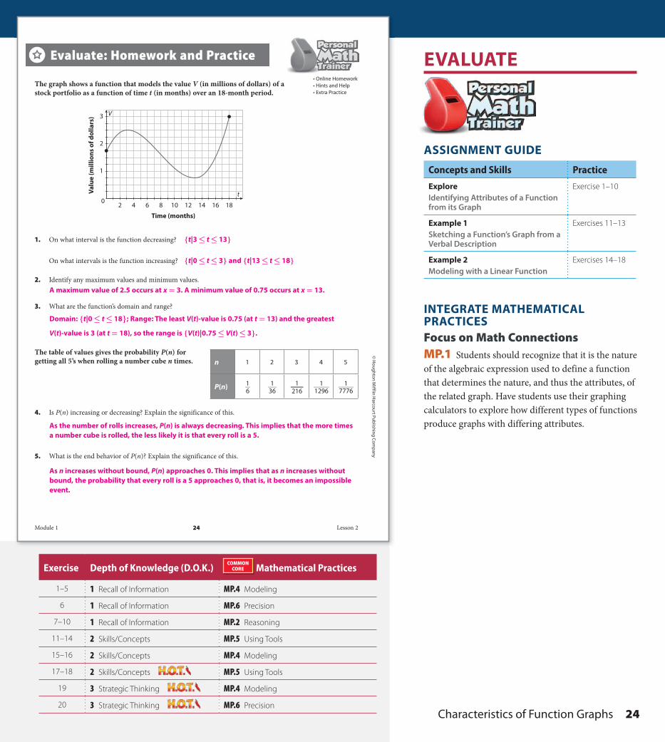
The graph shows a function that models the value V (in millions of dollars) of a stock portfolio as a function of time t (in months) over an 18-month period.
1. On what interval is the function decreasing?
On what intervals is the function increasing?
2. Identify any maximum values and minimum values.
3. What are the function’s domain and range?
The table of values gives the probability P(n) for getting all 5’s when rolling a number cube n times.
4. Is P(n) increasing or decreasing? Explain the significance of this.
5. What is the end behavior of P(n)? Explain the significance of this.
Evaluate: Homework and Practice
n 1 2 3 4 5
P(n) 1 _ 6
1 _ 36
1 _ 216
1 _ 1296
1 _ 7776
0
1
2
3
2 4 8 10 12 14 16 186
t
Time (months)
Valu
e (m
illio
ns o
f dol
lars
) V
{t|0 ≤ t ≤ 3} and {t|13 ≤ t ≤ 18}
A maximum value of 2.5 occurs at x = 3. A minimum value of 0.75 occurs at x = 13.
As the number of rolls increases, P(n) is always decreasing. This implies that the more times a number cube is rolled, the less likely it is that every roll is a 5.
As n increases without bound, P(n) approaches 0. This implies that as n increases without bound, the probability that every roll is a 5 approaches 0, that is, it becomes an impossible event.
Domain: {t|0 ≤ t ≤ 18}; Range: The least V(t)-value is 0.75 (at t = 13) and the greatest
V(t)-value is 3 (at t = 18 ), so the range is {V(t)|0.75 ≤ V(t) ≤ 3}.
{t|3 ≤ t ≤ 13}
Module 1 24 Lesson 2
DO NOT EDIT--Changes must be made through “File info”CorrectionKey=NL-C;CA-C
DO NOT EDIT--Changes must be made through “File info”CorrectionKey=NL-C;CA-C
A2_MNLESE385894_U1M01L2 24 6/8/15 11:33 AMExercise Depth of Knowledge (D.O.K.)COMMONCORE Mathematical Practices
1–5 1 Recall of Information MP.4 Modeling
6 1 Recall of Information MP.6 Precision
7–10 1 Recall of Information MP.2 Reasoning
11–14 2 Skills/Concepts MP.5 Using Tools
15–16 2 Skills/Concepts MP.4 Modeling
17–18 2 Skills/Concepts MP.5 Using Tools
19 3 Strategic Thinking MP.4 Modeling
20 3 Strategic Thinking MP.6 Precision
EVALUATE
ASSIGNMENT GUIDE
Concepts and Skills Practice
ExploreIdentifying Attributes of a Function from its Graph
Exercise 1–10
Example 1Sketching a Function’s Graph from a Verbal Description
Exercises 11–13
Example 2Modeling with a Linear Function
Exercises 14–18
INTEGRATE MATHEMATICAL PRACTICESFocus on Math ConnectionsMP.1 Students should recognize that it is the nature of the algebraic expression used to define a function that determines the nature, and thus the attributes, of the related graph. Have students use their graphing calculators to explore how different types of functions produce graphs with differing attributes.
Characteristics of Function Graphs 24
DO NOT EDIT--Changes must be made through “File info”CorrectionKey=NL-C;CA-C

© H
oug
hton
Mif
flin
Har
cour
t Pub
lishi
ng
Com
pan
y
6. The table shows some values of a function. On which intervals is the function’s average rate of change positive? Select all that apply.
x 0 1 2 3
f(x) 50 75 40 65
a. From x = 0 to x = 1
b. From x = 0 to x = 2
c. From x = 0 to x = 3
d. From x = 1 to x = 2
e. From x = 1 to x = 3
f. From x = 2 to x = 3
Use the graph of the function ƒ (x) to identify the function’s specified attributes.
7. Find the function’s average rate of change over each interval.
a. From x = -3 to x = -2
c. From x = 0 to x = 1
e. From x = -1 to x = 0
b. From x = -2 to x = 1
d. From x = 1 to x = 2
f. From x = -1 to x = 2
8. On what intervals are the function’s values positive?
9. On what intervals are the function’s values negative?
10. What are the zeros of the function?
11. The following describes the United States nuclear stockpile from 1944 to 1974. From 1944 to 1958, there was a gradual increase in the number of warheads from 0 to about 5000. From 1958 to 1966, there was a rapid increase in the number of warheads to a maximum of about 32,000. From 1966 to 1970, there was a decrease in the number of warheads to about 26,000. Finally, from 1970 to 1974, there was a small increase to about 28,000 warheads. Sketch a graph of the function.
x
y
2
4
0-2-4
-4
-24
f(x)
x
y
4 8 12 16 20 24 28 32
Time (years since 1944)
105
0
1520253035
War
head
s (1
000s
)
So, choices a, c, and f all have positive average rates of change.
f (3) − f (2) _______ 3 − 2 = 65 − 40 _____ 3 − 2 = 25
f (−2) − f (−3) _________ −2 − (−3) = 2 − 0 _______ −2 − (−3) = 2 f (1) − f (−2)
________ 1 − (−2) = −4 − 2 ______ 1 − (−2) = −2
f (1) − f (0) _______ 1 − 0 = −4 − (−3)
_______ 1 − 0 = −1 f (2) − f (1) _______ 2 − 1 = 0 − (−4)
______ 2 − 1 = 4
f (1) − f (0) _______ 1 − 0 = 75 − 50 _____ 1 − 0 = 25
f (2) − f (0) _______ 2 − 0 = 40 − 50 _____ 2 − 0 = -5
f (3) − f (0) _______ 3 − 0 = 65 − 50 _____ 3− 0 = 5
f (2) − f (1) _______ 2 − 1 = 40 − 75 _____ 2 − 1 = -35
f (3) − f (1) _______ 3 − 1 = 65 − 75 _____ 3 − 1 = -5
f (0) − f (−1) ________ 0 − (−1) = −3 − 0 ______ 0 − (−1) = −3 f (2) − f (−1)
________ 2 − (−1) = 0 − 0 ______ 2 − (−1) = 0
{x|-3 < x < -1} and {x|x > 2}.
{x|x < -3} and {x|-1 < x < 2}.
−3, −1, and 2.
Module 1 25 Lesson 2
DO NOT EDIT--Changes must be made through “File info” CorrectionKey=NL-C;CA-C
A2_MNLESE385894_U1M01L2 25 6/8/15 11:34 AM
AVOID COMMON ERRORSSome students may, in error, interpret the phrase increasing rate of change as meaning a positive rate of change, thus drawing a line (or line segment ) with a positive slope. Help them to see that if the rate of change is increasing, the slope is increasing, (that is, not simply the values of f (x) ) , and the resulting graph is a curve.
CONNECT VOCABULARY Have students “match” the graphs of different functions to descriptions of the highlighted vocabulary for this lesson, such as “This function is increasing/decreasing on an interval” or “The local minimum/maximum value of this function is at point (3, -2) ” or “The average rate of change of this function is ____.”
25 Lesson 1 . 2
DO NOT EDIT--Changes must be made through “File info”CorrectionKey=NL-C;CA-C
© H
oug
hton Mifflin H
arcourt Publishin
g Com
pany
12. The following describes the unemployment rate in the United States from 2003 to 2013. In 2003, the unemployment rate was at 6.3%. The unemployment rate began to fall over the years and reached a minimum of about 4.4% in 2007. A recession that began in 2007 caused the unemployment rate to increase over a two-year period and reach a maximum of about 10% in 2009. The unemployment rate then decreased over the next four years to about 7.0% in 2013. Sketch a graph of the function.
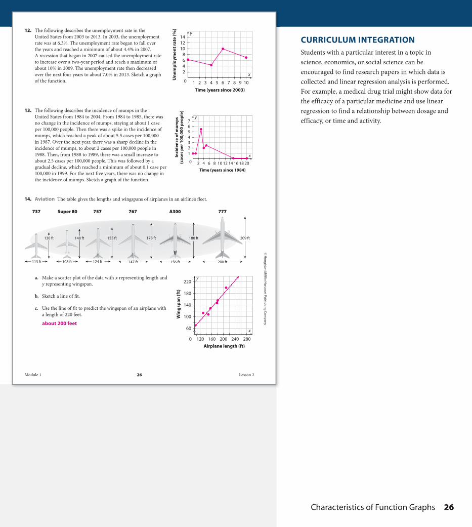
13. The following describes the incidence of mumps in the United States from 1984 to 2004. From 1984 to 1985, there was no change in the incidence of mumps, staying at about 1 case per 100,000 people. Then there was a spike in the incidence of mumps, which reached a peak of about 5.5 cases per 100,000 in 1987. Over the next year, there was a sharp decline in the incidence of mumps, to about 2 cases per 100,000 people in 1988. Then, from 1988 to 1989, there was a small increase to about 2.5 cases per 100,000 people. This was followed by a gradual decline, which reached a minimum of about 0.1 case per 100,000 in 1999. For the next five years, there was no change in the incidence of mumps. Sketch a graph of the function.
14. Aviation The table gives the lengths and wingspans of airplanes in an airline’s fleet.
a. Make a scatter plot of the data with x representing length and y representing wingspan.
b. Sketch a line of fit.
c. Use the line of fit to predict the wingspan of an airplane with a length of 220 feet.
x
y
120 160 200Airplane length (ft)
240 2800
60
100
140
Win
gspa
n (f
t) 180
220
x
y
1 2 3 4 5 6 7 8 9 10
Time (years since 2003)
42
0
68
101214
Une
mpl
oym
ent r
ate
(%)
x
y
20 4 6 8 10 12 14 16 18 20
Time (years since 1984)
21
34567
Inci
denc
e of
mum
ps(c
ases
per
100
,000
peo
ple)
200 ft
209 ft
156 ft
180 ft
147 ft
178 ft
124 ft
155 ft
108 ft
148 ft
113 ft
130 ft
777A300767757Super 80737
about 200 feet
Module 1 26 Lesson 2
DO NOT EDIT--Changes must be made through “File info”CorrectionKey=NL-B;CA-B
DO NOT EDIT--Changes must be made through “File info”CorrectionKey=NL-B;CA-B
A2_MNLESE385894_U1M01L2.indd 26 5/14/14 3:30 PM
CURRICULUM INTEGRATIONStudents with a particular interest in a topic in science, economics, or social science can be encouraged to find research papers in which data is collected and linear regression analysis is performed. For example, a medical drug trial might show data for the efficacy of a particular medicine and use linear regression to find a relationship between dosage and efficacy, or time and activity.
Characteristics of Function Graphs 26
DO NOT EDIT--Changes must be made through “File info”CorrectionKey=NL-C;CA-C
© H
oug
hton
Mif
flin
Har
cour
t Pub
lishi
ng
Com
pan
y • I
mag
e C
red
its:
(t) ©
Oce
an/
Cor
bis
; (b)
©Va
l Law
less
/Shu
tter
sto
ck
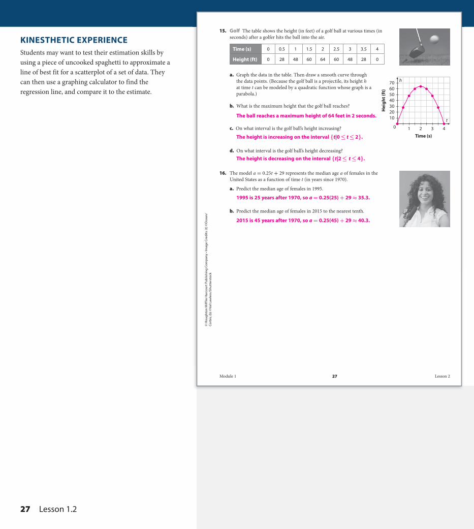
15. Golf The table shows the height (in feet) of a golf ball at various times (in seconds) after a golfer hits the ball into the air.
Time (s) 0 0.5 1 1.5 2 2.5 3 3.5 4
Height (ft) 0 28 48 60 64 60 48 28 0
a. Graph the data in the table. Then draw a smooth curve through the data points. (Because the golf ball is a projectile, its height h at time t can be modeled by a quadratic function whose graph is a parabola.)
b. What is the maximum height that the golf ball reaches?
c. On what interval is the golf ball’s height increasing?
d. On what interval is the golf ball’s height decreasing?
16. The model a = 0.25t + 29 represents the median age a of females in the United States as a function of time t (in years since 1970).
a. Predict the median age of females in 1995.
b. Predict the median age of females in 2015 to the nearest tenth.
t
h
0 1 2 3 4
Time (s)
2010
3040506070
Hei
ght (
ft)
The ball reaches a maximum height of 64 feet in 2 seconds.
The height is increasing on the interval {t|0 ≤ t ≤ 2}.
The height is decreasing on the interval {t|2 ≤ t ≤ 4}.
1995 is 25 years after 1970, so a = 0.25(25) + 29 ≈ 35.3.
2015 is 45 years after 1970, so a = 0.25(45) + 29 ≈ 40.3.
Module 1 27 Lesson 2
DO NOT EDIT--Changes must be made through “File info” CorrectionKey=NL-C;CA-C
A2_MNLESE385894_U1M01L2 27 6/8/15 11:34 AM
KINESTHETIC EXPERIENCEStudents may want to test their estimation skills by using a piece of uncooked spaghetti to approximate a line of best fit for a scatterplot of a set of data. They can then use a graphing calculator to find the regression line, and compare it to the estimate.
27 Lesson 1 . 2
DO NOT EDIT--Changes must be made through “File info”CorrectionKey=NL-C;CA-C
© H
oug
hton Mifflin H
arcourt Publishin
g Com
pany • Im
age C
redits: (t)
©d
ecade3d
/Shutterstock; (b) ©
Frank Leun
g/Vetta/G
etty Imag
es
H.O.T. Focus on Higher Order Thinking
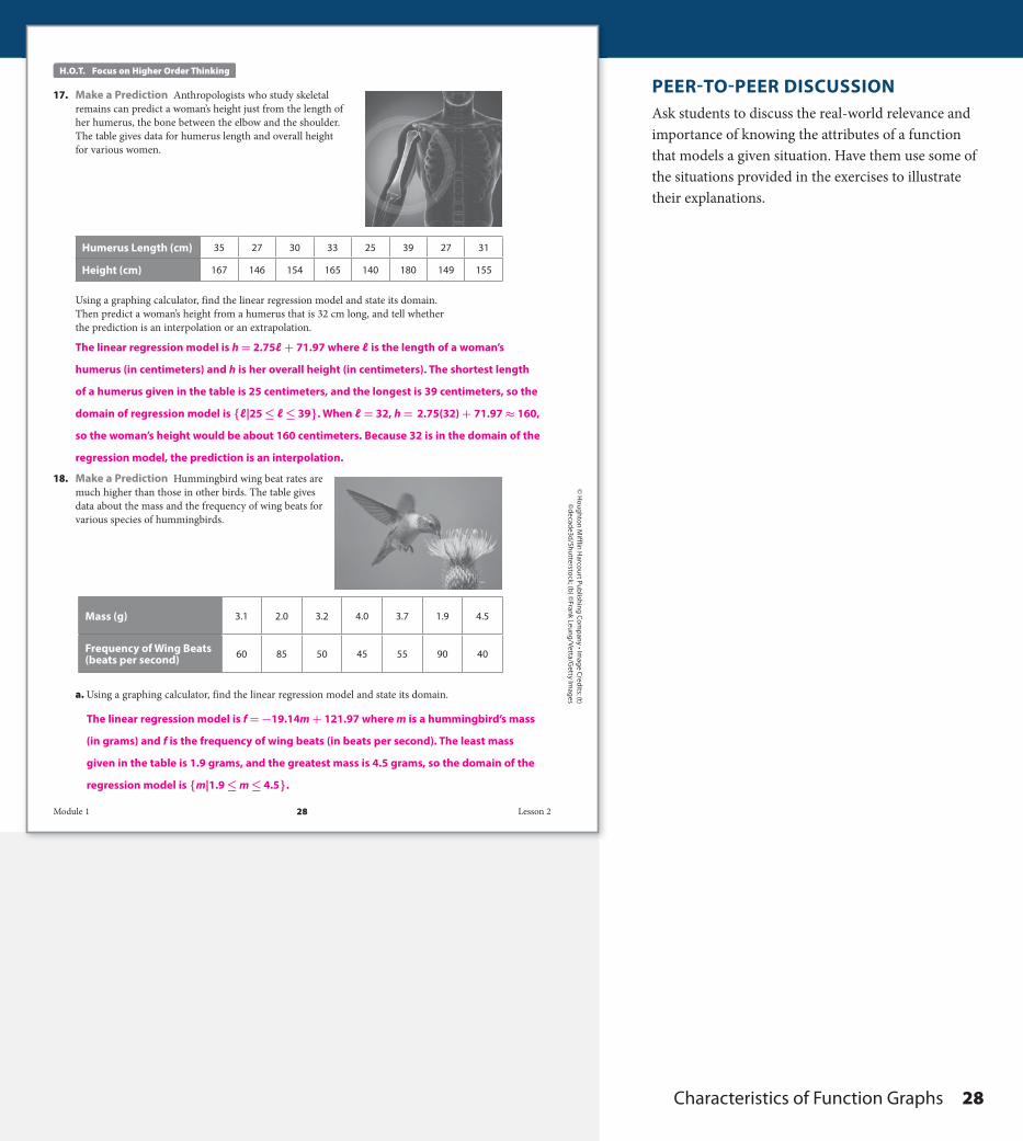
17. Make a Prediction Anthropologists who study skeletal remains can predict a woman’s height just from the length of her humerus, the bone between the elbow and the shoulder. The table gives data for humerus length and overall height for various women.
Humerus Length (cm) 35 27 30 33 25 39 27 31
Height (cm) 167 146 154 165 140 180 149 155
Using a graphing calculator, find the linear regression model and state its domain. Then predict a woman’s height from a humerus that is 32 cm long, and tell whether the prediction is an interpolation or an extrapolation.
18. Make a Prediction Hummingbird wing beat rates are much higher than those in other birds. The table gives data about the mass and the frequency of wing beats for various species of hummingbirds.
Mass (g) 3.1 2.0 3.2 4.0 3.7 1.9 4.5
Frequency of Wing Beats (beats per second) 60 85 50 45 55 90 40
a. Using a graphing calculator, find the linear regression model and state its domain.
The linear regression model is h = 2.75ℓ + 71.97 where ℓ is the length of a woman’s
humerus (in centimeters) and h is her overall height (in centimeters). The shortest length
of a humerus given in the table is 25 centimeters, and the longest is 39 centimeters, so the
domain of regression model is {ℓ|25 ≤ ℓ ≤ 39}. When ℓ = 32, h = 2.75(32) + 71.97 ≈ 160,
so the woman’s height would be about 160 centimeters. Because 32 is in the domain of the
regression model, the prediction is an interpolation.
The linear regression model is f = −19.14m + 121.97 where m is a hummingbird’s mass
(in grams) and f is the frequency of wing beats (in beats per second). The least mass
given in the table is 1.9 grams, and the greatest mass is 4.5 grams, so the domain of the
regression model is {m|1.9 ≤ m ≤ 4.5}.
Module 1 28 Lesson 2
DO NOT EDIT--Changes must be made through “File info” CorrectionKey=NL-C;CA-C
DO NOT EDIT--Changes must be made through “File info” CorrectionKey=NL-C;CA-C
A2_MNLESE385894_U1M01L2 28 6/8/15 11:35 AM
PEER-TO-PEER DISCUSSIONAsk students to discuss the real-world relevance and importance of knowing the attributes of a function that models a given situation. Have them use some of the situations provided in the exercises to illustrate their explanations.
Characteristics of Function Graphs 28
DO NOT EDIT--Changes must be made through “File info”CorrectionKey=NL-C;CA-C
© H
oug
hton
Mif
flin
Har
cour
t Pub
lishi
ng
Com
pan
y
b. Predict the frequency of wing beats for a Giant Hummingbird with a mass of 19 grams.
c. Comment on the reasonableness of the prediction and what, if anything, is wrong with the model.
19. Explain the Error A student calculates a function’s average rate of change on an interval and finds that it is 0. The student concludes that the function is constant on the interval. Explain the student’s error, and give an example to support your explanation.
20. Communicate Mathematical Ideas Describe a way to obtain a linear model for a set of data without using a graphing calculator.
When m = 19, f = −19.14(19) + 121.97 ≈ −242, so the frequency of the wing beats is
about −242 beats per second.
A negative wing beat frequency makes no physical sense, so the prediction isn’t
reasonable. There is nothing wrong with the model. The prediction, which is an
extrapolation, is based on a value of m that is far outside the domain of the model.
The model simply doesn’t account for a hummingbird with such an exteme mass.
The average rate of change on an interval uses only the endpoints of the interval in the
calculation. If the endpoints happen to have the same y-coordinate, the average rate of
change will be 0, but that doesn’t mean the function remains constant throughout the
interval. For example, the average rate of change for f(x) = x 2 on the interval
{x|-1 ≤ x ≤ 1} is f (1) − f (−1) ________ 1 − (−1) = 1 − 1 ______ 1 − (−1) = 0 _ 2 = 0 , but the function is decreasing from (-1, 1)
to (0, 0) and then increasing from (0, 0) to (1, 1), so the function is clearly not constant on
the interval.
After making a scatter plot of the data, draw a line that appears to pass as close to the data
points as possible. (It may pass through some of them, or it may not pass through any of
them.) Choose two points on the line to calculate its slope m, and then substitute one of
the points and the value of m into y = mx + b to find the value of b, the line’s y-intercept.
Knowing the values m and b, write the model as y = mx + b.
Module 1 29 Lesson 2
DO NOT EDIT--Changes must be made through “File info” CorrectionKey=NL-B;CA-B
A2_MNLESE385894_U1M01L2.indd 29 5/14/14 3:30 PM
JOURNALHave students describe how the attributes of increasing, decreasing, maximum values, and minimum values of a function are related, and how information about these attributes is helpful in drawing the graph of a function.
29 Lesson 1 . 2
DO NOT EDIT--Changes must be made through “File info”CorrectionKey=NL-C;CA-C

© H
oug
hton Mifflin H
arcourt Publishin
g Com
pany
Lesson Performance Task
Since 1980 scientists have used data from satellite sensors to calculate a daily measure of Arctic sea ice extent. Sea ice extent is calculated as the sum of the areas of sea ice covering the ocean where the ice concentration is greater than 15%. The graph here shows seasonal variations in sea ice extent for 2012, 2013, and the average values for the 1980s.
a. According to the graph, during which month does sea ice extent usually reach its maximum? During which month does the minimum extent generally occur? What can you infer about the reason for this pattern?
b. Sea ice extent reached its lowest level to date in 2012. About how much less was the minimum extent in 2012 compared with the average minimum for the 1980s? About what percentage of the 1980s average minimum was the 2012 minimum?
c. How does the maximum extent in 2012 compare with the average maximum for the 1980s? About what percentage of the 1980s average maximum was the 2012 maximum?
d. What do the patterns in the maximum and minimum values suggest about how climate change may be affecting sea ice extent?
e. How do the 2013 maximum and minimum values compare with those for 2012? What possible explanation can you suggest for the differences?
Arctic Sea Ice Extent
Sea
Ice
Exte
nt (m
illio
n km
2 )
Months
468
10
20
121416
Jan
Feb
Mar
Apr
May Jun
Jul
Aug
Sep
Oct
Nov Dec
1980’s Average20122013
a. The maximum sea ice extent usually occurs in March and the minimum in September. We can infer that sea ice extent increases during the cold winter months, begins to decrease as ice melts in the spring, and reaches its minimum at the end of the summer.
b. The 2012 minimum was about 3.4 million km 2 compared with the 1980s average minimum of about 7.3 million km 2 . Thus the 2012 minimum was about 3.9 million km 2 less, or about 47% of the 1980s average. Student answers should be within a reasonable range of these values given the scale of the graph.
c. The 2012 maximum is less than the average 1980s maximum, but the difference is less than with the minimum values. The 2012 maximum is about 92% of the 1980s average maximum.
d. The warmer temperatures associated with global climate change have drastically reduce the extent of sea ice during the summer but have had a much less significant effect on the extent during the winter.
e. The 2013 maximum was about the same as in 2012, but the 2013 minimum was actually about 1.5 million km 2 greater than in 2012. Students may suggest that while the overall trend is for decreasing minimum values, variations in specific climate conditions from year to year mean that minimum values may fluctuate.
Module 1 30 Lesson 2
DO NOT EDIT--Changes must be made through “File info” CorrectionKey=NL-B;CA-B
A2_MNLESE385894_U1M01L2.indd 30 5/14/14 3:30 PM
AVOID COMMON ERRORSHave students read the labels on the graph to ensure they understand that the values in the scale of the sea ice extent are to be multiplied by 10 6 (one million) and that the units are kilometers squared, because the sea ice extent is calculated as an area of ice.
INTEGRATED MATHEMATICAL PRACTICESFocus on ModelingMP.4 Note that the graph of the Arctic Sea Ice Extent shows several sets of data that do not follow smooth curves. It may be helpful to begin analysis by placing a straightedge parallel to the x-axis (Months) . The straightedge can be moved up slowly to determine the minimums and maximums for each set of data. A ruler can also be placed along the line that approximates the given curve of data between March and September for each year to help students compare their rates of change.
EXTENSION ACTIVITY
Have students research the National Snow and Ice Data Center to learn more about the cryosphere, sea ice in general, the current condition of arctic sea ice, and changes that have occurred over the past year. Note that during 2013, summer weather patterns were very different from previous summers, as it was considerably cooler in 2013 than in prior years. Ask students to use the information they find to discuss any pattern of changes that are reflected in the maximum and minimum extent values.
Scoring Rubric2 points: Student correctly solves the problem and explains his/her reasoning.1 point: Student shows good understanding of the problem but does not fully solve or explain his/her reasoning.0 points: Student does not demonstrate understanding of the problem.
Characteristics of Function Graphs 30
DO NOT EDIT--Changes must be made through “File info”CorrectionKey=NL-C;CA-C