Embed Size (px)
Citation preview

Kathy O’Leary
Create Your Own Infographics
Why Use Infographics?
• Makes Data more appealing
• Gets attention
• More likely to read through & remember data
Digestible bite-sized chunks of information

Everyone likes “eye candy”


Annual Report Data
before infographics


!

Infographic Guidelines
• Simplicity
• Simple Graphics
• Strong Title
• Limited palette - 2-4 colors – Color palette ideas: https://color.adobe.com/explore/newest/?time=all

• limit yourself to 1-2 Fonts • Fonts can give your infographic a professional look.
• Alternate font colors.
• Large size contrast = interesting to view
INFORMATION
70 SQUIRRELS PREFER PEANUT BUTTER OVER JELLY
PEOPLE
9 OUT OF 10 MARKETERS WILL SHARE THIS
USE YOUR COLORS
ALTERNATE THE COLOR
OF YOUR TEXT TO
EMPHASIZE CERTAIN DATA
MIX AND MATCH SHAPES
OVER 100 SHAPES
Convey the message at a glance
• Boil down data to one image
• Use Hierarchy and Consistency
– ie: Large and small, colors, images
• Use as little text as possible

• Use Basic Shapes or
Simple Images
400 BILLION STARS IN THE MILKY WAY
You’ll notice that this infographic was created entirely from basic shapes and alternating font sizes. By focusing your design on two simple aspects, you can accomplish an intricate outcome. For an infographic of this style, I would suggest using no more than three colors and stick to one font to make things simpler.
400 BILLION STARS IN THE MILKY WAY
★ 400 BILLION STARS IN THE MILKY WAY

White Space is powerful
• Too much will spread data too far apart
– Can break the flow
• Too little give cramped feel
– Hard to read easily
• When done, go back and adjust spacing
and the overall “flow”

What software to use?
• PowerPoint – 100s of shapes • canva.com • easel.ly • piktochart • vennage • infogr.am • visme.co • I used Illustrator
canva.com
• Set up free account
• Open Custom Design on homepage
- Set measurements to 8.5”x11”
• Upload images
- Your library logo
- Annual Report images from IFLS website
http://iflsweb.org/infographics

Use shapes to illustrate a story
5,018 45,864
83,038
Registered Borrowers Annual Visits
Total Circ Transactions
For more images in Canva: • Click on Search in the upper left • Choose Infographics or Shapes

or use images…
5,018 45,864
83,038
Registered Borrowers Annual Visits
Total Circ Transactions

Creating Charts
• onlinecharttool.com • Can also use Excel or another means for charts • Set up online account (free and simple) to save
your files for editing • I use a Pie Chart – Donut – 2D • Give it a title and set the data – 3 items and list the item name and value from your
annual report info. Choose colors that will make sense with your palette.
– Don’t show labels
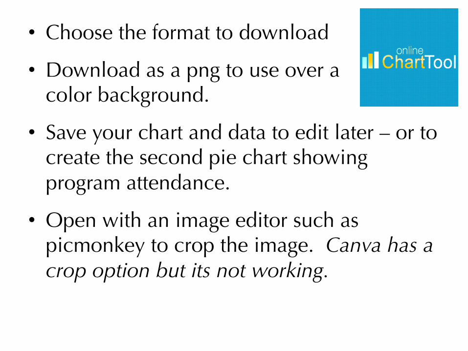
• Choose the format to download
• Download as a png to use over a ���color background.
• Save your chart and data to edit later – or to create the second pie chart showing program attendance.
• Open with an image editor such as picmonkey to crop the image. Canva has a crop option but its not working.

• Add title and labels to charts.
• Revist the white space and spacing of entire page.
• Download either a pdf (for printing) or jpg for use online
• Canva will save your file so you can come back and edit it later.
Back in Canva…

Canva is still in beta
• If you run into problems, they do respond to questions.

Using PowerPoint
• Open a new presentation
• Page set up to set size
• Can Insert – Photo – Picture from File
• Use Shapes and Symbols
• Save As as PDF or JPEG
Create a sample in PowerPoint

In Conclusion
• Use Good Data that will Tell Your Story
• Clear Simple Graphics
• Use enough white space – but not too much
• Limit colors to 2-4
• Keep it to one page
• Use in print (pdf) and digitally (jpg)

Please Share with IFLS!

Thank you for Attending
• Good luck!
• Share your results!
• I will be at IFLS until March 19 if you have any questions.
• Kathy O’Leary [email protected] or 715-839-5082 ext 118

More Resources:
• https://www.canva.com/create/infographics/
• piktochart.com/infographics-design-series-design-your-infographic-like-a-pro
• http://www.slideshare.net/proformarich/how-to-easily-create-3-infographics-in-ppt-15961443