Embed Size (px)
Citation preview
skills1. Planning a PivotTable
Report
2. Creating a Pivot Table
3. Modifying theSummary Function of a Pivot Table
4. Creating a Three-Dimensional PivotTable
5. Updating a PivotTable
6. Modifying theStructure and Formatof a Pivot Table
7. Creating andModifying aPivotChart Report
8. Using the GETPIVOTDATAFunction
Creating and Modifying Pivot Tablesand Charts
A PivotTable Report (commonly called a pivot table) is a specialized report inMicrosoft Excel that summarizes and analyzes data from an outside source like aspreadsheet or similar table. That is, a pivot table is a tool for taking a large andcomplete amount of data and formatting it in a table that makes that same informa-tion easier to understand and assimilate. You generally will create a pivot table whenyou want to do one of the following:
extract a smaller amount of data from a larger set of datasum up a large amount of data and compare one section of the original datawith another ororganize sub-categories of data within larger categories.
It is important to organize an Excel spreadsheet properly, but especially so when youmay want to create a pivot table from it. When creating a spreadsheet, remember thefollowing advice:
Label your data well. For example, the first row of an Excel spreadsheetshould have clear, descriptive column labels.Verify that each spreadsheet column contains only one set of data. For exam-ple, a column labeled Fname should contain only the first names of salesper-sons or vendors or customers, etc, and a column labeled Total should sum upthe same type of data from cell to cell.Keep your spreadsheet free of automatic subtotals. Pivot tables will calculatesubtotals and totals for you.
A PivotChart Report (commonly called a pivot chart) represents in graphical formthe data from a pivot table. You can modify the layout and data from a pivot chartjust as you can those of a pivot table. Finally, you can use the GETPIVOTDATAfunction in a worksheet to create a formula that will produce, under many conditions,a consistent answer even if you later rearrange the pivot table.
Lesson Goal:
Understand how to plan a pivot table. Create an Excel pivot table, change its sum-mary function, and analyze three-dimensional data. Update a report and then modify its structure and format. Finally, create a PivotChart Report and use the GETPIVOTDATA function.
C U S T O M S K I L L C U S T O M S K I L L C U S T O M S K I L L
custom skill custom skill
custom SKILL
1

skill 1Planning a PivotTableReport
A PivotTable Report (commonly called a pivot table) is an interactive, cross-tabulatedreport in Excel that summarizes and analyzes data from an outside source such as an Excelspreadsheet or similar table. Using a pivot table, you can summarize selected data from aworksheet, list and display it in a table format, and organize the data in meaningful ways.Before you create a pivot table, however, you should plan it out so that the process of creat-ing the table goes more smoothly.
overview
Planning a PivotTable Report involves several steps:
1. Review the information in your source spreadsheet or other table. Before summariz-ing an Excel spreadsheet or similar set of data in a pivot table, be sure to understand therange of information that the pivot table will cover. Also understand what fields of infor-mation will appear in the pivot table. A field is a particular type of data about a person,place, or object. For example, when creating fields related to personal friends, you mightwant to indicate their names, addresses, phone numbers, and related information.However, when creating fields for a company’s employees, you instead may need to listtheir job occupations, work location, annual salaries, etc. Figure A-1 displays a list of student interns, their college enrollment dates, their academic class, and so on.
2. Determine the objective of your pivot table and identify the names of the fields thatrelated to that objective. The objective of the pivot table is to identify student interns,their work locations, and their current job performance ratings. To create such a pivottable, you should include the students’ last names, the locations of their internship, andtheir job scores.
3. Identify which fields you want to summarize in the pivot table and which summaryfunction you want to use. The summary function is an automatic subtotal or other calcu-lation used in pivot tables and pivot charts. To gauge the typical grade that instructors giveto the current group of interns, you would select the Job Score field and use the MODEfunction to determine the most frequently appearing grade.
4. Determine how to organize your data. You must organize your pivot table properly topresent the desired information in the desired way. To best display the most frequentlyoccurring job score for the data that you want to include, define the Internship as a col-umn field, the Fname (first names) as the row field, and the Job Score as the data summa-ry field. Figure A-2 displays the empty pivot table and indicates the location of the col-umn field area, the row field area, and the data summary area.
5. Decide which worksheet should display the pivot table. You can place the newly createdpivot table on the same sheet as your worksheet data or on a new worksheet. To keep yourraw worksheet data separate from the interpretive pivot table, you should put your pivottable on a separate worksheet. Figure A-3 displays the completed pivot table on a newworksheet with a new name, along with an added table title and the MODE displayed incell F22.
how to
LESSON ONE Creating and Modifying Pivot Tables and ChartsEX A.2
Figure A-1 Worksheet of student interns
Figure A-2 Blank pivot table
Row field area
Open pivot_exprac.xls. Save it as my_pivot_exprac.xls. Review the data on the Interns work-sheet. Using the five planning guidelines in this Skill, summarize what could be the purpose of apivot table based on the worksheet, which fields you could place in a pivot table, how you wouldarrange such a table, and whether you would place it on the current worksheet or a new one.
Practice
Figure A-3 Completed pivot table
Data summaryarea
EX A.3I n t e r @ c t i v e L e a r n i n g S e r i e s
Column fieldarea
PivotTableField List
Student internshipscores
Result of usingMODE function
Pivot table worksheetwith new name
Pivot tabletitle
Worksheet from whichpivot table will draw data

skill 2 Creating a Pivot Table
After you plan a pivot table, you then can create it from an Excel worksheet or similar table.To create a pivot table, you use the PivotTable and PivotChart Wizard. A wizard is a seriesof interrelated dialog boxes that ask you for data and usually offer options on how to formatyour data. Using a wizard breaks down a complex task into more manageable steps, therebyhelping you to enter correct data and then properly format it so that viewers can easilyunderstand it.
overview
Create a pivot table.
1. Open student file pivot_exhowto2.xls and save it as Pivot_Table_One.xls. This worksheetcontains data about student interns, their enrollment dates as students, their current acade-mic class (freshman, sophomore, junior, or senior), their intern level and their job perfor-mance rating—or job score.
2. Click cell A1 if necessary, click the Data menu, and then click the PivotTable andPivotChart Report command. This action opens the first of three dialog boxes in thePivotTable and PivotChart Wizard (Figure A-4). In this dialog box, you specify thelocation of the data to be converted into a pivot table and whether you want to create apivot table or a pivot chart from that data.
3. In the section entitled, Where is the data that you want to analyze?, verify that theMicrosoft Office Excel list or database option button is selected. In the section entitledWhat kind of report do you want to create?, verify that the PivotTable option button is selected.
4. Click the Next button to move to Step 2 of 3 in the wizard (Figure A-5). In theWhere is the data that you want to use? text box, the cell range for the entire worksheetselected in Step 2 appears by default. You can accept this default cell range or specify asmaller range of cells. Since you want to create a pivot table that shows data for all studentinterns, leave the default data in the text box.
5. Click to move to Step 3 of 3 of the wizard (Figure A-6). In this dialog box,you select whether to place the pivot table on the same worksheet from which youobtained your data for the upcoming pivot table or on a new worksheet within the sameExcel workbook. Accept the default option button, New worksheet.
how to
LESSON ONE Creating and Modifying Pivot Tables and ChartsEX A.4
tipIn Step 4, the worksheetselected in Step 2appears with an animat-ed border (“marchingants”) around it. Therange of cells within thisborder matches the cellrange in the Where isthe data that you want touse? text box.
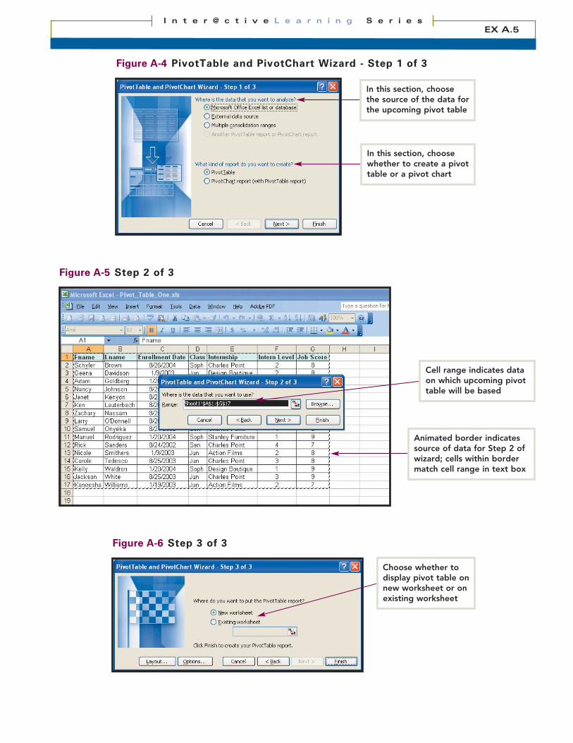
Figure A-4 PivotTable and PivotChart Wizard - Step 1 of 3
Figure A-5 Step 2 of 3
Animated border indicatessource of data for Step 2 ofwizard; cells within bordermatch cell range in text box
In this section, choosethe source of the data forthe upcoming pivot table
Figure A-6 Step 3 of 3
Choose whether todisplay pivot table onnew worksheet or onexisting worksheet
EX A.5I n t e r @ c t i v e L e a r n i n g S e r i e s
Cell range indicates dataon which upcoming pivottable will be based
In this section, choosewhether to create a pivottable or a pivot chart
skill 2Creating a Pivot Table(cont’d)
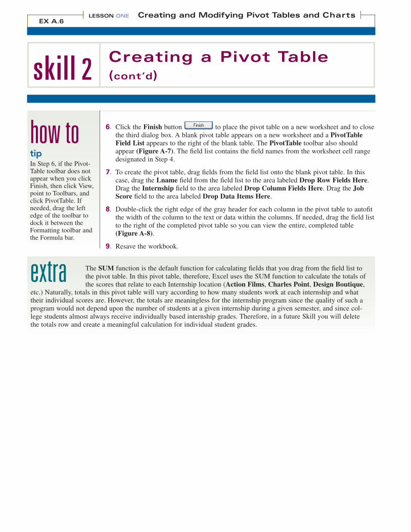
6. Click the Finish button to place the pivot table on a new worksheet and to closethe third dialog box. A blank pivot table appears on a new worksheet and a PivotTableField List appears to the right of the blank table. The PivotTable toolbar also shouldappear (Figure A-7). The field list contains the field names from the worksheet cell rangedesignated in Step 4.
7. To create the pivot table, drag fields from the field list onto the blank pivot table. In thiscase, drag the Lname field from the field list to the area labeled Drop Row Fields Here.Drag the Internship field to the area labeled Drop Column Fields Here. Drag the JobScore field to the area labeled Drop Data Items Here.
8. Double-click the right edge of the gray header for each column in the pivot table to autofitthe width of the column to the text or data within the columns. If needed, drag the field listto the right of the completed pivot table so you can view the entire, completed table(Figure A-8).
9. Resave the workbook.
how to
extraetc.) Naturally, totals in this pivot table will vary according to how many students work at each internship and whattheir individual scores are. However, the totals are meaningless for the internship program since the quality of such aprogram would not depend upon the number of students at a given internship during a given semester, and since col-lege students almost always receive individually based internship grades. Therefore, in a future Skill you will deletethe totals row and create a meaningful calculation for individual student grades.
The SUM function is the default function for calculating fields that you drag from the field list tothe pivot table. In this pivot table, therefore, Excel uses the SUM function to calculate the totals ofthe scores that relate to each Internship location (Action Films, Charles Point, Design Boutique,
LESSON ONE Creating and Modifying Pivot Tables and ChartsEX A.6
tipIn Step 6, if the Pivot-Table toolbar does notappear when you clickFinish, then click View,point to Toolbars, andclick PivotTable. Ifneeded, drag the leftedge of the toolbar todock it between theFormatting toolbar andthe Formula bar.

Figure A-7 Blank pivot table
Figure A-8 Completed pivot table
Open the my_pivot_exprac.xls file, which you created in the previous Practice. Using all dataon the Interns worksheet, work through the PivotTable and PivotChart Wizard to create ablank pivot table. Name the pivot table tab InternsTable. Drag the Class field to the ColumnFields area, drag the Lname field to the Row Fields area, and drag the Hourly Wage field to theData Items area. Autofit the columns to their data and resave the file as my_pivot_exprac2.xls.
Practice
EX A.7I n t e r @ c t i v e L e a r n i n g S e r i e s
Drag Internship fieldto here
Drag Lname fieldto here
Drag Job score fieldto here
Drag field list off ofcompleted pivot tableto display whole table
Double-click rightedge of each columnto autofit it to itsrelated data
Pivot Tabletoolbar

skill 3Modifying the SummaryFunction of a Pivot Table
A summary function is an automatic subtotal or other calculation and is used in pivot tablesand pivot charts. The phrase “other calculation” indicates that a summary function can beother than just the SUM function, which totals the data in a cell range. For example, a sum-mary function can be the COUNT function, which calculates the number of values in a cellrange. Since the SUM function in the previous Skill supplied a meaningless statistic for indi-vidual student interns, you will replace it in this Skill with the AVERAGE function so thatpivot table users can see how well students in general are doing in their internships.
overview
Modify the summary function of a pivot table to calculate the average student job score ratherthan the total score per internship location and rename the pivot table worksheet tab.1. If needed, open Pivot_Table_One.xls, created in Skill 2. On the PivotTable toolbar, click
the Hide Field List button to conceal the field list so that you can work more easilywith the pivot table. (Note: To conceal the field list, you also can click the Close button
at the right end of the field list Title bar.)
2. In cell A21, type Job Score Averages and press [Enter]. If needed, double-click the rightedge of the gray column A header to autofit the column width to the new row label.
3. Click any cell in the pivot table. Click the Field Settings button on the PivotTabletoolbar to display the PivotTable Field dialog box. The Name text box displays the cur-rent default function of the pivot table (SUM) and the field (Job Score) that the functionis using to calculate a result. The Summarize by list box displays other functions you canuse, with the default function (SUM) selected at the top of the list box.
4. In the Summarize by list box, click Average (Figure A-9). Click the OK buttonto calculate the average (rather than total) of the job scores and to close the
PivotTable Field dialog box.
5. Right-click the Sheet4 worksheet tab (i.e., for the worksheet with the modified pivottable). Click the Rename command to select the tab name. Type PivotTable and press[Enter] to confirm the new name (Figure A-10). Resave the workbook.
how to
extra
LESSON ONE Creating and Modifying Pivot Tables and ChartsEX A.8
tipBased on your experi-ence with Excel tables,you might think that youcould just delete thedata in cell rangeB21:F21 and replace itwith data based on theAVERAGE function.However, if you try thisapproach, you will dis-play a box warning youthat you cannot changethis part of a pivot table.
Table A-1 PivotTable toolbar buttons
Button Button Name Function
PivotTable Displays menu of pivot table commands
Format Report Displays palette of formatting options for pivot table
Chart Wizard Automatically creates chart from active pivot table
Hide Detail Conceals specific data in table groupings
Show Detail Displays detailed data in table groupings
Refresh Data Reloads list changes in a table
Include Hidden Items in Totals Ensures that pivot table will calculate concealed data
Always Display Items Makes pivot table show all data at all times
Field Settings Displays PivotTable Field dialog box
Show/Hide Field List Displays/conceals the PivotTable Field List
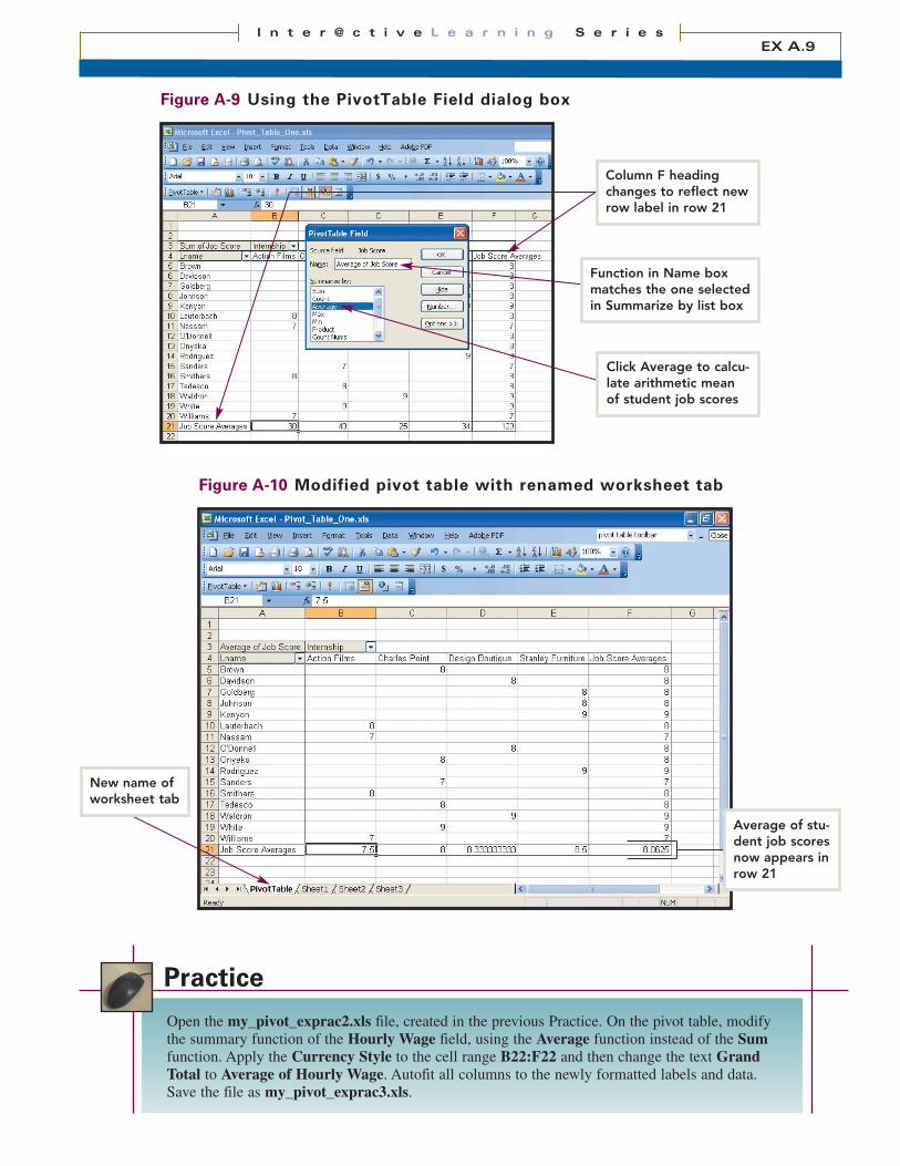
Figure A-9 Using the PivotTable Field dialog box
Figure A-10 Modified pivot table with renamed worksheet tab
Open the my_pivot_exprac2.xls file, created in the previous Practice. On the pivot table, modifythe summary function of the Hourly Wage field, using the Average function instead of the Sumfunction. Apply the Currency Style to the cell range B22:F22 and then change the text GrandTotal to Average of Hourly Wage. Autofit all columns to the newly formatted labels and data.Save the file as my_pivot_exprac3.xls.
Practice
EX A.9I n t e r @ c t i v e L e a r n i n g S e r i e s
Function in Name boxmatches the one selectedin Summarize by list box
Click Average to calcu-late arithmetic meanof student job scores
Average of stu-dent job scoresnow appears inrow 21
New name ofworksheet tab
Column F headingchanges to reflect newrow label in row 21

skill 4Creating a Three-Dimensional Pivot Table
A basic pivot table has two dimensions to it: height, created by the number of rows, andwidth, created by the number of columns. However, a pivot table has three dimensions ifyou add a page field to it, creating a kind of layered table. A page field enables you to filtera whole pivot table to display data for all items or for just one item in the pivot table. Usinga page field enables you to filter your data field by field. (Filtering involves specifying crite-ria by which you will select a smaller set of data from a larger set.)
overview
Convert your pivot table to a three dimensions by adding a page field.
1. If needed, open the file Pivot_Table_One.xls.
2. Drag the Internship button in cell B3 to the area labeled Drop Page Fields Here (in row 1 above the pivot table). The pivot table re-forms with the Internship button in cellA1, the word (All) and an Internship list arrow in cell B1, a list of all students in the cellrange A5:A20, a list of their corresponding job scores in cell range B5:B20, and the aver-age job score for all students in cell B21 (Figure A-11).
3. Click the Internship list arrow, click Action Films (Figure A-12), and then click the OK button . The pivot table displays the individual job scores for the studentsnamed Lauterbach, Nassam, Smithers, and Williams and the average job score for thosefour students (Figure A-13).
5. Click the Internship list arrow again, click Stanley Furniture, and then click the OKbutton again. The pivot table now displays the individual job scores forGoldberg, Johnson, Kenyon, and Rodriguez and the average job score for those students(Figure A-14).
6. Save the workbook.
how to
extraand then clear the check mark from the Disable pivoting of this field check box.
You also cannot drag a field to a new location if the worksheet that serves as the data source for the pivot table is pro-tected. To solve this problem, click the Tools menu, point to the Protection command, and then click the ProtectSheet subcommand to display the Protect Sheet dialog box. Clear the check mark from the Protect worksheet andcontents of locked cells check box, and then click the OK button .
Finally, if the list arrow for a field does not work, activate the Always Display Items button on the PivotTabletoolbar. If you do not want to use this tool, then drag a field to the data area so that list arrows will work for all fieldsin the pivot table report.
Problems can arise when converting a two-dimensional pivot table to a three-dimensional format.For example, if you cannot drag a field to a new location, it may be locked. To unlock it, double-click the field to display the PivotTable Field dialog box, click the Advanced button ,
LESSON ONE Creating and Modifying Pivot Tables and ChartsEX A.10
tipTo create a separateworksheet for each field, click the PivotTablebutton on the PivotTabletoolbar, click the ShowPages command, andthen click the OK button.
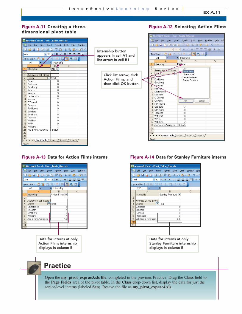
Figure A-11 Creating a three-dimensional pivot table
Figure A-12 Selecting Action Films
Open the my_pivot_exprac3.xls file, completed in the previous Practice. Drag the Class field tothe Page Fields area of the pivot table. In the Class drop-down list, display the data for just thesenior-level interns (labeled Sen). Resave the file as my_pivot_exprac4.xls.
Practice
Figure A-13 Data for Action Films interns
EX A.11I n t e r @ c t i v e L e a r n i n g S e r i e s
Internship buttonappears in cell A1 andlist arrow in cell B1
Figure A-14 Data for Stanley Furniture interns
Click list arrow, clickAction Films, andthen click OK button
Data for interns at onlyAction Films internshipdisplays in column B
Data for interns at onlyStanley Furniture internshipdisplays in column B

skill 5 Updating a Pivot Table
Pivot tables look very similar to standard Excel worksheets. However, the data and calcula-tions in a pivot table are just read-only values. In other words, you can only view the dataand cannot insert and/or delete rows to modify the pivot table. Therefore, to change the datain a pivot table, you must change the data directly in the source list and then refresh thetable. The source list is the list used to create the table. And to refresh data means to updatethe pivot table to reflect the changed data in the source list.
overview
Add information to your source list and then refresh the pivot table to reflect the new data.
1. Open the Pivot_Table_One.xls file, if needed. Imitate Step 3 or 4 in the previous Skill, ifneeded, to display All interns in the pivot table. Then click the Sheet1 worksheet tab todisplay the sheet that contains the names, enrollments dates, academic classes, and relateddata for the student interns.
2. Right-click the gray header for row 17, containing the data for Kaneesha Williams, todisplay a shortcut menu. Click the Insert command (Figure A-15) to add a blank row 17between row 16 and the new row 18, which now contains the data for Ms. Williams.
3. Enter data for a new student, George Witherspoon, following the data listed below:
Enrollment date 8/25/2003Class JunInternship Design BoutiqueIntern Level 3Job Score 8
Be sure to press [Tab] to move from one cell to the next, and then press [Enter] when finished with the last cell. Verify that the worksheet looks like Figure A-16.
4. Click the PivotTable worksheet tab to return to the pivot table. Verify that a cell within the pivot table is selected.
5. On the PivotTable toolbar, click the Refresh Data button to update the pivot tablewith the new source list data. Notice that Witherspoon now appears in the pivot tablewith the corresponding job score of 8. The average student score now equals 8.058823529(Figure A-17).
6. Save the workbook.
how to
extrathe table before you refreshed it, you must return the worksheet to its previous state and then update the pivot table. Todo this, click the Sheet1 worksheet tab. Right-click row 17, containing the data for George Witherspoon, and clickthe Delete command on the shortcut menu. Then click the PivotTable worksheet tab, click the Refresh Data buttononce again, and then resave the workbook.
Sometimes, changing worksheet data, refreshing a pivot table, re-changing the data, re-refreshing the table, etc., canresult in very confused worksheets. In cases like this, simply save a duplicate copy of your workbook (suggestedname, Pivot_Table_One_dupe.xls) and make your desired changes there. Once you verify that the duplicate work-book has exactly the right information, resave it as Pivot_Table_One.xls and delete the duplicate file.
After you click the Refresh Data button, the Undo button on the Standard toolbar turnsgrayish, indicating that you cannot undo the update. To have the pivot table display only the data in
LESSON ONE Creating and Modifying Pivot Tables and ChartsEX A.12
tipIn Step 2, be sure toright-click the grayheader button for thewhole row, not just acell within the row, todisplay the desired shortcut menu.
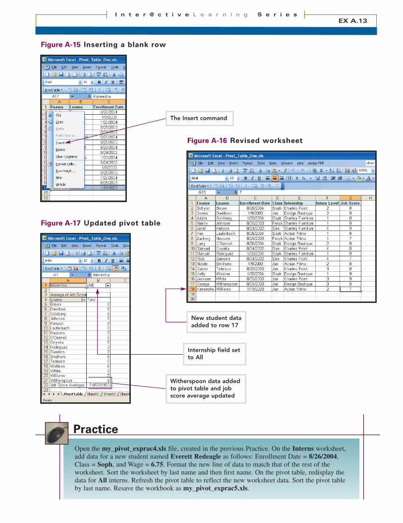
Figure A-15 Inserting a blank row
Figure A-16 Revised worksheet
Open the my_pivot_exprac4.xls file, created in the previous Practice. On the Interns worksheet,add data for a new student named Everett Redeagle as follows: Enrollment Date = 8/26/2004,Class = Soph, and Wage = 6.75. Format the new line of data to match that of the rest of theworksheet. Sort the worksheet by last name and then first name. On the pivot table, redisplay thedata for All interns. Refresh the pivot table to reflect the new worksheet data. Sort the pivot tableby last name. Resave the workbook as my_pivot_exprac5.xls.
Practice
Figure A-17 Updated pivot table
EX A.13I n t e r @ c t i v e L e a r n i n g S e r i e s
Witherspoon data addedto pivot table and jobscore average updated
The Insert command
New student dataadded to row 17
Internship field setto All
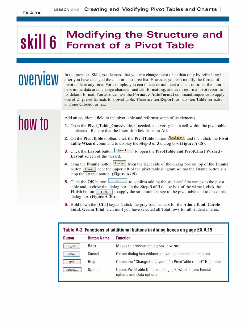
skill 6Modifying the Structure andFormat of a Pivot Table
In the previous Skill, you learned that you can change pivot table data only by refreshing itafter you have changed the data in its source list. However, you can modify the format of apivot table at any time. For example, you can indent or unindent a label, reformat the num-bers in the data area, change character and cell formatting, and even return a pivot report toits default format. You also can use the Format > AutoFormat command sequence to applyone of 21 preset formats to a pivot table. There are ten Report formats, ten Table formats,and one Classic format.
overview
Add an additional field to the pivot table and reformat some of its elements.
1. Open the Pivot_Table_One.xls file, if needed, and verify that a cell within the pivot tableis selected. Be sure that the Internship field is set to All.
2. On the PivotTable toolbar, click the PivotTable button and then click the PivotTable Wizard command to display the Step 3 of 3 dialog box (Figure A-18).
3. Click the Layout button to open the PivotTable and PivotChart Wizard -Layout screen of the wizard.
4. Drag the Fname button from the right side of the dialog box on top of the Lnamebutton near the upper left of the pivot table diagram so that the Fname button sitsatop the Lname button. (Figure A-19).
5. Click the OK button to confirm adding the students’ first names to the pivottable and to close the dialog box. In the Step 3 of 3 dialog box of the wizard, click theFinish button to apply the structural change to the pivot table and to close thatdialog box (Figure A-20).
6. Hold down the [Ctrl] key and click the gray row headers for the Adam Total, CaroleTotal, Geena Total, etc., until you have selected all Total rows for all student interns.
how to
LESSON ONE Creating and Modifying Pivot Tables and ChartsEX A.14
Table A-2 Functions of additional buttons in dialog boxes on page EX A.15
Button Button Name Function
Back Moves to previous dialog box in wizard
Cancel Closes dialog box without activating choices made in box
Help Opens the “Change the layout of a PivotTable report” Help topic
Options Opens PivotTable Options dialog box, which offers Formatoptions and Data options
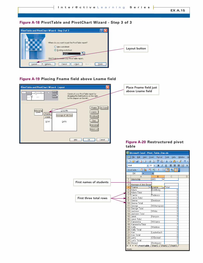
Figure A-18 PivotTable and PivotChart Wizard - Step 3 of 3
Figure A-19 Placing Fname field above Lname field
Figure A-20 Restructured pivottable
EX A.15I n t e r @ c t i v e L e a r n i n g S e r i e s
Place Fname field justabove Lname field
Layout button
First names of students
First three total rows
skill 6Modifying the Structure andFormat of a Pivot Table (cont’d)
7. Release the [Ctrl] key. Without deselecting any rows, right-click the gray header of aselected row to display a shortcut menu and then click the Hide command. This actionwill conceal all of the student total rows, making it easier to see all of the restructuredpivot table at one glance. (Figure A-21).
8. In cell A1, click the Internship field and then click the Bold button on theFormatting toolbar to bold the field text. With the cell pointer still in cell A1, double-click the Format Painter button and click in the relevant cell to bold the Average ofJob Score, Fname, Lname, and Total fields. Click the Format Painter button again tocancel it (Figure A-22).
9. Click cell C39, which contains the average job score for all students. Click the DecreaseDecimal button seven (7) times to format the job score with only two decimal places.
10. Click cell E39 so that you can see the actual border lines of the table.
11. Save the workbook.
how to
extraFormat menu, and then click the Cells command to open the Format Cells dialog box that you use with regular
worksheets. To format numerical data, you can use the Currency Style , Percent Style , Comma Style ,
and similar buttons on the Formatting toolbar or use the Format Cells dialog box. You can open the Format Cells dia-
log box by right-clicking a cell in the pivot table to display a shortcut menu and then clicking the Format Cells com-
mand. Finally, you can right-click a cell containing numerical data to display the shortcut menu, click the FieldSettings command to open the PivotTable Field dialog box, and then click the Number button in that
dialog box to display just the Number tab of the Format Cells dialog box. (Of course, if a cell with numerical data is
active, you also can access the PivotTable Field dialog box just by clicking the Field Settings button on the
PivotTable toolbar.)
To format the labels that identify data, you can use the Italic , Underline , Align Left ,
and similar buttons on the Formatting toolbar. You also can select a cell or cell range, click the
LESSON ONE Creating and Modifying Pivot Tables and ChartsEX A.16
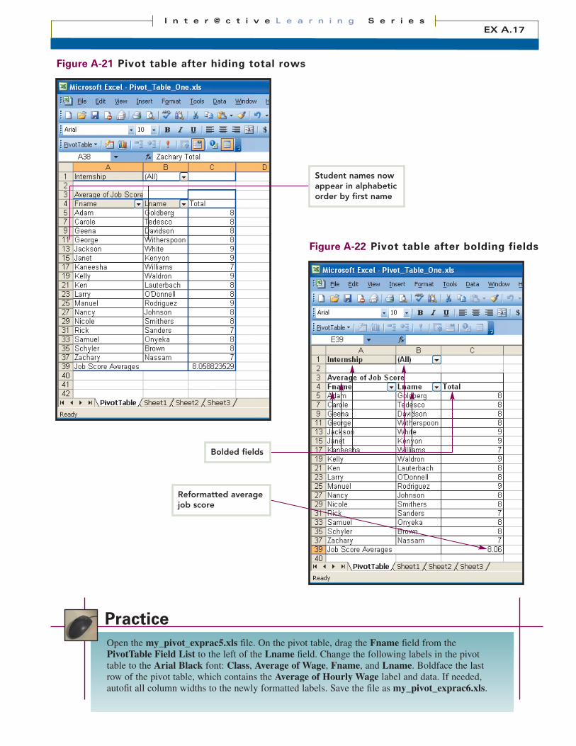
Figure A-21 Pivot table after hiding total rows
Figure A-22 Pivot table after bolding fields
Open the my_pivot_exprac5.xls file. On the pivot table, drag the Fname field from thePivotTable Field List to the left of the Lname field. Change the following labels in the pivottable to the Arial Black font: Class, Average of Wage, Fname, and Lname. Boldface the lastrow of the pivot table, which contains the Average of Hourly Wage label and data. If needed,autofit all column widths to the newly formatted labels. Save the file as my_pivot_exprac6.xls.
Practice
EX A.17I n t e r @ c t i v e L e a r n i n g S e r i e s
Bolded fields
Student names nowappear in alphabeticorder by first name
Reformatted averagejob score

skill 7Creating and Modifying a PivotChart Report
A PivotChart Report (commonly called a pivot chart) is a graphical representation of thedata in a corresponding pivot table. Pivot charts have special elements that pivot tables donot have. For example, pivot charts contain a data series, data markers, and—in column, bar,line, and similar charts—an X and a Y axis. (Consult the Extra section for an explanation ofthese terms.) As with pivot tables, you can modify the structure and format of pivot charts tomake them more readable and attractive.
overview
Create a pivot chart from an open pivot table.
1. Open the Pivot_Table_One.xls file, if needed. Verify that it displays the first names, lastnames, and job scores of all student interns, including the recently added student, GeorgeWitherspoon.
2. Click cell A3, type the new field name, Job Scores, and then press [Enter].
3. Click the Lname field in cell B4 and drag it to the left of the Fname field in cell A4. This action will reverse the order of the Fname and Lname fields in the columns and sort the student names in ascending, alphabetic order by last name rather than first name (Figure A-23).
4. Verify that any cell in the pivot table is selected. On the PivotTable toolbar or theStandard toolbar, click the Chart Wizard button . A pivot chart based on the currentpivot table appears on a new worksheet tab entitled Chart1. Verify that the chart showsjob scores for all of the student interns (Figure A-24).
5. At the top left corner of the pivot chart, click the list arrow next to the word All, clickCharles Point, and then click the OK button . Columns representing the jobscores for just the students Brown, Onyeka, Sanders, Tedesco, and White display in thechart (Figure A-25).
6. Right-click any blue column in the chart to display a shortcut menu and then click theChart Type command to display the Chart Type dialog box.
how to
LESSON ONE Creating and Modifying Pivot Tables and ChartsEX A.18
tipYou also can use thePivotTable toolbar tocreate a pivot chart. Todo so, select a cell in thepivot chart that willserve as your datasource. Click thePivotTable button andthen click the PivotChartcommand. A pivot chartwill appear on a newworksheet tab.
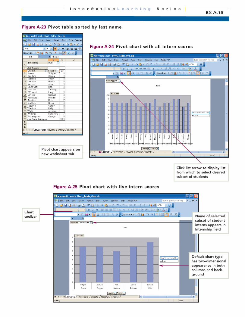
Figure A-23 Pivot table sorted by last name
Figure A-24 Pivot chart with all intern scores
Figure A-25 Pivot chart with five intern scores
EX A.19I n t e r @ c t i v e L e a r n i n g S e r i e s
Default chart typehas two-dimensionalappearance in bothcolumns and back-ground
Pivot chart appears onnew worksheet tab
Click list arrow to display listfrom which to select desiredsubset of students
Name of selectedsubset of studentinterns appears inInternship field
Charttoolbar

skill 7Creating and Modifying a PivotChart Report (cont’d)
7. In the Chart sub-type section, click the first chart in the second row. Below the chartimages will be the name of the selected chart sub-type—namely, Clustered column with a 3-D visual effect (Figure A-26).
8. Click the OK button to change the chart type and to close the dialog box. The blue chart columns now look three-dimensional, and the gray background is slightlyangled to match the three-dimensional appearance of the columns (Figure A-27).
9. Save the workbook.
how to
LESSON ONE Creating and Modifying Pivot Tables and ChartsEX A.20
extraIn a standard Excel chart or a pivot chart, a data series is the set of data points that are plotted in a chart. For example,in a column chart, the data series is the group of columns. In a pie chart, the data series is the group of slices. A datamarker is one data point in the data series. A column, bar, slice, or similar chart element is a data marker. The X axisin a column, bar, stock, or similar chart is the horizontal plane of the chart. The X axis usually displays names of prod-ucts, customers, stocks, or similar labels in a chart. The Y axis is the vertical plane of the chart. Items on the Y axisusually indicate quantities, dollar amounts, percentages, or similar numerical data.
To modify a chart more than you did in the Skill steps, right-click the specific area of the chart that you want tochange, and then click the shortcut command that relates to what you want to do. For example, if you right-click thegray wall of a column chart and then click Format Walls, you can change the border, color, and fill effects of thewalls in the Format Walls dialog box.
When you create a pivot chart from a pivot table, the row fields of the table become category fieldsin the chart. The column fields of the table become series fields in the chart. Finally, the pagefields of the table become page fields in the chart.

Open the my_pivot_exprac6.xls file, created in the previous Practice. In the pivot table, verifythat hourly wage data appears for all students. Select any cell in the pivot table and click theChart button to create a pivot chart. Name the pivot chart tab as InternsChart. Change the chartto the Clustered bar with a 3-D visual effect type. At the left edge of the chart, right-click andremove the Fname field. Change the chart title (not the tab) to Intern Salaries, formatted as 14-point, Arial Black font. Save the file as my_pivot_exprac7.xls.
Practice
EX A.21I n t e r @ c t i v e L e a r n i n g S e r i e s
Figure A-26 Chart type dialog box
Figure A-27 Column chart with three-dimensional effect
Columns and graybackground nowhave 3-D appearance
Click chart type in left paneand then select desired sub-type in right pane
Description of selectedchart sub-type appearsbelow right pane
Right-click a desired chart ele-ment and then click relatedcommand on shortcut menuto reformat selected element
skill 8Using the GETPIVOTDATAFunction
Sometimes, you may want to display information from a pivot table in a worksheet and use that information over and over. Unfortunately, since you can rearrange the data in a pivot table, your worksheet cannot use a standard cell reference to refer to a cell in the table, expecting that table cell to remain constant. However, if your worksheet uses theGETPIVOTDATA function to retrieve data from a pivot table, then the worksheet data willremain reliable even after you rearrange the table.
overview
Use the GETPIVOTDATA function in a worksheet to retrieve information from a pivot table.
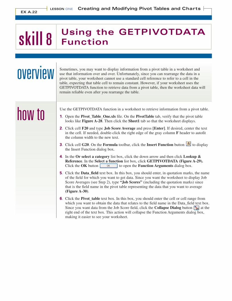
1. Open the Pivot_Table_One.xls file. On the PivotTable tab, verify that the pivot tablelooks like Figure A-28. Then click the Sheet1 tab so that the worksheet displays.
2. Click cell F20 and type Job Score Average and press [Enter]. If desired, center the text in the cell. If needed, double-click the right edge of the gray column F header to autofitthe column width to the new text.
3. Click cell G20. On the Formula toolbar, click the Insert Function button to displaythe Insert Function dialog box.
4. In the Or select a category list box, click the down arrow and then click Lookup &Reference. In the Select a function list box, click GETPIVOTDATA (Figure A-29).Click the OK button to open the Function Arguments dialog box.
5. Click the Data_field text box. In this box, you should enter, in quotation marks, the nameof the field for which you want to get data. Since you want the worksheet to display JobScore Averages (see Step 2), type “Job Scores” (including the quotation marks) since that is the field name in the pivot table representing the data that you want to average (Figure A-30).
6. Click the Pivot_table text box. In this box, you should enter the cell or cell range fromwhich you want to obtain the data that relates to the field name in the Data_field text box.Since you want data from the Job Score field, click the Collapse Dialog button at theright end of the text box. This action will collapse the Function Arguments dialog box,making it easier to see your worksheet.
how to
LESSON ONE Creating and Modifying Pivot Tables and ChartsEX A.22
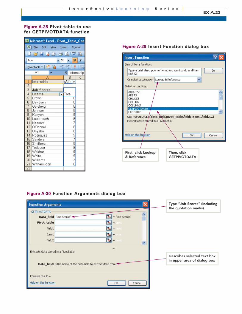
Figure A-28 Pivot table to usefor GETPIVOTDATA function
Figure A-29 Insert Function dialog box
Figure A-30 Function Arguments dialog box
EX A.23I n t e r @ c t i v e L e a r n i n g S e r i e s
First, click Lookup& Reference
Then, click GETPIVOTDATA
Type “Job Scores” (includingthe quotation marks)
Describes selected text boxin upper area of dialog box
skill 8Using the GETPIVOTDATAFunction (cont’d)
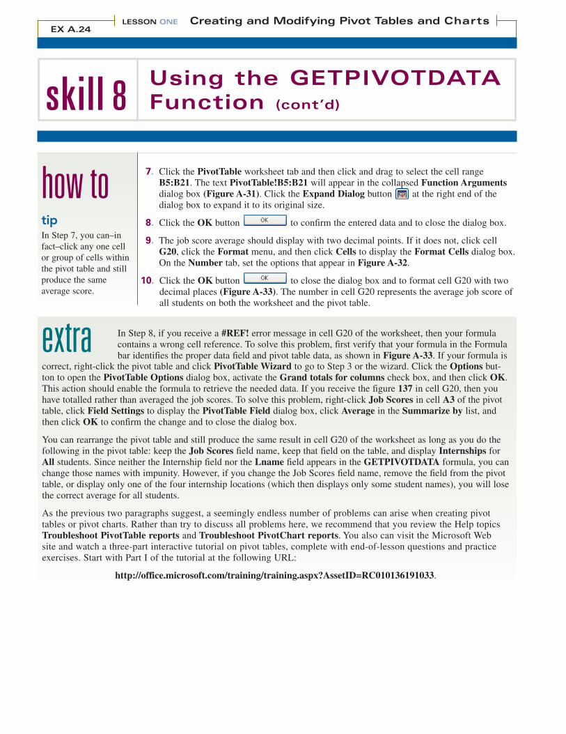
7. Click the PivotTable worksheet tab and then click and drag to select the cell rangeB5:B21. The text PivotTable!B5:B21 will appear in the collapsed Function Argumentsdialog box (Figure A-31). Click the Expand Dialog button at the right end of the dialog box to expand it to its original size.
8. Click the OK button to confirm the entered data and to close the dialog box.
9. The job score average should display with two decimal points. If it does not, click cellG20, click the Format menu, and then click Cells to display the Format Cells dialog box.On the Number tab, set the options that appear in Figure A-32.
10. Click the OK button to close the dialog box and to format cell G20 with twodecimal places (Figure A-33). The number in cell G20 represents the average job score ofall students on both the worksheet and the pivot table.
how to
extracorrect, right-click the pivot table and click PivotTable Wizard to go to Step 3 or the wizard. Click the Options but-ton to open the PivotTable Options dialog box, activate the Grand totals for columns check box, and then click OK.This action should enable the formula to retrieve the needed data. If you receive the figure 137 in cell G20, then youhave totalled rather than averaged the job scores. To solve this problem, right-click Job Scores in cell A3 of the pivottable, click Field Settings to display the PivotTable Field dialog box, click Average in the Summarize by list, andthen click OK to confirm the change and to close the dialog box.
You can rearrange the pivot table and still produce the same result in cell G20 of the worksheet as long as you do thefollowing in the pivot table: keep the Job Scores field name, keep that field on the table, and display Internships forAll students. Since neither the Internship field nor the Lname field appears in the GETPIVOTDATA formula, you canchange those names with impunity. However, if you change the Job Scores field name, remove the field from the pivottable, or display only one of the four internship locations (which then displays only some student names), you will losethe correct average for all students.
As the previous two paragraphs suggest, a seemingly endless number of problems can arise when creating pivottables or pivot charts. Rather than try to discuss all problems here, we recommend that you review the Help topicsTroubleshoot PivotTable reports and Troubleshoot PivotChart reports. You also can visit the Microsoft Web site and watch a three-part interactive tutorial on pivot tables, complete with end-of-lesson questions and practiceexercises. Start with Part I of the tutorial at the following URL:
http://office.microsoft.com/training/training.aspx?AssetID=RC010136191033.
In Step 8, if you receive a #REF! error message in cell G20 of the worksheet, then your formulacontains a wrong cell reference. To solve this problem, first verify that your formula in the Formulabar identifies the proper data field and pivot table data, as shown in Figure A-33. If your formula is
LESSON ONE Creating and Modifying Pivot Tables and ChartsEX A.24
tipIn Step 7, you can–infact–click any one cellor group of cells withinthe pivot table and stillproduce the same average score.
Figure A-31 Selecting the Job Scores data
Figure A-32 Format Cellsdialog box
Open the my_pivot_exprac7.xls file. In cell D21 of the Interns worksheet, type, center, andbold the text Average Wage. Autofit column D to the newly formatted text. In cell E21 of thesame worksheet, type the following formula:
=getpivotdata(“average of hourly wage”,InternsTable!B22)Press [Enter]. Format cell E21 with the Currency Style. Save the file as my_pivot_exprac8.xlsand then close it. Exit Excel.
Practice
Figure A-33 Worksheet with formatted Job Score Averages
EX A.25I n t e r @ c t i v e L e a r n i n g S e r i e s
Job Score Averageis formatted withtwo decimal places
Range of selected cells (identi-fied with animated border)appears in collapsed FunctionArguments dialog box
Click Number categoryand two decimalplaces; other optionsare irrelevant
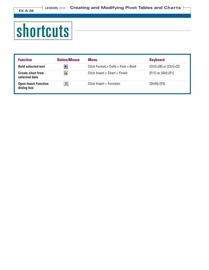
shortcutsFunction Button/Mouse Menu Keyboard
Bold selected text Click Format > Cells > Font > Bold [Ctrl]+[B] or [Ctrl]+[2]
Create chart from Click Insert > Chart > Finish [F11] or [Alt]+[F1]selected data
Open Insert Function Click Insert > Function [Shift]+[F3]dialog box
LESSON ONE Creating and Modifying Pivot Tables and ChartsEX A.26

quizA. Identify Key Features
Name the items indicated by callouts in Figure A-34.
B. Select the Best Answer
10. A specialized report in Excel that summarizes data from a spreadsheet a. SUM
11. A graphical representation of the data in a pivot table b. Summary function
12. A series of interrelated dialog boxes that ask for data and offer options c. Field Settings
13. The default function for calculating fields in a pivot table d. Data series
14. An automatic subtotal or other calculation in a pivot table or pivot chart e. Wizard
15. The button that displays the PivotTable Field dialog box f. Refresh
16. Enables you to filter a pivot table to display data for one or all items g. Pivot chart
17. To update a pivot table to reflect changed data in its source list h. Page field
18. The set of data points that are plotted in a chart i. Pivot table
1.
2.
4.
5.
6.
3.
7.
Figure A-34 Pivot table elements
EX A.27I n t e r @ c t i v e L e a r n i n g S e r i e s
8.
9.

quiz (continued)
19. You generally create pivot tables to:
a. Extract a smaller amount of data from a largerset.
b. Sum up a large amount of data to compareone set of data with another.
c. Organize sub-categories of data within largercategories.
d. All of the above
20. A PivotChart report is commonly called a:
a. Pivot table.
b. Table chart.
c. Chart table.
d. None of the above
21. A wizard is a
a. Series of interrelated dialog boxes.
b. Set of option buttons.
c. Set of check boxes.
d. None of the above
22. Which one of the following is the default func-tion for calculating fields that you drag from afield list to a pivot table?
a. AVERAGE
b. SUM
c. FIELDS
d. COUNT
23. Filtering involves specifying criteria by whichyou
a. Change the height and width of a pivot table.
b. Protect a worksheet so you cannot drag afield to a new location.
c. Select a smaller set of data from a larger set.
d. None of the above
24. A source list is
a. A worksheet or similar table used to create apivot table or a pivot chart.
b. The pivot table or pivot chart created from aworksheet.
c. The same as a destination list.
d. None of the above
25. To access the Pivot Table Wizard, you can clickthe
a. PivotTable button on the PivotTable toolbar.
b. PivotChart button on the PivotChart toolbar.
c. Help button on the Layout screen.
d. None of the above
26. The Bold, Currency Style, and Decrease Decimalbuttons appear on the
a. Standard toolbar.
b. Formatting toolbar.
c. PivotTable toolbar.
d. All of the above
27. The GETPIVOTDATA function is used to
a. Create a pivot table from a worksheet.
b. Create a pivot chart from a worksheet.
c. Retrieve data from a pivot table.
d. None of the above
C. Complete the Statement
LESSON ONE Creating and Modifying Pivot Tables and ChartsEX A.28

interactivity1. Create a pivot table from a pre-existing worksheet:
a. Open the student file pivot_exbuild.xls and save it as Faculty.xls. Click cell A1, click the Data menu, and thenclick PivotTable and PivotChart Report to open the PivotTable and PivotChart Wizard.
b. In the Where is the data that you want to analyze? section, verify that the Microsoft Office Excel list or dataoption button is selected. In the What kind of report do you want to create? section, verify that the PivotTableoption button is selected. Click Next to move to Step 2 of the wizard.
c. Accept the selection in the Where is the data that you want to use? text box and then click Next to move to Step 3 of the wizard. Accept the default option, New worksheet. Click Finish to display a blank pivot table on anew worksheet and the PivotTable Field List.
d. Drag the Position field from the field list to the Column Fields area on the blank table. Drag the Lname field fromthe field list to the Row Fields area. Drag the Annual Salary field from the field list to the Data Items area.
e. Verify that the following totals appear in the completed pivot table: Assistant Professor - 325000; AssociateProfessor - 320000; Instructor - 148000; Professor - 415000; Grand Total - 1208000.
f. Rename the worksheet tab for the pivot table as FacultyTable. Resave the workbook.
2. Add a summary function to the pivot table:
a. Click cell E25, type No. of Faculty, and press [Tab].
b. In cell F25, type =COUNT(. Select cell range F5:F23, which contains the annual salaries of all faculty members.Press [Enter]. Verify that the total count of faculty equals 19.
c. Resave the workbook.
3. Create a three-dimensional pivot table:
a. If needed, click a cell in the pivot table. Drag the Division field from the fields list to the Page Fields area at thevery top of the pivot table.
b. Click the drop-down list arrow for the Division field, click Humanities, and then click OK to display just thesalaries for the Humanities faculty. Verify that the Grand Total of salaries equals 355000.
c. Imitate Step 3b to display the salaries for just the Natural Sciences, Professional Studies, and Social Sciences.Verify the following Grand Totals: Natural Sciences - 227000; Professional Studies - 335000; Social Sciences -291000.
d. Return the pivot table to displaying the salaries for All faculty and resave the workbook.
4. Modify the worksheet source list and then refresh the pivot table:
a. Click the Faculty worksheet tab.
b. Add the following information, in the proper cells, for a new faculty member, Evita Cervantes. Division -Humanities; Department - Languages; Position - Assistant Professor; Annual Salary - 55000; Course Load - 4.
c. Format the additional line with All Borders, use the Sort command on the Data menu to re-sort the worksheet byLname, Fname, and then Position. Verify that Cervantes’ name and data appear at the top of the worksheet.
d. Click the FacultyTable worksheet tab and then click any cell of the pivot table. Click the Refresh button on thePivotTable toolbar to update the table. Resave the workbook.
Build Your Skills
EX A.29I n t e r @ c t i v e L e a r n i n g S e r i e s
interactivity (continued)
LESSON ONE Creating and Modifying Pivot Tables and ChartsEX A.30
5. Modify the layout of the pivot table:
a. Click a cell in the Lname column of the pivot table. Click the Data menu, point to Sort, and then click OK toarrange the faculty members’ data by last name.
b. Click cell E25 in the pivot table, and then bold and center the text, No. of Faculty. Select the cell range E25:F25and then use the Borders button on the Formatting toolbar to add All Borders to the two cells.
c. Click cell B1 and drag backward into cell A1. Bold both the Division field and the word All. Double-click theFormat Painter, use it to bold the Sum of Annual Salary field in cell A3, the Position field in cell B3, and all ofthe text in row 4 (not the row itself). Turn off the Format Painter button.
6. Create and modify a pivot chart from the pivot table:
a. Use the Division field drop-down list to display the data for just the Humanities faculty in the pivot table. Clickthe Chart button to create a pivot chart for the Humanities faculty. If needed, use the Zoom box on the Standardtoolbar to set the Zoom percentage to Selection so you can see the entire chart. Rename the new pivot chart work-sheet tab as FacultyChart.
b. Right-click the white area of the chart and click Chart type. In the Chart type pane, click Bar. In the Chart sub-type pane, click the Clustered bar with a 3-D visual effect chart (the first item in the second row). Click OK tocreate the pivot chart and to close the dialog box.
c. If needed, close the PivotTable Field List. Right-click the white area of the chart and click Chart Options. Onthe Titles tab, enter the chart title Annual Faculty Salaries - Humanities Division and then close the dialog box.On the pivot chart, select the new title text and change its size to 14 point. Resave the file.
7. Use the GETPIVOTDATA function to place data from a pivot table on the worksheet.
a. Click the FacultyTable worksheet tab. In the Division field drop-down list, click All and then click the OK buttonto display all of the data on the pivot table.
b. Click the Faculty worksheet tab. In cell E23, type Sum of Annual Salaries. Select cell F23 and click the InsertFunction button on the Formula bar. In the Insert Function dialog box, click the Lookup & Reference categoryfrom the Or select a category drop-down list. In the Select a function list box, click GETPIVOTDATA.
c. Click OK to open the Function Arguments dialog box. In the Data_field text box, type “Sum of AnnualSalary” (including the quotation marks).
d. With the Pivot_table text box selected, collapse the dialog box and click the FacultyTable worksheet tab. Selectthe cell range F5:F23 in the pivot table, expand the dialog box, and then click OK to close the dialog box. Thetotal salaries of all faculty, 1198000, will appear in cell F23 of the worksheet.
e. Type your name in cell A23. Type the due date of this exercise in cell B23. Resave and print all three sheets of the workbook.
Build Your Skills
interactivity (continued)1. You run the sales division of Peak City Computers (PCC), which makes, installs, and maintains computer equipment
and software. To track your sales pesonnel in the Northeast, you created a worksheet with their names, job titles, etc.The company president of PCC wants you to reorganize the worksheet by new criteria. Instead of redesigning theworksheet, create three pivot tables that organize the data in differing ways and then create a pivot chart.
a. Open the student file pivot_exproblem-1.xls and save it as PeakStaff.xls.b. Create a pivot table listing employees by the types of jobs they have. To do so, place the employee’s last
name field in the row fields area, place the job title in the column fields area, and then again in the dataitems area. Name the pivot table tab as StaffTable.
c. Create a second pivot table on a new sheet. Display employees by last name in the row fields area, city in thecolumn fields area, and job title in the data fields area. Name this pivot table tab as StaffTable2.
d. In cell A27 of StaffTable2, type, center, bold, and autofit the text Total Boston Staff. In cell B27 use theCOUNT function to create a formula that returns the total number of Boston sales managers and representa-tives together.
e. Create a third pivot table on a new sheet. Drag the City field to the Row Fields area and drag the Lnamefield to the Data Items area. Name this pivot table tab as StaffTable3.
f. Based on StaffTable3, create a pivot chart that shows the number of employees in each city. Rename the charttab as StaffChart.
g. Convert the chart to a Pie with a 3-D visual effect. Right-click the entire pie, click Format Data Series, addthe Value to the Data Labels tab, and then click OK to apply the value to each pie slice.
h. Add your name to the bottom of both the worksheet and the pivot table, resave the workbook, and then printit for your instructor.
2. At PCC, you must report to the president periodically and review sales data. You have just prepared the 2005 year-endsales report for five cities where your company does business. Create a pivot table from the worksheet, modify thepivot table to reflect a change in the worksheet, create a pivot chart, and then use the GETPIVOTDATA function.
a. Open the student file pivot_exproblem-2.xls. Save it as PeakSales.xls. Create a pivot table displaying datafor the City field and Totals field. Rename the pivot table tab as SalesTable. Resave the workbook.
b. Click the 2005_Sales tab, add the following data to the worksheet:City: CharlestonFirst Quarter: 125000Second Quarter: 185000Third Quarter 225000Fourth Quarter 295000
c. Refresh the pivot table, then sort it alphabetically by city name. Resave the workbook.d. Right-click any cell in the pivot table and click PivotTable Wizard to display Step 3 of 3 of the PivotTable
and PivotChart Wizard. Open the PivotTable Options dialog box. Deselect the Grand totals for columnscheck box. Click OK to close the dialog box and then click Finish to close the wizard. Resave the workbook.
e. Create a pivot chart from the pivot table and name the chart tab SalesChart. At the bottom of the chart, clickthe City list arrow, remove the check mark from the Totals check box, and then click OK to delete the Totalscolumn from the chart. Resave the workbook.
f. Change the chart to a Clustered column with 3-D visual effect chart type. Change the chart title (not thechart tab) to Total Peak City Sales - 2005. Change the font to Arial Black. Change the font size to 14 point.
g. On the SalesTable page, restore the Grand Total row using the Grand totals for columns check box in thePivotTable Options dialog box. Resave the workbook. Modify the pivot table to display Totals for only NewYork and Newark.
h. In cell E11 of the worksheet, type, center, and bold the text New York/Newark. Autofit the column to thetext. Add All Borders around cells E11 and F11.
i. In cell F11, use the GETPIVOTDATA function to display the total sales for New York and Newark. Resavethe workbook. Follow your instructor’s directions as to which versions of the worksheet, pivot table, and pivotchart to print.
Problem Solving Exercises
EX A.31I n t e r @ c t i v e L e a r n i n g S e r i e s

NOTES