Embed Size (px)
Citation preview

Appendix A
Criteria for the Development and Evaluation of Electronic-Based Nutrition Education for
WIC Participants

2
Table of Contents
Pages Overview……………………………………………………………… 3-4
Criteria Checklist……………………………………………………… 5-17 • Site Content – page 5 • Site Functionality – page 6 • Site Design – page 7 • Layout – page 8 • Readability/Writing Style – page 9 • Learning Experience – pages 10-11 • Type Style – page 12 • Use of Color – page 13 • Photos, Illustrations, Symbols – page 14 • Non- English Site Development/Translations – page 15 • Site Evaluation – page 16 • Score sheet – page 17
Rationale for Criteria…………………………………………………… 18-30 • Site Content – page 18 • Site Functionality – page 19 • Site Design – page 20 • Layout – page 21 • Readability/Writing Style – page 22 • Learning Experience – pages 23-24 • Type Style – pages 25-26 • Use of Color – page 27 • Photos, Illustrations, Symbols – page 28 • Non- English Site Development/Translations – page 29 • Site Evaluation – page 30
References……………………………………………………………… 31-34

3
Criteria for the Development and Evaluation of Computer-Based Nutrition Education for WIC Participants
Overview The Food and Nutrition Service (FNS) Special Supplemental Nutrition Program for Women, Infants and Children (WIC) has developed standardized, science-based criteria for use by State and local WIC agencies in designing, developing and evaluating electronic-based nutrition education for participants of the WIC Program. The criteria can be used during the design and development phase or to evaluate electronic-based nutrition education that is already developed and available for use or purchase. In an attempt to find new, innovative and accessible methods for delivering nutrition education, some State and local agencies are turning to the Internet as one method of delivering nutrition education benefits to WIC participants. Applying standardized science-based criteria for the development and evaluation of electronic-based nutrition education will ensure that WIC participants receive effective, high-quality, nutrition education via this delivery method. The criteria were developed through a comprehensive literature search of relevant material pertaining to effective online/Internet-based education, nutrition education, communication, adult/child learning and behavior change theory and Internet evaluation tools. The criteria meld what is known about communication for low-literacy audiences with more recent references on evaluation of on-line education and information for underserved populations (those with less access to technology). Considerations for Use of Electronic–Based Nutrition Education Currently, FNS has allowed limited Internet nutrition education to be used in remote areas that lack clinic access, that have participants who are well ”connected” to the internet and have, for the most part, developed sophisticated systems for tracking, monitoring and following-up participant usage to ensure nutrition education is being delivered effectively. Administrative Burdens -- Significant resources are required to operate, staff and manage an on-line or computerized system. Factored with other barriers associated with electronic-based nutrition education, it may be cost prohibitive for most State and local agencies. • Tracking and monitoring requires an administrative back-end system, which can incur
considerable cost. • Staff requirements include not only the time required to input data, monitor and track
usage, but may also necessitate skills that current employees may not possess. • Nutrition information and links need to be constantly evaluated to ensure that they are
up-to-date and active. • Technical assistance and follow-up to address questions, both technical and nutrition
related, and to provide feedback to participants must be available.
4
Participant Barriers – electronic-based nutrition education can also be difficult due to: • Lack of consistent computer and Internet access; many participants may initially have
computer/Internet access but lose it due to moving, transportation or money. • Lack of structure; many people find it easier to follow through when engaged in a
face-to-face conversation. • Low literacy or illiteracy and discomfort with technology. Organization This document has three sections, the criteria checklist with site evaluation questions and scoring; a rationale for inclusion of the criterion; and a reference section. There are 66 questions that make up the criteria. The criteria are organized into eleven groupings including:
1. Site Content 2. Site Functionality 3. Site Design 4. Layout 5. Readability/Writing Style 6. Learning Experience 7. Type Style 8. Use of Color 9. Photos, Illustrations, Symbols 10. Non-English Site Development/Translations 11. Site Evaluation
Scoring The criteria are written as evaluation questions with each question scored on a scale from 0 (zero) to 2. If the site meets the criterion, score it as a 2 (Yes). If the site has some elements of the criterion but needs improvement, score it as a 1 (Needs Improvement). If the site does not reflect the criterion, score it as a 0 (No). If the criterion cannot be assessed, enter CA on the rating line. There may be some questions that are difficult to assess without background information and documentation from the site developer. For instance, assessing whether the site developer pre-tested content and messages with a sample client population prior to launching the site may not be information that is readily available on the site. Questions with a rating of CA indicate that further inquiry and discussions with the site developer is needed to determine whether the criterion is met. Each group of criterion has a sub-score. At the end of the checklist, the sub-scores are tallied for an overall score. A higher score indicates a higher level of site quality. A low score on rating as well as a high number of “CA” responses may indicate a poorer quality site.
5
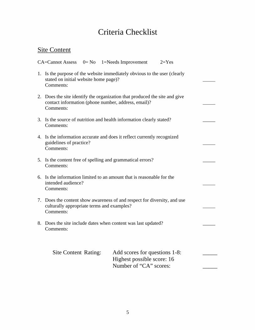
Criteria Checklist
Site Content CA=Cannot Assess 0= No 1=Needs Improvement 2=Yes 1. Is the purpose of the website immediately obvious to the user (clearly
stated on initial website home page)? _____ Comments:
2. Does the site identify the organization that produced the site and give contact information (phone number, address, email)? _____ Comments:
3. Is the source of nutrition and health information clearly stated? _____
Comments: 4. Is the information accurate and does it reflect currently recognized
guidelines of practice? _____ Comments:
5. Is the content free of spelling and grammatical errors? _____
Comments:
6. Is the information limited to an amount that is reasonable for the intended audience? _____ Comments:
7. Does the content show awareness of and respect for diversity, and use
culturally appropriate terms and examples? _____ Comments:
8. Does the site include dates when content was last updated? _____ Comments:
Site Content Rating: Add scores for questions 1-8: _____ Highest possible score: 16 Number of “CA” scores: _____

6
Site Functionality CA=Cannot Assess 0= No 1=Needs Improvement 2=Yes 1. Is the speed of download for the site acceptable to users with graphics
and photos downloading quickly (tested with both high-speed cable and dial-up connections)? _____ Comments:
2. Does site work in both Internet Explorer and Netscape Navigator browsers? _____ Comments:
3. Is the site easy to navigate, including clearly labeled Back, Home, Go To Top, Next Page icons/links? _____ Comments:
4. Do all site links work properly? _____
Comments: 5. Do all multimedia resources work properly (audio, video)? _____
Comments: 6. Does the site work in “text only” (graphics turned off) mode? _____
Comments:
Site Functionality Rating: Add scores for questions 1-6: _____
Highest possible score: 12 Number of “CA” scores: _____

7
Site Design CA=Cannot Assess 0= No 1=Needs Improvement 2=Yes 1. Does the site look appealing at first glance (uncluttered pages with
plenty of white space? _____ Comments:
2. Are there brief, easy to understand instructions on how to move
through the site and complete activities? _____ Comments:
3. Do the graphics enrich the content and add to it in a logical fashion, not
merely decoratively, including making the text easier to understand for low-literacy users? _____ Comments:
4. Does the graphic design use contrast, indentation, bullets, interactive _____
buttons, and other devices to signal main points and make the text easy to skim/read? Comments:
Site Design Rating: Add scores for questions 1-4: _____
Highest possible score: 8 Number of “CA” scores: _____

8
Layout
CA=Cannot Assess 0= No 1=Needs Improvement 2=Yes 1. Does the overall site/module design seem unified and consistent from
page to page in its layout? _____ Comments:
2. Is the material logically organized into meaningful segments, sections,
pages or pop-ups? _____ Comments:
3. Are there banners, headings, subheadings or other design elements that are clear, informative, and signal what is coming next? _____ Comments:
4. Does the material emphasize and summarize the main points? _____
Comments: 5. Are pages laid out to minimize need for scrolling to read content? _____
Comments: 6. Is there a navigation bar (menu) that clearly describes choices for users and
appears consistently from page to page? _____ Comments:
Layout Rating: Add scores for questions 1-6: _____ Highest possible score: 12 Number of “CA” scores: _____

9
Readability/Writing Style CA=Cannot Assess 0= No 1=Needs Improvement 2=Yes 1. Is the material written primarily in the active voice (for primary sites
and any links that provide additional information and resources)? _____ Example: Active voice: Eat a variety of foods to help your body meet its nutrient needs. Non-active voice: A nutritious diet consists of a variety of foods. Comments:
2. Is the reading level appropriate for the intended audience? _____
Comments:
3. Are the words and sentences generally short, simple, and direct without being choppy or sacrificing meaning? _____ Comments:
4. If technical terms and jargon are used, are they clearly explained with helpful examples? _____ Comments:
5. Are concise words used whenever possible? _____ Example: “Fruits have fiber” instead of “Fruits contain fiber.” Comments:
6. Is the information supported by concrete examples? _____ This sentence provides concrete examples: Vegetables that are deep orange, like carrots, sweet potatoes and deep green, like broccoli, collards, are good sources of Vitamin A.” Comments:
Readability/Writing Style Rating: Add scores for questions 1-6: _____ Highest possible score: 12 Number of “CA” scores: _____

10
Learning Experience (Engaging, Motivating, Supporting the User) CA=Cannot Assess 0= No 1=Needs Improvement 2=Yes 1. Are learning outcomes defined (either as learning objectives written as
part of user content or included as a “menu” option)? Comments: _____ 2. Does the site effectively use a learning/behavior change model (such as
stages of change, constructs of the health belief model, Transtheoretical Model, social cognitive theory, or theory of reasoned action and planned behavior or other) for planning the content, choices and interactivity? _____ Comments:
3. Are there strategies to engage and involve the user (such as question and answer format, problem-solution, stories, or vignettes)? _____
Comments:
4. Does the site provide immediate feedback to users when they complete an activity or answer questions? _____ Comments:
5. Is the “how to” advice specific, urging behavior that is feasible and
culturally appropriate for users? _____ Comments:
6. Does the site request user information, such as food intake and preferences, in order to customize the learning experience and increase user interaction? _____ Comments:
7. Does the site customize information and recommendations to individual users (like the MyPyramid.gov)? _____ Comments:
8. Are users able to print hard copy of individualized information, materials, and selected site content ? _____ Comments: 9. Are there printable materials (e.g., fact sheets, recipes, posters, eating
pattern messages on a variety of items) that reinforce the on-line messages, information, and content to extend the learning experience? _____ Comments:

11
10. Are there links to local resources where users can get more information or assistance (for example, Farmers Market locations, WIC retailers, food assistance organizations)? _____ Comments: 11. Does the site minimize the amount and type of keyboarding needed to _____
move through and complete the educational activity? Comments:
Learning Experience Rating: Add scores for questions 1-11: _____ Highest possible score: 22 Number of “CA” scores: _____

12
Type Style CA=Cannot Assess 0= No 1=Needs Improvement 2=Yes
1. Does the site use an effective combination of readable type styles
and font sizes to get good contrast between the text and the heading and titles? _____
Comments: 2. Do the text and titles use capital letters only when capitals
are needed grammatically (no text in “ALL CAPS”)? _____ Comments:
3. Does the site emphasize text by restrained use of italics, bolding,
or other devises like contrast in size or color accents? _____ Comments:
4. Are lines of text an appropriate length for easy reading (no left to right
or up and down scrolling needed to read text)? _____ Comments:
5. Does the site avoid the use of wrapping text around photos/graphics
in awkward ways? _____ Comments:
6. Does the text avoid splitting words across two lines? When headings take
more than one line, does the break between lines reflect natural phrasing and avoid leaving a single word by itself on the second line? _____ Comments:
7. Is there enough contrast between the text and the background to read _____
everything easily, i.e., limited use of reversed out (light-colored text on a dark background)?
Comments: Type Style Rating: Add scores for questions 1-7: _____
Highest possible score: 14 Number of “CA” scores: _____

13
Use of Color CA=Cannot Assess 0= No 1=Needs Improvement 2=Yes
1. Are the colors chosen appealing to the intended audience and free from
problematic cultural significance? _____ Comments:
2. Is color used in a consistent and deliberate way to enhance the meaning
and impact of the key messages and information? ______ Comments:
Use of Color Rating: Add scores for questions 1-2 _____
Highest possible score: 4 Number of “CA” scores: _____

14
Photos, Illustrations, Symbols CA=Cannot Assess 0= No 1=Needs Improvement 2=Yes 1. Are the photos, illustrations, symbols, patterns, and other visuals related
to the information presented and used to reinforce key messages? _____ Comments:
2. Are the people and activities shown in photos or illustrations contemporary
and representative of the intended audience in their demographics, physical appearance, behavior, and cultural elements (free from unwanted connotations or problematic cultural significance)? _____ Comments:
3. Are the photos, illustrations, and other images consistent in style for a
uniform look? _____ Comments:
4. Do the photos and illustrations have a high quality professional look (the
images themselves, cropping, resolution is not grainy, free from clutter and other distracting details)? _____ Comments:
5. Does the site avoid using cartoons, humor, and caricature (which may be misunderstood or offensive)? _____ Comments:
Photos, Illustrations, Symbols Rating: Add scores for questions 1-5: _____ Highest possible score: 10 Number of “CA” scores: _____

15
Non-English Site Development/Translations CA=Cannot Assess 0= No 1=Needs Improvement 2=Yes 1. Is the site available in other languages? _____
Comments:
2. Does the site clearly direct users to alternate versions in other languages? _____ Comments:
3. Is translation done for meaning and ease of reading, avoiding
awkwardness of literal translation from English? _____ Comments:
4. If a translated version of the site exists, has it been evaluated by a native
speaker using the evaluation criteria by someone proficient in the language and aware of the cultural sensitivities of the intended audience? _____ Comments:
Non-English Site Development/Translations Rating:
Add scores for questions 1-4: _____ Highest possible score: 8 Number of “CA” scores: _____

16
Site Evaluation CA=Cannot Assess 0= No 1=Needs Improvement 2=Yes 1. Has formative research been conducted with intended audiences
to determine initial conception of communications, education strategies, messages, topic selection, and site design elements? _____ Comments:
2. Has the site been pre-tested with the intended audience for comprehension, ease of use, cultural acceptance, and interactivity? _____ Comments:
3. Has the site been reviewed by an appropriate professional resource
prior to release (nutrition professional, providers, website designers)? _____ Comments:
4. Has the site been evaluated post release and are the results of the
evaluation available? _____ Comments:
5. Does the site include pre and post test assessment of user knowledge,
attitude and behavior? _____ Comments:
6. Does the site include programming that collects information
(users, degree of interaction, length of time on site, accuracy of completing the activities, user satisfaction with site, number of hits, etc) for site evaluation and for documenting nutrition education contacts? _____ Comments:
7. Is there a confidentiality of information statement that explains to the user how any information collected will be used? _____ Comments:
Site Evaluation Rating: Add scores for questions 1-7: _____ Highest possible score: 14 Number of “CA” scores: _____

17
Criteria for the Development and Evaluation of Electronic-Based Nutrition Education for WIC Participants
CRITERIA SCORESHEET:
Sections (maximum possible score) Sub
Scores: Number of
“Cannot Assess” Responses
Site Content (16): Site Functionality (12): Site Design (8): Site Layout (12): Readability (12): Learning Experience (22): Type Style (14): Use of Color (4): Photos, Illustrations, Symbols (10): Non-English Site Development/Translations (8):
Site Evaluation (14):
Add sub-scores for Total Score: Total Possible Score: 132

18
Rationale for Criteria
Site Content 1. Is the purpose of the website immediately obvious to the user?
References: Bouch, Lazarus, McGee • If the content and purpose are not clearly evident for the title and other clues on
the home page, users may be confused or feel that that the site is not relevant to them.
2. Does the site identify the organization that produced the site and give contact information (telephone number, address, email)? References: Schrock • Necessary in order to be able to ask questions about site development.
3. Is the source of nutrition and health information clearly stated?
Reference: McGee • Necessary to ensure that reliable sources were used.
4. Is the information accurate and does it reflect currently recognized guidelines of
practice? References: McGee, Schrock • Be sure of the facts. This applies not only to nutrition, health, medical, scientific
and technical information, but also to contact information. 5. Is the content free of spelling and grammatical errors?
References: Doak, McGee, Schrock 6. Is the information limited to an amount that is reasonable for the intended audience?
References: Bouch, Marcario • Only 25% of the adult population is highly literate. Give readers the most
important points first and last. Literacy experts suggest that information be grouped into succinct “chunks” with a clear sequence of information.
7. Does the content show awareness of and respect for diversity, and use culturally
appropriate terms and examples? References: Macario, Shire, Lazarus • The research suggests that effective nutrition interventions must build on patients'
social networks; appear in a visually based, interactive format; and be culturally appropriate.
8. Does the site include dates when content was last updated? References: Bernard, Nielsen • Web sites should be updated regularly as new information becomes available.

19
Site Functionality 1. Is the speed of download for the site acceptable to users with graphics and photos
downloading quickly (tested with both high-speed cable and dial-up connections)? References: Bernard, Dellart, Lazarus • Users get frustrated with waiting for a site to download especially when there are
a lot of gratuitous graphics. Placing images that do not add to the site will decrease rather than increase user satisfaction with the site. Users may also be frustrated if they do not know how long they have to wait. It is preferable to have quick download times. When this is not possible, providing adequate information about expected wait time is important.
2. Does site work in both Internet Explorer and Netscape Navigator browsers?
References: Bernard, Lazarus 3. Is the site easy to navigate?
References: Benway, Kinzie, Lynch, Zarcadoolas • Navigation buttons should be clearly labeled, i.e., Back, Home, Go To, Top, Next
Page icons/links.
4. Do all site links work properly? References: Benway, Kinzie, Lynch, Zarcadoolas • Users will become frustrated if links are not maintained.
5. Do all multimedia resources work properly (audio, video)?
References: Lazarus • Users will become frustrated if multimedia resources are not maintained.
6. Does the site work in “text only” mode (with graphics turned off)?
References: Schrock • A Web page should be readable with graphics turned on or off or via a text-based
browser.

20
Site Design 1. Does the site look appealing at first glance with uncluttered pages with plenty of white space? References: Bernard, McGee, Doak
• The use of open space is generally more effective in organizing and grouping information than using imposed, artificial structures such as visually nested frames or bars. It is also more aesthetically pleasing. Empirical studies support the proper use of open space to increase user satisfaction with a website.
2. Are there brief, easy to understand instructions on how to move through the site and complete activities? References: Bernard, Zarcadoolas
• Instructions that help users learn about the site will enhance site use. 3. Do the graphics enrich content and add to it in a logical fashion, not merely decoratively, including making the text easier to understand for low-literacy users? References: Lantz, Lazarus
• Unrelated graphics that do not enrich content distract from important content and comprehension. For lower-literacy audiences, it critical that graphics directly relate to content. All illustrations, graphics, or photos must be placed near the related text/content, and when appropriate, be labeled and explained.
4. Does the graphic design use contrast, indentation, bullets, interactive buttons, and other devices to signal main points and make the text easy to skim/read? References: Doak, NCI-Clear & Simple, Bernard
• Users prefer lists to be presented with bullets and spaces between each line. Cues, like circles, arrows or boxes draw the reader's eye to important information.
• Action objects (live links, buttons, icons) should be easily identified as actionable. For example, a link button may be perceived to afford clicking because of its '3-D' or 'raised' appearance. Conversely, non-navigation objects should not look like they could be clicked in order not to 'trick' the user into thinking they are links.
• Buttons also can act as the primary link for movement to other web pages, usually within the same website. When this occurs, text-based links often serve as a less important, secondary or supplemental link for the buttons. Normally, however, text-based links are the primary link to other internal web pages.
• Physical appearance of objects such as icons can significantly affect navigational performance. For example, icons with abstract but simple symbols that represented concrete objects resulted in the fewest number of errors and requests for help. In addition, large and simple icons outperformed complex ones by a significant margin. Complex icons tend to clutter the screen with unnecessary information.

21
Layout 1. Does the overall site/module design seem unified and consistent from page to page in its layout? References: Bernard, Tufte
• Organize the interface by reducing un-needed visual elements as much as possible and to reduce unnecessary visual "noise." Ensuring consistency of layout and design from page to page supports a unified layout.
2. Is the material logically organized into meaningful segments, sections, pages or pop- ups? References: Doak, McGee 3. Are there banners, headings, subheadings or other design elements that are clear,
informative, and signal what is coming next? References: Benway, Doak, McGee
4. Does the material emphasize and summarize the main points? References: Doak, McGee • Summarizing main points increases comprehension of content and concepts.
5. Are pages laid out to minimize need for scrolling to read content?
References: Bernard • Users often miss important information simply because they forget or are
unwilling to scroll in a particular direction (either vertically or horizontally) so they may not see information outside the primary screen area. Important information should always fit within the horizontal viewing area and vertical scrolling should be kept to a minimum.
6. Is there a navigation bar (menu) that clearly describes choices for users and that
appears consistently on each page? References: Lazarus, Bernard • Categorical menus are superior in search performance and satisfaction to
alphabetized sitemaps. Categorical menus arranged in columns are searched faster than menus arranged in rows.

22
Readability/Writing Style 1. Is the material written primarily in the active voice (for primary sites and any links that provide additional information and resources)?
Example: Active voice: Eat a variety of foods to help your body meet its nutrient needs. Non-active voice: A nutritious diet consists of a variety of foods. Reference: Doak, Lazarus • Active voice gives the user an action to take rather than just provide information
and helps move the user into desired behaviors. 2. Is the reading level appropriate for the intended audience?
References: Busselman, Graber, Lazarus, Schoenberger, Townsend • A study of patient education material from the Web evaluated for readability
using the Flesch reading score and Flesch-Kinkaid reading level indicated that on average, patient information from the Web is written at a 10th grade reading level. Previous studies have shown that this readability level is not comprehensible to the majority of patients. When primary audience as limited literacy (particularly new immigrants), readability at grade 6 or lower is desirable. There are a variety of software tools available to assess the reading level of text.
3. Are the words and sentences generally short, simple, and direct without being choppy or sacrificing meaning?
References: Lazarus, Bernard, McGee, Nielsen • About 11 words per line is recommended to reduce eye movement and keep the
users attention. Use words that are familiar to your users. Keep sentences simple, specific, direct, and written in the active voice.
4. If technical terms and jargon are used, are they clearly explained with helpful examples?
References: McGee • It is critical to minimize the use of technical terms and jargon. If such terms are
used, clear explanations must be given using examples and words familiar to the intended audience.
5. Are concise words used whenever possible? References: Doak, Schuster, Lazarus Example: “Fruits have fiber” instead of “Fruits contain fiber.”
• Concise words help low literacy users understand the messages.
6. Is information supported by concrete examples? References: Doak, Schuster • For example: “Vegetables that are deep orange or dark green, like carrots, sweet
potatoes, collards, and broccoli are good sources of Vitamin A.”

23
Learning Experience (Engaging, Motivating, Supporting the User) 1. Are learning outcomes defined (either as learning objectives written as part of user content or included as a “menu” option)?
References: Doak, Jelovsek, Smith CE • Base the development of education sites on established principles of teaching and
learning, as well as proper identification of realistic educational goals. 2. Does the site effectively use a learning/behavior change model for planning the content, choices and interactivity (such as stages of change, constructs of the health belief model, Transtheoretical Model, social cognitive theory, or theory of reasoned action and planned behavior)?
References: Doshi, Fahrenwald, Jelovsek, Sternberger, Lazarus, Molaison, • Effective communication methods, both verbal and audiovisual, are as important
in computer modules as they are in face-to-face teaching. The quality of interactive questioning and the nature and timing of feedback are critical to the success of instruction by computer. Appropriate feedback can improve retention, as can the use of proper distractors in multiple-choice questions.
3. Are there strategies to engage and involve the user?
References: Block, Campbell • Strategies such as question and answers, problem-solution, stories, and vignettes
provide interaction which is important in effective nutrition education.
4. Does the site provide immediate feedback to users when they complete an activity or answer questions?
References: Block, Campbell • Feedback can emphasize small, practical steps that move learners in a direction
that is consistent with their goals and allows them to experience some success.
5. Is the “how to” advice specific, urging behavior that is feasible and culturally appropriate for users? References: Shire, USDA-ERS, Roberts
• The true mission of teaching is to facilitate learning, and adult learning is enhanced by four elements: respect, building on previous experiences, immediacy of application, and the opportunity to practice.
• Recommended actions for food purchasing, preparation and eating are low-cost in money, time, and effort to increase likelihood that consumers will adopt the chances.
6. Does the site ask users for information such as food intake and preferences, in order to customize the learning experience and increase user interaction? References: Bechtel-Blackwell, Block, Campbell, Lazarus, USDA-ERS • Assessment of a user’s level of interest in a topic or their motivation to
learn/change behavior is a factor for intent to change.

24
7. Does the site customize information and recommendations to individual users (like the MyPyramid.gov)?
References: Brug 1999, Brug 2000, Block, Campbell, Macario, Schoenberge • Results from a randomized control trial of computer-tailored nutrition education
interventions indicate that tailored feedback addressing attitudes, perceived social support and self-efficacy might be effective in inducing dietary changes.
• Computer-tailored feedback proved to be more effective in motivating precontemplators to proceed towards dietary fat reduction than general information. Higher appreciation and use of the computer-tailored fat-feedback was found among respondents in contemplation than in other stages.
• Respondents with low education were more positive about how interesting and how personally relevant the tailored letters were.
• The findings of a pilot study suggest that computerized tailored self-help health promotion programs may be effective educational interventions for lower income and minority populations.
• There is ample evidence that printed, computer-tailored nutrition education is a more effective tool for motivating people to change to healthier diets than general nutrition education. New technology is now providing more advanced ways of delivering tailored messages, e.g. via the World Wide Web (WWW).
8. Are users able to print a hard copy of individualized information, materials, and selected site content?
Reference: Tisa, USDA-ERS • This may extend the learning experience for some users.
9. Are there printable materials available (e.g., fact sheets, recipes, posters, eating pattern messages on a variety of items) that reinforce the on-line messages, information, and content to extend the learning experience? Reference: USDA-ERS • Repeating nutrition education messages reinforce the learning experience.
10. Are there links to local resources where users can get more information or assistance (i.e., Farmers Market locations, WIC retailers, food assistance organizations)?
References: Lazarus 11. Does the site minimize the amount and type of keyboarding (typing, mouse clicks)
needed to move through and complete the educational activity? References: Bernard • Scrolling should be minimal; experts suggest limiting the number of “clicks”
required to find information be less than 3 otherwise the user loses interest.

25
Type Style 1. Does the site use an effective combination of readable type styles and font sizes to get good contrast between the text and the heading and titles?
References: Doak, NCI-Clear & Simple, Bernard • A 14 or 12-point type is optimal for on-line reading. • Use a font that your target audience can read. Studies do not consistently show
that serif fonts (with little “feet” or extenders on the letters) are easier to read than non-serif fonts.
• Evidence suggests that the most commonly used fonts tend to be equally legible at the 10-, 12-, and 14-point size. Comparing four sans serif fonts (Arial, Comic Sans MS, Tahoma, and Verdana) and four serif fonts (Courier New, Georgia, Century Schoolbook, Times New Roman) at a resolution of 1024 x 768 revealed no difference in effective reading (font accuracy/speed of reading) between font types.
2. Do the text and titles use capital letters only when capitals are grammatically needed?
References: Doak, National Cancer Institute, Bernard • Text in “ALL CAPS” is difficult to read.
3. Does the site emphasize text by restrained use of italics, bolding, or other devises like contrast in size or color accents?
References: Doak, National Cancer Institute, Bernard • Italics and bolding should draw attention to important words or phrases.
Excessive use of these devises will clutter the site and distract the user.
4. Are lines of text an appropriate length for easy reading (no left to right or up and down scrolling needed to read text)?
References: Bernard • The optimal text line length is dependent upon several factors. It is commonly
recommended that shorter line lengths (about 11 words) should be used in place of longer, full-screen lengths. This is because longer line lengths require greater lateral eye movements, which make it more likely to lose one’s place within the text. Longer line lengths are more tiring to read. Lines should be limited to lengths of around 40 to 60 characters, which is approximately 11 words per line.
• People with poor reading ability performed better when the line length was approximately seven words. This suggests that young readers who have not mastered reading online, as well as readers who have vision deficits, may be most benefited by having shorter line lengths.
5. Is the wrapping of text around photos/graphics in awkward ways avoided? References: Bernard, McGee
• It is recommended that white space surround graphics with a well-formulated title or text that supports the graphic.

26
6. Does the text avoid splitting words across two lines? When a sentence takes more than one line, does the break between lines reflect natural phrasing and avoid leaving a single word by itself on the second line? References: McGee • Splitting words often causes confusion about how to read them correctly. Use
bulleted text or clear breaks to avoid confusion. 7. Is there enough contrast between the text and the background to read everything easily? That is, limited use of “reversed out” text (light-colored text on a dark back-ground)
• References: Bernard Dark text on a light background is preferred for better reading comprehension, increased reading speed and less eyestrain.

27
Use of Color 1. Are the colors chosen appealing to the intended audience and free from problematic cultural significance? References: Bernard, Hofstede, Lynch, Marcus
• Color has psychological effects on users that are different across cultures. Color can present opposite meanings, such as yellow for cowardice in the United States, and Grace and Nobility in Japan. Therefore, it is important to test colors with members of intended audience during formative research and design.
2. Is color used in a consistent and deliberate way to enhance the meaning and impact of the key messages and information? References: Lynch
• Color can change the look of pages without adding graphics and can increase the readability of text, separate information on a page, and create impact.

28
Photos, Illustrations, Symbols 1. Are the photos, illustrations, symbols, patterns, and other visuals related to the information presented and used to reinforce key messages? References: Bernard, Schoenberger
• Visuals should support the messages. Unrelated visuals will distract users from the message.
2. Are the people and activities shown in photos or illustrations contemporary and representative of the intended audience in their demographics, physical appearance, behavior, and cultural elements? References: Doak, Jantz, McGee
• Photos and illustrations should be free from unwanted connotations or problematic cultural significance.
3. Are the photos, illustrations, and other images consistent in style for a uniform look? References: Bernard, McGee 4. Do the photos and illustrations have a high quality professional look?
References: McGee • The images themselves, their cropping and resolution should not be grainy,
should be free from clutter and other distracting details.
5. Does the site avoid using cartoons, humor, and caricature (which may be misunderstood or offensive)?
References: Bernard • Studies indicate that animated graphics show no advantage over non-animated
graphics. Moreover, there is some evidence that animated graphics may even reduce text retention by serving to distract the user from attending to the textual information around the graphic. Studies have also been mixed about whether animated graphics are preferable to only text-based interfaces. It has been suggested that animated graphics should be kept at a minimum in order not to distract the user from the main points of the page, as well as to reduce the download time.
• Importantly, graphics that look like banners should normally not serve as important links. This is because users tend to ignore animated graphic because they are generally associated with advertisements. The graphics that are presented should convey a simple message to portray the intended mood of the site or to catch the 'eye' of the user for a brief moment. Any animation that is presented should animate only for several seconds in order not to annoy and distract the user.

29
Non-English Site Development/Translations 1. Is the site available in other languages? References: Lazarus, Russo 2. Does the site clearly direct users to alternate versions in other languages? References: Bernard, Lazarus 3. Is translation done for meaning and ease of reading, avoiding awkwardness of literal translation from English? References: Lazarus
4. If a site exists in other languages, has it been evaluated using the evaluation criteria by a native speaker or someone proficient in the language and aware of the cultural sensitivities of the intended audience? References: Bernard, Lazarus, Marcus, Russo

30
Site Evaluation 1. Has formative research been conducted with intended audiences to determine initial conception of communications, education strategies, messages, topic selection, and site design elements? Reference: USDA-ERS, Lazarus, McGee, Bernard
• Users tend to be far more satisfied and stay with websites that are designed for their use in mind. Formative research with the intended audience is critical for design of a site that reflects the needs, interests, learning styles, and cultural preferences of consumers.
2. Has the site been pre-tested with the intended audience for comprehension, ease of use, cultural acceptance, and interactivity? References: Kinzie, Bernard, McGee
• Relevance to the user is critical for learning.
3. Has the site been reviewed by an appropriate professional resource prior to release (nutrition professionals, providers, website designers)? References: McGee
• This will ensure that the site components are all working properly, the information presented is current and the site meets your criteria.
4. Has the site been evaluated post release and are the results of the evaluation available? References: Smith CE, Jantz, Barnard, Lazarus 5. Does the site include pre and post test assessment of user knowledge, attitude and behavior based on the learning objectives? References: Sternberger, Smith, Oeneman, Roberts, Kolasa
• This feedback is an important element of effective nutrition education. 6. Does the site include programming that collects information (users, degree of interaction, length of time on site, accuracy of completing the activities, user satisfaction with site, etc) for site evaluation and for documenting nutrition education contacts? References: Bechtel-Blackwell, Block, Doshi
• This type of information gathering can be used for site modifications that improve user satisfaction and increase counseling opportunities.
7. Is there a confidentiality of information statement that explains to the user how any information collected will be used? References: Kinzie
• This should be included in the “how-to-use” site or site registration pages.
31
References 1. Bechtel-Blackwell DA. Computer-assisted self-interview and nutrition education in
pregnant teens. Clin Nurs Res. 2002 Nov;11(4):450-62.
2. Benway, J. P., & Lang, D. M. Banner blindness: Web searchers often miss "obvious" links, Internetworking, Dec 1998. 1.3. Retrieved 8/20/02:
Web site: http://www.internettg.org/newsletter/dec98/banner_blindness.html 3. Bernard M. Criteria for Optimal Web Design. Software Usability Research Lab,
Wichita State University. March 2003. Web site: http://psychology.wichita.edu/optimalweb 4. Bernard, M.& Mills, M. Which font do children prefer to read online? Usability News
3.1. 2001. Web site: http://psychology.wichita.edu/surl/usabilitynews/3W/fontJR.htm
5. Bernard, M., Mills, Peterson, M., & Storrer, K. A comparison of popular online fonts: Which are best and when? Usability News 3.2. 2001.
Web site: http://psychology.wichita.edu/surl/usabilitynews/3S/font.htm 6. Bouch, A., Kuchnisky, A., & Bhatti, N. Quality is in the eye of the beholder: Meeting
users' requirements for Internet quality of service. 2000. Proceedings of CHI' 00, 297-304.
7. Block G, Miller M, Harnack L, Kayman S, Mandel S, Cristofar S. An interactive CD-ROM for nutrition screening and counseling. Am J Public Health. 2000 May;90(5):781-5.
8. Brug J, Steenhuis I, van Assema P, Glanz K, De Vries H. Computer-tailored nutrition education: differences between two interventions. Health Educ Res. 1999 Apr;14(2):249-56.
9. Brug J, van Assema P. Differences in use and impact of computer-tailored dietary fat-feedback according to stage of change and education. Appetite. 2000 Jun;34(3):285-93.
10. Busselman KM, Holcomb CA. Reading skill and comprehension of the dietary guidelines by WIC participants. J Am Diet Assoc. 1994 Jun;94(6):622-5.
11. Campbell MK, Honess-Morreale L, Farrell D, Carbone E, Brasure M. A tailored multimedia nutrition education pilot program for low-income women receiving food assistance. Health Educ Res. 1999 Apr;14(2):257-67.

32
12. Delleart B, Kahn, BE (1998). How tolerable is delay? Consumers' evaluations of
internet web sites after waiting. Retrieved 8/20/02: Web site: http://ideas.uqam.ca/ideas/data/Papers/dgrkubcen199864.html
13. Doak CC, Doak LG, Root, JH. Teaching Patients With Low Literacy Skills, 2nd Edition, 1996, J. B. Lippincott Co.
14. Doshi A, Patrick K, Sallis JF, Calfas K. Evaluation of physical activity web sites for use of behavior change theories. Ann Behav Med. 2003 Spring;25(2):105-11.
15. Eysenbach G, Kohler C. How do consumers search for and appraise health information on the world wide web? Qualitative study using focus groups, usability tests, and in-depth interviews. BMJ. 2002 Mar 9;324(7337):573-7.
16. Fahrenwald NL, Walker SN. Application of the Transtheoretical Model of Behavior Change to the Physical Activity Behavior of WIC Mothers. Public Health Nurs. 2003 Jul;20(4):307-317.
17. Graber MA, Roller CM, Kaeble B. Readability levels of patient education material on the World Wide Web. J Fam Pract. 1999 Jan;48(1):58-61.
18. Hofstede, G. Cultures and Organizations: Software of the Mind: Intercultural Cooperation and its Importance for Survival, McGraw Hill, New York. 1991.
19. Jantz C, Anderson J, Gould SM. Using computer-based assessments to evaluate interactive multimedia nutrition education among low-income predominantly Hispanic participants. J Nutr Educ Behav. 2002 Sep-Oct;34(5):252-60.
20. Jelovsek FR, Catanzarite VA, Price RD, Stull RE. Application of teaching and learning principles to computer-aided instruction. MD Comput. 1989 Sep-Oct;6(5):267-73
21. Kinzie MB, Cohn WF, Julian MF, Knaus WA. A user-centered model for web site design: needs assessment, user interface design, and rapid prototyping. J Health Inf Manag. 2003 Spring;17(2):51-5.
22. Kolasa K. New Developments in Computer Mediated Technology for Nutrition Education. East Carolina University School of Medicine, Greenville North Carolina 1995. Web sites: http://arborcom.com/frame/ed_art1.htm and http://www.fao.org/docrep/W3733E/w3733e00.htm#Contents
23. Lazarus W, Mora F. Online Content for Low-Income and Underserved Americans: A Report by the Children’s Partnership. 2000. Children’s Partnership. Santa Monica, CA. Web site: http://www.childrenspartnership.org/pub/low_income

33
24. Lynch, Horton. Web Style Guide 2nd Edition. 2002. Web site: http://www.webstyleguide.com 25. Macario E, Emmons KM, Sorensen G, Hunt MK, Rudd RE. Factors influencing
nutrition education for patients with low literacy skills. J Am Diet Assoc. 1998 May;98(5):559-64.
26. Marcus, A., Gould, E. Cultural dimensions and global web user-interface design: What? So what? Now what? 6th Conference on Human Factors & the Web. 2002. Retrieved 8/20/02: http://www.tri.sbc.com/hfweb/marcus/hfweb00_marcus.html
27. McGee, J. Writing and Designing Print Materials for Beneficiaries: A Guide for State Medicaid Agencies, U.S. Department of Health and Human Services, Health Care Financing Administration, Publication no. 10145. Washington, DC, 1999.
28. Mills, C. B. & Weldon, L., J. Reading text from computer screens. ACM Computing Surveys. 1987. 4, 329-358.
29. Molaison EF. Stages of change in clinical nutrition practice. Nutr Clin Care. 2002
Sep-Oct;5(5):251-7.
30. National Cancer Institute, National Institutes of Health. Clear & Simple: Developing Effective Print Materials for Low-Literate Readers. December 1994 NIH Publication No. 95 - 3594.
31. Nielsen, J. Usability Engineereing. Cambridge, MA: AP Professional. 1994. Website: http://www.useit.com/jakob/useengbook.html 32. Oenema A, Brug J, Lechner L. Web-based tailored nutrition education: results of a
randomized controlled trial. Health Educ Res. 2001 Dec;16(6):647-60.
33. Roberts KB. Educational principles of community-based education. Pediatrics. 1996 Dec;98(6 Pt 2):1259-63; discussion 1289-92.
34. Russo, P., & Boor, S. How fluent is your interface? Designing for international users. INTERCHI 1993. 342-347.
35. Schrock K. Evaluation of World Wide Web Sites: An Annotated Bibliography. August 1998.
Web site: http://www.ericit.org/digests/EDO-IR-1998-02.shtml 36. Schuster E. Can You Read This? Developing Readable Materials. Oregon State
University, Extension Family and Community Development, October 2002. Web site: http://www.oregonstate.edu/dept/ehe/nu_literacy_wt.htm

34
37. Shire N. Effects of race, ethnicity, gender, culture, literacy, and social marketing on
public health. J Gend Specif Med. 2002 Mar-Apr;5(2):48-54.
38. Smith CE, Cha J, Puno F, Magee JD, Bingham J, Van Gorp M. Quality assurance processes for designing patient education web sites. Comput Inform Nurs. 2002 Sep-Oct;20(5):191-200.
39. Sternberger CS. Embedding a pedagogical model in the design of an online course. Nurse Educ. 2002 Jul-Aug. 27(4):170-3.
40. Townsend MS, Kaiser LL, Allen LH, Joy AB. Murphy SP. Selecting items for a good behavior checklist for a limited-resource audience. J Nutr Educ Behav. 2003;35:69-82.
41. Tufte, E. R. Envisioning Information. 1990. Cheshire, CT: Graphics Press.
42. US Department of Agriculture, Economic Research Service. Consumer Use of Information. Publication AH-715
43. Zarcadoolas C, Blanco M, Boyer JF, Pleasant A. Unweaving the Web: an exploratory study of low-literate adults' navigation skills on the World Wide Web. Health Commun. 2002 Jul-Sep;7(4):309-24.

35
I:PPDB/Nutrition Education/Criteria for Electronic Ned 11-30-04 NUT-12