Embed Size (px)
Citation preview
CS 4518 Mobile and Ubiquitous Computing
Lecture 3: Android UI Design in XML+ Examples
Emmanuel Agu

Android UI Design in XML
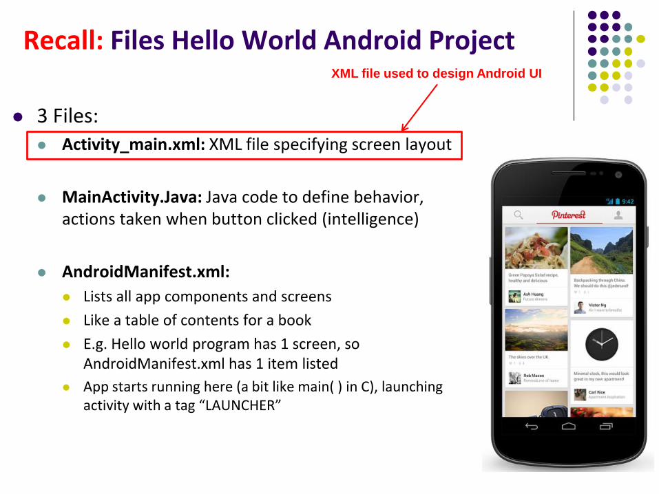
Recall: Files Hello World Android Project
3 Files: Activity_main.xml: XML file specifying screen layout
MainActivity.Java: Java code to define behavior, actions taken when button clicked (intelligence)
AndroidManifest.xml:
Lists all app components and screens
Like a table of contents for a book
E.g. Hello world program has 1 screen, so AndroidManifest.xml has 1 item listed
App starts running here (a bit like main( ) in C), launching activity with a tag “LAUNCHER”
XML file used to design Android UI
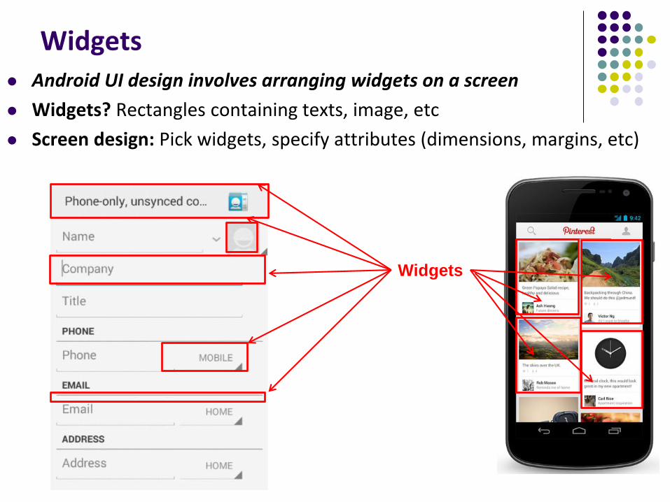
Widgets Android UI design involves arranging widgets on a screen
Widgets? Rectangles containing texts, image, etc
Screen design: Pick widgets, specify attributes (dimensions, margins, etc)
Widgets
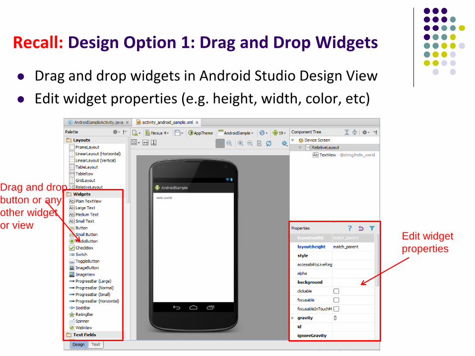
Recall: Design Option 1: Drag and Drop Widgets
Drag and drop widgets in Android Studio Design View
Edit widget properties (e.g. height, width, color, etc)
Drag and drop
button or any
other widget
or viewEdit widget
properties
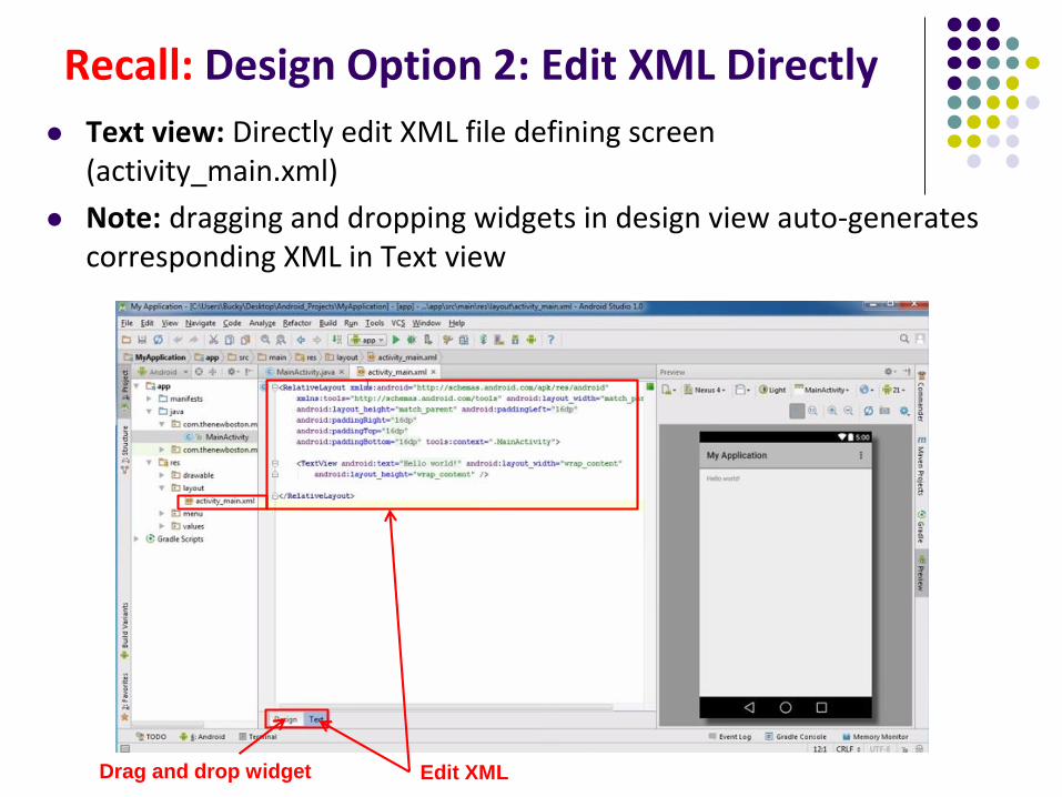
Recall: Design Option 2: Edit XML Directly
Text view: Directly edit XML file defining screen (activity_main.xml)
Note: dragging and dropping widgets in design view auto-generates corresponding XML in Text view
Edit XMLDrag and drop widget
Android Widgets
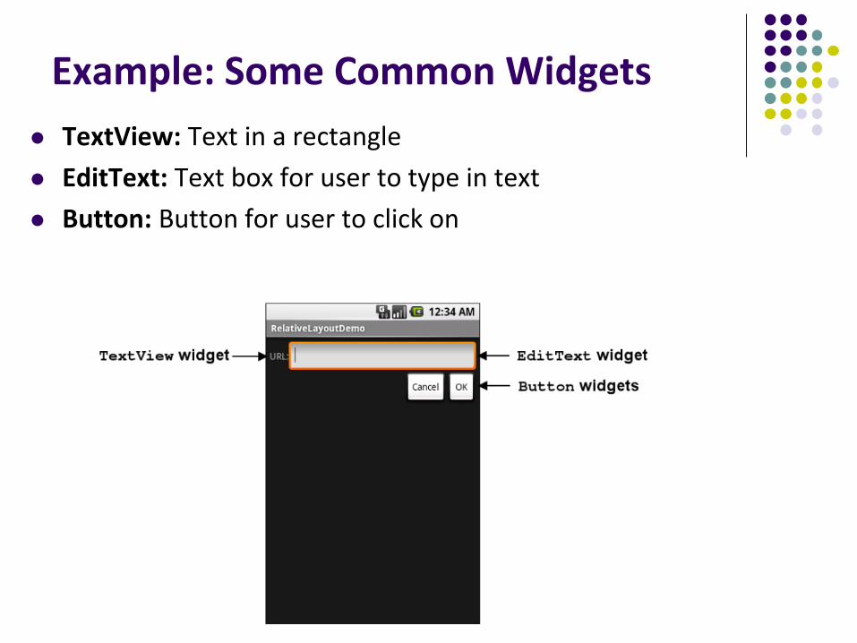
Example: Some Common Widgets
TextView: Text in a rectangle
EditText: Text box for user to type in text
Button: Button for user to click on
TextView Widget
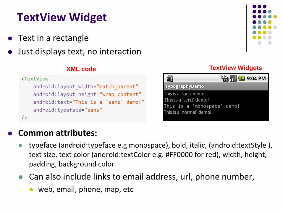
Text in a rectangle
Just displays text, no interaction
Common attributes: typeface (android:typeface e.g monospace), bold, italic, (android:textStyle ),
text size, text color (android:textColor e.g. #FF0000 for red), width, height, padding, background color
Can also include links to email address, url, phone number,
web, email, phone, map, etc
XML code TextView Widgets
TextView
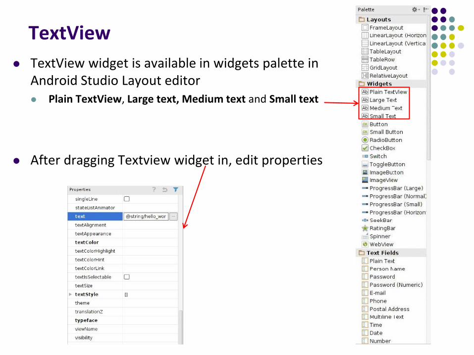
TextView widget is available in widgets palette in Android Studio Layout editor Plain TextView, Large text, Medium text and Small text
After dragging Textview widget in, edit properties
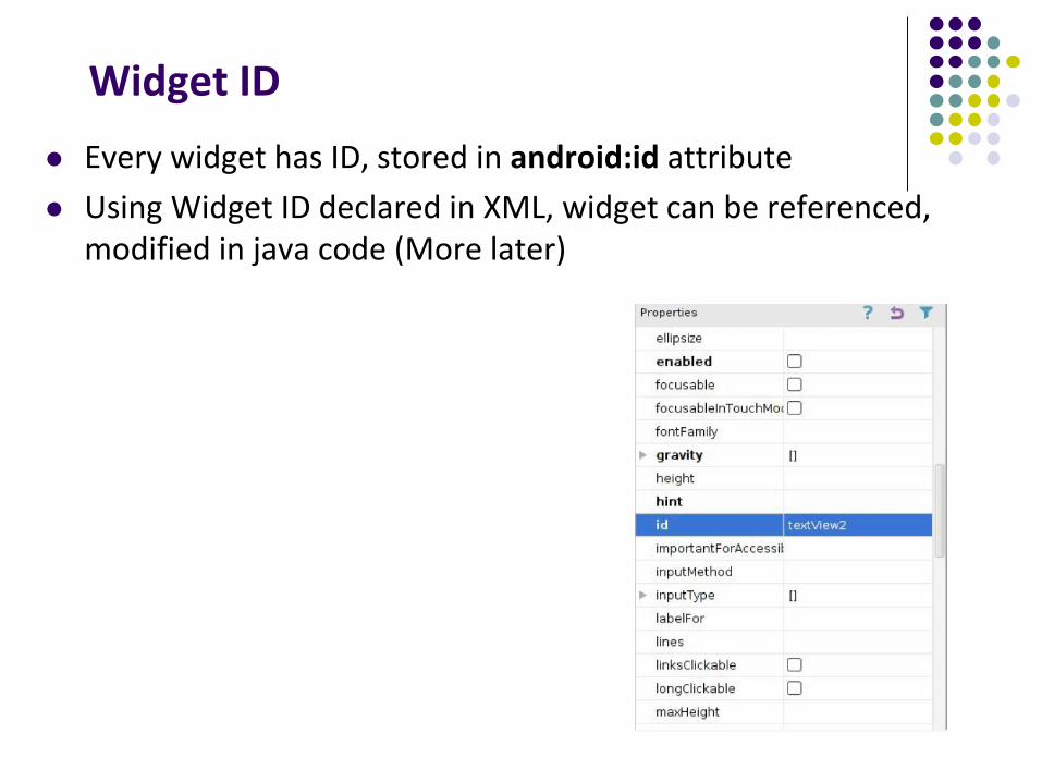
Widget ID
Every widget has ID, stored in android:id attribute
Using Widget ID declared in XML, widget can be referenced, modified in java code (More later)
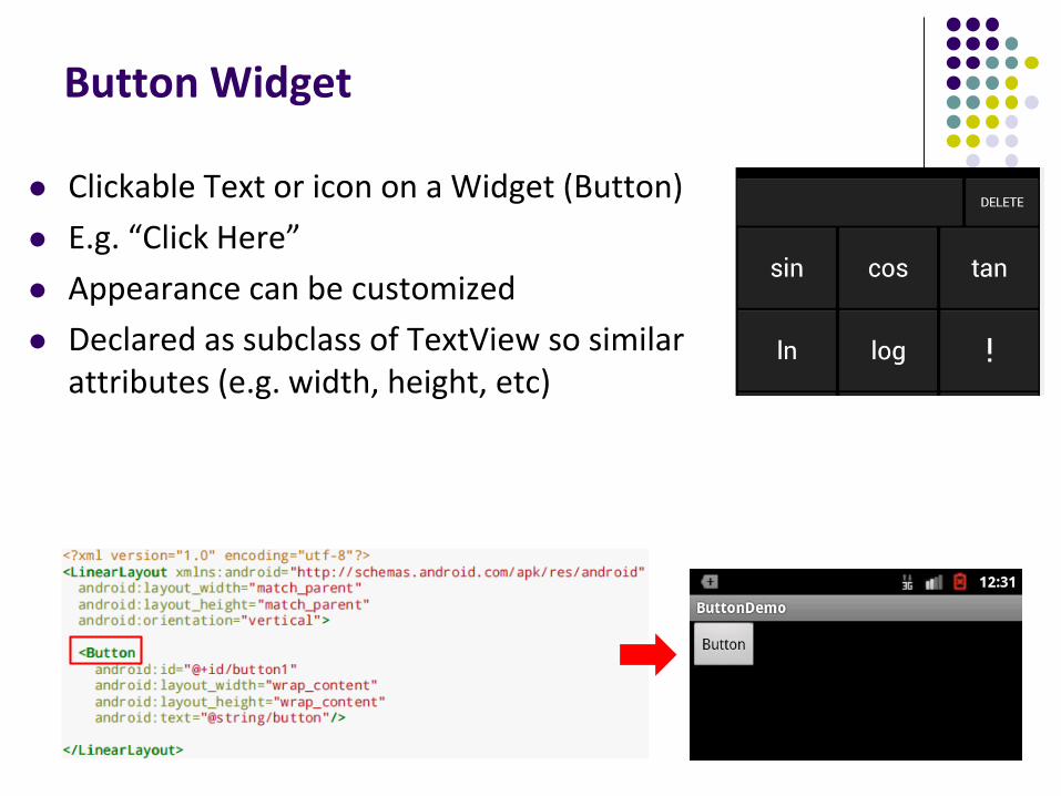
Button Widget
Clickable Text or icon on a Widget (Button)
E.g. “Click Here”
Appearance can be customized
Declared as subclass of TextView so similar attributes (e.g. width, height, etc)
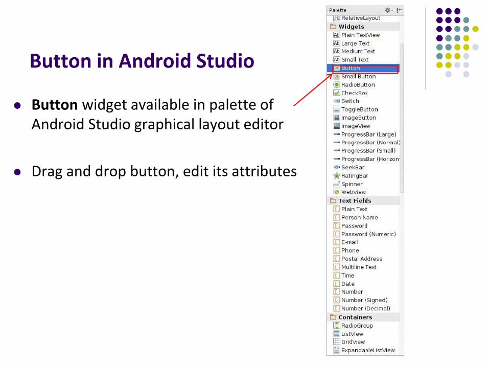
Button in Android Studio
Button widget available in palette of Android Studio graphical layout editor
Drag and drop button, edit its attributes
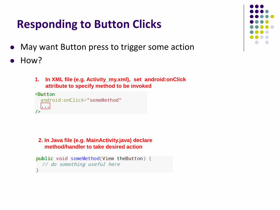
Responding to Button Clicks
May want Button press to trigger some action
How?
1. In XML file (e.g. Activity_my.xml), set android:onClick
attribute to specify method to be invoked
2. In Java file (e.g. MainActivity.java) declare
method/handler to take desired action
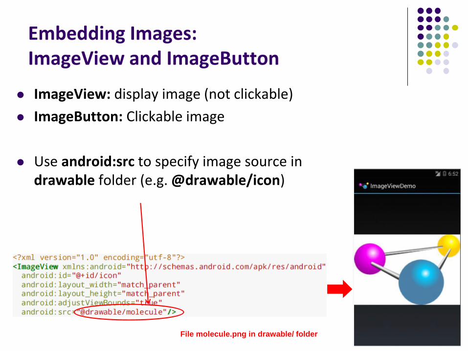
Embedding Images: ImageView and ImageButton
ImageView: display image (not clickable)
ImageButton: Clickable image
Use android:src to specify image source in drawable folder (e.g. @drawable/icon)
File molecule.png in drawable/ folder
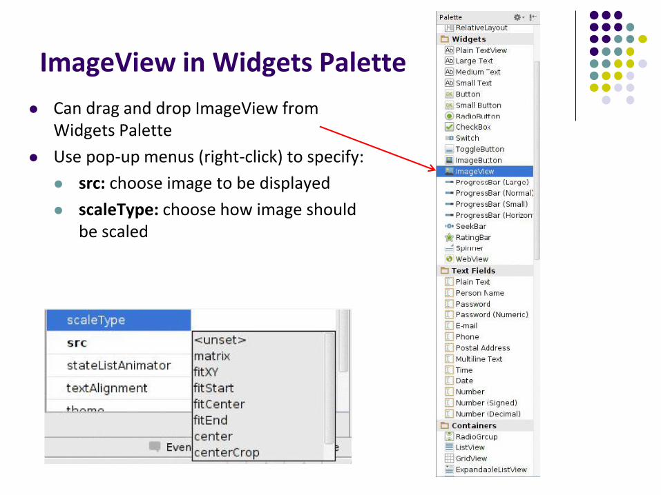
ImageView in Widgets Palette
Can drag and drop ImageView from Widgets Palette
Use pop-up menus (right-click) to specify:
src: choose image to be displayed
scaleType: choose how image should be scaled
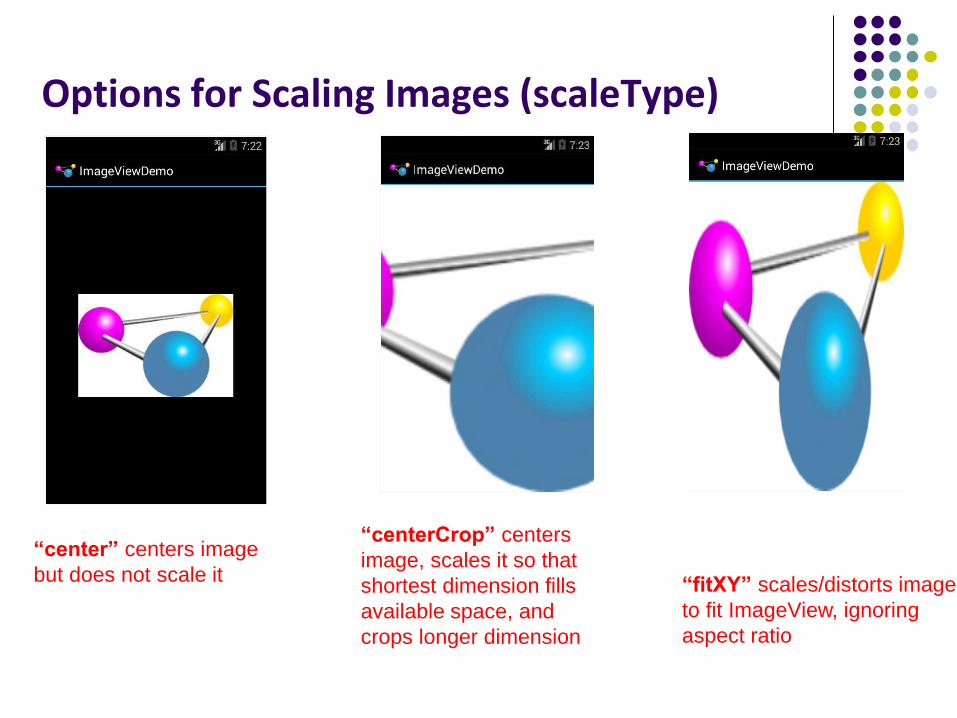
Options for Scaling Images (scaleType)
“center” centers image
but does not scale it
“centerCrop” centers
image, scales it so that
shortest dimension fills
available space, and
crops longer dimension
“fitXY” scales/distorts image
to fit ImageView, ignoring
aspect ratio
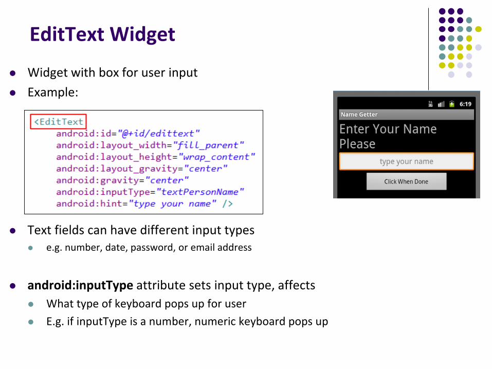
EditText Widget
Widget with box for user input
Example:
Text fields can have different input types e.g. number, date, password, or email address
android:inputType attribute sets input type, affects
What type of keyboard pops up for user
E.g. if inputType is a number, numeric keyboard pops up
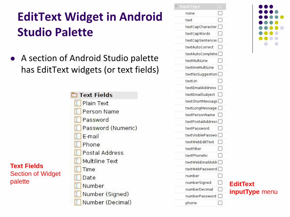
EditText Widget in Android Studio Palette
A section of Android Studio palette has EditText widgets (or text fields)
Text Fields
Section of Widget
palette EditText
inputType menu
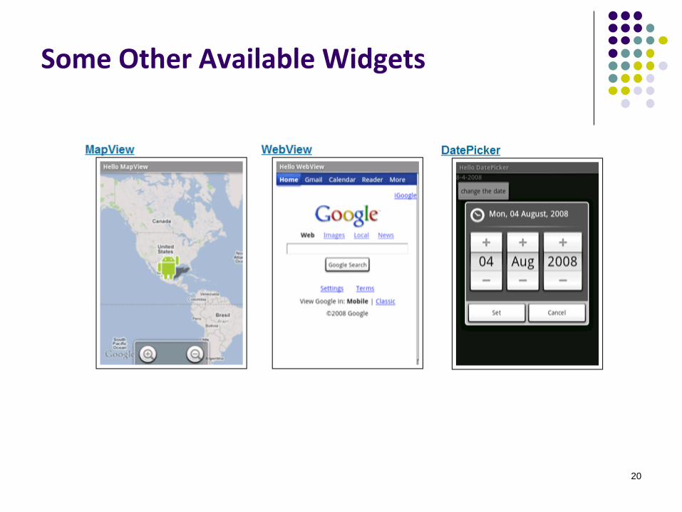
Some Other Available Widgets
20
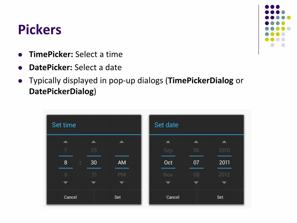
Pickers
TimePicker: Select a time
DatePicker: Select a date
Typically displayed in pop-up dialogs (TimePickerDialog or DatePickerDialog)
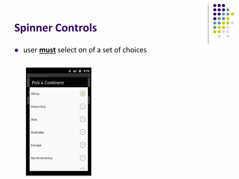
Spinner Controls
user must select on of a set of choices
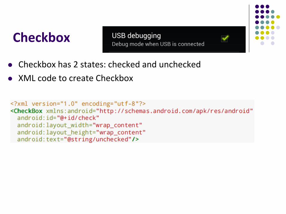
Checkbox
Checkbox has 2 states: checked and unchecked
XML code to create Checkbox
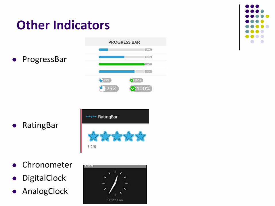
Other Indicators
ProgressBar
RatingBar
Chronometer
DigitalClock
AnalogClock
Android Layouts in XML
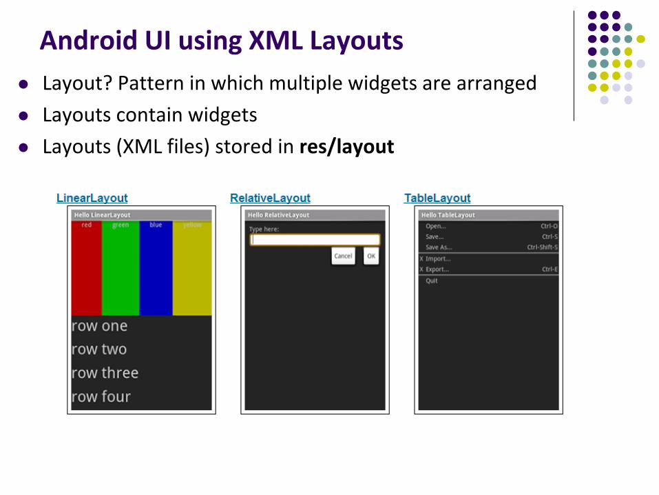
Android UI using XML Layouts
Layout? Pattern in which multiple widgets are arranged
Layouts contain widgets
Layouts (XML files) stored in res/layout
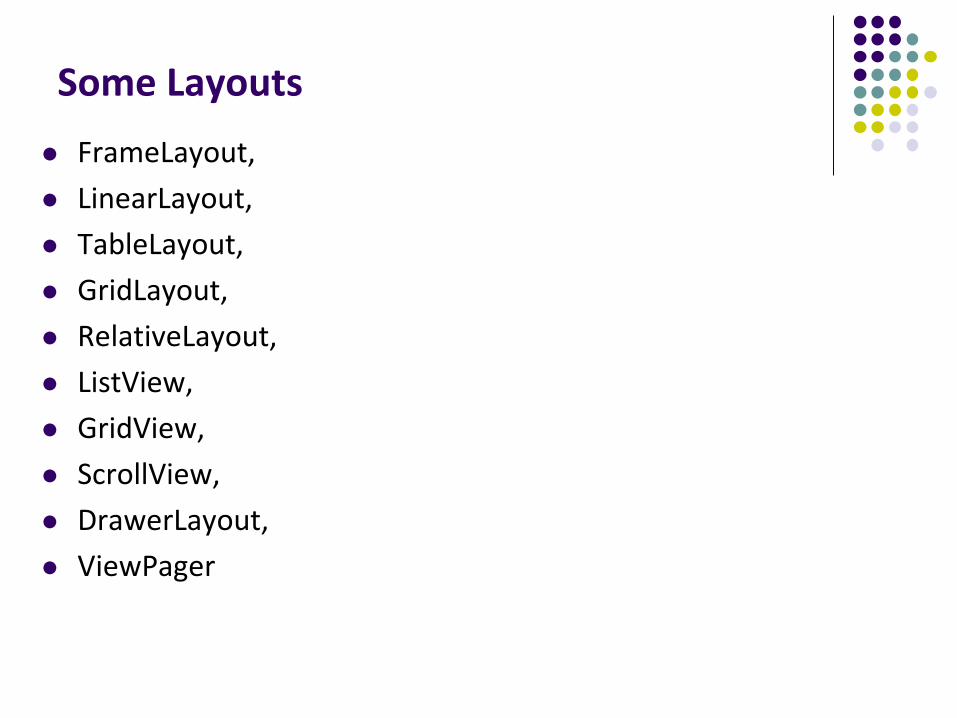
Some Layouts
FrameLayout,
LinearLayout,
TableLayout,
GridLayout,
RelativeLayout,
ListView,
GridView,
ScrollView,
DrawerLayout,
ViewPager
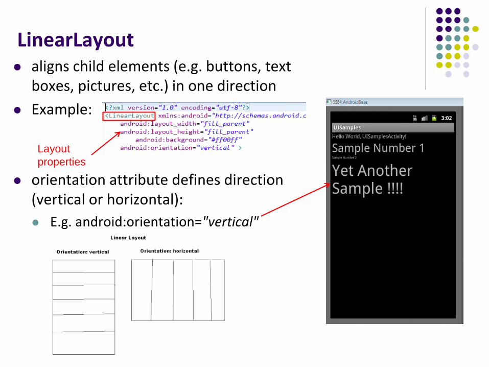
LinearLayout aligns child elements (e.g. buttons, text
boxes, pictures, etc.) in one direction
Example:
orientation attribute defines direction (vertical or horizontal):
E.g. android:orientation="vertical"
Layout
properties
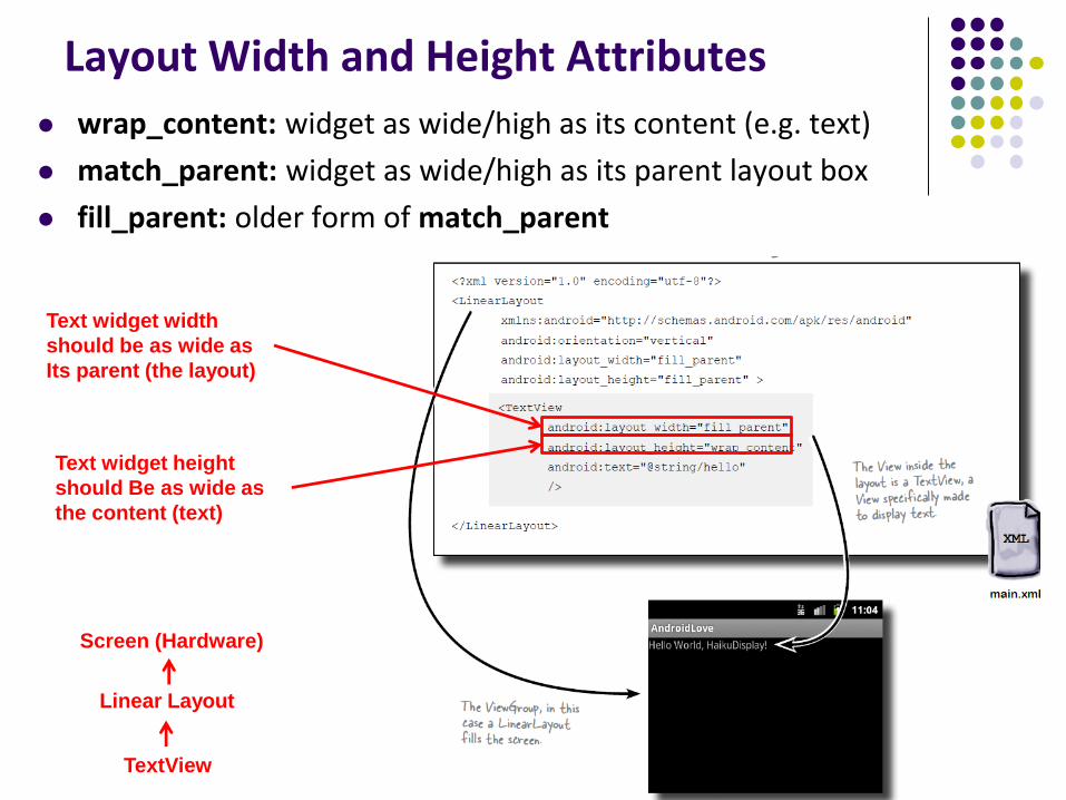
Layout Width and Height Attributes
wrap_content: widget as wide/high as its content (e.g. text)
match_parent: widget as wide/high as its parent layout box
fill_parent: older form of match_parent
Text widget width
should be as wide as
Its parent (the layout)
Text widget height
should Be as wide as
the content (text)
TextView
Linear Layout
Screen (Hardware)
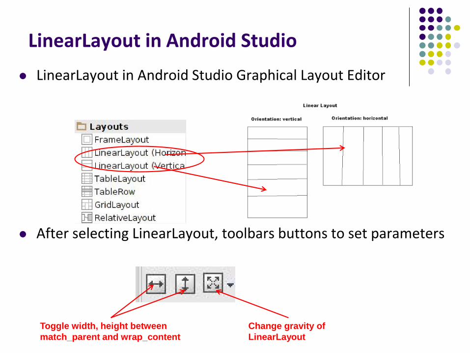
LinearLayout in Android Studio
LinearLayout in Android Studio Graphical Layout Editor
After selecting LinearLayout, toolbars buttons to set parameters
Toggle width, height between
match_parent and wrap_content
Change gravity of
LinearLayout
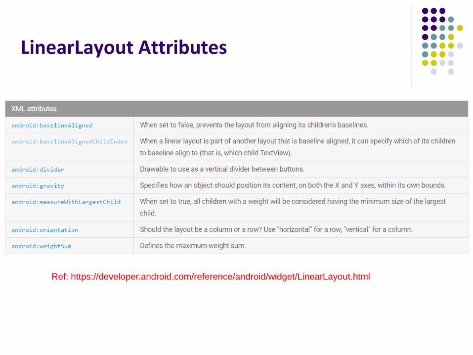
LinearLayout Attributes
Ref: https://developer.android.com/reference/android/widget/LinearLayout.html
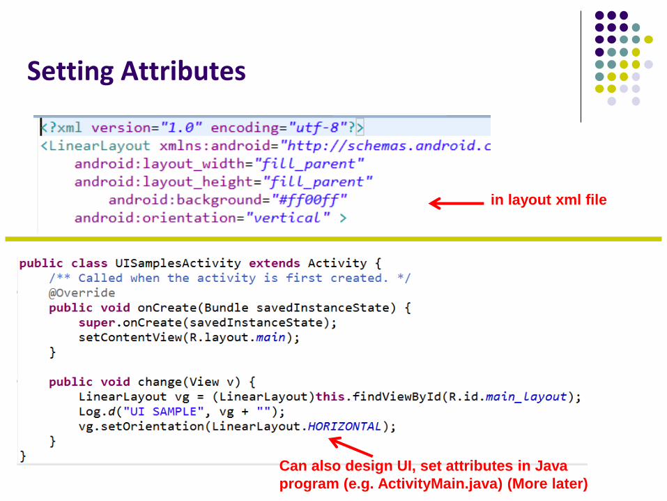
in layout xml file
Can also design UI, set attributes in Java
program (e.g. ActivityMain.java) (More later)
Setting Attributes
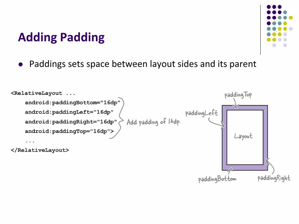
Adding Padding
Paddings sets space between layout sides and its parent
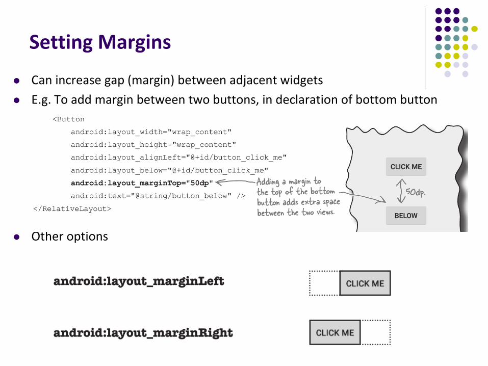
Setting Margins
Can increase gap (margin) between adjacent widgets
E.g. To add margin between two buttons, in declaration of bottom button
Other options
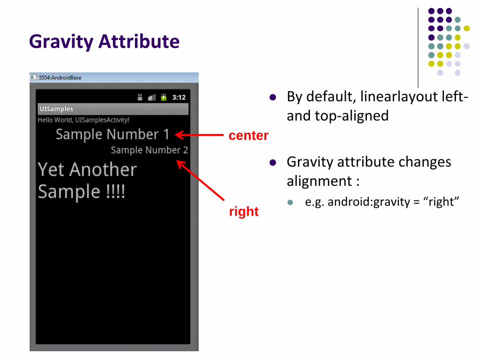
Gravity Attribute
By default, linearlayout left-and top-aligned
Gravity attribute changes alignment : e.g. android:gravity = “right”
right
center
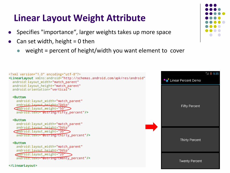
Linear Layout Weight Attribute
Specifies "importance“, larger weights takes up more space
Can set width, height = 0 then
weight = percent of height/width you want element to cover
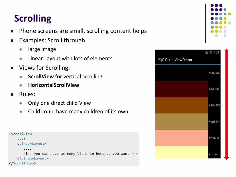
Scrolling Phone screens are small, scrolling content helps
Examples: Scroll through
large image
Linear Layout with lots of elements
Views for Scrolling:
ScrollView for vertical scrolling
HorizontalScrollView
Rules:
Only one direct child View
Child could have many children of its own
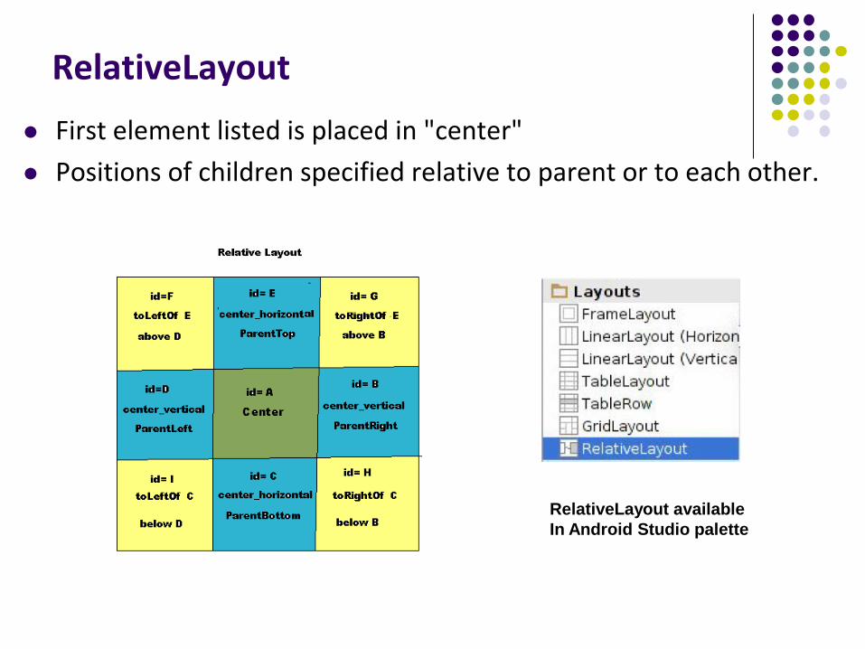
RelativeLayout
First element listed is placed in "center"
Positions of children specified relative to parent or to each other.
RelativeLayout available
In Android Studio palette
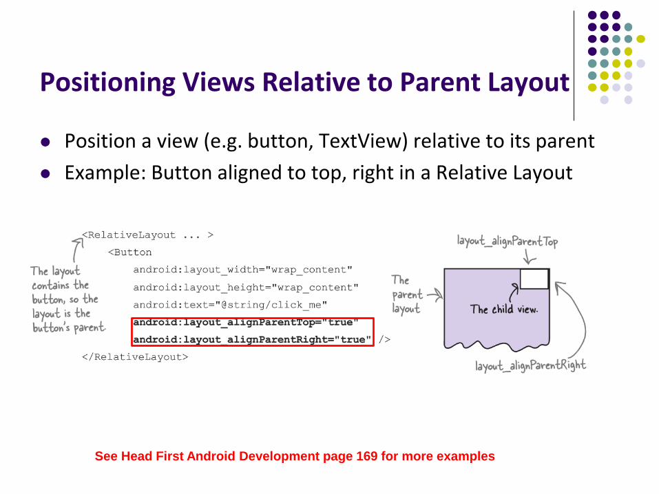
Positioning Views Relative to Parent Layout
Position a view (e.g. button, TextView) relative to its parent
Example: Button aligned to top, right in a Relative Layout
See Head First Android Development page 169 for more examples
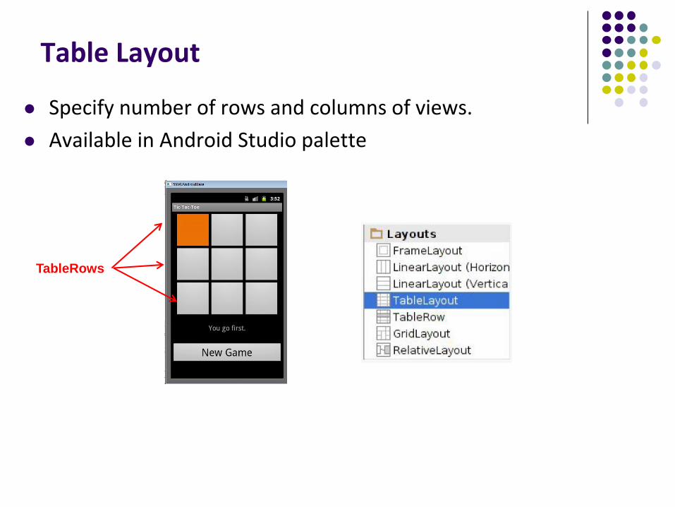
Table Layout
Specify number of rows and columns of views.
Available in Android Studio palette
TableRows
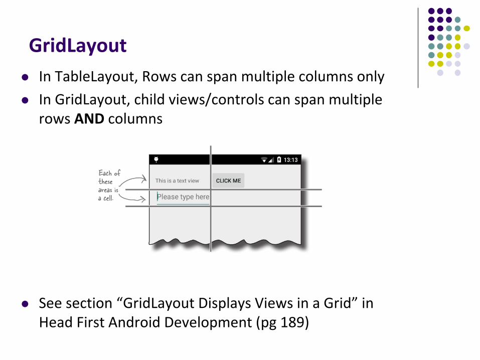
GridLayout
In TableLayout, Rows can span multiple columns only
In GridLayout, child views/controls can span multiple rows AND columns
See section “GridLayout Displays Views in a Grid” in Head First Android Development (pg 189)
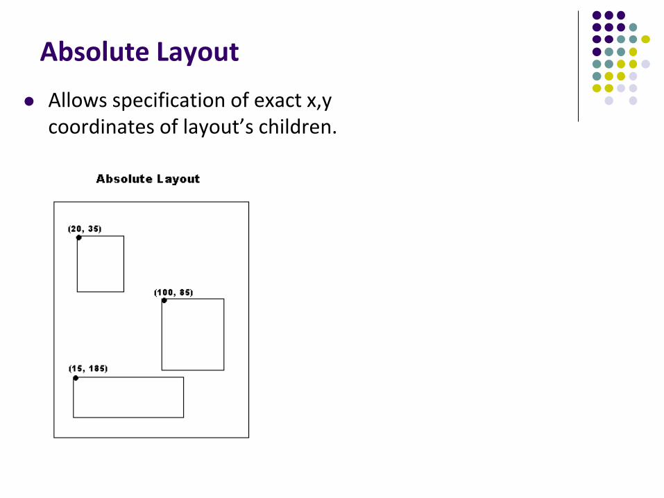
Absolute Layout
Allows specification of exact x,y coordinates of layout’s children.
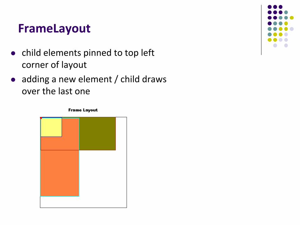
FrameLayout
child elements pinned to top left corner of layout
adding a new element / child draws over the last one
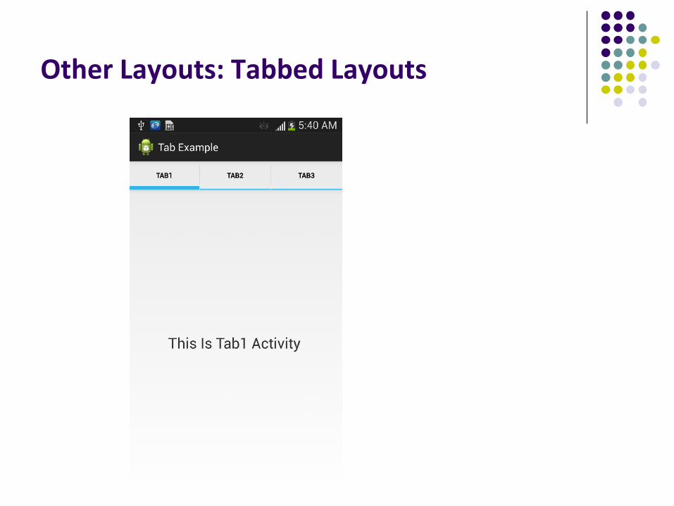
Other Layouts: Tabbed Layouts
Android Example: My First App(Ref: Head First Android)
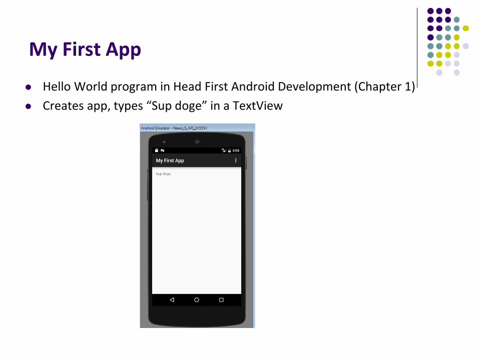
My First App
Hello World program in Head First Android Development (Chapter 1)
Creates app, types “Sup doge” in a TextView

Android UI Youtube Tutorials
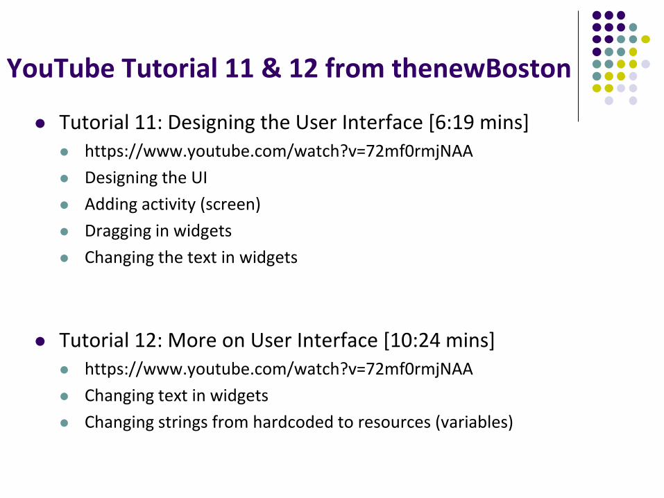
YouTube Tutorial 11 & 12 from thenewBoston
Tutorial 11: Designing the User Interface [6:19 mins] https://www.youtube.com/watch?v=72mf0rmjNAA
Designing the UI
Adding activity (screen)
Dragging in widgets
Changing the text in widgets
Tutorial 12: More on User Interface [10:24 mins] https://www.youtube.com/watch?v=72mf0rmjNAA
Changing text in widgets
Changing strings from hardcoded to resources (variables)
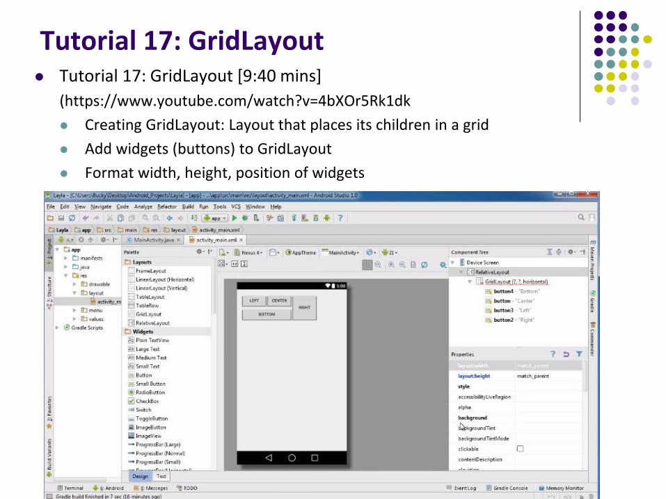
Tutorial 17: GridLayout Tutorial 17: GridLayout [9:40 mins]
(https://www.youtube.com/watch?v=4bXOr5Rk1dk
Creating GridLayout: Layout that places its children in a grid
Add widgets (buttons) to GridLayout
Format width, height, position of widgets
Android Themes
Styles
Android widgets have properties
E.g. Foreground color = red
Styles in Android: specifies properties for multiple attributes of 1 widget
E.g. height, padding, font color, font size, background color
Similar to Cascaded Style Sheets (CSS) in HTML
Themes apply styles to all widgets in an Activity (screen) E.g. all widgets on a screen can adopt the same font
Example Android themes: Theme, Theme.holo and Theme.material)
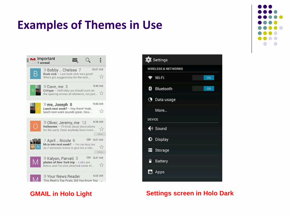
Examples of Themes in Use
GMAIL in Holo Light Settings screen in Holo Dark
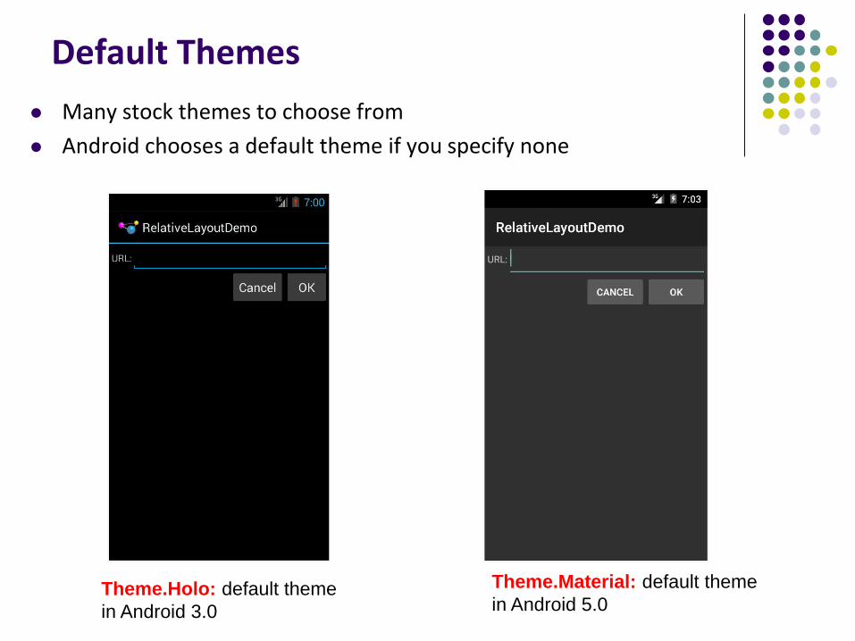
Default Themes
Many stock themes to choose from
Android chooses a default theme if you specify none
Theme.Material: default theme
in Android 5.0Theme.Holo: default theme
in Android 3.0
Adding Pictures in Android
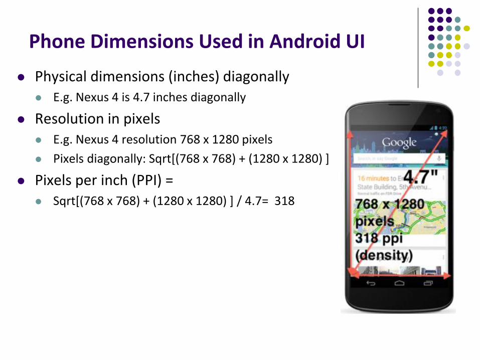
Phone Dimensions Used in Android UI
Physical dimensions (inches) diagonally E.g. Nexus 4 is 4.7 inches diagonally
Resolution in pixels E.g. Nexus 4 resolution 768 x 1280 pixels
Pixels diagonally: Sqrt[(768 x 768) + (1280 x 1280) ]
Pixels per inch (PPI) = Sqrt[(768 x 768) + (1280 x 1280) ] / 4.7= 318
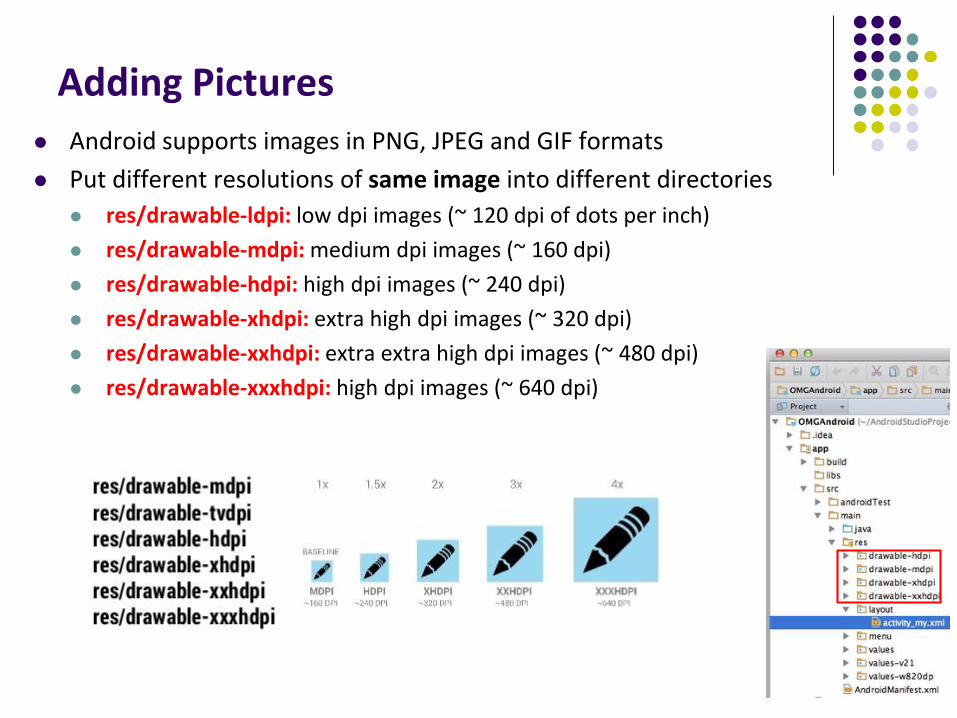
Adding Pictures
Android supports images in PNG, JPEG and GIF formats
Put different resolutions of same image into different directories
res/drawable-ldpi: low dpi images (~ 120 dpi of dots per inch)
res/drawable-mdpi: medium dpi images (~ 160 dpi)
res/drawable-hdpi: high dpi images (~ 240 dpi)
res/drawable-xhdpi: extra high dpi images (~ 320 dpi)
res/drawable-xxhdpi: extra extra high dpi images (~ 480 dpi)
res/drawable-xxxhdpi: high dpi images (~ 640 dpi)
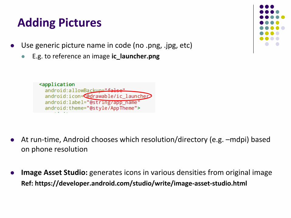
Adding Pictures
Use generic picture name in code (no .png, .jpg, etc)
E.g. to reference an image ic_launcher.png
At run-time, Android chooses which resolution/directory (e.g. –mdpi) based on phone resolution
Image Asset Studio: generates icons in various densities from original image
Ref: https://developer.android.com/studio/write/image-asset-studio.html
References
Android App Development for Beginners videos by Bucky Roberts (thenewboston)
Ask A Dev, Android Wear: What Developers Need to Know, https://www.youtube.com/watch?v=zTS2NZpLyQg
Ask A Dev, Mobile Minute: What to (Android) Wear, https://www.youtube.com/watch?v=n5Yjzn3b_aQ
Busy Coder’s guide to Android version 4.4
CS 65/165 slides, Dartmouth College, Spring 2014
CS 371M slides, U of Texas Austin, Spring 2014