Embed Size (px)
Citation preview
V isualArtsVisual
ArtsVisualArts
VisualArtsVisual
ArtsVisualArts
isualArtsVisual
CSEC®
Visual Arts
SYLLABUS SUBJECT REPORTS
Macmillan Education
4 Crinan Street, London, N1 9XW
A division of Macmillan Publishers Limited
Companies and representatives throughout the world
www.macmillan-caribbean.com
ISBN 978-0-230-48240-1
© Caribbean Examinations Council (CXC®) 2015www.cxc.org
www.cxc-store.com
The author has asserted their right to be identified as the author of this work in accordance with the
Copyright, Design and Patents Act 1988.
First published 2014
This revised edition published November 2017
Permission to copy
The material in this book is copyright. However, the publisher grants permission for copies to be
made without fee. Individuals may make copies for their own use or for use by classes of which they
are in charge; institutions may make copies for use within and by the staff and students of that
institution. For copying in any other circumstances, prior permission in writing must be obtained
from Macmillan Publishers Limited. Under no circumstances may the material in this book be used,
in part or in its entirety, for commercial gain. It must not be sold in any format.
Designed by Macmillan Publishers Limited
Cover design by Macmillan Publishers Limited and Red Giraffe
CSEC® Visual Arts Free Resources
LIST OF CONTENTS
CSEC® Visual Arts Syllabus Extract 3
CSEC® Visual Arts Syllabus 4
CSEC® Visual Arts Subject Reports:
2004 Subject Report 44
2006 Subject Report 55
2007 Subject Report 64
2008 Subject Report 74
2009 Subject Report 85
2010 Subject Report 96
2011 Subject Report 109
2012 Subject Report 121
2014 Subject Report 136
2015 Subject report 152
2016 Subject Report 166
Visual Arts
In the Caribbean, much knowledge and information are communicated through images
and spectacle and the visual arts serve to interpret this information and build bridges
to understanding the role of art in interpreting our contemporary, historical, cultural and
visual world. The Caribbean Secondary Education Certificate (CSEC) syllabus in the
Visual Arts will help to promote and encourage tolerance and diversity among students
of different ethnic backgrounds, cultures and points of view in the region. The syllabus
also helps students to develop intellectually and seeks to refine their critical thinking
skills and judgments through research and the making of art.
The knowledge, understanding, skills and values to be gained from the CSEC Visual
Arts syllabus are organized in three components namely:
These components assist students in building conceptual and practical skills which can
be applied in art, craft, design and related careers in the world of work.
The CSEC Visual Arts syllabus provides students with a basis for further study, enhances
leisure time pursuits and fosters their aesthetic, physical, spiritual, personal and cultural
development. The syllabus also focuses on the Caribbean, since there is a pressing
need for the people of the region to develop an aesthetic awareness and appreciation
of their cultural heritage.
1. Two-Dimensional
Expressive Forms
Drawing, Painting and Mixed-media, Graphic and
Communication Design, Printmaking, Textile Design
and Manipulation2. Three-Dimensional
Expressive Forms
Sculpture and Ceramics Leather craft, Fibre and
Decorative Arts3. The Reflective Journal The Theory, Process and Practice of Visual Arts
CXC 32/G/SYLL 01
CARIBBEAN EXAMINATIONS COUNCIL
Caribbean Secondary Education Certificate
CSEC®
VISUAL ARTSSYLLABUS
Effective for examinations from May/June 2011

2
Published by the Caribbean Examinations Council
All rights reserved. No part of this publication may be reproduced, stored in a retrieval system, ortransmitted in any form, or by any means electronic, photocopying, recording or otherwise without priorpermission of the author or publisher.
Correspondence related to the syllabus should be addressed to:
The Pro-RegistrarCaribbean Examinations CouncilCaenwood Centre37 Arnold Road, Kingston 5, Jamaica, W.I.
Telephone: (876) 630-5200Facsimile Number: (876) 967-4972E-mail address: [email protected]: www.cxc.org
Copyright © 2009, by Caribbean Examinations CouncilThe Garrison, St Michael BB14038, Barbados
CXC 32/G/SYLL 01
Contents
RATIONALE .................................................................................................................................................................. 1
AIMS ................................................................................................................................................................................. 1
GENERAL OBJECTIVES .......................................................................................................................................... 2
RELATED KNOWLEDGE ....................................................................................................................................... 3
ORGANIZATION OF THE SYLLABUS ............................................................................................................. 3
SUGGESTED TIME-TABLE ALLOCATION .................................................................................................. 3
FORMAT OF THE EXAMINATIONS ................................................................................................................ 4
CRITERIA FOR ASSESSMENT ............................................................................................................................. 5
WEIGHTING OF EXAMINATION COMPONENTS AND PROFILE DIMENSIONS .................. 6
CERTIFICATION ........................................................................................................................................................ 6
REGULATIONS FOR PRIVATE CANDIDATES ........................................................................................... 7
REGULATIONS FOR RE-SIT CANDIDATES. ............................................................................................... 7
SAFETY PRACTICES ................................................................................................................................................ 7
TWO-DIMENSIONAL EXPRESSIVE FORMS ................................................................................................ 8
DRAWING ..............................................................................................................................................8
PAINTING AND MIXED-MEDIA ........................................................................................................ 9
GRAPHIC AND COMMUNICATION DESIGN ..........................................................................10
PRINTMAKING ........................................................................................................................................... 12
TEXTILE DESIGN AND MANIPULATION .................................................................................. 13
THREE-DIMENSIONAL EXPRESSIVE FORMS ........................................................................................... 14
SCULPTURE AND CERAMICS ............................................................................................................. 14
LEATHERCRAFT ....................................................................................................................................... 15
FIBRE AND DECORATIVE ARTS ....................................................................................................... 16
CXC 32/G/SYLL 01
0
THEORY AND PRACTICE OF VISUAL ARTS: Regulations for the Reflective Journal........................... 18
REGULATIONS FOR THE PRODUCTION PAPER. ................................................................................... 23
REGULATIONS FOR SETTING, MARKING AND SELECTING SAMPLES FOR SCHOOL BASED ASSESSMENT ........................................................................................................................... 25
BIBLIOGRAPHY .......................................................................................................................................................... 33
This document CXC 18/G/SYLL 09 replaces CXC 18/O/SYLL 02 issued in 2002.
The Visual Arts Syllabus was revised in 2009 for use in examinations from 2011. Major amendments to
the syllabus are represented in italics.
Revised in 1996, 2002, 2009
Please check the website, www.cxc.org for updates on CXC’s syllabuses.
CXC 18/G/SYLL 09
Visual Arts Syllabus
◆RATIONALE
The Visual Arts area of study encompasses all three domains of learning, namely, cognitive, affective and psychomotor. The pedagogy of the subject covers such topics as the theory and history of art, elements and principles of design and manipulative or practical skills. Visual Arts, therefore, is of great relevance to students as it is important for learning and insight to problem-solving and creativity, evident in the interpretation of their own work and the work of others. The subject offers students the opportunity to acquire a variety of experiences and skills in the areas of art, craft and design. It also fosters interest and enjoyment in the doing, production and consumption of art and seeks to develop informed citizens and raise the standard of cultural awareness among students.
In the Caribbean, much knowledge and information are communicated through images and spectacle and the visual arts serve to interpret this information and build bridges to understanding the role of art in interpreting our contemporary, historical, cultural and visual world. The Caribbean Secondary Education Certificate (CSEC) syllabus in the Visual Arts will help to promote and encourage tolerance and diversity among students of different ethnic backgrounds, cultures and points of view in the region. The syllabus also helps students to develop intellectually and seeks to refine their critical thinking skills and judgments through research and the making of art.
The knowledge, understanding, skills and values gained from the CSEC Visual Arts Syllabus will assist students in building conceptual and practical skills which can be applied in art, craft, design and related careers in the world of work. The CSEC Visual Arts Syllabus provides students with a basis for further study, enhances leisure time pursuits and fosters their aesthetic, physical, spiritual, personal and cultural development. The syllabus also focuses on the Caribbean, since there is a pressing need for the people of the region to develop an aesthetic awareness and appreciation of their cultural heritage.
The syllabus also contributes to the development of selected attributes from the CARICOM Ideal Person document as articulated by the CARICOM Heads of Government. This person is one who demonstrates emotional security with a high level of self-confidence and self-esteem, is aware of the importance of living in harmony with the environment and nurtures its development in the economic and entrepreneurial spheres in all other areas of life (CARICOM Education Strategy, 2000). This holistic development of students aligns with selected competencies advocated in the UNESCO Pillars of learning. These are learning to be, learning to do, and learning to transform one’s self and society.
◆AIMS
The syllabus aims to:
1. provide a variety of experiences and skills in the field of the visual arts; 1CXC 18/G/SYLL 09

2. foster interest and enjoyment in the doing, production and consumption of art and craft;
3. develop informed citizens and raise the standard of cultural awareness among students;
4. promote and encourage tolerance and diversity among students of different ethnic backgrounds, cultures and point of view;
5. provide opportunity for informed decision-making through the development of skills in critical thinking,
problem solving, research and communication;
6. develop knowledge of visual arts practitioners and their practice in history and contemporary society.
◆GENERAL OBJECTIVES
On completion of the syllabus, students should develop:
1. the ability to perceive, understand and express concepts and feelings in Two-Dimensional and Three- Dimensional Expressive Forms;
2. the ability to record ideas from direct observation and personal experience;
3. the ability to communicate by using appropriate materials and technologies in a disciplined way;
4. the ability to experiment, innovate and use intuition and imagination in producing works of art;
5. critical and analytical faculties - the ability to identify, research and evaluate problems in a systematic
way;
6. a relevant working vocabulary in art and design;
7. an awareness and understanding of the holistic nature of the art and design activity;
8. an appreciation for the work of other artists and designers in the Caribbean in both a contemporary and a historical context;
9. an understanding of cultural change and the importance of art and design in the evaluation of personal
experience in a multicultural society;
10. positive personal and social attitudes;
11. the ability to produce samples integrated with historical, cultural and theoretical studies;
12. a well organised, comprehensive journal to include samples and supportive theoretical and visual material using knowledge of layout and design techniques.
2CXC 18/G/SYLL 09
◆RELATED KNOWLEDGE
The CSEC Visual Arts Syllabus assumes that students had previously:
1. acquired some knowledge of the basic elements and principles of design;
2. developed skills in the use of some basic tools and materials;
3. developed a working knowledge of the vocabulary of art.
◆ORGANIZATION OF THE SYLLABUS
The CSEC Visual Arts programme consists of three components, namely, Two-Dimensional Expressive Forms, Three-Dimensional Expressive Forms and the Theory, Process and Practice of Visual Arts (Reflective Journal). The Theory, Process and Practice of Visual Arts (Reflective Journal) is an integral part of the delivery of content and evaluation of coursework.
The Two-Dimensional and Three-Dimensional components of the syllabus include the following Expressive Forms:
Two-Dimensional Expressive Forms Three-Dimensional Expressive Forms
Drawing Sculpture and Ceramics *Painting and Mixed-media Leathercraft Graphic and Communication Design Fibre and Decorative Arts Printmaking Textile Design and Manipulation
(* Formerly Imaginative Composition)
The CSEC Visual Arts programme is offered as ONE inclusive syllabus. Candidates are required to complete a REFLECTIVE JOURNAL on the THEORY, PROCESS and PRACTICE of VISUAL ARTS based on one or more of the Expressive Forms. (Th is R e f le c tiv e J o u r n a l re p l a ce s t h e I l l u s t ra t e d P a p e r ).
Candidates MUST also select and study any TWO of the Expressive Forms. (They may select EXPRESSIVE FORMS from EITHER the TWO-DIMENSIONAL or the THREE-DIMENSIONAL components or a mix of forms from the two components).
◆SUGGESTED TIME-TABLE ALLOCATION
The syllabus should be taught over a period of two academic years. It is recommended that a minimum of four 45-minute periods per week be allocated and this should be arranged as two double periods.
3CXC 18/G/SYLL 09
◆FORMAT OF THE EXAMINATIONS
All candidates offering the same Expressive Forms will write the same examination paper and will fulfil the same requirements for the School Based Assessment.
The examination requirements are:
1. Two Production Papers based on two Expressive Forms chosen and one Reflective Journal
based on Theory, Process and Practice of Visual Arts related to the expressive forms chosen.
2. School Based Assessment consisting of SIX pieces of work (THREE pieces based on EACH Expressive form chosen).
PRODUCTION PAPER There are eight Expressive Forms, five are Two-dimensional and three are Three-dimensional forms. Each Expressive form will be assessed by four questions. Candidates are required to respond to one question from each of the Expressive Forms studied. Marks for the skills, Craftsmanship, Design and Composition; and Originality will be allocated in the ratio 8:5:2.
The duration of the examination for each Expressive Form will be six hours.
Each 6-hour paper will be divided into two 3-hour sessions with a break of not less than 1 hour between sessions. These two sessions need not be held on the same day.
If t h e ex a m i n a t i o n i s d o n e o n t w o s ep a r a t e d a y s th e n th e e x a m in a tio n w o r k M U S T N O T b e ta k e n fr o m th e E x a m in a tio n C e n tr e .
RE F L E C TI V E J O UR N A L ( T h e o r y , P r o c e s s a n d P r a c t i c e o f V i s u a l Ar t s )
Each Candidate will be required to prepare a Reflective Journal. The Journal will consist of a body of work reflecting the candidate’s exposure to Theory, Process and Practice of Visual Arts with special reference to the Expressive Forms studied. The Journal should be maintained over the first five terms of the two-year course and show evidence of research undertaken inclusive of samples, photographs, interviews, critiques, descriptive, anal y t i c and personal statements and reflections.
The Journal must contain no less than 1000 words and must be presented in a booklet no smaller than 21 cm x 30 cm and no larger than 30 cm x 40 cm. (See regulations for the Reflective Journal on pages 18 – 24).
4CXC 18/G/SYLL 09
SCHOOL BASED ASSESSMENT (completed over 5 terms)
Each candidate will be required to prepare a portfolio of work consisting of a sample of three pieces from each Expressive Form chosen. This portfolio MUST include the preparatory studies completed. The pieces should be prepared over the first five terms of the two-year course. (For further details on SBA see ‘Regulations for Teachers on Setting and Marking Coursework for School Based Assessment (pages 25 – 32).
◆CRITERIA FOR ASSESSMENT
The skills to be used as criteria for assessing candidate performance are:
Craftsmanship Design and Composition Originality Research (Theory, Process and Practice of Visual Arts)
Definition of Skills
Craftsmanship: the ability to demonstrate knowledge of materials,
media, traditions and Visual Art processes.
Design and Composition: the ability to apply materials, media and methods to complete stated objectives.
Originality the ability to demonstrate personal expression and
creativity.
Re s e a r c h : (Theory, Process and Practice of Visual Arts)
the ability to organise and report research findings and apply knowledge of Visual Art techniques, materials, media, traditions and practitioners.
5CXC 18/G/SYLL 09
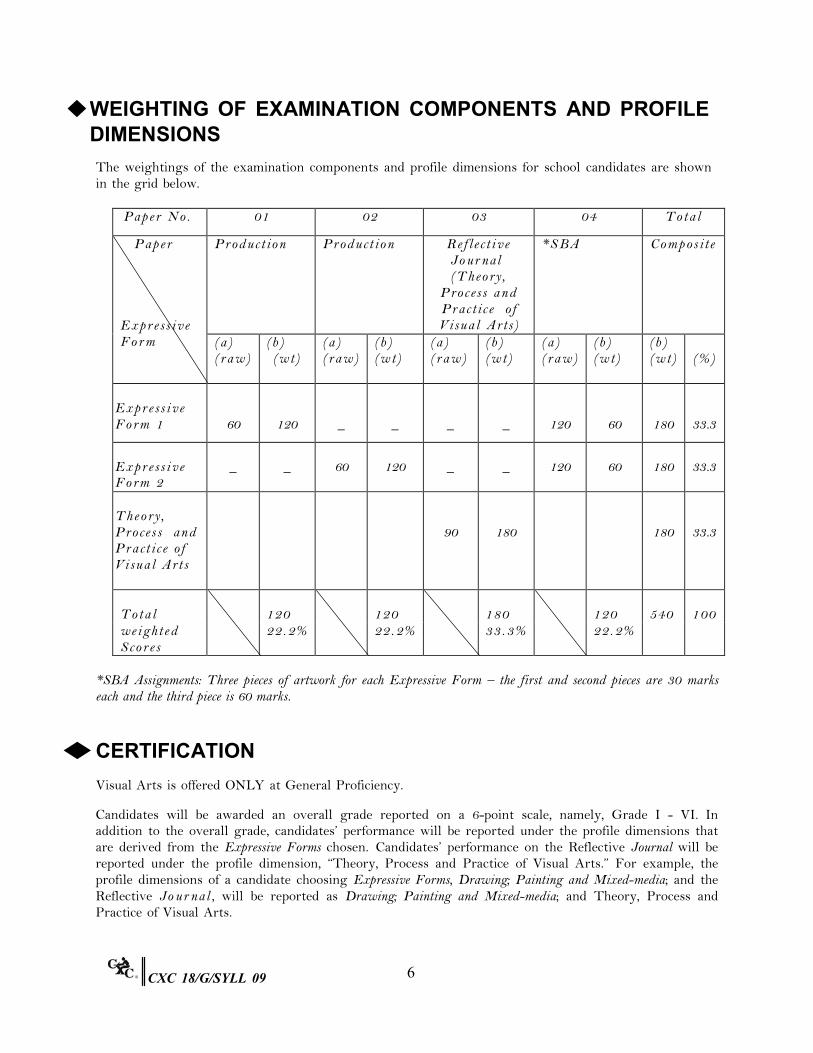
◆WEIGHTING OF EXAMINATION COMPONENTS AND PROFILEDIMENSIONS
The weightings of the examination components and profile dimensions for school candidates are shown in the grid below.
Pa p e r N o . 01 02 03 04 To t a l
P a p e r Ex p r e s s i v e Fo r m
Pr o d u c t i o n Pr o d u c t i o n Re f l e c t i v e Jo ur nal (T h e o r y ,
Pr o c e s s a n d Pr a c t i c e o f Vi su a l A r ts)
*S B A Co m p o s i t e
(a ) (r a w )
(b ) (w t)
(a ) (r a w )
(b ) (w t)
(a ) (r a w )
(b ) (w t)
(a ) (r a w )
(b ) (w t)
(b ) (w t)
(% )
Ex p r e s s i v e Fo r m 1
60
120
_
_
_
_
120
60
180
33.3
Ex p r e s s i v e Fo r m 2
_
_
60
120
_
_
120
60
180
33.3
Th e o r y , Pr o c e s s a n d Pr a c t i c e o f Vi s u a l A r t s
90
180
180
33.3
To t a l
120
120
180
120
540
100
we i g h t e d 22. 2% 22. 2% 33. 3% 22. 2% Sc o r e s
*SBA Assignments: Three pieces of artwork for each Expressive Form – the first and second pieces are 30 marks each and the third piece is 60 marks.
◆CERTIFICATION
Visual Arts is offered ONLY at General Proficiency.
Candidates will be awarded an overall grade reported on a 6-point scale, namely, Grade I - VI. In addition to the overall grade, candidates’ performance will be reported under the profile dimensions that are derived from the Expressive Forms chosen. Candidates’ performance on the Reflective Journal will be reported under the profile dimension, “Theory, Process and Practice of Visual Arts.” For example, the profile dimensions of a candidate choosing Expressive Forms, Drawing; Painting and Mixed-media; and the Reflective Jo ur nal , will be reported as Drawing; Painting and Mixed-media; and Theory, Process and Practice of Visual Arts.
6CXC 18/G/SYLL 09

◆ REGULATIONS FOR PRIVATE CANDIDATES
Candidates who are registered privately will be required to sit two Production papers and submit a Re f l e c t i v e Journal. The production paper will be based on each Expressive Form chosen by the candidate. Th e R e f l e c t i v e Jo ur nal M U S T b e s up p o r t e d b y T W O f i ni s he d p i e c e s r e l at e d t o t he E xp r e s s i v e F o r m s c ho s e n. Th e TW O f i n i s h e d p i e c e s m u s t b e s u b m i t t e d o n t h e C XC d u e d a t e f o r S B A ba s e d on th e Ex p r e s s i v e Fo r ms c h o s e n . T h e m a r k s c h e m e u s e d f o r t h e S B A w i l l b e a p p l i e d t o t h e t wo fin ish e d p ie c e s .
◆ REGULATIONS FOR RE-SIT CANDIDATES
1. Re-sit candidates must repeat the examinations in the academic year immediately following the
first sitting and must indicate at registration that they are re-sit candidates.
2. Re-sit candidates who at their first sitting successfully completed the SBA and Reflective Journal, that is, obtained a moderated score of 50% or more in both the SBA and Reflective Journal of the SBA marks, may elect not to repeat this these components of the examination.
3. Re-sit candidates who failed to achieve a moderated score of 50% of the total SBA marks must:
(a) re-sit the Production Paper in the Expressive Forms originally taken in the first sitting;
(b) repeat ONLY the SBA Expressive Forms in which they were unsuccessful.
4. The name and previous year’s registration number of all candidates who are re-sitting the
subject MUST be indicated on the SBA Summary Sheet.
◆SAFETY PRACTICES
Classroom practices must be safe. Teachers must encourage students to practice occupational health and safety procedures in the production of the Expressive Forms.
Materials considered dangerous to health and safety MU S T N O T be used. These include blood and bodily fluids, green leaves and green seeds, broken glass, sharp objects, such as needles, barbed wire and corrugated iron.
7CXC 18/G/SYLL 09
◆TWO-DIMENSIONAL EXPRESSIVE FORMS
DRAWING
GENERAL OBJECTIVE
On c o mp l e t i o n o f t h i s E x p r e s s i v e Fo r m, s t u d e n t s s h o u l d d e v e l o p o b s e r v a t i o n a l , i n t e r p r e t i v e and dr aw i ng s k i l l s o f s u b j e c t s , which will include natural and man-made objects and drawings from life (human or animal).
SPECIFIC OBJECTIVES
Students should be able to:
1. identify and use a variety of media and drawing techniques;
2. apply and use the elements and principles of Art, to drawing and composition;
3. draw from observation;
4. create aesthetically pleasing compositions based on given subjects;
5. assess their own work and that of established Caribbean and international artists.
CONTENT
1. Elements and principles of Art, lines, shape, colour, texture, movement, contrast, proportion emphasis.
2. Variety of drawing techniques, for example, contour, shading stippling and crosshatching.
3. A variety of subject matter, such as, still life, human figure, geometric drawings, architectural drawings, gestures and drawings from nature.
4. Variety of media.
5. Art works of established Caribbean and international artists.
8CXC 18/G/SYLL 09

PAINTING AND MIXED-MEDIA GENERAL OBJECTIVE
On completion of this Expressive Form, students should develop the ability to create ar t w o r k b as e d o n th e ir ow n i n t e rpre t a t i on of a given topic or theme using representational and non-representational approaches.
SPECIFIC OBJECTIVES
Students should be able to:
1. use colour to demonstrate expressive qualities;
2. show a variety of colour harmonies and contrasts;
3. explore a variety of painting media, materials and techniques used in picture making;
4. apply the elements and principles of art and design to produce compositions in a variety of media;
5. create aesthetically pleasing compositions from observation, imagination and interpretation based on
specific themes; 6. produce samples of personal expressions in a variety of media;
7. critique their own work and that of established Caribbean and international artists.
CONTENT
1. Colour exploration, harmonies, values, contrasts.
2. Media, such as water colour, inks acrylics, pastels and crayons.
3. Textural qualities, depth and expressions.
4. Collages and other mixed media compositions.
5. Themes, including historical, cultural, folklore and fantasy.
6. Traditional and contemporary paintings and processes seen and used in the Caribbean and other cultures.
9CXC 18/G/SYLL 09
GRAPHIC AND COMMUNICATION DESIGN GENERAL OBJECTIVE
On completion of this Expressive Form, students should develop knowledge of design, layout techniques, lettering and illustration skills in order to portray ideas and messages.
SPECIFIC OBJECTIVES
Students should be able to:
1. apply the elements and principles of design to produce aesthetically pleasing compositions;
2. demonstrate skills in layout techniques using both manual and/or computer-aided design methods and
graphic softwares; 3. define terminologies used in graphic and communication designs, for example, layout, typography, poster,
logo; 4. analyse given design problems and arrive at an appropriate solution;
5. use basic computer applications to create visual communication compositions;
6. use appropriate lettering styles and illustrations (manual or computer-aided design method) to achieve a
desired communication visual effect; 7. create visual communication material, such as posters, advertisements, illustrations for books, illuminated
letters, packaging, letterheads, signage, labels, logos; 8. critique their own work and that of other established Caribbean and international artists.
CONTENT
1. Manual or computer-generated lettering in a variety of lettering styles.
2. Lettering, illustrations and other visual materials in a variety of combinations to achieve desired effects.
3. Creative lettering for posters, advertisements, signboards, logos, and other visual communication material
based on given topics and themes. 4. Posters, logos, signs, labels, advertisements, illustration of books, CDs, DVDs and video cassette cases,
flyers, package designs and other visual communication materials. 5. Sequential art or cartoons on selected themes and topics.
6. Basic computer applications, such as, scanning, importation and manipulation of images, selection and
application of fonts and colour.
10CXC 18/G/SYLL 09
7. Variety of lettering styles (for example, Block, Roman, Gothic and Italic) and different visual communication materials.
8. Traditional and contemporary technological trends in graphic and communication designs used in the
Caribbean and other cultures.
IN S T R U C T IO N S F O R C O M P U T E R A I D E D D E S I G N W O R K
Students are encouraged to use their original artworks or photographs as the source for creating artwork using computer software. Where images are taken from other sources for inspiration, that is, books, Clip Art or other Internet sources such as image galleries, the source from which the image(s) is/are taken MUST be acknowledged. The image(s) MUST NOT be presented as the student’s own work.
All work submitted MUST adhere to the following guidelines:
1. All finished pieces must be presented in the form of a hard copy.
2. The hardware and software used must be clearly acknowledged, that is, Photoshop, Corel Draw,
Illustrator. 3. Evidence of all original images, artwork or resource images MUST be submitted.
4. A digital device showing the stages of preparatory work MUST be submitted along with the hard copy.
11CXC 18/G/SYLL 09
PRINTMAKING GENERAL OBJECTIVE
On completion of this Expressive Form, students should develop the ability to produce an edition of prints based on a given topic or theme.
SPECIFIC OBJECTIVES
Students should be able to:
1. apply the elements and principles of design in the printed images;
2. translate a given topic or theme into a pictorial image;
3. apply different methods of transfer of image to plate, blocks and silkscreen;
4. use a variety of materials and techniques to make plates and blocks;
5. combine materials and techniques in creative ways;
6. use a variety of materials and surfaces in printmaking processes;
7. demonstrate understanding of edition printing;
8. evaluate traditional and contemporary designs and processes used in the Caribbean and other cultures;
9. critique their own work and that of other established Caribbean and international artists.
CONTENT
1. Images using the elements and principles of design.
2. Prints from given topics and themes.
3. Image transfer to plates and blocks using a range of methods.
4. Plates, blocks and silkscreens made with traditional or non-traditional materials.
5. Printmaking techniques, for example, collographs, monoprints, reduction prints from selected themes.
6. Edition printing.
7. Original prints by established artists.
8. Traditional and contemporary designs and processes used in the Caribbean and other cultures.
12CXC 18/G/SYLL 09

TEXTILE DESIGN AND MANIPULATION GENERAL OBJECTIVE
On completion of this Expressive Form, students should develop the ability to create designs on fabric using various techniques, such as dyeing, printing, embroidery, hand painting, appliqué and any other suitable method. Students should also demonstrate fabric manipulation techniques, such as, but not limited to smocking, ruching, pleating and tucking.
SPECIFIC OBJECTIVES
Students should be able to:
1. apply the elements and principles of design in surface design and manipulation;
2. investigate traditional and contemporary designs, processes and materials used in fabric design and
manipulation in the Caribbean and other cultures;
3. describe styles and techniques used in textile design and manipulation;
4. create on paper aesthetically pleasing patterns (using traditional and original motifs) suitable for textile design;
5. explore through experimentation the variety of techniques used in the surface design and manipulation of
fabrics;
6. use dyes, paints, inks, threads, beads, crayons (natural and synthetic) appropriate for decoration on fabrics;
7. manipulate surface design and techniques to produce decorative fabrics and items;
8. critique their own work and that of established Caribbean and international artists. CONTENT
1. Traditional and contemporary techniques used in the design and manipulation of fabrics.
2. Historical, contemporary and cultural contexts of fabric design and manipulation.
3. Indigenous materials, natural dyes and techniques.
4. Manipulation techniques, for example, smocking, pleating and ruching.
5. Surface design techniques, for example, tie-dye, block printing, screen printing, embroidery, appliqué and
reverse applique.
6. Production pieces using the following techniques: tie-dye, batik, screen-printing, hand painting, block printing, trapunto, appliqué, patchwork, quilting and embroidery.
7. Traditional and contemporary designs and processes used in the Caribbean and other cultures.
13CXC 18/G/SYLL 09
◆THREE-DIMENSIONAL EXPRESSIVE FORMS
SCULPTURE AND CERAMICS
GENERAL OBJECTIVE
On completion of this Expressive Form, students should develop the ability to conceptualise, design and produce sculpture and/or ceramics in relief or in the round based on given themes, by means of modeling, casting, carving constructing, throwing and assembling, using materials, such as clay, stone, wood, metal and other natural and man-made materials.
SPECIFIC OBJECTIVES
Students should be able to:
1. analyse the elements and principles of design identified in examples of sculptural and/or ceramic forms;
2. demonstrate through the use of a variety of materials an understanding of the elements and principles of
design as they relate to sculptural and/or ceramic forms;
3. produce sculptural and/or ceramic forms on given themes using traditional and non-traditional materials;
4. use appropriate tools, equipment and techniques in the production of ceramic and sculptural pieces;
5. explore surface-decoration techniques, such as, carving, burnishing and glazing and processes, such as,
drying, firing;
6. construct three-dimensional forms with stone, wood or man-made materials using appropriate techniques and apply correct surface finishes;
7. critique traditional and contemporary designs and processes employed in the Caribbean and
internationally in producing sculptural and ceramic pieces;
8. assess own work and that of local, regional and international artists who are sculptors and ceramists or potters.
14CXC 18/G/SYLL 09
CONTENT
1. The elements of design as they relate to three-dimensional and relief work (line, mass, form, shape, space, colours, texture, value).
2. Representational and non-representational forms for decorative and utilitarian purposes made from clay
and other natural and man-made materials, such as wood and plaster of paris.
3. Modelling, carving, assembling, welding and construction techniques, in the round or in relief.
4. Techniques, such as pinch, coil, slab, modelling, draping, mould-casting, extracting and throwing on the wheel in producing objects from clay.
5. Preparation and storage of clay and other materials used in ceramics and sculpture.
6. Surface finishes, such as, glazing, burnishing, painting, polishing and texturing.
7. Public sculpture, monuments, stabiles, mobiles and other sculptural forms as context for their own work.
8. Traditional and contemporary ceramics, sculptures and three-dimensional objects and processes used in the
Caribbean and other cultures. LEATHERCRAFT
GENERAL OBJECTIVE
On completion of this Expressive Form, students should develop the ability to design and produce a variety of objects in leather using appropriate materials and techniques.
SPECIFIC OBJECTIVES
Students should be able to:
1. use appropriate surface decoration, manipulation and finishing techniques in the production of leather
objects (carving, modelling, burning, appliqué, pleating, braiding);
2. apply the elements and principles of design using leather;
3. prepare and store different types of leather;
4. assemble objects using one or a combination of different techniques;
5. evaluate historical and contemporary usage and processes within the Caribbean and other cultures;
6. use discarded pieces of leather in innovative ways;
15CXC 18/G/SYLL 09
7. show an awareness of good health and safety practices as well as the correct care and use of tools for leathercraft;
8. critique own work and that of established Caribbean and international artists.
CONTENT
1. Assembling techniques, such as, skiving, bevelling, punching, lacing, stitching and gluing.
2. Surface decoration technique, inclusive of, but not limited to staining, dyeing, modelling, carving, and
stamping of leather. 3. Designing and producing decorative and functional items.
4. Leather production, processes and finishes used locally and regionally.
5. Usage and maintenance of tools and equipment used in leather craft.
6. Displaying and assessing finished pieces.
7. Critique own work and that of established Caribbean and international artists’ works in leather.
FIBRE AND DECORATIVE ARTS
GENERAL OBJECTIVE
On completion of this Expressive Form, students should develop the ability to identify, prepare and manipulate fibres and other suitable materials utilizing a variety of techniques to produce functional or decorative objects.
SPECIFIC OBJECTIVES
Students should be able to:
1. apply the elements and principles of design in producing fibre and decorative artworks;
2. use appropriate processes, materials and techniques for producing fibre and decorative arts items
(plaiting, knotting, weaving, coiling, knitting, crocheting, gluing, stitching, embroidery, painting, construction);
3. use one or a combination of natural and man-made materials to make decorative as well as utilitarian
objects; 4. select suitable materials and appropriate techniques to create utilitarian or decorative items;
5. design and produce objects for mass production;
16CXC 18/G/SYLL 09

6. combine traditional and contemporary materials, designs and processes used in the Caribbean and internationally in producing three-dimensional fibre arts and decorative craft items;
7. critique own work and that of established local, regional and international artists.
CONTENT
1. Collection, preservation and storage of materials, such as bamboo, grass, banana bark, sisal, jute, shells,
coconut fibres, seeds, pandams, wicker and rattan. 2. Creation of utilitarian and decorative items.
3. Prototype for mass production.
4. Loom, non-loom, weaving and lace-making techniques.
5. Production of items using knotting, weaving and lace making techniques, such as, macromé, coiling.
6. Paper-making and felt-making techniques.
7. Gluing, painting, plaiting, constructing, sticking and stitching techniques.
8. Traditional and contemporary materials and processes used in the Caribbean and internationally.
17CXC 18/G/SYLL 09
◆THEORY, PROCESS AND PRACTICE OF VISUAL ARTS:Regulations for the Reflective Journal
JO U R N A L
The Reflective Journal is a body of work reflecting the student’s exposure to the theory, process and practice of Visual Arts with special reference to the Expressive Forms studied. The Journal must show evidence of research undertaken inclusive of samples, photographs, interviews, critiques, descriptive and personal statement and reflections.
The Reflective Journal should contain approximately 1000 words and must be presented in a booklet no smaller
than 21cm x 30cm and no larger than 30cm x 40cm.
On completion of the Reflective Journal, the student should have acquired:
1. knowledge of:
(a) aspects of Visual Arts in the Caribbean through a study of the work done and the techniques used by artists and craftpersons;
(b) facts relevant to the topic of study;
(c) description, interpretation and evaluation of artwork studied;
2. critical thinking and problem solving skills, in particular the ability to:
(a) identify and define problems related to art materials and processes;
(b) analyze evidence and arrive at a personal opinion and solution;
(c) interpret, compare, contrast and evaluate visual material;
3. attitudes, feelings and sensibilities, so that the student is open-minded enough to examine
alternative ideas rationally and to change position when the evidence warrants it;
4. social and research skills, including the ability to:
(a) work independently;
(b) use a variety of research sources;
(c) select and organise visual material relevant to written content;
(d) compile and present a journal that is logical, neat and legible using skills in illustration and layout.
18CXC 18/G/SYLL 09
JOURNAL CONTENT
The content of the Reflective Journal must be a related to both Expressive Forms chosen by the student. The content of the Reflective Journal must be relevant to the Caribbean Region.
The Reflective Journal should include the items listed in the outline below.
1. A title.
2. A brief statement outlining reasons for selecting the Expressive Form.
3. A definition of terms and concepts used in the Journal.
4. Illustrations, drawings, photographs, maps, digital documentations or any other supportive visual
materials relevant to the Expressive Form. Images should be properly labelled with titles as well as other information where relevant (artist or craftsperson, date, materials, dimensions, location).
5. Background information related to the Expressive Forms – historical or cultural information as it relates
to the period, group, country and region.
6. Student’s analysis of the object, artwork, design, artist/craftsperson, place or materials in terms of style, content, influences, form and function; interpretation, evaluation referencing specific examples.
7. Preparation and process.
8. Use of material – traditional, contemporary or experimental.
9. The student’s own experience in the use of particular materials and process.
10. Student’s artistic statement and reflection connecting the research to their own art work.
11. Bibliography.
PREPARING THE REFLECTIVE JO U R N A L
1. The Reflective Journal will be done over five terms and submitted through the Local Registrar at the same time as the Expressive Forms for external marking.
2. CXC will provide an insert cover page with a mark sheet and test data. These must be
accommodated by the candidate in the journal design.
3. CXC will indicate the type of assistance teachers might give to students preparing to submit the journal.
4. A checklist will be provided on which the teacher must record the nature of assistance given to
students.
5. If the Reflective Jo ur nal is not submitted, the student will be considered absent from the entire examination.
6. Teachers should discourage duplication of material. There must be evidence of individual work.
19CXC 18/G/SYLL 09
7. Plagiarism will not be accepted. Students must ensure all direct quotes are fully documented and that sources of material, intellectual property, and original ideas other than the students’ own are properly acknowledged. Whe r e s t u d e n t s a r e f o u n d t o h a v e p l a g i a r i z e d m a t e r i a l s t h e y w i l l b e aut o m ati c all y dis q u ali f i e d f r o m t he e xami nati o n.
8. The student’s name MUST NOT be written in the journal.
PRESENTATION OF THE REFLECTIVE JO U R N A L
1. A cover MUST be designed for the Reflective Journal including the title.
2. The Reflective Journal MUST also include a table of contents.
3. The writing or typing included in the Reflective Journal and the use of visual material should be neat and legible.
4. A list of sources of information and references, in alphabetical order, should be given at the end
of the Reflective Journal.
5. Materials should be suitably chosen, structured and integrated into the Reflective Journal.
6. All images inclusive of illustrations, photographs, samples, sketches, included in the Reflective Journal should be properly labelled.
7. Overall, presentation should be well-organised demonstrating cohesion, continuity and
completion.
RE F L E C T I V E J O U R N A L - N A T U R E O F A S S I S T A N C E T O B E GI V E N B Y TE A C H E R S
The types of assistance which teachers are required to give to candidates are listed below.
1. Guidance in the selection of the content of the Reflective Journal.
2. Assistance with the structure, format and layout of the Reflective Journal.
3. Instructions about the correct method of acquiring relevant material and research (for example, library,
interviews, Internet search, archival research) as well as the appropriate use of such information.
4. Instructions about the proper way to conduct interviews, the types of questions to ask and the way in which facts should be recorded.
5. Assistance with the review of candidates' work for any errors and omissions.
20CXC 18/G/SYLL 09
EX A M P LA R O F A R EFLEC T I V E J O UR N A L The Reflective Journal must include, but not limited to the following outline or sequence:
1. Title:
EXAMPLE Exploring Collage in a Caribbean Context. 2. A brief statement on why the subject was selected.
3. Identification of an Artist/Artisan who is working in the Expressive Forms chosen.
4. Relevant information on the artist/artisan (sourced through interview, Internet search, books, gallery
visits) inclusive of the artist/artisan subject matter(s), techniques (process), message concept and media. 5. Samples of the artist/artisan work; these should include photographs, artworks and reproductions.
6. A comprehensive analysis and evaluation of the artist/artisan work in an effort to better understand
technique (process), media and concept development. ST U D E N T ’ S A R T W O R K P R O D U C T I O N
Using the experience, knowledge and skills acquired above as background:
1. the student must develop a body of artwork to include, preliminary sketches of concept, samples, selection of
media, techniques, materials. 2. the artworks MUST be accompanied by a brief statement of reflection connecting the research to the
student’s own body of work. Note: All of the above must be compiled in the journal in a creative, cohesive, continuous, organised, neat, legible
presentation. DETAILED MARK SCHEME FOR THE REFLECTIVE JOURNAL
1. Visual Presentation 62 marks
(a) Visual Impact 1 mark Cover Design
Layout 2 marks 2 marks
(b)
Presentation of Journal Creativity
3 marks
(10 marks)
Neatness Cohesive Layout
2 marks 2 marks 3 marks
21CXC 18/G/SYLL 09
(c) Presentation of Visuals: Illustrations and
Photographs Preparatory drawings, sketches, photographs, digital documentation
(d) Samples of artist/artisan work (minimum of 5
visuals inclusive of photographs, samples, illustrations)
(7 marks)
(10 marks)
(e) Candidate’s samples (minimum of five samples per Expressive Form)
(30 marks)
For EACH sample: Craftsmanship 2 marks Design and Composition 2 marks Originality 2 marks
2. Th e o r e t i c a l C o n t e n t 28 m ar k s
(a) Appropriateness of Title (1 mark)
Communication of information using correct grammar and appropriate jargon
(2 marks)
Legibility (1 mark)
(b)
Content (6 marks) Historical
Cultural Contemporary
2 marks 2 marks 2 marks
(c)
Data gathering process (8 marks) Relevance of sources
Appropriate number and range of sources Information gathering techniques
3 marks 2 marks 3 marks
(d)
Critical Analysis (10 marks) Critique of own work/work of others 3 marks Reflection 5 marks Organization and Relevance of information 2 marks
22CXC 18/G/SYLL 09
◆REGULATIONS FOR THE PRODUCTION PAPER
1. The Production (examination) Paper will be given to students TWO weeks prior to the examination date, to allow them, in consultation with their Visual Arts teachers, to select and prepare specimens and objects for the examination.
2. With the exception of Drawing, students should take preliminary sketches and statements for all
other Expressive Forms into the examination for reference and should submit such sketches and statements with the final paper. These sketches MUST be on materials other than those that are to be used in the examination room and must be submitted with the finished pieces.
3. For Sculpture and Ceramics Expressive Form, some preparatory work may be done prior to the day
of the examination, for example, in carving in any kind of material, the student may bring in a rough hewn piece of material which would then be completed under examination conditions, or in modelling the student may bring in a completed armature.
With reference to Ceramics, glazing will not be required for the examination but should be done for SBA pieces. Gr e e n w a r e ( u n f i r e d ) c e ra m i c or s cu l p t u re p i e ce s d on e i n c l a y MUS T N O T b e s u b m i t t e d f o r e x a m i n a t i o n . T e a c h e r s m u s t e n s u r e t h a t t h e p i e c e s a r e fir e d b e fo r e su b m issio n .
4. Screens and blocks may be prepared in advance but no images should be put onto them prior to
the examination.
5. For weaving, the warp may be prepared on the loom beforehand, if necessary.
6. Size of work:
(a) Two-Dimensional - paper size SH O U L D N O T exceed A2 (420mm x 594mm);
(b) Three-Dimensional - objects SH O U L D N O T exceed 30cm in height, width or diameter;
(c) other works must be produced according to dimensions specified on the other
examination papers.
7. Flat work MUST not be folded or rolled.
8. Any suitable dry or quick drying medium may be used; oil-based paints MUS T N O T be used.
9. Craft objects do not have to be finished pieces, but they should reflect evidence of application of
particular techniques.
10. All pieces MUST be allowed to dry before packaging (for example: tie-dye, batik, prints, fibre arts, leather craft, 2 and 3 D pieces). Wax must be removed from batik pieces.
11. The labelled paper provided by CXC for the examination should be used. However, if
students wish to use other surfaces specially suited to their selected media, then these papers should be attached to the CXC labelled paper, so that the label remains at the front. The dimensions of the paper MUST NOT exceed CXC’s stipulations.
23CXC 18/G/SYLL 09
DETAILED MARK SCHEME FOR THE PRODUCTION (EXAMINATION) PAPER
The criteria for awarding marks are as follows:
1. Craftsmanship 30 m ar k s
(a) Appropriateness of material or relevance to theme or task – 8 marks
(b) Level of skill in manipulation of materials or media – 20 marks
(c) Experimentation – 2 marks
2. Design and Composition 15 m ar k s
(a) Manipulation of design elements (line, texture, colour, shape, mass, space); principles (balance, contrast, unity and aesthetic appeal) – 12 marks
(b) Functionality (decorative or utilitarian) – 3 marks
3. Originality 9 marks
(a) Conceptualisation – 3 marks
(b) Level of personal interpretation – 6 marks
4. Pr e p a r a t o r y W o r k 6 m ar k s
(a) Development of Concept – 3 marks
(b) Development of Design – 3 marks
TOTAL 60 marks
24CXC 18/G/SYLL 09
◆REGULATIONS FOR SETTING, MARKING AND SELECTINGSAMPLES FOR SCHOOL BASED ASSESSMENT
RATIONALE
School Based Assessment (SBA) is an integral part of student assessment in the course covered by this syllabus. It is intended to assist students in acquiring certain knowledge, skills and attitudes that are critical to the subject. The activities for the SBA are linked to the syllabus and should form part of the learning activities to enable the student to achieve the objectives of the syllabus.
During the course of study of the subject, students obtain marks for the competence they develop and demonstrate in undertaking their SBA assignments. These marks contribute to the final marks and grades that are awarded to students for their performance in the examination.
The guidelines provided in this syllabus for selecting appropriate tasks are intended to assist teachers and students in selecting assignments that are valid for the purpose of the SBA. These guidelines are also intended to assist teachers in awarding marks according to the degree of achievement in the SBA component of the course. In order to ensure that the scores awarded by teachers are not out of line with the CXC standards, the Council undertakes the moderation of a sample of SBA assignments marked by each school or Centre.
School Based Assessment provides an opportunity to individualise a part of the syllabus to meet the needs of students. It facilitates feedback to the students at various stages of the experience. This helps to build the self-confidence of the students as they proceed with their studies. School Based Assessment also facilitates the development of critical skills and abilities and enhances the validity of the examination scores on which candidate performance is reported. School Based Assessment, therefore, makes a significant and unique contribution to both the development of relevant skills and the testing and rewarding of students for the development of those skills.
REQUIREMENTS
The coursework for School Based Assessment is to be done over terms 1-5 of the two-year course.
The Expressive Forms, which students may offer for examination, are listed under ‘Organization of the Syllabus’. The SBA component is directly related to the Expressive Forms selected by the student.
Students must prepare a portfolio comprising six (6) pieces of work, three from each of the two Expressive Forms chosen.
All practical work for School Based Assessment, including preparatory drawings, must be done as part of the school activity.
25CXC 18/G/SYLL 09
REGULATIONS FOR SETTING ASSIGNMENTS FOR THE SCHOOL BASED ASSESSMENT
Teachers may assist students in identifying assignments and the teachers will record them on the ‘List of Assignments – Visual Arts’ sheet at the beginning of each term. The teacher should also establish a scheme of work, which sets out specific objectives over a year.
Coursework objectives should be related to those set out in the syllabus. Ideally, there should be evidence of set assignments and individual student experiments.
The stimulation of ideas through discussion, demonstration and the use of illustrations should precede identification of assignments. Technical demonstrations should serve as a means of identifying the tools and materials required as well as their use and care. Reasonable time frames should be set, dependent upon the nature of the technique and the type of assignment. The culmination of assignments could combine displays, discussion and critique.
POSSIBLE SBA PIECES
Drawing Tw o - Di m e n s i o n a l E x p r e s s i v e F o r m s
Drawings of figures, animals, natural and man-made objects using various media suggested in the syllabus. These can be single pieces no larger than A2 (420mm x 594mm) or a composite of smaller sketches mounted on a sheet of the same size. Studies showing close observation of sections of animals and figures may also be selected.
Painting and Mixed-Media
Pieces may include figures, objects, animals, buildings, landscapes, seascapes and work based on imaginative themes. These may be representational or both representational and non-representational. Experiments in techniques in painting, collage, textures and mixed media may be selected.
These can be single pieces no larger than A2 (420mm x 594mm) or composites of small pieces mounted on a sheet of the same size.
Graphic and Communication Design
Pieces may include posters, magazine layouts, logos, signs, cartoons and caricatures, and manuscripts with illuminated letters as described in the syllabus. These should be finished and presented in keeping with graphic work. Presentation should be no larger than A2 (420mm x 594mm). Composites of selected small pieces of work will be accepted.
Pri n t m a k i n g
Pieces may include monoprint, dry point, etchings, collographs and relief prints from linoleum, wood or found material, built-up blocks and screen prints. At least three prints must be presented from one edition. Colour prints are encouraged where possible. At least one of the three prints of an edition should be matted or mounted.
26CXC 18/G/SYLL 09
Textile Design and M anip u l ati o n
Design fabrics using printing, resist dyeing, embroidery and other surface decorating techniques. Fabric manipulation pieces that demonstrate techniques, such as smocking, trapunto, tucking, pleating, quilting and ruching.
Th r e e - Di m e n s i o n a l E x p r e s s i v e F o r m s
Sculpture and Ceramics Pieces
Sculpture and Ceramic pieces may include relief, pieces in the round and kinetic sculpture based on representational and non-representational themes using media, such as wood, clay, stone, plaster of paris, metals and other non-traditional media. If work is done which is too large to be included in the SBA portfolio, photographs (post card size - 5" x 7") may be submitted with a description of the work (size, material, theme). All clay pieces must be fired. Pieces submitted should not exceed 30cm in height, width or diameter.
Ceramic work may include pottery, tiles, jewellery and other fired or glazed objects. Pieces submitted should not exceed 30 cm in height, width or diameter.
Leathercraft
Pieces may include bags, belts, wallets, leather cases, folder jackets, key rings, bookmarks, desk sets and other decorative or utilitarian articles.
Fib r e a n d D e c o r a t i v e Art s
Fibre Arts pieces may include woven and constructed articles, such as baskets, mats, bags, free form objects, wall hangings and other decorative or utilitarian articles.
Decorative Art pieces may include objects, such as jewellery, bags, wall hangings, soft toys, vases and other decorative objects.
DESCRIPTIONS OF SKILLS
Craftsmanship: the ability to demonstrate knowledge of materials, media, traditions and
visual arts processes.
Design and Composition: the ability to apply materials, media and methods to complete stated objectives.
Originality: the ability to create value through innovation and creativity.
MARKING
In setting and marking assignments particular attention should be paid to the demands on students. If the demand is too heavy, the demands on the student’s time will be too great. If the demand is grossly inadequate, the marks awarded under coursework will be reduced in proportion by CXC. The first and
27CXC 18/G/SYLL 09
second assignments are marked out of 30 and the last or third assignment is marked out of 60. The marks awarded for each assignment should be in accordance with the skills and abilities being tested and will contribute to each component, that is, Craftsmanship, Design and Composition and Originality.
The following table gives the allocation of raw marks by skill for the School Based Assessment.
Allocation of marks by skill to the School Based Assessment art pieces.
SKILLS
MARKS
PIECE 1 PIECE 2 PIECE 3 TOTAL
Craftsmanship
16
16
32
64
Design and Composition
10
10
20
40
Originality 4 4 8 16
Total 30 30 60 120
Teachers will be required to allocate marks to each skill within the maximum specified in the above table.
STANDARDIZATION
Teachers are advised to follow carefully, the mark scheme provided. They should ensure that marking of the coursework is not too lenient or too harsh. The full range of marks should be used. This will reduce the probability of CXC having to make adjustments to the final coursework marks.
RECORDING COURSEWORK
Teachers should keep a complete and accurate record of marks earned by students. Each assignment should be numbered on the ‘List of Assignments’ sheet; the record of an assignment should be entered in the appropriate numbered slot on the summary sheet.
MODERATION
CXC regulations require that all the coursework record sheets (both the summary sheet and the list of assignments) be sent to the Local Registrar by April 15, so that they may reach CXC Headquarters no later than April 30 of the examination year. A sample of coursework assignments may be called for by CXC. The school must, therefore, retain assignments until three (3) months after the publication of examination results.
28CXC 18/G/SYLL 09
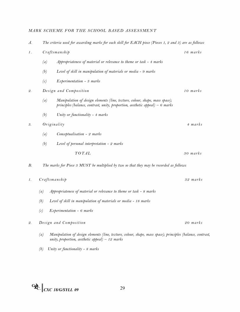
MA R K S C H E ME F O R T H E S C H O O L B A S E D A S S E S S ME N T
A. The criteria used for awarding marks for each skill for EACH piece (Pieces 1, 2 and 3) are as follows:
1 . Cr a f t s m a n s h i p 16 m ar k s
(a) Appropriateness of material or relevance to theme or task - 4 marks
(b) Level of skill in manipulation of materials or media - 9 marks
(c) Experimentation - 3 marks
2. De s i g n a n d Co m p o s i t i o n 10 m ar k s
(a) Manipulation of design elements (line, texture, colour, shape, mass space); principles (balance, contrast, unity, proportion, aesthetic appeal) – 6 marks
(b) Unity or functionality - 4 marks
3. Or i g i n a l i t y 4 m ar k s
(a) Conceptualisation - 2 marks
(b)
Level of personal interpretation - 2 marks
TO TA L
30 m ar k s
B. The marks for Piece 3 MUST be multiplied by two so that they may be recorded as follows:
1. Cr a f t s m a n s h i p 32 m ar k s
(a) Appropriateness of material or relevance to theme or task - 8 marks
(b) Level of skill in manipulation of materials or media - 18 marks
(c) Experimentation - 6 marks
2. De s i g n a n d C o m p o s i t i o n 20 m ar k s
(a) Manipulation of design elements (line, texture, colour, shape, mass space); principles (balance, contrast, unity, proportion, aesthetic appeal) – 12 marks
(b) Unity or functionality - 8 marks
29CXC 18/G/SYLL 09
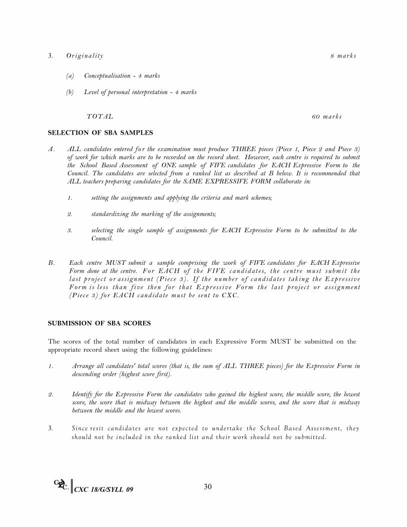
3. Or i g i n a l i t y 8 m ar k s
(a) Conceptualisation - 4 marks
(b) Level of personal interpretation - 4 marks
TO TA L 60 m ar k s
SELECTION OF SBA SAMPLES
A. ALL candidates entered fo r the examination must produce THREE pieces (Piece 1, Piece 2 and Piece 3) of work for which marks are to be recorded on the record sheet. However, each centre is required to submit the School Based Assessment of ONE sample of FIVE candidates for EACH Expressive Form to the Council. The candidates are selected from a ranked list as described at B below. It is recommended that ALL teachers preparing candidates for the SAME EXPRESSIVE FORM collaborate in:
1. setting the assignments and applying the criteria and mark schemes;
2. standardizing the marking of the assignments;
3. selecting the single sample of assignments for EACH Expressive Form to be submitted to the
Council.
B. Each centre MUST submit a sample comprising the work of FIVE candidates for EACH Expressive Form done at the centre. Fo r EAC H o f t h e FI V E c a n d i d a t e s , t h e ce n t re m u s t s u b m i t t h e la s t p r o je c t o r a ssig n m e n t (P ie c e 3 ) . I f th e n u m b e r o f c a n d id a te s ta k in g th e E x p r e ssiv e Fo r m i s l e s s t h a n f i v e t h e n f o r t h a t Ex p r e s s i v e Fo r m t h e l a s t p r o j e c t o r a s s i g n me n t (P ie c e 3 ) fo r E A C H c a n d id a te m u st b e se n t to C X C .
SUBMISSION OF SBA SCORES
The scores of the total number of candidates in each Expressive Form MUST be submitted on the appropriate record sheet using the following guidelines:
1. Arrange all candidates' total scores (that is, the sum of ALL THREE pieces) for the Expressive Form in
descending order (highest score first).
2. Identify for the Expressive Form the candidates who gained the highest score, the middle score, the lowest score, the score that is midway between the highest and the middle scores, and the score that is midway between the middle and the lowest scores.
3. S i nc e r e s i t c a nd i d a t e s a r e no t e x p e c t e d t o und e r t a ke t h e Sc h o o l B a s e d A s s e s s m e nt , t h e y
sh o u l d n o t b e in c l u d e d in t h e ra n k e d l i st a n d t h e i r w o rk sh o u l d n o t b e su b m it t e d .
30CXC 18/G/SYLL 09
MA T E R I A L S T O B E S U B MI T T E D T O C X C
The centre (team of teachers) must submit to CXC:
1. the projects or assignments of the FIVE candidates selected for EACH Expressive Form;
2. on e completed RECORD OF MARKS FOR SCHOOL BASED ASSESSMENT for ALL candidates at the centre;
3. on e completed MODERATION OF SCHOOL BASED ASSESSMENT FORM;
4. the list of assignments completed by the candidates for School Based Assessment.
PRE PARAT I ON FOR E X AM I N AT I ON
In preparation for the examination teachers should ensure that:
1. candidates receive the examination papers TWO WEEKS in advance of the examination date;
2. candidates obtain in time for the examination whatever materials and equipment are necessary for the selected Expressive Forms;
3. wherever required, preliminary studies and preparation of materials are to be the unaided work of the
candidates;
4. within TWO WEEKS after the examination, ALL ceramic pieces are:
(a) photographed;
(b) bisque fired;
(c) labelled and packed for despatch, including the photographs and all fragments if pieces were damaged during the firing process.
5. candidates are informed of the rules and regulations pertaining to misconduct and the consequences of such
misconduct;
6. labelled paper provided for the examination by CXC is used; if candidates wish to use other surfaces specially suited to their selected media, then these papers should be attached to the CXC labelled paper, so that the label remains at the front; no information should be written on the work itself;
7. labels for ALL Expressive Forms are securely attached to the pieces in order to avoid misplacement
during packaging and transportation;
8. dimensions of the work DO NOT exceed CXC's stipulation;
9. candidates consider the placement of their composition in relation to the size of the paper provided;
31CXC 18/G/SYLL 09
10. candidates DO NOT take preliminary sketches to be finished in the examination room for submission as their final examination piece;
11. candidates DO NOT take preliminary sketches into the examination room for the Expressive Form
Drawing;
12. candidates DO NOT take into the examination room a finished piece of work for substitution as an examination piece;
13. candidates DO NOT copy directly from books, magazines, calendars or other existing pictorial works for
submission as their final examination work;
14. proper care is taken to ensure that ceramics or other fragile works are carefully packaged to minimise breakage;
15. candidates DO NOT copy information verbatim and submit as their own material;
16. candidates DO NOT submit identical copies of the Reflective Journal;
17. candidates state the total number of words contained in the Reflective Journal;
18. they (teachers) indicate at the back of the Reflective Journal whatever assistance they gave; if no assistance
was given, teachers should provide some explanation;
19. candidates MUST prepare in the examination room silkscreen stencils and blocks for printing done for the Expressive Forms of Printmaking and Textile Design and Manipulation. (The only prepared screens or blocks with designs that may be brought into the room are those done using the photographic method or any method that would not be completed within a 6-hour sitting - in these cases, preliminary sketches and colour separations should be submitted);
20. candidates only bring into the examination room stretched screens and prepared blocks (without design).
21. All relevant information should be entered on the Moderation of SBA Form. In addition, each
art piece must be clearly labelled with the name of the Expressive Form, candidate’s name and registration number, and mark (out of 30 for each of the first TWO pieces and out of 60 for the LAST piece). Teachers should also indicate whether each piece is ‘highest mark’, ‘middle mark’ or ‘lowest mark’. The SBA samples should be sent to the Local Registrar by April 15, so that they may reach CXC Headquarters no later than April 30 of the examination year.
32CXC 18/G/SYLL 09
◆BIBLIOGRAPHY
The following is a list of books, which might be used for CSEC Visual Arts Syllabus. This is neither exhaustive nor prescriptive but indicates some possible sources that teachers and candidates may use as appropriate.
Crafts
Calder, Alexander Animal Sketching, New York: Dover Publications Inc., 1990.
Cushing, Val M. The Ceramic Design Book, London: Lark Books, 1998.
Dodd, Arthur E. Dictionary of Ceramics, Burlinton, Vermount: Ashgate Publishing Co., 1994.
Frank, Vivien Decorative Paper Crafts, London: Tiger Books International, 1991.
Kafka, Francis, J. Batik, Tie Dyeing, Stenciling, Silk Screen, Block Printing: The Hand Decoration of Fabrics, New York: Dover Publications Inc., 1990.
Reader’s Digest Association Reader’s Digest Craft and Hobbies: A Step by Step Guide to Creative Skills,
New York: The Reader’s Digest Association Inc., 1991.
Graphic Design
Place, Jennifer Creating Logos and Letterheads, New York: North Light Books, 1995.
Swann, Alan The New Graphic Design School, New York: John Wiley and Sons Inc., 1997.
History of Art
Arche-Straw, Petrine (Ed.) Fifty Years – Fifty Artists: 1950-2000, The School of Visual Arts, Kingston, Jamaica: Ian Randle Publishers, 2000.
Bender, Wolfgang (Ed.) Rastafarian Art, Kingston: Jamaica, Ian Randle Publishers, 1992.
Bercht, Fatima et al (Eds.) Taino: Pre-Columbian Art and Culture from the Caribbean: New York, Montacelli Press, 1997.
Block, Holly Art Cuba: The New Generation, New York: Harry N. Abrams, 2001.
Boxer, David and Poupeye, Veerle
Modern Jamaican Art, Kingston: Ian Randle Publishers, 1998.
33CXC 18/G/SYLL 09
Cummins, Alissandra et al Art in Barbados: What Kind of Mirror Image? Kingston, Jamaica: Ian Randle Press, 1999.
Drewett, Peter L Prehistoric Barbados, Institute of Archaeology, University College of
London, 1991. Fineberg, Jonathan Art Since 1940: Strategies of Being, Englewood Cliffs, New Jersey:
Prentice Hall, 2000. Glinton, Patricia et al. Bahamian Art 1492-1992, Nassau: The Counsellor Ltd., 1992.
Hill, Barbara Historic Churches of Barbados, London: Art Heritage Publications, 1990.
Lucie-Smith, Edward Albert Huie: Father of Jamaican Art, Kingston: Ian Randle Publishers,
2001. Poupeye, Veerle Caribbean Art, London: Thames and Hudson, 1998.
Straw, Petrine Archer and Robinson, Kim
Jamaican Art: An Overview with a Focus on Fifty Artists, Kingston: Kingston Publishers, 1990.
Painting
Walmsely, Anne Guyana Dreaming: The Art of Aubrey Williams, Aarhus, Denmark: Dangaroo, 1990.
Principles of Design in Art
Hollahan, Clodagh and Rosche, Maureen
Art Craft Design, London: Gill and Macmillan, 1993.
Printing
Stocks, Sue Printing, London: Wayland Publishers Ltd., 1994. Articles
34CXC 18/G/SYLL 09
Anderson, Kay Analysis of Three of John Dunkley’s Works, Jamaica Journal, vol. 2 No. 2, 1992.
Anderson, Kay Haitian Art: Interview with Gerald Alexis, Arts Jamaica, Vol. 3 Nos. 3
and 4, 1995.
Lamming, George and Carter, Martin
Artist and Teacher: E. R. Burrowes, New World: Guyana. Independence Issue, Edited by Donald Locke.
Brochures
Burnside, Jackson Match Me If You Can, Exhibition of works by Amos Ferguson, Nassau, the Counsellors Ltd., 1991.
Malone, Brent A Retrospective, Hialeah: A C. Graphics Inc., 1992.
Catalogues
Black Art: Ancestral Legacy Dallas Museum of Art.
Caribbean Export Development Agency
The Authentic Caribbean Craft Catalogue. Caribbean Export, Hastings, P.O. Box 34B, Brittons Hill P. O., Barbados, E-mail: cartis @caribsurf.com
Haniff, Nesha Z. 60 Years of Women Artist in Guyana, 1928-1988 - A Historical Perspective, Guyana Women Artists Association.
Jamaica Art National Gallery of Jamaica and Smithsonian Institute Travelling
Exhibition Service. National Gallery of Jamaica Gifts for the Nation: The Donations of Aaron and Marjorie Matalon,
Kingston: The National Gallery of Jamaica, 1999. The British Council Photos and Phantasms: Harry Johnston’s Photographs of the Caribbean,
London: The British Council. The October Gallery Contemporary Painting, Trinidad and Tobago, London: The October
Gallery, 1992. UNESCO Carib Art - Contemporary Art of the Caribbean, UNESCO, 1993.
35CXC 18/G/SYLL 09
Journals and Magazines
Caribbean Beat (Caribbean Airlines)
Island Life Magazine
Jamaica Journal
LIAT Islander
National Geographic
Skywritings - Air Jamaica Wes t e r n Z o n e O f f i c e 22 M ay 2 0 0 9
36CXC 18/G/SYLL 09
CARIBBEAN EXAMINATIONS COUNCIL
REPORT ON CANDIDATES’ WORK IN THESECONDARY EDUCATION CERTIFICATE EXAMINATIONS
JUNE 2004
VISUAL ARTS
Copyright © 2004 Caribbean Examinations CouncilSt. Michael, Barbados
All rights reserved
– 2 –
VISUAL ARTS
JUNE 2004
GENERAL COMMENTS
This was the first year of examination for this new syllabus. All production options are nowgiven the same completion time of six hours. In Syllabus A candidates were required to submitpieces for two practical papers as well as research work in the Illustrated Paper. There wereentries in all ten of the practical options however, Drawing, Imaginative Composition andGraphic Design were the popular options.
DETAILED COMMENTS
Production Papers
OPTION A – DRAWING
There continues to be a very good standard of work in this option. In a few cases, water-colourpaintings were submitted but this medium is not recommended for this option as paintingrather than drawing skills are emphasized. All drawings had to be done from observation.Candidates had the choice of drawing an arrangement of fruits on a fruit tray, a collection oforganic materials, a collection of items used for wrapping a gift and a character from a theatricalfor questions 1 - 4 respectively.
Question 1
This was the most popular question in this option. From the work submitted, it was evidentthat attention was given to the placement of items in the arrangements. The most outstandingpieces were produced from centres in which the stimulus was carefully arranged.
Question 2
There were some good submissions in black and white as well as in colour. In the pieces whichreceived high marks, variety was seen in tone, shape, size and texture.
Question 3
In the outstanding pieces there was differentiation between the textures of various objects.Candidates demonstrated an appreciation of spatial relationships and a good understandingof perspective.

– 3 –
Question 4
This was the least popular question in this option. Some pieces showed good control of themedium with adept use of fore-shortening. In depth studies from observation resulted in theexcellent execution of drawing skills needed for the human figure.
OPTION B – IMAGINATIVE COMPOSITION
The submissions in this option were well researched and this resulted in a wide variety ofinterpretations. There were excellent studies which in turn produced excellent submissions.Candidates were required to produce a collage, painting or any type of pictorial/abstractcomposition using different themes.
Question 1
The theme for this question was ‘The Domino Game’. Many original interpretations werepresented as responses. The settings varied from indoor to outdoor and from daytime tonightime activities. In the responses it was evident that many of the elements and principlesof design were explored.
Question 2
The theme ‘Ecstatic’ provided an opportunity for the exploration of different types of subjectmatter but there was little variety in the interpretations. Generally, the match between thefacial features, the postures and the theme was not evident.
Question 3
The theme of this question was ‘Sunlight’. This was the most popular question in this option.The subject matter included seascapes, landscapes, portraits and flowers. In the exceptionalpieces candidates were able to produce a unity of design, excellent surface quality (includingthe collage), colour harmony and good compositions. The pieces in which crayons were used,were generally of a high standard and candidates were able to successfully explore the textualand expressive qualities of the various components of their pieces.
Question 4
There were many innovative responses to this question which had as its theme ‘Forgotten’.The interpretation showed subjects such as a dripping tap, unfed pets, discarded clothing andfamily members. Many responses explored environmental issues.
– 4 –
OPTION C – GRAPHIC DESIGN
For this option candidates were required to use black and white only, colour only, or acombination of colours. The products were different for the four questions in the option andthe candidates who submitted pieces are to be commended for their research work.
Question 1
Candidates were required to produce the front panel of a brochure advertising a touristattraction in their country. Candidates had the option to use Computer-Aided Design (CAD)software in the development of their responses. Most brochures showed that a lot of preparatorywork was done. Even though there was evidence of experimentation, generally, the layoutwas good and the lettering was appropriate. Candidates who submitted pieces which weredeveloped using CAD also included their preliminary sketches and studies. Candidates showedtheir resourcefulness as they used images from a variety of sources.
Question 2
This was the most popular question in this option. Candidates were required to design a logofor a company which provided internet services. The best responses came from candidateswho engaged in research. The pieces which received high marks showed features such asgood layouts, balance in imagery, good colour distribution, creative use of shapes and the useof borders. The style of lettering complemented the shape and size of the composition.
Question 3
In this question candidates were required to create a design for a CARICOM passport cover.The responses were well researched and candidates displayed a high level of creativity in theexecution of the designs. There was great variety in the designs of the outstanding pieces,they contained creative lettering and illustrations. Candidates demonstrated their ability tosolve spatial problems.
Question 4
This was the least popular question in this option. Candidates had to design an advertisementfor an international teenage magazine, which would be used to encourage students to completetheir secondary education. The interpretations included good layout and lettering. However,the use of letter cut-outs is not a recommended technique for this type of task.
– 5 –
OPTION D – Printmaking
In this option candidates used a single or combination of techniques to produce a monoprintfor questions 1 and 2. Candidates could also have chosen to produce an edition of 3 prints aswas required in questions 3 and 4.
Questions 1 and 2
The themes for these questions were ‘Reflection’ and ‘The Smile’ respectively. The successfulmonoprints contained features such as detailed cuts on linoleum, correct application of colours,the appropriate choice of ink, excellent use of negative space and a clean finish.
Questions 3 and 4
The themes for these questions were ‘Rainy day’ and ‘Bird eating a fruit’ respectively. In thesequestions candidates had the opportunity to use multiple colour printing for subtle textures.They could also have used dominant shapes and colours associated with the themes. Very fewsubmissions were of a high quality.
OPTION E – 3 Dimensional Design
In this option candidates were required to use appropriate modelling and carving techniquesin the production of their pieces. Candidates had the choice of working with wood, wire, clay,plaster or papier mâché.
Question 1
In this question candidates were required to design and make a relief sculpture with thetheme ‘Workers’. Candidates interpreted the theme in various ways and, the productionsranged from figures to animals and insects. Candidates realized more success working withclay than with the other materials. Some pieces were not properly packaged which resultedin their breakage during shipping and handling.
Question 2
In this question candidates were required to make a maquette for a bust of a national hero intheir territory. This was the least popular question in this option although there were someoutstanding pieces among the submissions.
Question 3
In this question candidates were required to make a model of an aircraft. This was the most popular questionin this option. Most candidates chose appropriate materials and the finished pieces indicated that theirplanning was detailed, and catered for the employment of problem-solving skills. Generally the packagingwas suitable but pieces such as these have to be fully protected against impact, when they are being trans-ported.
– 6 –
Question 4
In this question candidates were required to make a mask using local or discarded materials. There were wellresearched pieces which depicted good concepts of the chosen topics. From one centre there were outstand-ing submissions which were glazed in one colour only or a combination of colours.
OPTION F – FIBRE ARTS
There was generally a satisfactory standard of work in this option. Ninety-four percent of thecandidates who were entered had profiles A – C.
Question 1
Despite the number of queries about the dimensions of the fruit basket, this was the mostpopular question in the option. Some very creative interpretations were received fromcandidates in one territory. A variety of materials was used to create the decorative flaringrim. The pieces showed good planning concepts.
Question 2
In this question candidates were required to make a high-relief wall hanging, depicting ariver scene. In a few of the outstanding pieces, the theme was well explored. Generally therewas creativity in the use of techniques. Many candidates submitted plans or preliminarystudies which showed how problems would be solved
Question 3
In this question candidates were required to use weaving and plaiting techniques to producea matching set containing a place-mat, coaster and serviette. A high degree of creativity wasdisplayed in the choice of weaving and plaiting techniques. In a few submissions naturalfibres were used.
Question 4
In this question candidates had to construct a free standing abstract form which would bemounted in the office of the Mathematics Department in a university. This was the leastpopular question in this option. Generally, the standard of the pieces indicated that candidatesdemonstrated a good understanding of the concepts and the skills needed for execution.
– 7 –
OPTION G – SURFACE DECORATION
The submissions in this option were of a high standard. A number of exceptional designs were of marketablequality.
Question 1
In this question candidates were required to produce a print on a T-shirt that would be used toadvertise and promote an annual boat racing competition. This was the most popular questionin this option. The outstanding pieces showed a high level of concept development and skill.In some responses too many words were used at the expense of imagery. In a few cases, wordswere painted instead of printed.
Question 2
In this question candidates were required to use a combination of appliqué and embroiderytechniques in the design of and making of a seat cover panel. This was the least popularquestion in this option. However, the outstanding submissions were utilitarian, combinedtwo techniques and were well designed and executed.
Question 3
In this question candidates were required to use one or more resist dyeing processes to decoratefabric that could be used as a headwrap. They had to use the theme of ‘Ripples and Pebbles’.In the pieces that were well executed, the resist processes that were used, were suited to thefabric. Some candidates concentrated on ripples or pebbles only and did not fully answer thequestion.
Question 4
Candidates were required to create a realistic or stylized design based on a cross-section of atomato or pumpkin. This design had to be used to decorate a pair of place mats as well asmatching table napkins. Excellent responses were submitted by candidates who chose tostencil or use screen printing. A high level of preparation was seen in the registration ofprints. These prints were used to produce good designs.
– 8 –
OPTION H – CERAMICS
Pieces submitted for this option MUST be photographed before firing. Generally the workthat was submitted by the candidates was of a satisfactory standard.
Question 1
In this question candidates were required to make a relief wall plaque. They had to depict either the front orside view of the head of an animal or person. Generally the pieces were well planned. In the outstandingpieces, clear images, telling facial expressions and creativity were seen.
Question 2
In this question candidates had to make two decorative tiles. They had to use a subtractivetechnique on one tile and an additive technique on the other using the same motif. This wasthe most popular question in this option. The requested techniques were not properly executedby many candidates. In a few cases there were two parts on a single tile. The outstandingpieces however, showed good knowledge of the additive and subtractive techniques.
Question 3
In this question candidates had to use a combination of techniques to construct a ceramicsculpture. The responses showed that candidates researched their pieces . The designs werequite detailed. In most cases the theme ‘Sea-horse’ was interpreted well. Generally candidatespaid attention to the surface finishes.
Question 4
In this question candidates were asked to design and produce two thrown or hand-built bowls.In the best submissions the high skill level of candidates was demonstrated. The weakerpieces were too heavy with limited decorative technique.
OPTION I – LEATHERCRAFT
Generally the submissions in this option were of a highly satisfactory quality. Ninety-sevenpercent of the candidates who were entered for this option had profiles of A – C.
Question 1
In this question candidates were required to use at least two decorative techniques in themaking of a plaque based on the theme ‘Birds’. This was the most popular question in thisoption. There were some excellent responses in which candidates demonstrated excellentinsight and a high level of creativity. Candidates also demonstrated good problem solvingskills and mastery through the effective use of tooling and stamping.
Question 2
In this question candidates were asked to produce a picture mount (frame) as a gift for Mother’s Day. Theywere required to decorate the frame using one, or a combination of the techniques of stamping, carving andlaminating. This was a fairly popular question. There were many good responses with appropriate designsand good levels of craftmanship.

– 9 –
Question 3
In this question candidates were asked to produce a cushion. There were many submissionswhich showed that candidates had a good understanding of the requirements. There wasgood application of the elements and principles of design. Generally, the pieces were quitefunctional with the fringe complementing the design on the cushions.
Question 4
In this question candidates were required to use a variety of ‘scraps’ of leather/leatherette tocreate a collage based on the theme ‘Flower Garden’. There were outstanding pieces in whichthere was a successful combination of material and design. In a few cases the collage wasdone on wood or paper instead of leather, but the overall quality was satisfactory.
OPTION J – DECORATIVE CRAFT
Ninety percent of the candidates who entered for this option received profiles of A to C.Generally the quality of work was highly satisfactory.
Question 1
In this question candidates were required to make a wall plaque for hanging keys using frogsas the motif. This was the most popular question in this option. Candidates used a widevariety of materials and exhibited a high level of creativity. Most of the responses wereappropriate for use as utilitarian objects.
Question 2
In this question candidates were asked to create a picture frame based on the theme‘Underwater ’. Generally the candidates’ submissions were innovative. Greater attentionmust be paid to how attachments are secured to the various surfaces.
Question 3
In this question candidates were asked to decorate a bottle of their choice for use as a lampbase. Paint and découpage techniques were to be used for decorating. There were someoutstanding responses, which skilfully combined painting techniques with découpage.
Question 4
In this question candidates were required to make a soft toy based on a character from the folklore of theirterritory. There was evidence of preparatory work and this led to good development of concepts. Theexecution in most cases was fair.
– 10 –
ILLUSTRATED PAPER
The content for this paper has been expanded and the area “Critical Analysis of Works of Art”has been included in the syllabus. The marks for this paper have been increased to 90 from60.
Quality and Topics
Most topics were appropriate and related to the Caribbean. Some were well thought out, wellresearched and quite original, while others lacked the required analysis of the work of artists.
Verbal Presentation
(i) Generally there was a good use of language though there were a few cases of poorgrammar and weak sentence structure.
(ii) In many cases the title page was not identified.
(iii) A few candidates from the same centre presented papers which were duplicates of thework of other candidates. This is unacceptable and teachers need to give more guidanceto candidates in this area.
(iv) While some candidates submitted the interviews and questionnaires, they did notsubmit the data that was collected.
(v) There were numerous cases of plagiarism. This practice is unacceptable and teachersare expected to give guidance to candidates about this issue.
Visual Presentation
(i) The majority of booklets were well presented and contained a cover page, title page,table of contents, appropriate illustrations, legible text and good layout.
(ii) Generally, the artistic embellishments had a high aesthetic appeal and the papersbecame a work of art in themselves. There were very good border designs with motifsand decorative work that was relevant to the theme.
SCHOOL BASED ASSESSMENT
The moderation of the SBA took place in Barbados, Jamaica and Trinidad and Tobago. The new moderationfeed-back report, summary sheets and list of assignment forms were intended to simplify the process ofcapturing data. Teachers are asked to pay careful attention to CXC instructions and ensure that the correctforms are being used.
Fair and objective marking by teachers will reduce the number of adjustments that were made in the modera-tion exercise. Teachers must adhere to the mark scheme.
Samples MUST be submitted for each option that is identified on the record sheet.

– 11 –
Pictures must accompany the three-dimensional pieces, especially those done in clay. However, they are nota substitute for actual submissions. If shattering occurs during the firing process, the pieces must still besubmitted with the pictures.
Generally, more attention must be paid to the labelling and packaging of items. Candidatesare put at a disadvantage when either of these two processes is not properly done.
CARI BB EAN E XAMINAT IONS COUNCIL
REPORT ON CANDIDATES’ WORK IN THE
SECONDARY EDUCATION CERTIFICATE EXAMINATION
JUNE 2006
VISUAL ARTS
Copyright © 2006 Caribbean Examinations Council ®
St Michael, Barbados
All rights reserved

- 2 -
VISUAL ARTS 2006
GENERAL COMMENTS
Five thousand, three hundred and thirty-four candidates registered for the examination compared with
5603 in June 2005. Drawing, Imaginative Composition, Graphic Design and Surface Decoration
were the most popular options with between 2100 and 3276 candidates registering. This was
followed by Decorative Craft with approximately 1300 candidates. All the other options had less than
1000 candidates registering.
Generally there was a vast improvement in the quality of work submitted, particularly in the two
dimensional Options A-D. In these options candidates made excellent use of the six (6) hours. Many
pieces demonstrated a high level of technical skills.
In the three dimensional options E-J, the quality of the work was generally weak. The pieces
demonstrated little preparatory work and research. The wrong choice of materials and techniques and
very little creativity and originality were evident.
Since candidates are given two weeks in which to prepare responses, they need to research and plan in
order to produce effective and highly creative pieces. Students have more than enough opportunity to
seek assistance, to read and fully comprehend the requirements of specific questions.
Candidates must be directed to read the entire question booklet, particularly page three of the booklet
which gives general instructions.
Work must be produced according to dimensions where specified.
The instructions for Option B – imaginative compositions states that colour must be used, yet some
responses were submitted in black and white.
DETAILED COMMENTS
Production Papers
OPTION A – DRAWING
Question 2 was the most popular question and question 3 was the least popular. Generally the
responses were of a high standard. In many instances candidates drew from photographs.
Question 1
Self portrait
A significant number of candidates attempted this question with some very good responses. A variety
of media such as pencils, pastels and pencil crayons were utilised. There were some issues and with
proportions tonal values. Many candidates drew from photographs instead of doing observational
drawings and this should be discouraged.
- 3 -
Question 2
Bunch of coconuts
This was the most popular question with some excellent interpretations. Candidates explored a wide
variety of drawing media and demonstrated high levels of skill. Compositions were excellent.
Various techniques were also explored.
Question 3
Table set for breakfast
This was the least popular question and responses were generally weak. Responses demonstrated a
lack of understanding of the principles of perspective. Ellipses were poorly executed. Many persons
focused on the entire setting instead of the drawing plane. The treatment of tonal values was very
week.
Question 4
Detailed studies – sections of a live flowering plant
There were a few good responses but generally there were poor, with candidates drawing a potted
plant in various positions instead of detailed studies of the stem, leaves, roots or flowers.
OPTION B – IMAGINATIVE COMPOSITION
This was a popular option. Many responses were average and lacked creativity and imagination with
a few excellent interpretation of the subjects.
It was obvious that candidates lacked a sound knowledge of the elements and principles of design,
and the emotive use of colour, knowledge of elements and principles of design, the emotive use of
colour and perspective.
There was a very little exploration of medium and techniques.
Question 3 was the most popular and Question 2 was the least popular.
Question 1
Traffic
There were a few excellent and creative interpretations of the subject. Many candidates confined
themselves to the conventional interpretation of vehicular traffic – a safe response.
Others produced varied interpretations of the theme focusing on fish, animals, inserts as well as
vehicles and people.
Craftsmanship was generally weak in this option.
- 4 -
Question 2
Mix and Match
Most candidates who attempted this question had difficulty in interpreting the topic, because the
concept was an unusual one or perhaps too abstract for this age group. There were, however some
excellent responses.
Question 3
Nocturnal
This was the most popular question in this option, varied and interesting interpretations emerged.
However there were large numbers of responses which lacked originality.
Candidates just painted a night sky with a nocturnal animal or bird.
Question 4
HIV and AIDS
Generally candidates produced interesting responses. Some good pieces demonstrated an awareness
of the consequences of AIDS, data on HIV infections as well as activities and behaviour that can put
persons at risk.
There was not enough exploration of materials and combination of techniques.
OPTION C – GRAPHIC DESIGN
Responses ranged from weak to excellent. The most popular question was Question 3 and the least
popular was Question 4. Spatial organisation, layout altering and illustration need to be paid a lot
more attention.
Question 1
Poster – persons with disabilities
Most candidates did not adhere to the specified dimensions and no preparatory studies were submitted
for the computer generated designs and others. Generally the messages were quite clear and effective.
Question 2
Book Jacket for Island Craft Magazine
This question was poorly represented by most entrants. The concept of a book jacket was not brought
out in most of the pieces.
Good design and layout techniques were ignored. Some illustrations were not relevant to the theme.
Preliminary sketches were not submitted in most cases.
There were very few good responses.
- 5 -
Question 3
Illustrated Text
Though not a popular question, the attempts were largely satisfactory. Some good lettering was seen,
but quality illustrations were absent from many. The selection of text and illustrations did not always
relate to the stanzas of the poem.
Question 4
Cartoon – Youth against violence in schools
This was the least popular but the most successful in terms of responses. The highly successful ones
portrayed excellent skills in depicting the forms, figures and setting for each frame, and a strong story
line was present.
In others the story line was weak and standards were low in terms of design, composition and
craftsmanship.
Nevertheless, it encouraged candidates to explore and express a relevant, social and cultural problem.
OPTION D – PRINTMAKING
Paints were generally fairly good with some excellent responses. Many candidates used stencils, but
this technique does not lend itself to the production of an edition of three prints. More suitable
techniques would have been lino, wood cut, etching and screen-printing.
Questions 1 and 2 were equally as popular. Question 4 was the least popular.
Some candidates are still submitting work on fabric instead of paper.
Question 1
There were some interesting responses which demonstrated the expressive power of lines, texture,
shape and tonal value.
Question 2
There were some good responses demonstrating good design and composition.
Question 3
There were very few responses to this question, but some were very outstanding. Designs were very
base with little contrast and variation in lines, textures tone, contract and shapes.
Question 4
This question was poorly represented. There is still a general lack of understanding of the concept of
an edition of prints.
Colour changes were done for each print. Many were poor in terms of execution of the concept and
registration.
- 6 -
OPTION E – 3 DIMENSIONAL DESIGN
Entries in this option have increased and improved over the past few years.
Question 2 was the most popular and Question 3 was the least popular.
Question 1
Sculpture based on your country’s folklore.
There were many excellent responses to this question, including ‘Anansi’ and other local folkloric
characters. Pieces were well made and designs were good.
Question 2
Sculpture of a person with a walking stick
This was the most popular question and responses were of some highly expressive figures which
spoke of aging. A variety of materials and techniques were explored.
Question 3
Sculpt an animal from a block of plaster/wood. This was the least popular question. Although a few
pieces were realised the majority were poorly done.
Question 4
Relief – ‘Down and Out’
The responses were generally varied and well executed. Some were excellent in terms of
craftsmanship, design and composition and originality. A variety of materials were explored.
OPTION F – FIBRE ARTS
Work in this option was moderate to fair. This was as a result of poor craftsmanship, design and use
of inappropriate materials and techniques.
Question 2 was the most popular and Question 4 was the least popular.
Question 1
Responses were fair to moderate. The main problem was the inappropriate selection of materials
used.
Question 2
This was the most popular question. Some excellent responses were seen, but they were not really
practical as hats to be worn, as the material from which it was made was much too heavy.
Question 3
There were some excellent pieces with good craftsmanship. Several pieces demonstrated a lack of
proper planning and preparation. Several pieces were submitted on the loom.
- 7 -
Question 4
On a whole, responses were weak and were more decorative craft than fibre arts responses. Hardly
any fibre arts materials or techniques were used.
OPTION G – SURFACE DECORATION
There were an unusual low number of candidates who selected this option. Responses were fair to
moderate. Design, layout and use of techniques and colour were moderate. There was evidence of
poor research, planning and choice and suitability of fabrics.
Both Questions 2 and 3 were equally as popular and Question 1 was the least popular.
Question 1
Responses to this question were moderate to weak. Most pieces were presented like throw cushions
rather than wall hangings. There was a lack of understanding of the trapunto technique. Embroidery
techniques were very poorly done.
Question 2
Generally responses to this question were weak. This was not removed from many pieces. Designs
were weak and demonstrated a lack of research and planning.
Fabrics used were unsuitable for these techniques.
Question 3
Most responses were basic. A lot more could have been done with the background. Border designs
were basic and did not flow. Designs were weak and pieces demonstrated a complete lack of
preparation. Use of colour was weak.
Question 4
Moderate work was seen and motifs were basic. More exploration and experimentation was needed.
Design concepts were weak.
OPTION H – CERAMICS
There were not as many responses in this option as usual. There were however a few excellent
pieces.
Pieces need to be properly packaged. It is important that registration numbers must be inscribed or
written on pieces. The stipulation and requirements of the question must be observed. Pieces must be
photographed before they are fired and photographs must be submitted with the pieces.
Question 1
Responses were fairly good, but design quality was poor in most cases.
Question 2
Most of the pieces were well executed.
- 8 -
Question 3
Responses were moderate. Craftsmanship and design were weak.
Question 4
Responses were moderate. The theme was not evident in many pieces. Construction was weak.
OPTION I - LEATHERCRAFT
Responses ranged from moderate to fair. Generally the pieces were weak in terms of design and
craftsmanship.
Question 1
Generally responses to this question were moderate.
Question 2
There were a few outstanding pieces. In general the work was way below the expected standard.
Attention needed to be paid to the areas of design and tooling.
Question 3
Responses were poorly executed.
Question 4
Responses were fairly good. Some candidates did not adhere to specifications.
OPTION J – DECORATIVE CRAFT
There were some excellent responses to this option, with good craftsmanship and design.
There was some improvement in the choice of materials and techniques. Question 1 was the most
popular and Question 4 was the least popular.
Question 1
There were some strong pieces which were quite marketable. But many showed poor craftsmanship.
Many dolls fell apart during packaging and transportation.
Question 2
There were some varied interpretations. A variety of materials and techniques were employed. There
were major problems with craftsmanship, as many pieces were falling apart.
Question 3
A pair of floor cushions
Although there were some excellent responses, many responses were poor and unresolved. Many
cushions were non-functional.
- 9 -
Some were decorated with glass which was not practical. Some candidates did not understand the
term traditional motifs and embellishments.
Candidates simply purchased ready-made motifs and applied them.
Question 4
Cricket souvenir
This question produced some excellent responses. They demonstrated a lot of innovation and original
ideas were presented.
In many cases the pieces were marketable.
ILLUSTRATED PAPER
Fewer candidates attempted the illustrated paper this year, but there was an improvement overall.
Some topics were too vague and open. Candidates should be discouraged from using topics such as
Ceramics, painting or ‘David Brown’. There were many papers without titles.
There was evidence that information was copied directly from sources. Some even cut and glued the
information from other sources directly into their papers. Decorative content was weak in many
instances it was incomplete, untidy or neglected.
The handwriting of many candidates was illegible and very often obscured by a painted or decorative
background.
Little attention was paid to layout. Photographs and other illustrations were quite often not labelled.
Most papers fell down in the area of critical analysis.
Some topics were not related in anyway to the Caribbean.
CA RI B B E AN E X AMI N AT I O NS CO UN CI L
REPORT ON CANDIDATES’ WORK IN THE
SECONDARY EDUCATION CERTIFICATE EXAMINATION
MAY/JUNE 2007
VISUAL ARTS
Copyright © 2007 Caribbean Examinations Council ®
St. Michael, Barbados
All rights reserved.

- 2 -
VISUAL ARTS
GENERAL PROFICIENCY EXAMINATION
MAY/JUNE 2007
GENERAL COMMENTS
Five thousand three hundred and thirty four candidates registered for the examination compared with 5334
in 2006.
On a whole, there were some outstanding pieces demonstrating a strong understanding of form, value,
texture, composition, use of media and creativity. There were, however, many pieces that were not up to the
required standard. It was apparent that very little preparatory work was done, and that the two weeks
allotted for this purpose was not utilized.
There was evidence of inappropriate materials and techniques being utilized and many instances where
requirements for individual questions were either ignored or misinterpreted. It was also noted that specific
dimensions and a required number of techniques to be utilized were also ignored. There were many
instances where examiners came across pieces of work responding to questions in options for which the
candidate had not registered.
Candidates must take the time to read the general instructions in the question booklet before beginning the
exam.
DETAILED COMMENTS
Production Papers
OPTION A – DRAWING
Question 4 was the most popular and Question 1 the least popular. Overall, drawings were average.
Candidates presented incomplete work in spite of the fact that six hours is the allotted time. There were
however, some outstanding works demonstrating great use of space, composition, tonal values and media.
Question 1
Reclining figure
Only a few candidates attempted this question. There were a few outstanding pieces. Generally they
demonstrated good use of media and creativity in the arrangement of the objects. Weak pieces had
difficulty with proportion and tonal values, use of space, composition and basic drawing skills. Very few
candidates handled the draped fabric well.
Question 2
Composition of root crops
Some outstanding pieces were produced. The majority of candidates misinterpreted the question by drawing
rooted plants instead of root crops, and the objects were not arranged on two different levels as required by
the question. Some compositions seemed to be drawn from memory instead of observation.
- 3 -
Question 3
Detailed studies – tree bark
A few candidates mastered this question. Although the question required emphasized, detailed studies,
some drawings were very basic, and in some cases rubbings were done. Weak examples showed very little
details and almost no variation in texture and tone. In other drawings candidates concentrated on drawing a
branch instead of zooming in on the bark.
Question 4
Composition of shoes
This was the most popular question with some outstanding pieces demonstrating creativity and mastery in
handling the media.
The majority of the pieces demonstrated poor compositions and use of media. Many candidates experienced
difficulty with foreshortening and lack of skill with tonal values and texture. Many candidates overworked
the background, and this became a distraction.
OPTION B – IMAGINATIVE COMPOSITION
Question 3 was the most popular question and Question 2 was the least popular.
Question 1
Night life – monochromatic
There were some good pieces, demonstrating great compositions, painting styles and execution of tonal
values. But most candidates misunderstood the ‘monochromatic’ colour scheme concept. Many were flat
with very little application of tonal value and limited use of the tonal scale to create the illusion of form,
depth and pattern.
Question 2
Ancestry – collage
Generally, pieces were weak. Candidates did not grasp the concept of ‘ancestry’ very well. Pieces
demonstrated a failure by candidates to do research and to select appropriate materials and methods to
execute the piece. Compositions were generally weak. There were, however, a few responses which
grasped the concept and demonstrated good organization of space.
Question 3
Upside down
There were some interesting concepts and compositions, demonstrating a sound knowledge of the elements
and principles of design. But in most cases the question was treated as a ‘reflection’ instead of ‘upside
down’. There was limited imagination used in developing the topic and in the expressive use of media,
techniques and styles.
- 4 -
Question 4
Erosion
There were a few expressive pieces which were quite successful and well executed. Many candidates
misinterpreted the question. Most pieces lacked conceptual development. A variety of media was not
optimally utilized and most pieces lacked creative expression and imagination.
OPTION C – GRAPHIC DESIGN
Question 3 was the most popular and Question 1 the least popular. There were some excellent examples
from candidates who had an excellent grasp of the elements and principles of design. But generally the
requirements of the question were basically ignored especially when it came to size and measurements.
There was little evidence of research and preparatory work. There was general lack of unity in most pieces,
to demonstrate a balance between pictorial illustrations and text to produce aesthetically pleasing work.
Question 1
Poster – CSME
Most responses were computer generated and were of a high standard. Overall visual appeal was quite
stimulating. Successful pieces displayed good lettering and the message was clear and appropriate
combined with appropriate illustrations. It was quite evident that some candidates did no research for this
question and this resulted in weak work. Candidates were unable to depict what was required from this
question. Weak pieces demonstrated poor design concepts and lack of a clear message and visual appeal.
Question 2
Deforestation brochure
There were a few entries for this question. For the most part, they were computer generated designs. A few
were impressive and were quite informative with relevant pictorial information. In responses which were
hand done, the graphics were weak and many designs were unresolved. Many candidates failed to adhere to
the required measurements for this question and in others there was very little evidence of preparatory work.
Question 3
Sign – Mango Tree Bar
This was the most popular question. Quite a variety of approaches were employed. There were some
creative lettering styles and layout techniques. There was evidence of a sound understanding of the
elements and principles of good design, including good use of colour.
Generally most responses were quite unique and delightful. There were some pieces, however, where the
candidates did not adhere to the specifications, and they were also weak in terms of good layout.
Question 4
Logo, ‘Safari Trails and Tours’.
This question was attempted by many candidates; however the responses showed a lack of understanding of
the characteristics of a good logo. As a result many responses came across as being signs, posters or
advertisements. Many aspects of eco-tourism were portrayed.
Many candidates ignored one of the requirements of the question which required that they portray the
working logo as a letterhead.
- 5 -
OPTION D
Printmaking
The most popular question was Question 1 and the least popular was Question 4. There were a few
outstanding pieces, but generally the work was moderate. Instructions were not adhered to. The concept of
an edition is still not understood. In many cases the three prints were done on the same sheet, when they
should have been done on three separate sheets. It must be noted that it is impossible to get an edition of the
same print using a stencil. In some cases candidates cut away the ‘virgin’ area around the print, this should
not be done. Some prints had evidence of hand-painting on them. Some candidates changed colour for each
edition of the same print. An edition is three of the very same print done on separate sheets of paper with
virgin area left all around them.
Question 1
The musician
There were some good responses with a high level of creativity. In some instances stencil printing was
utilized as a technique. This type of printing does not lend itself to the printing of an edition. There was
good use of a variety of lines, texture and contrast.
Question 2
Up there
There were a few interesting interpretations, but generally this question was poorly interpreted and executed.
Question 3
Abandoned
Candidates interpreted this theme well. The principles and elements of good design were explored.
Question 4
Night and day
Interpretation and exploration of the question were poor.
OPTION E – 3 DIMENSIONAL DESIGN
The most popular questions were Question 3 and Question 4 and the least popular was Question 2.
Performance in this option continues to be weak overall. There was generally no preparatory work or
research into appropriate materials and techniques. There were very few outstanding pieces for this option.
Question 1
The crossing
Not much creativity of interpretation was seen. It was poorly attempted. More research should have been
done and more attention paid to the elements and principles of good design.
- 6 -
Question 2
Flight
Very few candidates attempted this question, and most showed a lack of creativity and craftsmanship.
Question 3
Obesity
A few responses were received. They lacked preparation and creativity.
Question 4
Imprisoned
A range of concepts and interpretations were attempted, however the execution of most was weak. Some
pieces were too bulky due to their literal interpretations.
OPTION F – FIBRE ARTS
Question 3 was the most popular and Question 1 the least popular. The number of candidates selecting this
option was very few and generally the work was very weak. There were many examples which exhibited
lack of understanding of good design, poor choice of materials and techniques.
Question 1
Pair of table mats
Responses were generally weak. The requirements of the question were ignored in many instances. Some
exhibited one fibre art technique, dimensions were not adhered to and some candidates produced only one
table mat. Inappropriate materials and techniques were utilized and creativity and exploration of materials
were minimal.
Question 2
Circular throw cover
Overall the work was weak. The circle seemed to have presented a problem to some candidates. Most
chose weaving over lace-making techniques such as crochet. Many did not conform to the specified shape
or size required by the question. Most of the pieces were therefore non-functional.
Question 3
Macramé wall-hanging
Responses ranged from outstanding to very weak. Again size requirements were ignored in some instances.
Some candidates made poor choices of materials and techniques.
Question 4
Ceremonial headdress
There were one or two outstanding responses. The ceremonial aspect was ignored in others. In many
submissions neither fibre materials nor techniques were utilized.
- 7 -
OPTION G – SURFACE DECORATION
Question 3 was the most popular and Question 4 was the least popular. There were some good responses,
which demonstrated good research and application. In many instances all the requirements for each
question were not fulfilled.
Question 1
Pictures – Earth, Wind, Fire, Water
There were some very good creative pieces which utilized a variety of techniques and materials. Others
however were not well thought through or presented.
Question 2
Wall hanging, ‘Looking at my garden through the fence’
There were some excellent examples which displayed a unique, creative perspective. It was obvious
however that with inadequate preparation others fell short of decoration techniques.
Question 3
Fabric for beach wear – elements of sea life
There were a few good examples. Generally they were weak both design and execution. It was obvious that
candidates had limited grasp of the elements and principles of good design. Therefore the designs lacked
cohesiveness, especially in use of colour shapes and flow.
Question 4
Fabric for a bag with geometrical and organic motifs
There were very few candidates who handled this question well. Design and composition, craftsmanship
and functionality were very lacking. There was obviously lack of preparation and some misinterpretation of
the question.
OPTION H – CERAMICS
Question 3 was the most popular and Question 1 was the least popular. Although there were some
imaginative and well finished pieces many were clumsy and impractical. Most fell down in the area of
craftsmanship. More care needs to be taken with the finish.
Question 1
Relief of traditional architecture
There were some excellent interpretations. In others all the requirements were not fulfilled. In some, for
example, the name of the territory was omitted. The concept of ‘relief’ was not clearly understood as many
buildings were produced in the round.
Question 2
Picture frame with shells
Most of the responses were fairly successful. Designs were interesting; however they fell down in
craftsmanship.
- 8 -
Question 3
Non-traditional teapot
There were some very imaginative and interesting pieces. Some were more decorative than functional.
Some had no hole in the spout and were much too clumsy. More care needed to be taken when joining the
spout, handle and other decorative elements to the pot.
Question 4
Decorative bowl
Generally the designs were not well thought through. Dimensions were not adhered to and design elements
of ornate edges and vines were minimal or ignored. Craftsmanship was generally weak.
OPTION I – LEATHERCRAFT
Question 1 was the most popular and Question 4 was the least popular. There were some outstanding
examples with excellent designs and good craftsmanship. Others were non-functional and demonstrated a
lack of research and planning.
Question 1
Bag with handles
This was the most popular question and the quality of work varied from good to poor. Some demonstrated
good knowledge and skill in tooling and construction, while others were weak in one or more of these areas.
There seemed to have been some confusion between stamping and tooling techniques.
Question 2
Back of chair
Most attempts at this question were good. A few instances of weak tooling and inconsistent application of
dyes were evident.
Question 3
Hand-held mask
This question had good and bad responses. Tooling techniques were excellent in some while others
reflected a lack of research and planning. This resulted in pieces which were non-functional. The use of
embellishment was minimal although it was demanded by the question.
Question 4
Drop piece with fringe
Few candidates attempted this question. The pieces were for the most part very successful. There was some
misinterpretation of the question, as traditional belts were produced in many instances.
- 9 -
OPTION J – DECORATIVE CRAFT
Question 4 was the most popular and Question 3 was the least popular. Although there were some good
pieces, responses were generally weak and showed very little imagination.
Question 1
Three piece jewellery set
Responses were generally weak. The words ‘hand-crafted’ were ignored and many candidates simply
purchased beads and other items to be strung.
Question 2
Mural for childrens’ ward
There were some very good responses, utilizing a variety of materials and techniques. Elements of good
design were evident.
Question 3
Conversion of a garment
Generally the responses to this question were very weak. There seem to have been some confusion with the
word, ‘convert’. There were, however, a few creative examples, which answered the question perfectly.
Question 4
Cover of a photo album
Although this was the most popular question, responses were extremely disappointing. Craftsmanship was a
major issue with most of the pieces. There were, however, some fine examples with great craftsmanship
and design and functionality.
THEORY OF ART OR ILLUSTRATED PAPER
Overall there was a general improvement in the quality of papers received.
Topic
Some topics were too general and not related to the Caribbean region in any way, but generally they were
related to the visual arts. Some interesting topics included, “Art in Caribbean Culture”, ‘Tainos –
Amerindian symbolism in Art”. The more general topics included, “Basketry”, and “Batik”.
Candidates should be encouraged to conduct research on new and emerging artists and artforms.
LEVEL OF EXPRESSION
There was an improvement in the level of expression and use of language. There was some variety of
research methods used for the gathering of data, but there is a need to widen their scope in this area.
The level of content and verbal expression in many papers was poor. Many candidates are unable to carry
out critical analysis of art work. Many papers lacked a necessary conclusion.

- 10 -
ORGANISATION OF VISUAL MATERIAL
Some excellent, well-decorated papers were received; however there was a general decline in the visual
presentation of booklets. The decorative content should be carefully planned, be relevant to the topic and
should follow the principles of good design.
Illustrations were not always of a high quality. Layout was sometimes poor and illustrations were not
always labelled or placed next or near to the relevant text.
Many papers had no cover page, no title and no table of contents. The cover page should be decorated and
include the topic under research.
Some handwritten papers were received and the majority were poorly done with very poor penmanship.
Candidates using the computer, however, should select fonts which are legible and less ornamental and of an
appropriate size.
In carrying out research students should attempt to do more personal “on sight” research to gather first-hand
information including the gathering of illustrations. Candidates MUST make the Illustrated Papers a
WORK OF ART.

CARIBBEAN EXAMINATION COUNCIL
REPORT ON CANDIDATES’ WORK IN THE SECONDARY EDUCATION CERTIFICATE EXAMINATION
MAY/JUNE 2008
VISUAL ARTS
Copyright© 2008 Caribbean Examinations Council ® St. Michael, Barbados ALL rights reserved.

-2-
VISUAL ARTS GENERAL PROFICIENCY EXAMINATION
MAY/JUNE 2008
GENERAL COMMENTS Five thousand five hundred and seven candidates registered for the examination compared with 5334 in 2007. Generally the pieces submitted for examination were not of a high standard. It was really difficult to identify outstanding samples of work in all options. There was, in most instances no evidence of preparatory work or research being done. General and specific instructions related to techniques, materials and dimensions were often ignored. It is quite difficult to believe that many candidates who registered for the examination were actually being taught.
DETAILED COMMENTS
Production Papers OPTION A – DRAWING Question two was the most popular and question one was the least popular. Generally the drawings were average. There were however a few outstanding pieces which demonstrated good use of space, composition, tonal value and media. Question 1 Bust of a figure This was the least popular question. It demanded a basic understanding of proportion of the human, face neck and shoulder. The question demanded some emphasis on tonal values to create the illusion of form. There was a wide range of responses to the question varying from outstanding to the very weak. Outstanding pieces, which were very rare, demonstrated a good grasp of tonal values and proportion in the face, but a basic grasp of the human anatomy. However, candidates were able to develop how light plays on the face, capture facial expression as well as the textural qualities of hair and clothing. Moderate to weak pieces demonstrated lack of knowledge of basic proportions, anatomy and tonal values. Candidates’ drawings were flat and distorted. Some candidates should not have attempted this question because they lacked the required knowledge and skills. The dominant drawing media was pencil and oil pastels. Some candidates produced work in mixed media such as: pencil, pen and ink and watercolor wash techniques. Question 2 Composition with lamp and book This was the most popular question. This question required an understanding of line, geometric structure such as cuboids, cylinders and cones, along with a sound knowledge of perspective. It also required a sound knowledge of how to create light and dark on the surfaces of objects. There were many outstanding pieces which demonstrated accurate observational skills and knowledge of line and structure. The elliptical shapes of cylindrical forms were well constructed and the cuboid form of the book was placed in correct perspective. The study of light and dark were accurately rendered. The candidates who did poorly experienced problems with observation, composition and tonal values. This question encouraged the exploration of a wide range of drawing media.
-3-
Question 3 View through a window This was the third most popular question which required an understanding of linear as well as colour perspective. Using a combination of both, outstanding candidates created the illusion of form and depth, and utilized space effectively. The weaker candidates displayed a deficiency in being able to create depth on a flat surface. Many candidates demonstrated a lack of knowledge of perspective and a insensitive application of colour or tonal values. This question required that the candidates work from direct observation and to explore and record aspects of their environment; which many found challenging and exciting. Candidates explored a wide range of materials and processes in the creation of their work. Question 4 Basket, fabric and produce This was the second most popular question. The question required candidates to explore organic and man-made forms, colour and texture. A variety of drawing media were explored. Colour was used in many instances. Many candidates’ responses revealed that candidates tried to use colour to disguise their weaknesses in drawing skills. The main problem encountered was with use of space, composition and non use of the full values scale. OPTION B – IMAGINATIVE COMPOSITION The most popular question was Question two and the least popular question was Question three. Generally candidates misinterpreted the question and demonstrated a lack of preparation. Little attention was paid to the elements and principles of good design. The pieces showed very little knowledge of how to create depth and perspective on a flat surface. Some pieces clearly showed that candidates had copied from existing materials. Question 1 Below the Surface Most questions dealt with views below the earth and the ocean. There were others where candidates did anatomical drawings of the human body, without any consideration to creating an interesting composition. There was little evidence of research. Question 2 Butterfly Fantasy This was the most popular question. But generally compositions were poor and lacking in creativity. Compositions, perspective and use of colour were poor. It was apparent that very little thought went into the compositions. The butterflies in most cases were abstract, flat and lacked details. Question 3 Our past our future This was the least popular question, but with some outstanding pieces, especially using mixed-media techniques and collage. Other pieces lacked cohesiveness, originality and good craftsmanship. Many
-4-
candidates’ responses revealed a lack of depth of understanding of the subject matter and it was obvious that very little or no research and preparatory work was done. Question 4 Metamorphosis This was another popular question with few outstanding responses. The majority of candidates’ responses showed a caterpillar morphing into a butterfly without much regard to creating an exciting composition. OPTION C – GRAPHIC DESIGN The most popular question was Question one and the least popular was Question three. The general standard for this option was low, however there were some pieces which were fairly good to good. However candidates need to pay keen attention to the requirements of the questions, including size. The lettering or written elements in many cases was very poorly done. Candidates must be made aware that the questions require good knowledge of lettering, illustration and lay out techniques, to produce effective graphic communication pieces. Question 1 Alien War This question attracted the most responses. A variety of media were used ranging from colour crayons, acrylics, watercolour paints through to pastels and markers. There were a number of interesting pieces which showed good use of the imagination. Many responses concentrated only on the illustrations and little attention was paid to the lettering. There were others which lacked clarity and impact. Overall responses were well researched with preparatory studies to support the final piece. It was evident that many candidates lacked an understanding of what a poster was. It was expected that more information than just the name of the movie was required. Question 2 Pages of a child’s book This was the second most popular question. Responses were generally fairly good, with some outstanding pieces. In many responses originality was lacking as candidates copied directly from existing books. Again with this question the candidates concentrated on the illustration and paid little attention to the lettering or text. Those pieces that were consistent in both the illustration and text proved to be highly successful. Question 3 How did I get here?-poster This was the least popular question. This question required the candidates to utilize the computer to manipulate images. Responses were interesting with varied interpretation. Some excellent pieces were produces. Preparatory studies and copies of the photographs used helped to support the final pieces. In some cases however there was very little preliminary evidence submitted.
-5-
Question 4 Cartoon or Sequential art There were many attempts of this question. Most candidates developed their story line well and showed a high level of originality. Again, in many cases all the attention was focused on the illustration to the detriment of the text. There were some unique skills in the layout of the panels. The most successful pieces were well resolved and showed good concepts, illustrations and lettering. OPTION D – PRINTMAKING The most popular question was Question one, and the least popular was Question four. Generally the pieces were below the required standard for this examination. There were few genuine printmaking techniques utilized. There were some relief prints and screen prints. Among the submissions were a few noteworthy adventures into experimental relief media. Regrettably the prints were dominated by free-hand open stencils which do not relate to the discipline of printmaking particularly for the production of an edition. The proofs of an edition are expected to be near perfect in all respects from paper stocks to inks to colours. There are established approaches to multiple colour use in relief printmaking, all dependant on block and plate registration. Candidates did not demonstrate mastery in the use of lino or woodcut tools. This resulted in poor line quality and ineffective use of shapes and texture. A few collagraphs or collage plates were used but these did not reflect the control required for expression in this medium. Experimentation with media should be encouraged and this year some candidates used materials which were rigid enough for cutting. These media worked well for linear expression but was less successful in multiple colour applications. Candidates should not that apart from techniques and processes, design and composition plays an essential part in the production of good prints. Question 1 Birds on a branch Most pieces ranged between poor and moderate. A large percentage of prints were done with stencils and sponging which is not a recommended printmaking process. Not much exploration was done. Compositions, tonal contrast and texture were weak in most pieces. Question 2 Dancing girl The prints were generally weak Most responses did not demonstrate any understanding of figure drawing or composition. Most prints were done using stencils and sponging. This technique lends itself to poor registration and uniformity of colour. Exposure to a variety of printmaking techniques is evident. Question 3 Veiled This question yielded the best result. There were various interpretations, which showed a reasonable amount of experimentation. Most pieces demonstrated organized compositions and sound knowledge of the elements and principles of design.
-6-
Question 4 Archaic The few responses were poorly interpreted and rendered. It was obvious that candidates were ill prepared for this option. OPTION E – DIMENSIONAL DESIGN Question one was the most popular and Question three the least popular. Few candidates entered for this option. Work was generally weak and demonstrated a lack of understanding of composition and 3-dimensional form in space. Much more attention needed to be paid to the selection of appropriate materials to interpret the questions. There was lack of supporting evidence and preparatory work in most instances. Creativity and originality were in short supply. There were very few excellent examples. Question 1 A sleeping figure Some responses were very basic and lacked an understanding of form and design. Good pieces demonstrated good choice of materials and techniques and a strong sense of form. Candidates must be encouraged to think outside of the box and to come up with unique and original interpretations of the subject matter. Question 2 Shell fish Responses were few and extremely weak in both design and construction. No creativity was evident. Most demonstrated poor choice of media. Question 3 Liberation There were many responses to this question and most responses were basic to fair in interpretation, design and construction. Not much imagination was employed and the pieces lacked originality and creativity. Many responses showed one or two hands with chains. Selection of media was inappropriate in many instances. Question 4 Derelict There were a few responses to this question and there were some excellent responses which demonstrated good choice of media and a sound understanding of composition and the elements and principles of good design. OPTION F – FIBRE ARTS Very few candidates selected this option. The most popular question was Question four and the least popular was Question three. Generally the pieces were of a low standard. It was difficult to relate the pieces to the themes selected, as there was little evidence of good design, interpretation, creativity and
-7-
choice of materials. There was little evidence of preparatory work and research. Construction skills were extremely poor. Question 1 Wall-hanging entitled, ‘Vines’ Pieces were generally fair, however a lot more could have been done in the areas of interpretation of the question, and the selection of a variety of fibres and techniques to produce more interesting textural variety. Macramé techniques dominated the responses. There was very little use of natural fibres. The movement of vines intertwining was not felt. Candidates need to be exposed to the various fibre arts techniques and to practice combining them in a single piece. They should also develop some experience with thematic approached to producing items. Question 2 Front panel of floor cushion Although not very popular, the question produces the most satisfying results. Plain weave dominated the designs. Some candidates introduced basket weave. One major problem overall was the difficulty the candidates had with maintaining the selvedges. Question 3 3-dimensional pieces entitled, ‘Ocean’ The few responses to this question were unimpressive. Designs were poor and in most instances there was inappropriate use of materials. Question 4 Belt This was a most popular question, but in most cases the responses were poorly rendered. Almost all of the belts were produced with one technique namely macramé. Recognition of the cultural influence in the piece was generally ignored. Candidates need to learn how to interpret and answer questions. Candidates also need to be well grounded in the elements and principles of design. In instances where the candidates attempted to use two techniques the results were untidy, unattractive and lacked cohesiveness. In this option originality was almost was not visible as all candidates from the some school submitted the same design. Many candidates are not clear as to what are fibre art techniques. OPTION G – SURFACE DECORATION The most popular question was Question two and the least popular was Question one. Generally responses were weak but there were a few outstanding responses. Registration was poor in many instances. Candidates took shortcuts and dip-dyed the fabric and hand painted instead of printing the designs. The designs demonstrated a complete lack of layout and repeat printing. Some candidates used puff paints to outline the printed designs, and this should be discouraged. Many candidates disregarded the size requirements and produced more or less than one meter of fabric. Some candidates submitted their work stretched on large wooden frames, this is not required and should be discouraged. The term embellished was misunderstood by many. Work from many centres was folded and the labels were then stapled through all the folds, this practise should be stopped. In instances when threads were used for embellishment the candidates glued them instead of stitching them to the fabric.
-8-
Question 1
Wall hanging entitled, ‘Endangered species’ Some responses demonstrated good tie and dye skills, printing skills, use of colour and layout techniques. A few candidates’ used inappropriate fabrics. There was some evidence that in some schools all candidates used the same blocks and stencils, therefore no marks could be assigned for originality. It must be noted that stencils and screens should not be submitted with the finished pieces. Many candidates misinterpreted the question. Therefore the compositions were weak. Many responses did not include all of the required techniques. Research and preparatory studies were lacking and accounted for most of the weak responses. Question 2 Design fabric based on, ‘palm trees’ There were many responses to this question but with a few being good to excellent. The tie-dyed elements in many responses were very strong but the printing was weak. There was evidence that candidates from the same centre used the same blocks and screens. Many of the design for this question were treated as large painting instead of yardage. It was difficult to understand this interpretation of the question as it never asked for a painting but for fabric suitable for use as bed linen. Question 3 A floor cushion There were very few good responses to this question. Many designs were printed and the embellishment was omitted. There were many instances where the threads were stuck on instead of being stitched on. Some outstanding responses understood the term abstraction and demonstrated good design skills and craftsmanship. Question 4 Picture with banana theme The responses to this question were weak. Most candidates fell down in design and craftsmanship. In many pieces all the required techniques were not done. Many candidates glued pieces of fabric to the background instead of stitching or appliquéing. There was little evidence of research or preparatory studies to come up with cohesive designs. OPTION H – CERAMICS Question three was the most popular and Question two the least popular. The standard this year was generally weak. Schools are still submitting green ware pieces, several of which were broken, without supporting photographs of the pieces. It is quite difficult to try and put pieces together when you have no idea what the piece should look like. Many responses were very basic, but there were a few outstanding responses.
-9-
Question 1 Souvenir item based on a house Generally responses to this question were good. Pieces were done both in 3D and low relief. Craftsmanship and design were fairly good. Question 2 Figure riding on a donkey Very few candidates responded to this question. But the pieces were of a high quality. There was good craftsmanship with attention to proportion and details. Question 3 Candle holder with cover There were varying responses to this question, with a few outstanding pieces. Some pieces demonstrated a lack of design and preparation. Craftsmanship was generally weak. Candidates misunderstood the concept completely, and many designs did not allow for light to come through the covers. Question 4 Object based on ancestral heritage There were some outstanding responses to this question, with varying interpretations. Most responses showed good research, preparation and a high level of skill. OPTION I – LEATHERCRAFT Question four was the most popular and Question two the least popular. Generally the pieces ranged from weak to good. It is obvious that candidates were not well grounded in the use of leathercraft tools and techniques. Evidence of the knowledge of the elements and principles of design was lacking. Experimentation and preparation was also not evident. The standard therefore was generally low. In many instances candidates simply painted their surfaces. Interesting surface textures can be created by using a variety of tools before applying paints or dyes. Question 1 A belt Many responses were poorly planned and executed, but there were however some outstanding pieces. The use of stamping and lacing techniques to create patterns was limited. Size requirements were ignored in some instances. Question 2 Wall plaque Responses to this question were generally weak. Most pieces did not comply with the given theme. There was not much experimentation with shapes which would appeal to children. Very little
-10-
interesting surface texture was employed. In many pieces the rudiments of leathercraft were not used and designs were simply painted onto the leather. Question 3 Cellular phone pouch In most instances the craftsmanship of the pouches was good, however the tooled design based on lizards was poorly executed and not followed through. Those candidates who attempted lacing were not consistent in their efforts. Question 4 Picture frame There were some excellent pieces with interesting shapes. Weak pieces had designs which were lacking in creativity. The tooling techniques were poorly executed and limited to less than three. OPTION J – DECORATIVE CRAFT Question two was the most popular and Question four the least popular. Responses ranged from poor to excellent. Many candidates simply decorated boxes using collage and shells. Overall the responses indicated that the candidates did little or no preliminary work or research. Most candidates explored collage instead of decoupage techniques. Question 1 Shopping bag Responses to this question were generally good with some excellent examples. The question asked for a woven shopping bag, but some candidates simply using weaving and decoration. There were some fine examples demonstrating creativity, experimentation, good design and good craftsmanship. Question 2 Decoupage jewelry box Many candidates did not understand the requirements of this question and seemed not to be familiar with the decoupage technique. The quality of work was very low. There was evidence that candidates could not have taken advantage of the six hours available to them. Question 3 Lampshade There was gross misuse and misinterpretation of the works, ‘rework’ and ‘discotheque’. No attention was paid to design and composition and the result was some very garish and dysfunctional shades. Many candidates attempted to rework glass shades and this was a disaster. It was obvious that designing for a particular purpose was ignored or misunderstood.

-11-
Question 4 Wreath Construction of the wreaths was the major issue. Most fell apart before marking. Choice of materials needed to be carefully considered. Some pieces used thorns and other sharp materials which made handing difficult. There were however some fine examples which demonstrated a high level of craftsmanship and creativity. ILLUSTRATED PAPERS The papers were fairly good, with some below the required standard. The topics chosen were good, however some were very vague or too general and the students therefore encountered difficulty in researching these topics. In approximately 70 per cent of the papers little attention was given to the title page. This page is a vital part of the paper should be visually appealing and should clearly state the topic. Use of language was generally good, but candidates must be cautioned against plagiarism and regurgitation of information. Too many candidates resorted to description instead of analysis. In cases where candidates opted to write their paper little attention was given to penmanship. Where possible, candidates should be encouraged to type their papers. There were many papers which were padded with lots of irrelevant information, and illustrations and information was repeated. Visual presentation was the greatest area of weakness in the 2008 presentations. Too little attention was paid to visual appeal. In cases where candidates tried to decorate their papers they were untidy, distracting and irrelevant to the topic selected. In others the decoration obscured the text. Greater effort and more thought needs to be put into the presentation of the paper. Some good examples included watermarks and border designs. Investigation of topics in many instances was fairly superficial. Although an attempt was made in some instances to produce creative studies, this was only evident in select territories and schools. It is suggested that candidates opting to do the illustrated paper have some knowledge of what is expected in pursuing this option, to ensure that their work reflects the expectations and standards of Caribbean Examinations Council.
C A R I B B E A N E X A M I N A T I O N S C O U N C I L
REPORT ON CANDIDATES’ WORK IN THE SECONDARY EDUCATION CERTIFICATE EXAMINATION
MAY/JUNE 2009
VISUAL ARTS
Copyright © 2009 Caribbean Examinations Council ® St Michael, Barbados All Rights Reserved.
- 2 -
VISUAL ARTS
GENERAL PROFICIENCY
MAY/JUNE 2009
GENERAL COMMENTS
Generally the pieces submitted for the examinations were not of a high standard. As in 2008, it was quite difficult to find outstanding work for all options. There continues to be little evidence of preparatory work and adequate guidance from teachers. Craftsmanship and selection of appropriate materials and techniques were poor. The pieces gave the impression that a large number of candidates did not possess the requisite knowledge and skills.
DETAILED COMMENTS
Production Papers
OPTION A – DRAWING Drawings were fair overall, with some outstanding responses. Question 1 Seated figure This was the least popular question. The question demanded a basic understanding of the human form with emphasis on the face, neck, shoulders and hands. Responses ranged from outstanding to weak. Outstanding responses showed that candidates possessed a good grasp of the human anatomy, and how light plays on the form. This enabled them to capture the facial expressions as well as the textural and tonal qualities of the hair and clothing. Weak responses did not demonstrate adequate knowledge of basic proportions, anatomy or the effects of light on the human form. Drawings therefore appeared flat and most were distorted. The dominant drawing medium was graphite. Question 2 Detailed study of fruits in basket This was the most popular question. The responses demonstrated the candidates’ interest and excitement in the varieties of fruit and basket selected and the way in which they were arranged in compositions. This question required that candidates explore a wide variety of organic and man-made forms including the baskets with intricate weaving patterns. Emphasis was to be placed on careful observation, tonal and textural values. There were many outstanding pieces which demonstrated accurate observational skill as well as geometric forms. The less successful pieces demonstrated difficulties with observational skill, composition, tonal and textural values. The most difficult aspect for weaker responses was the handling of the intricate weave structures of the baskets and the play of light and dark. A wide variety of drawing media and processes were explored. Many candidates used bright colour to disguise their inadequacies in other areas.
- 3 - Question 3 Collection of shells This was the third most popular question. This question required an understanding of the basic geometric structure of the shells, and an understanding of line, texture and tonal values. Some candidates produced outstanding work and successfully created the illusion of form and depth on a flat surface. The weaker candidates were not able to adequately demonstrate depth with tone and their drawings appeared flat and focused on lines and patterns. This question encouraged an exploration of various media. There were some unusual interpretations of the theme such as a composition composed of coconuts, some opened to expose the shell. Question 4 Book bag with books This was the second most popular question. This question required an understanding of cuboids represented by books placed in varying angles emerging from a bag. This encouraged the candidates to demonstrate skills in creating texture and tonal values and the organization of the graphic details found on printed materials. It also required them to demonstrate contrast in the shape and the materials of the bag against the shape and materials of the books. The outstanding work demonstrated a firm grasp of geometric forms and perspective. This, combined with an acute sense of observation, produced some exciting compositions. The weaker candidates in contrast produced pieces which were not visually interesting. Candidates explored a wide range of media including graphite, pen and ink, pencil crayons and oil pastels. In some cases although the candidates did not demonstrate skill in handling the media their drawing skills were evident.
OPTION B – IMAGINATIVE COMPOSITION
This was clearly one of the most popular options this year. The responses were of a fairly good quality overall. Again, there was not much evidence of preparatory work being done. Candidates often selected media and materials which they could not manipulate well. Many pieces lacked innovation, exploration and creativity. The instructions for this option clearly state that pieces MUST be done in colour and many were not. Question 1 Dance of the dragonflies (complementary colours) This was the third most popular question. This was perhaps an indication that candidates lacked the knowledge of complementary colours. The responses generally lacked creativity and innovation. There was little evidence of preparatory work.
- 4 - Question 2 The vendor (collage) This was the least popular question. It was evident that candidates lacked an understanding and knowledge of a collage. Designs and compositions were weak. Generally the pieces did not demonstrate a good understanding of the elements and principles of design. They lacked an understanding of depth and perspective on a flat surface. Question 3 Birds of a feather This was the second most popular question. Interpretations were varied. Candidates used their imaginations and thought ‘outside the box’. There was an attempt to create depth and perspective, and compositions were well thought out. Question 4 Red This was the most popular question. Interpretations were varied. Most of the outstanding pieces from this option were responses to this question. The pieces utilized a variety of media and demonstrated a high level of skill in using the media. Compositions were generally fair.
OPTION C – GRAPHIC DESIGN Candidates explored a variety of media in relation to the requirements of this option. Interpretations were varied and interesting. It was evident that at some centres candidates copied each other’s style, concept and approach to specific questions, and this should be discouraged. Generally work was of a high standard. Question 1 Caribbean Film Festival (poster) This was the second most popular question. This question required that candidates design a poster to promote a Caribbean Film Festival to be held in their country. Responses ranged from fairly good to good. There were a few outstanding responses. Many candidates did not understand the characteristics of a poster much less the features of an ‘events’ poster. The basic elements in some instances were lacking. Pieces demonstrated poor layout, and included too much information to be easily read. An events poster includes information such as: name of event, date, time and venue. Jumbled, poor quality and crowded imagery overwhelmed some posters. Outstanding responses were well laid out, creative and impacting. Some candidates ignored the size specifications. Question 2 Jollijuice (flyer) This was the least popular question. Candidates were required to produce a flyer to promote a new health drink which was made from local fruits or vegetables. This question demanded an understanding of and the use of the computer in terms of using the appropriate software to produce the design. A few candidates clearly misunderstood the question and produced a label instead of a flyer. Other responses were done manually instead of using the computer. Many candidates did not submit preparatory work on a CD or other digital device. Candidates who submitted preparatory work showed stage-by-stage planning on CD and also presented the stages on paper to demonstrate clearly how the final piece was developed. Outstanding
- 5 - samples were found in responses to this question, which demonstrated good lettering, use of space and illustration. Question 3 Logo for agricultural organization This was the third most popular question. The question demanded that candidates use creative typography to produce a logo for a local agricultural organization. They were also required to demonstrate how the logo would appear on the organization’s letterhead and envelope. Most responses did not demonstrate the concept of a logo. Logos must be structured, clear and impacting. Some responses showed multiple logos as one. Others were weak in terms of design and illustration. There were others which did not submit all the requirements of the question, including the letterhead and/or envelope. In other instances, some elements appeared on the letterhead or envelope which did not appear on the original logo design. Question 4 Caribbean story book cover (The Enchanted Tree) This was the most popular question. The candidates were required to design the front cover of a Caribbean story book, entitled ‘The Enchanted Tree’. The question also required that the first letter in the title be illuminated. There was an overwhelming response to this question. Candidates used their imaginations to produce some highly interesting and successful results. It demonstrated their ability to think ‘outside of the box’. The more successful responses were of a high standard and demonstrated mastery of lettering and illustration. A variety of media were explored. A few were able to manipulate watercolours effectively to bring out the pictorial aspects. A variety of lettering styles were also presented. Many responses completely ignored the requirement to illuminate the first letter of the title. There were other instances where the size requirements were ignored.
OPTION D – PRINTMAKING Responses were for the most part well below the expected standard for this examination. The examination requires that candidates produce limited edition prints of three. Most candidates, however, elected to pursue a nontraditional approach which did not result in an edition for submission. In addition there was an absence of experimentation in traditional print media and a lack of understanding and use of the principles and elements of design. It is obvious that many candidates lack skill in design and image-making, making of plates or blocks and preparing the plates or blocks. The use of stencils, which so many candidates employed this year, cannot result in editions (three of the same). Colour proofs can be achieved through multiple blocks and reduction in relief printmaking, serigraphy, colour intaglio and lithographic printing. Only a few lino prints were submitted. Many of these were from over-inked blocks resulting in filled lines and over-inking marks on the surface of the prints. There was an abundance of simple lino cuts using a single colour. One-colour prints depend on a variety of lines and textures for success. There also needs to be strong contrast in terms of positive and negative shapes. Printing for this option is to be done on paper and not fabric. Prints on fabric come under the option, ‘Surface Decoration’. Question 1 Underground This was the third most popular question. The topic was not widely explored. Simple principles such as perspective, balance, emphasis and use of space were not adhered to. Responses were generally weak.
- 6 - Question 2 Shellfish Responses were generally moderate in quality. Although a variety of shellfish was evident the subject was not adequately explored. There needed to be more exploration of texture, variety of lines and of positive and negative areas. Question 3 Machinery There were very few outstanding pieces. The term ‘machinery’ was treated as a single item in most instances and not as complex activity. The pieces therefore were uninteresting and showed disregard for the principles of good design. Question 4 Contrast A variety of concepts were not explored. Candidates used colour to portray contrast. Pieces were generally moderate to fairly good.
OPTION E – 3-DIMENSIONAL DESIGN The responses ranged from weak to good. It was obvious that for the weak pieces no preparatory work was done, there was poor choice of materials used and candidates did not fully utilize the six hours allocated for this paper. Generally, little thought was given to design and composition. Good pieces were well thought out with emphasis on good design, composition and choice of materials used. Candidates were able to demonstrate the full range of competencies while exploring three-dimensional media and at times combining media for unique presentations. Papier mâché was the most popular medium of choice, and this was finished with a bronze patina. Question 1 A hunched figure This was the most popular question. Pieces were moderate to fairly good. Figures were generally well done. Many were ‘humped’ and not ‘hunched’. Proportions were off in some instances. Papier mâché was the medium of choice. Question 2 Metamorphosis This was the least popular question. In many cases there was a misinterpretation of the theme. The choice of media was inappropriate in many cases. Question 3 Tenement This was the second most popular question. There were some unusual and original interpretations of the theme of communal living. Choice of materials, design and construction were good for the most part.
- 7 - Question 4 Intertwined This was the third most popular option. The feeling of being intertwined was not seen or felt in many pieces. Some designs had elements which just overlapped each other and construction was poor.
OPTION F – FIBRE ARTS Generally the work submitted for this option showed that the majority of candidates lacked the requisite knowledge and skills to respond to these questions. Teachers need to help candidates to identify areas and skills that they can master, based on readily available and suitable materials. Question 1 Free-standing table decoration This question was fairly popular, but the responses were poor. It was obvious that many candidates were not familiar with the ‘coiling’ technique. Many candidates incorporated man-made insects into their designs instead of creating their own. Materials selected for these pieces were inappropriate. Generally the results were of an inferior quality. Weak design and construction also contributed to the poor quality of the pieces. Question 2 Basket with two handles Not many candidates attempted this question. However, the pieces submitted were fairly well done. There is some evidence that the availability of suitable materials still poses a challenge to some schools. Many of the bottles used as armatures were too large and unsuitable, and baskets only exhibited one weaving technique. Question 3 Woven wall hanging on the theme, “Earth and Sky” This was the least popular question. However, some of the pieces were well done. There was some evidence of confusion between the techniques, ‘macramé’ and ‘weaving’. Those who utilized macramé were not able to follow through with the theme and therefore submitted a non-woven wall hanging. Candidates had difficulty with the selection of suitable materials as well as techniques. Question 4 Elaborate ceremonial dress This was the most popular question. There was evidence of preparatory work and research being done for the more successful pieces. The quality of work ranged from excellent to poor. The weaker pieces were often as a result of unsuitable materials, poor design and construction. The concept of ‘elaborate’ was completely overlooked. Generally the interpretation was below the standard expected for this examination.
OPTION G – SURFACE DECORATION Generally the standard of work in this option has deteriorated. Most responses were below the standard expected for this level. Candidates need more guidance in their research and preparation for this examination. Pieces demonstrated a lack of mastery in required skills. Candidates’ performance was weak in the areas of craftsmanship, composition and originality.
- 8 - Question 1 Wall hanging – “A Meeting of Jellyfish” This was the third most popular question. The responses to this question were disappointing. The combination of techniques lacked cohesion and creativity. Most candidates simply glued fabric to fabric rather than stitched. Embroidery stitches in most cases were very basic and messy in presentation. The use of design elements was not evident. Question 2 Rectangular scarf with all-over print This was the most popular question. Pieces demonstrated a lack of understanding of the term, ‘all-over’ pattern. In many instances the strong tie-dyed background overpowered the printed design. Generally the registration of the printed elements was weak. Candidates need more practice in pattern planning and registration. Work was generally messy and below the standard required at this level. Question 3 Cape for a theatrical production, “Flaming Fury” This was the least popular question. The pieces were of a very poor quality. The designs were generally weak in creativity and relevance to the topic. Most of the candidates who responded to this question did not explore the required techniques. Most of the applied shapes were stuck and not stitched to the cape. There was very little evidence of embroidery and printing techniques. Question 4 Circular floor cushion with tie dye and batik This was the second most popular question. Most candidates found the question challenging. The combination of tie dye and batik lacked cohesion, skill and creativity. Some candidates spent more time completing the cushion rather than fulfilling the required techniques and design.
OPTION H – CERAMICS Pieces ranged from moderate to outstanding. Ceramic pieces were not properly packaged and this resulted in a high percentage of the pieces being damaged or broken beyond recognition, hence the importance of photographing each piece before they are fired and submitting the photographs with the pieces. Candidates are also being encouraged to engrave their registration and question number on the base or other area which is not so visible. Labels must be securely fastened to the pieces. Question 1 Ornamental teacup and saucer This was the most popular question. There were some outstanding submissions. The teacup design was based on a flower and the saucer on a leaf. In the weaker responses the flower was simply used as a motif to decorate the teacup and some engraved lines decorated the saucer to represent a leaf. Many pieces did not reflect fully the requirements of the question. There were issues with creativity, construction and design. In many pieces there was no depression in the saucer to hold the teacup.
- 9 - Question 2 Napkin holders with design based on “Cockerel” This was the least popular question. The pieces showed a general lack of creativity and design. Many were not balanced and did not adhere to the techniques required. There were many interpretations of this question. Some candidates produced napkin holders and others produced napkin rings. In many instances the rings were not functional. Question 3 Lamp based on the theme – “Reptiles” There were many good responses. There was evidence of preparatory work and creativity of design. Some designs were non-functional and did not sit properly on a surface. Question 4 Rectangular honey jar The responses ranged from weak to good. The application of designs was generally weak. Many did not utilize both decorative techniques required by the question. However, the construction of the jars was fairly good.
OPTION I – LEATHERCRAFT
The responses ranged from moderate to good. Many of the same problems are still being encountered in responses to this option. Candidates continue to use leatherette and other man-made materials instead of leather. There is evidence that some candidates are not at all familiar with leathercraft tools, techniques and materials. Many pieces were painted heavily with varnish which resulted in surface crackling. The aesthetic appeal of many was sadly lacking. Question 1 Cylindrical container with a lid This was the least popular question. Responses were generally weak. Lids were not properly affixed to the container and some candidates even used tape to complete this task. Generally candidates adhered to the form and dimensions that were required. Most designs were very simple but were not complemented by good craftsmanship. Question 2 Front cover of a folder-“Regatta Sunday” This was the most popular option. There were some outstanding pieces. Unfortunately, however, there were some weak pieces in terms of craftsmanship and design. It was evident that some candidates were not at all familiar with modeling techniques. Therefore, responses had designs that were predominantly stamped, but this was not done in an organized manner.

- 10 - Question 3 A lady’s overnight bag This was the third most popular question. There were not many good responses to this question. The question was very specific in its requirements for the use of natural leather and the natural colour and texture of that leather. Most candidates ignored all or some of the requirements of the question. Man-made leatherette was used and leathers were painted or dyed. The design and craftsmanship were generally weak. It was obvious that very little preparatory work was done. Question 4 Wall plaque-“Tropical Garden” This was the second most popular question. There were some good samples which demonstrated good design, good craftsmanship and originality. Many attempted successfully to paint on the tooled leather to depict a tropical garden. The question specified an organic shape. Many pieces were geometrically shaped. Candidates did not demonstrate a high level of skill in the stamping and carving techniques.
OPTION J – DECORATIVE CRAFT There were some excellent examples. The weaker examples fell below the acceptable standard in design and craftsmanship. Question 1 Convert a pair of old shoes-“Sea Creature” This was the least popular question; however, there were a few outstanding pieces. Many candidates merely decorated the shoes by painting them instead of converting them. The outstanding responses managed to transform the shoes in ways which made them difficult to be identified as such. Question 2 A child’s pull toy There were some excellent examples. This was the third most popular question. Some candidates made the toy in the shape of a dragon, while others decorated it with designs based on dragons. Some demonstrated good design and construction and others were poorly executed. Some pieces fell below the acceptable standard because of inappropriate choice of materials and produced soft toys. Question 3 A crown for the winner of “Best Garden” This was the most popular question. However, most candidates demonstrated poor designs, and inappropriate choice of material and techniques. Many candidates completely ignored the fact that a crown is an object to be worn and their design did not take that into consideration. Poor choice of materials led to some issues of safety and comfort. The materials used ranged from pins to wires and other sharp objects. While decorative craft offers a wide scope for the use of materials and techniques, many candidates opted to use commercially produced items instead of utilizing indigenous and natural materials and/or creating their own. The use of glitter was overwhelming. It was clear that candidates felt that glitter and other such materials could camouflage the weaknesses in their work.
- 11 - Question 4 Wall plaque for hanging keys Generally responses to this question were quite good. There were some exciting and innovative responses. Some candidates placed more emphasis on the gadgets for hanging the keys than the actual design of the piece. The more successful responses were well designed and constructed and created three-dimensional illusions of depth. Correct choice of materials also added to the success of the pieces.
ILLUSTRATED PAPERS
Relevance Most of the papers had relevant focus areas; however, there was room for improvement in terms of exploration. Written Material While most candidates did fairly well in organizing the material, the level of expression fell far below what is expected at this level. There was evidence that many candidates were not adequately prepared for this aspect of the syllabus. Some of the papers were difficult to read as candidates continued to present handwritten scripts in poor handwriting. Content Most candidates did fairly well in this area. Research/Inquiry There is room for improvement in this area. While use of technology is encouraged, the candidates relied too much on the ‘cutting’ and ‘pasting’ of information from existing sources. One of the weaker areas involved the critique and analysis of art work. Most candidates described the work instead of analysing them. Organization of written material The performance in this area was fairly good. There was some evidence that candidates understood what was expected. However, in the area of aesthetic appeal more work needs to be done. Illustration/Photographs This area was also well represented. However, some candidates presented papers devoid of titles and other required information. The ability of candidates to use information in novel ways is weak hence the need for additional instruction from teachers.

CARIBBEAN EXAMINATIONS COUNCIL
REPORT ON CANDIDATES’ WORK IN THE SECONDARY EDUCATION CERTIFICATE EXAMINATION
MAY/JUNE 2010
VISUAL ARTS GENERAL PROFICIENCY
Copyright © 2010 Caribbean Examinations Council St Michael Barbados All rights reserved.
2
GENERAL COMMENTS
The Caribbean Secondary Education Certificate examination in Visual Arts is organized under two syllabi, A and B. The examination requirements for Syllabus A are as follows:
Two Production Papers based on two Production Options chosen One Illustrated Paper based on the Theory of Art A portfolio of six pieces of work (three based on each Production Option chosen)
The examination requirements for Syllabus B are as follows:
Three Production Papers based on three Production Options chosen A portfolio of nine pieces of work (three based on each Production Option chosen)
There are ten Production Options from which the candidates choose to study. They are
Option A - Drawing Option B - Imaginative Composition Option C - Graphic Design Option D - Printmaking Option E - 3-Dimesional Design Option F - Fibre Arts Option G - Surface decoration (Textiles) Option H - Ceramics Option I - Leathercraft Option J - Decorative Craft
The Visual Arts examination consists of three components. The Production Paper is done by all candidates, that is, those registered for Syllabus A and B. There are four questions for each of the ten Production Options. Candidates are required to do one question from each of the Production Options studied.
The Illustrated Paper, which is a research paper, is done only by those candidates registered for Syllabus A. The Illustrated Paper must be related to one of the Production Options studied.
The School-Based Assessment is done by all candidates. It is a portfolio of work consisting of a sample of three pieces from each Production Option chosen.
This was the last examination for this syllabus. The 2011 Visual Arts examination will be based on the revised syllabus.
There were 464 entries for Syllabus A and approximately 8,881 entries for Syllabus B in the 2010 examination. This year, fewer candidates selected Option E, 3-Dimensional Design, Option F, Fibre Arts, and Option I, Leathercraft. It was also noted that the standard of work produced for these options was lower than that of previous years. Overall, while there were outstanding pieces submitted for the 2010 Visual Arts examination, generally, some of the work submitted was not of an acceptable standard. It was evident that preparation, prerequisite knowledge and skills were lacking.
3
DETAILED COMMENTS
Production Papers
Option A – Drawing
This was one of the most popular options in this year‟s examination. All questions were attempted. There were many good responses which displayed a high level of skill and knowledge of the elements and principles of design. Candidates explored a variety of drawing media and made satisfactory attempts in answering the questions chosen. It was noted that some attempts at exploring colour did not demonstrate a strong understanding of tones and shade.
Question 1
Candidates were required to draw a bust of a figure wearing a straw hat.
This was the least popular question. There was, however, a wide range of responses to the question which demanded a basic understanding of proportion, texture and tonal qualities. There was some overuse of hard lines to outline the form and representation of the facial features. Outstanding pieces showed a good grasp of proportion and the human anatomy. They demonstrated knowledge of tonal and textural qualities of the face, hat and clothing.
Moderate, weak and poor pieces were often flat and distorted. It was obvious that many drawings were not done from life. In some instances, the figure was cut from a magazine and included as preparatory work. Some candidates even included a photograph of a sculptural bust from which the drawing was done.
Question 2
Candidates were required to draw an arrangement of five objects including container, hose and garden tools. This was the third most popular question. This question required an understanding of composition and geometric and organic forms. It also demanded a good understanding of tonal qualities. There were many outstanding pieces which demonstrated accurate observational skills and knowledge of form, structure, tonal and textural qualities. The cut flowers were excellent in execution and the garden hose with its cylindrical form and curves was handled with considerable skill.
The moderate and poor responses showed that these candidates experienced problems with observation, composition, textural and tonal qualities. The serpentine movement and cylindrical shape of the hose posed the most challenges. Some candidates destroyed the integrity of their compositions by applying paint, overpowering patterns and textures in the backgrounds. However, the question encouraged the exploration of a variety of drawing media including chalk and oil pastels, pen and ink, and pencil crayons.
Question 3
Candidates were required to draw a garment and a hat placed on a chair with a pair of shoes underneath.
This was the most popular question. The level of difficulty was equal to that of the others, as the candidates had to draw a cuboid form (the chair) in perspective, as well as create the folds and textures in the cloth and hat. As expected, the successful responses created a strong sense of form, light and shade and a variety of textural qualities.
Weaker candidates were deficient in their ability to create depth on a flat surface. In many instances, the seat of the chair appeared to be tipping over and the legs were not aligned. They also experienced
4 difficulty observing and executing detailed drawings of surface textures, folds in fabric, and utilizing space and perspective. This question encouraged candidates to explore a wide range of drawing media in their work.
Question 4
Candidates were required to draw an arrangement of five objects connected to the heritage of their country.
This was the second most popular question. It required an understanding of line and geometric structures such as cuboids, cylinders and cones. The responses to this question were executed fairly well. The successful pieces demonstrated accurate observational skills and knowledge of elliptical shapes. The question encouraged candidates to seek out and use a variety of objects, both natural and man-made. Natural objects that were used included sugar cane, yams, breadfruit, sweet potatoes and bananas. Man-made objects included coal pots, three-legged pots, guitars and drums. In some cases, candidates appeared to have used an imaginative approach to the interpretation of the question resulting in the appearance of floating objects and poor use of space. There was, however, some poor choices of objects to create the still-life composition.
Generally, a wide variety of drawing media was utilized. Many responses tried to utilize colour to disguise the weaknesses in the drawings.
Option B - Imaginative Composition
This was also one of the most popular options in the examination. All questions were attempted. Generally, candidates explored a wide range of techniques in this option. Some candidates effectively incorporated screen-printing, design element and impasto techniques in their composition. The most successful pieces were those where it was evident that the candidate undertook significant preparation in developing the work. It was noted, however, that many candidates copied directly from existing work. This should be discouraged.
Question 1
Candidates were required to produce a piece of work on the topic “The Old Timers”.
There were varied responses to this question. Some candidates presented interesting concepts. A high degree of symbolism was evident in the visualizing of the subject matter with most of the concepts reflecting traditional imagery. Compositions included old people, pots, shoes, cars and old architecture. Some of the pieces presented for this question demonstrated the exploration of interesting concepts using a range of techniques and treatment of the surface. On the other hand, some pieces demonstrated that interpretations of the subject matter lacked understanding, interest cohesiveness and skill.
Question 2
Candidates were required to produce a piece of work on the topic “In the Shade”.
This was the most popular question for this option. The majority of responses depicted the tree as the main source of the shade but a few candidates presented some very interesting interpretations; the majority of the responses, however, were mediocre. There was little evidence of exploration of interesting concepts. What was presented was typical, cliché and literal. Responses also lacked skill in using the media and showed an absence of tonal emphasis and perspective.
5 Question 3
Candidates were required to produce a piece of work on the topic “Ritual”. A number of candidates demonstrated the effective use of the elements and principles of design, which is commendable. Yet, some of the work demonstrated a lack of understanding of the use of space, composition, colour and perspective. This was mostly due to the fact that the meaning of the word ritual was not understood and little or no research was done. So, most compositions demonstrated sacrificial offerings, blood shedding or killing of some sort. Some responses illustrated a party-like setting showing celebration. In such cases, compositions were weak and there was a lack of skill in using the media.
Question 4
Candidates were required to produce a piece of work on the topic “The City Dump”. This question had some of the most creative responses in terms of the use of mixed media and interpretation of the theme. The collage technique was popular but in some cases there was minimal level of skill in both composition and technique. Many of the candidates lacked the skill to create an interesting composition with foreground, middle ground and background; hence, the pieces lacked depth.
Option C - Graphic Design
This was one of the most popular options in the examination. The use of typography posed several challenges for candidates. There were many pieces with poor spelling and grammar throughout. Preparatory sketches were submitted by most candidates. In some instances, however, candidates submitted unnecessary preparatory work or empty CDs. Much of what was submitted needed to be sorted and edited to ensure that only the appropriate information was selected. Candidates should ensure that preparatory work is properly mounted and securely attached to the back of the finished piece, never to the front of the work.
Research for some candidates meant copying directly from books, magazines and the Internet. In many instances, candidates were weak in either lettering or illustration or both. Layout skills were also weak. Some candidates also completely disregarded the stipulated dimensions.
Question 1
Candidates were required to design a poster to promote awareness of the abuse of persons in the community.
This was the most popular question. The subject matter was very relevant and gave candidates the opportunity to express themselves. Interpretations were varied and spoke to all types of abuses beside the physical and mental. Some candidates spoke to the abuse of properties and the rights of persons being taken away as in the case of crime, violence and slavery. Most approached the question from the perspective of child abuse. Some images were extremely graphic and demonstrated the diverse experiences of candidates.
Generally, the concepts were good, but the pieces were not well executed. There was poor choice of fonts which made reading difficult. There was also poor spacing between words and letters and the mixture of upper and lower case in the same word made the pieces unattractive and illegible. Candidates are encouraged to experiment with colouring when using fonts. The computer-generated artworks were generally well executed. In the moderate to poor responses, there were problems with organization, layout, lettering and illustration techniques. They also lacked impact, clarity and simplicity in conveying the message.
Many candidates from the same centre used the same images as sources and so the work lacked originality.
6 Question 2
Candidates were required to design a cartoon with eight to ten panels showing the importance of school rules. There were some excellent responses to this question. Candidates demonstrated a good understanding of how to use caricature and cartooning techniques. Some of the illustrations were very strong but there were poor storylines in most of the pieces submitted. Some of the pieces also lacked originality as candidates copied characters from existing cartoons, television, newspapers and other sources.
Most pieces lacked the dialogue (text), a necessary element of graphic design and of carrying through the storyline in the cartoon. Some, with strong written messages, lacked good illustrations. In many instances, there were no titles or captions for the cartoons.
Candidates must not use expletives in the pieces of work created for the Visual Arts examination.
Question 3
Candidates were required to design a circular poster to promote the importance of preserving the endangered species in the Caribbean. Candidates demonstrated strong use of colour in their responses to this question. There was very good use of media such as coloured pencils and paints to illustrate pictures but some of the pieces showed that candidates experienced difficulties with designing in the round.
Most of the pieces demonstrated thorough research. However, there were responses, in the minority, that were obviously unaware of the endangered species in the Caribbean. As such, creatures not indigenous to the Caribbean were illustrated.
The computer generated responses were well executed and ranged from good to outstanding. However, some of the CDs which were presented with preparatory work only showed the completed piece and not the step by step work leading to the finished piece. It was difficult to determine how these candidates arrived at the finished product.
In some responses, the text and images competed with each other for visibility.
Question 4
Candidates were required to illustrate a given text. This was the least popular question. For those who attempted this question, the pieces produced were well done. There was one illustration which was taken directly from a history book with no manipulation. This is to be discouraged. Generally, candidates experienced problems in combining illustration and typography within a given space.
There was not enough contrast between the illustration and the text as the background often competed with the text and made it difficult to read.
Option D - Printmaking
The number of candidates registered for this option increased this year. Several of the pieces submitted lacked traditional print notations that are necessary in presenting the finished print. The required information includes the number of editions to be placed at the bottom left corner of the print, the title of the print to be located below the image in the centre and the date the print was done. This information must be written in pencil. Several candidates laid out their editions connected side by side in a tiled manner on a single sheet of paper. Each print ought to be presented on a separate sheet of paper with adequate clean virgin border around the image with approximately 1½ʺ at the top and sides of the print and 2ʺ at the bottom of the border.
7 The preliminary studies accompanying the artwork of many candidates consisted of long and elaborate written explanations and a journal, entire sketchpads and the blocks used for the print. A simple paragraph along with the three editions is what is required. Worthy of commendation is one centre that explored the etching technique. The pieces were of exceptionally high quality. The editions were clear and effective and the candidates were able to capture the stippling technique with a high degree of complexity. Tonal qualities were also quite effective with these prints.
Question 1
Candidates were required to produce an edition of three prints on the topic “Architectural Heritage”. This was the least popular question for this option. Several of the pieces had images depicting landmarks and Victorian and Georgian architecture commonly found throughout the Caribbean. However, there was evidence that some candidates extracted their designs from secondary sources and reproduced them using photo reduction methods. Some of the pieces reflected the word architecture and ignored the heritage aspect of the theme.
Question 2
Candidates were required to produce an edition of three prints on the topic “Roots”. This was the second most popular question. There were varied interpretations of the theme. Most interpretations were literal and were based on tree roots. In some instances, the designs were hand painted. A variety of lines, shapes, textures and areas of contrast were not explored and designs lacked interesting concepts or creativity.
Question 3
Candidates were required to produce an edition of three prints on the topic “Reality and Fantasy”. This was not a popular question but it lent itself to creative interpretations. The juxtaposition of the notions of bold and thin, good and evil, beauty and ugliness, wealth and poverty were some of the more common expressions. Some of the pieces, however, were poorly executed. Candidates went as far as spray painting backgrounds of their prints. There was also little contrast between the reality and fantasy. More attention should be paid to the elements and principles of design.
Question 4
Candidates were required to produce an edition of three prints on the topic “Warrior”. This was the most popular question. Many images conveyed good levels of creative expressions represented through form and movement. The images explored comprised Japanese Anime, Gothic Conan-like warriors and traditional North American Indians. While they were skillfully rendered, they appeared as though reproduced from primary sources. Nonetheless, there were some creative interpretations where candidates did not use figures armed with traditional weapons but rather images such as competing sporting figures, events of racing and even fighting to preserve the natural environment.
Option E - 3-Dimensional Design
Some candidates had a clear understanding of the concept of 3-dimensional design. There were a few weak or poor pieces. All questions were widely explored by the candidates. In responses where candidates explored the human form, most of them were able to capture movement. Some compositions were weak because it was evident that there was little understanding of the elements and principles of design. Many of the pieces had problems with choice of materials and construction. There were several which exceeded the stipulated size dimensions.

8 Question 1
Candidates were required to produce a piece of work on the topic “Survival”.
This was the most popular question. However, neither the topic nor the variety of materials that could have been used were fully explored. Most responses were moderate to weak.
Question 2
Candidates were required to produce a piece of work on the topic “Conflict”.
This was the least popular question. A variety of themes and media were explored. In most instances, construction was poor. Many of the responses demonstrated a lack of skill in representing the figures in proportion. Where armatures were used they were not covered properly.
Question 3
Candidates were required to produce a piece of work on the topic “Age”. This was the second most popular question. It generated many interesting responses. Most pieces explored the human figure and face. There were, on the other hand, examples of inappropriate use of materials and pieces that were poorly constructed. The successful pieces were supported by evidence of research and an understanding of the concept requested by the examination question.
Question 4
Candidates were required to produce a piece of work on the topic “The Gathering”.
This was the third most popular question. A wide variety of ideas were explored. These included plants, harvest, church gatherings and animals feeding or gathering together. However, the pieces submitted were not well done.
Option F - Fibre Arts
Very few candidates registered for this option. Generally, the responses submitted demonstrated a lack of preparation and research.
Question 1
Candidates were required to design and produce the front panel of a circular floor cushion. The sun had to be used as the inspiration for the design. This was the third most popular question. Most of the responses failed to develop the theme of the sun or took a very literal interpretation. The designs were weak and did not respond to the circular format. The materials and techniques chosen were inappropriate and as a result, the pieces were more suitable for the Decorative Craft option. Many responses did not conform to the required dimensions. Generally, the pieces were of a low standard.
Question 2
Candidates were required to design and produce a mask for a theatrical production based on a character from local folklore. This was the second most popular question. Responses were weak because candidates again used inappropriate materials and techniques. Many of the pieces were more suitable for the Decorative Craft option. Candidates did not explore creativity, techniques or materials used. The term folklore was apparently not familiar to candidates as this did not come out in their research or designs. However, there were some outstanding responses which utilized wire armatures and macramé and weaving techniques.
9 Question 3
Candidates were required to design and produce a belt for an avant-garde fashion show to be held during Caribbean Fashion Week.
This was the most popular question. Most candidates experienced problems either with choice of materials, execution of techniques, construction or finish of the belt. A variety of media were explored. Most of the pieces which used macramé were successful. Weaving skills were weak and the coiling technique appeared to be the most challenging.
Question 4
Candidates were required to design and produce a woven panel for a screen based on the theme “Wet Lands”.
This was the least popular question. There were some very good responses. Candidates demonstrated good weaving techniques supported by good compositions. They demonstrated effective and creative use of colour showing the transition of moods in the landscapes.
Option G - Surface Decoration
Generally, the quality of work was below the required standard. The responses were very basic and did not explore a variety of surface decoration techniques. Most of the responses demonstrated a lack of competence in craftsmanship, design and originality. Where screens and blocks were used, they showed difficulty with registration of motifs and cohesion in pattern development. Responses appeared to be „one shot‟ attempts rather than the result of thorough research and development.
Question 1
Candidates were required to design and produce a wall hanging titled “The Village Market”. This was the least popular question. Batik techniques were frequently used in response to this question. However, the execution of responses was badly done and displayed poor drawing skills. Too often embroidered areas did not necessarily enhance the batik and were minimal. Basic embroidery techniques were displayed. Also, in many instances, the wax was not removed from the fabric. Some candidates selected inappropriate materials and others did not adhere to the size stipulations.
Question 2
Candidates were required to design and produce a 1m length of fabric suitable for a vegetarian restaurant using the theme “Culturmania”. The requirements of this question appeared to have been misunderstood as the required amount of surface design techniques were not utilized. Several pieces were screen printed instead of block printed. Printing was haphazard with no continuity, cohesion or registration. The designs were weak and use of colour was poor.
Question 3
Candidates were required to design and produce a tote bag, 30 cm x 40cm to be used as a promotional item for an aquatic park. This was the second most popular question. Some responses were innovative in the basic shape of the bag before the application of the surface design techniques. However, many candidates omitted the promotional element as was required in the question. Much of the applique´ used was ready-made and pasted onto the bag. There was also indiscriminate use of glitter which did not serve to enhance the design of the piece. Additionally, many of the designs utilized two rather than three surface design techniques and the choice of materials was poor. Many designs did not include the name of the park, and the theme was not well explored.
10 Question 4
Candidates were required to design and produce a three-colour floor cloth for a bathroom based on the theme “Parrots”. This was by far the most popular question. Some interpretations used elements and characteristics of the parrot in creating a successful design. On the other hand, some of the pieces displayed weak printing skills with poor registration. Use of colour was also poor. It was obvious that there was little research and planning put into such designs. Several candidates concentrated on the construction of the floor cloth rather than the design.
Option H - Ceramics
Candidates‟ performance on this option was very good. There were examples of great creativity and craftsmanship. There was some demonstration of successful use of techniques such as scoring, adding slip and coiling to produce properly constructed ceramic pieces. Only a few pieces were classified as weak. Although it was stipulated that photographs must accompany pieces, and that ceramic pieces must be at least bisque fired, some pieces were not fired and were presented in a very raw stage. In some instances, supporting photographs were helpful in evaluating broken pieces of work. However, in some cases no supporting photographs were submitted. Poor packaging continues to be a problem.
Question 1
Candidates were required to design and produce a container for saving coins. This was the second most popular question. Responses to this question were generally successful. Designs were well thought out and developed. In some cases though, research and preparatory studies were not evident as the pieces were either too small to hold coins or did not accommodate the removal of the coins once they were in.
Question 2
Candidates were required to design and produce a soap dish using a leaf and frog as inspiration. This was the most popular question. There was some creativity and originality expressed in the more successful pieces. Once again because of lack of research and proper planning, some of the designs were not functional. For instance, the receptacle for holding the soap was almost non-existent and there was no thought given to drainage of water in the pieces.
Question 3
Candidates were required to design and produce a salad bowl which has an animal form as its base. This was the least popular question. The animal was incorporated into the design but it was poorly done. The decorative techniques were in many instances ignored. A variety of techniques were not explored. The responses ranged from moderate to weak.
Question 4
Candidates were required to design and produce four tiles to be used in the bathroom of an international spa based on the theme “Orchids”. This was the third most popular question but the responses were the least successful. Responses again demonstrated a lack of research, preparation and a basic understanding of the requirements of the question. There were instances where candidates used incised instead of relief technique as specified. There were also uneven slabs and, in some cases, thin slabs warped when fired. It was apparent that some candidates did not know what an orchid looked like.
11 Option I – Leathercraft
The leathercraft pieces did not demonstrate mastery of some techniques used. The responses showed poor bevelling technique and use of tools to create background texture. While some lacing techniques were excellent, many candidates needed to demonstrate proper joining techniques, neatness and good finish on the pieces submitted.
Question 1
Candidates were required to design and produce an evening bag with a flap, handle and fastener using the theme “Night Sky”. This was the second most popular question. In general, the theme and the dimensions were adhered to. Many bags were incomplete, especially those which utilized the lacing technique. It was observed that in many instances inappropriate leather was used, and this did not allow for efficient bevelling and modelling of the images.
Question 2
Candidates were required to design and produce a sun visor to be worn at the “Region Cup” cricket tournament. This was the third most popular question. In many instances, the incorporation of two different colour leathers was ignored. The construction of the visors was poor as many had no peak. There were also obvious challenges in attaching the visor to the headband. There was inconsistency in the use of the stamping technique which demonstrated lack of technical knowledge of the art form.
Question 3
Candidates were required to design and produce a menu cover for the “Hot Pot” vegetarian restaurant. This was the most popular question. In general, the dimensions were adhered to. The more successful responses demonstrated variety in colour and texture achieved through stamping, painting and appliqué. One glaring negative was the misspelling of the words vegetarian and restaurant. There were obvious difficulties with the use of tools for some techniques. Many candidates did not fulfill the requirements for the number of techniques to be used in the design.
Question 4
Candidates were required to design and produce a 3-dimensional centre piece for an entrance table based on the theme “The Bird in Flight”. This was the least popular question. Most candidates who opted to do this question created a cylindrical form after having done some tooling on the leather. A few candidates attempted to create the three dimension form of a bird in flight. Craftsmanship was poor in most cases. In one case, staples were used to hold the pieces of leather together in assembling the bird which was obviously unacceptable.
Option J - Decorative Craft
Most of the work presented was damaged due to poor packaging. The most affected response due to poor packaging was Question 3. There was a wide range of responses to the questions in this option. More attention should, however, be paid to the construction of the pieces and the selection of appropriate materials. Candidates should ensure that they stick to the stipulated dimensions and do thorough research and preparation.
12 Question 1
Candidates were required to design and produce a wall hanging using architecture as inspiration. This was the third most popular question. The designs varied from realistic to slight abstraction. Some of the more successful pieces were in high relief. However, while some concepts were well thought out, original craftsmanship was of some concern.
Preparatory work was lacking in some of the designs.
Question 2
Candidates were required to design and produce a lamp base using a bottle and based on the theme “Under Water”.
This was the most popular question. There were some outstanding responses. The designs were original and craftsmanship was good. Unfortunately, there were instances where the bottle was used more as a part of an assemblage, instead of a base to support the theme. The use of papier mache´ was popular. While the attempts to explore this sculptural technique were welcomed, craftsmanship was often compromised. In some instances, candidates used computer-generated images and pictures from magazines. Although this was acceptable, they should have been cut in a more free form, organic fashion instead of with straight edges and geometric shapes.
Question 3
Candidates were required to design and produce a model of a village using boxes and other materials. This was the least popular question. There were some successful pieces, where candidates made use of a variety of natural and man-made materials to present a realistic landscape. The pieces were sturdy and well constructed. In other responses, many of the pieces that were produced were lacking in the areas of craftsmanship and use of appropriate materials.
Question 4
Candidates were required to design and produce an elaborate neckpiece and a bracelet to be worn by an Egyptian princess in a theatrical production. This was the second most popular question. There were some successful responses which demonstrated evidence of research in the design, use of colour and other design elements. In the less successful pieces, there was little evidence that any research was done and the operative words in the question namely, Egyptian, elaborate, and theatrical production were partially or totally ignored. The construction of the pieces was very weak, the designs poor and inappropriate materials were used. Many candidates elected to string beads which was not original and did not respond to the requirements of the question.
Illustrated Papers
Generally, the papers were well done. There was an overall improvement in the papers presented. Legibility was fairly good but where the computer was used candidates continue to use inappropriate lettering styles. Some fonts are more difficult to read than others. Some of the works showed good organization of visual materials.
On the other hand, some of the titles of the papers suggest that the candidates did not fully understand how to select their topics and how to identify what makes a topic relevant. Teachers need to introduce students to project writing and research at an earlier stage in school in order to develop their level of expression and writing skills. Field trips and critiques will expose students to the work of other artists and develop knowledge of the language of art.

13 Additionally, some of the content of the papers were of a low standard. Candidates need assistance in doing quality research to allow them to develop and expand the topics that they select to explore. As much as possible, candidates should conduct interviews instead of cutting and pasting information directly from the Internet. Candidates continue to gather booklets, journals and flyers on various artists and glue them directly to their papers.
Candidates should be taught the skills of description, interpretation, analysis and evaluation to be able to effectively critique works of art. More attention needs to be paid to the decorative content of the paper. Most of the photographs and illustrations were adequate, but there is room for improvement.
C A R I B B E A N E X A M I N A T I O N S C O U N C I L
REPORT ON CANDIDATES’ WORK IN THE SECONDARY EDUCATION CERTIFICATE EXAMINATION
MAY/JUNE 2011
VISUAL ARTS
GENERAL PROFICIENCY EXAMINATION
Copyright © 2011 Caribbean Examinations Council St Michael, Barbados
All rights reserved.
- 2 -
GENERAL COMMENTS
This was the first examination based on the revised syllabus in Visual Arts. The examination requirements for the revised syllabus are as follows:
Two Production Papers based on two expressive forms chosen from the eight forms
A Reflective Journal based on Theory, Process and Practice of Visual Arts related to the expressive forms chosen
A School-Based Assessment consisting of six pieces of work based on the expressive forms chosen (three pieces for each expressive form)
The eight expressive forms from which candidates can choose to study are as follows:
Two-Dimensional Expressive Forms
Drawing
Painting and Mixed Media
Graphic and Communication Design
Printmaking
Textile Design and Manipulation Three-Dimensional Expressive Forms
Sculpture and Ceramics
Leather Craft
Fibre and Decorative Arts
The Production Paper, the Reflective Journal and the School-Based Assessment are compulsory components of the examination. Hence, all candidates must submit each component in order to qualify for a grade.
Eight thousand one hundred and thirty pieces of work for the 8 expressive forms and 4,074 Reflective Journals were marked. Entries for the following expressive forms were small: Leather craft, Printmaking, Sculpture and Ceramics, and Fibre and Decorative Arts. There were some very outstanding responses in all the expressive forms, however, the examining committee believes that a higher standard of work is possible and that teachers should attempt to motivate students to do even better pieces.
- 3 -
DETAILED COMMENTS
Reflective Journal
Generally, the journals were well done. There were some outstanding responses which displayed a high level of creativity and ingenuity. Some very interesting and culturally relevant themes and concepts were identified such as ‘New portrayals of Caribbean Culture’, ‘Living Things’, ‘Nature’, ‘Heritage’, ‘Identity’, ‘Agriculture’, ‘Sports’ and ‘Religion’ to name a few. A full range of styles and approaches to the Visual Arts were presented. Many candidates utilized good research skills and analytical competence and employed a variety of data collection strategies. The use of the computer and other electronic media in the preparation and presentation of the journals were also quite significant.
On the other hand, many journals showed a lack of cohesion and organization. Instead of being a record of the work done over the final two years of secondary school, they seemed more like a one-time submission. Many candidates did not fully understand how to journal their classroom projects. Instead, they presented a personal diary of their daily activities. The following are comments on the different areas required for the journal.
Visual Presentation of the Cover
This aspect of the journal was moderately represented. Most of the covers lacked the kind of impact that would allow them to be considered aesthetically pleasing. Lack of knowledge of the elements and principles of design was evident. In addition, many of the designs were neither relevant nor appropriate for the selected themes. Some of the glaring problems included lack of a title or theme, poor designs, poor layout, poor lettering.
Visual Presentation of Journals
Some very interesting approaches were revealed but innovation was lacking.
The use of the principles of design was not reinforced in the presentation of the journals. Little attention was paid to neatness in the design of the pages as well as the general construction of the journal.
In many instances, the visuals were too far from the related texts, so that the relevant associations were difficult to make.
Presentation of Visuals
The presentation of visuals in some journals was excellent. They were properly labeled and mounted with relevant captions, and were put in sequential order. However, many others were devoid of captions and labels which made it difficult to make a decision as to whether they were related to the chosen topic or theme. In many cases, candidates stuck photographs of works which were unrelated to their theme, or gave the impression that the images were of their own work when they were not. Many of those images, especially those copied from the Internet, were blurred and of a poor quality.
Samples of Artists’ Work
Some candidates had good samples of artists’ work that were relevant to their concept or theme. Based on the responses, it was obvious that candidates are still not aware of or have access to the vast amount of information available. In some instances, the selected artist/artisan had no bearing or relevance either through concept, process or theme, to that of the candidates’ work. The candidates did not state why they selected the particular artist. Many visuals were of an inferior quality and the number stated in the syllabus was not presented.
- 4 - Samples of Candidates’ Work
The response in this section of the journal ranged from no relevance to core concepts to proficient in choice of materials, processes and concepts. In many instances, there was a clear and logical lead up to the completed project along with detailed preparatory studies.
It was obvious that many candidates/schools misinterpreted the requirements of the journal for this component. Hence, the number of candidate’s samples was inadequate in many instances. The syllabus requires that the journal be based on both expressive forms, but some candidates only presented on one. Additionally, samples were not properly labeled and identified. There was also little critique of their work so that there could be a better understanding of what the candidates, work was about. This critique is essential as candidates are to develop their analytical skills which will assist them in gaining the marks allocated to this section. The knowledge of and use of the elements and principles of design cannot be overemphasized.
Appropriateness of Title
Many of the journals lacked a title and those that had titles were not exactly appropriate to the selected theme.
Communication of Information
Many candidates did an excellent job of communicating information using the correct artistic jargon. Other candidates displayed poor language and grammar skills and were unfamiliar with the correct vocabulary and jargon.
Legibility
Many candidates utilized technology, so the fonts and text selected were clear and legible. Handwritten journals tended to be untidy and illegible.
Content
Many journals had the relevant supporting historical, cultural and contemporary data and comprehensive concept development with relevant supporting information. However, there were instances where the concepts presented were neither explained, explored nor illustrated.
The content gives the journal its body, so there must be supporting historical, cultural and contemporary content.
Data Gathering Processes
This aspect of the journal was poorly represented by most candidates. Most candidates relied solely on the Internet for information, and the information they downloaded and presented lacked substance. Candidates missed the whole idea of constructing their own knowledge. In many instances, the information was totally unrelated to the concept or theme. The organization of the information was not coherent and the number of listed sources was not reflected in the journal. The bibliography was often used for acknowledgements.
- 5 - Critical Analysis
This was the most poorly done section in the journal. There were some candidates who offered good interpretations of information gathered and these were properly organized. Most candidates simply described the steps they used to complete their work. It was obvious that the majority of candidates lacked the tools necessary to critique works of art. This aspect of the syllabus is critical for the addition of insight and new meaning to art.
Production Paper
Two-Dimensional Expressive Forms
Expressive Form A – Drawing
This was one of the most popular expressive forms in the examination. All questions were attempted. The drawings were generally of a high standard.
Question 1
Candidates were required to draw a composition made up of a washbasin, scrub brush, a bottle of bleach and a bar of soap arranged on a surface.
This was the most popular question which demanded an understanding of line and geometric structures. In addition, the question demanded that candidates create the effects of light and dark on objects, thereby revealing their textural qualities. Compositions were exciting and the folds in fabric were handled very well. Generally, candidates’ work displayed a high level of confidence and skill. There was a wide range of responses, varying from outstanding to moderate.
Generally, the number of weak responses declined this year. The weaker responses had problems with executing the folds in the cloth, the ellipse of the basin and bottle. The more successful pieces showed that candidates displayed a greater understanding of design and composition. They utilized the space (A2 paper) effectively and created some outstanding compositions, especially those in which the washbasin was placed on its side. The brush and bar of soap were outstanding in most compositions, with correct perspective and foreshortening. A variety of media were explored including pencils, charcoal, coloured pencils, oil and chalk pastels. In the more successful pieces of work, these were handled with skill and sensitivity.
Question 2
This was the least popular question. The question required candidates to draw a male or female model reclining on cushions.
This question demanded some understanding of the human form and the use of foreshortening. The question also demanded an understanding of the word ‘reclining’. A few candidates concentrated on the bust of the figure and the facial features, instead of a figure drawing. Some drawings had the figure seated upright instead of reclining. The majority of the drawings had difficulty with the foreshortening of the legs of the figure, which in most cases, was a female. There were two outstanding samples produced for this question.

- 6 - Some very good responses demonstrated a good grasp of human anatomy, with a well developed knowledge of how light plays on the figure to capture facial expressions as well as the textural and tonal qualities of the hair, skin and clothing. Good responses explored a range of media and techniques to create the illusion of mass, volume and textural qualities.
Moderate and weak responses were few. These responses did not demonstrate sufficient knowledge of basic proportions or anatomy and figures appeared flat and in some instances distorted. It was evident that some candidates drew from a photograph and not from life.
Question 3
This was the second most popular question which produced two outstanding samples. Candidates were required to draw a variety of four twigs with leaves arranged in and around a shallow basket. Two of the twigs had to be dried.
The question was designed to test candidates’ ability to use their knowledge of cylindrical and geometric forms to construct a basket. At the same time, they were required to keenly observe and record the structure of organic forms including leaves and twigs, living and non-living, all arranged in a basket. This was a study in textures, especially in contrasting the texture of the basket with that of the leaves and stems of the plant.
The most popular drawing media was the coloured pencil, and candidates used it with great skill and understanding of form. In general, the stronger responses fulfilled most of the conditions stated above and produced aesthetically pleasing compositions. The weaker candidates, at times, were unable to complete the compositions and experienced difficulties with the renderings of the leaves and twigs. They also lacked skill in creating baskets which showed depth and understanding of light and shadows.
Question 4
This was the third most popular question. Candidates were required to draw a composition of the following items: two boxes of different sizes, a lamp, a small table and a large, leafy vegetable. The lamp and the vegetable were to be arranged on the table, the two boxes were to be placed on the floor next to the table.
This question required knowledge of geometric and organic forms and perspective. There were many aesthetically pleasing responses. The most successful ones resolved the technical issues and created the strong illusion of form and depth in space. The weaker responses had problems with perspective and compositions were weak.
Expressive Form B – Painting and Mixed Media
Question 1
Candidates were required to produce an imaginative piece based on the topic ‘View From Above’. This was the least popular question.
There were some outstanding responses which explored a variety of media and demonstrated a good knowledge of perspective both with lines and colour. These responses were successful in creating the idea and atmosphere of looking down from above, in many instances, from an aircraft. The unsuccessful responses lacked interest, aesthetic appeal and knowledge of the elements and principles of design.

- 7 - Question 2
This was the second most popular question. Candidates were required to produce a piece based on the topic ‘Spirit of the Caribbean’.
There were some outstanding and creative responses which demonstrated a lot of research and a high level of skill. Several pieces were mixed media with collage. The weaker responses lacked craftsmanship and aesthetic appeal. Candidates must pay more attention to researching the topic, key words in the question and doing preparatory sketches. More attention must also be paid to good design.
Question 3
This was the most popular question. Candidates were required to produce a piece based on the topic ‘Submerged’.
Many successful responses demonstrated a high level of skill in manipulating the media. Though, in many instances, there was very little originality with students from the same school depicting very similar themes. Research and preparatory studies are very important to the success of these expressive pieces.
Question 4
This was the third most popular question. Candidates had to produce a piece based on the topic ‘Shadows’.
Overall, the responses to this question were fairly good. There were a variety of interpretations of the subject. Many abstract responses were attempted and reflected candidates’ innermost thoughts and feelings. However, the evidence showed that more research could have been done.
Expressive Form C – Graphic and Communication Design
Question 1
This was the second most popular question. The question required candidates to produce a poster to promote ‘Caribbean Fashion Week’.
The more successful responses displayed a high level of creativity and evidence of thorough research and planning. There was a good understanding of the elements of an events poster and the results were quite professional. Candidates at some centres utilized the computer for this question and these were of a very high standard. The outstanding manual and computer generated pieces displayed good craftsmanship. They were aesthetically pleasing and design and composition were creative and innovative. The pictorial composition and text were well manipulated. There were ten outstanding pieces from this question.
The weaker responses showed a lack of the prerequisite knowledge and skills. Many posters were presented on paper that was less than the required size. Many responses were generic in nature and demonstrated little or no evidence of comprehensive research. There was no innovation in the use and development of concepts, media, techniques and the principles of design. They lacked unity, information was jumbled and difficult to read. In too many cases, the poster was crammed with a lot of text with little organization. Some candidates used only one font size and type for all written information. The name of the event seemed insignificant to some candidates. Others had the name of the event and little else.
A number of candidates failed to submit preparatory work to show evidence of the process by which they arrived at the final production piece. They therefore were not awarded the marks allotted for preparatory work.
- 8 - Question 2
This was the third most popular question. It required candidates to design a signboard for a sanctuary of an endangered species.
The general quality of the entries was fairly good. Candidates who achieved positive results conceptualized and developed excellent designs with good layout. The signboards were aesthetically pleasing and impactful. In the weaker responses, it was evident that candidates misunderstood the word ‘endangered’, so the message on the signboard was not clear. Some research would have helped candidates to develop a list of endangered species in the world. Also, many candidates did not understand what a signboard was. They experienced difficulty with the elements and principles of design. The selection of effective fonts was also a challenge.
Question 3
This question required candidates to design a CD cover for a Caribbean jazz artist. This was the most popular question which generated overwhelming responses from a wide cross section of candidates.
A high level of experience and research was evident and exceeded the conventional standards. In most of the successful pieces, craftsmanship was of a high standard and candidates experimented and manipulated the media well. The variety of colour schemes created impact and the writing styles were creative. The concepts were original and interesting. Various areas of Caribbean culture and history were used to add a Caribbean flair to the work. The pieces showcased a variety of musical instruments and other images to portray the theme. There were a few computer-generated designs and these were successful.
It was observed that some candidates generated designs directly from the Internet; hence a number of candidates from different centres had the same design. The weaker responses were disorganized with no cohesiveness in the design. There was nothing in the design which reflected the Caribbean.
Preparatory work presented on CDs must be securely attached to the back of the work being presented, instead of all jumbled up in an envelope.
Question 4
This was the least popular question. Candidates were required to design a billboard promoting a ‘Youth Empowerment Organization’.
There were a few good responses to this question. It was evident from what was presented that many candidates misunderstood the theme. Many depicted youth empowerment in some obscure way; other candidates changed the theme and created their own concept. There were many instances where the organization was not identifiable. Some candidates focused on ‘Youth Empowerment’ and used slogans such as ‘Strive for Success’, ‘Stay away from drugs’ and ‘Abuse’.
Expressive Form D – Printmaking
Question 1
This was the least popular question. Candidates were required to produce an edition of prints based on the theme ‘Stilt Man’.

- 9 - There were few responses for this expressive form. The responses ranged from weak to fairly good. Creativity in interpreting this topic was lacking. There was little research and preparatory studies were missing. Attention to proportion of the figure and perspective in the composition were weak. The use of a variety of lines and contrast were minimal in some instances. Generally, the responses lacked aesthetic appeal and interest.
Question 2
This question required candidates to produce an edition based on the theme ‘Wrinkled’. This was the second most popular question.
A variety of concepts were explored. Most responses were moderate. Although this was a popular question, the concept of ‘wrinkled’ was not effectively portrayed. Inappropriate materials were used in some cases and preparatory work and proofs were missing.
Question 3
This was the most popular question. It required candidates to produce an edition of prints based on the theme ‘Rhythms’.
There were many good to outstanding responses to this question. Candidates related readily to this theme. There was good use of lines, shapes, perspective and contrast.
Question 4
This was the third most popular question. It required the candidates to produce an edition based on the theme ‘Barrier’.
Responses were generally fair. There were some abstract interpretations with a good sense of design. Weaker responses lacked cohesiveness. Candidates had difficulty with creating depth, space and contrast. There are still some centres using stencils and sponging to create prints. This is not a printmaking technique. Many prints in the editions lacked consistency.
Expressive Form E – Textile Design and Manipulation
Question 1
This was the least popular question. It required candidates to create a quilted panel utilizing the following techniques: smocking, tucking, appliqué and embroidery.
There were some outstanding pieces produced for this question, but most pieces were fair. The most successful responses saw candidates joining the squares to create a quilt after executing the various techniques. The designs on the individual squares were good in most cases.
In the weaker responses, it was obvious that the question was misinterpreted. Many responses were poorly executed especially in attempting the various techniques such as pleating and tucking. It was also evident that the words ‘panel’ and ‘square’ created some confusion. Many candidates created the techniques on separate squares and then attached them to another square, sometimes even at odd angles.

- 10 - Question 2
This was the most popular question attempted for this expressive form. Candidates were required to print fabric appropriate for beach chairs based on the theme ‘Orchids in Bloom’.
The majority of pieces fell into the fairly good category. In general, the dimensions and three colour requirements were adhered to. There was evidence of lack of research as some of the designs did not reflect orchids. There was also noticeable disregard for the ‘solid stripe’ required in the question. In many instances, the stripes and the flowers were hand painted. In some instances, the choice of fabric for beach chairs was inappropriate. It was obvious that candidates were not familiar with the range of layout techniques when printing on fabric. The majority of pieces were screen printed, although the use of stencils and sponge showed some level of success. Generally, the designs showed some elements of initiative and originality.
Question 3
This was the second most popular question. Candidates were required to use batik and tie dye to produce a metre of fabric suitable for a lounge dress. Grades ranged from poor to outstanding with the more successful pieces fulfilling all the requirements of the question, including the extraction of the wax. In the weaker responses, although the required geometric shapes were used, the ‘interlocking’ was not done. Shapes were instead placed next to each other. The principle of unity was lacking in many pieces as the batik border seemed to have no relationship with the rest of the design, either in colour or design. In many instances, the wax was not removed from the fabric.
Question 4
This was the third most popular question attempted by candidates. It required candidates to produce a wall hanging based on the themes ‘Masquerade’, with a combination of techniques.
There were many interpretations. Interpretations varied from designs based on ‘masks’ to ‘masquerade’. While craftsmanship appeared weak in some designs, in others it was quite strong as candidates explored the techniques required.
THREE-DIMENSIONAL EXPRESSIVE FORMS
Expressive Form F– Sculpture and Ceramics
Question 1
This was the most popular question. Candidates were required to create a three-dimensional object entitled ‘The Dancer’. There were some excellent creative responses with good use of shapes, form, lines and movement. Candidates were prepared with the requisite knowledge and skills to effectively manipulate the selected materials. The choice of materials was good. Many of the weaker responses were very low relief to the point that they could be considered collage rather than sculpture. In some of the three dimensional pieces, the craftsmanship was very poor and choice of materials less than adequate.
- 11 - Question 2
This was the second most popular question. Candidates were required to create a water jug using the human face as inspiration.
There was creative expression of the facial features that were successfully incorporated into the function of the jug. Most candidates, however, paid little attention to the utilitarian aspect of the question. They experienced difficulties with incorrect size, lack of a handle and spout. Many of the pieces were not fired which is a requirement of the syllabus. Other pieces were painted with acrylics instead of glaze, although this was not a requirement. Preparatory studies and other supporting information was lacking for many of the pieces.
Question 3
This was the third most popular question. Candidates were required to create a three-dimensional object entitled ‘Decay’.
There were very few outstanding responses. Many utilized inappropriate materials and techniques. Some of the themes were very graphic, such as the decay of body parts. In some cases, the approach was too painterly and did not meet the requirement of three-dimensional works.
Question 4
This was the least popular question. Candidates were required to create a relief sculpture entitled ‘Trapped’.
Some candidates were creative in their use of assemblage and other sculptural techniques. Various domains were explored including the psychological, emotional and spiritual. Although there were some fairly good responses, many were too low relief to be considered sculpture.
Expressive Form G – Leather Craft
The number of candidates registering for this expressive form has fallen considerably.
Question 1
This was the second most popular question. Candidates were required to produce a trinket box decorated with a design based on the theme ‘Flowering Vine’. There were some fairly good responses to this question. Many candidates ignored crucial requirements of the question including the use of the design elements and a clasp. Instead of dyes, many candidates added colour with acrylic paints. It was obvious that many candidates lacked the requisite knowledge, skills and tools required to produce leather items.
Question 2
This was the most popular question. Candidates were required to produce four coasters for a gift shop, showcasing a variety of national symbols.
There were some excellent responses which were creative and skilled in their use of tooling and lacing techniques. A variety of national symbols was explored. In the weaker responses, the choice of leather was inappropriate, the designs and craftsmanship were weak. There was excessive use of paints instead of leather dyes.

- 12 - Question 3
There were no responses to this question.
Question 4
This was the third most popular question. It required candidates to create an elaborate neckpiece based on the theme ‘Petals’.
There were a few good responses to this question. In many instances, candidates did not respond to all the requirements of the question. The motifs were not joined together and the surfaces were not built up to create a three-dimensional effect. Tooling and finishing skills were weak in many instances.
Expressive Form H – Fibre And Decorative Arts
Question 1
Candidates were required to produce a pair of woven place mats. This was the most popular question. While many pieces were non-functional because of the addition of three-dimensional objects, they were very creative. There were outstanding designs where candidates explored other shapes besides the traditional square and rectangle. The more successful creations were those which incorporated the bug within the weave. Many candidates also chose to laminate the mats, although this was not required it certainly added to the finish and integrity of the mats. Many responses also had the addition of creative borders which added to the design and completion. The weaker responses took a less labour intensive and less creative route by printing and pasting pictures of bugs onto the woven surface. Most mats were created using either plain weave or tabby weave.
Question 2
This was the third most popular question attempted. It required candidates to produce a drawstring beach bag using any one or a combination of crochet, knitting and macramé techniques. The more successful pieces adhered to the required colours and techniques. Most bags were done using the macramé technique with very little variety of knots. The selection of the cords was appropriate and many were dyed or painted to reflect the theme. Some were lined. In the weaker responses, the choice of yarns was poor and the weave was inappropriate and therefore non-functional as a bag.
Question 3
This was the second most popular question. It required candidates to convert a straw hat into a decorative item which promotes one of their country’s natural resources.
There were some excellent responses where candidates achieved a total conversion of the hat. Some of the most successful pieces converted the hat by cutting, folding and twisting the straw. Many pieces were designed in the round while others were designed as relief wall plaques. In the least successful responses, the hats were simply decorated with a variety of items.
Question 4
This was the least popular question. This question required candidates to create a container for a potted plant. While there were some outstanding responses the majority were poor in terms of choice of materials, design and craftsmanship. Several candidates did not use the coiling technique but simply glued the coils together. Some candidates chose to glue plastic bags over a plastic container.
C A R I B B E A N E X A M I N A T I O N S C O U N C I L
REPORT ON CANDIDATES’ WORK IN THE CARIBBEAN SECONDARY EDUCATION CERTIFICATE® EXAMINATION
MAY/JUNE 2012
VISUAL ARTS GENERAL PROFICIENCY EXAMINATION
Copyright © 2012 Caribbean Examinations Council St Michael, Barbados All rights reserved.
-2-
GENERAL COMMENTS
This was the second examination based on the revised syllabus in Visual Arts. The examination requirements for the syllabus are as follows:
Two Production Papers based on two expressive forms chosen from the eight forms A Reflective Journal based on Theory, Process and Practice of Visual Arts related to the expressive
forms chosen A School-Based Assessment consisting of six pieces of work based on the expressive forms chosen
(three pieces for each expressive form)
The eight expressive forms from which the candidates can choose to study are as follows: Two-dimensional expressive forms
Drawing Painting and Mixed Media Graphic and Communication Design Printmaking Textile Design and Manipulation
Three-dimensional expressive forms
Sculpture and Ceramics Leathercraft Fibre and Decorative Arts
The Production Paper, the Reflective Journal and the School-Based Assessment are compulsory components of the examination. Hence, all candidates must submit each component in order to qualify for a grade. Approximately 5,245 candidates registered for the Visual Arts examination in 2012. Entries for the following expressive forms were limited: Printmaking, Sculpture and Ceramics, Fibre and Decorative Arts and Leathercraft. The quality of some of the work submitted is cause for concern and teachers are urged to motivate students to better prepare for the examination in Visual Arts.
DETAILED COMMENTS
Reflective Journal
Overall, responses for the Reflective Journal were fairly good, but there is still much room for improvement. There were some outstanding responses where candidates displayed creativity in selection of the theme, research and the presentation of the journal itself. A full range of styles and approaches were explored. On the other hand, some journals lacked cohesion. In others, the required number of samples with the accompanying research and studies were missing. There is still a lack of understanding regarding how to journal the work being done in class. It was obvious in some cases that the journal was set as a one off assignment, instead of a record of the work carried out over five terms. The following are comments on the different areas required for the journal. Visual Presentation of the Cover Generally, covers were good. Some were so elaborate that the meaning and point of the covers were lost. They did not employ the elements and principles of good design and did not combine the title or theme with illustrations. Many covers and the designs were also completely unrelated to the theme and or content of the journal.
-3-
Visual Presentation of the Journals Overall the visual presentation of the journals ranged from satisfactory to good. Some of the candidates were creative in their delivery and spent much time organizing the text and illustrations. There were some excellent journals where candidates included watermarks, motifs and designs which were related to and/or complemented the content. A few displayed a high level of creativity and innovation. In some cases, however, the presentation of the content was untidy and layout was weak. In other instances, candidates used a variety of inappropriate materials to embellish their journals to the point where the embellishment overshadowed the text. Presentation of the Visuals There was an improvement in the quality and quantity of the visuals to support the content of the journals this year. In the satisfactory to excellent journals the visuals were identified and labelled with details such as title, date, artists’ name and medium. Many candidates supported the final work with sketches, preparatory drawings, photos, illustrations and inspiration. But in far too many instances images were blurred, unrelated to the theme and lacked the supporting, relevant documentation. Work samples of Artists/Artisans Many candidates included in their journals excellent examples of artists’ works, which were visually relevant to the themes in their own work. This gave them a broader perspective from which to explore the art making process. They researched artists within their territory, the wider Caribbean as well as international artists. In many instances however, the selected images were blurred, too small, or irrelevant to the themes being explored. It was obvious that candidates did not see the importance of explaining the influence or relationship of the artists’ work to their own work or selected themes. In some cases, the required number of samples was not included in the journal. It was observed that at some centres all candidates studied the same artist or artisan. Although this is acceptable, only a few candidates were able to personalize their analyses and clearly relate this to their own work. Some candidates in their attempt to critically analyse the artist’s work copied large portions of already published critiques. Such work will not be given much of the marks allocated for this area. Samples of Candidates’ Work There were some good samples of candidates work, which demonstrated good craftsmanship, design and composition and originality in the use of materials, techniques and concepts. Most candidates submitted the required number of samples for the expressive forms studied. Candidates’ demonstrated experimentation and ongoing critical analysis of their work as it progressed. Still, many candidates failed to illustrate the process and exploration of materials and techniques used in the production of each work through the use of photographs, sketches and drawings as well as sources of inspiration. Appropriateness of Title There were some journals which had good, relevant themes/topics and associated research and exploration. The title was appropriate for the exploration of the work being done in both expressive forms and was related to the work of the artist or artisan being researched. In many instances, however, the title was not connected to the body of work. Some themes were too wide which made it difficult for candidates to make a connection to the body of the journal. There were some instances where two conflicting titles appeared as well as some instances where there was no title at all. In one case, the most dominant theme for a centre was ‘nature’. From all appearances, it seemed that the theme was forced upon candidates. It was obvious therefore that they had a difficult time making a connection to the theme. The themes did not match candidates’ level of experience. There were journals with similar content, similar artists, samples of candidates’ work and layout.
-4-
Communication of Information In the majority of journals, candidates were able to successfully meet their objectives in disseminating the necessary information in a clear and concise manner. The correct artistic terms and words were utilized. Others displayed poor language skills and were clearly unfamiliar with the technical language of the field. Legibility This area showed much improvement. Most candidates had a good grasp of the English language. There was a high degree of effective writing skills by candidates who decided to forego the use of technology. Candidates who used technology selected fonts appropriate to their selected themes. Content Generally, the information presented in the journals was relevant. Candidates explored a variety of topics ranging from historical perspectives to more personal documentation of experimentation, processes, personal triumphs and reflections. The journals also provided an in-depth look at the contribution many artists and artisans have made and continue to make across the Caribbean and the world. Generally, exploration of concepts and/or themes was done in a logical and sequential manner. On the other hand, there was some evidence of several candidates submitting the very same information, and plagiarism was evident. Some candidates copied and pasted directly from the Internet. At one centre many available booklets on popular artists were simply cut up and placed in the journals. Data Gathering Processes There was satisfactory evidence that many candidates had explored a variety of ways of retrieving information. These candidates explored books, journals, interviews and the Internet and included a reference page in the journals. Candidates must desist from downloading information and applying it wholesale to their journals. Candidates should read information and extract relevant information, draw conclusions and then compose their findings. This is in keeping with good research methods. Candidates are encouraged to explore a wider variety of sources in order to identify balanced and relevant information. Included in this should be their own observations through sketches, photographs, and personal reflections on social and community concerns. Critical Analysis There was evidence of critical analysis of artists’ work and that of candidates’. Candidates must be mindful that the description, analysis, interpretation and judgement of works of art are part of the process of critiquing artwork. Many candidates failed to be thorough in their discussions about their work and the work of the artists or artisans. They also failed to explore the elements and principles of art as it relates to their own work and that of others. There were also inconsistencies in reflections and conclusions. The critique of artists and candidates work lacked linkage to themes.
-5-
Production Paper
Two-Dimensional Expressive Forms
Expressive Form A – Drawing This continues to be one of the more popular expressive forms. All questions were attempted. Question 1 Candidates were required to draw a seated figure with both hands resting on the lap. This was the third most popular question. The question demanded some understanding of the human form and foreshortening. The drawing of the hands was vitally important in this composition. The dominant media used were graphite and coloured pencil crayons on paper. It was noted that the attempts of some candidates to explore colour did not demonstrate a strong understanding of tonal values as the full spectrum of the grey scale was underutilized. In the successful drawings, candidates used their technical knowledge and experience to explore a range of tones, textures and colour values. The front view dominated the interest of most candidates. The figure was boldly drawn filling the rectangular plane and creating a pleasing balance between positive and negative space. Most candidates were able to render the folds in the clothing and capture the play of light and shade on the clothing and the body. In many instances, candidates concentrated on the face and were able to capture the individual features as well as the personality of the sitter. In other cases, candidates drew the sitter so that the hands were not visible although this was clearly required by the question. Some candidates attempted a three-quarter view of the figure and were quite successful as well. Many candidates were challenged to draw the figure with correct proportions. Common problems were narrow shoulders, short arms, large heads and deformed hands. For the frontal views of the figure foreshortening of the arms presented a huge challenge. Question 2 This question required candidates to represent the surface quality of various objects and materials including wood, plastic, rubber (handles of hammer) and metal. It required a good knowledge of geometric shapes, form, texture, tonal values and perspective. This was the most popular question. Candidates explored a variety of media including graphite and coloured pencils. The carpenter’s plane, electric drill and screwdriver were typical tools used in the arrangement. The outstanding responses demonstrated accurate observational skills and knowledge of lines, texture, perspective and geometric structure. These pieces had bold compositions in which the tools dominated the pictorial space. This created a dramatic and exciting visual experience. Tools were for the most part rendered realistically, capturing the play of light and dark and texture. Tones and colour values were used to create depth, and issues of foreshortening and perspective were fully resolved. In the average responses, candidates experienced difficulty with observation, composition, and application of tone, texture and colour values. They lacked knowledge of perspective and foreshortening, which resulted in distorted and flat images. In some compositions, objects appeared to be floating in space or were drawn too small. This left the majority of the picture plane as negative space which was often filled with shapes, colours and textures unrelated to the composition. Question 3 This question required that candidates draw a composition of three potted plants, one of which should be a fern and the other a flowering plant. It required keen observational skills and knowledge of organic and geometric form. It was a study of texture and contrast between the plants and the containers.
-6-
This was the second most popular question. There was a wide range of responses to this question ranging from weak to outstanding. A wide variety of media such as pencils, pastels, pen and ink were explored. The excellent responses demonstrated accurate observational skills and knowledge of organic and geometric forms. The elliptical shapes of the cylindrical containers were well executed. The study of light, colour and texture were well observed and rendered creating the illusion of space and volume. Weaker responses experienced problems with observation, composition and application of tones and textures in a variety of media. Question 4 This question required that candidates draw two wooden chairs, a standing lamp, and a piece of cloth all arranged in the corner of a room. It demanded strong observational skills and knowledge of geometric forms, linear perspective and foreshortening. This was the least popular question. Graphite and coloured pencils were the media of choice. The outstanding responses demonstrated high levels of observation and candidates were able to explore and produce effects of light, shadows and textures. They were also skilled in interpreting the folds in the cloth and the perspective and foreshortening in the chairs. The weaker responses had difficulty with depicting the chair on its side, the perspective of the legs seat and back of the chairs and the drape of the cloth. Expressive Form B – Painting and Mixed Media The standard of the work in this expressive form was generally satisfactory. There were, however, a few outstanding pieces where the theme or concept was researched and explored fully. These responses demonstrated some knowledge of design and composition. In most of the responses, the choice of materials and media was inappropriate. Candidates demonstrated little skill in the use of the media and there was little evidence of innovation. The compositions were weak and there were many distracting elements affecting balance and aesthetic appeal. The development of the concepts was poor. The use of space and perspective was sadly lacking. Question 1 Candidates were required to produce a composition based on the theme ‘Indigo’. There were very few good responses which demonstrated a high level of skill in the manipulation of material, media and development of concept. Some compositions utilized the colour ‘indigo’ within aesthetically pleasing designs; others depicted indigo birds, indigo flowers and indigo people. Some candidates dealt with the psychology of the colour and the symbolism of it being associated with depression, royalty and mystery. Those who experimented with mixed media were generally very successful in incorporating materials such as strings, coloured paper and fabric. In weaker responses, preparatory studies demonstrated the fact that very little research was done for this concept. Some compositions were organized with just hints of blues and purples. Compositions were disorganized and there was little attempt at creating tonal value, depth, perspective and interest.
-7-
Question 2 Candidates were required to produce an imaginary composition based on the theme ‘Twist and Turns’. This was the most popular question, but very few responses were in the good to excellent range. Overall, there was little development of the concept and some responses were ambiguous. Some candidates tried thinking outside of the box with compositions based on the ‘twists and turns’ in dance movements, or the ‘twists and turns’ of the human mind and concerns with matters of ‘love’. Some dealt with the ‘twists and turns’ of childhood to death and the twisting and turning of lines and objects. Few responses demonstrated both aesthetic appeal and good knowledge of the elements and principles of design. Weaker responses displayed many distracting elements which made little or no contribution to the overall theme or the aesthetic appeal of the piece. Question 3 This question required candidates to create a composition based on the theme ‘Kite Flying’. Candidates were required to create an aesthetically pleasing composition paying special attention to the elements and principals of good design. For this question, it was important to demonstrate the use of aerial and linear elements, colour perspective and texture. A combination of media and materials could also have been utilized. This was the second most attempted question. Overall, there were very few good to outstanding responses. A large number of the responses utilized collage. In the weaker responses, there was poor manipulation of design elements and the level of skill in the manipulation of media and materials was poor. Many responses avoided the inclusion of the human figure in the compositions and depicted landscapes with a few kites in the sky. The landscapes lacked depth, perspective and interest. Question 4 This question required candidates to illustrate an extract from a story, ‘The Pickpocket’. Candidates were to interpret the extract pictorially, but still pay attention to design, composition and manipulation of media, materials and techniques. This was the least popular question; there were very few responses. There were very few successful pieces. Candidates avoided the inclusion of the human figure in all compositions. Even in the successful responses the figures were poorly drawn. There was very little skill and innovation in the use of media, materials and techniques. Compositions were poor and lacked interest. In the weaker responses, there was evidence of lack of preparation, and this accounted for the poor compositions and use of materials, media and techniques. Expressive Form C – Graphic and Communication Design There was some improvement in the overall standard of work in this expressive form. Grades ranged from moderate to outstanding. The majority of responses were fairly good. There was a minimal number of computer graphic responses. The print quality of many responses was poor and many images were pixilated.
-8-
Question 1 This question required candidates to design and produce a package for a novelty or gift item. A variety of novelty or gift items were explored, from perfumes to jewelry to toys. Packages were done in the form of boxes and gift bags. This was the third most popular question. In successful responses, the packages were well designed, constructed and cut out and flattened for presentation. They could quite easily be assembled for viewing. Some candidates drew their packages on the examination paper and were also successful. In the successful pieces, candidates demonstrated innovation, originality and creativity in design and concept development. A variety of unique shapes, styles and fonts were explored. The materials and media were appropriate for the task and craftsmanship was of a high standard. Outstanding responses which were drawn on the paper displayed good design and layout of the package showing all the panels and flaps in their correct position. The written graphics were well formed and a variety of lettering styles were explored. The name of the product was dominant along with other relevant information. In the weaker responses, there was little or no originality. The measurements did not comply with the requirements of the question. The presentation of the visuals was poor. Some responses also demonstrated poor choice of fonts. Some concepts were not researched or developed sufficiently, and design and composition were poor. The construction of some packages was weak. Question 2 This question required candidates to design and produce a poster promoting a historic site in their country. There was an overwhelming response to this question. A variety of historic sites from a variety of countries were highlighted. Some posters had the characteristics of message posters while others were treated as events posters. This was the most popular question. The successful posters featured the name of the site written in bold, appropriate font that had great impact. Prominent pictorial images, drawings and symbols relating to the site were presented as part of the design. Some additional information which was relevant formed part of the layout. The computer - generated posters were also successful. Many candidates used the Adobe Photoshop Software and the steps were clearly shown on the CD. Candidates showed mastery in the rendering and overall manipulation of images. A number of posters were produced by hand and were very successful as well and had strong aesthetic appeal. It was obvious from the preparatory studies that most candidates had done extensive research. In the weaker responses, it was obvious that candidates lacked the basic knowledge and understanding of the elements of an effective poster. There were many instances of difficulty with the layout process and those posters lacked unity. Jumbled information made some posters difficult to read and quite often the font style was inappropriate. In others the choice of media was also inappropriate. Some text was not visible because of the wrong choice or unskilled use of media. Question 3 In this question candidates were required to design and produce a comic strip of 8–10 panels, illustrating a folk tale from their country. This question proved to be an exciting one, hence there were a number of responses. Generally, the responses were of a high standard. There was evidence of comprehensive research of the folk tale themselves and also of the design of the panels. Generally, the storylines were well developed. Many storylines were quite humorous as well as informative. Some folk characters included Anansi, Big Bwoy, Old Higue, Tata Duente, Rolling Calf and River Mumma. Several candidates were creative in adding a
-9-
modern twist to the folk tales. A few also presented the tale in a narrative format without any dialogue taking place between the characters. The storyline however came across in a clear manner and the pictorial images were skillfully executed. The majority of responses did not display an introductory panel with headline or caption to introduce the story. Those that did were quite effective and gave the reader an insight into what was to follow. In the excellent examples the concepts were well developed. The drawings were strong and the expression of the characters matched what they were verbally expressing. The elements and principles of design were applied in minute details, in a very skilful manner. The pictorial images were well executed at times using a combination of pen and ink, and pencil crayons. The images from panel to panel were clear, consistent and had great impact. Candidates paid attention to the layout of each panel. Craftsmanship was excellent, originality and innovation were evident. In the weaker responses, design and composition, craftsmanship and originality were poor. Illustrations were not skilfully handled and this was made even worse by the wrong choice of media. In many responses there were distracting elements that were irrelevant to the storyline. In others the dialogue was jumbled and difficult to read, there was no introductory panel and no conclusion to the storyline. In many instances there was little or no development of the concepts and responses also lacked aesthetic appeal. Question 4 This question required that candidates use appropriate computer software to produce a board game entitled ‘Pirates’ Treasure’. A large number of candidates who responded to this question showed a good understanding of the requirements and displayed strong mastery and skills that meet conventional standards. The successful candidates used original images which they drew, scanned and manipulated into their final piece. The final pieces demonstrated sound knowledge of design principles and elements. Fonts were generally appropriate to the theme. Many candidates ignored the requirements of the question and produced work done by hand on plywood, cartridge and regular typing paper. Many did not include the name of the game and/or the rules of play. Expressive Form D – Printmaking There were some obvious flaws in the mechanics of candidates’ printmaking submissions. The following are some areas that deserve immediate attention. Printmaking Editions A formal edition in printmaking consists of three identical images, each reproduced on separate pieces of paper with a clean, pristine border (of approximately an inch or more) surrounding the image. The formal notation for the print is normally written in the bottom margin of this border, with the edition indicator (for example, 1/3, 2/3, or 3/3) on the bottom left, title of the artwork in the middle, and the date on the right, not beyond the left and right margins of the print image. Ink Quality Several candidates’ work indicated the use of pigments other than ‘printmaking ink’. Several pieces were clearly rendered using screen printing ink, poster paints and other unknown emulsions. The stickiness and viscosity of printmaking ink greatly reduces ‘bleeding’ and ‘bleeding’ and ‘flooding’ defects when used correctly, ensuring clear, clean images. It is recommended that teachers ensure that students utilize the correct materials for this expressive form.
-10-
Registration Several pieces showed evidence of inaccurate registration, especially among the multiple coloured block reduction prints. Single coloured prints should be reproduced in the same position on each page of the edition. Block Reduction Prints Teachers must keep in mind that the block reduction process is complex and requires much preparation and patience. In the six hour period allotted, it may have been more advisable for candidates to focus on simplicity by limiting the number of colours used so there would be enough time to re-cut and print the block at each stage. Monor Flaws Little specs of unlinked dots and bubbles can be ‘touched up’ with a Q-tip. However overindulgence of this should not be encouraged. Virgin Paper There were many ‘dirty borders’ among prints that were otherwise well done. Candidates should get into the habit of using powder on their fingertips to prevent the transference of unwanted and untidy marks. At no time should the virgin paper be cut off and the print stuck to another sheet of paper. Teachers should encourage their students to get into the practice of printing more than three pieces and then selecting the best three prints to make the edition rendering the remaining prints as ‘artist’s proofs’ or ‘A/P’, one of which may be included among the preparatory studies for submission. Question 1 This question required candidates to produce an edition of three prints based on the theme ‘The Card Players’. It was the second most popular question. The standard of work in this expressive form continues to be weak. Although there were some excellent responses these were in the minority. The presentation of the prints continues to be an issue. An edition means three of the very same print presented on three separate pieces of paper with ‘virgin’ border all around each one. Candidates are still presenting three different prints on the same piece of paper with the edges cut away. The skill of applying the ink to the plate needs to be developed. Many candidates did no preparatory studies hence the weak designs and compositions. Stencils are still being considered a printmaking technique. The good responses demonstrated a good knowledge of design elements and principles with a concentration on variety of lines and shapes, positive and negative space, strong contrast and centre of interest to produce aesthetically pleasing compositions. There were a variety of interpretations of the theme ranging from people playing cards to an arrangement of playing cards in the hands or on a surface. Question 2 This question required candidates to create an edition of three prints based on the theme ‘Crabs on the Sand’. This was the third most popular question. There were not many successful responses. A few demonstrated good design principles and were able to illustrate good use of lines, texture, contrast, positive and negative space to create pleasing compositions.
-11-
Question 3 This question required candidates to produce an edition of three prints based on the theme ‘The Clown’. Although this was the most popular question, there were very few outstanding responses. The compositions were not appealing and in many instances the preparatory studies showed that candidates simply took an image from a magazine and traced it unto the printing plate with very little manipulation. The prints lacked variety in lines, shapes, texture and contrast. Question 4 This question required candidates to produce an edition of three prints based on the theme ‘Over and under’. Although this was the least popular question, there were some outstanding, creative responses. Candidates were creative in interpreting the theme. There was good use of the design elements and principles. A variety of lines, shapes, texture and strong contrast were utilized. Expressive Form E – Textile Design and Manipulation Question 1 This question required candidates to design and produce the front panel of a beach bag using a combination of printing and fabric manipulation techniques. Overall the work produced in this expressive form was weak. There were very few good responses. There was very little preparatory work and this resulted in weak designs and craftsmanship. There was a lack of understanding of how printing and manipulation techniques could be combined. This was the least popular question. Most candidates printed designs and then smocked the panel. The design was of course lost. Many candidates took the time to make the entire bag, which was not a requirement. Many candidates painted the design instead of utilizing printing techniques. Other candidates glued the manipulated elements to the panel, instead of stitching them. Question 2 This question required candidates to use block or silk screen printing techniques to produce an all-over print on one metre of fabric. There were a few outstanding responses, where the design was well worked out. Craftsmanship was good, prints were clean, registration was good and the design flowed all over the fabric. In the successful pieces, creativity, originality and innovation were visible. In weaker responses designs were poor and there was little evidence of preparatory work especially when creating the design motifs. Many candidates used architectural tools instead of architectural elements such as fretwork, grillwork, stained glass windows and columns. Craftsmanship was poor, registration was weak. Many used the drop repeat or random arrangement and forgot the requirement of an all-over design. Many candidates took the time to make the drape which was not required. Question 3 This question required candidates to design and produce a wall hanging entitled ‘The Village Market’, using batik techniques. There were very few good responses for this question. Although some pieces demonstrated strengths in the area of design and composition, craftsmanship was obviously a challenge. This was the third most popular question.
-12-
In the majority of weak responses, candidates did little preparatory work so the design and compositions were weak. Figure drawing was extremely weak. Most responses utilized sneak batik and painted in the design instead of dyeing. Several even utilized markers. Candidates made little attempt to remove the wax from the fabrics. Question 4 In this question, candidates were required to use a combination of tie and dye and printing techniques to design and produce a table skirting for a wedding banquet based on the theme ‘Springtime’. This was the most popular question. Although there were some outstanding responses, many candidates misinterpreted the requirements of the question. They ignored the words, ‘border design’ and produced random or all-over designs. In the good responses, preparatory studies aided the design process. The prints were clean and registration was good. Colour schemes were excellent for the theme. The weaker responses demonstrated poor design skills, registration was poor and prints were smudged and untidy. Most were all-over designs instead of a border design. Most candidates did tie dye in strong colours which conflicted with the print. Some candidates wasted time making the entire tablecloth when this was not a requirement.
Three-Dimensional Expressive Forms Expressive Form F – Sculpture and Ceramics Generally, this expressive form produced weak results for many reasons. In many instances, the clay was not properly prepared and pieces were not fired before they were submitted. This is a requirement of the syllabus and examination. It is a requirement that photographs taken before firing are submitted with the pieces as supporting documentation. Preparatory studies inclusive of photographs were not submitted to show process, this is a requirement. Preparatory work would also give candidates time to explore other media and materials they wish to use as this would affect craftsmanship. Question 1 This question required candidates to use any subtractive technique to create a free-standing sculpture entitled ‘Fisherwoman’. It was the second most popular question. There were a few outstanding responses. In the outstanding responses, the designs were good and much attention was paid to craftsmanship and details including balance and texture. Most pieces used the applied techniques. Weaker responses did very little preparatory work so designs and choice of materials were weak. Many were not freestanding. Some candidates also ignored the word ‘subtractive’. Question 2 This question required candidates to produce a pair of salt and pepper containers with the design based on two different vegetables. It was the third most popular question. There were some outstanding responses to this question. The interpretation of the theme was good. Candidates manipulated the medium with some skill and craftsmanship was therefore good. Many of them displayed innovation and creativity in their designs. In the weaker responses, there was evidence of very little preparatory work. Hence media and materials chosen were weak and so was the manipulation of the media and materials. Designs were poor. Many candidates omitted openings on the containers.
-13-
Question 3 This question required candidates to produce a maquette illustrating one side of a souvenir coin commemorating a Caribbean sporting event. Not many candidates responded to this question. It was the least popular question. The responses were mainly average. Most candidates did not understand the requirements of the question. Many of them selected inappropriate materials and techniques. Designs were extremely weak. Question 4 This question required candidates to design and produce a jug for coconut water with a raised design which covers the entire surface of the jug. It was the most popular question. Generally the responses were poor. Designs and craftsmanship were well done in good designs. These candidates also displayed creativity and innovation in the designs which covered the entire surface of the jug. In weaker responses, there was evidence of lack of preparation and the selection of inappropriate media. Many candidates used cardboard to construct the jug. Design and craftsmanship were extremely weak. Most of the designs were sporadic and did not cover the entire surface as required by the question. Expressive Form G – Leathercraft Question 1 This question required candidates to design and produce a belt using the steel pan as inspiration for the design. Both stamping and tooling techniques were to be used. Not many candidates opted to do this expressive form. In many instances, candidates had good quality materials but their craftsmanship and design were very poor. This was the second most popular question. The good examples exhibited good preparatory studies and hence designs were well done. They demonstrated good control and skills in a variety of stamping and tooling techniques. The belts were functional. The choice of leather was suitable for the design and techniques used. Weaker responses demonstrated very light thought and planning in terms of construction and design. The choice of leather was unsatisfactory. Designs were weak and the steel pan was used as a simple motif which was stamped randomly all over the belt. These candidates had difficulty with the construction of the belts and the stamped and tooled designs. Question 2 This question required candidates to produce a pair of wristbands – with the design on the bands based on the theme ‘Iguanas’. The design was to be tooled and embellished with studs and eyelets. This was the most popular question. There were very few outstanding pieces which were functional as a wristband. These showed some preparatory studies and the designs were creative and original. The use of tooling and the addition of eyelets and studs did much to complement the design. In the weaker responses, the wristbands were not functional. There was little evidence of research and preparatory studies; therefore, the design of the wristband and of the tooled designs were unsatisfactory. Eyelets and studs were added but were not integrated into the design. In several of the bands the choice of material was unsatisfactory.
-14-
Question 3 This question required candidates to design and produce a photo album cover. The tooled design on the cover was to duplicate a photograph in the album. It was the third most popular question. Very few candidates responded to this question and there were even fewer satisfactory responses. In the successful pieces, preparatory work was done and the designs were creative and innovative. The photograph which was selected was interesting and lent itself to a successful integration with the overall design concept. These candidates were skilled at the tooling techniques and the designs were aesthetically pleasing. In weaker responses, it was obvious from the designs that very little preparatory studies were done. The selected photograph was uninteresting in terms of the amount of objects in the compositions and positive and negative spaces. They did not lend themselves to the successful integration into the overall design. In many instances, the designs were copied and were not original. The overall aesthetic appeal of the cover was weak. Question 4 This question required candidates to design and produce an ornamental cube using birds as the inspiration for the design. The design should be executed using a combination of the following techniques: appliqué, carving, stamping and tooling. This was the least popular question. Although the creation of the cube was challenging, candidates who attempted this question did a satisfactory job. The lacing was well done and the overall design was innovative, original and well thought out, so that it flowed from one side to the next. Interesting surface texture was created by stamping, tooling and carving. In weaker responses, little preparatory work was done, so the designs did not flow from one side to the next and was disjointed. Candidates made no attempt to create some texture like that of feathers. The lacing was untidy and irregular. Expressive Form H – Fibre and Decorative Arts Question 1 This question required candidates to use papier mâche to design and create a decorative mask to be used in a hotel lobby. The design was to be based on the theme ‘Harlequin’. It was the most popular question. The most successful masks revealed evidence of good preparation including research. They demonstrated a high level of skill in innovation and craftsmanship. The decorative component was taken to a high level. These masks were generally three dimensional and revealed designs based on the ‘Harlequin’. Lack of research was a weakness in the less successful masks. Many did not reflect the features or designs associated with the ‘Harlequin’. Craftsmanship was generally neglected and so was the design. Several masks were flat as opposed to three dimensional and there were no variations in levels resulting in unimpressive pieces. Many candidates ignored the ‘papier mâche’ requirement of the question and simply presented cardboard cut outs. Others presented collage on cardboard. Question 2 This question required candidates to design and produce an elaborate brooch for a jewellery exhibition based on the theme ‘Bird of Paradise’.
-15-
This question evoked some interesting designs. Candidates stretched their imaginations from realistic representations to the abstraction of the ‘Bird of Paradise’. Some were based on the flower, others on the bird. In the successful responses, there was evidence of preparatory work. Candidates utilized a variety of natural materials such as grasses, seeds, feathers and peas. They were combined in very aesthetically pleasing designs. Craftsmanship was outstanding. This was the second most popular question. In the less successful responses, there was lack of research and preparatory studies. Craftsmanship was a challenge to many candidates who were either not capable of working with the materials stipulated or on that scale. The designs were weak and uninteresting. In many instances, candidates ignored the ‘all natural materials’ aspect of the question. Some used metal, plastic and other synthetic materials. Others were so elaborate they could not function as a brooch. Question 3 This question required candidates to use crochet, knitting or knotting techniques to design and produce one side of a cushion on a panel constructed of no less than four motifs. There were very few good responses to this question. Some candidates crocheted four distinct panels which were successfully joined together. One of the panels had a raised motif, which in many instances was a flower. Craftsmanship and design were good and candidates demonstrated some innovation. This was the least popular question. In the weak responses, very little preparatory work was evident. Candidates completely ignored the requirement for four motifs. Many responses used macramé and the pieces appeared to be wall hangings more than the front panel of a cushion. Many candidates produced the entire cushion which was not required. Generally, it was evident that a variety of knots and other techniques were lacking. Question 4 This question required candidates to design and produce a woven wall hanging entitled ‘Eruption’, using strips of cloth as the weft as well as three weaving techniques. It was the third most popular question. This question produced some very interesting interpretations and designs, with most designs based on the volcano. The selected colour schemes were most appropriate for the theme. The techniques which were utilized were well executed but in some instances some required techniques were omitted. In the weak responses, candidates ignored the requirement for ‘at least three weaving techniques’. Most responses only utilized plain weave and piling. One major shortcoming was the lack of knowledge for the removal of the weaving from the frame on completion. The designs were generally weak and lacked cohesion.
C A R I B B E A N E X A M I N A T I O N S C O U N C I L
REPORT ON CANDIDATES’ WORK IN THE
CARIBBEAN SECONDARY EDUCATION CERTIFICATE® EXAMINATION
MAY/JUNE 2014
VISUAL ARTS
GENERAL PROFICIENCY EXAMINATION
Copyright © 2014 Caribbean Examinations Council
St Michael, Barbados
All rights reserved.
- 2 -
GENERAL COMMENTS
This was the fourth examination based on the revised syllabus in Visual Arts. The examination
requirements for the syllabus are as follows:
Two Production Papers based on two expressive forms chosen from the eight forms
A Reflective Journal based on Theory, Process and Practice of Visual Arts related to the expressive
forms chosen
A School-Based Assessment (SBA) tasks, consisting of six pieces of work based on the expressive
forms chosen (three pieces for each expressive form)
The eight expressive forms from which the candidates can choose to study are as follows:
Two-dimensional expressive forms
Drawing
Painting and Mixed-Media
Graphic and Communication Design
Printmaking
Textile Design and Manipulation
Three-dimensional expressive forms
Sculpture and Ceramics
Leathercraft
Fibre and Decorative Arts
The Production Paper, the Reflective Journal and the School-Based Assessment are compulsory components
of the examination. Hence, all candidates must submit each component in order to qualify for a grade.
Approximately 4155 candidates wrote the Visual Arts examination in 2014. Entries for the following
expressive forms continue to be limited in number: Printmaking, Sculpture and Ceramics, Fibre and
Decorative Arts and Leather-craft. There was some improvement in the quality of work submitted,
especially in Drawing, Painting and Mixed-Media, and Graphic and Communication Design.
DETAILED COMMENTS\
Reflective Journal
The overall responses were fairly good, with fewer falling into the category of good or outstanding this year.
The outstanding submissions had a clearly defined theme/topic around which the candidates focused their
selection of artist, art-making processes and critical analysis and reflections. Overall, there was marked
improvement in some areas of the journals, especially in illustrating and describing processes. Still, a lot of
work needs to be done so as to assist candidates to understand critical analysis of works of art.
Selection of themes was problematic. The range of themes was too wide and non-specific. Many journals
were based on “Sports” and “Nature”. The more successful submissions tended to individualize the themes
/topics showing clear linkages between presentation, content and art-making processes throughout the
journal. This year there was an overabundance of journals with “Nature” as the theme and topics centred on
the flora and fauna of the Caribbean. Some candidates titled their submission “My Reflective Journal”, and
in most instances these journals lacked focus and were merely a collection of random ideas and art-making
assignments. In the weaker journals, the projects that were explored and the artists that were selected were
often totally unrelated to the themes.
- 3 -
The layout of some of the weaker journals was very confusing, with the reader having to jump backwards
and forwards to make sense of the information. Although the syllabus demands a minimum of five samples
for each Expressive Form studied, many candidates failed to submit that number. In many instances the
quality and amount of research were lacking.
There were, however, some extremely outstanding journals, where themes were well thought through. The
artists selected were related to the themes through subject matter, media, style or use of techniques.
Visual Presentation of the Cover
Some cover designs were good and were related to the theme. The combination of appropriate lettering
styles and illustration demonstrated high aesthetic appeal. Many were extremely creative and innovative.
On the other hand, there were others with no title page or titles that were unrelated to the themes explored in
the journal. A large number of the covers were cumbersome, elaborate and impractical. The lettering style
was often inappropriate and illegible. In some instances, it was obvious that more time was spent on the
covers than the total amount of information in the body of the journal. There were a few submissions of
blank-covers, that is, covers devoid of text or illustration.
Presentation of the Journals
In most cases the pages were illustrated with appropriate illustrations and decorations. Generally, this did
not interfere with or obscure the text. However, many of the weaker journals contained decorative elements
meant to add to the creative and aesthetic presentation that instead were distracting and excessive with little
or no creative value or relevance to the journal’s theme or topic. In addition, some candidates included
numerous pages of extraneous content that was irrelevant to the purpose of the journal. Many candidates
utilized computer technology to decorate pages, quite often utilizing water marks of related illustrations.
Attention was paid to layout and legibility. The placement of illustrations and text was well thought out on
each page. In the less successful journals, some pages were poorly presented, illustrations overpowered the
text and images were poorly presented.
Many of the journals were not properly bound; some were excessively bulky with loose pages and other
content spilling out. Many candidates also included large and bulky samples of their work for Textile
Design and Fabric Manipulation, Printmaking, and Ceramics and Sculpture. These included printing blocks,
bags with samples of clay, stencils and large pieces of textiles. It is recognized that not all candidates have
access to cameras and printing; nonetheless, such inclusion of samples must be relevant and of appropriate
size.
This year some candidates also included perishable materials, such as salt, rice, beans, and parts of plants,
which resulted in to a number of journals being damaged by insects, mildew and mould. Please note that
CXC’s regulations discourage the submission of perishable materials.
A number of candidates also used a variety of inappropriate materials (such as glitter, dried beans, rice,
flowers, leaves) to embellish their journals.
Some journals met the size requirement; however, there were a number of grossly oversized journals.
Candidates must be encouraged to adhere to the specified size requirement for the journal.
Presentation of the Visuals
There was some improvement in the presentation of the visuals. Many were of a very high quality. Images
were correctly identified and labelled. There were outstanding preliminary studies to show concept and
progress development.
In many instances, on the other hand, little attention was paid to properly labelling and identifying artists and
works of art as well as processes. Minor challenges were observed with resizing, resulting in distortion of
- 4 -
images. Many images were pixilated and others were in black and white when the candidate was describing
colours used.
Most candidates presented the required number of samples of the artist’s work; however, more visuals
would have been helpful in demonstrating the stages in the candidates’ process. There was marked
improvement in labelling and most candidates included the name of the artist, the title of the work, date,
media and size. In the weaker journals, many images were unrelated to the theme. There was some
confusion evident as to the number of images to be included from artists related to the themes.
Samples of Artists’/Artisans’ Works
Candidates researched artists within their territory, the wider Caribbean as well as international artists.
In most cases candidates submitted the required five samples of the artist’s work, with some submitting as
many as ten samples. It must be noted that the five samples of artists work can be divided between both
expressive forms studied.
The links between the artists and candidates’ work was satisfactory. Samples of the artists’ work were
clearly linked to the candidates’ work and or themes. In most cases, candidates successfully articulated the
relevance of the artists’ work to their own art-making process via media, subject matter, technique and/or
style. Weaker candidates showed no link between the work of the artists and their own work.
Unfortunately, a few candidates copied random images from the Internet and presented them as the works of
noted Caribbean artists.
A number of candidates (many sharing the same school code) submitted identical artist samples, artist
biography and interview questions and responses. This is overt plagiarism and contrary to regulations in the
CSEC Visual Arts Syllabus.
Candidates utilized a variety of research methods inclusive of interviews (some via means of social media),
the Internet, books, magazines and journals. The proper labelling of the artist’s work still proved
challenging to some candidates. Many illustrations were attributed to the wrong artist.
Samples of Candidates’ Work
Most candidates submitted the required ten samples of their work with the required description of process
and illustrations for each step of the process. There was proper labelling and analysis of the images. There
was also logical exploration of processes, materials, techniques and concepts.
In many instances candidates referred to ‘Drawing’ as ‘Painting and Mixed Media’, and to ‘technique’ as
‘medium’. It is obvious that they lacked a sound knowledge of the terms and vocabulary used in Visual Arts.
Many samples which were included had no relevance to the concept or theme. Many centres submitted
three samples for each expressive form instead of the required five.
In some cases the organization of information was poor and did not adequately demonstrate the candidate’s
process, and the over-decoration of pages made the information difficult to follow. In commenting on their
work, candidates often limited their discussion to description of the work, ignoring interpretation and
outcome (i.e. what I have learnt and how this will affect future decision making). The overarching purpose
of the Reflective Journal was to encourage candidates to develop the habit of thinking in a critical and
analytical way about their art-making processes and to show how different aspects of their work and the
world interconnect. This interconnection includes the works and ideas of other artists and the social,
political, aesthetic and ideological contexts of the candidates’ living environment. Instead of this, some
candidates persist in submitting research papers (reminiscent of the Illustrated Paper from the previous
syllabus) in place of the Reflective Journal.
- 5 -
Appropriateness of Title
Many titles were appropriate and creative and were carried through in the body of the journal. However,
there were far too many instances where all candidates in the same centre presented the same themes,
including “Sports”, “Nature” and “Fashion”. Some even carried titles such as, “My Reflective Journal”.
The themes were vague and non-specific and had no relevance to the artist or candidates’ work or themes.
In a few instances, there were no titles or the title was not connected to the body of work. Many candidates
neglected to introduce their title at the beginning of the journal.
Communication of Information
In the majority of journals, candidates demonstrated good communication skills. An improvement was
noted in grammar, spelling and the use of vocabulary and correct art jargon.
Issues pertinent to the candidates’ themes and art-making processes were usually well articulated.
In other journals, candidates had difficulty expressing their thoughts and observations and were clearly
unfamiliar with the technical language appropriate to the critique of works of art.
Legibility
Many candidates met this requirement as most of the journals were typewritten and thus were easy to read.
Fonts were appropriate for the theme and the font size was legible. There were, however, cases where the
font size was too small and the style used made it difficult to read. There were some instances of illegibility
and untidiness in some of the hand-written journals.
Content
Generally, the information presented in the journals was relevant. In a majority of cases, adequate research
was conducted and presented. There was comprehensive coverage of historical, cultural and contemporary
supporting information for the themes and techniques and artists being researched. Generally, exploration of
concepts and/or themes was done in a logical and sequential manner.
In other, less successful journals there was lack of in-depth research to support concepts and themes. There
was also some evidence of several candidates submitting similar information, and plagiarism was evident.
Some candidates copied and pasted directly from the Internet.
Data Gathering Processes
Many candidates explored a variety of sources and used information effectively to support their concepts,
artists and themes. These candidates explored books, journals, interviews and the Internet and included a
reference page in the journals. Overall, the information gathered was relevant to the themes/titles or art-
making processes. There was also evidence of personal reflection by many candidates. However, in
general, more variety in the collection and effective use of the information gathered is needed. Many
candidates printed information from the Internet and glued it directly onto the pages of the journals.
Teachers need to spend some time explaining ‘plagiarism’ to students. A consequence of the lack of
understanding of plagiarism on the part of some candidates was a lot of padding of the journals with
irrelevant information. In some instances, books and catalogues were cut up and pasted into journals.
Critical Analysis
Although there were many outstanding journals, there were some weaknesses shown in this area. There
needs to be more evidence of insight, analysis and conclusions drawn. There was often limited reference to
the elements and principles of design in reference to pieces shown or produced by candidates. There was
lack of depth and substance in the discourse. This trend has continued from previous years.
- 6 -
However, when compared with previous years there was an improvement in candidates’ attempts to
describe, interpret and evaluate both the artist and their own artworks. The less successful candidates
limited their analysis to brief descriptions.
Overall, there has to be better guidance and supervision of candidates when preparing journals. It is
recommended that Ministries of Education assist teachers by holding workshops to address the concerns
raised.
Production Paper
Two-Dimensional Expressive Forms
Expressive Form A — Drawing
This continues to be one of the more popular expressive forms. All questions were attempted.
Overall, the skills demonstrated in this area did not meet the required standard expected at this level. Basic
observational skills, understanding of proportion, perspective, foreshortening, the human form and structure
need improvement. Candidates need more exposure and practice in drawing from observation and live
forms and NOT photographs.
Question 1
Candidates were required to draw a profile of a figure with braided hair and the chin resting on one hand.
The objectives of this question were to demonstrate knowledge of the human structure and proportions. In
addition, it demanded correct use of tonal values to show an understanding of form, light source and
shadows.
In the more successful responses, the dominant media used were graphite and pencil crayons on paper. A
wide range of tone and colour values and texture were explored. Candidates demonstrated a good
understanding of the shape and proportion of the head and other limbs in relation to the body. They were
able to capture the personality of the model in great detail. They also demonstrated understanding of light
sources and shadows. It must be noted that there was some measure of success in the treatment of the
braided hair which often times lent to a visual, tactile feeling, seemingly coming off the page and the feeling
of the tension of the scalp was also evident due to the successful handling of the medium. However, with
regard to limbs, facial expression, treatment of the eyes, caricature, and shoulder to head ratio there was
evidence of some challenges.
In the less successful responses, the candidates lacked understanding of the form and proportion of the
human body. Many neglected to draw the figure ‘in profile’ as required by the question and some
candidates produced a frontal drawing rather than a profile. Careful consideration must be given to the
reading and interpretation of examination questions.
Many candidates were not competent in the use of media such as charcoal, pastels and pen and ink. Some
candidates attempted to mix media and this was unsuccessful. Some candidates worked from still
photographs as opposed to live models. There was also evidence of many irrelevant background images in
the drawings as well.
Question 2
Question 2 asked for a drawing of a figure sitting astride a chair with the elbows resting on the back of the
chair. It required a sound knowledge of the human form, proportion, tonal values and the treatment of
clothing and folds. Generally, the responses to this question were fairly good.
- 7 -
In the successful responses, candidates demonstrated some understanding of the form and proportion of the
human body. Candidates used tonal values to show shadows and light sources effectively. The exploration
of a variety of media was evident and successful. A range of textures was explored and the fabric and folds
of the clothing were handled well. The most popular media were graphite and pencil crayons on paper.
The less successful responses demonstrated difficulty with proportion, tonal values and the use of media.
Many candidates had difficulty with foreshortening of limbs. Attempts at mixing media were unsuccessful.
Many of the candidates did not understand the meaning of the term “astride”. In many instances where the
model sat astride the chair there were exaggerations in the rendering of the legs. This challenge resulted in
issues with foreshortening of the legs and the proportions of the hands and feet. Many candidates also
focused on irrelevant background images.
Question 3
Question 3 required candidates to draw an arrangement of five boxes of varying sizes. The boxes were to be
stacked in the corner of a room, with two of the boxes opened to show their contents. This question
demanded good knowledge of multiple perspectives, the creation of cuboids and the use of tone and colour
values to show form, depth, texture and light.
For the more successful responses, candidates showed the illusion of depth and space, in and around the
boxes. The majority had a basic knowledge of perspective. Candidates were able to use tonal values to
show the effect of light and shadows. They were also proficient in demonstrating various textures on the
boxes. The dominant media used were graphite and pencil crayons on paper. Most compositions were
effectively arranged.
In the less successful responses, candidates did not demonstrate sufficient knowledge of perspective and
basic line construction techniques. Many of the candidates presented poorly constructed compositions with
little or no thought given to the arrangement of the boxes or variation in the size of the boxes. On the other
hand, there was the extreme where some candidates chose boxes that were much too small and some
compositions were also rendered on a very small scale, which made it very difficult to decipher exactly what
the subject matter was really about.
Many did not show mastery of the media used, such as wax crayons, oil pastels and charcoal. In many
instances, the design and composition were weak because the background or negative space was too loud
and distracting, and basically overpowered the composition. In some instances, candidates spent time
dealing with peripheral aspects of the composition, such as cupboards, doors, windows, brick walls, grill
work and distressed wood rather than focusing on developing the required subject matter. Often times, the
inclusion of a background proved distracting and because of little to no tonal variation the boxes were
virtually nonexistent in the composition.
In some instances, contents presented in the boxes seemed like an afterthought or mere drawing requirement
as specified by the question rather than a sincere commitment to the drawing exercise, and there was an
overwhelming absence of objects in many of the boxes as well.
Question 4
This question required candidates to draw a composition made up of a variety of organic and manmade
forms; specifically a kitchen towel, half of a cabbage, a hand of bananas and two other fruits or vegetables,
all arranged on a table. It required some knowledge of composition, form, light, shadow and texture.
Both graphite and pencil crayons were used for this composition. With the use of coloured crayons and
pencils the candidates explored tonal values, contrast and texture very skilfully. There were some good
examples using pen and ink with stippling and crosshatching techniques. The compositions were generally
bold and dramatic with some filling the picture frame.
- 8 -
The less successful responses displayed difficulty with the arrangement of the items into a pleasing
composition. Some compositions included patterned fabric, which increased the level of difficulty for the
candidates. Many of these candidates struggled with representing the folds in the fabric and in some
instances became overwhelmed with the patterned fabric of the kitchen towel. They spent too much time on
the fabric and neglected the organic items in the arrangement. Some lacked a sound grasp of form, tonal
values as well as light and shadow and texture. This was evident as there was an absence of critical
transitioning from light areas to mid-tones, to darker tones in many of the submissions. Some candidates did
not pay attention to grounding the composition and this resulted in the floating effect. It was also evident
that candidates needed to become much more intimate with their subject matter and pay attention to the
examination specifications of the question. While there was the requirement to draw half of the cabbage,
many of the candidates instead chose to draw a full cabbage head. Such is important, as it is an indication as
to how time should be valued in the execution of the examination requirements.
Expressive Form B — Painting and Mixed Media
There has been quite a lot of improvement seen in this expressive form. Most responses were innovative
and aesthetically pleasing. Preparatory work with development of the concept and design was submitted
with the pieces. A high level of skill was seen with the use of a wide variety of media.
There was a marked improvement in the work submitted for this expressive form. The majority of
candidates attached preparatory studies which in most cases gave additional insight and meaning to the
pieces. There was considerable originality and innovation seen in the approach and interpretation of the
themes. A high level of skill was demonstrated in the handling of a variety of media and there were some
excellent examples of mixed media work. In the outstanding compositions, candidates demonstrated a
sound knowledge of the elements and principles of design and the work was aesthetically pleasing.
Question 1
The theme was “Invasion”. The more successful responses showed good research and candidates generally
thought outside of the box. The theme was widely interpreted as it lent itself to an array of serious messages
and humorous expression. Portrayals ranged from physical invasions of soldiers, ants, snails, aliens from
outer space and other real or imagined creatures. There were also metaphorical interpretations of cultural
invasions and even personal interpretations by candidates with images of invasions of their thoughts and
feelings. Several submissions demonstrated good levels of research and preparation. Some pieces, though
well planned, fairly intricate and detailed apparently required time beyond that allowed by the examination
and as a result some artworks were incomplete.
A variety of materials and techniques were explored. The less successful responses lacked research on the
theme and demonstrated little creativity and originality. The final pieces were poorly executed and showed
no exploration of media.
Question 2
The theme was “Submerged”. There were few outstanding responses to this theme demonstrated through
preparatory studies, detailed sketches as well as research from the Internet and books. While most
candidates chose to render underwater scenes, it was evident that many pieces required further studies of
water, waves and reflections. There was a fair amount of creativity and dramatic renderings in candidates’
presentations. Some candidates provided written statements that unfortunately tended to be solely
descriptive rather than explaining the symbolism and meaning of their work.
The weaker responses lacked depth, perspective and interest. A few showed skill in the use of techniques
and materials. Several candidates found a particular image on the Internet and many from a number of
territories simply reproduced this image, some with some slight variation. In these cases, the scores for
originality were minimal. There were basic flaws in the interpretation of this theme. Many used
inappropriate materials that were poorly applied.

- 9 -
Question 3
The theme was “Chequered”, and there was a limited number of successful responses. Many of the
candidates who selected this question simply created a chequered background with images superimposed in
the foreground. Some created patterned chequered designs with optical illusions that were very successful.
The less successful responses were weak in craftsmanship and design. They included irrelevant and
distracting elements. There were significant errors in the application of skills. Overall, the responses did
not meet the standards required at this level.
This question appeared to have posed some difficulty in its interpretation, since quite a few pieces were
received without written statements. The few artworks that were submitted tended to be more descriptive
than interpretive. Successful responses were clearly articulated in the preparatory work for the question and
demonstrated detailed planning, such as sketches that showed chequered plains in perspective or how
chequered patterns would appear as it flowed and folded.
Question 4
The theme was “Graffiti”, and there were some highly successful responses illustrating different types of
graffiti. Many employed mixed-media techniques and were very successful. There was some attempt to
create aesthetically pleasing compositions with a variety of lines, shapes and the illusion of depth. Many
candidates thought outside of the box to create some exciting compositions, approaching the response to this
question from familiar and personal perspectives or highlighting current social and community issues.
In converse, some candidates chose literal interpretations of painted words and images against a brick wall.
It was felt that in many instances very little research of the theme was carried out and many candidates chose
to approach this theme intuitively. Many paid little attention to design and composition and layouts were
weak. A variety of media and materials were explored but they were not skillfully applied.
Expressive Form C — Graphic and Communication Design
This was one of the most popular expressive forms. Question 2 was the most popular and Question 3 the
least popular.
The responses displayed a vast improvement in terms of layout, lettering styles and the use of appropriate
illustrations. The computer-aided work has shown a vast improvement in the level of skill in manipulating
the media.
Most candidates submitted preparatory work and the quality has improved. Successful responses
demonstrated good placement of text, good choice of images, font, colour and font size. The weak
responses showed that candidates did not adequately demonstrate an understanding of effective use of space,
particularly in arranging illustration and text.
Question 1
This question required candidates to design and produce a poster promoting a community cricket match.
Candidates utilized a variety of media such as watercolour, pen and ink, pencil markers, oil and chalk pastels
and paint to answer the question. The question required candidates to produce a poster to promote a
community cricket match. The rudiments of a cricket competition were evident in the majority of the
illustrations. In the successful responses, candidates demonstrated the creative use of elements of cricket,
(wickets, balls and players) the playful use of lettering and illustration in creating the design. Most
candidates included all the relevant information required for an event poster (such as date, time, venue and
admission) using headlines and secondary information.
Some candidates demonstrated a high level of experience and research that exceeded the conventional
standards of what an advertising poster should look like. Other candidates used the computer to produce the
preliminary studies but completed the final piece by hand, and achieved a lower grade due to the final
- 10 -
outcome. Large numbers of candidates also took images from the Internet, but many also took their own
photographs indicating that more candidates are using various technological devices to support their art-
making process. These pieces stood out because of their originality.
The less successful responses had a lot of secondary information that tended to dominate the primary
information. The overcrowding of lettering was noticeable. For example, some posters were designed with
more lettering than illustration. In others, too many font styles were used. The use of design elements in
many posters was confusing. There was a lack of skill in using certain media. Some images were
downloaded directly from the Internet and pasted to the posters.
In the weaker responses, there was usually little or no originality. Although there were some potentially
good illustrations using a variety of media, they were poorly executed. The images appeared flat and some
candidates lacked the skill to construct and render lettering/text effectively. Layout was poor due in some
measure to poor colour choices and a lack of contrast between background and text. In some instances,
handwriting was used instead of a lettering style.
Question 2
This question required candidates to design and produce the cover of a child’s book entitled, “Caribbean
Bedtime Stories”. It was the most popular question and there were some excellent responses, many
demonstrating appropriate layout, images, and overall good designs.
Many utilized unconventional methods of cover design by cutting and pasting elements to create relief.
Some candidates incorporated folklore and other symbols of the Caribbean lifestyle, providing the viewer
with much insight into a variety of local and regional cultural aspects such as the ‘Rolling Calf’ from
Jamaica, ‘Tata Duende’ from Belize and ‘The Mermaid’ of Trinidad and Tobago, which demonstrated some
meaningful level of research. Some candidates displayed superior understanding of preliminary studies,
evidence of research, processes, the computer graphics software used and the inclusion of the appropriate
jargon. Suitable illustrations related to the Caribbean theme were also selected. Some candidates designed
the front, spine and back covers and these were accepted as they were done within the required
measurements. Successful book covers also showed an understanding of the style and age group for whom
the book was suited.
In the less successful responses, candidates needed to spend more time researching the theme. There were
many clichéd images and interpretations using coconut trees with hammocks and beaches. More attention
should have been paid to size requirements. These responses demonstrated that candidates did not spend
enough time researching and understanding the requirements of the questions. Some embellished and
unsuitable lettering styles made the words difficult to read. The final designs generally lacked aesthetic
appeal. Some candidates misinterpreted the question, producing book covers for horror stories, which were
poorly executed and inappropriate for children. Text included hand-drawn lettering, computer fonts and
handwriting. There were instances where candidates used stencils to create their lettered information.
Question 3
This was the least popular question, attempted by a few candidates. The question required the use of
appropriate computer software to produce a four-fold tourism poster promoting the 2015 calendar of events
in the candidates’ country. Generally, the candidates who attempted this question achieved positive results
that conceptualized and developed excellent designs. In the less successful responses candidates
experienced difficulty with size, concepts and the rudiments for producing a fold-out folder.
Question 4
This was the third most popular question. There were some excellent responses which displayed a superior
understanding of design elements and layout techniques. The question asked for appropriate computer
software to be used to illustrate a page of a children’s story-book entitled, “The Enchanted River”.
Candidates were asked to include the text provided in their illustrations. For the most exciting responses,
- 11 -
candidates pulled elements from the text to create aesthetically pleasing compositions. Candidates displayed
a superior understanding of the elements and principles of good design.
Candidates need to do more research on font styles and their uses. They must remember that preparatory
studies are a requirement of this examination. Schools are to note that multiple candidate studies are not to
be submitted on the same CD. Each candidate’s work is to be submitted on his or her individual CD.
Information and illustrations are not to be duplicated and reproduced as the candidate’s own work. They
must be manipulated to make the design their own. Candidates must label both the CD and the examination
piece with their registration number. Candidates are reminded to submit preparatory studies on CDs and not
flash drives or on memory cards. Candidates using computer-aided designs must provide evidence of
resources by submitting a folder of the pictures copied on to the CD which also accompanies the references.
Expressive Form D — Printmaking
For this expressive form Question 2 was the most popular and Question 4 the least popular, and there were
some good responses to some of the questions. However, most candidates showed a lack of basic
understanding of printmaking. The elements and principles of design were not observed in the
compositions. The use of line, texture, contrast and form were not evident in the prints. There is still some
confusion about printmaking and printing in textiles. Candidates are still presenting prints on fabric. The
idea of ‘editions’ is also misunderstood as candidates continue to do three prints on one sheet of paper, quite
often doing each print in a different colour.
However there was evidence of a better understanding of some of the technical requirements of this
expressive form.
Question 1
The theme was “The Bridge”, and there were some very good responses for this question. Preliminary
studies accompanied most pieces. In the less successful pieces, candidates had difficulty with registration
and there was a lot of bleeding of the ink and smudging of the prints. The elements and principles of design
were not fully explored in the designs. The prints did not always show variety of lines, textures and
contrast.
Question 2
The theme was “Coconuts” and there were some excellent prints, accompanied by preparatory studies, based
on this theme. Bunches of coconuts lent themselves to very interesting textures, lines and areas of contrast.
Some responses, however, did not meet the required standard and the designs lacked creativity, originality
and imagination. The designs were minimal and did not utilize the elements and principles of design. Many
had poor registration. Some candidates concentrated more on the use of colour to the detriment of the other
elements of design. The improper inking of blocks affected registration and the intensity and value of
colours.
Question 3
Very few candidates responded to this question for which the theme was “Shadows”. There were some
good responses, which were very creative and original. Poor execution marred some of these responses.
There was little variety shown in the use of lines and textures and compositions appeared uninteresting.
Some more research and preparatory studies would have helped to shape more successful compositions.
Question 4
The theme was “Inside Out”, and this question it was attempted by very few candidates. There were some
good responses. This question pushed candidates to think outside of the box. Some candidates had good
ideas but fell down in their execution. Much attention was not paid to the elements and principles of design.
Registration was weak in many instances.
- 12 -
Expressive Form E — Textile Design and Manipulation
Question 3 was the most popular question and Question 2 was the least popular.
There were some excellent responses with the tie-dye techniques complementing the printed motifs. The
prints were done in more than one colour and they were clean with excellent registration. Preparatory
studies showed the development of the designs. There was improvement in the understanding and execution
of fabric manipulation techniques. There was also improvement in the use of other surface decoration
techniques. However, more attention should be paid to the number of techniques the question required.
Many tie-dyed pieces were pale and ineffective because the candidates used synthetic fabrics for dyeing. It
should be noted that research and preparatory studies would assist with more interesting designs.
Question 1
Question 1 required candidates to produce the front panel of an evening bag, using three fabric manipulation
techniques. The more successful responses consisted of interesting, balanced designs that used the three
manipulative techniques. The most popular techniques were pleating, tucking, quilting and gathering.
Fewer candidates attempted smocking and trapunto. The less successful responses did not have the required
number of techniques. In many instances, there was obvious misunderstanding about fabric manipulation
and surface decoration techniques.
Question 2
This question required candidates to design and produce a wall hanging titled “Market Day”, using a
combination of tie-dye, appliqué and embroidery techniques. This was the least popular question. The more
successful responses showed evidence of research and the candidates created aesthetically pleasing designs
of Caribbean market settings. Fabrics were appropriately dyed to portray blue skies, hills and brown earth.
Then appliqué and embroidery were used to apply figures such as vendors and shoppers with boxes and
baskets of fruits, vegetables and other ware.
The less successful responses showed little evidence of preparatory study and therefore compositions were a
bit disordered. Instead of using hand or machine stitches to apply fabric to the background many candidates
used glue.
Question 3
This question required candidates to design and produce a metre of fabric using a combination of tie-dye and
printing techniques. In the more successful responses, candidates demonstrated thorough research and
planning in the selection of appropriate fabrics. The tie-dyeing used techniques and colours which
complemented the designs. The candidates demonstrated a high level of skill in the registration and printing
of the designs, and utilized the required number of colours. Prints were done using block and stencil
techniques.
There was some confusion interpreting the term ‘all over’ design. The random and spotting layout was used
in many instances and this tended to minimize the overall strength of the designs. Registration posed a
challenge to many candidates. Weaker pieces selected inappropriate and synthetic fabrics which affected the
quality of the tie dye.
Many designs were more suitable for drapery than for evening wear.

- 13 -
Question 4
This question required candidates to design and produce a decorative wall panel using batik techniques. The
design was to be based on the theme “Coral Reef”. The design was to be enhanced, using techniques such
as appliqué and/or embroidery. The more successful pieces demonstrated that candidates had a good
understanding of how to create the illusion of depth in a piece. This was done through overlapping and
differentiation in size of elements. Candidates also had a sound understanding of batik techniques. Instead
of stitching fabric elements to the background, many candidates used glue. Perhaps due to improper time
management many responses were incomplete.
Three-Dimensional Expressive Forms
Expressive Form F — Sculpture and Ceramics
Few candidates attempted this expressive form. There were some outstanding responses, especially for
Question 4. The figures were well thought out and executed. Many other responses demonstrated poor
designs and weak execution of techniques.
Question 1
Question 1 required candidates to design and produce a pair of wall sconces for candles. The design was to
be based on a leaf. There were some outstanding examples which utilized appropriate materials and
techniques. A variety of media, materials and techniques were used to create the sconces. Clay was the
most popular medium although this medium was sometimes poorly handled. The majority of candidates
fired the clay pieces to a bisque form, but the submissions of green-ware and improper packaging resulted in
breakage. The candidates showed a fairly good level of skill in the manipulation of this medium but there
was little innovation seen in creative interpretation of the question.
The finished items were not always up to the standard required by this examination. Some candidates
experimented with other materials such as wood, tin, wire and cardboard, paper and plastic, but these pieces
were not successful due to inappropriate materials for the function of candle sconces. They were not
functional and many of these materials were inappropriate and could create a fire hazard. Research and
preparatory work should help candidates to make the right decisions regarding choice of materials and
techniques. Many responses were much more decorative than functional. Some candidates produced one
sconce instead of a pair as required by the question.
Question 2
Candidates were required to create a nameplate for a historical building. The design was to feature
architectural details and the name of the building. This question was mostly done using clay; some
candidates produced work in plaster of Paris and others in papier mâché. In some cases, the designs of the
buildings and nameplates demonstrated little research and imagination and lacked basic elements and
principles of design. Some of the buildings identified were not historic. Many designs were extremely poor
and did not include any architectural details or the name of the building.
Question 3
Candidates were required to design and produce a relief sculpture entitled “Flamingoes”. In the most
successful responses, candidates showed evidence of research and preparatory studies which resulted in
really exciting designs. Clay was the most popular medium used, followed by papier mâché, plaster of Paris
and wood. The most successful entries, however, explored a variety of materials that led to good textural
compositions. Appropriateness of materials was observed in most cases. There was a play of colours, lines
and shapes to produce aesthetically pleasing designs. Some candidates did sculpture in the round instead of
relief. Much more interest and variety could have been achieved with the creation of more high and low
relief. In some instances, designs were poor and no care was taken in finishing of the pieces. Some
responses were more appropriate for decorative craft than for sculpture and ceramics.
- 14 -
Question 4
This question required candidates to design and produce a three-dimensional sculpture entitled “Vendor”.
There were some excellent responses, utilizing a variety of techniques, media and materials. The successful
pieces demonstrated a lot of creativity and innovation. Clay was the most popular medium used followed by
papier mâché. Most designs were original and unique and the craftsmanship was very good. Many
responses lacked preparatory studies and research. The quality of the photographs that should accompany
and support the finished pieces was poor, while others pieces had no such documentation.
Expressive Form G — Leather craft
This year saw a relatively low number of registered candidates for this expressive form. Despite this, the
quality of work submitted was of a high standard. There were some fairly good responses which
demonstrated a fair level of skill in craftsmanship and design of the items produced. More attention must be
paid to research and preparatory studies.
Question 1
This question required candidates to design and produce the front panel of a handbag, using two panels laced
together. Both panels were to be decorated by using at least two leather-craft techniques. Designs were poor
and tooling techniques were limited and weak. Most candidates used stamping and dyeing techniques as
opposed to carving and tooling. There needed to be better use of positive and negative space. The lacing
technique was generally of a good standard. Candidates need to do more planning and research in the two-
week period given, as this will assist in producing work of a higher quality.
Question 2
This question required the candidates to design and produce a place mat. The mat was to have a border
design and central motif.
In the more successful responses, the design and execution of the central motif was excellent, but the border
designs were weak or non-existent. Some candidates attempted to use leather dyes but these were poorly
applied.
Question 3
The question required the candidates to produce a belt. The design was to be based on the theme, “Insects”
and the belt was to be decorated using stamping and carving techniques.
The responses were extremely weak. Designs were poor, inappropriate and not functional. Candidates
attempting this question gave a very literal interpretation of the theme. The attempts at appliqué were not up
to the standard required at this level. Most candidates used the appliqué to demonstrate the theme “Insects”
and complemented the design with the stamping and carving techniques. Candidates’ approach to belt
making was very poor as most of the pieces had no fastening device or proper finishing. The level of
craftsmanship demonstrated was below the required standards of the syllabus.
Question 4
This question required candidates to design and produce a letter holder with two pockets, to be hung on the
wall. Candidates attempting this question displayed good skills in tooling as well as other skills, for
example, stamping, lacing, dyeing and, appliqué. The level of craftsmanship demonstrated was in keeping
with the required standards of the syllabus. Candidates also displayed good knowledge of the use of design
elements such as use of lines, shapes, form and texture. There was evidence that candidates were able to
successfully manipulate a variety of tools to produce these elements.
- 15 -
Expressive Form H — Fibre and Decorative Arts
Question 4 was the most popular question and Question 1 was the least popular for this expressive form.
The work submitted for this expressive form continues to be weak to fairly good, with some outstanding
pieces. Generally speaking, candidates paid little attention to proper research and preparatory work for this
expressive form. This contributed significantly to the poor designs and craftsmanship. Generally, the
dimensions and techniques were adhered to. Some schools submitted very poor responses that showed a
lack of understanding of design and use of appropriate materials and techniques. The responses were well
below the standard of work expected at this level.
Question 1
This question required candidates to produce a woven panel based on the theme “Roots”. At least three
weaving techniques and three colours were to be used. In the most successful responses, candidates
demonstrated mastery in the execution of the techniques. These candidates selected appropriate colours to
interpret the theme and complement the design.
The interpretation of the theme varied from the metaphorical presentations of culture, history and religion to
the literal, with the incorporation of actual roots into the design, to the abstract. Appropriate materials were
utilized.
In some responses candidates were not successful in utilizing the required number of colours and techniques.
There were some instances of plaiting instead of weaving techniques. The most popular weaving technique
was the tabby.
Question 2
This question required candidates to use a combination of plastic and paper to design and produce the front
panel of a woven beach bag. At least two weaving techniques and three colours were to be used. The
responses to this question were relatively good, with some above average pieces. Most candidates
understood the requirements of the question and the more successful pieces integrated the use of the two
media into the actual weave. The most popular technique used was the tabby weave. Most observed the
requirements for colours and numbers of weaving techniques.
Question 3
This question required candidates to design and produce a wall hanging based on the theme “Rain Forest”.
At least three macramé techniques and fabric and natural fibres were to be used. There were some
outstanding responses to this question. The successful responses demonstrated proficiency in the choice of
materials, colour schemes and techniques required for the theme. The responses varied from attempts at
realism to conceptual interpretations. Many candidates fell short of the three required macramé techniques.
With proper research and preparation this could have been overcome. The most popular knot was the square
knot followed by the half hitch and half knot twist. A few candidates attempted the Josephine knot. There
were a few candidates who lacked the requisite knowledge and skills and were extremely minimalistic in
their approach. They approached the question by covering large areas with paints and then pasting on some
small macramé knots.
Question 4
Question 4 required candidates to design and produce a toy box with a lid. Four sides of the box and the lid
were to be decorated using a letter of the alphabet along with appropriate illustration using découpage or
collage techniques. There were some outstanding responses for this question. This was the most popular
question in the expressive form. Most candidates displayed a fairly good understanding of the skills that
were required to complete this task. In the most successful responses, they demonstrated a strong grasp of
good design and managed to create interest and the illusion of depth through overlapping and deliberate

- 16 -
attempts to work from the back forward. These candidates demonstrated evidence of careful research and
planning through the meticulous placement of the images to create aesthetic appeal. Some candidates had
challenges to effectively execute the découpage and collage techniques. There was poor use of space and
weak craftsmanship in these pieces.
CARIBBEAN EXAMINATIONS COUNCIL
REPORT ON CANDIDATES’ WORK IN THE
CARIBBEAN SECONDARY EDUCATION CERTIFICATE®
EXAMINATION
MAY/JUNE 2015
VISUAL ARTS
GENERAL PROFICIENCY EXAMINATION
Copyright © 2015 Caribbean Examinations Council
St Michael, Barbados
All rights reserved.
- 2 -
GENERAL COMMENTS
This was the fifth examination based on the revised syllabus. The examination requirements for the
syllabus are as follows:
Two Production Papers based on two expressive forms chosen from the eight forms
A Reflective Journal based on Theory, Process and Practice of Visual Arts related to the
expressive forms chosen
A School-Based Assessment (SBA) consisting of six pieces of work based on the expressive
forms chosen (three pieces for each expressive form)
The eight expressive forms from which candidates can choose to study are as follows:
Two-dimensional expressive forms
Drawing
Painting and Mixed Media
Graphic and Communication Design
Printmaking
Textile Design and Manipulation
Three-dimensional expressive forms
Sculpture and Ceramics
Leathercraft
Fibre and Decorative Arts
The Production Paper, the Reflective Journal and the School-Based Assessment are compulsory
components of the examination. Hence, all candidates must submit each component in order to
qualify for a grade.
Approximately 4826 candidates registered for the Visual Arts examination in 2015. The overall
performance of candidates resulted in 62.6 per cent earning Grades I–III compared with 69.6 per cent
in 2014. Entries for the following expressive forms continue to be limited: Printmaking, Sculpture
and Ceramics, Fibre and Decorative Arts and Leathercraft.
DETAILED COMMENTS
Reflective Journal
Students this year showed an improvement in their understanding of the requirements for the
reflective journal. In most instances they demonstrated the ability to think in a critical and analytical
way about their art making processes and showed how different aspects of their work and world
interconnect. This interconnection included integrating the works and ideas of other artists and the
social, political, aesthetic and ideological contexts of the students’ living environment.
The overall responses were fairly good, with fewer falling into the category of good or outstanding
this year. The outstanding submissions had a clearly defined theme/topic around which the students
focused their selection of artist, art making processes, critical analysis and reflections. Overall, there
was marked improvement in some areas of the journals, especially in data gathering, presentation of
visuals, selection of artists, development and organization of content and the description of students’
art-making process. Still, a lot of work needs to be done with assisting students to understand critical
analysis of works of art.
- 3 -
The selection of themes is still somewhat problematic, and in many instances, the range of themes
was too wide and non-specific (breadfruit, banana, nature, sports, history). The more successful
submissions tended to individualize the themes/topics showing clear linkages between the selection of
artist, content and art making processes throughout the journal. The weaker journals lacked focus and
were merely a collection of random ideas and art making assignments. The projects explored and the
artists selected were often totally unrelated to the themes and the quality and depth of research in
many instances was lacking.
Visual Presentation of Cover
Many covers were extremely creative and innovative, demonstrating high aesthetic appeal.
Typography and illustration worked cohesively to creatively and vividly reflect the theme and content
of the journal. Conversely, there were others that did not reflect the theme or content of the journal
and lettering styles were inappropriate and illegible. A large number of the covers were cumbersome,
elaborate and impractical (made from wood, metal, etc.). It appeared in some instances that more time
was spent on creating the covers than on developing the content of the journal. There were a few
submissions of blank covers, devoid of text or illustration.
Presentation of Journals
In most cases, pages were designed with appropriate illustrations and decorations, with attention paid
to layout, legibility and aesthetic appeal. In less successful journals, pages were poorly organized,
illustrations overpowered the text and images were poorly presented. Weaker journals often contained
decorative elements that were distracting and excessive with little or no creative value or relevance to
the journal’s theme or topic. In addition, some students included numerous pages of extraneous
content that was irrelevant to the purpose of the journal (mostly downloads from the internet).
Some journals were excessively bulky with loose pages and content spilling out. Many students also
included large and bulky samples of their work for Textile Design and Fabric Manipulation, and the
linoleum blocks for Printmaking. It is recognized that not all candidates have access to cameras and
printing; nonetheless, inclusion of such samples must be relevant and of appropriate size.
Some journals met the size requirement; however, there were a number of grossly oversized and
heavy journals. Students must be encouraged to adhere to the specified size requirement for the
journal.
Presentation of Visuals
Illustrations, photographs, sketches and images demonstrating stages of students’ art making process
were neatly presented for most journals. Images were generally of a very high quality, correctly
formatted and labelled. There were outstanding examples of photography and illustrations to support
preliminary studies, demonstrating students’ concept and process development. In weaker journals,
many images were unrelated to the theme and content of the journal and some students experienced
challenges in properly labelling and identifying artists’ work and resizing images. Most students
presented the required number of samples of artists’ work; however, in some instances more visuals
were needed to demonstrate the stages in the students’ art making process.
Samples of Artists/Artisans’ Work
Students researched artists from their territory, the wider Caribbean and internationally. In most cases,
students submitted the required five samples of the artist’s work and successfully articulated the
relevance of the artist’s work to their own art making process via media, subject matter, technique
and/or style. Weaker students showed no linkages between the work of the artists and their own
work.
- 4 -
Samples of Students’ Work
Most students submitted the required ten samples of their work with detailed analysis of their art
making process. They also demonstrated logical exploration of processes, media, techniques and
concepts, supported by illustrations or photographs detailing each step of their process.
In the weaker journals, the organization of information was poor and did not adequately demonstrate
the student’s process. In commenting on their work, these students often limited their discussion to a
description of their artwork, ignoring interpretation and outcome (what I have learnt and how this will
affect future decision-making). A number of students were unclear as to how many pieces to present
and so they failed to maximize on their marks. Many centres continue to submit three samples for
each expressive form instead of the required five.
Appropriateness of Title
Many titles were appropriate, creative and specific to the theme and content of the journals. In a few
instances, there were no titles or the title was vague, non-specific and had no connection to the theme,
artist or content of the journal. Some journals were titled “My Reflective Journal” which did not
address the theme or content of the student’s work.
Communication of Information
In the majority of journals, students demonstrated good communication skills using correct grammar,
spelling and art vocabulary to articulate their ideas and commentaries. In weaker journals, students
had difficulty expressing their thoughts and observations and were clearly unfamiliar with the
technical language of the field, especially for critiquing works of art.
Legibility
The majority of students met this requirement, as most of the journals were typewritten so they were
easy to read. Fonts were legible and of the appropriate size. In a few cases the font size was too small
and the style used made it difficult to read. There were some instances of illegibility in some of the
handwritten journals.
Content
Generally, there was comprehensive coverage of historical, cultural and contemporary information
supporting the themes, media, techniques and artists being researched. The exploration of concepts
and/or themes was done in a logical and sequential manner. In the less successful journals, there was
lack of indepth research to support concepts, themes, media, techniques and artists being researched.
Some students copied and pasted directly from the internet.
Data Gathering Processes
There was a general improvement in the research skills of students. The majority explored a variety of
data sources and used information effectively to support their themes, concepts, artists and art making
process. These students utilized interviews (some via means of social media), the internet, books,
magazines, journals, observation, personal reflections, photography, exhibitions, field trips and
critiques.
Some students continue to cut and paste information directly from the internet onto the pages of the
journals. More emphasis needs to be placed on explaining plagiarism to students, especially as it
relates to the visual arts. For example, students continue to integrate images from various sources into
their work without acknowledging the source or creator. In one instance, a number of journals were
produced by one individual and submitted on behalf of students.

- 5 -
Critical Analysis
The majority of students attempted to describe, interpret and evaluate their artwork and the products
of their featured artist. Although there were many outstanding journals, there was usually some
weakness shown in this area. In general, there needs to be more evidence of insightful interpretation
and integration of information within the context of topic/theme, artist work, techniques, medium,
elements and principles of art, art history and art criticism.
Production Paper
Two-Dimensional Expressive Forms
Expressive Form A — Drawing
There was overall improvement in the skills expected at this level. However, basic observational
skills, understanding of proportion, perspective, foreshortening, the human form and structure need
improvement.
Question 1
Students were required to draw the bust of a male or female wearing reading glasses. The primary
objective was to demonstrate knowledge of the human structure and the use of tonal values to create
form.
Popular media were charcoal, pastel, graphite and pencil crayons on paper. However, the dominant
and most successful media were pencils and pencil crayons. They also produced the most outstanding
pieces.
Successful candidates demonstrated a high level of mastery which was evident in their representation
of the structure, proportions and features of the head and upper body, and the sensitive renderings of
the texture of skin, clothing and hair. They also demonstrated an excellent understanding of light in
terms of colour/tonal values. Most of the pieces, not only captured the models wearing reading glasses
but their personality and emotions as well. It must be noted that there was evidence of some
challenge with facial expression, treatment of the eyes, proportioning of head and shoulders,
specifically the back of the head for those candidates who did a side view.
The weaker candidates also had problems with the individual features of the face such as eyes, nose
and mouth. Some displayed limited understanding of basic proportions and knowledge of light source
and tonal values.
Question 2
Candidates were required to draw five detailed studies from five different angles of a woven hat or
basket. This question required knowledge of tonal values, the elements and principles of art and
mastery of media. This was the least attempted question. Candidates ignored the word ‘studies’ and
represented the same object, but from five different angles. Nonetheless, the question produced some
outstanding pieces. The dominant media used were pencils, pencil crayons, charcoal and pastels.
The successful responses demonstrated some understanding of detailed studies and produced
drawings focused on the form and textural qualities of different parts of the objects. Some candidates
successfully captured the interlacing on the objects and the weaving patterns. In most instances,
candidates’ rendering of the linear structure of the hat or basket was well done and they used tonal
- 6 -
values to show shadows and light sources effectively. In terms of design and composition, most
candidates chose five different views as required by the question. Others were more creative; they
selected five different parts of the object and arranged smaller rectangular formats on the drawing
sheets.
Weaker candidates did not understand the question entirely; hats were chosen, which had no weaving
or interlacing. Some did not show all of the different angles.
Question 3
Candidates were required to draw a view through a window. Sound knowledge of multiple
perspectives (linear and atmospheric perspective, the illusion of distance, foreground, mid-ground and
background) was demanded. The use of tone and colour values to show form, depth, texture and light
were also required.
Dominant media were pencil crayons, pencil, charcoal and chalk pastels on paper. There was also
some use of pen and ink and the stippling technique. Most candidates chose visually interesting and
challenging views, and the stronger candidates were able to create the illusion of depth and space
behind the picture plane. In most cases, the window or doorway acted as a frame. They were also
able to use tone/colour values to create a variety of textural effects, for example, grass, bark, stucco.
The less successful responses did not demonstrate sufficient knowledge of perspective and basic line
construction techniques. Many candidates presented poorly constructed compositions with no distinct
foreground, mid-ground or background. In some instances, candidates focused on the window rather
than on the view, and some did not indicate a window. Some candidates drew from pictorial sources
or their imagination, instead of drawing directly from observation. Many did not show mastery of the
media, for example, applying colours in a flat manner without creating variation in values.
Question 4
This question required candidates to draw an arrangement of five objects found in a child’s room. One
of the objects was required to have a reflective surface. Completing this question required some
knowledge of composition, perspective, form, light, value, proportions and texture.
Candidates explored a wide range of drawing media inclusive of crayons, pastels, graphite, charcoal
and ink. Outstanding submissions used these to explore tonal values, contrast and texture very
skilfully. Some candidates lacked basic knowledge of perspective, which was evident in their
construction of basic forms such as the cuboid and cylinder. There was also limited understanding of
light source and shadows.
Less successful responses demonstrated difficulty with the arrangement of the items into a pleasing
composition. Some lacked a sound grasp of form, tonal values, light, shadow and texture. This was
evident as there was an absence of critical transitioning from light areas to mid-tones, to darker tones
in many of the submissions. There were also issues with establishing a distinct fore, mid and
background. Some candidates did not pay attention to grounding the composition and this resulted in
the ‘floating effect’.
Expressive Form B — Painting and Mixed Media
While some candidates demonstrated high levels of understanding of the skills required at the CSEC
level it was generally felt that the majority of candidates was underprepared for the questions they
selected. The evidence of research and preparation of the selected question was not present in most of
the submissions. It was also evident, both in preparatory work as well as within the production pieces,
that candidates lacked drawing skills.
- 7 -
The majority of candidates attached preparatory studies, which showed concept development and
gave additional insights and meaning to the pieces. There was considerable originality and innovation
seen in the approach and interpretation of the themes. A high level of skill was demonstrated in the
handling of a variety of media and there were some excellent examples of mixed media work.
Outstanding compositions demonstrated a sound knowledge of the elements and principles of design
and the work was generally aesthetically pleasing.
Question 1
The theme was “Drought”. Many responses were very literal; often, dry, desert scenes complete with
cacti, cracked riverbeds and half-buried cattle skulls. A few pieces did demonstrate some skill in
candidates’ handling of shadows, textures, and desert tones, which successfully conveyed a sense of
drought. However, many pieces still appeared to be rushed and lacking in creativity. The more
successful pieces were often those composed of mixed media where candidates clearly demonstrated a
level of detailed planning and experimentation with media, before executing the piece.
Question 2
The theme was “Footprints of Time”. “Footprints of Time” lent itself to some very creative
interpretations such as the evolution of man, the human life cycle, slavery or topics that reflected an
ancient to modern era. Most submissions, however, were very literal compositions comprising various
types of clocks, watches, other forms of timepieces and trails of footprints; the more successful pieces
took the theme of footprints and time and creatively incorporated other forms into their compositions
to create some profound artistic statement or message. While some of these pieces were successful,
the majority appeared rushed and unplanned.
Question 3
The theme was “Beneath the Surface”. There was a wide variety of interpretations to this question
which ranged from underwater seascapes, buried bones and treasures, anatomical dissections of
skeletons and internal organs to more conceptual interpretations such as drug use, jealousy, love,
emotional abuse, masked facades, etc. While it was refreshing to see a variety of interesting
interpretations, again the most successful artworks were almost always carefully planned mixed media
pieces or traditional paintings in which it was evident, through the attached preparatory work, that
they were well-researched and prepared.
Question 4
The theme was “The Cricket Game”. Most submissions were painted renderings of the typical cricket
game on a sunny day with batsmen, bowler and fielders on a cricket pitch and spectators in the
background. Very few pieces were done in mixed media. There were some good examples of heavy
impasto techniques and some watercolours skilfully done. Other successful pieces were those that
incorporated unusual visual perspectives of a game or special aspects such as capturing the dynamic
movement of a bowler’s action in the full flight of his delivery stride, or a fielder or wicket keeper
diving to catch a ball. Very successful submissions handled the human form very well, while many
other paintings omitted faces or had disproportioned hands and feet. There were some humorous
compositions that portrayed crickets (the insects) engaged in playing games such as card games or
cricket (the sport) themselves.
Expressive Form C — Graphic and Communication Design
The responses showed vast improvement in terms of layout and composition, typography and
illustration. Most candidates submitted preparatory work which has shown improvement in quality.
Successful responses demonstrated mastery in media, design and concept.
- 8 -
Question 1
Candidates were required to use Caribbean images related to folklore or flora and fauna to create
designs for each honour card (Ace, King, Queen and Jack) in a deck of cards. Each card was not to
exceed 20 cm x 15 cm. This question was interpreted by candidates mainly in two ways: some
candidates responded by selecting only one honour card, for example, the King or Queen, and created
four cards of the same, using the different suits; while others created all four honour cards with the
different suits combined with the various images selected. In most instances, there was a common
thread throughout all four cards that showed that they were related. Candidates utilized a variety of
media such as watercolour, pen and ink, pencil, markers, oil and chalk pastels, crayons and acrylic
paint to answer the question.
Most submissions showed evidence of research and demonstrated in-depth knowledge of the folklore,
flora or fauna of the various countries. Submissions were hand illustrated and/or computer-aided. In
most instances, the backgrounds of cards were done in order to project the various images clearly.
Weaker submissions were mostly computer-aided, exceeded the size requirement, were cliché in
content and lacked originality. In some instances, the card designs were without either the suits or the
symbols, for example, “K, Q, A, J,” for the honour cards. The illustration often overpowered the space
and obscured the lettering and symbols.
Question 2
Candidates were required to design and produce a poster to promote carnival in their country. The
poster was not to exceed A2 size paper (420 mm x 594 mm). There were some excellent responses for
this question, many demonstrating appropriate layout, image selection, lettering and the use of design
principles. Responses were either ‘Events’ posters or ‘General Message’ posters promoting carnival.
Successful pieces were clear, impacting, and had good layout in terms of spacing of images, the name
of the event and other secondary lettering/information. The colour schemes worked well, producing
intense aesthetic appeal.
A number of responses were computer-aided and, in most cases, these were highly successful and
made good use of the tools available in Adobe Photoshop software. Most candidates submitted
compact discs (CDs) or flash drives and their design processes were explicit and could be easily
observed. There were a few cases, however, where candidates did not submit either a compact disc or
a flash drive to indicate, or to show evidence of various stages of work done on the computer. In some
instances, written statements were not presented and familiar images used in the artwork were not
generally acknowledged. Some of the posters that were done by hand showed good use of images and
letterings, space was properly utilized and there was good manipulation of materials and media.
Weaker submissions displayed moderate colour schemes, crowded information presented in an inept
manner, omitted the name of the country, and had poorly drawn images. At times, the background
images dominated the letterings and they became obscured. Some submissions were presented as
small flyers and these did not function as posters. A few pieces had incorrect spelling and grammar,
which made the poster difficult to read and to comprehend. Some posters incorporated the collage
technique. Some of these displayed good craftsmanship, while others were unsuccessful.
Question 3
The question required the use of appropriate computer software to design suitable packaging for a
local coffee company. The package design was required to illustrate how the package would be
constructed and was not expected to exceed 25 cm in any direction. There were very few submissions.
However, most were very successful, displaying in-depth research, functional and innovative
packaging designs and good control of media. While most submissions (production pieces) were
properly presented, one of the main observations was that a lot of brown shades were used in these
designs. This sometimes overwhelmed the images and other details such as letterings and gave the
- 9 -
design a bland appearance. In most instances, images taken from online galleries and other sources
were acknowledged and there was adequate written information (statements) in relation to the work.
A few candidates did not submit a compact disc, or a flash drive.
Question 4
Candidates were required to use an A2 size paper (420 mm x 594 mm) to design and produce a
cartoon with 8–10 panels to highlight the negative effects of bullying in schools. Most responses were
hand illustrated, with some showing a heavy influence of “Anime” and “Manga”. This question
generated some interesting, ‘eye-opening’ responses that brought out quite clearly the various forms
of bullying (inclusive of cyber-bullying) and the many negative effects that result from it. Common
effects portrayed were fear, frustration, loneliness, depression, anxiety, worry and emotional pain,
which led to suicide. There were very good choices and use of media in most cases. Most were in
colour but a few pieces were successfully done in black and white using pen and ink or pencils, and
even fine point markers.
The successful pieces included titles/headlines; excellent illustrations portraying context, characters
and setting; consistency in use of imagery across panels; sequencing; a strong, compelling storyline;
and original story and characters. The actions of the characters (body language and facial expressions)
were explicit and clearly expressed for the viewer to comprehend.
Weaker submissions exhibited violation of size and number of panels; disorganization in the layout
and sequencing of panels; cartoon characters that were not original; no preparatory work; and
illegibility, with storylines that did not flow effectively. In such submissions, the story was also
difficult to read and understand.
Still some pieces did not depict one cohesive storyline but instead portrayed a different negative effect
of bullying in each panel. Some could be clearly understood, while others were a bit vague.
Expressive Form D — Printmaking
This expressive form required candidates’ interpretation of one of the following topics “Gully”,
“Cactus”, “Between” and “Old Cars”. The most popular was “Cactus”. Most submissions showed
interesting and creative interpretations. Generally, there were some good responses; however, some
candidates lacked a basic understanding of the requirements of printmaking. For example, the
elements and principles of design: specifically, line, texture and contrast were not adequately explored
in most of the compositions. Also, the concept of ‘editions’ is somewhat misunderstood, as candidates
continue to do three prints on one sheet of paper, quite often doing each print in a different colour.
Other breaches included not having ‘virgin paper’ and opting to cut and mount the editions on new
paper. However, there was evidence of a better understanding of some of the technical requirements
of printmaking as some responses appeared original and the print quality and consistency of the
editions were good. Preliminary studies accompanied most pieces.
The less successful pieces had difficulty with registration, displaying over-inking, resulting in
bleeding of the ink and smudging of the prints. The elements and principles of design were not fully
explored, as the prints did not always show variety of lines, textures and contrast.
Expressive Form E — Textile Design and Manipulation
The submissions were generally of a poor quality showing a lack of understanding and execution of
fabric manipulation techniques. It should be noted that research and preparatory studies would result
in more interesting designs.
- 10 -
Question 1
Candidates were required to use batik techniques to execute an architecture inspired fabric design
suitable for an architect's office drapery. Evidence of research of different types of architecture was
limited. Instead of creating a motif from architecture, and using it in an appropriate way for drapery
by suitable placement on the fabric, or in a repeat pattern for use as a textile for drapery, candidates
presented a more literal interpretation. Many candidates produced pictorial compositions, more
suitable for framing rather than designs for use as drapery. Some responses were images of complete
architectural structures.
Most submissions were of ‘sneak batik’ rather than ‘traditional batik’. Where traditional batik was
done, in many cases, the wax was not properly extracted from the fabric, but it was evident that
candidates had knowledge of how the medium should be manipulated. Gutta was used as the resist in
some instances.
Question 2
Candidates used a combination of three techniques to design and produce the front panel of a
shopping bag based on the theme “Bird of Paradise”. The more successful pieces evidenced a good
level of skill in the manipulation of the media and use of the appropriate tools. Some creative
responses used block-printing techniques.
Most responses were literal, based on either a Caribbean bird or the plant known as bird of paradise.
Fabric pieces for applique were often glued and not attached with the traditional embroidery stitches.
Some candidates attached cut-out pictures to the composition. Fabric choices were often
inappropriate, even though the question stated ‘canvas bag’. Many candidates constructed complete
bags instead of just the panel as required.
Question 3
Candidates were required to produce a T-shirt design for employees at Bliss Butterfly Museum. Three
colours and two textile design techniques were to be used. The terms inspiration and theme were
frequently misunderstood as some candidates attempted to execute a realistic representation of what
should be used as the inspiration or theme. In some cases, candidates needed a deeper understanding
of the use of space and creation of visual balance in an artwork.
A large number of candidates used glitter but did not ensure that it was properly adhered to the
surface so as to prevent flaking. Inks containing glitter may have been considered. Some candidates
also used markers to camouflage errors in the execution of printed works, a practice that is
unacceptable.
A number of candidates did not utilize the required number of textile design techniques. However,
there were some interesting responses with most candidates choosing to tie-dye the background then
print on the text and images. In many cases, the lettering was poor. Many candidates did not strike the
balance between the boldness of the background and the superimposed motif. The more effective
responses were on T-shirts that had a solid colour background. A few candidates used the heat transfer
method to adhere the design onto the T-shirt. Generally, these candidates did not show developmental
stages of the design as part of the preparatory work.
Question 4
Candidates were required to use aspects of their country's history as the stimulus for a three-panel
wall hanging, utilizing a different fabric decorating and manipulation technique in each panel. Few
candidates responded to this question, and their responses were generally poorly executed. There was
apparently significant misunderstanding of the question as many candidates failed to execute the
stipulated manipulation. In some cases where manipulation was done, it was not used to create the
- 11 -
images but rather, to create decorative borders around the edges. Material choices were generally
good in spite of the poor manipulation of media.
Three-Dimensional Expressive Forms
Expressive Form F — Sculpture and Ceramics
There was a relatively low number of submissions. Notwithstanding this, the quality of work
submitted was of a fairly good standard. A variety of materials were used, such as papier-mache, clay,
wood and wire. In most instances, candidates’ interpretations of the questions were very literal. A
large percentage of candidates lost marks due to non-submission of preparatory work.
Question 1
Candidates were required to design and produce a 3D paperweight based on a folkloric character of
their country. A variety of materials, such as papier-mache, clay, wood, wire and a combination of
wire, paper and fabric were used. The most successful medium was clay and the least popular was
papier-mache. Candidates who attempted this question produced some interesting figures, especially
those based on the folklore Anansi and Jankanoo. An Average understanding was shown in the
choice of material and the nature of the medium. Some of the pieces were not functional.
Question 2
Candidates were required to design and produce a three-legged jar and apply a raised design to the
surface based on the theme “Market Women”. The majority of the responses was executed using
clay. Overall, the composition was in keeping with the theme and there was aesthetic appeal. The
functionality was not fully suited to all of the designs, but most of the innovations were successful.
There were some very outstanding pieces.
Most candidates demonstrated good understanding of the theme. However, in most cases, the balance
of the pieces was ineffective. A large percentage of the jars had proper legs but the overall balance of
the pieces was not well-executed. Candidates used a wide range of finishes ranging from plain bisque
fire to glazed and acrylic finishes. In some cases, pieces were done using papier-mache.
Question 3
Candidates were required to use clay to design and produce an incense burner based on the theme
“Fish”. The fish was required to be hollow inside. Candidates demonstrated a high level of creativity
in interpreting the theme of this question. However, the construction of the incense burner was not
well-executed, as in most cases, candidates left little or no space for holding the incense. As such, the
functionality of the piece was affected. Also, there was generally little evidence of sculpting and
some candidates simply drew lines without adding or subtracting material to model the features of the
fish. Most submissions were finished using glaze or other ceramic finishing techniques while some
work was submitted in bisque form; a small percentage was submitted as greenware.
Question 4
Candidates were asked to design and produce a decorative plate to be hung in the VIP lounge of their
local airport. The design of the plate was to be based on a traditional dance form of their country. The
main choice of material was plaster of Paris. Candidates used varying additive and subtractive
methods of sculpting to produce their piece. Most candidates understood the concept of relief forms;
however, they needed to pay more attention to finishing in order to create a more cohesive, innovative
and refined piece. Many pieces executed in clay were not fired.
- 12 -
Expressive Form G — Leathercraft
The submissions for this expressive form were relatively few, and the quality of a low standard.
Question 1
Candidates were asked to design and produce four circular emblems to be presented to the most
valuable members of the athletic team of their country in four events at the 2016 CARIFTA Games.
The design was to be executed using carving techniques and the edges finished using an appropriate
finishing technique. Not many candidates attempted this question and the few pieces submitted were
fairly good. Most of the pieces were conventional with designs lacking originality and creativity.
Overall, the images that were used appeared to be copied with little or no attempt at manipulation.
Original images were often very stylized in concept.
Materials for this question were appropriately chosen and the carving technique was evident in all
pieces. The finishing technique, however, was poorly done, with a large number of candidates leaving
the pieces unfinished. Candidates who finished their pieces or attempted to finish used lacing
techniques that were not very successful.
Question 2
Candidates were required to design and produce a monogram A4 size notelet cover. The edge was to
be finished using the lacing technique. Candidates’ interpretation of the question was very successful
but a few did not understand the concept ‘monogram’. Candidates need to pay close attention to
proper selection of materials and appropriate tools. In some territories, there was noticeable use of
local materials such as goatskin, which was not stretched properly or adequately prepared. In a few
instances, candidates had challenges differentiating between stamping and tooling. While some
candidates showed that they understood the concept of lacing, some lacked the skill. While there were
fair attempts at lacing in this question, most candidates demonstrated their strengths in carving and
stamping.
Question 3
Candidates were required to design and produce a billfold using leaves as the inspiration. Two of the
following techniques were to be used: stamping, carving, incising or applique. The billfold was to be
laced and was not to exceed 20 cm x 8 cm. Many candidates attempted this question, but some did
not include the design elements that were required. There was some carving and stamping but little or
no incising or appliqué used. Candidates attempting this question gave a very literal interpretation of
the theme. The finished products for this question varied in size and as a result some pieces were not
very functional. Candidates, however, demonstrated sufficient skill in the use of tools and techniques
to complete their pieces.
Question 4
Candidates were to design and produce a motif to be used to decorate a hat to be worn to a
horticultural event. The design was to be based on a parrot which was to be constructed using layers
of leather to create a three-dimensional effect. The layers were to feature textures and colours to
reflect the characteristics of the parrot. The piece was not to exceed 20 cm.
Most candidates struggled to produce the parrot motif with a 3D effect. They were also challenged
with the creation of texture using stamping and layering techniques. Most of the designs were poor,
inappropriate and not functional. More work is required in developing and mastering these as well as
other techniques in leathercraft.
- 13 -
Expressive Form H — Fibre and Decorative Arts
The work submitted for this expressive form continues to be below the standard of work expected at
this level. In general, it appears that candidates pay little attention to adequate research and
preparatory planning and this contributes significantly to the poor designs and craftsmanship. Some
schools submitted very poor responses that showed lack of understanding of design and use of
appropriate materials and techniques.
Question 1
Candidates were required to design and produce a wall hanging for an interior designer's office based
on the theme “The Tree”. The design was to include at least four colours and three weaving
techniques. The piece was not to exceed 30 cm x 40 cm and was to be removed from the loom for
presentation.
While most candidates adhered to the request for four colours, many ignored the directive to use
three weaving techniques. Some candidates did not use a loom and about 50 per cent of them did not
weave at all. Paper weaving techniques were used as well. The most successful responses
demonstrated mastery in the execution of the techniques. These candidates selected appropriate
colours to interpret the theme and complement the design. Most candidates executed pieces using the
plain and rya weaves. There were a few misinterpretations of the question that saw candidates
producing three-dimensional work, unsuitable for wall hangings.
Question 2
Candidates were required to repurpose three plastic bottles and create a collection of three figurines
based on animals indigenous to their country. In general, the responses were very poor when
compared with performance on other questions. There were very few interesting responses to this
question as not much was done to transform the bottles.
In most instances, the bottles were still too recognizable as in many cases bottles were merely cut and
other materials attached with minimal effort. Some of the more successful pieces saw candidates
using the bottles as armatures and introducing papier-mache. Many pieces were treated more as
surface decoration using paint. It was generally observed that of the three creatures, one was usually
fairly good but the other two poorly executed. This seemed to have been a problematic question.
There was little evidence of serious research.
Question 3
Candidates were to use paper-weaving techniques to create a design to be used for the front panel of a
tote bag. The design motif was to be woven. The design was to be based on the theme “Butterfly” and
was not to exceed 35 cm x 30 cm.
There were a few outstanding pieces, but most fell in the category of fairly good. While most
candidates used paper, some used other media such as yarn, leather or fabric. The most frequently
used weaving techniques were plain and tabby with a few attempts at twill and basket weaves
In some cases, only the design motif was woven, leaving the other areas unwoven, while others did
not incorporate the motif into the weaving, instead the butterfly was superimposed by drawing on to
the surface or cut and pasted on to the panel. Some created 3D effects, which in most cases were very
good.
Question 4
Candidates were asked to use the turtle as inspiration, and produce a stuffed toy. They were to use at
least three colours and three selected techniques. Most candidates adhered to the request for three

- 14 -
colours. However, many used only two techniques, mainly sewing and one other. While many
attempts were made at producing a realistic 3D form of the turtle, a few candidates created other
interesting concepts like using the shell of the turtle to provide visual texture. Many responses used
the turtle literally. Poor construction techniques often pulled grades down. The few responses that
used crochet were very creative. Most used tie and dye, hand painting and embroidery. Some
successful responses of candidates thinking outside of the box using the essence of the turtle were
seen. In most instances candidates followed the size guidelines.
CARIBBEAN EXAMINATIONS COUNCIL
REPORT ON CANDIDATES’ WORK IN THE
CARIBBEAN SECONDARY EDUCATION CERTIFICATE®
EXAMINATION
MAY/JUNE 2016
VISUAL ARTS GENERAL PROFICIENCY EXAMINATION
Copyright © 2016 Caribbean Examinations Council St Michael, Barbados
All rights reserved.
- 2 -
GENERAL COMMENTS This was the sixth examination based on the revised syllabus in Visual Arts. The examination requirements for the syllabus are as follows:
Two Production Papers based on two expressive forms chosen from the eight forms
A Reflective Journal based on Theory, Process and Practice of Visual Arts related to the expressive forms chosen
A School-Based Assessment (SBA) consisting of six pieces of work based on the expressive forms chosen (three pieces for each expressive form)
The eight expressive forms from which the candidates can choose to study are as follows: Two-dimensional expressive forms
Drawing
Painting and Mixed Media
Graphic and Communication Design
Printmaking
Textile Design and Manipulation
Three-dimensional expressive forms
Sculpture and Ceramics
Leathercraft
Fibre and Decorative Arts The Production Paper, the Reflective Journal and the School-Based Assessment are compulsory components of the examination. Hence, all candidates must submit each component in order to qualify for a grade. Approximately 3993 candidates wrote for the Visual Arts examination in 2016. The overall performance of candidates resulted in 68 per cent earning Grades I–III compared with 62 per cent in 2015. Entries for the following expressive forms continue to be limited: Printmaking, Sculpture and Ceramics and Leathercraft. There was some improvement in the quality of work submitted especially in Printmaking and Fibre and Decorative Arts.
DETAILED COMMENTS
Reflective Journal Candidates continue to show improvement in their understanding of the requirements for the reflective journal. In most instances, candidates demonstrated their ability to think in a critical and analytical way about their art-making processes and to show how different aspects of their art-work and world interconnect. Although the overall responses were fairly good, there was an increase in the number of candidates whose work was placed in the categories of outstanding or good this year. The
- 3 -
outstanding submissions had a clearly defined theme/topic around which the candidates focused their selection of artist, art-making processes and critical analysis and reflections. Overall, there was marked improvement in some areas of the journals; especially in title/theme selection, visual presentation of the journal, data gathering, presentation of visuals, selection of artists, development and organization of content and the description of candidates’ art-making process. Still, a lot of work needs to be done with assisting candidates to understand how to critically analyse works of art. The selection of themes is still somewhat problematic, and in many instances, the range of themes was too generic, wide and non-specific (such as flora and fauna, nature, music, art). The more successful submissions tended to individualize the themes/topics and show clear linkages between selection of artist, content and art-making processes throughout the journal. Some students were very brave in reflecting some of the themes chosen, which voiced their personal trials, social/community issues and economic struggles. There was also more evidence of cross-disciplinary integration of content knowledge and skills. The weaker journals lacked focus and were merely a collection of random ideas and art-making assignments. The projects explored and the artists selected were often totally unrelated to the themes and the quality of research in many instances was lacking. It appears that some schools have produced a format to guide candidates in the development of the journals. Although this technique allowed candidates to score the minimum marks required to pass, it reduced creative expression and made a significant number of journals seem generic and sterile. The content of a few journals did not match the expressive form for which the candidates were registered. From the journals, examiners observed that some candidates were clearly not being adequately exposed to the content knowledge and skills required by the syllabus. For example, many candidates were observed drawing from imagination or photographs instead of examining and representing objects from direct observation. Visual Presentation of the Cover Many covers were extremely creative and innovative, demonstrating high aesthetic appeal. Conversely, there were others that did not reflect the theme or content of the journal and with lettering styles that were inappropriate and illegible. There were a number of submissions of blank covers, devoid of text or illustration. Some candidates continue to use inappropriate materials (such as perishable and hazardous materials) for decoration on the covers of the journals. Presentation of the Journals In most cases, the pages were designed with appropriate illustrations and decorations, with attention paid to layout, legibility and aesthetic appeal and tying in the theme of the journal throughout. Some candidates utilized computer technology including desktop publishing, and to excellent effect, so well executed was the result. The placement of all components on the page appeared homogeneous and well thought out.
- 4 -
In the less successful journals, pages were poorly organized, illustrations overpowered the text and images were poorly presented. These journals were generally untidy while displaying poor organization of information. Many of these journals were not properly bound; some had loose pages and other content spilling out. Some candidates still continue to include numerous pages of extraneous content that is irrelevant to the purpose of the journal (mostly downloads from the Internet). Most journals met the size requirement with just a few oversized and heavy ones. Presentation of the Visuals Illustrations, photographs, sketches and images demonstrating stages of candidates’ art-making process were neatly presented for most journals. Images were generally of a very high quality, correctly formatted and labelled. There were outstanding examples of photography and illustrations demonstrating candidates’ concept and process development. In the weaker journals, many images were unrelated to the theme and content of the journal and some candidates experienced challenges in properly resizing images, and labelling and identifying artists’ work. Most candidates presented the required number of samples of the artist’s work; however, in some instances more visuals were needed to demonstrate the stages in the candidates’ art- making process. Samples of Artists/Artisans’ Works Overall, candidates showed comprehensive explorations of artists within their territory, the wider Caribbean as well as international artists. In most cases, candidates submitted the required five samples of the artist’s work and successfully articulated the relevance of the artist’s work to their own art-making process via media, subject matter, technique and or style. Weaker candidates showed no linkages between the work of the artists and their own work. Samples of Candidates’ Work Most candidates submitted the required ten samples of their work with detailed analysis of their art-making process. They also demonstrated logical exploration of processes, media, techniques and concepts supported by illustrations or photographs detailing each step of their art making. Overall, candidates seemed better able to apply the artist’s style and technique to their work and relate it to their theme. In the weaker journals, the organization of information was poor and did not adequately demonstrate the candidate’s process. Some candidates did not show the stages of development for each piece submitted. There were occasions when samples were displayed without a critique or samples were absent and the critique given. In commenting on their work, these candidates often limited their discussion to description of their artwork, ignoring interpretation and outcome (what I have learnt and how this will affect future decision making). A number of candidates continue to submit three samples for each expressive form instead of the required five. Another variation is that they would submit too many in one
- 5 -
option and too few in the other. On a number of occasions, the works did not support the expressive form. Many of those who submitted all ten samples did not include a detailed analysis of their art-making process to support the images presented. Some candidates did not submit samples or photographs of work. There were instances when candidates presented images of paintings and labelled them drawings or used images of paintings when the option was for prints. Appropriateness of Title Most titles were appropriate, creative and specific to the theme and content of the journals and were used to create unity throughout the journal. Some creative topics were explored, such as Baby Hygiene and Anthromorphism and some candidates applied a modern take on folklore and other socially relevant and age-appropriate topics. In a few instances, there was no title or the title was vague, non-specific and had no connection to the theme, artist or content of the journal. There were far too many instances where generic titles were used, such as, “My Journal”, “My Visual Arts Journal” and “My Reflective Journal”. Many candidates included the title on the cover page instead of on the cover of the journal. Some of the journals did not reflect the theme or topic and many titles were too lengthy (one or more sentences).
Communication of Information An improvement was noted in grammar, spelling and the use of vocabulary and correct art jargon. In the majority of journals, candidates demonstrated good communication skills and used correct grammar, spelling and art vocabulary to articulate their ideas and commentaries. Issues pertinent to the candidate’s theme and artmaking processes were usually well articulated. In the weaker journals, candidates had difficulty expressing their thoughts and observations and were clearly unfamiliar with the technical language of the field especially for critiquing works of art.
Legibility The majority of candidates met this requirement, as most of the journals were typewritten so they were easy to read. Fonts were legible and of the appropriate size. In only a few cases, the font size was too small and the style used made it difficult to read. There were minor instances of illegibility in some of the handwritten journals. Content Generally, the information presented in the journals was relevant. In a majority of cases, adequate research was conducted and presented as it related to comprehensive coverage of historical, cultural and contemporary information supporting the themes, media, techniques and artists being researched. The exploration of concepts and/or themes was generally done in a logical and sequential manner. In the less successful journals, there was lack of in-depth research to support concepts, themes, media, techniques and artists being researched. Some candidates copied and pasted directly from the Internet. There was also some evidence of several candidates submitting the very same information, and plagiarism was evident.

- 6 -
Data Gathering Processes There was a general improvement in the research skills of the candidates. Overall, the information gathered was relevant to the themes/titles and artmaking processes. The majority of candidates explored a variety of data sources and used information effectively to support their themes, concepts, artists and art-making process. These candidates utilized interviews (some via means of social media), the Internet, books, magazines, journals, observation, personal reflections, photography, exhibitions, field trips and critiques. Most candidates did source interviews from their respective artists and included transcripts of the interview as part of their reference. There was also evidence of personal reflection by many candidates. A few enterprising candidates also interviewed family and community members, showing connections between the art and the social and economic circumstances of their lives and communities. There is still a need, however, for more variety in the collection and effective use of the information gathered. Too many candidates continue to use online references as the primary source of information. Some candidates printed information from the Internet and glued them directly onto the pages of the journals with scant regard for plagiarism. In some instances, books and catalogues were cut up and pasted into journals. There are also concerns over the duplication of information and credibility of research presented in some submissions. Teachers need to spend some time explaining plagiarism to students. Since this was not done there was a lot of padding of the journals with irrelevant information. Critical Analysis The majority of candidates attempted to describe, interpret and evaluate their artworks and that of their featured artist. Although there were examples of excellent analysis there were also a large number of candidates who were unable to apply the technical language of art to discussions about their artworks and that of their featured artist. Despite this limitation the majority of candidates made an attempt to critically analyse the work of the artist and their own artwork.
Generally, candidates were able to use Visual Arts language or jargon somewhat effectively. For example, even though many candidates literally listed the principles and elements of design, it was clear that they did not know how to apply the terms during critical analysis of art works. Also, there is still evidence that candidates misunderstood the difference between a critical analysis and a description. On most occasions, little or no reference to the elements and principles of design was made in respect of the pieces shown or produced by candidates. Sometimes, the analysis was too superficial and failed to provide in-depth insight about the works. However, when compared with previous years there was an improvement in candidates’ attempts to describe, interpret and evaluate both the artists’ and their own artworks. The less successful candidates limited their analysis to brief descriptions. There is a need for teachers of Visual Arts to provide better guidance and supervision of the candidates when they are preparing their journals.
- 7 -
Production Paper
Two-Dimensional Expressive Forms Expressive Form A — Drawing There was overall improvement in the skills expected at this level. However, basic observational skills, understanding of proportion, perspective, foreshortening, composition (foreground, mid-ground and background), the human form and structure need improvement. Some candidates lacked a sound grasp of form, tonal values as well as light and shadow and texture. This was evident as there was an absence of critical transitioning from light areas to mid-tones, to darker tones in many of the submissions. There were also issues with establishing a distinct foreground, mid-ground and background. Some candidates did not pay attention to grounding the composition and this resulted in the floating effect. Candidates need more exposure and practice in drawing from observation and live forms and NOT from photographs. Question 1 Candidates were required to draw a standing figure leaning against a wall. The primary objective of this question was to demonstrate some knowledge of the human visual anatomical structure and proportions. In addition, it demanded correct use of tonal values to show an understanding of volumetric relationships and structure. In the more successful responses, the dominant media used were graphite and pencil crayons on paper. A wide range of tone and colour values and textures were explored. The candidates demonstrated a good understanding of the shape and proportion of the head and other limbs in relation to the body. The physical characteristics of the model were captured in great detail. They also demonstrated an understanding of light direction and shadows. However, with regard to limbs, head structure, caricature, areas of flexion, figure balance and head to body ratio, there was evidence of some challenges. Some pieces, not only captured the physical proportions of the model leaning against a wall but their personality and emotions as well. In the less successful responses, the candidates exhibited observational challenges with understanding the form and proportion of the human body. Many neglected to establish a connection between the figure and the wall as required by the question. Perhaps more careful consideration must be given to the reading and interpretation of examination questions. Many were not competent in the use of media such as charcoal, pastels and pen and ink. Some candidates attempted to mix media and these were unsuccessful due to a lack of experiential knowledge relative to the process. Weaker candidates also struggled with proportions, placement of the body against the wall and the use of tonal values to imply three-dimensionality. Some candidates worked from still photographs as opposed to live models. There was also much mark making or toning being attempted in the backgrounds that amounted to not much else than a mess. Backgrounds need to be seriously considered to enhance the work and must not be seen as a filler of negative space.
- 8 -
Question 2 Candidates were required to draw four live stems of flowers with leaves, arranged in a clear glass vase half-filled with water. The responses to this question were generally fairly good. The dominant media used were pencils, pencil crayons, charcoal and pastels. The successful responses demonstrated understanding of surface qualities (textures), transparency, refraction, and composition/layout. They also demonstrated some understanding of overlap, texture, tonal differences of the forms, use of colour and direction of light source. Colour was well used in some instances to show shadows and light sources effectively. In most instances, candidates rendering of the glass container was exceptionally well done and they used tonal values to show transparent and reflecting surfaces effectively. Some shapes like the ellipse continue to prove challenging for candidates. They are not seeing that linear perspective is effected even in short distances. Form, shape and colour integration need to be better considered in most pieces relative to use of atmospheric perspective. The less successful responses had difficulty with structure, linear variety relative to edges, tonal values and the use of media. Attempts at mixing media were unsuccessful. Question 3 Candidates were required to draw an arrangement of a small stool, a pair of men’s shoes, socks and a shoe brush. This question demanded some knowledge of linear perspective and the use of tone and colour values to express form, depth, texture and light. Most candidates chose visually interesting and challenging arrangements of the required objects. Dominant media were pencil crayons, pencil, charcoal and pastels on paper. The more successful responses showed the illusion of depth and space, in and around the objects. The majority had a basic knowledge of perspective. They were also able to use tonal values to show the effect of light and shadows. They were also proficient in demonstrating the various textures on the objects. Some candidates showed exceptional abilities with foreshortening, proportion and the use of media to represent the various surface qualities of the objects. The less successful responses did not demonstrate sufficient knowledge of perspective and basic line construction techniques, which was evident in their construction of the forms. There was also limited understanding of light source and shadows. Many linear compositions suffered greatly from little or no planning and organization. In many instances, the design/composition was weak because the background or negative spaces were too busy and provided no area of rest. This rendered the pieces distracting, by creating too much clutter of the pictorial space. Also, many did not show mastery of the media used, such as pencil crayons, chalk pastels and charcoal. Question 4 Candidates were required to draw an arrangement of five objects used in cake making: an opened bag of flour, a mixing bowl, a wooden spoon and an opened egg box containing two eggs. This question required some knowledge of composition, form, light, shadow and texture. Successful submissions exemplified knowledge of composition, perspective, form, light, value, proportion and texture. Candidates explored a wide range of drawing media
- 9 -
inclusive of crayons, pastels, graphite and charcoal, and the outstanding submissions very skillfully used these to explore tonal values, contrast and texture. There were some good examples of candidates using pen and ink with stippling and crosshatching techniques. The compositions were generally bold and dramatic with some filling the picture frame. The less successful responses had difficulty with the arrangement of the items into a pleasing composition. Some lacked a sound grasp of form, tonal values, light and shadow and texture. This was evident as there was an absence of critical transitioning from light areas to mid-tones, to darker tones in many of the submissions. Some candidates did not pay attention to grounding the composition and this resulted in the floating effect. It was also evident that candidates needed to become much more intimate with their subject matter and pay attention to the specifications of the question. Expressive Form B — Painting and Mixed Media There has been some improvement in this expressive form. Most responses were innovative and aesthetically pleasing, and in some instances a high level of skill was seen with the use of a wide variety of media. While some candidates demonstrated high levels of understanding of the skills required at the CSEC level it was generally felt that a large number of candidates were under-prepared for the questions that they selected. The evidence of research and preparation of the selected question was not present in some of these submissions. It was also evident, both in preparatory work as well as within the production pieces, that several candidates lacked drawing skills. Most candidates attached preparatory studies which showed concept development and gave additional insights and meaning to the pieces. There was considerable originality and innovation seen in the approach and interpretation of the themes. Outstanding compositions demonstrated a sound knowledge of the elements and principles of design and the work was generally aesthetically pleasing. The weaker submissions were done in black and white and showed limited knowledge of media, technique and composition. Preliminary research and development of concepts were seriously lacking.
Question 1 The theme for this question was “Rainforests”. Responses to this question revealed varied levels of skills and techniques. Many different approaches were taken to depict this theme; however, most pieces did not meet the required standards of the syllabus, as there were noticeable weaknesses in the application of skills and manipulation of media. A few candidates presented works that were outstanding or good. These compositions were quite innovative in the application of skills and use of media. On the other hand, the majority of responses to this question were moderate or weak in both craftsmanship and design composition. Generally, the responses showed literal interpretations with limited experimentation both in terms of the theme and media used. The majority of responses showed rainforests or some aspects of it, inclusive of wildlife and activities found within rainforests. With regard to the
- 10 -
different approaches that were taken to depict the theme, some candidates explored water along with the rainforest, and some explored animals within the forest, while others zoomed in on features of the forest such as frogs, birds and butterflies. Very few candidates approached the question with novel ideas, while a few were semi-abstract. Generally, candidates depicted very basic understanding of composition and painting techniques with poor use of space. Numerous responses to this question seemed to be on one plane which led to compositions lacking spatial depth. Comparatively, a greater number of preliminary works were submitted; however, the concepts were not amply researched and explored. The more successful pieces were often those composed of mixed media where the candidates clearly demonstrated a level of detailed planning and experimentation with media, before executing the piece. Question 2 The theme for this question was “Rooftops”. Of all the questions, this one yielded the most innovation as candidates explored suitable materials to represent the roof and other aspects of their composition. It was quite evident in most works that research was carried out into the different forms and textures of roofs, as well as varied perspectives. Of the four themes, this question showed more attempts at employing mixed media, although there were a few uses of inappropriate materials such as metal and glass. Candidates attempted various perspectives of rooftops including aerial views across cities or city buildings in three-point perspective. Interesting concepts were observed in depicting the theme. For example, animals having fun on the roof, garden, bed on the roof, or people dancing or sitting and smoking on the roof. In a few instances, the responses illustrated activities that teenagers would engage in. A few candidates showed a philosophical approach to using the theme. An example of this was shown in a design wherein “Rooftops” was used to reflect the ‘Height of Success.’ Most of the attempts for this question were fairly good. Responses, however, were generally literal showing rooftops of some kind or activities on them. Those candidates who opted to explore this question were successful in terms of the materials chosen; however, the applications were not always very cohesive which resulted in making the responses look haphazard. Responses were monotonous in terms of composition and layout. The design composition for some works had distracting elements that made little or no contribution to the theme and this resulted in a reduced aesthetic appeal. It was observed that most candidates focused on local colour of the rooftops and foliage but did not take into consideration atmospheric perspective and the changes that will occur in the landscape. Question 3 The theme for this question was “Country Bus”. Most submissions revealed that the candidates understood the theme, and a number of the compositions were successful in evoking the feel of a country bus travelling to or from a rural area. Many of the compositions observed, showed evidence that some candidates had a knowledge of perspective, a few exhibited a good knowledge of it, while many were lacking in understanding.
- 11 -
In many instances, design/composition was fairly good and some were hilarious in concept. Many of the sceneries observed were created using vibrant colours; although some designs showed challenges with forms around the point of emphasis such as landscape and figures. A few candidates were quite innovative in their approach, such as, portraying an abandoned bus, an animated bus, and one candidate looked at a partially submerged bus. Too often, many candidates’ responses were very literal and those compositions were mainly monotonous having one bus placed centrally in the space. There were a few instances where animals like the donkey and rabbit were used symbolically to represent the bus. The inclusion of the human figure was generally poorly executed as candidates seem to lack an understanding of scale, proportion and detailing of the human features. In many of these submissions, there was a general lack of the use of perspective, form and structure and as a result responses were flat. There was limited cohesion between the middle ground and background to support the subject matter as responses lacked detailing in the environmental representation which further contributed to the flatness illustrated in the responses received. Overall, many of the designs lacked skills in the manipulation of media as well as the manipulation of the elements and principles of art. Only a few candidates explored with mixed media. Question 4 The theme for this question was “Lagoon”. Most candidates did a good job of depicting the theme and, in most cases, compositions were balanced. It was quite clear what subject was being explored, and some works, with superior evidence of the development process, showed that much research was done. Candidates’ responses to this question generally fell into either of two extremes: those that showed advanced maturity in technical skill and application or those that showed a lack of technical knowledge and skills. For design composition, some candidates misunderstood the difference between a seascape and a lagoon; hence concepts used were ineffective. A larger number of these candidates did not know what a lagoon was, and thus presented lakes and other water forms instead. Compared with the responses to the other questions, this question garnered greater exploration of mixed media techniques and successful integration of the various design elements, along with the use of media. Responses to this question demonstrated the most success with respect to the use of space and representation of perspective. Some compositions showed little development of the subject and many were lacking in tonal variation. There was not much use of varied tones that would have helped in achieving forms explored, such as trees, water and clouds. The use of the monochromatic colour scheme was frequently used to respond to this question but this approach was generally not very successful. A few candidates showed superior understanding in their choice of material as well as their ability to manipulate the medium. Expressive Form C — Graphic and Communication Design The responses showed vast improvement over previous years in terms of layout and composition, typography and the use of appropriate illustration. The computer-aided work has shown a vast improvement in the level of skill required for manipulating the media. Most

- 12 -
candidates submitted preparatory work and the quality has improved. Successful responses demonstrated mastery in concept, design, technique and media. These responses, generally, demonstrated good placement of text and good choice of images, font type, colour and font size. The weak responses showed that candidates did not adequately understand the effective use of space, particularly in arranging the illustration and text. In general, candidates need to do more research on font styles and their uses. They must remember that preparatory studies are a requirement of this examination. Schools are to note that multiple candidates’ studies are not to be submitted on the same CD. Each candidate’s work is to be submitted on his or her individual CD. Information and illustrations are not to be duplicated and reproduced as the candidate’s own work. They must be manipulated to make the design their own. Candidates must label both the CD and the examination piece with their registration number. Candidates are reminded to submit preparatory studies on CDs and not flash drives or on memory cards as these assist in the transmission of viruses. Candidates using computer-aided designs must provide evidence of resources used by submitting a folder of the pictures copied unto the CD. The CD must accompany the references. Question 1 Candidates were required to design a circular logo for a local dairy industry. The logo design was not to exceed 10 cm diameter. The majority of candidates who answered this question adhered to the size specifications. A few submissions were larger in overall design while others were larger because the text fell outside of the shape. Candidates employed unconventional methods of logo design and demonstrated mastery of key graphical concepts in response to the examination question. Some presented logos that could be reproduced into state of the art designs. There were many outstanding entries in which the candidates displayed superior understanding in the production of preliminary studies, research evidence and processes. Some candidates attempted the question by using the computer graphics format. Suitable illustrations were used in most instances but some were inappropriate in the context of the expression of a logo. A variety of responses and interpretations were received, from the generic ‘cow on the farm’ concept to ‘bionic/muscle power’ cows taking on a human appearance. There were some broader interpretations of the term dairy with designs inclusive of eggs, different milk products, for example, coconut, soy and chocolate. The majority of pieces were done by hand while the others were computer generated. Overall, the hand-done designs were well rendered using a variety of media to include pen and ink, markers, paint, and graphite pencils. However, some candidates did not handle the medium well or chose the wrong medium to execute their work. The few computer-generated submissions showed that candidates had a good knowledge of how to use the computer as a tool to create art. However, they fell short in the actual design and layout. Some designs were done using lettering only with candidates creating innovative font styles. However, some posed problems with legibility and some styles were inconsistent in appearance. Also, in a number of designs the choice of colour of the text presented problems because of a lack of contrast against the background which made them hard to read and also dazzling to the eye due to unnecessary outlines and shadows. A number of designs were
- 13 -
‘overdone’, with too many elements placed in the design, thus making it confusing and likely to be lost if the design was further reduced. Candidates must be reminded that designs should be simple to allow for the reduction to letterhead, pocket and calling card size without loss of legibility. Some candidates showed how the logo would be applied to different point of sale items, for example, packaging (cartons and bottles), cups and glasses. A few candidates presented files, statements and hard copy of screen shots of the final processes. The completed piece, however, was not submitted. Question 2 In this question, candidates were required to use computer-aided design software to design a poster promoting a local folk festival. The poster was not to exceed 420 mm x 594 mm (A2 size paper). Not many candidates attempted this question, but those who did achieved positive results with well conceptualized and excellent design elements which answered most aspects of the question successfully. Aspects that were lacking, included size, concept of a folk festival, and the rudiments that represent a poster. Overall, the responses were very good and showed an understanding of the use of the computer as a tool to create an artwork. Most candidates used either Adobe Photoshop or Adobe Illustrator or a combination of both. In terms of design, generally, the layout was good and exemplified good craftsmanship (excellent use and manipulation of the different art- making tools in the program) using the technology. However, while students were well equipped to use the technology, some designs were poor in terms of balancing the use of the illustration and the lettered information. In many instances, too much information was placed in the design which resulted in overcrowding or cluttering. Some submissions suffered from monotony, which resulted from a lack of use of a variety of lettering sizes. While the concept ideas showcased the different folk festivals across the region, some designs did not highlight an identifiable festival or a festival considered to be a folk festival. Question 3 Candidates were required to design three invitation cards for a ‘sweet sixteen’ birthday party based on the theme “Mask”. Each invitation was required to have a different design and the card was not to exceed 12 cm x 15 cm. Some candidates used various techniques to display a high level of experience and research which exceeded the conventional standards of what a basic invitation should look like. However, most candidates used the basic Venetian mask designs while others explored other types of masks from different cultures and festivals to create their design concepts. Media and techniques included, but were not limited to, collage, watercolour, pen-and-ink, block printing (linoleum block), papier mâché and plaster of Paris. Not all of these were successful and in some instances they were not appropriate. The designs displayed varied layout concepts but some lacked clarity in terms of legibility as the text size used was either too small or the choice of colour made it difficult to read against the background colour. Very few candidates maintained a high standard throughout the three cards. Most successfully completed one or two while the other(s) were not as strong in terms of design and craftsmanship. The majority of the more successful cards showed a link

- 14 -
between the designs. Some chose to maintain the overall design while adjusting only one or two elements to differentiate each design. Some cards were designed to function as a triptych. Glitter was sometimes used, but too often worked as a distracting element and did not enhance the design. Question 4 Candidates were required to design a comic strip of 8–10 panels to create awareness about “Human Trafficking”. The comic strip was be done using 420 mm x 594 mm paper (A2 size). Some thought-provoking comic strips were received with a wide range of interesting story lines and some excellent illustrations. Some story lines showed excellent research of the topic being studied and candidates used current statistical data to present relevant information about contemporary practices of human trafficking. Some included humorous elements to bring across the message while others took a statistical approach which gave details about human trafficking while others used a narrative conversational type storyline. Candidates used a variety of rendering styles such as manga (Japanese style comics), using pen-and-ink, watercolour or a combination of both, and showed a variety of emotions using a blend of a line variety and colour. A large number of candidates showed that they had a good understanding of the components of a comic strip – the storyline (narratives, speech and thought bubbles, and headline/title), the illustration and the use of emphasis within an illustration to bring across the message. However, in some pieces the headline/title was missing or poorly executed and there was a lack of proper sequencing of panels throughout the design. Also, some storylines did not have a clear message to create awareness of human trafficking or they lacked a satisfactory conclusion. Expressive Form D — Printmaking There were some good responses to some questions. However, most candidates lacked a basic understanding of the requirements of this expressive form. The elements and principles of design were not observed in a number of the compositions. The use of line, texture, contrast and form were not evident in the prints. There is still some confusion about printmaking and printing in textiles. Candidates are still presenting prints on fabric. The idea of ‘editions’ is also misunderstood as candidates continue to do three prints on one sheet of paper, quite often doing each print in a different colour. However, there was evidence of a better understanding of some of the technical requirements of this expressive form. Linoleum block was the printmaking technique most widely explored. While most of the submissions were successful prints, it appeared that the majority of candidates required greater practice and experimentation to enhance their printmaking skills. Many prints showed the use of only one cutting tool to carve the entire image. It was generally felt that more successful and interesting images could have been achieved if candidates had varied their tooling of the blocks as they were being gouged. This change would have enabled a greater variety of lines and textures within the artworks. Weaker pieces could have been improved if the candidates had visually separated the forms within their artwork. This could have been achieved if candidates had practised the skill of
- 15 -
varying the texture and contrast of the forms within their compositions while in the process of cutting their blocks. Notable flaws in the mechanics of candidates’ printmaking submissions were:
i. Printmaking editions – A large number of candidates did not submit editions. A formal edition in printmaking consists of three identical images, each reproduced on separate pieces of paper with a clean pristine border (of about an inch or more) surrounding the image. The formal notation for the print is normally written in the bottom margin of this border, with the edition indicator (for example, 1/3, 2/3 or 3/3) on the bottom left, the title of the artwork in the middle, and the date on the right, not beyond the left and right margins of the print image.
ii. Ink quality – Several candidates’ work indicated the use of pigments other than ‘block printmaking ink.’ Several pieces were clearly rendered using screen printing ink, poster paints and other unknown emulsions. The stickiness and viscosity of printmaking ink greatly reduces ‘bleeding’ and ‘flooding’ defects when used correctly, ensuring clear, clean images. It is recommended that teachers ensure that their students utilize the correct purpose-made materials for this expressive form.
iii. Registration – Several pieces showed evidence of inaccurate registration,
especially among the multiple coloured block reduction prints. Single coloured prints should be reproduced in the same position for each page of the edition.
iv. Block reduction prints – Teachers must keep in mind that the block reduction
process is complex and requires much preparation and patience by the candidate. In the six-hour period allotted it may have been more advisable for candidates to focus on simplicity by limiting the number of colors they intended to use and that there was enough time to re-cut and print the block at each stage. Candidates must be mindful of the drying time after each colour is added to the print to ensure the print is successful.
v. Minor flaws – little specs of un-inked dots and bubbles, can be ‘touched up’ with
a Q-tip. Overindulgence of this tip however would be frowned upon.
vi. Virgin paper – There were also many ‘dirty borders’ among prints that were otherwise properly done. Candidates ought to get into the habit of using powder on their fingertips to prevent the transference of unwanted and untidy marks. At no time should the virgin paper be cut off and the print stuck to another sheet of paper. Teachers should encourage their students to get into the practice of printing more than three pieces and then selecting the three best prints to make the edition, thus rendering the remaining prints as ‘artist’s proofs’ or ‘A/P’; one of which may be included among the preparatory work submission.
- 16 -
Question 1 The theme for this question was “Insects”. There were some very good responses to this question, demonstrating high levels of skill and manipulation of materials. However, although the most successful candidates demonstrated a well-articulated preparatory process, the final execution showed a clumsy rendition. In addition, the very successful images, although displaying good technical skill, appeared to be literal interpretations of insects copied from photographs. Most candidates produced little evidence of investigation and exploration; however, preliminary studies accompanied most pieces. The less successful pieces showed that candidates had difficulty with registration and there was a lot of bleeding of the ink and smudging of the prints. Also, on a number of occasions the third print was of colour or of a different colour and therefore not considered an edition. The elements and principles of design were not fully explored in the designs. The prints did not always exhibit variety of lines, textures and contrast and so the insect(s) became lost in the background. Question 2
The theme for this question was “Vegetables”. The quality of the responses to this topic ranged from weak to fairly good with most candidates being very literal in their interpretations. Very few offerings met the required standard while most did not. The designs were generally quite pedestrian, lacking in creativity, originality and imagination. Draftsmanship was basic, with vegetables inaccurately structured without apparent or just intent and with many having a simple contour line demarcating them. The designs were minimal and did not utilize the elements and principles of design. Improper inking, cutting and registration were the major technical issues affecting the quality prints produced. Some candidates concentrated more on the use of colour to the detriment of the other elements of design. Question 3 The theme for this question was “The Catch”. Responses to this question displayed the highest level of creativity and originality. Candidates provided a variety of interpretations and concepts ranging from representational to the abstract and most tended to be clear and successful. It is evident that much research and preparatory studies aided in the success of these compositions. Most candidates rendered literal catches, which ranged from random objects being caught by hand, such as local fruits being picked, to keepers and players at cricket matches. Other interpretations were humorous, such as mothers catching their off-springs in some form of mischief; romantic catches as well as criminal catches. In addition, candidates provided in-depth written preparatory work, which explained the artworks or narrated stories underlying the illustrations. Question 4 The theme for this question was “The Old Tree”. There were some very good responses and candidates again exhibited much creativity and strong conceptual thinking. Some of the more notable pieces consisted of images of human forms within the trunk and branches of an old
- 17 -
tree. Most submissions, however, appeared to lack creativity and exploration of theme, and most of these pieces portrayed leafless tree forms against simple sceneries or plain backgrounds. A few were innovative in their application of skills to manipulate the materials to derive a specific effect. Some candidates had good ideas as was attested by their preliminary studies but fell down in their execution. Much attention was not paid to the elements and principles of design. Expressive Form E — Textile Design and Manipulation There was overall improvement seen with an increase in the number of candidates whose work was outstanding or good this year. The submissions were generally of a good quality with overall weakness in the selection of materials and the interpretation of the questions. It should be noted that research and preparatory studies would assist with more interesting designs. There were some excellent responses with the tie-dye techniques complementing the printed motifs. The prints were done in more than one colour and they were clean with excellent registration. Preparatory studies showed the development of the designs. There was an improvement in understanding and execution of a variety of fabric manipulation techniques. Question 1 Candidates were required to produce a half-drop design based on “Leaves”. The design was to be done using black and two colours on one metre of white fabric. The fabric was to be appropriate for bed linen and was to utilize either block or silkscreen printing techniques. The more successful responses had interestingly balanced designs using the stipulated colours and techniques. Successful candidates utilized the negative spaces between the motifs, creating designs that appeared sophisticated and appealing. Some utilized a secondary motif at a different scale to create a more cohesive textile. However, evidence of research of different types of leaves was limited and there was not enough exploration of the theme. Often the motif was representational with little thought given to stylization of the leaf. Many candidates did not understand the half-drop repeat layout. This question required block or silkscreen printing; however, there were many instances were candidates used open stenciling techniques. Usually, the less successful responses did not have the required number of techniques or colours. Question 2 Candidates were required to use “The Village” as inspiration to design and produce a decorative wall hanging for a tourism agency. They were to use the batik technique in a minimum of three colours on one metre of fabric. The more successful pieces showed a good level of skill in the manipulation of the media, use of the appropriate tools and selection of fabric. Designs were generally interesting, appealing and appropriate for the stated purpose. Some designs focused primarily on the unique architectural features of Caribbean buildings, some on the layout and placement of buildings in rural settings and others incorporated daily life experiences (including feeding of goats, riding of donkeys and children at play). In many instances the wax was not removed from the fabric. Also, some candidates seemed to utilize non-traditional resists, such as flour-paste and glue; therefore, the designs showed
- 18 -
no cracking, which is a characteristic of traditional batik. Much ‘sneak batik’ was employed and was often unsuccessful. Question 3 Candidates were required to design and produce one side of a round accent cushion to be placed in a living room chair and to create a radial design in three colours using their country’s national flower as inspiration for the design. The design was to be executed using silk-screen printing and embellishments such as but not limited to beads, buttons, sequins and embroidery. The piece could not exceed 38 cm in diameter. The more successful responses demonstrated thorough research, planning and the selection of appropriate fabrics. Pieces were printed using silkscreen techniques and embellished with beads, buttons, sequins and embroidery which complemented the designs. High levels of skill were demonstrated in the registration and printing of the designs, and a significant number of candidates utilized the required amount of colours. Prints were done using block and stencil techniques. Many submissions were embellished and explored the national flowers of countries across the region. In many instances, the radial element was missing and showed little evidence of silkscreen printing. Registration posed a challenge to many candidates. Weaker pieces exhibited a lack of proper printing technique as designs were not clean, ink was smudged and edges broken.
Question 4 Candidates were required to design and produce one metre of fabric in a three-colour all-over repeat design. The fabric was to be worn to a Heritage Day event and candidates were to use tie-and-dye and block-printing to execute the design. Many candidates attempted this question but few achieved excellent results. The successful pieces showed well-executed techniques and creatively conceived designs. There was often a good marriage between the tie-and-dye and the block-printing in respect of colour and tonal use. There was apparently significant misunderstanding of the question as the main aspects of “Heritage Day event” and “fabric to be worn” were lost in many candidates’ interpretations of the question. In many of the submissions the tie-and-dye overpowered the printed motifs. In the few successful submissions, candidate created interesting motifs based on heritage themes (folklore, historical) and appropriate layout techniques. Material choices were generally good. The less successful pieces, on the other hand, lacked proper technique in tie- and-dye and in printing.

- 19 -
Three-Dimensional Expressive Forms Expressive Form F — Sculpture and Ceramics The quality of work submitted for this option was of a good standard. A wide variety of sculptural techniques and media were explored. In almost all instances, the candidates’ interpretations of the questions were very literal. There was overall improvement in the quantity and quality of preparatory work submissions. Few candidates attempted this expressive form. There were some outstanding responses especially for Question 4. The figures were well thought out and executed. However, many other responses demonstrated poor designs and weak execution of techniques. Question 1 Candidates were required to create a figurine in the round, to be displayed in the Museum of Natural History, based on the theme “An Angry Bull”. The finished piece was to be mounted on a base and could not exceed 20 cm in any direction. There were some very good examples which utilized appropriate materials and techniques. Clay and plaster of Paris were the most popular media, while some candidates used clay, wire and papier mâché. Candidates utilized various sculpting techniques with the most popular being the additive method. The main issue surrounding the pieces was the design constructed in the round, for which the planes were insufficiently modelled and hence lost quality as sculptural structures. Also, in many cases the pieces were not functional, and some forms collapsed because they were not mounted properly onto their bases. A number of the clay pieces were friable as they had not been fired and were broken as a consequence. Many candidates showed a fairly good level of skill in the manipulation of their chosen media but there was little innovation seen in creative interpretation of the question. A few preparatory works were missing but where present they were most useful, especially where works were broken. Question 2 Candidates were required to create a square container using any 3D technique(s) and material(s) of their choice and to decorate the container using heritage images or symbols of their country. The design was to flow around the surface of the container and the piece could not exceed 20 cm in any direction. Various materials were used, including clay, wood and paper, with the most commonly manipulated being plaster of Paris. However, some materials were inappropriate, such as card. Most pieces were finished with a glaze, but there were also cases of paint being applied to completed work. The slab technique appeared to be the method of choice; however, the
- 20 -
level of craftsmanship in the execution of the majority of these pieces was not very strong. In many cases, designs were not in relief, but were etched into the surface. It was evident that candidates had difficulty in producing a design that flowed continuously around the box. In many instances, the way that the national images and symbols were used rendered them ineffective, unclear and aesthetically displeasing. More research needed to be done in order to produce better results. Question 3 Candidates were required to create a set of two circular trinket boxes, one larger than the other. The lid design was to incorporate an insect, and the sides of the box, the flora of the candidates’ country. The piece could not exceed 15 cm in diameter and 8 cm in height including the lid. Candidates were very creative in their responses; however, in most cases the construction of the lids was not well executed. Materials used included plaster of Paris, papier mâché, bamboo and wood, with the most common being clay. Most submissions were finished using glaze or other ceramic finishing techniques although some pieces were submitted in bisque form with a small percentage being submitted as green-ware. Overall, the designs were average in execution though functional. Designs were mostly moderate and it would appear that very little care was taken in craftsmanship. A wide range of 3D insects were created but some were not attached properly to lids, and floral designs lacked detail and structure. Some of the insects or flora had fallen off, while some lids merely had incised lines representing the images. Question 4 Candidates were required to create a pencil holder with two compartments. The design was to be based on an old boot and the piece could not exceed 15 cm in height and 15 cm in width. There were some excellent responses, utilizing a variety of techniques, media and materials. The successful pieces demonstrated a lot of creativity, innovation and aesthetic appeal. Clay was the most popular medium used followed by papier mâché, plaster of Paris, wood and wire. Most pieces were fired and finished in glazes; however, there were some instances of paint being applied to the finished product. Limited pieces remained bare/bisque. The preferred construction technique was the slab method. Most designs were original and unique and the craftsmanship was very good. However, many responses lacked preparatory studies and research. The quality of the photographs which should accompany and support the finished pieces was of poor while a number of finished pieces had no such documentation.
- 21 -
Expressive Form G — Leathercraft This option has experienced low numbers of candidates’ responses. Nevertheless, there have been some fairly good and very good production pieces submitted. These clearly speak to skills and competencies in existence within the secondary school community. The successful designs were quite strong and exhibited good use of tools, craftsmanship, materials and techniques. The less successful productions showed a real lack of skill and feel for the materials. In many instances, the utilitarian significance of the finished piece was missing. More attention must be paid to research and preparatory studies. Most candidates demonstrated some understanding of the skills required at the CSEC level for leathercraft. However, a greater amount of time should be dedicated to ensuring that the craftsmanship is of a high standard, particularly that edges are beveled to obtain the best results. Candidates must practise with the various techniques in leathercraft as this is the only way that they will be able to perfect the skill. All lacing must be done well and closed properly. Assembly and construction of completed pieces should be treated more meticulously so as not to produce pieces that appear to be unfinished. Planning and preparatory work is also necessary as this makes completing the piece within the allotted exam time easier, as well as accounts for 10 per cent of the total allotted mark. Further research, experimentation and exploration with the appliqué and other techniques are suggested. Question 1 Candidates were required to design and produce a set of three key rings based on the theme “Turtles”. The surface decoration for two of the key rings was to be done using carving and appliqué techniques while the third key ring was to be decorated with built- up layers of leather to create a three-dimensional effect. Not many candidates attempted this question and the few pieces submitted were weak. Candidates did not appear to understand the requirements of the question. Materials for this question were appropriately chosen and carving techniques were evident in all pieces; however, the finishing technique was generally poorly executed. A large number of the candidates left the pieces unfinished. Candidates who finished or attempted to finish their pieces used lacing techniques but did not apply the technique well. Further research and experimentation with the application of the three-dimensional effect could have been helpful in responding to this question. Candidates need to do more planning and research in the two-week period available for this purpose, as this will assist in producing work of a higher quality. Question 2 Candidates were to design and produce a set of cellular phone cases. The design had to be based on the flora or fauna of their country and the cases were to be decorated using a combination of appliqué and carving techniques. The items should be finished with lacing or stitching.

- 22 -
Generally, candidates’ interpretation of the question was very successful; however, closer attention must be paid to proper selection of materials and appropriate tools in order to achieve the desired results. In particular, attention must be paid to the different types of leather and their uses as failing to do this can negatively impact the quality of submissions. In a few instances, candidates had challenges differentiating between stamping and tooling. Carving elements were very limited in these responses. While some candidates showed that they understood the concept of lacing, some lacked the skill. In the more successful responses, the design and execution of the central motif was good, but in some instances, the case was incapable of holding a cell phone. In the less successful submissions, concept development was minimal and no personal interpretation was seen. Also the level of craftsmanship demonstrated was below the required standards of the syllabus. Question 3 Candidates had to design and produce a picture frame for a child’s room. The all-over design had to be based on a “Reef”, using a combination of three leathercraft techniques. The finished frame could not exceed 24cm x 18cm and the working area of the frame could be no more than 8cm in width on all sides. Many candidates attempted this question, but generally did not explore the creative possibilities presented. Instead, they opted to remain within their comfort zones. Also, some did not include the design elements that were required by the question. Candidates generally were very literal in their interpretation of the theme, with a few candidates providing a wide range of creative ideas in their responses. In general, design/composition was mediocre at best and, coupled with low-level application of manipulation skills, the pieces had minimal aesthetic appeal. However, a few candidates demonstrated sufficient skills in the use of tools and techniques in the completion of their pieces. Some pieces indicated depth and variation of tones in designs quite successfully whilst others were very flat. In some cases, frames were not completely finished. Question 4 Candidates were required to design and produce a fantasy mask to be worn to a benefit event. They were to use the peacock feather as inspiration for the design and decorate the mask using carving and appliqué techniques and use a lacing technique for finishing. The piece could not exceed 25cm x 10cm. There were very limited responses to this question but in most submissions some degree of creativity was seen and candidates constructed their responses well. The level of craftsmanship and manipulation of materials were of a high standard. The design compositions were good and true to the function intended. There was evidence that candidates were able to successfully manipulate a variety of tools to produce these pieces. Most candidates struggled to produce the peacock motif with a 3D effect. They were also challenged with the creation of texture using stamping and layering techniques.

- 23 -
Expressive Form H — Fibre and Decorative Arts The work submitted for this expressive form continues to be weak to fairly good, with some outstanding pieces. Generally, candidates paid little attention to proper research and preparatory work for this expressive form. This contributes significantly to the poor designs and craftsmanship. The dimensions and techniques were usually adhered to. Some schools submitted very poor responses that showed a lack of understanding of design and failure to use appropriate materials and techniques. Such performances continue to be below the standard expected at this level. Question 1 Candidates were to design and produce a woven wall hanging based on the theme “Rhapsody in blue” demonstrating at least three weaving techniques. The piece could NOT exceed 30 cm x 40 cm and had to be removed from the loom for presentation. Most candidates did not show an understanding of the theme except for the use of the colour blue. Some candidates used paper-weaving, therefore limiting them to the number of techniques possible. The majority of the submissions done on the frame loom were of a poor quality and most used only two techniques. The most successful responses demonstrated mastery in the execution of the techniques. They selected appropriate colours and materials to interpret the theme and complement the design. Question 2 Candidates were required to use a variety of decorative techniques including embroidery, applique, painting, knotting and knitting to design and produce a wall hanging for a child’s room based on the theme “The Crazy Monkey”. Embellishments such as beads, buttons and studs could be used and the piece should NOT exceed 30 cm x 40 cm. In general, the responses were very interesting with many variations to the characterization and form of the monkey. Some candidates placed the design within the traditional rectangular frame, while others experimented with assembling free-forms to create hanging sculptures. Successful submissions met all of the requirements of the question, were very creative in design and concept and were aesthetically pleasing. Many candidates were unable to utilize all of the techniques required. Weaker candidates provided little evidence of serious research. In some instances, appliqué was poorly executed as candidates continue to glue instead of layering and attaching by stitching.
- 24 -
Question 3 Candidates were required to repurpose an old handbag to be used as a decorative centerpiece at a gathering to celebrate the birth of a baby. Response to this question were very disappointing, as almost all candidates misinterpreted “repurpose” and used the bag in its original form as a container for store-bought baby paraphernalia. One of the main elements of the question “decorative centrepiece” was ignored. The successful responses demonstrated creativity and innovativeness in the choice of materials, colour schemes had quite strong aesthetic appeal. Question 4 Candidates were required to design and produce a wreath to be hung on a front door, utilizing buttons, beads, threads, fabric and other found objects. The piece could not exceed 30 cm in diameter. This question produced very interesting designs and aesthetically pleasing results. Many interesting themes, materials and techniques were explored. Successful designs included natural and repurposed materials. Some candidates emphasized specific colour schemes, events or themes. Many candidates used the traditional wreath format while others experimented with more unconventional layouts. The most successful responses demonstrated a strong grasp of good design and managed to create interest through theme, colour composition, textural and shape variety. These candidates demonstrated evidence of careful research and planning. Many of the unsuccessful submissions relied heavily on ready-made items that were simply arranged to look like a store-bought product.