Embed Size (px)
Citation preview

B O N N E V I L L E P O W E R A D M I N I S T R A T I O N
Data Center Dashboard Demonstration
November 30, 2013
A Report of BPA’s Energy Efficiency Emerging Technologies Initiative
Prepared for Mira Vowles - Project Manager
Bonneville Power Administration
Prepared by Ted Brown
Sr. Energy Management Analyst Seattle City Light
[Report Number]
Contract #54185

BONNEVILLE POWER ADMINISTRATION
Publication Number Month Year
An Emerging Technologies for Energy Efficiency Report The following report was funded by the Bonneville Power Administration (BPA) as an assessment of the state of technology development and the potential for emerging technologies to increase the efficiency of electricity use. BPA is undertaking a multi-year effort to identify, assess and develop emerging technologies with significant potential for contributing to efficient use of electric power resources in the Northwest. BPA does not endorse specific products or manufacturers. Any mention of a particular product or manufacturer should not be construed as an implied endorsement. The information, statements, representations, graphs and data presented in these reports are provided by BPA as a public service. For more reports and background on BPA’s efforts to “fill the pipeline” with emerging, energy-efficient technologies, visit the E3T website at http://www.bpa.gov/energy/n/emerging_technology/.
Acknowledgements This demonstration project would not have been possible without the contributions of the pilot project participants and the support of their respective organizations: Dean Collins, Projects Director, The Westin Building Exchange
Robert Cowan, Director of Facilities Engineering, Fred Hutchinson Cancer Research Center
Jim Walker, Facilities Engineer, Fred Hutchinson Cancer Research Center
Chris Lewis, Sr. Project Manager, Fred Hutchinson Cancer Research Center
Steve LeVeck, Data Center and Network Operations Supervisor, Fred Hutchinson Cancer Research Center
Mark Van Horn, Manager, Data Center Services, King County Information Technology
Rick Gideon, Data Center Architect, King County Information Technology
Javad Maadanian, Energy Management Analyst Supervisor, Seattle City Light
Lucie Huang, Senior Energy Management Analyst, Seattle City Light
Mira Vowles, Project Manager, Bonneville Power Administration
Abstract
This project was a regional demonstration sponsored by the Bonneville Power Administration and Seattle City Light. The funding they provided assisted each demonstration site in the purchase and installation of hardware and software required to implement a dashboard system at its data center operation. These dashboards, also referred to as Data Center Infrastructure Management (DCIM) systems, track data center operations in real-time. They provide actionable information and analyses for management of IT equipment, space allocation, power systems, and cooling systems. BPA and SCL conducted the demonstration project to evaluate how DCIM systems could be used by operators as a tool for managing energy consumption, how they could assist in quantification of energy savings for utility incentive programs, and to highlight best practices for maximizing the value of this emerging technology.
BONNEVILLE POWER ADMINISTRATION
Publication Number Month Year
Table of Contents Executive Summary ................................................................................................................................................... 1 Project Background ................................................................................................................................................... 2
Dashboard Technology Overview .................................................................................................................... 2 Methods ..................................................................................................................................................................... 3
Demonstration Sites ......................................................................................................................................... 3 Dashboard System Selection .......................................................................................................................... 4
Findings ..................................................................................................................................................................... 5 Implementation ................................................................................................................................................ 5 Dashboard Costs ............................................................................................................................................. 6 Dashboard System Uses ................................................................................................................................. 6 Operational Efficiency Gains ........................................................................................................................... 8 Actions Taken ................................................................................................................................................ 10 Key Dashboard Features ............................................................................................................................... 10 Energy Conservation Measures .................................................................................................................... 11
Conclusions and Recommendations ....................................................................................................................... 11 Utility Incentives for Dashboard Implementation ........................................................................................... 12 Dashboard System Best Practices ................................................................................................................ 12 Parameters to Monitor ................................................................................................................................... 12 Implementation Tips ....................................................................................................................................... 15 Value of Dashboard Systems for Electric Utilities ......................................................................................... 15 Future Potential for Utility Use of Dashboard Systems ................................................................................. 15
References .............................................................................................................................................................. 17 Appendix 1: Dashboard System Requirements ...................................................................................................... 18 Appendix 2: The Westin Building Exchange Summary ........................................................................................... 19 Appendix 3: Fred Hutchinson Cancer Research Center Summary ......................................................................... 21 Appendix 4: King County Government Data Center Summary ............................................................................... 23

BONNEVILLE POWER ADMINISTRATION
Publication Number Month Year
1
Executive Summary The Bonneville Power Administration (BPA) and Seattle City Light (SCL) sponsored the Seattle City Light Data Center Dashboard Demonstration, a regional demonstration project, to fund and assist three demonstration sites in the purchase and installation of hardware and software required to implement a dashboard system at each of their data center operations. These dashboards, known within the sector as Data Center Infrastructure Management (DCIM) systems, can track information technology (IT) equipment status and can provide actionable information and analyses for management of IT equipment, data center space, power, and cooling. BPA and SCL conducted the demonstration project to develop publicly-available references and to identify best practices in the implementation of this emerging technology as a tool to optimize data center operations and energy consumption. The project had the additional objective of outlining benefits for utility efficiency programs that accrue from adoption of dashboard systems in data centers. The pilot also sought to determine whether placement of a physical dashboard monitor in the data center would have any effect on operators’ energy consumption. The pilot approached this as a very open-ended exercise to see how data center operators could or would use a dashboard system to optimize their operations. Because most of the participants in this pilot represented the facilities function of their respective organizations, results primarily focused on increasing the efficiency of data center cooling systems. Two of the three sites participating in this pilot succeeded in producing significant cooling system energy savings. The site that has not achieved energy savings to date is in the process of implementing a charge-back mechanism and accounting system for each business unit utilizing its data center. It will use this system to encourage virtualization and deployment of only those servers that are actually needed. The site’s staff expects to reduce the physical server count by 5% to 10% through use of the dashboard to better manage equipment use in the data center. The pilot illustrates that a dashboard system is a very effective tool for facility operators. While these systems did not provide direct control of the data center cooling systems, they did empower motivated facility operators with the data needed to effectively optimize energy use without negatively impacting reliability of the data center. The systems proved very effective in enabling operators to document operational savings to management and provided confirmation of the maintenance or improvement of desired environmental conditions. As another key benefit, the use of a dashboard system also facilitated measurement and verification of efficiency measures in these pilot sites, as well as at other data centers that have implemented efficiency measures. In one case, the facility operator would not have pursued efficiency measures without the verification of performance provided by a dashboard system. Despite these benefits, SCL does not currently plan to offer incentives solely for implementation of a data center dashboard because a monitoring dashboard still relies on intervention by the facility operator to act on the system data and to implement efficiency measures. On the other hand, installations of dashboards that directly control cooling systems are eligible for incentives under SCL’s custom incentive program. Those incentives are based on the expected kilowatt hour (kWh) energy savings from using a control system that better matches cooling system operations to the actual cooling load of the data center. Monitoring-only dashboard costs are, however, eligible for inclusion in the calculation of incentive funding for efficiency efforts that include installation of a dashboard along with other measures, such as hot/ cold aisle separation. The dashboard systems have significant potential for future utility program use in estimating savings from IT equipment efficiency measures; most IT equipment currently in use does not scale power consumption with actual computer utilization. Development of new technologies for power management of IT equipment will likely necessitate more granular power monitoring in order to offer utility incentives appropriate for encouraging adoption of power management technologies. Ultimately, each participant in this pilot indicated that the use of a dashboard system enabled him/her to more efficiently operate his/her data center. These systems centralize data that is currently stored in disparate formats, or not being collected at all. They enable an organization to focus more on optimizing operations and utilization of their data center.

BONNEVILLE POWER ADMINISTRATION
Publication Number Month Year
2
Project Background Data center and information technology (IT) operations are significant consumers of energy throughout the United States and in the Pacific Northwest. According to research conducted in 2013 by the Northwest Power and Conservation Council, enterprise and mid-tier data center loads in the region exceed 300 megawatts, and could nearly double in the next decade. This project was intended to investigate how utilities can become more engaged with data center operators, while providing a tool to encourage, verify and document higher data center efficiency. Learning the manner in which data center operators and utilities can best leverage dashboard technology to increase efficiency will significantly benefit the region’s power supply.
Figure 1: Northwest Power and Conservation Council projected load growth of enterprise and mid-tier data
centers
Dashboard Technology Overview Several stakeholders are typically responsible for a data center’s operations. In most organizations, responsibility for the data center tends to be divided among two or three primary stakeholders. IT is responsible for servers, networking, storage, and software applications running in the data center. The facilities group is usually responsible for the power and cooling infrastructure of the data center. The third group of stakeholders, whose level of involvement varies by organization, includes the finance or executive management team. Data Center Infrastructure Management (DCIM) or dashboard products currently available tend to serve one group very well and are less than optimal for the other stakeholders. The “holy grail” for dashboard systems would be a single application that captures the metrics and key performance data desired by each of these groups. The DCIM market is rapidly moving to address this need, but commercial DCIM applications still tend to be those built for either IT or facilities groups. While additional modules or connections to other applications are often available to address the needs of other data center stakeholders, they still frequently focus on only one organizational need in the application.

BONNEVILLE POWER ADMINISTRATION
Publication Number Month Year
3
DCIM tools monitor, measure, manage and/or control data center utilization and energy consumption of all IT-related equipment (such as servers, storage and network switches) and facility infrastructure components (such as power distribution units
[PDUs] and computer room air conditioners [CRACs]).*
*Gartner Research definition
Figure 2: Dashboard/DCIM definition and scope
The table below illustrates examples of organizational units, their typical areas of responsibility in managing the data center, and a small sample of dashboard applications with a primary focus on the needs of each group.
Organizational Unit
IT / Operations / Finance Facilities
DCIM Uses
Asset management Capacity management Network utilization Power & environmental monitoring Alarming
Alarming Control of HVAC / power infrastructure Power & environmental monitoring Trending of data points
Example Applications
CA Technologies Emerson – Trellis / IBM Nlyte Raritan DC Track
Building Management System “Add-ons” Automated Logic Corp., ATS, JCI, Siemens
APC - StruxureWare Emerson Site Scan FieldView Synapsense Vigilent
Table 1: Dashboard functionality and example applications
Methods Seattle City Light (SCL) recruited sites to participate in the demonstration based solely on an agreement that they would report on their experiences in the selection and use of a dashboard system. SCL did not require the sites to implement energy efficiency measures to qualify for participation in the pilot. Each site received funding of approximately 25% - 45% toward the cost of its dashboard system. The demonstration had as its end goal the provision of qualitative information about the uses of dashboards for data center energy management and their uses in support of utility incentive programs.
Demonstration Sites SCL approached a number of prospective sites about participation in the pilot. It had difficulty identifying sites in this sector that would be willing to publish results and to meet timeline goals for the demonstration project, and ultimately, had to extend timelines several times in order to complete the pilot. This reflects the pressures and conflicting priorities faced by data center operators in maintaining day-to-day support of an organization’s computing needs with the desire to better manage data center operations.
EnvironmentalEnvironmental
MonitoringMonitoring
AssetAsset
ManagementManagement
Space / CapacitySpace / Capacity
PlanningPlanning
EnvironmentalEnvironmental
MonitoringMonitoring
AssetAsset
ManagementManagement
Space / CapacitySpace / Capacity
PlanningPlanning
BONNEVILLE POWER ADMINISTRATION
Publication Number Month Year
4
Seattle City Light ultimately selected the following three sites for this pilot project:
The Westin Building Exchange Colocation suite
Fred Hutchinson Cancer Research Center
King County Government Data Center Facilities personnel primarily represented two organizations participating in the pilot; the IT operations section primarily represented the third organization.
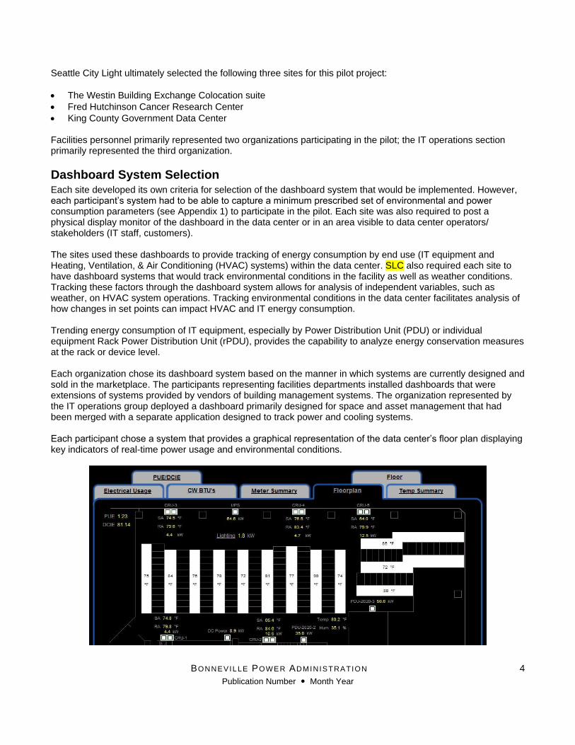
Dashboard System Selection Each site developed its own criteria for selection of the dashboard system that would be implemented. However, each participant’s system had to be able to capture a minimum prescribed set of environmental and power consumption parameters (see Appendix 1) to participate in the pilot. Each site was also required to post a physical display monitor of the dashboard in the data center or in an area visible to data center operators/ stakeholders (IT staff, customers). The sites used these dashboards to provide tracking of energy consumption by end use (IT equipment and Heating, Ventilation, & Air Conditioning (HVAC) systems) within the data center. SLC also required each site to have dashboard systems that would track environmental conditions in the facility as well as weather conditions. Tracking these factors through the dashboard system allows for analysis of independent variables, such as weather, on HVAC system operations. Tracking environmental conditions in the data center facilitates analysis of how changes in set points can impact HVAC and IT energy consumption. Trending energy consumption of IT equipment, especially by Power Distribution Unit (PDU) or individual equipment Rack Power Distribution Unit (rPDU), provides the capability to analyze energy conservation measures at the rack or device level. Each organization chose its dashboard system based on the manner in which systems are currently designed and sold in the marketplace. The participants representing facilities departments installed dashboards that were extensions of systems provided by vendors of building management systems. The organization represented by the IT operations group deployed a dashboard primarily designed for space and asset management that had been merged with a separate application designed to track power and cooling systems. Each participant chose a system that provides a graphical representation of the data center’s floor plan displaying key indicators of real-time power usage and environmental conditions.

BONNEVILLE POWER ADMINISTRATION
Publication Number Month Year
5
Figure 3: Westin Building Dashboard floor plan view Some dashboards include the ability to graphically display rack and/or power utilization to quickly represent the status of data center capacity to stakeholders.
Figure 4: King County Data Center Floor Plan Graphic
Findings
Implementation Installation of dashboard systems can be quite complex. The more granular the data acquired by the dashboard, the greater the complexity of setting up the system. Dashboard systems that track only power and environmental conditions are generally easier to implement than a system that includes asset, space, network, and IT equipment utilization. This is especially true of systems requiring manual entry and configuration of assets and monitoring points. For example, manually collecting server and Power Distribution Unit (PDU) plug relationships and server/network port relationships for hundreds to thousands of servers represents a significant data collection task for existing staff. Those dashboard systems fully installed by the vendor generally experienced smoother and faster implementation. Implementations that depended on existing staff and involved documentation of asset details often experienced delays due to conflicting organizational priorities. Centralization of these details greatly enhanced an organization’s ability to manage the data center, but creating that database while maintaining operations of the facility was no small task. Integration of dashboard data from external sources also presented some difficulties for incorporation into dashboard systems. Despite the use of open communication protocols, operators reported occasional difficulties importing and maintaining data feeds from existing building sensors into their dashboard systems.
BONNEVILLE POWER ADMINISTRATION
Publication Number Month Year
6
One participant stated that a dashboard system of some sort should be a standard practice or a requirement for operating a reliable data center. Participation in the pilot did require each site to deploy additional environmental and power monitoring sensors above those they would have utilized on their own. Several of the initial monitoring plans specified just a few wall-mounted temperature sensors located in the data center space. The pilot required monitoring of space temperatures at the server rack inlet and outlet, which allowed operators to better manage and optimize operation of their cooling systems to meet cooling requirements of the IT equipment. At the conclusion of the study, all sites indicated that they felt the additional sensors were worthwhile and that they increased the value and usability of their systems.
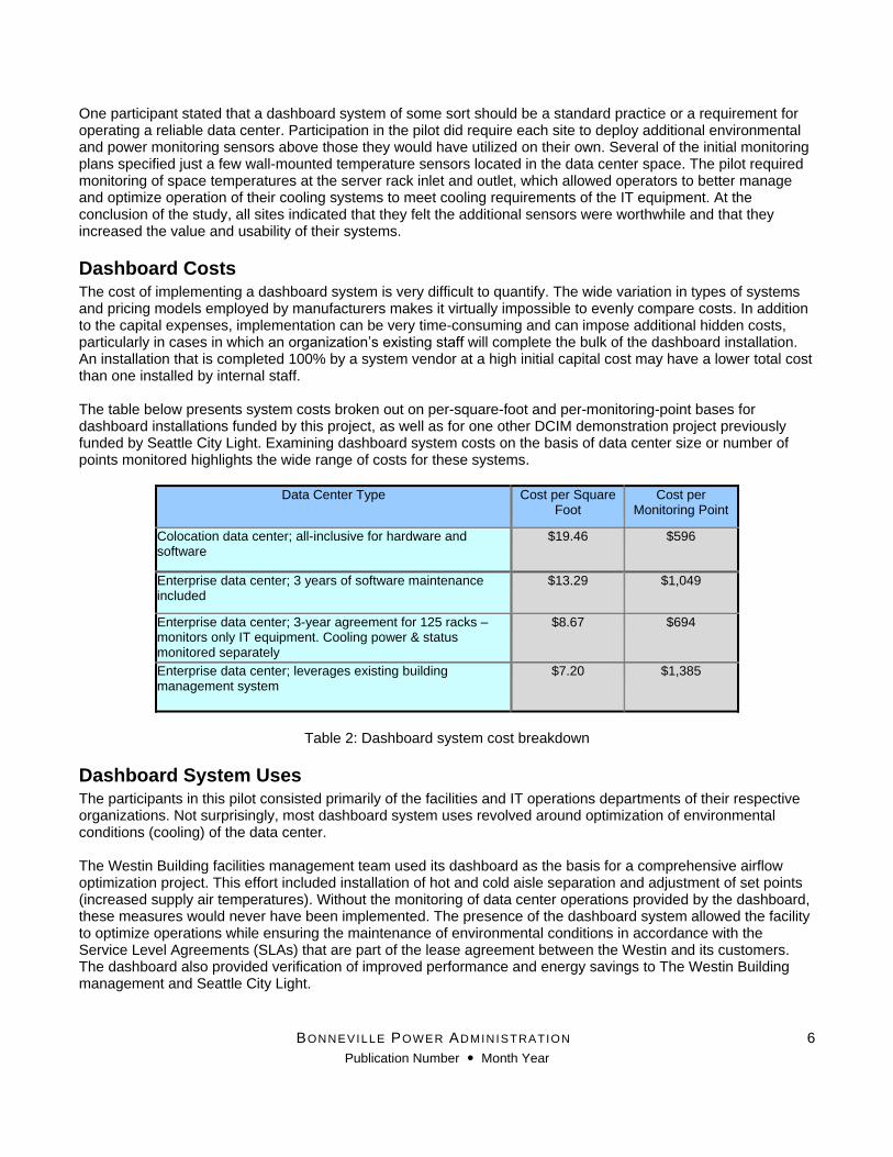
Dashboard Costs The cost of implementing a dashboard system is very difficult to quantify. The wide variation in types of systems and pricing models employed by manufacturers makes it virtually impossible to evenly compare costs. In addition to the capital expenses, implementation can be very time-consuming and can impose additional hidden costs, particularly in cases in which an organization’s existing staff will complete the bulk of the dashboard installation. An installation that is completed 100% by a system vendor at a high initial capital cost may have a lower total cost than one installed by internal staff. The table below presents system costs broken out on per-square-foot and per-monitoring-point bases for dashboard installations funded by this project, as well as for one other DCIM demonstration project previously funded by Seattle City Light. Examining dashboard system costs on the basis of data center size or number of points monitored highlights the wide range of costs for these systems.
Data Center Type Cost per Square Foot
Cost per Monitoring Point
Colocation data center; all-inclusive for hardware and software
$19.46 $596
Enterprise data center; 3 years of software maintenance included
$13.29 $1,049
Enterprise data center; 3-year agreement for 125 racks –monitors only IT equipment. Cooling power & status monitored separately
$8.67 $694
Enterprise data center; leverages existing building management system
$7.20 $1,385
Table 2: Dashboard system cost breakdown
Dashboard System Uses The participants in this pilot consisted primarily of the facilities and IT operations departments of their respective organizations. Not surprisingly, most dashboard system uses revolved around optimization of environmental conditions (cooling) of the data center. The Westin Building facilities management team used its dashboard as the basis for a comprehensive airflow optimization project. This effort included installation of hot and cold aisle separation and adjustment of set points (increased supply air temperatures). Without the monitoring of data center operations provided by the dashboard, these measures would never have been implemented. The presence of the dashboard system allowed the facility to optimize operations while ensuring the maintenance of environmental conditions in accordance with the Service Level Agreements (SLAs) that are part of the lease agreement between the Westin and its customers. The dashboard also provided verification of improved performance and energy savings to The Westin Building management and Seattle City Light.

BONNEVILLE POWER ADMINISTRATION
Publication Number Month Year
7
Verification of the efficiency gains has led The Westin Building management to expand adoption of the dashboard to other data center spaces it operates. It is also pursuing additional efficiency measures and utility incentives based on the successes documented through the pilot dashboard installation.
Figure 5: CRAC Power Trend data provided by The Westin Building dashboard for verification of energy savings
King County’s data center greatly valued the visibility the dashboard provided into real-time data center operations by IT and operations staff from offsite locations. King County’s data center is in a leased facility outside of the main county offices. It is staffed 24x7 by county IT operations staff, but many stakeholders and managers of the data center work in offices not located at the facility. Their ability to access real-time operational details when not physically on-site has simplified the process of managing the facility, and has improved effective tracking of operations. IT managers use the dashboard to cross-reference electrical charges from their landlord, manage capacity and IT equipment deployment, and to track power usage. The Fred Hutchinson Cancer Research Center (FHCRC) installed its dashboard as part of a new data center build-out in an existing building. The facilities staff used the dashboard extensively in the commissioning process to optimize operations of the supply fans. Once operational, the data center facilities staff used the dashboard to institute a supply temperature reset strategy to further reduce airflow and to provide additional use of outside air “free cooling” in the data center. The IT staff at FHCRC also uses the dashboard to assist in capacity planning and to assist in decisions regarding physical server deployment in the data center. IT has been using the dashboard for capacity management, space planning, and tracking utilization. FHCRC also reported that use of the physical dashboard monitor at the data center has been a key element in communicating the story of the data center’s efficiency and reliability to management and stakeholders. As a high-profile cancer research center, FHCRC conducts an average of two data center tours per week. Its dashboard is now the focal point for these tours. It provides a concise, detailed view of the data center’s role in supporting its core research work. Bob Cowan, Director of Facilities at FHCRC, reports: “We believe we have one of the most energy efficient data centers in the world and the dashboard allows us to demonstrate that and to even improve upon the inherent energy efficiency in the design. We’ve had over two
Westin Suite 2020 Data Center Energy Use
0
20
40
60
80
100
120
140
160
2/1/12 0:00 3/2/12 0:00 4/1/12 0:00 5/1/12 0:00 5/31/12
0:00
6/30/12
0:00
7/30/12
0:00
8/29/12
0:00
9/28/12
0:00
10/28/12
0:00
11/27/12
0:00
12/27/12
0:00
kW
TOTAL CRU Energy Use kW
Condenser control changes
to "summer" schedule
Start of Suite 2020 energy
management project
Completion of Suite 2020
containment project

BONNEVILLE POWER ADMINISTRATION
Publication Number Month Year
8
hundred IT and facilities specialists tour the data center and the starting point is always the dashboard; it allows the story to be told, the energy efficiency to be shown, and the design concepts to be demonstrated in one graphically pleasing way. We believe our data center will set the standard for the future, and the dashboard is central to this design shift that is shaping the future of data centers.”
Figure 6: Fred Hutchinson Dashboard Graphic
Operational Efficiency Gains This pilot revealed themes of better tracking and centralization of information about each data center. Each site reported that its dashboard greatly improved its ability to manage and track data center operations and performance. Personnel spent less time physically walking the floor of the facilities to monitor operations. The presence of a dashboard system greatly enhanced the accuracy and consistency of data collection from each facility. Access to more readily-accessible information about each facility has facilitated the examination of opportunities to improve operations and efficiency. The dashboards have also simplified and enhanced the tracking and reporting of key operational metrics about the data centers to participants’ executive management teams.

BONNEVILLE POWER ADMINISTRATION
Publication Number Month Year
9
Figure 7: Quarterly report of data center environmental conditions provided by King County dashboard
The dashboards’ detailed data about HVAC system operations and the data center environment provide early warnings for potential issues with equipment/space conditions. Dean Collins, Project Director at The Westin Building, reported “I can tell by looking at the dashboard if a tenant has left a door open in the cold aisle.”
Figure 8: Tabular view of aisle temperatures from The Westin Building dashboard

BONNEVILLE POWER ADMINISTRATION
Publication Number Month Year
10
The dashboards also facilitate visualization of the potential impacts of new equipment deployments and quick assessment of the impacts of operational changes in the data center. Participants identified the ability to quickly generate reports and to trend operational parameters over user-selected time intervals as key benefits of the dashboard systems.
Actions Taken All of the participants have integrated use of the dashboard into daily management of their data centers. They are all more closely monitoring their facilities’ energy use now that it is part of their stream of operational data. Each of the data centers is monitoring PUE* (Power Usage Effectiveness) in real time. Sudden changes in the PUE of a facility can indicate cooling system malfunctions or other operational issues in the data center. *PUE is a data center energy efficiency metric, the ratio of total data center power/IT equipment power. 1.0 is the best theoretically-possible PUE. Typical mid-size data centers have PUEs of 1.7 – 2.0 +
The Westin Building has utilized the dashboard as a vehicle to implement hot/cold aisle separation in its operations. The detailed monitoring it provides served as proof of concept. The dashboard illustrated potential reductions in the energy required for cooling while still adhering to SLAs in customer leases. The dashboard system also documented much more consistent and uniform space temperatures in the cold aisles after completion of the cold aisle containment. Dean Collins, Projects Director at The Westin Building, said of his site’s use of its dashboard: “This system has allowed us to operate smarter and with tighter controls.”
Figure 9: Cold aisle temperature trending documents more uniformity after containment installed The Westin Building has used the results of this pilot as a test case to expand dashboard use and aisle containment throughout other portions of the facility it operates. These measures would not have been adopted without the presence of the dashboard system and the operational confidence that it provides. FHCRC has pursued several incremental efficiency measures that likewise have been impossible without its dashboard monitoring. These improvements stemmed from use of the dashboard to fine-tune operational sequences for airflow and supply and return air temperatures.
Key Dashboard Features All participants cited the ability to quickly assess operations of their data centers in real time as the most useful aspect of their dashboard implementations. Monitoring and trending of power and environmental conditions

BONNEVILLE POWER ADMINISTRATION
Publication Number Month Year
11
greatly enhanced participants’ abilities to manage their data centers on a day-to-day basis, optimize operations, and report the impact of changes or proposed changes to the data center. The specific features referenced by the dashboard pilot participants as the most useful are as follows:
Powerful graphing and trending tools allow for detailed analysis over time
Instant overview available visually through dashboard “gauges” and graphs
PUE information is front and center to allow quick checks on systems
Load Planning for IT is facilitated by quick reference to pod load and capacity
Trend data allows personnel to quickly tell the operations story to visitors
Generates discussions about data center personnel’s efforts and methods due to availability of information to non-technical users
Tracking environmental conditions to see trending over a period of time is helpful in space management
Energy Conservation Measures The participants all managed to use the dashboards to identify energy efficiency measures for their facilities, even in newly-constructed facilities and in those already operating with better-than-average energy efficiency compared to other data centers. The energy efficiency measures identified by participants in this pilot included:
Hot/cold aisle separation
Higher cold aisle, return air temperature set points
Additional use of water side economization realized through higher set points
Optimization of airflow delivery at the rack level (supply air duct vents adjusted)
Supply fan airflow reduction
Supply temperature reset (Higher temperature differential reduced airflow by 20-30% from design)
Reset supply air static pressure from 0.2” to 0.1,” further reducing airflow
Identification of servers for virtualization/consolidation
The Westin Building received utility incentive funding for efficiency measures identified through the use of its dashboard. Those efforts (hot/cold aisle separation, set point increases) produced an 11% annualized reduction in cooling system energy consumption (271,556 kWh) for its dashboard pilot location.
Conclusions and Recommendations A dashboard system can greatly enhance the operational and energy efficiency of a data center. Every organization that participated in this pilot reported that the dashboard greatly improved its ability to manage its facility, track energy use, and implement energy efficiency measures. Two of the three participating sites reported specific energy savings measures completed over the relatively short duration of this pilot. However, the dashboard alone did not produce the energy savings. Realizing these efficiency gains requires data center operators to analyze and act on data acquired by the dashboards. Maximizing the benefits of a dashboard system requires that an organization’s policies and processes create the incentives and accountability that will ensure that the dashboard system is utilized to optimize the data center operations. While participants found the use of the physical dashboard display in each facility to be valuable for communicating with internal and external data center stakeholders, the physical display had no direct impact on energy consumption in the data centers participating in this pilot. The physical dashboard display seemed to generate greater collaboration among facilities operators and IT staff. In the enterprise data centers participating in the pilot, the physical display provided a common frame of reference for IT and facilities staff to discuss data center operations. While such discussions will likely lead to actions that engender energy savings, quantifying the extent of such savings would be difficult. The presence of a dashboard system does provide significant value to utilities in administering incentive programs. However, since most dashboard systems do not directly result in energy savings, they would likely be

BONNEVILLE POWER ADMINISTRATION
Publication Number Month Year
12
ineligible for stand-alone incentives under most utility incentive program rules. A dashboard system’s costs would more likely be eligible for inclusion in incentive funding calculations. A dashboard may also receive funding at a “bonus” or higher incentive rate where energy efficiency measures are completed in a data center. An organization’s investment in a dashboard system can be an indicator that it is committed to more closely managing its data center operations and that the proposed energy savings measures are likely to persist, even if they are reliant on the actions of the facility’s personnel to sustain the efficiency.
Utility Incentives for Dashboard Implementation Seattle City Light (SCL) does not offer an incentive solely for use of a data center dashboard or DCIM system implementation. This demonstration project highlights that a monitoring system can be a very powerful tool when used by an experienced, motivated facility manager. SCL has observed that implementing dashboard systems results in significant energy savings. However, those energy savings resulted from the facility manager acting on data acquired by the monitoring system, and not directly the result of the system optimizing facility operations. At SCL, dashboard system costs are eligible for inclusion with project costs for energy conservation incentives that include implementation of a dashboard system. However, such systems are not funded by themselves as a conservation measure. Funding for projects that include a dashboard as part of a larger efficiency effort is based on estimated annual kWh savings and expected measure life of the other measure(s) implemented. Dashboards that are part of HVAC control systems or that have optional HVAC control modules are eligible for Seattle City Light custom incentive funding of up to $0.23/ kWh saved, based on an expected measure life of 12 years for HVAC controls. Two of the three sites participating in this pilot installed additional temperature sensors at SCL’s request, including additional sensors to monitor inlet and exhaust temperatures in the data center as well as sensors to monitor outside air dry bulb and wet bulb temperatures. At the conclusion of the study, participants commented that the additional sensors were very worthwhile and that they provided actionable data for better managing the data center to improve reliability and efficiency. Utility incentives may be justified in this area if they are tied to the use of economizer cooling and/or higher temperature set points.
Dashboard System Best Practices This section focuses on the use of dashboards in energy management and utility incentive programs given that the scope of this project and its primary participants mainly addressed facility operations. It does not constitute a comprehensive checklist for an organization’s use in planning or deploying a dashboard system. It is based on feedback from the pilot participants, experienced facility operators who have worked with dashboard implementation and use for the past 18 months.
Parameters to Monitor
Track IT equipment consumption – at UPS output or Power Distribution Unit (PDU)
Track cooling energy consumption
Track independent variables (outside air temperature, relative humidity, barometric pressure) – trend dry bulb and wet bulb temperatures
Deploy temperature sensors throughout the IT equipment aisles vs. 1-2 space temperature sensors to provide a better representation of actual conditions at the server inlet and outlet
Ensure the system tracks Key Performance Indicators (KPIs) that are meaningful at all levels of an organization
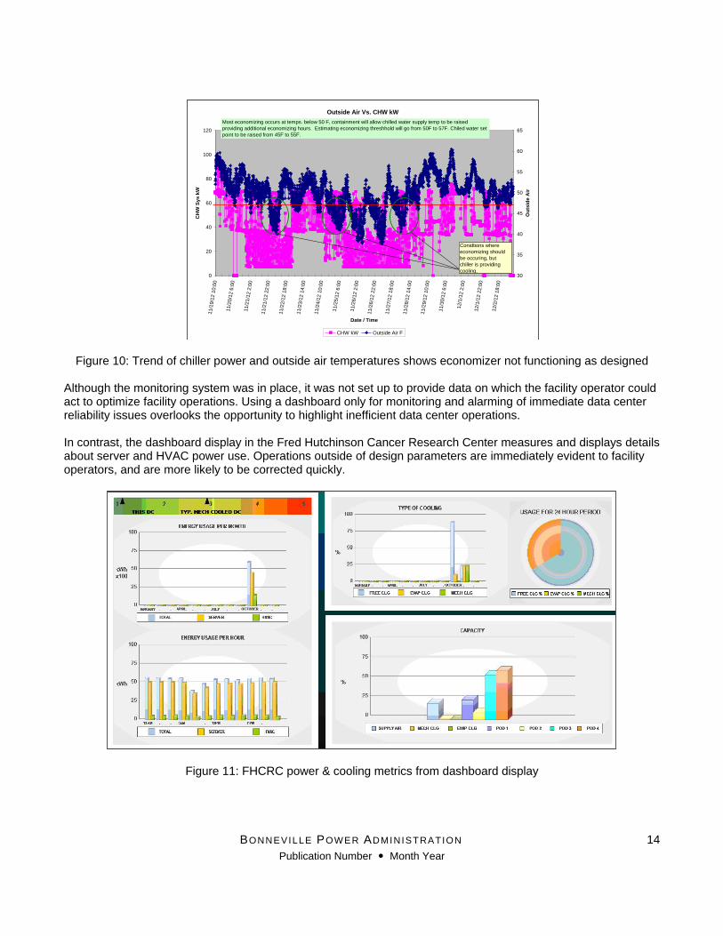
Correlating the performance of HVAC equipment to weather conditions in order to track actual system operations with expected or design operation is especially important if the data center is equipped to operate in economizer or “free cooling” modes. The graph below shows data collected from a data center equipped with “free air” economizer cooling (not part of this pilot). While the facility monitors the chiller power consumption and outside air

BONNEVILLE POWER ADMINISTRATION
Publication Number Month Year
13
temperature, these two measurements are not correlated or compared regularly by the facility operator. Analysis of the facility’s operations for potential utility incentive funding showed that the mechanical cooling (chiller) still operated at conditions under which it should have been shut off because the data center was using outside air for cooling.
BONNEVILLE POWER ADMINISTRATION
Publication Number Month Year
14
Figure 10: Trend of chiller power and outside air temperatures shows economizer not functioning as designed
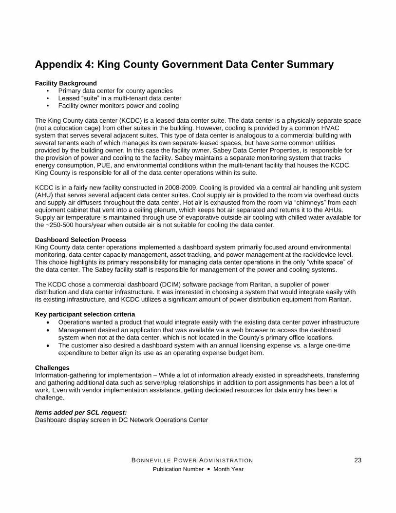
Although the monitoring system was in place, it was not set up to provide data on which the facility operator could act to optimize facility operations. Using a dashboard only for monitoring and alarming of immediate data center reliability issues overlooks the opportunity to highlight inefficient data center operations. In contrast, the dashboard display in the Fred Hutchinson Cancer Research Center measures and displays details about server and HVAC power use. Operations outside of design parameters are immediately evident to facility operators, and are more likely to be corrected quickly.
Figure 11: FHCRC power & cooling metrics from dashboard display
Outside Air Vs. CHW kW
0
20
40
60
80
100
120
11/1
9/1
2 1
0:0
0
11/2
0/1
2 6
:00
11/2
1/1
2 2
:00
11/2
1/1
2 2
2:0
0
11/2
2/1
2 1
8:0
0
11/2
3/1
2 1
4:0
0
11/2
4/1
2 1
0:0
0
11/2
5/1
2 6
:00
11/2
6/1
2 2
:00
11/2
6/1
2 2
2:0
0
11/2
7/1
2 1
8:0
0
11/2
8/1
2 1
4:0
0
11/2
9/1
2 1
0:0
0
11/3
0/1
2 6
:00
12/1
/12 2
:00
12/1
/12 2
2:0
0
12/2
/12 1
8:0
0
Date / Time
CH
W S
ys k
W
30
35
40
45
50
55
60
65
Ou
tsid
e A
ir
CHW kW Outside Air F
Most economizing occurs at temps. below 50 F, containment will allow chilled water supply temp to be raised
providing additional economizing hours. Estimating economizing threshhold will go from 50F to 57F. Chiled water set
point to be raised from 45F to 55F.
Conidtions where
economizing should
be occuring, but
chiller is providing
cooling.

BONNEVILLE POWER ADMINISTRATION
Publication Number Month Year
15
Implementation Tips
Flexibility is key – deploy a system that can be reconfigured or shared for multiple locations
Ensure that user-selectable reporting, graphing, and trending is part of the application
Report metrics in a meaningful way, use Key Performance Indicators (KPIs) that relate to organizational or stakeholder goals o PUE, DCiE (data center infrastructure efficiency), annual energy cost/server, annual cost or
kWh/production unit
Maintain portability of data – Ability to export dashboard data in a format (.xls, .csv, .txt, .xml) that can be used for deeper analysis or for import into other applications o It’s important to ensure data is available for use in scenarios not envisioned in the selection process
Take time to ensure initial data entry and system setup is accurate o Garbage In Garbage Out!
Limit administrative rights to maintain integrity of data entry o Adherence to naming conventions
Establish processes and procedures for dashboard maintenance and backup – Don’t set it & forget it! o Sensors need calibration, wireless units need battery replacements o Database software upgrades and maintenance o Some dashboard maintenance will be required!
Value of Dashboard Systems for Electric Utilities Dashboard systems offer significant value for use in utility energy efficiency programs. Their primary benefits for energy efficiency programs include:
Collection of trend data to establish baseline energy consumption for proposed incentive project(s)
Verification of energy savings from completed efficiency measures
Confirmation that measures have been implemented without negatively impacting the reliability or environmental operating envelope of the data center
Better visibility of operating conditions highlights additional efficiency opportunities Dashboard systems can also assist in the development of programmatic baseline metrics for energy consumption of commonly-used data center HVAC equipment (Chiller kW/ton, fan energy use- cfm/kW, etc.). They can also provide evidence to support or amend assumptions regarding operational characteristics of data centers. These assumptions can be used in facilities lacking a dashboard system but with similar installations of IT and HVAC equipment. A dashboard can also provide verification that system components (cooling towers, air economizers, etc.) perform as designed or expected.
Future Potential for Utility Use of Dashboard Systems The role of dashboard systems in utilities is likely to increase as additional measures are developed for IT equipment. Current deployments of IT equipment tend to have relatively small variations in power usage compared to the amount of processing being done. Although most IT equipment operates at low levels of utilization or in idle mode the majority of the time, its power consumption is relatively constant. This is especially true in small to medium-sized data centers that house the majority of servers in the US. (EPA 2007 Study) IT equipment manufacturers are conducting significant research to have power consumption scale proportionally with utilization. Measurement and tracking of IT power consumption via a dashboard system will enable utilities to evaluate the effectiveness of these technologies as they are deployed. Resultant energy savings may warrant appropriate incentives; however, this determination will rely on more detailed data on IT equipment power consumption. This project has demonstrated that implementation of a dashboard or DCIM system greatly expands an organization’s ability to effectively manage its data center operations. These systems deliver significant benefits to

BONNEVILLE POWER ADMINISTRATION
Publication Number Month Year
16
each stakeholder in the data center’s operation. A dashboard system also greatly simplifies the process of providing utility incentives for efficiency measures installed in data centers. Utilities should certainly continue to encourage installation of dashboard systems in data centers.

BONNEVILLE POWER ADMINISTRATION
Publication Number Month Year
17
References Gartner Research. “Gartner IT Glossary/Data Center Infrastructure Management (DCIM).” Gartner Research, http://www.gartner.com/it-glossary/data-center-infrastructure-management-dcim. Accessed 10/25/2013. U.S. Environmental Protection Agency ENERGY STAR Program. “Report to Congress on Server and Data Center Energy Efficiency.” 8/2/2007. http://www.energystar.gov/ia/partners/prod_development/downloads/EPA_Datacenter_Report_Congress_Final1.pdf Northwest Power and Conservation Council. “Update on Data Centers in the Northwest.” 7/30/2013. http://www.nwcouncil.org/media/6871494/p6.pdf

BONNEVILLE POWER ADMINISTRATION
Publication Number Month Year
18
Appendix 1: Dashboard System Requirements Participation in the pilot required that dashboard systems had to be able to track the following parameters:
Power consumption of Information Technology (IT) equipment
Power consumption of cooling equipment
Representative measurement of inlet and exhaust temperatures at IT equipment racks (top/bottom, end and center of aisles)
Temperatures of cooling system air streams (supply and return)
Relative humidity
Measurement of airflow* (fan Hz, %, or CFM) *If central air handlers supply the data center and have capability of variable flow. Not needed for constant volume
fans or CRAH/CRAC units
Condenser loop flow rate
Condenser loop temperatures (supply and return)
Data collection intervals shall be in periods of no more than 15 minutes, unless specified in writing with the approval of SCL. Systems shall have reporting capabilities that allow data center staff to produce reports with separate kilowatt hour (kWh) consumption of IT and cooling systems for user-selected time intervals. The dashboard shall be displayed continuously on a physical display located in the data center, or in an adjacent location monitored by data center end users and operators.

BONNEVILLE POWER ADMINISTRATION
Publication Number Month Year
19
Appendix 2: The Westin Building Exchange Summary Background
Carrier hotel, downtown Seattle, WA
Dashboard in a colocation suite
Owner only responsible for power and cooling This dashboard was installed in a colocation suite operated by the Westin Building Internet Exchange facility. The suite is cooled by five direct expansion Computer Room Air Conditioning units (Dx CRACS) located around the perimeter of the room. The CRAC units provide cold air to the IT equipment via overhead supply air ducts and warm air is returned to the CRAC unit intakes (@ floor level) via an open pathway. Heat is rejected from the space by the building’s condenser loop and cooling towers. During the course of the dashboard demonstration project, Westin personnel installed cold aisle containment in this suite consisting of sliding doors at the end of each cold aisle and vinyl curtains located above the equipment cabinets and above the door at the end of each aisle. These vinyl curtains did not extend all the way to the ceiling due to obstructions from cable trays and the fire suppression system; however, they did extend above the supply air ducts. Westin personnel also installed blanking panels in open rack units to reduce mixing between hot and cold aisles. Net impact of the containment has been a dramatic improvement in consistency of supply air temperatures in the cold aisles. Return air temperatures and supply air temperatures have increased by approximately 10 degrees F. Airflow volume has remained at the same level as before installation of the containment. The operators experimented with reducing airflow by staging off constant volume CRAC units. The non-standard layout of the room resulted in supply temperature variations when CRAC unit(s) were staged off, so all units have remained operational. The containment and set point adjustments have provided many more hours during which the building’s condenser water (cooling tower) loop rather than CRAC compressors can provide cooling, resulting in significant energy savings. Dashboard Selection Process The Westin Building team solicited bids from three providers and selected Sunbelt Controls’ Automated Logic Corp. (ALC) system. This installation is used only for monitoring, and does not provide control over cooling equipment in the data center. Items added per SCL requests:
Outside air temperature sensor (Existing sensor data imported into system)
Additional space temperature/humidity sensors in equipment aisles (total of 72 sensors) throughout the collocation space. The initial deployment plan called for 12 temperature sensors
Key to successful implementation
Planning
Use of a contractor experienced in deployment of monitoring and control systems. The vendor selected was a local distributor with a good working knowledge of the facility.
Minimal use of data monitoring points that needed to be “imported” from disparate networks via Building Automation and Control Networks (BACnet), Simple Network Management Protocol (SNMP), or other external protocols.
Continuous monitoring of the system and slow incremental operational changes provided the best results.
Dashboard System Use
Allowed the facility to implement hot/cold aisle separation and to raise supply and return temperatures.

BONNEVILLE POWER ADMINISTRATION
Publication Number Month Year
20
Used almost solely by building (facilities) management to monitor space conditions. This is colocation space and facilities need to maintain environmental conditions in accordance with service level agreements (SLAs) in customer leases.
Used to manage energy consumption – ensure that the space is maximizing use of water side economization; it has been used to manage increases in set points for space temperatures.
Used to measure baseline energy consumption for a utility energy efficiency project (cold aisle containment).
Power Usage Effectiveness (PUE) is now being measured for this suite. Use of PUE is helpful in comparing the relative efficiency of the suite, and also for trending changes in its operational efficiency to building owners and tenants.
Use by different business units (IT, Facilities, Management, others)
The ability to observe and track efficiency gains and to understand the return on investment has helped tremendously with the approval of future energy efficiency projects.
Facilities engineering is using the system to identify where environmental controls can be manipulated to increase efficiencies.
Greater awareness by operations and engineering for real-life environmental controls and efficiencies. This system has allowed The Westin Building to operate smarter and with tighter controls.
Actions taken as a result of dashboard use Implementation of efficiency measures – cold/hot aisle separation, raising set points for space temperatures, additional water side economizing. The Westin Building would not have pursued these measures without the confidence provided by the dashboard system that it was maintaining SLAs.
Energy conservation measures identified
Hot/cold aisle separation
Higher cold aisle, return air temperature set points
Additional use of water side economization
Energy savings realized
Annual baseline consumption (IT & HVAC) was 2,458,672 kWh
Energy savings estimated via calculations - 182,083 kWh/year; 7.4% estimated reduction
271,556 kWh/year validated through use of the dashboard system; 11.0% actual kWh reduction
Most useful features of systems 1. Space temperature monitoring for verification of SLA performance 2. PUE calculation for simple communication of efficiency to external stakeholders 3. Ability to correlate HVAC power consumption to outside air conditions valuable in determining if
economizer functions are working per design specifications 4. Powerful graphing and trending tools allow for detailed analysis over time

BONNEVILLE POWER ADMINISTRATION
Publication Number Month Year
21
Appendix 3: Fred Hutchinson Cancer Research Center Summary
Facility Background
Enterprise data center, Seattle, WA
Owner responsible for IT and facility operations Fred Hutchinson Cancer Research Center (FHCRC) recently constructed this data center in a commercial office building. The building core and shell had been completed before being purchased by FHCRC. Once FHCRC assumed ownership, the building was converted into lab, technical office space, and data center use in 2011- 2012. It is a “new” data center build-out, but the building was not initially designed for a data center. The data center was constructed with four “pods” that contain IT equipment racks arranged into tightly-separated hot aisles or rooms where warm server exhaust is removed from the space. Hot air is either mixed with outside air to deliver the desired supply temperature, or exhausted completely if warmer than desired supply air temperature. The data center floor serves as the cold supply air plenum. Cooling is provided by a central fan array supply air handler (AHU) that relies primarily on outside air and evaporative cooling. The building’s chilled water loop supplies a coil in the data center, but the chiller is used for cooling only when outside air conditions are too humid or when contamination is present. Chilled water cooling is used less than 250 hours/year given Seattle’s cool climate and generally dry conditions during periods of warm weather. This has proven to be a very energy efficient reliable data center design, but FHCRC staff has still been able to increase the efficiency of the data center through use of its dashboard. Dashboard Selection Process FHCRC selected an extension of an existing Siemens Building management system. This system is used throughout its campus and was chosen for the dashboard because Siemens is an existing vendor in which FHCRC has confidence and a familiarity with their products.
Challenges The biggest challenges to implementation pertained to communication of FHCRC’s vision for the dashboard’s usage. Once a common understanding of dashboard usage was established, having graphics created that effectively communicated that vision in a manner that was functional and easy to read proved to be a challenge. Items added per SCL/dashboard pilot participation requirements:
Publicly-viewable dashboard
Additional sensors for temperature and power use Use by different business units (IT, Facilities, Management, others) IT has been using the dashboard for capacity management, space planning, and tracking utilization.
Facilities used the dashboard system extensively in the facility’s commissioning process (this is a new data center). The control system for the FanWall supply fan system was not performing to expectations and the dashboard system helped document this disparity to the fan control vendor. The FanWall software was upgraded and supply fans are now operating per design specifications.
The facilities team has also instituted a supply temperature reset strategy to allow supply temperatures to float between 60-72 degrees when outside air temperatures are below 72 degrees F. By increasing target delta T from ~20 degrees F to ~30 degrees F., reductions in airflow of up to 30% are being realized.

BONNEVILLE POWER ADMINISTRATION
Publication Number Month Year
22
FHCRC management is much better-informed about the data center’s operations and how its efficiency compares to that of a typical facility. The dashboard provides a reporting framework for facilities to document how their efforts to manage the data center are reducing costs. The IT Manager, Steve LeVeck, reported that because of the dashboard his staff is much more aware of the energy consumption of the IT equipment and takes more care in deploying IT equipment in a manner that results in better utilization of the data center.
Top five, or most useful features of systems
1. Instant overview available visually through dashboard “gauges” and graphs 2. PUE information is front and center to allow a quick check on systems 3. Load Planning for IT is facilitated by quick reference to pod load and capacity 4. Trend data allows FHCRC to quickly tell the operations story to visitors 5. Generates discussions about FHCRC’s efforts and methods due to availability of information to non-
technical users
BONNEVILLE POWER ADMINISTRATION
Publication Number Month Year
23
Appendix 4: King County Government Data Center Summary Facility Background
• Primary data center for county agencies • Leased “suite” in a multi-tenant data center • Facility owner monitors power and cooling
The King County data center (KCDC) is a leased data center suite. The data center is a physically separate space (not a colocation cage) from other suites in the building. However, cooling is provided by a common HVAC system that serves several adjacent suites. This type of data center is analogous to a commercial building with several tenants each of which manages its own separate leased spaces, but have some common utilities provided by the building owner. In this case the facility owner, Sabey Data Center Properties, is responsible for the provision of power and cooling to the facility. Sabey maintains a separate monitoring system that tracks energy consumption, PUE, and environmental conditions within the multi-tenant facility that houses the KCDC. King County is responsible for all of the data center operations within its suite. KCDC is in a fairly new facility constructed in 2008-2009. Cooling is provided via a central air handling unit system (AHU) that serves several adjacent data center suites. Cool supply air is provided to the room via overhead ducts and supply air diffusers throughout the data center. Hot air is exhausted from the room via “chimneys” from each equipment cabinet that vent into a ceiling plenum, which keeps hot air separated and returns it to the AHUs. Supply air temperature is maintained through use of evaporative outside air cooling with chilled water available for the ~250-500 hours/year when outside air is not suitable for cooling the data center. Dashboard Selection Process King County data center operations implemented a dashboard system primarily focused around environmental monitoring, data center capacity management, asset tracking, and power management at the rack/device level. This choice highlights its primary responsibility for managing data center operations in the only “white space” of the data center. The Sabey facility staff is responsible for management of the power and cooling systems. The KCDC chose a commercial dashboard (DCIM) software package from Raritan, a supplier of power distribution and data center infrastructure. It was interested in choosing a system that would integrate easily with its existing infrastructure, and KCDC utilizes a significant amount of power distribution equipment from Raritan. Key participant selection criteria
Operations wanted a product that would integrate easily with the existing data center power infrastructure
Management desired an application that was available via a web browser to access the dashboard system when not at the data center, which is not located in the County’s primary office locations.
The customer also desired a dashboard system with an annual licensing expense vs. a large one-time expenditure to better align its use as an operating expense budget item.
Challenges Information-gathering for implementation – While a lot of information already existed in spreadsheets, transferring and gathering additional data such as server/plug relationships in addition to port assignments has been a lot of work. Even with vendor implementation assistance, getting dedicated resources for data entry has been a challenge. Items added per SCL request: Dashboard display screen in DC Network Operations Center

BONNEVILLE POWER ADMINISTRATION
Publication Number Month Year
24
Challenges
Conflicting workload priorities impacted the ability of existing KCDC staff to deploy the system according to the planned rollout schedule.
The dashboard system utilizes two separate software applications that the vendor originally marketed separately and is in the process of combining into a single application. Underlying differences in the applications caused conflicts that had to be resolved via the vendor’s technical support process.
Populating the system was primarily a manual process of validating spreadsheet inventories and tracking sheets for data center assets and bringing them into the system.
Key to successful implementation Accuracy of information entered into DCIM is paramount. Any erroneous information can quickly skew and invalidate space planning efforts. Keeping a very small team managing the products is also key; in this case, “too many cooks can spoil the broth.” It can also cause deviations from standards and naming conventions in the product. How is the system used by demonstration site?
Event logs created by the system allow for analysis of anomalies/equipment failures
Aids in contingency planning – dashboard allows for “Failure Mapping,” which documents equipment/applications impacted by failure or partial failure of data center equipment
Tracking and trending actual performance of cooling system to SLAs for environmental conditions in the data center
Capacity planning, optimizing use of space, networking equipment
Tracking power and space utilization to each business unit for accountability, and possible chargeback
Concise reporting now available for KCDC management to report on costs, energy use. Develop action plans and track progress on cost reduction targets set by the executive team for the data center operations.
Validating energy sub-meter billing from the building owner
Use by different business units (IT, Facilities, Management, others)
IT Operations uses the system to manage space/capacity planning, network utilization
The dashboard reports on device health
The display plots the real-time DC environmental conditions compared to the American Society of Heating, Refrigerating and Air-Conditioning Engineers (ASHRAE)-recommended conditions via a psychometric chart display
Operational efficiencies realized through dashboard use
Better use of space in deployment of new servers
Identification of servers that are candidates for virtualization
Simplifies reporting of energy metrics, greenhouse gas reporting – the dashboard software calculates these metrics instead of using manual tracking via Excel
Visibility into data center operations for KCDC staff located in other facilities
Top five, or most useful features of the dashboard 1. Reporting for King County management 2. Validation of electrical billing from building owner 3. Ability to track utilization of data center by each customer (agency) 4. Tracking environmental conditions to see trending over a period of time is helpful in space management 5. Locating devices within the data center with ease for troubleshooting