Embed Size (px)
Citation preview
DATA-DRIVEN PERFORMANCER I C K W A N N E
E L I G I B I L I T Y O P E R AT I O N S
H E A LT H A N D H U M A N S E R V I C E S A G E N C Y ( H H S A )
S A N D I E G O C O U N T Y
A U G U S T 1 9 , 2 0 1 4
“The goal is to turn data into information, and information into insight.”
– Carly Fiorina, former executive, president, and chair of Hewlett-Packard Co.
2
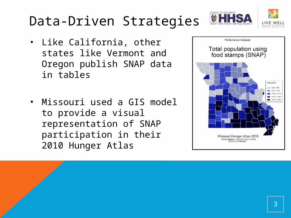
• Like California, other states like Vermont and Oregon publish SNAP data in tables
• Missouri used a GIS model to provide a visual representation of SNAP participation in their 2010 Hunger Atlas
3
Data-Driven Strategies
Data-Driven Strategies
• In the public sector, there are increased efforts to harness data to better track activities and outcomes
• San Diego County explored a variety of options to better collect and monitor self sufficiency eligibility data
4
San Diego’s Approach
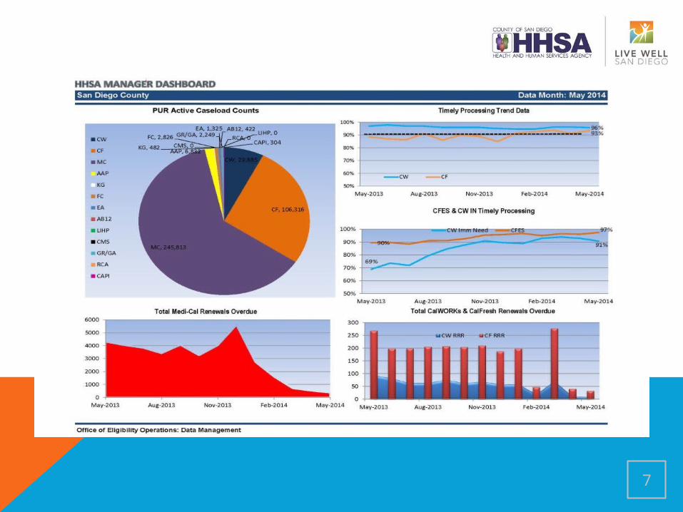
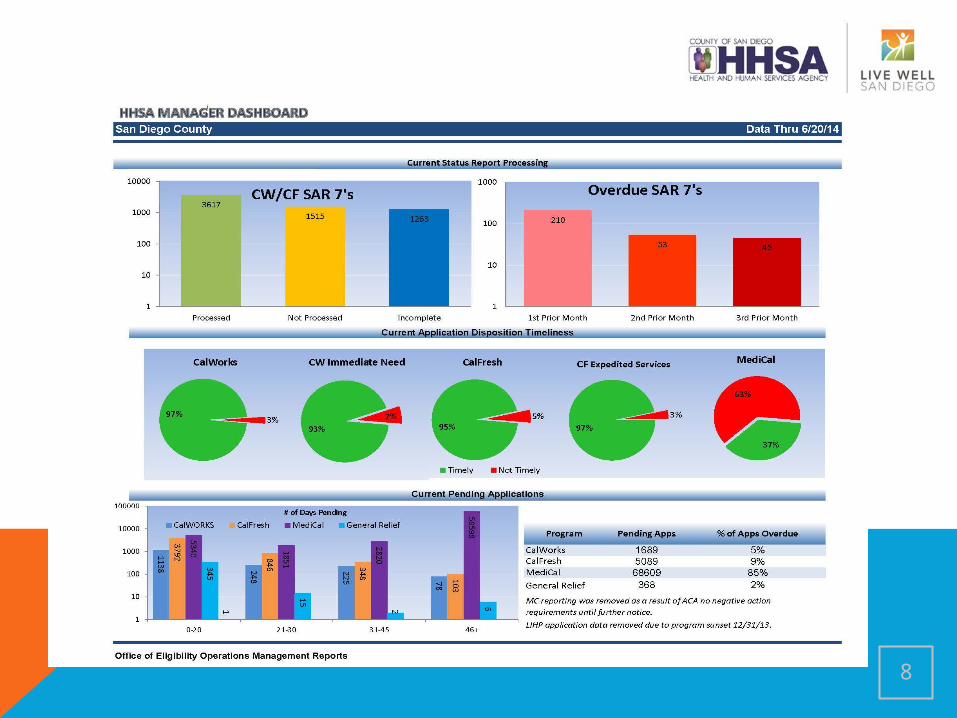
• Dashboards are created on a weekly and monthly basis and track a variety of measures, from caseload counts, to processing timelines, to demographics
• Dashboards include Countywide and regional data, as well as site-specific data on Family Resource Center (FRC) offices where Eligibility Operations staff are deployed at ten sites across San Diego County
5
San Diego’s Approach
• Builds accountability and serves as a tool for identifying effective strategies
• Visual representation of data allows management staff to quickly spot trends, successes and areas for improvement
• Set expectations for a customer service based delivery model
6
7
8
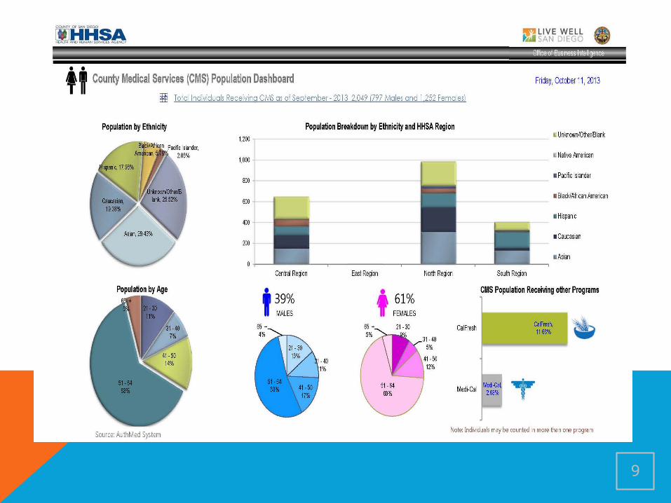
9
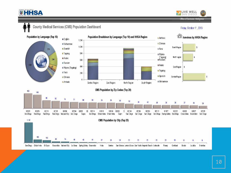
10
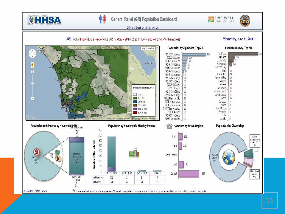
11
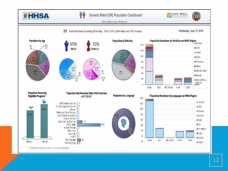
12
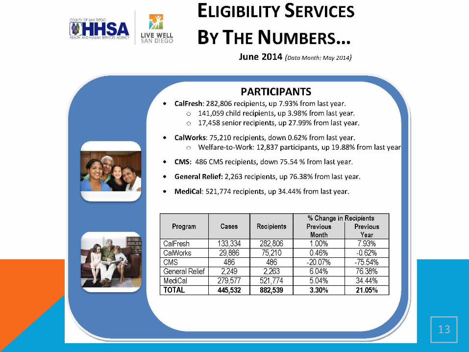
13
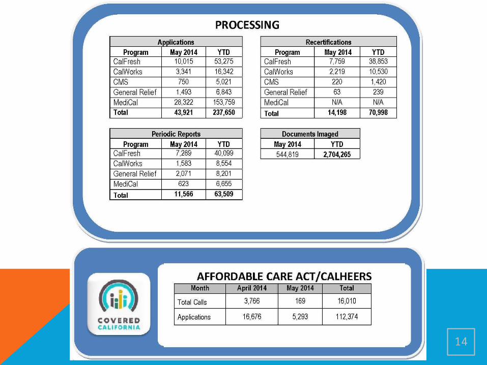
14
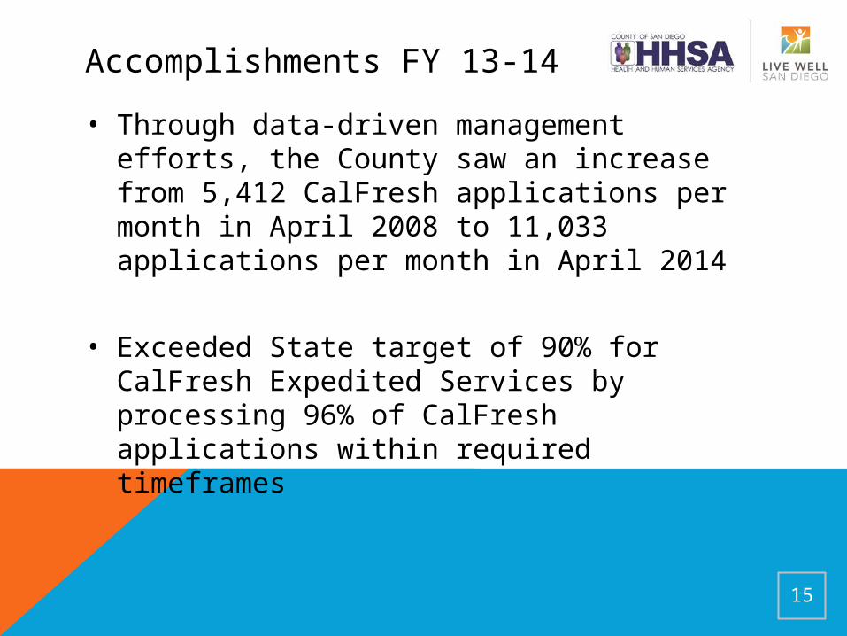
Accomplishments FY 13-14
• Through data-driven management efforts, the County saw an increase from 5,412 CalFresh applications per month in April 2008 to 11,033 applications per month in April 2014
• Exceeded State target of 90% for CalFresh Expedited Services by processing 96% of CalFresh applications within required timeframes
15
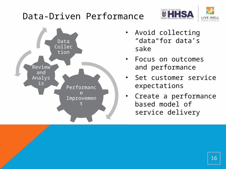
Performance Improvemen
t
Review and
Analysis
Data Collecti
on
• Avoid collecting “data for data’s sake”
• Focus on outcomes and performance
• Set customer service expectations
• Create a performance based model of service delivery
16
Data-Driven Performance
Questions?
Rick Wanne
Eligibility Operations │ Health and Human Services Agency (HHSA)
San Diego County
619.338.2869
17

ADD MISSING POWER POINT HERE
18
CALFRESH DATA DASHBOARDLinda Patterson
CalFresh Branch ChiefAugust 2014
The Problem: SNAP Participation
Although generally doing well on most performance measures, California was not doing well on program participation. Based on Federal Fiscal Year (FFY) 2011 federal data (the latest available), California is behind most of the country in terms of the percentage of eligible people actually enrolled in the SNAP program.
Enrollment of potentially eligible persons is at approximately 57 percent. This is below the national participation rate of 79 percent.
Although there has been continued improvement, last place is not an option!
Official numbers do not yet reflect recent policy changes in California.
Goal: Increase SNAP ParticipationCDSS, in collaboration with counties, requested
that counties undertake a three-year goal-setting process to help achieve increased CalFresh participation within their county.
There are many factors that contribute to individual county program participation, both demographically and economically. The majority of the county plans focused on:in-reach to current Medi-Cal recipients; increasing program outreach to seniors; addressing churning and retention of cases; andthe use of technology
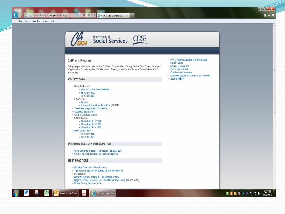
Using Data to Improve PerformanceIn support of the county efforts to increase
participation using a data-driven approach, the CDSS developed a County Data Dashboard (located at http://www.cdsscounties.ca.gov/foodstamps/ ).
This public dashboard provides tools and information for counties to evaluate existing participation improvement efforts and make decisions about future ones.
Although our goal was to increase participation, the dashboard would also be a good tool to increase performance in other program priorities or Federal performance measures.
Using Data to Improve PerformanceWhen putting together the dashboard, we wanted to
focus our group efforts on a few key measures: maintaining case accuracy, timeliness and efforts to increase participation. Specifically to improve participation by reducing churn, increasing dual participation between SNAP and Medicaid and senior participation.
“Where attention goes, energy flows and results show.”
The items you put on your dashboard should be your top few issues as what you put there indicates your program priorities. Too many can overwhelm staff so make sure you don’t scatter your staff’s efforts.
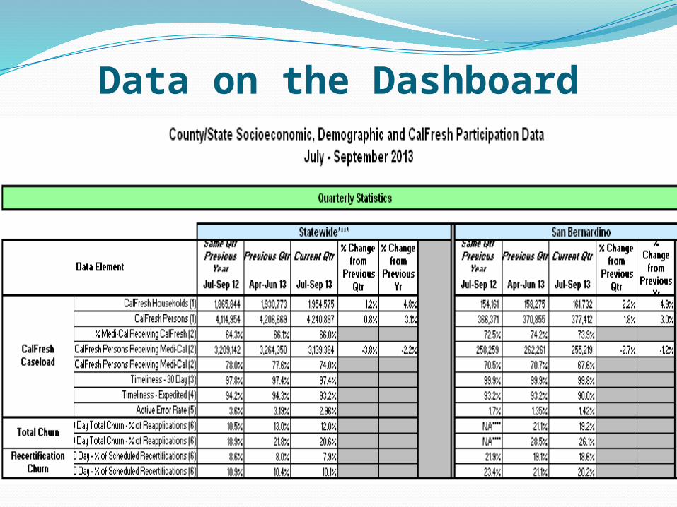
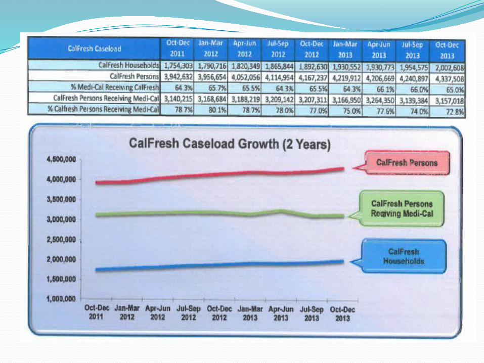
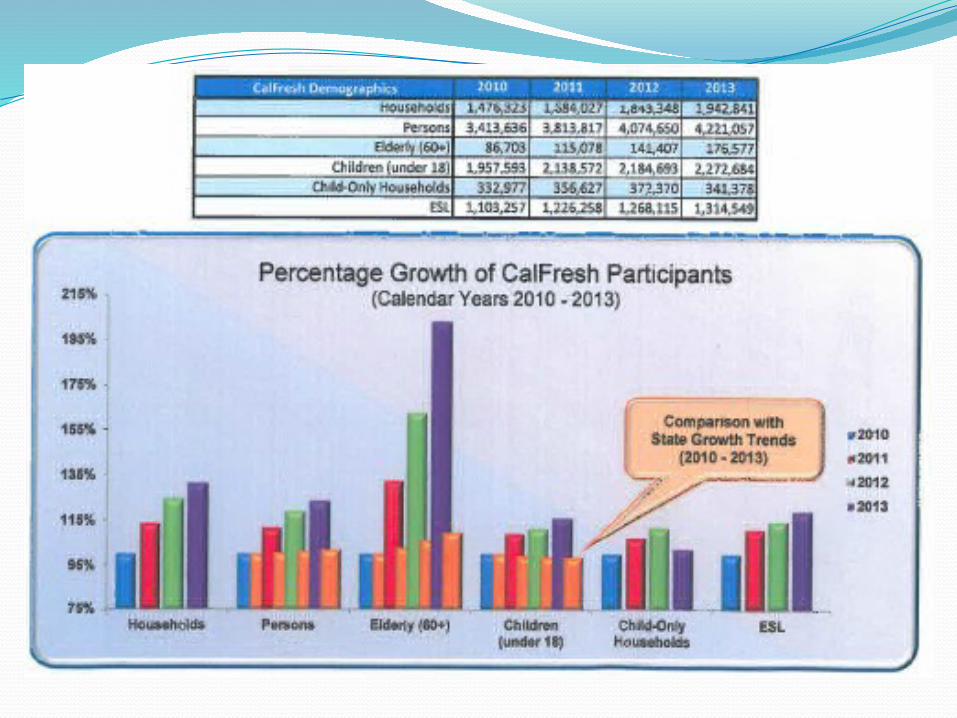
Data on the DashboardThe County Data Dashboard includes data in the following
areas: Enrollment growth in SNAP. (Rather than participation
“rates” since the state and counties have little control over the increase or decline in the eligible population on which rates are based)
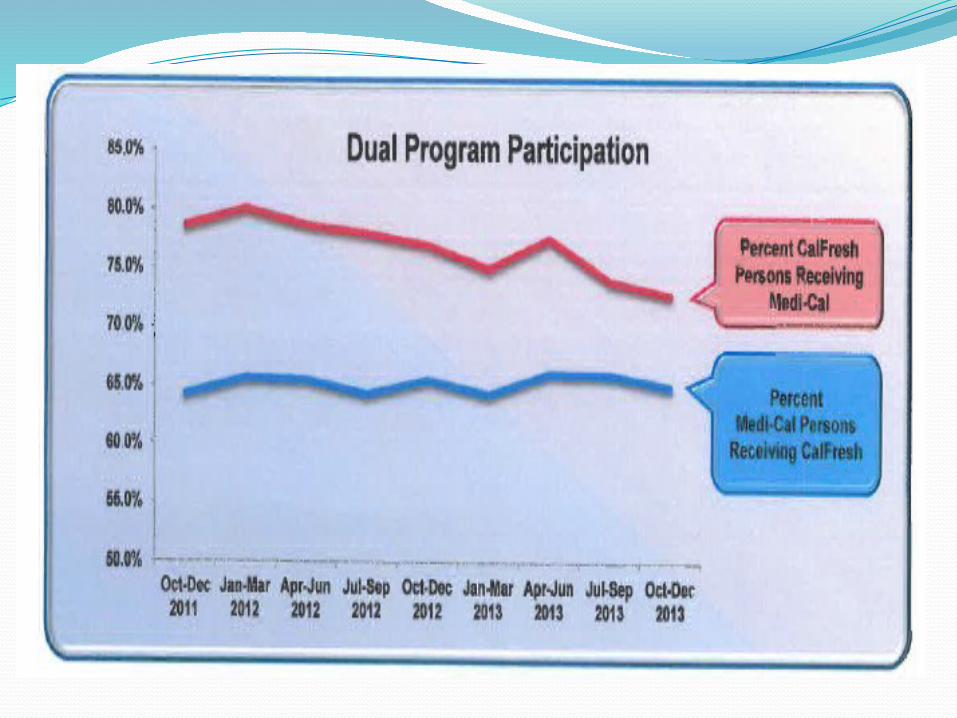
SNAP cases receiving Medi-Cal (to measure in-reach) Medi-Cal cases receiving SNAP (to measure Express
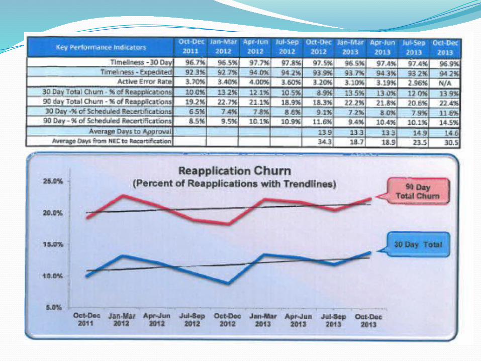
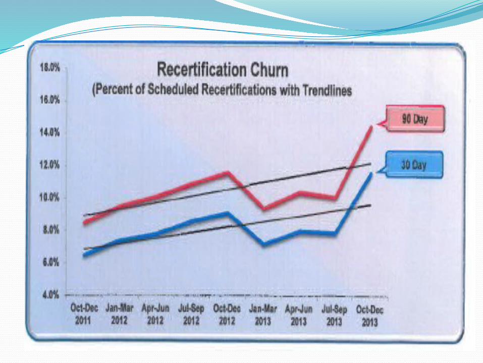
Lane Eligibility); Churn rates for recertifications and for all
reapplications (churn is defined as returning within 90 days although 30 days is also included)
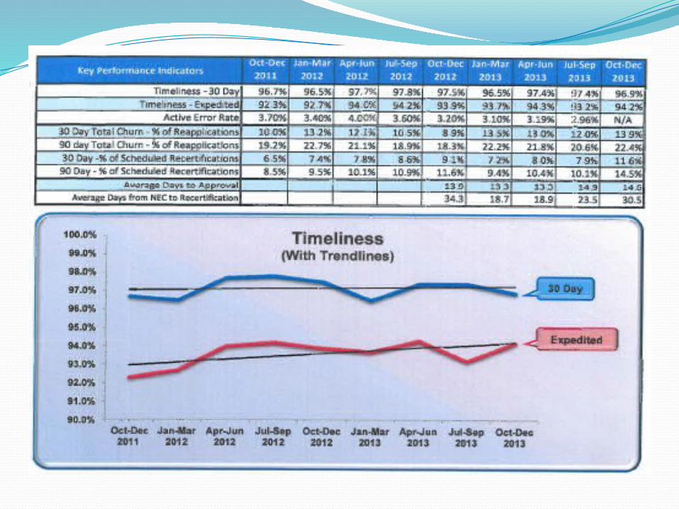
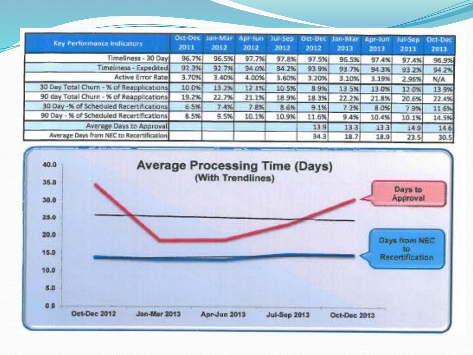
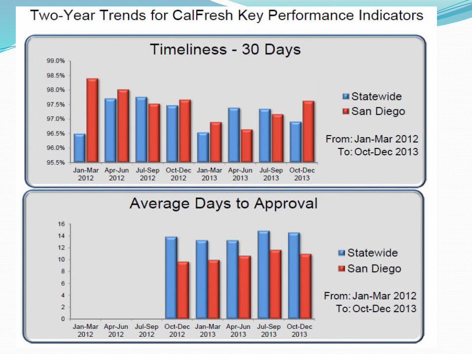
Active error rates Timeliness for both Expedited Service cases and for 30-
day processing
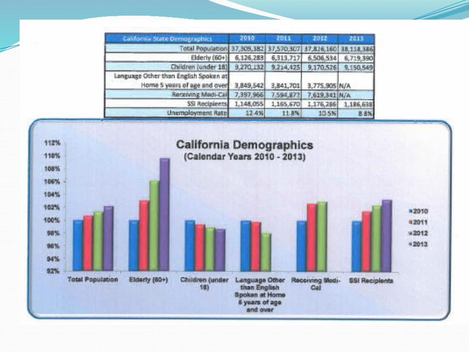
Data on the Dashboard
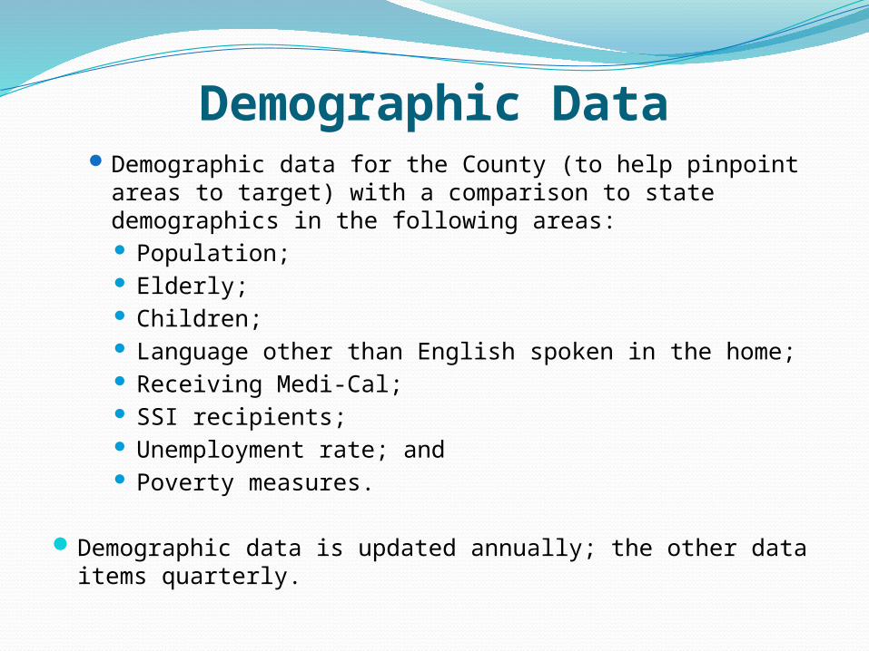
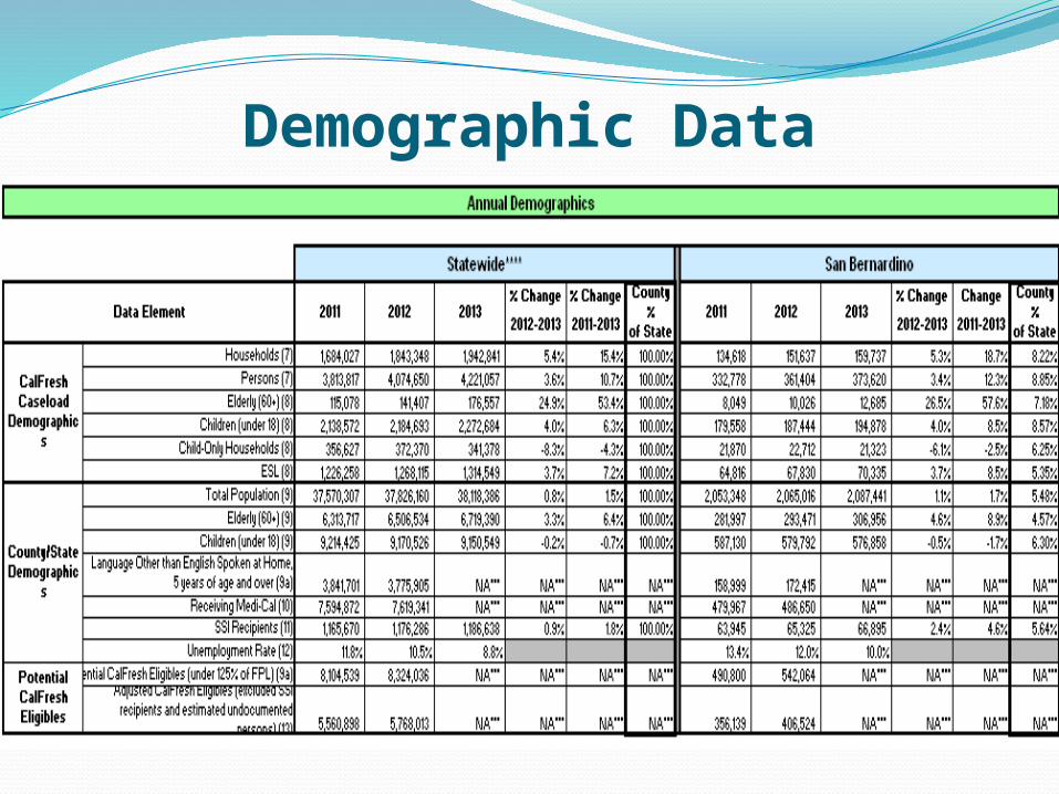
Demographic DataDemographic data for the County (to help pinpoint areas
to target) with a comparison to state demographics in the following areas: Population; Elderly; Children; Language other than English spoken in the home; Receiving Medi-Cal; SSI recipients; Unemployment rate; and Poverty measures.
Demographic data is updated annually; the other data items quarterly.
Demographic Data
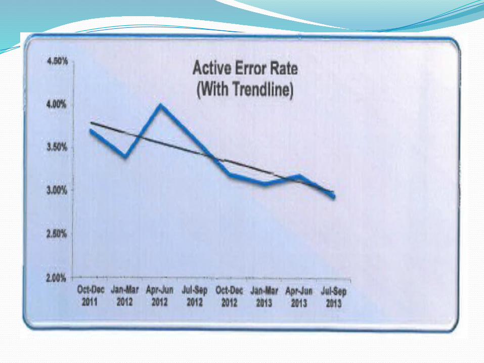
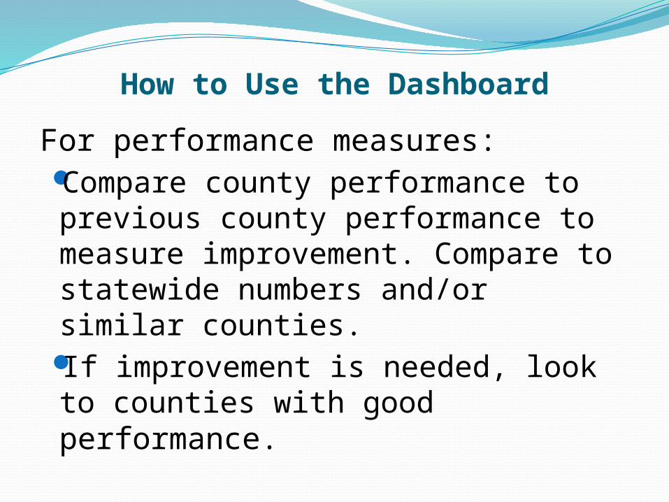
How to Use the Dashboard For almost any social service program, reducing
churn saves time for staff and clients. Churn rate for reapplications is: the SNAP
applications that received benefits in the previous 30 -90 days divided by the total applications received.
Churn rate for recertifications is: the SNAP cases who had recertifications due who didn’t complete them who reapplied within 30 -90 days divided by the total applications received. It is a subset of reapplication churn. Measuring this component allows us to identify where we need to make changes like streamlining the recertification process.
How to Use the Dashboard
To understand the demographics of your caseload: Use county’s percentage of state population as an item
to compare to other county demographics.For example, if county has 5% of state population, but
8% of the elderly population, you may want to put greater emphasis on outreach to the elderly, unless the SNAP demographics indicate you have 8% of the elderly in your caseload.
Compare growth to population growth for county and to change in poverty level. If caseload growth is higher, it would indicate increased participation.
If the county’s unemployment rate is higher than the state’s or other similar counties, it may indicate greater need/poverty.
How to Use the Dashboard
For performance measures: Compare county performance to previous county performance to measure improvement. Compare to statewide numbers and/or similar counties.
If improvement is needed, look to counties with good performance.
Inspiring Improvement
CDSS posts best practices to improve performance that counties are willing to share.
CDSS monitors county performance in key areas and provides technical assistance, as needed, to improve performance.
The model of focusing attention on key performance measures and encouraging natural competition between counties in areas like the active error rate has been very successful in improving performance.
It provides a good opportunity to acknowledge successes and provide resources to those counties that need it.
The increased transparency was appreciated by our advocates and other stakeholders.
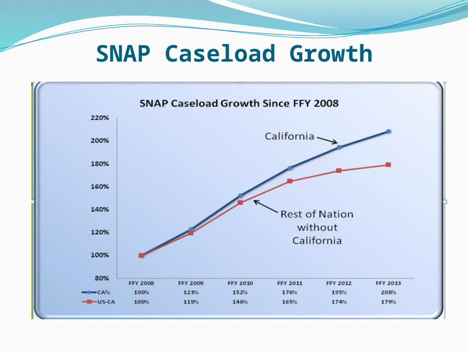
SNAP Caseload Growth

In ClosingI am very encouraged at the continued efforts of the
our counties and all the dedicated staff who work in social services programs who endeavor to do the best job possible. Hopefully the dashboard can be a tool to monitor the success of our joint efforts.
I enjoy attending NAPIPM as I am always happy to hear of ideas for program improvement. Please feel free to share your ideas. My email address is: [email protected]
Questions?


![Abdichtung - Elmenhorst · Abdichtung │ 7 Weiße Wanne [1] Als weiße Wanne bezeichnet man wasserundurch-lässig geplante Bauwerke in Form einer geschlos-senen Wanne, bei der die](https://img.pdfslide.net/doc/110x75/6085f2729f02f44d37150060/abdichtung-elmenhorst-abdichtung-a-7-weie-wanne-1-als-weie-wanne-bezeichnet.jpg)