Embed Size (px)
Citation preview
1
Demand Shocks and Productivity: Technology Adoption During the U.S. Ethanol Boom
Richard Kneller† and Danny McGowan‡*
December 2013 Abstract We study the causal effect of demand shocks on productivity using an instrumental variable approach. The demand shock we examine leverages reforms to U.S. energy policy that mandated a higher ethanol content of gasoline which subsequently increased demand for corn. Exploiting variation in the demand for corn due to the geographic segmentation of markets we create instruments based on distance and numbers of cattle (as a by-product of ethanol production can be used as an animal feed). To obviate the conflation of productivity and price effects using standard revenue based measures of productivity we use as our outcome physical TFP (yield). We show that the demand shock caused firms to make productivity improvements and provide evidence that this occurred through technology adoption. Other tests reveal that only permanent demand shocks motivate productivity change, suggesting a link between demand uncertainty in the operating environment and investment. We also show that the results are externally valid, invariant to using alternative control groups, and are robust to a battery of robustness, falsification and placebo tests.
Keywords: Demand shocks, productivity, technology adoption JEL Codes: D22, D24, L16, Q11 † University of Nottingham, School of Economics, Nottingham, NG7 2RD. Email: [email protected]; tel: +44 (0)115 95 14734. ‡ (Corresponding author) Bangor University, Business School, College Road, Bangor, LL57 2DG, United Kingdom. Email: [email protected]. Tel: +44 (0)1248 38 3948. * We thank Roberto Bonfati, Hans Degryse, Ana Fernandes, Christopher Gilbert, Mitsuru Igami, Enrico Onali, Bettina Peters, Mark Roberts, Carlos Daniel Santos, Klaus Schaeck, Richard Upward, and Zheng Wang for helpful comments and suggestions. This paper has benefitted conference participants at the International Industrial Organization Conference 2013, the European Association for Research in Industrial Economics 2013, and seminar participants at Bangor University, Hull University, University of Nottingham, Trento University, University of Tübingen, ZEW. Hansol Park and Anh Huang provided excellent research assistance. Finally, we are very grateful to Jim Burt from the NASS datalab for providing helpful guidance and access to data. McGowan thanks the Leverhulme Research Council for funding under project grant number RPG-2013-163.
2
1. Introduction
In this paper we study whether changes to demand affect producer’s decisions to invest in
new technologies, raising their productivity. Although not typically assumed to have any direct
productivity impacts, it has long been recognized that demand factors can lead producers to
innovate new technologies or adopt those produced by others.1 Schmookler (1954) for
example, identified that the larger the target market, the more profitable it is for firms to invest
in innovation activities. Profit incentives and market size also feature prominently within
endogenous growth models by Romer (1990), Grossman and Helpman (1991), Aghion and
Howitt (1992) and Acemoglu (1999, 2007) and in recent theories within the productivity
literature by Chaney and Ossa (2013).2 The literature has also highlighted theoretically how the
expansions in market size can induce firms to adopt more advanced technologies. This can be
found within models of growth and development in Parante and Prescott (1999), Bellettini and
Ottaviano (2005) and Desmet and Parente (2010), as well as models within the trade literature
by Lileeva and Trefler (2010) and Bustos (2011), where the expansion in market size occurs
because of trade liberalization.
In order to provide reliable empirical evidence on the demand-productivity nexus two major
issues must be confronted. Firstly, there is the endogeneity of demand itself. High productivity
firms exist disproportionately in large markets (Syverson, 2004). Secondly, in the absence of
producer-specific prices, micro-level estimates of productivity are contaminated by demand
shifts and variations in market power across producers (Foster et al., 2008, 2012). Changes in
demand, and therefore prices, can make producers appear more productive even when their
underlying efficiency is unchanged. De Loecker (2011) demonstrates that these effects can be
large. In his study unobserved prices inflate the effects of trade liberalization on firm level
productivity by a factor of four.
We by-pass the issue of price effects contaminating our productivity effects by constructing a
measure of productivity based on physical quantities. Using data from the U.S. corn industry we
measure productivity as the number of bushels of corn per acre (yield) and total factor
productivity (TFP).3 To establish causal effects of demand on productivity we use an
instrumental variable approach that exploits exogenous variation in the demand for corn driven
by the opening of new ethanol plants in the period following the U.S. Energy Policy Act of 2005
(EPA).
The EPA was designed to improve U.S. energy independence and security by stimulating
domestic energy production. Part of this legislative strategy sought to reduce crude oil imports
by mandating volumetric increases in the ethanol content of gasoline. In addition, the EPA
contained the Renewable Fuel Standard (RFS) which stipulated a target of a minimum 10%
ethanol content in future. The EPA led to substantial increases in the number of plants and
1 Improved access to micro-level production data over the last few decades has led to a rapid expansion in applied economic research that tries to unravel the contribution of supply-side forces, such as the competitive and regulatory landscapes, to productivity levels and growth. In comparison, the productivity effects of fluctuations in demand have been somewhat neglected (Syverson, 2011). 2 See also Guiso and Parigi (1999) and Collard-Wexler (2013) for evidence that demand affects managers’ and entrepreneurs’ investment decisions. 3 Foster et al. (2008) note that comparisons of physical productivity are more meaningful when variations in quality are small. This argument would appear to be relevant in the case of corn.
3
production capacity within the ethanol industry. This period is commonly labelled the ‘ethanol
boom’.
As the primary ingredient used to manufacture 90% of U.S. ethanol, a direct consequence of
the ethanol industry’s expansion was a large increase in the demand for corn. In constructing
our demand variable and our instruments we build on the insight of Syverson (2004) and Foster
et al. (2012) that products with homogenous characteristics can still be sold in differentiated
markets because of geographic variations in demand. As with the market for concrete described
in Syverson (2004), market segmentation in the demand for corn from ethanol producers
occurs because of transport costs. Ethanol producers are sensitive to transport costs for corn
due to their importance within total costs (on average corn accounts for 60% of total costs
[Hofstrand, 2013]) and therefore typically procure all of the corn they require from farms
within a 50 mile radius of the ethanol plant (USDA, 2007). Negative agglomeration effects exist
for ethanol producers as they seek to avoid competition that would drive up the local price of
corn (Fatal, 2011). As corn producers cannot re-locate to reduce trade costs and better serve
ethanol producers, the demand shocks they received during the ethanol boom was of varying
magnitudes.
McAloon et al. (2000) and Sarmiento et al. (2012) have previously shown, and we repeat
their analysis using our data, that the location and capacity of new plants was determined by the
location of existing ethanol plants and the number of cattle on feed. Using these insights we
instrument for the demand for corn from local ethanol producers using the distance of each
corn producer to the nearest ethanol plant. The greater is this distance the lower the demand
for corn from this and other ethanol plants in the locality is likely to be. The location of cattle
affects the location of ethanol producers because a by-product of ethanol production can be
used as an animal feed, and simultaneously accounts for 20% of ethanol profits. We use the
number of cattle on feed within a 50 mile radius of each county’s centroid as a second
instrument.4 Diagnostic tests demonstrate that the instruments are valid and we repeat
evidence found in McAloon et al. (2000) and Sarmiento et al. (2012) which shows that
expansions of the ethanol industry were independent of corn yields.
We find from this exercise evidence of a positive effect of demand shocks on corn yields. We
find an elasticity of corn yields with respect to ethanol capacity of 0.083%. Using the growth in
ethanol capacity for the average county between 2004 and 2010 (the end of our data period)
our results imply that yields rose around 5% per year. There is also considerable variation in
the estimated gains to yields: the productivity of corn producers at the 75th percentile of the
demand shock is estimated to have increased by 7.7% per year, whereas for those at the 25th
percentile is estimated to have been just 0.4% per year.
Having established a causal effect from demand shocks on physical productivity we move on
to explore why productivity increased. We test for a number of possibilities. As the data that are
available to answer this question exist at the state rather than the county level this necessitates
a change in the methodology to difference-in-differences. We are however, able to establish a
4 The inability of production to move location in this industry also explains why we focus on the role of market size as the source of the productivity gains rather than say changes to competition or information networks caused by increased industry agglomeration. See Aghion et al, (2005), Blundell et al, (1999), and Cohen and Levin (1989) as examples of the literature on competition and innovation, and Coombes (2012) for a model with agglomeration effects.
4
clear explanation for the observed rise in corn productivity: the demand shock induced
technology adoption.5 Corn producers rapidly adopted genetically engineered (GE) seeds, and in
particular stacked variety GE seeds, that reduce losses due to pests and herbicide over the
growing season, and also decrease herbicide and insecticide expenditure. Despite being
commercially available since 1996, few corn producers used GE seeds because their high net
cost relative to traditional hybrid seeds acted as a barrier to technology adoption. By causing an
increase in final goods’ prices, the demand shock reduced the effective cost of using the new
technology, triggering increases in its adoption. As a consequence TFP rose alongside yields.
We show that the permanence of the demand shock is an important element of our results.
Using previous examples of permanent and temporary demand shocks for corn (including the
switch to high-fructose corn syrup as a sweetener for carbonated soft drinks by Coca-Cola and
Pepsi in 1985, and the temporary withdrawal of China from the export market in 1995) we find
that a similarly permanent shock also increased productivity in this sector, whereas the
temporary one had no effect.
We can relate these findings to several strands of the literature. First, there is a new line of
research which expands the sources of heterogeneity between firms to include both
technological and demand-based factors. Key references include Das et al. (2007), Eslava et al.
(2009), Foster et al. (2008), Kee and Krishna (2008), Park et al. (2010) and De Loecker (2011).
Idiosyncratic demand shocks have been shown to exert a key influence on some aspects of firm
performance such as survival and growth (Foster et al., 2008, 2012; Pozzi and Schivardi, 2012).6
In this paper we contribute to this literature by demonstrating that changes to demand can have
an effect even on physical productivity. In the language of Foster et al. (2012), the demand stock
and the physical productivity of the firm may co- rather than independently evolve.
Second, our paper builds on the empirical literature relating market size and technological
change. The paper most closely related to our empirical setting is the pioneering work of
Griliches (1957), who studies adoption of hybrid corn seed across U.S. states. He identifies
market size as a factor that affects the rate of technology diffusion. We find a similar result while
dealing with the potential endogeneity of demand. In this regard the mechanism we identify is
common within the technology diffusion literature (Hall 2004), including that found previously
for a broad range of agricultural technologies.7 Our findings also complement studies of the
diffusion of agricultural technologies in developing countries. 8 A recent example is the work of
Suri (2011) who studies the adoption of hybrid-maize and fertilizer in Kenya. Their work
suggests heterogeneity in the returns to hybrid-maize and that non-adoption can occur even
when the increase in yields are in the order of 150%. Our findings indicate that economic
factors can also delay technology adoption in countries that operate close to the technological
5 Geroski (2000) and Hall (2004) provide interesting overviews of the technology adoption literature. Within this Geroski (2000) includes some discussion of the endogeneity of market size as new technological innovations are targeted at specific consumers. 6 A separate theoretical literature studies how changes in market size can increase aggregate productivity by inducing reallocation of market share across firms. See, for example, Melitz (2003), Syverson (2004), and Asplund and Nocke (2006). 7 See for example David (1975a,b) on the factors that affected the diffusion of the mechanical reaper in the U.S. and U.K. 8 See Feder et al. (1985) for a review of an older literature, while Foster and Rosenzweig (2010) discuss more recent studies.
5
frontier, albeit where in developed countries constraints appear are more likely to be on the
demand side.
Finally, some contemporary studies have estimated the impact of foreign market access on
productivity (Lileeva and Trefler, 2010) and technology adoption (Bustos, 2011). Those papers
show that firms that were induced to export because of trade liberalization undertook process
and product innovation to increase labor productivity. However, clean identification of the
productivity effects of demand through the lens of trade liberalization is complicated by the
simultaneous changes in competition following entry by foreign firms into the domestic
marketplace. The inability of corn producers to change location, limits the extent to which
changes in competition can occur during the ethanol boom.
Our paper is organized as follows. In the next section we describe the data set. In Section 3
we provide an overview of the ethanol industry and the key legislative changes that motivate
our empirical framework. We outline our identification strategy in section 4 and provide the
main results in Section 5. Section 6 contains explanations for the productivity increase while in
Section 7 we conduct robustness tests. In Section 8 we draw some conclusions from the study.
2. Data
[INSERT TABLE 1]
Much of the data we use in the empirical analysis is drawn from the National Agricultural
Statistics Service (NASS). The NASS is the statistics branch of the U.S. Department for
Agriculture and conducts hundreds of surveys each year on issues relating to agricultural
production, demographics, and the environment. As part of this mission the NASS administers
an annual survey of crop yields and output in each U.S. county. From this we have detailed
information on the productivity of the corn (NAICS 11115), as well as other crops grown within
the county such as soybeans (NAICS 11111), wheat, and barley, for 1,003 Midwest counties
between 2000 and 2010. The unit of observation in the sample is the county-industry. Our
decision to restrict the sample to only counties located in 12 states that makeup the Corn Belt is
predicated on the fact that both industries are ubiquitous throughout the region, and because
the ethanol sector is geographically concentrated there as well.9
We match the yield data to detailed information on the ethanol industry taken from The
Ethanol Industry Outlook, an annual industry journal published by the Renewable Fuels
Association. This contains plant-level data on the owner, capacity (both operating and under
construction), location, and feedstock of every ethanol plant in the U.S. We exclude all plants
that do not use corn as a feedstock on the grounds that they are irrelevant to corn producers.
Based on this information, for each year we create a binary dummy variable equal to 1 if there is
an ethanol plant in county c, 0 otherwise; total operating capacity within a 200 mile radius of
9 88% of national corn and 81% of national soybean production takes place in the Corn Belt. The 12 states in the sample are Illinois, Indiana, Iowa, Kansas, Michigan, Minnesota, Missouri, Nebraska, North Dakota, Ohio, South Dakota and Wisconsin.
6
each county; and the minimum distance between county c and the nearest operating ethanol
plant.10
We also incorporate a number of other variables into the data set. We rely on the NASS for
data on the number of cattle on feed within the county (to proxy for demand for distillers’ dry
grains), and retrieve information on the number of corn and soybean firms in each county from
the quinquennial Census of Agriculture.11 The remaining variables used in the econometric
analysis are listed in Table 1. This includes the number of banks in each county (SNL Financial),
the top state marginal corporate and personal income tax rates (The Tax Foundation),
population density (US Census Bureau), agricultural subsidy payments (USDA), industry exports
(USDA), GE seed usage (USDA), input usage (ARMS), output (NASS), and precipitation and
temperature (measured by growing degree days) over the growing season (Weather
Underground).12
In the majority of the empirical analysis, productivity is measured as yield (calculated as the
number of bushels produced per acre), but we also experiment with physical (TFPQ) and
revenue total factor productivity (TFPR) measures in Section 6. Earlier studies have often
estimated productivity as a residual in the production function. In the absence of producer-
specific prices or detailed production data these residuals capture not only differences in
technical efficiency across firms but also differences in market power, factor market distortions,
or changes in the product mix (Foster et al. 2008; Hsieh and Klenow, 2009; and Bernard et al.,
2010). The yield and TFPQ measures seek to obviate these concerns. The TFP variables are
constructed at the state-industry level using data retrieved from the Agricultural Resource
Management Survey (ARMS) following the method used by Foster et al. (2008).13 Each measure
is constructed using the typical index form
(1)
where the lower-case letters indicate the natural logarithm of output, capital stock, labour
hours, material inputs, and energy inputs, and ( { }) are the factor elasticities
corresponding to the corresponding inputs. All inputs and output are measured per acre. Labor
inputs are measured in hours, capital as the value of machinery services used, and material
inputs are the sum of reported expenditures on fertilizer, lime, seeds, herbicide and insecticide.
We deflate capital, material, and energy inputs into 1992 values using the NASS price index. To
measure the input elasticities , we use industries’ average cost shares over our sample.
The difference between the TFP variables lies in the output measure . The first index,
TFPQ, uses the yield per acre data described above. Variation in TFPQ reflects dispersion in
physical efficiency and possibly factor prices; it essentially reflects a producer’s average cost per
unit (Foster et al., 2008). The TFPR index measures as the deflated nominal revenue from
10 Distance is calculated as the great circle distance between the midpoint of county and the midpoint of the nearest county containing an operating ethanol plant. 11 Because the census is administered in 2002 and 2007 we apply the 2002 figures to the pre-treatment period (2000-2004) and those from 2007 to the post-treatment period (2005-2010). We also have census data for the years 1982, 1987, 1992, and 1997. 12 Weather stations are not uniformly distributed across counties. We therefore match each county to the nearest weather station. 13 We are forced to use state-level information because we do not have county-level information on capital, labor, and input expenditure.
7
product sales, and is similar in many respects to the estimates produced by Olley and Pakes
(1996) and Levinsohn and Petrin (2003) estimators.
3. Overview of the Corn and Ethanol Industries and Legislative Changes
In this section we outline important details regarding the production and distribution of
ethanol, as well as the key reforms to U.S. energy policy that sparked the ethanol boom, and
tests regarding the exogeneity of ethanol plant location with respect to corn productivity.
3.1 The Ethanol Production and Distribution Process
Ethanol is a clean-burning, high-octane motor fuel. Almost all ethanol is derived from starch-
and sugar-based feedstocks. The ease with which these sugars can be extracted from corn
makes it the preferred feedstock of large-scale, commercial ethanol producers (USDE, 2013).14
The production process involves converting starch-based crops into ethanol either by dry- or
wet-mill processing. More than 80% of ethanol plants in the United States are dry mills due to
lower capital costs (McAloon et al., 2000; USDE, 2012). During the dry-milling process the corn
kernel is ground into flour and subsequently fermented to make ethanol. By-products of this
process include distillers’ dry grains (DDG), which are sold as animal feed, and carbon dioxide.
Wet-mill plants steep corn in a dilute sulfuric acid solution in order to separate the starch,
protein, and fiber content. The corn starch component can then be fermented into ethanol
through a process similar to that used in dry milling, while the steep water is sold as a feed
ingredient.
Corn accounts for approximately 60% of ethanol production costs, with the remainder due to
natural gas (15%), other variable costs (12%), and fixed costs (13%) (Hofstrand, 2013). The
distribution process entails shipping harvested corn from farms and co-ops to ethanol plants
using trucks. Tanker trucks and rail cars are subsequently used to transport manufactured
ethanol to a terminal for blending. The blended gasoline is then distributed to gasoline retailers
or stored.
[Insert Figure 1: Oxygenates in Gasoline]
3.2 U.S. Legislative Changes
The background to the period we study begins with the mandated use of oxygenates in
gasoline in response to evidence that poor air quality in certain regions of the U.S. was
damaging health. This requirement was contained in the Clean Air Act Amendments of 1990 but
was later enforced through the Winter Oxygenate Fuel Program and the Reformulated Gasoline
Program in 1995. This legislation sought to improve the efficiency with which gasoline was
converted into heat, which was to be achieved by mandating that gasoline must contain a
certain percentage of oxygenate.15
The main oxygenates blended with gasoline were Methyl Tertiary Butyl Ether (MTBE) and
ethanol. Outside of the Midwest, MTBE was the preferred oxygenate based on cost advantages
14 According to USDE (2013) ethanol produced using wheat, milo and sugarcane is not economically feasible. As a result, over 90% of U.S. ethanol production relies on corn as a feedstock. Owing to differences in their chemical properties, multiple feedstocks cannot be mixed together during production. 15 2.7% under the WOFP and 2.0% under the RFG, where the RFG stipulated that this was year-round.
8
and its less volatile nature (Tiffany, 2009). In the Midwest, ethanol was more commonly used, a
difference that is generally attributed to a desire in corn producing states to help bolster
agricultural markets. MTBE’s dominance of the oxygenate market began to change when it was
detected in water supplies.16 Bans on the use of MTBE were introduced in some farm states such
as Minnesota as early as 2000, but were adopted by heavy users of MTBE, such as California,
from 2004 when the health concerns became better known.17 Figure 1 provides further detail
on the use of ethanol and MTBE as oxygenates over time, and Appendix Table A1 provides an
overview of the states that adopted these measures, the timing, and type of oxygenate phaseout.
Also of importance for the demand shock that we study were a series of other political issues
that culminated in the 2005 EPA. During the early 2000’s a perception grew within national
policymaking circles that the U.S. economy was overly reliant on foreign energy supplies that
were vulnerable to interruption (Diggs, 2012). The EPA was formulated in response to these
pressures, and aimed to improve energy independence and security by stimulating various
forms of domestic energy production. Part of this agenda sought to displace crude oil and
gasoline imports by promoting greater use of ethanol in gasoline. Crucially the EPA mandated
that the ethanol content of gasoline rise from 4 billion gallons in 2006 to 7.5 billion in 2012, and
also contained a Renewable Fuel Standard (RFS) that stipulated a minimum 10% ethanol
content in future.18 The subsequent Energy Independence and Security Act of 2007 (EISA) set
yet higher targets, mandating a minimum 36 billion gallon ethanol content by 2022. 19
It is also recognized within the agricultural and ethanol industries that an important
additional demand stimulus was the failure of the EPA to grant the manufacturers of MTBE
liability protection from environmental damage and health claims (Tiffany, 2009). Today,
ethanol is used as a gasoline oxygenate in all 50 states.
Together the RFS and the volumetric ethanol production targets provided assurance of
ethanol demand, and accelerated ethanol production beyond levels that would have been
otherwise supported by a free market. Ethanol blenders also benefitted from a 51 cent per
gallon tax credit paid through the Volumetric Ethanol Excise Tax Credit (VEETC), and were
shielded from competition with foreign ethanol producers by an import tariff of $143/m3 levied
on imported ethanol.20 This institutional feature is important for our empirical strategy as it
means we can study the effects of a demand shock in isolation from changes in the competitive
landscape as is the case with trade liberalization.
The rapid rise of blended gasoline (gasoline containing ethanol) was facilitated by the fact
that no engine modifications were required in older (post-1992) or newer (post-2001) vehicles.
This spurred most gasoline retailers throughout the U.S. to offer E10, a fuel mixture of 10%
16 State legislators opted to ban MTBE following its discovery in groundwater and medical evidence linking MTBE ingestion to carcinogenic diseases. 17 California originally introduced a ban on 1st January 2003, but this was delayed by one year out of concern for potential supply disruptions. 18 According to the USDA Feed Grains Database by 2009 the ethanol market share of the U.S. gasoline industry had reached 8% as a result of the energy legislation. E10, gasoline with 10% ethanol content, is readily available throughout all 50 states. Higher ethanol blends are also marketed by gasoline retailers. 19 The United States Environmental Protection Agency made this applicable to fuel used in both older and newer (post-2001) vehicles, all motorcycles, heavy-duty vehicles and non-road engines (for example, motorboats). 20 The VEETC was created under the American Jobs Creation Act of 2004. It was renewed as part of the Farm Bill of 2008 at a lower rate of $0.45 per gallon of ethanol blended with gasoline. Congress allowed the VEETC to expire on December 31 2011.
9
ethanol and 90% gasoline. Automobile manufacturers also promoted blended gasoline by
introducing car engines capable of running on E15 and E85.21
3.3 The Ethanol Boom
The surety of demand created by the EPA sparked a wave of investment in building new
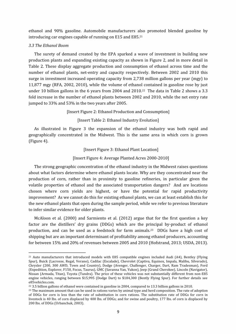
production plants and expanding existing capacity as shown in Figure 2, and in more detail in
Table 2. These display aggregate production and consumption of ethanol across time and the
number of ethanol plants, net-entry and capacity respectively. Between 2002 and 2010 this
surge in investment increased operating capacity from 2,738 million gallons per year (mgy) to
11,877 mgy (RFA, 2002, 2010), while the volume of ethanol contained in gasoline rose by just
under 10 billion gallons in the 6 years from 2004 and 2010.22 The data in Table 2 shows a 3.3
fold increase in the number of ethanol plants between 2002 and 2010, while the net entry rate
jumped to 33% and 53% in the two years after 2005.
[Insert Figure 2: Ethanol Production and Consumption]
[Insert Table 2: Ethanol Industry Evolution]
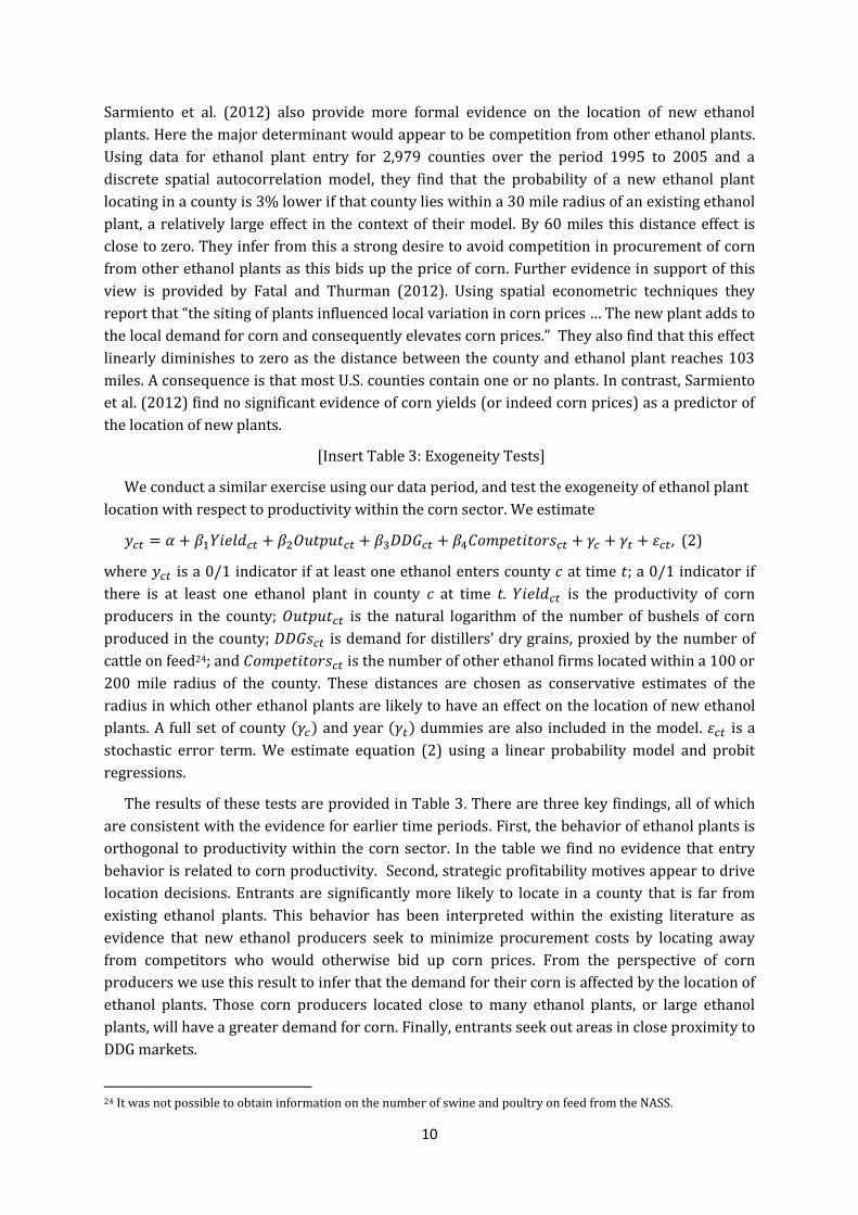
As illustrated in Figure 3 the expansion of the ethanol industry was both rapid and
geographically concentrated in the Midwest. This is the same area in which corn is grown
(Figure 4).
[Insert Figure 3: Ethanol Plant Location]
[Insert Figure 4: Average Planted Acres 2000-2010]
The strong geographic concentration of the ethanol industry in the Midwest raises questions
about what factors determine where ethanol plants locate. Why are they concentrated near the
production of corn, rather than in proximity to gasoline refineries, in particular given the
volatile properties of ethanol and the associated transportation dangers? And are locations
chosen where corn yields are highest, or have the potential for rapid productivity
improvement? As we cannot do this for existing ethanol plants, we can at least establish this for
the new ethanol plants that open during the sample period, while we refer to previous literature
to infer similar evidence for older plants.
McAloon et al. (2000) and Sarmiento et al. (2012) argue that for the first question a key
factor are the distillers’ dry grains (DDGs) which are the principal by-product of ethanol
production, and can be used as a feedstock for farm animals.23 DDGs have a high cost of
shipping but are an important determinant of profitability among ethanol producers, accounting
for between 15% and 20% of revenues between 2005 and 2010 (Hofstrand, 2013; USDA, 2013).
21 Auto manufacturers that introduced models with E85 compatible engines included Audi (A4), Bentley (Flying Spur), Buick (Lacrosse, Regal, Verano), Cadilac (Escalade), Chevrolet (Captiva, Equinox, Impala, Malibu, Silverado), Chrysler (200, 300 AWD, Town and Country), Dodge (Avenger, Challenger, Charger, Dart, Ram Tradesman), Ford (Expedition, Explorer, F150, Focus, Taurus), GMC (Savanna Van, Yukon), Jeep (Grand Cherokee), Lincoln (Navigator), Nissan (Armada, Titan), Toyota (Tundra). The price of these vehicles was not substantially different from non-E85 engine vehicles, ranging between $15,995 (Dodge Dart) to $184,300 (Bently Flying Spur). For further details see e85vehicles.com. 22 3.5 billion gallons of ethanol were contained in gasoline in 2004, compared to 13.3 billion gallons in 2010. 23 The maximum amount that can be used in rations varies by animal type and herd composition. The rate of adoption of DDGs for corn is less than the rate of substitution in corn rations. The substitution rate of DDGs for corn in livestock is 40 lbs. of corn displaced by 400 lbs. of DDGs; and for swine and poultry, 177 lbs. of corn is displaced by 200 lbs. of DDGs (Urbanchuk, 2003).
10
Sarmiento et al. (2012) also provide more formal evidence on the location of new ethanol
plants. Here the major determinant would appear to be competition from other ethanol plants.
Using data for ethanol plant entry for 2,979 counties over the period 1995 to 2005 and a
discrete spatial autocorrelation model, they find that the probability of a new ethanol plant
locating in a county is 3% lower if that county lies within a 30 mile radius of an existing ethanol
plant, a relatively large effect in the context of their model. By 60 miles this distance effect is
close to zero. They infer from this a strong desire to avoid competition in procurement of corn
from other ethanol plants as this bids up the price of corn. Further evidence in support of this
view is provided by Fatal and Thurman (2012). Using spatial econometric techniques they
report that “the siting of plants influenced local variation in corn prices … The new plant adds to
the local demand for corn and consequently elevates corn prices.” They also find that this effect
linearly diminishes to zero as the distance between the county and ethanol plant reaches 103
miles. A consequence is that most U.S. counties contain one or no plants. In contrast, Sarmiento
et al. (2012) find no significant evidence of corn yields (or indeed corn prices) as a predictor of
the location of new plants.
[Insert Table 3: Exogeneity Tests]
We conduct a similar exercise using our data period, and test the exogeneity of ethanol plant
location with respect to productivity within the corn sector. We estimate
, (2)
where is a 0/1 indicator if at least one ethanol enters county at time ; a 0/1 indicator if
there is at least one ethanol plant in county c at time t. is the productivity of corn
producers in the county; is the natural logarithm of the number of bushels of corn
produced in the county; is demand for distillers’ dry grains, proxied by the number of
cattle on feed24; and is the number of other ethanol firms located within a 100 or
200 mile radius of the county. These distances are chosen as conservative estimates of the
radius in which other ethanol plants are likely to have an effect on the location of new ethanol
plants. A full set of county ( ) and year ( ) dummies are also included in the model. is a
stochastic error term. We estimate equation (2) using a linear probability model and probit
regressions.
The results of these tests are provided in Table 3. There are three key findings, all of which
are consistent with the evidence for earlier time periods. First, the behavior of ethanol plants is
orthogonal to productivity within the corn sector. In the table we find no evidence that entry
behavior is related to corn productivity. Second, strategic profitability motives appear to drive
location decisions. Entrants are significantly more likely to locate in a county that is far from
existing ethanol plants. This behavior has been interpreted within the existing literature as
evidence that new ethanol producers seek to minimize procurement costs by locating away
from competitors who would otherwise bid up corn prices. From the perspective of corn
producers we use this result to infer that the demand for their corn is affected by the location of
ethanol plants. Those corn producers located close to many ethanol plants, or large ethanol
plants, will have a greater demand for corn. Finally, entrants seek out areas in close proximity to
DDG markets.
24 It was not possible to obtain information on the number of swine and poultry on feed from the NASS.
11
In Appendix Table A2 we report further evidence that plant operating capacity and capacity
under construction are independent of productivity in the corn sector.
4. Empirical Design
As the primary ingredient used to produce U.S. ethanol, the legislative changes culminating in
the EPA triggered a large, exogenous increase in demand for corn. Before 2005 corn was mainly
used as a feed for livestock with the rest exported or sold to the food industry. That began to
change as U.S. states banned the use of MTBE, but as shown in Figure 5, changed even more
dramatically following the EPA; the share of corn production used to manufacture ethanol,
reached 40% in 2010. Moreover, as illustrated in Figure 6, the higher demand from the ethanol
sector did not displace other sources of corn demand such as feed or exports, meaning that the
ethanol demand shock was largely additive.
[Insert Figure 5: Share of U.S. Corn Production in Ethanol]
[Insert Figure 6: Sources of Corn Demand]
The hypothesis we test in this paper is whether the surge in demand for ethanol created by
the opening of new ethanol plants provided an incentive for corn producers to improve their
productivity. We identify the effect of demand by exploiting spatial variation in the magnitude of
the demand shock using an instrumental variables estimation strategy. The construction of our
instrument set draws closely on the ideas in Syverson (2004) that an industry or economy-wide
market is actually comprised of a collection of heterogeneous local markets, even when the
goods produced cannot be differentiated by quality or other characteristics. The estimating
equation we use is
, (3)
where is productivity of corn production in county at time , is the demand for corn,
is a vector of other control variables, and is a stochastic error term. We also include
county-fixed effects ( ) in equation (3) to control for time invariant county-specific factors
such as altitude, latitude and soil conditions that might generate differences in the yield across
counties. Year fixed effects ( ) are also included in the estimating equation.
We proxy demand for corn in equation (3) using the operating capacity of ethanol plants
within a 200 mile radius of each county. We choose a radius of 200 miles based on existing
evidence. Because ethanol plants pay the shipping costs they purchase corn locally. For
example, according to McAloon et al. (2000) ethanol producers located near corn growers have
the advantage of lower shipping costs, while USDA (2007) provide evidence that most ethanol
plants get their corn supply from within 50 miles of the plant. Fatal (2011) uses a non-linear
least squares procedure and estimates that the maximum radius around which ethanol plants
affect corn supply exists up to 286 miles. The average county is only 20 miles across. Several
hundred counties can be located within a radius of this size.
Our first instrument uses the distance between county and the nearest county containing
an operating ethanol plant in year . In addition to the geographic limit of the effect of ethanol
producers on corn producers, we draw on two features of corn and ethanol production to justify
this instrument. First, a feature of agricultural production is of course that the location of corn
12
producers is fixed. It follows that corn producers cannot move location in order to reduce their
transport costs to better serve new ethanol producers. Secondly, the evidence in Table 3 and
elsewhere suggests that ethanol producers have a strong desire to locate away from other
ethanol producers and that location choice is independent of corn yields. Within the ethanol
industry there are negative agglomeration effects, and from the perspective of corn
productivity, their location is as good as random.
From this we anticipate that the shorter the distance between a corn producer and the
closest ethanol producer, the greater is the number of other ethanol plants that are likely to be
located within a 200 mile radius of the corn producer. As ethanol plants have a desire to locate
away from each other, the distance to the nearest plant will be negatively correlated with the
total number of plants that are located within 200 miles of the corn producer and therefore the
ethanol capacity within that area. To put this differently, the area of the circle with a radius 200
miles in which other corn producers can be located is greater, the shorter is the initial distance
between the corn producer and the ethanol plant. At one extreme, when the corn producer and
the ethanol producer are located within the same county then then the area in which other
ethanol plants can be located is given by r2. At the other extreme of when the nearest ethanol
plant is 200 miles away from the corn producer, then other ethanol plants will count towards its
demand only if they are located exactly on the perimeter of the circle. It has already been
established that corn yields do not determine the location of ethanol plants and we see no
reason why this distance between a corn producer and the nearest ethanol producer should be
correlated with the productivity of corn within the county other than through its correlation
with ethanol capacity within a 200 mile radius.
The second instrument we use is a measure of the number of cattle on feed in county at
time . As outlined by Sarimento et al. (2012) and McAloon et al. (2000), sales of DDGs are a key
consideration in ethanol plant location as they accounts for approximately 20% of plants’
revenues. The high transport costs associated with shipping DDGs (McAloon et al., 2000) means
that plants seek to locate close to large DDG markets, a result confirmed earlier in Table 3. We
therefore follow Dooley and Martens (2008) and proxy DDGs demand using the number of
cattle on feed within 50 miles of each county. Because DDGs demand influences the location and
capacity choices of ethanol producers, this in turn generates plausibly exogenous variation in
the proximity of corn producers to ethanol plants, and the magnitude of the demand shock they
face.25
5. Instrumental Variable Estimates
Before reporting formal empirical tests of the above hypothesis, we provide some simple
descriptive evidence. Within the raw data presented in Figure 7 Panel A we compare the
productivity distribution in the first half of the sample period (up to 2005) and that in the
second half of the period (post to 2005). We use 2005 as this was the year in which the EPA was
passed. The figure indicates a clear, unambiguous increase in average productivity in the second
half of the period, part of the reason for which would appear to be due to the substantial
25 One could argue that productivity within corn farming might affect the number of cattle on feed leading to a breakdown in the exclusion restriction. We test this directly by regressing the number of cattle on feed on yield and output and show that this is not the case.
13
rightward shift in the survival productivity threshold.26 Average corn yield rose by 10% over
this period. First evidence that the productivity gains were driven by the opening of ethanol
plants can be found in Panel B of Figure 7 where we plot average productivity in counties in
which new ethanol plants were opened. This figure indicates a 5% increase in corn productivity
during the three years after an ethanol plant enters the county.
[Insert Figure 7: Productivity Response to the Demand Shock]
The instrumental variable estimation results are provided in Table 4. In the first stage of
regression 1 we find that demand for corn was lower in counties further away from an ethanol
plant, whereas the number of cattle on feed is positively related to ethanol demand. Thus the
instruments have the expected relationships with the endogenous variable. The instruments are
highly significant individually and collectively in the first-stage regression, as shown by the
Kleibergen-Paap F-statistic. They also pass the under-identification and over-identification
tests, and are uncorrelated with the error term from the second-stage regression. The
instruments therefore pass standard statistical tests for their validity.
In the second stage we find that the demand shock caused a significant increase in
productivity with the elasticity estimated to be equal to 0.083%. Between 2004 and 2010
ethanol operating capacity within 200 miles of the mean county increased by 415%. Our results
imply that corn yields increased by just under 35% over these 6 years as a result of the increase
in ethanol demand, equivalent to an increase in the average annual growth rate in productivity
of 5 percentage points. The size of the effect differs with the size of the demand shock. Using the
distribution of the change in ethanol production capacity within 200 miles of the county
between 2004 and 2010 the value at the 25th percentile was 151mgy. At the 75th percentile it
was 4046mgy. These imply an increase in the mean value in 2004 of 27% and 711%
respectively, and in turn a 0.4% and 7.7% increase in the rate of productivity growth of corn.
[Insert Table 4: Instrumental Variables Estimates]
In regressions 2 and 3 of Table 4 we add additional control variables to establish that the
instruments are not capturing the effect of some other omitted variable. In regression 2 we add
supply-side factors, including variables capturing the weather, and in regression 3 we control
for other demand-side factors including exports of corn, the price of corn within the state and
the subsidy rate. Syverson (2004) suggests that average productivity is higher in larger markets
because low-productivity firms are eliminated as markets grow. We attempt to control for such
effects using a measure of the number of acres of corn planted, median firm size, and the
number of operating firms. We use the number of banks within the county to control for the
potential effects of differences in access to finance on corn yields (Butler and Cornaggia, 2011).
In the first stage the instruments continue to behave as expected and remain valid. In the
second stage we find the estimated elasticity is similar to that found in regression 1. The
demand shock caused a significant increase in productivity with the elasticity estimated to be
equal to 0.096% in regression 2 and 0.088% in regression 3. For a 415% increase in the median
ethanol operating capacity corn yields would be predicted to increase by between 5.6 points
and 5.1 percentage points each year.
26 The productivity threshold is 138% higher during the post-treatment era relative to pre-treatment.
14
We show in Appendix Table A3 that our results are robust to proxying corn demand with
ethanol capacity within a 100-mile radius. The magnitude of the demand elasticity in these
regressions is somewhat larger.
6. Why did Productivity Increase?
The results found thus far suggest that changes in demand can affect productivity. An
obvious next question is why did productivity increase? Is it to do with the type of shock that we
use? Or do our results for the productivity of land reflect increases in other inputs, such as
increased fertilizer use, which may indicate no increase in TFP? Unfortunately, the data that
would help to provide answers to the questions on the type of input changes that occur are
available at the state, rather than the county level. This prevents us from using the instruments
adopted in Section 5. To make progress on this issue we switch to a difference-in-difference
approach using the 2005 EPA as the source of the exogenous increase in the demand for corn.
Precedent for the use of the EPA as a treatment can be found in Butler and Cornaggia (2011)
who study the effect of access to finance on corn yields using county-level data up to 2006.
Following Butler and Cornaggia (2011) we use soybeans as a counterfactual.
In order to establish the use of the EPA as a treatment and soybeans as a counterfactual, we
proceed in three steps. First, we examine the key identifying assumption of parallel trends
between corn and soybean productivity. Second, we test whether the alternative estimation
strategy is able to replicate the previous results. Having established the apparent validity of the
approach we then consider in more detail why productivity increased, focusing on different
types of demand shocks, a measure of physical TFP for corn, technology adoption, and input
usage.
6.1 Parallel Trends
Invariably, DID estimates are scrutinized based on the extent to which the control group
represents the valid counterfactual. Soybeans are an obvious choice to play such a role for corn
as they are also planted during spring and harvested in fall, the majority of output is produced
in the Corn Belt, but it is not a crop that can be used to produce ethanol. Historically, the growth
rate of soybean yields has closely matched corn yield.27 Similar machinery (combines, trailers,
seeders and tractors) is used to plant and harvest both crops.
[Insert Figure 8: Pre-Treatment Productivity Evolution]
[Insert Table 5: Parallel Trends Tests]
Key to this approach is the identifying assumption of parallel trends. In Figure 8 we plot the
annual rate of productivity growth in corn and soybeans during the pre-treatment era.28 We
observe very similar patterns, although corn productivity grew somewhat faster between 2002
and 2003. The important question is of course whether these trends are significantly different.
We investigate this issue using t-tests that test for equality between productivity growth in the
two sectors in each year. These results are reported in Table 5. We find no significant
27 The respective average annual growth rates for soybean and corn yields were 3.9% versus 4.5% since 1990 respectively. 28 A within county-industry transformation of the data is applied because in the subsequent econometric tests we include county-industry fixed effects in the estimating equation.
15
differences for any of the years indicating that the parallel trends assumption is satisfied, and
soybeans represent a valid counterfactual. We take form this that the banning of MTBEs by
some states had no statistically significant effect on corn yields over this period. Given the EPA
was passed due to national policymakers’ concerns about the adverse effects of interruptions to
foreign energy sources, and their repercussions for the U.S. economy, the legislation
represented an exogenous shock.29
6.2 Difference-in-Difference Estimates
The difference-in-difference (DID) estimator exploits the asymmetry in treatment status
between corn and soybeans using the following equation
, (4)
where is productivity in industry in county at time ; is a dummy equal to 1 if the
observation is from the corn industry, 0 otherwise; is a dummy equal to 1 for the
years 2005-2010, 0 otherwise; is a vector of control variables measuring competition
(number of corn/soybean firms), and acres planted; is a stochastic error term. We also
include a full set of county-year ( ) and county-industry ( ) dummy variables. The county-
year effects capture time-varying productivity influences (common across the treatment and
control group) that may coincide with treatment. For example, subsidy payments may affect
managerial effort, and therefore productivity, but changes in the generosity of such payments
through time are likely to affect both groups equally. An attractive property of including county-
year effects in the estimating equation is that the average treatment effect is identified through
cross-industry variation within the county-year dimension of the data set. It also seems likely
that there exist a number of time-invariant productivity determinants that are county-specific
but have differential effects on corn and soybean productivity, hence the inclusion of .30 We
cluster the standard errors at the county level in line with Bertrand et al. (2004).31
[Insert Table 6: Productivity Response to the Demand Shock]
We first examine whether the alternative estimation strategy is able to replicate our previous
findings.
In regression 1 of Table 6 we report the estimates of equation (4). The average treatment
effect (ATE) of the demand shock is estimated to be 6.3 bushels per acre. In column 2 we
collapse each variable on its pre- and post-treatment mean for each county-industry. We now
have just two observations for each county-industry; one before, and one after treatment. This
procedure has two advantages: 1) we are able to establish the average annual ATE effect of the
demand shock, and 2) it provides further evidence against the claim that our inferences are
driven by artificially low standard errors (Bertrand et al., 2004). The ATE is now estimated to be
equal to 6.8 bushels per acre per year (t-statistic = 7.00). This implies a net productivity
29
If farmers were aware of the potential effect ethanol would have on their businesses, we would expect to see a jump in lobbying contributions as they attempt to pressure policymakers to include such legislation. However, there is no evidence of an increase in contributions to the National Corn Growers’ Association (the industry lobby) before 2005. For further details see http://www.opensecrets.org . 30 For example, Grau et al. (2002) find soybean yields are affected to a greater extent by high soil pH values because this results in cyst nematode and brown stem rot. Equally, corn yields tend to be proportionately lower in more northern areas while altitude influences crop yields. 31 The coefficient estimate of the first order autoregressive productivity parameter is 0.9309 (t-statistic = 313.39) indicating serial correlation in the dependent variable.
16
improvement over the post-treatment period of 32% [(6.8*6)/128 = 0.32] which is very close to
the estimates using IV.
Given that soybeans represent a good counterfactual, and the similarity between the DID and
IV estimation results, we conclude that the DID identification strategy is valid.
6.3 Type of Demand Shock
Our first test for why productivity increased focuses on the type of the demand shock.
Through the RFS, the EPA provided surety of corn demand in all future years. It was therefore a
permanent demand shock. Previous research has typically emphasized that permanent demand
shocks motivate firms to make investments as they increase expected revenues and reduce the
uncertainty of investment (Schmookler, 1954; Campbell and Hubbard, 2009), whereas
transitory demand shocks do not.
We consider this question using two historical changes to the demand for corn. In 1985 Coca-
Cola and Pepsi switched from using a sugar cane-based glucose sweetener to high fructose corn
syrup (HFCS). The change in sweetener was driven by cost concerns as HFCS was considerably
cheaper than sugar cane. As approximately 90% of HFCS consumed in the U.S. is contained
within soft drinks, the actions of the major cola manufacturers had a large impact on demand
for corn: in the five years prior to 1985, HFCS production consumed 227 million bushels of corn
per annum compared to 338 million between 1985 and 1990. As with the ethanol-boom period
this was likely to have been viewed by corn producers as a permanent demand shock.
Again we draw upon data from the NASS for information on corn and soybean productivity in
the Corn Belt. The HFCS treatment dummy takes a value of 1 for the years 1985 to 1990 and 0
for 1980 to 1984. Applying a DID estimation approach we estimate equation (4) using the new
data set and report the results in regression 3 of Table 6.32 We continue to find large
productivity effects of demand: following the HFCS demand shock corn firm productivity
increased by 10 bushels per acre, equivalent to an 11.8% productivity gain relative to pre-
treatment levels.
We then compare this outcome to the withdrawal of China from the export market
announced in December 1994, which it undertook in an attempt to fight inflation related to its
domestic grain shortages. According to Stevens (2000) over the previous four years China had
aggressively expanded its corn exports to 465 million bushels per annum and that, “This was
hard on U.S. corn exports … China had taken over about one fourth of the U.S. share of the
market. Getting this market back was good news indeed”, but, “[T]he Chinese withdrawal from
the world corn export market had the tone of a one-time shock.” We test for the effect on corn
and soybean yields using data from the NASS covering the years 1992 to 1997 and set the
treatment indicator equal to 1 for the period 1995 to 1997, and 0 otherwise.33
The results in regression 4 of Table 6 show no significant effect of the temporary demand
shock on productivity. That producers did not respond in the same manner as to the permanent
demand shocks suggests that demand structure has important implications for productivity
32 Data on the number of firms is drawn from the 1982 and 1987 Census. The values for 1982 are applied across the years 1980 to 1984 and those for 1987 are applied to the years 1985 onwards. 33 Data on the number of firms is drawn from the 1992 and 1997 Census. The values for 1992 are applied across the years 1992 to 1994 and those for 1997 are applied to the years 1995 onwards.
17
investments. In particular, it would seem that the renewable fuel standard raised the surety of
future demand, and reduced the uncertainty surrounding investment. The observed
productivity movements are therefore likely to stem from reduced uncertainty (Guiso and
Pagini, 1999; Bloom et al., 2007; Bloom, 2009).
6.4 Did TFP or Input Use Increase?
The increase in corn yields following the ethanol boom could have occurred because of
adjustment in the intensity with which other inputs are used, rather than actual improvements
to technical efficiency. In this section we explore in more detail whether TFP was also affected,
and the investments made by producers that raised corn yields.
6.4.1 Total Factor Productivity
One constraint we face is the construction of total factor productivity in the corn and
soybean industries is that the NASS does not release data on capital stocks, labor, material, and
energy inputs at the county level. However, such information is available from the ERS
Agricultural Resource Management Survey (ARMS) at the state-industry level from 2003
onwards for eight states.34 This allows us to construct physical and revenue TFP as described
earlier in Section 2.
Foster et al. (2008) note that there are important differences between revenue and physical
productivity. First, in the absence of producer-level price data, revenue productivity is unable to
distinguish whether output is high because of price shocks or technical efficiency. In the context
that we consider where there were large changes to the price of corn and soybeans, in part
associated with movements in global commodity prices, such price effects are likely to be
important.
We first examine whether the yield per acre variable we have used until now is a good proxy
for both TFP variables. The data suggest this to be the case, in particular for TFPQ: the
correlation (p-value) between yield and TFPQ is 0.9842 (0.00), while it is 0.4941 (0.00) for
TFPR. When TFPQ is used as the dependent variable the average treatment effect is estimated to
be 7% (regression 5 in Table 6). In regression 6 we repeat the exercise but use TFPR to measure
productivity instead. Again, we find that the treatment effect is statistically significant, but now
implies a productivity increase of 18%. The difference between the two coefficients serves to
illustrate the importance of controlling for producer prices when estimating productivity and
reinforces the argument made in De Loecker (2011) who finds a similar upward bias in the
estimated effects of trade liberalisation. This issue is particularly acute in our context and these
results show a strong upward bias to the estimated productivity effects from demand shocks
that occur because prices also rose.
6.4.2 Changes to Input Use
We next try to obtain a fuller understanding of why productivity increased by honing in on
the investments and organizational innovations firms instigated. Using data from the ARMS and
the NASS, we estimate the equation
, (5)
34 The reporting states are Illinois, Indiana, Iowa, Kansas, Minnesota, Missouri, Nebraska, and Wisconsin.
18
where denotes the share of corn acres planted with GE seeds, seed and plant expenditure,
irrigation technology, machinery and equipment, land and buildings, rented machinery, labor,
and fertilizer expenditure. The subscript denotes the unit of observation (either the county or
state); and is the error term.
[Insert Table 7: Productivity Drivers]
The evidence from Table 7 suggests that the primary explanation behind the productivity
increase was that the demand shock triggered new technology adoption.35 Historically, and in
marked contrast to soybeans, the share of corn acres planted with GE seed had been low.
However, as shown in regression 1 in Table 7, the EPA caused a 19 percentage point increase in
the share of acres planted with GE seeds. As shown in Figure 9 Panel A, corn farmers throughout
the Corn Belt started to plant stacked gene variety seeds from 2005 onwards. In Figure 9 Panel
B we also observe that there was no equivalent change in the use of GE seeds in the soybean
industry, which were already high prior to the ethanol boom period.
[Insert Figure 9: Stacked Varieties GE Seed Usage]
The stacked variety seeds adopted by corn producers were developed by Monsanto in the
mid-1990s and became commercially available from 1997. Irrespective of which state we
consider, the incidence of stacked varieties was low pre-2005 (used in only 3% of planted acres)
but accelerated afterwards, and accounted for much of the increase in GE acreage. Stacked gene
varieties raise productivity by reducing crop losses over the growing season. For example, they
are resistant to pests such as the European corn borer, and prevent herbicide intolerance. As
reported by Shi et al. (2013) and Marra et al. (2010), stacked varieties are expected to increase
corn yields by 7 bushels per acre (6%), which is very close to the average treatment effect we
estimated previously in Table 6.
[Insert Table 8: Seed Profitability]
An obvious question would be, why did firms not adopt stacked gene varieties earlier if they
knew this would raise productivity, and profits? The answer would appear to be that because
stacked gene varieties are sold at a premium to regular seeds, they were not a profitable option
before 2005. As shown in Table 8, despite being expected to raise yields by 7 bushels per acre,
the net cost of planting an acre of stacked variety seeds (defined as the seed cost minus 7 times
the price of a bushel of corn) was in fact higher compared to the cost of planting regular hybrid
seeds plus additional herbicide and insecticide expenses. However, because the demand shock
brought about an increase in corn prices, by 2007 it was less expensive to plant an acre of corn
using stacked variety rather than hybrid seeds. In summary, the GE seed price premium acted as
a fixed cost that stifled productivity improvements through technology adoption, and the
demand shock allowed producers to overcome this barrier by raising the price of their output.
This implied mechanism would therefore appear to be similar to that described in David
(1975a,b) regarding differences in the timing of the introduction of the mechanical reaper
between the U.K. and U.S. in the 19th century. As part of this he finds that diffusion of this
35 This result echoes the findings by Griliches (1957) on new technology adoption and market size within the corn industry.
19
technology into the U.S. was delayed until the price of labour rose to a level that made the
investment in the reaper (a labour-saving device) profitable.36
In Table 7 we also consider whether corn firms adjusted their use of other inputs and
technologies. In regression 2 we find that expenditure on seed and plants increased (reflecting
the switch to more expensive GE seeds), although the coefficient is only significant at the 10%
level. Consistent with the view that technology adoption was the main driver of productivity, we
do not find any increase in the capital stock measured by machinery and equipment (either
owned or rented), land and buildings, or labor usage, and no effect on the incidence of irrigation
technology (regressions 3 to 8).
7. Threats to Identification
To establish the robustness of these findings we undertake a large number of tests, the
results for which are contained in the supplementary Appendix to the paper.
7.1 Falsification Tests
Our main finding that demand shocks motivate productivity change could be contested on
the grounds that we are capturing wider industry trends unrelated to demand. Ideally we would
test this by observing the treatment group in the untreated state. While this is clearly
impossible, we are able to inspect what happened to productivity among Canadian corn
producers who did not receive a demand shock. Owing to climatic conditions, Canadian corn
and soybean producers are concentrated at more temperate latitudes near the U.S. border, and
use the same technologies and production methods practiced in the Corn Belt. They therefore
operate under very similar conditions. However, Canadian producers were unaffected by the
ethanol boom for two reasons. First, the prohibitively high ethanol import tariff levied by the
U.S. denied Canadian ethanol manufacturers (and by extension Canadian corn growers) the
possibility of exporting ethanol to the U.S. Second, Canadian producers sell virtually all their
output to the domestic feed market. Moreover, as shown in Appendix Table A4 there was no
increase in Canadian exports or the share of production exported to the U.S. post-2005.
Exporting to the U.S. is rare: only 2.3% of Canadian corn is exported and over the sample period
this has actually fallen (Appendix Table A4 Panel A). Moreover, using data retrieved from the
USDA Feed Grains Database, a t-test cannot reject the null that the volume of exports, and the
share of production exported to the U.S. were significantly different after the introduction of the
EPA. Canadian corn producers therefore did not experience a demand shock due to the EPA.
Using data on yield per acre for corn and soybean production in 9 Canadian provinces
obtained from Statistics Canada, we re-estimate equation (4).37 The results in Appendix Table
A4 show no increase in yield post 2005 for corn producers when we consider all provinces, or
just Manitoba and Ontario on the basis that because these provinces border the northern Corn
36 Hall (2004) describes similar empirical findings for other technologies. 37 The provinces are Alberta, Manitoba, Newfoundland and Labrador, New Brunswick, Nova Scotia, Ontario, Prince Edward Island, Quebec, and Saskatchewan.
20
Belt, the operating environment is likely to be most similar.38 This result confirms that the
demand shock in the U.S. caused the productivity increase in the U.S..
7.2 Anticipation Effects
A major reform to energy policy was first mooted in 2002, and previous versions of the EPA
were defeated in Congress in 2002 and 2003.39 If farmers expected that the EPA would be
introduced, and that it would increase demand for corn, the optimizing decision may have been
to make productivity investments in preparation for the heightened demand. If so, the
productivity effects we ascribe to the demand shock will be biased and calls into question the
claim that the EPA was an exogenous event.
We address this by running a placebo test that uses annual corn yield data from the NASS for
the years 1998 to 2004. We then generate a placebo treatment dummy equal to 1 for the period
2002 to 2004 (0 otherwise) and randomly assign 50% of counties to placebo treatment status.
Next, we regress yield on the placebo treatment, year and county dummies 1,000 times. If
anticipation effects are present in the data we would expect to observe rejection rates of the
placebo treatment at a much higher frequency than if we were making type-1 errors. The
rejection rates reported in Appendix Table A5 Panel A are remarkably close to those we would
expect if the null hypothesis is only rejected by chance. Based on this evidence, corn farmers did
not make productivity investments ahead of the EPA.
7.3 Spillover Effects
Next we try to establish whether there were spillover effects on the soybean industry. Our
first approach to tackling whether soybean yields are a suitable counterfactual is to randomly
assign placebo treatments to post-2005 observations of soybean productivity. We would expect
that if spillover effects are important for soybean yields, then the null hypothesis that soybean
productivity is unaffected by the placebo treatment would be rejected more often than would be
expected. Again, we randomly assign placebo treatments (equal to 1 for 2005 to 2010, 0
otherwise) to 50% of soybean observations, and regress yield on the placebo treatment, year,
and county dummies, 1,000 times. The rejection rates reported in Appendix Table A5 Panel B
are consistent with the rejection rate associated with type-1 errors. Soybean productivity was
therefore unaffected by the EPA.
The second procedure considers an alternative control group. In Panel C of Appendix Table
A5 we test report the robustness of our findings to using barley instead of soybeans as the
control group. Like corn, barley is a major cereal grain that can be used for animal fodder, but
like soybeans is not used to produce ethanol. It has the additional advantage that barley is not
usually used in rotation with corn and should therefore be unaffected by concerns of possible
spillover effects.40 Despite the drop in the number of observations when barley is used as the
control group, we reach the same conclusion as before. Indeed, the average treatment effect of
38 These results are not driven by small sample size and the inclusion of a large number of fixed effects: when we estimate less restrictive specifications with just province and year dummies in the model the treatment effect remains statistically insignificant. 39 http://www.ucsusa.org/clean_energy/smart-energy-solutions/increase-renewables/energy-bill-2005.html 40 Rotations are typically either corn-soybean or soybean-barley.
21
the demand shock on productivity is somewhat larger, equal to an 8.5% increase. The results
are unchanged when we use wheat as the control group.41
Finally, we repeat the placebo treatment procedure but use GE acreage in the soybean
industry as the dependent variable to check that technology adoption was specific to corn. The
rejection rates reported in Appendix Table 5 Panel D are very close to type-1 errors indicating
that technology adoption was unique to the corn sector.
8. Conclusions
The key result in this paper is that changes in the demand environment trigger productivity
improvements. Our research builds on a quickly evolving body of literature that hones in on the
potentially wide-ranging effects of demand on producers (Syverson, 2004; De Loecker, 2011;
Foster et al., 2008, 2012; Pozzi and Schivardi, 2012).
Exploiting natural variation in the size of the demand for corn that occurs due to the opening
of new ethanol plants following modifications to U.S. energy policy, we use an instrumental
variable estimation strategy to pin down the causal effect. We find evidence that positive
demand shocks increase quantity based measures of productivity. The economic magnitude of
the treatment effect we uncover is economically important, equivalent to a 6% annual
productivity increase. The reason for this productivity increase was that the demand shock
caused a substantial rise in the price of corn, and that this made it possible for producers to
overcome the fixed costs of adopting a new technology (GE seeds). A battery of robustness,
falsification, and placebo tests confirm our main results. Finally, we find that the structure of
demand also matters: we only find significant productivity effects following permanent, but not
temporary demand shocks.
How does the impact of demand compare to other factors that have also been shown to
influence productivity? By comparison adoption of modern management practices is estimated
to raise firm productivity by 17% (Bloom et al., 2013). De Loecker (2011) reports a 4%
productivity gain among Belgian textile firms following trade liberalization. The case studies of
the U.S. iron ore and cement industries by Schmitz (2005) and Dunne et al. (2010) find TFP
gains between 35% and 48% due to an increase in competition. Although comparison of such
effects between studies is difficult due to contextual and industry environments, the local ATE
we estimate is somewhat smaller. But major supply-side shocks and changes in competition are
often landmark events whereas firms are confronted by quickly changing demand
environments as incumbent rivals and entrants seek to appropriate their market share. The
effect of demand shocks may also be larger in industries where productivity is more dispersed
and knowledge of the optimal production methods is not as well understood.
Based on this, and the fact that our setting is highly stylized, and considers an industry that in
most developed countries accounts for a relatively small share of total output and employment,
an interesting question for future research would be to examine the productivity effects of
demand shocks in other industries using firm-level data to gauge the pattern of adjustment.
41 We do not have data on the number of barley or wheat firms in each county.
22
References
Acemoglu, D. (1999) “Patterns of Skill Premia”. The Review of Economic Studies, Vol. 70, pp. 199-
230.
Acemoglu, D. (2007) “Equilibrium Bias of Technology” Econometrica, Vol. , pp. .
Aghion, P. Bloom, N., Blundell, R., Griffith, R., and Howitt, P., (2005) “Competition and
Innovation: An Inverted U relationship”, Quarterly Journal of Economics, Vol. 120, pp.701-
728.
Aghion, P. and Howitt, P. (1992) “A Model of Growth through Creative Destruction”,
Econometrica, Vol. 60, pp. 323-351.
Asplund, M. and Nocke, V. (2006) “Firm Turnover in Imperfectly Competitive Markets”, Review
of Economic Studies, Vol. 73, pp. 295-327.
Bellettini, G. and Ottaviano, G., (2005) “Special Interests and Technological Change”, Review of
Economic Studies, Vol. 72, pp.43-56.
Bernard, A.B., Redding, S.J. and Schott, P.K. (2010) “Multiple-Product Firms and Product
Switching”, American Economic Review, Vol. 100(1), pp. 70-97.
Bertrand, M., Duflo, E. and Mullainathan, S. (2004) “How Much Should We Trust Differences-in-
Differences Estimates?”, Quarterly Journal of Economics, Vol. 119(1) , pp. 249-275.
Bloom, N., Bond, S., and Van Reenen, J. (2007) “Uncertainty and Investment Dynamics”, Review
of Economic Studies, Vol. 74(2), pp. 391-415.
Bloom, N. (2009) “The Impact of Uncertainty Shocks”, Econometrica, Vol. 77(3), pp. 623-685.
Bloom, N., Eifert, B., Mahajan, A., McKenzie, D. and Roberts, J. (2013) “Does Management Matter?
Evidence from India”, Quarterly Journal of Economics, Vol. 128(1), pp. 1-51.
Blundell, R., Griffith, R. and Van Reenen, J. (1999). "Market share, market value and Innovation:
Evidence from British Manufacturing Firms" Review of Economic Studies, Vol. 66, pp.529-
554.
Bustos, P. (2011) “Trade Liberalization, Exports, and Technology Upgrading: Evidence on the
Impact of MERCOSUR on Argentinian Firms”, American Economic Review, Vol. 101(1), pp.
304-340.
Butler, A. and Cornaggia, J. (2011) “Does Access to External Finance Improve Productivity?
Evidence from a Natural Experiment”, Journal of Financial Economics, Vol. 99(1), pp. 184-
203.
Campbell, J.R. and Hubbard, T.N. (2009) “The Economics of Radiator Springs: Industry
Dynamics, Sunk Costs, and Spatial Demand Shifts”, Federal Reserve Bank of Chicago Working
Paper WP-09-24.
Chaney, T. and Ossa, R. (2013) “Market Size, Division of Labor, and Firm Productivity”, Journal of
International Economics, Vol. 90(1), pp. 177-180.
Cohen, W. and Levin, R. (1989) “Empirical Studies of Innovation and Market Structure”
Handbook of Industrial Organization, Vol. 2, pp.1059-1108.
Collard-Wexler, A. (2013) “Demand Fluctuations in the Ready-Mix Concrete Industry”,
Econometrica, Vol. 81(3), pp. 1003-1037.
Combes, P.-P., Duranton, G., Gobillon, L., Puga, D. and Roux, S. (2012) “The Productivity
Advantages of Large Cities: Distinguishing Agglomeration from Firm Selection”,
Econometrica, Vol.80, pp.2543-2594.
23
Das, S., Roberts, M.J. and Tybout, J.R. (2007) “Market Entry Costs, Producer Heterogeneity and
Export Dynamics”, Econometrica, Vol. 75(3), pp. 837-873.
David, P. A. (1975a). “The Mechanization of Reaping in the Ante-bellum Midwest,” in P. A. David,
Technical Choice, Innovation, and Economic Growth.. Cambridge, Cambridge University Press,
pp. 195-232.
David, P. A. (1975b). “The Landscape and the Machine: Technical Interrelatedness, Land Tenure,
and the Mechanization of the Corn Harvest in Victorian Britain,” in P. A. David, Technical
Choice, Innovation, and Economic Growth. Cambridge, Cambridge University Press, pp. 233-
290.
De Loecker, J. (2011) “Product Differentiation, Multi-product Firms and Estimating the Impact
of Trade Liberalization on Productivity”, Econometrica, Vol. 79(5), pp. 1407-1451.
Desment, K. and Parente, S. (2010) “Bigger is Better: Market Size, Demand Elasticity, and
Innovation”, International Economic Review, Vol. 51(2), pp. 319-333.
Diggs, A. (2012) “The Expiration of the Ethanol Tax Credit: An Analysis of Costs and Benefits”, Policy Perspectives, Vol. 19, pp. 47-58.
Dooley, F.J. and Martens, B.J. (2008) “Transportation and Logistics in Distillers Grain Markets”,
in Using Distillers Grains in the U.S. and International Livestock and Poultry Industries, pp. 199-
230. Bruce A. Babcock, Dermot J. Hayes, and John D. Lawerence, Editors. Ames, IA: Iowa State
Press.
Dunne, T., Klimek, S. and Schmitz, J. (2010) “Does Foreign Competition Spur Productivity?
Evidence from Post WWII U.S. Cement Manufacturing”, 2010 Meeting Papers 805 Society for
Economic Dynamics.
Eslava, M., Haltiwanger, J.Kugler, A. and Kugler, M. (2009) “Trade Reforms and Market Selection:
Evidence from Manufacturing Plants in Colombia”, NBER Working Paper 14935.
Fatal, Y. S. (2011) “Ethanol Plant Siting and the Corn Market”, PhD Thesis, North Carolina State
University.
Fatal, Y.S. and Thurman (2012) “The Effect of Ethanol Plant Siting on Corn Basis”, Ethanol
Producer Magazine, downloaded from http://ethanolproducer.com/articles/10266/the-
effect-of-ethanol-plant-siting-on-corn-basis on 5/12/2013.
Feder, G., Just, R. and Zilberman, D. (1985) “Adoption of Agricultural Innovations in Developing
Countries: A Survey”, Economic Development and Cultural Change, Vol.
Foster, A.D. and Rosenzweig, M. (2010) “Microeconomics of Technology Adoption” Yale
University Department of Economics Working Paper No. 78.
Foster, L., Haltiwanger, J. and Syverson, C. (2008) “Reallocation, Firm Turnover and Efficiency:
Selection on Productivity or Profitability?”, America Economic Review, Vol. 98(1), pp. 394-
425.
Foster, L., Haltiwanger, J. and Syverson, C. (2012) “The Slow Growth of New Plants: Learning
About Demand”, NBER Working Paper 17853.
Geroski, P. (2000). “Models of Technology Diffusion”, Research Policy, Vol. 29, pp. 603-625.
Grau, C.R., Dorrance, A.E., Bond, J.E. and Russin, J.S. (2004) “Fungal Diseases” in Boerma, H.R.
and Specht, J.E. (eds) “Soybeans: Improvement, Production, and Uses”, 3rd edn. Agronomy
Monograph 16. American Society of Agronomy, Crop Science Society of America, and Soil
Science Society of America, Madison, WI, USA, pp. 679-764.
Griliches, Z. (1957) “Hybrid Corn: An Exploration in the Economics of Technological Change”,
Review of Economics and Statistics, Vol. 25(4), pp. 501-522.
24
Grossman, G.M. and Helpman, E. (1991) “Quality Ladders in the Theory of Growth”, Review of
Economics and Statistics, Vol. 58(1), pp. 43-61.
Guiso, L. and Parigi, G. (1999) “Investment and Demand Uncertainty”, Quarterly Journal of
Economics, Vol. 114(1), pp.185-227.
Hall, B. (2004) “Innovation and Diffusion” NBER Working Paper No. 10212.
Hofstrand, D. (2013) “Ethanol Profitability”, mimeo, downloaded on 12/12/2013 from
http://www.extension.iastate.edu/agdm/energy/xls/d1-10ethanolprofitability.xls.
Hsieh, C.-T. and Klenow, P.J. (2009) “Misallocation and Manufacturing TFP in China and India”,
Quarterly Journal of Economics, Vol. 124(4), pp. 1403-1448.
Kee, H.L. and Krishna, K. (2008) “Firm-Level Heterogeneous Productivity and Demand Shocks:
Evidence from Bangladesh”, American Economic Review, Vol. 98(2), pp. 457-62.
Levinsohn, J. and Petrin, A. (2003) “Estimating Production Functions Using Inputs to Control for
Unobservables”, Review of Economic Studies, Vol. 70(2), pp. 317-341.
Lileeva, A. and Trefler, D. (2010) “Improved Access to Foreign Markets Raises Plant-Level
Productivity… for Some Plants”, Quarterly Journal of Economics, Vol. 125(3), pp. 1051-1099.
Marra, M.C., Piggott, N.E. and Goodwin, B.K. (2012) “The Impact of Corn Rootworm Protected
Biotechnology Traits in the United States”, Journal of Agrobiotechnology Management and
Economics, Vol. 15(2), pp. 217-230.
McAloon, A., Taylor, F., Yee, W. (2000) ‘Determining the Cost of Producing Ethanol from Corn Starch and Lignocellulosic Feedstocks, National Renewable Energy Laboratory, NREL/TO-580-28893.
Melitz, M.J. (2003) “The Impact of Trade on Intra-Industry Reallocations and Aggregate Industry Productivity”, Econometrica, Vol. 71(6), pp.1695-1725.
Olley, G.S. and Pakes, A. (1996) “The Dynamics of Productivity in the Telecommunications
Equipment Industry”, Econometrica, Vol. 64, pp. 1263-1297.
Parente, S.L. and Prescott, E.C. (1999) “Monopoly Rights: a Barrier to Riches”, American
Economic Review, Vol.89, pp1216-1233.
Park, A., Yang, D., Shi, Xinzheng and Jiang, Y. (2010) “Exporting and Firm Performance: Chinese
Exporters and the Asian Financial Crisis”, Review of Economics and Statistics, Vol. 92(4), pp
822-842.
Pozzi, A. and Schivardi, F. (2012) “Demand or Productivity: What Determines Firm Growth?”,
CEPR Discussion Paper 9184.
Romer, P.M. (1990) “Endogenous Technological Change”, Journal of Political Economy, Vol.
98(5), pp. 71-102.
Suri, T. (2011) “Selection and Comparative Advantage in Technology Adoption”, Econometrica,
Vol. 79, pp. 159-209.
Sarmiento, C., Wilson, W.W. and Dahl, B. (2012) “Spatial Competition and Ethanol Plant Location
Decisions”, Agribusiness, Vol. 28(3), pp. 260-273.
Schmitz, J.A. (2005) “What Determines Productivity? Lessons from the Dramatic Recovery of
the U.S. and Canadian Iron Ore Industries Following Their Early 1980s Crisis”, Journal of
Political Economy, Vol. 113(3), pp. 582-625.
Schmookler, J. (1954) “The Level of Inventive Activity”, Review of Economics and Statistics, Vol.
36(2), pp. 183-190.
Shi, G., Chavas, J.C. and Lauer, J. (2013) “Commercialized Transgenic Traits, Maize Productivity
and Yield Risk”, Nature Biotechnology, Vol. 31, pp. 111-114.
25
Stevens, S.C. (2000) “Boom and Bust in the ‘90s: The Story as Told by Corn”, Journal of the
ASFMRA, Vol. 2000, pp. 23-28.
Syverson, C. (2004) “Market Structure and Productivity: A Concrete Example”, Journal of
Political Economy, Vol. 112(6), pp. 1181-1222.
Syverson, C. (2011) “What Determines Productivity?”, Journal of Economic Literature, Vol. 49(2),
pp. 326-365.
Tiffany, D.G. (2009). ‘Economic and Environmental Impacts of U.S. Corn Ethanol Production and
Use’ Federal Reserve Bank of St. Louis, Regional Economic Development, Vol. 5, No.1.pp 42-58.
Urbanchuk, J.M. (2003) “Consumer Impacts of the Renewable Fuel Standard”, mimeo.
United States Department of Agriculture (2007) “Ethanol Transportation Background,
Expansion of the U.S. Corn-based Ethanol from the Agricultural Transportation Perspective”,
mimeo.
United States Department of Agriculture (2010) “Food Grains Database”.
United States Department of Energy (2012) “Ethanol Production and Distribution”, downloaded
on 14/10/2013 from http://www.afdc.energy.gov/fuels/ethanol_production.html.
United States Department of Energy (2013) “Ethanol Feedstocks”, downloaded on 5/12/2013
from http://www.afdc.energy.gov/fuels/ethanol_feedstocks.html.
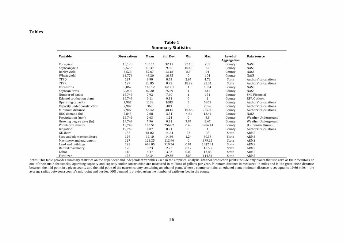
26
Tables
Table 1 Summary Statistics
Variable Observations Mean Std. Dev. Min Max Level of
Aggregation Data Source
Corn yield 10,170 136.11 32.11 22.10 203 County NASS Soybean yield 9,579 40.37 9.50 10.40 62 County NASS Barley yield 3,528 52.67 13.18 8.9 94 County NASS Wheat yield 14,776 48.20 16.85 0 104 County NASS TFPQ 127 3.90 0.63 2.67 4.72 State Authors’ calculations TFPR 127 20.85 0.73 18.92 22.31 State Authors’ calculations Corn firms 9,867 143.12 141.81 1 1034 County NASS Soybean firms 9,248 82.20 75.59 1 645 County NASS Number of banks 19,749 7.92 7.60 1 171 County SNL Financial Ethanol production plant 19,749 0.11 0.31 0 1 County RFA Outlook Operating capacity 7,907 1133 1083 5 5865 County Authors’ calculations Capacity under construction 7,907 368 483 0 2596 County Authors’ calculations Minimum distance 7,907 56.42 38.45 10.66 225.80 County Authors’ calculations DDG demand (ln) 7,845 7.08 3.54 -4.61 13.41 County NASS Precipitation (mm) 19,749 2.63 1.24 0 8.8 County Weather Underground Growing degree days (ln) 19,749 7.96 0.31 3.97 8.47 County Weather Underground Population density 19,749 106.51 256.87 0.48 3286.41 County U.S. Census Bureau Irrigation 19,749 0.07 0.21 0 1 County Authors’ calculations GE share 132 81.02 14.54 22 98 State ARMS Seed and plant expenditure 126 19.10 14.89 1.24 60.33 State ARMS Machinery and equipment 127 123.25 112.96 0 379.15 State ARMS Land and buildings 122 669.05 519.24 0.01 1812.31 State ARMS Rented machinery 120 3.23 2.23 0.12 10.58 State ARMS Labor 118 5.47 3.83 0.02 13.85 State ARMS Fertilizer 125 36.34 29.36 2.00 114.84 State ARMS
Notes: This table provides summary statistics on the dependent and independent variables used in the empirical analysis. Ethanol production plants include only plants that use corn as their feedstock or one of their main feedstocks. Operating capacity and capacity under construction are measured in millions of gallons per year. Minimum distance is measured in miles and is the great circle distance between the mid-point in a given county and the mid-point of the nearest county containing an ethanol plant. Where a county contains an ethanol plant minimum distance is set equal to 10.66 miles – the average radius between a county’s mid-point and border. DDG demand is proxied using the number of cattle on feed in the county.
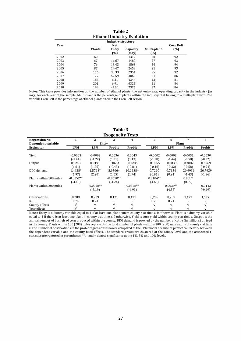
27
Table 2 Ethanol Industry Evolution
Industry structure Year Plants
Net Entry (%)
Capacity (mgy)
Multi-plant (%)
Corn Belt (%)
2002 60 1312 30 92 2003 67 11.67 1489 27 93 2004 76 13.43 1863 24 94 2005 87 14.47 2453 21 93 2006 116 33.33 2951 25 92 2007 177 52.59 3860 21 86 2008 188 6.21 4344 43 81 2009 201 6.91 6323 41 84 2010 199 -1.00 7325 37 84
Notes: This table provides information on the number of ethanol plants, the net entry rate, operating capacity in the industry (in mgy) for each year of the sample. Multi-plant is the percentage of plants within the industry that belong to a multi-plant firm. The variable Corn Belt is the percentage of ethanol plants sited in the Corn Belt region.
Table 3 Exogeneity Tests
Regression No. 1 2 3 4 5 6 7 8 Dependent variable Entry Plant Estimator LPM LPM Probit Probit LPM LPM Probit Probit Yield -0.0003 -0.0002 0.0036 0.0043 -0.0002 -0.0002 -0.0051 -0.0030 (-1.44) (-1.22) (1.21) (1.43) (-1.28) (-1.44) (-0.58) (-0.32) Output 0.0243 0.0191 -0.0654 -0.1286 -0.0055 -0.0039 -0.3882 -0.6969 (1.61) (1.25) (-0.43) (-0.81) (-0.46) (-0.32) (-0.58) (-0.94) DDG demand 1.4428* 1.5728* 8.9506+ 10.2288+ 0.7290 0.7154 -20.9939 -20.7939 (1.97) (2.20) (1.65) (1.74) (0.91) (0.91) (-1.43) (-1.36) Plants within 100 miles -0.0052** -0.0670** 0.0104** 0.0587 (-4.46) (-4.24) (4.63) (0.99) Plants within 200 miles -0.0028** -0.0358** 0.0039** -0.0143 (-5.19) (-4.93) (4.38) (-0.49) Observations 8,209 8,209 8,171 8,171 8,209 8,209 1,177 1,177 R2 0.74 0.74 - - 0.75 0.74 - - County effects √ √ √ √ √ √ √ √ Year effects √ √ √ √ √ √ √ √
Notes: Entry is a dummy variable equal to 1 if at least one plant enters county c at time t, 0 otherwise. Plant is a dummy variable equal to 1 if there is at least one plant in county c at time t, 0 otherwise. Yield is corn yield within county c at time t. Output is the annual number of bushels of corn produced within the county. DDG demand is proxied by the number of cattle (in millions) on feed in the county. Plants within 100 (200) miles represents the total number of plants within a 100 (200) mile radius of county c at time t. The number of observations in the probit regressions is lower compared to the LPM model because of perfect collinearity between the dependent variable and the county fixed effects. The standard errors are clustered at the county level and the associated t-statistics are reported in parentheses. **, * and + denote significance at the 1%, 5% and 10% levels.
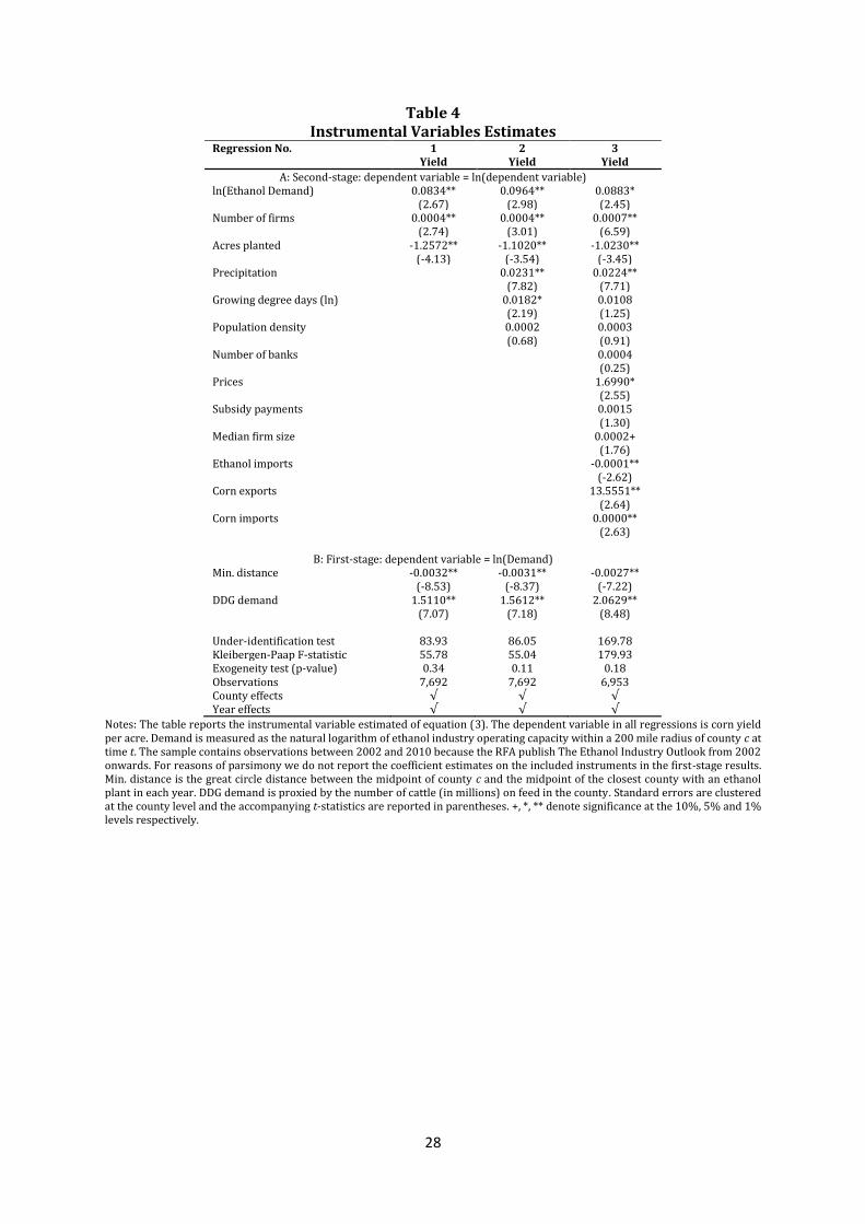
28
Table 4 Instrumental Variables Estimates
Regression No. 1 2 3 Yield Yield Yield
A: Second-stage: dependent variable = ln(dependent variable) ln(Ethanol Demand) 0.0834** 0.0964** 0.0883* (2.67) (2.98) (2.45) Number of firms 0.0004** 0.0004** 0.0007** (2.74) (3.01) (6.59) Acres planted -1.2572** -1.1020** -1.0230** (-4.13) (-3.54) (-3.45) Precipitation 0.0231** 0.0224** (7.82) (7.71) Growing degree days (ln) 0.0182* 0.0108 (2.19) (1.25) Population density 0.0002 0.0003 (0.68) (0.91) Number of banks 0.0004 (0.25) Prices 1.6990* (2.55) Subsidy payments 0.0015 (1.30) Median firm size 0.0002+ (1.76) Ethanol imports -0.0001** (-2.62) Corn exports 13.5551** (2.64) Corn imports 0.0000** (2.63)
B: First-stage: dependent variable = ln(Demand) Min. distance -0.0032** -0.0031** -0.0027** (-8.53) (-8.37) (-7.22) DDG demand 1.5110** 1.5612** 2.0629** (7.07) (7.18) (8.48) Under-identification test 83.93 86.05 169.78 Kleibergen-Paap F-statistic 55.78 55.04 179.93 Exogeneity test (p-value) 0.34 0.11 0.18 Observations 7,692 7,692 6,953 County effects √ √ √ Year effects √ √ √
Notes: The table reports the instrumental variable estimated of equation (3). The dependent variable in all regressions is corn yield per acre. Demand is measured as the natural logarithm of ethanol industry operating capacity within a 200 mile radius of county c at time t. The sample contains observations between 2002 and 2010 because the RFA publish The Ethanol Industry Outlook from 2002 onwards. For reasons of parsimony we do not report the coefficient estimates on the included instruments in the first-stage results. Min. distance is the great circle distance between the midpoint of county c and the midpoint of the closest county with an ethanol plant in each year. DDG demand is proxied by the number of cattle (in millions) on feed in the county. Standard errors are clustered at the county level and the accompanying t-statistics are reported in parentheses. +, *, ** denote significance at the 10%, 5% and 1% levels respectively.
29
Table 5 Parallel Trends Tests
Year Treatment Control Difference t-statistic
Yield2004 -2.1031 -1.1614 0.9417 0.44 (2.11) (0.29) (2.13) Yield2003 -0.3104 1.0832 1.3936 0.81 (0.33) (1.69) (1.72) Yield2002 -2.3354 -5.0169 -2.6816 -0.56 (3.69) (3.07) (4.80) Yield2001 1.8851 1.4779 -0.4072 -0.18 (1.89) (1.15) (2.21)
Notes: Yieldt denotes the annual rate of productivity change measured as ( ) ⁄ . Standard errors are reported in parentheses. Treatment is the average annual rate of productivity growth (in bushels per acre) within the treatment group. Control is the average annual rate of productivity growth (in bushels per acre) within the control group.
Table 6 Productivity Response to the Demand Shock
Regression No. 1 2 3 4 5 6 Control group Soybeans Soybeans Soybeans Soybeans Soybeans Soybeans Dependent variable Yield Yield Yield Yield TFPQ TFPR Event EPA EPA HFCS Chinese
exports EPA EPA
Corn * Treatment 6.3120** 6.7972** 0.0728* 0.1796** (8.98) (7.00) (2.48) (6.38) Corn * HFCS Treatment 10.7411** (18.97) Corn * China Treatment 0.9387 (1.19) Number of firms 0.0102 0.0140 0.0092* -0.001 0.0030 -0.0194+ (1.63) (1.56) (2.52) (-0.07) (0.27) (-1.88) Acres planted 0.0001** -0.0000 0.7264* 0.0004** -0.0826 0.6918** (3.56) (-1.05) (1.31) (7.15) (-0.63) (4.77) Observations 19,115 3,614 21,114 11,245 127 127 R2 0.98 0.99 0.96 0.97 0.99 0.99 County effects Year effects County-industry effects √ √ √ √ County-year effects √ √ √ County-period effects √ State-industry effects √ √ State-year effects √ √
Notes: The table reports estimates of equation (4). County-level data is used in regression 1, 2, 3, and 4 and state-level data from the ARMS database is used in regressions 5 and 6. The treatment used in regression 1, 2,5, and 6 is the Energy Policy Act of 2005. The treatment in regression 3 is the HFCS shock following the switch in sweetener by Coca-Cola and Pepsi. The treatment in regression 4 is the temporary withdrawal of China from the export market. In regression 3 the equation is estimated using data from 1980 to 1990. The HFCS Treatment variable is equal to one for the years 1985 to 1990, zero otherwise. In regression 4 the equation is estimated using data from 1992 to 1997. The China Treatment variable is equal to one for the years 1995 to 1997, zero otherwise. Yield is measured as bushels per acre. The standard errors are clustered at the county level in regression 1, 2, 3, and 4 and at the state level in regressions 5 and 6; the associated t-statistics are reported in parentheses.. +, *, ** denote significance at the 10%, 5% and 1% levels respectively.
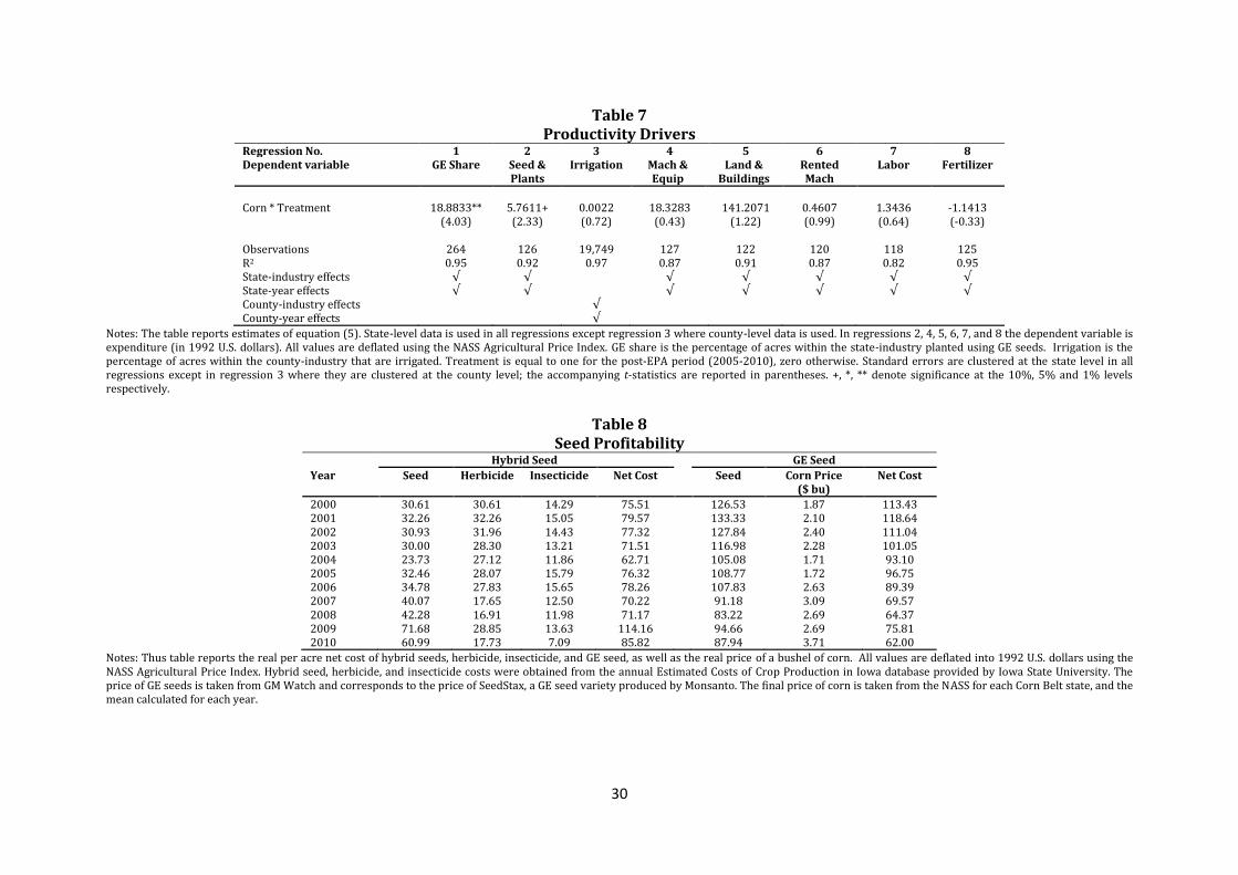
30
Table 7 Productivity Drivers
Regression No. 1 2 3 4 5 6 7 8 Dependent variable GE Share Seed &
Plants Irrigation Mach &
Equip Land &
Buildings Rented Mach
Labor Fertilizer
Corn * Treatment 18.8833** 5.7611+ 0.0022 18.3283 141.2071 0.4607 1.3436 -1.1413 (4.03) (2.33) (0.72) (0.43) (1.22) (0.99) (0.64) (-0.33) Observations 264 126 19,749 127 122 120 118 125 R2 0.95 0.92 0.97 0.87 0.91 0.87 0.82 0.95 State-industry effects √ √ √ √ √ √ √ State-year effects √ √ √ √ √ √ √ County-industry effects √ County-year effects √
Notes: The table reports estimates of equation (5). State-level data is used in all regressions except regression 3 where county-level data is used. In regressions 2, 4, 5, 6, 7, and 8 the dependent variable is expenditure (in 1992 U.S. dollars). All values are deflated using the NASS Agricultural Price Index. GE share is the percentage of acres within the state-industry planted using GE seeds. Irrigation is the percentage of acres within the county-industry that are irrigated. Treatment is equal to one for the post-EPA period (2005-2010), zero otherwise. Standard errors are clustered at the state level in all regressions except in regression 3 where they are clustered at the county level; the accompanying t-statistics are reported in parentheses. +, *, ** denote significance at the 10%, 5% and 1% levels respectively.
Table 8
Seed Profitability Hybrid Seed GE Seed
Year Seed Herbicide Insecticide Net Cost Seed Corn Price ($ bu)
Net Cost
2000 30.61 30.61 14.29 75.51 126.53 1.87 113.43 2001 32.26 32.26 15.05 79.57 133.33 2.10 118.64 2002 30.93 31.96 14.43 77.32 127.84 2.40 111.04 2003 30.00 28.30 13.21 71.51 116.98 2.28 101.05 2004 23.73 27.12 11.86 62.71 105.08 1.71 93.10 2005 32.46 28.07 15.79 76.32 108.77 1.72 96.75 2006 34.78 27.83 15.65 78.26 107.83 2.63 89.39 2007 40.07 17.65 12.50 70.22 91.18 3.09 69.57 2008 42.28 16.91 11.98 71.17 83.22 2.69 64.37 2009 71.68 28.85 13.63 114.16 94.66 2.69 75.81 2010 60.99 17.73 7.09 85.82 87.94 3.71 62.00
Notes: Thus table reports the real per acre net cost of hybrid seeds, herbicide, insecticide, and GE seed, as well as the real price of a bushel of corn. All values are deflated into 1992 U.S. dollars using the NASS Agricultural Price Index. Hybrid seed, herbicide, and insecticide costs were obtained from the annual Estimated Costs of Crop Production in Iowa database provided by Iowa State University. The price of GE seeds is taken from GM Watch and corresponds to the price of SeedStax, a GE seed variety produced by Monsanto. The final price of corn is taken from the NASS for each Corn Belt state, and the mean calculated for each year.
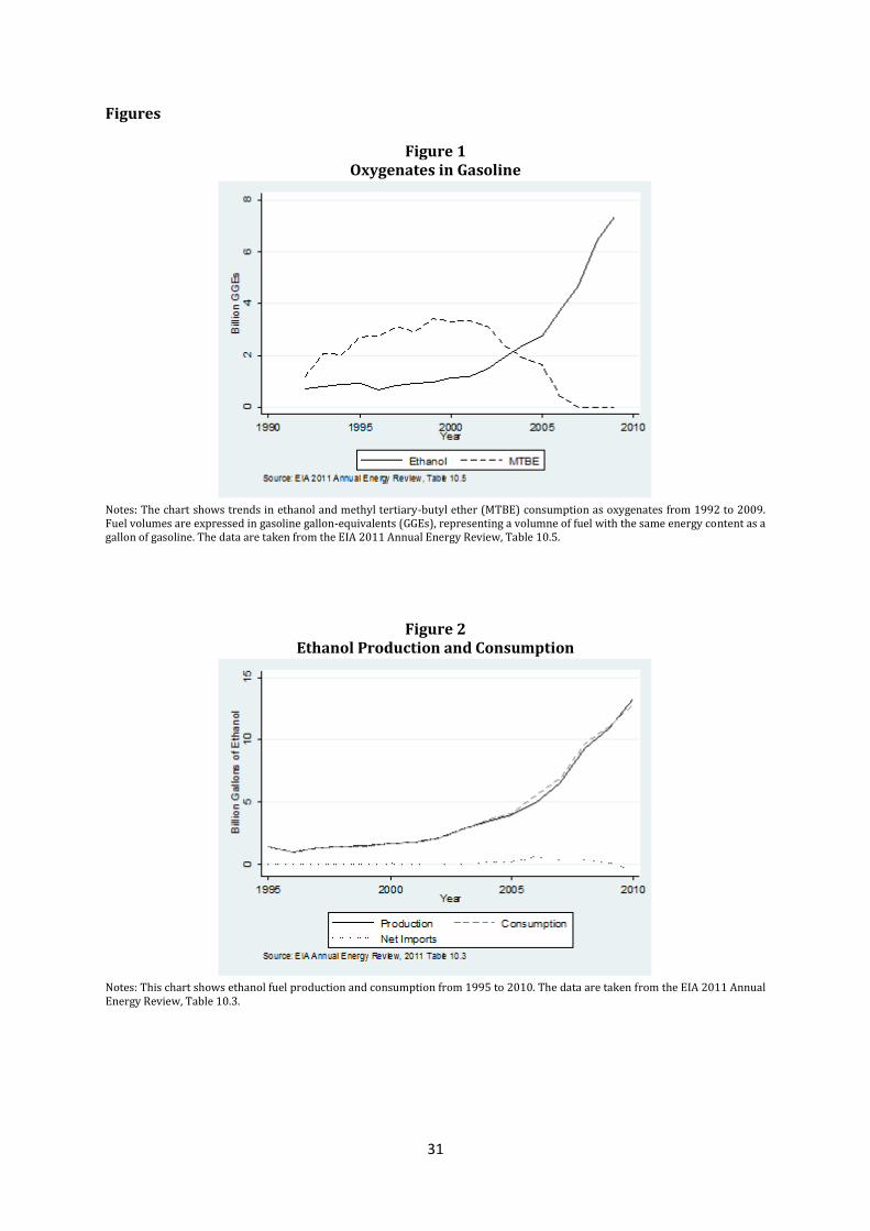
31
Figures
Figure 1 Oxygenates in Gasoline
Notes: The chart shows trends in ethanol and methyl tertiary-butyl ether (MTBE) consumption as oxygenates from 1992 to 2009. Fuel volumes are expressed in gasoline gallon-equivalents (GGEs), representing a volumne of fuel with the same energy content as a gallon of gasoline. The data are taken from the EIA 2011 Annual Energy Review, Table 10.5.
Figure 2 Ethanol Production and Consumption
Notes: This chart shows ethanol fuel production and consumption from 1995 to 2010. The data are taken from the EIA 2011 Annual Energy Review, Table 10.3.
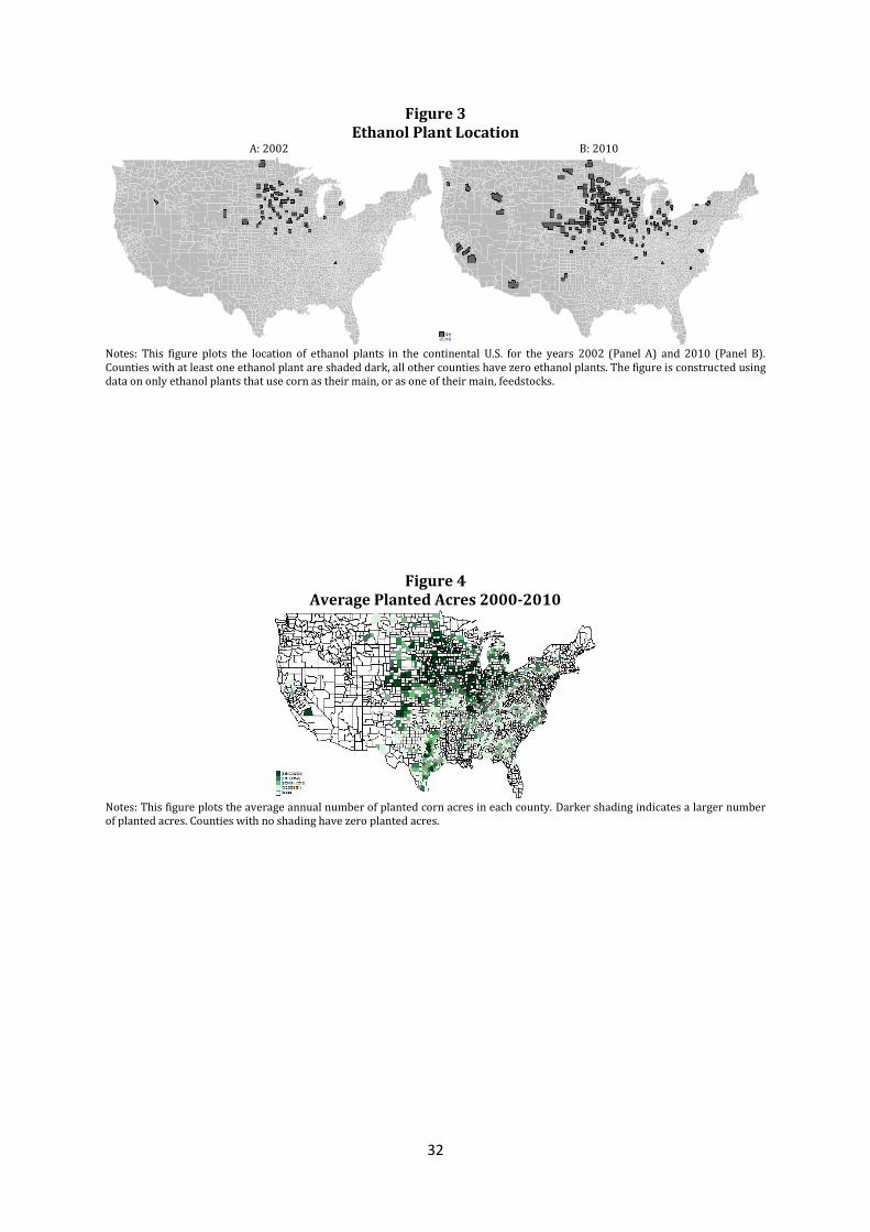
32
Figure 3 Ethanol Plant Location
A: 2002 B: 2010
Notes: This figure plots the location of ethanol plants in the continental U.S. for the years 2002 (Panel A) and 2010 (Panel B). Counties with at least one ethanol plant are shaded dark, all other counties have zero ethanol plants. The figure is constructed using data on only ethanol plants that use corn as their main, or as one of their main, feedstocks.
Figure 4 Average Planted Acres 2000-2010
Notes: This figure plots the average annual number of planted corn acres in each county. Darker shading indicates a larger number of planted acres. Counties with no shading have zero planted acres.
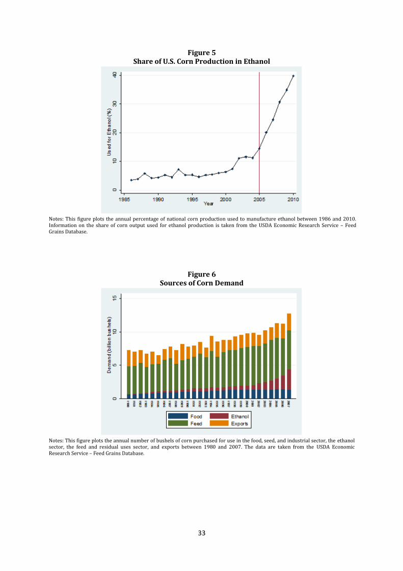
33
Figure 5 Share of U.S. Corn Production in Ethanol
Notes: This figure plots the annual percentage of national corn production used to manufacture ethanol between 1986 and 2010. Information on the share of corn output used for ethanol production is taken from the USDA Economic Research Service – Feed Grains Database.
Figure 6 Sources of Corn Demand
Notes: This figure plots the annual number of bushels of corn purchased for use in the food, seed, and industrial sector, the ethanol sector, the feed and residual uses sector, and exports between 1980 and 2007. The data are taken from the USDA Economic Research Service – Feed Grains Database.
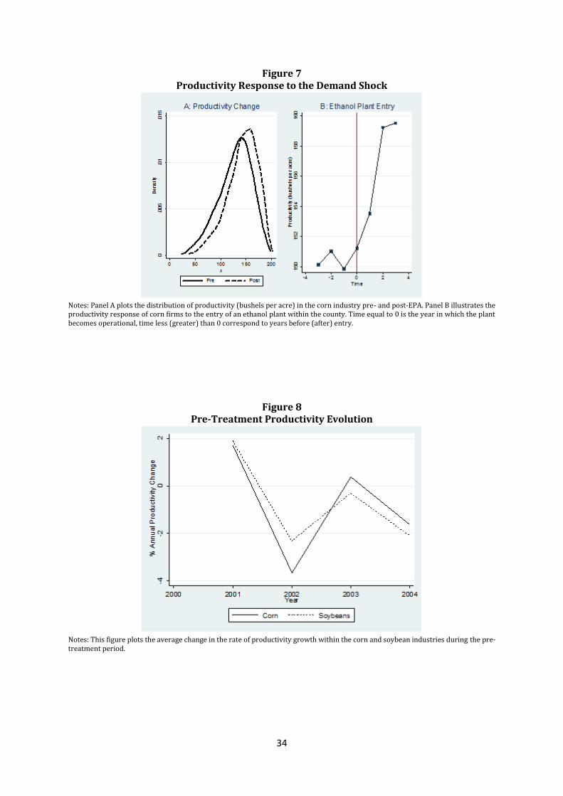
34
Figure 7 Productivity Response to the Demand Shock
Notes: Panel A plots the distribution of productivity (bushels per acre) in the corn industry pre- and post-EPA. Panel B illustrates the productivity response of corn firms to the entry of an ethanol plant within the county. Time equal to 0 is the year in which the plant becomes operational, time less (greater) than 0 correspond to years before (after) entry.
Figure 8 Pre-Treatment Productivity Evolution
Notes: This figure plots the average change in the rate of productivity growth within the corn and soybean industries during the pre-treatment period.
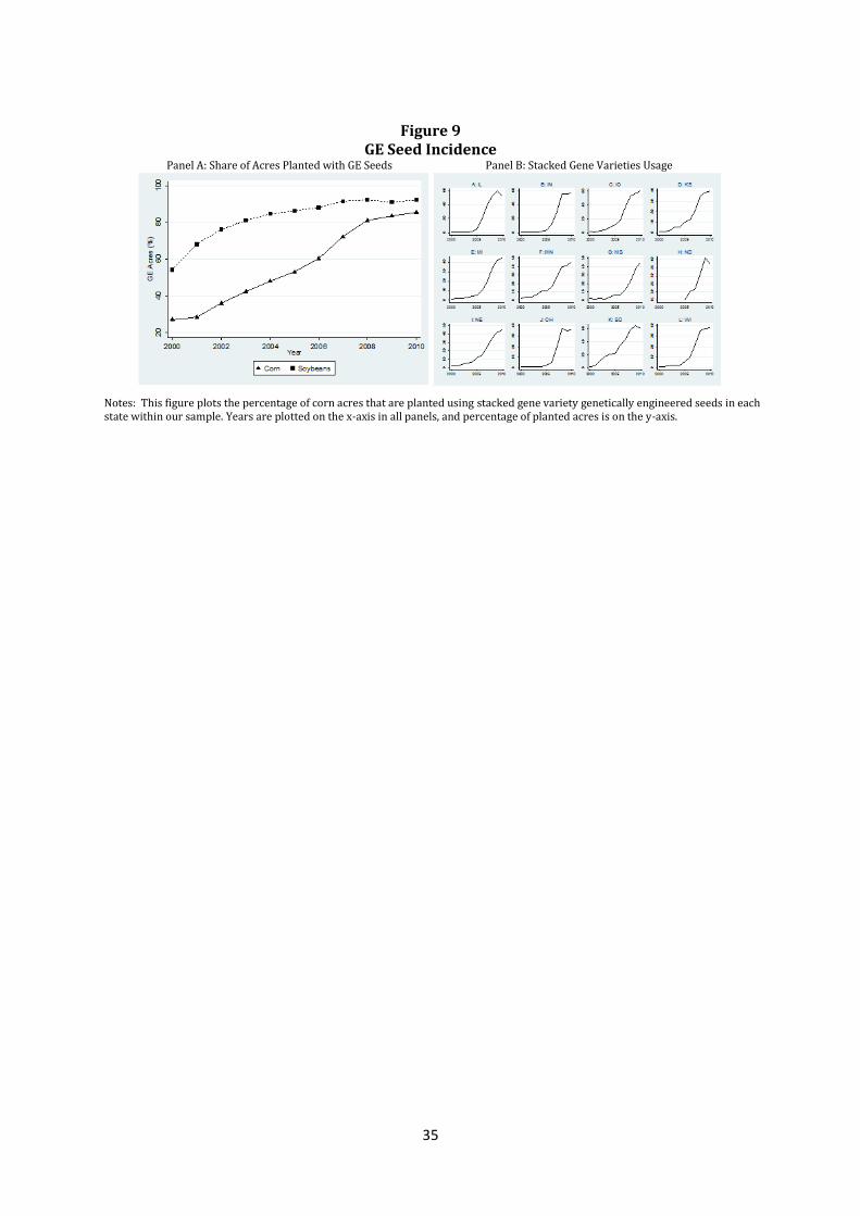
35
Figure 9
GE Seed Incidence Panel A: Share of Acres Planted with GE Seeds Panel B: Stacked Gene Varieties Usage
Notes: This figure plots the percentage of corn acres that are planted using stacked gene variety genetically engineered seeds in each state within our sample. Years are plotted on the x-axis in all panels, and percentage of planted acres is on the y-axis.
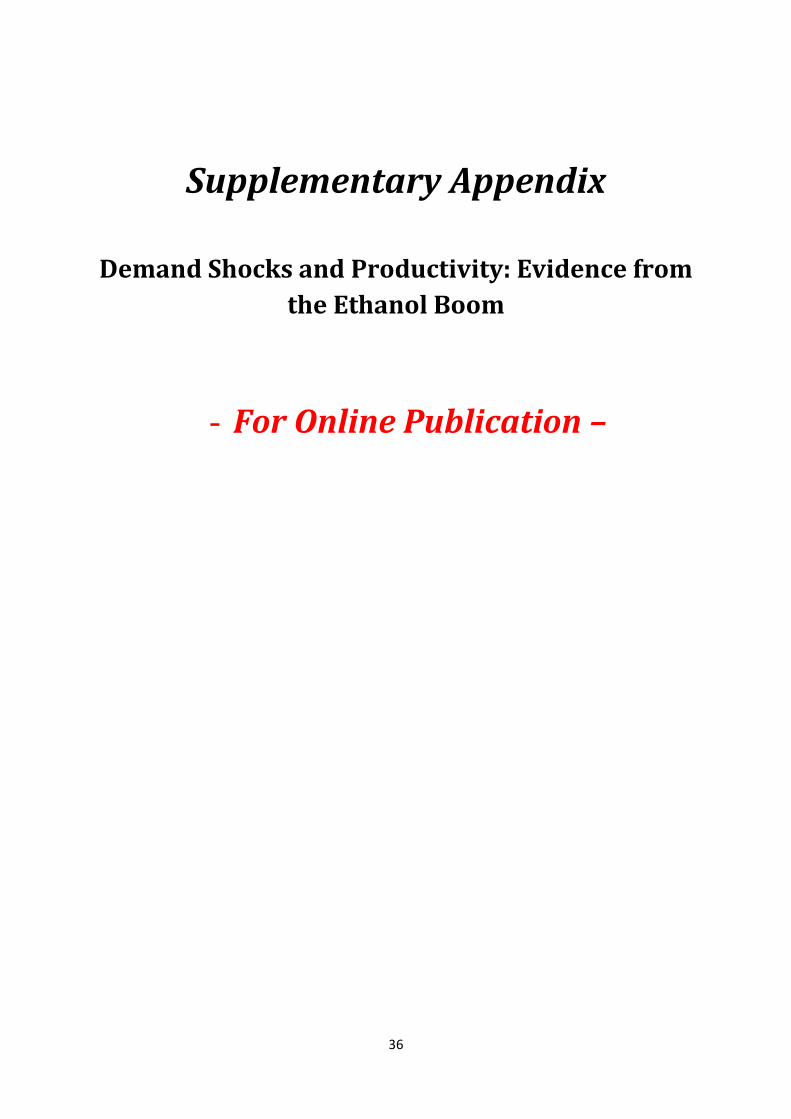
36
Supplementary Appendix
Demand Shocks and Productivity: Evidence from
the Ethanol Boom
- For Online Publication –
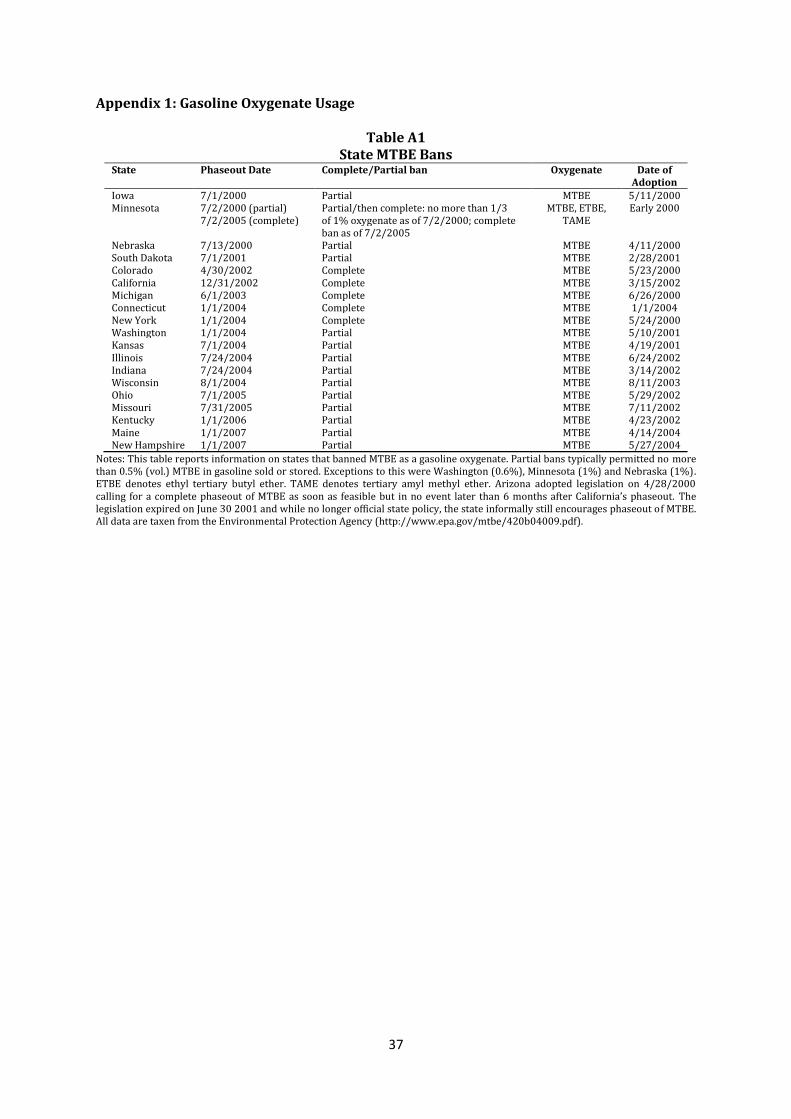
37
Appendix 1: Gasoline Oxygenate Usage
Table A1 State MTBE Bans
State Phaseout Date Complete/Partial ban Oxygenate Date of Adoption
Iowa 7/1/2000 Partial MTBE 5/11/2000 Minnesota 7/2/2000 (partial) Partial/then complete: no more than 1/3 MTBE, ETBE, Early 2000 7/2/2005 (complete) of 1% oxygenate as of 7/2/2000; complete TAME ban as of 7/2/2005 Nebraska 7/13/2000 Partial MTBE 4/11/2000 South Dakota 7/1/2001 Partial MTBE 2/28/2001 Colorado 4/30/2002 Complete MTBE 5/23/2000 California 12/31/2002 Complete MTBE 3/15/2002 Michigan 6/1/2003 Complete MTBE 6/26/2000 Connecticut 1/1/2004 Complete MTBE 1/1/2004 New York 1/1/2004 Complete MTBE 5/24/2000 Washington 1/1/2004 Partial MTBE 5/10/2001 Kansas 7/1/2004 Partial MTBE 4/19/2001 Illinois 7/24/2004 Partial MTBE 6/24/2002 Indiana 7/24/2004 Partial MTBE 3/14/2002 Wisconsin 8/1/2004 Partial MTBE 8/11/2003 Ohio 7/1/2005 Partial MTBE 5/29/2002 Missouri 7/31/2005 Partial MTBE 7/11/2002 Kentucky 1/1/2006 Partial MTBE 4/23/2002 Maine 1/1/2007 Partial MTBE 4/14/2004 New Hampshire 1/1/2007 Partial MTBE 5/27/2004
Notes: This table reports information on states that banned MTBE as a gasoline oxygenate. Partial bans typically permitted no more than 0.5% (vol.) MTBE in gasoline sold or stored. Exceptions to this were Washington (0.6%), Minnesota (1%) and Nebraska (1%). ETBE denotes ethyl tertiary butyl ether. TAME denotes tertiary amyl methyl ether. Arizona adopted legislation on 4/28/2000 calling for a complete phaseout of MTBE as soon as feasible but in no event later than 6 months after California’s phaseout. The legislation expired on June 30 2001 and while no longer official state policy, the state informally still encourages phaseout of MTBE. All data are taxen from the Environmental Protection Agency (http://www.epa.gov/mtbe/420b04009.pdf).
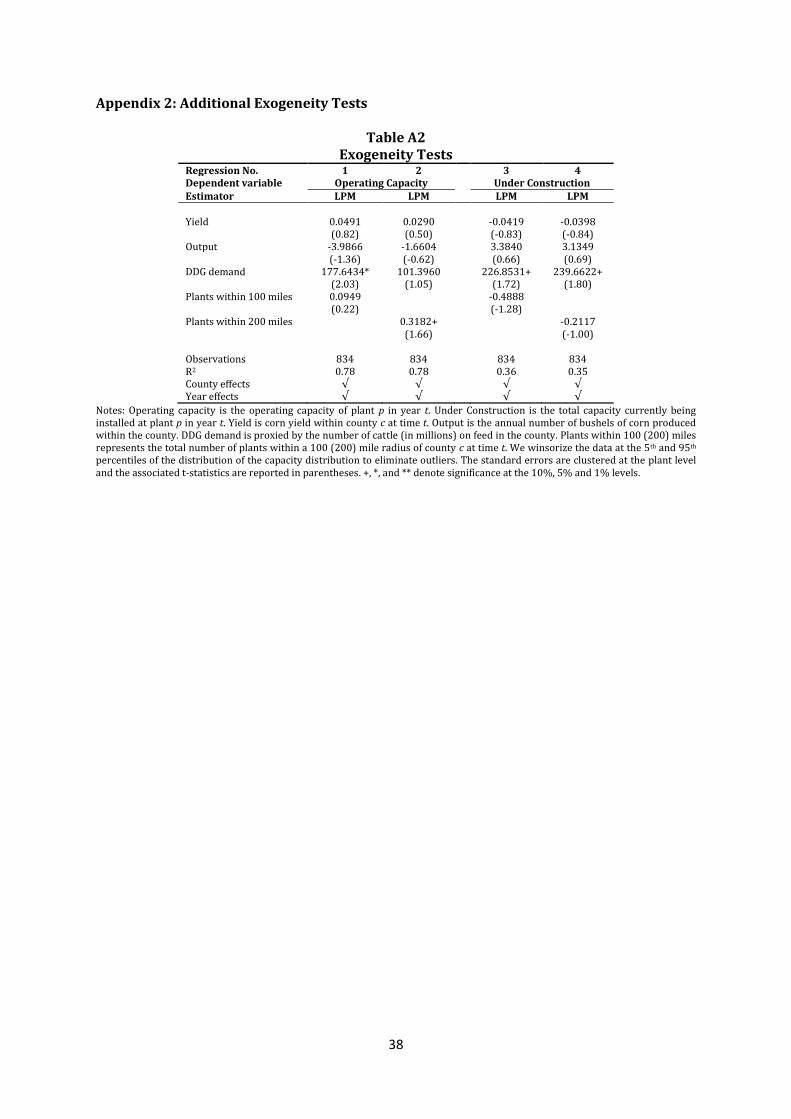
38
Appendix 2: Additional Exogeneity Tests
Table A2 Exogeneity Tests
Regression No. 1 2 3 4 Dependent variable Operating Capacity Under Construction Estimator LPM LPM LPM LPM Yield 0.0491 0.0290 -0.0419 -0.0398 (0.82) (0.50) (-0.83) (-0.84) Output -3.9866 -1.6604 3.3840 3.1349 (-1.36) (-0.62) (0.66) (0.69) DDG demand 177.6434* 101.3960 226.8531+ 239.6622+ (2.03) (1.05) (1.72) (1.80) Plants within 100 miles 0.0949 -0.4888 (0.22) (-1.28) Plants within 200 miles 0.3182+ -0.2117 (1.66) (-1.00) Observations 834 834 834 834 R2 0.78 0.78 0.36 0.35 County effects √ √ √ √ Year effects √ √ √ √
Notes: Operating capacity is the operating capacity of plant p in year t. Under Construction is the total capacity currently being installed at plant p in year t. Yield is corn yield within county c at time t. Output is the annual number of bushels of corn produced within the county. DDG demand is proxied by the number of cattle (in millions) on feed in the county. Plants within 100 (200) miles represents the total number of plants within a 100 (200) mile radius of county c at time t. We winsorize the data at the 5th and 95th percentiles of the distribution of the capacity distribution to eliminate outliers. The standard errors are clustered at the plant level and the associated t-statistics are reported in parentheses. +, *, and ** denote significance at the 10%, 5% and 1% levels.
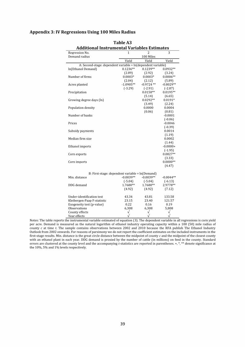
39
Appendix 3: IV Regressions Using 100 Miles Radius
Table A3 Additional Instrumental Variables Estimates
Regression No. 1 2 3 Demand radius 100 Miles
Yield Yield Yield
A: Second-stage: dependent variable = ln(dependent variable) ln(Ethanol Demand) 0.1236** 0.1239** 0.0932** (2.89) (2.92) (3.24) Number of firms 0.0003* 0.0003* 0.0006** (2.04) (2.12) (5.89) Acres planted -1.0905** -0.9724 ** -0.8029** (-3.29) (-2.91) (-2.87) Precipitation 0.0158** 0.0195** (5.14) (6.65) Growing degree days (ln) 0.0292** 0.0191* (3.49) (2.24) Population density 0.0000 0.0004 (0.06) (0.81) Number of banks -0.0001 (-0.06) Prices -0.0046 (-0.39) Subsidy payments 0.0014 (1.19) Median firm size 0.0002 (1.44) Ethanol imports -0.0000+ (-1.95) Corn exports 0.0827** (3.33) Corn imports 0.0000** (4.47)
B: First-stage: dependent variable = ln(Demand) Min. distance -0.0039** -0.0039** -0.0044** (-5.04) (-5.04) (-6.13) DDG demand 1.7680** 1.7680** 2.9778** (4.92) (4.92) (7.12) Under-identification test 43.34 43.81 133.58 Kleibergen-Paap F-statistic 23.15 23.40 121.57 Exogeneity test (p-value) 0.22 0.16 0.19 Observations 6,308 6,308 5,808 County effects √ √ √ Year effects √ √ √
Notes: The table reports the instrumental variable estimated of equation (3). The dependent variable in all regressions is corn yield per acre. Demand is measured as the natural logarithm of ethanol industry operating capacity within a 100 (50) mile radius of county c at time t. The sample contains observations between 2002 and 2010 because the RFA publish The Ethanol Industry Outlook from 2002 onwards. For reasons of parsimony we do not report the coefficient estimates on the included instruments in the first-stage results. Min. distance is the great circle distance between the midpoint of county c and the midpoint of the closest county with an ethanol plant in each year. DDG demand is proxied by the number of cattle (in millions) on feed in the county. Standard errors are clustered at the county level and the accompanying t-statistics are reported in parentheses. +, *, ** denote significance at the 10%, 5% and 1% levels respectively.
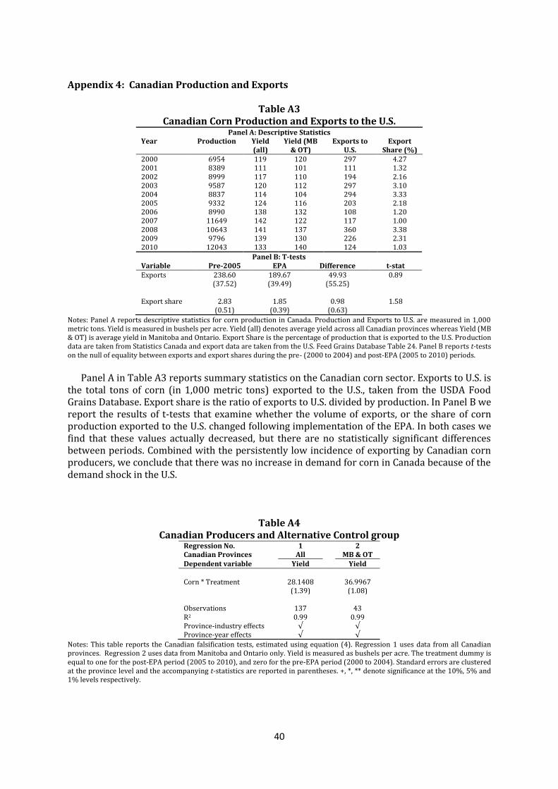
40
Appendix 4: Canadian Production and Exports
Table A3 Canadian Corn Production and Exports to the U.S.
Panel A: Descriptive Statistics Year Production
Yield (all)
Yield (MB & OT)
Exports to U.S.
Export Share (%)
2000 6954 119 120 297 4.27 2001 8389 111 101 111 1.32 2002 8999 117 110 194 2.16 2003 9587 120 112 297 3.10 2004 8837 114 104 294 3.33 2005 9332 124 116 203 2.18 2006 8990 138 132 108 1.20 2007 11649 142 122 117 1.00 2008 10643 141 137 360 3.38 2009 9796 139 130 226 2.31 2010 12043 133 140 124 1.03
Panel B: T-tests Variable Pre-2005 EPA Difference t-stat Exports 238.60 189.67 49.93 0.89 (37.52) (39.49) (55.25) Export share 2.83 1.85 0.98 1.58 (0.51) (0.39) (0.63)
Notes: Panel A reports descriptive statistics for corn production in Canada. Production and Exports to U.S. are measured in 1,000 metric tons. Yield is measured in bushels per acre. Yield (all) denotes average yield across all Canadian provinces whereas Yield (MB & OT) is average yield in Manitoba and Ontario. Export Share is the percentage of production that is exported to the U.S. Production data are taken from Statistics Canada and export data are taken from the U.S. Feed Grains Database Table 24. Panel B reports t-tests on the null of equality between exports and export shares during the pre- (2000 to 2004) and post-EPA (2005 to 2010) periods.
Panel A in Table A3 reports summary statistics on the Canadian corn sector. Exports to U.S. is the total tons of corn (in 1,000 metric tons) exported to the U.S., taken from the USDA Food Grains Database. Export share is the ratio of exports to U.S. divided by production. In Panel B we report the results of t-tests that examine whether the volume of exports, or the share of corn production exported to the U.S. changed following implementation of the EPA. In both cases we find that these values actually decreased, but there are no statistically significant differences between periods. Combined with the persistently low incidence of exporting by Canadian corn producers, we conclude that there was no increase in demand for corn in Canada because of the demand shock in the U.S.
Table A4 Canadian Producers and Alternative Control group
Regression No. 1 2 Canadian Provinces All MB & OT Dependent variable Yield Yield
Corn * Treatment 28.1408 36.9967 (1.39) (1.08) Observations 137 43 R2 0.99 0.99 Province-industry effects √ √ Province-year effects √ √
Notes: This table reports the Canadian falsification tests, estimated using equation (4). Regression 1 uses data from all Canadian provinces. Regression 2 uses data from Manitoba and Ontario only. Yield is measured as bushels per acre. The treatment dummy is equal to one for the post-EPA period (2005 to 2010), and zero for the pre-EPA period (2000 to 2004). Standard errors are clustered at the province level and the accompanying t-statistics are reported in parentheses. +, *, ** denote significance at the 10%, 5% and 1% levels respectively.
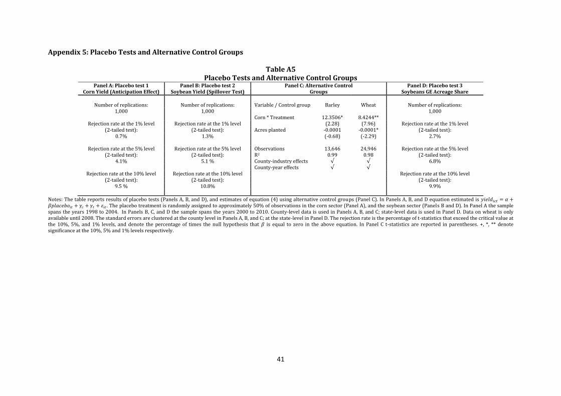
41
Appendix 5: Placebo Tests and Alternative Control Groups
Table A5 Placebo Tests and Alternative Control Groups
Panel A: Placebo test 1 Panel B: Placebo test 2 Panel C: Alternative Control Groups
Panel D: Placebo test 3 Corn Yield (Anticipation Effect) Soybean Yield (Spillover Test) Soybeans GE Acreage Share
Number of replications: Number of replications: Variable / Control group Barley Wheat Number of replications:
1,000 1,000 1,000 Corn * Treatment 12.3506* 8.4244**
Rejection rate at the 1% level Rejection rate at the 1% level (2.28) (7.96) Rejection rate at the 1% level (2-tailed test): (2-tailed test): Acres planted -0.0001 -0.0001* (2-tailed test):
0.7% 1.3% (-0.68) (-2.29) 2.7%
Rejection rate at the 5% level Rejection rate at the 5% level Observations 13,646 24,946 Rejection rate at the 5% level (2-tailed test): (2-tailed test): R2 0.99 0.98 (2-tailed test):
4.1% 5.1 % County-industry effects √ √ 6.8% County-year effects √ √
Rejection rate at the 10% level Rejection rate at the 10% level Rejection rate at the 10% level (2-tailed test): (2-tailed test): (2-tailed test):
9.5 % 10.8% 9.9%
Notes: The table reports results of placebo tests (Panels A, B, and D), and estimates of equation (4) using alternative control groups (Panel C). In Panels A, B, and D equation estimated is . The placebo treatment is randomly assigned to approximately 50% of observations in the corn sector (Panel A), and the soybean sector (Panels B and D). In Panel A the sample spans the years 1998 to 2004. In Panels B, C, and D the sample spans the years 2000 to 2010. County-level data is used in Panels A, B, and C; state-level data is used in Panel D. Data on wheat is only available until 2008. The standard errors are clustered at the county level in Panels A, B, and C; at the state-level in Panel D. The rejection rate is the percentage of t-statistics that exceed the critical value at the 10%, 5%, and 1% levels, and denote the percentage of times the null hypothesis that is equal to zero in the above equation. In Panel C t-statistics are reported in parentheses. +, *, ** denote significance at the 10%, 5% and 1% levels respectively.