Embed Size (px)
Citation preview
2 Descriptive Statistics
LEARNING OBJECTIVES• Types of data 000• Visual descriptive statistics 000• Numerical descriptive statistics 000• Descriptive spatial statistics 000• Angular data 000
In Chapter 1, a fundamental distinction was drawn between descriptive and inferentialstatistics. We saw that describing data constitutes an important early phase of thescientific method. In this chapter, we will focus upon visual and numerical descrip-tive summaries of data.
In this chapter, we will begin by describing different types of data and by cover-ing some of the visual approaches that are commonly used to explore and describedata. Following this, numerical measures of description are reviewed. Finally, visualand numerical description is discussed for the special context of spatial data.
2.1 Types of Data
Data may be classified as nominal, ordinal, interval, or ratio. Nominal data areobservations that have been placed into a set of mutually exclusive and collectivelyexhaustive categories. Examples of nominal data include soil type and vegetationtype. Ordinal data consist of observations that are ranked. Thus it is possible to saythat one observation is greater than (or less than) another, but with this muchinformation, it is not possible to say by how much an observation is greater or lessthan another. It is not uncommon to find ordinal data in almanacs and statisticalabstracts; examples include data on the size of cities, by rank.
When it is possible to say by how much one observation is greater or less thananother, data are either interval or ratio. With interval data, differences in valuesare identifiable. For example, on the Fahrenheit temperature scale, 44 degrees is12 degrees warmer than 32 degrees. However, the “zero” is not meaningful onthe interval scale, and consequently ratio interpretations are not possible. Thus44 degrees is not “twice as warm” as 22 degrees. Ratio data, on the other hand, does
AQ changedfrom 10 –OK?
02-Rogerson-3333-02.qxd 9/14/2005 7:07 PM Page 23
24 STATISTICAL METHODS FOR GEOGRAPHY
have a meaningful zero. Thus 100 degrees Kelvin is twice as warm as 50 degreesKelvin. Most numerical data are ratio data – indeed it is difficult to think of exam-ples for interval data other than the Fahrenheit scale.
Data may consist of values that are either discrete or continuous. Discrete vari-ables take on only a finite set of values – examples include the number of sunnydays in a year, the annual number of visits by a family to a local public facility, andthe monthly number of collisions between automobiles and deer in a region.Continuous variables take on an infinite number of values; examples include tem-perature and elevation.
2.2 Visual Descriptive Methods
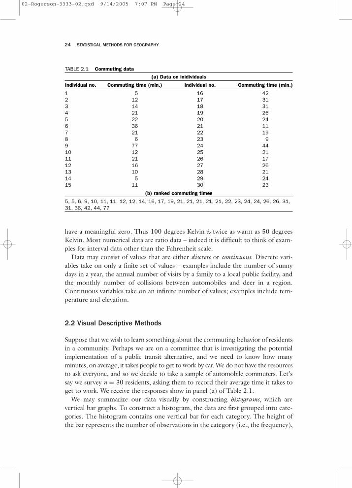
Suppose that we wish to learn something about the commuting behavior of residentsin a community. Perhaps we are on a committee that is investigating the potentialimplementation of a public transit alternative, and we need to know how manyminutes, on average, it takes people to get to work by car. We do not have the resourcesto ask everyone, and so we decide to take a sample of automobile commuters. Let’ssay we survey n = 30 residents, asking them to record their average time it takes toget to work. We receive the responses show in panel (a) of Table 2.1.
We may summarize our data visually by constructing histograms, which arevertical bar graphs. To construct a histogram, the data are first grouped into cate-gories. The histogram contains one vertical bar for each category. The height ofthe bar represents the number of observations in the category (i.e., the frequency),
TABLE 2.1 Commuting data
(a) Data on inidividuals
Individual no. Commuting time (min.) Individual no. Commuting time (min.)
1 5 16 422 12 17 313 14 18 314 21 19 265 22 20 246 36 21 117 21 22 198 6 23 99 77 24 4410 12 25 2111 21 26 1712 16 27 2613 10 28 2114 5 29 2415 11 30 23
(b) ranked commuting times
5, 5, 6, 9, 10, 11, 11, 12, 12, 14, 16, 17, 19, 21, 21, 21, 21, 21, 22, 23, 24, 24, 26, 26, 31,31, 36, 42, 44, 77
02-Rogerson-3333-02.qxd 9/14/2005 7:07 PM Page 24
DESCRIPTIVE STATISTICS 25
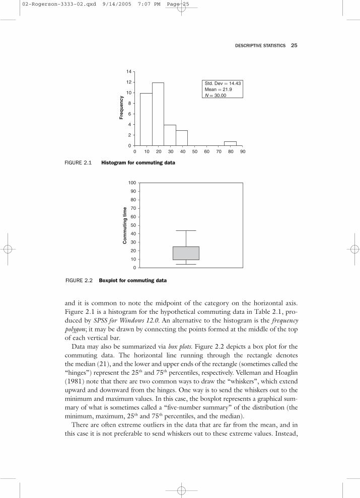
and it is common to note the midpoint of the category on the horizontal axis.Figure 2.1 is a histogram for the hypothetical commuting data in Table 2.1, pro-duced by SPSS for Windows 12.0. An alternative to the histogram is the frequencypolygon; it may be drawn by connecting the points formed at the middle of the topof each vertical bar.
Data may also be summarized via box plots. Figure 2.2 depicts a box plot for thecommuting data. The horizontal line running through the rectangle denotesthe median (21), and the lower and upper ends of the rectangle (sometimes called the“hinges”) represent the 25th and 75th percentiles, respectively. Velleman and Hoaglin(1981) note that there are two common ways to draw the “whiskers”, which extendupward and downward from the hinges. One way is to send the whiskers out to theminimum and maximum values. In this case, the boxplot represents a graphical sum-mary of what is sometimes called a “five-number summary” of the distribution (theminimum, maximum, 25th and 75th percentiles, and the median).
There are often extreme outliers in the data that are far from the mean, and inthis case it is not preferable to send whiskers out to these extreme values. Instead,
0 10 20 30 40 50 60 70 80 900
2
4
6
8
10
12
14
Fre
qu
ency
Std. Dev = 14.43Mean = 21.9N = 30.00
FIGURE 2.1 Histogram for commuting data
Co
mm
uti
ng
tim
e
0
10
20
30
40
50
60
70
80
90
100
FIGURE 2.2 Boxplot for commuting data
02-Rogerson-3333-02.qxd 9/14/2005 7:07 PM Page 25
26 STATISTICAL METHODS FOR GEOGRAPHY
FIGURE 2.3 Stem-and-leaf plot for commuting data
Frequency Steam & Leaf
.00 0 .4.00 0 . 55696.00 1 . 0112243.00 1 . 6799.00 2 . 1111123442.00 2 . 662.00 3 . 111.00 3 . 62.00 4 . 241.00 Extremes > =77)Stem width: 10.00Each leaf: 1 case(s)
whiskers are sent out to the outermost observations, which are still within 1.5times the interquartile range of the hinge. All other observations beyond this areconsidered outliers, and are shown individually. In the commuting data, 1.5 timesthe interquartile range is equal to 1.5(14.25) = 21.375. The whisker extendingdownward from the lower hinge extends to the minimum value of 5, since thisis greater than the lower hinge (11.75) minus 21.375. The whisker extendingupward from the upper hinge stops at 44, which is the highest observation lessthan 47.375 (which in turn is equal to the upper hinge (26) plus 21.375). Notethat there is a single outlier – observation 9 – and it has a value of 77 minutes.
A stem-and-leaf plot is an alternative way to show how common observations are.It is similar to a histogram tilted onto its side, with the actual digits of each obser-vation’s value used in place of bars. John Tukey, the designer of the stem-and-leafplot, has said, “If we are going to make a mark, it may as well be a meaningful one.The simplest – and most useful – meaningful mark is a digit.” (Tukey, 1972, p. 269).
For the commuting data, which have at most two-digit values, the first digit isthe “stem”, and the second is the “leaf” (see Figure 2.3).
To give another example, consider school district administrators, who often takecensuses of the number of school-age children in their district, so that they may
TABLE 2.2
Number of children Absolute frequency
0 1001 2002 3003 1004+ 50Total 7506 307 88 89 310 1
02-Rogerson-3333-02.qxd 9/14/2005 7:07 PM Page 26
DESCRIPTIVE STATISTICS 27
form hopefully accurate estimates of future enrollment. Table 2.2 gives the hypo-thetical responses of 750 households when asked how many school-age childrenare co-residents.
The absolute frequencies may be translated into relative frequencies by dividingby the total number of observations (in this case, 750). Table 2.3 reveals, forexample, that 26.7% of all households surveyed had one child. Note that the sumof the relative frequencies is equal to one. Note also that we can easily construct afrequency polygon using the relative frequencies instead of the absolute frequen-cies (see Figure 2.4); this frequency polygon in panel (b) has precisely the sameshape as that in panel (a); the vertical scale has just been changed by a factor equalto the sample size of 750.
2.3 Measures of Central Tendency
We may continue our numerical descriptive analysis of the data in Table 2.1 bysummarizing the information numerically. The sample mean commuting time issimply the average of our observations; it is found by adding all of the individualresponses and dividing by 30. The sample mean is traditionally denoted by x–;in our example we have x– = 21.93 minutes. In practice, this could sensibly berounded to 22 minutes. We can use notation to state more formally that the meanis the sum of the observations, divided by the number of observations:
where xi denotes the value of observation i, and where there are n observations. (Fora review of mathematical conventions and mathematical notation, see Appendix B.)
The median time is defined as the time that splits the ranked list of commutingtimes in half – half of all respondents have commutes that are longer than the
0 1 2 3 4+(a)
300
200
100
0 1 2 3 4+(b)
.400
.267
.133
FIGURE 2.4 Number of children in households: (a) absolute frequency; (b) relativefrequency
x =∑n
i=1 xi
n, (2.1)
02-Rogerson-3333-02.qxd 9/14/2005 7:07 PM Page 27

28 STATISTICAL METHODS FOR GEOGRAPHY
median, and half have commutes that are shorter. When the number of observa-tions is odd, the median is simply equal to the middle value on a list of the obser-vations, ranked from shortest commute to longest commute. When the number ofobservations is even, as it is here, we take the median to be the average of the twovalues in the middle of the ranked list. When the responses are ranked as in panel(b) of Table 2.1, the two in the middle are 21 and 21. The median in this case isequal to 21 minutes. The mode is defined as the most frequently occurring value;here the mode is also 21 minutes, since it occurs more frequently (four times) thanany other outcome.
Many variables have distributions where a small number of high values cause themean to be much larger than the median; this is true for income distributions anddistance distributions. For example, Rogerson et al. (1993) used the US NationalSurvey of Families and Households to study the distance that adult children livedfrom their parents. For adult children with both parents alive and living together,the mean distance to parents is over 200 miles, and yet the median distance is only25 miles! Because the mean is not representative of the data in circumstances suchas these, it is common to use the median as a measure of central tendency.
Grouped means may be calculated when data are available only for categories.This is achieved by assuming that all of the data within a particular category takeon the midpoint value of the category. For example, Table 2.4 portrays somehypothetical data on income (units have been deliberately omitted to keep theexample location-free!).
The grouped mean is found by assuming that the ten individuals in the firstcategory have an income of 7500 (the midpoint of the category), the 20 individ-uals in the second category each have an income of 25,000, the 30 individuals inthe next category each have an income of 45,000, and those in the final categoryeach have an income of 77,500. All of these individual values are added, and the
TABLE 2.3
Number of children Absolute frequency Relative frequency
0 100 100/750 = .1331 200 200/750 = .2662 300 300/750 = .4003 100 100/750 = .1334+ 50 50/750 = .067Total 750
TABLE 2.4
Income Frequency (Number of individuals)
< 15,000 1015,000–34,999 2035,000–54,999 3055,000–99,999 15
02-Rogerson-3333-02.qxd 9/14/2005 7:07 PM Page 28
DESCRIPTIVE STATISTICS 29
result is divided by the number of individuals. Thus the grouped mean for thisexample is
More formally,
where xi– denotes the grouped mean, G is the number of groups, fi is the number
of observations in group i, and xi,mid denotes the value of the midpoint of thegroup.
It is not uncommon to find that the last category is open-ended; instead of the55,000–99,999 category, it might be more common for data to be reported in acategory labeled “55,000 and above”. In this case, an educated estimate of theaverage salary for those in this group should be made. It would also be useful tomake a number of such estimates, to see how sensitive the grouped mean was todifferent choices for the estimate.
2.4 Measures of Variability
We may also summarize the data by characterizing its variability. The commutingdata in Table 2.1 range from a low of 5 minutes to a high of 77 minutes. The rangeis the difference between the two values – here it is equal to 77 − 5 = 72 minutes.
The interquartile range is the difference between the 25th and 75th percentiles,and hence can be thought of as the middle half of the data. With n observations,the 25th percentile is represented by observation (n + 1)/4, when the data havebeen ranked from lowest to highest. The 75th percentile is represented by obser-vation 3(n + 1)/4. These will often not be integers, and interpolation is used, justas it is for the median when there is an even number of observations. For the com-muting data, the 25th percentile is represented by observation (30 + 1)/4 = 7.75.Interpolation between the 7th and 8th lowest observations requires that we go 3/4of the way from the 7th lowest observation (which is 11) to the 8th lowest obser-vation (which is 12). This implies that the 25th percentile is 11.75. Similarly, the75th percentile is represented by observation 3(30 + 1)/4 = 23.25. Since both the23rd and 24th observations are both equal to 26, the 75th percentile is equal to 26.The interquartile range is the difference between these two percentiles, or26 − 11.75 = 14.25.
The sample variance of the data (denoted s 2) may be thought of as the averagesquared deviation of the observations from the mean. To ensure that the samplevariance gives an unbiased estimate of the true, unknown variance of the population
xg =∑G
i=1 fixi,mid∑Gi=1 fi
, (2.3)
10(7,500) + 20(25,000) + 30(45,000) + 15(77,500)
10 + 20 + 30 + 15= 41,167. (2.2)
02-Rogerson-3333-02.qxd 9/14/2005 7:07 PM Page 29
from which the sample was drawn (denoted σ2), s2 is computed by taking the sumof the squared deviations, and then dividing by n − 1, instead of by n. Here theterm unbiased implies that if we were to repeat this sampling many times, wewould find that the average or mean of our many sample variances would be equalto the true variance. Thus the sample variance is found by taking the sum ofsquared deviations from the mean, and then dividing by n − 1:
An approximate interpretation of the variance is that it represents the averagesquared deviation of an observation from the mean (it is an approximate interpre-tation, because n − 1, instead of n, is used in the denominator).
In our example, s 2 = 208.13. The sample standard deviation is equal to thesquare root of the sample variance; here we have s = √208.13 = 14.43. Since thesample variance characterizes the average squared deviation from the mean, bytaking the square root and using the standard deviation, we are putting the mea-sure of variability back on a scale closer to that used for the mean and the originaldata. It is not quite correct to say that the standard deviation is the average absolutedeviation of an observation from the mean, but it is close to correct.
Variances for grouped data are found by assuming that all observations are atthe midpoint of their category, and are based on the sum of squared deviations ofthese midpoint values from the grouped mean:
Thus for the data in Table 2.4, the grouped variance is
The square root of this, 22,301, is the grouped standard deviation.
2.5 Other Numerical Measures for Describing Data
2.5.1 Coefficient of Variation
Consider the selling price of homes in two communities. In community A, the meanprice is 150,000 (units are deliberately omitted, so that the illustration may apply to
30 STATISTICAL METHODS FOR GEOGRAPHY
s2 =∑n
i=1 (xi − x)2
n − 1. (2.4)
s2g =
∑Gi=1 fi(xi,mid − xg)
2
(∑G
i=1 fi) − 1, (2.5)
10(7,500 − 41,167)2 + 20(25,000 − 41,167)2+30(45,000 − 41,167)2 + 15(77,500 − 41,167)2
(10 + 20 + 30 + 15) − 1= 4.97356 ∗ 108 (2.6)
02-Rogerson-3333-02.qxd 9/14/2005 7:07 PM Page 30
DESCRIPTIVE STATISTICS 31
more than one unit of currency!). The standard deviation is 75,000. In communityB, the mean selling price is 80,000, and the standard deviation is 60,000.
The standard deviation is an absolute measure of variability; in this example, suchvariability is clearly lower in community B. However, it is also useful to think in termsof relative variability. Relative to its mean, the variability in community B is greaterthan that in community A. More specifically, the coefficient of variation is defined asthe ratio of the standard deviation to the mean. Here the coefficient of variation incommunity A is 75,000/150,000 = 0.5; in community B it is 60,000/80,000 = 0.75.
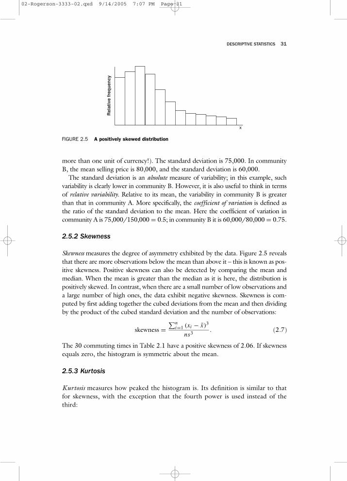
2.5.2 Skewness
Skewness measures the degree of asymmetry exhibited by the data. Figure 2.5 revealsthat there are more observations below the mean than above it – this is known as pos-itive skewness. Positive skewness can also be detected by comparing the mean andmedian. When the mean is greater than the median as it is here, the distribution ispositively skewed. In contrast, when there are a small number of low observations anda large number of high ones, the data exhibit negative skewness. Skewness is com-puted by first adding together the cubed deviations from the mean and then dividingby the product of the cubed standard deviation and the number of observations:
The 30 commuting times in Table 2.1 have a positive skewness of 2.06. If skewnessequals zero, the histogram is symmetric about the mean.
2.5.3 Kurtosis
Kurtosis measures how peaked the histogram is. Its definition is similar to thatfor skewness, with the exception that the fourth power is used instead of thethird:
Rel
ativ
e fr
equ
ency
x
FIGURE 2.5 A positively skewed distribution
skewness =∑n
i=1 (xi − x)3
ns3. (2.7)
02-Rogerson-3333-02.qxd 9/14/2005 7:07 PM Page 31
32 STATISTICAL METHODS FOR GEOGRAPHY
Data with high degree of peakedness are said to be leptokurtic, and have valuesof kurtosis over 3.0. Flat histograms are platykurtic, and have kurtosis values lessthan 3.0. The kurtosis of the commuting times is equal to 6.43, and hence isrelatively peaked.
2.5.4 Standard scores
Since data come from distributions with different means and different degreesof variability, it is common to standardize observations. One way to do this is totransform each observation into a z-score by first subtracting the mean of all obser-vations, and then dividing the result by the standard deviation:
z-scores may be interpreted as the number of standard deviations an observationis away from the mean. For example, the z-score for individual 1 is (5 − 21.93)/14.3 = −1.17. This individual has a commuting time that is 1.17 standard devia-tions below the mean.
2.6 Descriptive Spatial Statistics
To this point our discussion of descriptive statistics has been general, in the sensethat the concepts and methods covered apply to a wide range of data types. In thissection we review a number of descriptive statistics that are useful in providingnumerical summaries of spatial data.
Descriptive measures of spatial data are important in understanding and evaluat-ing such fundamental geographic concepts as accessibility and dispersion. For exam-ple, it is important to locate public facilities so that they are accessible to definedpopulations. Spatial measures of centrality applied to the location of individuals inthe population will result in geographic locations that are in some sense optimalwith respect to accessibility to the facility. Similarly, it is important to characterizethe dispersion of events around a point. It is useful to summarize the spatial dis-persion of individuals around a hazardous waste site. Are individuals with a partic-ular disease less dispersed around the site than are people without the disease? If so,this could indicate that there is increased risk of disease at locations near the site.
2.6.1 Mean Center
The most commonly used measure of central tendency is the mean center. Forpoint data, the x- and y-coordinates of the mean center are found by simply findingthe mean of the x-coordinates and the mean of the y-coordinates, respectively.
kurtosis =∑n
i=1 (xi − x)4
ns4. (2.8)
z = x − x
s. (2.9)
02-Rogerson-3333-02.qxd 9/14/2005 7:07 PM Page 32
DESCRIPTIVE STATISTICS 33
For areal data, one may still find a mean center by attaching weights to, forexample, the centroids of each area. To find the center of population for instance,the weights are taken as the number of people living in each subregion. Theweighted mean of the x-coordinates and y-coordinates then provides the locationof the mean center. More specifically, when there are n subregions,
where the wi are the weights (e.g., population in region i) and xi and yi are thecoordinates of the centroid in region i. Conceptually, this is identical to assumingthat all individuals living in a particular subregion lived at a prespecified point(such as a centroid) in that subregion.
The mean center has the property that it minimizes the sum of squared dis-tances that individuals must travel (assuming that each person travels to the cen-tralized facility located at the mean center). Although it is easy to calculate, thisinterpretation is a little unsatisfying – it would be nicer to be able to find a cen-tral location that minimizes the sum of distances, rather than the sum of squareddistances.
2.6.2 Median Center
The location that minimizes the sum of distances traveled is known as the mediancenter. Although its interpretation is more straightforward than that of the meancenter, its calculation is more complex. Calculation of the median center is itera-tive, and one begins by using an initial location (and a convenient starting locationis the mean center). Then the new x- and y-coordinates are updated using thefollowing:
where di is the distance from point i to the specified initial location of the mediancenter. This process is then carried out again – new x and y coordinates are againfound using these same equations, with the only difference being that di is rede-fined as the distance from point i to the most recently calculated location for themedian center. This iterative process is terminated when the newly computed loca-tion of the median center does not differ significantly from the previously com-puted location.
In the application of social physics to spatial interaction, population dividedby distance is considered a measure of population “potential” or accessibility. If thew’s are defined as populations, then each iteration finds an updated location basedupon weighting each point or areal centroid by its accessibility to the currentmedian center. The median center is the fixed point that is “mapped” into itself
x =∑n
i=1 wixi∑ni wi
; y =∑n
i=1 wiyi∑ni wi
(2.10)
x′ =∑n
i=1wixi
di∑ni=1
wi
di
; y′ =∑n
i=1wiyi
di∑ni=1
wi
di
(2.11)
02-Rogerson-3333-02.qxd 9/14/2005 7:07 PM Page 33
when weighted by accessibility. Alternatively stated, the median center is anaccessibility-weighted mean center, where accessibility is defined in terms of thedistances from each point or areal centroid to the median center.
2.6.3 Standard Distance
Aspatial measures of variability such as the variance and standard deviation charac-terize the amount of dispersion of data points around the mean. Similarly, the spatialvariability of locations around a fixed central location may be summarized. Thestandard distance (Bachi 1963) is defined as the square root of the average squareddistance of points to the mean center:
where dic is the distance from point i to the mean center.Although Bachi’s measure of standard distance is conceptually appealing as a
spatial version of the standard deviation, it is not really necessary to maintain thestrict analogy with the standard deviation by taking the square root of the averagesquared distance. With the aspatial version (i.e., the standard deviation), looselyspeaking, the square root “undoes” the squaring and thus the standard deviationmay be roughly interpreted as a quantity that is on the same approximate scale asthe average absolute deviation of observations from the mean. Squaring and takingsquare roots is carried out because deviations from the mean may be either posi-tive or negative. But in the spatial version, distances are always positive, and so amore interpretable and natural definition of standard distance would be to simplyuse the average distance of observations from the mean center (and in practice, theresult would usually be fairly similar to that found using the equation above).
2.6.4 Relative Distance
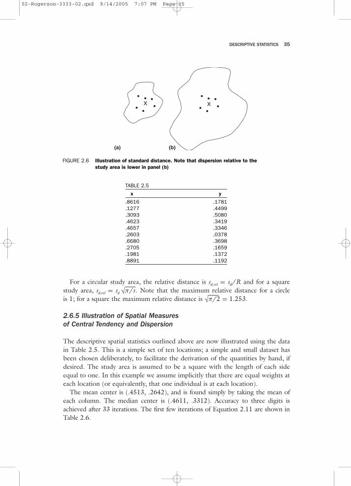
One drawback to the standard distance measure described above is that it is ameasure of absolute dispersion; it retains the units in which distance is measured.Furthermore, it is affected by the size of the study area. The two panels of Figure 2.6show situations where the standard distance is identical, but clearly the amountof dispersion about the central location, relative to the study area, is lower inpanel (a).
A measure of relative dispersion may be derived by dividing the standard dis-tance by the radius of a circle with area equal to the size of the study area (McGrewand Monroe 1993). This makes the measure of dispersion unitless and standard-izes for the size of the study area, thereby facilitating comparison of dispersion instudy areas of different sizes.
34 STATISTICAL METHODS FOR GEOGRAPHY
sd =√∑n
i=1 d2ic
n(2.12)
02-Rogerson-3333-02.qxd 9/14/2005 7:07 PM Page 34
DESCRIPTIVE STATISTICS 35
For a circular study area, the relative distance is sd,rel = sd/R and for a squarestudy area, sd,rel = sd √π/s . Note that the maximum relative distance for a circleis 1; for a square the maximum relative distance is √π/2 = 1.253.
2.6.5 Illustration of Spatial Measuresof Central Tendency and Dispersion
The descriptive spatial statistics outlined above are now illustrated using the datain Table 2.5. This is a simple set of ten locations; a simple and small dataset hasbeen chosen deliberately, to facilitate the derivation of the quantities by hand, ifdesired. The study area is assumed to be a square with the length of each sideequal to one. In this example we assume implicitly that there are equal weights ateach location (or equivalently, that one individual is at each location).
The mean center is (.4513, .2642), and is found simply by taking the mean ofeach column. The median center is (.4611, .3312). Accuracy to three digits isachieved after 33 iterations. The first few iterations of Equation 2.11 are shown inTable 2.6.
XX
(a) (b)
FIGURE 2.6 Illustration of standard distance. Note that dispersion relative to thestudy area is lower in panel (b)
TABLE 2.5
x y
.8616 .1781
.1277 .4499
.3093 .5080
.4623 .3419
.4657 .3346
.2603 .0378
.6680 .3698
.2705 .1659
.1981 .1372
.8891 .1192
02-Rogerson-3333-02.qxd 9/14/2005 7:07 PM Page 35
36 STATISTICAL METHODS FOR GEOGRAPHY
TABLE 2.6
.4512 .2642
.4397 .2934
.4424 .3053
.4465 .3116
.4499 .3159
.4623 .3191
. .
. .
. .
. .
.4611 .3312
It is interesting to note that the approach to the y-coordinate of the median centeris monotonic, while the approach to the x-coordinate is a damped harmonic.
The sum of squared distances to the mean center is 0.8870; note that this islower than the sum of squared distances to the median center (0.9328). Similarly,the sum of distances to the median center is 2.655, and this is lower than the sumof distances to the mean center (2.712).
The standard distance is 0.2978 (which is the square root of 0.8870/10); notethat this is similar to the average distance of a point from the mean center (2.712/10= .2712).
Testing the hypothesis that the points are randomly distributed about the cen-ter of the square results in a z-score of z = (.2712 – .383)/(√.02/10) = −2.500(see Equation 1.1). Since this is less than the critical value of 1.96 associated witha two-sided test using α = 0.05, we reject the null hypothesis, and conclude thatpoints are clustered to a greater degree about the center than would be expectedunder the null hypothesis of random dispersion about the center. A similar con-clusion is obtained using Equation 1.2, since
2.6.6 Angular Data
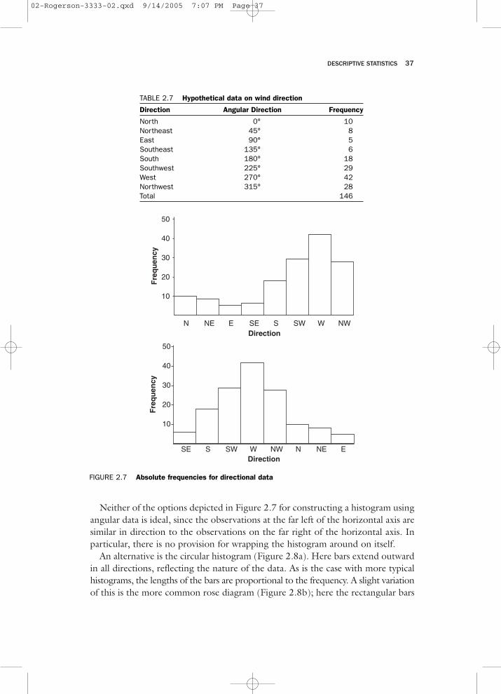
Angular data arise in a number of geographical applications; the analysis of winddirection, and the study of the alignment of crystals in bedrock provide two exam-ples. The latter example has been particularly important in the study of continen-tal drift, and in establishing the timing of reversals in earth’s magnetic field.
Special considerations arise in the visual and numerical description of angular data.Consider the 146 observations on wind direction given in Table 2.7. A histogram couldbe constructed, but it is not clear how the horizontal axis should be labeled. A histogramcould arbitrarily start with North on the left, as in Figure 2.7a; another possibility isto arrange for the mode to be near the middle of the histogram, as in Figure 2.7b.
z = √90(10)
.0887 − .1667
1= −2.35. (2.13)
02-Rogerson-3333-02.qxd 9/14/2005 7:07 PM Page 36
DESCRIPTIVE STATISTICS 37
Neither of the options depicted in Figure 2.7 for constructing a histogram usingangular data is ideal, since the observations at the far left of the horizontal axis aresimilar in direction to the observations on the far right of the horizontal axis. Inparticular, there is no provision for wrapping the histogram around on itself.
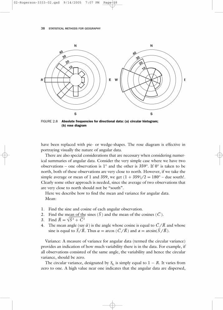
An alternative is the circular histogram (Figure 2.8a). Here bars extend outwardin all directions, reflecting the nature of the data. As is the case with more typicalhistograms, the lengths of the bars are proportional to the frequency. A slight variationof this is the more common rose diagram (Figure 2.8b); here the rectangular bars
N NE E SE S SW W NW
10
20
30
40
50
Fre
qu
ency
Direction
N NE ESE S SW W NW
10
20
30
40
50
Fre
qu
ency
Direction
FIGURE 2.7 Absolute frequencies for directional data
TABLE 2.7 Hypothetical data on wind direction
Direction Angular Direction Frequency
North 0° 10Northeast 45° 8East 90° 5Southeast 135° 6South 180° 18Southwest 225° 29West 270° 42Northwest 315° 28Total 146
02-Rogerson-3333-02.qxd 9/14/2005 7:07 PM Page 37
38 STATISTICAL METHODS FOR GEOGRAPHY
W
1020
3040
E
N
S
W
1020
3040
E
N
S
FIGURE 2.8 Absolute frequencies for directional data: (a) circular histogram;(b) rose diagram
have been replaced with pie- or wedge-shapes. The rose diagram is effective inportraying visually the nature of angular data.
There are also special considerations that are necessary when considering numer-ical summaries of angular data. Consider the very simple case where we have twoobservations – one observation is 1° and the other is 359°. If 0° is taken to benorth, both of these observations are very close to north. However, if we take thesimple average or mean of 1 and 359, we get (1 + 359)/2 = 180° – due south!.Clearly some other approach is needed, since the average of two observations thatare very close to north should not be “south”.
Here we describe how to find the mean and variance for angular data.Mean:
1. Find the sine and cosine of each angular observation.2. Find the mean of the sines (S–) and the mean of the cosines (C–).3. Find R– = √S–2 + C–2
4. The mean angle (say α–) is the angle whose cosine is equal to C–/R– and whosesine is equal to S–/R–. Thus α = arcos (C–/R–) and a = arcsin(S–/R–).
Variance: A measure of variance for angular data (termed the circular variance)provides an indication of how much variability there is in the data. For example, ifall observations consisted of the same angle, the variability and hence the circularvariance, should be zero.
The circular variance, designated by S0, is simply equal to 1 − R. It varies fromzero to one. A high value near one indicates that the angular data are dispersed,
02-Rogerson-3333-02.qxd 9/14/2005 7:07 PM Page 38
DESCRIPTIVE STATISTICS 39
and come from many different directions. Again, a value near zero implies that theobservations are clustered around particular directions.
Readers interested in more detail regarding angular data may find more exten-sive coverage in Mardia (1970).
EXAMPLE 2.1
Three observations of wind direction yield measurements of 43°, 88°, and279°. Find the angular mean and the circular variance.Solution: We start by constructing the following table:
Observation cosine sine
43° 0.7314 0.682088° 0.0349 0.9994
279° 0.1564−0.9877
The mean of the cosines is equal to C– = (.7314 + .0349 + .1564)/3 =0.3076. The mean of the sines is equal to S– = (.6820 + .9994 − .9877)/3= 0.2312. Then R– = √0.30762 + 0.23122 = 0.3848. The mean angle, α, isthe angle whose cosine is equal to C–/R– = 0.3076/0.3848 = 0.7994, andwhose sine is equal to S–/R– = 0.2312/0.3848 = 0.6008.
Using a calculator or table we find that the mean angle is 37°. The circularvariance is equal to 1 − R– = 1 − .3848 = .6152. This value is closer to onethan to zero, indicating a tendency for high variability – that is, the angles arerelatively dispersed and are coming from different directions.
2.7 Descriptive Statistics in SPSS for Windows 12.0
2.7.1 Data Input
After starting SPSS, data are input for the variable or variables of interest. Each columnrepresents a variable. For the commuting example set out in Table 2.1, the 30 obser-vations were entered into the first column of the spreadsheet. Alternatively, respondentID could have been entered into the first column (i.e., the sequence of integers, from1 to 30), and the commuting times would then have been entered in the secondcolumn. The order that the data are entered into a column is unimportant.
2.7.2 Descriptive Analysis
2.7.2.1 Simple descriptive statistics Once the data are entered, click on Analyze(or Statistics, in older versions of SPSS for Windows). Then click on Descriptive
02-Rogerson-3333-02.qxd 9/14/2005 7:07 PM Page 39
40 STATISTICAL METHODS FOR GEOGRAPHY
AQ supplyTable 2.8
Statistics. Then click on Explore. A split box will appear on the screen; move thevariable or variables of interest from the left box to the box on the right that isheaded “Dependent List” by highlighting the variable(s) and clicking on thearrow. Then click on OK.
2.7.2.2 Other Options Options for producing other related statistics and graphsare available. To produce a histogram for instance, before clicking OK above, clickon Plots, and you can then check a box to produce a histogram. Then click onContinue and OK.
2.7.2.3 Results Table 2.8 displays results of the output. In addition to this table,boxplots (Figure 2.2), stem and leaf displays (Figure 2.3) and, optionally, histograms(Figure 2.1) are also produced.
Table 2.8 Missing
02-Rogerson-3333-02.qxd 9/14/2005 7:07 PM Page 40
DESCRIPTIVE STATISTICS 41
EXERCISES
1. The 236 values that appear below are the 1990 median household incomes(in dollars) for the 236 census tracts of Buffalo, New York.
(a) For the first 19 tracts, find the mean, median, range, interquartilerange, standard deviation, variance, skewness, and kurtosis using only acalculator (though you may want to check your results using a statisti-cal software package). In addition, construct a stem-and-leaf plot, a boxplot, and a histogram for these 19 observations.
(b) Use a statistical software package to repeat part (a), this time using all236 observations.
(c) Comment on your results. In particular, what does it mean to find themean of a set of medians? How do the observations that have a valueof 0 affect the results? Should they be included? How might the resultsdiffer if a different geographic scale was chosen?
22342, 19919, 8187, 15875, 17994, 30765, 31347, 27282, 29310,23720, 22033, 11706, 15625, 6173, 15694, 7924, 10433, 13274, 17803,20583, 21897, 14531, 19048, 19850, 19734, 18205, 13984, 8738,10299, 10678, 8685, 13455, 14821, 23722, 8740, 12325, 10717, 21447,11250, 16016, 11509, 11395, 19721, 23231, 21293, 24375, 19510,14926, 22490, 21383, 25060, 22664, 8671, 31566, 26931, 0, 24965,34656, 24493, 21764, 25843, 32708, 22188, 19909, 33675, 15608,15857, 18649, 21880, 17250, 16569, 14991, 0, 8643, 22801, 39708,17096, 20647, 30712, 19304, 24116, 17500, 19106, 17517, 12525,13936, 7495, 10232, 6891, 16888, 42274, 43033, 43500, 22257, 22931,31918, 29072, 31948, 36229, 33860, 32586, 32606, 31453, 32939,30072, 32185, 35664, 27578, 23861, 18374, 26563, 30726, 33614,30373, 28347, 37786, 48987, 56318, 49641, 85742, 43229, 53116,44335, 30184, 36744, 39698, 0, 21987, 66358, 46587, 26934, 27292,31558, 36944, 43750, 49408, 37354, 31010, 35709, 32913, 25594,25612, 28980, 28800, 28634, 18958, 26515, 24779, 21667, 24660,29375, 29063, 30996, 45645, 39312, 34287, 35533, 27647, 24342,22402, 28967, 39083, 28649, 23881, 31071, 27412, 27943, 34500,19792, 41447, 35833, 41957, 14333, 12778, 20000, 19656, 22302,33475, 26580, 0, 24588, 31496, 30179, 33694, 36193, 41921, 35819,39304, 38844, 37443, 47873, 41410, 34186, 36798, 38508, 38382,37029, 48472, 38837, 40548, 35165, 39404, 34281, 24615, 34904,21964, 42617, 58682, 41875, 40370, 24511, 31008, 16250, 29600,38205, 35536, 35386, 36250, 31341, 33790, 31987, 42113, 37500,33841, 37877, 35650, 28556, 27048, 27736, 30269, 32699, 28988,22083, 27446, 76306, 19333
(Continued)
02-Rogerson-3333-02.qxd 9/14/2005 7:07 PM Page 41
(Continued)
2. Ten migration distances corresponding to the distances moved by recentmigrants are observed (in miles): 43, 6, 7, 11, 122, 41, 21, 17, 1, 3. Findthe mean and standard deviation, and then convert all observations intoz-scores.
3. By hand, find the mean, median, and standard deviation of the followingvariables for subset A of the RSSI dataset: RSSI, slope, altitude, and distanceto the nearest cell tower.
4. Using SPSS or Excel, answer the following questions using the full RSSIdataset:
(a) Make histograms of (i) RSSI values for those observations that aremore than 3000 meters from the nearest cell tower, and (ii) thoseobservations that are less than 3000 meters from the nearest cell tower.Comment on the differences.
(b) What percentage of RSSI observations are within 2 km of the nearestcell tower?
(c) What percentage of RSSI observations are made at elevations greaterthan 400 meters?
(d) Find the mean, median, and standard deviation for RSSI, slope, altitude,and distance to the nearest cell tower.
5. Using SPSS or Excel, answer the following questions using the full Tyne andWear dataset:
(a) Provide descriptive information on house prices, number of bedrooms,number of bathrooms, floor area, and date built. For each, provide themean, median, standard deviation, and skewness. Also for each, providea boxplot.
(b) What percentage of homes have garages?(c) What percentage of homes were built during each of the following time
periods: pre-war, inter-war, and post-war?
6. Make histograms of (a) RSSI values for those observations that are morethan 3000 meters from the nearest cell tower, and (b) those observationsthat are less than 3000 meters from the nearest cell tower. Comment on thedifferences.
7. For the observations in subset A of the RSSI dataset:
(a) find the mean center(b) find the standard distance
8. Given a = 3, b = 4, and
42 STATISTICAL METHODS FOR GEOGRAPHY
02-Rogerson-3333-02.qxd 9/14/2005 7:07 PM Page 42
DESCRIPTIVE STATISTICS 43
(Continued)
Observation x y1 3 22 5 43 7 64 2 85 1 10
Find the following:
9. Let a = 5, x1 = 6, x2 = 7, x3 = 8, x4 = 10, x5 = 11, y1 = 3, y2 = 5, y3 = 6,y4 = 14, and y5 = 12. Find the following:
10. Find 8!/3!.
(Continued)
(a)∑
yi
(b)∑
y2i
(c)∑
axi + byi
(d)∏
xi
(e) 2∑3
i=2 yi
(f) 3x2 + y4
(g) 32!/(30!)
(h)∑
k xkyk
(a)∑
xi
(b)∑
xiyi
(c)∑
(xi + ayi)
(d)∑3
i=1 y2i
(e)∑i=n
i=1 a
(f)∑
k 2(yk − 3)
(g)∑i=5
i=1(xi − x)
11. Find(
10
5
).
02-Rogerson-3333-02.qxd 9/14/2005 7:07 PM Page 43
44 STATISTICAL METHODS FOR GEOGRAPHY
(Continued)
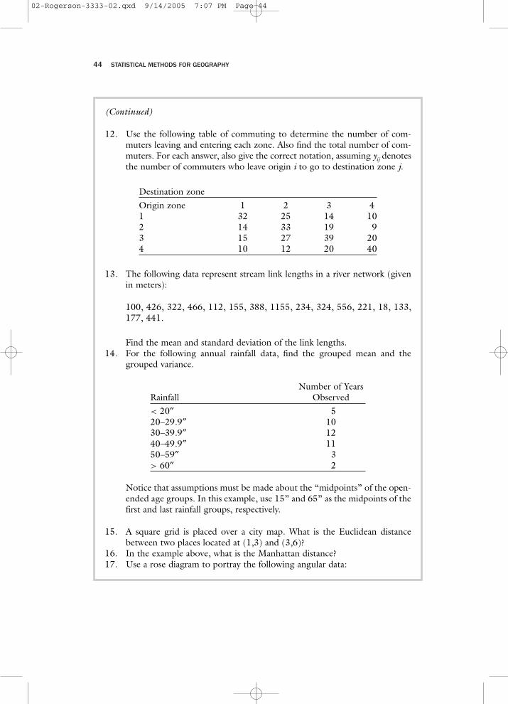
12. Use the following table of commuting to determine the number of com-muters leaving and entering each zone. Also find the total number of com-muters. For each answer, also give the correct notation, assuming yij denotesthe number of commuters who leave origin i to go to destination zone j.
Destination zoneOrigin zone 1 2 3 41 32 25 14 102 14 33 19 93 15 27 39 204 10 12 20 40
13. The following data represent stream link lengths in a river network (givenin meters):
100, 426, 322, 466, 112, 155, 388, 1155, 234, 324, 556, 221, 18, 133,177, 441.
Find the mean and standard deviation of the link lengths.14. For the following annual rainfall data, find the grouped mean and the
grouped variance.
Number of YearsRainfall Observed< 20′′ 520–29.9′′ 1030–39.9′′ 1240–49.9′′ 1150–59′′ 3> 60′′ 2
Notice that assumptions must be made about the “midpoints” of the open-ended age groups. In this example, use 15” and 65” as the midpoints of thefirst and last rainfall groups, respectively.
15. A square grid is placed over a city map. What is the Euclidean distancebetween two places located at (1,3) and (3,6)?
16. In the example above, what is the Manhattan distance?17. Use a rose diagram to portray the following angular data:
02-Rogerson-3333-02.qxd 9/14/2005 7:07 PM Page 44
DESCRIPTIVE STATISTICS 45
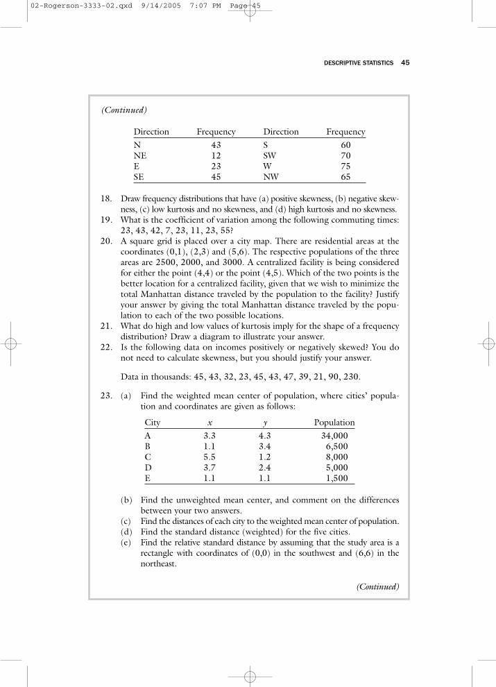
(Continued)
Direction Frequency Direction FrequencyN 43 S 60NE 12 SW 70E 23 W 75SE 45 NW 65
18. Draw frequency distributions that have (a) positive skewness, (b) negative skew-ness, (c) low kurtosis and no skewness, and (d) high kurtosis and no skewness.
19. What is the coefficient of variation among the following commuting times:23, 43, 42, 7, 23, 11, 23, 55?
20. A square grid is placed over a city map. There are residential areas at thecoordinates (0,1), (2,3) and (5,6). The respective populations of the threeareas are 2500, 2000, and 3000. A centralized facility is being consideredfor either the point (4,4) or the point (4,5). Which of the two points is thebetter location for a centralized facility, given that we wish to minimize thetotal Manhattan distance traveled by the population to the facility? Justifyyour answer by giving the total Manhattan distance traveled by the popu-lation to each of the two possible locations.
21. What do high and low values of kurtosis imply for the shape of a frequencydistribution? Draw a diagram to illustrate your answer.
22. Is the following data on incomes positively or negatively skewed? You donot need to calculate skewness, but you should justify your answer.
Data in thousands: 45, 43, 32, 23, 45, 43, 47, 39, 21, 90, 230.
23. (a) Find the weighted mean center of population, where cities’ popula-tion and coordinates are given as follows:
City x y PopulationA 3.3 4.3 34,000B 1.1 3.4 6,500C 5.5 1.2 8,000D 3.7 2.4 5,000E 1.1 1.1 1,500
(b) Find the unweighted mean center, and comment on the differencesbetween your two answers.
(c) Find the distances of each city to the weighted mean center of population.(d) Find the standard distance (weighted) for the five cities.(e) Find the relative standard distance by assuming that the study area is a
rectangle with coordinates of (0,0) in the southwest and (6,6) in thenortheast.
(Continued)
02-Rogerson-3333-02.qxd 9/14/2005 7:07 PM Page 45
46 STATISTICAL METHODS FOR GEOGRAPHY
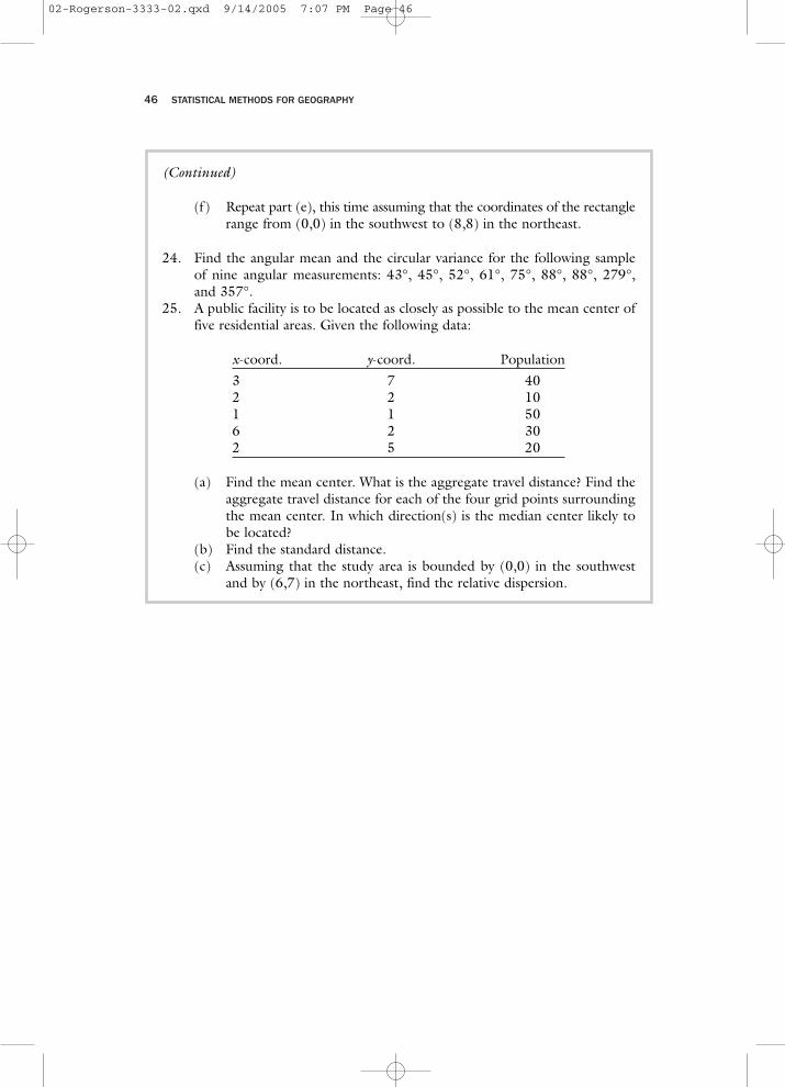
(Continued)
(f) Repeat part (e), this time assuming that the coordinates of the rectanglerange from (0,0) in the southwest to (8,8) in the northeast.
24. Find the angular mean and the circular variance for the following sampleof nine angular measurements: 43°, 45°, 52°, 61°, 75°, 88°, 88°, 279°,and 357°.
25. A public facility is to be located as closely as possible to the mean center offive residential areas. Given the following data:
x-coord. y-coord. Population3 7 402 2 101 1 506 2 302 5 20
(a) Find the mean center. What is the aggregate travel distance? Find theaggregate travel distance for each of the four grid points surroundingthe mean center. In which direction(s) is the median center likely tobe located?
(b) Find the standard distance.(c) Assuming that the study area is bounded by (0,0) in the southwest
and by (6,7) in the northeast, find the relative dispersion.
02-Rogerson-3333-02.qxd 9/14/2005 7:07 PM Page 46