Embed Size (px)
Citation preview
Learning ObjectivesAfter studying this chapter, you will be able to:� Summarize the role of the graphic designer.� List and explain the elements of design.� Utilize the principles of design.� Identify the elements that make up a layout.� Explain the factors that determine how a lay-
out design is developed.� Differentiate between the design methods
used in layout.� Demonstrate how copyfitting is used to esti-
mate layout space.� Describe the methods used in preparing illus-
trations for layout.� List the layout materials needed to produce a
mechanical.
Important Termscomprehensive layoutcopyfittingelements of designelements of layoutlayout base sheetphoto croppingprinciples of designrough layoutspecificationsthumbnail sketches
In graphic communications, design refers to theapplication of proper methods to produce a productthat is both artistic and functional. A successfuldesign requires the skillful use of design elementsand principles.
This chapter will cover the primary elementsand principles of design and layout. Knowledge ofcommon design techniques is critical in producing a layout and evaluating the visual quality of a product.
The Graphic DesignerThe role of the graphic designer varies greatly
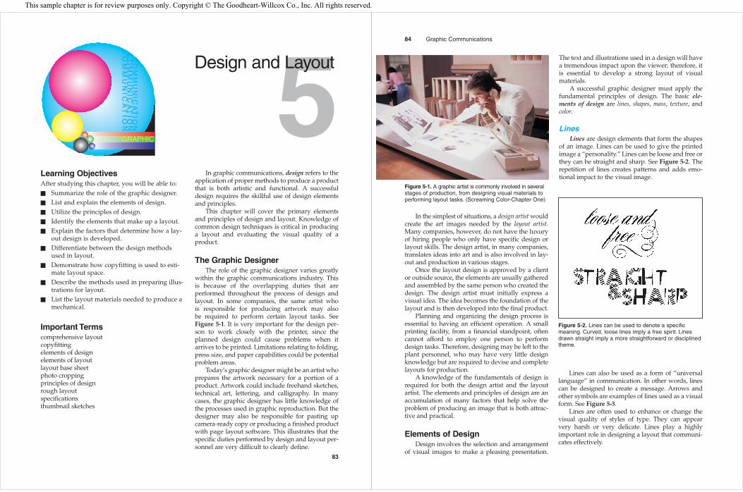
within the graphic communications industry. This is because of the overlapping duties that are performed throughout the process of design andlayout. In some companies, the same artist who is responsible for producing artwork may also be required to perform certain layout tasks. See Figure 5-1. It is very important for the design per-son to work closely with the printer, since theplanned design could cause problems when itarrives to be printed. Limitations relating to folding,press size, and paper capabilities could be potentialproblem areas.
Today’s graphic designer might be an artist whoprepares the artwork necessary for a portion of aproduct. Artwork could include freehand sketches,technical art, lettering, and calligraphy. In manycases, the graphic designer has little knowledge ofthe processes used in graphic reproduction. But thedesigner may also be responsible for pasting upcamera-ready copy or producing a finished productwith page layout software. This illustrates that thespecific duties performed by design and layout per-sonnel are very difficult to clearly define.
83
5Design and Layout
GRAPHIC
CO
MM
UN
ICA
TIO
NC
OM
MU
NIC
AT
ION
CO
MM
UN
ICA
TIO
N
In the simplest of situations, a design artist wouldcreate the art images needed by the layout artist.Many companies, however, do not have the luxuryof hiring people who only have specific design orlayout skills. The design artist, in many companies,translates ideas into art and is also involved in lay-out and production in various stages.
Once the layout design is approved by a clientor outside source, the elements are usually gatheredand assembled by the same person who created thedesign. The design artist must initially express avisual idea. The idea becomes the foundation of thelayout and is then developed into the final product.
Planning and organizing the design process isessential to having an efficient operation. A smallprinting facility, from a financial standpoint, oftencannot afford to employ one person to performdesign tasks. Therefore, designing may be left to theplant personnel, who may have very little designknowledge but are required to devise and completelayouts for production.
A knowledge of the fundamentals of design isrequired for both the design artist and the layoutartist. The elements and principles of design are anaccumulation of many factors that help solve theproblem of producing an image that is both attrac-tive and practical.
Elements of DesignDesign involves the selection and arrangement
of visual images to make a pleasing presentation.
The text and illustrations used in a design will havea tremendous impact upon the viewer; therefore, itis essential to develop a strong layout of visualmaterials.
A successful graphic designer must apply thefundamental principles of design. The basic ele-ments of design are lines, shapes, mass, texture, andcolor.
LinesLines are design elements that form the shapes
of an image. Lines can be used to give the printedimage a “personality.” Lines can be loose and free orthey can be straight and sharp. See Figure 5-2. Therepetition of lines creates patterns and adds emo-tional impact to the visual image.
84 Graphic Communications
Figure 5-1. A graphic artist is commonly involved in severalstages of production, from designing visual materials toperforming layout tasks. (Screaming Color-Chapter One)
Figure 5-2. Lines can be used to denote a specificmeaning. Curved, loose lines imply a free spirit. Linesdrawn straight imply a more straightforward or disciplinedtheme.
Lines can also be used as a form of “universallanguage” in communication. In other words, linescan be designed to create a message. Arrows andother symbols are examples of lines used as a visualform. See Figure 5-3.
Lines are often used to enhance or change thevisual quality of styles of type. They can appearvery harsh or very delicate. Lines play a highlyimportant role in designing a layout that communi-cates effectively.
This sample chapter is for review purposes only. Copyright © The Goodheart-Willcox Co., Inc. All rights reserved.
ShapesShapes are elementary forms that define specific
areas of space. In many cases, a shape is defined bya line. The three basic shapes are the square, circle,and triangle. See Figure 5-4.
Chapter 5 Design and Layout 85
Figure 5-3. Lines can deliver a visual message whenthey are drawn as arrows or other symbols.
Figure 5-4. The three basic design shapes are thesquare, circle, and triangle.
Figure 5-5. Different shapes are associated with psycho-logical meanings. Squares show organization, while trian-gles display aggression and circles indicate motion.
Each of the three basic shapes is associated witha psychological meaning, as shown in Figure 5-5.The visual attitude portrayed by the triangle is oneof conflict or action. The square projects an attitudeof honesty or equality, while the circle conveys a feel-ing of protection or infinity.
MassMass is a measure of volume that adds defini-
tion to shapes in a visual presentation. The mass orsolid portion of the shape provides a visual rela-tionship with the other elements. See Figure 5-6.
TextureThe texture of a visual image is a projection of
emphasized structure or weight. When measuringthe texture of an object, the first inclination is totouch the surface. In graphic communications, tex-ture is usually visual; there is no feeling gainedthrough the sense of touch. See Figure 5-9.
86 Graphic Communications
Figure 5-6. Mass adds volume or weight to a shape byemphasizing part of an image.
Different shapes of varying intensities, knownas weights, can be used to emphasize or de-empha-size styles of type. See Figure 5-7. Physical forms aremade by combining the three basic shapes. See Figure 5-8.
Figure 5-7. Visual emphasis can be achieved by varyingthe weights or sizes of type or other images.
Figure 5-8. A combination of shapes creates the physicalform of an image.
Figure 5-9. Lines can provide surface variation to givetexture to an image.
Texture appears as a design element when thevisual images reflect the meaning of lines, as shownin Figure 5-10, or when mass forms images thatreflect a special technique. See Figure 5-11.
Texture varies and depends on the structure andweight of the individual letters, the amount of spacebetween lines, and the amount of mass in a certainspace. Actual texture for a printed image can be pro-duced by embossing, which presses a shape orirregular surface into the substrate.
ColorColor is an important element to be considered
when planning or designing a printed product.
Color can draw attention and produce a strongemotional and psychological impact. Different colors have traditional and symbolic meanings. A basic understanding of color is essential to creating a good design.
Color should be used to add interest and varietyto a design. A small amount of color can heightenthe visual quality of a page.
Color moodsDifferent colors project different moods. Yellow,
orange, and red are considered to be warm colorsand often denote aggression, excitement, and danger. Red is considered the most active of thesethree. Blue, green, and violet are considered to be cool colors and are associated with nature and passiveness.
Color wheelA color wheel is a visual tool that illustrates the
basics of color. It is an arrangement of colors thatprovides a means of identifying colors in a consis-tent manner. See Figure 5-12.
Chapter 5 Design and Layout 87
Figure 5-10. Texture of type can be a design element.
Figure 5-11. Lines added to type can provide texture.Here, they create a unique visual effect resembling rope.
Yellow
Violet
Orange Green
Red Blue
Figure 5-12. A color wheel is an arrangement of colorsbased on three primary colors, red, yellow, and blue.
The wheel is based on three primary colors,from which all other colors can be made. The primary colors are red, yellow, and blue. Mixing anytwo will produce a secondary color. The secondarycolors are green, orange, and violet.
Two systems of color formation, additive andsubtractive, use different primary colors. The additive primaries are red, green, and blue. The subtractive primaries are cyan, magenta, and yellow.Color formation is covered in detail in Chapter 8.
The colors that are positioned across from each other on the color wheel are known as complementary colors. Red and green, orange andblue, and yellow and violet are complementary colors. See Figure 5-13.
Different shades and tints of a color, known asvalues, may be obtained by adding white or black toa color. A color can also take on a different intensitywhen it is mixed with its complement. For example,when green is mixed with red, it will probably produce a brown. Striking color effects may be
produced not only by mixing colors, but also byarranging colors in a layout so they have a directeffect on each other. Chapter 8 includes a detaileddescription of color theory and how it relates tographic communication.
Principles of DesignIn the process of designing a printed product,
many different ideas are generated through the useof design elements. To ensure the images have apleasing relationship, design principles must beapplied to sort out or select the right ideas.
The basic principles of design are balance, con-trast, unity, rhythm, and proportion. These principlesare used by the design artist to create an image thatis both visually pleasing and functional.
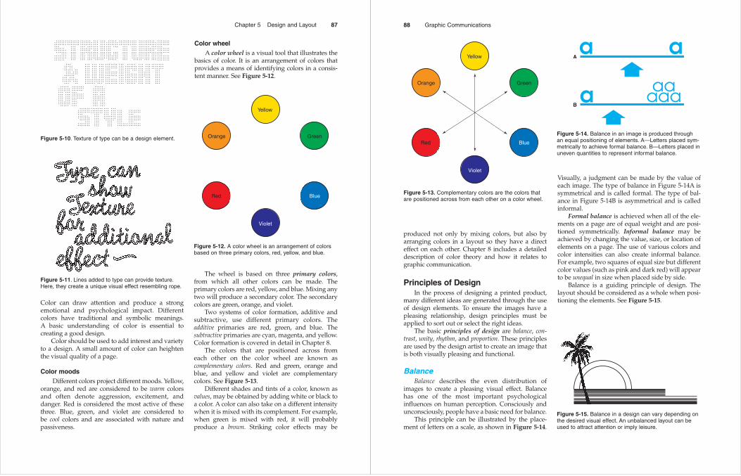
BalanceBalance describes the even distribution of
images to create a pleasing visual effect. Balancehas one of the most important psychological influences on human perception. Consciously andunconsciously, people have a basic need for balance.
This principle can be illustrated by the place-ment of letters on a scale, as shown in Figure 5-14.
Visually, a judgment can be made by the value ofeach image. The type of balance in Figure 5-14A issymmetrical and is called formal. The type of bal-ance in Figure 5-14B is asymmetrical and is calledinformal.
Formal balance is achieved when all of the ele-ments on a page are of equal weight and are posi-tioned symmetrically. Informal balance may beachieved by changing the value, size, or location ofelements on a page. The use of various colors andcolor intensities can also create informal balance.For example, two squares of equal size but differentcolor values (such as pink and dark red) will appearto be unequal in size when placed side by side.
Balance is a guiding principle of design. Thelayout should be considered as a whole when posi-tioning the elements. See Figure 5-15.
88 Graphic Communications
Yellow
Violet
Orange Green
Red Blue
Figure 5-13. Complementary colors are the colors thatare positioned across from each other on a color wheel.
A
B
Figure 5-14. Balance in an image is produced throughan equal positioning of elements. A—Letters placed sym-metrically to achieve formal balance. B—Letters placed inuneven quantities to represent informal balance.
Figure 5-15. Balance in a design can vary depending onthe desired visual effect. An unbalanced layout can beused to attract attention or imply leisure.
ContrastContrast is the variation of elements in a
printed product. When used, contrast gives mean-ing to a design. Lines drawn thick might have littlemeaning by themselves. Adding thin lines, how-ever, can enhance the design and eliminate monot-ony. See Figure 5-16.
Care must be taken when combining contrast-ing elements so that the uniform effect of the totaldesign remains unaffected. A page of many contrasting designs might create confusion. See Figure 5-19.
Chapter 5 Design and Layout 89
Figure 5-16. A variation of mass or other elements addscontrast and attracts attention to an area of an image.
Styles of type can be contrasted to producegreater legibility and design variation. Some usefulcontrasts are round and straight, ornate and plain,and broad and narrow. An example of contrast isshown in Figure 5-17. A tall tree looks much taller ifit is standing on a flat plane.
Figure 5-17. Using contrast emphasizes one element inrelation to another. A tree appears taller when it is placedon a flat plane.
The relationship between an unprinted area and a printed area of an image can also be en-hanced through the use of contrast. White space,when used effectively, creates contrast in an image.See Figure 5-18.
Figure 5-18. The use of white space creates contrastbetween the printed and unprinted areas of an image.
Figure 5-19. Too much contrast between elements cancause confusion.
Balance must be maintained to ensure that one primary element dominates the layout. This principle can be used to draw attention and keep thereader’s attention from jumping from one elementto another.
UnityUnity is the proper balance of all elements in an
image so that a pleasing whole results and theimage is viewed as one piece. Every element mustbe in proper position to create a harmonious image.A design can be moved and manipulated to createan interesting and functional combination of elements.
Choosing type styles is also important to achiev-ing unity. See Figure 5-20. A unified design is theresult of viewing the layout as a whole and not asseparate elements. This principle is also called har-mony. See Figure 5-21.
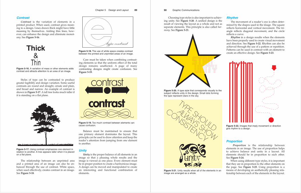
RhythmThe movement of a reader’s eye is often deter-
mined by the shapes used in the image. The squarereflects horizontal and vertical movement. The tri-angle reflects diagonal movement, and the circlereflects a curve.
Rhythm in a design results when the elementshave been properly used to create visual movementand direction. See Figure 5-22. Rhythm can also beachieved through the use of a pattern or repetition.Patterns can be used in contrast with an element tocreate an effective design. See Figure 5-23.
90 Graphic Communications
Figure 5-20. A type style that corresponds visually to thesubject reflects unity in the design. Small dots formingthe type represent stars in the sky.
Figure 5-21. Unity results when all of the elements in animage are arranged as a whole.
Figure 5-22. Images that imply movement or directiongive rhythm to a design.
ProportionProportion is the relationship between
elements in an image. The use of proportion helps to achieve balance and unity in a layout. All elements should be in proportion to each other. See Figure 5-24.
When using different type styles, it is importantthat they are in proportion to the other elements onthe page. See Figure 5-25. Using proportion is ameans of developing an aesthetically pleasing rela-tionship between each of the elements in the layout.
A basic knowledge of design elements and prin-ciples is key to understanding the guidelines usedin layout. The finished layout or mechanical must
exhibit sound principles of design. The process ofpreparing a layout sheet is often performed by thesame artist responsible for the design.
Layout ElementsLayout is the arrangement of printing elements
on a layout sheet. The paste-up version of the basesheet, or mechanical, is made up of the elementsready for reproduction. Planning a layout involveschoosing elements that best represent the design.The elements of layout are body type, display type,illustrations, and white space.
The arrangement of elements in a layout mustbe pleasing to the eye and easy to read. The layoutartist or designer is responsible for assembling theelements to make a composition. The layout artistplays a very important role in planning each job.
Chapter 5 Design and Layout 91
Figure 5-23. A balanced pattern of lines provides rhythmby contrasting with the rest of the image.
Figure 5-24. Elements arranged in proportion to eachother produce a unified design.
Figure 5-25. The size of type used in a design should bein proportion to the other elements.
If the same elements were given to severalartists, it is very probable that different layoutswould be submitted. If each layout applies validprinciples of design, it might be impossible to sayone is better than another. Layouts may be judgeddifferently by different people.
The major objective of the layout is that theprinted material must be clearly seen and read. Thelayout artist must consider each element indepen-dently and determine how each one relates to thecomplete product.
Body typeBody type is the printed type that makes up the
text in a layout. Body type must be chosen to reflectthe intent of the message. The text must be clearlylegible and must relate to the topic. Typically, a topicaimed at a contemporary audience would use amodern typeface. See Figure 5-26. The placement oftype requires proper spacing or air. White space canbe just as important as the type itself.
Usually, the body type itself is not the focalpoint of the layout. The text will contain a messagethat expands upon the other elements. All of the ele-ments, including type, are positioned in a logicalprogression of importance to meet the layout objec-tives. Some layout elements will be primary, whileothers become secondary, according to the objec-tives of the layout.
Display typeDisplay type is the type that conveys the main
message of the layout. It is intended to draw atten-tion. Newspaper and magazine headlines are typi-cal examples of display type. See Figure 5-27. Thedisplay line is key to the success of a message. If thedisplay type creates interest, the reader will proceedto the body.
92 Graphic Communications
Figure 5-26. Selecting a proper typeface and type sizefor the layout is an important part of the design process.
Figure 5-27. Headlines are a form of display type. Theyshould draw attention and create interest in the image.
The display line in an advertisement leads thereader to other information. After reading the dis-play material, the person must be satisfied ordirected to continue reading the text.
The style of display type is very importantbecause it must correspond to the visual message.Some type styles can be very dramatic, as illustratedin Figure 5-28. In such cases, the topic and type stylemust be compatible. Fine-line display type, forexample, is usually not appropriate when used withheavy mass images.
Some type styles are directional and lead the eyeof the reader. Sometimes, the layout designer orga-nizes the display line for an ad using hand-lettereddisplay type.
The entire layout must be looked at when choos-ing a display typeface. The display line must be dis-tinctive and appropriate. To properly select atypeface, the job objective must be fully understoodby the layout artist.
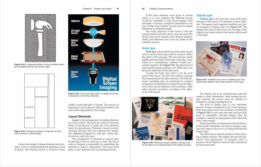
IllustrationsThe illustrations in a layout include the orna-
mentation, photographs, and artwork, such as lineart. Illustrations are common in most printed mate-rials. For example, display ads typically includeillustrations of the product.
The message provided by an illustration can bevery revealing. See Figure 5-29. The old saying, “Apicture is worth a thousand words,” applies tomany printed materials. Pictorial images are a verystrong way of conveying a message. In some cases,an illustration may convey the message by itself. SeeFigure 5-30. Illustrations add another dimension tothe layout; they can increase understanding of theproduct, as well as interest in the product.
White spaceWhite space includes areas of the layout that are
void of printed images. Filling up the entire designspace will usually not produce good results. The
utilization of white space or air can add to the visualquality of a layout.
The distance between elements can be veryvaluable when white space is used according tosound design principles. It provides a brief periodfor absorbing the printed matter.
If used excessively, white space can be disori-enting. When ideas are too greatly separated, flowand meaning can be lost. White space is very impor-tant and must be used properly to create flow, unity,and organization for the reader.
Chapter 5 Design and Layout 93
Figure 5-28. The style of display type used should reflectthe message of the printed piece.
Figure 5-29. A meaningful illustration can be used toconvey a strong message.
Developing a LayoutThere are a number of factors to consider in
developing a layout. Five areas that must beaddressed by the layout artist are the objective of theproject, the message the product will send, the styleand format to be used, the layout requirements forproduction, and printing requirements. Each factorcontributes to making decisions that will influenceproduction of the final product.
Layout objectiveThe layout objective is a statement that
describes the intent or purpose of an identifiableend product. The objective outlines the goal of thelayout artist. For example, an objective might statethat the final printed piece should inform the reader,through text and illustrated material, how a piece ofequipment will help in a specific production situation.
The objective describes what the information onthe printed page is intended to do. Knowing thepurpose helps the layout artist determine whichtext and illustrations will be best for the job.
Conveying a messageThe message or visual effect delivered by a
printed image helps determine how the layout will
be planned. Identifying the audience gives directionto the layout artist. For example, one ad might bedesigned for young people, while another might beaimed at the elderly. The design of each ad shouldbe unique and must reflect the intent of the printedpiece.
Design of the end product also determines thetone or mood of the message. If a lighthearted orhumorous mood is intended, a dramatic photo-graph might not achieve the desired effect. All of theelements should reflect the message of the endproduct.
Style and formatStyle includes the text type, display type, and
illustrations of the design. Some printed pieces willrequire a set style, while others do not. For instance,the style used in this textbook is quite different fromthe styles used in advertisements. The designermust choose the elements that will work best.
Deciding how to organize the format of theprinted piece is of primary importance. Will a singlesheet carry the message, or will a booklet do a bet-ter job? The format will also be determined by itsintended use. For example, if the printed piece is tobe posted, it should not be printed on both sides.
Layout requirementsThe different methods of layout and the sched-
ule to complete the job must be considered in plan-ning a layout. A layout may need to be developed asa sketch, a rough, or a comprehensive. It may benecessary to perform all three.
A sketch is an idea in pictorial form with littledetail. Sketches are often helpful because they pro-vide a picture indicating possible placement of theelements. A rough is more illustrative of the finalproduct; it provides the style of the type as well asthe position of the elements. A comprehensive is thethird and final method of layout. It is the presenta-tion of what the finished product will indeed looklike. When planning a layout, the artist shoulddecide which methods will be necessary to reachthe final product in a timely manner.
An estimate of the time it will take to completethe job is essential from a planning standpoint. Mostprinted pieces are produced to meet a deadline andmust be delivered by a specified date. The plannermust decide whether the job can be completed inthe time allowed.
94 Graphic Communications
Figure 5-30. Illustrations used in road signs can deliver amessage with a minimum use of words.
Printing requirementsThe printing process that follows production
has a strong influence on how a layout is developed.The size of the product, the quantity to be printed,paper requirements, color use, and operations fol-lowing the printing must all be considered.
The finished dimension of a printed piece mustbe determined before beginning layout. The finished size will have a bearing on every produc-tion step. One important concern is the size of thepress required to run the job. The finished size alsodetermines the size of the paper to be used in printing.
The number of pages to be printed and thenumber of copies required are also factors to con-sider because they will help determine the printingrequirements. Deciding the most economical way ofprinting the job is essential. The designer or editormust estimate the approximate number of pages tobe printed so that final plans for printing can bemade.
Printing requirements include the kind of stockor paper to be used. The necessary stock must beavailable at the designated time for printing. A cus-tom stock may need to be ordered and may requireadditional time. Other considerations in orderingstock are the size of the order, paper weight (thick-ness), and opacity.
Multicolor printing is another factor to considerwhen planning a layout. Different jobs require dif-ferent uses of color. Printing a one-color or blackand white job requires different layout methodsthan a two-color, or four-color job. The layout artistmust decide whether to use color when planningthe layout.
Once the job is printed, further finishing opera-tions might be required, such as trimming the job tothe final size. Other finishing operations mayinclude folding, scoring, creasing, varnishing, andbinding. Knowing the operations that will berequired after printing is important in planning thejob.
Layout MethodsChoosing the right method to develop a layout
can be very difficult and requires careful planningand thinking by the layout artist. The design meth-ods used in layout are thumbnail sketches, therough layout, and the comprehensive layout. Muchof the decision depends on the factors that have
already been discussed. The size of the job, theobjective, and use of color are all important consid-erations. The layout artist must have a vision of howto arrive at the final product.
The layout can make or break the appearance ofthe final product. Many times, a number of layoutideas are discarded before one is chosen. Eachmethod must be carefully analyzed to produce astrong, functional layout.
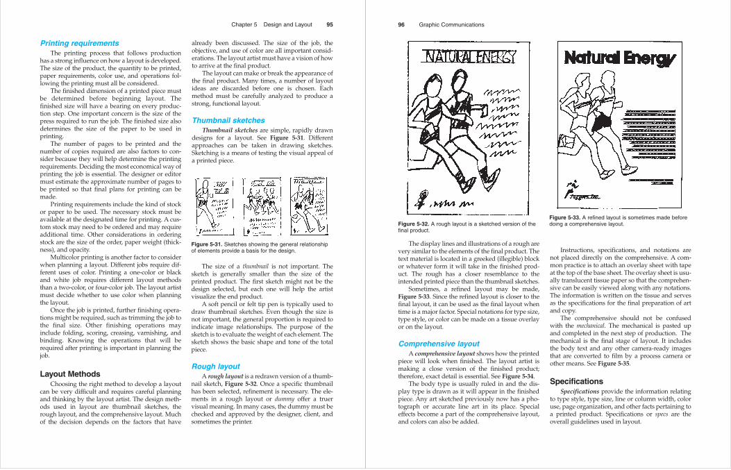
Thumbnail sketchesThumbnail sketches are simple, rapidly drawn
designs for a layout. See Figure 5-31. Differentapproaches can be taken in drawing sketches.Sketching is a means of testing the visual appeal ofa printed piece.
Chapter 5 Design and Layout 95
Figure 5-31. Sketches showing the general relationshipof elements provide a basis for the design.
The size of a thumbnail is not important. Thesketch is generally smaller than the size of theprinted product. The first sketch might not be thedesign selected, but each one will help the artistvisualize the end product.
A soft pencil or felt tip pen is typically used todraw thumbnail sketches. Even though the size isnot important, the general proportion is required toindicate image relationships. The purpose of thesketch is to evaluate the weight of each element. Thesketch shows the basic shape and tone of the totalpiece.
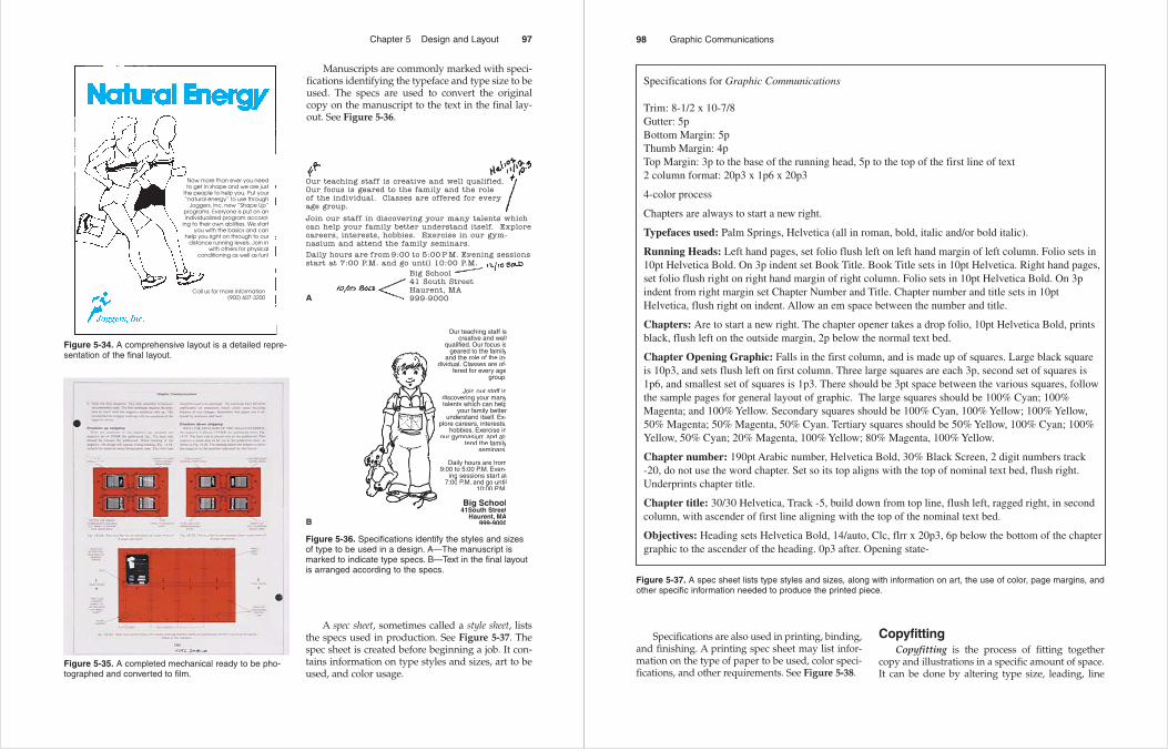
Rough layoutA rough layout is a redrawn version of a thumb-
nail sketch, Figure 5-32. Once a specific thumbnailhas been selected, refinement is necessary. The ele-ments in a rough layout or dummy offer a truervisual meaning. In many cases, the dummy must bechecked and approved by the designer, client, andsometimes the printer.
The display lines and illustrations of a rough arevery similar to the elements of the final product. Thetext material is located in a greeked (illegible) blockor whatever form it will take in the finished prod-uct. The rough has a closer resemblance to theintended printed piece than the thumbnail sketches.
Sometimes, a refined layout may be made, Figure 5-33. Since the refined layout is closer to thefinal layout, it can be used as the final layout whentime is a major factor. Special notations for type size,type style, or color can be made on a tissue overlayor on the layout.
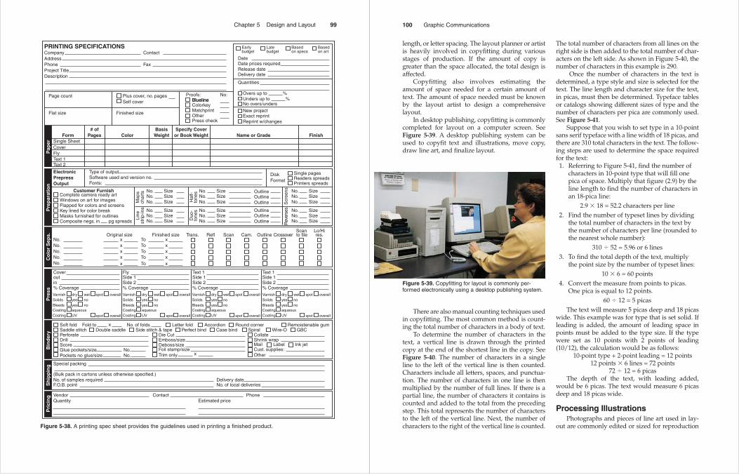
Comprehensive layoutA comprehensive layout shows how the printed
piece will look when finished. The layout artist ismaking a close version of the finished product;therefore, exact detail is essential. See Figure 5-34.
The body type is usually ruled in and the dis-play type is drawn as it will appear in the finishedpiece. Any art sketched previously now has a pho-tograph or accurate line art in its place. Specialeffects become a part of the comprehensive layout,and colors can also be added.
Instructions, specifications, and notations arenot placed directly on the comprehensive. A com-mon practice is to attach an overlay sheet with tapeat the top of the base sheet. The overlay sheet is usu-ally translucent tissue paper so that the comprehen-sive can be easily viewed along with any notations.The information is written on the tissue and servesas the specifications for the final preparation of artand copy.
The comprehensive should not be confusedwith the mechanical. The mechanical is pasted upand completed in the next step of production. Themechanical is the final stage of layout. It includesthe body text and any other camera-ready imagesthat are converted to film by a process camera orother means. See Figure 5-35.
SpecificationsSpecifications provide the information relating
to type style, type size, line or column width, coloruse, page organization, and other facts pertaining toa printed product. Specifications or specs are theoverall guidelines used in layout.
96 Graphic Communications
Figure 5-32. A rough layout is a sketched version of thefinal product.
Figure 5-33. A refined layout is sometimes made beforedoing a comprehensive layout.
Manuscripts are commonly marked with speci-fications identifying the typeface and type size to beused. The specs are used to convert the originalcopy on the manuscript to the text in the final lay-out. See Figure 5-36.
Chapter 5 Design and Layout 97
Figure 5-34. A comprehensive layout is a detailed repre-sentation of the final layout.
Figure 5-35. A completed mechanical ready to be pho-tographed and converted to film.
Our teaching staff iscreative and well
qualified. Our focus isgeared to the family
and the role of the in-dividual. Classes are of-
fered for every agegroup.
Join our staff indiscovering your manytalents which can help
your family betterunderstand itself. Ex-
plore careers, interests,hobbies. Exercise in
our gymnasium and at-tend the family
seminars.
Daily hours are from9:00 to 5:00 P.M. Even-
ing sessions start at7:00 P.M. and go until
10:00 P.M.
Big School41South Street
Haurent, MA999-9000
A
B
Figure 5-36. Specifications identify the styles and sizesof type to be used in a design. A—The manuscript ismarked to indicate type specs. B—Text in the final layoutis arranged according to the specs.
A spec sheet, sometimes called a style sheet, liststhe specs used in production. See Figure 5-37. Thespec sheet is created before beginning a job. It con-tains information on type styles and sizes, art to beused, and color usage.
Specifications are also used in printing, binding,and finishing. A printing spec sheet may list infor-mation on the type of paper to be used, color speci-fications, and other requirements. See Figure 5-38.
CopyfittingCopyfitting is the process of fitting together
copy and illustrations in a specific amount of space.It can be done by altering type size, leading, line
98 Graphic Communications
Specifications for Graphic Communications Trim: 8-1/2 x 10-7/8Gutter: 5pBottom Margin: 5pThumb Margin: 4pTop Margin: 3p to the base of the running head, 5p to the top of the first line of text2 column format: 20p3 x 1p6 x 20p3
4-color process
Chapters are always to start a new right.
Typefaces used: Palm Springs, Helvetica (all in roman, bold, italic and/or bold italic).
Running Heads: Left hand pages, set folio flush left on left hand margin of left column. Folio sets in10pt Helvetica Bold. On 3p indent set Book Title. Book Title sets in 10pt Helvetica. Right hand pages, set folio flush right on right hand margin of right column. Folio sets in 10pt Helvetica Bold. On 3p indent from right margin set Chapter Number and Title. Chapter number and title sets in 10pt Helvetica, flush right on indent. Allow an em space between the number and title.
Chapters: Are to start a new right. The chapter opener takes a drop folio, 10pt Helvetica Bold, prints black, flush left on the outside margin, 2p below the normal text bed.
Chapter Opening Graphic: Falls in the first column, and is made up of squares. Large black square is 10p3, and sets flush left on first column. Three large squares are each 3p, second set of squares is 1p6, and smallest set of squares is 1p3. There should be 3pt space between the various squares, followthe sample pages for general layout of graphic. The large squares should be 100% Cyan; 100% Magenta; and 100% Yellow. Secondary squares should be 100% Cyan, 100% Yellow; 100% Yellow, 50% Magenta; 50% Magenta, 50% Cyan. Tertiary squares should be 50% Yellow, 100% Cyan; 100% Yellow, 50% Cyan; 20% Magenta, 100% Yellow; 80% Magenta, 100% Yellow.
Chapter number: 190pt Arabic number, Helvetica Bold, 30% Black Screen, 2 digit numbers track -20, do not use the word chapter. Set so its top aligns with the top of nominal text bed, flush right. Underprints chapter title.
Chapter title: 30/30 Helvetica, Track -5, build down from top line, flush left, ragged right, in second column, with ascender of first line aligning with the top of the nominal text bed.
Objectives: Heading sets Helvetica Bold, 14/auto, Clc, flrr x 20p3, 6p below the bottom of the chaptergraphic to the ascender of the heading. 0p3 after. Opening state-
Figure 5-37. A spec sheet lists type styles and sizes, along with information on art, the use of color, page margins, andother specific information needed to produce the printed piece.
Chapter 5 Design and Layout 99
PRINTING SPECIFICATIONSCompany ContactAddressPhone FaxProject TitleDescription
Page count
Flat size
FormSingle SheetCoverFlyText 1Text 2
Type of outputSoftware used and version no.Fonts:
ElectronicPrepressOutput
# ofPages
Customer Furnish
ColorBasis
WeightSpecify Cover
or Book Weight Name or Grade Finish
Finished size
Plus cover, no. pages Proofs: No:BluelineBluelineColorkey
Overs up to %
Date
Earlybudget
Date prices requiredRelease dateDelivery date
Quantities
Unders up to %No overs/undersNew projectExact reprintReprint w/changes
MatchprintOtherPress check
Self cover
Complete camera ready artNo. SizeNo. SizeNo. SizeM
aps
char
tsLi
nest
rip-in
s
Soft fold Fold to Letter fold Accordion Round corner Remoistenable gumSaddle stitch Double saddle Side stitch & tape Perfect bind Case bind Spiral Wire-O GBCPerforateDrillScoreGlue pockets/size No.
No. xPockets no glue/size
Deboss/sizeFoil stamp/sizeTrim only
Emboss/size Shrink wrapMailCust. supplies:Other
Label Ink jet
Die Cut Collate
Windows on art for imagesFlapped for colors and screensKey lined for color breakMasks furnished for outlinesComposite negs. in pg spreads
Latebudget
Basedon specs
Basedon art
No.Original size Finished size Trans. Refl Scan Cam. Outline
Scanto file
Lo/Hires.Crossover
ToToToToTo
xxxxx
No.No.No.No.
Coveroutin% Coverage
FlySide 1Side 2% Coverage
Text 1Side 1Side 2% Coverage
Text 1Side 1Side 2% Coverage
Varnish dryyesyes
wet spot overall
spot overall
nono
aqueousUV
SolidsBleedsCoatingCoating
Varnish dryyesyes
wet spot overall
spot overall
nono
aqueousUV
SolidsBleedsCoatingCoating
Varnish dryyesyes
wet spot overall
spot overall
nono
aqueousUV
SolidsBleedsCoatingCoating
Varnish dry
Single pagesReaders spreadsPrinters spreads
DiskFormat
yesyes
wet spot overall
spot overall
nono
aqueousUV
SolidsBleedsCoatingCoating
Special packing
(Bulk pack in cartons unless otherwise specified.)No. of samples required Delivery dateF.O.B. point
Vendor ContactEstimated price
PhoneQuantity
No. of local deliveries
x No. of folds
xxxxx
No. SizeNo. SizeNo. Size
No. SizeNo. SizeNo. SizeH
alf-
tone
s
Scr
eens
Rev
erse
s
Duo
-to
nes No. Size
No. SizeNo. Size
Outline
OutlineOutline
Outline
OutlineOutline
No. SizeNo. SizeNo. Size
No. SizeNo. SizeNo. Size
Pap
erP
rep
arat
ion
Co
lor
Sep
s.P
ress
Bin
der
yS
hip
pin
gP
rici
ng
Figure 5-38. A printing spec sheet provides the guidelines used in printing a finished product.
length, or letter spacing. The layout planner or artistis heavily involved in copyfitting during variousstages of production. If the amount of copy isgreater than the space allocated, the total design isaffected.
Copyfitting also involves estimating theamount of space needed for a certain amount oftext. The amount of space needed must be knownby the layout artist to design a comprehensive layout.
In desktop publishing, copyfitting is commonlycompleted for layout on a computer screen. See Figure 5-39. A desktop publishing system can beused to copyfit text and illustrations, move copy,draw line art, and finalize layout.
The total number of characters from all lines on theright side is then added to the total number of char-acters on the left side. As shown in Figure 5-40, thenumber of characters in this example is 290.
Once the number of characters in the text isdetermined, a type style and size is selected for thetext. The line length and character size for the text,in picas, must then be determined. Typeface tablesor catalogs showing different sizes of type and thenumber of characters per pica are commonly used.See Figure 5-41.
Suppose that you wish to set type in a 10-pointsans serif typeface with a line width of 18 picas, andthere are 310 total characters in the text. The follow-ing steps are used to determine the space requiredfor the text:1. Referring to Figure 5-41, find the number of
characters in 10-point type that will fill onepica of space. Multiply that figure (2.9) by theline length to find the number of characters inan 18-pica line:
2.9 � 18 = 52.2 characters per line2. Find the number of typeset lines by dividing
the total number of characters in the text bythe number of characters per line (rounded tothe nearest whole number):
310 � 52 = 5.96 or 6 lines3. To find the total depth of the text, multiply
the point size by the number of typeset lines:10 � 6 = 60 points
4. Convert the measure from points to picas.One pica is equal to 12 points.
60 � 12 = 5 picasThe text will measure 5 picas deep and 18 picas
wide. This example was for type that is set solid. Ifleading is added, the amount of leading space inpoints must be added to the type size. If the typewere set as 10 points with 2 points of leading(10/12), the calculation would be as follows:
10-point type + 2-point leading = 12 points12 points � 6 lines = 72 points
72 � 12 = 6 picasThe depth of the text, with leading added,
would be 6 picas. The text would measure 6 picasdeep and 18 picas wide.
Processing IllustrationsPhotographs and pieces of line art used in lay-
out are commonly edited or sized for reproduction
100 Graphic Communications
Figure 5-39. Copyfitting for layout is commonly per-formed electronically using a desktop publishing system.
There are also manual counting techniques usedin copyfitting. The most common method is count-ing the total number of characters in a body of text.
To determine the number of characters in thetext, a vertical line is drawn through the printedcopy at the end of the shortest line in the copy. SeeFigure 5-40. The number of characters in a singleline to the left of the vertical line is then counted.Characters include all letters, spaces, and punctua-tion. The number of characters in one line is thenmultiplied by the number of full lines. If there is apartial line, the number of characters it contains iscounted and added to the total from the precedingstep. This total represents the number of charactersto the left of the vertical line. Next, the number ofcharacters to the right of the vertical line is counted.
by the layout artist. The principles used in designand layout must be followed when processing illus-trations. The layout artist must make sure that theillustrations are sized properly, and that they havethe right contrast, unity, and proportion.
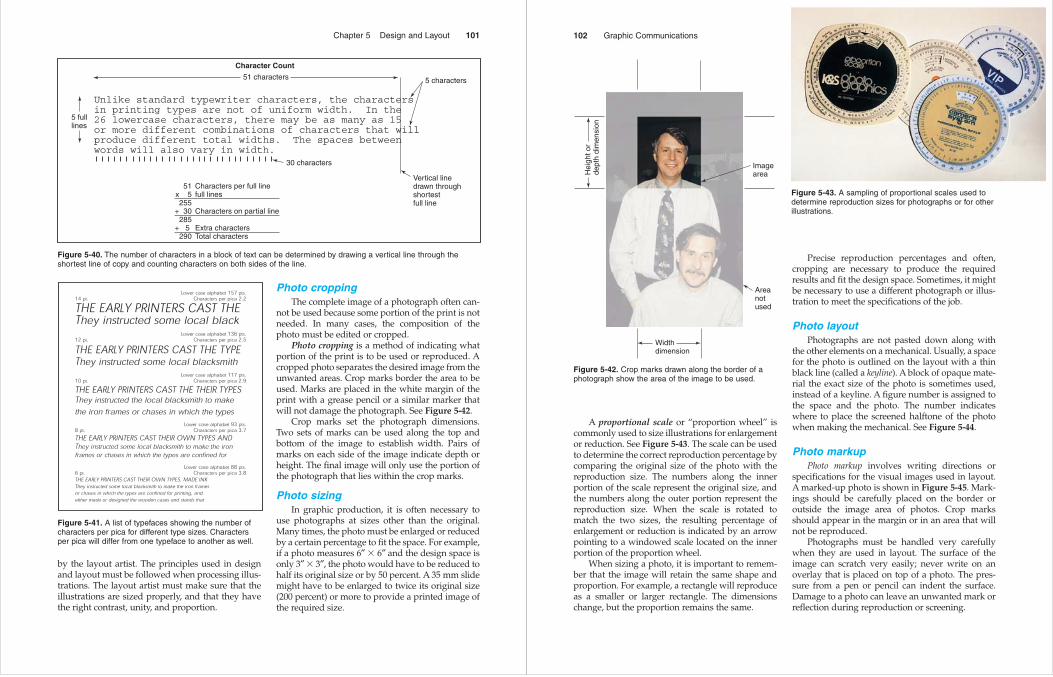
Photo croppingThe complete image of a photograph often can-
not be used because some portion of the print is notneeded. In many cases, the composition of thephoto must be edited or cropped.
Photo cropping is a method of indicating whatportion of the print is to be used or reproduced. Acropped photo separates the desired image from theunwanted areas. Crop marks border the area to beused. Marks are placed in the white margin of theprint with a grease pencil or a similar marker thatwill not damage the photograph. See Figure 5-42.
Crop marks set the photograph dimensions.Two sets of marks can be used along the top andbottom of the image to establish width. Pairs ofmarks on each side of the image indicate depth orheight. The final image will only use the portion ofthe photograph that lies within the crop marks.
Photo sizingIn graphic production, it is often necessary to
use photographs at sizes other than the original.Many times, the photo must be enlarged or reducedby a certain percentage to fit the space. For example,if a photo measures 6″ � 6″ and the design space isonly 3″ � 3″, the photo would have to be reduced tohalf its original size or by 50 percent. A 35 mm slidemight have to be enlarged to twice its original size(200 percent) or more to provide a printed image ofthe required size.
Chapter 5 Design and Layout 101
Unlike standard typewriter characters, the charactersin printing types are not of uniform width. In the 26 lowercase characters, there may be as many as 15or more different combinations of characters that willproduce different total widths. The spaces betweenwords will also vary in width.
Vertical linedrawn throughshortestfull line
5 characters51 characters
5 fulllines
Character Count
30 characters
51x 5255
+ 30285
+ 5 290
Characters per full linefull lines
Characters on partial line
Extra charactersTotal characters
Figure 5-40. The number of characters in a block of text can be determined by drawing a vertical line through theshortest line of copy and counting characters on both sides of the line.
Lower case alphabet 157 pts.14 pt. Characters per pica 2.2
THE EARLY PRINTERS CAST THEThey instructed some local black
Lower case alphabet 136 pts.12 pt. Characters per pica 2.5
THE EARLY PRINTERS CAST THE TYPEThey instructed some local blacksmith
Lower case alphabet 117 pts.10 pt. Characters per pica 2.9
THE EARLY PRINTERS CAST THE THEIR TYPESThey instructed the local blacksmith to make the iron frames or chases in which the types
Lower case alphabet 93 pts.8 pt. Characters per pica 3.7
THE EARLY PRINTERS CAST THEIR OWN TYPES ANDThey instructed some local blacksmith to make the iron frames or chases in which the types are confined for
Lower case alphabet 88 pts.6 pt. Characters per pica 3.8THE EARLY PRINTERS CAST THEIR OWN TYPES, MADE INKThey instructed some local blacksmith to make the iron framesor chases in which the types are confined for printing, andeither made or designed the wooden cases and stands that
Figure 5-41. A list of typefaces showing the number ofcharacters per pica for different type sizes. Charactersper pica will differ from one typeface to another as well.
A proportional scale or “proportion wheel” iscommonly used to size illustrations for enlargementor reduction. See Figure 5-43. The scale can be usedto determine the correct reproduction percentage bycomparing the original size of the photo with thereproduction size. The numbers along the innerportion of the scale represent the original size, andthe numbers along the outer portion represent thereproduction size. When the scale is rotated tomatch the two sizes, the resulting percentage ofenlargement or reduction is indicated by an arrowpointing to a windowed scale located on the innerportion of the proportion wheel.
When sizing a photo, it is important to remem-ber that the image will retain the same shape andproportion. For example, a rectangle will reproduceas a smaller or larger rectangle. The dimensionschange, but the proportion remains the same.
Precise reproduction percentages and often,cropping are necessary to produce the requiredresults and fit the design space. Sometimes, it mightbe necessary to use a different photograph or illus-tration to meet the specifications of the job.
Photo layoutPhotographs are not pasted down along with
the other elements on a mechanical. Usually, a spacefor the photo is outlined on the layout with a thinblack line (called a keyline). A block of opaque mate-rial the exact size of the photo is sometimes used,instead of a keyline. A figure number is assigned tothe space and the photo. The number indicateswhere to place the screened halftone of the photowhen making the mechanical. See Figure 5-44.
Photo markupPhoto markup involves writing directions or
specifications for the visual images used in layout.A marked-up photo is shown in Figure 5-45. Mark-ings should be carefully placed on the border oroutside the image area of photos. Crop marksshould appear in the margin or in an area that willnot be reproduced.
Photographs must be handled very carefullywhen they are used in layout. The surface of theimage can scratch very easily; never write on anoverlay that is placed on top of a photo. The pres-sure from a pen or pencil can indent the surface.Damage to a photo can leave an unwanted mark orreflection during reproduction or screening.
102 Graphic Communications
Widthdimension
Hei
ght o
rde
pth
dim
ensi
on
Area notused
Image area
Figure 5-42. Crop marks drawn along the border of aphotograph show the area of the image to be used.
Figure 5-43. A sampling of proportional scales used todetermine reproduction sizes for photographs or for otherillustrations.

Line artLine art is artwork that is drawn by hand or
electronically and is normally pasted up at the samesize on a mechanical. If necessary, the original artcan be enlarged or reduced. Then, the correctlysized line art can be pasted onto the mechanical. SeeFigure 5-46.
Sketches and drawings are marked in the samemanner as photographs. They must be cropped,sized, and located. Information that is marked upon illustrations might include the job title and num-ber, location in the printed piece, a figure number ifapplicable, the percentage for enlargement orreduction, the reproduction size, and the name ofthe layout artist.
When line art and tone material are usedtogether, the tone material is placed on an overlay.For example, if the tone material is going to be usedto place color in line art, it must be cut to the shapeof the art and placed in register on the overlay.
Clip artClip art is preprinted artwork that is designed
to be cut and pasted up on the mechanical. The art-work is normally cut from a sheet of clip art. SeeFigure 5-47. Today, clip art is commonly available inelectronic form. It can be printed out and pasted upin the traditional manner, or added directly to anelectronic page layout.
Clip art is commonly used for seasonal designs,such as Thanksgiving or Christmas newspaper ads.Pieces of clip art save the artist from having to drawChristmas trees, wreaths, turkeys, and other com-mon images.
Chapter 5 Design and Layout 103
Figure 5-44. Spaces are reserved as holes to indicatewhere photos are to be placed for a mechanical.
Enlarge to 6″
Figure 5-45. A photo marked up with crop marks indi-cates the size for reduction.
Figure 5-46. Line art is drawn to the necessary size andpasted up on the mechanical.
Clip art must have high image quality and density so that it will reproduce properly. The mostcommon form of clip art is made up of black imageson a white background. Some clip art is also available as separations for color printing. See Figure 5-48. Four-color clip art can be very effectiveif the artwork is appropriate for the layout.
Layout MaterialsThe two most common working surfaces used
in layout and design are a drawing board and light table. A drawing board provides an area wherethe layout can be taped down for paste-up. AT-square is used to align the mechanical on theboard. See Figure 5-49.
A light table is used in layout for the placementof translucent images, such as page negatives orcolor separations. Light passing through the imagesallows for easier alignment or registration.
104 Graphic Communications
A
B
Figure 5-47. Clip art. A—Preprinted clip art is availablein common designs and is ready to be pasted up.B—Electronic clip art is now widely used.
Figure 5-48. Clip art used in multicolor printing. Each image is a color separation and can be used to make a plate fora primary color.
YELLO PLATE
RED PLATE
BLUE
PLAT
E
Drafting boardT-square
Draftingtape
Mechanical
Figure 5-49. A drawing board serves as a working surface to paste up the mechanical.
Layout base sheetA layout base sheet is the paste-up surface or
board used in layout. The elements making up thelayout design are pasted up on the base sheet as it isdeveloped into a mechanical.
Various kinds of base sheet stock are available.Base sheets must have a surface that can accept avariety of adhesives and ink drawings. Sizes typi-cally depend on the size of the copyboard of theprocess camera used to photograph the finishedmechanical.
Preprinted base sheets are often used to makemechanicals when the same type of job is donerepeatedly. Artists using preprinted sheets do notalign paste-up materials with a T-square. Preprintedbase sheets have grids printed with nonreproduc-ing blue lines that serve as a guide for image place-ment. The grid lines are often measured at intervalsof one pica. See Figure 5-50.
Thin plastic sheets are used with base sheets asoverlays when preparing a mechanical. Overlays areusually frosted or clear plastic and are used to alignimages supporting color on top of the base sheet.They contain the elements that will print as color orscreened color. Register marks are used to align theoverlay with the mechanical. See Figure 5-51.
Chapter 5 Design and Layout 105
Figure 5-50. A preprinted layout base sheet often isused to make the mechanical. Grid lines serve as guidesfor positioning copy and art.
Figure 5-51. A plastic overlay sheet is used with amechanical to align images that will print in a secondcolor or as a percentage of black. Register marks areapplied to align the parts.
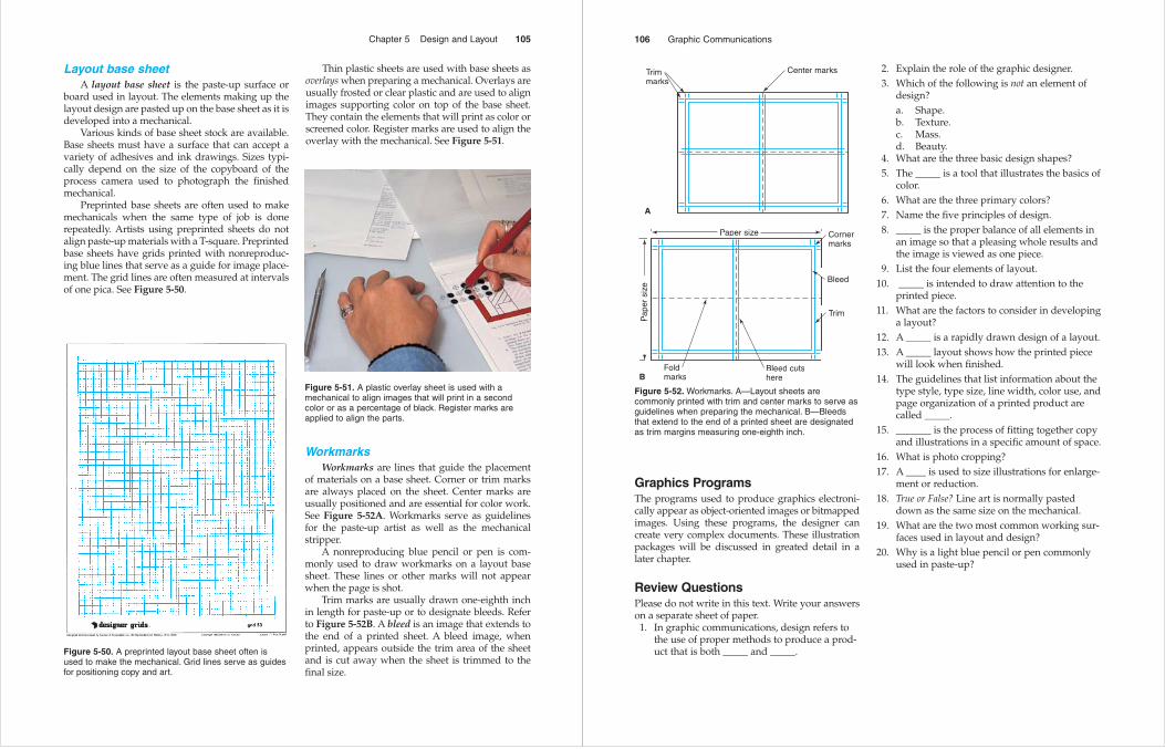
WorkmarksWorkmarks are lines that guide the placement
of materials on a base sheet. Corner or trim marksare always placed on the sheet. Center marks areusually positioned and are essential for color work.See Figure 5-52A. Workmarks serve as guidelinesfor the paste-up artist as well as the mechanicalstripper.
A nonreproducing blue pencil or pen is com-monly used to draw workmarks on a layout basesheet. These lines or other marks will not appearwhen the page is shot.
Trim marks are usually drawn one-eighth inchin length for paste-up or to designate bleeds. Referto Figure 5-52B. A bleed is an image that extends tothe end of a printed sheet. A bleed image, whenprinted, appears outside the trim area of the sheetand is cut away when the sheet is trimmed to thefinal size.
Graphics ProgramsThe programs used to produce graphics electroni-cally appear as object-oriented images or bitmappedimages. Using these programs, the designer can create very complex documents. These illustrationpackages will be discussed in greated detail in alater chapter.
Review QuestionsPlease do not write in this text. Write your answerson a separate sheet of paper.1. In graphic communications, design refers to
the use of proper methods to produce a prod-uct that is both _____ and _____.
2. Explain the role of the graphic designer. 3. Which of the following is not an element of
design? a. Shape.b. Texture.c. Mass.d. Beauty.
4. What are the three basic design shapes? 5. The _____ is a tool that illustrates the basics of
color. 6. What are the three primary colors? 7. Name the five principles of design.8. _____ is the proper balance of all elements in
an image so that a pleasing whole results andthe image is viewed as one piece.
9. List the four elements of layout. 10. _____ is intended to draw attention to the
printed piece. 11. What are the factors to consider in developing
a layout? 12. A _____ is a rapidly drawn design of a layout. 13. A _____ layout shows how the printed piece
will look when finished. 14. The guidelines that list information about the
type style, type size, line width, color use, andpage organization of a printed product arecalled _____.
15. _______ is the process of fitting together copyand illustrations in a specific amount of space.
16. What is photo cropping? 17. A ____ is used to size illustrations for enlarge-
ment or reduction. 18. True or False? Line art is normally pasted
down as the same size on the mechanical. 19. What are the two most common working sur-
faces used in layout and design? 20. Why is a light blue pencil or pen commonly
used in paste-up?
106 Graphic Communications
Center marksTrimmarks
A
B
Pap
er s
ize
Paper size Cornermarks
Bleed
Trim
Bleed cutshere
Foldmarks
Figure 5-52. Workmarks. A—Layout sheets are commonly printed with trim and center marks to serve asguidelines when preparing the mechanical. B—Bleedsthat extend to the end of a printed sheet are designatedas trim margins measuring one-eighth inch.