Embed Size (px)
DESCRIPTION
something here
Citation preview
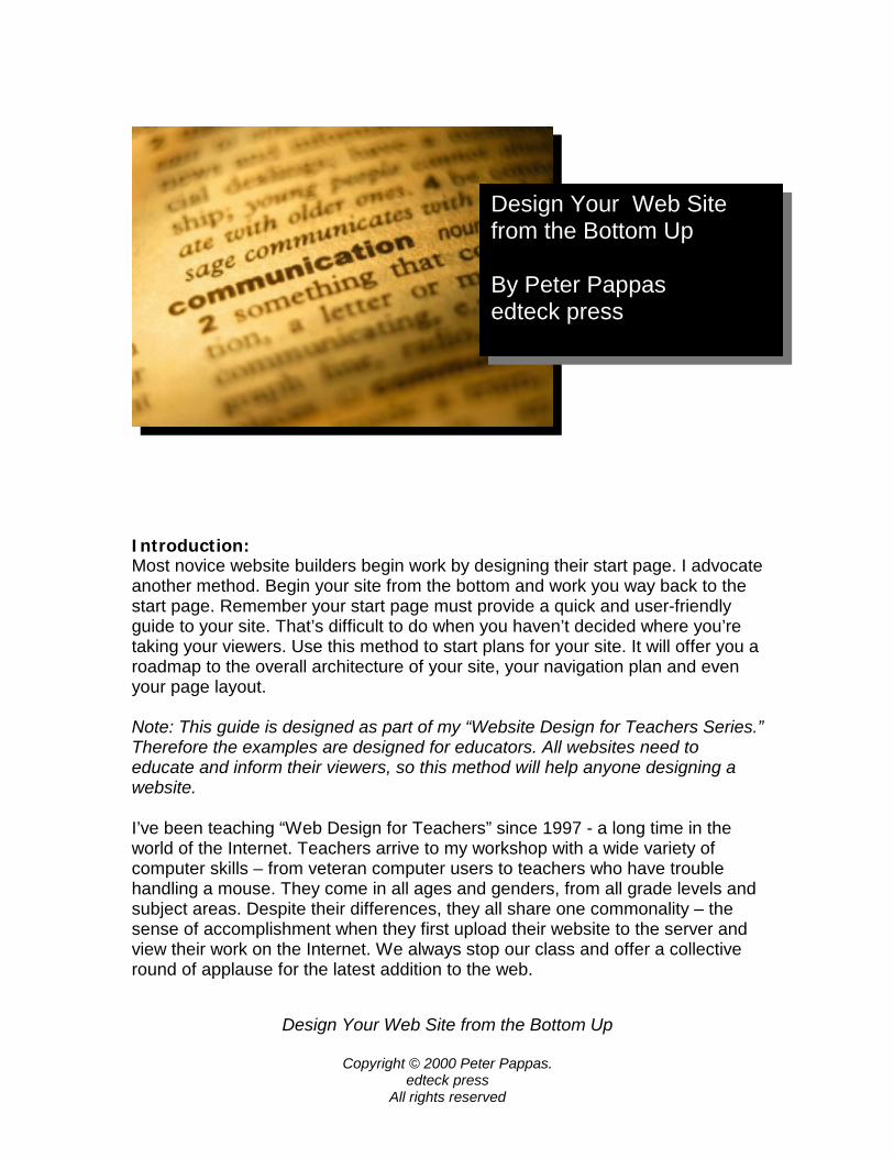
Design Your Web Site from the Bottom Up
Copyright © 2000 Peter Pappas. edteck press
All rights reserved
Introduction: Most novice website builders begin work by designing their start page. I advocate another method. Begin your site from the bottom and work you way back to the start page. Remember your start page must provide a quick and user-friendly guide to your site. That’s difficult to do when you haven’t decided where you’re taking your viewers. Use this method to start plans for your site. It will offer you a roadmap to the overall architecture of your site, your navigation plan and even your page layout. Note: This guide is designed as part of my “Website Design for Teachers Series.” Therefore the examples are designed for educators. All websites need to educate and inform their viewers, so this method will help anyone designing a website. I’ve been teaching “Web Design for Teachers” since 1997 - a long time in the world of the Internet. Teachers arrive to my workshop with a wide variety of computer skills – from veteran computer users to teachers who have trouble handling a mouse. They come in all ages and genders, from all grade levels and subject areas. Despite their differences, they all share one commonality – the sense of accomplishment when they first upload their website to the server and view their work on the Internet. We always stop our class and offer a collective round of applause for the latest addition to the web.
Design Your Web Site from the Bottom Up By Peter Pappas edteck press
Design Your Web Site from the Bottom Up
Copyright © 2000 Peter Pappas. edteck press
All rights reserved
When I first stated teaching “Web Design for Teachers” my focus was on the technical side of the process. Teachers spent hours learning how to set text and images, layout pages and build hyperlinks. But I’ve learned that they can quickly master the technical side of making a web page. After a quick overview of the software, most teachers can begin building a website within a few hours. New web authoring software like FrontPage makes web design about as easy as word processing. Most find that the real challenge is mastering the architecture and design of a website. So let’s get started designing from the bottom up. Table of Contents:
Step 1: Brainstorm Step 2: Grouping the information Step 3: Critique the categories Step 4: Revise your categories Step 5: Develop a flow chart Step 6: Design a navigational plan Step 7: Page layout Step 8: Don’t forget to keep it simple Step 9: Finally, you get to make your homepage Step 10: Congratulate yourself and get ready to upload your server
About the author: Over his 30-year career in education, Peter Pappas has worked with school districts from across the nation as consultant for technology integration, staff development, curriculum and assessment design. He has been the recipient of state and national fellowships and has authored or contributed to textbooks, teacher resource books, assessment packages, and professional journals. Currently he’s exploring the ways that Internet can be better harnessed to improve student performance and the quality of teaching and learning. His homepage is found at: www.edteck.com
Design Your Web Site from the Bottom Up
Copyright © 2000 Peter Pappas. edteck press
All rights reserved
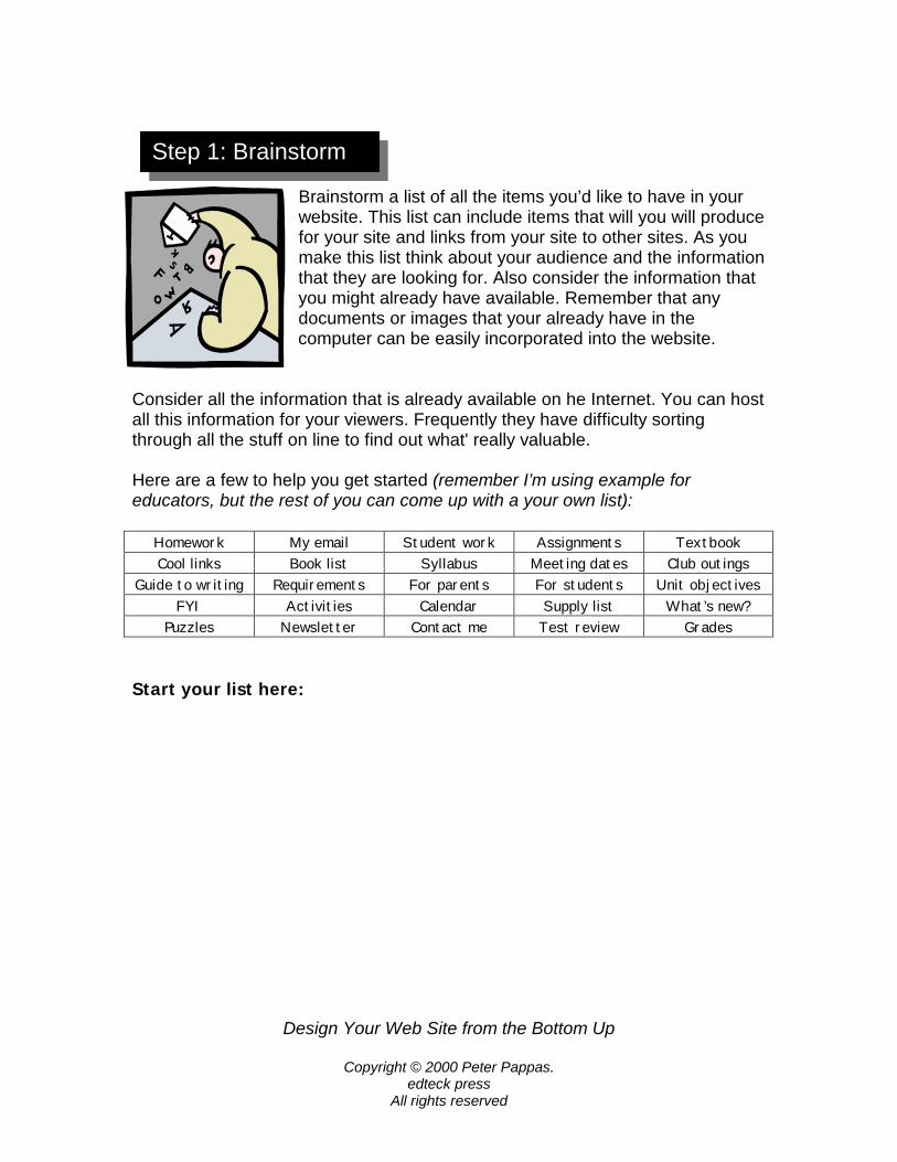
Brainstorm a list of all the items you’d like to have in your website. This list can include items that will you will produce for your site and links from your site to other sites. As you make this list think about your audience and the information that they are looking for. Also consider the information that you might already have available. Remember that any documents or images that your already have in the computer can be easily incorporated into the website.
Consider all the information that is already available on he Internet. You can host all this information for your viewers. Frequently they have difficulty sorting through all the stuff on line to find out what' really valuable. Here are a few to help you get started (remember I’m using example for educators, but the rest of you can come up with a your own list):
Homework My email Student work Assignments Textbook Cool links Book list Syllabus Meeting dates Club outings
Guide to writing Requirements For parents For students Unit objectives FYI Activities Calendar Supply list What’s new?
Puzzles Newsletter Contact me Test review Grades Start your list here:
Step 1: Brainstorm
Design Your We
Copyright ©e
All r
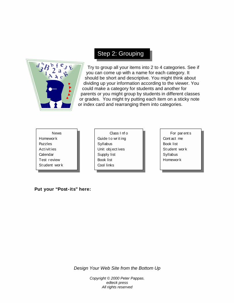
Try to group all your items into 2 to 4 categories. See if
you can come up with a name for each category. It should be short and descriptive. You might think about
dividing up your information according to the viewer. You could make a category for students and another for
parents or you might group by students in different classes or grades. You might try putting each item on a sticky note
or index card and rearranging them into categories.
Put your “Post-its” here:
News Homework Puzzles Activities Calendar Test review Student work
GuideSyllabUnit oSupplBook lCool li
For parents Contact me Book list Student work Syllabus Homework
Step 2: Grouping
Class Info to writing us bjectives y list ist nks
b Site from the Bottom Up
2000 Peter Pappas. dteck press ights reserved
Design Your Web Site from the Bottom Up
Copyright © 2000 Peter Pappas. edteck press
All rights reserved
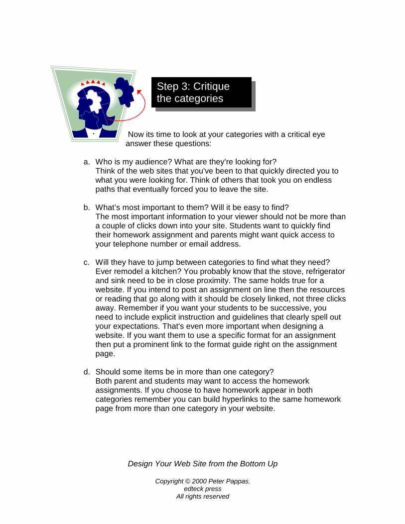
Now its time to look at your categories with a critical eye answer these questions:
a. Who is my audience? What are they’re looking for?
Think of the web sites that you've been to that quickly directed you to what you were looking for. Think of others that took you on endless paths that eventually forced you to leave the site.
b. What’s most important to them? Will it be easy to find?
The most important information to your viewer should not be more than a couple of clicks down into your site. Students want to quickly find their homework assignment and parents might want quick access to your telephone number or email address.
c. Will they have to jump between categories to find what they need?
Ever remodel a kitchen? You probably know that the stove, refrigerator and sink need to be in close proximity. The same holds true for a website. If you intend to post an assignment on line then the resources or reading that go along with it should be closely linked, not three clicks away. Remember if you want your students to be successive, you need to include explicit instruction and guidelines that clearly spell out your expectations. That's even more important when designing a website. If you want them to use a specific format for an assignment then put a prominent link to the format guide right on the assignment page.
d. Should some items be in more than one category?
Both parent and students may want to access the homework assignments. If you choose to have homework appear in both categories remember you can build hyperlinks to the same homework page from more than one category in your website.
Step 3: Critique the categories
Design Your Web Site from the Bottom Up
Copyright © 2000 Peter Pappas. edteck press
All rights reserved
e. What items will stay the same, or will they need frequent updating? This is important since your website should make your life easier, not become a project that demands constant attention. You might consider designing one section of your site that won't need much updating, and another that will be updated on a regular basis. This will help you to stay focused on the sections of the site that will need revisions. Do yourself a favor and don't set overly ambitions goals for yourself. The "Quote of the Day" may sound like a good idea when you get started, but be sure you intend to keep it up. A weekly "review guide" may be a more manageable task.
f. Do the categories make sense? Do they describe what’s in them?
You won't be around to guide your audience through your website. You might think that an image of an owl makes a good link to your resource list, but will the viewer know that? It's great to use some artistic creativity, but your site needs to be clear in its organization and navigation. Also remember that you may be reaching a diverse audience with special needs that can be addressed in the design of your site.
Revise the categories and items as needed. Stay focused on what it will be like for your audience to find the information they want. Remember that when confronted with new information people make their own assumptions about what information they’ll find and where the will go to get it.
Step 4: Revise your categories
Design Your Web Site from the Bottom Up
Copyright © 2000 Peter Pappas. edteck press
All rights reserved
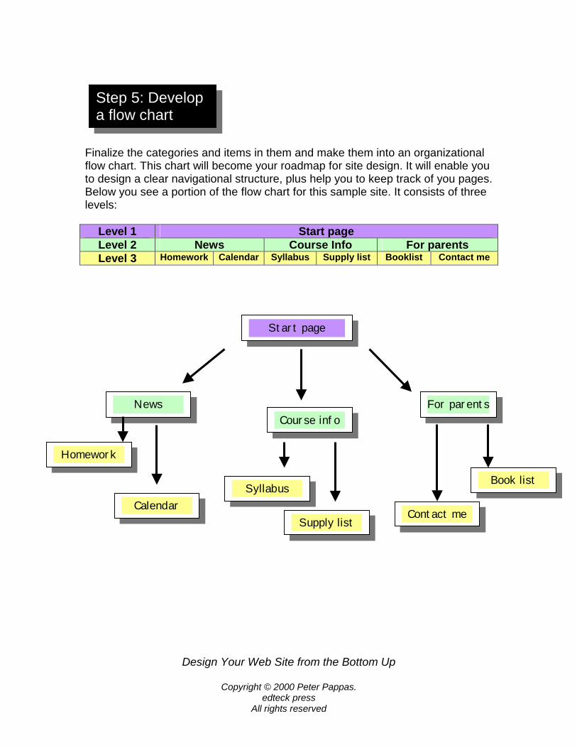
Finalize the categories and items in them and make them into an organizational flow chart. This chart will become your roadmap for site design. It will enable you to design a clear navigational structure, plus help you to keep track of you pages. Below you see a portion of the flow chart for this sample site. It consists of three levels:
Level 1 Start page Level 2 News Course Info For parents Level 3 Homework Calendar Syllabus Supply list Booklist Contact me
Start page
News Course info
For parents
Step 5: Develop a flow chart
Syllabus
Supply listContact me
Book list
Homework
Calendar
Design Your Web Site from the Bottom Up
Copyright © 2000 Peter Pappas. edteck press
All rights reserved
As you layout your flow chart you need to balance the breadth and depth of the design. For example, if you had 12 second level pages and no third level you would have a very broad and shallow site that would force the viewer to sort through a long laundry list of second level page choices. In contrast a site with only 3 second level pages and a depth down to 5 levels might force the viewer to click down through too many levels to reach the information they were looking for. As with most things in life, look for a balance.
Now you need to think about he navigational path that viewers will use to move around your site. Most likely they will begin on the start page and click to a second level page and perhaps down to a third level page. Many will simple use the back button on the browser to return to the start. But you also need to develop a navigational system to give them short cuts from one portion of the site to another without have to use the back button. Once again balance is the key. You need to offer them enough short cut links to other areas of your site, but not so many to confuse them or clutter the page. It is impractical to provide links directly connecting every page in your site. I find that the best approach is to put a navigation bar on every page that links to the start page and each of the second level pages. This simplified navigational structure gives the viewer a limited number of direct links to recognizable reference point in the site. In the current example I would use:
start | news | info | parents Each of your pages in the site can begin with this navigation bar. It’s a clear guide the viewer to the start page or any of the second level pages in the site. Notice that each of the links is a short word. Remember that space is at a premium on each page. You may have to use some creativity to develop short words for a navigation bar.
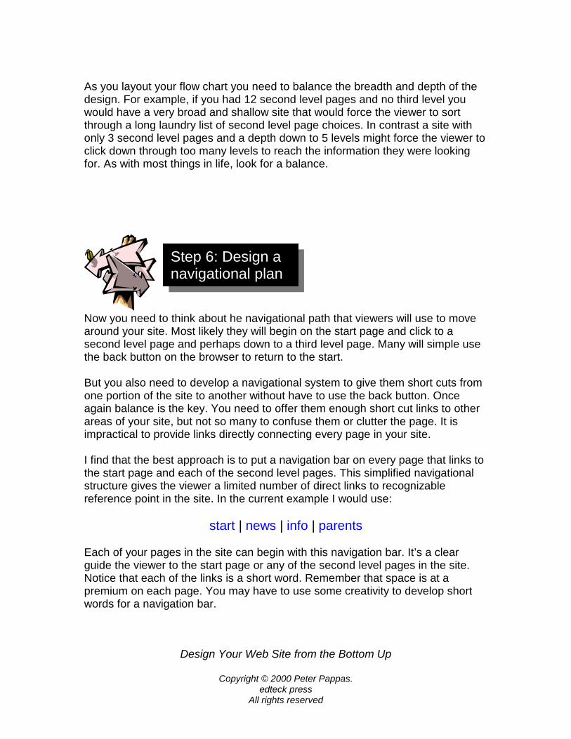
Step 6: Design a navigational plan
Design Your Web Site from the Bottom Up
Copyright © 2000 Peter Pappas. edteck press
All rights reserved
Once you make your hyperlinks, it's easy to copy and paste them into the top of every page in your site. This navigational system doesn’t allow the viewer to go directly from one third level page to another third level page, but most people will quickly learn how to get around your site. Many web designers use frames to create navigational structure, but they create problems that can outweigh their functionality. Many people rely on the “Back button” of their browser to get around. Frames can confuse that technique. Frames also make it difficult for people to bookmark or print out specific pages in the site. The frames also use up valuable screen space when they run continuously down the margin of a page. I strongly recommend putting your navigation bar at the top and bottom of very page. If you choose to use a navigational bar on the side of the page, you'll be using up valuable screen space. The top / bottom navigation maximizes your usable screen space plus its easier to build into each page as a header and footer. Viewers will want to navigate from both the top and bottom of your page so they don’t have to scroll up or down to move to another page in your site. You should include some information that identifies your site and the designer at the bottom of very page. Sometime search engines will pick up a direct link to a lower level of your site. For example a search engine might take viewers directly to one of your third level. They need to quickly know where they have arrived and be provided with information about the site and a chance to get back to your start page. You need to brand the page and provide navigation back to your home page or you might find a new viewer at your site stranded on an “orphan page.” Then they have only one place to go – they’ll use the browser back button and return to the search engine. You just lost a viewer. If you use images as part of your navigational structure, remember to put a second text only navigation bar somewhere else on the page. Some people browse the web with the images "turned off." Others may be visually impaired and rely on software to read the web to them. In both cases they will need to have a text alternative to an image-only navigation bar.
Design Y
C
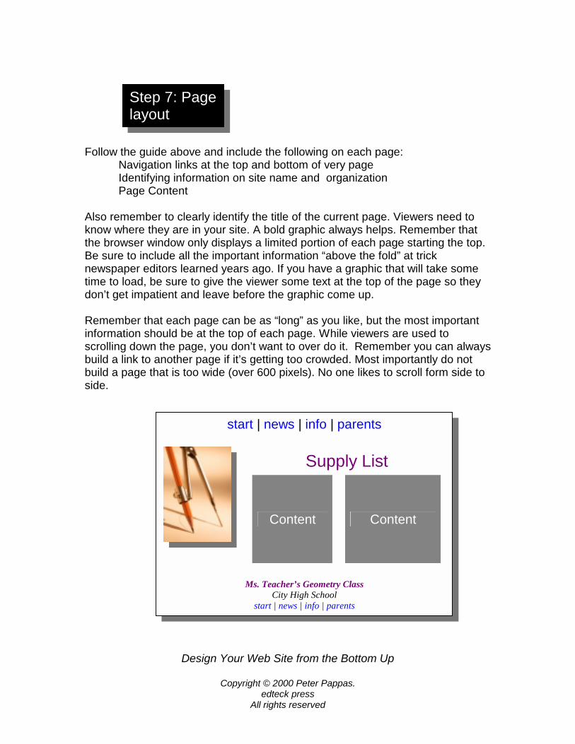
Follow the guide above and include the following on each page:
Navigation links at the top and bottom of very page Identifying information on site name and organization Page Content
Also remember to clearly identify the title of the current page. Viewers need to know where they are in your site. A bold graphic always helps. Remember that the browser window only displays a limited portion of each page starting the top. Be sure to include all the important information “above the fold” at trick newspaper editors learned years ago. If you have a graphic that will take some time to load, be sure to give the viewer some text at the top of the page so they don’t get impatient and leave before the graphic come up. Remember that each page can be as “long” as you like, but the most important information should be at the top of each page. While viewers are used to scrolling down the page, you don’t want to over do it. Remember you can always build a link to another page if it’s getting too crowded. Most importantly do not build a page that is too wide (over 600 pixels). No one likes to scroll form side to side.
Step 7: Page layout
start | news | info | parents
Supply List
Content Content
Ms. Teacher’s Geometry Class City High School
start | news | info | parents
our Web Site from the Bottom Up
opyright © 2000 Peter Pappas. edteck press
All rights reserved
Design Your Web Site from the Bottom Up
Copyright © 2000 Peter Pappas. edteck press
All rights reserved
Most viewers want to quickly find the information that they’re looking for. Don’t clutter up the page with scrolling banners and animations that distract from the message of the site. And who wants to wait while your sound file of the “National Anthem” loads? Every graphic you add to the page will increase the download time. Most viewers quickly lose interest in waiting for your page to appears. Load time is especially important at the top end of your site. Be sure that your start page and second level pages load very quickly. If you must include some graphic intensive pages, do it lower in your site. This way if the viewer gets impatient and hits the back button, they will still be in your site.
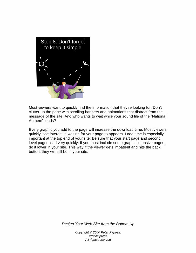
Step 8: Don’t forgetto keep it simple
Design Your Web Site from
Copyright © 2000 Peter edteck press
All rights reserve
But don’t get smug, remember that building andgoing project. And please don’t add any cute “usite. They’re always under construction.
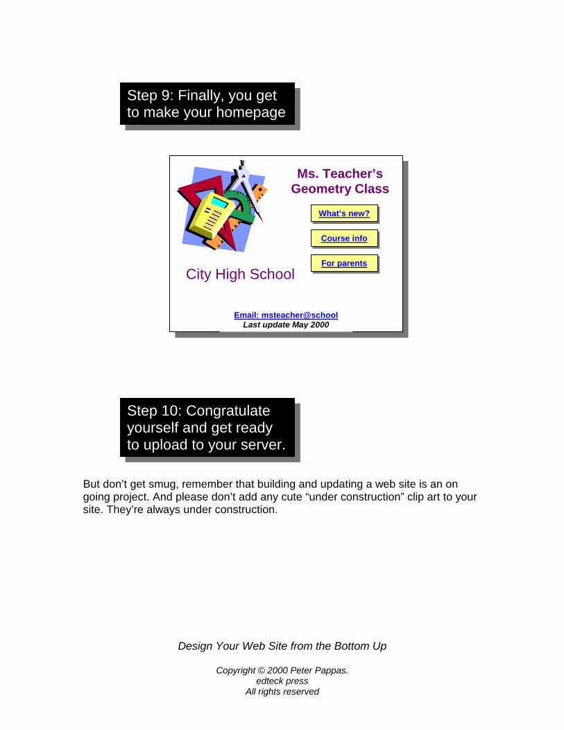
Ms. Teacher’s Geometry Class
City High School
Step 9: Finally, you get to make your homepage
What’s new?
P
d
n
Course info
For parents
Email: msteacher@schoolLast update May 2000
Step 10: Congratulate yourself and get ready to upload to your server.
the Bottom Up
appas.
updating a web site is an on der construction” clip art to your