Embed Size (px)
Citation preview
MARKS: 150
This memorandum consists of 29 pages.
Copyright reserved Please turn over
DESIGN P1
(THEORY)
NOVEMBER 2009
MEMORANDUM
NATIONALSENIOR CERTIFICATE
EXAMINATION
GRADE 12
Design/P1 2 DoE/November 2009NSC – Memorandum
SECTION A
QUESTION 1 [20 marks]
AS1: Make value judgments informed by a clear understanding of design. AS2: Understand design theory and use design terminology correctly.
1.1 [10 marks]
1.1.1 (Allocate 4 marks)
The application of critical thinking skills and how the learner is able to answer appropriately is to be considered in the overall assessment of this question.
Credit must be given to any valid and reasonable answer.
ART: Learners may argue that the teapot can be viewed in a gallery as the surface decoration is too embellished/ornate to be a design (functional). They may refer to the surface decoration as being seen as part of the artist’s personal expression, which therefore classifies the ceramic piece as art. The surface decoration could also relate to storytelling, which is better suited to an art piece to be viewed at a gallery. This ceramic piece emphasises appearance (form) as opposed to function. The delicate nature of the surface decoration will make this pot difficult to use as a design for everyday usage which makes it art. The teapot is unique (once-off) that would be difficult to mass produce.
DESIGN: Learners may argue that the teapot embraces design in an African aesthetic, which is unique and different to what people generally classify as design. (The separation of Art and Design does not exist in traditional African society). The teapot has a function/purpose as seen by the decorative handle and elephant on the top of the lid. The teapot combines functionality and aesthetics in a pleasing manner that benefits the designer in being able to make a living from his/her craft. The pot offers a creative solution to the function of a pot, which therefore makes it an innovative, aesthetic design solution. The creation of these teapots empowers designers to create craft/design which can be sold at craft markets or galleries.
As a third option, learners should be given credit if they argue that the pot is both Design and Art, as this division should not exist. Art and Design cannot be separated from each other, and, as there are no boundaries, they may substantiate from the answers shown above.
Credit any other arguments.
Copyright reserved Please turn over

Design/P1 3 DoE/November 2009NSC – Memorandum
1.1.2 (Allocate 6 marks)
1 mark for identification and 1 mark for explanation of.
The following may be included in the analysis:
Form (element) – There are organic 3-D forms (like the sculptural leopard) that are combined in an unusual way (the contrast between the animal forms and the plant forms). The pot has a bulbous form .
Plane (element) – The surface decoration shows flat (2-D) glazed shapes (images) of animals.
Dot/line (element) – Heavy dark lines outline the animals to emphasise and define them. The use of dots in the glaze builds up patterns and visual textures.
Tonal value (element) – The lighter tones on the body of the pot contrast against the middle and darker tones of the animal and plant forms, e.g. the leopards spots.
Texture (element) – Tactile (physical) texture is found in the sculptural surface decoration of the 3-D animal and plant forms. Visual (illusionary) texture can be seen as a design feature e.g. the leopard fur. This is 2-D glazed surface decoration which is smooth
Balance (principle) Asymmetrically balanced – what appears on one side, does not reflect the other side. E.g. the spout on one side – handle on the other side.
Unity (principle) Created by the repetition of animals all over the teapot.
Variety (principle) The designer used different shapes e.g. animals, birds, plant forms, etc. to create variety in the design.
Contrast (principle) Is created by the use of different shapes (animals and flowers), patterns and sizes (big animal pattern next to small patterns) next to each other .
Rhythm (and movement) (principle) The repetition of the leopard spots seen at the bottom of the pot, creates a sense of rhythm that moves in a circle.
Emphasis (principle) The sculptural elephant head on the lid acts as the focal area.
Proportion (principle) The teapot shows an awareness of the human hand in the size of the handle. (Ergonomics) The spout is big and would most likely allow a good delivery of tea into the cup.
Copyright reserved Please turn over
Design/P1 4 DoE/November 2009NSC – Memorandum
Storytelling (universal principle) The oral history of indigenous cultures takes visual form in a depiction of the natural African landscape, which includes the characters found there. This creates a rich cultural context (tells a story).
Similarity (universal principle) (Gestalt) Elements that are similar (animal forms) are seen to be more related than elements that are dissimilar. This sets up relatedness (unity) within the pot and ensures integration of elements.
Aesthetic-usability effect (universal principle) The function of this design is to pour tea. A simple pot would do, BUT a design which is beautiful at the same time is perceived as more desirable, easier to use, and reduces stress.
Credit must also be awarded to any other reasonable observations.
Give credit for any other elements and principles.
1.2 [10 marks]
1.2.1 (Allocate 6 marks)
The application of critical thinking skills and how the learner is able to comment on the statement with a substantiated response is to be considered in the overall assessment of this question.
Credit must be given to any valid and reasonable answer.
Weaknesses: Learners may argue that cutlery is important in fulfilling a specific function in being able to pick up food; if this function is compromised then the design is inappropriate.
Copyright reserved Please turn over
Q1.1LEVEL
COGNITIVE SKILLS
WEIGHTING %
QUESTIONS MARKS(10)
Lower order Recall of elements and principles 30% 1.1.1 + 1.1.2 3
Middle order Application of elements and principles
40% 1.1.1 + 1.1.2 4
Higher order AnalysisSynthesisEvaluation
30% 1.1.1 + 1.1.2 3
Design/P1 5 DoE/November 2009NSC – Memorandum
(Example: the spoon on the right-hand side is not suitable for eating soup because of the hole in the centre; the ‘fork’ utensil in the centre will not be able to pick thick pieces of meat, etc.) The cutlery should be able to perform a function and look good at the same time; a design that emphasises appearance will ignore the fundamental concern of providing an innovative design solution and problem-solving. All designs should perform its function with relative ease, as this is the first hurdle in coming up with a design solution that looks good and is usable. E.g. the centre fork does not seem ergonomically suitable for a small hand. The cutlery looks difficult to use because the handle sizes differ, and may not be suited to certain foods and is therefore a weak design.
The shapes of the cutlery do not create an immediately recognisable design solution and therefore people may not recognise it as a set of cutlery. The unusual appearances of the design make it difficult to perform simple tasks (example the disproportioned forks will not be able to pick up food as expected). The spoon with the hole on the centre will not be able to function appropriately as it could cut your lip. The sharp-pointed ends of the centre fork make it dangerous for everyday use.
Strengths: Learners may argue that consumers are often bombarded with boring, run- of-the-mill design products that need to change and offer variety. This cutlery is unique and original, which stimulates the imagination, provides beauty and is able to provide a function (you can eat with it). Designers often focus on providing long- lasting, iconic design solutions that need to embrace style and visual appeal as opposed to an over-emphasis on function. Aesthetics is more important. The debate of form following function is irrelevant to the cutlery as the visual appeal is emphasised as a means of evolution of design development (This cutlery range could be seen in a gallery). The cutlery combines different functions (cutting food and using the sharp points to pick up) of cutlery in a visually pleasing and aesthetic manner. The cutlery is further enhanced by the ability to pick up foods that were difficult to pick up before. E.g. cherry tomatoes by the centre fork. This cutlery range is far more culturally diverse in catering for a wide variety of food e.g. Chinese, African, etc. The unique contrast of shapes from oval to sharp-pointed shapes adds to the visual appeal of the design.
1.2.2 (One mark per explanation) Positive form (3D): The irregular shape/form of each piece of cutlery is
different to what is generally accepted as the shape/form of cutlery and is called the positive/material form – e.g. here made of stainless steel. Organic, oval shapes blend in with simple straight lines in the easy to hold handles.
Negative plane (two-dimensional): The planes (voids) within the utensils contrast with the positive (solid) forms (3D) to create a unique design solution that is pleasing to the eye and the background creates negative planes. The long thin negative shapes/planes of the background interplay with the positive forms of the fork to create a combined whole.
Copyright reserved Please turn over
Design/P1 6 DoE/November 2009NSC – Memorandum
Proportion: The weight of the top parts of the utensils is related to the length of the handles. The handles are ergonomic and easy to use, or can be seen as not having proportionally well designed handles e.g. the centre fork’s handle is too thick and too short. The utensil looks well balanced with regard to weight distribution.
Symmetry: The utensils are asymmetrical in design. The pointed feature at the top is balanced with the round or flat handle. The fork on the left has
a symmetrical balance with a middle tine and 2 on each side.
Credit must be given to any valid and reasonable answer.
Copyright reserved Please turn over
Q1.2LEVEL
COGNITIVE SKILLS
WEIGHTING QUESTIONS MARKS(10)
Lower order Recall of elements and principles 30% 1.2.1 + 1.2.2 3
Middle order Application of elements and principles
40% 1.2.2 4
Higher order AnalysisSynthesisEvaluation
30% 1.2.1 + 1.1.2 3
Design/P1 7 DoE/November 2009NSC – Memorandum
QUESTION 2 [10 marks]
AS3: Discuss, explain and demonstrate the context and purpose of the products, images, signs and symbols used in design to convey overt and hidden messages that reinforce or challenge stereotypes, biases and prejudices, past and present.
AS2: Understand design theory and use design terminology correctly.
2.1 (Allocate 4 marks)
Learners might offer different viewpoints to the question. The application of critical thinking skills and how the learner is able to answer appropriately is to be considered in the overall assessment of this answer. Credit must be awarded to any other reasonable observations.
The symbol represents recycling or re-use – this is shown by the rotation; a continuation of an on-going process. The folded arrows symbolises movement in a specific direction. The play between positive and negative shapes in the circle can symbolise black/white, good/evil. The learners may also refer to the symbol as a directional arrow/movement that creates a circle or “wholeness”. The black circle can be read as the earth (global circle).
2.2 (Allocate 6 marks)
Learners will offer different interpretations to the question. The application of visual literacy and how the learner is able to answer appropriately is to be considered in the overall assessment of this question.
Possible symbols: Band-Aid symbolises healing. The heart symbolises feelings/love/soul. The burning candle symbolises hope/light for a brighter future. The uniform figures symbolises the people/population/community/nation. One light-shaded figure (with the heart) symbolises difference/not part of the crowd/individualism. The detail of the heart seems to come from the stylised heart of the man, that means visible ‘love’ towards neighbours. This symbolises focussing in on healing activities that are possible. The rainbow symbolizes hope for diversity – ‘rainbow nation’.
Possible message: The map of South Africa on the heart, with the Band-Aid across, could symbolise both the healing of the country and the healing of its entire people. It could also symbolise the difference that one person, with a heart/feelings for humanity, can make in society – change can thus be brought about by one individual. It is interesting that only the symbols for men are used. This could be a message to show the nurturing potential of all men.
Credit must also be given to any other reasonable observations.
Copyright reserved Please turn over
Q2LEVEL
COGNITIVE SKILLS
WEIGHTING QUESTIONS MARKS(10)
Lower order Observation; Comprehension 30% 2.1 + 2.2 3
Middle order Application 40% 2.1 + 2.2 4
Higher order Analysis; SynthesisEvaluation Deduction
30% 2.1 + 2.2 3
Design/P1 8 DoE/November 2009NSC – Memorandum
QUESTION 3 [20 marks]
AS4: Investigate, reflect on and interpret information from a variety of sources that show global influences shaping the development of design.
3.1
This will highlight the connections between International and South African Design. Examples used will be ‘unseen’.This question gives scope for critical evaluation of the interface between international and local design.
3.1.1 (Allocate 6 marks)
Similarities: The use of geometric lines and shapes is evident on both designs. Both designs employ geometric patterning such as triangles, diagonal bands (zigzag shapes and patterns). The surface decoration shows contrast as seen in the use of tonal variations (black, grey and white, lighter/darker tones or colours). The surface texture appears to be tactile, as both designs appear to be hand-made (recycled fabrics and glass beads and shells). Both designs combine different materials (the vase uses glass and recycled fabric while the apron uses glass beads and shells). Both designs are organic in nature. Both designs are functional.
Differences: Obvious = material differences: Recycled fabric woven around glass versus natural glass beads and seeds. Vase is 3-dimensional versus the 2-dimensional nature of the apron. The surface pattern on the Missoni vase combines already made fabric patterns in a unique ‘pastiche’/combined design, while the apron incorporates the surface design as part of the production process in an ordered manner – i.e. counting stitches as the weaving progresses. The triangular patterns on the apron contrast with zigzag, linear patterns shown on the Missoni vase. The apron’s surface pattern is symmetrically balanced white. The Missoni vase is asymmetrically patterned.
3.1.2 (Allocate 4 marks)
The application of critical thinking skills and how the learner is able to answer appropriately is to be considered in the overall assessment of this question.
Learners may argue that the combination of traditional African practice with European influences is unfair, as traditional African practices are often exploited for commercial gain where craftspeople are paid very poorly. The combination of that which is traditional with outside, European influences is disrespectful to age-old traditions passed on from generation to generation. Once this combination occurs, traditional African practices will be lost and original meaning and techniques altered. Learners may argue that design should be unique and original, in that the influences on them are not obviously apparent. Designers need to create design solutions that stand (representative of a culture/country) out as opposed to designs that are merely concerned with capital gain, disregarding heritage. Each design should have a contextual feel of the country in which it is made.
Copyright reserved Please turn over
Design/P1 9 DoE/November 2009NSC – Memorandum
Alternatively, learners may argue that this combination between traditional African practices and European influence is what ‘new’ design practices are all about, as they evolve into something new. The ability of the new-age designer to marry influences and traditional practices is an essential part of the design process and development. Design defies boundaries and is inclusive of tradition and modern development. Learners may argue that if global trends are not accommodated, the designer will not be able to sell his/her products. Designers need to earn a living to suit the needs of clients who have exposure to the global village. Global trends inform design practice therefore design constantly evolves and renews trends. Design cannot operate without collaboration and trend setting i.e. the change of trends to other newer ones. E.g. to develop African themes now in fashion. Combined trends to gain a wider target market. Make African design popular in European/ USA markets.A way of teaching one another about different cultures and traditions.
3.2 (Allocate 10 marks)
NOTE: A learner may choose to use any example as provided in the LPG, PAT or any other documented source.
In the candidate's discussion the following must be discussed to ensure full credit:
Identify the designer. E.g. Sonwabile Ndamase of Vukani Fashions; Carrol Boyes. (1)
Names of the designs/description of the designs. (1) Influences on the designer's work; local and global/international and characteristic
style of the design(s). (8)
Example: (Allocate 10 marks)
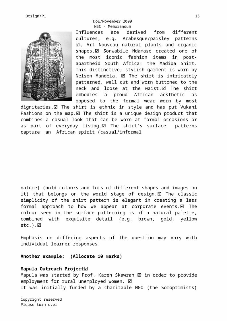
Sonwabile Ndamase of Vukani Fashions, creator of the Madiba shirts.
Influences are derived from different cultures, e.g. Arabesque/paisley patterns , Art Nouveau natural plants and organic shapes. Sonwabile Ndamase created one of the most iconic fashion items in post-apartheid South Africa: the Madiba Shirt. This distinctive, stylish garment is worn by Nelson Mandela. The shirt is intricately patterned, well cut and worn buttoned to the neck and loose at the waist. The shirt embodies a proud African aesthetic as opposed to the formal wear worn by most dignitaries. The shirt is ethnic in style and has put Vukani Fashions on
Copyright reserved Please turn over
Q3.1LEVEL
COGNITIVE SKILLS
WEIGHTING QUESTIONS Marks(10)
Lower order Observation 30% 3.1.1 3Middle order Application 40% 3.1.1 + 3.1.2 4Higher order Evaluation 30% 3.1.2 + 3.1.2 3
Design/P1 10 DoE/November 2009NSC – Memorandum
the map. The shirt is a unique design product that combines a casual look that can be worn at formal occasions or as part of everyday living. The shirt’s surface patterns capture an African spirit (casual/informal
nature) (bold colours and lots of different shapes and images on it) that belongs on the world stage of design. The classic simplicity of the shirt pattern is elegant in creating a less formal approach to how we appear at corporate events. The colour seen in the surface patterning is of a natural palette, combined with exquisite detail (e.g. brown, gold, yellow etc.).
Emphasis on differing aspects of the question may vary with individual learner responses.
Another example: (Allocate 10 marks)
Mapula Outreach ProjectMapula was started by Prof. Karen Skawran in order to provide employment for rural unemployed women. It was initially funded by a charitable NGO (the Soroptimists) but is now self-funding. The women create their own designs based on natural forms such as flowers and trees and also refer to their lives – such as children playing in a rural community. Work can be done at home, which allows the women to take care of the household.
The women were initially taught the skills of surface (2-D) design and embroidery techniques, and now come up with many new designs. One of their favourite stitches seems to be chain stitch. Colours are usually dazzling, bright and happy e.g. reds, yellows, greens etc.
They create both functional products such as cushion covers and table runners, as well as one-of-a-kind art pieces such as wall hangings. They create genre narrative cloths e.g. telling the story of the Queen to the school or how they prepare food in the village. Their work is usually on black cloth (100% cotton), and brightly coloured cotton embroidery threads emphasise the unique African identity of the work. Surfaces are often densely embroidered, and the black negative spaces of the cloth function as the background.
Give credit for any other information.
Copyright reserved Please turn over
Q3.2LEVEL
COGNITIVE SKILLS
WEIGHTING QUESTIONS Marks(10)
Lower order Recall Name
30% 3.2 3
Middle order Application 40% 3.2 4
Higher order AnalysisSynthesisEvaluation/ Deduction
30% 3.2 3
Design/P1 11 DoE/November 2009NSC – Memorandum
Copyright reserved Please turn over
Design/P1 12 DoE/November 2009NSC – Memorandum
QUESTION 4 [30 marks]
AS4: Investigate, reflect on and interpret information from a variety of sources that show global influences shaping the development of design.
AS5: Analyse, interpret and critically reflect on examples and relate them to their cultural, historical and contemporary contexts.
4.1 (Allocate 20 marks in total)
POSSIBLE EXAMPLES:No marks to be allocated for the style/movement, because this has already been given in the question. Marks given only for the artist/designer (1) and design (1).
Art Deco – Popular Modernism (1925 – 1939)
William van Alen, e.g. “Chrysler Building”, New York, 1928 – 1930 OR Eileen Gray , e.g. “Tubular Armchair” , 1929 or any other. (Allocate 2 marks only)
Influences: Influenced by the growing impact of the machine technology and war
weaponry e.g. canons. Influenced by the streamlined forms derived from the principles of
aerodynamics. Influenced by arts of Egypt and Aztec, Mexico, in that geometric forms are
simplified to become more dynamic and free-flowing Influenced by Fauvism, the jazz culture in the zigzag patterns
Characteristics: Opulent and lavish style, as a reaction to World War 1. Use of materials such as aluminium, stainless steel, lacquer, inlaid wood,
shark skin and zebra skin. Bold use of stepped forms, sweeping curves (unlike the sinuous curves of
the Art Nouveau), chevron patterns and the sunburst motif. Colour schemes not restrained – brilliant reds, ‘shocking’ pinks, ‘electric’
blues, metallic hues of gold, platinum, silver and bronze. Art Deco shows abstraction, distortion and simplification, particularly
geometric shapes and intense colours – celebrating the rise of commerce, technology and speed.
New ‘modern’ emphasis on speed, travel, luxury and leisure e.g. luxury cruise liners.
Credit any other valid characteristics.
AND
Art Nouveau – ‘The Languid Line’ (1890 – 1905)
Antoni Gaudi, e.g. ‘Casa Milá’ 1905 - 1910 OR Renè Lalique, e.g. Diamond and Tourmaline Brooch 1900 OR any other. (Allocate 2 marks only)
Copyright reserved Please turn over
Design/P1 13 DoE/November 2009NSC – Memorandum
Influences: Organic forms of plant-life such as ivy; tendrils; roses; wisteria Insect forms such as dragonflies; bees; scarabs Exotic influences from the Celts, like Owen Jones’ Celtic stone cross, and the
simple outlines of ancient Greek decoration Japanese interiors and woodblocks, like the sideboard by Mackintosh Simple flowing lines and details from the Arts & Crafts Movement ‘Decadent/aesthetic’ flowing and detailed lines as seen in the work of illustrators
such as Beardsley and Toorop Industrialisation was acknowledged with a return to mass-produced iron and
glass, like the castings done in foundries
Characteristics: The use of lines that are free-flowing and curvilinear – the gentle feminine
‘languid’ feel, ‘rhythmic arabesques’ The forms move from the figurative towards the abstract with their reference to
organic shapes. Gold, turquoise and green are typical Art Nouveau colours. Subtle colour contrasts such as gold (yellow) and lapis lazuli (blue) Luxury materials used – precious metals e.g. gold; semi-precious metals e.g.
gilt bronze precious and semi-precious stones e.g. diamond and tourmaline
Fonts showed asymmetry and spontaneity with rounded curves e.g. ‘Troy’ and ‘Herold’
Stained glass for windows and lamps (e.g. Tiffany) Coloured enamels for tiles (e.g. Minton)
Other styles/movements as shown in the visual images or given in the list may be discussed.
4.2 [10 marks]Copyright reserved Please turn over
Q4.1LEVEL
COGNITIVE SKILLS
WEIGHTING QUESTIONS MARKS(20)
Lower order Recall of facts 30% 6Middle order Application 40% 8Higher order Critique 30% 6
Design/P1 14 DoE/November 2009NSC – Memorandum
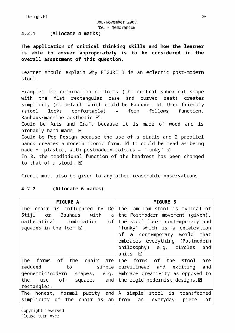
4.2.1 (Allocate 4 marks)
The application of critical thinking skills and how the learner is able to answer appropriately is to be considered in the overall assessment of this question.
Learner should explain why FIGURE B is an eclectic post-modern stool.
Example: The combination of forms (the central spherical shape with the flat rectangular base and curved seat) creates simplicity (no detail) which could be Bauhaus. . User-friendly (stool looks comfortable) – form follows function. Bauhaus/machine aesthetic .Could be Arts and Craft because it is made of wood and is probably hand-made. Could be Pop Design because the use of a circle and 2 parallel bands creates a modern iconic form. It could be read as being made of plastic, with postmodern colours – ‘funky’.In B, the traditional function of the headrest has been changed to that of a stool.
Credit must also be given to any other reasonable observations.
4.2.2 (Allocate 6 marks)
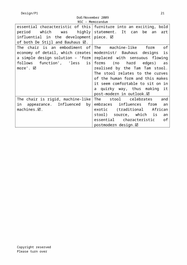
FIGURE A FIGURE BThe chair is influenced by De Stijl or Bauhaus with a mathematical combination of squares in the form .
The Tam Tam stool is typical of the Postmodern movement (given). The stool looks contemporary and ‘funky’ which is a celebration of a contemporary world that embraces everything (Postmodern philosophy) e.g. circles and units.
The forms of the chair are reduced to simple geometric/modern shapes, e.g. the use of squares and rectangles.
The forms of the stool are curvilinear and exciting and embrace creativity as opposed to the rigid modernist designs.
The honest, formal purity and simplicity of the chair is an essential characteristic of this period which was highly influential in the development of both De Stijl and Bauhaus .
A simple stool is transformed from an everyday piece of furniture into an exciting, bold statement. It can be an art piece.
The chair is an embodiment of economy of detail, which creates a simple design solution – ‘form follows function’, ‘less is more’.
The machine-like form of modernist/ Bauhaus designs is replaced with sensuous flowing forms (no hard edges) as realised by the Tam Tam stool. The stool relates to the curves of the human form and this makes it seem comfortable to sit on in a quirky way, thus making it post-modern in outlook.
The chair is rigid, machine-like in appearance. Influenced by machines..
The stool celebrates and embraces influences from an exotic (traditional African stool) source, which is an essential characteristic of postmodern design.
Copyright reserved Please turn over
Design/P1 15 DoE/November 2009NSC – Memorandum
The chair is simple, lacks ornamentation, and looks as though it performs its function very well – ergonomically suitable to the human form.
The form of the stool is typically Postmodern in style in using contrasting shapes in a unique, fun way. One can also argue that the stool parodies accepted conventions (modernist rigidity), which therefore make it a postmodern design. It looks like a toy/play frame.
Credit must also be given to any other reasonable observations.
TOTAL SECTION A: 80
SECTION B
QUESTION 5: SOCIAL EMPHASIS [20 marks]
AS7: Demonstrate an understanding of the ways in which design can be used to reinforce or challenge social, cultural, environmental and ethical issues.
5.1 SOCIAL ISSUES (INTERNATIONAL)
5.1.1 (Allocate 2 marks)
The handprint adds a human touch – we can support these people by ‘doing’ things for them . The cramped or over-crowded composition emphasises the enormity and seriousness of the deadly epidemic . The need for the human love and attention these people need, is seen in the repetition of the faces on the daisy petals in the tophalf. All these faces represent the community that must be involved to support these people.. The phone number provided in the bottom right corner is the helpline that people can call for support.
Credit any other examples.
The application of critical thinking skills and how the learner is able to refer to social awareness in design is to be considered in the overall assessment of this answer.
5.1.2 (Allocate 8 marks)
NOTE: A learner may choose to use any example as provided in the LPG, PAT or any other documented source.
POSSIBLE EXAMPLE: Name of designer and name of design. (Do not credit listing of designs)
Example(s) of design/product – maximum 2 marks Explanation of the social issues – other 6 marks
Copyright reserved Please turn over
Q4.2LEVEL
COGNITIVE SKILLS
WEIGHTING QUESTIONS MARKS(10)
Lower order ObservationVisual comprehension
30% 4.2.1 + 4.2.2 3
Middle order Application 40% 4.2.1 + 4.2.2 4Higher order Analysis 30% 4.2.1 + 4.2.2 3

Design/P1 16 DoE/November 2009NSC – Memorandum
EXAMPLES:
Erik Adigard and Patricia McShane (M.A.D.) . Examples of their work include the Websites ‘LiveWired’ and ‘Funnel’ , as well as spreads published in the ‘Wired’ magazine where they engage with social issues like pollution and contamination.As designers they combine popular culture with intellectual messages e.g. ‘Pollution is a measure of inefficiency’ . ‘Teen sex drops’ . They use popular new technologies, moving from print to multimedia web design to make the people aware of social issues, e.g. inefficiency and lost profit . They make use of typography and symbols, information and icons and combine them with bold images to convey social issues so that they are accessible to the ‘now’ generation.. They often change words into images to make it part of the contemporary media culture e.g. the font of LIVEWIRED plays with patterns of digital pixels . They also mingle icons, information graphics and text with rich images to create a social outcry, e.g. “the pill for men” .
Q5.1LEVEL
COGNITIVE SKILLS
WEIGHTING QUESTIONS MARKS(10)
Lower order Observation/Recall 30% 5.1.2 3Middle order Application 40% 5.1.1 4Higher order Analysis
SynthesisEvaluation
30% 5.1.1 + 5.1.2 3
5.2 SOCIAL ISSUES (LOCAL)
5.2.1 (Allocate 2 marks)
Learners will offer different viewpoints to the question. Learners must be able to explain their opinion on the statement provided. The application of critical thinking skills and how the learner is able to answer appropriately is to be considered in the overall assessment of this question, for example: the poster was used as a form of protest to highlight the need for social reform.
Candidates who are more socially and politically aware might interpret the design in a positive or negative way.
Some candidates who look at the poster might be agitated with the text and gestures.
Candidates who have not reaped the fruits of democracy may not identify with the poster.
Candidates may interpret it as racist or a statement against racism depending on their socialisation and personal belief system.
Candidates should try to make reference to the historical context (the ‘struggle years’) – e.g. troops in the townships.
POSSIBLE EXAMPLES: Copyright reserved Please turn over
Design/P1 17 DoE/November 2009NSC – Memorandum
Some learners might answer YES, I agree that design can benefit the community because design can protest peacefully through the media, for example the protest poster in the illustration provided. Design can make a statement and get the broader society (those who are not usually involved) to start thinking about certain social issues or wrongs in society , for example the demand for housing, security and comfort.
Other learners might argue NO, as design only produces what the client or brief requests . Design, as in the poster, could easily be ignored by the public without any action taken . Design, on the other hand, could also be used/abused by the client to promote negative things, e.g. provoking violence, drinking (alcohol) and smoking . I could be argued that violence (e.g. armed vehicles and raised fists) is not preferable to respectful calm negotiation.
5.2.2 SOCIAL ISSUE (LOCAL)
NOTE: A learner may choose to use any example as provided in the LPG, PAT or any other documented source.
POSSIBLE EXAMPLE: (Allocate 8 marks)Designer (1) and examples of design (1); do not credit listing of designers or designs.Monkeybiz Beading outreach project
Barbara Jackson and Shirley Fintz, ceramicists, founded Monkeybiz in January 2000 with Mathaphelo Ngaka, a crafter.
They saw the potential for marketing and at the same time reviving the traditional craft of beadwork . Mathaphelo got a few unemployed women from the Western Cape (Macassar and Khayelitsha) to make more dolls. Having received a positive response from local shops and tourists, they expanded the business to other communities in order to promote social upliftment. They now have approximately 450 women making dolls with 200 women on their waiting list, and in addition to dolls they make bags, beaded pictures, animals, cushion covers and sculptures. They constantly continue to teach and motivate the crafters, inspiring them to become recognised bead artists, and also help them learn business skills so that they can improve their social and economic status.
In 2003, the Cape Town studio of Monkeybiz received a visit from the directors of ArtAidsArt, a US non-profit organisation, who purchased dozens of dolls and returned to the USA to hold a doll sale fundraiser. With the support of a group of African-American women, the sale generated the funds needed to purchase a container. Now installed and fully outfitted, the container or studio in Khayelitsha has been christened ‘The Boat’ to acknowledge its role as a place of safety and support for female artists, another social outreach project.
The collaboration between Monkeybiz and ArtAidsArt has continued to bear fruit and in 2004 ArtAidsArt hosted the only US exhibit of ‘Positively HIV’ in Pasedena, California, and held a second sale of bead art to fund the Monkeybiz Wellness Clinic. They formed an Aids Support Group in their building in Cape Town. The women have formed a sewing group and they are busy customising denim jackets, making HIV Love Letters and T-shirts.
Copyright reserved Please turn over

Design/P1 18 DoE/November 2009NSC – Memorandum
The artists have formed a non-profit company, so that all profits go directly back into the communities and the women benefit. Carrol Boyes stocks Monkeybiz artwork at her new store in New York to increase sales in order to generate more money for socially disadvantaged women . Their own-initiated Aids clinic is self-sufficient (funded with their own profits) and well attended.
Credit must be given to any valid and reasonable answer.
Q5.2LEVEL
COGNITIVE SKILLS
WEIGHTING QUESTIONS MARKS(10)
Lower order Observation/RecallComprehension
30% 5.2.2 3
Middle order Application 40% 5.2.1 + 5.2.2 4Higher order Analysis
SynthesisEvaluation
30% 5.2.1 3
QUESTION 6
Candidates answer either QUESTION 6.1 and QUESTION 6.2 or only QUESTION 6.3.
6.1 (Allocate 10 marks)
Local Design Group – Strangelove (KwaZulu-Natal)
Backrest is probably from an old typist chair – saves part of an old chair from increasing the amount of rubbish in a dump site
Log seat is probably from old municipal trees – these would also be dumped to rot away. Learners could argue that rotting wood is supposed to be there – detrimental to remove it. However if it could be used for something else, then there is a move towards eco-friendly design products.
Industrial materials (steel) could be made from old machinery or off-cuts. The industrial plate and bolted legs seem to resemble a strange alien creature
about to walk. This shows an organic link with natural animal-like forms. The legs also resemble prosthetic legs – a human link The juxtapositioning of industrial elements (steel and bolts) and commercial
elements (typist chair) with natural wood in one chair is unsettling , much like the Surrealists worked. (Dali – boiled beans with a mutilated body)
The name 'wishbone' refers to the Y-shaped bone kept from a chicken carcass. This gets pulled when dry, and the person with the largest piece gets the wish granted.
This chair uses mainly natural wood with unnatural re-useable steel and bolts.
Ergonomically it could be argued that this is a successful design because although it looks strange, the wood has been carved/shaped to fit the buttocks, and is therefore ‘humanist’ in design.
Allocate marks for any 10 valid and reasonable points.
6.2 INTERNATIONAL Copyright reserved Please turn over
Design/P1 19 DoE/November 2009NSC – Memorandum
6.2.1 (Allocate 2 marks)No marks to be awarded for simple paraphrasing of the question. E.g. repetition of the following – recycle; green design; found objects; waste wood.The use of recycled old CDs and recycled old cardboard contributes toward a sustainable environment. The ability to take that which would be waste and create an effective design solution that can be sold, is a vital prerogative of designers today . The use of recycled material like the CDs and the cardboard ensures an environment that is not wasteful and destructive, as they do not end up in a landfill site.. Learners may argue that Figure A is not sustainable because there may not be enough old CDs; new CDs may have to be used.
Credit must also be given to any other reasonable observations.
6.2.2 (Allocate 8 marks)
NOTE: A learner may choose to use any example as provided in the LPG, PAT or any other documented source.
Example: o Name of designer/group (1 mark)
Constantin Boym and Laurene Leon Boym o Motivate why they have chosen this designer/(s). (1 mark)
E.g. the use of recycled old material helps in sustaining the environment. Boym is trained as an architect and an industrial designer. He has built a reputation that is based on blending found objects with mass production design work. He is interested in the ‘redesign’ of the design profession itself.
o Name of one design/product (1 mark)e.g. The Strap furniture, 1999 – recycled wood, polypropylene strapping tape
The pair’s recent line of Strap furniture (1999) is an experimental prototype that takes the kind of web strapping (by using recycled material) often used by overnight delivery services as its most prominent element . Wrapped around simple wooden frames (that is also recycled wood), such strapping makes for a clever, innovative design solution that uses recycled material in an imaginative manner – in this case a woven strapped chair . These uses of recycled materials help in creating a sustainable environment that encourages discipline in design practice. In addition, the use of such ordinary material gives this design a stripped-down, almost incomplete feel, as if they have been reduced to their essential states (less is more) . Cushions of air are encased in a network of lines that creates a transparent feel that is unique This transparent look gives the feel of less solid material being used and also saves materials. The chair juxtaposes recycled material in a unique way that enhances the overall design aesthetic – i.e. a new ‘green’ design. They have used simplicity of form and ‘form follows function’ without any extra detailing. This creates less recycling and less pollution.
Credit must be given to any valid and reasonable answer.
Copyright reserved Please turn over
Design/P1 20 DoE/November 2009NSC – Memorandum
Q6.1 + Q6.2LEVEL
COGNITIVE SKILLS
WEIGHTING QUESTION MARKS(20)
Lower order Recall/KnowledgeComprehension 30 6.1 + 6.2 6
Middle order Application 40 6.1 + 6.2 8
Higher order AnalysisSynthesisEvaluation
30 6.1 + 6.2 6
6.3 (Allocate 20 marks)
NOTE: A learner may choose to use any example as provided in the LPG, PAT or any other documented source.
Marks should only be awarded for a designer and design that have been discussed.
Credit any examples – TWO or more designers. Do NOT award marks for listing of designs without any substantive facts.
(LOCAL) POSSIBLE EXAMPLE:
Rina King and Crispin Pemberton-Pigott and the New Dawn Energy Systems . New Dawn Engineering is at the forefront of labour-intensive equipment manufacturing and situated in Matsapha, Swaziland. They focus on maximising the effective use of human resources . One of their products is the award-winning Vesto stove . This stove is a cylindrical metal cooking device, that burns biomass fuels (wood, charcoal, briquettes, etc.) because there is no electricity. The demand for these fuels can be so reduced that it could save the equivalent of planting an entire forest . The product is also affordable – although designed to look as if it was made for rich people, but is sold to poorer, wood-burning households . The Vesto cooking stove saves 70% of the fuel normally used , while simultaneously reducing combustion emissions (gases and ash) to legal and safe levels . The stove is also economically sustainable in that it is manufactured locally and distributed through local hardware shops .
(INTERNATIONAL) POSSIBLE EXAMPLE:
Credit any examples (TWO or more) as suggested by the LTSMs in the LPG, or any other documented source.
Only 2 marks should be awarded for the designer and design.Do not award marks for listing of designs without any substantive facts.
Copyright reserved Please turn over
Design/P1 21 DoE/November 2009NSC – Memorandum
Julie Bargmann 'Testing the Waters: Water treatment system' 1997 Julie Bargmann is internationally recognised as an innovator in regenerative
environmental design and interdisciplinary design education. She owns D.I.R.T. Studio (Design Investigations Reclaiming Terrain).
She reclaims polluted industrial sites e.g. Southwestern Pennsylvania North America.
She stresses the value of remembering as well as reviving – abandoned coal mines and mounds of refuse pollute and poison the earth
Acid mine drainage is spilling into the streams and rivers and suffocates life forms – she reclaims such polluted industrial sites
She designs hybrid landscapes that blend construction with elements that represent the physical and cultural histories of the sites at which she works
'Testing the waters' is a 45-acre park for acid mine drainage. This project is also a community recreational centre at the site of a former coal
mine in Vintondale. She makes use of a team e.g. hydrogeologist, historian etc. to create an AMD
treatment system that works like a giant ecological washing machine. She involves the public by inviting them to witness the cleaning process
physically as well as symbolically. AMD goes through a series of retention basins and spillways. As the polluted water passes over this 'treatment garden' its changing colour from acidic orange to pea green to alkaline blue-green reflects the process of cleansing.
This cleansing process is symbolically shown in 'Litmus Garden'. The seasonal colours of bark, foliage and fruit of alternating rows of native trees and shrubs visually represent the treatment sequence progressing from reds and oranges to greens and blues.
After water has flown through these wetlands it returns to the local creek in a purified state.
Her designs also offer visual evidence of the site's former industrial identity e.g. mine buildings, and includes recreational amenities such as picnic grounds, play areas and wildlife trails that serve both local and regional communities.
Bargmann challenges the restrictive policies and conventional remediation practices that plague Superfund sites and Brownfields in the USA.
Bargmann teaches critical site-seeing as a means to reveal multiple site histories and to offer renewal for communities in tired and toxic surroundings.
National and international design publications have recognised her as a leader of the next generation of designers. Bargmann was named one of Time's '100 Innovators — The Next Wave' in the category of Architecture and Design.
The work of D.I.R.T. Studio includes collaborations on a proposal for New York's High Line Project, a public park in a former Pennsylvania coal mine, and the creative reattribution of a landfill in Tel Aviv, Israel.
Copyright reserved Please turn over
Design/P1 22 DoE/November 2009NSC – Memorandum
Example of her work: Location Type: Landfill Dumps became 'sanitary landfills' with the installation of environmental systems to control landfill-related pollution. Sanitary landfills are essentially giant garbage bags in the ground with 'impermeable' membranes entombing trash. Common remediation practices in waste management disguise large mountains of trash (each called a 'cell') as pastoral green hills or happy recreation fields.
D.I.R.T. believes landfills could be more productive. Remediation systems could be more transparent. Communities could feel fortunate that a landfill was, or is,
in their town varying with the type of trash being MSW (municipal solid waste) or CDD (construction demolition debris), two main issues plague landfills, ones that could become opportunities.
Credit must be given to any valid and reasonable answer.
More information:
D.I.R.T (Julie Bargmann) – landscape architects working with reclamation of landfill sites. D.I.R.T works with sanitary landfills are essentially giant baggies in the ground with ‘impermeable’ membranes entombing trash. D.I.R.T. believes landfills could be more productive than just lying fallow, e.g. they could be used as recreation sites for the community. Remediation systems could be more transparent i.e. the public must be involved in decisions and be able to observe and check. Communities could feel fortunate that a landfill was, or is, in their town, because it now benefits the community recreationally. Leachate (similar to the nasty stuff at the bottom of your garbage cans) is usually collected and sent off to often over-burdened and expensive waste-water treatment facilities. D.I.R.T. has designed alternatives such as on-site systems recirculating the liquid waste to increase bioactivity as well as constructed wetlands to treat the liquid waste. These become beautiful water gardens. [e.g. Testing the Waters] [e.g. Hiriya Waste Mountain and Stearns Quarry Park projects] Methane gas emitted from the very slowly decomposing garbage is commonly flared off (invisible by day but flaming at night). When landfills produce enough gas, methane can be captured and converted through a fuel cell to produce energy for the community. [e.g. Antioch Landfill Park project] Subsidence of trash can be uneven and produce an unanticipated ankle-breaking topography. In spite of this fact, closed landfills are commonly contorted to create super flat and even planes of sports fields or the typical smooth artificial look of golf courses. D.I.R.T reclaims landfills to emphasise this dynamic process, and recreational walks and picnic areas are the alternatives where it doesn’t matter if the ground is uneven. [e.g. Hiriya Waste Mountain and Stearns Quarry Park projects]
Copyright reserved Please turn over
Design/P1 23 DoE/November 2009NSC – Memorandum
Q6.3LEVEL
COGNITIVE SKILLS
PERCENTAGE MARKS(20)
Lower order Observation/RecallComprehension 30% 6
Middle order Application 40% 8
Higher order AnalysisSynthesisEvaluation
30% 6
TOTAL SECTION B: 40
SECTION C
QUESTION 7 [30 marks] AS9: Demonstrate a basic understanding of marketing design products in
terms of target market, packaging and advertising.
AS10: Demonstrate an understanding of responsible design by taking into consideration human rights and environmental issues throughout the process.
AS11: Explore career opportunities within the design discipline.
Answer either 7.1 OR 7.2.
The application of critical thinking skills and how the learner is able to answer appropriately is to be considered in the overall assessment of this question. Credit must also be given to any other reasonable observations.
7.1
An example:
7.1.1 (Allocate 10 marks)
The guidelines are supplied in order to focus learners. The idea is to show that they can apply what they know to their own contexts. However, learners may focus on selected areas only of this essay. Learners should be free to develop their own scenario, and not necessarily follow all or some of the guidelines.E.g.
o Who are you? I am a young woman who does fashion design, and I intend calling my line of clothing ‘WasteCoats’. o What do you do? I collect the waste materials and overruns from textile factories and use them to construct ‘de-constructed’ waistcoats for women and men.
Copyright reserved Please turn over
Design/P1 24 DoE/November 2009NSC – Memorandum
o Why is it necessary? These waste fabrics are normally sold for recycling or for use as rags in industry. Some of the colour effects are extraordinary and it seems a waste to pulp and discard them. o What do you use? Not only will I use these waste fabrics but I will also need to buy machinery and thread to put them together. I may be able to outsource this activity to women who could work from home using their own equipment. o How will you organise ‘start-up’ funding? I could apply for a loan from a bank such as Ithala or ABSA who have programmes for entrepreneurial development. I will not use my profit, but will put it back into the business. I could also slowly work up my capital by making five samples a week and selling them. I could also make sure to enter any design competition as this often results in a financial prize. o What market research have you done on pricing/costing? The ornamented waistcoats already available are selling for R230 plus. This is because the beads etc. are imported. By using local waste materials and local labour, I can substantially reduce this. The ‘de-constructed’ technique means that less time will be spent on the finishing of seams. This will also reduce the amount of time spent on each unit, thus making it more affordable to clients. The waistcoats can be sold from my home studio or through existing retail outlets, and this will also reduce the price of the product.
7.1.2 (Allocate 10 marks)Learners must demonstrate that they have researched a design company or individual.The emphasis should be on the award-winning aspects of the design company or individual. Unacknowledged / little known designers used by the learners, should not be credited.Example:Orange Juice – Durban SA Designer/Founder: Garth Walker Example of his work: Originator of the typography used for the Constitutional Court.
His Background/Training He has been trained locally, which gives me direction and a path to follow. Mention some training. E.g:
Matriculated at Durban Commercial High (pure Art Matric) 3-Year Graphic Design Diploma Natal Technikon Professional graphic designer since 1978
Copyright reserved Please turn over
Design/P1 25 DoE/November 2009NSC – Memorandum
InspirationGarth Walker inspires me because:
The creativity of ordinary South Africans (street and township vernacular design). He used graffiti on the old prison walls for a unique typeface design for internal and external signage for the Constitutional Court of South Africa.
Graphic design history. Everything we do has been done before – and probably better. The Pears soap packaging draws on this historical referencing. Walker uses history/previous designs/advertising as inspiration.
BrandingWalker’s idea, in order to stand out from the others, was to have a brand identity that seemed to have nothing to do with a design company. ‘Orange Juice Design’ was OK to register with the Registrar of Companies – it hadn’t been used before. This is an intuitive/random method which has been successful because it is an odd name for a design company. The logo uses green to depict the word ‘orange’. This is a clever pun – it signifies a ‘green’ approach and is memorable.
Design and Production Process: He has a simple approach to design which I find achievable. He says … ‘Firstly, find an idea to work with. No idea … don’t start!’
Then … “What do you want to say?” “To whom do you want to say it?” “How do you want to say it?”
Awards – mention any Over 100 awards from all the recognised design competitions locally and internationally. E.g. Loerie award etc. Exhibited in 11 countries. E.g. Germany Hosted student and professional design workshops in 14 countries.Widely travelled as a ‘design conference’ speaker on African creativity in Visual Design.
Any other relevant points. Allocate 10 marks.
7.1.3 (Allocate 10 marks)
Both FIGURE A and FIGURE B below show workspaces in different design businesses. (a) Compare the two by looking at similarities and differences.(b) State which ONE you prefer and give reasons for your answer. (c) Explain which aspects you will change in one of these studios to be more
functional for your employees.
Copyright reserved Please turn over
Design/P1 26 DoE/November 2009NSC – Memorandum
(a)FIGURE A FIGURE B
Large, open workspace Limited workspace, cramped Organised storage space/shelves – with different shelves and compartments
Unorganised storage space/shelves
Materials organised Materials unorganised No unused objects around, providing more space
Unnecessary clutter, taking up space
Creative surroundings/studio Uncreative surroundings/studio Neat and tidy work space/studio Untidy work space/studio Safe environment with larger production possibilities
Unsafe space and limited production possibilities
(b): (2 marks)
The learner may choose Figure A:o It looks organised and neat the studio looks disciplined/subject specific (e.g.
Ceramics) or
The learner may choose Figure B:o It looks relaxed/informal/less rigid/more friendly. o It looks as if it could have been at the designer’s house. o Any other relevant points.
(c) (4 marks)
In either Figure A or Figure B:
o More natural light o If electrical lighting – use energy-efficient bulbs. o Provide background music.o Provide an area for relaxation. o In cold weather, provision of heating.
Q7.1LEVEL
COGNITIVE SKILLS
WEIGHTING QUESTION MARKS(30)
Lower order Recall/knowledge 33,3% 7.1.1+ 7.1.2 + 7.1.3 10Middle order Application 33,3% 7.1.1 + 7.1.2 + 7.1.3 10Higher order Analysis Synthesis
Evaluation 33,3% 7.1.1 + 7.1.2 + 7.1.3 10
OR
Copyright reserved Please turn over
Design/P1 27 DoE/November 2009NSC – Memorandum
7.27.2.1 (a): (Allocate 4 marks)
o Content should emphasise the product that will be sold. E.g. for this jewellery, then use a beautiful woman wearing the brooch.
o Contact details – fax, phone of the designer. Also the e-mail address and any websites.
o Location – where the range can be bought. o The logo will be clearly depicted in the advertisement and easily
recognisable. o Text/font will be legible, and easily understandable. o A captivating slogan should be used – perhaps playing cleverly on the idea of a
game – 'umlabalaba'
(b): (Allocate 8 marks only)
The key to a successful business is to use ‘SWOT’ and ‘PESTLE’ analyses.
‘SWOT’ is an anagram, which stands for strengths, weaknesses, opportunities and threats. A ‘SWOT’ analysis implies the following:
Allocate 4 markso Analysis of a business’ strengths [S] e.g. the business has a very well-known
designer – this will draw a large dedicated client base. OR tourists are keen on Zulu heritage.
o And weaknesses [W] e.g. people who are opposed to the killing of animals for meat would be repelled by the skin.
o Search for areas of opportunity [O] e.g. this would usually be in export opportunities.
o And threats [T] e.g. there may be a problem with the cost of cow hides in future as the demand for leather shoes and bags increases.
‘PESTLE’ refers to an analysis of the Political, Economic, Social, Technological, Legal and Environmental issues that a company faces. A ‘PESTLE’ analysis implies the following:
Copyright reserved Please turn over
Design/P1 28 DoE/November 2009NSC – Memorandum
Allocate 4 markso Political e.g. a politically correct action is to only use local materials and
manufactured items. o Economic, e.g. use what is locally found which keeps the money in the country
– balance of trade. o Social e.g. the business would employ local people who have hide-working skills
as part of their indigenous knowledge systems. o Technological e.g. this is a low-tech design solution, which does not need
machinery. This is hand-made jewellery. o Legal e.g. copyright issues are usually the problem here. This is a unique
design and would need to be registered. o Environmental issues – use of cowhides which are often discarded in the
abattoirs and then dumped. These are organic and eco-friendly.
7.2.2 (Allocate 10 marks)Select the design discipline with which you are most familiar.
Example:Fashion Design
2 possibilities for study options:What? – 2 marks and where? – 2 marks
(a): Allocate 4 marksE.g. a 4-year B.Tech degree; 3-year diploma; 1-year diploma A course in a financial programme e.g. Quicken to allow you to do the finances of your own company. Any two courses
E.g. University of Technology. (Tshwane University of Technology; Durban University of Technology; Cape Peninsula University of Technology) Damelin College; Vega Brand school; University of Pretoria.Any two institutions.
(b): Allocate 4 marks The job requires a person with:
o artistic talent; o the ability to problem-solve; o openness to new ideas; o the ability to work alone and as part of a team; o the ability to work to a deadline. o ‘people-oriented’ ; o able to guide clients; o able to work under pressure; o able to handle crisis situations ; o have good communication skills ;o need to believe in the product ;
Copyright reserved Please turn over

Design/P1 29 DoE/November 2009NSC – Memorandum
7.2.3 (Allocate 10 marks)Give credit for a reasoned answer that includes examples.
I disagree with this statement because:Design is important in the informal sector (See FIGURE A – the vendor). Many people use indigenous skills like basket-weaving to earn a living. These baskets are not expensive and are widely available in many informal hawkers’ stands. This is, in effect, indigenous design that is used by most rural people every day. An example that I have studied is the work of a basket-maker such as Rueben Ndwandwe. He makes organic grass baskets with geometric patterns in dyed grasses of contrasting colours. Many informal designers and crafters work from home and would use the money made from previous sales to finance new work. Basket-makers, for example, would use resources found in the wild (reed beds and river banks), which would cost them very little. Also grasses along the road. These resources are sustainable as the reeds will propagate themselves if harvested sensitively.
Often group cooperatives are set up where jobs are created in impoverished areas. A group like KEAG (Kommetjie Environmental Action Group) has created designs which create both jobs for the community and an awareness of the litter on our beaches, as they collect and re-use this litter.
Design is also important in the formal sector:Heath Nash creates designer lamps from plastic waste, and started this while he was still studying with very little capital. He is now well known and sells through galleries and decor shops in the formal sector. He has contributed to job creation as he now employs assistants.
Joseph Diliza is an example of somebody who did not have a lot of money and started part-time in the Montebello Design Centre, which is a cultural initiative. Diliza makes paper products and he was also assisted by SAB to buy pulping equipment. He produces handmade paper from which he manufactures, e.g. lampshades.
Give credit for a reasoned answer that includes an example. Learners should reflect an understanding of the hard work and business acumen behind the glamour.
Q7.2LEVEL
COGNITIVESKILLS
WEIGHTING QUESTIONS MARKS(30)
Lower order Observation/RecallComprehension 33,3% 7.2.1 + 7.2.2 + 7.2.3 10
Middle order Application 33,3% 7.2.1 + 7.2.2 + 7.2.3 10
Higher order AnalysisSynthesisEvaluation
33,3% 7.2.1 + 7.2.2 + 7.2.3 10
TOTAL SECTION C:
GRAND TOTAL:
30
150
Copyright reserved


![“Syllabication” in English according to John Walker’s … J.C. Longman Pronunciation Dictionary, Harlow: Pearson Education Limited, [1990] 2008 (3rd edition). Author Véronique](https://img.pdfslide.net/doc/110x75/5aef30b47f8b9ac2468c6178/syllabication-in-english-according-to-john-walkers-jc-longman-pronunciation.jpg)