Embed Size (px)
Citation preview

Design of Experiments Guide
“The real voyage of discovery consists not in seeking newlandscapes, but in having new eyes.”
Marcel Proust
Release 7
JMP, A Business Unit of SASSAS Campus DriveCary, NC 27513

JMP Design of Experiments, Release 7
Copyright © 2007, SAS Institute Inc., Cary, NC, USA
ISBN 978-1-59994-413-5
All rights reserved. Produced in the United States of America.
For a hard-copy book:
No part of this publication may be reproduced, stored in a retrieval system, or transmitted, in any form or by any means, electronic, mechanical, photocopying, or otherwise, without the prior written permission of the publisher, SAS Institute Inc.
For a Web download or e-book:
Your use of this publication shall be governed by the terms estab-lished by the vendor at the time you acquire this publication.
U.S. Government Restricted Rights Notice:
Use, duplication, or disclosure of this software and related documentation by the U.S. government is subject to the Agreement with SAS Institute and the restrictions set forth in FAR 52.227-19, Commercial Computer Software-Restricted Rights (June 1987).
SAS Institute Inc., SAS Campus Drive, Cary, North Carolina 27513.
1st printing, May 2007
JMP
®
, SAS
®
and all other SAS Institute Inc. product or service names are registered trademarks or trademarks of SAS Institute Inc. in the USA and other countries. ® indicates USA registration.
Other brand and product names are registered trademarks or trademarks of their respective compa-nies.

Contents
Design of Experiments
1 Introduction to Designing Experiments
A Beginner’s Tutorial
. . . . . . . . . . . . . . . . . . . . . . . . . . . . . . . . . . . . . . . . . . . . . . . . . . . . . . . . 1
About Designing Experiments
. . . . . . . . . . . . . . . . . . . . . . . . . . . . . . . . . . . . . . . . . . . . . . . . . . . . . 3
My First Experiment
. . . . . . . . . . . . . . . . . . . . . . . . . . . . . . . . . . . . . . . . . . . . . . . . . . . . . . . . . . . . 3
The Situation
. . . . . . . . . . . . . . . . . . . . . . . . . . . . . . . . . . . . . . . . . . . . . . . . . . . . . . . . . . . . . . . 3
Step 1: Design the Experiment
. . . . . . . . . . . . . . . . . . . . . . . . . . . . . . . . . . . . . . . . . . . . . . . . . . 3
Step 2: Define Factor Constraints
. . . . . . . . . . . . . . . . . . . . . . . . . . . . . . . . . . . . . . . . . . . . . . . . 5
Step 3: Add Interaction Terms
. . . . . . . . . . . . . . . . . . . . . . . . . . . . . . . . . . . . . . . . . . . . . . . . . . 6
Step 4: Determine the Number of Runs
. . . . . . . . . . . . . . . . . . . . . . . . . . . . . . . . . . . . . . . . . . . 7
Step 5: Check the Design
. . . . . . . . . . . . . . . . . . . . . . . . . . . . . . . . . . . . . . . . . . . . . . . . . . . . . . 7
Step 6: Gather and Enter the Data
. . . . . . . . . . . . . . . . . . . . . . . . . . . . . . . . . . . . . . . . . . . . . . . 9
Step 7: Analyze the Results
. . . . . . . . . . . . . . . . . . . . . . . . . . . . . . . . . . . . . . . . . . . . . . . . . . . . . 9
2 Examples Using the Custom Designer
. . . . . . . . . . . . . . . . . . . . . . . . . . . . . . . . 13
Creating Screening Experiments
. . . . . . . . . . . . . . . . . . . . . . . . . . . . . . . . . . . . . . . . . . . . . . . . . . 15
Creating a Main-Effects-Only Screening Design
. . . . . . . . . . . . . . . . . . . . . . . . . . . . . . . . . . . . 15
Creating a Screening Design to Fit All Two-Factor Interactions
. . . . . . . . . . . . . . . . . . . . . . . . 16
A Compromise Design Between Main Effects Only and All Interactions
. . . . . . . . . . . . . . . . . 18
Creating ‘Super’ Screening Designs
. . . . . . . . . . . . . . . . . . . . . . . . . . . . . . . . . . . . . . . . . . . . . . 19
Screening Designs with Flexible Block Sizes
. . . . . . . . . . . . . . . . . . . . . . . . . . . . . . . . . . . . . . . 23
Checking for Curvature Using One Extra Run
. . . . . . . . . . . . . . . . . . . . . . . . . . . . . . . . . . . . . 26
Creating Response Surface Experiments
. . . . . . . . . . . . . . . . . . . . . . . . . . . . . . . . . . . . . . . . . . . . 29
Exploring the Prediction Variance Surface
. . . . . . . . . . . . . . . . . . . . . . . . . . . . . . . . . . . . . . . . . 29
Introducing
I
-Optimal Designs for Response Surface Modeling
. . . . . . . . . . . . . . . . . . . . . . . . 33
A Three-Factor Response Surface Design
. . . . . . . . . . . . . . . . . . . . . . . . . . . . . . . . . . . . . . . . . 34
Response Surface with a Blocking Factor
. . . . . . . . . . . . . . . . . . . . . . . . . . . . . . . . . . . . . . . . . 35
Creating Mixture Experiments
. . . . . . . . . . . . . . . . . . . . . . . . . . . . . . . . . . . . . . . . . . . . . . . . . . . 38
Special-Purpose Uses of the Custom Designer
. . . . . . . . . . . . . . . . . . . . . . . . . . . . . . . . . . . . . . . . 41
Designing Experiments with Fixed Covariate Factors
. . . . . . . . . . . . . . . . . . . . . . . . . . . . . . . . 41
Creating a Design with Two Hard-to-Change Factors: Split Plot
. . . . . . . . . . . . . . . . . . . . . . . 44
Technical Discussion
. . . . . . . . . . . . . . . . . . . . . . . . . . . . . . . . . . . . . . . . . . . . . . . . . . . . . . . . . . . 48

civ
3 Building Custom Designs
The Basic Steps
. . . . . . . . . . . . . . . . . . . . . . . . . . . . . . . . . . . . . . . . . . . . . . . . . . . . . . . . . . . . 51
Creating a Custom Design
. . . . . . . . . . . . . . . . . . . . . . . . . . . . . . . . . . . . . . . . . . . . . . . . . . . . . . . 53
Enter Responses and Factors into the Custom Designer
. . . . . . . . . . . . . . . . . . . . . . . . . . . . . . 53
Describe the Model
. . . . . . . . . . . . . . . . . . . . . . . . . . . . . . . . . . . . . . . . . . . . . . . . . . . . . . . . . . 57
Select the Number of Runs
. . . . . . . . . . . . . . . . . . . . . . . . . . . . . . . . . . . . . . . . . . . . . . . . . . . . 57
Understanding Design Diagnostics
. . . . . . . . . . . . . . . . . . . . . . . . . . . . . . . . . . . . . . . . . . . . . . 58
The Alias Matrix (Confounding Pattern)
. . . . . . . . . . . . . . . . . . . . . . . . . . . . . . . . . . . . . . . . . 62
Specify Output Options
. . . . . . . . . . . . . . . . . . . . . . . . . . . . . . . . . . . . . . . . . . . . . . . . . . . . . 63
Make the JMP Design Table
. . . . . . . . . . . . . . . . . . . . . . . . . . . . . . . . . . . . . . . . . . . . . . . . . . 63
Creating Random Block Designs
. . . . . . . . . . . . . . . . . . . . . . . . . . . . . . . . . . . . . . . . . . . . . . . . . 64
Creating Split Plot Designs
. . . . . . . . . . . . . . . . . . . . . . . . . . . . . . . . . . . . . . . . . . . . . . . . . . . . . 64
Creating Split-Split Plot Designs
. . . . . . . . . . . . . . . . . . . . . . . . . . . . . . . . . . . . . . . . . . . . . . . . . 65
Creating Strip Plot Designs
. . . . . . . . . . . . . . . . . . . . . . . . . . . . . . . . . . . . . . . . . . . . . . . . . . . . . 66
Special Custom Design Commands
. . . . . . . . . . . . . . . . . . . . . . . . . . . . . . . . . . . . . . . . . . . . . . . 66
Save Responses and Save Factors
. . . . . . . . . . . . . . . . . . . . . . . . . . . . . . . . . . . . . . . . . . . . . . . 67
Load Responses and Load Factors
. . . . . . . . . . . . . . . . . . . . . . . . . . . . . . . . . . . . . . . . . . . . . . 68
Save Constraints and Load Constraints
. . . . . . . . . . . . . . . . . . . . . . . . . . . . . . . . . . . . . . . . . . 68
Set Random Seed: Setting the Number Generator
. . . . . . . . . . . . . . . . . . . . . . . . . . . . . . . . . . 69
Simulate Responses
. . . . . . . . . . . . . . . . . . . . . . . . . . . . . . . . . . . . . . . . . . . . . . . . . . . . . . . . . 69
Show Diagnostics: Viewing Diagnostics Reports
. . . . . . . . . . . . . . . . . . . . . . . . . . . . . . . . . . . 70
Save X Matrix: Viewing the Design (X) Matrix in the Logt
. . . . . . . . . . . . . . . . . . . . . . . . . . . . 71
Optimality Criterion: Changing the Design Criterion (
D
- or
I
- Optimality)
. . . . . . . . . . . . . . . 71
Number of Starts: Changing the Number of Random Starts
. . . . . . . . . . . . . . . . . . . . . . . . . . 72
Sphere Radius: Constraining a Design to a Hypersphere
. . . . . . . . . . . . . . . . . . . . . . . . . . . . . 73
Disallowed Combinations: Accounting for Factor Level Restrictions
. . . . . . . . . . . . . . . . . . . . 73
Advanced Options for the Custom Designer
. . . . . . . . . . . . . . . . . . . . . . . . . . . . . . . . . . . . . . 74
Save Script to Script Window
. . . . . . . . . . . . . . . . . . . . . . . . . . . . . . . . . . . . . . . . . . . . . . . . . . 75
Assigning Column Properties
. . . . . . . . . . . . . . . . . . . . . . . . . . . . . . . . . . . . . . . . . . . . . . . . . . . . . 75
Define Low and High Values (DOE Coding) for Columns
. . . . . . . . . . . . . . . . . . . . . . . . . . . 76
Set Columns as Factors for Mixture Experiments
. . . . . . . . . . . . . . . . . . . . . . . . . . . . . . . . . . . 77
Define Response Column Values
. . . . . . . . . . . . . . . . . . . . . . . . . . . . . . . . . . . . . . . . . . . . . . . 78
Assign Columns a Design Role
. . . . . . . . . . . . . . . . . . . . . . . . . . . . . . . . . . . . . . . . . . . . . . . . 79
Identify Factor Change Column Property
. . . . . . . . . . . . . . . . . . . . . . . . . . . . . . . . . . . . . . . . 80
How Custom Designs Work: Behind the Scenes
. . . . . . . . . . . . . . . . . . . . . . . . . . . . . . . . . . . . . . 81
4 Screening Designs
. . . . . . . . . . . . . . . . . . . . . . . . . . . . . . . . . . . . . . . . . . . . . . . . . . . . . . . . . . . . 83
Screening Design Examples
. . . . . . . . . . . . . . . . . . . . . . . . . . . . . . . . . . . . . . . . . . . . . . . . . . . . . . 85
Using Two Continuous Factors and One Categorical Factor
. . . . . . . . . . . . . . . . . . . . . . . . . . . 85
Using Five Continuous Factors
. . . . . . . . . . . . . . . . . . . . . . . . . . . . . . . . . . . . . . . . . . . . . . . . 87
Creating a Screening Design
. . . . . . . . . . . . . . . . . . . . . . . . . . . . . . . . . . . . . . . . . . . . . . . . . . . . . 89

Co
nte
nts
cv
Entering Responses
. . . . . . . . . . . . . . . . . . . . . . . . . . . . . . . . . . . . . . . . . . . . . . . . . . . . . . . . . . 90
Entering Factors
. . . . . . . . . . . . . . . . . . . . . . . . . . . . . . . . . . . . . . . . . . . . . . . . . . . . . . . . . . . . 91
Choosing a Design
. . . . . . . . . . . . . . . . . . . . . . . . . . . . . . . . . . . . . . . . . . . . . . . . . . . . . . . . . . 92
Displaying and Modifying the Design
. . . . . . . . . . . . . . . . . . . . . . . . . . . . . . . . . . . . . . . . . . . 95
Specifying Output Options
. . . . . . . . . . . . . . . . . . . . . . . . . . . . . . . . . . . . . . . . . . . . . . . . . . . 98
Viewing the Table
. . . . . . . . . . . . . . . . . . . . . . . . . . . . . . . . . . . . . . . . . . . . . . . . . . . . . . . . . . . 99
Continuing the Analysis
. . . . . . . . . . . . . . . . . . . . . . . . . . . . . . . . . . . . . . . . . . . . . . . . . . . . . . 99
5 Response Surface Designs
. . . . . . . . . . . . . . . . . . . . . . . . . . . . . . . . . . . . . . . . . . . . . . 103
A Box-Behnken Design: The Tennis Ball Example
. . . . . . . . . . . . . . . . . . . . . . . . . . . . . . . . . . . . 105
Viewing the Geometry of a Box-Behnken Design
. . . . . . . . . . . . . . . . . . . . . . . . . . . . . . . . . . 110
Creating a Response Surface Design
. . . . . . . . . . . . . . . . . . . . . . . . . . . . . . . . . . . . . . . . . . . . . . . 111
Enter Responses and Factors
. . . . . . . . . . . . . . . . . . . . . . . . . . . . . . . . . . . . . . . . . . . . . . . . . . . 111
Choose a Design
. . . . . . . . . . . . . . . . . . . . . . . . . . . . . . . . . . . . . . . . . . . . . . . . . . . . . . . . . . . 112
Specify Axial Value (Central Composite Designs Only)
. . . . . . . . . . . . . . . . . . . . . . . . . . . . . . 113
Specify Output Options
. . . . . . . . . . . . . . . . . . . . . . . . . . . . . . . . . . . . . . . . . . . . . . . . . . . . . . 113
View the Design Table
. . . . . . . . . . . . . . . . . . . . . . . . . . . . . . . . . . . . . . . . . . . . . . . . . . . . . . 114
6 Full Factorial Designs
. . . . . . . . . . . . . . . . . . . . . . . . . . . . . . . . . . . . . . . . . . . . . . . . . . . . . . . 117
The Five-Factor Reactor Example
. . . . . . . . . . . . . . . . . . . . . . . . . . . . . . . . . . . . . . . . . . . . . . . . 119
Creating a Factorial Design
. . . . . . . . . . . . . . . . . . . . . . . . . . . . . . . . . . . . . . . . . . . . . . . . . . . . . 125
Enter Responses and Factors
. . . . . . . . . . . . . . . . . . . . . . . . . . . . . . . . . . . . . . . . . . . . . . . . . . 125
Select Output Options
. . . . . . . . . . . . . . . . . . . . . . . . . . . . . . . . . . . . . . . . . . . . . . . . . . . . . . 125
Make the Table
. . . . . . . . . . . . . . . . . . . . . . . . . . . . . . . . . . . . . . . . . . . . . . . . . . . . . . . . . . . . 126
7 Mixture Designs . . . . . . . . . . . . . . . . . . . . . . . . . . . . . . . . . . . . . . . . . . . . . . . . . . . . . . . . . . . . . . . 127Mixture Design Types . . . . . . . . . . . . . . . . . . . . . . . . . . . . . . . . . . . . . . . . . . . . . . . . . . . . . . . . . 129The Optimal Mixture Design . . . . . . . . . . . . . . . . . . . . . . . . . . . . . . . . . . . . . . . . . . . . . . . . . . . 129The Simplex Centroid Design . . . . . . . . . . . . . . . . . . . . . . . . . . . . . . . . . . . . . . . . . . . . . . . . . . . 130
Creating the Design . . . . . . . . . . . . . . . . . . . . . . . . . . . . . . . . . . . . . . . . . . . . . . . . . . . . . . . . 130Simplex Centroid Design Examples . . . . . . . . . . . . . . . . . . . . . . . . . . . . . . . . . . . . . . . . . . . . . 131
The Simplex Lattice Design . . . . . . . . . . . . . . . . . . . . . . . . . . . . . . . . . . . . . . . . . . . . . . . . . . . . . 133The Extreme Vertices Design . . . . . . . . . . . . . . . . . . . . . . . . . . . . . . . . . . . . . . . . . . . . . . . . . . . . 135
Creating the Design . . . . . . . . . . . . . . . . . . . . . . . . . . . . . . . . . . . . . . . . . . . . . . . . . . . . . . . . 135An Extreme Vertices Example with Range Constraints . . . . . . . . . . . . . . . . . . . . . . . . . . . . . . 136An Extreme Vertices Example with Linear Constraints . . . . . . . . . . . . . . . . . . . . . . . . . . . . . . 137Extreme Vertices Method: How It Works . . . . . . . . . . . . . . . . . . . . . . . . . . . . . . . . . . . . . . . . 138
The ABCD Design . . . . . . . . . . . . . . . . . . . . . . . . . . . . . . . . . . . . . . . . . . . . . . . . . . . . . . . . . . . 139Creating Ternary Plots . . . . . . . . . . . . . . . . . . . . . . . . . . . . . . . . . . . . . . . . . . . . . . . . . . . . . . . . . 140Fitting Mixture Designs . . . . . . . . . . . . . . . . . . . . . . . . . . . . . . . . . . . . . . . . . . . . . . . . . . . . . . . . 141
Whole Model Tests and Analysis of Variance Reports . . . . . . . . . . . . . . . . . . . . . . . . . . . . . . . 142Understanding Response Surface Reports . . . . . . . . . . . . . . . . . . . . . . . . . . . . . . . . . . . . . . . . 142

cvi
A Chemical Mixture Example . . . . . . . . . . . . . . . . . . . . . . . . . . . . . . . . . . . . . . . . . . . . . . . . . . . 143Creating the Design . . . . . . . . . . . . . . . . . . . . . . . . . . . . . . . . . . . . . . . . . . . . . . . . . . . . . . . . . 143Running a Mixture Model . . . . . . . . . . . . . . . . . . . . . . . . . . . . . . . . . . . . . . . . . . . . . . . . . . . . 144Viewing the Prediction Profiler . . . . . . . . . . . . . . . . . . . . . . . . . . . . . . . . . . . . . . . . . . . . . . . . 145Plotting a Mixture Response Surface . . . . . . . . . . . . . . . . . . . . . . . . . . . . . . . . . . . . . . . . . . . . 146
8 Space-Filling Designs . . . . . . . . . . . . . . . . . . . . . . . . . . . . . . . . . . . . . . . . . . . . . . . . . . . . . . . 149Introduction to Space-Filling Designs . . . . . . . . . . . . . . . . . . . . . . . . . . . . . . . . . . . . . . . . . . . . . 151Sphere-Packing Designs . . . . . . . . . . . . . . . . . . . . . . . . . . . . . . . . . . . . . . . . . . . . . . . . . . . . . . . . 151
Creating a Sphere-Packing Design . . . . . . . . . . . . . . . . . . . . . . . . . . . . . . . . . . . . . . . . . . . . . . 151Visualizing the Sphere-Packing Design . . . . . . . . . . . . . . . . . . . . . . . . . . . . . . . . . . . . . . . . . . 153
Latin Hypercube Designs . . . . . . . . . . . . . . . . . . . . . . . . . . . . . . . . . . . . . . . . . . . . . . . . . . . . . . . 154Creating a Latin Hypercube Design . . . . . . . . . . . . . . . . . . . . . . . . . . . . . . . . . . . . . . . . . . . . . 154Visualizing the Latin Hypercube Design . . . . . . . . . . . . . . . . . . . . . . . . . . . . . . . . . . . . . . . . . 156
Uniform Designs . . . . . . . . . . . . . . . . . . . . . . . . . . . . . . . . . . . . . . . . . . . . . . . . . . . . . . . . . . . . . 157Comparing Sphere-Packing, Latin Hypercube, and Uniform Methods . . . . . . . . . . . . . . . . . . . . . 158Minimum Potential Designs . . . . . . . . . . . . . . . . . . . . . . . . . . . . . . . . . . . . . . . . . . . . . . . . . . . . . 160Maximum Entropy Designs . . . . . . . . . . . . . . . . . . . . . . . . . . . . . . . . . . . . . . . . . . . . . . . . . . . . . 161Gaussian Process IMSE Optimal Designs . . . . . . . . . . . . . . . . . . . . . . . . . . . . . . . . . . . . . . . . . . . 162Borehole Model: A Sphere-Packing Example . . . . . . . . . . . . . . . . . . . . . . . . . . . . . . . . . . . . . . . . 163
Create the Sphere-Packing Design for the Borehole Data . . . . . . . . . . . . . . . . . . . . . . . . . . . . 164Guidelines for the Analysis of Deterministic Data . . . . . . . . . . . . . . . . . . . . . . . . . . . . . . . . . . 165Results of the Borehole Experiment . . . . . . . . . . . . . . . . . . . . . . . . . . . . . . . . . . . . . . . . . . . . . 165
9 Nonlinear Designs. . . . . . . . . . . . . . . . . . . . . . . . . . . . . . . . . . . . . . . . . . . . . . . . . . . . . . . . . . . . 169Examples of Nonlinear Designs . . . . . . . . . . . . . . . . . . . . . . . . . . . . . . . . . . . . . . . . . . . . . . . . . . 171
Using Nonlinear Fit to Find Prior Parameter Estimates . . . . . . . . . . . . . . . . . . . . . . . . . . . . . . 171Creating a Nonlinear Design with No Prior Data . . . . . . . . . . . . . . . . . . . . . . . . . . . . . . . . . . 175
Creating a Nonlinear Design . . . . . . . . . . . . . . . . . . . . . . . . . . . . . . . . . . . . . . . . . . . . . . . . . . . . 179Identify the Response and Factor Column with Formula . . . . . . . . . . . . . . . . . . . . . . . . . . . . . 179Set Up Factors and Parameters in the Nonlinear Design Dialog . . . . . . . . . . . . . . . . . . . . . . . . 179Enter the Number of Runs and Preview the Design . . . . . . . . . . . . . . . . . . . . . . . . . . . . . . . . . 180Make Table or Augment the Table . . . . . . . . . . . . . . . . . . . . . . . . . . . . . . . . . . . . . . . . . . . . . . 181
Advanced Options for the Nonlinear Designer . . . . . . . . . . . . . . . . . . . . . . . . . . . . . . . . . . . . . . . 181
10 Taguchi Designs . . . . . . . . . . . . . . . . . . . . . . . . . . . . . . . . . . . . . . . . . . . . . . . . . . . . . . . . . . . . . . 183The Taguchi Design Approach . . . . . . . . . . . . . . . . . . . . . . . . . . . . . . . . . . . . . . . . . . . . . . . . . . . 185Taguchi Design Example . . . . . . . . . . . . . . . . . . . . . . . . . . . . . . . . . . . . . . . . . . . . . . . . . . . . . . . 185
Analyze the Data . . . . . . . . . . . . . . . . . . . . . . . . . . . . . . . . . . . . . . . . . . . . . . . . . . . . . . . . . . . 187Creating a Taguchi Design . . . . . . . . . . . . . . . . . . . . . . . . . . . . . . . . . . . . . . . . . . . . . . . . . . . . . . 189
Detail the Response and Add Factors . . . . . . . . . . . . . . . . . . . . . . . . . . . . . . . . . . . . . . . . . . . . 189Choose Inner and Outer Array Designs . . . . . . . . . . . . . . . . . . . . . . . . . . . . . . . . . . . . . . . . . . 190

Co
nte
nts
cvii
Display Coded Design . . . . . . . . . . . . . . . . . . . . . . . . . . . . . . . . . . . . . . . . . . . . . . . . . . . . . . 191Make the Design Table . . . . . . . . . . . . . . . . . . . . . . . . . . . . . . . . . . . . . . . . . . . . . . . . . . . . . . 191
11 Augmented Designs . . . . . . . . . . . . . . . . . . . . . . . . . . . . . . . . . . . . . . . . . . . . . . . . . . . . . . . . . 193A D-Optimal Augmentation of the Reactor Example . . . . . . . . . . . . . . . . . . . . . . . . . . . . . . . . . 195
Analyze the Augmented Design . . . . . . . . . . . . . . . . . . . . . . . . . . . . . . . . . . . . . . . . . . . . . . . 197Creating an Augmented Design . . . . . . . . . . . . . . . . . . . . . . . . . . . . . . . . . . . . . . . . . . . . . . . . . . 202
Replicate a Design . . . . . . . . . . . . . . . . . . . . . . . . . . . . . . . . . . . . . . . . . . . . . . . . . . . . . . . . . 203Add Centerpoints . . . . . . . . . . . . . . . . . . . . . . . . . . . . . . . . . . . . . . . . . . . . . . . . . . . . . . . . . . 205Creating a Foldover Design . . . . . . . . . . . . . . . . . . . . . . . . . . . . . . . . . . . . . . . . . . . . . . . . . . . 206Adding Axial Points . . . . . . . . . . . . . . . . . . . . . . . . . . . . . . . . . . . . . . . . . . . . . . . . . . . . . . . . 207Adding New Runs and Terms . . . . . . . . . . . . . . . . . . . . . . . . . . . . . . . . . . . . . . . . . . . . . . . . . 208
Special Augment Design Commands . . . . . . . . . . . . . . . . . . . . . . . . . . . . . . . . . . . . . . . . . . . . . . 211View Diagnostics Reports . . . . . . . . . . . . . . . . . . . . . . . . . . . . . . . . . . . . . . . . . . . . . . . . . . . . 212Save the Design (X) Matrix . . . . . . . . . . . . . . . . . . . . . . . . . . . . . . . . . . . . . . . . . . . . . . . . . . . 212Modify the Design Criterion (D- or I- Optimality) . . . . . . . . . . . . . . . . . . . . . . . . . . . . . . . . 212Select the Number of Random Starts . . . . . . . . . . . . . . . . . . . . . . . . . . . . . . . . . . . . . . . . . . . 212Specify the Sphere Radius Value . . . . . . . . . . . . . . . . . . . . . . . . . . . . . . . . . . . . . . . . . . . . . . . 213Disallow Factor Combinations . . . . . . . . . . . . . . . . . . . . . . . . . . . . . . . . . . . . . . . . . . . . . . . . 213
12 Prospective Power and Sample Size. . . . . . . . . . . . . . . . . . . . . . . . . . . . . . . . . . . 215Prospective Power Analysis . . . . . . . . . . . . . . . . . . . . . . . . . . . . . . . . . . . . . . . . . . . . . . . . . . . . . 217One-Sample and Two-Sample Means . . . . . . . . . . . . . . . . . . . . . . . . . . . . . . . . . . . . . . . . . . . . . 217
Single-Sample Mean . . . . . . . . . . . . . . . . . . . . . . . . . . . . . . . . . . . . . . . . . . . . . . . . . . . . . . . . 219Power and Sample Size Animation for a Single Sample . . . . . . . . . . . . . . . . . . . . . . . . . . . . . . 220Two-Sample Means . . . . . . . . . . . . . . . . . . . . . . . . . . . . . . . . . . . . . . . . . . . . . . . . . . . . . . . . . 221
k-Sample Means . . . . . . . . . . . . . . . . . . . . . . . . . . . . . . . . . . . . . . . . . . . . . . . . . . . . . . . . . . . . . 222One-Sample Variance . . . . . . . . . . . . . . . . . . . . . . . . . . . . . . . . . . . . . . . . . . . . . . . . . . . . . . . . . 223One-Sample and Two-Sample Proportions . . . . . . . . . . . . . . . . . . . . . . . . . . . . . . . . . . . . . . . . . 224Counts per Unit . . . . . . . . . . . . . . . . . . . . . . . . . . . . . . . . . . . . . . . . . . . . . . . . . . . . . . . . . . . . . 226Sigma Quality Level . . . . . . . . . . . . . . . . . . . . . . . . . . . . . . . . . . . . . . . . . . . . . . . . . . . . . . . . . . 227
IndexDesign of Experiments . . . . . . . . . . . . . . . . . . . . . . . . . . . . . . . . . . . . . . . . . . . . . . . . . . . . . 233


Credits and Acknowledgments
Origin
JMP was developed by SAS Institute Inc., Cary, NC. JMP is not a part of the SAS System, though por-tions of JMP were adapted from routines in the SAS System, particularly for linear algebra and proba-bility calculations. Version 1 of JMP went into production in October, 1989.
Credits
JMP was conceived and started by John Sall. Design and development were done by John Sall, Chung-Wei Ng, Michael Hecht, Richard Potter, Brian Corcoran, Annie Dudley Zangi, Bradley Jones, Craige Hales, Chris Gotwalt, Paul Nelson, Xan Gregg, Jianfeng Ding, Eric Hill, John Schroedl, Laura Lancaster, Scott McQuiggan, and Peng Liu. .
In the SAS Institute Technical Support division, Wendy Murphrey, Toby Trott, and Rosemary Lucas provide technical support and conduct test site administration. Statistical technical support is provided by Craig DeVault, Duane Hayes, Elizabeth Edwards, Kathleen Kiernan, Tonya Mauldin, and Doug Wielenga.
Nicole Jones, Jim Borek, Kyoko Keener, Hui Di, Joseph Morgan, Wenjun Bao, Fang Chen, Susan Shao, Hugh Crews, Yusuke Ono and Kelci Miclaus provide ongoing quality assurance. Additional test-ing and technical support is done by Noriki Inoue, Kyoko Takenaka, and Masakazu Okada from SAS Japan.
Bob Hickey is the release engineer.
The JMP manuals were written by Ann Lehman, Lee Creighton, John Sall, Bradley Jones, Erin Vang, Melanie Drake, and Meredith Blackwelder, with contributions from Annie Dudley Zangi and Brian Corcoran. Creative services and production was done by SAS Publications. Melanie Drake imple-mented the help system.
Jon Weisz and Jeff Perkinson provided project management. Also thanks to Lou Valente, Ian Cox, Mark Bailey, and Malcolm Moore for technical advice.
Genomics development was led by Russ Wolfinger. Thanks to Tzu Ming Chu, Wendy Czika, and Geoff Mann for their development work on the Genomics product.
Thanks also to Georges Guirguis, Warren Sarle, Gordon Johnston, Duane Hayes, Russell Wolfinger, Randall Tobias, Robert N. Rodriguez, Ying So, Warren Kuhfeld, George MacKensie, Bob Lucas, War-ren Kuhfeld, Mike Leonard, and Padraic Neville for statistical R&D support. Thanks are also due to Doug Melzer, Bryan Wolfe, Vincent DelGobbo, Biff Beers, Russell Gonsalves, Mitchel Soltys, Dave Mackie, and Stephanie Smith, who helped us get started with SAS Foundation Services from JMP.
Acknowledgments
We owe special gratitude to the people that encouraged us to start JMP, to the alpha and beta testers of JMP, and to the reviewers of the documentation. In particular we thank Michael Benson, Howard Yet-

cx
ter (d), Andy Mauromoustakos, Al Best, Stan Young, Robert Muenchen, Lenore Herzenberg, Ramon Leon, Tom Lange, Homer Hegedus, Skip Weed, Michael Emptage, Pat Spagan, Paul Wenz, Mike Bowen, Lori Gates, Georgia Morgan, David Tanaka, Zoe Jewell, Sky Alibhai, David Coleman, Linda Blazek, Michael Friendly, Joe Hockman, Frank Shen, J.H. Goodman, David Iklé, Barry Hembree, Dan Obermiller, Jeff Sweeney, Lynn Vanatta, and Kris Ghosh.
Also, we thank Dick DeVeaux, Gray McQuarrie, Robert Stine, George Fraction, Avigdor Cahaner, José Ramirez, Gudmunder Axelsson, Al Fulmer, Cary Tuckfield, Ron Thisted, Nancy McDermott, Veronica Czitrom, Tom Johnson, Cy Wegman, Paul Dwyer, DaRon Huffaker, Kevin Norwood, Mike Thomp-son, Jack Reese, Francois Mainville, John Wass, Thomas Burger, and the Georgia Tech Aerospace Sys-tems Design Lab.
We also thank the following individuals for expert advice in their statistical specialties: R. Hocking and P. Spector for advice on effective hypotheses; Robert Mee for screening design generators; Greg Piepel, Peter Goos, J. Stuart Hunter, Dennis Lin, Doug Montgomery, and Chris Nachtsheim for advice on design of experiments; Jason Hsu for advice on multiple comparisons methods (not all of which we were able to incorporate in JMP); Ralph O’Brien for advice on homogeneity of variance tests; Ralph O’Brien and S. Paul Wright for advice on statistical power; Keith Muller for advice in multivariate methods, Harry Martz, Wayne Nelson, Ramon Leon, Dave Trindade, Paul Tobias, and William Q. Meeker for advice on reliability plots; Lijian Yang and J.S. Marron for bivariate smoothing design; George Milliken and Yurii Bulavski for development of mixed models; Will Potts and Cathy Maahs-Fladung for data mining; Clay Thompson for advice on contour plotting algorithms; and Tom Little, Damon Stoddard, Blanton Godfrey, Tim Clapp, and Joe Ficalora for advice in the area of Six Sigma; and Josef Schmee and Alan Bowman for advice on simulation and tolerance design.
For sample data, thanks to Patrice Strahle for Pareto examples, the Texas air control board for the pollu-tion data, and David Coleman for the pollen (eureka) data.
Translations
Erin Vang coordinated localization. Noriki Inoue, Kyoko Takenaka, and Masakazu Okada of SAS Japan were indispensable throughout the project. Special thanks to Professor Toshiro Haga (retired, Sci-ence University of Tokyo) and Professor Hirohiko Asano (Tokyo Metropolitan University for reviewing our Japanese translation. Special thanks to Dr. Fengshan Bai, Dr. Xuan Lu, and Dr. Jianguo Li, profes-sors at Tsinghua University in Beijing, and their assistants Rui Guo, Shan Jiang, Zhicheng Wan, and Qiang Zhao, for reviewing the Simplified Chinese translation. Finally, thanks to all the members of our outstanding translation teams.
Past Support
Many people were important in the evolution of JMP. Special thanks to David DeLong, Mary Cole, Kristin Nauta, Aaron Walker, Ike Walker, Eric Gjertsen, Dave Tilley, Ruth Lee, Annette Sanders, Tim Christensen, Jeff Polzin, Eric Wasserman, Charles Soper, Wenjie Bao, and Junji Kishimoto. Thanks to SAS Institute quality assurance by Jeanne Martin, Fouad Younan, and Frank Lassiter. Additional testing for Versions 3 and 4 was done by Li Yang, Brenda Sun, Katrina Hauser, and Andrea Ritter.
Also thanks to Jenny Kendall, John Hansen, Eddie Routten, David Schlotzhauer, and James Mulherin. Thanks to Steve Shack, Greg Weier, and Maura Stokes for testing JMP Version 1.
Thanks for support from Charles Shipp, Harold Gugel (d), Jim Winters, Matthew Lay, Tim Rey, Rubin Gabriel, Brian Ruff, William Lisowski, David Morganstein, Tom Esposito, Susan West, Chris Fehily, Dan Chilko, Jim Shook, Ken Bodner, Rick Blahunka, Dana C. Aultman, and William Fehlner.

Cre
dits
cxi
Technology License Notices
The ImageMan DLL is used with permission of Data Techniques, Inc.
Scintilla is Copyright 1998-2003 by Neil Hodgson <[email protected]>. NEIL HODGSON DISCLAIMS ALL WARRANTIES WITH REGARD TO THIS SOFTWARE, INCLUDING ALL IMPLIED WARRANTIES OF MER-
CHANTABILITY AND FITNESS, IN NO EVENT SHALL NEIL HODGSON BE LIABLE FOR ANY SPECIAL, INDI-
RECT OR CONSEQUENTIAL DAMAGES OR ANY DAMAGES WHATSOEVER RESULTING FROM LOSS OF USE, DATA OR PROFITS, WHETHER IN AN ACTION OF CONTRACT, NEGLIGENCE OR OTHER TORTIOUS ACTION, ARISING OUT OF OR IN CONNECTION WITH THE USE OR PERFORMANCE OF THIS SOFT-
WARE.
XRender is Copyright © 2002 Keith Packard. KEITH PACKARD DISCLAIMS ALL WARRANTIES WITH REGARD TO THIS SOFTWARE, INCLUDING ALL IMPLIED WARRANTIES OF MERCHANTABILITY AND FIT-
NESS, IN NO EVENT SHALL KEITH PACKARD BE LIABLE FOR ANY SPECIAL, INDIRECT OR CONSEQUEN-
TIAL DAMAGES OR ANY DAMAGES WHATSOEVER RESULTING FROM LOSS OF USE, DATA OR PROFITS, WHETHER IN AN ACTION OF CONTRACT, NEGLIGENCE OR OTHER TORTIOUS ACTION, ARISING OUT OF OR IN CONNECTION WITH THE USE OR PERFORMANCE OF THIS SOFTWARE.


Chapter 1Introduction to Designing Experiments
A Beginner’s Tutorial
This tutorial chapter introduces you to the design of experiments (DOE) using JMP’s custom designer. It gives a general understanding of how to design an experiment using JMP. Refer to subsequent chap-ters in this book for more examples and procedures on how to design an experiment for your specific project.

ContentsAbout Designing Experiments . . . . . . . . . . . . . . . . . . . . . . . . . . . . . . . . . . . . . . . . . . . . . . . . . . . . 3My First Experiment . . . . . . . . . . . . . . . . . . . . . . . . . . . . . . . . . . . . . . . . . . . . . . . . . . . . . . . . . . . 3
The Situation . . . . . . . . . . . . . . . . . . . . . . . . . . . . . . . . . . . . . . . . . . . . . . . . . . . . . . . . . . . . . . 3Step 1: Design the Experiment . . . . . . . . . . . . . . . . . . . . . . . . . . . . . . . . . . . . . . . . . . . . . . . . . 3Step 2: Define Factor Constraints . . . . . . . . . . . . . . . . . . . . . . . . . . . . . . . . . . . . . . . . . . . . . . . 5Step 3: Add Interaction Terms . . . . . . . . . . . . . . . . . . . . . . . . . . . . . . . . . . . . . . . . . . . . . . . . . . 6Step 4: Determine the Number of Runs . . . . . . . . . . . . . . . . . . . . . . . . . . . . . . . . . . . . . . . . . . 7Step 5: Check the Design . . . . . . . . . . . . . . . . . . . . . . . . . . . . . . . . . . . . . . . . . . . . . . . . . . . . . 7Step 6: Gather and Enter the Data . . . . . . . . . . . . . . . . . . . . . . . . . . . . . . . . . . . . . . . . . . . . . . 9Step 7: Analyze the Results . . . . . . . . . . . . . . . . . . . . . . . . . . . . . . . . . . . . . . . . . . . . . . . . . . . . 9

1In
trod
uctio
n
Chapter 1 Introduction to Designing Experiments 3About Designing Experiments
About Designing ExperimentsIncreasing productivity and improving quality are important goals in any business. The methods for determining how to increase productivity and improve quality are evolving. They have changed from costly and time-consuming trial-and-error searches to the powerful, elegant, and cost-effective statisti-cal methods that JMP provides.
Designing experiments in JMP is centered around factors, responses, a model, and runs. JMP helps you determine if and how a factor affects a response.
My First ExperimentIf you have never used JMP to design an experiment, this section shows you how to design the experi-ment and how to understand JMP’s output.
Tip: The recommended way to create an experiment is to use the custom designer. JMP also provides classical designs for use in textbook situations.
The Situation
Your goal is to find the best way to microwave a bag of popcorn. Because you have some experience with this, it is easy to decide on reasonable ranges for the important factors:
• how long to cook the popcorn (between 3 and 5 minutes)
• what level of power to use on the microwave oven (between settings 5 and 10)
• which brand of popcorn to use (Top Secret or Wilbur)
When a bag of popcorn is popped, most of the kernels pop, but some remain unpopped. You prefer to have all (or nearly all) of the kernels popped and no (or very few) unpopped kernels. Therefore, you define “the best popped bag” based on the ratio of popped kernels to the total number of kernels.
A good way to improve any procedure is to conduct an experiment. For each experimental run, JMP’s custom designer determines which brand to use, how long to cook each bag in the microwave and what power setting to use. Each run involves popping one bag of corn. After popping a bag, enter the total number of kernels and the number of popped kernels into the appropriate row of JMP data table. After doing all the experimental runs, use JMP’s model fitting capabilities to do the data analysis. Then, you can use JMP’s profiling tools to determine the optimum settings of popping time, power level, and brand.
Step 1: Design the Experiment
The first step is to select DOE > Custom Design (Figure 1.1). Then, define the responses and factors.

4 Introduction to Designing Experiments Chapter 1My First Experiment
Figure 1.1 Select the Custom Designer
Define the Responses: Popped Kernels and Total Kernels
In this experiment, you have two responses:
• the number of popped kernels
• the total number of kernels in the bag. After popping the bag add the number of unpopped kernels to the number of popped kernels to get the total number of kernels in the bag.
By default, the custom designer contains one response labeled Y (Figure 1.2).
Figure 1.2 Open and Close the Responses Panel by Clicking the Disclosure Icon
You have more than one response, so you want to add a second response to the Response panel and change the names to be more descriptive:
1 Rename the Y response by double-clicking it and typing “Number Popped.” Since you want to increase the number of popped kernels, leave the goal at Maximize.
2 To add the second response (total number of kernels), click Add Response and choose None from the menu that appears. JMP labels this response Y2 by default.
3 Double-click Y2 and type “Total Kernels” to rename it.
The completed Responses panel looks like Figure 1.3.
Figure 1.3 Renamed Responses with Specified Goals

1In
trod
uctio
n
Chapter 1 Introduction to Designing Experiments 5My First Experiment
Define the Factors: Time, Power, and Brand
In this experiment, the factors are:
• brand of popcorn (Top Secret or Wilbur)
• cooking time for the popcorn (between 3 and 5 minutes)
• microwave oven power level (between settings 5 and 10)
In the Factors panel, add Brand as a two-level categorical factor:
1 Click Add Factor and select Categorical > 2 Level. 2 To change the name of the factor (currently named X1), double-click it and type Brand.3 Rename the default levels (currently named L1 and L2) by clicking the level name and typing Top
Secret and Wilbur.
Add Time as a two-level continuous factor:
4 Click Add Factor and select Continuous. 5 Change the name of the factor (currently named X2) by double-clicking it and typing Time.6 Rename the default levels (currently named -1 and 1) as 3 and 5 by clicking the current name and
typing in the new value.
Add Power as a two-level continuous factor:
7 Click Add Factor and select Continuous. 8 Change the name of the factor (currently named X3) by double-clicking it and typing Power.9 Rename the default levels (currently named -1 and 1) as 5 and 10 by clicking the current name and
typing. The completed Factors panel looks like Figure 1.4.
Figure 1.4 Renamed Factors with Specified Values
10 Click Continue.
Step 2: Define Factor Constraints
The popping time for this experiment is between three and five minutes, and the power settings on the microwave are between five and 10. From experience, you know that:
• You don’t want to have runs in the experiment where the corn is popped for a long time on a high setting because this tends to scorch kernels.
• You don’t want to have runs in the experiment where the corn is popped for a brief time on a low setting because then not many kernels pop.
To limit the experiment so that the amount of popping time combined with the microwave power level is less than or equal to 13, but greater than or equal to 10:

6 Introduction to Designing Experiments Chapter 1My First Experiment
1 Open the Constraints panel by clicking the disclosure button beside the Define Factor Constraints title bar.
2 Click the Add Constraints button twice, once for each of the known constraints.3 Complete the information, as shown to the right in Figure 1.5. These constraints tell the Custom
Designer to avoid combinations of Power and Time that sum to less than 10 and more than 13. Be sure to change <= to >= in the second constraint.
The area inside the parallelogram, illustrated on the left in Figure 1.5, is the allowable region for the runs.You can see the popping for 5 minutes at a power of 10 is not allowed and neither is popping for 3 minutes at a power of 5.
Figure 1.5 Defining Factor Constraints
Step 3: Add Interaction Terms
You suspect that the effect of any factor on the proportion of popped kernels may depend on the value of some other factor. For example, for the Wilbur brand of popcorn the effect of a change in time could be larger than the effect of the same change in time using the Top Secret brand. This kind of synergistic effect of factors acting in concert is called a two-factor interaction. You decide to include all the possible two-factor interactions in your a priori model of the popcorn popping process.
1 Click Interactions in the Model panel and select 2nd. JMP adds two-factor interactions to the model as shown to the left in Figure 1.6.
2 Click Powers and select 2nd to add quadratic effects of the continuous factors, power and time. You do this because you suspect the graph of the relationship between any factor and any response might be curved. Quadratic model terms allow the model to fit that curvature. The completed Model is should look like the one to the right in Figure 1.6.
Figure 1.6 Add Interaction and Power Terms to the Model

1In
trod
uctio
n
Chapter 1 Introduction to Designing Experiments 7My First Experiment
Step 4: Determine the Number of Runs
The Design Generation panel in Figure 1.7 shows the minimum number of runs needed to perform the experiment with the effects you’ve added to the model. You can use the minimum, any of the other suggested number of runs, or you can specify your own number of runs as long as it more than the minimum. JMP has no restrictions on the number of runs you request. For this example, use the default number of runs, 16. Click Make Design to continue.
Figure 1.7 Model and Design Generation Panels
Step 5: Check the Design
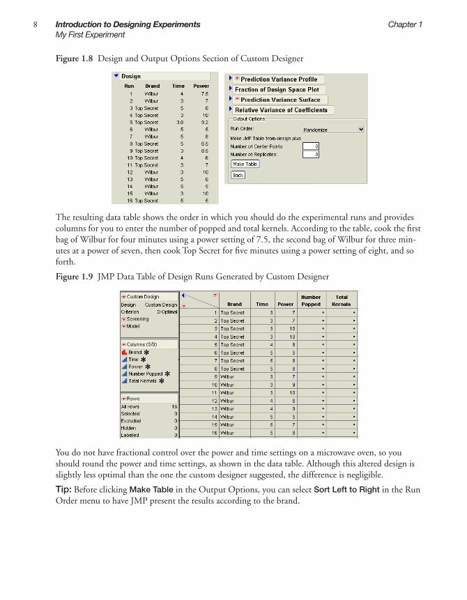
When you click the Make Design button, JMP generates and displays a design table, as shown on the left in Figure 1.8. Note that because JMP uses a random seed to generate custom designs and there is no unique optimal design for this problem, your table may be different than the one shown here. You can see in the table that the custom design requires 8 runs using each brand of popcorn.
Scroll to the bottom of the Custom Design window and look at the Output Options area (shown to the right in Figure 1.8. The Run Order option lets you designate the order you want the runs to appear in the data table when it is created. Keep the selection at Randomize so the rows (runs) in the output table appear in a random order.
Now click Make Table in the Output Options section.
8 Introduction to Designing Experiments Chapter 1My First Experiment
Figure 1.8 Design and Output Options Section of Custom Designer
The resulting data table shows the order in which you should do the experimental runs and provides columns for you to enter the number of popped and total kernels. According to the table, cook the first bag of Wilbur for four minutes using a power setting of 7.5, the second bag of Wilbur for three min-utes at a power of seven, then cook Top Secret for five minutes using a power setting of eight, and so forth.
Figure 1.9 JMP Data Table of Design Runs Generated by Custom Designer
You do not have fractional control over the power and time settings on a microwave oven, so you should round the power and time settings, as shown in the data table. Although this altered design is slightly less optimal than the one the custom designer suggested, the difference is negligible.
Tip: Before clicking Make Table in the Output Options, you can select Sort Left to Right in the Run Order menu to have JMP present the results according to the brand.

1In
trod
uctio
n
Chapter 1 Introduction to Designing Experiments 9My First Experiment
Step 6: Gather and Enter the Data
Pop the popcorn according to the design JMP provided. Then, count the number of popped and unpopped kernels left in each bag. Finally, manually enter the numbers, shown below, into the data table’s appropriate columns.
We have conducted this experiment for you and placed the results in the Sample Data folder installed with JMP. To see the results, open Popcorn DOE Results.jmp from the Design Experiment folder in the sample data. The data table is shown in Figure 1.10.
Figure 1.10 Results of the Popcorn DOE Experiment
Step 7: Analyze the Results
After the experiment is finished and the number of popped kernels and total kernels have been entered into the data table, it is time to analyze the data. The design data table has a script, labeled Model, that shows in the top left panel of the table. When you created the design, the appropriate analysis (in this case, a standard least squares analysis) is stored in the Model script with the data table.
1 Click the red triangle for Model and select Run Script.
The default fitting personality in the model dialog is Standard Least Squares. One assumption of standard least squares is that your responses are normally distributed. But because you are modeling the proportion of popped kernels it is more appropriate to assume that your responses come from binomial distribution. You can use this assumption by changing to a generalized linear model.
2 Change the Personality to Generalized Linear Model, Distribution to Binomial, and Link Func-tion to Logit, as shown in Figure 1.11.
results from experiment
scripts toanalyze data

10 Introduction to Designing Experiments Chapter 1My First Experiment
Figure 1.11 Fitting the Model
3 Click the Run Model button. 4 Scroll down to view the Effect Tests table (Figure 1.12) and look in the column labeled Prob>Chisq.
This column lists p-values. A low p-value (a value less than 0.05) indicates that results are statistically significant. In this column, asterisks indicate the low p-values. You can therefore conclude that, in this experiment, all the model effects except the two-factor interaction involving Brand and Power are highly significant. You have confirmed that there is a strong relationship between popping time (Time), power, and brand and the proportion of popped kernels
Figure 1.12 Investigating p-Values
To further investigate, use the Prediction Profiler to develop an understanding of how changes in the factor settings affect the numbers of popped and unpopped kernels:
1 Choose Profilers > Profiler from the red triangle menu on the Generalized Linear Model Fit title bar. Now scroll to the bottom of the report to see the Prediction Profiler. Open it by clicking the dis-closure button beside the Prediction Profiler title bar. The Prediction Profiler (Figure 1.13) displays prediction traces for each factor.
p-values indicate significance. Values with * beside them are p-values that indicate the results are statistically significant.

1In
trod
uctio
n
Chapter 1 Introduction to Designing Experiments 11My First Experiment
Figure 1.13 The Prediction Profiler
2 Move the red dotted lines to see the effect that changing the factor’s value has on the response. Click the red line in the time graph and drag it right and left (Figure 1.14).
Figure 1.14 Moving the Time Value from 4 to 5
As time increases and decreases, the curved time and power prediction traces shift their slope and max-imum/minimum values as you change the values of time. The fact that there is a substantial slope shift tells you that there is an interaction (synergistic effect) involving time and power.
Furthermore, the steepness of a prediction trace reveals a factor’s importance. Because the prediction trace for power is steeper than that for brand or time (see Figure 1.14), you can see that the microwave power setting is more important than the brand of popcorn or the amount of cooking time.
Now for the final steps.
3 Click the red triangle icon in the Prediction Profiler title bar and select Desirability Functions.4 Click the red triangle icon in the Prediction Profiler title bar and select Maximize Desirability. JMP
automatically adjusts the graph to display the optimal settings at which the most kernels will be popped (Figure 1.15).
Prediction trace for brand
predicted value of the response
95% confidence interval on the mean response
Factor values (here, time = 4)
Prediction trace for time
Prediction trace for power

12 Introduction to Designing Experiments Chapter 1My First Experiment
Our experiment found how to cook the bag of popcorn with the greatest proportion of popped kernels: use the Wilbur brand, cook for five minutes, and use a power level of 7.8 (or 8). The experiment pre-dicts that cooking at these settings will yield greater than 97% popped kernels.
Figure 1.15 The Most Desirable Settings
The best settings are:
• the Wilbur brand
• cooking time at 5
• power set at 7.79

Chapter 2Examples Using the Custom Designer
The use of statistical methods in industry is increasing. Arguably, the most cost-beneficial of these methods for quality and productivity improvement is statistical design of experiments. A trial-and -error search for the vital few factors that most affect quality is costly and time-consuming. The purpose of experimental design is to characterize, predict, and then improve the behavior of any system or pro-cess. Designed experiments are a cost-effective say to accomplish these goals.
JMP’s custom designer is the recommended way to describe your process and create a design that works for your situation.To use the custom designer, you first enter the process variables and constraints, then JMP tailors a design to suit your unique case. This approach is more general and requires less experi-ence and expertise than previous tools supporting the statistical design of experiments.
Custom designs accommodate any number of factors of any type. You can also control the number of experimental runs. This makes custom design more flexible and more cost effective than alternative approaches.
This chapter presents several examples showing the use of custom designs. It shows how to drive its interface to build a design using this easy step-by-step approach:
Key engineering steps: process knowledgeand engineering judgement are important.
Key mathematical steps: appropriatecomputer-based tools are empowering
Describe Design Collect Fit Predict
identify factors and responses
compute design for maximum informationfrom runs
use design to set factors; measure response foreach run
compute best fit ofmathematical modelto data from test runs
use model to find bestfactor settings for on-targetresponses and minimumvariability

ContentsCreating Screening Experiments . . . . . . . . . . . . . . . . . . . . . . . . . . . . . . . . . . . . . . . . . . . . . . . . . . . 15
Creating a Main-Effects-Only Screening Design . . . . . . . . . . . . . . . . . . . . . . . . . . . . . . . . . . . . 15Creating a Screening Design to Fit All Two-Factor Interactions . . . . . . . . . . . . . . . . . . . . . . . . . 16A Compromise Design Between Main Effects Only and All Interactions . . . . . . . . . . . . . . . . . . 18Creating ‘Super’ Screening Designs . . . . . . . . . . . . . . . . . . . . . . . . . . . . . . . . . . . . . . . . . . . . . . 19Screening Designs with Flexible Block Sizes . . . . . . . . . . . . . . . . . . . . . . . . . . . . . . . . . . . . . . . 23Checking for Curvature Using One Extra Run . . . . . . . . . . . . . . . . . . . . . . . . . . . . . . . . . . . . 26
Creating Response Surface Experiments . . . . . . . . . . . . . . . . . . . . . . . . . . . . . . . . . . . . . . . . . . . . 29Exploring the Prediction Variance Surface . . . . . . . . . . . . . . . . . . . . . . . . . . . . . . . . . . . . . . . . 29Introducing I-Optimal Designs for Response Surface Modeling . . . . . . . . . . . . . . . . . . . . . . . . 32A Three-Factor Response Surface Design . . . . . . . . . . . . . . . . . . . . . . . . . . . . . . . . . . . . . . . . . . 33Response Surface with a Blocking Factor . . . . . . . . . . . . . . . . . . . . . . . . . . . . . . . . . . . . . . . . . . 35
Creating Mixture Experiments . . . . . . . . . . . . . . . . . . . . . . . . . . . . . . . . . . . . . . . . . . . . . . . . . . . . 38Special-Purpose Uses of the Custom Designer . . . . . . . . . . . . . . . . . . . . . . . . . . . . . . . . . . . . . . . . 41
Designing Experiments with Fixed Covariate Factors . . . . . . . . . . . . . . . . . . . . . . . . . . . . . . . . . 41Creating a Design with Two Hard-to-Change Factors: Split Plot . . . . . . . . . . . . . . . . . . . . . . . 44
Technical Discussion . . . . . . . . . . . . . . . . . . . . . . . . . . . . . . . . . . . . . . . . . . . . . . . . . . . . . . . . . . 48

2E
xam
ple
s
Chapter 2 Examples Using the Custom Designer 15Creating Screening Experiments
Creating Screening ExperimentsYou can use the screening designer in JMP to create screening designs, but the custom designer is more flexible and general. The straightforward screening examples described below show that ‘custom’ is not equivalent to ‘exotic.’ The custom designer is a general purpose design environment that can create screening designs.
Creating a Main-Effects-Only Screening Design
To create a main-effects-only screening design using the custom designer:
1 Select DOE > Custom Design.2 Enter six continuous factors into the Factors panel (see “Step 1: Design the Experiment,” p. 3, for
details). Figure 2.1 shows the six factors.3 Click Continue. The default model contains only the main effects. 4 Using the default of eight runs, click Make Design.
Note to DOE experts: The result is a resolution-three screening design. All the main effects are esti-mable, but they are confounded with two factor interactions.
Figure 2.1 A Main-Effects-Only Screening Design
5 Click the disclosure button ( on Windows/Linux and on the Macintosh) to open the Alias Matrix. Figure 2.2 shows the Alias Matrix, which is a table of zeros, ones, and negative ones.
The Alias Matrix shows how the coefficients of the constant and main effect terms in the model are biased by any active two-factor interaction effects not already added to the model. For example, the col-

16 Examples Using the Custom Designer Chapter 2Creating Screening Experiments
umns labeled 2 6 and 3 4 in the table have a 1 in the row for X1. This means that the expected value of the main effect of X1 is actually the sum of the main effect of X1 and the two-factor interactions X2*X6 and X3*X4. You are assuming that these interactions are negligible in size compared to the effect of X1.
Figure 2.2 The Alias Matrix
Note to DOE experts: The Alias matrix is a generalization of the confounding pattern in fractional factorial designs.
Creating a Screening Design to Fit All Two-Factor Interactions
There is risk involved in designs for main effects only. The risk is that two-factor interactions, if they are strong, can confuse the results of such experiments. To avoid this risk, you can create experiments resolving all the two-factor interactions.
Note to DOE experts: The result in this example is a resolution-five screening design. Two-factor interactions are estimable but are confounded with three-factor interactions.
1 Select DOE > Custom Design.2 Enter five continuous factors into the Factors panel (see “Step 1: Design the Experiment,” p. 3, for
details).3 Click Continue.4 In the Model panel, select Interactions > 2nd.5 In the Design Generation Panel choose Minimum for Number of Runs and click Make Design.
Figure 2.3 shows the runs of the two-factor design with all interactions. The sample size, 16 (a power of two) is large enough to fit all the terms in the model. The values in your table may be different from those shown below.

2E
xam
ple
s
Chapter 2 Examples Using the Custom Designer 17Creating Screening Experiments
Figure 2.3 All Two-Factor Interactions
6 Click the disclosure button to open the Alias Matrix. Figure 2.4 shows a table of zeros and ones. The columns are labelled to identify an interation. For example, the column labelled 1 2 refers to the interaction of the first and second effect, the column labelled 2 3 refes to the interaction between the second and third effect, and so forth. Look at the column labelled 1 2. There is only one value of 1 in that column. All the others are 0. The 1 occurs in the row labelled X1*X2. All the other rows and columns are similar. This means that the expected value of the two-factor interaction X1*X2 is not biased by any other terms. All the rows above the row labelled X1*X2 contain only zeros which means that the Intercept and main effect terms are not biased by any two-factor interactions.
Figure 2.4 Alias Matrix Showing all Two-Factor Interactions Clear of all Main Effects

18 Examples Using the Custom Designer Chapter 2Creating Screening Experiments
A Compromise Design Between Main Effects Only and All Interactions
In a screening situation, suppose there are six continuous factors and resources for n = 16 runs. The first example in this section showed an eight-run design that fit all the main effects. With six factors, there are 15 possible two-factor interactions. The minimum number of runs that could fit the constant, six main effects and 15 two-factor interactions is 22. This is more than the resource budget of 16 runs. It would be good to find a compromise between the main-effects only design and a design capable of fitting all the two-factor interactions.
This example shows how to obtain such a design compromise using the custom designer.
1 Select DOE > Custom Design.2 Define six continuous factors (X1 - X6).3 Click Continue. The model includes the main effect terms by default. The default estimability of
these terms is Necessary. 4 Add all the two-factor interactions by clicking the Interactions button and choosing 2nd. 5 Select all the interaction terms and click the current estimability (Necessary) to reveal a menu.
Change Necessary to If Possible, as shown in Figure 2.5.
Figure 2.5 Model for Six-Variable Design with Two-Factor Interactions Designated If Possible
6 Type 16 in the User Specified edit box in the Number of Runs section. Although the desired num-ber of runs (16) is less than the total number of model terms, the custom designer builds a design to

2E
xam
ple
s
Chapter 2 Examples Using the Custom Designer 19Creating Screening Experiments
estimate as many two-factor interactions as possible.7 Click Make Design.
After the custom designer creates the design, click the disclosure button to open the Alias Matrix (Figure 2.6). The values in your table may be different from those shown below, but with a similar pat-tern.
Figure 2.6 Alias Matrix
All the rows above the row labelled X1*X2 contain only zeros, which means that the Intercept and main effect terms are not biased by any two-factor interactions. The row labelled X1*X2 has the value 0.25 in the 1 2 column and the same value in the 5 6 column. That means the expected value of the estimate for X1*X2 is actually the sum of X1*X2 and any real effect due to X5*X6.
Note to DOE experts: The result in this particular example is a resolution-four screening design. Two-factor interactions are estimable but are aliased with other two-factor interactions.
Creating ‘Super’ Screening Designs
This section shows how to use the technique shown in the previous example to create ‘super’ (supersat-urated) screening designs. Supersaturated designs have fewer runs than factors, which makes them attractive for factor screening when there are many factors and experimental runs are expensive.
In a saturated design, the number of runs equals the number of model terms. In a supersaturated design, as the name suggests, the number of model terms exceeds the number of runs (Lin, 1993). A supersaturated design can examine dozens of factors using fewer than half as many runs as factors.
The Need for Supersaturated Designs
The 27–4 and the 215–11 fractional factorial designs available using the screening designer are both satu-rated with respect to a main effects model. In the analysis of a saturated design, you can (barely) fit the

20 Examples Using the Custom Designer Chapter 2Creating Screening Experiments
model, but there are no degrees of freedom for error or for lack of fit. Until recently, saturated designs represented the limit of efficiency in designs for screening.
Factor screening relies on the sparsity principle. The experimenter expects that only a few of the factors in a screening experiment are active. The problem is not knowing which are the vital few factors and which are the trivial many. It is common for brainstorming sessions to turn up dozens of factors. Yet mysteriously, screening experiments in practice rarely involve more than ten factors. What happens to winnow the list from dozens to ten or so?
If the experimenter is limited to designs that have more runs than factors, then dozens of factors trans-late into dozens of runs. This is usually economically unfeasible. The result is that the factor list is reduced without the benefit of data. In a supersaturated design, the number of model terms exceeds the number of runs, and you can examine dozens of factors using less than half as many runs.
There are drawbacks:
• If the number of active factors approaches the number of runs in the experiment, then it is likely that these factors will be impossible to identify. A rule of thumb is that the number of runs should be at least four times larger than the number of active factors. If you expect that there might be as many as five active factors, you should have at least 20 runs.
• Analysis of supersaturated designs cannot yet be reduced to an automatic procedure. However, using forward stepwise regression is reasonable and the new Screening platform (Analyze > Modeling > Screening) offers a more streamlined analysis.
Example: Twelve Factors in Eight Runs
As an example, consider a supersaturated design with twelve factors. Using model terms designated If Possible provides the machinery for creating a supersaturated design.
In the last example, two-factor interactions terms were specified If Possible. In a supersaturated design, all terms—including main effects—are If Possible. Note in Figure 2.7, the only primary term is the intercept.
To see an example of a supersaturated design with twelve factors in eight runs:
1 Select DOE > Custom Design.2 Add 12 continuous factors and click Continue.3 Highlight all terms except the Intercept and click the current estimability (Necessary) to reveal the
menu. Change Necessary to If Possible, as shown in Figure 2.7.

2E
xam
ple
s
Chapter 2 Examples Using the Custom Designer 21Creating Screening Experiments
Figure 2.7 Changing the Estimability
4 The desired number of runs is eight so type 8 in the User Specified edit box in the Number of Runs section.
5 Click the red triangle on the Custom Design title bar and select Simulate Responses, as shown in Figure 2.8.
Figure 2.8 Simulating Responses
6 Click Make Design, then click Make Table. A window named Simulate Responses and a design table appear, similar to the one in Figure 2.9. The Y column values are controlled by the coefficients of the model in the Simulate Responses window. The values in your table may be different from those shown below.

22 Examples Using the Custom Designer Chapter 2Creating Screening Experiments
Figure 2.9 Simulated Responses and Design Table
7 Change the default settings of the coefficients in the Simulate Responses dialog to match those in Figure 2.10 and click Apply. The numbers in the Y column change. Because you have set X2, X9, and X10 as active factors in the simulation, the analysis picks up the same three factors.
Note that random noise is added to the Y column formula, so the numbers you see might not necessar-ily match those in the figure. The values in your table may be different from those shown below.
Figure 2.10 Give Values to Three Main Effects and Specify the Standard Error as 0.5
To identify active factors using stepwise regression:
1 To run the Model script in the design table, click the red triangle beside Model and select Run Script.
2 Change the Personality in the Model Specification window from Standard Least Squares to Stepwise.
3 Click Run Model on the Model dialog. In the resulting display click the Step button three times. JMP enters the factors with the largest effects. From the report that appears, you should identify three active factors: X2, X9, and X10 as shown in Figure 2.11. The step history appears in the bot-tom part of the report. Because random noise is added, your estimates will be slightly different from those shown below.

2E
xam
ple
s
Chapter 2 Examples Using the Custom Designer 23Creating Screening Experiments
Figure 2.11 Stepwise Regression Identifies Active Factors
Note: This example defines a few large main effects and sets the rest to zero. In real situations, it is much less likely to have such clearly differentiated effects.
Screening Designs with Flexible Block Sizes
When you create a design using the screening designer, the available block sizes for the listed designs are a power of two. However, custom designs in JMP can have blocks of any size. The blocking example shown in this section is flexible because it is using three runs per block, instead a power of two.
After you select DOE > Custom Design and enter factors, you see that the blocking factor shows only one level in the Values section of the Factors panel. This is because the sample size is unknown at this point. After you complete the design, JMP shows the appropriate number of blocks calculated as the sample size divided by the number of runs per block.
For example, Figure 2.12 shows that when you enter three continuous factors and one blocking factor with three runs per block, only one block appears in the Factors panel.

24 Examples Using the Custom Designer Chapter 2Creating Screening Experiments
Figure 2.12 One Block Appears in the Factors Panel
The default sample size of nine requires three blocks. After you click Continue, there are three blocks in the Factors panel (Figure 2.13). This is because the default sample size is nine, which requires three blocks with three runs each.
Figure 2.13 Three Blocks in the Factors Panel
If you enter 24 runs in the User Specified box of the Number of Runs section, the Factors panel changes and now contains 8 blocks (Figure 2.14).

2E
xam
ple
s
Chapter 2 Examples Using the Custom Designer 25Creating Screening Experiments
Figure 2.14 Number of Runs is 24 Gives Eight Blocks
If you add all the two-factor interactions and change the number of runs to 15, three runs per block produces five blocks (as shown in Figure 2.15), so the Factors panel displays five blocks in the Values section.
Figure 2.15 Changing the Runs to 15

26 Examples Using the Custom Designer Chapter 2Creating Screening Experiments
Click Make Design, then click the disclosure button ( on Windows/Linux and on the Macintosh) to open the Relative Variance of Coefficients report. Figure 2.16 shows the variance of each coefficient in the model relative to the unknown error variance.
The values in your table may be slightly different from those shown below. Notice that the variance of each coefficient is about one-tenth the error variance and that all the variances are roughly the same size. The error variance is assumed to be 1.
Figure 2.16 Table of Relative Variance of the Model Coefficients
The main question here is whether the relative size of the coefficient variance is acceptably small. If not, adding more runs (18 or more) will lower the variance of each coefficient.
For more details, see “The Relative Variance of Coefficients and Power Table,” p. 61.
Note to DOE experts: There are four rows associated with X4 (the block factor). That is because X4 has 5 blocks and, therefore, 4 degrees of freedom. Each degree of freedom is associated with one unknown coefficient in the model.
Checking for Curvature Using One Extra Run
In screening designs, experimenters often add center points and other check points to a design to help determine whether the assumed model is adequate. Although this is good practice, it is also ad hoc. The custom designer provides a way to improve on this ad hoc practice while supplying a theoretical founda-tion and an easy-to-use interface for choosing a design robust to the modeling assumptions.
The purpose of check points in a design is to provide a detection mechanism for higher-order effects that are contained in the assumed model. These higher-order terms are called potential terms. (Let q denote the potential terms designated If Possible in JMP.) The assumed model consists of the primary terms. (Let p denote the primary terms designated Necessary in JMP.)
To take advantage of the benefits of the approach using If Possible model terms, the sample size should be larger than the number of primary terms but smaller than the sum of the primary and potential terms. That is, p < n < p+q. The formal name of the approach using If Possible model terms is Bayesian D-Optimal design. This type of design allows the precise estimation of all of the primary terms while providing omnibus detectability (and some estimability) for the potential terms.

2E
xam
ple
s
Chapter 2 Examples Using the Custom Designer 27Creating Screening Experiments
For a two-factor design having a model with an intercept, two main effects, and an interaction, there are p = 4 primary terms. When you enter this model in the custom designer, the default is a four-run design with the factor settings shown in Figure 2.17.
Figure 2.17 Two Continuous Factors with Interaction
Now suppose you can afford an extra run (n = 5). You would like to use this point as a check point for curvature. If you leave the model the same and increase the sample size, the custom designer replicates one of the four vertices. Replicating any run is the optimal choice for improving the estimates of the terms in the model, but it provides no way to check for lack of fit.
Adding the two quadratic terms to the model makes a total of six terms. This is a way to model curva-ture directly. However, to do this the custom designer requires two additional runs (at a minimum), which exceeds your budget of five runs.
The Bayesian D-Optimal design provides a way to check for curvature while adding only one extra run. To create this design:
1 Select DOE > Custom Design.2 Define two continuous factors (X1 and X2).3 Click Continue. 4 Choose 2nd from the Interactions menu in the Model panel. The results appear as shown in
Figure 2.18.
Figure 2.18 Second-Level Interactions
5 Choose 2nd from the Powers button in the Model panel. This adds two quadratic terms.6 Select the two quadratic terms (X1*X1 and X2*X2) and click the current estimability (Necessary) to

28 Examples Using the Custom Designer Chapter 2Creating Screening Experiments
see the menu and change Necessary to If Possible, as shown in Figure 2.19.
Figure 2.19 Changing the Estimability
Now, the p = 4 primary terms (the intercept, two main effects, and the interaction) are designated as Necessary while the q = 2 potential terms (the two quadratic terms) are designated as If Possible. The desired number of runs, five, is between p = 4 and p + q = 6.
7 Enter 5 into the User Specified edit box in the Number of Runs section of the Design Generation panel.
8 Click Make Design. The resulting factor settings appear in Figure 2.20. The values in your design may be different from those shown below.
Figure 2.20 Five-Run Bayesian D-Optimal Design
9 Click Make Table to create a JMP data table of the runs.10 Create the overlay plot in Figure 2.21 with Graph > Overlay Plot, and assign X1 as Y and X2 as X.
The overlay plot illustrates how the design incorporates the single extra run. In this example the design places the factor settings at the center of the design instead of at one of the corners.

2E
xam
ple
s
Chapter 2 Examples Using the Custom Designer 29Creating Response Surface Experiments
Figure 2.21 Overlay Plot
Creating Response Surface ExperimentsResponse surface experiments traditionally involve a small number (generally 2 to 8) of continuous fac-tors. The a priori model for a response surface experiment is usually quadratic.
In contrast to screening experiments, researchers use response surface experiments when they already know which factors are important. The main goal of response surface experiments is to create a predic-tive model of the relationship between the factors and the response. Using this predictive model allows the experimenter to find better operating settings for the process.
In screening experiments one measure of the quality of the design is the size of the relative variance of the coefficients. In response surface experiments, the prediction variance over the range of the factors is more important than the variance of the coefficients. One way to visualize the prediction variance is JMP’s prediction variance profile plot. This plot is a powerful diagnostic tool for evaluating and com-paring response surface designs.
Exploring the Prediction Variance Surface
The purpose of the example below is to generate and interpret a simple Prediction Variance Profile Plot. Follow the steps below to create a design for a quadratic model with a single continuous factor.
1 Select DOE > Custom Design.2 Add one continuous factor by selecting Add Factor > Continuous (Figure 2.22) and click
Continue.3 In the Model panel, select Powers > 2nd to create a quadratic term (Figure 2.22).

30 Examples Using the Custom Designer Chapter 2Creating Response Surface Experiments
Figure 2.22 Adding a Factor and a Quadratic Term
4 In the Design Generation panel, use the default number of runs (six) and click Make Design (Figure 2.23). The number of runs is inversely proportional to the size of variance of the predicted response. As the number of runs increases, the prediction variances decrease.
Figure 2.23 Using the Default Number of Runs
5 Click the disclosure button ( on Windows/Linux and on the Macintosh) to open the Prediction Variance Profile, as shown in Figure 2.24.
For continuous factors, the initial setting is at the mid-range of the factor values. For categorical factors, the initial setting is the first level. If the design model is quadratic, then the prediction variance func-tion is quartic. The y-axis is the relative variance of prediction of the expected value of the response.
In this design, the three design points are –1, 0, and 1. The prediction variance profile shows that the variance is a maximum at each of these points on the interval –1 to 1.
Figure 2.24 Prediction Profile for Single Factor Quadratic Model
The prediction variance is relative to the error variance. When the relative prediction variance is one, the absolute variance is equal to the error variance of the regression model. More details on the Predic-tion Variance Profiler is in “Understanding Design Diagnostics,” p. 58.
6 To compare profile plots, click the Back button and choose Minimum in the Design Generation panel, which gives a sample size of three.
7 Click Make Design and then open the Prediction Variance Profile again.

2E
xam
ple
s
Chapter 2 Examples Using the Custom Designer 31Creating Response Surface Experiments
Now you see a curve that has the same shape as the previous plot, but the maxima are at one instead of 0.5. Figure 2.25 compares plots for a sample size of six and sample size of three for this quadratic model. You can see the prediction variance increase as the sample size decreases. Since the prediction variance is inversely proportional to the sample size, doubling the number of runs halves the prediction variance. These profiles show settings for the maximum variance and minimum variance, for sample sizes six (top charts) and sample size three (bottom charts). The axes on the bottom plots are adjusted to match the axes on the top plot.
Figure 2.25 Comparison of Prediction Variance Profiles
Tip: Control-click (Command-click on the Mac) on the factor to set a factor level precisely.
8 To create an unbalanced design, click the Back button and enter a sample size of four in the User Specified text edit box in the Design Generation panel, then click Make Design. The results are shown in Figure 2.26.
You can see that the variance of prediction at –1 is lower than the other sample points (its value is 0.5 instead of one). The symmetry of the plot is related to the balance of the factor settings. When the design is balanced, the plot is symmetric, as shown in Figure 2.25. When the design is unbalanced, the prediction plot is not symmetric, as shown in Figure 2.26.

32 Examples Using the Custom Designer Chapter 2Creating Response Surface Experiments
Figure 2.26 Sample Size of Four for the One-Factor Quadratic Model
Note to scripting experts:
The following JSL code shows graphically that a one-factor design for a cubic model with unequally spaced points can have a lower prediction variance than the equally spaced design.
To view the script in this example, open Cubic Model.jsl from the Sample Scripts folder installed with JMP. Then select Edit > Run Script from the Edit menu. When the plot appears, move the free values from the equally spaced points to the optimal points (–0.445 and 0.445) to see that the maximum vari-ance on the interval decreases by more than 10%.
// DOE for fitting a cubic model.
n = 4; // number of points
//Start with equally spaced points.u = [-0.333 0.333];x = {-1,u[1],u[2],1};y = j(2,1,.2);
cubicx = function({x1},rr=j(4,1,1);for(i=1,i<=3,i++,rr[i+1]=x1^i); rr;);
NewWindow("DOE - Variance Function of a Cubic Polynomial",
Graph(FrameSize(500,300),XScale(-1.0,1.0),yScale(0,1.2),Double Buffer,
M = j(n,1,1);for(i=1,i<=3,i++, M = M||(x^i));V = M`*M;C = inverse(V);yFunction(xi=cubicx(x);sqrt(xi`*C*xi),x);detV = det(V);text({-0.3,1.1},"Determinant = ",char(detV,6,99));DragMarker(u,y);for(i=1,i<=2,i++,Text({u[i],.25},char(u[i],6,99)));));show(n,d,u);// Drag the middle points to -0.445 and 0.445 // for a D-Optimal design.
Prediction variance at X1= 0 Prediction variance at X1= –1

2E
xam
ple
s
Chapter 2 Examples Using the Custom Designer 33Creating Response Surface Experiments
Introducing I-Optimal Designs for Response Surface Modeling
The custom designer generates designs using a mathematical optimality criterion. All the designs in this chapter so far have been D-Optimal designs. D-Optimal designs are most appropriate for screening experiments because the optimality criterion focuses on precise estimates of the coefficients. If an exper-imenter has precise estimates of the factor effects, then it is easy to tell which factors’ effects are impor-tant and which are negligible. However, D-Optimal designs are not as appropriate for designing experiments where the primary goal is prediction.
I-Optimal designs minimize the average prediction variance inside the region of the factors. This makes I-Optimal designs more appropriate for prediction. As a result I-Optimality is the recommended crite-rion for JMP response surface designs.
An I-Optimal design tends to place fewer runs at the extremes of the design space than does a D-Opti-mal design. As an example, consider a one-factor design for a quadratic model using n = 12 experimen-tal runs. The D-Optimal design for this model puts four runs at each end of the range of interest and four runs in the middle. The I-Optimal design puts three runs at each end point and six runs in the middle. In this case, the D-Optimal design places two-thirds of its runs at the extremes versus one-half for the I-Optimal design.
Figure 2.27 compares prediction variance profiles of the one-factor I- and D-Optimal designs for a qua-dratic model with (n = 12) runs. The variance function for the I-Optimal design is less than the corre-sponding function for the D-Optimal design in the center of the design space; the converse is true at the edges.
Figure 2.27 Prediction Variance Profiles for 12-Run I-Optimal (left) and D-Optimal (right) Designs
The average variance (relative to the error variance) for the I-Optimal design is 0.178 compared to the D-Optimal design, which is 0.2. This means that confidence intervals for prediction will be nearly 10% shorter on average for the I-Optimal design.
To compare the two design criteria, create a one-factor design with a quadratic model that uses the I-Optimality criterion, and another one that uses D-Optimality:
1 Select DOE > Custom Design.2 Add one continuous factor: X1.3 Click Continue.4 Click the RSM button in the Model panel to make the design I-Optimal.5 Change the number of runs to 12.6 Click Make Design.7 Click the disclosure button ( on Windows/Linux and on the Macintosh) to open the
Prediction Variance Profile, as shown on the left in Figure 2.27.

34 Examples Using the Custom Designer Chapter 2Creating Response Surface Experiments
8 Repeat the same steps to create a D-Optimal design, but select Optimality Criterion > Make D-Optimal Design from the red triangle menu on the custom design title bar. The results in the Pre-diction Variance Profile should look the same as those on the right in Figure 2.27.
A Three-Factor Response Surface Design
In higher dimensions, the I-Optimal design continues to place more emphasis on the center of the region of the factors. The D-Optimal and I-Optimal designs for fitting a full quadratic model in three factors using 16 runs are shown in Figure 2.28.
To compare the two design criteria, create a three-factor design that uses the I-Optimality criterion, and another one that uses D-Optimality:
1 Select DOE > Custom Design.2 Add three continuous factors: X1, X2, and X3.3 Click Continue.4 Click the RSM button in the Model panel to add interaction and quadratic terms to the model and
to change the default optimality criterion to I-Optimal.5 Use the default of 16 runs.6 Click Make Design.7 The design is shown in the Design panel (the left in Figure 2.28).8 If you want to create a D-Optimal design for comparison, repeat the same steps but select
Optimality Criterion > Make D-Optimal Design from the red triangle menu on the custom design title bar. The design should look similar to those on the right in Figure 2.28. The values in your design may be different from those shown below.
Figure 2.28 16-run I-Optimal and D-Optimal designs for RSM Model
Profile plots of the variance function are displayed in Figure 2.29. These plots show slices of the vari-ance function as a function of each factor, with all other factors fixed at zero. The I-Optimal design has the lowest prediction variance at the center. Note that there are two center points in this design.
The D-Optimal design has no center points and its prediction variance at the center of the factor space is almost three times the variance of the I-Optimal design. The variance at the vertices of the D-Opti-

2E
xam
ple
s
Chapter 2 Examples Using the Custom Designer 35Creating Response Surface Experiments
mal design is not shown. However, note that the D-Optimal design predicts better than the I-Optimal design near the vertices.
Figure 2.29 Variance Profile Plots for 16 run I-Optimal and D-Optimal RSM Designs
Response Surface with a Blocking Factor
It is not unusual for a process to depend on both qualitative and quantitative factors. For example, in the chemical industry, the yield of a process might depend not only on the quantitative factors temper-ature and pressure, but also on such qualitative factors as the batch of raw material and the type of reac-tor. Likewise, an antibiotic might be given orally or by injection, a qualitative factor with two levels. The composition and dosage of the antibiotic could be quantitative factors (Atkinson and Donev, 1992).
The response surface designer (described in “Response Surface Designs,” p. 103) only deals with quan-titative factors. You could use the response surface designer to produce a Response Surface Model (RSM) design with a qualitative factor by replicating the design over each level of the factor. But, this is unnecessarily time-consuming and expensive. Using custom designer is simpler and more cost-effective because fewer runs are required.
The following steps show how to accommodate a blocking factor in a response surface design using the custom designer:
1 First, define two continuous factors (X1 and X2).2 Now, click Add Factor and select Blocking > 4 runs per block to create a blocking factor(X3). The
blocking factor appears with one level, as shown in Figure 2.30, but the number of levels adjusts later to accommodate the number of runs specified for the design.

36 Examples Using the Custom Designer Chapter 2Creating Response Surface Experiments
Figure 2.30 Add Two Continuous Factors and a Blocking Factor
3 Click Continue, and then click RSM in the Model panel to add the quadratic terms to the model (Figure 2.31). This automatically changes the recommended optimality criterion from D-Optimal to I-Optimal. Note that when you click RSM, a message reminds you that nominal factors (such as the blocking factor) cannot have quadratic effects.
Figure 2.31 Add Response Surface Terms
4 Enter 12 in the User Specified text edit box in the Design Generation panel, and note that the Fac-tors panel now shows the Blocking factor, X3, with three levels (Figure 2.32). Twelve runs defines three blocks with four runs per block.
Figure 2.32 Blocking Factor Now Shows Three Levels
5 Click Make Design.6 In the Output Options, select Sort Right to Left from the Run Order list 7 Click Make Table to see an I-Optimal table similar to the one on the left in Figure 2.33.
Figure 2.33 compares the results of a 12-run I-Optimal design and a 12-run D-Optimal Design. To see the D-Optimal design:
1 Click the Back button. 2 Click the red triangle icon on the Custom Design title bar and select Optimality Criterion > Make

2E
xam
ple
s
Chapter 2 Examples Using the Custom Designer 37Creating Response Surface Experiments
D-Optimal Design. 3 Click Make Design, then click Make Table.
Figure 2.33 JMP Design Tables for 12-Run I-Optimal and D-Optimal Designs
Figure 2.34 gives a graphical view of the designs generated by this example. These plots were generated for the runs in each JMP table by choosing Graph > Overlay from the main menu and using the block-ing factor (X3) as the Grouping variable.
Note that there is a center point in each block of the I-Optimal design. The D-Optimal design has only one center point. The values in your graph may be different from those shown below.
Figure 2.34 Plots of I-Optimal (left) and D-Optimal (right) Design Points by Block.
Either of the above designs supports fitting the specified model. The D-Optimal design does a slightly better job of estimating the model coefficients. The D-efficiency of the I-Optimal design is 92.4%.
The I-Optimal design is preferable for predicting the response inside the design region. Using the for-mulas given in “Technical Discussion,” p. 48, you can compute the relative average variance for these designs. The average variance (relative to the error variance) for the I-Optimal design is 0.61 compared

38 Examples Using the Custom Designer Chapter 2Creating Mixture Experiments
to 0.86 for the D-Optimal design. This means confidence intervals for prediction will be more than 16% longer on average for D-Optimal designs.
Creating Mixture ExperimentsIf you have factors that are ingredients in a mixture, you can use either the custom designer or the spe-cialized mixture designer. However, the mixture designer is limited because it requires all factors to be mixture components and you might want to vary the process settings along with the percentages of the mixture ingredients. The optimal formulation could change depending on the operating environment. The custom designer can handle mixture ingredients and process variables in the same study. You are not forced to modify your problem to conform to the restrictions of a special-purpose design approach.
The following example from Atkinson and Donev (1992) shows how to create designs for experiments with mixtures where one or more factors are not ingredients in the mixture. In this example:
• The response is the electromagnetic damping of an acrylonitrile powder.
• The three mixture ingredients are copper sulphate, sodium thiosulphate, and glyoxal.
• The nonmixture environmental factor of interest is the wavelength of light.
Though wavelength is a continuous variable, the researchers were only interested in predictions at three discrete wavelengths. As a result, they treated it as a categorical factor with three levels. To create this custom design:
1 Select DOE > Custom Design.2 Create Damping as the response. The authors do not mention how much damping is desirable, so
right-click the goal and create Damping’s response goal to be None.3 In the Factors panel, add the three mixture ingredients and the categorical factor, Wavelength. The
mixture ingredients have range constraints that arise from the mechanism of the chemical reaction. Rather than entering them by hand, load them from the Sample Data folder that was installed with JMP: click the red triangle icon on the Custom Design title bar and select Load Factors. Open Donev Mixture factors.jmp, from the Design Experiment folder in the sample data. The custom design panels should now look like those shown in Figure 2.35.
Figure 2.35 Mixture Experiment Response Panel and Factors Panel

2E
xam
ple
s
Chapter 2 Examples Using the Custom Designer 39Creating Mixture Experiments
The model, shown in Figure 2.36 is a response surface model in the mixture ingredients along with the additive effect of the wavelength. To create this model:
1 Click Interactions, and choose 2nd. A warning dialog appears telling you that JMP removes the main effect terms for non-mixture factors that interact with all the mixture factors. Click OK.
2 In the Design Generation panel, type 18 in the User Specified text edit box (Figure 2.36), which results in six runs each for the three levels of the wavelength factor.
Figure 2.36 Mixture Experiment Design Generation Panel
3 Click Make Design, and then click Make Table.
The resulting data table is shown in Figure 2.37. The values in your table may be different from those shown below.

40 Examples Using the Custom Designer Chapter 2Creating Mixture Experiments
Figure 2.37 Mixture Experiment Design Table
Atkinson and Donev also discuss the design where the number of runs is limited to 10. In that case, it is not possible to run a complete mixture response surface design for every wavelength.
To view this:
1 Click the Back button.2 Remove all the effects by highlighting them and clicking Remove Terms.3 Add the main effects by clicking the Main Effects button.4 In the Design Generation panel, change the number of runs to 10 (Figure 2.38) and click Make
Design. The Design table to the right in Figure 2.38 shows the factor settings for 10 runs.
Figure 2.38 Ten-Run Mixture Response Surface Design
Note that there are necessarily unequal numbers of runs for each wavelength. Because of this lack of balance it is a good idea to look at the prediction variance plot (top plot in Figure 2.39).
The prediction variance is almost constant across the three wavelengths, which is a good indication that the lack of balance is not a problem.
The values of the first three ingredients sum to one because they are mixture ingredients. If you vary one of the values, the others adjust to keep the sum constant. The bottom profiler in Figure 2.39 shows the result of increasing the copper sulphate percentage from about 0.4 to 0.6. The other two ingredi-ents both drop, keeping their ratio constant.
2E
xam
ple
s
Chapter 2 Examples Using the Custom Designer 41Special-Purpose Uses of the Custom Designer
Figure 2.39 Prediction Variance Plots for Ten-Run Design
Special-Purpose Uses of the Custom DesignerWhile some of the designs discussed in previous sections can be created using other designers in JMP or by looking them up in a textbook containing tables of designs, the designs presented in this section can-not be created without using the custom designer.
Designing Experiments with Fixed Covariate Factors
Pre-tabulated designs rely on the assumption that the experimenter controls all the factors. Sometimes you have quantitative measurements (a covariate) on the experimental units before the experiment begins. If this variable affects the experimental response, the covariate should be a design factor. The pre-defined design that allows only a few discrete values is too restrictive. The custom designer supplies a reasonable design option.
For this example, suppose there are a group of students participating in a study. A physical education researcher has proposed an experiment where you vary the number of hours of sleep and the calories for breakfast and ask each student run 1/4 mile. The weight of the student is known and it seems impor-tant to include this information in the experimental design.
To follow along with this example that shows column properties, open Big Class.jmp from the Sample Data folder that was installed when you installed JMP.
Build the custom design as follows:
1 Select DOE > Custom Design.2 Add two continuous variables to the models by clicking Add Factors and selecting Continuous,
naming them calories and sleep.3 Click Add Factor and select Covariate, as shown in Figure 2.40. The Covariate selection displays a
list of the variables in the current data table.

42 Examples Using the Custom Designer Chapter 2Special-Purpose Uses of the Custom Designer
Figure 2.40 Add a Covariate Factor
4 Select weight from the variable list (Figure 2.41) and click OK.
Figure 2.41 Design with Fixed Covariate
5 Click Continue.6 Add the interaction to the model by selecting calories in the Factors panel, selecting sleep in the
Model panel, and then clicking the Cross button (Figure 2.42).
Figure 2.42 Design With Fixed Covariate Factor
7 Click Make Design, then click Make Table. The data table in Figure 2.43 shows the design table. Your runs might not look the same because the order of the runs has been randomized.

2E
xam
ple
s
Chapter 2 Examples Using the Custom Designer 43Special-Purpose Uses of the Custom Designer
Figure 2.43 Design Table
Note: Covariate factors cannot have missing values.
Remember that weight is the covariate factor, measured for each student, but it is not controlled. The custom designer has calculated settings for calories and sleep for each student. It would be desirable if the correlations between calories, sleep and weight were as small as possible. You can see how well the custom designer did by fitting a model of weight as a function of calories and sleep. If that fit has a small model sum of squares, that means the custom designer has successfully separated the effect of weight from the effects of calories and sleep.
8 Click the red triangle icon beside Model in the data table and select Run Script, as shown on the left in Figure 2.44.
Figure 2.44 Model Script
9 Rearrange the dialog so weight is Y and calories, sleep, and calories*sleep are the model effects, as shown to the right in Figure 2.44. Click Run Model.
The leverage plots are nearly horizontal, and the analysis of variance table shows that the model sum of squares is near zero compared to the residuals (Figure 2.45). Therefore, weight is independent of calories and sleep. The values in your analysis may be a little different from those shown below.

44 Examples Using the Custom Designer Chapter 2Special-Purpose Uses of the Custom Designer
Figure 2.45 Analysis to Check That Weight is Independent of Calories and Sleep
Creating a Design with Two Hard-to-Change Factors: Split Plot
While there is substantial research literature covering the analysis of split plot designs, it has only been possible in the last few years to create optimal split plot designs (Goos 2002). The split plot design capability accessible in the JMP custom designer is the first commercially available tool for generating optimal split plot designs.
The split plot design originated in agriculture, but is commonplace in manufacturing and engineering studies. In split plot experiments, hard-to-change factors only change between one whole plot and the next. The whole plot is divided into subplots, and the levels of the easy-to-change factors are randomly assigned to each subplot.
The example in this section is adapted from Kowalski, Cornell, and Vining (2002). The experiment studies the effect of five factors on the thickness of vinyl used to make automobile seat covers. The response and factors in the experiment are described below:
• Three of the factors are ingredients in a mixture. They are plasticizers whose proportions, m1, m2, and m3, sum to one. Additionally, the mixture components are the subplot factors of the experi-ment.
• Two of the factors are process variables. They are the rate of extrusion (extrusion rate) and the tem-perature (temperature) of drying. These process variables are the whole plot factors of the experi-ment. They are hard to change.
• The response in the experiment is the thickness of the vinyl used for automobile seat covers. The response of interest (thickness) depends both on the proportions of the mixtures and on the effects of the process variables.
To create this design in JMP:
1 Select DOE > Custom Design.

2E
xam
ple
s
Chapter 2 Examples Using the Custom Designer 45Special-Purpose Uses of the Custom Designer
2 By default, there is one response, Y, showing. Double-click the name and change it to thickness. Use the default goal, Maximize (Figure 2.46).
3 Enter the lower limit of 10. 4 To add three mixture factors, type 3 in the box beside Add N Factors, and click Add Factor >
Mixture. 5 Name the three mixture factors m1, m2, and m3. Use the default levels 0 and 1 for those three fac-
tors.6 Add two continuous factors by typing 2 in the box beside Add N Factors, and click Add Factor >
Continuous. Name these factors extrusion rate and temperature. 7 Ensure that you are using the default levels, –1 and 1, in the Values area corresponding to these two
factors.8 To make extrusion rate the whole plot factor, click Easy and select Hard.9 To make temperature the subplot factor, click Easy and select Hard. Your dialog should look like
the one in Figure 2.46.
Figure 2.46 Entering Responses and Factors
10 Click Continue.11 Next, add interaction terms to the model by selecting Interactions > 2nd (Figure 2.47). This causes
a warning that JMP removes the main effect terms for non-mixture factors that interact with all the mixture factors. Click OK.
Figure 2.47 Adding Interaction Terms
12 In the Design Generation panel, type 7 in the Number of Whole Plots text edit box.

46 Examples Using the Custom Designer Chapter 2Special-Purpose Uses of the Custom Designer
13 For Number of Runs, type 28 in the User Specified text edit box (Figure 2.48).
Figure 2.48 Assigning the Number of Whole Plots and Number of Runs
14 Click Make Design.The result is shown in Figure 2.49.
Figure 2.49 Partial Listing of the Final Design Structure
15 Click Make Table. 16 From the Sample Data folder that was installed with JMP, open vinyl data.jmp from the Design
Experiment folder, which contains 28 runs as well as response values. The values in the table you generated with the custom designer may be different from those from the Sample Data folder, shown in Figure 2.50.
Figure 2.50 The Vinyl Data Design Table
17 Click the red triangle icon next to the Model script and select Run Script. The dialog in Figure 2.51 appears.
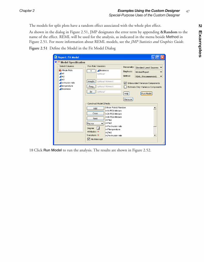
2E
xam
ple
s
Chapter 2 Examples Using the Custom Designer 47Special-Purpose Uses of the Custom Designer
The models for split plots have a random effect associated with the whole plot effect.
As shown in the dialog in Figure 2.51, JMP designates the error term by appending &Random to the name of the effect. REML will be used for the analysis, as indicated in the menu beside Method in Figure 2.51. For more information about REML models, see the JMP Statistics and Graphics Guide.
Figure 2.51 Define the Model in the Fit Model Dialog
18 Click Run Model to run the analysis. The results are shown in Figure 2.52.

48 Examples Using the Custom Designer Chapter 2Technical Discussion
Figure 2.52 Split Plot Analysis Results
Technical DiscussionThis section provides more technical information about I-, D-, and Bayesian D-Optimal designs in JMP.
D-Optimality:
• Is the default design type produced by the custom designer (except when the model is a response surface design)
• Minimizes the variance of the model coefficient estimates. This is appropriate for first-order models and in screening situations, because the experimental goal in such situations is often to identify the active factors; parameter estimation is key.
• Is dependent on a pre-stated model. This is a limitation because in most real situations, the form of the pre-stated model is not known in advance.
• Has runs whose purpose is to lower the variability of the coefficients of this pre-stated model. By focusing on minimizing the standard errors of coefficients, a D-Optimal design may not allow for checking that the model is correct. It may not include center points when investigating a first-order model. In the extreme, a D-Optimal design may have just p distinct runs with no degrees of freedom for lack of fit.
• Maximizes D when D = det[XTX].
2E
xam
ple
s
Chapter 2 Examples Using the Custom Designer 49Technical Discussion
• D-optimal split plot designs maximize D when D = det[XTV -1X] where V -1is the block diagonal variance matrix of the responses (Goos 2002).
Bayesian D-Optimality:
• Is a modification of the D-Optimality criterion that effectively estimates the coefficients in a model, and at the same time has the ability to detect and estimate some higher-order terms. If there are interactions or curvature, the Bayesian D-Optimality criterion is advantageous.
• Works best when the sample size is larger than the number of primary terms but smaller than the sum of the primary and potential terms. That is, p + q > n > p. The Bayesian D-Optimal design is an approach that allows the precise estimation of all of the primary terms while providing omnibus detectability (and some estimability) for the potential terms.
• Uses the potential terms to force in runs that allow for detecting any inadequacy in the model con-taining only the primary terms. Let K be the (p + q) by (p + q) diagonal matrix whose first p diagonal elements are equal to 0 and whose last q diagonal elements are the constant, k. The Bayesian D-Optimal design maximizes the determinant of (XT X + K). The difference between the criterion for D-Optimality and Bayesian D-Optimality is this constant added to the diagonal elements corre-sponding to the potential terms in the XT X matrix.
I-Optimality:
• Minimizes the average variance of prediction over the region of the data.
• Is more appropriate than D-Optimality if your goal is to predict the response rather than the coeffi-cients, such as in response surface design problems. Using the I-Optimality criterion is more appro-priate because you can predict the response anywhere inside the region of data and therefore find the factor settings that produce the most desirable response value. It is more appropriate when your objective is to determine optimum operating conditions, and also is appropriate to determine regions in the design space where the response falls within an acceptable range; or, to develop feed-back-control models. Precise estimation of the response therefore takes precedence over precise esti-mation of the parameters.
• Maximizes this criterion: If f T(x) denotes a row of the X matrix corresponding to factor combina-tions x, then
where
is a moment matrix that is independent of the design and can be computed in advance.
I fR∫ T x( ) XTX( )= 1– f x( )dx
Trace XTX( )1–M[ ]=
M fR∫ x( )f x( )T dx=

50 Examples Using the Custom Designer Chapter 2Technical Discussion

Chapter 3Building Custom Designs
The Basic Steps
JMP can build a custom design that both matches the description of your engineering problem and remains within your budget for time and material. Custom designs are general, flexible, and good for routine factor screening or response optimization. To create these tailor-made designs, use the Custom Design. command found on the DOE menu or the Custom Design Button found on the DOE panel of the JMP Starter.
This chapter introduces you to the steps you need to complete to build a custom design.

ContentsCreating a Custom Design . . . . . . . . . . . . . . . . . . . . . . . . . . . . . . . . . . . . . . . . . . . . . . . . . . . . . . . 53
Enter Responses and Factors into the Custom Designer . . . . . . . . . . . . . . . . . . . . . . . . . . . . . . 53Describe the Model . . . . . . . . . . . . . . . . . . . . . . . . . . . . . . . . . . . . . . . . . . . . . . . . . . . . . . . . . . 57Select the Number of Runs . . . . . . . . . . . . . . . . . . . . . . . . . . . . . . . . . . . . . . . . . . . . . . . . . . . . 57Understanding Design Diagnostics . . . . . . . . . . . . . . . . . . . . . . . . . . . . . . . . . . . . . . . . . . . . . . 58The Alias Matrix (Confounding Pattern) . . . . . . . . . . . . . . . . . . . . . . . . . . . . . . . . . . . . . . . . . 62Specify Output Options . . . . . . . . . . . . . . . . . . . . . . . . . . . . . . . . . . . . . . . . . . . . . . . . . . . . . 63Make the JMP Design Table . . . . . . . . . . . . . . . . . . . . . . . . . . . . . . . . . . . . . . . . . . . . . . . . . . 63
Creating Random Block Designs . . . . . . . . . . . . . . . . . . . . . . . . . . . . . . . . . . . . . . . . . . . . . . . . . 64Creating Split Plot Designs . . . . . . . . . . . . . . . . . . . . . . . . . . . . . . . . . . . . . . . . . . . . . . . . . . . . . 64Creating Split-Split Plot Designs . . . . . . . . . . . . . . . . . . . . . . . . . . . . . . . . . . . . . . . . . . . . . . . . . 65Creating Strip Plot Designs . . . . . . . . . . . . . . . . . . . . . . . . . . . . . . . . . . . . . . . . . . . . . . . . . . . . . 66Special Custom Design Commands . . . . . . . . . . . . . . . . . . . . . . . . . . . . . . . . . . . . . . . . . . . . . . . 66
Save Responses and Save Factors . . . . . . . . . . . . . . . . . . . . . . . . . . . . . . . . . . . . . . . . . . . . . . . 67Load Responses and Load Factors . . . . . . . . . . . . . . . . . . . . . . . . . . . . . . . . . . . . . . . . . . . . . . 68Save Constraints and Load Constraints . . . . . . . . . . . . . . . . . . . . . . . . . . . . . . . . . . . . . . . . . . 68Set Random Seed: Setting the Number Generator . . . . . . . . . . . . . . . . . . . . . . . . . . . . . . . . . . 69Simulate Responses . . . . . . . . . . . . . . . . . . . . . . . . . . . . . . . . . . . . . . . . . . . . . . . . . . . . . . . . . 69Show Diagnostics: Viewing Diagnostics Reports . . . . . . . . . . . . . . . . . . . . . . . . . . . . . . . . . . . 70Save X Marix: Viewing the Design (X) Matrix in the Logt . . . . . . . . . . . . . . . . . . . . . . . . . . . . . 71Optimality Criterion: Changing the Design Criterion (D- or I- Optimality) . . . . . . . . . . . . . . . 71Number of Starts: Changing the Number of Random Starts . . . . . . . . . . . . . . . . . . . . . . . . . . 72Sphere Radius: Constraining a Design to a Hypersphere . . . . . . . . . . . . . . . . . . . . . . . . . . . . . 73Disallowed Combinations: Accounting for Factor Level Restrictions . . . . . . . . . . . . . . . . . . . . 73Advanced Options for the Custom Designer . . . . . . . . . . . . . . . . . . . . . . . . . . . . . . . . . . . . . . 74Save Script to Script Window . . . . . . . . . . . . . . . . . . . . . . . . . . . . . . . . . . . . . . . . . . . . . . . . . . 75
Assigning Column Properties . . . . . . . . . . . . . . . . . . . . . . . . . . . . . . . . . . . . . . . . . . . . . . . . . . . . . 75Define Low and High Values (DOE Coding) for Columns . . . . . . . . . . . . . . . . . . . . . . . . . . . 76Set Columns as Factors for Mixture Experiments . . . . . . . . . . . . . . . . . . . . . . . . . . . . . . . . . . . 77Define Response Column Values . . . . . . . . . . . . . . . . . . . . . . . . . . . . . . . . . . . . . . . . . . . . . . . 78Assign Columns a Design Role . . . . . . . . . . . . . . . . . . . . . . . . . . . . . . . . . . . . . . . . . . . . . . . . 79Identify Factor Change Column Property . . . . . . . . . . . . . . . . . . . . . . . . . . . . . . . . . . . . . . . . 80
How Custom Designs Work: Behind the Scenes . . . . . . . . . . . . . . . . . . . . . . . . . . . . . . . . . . . . . . 81

3C
usto
m
Chapter 3 Building Custom Designs 53Creating a Custom Design
Creating a Custom DesignTo begin, select DOE > Custom Design, or click the Custom Design button on the JMP Starter DOE page. Then, follow the steps below.
• Enter responses and factors into the custom designer
• Describe the model
• Select the number of runs.
• Check the design diagnostics, if desired.
• Specify output options.
• Make the JMP design table.
The following sections describe each of these steps.
Enter Responses and Factors into the Custom Designer
How to Enter Responses
To enter responses, follow the steps in Figure 3.1.
Figure 3.1 Entering Responses
Tip: To quickly enter multiple responses, click the N Responses button and enter the number of responses you want.
Specifying Response Goal Types and Lower and Upper Limits
When entering responses, you can tell JMP that your goal is to obtain the maximum or minimum value possible, to match a specific value, or that there is no response goal.
Click to change the response goal, if desired.
To enter one response at a time, click then select a goal type: Maximize, Match Target, Minimize, or None.
Double-click to edit the response name, if desired.
Click to enter lower and upper limits and importance weights.
2 3
4
1

54 Building Custom Designs Chapter 3Creating a Custom Design
The following description explains the relationship between the goal type (step 3 in Figure 3.1) and the lower and upper limits (step 4 in Figure 3.1):
• For responses such as strength or yield, the best value is usually the largest possible. A goal of Maximize supports this objective.
• The Minimize goal supports an objective of having the smallest value, such as when the response is impurity or defects.
• The Match Target goal supports the objective when the best value for a responses is a specific target value, such as dimensions for a manufactured part. The default target value is assumed to be midway between given lower and upper limits.
Note: If your target response is not equidistant from the lower and upper acceptable bounds, you can alter the default target after you make a table from the design. In the data table, open the Column Info dialog for the response column (Cols > Column Info) and enter the desired target value.
Understanding Response Importance Weights
When computing and maximizing overall desirability, JMP uses the value you enter as the importance weight (step 4 in Figure 3.1) as the weight of each response. If there is only one response, then specify-ing importance is unnecessary. With two responses you can give greater weight to one response by assigning it a higher importance value.
Adding Simulated Responses, If Desired
If you do not have values for specific responses, you might want to add simulated responses to see a prospective analysis in advance of real data collection:
1 Create the design.2 Before clicking the Make Table button, click the red triangle icon in the title bar and select
Simulate Responses. 3 Click Make Table to create the design table—the Y column contains values for simulated responses.4 For custom and augment designs, a window (Figure 3.2) appears along with the design data table. In
this window, enter values you want to apply to the Y column in the data table and click Apply. The numbers you enter represent the coefficients in an equation. An example of such an equation, as shown in Figure 3.2, would be, y = 28 + 4X1 + 5X2 + random noise, where the random noise is dis-tributed with mean zero and standard deviation one.

3C
usto
m
Chapter 3 Building Custom Designs 55Creating a Custom Design
Figure 3.2 In Custom and Augment Designs, Specify Values for Simulated Responses
How to Enter Factors
Figure 3.3 Entering Factors in a Custom Design
Types of Factors
When adding factors, click the Add Factor button and choose the type of factor.
Continuous Continuous factors are numeric data types only. In theory, you can set a continuous factor to any value between the lower and upper limits you supply.
Categorical Either numeric or character data types. Categorical data types have no implied order. If the values are numbers, the order is the numeric magnitude. If the values are character, the order is the sorting sequence. The settings of a categori-
To add one factor, click Add Factor and select a factor type: Continuous, Categorical, Blocking, Covariate, Mixture, or Constant (see description below).
To add multiple factors, type the number of factors in the Add N Factors box, click the Add Factor button, and select the factor type.
Click and select Add Level to increase the number of levels.
Double-click to edit the fac-tor name.
Click to enter or change fac-tor values. To remove a level, click it, press the delete key on the keyboard, then press the Return or Enter key on the keyboard.
1
2
3 4 5Click to indicate that changing a factor’s setting from run to run is Easy or Hard. Changing to Hard will cause the resulting design to be a split plot design.

56 Building Custom Designs Chapter 3Creating a Custom Design
cal factor are discrete and have no intrinsic order. Examples of categorical factors are machine, operator, and gender.
Blocking Either numeric or character data types. Blocking factors are a special kind of categorical factor. Blocking factors differ from other categorical factors in that there is a limit to the number of runs that you can perform within one level of a blocking factor.
Covariate Either numeric or character data types. Covariate factors are not controllable, but their values are known in advance of an experiment.
Mixture Mixture factors are continuous factors that are ingredients in a mixture. Factor settings for a run are the proportion of that factor in a mixture and vary between zero and one.
Constant Either numeric or character data types. Constant factors are factors whose values are fixed during an experiment.
Uncontrolled Either numeric or character data types. Uncontrolled factors have values that can-not be controlled during an experiment, but they are factors you wish to include in the model.
Easy or Hard to Change Factors - Creating Optimal Split Plot Designs
Split plot experiments are performed in groups of runs where one or more factors are held constant within a group but vary between groups. In industrial experimentation this structure is desirable because certain factors may be difficult and expensive to change from one run to the next. It is conve-nient to make several runs while keeping such factors constant. Until now, commercial software has not supplied a general capability for the design and analysis of these experiments.
To indicate that a factor’s settings are difficult to change, click Easy or Hard in the Factors Panel Changes column and select from the menu that appears. Changing to Hard will cause the resulting design to be a split plot design.
See “Creating Random Block Designs,” p. 64, for more details.
Defining Factor Constraints, If Necessary
Sometimes it is impossible to vary factors simultaneously over their entire experimental range. For example, if you are studying the affect of cooking time and microwave power level on the number of kernels popped in a microwave popcorn bag, the study cannot simultaneously set high power and long time without burning all the kernels. Therefore, you have factors whose levels are constrained.
To define the constraints:
1 After you add factors and click Continue, click the blue disclosure button ( on Windows/Linux and on the Macintosh) to open the Define Factor Constraints panel.
2 Click the Add Constraint button. Note that this feature is dis-abled if you have already controlled the design region by entering disallowed combinations or chosen a sphere radius.
3 Specify the coefficients and their limiting value in the boxes pro-vided, as shown to the right. When you need to change the direc-tion of the constraint, click the <= button to change it to >=.
4 To add another constraint, click the Add Constraint button again and repeat the above steps.

3C
usto
m
Chapter 3 Building Custom Designs 57Creating a Custom Design
Describe the Model
Initially, the Model panel lists only the main effects corresponding to the factors you entered, as shown in Figure 3.4. However, you could add factor interactions or powers of continuous factors to the model. For example. to add all the two-factor interactions and quadratic effects at once, click the RSM button.
Figure 3.4 Add Terms
Table 3.1 summarizes the ways to add specific factor types to the model.
Select the Number of Runs
The Design Generation panel (Figure 3.5) shows the minimum number of runs needed to perform the experiment based on the effects you’ve added to the model (two main effect). It also shows alternate (default) numbers of runs, or lets you choose your own number of runs. Balancing the cost of each run with the information gained by extra runs you add is a judgment call that you control.
Table 3.1 How to Add Terms to a ModelAction Instructions
Add interaction terms involving selected factors. If none are selected, JMP adds all of the interactions to the specified order.
Click the Interactions button and select 2nd, 3rd, 4th, or 5th. For example, if you your factors are X1 and X2 and you click Interactions > 2nd, X1*X2 is added to the list of model terms.
Add all second-order effects, including two-factor interactions and quadratic effects
Click the RSM button. The design now uses I-Optimal-ity criterion rather than D-Optimality criterion.
Add selected cross product terms 1 Highlight the factor names.2 Highlight term(s) in the model list.3 Click the Cross button.
Add powers of continuous factors to the model effects
Click the Powers button and select 2nd, 3rd, 4th, or 5th.

58 Building Custom Designs Chapter 3Creating a Custom Design
Figure 3.5 Options for Selecting the Number of Runs
The Design Generation panel has these options for selecting the number of runs you want:
Minimum is the smallest number of terms that can create a design. When you use Minimum, the resulting design is saturated (no degrees of freedom for error). This is an extreme and risky choice, and is appropriate only when the cost of extra runs is prohibitive.
Default is a custom design suggestion for the number of runs. This value is based on heuristics for creating balanced designs with a few additional runs above the minimum.
User Specified is a value that specifies the number of runs you want. Enter that value into the Number of Runs text box.
When the Design Generation panel shows the number of runs you want, click Make Design.
Understanding Design Diagnostics
After making the design but before you create the design table, you can preview the design and investi-gate details by looking at various plots and tables that serve as design diagnostic tools.
Although different tools are available depending on the model you specify, most designs display
• the Prediction Variance Profile plot,
• the Fraction of Design Space Plot,
• the Prediction Variance Surface plot,
• the Relative Variance of Coefficients and Power table.
These diagnostic tools and the Alias Matrix are outline nodes beneath the design, as shown in Figure 3.6. JMP always provides the Prediction Variance Profile, but the Prediction Surface Plot only appears if there are two or more variables.

3C
usto
m
Chapter 3 Building Custom Designs 59Creating a Custom Design
Figure 3.6 Custom Design Diagnostic Tools
The Prediction Variance Profile
The example in Figure 3.7 shows the prediction variance profile for response surface model (RSM) with 2 variables and 8 runs. To see a response surface design similar to this:
1 Chose DOE > Custom Design.2 In the Factors panel, add 2 continuous factors.3 Click Continue.4 In the Model panel, click RSM.5 Click Make Model.6 Open the Prediction Variance Profile.
Figure 3.7 A Factor Design Layout For a Response Surface Design with 2 Variable
The prediction variance for any factor setting is the product of the error variance and a quantity that depends on the design and the factor setting. Before you collect the data the error variance is unknown, so the prediction variance is also unknown. However, the ratio of the prediction variance to the error variance is not a funtion of the error variance. This ratio, called the relative variance of prediction, depends only on the design and the factor setting and can be calculated before acquiring the data. The prediction variance profile plots the relative variance of prediction as a function of each factor at fixed values of the other factors.

60 Building Custom Designs Chapter 3Creating a Custom Design
After you run the experiment, collect the data, and fit the model, you can estimate the actual variance of prediction at any setting by multiplying the relative variance of prediction by the mean squared error (MSE) of the least squares fit.
It is ideal for the prediction variance to be small throughout the allowable regions of the factors. Gener-ally, the error variance drops as the sample size increases. Comparing the prediction variance profilers for two designs side-by-side, is one way to compare two designs. A design that has lower prediction variance on the average is preferred.
In the profiler, drag the vertical lines in the plot to change the factor settings to different points. Drag-ging the lines reveals any points that have prediction variances that are larger than you would like.
Another way to evaluate a design, or to compare designs, is to try and minimize the maximum variance. You can use the Maximum Desirability command on the Prediction Variance Profile title bar to iden-tify the maximum prediction variance for a model. Consider the Prediction Variance profile for the two-factor RSM model shown in Figure 3.8. The plots on the left are the default plots. The plots on the right identify the factor values where the maximum variance (or worst-case scenario) occur, which helps you evaluate the acceptability of the model.
Figure 3.8 Find Maximum Prediction Variance
The Fraction of Design Space Plot
The Fraction of Design Space plot is a way to see how much of the model prediction variance lies above (or below) a given value. As a simple example, consider the Prediction Variance plot for a single factor quadratic model, shown on the left inFigure 3.9. The Prediction Variance plot shows that 100% of the values are smaller than 0.5. You can move the vertical trace and also see that all the values are above 0.332. The Fraction of Design Space plot displays the same information. The X axis is the proportion or percentage of prediction variance values, ranging from 0 to 100%, and the Y axis is the range of pre-diction variance values. In this simple example, the Fraction of Design plot verifies that 100% of the values are below 0.5 and 0% of the values are below approximately 0.3. You can use the crosshair tool and find the percentage of values for any value of the prediction variance. The example to the right in Figure 3.9 shows that 75% of the prediction variance values are below approximately 0.46.
The Fraction of Design space is most useful when there are multiple factors. It summarizes the predic-tion variance, showing the fractional design space for all the factors taken together.

3C
usto
m
Chapter 3 Building Custom Designs 61Creating a Custom Design
Figure 3.9 Variance Profile and Fraction of Design Space
The Prediction Variance Surface
When there are two or more factors, the Prediction Variance Surface plots the surface of the prediction variance for any two variables. This feature uses the Graph > Surface platform in JMP, and has all the its functionality. Drag on the plot to rotate and change the perspective. Figure 3.10 shows the Predic-tion Variance Surface plot for a two-factor RSM model. The factors are on the x and y axes, and the pre-diction variance is on the z axis. You can clearly see the high and low variance areas for both factors. Compare this plot to the Prediction Variance Profile shown in Figure 3.8.
Figure 3.10 Prediction Variance Surface Plot for Two-Factor RSM Model
You can find complete documentation for the Graph platform in “Plotting Surfaces,” p. 763 of JMP Statistics and Graphics Guide.
The Relative Variance of Coefficients and Power Table
Before clicking Make Table in the custom designer, click the disclosure button ( on Windows/Linux and on the Macintosh) to open the Relative Variance of Coefficients table.
The Relative Variance of Coefficients table (Figure 3.11) shows the relative variance of all the coeffi-cients for the example RSM custom design (see Figure 3.7). The variances are relative to the error vari-ance, which is unknown before the experiment, and is assumed to be one. Once you complete the experiment and have an estimate for the error variance, you can multiply it by the relative variance to get the estimated variance of the coefficient. The square root of this value should match the standard error of prediction for the coefficient when you fit a model using Analyze > Fit Model.

62 Building Custom Designs Chapter 3Creating a Custom Design
The Power column shows the power of the design as specified to detect effects of a certain size. In the text edit boxes, you can change the alpha level of the test and the magnitude of the effects compared to the error standard deviation. The alpha level edit box is called Significance Level. The magnitude of the effects edit box is called Signal to Noise Ratio. This is the ratio of the absolute value of the regres-sion parameter to sigma (the square root of the error variance).
If you enter a smaller alpha smaller (requiring a more significant test), then the power falls. If you increase the magnitude of the effect that to be detected, the power rises.
The power reported is the probability of finding a significant model parameter if the true effect is Sig-nal to Noise Ratio times sigma. The Relative Variance of Coefficients table on the left in Figure 3.11 shows the results for the two-factor RSM model.
As another example, suppose you have a 3-factor 8-run experiment with a linear model and you want to detect any regression coefficient that is twice as large as the error standard deviation, with an alpha level of 0.05. The Relative Variance of Coefficients table on the right in Figure 3.11 shows that the resulting power is 0.984 for all the parameters.
Figure 3.11 Table of Relative Variance of Coefficients
The Alias Matrix (Confounding Pattern)
Before clicking Make Table in the custom designer, click the disclosure button ( on Windows/Linux and on the Macintosh) to open the alias matrix.
The alias matrix only appears for custom designs with two factor interactions if all factors are two-lev-els. The table shows the aliasing (if any) between the model terms and all the two-factor interactions. It allows you to see the confounding pattern in D-Optimal designs.
Figure 3.12 Alias Matrix

3C
usto
m
Chapter 3 Building Custom Designs 63Creating a Custom Design
Specify Output Options
Use the Output Options panel to specify how you want the output data table to appear:
Run Order Lets you designate the order you want the runs to appear in the data table when it is created. Choices are:
Keep the Same the rows (runs) in the output table will appear as they do in the Design panel.
Sort Left to Right the rows (runs) in the output table will appear sorted from left to right.
Randomize the rows (runs) in the output table will appear in a random order.
Sort Right to Left the rows (runs) in the output table will appear sorted from right to left.
Randomize within Blocks the rows (runs) in the output table will appear in random order within the blocks you set up.
Add addional points using options from Make JMP Table from design plus
Number of Center Points: Specifies additional runs placed at the center of each continuous fac-tor’s range.
Number of Replicates: Specify the number of times to replicate the entire design, including cen-terpoints. Type the number of times you want to replicate the design in the associated text box. One replicate doubles the number of runs.
Make the JMP Design Table
When the Design panel shows the layout you want, click Make Table. Parts of the table contain infor-mation you might need to continue working with the table and your design in JMP.
Figure 3.13 Example Design Table
This area identifies the design type that generated the table. Click Custom Design to edit.
Model is a script. Click the red triangle icon and select Run Script to open the Fit Model dialog, which is used to generate the analysis appropriate to the design.

64 Building Custom Designs Chapter 3Creating Random Block Designs
Creating Random Block DesignsIt is often necessary to group the runs of an experiment into blocks. Runs within a block of runs are more homogeneous than runs in different blocks. For example, the experiment described in Goos (2002), describes a pastry dough mixing experiment that took several days to run. It is likely that ran-dom day-to-day differences in environmental variables have some effect on all the runs performed on a given day. Random block designs are useful in situations like this, where there is a irreproducible shock to the system between each block of runs. In Goos (2002), the purpose of the experiment was to under-stand how certain properties of the dough depend on three factors: feed flow rate, initial moisture con-tent, and rotational screw speed. It was only possible to conduct four runs a day. Because day-to-day variation was likely, it was important to group the runs so that this variation would not compromise the information about the three factors. Thus, blocking the runs into groups of four was necessary. Each day's experimentation was one block. The factor, Day, is an example of a random block factor.
To create a random block, use the custom design and enter responses and factors, and define your model as usual. In the Design Generation panel, check the Group runs into random blocks of size check box and enter the number of runs you want in each block. When you select or enter the sample size , the number of runs specified are assigned the blocks..
In this example, the Design Generation Panel shown here des-ignates four runs per block, and the user-specified number of runs (28) indicates there will be seven days (blocks) of 4 runs. If the number of runs is not an even multiple of the random block size, some blocks will have a fewer runs than others.
Creating Split Plot DesignsSplit plot experiments happen when it is convenient to run an experiment in groups of runs (called whole plots) where one or more factors stay constant within each group. Usually this is because these factors are difficult or expensive to change from run to run. JMP calls these factors Hard to change because this is usually how split plotting arises in industrial practice.
In a completely randomized design, any factor can change its setting from one run to the next. When certain factors are hard to change, the completely randomized design may require more changes in the settings of hard-to-change factors than desired.
If you know that a factor or two are difficult to change, then you can set the Changes setting of a factor from the default of Easy to Hard. Before making the design, you can set the number of whole plots you are willing to run.
For an example of creating a split plot design, see “Creating a Design with Two Hard-to-Change Fac-tors: Split Plot,” p. 44.
To create a split plot design using the custom designer:
1 In the factors table there is a column called Changes. By default, changes are Easy for all factors. If, however, you click in the changes area for a factor, you can choose to make the factor Hard to change.

3C
usto
m
Chapter 3 Building Custom Designs 65Creating Split-Split Plot Designs
2 Once you finish defining the factors and click continue, you see an edit box for supplying the num-ber of whole plots. You can supply any value as long it is above the minimum necessary to fit all the model parameters. You can also leave this field empty. In this case, JMP chooses a number of whole plots to minimize the omnibus uncertainty of the fixed parameters.
Note: To create a split plot design every time you use a certain factor, save steps by setting up that fac-tor to be “hard” in all experiments. See “Identify Factor Change Column Property,” p. 80, for details.
Creating Split-Split Plot DesignsSplit-split plot designs are a three stratum extension of split-plot designs. Now there are factors that are Very-Hard-to-change, Hard-to-change, and Easy-to-change. Here, in top stratum, the Very-Hard-to-change factors stay fixed within each whole plot. In the middle stratum the Hard-to-change factors stay fixed within each subplot. Finally, the Easy-to-change factors may vary (and should be reset) between runs within a subplot. This structure is natural when an experiment cov-ers three processing steps. The factors in the first step are Very-Hard-to-change in the sense that once the material passes through the first processing stage, these factor settings are fixed. Now the material passes to the second stage where the factors are all Hard-to-change. In the third stage, the factors are Easy-to-change.
Schoen (1999) provides an example of three-stage processing involving the production of cheese that leads to a split-split plot design. The first processing step is milk storage. Typically milk from one stor-age facility provides the raw material for several curds processing units—the second processing stage. Then the curds are further processed to yield individual cheeses.
In a split-split plot design the material from one processing stage passes to the next stage in such a way that nests the subplots within a whole plot. In the example above, milk from a storage facility becomes divided into two curds processing units. Each milk storage tank provided milk to a different set of curds processors. So, the curds processors were nested within the milk storage unit.
Figure 3.14 shows an example of how responses might be define forthe cheese processing example.
Figure 3.14 Example of Split-Split Response and Factors in Custom Designer Dialog

66 Building Custom Designs Chapter 3Creating Strip Plot Designs
Creating Strip Plot DesignsIn a strip-plot design it is possible to reorder material between processing stages. Suppose units are labelled and go through the first stage in a particular order. If it is possible to collect all the units at the end of the first stage and reorder them for the second stage process, then the second stage variables are not nested within the blocks of the first stage variables. For example, in semiconductor manufacturing a boat of wafers may go through the first processing step together. However, after this step, the wafers in a given boat may be divided among many boats for the second stage.
To set up a strip plot design, enter responses and factors as usual, designating factors as Very Hard, Hard, or Easy to change. Then, in the the Design Generation panel, check the box that says Hard to change factors can vary independently of Very Hard to change factors, as shown in Figure 3.14. Note that the Design Generation panel specified 6 whole plots, 12 subplots, and 24 runs.
When you click Make Design, the design table on the right in Figure 3.14 lists the run with subplots that are not nested in the whole plots.
Figure 3.15 Example of Srip Split Factors and Design Generation panel in Custom Designer Dialog
Special Custom Design CommandsAfter you select DOE > Custom Design, click the red triangle icon on the title bar to see the list of commands available to the Custom designer (Figure 3.16). The commands found on this menu vary, depending on which DOE command you select. However, the commands to save and load response

3C
usto
m
Chapter 3 Building Custom Designs 67Special Custom Design Commands
and factors, the command to set the random seed, and the command to simulate responses are available to all designers. You should examine the red triangle menu for each designer you use to determine which commands are available. If a designer has additional commands, they are described in the appro-priate chapter.
Figure 3.16 Click the Red Triangle Icon to Reveal Commands
The following sections describe these menu commands and how to use them.
Save Responses and Save Factors
If you plan to do further experiments with factors and/or responses to which you have given meaning-ful names and values, you can save them for later use.
To save factors or responses:
1 Select a design type from the DOE menu.2 Enter the factors and responses into the appropriate panels (see “Enter Responses and Factors into
the Custom Designer,” p. 53, for details).3 Click the red triangle icon on the title bar and select Save Responses or Save Factors.
Save Responses creates a data table containing a row for each response with a column called Response Name that identifies the responses. Four additional columns identify more informa-tion about the responses: Lower Limit, Upper Limit, Response Goal, and Importance.
Save Factors creates a data table containing a column for each factor and a row for each factor level. The columns have a column property (noted with an asterisk icon in the column panel) called Design Role that identifies them as DOE factors and lists their type (continuous, categori-cal, blocking, and so on).
4 Save the data table.

68 Building Custom Designs Chapter 3Special Custom Design Commands
Load Responses and Load Factors
If you have saved responses and factors, you can quickly apply them to your design and avoid retyping this information each time you run an experiment.
To design an experiment using responses or factors you have previously saved:
1 Open the data table that contains the factor names and levels. 2 Select a design type from the DOE menu.3 Click the red triangle icon on the title bar (Figure 3.17) and select Load Responses or Load
Factors.
Figure 3.17 Loading Factor Names and Values from a JMP Table
Tip: It is possible to create a factors table by keying data into an empty table, but remember to assign each column a factor type. Do this by right-clicking the column name, selecting Column Info, and then selecting Column Properties > Design Role. Lastly, click the button in the Design Role area and select the appropriate role.
Save Constraints and Load Constraints
In custom, augment, and mixture designs, if you set up factor constraints and plan to do further exper-iments with them, you can save them for later use. You can quickly apply these constraints to your design and avoid retyping this information each time you run an experiment.
To save factor constraints:
1 Select a design type from the DOE menu.2 Enter the factor constraints into the appropriate panels (see “Enter Responses and Factors into the
Custom Designer,” p. 53, for details).3 Click the red triangle icon on the title bar (Figure 3.17) and select Save Constraints. Save
Constraints creates a data table that contains the information you enter into a constraints panel. There is a column for each constraint. Each has a column property called Constraint State that iden-tifies it as a ‘less than’ or a ‘greater than’ constraint. There is a row for each variable and an additional row that has the inequality condition for each variable.
4 Save the data table.
To design an experiment using factor constraints you have previously saved:
1 Open the data table that contains the constraints.

3C
usto
m
Chapter 3 Building Custom Designs 69Special Custom Design Commands
2 Select a design type from the DOE menu.3 Click the red triangle icon on the title bar (Figure 3.17) and select Load Constraints.
Set Random Seed: Setting the Number Generator
The design process begins with a random starting design. To set the random seed that the custom designer uses to create this starting design, click the red triangle icon in the design title bar (Figure 3.17) and select Set Random Seed.
The window that appears shows the generating seed for that design (Figure 3.18). From this window, you can set a new random number and then run the design again.
If you use the same seed as a previous design, you will get the same design again.
Figure 3.18 Setting the Random Seed
Note: The random seed is also used when you simulate responses to be used with a design, as described next.
Simulate Responses
Often, when you define a custom design (or any standard design), it may be useful to look at properties of the design with response data before you have collected data. The Simulate Responses command adds random response values to the JMP table that the custom designer creates. To use the command, select it before you click Make Table. When you click Make Table to create the design table, the Y column contains values for simulated responses.
For custom and augment designs, an additional window appears with the design data table that lists coefficients for the design you described in the designer panels. You can enter any coefficient values you want and click Apply to see new Y values in the data table. An example of an equation for a model with two factors and interaction (Figure 3.19) would be,
y = 19 + 2X1 + (–5)X2 + 6X1X2 + random noise,
where the random noise is distributed with mean zero and standard deviation one.

70 Building Custom Designs Chapter 3Special Custom Design Commands
Figure 3.19 Example of a Custom Design with Simulated Responses
Show Diagnostics: Viewing Diagnostics Reports
To display a table with relative D-, G-, and A-efficiencies, average variance of prediction, and length of time to create the design, click the red triangle icon in the Custom Design title bar (Figure 3.16) and select Show Diagnostics before clicking the Make Design button. Now when you click the Make Design button, a diagnostics report (Figure 3.20) appears beneath the model in the Model panel.
where
• ND is the number of points in the design
• p is the number of effects in the model including the intercept
• σM is the maximum standard error for prediction over the design points.
These efficiency measures are single numbers attempting to quantify one mathematical design charac-teristic. While the maximum efficiency is 100 for any criterion, an efficiency of 100% is impossible for many design problems. It is best to use these design measures to compare two competitive designs with the same model and number of runs rather than as some absolute measure of design quality.
D-efficiency = 100 1ND------- X′X 1 p/⎝ ⎠⎛ ⎞
A-efficiency = 100p
trace ND X′X( )1–
( )------------------------------------------------⎝ ⎠⎜ ⎟⎛ ⎞
G-efficiency = 100
pND
------
σM-----------⎝ ⎠⎜ ⎟⎜ ⎟⎜ ⎟⎛ ⎞

3C
usto
m
Chapter 3 Building Custom Designs 71Special Custom Design Commands
Figure 3.20 Custom Design Showing Diagnostics
Save X Matrix: Viewing the Design (X) Matrix in the Logt
To create a script and save the design matrix as a table property in a data table, click the red triangle icon in the Custom Design title bar (Figure 3.16) and select Save X Matrix. A script is saved as a table property called Design Matrix. When you run this script, JMP creates a global matrix called X and dis-plays its number of rows in the log. If you do not have the log visible, select View > Log (Window > Log on the Macintosh).
Optimality Criterion: Changing the Design Criterion (D- or I- Optimality)
To change the design criterion, click the red triangle icon in the Custom Design title bar (Figure 3.21) and select Optimality Criterion, then choose Make D-Optimal Design or Make I-Optimal Design.
Figure 3.21 Changing the Design Criterion
The default criterion for Recommended is D-optimal for all design types unless you have used the RSM button in the Model panel to add effects that make the model quadratic. For specific information about optimality criterion, see “Technical Discussion,” p. 48.

72 Building Custom Designs Chapter 3Special Custom Design Commands
Number of Starts: Changing the Number of Random Starts
To override the default number of random starts, click the red triangle icon in the Custom Design title bar (Figure 3.16) and select Number of Starts. When you select this command, the window in Figure 3.22 appears with an edit box for you to enter the number of random starts for the design you want to build. The number you enter overrides the default number of starts, which varies depending on the design.
Figure 3.22 Changing the Number of Starts
Why Change the Number of Starts?
One difficulty with the creation of optimal designs is that the methods used do not always find the glo-bally optimal design in cases where the optimal design is known from theory. For example, orthogonal designs are D-optimal with respect to a linear additive model and a cubic design space.
As the number of factors and sample size increase, the optimization problem becomes harder. It is easy for an optimizer to converge to a local optimum instead of a global optimum.
It is useful to know that:
• If random starts are used for the optimization, the design produced at the end is not always the same. Increasing the number of random starts tends to improve the optimality of the resulting design.
• For designs with all two-level factors, there is a formula for the optimal determinant:If D is the determinant, n is the sample size, and c is the number of columns in the design matrix, the LogD = cLogn.
If the determinants that result from the random starts match the formula above, the algorithm stops. The design is D-optimal and orthogonal.
Default Choice of Number of Random Starts
JMP does not start over with random designs until a jackpot is hit. The time it takes for one iteration of the algorithm (coordinate exchange) increases roughly as the product of the sample size and the num-ber of terms in the model. By doing a large number of random starts for small sample sizes and reduc-ing this number proportional to the square of the sample size as the designs get larger, the total time it takes to generate a design is kept roughly constant over the range of usual sample sizes.
The default number of starts for each design are as follows:
Sample Size Number of Starts
9 or fewer 80from 9 to 16 40from 17 to 24 10

3C
usto
m
Chapter 3 Building Custom Designs 73Special Custom Design Commands
Finally, if the number of runs is a multiple of four, each factor has only two levels, and the model is lin-ear, then the number of starts listed above is multiplied by four. This modification of rules puts extra effort towards finding two-level fractional factorial and Plackett-Burman designs (or their equivalents).
Sphere Radius: Constraining a Design to a Hypersphere
You can constrain custom and augmented designs to a hypersphere by editing the sphere radius. Before making the design, click the red triangle icon in the Custom Design title bar (Figure 3.16) and select Sphere Radius. Enter the appropriate value and click OK.
Note that hypersphere constraints do not work with other constraints. Also, split plot designs cannot be generated with hypersphere constraints.
If you have designed any factor’s changes as Hard (see “Easy or Hard to Change Factors - Creating Optimal Split Plot Designs,” p. 56, and “Creating Random Block Designs,” p. 64), the sphere radius item becomes unavailable. Conversely, once you set the sphere radius, you cannot make a factor Hard to change.
Disallowed Combinations: Accounting for Factor Level Restrictions
JMP gives you the flexibility to disallow particular combinations of levels of factors. You can do this for custom and augmented designs except for experiments with mixture or blocking factors. This feature can also be used with continuous factors or mixed continuous and categorical factors.
For example, in a market research choice experiment, you might want to exclude a choice that allows all the best features of a product at the lowest price. In this case, the factor Feature has levels of worst (1), medium (2), and best (3), and the factor Price has levels of high (1), medium (2), and low (3). You want to exclude the third Feature level (best) and the third Price level (low).
To disallow a combination of factor levels:
1 Begin by adding the factors. 2 Click the red triangle icon in the title bar (Figure 3.16) of the designer window and select
Disallowed Combinations. Note that this menu item is not available if you have already defined linear inequality constraints.
3 Enter a Boolean expression that identifies what you do not want allowed (Figure 3.23). JMP evalu-ates your expression, and when it sees it as true, it disallows the specified combination.
Note: When forming the expression, use the ordinal value of the level instead of the name of the level. If the level names of the factor called Price are high, medium, and low, their associated ordinal values are 1, 2, and 3.
For example, in Figure 3.23, Feature==3 & Price==3 will not allow a run containing the best features at the lowest price. If there were two disallowed combinations in this example, you would
from 25 to 32 5more than 32 2
Sample Size Number of Starts

74 Building Custom Designs Chapter 3Special Custom Design Commands
use Feature==3 & Price==3 | Quality==3 & Price==3, which tells JMP to disallow a run with the best features at the lowest price or a run with the best quality and lowest price.
Figure 3.23 Enter a Boolean Expression
4 Make the design table. It excludes the combination of factors you specified, as shown in Figure 3.24.
Figure 3.24 No Row Contains L3 for Both Price and Feature
Advanced Options for the Custom Designer
The following options are for advanced design of experiment users.
Changing the Search Points Per Factor
For a main effects model, the coordinate exchange algorithm in the custom designer only considers the high and low values. However, you can change this so the algorithm considers more search points. For example, if you enter 5, then JMP considers five equally spaced settings for each factor. To change the search points:
1 Select DOE > Custom Design.2 Click the red triangle icon in the title bar (Figure 3.16) of the designer window and select
Advanced Options > Search Points Per Factor.3 Enter a positive integer and click OK. 4 Make the design.
Altering the Mixture Sum
If you want to keep a component of a mixture constant throughout an experiment, then the sum of the other mixture components must be between 0.001 and 1. You may have one or more fixed ingredients so that the sum of the remaining add to less than one but more than zero. To alter the mixture sum:
1 Select DOE > Custom Design.2 Click the red triangle icon in the title bar (Figure 3.16) of the designer window and select
Advanced Options > Mixture Sum.3 Enter a positive number and click OK.

3C
usto
m
Chapter 3 Building Custom Designs 75Assigning Column Properties
4 Make the design.
Split Plot Variance Ratio
The optimal split plot design depends on the ratio of the variance of the random whole plot variance to the error variance. By default, this variance is one. If you have some prior knowledge of this variance ratio, you can supply it by following these steps:
1 Select DOE > Custom Design.2 Click the red triangle icon in the title bar (Figure 3.16) of the designer window and select
Advanced Options > Split Plot Variance Ratio.3 Enter a positive number and click OK.4 Make the design.
Save Script to Script Window
This command creates the script for the design you described in the Custom Designer and saves it in an open script window.
Assigning Column PropertiesColumns in a data table can contain special column properties. Figure 3.25 shows that a column called Stretch has two special properties: Role and Response Limits, that were assigned by the Custom Designer when the table was created. To see the example in Figure 3.25, open Bounce Data.jmp from the Design Experiments folder found in the sample data installed with JMP. Then, right-click the col-umn name in the data table and select Column Info. When the Column Info dialog appears, click on the property you want to see.

76 Building Custom Designs Chapter 3Assigning Column Properties
Figure 3.25 Column Info Dialog and New Property Menu
All special column properties are covered in the JMP User Guide. The following discussion gives details about properties specific to DOE and that are useful for analyzing DOE data.
Define Low and High Values (DOE Coding) for Columns
For continuous variables, the Coding column property transforms data in the range you specify from –1 to +1. When you analyze the coded variable, JMP uses those transformed data values to compute mean-ingful parameter estimates. You can specify the range in which the low and high values of the column are transformed.
By default, when JMP generates a design table from values entered in the Factors panel, it uses those values as the low and high values of the coding property. If a column has one or more limits missing, JMP substitutes the data’s minimum and maximum for the high and low values.
You can use the Column Info dialog to manually add or delete a coding property, or change the range in which the low and high values are transformed. Figure 3.26 shows the coding values for the Temperature variable in the Reactor 8 Runs data table from the Design Experiments Sample Data.

3C
usto
m
Chapter 3 Building Custom Designs 77Assigning Column Properties
Figure 3.26 Coding Column Property in Column Info Dialog
Set Columns as Factors for Mixture Experiments
You might have a column in a data table that is one of several factors that form 100% of a mixture. You can set up the column so JMP uses it to automatically generate a no-intercept model when you analyze the data with the Fit Model platform. The following example uses the Donev Mixture Data from the Design Experiment sample data
To set up the CuS04 column as a mixture factor, first select Cols > Column Info to see the Column Info dialog for CuS04.Then continue as follows:
1 Select Mixture from the New Property drop-down menu. Upper and Lower limits, and the sum of the limits appear in a panel on the dialog, as shown in Figure 3.27. You can use these limits, or enter your own values.
2 Optionally, check the boxes beside L and U PseudoComponent Coding. Using the example in Figure 3.27, where the mixture sum value is 1, the terms are coded as:
for the L pseudocomponent
for the U pseudocomponent
where Li and Ui are the lower and upper bounds, L is the sum of Li and U is the sum of Ui. If you check both in this example, the Fit Model platform uses the L coding if (1 – L) < (U – 1), and the U coding otherwise.
In the Fit Model report, the main effects are labeled with the coding transformation. Crossed effects are not labeled, but coding values are used. All the features of fitting, such as the profilers and saved formulas, respect the pseudocomponent coding but present the un-coded values in the tables and plots.
3 Select the Design Role Column Property, and choose Mixture from its drop down menu.4 Click OK. The properties icon ( ) now appears next to the column name column panel, indicating
the column contains one or more column properties.
XiL Xi Li–( ) 1 L–( )⁄=
XiU Ui Xi–( ) U 1–( )⁄=
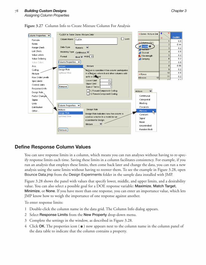
78 Building Custom Designs Chapter 3Assigning Column Properties
Figure 3.27 Column Info to Create Mixture Column For Analysis
Define Response Column Values
You can save response limits in a column, which means you can run analyses without having to re-spec-ify response limits each time. Saving these limits in a column facilitates consistency. For example, if you run an analysis that employs these limits, then come back later and change the data, you can run a new analysis using the same limits without having to reenter them. To see the example in Figure 3.28, open Bounce Data.jmp from the Design Experiments folder in the sample data installed with JMP.
Figure 3.28 shows the panel with values that specify lower, middle, and upper limits, and a desirability value. You can also select a possible goal for a DOE response variable: Maximize, Match Target, Minimize, or None. If you have more than one response, you can enter an importance value, which lets JMP know how to weigh the importance of one response against another.
To enter response limits:
1 Double-click the column name in the data grid. The Column Info dialog appears.2 Select Response Limits from the New Property drop-down menu.3 Complete the settings in the window, as described in Figure 3.28.4 Click OK. The properties icon ( ) now appears next to the column name in the column panel of
the data table to indicate that the column contains a property.

3C
usto
m
Chapter 3 Building Custom Designs 79Assigning Column Properties
Figure 3.28 Define Response Column Values
Assign Columns a Design Role
The Custom designer in JMP assigns design roles to factors when you create the design. However, you can assign a property to a column that identifies a factor column as a continuous, categorical, blocking, covariate, mixture, constant, signal, or noise factor. The example in Figure 3.29 shows the Whole Plots factor in the Vinal Data.jmp table from the Design Experiment sample data assigned the Random Block design role.
To give a column a design role:
1 Double-click the column name in the data grid. The Column Info window appears.2 Select Design Role from the New Property drop-down menu, as shown in Figure 3.29. Design role
information appears on the right.3 Click the Design Role drop-down menu and select how you want JMP to use the factor column:
Continuous, Categorical, Blocking, Covariate, Mixture, Constant, Signal, Noise, Uncontrolled, or Random Block.
4 Click OK. to see the property icon ( ) next to the column name in the data table’s column panel.
Click to select a goal for the response variable. For example, if you are in the prediction profiler and want the desired value to be close to zero, select Match Target
When you have two responses, enter a number to indicate the amount of weight you want this response to have when JMP computes the over-all desirability
Enter the lower, middle and upper limits as well as the desirability values

80 Building Custom Designs Chapter 3Assigning Column Properties
Figure 3.29 Assign a Design Role to a Factor Column
Identify Factor Change Column Property
To create split plot or split split plot designs , you must identify a factor as having values that are hard to change, or very hard to change.This is done in the DOE design panel (see “Creating Split Plot Designs,” p. 64, for details) each time you design an experiment. However, if you know that every time you use that factor, you want it to be considered hard or very hard to change, you can save yourself steps by setting up a column property to be used in all experiments using that factor. To do this:
1 Double-click the column name in the data grid to see the Column Info dialog for that column.2 Select Factor Change from the Column Properties drop-down menu, as shown in Figure 3.30.3 Click the Factor Change and select Easy, Hard, or Very Hard from the Factor Change drop-down
menu.4 Click OK. The properties icon ( ) now appears next to the column name in the column panel of
the data table.
Note: Although you can save design roles for factors, which are then automatically used each time those factors are loaded, you must always verify the the model for the design you create is correctly entered into the DOE custom designer.

3C
usto
m
Chapter 3 Building Custom Designs 81How Custom Designs Work: Behind the Scenes
Figure 3.30 Factor Change Column Property
How Custom Designs Work: Behind the ScenesThe custom designer starts with a random set of points inside the range of each factor. The computa-tional method is an iterative algorithm called coordinate exchange (Meyer and Nachtsheim, 1995). Each iteration of the algorithm involves testing every value of every factor in the design to determine if replacing that value increases the optimality criterion. If so, the new value replaces the old. This process continues until no replacement occurs for an entire iteration.
To avoid converging to a local optimum, the whole process is repeated several times using a different random start. The custom designer displays the best of these designs. For more details, see the section “Optimality Criterion: Changing the Design Criterion (D- or I- Optimality),” p. 71.
Sometimes a design problem can have several equivalent solutions. Equivalent solutions are designs with equal precision for estimating the model coefficients as a group. When this is true, the design algo-rithm may generate different (but equivalent) designs when you click the Back and Make Design but-tons repeatedly.


Chapter 4Screening Designs
Screening designs are some of the most popular designs for industrial experimentation. They examine many factors to see which have the greatest effect on the results of a process.
Compared to full factorial designs, screening designs require fewer experimental runs, which is why they cost less. Thus, they are attractive because they are a relatively inexpensive and efficient way to begin improving a process.
Often screening designs are a prelude to further experiments. It is wise to spend only about a quarter of your resource budget on an initial screening experiment. You can then use the results to guide further study.
The efficiency of screening designs depends on the critical assumption of effect sparsity. Effect sparsity results because real-world processes usually have only a few driving factors; other factors are relatively unimportant. To understand the importance of effect sparsity, you can contrast screening designs to full factorial designs:
• Full factorial designs consist of all combinations of the levels of the factors. The number of runs is the product of the factor levels. For example, a factorial experiment with a two-level factor, a three-level factor, and a four-level factor has 2 x 3 x 4 = 24 runs.
• By contrast, screening designs reduce the number of runs by restricting the factors to two (or three) levels and by performing only a fraction of the full factorial design.
Each factor in a screening design is usually set at two levels to economize on the number of runs needed, and response measurements are taken for only a fraction of the possible combinations of levels. In the case described above, you can restrict the factors to two levels, which yield 2 x 2 x 2 = 8 runs. Further, by doing half of these eight combinations you can still assess the separate effects of the three factors. So the screening approach can reduce the 24-run experiment to four runs.
Of course, there is a price for this reduction. This chapter discusses the screening approach in detail, showing both pros and cons. It also describes how to use JMP’s screening designer, which supplies a list of popular screening designs for two or more factors. These factors can be continuous or categorical, with two or three levels. The list of screening designs you can use includes designs that group the exper-imental runs into blocks of equal sizes where the size is a power of two.

ContentsScreening Design Examples . . . . . . . . . . . . . . . . . . . . . . . . . . . . . . . . . . . . . . . . . . . . . . . . . . . . . . 85
Using Two Continuous Factors and One Categorical Factor . . . . . . . . . . . . . . . . . . . . . . . . . . . 85Using Five Continuous Factors . . . . . . . . . . . . . . . . . . . . . . . . . . . . . . . . . . . . . . . . . . . . . . . . 87
Creating a Screening Design . . . . . . . . . . . . . . . . . . . . . . . . . . . . . . . . . . . . . . . . . . . . . . . . . . . . . 89Entering Responses . . . . . . . . . . . . . . . . . . . . . . . . . . . . . . . . . . . . . . . . . . . . . . . . . . . . . . . . . 90Entering Factors . . . . . . . . . . . . . . . . . . . . . . . . . . . . . . . . . . . . . . . . . . . . . . . . . . . . . . . . . . . . 91Choosing a Design . . . . . . . . . . . . . . . . . . . . . . . . . . . . . . . . . . . . . . . . . . . . . . . . . . . . . . . . . 92Displaying and Modifying the Design . . . . . . . . . . . . . . . . . . . . . . . . . . . . . . . . . . . . . . . . . . . . 95Specifying Output Options . . . . . . . . . . . . . . . . . . . . . . . . . . . . . . . . . . . . . . . . . . . . . . . . . . . 98Viewing the Table . . . . . . . . . . . . . . . . . . . . . . . . . . . . . . . . . . . . . . . . . . . . . . . . . . . . . . . . . . 99Continuing the Analysis . . . . . . . . . . . . . . . . . . . . . . . . . . . . . . . . . . . . . . . . . . . . . . . . . . . . . 99

4S
cre
en
ing
Chapter 4 Screening Designs 85Screening Design Examples
Screening Design ExamplesThis chapter is divided into two sections. The first section consists of two examples using screening designs. The second section outlines the procedures to follow to create a screening design to match your needs.
Using Two Continuous Factors and One Categorical Factor
Suppose an engineer wants to investigate a process that uses an electron beam welding machine to join two parts. The engineer fits the two parts into a welding fixture that holds them snugly together. A voltage applied to a beam generator creates a stream of electrons that heats the two parts, causing them to fuse. The ideal depth of the fused region is 0.17 inches. The engineer wants to study the welding process to determine the best settings for the beam generator to produce the desired depth in the fused region.
For this study, the engineer wants to explore the following three inputs, which are the factors for the study:
• Operator, who is the technician operating the welding machine
• Rotation Speed, which is the speed at which the part rotates under the beam
• Beam Current, which is a current that affects the intensity of the beam
After each processing run, the engineer cuts the part in half. This reveals an area where the two parts have fused. The Length of this fused area is the depth of penetration of the weld. This depth of pene-tration is the response for the study.
The goals of the study are to:
• find which factors affect the depth of the weld
• quantify those effects
• find specific factor settings that predict a weld depth of 0.17 inches
To begin this example, select DOE > Screening Design from the main menu. Note that in the Responses panel, there is a single default response called Y. Change the default response as follows:
1 Double-click the response name and change it to Depth (In.). 2 The default goal for the single default response is Maximize, but the goal of this process is to get a
target value of 0.17 inches with a lower bound of 0.12 and an upper bound of 0.22. Click the Goal box and choose Match Target from the drop-down menu, as shown in Figure 4.1.
Figure 4.1 Screening Design Response With Match Target Goal
3 Click the Lower Limit text edit area and enter 0.12 as the lower limit (minimum acceptable value), Then click the Upper Limit text edit area and enter 0.22 as the upper limit (maximum acceptable value).

86 Screening Designs Chapter 4Screening Design Examples
This example has one categorical factor (Operator) and two continuous factors (Speed and Current).
4 Add the categorical factor by clicking the Add button beside 2-Level Categorical. 5 Add two continuous factors by typing 2 in the Continuous box and clicking the associated Add
button. 6 Double-click the factor names and rename them Operator, Speed, and Current. 7 Set high and low values for Speed to 3 and 5 rpm. Set high and low values for Current to 150 and
165 amps, and assign Mary and John as values for the categorical factor called Operator, as shown in Figure 4.2.
Figure 4.2 Screening Design with Two Continuous and One Categorical Factor
8 Click Continue.9 Select Full Factorial in the list of designs, as shown in Figure 4.3, and then click Continue.
Figure 4.3 List of Screening Designs for Two Continuous and One Categorical Factors
In the Display and Modify Design panel that appears, click on the Run Order menu and select Sort Left to Right, which arranges the runs in the JMP design data table (see Figure 4.7). Then click Make Table to create the JMP table that contains the specified design.
The table in Figure 4.4 appears. The table uses the names for responses, factors, and levels you speci-fied. The Pattern variable shows the coded design runs. You can also see the table produced in this example by selecting Help (View on the Macintosh) > Sample Data Directory > Design Experiment > DOE Example 1.jmp.

4S
cre
en
ing
Chapter 4 Screening Designs 87Screening Design Examples
Figure 4.4 The Design Data Table
Using Five Continuous Factors
As illustrated in the previous section, experiments for screening the effects of many factors usually con-sider only two levels of each factor. This allows the examination of many factors with a minimum num-ber of runs.
The following example, adapted from Meyer, et al. (1996), demonstrates how to use JMP’s screening designer when you have many factors. In this study, a chemical engineer investigates the effects of five factors on the percent reaction of a chemical process. The factors are:
• feed rate, the amount of raw material added to the reaction chamber in liters per minute
• percentage of catalyst
• stir rate, the RPMs of a propeller in the chamber
• reaction temperature in degrees Celsius
• concentration of reactant
To start the example:
1 Select DOE > Screening Design.2 You see one default response called Y. Change the default response name (Y) to Percent Reacted.3 Change the minimum acceptable reaction percentage (Lower Limit) to 90, upper limit to 99, and
importance to 1 (Figure 4.5).4 Add five continuous factors.5 Change the default factor names (X1-X5) to Feed Rate, Catalyst, Stir Rate, Temperature, and
Concentration.6 Enter the high and low values, as shown in Figure 4.5.

88 Screening Designs Chapter 4Screening Design Examples
Figure 4.5 Screening for Many Factors
7 Click Continue. Now, JMP lists the designs for the number of factors you specified, as shown to the left in Figure 4.6.
8 Select the first item in the list, which is an 8-run fractional factorial design. 9 Click Continue to see the Display and Modify Design panel on the right in Figure 4.6.
Figure 4.6 Two-level Screening Design (left) and design output options (right)
The design dialog has options shown in Figure 4.7 that can modify the final design table.

4S
cre
en
ing
Chapter 4 Screening Designs 89Creating a Screening Design
Figure 4.7 Output Options for Design Table
10 Click Make Table to create the data table shown in Figure 4.8 that lists the runs for the design you selected. Note that it also has a column called Percent Reacted for recording experimental results, showing as the rightmost column of the data table.
Figure 4.8 JMP Table of Runs for Screening Example
Of the five factors in the reaction percentage experiment, you expect a few to stand out in comparison to the others. Let’s take an approach to the analysis that looks for active effects.
11 To run the model generated by the data shown in Figure 4.8, open Reactor 8 Runs.jmp from the Design Experiment folder found in the sample data that was installed with JMP. This table has the design runs and the results of the experiment.
12 In the design data table, click the Model script that shows on the upper left of the data table, and select Run Script. Or, you can choose Analyze > Fit Model to analyze the data. The model appears automatically in the Fit Model dialog.
Creating a Screening DesignTo begin, select DOE > Screening Design, or click the Screening Design button on the JMP Starter DOE page. Then, see the following sections for each step to create a screening design:
1 “Entering Responses,” p. 902 “Choosing a Design,” p. 923 “Displaying and Modifying the Design,” p. 954 “Specifying Output Options,” p. 98

90 Screening Designs Chapter 4Creating a Screening Design
5 “Viewing the Table,” p. 996 “Continuing the Analysis,” p. 99
Entering Responses
To enter responses, follow the steps in Figure 4.9.
Figure 4.9 Entering Responses
Tip: To quickly enter multiple responses, click the N Responses button and enter the number of responses you want.
Specifying Goal Types and Lower and Upper Limits
When entering responses, you can tell JMP that your goal is to obtain the maximum or minimum value possible, to match a specific value, or that there is no goal.
The following description explains the relationship between the goal type (step 3 in Figure 4.9) and the lower and upper limits (step 4 in Figure 4.9):
• For responses such as strength or yield, the best value is usually the largest possible. A goal of Maximize supports this objective.
• The Minimize goal supports an objective of having the smallest value be the most desirable, such as when the response is impurity or defects.
• The Match Target goal supports the objective when the best value for a responses is a specific target value, such as dimensions of a manufactured part. The default target value is assumed to be midway between the lower and upper limits.
Note: If your target range is not symmetric around the target value, you can alter the default target after you make a table from the design. In the data table, open the response’s Column Info dialog by double-clicking the column name, and enter an asymmetric target value.
Click to change the response goal, if desired.
To enter one response at a time, click then select a goal type: Maximize, Match Target, Minimize, or None.
Double-click to edit the response name, if desired.
Click to enter lower and upper limits and importance weights.
2 3
4
1

4S
cre
en
ing
Chapter 4 Screening Designs 91Creating a Screening Design
Understanding Importance Weights
When computing overall desirability, JMP uses the value you enter as the importance weight (step 4 in Figure 4.9) as the weight of each response. If there is only one response, then specifying importance is unnecessary. With two responses you can give greater weight to one response by assigning it a higher importance value.
Entering Factors
Next, you enter factors. The Factors panel’s appearance depends on the design you select. Entering fac-tors is the same in Screening Design, Space Filling Design, Mixture Design, and Response Surface Design. This process is described below, in Figure 4.10.
For information on entering factors in Taguchi designs, full factorial designs, and custom designs, see “Taguchi Designs,” p. 183, “Full Factorial Designs,” p. 117, and “Creating a Custom Design,” p. 53.
Figure 4.10 Entering Factors
Types of Factors
In general, when designing experiments, you can enter different types of factors in the model. Below is a description of factor types from which you can choose when creating screening designs:
Continuous Continuous factors have numeric data types only. In theory, you can set a continuous factor to any value between the lower and upper limits you supply.
Categorical Categorical factors (either numerical or categorical data types) have no implied order. If the values are numbers, the order is the numeric magnitude. If the values are character, the order is the sorting sequence. The settings of a categorical factor are discrete and have no intrinsic order. Examples of categorical factors are machine, operator, and gender.
After you enter responses and factors, click Continue.
To enter factors, type the number of factors and click Add.
Double-click to edit the factor name.
Click to enter factor values. To remove a level, click it, press the delete key on your keyboard, then press the Return or Enter key on your keyboard.
Highlight the factor and click the Remove Selected button to remove a factor in the list.

92 Screening Designs Chapter 4Creating a Screening Design
Choosing a Design
The list of screening designs you can use includes designs that group the experimental runs into blocks of equal sizes where the size is a power of two. Highlight the type of screening design you want to use and click Continue.
Figure 4.11 Choosing a Type of Screening Design
The screening designer provides the following types of designs:
Two-Level Full Factorial
A full factorial design has runs for all combinations of the levels of the factors. The samples size is the product of the levels of the factors. For two-level designs, this is 2k where k is the number of factors. This can be expensive if the number of factors is greater than 3 or 4.
These designs are orthogonal. This means that the estimates of the effects are uncorrelated. If you remove an effect in the analysis, the values of the other estimates remain the same. Their p-values change slightly, because the estimate of the error variance and the degrees of freedom are different.
Full factorial designs allow the estimation of interactions of all orders up to the number of factors. Most empirical modeling involves first- or second-order approximations to the true functional relationship between the factors and the responses. The figure to the left in Figure 4.12 is a geometric representation of a two-level factorial.
Two-Level Fractional Factorial
A fractional factorial design also has a sample size that is a power of two. If k is the number of factors, the number of runs is 2k – p where p < k. The fraction of the full factorial is 2-p. Like the full factorial, fractional factorial designs are orthogonal.
The trade-off in screening designs is between the number of runs and the resolution of the design. If price is no object, you can run several replicates of all possible combinations of m factor levels. This provides a good estimate of everything, including interaction effects to the mth degree. But because running experiments costs time and money, you typically only run a fraction of all possible levels. This causes some of the higher-order effects in a model to become nonestimable. An effect is nonestimable when it is confounded with another effect. In fact, fractional factorials are designed by deciding in advance which interaction effects are confounded with the other interaction effects.
Resolution Number: The Degree of Confounding
In practice, few experimenters worry about interactions higher than two-way interactions. These higher-order interactions are assumed to be zero.

4S
cre
en
ing
Chapter 4 Screening Designs 93Creating a Screening Design
Experiments can therefore be classified by resolution number into three groups:
• Resolution = 3 means that main effects are confounded with one or more two-way interactions, which must be assumed to be zero for the main effects to be meaningful.
• Resolution = 4 means that main effects are not confounded with other main effects or two-factor interactions. However, two-factor interactions are confounded with other two-factor interactions.
• Resolution ≥ 5 means there is no confounding between main effects, between two-factor interac-tions, or between main effects and two-factor interactions.
All the fractional factorial designs are minimum aberration designs. A minimum aberration design is one in which there are a minimum number of confoundings for a given resolution. For DOE experts, the minimum aberration design of a given resolution minimizes the number of words in the defining relation that are of minimum length.
The figure on the right in Figure 4.12 is geometric representation of a two-level fractional factorial design.
Figure 4.12 Representation of Full Factorial (Left) and Two-Level Fractional Factorial (Right) Designs
Plackett-Burman Designs
Plackett-Burman designs are an alternative to fractional factorials for screening. One useful characteris-tic is that the sample size is a multiple of four rather than a power of two. There are no two-level frac-tional factorial designs with sample sizes between 16 and 32 runs. However, there are 20-run, 24-run, and 28-run Plackett-Burman designs.
The main effects are orthogonal and two-factor interactions are only partially confounded with main effects. This is different from resolution-three fractional factorial where two-factor interactions are indistinguishable from main effects.
In cases of effect sparsity, a stepwise regression approach can allow for removing some insignificant main effects while adding highly significant and only somewhat correlated two-factor interactions. The new Screening platform in JMP, Analyze > Modeling > Screening, is a streamlined approach for look-ing at sparse data. This platform accepts a single response and multiple factors, then automatically fits a two-level design and shows signifcant effects with plots and statistics. See “Screening Designs,” p. 83 of JMP Statistics and Graphics Guide for documentation of the Screening platform.
Mixed-Level Designs
If you have qualitative factors with three values, then none of the classical designs discussed previously are appropriate. For pure three-level factorials, JMP offers fractional factorials. For mixed two-level and
–1, –1, –1
1, 1, 1
-1, 1, -1
1, 1, -1
1, -1, -1
-1, -1, 1

94 Screening Designs Chapter 4Creating a Screening Design
three-level designs, JMP offers complete factorials and specialized orthogonal-array designs, listed in Table 4.1
If you have fewer than or equal to the number of factors for a design listed in the table, you can use that design by selecting an appropriate subset of columns from the original design. Some of these designs are not balanced, even though they are all orthogonal..
Cotter Designs
Cotter designs are used when you have very few resources and many factors, and you believe there may be interactions. Suppose you believe in effect sparsity— that very few effects are truly nonzero. You believe in this so strongly that you are willing to bet that if you add up a number of effects, the sum will show an effect if it contains an active effect. The danger is that several active effects with mixed signs will cancel and still sum to near zero and give a false negative.
Cotter designs are easy to set up. For k factors, there are 2k + 2 runs. The design is similar to the “vary one factor at a time” approach many books call inefficient and naive.
A Cotter design begins with a run having all factors at their high level. Then follow k runs each with one factor in turn at its low level, and the others high. The next run sets all factors at their low level and sequences through k more runs with one factor high and the rest low. This completes the Cotter design, subject to randomizing the runs.
When you use JMP to generate a Cotter design, the design also includes a set of extra columns to use as regressors. These are of the form factorOdd and factorEven where factor is a factor name. They are con-structed by adding up all the odd and even interaction terms for each factor. For example, if you have three factors, A, B, and C:
Because these columns in a Cotter design make an orthogonal transformation, testing the parameters on these combinations is equivalent to testing the combinations on the original effects. In the example of factors listed above, AOdd estimates the sum of odd terms involving A. AEven estimates the sum of the even terms involving A, and so forth.
Because Cotter designs have a false-negative risk, many statisticians discourage their use.
How to Run a Cotter Design
By default, JMP does not include a Cotter design in the list of available screening designs (Figure 4.11). However, if you want to make a Cotter design:
Table 4.1 Table of Mixed-Level DesignsDesign Two–Level Factors Three–Level Factors
L18 John 1 7L18 Chakravarty 3 6L18 Hunter 8 4L36 11 12
AOdd = A + ABC AEven = AB + ACBOdd = B + ABC BEven = AB + BCCOdd = C + ABC CEven = BC + AC

4S
cre
en
ing
Chapter 4 Screening Designs 95Creating a Screening Design
1 Immediately after entering responses and factors (and before clicking Continue), click the red triangle icon in the Screening Design title bar.
2 Select Supress Cotter Designs (to uncheck it), as shown to the right.
Changing the setting via the red triangle menu applies only to the current design. To alter the setting for all screening designs:
1 Select File > Preferences.2 Click the Platform icon.3 Click DOE to highlight it.4 Uncheck the box beside Supress Cotter Designs.
Displaying and Modifying the Design
After you select a design type, click the disclosure buttons ( on Windows/Linux and on the Macintosh) to display the design and show modification options using the Display and Modify Design panel to tailor the design (Figure 4.13).
Figure 4.13 Display and Modification Options
Change Generating Rules Controls the choice of different fractional factorial designs for a given number of factors.
Aliasing of Effects Shows the confounding pattern for fractional factorial designs.
Coded Design Shows the pattern of high and low values for the factors in each run.
Aliasing of Effects
To see which effects are confounded with which other effects, click the disclosure button ( on Windows/Linux and on the Macintosh) to reveal the Aliasing of Effects panel. It shows effects and confounding up to two-factor interactions (Figure 4.14).

96 Screening Designs Chapter 4Creating a Screening Design
Figure 4.14 Generating Rules and Aliasing of Effects Panel
For example, a full factorial with five factors requires 25 = 32 runs. Eight runs can only accommodate a full factorial with three two-level factors. It is necessary to construct the two additional factors in terms of the first three factors.
The price of reducing the number of runs from 32 to eight is effect aliasing (confounding). Confound-ing is the direct result of the assignment of new factor values to products of the coded design columns.
In the example above, the values for Temperature are the product of the values for Feed Rate and Concentration. This means that you can’t tell the difference of the effect of Temperature and the syner-gistic (interactive) effect of Feed Rate and Concentration.
In the example shown in Figure 4.14, all the main effects are confounded with two-factor interactions. This is characteristic of resolution-three designs.
Viewing the Confounding Pattern
JMP can create a data table that shows the aliasing pattern for a specified level. To create this table:
1 Click the red triangle at the bottom of the Aliasing of Effects area.2 Select Show Confounding Pattern (Figure 4.15).
Figure 4.15 Show Confounding Patterns
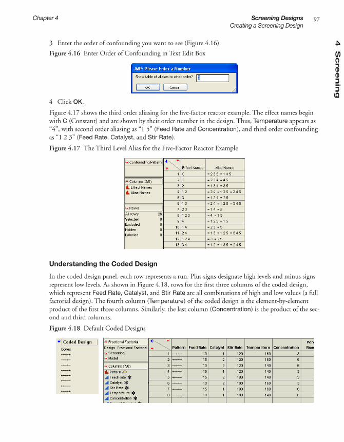
4S
cre
en
ing
Chapter 4 Screening Designs 97Creating a Screening Design
3 Enter the order of confounding you want to see (Figure 4.16).
Figure 4.16 Enter Order of Confounding in Text Edit Box
4 Click OK.
Figure 4.17 shows the third order aliasing for the five-factor reactor example. The effect names begin with C (Constant) and are shown by their order number in the design. Thus, Temperature appears as “4”, with second order aliasing as “1 5” (Feed Rate and Concentration), and third order confounding as “1 2 3” (Feed Rate, Catalyst, and Stir Rate).
Figure 4.17 The Third Level Alias for the Five-Factor Reactor Example
Understanding the Coded Design
In the coded design panel, each row represents a run. Plus signs designate high levels and minus signs represent low levels. As shown in Figure 4.18, rows for the first three columns of the coded design, which represent Feed Rate, Catalyst, and Stir Rate are all combinations of high and low values (a full factorial design). The fourth column (Temperature) of the coded design is the element-by-element product of the first three columns. Similarly, the last column (Concentration) is the product of the sec-ond and third columns.
Figure 4.18 Default Coded Designs

98 Screening Designs Chapter 4Creating a Screening Design
Changing the Coded Design
In the Change Generating Rules panel, changing the check marks and clicking Apply changes the coded design; it changes the choice of different fractional factorial designs for a given number of fac-tors. The Change Generating Rules table in Figure 4.19 shows how the last two columns are con-structed in terms of the first three columns. The check marks for Temperature show it is a function of Feed Rate, Catalyst, and Stir Rate. The check marks for Concentration show it is a function of Catalyst and Stir Rate.
If you check the options as shown in Figure 4.19 and click Apply, the Coded Design panel changes. The first three columns of the coded design remain a full factorial for the first three factors (Feed Rate, Catalyst, and Stir Rate). Temperature is now the product of Feed Rate and Catalyst, so the fourth column of the coded design is the element by element product of the first two columns. Concentration is a function of Feed Rate and Stir Rate.
Figure 4.19 Modified Coded Designs and Generating Rules
Specifying Output Options
Use the Output Options panel (Figure 4.20) to specify how you want the output data table to appear. When the options are the way you want them, click Make Table.
Figure 4.20 Select the Output Options

4S
cre
en
ing
Chapter 4 Screening Designs 99Creating a Screening Design
Run Order Lets you designate the order you want the runs to appear in the data table when it is created. Choices are:
Keep the Same—the rows (runs) in the output table appear as they do in the Design panel.
Sort Left to Right—the rows (runs) in the output table appear sorted from left to right.
Randomize—the rows (runs) in the output table appear in a random order.
Sort Right to Left—the rows (runs) in the output table appear sorted from right to left.
Randomize within Blocks—the rows (runs) in the output table will appear in random order within the blocks you set up.
Number of Center Points Specifies additional runs placed at the center points.
Number of Replicates Specify the number of times to replicate the entire design, including cen-terpoints. Type the number of times you want to replicate the design in the associated text box. One replicate doubles the number of runs.
Viewing the Table
Click Make Table to create a data table that contains the runs for your experiment. In the table, the high and low values you specified are displayed for each run.
Figure 4.21 The Design Data Table
Continuing the Analysis
After creating and viewing the data table, you can now run analyses on the data. The data table contains a script labeled Model. Right-click it and select Run Script to run a fit model analysis (Figure 4.22).
The name of the table is the design type that generated it.
The column called Pattern shows the pattern of low values denoted “–” and high values denoted “+”. Pattern is especially useful as a label variable in plots.
This script allows you to easily fit a model using the values in the design table.
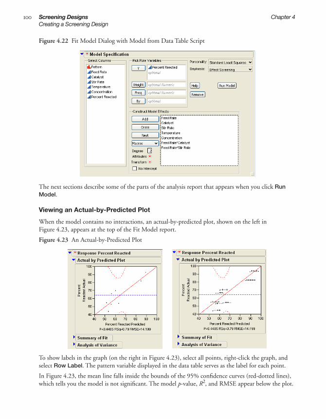
100 Screening Designs Chapter 4Creating a Screening Design
Figure 4.22 Fit Model Dialog with Model from Data Table Script
The next sections describe some of the parts of the analysis report that appears when you click Run Model.
Viewing an Actual-by-Predicted Plot
When the model contains no interactions, an actual-by-predicted plot, shown on the left in Figure 4.23, appears at the top of the Fit Model report.
Figure 4.23 An Actual-by-Predicted Plot
To show labels in the graph (on the right in Figure 4.23), select all points, right-click the graph, and select Row Label. The pattern variable displayed in the data table serves as the label for each point.
In Figure 4.23, the mean line falls inside the bounds of the 95% confidence curves (red-dotted lines), which tells you the model is not significant. The model p-value, R2, and RMSE appear below the plot.

4S
cre
en
ing
Chapter 4 Screening Designs 101Creating a Screening Design
The RMSE is an estimate of the standard deviation of the process noise, assuming that the unestimated effects are negligible. In this case, the RMSE is 14.199, which is much larger than expected. This sug-gests that effects other than the main effects of each factor are important. Because of the confounding between two-factor interactions and main effects in this design, it is impossible to determine which two-factor interactions are important without performing more experimental runs.
Viewing a Scaled Estimates Report
When you fit the model, JMP displays a Scaled Estimates report (Figure 4.24) as a part of the Fit Model report. The Scaled Estimates report includes a bar chart of the individual effects embedded in a table of parameter estimates. The last column of the table has the p-values for each effect. None of the factor effects are significant, but the Catalyst effect is large enough to be interesting if it is real. At this stage the results are not clear, but this does not mean that the experiment has failed. It means that some follow-up runs are necessary.
Figure 4.24 Example of a Scaled Estimates Report
If this scaled estimates report were not an example, you would then want to augment the design, as described in “Augmented Designs,” p. 193. For comparison, you might also want to have complete 32-run factorial experimental data and analysis (see the chapter “Full Factorial Designs,” p. 117).
Running a Power Analysis
When the model contains interactions, JMP displays an Effect Details panel. If necessary, open the out-line node to see this panel. To run the power analysis, click the red triangle icon in a factor’s title bar and select Power Analysis.

102 Screening Designs Chapter 4Creating a Screening Design
Figure 4.25 Example of a Power Analysis
Refer to the JMP Statistics and Graphics Guide for details.

Chapter 5Response Surface Designs
Response surface designs are useful for modeling a curved quadratic surface to continuous factors. A response surface model can pinpoint a minimum or maximum response, if one exists inside the factor region. Three distinct values for each factor are necessary to fit a quadratic function, so the standard two-level designs cannot fit curved surfaces.
The most popular response surface design is the central composite design, illustrated in the figure to the left below. It combines a two-level fractional factorial and two other kinds of points:
• Center points, for which all the factor values are at the zero (or midrange) value.
• Axial (or star) points, for which all but one factor are set at zero (midrange) and that one factor is set at outer (axial) values.
The Box-Behnken design, illustrated in the figure on the right below, is an alternative to central com-posite designs. One distinguishing feature of the Box-Behnken design is that there are only three levels per factor.
Another important difference between the two design types is that the Box-Behnken design has no points at the vertices of the cube defined by the ranges of the factors. This is sometimes useful when it is desirable to avoid these points due to engineering considerations. The price of this characteristic is the higher uncertainty of prediction near the vertices compared to the central composite design.
center points
axial points
fractional factorial points
Central Composite Design Box-Behnken Design

ContentsA Box-Behnken Design: The Tennis Ball Example . . . . . . . . . . . . . . . . . . . . . . . . . . . . . . . . . . . . 105
Viewing the Geometry of a Box-Behnken Design . . . . . . . . . . . . . . . . . . . . . . . . . . . . . . . . . . 110Creating a Response Surface Design . . . . . . . . . . . . . . . . . . . . . . . . . . . . . . . . . . . . . . . . . . . . . . . 111
Enter Responses and Factors . . . . . . . . . . . . . . . . . . . . . . . . . . . . . . . . . . . . . . . . . . . . . . . . . . 111Choose a Design . . . . . . . . . . . . . . . . . . . . . . . . . . . . . . . . . . . . . . . . . . . . . . . . . . . . . . . . . . . 112Specify Axial Value (Central Composite Designs Only) . . . . . . . . . . . . . . . . . . . . . . . . . . . . . . 113Specify Output Options . . . . . . . . . . . . . . . . . . . . . . . . . . . . . . . . . . . . . . . . . . . . . . . . . . . . . 113View the Design Table . . . . . . . . . . . . . . . . . . . . . . . . . . . . . . . . . . . . . . . . . . . . . . . . . . . . . . . 114

5S
urfa
ce
Chapter 5 Response Surface Designs 105A Box-Behnken Design: The Tennis Ball Example
A Box-Behnken Design: The Tennis Ball Example The Bounce Data.jmp sample data file has response surface data inspired by the tire tread data described in Derringer and Suich (1980). The objective of this experiment is to match a standardized target value (450) of tennis ball bounciness. The bounciness varies with amounts of Silica, Silane, and Sulfur used to manufacture the tennis balls. The experimenter wants to collect data over a wide range of values for these variables to see if a response surface can find a combination of factors that matches a specified bounce target. To follow this example:
1 Select DOE > Response Surface Design. 2 Load factors by clicking the red triangle icon on the Response SurfaceDesign title bar and selecting
Load Factors. Navigate to the Sample Data folder installed with JMP, and open Bounce Fac-tors.jmp.from the Design Experiment folder.
3 Load the responses by clicking the red triangle icon on the Response Surface Design title bar and selecting Load Responses. Navigate to the Sample Data folder, and open Bounce Response.jmp. from the Design Experiment folder. Figure 5.1 shows the completed Response panel and Factors panel.
Figure 5.1 Response and Factors For Bounce Data
After the response data and factors data are loaded, the Response Surface Design Choice dialog lists the designs in Figure 5.2.
Figure 5.2 Response Surface Design Selection
The Box-Behnken design selected for three effects generates the design table of 15 runs shown in Figure 5.3.
In real life, you would conduct the experiment and then enter the responses into the data table. Sup-pose you completed the experiment and the final data table is Bounce Data.jmp.
1 Open Bounce Data.jmp from the Design Experiment folder found in the sample data installed with JMP (Figure 5.3).

106 Response Surface Designs Chapter 5A Box-Behnken Design: The Tennis Ball Example
Figure 5.3 JMP Table for a Three-Factor Box-Behnken Design
After opening the Bounce Data.jmp data table, run a fit model analysis on the data. The data table contains a script labeled Model, showing in the upper left panel of the table.
2 Click the red triangle next next to Model and select Run Script to start a fit model analysis.3 When the Fit Model dialog appears, click Run Model.
The standard Fit Model analysis results appear in tables shown in Figure 5.4, with parameter estimates for all response surface and crossed effects in the model.
The prediction model is highly significant with no evidence of lack of fit. All main effect terms are sig-nificant as well as the two interaction effects involving Sulfur.
Figure 5.4 JMP Statistical Reports for a Response Surface Analysis of Bounce Data
See the chapter “Standard Least Squares: Introduction” of JMP Statistics and Graphics Guide for more information about interpretation of the tables in Figure 5.4.
The Response Surface report also has the tables shown in Figure 5.5.

5S
urfa
ce
Chapter 5 Response Surface Designs 107A Box-Behnken Design: The Tennis Ball Example
Figure 5.5 Statistical Reports for a Response Surface Analysis
See the chapter “Standard Least Squares: Exploring the Prediction Equation” of JMP Statistics and Graphics Guide for details about the response surface analysis tables in Figure 5.5.
Using the Prediction Profiler
Next, use the response Prediction Profiler to get a closer look at the response surface and help find the settings that produce the best response target. The Prediction Profiler is a way to interactively change variables and look at the effects on the predicted response.
1 If the Prediction Profiler is not already open, click the red triangle on the Response title bar and select Factor Profiling > Profiler, as shown in Figure 5.6.
Figure 5.6 The Profiler
The first three plots in the top row of plots in the Prediction Profiler (Figure 5.7) display prediction traces for each x variable. A prediction trace is the predicted response as one variable is changed while the others are held constant at the current values (Jones 1991).
Provides a summary of the parameter estimates
Lists the critical values of the surface factors and tells the kind of solution (maximum, mini-mum, or saddlepoint). The solution for this example is a saddlepoint. The table also warns that the critical values given by the solution are outside the range of data values.
Shows eigenvalues and eigenvectors of the effects. The eigenvector values show that the dominant negative cur-vature (yielding a maximum) is mostly in the Sulfur direction. The dominant positive curvature (yielding a minimum) is mostly in the Silica direction. This is con-firmed by the prediction profiler in Figure 5.8.
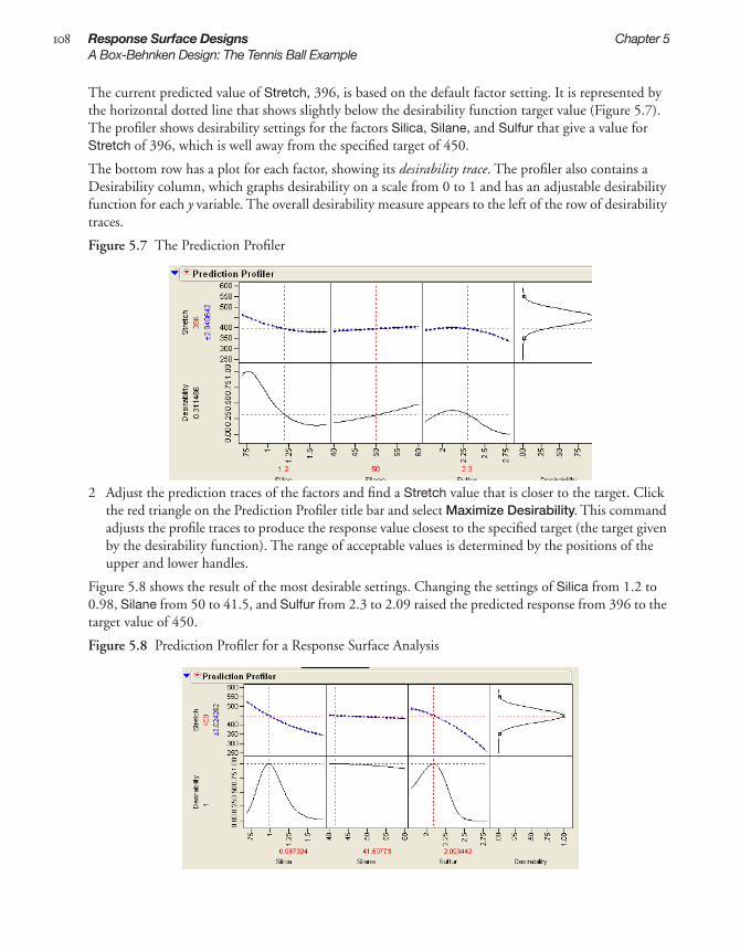
108 Response Surface Designs Chapter 5A Box-Behnken Design: The Tennis Ball Example
The current predicted value of Stretch, 396, is based on the default factor setting. It is represented by the horizontal dotted line that shows slightly below the desirability function target value (Figure 5.7). The profiler shows desirability settings for the factors Silica, Silane, and Sulfur that give a value for Stretch of 396, which is well away from the specified target of 450.
The bottom row has a plot for each factor, showing its desirability trace. The profiler also contains a Desirability column, which graphs desirability on a scale from 0 to 1 and has an adjustable desirability function for each y variable. The overall desirability measure appears to the left of the row of desirability traces.
Figure 5.7 The Prediction Profiler
2 Adjust the prediction traces of the factors and find a Stretch value that is closer to the target. Click the red triangle on the Prediction Profiler title bar and select Maximize Desirability. This command adjusts the profile traces to produce the response value closest to the specified target (the target given by the desirability function). The range of acceptable values is determined by the positions of the upper and lower handles.
Figure 5.8 shows the result of the most desirable settings. Changing the settings of Silica from 1.2 to 0.98, Silane from 50 to 41.5, and Sulfur from 2.3 to 2.09 raised the predicted response from 396 to the target value of 450.
Figure 5.8 Prediction Profiler for a Response Surface Analysis

5S
urfa
ce
Chapter 5 Response Surface Designs 109A Box-Behnken Design: The Tennis Ball Example
See the chapter “Standard Least Squares: Exploring the Prediction Equation” of JMP Statistics and Graphics Guide for further discussion of the Prediction Profiler.
Using a Response Surface Plot (Contour Profiler)
Another way to look at the response surface is to use the Contour Profiler. Click the red triangle on the Response title bar and select Factor Profiling > Contour Profiler to display the interactive contour pro-filer, as shown in Figure 5.9.
The contour profiler is useful for viewing response surfaces graphically, especially when there are multi-ple responses. This example shows the profile to Silica and Sulphur for a fixed value of Silane.
Options on the Contour Profiler title bar can be used to set the grid density, request a surface plot (mesh plot), and add contours at specified intervals, as shown in the contour plot in Figure 5.9. The sliders for each factor set values for Current X and Current Y.
Figure 5.9 Contour Profiler for a Response Surface Analysis
Figure 5.10 shows the Contour profile when the Current x values have Lo and Hi limits in effect, which cause shaded regions to show on the contour.

110 Response Surface Designs Chapter 5A Box-Behnken Design: The Tennis Ball Example
Figure 5.10 Contour Profiler with High and Low Limits
The Prediction Profiler and the Contour Profiler are discussed in more detail in the chapter “Standard Least Squares: Exploring the Prediction Equation” of JMP Statistics and Graphics Guide.
Viewing the Geometry of a Box-Behnken Design
The geometric structure of a design with three effects is seen by using the Spinning Plot platform. The spinning plot shown in Figure 5.11 illustrates the three Box-Behnken design columns. Options avail-able on the spin platform draw rays from the center to each point, inscribe the points in a box, and sup-press the x, y, and z axes. You can clearly see the 12 points midway between the vertices, leaving three points in the center.
Figure 5.11 Spinning Plot of a Box-Behnken Design for Three Effects
For details on how to create a spinning plot, see the JMP Statistics and Graphics Guide.
Enter lo limit and hi limitto see shaded unacceptable reagions in contour plot

5S
urfa
ce
Chapter 5 Response Surface Designs 111Creating a Response Surface Design
Creating a Response Surface DesignResponse Surface Methodology (RSM) is an experimental technique invented to find the optimal response within specified ranges of the factors. These designs are capable of fitting a second-order pre-diction equation for the response. The quadratic terms in these equations model the curvature in the true response function. If a maximum or minimum exists inside the factor region, RSM can estimate it. In industrial applications, RSM designs usually involve a small number of factors. This is because the required number of runs increases dramatically with the number of factors. Using the response surface designer, you choose to use well-known RSM designs for two to eight continuous factors. Some of these designs also allow blocking.
Response surface designs are useful for modeling and analyzing curved surfaces.
To start a response surface design, select DOE > Response Surface Design, or click the Response Surface Design button on the JMP Starter DOE page. Then, follow the steps described in the follow-ing sections.
• “Enter Responses and Factors,” p. 111
• “Choose a Design,” p. 112
• “Specify Axial Value (Central Composite Designs Only),” p. 113
• “Specify Output Options,” p. 113
• “View the Design Table,” p. 114
Enter Responses and Factors
The steps for entering responses are the same in Screening Design, Space Filling Design, Mixture Design, Response Surface Design, Custom Design, and Full Factorial Design. These steps are out-lined in “Enter Responses and Factors into the Custom Designer,” p. 53
Factors in a response surface design can only be continuous. The Factors panel for a response Surface design appears with two default continuous factors. To enter more factors, type the number you want in the Factors panel edit box and click Add, as shown in Figure 5.12.

112 Response Surface Designs Chapter 5Creating a Response Surface Design
Figure 5.12 Entering Factors into a Response Surface Design
Click Continue to proceed to the next step.
Choose a Design
Highlight the type of response surface design you want and click Continue. The next sections describe the types of response surface designs shown in Figure 5.13.
Figure 5.13 Choose a Design Type
Box-Behnken Designs
The Box-Behnken design has only three levels per factor and has no points at the vertices of the cube defined by the ranges of the factors. This is sometimes useful when it is desirable to avoid extreme points due to engineering considerations. The price of this characteristic is the higher uncertainty of prediction near the vertices compared to the central composite design.

5S
urfa
ce
Chapter 5 Response Surface Designs 113Creating a Response Surface Design
Central Composite Designs
The response surface design list contains two types of central composite designs: uniform precision and orthogonal. These properties of central composite designs relate to the number of center points in the design and to the axial values:
• Uniform precision means that the number of center points is chosen so that the prediction variance near the center of the design space is very flat.
• For orthogonal designs, the number of center points is chosen so that the second order parameter estimates are minimally correlated with the other parameter estimates.
Specify Axial Value (Central Composite Designs Only)
When you select a central composite (CCD-Uniform Precision) design and then click Continue, you see the panel in Figure 5.14. It supplies default axial scaling information. Entering 1.0 in the text box instructs JMP to place the axial value on the face of the cube defined by the factors, which controls how far out the axial points are. You have the flexibility to enter the values you want to use.
Figure 5.14 Display and Modify the Central Composite Design
Rotatable makes the variance of prediction depend only on the scaled distance from the center of the design. This causes the axial points to be more extreme than the range of the factor. If this factor range cannot be practically achieved, it is recommended that you choose On Face or spec-ify your own value.
Orthogonal makes the effects orthogonal in the analysis. This causes the axial points to be more extreme than the –1 or 1 representing the range of the factor. If this factor range cannot be prac-tically achieved, it is recommended that you choose On Face or specify your own value.
On Face leaves the axial points at the end of the -1 and 1 ranges.
User Specified uses the value you enter, which can be any value greater than zero. Enter that value into the Axial Value text box.
If you want to inscribe the design, click the box beside Inscribe. When checked, JMP rescales the whole design so that the axial points are at the low and high ends of the range (the axials are –1 and 1 and the factorials are shrunken based on that scaling).
Specify Output Options
Use the Output Options panel to specify how you want the output data table to appear. When the options are specified the way you want them, click Make Table.

114 Response Surface Designs Chapter 5Creating a Response Surface Design
Figure 5.15 Select the Output Options
Run Order provides a menu with options for designating the order you want the runs to appear in the data table when it is created. Menu choices are:
Keep the Same the rows (runs) in the output table will appear as they do in the Design panel.
Sort Left to Right the rows (runs) in the output table will appear sorted from left to right.
Randomize the rows (runs) in the output table will appear in a random order.
Sort Right to Left the rows (runs) in the output table will appear sorted from right to left.
Randomize within Blocks the rows (runs) in the output table will appear in random order within the blocks you set up.
Add additional points with options given by Make JMP Table from design plus:
Number of Center Points Specifies additional runs placed at the center points.
Number of Replicates Specify the number of times to replicate the entire design, including cen-terpoints. Type the number of times you want to replicate the design in the associated text box. One replicate doubles the number of runs.
View the Design Table
Now you have a data table that outlines your experiment, as described in Figure 5.16.

5S
urfa
ce
Chapter 5 Response Surface Designs 115Creating a Response Surface Design
Figure 5.16 The Design Data Table
The name of the table is the design type that generated it.
There are two center points per replicate.
Runs are in a random order.
The column called Pattern identifies the coding of the factors. It shows all the codings with “+” for high, “–” for low factor, “a” and “A” for low and high axial values, and “0” for midrange. Pattern is suitable to use as a label variable in plots because when you hover over a point in a plot of the factors, the pattern value shows the factor coding of the point.
The Y column is for recordingexperimental results.
This script allows you to easily fit a model using the values in the design table.


Chapter 6Full Factorial Designs
A full factorial design contains all possible combinations of a set of factors. This is the most fool proof design approach, but it is also the most costly in experimental resources. The full factorial designer sup-ports both continuous factors and categorical factors with up to nine levels.
In full factorial designs, you perform an experimental run at every combination of the factor levels. The sample size is the product of the numbers of levels of the factors. For example, a factorial experiment with a two-level factor, a three-level factor, and a four-level factor has 2 x 3 x 4 = 24 runs.
Factorial designs with only two-level factors have a sample size that is a power of two (specifically 2f where f is the number of factors). When there are three factors, the factorial design points are at the ver-tices of a cube as shown in the diagram below. For more factors, the design points are the vertices of a hypercube.
Full factorial designs are the most conservative of all design types. There is little scope for ambiguity when you are willing to try all combinations of the factor settings.
Unfortunately, the sample size grows exponentially in the number of factors, so full factorial designs are too expensive to run for most practical purposes.

ContentsThe Five-Factor Reactor Example . . . . . . . . . . . . . . . . . . . . . . . . . . . . . . . . . . . . . . . . . . . . . . . . . 119Creating a Factorial Design . . . . . . . . . . . . . . . . . . . . . . . . . . . . . . . . . . . . . . . . . . . . . . . . . . . . . 125
Enter Responses and Factors . . . . . . . . . . . . . . . . . . . . . . . . . . . . . . . . . . . . . . . . . . . . . . . . . . 125Select Output Options . . . . . . . . . . . . . . . . . . . . . . . . . . . . . . . . . . . . . . . . . . . . . . . . . . . . . . 125Make the Table . . . . . . . . . . . . . . . . . . . . . . . . . . . . . . . . . . . . . . . . . . . . . . . . . . . . . . . . . . . . 126

6F
acto
rial
Chapter 6 Full Factorial Designs 119The Five-Factor Reactor Example
The Five-Factor Reactor ExampleThe following example, adapted from Meyer et al. (1996) and Box, Hunter, and Hunter (1978), shows a five-factor reactor example.
Previously, the screening designer was used to investigate the effects of five factors on the percent reac-tion of a chemical process (see “Screening Designs,” p. 83). The factors (Feed Rate, Catalyst, Stir Rate, Temperature, and Concentration) are all two-level continuous factors. The next example studies the same system using a full factorial design.
1 Select DOE > Full Factorial Design.2 Click the red triangle icon on the Full Factorial Design title bar and select Load Responses.3 In the sample data (installed with JMP), open Reactor Response.jmp.found in the Design Experi-
ment Sample Data folder.4 Click the red triangle icon on the Full Factorial Design title bar and select Load Factors.5 In the sample data (installed with JMP), open Reactor Factors.jmp found in the Design Experi-
ment folder.
The completed dialog should look like the one shown in Figure 6.1.
Figure 6.1 Full-Factorial Example Response and Factors Panels
6 Click Continue to see Output Options panel. In the Output Options panel, select Sort Left to Right in the Run Order menu, as shown to the right. This command defines the order of runs as they will be in the final JMP design table.
7 Click Make Table.
The design data table (Figure 6.3) contains a run for every combination of high and low values for the five variables, which covers all combinations of five factors with two levels each. Since there are five variables, there are 25=32 runs. Initially, the table has an empty Y column named Percent Reacted for entering response values when the experiment is complete.

120 Full Factorial Designs Chapter 6The Five-Factor Reactor Example
Figure 6.2 25 Factorial Reactor Data
To see the completed experiment and continue following this example, open Reactor 32 Runs.jmp found in the Design Experiment Sample Data folder.
Figure 6.3 Partial Listing of Reactor 32 Runs.jmp from the Sample Data Folder
Begin the analysis with a quick look at the response data before fitting the factorial model.
1 Select Analyze > Distribution.2 Highlight Percent Reacted and click Y, Columns. Then click OK.3 Click the red triangle icon on the Percent Reacted title bar and select Normal Quantile Plot. The
results are shown in Figure 6.4.

6F
acto
rial
Chapter 6 Full Factorial Designs 121The Five-Factor Reactor Example
Figure 6.4 Distribution of Response Variable for Reactor Data
Start the formal analysis with a stepwise regression. The data table has a script stored with it that auto-matically defines an analysis of the model with main effects and all two-factor interaction.
4 Click the red triangle icon next to the Fit Model script and select Run Script. The stepwise analysis begins with the Stepwise Regression Control panel shown in Figure 6.5.
5 The probability to enter a factor (Prob to Enter) in the model should be 0.05. 6 The probability to remove a factor (Prob to Leave) should be 0.1.
Figure 6.5 Stepwise Control Panel
7 A useful way to use the Stepwise platform is to check all the main effects in the Current Estimates table. However, make sure that the menu beside Direction in the Stepwise Regression Control panel specifies Mixed (see Figure 6.5).
8 Check the boxes for the main effects of the factors as shown in Figure 6.6. 9 Click Go.
Note that this initial analysis shows some experimental runs with a very high percent reacted response.
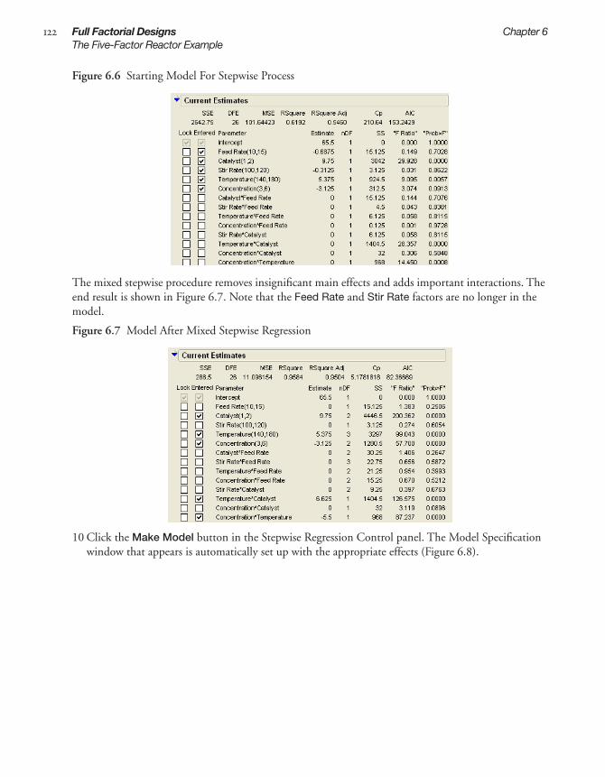
122 Full Factorial Designs Chapter 6The Five-Factor Reactor Example
Figure 6.6 Starting Model For Stepwise Process
The mixed stepwise procedure removes insignificant main effects and adds important interactions. The end result is shown in Figure 6.7. Note that the Feed Rate and Stir Rate factors are no longer in the model.
Figure 6.7 Model After Mixed Stepwise Regression
10 Click the Make Model button in the Stepwise Regression Control panel. The Model Specification window that appears is automatically set up with the appropriate effects (Figure 6.8).

6F
acto
rial
Chapter 6 Full Factorial Designs 123The Five-Factor Reactor Example
Figure 6.8 Fitting a Prediction Model
11 Click Run Model to see the analysis for a candidate prediction model (Figure 6.9).
The figure on the left in Figure 6.9 shows the actual by predicted plot for the model. The predicted model covers a range of predictions from 40% to 95% reacted. The size of the random noise as mea-sured by the RMSE is only 3.3311%, which is more than an order of magnitude smaller than the range of predictions. This is strong evidence that the model has good predictive capability.
The figure on the right in Figure 6.9 shows a table of model coefficients and their standard errors (labeled Parameter Estimates). All effects selected by the stepwise process are highly significant.
Figure 6.9 Actual by Predicted Plot and Prediction Parameter Estimates Table
The factor Prediction Profiler also gives you a way to compare the factors and find optimal settings.
1 To open the Prediction Profiler, click the red triangle on the Response Percent Reacted title bar and select Factor Profiling > Profiler, as shown in Figure 6.10.

124 Full Factorial Designs Chapter 6The Five-Factor Reactor Example
Figure 6.10 Selecting the Profiler
Figure 6.11 shows the profiler’s initial display. The Prediction Profiler is discussed in more detail in the chapter “Response Surface Designs,” p. 103, and in the chapter “Standard Least Squares: Exploring the Prediction Equation” of JMP Statistics and Graphics Guide.
Figure 6.11 Viewing the Profiler
2 Click the red triangle on the Prediction Profiler title bar and select Maximize Desirability to see the profiler in Figure 6.12.
Figure 6.12 Viewing the Prediction Profiles at the Optimum Settings
T he goal is to maximize Percent Reacted. The reaction is unfeasible economically unless the Percent Reacted is above 90%. Percent Reacted increases from 65.5 at the center of the factor ranges to

6F
acto
rial
Chapter 6 Full Factorial Designs 125Creating a Factorial Design
95.875 ± 2.96 at the most desirable settings. The best settings of all three factors are at the ends of their ranges. Future experiments could investigate what happens as you continue moving further in this direction.
Creating a Factorial DesignTo start a full factorial design, select DOE > Full Factorial Design, or click the Full Factorial Design button on the JMP Starter DOE page. Then, follow the steps below:
• “Enter Responses and Factors,” p. 125
• “Select Output Options,” p. 125
• “Make the Table,” p. 126
Enter Responses and Factors
The steps for entering responses are outlined in “Enter Responses and Factors into the Custom Designer,” p. 53
The steps for entering factors in a full factorial design are unique to this design. To add factors, see Figure 6.13.
Figure 6.13 Entering Factors in a Full Factorial Design
When you finish adding factors, click Continue.
Select Output Options
Use the Output Options panel to specify how you want the output data table to appear, as illustrated in Figure 6.14:
To enter factors, click either the Continuous button or the Categorical button and select a factor type, level 2 - 9.
Double-click to edit the factor name.
Click to enter values or change the level names. To remove a level, click it, press the delete key on the keyboard, then press the Return or Enter key on the keyboard.

126 Full Factorial Designs Chapter 6Creating a Factorial Design
Figure 6.14 Output Options Panel
Run Order gives options to designate the order you want the runs to appear in the data table when it is created. Choices are:
Keep the Same the rows (runs) in the output table will appear as they do in the Design panel.
Sort Left to Right the rows (runs) in the output table will appear sorted from left to right.
Randomize the rows (runs) in the output table will appear in a random order.
Sort Right to Left the rows (runs) in the output table will appear sorted from right to left.
Add additional point to the data able with these options:
Number of Center Points Specifies additional runs placed at the center of each continuous factor’s range.
Number of Replicates Specify the number of times to replicate the entire design, including cen-terpoints. Type the number of times you want to replicate the design in the associated text box. One replicate doubles the number of runs.
Make the Table
When you click Make Table, the table shown in Figure 6.15 appears.
Figure 6.15 Factorial Design Table
for continuous factors, a minus sign represents low levels
level numbers represent values of categorical factors
values in the Pattern column describe the run each row rep-resents
The name of the table is the design type that generated it.
This script automates the fit a model using values in the design table.
for continuous factors, a plus sign represents high levels

Chapter 7Mixture Designs
The mixture designer supports experiments with factors that are ingredients in a mixture. You can choose among several classical mixture design approaches, such as simplex, extreme vertices, and lattice. For the extreme vertices approach you can supply a set of linear inequality constraints limiting the geometry of the mixture factor space.
The properties of a mixture are almost always a function of the relative proportions of the ingredients rather than their absolute amounts. In experiments with mixtures, a factor's value is its proportion in the mixture, which falls between zero and one. The sum of the proportions in any mixture recipe is one (100%).
Designs for mixture experiments are fundamentally different from those for screening. Screening exper-iments are orthogonal. That is, over the course of an experiment, the setting of one factor varies inde-pendently of any other factor. Thus, the interpretation of screening experiments is relatively simple, because the effects of the factors on the response are separable.
With mixtures, it is impossible to vary one factor independently of all the others. When you change the proportion of one ingredient, the proportion of one or more other ingredients must also change to compensate. This simple fact has a profound effect on every aspect of experimentation with mixtures: the factor space, the design properties, and the interpretation of the results.
Because the proportions sum to one, mixture designs have an interesting geometry. The feasible region for the response in a mixture design takes the form of a simplex. For example, consider three factors in a 3-D graph. The plane where the sum of the three factors sum to one is a triangle-shaped slice. You can rotate the plane to see the triangle face-on and see the points in the form of a ternary plot.
triangular feasible region
x1
x2
x3

ContentsMixture Design Types . . . . . . . . . . . . . . . . . . . . . . . . . . . . . . . . . . . . . . . . . . . . . . . . . . . . . . . . . 129The Optimal Mixture Design . . . . . . . . . . . . . . . . . . . . . . . . . . . . . . . . . . . . . . . . . . . . . . . . . . . . 129The Simplex Centroid Design . . . . . . . . . . . . . . . . . . . . . . . . . . . . . . . . . . . . . . . . . . . . . . . . . . . 130
Creating the Design . . . . . . . . . . . . . . . . . . . . . . . . . . . . . . . . . . . . . . . . . . . . . . . . . . . . . . . . . 130Simplex Centroid Design Examples . . . . . . . . . . . . . . . . . . . . . . . . . . . . . . . . . . . . . . . . . . . . . 131
The Simplex Lattice Design . . . . . . . . . . . . . . . . . . . . . . . . . . . . . . . . . . . . . . . . . . . . . . . . . . . . . 133The Extreme Vertices Design . . . . . . . . . . . . . . . . . . . . . . . . . . . . . . . . . . . . . . . . . . . . . . . . . . . . 135
Creating the Design . . . . . . . . . . . . . . . . . . . . . . . . . . . . . . . . . . . . . . . . . . . . . . . . . . . . . . . . . 135An Extreme Vertices Example with Range Constraints . . . . . . . . . . . . . . . . . . . . . . . . . . . . . . 136An Extreme Vertices Example with Linear Constraints . . . . . . . . . . . . . . . . . . . . . . . . . . . . . . 138Extreme Vertices Method: How It Works . . . . . . . . . . . . . . . . . . . . . . . . . . . . . . . . . . . . . . . . 139
The ABCD Design . . . . . . . . . . . . . . . . . . . . . . . . . . . . . . . . . . . . . . . . . . . . . . . . . . . . . . . . . . . . 139Creating Ternary Plots . . . . . . . . . . . . . . . . . . . . . . . . . . . . . . . . . . . . . . . . . . . . . . . . . . . . . . . . . 140Fitting Mixture Designs . . . . . . . . . . . . . . . . . . . . . . . . . . . . . . . . . . . . . . . . . . . . . . . . . . . . . . . . 141
Whole Model Tests and Analysis of Variance Reports . . . . . . . . . . . . . . . . . . . . . . . . . . . . . . . 142Understanding Response Surface Reports . . . . . . . . . . . . . . . . . . . . . . . . . . . . . . . . . . . . . . . . 142
A Chemical Mixture Example . . . . . . . . . . . . . . . . . . . . . . . . . . . . . . . . . . . . . . . . . . . . . . . . . . . 143Creating the Design . . . . . . . . . . . . . . . . . . . . . . . . . . . . . . . . . . . . . . . . . . . . . . . . . . . . . . . . . 143Running a Mixture Model . . . . . . . . . . . . . . . . . . . . . . . . . . . . . . . . . . . . . . . . . . . . . . . . . . . . 144Viewing the Prediction Profiler . . . . . . . . . . . . . . . . . . . . . . . . . . . . . . . . . . . . . . . . . . . . . . . . 145Plotting a Mixture Response Surface . . . . . . . . . . . . . . . . . . . . . . . . . . . . . . . . . . . . . . . . . . . . 146

7M
ixtu
re
Chapter 7 Mixture Designs 129Mixture Design Types
Mixture Design TypesTo create a mixture design, you first choose DOE > Mixture Design, enter the responses and factors into the initial mixture designer panel, and click Continue. You then see the list of available mixture designs shown in. Select one of the designs from the list:
Optimal Invokes the custom designer with all the mixture variables already defined.
Simplex Centroid lets you specify the degree to which the factor combinations are made.
Simplex Lattice lets you specify how many levels you want on each edge of the grid.
Extreme Vertices lets you specify linear constraints or restrict the upper and lower bounds to be within the 0 to 1 range.
ABCD Design generates a screening design for mixtures devised by Snee (1975).
Figure 7.1 Mixture Design Selection Dialog
Then click Make Design and complete the remainder of the design, following instructions for the Design Generation panel in “Select the Number of Runs,” p. 57 and the prediction variance profile in “Understanding Design Diagnostics,” p. 58.
The following sections describe each mixture design type and show examples.
The Optimal Mixture DesignCreating an optimal mixture design invokes the custom designer with all the mixture variables already defined. To create an optimal mixture design:
1 Select DOE > Mixture Design.2 Enter factors and responses. The steps for entering responses are outlined in “Enter Responses and
Factors into the Custom Designer,” p. 53. 3 After you enter responses and factors, click Continue.4 Click Optimal on the Choose Mixture Design Type panel. 5 Add effects to the model using the instructions below.
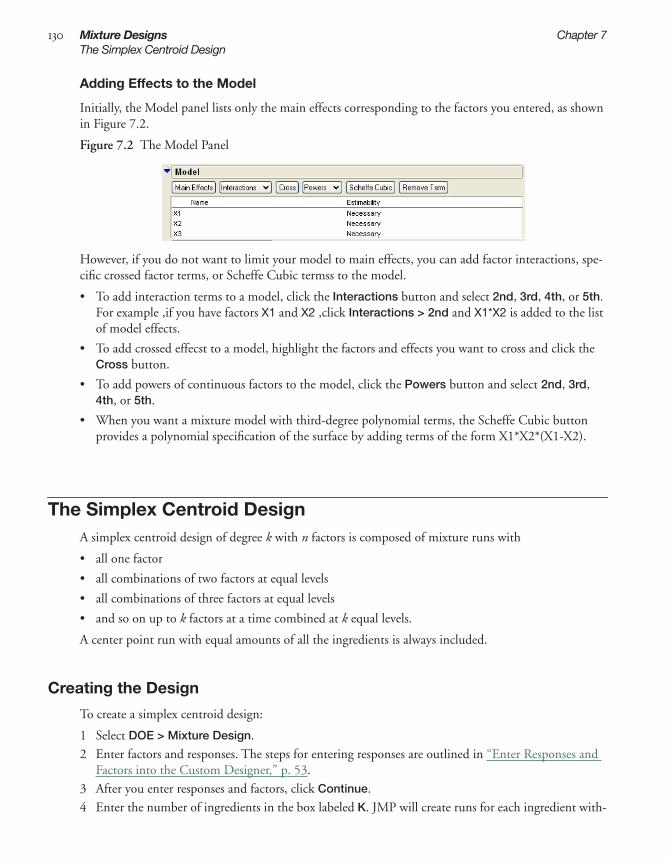
130 Mixture Designs Chapter 7The Simplex Centroid Design
Adding Effects to the Model
Initially, the Model panel lists only the main effects corresponding to the factors you entered, as shown in Figure 7.2.
Figure 7.2 The Model Panel
However, if you do not want to limit your model to main effects, you can add factor interactions, spe-cific crossed factor terms, or Scheffe Cubic termss to the model.
• To add interaction terms to a model, click the Interactions button and select 2nd, 3rd, 4th, or 5th. For example ,if you have factors X1 and X2 ,click Interactions > 2nd and X1*X2 is added to the list of model effects.
• To add crossed effecst to a model, highlight the factors and effects you want to cross and click the Cross button.
• To add powers of continuous factors to the model, click the Powers button and select 2nd, 3rd, 4th, or 5th.
• When you want a mixture model with third-degree polynomial terms, the Scheffe Cubic button provides a polynomial specification of the surface by adding terms of the form X1*X2*(X1-X2).
The Simplex Centroid DesignA simplex centroid design of degree k with n factors is composed of mixture runs with
• all one factor
• all combinations of two factors at equal levels
• all combinations of three factors at equal levels
• and so on up to k factors at a time combined at k equal levels.
A center point run with equal amounts of all the ingredients is always included.
Creating the Design
To create a simplex centroid design:
1 Select DOE > Mixture Design.2 Enter factors and responses. The steps for entering responses are outlined in “Enter Responses and
Factors into the Custom Designer,” p. 53.3 After you enter responses and factors, click Continue.4 Enter the number of ingredients in the box labeled K. JMP will create runs for each ingredient with-

7M
ixtu
re
Chapter 7 Mixture Designs 131The Simplex Centroid Design
out mixing, then create runs that mix equal proportions of K ingredients at a time to the specified limit.
5 Click the Simplex Centroid button.6 View factor settings and Output Options, as illustrated in Figure 7.3.
Figure 7.3 Example of Factor Settings and Output Options
7 Specify Run Order, which is the order you want the runs to appear in the data table when it is cre-ated. Run order choices are:
Keep the Same the rows (runs) in the output table will appear as they do in the Design panel.
Sort Left to Right the rows (runs) in the output table will appear sorted from left to right.
Randomize the rows (runs) in the output table will appear in a random order.
Sort Right to Left the rows (runs) in the output table will appear sorted from right to left.
Randomize within Blocks the rows (runs) in the output table will appear in random order within the blocks you set up.
8 Specify Number of Replicates. the number of replicates is the number of times to replicate the entire design, including centerpoints. Type the number of times you want to replicate the design in the associated text box. One replicate doubles the number of runs.
9 Click Make Table.
Simplex Centroid Design Examples
The table of runs for a design of degree 1 with three factors (left in Figure 7.4) shows runs for each sin-gle ingredient followed by the center point. The table of runs to the right is for three factors of degree 2. The first three runs are for each single ingredient, the second set shows each combination of two ingre-dients in equal parts, and the last run is the center point.

132 Mixture Designs Chapter 7The Simplex Centroid Design
Figure 7.4 Three-Factor Simplex Centroid Designs of Degrees 1 and 2
To generate the two sets of runs in Figure 7.4:
1 Choose DOE > Mixture Design.2 Enter three mixture factors. 3 Click Continue. 4 Enter 1 in the K box, and click Simplex Centroid to see the design on the left in Figure 7.5. 5 Click the Back button and enter 2 in the K box. Then click Simplex Centroid to see the design on
the right in Figure 7.5.
Figure 7.5 Create Simplex Centroid Designs of Degrees 1 and 2
As another example:
1 Choose DOE > Mixture Design.2 Enter five factors and click Continue. 3 Use the default value, 4, in the K box. 4 Click Simplex Centroid. 5 Click Make Table to see the 31-run JMP data table shown in Figure 7.6.

7M
ixtu
re
Chapter 7 Mixture Designs 133The Simplex Lattice Design
Figure 7.6 Partial Listing of Factor Settings for Five-Factor Simplex Centroid Design
The Simplex Lattice DesignThe simplex lattice design is a space filling design that creates a triangular grid of runs. The design is the set of all combinations where the factors’ values are i / m, where i is an integer from 0 to m such that the sum of the factors is 1.
To create simplex lattice designs:
1 Select DOE > Mixture Design.2 Enter factors and responses. The steps for entering responses are outlined in “Enter Responses and
Factors into the Custom Designer,” p. 53.3 Click Continue.4 Specify the number of levels you want in the Mixture Design Type dialog (Figure 7.1) and click
Simplex Lattice.
Figure 7.7 shows the runs for three-factor simplex lattice designs of degrees 3, 4, and 5, with their cor-responding geometric representations. In contrast to the simplex centroid design, the simplex lattice design does not necessarily include the centroid.

134 Mixture Designs Chapter 7The Simplex Lattice Design
Figure 7.7 Three-Factor Simplex Lattice Designs for Factor Levels 3, 4, and 5
Figure 7.8 lists the runs for a simplex lattice of degree 3 for five effects. In the five-level example, the runs creep across the hyper-triangular region and fill the space in a grid-like manner.
Figure 7.8 JMP Design Table for Simplex Lattice with Five Variables, Order (Degree) 3

7M
ixtu
re
Chapter 7 Mixture Designs 135The Extreme Vertices Design
The Extreme Vertices DesignThe extreme vertices design accounts for factor limits and selects vertices and their averages (formed by factor limits) as design points. Additional limits are usually in the form of range constraints, upper bounds, and lower bounds on the factor values.
The extreme vertices design finds the corners (vertices) of a factor space constrained by limits specified for one or more of the factors. The property that the factors must be non-negative and must add up to one is the basic mixture constraint that makes a triangular-shaped region.
Sometimes other ingredients need range constraints that confine their values to be greater than a lower bound or less than an upper bound. Range constraints chop off parts of the triangular-shaped (simplex) region to make additional vertices. It is also possible to have a linear constraint, which defines a linear combination of factors to be greater or smaller than some constant.
The geometric shape of a region bound by linear constraints is called a simplex, and because the vertices represent extreme conditions of the operating environment, they are often the best places to use as design points in an experiment.
You usually want to add points between the vertices. The average of points that share a constraint boundary is called a centroid point, and centroid points of various degrees can be added. The centroid point for two neighboring vertices joined by a line is a second degree centroid because a line is two dimensional. The centroid point for vertices sharing a plane is a third degree centroid because a plane is three dimensional, and so on.
If you specify an extreme vertices design but give no constraints, a simplex centroid design results.
Creating the Design
Follow these steps to create an extreme vertices design. The next sections show examples with specific constraints.
1 Select DOE > Mixture Design.2 Enter factors and responses. These steps are outlined in “Enter Responses and Factors into the Cus-
tom Designer,” p. 53. Remember to enter the upper and lower limits in the factors panel (see Figure 7.9).
3 Click Continue.4 In the Degree text box, enter the degree of the centroid point you want to add. The centroid point
is the average of points that share a constraint boundary.5 If you have linear constraints, click the Linear Constraints button for each constraint you want to
add. Use the text boxes that appear to define a linear combination of factors to be greater or smaller than some constant.
6 Click Extreme Vertices to see the factor settings.

136 Mixture Designs Chapter 7The Extreme Vertices Design
7 (Optional) Change the order of the runs in the data table when it is created. Run order choices are:
Keep the Same—the rows (runs) in the output table will appear as they do in the Design panel.
Sort Left to Right—the rows (runs) in the output table will appear sorted from left to right.
Randomize—the rows (runs) in the output table will appear in a random order.
Sort Right to Left—the rows (runs) in the output table will appear sorted from right to left.
Randomize within Blocks—the rows (runs) in the output table will appear in random order within the blocks you set up.
8 (Optional) Type the sample size you want in the Choose desired sample size text box. 9 (Optional) Click Find Subset to generate the optimal subset having the number of runs specified in
sample size box described in Step 8. The Find Subset option uses the row exchange method (not coordinate exchange) to find the optimal subset of rows.
10 Click Make Table.
An Extreme Vertices Example with Range Constraints
The following example design table is for five factors with the range constraints shown in Figure 7.9, where the ranges are smaller than the default 0 to 1 range.
1 Select DOE > Mixture Design.2 Add two factors and give them the values shown in Figure 7.9.3 Click Continue.4 Enter ‘4’ in the Degree text box (Figure 7.9)
Figure 7.9 Example of Five-factor Extreme Vertices
5 Click Exreme Vertices. 6 Select Sort Left to Right from the Run Order menu.7 Click Make Table. Figure 7.10 shows a partial listing of the resulting table. Note that the Rows
panel in the data table shows that the table has the default 116 runs.

7M
ixtu
re
Chapter 7 Mixture Designs 137The Extreme Vertices Design
Figure 7.10 JMP Design Table for Extreme Vertices with Range Constraints
Suppose you want fewer runs. You can go back and enter a different sample size (number of runs).
8 Click Back, then click Continue. 9 Enter ‘4’ in the Degree text box and click Exreme Vertices. 10 In the sample size text box, enter ‘10’ as the desired size. 11 Click Find Subset to generate the optimal subset having the number of runs specified. The result-
ing design (Figure 7.11) is the optimal 10-run subset of the 116 current runs. This is useful when the extreme vertices design generates a large number of vertices.
Figure 7.11 JMP Design Table for 10-Run Subset of the 13 Current Runs
Note: The Find Subset option uses the row exchange method (not coordinate exchange) to find the optimal subset of rows.
An Extreme Vertices Example with Linear Constraints
Consider the classic example presented by Snee (1979) and Piepel (1988). This example has three fac-tors, X1, X2, and X3, with five individual factor bound constraints and three additional linear con-straints:

138 Mixture Designs Chapter 7The Extreme Vertices Design
To enter these constraints:
1 Enter the upper and lower limits in the factors panel. 2 Click Continue.3 Click the Linear Constraints button three times. Enter the constraints as shown in Figure 7.12.4 Click the Extreme Vertices button.5 Change the run order to Sort Right to Left, and keep the sample size at 13 to see the 13-run factor
settings like those shown on the right in Figure 7.12.6 Click Make Table.
Figure 7.12 Constraints
This example is best understood by viewing the design as a ternary plot, as shown at the end of this chapter, in Figure 7.14. The ternary plot shows how close to one a given component is by how close it is to the vertex of that variable in the triangle. See “Creating Ternary Plots,” p. 140, for details.
Extreme Vertices Method: How It Works
If there are linear constraints, JMP uses the CONSIM algorithm developed by R.E. Wheeler, described in Snee (1979) and presented by Piepel (1988) as CONVRT. The method is also described in Cornell (1990, Appendix 10a). The method combines constraints and checks to see if vertices violate them. If so, it drops the vertices and calculates new ones. The method named CONAEV for doing centroid points is by Piepel (1988).
Table 7.1 Linear Constraints for the Snee and Piepel Example
X1 ≥ 0.1X1 ≤ 0.5X2 ≥ 0.1X2 ≤ 0.7X3 ≤ 0.7
90 ≤ 85*X1 + 90*X2 + 100*X3 85*X1 + 90*X2 + 100*X3 ≤ 95.4 ≤ 0.7*X1 + X3

7M
ixtu
re
Chapter 7 Mixture Designs 139The ABCD Design
If there are no linear constraints (only range constraints), the extreme vertices design is constructed using the XVERT method developed by Snee and Marquardt (1974) and Snee (1975). After the verti-ces are found, a simplex centroid method generates combinations of vertices up to a specified order.
The XVERT method first creates a full 2nf – 1 design using the given low and high values of the nf – 1 factors with smallest range. Then, it computes the value of the one factor left out based on the restric-tion that the factors’ values must sum to one. It keeps the point if it is in that factor’s range. If not, it increments or decrements it to bring it within range, and decrements or increments each of the other factors in turn by the same amount, keeping the points that still satisfy the initial restrictions.
The above algorithm creates the vertices of the feasible region in the simplex defined by the factor con-straints. However, Snee (1975) has shown that it can also be useful to have the centroids of the edges and faces of the feasible region. A generalized n-dimensional face of the feasible region is defined by nf – n of the boundaries and the centroid of a face defined to be the average of the vertices lying on it. The algorithm generates all possible combinations of the boundary conditions and then averages over the vertices generated on the first step.
The ABCD DesignThis approach by Snee (1975) generates a screening design for mixtures. To create an ABCD design:
1 Select DOE > Mixture Design.2 Enter factors and responses. The steps for entering responses are outlined in “Enter Responses and
Factors into the Custom Designer,” p. 53.3 After you enter responses and factors, click Continue.4 Click the ABCD button. 5 View factor settings and Output Options.6 Specify Run Order, which is the order you want the runs to appear in the data table when it is cre-
ated. Run order choices are:
Keep the Same—the rows (runs) in the output table will appear as they do in the Design panel.
Sort Left to Right—the rows (runs) in the output table will appear sorted from left to right.
Randomize—the rows (runs) in the output table will appear in a random order.
Sort Right to Left—the rows (runs) in the output table will appear sorted from right to left.
Randomize within Blocks—the rows (runs) in the output table will appear in random order within the blocks you set up.
7 Specify Number of Replicates. The number of replicates is the number of times to replicate the entire design, including centerpoints. Type the number of times you want to replicate the design in the associated text box. One replicate doubles the number of runs.
8 Click Make Table.

140 Mixture Designs Chapter 7Creating Ternary Plots
Creating Ternary PlotsA mixture problem in three components can be represented in two dimensions because the third com-ponent is a linear function of the others. The ternary plot in Figure 7.14 shows how close to one (1) a given component is by how close it is to the vertex of that variable in the triangle. The plot to the left in Figure 7.13 illustrates a ternary plot.
Figure 7.13 Ternary Plot (left) and Tetrary Plot (right) for Mixture Design
To view a mixture design as a ternary plot:
1 Create the design by choosing DOE > Mixture Design and making the design data table.2 Choose Graph > Ternary Plot.3 In the ternary plot launch dialog, specify the three mixture components and click OK.
The Piepel (1979) example referenced in “An Extreme Vertices Example with Linear Constraints,” p. 137 is best understood by the ternary plot shown in Figure 7.14. The ternary plot in Figure 7.14 shows how close to one (1) a given component is by how close it is to the vertex of that variable in the triangle. Each constraint is a line. The area that satisfies all constraints is the shaded feasible area. There are six active constraints, six vertices, and six centroid points shown on the plot, as well as two inactive (redundant) constraints.
X1
X2X3
(1/2, 1/2, 0)
X1 (1, 0, 0)
X2 (0, 1, 0) X3 (0, 0, 1)
(1/3, 1/3, 1/3)
(1, 1, 0.8)

7M
ixtu
re
Chapter 7 Mixture Designs 141Fitting Mixture Designs
Figure 7.14 Ternary Plot Showing Piepel Example Constraints
Fitting Mixture DesignsWhen fitting a model for mixture designs, you must take into account that all the factors add up to a constant, and thus a traditional full linear model will not be fully estimable.
The recommended response surface model, called the Scheffé polynomial (Scheffé 1958), does the fol-lowing:
• suppresses the intercept
• includes all the linear main-effect terms
• excludes all the square terms (such as X1*X1)
• includes all the cross terms (such as X1*X2)
To fit a model:
1 Choose DOE > Mixture Design and make the design data table. Remember that to fit a model, the Y column in the data table must contain values, so either assign responses or click the red triangle menu and select Simulate Responses before you click Make Table.
2 The design data table stores the model in the data table as a table property. This table property is a JSL script called Model, located in the left panel of the table.
3 Right-click the model and select Run Script to launch the Fit Model dialog, which is automatically filled with the saved model.
4 Click Run Model on the Fit Model dialog.
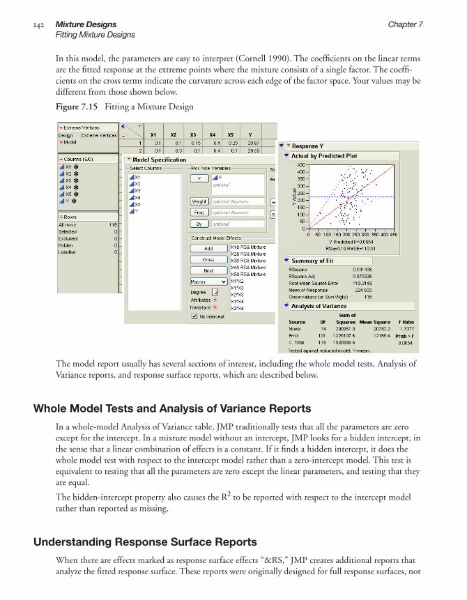
142 Mixture Designs Chapter 7Fitting Mixture Designs
In this model, the parameters are easy to interpret (Cornell 1990). The coefficients on the linear terms are the fitted response at the extreme points where the mixture consists of a single factor. The coeffi-cients on the cross terms indicate the curvature across each edge of the factor space. Your values may be different from those shown below.
Figure 7.15 Fitting a Mixture Design
The model report usually has several sections of interest, including the whole model tests, Analysis of Variance reports, and response surface reports, which are described below.
Whole Model Tests and Analysis of Variance Reports
In a whole-model Analysis of Variance table, JMP traditionally tests that all the parameters are zero except for the intercept. In a mixture model without an intercept, JMP looks for a hidden intercept, in the sense that a linear combination of effects is a constant. If it finds a hidden intercept, it does the whole model test with respect to the intercept model rather than a zero-intercept model. This test is equivalent to testing that all the parameters are zero except the linear parameters, and testing that they are equal.
The hidden-intercept property also causes the R2 to be reported with respect to the intercept model rather than reported as missing.
Understanding Response Surface Reports
When there are effects marked as response surface effects “&RS,” JMP creates additional reports that analyze the fitted response surface. These reports were originally designed for full response surfaces, not

7M
ixtu
re
Chapter 7 Mixture Designs 143A Chemical Mixture Example
mixture models. However, if JMP encounters a no-intercept model and finds a hidden intercept with linear response surface terms, but no square terms, then it folds its calculations, collapsing on the last response surface term to calculate critical values for the optimum. This can be done for any combina-tion that yields a constant and involves the last response surface term.
The contour plot feature of these reports does not fold to handle mixtures. If you want a contour plot of the surface, you can do any of the following:
• Save the model prediction formula and then create a ternary plot with Graph > Ternary Plot.
• Refit the model using a full response surface that omits the last factor.
• Create a separate contour plot with Graph > Contour Plot, and add points to make the plot less granular.
A Chemical Mixture ExampleThree plasticizers (p1, p2, and p3) comprise 79.5% of the vinyl used for automobile seat covers (Cor-nell, 1990). Within this 79.5%, the individual plasticizers are restricted by the following constraints: 0.409 ≤ x1 ≤ 0.849, 0 ≤ x2 ≤ 0.252, and 0.151 ≤ x3 ≤ 0.274.
Creating the Design
To create Cornell’s mixture design in JMP:
1 Select DOE > Mixture Design.2 In the Factors panel, use the three default factors but name them p1, p2, and p3, and enter the high
and low constraints as shown in Figure 7.16. Or, load the factors with the Load Factors command in the red triangle on the Mixture Design title bar. To import the factors, open Plastifactors.jmp, found in the Design Experiment Sample Data folder that was installed with JMP.
Figure 7.16 Factors and Factor Constraints for the Plasticizer Experiment
3 Click Continue.4 Enter 3 in the Degree text box.5 Click Exreme Vertices.6 Click Make Table, JMP uses the 9 factor settings to generate a JMP table (Figure 7.17).

144 Mixture Designs Chapter 7A Chemical Mixture Example
Figure 7.17 Mixture Data for Analysis
7 Add an extra five design runs by duplicating the vertex points and center point. This gives a total of 14 rows in the design table. To do this, highlight the rows you want to duplicate, select Edit > Copy, select Rows > Add Rows, enter 5 as the number of rows to add, and click OK. Then select Edit > Paste.
Note: The Plasticizer data with the results (Y values) that Cornell obtained are available in the Sample data. Open Plasticizer.jmp in the Sample Data folder installed with JMP to see this table (Figure 7.18).
Figure 7.18 Plasticizer.jmp Data Table from the Sample Data Library
Running a Mixture Model
Use the Cornell data from the Sample Data library (Figure 7.18) to run the mixture model:
1 Right-click the table property named Mixture RSM on the upper-left of the data table and select Run Script, which runs a script that displays a completed Fit Model dialog.
2 Click Run Model on the Fit Model dialog.3 Plasticizer.jmp contains a column called Pred Formula Y. This column was added after the analysis
by selecting Save Columns > Prediction Formula from the red triangle menu in the Response Y title bar of the analysis report. To see the prediction formula, right-click (Ctrl+click on the Mac) the column name and select Formula: 0–50.1465*p1 – 282.1982*p2 – 911.6484*p3 + p2*p1317.363 +
p3*p1*1464.3298 + p3*p2*1846.2177

7M
ixtu
re
Chapter 7 Mixture Designs 145A Chemical Mixture Example
Your values may be different from those shown below.
Note: These results correct the coefficients reported in Cornell (1990).
The Response Surface Solution report (Figure 7.19) shows that a maximum predicted value of 19.570299 occurs at point (0.63505, 0.15568, 0.20927).
Figure 7.19 Mixture Response Surface Analysis
Viewing the Prediction Profiler
The report contains a prediction profiler. If the profiler is not visible, click the red triangle in the Response Y title bar and select Factor Profiling > Profiler.
The profiler, shown in Figure 7.20, displays optimal settings of 0.6615 for p1, 0.126 for p2, and 0.21225 for p3, which give an estimated response of 19.26923.
The crossed effects show as curvature in the prediction traces. Drag one of the vertical reference lines, and the other two move in the opposite direction maintaining their ratio.

146 Mixture Designs Chapter 7A Chemical Mixture Example
Figure 7.20 Profiler for Mixture Analysis Example
Plotting a Mixture Response Surface
You can plot the response surface of the plasticizer data as a ternary plot:
1 Choose Graph > Ternary Plot.2 Specify plot variables (p1, p2, and p3) and click Y, Plottting, as shown in Figure 7.21. To identify
the contour variable (the prediction equation), select Pred Formula Y and click the Contour Formula button. The contour variable must have a prediction formula to form the contour lines, as shown by the ternary plots at the bottom in Figure 7.22. If there is no prediction formula, the ter-nary plot only shows points.
Figure 7.21 Launch Dialog for the Ternary Plot Platform
3 Click OK and view the results, as shown in Figure 7.22.

7M
ixtu
re
Chapter 7 Mixture Designs 147A Chemical Mixture Example
Figure 7.22 Ternary Plot of a Mixture Response Surface


Chapter 8Space-Filling Designs
Space-filling designs are useful in situations where run-to-run variability is of far less concern than the form of the model. Sensitivity studies of computer simulations is one such situation. For this case, and any mechanistic or deterministic modeling problem, any variability is small enough to be ignored.
For systems with no variability, randomization and blocking are irrelevant. Replication is undesirable because repeating the same run yields the same result. In space-filling designs, there are two objectives:
• The first objective is to prevent replicate points by spreading the design points out to the maximum distance possible between any two points.
• The second objective is to space the points uniformly.
The following methods are implemented for these types of designs:
• The Sphere-Packing method emphasizes spread of points.
• The Latin Hypercube method is a compromise between spread of points and uniform spacing.
• The Uniform method mimics the uniform probability distribution.
• The Minimum Potential method minimizes energy designs in a hyperspherical.
• The Maximum Entropy method measures the amount of information contained in the distribution of a set of data.
• The Gaussian Process IMSE Optimal method creates a design that minimizes the integrated mean squared error of the gaussian process over the experimental region.

ContentsIntroduction to Space-Filling Designs . . . . . . . . . . . . . . . . . . . . . . . . . . . . . . . . . . . . . . . . . . . . . 151Sphere-Packing Designs . . . . . . . . . . . . . . . . . . . . . . . . . . . . . . . . . . . . . . . . . . . . . . . . . . . . . . . . 151
Creating a Sphere-Packing Design . . . . . . . . . . . . . . . . . . . . . . . . . . . . . . . . . . . . . . . . . . . . . . 151Visualizing the Sphere-Packing Design . . . . . . . . . . . . . . . . . . . . . . . . . . . . . . . . . . . . . . . . . . 153
Latin Hypercube Designs . . . . . . . . . . . . . . . . . . . . . . . . . . . . . . . . . . . . . . . . . . . . . . . . . . . . . . . 154Creating a Latin Hypercube Design . . . . . . . . . . . . . . . . . . . . . . . . . . . . . . . . . . . . . . . . . . . . . 154Visualizing the Latin Hypercube Design . . . . . . . . . . . . . . . . . . . . . . . . . . . . . . . . . . . . . . . . . 156
Uniform Designs . . . . . . . . . . . . . . . . . . . . . . . . . . . . . . . . . . . . . . . . . . . . . . . . . . . . . . . . . . . . . 157Comparing Sphere-Packing, Latin Hypercube, and Uniform Methods . . . . . . . . . . . . . . . . . . . . . 158Minimum Potential Designs . . . . . . . . . . . . . . . . . . . . . . . . . . . . . . . . . . . . . . . . . . . . . . . . . . . . . 160Maximum Entropy Designs . . . . . . . . . . . . . . . . . . . . . . . . . . . . . . . . . . . . . . . . . . . . . . . . . . . . . 161Gaussian Process IMSE Optimal Designs . . . . . . . . . . . . . . . . . . . . . . . . . . . . . . . . . . . . . . . . . . . 162Borehole Model: A Sphere-Packing Example . . . . . . . . . . . . . . . . . . . . . . . . . . . . . . . . . . . . . . . . 163
Create the Sphere-Packing Design for the Borehole Data . . . . . . . . . . . . . . . . . . . . . . . . . . . . 164Guidelines for the Analysis of Deterministic Data . . . . . . . . . . . . . . . . . . . . . . . . . . . . . . . . . . 165Results of the Borehole Experiment . . . . . . . . . . . . . . . . . . . . . . . . . . . . . . . . . . . . . . . . . . . . . 165

8S
pace F
illing
Chapter 8 Space-Filling Designs 151Introduction to Space-Filling Designs
Introduction to Space-Filling DesignsSpace-filling designs are useful for modeling systems that are deterministic or near-deterministic. One example of a deterministic system is a computer simulation. Such simulations can be very complex involving many variables with complicated interrelationships. A goal of designed experiments on these systems is to find a simpler empirical model that adequately predicts the behavior of the system over limited ranges of the factors.
In experiments on systems where there is substantial random noise, the goal is to minimize the variance of prediction. In experiments on deterministic systems, there is no variance but there is bias. Bias is the difference between the approximation model and the true mathematical function. The goal of space-filling designs is to bound the bias.
There are two schools of thought on how to bound the bias. One approach is to spread the design points out as far from each other as possible consistent with staying inside the experimental boundaries. The other approach is to space the points out evenly over the region of interest.
The Space Filling designer supports the following design methods:
Sphere Packing maximizes the minimum distance between pairs of design points.
Latin Hypercube maximizes the minimum distance between design points but requires even spacing of the levels of each factor. This method produces designs that mimic the uniform distri-bution. The Latin Hypercube method is a compromise between the Sphere-Packing method and the Uniform design method.
Uniform minimizes the discrepancy between the design points (which have an empirical uniform distribution) and a theoretical uniform distribution.
Minimum Potential spreads points out inside a sphere around the center.
Maximum Entropy measures the amount of information contained in the distribution of a set of data.
Gaussian Process IMSE Optimal creates a design that minimizes the integrated mean squared error of the Gaussian process over the experimental region.
Sphere-Packing DesignsThe Sphere-Packing design method maximizes the minimum distance between pairs of design points. The effect of this maximization is to spread the points out as much as possible inside the design region.
Creating a Sphere-Packing Design
To use the Sphere-Packing method:
1 Select DOE > Space Filling. 2 Enter responses and factors. (See “Enter Responses and Factors into the Custom Designer,” p. 53.)3 Alter the factor level values, if necessary. For example, Figure 8.1 shows the two existing factors, X1
and X2, with values that range from 0 to 1 (instead of the default –1 to 1).

152 Space-Filling Designs Chapter 8Sphere-Packing Designs
4 To see the discrepancy value and the minimum distance from each point to its closest neighbor, select Show Diagnostics from the red triangle icon menu, as shown in Figure 8.1.
Figure 8.1 Space-Filling Dialog for Two Factors
5 Click Continue. 6 In design specification dialog, specify a sample size. Figure 8.2 shows a sample size of eight.
Figure 8.2 Space-Filling Design Dialog
7 Click Sphere Packing.
JMP creates the design and displays the design runs and the design diagnostics (if specified, as shown in step 4). Figure 8.3 shows the Design Diagnostics panel open with 0.518 as the Minimum Distance. Your results might differ slightly from the ones below, but the minimum distance will be the same.
Change Values to 0 and 1

8S
pace F
illing
Chapter 8 Space-Filling Designs 153Sphere-Packing Designs
Figure 8.3 Space-Filling Design Dialog, Sphere-Packing Design Settings and Design Diagnostics
8 Click Make Table. Use this table to complete the visualization example, described next.
Visualizing the Sphere-Packing Design
To visualize the nature of the Sphere-Packing technique, create an overlay plot, adjust the plot’s frame size, and add circles using the minimum distance from the diagnostic report shown in Figure 8.3 as the radius for the circles. Using the table you just created:
1 Select Graph > Overlay Plot. 2 Specify X1 as X and X2 as Y, then click OK. 3 Adjust the frame size so that the frame is square by right-clicking the plot and selecting
Size/Scale > Size to Isometric. 4 Right-click the plot and select Customize. When the Customize panel appears, click the plus sign
to see a text edit area and enter the following script: For Each Row(Circle({:X1, :X2}, 0.518/2)) where 0.518 is the minimum distance number you noted in the Design Diagnostics panel. This script draws a circle centered at each design point with radius 0.259 (half the diameter, 0.518), as shown on the left in Figure 8.4. This plot shows the efficient way JMP packs the design points.
5 Now repeat the procedure exactly as described in the previous section, but with a sample size of 10 instead of eight.Remember to change 0.518 in the graphics script to the minimum distance produced by 10 runs. When the plot appears, again set the frame size and create a graphics script using the minimum dis-tance from the diagnostic report as the diameter for the circle. You should see a graph similar to the one on the right in Figure 8.4. Note the irregular nature of the sphere packing. In fact, you can repeat the process a third time to get a slightly different picture because the arrangement is depen-dent on the random starting point.

154 Space-Filling Designs Chapter 8Latin Hypercube Designs
Figure 8.4 Sphere-Packing Example with Eight Runs (left) and 10 Runs (right)
Latin Hypercube DesignsIn a Latin Hypercube, each factor has as many levels as there are runs in the design. The levels are spaced evenly from the lower bound to the upper bound of the factor. Like the sphere-packing method, the Latin Hypercube method chooses points to maximize the minimum distance between design points, but with a constraint. The constraint maintains the even spacing between factor levels.
Creating a Latin Hypercube Design
To use the Latin Hypercube method:
1 Select DOE > Space Filling. 2 Enter responses, if necessary, and factors. (See “Enter Responses and Factors into the Custom
Designer,” p. 53.)3 Alter the factor level values, if necessary. For example, Figure 8.5 shows adding two factors to the
two existing factors and changing their values to 1 and 8 instead of the default –1 and 1. 4 To view the discrepancy value and the minimum distance from each point to its closest neighbor,
click the red triangle icon on the Space Filling Design title bar and select Show Diagnostics.

8S
pace F
illing
Chapter 8 Space-Filling Designs 155Latin Hypercube Designs
Figure 8.5 Space-Filling Dialog for Four Factors
5 Click Continue. 6 In design specification dialog, specify a sample size. This example uses a sample size of eight.7 Click Latin Hypercube (see Figure 8.2).Factor settings and design diagnostics results appear similar
to those in Figure 8.6, which shows the Latin Hypercube design with four factors and eight runs.
Note: The purpose of this example is to show that each column (factor) is assigned each level only once, and each column is a different permutation of the levels.
Figure 8.6 Latin Hypercube Design for Four Factors and Eight Runs with Eight Levels

156 Space-Filling Designs Chapter 8Latin Hypercube Designs
Visualizing the Latin Hypercube Design
To visualize the nature of the Latin Hypercube technique, create an overlay plot, adjust the plot’s frame size, and add circles using the minimum distance from the diagnostic report as the radius for the circle.
1 First, create another Latin Hypercube design using the default X1 and X2 factors. 2 Be sure to change the factor values so they are 0 and 1 instead of the default –1 and 1.3 Click the red triangle icon on the Space Filling Design title bar and select Show Diagnostics.
4 Click Continue.5 Specify a sample size of eight.6 Click Latin Hypercube. Factor settings and design diagnostics are shown in Figure 8.7.
Figure 8.7 Latin Hypercube Design with two Factors and Eight Runs
7 Click Make Table. 8 Select Graph > Overlay Plot. 9 Specify X1 as X and X2 as Y, then click OK. 10 Right-click the plot and select Size/Scale > Frame Size to Isometric to adjust the frame size so
that the frame is square.11 Right-click the plot, select Customize from the menu. In the Customize panel, click the large plus
sign to see a text edit area, and enter the following script: For Each Row(Circle({:X1, :X2}, 0.404/2)),where 0.404 is the minimum distance number you noted in the Design Diagnostics panel (Figure 8.7). This script draws a circle centered at each design point with radius 0.202 (half the diameter, 0.404), as shown on the left in Figure 8.8. This plot shows the efficient way JMP packs the design points.
12 Repeat the above procedure exactly, but with 10 runs instead of eight (step 4). Remember to change 0.404 in the graphics script to the minimum distance produced by 10 runs.
You should see a graph similar to the one on the right in Figure 8.8. Note the irregular nature of the sphere packing. In fact, you can repeat the process to get a slightly different picture because the arrange-ment is dependent on the random starting point.
The minimum distance

8S
pace F
illing
Chapter 8 Space-Filling Designs 157Uniform Designs
Figure 8.8 Comparison of Latin Hypercube Designs with Eight Runs (left) and 10 Runs (right)
Note that the minimum distance between each pair of points in the Latin Hypercube design is smaller than that for the Sphere-Packing design. This is because the Latin Hypercube design constrains the lev-els of each factor to be evenly spaced. The Sphere-Packing design maximizes the minimum distance without any constraints.
Uniform DesignsThe Uniform design minimizes the discrepancy between the design points (empirical uniform distribu-tion) and a theoretical uniform distribution.
Note: These designs are most useful for getting a simple and precise estimate of the integral of an unknown function. The estimate is the average of the observed responses from the experiment.
1 Select DOE > Space Filling. 2 Enter responses, if necessary, and factors. (See “Enter Responses and Factors into the Custom
Designer,” p. 53.)3 Alter the factor level values, if necessary. 4 To view the discrepancy value and the minimum distance from each point to its closest neighbor,
click the red triangle icon on the Space Filling Design title bar and select Show Diagnostics, as shown in Figure 8.1.
5 Click Continue. 6 In design specification dialog, specify a sample size. This example uses a sample size of eight.7 Click the Uniform button. JMP creates this design and displays the design runs and the design diag-
nostics (if specified in step 4).
Note: The emphasis of the Uniform design method is not to spread out the points. The minimum dis-tances in Figure 8.9 vary substantially.

158 Space-Filling Designs Chapter 8Comparing Sphere-Packing, Latin Hypercube, and Uniform Methods
Figure 8.9 Factor Settings and Diagnostics for Uniform Space-Filling Designs with Eight Runs
8 Click Make Table.
A Uniform design does not guarantee even spacing of the factor levels. However, increasing the number of runs and running a distribution on each factor (use Analyze > Distribution) clearly shows nearly flat histograms.
Figure 8.10 Histograms are almost Flat for each Factor when Number of Runs is Increased to 16
Comparing Sphere-Packing, Latin Hypercube, and Uniform Methods
To compare space-filling design methods, click the red triangle icon in the Space Filling Design title bar and select Show Diagnostics before creating the Sphere Packing, Latin Hypercube, or Uniform designs, as shown in all the previous examples. The Design Diagnostics tables show the values for the factors scaled from zero to one. The minimum distance is based on these scaled values and is the mini-mum distance from each point to its closest neighbor. The discrepancy value is the integrated difference between the design points and the uniform distribution.
Figure 8.11 shows a comparison of the design diagnostics for three eight-run space-filling designs. Note that the discrepancy for the Uniform design is the smallest (best). The discrepancy for the Sphere-Pack-

8S
pace F
illing
Chapter 8 Space-Filling Designs 159Comparing Sphere-Packing, Latin Hypercube, and Uniform Methods
ing design is the largest (worst). The discrepancy for the Latin Hypercube takes an intermediate value that is closer to the optimal value.
Also note that the minimum distance between pairs of points is largest (best) for the Sphere-Packing method. The Uniform design has pairs of points that are only about half as far apart. The Latin Hyper-cube design behaves more like the Sphere-Packing design in spreading the points out.
For both spread and discrepancy, the Latin Hypercube design represents a healthy compromise solu-tion.
Figure 8.11 Comparison of Diagnostics for Three Eight-Run Space-Filling Methods
Another point of comparison is the time it takes to compute a design. The Uniform design method requires the most time to compute. Also, the time to compute the design increases rapidly with the number of runs. For comparable problems, all the space-filling design methods take longer to compute than the D-optimal designs in the Custom Designer.
Sphere- Packing
Latin Hypercube
Uniform

160 Space-Filling Designs Chapter 8Minimum Potential Designs
Minimum Potential DesignsThe Minimum Potential design spreads points out inside a sphere. To under-stand how this design is created, imagine the points as electrons with springs attached to every other point, as illustrated to the right. The coulomb force pushes the points apart, but the springs pull them together. The design is the spacing of points that minimizes the potential energy of the system.
Minimum Potential designs:
• have spherical symmetry
• are nearly orthogonal
• have uniform spacing
To see a Minimum Potential example:
1 Select DOE > Space Filling. 2 Enter responses and factors. (See “Enter Responses and Factors into the Custom Designer,” p. 53.)3 Alter the factor level values, if necessary.4 Click Continue. 5 In design specification dialog (shown on the left in Figure 8.12), enter a sample size. This example
uses a sample size of 12.6 Click the Minimum Potential button. JMP creates this design and displays the design runs (shown
on the right in Figure 8.12) and the design diagnostics (if specified).
Figure 8.12 Space-Filling Methods and Design Runs for Three-Factor Minimum Potential Design
7 Click Make Table.
You can see the spherical symmetry of the Minimum Potential design using the Scatterplot 3D graphics platform.
1 After you make the JMP design table, choose the Graph > Scatterplot 3D command.2 In the Scatterplot 3D launch dialog, select X1, X2, and X3 as Y Columns and click OK to see the ini-
tial three dimensional scatterplot of the design points.3 To see the results in Figure 8.13, double-click on the axes to scale them, and use the Normal
Contour Ellipsoids option from the menu in the Scatterplot 3D title bar.
Now it is easy to see the points spread evenly on the surface of the ellipsoid.

8S
pace F
illing
Chapter 8 Space-Filling Designs 161Maximum Entropy Designs
Figure 8.13 Minimum Potential Design Points on Sphere
Maximum Entropy DesignsThe Latin Hypercube design is currently the most popular design assuming you are going to analyze the data using a Gaussian-Process model. Computer simulation experts like to use the Latin Hypercube design because all its projections onto the coordinate axes are uniform.
However, as the example at the top in Figure 8.14 shows, the Latin Hypercube design does not neces-sarily do a great job of space filling. This is a two-factor Latin Hypercube with 16 runs. Note that this design appears to leave a hole in the bottom right of the overlay plot.
Figure 8.14 Two-factor Latin Hypercube Design
Note empty area inLatin Hypercube design

162 Space-Filling Designs Chapter 8Gaussian Process IMSE Optimal Designs
The Maximum Entropy design is a competitor to the Latin Hypercube design for computer experi-ments because it optimizes a measure of the amount of information contained in an experiment. See the technical note below. The two-factor Maximum Entropy design shown in Figure 8.15 appears to better cover the space.
Figure 8.15 Two-Factor Maximum Entropy Design
Technical Note: Maximum Entropy designs maximize the Shannon information (Shewry and Wynn (1987)) of an experiment, assuming that the data come from a normal (m, s2 R) distribution, where
is the correlation of response values at two different design points, xi and xj. Computationally, these designs maximize |R|, the determinant of the correlation matrix of the sample. When xi and xj are far apart, then Rij approaches zero. When xi and xj are close together, then Rij is near one.
Gaussian Process IMSE Optimal DesignsThe Gaussian process IMSE optimal design is also a competitor to the Latin Hypercube design because it minimizes the integrated mean squared error of the gaussian process model over the experimental region.
You can compare the IMSE optimal design to the Latin Hypercube (shown previously in Figure 8.14). The table and overlay plot in Figure 8.16 show a Gaussian IMSE optimal design. You can see that the design provides uniform coverage of the factor region.
Rij θk xik xjk–( )2
k∑–⎝ ⎠
⎛ ⎞exp=

8S
pace F
illing
Chapter 8 Space-Filling Designs 163Borehole Model: A Sphere-Packing Example
Figure 8.16 Comparison of Two-factor latin Hypercube and Gaussian IMSE Optimal Designs
Note: Both the Maximum Entropy design and the Gaussian Process IMSE Optimal design were cre-ated using 100 random starts.
Borehole Model: A Sphere-Packing ExampleWorley (1987) presented a model of the flow of water through a borehole that is drilled from the ground surface through two aquifers. The response variable y is the flow rate through the borehole in m3/year and is determined by the equation
There are eight inputs to this model.
rw = radius of borehole, 0.05 to 0.15 m
r = radius of influence, 100 to 50,000 m
Tu = transmissivity of upper aquifier, 63,070 to 115,600 m2/year
Hu = potentiometric head of upper aquifier, 990 to 1100 m
Tl = transmissivity of lower aquifier, 63.1 to 116 m2/year
Hl = potentiometric head of lower aquifier, 700 to 820 m
L = length of borehole, 1120 to 1680 mKw = hydraulic conductivity of borehole, 9855 to 12,045 m/year
This example is atypical of most computer experiments because the response can be expressed as a sim-ple, explicit function of the input variables. However, this simplicity is useful for explaining the design methods.
y2πTu Hu Hl–( )
r rw⁄( )ln 12LTu
r rw⁄( )ln rw2
Kw
---------------------------------------TuTl------+ +
------------------------------------------------------------------------------------------=

164 Space-Filling Designs Chapter 8Borehole Model: A Sphere-Packing Example
Create the Sphere-Packing Design for the Borehole Data
To create a Sphere-Packing design for the borehole problem:
1 Select DOE > Space Filling.2 Click the red triangle icon on the Space Filling Design title bar and select Load Factors.3 Open the Sample Data folder installed with JMP. In that folder, open Borehole Factors.jmp from
the Design Experiment folder to load the factors (Figure 8.17).
Figure 8.17 Factors Panel with Factor Values Loaded for Borehole Example
Note: The logarithm of r and rw are used in the following discussion.
4 Click Continue.5 Specify a sample size of 32 runs, as shown in Figure 8.18.
Figure 8.18 Space-Filling Design Method Panel Showing 32 Runs
6 Click the Sphere Packing button to produce the design. 7 Click Make Table to make a table showing the design settings for the experiment. The factor set-
tings in the example table might not have the same ones you see when generating the design because the designs are generated from a random seed.
8 To see a completed data table for this example, open Borehole Sphere Packing.jmp (Figure 8.19) from the Design Experiment Sample Data folder installed with JMP. This table also has a table vari-able that contains a script to analyze the data. The results of the analysis are saved as columns in the table.

8S
pace F
illing
Chapter 8 Space-Filling Designs 165Borehole Model: A Sphere-Packing Example
Figure 8.19 Borehole Sample Data
Guidelines for the Analysis of Deterministic Data
It is important to remember that deterministic data has no random component. As a result, p-values from fitted statistical models do not have their usual meanings. A large F statistic (low p-value) is an indication of an effect due to a model term. However, you cannot make valid confidence intervals about the size of the effects or about predictions made using the model.
Residuals from any model fit to deterministic data are not a measure of noise. Instead, a residual shows the model bias for the current model at the current point. Distinct patterns in the residuals indicate new terms to add to the model to reduce model bias.
Results of the Borehole Experiment
The example described in the previous sections produced the following results:
• A stepwise regression of the response, log y, versus the full quadratic model in the eight factors, led to the prediction formula column.
• The prediction bias column is the difference between the true model column and the prediction formula column.
• The prediction bias is relatively small for each of the experimental points. This indicates that the model fits the data well.
In real world examples, the true model is generally not available in a simple analytical form. As a result, it is impossible to know the prediction bias at points other than the observed data without doing addi-tional runs.
In this case, the true model column contains a formula that allows profiling the prediction bias to find its value anywhere in the region of the data. To understand the prediction bias in this example:
1 Select Graph > Profiler.

166 Space-Filling Designs Chapter 8Borehole Model: A Sphere-Packing Example
2 Highlight the prediction bias column and click the Y, Prediction Formula button.3 Check the Expand Intermediate Formulas box, as shown at the bottom on the Profiler dialog in
Figure 8.20, because the prediction bias formula is a function of columns that are also created by formulas.
4 Click OK.
The profile plots at the bottom in Figure 8.20 show the prediction bias at the center of the design region. If there were no bias, the profile traces would be constant between the value ranges of each fac-tor. In this example, the variables Hu and Hl show nonlinear effects.
Figure 8.20 Profiler Dialog and Profile of the Prediction Bias in the Borehole Sphere-Packing Data
The range of the prediction bias on the data is smaller than the range of the prediction bias over the entire domain of interest. To see this, look at the distribution analysis (Analyze > Distribution) of the prediction bias in Figure 8.21. Note that the maximum bias is 1.826 and the minimum is –0.684 (the range is 2.51).

8S
pace F
illing
Chapter 8 Space-Filling Designs 167Borehole Model: A Sphere-Packing Example
Figure 8.21 Distribution of the Prediction Bias
The top plot in Figure 8.22 shows the maximum bias (2.91) over the entire domain of the factors. The plot at the bottom shows the comparable minimum bias (–4.84). This gives a range of 7.75. This is more than three times the size of the range over the observed data.
Figure 8.22 Prediction Plots showing Maximum and Minimum Bias Over Factor Domains
Keep in mind that, in this example, the true model is known. In any meaningful application, the response at any factor setting is unknown. The prediction bias over the experimental data underesti-mates the bias throughout the design domain.
There are two ways to assess the extent of this underestimation:
• Cross-validation refits the data to the model while holding back a subset of the points and looks at the error in estimating those points.
• Verification runs (new runs performed) at different settings to assess the lack of fit of the empirical model.


Chapter 9Nonlinear Designs
Design of experiments with models that are nonlinear in their parameters is available using either the DOE menu or the JMP Starter DOE category, as shown below.
Nonlinear designs offer both advantages and disadvantages compared to designs for linear models.
On the positive side, predictions using a well chosen model are likely to be good over a wider range of factor settings. It is also possible to model response surfaces with more curvature and with asymptotic behavior.
On the negative side, the researcher needs a greater understanding of both the system and of the non-linear design tool.
DOE Menu JMP Starter

ContentsExamples of Nonlinear Designs . . . . . . . . . . . . . . . . . . . . . . . . . . . . . . . . . . . . . . . . . . . . . . . . . . 171
Using Nonlinear Fit to Find Prior Parameter Estimates . . . . . . . . . . . . . . . . . . . . . . . . . . . . . . 171Creating a Nonlinear Design with No Prior Data . . . . . . . . . . . . . . . . . . . . . . . . . . . . . . . . . . 175
Creating a Nonlinear Design . . . . . . . . . . . . . . . . . . . . . . . . . . . . . . . . . . . . . . . . . . . . . . . . . . . . 179Identify the Response and Factor Column with Formula . . . . . . . . . . . . . . . . . . . . . . . . . . . . . 179Set Up Factors and Parameters in the Nonlinear Design Dialog . . . . . . . . . . . . . . . . . . . . . . . . 179Enter the Number of Runs and Preview the Design . . . . . . . . . . . . . . . . . . . . . . . . . . . . . . . . . 180Make Table or Augment the Table . . . . . . . . . . . . . . . . . . . . . . . . . . . . . . . . . . . . . . . . . . . . . . 181
Advanced Options for the Nonlinear Designer . . . . . . . . . . . . . . . . . . . . . . . . . . . . . . . . . . . . . . . 181

9N
on
linear
Chapter 9 Nonlinear Designs 171Examples of Nonlinear Designs
Examples of Nonlinear DesignsThe Nonlinear Designer allows scientists to generate optimal designs and optimally augment data for fitting models that are nonlinear in their parameters. Such models, when they are descriptive of the underlying process, can yield more accurate prediction of process behavior than is possible with the standard polynomial models.
To use the Nonlinear Designer, you first need a data table that has
• one column for each factor
• one column for the response
• a column that contains a formula showing the functional relationship between the factor(s) and the response.
This is the same format for a table you would supply to the nonlinear platform for modeling.
The first example in this section describes how to approach creating a nonlinear design when there is prior data. The second example describes how to approach creating the design without data, but with reasonable starting values for the parameter estimates.
Using Nonlinear Fit to Find Prior Parameter Estimates
Suppose you have already collected experimental data and placed it in a JMP data table. That table can be used to create a nonlinear design for improving the estimates of the model’s parameters.
To follow along with this example, open Chemical Kinetics.jmp from the Nonlinear Examples folder found in the sample data installed with JMP.
Chemical Kinetics.jmp (Figure 9.1) contains a column (Model (x))whose values are formed by a for-mula with a poor guess of the parameter values.
Figure 9.1 Chemical Kinetics.jmp
First, fit the data to the model using nonlinear least squares to get better parameter values.
1 Select Analyze > Modeling > Nonlinear.2 Select Velocity (y) and click the Y, Response button.3 Select Model (x) and click the X, Predictor Formula button (Figure 9.2), then click OK.

172 Nonlinear Designs Chapter 9Examples of Nonlinear Designs
Figure 9.2 Initial Nonlinear Analysis Launch Dialog
4 Click the Go button on the Nonlinear control panel (Figure 9.3).
Figure 9.3 Results After Clicking Go
These ranges are the intervals for Vmax and k. They are asymptotically normal. Use these limits to create a nonlinear design in JMP.
The Save Estimates button adds the new fitted parameter values in the Model (x) column in the Chemical Kinetics.jmp data table.
The Confidence Limits button computes confidence intervals used to create a nonlinear design.

9N
on
linear
Chapter 9 Nonlinear Designs 173Examples of Nonlinear Designs
5 Click the Confidence Limits button to produce confidence intervals.6 Click Save Estimates to add the new fitted parameter values in the Model (x) column in the
Chemical Kinetics.jmp data table. The formula looks like:
Note: Leave the nonlinear analysis report open because these results are needed in the DOE nonlinear design dialog described next.
Now create a design for fitting the model’s nonlinear parameters.
1 With the Chemical Kinetics.jmp data table open, select DOE > Nonlinear.2 Complete the launch dialog the same way as the Nonlinear Analysis launch dialog shown previously.
That is, Select Velocity (y) and click Y, Response. Select Model (x) and click the X, Predictor Formula. Figure 9.4 shows the completed dialog.
Figure 9.4 Initial Nonlinear Design Launch Dialog
3 Click OK to see the Design panels for entering factors and parameters, as shown in Figure 9.5.
Figure 9.5 Nonlinear Design Panels for Factors and Parameters
Note that in Chemical Kinetics.jmp (Figure 9.1), the range of data for Concentration goes from 0.417 to 6.25. Therefore, these values initially appear as the high and low values in the Factors control panel as follows:
4 Change the factor range for Concentration to a broader interval—from 0.1 to 7 (Figure 9.6).

174 Nonlinear Designs Chapter 9Examples of Nonlinear Designs
Figure 9.6 Change Factor Values to Have a Broader Interval
Note that the a priori distribution of the parameters Vmax and k is Normal, which is correct for this example. To describe the current level of uncertainty in the two parameters,
5 Look back at the analysis report you created above and locate the upper and lower confidence limits for Vmax and k in the Solution table (see circled values in Figure 9.3). Change the values for Vmax and k to correspond to those limits, as shown in Figure 9.7.Now you have described the current level of uncertainty of the two parameters.
Figure 9.7 Changing the Values
6 If necessary, type the desired number of runs (15) into the text box.
Use commands from the menu on the Nonlinear Design title bar to get the best possible design:
7 Select Number of Starts from the menu on the title bar and enter 100 in the text box.8 Select Advanced Options > Number of Monte Carlo Samples and enter 2 in the text box.9 Click Make Design to preview the design (Figure 9.8).
Figure 9.8 Selecting the Number of Runs
10 Click Make Table. This creates a new JMP design table (Figure 9.9) whose rows are the runs defined by the nonlinear design. This example creates a new table to avoid altering the sample data table Chemical Kinetics.jmp. In most cases, however, you can augment the original table using the Augment Table option in the Nonlinear Designer instead of making a new table.

9N
on
linear
Chapter 9 Nonlinear Designs 175Examples of Nonlinear Designs
Figure 9.9 Making a Table with the Nonlinear Designer
The new runs use the wider interval of allowed concentration, which leads to more precise estimates of k and Vmax.
Creating a Nonlinear Design with No Prior Data
This example describes how to create a design when you have not yet collected data, but have a guess for the unknown parameters.
To follow along with this example, open Reaction Kinetics Start.jmp, found in the Design Experiment folder in the sample data installed with JMP. Notice that the table is a template. That is, the table has columns with properties and formulas, but there are no observations in the table. The design has not yet been created and data has not been collected.
The formula in the yield model column is used to create a nonlinear design for fitting the model’s non-linear parameters. The formula looks like this:
This model is from Box and Draper (1987). The formula arises from the fractional yield of the interme-diate product in a consecutive chemical reaction. It is written as a function of time and temperature.
1 With the Reaction Kinetics Start.jmp data table open, select DOE > Nonlinear Design to see the initial launch dialog.
2 Select observed yield and click Y, Response.3 Select yield model (the column with the formula) and click X, Predictor Formula.
The completed dialog should look like the one in Figure 9.10.

176 Nonlinear Designs Chapter 9Examples of Nonlinear Designs
Figure 9.10 Initial Nonlinear Design launch Dialog
4 Click OK to see the nonlinear design Factors and Parameters panels in Figure 9.11.5 Change the two factors’ values to be a reasonable range of values. (In your experiment, these values
might have to be an educated guess.) For this example, use the values 520 and 540 for Reaction Temperature. Use the values 0.1 and 0.3 for Reaction Time.
6 Click on the Distribution of each parameter and select Uniform from the menu to change the distri-bution from the default Normal (see Figure 9.11).
7 Change the number of runs to 12 in the Design Generation panel.
Figure 9.11 Change Factor Values, Parameter Distributions, and Number of Runs
8 Click Make Design, then Make Table. Your results should look similar to those in Figure 9.12.

9N
on
linear
Chapter 9 Nonlinear Designs 177Examples of Nonlinear Designs
Figure 9.12 Design Table
9 To analyze data that contains values for the response, observed yield, open Reaction Kinetics.jmp from the Design Experiment folder in the sample data installed with JMP (Figure 9.13).
Figure 9.13 Reactor Kinetics.jmp
First, examine the design region with an overlay plot.
10 Selecting Graph > Overlay Plot.11 Select Reaction Temperature and click Y 12 Select Reaction Time and click X (Figure 9.14).13 Click OK to see the overlay plot to the right in Figure 9.14.

178 Nonlinear Designs Chapter 9Examples of Nonlinear Designs
Figure 9.14 Create an Overlay Plot
Notice that the points are not at the corners of the design region. In particular, there are no points at low temperature and high time—the lower right corner of the graph.
14 Select Analyze > Modeling > Nonlinear.15 Select observed yield and click Y, Response.16 Select yield model and click the X, Predictor Formula, then click OK.17 Click Go on the Nonlinear control panel.18 Now, choose Profilers > Profiler from the red triangle menu on the Nonlinear Fit title bar.19 To maximize the yield, choose Maximize Desirability from the red triangle menu on the Prediction
Profiler title bar.
The maximum yield is 60.907% at a reaction temperature of 540 degrees Kelvin and a reaction time of 0.111868 minutes
Figure 9.15 Time and Temperature Settings for Maximum Yield

9N
on
linear
Chapter 9 Nonlinear Designs 179Creating a Nonlinear Design
Creating a Nonlinear DesignTo begin, open a data table that contains a column whose values are formed by a formula (for details about formulas, see the JMP User Guide). This formula must have parameters.
Select DOE >Nonlinear Design, or click the Nonlinear Design button on the JMP Starter DOE page. Then, follow the steps below:
• “Identify the Response and Factor Column with Formula,” p. 179
• “Set Up Factors and Parameters in the Nonlinear Design Dialog,” p. 179
• “Enter the Number of Runs and Preview the Design,” p. 180
• “Make Table or Augment the Table,” p. 181
Identify the Response and Factor Column with Formula
1 Open a data table that contains a column whose values are formed by a formula that has parameters. This example uses Corn.jmp from the Nonlinear Examples folder in the sample data installed with JMP.
2 Select DOE > Nonlinear Design to see the initial launch dialog.3 Select yield and click Y, Response. The response column cannot have missing values.4 Select quad and click X, Predictor Formula. The quad variable has a formula that includes nitrate
and three parameters (Figure 9.17).5 Click OK on the launch dialog to see the Nonlinear Design DOE panels.
Figure 9.16 Identify Response (Y) and the Column with the Nonlinear Formula (X)
Set Up Factors and Parameters in the Nonlinear Design Dialog
First, look at the formula for quad, shown in Figure 9.17, and notice there are three parameters. These parameters show in the Parameters panel of the Nonlinear design dialog, with initial parameter values.

180 Nonlinear Designs Chapter 9Creating a Nonlinear Design
Figure 9.17 Formula for quad has Parameters a, b, and c
Use Figure 9.18 to understand how to set up factor and parameter names and values.
• The initial values for the factor and the parameters are reasonable and do not need to be changed.
• If necessary, change the Distribution of the parameters to Uniform, as shown in Figure 9.18.
Figure 9.18 Example of Setting Up Factors and Parameters
Enter the Number of Runs and Preview the Design
1 The Design Generation panel shows a default number of runs needed to perform the experiment. This example needs one run for each observation (144) plus three additional runs for the three parameters giving 147 as a total minimum number of runs. Enter 147 in the Number of Runs edit box.
2 Click Make Design before creating the data table to preview the design. Figure 9.19 shows a partial listing of the design.
Double-click to edit the factor or parameter name. Click to enter or change factor values.
Click to edit the distribution: Uniform, Normal, Lognormal, or Exponential.
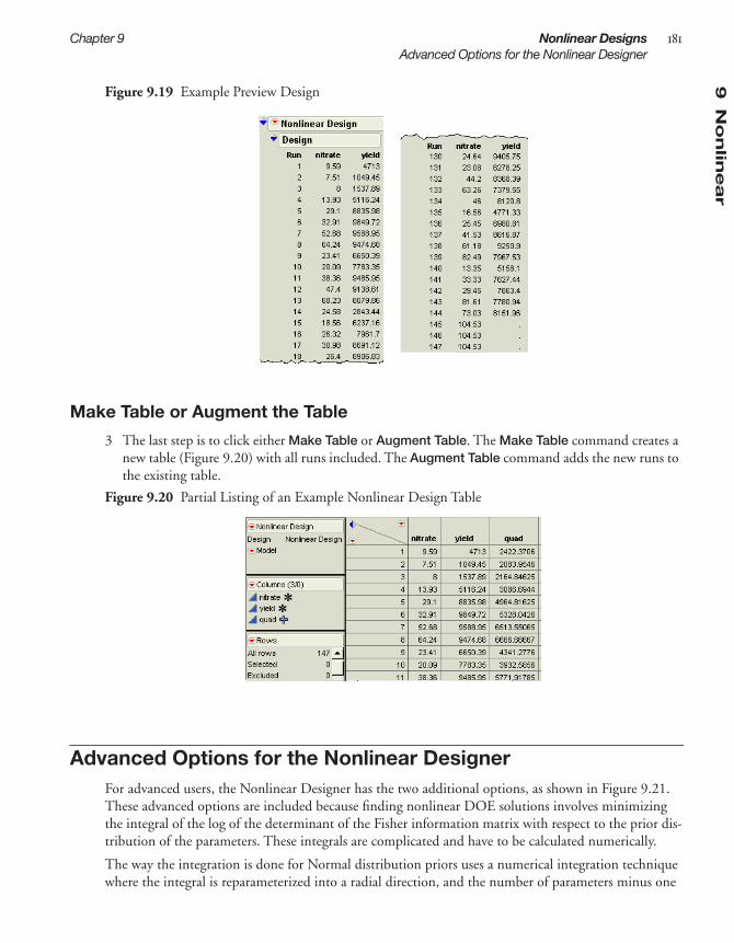
9N
on
linear
Chapter 9 Nonlinear Designs 181Advanced Options for the Nonlinear Designer
Figure 9.19 Example Preview Design
Make Table or Augment the Table
3 The last step is to click either Make Table or Augment Table. The Make Table command creates a new table (Figure 9.20) with all runs included. The Augment Table command adds the new runs to the existing table.
Figure 9.20 Partial Listing of an Example Nonlinear Design Table
Advanced Options for the Nonlinear DesignerFor advanced users, the Nonlinear Designer has the two additional options, as shown in Figure 9.21. These advanced options are included because finding nonlinear DOE solutions involves minimizing the integral of the log of the determinant of the Fisher information matrix with respect to the prior dis-tribution of the parameters. These integrals are complicated and have to be calculated numerically.
The way the integration is done for Normal distribution priors uses a numerical integration technique where the integral is reparameterized into a radial direction, and the number of parameters minus one

182 Nonlinear Designs Chapter 9Advanced Options for the Nonlinear Designer
angular directions. The radial part of the integral is handled using Radau-Gauss-Laguerre quadrature with an evaluation at radius=0. A randomized Mysovskinkh quadrature is used to calculate the integral over the radial direction, which is equivalent to integrating over the surface of a hypersphere.
Note: If some of the prior distributions are not Normal, then the integral is reparameterized so that the new parameters have normal distribution, and then the radial-spherical integration method is applied. However, if the prior distribution set for the parameters does not lend itself to a solution, sometimes the process fails and gives the message that the Fisher information is singular in a region of the parame-ter space, and advises changing the prior distribution or the ranges of the parameters.
Figure 9.21 Advanced Options for the Nonlinear Designer
The following is a technical description for these two advanced options:
Number of Monte Carlo Samples sets the number of octahedra per sphere. Because each octa-hedron is a fixed unit, this option can be thought of as setting the number of octahedra per sphere.
N Monte Carlo Spheres are the number of nonzero radius values used. The default is two spheres and one centerpoint. Each radial value requires integration over the angular dimensions. This is done by constructing a certain number of hyperoctahedra (the generalization of an octa-gon in arbitrary dimensions), and randomly rotating each of them.
Technical Note: The reason for the approach given by these advanced options is to get good integral approximations much faster than using standard methods. For instance, with six parameters, using two radii and one sample per sphere, these methods give a generalized five- point rule that needs only 113 observations to get a good approximation. Using the most common approach (Simpson’s rule) would need 56 = 15,625 evaluations. The straight Monte Carlo approach also requires thousands of function evaluations to get the same level of quality in the answer.
Keep in mind is that if the number of radii is set to zero, then just the center point is used, which gives a local design that is optimal for a particular value of the parameters. For some people this is good enough for their purposes. These designs are created much faster than if the integration is performed.

Chapter 10Taguchi Designs
Quality was the watchword of 1980s, and Genichi Taguchi was a leader in the growth of quality con-sciousness. One of Taguchi’s technical contributions to the field of quality control was a new approach to industrial experimentation. The purpose of the Taguchi method was to develop products that worked well in spite of natural variation in materials, operators, suppliers, and environmental change. This is robust engineering.
Much of the Taguchi method is traditional. His orthogonal arrays are two-level, three-level, and mixed-level fractional factorial designs. The unique aspects of his approach are the use of signal and noise factors, inner and outer arrays, and signal-to-noise ratios.
The goal of the Taguchi method is to find control factor settings that generate acceptable responses despite natural environmental and process variability. In each experiment, Taguchi’s design approach employs two designs called the inner and outer array. The Taguchi experiment is the cross product of these two arrays. The control factors, used to tweak the process, form the inner array. The noise factors, associated with process or environmental variability, form the outer array. Taguchi’s signal-to-noise ratios are functions of the observed responses over an outer array. The Taguchi designer supports all these fea-tures of the Taguchi method. You choose from inner and outer array designs, which use the traditional Taguchi orthogonal arrays, such as L4, L8, and L16.
Dividing system variables according to their signal and noise factors is a key ingredient in robust engi-neering. Signal factors are system control inputs. Noise factors are variables that are typically difficult or expensive to control.
The inner array is a design in the signal factors and the outer array is a design in the noise factors. A sig-nal-to-noise ratio is a statistic calculated over an entire outer array. Its formula depends on whether the experimental goal is to maximize, minimize or match a target value of the quality characteristic of inter-est.
A Taguchi experiment repeats the outer array design for each run of the inner array. The response vari-able in the data analysis is not the raw response or quality characteristic; it is the signal-to-noise ratio.
The Taguchi designer in JMP supports signal and noise factors, inner and outer arrays, and sig-nal-to-noise ratios as Taguchi specifies.

ContentsThe Taguchi Design Approach . . . . . . . . . . . . . . . . . . . . . . . . . . . . . . . . . . . . . . . . . . . . . . . . . . . 185Taguchi Design Example . . . . . . . . . . . . . . . . . . . . . . . . . . . . . . . . . . . . . . . . . . . . . . . . . . . . . . . 185
Analyze the Data . . . . . . . . . . . . . . . . . . . . . . . . . . . . . . . . . . . . . . . . . . . . . . . . . . . . . . . . . . . 187Creating a Taguchi Design . . . . . . . . . . . . . . . . . . . . . . . . . . . . . . . . . . . . . . . . . . . . . . . . . . . . . . 189
Detail the Response and Add Factors . . . . . . . . . . . . . . . . . . . . . . . . . . . . . . . . . . . . . . . . . . . . 189Choose Inner and Outer Array Designs . . . . . . . . . . . . . . . . . . . . . . . . . . . . . . . . . . . . . . . . . . 190Display Coded Design . . . . . . . . . . . . . . . . . . . . . . . . . . . . . . . . . . . . . . . . . . . . . . . . . . . . . . . 191Make the Design Table . . . . . . . . . . . . . . . . . . . . . . . . . . . . . . . . . . . . . . . . . . . . . . . . . . . . . . 191

10
Tag
uch
i
Chapter 10 Taguchi Designs 185The Taguchi Design Approach
The Taguchi Design ApproachThe Taguchi method defines two types of factors: control factors and noise factors. An inner design constructed over the control factors finds optimum settings. An outer design over the noise factors looks at how the response behaves for a wide range of noise conditions. The experiment is performed on all combinations of the inner and outer design runs. A performance statistic is calculated across the outer runs for each inner run. This becomes the response for a fit across the inner design runs. The table below lists the recommended performance statistics.
Taguchi Design ExampleThe following example is an experiment done at Baylock Manufacturing Corporation and described by Byrne and Taguchi (1986). The objective of the experiment is to find settings of predetermined control factors that simultaneously maximize the adhesiveness (pull-off force) and minimize the assembly costs of nylon tubing.
To follow along with this example, open the Byrne Taguchi Data.jmp table found in the Design Exper-iment folder of the Sample Data installed with JMP. Or, generate the original design table on your own using DOE > Taguchi Arrays.
The signal and noise factors in the Byrne Taguchi Data for this example appear in the table below.
Table 10.1Goal S/N Ratio Formula
nominal is best
larger-is-better (maximize)
smaller-is-better (minimize)
SN---- 10 Y
2
s2------⎝ ⎠⎜ ⎟⎛ ⎞
log=
SN---- 10 1
n---1
Yi2------
i∑
⎝ ⎠⎜ ⎟⎛ ⎞
log–=
SN---- 10 1
n--- Yi
2
i∑⎝ ⎠
⎛ ⎞log–=
Table 10.2Factor Name Type Levels Comment
Interfer control 3 tubing and connector interferenceWall control 3 the wall thickness of the connectorDepth control 3 insertion depth of the tubing into the connectorAdhesive control 3 percent adhesiveTime noise 2 the conditioning timeTemperature noise 2 temperatureHumidity noise 2 the relative humidity

186 Taguchi Designs Chapter 10Taguchi Design Example
To start this example:
1 Select DOE > Taguchi.2 Click the red triangle icon on the Taguchi Design title bar and select Load Factors.3 When the Open File dialog appears, open the factors table, Byrne Taguchi Factors.jmp found in
the Design Experiment Sample Data folder installed with JMP.
The factors panel then shows the four three-level control (signal) factors and three noise factors, as shown in Figure 10.1.
Figure 10.1 Response, and Signal and Noise Factors for the Byrne-Taguchi Example
4 Highlight L9-Taguchi to give the L9 orthogonal array for the inner design.5 Highlight L8 to give an eight-run outer array design.6 Click Continue.
The outer design has three two-level factors. A full factorial in eight runs is generated. However, it is only used as a guide to identify a new set of eight columns in the final JMP data table—one for each combination of levels in the outer design.
7 Click Make Table to create the design table shown in Figure 10.2.

10
Tag
uch
i
Chapter 10 Taguchi Designs 187Taguchi Design Example
Figure 10.2 Taguchi Design Before Data Entry
Now suppose the pull-off adhesive force measures are collected and entered into the columns contain-ing missing data, as shown in Figure 10.3. The missing data column names are appended with the letter Y before the levels (+ or –) of the noise factors for that run. For example, Y--- is the column of measure-ments taken with the three noise factors set at their low levels.
8 To see the completed experiment, open the data table, open Byrne Taguchi data.jmp found in the Design Experiment Sample Data folder installed with JMP. Figure 10.3 shows the completed design.
Figure 10.3 Complete Taguchi Design Table (Byrne Taguchi Data.jmp)
The column named SN Ratio Y is the performance statistic computed with the formula shown below. In this case, it is the “larger-the-better” (LTB) formula, which is –10 times the common logarithm of the average squared reciprocal:
This expression is large when all of the individual y values are small.
Analyze the Data
The data in Byrne Taguchi Data.jmp are now ready to analyze. The goal of the analysis is to find factor settings that maximize both the mean and the signal-to-noise ratio.
1 Click the red triangle icon next Model on the upper right of the data table and select Run Script. The Model script produces the Fit Model dialog shown in Figure 10.4.
–10Log10 Mean1 1 1 1 1 1 1 1
y - - + 2,
y - - - 2,
y+- - 2,
y+- +2,
y++-2,y+++2
,,y - -+ 2
,2y - + +

188 Taguchi Designs Chapter 10Taguchi Design Example
The Fit Model dialog that appears automatically has the appropriate effects. It includes the main effects of the four signal factors. The two responses are the mean (Mean Y) and signal-to-noise ratio (SN Ratio Y) over the outer array.
Figure 10.4 Fit ModelDialog for Taguchi Data
2 Click Run Model on the Fit Model dialog.
The prediction profiler is a quick way to find settings that give the highest signal-to-noise ratio for this experiment.
3 To open the Prediction Profiler. click the red triangle on the Response Mean Y title bar and select Factor Profiling > Profiler.
The profile traces (Figure 10.5) indicate that different settings of the first three factors would increase SN Ratio Y.
Figure 10.5 The Prediction Profiler
4 To find optimal settings, click the red triangle on the Prediction Profiler title bar and select Desirability Functions. This adds the row of traces and a column of function settings to the pro-filer, as shown in Figure 10.6. The default desirability functions are set to larger-is-better, which is

10
Tag
uch
i
Chapter 10 Taguchi Designs 189Creating a Taguchi Design
what you want in this experiment. See the chapter “Standard Least Squares: Perspectives on the Esti-mates” of JMP Statistics and Graphics Guide for more details about the prediction profiler.
5 Again click the red triangle on the Prediction Profiler title bar and select Maximize Desirability to automatically set the prediction traces that give the best results according to the desirability func-tions.
In this example, the settings for Interfer and Wall changed from L1 to L2 (Figure 10.6). The Depth set-ting changed from L1 to L3. The settings for Adhesive did not change. These new settings increased the signal-to-noise ratio from 24.0253 to 26.9075.
Figure 10.6 Best Factor Settings for Byrne Taguchi Data
Creating a Taguchi DesignTo start a Taguchi design, select DOE >Taguchi Arrays, or click the Taguchi Arrays button on the JMP Starter DOE page. Then, follow the steps below:
• “Detail the Response and Add Factors,” p. 189
• “Choose Inner and Outer Array Designs,” p. 190
• “Display Coded Design,” p. 191
• “Make the Design Table,” p. 191
Detail the Response and Add Factors
The Responses panel has a single default response. The steps for setting up the details of this response are outlined in Figure 10.7. For information on importance weights and lower and upper limits, see “Understanding Response Importance Weights,” p. 54.

190 Taguchi Designs Chapter 10Creating a Taguchi Design
Figure 10.7 Setting Up the Response
The steps for setting up the factors are outlined in Figure 10.8.
Figure 10.8 Entering Factors
When you finish adding factors, click Continue.
Choose Inner and Outer Array Designs
You choice for inner an outer arrays depends on the number and type of factors you have. Figure 10.9 shows the available inner array choices when you have eight signal factors. If you also have noise factors, choices include designs for the outer array Highlight the design(s) you want and click Continue. This example uses the L12 design.
Click to change the response goal: Larger Is Better, Nominal is Best, Smaller is Better, or None.
Double-click to edit the response name.
Click to enter lower and upper limits and importance weights.
1 2
3
Double-click to edit the factor name.
To change a signal or noise’s value, click and then type the new value.
2
3
Click to add a signal, then select a signal type: 2 Level, or 3 Level.
or
Click to add a noise.
1

10
Tag
uch
i
Chapter 10 Taguchi Designs 191Creating a Taguchi Design
Figure 10.9 Selecting a Design for Eight Signal Factors
After you click Continue, a dialog appears that asks to you specify how many times you want to per-form each inner array run. Specify one (1) for this example.
Display Coded Design
After you select a design type, click the disclosure buttons ( on Windows/Linux and on the Macintosh) to display the Coded Design (Figure 10.10).
Figure 10.10 Coding for Eight Factor L12 Design
The Coded Design shows the pattern of high and low values for the factors in each run. For more details on the coded design, see “Understanding the Coded Design,” p. 97
Make the Design Table
When you click Make Table, a table similar to that shown in Figure 10.11 appears. In the data table, each row represents a run. In the values for the Pattern variable, plus signs designate high levels and minus signs represent low levels.

192 Taguchi Designs Chapter 10Creating a Taguchi Design
Figure 10.11 Taguchi Design Table for Eight Factor L12 Design

Chapter 11Augmented Designs
If you treat experimentation as an iterative process, you can master the temptation to assume that one successful screening experiment has optimized your process. You can also avoid disappointment if a screening experiment leaves behind some ambiguities. The augment designer helps facilitate experi-mentation as an iterative process.
The augment designer modifies an existing design data table, supporting your iterative process. It gives the following five choices:
• replicate the design a specified number of times
• add center points
• create a foldover design
• add axial points together with center points to transform a screening design to a response surface design
• add runs to the design using a model that can have more terms than the original model
This chapter provides an overview of the augment designer. It also presents a case study of design aug-mentation.

ContentsA D-Optimal Augmentation of the Reactor Example . . . . . . . . . . . . . . . . . . . . . . . . . . . . . . . . . . 195
Analyze the Augmented Design . . . . . . . . . . . . . . . . . . . . . . . . . . . . . . . . . . . . . . . . . . . . . . . . 197Creating an Augmented Design . . . . . . . . . . . . . . . . . . . . . . . . . . . . . . . . . . . . . . . . . . . . . . . . . 202
Replicate a Design . . . . . . . . . . . . . . . . . . . . . . . . . . . . . . . . . . . . . . . . . . . . . . . . . . . . . . . . . . 203Add Centerpoints . . . . . . . . . . . . . . . . . . . . . . . . . . . . . . . . . . . . . . . . . . . . . . . . . . . . . . . . . . 205Creating a Foldover Design . . . . . . . . . . . . . . . . . . . . . . . . . . . . . . . . . . . . . . . . . . . . . . . . . . 206Adding Axial Points . . . . . . . . . . . . . . . . . . . . . . . . . . . . . . . . . . . . . . . . . . . . . . . . . . . . . . . . 207Adding New Runs and Terms . . . . . . . . . . . . . . . . . . . . . . . . . . . . . . . . . . . . . . . . . . . . . . . . 208
Special Augment Design Commands . . . . . . . . . . . . . . . . . . . . . . . . . . . . . . . . . . . . . . . . . . . . . . 211View Diagnostics Reports . . . . . . . . . . . . . . . . . . . . . . . . . . . . . . . . . . . . . . . . . . . . . . . . . . . . 212Save the Design (X) Matrix . . . . . . . . . . . . . . . . . . . . . . . . . . . . . . . . . . . . . . . . . . . . . . . . . . . 212Modify the Design Criterion (D- or I- Optimality) . . . . . . . . . . . . . . . . . . . . . . . . . . . . . . . . . 212Select the Number of Random Starts . . . . . . . . . . . . . . . . . . . . . . . . . . . . . . . . . . . . . . . . . . . . 212Specify the Sphere Radius Value . . . . . . . . . . . . . . . . . . . . . . . . . . . . . . . . . . . . . . . . . . . . . . . 213Disallow Factor Combinations . . . . . . . . . . . . . . . . . . . . . . . . . . . . . . . . . . . . . . . . . . . . . . . . 213

11
Au
gm
en
ted
Chapter 11 Augmented Designs 195A D-Optimal Augmentation of the Reactor Example
A D-Optimal Augmentation of the Reactor ExampleThis example, adapted from Meyer, et al. (1996), demonstrates how to use the augment designer in JMP to resolve ambiguities left by a screening design. In this study, a chemical engineer investigates the effects of five factors on the percent reaction of a chemical process.
To begin, open Reactor 8 Runs.jmp found in the Design Experiment Sample Data folder installed with JMP. Then select Augment Design from the DOE menu. When the initial launch dialog appears:
1 Select Percent Reacted and click Y, Response.2 Select all other variables except Pattern and click X, Factor.3 Click OK on the launch dialog to see the Augment Design dialog in Figure 11.1.
Note: You can check Group New Runs into Separate Blocks to add a blocking factor to any design. However, the purpose of this example is to estimate all two-factor interactions in 16 runs, which can’t be done when there is the additional blocking factor in the model.
Figure 11.1 Augment Design Dialog for the Reactor Example
4 Now click Augment on the Augment Design dialog to see the display in Figure 11.2.
This model shown in Figure 11.2 is the result of the model stored with the data table when it was cre-ated by the Custom designer. However, the augmented design is to have 16 runs in order to estimate all two-factor interactions.
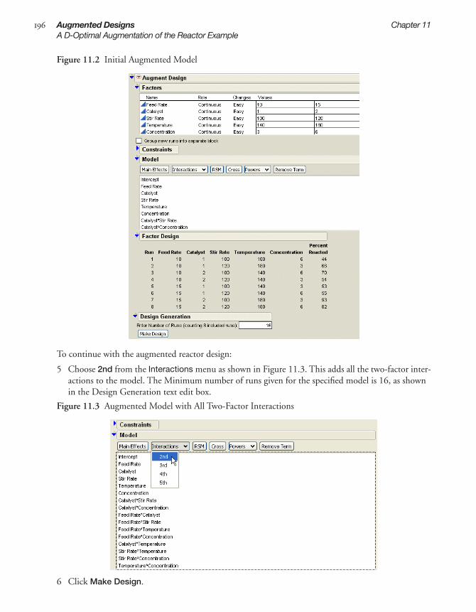
196 Augmented Designs Chapter 11A D-Optimal Augmentation of the Reactor Example
Figure 11.2 Initial Augmented Model
To continue with the augmented reactor design:
5 Choose 2nd from the Interactions menu as shown in Figure 11.3. This adds all the two-factor inter-actions to the model. The Minimum number of runs given for the specified model is 16, as shown in the Design Generation text edit box.
Figure 11.3 Augmented Model with All Two-Factor Interactions
6 Click Make Design.
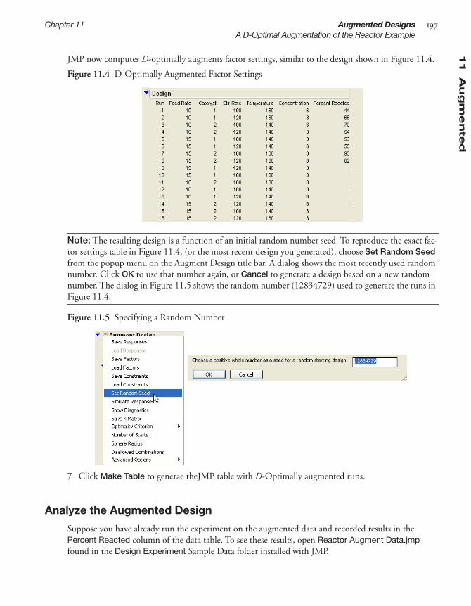
11
Au
gm
en
ted
Chapter 11 Augmented Designs 197A D-Optimal Augmentation of the Reactor Example
JMP now computes D-optimally augments factor settings, similar to the design shown in Figure 11.4.
Figure 11.4 D-Optimally Augmented Factor Settings
Note: The resulting design is a function of an initial random number seed. To reproduce the exact fac-tor settings table in Figure 11.4, (or the most recent design you generated), choose Set Random Seed from the popup menu on the Augment Design title bar. A dialog shows the most recently used random number. Click OK to use that number again, or Cancel to generate a design based on a new random number. The dialog in Figure 11.5 shows the random number (12834729) used to generate the runs in Figure 11.4.
Figure 11.5 Specifying a Random Number
7 Click Make Table.to generae theJMP table with D-Optimally augmented runs.
Analyze the Augmented Design
Suppose you have already run the experiment on the augmented data and recorded results in the Percent Reacted column of the data table. To see these results, open Reactor Augment Data.jmp found in the Design Experiment Sample Data folder installed with JMP.

198 Augmented Designs Chapter 11A D-Optimal Augmentation of the Reactor Example
Figure 11.6 Completed Augmented Experiment (Reactor Augment Data.jmp)
To start the analysis, click the red triangle for Model in the upper left of the data table and select Run Script from the menu, as shown in Figure 11.6.
The Model script, stored as a table property with the data, contains the JSL commands that display the Fit Model dialog with all main effects and two-factor interactions as effects. Change the fitting person-ality on the Fit Model dialog from Standard Least Squares to Stepwise, as shown in Figure 11.7.
Figure 11.7 Fit Model Dialog for Stepwise Regression on Generated Model
When you click Run Model, the stepwise regression control panel appears. Click the check boxes for all the main effect terms.
Important: Choose Mixed from the Direction menu and make sure Prob to Enter is 0.050 and Prob to Leave is 0.100. These are not the default values. You should see the dialog shown in Figure 11.8.

11
Au
gm
en
ted
Chapter 11 Augmented Designs 199A D-Optimal Augmentation of the Reactor Example
Figure 11.8 Initial Stepwise Model
o
Click Go to start the stepwise regression and watch it continue until all terms are entered into the model that meet the Prob to Enter and Prob to Leave criteria in the Stepwise Regression Control panel.
Figure 11.9, shows the result of this example analysis. Note that Feed Rate is out of the model while the Catalyst*Temperature, Stir Rate*Temperature, and the Temperature*Concentration interactions have entered the model.

200 Augmented Designs Chapter 11A D-Optimal Augmentation of the Reactor Example
Figure 11.9 Completed Stepwise Model
After Stepwise is finished, click Make Model on the Stepwise control panel to generate this reduced model, as shown in Figure 11.10. You can now fit the reduced model to do additional diagnostic work, make predictions, and find the optimal factor settings.
Figure 11.10 New Prediction Model Dialog
The Analysis of Variance and Lack of Fit Tests in Figure 11.11, indicate a highly significant regression model with no evidence of Lack of Fit.
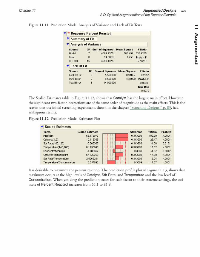
11
Au
gm
en
ted
Chapter 11 Augmented Designs 201A D-Optimal Augmentation of the Reactor Example
Figure 11.11 Prediction Model Analysis of Variance and Lack of Fit Tests
The Scaled Estimates table in Figure 11.12, shows that Catalyst has the largest main effect. However, the significant two-factor interactions are of the same order of magnitude as the main effects. This is the reason that the initial screening experiment, shown in the chapter “Screening Designs,” p. 83, had ambiguous results.
Figure 11.12 Prediction Model Estimates Plot
It is desirable to maximize the percent reaction. The prediction profile plot in Figure 11.13, shows that maximum occurs at the high levels of Catalyst, Stir Rate, and Temperature and the low level of Concentration. When you drag the prediction traces for each factor to their extreme settings, the esti-mate of Percent Reacted increases from 65.1 to 81.8.

202 Augmented Designs Chapter 11Creating an Augmented Design
Figure 11.13 Maximum Percent Reacted
To summarize, compare the analysis of 16 runs with the analyses of reactor data from previous chapters:
• “Screening Designs,” p. 83, the analysis of a screening design with only 8 runs produced a model with the five main effects and two interaction effects with confounding. None of the factors effects were significant, although the Catalyst factor was large enough to encourage collecting data for fur-ther runs.
• “Full Factorial Designs,” p. 117, a full factorial of the five two-level reactor factors, 32 runs, was first subjected to a stepwise regression. This approach identified three main effects (Catalyst, Temperature, and Concentration) and two interactions (Temperature*Catalyst, Contentration*Temperature) as significant effects.
• By using a D-optimal augmentation of 8 runs to produce 8 additional runs, a stepwise analysis returned the same results as the analysis of 32 runs. The bottom line is that only half as many runs yielded the same information. Thus, using an iterative approach to DOE can save time and money.
Creating an Augmented DesignThe augment designer modifies an existing design data table. It gives the following five choices:
Replicate replicates the design a specified number of times. See “Replicate a Design,” p. 203.
Add Centerpoints adds centerpoints. See “Add Centerpoints,” p. 205.
Fold Over creates a foldover design. See “Creating a Foldover Design,” p. 206.
Add Axial adds axial points together with center points to transform a screening design to a response surface design. See “Adding Axial Points,” p. 207.
Augment adds runs to the design (augment) using a model, which can have more terms than the original model. See “Adding New Runs and Terms,” p. 208.

11
Au
gm
en
ted
Chapter 11 Augmented Designs 203Creating an Augmented Design
Replicate a Design
Replication provides a direct check on the assumption that the error variance is constant. It also reduces the variability of the regression coefficients in the presence of large process or measurement variability.
To replicate the design a specified number of times:
1 Open a data table that contains a design you want to augment. This example uses Reactor 8 Runs.jmp from the Design Experiment Sample Data folder installed with JMP.
2 Select DOE > Augment Design to see the initial dialog for specifying factors and responses.3 Select Percent Reacted and click Y, Response.4 Select all other variables (except Pattern) and click X, Factor to identify the factors you want to use
for the augmented design (Figure 11.14)
Figure 11.14 Identify Response and Factors
5 Click OK to see the Augment Design panel shown in Figure 11.15.6 If you want the original runs and the resulting augmented runs to be identified by a blocking factor,
check the box beside Group New Runs into Separate Block on the Augment Design panel.
Figure 11.15 Choose an Augmentation Type
7 Click the Replicate button to see the dialog shown on the left in Figure 11.16. Enter the number of times you want JMP to perform each run, then click OK.
Note: Entering 2 specifies that you want each run to appear twice in the resulting design. This is the same as one replicate (Figure 11.16).
8 View the design, shown on the right in Figure 11.16.

204 Augmented Designs Chapter 11Creating an Augmented Design
Figure 11.16 Reactor Data Design Augmented With Two Replicates
9 Click the disclosure icons next to Prediction Variance Profile and Prediction Variance Surface to see the profile and surface plots shown in Figure 11.17 .
Figure 11.17 Prediction Profiler and Surface Plot
10 Click Make Table. to produce the design table shown in Figure 11.18.

11
Au
gm
en
ted
Chapter 11 Augmented Designs 205Creating an Augmented Design
Figure 11.18 The Replicated Design
Add Centerpoints
Adding centerpoints is useful to check for curvature and reduce the prediction error in the center of the factor region. Centerpoints are usually replicated points that allow for an independent estimate of pure error, which can be used in a lack-of-fit test.
To add centerpoints:
1 Open a data table that contains a design you want to augment. This example uses Reactor 8 Runs.jmp found in the Design Experiment Sample Data folder installed with JMP.
2 Select DOE > Augment Design.3 In the initial Augment Design dialog, identify the response and factors you want to use for the aug-
mented design (see Figure 11.14) and click OK. 4 If you want the original runs and the resulting augmented runs to be identified by a blocking factor,
check the box beside Group New Runs into Separate Block (Figure 11.15).5 Click the Add Centerpoints button and type the number of centerpoints you want to add. For this
example, add two centerpoint, and click OK.6 Click Make Table.to see the data table in Figure 11.19.
The table shows two center points appended to the end of the design.

206 Augmented Designs Chapter 11Creating an Augmented Design
Figure 11.19 Design with Two Center Points Added
Creating a Foldover Design
A foldover design removes the confounding of two-factor interactions and main effects. This is espe-cially useful as a follow-up to saturated or near-saturated fractional factorial or Plackett-Burman designs.
To create a foldover design:
1 Open a data table that contains a design you want to augment. This example uses Reactor 8 Runs.jmp, found in the Design Experiment Sample Data folder installed with JMP.
2 Select DOE > Augment Design.3 In the initial Augment Design dialog, identify the response and factors you want to use for the aug-
mented design (see Figure 11.14) and click OK. 4 Check the box to the left of Group New Runs into Separate Block (Figure 11.15).This identifies
the original runs and the resulting augmented runs with a blocking factor.5 Click the Fold Over button. A dialog appears that lists all the design factors.6 Choose (select) which factors to fold. The default, if you choose no factors, is to fold on all design
factors. If you choose a subset of factors to fold over, the remaining factors are replicates of the orig-inal runs. The example in Figure 11.20 folds on all five factors and includes a blocking factor.
7 Click Make Table. The design data table that results lists the original set of runs as block 1 and the new (foldover) runs are block 2.

11
Au
gm
en
ted
Chapter 11 Augmented Designs 207Creating an Augmented Design
Figure 11.20 Listing of a Foldover Design On All Factors
Adding Axial Points
You can add axial points together with centerpoints, which transforms a screening design to a response surface design. To do this:
1 Open a data table that contains a design you want to augment. This example uses Reactor 8 Runs.jmp, from the in the Design Experiment Sample Data folder installed with JMP.
2 Select DOE > Augment Design.3 In the initial Augment Design dialog, identify the response and factors you want to use for the aug-
mented design (see Figure 11.14) and click OK. 4 If you want the original runs and the resulting augmented runs to be identified by a blocking factor,
check the box beside Group New Runs into Separate Block (Figure 11.15).5 Click Add Axial.6 Enter the axial values in units of the factors scaled from –1 to +1, then enter the number of center-
points you want. When you click OK, the augmented design includes the number of centerpoints specified and constructs two axial points for each variable in the original design.
Figure 11.21 Entering Axial Values
7 Click Make Table. The design table appears. Figure 11.22 shows a table augmented with two center points and two axial points for five variables.

208 Augmented Designs Chapter 11Creating an Augmented Design
Figure 11.22 Design Augmented With Two Center and Ten Axial Points
Adding New Runs and Terms
A powerful use of the augment designer is to can add runs using a model that can have more terms than the original model. For example, you can achieve the objectives of response surface methodology by changing a linear model to a full quadratic model and adding the necessary number of runs. Suppose you start with a two-factor, two-level, four-run design. If you add quadratic terms to the model and five new points, JMP generates the 3 by 3 full factorial as the optimal augmented design.
D-optimal augmentation is a powerful tool for sequential design. Using this feature you can add terms to the original model and find optimal new test runs with respect to this expanded model. You can also group the two sets of experimental runs into separate blocks, which optimally blocks the second set with respect to the first.
To add new runs and terms to the original model:
1 Open a data table that contains a design you want to augment. This example uses Reactor Augment Data.jmp, from the Design Experiment Sample Data folder installed with JMP.
2 Select DOE > Augment Design.3 In the initial Augment Design dialog, identify the response and factors you want to use for the aug-
mented design (see Figure 11.14) and click OK.. 4 If you want the original runs and the resulting augmented runs to be identified by a blocking factor,
check the box beside Group New Runs into Separate Block (not used in this example).5 Click the Augment button. The original number of runs (Figure 11.23) appear in the Factor Design
panel.
center points
axial points

11
Au
gm
en
ted
Chapter 11 Augmented Designs 209Creating an Augmented Design
Figure 11.23 Viewing the Existing Design
6 In the Design Generation panel, enter the number of total runs you want this design to contain. The number you enter is the original number of runs plus the number of additional runs you want.
7 Click the Make Design button. The new number of runs (Figure 11.24) appear in the Design panel.

210 Augmented Designs Chapter 11Creating an Augmented Design
Figure 11.24 24 Total Runs
8 If desired, view the prediction variance profile and the prediction variance surface.9 Click Make Table to create the augmented design JMP table (Figure 11.25) with the additional
runs.

11
Au
gm
en
ted
Chapter 11 Augmented Designs 211Special Augment Design Commands
Figure 11.25 The Augmented Design Table with New Runs
Special Augment Design CommandsAfter you select DOE > Augment Design and identify factors and responses, the window in Figure 11.26 appears. Click the red triangle icon on the Augment Design title bar to see a list of com-mands. Most of these commands are for saving and loading information about variables; they are avail-able in all designs and more information is in “Special Custom Design Commands,” p. 66. The following sections describe commands found in this menu that are specific to augment designs.
Figure 11.26 Click the Red Triangle Icon to Reveal Commands
additional runs

212 Augmented Designs Chapter 11Special Augment Design Commands
View Diagnostics Reports
To display a table with relative D, G and A efficiencies in augmented designs, click the red triangle icon in the Augment Design title bar and select Show Diagnostics before clicking the Make Design but-ton.
Save the Design (X) Matrix
To create a script and save it as a table property in the JMP design data table, click the red triangle icon in the Augment Design title bar (Figure 11.26) and select Save X Matrix. The script is saved as a table property called Design Matrix. When you run this script, JMP creates a global matrix called X and dis-plays its number of rows in the log. If you do not have the log visible, select View > Log or Window > Log on the Macintosh.
Modify the Design Criterion (D- or I- Optimality)
To modify the design otimality criterion, click the red triangle icon in the Augment Design title bar (Figure 11.27) and select Optimality Criterion, then choose Make D-Optimal Design or Make I-Optimal Design. The default criterion for Recommended is D-optimal for all design types unless you have used the RSM button in the Model panel to add effects that make the model quadratic.
Figure 11.27 Change the Optimality Criterion
Select the Number of Random Starts
To override the default number of random starts, click the red triangle icon in the Augment Design title bar (Figure 11.27) and select Number of Starts. The window in Figure 11.28 appears with an edit box for you to enter the number of random starts for the design you want to build. The number you enter overrides the default number of starts, which varies depending on the design.

11
Au
gm
en
ted
Chapter 11 Augmented Designs 213Special Augment Design Commands
Figure 11.28 Changing the Number of Starts
For additional information on the number of starts, see “Why Change the Number of Starts?,” p. 72.
Specify the Sphere Radius Value
Augment designs can be constrained to a hypersphere. To edit the sphere radius for the design in units of the coded factors (–1, 1), click the red triangle icon in the Augment Design title bar (Figure 11.26) and select Sphere Radius. Enter the appropriate value and click OK.
Or, usie JSL and submit the following command before you build a custom design:
DOE Sphere Radius = 1.0;
In this statement you can replace 1.0 with any positive number.
Disallow Factor Combinations
In addition to linear inequality constraints on continuous factors and constraining a design to a hyper-sphere, you can define general factor constraints on the factors. You can disallow any combination of levels of categorical factors if you have not already defined linear inequality constraints.
For information on how to do this, see “Disallowed Combinations: Accounting for Factor Level Restrictions,” p. 73.

214 Augmented Designs Chapter 11Special Augment Design Commands

Chapter 12Prospective Power and Sample Size
Use the DOE > Sample Size and Power command to answer the question “How many runs do I need?” The important quantities are sample size, power, and the magnitude of the effect. These depend on the significance level—alpha—of the hypothesis test for the effect and the standard deviation of the noise in the response. You can supply either one or two of the three values. If you supply only one of these values, the result is a plot of the other two. If you supply two values, JMP computes the third.
Using the Sample Size and Power command when doing a prospective analysis helps answer the question, “Will I detect the group differences I am looking for, given my proposed sample size, estimate of within-group variance, and alpha level?” In this type of analysis, you must give JMP an estimate of the group means and sample sizes in a data table as well as an estimate of the within-group standard deviation (σ).
The sample size and power computations determine how large a sample is needed to be reasonably likely that an experiment or sample will yield a significant result, given that the true effect size is at least a certain size. It requires that you enter any two of three quantities, difference to detect, sample size, and power, and computes the third for the following cases:
• difference between one sample's mean and a hypothesized value
• difference between two samples means
• differences in the means among k samples
• difference between a variance and a hypothesized value
• difference between one sample proportion and a hypothesized value
• difference between two sample proportions
• difference between counts per unit in a Poisson-distributed sample and a hypothesized value.
The calculations assume that there are equal numbers of units in each group. You can apply this plat-form to more general experimental designs, if they are balanced, and a number-of-parameters adjust-ment is specified .

ContentsProspective Power Analysis . . . . . . . . . . . . . . . . . . . . . . . . . . . . . . . . . . . . . . . . . . . . . . . . . . . . . . 217One-Sample and Two-Sample Means . . . . . . . . . . . . . . . . . . . . . . . . . . . . . . . . . . . . . . . . . . . . . . 217
Single-Sample Mean . . . . . . . . . . . . . . . . . . . . . . . . . . . . . . . . . . . . . . . . . . . . . . . . . . . . . . . . 219Power and Sample Size Animation for a Single Sample . . . . . . . . . . . . . . . . . . . . . . . . . . . . . 220Two-Sample Means . . . . . . . . . . . . . . . . . . . . . . . . . . . . . . . . . . . . . . . . . . . . . . . . . . . . . . . . . 221
k-Sample Means . . . . . . . . . . . . . . . . . . . . . . . . . . . . . . . . . . . . . . . . . . . . . . . . . . . . . . . . . . . . . . 222One-Sample Variance . . . . . . . . . . . . . . . . . . . . . . . . . . . . . . . . . . . . . . . . . . . . . . . . . . . . . . . . . . 223One-Sample and Two-Sample Proportions . . . . . . . . . . . . . . . . . . . . . . . . . . . . . . . . . . . . . . . . . . 224Counts per Unit . . . . . . . . . . . . . . . . . . . . . . . . . . . . . . . . . . . . . . . . . . . . . . . . . . . . . . . . . . . . . 226Sigma Quality Level . . . . . . . . . . . . . . . . . . . . . . . . . . . . . . . . . . . . . . . . . . . . . . . . . . . . . . . . . . 227

12
Po
wer
Chapter 12 Prospective Power and Sample Size 217Prospective Power Analysis
Prospective Power AnalysisThe following five values have an important relationship in a statistical test on means:
Alpha Alpha is the significance level that prevents declaring a zero effect significant more than alpha portion of the time.
Error Standard Deviation Error Standard Deviation is the unexplained random variation around the means.
Sample Size Sample size is how many experimental units (runs, or samples) are involved in the experiment.
Power Power is the probability of declaring a significant result.
Effect Size Effect size is how different the means are from each other or from the hypothesized value.
The Sample Size and Power command in JMP helps estimate in advance either the sample size needed, power expected, or the effect size expected in the experimental situation where there is a single mean or proportion comparison, a two sample or proportion comparison, when comparing k sample means, or when comparing counts per unit.
When you select DOE > Sample Size and Power, the panel shown in Figure 12.1 appears with button selections for experimental situations. The following sections describe each of these selections and explains how to enter estimated parameter values and the desired computation.
Figure 12.1 Sample Size and Power Choices
One-Sample and Two-Sample MeansAfter you click either One Sample Mean, or Two Sample Means in the initial Sample Size selection list (Figure 12.1), the Power and Sample Size dialog in Figure 12.2 appears and asks for the anticipated experimental values. As an example, consider the two-sample situation.

218 Prospective Power and Sample Size Chapter 12One-Sample and Two-Sample Means
Figure 12.2 Initial Power and Sample Size Dialogs for Single Mean (left) and Two Means (right)
The dialogs are the same except the One Mean dialog has a button at the bottom that accesses an ani-mation script.
The choice in the initial Power and Sample Size dialog always requires values for Alpha and the error standard deviation (Error Std Dev), and one or two of the other three values: Difference to detect, Sample Size, and Power. The power and sample size platform then calculates the missing item. If there are two unspecified fields, the power and sample size platform constructs a plot that shows the relationship between those two values:
• power as a function of sample size, given specific effect size
• power as a function of effect size, given a sample size
• effect size as a function of sample size, for a given power.
The Power and Sample Size dialog asks for the values depending the first choice of design:
Alpha Alpha is the significance level, usually 0.05. This implies willingness to accept (if the true difference between groups is zero) that 5% (alpha) of the time a significant difference will be incorrectly declared.
Error Std Deviation Error Std (Standard) Deviation is the true residual error. Even though the true error is not known, the power calculations are an exercise in probability that calculates what might happen if the true value is the one you specify.
Extra Params Extra Params (Parameters) is only for multi-factor designs. Leave this field zero in simple cases. In a multi-factor balanced design, in addition to fitting the means described in the situation, there are other factors with the extra parameters that can be specified here. For exam-ple, in a three-factor two-level design with all three two-factor interactions, the number of extra parameters is five—two parameters for the extra main effects, and three parameters for the inter-actions. In practice, it isn’t very important what values you enter here unless the experiment is in a range where there is very few degrees of freedom for error.
Difference to Detect Difference to detect is the smallest detectable difference (how small a dif-ference you want to be able to declare statistically significant). For single sample problems this is the difference between the hypothesized value and the true value.
Sample Size Sample size is the total number of observations (runs, experimental units, or sam-ples). Sample size is not the number per group, but the total over all groups. Computed sample

12
Po
wer
Chapter 12 Prospective Power and Sample Size 219One-Sample and Two-Sample Means
size numbers can have fractional values, which you need to adjust to real units. This is usually done by increasing the estimated sample size to the smallest number evenly divisible by the num-ber of groups.
Power Power is the probability of getting a statistic that will be declared statistically significant. Bigger power is better, but the cost is higher in sample size. Power is equal to alpha when the specified effect size is zero. You should go for powers of at least 0.90 or 0.95 if you can afford it. If an experiment requires considerable effort, plan so that the experimental design has the power to detect a sizable effect, when there is one.
Continue Evaluates at the entered values.
Back Goes back to the previous dialog.
Animation Script The Animation Script button runs a JSL script that displays an interactive plot showing power or sample size. See the section, “Power and Sample Size Animation for a Single Sample,” p. 220, for an illustration of this animation script.
Single-Sample Mean
Suppose there is a single sample and the goal is to detect a difference of 1.5 where the error standard deviation is2, as shown in the left-hand dialog in Figure 12.3. To calculate the power when the sample size is 20, leave Power missing in the dialog and click Continue. The dialog on the right in Figure 12.3, shows the power is calculated to be 0.888864 (round to 0.89). That is, there is an approximately 89% is 2.
Figure 12.3 A One-Sample Example
To see a plot of the relationship of power and sample size, leave both Sample Size and Power empty in the dialog and click Continue.
The plots inFigure 12.4, show a range of sample sizes for which the power varies from about 0.1 to about 0.95. The plot on the right in Figure 12.4 shows using the crosshair tool to illustrate the example in Figure 12.3.
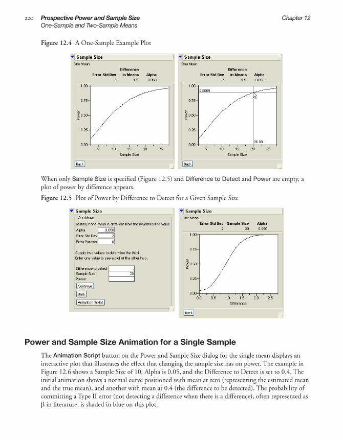
220 Prospective Power and Sample Size Chapter 12One-Sample and Two-Sample Means
Figure 12.4 A One-Sample Example Plot
When only Sample Size is specified (Figure 12.5) and Difference to Detect and Power are empty, a plot of power by difference appears.
Figure 12.5 Plot of Power by Difference to Detect for a Given Sample Size
Power and Sample Size Animation for a Single Sample
The Animation Script button on the Power and Sample Size dialog for the single mean displays an interactive plot that illustrates the effect that changing the sample size has on power. The example in Figure 12.6 shows a Sample Size of 10, Alpha is 0.05, and the Difference to Detect is set to 0.4. The initial animation shows a normal curve positioned with mean at zero (representing the estimated mean and the true mean), and another with mean at 0.4 (the difference to be detected). The probability of committing a Type II error (not detecting a difference when there is a difference), often represented as β in literature, is shaded in blue on this plot.
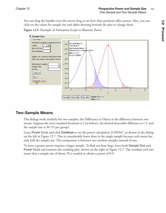
12
Po
wer
Chapter 12 Prospective Power and Sample Size 221One-Sample and Two-Sample Means
You can drag the handles over the curves drag to see how their positions affect power. Also, you can click on the values for sample size and alpha showing beneath the plot to change them.
Figure 12.6 Example of Animation Script to Illustrate Power
Two-Sample Means
The dialogs work similarly for two samples; the Difference to Detect is the difference between two means. Suppose the error standard deviation is 2 (as before), the desired detectable difference is 1.5, and the sample size is 30 (15 per group).
Leave Power blank and click Continue to see the power calculation, 0.509347, as shown in the dialog on the left in Figure 12.7. This is considerably lower than in the single sample because each mean has only half the sample size. The comparison is between two random samples instead of one.
To have a greater power requires a larger sample. To find out how large, leave both Sample Size and Power blank and examine the resulting plot, shown on the right in Figure 12.7. The crosshair tool esti-mates that a sample size of about 78 is needed to obtain a power of 0.9.

222 Prospective Power and Sample Size Chapter 12k-Sample Means
Figure 12.7 Plot of Power by Sample Size to Detect for a Given Difference
k-Sample MeansThe k-Sample Means situation can examine up to 10 means. The next example considers a situation where 4 levels of means are expected to be about 10 to 13, and the Error Std Dev is 0.9. When a sample size of 16 is entered the power calculation is 0.95, as shown in the dialog on the left in Figure 12.8.
If both Sample Size and Power are left blank, the power and sample size calculations produce the power curve shown on the right in Figure 12.8. This confirms that a sample size of 16 looks acceptable.
Notice that the difference in means is 2.236, calculated as square root of the sum of squared deviations from the grand mean. In this case it is the square root of (–1.5)2+ (–0.5)2+(0.5)2+(1.5)2, which is the square root of 5.

12
Po
wer
Chapter 12 Prospective Power and Sample Size 223One-Sample Variance
Figure 12.8 Prospective Power for k-Means and Plot of Power by Sample Size
One-Sample VarianceThe One-Sample Variance choice on the Power and Sample Size dialog (Figure 12.1) determines sam-ple size for detection of a change in variance.The usual purpose of this option is to compute a large enough sample size to guarantee that the risk of accepting a false hypothesis (β) is small.
In the dialog, specify
Alpha Alpha is the significance level, usually 0.05. This implies willingness to accept (if the true difference between variance and the baseline variance is zero) that 5% (alpha) of the time a signif-icant difference will be incorrectly declared.
Baseline Variance Hypothisized variance to which the sample variance is compared.
Guarding a Change Select Larger or Smaller from the menu to indicate the direction of the change you want to detect.
The computations then show whether the true variance is larger or smaller than its hypothesized value, entered as the Baseline Variance. An example is when the variance for resistivity measurements on a lot of silicon wafers is claimed to be 100 ohm-cm (the baseline or hypothesized variance) and a buyer is unwilling to accept a shipment if variance is greater than 155 ohm-cm for a particular lot (55 ohm-cm above the baseline of 100 ohm-cm).
The examples throughout the rest of this chapter use engineering examples from the online manual of The National Institute of Standards and Technology (NIST). You can access the NIST manual exam-ples at http://www.itl.nist.gov/div898/handbook.
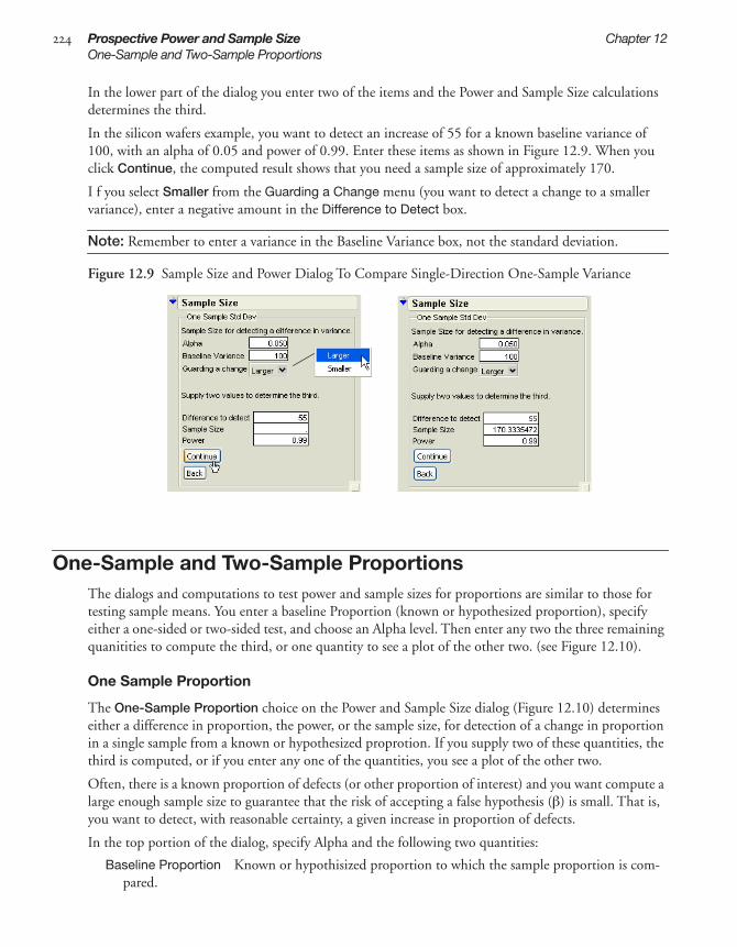
224 Prospective Power and Sample Size Chapter 12One-Sample and Two-Sample Proportions
In the lower part of the dialog you enter two of the items and the Power and Sample Size calculations determines the third.
In the silicon wafers example, you want to detect an increase of 55 for a known baseline variance of 100, with an alpha of 0.05 and power of 0.99. Enter these items as shown in Figure 12.9. When you click Continue, the computed result shows that you need a sample size of approximately 170.
I f you select Smaller from the Guarding a Change menu (you want to detect a change to a smaller variance), enter a negative amount in the Difference to Detect box.
Note: Remember to enter a variance in the Baseline Variance box, not the standard deviation.
Figure 12.9 Sample Size and Power Dialog To Compare Single-Direction One-Sample Variance
One-Sample and Two-Sample ProportionsThe dialogs and computations to test power and sample sizes for proportions are similar to those for testing sample means. You enter a baseline Proportion (known or hypothesized proportion), specify either a one-sided or two-sided test, and choose an Alpha level. Then enter any two the three remaining quanitities to compute the third, or one quantity to see a plot of the other two. (see Figure 12.10).
One Sample Proportion
The One-Sample Proportion choice on the Power and Sample Size dialog (Figure 12.10) determines either a difference in proportion, the power, or the sample size, for detection of a change in proportion in a single sample from a known or hypothesized proprotion. If you supply two of these quantities, the third is computed, or if you enter any one of the quantities, you see a plot of the other two.
Often, there is a known proportion of defects (or other proportion of interest) and you want compute a large enough sample size to guarantee that the risk of accepting a false hypothesis (β) is small. That is, you want to detect, with reasonable certainty, a given increase in proportion of defects.
In the top portion of the dialog, specify Alpha and the following two quantities:
Baseline Proportion Known or hypothisized proportion to which the sample proportion is com-pared.

12
Po
wer
Chapter 12 Prospective Power and Sample Size 225One-Sample and Two-Sample Proportions
One or Two Sided computes values for difference in proportion that is either greater than or less than the difference to detect (two sided) or values for difference in porportion that is greater than the difference to detect (one sided).
In the bottom portion of the dialog, enter two of the following quantities to see the third, or a single quatity to see a plot of the other two.
Difference to detect Difference between the baseline proportion and the maximum acceptable proportion, or blank for computation.
Sample Size Desired sample size, or blank for computation.
Power Desired power, or blank for computation.
For example, suppose an assembly line has a known proportion of defects of 0.3 and you want to know the power to detect when the proportion exceeds 0.5 in a sample of 25 . That is, you want to be able to detect a change of 0.2 in the proportion of defects, for an alpha level of 0.05 in a sample size of 25. Since you are only interested in knowing when the level of defects exceeds 0.5, these are one-sided com-putations.
Click Continue to see the Power computation of approximately 0.7.
Figure 12.10 Power and Sample Dialog for One-Sample Proportions
The sampling distribution for proportions is actually binomial, but the computations to determine sample size and test proportions use a normal approximation, as indicated on the dialog (Figure 12.10).
Two Sample Proportion
The two-Sample Proportion choice computes the power or sample size needed to detect the difference between two proportions, P1 and P2.
• As the Baseline Proportion, enter the average of the two proportions you want to compare, that is 1/2(P1 +P2).
• In the Difference to detect, enter the difference between the two proportions (P1 – P2).
• For Sample Size, enter the total sample size for the combined groups.
If you enter any two of the three quantities (Difference to detect, Sample Size, or Power), the third is computed. If you leave two blank, a graph of the two is displayed.
.Enter known or hypothesized proportion
Enter 1 or 2 to indicate the type of comparison (one- or two-sided)
Enter difference between baseline proportion and maximum acceptable proportion
Click Continue to see computation

226 Prospective Power and Sample Size Chapter 12Counts per Unit
As an example, suppose P1 is 0.2 and P2 is 0.4. Enter the average, 0.3, as the Baseline Proportion, and assume you are interested in a one-sided comparison. The difference to detect is 0.2. and the total Sample Size is 100, giving the completed dialog shown on the upper left in Figure 12.11. When you click Continue, the computed power shows as approximately 0.70.
To see a chart of power and sample size, delete both quantities in the dialog. Click Continue to see the plot on the lower right in Figure 12.11.Using the crosshair tool shows that to achieve a power of 0.90 would require sample sizes of approximately 90 in each group.
Figure 12.11 Difference Between Two Proportions
Counts per UnitThe Counts per Unit selection from the Power and Sample size selection list calculates sample size for the Poisson-distributed counts typical when you can measure more than one defect per unit. A unit can be an area and the counts can be fractions or large numbers.
Although the number of defects observed in an area of a given size is often assumed to have a Poisson distribution, the area and count are assumed to be large enough to support a normal approximation.

12
Po
wer
Chapter 12 Prospective Power and Sample Size 227Sigma Quality Level
Questions of interest are:
• Is the defect density within prescribed limits?
• Is the defect density greater than or less than a prescribed limit?
In the Counts per Unit dialog, enter alpha and the baseline count per unit. Then enter two of the remaining fields to see the calculation of the third. The test is for one-sided (one-tailed) change. Enter the Difference to Detect in terms of the Baseline Count per Unit (defects per unit). The computed sample size is expressed in those units.
As an example, consider a wafer manufacturing process with a target of 4 defects per wafer and you want to verify that a new process meets that target. In the Counts per Unit dialog:
1 Enter an alpha of 0.1 to be the chance of failing the test if the new process is as good as the target.2 Enter a power of 0.9, which is the chance of detecting a change larger than 2 (6 defects per wafer).
In this kind of situation, alpha is sometimes called the producer’s risk and beta is called the consumer’s risk.
3 Click Continue to see the computed sample size of 8.128 (Figure 12.12).
The process meets the target if there are less than 48 defects (6 defects per wafer in a sample of 8 wafers).
Figure 12.12 Dialog For Counts Per Unit Example
Sigma Quality LevelThe Sigma Quality Level feature is a simple statistic that puts a given defect rate on a six sigma scale. For example, on a scale of one million opportunities, 3.397 defects results in a ‘6-sigma process. The computation that gives the Sigma Quality Level statistic is
Sigma Quality Level = NormalQuantile(1 – defects/opportunities) + 1.5
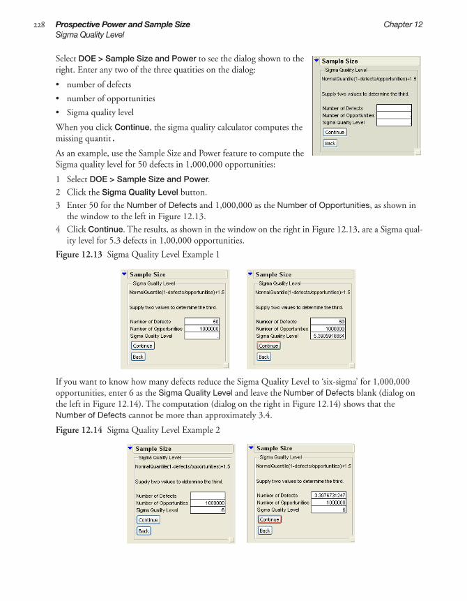
228 Prospective Power and Sample Size Chapter 12Sigma Quality Level
Select DOE > Sample Size and Power to see the dialog shown to the right. Enter any two of the three quatities on the dialog:
• number of defects
• number of opportunities
• Sigma quality level
When you click Continue, the sigma quality calculator computes the missing quantit.
As an example, use the Sample Size and Power feature to compute the Sigma quality level for 50 defects in 1,000,000 opportunities:
1 Select DOE > Sample Size and Power.2 Click the Sigma Quality Level button.3 Enter 50 for the Number of Defects and 1,000,000 as the Number of Opportunities, as shown in
the window to the left in Figure 12.13. 4 Click Continue. The results, as shown in the window on the right in Figure 12.13, are a Sigma qual-
ity level for 5.3 defects in 1,00,000 opportunities.
Figure 12.13 Sigma Quality Level Example 1
If you want to know how many defects reduce the Sigma Quality Level to ‘six-sigma’ for 1,000,000 opportunities, enter 6 as the Sigma Quality Level and leave the Number of Defects blank (dialog on the left in Figure 12.14). The computation (dialog on the right in Figure 12.14) shows that the Number of Defects cannot be more than approximately 3.4.
Figure 12.14 Sigma Quality Level Example 2

References
Atkinson, A. C. and Donev, A. N. Optimum Experimental Designs Clarendon Press, Oxford (1992) p.148.
Bose, R.C., (1947) “Mathematical Theory of the Symmetrical Factorial Design” Sankhya: The Indian Journal of Statistics, Vol. 8, Part 2, pp. 107-166.
Box, G.E.P. and Wilson, K.B. (1951), “On the Experimental Attainment of Optimum Conditions,” Journal of the Royal Statistical Society, Series B, 13, 1-45.
Box, G.E.P. and Behnken, D.W. (1960), “Some New Three-Level Designs for the Study of Quantitative Variables,” Technometrics 2, 455–475.
Box, G.E.P. and Meyer, R.D. (1986), “An Analysis of Unreplicated Fractional Factorials,” Technometrics 28, 11–18.
Box, G.E.P. and Draper, N.R. (1987), Empirical Model–Building and Response Surfaces, New York: John Wiley and Sons.
Box, G.E.P. (1988), “Signal–to–Noise Ratio, Performance Criteria, and Transformations,” Technometrics 30, 1–40.
Box, G.E.P., Hunter,W.G., and Hunter, J.S. (1978), Statistics for Experimenters, New York: John Wiley and Sons, Inc.
Byrne, D.M. and Taguchi, G. (1986), ASQC 40th Anniversary Quality Control Congress Transactions, Milwaukee, WI: American Society of Quality Control, 168–177.
Chen, J., Sun, D.X., and Wu, C.F.J. (1993), “A Catalogue of Two-level and Three-Level Fractional Factorial Designs with Small Runs,” International Statistical Review, 61, 1, p131-145, International Statistical Institute.
Cochran, W.G. and Cox, G.M. (1957), Experimental Designs, Second Edition, New York: John Wiley and Sons.
Cornell, J.A. (1990), Experiments with Mixtures, Second Edition New York: John Wiley & Sons.
Cook, R.D. and Nachtsheim, C.J. (1990), “Letter to the Editor: Response to James M. Lucas,” Technometrics 32, 363-364.
Daniel, C. (1959), “Use of Half–normal Plots in Interpreting Factorial Two–level Experiments,” Technometrics, 1, 311–314.
Daniel C. and Wood, F. (1980), Fitting Equations to Data, Revised Edition, New York: John Wiley and Sons, Inc.
Derringer, D. and Suich, R. (1980), “Simultaneous Optimization of Several Response Variables,” Journal of Quality Technology, Oct. 1980, 12:4, 214–219.

230 References
DuMouched, W. and Jones, B. (1994), “A Simple Bayesian Modification of D-Optimal Designs to Reduce Dependence on an Assumed Model,” Technometrics, 36, 37–47.
Goos, P. (2002) The Optimal Design of Blocked and Split-Plot Experiments, New York: Springer
Haaland, P.D. (1989), Experimental Design in Biotechnology, New York: Marcel Dekker, Inc.
Hahn, G. J., Meeker, W.Q., and Feder, P. I., (1976), “The Evaluation and Comparison of Experimental Designs for Fitting Regression Relationships,” Journal of Quality Technology, Vol. 8, #3, pp. 140-157.
John, P.W.M. (1972), Statistical Design and Analysis of Experiments, New York: Macmillan Publishing Company, Inc.
Johnson, M.E. and Nachtsheim, C.J. (1983), “Some Guidelines for Constructing Exact D–Optimal Designs on Convex Design Spaces,” Technometrics 25, 271–277.
Jones, Bradley (1991), “An Interactive Graph For Exploring Multidimensional Response Surfaces,” 1991 Joint Statistical Meetings, Atlanta, Georgia.
Jones, Bradley and Goos, Peter (2007), “A Candidate-set-free Algorithm for Generating D-optimal Designs,” Applied Statistics, 56, Part 3, pp 1-18.
Khuri, A.I. and Cornell, J.A. (1987) Response Surfaces: Design and Analysis, New York: Marcel Dekker.
Kowalski, S.M., Cornell, J.A., and Vining, G.G. (2002) “Split Plot Designs and Estimation Methods for Mixture Experiments with Process Variables,” Technometrics 44: 72-79.
Lenth, R.V. (1989), “Quick and Easy Analysis of Unreplicated Fractional Factorials,” Technometrics, 31, 469–473.
Lin, D. K. J. (1993), “A New Class of Supersaturated Design,” Technometrics, 35, 28-31.
Lucas, J.M., (1990), “Letter to the Editor: Comments on Cook and Nachtsheim (1989),” Technometrics, 32, 363–364.
Mahalanobis, P.C. (1947), “Sankhya,” The Indian Journal of Statistics, Vol 8, Part 2, April.
Myers, R.H. (1976) Response Surface Methodology, Boston: Allyn and Bacon.
Myers, R.H. (1988), Response Surface Methodology, Virginia Polytechnic and State University.
Meyer, R.K. and Nachtsheim, C.J. (1995), The Coordinate Exchange Algorithm for Constructing Exact Optimal Designs,” Technometrics, Vol 37, pp. 60-69.
Meyer, R.D., Steinberg, D.M., and Box, G.(1996), Follow-up Designs to Resolve Confounding in Multifactor Experiments, Technometrics, 38:4, p307.
Mitchell, T.J. (1974), “An algorithm for the Construction of D-Optimal Experimental Designs,” Technometrics, 16:2, pp.203-210.
Morris, M.D., Mitchell, T.J., and Ylvisaker, D. (1993), “Bayesian Design and Analysis of Computer Experiments: Use of Derivatives in Surface Prediction,” Technometrics 35:2, 243-255.
Piepel, G.F. (1988), “Programs for Generating Extreme Vertices and Centroids of Linearly Constrained Experimental Regions,” Journal of Quality Technology 20:2, 125-139.
Plackett, R.L. and Burman, J.P. (1947), “The Design of Optimum Multifactorial Experiments,” Biometrika, 33, 305–325.

Refe
ren
ces
References 231
Schoen, E. D. (1999), “Designing Fractional Two-level Experiments with Nested Error Structures,” Journal of Applied Statistics 26: 495-508.
Shannon, C.E. and Weaver, W. (1949), “The Mathematical Theory Of Comunication,” University Of Illinois Press, Urbana, Illinois.
Sheffé, H. (1958) Experiments with Mixtures, JRSS B 20, 344-360.
Shewry, M.C. and Wynn, H.P. (1987), “Maximum Entropt Sampling,” Journal of Applied Statistics 14, 165-170.
Snee, R.D. and Marquardt, D.W. (1974), “Extreme Vertices Designs for Linear Mixture Models,” Technometrics, 16, 391–408.
Snee, R.D. (1975), “Experimental Designs for Quadratic Models in Constrained Mixture Spaces,” Technometrics, 17:2, 149–159.
Snee, R.D. (1979), “Experimental Designs for Mixture Systems with Multicomponent Constraints,” Commun. Statistics, A8(4), 303–326.
Snee, Ronald D. (1985)Computer Aided Design of Experiments - Some Practical Experiences, Journal of Quality Technology, Vol 17. No. 4 October 1985 p.231.
St. John, R.C. and Draper, N.R. (1975), “D-Optimality for Regression Designs: A Review,” Technometrics, 17 pp 15-23.
Taguchi, G. (1976), “An Introduction to Quality Control,” Nagoya, Japan: Central Japan Quality Control Association.
Welch, W.J. (1984), “Computer-Aided Design of Experiments for Response Estimation,” Technometrics, 26, 217–224.M

232 References

IndexDesign of Experiments
AABCD designs 139aberration designs 93acceptable values See lower limits and upper lim-
itsActual-by-Predicted plots 100adding
center points in augment designs 205, 207factors 35, 55linear constraints 135runs and terms in augment designs 208
additional runs 63, 99, 114, 126advanced options (nonlinear designer) 181aias matrix 15algorithms, coordinate exchange 81alias matrix 15, 62aliasing effects 95Alpha 217–218animation scripts 219Anova reports 142assigning importance (of responses) 53, 67, 90,
190Augmented Designs 193–213
add centerpoints 202, 205add new runs and terms 202, 208adding axial points 202, 207disallow factor combinations 213D-optimal 208extending experiments 202foldover 202, 206modify D- or I- optimality criterion 212replicate 202–203saved desisgn (X) matrix 212select number of random starts 212special commands 211specify sphere radius value 213view diagnostics reports 212
axialpoints 103scaling, central composite designs 113
Bbalanced designs 58Bayesian D-optimal designs 26, 48–49Big Class.jmp 41block sizes 23Borehole Factors.jmp 164Borehole Sphere Packing.jmp 164Bounce Data.jmp 105Bounce Factors.jmp 105Box-Behnken designs 103, 105, 112
See also Response Surface designsByrne Taguchi Factors.jmp 186–187
CCategorical factors 55, 91CCD See central composite designscenter points
augment designs 205, 207central composite designs 103response surface designs 103simplex centroid designs 130
central composite designs 103, 112–113See also response surface designs
centroid points 135Chakravarty 94Chemical Kinetics.jmp 171chemical mixture, examples 143coding, column property 76coefficients, relative variance 61column properties
coding 76constrained state 68design roles 67, 79factors for mixture experiments 77high and low values 76response limits 78
combinations, disallowing 73, 213CONAEV method 138confounding 96, 101
resolution numbers 93

234 Index
confounding pattern 62, 96constraints
adding 135disallowing combinations 73, 213entering 68linear 137loading 68saving 68
continuous factors 55, 91contour plots 143control factors 183, 185CONVRT method 138coordinate exchange algorithms 81Cotter designs 94counts per unit (power and sample size) 226creating factors tables 68criterion, optimality 71, 212Cubic Model.jsl 32custom design commands 66custom designs
data tables 63Design Generation panel 7, 57factors, defining 53flexible block size 23how they work 81models, describing 57random block design 64screening 15special commands 66split plot design 64split-split plot design 65strip plot design 66
Ddefaults
number of random starts 72defects 226D-efficiencies 37describing models 57, 130design
matrix table properties 71, 212resolutions 92roles 67
design diagnostics table 158Design of Experiments. See DOE 76design roles 79designs
ABCD 139aberration 93augment 202
balanced 58Bayesian D-optimal 26, 49Box-Behnken 103, 105, 112central composite 103foldover 206fractional factorial 92full factorial 83, 117, 125full factorials 92Gaussian process IMSE optimal space
filling 162Latin hypercube space filling design 154–157maximum entropy space filling 161minimum aberration 93minimum potential space filling 160mixed-level 93mixture 127, 143nonlinear 171orthogonal
screening designs 92screening experiments 127surface designs 113
orthogonal arrays 93Plackett-Burman 93random block 64replicating 203response surface 103saturated 58screening 83simplex centroid 130simplex centroids 130simplex lattice 133space filling 149–167sphere packing space filling 151split plot 64split-split plot 65strip plot 66uniform precision 113uniform space filling 157
desirabilityfunctions 108, 188maximizing 108values 54, 90
desirability traces 108desirability values, as column properties 78determinant formula 72diagnostics for custom designs 69, 212Difference to Detect option 218, 221disallowing combinations 73, 213DOE (Design of Experiments)
coding 76simple examples 85

Ind
ex
Index 235
DOE Sphere Radius 213Donev Mixture factors.jmp 38D-optimal
augmentation 208designs 26, 48–49optimality criteria 71, 212
Eeffect
aliasing 96eigenvalue 107eigenvector 107nonestimable 92orthogonal 113, 183size 217sparsity 83, 93–94
efficienciesD, G, and A 70, 212
eigenvalue of effect 107eigenvector of effect 107equivalent solutions 81error standard deviation 217–218error variance 30excluding factor combinations 73extra parameters 218extreme vertices 135
algorithms 138finding optimal subsets 136range constraints 136
Ffactor combinations, disallowing 73Factor Profiling option 107, 109, 123, 145, 188factorial designs
fractional 92full 83, 92, 117, 125three level 93
factorsadding 35, 55categorical 55, 91column 79continuous 55, 91control factors 183, 185for mixture experiments 77key factors 83loading 68nonmixture 38saving 67tables, creating 68
false negatives 94finding optimal subsets (extreme vertices) 136fitting mixture designs 141fixed covariates example 41folding the calculation 143foldover designs 206fraction of design space plot 60fractional factorial designs 92Full Factorial Designs 117–126
design generation panel 58examples 119
full factorial designs 92, 117functions, desirability 108, 188
GGaussian process IMSE optimal design 149, 162global optimum 72goal types 53, 90
matching targets 54, 90minimizing and maximizing 54, 90
Group New Runs into Separates Block option 205
Hhidden intercepts 142hyperspheres 73, 213
Iidentifying key factors 83importance of responses 53, 67, 90, 190
entering 78inner arrays, inner designs 183, 185Inscribe option 113interactions 94
high-order 92intercepts, hidden 142I-optimal
designs 48optimality criteria 71, 212
JJSL (JMP Scripting Language)
animation scripts 219augmented designs 198examples for DOE 32sphere radius 213

236 Index
KKeep the Same command 63k-Sample Means (power and sample size) 222
LL18 Chakravarty 94L18 Hunter 94L18 John 94L36 94L9-Taguchi 186Label column 99, 115larger–the–better formulas (LTB) 187Latin hypercube space filling design 154–157limits, responses 78linear constraints 135, 137loading
constraints 68factors 68responses 68
local optimum 72
Mmatching target goals 53–54, 78, 90matrix, alias 62matrix, design 71, 212maximize responses 53, 90maximizing
desirability 108goals 54, 90
maximum entropy space filling design 149, 161means, one- and two-sample (power and sample
size) 217methods
CONAEV 138minimize responses 53, 90minimizing goals 54, 90minimum aberration designs 93minimum potential design 160minimum potential space filling design 149mixed-level designs 93Mixture Designs 127–147
ABCD design 139compared to screening designs 127definition 127examples 143–145extreme vertices 135fitting 141linear constraints 137
optimal 129optimal subsets 136response surfaces 145simplex centroids 130simplex lattice 133ternary plots 140with nonmixture factors 38
mixture designsexamples 143
mixture experiments (column property) 77mixture, column properties 77Model script
Model Specification dialog 99, 106models
custom design 57describing 57, 130
NN factors, adding 55N Monte Carlo Spheres (nonlinear design
option) 182N Responses button 53, 90no-intercept model 77noise factors 183, 185nonestimable effect 92Nonlinear Designs 169–182
advanced options 181creating 179examples 171
nonmixture factors in mixture designs 38Number of Monte Carlo Samples (nonlinear de-
sign option) 182number of runs 13, 57
screening designs 92number of starts 71, 212
OOn Face option 113one-sample and two-sample means (power and
sample size) 217one-sample and two-sample proportion (power
and sample size) 224one-sample variance (power and sample
size) 223optimal determinant formula 72optimal subsets (mixture designs) 136Optimality Criterion 71, 212optimality criterion 71order of runs 63, 99, 114, 126, 131, 136, 139

Ind
ex
Index 237
orthogonal array designs 93, 183orthogonal designs
screening designs 92screening experiments 127surface designs 113
Orthogonal option 113outer arrays, outer designs 183, 185
Pparameters, extra 218Pattern column 86, 99, 115, 126patterns, confounding 96performance statistics 185Plackett-Burman designs 93Plastifactors.jmp 143plots
Actual-by-Predicted 100spinning 110ternary 127, 140
pointsaxial 103center See center pointscentroid 135
Poisson-distributed counts 226potential terms (DOE) 26power and sample size calculations 215–228
analyses 217animation 220counts per unit 226in statistical tests on means 217k-sample means 222one-sample and two sample proportions 224one-sample mean 218–219one-sample variance 223–225Sigma quality level 227two-sample means 221
predictionprofilers 30, 33traces 107variances 30, 113
prediction formulas, saving 144prediction profiler 107prediction variance profile plot 29prediction variance surface plot 61primary terms (Bayesian D-optimal design) 26profilers
mixture response surface 145prediction profilers 30, 33, 107prediction variance plot 29
properties, columns 75
proportions (power and sample size) 224prospective power and sample size 215prospective power and sample size calculations
(see power and sample size) 228pseudocomponent (mixture column
property) 77pure error 205
Qquadratic model 29–62
Rradius, sphere 73, 213random block designs 64random seed, setting 69random starts 72Randomize within Blocks 63randomizing runs 63range constraints 135Reaction Kinetics Start.jmp 175Reaction Kinetics.jmp 177Reactor 8 Runs.jmp 195Reactor Factors.jmp 119–120Reactor Response.jmp 119regressor columns 94relative proportions See mixture designsrelative variance of coefficients 61relative variance of coefficients and power
table 26replicating
designs 203replicating designs 203reponses
loading 68requesting additional runs 63, 99, 114, 126rescaling designs 113resolution numbers 93resolutions of designs 92response limits, column property 78Response Surface Designs 103–115
examples 105–110introduction 111purpose 103reports 106with blocking factors 35with categorical factors 35
response surface effects 142Response Surface Methodology (RSM) 111response surfaces

238 Index
mixture designs 145responses
custom designs 53, 90, 111desirability values 54, 90goals 53, 90goals, desirability functions 108lower limits 54, 90saving 67upper limits 54, 90
responses, multiple 78RMSE 101, 123robust engineering 183roles, design 79Rotatable option 113RSM (Response Surface Methodology) 111runs
additional 63, 99, 114, 126order they appear in table 63, 99, 114, 126, 131,
136, 139requesting additional 63, 99, 114, 126screening designs 92
Ssample means (power and sample size) 217sample sizes
example comparing single-direction one-sample variances 223–224
example with counts per unit 226one and two sample means 218prospective power analysis 217screening designs 117
saturated designs 58saving
constraints 68factors 67prediction formulas 144responses 67X Matrix 71, 212
scalingaxial 113designs 113
Scheffé polynomial 141screening designs 83–102
custom designs 15design types 92dialogs 87examples 87–114
scriptsanimation 219generating the analysis model
Model script See Model table propertyscripting See JSL
Set Random Seed command 69sigma quality level (power and sample size) 227signal factors 183signal-to-noise ratios 183simplex 127
centroid designs 130lattice designs 133
single-sample means (power and sample size) 219
solutions, equivalent 81Sort Left to Rightoptions 63Sort Right to Left option 63Space Filling Designs 149–167
borehole problem, sphere packing example 164
Gaussian process IMSE optimal 149, 162Latin hypercube 149, 154–157maximum entropy 149, 161minimum potential 149, 160sphere packing 149, 151uniform 149, 157
sparsity, effect 83, 93–94sphere packing design 149, 151sphere radius 73, 213spinning plots
Box-Behnken designs 110split plot designs 56, 64split-split plot designs 65standard deviation, error 217star points 103starts, number of 71, 212starts, random 72statistics, performance 185strip plot designs 66subsets, finding optimal 136supersaturated designs 19surface designs See response surface designs
Ttables
factors table, creating 68making in custom designs 63
Taguchi designs 183–189description 183methods 183
target values 54, 78, 90ternary plots 127, 140, 143traces, desirability 108

Ind
ex
Index 239
trade-off in screening designs 92tutorial examples
augment designs 195–202custom design 1–12DOE 85flexible block size 23full factorial designs 119mixture designs 143–145response surface designs 105, 109–110screening designs 87
two-level categorical 86two-level fractional factorials 92two-level full factorials 92two-sample and one-sample means 221two-sample means (power and sample size) 217two-sample proportion (power and sample
size) 224
UUniform (space filling design) 149uniform (space filling design) 157uniform precision designs 113User Defined option 113
Vvalues
high and low for columns (in DOE) 76target 54, 90
variance of prediction 113variance, error and prediction 30vertices
extreme 135extreme, finding optimal subsets 136
W-Zweight, importance of response 53, 67, 79, 90,
190whole model test 142X Matrix, saving 71, 212XVERT method 139

240 Index Index