Embed Size (px)
Citation preview

ERIC / ECTJ Annual Review Paper Designing Electronic Text: The Role of Print-Based Research James Hartley
James Hartley is Reader and Head of the Department of Psychology at the University of Keele, Staffordshire, U.K.
This is the 14th ERIC/ECTJ Annual Review Paper, preparation of which was supported by the ERIC (Educational Resources Information Center] Clearinghouse on Information Resources, Syracuse University. The material in this article was prepared pursuant to a contract with the National Institute of Education, U.S. Department of Education. Contractors undertaking such projects under government sponsorship are encouraged to express freely their judgement in professional and technical matters. Points of view or opinions do not necessarily represent the official view or opinion of the NIE. - Ed.
I am often asked what relevance my re- search on the design of printed text has for the design of electronic text. My cautious reply usually suggests that certain features of print-based text research do apply to elec- tronic text, but that there are many features that do not. Electronic text is limited in some ways compared with printed text, but it has other important features that printed text does not share. Thus, research on printed text might guide research on electronic text in some cases, but there are other areas where fresh research is needed.
In this ar~cle I examine how far research work on the design of printed text can in- form research on the design of electronic text. My discussion centres on three areas: �9 the layout of instructional text; �9 the role of typographic cueing; and �9 the presentation of graphic materials. The discussion is relevant to both screen- based text and to desktop publishing.
ECTJ, VOL. 35, NO. 1, PAGES 3-17 ISSN 0148-5806
THE LAYOUT OF INSTRUCTIONAL TEXT
Page Size and Spacing
Recent work on the design of printed text has emphasised how the initial choice of page size affects almost every other decision made about the layout of that text. For example, the size and the orientation of the page on which the material is to be printed affects decisions about column widths, interline spacing, choice of typeface, and
4 ECTJ SPRING|987
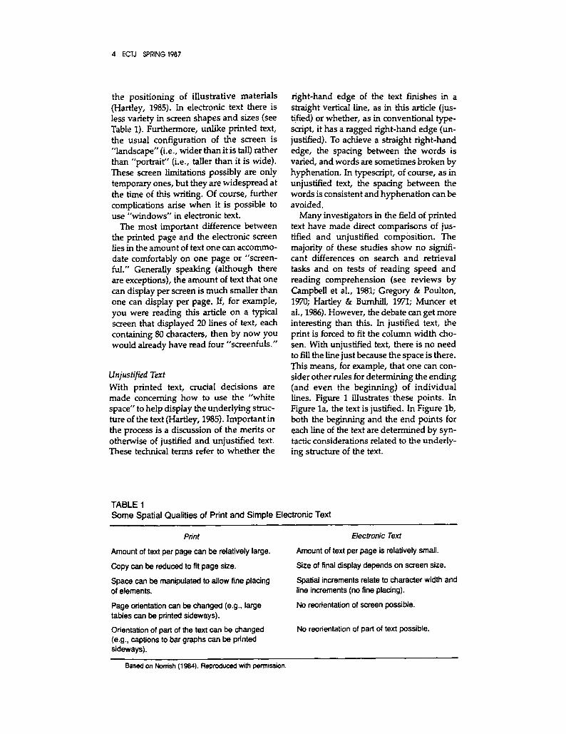
the positioning of illustrative materials (Hartley, 1985). In electronic text there is less variety in screen shapes and sizes (see Table 1). Furthermore, unlike printed text, the usual configuration of the screen is "landscape" (i.e., wider than it is tail) rather than "portrait" (i.e., taller than it is wide). These screen limitations possibly are only temporary ones, but they are widespread at the time of this writing. Of course, further complications arise when it is possible to use "windows" in electronic text.
The most important difference between the printed page and the electronic screen lies in the amount of text one can accommo- date comfortably on one page or "screen- ful." Generally speaking (although there are exceptions), the amount of text that one can display per screen is much smaller than one can display per page. If, for example, you were reading this article on a typical screen that displayed 20 lines of text, each containing 80 characters, then by now you would already have read four "screenfuls."
Unjustified Text With printed text, crucial decisions are made concerning how to use the "white space" to help display the underlying struc- ture of the text (Hartley, 1985). Important in the process is a discussion of the merits or otherwise of justified and unjustified text. These technical terms refer to whether the
right-hand edge of the text finishes in a straight vertical line, as in this article (jus- tiffed) or whether, as in conventional type- script, it has a ragged right-hand edge (un- justified). To achieve a straight right-hand edge, the spacing between the words is varied, and words are sometimes broken by hyphenation. In typescript, of course, as in unjustified text, the spacing between the words is consistent and hyphenation can be avoided.
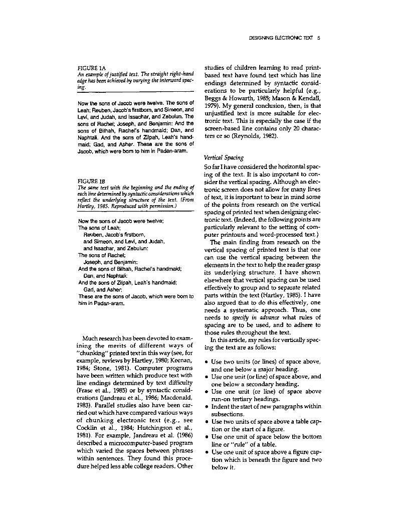
Many investigators in the field of printed text have made direct comparisons of jus- tified and unjustified composition. The majority of these studies show no signifi- cant differences on search and retrieval tasks and on tests of reading speed and reading comprehension (see reviews by Campbell et al., 1981; Gregory & Poulton, 1970; Hartley & Burnhill, 1971; Muncer et al., 1986). However, the debate can get more interesting than this. In justified text, the print is forced to fit the column width cho- sen. With unjustified text, there is no need to fill the line just because the space is there. This means, for example, that one can con- sider other rules for determining the ending (and even the beginning) of individual lines. Figure 1 illustrates these points. In Figure la, the text is jusEfied. In Figure lb, both the beginning and the end points for each line of the text are determined by syn- tactic considerations related to the underly- ing structure of the text.
TABLE 1 Some Spatial Qualities of Print and Simple Electronic Text
Amount of text per page can be relatively large.
Copy can be reduced to fit page size.
Space can be manipulated to allow fine placing of elements.
Page orientation can be changed (e.g., large tables can be printed sideways).
Orientation of part of the text can be changed (e.g., captions to bar graphs can be printed sideways).
Electronic Text
Amount of text per page is relatively small.
Size of final display depends on screen size.
Spatial increments relate to character width and line increments (no fine placing).
No reorientation of screen possible.
No reodentation of part of text possible.
Based on Nomsh (1984). Reproduced with permission.
DESIGNING ELECTRONIC TEXT 5
FIGURE 1A An example of justified text. The straight right-hand edge has been achieved by varying the interword spac- i.g.
Now the sons of Jacob were twelve. The sons of Leah; Reuben, Jacob's firstbom, and Simeon, and Levi, and Judah, and Issachar, and Zebulun. The sons of Rachel; Joseph, and Benjamin: And the sons of Bilhah, Rachel's handmaid; Dan, and Naphtali. And the sons of Zilpah, Leah's hand- maid; Gad, and Asher. These are the sons of Jacob, which were born to him in Padan-aram.
FIGURE 1B The same text with the beginning and the ending of each line determined by syntactic considerations which reflect the underlying structure of the text. (From Hartley, 1985. Reproduced with permission.)
Now the sons of Jacob were twelve; The sons of Leah;
Reuben, Jacob's firstborn, and Simeon, and Levi, and Judah, and Issachar, and Zebulun:
The sons of Rachel; Joseph, and Benjamin:
And the sons of Bilhah, Rachel's handmaid; Dan, and Naphtali:
And the sons of Zilpah, Leah's handmaid; Gad, and Asher:
These are the sons of Jacob, which were born to him in Padan-aram.
Much research has been devoted to exam- ining the merits of different ways of "chunking" printed textin this way (see, for example, reviews by Hartley, 1980; Keenan, 1984; Stone, 1981). Computer programs have been written which produce text with line endings determined by text difficulty (Frase et al., 1985) or by syntactic consid- erations (Jandreau et al., 1986; Macdonald, 1983). Parallel studies also have been car- ried out which have compared various ways of chunking electronic text (e.g., see Cocklin et al., 1984; Hutchingson et al., 1981). For example, Jandreau et al. (1986) described a microcomputer-based program which varied the spaces between phrases within sentences. They found this proce- dure helped less able college readers. Other
studies of children learning to read print- based text have found text which has line endings determined by syntactic consid- erations to be particularly helpful (e.g., Beggs & Howarth, 1985; Mason & Kendall, 1979). My general conclusion, then, is that unjustified text is more suitable for elec- tronic text. This is especially the case if the screen-based line contains only 20 charac- ters or so (Reynolds, 1982).
Vertical Spacing
So far I have considered the horizontal spac- ing of the text. It is also important to con- sider the vertical spacing. Although an elec- tronic screen does not allow for many lines of text, it is important to bear in mind some of the points from research on the vertical spacing of printed text when designing elec- tronic text. (Indeed, the following points are particularly relevant to the setting of com- puter printouts and word-processed text.)
The main finding from research on the vertical spacing of printed text is that one can use the vertical spacing between the elements in the text to help the reader grasp its underlying structure. I have shown elsewhere that vertical spacing can be used effectively to group and to separate related parts within the text (Hartley, 1985). I have also argued that to do this effectively, one needs a systematic approach. Thus, one needs to specify in advance what rules of spacing are to be used, and to adhere to those rules throughout the text.
In this article, my rules for vertically spac- ing the text are as follows:
�9 Use two units (or lines) of space above, and one below a major heading.
�9 Use one unit (or line) of space above, and one below a secondary heading.
�9 Use one unit (or line) of space above run-on tertiary headings.
�9 Indent the start of new paragraphs within subsections.
�9 Use two units of space above a table cap- tion or the start of a figure.
�9 Use one unit of space below the bottom line or "rule" of a table.
�9 Use one unit of space above a figure cap- tion which is beneath the figure and two below it.
6 ECTJ SPRING1987
This procedure produces text almost exactly the same as the text before you. It differs slightly in that I always use an additional rule to ensure that the text stops in a meaningful place at the bottom of each page. Thus I require the text to have a vari- able baseline rather than a fixed baseline, like the present text. A variable baseline allows me to ensure (1) that I do not have to vary my rules of spacing listed above in order to make the text fit on the page (as sometimes happens in this journal), and (2) that I can determine the stopping point for the text on each page by the sense of the text (rather than by the requirement of the jour- nal that each column has 54 lines of print). Clearly, I am arguing for unjustified com- position for both horizontal and vertical text.
The rules of spacing listed above can, of course, be changed to fit specific require- ments. Some authors, including myself, prefer to use a line space to denote the start of new paragraphs, especially in complex text. I reserve indentation for showing sub- structures (as I did in Figure lb). Research with printed text has shown that readers prefer indented lists to run-on ones (Frase & Schwartz, 1979), and that numbering the
indented items can make them easier to re- call (Lorch &Chen, 1986).
Spacing in Electronic Text
All of this may seem rather esoteric in terms of electronic text, but it is important to con- sider the notion of using predetermined and consistent units of line space to convey the structure of a piece of text. Vertical spacing of text that varies from screen to screen does not help the reader.
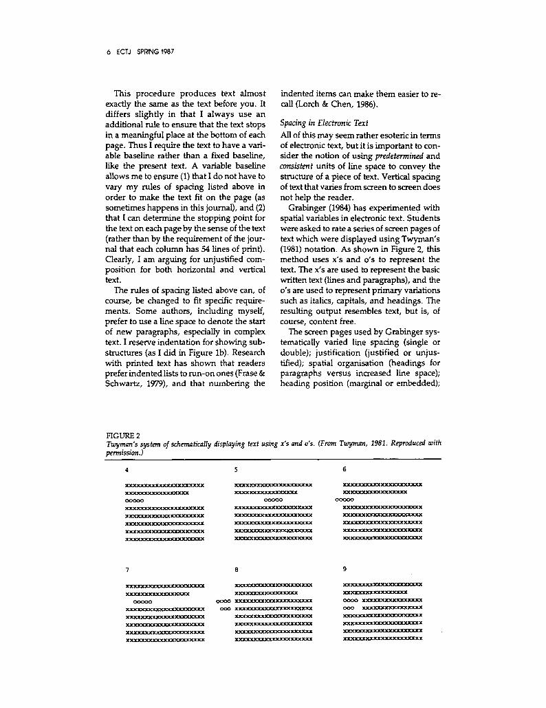
Grabinger (1984) has experimented with spatial variables in electronic text. Students were asked to rate a series of screen pages of text which were displayed using Twyman's (1981) notation. As shown in Figure 2, this method uses x's and o's to represent the text. The x's are used to represent the basic written text (lines and paragraphs), and the o's are used to represent primary variations such as italics, capitals, and headings. The resulting output resembles text, but is, of course, content free.
The screen pages used by Grabinger sys- tematically varied line spacing (single or double); justification (justified or unjus- tiffed); spatial organisation (headings for paragraphs versus increased line space); heading position (marginal or embedded);
FIGURE 2 Twyman's system of schematically displaying text using x's and o's. (From Twyman, 1981. Reproduced with permission.)
4 5 6
XXXXXXXXXXXXXXXXXXXXX
XXXXXXXXXXXXXXXXX
00000
XXXXXXXXXXXXXXXXXXXXX
XXXXXXXXXXXXXXXXXXXXX
XXXXXXXXXXXX~L~XXX.XX
X ~
X X X X ~ X X X X X X X X X
XXXXXXXXXXXXXXXXX
00000
XXXXXXXXXXX XXXXXXXXXX
XXXXXXXXXXXXXXXXX XXXX
X XXXXXXXXX XXXXXX XXX XX
XXXXXXXXXXXXXXXXXXXXX
XXXXX XXXXXXXXXXXXXX XX
~J~Y.XXXXXX XXXXXXXXXXX
X X ~
00000
XXXXXXX XXXXXXXXXXXXX X
X X X X X X ~
XXXXXXXXXXXX XXXX XXXX X
XXXXXXXXXXXXXXXXXXXXX
XXXXX
X ~
XXXF~CXXXX.F~CXXXXXX
00000
X X X X X X X ~
XXXXXXX XXXXXX 30CXXXXXX
X X ~
XXXXXXXXXXXXXXXXXX XXX
X XXXXXXXXXX XXXXXXXX X X
~ X X X X X X , X X
X X X ~ X X . X X X
0000 XXXXXXXX XXXX XXXXXX.XXX
000 X XX XXX XXXXXX X~C~XXXXXX
X~UC XXXXXXXXX XXX XXX XXX
XXY~ XXXXX.X XXXXXX XX XXX
X.XX ~T.XXX XXXXXX XXXXXX
XXXX XXXXXX XXXXX XXXXXX
x x x x m r 1 6 2
XXXXXXXXXXXXXXXXX
0000 XX3~XXXXXXXXXXXXX
000 XXXXXXXXXXXXXXXX
XXXXXXXXXXXXXXXXXXXX X
XXXXXXXXXXXXXXXXXX XX X
X X X X X X X X ~ X
XXX XXX XXXXXXXX XXXXXX X

DESIGNING ELECTRONIC TEXT 7
and running heads (present or absent). The students were asked to rate the pages using semantic-differential type judgments with a variety of scales such as messy-neat , crowded-spacious, s t ructured-unstruc- tured, and so on.
Using multidimensional scaling analyses, Grabinger found that three main dimen- sions of judgment affected the results. Di- mension I was named spaciousness; the stu- dents preferred designs with lots of white space and openness. Dimension 2 was named organisation; the students preferred designs that looked to be grouped or chunked around ideas. Dimension 3 was named structure; the students preferred de- signs that appeared hierarchically struc- tured with the use of organisers and head- ings.
Grabinger (1985) repeated his study (with more texts), and this time he asked the stu- dents to rate the texts on their perceived usefulness for study. The results suggested several design considerations: Double- spaced text was preferred to single-spaced, although single-spaced text with directive cues such as headings was preferred to double-spaced text without such cues. Again, the more organised the text ap- peared, the more it was preferred. Finally, structured texts with headings and a line space between paragraphs were judged as the most useful for study purposes.
The Grid In concluding this discussion of the layout of instructional text, I want to suggest that the typographic reference grid is a useful tool. Grids help designers to be consistent in their use of horizontal and vertical spacing (Hartley, 1985). In terms of this journal, for example, one can create the underlying grid for a double-page spread by drawing (1) horizontal lines, one for each line of text, with an additional line at the top on which to position the page numbers and the run- ning heads; and (2) eight vertical lines to represent the position of the margins and the inter-column "gutter" on each of the two pages. Using this grid as a base, it would be possible at the layout stage to space the text and all its elements consis- tently throughout the journal.
One can imagine much the same thing for the design of electronic text. In fact, authors of electronic texts often do write their texts on specially pre-prepared grids (e.g., see Rubin, 1985). Each grid specifies the number of lines and the number of charac- ters available on each line for one screen page. In addition, space usually is provided at the side of each grid for recording the more technical requirements , such as whether a word is to be presented in a dif- ferent color or flashed in reverse video.
In this section I have tried to show that research on the layout of printed text is di- rectly relevant to the setting of electronic text when one is considering problems of layout. It may well be that some of the extra possibilities of electronic text can take over the role of white space (e.g., by using differ- ent colors to separate elements), and I dis- cuss these issues later in this article. How- ever, first I wish to turn to areas of print research that are not so relevant to the de- sign of electronic text.
THE ROLE OF TYPOGRAPHICAL CUEING
The research on the typography of printed text abounds with reports of studies com- paring different typefaces and different typesizes (e.g., see Hartley, 1982; Tinker, 1965; Watts & Nisbet, 1974), but surpris- ingly little attention has been paid to these issues in the field of electronic text. This may be because designers of electronic text have fewer alternative typefaces and type- sizes than designers of printed texts. Table 2 summarizes the main differences between printed text and some of the earlier elec- tronic formats in this respect. However, when it comes to computer-aided printouts and desktop publishing, it seems that to- day's authors are faced with almost as be- wildering a variety of typefaces as are the designers of printed text. So perhaps a few words on this issue might be helpful here.
Typefaces
In printed text there are over a thousand typefaces (Jaspert et al., 1970). In electronic text the choice is more restricted, and re- search is being carried out to see what fonts

8 ECTJ SPRING1987
seem to be the most legible and most pre- ferred (e.g., see Maddox et al., 1977; Riley & Barbato, 1978; Snyder & Taylor, 1979; Southall, 1981). In printed text there ap- pears to be little to choose between two major groups of typefaces- - those with serifs (the tiny finishing strokes on the let- ters you are reading here) and those with- out serifs (as used in the typeface for the abstract to this article). Some investigators have argued that serifs in printed text in- crease the spacing between the letters slightly, and that this makes the text easier to read, but there does not seem to be any conclusive proof for such assumptions (see Hartley & Rooum, 1983). Reynolds (1980) thinks that typefaces without serifs might be better in electronic text. Such typefaces may seem more modem, and therefore be more appropriate, but in reality the choice of typeface is oftened determined by what the printer or the system has available (Dreyfus, 1985).
Type Sizes The measurement of type sizes is too com- plex a matter to go into here (but see Hartley, 1985). Different type sizes affect the number of characters (or words) one can have in a line of text, as well as how many lines of text one can have per page. A major problem with large type sizes is that they restrict the number of words that will fit in a given line length. If, for example as in text for children, the line is restricted to only
three or four words, then it will be difficult to achieve sensible syntactic groupings with the words. In fact, some research with printed text suggests that large type sizes are not so necessary for young children as many people appear to believe (Tinker, 1965).
Another important issue here is the rela- tionship between the type size, the line length, and the interline space. For exam- ple, Duchnicky and Kolers (1983) found that electronic text set with 80 characters per line was read more quickly than text set with 40 characters per line. Furthermore, text pre- sented across the fifll width of the screen or across two-thirds of the screen was read more rapidly than was text set for only one- third of the width. Several observers also comment that text should not be set so close that the tops of the ascenders of the letters touch the bottoms of the descenders, as sometimes happens in electronic text. One useful rule of thumb in this respect is to ensure that the line space between each line of text is equal to the minimum line space possible plus the amount used for the inter-word space. (This would result in one-and-a-half spacing in typescript.) In electronic text, where half-spacing may not be available, Kolers et al. (1981) suggest that double spacing is preferable to single spac- ing. Wilkins (1984) considers that poor legi- bility and inappropriate line spacing may well lead to headaches when working with electronic text.
TABLE 2 Some Typographic Features of Print and Simple Electronic Text
Choice of typefaces.
Choice of type,sizes.
Choice of type variants (e.g., roman, italic, bold).
Large character set.
Characters vary in width.
Limited color facility.
Electronic Text
One typeface provided by manufacturer.
Single and double-height characters only.
One type variant--roman.
Character set comparable with typewriter.
All characters same width.
Abundant color facility.
Based on Norrish (1984). Reproduced with permission.

DESIGNING ELECTRONIC TEXT 9
Capitals and Lzwer-Case Letters In printed text, capital letters often are used for main headings (as in this journal). Used in this way and with sufficient space around them, capital letters are not difficult to read (Kinney & Showman, 1967). However, it is generally considered that large sections of text printed in capital letters are rather disa- greeable (Tinker, 1965). In electronic text, of course, it is more common to find screen- based text which is presented all in capitals, although happily this practice seems to be disappearing. Research on reading elec- tronic text set in capitals versus the con- ventional use of capitals and lower-case let- ters suggests that readers process text set in capitals more slowly than conventional text (Henney, 1981; Poulton & Brown, 1968). However, this reduction in speed may bring its own reward. Henney (1981) found that readers were more accurate in perceiving errors when the text was in capital letters.
Emphasising in Printed Text There are many ways of emphasising par- ticular words or phrases in printed text, for example, by using underlining, italics, or bold print. Research on the effectiveness of these cueing devices has been summarised elsewhere (see Foster, 1979; Meyer, 1985; Hartley, 1986). Basically speaking, this re- search shows that readers (especially chil- dren) need to be told what the cues signify before they can appreciate their functions. Such print-based features for emphasising are not so easy to match in screen-based text but, of course, they are relatively easy to produce in word-processed text.
Color in Electronic Text One solution to this problem with screen- based text is to use color as a typographic cue. Thus, for example, key words might appear in red while the rest of the text re- mains white on a blue background (e.g., see Backmann et al., 1984). Christ's (1975) re- view of over forty studies of color cueing in electronic text parallels Dwyer's (1978) re- view of an even greater number of studies on the effectiveness of color in printed in- structional text. Both authors discuss studies which show where color is effective: color aids searching in electronic text, and can be functionally useful in printed text.
The role of color generally is, of course, an important one in electronic text. In some systems many colors can be used, but in the British Ceefax, Oracle, and Prestel informa- tion systems (which parallel the North American Telidon or NAPLPS systems), only seven colors are used: green, red, blue, magenta, cyan (pale blue), yellow, and white, and each can form the background for the others. In a comprehensive review of technical features associated with these seven colors, Reynolds (1980) suggested green, white, yellow, and cyan as the most useful colors to use for text on a dark back- ground, and these recommendations were supported in a study by Bruce and Foster (1982). More complex studies of color in electronic text are provided by De Corte (1986) and Spiker et al. (1986).
Combining Cues Some investigators have studied the effects of adding cues to printed text by comparing the effects of single versus multiple cues (e;g., see Christensen & Stordahl, 1955; Hershberger & Terry, 1965). Beck (1984), for example, examined the effects of cues in four conditions: (1) no cue control; (2) picto- rial cues (arrows and labels); (3) textual cues (underlining and colored type); and (4) a combination of pictorial and textual cues. Beck found that his fourth-grade readers did significantly better in condition 4 than in condition 1. The other conditions were not significantly different from each other.
At this point we need to make a distinc- tion between adding cues throughout the text (as in Beck's study) and adding extra cues on to the same piece of text. I am trying to suggest here that there is no need to use three cues when one might suffice--it hardly seems necessary in my view to em- phasise a word by printing it in bold and in color and then underlining it; one cue would be sufficient. Sless (1984) provides an interesting example of this problem. His illustration shows a piece of text which has five different unrelated typefaces in various weights in the space of seven lines. Such multiple cueing has been criticised (e.g., by Hershberger & Terry, 1965 and Sless, 1984), and some authors come close (in my view) to confusing the readers by using too many cues (e.g., Shebilske & Rotondo, 1981;

10 ECTJ SPRING'I987
Tukey, 1977). This problem can also be acute in electronic text when several colors are used (Christ, 1975; 1984).
THE PRESENTATION OF GRAPHIC MATERIALS
In this section I first consider some design features common to printed and electronic text in the presentat ion of tables and graphs. I then turn to those features of elec- tronic text which present their own design problems.
Tabular Materials Tables vary enormously in complexity, de- tail, and size. It is often thought that chil- dren have trouble with complex tables, but Follettie (1978) showed that fourth- through sixth-graders could do surprisingly well. Wright (1980) suggested that in order to use a table successfully, readers have to (1) un- derstand how the table has been organised; (2) know where to look to find the answers to their questions; and (3) be able to inter- pret the answers that they find in the ta- b le- -a process which may involve compar- ing figures within and across the same or different tables. Wright argues that as a table becomes more complex, each of the three elements of the process becomes more difficult.
A large body of research has been assem- bled on the merits of different ways of pre- senting tabular material. Effective over- views for printed texts have been provided by Macdonald-Ross (1977a) and Wright (1982), together with appropriate guide- lines for action. Similar discussions of the design of tabular materials for electronic text have been provided by Galitz (1981), Tullis (1983), Heines (1984) and Norrish (1984, 1986).
In my review of these materials with ref- erence to printed text (Hartley, 1985), I sug- gested that there were two main ways of making tables easier to use. First, one can consider simplifying their content. Ehren- berg (1977) gives some particularly useful suggestions in this regard. Second, one can consider their typographic layout. Exper- iments have been reported which compared justified with unjustified settings for tables
(e.g., Hartley et al., 1975) and which exam- ined how one can use white space both ver- tically and horizontally to separate out and group related sections (e.g., Wright, 1982, and Parkinson et al., 1985).
Norrish (1984, 1986) provides a detailed discussion and many illustrations of the problems of converting printed tables into electronic ones. Norrish points out that most large tables are presented in landscape form in printed text, but that, even so, con- verting them into an electronic form often requires the content to be reorganised. It is this reorganisation that causes difficulties because of the limited size of the screen display. Let me give a personal example. Once, when I was preparing an article for the British Library experimental project on "electronic journals" (Shackel 1983; Pul- linger, 1984), I decided that I had three op- lions for dealing with a complex table. I could divide it up into three separate tables; or I could simplify it and let the reader know that more details were available in a series of tables in a later appendix; or I could simply exclude lots of detail. I chose the latter op- tion because I felt it would be least confus- ing for the reader.
With electronic text there is a temptation to use a variety of colors in the presentation of tabular materials. However, such an ap- proach can lead to a number of unintended problems (see Reynolds, 1982). If, for example, color cueing is used instead of spacing in a tabular presentation, then one can cue rows or columns by using different (or alternate) colors. Such an approach is useful if the reader needs to search only the rows or only the columns, but few tables are that simple. Studies by Foster and Bruce (1982) and Norrish (1986) suggest that stu- dents find such "striped" text more difficult to use than monochrome versions.
Graphics Just as there are several reviews of the re- search literature on the presentation of tabular materials, so there are parallel re- views on the presentation of graphic and illustrative material in printed and elec- tronic text (see Alesandrini, 1987; Macdon- ald-Ross, 1977b; Poggenpohl, 1985; Tufte, 1983; Winn, 1987; Winn & Holliday, 1982). The points I take from these reviews are that

DESIGNING ELECTRONIC TEXT 11
graphic materials need to be simple, clear and consistently presented.
In printed text, simple bar charts and line graphs are probably the easiest kinds of graphical presentation to understand. Line graphs probably are better in most circum- stances than bar charts or tables for showing trends, and tables probably are better than line graphs for providing exact quantities.
(There are rather intriguing perceptual dif- ficulties involved in reading off exact quan- tities from a line graph; see Poulton, 1985).
Figure 3 shows data presented in three- dimensional bar charts--a not uncommon procedure these days. However, the re- search would suggest that a two-dimen- sional presentation would make the data clearer to the reader, and that the clarity of
FIGURE 3 These bar charts come from a series in a promotional pamphlet. Such inconsistency in layout can present readers with unnecessary difficulties. Note: the original graphs were color coded in shades of blue. (Reproduced with permission.)
\
AVERAGE DOMESTIC CONSUMPTION (THERMS PER ANNUM)
GAS SALES SOLD PER'EMPLOYEE (DIRECT AND CONTRACTOR)
NUMBERS OF CUSTOMERS '0(O
A ~
~ l t ~ l I ' ~ , ~~ o+
+mlll + ,+ e'+-i+,-'~l. - I I I II I I +~+~'~+~I I I I I I ~,q+~l+~-,,l. llll I
- , , o ~ , ~ t , L,~. ~
CUSTOMERS PER EMPLOYEE (INCLUDING CONTRACTOR)
|61
152
44
7

12 ECTJ SPRING1987
the charts might be enhanced by putting a small space between each bar. The figure also shows how, if one is inconsistent in one's layout, it is difficult to move quickly from one chart to the next or to make com- parisons between them.
Pie charts are said to be easy to under- stand, but at times they can be misleading. When the segments are small, it is difficult to judge the proportions accurately and to put the lettering in clearly. It also is difficult to compare the segments of two or more pie charts ff the charts have different diameters. One possible reason for this is that in order to make one circle (or a square) look twice the size of another, one has to draw it al- most four times as large.
As with tabular materials, there is a temp- tation to use a variety of colors in the pre- sentation of graphic materials in electronic text. Reynolds (1980, 1982) suggests that the number of colors used on any one graph or chart should be kept to a minimum and that they should be used consistently from one graph or chart to the next. Reynolds also suggests that the colors used in graphs should be clearly differentiated from the colors used in the wording of the text on the screen. Tedford et al. (1977) discuss further technical problems: a bar presented in one color can seem larger or smaller depending on the background color on which it is pre- sented.
Animated Graphics Electronic texts, of course, have an advan- tage over printed texts in that in some cir- cumstances they can employ animated graphics. At present these graphics often appear crude and amateurish because of the nature of the system being used, but de- velopments with high-resolution screens can be expected to reduce this problem (Alesandrini, 1987). Studies of the effec- tiveness of animated graphics in electronic text have largely, but not always, testified to their value (Alesandrini, 1987; Avons, et al., 1983; Riding & Tite, 1985). A study by Reed (1986) has suggested how different strategies in producing graphics can have different effects. Graphics that were suc- cessful in Reed's experiments (1) replaced rather than supplemented verbal compo-
nents, (2) drew the readers' attention to sa- lient features of the topic under discussion; and (3) required the user to interact with the material.
Interrelating Text and Graphics It is not uncommon in both printed and electronic text to find text "wrapped around" a graphic. I know of no research on this particular matter, but experience would suggest that such a presentation might be confusing (especially if the graphic is an animated one in an electronic tex0. In terms of the presentation of printed text, there are guidelines about positioning graphic and illustrative materials (e.g., Hartley, 1985, 1986), and I imagine the same might be true of electronic text. However, the nature of the presentation in the two systems is rather different, and this problem may be resolved differently within them. In terms of printed text, it has been suggested that graphic and illustrative materials should be positioned nearest to their textual reference (Hartley, 1986; Whalley & Fleming, 1975). This rec- ommendation is difficult to follow when there are large graphics, or a series of graphics with very little text between them, but the aim is to reduce the need to look ahead, or back, in order to follow the text that is being read. This problem can be minimised in printed text by a careful use of the double-page typographic reference grid. In electronic text, of course, it may be accentuated by the reduced dimensions of the screen page. Just where to position text and illustrative materials that won't fit on the same screen is a considerable problem. Two solutions (which do not appear to be used as much as they could) are to supply printed workbooks with illustrative mate- rials to accompany electronic text, or, con- versely, to supply electronic graphics to ac- company printed text (e.g., Harding, 1986).
Some Extra Features of Electronic Text One way of overcoming difficulties pre- sented by the small grid configuration of the electronic screen is to write text in smaller sections, to characterise each section by a heading, and to allow readers to pick and choose the sections they wish to read by

DESIGNING EIFCTRONIC TEXT 13
using an appropriate "menu." It is con- ventional to structure such menus in a hierarchical or tree-like manner, with the basic or primary choices first and the lower- level, more detailed choices later (Lee et al., 1984; Merrill, 1982), but a simpler way might be to list all the entries alphabetically (Parkinson et al., 1985). The difficulty with the former arrangement is in making sure that the users' concept groupings match those of the authors' (Roske-Hofstrand & Paap, 1986). Furthermore, authors have to choose between providing a few detailed (and crowded) menus, or a large number of less-detailed (but spacious) ones that will take the reader time to work through. It may well be that once readers are familiar with a system, they will prefer a few detailed menus to lots of simpler ones. The beauty of electronic text, of course, is that it can be designed to cater to both preferences.
Another "extra" feature of electronic text is the facility to vary the rate of presenta- tion. There has been much discussion over different ways of scrolling or moving elec- tronic text as the reader progresses through it (see, for example, Duchnicky & Kolers, 1983). The research generally suggests that readers find moving text to be more difficult to read than static text (Granaas et al., 1984; Kolers et al., 1981).
Studies which have compared how well children and adults read electronic text compared with "hard copy" (printed text) have suggested that people read electronic text more slowly than text presented in the conventional way (Gould & Grischkowsky, 1984; Kruk & Muter, 1984; Weldon et al., 1985). However, screen size, the number of characters per line, whether the image is positive (dark characters on a light back- ground) or negative (light characters on a dark background), and screen resolution are important issues here (Cushman, 1986; Haas & Hayes, 1985a; 1985b). In studies of search tasks, the results have not been quite so clear. It is possible, for example, that people search electronic text more slowly but more carefully than they do printed text (Askwall, 1985), and certainly large differ- ences have been reported between the search strategies of experts and novices (El- kerton & Williges, 1984).
It is clearly important, therefore, to pur- sue the idea that people might process elec- tronic text differently from printed text. If there are differences, then we can consider changing the design of the presentation either to accommodate or to enhance such differences. One of the virtues of electronic text compared with print is that we can ma- nipulate more easily what we want different readers to do by making such texts much more interactive (see Reed, 1986; Reinking & Schreiner, 1985).
Alesandrini (1987) pays particular atten- tion to interactive animated graphics and graphics application software. With this tool, learners can create their own computer graphics using an input device such as a mouse or joystick: "Images can be enlarged, flipped, rotated, animated, duplicated, col- ored, sized up or down, moved around the screen, deleted, and more--all without the learner having to program the system." Alesandrini reports that this flexibility is es- pecially evident in the creation of color graphics. Learners can try out varieties of different colors simply by pressing different function keys. So, just as word processing has changed the nature of writing and edit- ing text, graphics application software is revolutionizing the process of preparing artwork.
The final point I wish to make here is that it is important to ensure that the method of presentation is optimal for the task when assessing the value of the additional fea- tures that can be provided by electronic text. In my experience, inexperienced users tend to overuse the facilities available in elec- tronic text.
CONCLUDING REMARKS
In this article I have reviewed some of the literature on the presentation of printed and electronic text. I have argued that much of the research on printed text is clearly rele- vant to the setting of electronic text (e.g., work on its spacing), but also that there is much research in the area of printed text that does not really apply (e.g., work on typefaces and type sizes). I have also indi- cated that electronic text, by its very nature,

14 ECTJ SP~NG'I987
presents us with a whole new set of re- search problems if we are to use it effec- tively (e.g., the role of color). My remarks have been written from the personal point of view of a researcher concerned mainly with the presenta t ion of pr in ted text. Readers may be interested in other, similar reviews written from different perspectives (see, for example, Bork, 1983; Galitz, 1981; Heines, 1984; Tullis, 1983).
In this article I have not dwelt on how the authors of electronic text might achieve the effects that I have been advocating, nor have I commented much on the possibilities of future research in this area. Clearly there is a need for continued practical work on the issues I have been describing, but there is also a great need for more theoretical un- derstanding of how people learn from elec- tronic text. I agree with Kerr (1986) that re- search is required particularly on how users learn to cope with three aspects of electronic text: (1) the appropriate density for elec- tronic text and how it relates to the ages and the experience of the user; (2) the ways in which users learn to manipulate images, especially interactive graphics that accom- pany text; and (3) the ways in which people "navigate" their way through electronic text. One part icular difficulty here, of course, is that reading electronic text is still a relatively new activity for most people. As Norrish (1986) has pointed out, it may well be too early for useful testing to be done. In a way, this is a kind of chicken-or-egg prob- lem: It may take years for people to become as familiar with electronic text as they are with printed text, and during this time elec- tronic text may develop beyond our wildest dreams. My review has shown that much has been achieved, but it has also shown that much more needs to be done. Research on print-based text may have informed elec- tronic text in its early stages, but it is un- likely to do so for much longer.
I am grateful to Alice Slaney, Margaret Woodward, Dorothy Masters, and Doreen Waters for their secretar- ial assistance in the preparation of this article, and to John Coleman for providing the figures. Helpful com- ments on an earlier version of this manuscript were provided by Jeremy Foster, William Winn, and Patricia Wright.
REFERENCES
Alesandrini, K. L. (1987). Computer graphics in learning and instruction. In H. A. Houghton and D. M. Willows (Eds.), The psychology of illustration: Vol. 2: Instructional issues. New York: Springer Verlag.
AskwaU, S. (1985). Computer supported reading versus reading text on paper: A comparison of two reading situations. International Journal of Man-Machine Studies, 22, 425--439.
Avons, S. E., Beveridge, M. C., Hickman, A. T., & Hitch, G. J. (1983). Teaching journey graphs with micro-computer animation. Human Learn- ing, 2,. 93-105.
Backmann, J., Lundberg, I., Nilsson, L., & Ohlsson, K. (1984). Reading skill and text structure. Educational Communication and Technology Journal, 32(1) p. 51 (Abstract).
Beck, C. R. (1984). Visual cueing strategies: Pic- torial, textual and combinational effects. Edu- cational Communication and Technology Journal, 32(4), 207-216.
Beggs, W. D. A., & Howarth, P. N. (1985). Inner speech as a learned skill. Journal of Experimental Child Psychology, 39, 396--411.
Bork, A. (1983). A preliminary taxonomy of ways of displaying text on screens. Information De- sign Journal, 3(3), 206-214.
Bruce, M., & Foster, J. J. (1982). The visibility of colored characters on colored backgrounds in Viewdata displays. Visible Language, XVI, 382-390.
Campbell, A. J., Marchetti, F. M., & Mewhort, D. J. K. (1981). Reading speed and text pro- duction: A note on right-justification tech- niques. Ergonomics, 24, 611-622.
Christ, R. E. (1975). Review and analysis of color coding research for visual displays. Human Fac- tors, 17, 542-578.
Christ, R. E. (1984). Research for evaluating vi- sual display codes: An emphasis on color cod- ing. In R. Easterby & H. Zwaga (Eds.), Informa- tion Design. Chichester, U.K.: Wiley.
Christensen, C. M., & Stordahl, K. E. (1955). The effect of organisational aids on com- prehension and retention. Journal of Educational Psychology, 46, 65-74.
Cocklin, T. G., Ward, N. J., Chen, H., & Suola, J. F. (1984). Factors influencing readability of rapidly presented text segments. Memory and Cognition, 12(5), 431--442.
Cushman, W. H. (1986). Reading from micro- fiche, a VDT and the printed page: Subjective fatigue and performance. Human Factors, 28(1), 63-73.
De Corte, W. (1986). Optimal colors, phos- phours, and illuminant characteristics for CRT

DESIGNING ELECTRONIC TEXT 15
displays: The algorithmic approach. Human Factors, 28(1) 39-47.
Dreyfus, J. (1985). A turning point in type design. Visible Language, XIX(1), 11-22.
Duchnicky, R. L., & Kolers, P. A. (1983). Reada- bility of text scrolled on visual display termi- nals as a function of window size. Human Fac- tors, 25(6), 68,3-692.
Dwyer, R. M. (1978). Strategies for improving vi- sual learning. State College, PA: Learning Ser- vices.
Ehrenberg, A. S. C. (1977). Rudiments of num- eracy. Journal of the Royal Statistical Society, 140, 227-297.
Elkerton, J., & WilIiges, R. C. (1984). Information retrieval strategies in a file search environ- ment. Human Factors, 26(2), 171-184.
FoUettie, J. F. (1978). Research on table-using tasks. Series 2 Studies. (Report TN 2-78-04). Los Alamitos, CA: Southwest Regional Labo- ratory.
Foster, J. J. (1979). The use of visual cues in text. In P. Kolers, M. E. Wrolstad, & H. Bouma (Eds.), Processing of visible language. New York: Plenum.
Foster, J. J., & Bruce, M. (1982). Looking for en- tries in videotex tables: A comparison of four color formats. Journal of Applied Psychology, 67(5), 611-615.
Frase, L. T., Macdonald, N. H., & Keenan, S. A. (1985). Intuitions, algorithms and a science of text design. In T. Duffy & R. W. Waller (Eds.), Designing usable texts. Orlando, FL: Academic Press.
Frase, L. T., & Schwartz, B. J. (1979). Typo- graphic cues that facilitate comprehension. Journal of Educational Psychology, 71 (2), 197-206.
Galitz, W. O. (1981). Handbook of screen format design. Wellesley, MA: QED Information Sci- ences.
Gould, J. D., & Grischkowsky, N. (1984). Doing the same work with hard copy and with cathode-ray tube (CRT) computer terminals. Human Factors, 26(3), 323-337.
Grabinger, R. S. (1984, Spring). CRT text design: Psychological attributes underlying the evalua- tion of models of CRT text displays. Journal of Visual Verbal Languaging, pp. 17-39.
Grabinger, R. S. (1985). Relationships among text format variables in computer-generated text. Paper presented to the Annual Conference, AECT, Las Vegas, NV, 1985. (Copies available from the author at 118, Henzlik Hall, University of Nebraska-Lincoln, Lincoln, NE 68588)
Granaas, M. M., McKay, T. D., Laham, D., & Hurt, L. (1984). Reading moving text on a CRT screen. Human Factors, 26(1), 97-104.
Gregory, M., & Poulton, E. C. (1970). Even ver-
sus uneven right-hand margins and rate of comprehension in reading. Ergonomics, 13, 427-434.
Haas, C., & Hayes, J. R. (1985a). Effects of text display variables on reading tasks: Computer screen versus hard copy (CDC Technical Report No. 3). Pittsburgh: Communications Design Center, Carnegie Mellon University.
Haas, C., & Hayes, J. R. (1985b). Reading on the computer: A comparison of standard and advanced computer display and hard copy (CDC Technical Report No. 7). Pittsburgh: Communications Design Center, Carnegie Mellon University.
Harding, R. D. (1986). Fourier series and tran- sitions: A computer illustrated text. London: Hilger.
Hartley, J. (1980). Spatial cues in text: Some comments on the paper by Frase and Schwartz (1979). Visible Language, XIV(1), 62-79.
Hartley, J. (1982). Student preferences in typog- raphy. Programmed Learning and Educational Technology, 19(2), 166-170.
Hartley, J. (1985). Designing instructional text (2nd ed.). New York: Nichols.
Hartley, J. (1986). Planning the typographical structure of instructional text. Educational Psy- chologist, 21(4), 315-332.
Hartley, J., & Burnhill, P. (1971). Experiments with unjustified text. Visible Language, V(3), 265--278.
Hartley, J., & Rooum, D. (1983). Sir Cyril Butt and typography. British Journal of Psychology, 74(2), 203-212.
Hartley, J., Young, M., & Burnhill, P. (1975). On the typing of tables. Applied Ergonomics, 6, 39-42.
Heines, J. (1984). Screen design strategies for com- puter assisted instruction. Bedford, MA: Digital Press.
Henney, M. (1981). The effect of all-capital print versus regular mixed print as displayed on a micro-computer screen on reading speed and accuracy. Educational Communication and Technology Journal, 31(2), p. 126 (Abstract).
Hershberger, W. A., & Terry, D. F. (1965). Typographical cueing in conventional and programmed texts. Journal of Applied Psychol- ogy, 49(1), 55-60.
Hutchingson, R.D., Williams, R. D., Reid, T.G., & Dudek, C.L. (1981). Formatting, message load, sequencing method and presen- tation rate for computer generatect displays. Human factors, 23(5), 551-559.
Jandreau, S. M., Muncer, S. J., & Bever, T. G. (1986). Improving the readability of text with automatic phrase-sensitive formatting. British Journal of Educational Technology, 17(2), 128-133.
Jaspert, W. P., Berry, W. T., & Johnson, A F.

'16 ECTJ SPRING'I987
(1970). The encyclopaedia of typefaces. London: Blandford.
Keenan, S. A. (1984). Effects of chunking and line-length on reading efficiency. Visible Lan- guage, XVIII(1), 61-80.
Kerr, S. T. (1986). Learning to use electronic text: An agenda for research on typography, graphics and interpanel navigation, lnforma- l~on Design Journal, 4(3), 206-211.
Kinney, G. C., & Showman, D. J. (1967). The relative legibility of upper-case and lower-case typewritten words. Information Display, 4, 34-39.
Kolers, P. A., Duchnicky, R. L., & Ferguson, D. C. (1981). Eyemovement measurement of readability of CRT displays. Human Factors, 23, 517-528.
Kruk, R. S., & Muter, P. (1984). Reading con- tinuous text on video screens. Human Factors, 26, 339-345.
Lee E., Whalen, T., McEwen, S., & Latremouille, S. (1984). Optimising the design of menu pages for information retrieval. Ergonomics, 27(10), 1051-1069.
Lorch, R. F., &Chen, A. H. (1986). Effects of number signals on reading and recall. Journal of Educational Psychology, 76(4) 263-270.
Macdonald, N. J. (1983). The unix writer's work- bench software: Rationale and design. The Bell System Technical Journal, 62(6), 1891-1908.
Macdonald-Ross, M. (1977a). How numbers are shown: A review of research on the presenta- tion of quantitative data in texts. Audiovisual Communication Review, 25, 359--409.
Macdonald-Ross, M. (1977b). Graphics in text. In L. S. Shulman (Ed.), Review of research in educa- tion (Vol. 5). Itasca, IL: Peacock.
Maddox, M. E., Burnette, J. T., & Gutmann, J. C. (1977). Font comparisons for 5 x 7 dot matrix characters. Human Factors, 19(1), 89-93.
Mason, J. M., & Kendall, J. R. (1979). Facilitating reading comprehension through text structure manipulation. Alberta Journal of Educational Re- search, 25, 68-76.
Merrill, P. F. (1982). Displaying text on micro- computers. In D. H. Jonassen (Ed.), The technology of text. Englewood Cliffs, NJ: Educa- tional Technology Publications.
Meyer, B. J. F. (1985). Signaling the structure of text. In D. H. Jonassen (Ed.), The technology of text 0lol. 2). Englewood Cliffs, NJ: Educational Technology Publications.
Muncer, S. J., Gorman, B. S., Gorman, S., & Bibel, D. (1986). Right is wrong: An examina- tion of the effect of right justification on read- ing. British Journal of Educational Technology, 17(1), 5-10.
Norrish, P. (1984). Moving tables from paper to screen. Visible Language, XVIII(2), 154-170.
Norrish, P. (1986). The graphic translatability of text. (R & D Report No. 5854). London: The British Library.
Parkinson, S. R., Sisson, N., & Snowberry, K. (1985). Organisation of broad computer menu displays. International Journal of Man-Machine Studies, 23(6), 689-697.
Poggenpohl, S. (Ed.). (1985). Graphic design: Computer graphics [Special issue]. Visible Lan- guage, XIX(2), 173--306.
Poulton, E. C. (1960). A note on printing to make comprehension easier. Ergonomics, 3, 245-248.
Poulton, E. C. (1985). Geometric illusions in reading graphs. Perception and Psychophysics, 37, 543-548.
Poulton, E. C., & Brown, C. H. (1968). Rate of comprehension of an existing teleprinter out- put and of possible alternatives. Applied Psy- chology, 52, 16--21.
PuUinger, D. J. (1984). The design and presenta- tion of the computer human factors journal in the Blend system. Visible Language, XVIII(2), 171-185.
Reed, S. K. (1986). Effect of computer graphics on improving estimates to algebra word prob- lems. Journal of Educational Psychology, 77(3), 285-298.
Reinking, D., & Schreiner, R. (1985). The effects of computer mediated text on measures of comprehension and reading behavior. Reading Research Quarterly, XX(5), 536--552.
Reynolds, L. (1980). Teletext and viewdata--a new challenge for the designer. In J. Hartley (Ed.), The psychology of written communication: Selected readings. New York: Nichols.
Reynolds, L. (1982). Display problems for tele- text. In D. H. Jonassen (Ed.), The technology of text. Englewood Cliffs, NJ: Educational Technology Publications.
Riding, R. S., & Tite, H. C. (1985). The use of computer graphics to facilitate story-telling in young children. Educational Studies, 11(3), 203-209.
Riley, T. M., & Barbato, G. J. (1978). Dot-matrix alphanumerics viewed under discrete element degradation. Human Factors, 20(4), 473-479.
Roske-Hofstrand, J. R.,& Paap, K. R. (1986). Cognitive networks as a guide to menu organi- sation: An application in the automated cockpit. Ergonomics, 29(11), 1301-1311.
Rubin, M. M. (1985). Spatial context as an aid to page layout: A system for planning and sketch- ing. Visible Language, X/X(2), 243-250.
Shackel, B. (1983). The BLEND system-pro- gramme for the study of some electronic jour- nals. Journal of the American Society for Informa- tion Science, 34(1), 22-30.
Shebilske, W. L., & Rotondo, J. A. (1981). Typographical and spatial cues that facilitate

DESIGNING ELECTRONIC TEXT 17
learning from textbooks. Visible Language, XV(1), 41-54.
Sless, D. (1984). Visual literacy: A failed oppor- tu f ty . Educational Communication and Technol- ogy Journal, 32(4), 224-228.
Snyder, H. L., & Taylor, G. B. (1979). The sen- sitivity of response measures of alphanumeric legibility to variation in dot matrix display parameters. Human Factors, 21(4), 457-471.
Southail, 1L (1981). Character generator systems for broadcast television. Information Design Journal, 2(1), 44-57.
Spiker, A., Rogers, S. P., CincineUi, J. (1986). Selecting colour codes for a computer gener- ated topographic map based on perception ex- periments and functional requirements. Er- gonomics, 29(11), 1313-1320.
Stone, J. (1981). The effect of the format and the number of arguments on comprehension of text by college undergraduates. In L. J. Chap- man (Ed.), The reader and the text. London: Heinemann.
Stone, V. L. (1983). Effects of color in filmed be- havior sequences on descriptions and elabora- tion by Liberian schoolboys. Educational Com- munication and Technology Journal, 31 (1), 33--45.
Tedford, W. H., Berquist, S. L., & Flynn, W. E. (1977). The size-color illusion. Journal of General Psychology, 97(1), 145--149.
Tinker, M. A. (1965). Bases for effective reading. Minneapolis: University of Minnesota Press.
Tufte, E. R. (1983). The visual display ofquan titative information. Graphics Press, Box 430, Cheshire, CT O641O.
Tukey, J. W. (1977). Exploratory data analysis. New York: Addison-Wesley.
Tullis, T. S. (1983). The formatting of al- phanumeric displays: A review and analysis. Human Factors, 25(6), 657-682.
Twyman, M. (1981). Typography without words. Visible Language, XV(1), 5-12.
Waller, R. H. W., Lefrere, P., & Macdonald-
Ross, M. (1982). Do you need that second color? IEEE Transactions on Professional Com- munication, VoL PC-25(2), 80--85.
Watts, L., & Nisbet, J. (1974). Legibility in chil- dren's books. London: National Foundation for Educational Research.
Weldon, L. S., Mills, C. B., Koved, L., & Shneiderman, B. (1985). The structure of in- formation in online and paper technical manu- als. In R. W. Swezey (Ed.), Proceedings of the Human Factors, 29th Annual Meeting (Vol. 2). Santa Monica, CA: Human Factors Society.
WhaUey, P., & Fleming, R. (1975). An experiment with a simple recorder of reading behavior. Programmed Learning and Educational Technol- ogy, 12, 120-124.
Wilkins, A. J. (1984). Visual illusions, eye-strain, headaches and epilepsy. Paper to the Annual meeting of the British Association for the Ad- vancement of Science, September 1984. (Copies available from the author, MRC Applied Psychology Unit, 15, Chaucer Road, Cambridge, CB2 2EF, U.K.)
Winn, W. (1987). Using charts, graphs and dia- grams in educational materials. In D. M. Willows and H. A. Houghton (Eds.), The psy- chology of illustration: Vol. 1. Basic research. New York: Springer Verlag.
Winn, W. D., & Holliday, W. G. (1982). Design principles for diagrams and charts. In D. H. Jonassen (Ed.), The technology of text. En- glewood Cliffs, NJ: Educational Technology Publications.
Wright, P. (1980). The comprehension of tabu- lated information: Some similarities between reading prose and reading tables. NSPI Journal, XIX(8), 2,5--29.
Wright, P. (1982). A user-oriented approach to the design of tables and flowcharts. In D. H. Jonassen (Ed.), The technology of text. En- glewood Cliffs, N]: Educational Technology Publications.
![Chicago Citation Style · 2 Periodicals – Print or Online (Journals, Magazines, Newspapers) Journals – Print and Electronic Scholarly Journal Article – [Electronic database]](https://img.pdfslide.net/doc/110x75/5e7cea532b56a61fbd0bf8a5/chicago-citation-style-2-periodicals-a-print-or-online-journals-magazines-newspapers.jpg)