Embed Size (px)
Citation preview

Designing Forms and Reports
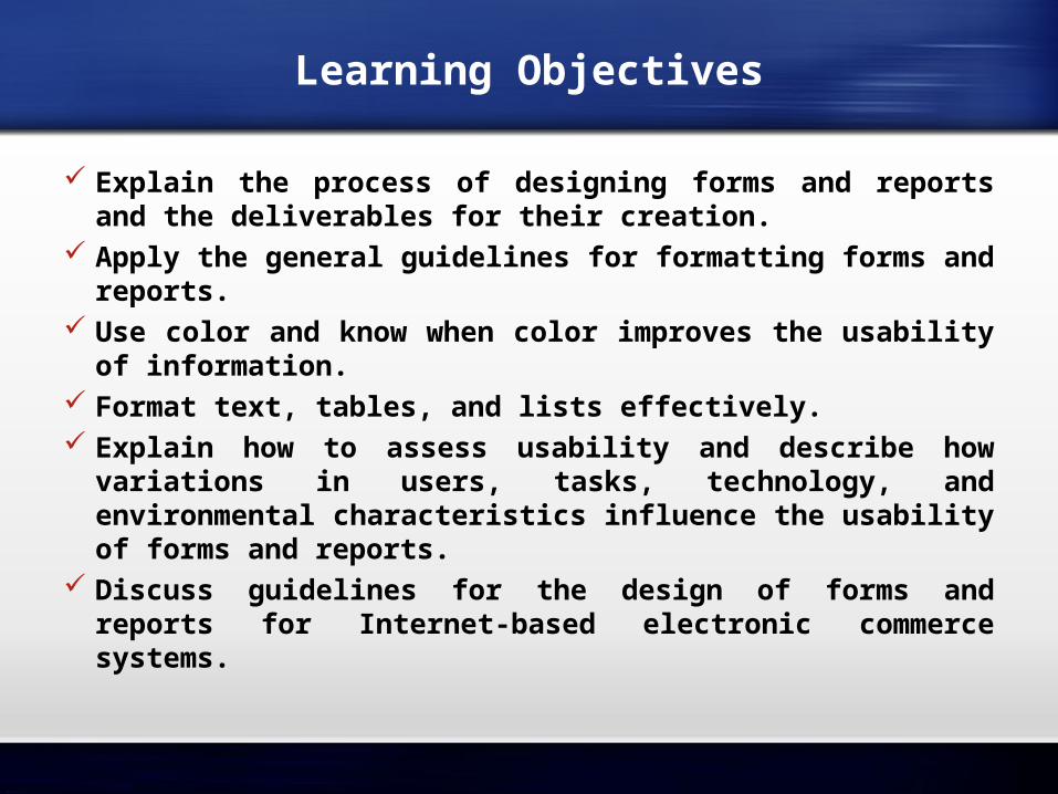
Learning Objectives
Explain the process of designing forms and reports and the deliverables for their creation.
Apply the general guidelines for formatting forms and reports.
Use color and know when color improves the usability of information.
Format text, tables, and lists effectively. Explain how to assess usability and describe how
variations in users, tasks, technology, and environmental characteristics influence the usability of forms and reports.
Discuss guidelines for the design of forms and reports for Internet-based electronic commerce systems.
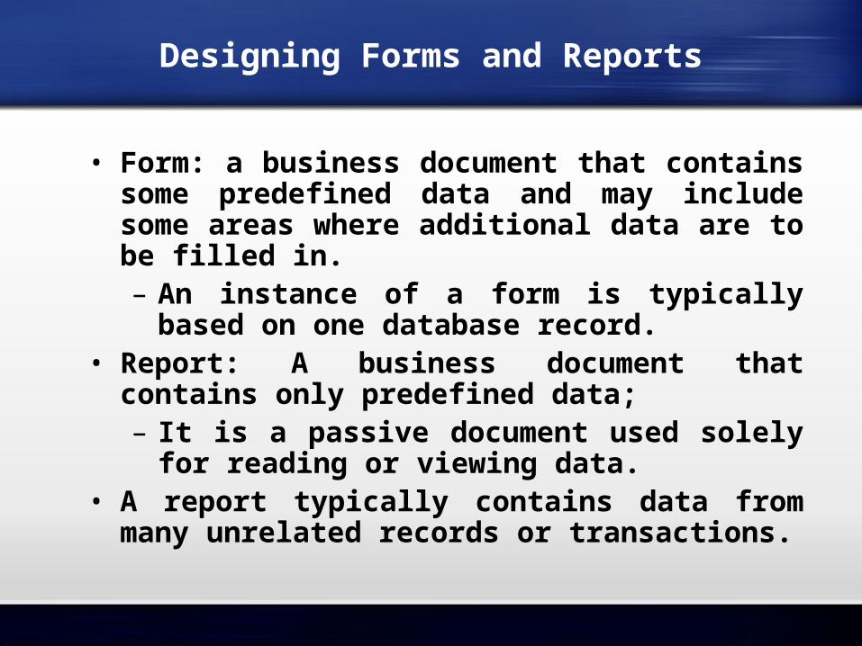
Designing Forms and Reports
• Form: a business document that contains some predefined data and may include some areas where additional data are to be filled in.– An instance of a form is typically based
on one database record.• Report: A business document that
contains only predefined data;– It is a passive document used solely for
reading or viewing data.• A report typically contains data from
many unrelated records or transactions.
Designing Forms and Reports (Cont.)
• Common Types of Reports:– Scheduled: produced at predefined time
intervals for routine information needs.– Key-indicator: provide summary of critical
information on regular basis.– Exception: highlights data outside of
normal operating ranges.– Drill-down: provide details behind
summary of key-indicator or exception reports.
– Ad-hoc: respond to unplanned requests for non-routine information needs.
The Process of Designing Forms and Reports
• User-focused activity.• Follows a prototyping approach.• First steps are to gain an understanding
of the intended user and task objectives by collecting initial requirements during requirements determination.
• Requirements determination:– Who will use the form or report?– What is the purpose of the form or
report?– When is the report needed or used?– Where does the form or report need to
be delivered and used?– How many people need to use or view
the form or report?
The Process of Designing Forms and Reports
The Process of Designing Forms and Reports (Cont.)
• Prototyping– Initial prototype is designed from requirements.– Users review prototype design and either accept
the design or request changes.– If changes are requested, the construction-
evaluation-refinement cycle is repeated until the design is accepted.
• A coding sheet is an “old” tool for designing forms and reports, usually associated with text-based forms and reports for mainframe applications.
• Visual Basic and other development tools provide computer aided GUI form and report generation.
Deliverables and Outcomes
• Design specifications are the major deliverables and inputs to the system implementation phase.
• Design specifications have three sections:– Narrative overview: characterizes users,
tasks, system, and environmental factors.– Sample design: image of the form (from
coding sheet or form building development tool).
– Testing and usability assessment: measuring test/usability results (consistency, sufficiency, accuracy, etc.).
Formatting Forms and Reports
• Meaningful titles: clear, specific, version information, current date.
• Meaningful information: include only necessary information, with no need to modify.
• Balanced layout: adequate spacing, margins, and clear labels.
• Easy navigation system: show how to move forward and backward, and where you are currently.
Highlighting Information
• Notify users of errors in data entry or processing.
• Provide warnings regarding possible problems.• Draw attention to keywords, commands, high-
priority messages, unusual data values.• Highlighting can include:
– use of upper case, font size differences, bold, italics, underline, boxing, and all capital letters.
– Use of blinking, reverse video, audible tones, and intensity differences.
– And other approaches.
Color vs. No Color
• Benefits from Using Color– Soothes or strikes the eye.– Accents an uninteresting display.– Facilitates subtle discriminations in
complex displays.– Emphasizes the logical organization of
information.– Draws attention to warnings.– Evokes more emotional reactions.
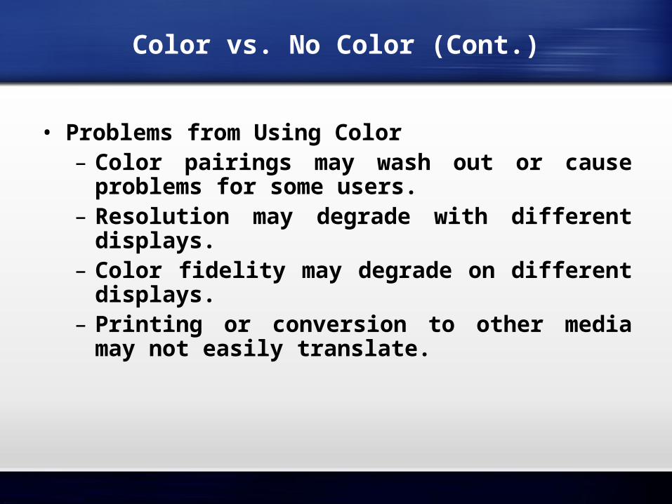
Color vs. No Color (Cont.)
• Problems from Using Color– Color pairings may wash out or cause
problems for some users.– Resolution may degrade with different
displays.– Color fidelity may degrade on different
displays.– Printing or conversion to other media may
not easily translate.
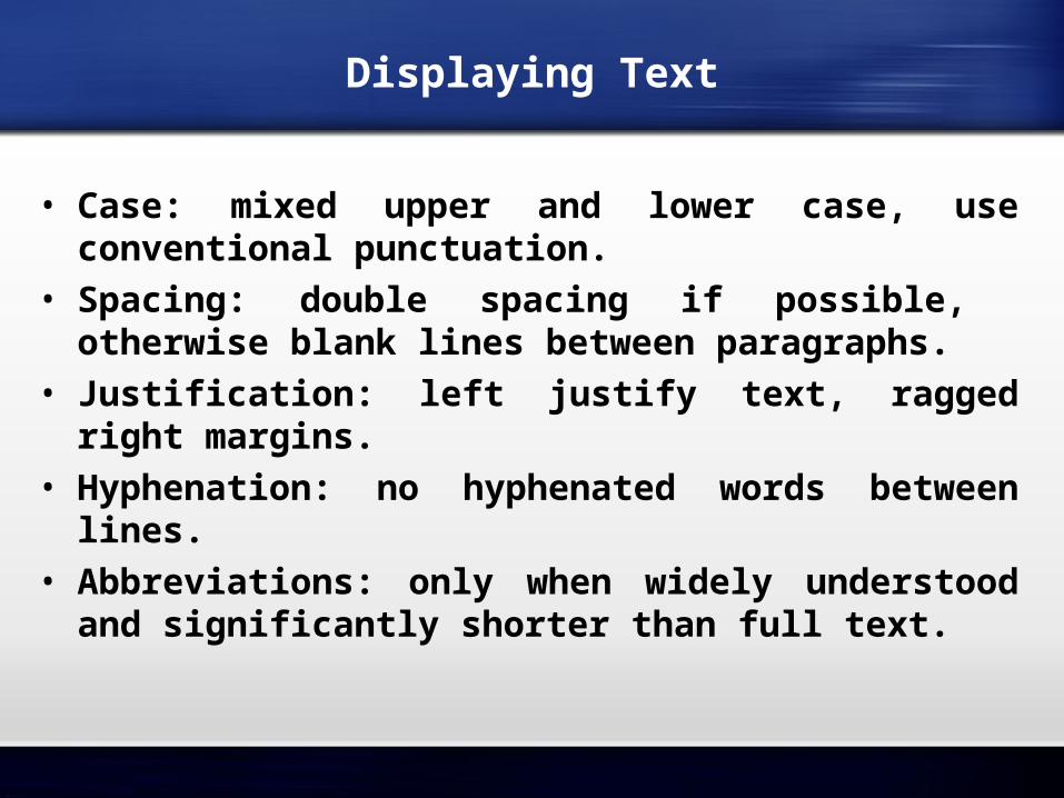
Displaying Text
• Case: mixed upper and lower case, use conventional punctuation.
• Spacing: double spacing if possible, otherwise blank lines between paragraphs.
• Justification: left justify text, ragged right margins.
• Hyphenation: no hyphenated words between lines.
• Abbreviations: only when widely understood and significantly shorter than full text.
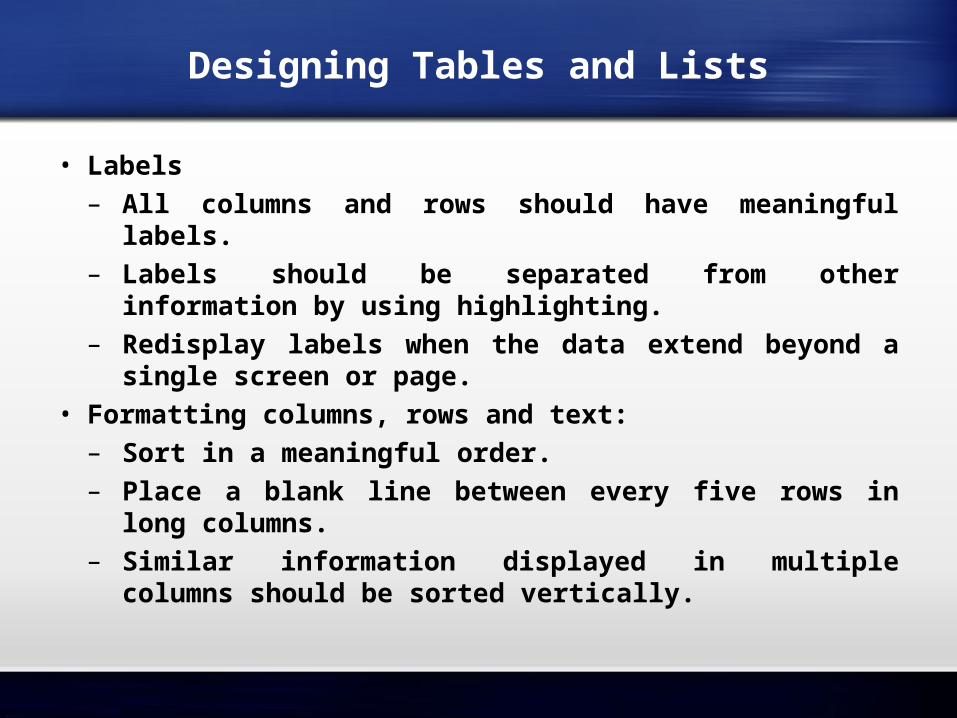
Designing Tables and Lists
• Labels– All columns and rows should have meaningful
labels.– Labels should be separated from other
information by using highlighting.– Redisplay labels when the data extend beyond a
single screen or page.• Formatting columns, rows and text:– Sort in a meaningful order.– Place a blank line between every five rows in long
columns.– Similar information displayed in multiple columns
should be sorted vertically.
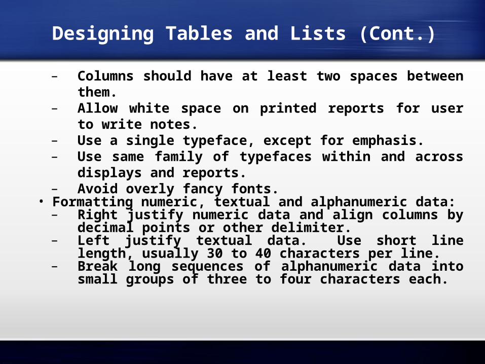
Designing Tables and Lists (Cont.)
– Columns should have at least two spaces between them.
– Allow white space on printed reports for user to write notes.
– Use a single typeface, except for emphasis.– Use same family of typefaces within and across
displays and reports.– Avoid overly fancy fonts.
• Formatting numeric, textual and alphanumeric data:– Right justify numeric data and align columns by
decimal points or other delimiter.– Left justify textual data. Use short line length,
usually 30 to 40 characters per line.– Break long sequences of alphanumeric data into
small groups of three to four characters each.
• Use tables for reading individual data values.
• Use graphs for:– Providing quick summary.– Displaying trends over time.– Comparing points and patterns of
variables.– Forecasting activity.– Simple reporting of vast quantities of
information.
Designing Tables and Lists (Cont.)

Assessing Usability
• Objective for designing forms, reports and all human-computer interactions is usability.
• There are three characteristics:– Speed. Can you complete a task efficiently?– Accuracy. Does the output provide what you
expect?– Satisfaction. Do you like using the output?
• Usability: an overall evaluation of how a system performs in supporting a particular user for a particular task.
Usability Success Factors
• Consistency: of terminology, formatting, titles, navigation, response time.
• Efficiency: minimize required user actions.• Ease: self-explanatory outputs and labels.• Format: appropriate display of data and symbols.• Flexibility: maximize user options for data input according
to preference.• Characteristics for consideration:– User: experience, skills, motivation, personality.– Task: time pressure, cost of errors, work durations.– System: platform.Environment: social and physical issues.
Measures of Usability
• Time to learn.• Speed of performance.• Rate of errors.• Retention over time.• Subjective satisfaction.• Layout of information should be consistent,
both within and across applications.• Layout of information should be consistent:
– both within and across applications.• Whether information is delivered:
– On screen display or on a hard-copy report.
Lightweight Graphics
• Lightweight Graphics: the use of small, simple images to allow a Web page to more quickly be displayed.– Quick image download.– Quick feedback from the Web site can
provide will help to keep customers at the PVF WebStore longer.
Forms and Data Integrity Rules.
• All forms that request information should be clearly labeled and provide adequate room for input.
• Specific fields requiring specific information must provide a clear example.
• Must designate which fields are optional, required, and which have a range of values.
Template-Based HTML
• Template-based HTML: templates to display and process common attributes of higher-level, more abstract items.– Creates an interface that is very easy to
maintain.– Advantageous to have a “few” templates
that could be used for entire product line.– Not every product needs its own page.
Summary
• In this chapter you learned how to: Explain the process of designing forms and reports
and the deliverables for their creation. Apply the general guidelines for formatting forms
and reports. Use color and know when color improves the
usability of information. Format text, tables, and lists effectively. Explain how to assess usability and describe how
variations in users, tasks, technology, and environmental characteristics influence the usability of forms and reports.
Discuss guidelines for the design of forms and reports for Internet-based electronic commerce systems.