Embed Size (px)
Citation preview
Developing a Visualization Tool
for Unsupervised Machine Learning Techniques on *Omics Data
Jiayuan Guo
A thesis
submitted in partial fulfillment of the
requirements for the degree of
Master of Science in Chemical Engineering
(Data Science)
University of Washington
2018
Committee:
David Beck
Joseph Hellerstein
Heidi Gough
Program Authorized to Offer Degree:
Chemical Engineering

© Copyright 2018
Jiayuan Guo

University of Washington
Abstract
Developing a Visualization Tool
for Unsupervised Machine Learning Techniques on *Omics Data
Jiayuan Guo
Chair of the Supervisory Committee:
Professor David A.C. Beck
Chemical Engineering
Machine learning is a powerful technique to analyze massive *omics data. Combined with
visualization approaches, such as gene expression profile graphs, machine learning algorithms has
found great use in exploring the hidden mechanism in *omics field.
This work presents a user-friendly web application, called DashOmics to efficiently
compute unsupervised machine learning algorithms on *omics data and interactively visualize
machine learning results and gene expression profiles to provide insight into underlying gene
expression patterns. The functionality of DashOmics includes K-Means clustering algorithms,
Elbow Method and Silhouette Analysis as model evaluation methods to explore clustering analysis
on *omics data, and also Principal Component Analysis (PCA) to reduce dimensionality and
visualize data in an intuitive way. It is open-source and freely available on GitHub at
https://github.com/BeckResearchLab/DashOmics
Table of Contents
LIST OF FIGURES ........................................................................................................................ 6
LIST OF TABLES .......................................................................................................................... 6
Chapter 1: INTRODUCTION......................................................................................................... 1
1.1 Machine learning analysis on *omics data .......................................................................................... 1
1.2 Visualization of *Omics Data ............................................................................................................. 2
Chapter 2: MATERIALS AND METHODS .................................................................................. 6
2.1 Data Description .................................................................................................................................. 6
2.2 DashOmics Workflow ......................................................................................................................... 6
2.3 Clustering analysis: K-Means Clustering ............................................................................................ 7
2.4 Model evaluation: Elbow Method & Silhouette Analysis ................................................................... 8
2.5 Principal Component Analysis (PCA) ................................................................................................ 9
Chapter 3: RESULTS AND DISCUSSION ................................................................................. 11
3.1 Define Input Dataset .......................................................................................................................... 11
3.2 Model Evaluation -- define optimal k value as number of clusters ................................................... 12
3.3 Cluster Profile.................................................................................................................................... 14
Chapter 4: CONCLUSION ........................................................................................................... 19
4.1 Summary ........................................................................................................................................... 19
4.2 Future Work ...................................................................................................................................... 19

BIBLIOGRAPHY ......................................................................................................................... 20

LIST OF FIGURES
Figure 1 R Shiny app by David Beck. ............................................................................................ 3
Figure 2 Workflow of DashOmics. ................................................................................................. 7
Figure 3 DashOmics Homepage ................................................................................................... 12
Figure 4 Elbow Method ................................................................................................................ 13
Figure 5 Silhouette Analysis ......................................................................................................... 14
Figure 6 Cluster sizes .................................................................................................................... 15
Figure 7 PCA variance explained plot .......................................................................................... 15
Figure 8 Principal Component Analysis 2-D Projection .............................................................. 16
Figure 9 Average expression profile of Cluster #8 and CLUSTER #18 ...................................... 17
Figure 10 Average expression profile of Cluster #5 and target gene MBURv2_130043 ............. 18
LIST OF TABLES
Table 1 Visualization Tools Comparison ....................................................................................... 4
Table 2 Example data.................................................................................................................... 11
1
Chapter 1: INTRODUCTION
1.1 Machine learning analysis on *omics data
Genomics, transcriptomics, and other *omics fields are known for producing enormous
volumes of raw sequencing data. Methods and tools are needed to analyze and handle such
burdensome data and provide insights into the underlying mechanism.
Machine learning is a method used for developing and applying computer algorithms,
enabling computers to assist humans in making sense of large, complex datasets1. In the past
decades, machine learning methods have found great use in genetics and genomics field. It helps
to understand the mechanisms underlying gene regulation, metabolic pathways, genetic
mechanism of diseases and gene expression pattern2.
Machine learning methods are usually segregated into two primary categories: supervised
versus unsupervised methods.
Supervised machine learning contains classification and regression, which are useful for
datasets with both input and output variables, such as gene function classes prediction and cancer
classifications. Brown et al.3 applied support vector machines (SVM, one of supervised machine
learning methods) to six functional classes of yeast genes from 79 samples and predict the
functional classes that are expected to be co‐regulated.
Unsupervised machine learning methods, such as clustering and principal components
analysis, can better explain the situation in which we only observe input variables but without
predetermined set of labels or numerals as output. Clustering method, which is commonly used for
gene expression analysis, has been proved useful in finding groups of co‐regulated genes or related
2
samples. The application of clustering analysis on genomics data can be divided to two general
classes: grouping genes and grouping samples with similar properties. The hierarchical clustering
and K-Means clustering algorithms have been widely used for clustering expression profiles by
genes4. Tavazoie et al. 5 clustered profiles of 3000 yeast genes into 30 clusters by the K-Means
algorithm and uncovered new regulons (sets of co-regulated genes) and their putative cis-
regulatory elements. Hierarchical clustering algorithm has also been used for sample clustering.
One common application is clustering of tumors to find new possible tumor subclasses. Alizadeh
et al.6 applied hierarchical clustering algorithm to 96 samples of normal and malignant
lymphocytes in diffuse large B‐cell lymphoma (DLBCL), to study the diversity in gene expression
among the tumors of DLBCL patients.
1.2 Visualization of *Omics Data
Although various machine learning methods can organize tables of genomics
measurements, the results are still massive collection of numbers and remain difficult to take in
and understand fully. Therefore, visualization is another key aspect of both the analysis and
understanding of these data.
Scatter plot, profile plot and heatmap are the three most commonly used visualization
methods in gene expression studies7. Scatter plots combined with dimensionality reduction
methods (eg. Principle Component Analysis) are excellent to reveal clusters and outliers for
multivariate data and gain insight into global patterns8. Profile plots display the expression level
of genes across a set of samples, making it possible to generate hypothesis about the expression
trend. Heatmaps provide globally visualization and summarization about the abundance of gene in
each sample represented in color9.
3
Currently, there are different visualization tools for expression data in *omics field.
Methods are available in R, MATLAB, and many other analysis software. Here we take Python
Plot.ly, R Shiny and Tableau for comparison.
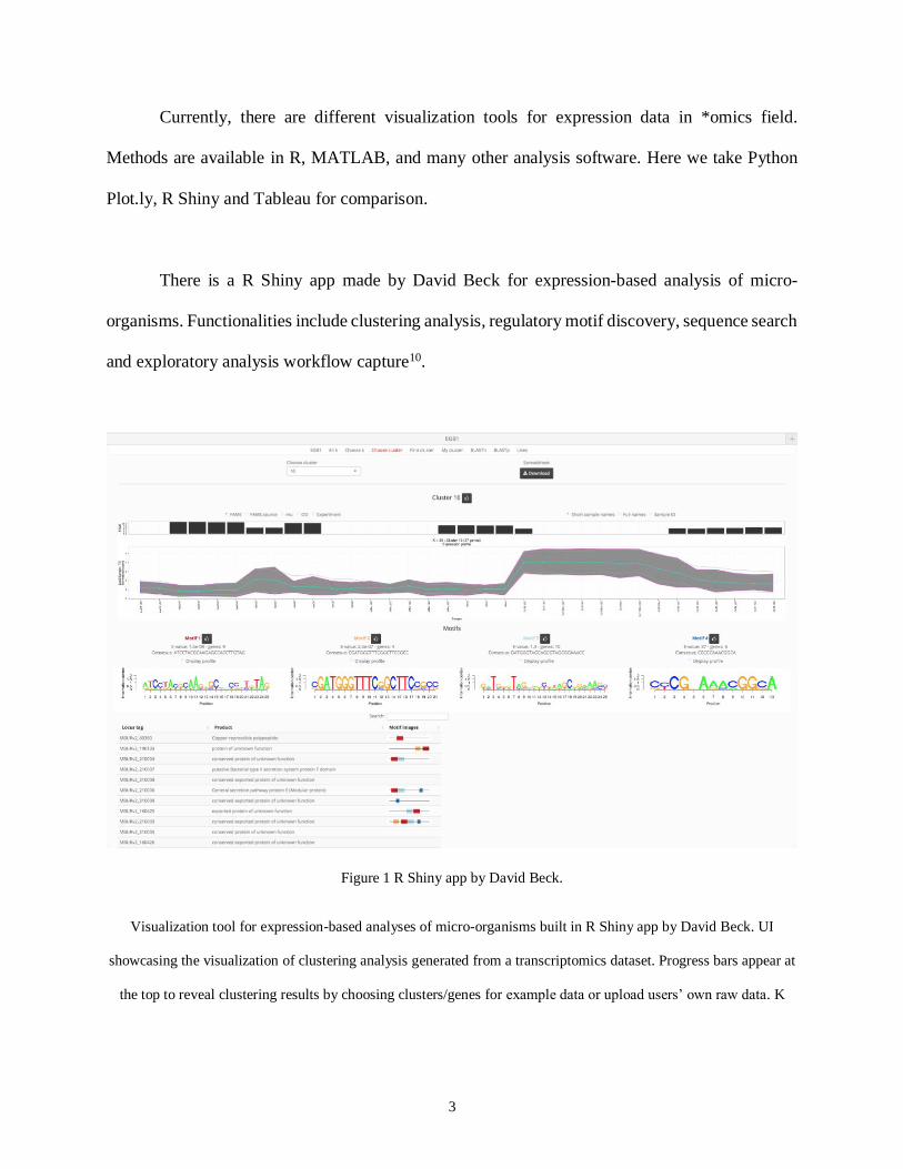
There is a R Shiny app made by David Beck for expression-based analysis of micro-
organisms. Functionalities include clustering analysis, regulatory motif discovery, sequence search
and exploratory analysis workflow capture10.
Figure 1 R Shiny app by David Beck.
Visualization tool for expression-based analyses of micro-organisms built in R Shiny app by David Beck. UI
showcasing the visualization of clustering analysis generated from a transcriptomics dataset. Progress bars appear at
the top to reveal clustering results by choosing clusters/genes for example data or upload users’ own raw data. K
4
values have been precomputed and can be chosen by the user. Motif discovery and related genes profiles are
displayed below. Source code can be viewed on Github.
However, due to R’s single threaded nature, the application performance is less productive.
Models need to be precomputed and stored in MySQL database. Each time it takes users about 10
seconds to interact with the results in database. Besides speed and efficiency, continuity and
maintenance are another concern for R Shiny app. The functions used in the app gets outdated
sometimes with newer package version. It’s necessary to update it time to time11,12.
Also, Tableau is a powerful visualization BI tools without any coding background. It’s easy
to handle by simple clicking and dragging. However, Tableau becomes awkward to use when it
comes to data manipulation and machine learning analysis.
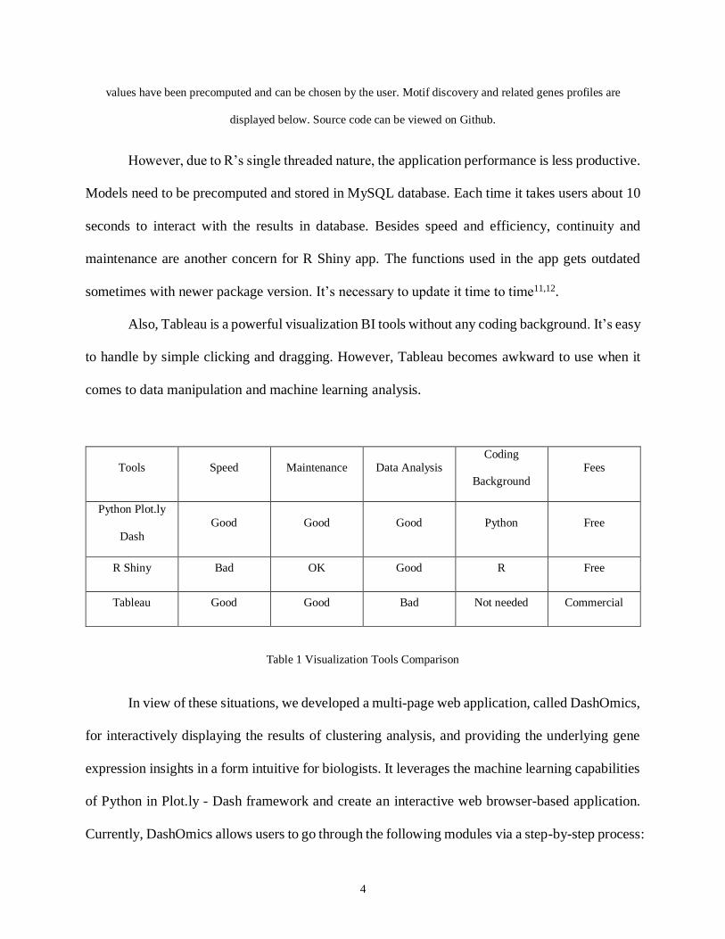
Tools Speed Maintenance Data Analysis Coding
Background
Fees
Python Plot.ly
Dash
Good Good Good Python Free
R Shiny Bad OK Good R Free
Tableau Good Good Bad Not needed Commercial
Table 1 Visualization Tools Comparison
In view of these situations, we developed a multi-page web application, called DashOmics,
for interactively displaying the results of clustering analysis, and providing the underlying gene
expression insights in a form intuitive for biologists. It leverages the machine learning capabilities
of Python in Plot.ly - Dash framework and create an interactive web browser-based application.
Currently, DashOmics allows users to go through the following modules via a step-by-step process:

5
(1) Choosing example datasets or uploading users’ own datasets to explore DashOmics; (2)
Deciding optimal number of clusters by two model evaluation methods -- Elbow Method and
Silhouette Analysis; (3) Overview of overall cluster profiles; (4) Exploring a certain cluster or
gene profile.
These modules form an integrated pipeline, but each step can also be used independently.
6
Chapter 2: MATERIALS AND METHODS
In this chapter we provide information regarding the format of example datasets and the
experimental methods applied in our study.
2.1 Data Description
Example RNA-seq dataset is consists of over 40 samples from 12 different bioreactor
experiments, focusing on identifying co-expressed genes during a copper-induced metabolic time-
switch experiment13.
The raw data is transformed into gene expression matrices -- tables where rows represent
genes, columns represent samples of different experimental conditions. And each cell in matrix
containing numbers characterizing the expression level of particular gene in the particular sample.
The total dataset is then log2 transformed and normalized to reduce the variance between samples.
A sample in experimental condition which fed batch on methanol is chosen to be the baseline.
Preprocess of log-transformation and taking ratio allows users intuitively visualize and interpret
data in the same order of magnitude14. The normalized read counts are the starting point for the
following unsupervised machine learning analysis.
2.2 DashOmics Workflow
This project is built on the top of Plot.ly - Dash15, a web-based interfaces in Python,
requiring no HTML, CSS or JavaScript programming experience for Graphical User Interface
(GUI) design.

7
Figure 2 Workflow of DashOmics.
By following steps above, example data in database or local data from users can be chosen as input data. Elbow
Method and Silhouette Analysis are provided to help users predetermine optimal k value before applying K-Means
clustering algorithm on input dataset. Cluster profiles are visualized by three parts: cluster overview (including
cluster sizes and principle component analysis), specific clusters visualization and genes visualization.
Example datasets are stored in our SQLite database for users to play. Uploading csv or
Excel file into database is another choice. Local datasets are parsed as DataFrame by Pandas16,
and then added into database as tables. Scikit-Learn17 is used to apply K-Means clustering method
on datasets queried from database, with two model evaluation methods — Elbow Method and
Silhouette Analysis. Cluster profiles of grouped genes based on specific k value are shown in
following layout.
The repository containing the scripts and instructions for the entire project is located on
GitHub18.
2.3 Clustering analysis: K-Means Clustering
K-Means clustering is one of the most widely used clustering algorithm19.
8
It starts by placing k centroid (c1, c2, …, ck) at random locations within space of datasets.
For each individual point xi, compute Euclidean distance (EUC) between this point and every
centroid to find the nearest centroid cj. Then assign the point xi to cluster j of the nearest centroid.
Next step is resetting the position of each centroid by moving it to the arithmetic mean of all
individual points aligned to this cluster. The iteration of two steps above continues until none of
the cluster assignment changes, which means K-Means algorithm converges.
Compared to other clustering algorithm, K-Means clustering is easy to implement and
effective to identify clusters of dense data points in multi-dimensional datasets. However, the
limitation of K-Means clustering cannot be ignored: 1. Initial centroid placement have a strong
impact on the final results, which causes unstable clustering result; 2. K-Means clustering is
sensitive to scale. It does not work well with clusters of different size and density. It’s vital to
spend lots of time on scaling (normalization or standardization) your datasets; 3. It is difficult to
pick k value if little is known about the data.
2.4 Model evaluation: Elbow Method & Silhouette Analysis
K-Means clustering analysis requires an optimal k value to define the number of clusters.
Currently, there is no great ways to do it automatically. Here, we considered two common
strategies -- Elbow Method and Silhouette Analysis to help users manually choose the number of
clusters in visualization20.
In Elbow method, we run K-Means clustering in a selected range of k value, and compute
average sum of square error (SSE) for every k value. SSE is expected to be zero when k value is
equal to the number of data point and each point belong to its own cluster. By plotting the sum of
square error of every cluster against the range of k-values, we get a curve showing SSE decrease
as the result of increasing k value. There can be a “elbow point” where rapidly decreasing of SSE
9
ends and marginal decreasing begins, indicating it can be fitting noise instead of getting substantial
decrease in variance after that elbow point. This elbow point is the optimal k value we need to find.
Silhouette analysis is another model evaluation method which is worth a try when Elbow Method
does not work well. By measuring how close each point is to points in the same cluster and to
points in the neighboring clusters, Silhouette analysis provides a way to assess parameters like
number of clusters visually21. The first step of Silhouette Analysis is computing the average
distance of each point to all other points in the same cluster, which is denoted as A. The second
step is computing the average distance of points to all the points in the nearest neighboring cluster,
which is denoted as B. Silhouette coefficient (Sc) value is defined as (B - A) / max (A, B). The
range of Silhouette coefficient is between -1 to 1. If values approach 1, resulting clusters are clearly
separated from each other and points in clusters are tightly packed. If values are negative, there
can be wrong assignments in each cluster. Values near 0 indicate overlapping clusters.
2.5 Principal Component Analysis (PCA)
Principal Component Analysis (PCA) is an unsupervised machine method designed mainly
to reduce dimensionality22.
In a multivariate dataset, there is often some degree of covariation between variables which
introduce redundancy into data. Basically, PCA finds the direction which maximizes variability of
data, calls it the first principal component and set it as horizontal axis. All the remaining principal
components are orthogonal of previous principal components and are ordered by decreasing
variance explained. So the principal component axis are now linear combination of original
variables. PCA rotates the original axes into this new principal component coordinate system.
There are two common application of PCA: 1. Optimization of machine learning methods which
are running slow because of their high dimensionality; 2. Visualization of multivariate data with

10
two-dimensional or three-dimensional scatter plot representation of the expression profiles, in
order to aid the interpretation of underlying patterns that reveal clusters and outliers in the data.
PCA also has the inherent limitation: 1. It is not scale invariant. We need to scale our data before
implementing PCA for dimension reduction; 2. PCA is based on the hypothesis that variables are
correlated. If not, PCA just orders them according to the amount of variances they contribute23.

11
Chapter 3: RESULTS AND DISCUSSION
We propose DashOmics, an advanced user-friendly analytical suite capable of efficiently
computing unsupervised machine learning algorithm and creating interactive visualization of
clustering results for genomics dataset in a web browser.
To use DashOmics, input data must be in the form of a matrix of numeric with gene name
as index column [Table 1]. The columns of the matrix might correspond to various samples of
different experimental conditions. The numerical values which represent gene expression level
need to be normalized to the same scale.
id FM18_CH3OH_4.1/day FM18_CH3OH_4.1/day_R1 ... FM20_no-
lim_5.2/day_R1
MBURv2_100001 0.19239034 0.399055752 ... 0.031919312
MBURv2_100002 -0.405649447 -0.30995986 ... -1.050033096
... ... ... ... ...
MBURv2_10017 -0.020934651 0.060153387 0.221941622 0.239143072
Table 2 Example data
Usage of DashOmics can be divided into following steps:
Step 0: Define Input Dataset
Input dataset can be defined in two ways: choosing an existing example dataset from
dropdown menu or uploading a local file. Upon choosing example data or uploading the input data,
data table will automatically show the content of datasets.

12
Figure 3 DashOmics Homepage
If uploading and choosing example data are triggered simultaneously, input error arises in
console indicating “Upload data conflicts with Example data”.
In this case study, we choose the first example dataset in the dropdown menu as input data
for following analysis.
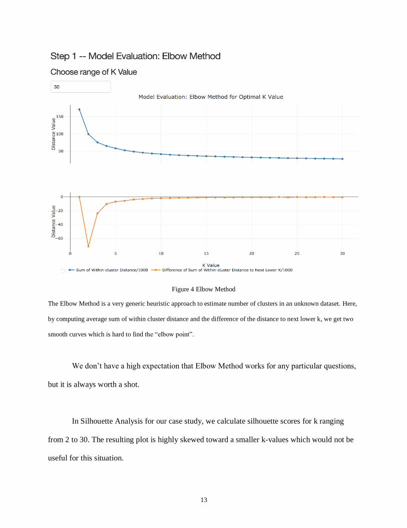
Step 1: Model Evaluation -- define optimal k value as number of clusters
To choose an optimal k value for K-Means clustering analysis, we start with Elbow Method
as a model evaluation approach.
In our analysis, we choose 2 to 30 as the range of k value. However, both two curves --
sum of within cluster distance and the difference of the distance to next lower k look like
ambiguous that does not give a clear answer as “elbow” point to identify optimal number of
clusters.
13
Figure 4 Elbow Method
The Elbow Method is a very generic heuristic approach to estimate number of clusters in an unknown dataset. Here,
by computing average sum of within cluster distance and the difference of the distance to next lower k, we get two
smooth curves which is hard to find the “elbow point”.
We don’t have a high expectation that Elbow Method works for any particular questions,
but it is always worth a shot.
In Silhouette Analysis for our case study, we calculate silhouette scores for k ranging
from 2 to 30. The resulting plot is highly skewed toward a smaller k-values which would not be
useful for this situation.

14
Figure 5 Silhouette Analysis
Fig 5. Silhouette Analysis plot for a range of k value. It is a very generic heuristic approach to estimate number of
clusters in an unknown dataset. Here, we get a highly skewed curve which suggest Silhouette Analysis should be
abandoned in this case.
For the dataset in this study, the silhouette analysis does not prove to be useful at suggesting
a k-value.
When common model evaluation methods fail to get a certain answer for optimal k value,
biological background and key information about data characteristic need to be introduced as
assistance.
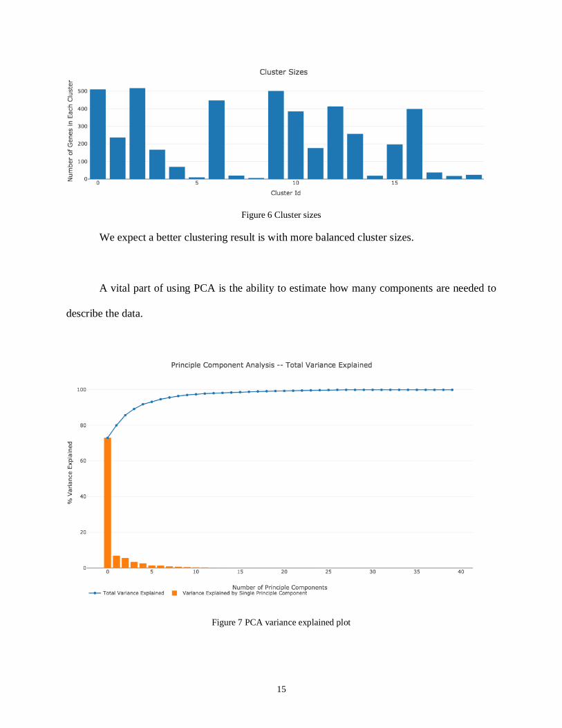
Step 2: Cluster Profile
Setting k value equals to 20, we will get an overview profile of cluster sizes and its two-
dimensional projection.
15
Figure 6 Cluster sizes
We expect a better clustering result is with more balanced cluster sizes.
A vital part of using PCA is the ability to estimate how many components are needed to
describe the data.
Figure 7 PCA variance explained plot
16
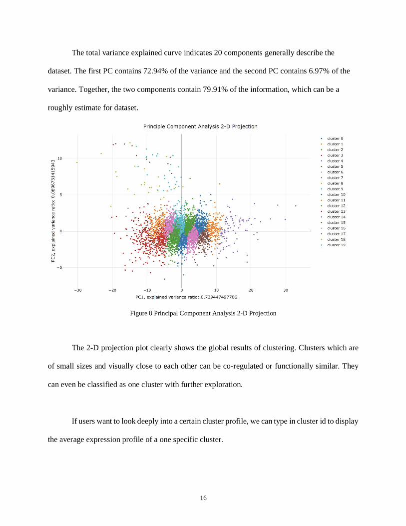
The total variance explained curve indicates 20 components generally describe the
dataset. The first PC contains 72.94% of the variance and the second PC contains 6.97% of the
variance. Together, the two components contain 79.91% of the information, which can be a
roughly estimate for dataset.
Figure 8 Principal Component Analysis 2-D Projection
The 2-D projection plot clearly shows the global results of clustering. Clusters which are
of small sizes and visually close to each other can be co-regulated or functionally similar. They
can even be classified as one cluster with further exploration.
If users want to look deeply into a certain cluster profile, we can type in cluster id to display
the average expression profile of a one specific cluster.

17
Figure 9 Average expression profile of Cluster #8 and CLUSTER #18
Two cluster profiles share similar trend: highly expressed in the absence of Cu and during the first several time
points after Cu induction, and also highly expressed at sample FM 69 & FM 81.
From average expression profile above, it’s easy to find genes in cluster #8 and cluster #18
have similar expression trend but different magnitude across the samples. Hypothesis is generated
that genes in cluster #8 and cluster #18 might encode proteins that complete a specific function.
If users generate interests in expression profile of a certain gene, we can type in gene
name to find out which cluster it belongs to and what the average expression profile look like.
18
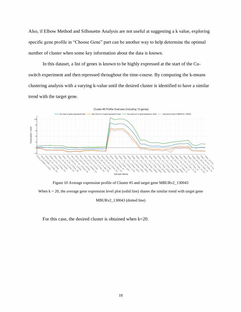
Also, if Elbow Method and Silhouette Analysis are not useful at suggesting a k value, exploring
specific gene profile in “Choose Gene” part can be another way to help determine the optimal
number of cluster when some key information about the data is known.
In this dataset, a list of genes is known to be highly expressed at the start of the Cu-
switch experiment and then repressed throughout the time-course. By computing the k-means
clustering analysis with a varying k-value until the desired cluster is identified to have a similar
trend with the target gene.
Figure 10 Average expression profile of Cluster #5 and target gene MBURv2_130043
When k = 20, the average gene expression level plot (solid line) shares the similar trend with target gene
MBURv2_130043 (dotted line)
For this case, the desired cluster is obtained when k=20.
19
Chapter 4: CONCLUSION
This chapter summarizes the work described in this thesis and provides recommendations
for future work.
4.1 Summary
We build a user-friendly web application designed to quickly and efficiently computing
unsupervised machine learning algorithms and creating interactive visualization within the Python
programming environment, without any prerequisite programming skills required of the user. Our
web-based application aims to enhance the genomic data exploration experience by integrating
unsupervised machine learning capability and visualization.
DashOmics is especially useful for exploratory data analysis and generating hypotheses,
but extra biological background and experiments are still needed for getting a certain answer.
4.2 Future Work
The following steps can be pursued to improve the work completed in this project:
1. Adding preprocessing functionality for raw data, such as cleaning and filtering raw data,
normalizing and choosing certain sample as baseline, in order to extend the application
scope from clean and normalized data, to experimental raw data.
2. Applying other clustering analysis algorithms, eg. hierarchical lustering analysis, which
can be used to group samples instead of genes with similar properties24.
3. Setting data table for edible input datasets and giving users options to apply clustering
analysis on selected subgroups of samples or genes.
4. Adding features from R Shiny cluster analysis app made by David Beck, eg. motif
discovery and sequence search.
5. Refining layout with CSS themes and editing documentation for user instruction
20
BIBLIOGRAPHY
1. Mitchell, T. Machine Learning. McGraw-Hill; 1997.
2. Libbrecht, Maxwell W., and William Stafford Noble. "Machine learning applications in
genetics and genomics." Nature Reviews Genetics 16.6 (2015): 321.
3. Brown, Michael PS, et al. "Knowledge-based analysis of microarray gene expression data
by using support vector machines." Proceedings of the National Academy of Sciences
97.1 (2000): 262-267.
4. Brazma, Alvis, and Jaak Vilo. "Gene expression data analysis." FEBS letters 480.1
(2000): 17-24.
5. Tavazoie, Saeed, et al. "Systematic determination of genetic network architecture."
Nature genetics 22.3 (1999): 281.
6. Alizadeh, Ash A., et al. "Distinct types of diffuse large B-cell lymphoma identified by
gene expression profiling." Nature 403.6769 (2000): 503.
7. Gehlenborg, Nils, et al. "Visualization of omics data for systems biology." Nature
methods 7.3s (2010): S56.
8. Quackenbush, J. Computational analysis of microarray data. Nat. Rev. Genet. 2, 418–427
(2001). 33.
9. Khomtchouk, Bohdan B., James R. Hennessy, and Claes Wahlestedt. "shinyheatmap:
Ultrafast low memory heatmap web interface for big data genomics." PloS one 12.5
(2017): e0176334.
10. D.A.C. Beck. https://github.com/BeckResearchLab/cluster_analysis
21
11. Ihaka, Ross, and Robert Gentleman. "R: a language for data analysis and graphics."
Journal of computational and graphical statistics 5.3 (1996): 299-314.
12. Polpitiya, Ashoka D., et al. "DAnTE: a statistical tool for quantitative analysis of-omics
data." Bioinformatics 24.13 (2008): 1556-1558.
13. Gilman, Alexey. Development of a Promising Methanotrophic Bacterium as an
Industrial Biocatalyst. Diss. 2017
14. Bland, J. Martin, and DouglasG Altman. "Statistical methods for assessing agreement
between two methods of clinical measurement." The lancet 327.8476 (1986): 307-310.
15. Sievert, Carson, et al. "plotly: Create Interactive Web Graphics via ‘plotly. js’." R
package version 3.0 (2016).
16. McKinney, Wes. "pandas: a foundational Python library for data analysis and statistics."
Python for High Performance and Scientific Computing (2011): 1-9.25.
17. Pedregosa, Fabian, et al. "Scikit-learn: Machine learning in Python." Journal of machine
learning research 12.Oct (2011): 2825-2830.
18. Guo J, A.C. Beck D. DashOmics. https://github.com/BeckResearchLab/DashOmics
19. Jain AK: Data clustering: 50 years beyond K-means. Pattern Recognition Letters 2010,
31:651-666.
20. Deb, Chirag, and Siew Eang Lee. "Determining key variables influencing energy
consumption in office buildings through cluster analysis of pre-and post-retrofit building
data." Energy and Buildings 159 (2018): 228-245.
21. Wang, Liang, et al. "Silhouette analysis-based gait recognition for human identification."
IEEE transactions on pattern analysis and machine intelligence 25.12 (2003): 1505-
1518.
22
22. Wold, Svante, Kim Esbensen, and Paul Geladi. "Principal component analysis."
Chemometrics and intelligent laboratory systems 2.1-3 (1987): 37-52.
23. Yeung, Ka Yee, and Walter L. Ruzzo. "Principal component analysis for clustering gene
expression data." Bioinformatics17.9 (2001): 763-774.
24. Jaskowiak, Pablo Andretta, Ivan G. Costa, and Ricardo JGB Campello. "Clustering of
RNA-Seq samples: Comparison study on cancer data." Methods 132 (2018): 42-49.


![Task-Oriented Optimal Sequencing of Visualization Charts · developing techniques to threading visualization charts into meaningful sequences. Kim et al. [25] introduced GraphScape,](https://img.pdfslide.net/doc/110x75/5f61133bf3ed7763fb2e9c52/task-oriented-optimal-sequencing-of-visualization-charts-developing-techniques-to.jpg)