Embed Size (px)
Citation preview
Effective Use of Line Charts
1
Purpose This tool provides guidelines and tips on how to effectively use line charts to communicate research findings. Format This tool provides guidance on line charts and their purposes, shows examples of preferred practices and practical tips for line charts, and provides cautions and examples of misuse and poor use of line charts and how to make corrections. Audience This tool is designed primarily for researchers from the Model Systems that are funded by the National Institute on Disability and Rehabilitation Research (NIDILRR). The tool can be adapted by other NIDILRR-funded grantees and the general public.
The contents of this tool were developed under a grant from the National Institute on Disability, Independent Living, and Rehabilitation Research (NIDILRR grant number 90DP0012-01-00). The contents of this fact sheet do not necessarily represent the policy of Department of Health and Human Services, and you should not assume endorsement by the Federal Government.
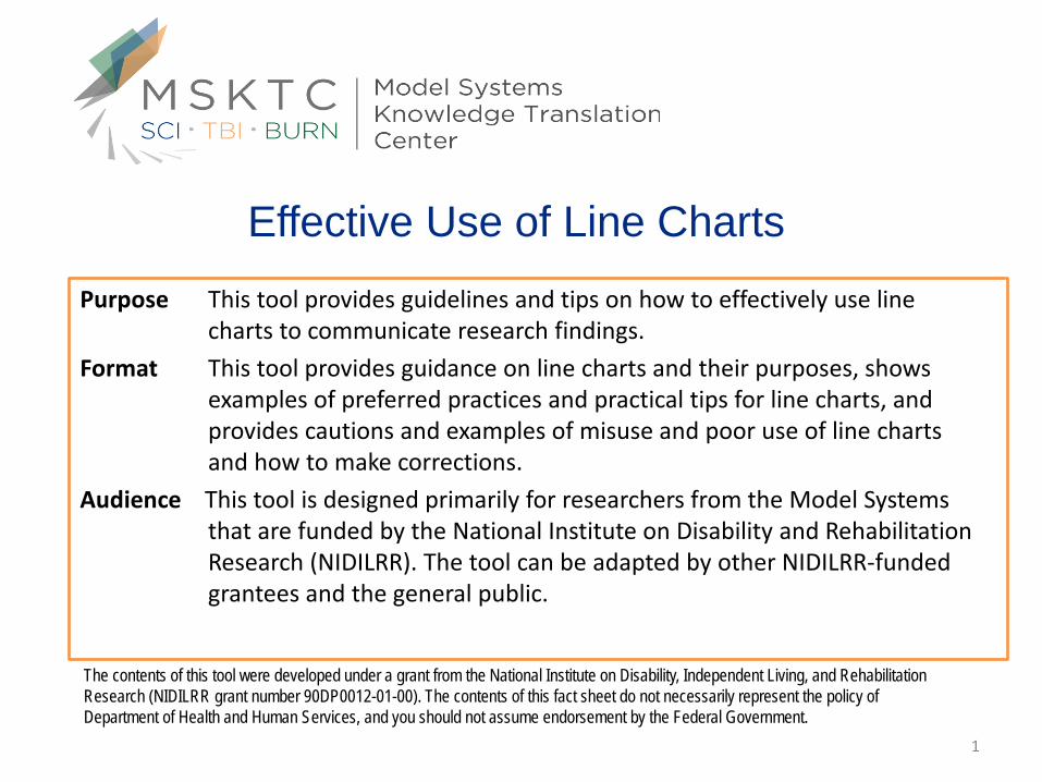
Overview and Organization
Simple Line Chart ………………………………………………..3 Trends…………………………………………………………………………4 Vertical Axis………………………………………….…………………….7 3-D…………………………………………………………………………….10 Unequal Horizontal Axis……………………………………………..11 Cumulative Trends……………………………………………………..13
Multiple Line Series Chart…………………………………...16 Data Investigation………………………………………………………17 Simple....…………………………………………………………………….19 Complex and Intersection…………………………………………..20 Dual Vertical Axis………………………………….…………....………21
Simple Line Chart
The primary use of Line Charts is to display trends over a period of time (marijuana use by youth by year, trends in clients served at a food pantry by quarter, website page hits by hour).
The Time unit (years, quarter, months, hours of the day etc) is distributed evenly along the horizontal axis.
The magnitude of each data element in the series is represented by its position on the vertical axis.
The line in the Line Chart connects the individual data points across the time period.
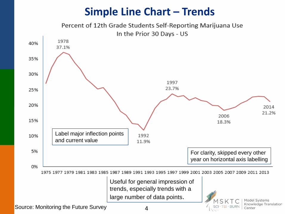
Simple Line Chart – Trends
Useful for general impression of trends, especially trends with a large number of data points.
For clarity, skipped every other year on horizontal axis labelling
Label major inflection points and current value
Source: Monitoring the Future Survey
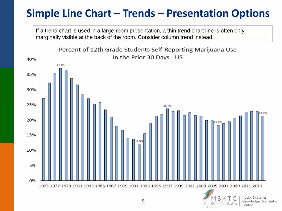
Simple Line Chart – Trends – Presentation Options If a trend chart is used in a large-room presentation, a thin trend chart line is often only marginally visible at the back of the room. Consider column trend instead.
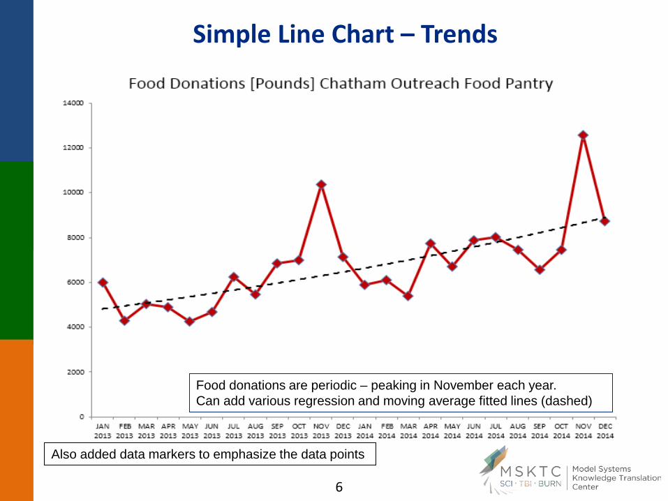
Simple Line Chart – Trends
Food donations are periodic – peaking in November each year. Can add various regression and moving average fitted lines (dashed)
Also added data markers to emphasize the data points
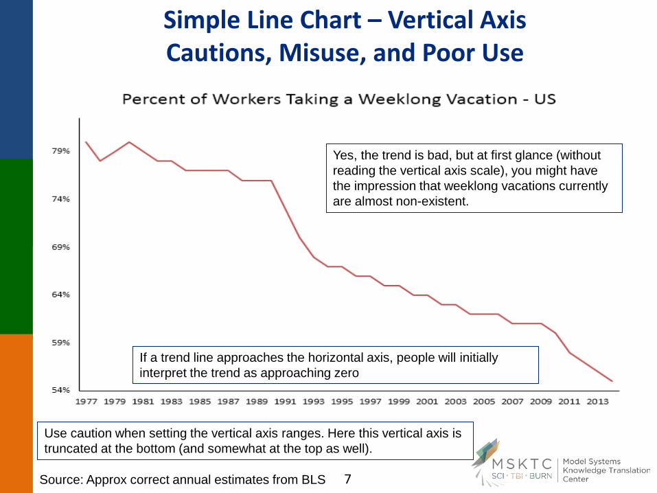
Simple Line Chart – Vertical Axis Cautions, Misuse, and Poor Use
Use caution when setting the vertical axis ranges. Here this vertical axis is truncated at the bottom (and somewhat at the top as well).
Yes, the trend is bad, but at first glance (without reading the vertical axis scale), you might have the impression that weeklong vacations currently are almost non-existent.
If a trend line approaches the horizontal axis, people will initially interpret the trend as approaching zero
Source: Approx correct annual estimates from BLS
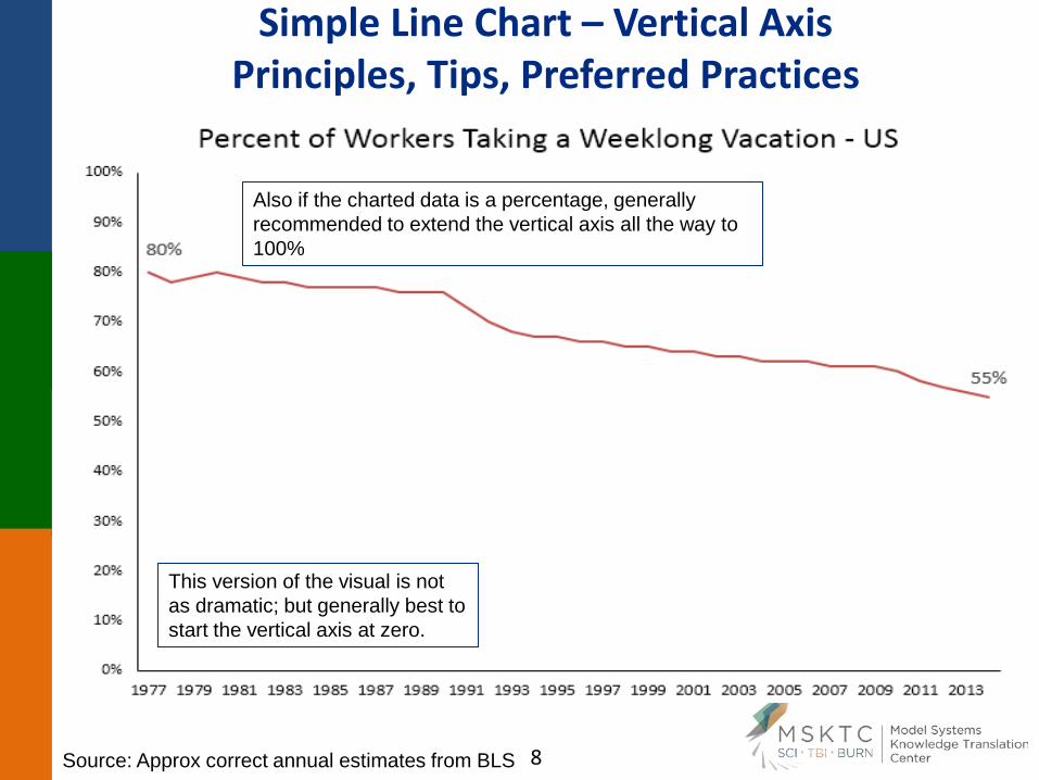
Simple Line Chart – Vertical Axis Principles, Tips, Preferred Practices
This version of the visual is not as dramatic; but generally best to start the vertical axis at zero.
Also if the charted data is a percentage, generally recommended to extend the vertical axis all the way to 100%
Source: Approx correct annual estimates from BLS
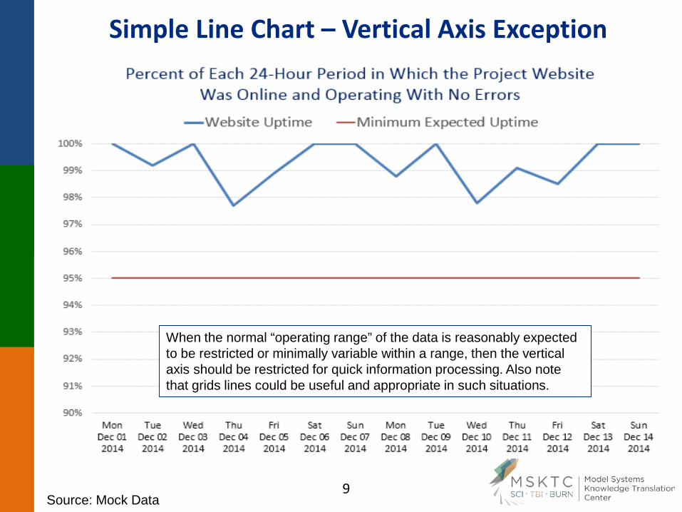
Simple Line Chart – Vertical Axis Exception
When the normal “operating range” of the data is reasonably expected to be restricted or minimally variable within a range, then the vertical axis should be restricted for quick information processing. Also note that grids lines could be useful and appropriate in such situations.
Source: Mock Data
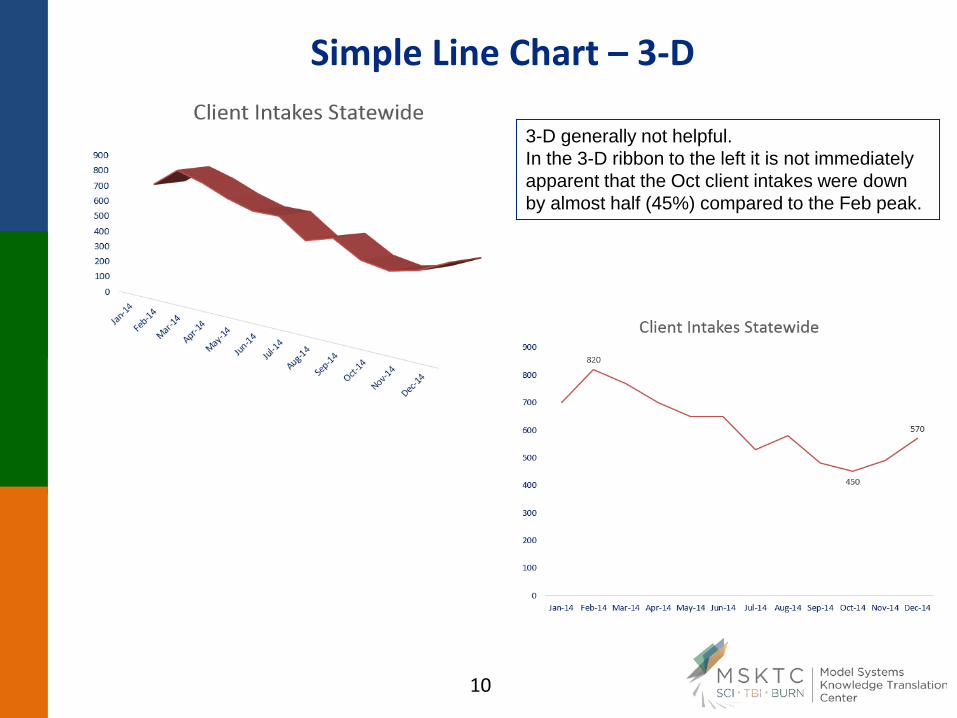
Simple Line Chart – 3-D
3-D generally not helpful. In the 3-D ribbon to the left it is not immediately apparent that the Oct client intakes were down by almost half (45%) compared to the Feb peak.
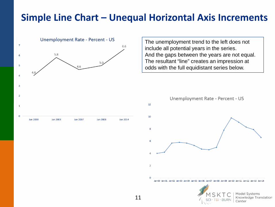
Simple Line Chart – Unequal Horizontal Axis Increments
The unemployment trend to the left does not include all potential years in the series. And the gaps between the years are not equal. The resultant “line” creates an impression at odds with the full equidistant series below.
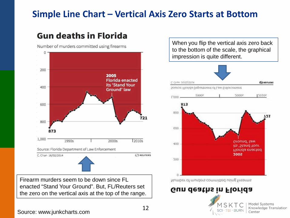
Simple Line Chart – Vertical Axis Zero Starts at Bottom
When you flip the vertical axis zero back to the bottom of the scale, the graphical impression is quite different.
Firearm murders seem to be down since FL enacted “Stand Your Ground”. But, FL/Reuters set the zero on the vertical axis at the top of the range.
Source: www.junkcharts.com
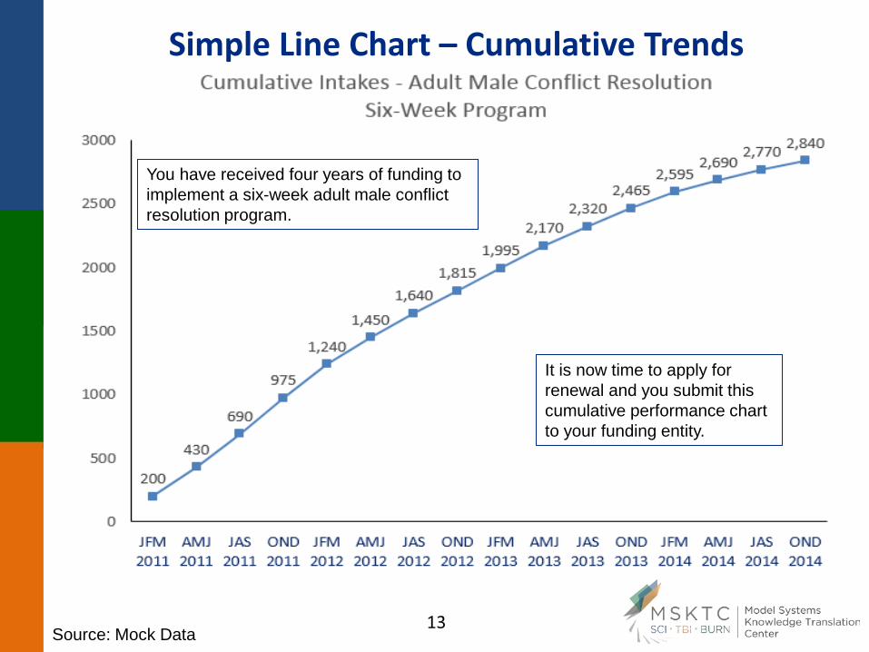
Simple Line Chart – Cumulative Trends
You have received four years of funding to implement a six-week adult male conflict resolution program.
It is now time to apply for renewal and you submit this cumulative performance chart to your funding entity.
Source: Mock Data
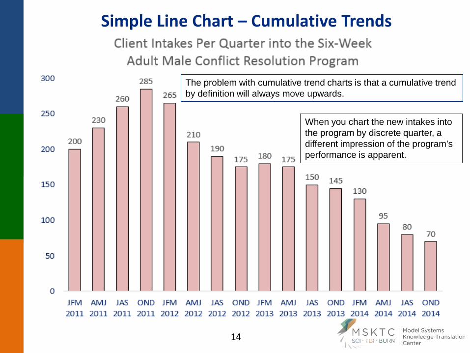
Simple Line Chart – Cumulative Trends
The problem with cumulative trend charts is that a cumulative trend by definition will always move upwards.
When you chart the new intakes into the program by discrete quarter, a different impression of the program’s performance is apparent.
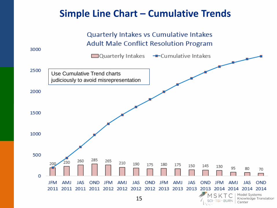
Simple Line Chart – Cumulative Trends
Use Cumulative Trend charts judiciously to avoid misrepresentation
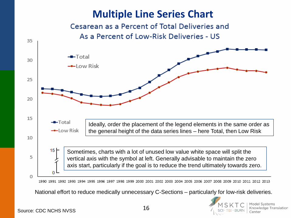
Multiple Line Series Chart
National effort to reduce medically unnecessary C-Sections – particularly for low-risk deliveries.
Ideally, order the placement of the legend elements in the same order as the general height of the data series lines – here Total, then Low Risk
Sometimes, charts with a lot of unused low value white space will split the vertical axis with the symbol at left. Generally advisable to maintain the zero axis start, particularly if the goal is to reduce the trend ultimately towards zero.
Source: CDC NCHS NVSS
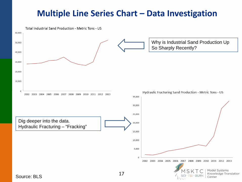
Multiple Line Series Chart – Data Investigation
Why is Industrial Sand Production Up So Sharply Recently?
Dig deeper into the data. Hydraulic Fracturing – “Fracking”
Source: BLS
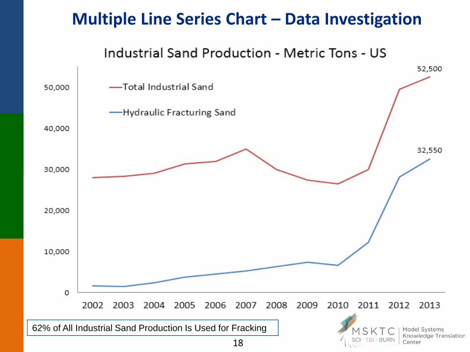
Multiple Line Series Chart – Data Investigation
62% of All Industrial Sand Production Is Used for Fracking
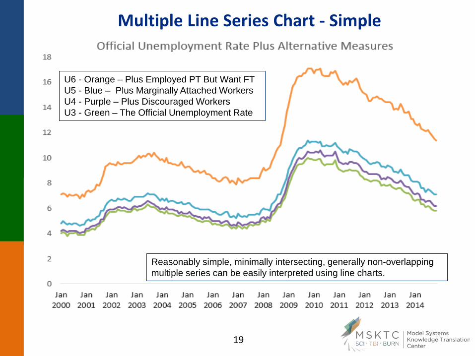
Multiple Line Series Chart - Simple
U6 - Orange – Plus Employed PT But Want FT U5 - Blue – Plus Marginally Attached Workers U4 - Purple – Plus Discouraged Workers U3 - Green – The Official Unemployment Rate
Reasonably simple, minimally intersecting, generally non-overlapping multiple series can be easily interpreted using line charts.
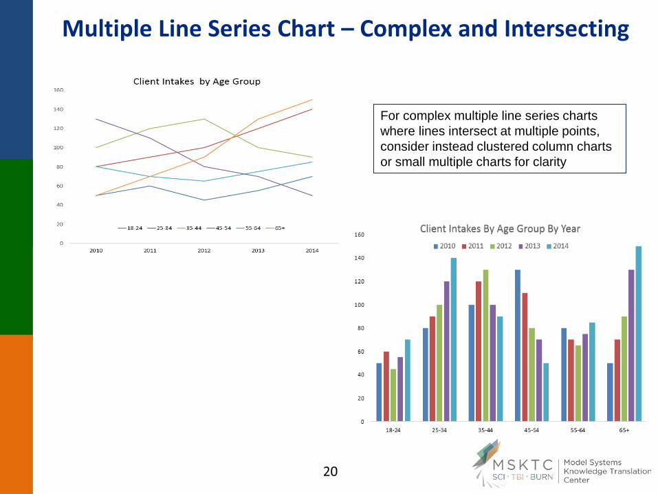
Multiple Line Series Chart – Complex and Intersecting
For complex multiple line series charts where lines intersect at multiple points, consider instead clustered column charts or small multiple charts for clarity
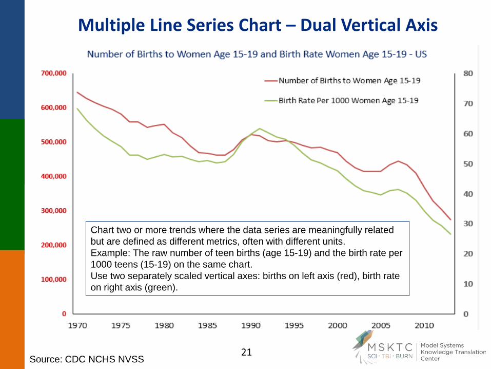
Multiple Line Series Chart – Dual Vertical Axis
Chart two or more trends where the data series are meaningfully related but are defined as different metrics, often with different units. Example: The raw number of teen births (age 15-19) and the birth rate per 1000 teens (15-19) on the same chart. Use two separately scaled vertical axes: births on left axis (red), birth rate on right axis (green).
Source: CDC NCHS NVSS
Multiple Line Series Chart – Dual Vertical Axis
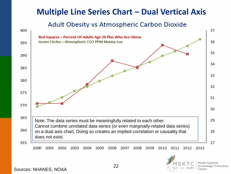
Note: The data series must be meaningfully related to each other. Cannot combine unrelated data series (or even marginally-related data series) on a dual axis chart. Doing so creates an implied correlation or causality that does not exist.
Sources: NHANES, NOAA