Embed Size (px)
Citation preview

Eindhoven University of Technology
MASTER
Helping novices explore data
facilitating mental model creation of an information visualization system by displayinginformation flows
Schröter, H.L.
Award date:2015
Link to publication
DisclaimerThis document contains a student thesis (bachelor's or master's), as authored by a student at Eindhoven University of Technology. Studenttheses are made available in the TU/e repository upon obtaining the required degree. The grade received is not published on the documentas presented in the repository. The required complexity or quality of research of student theses may vary by program, and the requiredminimum study period may vary in duration.
General rightsCopyright and moral rights for the publications made accessible in the public portal are retained by the authors and/or other copyright ownersand it is a condition of accessing publications that users recognise and abide by the legal requirements associated with these rights.
• Users may download and print one copy of any publication from the public portal for the purpose of private study or research. • You may not further distribute the material or use it for any profit-making activity or commercial gain

in partial fulfilment of the requirements for the degree of
Master of Science
in Human Technology Interaction
Supervisors:
Dr.ir. M.C. Willemsen
Prof.dr.ir. J. J. van Wijk
Helping novices explore data: facilitating
mental model creation of an information
visualization system by displaying
information flows
By Henri Schröter - 0832259


Table of Contents 1 Abstract ................................................................................................................................... 1
2 Introduction ............................................................................................................................. 2
2.1 Expertise .......................................................................................................................... 3
2.2 Mental models .................................................................................................................. 5
2.3 Measuring mental models ................................................................................................. 7
2.4 Research questions .......................................................................................................... 9
2.5 Hypothesis development .................................................................................................. 9
3 Method ...................................................................................................................................12
3.1 Research design ..............................................................................................................12
3.2 The application ................................................................................................................13
3.3 The Procedure .................................................................................................................18
3.4 Measures .........................................................................................................................19
4 Results ...................................................................................................................................21
4.1 Revised hypotheses ........................................................................................................21
4.2 Descriptive Statistics .......................................................................................................22
4.3 Success rate ....................................................................................................................22
4.4 Dimension Reduction.......................................................................................................24
4.5 System Satisfaction .........................................................................................................26
4.6 Performance ....................................................................................................................29
5 Discussion .............................................................................................................................35
5.1 Mental model measurement ............................................................................................35
5.2 Information flows selection effect .....................................................................................35
5.3 System satisfaction ..........................................................................................................36
5.4 Performance ....................................................................................................................36
5.5 Conclusion and recommendations for further study .........................................................37
6 References ............................................................................................................................40

7 Appendix ................................................................................................................................44
7.1 Questionnaires ................................................................................................................44
7.1.1 Expertise ...................................................................................................................44
7.1.2 System satisfaction ...................................................................................................44
7.1.3 Mental Model Understanding.....................................................................................45
7.2 Assignments ....................................................................................................................45
7.2.1 Assignment 1 ............................................................................................................45
7.2.2 Assignment 2 ............................................................................................................46
7.2.3 Assignment 3 ............................................................................................................46
7.2.4 Assignment 4 ............................................................................................................47
7.2.5 Assignment 5 ............................................................................................................47
7.3 Screenshots ....................................................................................................................48
7.3.1 Informed Consent Form ............................................................................................48
7.3.2 Introductory text ........................................................................................................49
7.3.3 Application with information flows ..............................................................................49
7.3.4 Application without information flows .........................................................................50
7.3.5 Questionnaire top part ...............................................................................................51
7.3.5 Questionnaire bottom part .........................................................................................52
1
1 Abstract
Information visualization systems are complex systems that are generally hard to use for
novices. Due to the exponential increase of data in our society, more novice users are adopting
these types of systems. This new target-group has different interaction and usability needs, as
expert-tailored systems don’t suit novices and vice versa. This gives rise to a demand for
specifically designing information visualization systems for different expertise levels.
After addressing the general usability problems of an information visualization system, another
approach is proposed to help novices users. Teaching novice users the underlying structure of a
system was previously found to increase performance with and understanding of the system.
Improving the user’s so called mental model allows them to more easily infer the results of
interacting with the system, creating a seamless information flow between user and system. In
this study we investigate if facilitating mental model creation can help novices develop correct
semantic and schematic knowledge of an information visualization system to increase
performance and satisfaction with the system.
We focus on a specific case where different filter types were previously found to create
interaction issues with information visualization systems. Global filters that affect all
visualizations were confused with local filters, that only apply to a single visualization. The
proposed solution to this problem is graphically displaying the flow of information through the
filters in the interface to help novice users obtain a better mental model. This will allow them to
use the filtering components of the information visualization system more efficiently.
An experiment was carried out using an information visualization system called Nvision, where
the use of information flows was compared to a base condition without information flows. More
participants in the information flows condition finished the experiment, implying that the
information flows helped explain the system. Contrary to our expectations the information flows
had a negative effect on the performance and satisfaction of novice users, and a positive effect
on expert users. We argue that the information flows are not directly understood by novices
making the system more complex for them, but experts quickly understand their functionality
and benefit from it.
Key words: User study, information visualization, human cognition, mental models, expertise

2
2 Introduction
Information visualization systems (abbreviated infovis systems) are created to provide insight in
and communicate hard to grasp, often abstract information. These systems combine multiple
visualizations, filters and other data processing techniques to allow for the exploration of
complex datasets. User interaction is a vital part of such a system; it must be carefully crafted to
allow users to use the system optimally. How well the system is used depends on the users
previous experience with these types of systems, and the data that is being examined (Grammel,
Tory, & Storey, 2010). Demand for infovis systems is increasing due to the exponential increase
of data in our society: from now until 2020 the amount of data is predicted to double every two
years. Even more, in 2012 only 0.5% of the total data volume was analyzed, while 23% is
predicted to be useful (Gantz, Reinsel, & Shadows, 2012). Due to this demand for data analysis
the number of non-expert users for infovis systems will increase rapidly. This means that
interaction and interface optimization should also focus on novice users. Some established
solutions like Tableau (Tableau, 2015) are already heading in this direction with increasingly
novice-oriented interfaces.
In general creating an interface for novices means: limit the number of options to the ones used
by novices, give clear instructional guidance, and graphically structure the interface in such a
way that a user is guided through the process (Barfield, 2004; Krug, 2005). Another way to help
novices comprehend interfaces and other systems is to explain what components it consists of,
what their functions are, and how these are connected (Jih & Reeves, 1992; Storey, Fracchia, &
Müller, 1999). This allows the users to form a mental model of the interface or system: a mental
representation of how something works in the real world that can be used for reasoning. For
example many people have a complete mental model of a bicycle that can be reasoned with. If
we show someone a picture of a bicycle without a bicycle-chain and ask if this bicycle would
work, the answer of course would be negative. In this case, the mental model of the bicycle
allows us to infer that the chain that connects the cogwheels cannot transfer the movement
meaning that this bicycle would not move by pedaling. People use these models all the time: we
cannot possibly comprehend every bit of information around us, so instead we create these
abstract models to work with. This counts for all kinds of complex systems: when the inner
workings of a device or application are explained, the user can more easily make inferences
when reasoning (Kieras & Bovair, 1984).

3
When people are solving problems, they often use internal representations in combination with
external representations: pen and paper for example. In this case the pen and paper augment
and enhance human cognition by providing ways to externally store and structure the
information. A user interacting with an infovis system is trying to create an application state that
provides a data insight he or she finds of importance. This is an iterative process of adjusting the
system and observing the result (Grammel et al., 2010), just like when an artist is painting and
then refining the painting based on the observed result. In this iterative process the user is not
only responding to the interface, but is cognitively simulating what action in the interface will
provide what type of result, just like the artist would simulate how the added color changes the
painting. In other words, the user is creating and using a mental model of the application to
simulate what the outcome of the interaction will be. A more refined and functionally correct
mental model might then lead to reduced effort in achieving the goal of obtaining the required
system state.
Expert users usually have a mental model that is to a large extent coherent to the system’s
model, but novices lack this (Grammel et al., 2010). Helping novices gain a more expert-like
mental model of the system might then help them in using the system. How is this mental model
creation best facilitated, especially for novices, and how can this be applied to solve interaction
issues currently present in infovis system? We will discuss the implications of expertise
differences and mental model theory for infovis systems in the following sections.
2.1 Expertise
Using an infovis system is a task that needs to be learned. Understanding the available
individual visualizations is already hard for a novice user, let alone understanding the structure
of the system itself (Grammel et al., 2010). For the scope of this study we define novice users as
those that are competent in using computers, but lack specific experience with infovis
applications and programming.
A few guidelines can already make a big difference in helping novices. Heer, van Ham,
Carpendale, Weaver & Isenberg (2008) provide a comprehensive list of usability requirements
for an infovis system for novices. First of all, data input for these systems should be
standardized, to prevent novices from having to tweak round in data conversion tools.
Automatic selection of visualization type can help them get started, because they lack the

4
experience for imagining the possible visual mappings on the different visualizations. Useful
defaults such as automated colors, scales and viewpoints should prevent unnecessary
complicated interaction for the novices. Finally contextual information and additional help
should be included, to explain visualization jargon (Elias & Bezerianos, 2011), what is displayed,
and why certain visual mappings are chosen. As much functionality as possible needs to be
automated while explaining the automation, so the novices can learn to apply this new
knowledge and finally take control over parts of this automation when their proficiency
increases. But how would these measures affect experts using the same system?
The differences in performance between novices and experts have been studied extensively. A
broad meta-analysis of eye tracker studies into visualizations from numerous different fields has
confirmed that experts outperform novices on using visualizations (Gegenfurtner, Lehtinen,
Säljö, 2011). Compared to non-experts, experts had shorter fixation durations, more fixations on
task-relevant areas, fewer fixations on task-redundant areas and thus shorter response times for
the task. For tasks of increasing complexity, the difference in performance between novices and
experts was found to be greater. But novice-expert differences aren’t always as straightforward
as this. Interestingly when the visualizations were annotated with text, or if the visualization
style was more naturalistic, the gap between experts and non-experts became smaller: the
experts performance decreased and the novices performance increased. In another study a
similar interaction effect was found in differing levels of dynamics: more animation benefited
experts, where static images benefited novices (Kalyuga, 2008). Multiple studies shows that
when experts use a medium created with instructional guidance for novices, the experts
underperform (Kalyuga, Chandler and Sweller, 2000; Kalyuga, Ayres, Chandler and Sweller,
2003; Homer & Plass, 2010). According to these studies the redundant information displayed
for the novice users, for example textual annotation, is difficult to ignore by the experts. These
experts are then distracted from their normal workflow, reducing their performance. This is a
so-called cognitive load effect: more mental effort needs to be made to ignore the redundant
information in working memory. The effect was labeled the expertise reversal effect.
Kalyuga et al. (2003) argue that experts are normally able to recognize patterns as a familiar
schema, and treat this as one high level unit (chunking). This unit takes up considerably less
working memory capacity than the multiple low-level elements it is composed of, making
information processing more efficient. Novices lack these schema, and will fall back to an
inefficient problem-solving search strategy when they figure out how to use an interface. This

5
might be for example clicking on every possible object to figure out the functionality. The
effectiveness of this strategy can then be supported by instructional guidance: creating a step-by
step process guiding the user through the interface. But when experts are exposed to this they
will be distracted from using their existing schema’s by the redundant information. The display
of instructional guidance is usually prominently present in the interface, making it hard to
ignore for the experts.
A system designed for experts will not suit novices, and the reverse will not work either. This
supports our idea that there is a need for specifically tuning interfaces to the expertise level of
the user. Then the system can facilitate the creation of the novice users’ schemas or mental
models, and prevent an expertise reversal effect from occurring when a correct mental model is
already acquired.
2.2 Mental models
A mental model is a mental representation of how something in the real world works. Because a
person can never contain all the information about the real world in his or her mind, this is
always considered a model. The definition we choose to use for mental models with our focus on
infovis systems is the one of internal representations used by Lui & Stasko (2010):
“We identify mental models as internal, structural, behavioral and functional analogues
of external visualization systems. Mental models preserve schematic, semantic or item
level information about the data, and may be in the format of collages where different
types of information are overlaid.”
Most importantly the model contains information about what components the system or
visualization consists of (semantic information) and how these are connected and relate to each
other (schematic information). Semantic information about a bicycle might for example be that
it has two wheels a chain, cogwheels and some pedals. Schematic information tells us how the
chain connects the cogs and allows the wheel to be driven by the pedals. In the ideal case these
internalized mental models can then be used for reasoning (Kieras & Bovair, 1984; Ziemkiewicz
& Kosara, 2008).

6
The so called coupling of the internal model and external system is what makes visualization
systems augment and enhance cognition. A perfectly coupled system should allow for a seamless
information flow between the human and the application, requiring as little cognitive effort as
possible. Three purposes of coupling are distinguished by Lui & Stasko (2010): external
anchoring, information foraging and cognitive offloading.
External anchoring is accomplished by the way of representing the data itself, the dots in a
scatterplot for example. This plays the same role as drawing or writing for assisting cognition. If
the chosen representation is optimal the user can project his knowledge of the information at
hand on the external representation, and locate the required information.
Information foraging means restructuring and exploring the data to gain new insights through
interacting with the system. An iterative form of interaction takes part where based on the
previous results the user creates new hypotheses and adjusts the system to test them. Here most
of the interaction in infovis systems takes part.
Cognitive offloading is facilitated by the current application state itself and for example the
ability to save points of interest in the data. It would be tedious to keep all the information in
memory, and almost impossible to remember one point of interest in a crowded scatterplot.
The coupling between user and infovis system is always a two way interaction and the external
system should be designed in such a way that the users’ mental model of the application is
optimally induced. Hegarty (2004) even takes this a bit further: “... the design of effective
external visualizations will be based on an understanding of internal (mental) visualization
abilities.” Getting visualizations and infovis systems to adhere to existing mental models might
help accomplish this (Patterson et al., 2014). People use familiar conceptual frameworks to
structure new knowledge during the learning process, and if the system is designed according to
common prior schema’s this will aid knowledge integration. This means that if common
metaphors are used the system will be easier to understand. If using this technique construction
of a correct mental model is accomplished, the schema based simulation of the interaction with
the system will require less effort, and will more likely produce the correct result (Kalyuga et al.
2003). We expect that this will lead to an increase in performance with the system and a more
positive user experience.

7
In interface design study, Kieras & Bovair (1984) provided a schematic drawing of the interface
components for the participants in their manipulation condition. They found that users that first
studied the graphical diagram of the experimental interface increased in performance when
using this interface. They argue that the users’ performance increased because they were able to
infer shortcuts while using the interface by using mental model reasoning. Fiore, Cuevas & Oser
(2003) found a similar result when testing the use of diagrams in a hyperlink based learning
environment. Participants better understood the concepts they were taught in the condition that
contained a diagram about airplane and flight terminology. Fiore et al. argue that the diagrams
may act as scaffolding and facilitate mental model construction by helping to explain the
connections between the concepts (schematic information) in the system. Most mental model
creation facilitating methods are either diagrams (Larkin & Simon, 1987) or metaphorical
representations (Hsu, 2006) of similar systems.
2.3 Measuring mental models
Although most of these experiments mention mental model facilitation in one way or another,
they don’t measure the quality of the resulting mental model directly. Instead they rely on a
performance variable, like time to complete a task, that is affected by a manipulation that
supposedly increases the mental model quality (Kieras & Bovair, 1984; Fiore et al., 2003). This
pragmatic approach does not provide insight in the cognitive changes that take place after the
manipulation. Insight in these processes is useful, because with this knowledge external
visualization systems can be tuned to match internal visualization skills (Patterson et al., 2014 &
Hegarty, 2004) to allow for easier coupling. The reason that measuring mental models is often
omitted has to do with the fact that measuring them is difficult because of their cognitive nature.
One challenge is that even the act of measuring can bias the resulting model: asking someone to
describe his mental model of an application might lead to the development of this model in the
process (Doyle, Radzicki & Trees, 1998). People are experts coming up with plausible
explanations for all kinds of phenomena (Gazzinga, 1998). Part of this effect is unavoidable, but
should be prevented as much as possible by using the correct measurement method for the
specific situation.
Rowe & Cooke (1995) performed a study comparing four mental model measuring methods.
Three of those provided accurate results that were also correlated to performance. These were
laddering, rating relatedness of concepts, and diagramming. The laddering method requires

8
participants to solve a certain problem with their knowledge of a system. The experimenter asks
them to explain every system component they named in their answer and in the following
answers, getting them to reveal most of their knowledge about the system structure and
semantics. The rating measure requires participants to indicate on a point scale how related a
list of concepts are. In the diagramming method participants have to draw and connect
diagrams of system components. This method is also often applied in the form of the so called
card-sorting task. The location of cards containing system nodes represent the relationship of
concepts. The fourth method Rowe & Cooke (1995) investigated was the think aloud protocol
that is commonly used in HCI user studies. The user's comments on interaction are recorded
and this is coded to reconstruct the users mental model. Rowe & Cooke (1995) found the method
not to be related to performance, but they conclude that this might have been because of the
nature of their unstructured interviews.
In all the measures except for the laddering and think-aloud method the semantics of the system
are partly revealed: the names of the components are provided, and focus is only on the
relationship between concepts. This has some disadvantages because a mental models consist of
both semantic and schematic information, and the semantic knowledge might be revealed by the
measurement method. This would systematically bias the result, resulting in a more
sophisticated mental model than that was actually present.
Doyle, Radzicki & Trees (1998) created a method for preventing this bias. They asked
participants to write an essay on a subject that was studied before. Participants in their
manipulation condition received additional lecture material containing mental model
facilitation methods. Afterwards the resulting essays were coded with regard to the number of
concepts, and the connections between concepts on the topic. This way the experimenters didn’t
ask directly about the schematic and semantic concepts, but filtered this information out of the
essays. The difficulty with this method is that the coding process can be biased by subjective
judgments about the essays.
Out of all the measuring methods, the laddering, the essay, and the think-aloud protocol seem to
influence the mental model the least. But especially if the names of system components or nodes
are descriptive of their functionality and schematic position in the system, methods that provide
the names should be avoided.

9
2.4 Research questions
Based on the previously discussed literature we believe that internalizing the application mental
model is of importance when trying to explain infovis systems to new users. We propose using a
diagram type method like the one Kieras & Bovair (1984) used, because a typical infovis system
consists of multiple interconnected parts whose relationship is not obvious from the beginning.
Interaction issues arise out of lack of schematic knowledge, which can be prevented by
graphically representing the connections between these components, facilitating mental model
creation.
Summarized, in this study we want to find out if facilitating correct mental model creation
through the use of a graphical representation of the application model will help users in using an
infovis system. We also want to find out how this affects users of different levels of expertise, to
see if novices are helped by the representation, and if expertise reversal effects play a role.
RQ1 How effective is facilitating mental model creation in an information visualization
system (by means of displaying information flows) in increasing users' performance and
satisfaction while using the system?
RQ2 How does this affect users of different levels of expertise?
2.5 Hypothesis development
The research questions can be further specified into hypotheses that are schematically
represented in Figure 1. This hypothesis model is based on the previously discussed literature
and allows us to get a clear focus for experimentation and analysis of the result.

10
Figure 1. The hypothesis model. The blue arrows represent a positive effect (+), the red arrows a negative (-) and the
black a correlation.
First of all we expect the display of information flows to have a positive impact on quality of the
mental model of the user.
H1 Displaying information flows will lead to an increase of the quality of the users’
mental model of the system.
In general experts already have a more intricate knowledge of the system, and thus the quality of
their mental model is better to begin with.
H2 Users’ expertise is positively related to the quality of their mental model of the
system.
The display of information flows will be less beneficial to experts, because they already have
more knowledge about the system.
H3 The effect of displaying information flows on users’ mental model quality is
moderated by the users’ level of expertise.

11
We expect a higher quality mental model of the system to lead to more satisfying interaction for
the user: the coupling of system and user prevents frustration and facilitates seamless
interaction. This will also increase users’ performance with the system through for example
being able to use schematic knowledge about the system to infer faster interaction procedures.
H4 An increase in the quality of the users’ mental model of the system will lead to an
increase in users’ perceived system satisfaction.
H5 An increase in the quality of the users’ mental model of the system will lead to an
increase in users’ performance with the system.
For experts that already have a sophisticated mental model of the system the redundant display
of information flows could lead to an expertise reversal effect, increasing cognitive load and
decreasing performance.
H6 Users’ performance will be reduced if the user is an expert and the information flows
are displayed compared to if the flows are not displayed.
Lastly perceived system satisfaction and performance are related. Probably the causal relation is
from performance towards perceived system satisfaction, but we cannot be sure about that.
H7 Users’ performance correlates with users’ perceived system satisfaction.

12
3 Method
3.1 Research design
There are numerous ways to study infovis systems. Arguably the best and most thorough is
longitudinal observation of the system interaction of users that differ in expertise. This is due to
the fact that infovis systems are often used for exploration of data or creating insight, which has
no predefined goals and steps (Perer & Shneiderman, 2008). In exploratory data analysis the
user is refining hypotheses about the data on the fly while discovering new points of interest,
meaning the result can be unexpected and not something the user thought of beforehand. This
process may normally take days or weeks to complete. Because of time constraints and the fact
that the infovis system has to be created in the process, this is not an option for a thesis research
project like this. A different, more feasible way of conducting the study would be to do a typical
quantitative, empirical HCI study. This type of study trades in some external and ecological
validity for a more manageable study timespan (Carpendale, 2008). Because of the nature of the
application created for the experiment, and the quantitative advantages of recruiting
participants through the internet we decide to do a web-based HCI study using an online
application.
In this study we want to compare a version of an information visualization system that facilitates
mental model creation by displaying information flows with a version that does not. We decide
to focus on a specific use-case of an infovis system where having a better quality mental model
of the system would lead to better performance or reduced usability problems with the system.
Elias & Bezerianos (2011) found that novices using their experimental infovis system
‘Exploration Views’ had trouble in applying so called global and local filters. Global filters affect
all visualisations in the infovis system, and local filters should only affect the current
visualization or worksheet. These were often confused which lead to interaction issues and
frustration on the user’s end. As a solution, we propose that graphically representing the
information flow passing through the filters will create a visual metaphor that can help the
novices build and reason with a correct mental model of the system and use the different filter
types appropriately. First of all this flow will show how much of the information passes through
the filter to provide some means of external anchoring. The flow will point in the direction the
information flows and connect the different filters. When the user is interacting with the filters
during the information foraging stage it will respond directly to a new filtering input: the flow

13
will become wider or smaller like a stream of water that is being manipulated. Finally this flow
will provide some means of cognitive offloading by keeping the effect of the currently set filters
on the screen at all times.
We created an experiment where users are either assigned to a condition with information flows,
or without information flows. Users of differing visualization expertise will be recruited to
perform a set of tasks using the system. Their interaction with the system will be recorded, so we
can compare the differences between conditions by inspecting the measurement differences in
the mediating and dependent variables to be able to test our hypotheses.
Because we focus on the filtering problem it is important that the rest of the system interaction
is made as easy as possible through the use of step-by-step instructions. We will follow the
design guidelines by Heer et al. (2008) mentioned in section 2.1 as much as possible for this.
Grammel et al. (2010) also found that novices have difficulties decomposing questions and
abstract goals into data attributes, assigning visual mappings and in interpreting the resulting
visualizations. Clear instructions regarding the goal, the visual mappings and interpreting the
visualizations have to be provided to make sure we don’t introduce additional noise/variance
unrelated to the main research questions.
3.2 The application
A web-based infovis system called Nvision was created for meeting demands of customers of
Nspyre, the company that supports this thesis project, as well as to create a platform that
permits a study the effect of mental model facilitation. It is a javascript based application,
written on the google Angular framework that incorporates two visualization libraries: data
driven documents or d3 (Bostock, Ogievetsky & Heer, 2011) and an extension called nvd3
containing standardized visualizations (Novus Partners, 2014). The application passed through
multiple development iterations, each followed by user-tests involving about five participants to
make the interaction as easy as possible. Figure 2 contains a screenshot of the final application
displaying a dataset about Dutch government spending using an area-chart visualization.

14
Figure 2. The Nvision application displaying Dutch government spending as an area chart in euro’s from 1950 until
2013
The application is structured as a simplified version of many other infovis systems. A dataset can
be loaded from which the data attributes (dimensions) will be extracted. For this study the
dataset is automatically loaded and included. Multiple worksheets can be created that can be
selected by clicking on the appropriate tab. Each tab can contain only one screen-filling
visualization to keep the interaction simple. Dimensions can be dragged to input fields on the
sheet to enable visualization to display the selected dimensions. In this way a customized
visualization dashboard consisting of multiple sheets can be created. Currently five types of
visualizations can be used: a scatter plot, line chart, bar chart, area chart and a pie chart. A table
view is also included to make it possible to explore the raw data.
The application permits the use of filters on individual sheets and on all sheets at once. These so
called local and global filters were the ones that had been found to confuse novice users while
interacting with Elias & Bezerianos (2011) system. While piloting the Nvision system for
assessing the usability we found the same problem. The most common mistake was that users
wrongly applied a global filter instead of a local one, and became confused by it affecting
another (newly created) worksheet. This would prevent expected data from being displayed, and
cause some mild frustration while trying to figure out why this data was not displayed.
Furthermore, participants decided to stick with the filtering option they used initially. This

15
caused some of them to use local filtering for everything, which does give the correct result, but
is suboptimal in terms of efficiency.
To aid with using these filters we implement the display of information flows passing through
the filters as can be seen in Figure 3.
Figure 3. The filtering component in Nvision displaying the information flows. On the left side the global filters of
weight (lb) and power (hp) are set, and on the right the local (sheet) filter of acceleration 0-60 (s) is set. The green
flow becomes smaller by filtering and finally ends up pointing to the visualization that is located to the right.
The flow starts as part of a cloud-icon representing the raw data, and then passes through the
stack of global filters on the left. After this it passes on to the current sheet containing the local
or sheet filters as we name them in the application. To show the user the direction of the flow
and the effect of the filter, the width of the flow becomes smaller after a filter is applied,
proportional to the amount of data that remains after filtering. The percentage remaining is also
displayed on the information flow. The width of the flow changes when a filter handle is

16
dragged, so the connection is directly evident from the animation. When the user switches
between different worksheets (the part with white background in Figure 3) the right part of the
flow changes according to the local filters applied to that specific sheet. This way the users
should be able to infer the effect of the filters and the advantages of each filter type. The mental
model that should be created according to this flow is not technically correct, as the application
itself handles the data processing in a different order. The filters are always processed from top
to bottom, but in the case of the global filters this is not supported by the flow. But functionally
it will provide the result it is implying and this should be most important for the user. The user
doesn’t need a full understanding of the system, only what is relevant to be able to infer the
procedures for operating it (Kieras & Bovair, 1984).
A comparison of the application in both the base condition and the manipulation condition
containing the information flows can be seen in Figure 4 and Figure 5.

17
Figure 4. Nvision in the control condition, displaying a scatter chart with power (hp) and acceleration 0-60 (s) of cars
plotted on a sheet. Two global filters and a sheet filter are applied. Details on demand are shown for the datapoint the
cursor is on.
Figure 5: Nvision in the manipulation condition: the same situation as Figure 4 is displaying, except that the data-
flows are shown in the filtering component. The dimensions and chart/dimension selection components were reduced
in size to allow for the complete display of the data-flows.

18
3.3 The Procedure
The sample consists of a convenience sample, containing people recruited through Facebook by
the experimenter, from the university population and employees of Nspyre. Because
visualization experts are relatively scarce, these are specifically recruited among the student
population that has attended visualization courses. The study is performed online using the
user's personal computer and browser of choice. Mobile devices are not permitted, and users
entering the experiment using phones or tablets will be informed to return using a desktop
computer. This is done to prevent performance issues due to the small screen-size and relatively
small processing power of mobile devices from biasing the performance indicators. Cross-
browser testing is applied to prevent browser differences from influencing the experiment as
well. The incentive provided for participating is taking part in a lottery containing 10 twenty
euro gift vouchers for bol.com: a popular Dutch online store.
When participants enter the URL in their browser, they are first presented with an informed
consent form that can be found in the appendix (7.3.1). By pressing start they agree upon the
contents of the form and start the experiment. The users are then asked to complete a set of
tasks involving creating visualization sheets and answering questions. A narrative is used where
a fictional manager requires the participants to create the visualizations for him. The
assignments are written as requests from the manager in accordance to this narrative. The
dataset used for the assignments contains information about cars from the US between 1970 and
1982. This dataset was compiled in 1983 by the American Statistical Association for early
visualization purposes, and was picked for its multidimensionality that allows for complicated
filtering (Ramos and Donoho, 1983). It contains the name, release year, economy, number of
cylinders, displacement, power, weight and acceleration as data attributes (or dimensions in our
application) for each car.
The first three assignments require the participant to create a worksheet containing a
visualization displaying certain selected dimensions. Local (sheet) filters should be applied as
well to come up with an answer to complete each assignment. These assignments are displayed
in the bottom of the screen in a pop-up window that can be hidden on demand. Pilot testing
showed that this was the optimal placement and form of interaction for the assignment module.
Step-by step instructions are included in the assignments to prevent interaction difficulties that
are not part of this study (interpreting abstract goals and assigning visual

19
mappings/dimensions) from affecting our result. Figure 6 contains a screenshot of assignment
one.
Figure 6. The first assignment of the experiment.
When the assignment is correctly answered by the participant, a “well done”-message is
presented for a brief period, and the next assignment is loaded.
After completing the first three assignments, the next two assignments require the participant to
apply a few identical filters on all the previously created sheets. The optimal way of solving these
assignments is by using global filters. Here we can study if the users take the shortcut of
applying the global filter, or if they apply local filters to each sheet. This way we can measure if
the display of information flows helps users to filter more efficiently, increasing performance
with the system. All the assignments and their corresponding answers can be found in the
appendix (7.2).
3.4 Measures
We will record the time elapsed while completing every assignment, the number of attempts
required to provide the correct answer (accuracy), and the application state per assignment
containing the information about global and local filtering. The time elapsed while completing
the last two assignments, the accuracy difference, and the correct use of filtering will be used for
comparing the control and manipulation condition.

20
After completing the assignments, the participants are asked to provide demographic
information and to fill out two questionnaires. One questionnaire measures experience in using
infovis / visualization systems and general computer competency. To estimate visualization
experience we ask about previous use of infovis/business intelligence applications, and the
familiarity with visualization creation and statistics. Computer competency is based on a self-
assessment estimate of computer, internet, Microsoft Word and Excel skills.
The second questionnaire contains questions about perceived system satisfaction and is based
on a combination of the QUIS (Questionnaire of User Interface Satisfaction) by Chin, Diehl and
Norman (1988) and the questionnaire for user satisfaction by Knijnenburg, Willemsen, Gantner,
Soncu, & Newel (2012). All the questionnaires are included in the appendix (7.1).
For measuring mental model quality with regard to the filtering process we avoid providing
semantic knowledge about the application. Therefore we cannot use the laddering technique or a
think-aloud protocol, so we try inquiring as subtle as possible through asking the following
question: “According to you, in what parts of the interface is the data-flow manipulated in the
application? Try to be as specific as possible.” This way we can analyze if the user’s mental
model distinguishes global and local filters without directly naming them in the process.
Finally the participants are asked to provide their email address so they can be approached in
case they win the voucher lottery. To get a better understanding of the experiment it can still be
found at http://henrilouis.com/webprojects/nspyre/nvision/.

21
4 Results
We found is that our measure of mental model quality failed to provide accurate results. Many
participants indicated that they did not understand the question, or they provided incomplete
and short answers not providing us with insight into their schematic and semantic knowledge of
the system. This is problematic because this term is central in our proposed hypothesis model.
In the next sub-section we propose a new hypothesis model for structuring the data-analysis
with this mediator removed. Here we focus on the behavioral effects of including the
information flow, excluding the cognitive element of mental model quality. The implications will
be further discussed in the discussion section.
4.1 Revised hypotheses
The revised hypothesis model with mental model quality removed as a mediator is displayed in
Figure 7.
Figure 7. The revised hypothesis model. The blue arrows represent a positive effect (+), the red arrow a negative (-)
and the black a correlation.
H1 Displaying information flows will lead to an increase in users’ perceived system
satisfaction.
H2 Users’ level of expertise is positively correlated to users’ system satisfaction.
H3 Displaying information flows will lead to an increase in users’ performance with the
system.

22
H4 Users’ level of expertise is positively correlated to users’ performance with the
system.
H5 The effect of displaying information flows on users’ performance will be moderated
by users’ level of expertise.
H6 Users’ performance correlates with users’ perceived system satisfaction.
4.2 Descriptive Statistics
184 participants were recruited among the university population, the network of the
experimenter and employees of Nspyre. 65 of these did not complete the experiment and were
excluded from the second part of the analysis. Of the 119 remaining participants 21 were female
and 98 male and the mean age was 33 years. The mean time to finish the experiment was 14
minutes and 30 seconds and the mean time to finish assignment 4 & 5 was 6 minutes and 35
seconds. As expected the last two assignments took the more time to complete than the first
three. 69 participants finished the experiment using only one attempt per assignment (i.e.
immediately reported the correct answer).
4.3 Success rate
To see if the information flows manipulation leads to a different success rate we perform a Chi-
Square test including all 184 participants using the categorical grouping variables of display of
information flows and whether or not they finished the assignments. The group frequencies are
displayed in Figure 8.
23
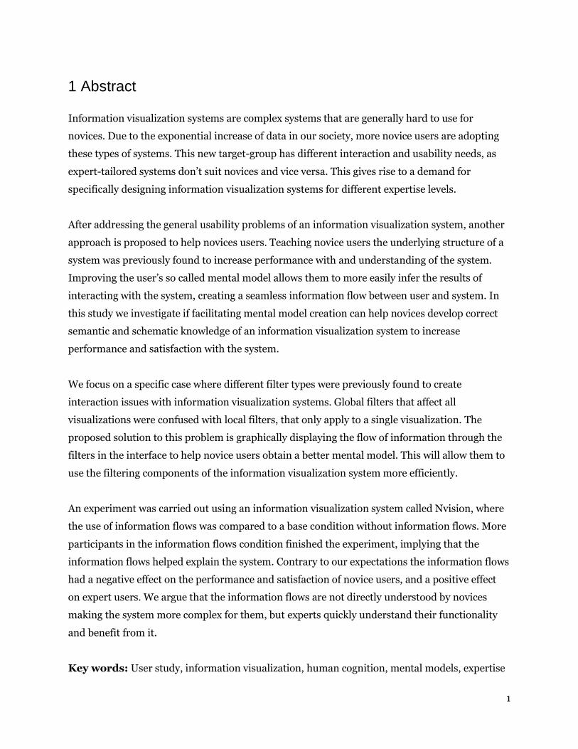
Figure 8. The number of participants finishing / not finishing the experiment for each condition.
In the information flows condition 70.87% were able to finish the experiment, as opposed to
56.79% for the base condition, implying that showing information flows has a significant
positive effect on completing the assignments (χ2= 3.937; p<.05).
We predicted that most participants would stop in either the fourth or fifth assignment where
global filtering would be necessary. The bar-chart in Figure 9 tells us that 28% of the
participants either stopped while working on the first assignment, or while working on the
fourth. Of those that stopped in the fourth assignment 8 out of 18 were assigned to the
information flows condition. The dropout numbers per assignment are relatively evenly
distributed among the conditions. 46,2% were in the manipulation condition and 53,8% in the
control condition. Because more participants in total were assigned to the manipulation
condition (103/81), this difference is still important.

24
Figure 9. Number of participants dropping out of the experiment per assignment.
4.4 Dimension Reduction
A rough estimate of visualization, computer expertise and perceived system satisfaction is
created by using the mean score per participant for each dimension, to inspect how the scores
on these dimensions are distributed before they are normalized. The scores are based on a
seven-point likert scale and the questionnaires can be found in the appendix (7.1). Visualization
expertise is approximately normally distributed with mean 3.72 and standard deviation 1.3.
Computer expertise is left-skewed with mean 5.8 and standard deviation 0.759. This means our
sample is diverse enough with regard to visualization skills and contains people skilled in using
computers. Perceived system satisfaction is also left-skewed with a mean of 5.54 indicating that
in general the participants were satisfied with the system.
Two principal component analyses (PCA) are carried out to confirm the two expertise and the
perceived system satisfaction components in the questionnaire and convert the variables to their
underlying components. Direct oblimin rotation is used for both because the different
components are allowed to correlate.
The first analysis for the questionnaire on visualization and computer expertise resulted in three
components with eigenvalues greater than 1. The questions on visualization clearly load on one
component, but for computer expertise Microsoft products were assigned to an extra
component. We decided to limit the number of components to two: we had no use for a

25
microsoft specific component, and want to use the scores as part of the computer skill
component. One question about programming skills is removed due to low loadings on both
visualization and computer expertise (Matsunaga, 2010). The result can be found in Table 1. The
final components of visualization and computer expertise are not significantly correlated
(B=.148; p=.111)
How would you rate your skills on the following subjects? Visualization
Expertise Computer Expertise
1. Information visualization applications ( Tableau, Spotfire, Qlikview etc. ).
.836 -.119
2. Business intelligence applications. .847 -.130
3. The field of statistics. .718 .112
4. The field of information visualization. .787 .122
6. Microsoft Excel. .352 .568
7. Microsoft Word. .161 .721
8. Using the internet. -.203 .848
9. Using computers. -.107 .839
Cronbach’s alpha: .755
Table 1. Pattern matrix of the PCA with direct oblimin rotation.

26
How much do you agree with the following statements? Perceived System Satisfaction
10. I would recommend the system to others. .822
11. The system is useless. -.661
12. The system showed useful visualizations. .769
13. The system made me understand the information. .684
14. Overall, I am satisfied with this system. .851
16. The system is wonderful. .719
19. Learning to operate the system is hard. .563
21. The system is flexible. .556
22. I feel comfortable using the system. .850
Cronbach’s alpha: .754
Table 2. Pattern matrix of the PCA with direct oblimin rotation.
In the second PCA the sole component of perceived system satisfaction clearly emerges. Initially
Cronbach’s alpha was very low when including all the variables. The inconsistent questions are
removed resulting in the list in Table 2.
The components are saved as normalized regression scores for each participant, creating a score
for visualization expertise, computer expertise and perceived system satisfaction. The complete
questionnaires can be found in the appendix (7.1).
4.5 System Satisfaction
To see if displaying the information flows and visualization expertise affect system satisfaction
in accordance to H1 and H2, we performed a regression with system satisfaction as a dependent
variable. A binary condition variable (information flows), visualization expertise, computer
expertise and the interaction effects between the expertise variables and the manipulation
condition are included as predictors. Age and Gender are additionally included as covariates to
increase model accuracy. The non-significant predictors were removed stepwise from the model
and the final model can be seen in Table3. All assumptions regarding linearity, normality and
multicollinearity are met.

27
B Standard Error t Significance
Constant -.015 .145 -.107 .915
Information Flows .002 .185 .010 .992
Visualization Expertise
-.323 .140 -2.310 .023
Visualization Expertise * Information Flows
.442 .186 2.383 .019
Computer Expertise
.325 .158 2.057 .042
Computer Expertise * Information Flows
-.342 .194 -1.759 .081
R2=.084 p<.05
Table 3. Regression coefficients for dependent variable perceived system satisfaction.
The effect of information flows and the covariates of age and gender explain no significant
variance. We expected to find a direct effect of information flows on perceived system
satisfaction according to H1, but instead only interaction effects were found. Apparently the
effect of information flows is moderated by both expertise variables. The information flows
condition is kept in the model because the interaction effects play a significant role, but age and
gender are removed.

28
Figure 10. Regression slopes for dependent variable perceived system satisfaction. The interaction effect of
visualization expertise and the display of information flows is shown.
Visualization expertise has a significant negative effect (B=-.323; p<.05) on perceived system
satisfaction as can be seen in the red line in Figure 10. This implies that visualization experts are
harder to satisfy with a system such as Nvision. But visualization expertise also interacts with
the effect of information flows as the blue line in Figure 10 shows. When information flows are
displayed, expert participants will be more satisfied by the system (B=.442; p<.05). A clear
preference seems to exist for the experts and non-experts: experts are more satisfied with the
information flows, and non-experts are more satisfied without information flows. This means
the direct effect of visualization expertise was opposite of what we expected in our second
hypothesis H2, and that expertise moderated the effect of information flows.

29
Figure 11. Regression slopes for dependent variable perceived system satisfaction. The interaction effect of
computer expertise and the display of information is shown.
For computer expertise the effect seems to be the reverse of visualization expertise (Figure 11).
Computer expertise has a positive effect on perceived system satisfaction (B=.325; p<0.05). A
marginally significant moderation effect is also found that points to a decrease in perceived
system satisfaction if information flows are displayed (B=-.342 p<.1). Computer experts are
more satisfied with the system, but the interaction seems to imply that this is cancelled out in
the manipulation condition.
4.6 Performance
Three measurements of performance are used in this analysis to test the performance
hypotheses: whether information flows increase performance (H3), whether visualization
expertise increases performance (H4) and if visualization expertise moderates the effect of
information flows (H5). The first measurement is the time that participants took to complete the

30
last two assignments. These assignments can be solved in two ways: by using global filters, or by
applying local filters to each of the sheets. We expect the latter to take more time, because it
requires additional steps to accomplish. The second measurement is accuracy, expressed in the
number of attempts needed to solve the assignments. The optimal number is five because there
are five assignments which of course need at least one attempt. Each wrong response then
increases this number. The third measurement is whether or not the participants used global
filtering at all. Initially the condition variable, visualization expertise, computer expertise, the
interaction effect between condition and the expertise variables, and the covariates of age and
gender are included in the regressions for the first two measurements. The non-significant
predictors are excluded stepwise. Two more cases were removed from the analysis due to the
Cook’s distance being larger than one.
For the first part of the performance analysis the time participants took to complete assignment
4 & 5 is added up and the natural logarithm of this variable is saved. The right-skewed nature of
response time data requires us to do this: taking the logarithm of this variable makes it normally
distributed, which is one of the assumptions of a linear regression. The results of this regression
can be found in Table 4.
B Standard Error t Significance
Constant .452 .043 10.533 .000
Information Flows .136 .055 2.483 .014
Visualization Expertise
-.028 .027 -1.044 .299
Computer Expertise
-.019 .027 -.721 .473
R2=.065 p=.054
Table 4. Regression coefficients for dependent variable time to complete assignments 4 & 5.
Displaying information flows has a significant positive effect on the time to complete
assignments 4&5 (B=.136;p<.05), meaning that participants took longer to complete the
assignments when these were displayed. This contradicts our hypothesis H3 where we expected
performance to increase. Visualization expertise (B=-.028; p=.229) and computer expertise
(B=-.019; p=.473) both had small non-significant negative effects, implying that an increase in
these forms of expertise would lead to reduced time to complete the assignments.

31
The second variable investigated in the analysis of performance is accuracy. For the accuracy
data, normality assumptions for a standard linear regression are not met. Count data like this
(number of attempts) is extremely skewed as can be observed from Figure 12. It typically follows
a poisson or a negative binominal distribution.
Figure 12. Frequency of the number of attempts needed to complete the assignments.
Either a poisson or a negative binominal regression is the correct approach to predicting count
data (Coxe, West & Aiken, 2009). First we subtract 5 from the accuracy variable to create a
variable containing the extra number of attempts needed to finish the experiment. This means
that zero is the optimal number in this case. The negative binominal distribution provided the
best model fit for the data because the count outcome variables are over-dispersed. Table 5
contains the regression results.

32
B Standard Error Wald Chi-Square Significance
Constant .039 .3129 .016 .000
Information Flows .716 .3905 3.364 .067
Visualization Expertise
.535 .3009 3.164 .075
Visualization Expertise * Information Flows
-1.049 .3839 7.470 .006
Negative Binominal
3.408 .7146
Chi-Square:10.594 p<.05
Table 5. Regression coefficients for dependent variable extra attempts.
The Negative Binomial coefficient in Table 5 confirms that a negative binominal regression
rather than a poisson regression was the right choice, because the value for Negative Binominal
estimate is not zero (B=3.408). The deviance (.857) and χ2 (.955) statistics for model goodness
are relatively close to one, meaning the model is adequately accurate. Using the poisson
distribution these numbers would be four times as large, which indicates the outcome variables
were over-dispersed. The omnibus test for the model is significant (χ2=10.594; p<0.05).
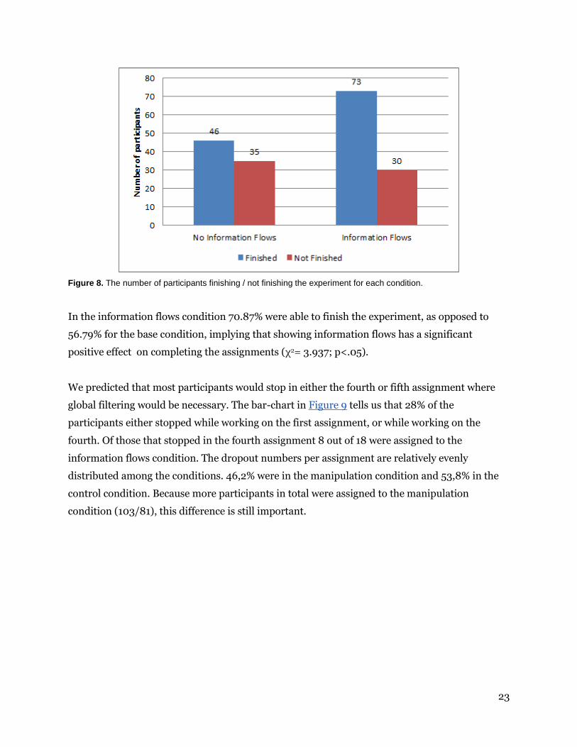
Displaying information flows has a marginally significant positive effect on number of attempts
(B=.716; p=.1) implying that the participants used more attempts in the manipulation condition
containing the information flows. This again contradicts our third hypothesis H3. Visualization
expertise also had a marginally significant positive effect on number of attempts. This
counterintuitive metric that is visualized by the red points in Figure 13 means that more
attempts were used with increasing visualization expertise. Visualization expertise was also
found to moderate the effect of information flows on the number of extra attempts (B=-1.049;
p<0.01). This significant interaction effect is visualized by the blue points in Figure 13: the
highest accuracy for experts is obtained when information flows are displayed, and novices are
most accurate when information flows are not displayed. Our fourth hypothesis H4 states that
performance should increase with expertise, and our findings indicate the opposite, except for
when information flows are shown. This means that the expected moderation by expertise H5
had the opposite effect: experts’ performance increased instead of expertise reversal playing a
role.
33
Figure 13. Mean regression scores for dependent variable extra attempts. A lower score in extra attempts means
greater accuracy.
The use of global filters was investigated as a third performance variable. Only 24% of the
participant didn’t use global filtering, and 69% used the optimal amount of two global filters.
Whether or not a participant used global filters was dummy-coded and group membership was
examined for both conditions. The resulting frequencies are visualized in Figure 14.

34
Figure 14. Number of participants using / not using global filters in each condition.
A marginally significant effect was found (χ2= 2.912; p<0.1) implying that participants in the
information flows condition were less likely (Phi=-.158; p<0.1) to use global filters than
participants in the control condition. This means information flows had the opposite effect of
what we expected with regard to the use of the correct filtering type.
Finally in accordance with H6 both time to finish assignment 4 & 5 (B= -.198; p<.05) and
accuracy (B= -.459; p<0.001) indicators were significantly negatively correlated to perceived
system satisfaction.

35
5 Discussion
Both performance variables of time elapsed and number of attempts to complete the
assignments were low compared to those recorded in earlier iterations of the experiment and
application, meaning that usability issues were mostly eliminated. Because of this we can
attribute most of the variance found to the difference in the conditions. In the following sections
we will discuss the mental model measurement, the results for the each dependent variable, and
provide a conclusion and recommendations for further study.
5.1 Mental model measurement
Our study did not provide insight into the mediatory role of mental model quality, because the
measurement was found to be unreliable. We knew that mental model quality would be difficult
to measure in an online study, but we did not expect this many confused and incomplete
answers. Apart from the wording of the question which could have been improved, the fact that
it followed at the end after all the questionnaires might have made it more effortful for
participants to answer. Many participants just shortly answered “filters” although it could be
that they very well understood the difference between local and global filters. In a lab-based HCI
study an experimenter can stimulate participants to provide a complete answer, but in our web-
based study this was not possible. An alternative explanation could be that the participants
gained structural knowledge, but not semantic knowledge. Fiore et al. (2003) found that mental
model facilitation through diagrams especially helped novices gain structural knowledge, and
did not help in learning the system semantics. This could mean that users understood the
structural relationship of the global and local filters, but could not come up with the names for
the components. This implies that system semantics should be provided, but then again this
would bias the results.
Further study should be done to find out what is the ideal way to measure mental model quality
in an online environment.
5.2 Information flows selection effect
The group of participants that finished the experiment was found to be significantly larger when
information flows were displayed. This means that information flows did seem to help
participants in completing the assignments. But we cannot tell for sure if it helps because of the

36
supposed increase in mental model quality, due to the faulty mental model measure. We
assumed that it helps the participants infer the schematic relation of the filtering components,
but it could be that it simply draws attention to a part of the interface that is important to
solving the assignments. This idea is supported by the negative relation found between the use
of global filters and the display of information flows.
5.3 System satisfaction
We expected a direct positive effect of displaying information flows on perceived system
satisfaction as stated in H1. This hypothesis has to be rejected, we found no information
supporting it. We also expected visualization expertise to positively affect perceived system
satisfaction (H2) and also have to reject this hypothesis, because the effect we found was the
reverse. Participants with increasing visualization expertise were less satisfied with the system.
But this only counts for the control condition: when information flows were displayed the
participants with high visualization expertise were more satisfied with the system than in the
base condition. It seem that experts are more critical of a system like Nvision, yet they are
positively surprised by the information flows. For visualization novices the effect was the
reverse: they were more satisfied in the control condition than in the manipulation condition.
Instead of increasing the satisfaction of novices as we expected, the information flows decreased
their satisfaction and positively changed the opinion of the experts. Computer expertise was also
positively related to perceived system satisfaction. This might imply that either participants with
high computer expertise find the system more interesting, or that some base level of expertise is
still required to operate the system satisfactory. When information flows were displayed this
effect was cancelled out, implying that computer experts were more satisfied with the base
condition.
5.4 Performance
The display of information flows had a direct effect on participants’ performance. But the effect
direction was the opposite of what we expected. It caused participants to take longer in
completing assignment 4 & 5, and this effect would only be reduced for participants with high
computer expertise. We noticed during the experiment that the interface would respond slightly
slower in the manipulation condition due to rendering the information flows in real time, and

37
this might have had some effect on the outcome. But the second performance variable of
accuracy unaffected by these issues tells us a similar story: when information flows were
displayed, participants required more attempts to finish the experiment. Only visualization
experts are exempt from this, their accuracy increased with their level of expertise in the
manipulation condition. We have to reject H3 and even state that the opposite might true:
displaying information flows decreases performance in general and only users with high
visualization expertise benefit from it.
Visualization experts’ performance was an interesting factor. It was higher when information
flows were displayed and the effect of computer expertise points in the same direction. But
without the flows they actually made more mistakes than the novices. It could be that experts
wanted to find out what the system would do if they provided a wrong answer, or were less
afraid of failing. But this does not explain why they performed better when information flows
were displayed. Our answer to H4 is not definite, but for now we have to reject and rephrase it:
expertise indeed seems to positively affect performance as expected, but only when information
flows are displayed.
The expected expertise reversal effect of H5 was not found and again the opposite effect was
found: visualization expert’s performance increased when information flows were displayed as
compared to novices. Apparently displaying the information flows explained to the experts how
the filtering system worked, increasing their performance instead of reducing it. The expertise
reversal effect might still be present for the top experts, but this overshadowed by the powerful
positive interaction effect of the manipulation with visualization expertise.
Finally the expected correlation between performance and perceived system satisfaction
according to H6 was confirmed. We expect that increasing performance leads to an increase in
system satisfaction, because we don’t think the aesthetic qualities of the information flows
would cause the users to perform better.
5.5 Conclusion and recommendations for further study
Our results on the performance of novices are twofold. In general information flows seem to
have helped participants in completing the assignments (less dropouts). But based on our
results we have to reject the idea that facilitating mental model creation through displaying

38
information flows in an information visualization system will increase novices performance and
satisfaction with the system. Instead the use of information flows lead to a decrease in their
performance and satisfaction. Apparently, to some extent it does help them in understanding
the system reducing the number of dropouts, but this comes at the cost of their performance and
perceived system satisfaction. Similar results were found in other studies: Hsu (2006) found
that using familiar metaphors (the mailing system in this case) to help with the creation of
mental models to understand new information (the internet IP system) reduces novice
performance. He argues that this might be because novices lack the knowledge accommodation
and assimilation skills of experts. This way including the metaphors causes them to have to
process even more novel information, reducing their performance. Lee (2007) also found that
using visual metaphors in a hypermedia learning environment would improve the quality of a
mental model, but also increase the mental load during navigation leading to a decreased
performance. Experts are more easily able to process this information, explaining why their
performance and perceived system satisfaction in our experiment increased.
In our case the display of information flows would also mean including another interface
element in an already complicated alien system making the whole more complex for the novice
user. This means that the cognitive load effect we expected to find for experts (H5) actually had
a greater impact on novices. To prevent as much cognitive load as possible, a ‘less is more’
approach seems to apply to the design of an infovis system for novices.
An alternative explanation is that our information flows metaphor wasn’t clear enough for the
novice users, but was clear to the expert users because they could infer the functionality using
their existing knowledge. This way the information flows lose their positive effect for novices,
and induce more cognitive load due to their presence. In future study, next to trying to measure
the mental model differences, finding out if the used metaphor was understood at all should be
part of the experiment. The role that the users’ mental model plays in this process should be
examined using a more refined method of measuring to find out if our current results hold with
the mental model mediator as part of the hypothesis model.
Based on our current results on the use of information flows we can advise that a correct balance
should be found between additional mental model inducing interface elements, and the possible
cognitive load and performance reduction they create for novices. For visualization experts the
display of information flows might be a useful addition for getting used to a new infovis system.

39
Experts are already familiar with most of the components of the system and the information
flows help quickly explain their schematic relationship. Information flows could also be useful
for explaining new components in existing expert-tailored infovis systems. The results still
support our idea that infovis interfaces have to be specifically designed for different user
expertise levels. This would imply that each target-group should have their own application, but
this doesn't necessarily have to be the case. Adaptive infovis systems that gradually introduce
new elements to the interface by measuring the users’ proficiency though the interaction might
be the ideal solution. This way novices can gradually improve their mental model of the
application and experts can quickly access their familiar functionality.
It seems that the mental model based methods of making infovis systems accessible and usable
for novices still need a lot of research. Our results with the use of information flows can at least
provide a direction for further study and can perhaps be generalized to the use of diagrams for
explaining interfaces as well.

40
6 References
Barfield, L. (2004). Design for New Media: Interaction Design for Multimedia and the Web.
Reading, USA: Pearson Education Ltd., 2004.
Bostock, M., Ogievetsky, V., & Heer, J. (2011). D3 data-driven documents. IEEE Transactions on
Visualization and Computer Graphics, 17(12), 2301–2309. doi:10.1109/TVCG.2011.185
Carpendale, S. (2008). Evaluating Information Visualizations: Challenges in Evaluating
Information Visualizations. Information Visualization: Human Centered Issues and
Perspectives, 19–45.
Chin, J.P., Diehl, V.A., Norman, K.L. (1988) Development of an Instrument Measuring User
Satisfaction of the Human-Computer Interface. ACM CHI'88 Proceedings, 213-218. ©1988
ACM.
Coxe, S., West, S. G., & Aiken, L. S. (2009). The analysis of count data: a gentle introduction to
poisson regression and its alternatives. Journal of Personality Assessment, 91(February 2015),
121–136. doi:10.1080/00223890802634175
Doyle, J. K., Radzicki, M. J., & Trees, W. S. (1998). Measuring Change in Mental Models of
Dynamic Systems : An Exploratory Study. Social Science, 1(14), 1–41. doi:citeulike-article-
id:1106445
Elias, M., & Bezerianos, A. (2011). Exploration views: understanding dashboard creation and
customization for visualization novices. Human-Computer Interaction–INTERACT 2011, 274–
291. Retrieved from http://link.springer.com/chapter/10.1007/978-3-642-23768-3_23
Fiore, S. M., Cuevas, H. M., & Oser, R. L. (2003). A picture is worth a thousand connections: The
facilitative effects of diagrams on mental model development and task performance. Computers
in Human Behavior, 19, 185–199. doi:10.1016/S0747-5632(02)00054-7

41
Gantz, B. J., Reinsel, D., & Shadows, B. D. (2012). Big Data , Bigger Digital Shadows, and
Biggest Growth in the Far East Executive Summary: A Universe of Opportunities and
Challenges. Idc, 2007(December 2012), 1–16.
Gazzaniga, M. S. (1998). The split brain revisited. Scientific American, 279(1), 50–55.
doi:10.1038/scientificamerican0867-24
Gegenfurtner, A., Lehtinen, E., & Säljö, R. (2011). Expertise Differences in the Comprehension
of Visualizations: A Meta-Analysis of Eye-Tracking Research in Professional Domains.
Educational Psychology Review, 23(4), 523–552. doi:10.1007/s10648-011-9174-7
Grammel, L., Tory, M., & Storey, M.-A. (2010). How information visualization novices construct
visualizations. Visualization and Computer …, 16(6), 943–952. Retrieved from
http://ieeexplore.ieee.org/xpls/abs_all.jsp?arnumber=5613431
Heer, J., Van Ham, F., Carpendale, S., Weaver, C., & Isenberg, P. (2008). Creation and
collaboration: Engaging new audiences for information visualization. Lecture Notes in
Computer Science (including Subseries Lecture Notes in Artificial Intelligence and Lecture
Notes in Bioinformatics), 4950 LNCS, 92–133. doi:10.1007/978-3-540-70956-5_5
Hegarty, M. (2004). Diagrams in the mind and in the world: Relations between internal and
external visualizations. Diagrammatic Representation and Inference, 1–13. Retrieved from
http://link.springer.com/chapter/10.1007/978-3-540-25931-2_1
Homer, B. D., & Plass, J. L. (2010). Expertise reversal for iconic representations in science
visualizations. Instructional Science, 38(3), 259–276. doi:10.1007/s11251-009-9108-7
Hsu, Y. C. (2006). The effects of metaphors on novice and expert learners’ performance and
mental-model development. Interacting with Computers, 18, 770–792.
doi:10.1016/j.intcom.2005.10.008
Jih, H., & Reeves, T. (1992). Mental models: A research focus for interactive learning systems.
Educational Technology Research and Development, 40(3), 39–53. Retrieved from
http://link.springer.com/article/10.1007/BF02296841

42
Kalyuga, S. (2008). Relative effectiveness of animated and static diagrams: An effect of learner
prior knowledge. Computers in Human Behavior, 24(3), 852–861.
doi:10.1016/j.chb.2007.02.018
Kalyuga, S., Ayres, P., Chandler, P., & Sweller, J. (2003). The Expertise Reversal Effect.
Educational Psychologist, 38(1), 23–31. doi:10.1207/S15326985EP3801
Kalyuga, S., Chandler, P., & Sweller, J. (2000). Incorporating learner experience into the design
of multimedia instruction. Journal of Educational Psychology, 92(1), 126–136.
doi:10.1037//0022-0663.92.1.126
Kieras, D., & Bovair, S. (1984). The Role of a Mental Model in Learning to Operate a Device*.
Cognitive Science, 273(1964), 255–273. Retrieved from
http://onlinelibrary.wiley.com/doi/10.1207/s15516709cog0803_3/abstract
Knijnenburg, B. P., Willemsen, M. C., Gantner, Z., Soncu, H., & Newell, C. (2012). Explaining
the user experience of recommender systems. User Modeling and User-Adapted Interaction,
22(4-5), 441–504
Krug, S. (2005). Don't Make Me Think: A Common Sense Approach to the Web (2nd Edition),
New Riders Publishing, Thousand Oaks, CA, 2005.
Larkin, J., & Simon, H. (1987). Why a diagram is (sometimes) worth ten thousand words.
Cognitive Science, 99, 65–99. Retrieved from http://onlinelibrary.wiley.com/doi/10.1111/j.1551-
6708.1987.tb00863.x/abstract
Lee, J. (2007). The effects of visual metaphor and cognitive style for mental modeling in a
hypermedia-based environment. Interacting with Computers, 19(5-6), 614–629.
doi:10.1016/j.intcom.2007.05.005
Matsunaga, M. (2010). How to Factor-Analyze Your Data Right: Do’s, Don’ts, and How-To’s.
International Journal of Psychological Research, 3(1), 2011–2079.

43
Novus Partners. (2014). NVD3 A reusable D3 charting library. Retrieved from http://nvd3.org/
Ramos, E., Donoho, D., 1983. The 1983 ASA data exposition dataset: Cars. Retrieved from
http://lib.stat.cmu.edu/datasets/cars.data. Modified version used in experiment retrieved from
http://bl.ocks.org/jasondavies/1341281#cars.csv
Perer, A., & Shneiderman, B. (2008). Integrating Statistics and Visualization: Case Studies of
Gaining Clarity during Exploratory Data Analysis. CHI, Human Factors in Computing Systems,
265-274.
Rowe, A. L., & Cooke, N. J. (1995). Measuring mental models: Choosing the right tools for the
job. Human Resource Development Quarterly, 6, 243–255. doi:10.1002/hrdq.3920060303
Storey, M. -a., Fracchia, F., & Müller, H. (1999). Cognitive design elements to support the
construction of a mental model during software exploration. Journal of Systems and Software,
44(3), 171–185. doi:10.1016/S0164-1212(98)10055-9
Tableau (2015). Tableau Software: Business Intelligence and Analytics. Retrieved from
http://www.tableau.com/
Ziemkiewicz, C., & Kosara, R. (2008). The shaping of information by visual metaphors. IEEE
Transactions on Visualization and Computer Graphics, 14(6), 1269–76.
doi:10.1109/TVCG.2008.171

44
7 Appendix
7.1 Questionnaires
7.1.1 Expertise
Likert scale, 7pt, very low/very high.
How would you rate your skills on the following subjects?
1. Information visualization applications ( Tableau, Spotfire, Qlikview etc. )
2. Business intelligence applications
3. The field of statistics
4. The field of information visualization
5. Programming
6. Microsoft Excel
7. Microsoft Word
8. Using the internet
9. Using computers
7.1.2 System satisfaction
Likert scale, 7pt, agree/disagree.
How much do you agree with the following statements?
1. I would recommend the system to others.
2. The system is useless.
3. The system showed useful visualizations.
4. The system made me understand the information.
5. Overall, I am satisfied with this system.
6. The system is dull.
7. The system is wonderful.
8. The system is difficult to use.
9. Learning to operate the system is hard.

45
10. Performing tasks is straightforward.
11. Using the system is frustrating.
12. The system is flexible.
13. I feel comfortable using the system.
http://hcibib.org/perlman/question.cgi?form=QUIS
7.1.3 Mental Model Understanding
Try to answer the following question as well as possible from memory.
According to you, in what parts of the interface is the data-flow manipulated in the application?
Try to be as specific as possible.
According to info flow:
Global Filters,
Sheet Filters,
Selected Dimensions.
This means it is possible to receive 3 points for this assignment.
7.2 Assignments
You work at a government organisation analyzing cars. Your manager Bob wants you to create
him a dashboard with three visualization-sheets he can inspect. He provides you with a dataset
containing information about cars in the US between 1970 and 1982. Bob has five assignments
for you to complete. Try to solve the assignments as efficiently as possible yet don't hesitate to
play around to get comfortable with the interface.
7.2.1 Assignment 1
I want an overview of the economy (mpg) of cars with 160 horsepower and above. This way we
can see what cars are powerful and efficient for reduced taxation.
● Create a scatter chart visualization on the first sheet.
● Then plot power by economy (miles per gallon) to activate the visualization.

46
● For this comparison filter to only show cars with power of 160 horsepower and above.
How much horsepower does the most economical car (highest number) in the visualization
have?
Answer: 165
7.2.2 Assignment 2
This time a request based on my personal interest. I'd like to see a sheet containing a bar chart
of the fastest accelerating cars from the 80's and later.
● I require you to create a new sheet (keep the old one!) containing a bar chart
visualization.
● It should display the names of the cars and their acceleration to 60mph in seconds.
● A requirement is that they are built in the year 1980 and later.
Please write down the brand name of the car that accelerates to 60mph in the least amount of
seconds.
Answer: Datsun
7.2.3 Assignment 3
I want to find out if a positive relation exists between the weight of a car and its power.
● Again create a new sheet (keep the old ones!) containing a scatter chart visualization.
● It should display the weight (lb) of the cars and their power (hp).
Is there a car that clearly does not conform to the general weight/power trend? Please write
down the brand name of that car.
Answer: Buick

47
7.2.4 Assignment 4
Good, now we have all the required sheets. Make sure they all show the correct results and that
you familiar with the filtering process. I have another set of requirements for all the previously
created sheets.
Please filter all of them to only display cars with 5 or 6 cylinders and economy (mpg) of 15 and
more.
What is the brand name of the slowest accelerating ( 0-60 mph ) (highest number) car on the
second sheet?
Answer: Audi
7.2.5 Assignment 5
With the previously assigned filtering in place, reinspect the first sheet with the visualization of
power and economy. What is the brand name of the only car left on this sheet?
Answer: Buick

48
7.3 Screenshots
The original experiment can be found at: http://henrilouis.com/webprojects/nspyre/nvision/
7.3.1 Informed Consent Form

49
7.3.2 Introductory text
7.3.3 Application with information flows

50
7.3.4 Application without information flows

51
7.3.5 Questionnaire top part

52
7.3.5 Questionnaire bottom part