Embed Size (px)
Citation preview
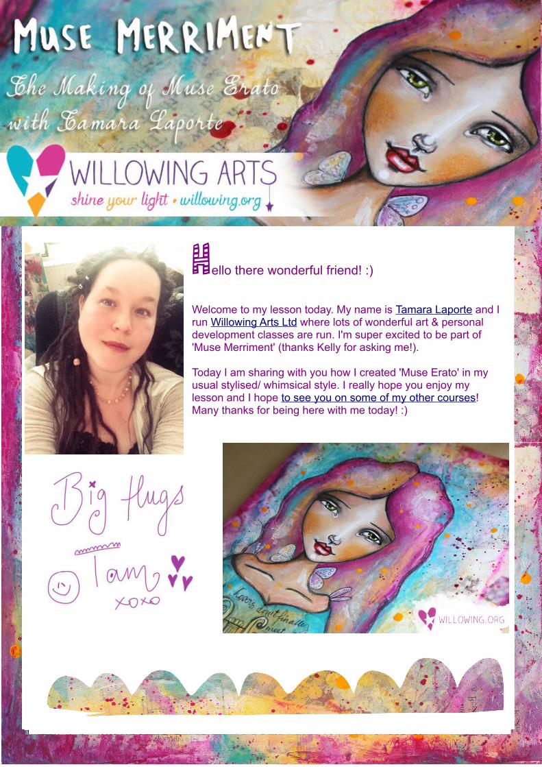
Hello there wonderful friend! :)
Welcome to my lesson today. My name is Tamara Laporte and I run Willowing Arts Ltd where lots of wonderful art & personal development classes are run. I'm super excited to be part of 'Muse Merriment' (thanks Kelly for asking me!).
Today I am sharing with you how I created 'Muse Erato' in my usual stylised/ whimsical style. I really hope you enjoy my lesson and I hope to see you on some of my other courses! Many thanks for being here with me today! :)
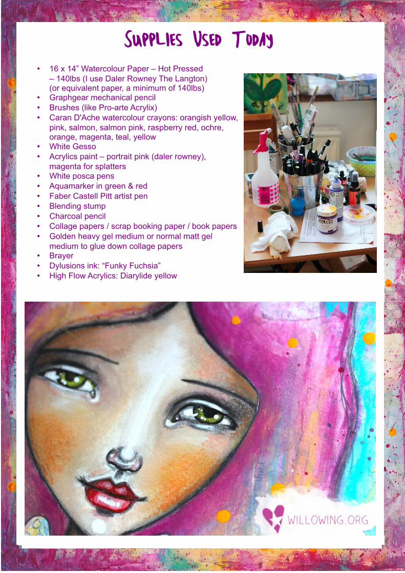
Supplies Used Today
• 16 x 14” Watercolour Paper – Hot Pressed– 140lbs (I use Daler Rowney The Langton)(or equivalent paper, a minimum of 140lbs)
• Graphgear mechanical pencil• Brushes (like Pro-arte Acrylix)• Caran D'Ache watercolour crayons: orangish yellow,
pink, salmon, salmon pink, raspberry red, ochre, orange, magenta, teal, yellow
• White Gesso• Acrylics paint – portrait pink (daler rowney),
magenta for splatters • White posca pens• Aquamarker in green & red• Faber Castell Pitt artist pen• Blending stump• Charcoal pencil• Collage papers / scrap booking paper / book papers• Golden heavy gel medium or normal matt gel
medium to glue down collage papers• Brayer• Dylusions ink: “Funky Fuchsia”• High Flow Acrylics: Diarylide yellow
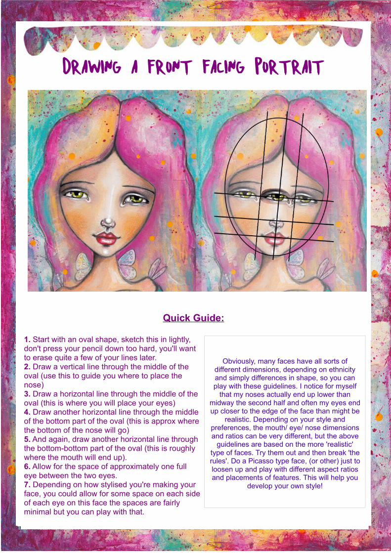
Drawing a Front Facing Portrait
Quick Guide:
1. Start with an oval shape, sketch this in lightly, don't press your pencil down too hard, you'll want to erase quite a few of your lines later.2. Draw a vertical line through the middle of the oval (use this to guide you where to place the nose)3. Draw a horizontal line through the middle of the oval (this is where you will place your eyes)4. Draw another horizontal line through the middle of the bottom part of the oval (this is approx where the bottom of the nose will go)5. And again, draw another horizontal line through the bottom-bottom part of the oval (this is roughly where the mouth will end up).6. Allow for the space of approximately one full eye between the two eyes.7. Depending on how stylised you're making your face, you could allow for some space on each side of each eye on this face the spaces are fairly minimal but you can play with that.
Obviously, many faces have all sorts of different dimensions, depending on ethnicity and simply differences in shape, so you can play with these guidelines. I notice for myself
that my noses actually end up lower than midway the second half and often my eyes end up closer to the edge of the face than might be
realistic. Depending on your style and preferences, the mouth/ eye/ nose dimensions and ratios can be very different, but the above
guidelines are based on the more 'realistic' type of faces. Try them out and then break 'the rules'. Do a Picasso type face, (or other) just to loosen up and play with different aspect ratios and placements of features. This will help you
develop your own style!
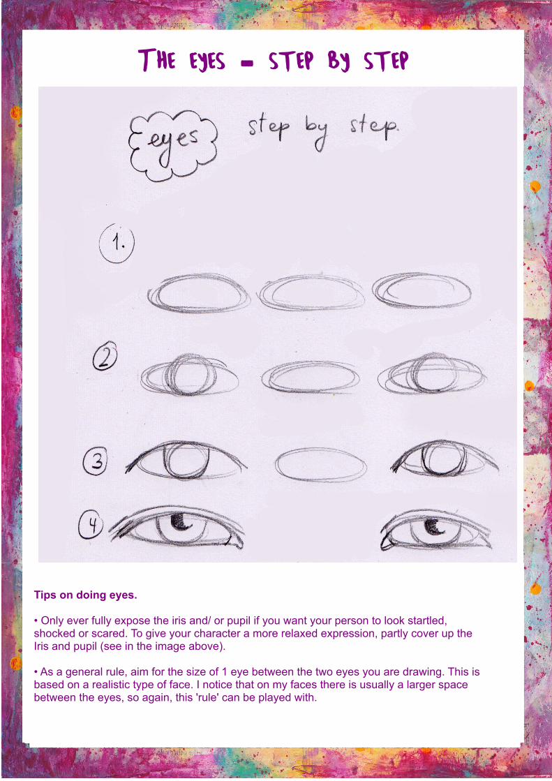
The eyes – step by step
Tips on doing eyes.
• Only ever fully expose the iris and/ or pupil if you want your person to look startled,shocked or scared. To give your character a more relaxed expression, partly cover up theIris and pupil (see in the image above).
• As a general rule, aim for the size of 1 eye between the two eyes you are drawing. This isbased on a realistic type of face. I notice that on my faces there is usually a larger spacebetween the eyes, so again, this 'rule' can be played with.
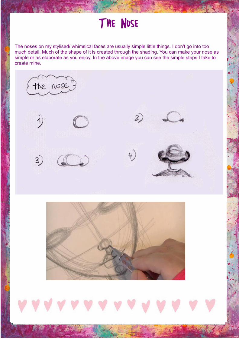
The Nose
The noses on my stylised/ whimsical faces are usually simple little things. I don't go into toomuch detail. Much of the shape of it is created through the shading. You can make your nose assimple or as elaborate as you enjoy. In the above image you can see the simple steps I take tocreate mine.
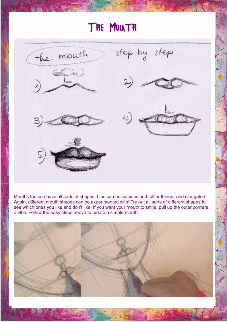
The Mouth
Mouths too can have all sorts of shapes. Lips can be luscious and full or thinner and elongated.
Again, different mouth shapes can be experimented with! Try out all sorts of different shapes tosee which ones you like and don't like. If you want your mouth to smile, pull up the outer corners a little. Follow the easy steps above to create a simple mouth.
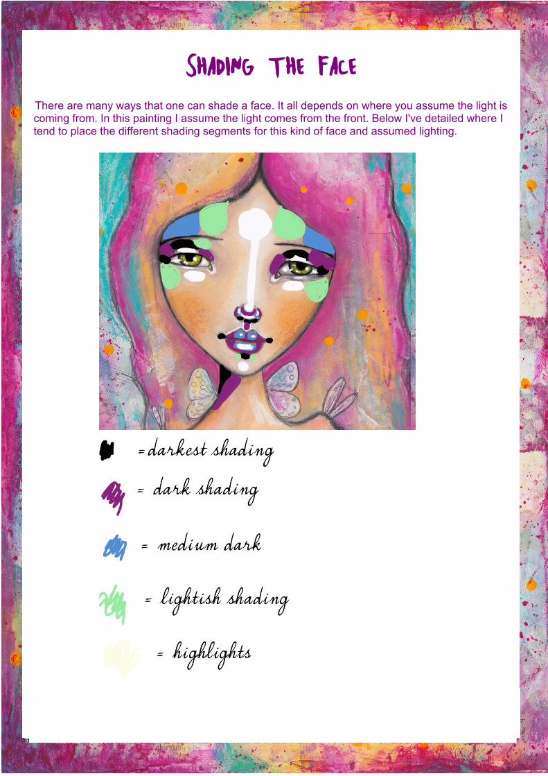
Shading the FaceThere are many ways that one can shade a face. It all depends on where you assume the light iscoming from. In this painting I assume the light comes from the front. Below I've detailed where Itend to place the different shading segments for this kind of face and assumed lighting.
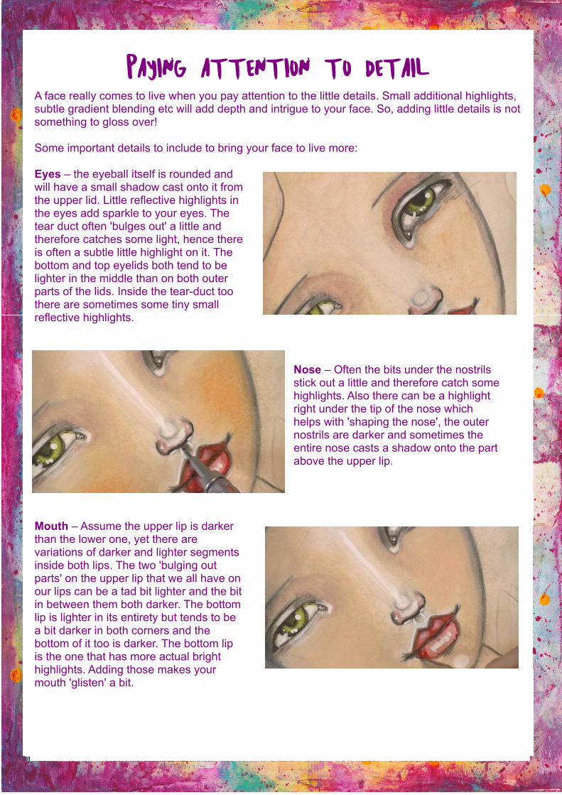
Paying attention to detailA face really comes to live when you pay attention to the little details. Small additional highlights,subtle gradient blending etc will add depth and intrigue to your face. So, adding little details is notsomething to gloss over!
Some important details to include to bring your face to live more:
Eyes – the eyeball itself is rounded andwill have a small shadow cast onto it fromthe upper lid. Little reflective highlights inthe eyes add sparkle to your eyes. Thetear duct often 'bulges out' a little andtherefore catches some light, hence thereis often a subtle little highlight on it. Thebottom and top eyelids both tend to belighter in the middle than on both outerparts of the lids. Inside the tear-duct toothere are sometimes some tiny smallreflective highlights.
Nose – Often the bits under the nostrilsstick out a little and therefore catch somehighlights. Also there can be a highlightright under the tip of the nose whichhelps with 'shaping the nose', the outernostrils are darker and sometimes theentire nose casts a shadow onto the partabove the upper lip.
Mouth – Assume the upper lip is darkerthan the lower one, yet there arevariations of darker and lighter segmentsinside both lips. The two 'bulging outparts' on the upper lip that we all have onour lips can be a tad bit lighter and the bitin between them both darker. The bottomlip is lighter in its entirety but tends to bea bit darker in both corners and thebottom of it too is darker. The bottom lipis the one that has more actual brighthighlights. Adding those makes yourmouth 'glisten' a bit.
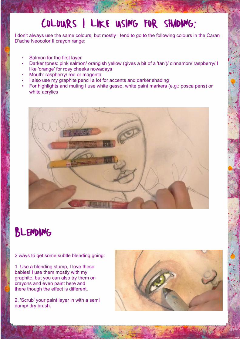
Colours I like using for shading:I don't always use the same colours, but mostly I tend to go to the following colours in the CaranD'ache Neocolor II crayon range:
• Salmon for the first layer• Darker tones: pink salmon/ orangish yellow (gives a bit of a 'tan')/ cinnamon/ raspberry/ I
like 'orange' for rosy cheeks nowadays• Mouth: raspberry/ red or magenta• I also use my graphite pencil a lot for accents and darker shading• For highlights and muting I use white gesso, white paint markers (e.g.: posca pens) or
white acrylics
Blending
2 ways to get some subtle blending going:
1. Use a blending stump, I love thesebabies! I use them mostly with mygraphite, but you can also try them oncrayons and even paint here andthere though the effect is different.
2. 'Scrub' your paint layer in with a semidamp/ dry brush.
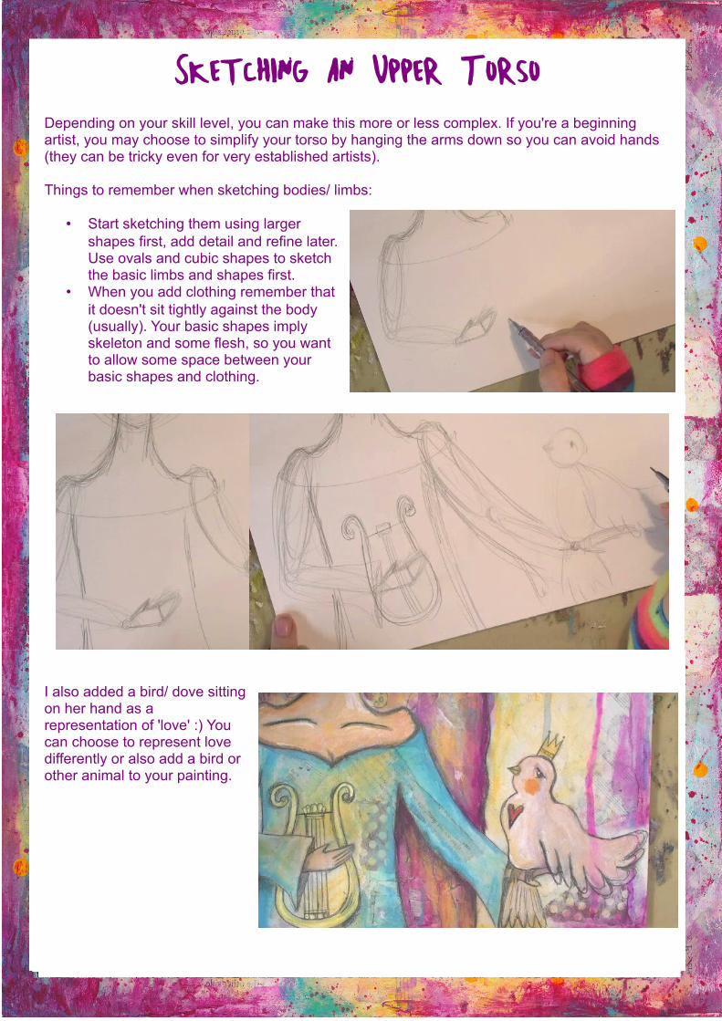
Sketching an Upper TorsoDepending on your skill level, you can make this more or less complex. If you're a beginning artist, you may choose to simplify your torso by hanging the arms down so you can avoid hands (they can be tricky even for very established artists).
Things to remember when sketching bodies/ limbs:
• Start sketching them using larger shapes first, add detail and refine later. Use ovals and cubic shapes to sketch the basic limbs and shapes first.
• When you add clothing remember that it doesn't sit tightly against the body (usually). Your basic shapes imply skeleton and some flesh, so you want to allow some space between your basic shapes and clothing.
I also added a bird/ dove sitting on her hand as a representation of 'love' :) You can choose to represent love differently or also add a bird or other animal to your painting.

Creating the background/ hair & adding colour & texture to the clothing
Let the fun begin! :) Not that drawing and shading the girl isn't of course :), but I do really love making layered, textured, splattered and interesting backgrounds, yay! :)
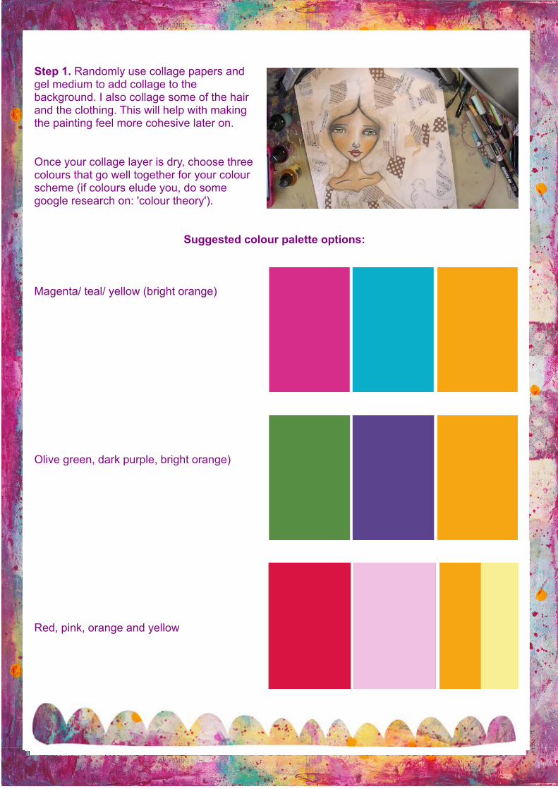
Step 1. Randomly use collage papers and gel medium to add collage to the background. I also collage some of the hair and the clothing. This will help with making the painting feel more cohesive later on.
Once your collage layer is dry, choose three colours that go well together for your colour scheme (if colours elude you, do some google research on: 'colour theory').
Suggested colour palette options:
Magenta/ teal/ yellow (bright orange)
Olive green, dark purple, bright orange)
Red, pink, orange and yellow
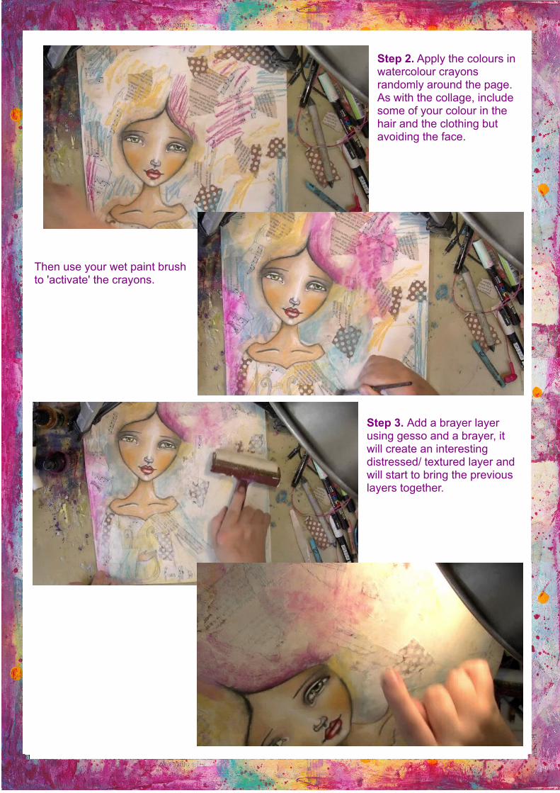
Step 2. Apply the colours in watercolour crayons randomly around the page. As with the collage, include some of your colour in the hair and the clothing but avoiding the face.
Then use your wet paint brush to 'activate' the crayons.
Step 3. Add a brayer layer using gesso and a brayer, it will create an interesting distressed/ textured layer and will start to bring the previous layers together.
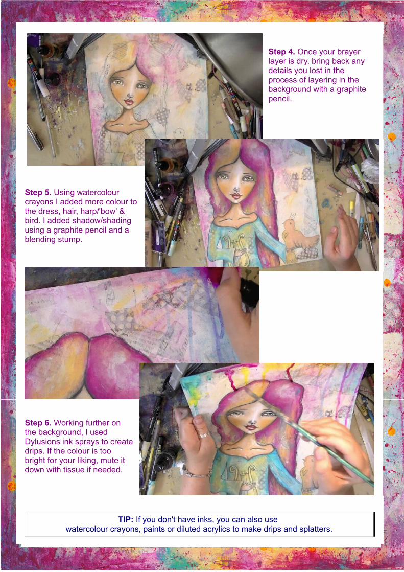
Step 4. Once your brayer layer is dry, bring back any details you lost in the process of layering in the background with a graphite pencil.
Step 5. Using watercolour crayons I added more colour to the dress, hair, harp/'bow' & bird. I added shadow/shading using a graphite pencil and a blending stump.
Step 6. Working further on the background, I used Dylusions ink sprays to create drips. If the colour is too bright for your liking, mute it down with tissue if needed.
TIP: If you don't have inks, you can also use watercolour crayons, paints or diluted acrylics to make drips and splatters.
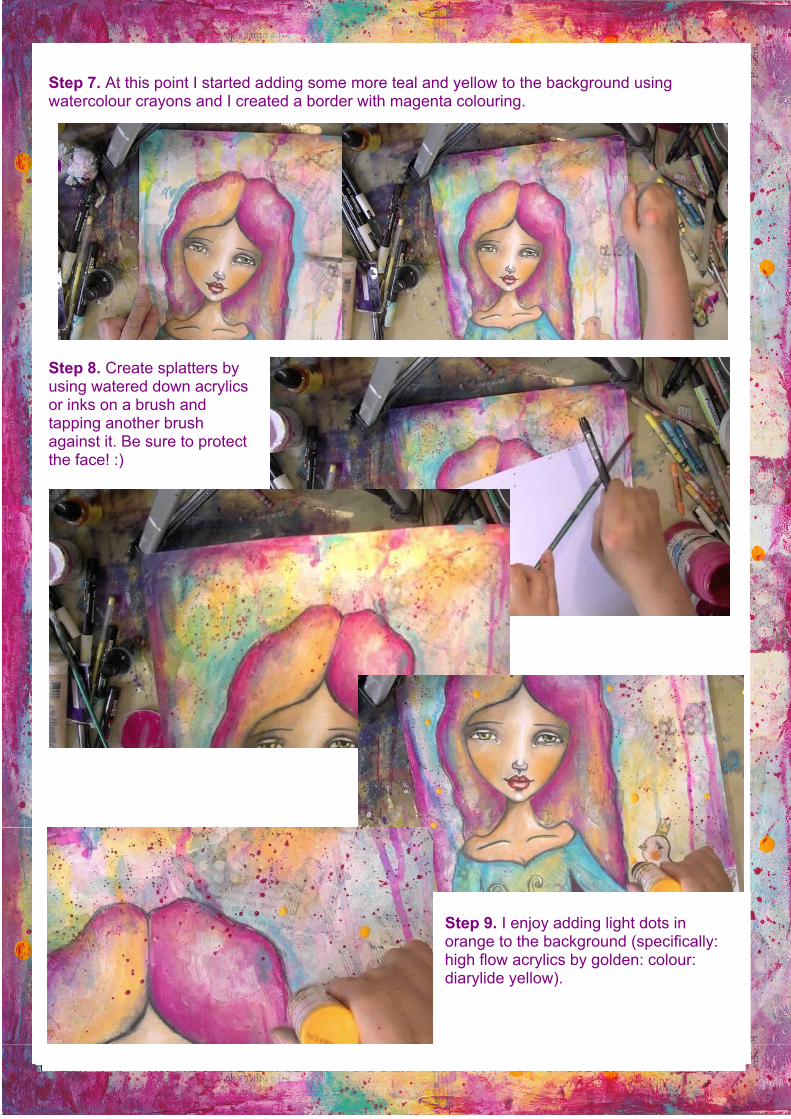
Step 7. At this point I started adding some more teal and yellow to the background using watercolour crayons and I created a border with magenta colouring.
Step 8. Create splatters by using watered down acrylics or inks on a brush and tapping another brush against it. Be sure to protect the face! :)
Step 9. I enjoy adding light dots in orange to the background (specifically: high flow acrylics by golden: colour: diarylide yellow).
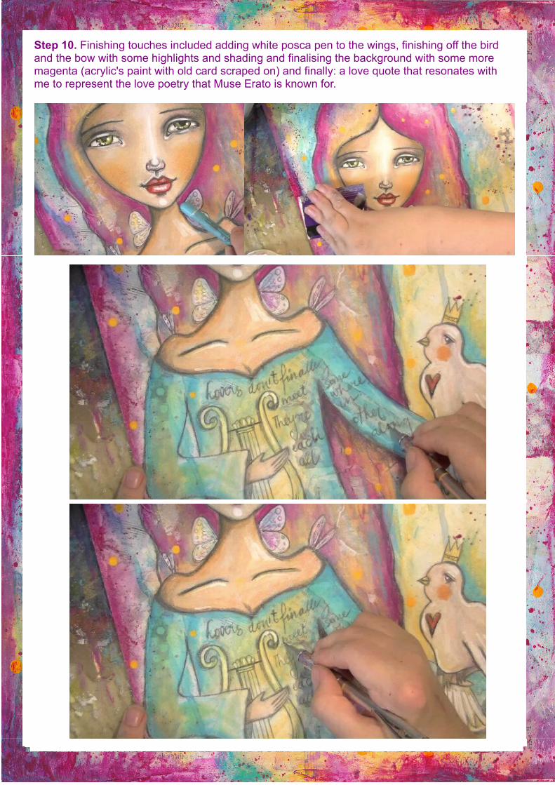
Step 10. Finishing touches included adding white posca pen to the wings, finishing off the bird and the bow with some highlights and shading and finalising the background with some more magenta (acrylic's paint with old card scraped on) and finally: a love quote that resonates with me to represent the love poetry that Muse Erato is known for.
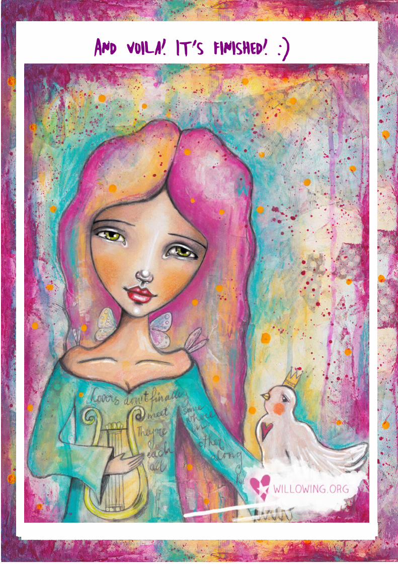
And voila! It's finished! :)
Thanks so much for being here with me today! :) I hope you learned loads and that you got connected to Muse Erato and may she inspire more love in your life for your loved ones and for yourself! :)
I hope to see you on some of my other courses! :)
Lots of love and creative inspiration!
Tam xoxo
© Willowing Arts Ltd. - www.willowing.org