Embed Size (px)
Citation preview
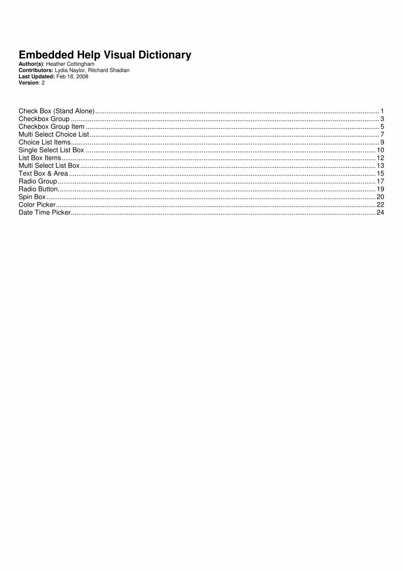
Embedded Help Visual Dictionary Author(s): Heather Cottingham Contributors: Lydia Naylor, Ritchard Shadian Last Updated: Feb 18, 2008 Version: 2
Check Box (Stand Alone)........................................................................................................................................................ 1 Checkbox Group ..................................................................................................................................................................... 3 Checkbox Group Item ............................................................................................................................................................. 5 Multi Select Choice List ........................................................................................................................................................... 7 Choice List Items..................................................................................................................................................................... 9 Single Select List Box ........................................................................................................................................................... 10 List Box Items........................................................................................................................................................................ 12 Multi Select List Box.............................................................................................................................................................. 13 Text Box & Area .................................................................................................................................................................... 15 Radio Group.......................................................................................................................................................................... 17 Radio Button.......................................................................................................................................................................... 19 Spin Box ................................................................................................................................................................................ 20 Color Picker........................................................................................................................................................................... 22 Date Time Picker................................................................................................................................................................... 24
Embedded Help Visual Dictionary Last Updated: 2.18.2008
EHVisualDictionary_v2.doc Page 1 of 25
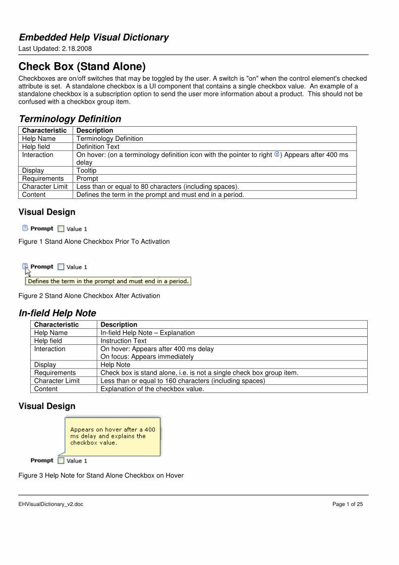
Check Box (Stand Alone) Checkboxes are on/off switches that may be toggled by the user. A switch is "on" when the control element's checked attribute is set. A standalone checkbox is a UI component that contains a single checkbox value. An example of a standalone checkbox is a subscription option to send the user more information about a product. This should not be confused with a checkbox group item.
Terminology Definition Characteristic Description
Help Name Terminology Definition
Help field Definition Text
Interaction On hover: (on a terminology definition icon with the pointer to right ) Appears after 400 ms delay
Display Tooltip
Requirements Prompt
Character Limit Less than or equal to 80 characters (including spaces).
Content Defines the term in the prompt and must end in a period.
Visual Design
Figure 1 Stand Alone Checkbox Prior To Activation
Figure 2 Stand Alone Checkbox After Activation
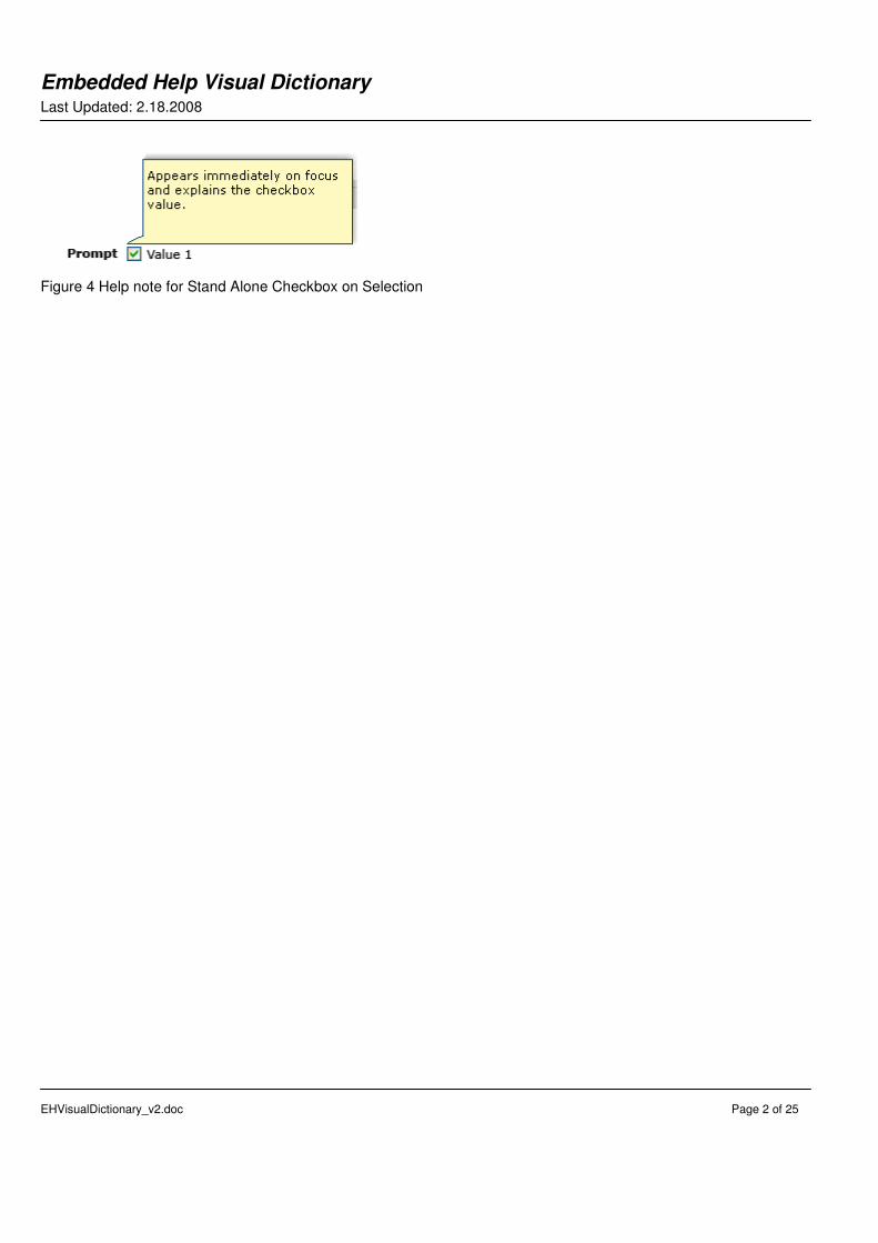
In-field Help Note Characteristic Description
Help Name In-field Help Note – Explanation
Help field Instruction Text
Interaction On hover: Appears after 400 ms delay On focus: Appears immediately
Display Help Note
Requirements Check box is stand alone, i.e. is not a single check box group item.
Character Limit Less than or equal to 160 characters (including spaces)
Content Explanation of the checkbox value.
Visual Design
Figure 3 Help Note for Stand Alone Checkbox on Hover
Embedded Help Visual Dictionary Last Updated: 2.18.2008
EHVisualDictionary_v2.doc Page 2 of 25
Figure 4 Help note for Stand Alone Checkbox on Selection
Embedded Help Visual Dictionary Last Updated: 2.18.2008
EHVisualDictionary_v2.doc Page 3 of 25
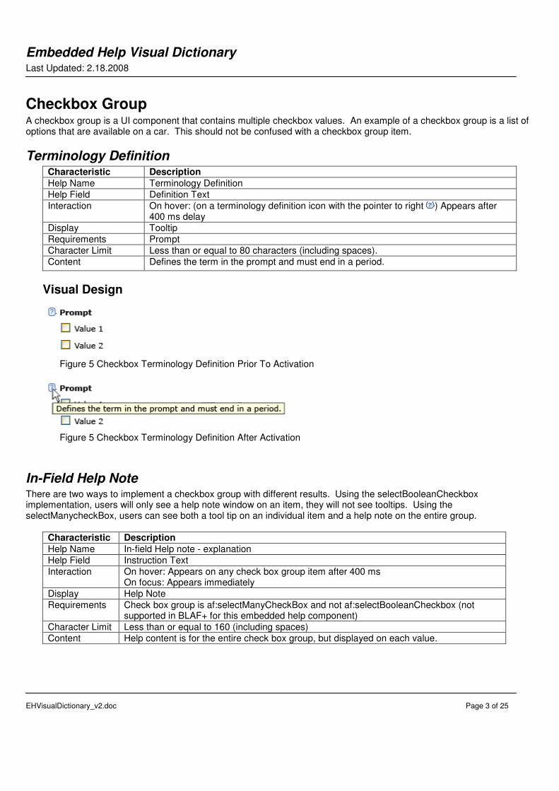
Checkbox Group A checkbox group is a UI component that contains multiple checkbox values. An example of a checkbox group is a list of options that are available on a car. This should not be confused with a checkbox group item.
Terminology Definition Characteristic Description
Help Name Terminology Definition
Help Field Definition Text
Interaction On hover: (on a terminology definition icon with the pointer to right ) Appears after 400 ms delay
Display Tooltip
Requirements Prompt
Character Limit Less than or equal to 80 characters (including spaces).
Content Defines the term in the prompt and must end in a period.
Visual Design
Figure 5 Checkbox Terminology Definition Prior To Activation
Figure 5 Checkbox Terminology Definition After Activation
In-Field Help Note There are two ways to implement a checkbox group with different results. Using the selectBooleanCheckbox implementation, users will only see a help note window on an item, they will not see tooltips. Using the selectManycheckBox, users can see both a tool tip on an individual item and a help note on the entire group.
Characteristic Description
Help Name In-field Help note - explanation
Help Field Instruction Text
Interaction On hover: Appears on any check box group item after 400 ms On focus: Appears immediately
Display Help Note
Requirements Check box group is af:selectManyCheckBox and not af:selectBooleanCheckbox (not supported in BLAF+ for this embedded help component)
Character Limit Less than or equal to 160 (including spaces)
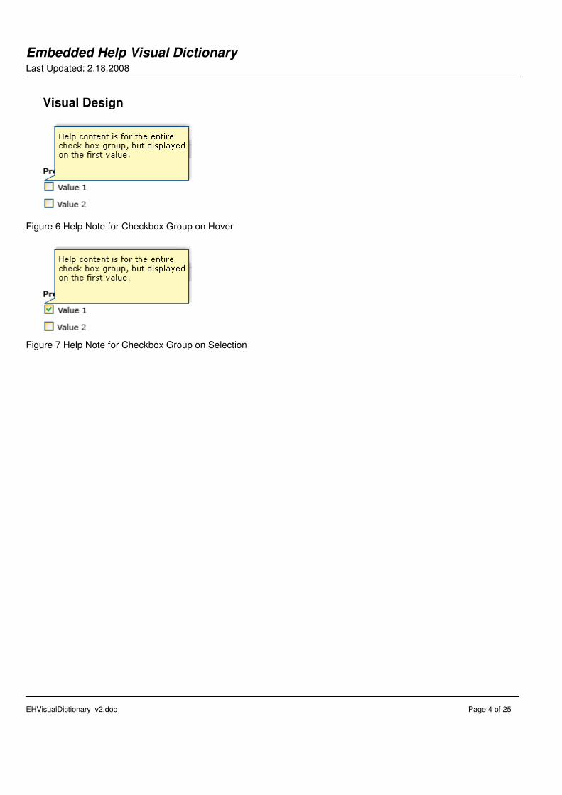
Content Help content is for the entire check box group, but displayed on each value.
Embedded Help Visual Dictionary Last Updated: 2.18.2008
EHVisualDictionary_v2.doc Page 4 of 25
Visual Design
Figure 6 Help Note for Checkbox Group on Hover
Figure 7 Help Note for Checkbox Group on Selection
Embedded Help Visual Dictionary Last Updated: 2.18.2008
EHVisualDictionary_v2.doc Page 5 of 25
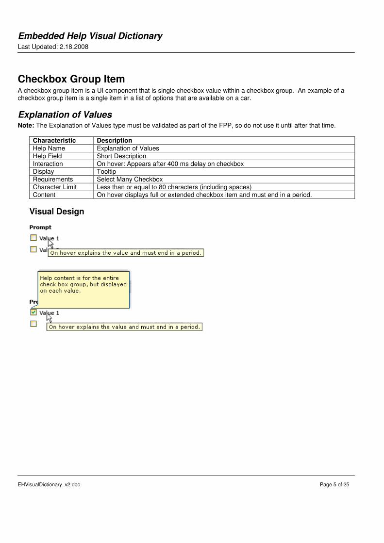
Checkbox Group Item A checkbox group item is a UI component that is single checkbox value within a checkbox group. An example of a checkbox group item is a single item in a list of options that are available on a car.
Explanation of Values Note: The Explanation of Values type must be validated as part of the FPP, so do not use it until after that time.
Characteristic Description
Help Name Explanation of Values
Help Field Short Description
Interaction On hover: Appears after 400 ms delay on checkbox
Display Tooltip
Requirements Select Many Checkbox
Character Limit Less than or equal to 80 characters (including spaces)
Content On hover displays full or extended checkbox item and must end in a period.
Visual Design
Embedded Help Visual Dictionary Last Updated: 2.18.2008
EHVisualDictionary_v2.doc Page 6 of 25
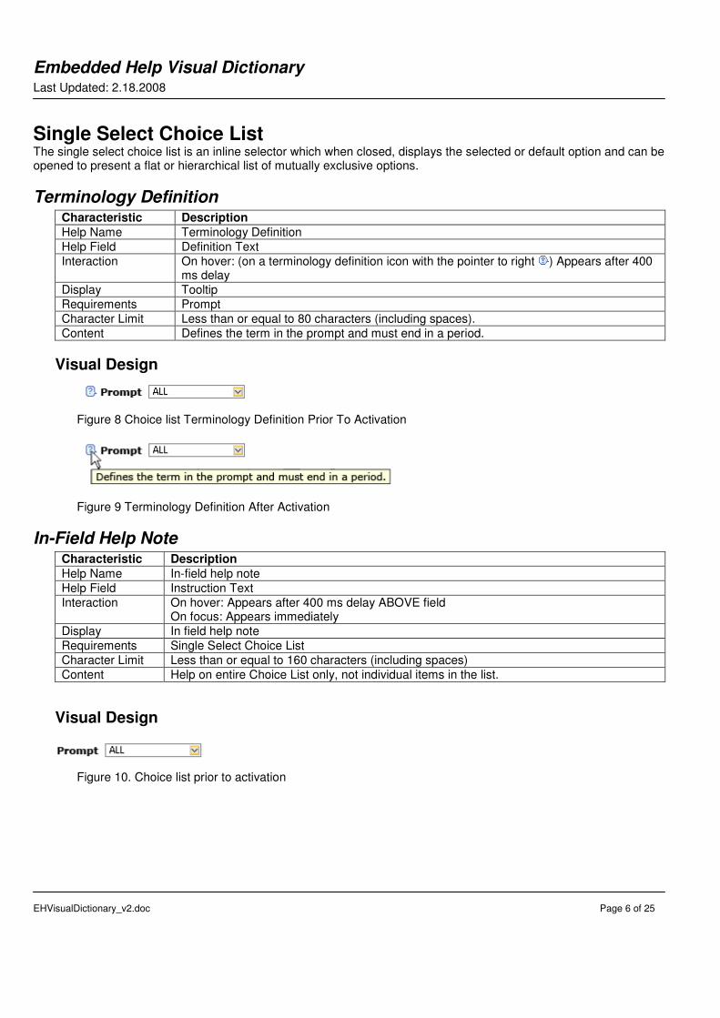
Single Select Choice List The single select choice list is an inline selector which when closed, displays the selected or default option and can be opened to present a flat or hierarchical list of mutually exclusive options.
Terminology Definition Characteristic Description
Help Name Terminology Definition
Help Field Definition Text
Interaction On hover: (on a terminology definition icon with the pointer to right ) Appears after 400 ms delay
Display Tooltip
Requirements Prompt
Character Limit Less than or equal to 80 characters (including spaces).
Content Defines the term in the prompt and must end in a period.
Visual Design
Figure 8 Choice list Terminology Definition Prior To Activation
Figure 9 Terminology Definition After Activation
In-Field Help Note Characteristic Description
Help Name In-field help note
Help Field Instruction Text
Interaction On hover: Appears after 400 ms delay ABOVE field On focus: Appears immediately
Display In field help note
Requirements Single Select Choice List
Character Limit Less than or equal to 160 characters (including spaces)
Content Help on entire Choice List only, not individual items in the list.
Visual Design
Figure 10. Choice list prior to activation
Embedded Help Visual Dictionary Last Updated: 2.18.2008
EHVisualDictionary_v2.doc Page 7 of 25
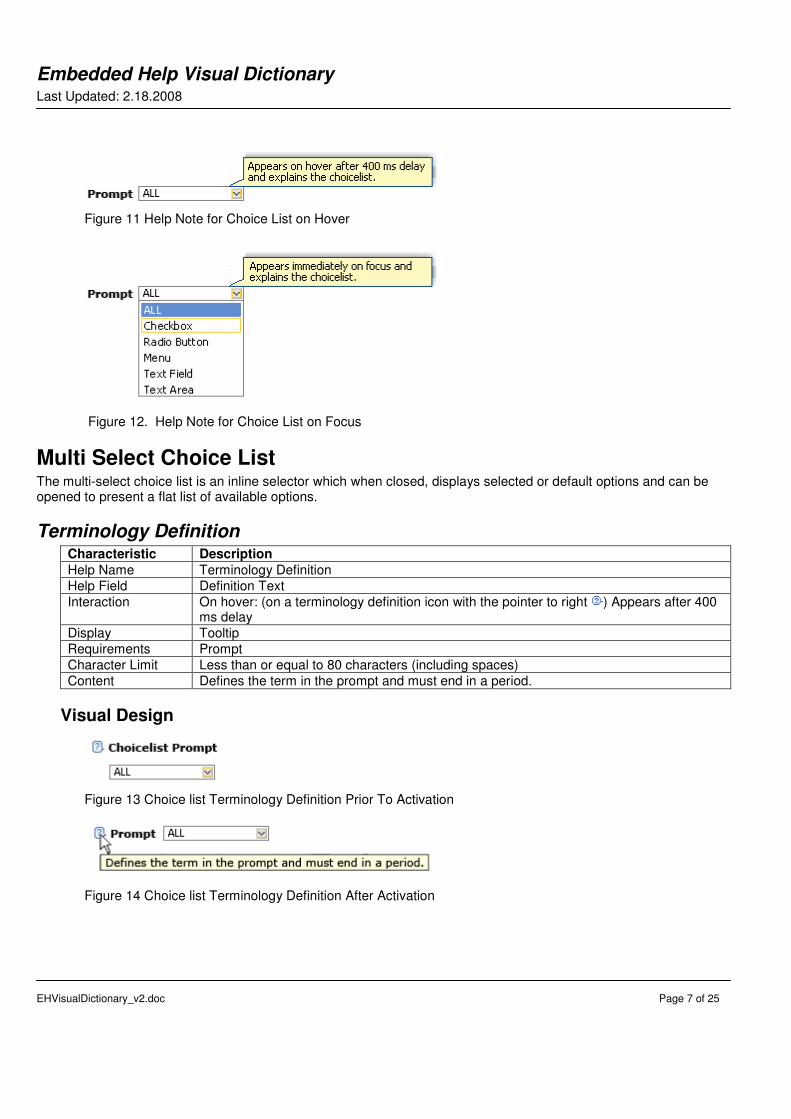
Figure 11 Help Note for Choice List on Hover
Figure 12. Help Note for Choice List on Focus
Multi Select Choice List The multi-select choice list is an inline selector which when closed, displays selected or default options and can be opened to present a flat list of available options.
Terminology Definition Characteristic Description
Help Name Terminology Definition
Help Field Definition Text
Interaction On hover: (on a terminology definition icon with the pointer to right ) Appears after 400 ms delay
Display Tooltip
Requirements Prompt
Character Limit Less than or equal to 80 characters (including spaces)
Content Defines the term in the prompt and must end in a period.
Visual Design
Figure 13 Choice list Terminology Definition Prior To Activation
Figure 14 Choice list Terminology Definition After Activation
Embedded Help Visual Dictionary Last Updated: 2.18.2008
EHVisualDictionary_v2.doc Page 8 of 25
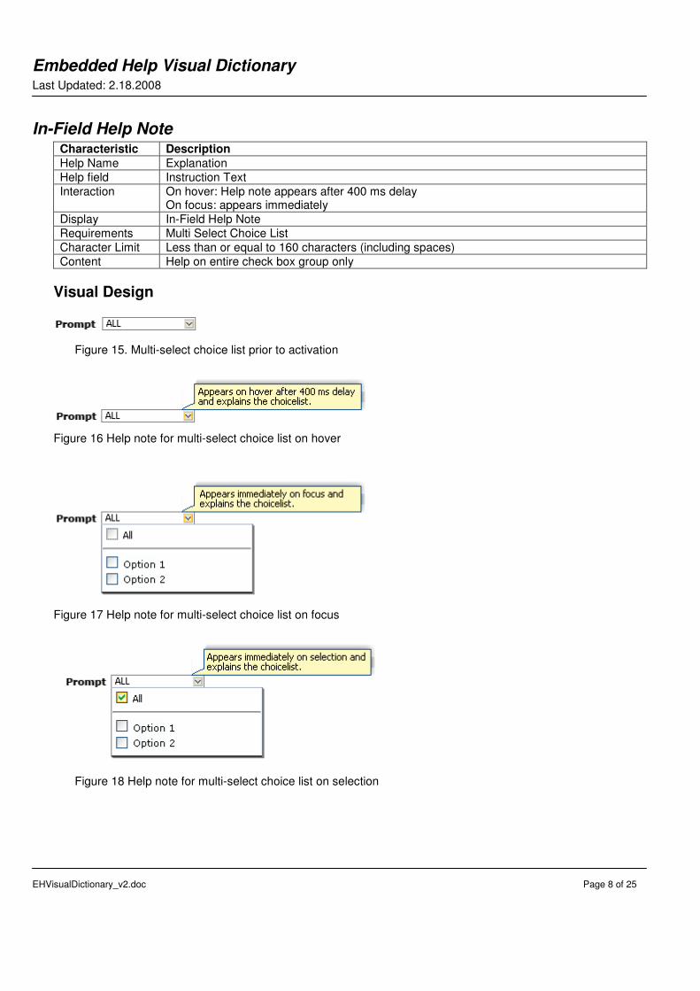
In-Field Help Note Characteristic Description
Help Name Explanation
Help field Instruction Text
Interaction On hover: Help note appears after 400 ms delay On focus: appears immediately
Display In-Field Help Note
Requirements Multi Select Choice List
Character Limit Less than or equal to 160 characters (including spaces)
Content Help on entire check box group only
Visual Design
Figure 15. Multi-select choice list prior to activation
Figure 16 Help note for multi-select choice list on hover
Figure 17 Help note for multi-select choice list on focus
Figure 18 Help note for multi-select choice list on selection
Embedded Help Visual Dictionary Last Updated: 2.18.2008
EHVisualDictionary_v2.doc Page 9 of 25
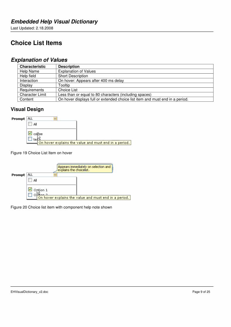
Choice List Items
Explanation of Values Characteristic Description
Help Name Explanation of Values
Help field Short Description
Interaction On hover: Appears after 400 ms delay
Display Tooltip
Requirements Choice List
Character Limit Less than or equal to 80 characters (including spaces)
Content On hover displays full or extended choice list item and must end in a period.
Visual Design
Figure 19 Choice List Item on hover
Figure 20 Choice list item with component help note shown
Embedded Help Visual Dictionary Last Updated: 2.18.2008
EHVisualDictionary_v2.doc Page 10 of 25
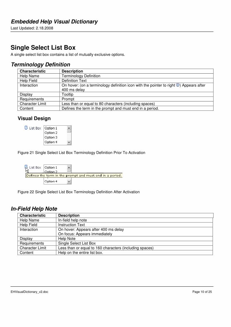
Single Select List Box A single select list box contains a list of mutually exclusive options.
Terminology Definition Characteristic Description
Help Name Terminology Definition
Help Field Definition Text
Interaction On hover: (on a terminology definition icon with the pointer to right ) Appears after 400 ms delay
Display Tooltip
Requirements Prompt
Character Limit Less than or equal to 80 characters (including spaces)
Content Defines the term in the prompt and must end in a period.
Visual Design
Figure 21 Single Select List Box Terminology Definition Prior To Activation
Figure 22 Single Select List Box Terminology Definition After Activation
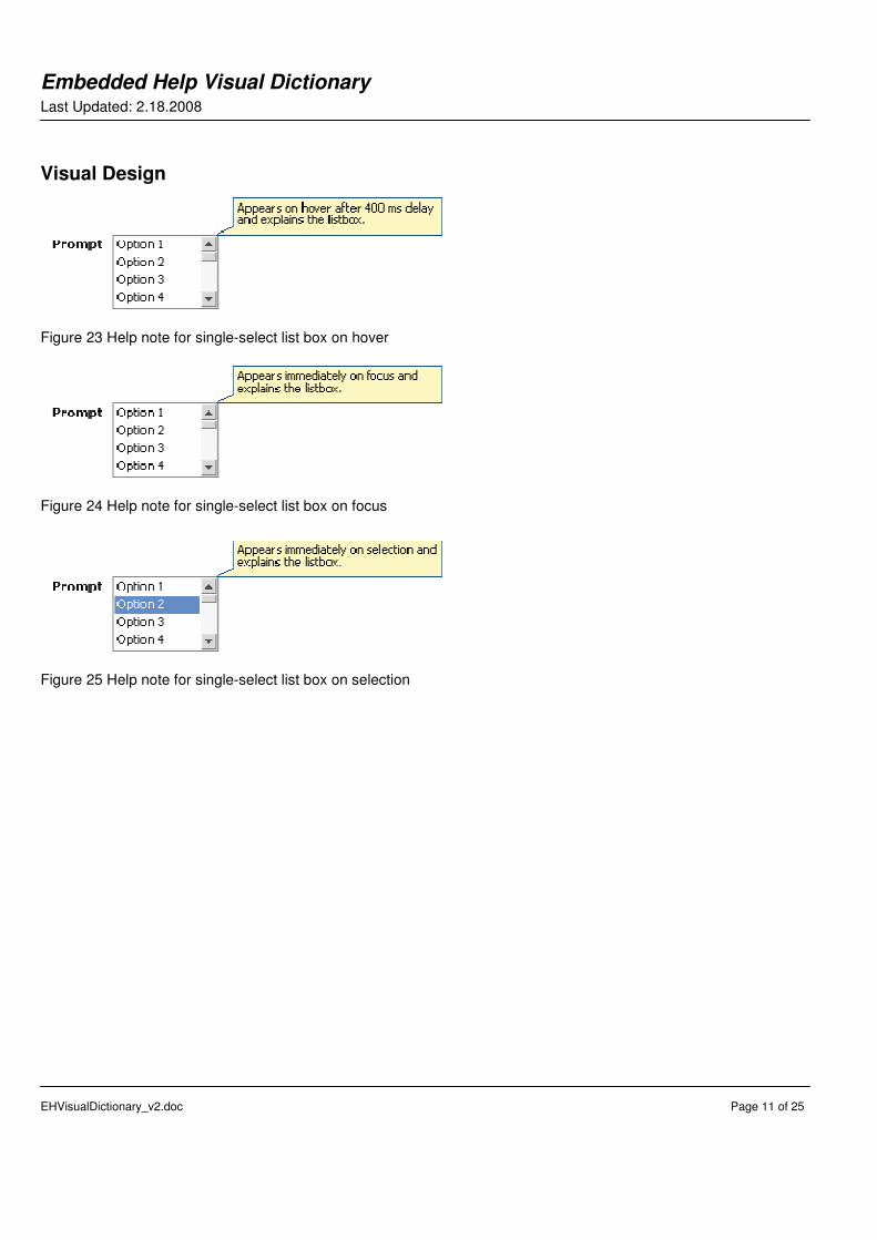
In-Field Help Note Characteristic Description
Help Name In-field help note
Help Field Instruction Text
Interaction On hover: Appears after 400 ms delay On focus: Appears immediately
Display Help Note
Requirements Single Select List Box
Character Limit Less than or equal to 160 characters (including spaces)
Content Help on the entire list box.
Embedded Help Visual Dictionary Last Updated: 2.18.2008
EHVisualDictionary_v2.doc Page 11 of 25
Visual Design
Figure 23 Help note for single-select list box on hover
Figure 24 Help note for single-select list box on focus
Figure 25 Help note for single-select list box on selection
Embedded Help Visual Dictionary Last Updated: 2.18.2008
EHVisualDictionary_v2.doc Page 12 of 25
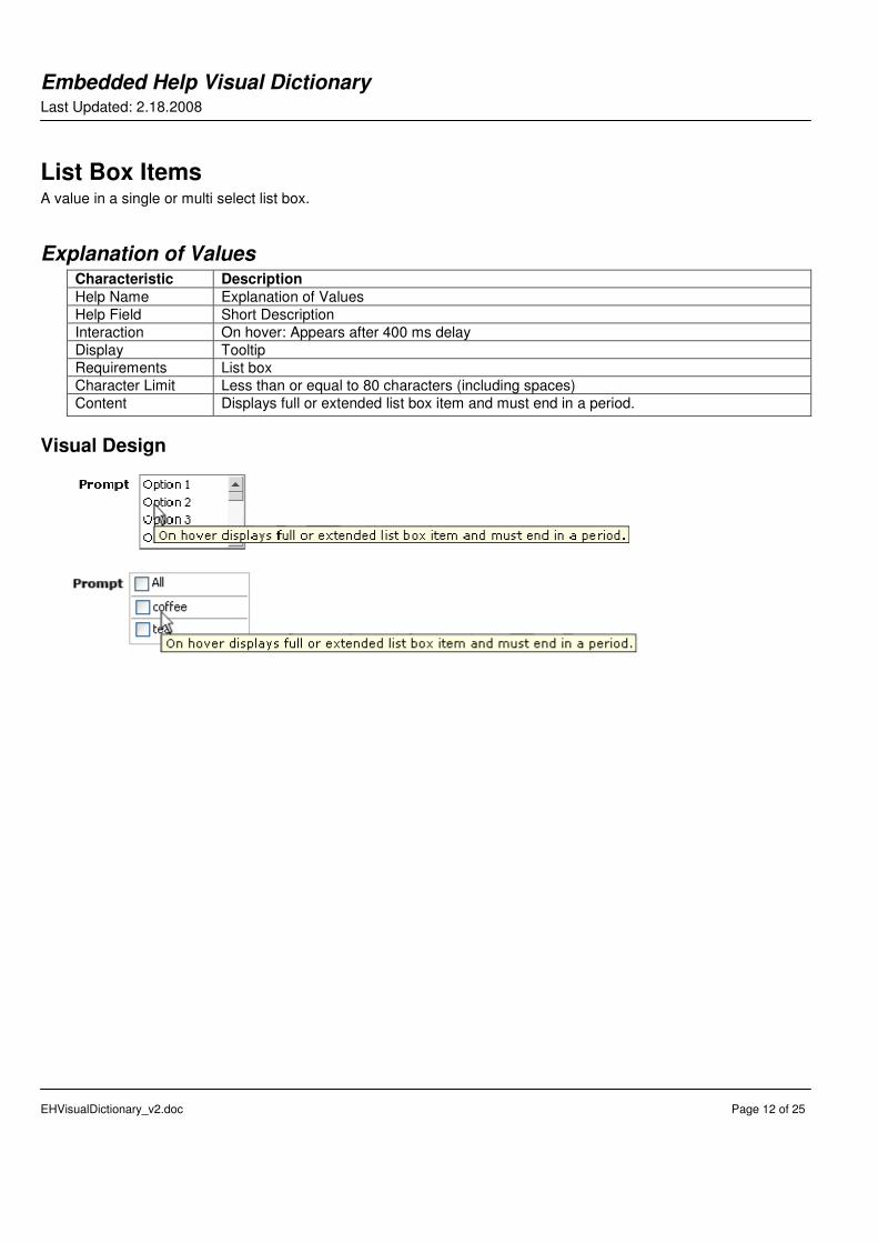
List Box Items A value in a single or multi select list box.
Explanation of Values Characteristic Description
Help Name Explanation of Values
Help Field Short Description
Interaction On hover: Appears after 400 ms delay
Display Tooltip
Requirements List box
Character Limit Less than or equal to 80 characters (including spaces)
Content Displays full or extended list box item and must end in a period.
Visual Design
Embedded Help Visual Dictionary Last Updated: 2.18.2008
EHVisualDictionary_v2.doc Page 13 of 25
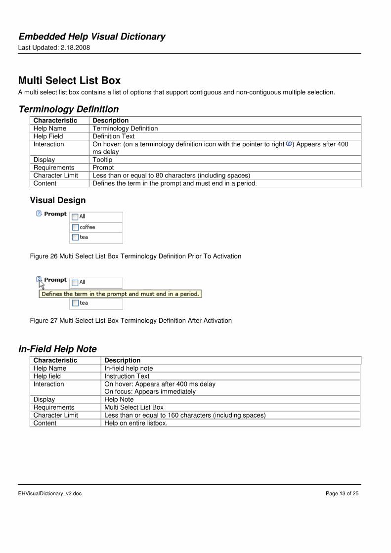
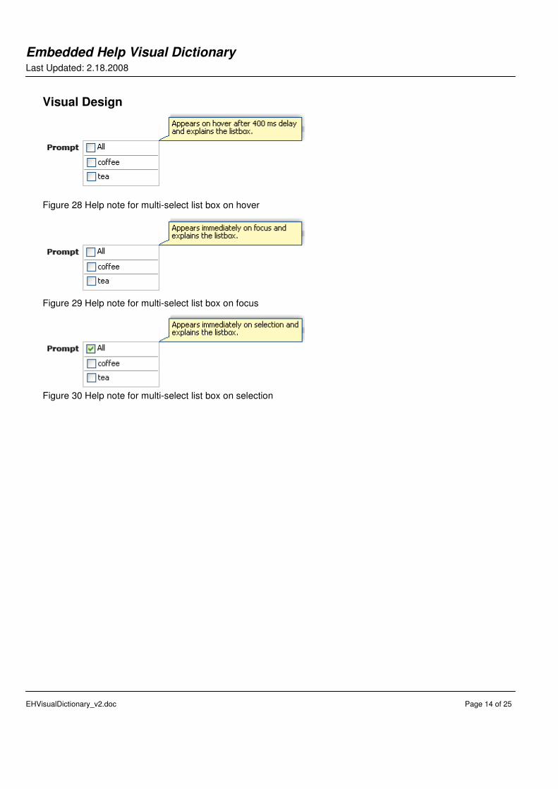
Multi Select List Box A multi select list box contains a list of options that support contiguous and non-contiguous multiple selection.
Terminology Definition Characteristic Description
Help Name Terminology Definition
Help Field Definition Text
Interaction On hover: (on a terminology definition icon with the pointer to right ) Appears after 400 ms delay
Display Tooltip
Requirements Prompt
Character Limit Less than or equal to 80 characters (including spaces)
Content Defines the term in the prompt and must end in a period.
Visual Design
Figure 26 Multi Select List Box Terminology Definition Prior To Activation
Figure 27 Multi Select List Box Terminology Definition After Activation
In-Field Help Note Characteristic Description
Help Name In-field help note
Help field Instruction Text
Interaction On hover: Appears after 400 ms delay On focus: Appears immediately
Display Help Note
Requirements Multi Select List Box
Character Limit Less than or equal to 160 characters (including spaces)
Content Help on entire listbox.
Embedded Help Visual Dictionary Last Updated: 2.18.2008
EHVisualDictionary_v2.doc Page 14 of 25
Visual Design
Figure 28 Help note for multi-select list box on hover
Figure 29 Help note for multi-select list box on focus
Figure 30 Help note for multi-select list box on selection
Embedded Help Visual Dictionary Last Updated: 2.18.2008
EHVisualDictionary_v2.doc Page 15 of 25
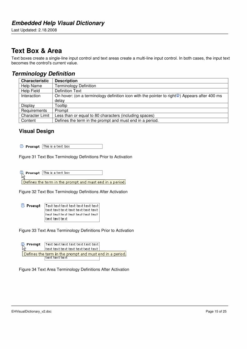
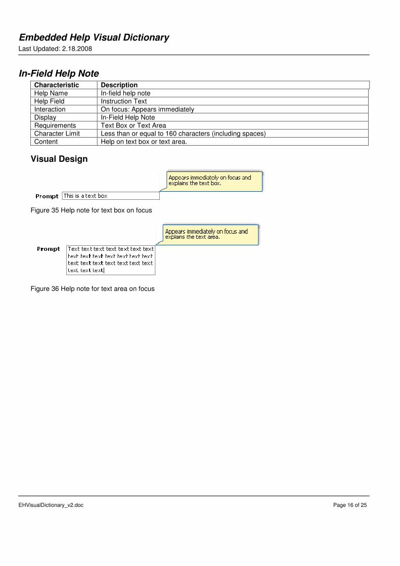
Text Box & Area Text boxes create a single-line input control and text areas create a multi-line input control. In both cases, the input text becomes the control's current value.
Terminology Definition Characteristic Description
Help Name Terminology Definition
Help Field Definition Text
Interaction On hover: (on a terminology definition icon with the pointer to right ) Appears after 400 ms delay
Display Tooltip
Requirements Prompt
Character Limit Less than or equal to 80 characters (including spaces)
Content Defines the term in the prompt and must end in a period.
Visual Design
Figure 31 Text Box Terminology Definitions Prior to Activation
Figure 32 Text Box Terminology Definitions After Activation
Figure 33 Text Area Terminology Definitions Prior to Activation
Figure 34 Text Area Terminology Definitions After Activation
Embedded Help Visual Dictionary Last Updated: 2.18.2008
EHVisualDictionary_v2.doc Page 16 of 25
In-Field Help Note Characteristic Description
Help Name In-field help note
Help Field Instruction Text
Interaction On focus: Appears immediately
Display In-Field Help Note
Requirements Text Box or Text Area
Character Limit Less than or equal to 160 characters (including spaces)
Content Help on text box or text area.
Visual Design
Figure 35 Help note for text box on focus
Figure 36 Help note for text area on focus
Embedded Help Visual Dictionary Last Updated: 2.18.2008
EHVisualDictionary_v2.doc Page 17 of 25
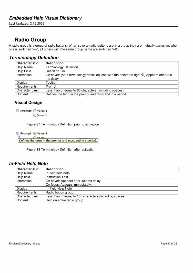
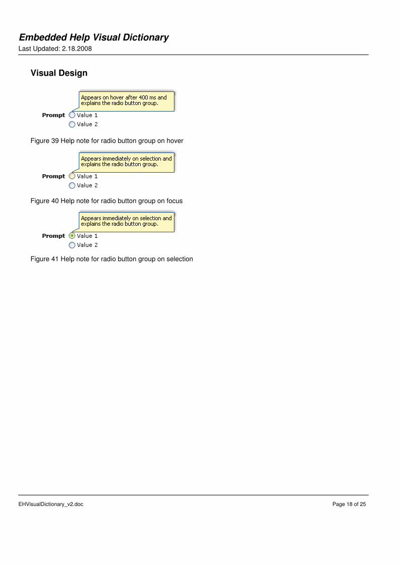
Radio Group A radio group is a group of radio buttons. When several radio buttons are in a group they are mutually exclusive: when one is switched "on", all others with the same group name are switched "off".
Terminology Definition Characteristic Description
Help Name Terminology Definition
Help Field Definition Text
Interaction On hover: (on a terminology definition icon with the pointer to right ) Appears after 400 ms delay
Display Tooltip
Requirements Prompt
Character Limit Less than or equal to 80 characters (including spaces)
Content Defines the term in the prompt and must end in a period.
Visual Design
Figure 37 Terminology Definition prior to activation
Figure 38 Terminology Definition after activation
In-Field Help Note Characteristic Description
Help Name In-field help note
Help field Instruction Text
Interaction On hover: Appears after 400 ms delay On focus: Appears immediately.
Display In-Field Help Note
Requirements Radio button group
Character Limit Less than or equal to 160 characters (including spaces)
Content Help on entire radio group.
Embedded Help Visual Dictionary Last Updated: 2.18.2008
EHVisualDictionary_v2.doc Page 18 of 25
Visual Design
Figure 39 Help note for radio button group on hover
Figure 40 Help note for radio button group on focus
Figure 41 Help note for radio button group on selection
Embedded Help Visual Dictionary Last Updated: 2.18.2008
EHVisualDictionary_v2.doc Page 19 of 25
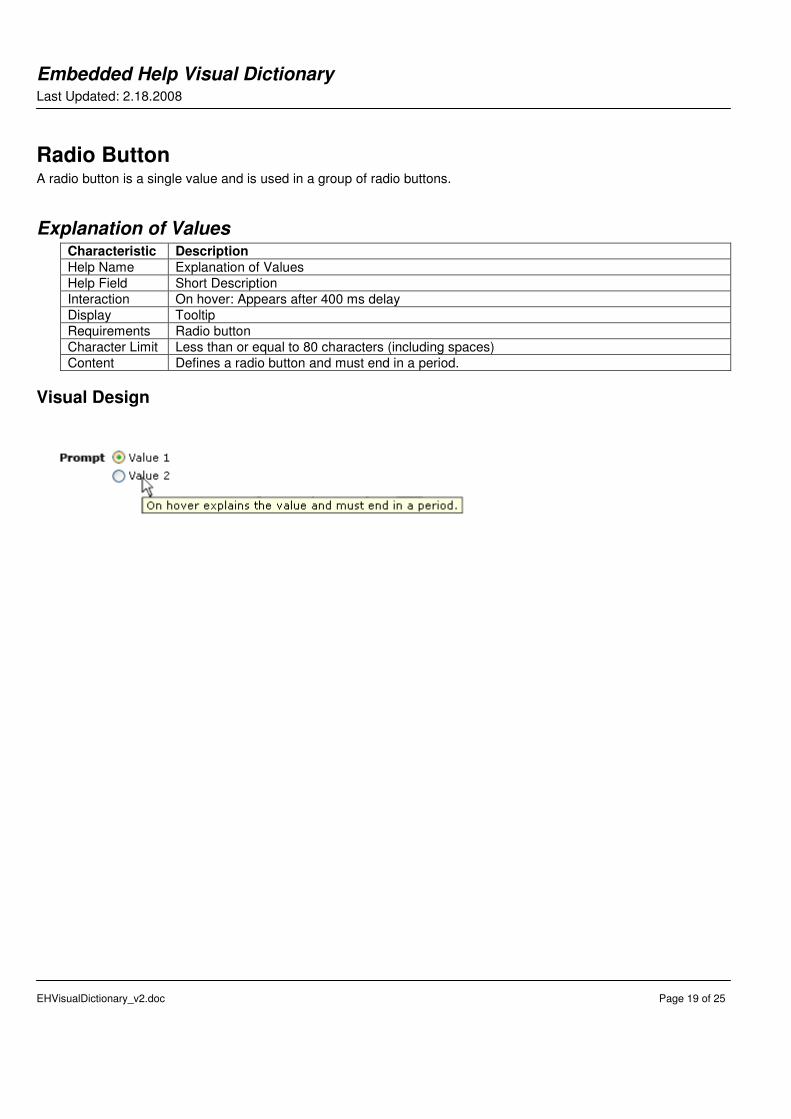
Radio Button A radio button is a single value and is used in a group of radio buttons.
Explanation of Values Characteristic Description
Help Name Explanation of Values
Help Field Short Description
Interaction On hover: Appears after 400 ms delay
Display Tooltip
Requirements Radio button
Character Limit Less than or equal to 80 characters (including spaces)
Content Defines a radio button and must end in a period.
Visual Design

Embedded Help Visual Dictionary Last Updated: 2.18.2008
EHVisualDictionary_v2.doc Page 20 of 25
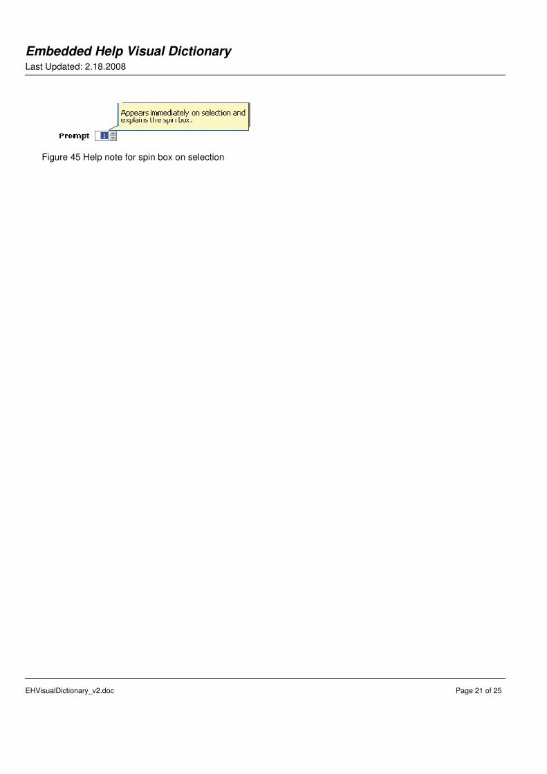
Spin Box The spin box displays a set of related but mutually exclusive numbers. It is composed of a box, sequence, and spin control.
Terminology Definition Characteristic Description
Help Name Terminology Definition
Help Field Definition Text
Interaction On hover: (on a terminology definition icon with the pointer to right ) Appears after 400 ms delay
Display Tooltip
Requirements Prompt
Character Limit Less than or equal to 80 characters (including spaces)
Content Defines the term in the prompt and must end in a period.
Visual Design
Figure 42 Terminology Definition prior to activation
Figure 43 Terminology Definition after activation
In-Field Help Note Characteristic Description
Help Name In-field help note
Help field Instruction Text
Interaction On focus: Appears immediately
Display In-Field Help Note
Requirements Spin box
Character Limit Less than or equal to 160 characters (including spaces)
Content Help on spin box.
Visual Design
Figure 44 Help note for spin box on focus
Embedded Help Visual Dictionary Last Updated: 2.18.2008
EHVisualDictionary_v2.doc Page 21 of 25
Figure 45 Help note for spin box on selection
Embedded Help Visual Dictionary Last Updated: 2.18.2008
EHVisualDictionary_v2.doc Page 22 of 25
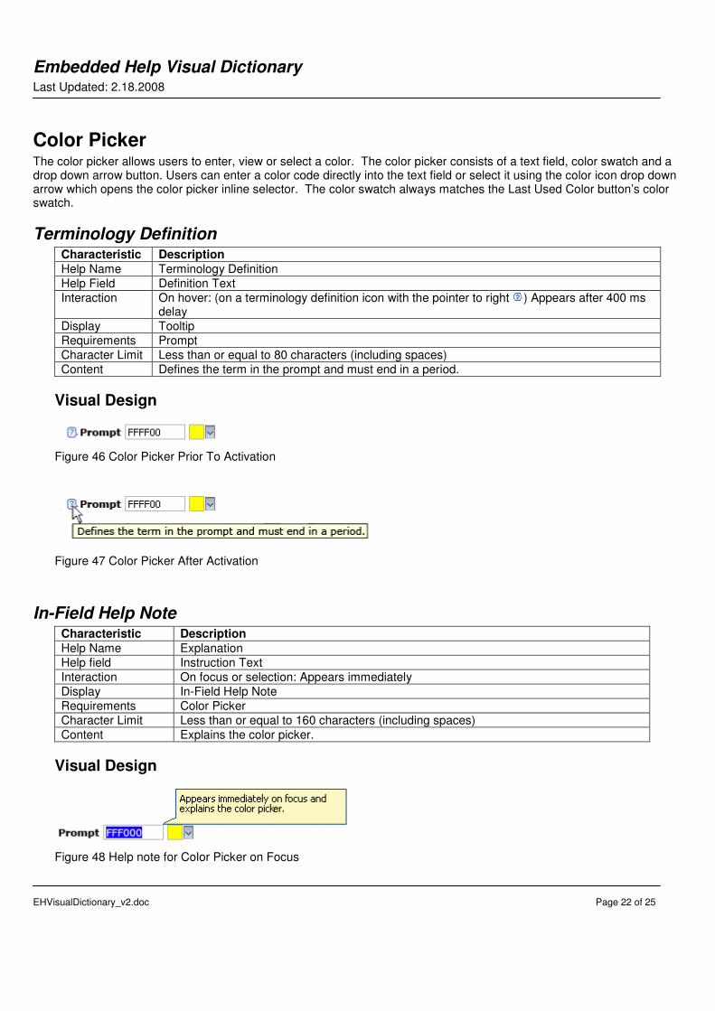
Color Picker The color picker allows users to enter, view or select a color. The color picker consists of a text field, color swatch and a drop down arrow button. Users can enter a color code directly into the text field or select it using the color icon drop down arrow which opens the color picker inline selector. The color swatch always matches the Last Used Color button’s color swatch.
Terminology Definition Characteristic Description
Help Name Terminology Definition
Help Field Definition Text
Interaction On hover: (on a terminology definition icon with the pointer to right ) Appears after 400 ms delay
Display Tooltip
Requirements Prompt
Character Limit Less than or equal to 80 characters (including spaces)
Content Defines the term in the prompt and must end in a period.
Visual Design
Figure 46 Color Picker Prior To Activation
Figure 47 Color Picker After Activation
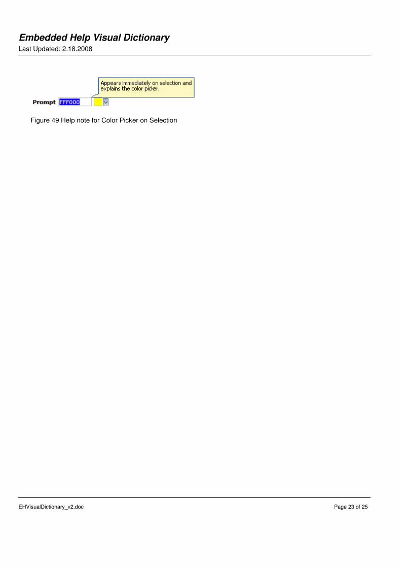
In-Field Help Note Characteristic Description
Help Name Explanation
Help field Instruction Text
Interaction On focus or selection: Appears immediately
Display In-Field Help Note
Requirements Color Picker
Character Limit Less than or equal to 160 characters (including spaces)
Content Explains the color picker.
Visual Design
Figure 48 Help note for Color Picker on Focus
Embedded Help Visual Dictionary Last Updated: 2.18.2008
EHVisualDictionary_v2.doc Page 23 of 25
Figure 49 Help note for Color Picker on Selection
Embedded Help Visual Dictionary Last Updated: 2.18.2008
EHVisualDictionary_v2.doc Page 24 of 25
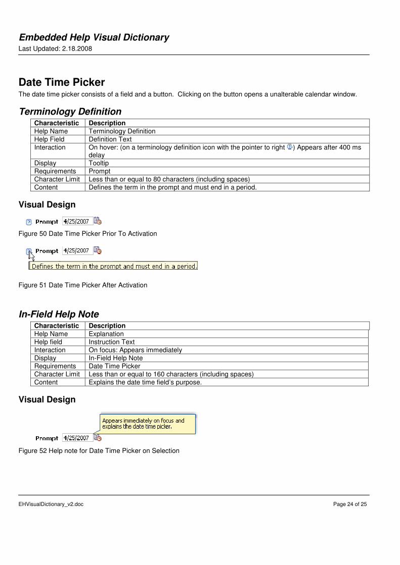
Date Time Picker The date time picker consists of a field and a button. Clicking on the button opens a unalterable calendar window.
Terminology Definition Characteristic Description
Help Name Terminology Definition
Help Field Definition Text
Interaction On hover: (on a terminology definition icon with the pointer to right ) Appears after 400 ms delay
Display Tooltip
Requirements Prompt
Character Limit Less than or equal to 80 characters (including spaces)
Content Defines the term in the prompt and must end in a period.
Visual Design
Figure 50 Date Time Picker Prior To Activation
Figure 51 Date Time Picker After Activation
In-Field Help Note Characteristic Description
Help Name Explanation
Help field Instruction Text
Interaction On focus: Appears immediately
Display In-Field Help Note
Requirements Date Time Picker
Character Limit Less than or equal to 160 characters (including spaces)
Content Explains the date time field’s purpose.
Visual Design
Figure 52 Help note for Date Time Picker on Selection