Embed Size (px)
Citation preview
Emergency Services Coverage Analyses Using a Road Network With Different Travel Cost Models Portland, Oregon
When someone is having a life‐threatening emergency, the rapid arrival of emergency personnel can be lifesaving. There are many factors that can hamper emergency services arriving quickly to the scene. Traffic congestion is one inhibiting factor, and my partner and I were very interested in investigating its effects on emergency response times. We designed our project to examine the effects of traffic congestion on the coverage distance and response times of EMS in the Portland, Oregon metro area. We also wanted to find out if it disrupts EMS service enough to consider adding another station or relocating one.
Before we could begin our analysis, we needed to find out if there was a national standard for response times for cities the size of Portland. There is no official Federal or State standard for response times in the United States. However, there are organizations that set standards for cities to follow and one of those organizations is the National Fire Protection Association (NFPA). According to the NFPA, urban areas that have greater than 1,000 people/miles2 should have a response time of four minutes or less for the arrival of the first engine company at a fire suppression incident. It requires eight minutes or less for the deployment of a full first alarm assignment at a fire suppression incident. For medical emergences, the NFPA states that fire departments should have a response time of four minutes or less for the arrival of a unit with a first responder (or higher level medical professional), and eight minutes or less for the arrival of an advanced life support unit. Fire departments must meet these response times to 90 percent of the incidents they are dispatched to.
Response time can mean life or death for the injured patient. According to the American Red Cross, a person who has suffered a heart attack needs EMS personnel to be on scene within 4 to 6 minutes to shock their heart back into a normal cardiac rhythm. A one‐minute decrease in the call‐to‐shock time increases the odds of survival by 57%. In other words, a three‐minute reduction in call‐to‐shock time improves a victim's odds of survival almost four‐fold. These numbers show why it’s so important for response times to emergencies to be low. However, if EMS personnel fail to make it on scene within the 4 to 6 minute window, brain damage is possible. Six to 10 minutes later, brain damage is likely, and beyond 10 minutes, irreversible brain damage is certain.
So, how do the city of Portland’s fire department fair on their response time? According to the City of Portland’s website, Portland Fire and Rescue has a response area of approximately 151.6 square miles populated by an estimated 584,000 people. The daytime population increases almost 25 percent during normal business hours in the downtown and central east side areas. The best response times were in the downtown area. Here, Portland Fire & Rescue’s response times at the 90th percentile were between six minutes, 11 seconds and six minutes, 38 seconds in 2012. These are pretty good response times for a large metro area like Portland and the department is currently trying to improve to a goal of 5 minutes and 20 seconds or less for 90 percent of the time. The areas of Portland with the worst response times were the Northwest, West, and Southwest areas of the city. These areas had an average response time of eight minutes, two seconds to eight minutes, 28 seconds. For our research area in the Southeast section of the city, the department had a response time of seven minutes, seven seconds to seven minutes, 33 seconds.
References
Bureau of Technology Services: Open GIS Data Initiative Data Catalog. (2014). Retrieved from http://www.portlandoregon.gov/bts/article/268487Davis, R. (2005). The price of just a few seconds lost: People die. USA Today. Retrieved from www.usatoday.comDunn, C.E. & Newton, D. (1992). Optimal Routes in GIS and Emergency Planning Applications. Royal Geographical Society with IBG. 24, 259‐267. Retrieved from http://www.jstor.org/stable/20003145 Lambert, T.E. & Meyer P.B. (2008). Practitioner’s Corner: New and Fringe Residential Development and Emergency Medical Services Response Times in the United States. State & Local Government Review. 40, 115‐124. Retrieved from http://www.jstor.org/stable/25469783 Population and Demographics: Population by Neighborhood. (2010). Retrieved from http://www.portlandonline.com/portlandplan/index.cfm?c=52257&Portland Fire & Rescue Response Times At 90th Percentile Fy 2012‐13. (2012). Retrieved from http://www.portlandoregon.gov/cbo/article/433203Rose, J. (2014, June 04). Portland traffic ranked ninth worst in the U.S. The Oregonian. Retrieved from www.oregonlive.comStandards development process‐NFPA 1720. (2010). Retrieved from http://www.nfpa.org/codes‐and‐standards/standards‐development‐process/safer‐act‐grant/nfpa‐1720Tom Tom Americas [Chart]. (2014) Retrieved from the Tom Tom Traffic index website: http://www.tomtom.com/en_gb/trafficindex/
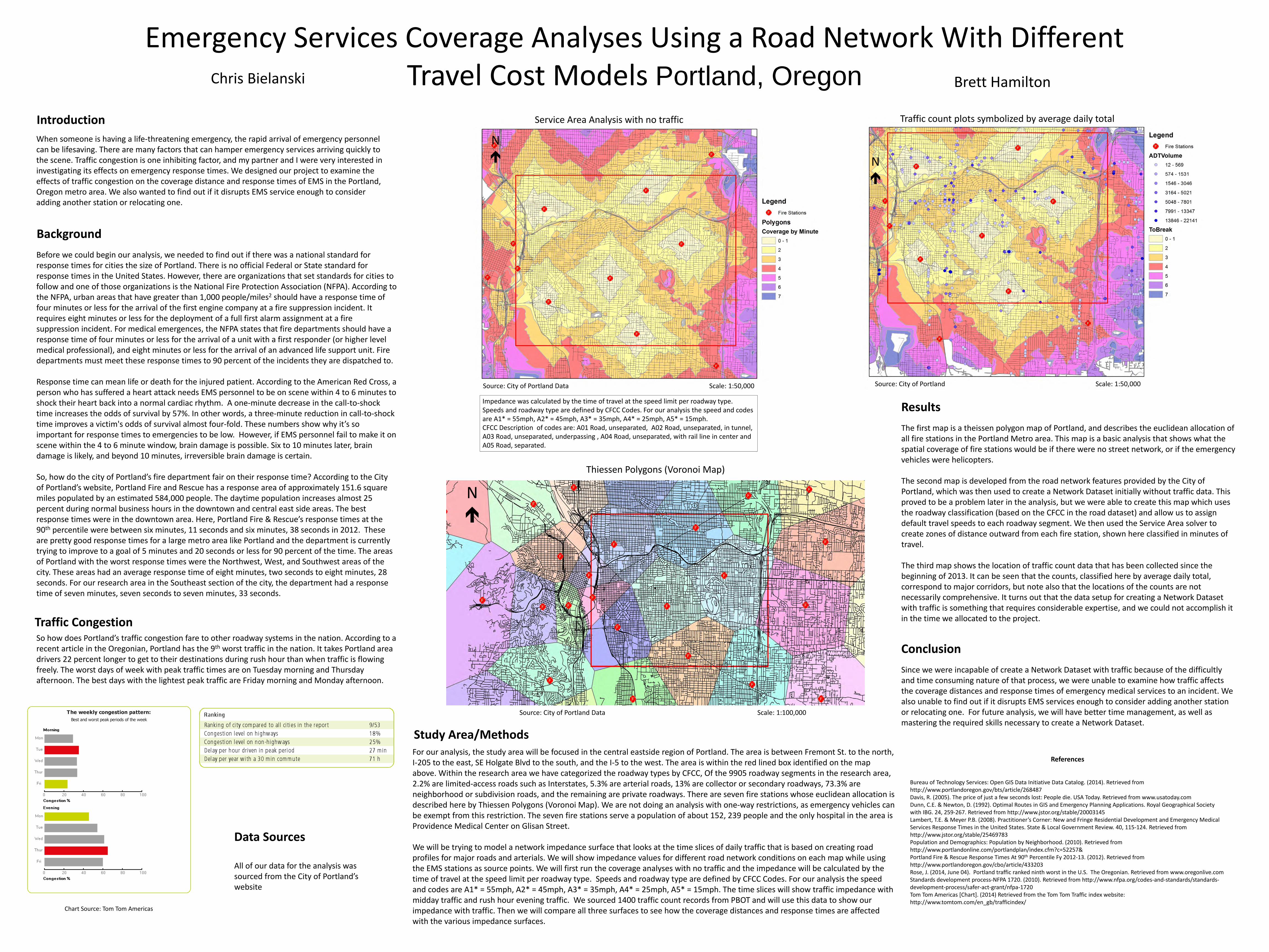
Thiessen Polygons (Voronoi Map)
For our analysis, the study area will be focused in the central eastside region of Portland. The area is between Fremont St. to the north, I‐205 to the east, SE Holgate Blvd to the south, and the I‐5 to the west. The area is within the red lined box identified on the map above. Within the research area we have categorized the roadway types by CFCC, Of the 9905 roadway segments in the research area, 2.2% are limited‐access roads such as Interstates, 5.3% are arterial roads, 13% are collector or secondary roadways, 73.3% are neighborhood or subdivision roads, and the remaining are private roadways. There are seven fire stations whose euclidean allocation is described here by Thiessen Polygons (Voronoi Map). We are not doing an analysis with one‐way restrictions, as emergency vehicles can be exempt from this restriction. The seven fire stations serve a population of about 152, 239 people and the only hospital in the area is Providence Medical Center on Glisan Street.
We will be trying to model a network impedance surface that looks at the time slices of daily traffic that is based on creating road profiles for major roads and arterials. We will show impedance values for different road network conditions on each map while using the EMS stations as source points. We will first run the coverage analyses with no traffic and the impedance will be calculated by the time of travel at the speed limit per roadway type. Speeds and roadway type are defined by CFCC Codes. For our analysis the speed and codes are A1* = 55mph, A2* = 45mph, A3* = 35mph, A4* = 25mph, A5* = 15mph. The time slices will show traffic impedance with midday traffic and rush hour evening traffic. We sourced 1400 traffic count records from PBOT and will use this data to show our impedance with traffic. Then we will compare all three surfaces to see how the coverage distances and response times are affected with the various impedance surfaces.
Source: City of Portland Data Scale: 1:100,000
Service Area Analysis with no traffic
So how does Portland’s traffic congestion fare to other roadway systems in the nation. According to a recent article in the Oregonian, Portland has the 9th worst traffic in the nation. It takes Portland area drivers 22 percent longer to get to their destinations during rush hour than when traffic is flowing freely. The worst days of week with peak traffic times are on Tuesday morning and Thursday afternoon. The best days with the lightest peak traffic are Friday morning and Monday afternoon.
Source: City of Portland Data Scale: 1:50,000
Impedance was calculated by the time of travel at the speed limit per roadway type. Speeds and roadway type are defined by CFCC Codes. For our analysis the speed and codes are A1* = 55mph, A2* = 45mph, A3* = 35mph, A4* = 25mph, A5* = 15mph.CFCC Description of codes are: A01 Road, unseparated, A02 Road, unseparated, in tunnel, A03 Road, unseparated, underpassing , A04 Road, unseparated, with rail line in center and A05 Road, separated.
N
N
Chart Source: Tom Tom Americas
Chris Bielanski Brett Hamilton
Traffic count plots symbolized by average daily total
Source: City of Portland Scale: 1:50,000
N
Introduction
Background
Study Area/Methods
Traffic Congestion
The first map is a theissen polygon map of Portland, and describes the euclidean allocation of all fire stations in the Portland Metro area. This map is a basic analysis that shows what the spatial coverage of fire stations would be if there were no street network, or if the emergency vehicles were helicopters.
The second map is developed from the road network features provided by the City of Portland, which was then used to create a Network Dataset initially without traffic data. This proved to be a problem later in the analysis, but we were able to create this map which uses the roadway classification (based on the CFCC in the road dataset) and allow us to assign default travel speeds to each roadway segment. We then used the Service Area solver to create zones of distance outward from each fire station, shown here classified in minutes of travel.
The third map shows the location of traffic count data that has been collected since the beginning of 2013. It can be seen that the counts, classified here by average daily total, correspond to major corridors, but note also that the locations of the counts are not necessarily comprehensive. It turns out that the data setup for creating a Network Dataset with traffic is something that requires considerable expertise, and we could not accomplish it in the time we allocated to the project.
Results
Data Sources
All of our data for the analysis was sourced from the City of Portland’s website
Since we were incapable of create a Network Dataset with traffic because of the difficultly and time consuming nature of that process, we were unable to examine how traffic affects the coverage distances and response times of emergency medical services to an incident. We also unable to find out if it disrupts EMS services enough to consider adding another station or relocating one. For future analysis, we will have better time management, as well as mastering the required skills necessary to create a Network Dataset.
Conclusion