Embed Size (px)
Citation preview

Empirical Foundations for
Web Site Usability
Marti Hearst
Melody Ivory
Rashmi Sinha
University of California, Berkeley

The Usability Gap
196M new Web sites in the next 5 years [Nielsen99]
~20,000 user interface professionals [Nielson99]

The Usability Gap
Most sites have inadequate usability [Forrester, Spool, Hurst]
(users can’t find what they want 39-66% of the time)
196M new Web sites in the next 5 years [Nielsen99]
A shortage of user interface professionals [Nielson99]

The Problem
NON-professionals need to create websites
Guidelines are helpful, but Sometimes imprecise Sometimes conflict Usually not empirically founded

Ultimate Goal: Tools to Help Non-Professional Designers
Examples: A “grammar checker” to assess guideline
conformance Imperfect Only suggestions – not dogma
Automatic comparison to highly usable pages/sites
Automatic template suggestions
A View of Web Site Structure (Newman et al. 00)
Information design structure, categories of
information
Navigation design interaction with
information structure
Graphic design visual presentation of
information and navigation (color, typography, etc.)
Courtesy of Mark Newman

Information Architecture includes management
and more responsibility for content
User Interface Design includes testing and
evaluation
A View of Web Site Design(Newman et al. 00)
Courtesy of Mark Newman

The Goal
Eventually want to assess navigation structure and graphic design at the page and site level.
Farther down the line: information design and scent
Note: we are NOT suggesting we can characterize: Aesthetics Subjective preferences

The Investigation
Can we place web design guidelines onto an empirical foundation?
Can we build models of good design by looking at existing designs?

Example Empirical Investigation
Is it all about the content?

Webby Awards 2000
27 topical categories We used finance, education, community,
living, health, services 100 judges
International Academy of Digital Arts & Sciences
3 rounds of judging 2000 sites initially

Webby Awards 2000 6 criteria
1. Content2. Structure & navigation3. Visual design4. Functionality5. Interactivity6. Overall experience
Scale: 1-10 (highest) Nearly normally distributed across judged sites What are Webby judgements about?
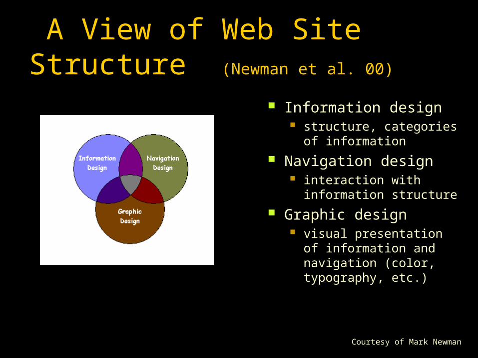
Webby Awards 2000 The best predictor of the overall score is
the score for content The worst predictor is visual design

So … Webbys focus on content!

Comparing Two Categories
news
arts

Guidelines
There are MANY usability guidelines A survey of 21 sets of web guidelines found
little overlap (Ratner et al. 96)
Why? One idea: because they are not empirically
validated So … let’s figure out what works!

Another Empirical Study:
Which features distinguish well-designed web pages?

Quantitative Metrics
Identified 42 attributes from the literature
Roughly characterized: Page Composition (e.g., words, links, images) Page Formatting (e.g., fonts, lists, colors) Overall Page Characteristics
(e.g., information & layout quality, download speed)

Metrics Used in Study
Word Count Body Text Percentage Emphasized Body
Text Percentage Text Positioning Count Text Cluster Count
Link Count Page Size Graphic Percentage Graphics Count Color Count Font Count

Data Collection
Collected data for 1898 pages from 163 sites Attempted to collect from 3 levels within each site Six Webby categories
Health, Living, Community, Education, Finance, Services
Data constraints At least 30 words No pages with forms Exhibit high self-containment (i.e., no scripts, applets,
etc.)

Method
The Webby factor A principle components analysis of the 6
judgement criteria accounted for 91% of the variance
Two comparisons Model 1: Top 33% of sites vs. the rest (using the overall Webby score) Model 2: Top 33% of sites vs. bottom 33%
(using the Webby factor)

Questions:
Can we use the metrics to predict membership in top vs. other groups?
Do we see a difference in how the metrics behave in different content categories?

Findings
We can accurately classify web pages Linear discriminant analysis Model 1: For top vs. rest
67% correct for overall 73% correct when taking categories into account
Model 2: For top vs. bottom 65% correct for overall 80% correct using categories

Findings Top 33% vs bottom 33% via Webby factor Linear discriminant analysis Works better when subdivided by category

Why does this work?
Content is most important predictor of overall score
BUT there is some predictive power in the visual design / navigation criteria
Also, it may just be that good design is good design all over This result is found in other domains
automatic essay grading for one

Deeper Analysis
Which metrics matter? Linear regression analysis
(backward elimination until adjusted R² reduced)
All metrics played a role Compared small, medium, and large pages
Across the board good pages had significantly smaller graphics percentage good pages had less emphasized body text good pages had more colors (on text)

Small pages (66 words on average)
Good small pages have (according to beta coefficients) slightly more content smaller page sizes fewer graphics more font variations
This suggests good small pages Have faster download times
corroborated by a download time metric Use different fonts for headers vs the rest of the text

Medium pages (230 words on average)
Good medium pages emphasize less of the body text
Good medium pages appear to organize text into clusters (e.g., lists and shaded table areas).
Good medium pages use colors to distinguish headers from body text

Large pages (827 words on average)
Good large pages have more headers more links are larger but have fewer graphics
probably attributable to style sheets

Future work
Distinguish according to page role Home page vs. content vs. index …
Better metrics Separate info design, navigation design,
graphic design Site level as well as page level Compare against results of live user
studies

Future work
Category-based profiles Can use clustering to create profiles of good
and poor sites for each category These can be used to suggest alternative
designs More information: CHI 2001 paper

More metrics

More metrics

More metrics

Ramifications
It is remarkable that such simple metrics predict so well Perhaps good design is good overall There may be other factors
A foundation for a new methodology Empirical, bottom up
But, there is no one path to good design!

Related Work
Some tools report on easy-to-measure attributes Compare number of links & graphics to
thresholds Stein (Rating Game), Theng & Marsden, Thimbley (Gentler) These are not empirically validated
Accessibility compliance CAST (Bobby), Scholtz & Laskowski
Perceptually based heuristics Faraday (Design Advisor)

Related Work
Web log analysis Traffic-based and time-based analysis
Drott, Etgan & Cantor, Fuller & deGraaff, Hochheiser & Shneiderman, Sullivan
Simulators Webcriteria (Max Site Profiler) makes predictions
via a pre-defined path Chi, Pirolli, & Pitkow generate navigation paths
from server logs

In Summary
Automated Usability Assessment should help close the Web Usability Gap
We can empirically distinguish between highly rated web pages and other pages Empirical validation of design guidelines Can build profiles of good vs. poor sites Are validating expert judgements with usability
assessments via a user study Eventually want to build tools to help end-users
assess their designs

More information: http://webtango.berkeley.edu http://www.sims.berkeley.edu/~hearst


![Untitled-1 [kilkaribihar.org]kilkaribihar.org/pdf/shortlisted_full_time_trainer_010914.pdf · ritu sinha niharika she-khar suman ruby yadav kamayani kumar' niramla pandey rashmi re-kha](https://img.pdfslide.net/doc/110x75/5fcfcc9662d5295fa7204489/untitled-1-ritu-sinha-niharika-she-khar-suman-ruby-yadav-kamayani-kumar-niramla.jpg)