Embed Size (px)
Citation preview

ESAP T02-00 - 1
T02-00 Qualitative (Tabular Summary, Bar Graph, Pie Chart)
Purpose Allows the analyst to analyze qualitative data by summarizing it in sorted format, tabular summary, frequency graphs (bar), and relative frequency graphs (pie, bar).
Inputs Qualitative data
Outputs Sorted Data Tabular SummaryFrequency Bar Graph Relative Frequency Bar GraphFrequency Pie Chart Relative Frequency Pie Chart
Limitations 1000 qualitative data elements10 classifications

ESAP T02-00 - 2
Coke ClassicDiet CokePepsi-ColaDiet CokeCoke ClassicCoke ClassicDr. PepperDiet CokePepsi-ColaPepsi-ColaCoke ClassicDr. PepperSpriteCoke ClassicDiet CokeCoke Classic
An Example
A random sample of soft drink preference was taken and the results were tallied as shown here.
Develop the Frequency, Relative Frequency, Percent Frequency distribution for each soft drink.
Create a bar graph and pie chart to graphically display the above distributions.
You can enter the data from the ESAP data set for this problem easily by: Click On The Data Set which will automatically open in Excel, Copy, Paste Special, Values to the appropriate cells
T02-00 Qualitative (Tabular Summary, Bar Graph, Pie Chart)

ESAP T02-00 - 3
Data can either be entered directly into the Original Data cells or copy, paste special, values into the cells.
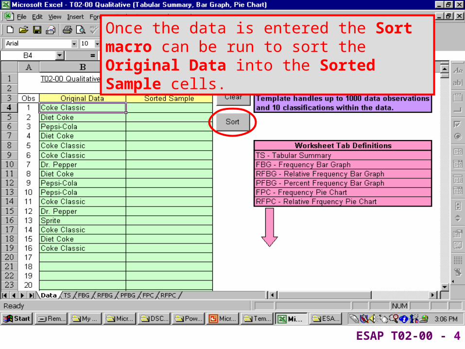
ESAP T02-00 - 4
Once the data is entered the Sort macro can be run to sort the Original Data into the Sorted Sample cells.

ESAP T02-00 - 5
Worksheet Tabs can be selected to view the desired output

ESAP T02-00 - 6
The Tabular Summary displays the frequency, relative frequency and percent frequency by classification.

ESAP T02-00 - 7
Cell A1 allows you to set the decimal point accuracy for the relative frequency and percent frequency.

ESAP T02-00 - 8
The Frequency Bar Graph (FBG) displays the frequency bar graph by classification

ESAP T02-00 - 9
The Relative Frequency Bar Graph (RFBG) displays the relative frequency bar graph by classification

ESAP T02-00 - 10
The Percent Frequency Bar Graph (PFBG) displays the percent frequency bar graph by classification

ESAP T02-00 - 11
The Frequency Pie Chart (FPC) displays the frequency pie chart by classification

ESAP T02-00 - 12
The Relative Frequency Pie Chart (RFPC) displays the relative frequency pie chart by classification