Embed Size (px)
Citation preview
XAML in a Nutshellby Lori A. MacVittie
Copyright © 2006 O’Reilly Media, Inc. All rights reserved.Printed in the United States of America.
Published by O’Reilly Media, Inc., 1005 Gravenstein Highway North, Sebastopol, CA 95472.
O’Reilly books may be purchased for educational, business, or sales promotional use. Onlineeditions are also available for most titles (safari.oreilly.com). For more information, contactour corporate/institutional sales department: (800) 998-9938 or [email protected].
Editor: Jeff PepperProduction Editor: Matt HutchinsonCopyeditor: Rachel MonaghanProofreader: Matt Hutchinson
Indexer: Ellen TroutmanCover Designer: Karen MontgomeryInterior Designer: David FutatoIllustrators: Robert Romano, Jessamyn
Read, and Lesley Borash
Printing History:
March 2006: First Edition.
Nutshell Handbook, the Nutshell Handbook logo, and the O’Reilly logo are registeredtrademarks of O’Reilly Media, Inc. The In a Nutshell series designations, XAML in a Nutshell,the image of a kudu, and related trade dress are trademarks of O’Reilly Media, Inc.
Many of the designations used by manufacturers and sellers to distinguish their products areclaimed as trademarks. Where those designations appear in this book, and O’Reilly Media,Inc. was aware of a trademark claim, the designations have been printed in caps or initialcaps.
While every precaution has been taken in the preparation of this book, the publisher andauthor assume no responsibility for errors or omissions, or for damages resulting from the useof the information contained herein.
This book uses RepKover™, a durable and flexible lay-flat binding.
ISBN: 0-596-52673-3
[M]
,COPYRIGHT.27866 Page iv Wednesday, March 22, 2006 11:12 AM

This excerpt is protected by copyright law. It is your responsibility to obtain permissions necessary for any
proposed use of this material. Please direct your inquiries to [email protected].
23
This is the Title of the Book, eMatter EditionCopyright © 2006 O’Reilly & Associates, Inc. All rights reserved.
Chapter 3The Basics of XAML
3The Basics of XAML
XAML is an XML-based markup language. Given that, it shares many propertieswith other XML documents, such as case sensitivity and having to be well-formed.XAML has some specific syntax peculiarities designed for easing the declaration ofspecific types of elements. It provides abbreviated markup syntax for specifictypes of elements that take advantage of the underlying Common LanguageRuntime (CLR) class constructors.
This chapter will examine the core XAML syntax, as well as some of the peculiari-ties of its abbreviated markup syntax, in preparation for understanding morecomplex concepts in later chapters.
Core XAML SyntaxXAML generally follows XML syntax rules, just as any other XML-based markuplanguage does. Each XAML element has a name and one or more attributes.Attributes correspond directly to object properties, and the name of the XAMLelement exactly matches the name of a CLR class definition.
XAML is pure markup, which means that while the names of event handlers arespecified as attributes, you must implement the actual logic of the event handlerin code. If you’re familiar with ASP.NET programming techniques, then you’ll befamiliar with the term codebehind, which refers to the code “behind” a XAMLinterface element that is responsible for providing application logic such as eventhandlers. It can be implemented in either C# or VB.NET. In both cases, the codecan be placed inline in the XAML file, although this contradicts best practices inseparating the presentation and application logic layers.
How does this work? Every event in XAML can be assigned to a codebehindhandler, which is implemented in a supported .NET language. For example, it’s acommon task to do something when a Button is clicked. So, first a Button isdeclared with the XAML code shown in Example 3-1.
,ch03.25064 Page 23 Wednesday, March 22, 2006 10:48 AM
24 | Chapter 3: The Basics of XAML
This is the Title of the Book, eMatter EditionCopyright © 2006 O’Reilly & Associates, Inc. All rights reserved.
Then, a corresponding codebehind handler is declared, and, when the Button isclicked, the handler is automatically executed (Examples 3-2 and 3-3).
In both Examples 3-2 and 3-3, the handler will change the width of the Buttonfrom 50 to 100 and change the text displayed on it from “Click Me!” to “Thankyou!”. All XAML attributes can be manipulated within code because they aresimply XML representations of actual CLR class attributes. You could just aseasily change the button’s background color, height, and even its position in code,just as you could in a traditional Windows application.
It is also acceptable to inline code in the XAML file by specifying the <x:Code>element. All inline code must be enclosed in the <CDATA[...]]> tag to ensure thatthe parser does not try to interpret the code. The XAML code from Example 3-1and the C# code from Example 3-2 yield Example 3-4.
Example 3-1. XAML Button declaration
<Button OnClick="ButtonClickedHandler" Name="MyButton" Width="50" Content="Click Me!" />
Example 3-2. Button OnClick handler in C#
void ButtonClickedHandler(object sender, RoutedEventArgs eventArgs){ MyButton.Width = 100; MyButton.Content = "Thank you!";}
Example 3-3. Button OnClick handler in VB.NET
Sub ButtonClickedHandler(ByVal sender As Object, ByVal eventArgs as RoutedEventArgs) MyButton.Width = 100 MyButton.Content = "Thank you!"End Sub
Example 3-4. Inlining code within a XAML file
<Button OnClick="ButtonClickedHandler" Name="MyButton" Width="50" Content="Click Me!" />
<x:Code><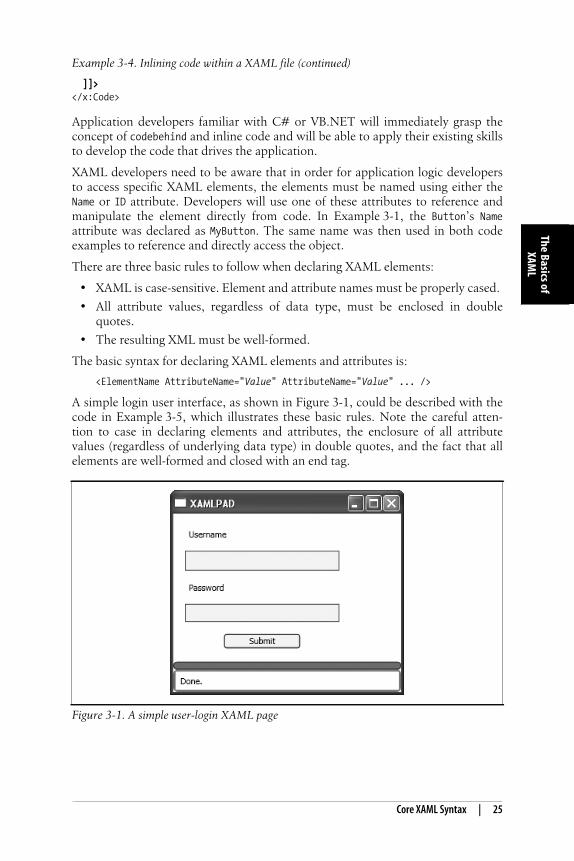
Core XAML Syntax | 25
The Basics ofXAM
L
This is the Title of the Book, eMatter EditionCopyright © 2006 O’Reilly & Associates, Inc. All rights reserved.
Application developers familiar with C# or VB.NET will immediately grasp theconcept of codebehind and inline code and will be able to apply their existing skillsto develop the code that drives the application.
XAML developers need to be aware that in order for application logic developersto access specific XAML elements, the elements must be named using either theName or ID attribute. Developers will use one of these attributes to reference andmanipulate the element directly from code. In Example 3-1, the Button’s Nameattribute was declared as MyButton. The same name was then used in both codeexamples to reference and directly access the object.
There are three basic rules to follow when declaring XAML elements:
• XAML is case-sensitive. Element and attribute names must be properly cased.
• All attribute values, regardless of data type, must be enclosed in doublequotes.
• The resulting XML must be well-formed.
The basic syntax for declaring XAML elements and attributes is:
<ElementName AttributeName="Value" AttributeName="Value" ... />
A simple login user interface, as shown in Figure 3-1, could be described with thecode in Example 3-5, which illustrates these basic rules. Note the careful atten-tion to case in declaring elements and attributes, the enclosure of all attributevalues (regardless of underlying data type) in double quotes, and the fact that allelements are well-formed and closed with an end tag.
]]></x:Code>
Figure 3-1. A simple user-login XAML page
Example 3-4. Inlining code within a XAML file (continued)
,ch03.25064 Page 25 Wednesday, March 22, 2006 10:48 AM
26 | Chapter 3: The Basics of XAML
This is the Title of the Book, eMatter EditionCopyright © 2006 O’Reilly & Associates, Inc. All rights reserved.
Formatting is a matter of style and corporate standards. The format for the exam-ples in this book was chosen because it is readable and clearly displays the nestingof elements in more complex markup. Elements can be declared all on one line, orattribute declarations can be split across lines; formatting is completely up to you.Because XAML is compiled into BAML before deployment, the amount of spacetaken up by elements in a XAML file is irrelevant. There are no advantages tousing less space by declaring elements on a single line and no disadvantages to theformatting used in this book. The elements will become binary representationsbefore deployment, and the whitespace will have no impact on the footprint offinished applications.
Clearly, XAML is comprised of elements and their attributes. The rest of thischapter will examine each of these concepts in depth.
Example 3-5. A simple login user interface
<StackPanel xmlns="http://schemas.microsoft.com/winfx/avalon/2005" HorizontalAlignment="Left" Margin="10"> <Label Margin="5" Content="Username" /> <TextBox Margin="5" BorderBrush="Blue" BorderThickness="1" Background="AliceBlue" Foreground="Black" Width="200"/> <Label Margin="5" Content="Password" /> <PasswordBox Margin="5" BorderBrush="Blue" BorderThickness="1" Background="AliceBlue" Foreground="Black" Width="200" /> <Button Margin="10" Background="AliceBlue" Foreground="Black" Width="100" Height="20" Content="Submit" /></StackPanel>
,ch03.25064 Page 26 Wednesday, March 22, 2006 10:48 AM
Elements | 27
The Basics ofXAM
L
This is the Title of the Book, eMatter EditionCopyright © 2006 O’Reilly & Associates, Inc. All rights reserved.
ElementsAll XAML elements are an XML representation of CLR classes, but not all CLRclasses are represented in XAML. Most of those represented are user-interfaceelements and are ultimately derived from System.Windows.UIElement, whichprovides basic visual user-interface properties that are shared by most XAMLelements. A System.Windows.UIElement can render itself, receive input via thekeyboard and mouse, visually size and position its child elements, and raiseevents.
Not all XAML elements are derived from System.Windows.UIElement. Some, such asLineBreak, TableColumn, and Document, are derived from System.Windows.Frame-workContentElement. System.Windows.FrameworkContentElement elements cannot renderthemselves but are instead rendered by another class, usually the container in whichthey have been placed.
Most XAML elements can be organized into five basic categories:
• Root elements
• Control elements
• Panel elements
• Shape and geometric elements
• Document elements
Root Elements
Root elements function as the page’s base container for all user-interfaceelements. A page is required to have one root element. The most commonly usedroot elements are the panel elements—StackPanel, DockPanel, Canvas, and Grid—and Page, a root element that allows you to declaratively control a number of theproperties of the window containing the XAML page. To be considered a rootelement, the element must be a container for at least one other element. (Whendisplaying XAML output in XamlPad, you don’t have to include a root elementbecause XamlPad provides it on your behalf.) You can create custom rootelements by deriving new classes from Page or Window and exposing them asXAML elements.
The root element must contain a reference to the appropriate namespace (in mostcases, the default Avalon namespace, http://schemas.microsoft.com/winfx/avalon/2005). As with all XML documents, unless otherwise specified, it is assumed that allelements in the page are associated with the default namespace declared on the rootelement. The declaration in XAML is the same as in any XML document.
<Page xmlns="http://schemas.microsoft.com/winfx/avalon/2005" .../>
Control Elements
Control elements handle user interaction. Controls are interactive and allow theuser to enter data, make choices, and perform other interactive tasks. They can bebroken up into five categories: simple controls, content controls, item controls,header item controls, and header content controls. They are differentiated by the
,ch03.25064 Page 27 Wednesday, March 22, 2006 10:48 AM
28 | Chapter 3: The Basics of XAML
This is the Title of the Book, eMatter EditionCopyright © 2006 O’Reilly & Associates, Inc. All rights reserved.
attributes they support, namely Content, Headers, and Items. Attribute support isdetermined by the underlying CLR class represented by the XAML element. Evenif you don’t use the Header attribute supported by a header item control, it doesn’tbecome an item control because the CLR class it represents still has a Headerwhether or not you assign it a value. Table 3-1 summarizes this informationneatly.
Simple controlsDerive directly from the System.Windows.Control class and do not haveContent, Items, or Header attributes. Examples of simple controls areHorizontalScrollBar, VerticalScrollBar, Frame, TextBox, and RichTextBox.
Content controlsHave a Content attribute, but no Items or Header attributes. Content controls arerestricted to only one element as its content, though that content may be anelement (such as a Panel) that can contain more than one element. Examples ofcontent controls are Button, RepeatButton, Label, RadioButton, CheckBox,ListBoxItem, GroupItem, StatusBarItem, ToolTip, ScrollViewer, and Window.
Item controlsHave an Items attribute, but no Header or Content attributes. Item controlsexpose a list of elements, usually offering you a choice. Item controls includeListBox, ComboBox, Menu, ContextMenu, RadioButtonList, and TabControl.
Header item controlsHave an Items attribute and a Header attribute but no Content attribute. TheHeader attribute determines the label for the Items, and the Items attributecontains child elements. The Items attribute is implicitly declared as asequence of child elements that are not assigned to it. The following declara-tion of a MenuItem shows how this works:
<MenuItem Header="First Menu Item"> <MenuItem Header="First Child Item" /> <MenuItem Header="Second Child Item" /></MenuItem>
Header item controls include MenuItem and ToolBar.
Header content controlsHave a Header attribute and a Content attribute, but no Items attribute. Like acontent control, the header content control may contain only one childelement in its Content attribute. Header content controls include Expanderand TabItem.
Table 3-1. Attributes supported by control type
Content Header Items
Simple N N N
Content Y N N
Item N N Y
Header item N Y Y
Header content Y Y N
,ch03.25064 Page 28 Wednesday, March 22, 2006 10:48 AM
Elements | 29
The Basics ofXAM
L
This is the Title of the Book, eMatter EditionCopyright © 2006 O’Reilly & Associates, Inc. All rights reserved.
Panel Elements
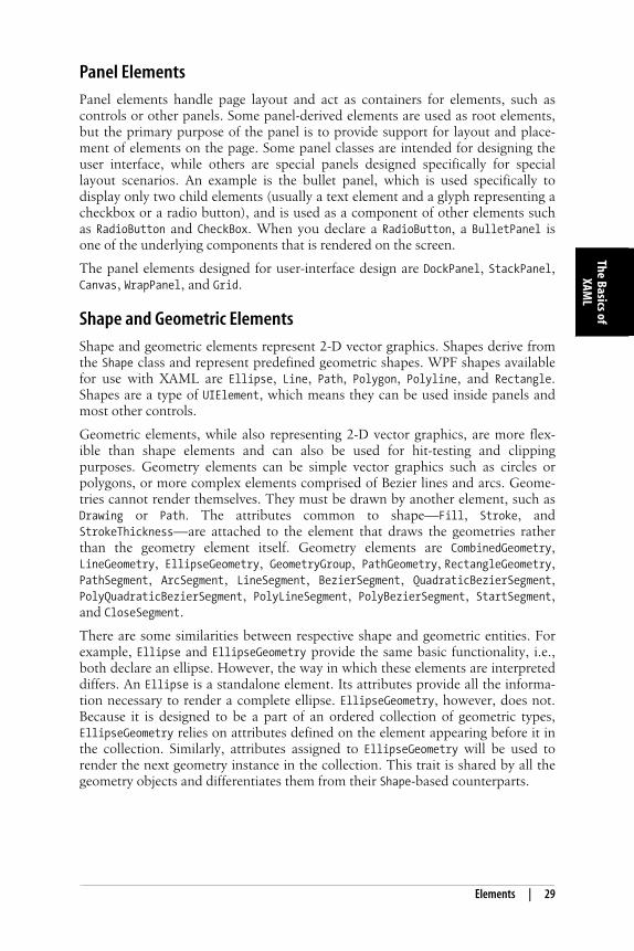
Panel elements handle page layout and act as containers for elements, such ascontrols or other panels. Some panel-derived elements are used as root elements,but the primary purpose of the panel is to provide support for layout and place-ment of elements on the page. Some panel classes are intended for designing theuser interface, while others are special panels designed specifically for speciallayout scenarios. An example is the bullet panel, which is used specifically todisplay only two child elements (usually a text element and a glyph representing acheckbox or a radio button), and is used as a component of other elements suchas RadioButton and CheckBox. When you declare a RadioButton, a BulletPanel isone of the underlying components that is rendered on the screen.
The panel elements designed for user-interface design are DockPanel, StackPanel,Canvas, WrapPanel, and Grid.
Shape and Geometric Elements
Shape and geometric elements represent 2-D vector graphics. Shapes derive fromthe Shape class and represent predefined geometric shapes. WPF shapes availablefor use with XAML are Ellipse, Line, Path, Polygon, Polyline, and Rectangle.Shapes are a type of UIElement, which means they can be used inside panels andmost other controls.
Geometric elements, while also representing 2-D vector graphics, are more flex-ible than shape elements and can also be used for hit-testing and clippingpurposes. Geometry elements can be simple vector graphics such as circles orpolygons, or more complex elements comprised of Bezier lines and arcs. Geome-tries cannot render themselves. They must be drawn by another element, such asDrawing or Path. The attributes common to shape—Fill, Stroke, andStrokeThickness—are attached to the element that draws the geometries ratherthan the geometry element itself. Geometry elements are CombinedGeometry,LineGeometry, EllipseGeometry, GeometryGroup, PathGeometry, RectangleGeometry,PathSegment, ArcSegment, LineSegment, BezierSegment, QuadraticBezierSegment,PolyQuadraticBezierSegment, PolyLineSegment, PolyBezierSegment, StartSegment,and CloseSegment.
There are some similarities between respective shape and geometric entities. Forexample, Ellipse and EllipseGeometry provide the same basic functionality, i.e.,both declare an ellipse. However, the way in which these elements are interpreteddiffers. An Ellipse is a standalone element. Its attributes provide all the informa-tion necessary to render a complete ellipse. EllipseGeometry, however, does not.Because it is designed to be a part of an ordered collection of geometric types,EllipseGeometry relies on attributes defined on the element appearing before it inthe collection. Similarly, attributes assigned to EllipseGeometry will be used torender the next geometry instance in the collection. This trait is shared by all thegeometry objects and differentiates them from their Shape-based counterparts.
,ch03.25064 Page 29 Wednesday, March 22, 2006 10:48 AM
30 | Chapter 3: The Basics of XAML
This is the Title of the Book, eMatter EditionCopyright © 2006 O’Reilly & Associates, Inc. All rights reserved.
Document Elements
Document elements handle document presentation. Documents are categorized aseither flow or fixed. The FixedDocument element is designed to be What You See IsWhat You Get (WYSIWYG) and is intended to appear in all formats (print,browser, application) with exactly the same layout.
A FlowDocument element provides more flexibility in appearance to enhance read-ability. Flow documents dynamically reformat content based on a variety offactors, including screen and page size, font size, and optional user preferences.Flow documents are comprised of one or more elements derived from Block orInline. Block elements such as Block, Figure, Floater, List, ListItem, Paragraph,Section, Table, and TableCell are used to organize and format blocks of text.Inline elements are used to format text within a block. Inline elements are Bold,AccessKey, LineBreak, Hyperlink, Italic, Subscript, Superscript, and Underline.
Some of these elements might look familiar, such as Paragraph, Table, and Italic.Similar formatting elements exist in other user-interface markup languages, suchas <p>, <table>, and <i>, respectively, in HTML. These elements are virtually iden-tical in execution but have structural differences as well as an abundance ofattributes in XAML that do not exist in their HTML counterparts.
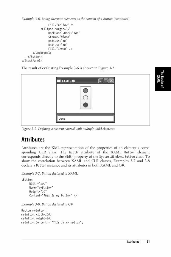
While the core syntax of XAML is very similar to markup languages such asHTML, XAML user-interface elements are not restricted to containing traditionalcontent. For example, a Button is not required, nor restricted, to present text-based content as a prompt. The flexibility of XAML and its object-oriented natureoffer unlimited possibilities. You can just as easily decorate the face of a Buttonwith any UIElement-derived element. Example 3-6 declares three circles—definedby an Ellipse element with equivalent x- and y-axis radii—as the content elementof a Button. While content control-derived classes may only have one childelement, that child element may contain additional elements, such as theDockPanel or StackPanel.
Example 3-6. Using alternate elements as the content of a Button
<StackPanel xmlns="http://schemas.microsoft.com/winfx/avalon/2005" HorizontalAlignment="Center" Margin="10"> <Button Width="50" Height="100"> <DockPanel> <Ellipse Margin="5" DockPanel.Dock="Top" Stroke="Black" RadiusX="10" RadiusY="10" Fill="Red" /> <Ellipse Margin="5" DockPanel.Dock="Top" Stroke="Black" RadiusX="10" RadiusY="10"
,ch03.25064 Page 30 Wednesday, March 22, 2006 10:48 AM
Attributes | 31
The Basics ofXAM
L
This is the Title of the Book, eMatter EditionCopyright © 2006 O’Reilly & Associates, Inc. All rights reserved.
The result of evaluating Example 3-6 is shown in Figure 3-2.
AttributesAttributes are the XML representation of the properties of an element’s corre-sponding CLR class. The Width attribute of the XAML Button elementcorresponds directly to the Width property of the System.Windows.Button class. Toshow the correlation between XAML and CLR classes, Examples 3-7 and 3-8declare a Button instance and its attributes in both XAML and C#.
Fill="Yellow" /> <Ellipse Margin="5" DockPanel.Dock="Top" Stroke="Black" RadiusX="10" RadiusY="10" Fill="Green" /> </DockPanel> </Button></StackPanel>
Figure 3-2. Defining a content control with multiple child elements
Example 3-7. Button declared in XAML
<Button Width="100" Name="myButton" Height="20" Content="This is my button" />
Example 3-8. Button declared in C#
Button myButton;myButton.Width=100;myButton.Height=20;myButton.Content = "This is my button";
Example 3-6. Using alternate elements as the content of a Button (continued)
,ch03.25064 Page 31 Wednesday, March 22, 2006 10:48 AM
32 | Chapter 3: The Basics of XAML
This is the Title of the Book, eMatter EditionCopyright © 2006 O’Reilly & Associates, Inc. All rights reserved.
As with the XAML tags for elements, attributes are spelled exactly the same astheir corresponding CLR class properties. (Width = Width, Content = Content . . .You get the picture.)
There are two types of XAML attributes. The first, dependency properties, are publicstatic read-only fields on CLR classes that are derived from DependencyProperty andhave declared CLR accessor methods. In other words, the value of dependencyproperties can be dependent on (hence the name) other variables in CLR classesand, therefore, can only be accessed with a public get or set accessor method to beevaluated properly.
Dependency properties are like stock certificates. The stock certificate represents avalue (money), but the actual amount of money it is worth (its value) is deter-mined by external calculations and can change at nearly any time. To determinethe value of your stock certificate, you must consult the stock exchange and dosome multiplication. Dependency properties can also be based on externalresources and often rely on calculations to determine their value.
Dependency property values are determined from a number of different places.The WPF property system searches for the value from the following places in thisorder:
• Storyboards or event triggers that start an animation; property values set byan animation override even local values
• Local value (i.e., <Object Property="value">)
• Property triggers
• TemplatedParent’s template (i.e., that template includes <Setter>)
• Style property
• ThemeStyle
• Inheritance (from your parent element, not your superclass)
• DefaultValue specified when you registered the property (or override metadata)
These attributes provide support for value expressions, property invalidation,default values, inheritance, data binding, animation, and styling. The propertysystem is complex, so WPF provides simple get and set accessor methods tomanipulate these attributes.
The second type of attribute supported in XAML is the common languageruntime property. Common language runtime properties are standard read/writeCLR class properties that can be accessed directly and do not require get or setaccessor methods, although they generally have them.
Both dependency properties and common runtime properties are accessed inXAML using the same techniques. The difference between them is important onlywhen you are using more advanced techniques, such as defining styles or triggersthat act upon a specific attribute. Some attributes of elements must reference adependency property, so you need to know which attributes are dependencyproperties and which are not.
Regardless of their underlying types, all XAML attributes can be assigned in oneof two ways. They can be assigned inline, as part of the element declaration, or
,ch03.25064 Page 32 Wednesday, March 22, 2006 10:48 AM
Attributes | 33
The Basics ofXAM
L
This is the Title of the Book, eMatter EditionCopyright © 2006 O’Reilly & Associates, Inc. All rights reserved.
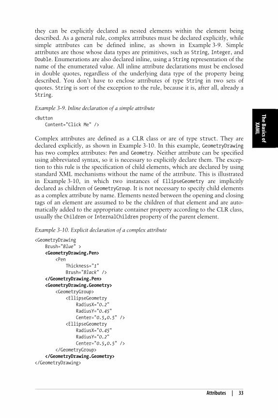
they can be explicitly declared as nested elements within the element beingdescribed. As a general rule, complex attributes must be declared explicitly, whilesimple attributes can be defined inline, as shown in Example 3-9. Simpleattributes are those whose data types are primitives, such as String, Integer, andDouble. Enumerations are also declared inline, using a String representation of thename of the enumerated value. All inline attribute declarations must be enclosedin double quotes, regardless of the underlying data type of the property beingdescribed. You don’t have to enclose attributes of type String in two sets ofquotes. String is sort of the exception to the rule, because it is, after all, already aString.
Complex attributes are defined as a CLR class or are of type struct. They aredeclared explicitly, as shown in Example 3-10. In this example, GeometryDrawinghas two complex attributes: Pen and Geometry. Neither attribute can be specifiedusing abbreviated syntax, so it is necessary to explicitly declare them. The excep-tion to this rule is the specification of child elements, which are declared by usingstandard XML mechanisms without the name of the attribute. This is illustratedin Example 3-10, in which two instances of EllipseGeometry are implicitlydeclared as children of GeometryGroup. It is not necessary to specify child elementsas a complex attribute by name. Elements nested between the opening and closingtags of an element are assumed to be the children of that element and are auto-matically added to the appropriate container property according to the CLR class,usually the Children or InternalChildren property of the parent element.
Example 3-9. Inline declaration of a simple attribute
<Button Content="Click Me" />
Example 3-10. Explicit declaration of a complex attribute
<GeometryDrawing Brush="Blue" > <GeometryDrawing.Pen> <Pen Thickness="1" Brush="Black" /> </GeometryDrawing.Pen> <GeometryDrawing.Geometry> <GeometryGroup> <EllipseGeometry RadiusX="0.2" RadiusY="0.45" Center="0.5,0.5" /> <EllipseGeometry RadiusX="0.45" RadiusY="0.2" Center="0.5,0.5" /> </GeometryGroup> </GeometryDrawing.Geometry></GeometryDrawing>
,ch03.25064 Page 33 Wednesday, March 22, 2006 10:48 AM
34 | Chapter 3: The Basics of XAML
This is the Title of the Book, eMatter EditionCopyright © 2006 O’Reilly & Associates, Inc. All rights reserved.
Abbreviated syntax must sound like jabberwocky at this point, but it’s really apretty neat concept. It uses a predefined format, such as CSV (comma-separatedvalues), to essentially declare the arguments that will be passed to the appropriateclass constructor beneath the covers. You can think of the String definition as thelist of arguments you’d normally pass to a constructor, except that sometimes youdon’t need a comma to separate the arguments.
Example 3-11 first creates an EllipseGeometry in C# and then assigns a Point tobe its Center property by instantiating a new Point and passing the appropriatevalues to its constructor. The XAML code in the same example creates anEllipseGeometry and then assigns a Point to be its Center attribute using abbrevi-ated syntax. The 0.5, 0.5 is parsed by the WPF engine, and the values are passedto a Point constructor as its arguments.
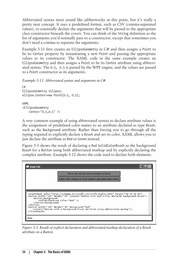
A very common example of using abbreviated syntax to declare attribute values isthe assignment of predefined color names to an attribute declared as type Brush,such as the Background attribute. Rather than forcing you to go through all thetyping required to explicitly declare a Brush and set its color, XAML allows you tojust declare the attribute as Red or Green instead.
Figure 3-3 shows the result of declaring a Red SolidColorBrush as the backgroundBrush for a Button using both abbreviated markup and by explicitly declaring thecomplex attribute. Example 3-12 shows the code used to declare both elements.
Example 3-11. Abbreviated syntax and arguments in C#
C#EllipseGeometry ellipse;ellipse.Center=new Point(0.5, 0.5);
XAML<EllipseGeometry Center="0.5,0.5" />
Figure 3-3. Result of explicit declaration and abbreviated markup declaration of a Brushattribute on a Button
,ch03.25064 Page 34 Wednesday, March 22, 2006 10:48 AM
Attributes | 35
The Basics ofXAM
L
This is the Title of the Book, eMatter EditionCopyright © 2006 O’Reilly & Associates, Inc. All rights reserved.
As you can see in Figure 3-3, both buttons are painted with the same back-ground, regardless of the method used to declare the Brush. Abbreviated syntax istypically used because it requires less typing. There are no advantages to usingexplicit syntax in most cases where abbreviated syntax is available, and it’s lesstyping for you.
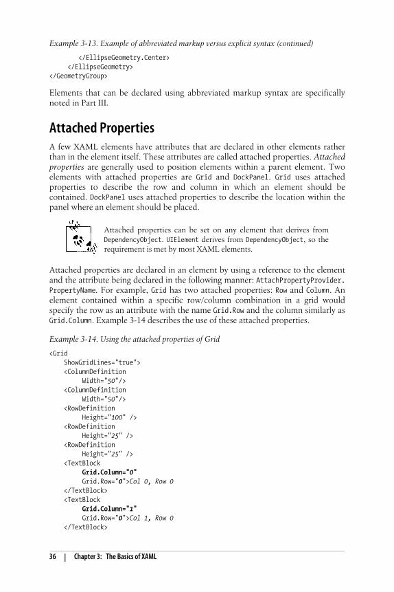
A more complex example is the common use of abbreviated markup syntax todeclare elements of the type Point. Point is a common, complex attribute that isused in the declaration of almost every geometric XAML element. You can use theabbreviated markup syntax for a Point element wherever an element of type Pointis declared. You’ll notice in Example 3-13 that EllipseGeometry has severalattributes. While RadiusX and RadiusY are Double values, the Center attribute foran EllipseGeometry is actually a complex attribute of type Point. In its abbrevi-ated syntax, Point accepts two comma-separated values representing the X and Ypositions, respectively. Example 3-13 shows different ways of using Point (in thiscase, it is used through the Center attribute).
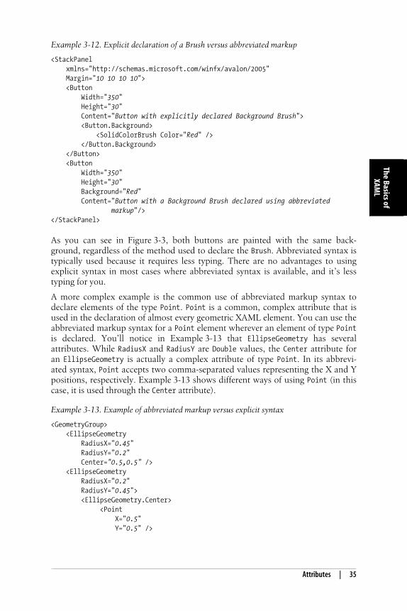
Example 3-12. Explicit declaration of a Brush versus abbreviated markup
<StackPanel xmlns="http://schemas.microsoft.com/winfx/avalon/2005" Margin="10 10 10 10"> <Button Width="350" Height="30" Content="Button with explicitly declared Background Brush"> <Button.Background> <SolidColorBrush Color="Red" /> </Button.Background> </Button> <Button Width="350" Height="30" Background="Red" Content="Button with a Background Brush declared using abbreviated markup"/></StackPanel>
Example 3-13. Example of abbreviated markup versus explicit syntax
<GeometryGroup> <EllipseGeometry RadiusX="0.45" RadiusY="0.2" Center="0.5,0.5" /> <EllipseGeometry RadiusX="0.2" RadiusY="0.45"> <EllipseGeometry.Center> <Point X="0.5" Y="0.5" />
,ch03.25064 Page 35 Wednesday, March 22, 2006 10:48 AM
36 | Chapter 3: The Basics of XAML
This is the Title of the Book, eMatter EditionCopyright © 2006 O’Reilly & Associates, Inc. All rights reserved.
Elements that can be declared using abbreviated markup syntax are specificallynoted in Part III.
Attached PropertiesA few XAML elements have attributes that are declared in other elements ratherthan in the element itself. These attributes are called attached properties. Attachedproperties are generally used to position elements within a parent element. Twoelements with attached properties are Grid and DockPanel. Grid uses attachedproperties to describe the row and column in which an element should becontained. DockPanel uses attached properties to describe the location within thepanel where an element should be placed.
Attached properties can be set on any element that derives fromDependencyObject. UIElement derives from DependencyObject, so therequirement is met by most XAML elements.
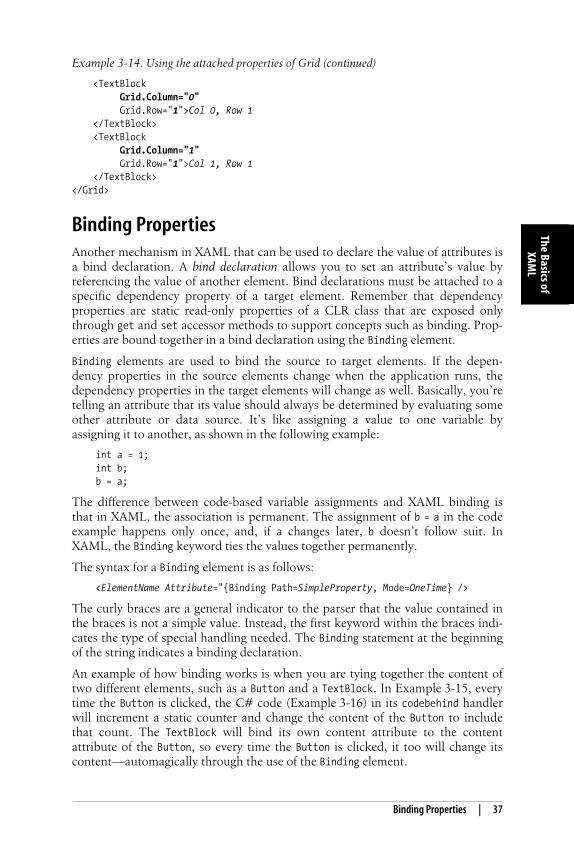
Attached properties are declared in an element by using a reference to the elementand the attribute being declared in the following manner: AttachPropertyProvider.PropertyName. For example, Grid has two attached properties: Row and Column. Anelement contained within a specific row/column combination in a grid wouldspecify the row as an attribute with the name Grid.Row and the column similarly asGrid.Column. Example 3-14 describes the use of these attached properties.
</EllipseGeometry.Center> </EllipseGeometry></GeometryGroup>
Example 3-14. Using the attached properties of Grid
<Grid ShowGridLines="true"> <ColumnDefinition Width="50"/> <ColumnDefinition Width="50"/> <RowDefinition Height="100" /> <RowDefinition Height="25" /> <RowDefinition Height="25" /> <TextBlock Grid.Column="0" Grid.Row="0">Col 0, Row 0 </TextBlock> <TextBlock Grid.Column="1" Grid.Row="0">Col 1, Row 0 </TextBlock>
Example 3-13. Example of abbreviated markup versus explicit syntax (continued)
,ch03.25064 Page 36 Wednesday, March 22, 2006 10:48 AM
Binding Properties | 37
The Basics ofXAM
L
This is the Title of the Book, eMatter EditionCopyright © 2006 O’Reilly & Associates, Inc. All rights reserved.
Binding PropertiesAnother mechanism in XAML that can be used to declare the value of attributes isa bind declaration. A bind declaration allows you to set an attribute’s value byreferencing the value of another element. Bind declarations must be attached to aspecific dependency property of a target element. Remember that dependencyproperties are static read-only properties of a CLR class that are exposed onlythrough get and set accessor methods to support concepts such as binding. Prop-erties are bound together in a bind declaration using the Binding element.
Binding elements are used to bind the source to target elements. If the depen-dency properties in the source elements change when the application runs, thedependency properties in the target elements will change as well. Basically, you’retelling an attribute that its value should always be determined by evaluating someother attribute or data source. It’s like assigning a value to one variable byassigning it to another, as shown in the following example:
int a = 1;int b;b = a;
The difference between code-based variable assignments and XAML binding isthat in XAML, the association is permanent. The assignment of b = a in the codeexample happens only once, and, if a changes later, b doesn’t follow suit. InXAML, the Binding keyword ties the values together permanently.
The syntax for a Binding element is as follows:
<ElementName Attribute="{Binding Path=SimpleProperty, Mode=OneTime} />
The curly braces are a general indicator to the parser that the value contained inthe braces is not a simple value. Instead, the first keyword within the braces indi-cates the type of special handling needed. The Binding statement at the beginningof the string indicates a binding declaration.
An example of how binding works is when you are tying together the content oftwo different elements, such as a Button and a TextBlock. In Example 3-15, everytime the Button is clicked, the C# code (Example 3-16) in its codebehind handlerwill increment a static counter and change the content of the Button to includethat count. The TextBlock will bind its own content attribute to the contentattribute of the Button, so every time the Button is clicked, it too will change itscontent—automagically through the use of the Binding element.
<TextBlock Grid.Column="0" Grid.Row="1">Col 0, Row 1 </TextBlock> <TextBlock Grid.Column="1" Grid.Row="1">Col 1, Row 1 </TextBlock></Grid>
Example 3-14. Using the attached properties of Grid (continued)
,ch03.25064 Page 37 Wednesday, March 22, 2006 10:48 AM
38 | Chapter 3: The Basics of XAML
This is the Title of the Book, eMatter EditionCopyright © 2006 O’Reilly & Associates, Inc. All rights reserved.
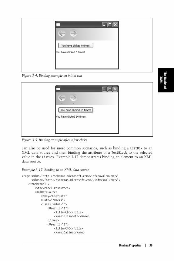
After compiling the application and running it, the content of MyButton is appro-priately, “You have clicked 0 times!” (Figure 3-4).
Clicking on the Button executes the ButtonClicked handler detailed in Example 3-16.The counter increments and the Content of the Button is changed to include thecount. Notice that nowhere in the code do you touch the TextBlock declared inExample 3-15. The Content of that TextBlock is bound to the Button’s Contentattribute by the Binding element, and whenever it changes, so will the content of theTextBlock. Clicking on the Button a few more times results in Figure 3-5.
You might think that this isn’t very useful. Binding content attributes of oneelement to another isn’t something you’ll do very often, but the Binding element
Example 3-15. Binding attributes: XAML
<Page xmlns="http://schemas.microsoft.com/winfx/avalon/2005" xmlns:x="http://schemas.microsoft.com/winfx/xaml/2005" x:Class="BindExample.Page1"> <StackPanel > <Button Width="150" Content="You have clicked 0 times!" Name="MyButton" Click="ButtonClicked"/> <TextBlock> <TextBlock.TextContent> <Binding ElementName="MyButton" Path="Content"/> </TextBlock.TextContent> </TextBlock> </StackPanel></Page>
Example 3-16. Binding attributes: C#
using System;using System.Windows;using System.Windows.Controls;using System.Windows.Navigation;using System.ComponentModel;
namespace BindExample{ public partial class Page1 : Page { static int clickCount = 0; void ButtonClicked(object sender, RoutedEventArgs e) { MyButton.Content="You have clicked " + ++clickCount + " times!"; } }}
,ch03.25064 Page 38 Wednesday, March 22, 2006 10:48 AM
Binding Properties | 39
The Basics ofXAM
L
This is the Title of the Book, eMatter EditionCopyright © 2006 O’Reilly & Associates, Inc. All rights reserved.
can also be used for more common scenarios, such as binding a ListBox to anXML data source and then binding the attribute of a TextBlock to the selectedvalue in the ListBox. Example 3-17 demonstrates binding an element to an XMLdata source.
Figure 3-4. Binding example on initial run
Figure 3-5. Binding example after a few clicks
Example 3-17. Binding to an XML data source
<Page xmlns="http://schemas.microsoft.com/winfx/avalon/2005" xmlns:x="http://schemas.microsoft.com/winfx/xaml/2005"> <StackPanel > <StackPanel.Resources> <XmlDataSource x:Key="UserData" XPath="/Users"> <Users xmlns=""> <User ID="1"> <Title>CEO</Title> <Name>Elisabeth</Name> </User> <User ID="2"> <Title>CTO</Title> <Name>Galina</Name>
,ch03.25064 Page 39 Wednesday, March 22, 2006 10:48 AM
40 | Chapter 3: The Basics of XAML
This is the Title of the Book, eMatter EditionCopyright © 2006 O’Reilly & Associates, Inc. All rights reserved.
In Example 3-17, there are three uses of the Binding element. It is first used as thevalue of the ListBox’s ItemsSource attribute. This declaration tells the ListBox that itshould get its items from the StaticResource UserData and to use the XPath User todetermine what an item consists of. The second use of the Binding element, theItemTemplate value, tells the ListBox how to display the data. The UserDataTemplatetells the ListBox that each item should be displayed as a text block with a small, redfont and that the value shown is the User attribute Title (specified by theXPath="Title" declaration).
</User> <User ID="3"> <Title>CSO</Title> <Name>Donald</Name> </User> <User ID="4"> <Title>CFO</Title> <Name>Victoria</Name> </User> <User ID="5"> <Title>CIO</Title> <Name>Korey</Name> </User> </Users> </XmlDataSource> <DataTemplate x:Key="UserDataTemplate"> <TextBlock FontSize="Small" Foreground="Red"> <TextBlock.TextContent> <Binding XPath="Title"/> </TextBlock.TextContent> </TextBlock> </DataTemplate> </StackPanel.Resources> <ListBox HorizontalAlignment="Left" Margin="10" Width="100" Height="100" Name="MyListBox" SelectedValuePath="Name" ItemsSource="{Binding Source={StaticResource UserData}, XPath=User}" ItemTemplate="{StaticResource UserDataTemplate}"/> <TextBlock HorizontalAlignment="Left" Margin="10"> <TextBlock.TextContent> <Binding ElementName="MyListBox" Path="SelectedValue" /> </TextBlock.TextContent> </TextBlock> </StackPanel></Page>
Example 3-17. Binding to an XML data source (continued)
,ch03.25064 Page 40 Wednesday, March 22, 2006 10:48 AM
codebehind | 41
The Basics ofXAM
L
This is the Title of the Book, eMatter EditionCopyright © 2006 O’Reilly & Associates, Inc. All rights reserved.
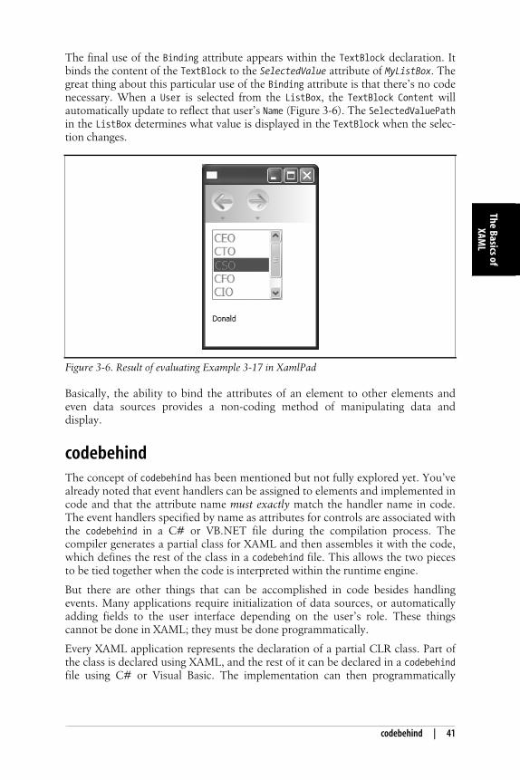
The final use of the Binding attribute appears within the TextBlock declaration. Itbinds the content of the TextBlock to the SelectedValue attribute of MyListBox. Thegreat thing about this particular use of the Binding attribute is that there’s no codenecessary. When a User is selected from the ListBox, the TextBlock Content willautomatically update to reflect that user’s Name (Figure 3-6). The SelectedValuePathin the ListBox determines what value is displayed in the TextBlock when the selec-tion changes.
Basically, the ability to bind the attributes of an element to other elements andeven data sources provides a non-coding method of manipulating data anddisplay.
codebehindThe concept of codebehind has been mentioned but not fully explored yet. You’vealready noted that event handlers can be assigned to elements and implemented incode and that the attribute name must exactly match the handler name in code.The event handlers specified by name as attributes for controls are associated withthe codebehind in a C# or VB.NET file during the compilation process. Thecompiler generates a partial class for XAML and then assembles it with the code,which defines the rest of the class in a codebehind file. This allows the two piecesto be tied together when the code is interpreted within the runtime engine.
But there are other things that can be accomplished in code besides handlingevents. Many applications require initialization of data sources, or automaticallyadding fields to the user interface depending on the user’s role. These thingscannot be done in XAML; they must be done programmatically.
Every XAML application represents the declaration of a partial CLR class. Part ofthe class is declared using XAML, and the rest of it can be declared in a codebehindfile using C# or Visual Basic. The implementation can then programmatically
Figure 3-6. Result of evaluating Example 3-17 in XamlPad
,ch03.25064 Page 41 Wednesday, March 22, 2006 10:48 AM
42 | Chapter 3: The Basics of XAML
This is the Title of the Book, eMatter EditionCopyright © 2006 O’Reilly & Associates, Inc. All rights reserved.
modify the user interface or interact with other systems such as a database orremote application to accomplish the application’s designated task.
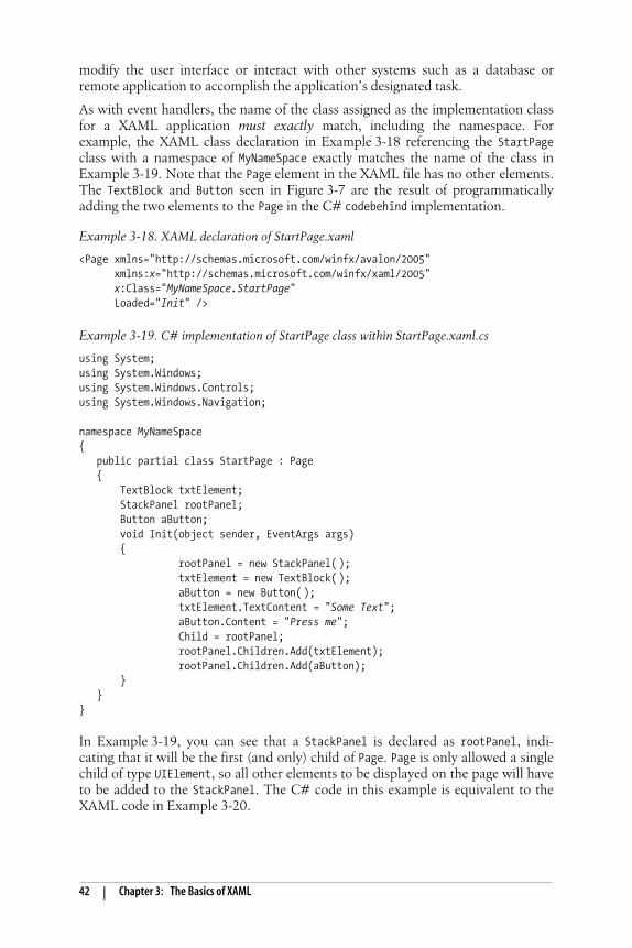
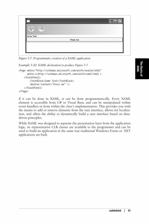
As with event handlers, the name of the class assigned as the implementation classfor a XAML application must exactly match, including the namespace. Forexample, the XAML class declaration in Example 3-18 referencing the StartPageclass with a namespace of MyNameSpace exactly matches the name of the class inExample 3-19. Note that the Page element in the XAML file has no other elements.The TextBlock and Button seen in Figure 3-7 are the result of programmaticallyadding the two elements to the Page in the C# codebehind implementation.
In Example 3-19, you can see that a StackPanel is declared as rootPanel, indi-cating that it will be the first (and only) child of Page. Page is only allowed a singlechild of type UIElement, so all other elements to be displayed on the page will haveto be added to the StackPanel. The C# code in this example is equivalent to theXAML code in Example 3-20.
Example 3-18. XAML declaration of StartPage.xaml
<Page xmlns="http://schemas.microsoft.com/winfx/avalon/2005" xmlns:x="http://schemas.microsoft.com/winfx/xaml/2005"
x:Class="MyNameSpace.StartPage" Loaded="Init" />
Example 3-19. C# implementation of StartPage class within StartPage.xaml.cs
using System;using System.Windows;using System.Windows.Controls;using System.Windows.Navigation;
namespace MyNameSpace{ public partial class StartPage : Page { TextBlock txtElement; StackPanel rootPanel; Button aButton; void Init(object sender, EventArgs args) { rootPanel = new StackPanel( ); txtElement = new TextBlock( ); aButton = new Button( ); txtElement.TextContent = "Some Text"; aButton.Content = "Press me"; Child = rootPanel; rootPanel.Children.Add(txtElement); rootPanel.Children.Add(aButton); } }}
,ch03.25064 Page 42 Wednesday, March 22, 2006 10:48 AM
codebehind | 43
The Basics ofXAM
L
This is the Title of the Book, eMatter EditionCopyright © 2006 O’Reilly & Associates, Inc. All rights reserved.
If it can be done in XAML, it can be done programmatically. Every XAMLelement is accessible from C# or Visual Basic and can be manipulated withinevent handlers or from within the class’s implementation. This provides you withthe means to add or remove elements from the user interface, allows for localiza-tion, and offers the ability to dynamically build a user interface based on data-driven principles.
While XAML was designed to separate the presentation layer from the applicationlogic, its representative CLR classes are available to the programmer and can beused to build an application in the same way traditional Windows Forms or .NETapplications are built.
Figure 3-7. Programmatic creation of a XAML application
Example 3-20. XAML declaration to produce Figure 3-7
<Page xmlns="http://schemas.microsoft.com/winfx/avalon/2005" xmlns:x=http://schemas.microsoft.com/winfx/xaml/2005 > <StackPanel> <TextBlock>Some Text</TextBlock> <Button Content="Press me" /> </StackPanel></Page>
,ch03.25064 Page 43 Wednesday, March 22, 2006 10:48 AM
![[MS-XAML] - download.microsoft.comMS-XAML].pdf · [MS-XAML]: Xaml Object Mapping Specification 2006 Intellectual Property Rights Notice for Open Specifications Documentation Technical](https://img.pdfslide.net/doc/110x75/5b43c9677f8b9a80388c1fba/ms-xaml-ms-xamlpdf-ms-xaml-xaml-object-mapping-specification-2006-intellectual.jpg)


![[MS-XAML]: XAML Object Mapping Specification 2006](https://img.pdfslide.net/doc/110x75/577d39661a28ab3a6b99a7b4/ms-xaml-xaml-object-mapping-specification-2006.jpg)