Embed Size (px)
Citation preview

Georgia State University Georgia State University
ScholarWorks @ Georgia State University ScholarWorks @ Georgia State University
Economics Dissertations
4-30-2018
Essays on the Impact of Economic Conditions on Health Essays on the Impact of Economic Conditions on Health
Jaesang Sung
Follow this and additional works at: https://scholarworks.gsu.edu/econ_diss
Recommended Citation Recommended Citation Sung, Jaesang, "Essays on the Impact of Economic Conditions on Health." Dissertation, Georgia State University, 2018. https://scholarworks.gsu.edu/econ_diss/144
This Dissertation is brought to you for free and open access by ScholarWorks @ Georgia State University. It has been accepted for inclusion in Economics Dissertations by an authorized administrator of ScholarWorks @ Georgia State University. For more information, please contact [email protected].

ABSTRACT
ESSAYS ON THE IMPACT OF ECONOMIC CONDITIONS ON HEALTH
BY
JAESANG SUNG
May, 2018
Committee Chair: Dr. James Marton
Major Department: Economics
This dissertation has three essays analyzing the impact of economic conditions on risky
behaviors and health outcomes. In the first essay, I estimate the effects of U.S. Metropolitan
Statistical Area housing prices on a variety of health outcomes and risky health behaviors
separately for homeowners and tenants. The constructed dataset consists of information on
individuals from the 2002 - 2012 Behavioral Risk Factor Surveillance System combined with
homeownership data from the March Current Population Survey and housing prices from
Freddie Mac. I estimate positive results for homeowners in terms of their health and negative
results for tenants when housing prices increase. I also find increases in risky behaviors among
tenants associated with increases in housing prices, which may be driving the reduction in their
health status. These estimated effects are concentrated among low income homeowners and
tenants and do not persist in the long run. However, the effects of an increase in housing prices
on being obese become more pronounced for homeowners in the long run, resulting in worse
self-reported health.
The second essay estimates the impact of income inequality on health. The relative
income hypothesis suggests that an individual’s health is impacted by the income of others.
However, prior studies suffer from mixed empirical findings that could be due to a lack of annual
individual income data with sufficient sample size. In this paper we apply a new methodology to

calculate a variety of income inequality measures based on aggregate income and household size
data from various Federal data sources. Our proposed methodology provides a way to express
various income inequality measures as a function of the ratio of mean to median household
income under the assumption that individual income is log-Normally distributed. This approach
produces a variety of precise annual income inequality measures at different levels of geography,
thus solving the sample size problem by incorporating externally calculated inequality measures.
Combining the 2001-2012 editions of Behavioral Risk Factor Surveillance System with annual
regional income inequality measures derived from our methodology enables us to estimate both
the contemporaneous and the lagged effect of income inequality on individual health outcomes.
In general, we find statistically significant evidence supporting the income inequality hypothesis
and the relative deprivation hypothesis, which suggests that greater income inequality adversely
affects health status in the United States.
In the third essay, In this paper we attempt to address a persistent question in the health
policy literature: Does more public health spending buy better health? This is a difficult question
to answer due to unobserved differences in public health across regions as well as the potential
for an endogenous relationship between public health spending and public health outcomes. We
take advantage of the unique way in which public health is funded in Georgia to avoid this
endogeneity problem. Using a twelve year panel dataset of Georgia county public health
expenditures and outcomes in order to address the “unobservables” problem, we find that
increases in public health spending lead to increases in mortality by several different causes,
including early deaths, heart disease deaths, and cancer deaths. We also find that increases in
such spending leads to increases in morbidity from cancer, heart disease, diabetes, and asthma.

THE IMPACT OF ECONOMIC CONDITIONS ON HEALTH
BY
JAESANG SUNG
A Dissertation Submitted in Partial Fulfillment
of the Requirements for the Degree
of
Doctor of Philosophy
In the
Andrew young School of Policy Studies
GEORGIA STATE UNIVERSITY
2018

Copyright by
Jaesang Sung
2018

ACCEPTANCE
This dissertation was prepared under the direction of the candidate’s Dissertation
Committee. It has been approved and accepted by all members of that committee, and it has been
accepted in partial fulfillment of the requirements for the degree of Doctor of Philosophy in
Economics in the Andrew Young School of Policy Studies of Georgia State University.
Dissertation
Chair:
Dr. James H. Marton
Committee: Dr. Charles Courtemanche
Dr. Kyle D. Mangum
Dr. Douglas W. Roblin
Electronic Version Approved:
Sally Wallace, Dean
Andrew Young School of Policy Studies
Georgia State University
May, 2018

vi
ACKNOWLEDGEMENT
I would like to convey my sincere gratitude to Dr. James Marton, my disseartion
committee chair and supervisor, for his always support and consistent encouragement in my
research as well as in my life. I also thank Dr. Charles Courtemanche, Dr. Kyle Mangum, and
Dr. Douglas Roblin, who have been my dissertation committee members, for their helpful
guidance in my research as well as in my life.
My thanks and appreciation also go to all of those who have supported me during the
completion of this dissertation and my Ph.D. study. I am especially grateful to all the faculty
members and staff in the Department of Economics from whom I have received enormous help
during the past six years.
I would also like to extend my thanks to my family whose love has supported me and
kept me running this way.

vii
TABLE OF CONTENTS
ACKNOWLEDGEMENT vi
List of Tables ix
List of Figures xii
Essay 1: The Impact of Housing Prices on Health in U.S. Before, During and After the Great
Recession 1
1. Introduction 1
2. Literature 3
3. Conceptual Model 6
4. Methodology 7
5. Data 8
5.1. Outcome variables 8
5.2. Explanatory variables 9
5.3. Descriptive statistics 11
6. Results 12
6.1. Contemporaneous results 12
6.2. Subgroup analysis of different income levels 14
6.3. Long-term effects 16
7. Robustness Checks 17
7.1 Specification Checks and Sensitivity Tests 17
7.2. Imputed homeownership vs. actual homeownership 18
8. Conclusion 19
Essay 2: New Evidence on the Relationship between Inequality and Health 32
1. Introduction 32
2. Literature Review on Income Inequality and Health 35
3. Methodology 38
3.1 Econometric Model 38
3.2 Calculating the Gini Index 39
3.3 Calculating Other Income Inequality Measures 42
3.4 Endogeneity and Measurement Error 44

viii
4. Data 45
5. Results 47
5.1 Contemporaneous Results 47
5.2 Lagged Results 53
6. Discussion 54
Essay 3: Does More Public Health Spending Buy Better health? 72
1. Introduction 72
2. Literature Review 74
3. Background on Public Health Funding in Georgia 76
3.1 Administrative Structure Overview 76
3.2 General Grant-in-Aid Overview 77
4. Data 78
5. Methods 79
6. Results 83
6.1 Primary Results 83
6.2 Stratification by County Income 87
7. Conclusion 88
Appendix A: Additional Tables and Figures for Essay 1 93
Appendix B: Additional Tables for Essay 2 102
Appendix C: Derivation for Measures of Income Inequality 106
Bibliography 114
Vita 121
ix
List of Tables
Table 1. Percent of homeowners in the March CPS 22
Table 2. Summary Statistics for Demographic Characteristics and Dependent Variables 23
Table 3. Summary Statistics of Economic Conditions 24
Table 4. Impact of changes in house prices on health status and lifestyle behaviors of
homeowners 25
Table 5. Impact of changes in house prices on health status and lifestyle behaviors of
tenants 26
Table 6. Impact of changes in house prices on health status by income and ownership
status 27
Table 7. Long-term impact of changes in house prices on health status of
homeowners/tenants 28
Table 8. Impact of changes in house prices on health status of homeowners/tenants
based on a specification adding MSA-specific linear time trends 29
Table 9. Impact of changes in house prices on health status of homeowners/tenants
based on 75:25/65:35 ratio of homeownership indicator 30
Table 10. Estimated percent change on being excellent health with respect to a one
percent change in house prices for high/low income homeowners/tenants
using actual/imputed homeownership data from annual/monthly CPS/BRFSS 31
Table 11. Descriptive Statistics for Health Outcomes and Behaviors 59
Table 12. Descriptive Statistics for Control Variables 60
Table 13. Descriptive Statistics for Regional Income Inequality Indices 61
Table 14. Effect of Income Inequality Indices on Self-reported Health Status 62

x
Table 15. Effect of Income Inequality Indices on Physically and Mentally Unhealthy
Days 63
Table 16. Effect of Income Inequality Indices on BMI or Obesity 64
Table 17. Effect of Income Inequality Indices on Exercise 65
Table 18. Effect of Income Inequality Indices on Smoking 66
Table 19. Effect of Income Inequality Indices on Drinking 67
Table 20. Effect of Income Inequality Indices on Health Insurance and Unaffordability
of Seeing Doctors 68
Table 21. Lagged Effect of Gini Index on Self-reported Health Status 69
Table 22. Lagged Effect of Gini Index on Physically or Mentally Unhealthy Days 70
Table 23. Lagged Effect of Gini Index on BMI or Obesity 71
Table 24. Descriptive Statistics for Georgia Counties 90
Table 25. Regressions of OLS, OLS with FE, OLS with FE and lags, and 2SLS 91
Table 26. Two Stage Least Squares Regressions Stratified by Income 92
Table 27. Impact of changes in house prices on health status of homeowners
in a specification controlling for individual income 93
Table 28. Impact of changes in house prices on health status of tenants
in a specification controlling for individual income 93
Table 29. Impact of changes in house prices on health status of high income
homeowners 94
Table 30. Impact of changes in house prices on health status of low income homeowners 94
Table 31. Impact of changes in house prices on health status of high income tenants 95
Table 32. Impact of changes in house prices on health status of low income tenants 95

xi
Table 33. Impact of changes in house prices on lifestyle behaviors of low income
tenants 96
Table 34. Long-term impact of changes in house prices on health status of homeowners
and tenants 97
Table 35. Impact of changes in house prices on health status of homeowners
based on a specification adding MSA-specific linear time trends 98
Table 36. Impact of changes in house prices on health status of tenants
based on a specification adding MSA-specific linear time trends 98
Table 37. Impact of changes in house prices on health status of homeowners
based on 75:25 ratio of homeownership indicator 99
Table 38. Impact of changes in house prices on health status of tenants
based on 75:25 ratio of homeownership indicator 99
Table 39. Impact of changes in house prices on health status of homeowners
based on 65:35 ratio of homeownership indicator 100
Table 40. Impact of changes in house prices on health status of tenants
based on 65:35 ratio of homeownership indicator 100
Table 41. Effect of the Atkinson Index with Different Values of ε on Self-reported
Health Status 102
Table 42. Effect of the Atkinson Index with Different Values of ε on Physically or
Mentally Unhealthy Days 103
Table 43. Effect of the Atkinson Index with Different Values of ε on BMI or Obesity 103
Table 44. Effect of Relative Deprivation on Self-reported Health 104
Table 45. Effect of Relative Deprivation on Physically and Mentally Unhealthy Days 104
Table 46. Effect of Relative Deprivation on BMI and Obesity 105

xii
List of Figures
Figure 1. Flow Chart of Mechanisms 21
Figure 2. Variation in Gini Index by State and Year 56
Figure 3. Variation in Reports of Fair or Poor Health and Gini Index by State and Year 57
Figure 4. Variation in Obesity Prevalence and Gini Index by State and Year 58
Figure 5. Fluctuations in Average Home Values across All Counties VS. Fluctuations
in Average Home Values in the Counties of the Lowest Quartile of Time-
Average Home Values 101

1
Essay 1: The Impact of Housing Prices on Health in U.S. Before, During and After the
Great Recession
1. Introduction
The U.S. Great Recession between 2007 and 2009 is considered to have exerted a strong
influence on the cognition, attitudes, and behaviors of individuals over a wide range of social and
economic issues. A major cause of the Great Recession was the bursting of a housing price
bubble. The average house price in the United States increased 71 percent from January 2002 to
July 2006. During this period, many people took advantage of easy mortgage loan accessibility
to purchase second and third homes based on the belief that prices would continue to climb.1
From July 2006 to April 2009, the average house price plunged 33 percent, causing significant
financial losses for homeowners. A survey by the University of Michigan showed one of the
largest declines in consumer confidence in its survey history between September and November
2008.2
These sharp changes in housing prices could influence consumption decisions related to
various lifestyle choices (food expenditure, smoking, drinking, etc.) and therefore impact health
outcomes, given that owner-occupied housing is the primary or only source of wealth for most
U.S. households.3 If a change in housing prices is associated with changes in housing
affordability, then such a change could also affect tenants’ lifestyle choices and health.4 On the
other hand, house price fluctuations could affect mental health through changes in how
homeowners perceive the absolute or relative value of their own home equity and how tenants
feel about a change in the value of others’ equity, which could impact their risky behaviors and,
in turn, their health.
In this paper I estimate the effects of U.S. Metropolitan Statistical Area (MSA) housing
prices on a variety of health outcomes and many specific risky health behaviors separately for
homeowners and tenants. The dataset used to conduct this analysis consists of information on
1 See Mankiw and Ball (2011) chapter 16, page 443. 2 See Mankiw and Ball (2011) chapter 19, page 553. 3 Housing wealth makes up about two thirds of the total wealth of the median U.S. household (Iacoviello, 2011). 4 With increased housing prices, a tenant who wants to purchase a home might have to curtail her spending on other
items within her budget. She might have to incur increased mortgage interest or save more money for a down payment.

2
individuals from the 2002 to 2012 waves of the Behavioral Risk Factor Surveillance System
(BRFSS) combined with homeownership data from the March Current Population Survey (CPS)
and housing prices from Freddie Mac. Using the March CPS, I impute the group homeownership
average for each year-MSA-demographic cell in my BRFSS sample. I utilize the Freddie Mac
house price index as a proxy for the housing wealth to capture the main channel through which
housing values affect health outcomes both for homeowners and tenants. Since the effect of
housing value on health outcomes could result from changes in economic conditions that may
influence both housing value and health outcomes, I control the unemployment rate as a proxy
for overall economic performance. Inspired by the empirical findings of Mian and Sufi (2014)
and Mian et al. (2013), I examine whether the effects of changes in housing prices on health and
risky behaviors vary according by income. To the best of my knowledge, this study is the first to
examine the effects of changes in housing prices both on a broad range of health outcomes and
risky health behaviors for both homeowners and tenants of all ages. I also analyze both the short-
and long-term effects of changes in housing prices on health outcomes. In addition, this paper
provides an intuition regarding the relationship between wealth inequality and health by
investigating how tenants’ health outcomes and behaviors vary with respect to changes in
housing prices.
I find that there is a statistically significant causal effect of changes in housing prices on
health outcomes and risky behaviors both for homeowners and tenants. My results suggest that a
30 percent contemporaneous increase in housing prices reduces the number of mentally
unhealthy days by 3.2 percent among homeowners. In contrast, for tenants, the probability of
reporting poor health increases by 3.9 percent and the number of mentally unhealthy days
increases by 6.8 percent. I also find statistically significant increases in contemporaneous risky
health behaviors among tenants, which may be driving this reduction in their contemporaneous
health status. Interestingly, the effects of contemporaneous changes in housing prices are
concentrated among low income homeowners and tenants. In the long run, the effects of an
increase in housing prices on being obese become more pronounced for homeowners, resulting
in worse self-reported health. In addition, the beneficial effects on the mental health status of
homeowners disappears. Finally, the negative effects on tenants’ health do not persist in the long
run.

3
There are several implications of these results. Any analysis of the impact of economic
changes focusing on time periods during which there are large fluctuations in housing prices
should consider the role of such fluctuations on both health and risky health behaviors. In
addition, any analysis of changes in housing prices should consider the spillover effects on tenant
health. Governmental subsidies such as low-income housing tax credits for developers and
housing voucher programs that directly subsidize low-income consumers could improve tenants’
health. Taking such spillovers into account reflects a “health-in-all-policies” approach to
policymaking.5
2. Literature
Prior to the Great Recession, many studies reported that economic recessions lead to better
health and healthier behaviors. Ruhm (2000) employs fixed-effect models using aggregate
longitudinal data from 1972 to 1991 and finds that mortality rates exhibit pro-cyclical variation.
Ruhm (2003) uses data from the National Health Interview Survey (NHIS) from 1972 to 1981
and shows that most measures of health deteriorate during an economic expansion. Furthermore,
using data from 1987 to 2000 from the BRFSS, Ruhm (2005) investigates the mechanisms
underlying the aforementioned pro-cyclical variation in mortality and morbidity. He
demonstrates that smoking and obesity declines and physical activity increases when the
economy suffers a downturn. On the other hand, Charles and DeCicca (2008) find that a weak
labor market is associated with weight gain and a worsening of mental health among African-
American men and less-educated males.
Despite these prior findings, researchers are still debating health impacts of the Great
Recession. Using a representative sample of U.K. households, Griffith et al. (2013) show that
there was a reduction in food expenditure and nutritional quality during the Great Recession. The
decline in nutritional quality was mainly caused by a switch from fruits and vegetables to sweet
and savory foods. Todd (2014) uses data from the National Health and Nutrition Examination
Survey (NHANES) and finds that diet quality improved slightly during the Great Recession, with
lower intake of fat and saturated fat calories, and less cholesterol consumption.
5 “Health in all policies is a collaborative approach to improving the health of all people by incorporating health
considerations into decision-making across sectors and policy areas.” (Rudolph et al., 2013)

4
Recent research has provided emerging evidence that suggests there may be no significant
relationship between recessions, health, and health-related lifestyle choices. Tekin et al. (2013)
use data from the BRFSS between 2005 and 2011 and demonstrate that the association between
economic downturns, health, and health-related behaviors weakened substantially during the
Great Recession. Ruhm (2015) adopts annual average state unemployment rates as proxies for
economic conditions and shows that total mortality became weakly associated or unassociated
with economic conditions between 1976 and 2010.
With regard to sharp wealth shocks, Cotti et al. (2015) reveal that stock market crashes are
related to declines in self-reported mental health and increases in risky health behaviors. Fiuzat
et al. (2010) show that there is a significant correlation between stock market crashes and growth
in acute myocardial infarction (AMI) rates. Currie and Tekin (2015) use data on all foreclosures
and all hospital and emergency room visits from the four states that suffered the most in U.S.
from the foreclosure crisis in 2010 and find that an increase in foreclosures is associated with a
significant increase in emergency room visits for mental health problems, heart disease, and
stroke. Meer et al. (2003) and Kim and Ruhm (2012) model inheritances as an exogenous wealth
shock and show no significant causal effect of wealth on health outcomes. Apouey and Clark
(2015) find that winning the lottery increases risky health behaviors while at the same time
improving mental health, thus having no significant effect on overall self-reported health.
Several studies have examined the relationship between changes in housing prices and
household consumption. Campbell and Cocco (2007) and Goodhart and Hofmann (2008) suggest
that changes in housing prices influence household consumption through different mechanisms,
such as changes in households’ perceived wealth and changes in the degree of household
borrowing constraints. Campbell and Cocco (2007) find positive and significant effects of
housing prices increases in the U.K. on the consumption of homeowners, as well as older
tenants. Goodhart and Hofmann (2008) find a significant multi-directional relationship between
money, credit, house prices and economic conditions among 17 developed countries between
1970 and 2006.
Case et al. (2005, 2011) examine the association between housing values, financial assets,
and household consumption using aggregate state data between 1978 and 2009. They find a
larger effect of housing values on consumption relative to the effect of financial wealth. Carroll

5
et al. (2010) also show that the marginal propensity to consume out of housing wealth is
substantially larger than the marginal propensity to consume out of financial assets between 1960
and 2007. On the other hand, Calomiris et al. (2009) show a small and insignificant effect of
housing values on consumption by exploiting state-level data on housing prices between 1982
and 1999.
A recent series of studies examines the effects of housing wealth on consumption across
different levels of income. Mian et al. (2013) find that with respect to a change in housing value,
the marginal propensity to consume of households living in low income zip codes is substantially
greater than that of households living in high income zip codes between 2006 and 2009. The
spending categories they analyze are autos, durable goods, and non-durable goods (including
health-related goods such as prescription drugs and groceries). Mian and Sufi (2014) find that
households in low income zip codes aggressively borrowed money using their homes as
collateral and increased consumption substantially when home values rose sharply from 2002 to
2006 whereas households in high income zip codes did not.
Finally, few studies have considered the direct relationship between housing market
fluctuations, health, and health-related behaviors. Using data from the 2007, 2009, and 2011
waves of the Panel Study of Income and Dynamics (PSID), Yilmazer et al. (2015) find that as
housing wealth decreases psychological distress and the self-reported health of homeowners
worsen at a small but statistically significant rate. However, there remain some issues related to
small sample size, short time periods, and reverse causality in their study.6 Golberstein et al.
(2016) employ the 2001-2013 NHIS and show that a decline in housing prices leads to the
deterioration of child and adolescent mental health. Utilizing individual-level data from the
Health and Retirement Study (HRS), Hamoudi and Dowd (2014) find that increases in housing
prices are associated with a statistically significant reduction in anxiety for women and better
performance on some cognitive functioning tests of older American homeowners. This paper
includes some analysis of a small sample of tenants, but given their use of the HRS this sample
consists of older tenants only. These studies generally focus on the short-run effects of housing
price changes on homeowners. Therefore, they do not consider longer run effects or the effects
6 Conversely, Joshi (2016) finds that housing price reductions lead to more mental distress among tenants, though the
validity of his identification of tenants is unclear.

6
of housing price changes on tenants of all ages in the United States, both of which are
contributions of my work.7
3. Conceptual Model
How increases in housing prices influence risky behaviors and health outcomes for
homeowners and tenants is clearly illustrated by the flow chart of mechanisms in Figure 1.8 For
homeowners, an increase in housing prices could lead to an improvement in mental health
because they are likely to be pleased with their increased home equity. Simultaneously,
homeowners could increase their spending by taking out a home equity loan. They could also
increase current consumption in anticipation of the increased value of their lifetime wealth.9
Assuming health-related goods are normal goods, homeowners would tend to spend more on
such goods. However, the effect of an increase in housing prices on overall health for
homeowners is ambiguous because better mental health and increased spending on health-related
goods could be offset by increases in risky behaviors. For example, better mental health might
lead to fewer reasons for engaging in risky behaviors such as smoking and drinking, whereas
increased wealth could be associated with more spending on unhealthy goods. In other words,
with an increase in home value, homeowners might enjoy more junk food, smoking, and
drinking while they might also be able to invest in their health through more consumption of
healthy food and more medical spending.
Tenants might suffer from worse health due to increases in housing prices, although the
overall effect of an increase in housing value on the health of tenants is also ambiguous. The
relative deprivation hypothesis suggests that having lower socioeconomic status, such as lower
income than one’s neighbors, causes mental distress and anxiety and therefore worsening
health.10 A spike in the value of others’ equity could lead to a greater sense of deprivation for
tenants, which could result in a deterioration of their mental health and riskier behaviors. On the
other hand, with an increase in housing prices, a tenant who wants to buy her own house might
7 Fichera and Gathergood (2016) find that housing price increases lead to better health for British homeowners. This
study also finds persistent health effects. 8 This flow chart can also apply to reductions in housing prices if I assume symmetry and switch signs. 9 Using the PSID, Cooper (2013) finds that household spending is influenced by changes in housing prices through
the “borrowing” mechanism but not the “loosening the lifetime budget constraint” mechanism. 10 There is considerable literature on the relationship between relative deprivation and health. For further discussion,
see Pickett and Wilkinson (2015) and Sung, Qiu, and Marton (2017).

7
have to curtail her spending on other items within her budget. She might have to pay off
increased mortgage interest or save more money towards a down payment. A reduction in her
budget could cause a decline in both the amount and quality of her consumption. For example,
with a more restricted budget, tenants might have to consume less junk food, smoking, and
drinking while they might also not be able to afford to invest as much on their own health (i.e.
less healthy food and medical spending).
Another mechanism for the effect of changes in housing prices on health and behaviors
operates through the link between house prices and rents. Rent levels might also influence
individual health status and risky behaviors, especially among tenants. Therefore, if house prices
and rent levels tend to move in the same direction, housing prices can also be used as a proxy for
rent levels in my analysis. However, Ellen and Dastrup (2012) show that rent levels rose steadily
whereas housing prices plunged during the Great Recession. Therefore, I include rent levels in
my analysis separately from housing prices.
I contribute to the literature by estimating the causal effect of changes in housing prices on
risky behaviors and health for homeowners and tenants, which is theoretically ambiguous. As
Mian and Sufi (2014) and Mian et al. (2013) suggest, if there exist differential effects of a
change in housing prices on consumption by income level, then the effects of a change in
housing prices on risky behaviors and health outcomes could also vary depending on individual
income. This motivates my sub-sample analysis by income for both homeowners and tenants.
Finally, I also differentiate between the short-run and long-run impact of changes in housing
prices.
4. Methodology
The basic empirical specification I employ in this paper is given by equation (1) below:
𝑌𝑖𝑗𝑡 = 𝛽𝑃𝑗𝑡 + 𝜃𝑅𝑗𝑡 + 𝛾𝑈𝑗𝑡 + 𝑋𝑖𝑗𝑡𝛿 + 𝛼𝑗 + 𝜆𝑡 + 휀𝑖𝑗𝑡 (1)
where Y is the health status or the presence of a health behavior for individual i living in MSA j
interviewed in year-month t (e.g. January 2002), P and R represents the house price index and
the median rent estimate in MSA j for year-month t respectively, U represents the seasonally
unadjusted unemployment rate (as a proxy for economic conditions that may influence both
housing values and health outcomes) in MSA j for year-month t, X is a vector of individual i’s

8
demographic characteristics, α represents time-invariant unobserved factors in MSA j, λ
represents unobserved factors associated with year-month t, and ε represents the error term.11
The regional dummies (α) control for time-invariant regional heterogeneity such as
differences in health care infrastructure across MSAs. The year-month dummies (λ) account for
nationwide trends such as a national change in the taste for cigarettes or soft drinks. As a
specification check, I add a vector of MSA-specific linear time trends (𝛼𝑗 ∗ 𝑡) to test for whether
or not my results are robust to unobserved factors varying within each MSA over time.12
In my analysis, I first estimate the effects of changes in housing prices on risky behaviors
and health for homeowners and tenants respectively. Next I stratify both samples by income to
test for differential effects of housing prices by income level. Finally, I analyze the long-term
effects of housing prices on health outcomes for both homeowners and tenants. Depending on
the type of dependent variable being analyzed, different estimation strategies are applied. For
dichotomous variables (e.g. obese or not), probit models are estimated, for ordered categorical
variables (e.g. self-reported health), ordered probit models are estimated, and for count variables
(e.g. number of mentally unhealthy days during the past 30 days), negative binomial models are
estimated. For continuous variables (e.g. body mass index), linear models are estimated. I use
heteroskedasticity-robust standard errors and clustered observations by MSA in all
specifications.
5. Data
5.1. Outcome variables
Data for health outcomes and risky behaviors are from the BRFSS, which is a telephone
survey of self-reported health conditions and risky behaviors conducted by state health
departments and the Center for Disease Control and Prevention. The dataset consists of repeated
cross-sections of randomly selected individuals, and it does not track the individuals over time.
11 I take logarithms of income and median rent estimates, considering their diminishing marginal effects on health.
12 Adding MSA-specific linear time trends enables me to control for unobserved factors varying within each MSA
over time, such as the establishment of medical facilities (good for health) or factories (bad for health), which could
also influence both health outcomes and housing prices.

9
For health outcomes, self-assessed health is reported as a five-level ordinal variable
(excellent/very good/good/fair/poor). Status of physical and mental health are both reported in
the form of count variables (i.e.: the number of physically/mentally unhealthy days during the
past 30 days). Obesity and variables representing health behaviors such as exercise, smoking,
binge drinking, health insurance coverage, flu-shot receipt, seatbelt usage, and not being able to
afford to see a doctor are converted to dichotomous variables. Others such as the body mass
index, average drinks per day, and number of times binge drinking are treated as continuous
variables.
5.2. Explanatory variables
I utilize the monthly MSA Freddie Mac house price index as a proxy for home value.13 The
Freddie Mac House Price Index (FMHPI) is built based on a repeat transaction methodology and
house prices are averaged by all counties within a MSA. The FMHPI uses data on transactions
involving single-family houses and townhouses serving for mortgages, which has been
purchased by Freddie Mac or Fannie Mae.14 The U.S. Bureau Labor Statistics (BLS) provides
monthly MSA-level seasonally unadjusted unemployment rates.15 The US Department of
Housing and Urban Development (HUD) provides annual median rent estimates at the MSA
level.16
Since individual health status could impact an individual’s income, which raises an
endogeneity issue, weighted group averages are adopted for household incomes (Ruhm, 2005).
Household incomes are averaged in the MSA and survey year for 16 groups stratified by age (18-
24, 25-54, 55-64, 65-99), gender (female versus male), and education (some college or higher
versus high school graduate or less).17
13 The data is available at: [http://www.freddiemac.com/finance/fmhpi/archive.html]. 14 Other house price indices are the Case-Shiller index and the Federal Housing Finance Agency (FHFA) index. The
Case-Shiller index is available only in 20 cities and the FHFA index provides quarterly transactions indexes (that
includes both purchase and appraisal data) and monthly purchase-only indexes. 15 The data is available at: [https://fred.stlouisfed.org/search?st=unemployment+rate+metropolitan]. 16 HUD provides each annual median rent estimates across studio, one-bedroom, two-bedroom, three-bedroom, and
four-bedroom houses at the MSA level [https://www.huduser.gov/portal/datasets/50per.html]. I take the annual
average of them in each MSA to provide an estimate of annual MSA median rent levels. 17 Empirical results that control for weighted group average income are similar to the results that control for individual
income. The latter results are provided in the Appendix tables 27 and 28.
10
Because the BRFSS did not begin to provide information on homeownership until 2009, I
impute homeownership using the March CPS. To be more specific, I calculate weighted group
averages of homeownership for individuals in different demographic bins in the March CPS and
assign those homeownership probabilities to individuals in the same bins in my BRFSS sample.18
Table 1 describes demographic characteristics associated with homeownership based on data
from the March CPS. Whites, married individuals, older individuals, and those with a college
degree or higher / higher income appear to be much more likely to be homeowners. Given these
demographics characteristics, I calculate weighted group averages of homeownership within bins
based on demographics, MSA, and year.19 Here are the five specific demographic categories,
which yield a total of 96 bins (3*2*2*2*4 = 96):
• Age (3): 18-34, 35-54, 55 or above;
• Race (2): White, or other;
• Marital status (2): Married, or not;
• Education (2): College graduate or higher, or less than college graduate;
• Income quartiles (4);
This homeownership measure from the March CPS is then matched into the BRFSS sample
at the demographic bin level in the same MSA in the same survey year, thus creating an imputed
probability of homeownership. I then arrange these imputed homeownership probabilities in
order within the BRFSS sample and define the highest 70 percent to be homeowners and the
bottom 30 percent to be tenants, given that the share of homeowners in the March CPS is about
70 percent.20 The matching rate between my imputed homeownership indicator and actual
homeownership is 80 percent in the CPS sample, while the matching rate between my imputed
homeownership indicator and actual homeownership over 2009-2012 is 77 percent in the BRFSS
sample.21
18 The BRFSS actually only provides adequate homeownership data starting in 2011, because response rates for the
homeownership questions over 2009-2010 are less than 10 percent. 19 Bostic et al. (2009) matched the Consumer Expenditure Survey (CEX) and Survey of Consumer Finances (SCF) in
a similar way to examine the causal relationship between wealth and consumption. Similarly, Ruhm (2005) matched
weekly work hours from the CPS Outgoing Rotation Group data into the BRFSS. 20 Later I test the sensitivity of my results to different cut-offs, such as 75:25 and 65:35. 21 Later I investigate the extent to which these differences influence my results.

11
Rather than combing homeowners and tenants into one sample and controlling for
homeownership, I conduct all of my analysis for homeowners and tenants separately. This is
because some demographic factors associated with my imputed homeownership indicator, such
as income quartiles, could lead to a reverse causality problem. In a combined regression,
controlling for homeownership could bias the estimated effects of changes of housing prices on
health because health could affect income levels and income influences homeownership.22
5.3. Descriptive statistics
Weighted descriptive statistics of the variables from the BRFSS and CPS used in my
analysis are summarized in table 2. Table 2 shows that both samples consist of larger shares of
those who are white, aged 25 to 54, those with some college or graduates, married, and
homeowners. Average annual household income in the CPS is more than $82,000 which is
higher than in the BRFSS. This could be because those two datasets measure income in different
ways. The BRFSS asks about household income in ranges while the CPS asks about exact
amounts of household income.23 As Ruhm (2005) suggests, I take the midpoint of each income
range from the BRFSS, and I take 150 percent of the highest income category that is unbounded
above $75,000, which may underestimate the average annual income in the BRFSS. I deflate
income using the 2009 Personal Consumption Expenditure Price Index.24 Finally, according to
the summary statistics, approximately 70 percent of the households are homeowners in both
samples.
Table 2 also shows the weighted means for health outcomes and health-related behaviors of
interest. In the BRFSS, 56 percent of the MSA respondents regard their health as excellent or
very good while 61 percent of the respondents in the CPS do so. Other measures of health
outcomes and behaviors are available only in the BRFSS. The average number of physically and
mentally unhealthy days during the past 30 days for adults living in a MSA are 3.39 and 3.48
days, respectively. The average body mass index (BMI) of adults living in a MSA is 27 and one-
fourth are obese (BMI ≥ 30).25 Nearly 80 percent exercised in the past 30 days, almost one-fifth
22 However, utilizing income quartiles instead of individual income in constructing my imputed homeownership
indicator might reduce this concern to some degree. 23 This explains why I prefer to use (relative) income quartiles as opposed to (absolute) income in stratifying
demographic groups when calculating group average homeownership. 24 This data is available at: [https://fred.stlouisfed.org/series/PCEPI]. 25 BMI is calculated by the BRFSS as weight in kilograms divided by square of height in meters.

12
report being a current smoker, and 71 percent of them smoke every day. The number of drinks
on average on days of drinking is about 2.4 and 17 percent binge drink.26 Among adults living in
a MSA, 85 percent are covered by some type of health insurance, 34 percent got flu-shots during
the past 12 months, and 86 percent always use seatbelts. The number of times engaged in
drunken driving in the past 30 days is 0.14 and 14 percent could not afford to see a doctor in the
past 12 months.
Table 3 provides averages for the economic indices across MSAs between 2002 and 2012.
The weighted mean value of the FMHPI adjusted for inflation is 144 (for instance, if the average
housing price in a MSA is $288,000, the value of one unit of the FMHPI is $2,000), and the
weighted mean value of the MSA unemployment rate is 6.7 percent. Finally, the weighed mean
value of the MSA median rent level adjusted for inflation is $1,100.
6. Results
6.1. Contemporaneous results
Table 4 reports the estimated effects of changes in housing prices, as proxied by the
FMHPI, on contemporaneous health status for homeowners based on equation (1). The first
column shows the predicted effect of a one unit change in the FMHPI on the dependent
variables, with all the explanatory variables measured at their average values. The second
column displays the percent change in each outcome given a one unit change in the FMHPI,
which is obtained by dividing the predicted effect (from the first column) by the weighted mean
of the dependent variable and multiplying it by 100 percent. The final column reports the percent
change in each outcome variable in response to a one percent change in the FMHPI, which is
calculated by dividing the third column by a reciprocal of the weighted mean of the FMHPI
times 100 percent.
For instance, the statistically significant predicted effect of a one unit change in the FMHPI
on the contemporaneous number of days that homeowners suffer from mental distress during the
past 30 days is -0.002234. Since the weighted mean number of mentally unhealthy days for
homeowners is 3.0027, a one unit increase in the FMHPI leads to a decline in the number of days
26 Binge drinking is measured in binary form: whether or not a person consumed 5 (4) or more drinks for men (women)
on an occasion during the past 30 days.

13
that homeowners suffer from mental distress by 0.0744 percent (= −0.002234
3.0027 × 100%). Finally,
a one percent increase in the FMHPI leads to a decline in the number of days that homeowners
suffer from mental distress by 0.1062 percent (= −0.0744%1
142.74×100%
) where the weighted mean
FMHPI for imputed homeowners is 142.74. In other words, a 30 percent increase in housing
prices statistically significantly reduces the number of days that homeowners suffer from mental
distress by 3.2 percent.27 I find no statistically significant effects of changes in housing prices on
other contemporaneous health outcomes, including self-reported health status.
Table 4 also reports the estimated effects of changes in housing prices on health-related
behaviors for homeowners. There is no statistically significant relationship between changes in
the FMHPI and risky behaviors, except for being a current smoker (0.08 percent increase) and
trouble affording to see a doctor (0.18 percent decrease). According to my conceptual model, this
may imply that increases in the affordability of smoking (bad for health) could be offset by
increases in the affordability of medical spending (good for health), leading to no significant
effect of housing prices on overall health status (as reported above in table 4). In addition, the
fact that I find no significant effects of changes in housing values on other contemporaneous
health-related behaviors such as exercise, drinking and risky behaviors also supports my earlier
finding of no significant effect of changes in housing values on contemporaneous self-reported
health.28
Table 5 reports the estimated effects of changes in housing prices on contemporaneous
health status and health-related behaviors for tenants, which are very different than those for
homeowners. A one percent increase in the FMHPI leads to a 0.13 percent increase in the
probability of tenants reporting poor health. In other words, a 30 percent increase in housing
prices statistically significantly increases the probability for tenants to be in poor health by 3.9
percent. Table 5 also reports that a one percent increase in the FMHPI leads to a 0.23 percent
increase in the number of days that tenants suffer from mental distress. Therefore, a 30 percent
27 This empirical finding is consistent with prior literature in that increases (decreases) in wealth lead to better (worse)
mental health in the following contexts: stocks (Cotti et al., 2015), foreclosure (Currie and Tekin, 2015), lottery
(Apouey and Clark, 2015), and housing (Yilmazer et al.,2015; Golberstein et al., 2016; Hamoudi and Dowd, 2014). 28 My results are also similar to findings by Apouey and Clark (2015) who suggest that increases in wealth are
associated with more smoking and better mental health, but no net change in general health as these two effects tend
to offset each other.

14
increase in the FMHPI leads to a 6.8 percent increase in the number of days that tenants suffer
from mental distress. In addition, a one percent increase in the FMHPI leads to a 0.11 percent
reduction in the probability that tenants do any exercise and a 0.18 percent increase in the
probability of being a current smoker. Tenants also increase the number of drinks on average on
the days they drink by 0.23 percent. In addition, a one percent increase in the FMHPI leads to a
0.1 percent reduction in the probability of having health insurance. Finally, it also leads to a 0.18
percent increase in the probability of reporting trouble affording to seeing a doctor.
These estimated effects of changes in housing prices on risky behaviors are all statistically
significant and could result in worse contemporaneous health for tenants (as reported above in
table 5). Tenant’s tendencies to suffer from mental distress and engage in risky behaviors due to
increases in the value of others’ equity could be explained by the relative deprivation hypothesis
and lead to worse overall health. On the other hand, with an increase in housing prices, a tenant
who wants to buy her own house might have to curtail her spending on other items such as
cigarettes and alcohol. She might have to pay off increased mortgage interest or save more
towards a down payment. My empirical findings suggesting that tenants increase the net amount
of risky behaviors they engage in, thus support the relative deprivation story rather than the
constrained budget story.
6.2. Subgroup analysis of different income levels
Table 6 reports the estimated effects of changes in housing prices on contemporaneous
health status across different income levels for homeowners and tenants.29 Homeowners and
tenants are each simply divided by the size of their income into two categories: high income
homeowners (tenants) and low income homeowners (tenants), where I use median income as the
dividing line for each group. Changes in home values are not statistically significantly related to
contemporaneous health status changes among high income homeowners. However, I find that
increases in housing prices have statistically significant causal effects on mental health (0.17
percent decline in the number of days suffering from mental distress) and obesity (0.08 percent
increase) for low income homeowners. Because these magnitudes and levels of statistical
29 Table 6 reports only estimated percent changes in health outcomes with respect to one percent change in the FMHPI.
Coefficient estimates are reported in tables 29 to 32 in the Appendix for high income homeowners, low income
homeowners, high income tenants, and low income tenants respectively.

15
significance are larger than those reported for the full sample of homeowners, the health effects
of contemporaneous changes in housing prices are concentrated among low income
homeowners.
This result is consistent with the empirical findings of Mian and Sufi (2014) and Mian et al.
(2013). The authors find that households in low income zip codes aggressively borrow money
using their homes as collateral and increase consumption substantially when home values rise.
Increases in spending on cars and groceries, which are the representative consumption goods in
those analyses, may improve mental health and increase the likelihood of being obese. They
consume more groceries and many prior studies support a positive association between vehicle
travel and obesity (Frank et al., 2004; Courtemanche, 2011).30 Meanwhile, I find no statistically
significant effects of changes in housing prices on other health outcomes, such as self-reported
health status, for low income homeowners.
For tenants, table 6 shows that changes in home values have no statistically significant
effects on the health outcomes of high income tenants. However, increases in housing prices lead
to statistically significant reductions in mental health and self-reported general health for low
income tenants. For such tenants, a 30 percent increase in the FMHPI leads to a 7.1 percent
increase in the number of days in which they suffer from mental distress and a 5.8 percent
increase in the probability of reporting poor health.
In order to further investigate the mechanisms behind the health reductions of low income
tenants, I replicate the analysis on the health behaviors of tenants presented in table 5 for the sub-
set of low income tenants and report those results in table 33 in the Appendix. According to table
33, among low income tenants, a one percent increase in the FMHPI leads to a 0.13 percent
reduction in exercise, a 0.21 percent increase in the probability of being a current smoker, a 0.26
percent increase in the number of drinks on average on days of drinking, and a 0.16 percent
increase in binge drinking. A one percent increase in the FMHPI also results in a 0.12 percent
reduction in health insurance and a 0.19 percent increase in the probability of having trouble
affording to see a doctor. These estimated effects are all statistically significant and suggest that
increases in risky behaviors is one mechanism through which increases in home values result in
30 McCormack and Virk (2014) review the literature on the relationship between driving time, distance and obesity.

16
worse health for low income tenants. As was the case with homeowners, my results suggest that
the effects of housing price changes on the health of tenants are concentrated among low income
tenants. These findings are all the more supportive of the relative deprivation story because low
income tenants might have a greater sense of deprivation relative to high income tenants when
faced with increases in housing values.
One concern is that low income homeowners and tenants tend to live in areas with lower
house prices within an MSA. If the house prices in these sub-areas (i.e. counties) move in the
opposite direction of the FMHPI, then my empirical results for low income homeowners and
tenants might be of incorrect sign. Using the county-level Zillow home value index, I plot Z
scores of both average home values across all counties and average home values in the counties
of the lowest quartile of time-average home values over time which are displayed in the
Appendix Figure 5.31 Z scores provide normalized variations of the home values with a mean of
0 and a standard deviation of 1. Appendix Figure 5 shows that both fluctuations in average home
values across all counties and average home values in the counties of the lowest quartile of time-
average home values move in the same direction during my study period.
6.3. Long-term effects
I next examine the long-term effects of changes in a given period’s housing prices on future
health outcomes controlling for lagged housing prices.32 Table 7 provides the predicted long-
term effect of a one percent change in the FMHPI on the health outcomes of both homeowners
and tenants.33 Contemporaneous effects displayed in the first columns of table 7 for homeowners
and tenants simply restate my previous results. Compared to the contemporaneous effects, the
effects of an increase in the FMHPI on being obese become stronger for homeowners over time,
resulting in worse self-reported health in the long run. Both the magnitudes and the levels of
31 The Zillow Home Value Index is available at: [http://www.zillow.com/research/data/#median-home-value].
32 I include not only a contemporaneous housing price variable in the regressions for each outcome, but also 36
additional variables representing housing prices in each of the previous 36 months. I selected 36 months because I
found that the maximum long-term effect on self-reported health is realized at about 36 months. However, the
maximum long-term effect on obesity is realized earlier at about 24 months. Therefore, I also estimate the long-term
effects of housing prices on obesity separately using 36 lags and 24 lags. 33 The estimated long-term effects are calculated by using the STATA syntax lincom, which provides linear
combination of the estimated coefficients on housing prices across all the terms. Table 7 reports only estimated percent
changes in health outcomes in the long run with respect to one percent change in the FMHPI. The predicted long-term
coefficients of a one unit change in the FMHPI are reported in table 34 in the Appendix.

17
statistical significances of those effects are larger in the long term. In addition, the beneficial
effect of an increase in home prices on the mental health of homeowners disappears in the long
run. On the other hand, the negative effects of an increase in home values on tenants’ health
outcomes do not persist in the long run either. The negative effects of contemporaneous
increases in housing prices on metal distress and self-reported health status of tenants lose
strength and statistical significance in the long run. Both the magnitudes and the levels of
statistical significances of those effects are smaller in the long term.
7. Robustness Checks
7.1 Specification Checks and Sensitivity Tests
First, I add a vector of MSA-specific linear time trends (𝛼𝑗 ∗ 𝑡) to my baseline specification
to test whether or not my results are robust to unobserved factors varying within each MSA over
time. The estimated effects of changes in housing prices on contemporaneous health status for
homeowners and tenants with the MSA-specific linear time trends are shown in table 8, and the
magnitudes, the levels of statistical significance, and the signs of the estimated effects turn out to
be similar to my baseline results.34
Recall that my homeowner indicator is set equal to 1 for individuals with an imputed
homeownership probability of 70 percent or higher. All others are assigned the status of
“tenant.” As a sensitivity test, I instead take the highest 75 (65) percent as homeowners and then
re-estimate my baseline specification. Table 9 reports these results, which are also largely similar
to my baseline results both for homeowners and tenants.35 Interestingly, as the percentage
assigned as tenants increases, the negative effects on mental health and self-reported health tend
to fall in magnitude and statistical significance. As I move along the distribution of imputed
homeownership from assigning the bottom 25 percent to be tenants to the bottom 35 percent, I
am likely classifying more homeowners as tenants. This likely attenuates the negative effects on
mental health and self-reported health for tenants, which supports my empirical finding that
homeowners’ mental health tends to improve and their self-reported health is not likely to be
34 Table 8 reports only estimated percent changes in health outcomes with respect to one percent change in the FMHPI.
Coefficient estimates are reported in tables 35 and 36 in the Appendix for homeowners and tenants respectively. 35 Table 9 reports only estimated percent changes in health outcomes with respect to one percent change in the FMHPI.
Coefficient estimates are reported in tables 37 to 40 in the Appendix for 75:25 homeowners, 75:25 tenants, 65:35
homeowners, and 65:35 tenants respectively.

18
influenced by increases in housing prices. Taken together, these results suggest that my baseline
findings are not being driven by my cutoff choice in the construction of my homeowner / tenant
indicator.
7.2. Imputed homeownership vs. actual homeownership
As mentioned, the matching rate between my imputed homeownership indicator and actual
homeownership is 80 (77) percent in my CPS (BRFSS) sample. In this sub-section I investigate
the extent to which these differences influence my estimated effects of changes in housing prices
on health outcomes. Table 10 provides the estimated percent change in excellent health with
respect to a one percent change in the FMHPI for homeowners and tenants across different
income levels using different homeownership information (actual vs. imputed) and different
datasets (CPS vs. BRFSS). I start with a comparison of my baseline results summarized in
column (4) to the estimated results based on the actual CPS homeownership indicator using the
CPS sample, which is summarized in column (1). This comparison is possible because the March
CPS also reports self-reported health status of respondents. Table 10 suggests that there are some
minor differences between columns (1) and (4) that may be occurring for several reasons. First,
the CPS actual homeownership indicator and my imputed homeownership indicator are not
exactly the same, as mentioned above. Second, the CPS is an annual survey whereas the BRFSS
is a monthly survey and the sample size of the BRFSS is almost twice the sample size of the
CPS. Consequently, the annual FMHPI and annual unemployment rate, rather than monthly
values, are used in the CSP analysis reported in column (1).
Given this discussion, it would be informative to separate the differences in these estimates
that come from differences in underlying data from the differences that come from differences
between actual vs. imputed homeownership. In order to do that, I first annualize my BRFSS
dataset then separately estimate the impact of housing prices on excellent health for both my
annualized BRFSS sample (column (3)) and my (already) annual CPS sample (column (2)). In
both columns (2) and (3) I use my imputed homeownership indicator. Thus, the differences in
estimates between columns (1) and (2) may be due to the differences between actual vs. imputed
homeownership, holding the data source constant. The differences in estimates between columns
(2) and (3) may be due to the differences in the data source, holding ownership measure constant.

19
The differences between columns (3) and (4) may result from differences in survey periods
(monthly vs. annual), holding data source and ownership measure constant.
A comparison of columns (1), (2), (3) and (4) allows me to ascertain whether or not my
BRFSS results with my imputed homeownership indicator are similar to what I would have
found if I had instead used the CPS with either my imputed homeownership indicator or actual
homeowner information in the CPS. The fact that the results for low income homeowners and
tenants, where most of the action in my analysis appeared to be, are qualitatively similar across
these columns suggests that my choice of imputing predicted homeownership into the BRFSS
via the CPS is a reasonable one. Use of the BRFSS allows me to analyze mental distress, obesity,
and risky health behaviors that serve potential mechanisms connecting changes in housing prices
to changes in overall health. The BRFSS also provides larger sample sizes, and thus more precise
estimates.
8. Conclusion
In this paper I estimate the effects of housing prices on a variety of health outcomes and
many specific risky health behaviors separately for U.S. homeowners and tenants during the time
period before, during, and after the Great Recession. I find positive contemporaneous results for
homeowners in terms of their health and negative results for tenants. I also find evidence of
increases in contemporaneous risky health behaviors associated with increases in home values
among tenants, which may be driving the reduction in their contemporaneous health.
Interestingly, I find that most of the action in terms of health and behaviors is concentrated
among low income homeowners and tenants. In the long run, the effects of an increase in
housing prices on being obese become more pronounced for homeowners, resulting in worse
self-reported health. In addition, the beneficial effect of an increase in home value on the mental
health status of homeowners disappears. Finally, the negative effects of an increase in housing
prices on tenants’ health do not persist in the long run.
There are several implications of these results. Any analysis of the impact of economic
changes focusing on time periods during which there are large fluctuations in housing prices
should consider the role of such fluctuations on both health and risky behaviors. In addition, any
analysis of changes in housing prices should consider the spillover effects on tenant health.

20
Governmental subsidies such as low-income housing tax credits for developers and housing
voucher programs that directly subsidize low-income consumers could improve tenants’ health.
My analysis contributes to the literature in several ways. First, I consider the impact of
housing price changes on both homeowners and tenants. This is important since I find negative
short-run health impacts of increases in housing prices for tenants, despite the fact that this group
is typically ignored in the literature. Second, I consider both short-run and longer-run health
impacts of housing price changes. This is important given that negative health impacts of
increases in housing prices for homeowners only manifest themselves in the long run, while the
negative health impacts on tenants tend to disappear in the long run.
Of course, this work is subject to some limitations. The BRFSS is a repeated cross sectional
dataset that does not track the same individuals over time. Therefore, migration bias could occur
if a substantial number of people moved to a different metropolitan area just prior to being
surveyed. MSA-level analysis could mitigate this issue relative to county-level analysis because
the metro-to-metro migration rate is smaller than the county-to-county migration rate.36 In
addition, the BRFSS does not survey non-housing wealth and individuals’ debt such as mortgage
liability, which restricts my ability to do a more comprehensive study of how different types of
equity and debt influence individuals’ risky behaviors and health outcomes.
My empirical findings regarding the effects of changes in housing prices on risky behaviors
and health outcomes for low income tenants provide reasonable evidence to support a strong and
negative association between relative deprivation in wealth and health. Therefore, my future
research will focus on how changes in housing values interact with homeownership status and
influence risky behaviors and health within different regional reference groups. This will enable
me to shed light on the relationship between wealth inequality and health, a relationship that has
been recognized as important but has not yet been quantified.
36 According to US Census (2015), 8.5 million people (2.6%) moved to a different MSA whereas 16.7 million people
(5.2%) moved to a different county in 2014. [https://www.census.gov/newsroom/press-releases/2015/cb15-145.html].

21
Figure 1. Flow Chart of Mechanisms
Homeowners Tenants
House Price ↑
Mental Health ↑ Borrowing & Spending ↑ Household Budget ↓
Risky Behavior ↓ (smoking, drinking,
exercise, seatbelt,
flu-shot, drunk-driving)
Medical
Spending ↑
Health Status?
Obesity?
Mental Health ↓
Smoking & Drinking ↑
Food Consumption? (quality & quantity)
Health Status?
Obesity?
Risky Behavior ↑ Medical
Spending ↓
Smoking & Drinking ↓
Food Consumption? (quality & quantity)

22
Table 1. Percent of homeowners in the March CPS
Categories % Homeowners
Age
18-34 53%
35-54 73%
55 or above 81%
Race
White 78%
Other 54%
Marital Status
Married 80%
Other 56%
Education
College graduate or higher 77%
Less than college graduate 65%
Income Quartile
1st (Lowest income) 47%
2nd 63%
3rd 77%
4th (Highest income) 89% Notes: Percent of homeowners across different demographic characteristics are calculated from the 2002-
2012 March CPS after being matched with the 2002-2012 BRFSS.

23
Table 2. Summary Statistics for Demographic Characteristics and Dependent Variables a
Variable
BRFSS
(N=1,777,070)
CPS
(N=983,260)
Demographic Characteristics
Gender
Female 0.50 (0.50) 0.52 (0.50)
Race
White 0.65 (0.48) 0.63 (0.48)
Black 0.12 (0.32) 0.13 (0.34)
Hispanic 0.16 (0.36) 0.17 (0.37)
Other Race 0.08 (0.27) 0.07 (0.26)
Age
Age from 18 to 24 0.11 (0.31) 0.13 (0.34)
Age from 25 to 34 0.20 (0.40) 0.19 (0.39)
Age from 35 to 44 0.21 (0.41) 0.20 (0.40)
Age from 45 to 54 0.20 (0.40) 0.19 (0.39)
Age from 55 to 64 0.14 (0.35) 0.14 (0.35)
Age from 65 to 99 0.15 (0.35) 0.15 (0.36)
Education
Not high school graduate 0.11 (0.31) 0.14 (0.35)
High school graduate 0.26 (0.44) 0.29 (0.45)
Take some college 0.27 (0.45) 0.27 (0.45)
College graduate 0.36 (0.48) 0.30 (0.46)
Marital Status
Married 0.58 (0.49) 0.54 (0.50)
Home Ownership
Home Owner 0.67 (0.47) b 0.69 (0.46)
Income (adjusted by 2009$)
Individual Household Income ($)
$63,047
(40,964)
$82,014
(81,583)
Dependent Variables
Self-reported Health (Ordinal) c
“Excellent” 0.22 (0.41) 0.29 (0.45)
“Very good” 0.34 (0.47) 0.32 (0.47)
“Good” 0.29 (0.46) 0.26 (0.44)
“Fair” 0.11 (0.32) 0.09 (0.29)
“Poor” 0.04 (0.19) 0.04 (0.19)
Physical Health and Mental Health (Count)
Number of physically unhealthy days during the past 30 days 3.39 (7.61) -
Number of mentally unhealthy days during the past 30 days 3.48 (7.51) -
Obesity Status
Body Mass Index (Continuous) 27.22 (5.79) -
Obese (Binary) 0.25 (0.43) -

24
(Table 2 Continued)
Exercise (Binary)
Any exercise in the past 30 days 0.77 (0.42) -
Any moderate physical activity for more than 10 minutes in a
week 0.87 (0.34) -
Any vigorous physical activity for more than 10 minutes in a
week 0.49 (0.50) -
Smoking (Binary)
Current smoker 0.19 (0.39) -
Smoke everyday among current smoker 0.71 (0.46) -
Drinking
Number of drinks on average on the days of drink (Continuous) 2.44 (2.62) -
Number of times of binge drinking in the past 30 days
(Continuous) 1.15 (3.42) -
Binge drinking (Binary) 0.17 (0.37) -
Other Risky Behaviors
Any health insurance (Binary) 0.85 (0.36) -
Flu-shot (Binary) 0.34 (0.47) -
Seatbelt (Binary) 0.86 (0.34)
Number of times of drunken driving in the past 30 days
(Continuous) 0.14 (0.98) -
Unaffordability of seeing a doctor in the past 12 months
(Binary) 0.14 (0.35) -
Notes: These descriptive statistics are calculated based on the MSA-level samples of 1,777,070 over the 2002-2012
BRFSS and samples of 983,260 over the 2002-2012 March CPS respectively and they are each sampling weighted. a Summary statistics are expressed in terms of weighted mean (weighted standard error). b Data on actual home ownership from the BRFSS is available only from 2009 to 2012. c CPS provides self-reported health data but no data on other health outcomes or health-related behaviors.
Table 3. Summary Statistics of Economic Conditionsa
Variable Weighted Mean
Freddie Mac House Price Index (FMHPI) 143.96 (34.93)
MSA Unemployment Rate (%) 6.67 (2.37)
MSA Median Rent ($) $1100.68 (292.44) Notes: Freddie Mac House Price Index, seasonally unadjusted unemployment rate, and the HUD MSA median rent
level are used. They are all adjusted to sampling weight between 2002 and 2012.
a Summary statistics are expressed in terms of weighted mean (weighted standard error).

25
Table 4. Impact of changes in house prices on health status and lifestyle behaviors of homeowners
Predicted effect
(1 unit change in
FMHPI)
Percent change
(1 unit change in
FMHPI)
Percent change
(1% change in
FMHPI)
Health Outcomes
Self-reported health (OProbit)
Excellent -0.000058 (0.000056) -0.0250% -0.0356%
Very good -0.000019 (0.000019) -0.0053% -0.0076%
Good 0.000040 (0.000039) 0.0144% 0.0205%
Fair 0.000026 (0.000026) 0.0273% 0.0389%
Poor 0.000011 (0.000010) 0.0319% 0.0456%
# Physically Unhealthy Days (NB) -0.000943 (0.001275) -0.0290% -0.0414%
# Mentally Unhealthy Days (NB) -0.002234** (0.000950) -0.0744% -0.1062%
BMI (OLS) 0.000812 (0.000800) 0.0030% 0.0043%
Obese (Probit) 0.000080 (0.000072) 0.0324% 0.0463%
Lifestyle Behaviors
Exercise (Probit)
Any exercise -0.000062 (0.000090) -0.0078% -0.0112%
Moderate Exercise -0.000041 (0.000047) -0.0046% -0.0066%
Vigorous Exercise 0.000052 (0.000108) 0.0104% 0.0149%
Smoking (Probit)
Current Smoker 0.000096* (0.000057) 0.0586% 0.0837%
Smoke Everyday -0.000085 (0.000157) -0.0117% -0.0167%
Drinking
# Average Drinks (OLS) 0.000783 (0.000755) 0.0354% 0.0505%
# Times Binge Drinking (OLS) 0.000556 (0.000589) 0.0565% 0.0807%
Binge drinking (Probit) -0.000006 (0.000049) -0.0039% -0.0055%
Other Risky Behaviors
Health Insurance (Probit) -0.000053 (0.000055) -0.0058% -0.0083%
Flu Shot (Probit) -0.000032 (0.000098) -0.0084% -0.0120%
Always Seatbelt (Probit) 0.000010 (0.000065) 0.0011% 0.0016%
# Times Drunken Driving (OLS) 0.000082 (0.000267) 0.0679% 0.0969%
Doctor Unaffordability (Probit) -0.000121*** (0.000042) -0.1281% -0.1829%
Abbreviations: OProbit, ordered probit; NB, negative binomial; OLS, ordinary least squares; Probit, binary probit;
# Physically (Mentally) Unhealthy Days, number of physically (mentally) unhealthy days during the past 30 days;
BMI, body mass index; Any exercise, any exercise in the past 30 days; Moderate (Vigorous) Exercise, any moderate
(vigorous) physical activity for more than 10 minutes in a week; # Average Drinks, number of drinks on average on
the days of drink; # Times Binge Drinking, number of times of binge drinking in the past 30 days; Doctor
Unaffordability, inability to afford seeing a doctor in the past 12 months.
Note: Standard errors, clustered by MSA, are in parenthesis.
*** represents statistical significance at the 1% level.
** represents statistical significance at the 5% level.
* represents statistical significance at the 10% level.

26
Table 5. Impact of changes in house prices on health status and lifestyle behaviors of tenants
Predicted effect
(1 unit change in
FMHPI)
Percent change
(1 unit change in
FMHPI)
Percent change
(1% change in
FMHPI)
Health Outcomes
Self-reported health (OProbit)
Excellent -0.000147* (0.000077) -0.0776% -0.1140%
Very good -0.000088* (0.000046) -0.0310% -0.0456%
Good 0.000085* (0.000044) 0.0256% 0.0376%
Fair 0.000111* (0.000059) 0.0732% 0.1075%
Poor 0.000039** (0.000020) 0.0886% 0.1301%
# Physically Unhealthy Days (NB) 0.001065 (0.002193) 0.0287% 0.0421%
# Mentally Unhealthy Days (NB) 0.007098** (0.003046) 0.1544% 0.2267%
BMI (OLS) -0.002591 (0.002368) -0.0095% -0.0140%
Obese (Probit) 0.000066 (0.000092) 0.0255% 0.0375%
Lifestyle Behaviors
Exercise (Probit)
Any exercise -0.000548*** (0.000194) -0.0755% -0.1108%
Moderate Exercise -0.000294* (0.000154) -0.0350% -0.0515%
Vigorous Exercise -0.000154 (0.000287) -0.0340% -0.0499%
Smoking (Probit)
Current Smoker 0.000299*** (0.000110) 0.1232% 0.1809%
Smoke Everyday -0.000085 (0.000220) -0.0126% -0.0185%
Drinking
# Average Drinks (OLS) 0.004877** (0.001899) 0.1587% 0.2330%
# Times Binge Drinking (OLS) 0.001929 (0.001393) 0.1197% 0.1758%
Binge drinking (Probit) 0.000180 (0.000123) 0.0895% 0.1314%
Other Risky Behaviors
Health Insurance (Probit) -0.000455*** (0.000133) -0.0650% -0.0954%
Flu Shot (Probit) -0.000009 (0.000161) -0.0036% -0.0053%
Always Seatbelt (Probit) -0.000094 (0.000107) -0.0112% -0.0164%
# Times Drunken Driving (OLS) 0.000260 (0.000768) 0.1313% 0.1929%
Doctor Unaffordability (Probit) 0.000300** (0.000145) 0.1208% 0.1774%
Abbreviations: OProbit, ordered probit; NB, negative binomial; OLS, ordinary least squares; Probit, binary probit;
# Physically (Mentally) Unhealthy Days, number of physically (mentally) unhealthy days during the past 30 days;
BMI, body mass index; Any exercise, any exercise in the past 30 days; Moderate (Vigorous) Exercise, any moderate
(vigorous) physical activity for more than 10 minutes in a week; # Average Drinks, number of drinks on average on
the days of drink; # Times Binge Drinking, number of times of binge drinking in the past 30 days; Doctor
Unaffordability, inability to afford seeing a doctor in the past 12 months.
Note: Standard errors, clustered by MSA, are in parenthesis.
*** represents statistical significance at the 1% level.
** represents statistical significance at the 5% level.
* represents statistical significance at the 10% level.

27
Table 6. Impact of changes in house prices on health status by income and ownership status
Health Outcomes Homeowners
Percent change
(1% change in FMHPI)
Tenants
Percent change
(1% change in FMHPI)
High income Low income High income Low income
Self-reported health (OProbit)
Excellent -0.0240% -0.0300% 0.0375% -0.1693%**
Very good -0.0000% -0.0122% -0.0022% -0.0739%**
Good 0.0206% 0.0078% -0.0359% 0.0429%**
Fair 0.0373% 0.0250% -0.0606% 0.1497%**
Poor 0.0508% 0.0349% -0.0621% 0.1924%***
# Physically Unhealthy Days (NB) 0.0004% -0.0630% 0.2041% 0.0419%
# Mentally Unhealthy Days (NB) -0.0215% -0.1687%** 0.3055% 0.2375%**
BMI (OLS) -0.0001% 0.0071% -0.0001% -0.0164%
Obese (Probit) -0.0006% 0.0754%* 0.2215% 0.0240%
Abbreviations: OProbit, ordered probit; NB, negative binomial; OLS, ordinary least squares; Probit, binary probit;
# Physically (Mentally) Unhealthy Days, number of physically (mentally) unhealthy days during the past 30 days;
BMI, body mass index.
Notes: Percent changes with respect to 1% change in FMHPI are reported. The sample size of the low income sub-
sample is 1,116,694 individuals, while for the high income sub-sample it is 655,780 individuals. The sample size of
low income individuals in the BRFSS is larger than that of high income. This is because the BRFSS asks about
household income in ranges and thus I take the midpoint of each income range as individual household income, which
makes many of the sample clustered at median income as the dividing line share the same income. I arbitrarily assign
them to be low income households. Also, non-respondents to income level questionnaires are excluded from the
sample size in this analysis.
*** represents statistical significance at the 1% level.
** represents statistical significance at the 5% level.
* represents statistical significance at the 10% level.
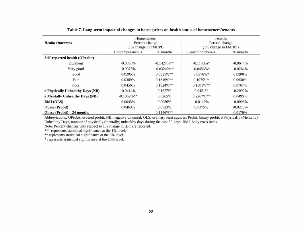
28
Table 7. Long-term impact of changes in house prices on health status of homeowners/tenants
Health Outcomes
Homeowners
Percent change
(1% change in FMHPI)
Tenants
Percent change
(1% change in FMHPI)
Contemporaneous 36 months Contemporaneous 36 months
Self-reported health (OProbit)
Excellent -0.0356% -0.1424%** -0.1140%* -0.0644%
Very good -0.0076% -0.0324%** -0.0456%* -0.0264%
Good 0.0205% 0.0825%** 0.0376%* 0.0208%
Fair 0.0389% 0.1616%** 0.1075%* 0.0630%
Poor 0.0456% 0.1824%** 0.1301%** 0.0767%
# Physically Unhealthy Days (NB) -0.0414% 0.1627% 0.0421% -0.2092%
# Mentally Unhealthy Days (NB) -0.1062%** 0.0265% 0.2267%** 0.0495%
BMI (OLS) 0.0043% 0.0086% -0.0140% -0.0003%
Obese (Probit) 0.0463% 0.0723% 0.0375% -0.0273%
Obese (Probit) – 24 months 0.1146%** 0.0176%
Abbreviations: OProbit, ordered probit; NB, negative binomial; OLS, ordinary least squares; Probit, binary probit; # Physically (Mentally)
Unhealthy Days, number of physically (mentally) unhealthy days during the past 30 days; BMI, body mass index.
Note: Percent changes with respect to 1% change in HPI are reported.
*** represents statistical significance at the 1% level.
** represents statistical significance at the 5% level.
* represents statistical significance at the 10% level.

29
Table 8. Impact of changes in house prices on health status of homeowners/tenants
based on a specification adding MSA-specific linear time trends
Health Outcomes Homeowners Tenants
Percent change
(1% change in FMHPI)
Percent change
(1% change in FMHPI)
Self-reported health (OProbit)
Excellent -0.0246% -0.1497%**
Very good -0.0052% -0.0601%**
Good 0.0138% 0.0492%**
Fair 0.0269% 0.1414%*
Poor 0.0290% 0.1701%**
# Physically Unhealthy Days (NB) -0.0653% 0.0394%
# Mentally Unhealthy Days (NB) -0.1230%** 0.2259%**
BMI (OLS) 0.0040% -0.0190%
Obese (Probit) 0.0549% 0.0415%
Abbreviations: OProbit, ordered probit; NB, negative binomial; OLS, ordinary least squares; Probit, binary probit;
# Physically (Mentally) Unhealthy Days, number of physically (mentally) unhealthy days during the past 30 days;
BMI, body mass index.
Note: Percent changes with respect to 1% change in HPI are reported.
*** represents statistical significance at the 1% level.
** represents statistical significance at the 5% level.
* represents statistical significance at the 10% level.

30
Table 9. Impact of changes in house prices on health status of homeowners/tenants
based on 75:25/65:35 ratio of homeownership indicator
Health Outcomes Homeowners
Percent change
(1% change in FMHPI)
Tenants
Percent change
(1% change in FMHPI)
75:25 65:35 75:25 65:35
Self-reported health (OProbit)
Excellent -0.0336% -0.0266% -0.1493%* -0.0968%**
Very good -0.0076% -0.0055% -0.0609%* -0.0385%**
Good 0.0188% 0.0160% 0.0478%* 0.0326%**
Fair 0.0364% 0.0307% 0.1406%* 0.0920%**
Poor 0.0406% 0.0343% 0.1690%** 0.1110%**
# Physically Unhealthy Days (NB) -0.0325% -0.0671% 0.0298% 0.0542%
# Mentally Unhealthy Days (NB) -0.1183%*** -0.1096%** 0.3058%*** 0.1743%*
BMI (OLS) 0.0032% 0.0019% -0.0148% -0.0094%
Obese (Probit) 0.0525% 0.0417% 0.0239% 0.0358%
Abbreviations: OProbit, ordered probit; NB, negative binomial; OLS, ordinary least squares; Probit, binary probit;
# Physically (Mentally) Unhealthy Days, number of physically (mentally) unhealthy days during the past 30 days;
BMI, body mass index.
Note: Percent changes with respect to 1% change in HPI are reported.
*** represents statistical significance at the 1% level.
** represents statistical significance at the 5% level.
* represents statistical significance at the 10% level.

31
Table 10. Estimated percent change on being excellent health with respect to a one percent change in house prices for high/low income
homeowners/tenants using actual/imputed homeownership data from annual/monthly CPS/BRFSS
CPS BRFSS
(1) (2) (3) (4)
Annual Annual Annual Monthly
Actual
Homeownership
indicator
Imputed
Homeownership
indicator
Imputed
Homeownership
indicator
Imputed
Homeownership
indicator
High Income
Homeowners
-0.0112%
(p=0.795)
[N=419,300]
0.0008%
(p=0.983)
[N=450,312]
-0.0269%
(p=0.578)
[N=618,475]
-0.0240%
(p=0.624)
[N=618,475]
Low Income
Homeowners
-0.0707%
(p=0.130)
[N=266,220]
-0.0448%
(p=0.442)
[N=238,819]
-0.0193%
(p=0.748)
[N=760,956]
-0.0300%
(p=0.581)
[N=760,956]
High Income
Tenants
0.0872%
(p=0.378)
[N=76,370]
0.0206%
(p=0.855)
[N=45,358]
0.1357%
(p=0.360)
[N=36,689]
0.0375%
(p=0.773)
[N=36,689]
Low Income
Tenants
-0.1047%**
(p=0.045)
[N=221,370]
-0.1435%**
(p=0.011)
[N=248,771]
-0.1616%***
(p=0.006)
[N=354,826]
-0.1693%**
(p=0.012)
[N=354,826]
Notes: 1. CPS provides actual homeownership data but BRFSS doesn’t until 2009 whereas BRFSS provides monthly data but CPS doesn’t.
2. Numbers in parenthesis are (p) value as a measure of statistical significance and sample size [N] respectively.
3. Non-respondents to self-reported health questionnaires are excluded from the sample size in this analysis.

32
Essay 2: New Evidence on the Relationship between Inequality and Health
1. Introduction
Interest within the academic literature and the popular press on the causes and
consequences of income inequality has exploded in recent years. This is no doubt driven by the
dramatic widening of the income distribution in both the United States as well as many other
developed countries over the past 30 years (Piketty, Saez, and Zucman, 2016; Piketty and Saez,
2003; Boustan et al., 2013).37 Figure 2 illustrates this trend in the U.S. over time. Potential causes
of income inequality include immigration, trade, unionization, and technological change (Leigh,
2007). Potential consequences of increased income inequality include increases in crime (Kelly,
2000), lower levels of education (Kawachi et al., 1997; Kawachi and Kennedy 1997), increases
in municipal revenue and expenditure (Boustan et al., 2013), and reductions in health status
(Marmot and Wilkinson, 2001).
The extent to which an individual’s health is impacted by the income of others,
sometimes referred to as the relative income hypothesis (RIH), is still subject to a great deal of
debate in the literature. Several studies find evidence supporting the notion that an individual’s
health is impacted by the income of others (Kaplan et al., 1996; Kennedy et al., 1996; Kawachi
and Kennedy, 1997; Blakely et al., 2002; Lopez, 2004).38 The notion that everyone’s health in
society is reduced when there is more income inequality is known as the income inequality
37 For further discussion on this topic, see Smeeding (2004) and Alvaredo et al. (2013). 38 Kaplan et al. (1996) and Kennedy et al. (1996) show that greater inequality leads to higher mortality in the United
States. They consider degree of inequality as a proxy for social indicators. Under-investment in human and social
capital such as education and medical care caused by inequality is a potential mechanism behind the significant
relationship between greater inequality and higher mortality. Kawachi and Kennedy (1997) also argue that lower
inequality promotes social integration that is closely associated with individual well-being.

33
hypothesis (IIH) (Gravelle and Sutton, 2009; Lynch et al., 2004; Marton and Wildasin, 2007).
The relative deprivation hypothesis (RDH) suggests that health status is influenced by how one’s
income compares to others. One possible mechanism associated with the RDH is that the stress
and anxiety caused by having less income than one’s neighbors lead to a reduction in one’s
physical health (Marmot and Wilkinson, 2001; Eibner and Evans, 2005; Gravelle and Sutton,
2009; Mangyo and Park, 2011). Despite this evidence, there are also several studies in the RIH
literature that find no income inequality or relative deprivation effects (Wagstaff and Doorslaer,
2000; Mellor and Milyo, 2002; Gerdtham and Johannesson, 2004; Lorgelly and Lindley, 2008;
Gronqvist et al., 2012).
The ideal dataset to evaluate the impact of income inequality on health would be an
individual level dataset containing information about income and health measured frequently
over time and space, as well as geographic identifiers. It is likely that at least some of the
conflicting results in the literature described above are driven by the fact that researchers don’t
typically have access to such an ideal dataset. As a result, some studies use aggregate data, such
as a national analysis of changes in income inequality and health in the United States over time.
In such studies, we cannot test the effects of income inequality directly because we do not have
individual data and the reference group is implicitly defined to be a national one.39 Other studies
employ individual data across different levels of geography, such as states or counties. Some
argue that smaller levels of geography provide better potential approximations of one’s reference
group, while others argue that smaller levels of geography result in reference groups that are too
39 As Bechtel et al. (2012) point out, the relationship between income and health may support the IIH at the
population level, due to changes in individual income caused by transfers rather than an actual change in income
inequality. For example, a transfer of income from the poor to the rich could generate such a result.
34
homogeneous to provide the variation necessary to test for the effect of income inequality.40
Smaller levels of geography also typically come at the cost of smaller sample sizes and less
precise estimates.
Our contribution to the income inequality literature is to develop a new methodology to
calculate a variety of income inequality measures based on aggregate income and household size
data from various Federal data sources. Our proposed methodology provides a way to express
various income inequality measures as a function of the ratio of mean to median household
income under the assumption that individual income is log-Normally distributed. This allows for
easy and accurate calculation of a variety of annual income inequality measures at different
levels of geography (state or county) using precise annual estimates of mean and median
household income. This is significant in that prior literature is limited due to the lack of publicly
available micro-data on income with a large sample size measured frequently over time and
space including geographic identifiers. We construct an individual level dataset by combining
the 2001-2012 editions of the Behavioral Risk Factor Surveillance System (BRFSS) with annual
regional inequality measures derived from our methodology. This produces a dataset more
closely resembling the ideal dataset described above than the datasets used in the previous
literature.
We exploit the repeated cross-sectional nature of our dataset to incorporate potential
lagged effects of income inequality and vary the geographic scope of our analysis between states
(higher level of geography) and counties (lower level of geography). We estimate several annual
40 Interestingly, a recent study by Ifcher et al. (2017) shows that subjective well-being (SWB), a potential proxy for
utility, is positively associated with the median income of individuals within one’s ZIP code while SWB is
negatively associated with the median income of individuals within one’s MSA, a larger geographic unit, using
SWB data between 2011 and 2012 from the U.S. Gallup-Healthways Well-Being Index and median income data
from the American Community Survey (ACS).

35
measures of income inequality, including the Gini coefficient, the Theil index, the Atkinson
index, and the relative deprivation index.
Although the degree of significance of the estimated effect of income inequality varies
with categories of health (“excellent” versus “fair or poor”) and level of geography, we generally
find statistically significant evidence supporting the IIH and the RDH. For example, at the state-
level, as the Gini index increases by one standard deviation, the probability of self-reported
“excellent” health status declines by 0.41 percentage points or 2.0 percent. We find both
contemporaneous and lagged effects of income inequality on health. We also find increases in
risky behaviors corresponding to increases in income inequality, which could lead to reduction in
health and therefore support the IIH and the RDH. These results are robust to our choice of
inequality measure and suggest that greater inequality adversely affect health status in the United
States.
The rest of the paper is organized as follows: first, we provide a review of the income
inequality literature. Second, we describe in detail our novel methodology. Third, we discuss the
data used to implement our methodology. Fourth, we present our results. Finally, we conclude
the paper with a discussion of these results.
2. Literature Review on Income Inequality and Health
In a seminal paper on the measurement of U.S. income inequality, Piketty and Saez
(2003) use tax return data to describe a rise in income inequality starting in the late 1970s
through the late 1990s. Subsequent work extending this time series through 2007 (Atkinson, et
al., 2011) and then 2011 (Alvaredo et al., 2013) illustrated a continuation of this trend. Thus
growth in income inequality in the U.S. over the past four decades is well documented.

36
We now turn to a review of the literature on the impact of this increase in income
inequality on health status in the United States.41 We start with Mellor and Milyo (2002)
because the many studies on this topic published previously tended to use aggregate health
outcome data.42 These previous aggregate studies could not control for many other covariates,
including individual income, given their aggregate outcome measure, which introduces the
possibility of a spurious relationship between changes in aggregate income inequality and
aggregate health status.43 Mellor and Miylo (2002) instead use data from the 1995-1999 Current
Population Survey (CPS) to investigate the effect of income inequality on individual health
status. Controlling for individual income and census tract of residence, Mellor and Milyo (2002)
find no causal relationship between income inequality and health status either at the state or
MSA-level of geography.44
Concurrent work published in the same year, Blakely et al. (2002), provides several
criticisms of the Mellor and Miylo (2002) use of the CPS for income inequality analysis. First,
CPS data are not precise enough to calculate inequality measures at local (i.e. sub-state) levels of
geography. Second, Blakely et al. (2002) argue that a five year study period is not sufficiently
long enough to capture changes in health status. Third, Mellor and Milyo (2002) overlook the
41 Studies of income inequality and health in countries other than U.S. generally provide little support for either the
income inequality hypothesis or the relative deprivation hypothesis, with the exception being a few studies using
data from China (Mangyo and Park, 2011; Chen and Meltzer, 2008; Li and Zhu, 2006). Other countries analyzed
include Britain (Lorgelly and Lindley, 2008; Gravelle and Sutton, 2009; Jones and Wildman, 2008), Australia
(Bechtel et al., 2012), and Sweden (Gerdtham and Johannesson, 2004). 42 For detailed reviews of the literature on income inequality and health see Wagstaff and Doorslaer (2000), Deaton
(2003), and Wilkinson and Pickett (2006). 43 Examples of some of these aggregate data studies include Waldmann (1992), Kaplan et al. (1996), and Kennedy et
al. (1996). 44 But Chen and Crawford (2012) and Krieger (2006) suggest that neighbors within a census tract are so closely
connected through their common community that controlling for census tract may not allow for sufficient variation
in income inequality to identify its effect on health outcomes.

37
lagged effects of inequality on health. Blakely et al. (2002) go on to suggest that decennial
Census data would produce more precise income inequality measures due to larger sample sizes.
After these comments, the literature has focused on the use of individual income data
from the decennial Census to construct regional income inequality measures. Employing 1990
decennial Census data or 2000 decennial Census data or both, Blakely et al. (2002) and Lopez
(2004) show support the income inequality hypothesis, whereas Chang and Chistakis (2005) and
Chen and Crawford (2012) find no effects or mixed effects of inequality on health status and
health behaviors. Eibner and Evans (2005) examine the impact of relative deprivation on
mortality using a measure of relative deprivation constructed from 1990 decennial Census data.
They find a statistically significant and positive association between relative deprivation and
mortality. In contrast, Miller and Paxson (2006) use 1980 and 1990 decennial Census and find no
statistically significant effect of relative income on mortality. Kearney and Levine (2014)
identify a positive relationship between low socioeconomic status and teen births among
unmarried women in the U.S. A general limitation associated with all of these studies using
decennial Census data is the inability to estimate time varying effects of inequality. This is due to
the fact that Census data is only produced every ten years.45
According to Kopczuk et al. (2010) use of either the CPS or the decennial Census has
serious limitations in that they do not allow for the construction of income inequality measures
from a dataset with a large sample size that measures income frequently over time. In addition,
45 An alternative way of calculating annual inequality measures would be to use the American Community Survey
(ACS). Kearney and Levine (2014) use 1980, 1990, and 2000 decennial Censuses along with household income
from the 2006-2008 ACS to create income inequality measures. An additional feature of the ACS that would be
potentially useful is that it provides both state and sub-state geographic identifiers through the use of
Public Use Microdata Areas (PUMAs). Unfortunately, the ACS does not include measures of individual health
status.

38
Pickett and Wilkinson (2015) point out in their review paper, “all of the previous studies tested
the lagged effect of income inequality in a particular year, treating it as a time-invariant variable
and failing to control for a series of previous, subsequent and contemporaneous income
inequalities.” We overcome these limitations by developing a new methodology to compute
annual income inequality measures based on aggregate income and household size data from
various annual Federal data sources. Our dataset combines these computed income inequality
measures with the 2001-2012 editions of the BRFSS in order to estimate lagged effects of
income inequality.
3. Methodology
In this section, we first describe the econometric models we use to estimate the
relationship between income inequality and health outcomes. We then describe the way in which
we employ new methodologies to calculate income inequality measures based on aggregate
income and household size data. Finally, we discuss how our approach addresses concerns about
the endogeneity of both income and health status.
3.1 Econometric Model
We estimate the impact of income inequality on health status and behaviors by estimating
linear models specified as in equation (1) below:
𝑦𝑖𝑠𝑡 = 𝛼 + 𝛽1𝐼𝑠𝑡 + 𝑋𝑖𝑠𝑡𝛽2 + 𝛽3𝑈𝑠𝑡 + 𝛿𝑠 + 𝜆𝑡 + 휀𝑖𝑠𝑡 (1)
where 𝑦𝑖𝑠𝑡 represents the health status or the health behavior for person i in region (state or
county) s at time t. Linear probability models are estimated for binary variables (e.g. reporting
“excellent” health or not) and ordinary least squares models are applied for continuous variables

39
(e.g. Body Mass Index).46 Our primary independent variable of interest is denoted by 𝐼𝑠𝑡. It
represents one of several measures of income inequality, whose construction we will discuss in
more detail below.47 One example is the Gini index for region s at time t. In the case of the
relative deprivation index, we include a subscript for individual i since the relative deprivation
index varies by i’s group average income relative to the income distribution in i’s region s and
time t.
We also include a vector of demographic characteristics denoted by 𝑋𝑖𝑠𝑡. It consists of
group average household income stratified by age, gender and education (Ruhm, 2005), age
dummies, race dummies, education dummies, a gender dummy, and a marital status dummy. The
regional unemployment rate in region s at time t is denoted by 𝑈𝑠𝑡. In addition, 𝛿𝑠 controls for
regional fixed effects (state or county) and 𝜆𝑡 controls for year-month fixed effects. Finally,
휀𝑖𝑠𝑡 is the idiosyncratic error term.
3.2 Calculating the Gini Index
Equation (2) describes the Gini index (Sen, 1973), the most commonly used measure of
income inequality in the literature:
𝐺 =
1
𝑛[𝑛 + 1 − 2(
∑ (𝑛 + 1 − 𝑖)𝑦𝑖𝑛𝑖=1
∑ 𝑦𝑖𝑛𝑖=1
)] 𝑓𝑜𝑟 y1 ≤ 𝑦2 ≤ ⋯ ≤ 𝑦𝑛 (2)
Here 𝑦𝑖 represents the income of individual (or household) i and n represents the total number of
individuals (or households) being considered. The Gini index varies from 0 (complete income
equality) to 1 (complete income inequality).
46 The specific dependent variables and their converted form for empirical analysis are reported in table 11 47 Our measures of income inequality consist of the regional Gini index, the regional Atkinson index (ε = 1), the
regional Theil index, and the individual within-region relative deprivation index.

40
Mellor and Miylo (2002) use individual data from the 1995-1999 CPS to directly
calculate multiple measures of income inequality based on their sample at different levels of
geography for each year (state and MSA).48 As discussed, concerns with their particular
approach include an insufficient CPS sample size for sub-state levels of geography and an
insufficiently short timeframe to allow for changes in health status to occur or to investigate
lagged effects of income inequality. Subsequent work, such as Lopez (2004), uses decennial
Census data in a similar way to directly calculate the Gini index, though such data are only
available once every 10 years.
These studies highlight the data challenge faced by researchers interested in studying the
effects of income inequality: how does one find individual-level income and health data varying
over time and space, such as in the CPS, that allows for a long enough time frame to identify
changes in health and lagged effects, while at the same time having a sufficient sample size to
identify effects at different levels of geography (as is the case with the decennial Census data)?
Our solution to this problem is to employ new methodologies to calculate income inequality
measures using values of mean and median household income derived from other Federal data
sources that report such statistics annually, rather than decennially.
For the Gini index, we apply the new specification derived in Crow and Shimizu (1988).
Crow and Shimizu (1988) showed that the Gini index can be derived as a function of mean and
median household income, under the assumption that individual income is log-Normally
distributed. This version of the Gini index is represented by the right term of equation (3):
48 While Mellor and Miylo (2002) do not use the Gini index as one of their measures of income inequality, they
could have done so by directly applying equation (2) to their individual income data.

41
𝐺 =1
𝑛[𝑛 + 1 − 2(
∑ (𝑛 + 1 − 𝑖)𝑦𝑖𝑛𝑖=1
∑ 𝑦𝑖𝑛𝑖=1
)] ≈ 2Φ(√ln (𝑚𝑒𝑎𝑛_ℎ𝑜𝑢𝑠𝑒ℎ𝑜𝑙𝑑_𝑖𝑛𝑐𝑜𝑚𝑒
𝑚𝑒𝑑𝑖𝑎𝑛_ℎ𝑜𝑢𝑠𝑒ℎ𝑜𝑙𝑑_𝑖𝑛𝑐𝑜𝑚𝑒)) − 1 (3)
Here Φ(. ) is the cumulative density function of standard normal distribution. Thus, under the
log-normality assumption, we can estimate the Gini index for any time period and level of
geography for which we have mean and median household income, regardless of the availability
of individual income data.
In order to implement this approach, we collect the following raw annual data at both the
state and county level:
• Regional mean personal income, Bureau of Economic Analysis (BEA)
• Regional median household income, Census Small Area Income and Poverty Estimate
(SAIPE)
• 2009 Personal Consumption Expenditure Price Index (PCEPI), BEA
• Regional mean household size, ACS
For each year between 2001 and 2012, we first take the 2009 PCEPI income deflator and
convert our measures of regional income from nominal to real 2009 dollars. Next, we multiply
regional mean personal income by regional mean household size in order to obtain regional mean
household income.49 This process leaves us with precise annual measures of real mean and
median household income that are derived by the BEA and the SAIPE (using a complex
methodology and a variety of data sources) and are reported annually over a 12 year time
49 Our annual measure of average household size is derived as follows, given differential availability from the
Census and the ACS over time. For 2000, we use average household size from the 2000 decennial Census. For
2001-2004, we assign average household size via a linear interpolation of our average household size in 2000 and
the 5 years estimates for average household size taken from the 2005-2009 ACS. For 2005-2009, we use 5 years
estimates for average household size from the 2005-2009 ACS. For 2010, 2011, and 2012, we use the 5 years
estimates for average household size from the 2006-2010, 2007-2011, and 2008-2012 ACS respectively.

42
period.50 With these inputs, we can thus compute the Gini index in a way that combines the best
features of the primary data sources used separately in the previous literature, the CPS and the
decennial Census. These features include a sufficient time frame to estimate the lagged impact of
income inequality and sufficient sample size to credibly do analysis at both the state and county
level.
3.3 Calculating Other Income Inequality Measures
The left hand side of equation (4) defines the Atkinson index (Atkinson, 1970), another
of the commonly used measures of income inequality in the literature:
𝐴 = {1 −
1
�̅�(1
𝑛∑ 𝑦𝑖
1−𝜀𝑛𝑖=1 )
1
1−𝜀 𝑓𝑜𝑟 0 ≤ 휀 ≠ 1
1 −1
�̅�(∏ 𝑦𝑖
𝑛𝑖=1 )
1
𝑛 𝑓𝑜𝑟 휀 = 1
≈ 1 − (𝑚𝑒𝑑𝑖𝑎𝑛_ℎ𝑜𝑢𝑠𝑒ℎ𝑜𝑙𝑑_𝑖𝑛𝑐𝑜𝑚𝑒
𝑚𝑒𝑎𝑛_ℎ𝑜𝑢𝑠𝑒ℎ𝑜𝑙𝑑_𝑖𝑛𝑐𝑜𝑚𝑒)𝜀
, 휀 ≥ 0 (4)
Here �̅� is the mean household income of all the households living in the reference group and ε is
the "inequality aversion parameter." The higher the value of ε, the more sensitive the Atkinson
index becomes to inequalities at the bottom of the income distribution (De Maio, 2007). Our
approximation of the Atkinson index as a function of mean and median household income is
given by the right hand side of equation (4). To ensure our estimates can be compared with
previous studies (Lorgelly and Lindley, 2008; Bechtel et al., 2012), we approximate the Atkinson
index for three values of ε: 0.5, 1 and 2.
50 For detailed information regarding data inputs and methodologies of the estimates of “per capita personal income”
and “median household income”, please see the BEA (http://www.bea.gov/regional/pdf/lapi2014.pdf) and the
SAIPE websites (http://www.census.gov/did/www/saipe/about/index.html), respectively.

43
Theil (1967) proposed the Theil index described by the left hand side of the equation (5):
𝑇 =
1
𝑛∑(
𝑦𝑖�̅�ln (
𝑦𝑖�̅�)) ≈ ln (
𝑚𝑒𝑎𝑛_ℎ𝑜𝑢𝑠𝑒ℎ𝑜𝑙𝑑_𝑖𝑛𝑐𝑜𝑚𝑒
𝑚𝑒𝑑𝑖𝑎𝑛_ℎ𝑜𝑢𝑠𝑒ℎ𝑜𝑙𝑑_𝑖𝑛𝑐𝑜𝑚𝑒)
𝑛
𝑖=1
(5)
The Theil index measures the logarithmic distance between the each individual’s income
and the mean income of the population. Our approximation of the Theil index of as a function of
mean and median household income is expressed in the right hand side of equation (5).
The left hand side of equation (6) describes the relative deprivation index (Yitzhaki,
1979):
𝑅𝐷(𝑦𝑖) = �̅�(1 − 𝐿(𝑦𝑖)) − 𝑦𝑖(1 − 𝐹(𝑦𝑖))
≈ 𝑚𝑒𝑎𝑛_ℎ𝑜𝑢𝑠𝑒ℎ𝑜𝑙𝑑_𝑖𝑛𝑐𝑜𝑚𝑒 ∗
(
1−Φ
(
ln (
𝑦𝑖 ∗ 𝑚𝑒𝑑𝑖𝑎𝑛_ℎ𝑜𝑢𝑠𝑒ℎ𝑜𝑙𝑑_𝑖𝑛𝑐𝑜𝑚𝑒𝑚𝑒𝑎𝑛_ℎ𝑜𝑢𝑠𝑒ℎ𝑜𝑙𝑑_𝑖𝑛𝑐𝑜𝑚𝑒2
)
√2 ln (𝑚𝑒𝑎𝑛_ℎ𝑜𝑢𝑠𝑒ℎ𝑜𝑙𝑑_𝑖𝑛𝑐𝑜𝑚𝑒𝑚𝑒𝑑𝑖𝑎𝑛_ℎ𝑜𝑢𝑠𝑒ℎ𝑜𝑙𝑑_𝑖𝑛𝑐𝑜𝑚𝑒
))
)
−𝑦𝑖 ∗
(
1 −Φ
(
ln (
𝑦𝑖𝑚𝑒𝑑𝑖𝑎𝑛_ℎ𝑜𝑢𝑠𝑒ℎ𝑜𝑙𝑑_𝑖𝑛𝑐𝑜𝑚𝑒
)
√2 ln (𝑚𝑒𝑎𝑛_ℎ𝑜𝑢𝑠𝑒ℎ𝑜𝑙𝑑_𝑖𝑛𝑐𝑜𝑚𝑒𝑚𝑒𝑑𝑖𝑎𝑛_ℎ𝑜𝑢𝑠𝑒ℎ𝑜𝑙𝑑_𝑖𝑛𝑐𝑜𝑚𝑒
))
)
(6)
Here 𝐿(𝑦𝑖) shows the proportion of total income received by those whose income is less than or
equal to 𝑦𝑖 and 𝐹(𝑦𝑖) is the Cumulative Density Function (CDF) of 𝑦𝑖. As defined in Yitzhaki
(1979), for individual 𝑖 with income 𝑦𝑖, his or her relative deprivation is “the gap between the
total income of those with income over 𝑦𝑖 and their total income if they had income 𝑦𝑖.” Higher

44
values of relative deprivation indicate that the individual has a lower relative income compared
to others. Our approximation of the relative deprivation index as a function of mean and median
household income as well as individual i’s income is given by the right hand side of equation (6).
Since the individual or household relative deprivation index expressed as a function of the
individual’s income 𝑦𝑖, it could also be influenced by an individual or household’s health status.
Thus, we also use group-average relative deprivation in our main results. 51
3.4 Endogeneity and Measurement Error
The micro-data on individual income levels used in prior studies to calculate inequality is
based on a sample of a given population, which by chance may consist of a large proportion of
high income or low income people within that population. A small sample size in a small
geographic area such as a county may consist by chance of a large proportion of unhealthy
people, which could lead to a potential endogeneity problem because a large proportion of
unhealthy people may simultaneously lead to higher income inequality in that area. Our
distinctive methodology based on our assumption of log-Normally distributed individual income
as well as aggregate income and household size data from external Federal sources addresses this
potential endogeneity problem. Our approach of using precise annual estimates of mean and
median household income from various Federal data sources under the assumption that
individual income is log-Normally distributed for the whole population in a given region might
be less likely to cause concerns about measurement error.
51 We also use individual income in our derivation of the relative deprivation index and the results are shown to be
robust although the magnitudes of estimated effects are larger, which are displayed in tables 44 to 46 in the
Appendix.

45
4. Data
To estimate the effect of income inequality on individual health status, we construct a
monthly individual pooled cross-sectional dataset using data from January 2001 to December
2012 from a variety of sources. Our primary data source is the BRFSS, which provides us with
health status indicators and additional control variables for individuals in our sample. In addition,
we merge the four income inequality indices described previously into our BRFSS dataset. The
large sample size of the BRFSS allows us to create both a state-level dataset and a county-level
dataset so that we can test for differences in the impact of income inequality at different levels of
geography. Our state-level dataset consists of 4,257,228 adult individuals, while our county-level
dataset consists of the sub-sample of 3,649,139 adult individuals whose county identifiers are
available.52
Table 11 presents descriptive statistics for our health outcomes and health behaviors
variables from our state-level sample. In our 2001-2012 state sample, we see that 20.65 percent
of individuals report being in excellent health in a given month. In comparison, 16.35 percent
report being in fair or poor health, while 25.37 percent are considered obese. Average number of
physically unhealthy days during the past 30 days is 3.63, average number of mentally unhealthy
days is 3.50, and average body mass index is 27.24. In addition, 75.52 percent of individuals
have exercise in the past 30 days, 20.1 percent are current smokers and 14.69 percent smoke
every day. Average number of drinks on drinking days is 1.74 and average number of binge
drinking times in the past 30 days is 0.85.
52 Our county-level BRFSS sample is over 85 percent of our state-level BRFSS sample. In comparison, Blakely et
al. (2002) report that less than 50 percent of their CPS sample have county identifiers. This suggests that the BRFSS
is better suited than the CPS to analyze the effects of income inequality at sub-state levels of geography.

46
Also presented in table 12 are descriptive statistics for our demographic control variables.
We split age into six mutually exclusive categories, with the largest share in the sample (20
percent) coming from the age 35-44 category. Similarly, we split race into four categories.
Nearly 70 percent of our state sample is white, with nearly 14 percent Hispanic, and 10 percent
African-American. The remaining category is other races. We split educational attainment into
four categories. A little over 31 percent of our state sample has graduated from college, while
almost 12 percent did not graduate from high school.
Household income is reported in categories in the BRFSS. For each individual in each
month of our sample, we take the midpoint of their reported income category to represent their
nominal household income if their household income is less than $75,000. If their income is
greater than or equal to $75,000, then we assign to them a nominal household income of
$112,500 = ($75,000 * 1.5).53 We then convert nominal household income to real household
income using the PCEPI income deflator we described previously. Finally, we assign to each
observation their group average real household income at the state or county level to address the
potential endogeneity of income with respect to health status. The group average monthly real
household income in our full state sample is a little under $60,000. We also control for monthly
seasonally-unadjusted regional unemployment rates, which are collected from the Bureau of
Labor Statistics (BLS). The average monthly seasonally-unadjusted state unemployment rate in
our sample is 6.57 percent.
Table 13 presents the mean values for our four different income inequality indices from
both our state-level and our county-level dataset. The average value of the Gini index in our state
53 Such an approach is used in Ruhm (2005), Eibner and Evans (2005), and Chang and Christakis (2005).

47
dataset is 0.5968 and 0.5883 in our county dataset. 54 Recall that a value of 1 represents complete
income inequality and a 0 represents complete equality. Figure 2 shows that state Gini indices
are increasing overall, as indicated by darker colors, which is consistent with the descriptive
evidence from previous studies that income inequality has increased in the United States. The
average values of the Atkinson index and the Theil index are also given in table 13. For ε = 1 we
see an average value of 0.5032 (0.7030) for the Atkinson (Theil) index in our state dataset and
0.4916 (0.6873) in our county dataset. Finally, table 13 provides the averaged value of the group-
average relative deprivation index across states and counties respectively. As previously
discussed, we expect the value of the RDI to be negatively associated with better health.
5. Results
In this section, we present our regression results. We start with our estimates of the
contemporaneous impact of income inequality, separately presenting results for each of a variety
of health status and health behaviors. We then turn to our lagged analysis in which we allow a
given period’s income inequality to impact future health outcomes. In both our contemporaneous
and lagged analysis, we report results for multiple measures of income inequality. In addition,
we present results for both state and county-level income inequality.
5.1 Contemporaneous Results
Table 14 presents our estimates of the contemporaneous impact of income inequality on
self-reported health status. The outcome considered in the left panel of the table is self-reported
excellent health, while the outcome considered in the right panel of the table is self-reported fair
54 Note that our computed values for the U.S. state and county Gini indices are higher than those from the U.S.
Census national Gini index. This could be due to variation in geographic scale and different methods of calculation.
Recall that our calculation of inequality indices is based on the assumption that income follows a log-Normal
distribution. Even if the assumption does not hold, our calculated inequality indices still measure inequality (Kelly
2000).

48
or poor health. We start with column (1), which provides regression estimates based on equation
(1) for state-level income inequality. Each row represents results based on a different
specification of income inequality. The top row uses the Gini index to measure inequality and
reports an estimated coefficient of -0.147 associated with the Gini index. This coefficient implies
that a 1 standard deviation increase in the state Gini index leads to a 0.408 percentage point
reduction in the probability of reporting excellent health or a 1.98 percent reduction relative to
the 20.65 percent average probability of reporting excellent health in our state dataset.55 This
suggests greater state income inequality, as measured by the Gini index, leads to a reduction in
the probability of reporting excellent health.
The next row presents results using the Atkinson index. Our results here suggest that
greater state income inequality, as measured by the Atkinson index, leads to a statistically
significant reduction in the probability of being in excellent health. Relative to the average
probability of reporting excellent health, a one standard deviation increase in the state Atkinson
index leads to a 1.99 percent reduction in the probability of reporting excellent health. The third
row shows a similar result when we use the Theil index (a 1.98 percent reduction), though the
level of significance associated with the Theil index coefficient is 13 percent. The final row
reports results based on the relative deprivation index. This specification suggests that a higher
level of state relative deprivation also leads to a reduction in the probability of being in excellent
health. To be more specific, a $10,000 increase in state relative deprivation is predicted to reduce
the probability of reporting excellent health by 5.42 percent.
55 Here (0.408 / 20.65) * 100 percent = 1.98 percent.

49
Column (2) narrows the geographic focus of our analysis from states to counties. Here we
find one standard deviation increase in county Gini/Atkinson/Theil index leads to a 1.6 percent
reduction in reporting excellent health. We also see a negative and statistically significant impact
of an increase in relative deprivation on the probability of reporting excellent health. The last
row in column (2) suggests that a $10,000 increase in county relative deprivation leads to a 3.52
percent reduction in the probability of reporting excellent health.
We now turn to the right panel of table 14 that reports the results of our analysis of the
impact of income inequality on the probability of reporting fair or poor health. Column (3)
suggests that changes in state income inequality do not lead to statistically significant changes in
the probability of reporting fair or poor health. However, column (4) shows that an increase in
county income inequality, whether measured by the Gini, Atkinson, or Theil index, leads to
increases in the probability of reporting fair or poor health. The last row in this column shows
that a $10,000 increase in county relative deprivation leads to a 1.32 percent increase in the
probability of reporting fair or poor health.56
In summary, we find that income inequality adversely affects self-reported health but
statistical significances are greater to the relative deprivation (compared to other inequality
measures) and at the county level (compared to state).
Table 15 reports our estimates of the contemporaneous impact of income inequality on
individual’s physical and mental health.57 We find that in general an increase in income
inequality leads to increases in the number of physically and mentally unhealthy day but
56 Appendix table 41 presents additional results using the Atkinson index with different values of ε. These results are
consistent with those reported in table 14 as well. 57 Appendix table 42 presents additional results using the Atkinson index with different values of ε. These results are
overall consistent with those reported in table 15 as well.

50
statistical significances are greater to the relative deprivation and at the county level, which is
similar to the results found in the effect of income inequality on self-reported health. For
example, a $10,000 increase in individual deprivation leads to a statistically significant increase
in mentally unhealthy days by 2.46 (2.31) percent at the state (county) level.58
Table 16 reports results considering different health outcomes, body mass index (BMI)
and obesity. 59 As with our self-reported health status and physical and mental health analysis
above, we focus here on the contemporaneous impact of income inequality and consider multiple
measures of income inequality and geography. Columns (1) to (4) suggest that an increase in
state and county income inequality, as measured by the Gini, Atkinson, or Theil index, leads to
an increase in both BMI and obesity. A one standard deviation increase in inequality for a given
index is predicted to increase BMI and obesity at the state (county) level by 0.65 (0.37) to 0.67
(0.40) percent for BMI and by 4.20 (2.54) to 4.27 (2.65) percent for obesity. We also see that an
increase in relative deprivation leads to increases in BMI and obesity. We find that overall the
estimated magnitudes of the coefficients are larger at the state level and the estimated effect of
state-level relative deprivation on BMI is not statistically significant, although the magnitude and
sign are similar to that of county-level relative deprivation on BMI.
We also examine a variety of health behaviors as mechanisms influencing health
outcomes. Table 17 shows that one standard deviation increase in income inequality at the state
(county) level leads to a reduction in the probability of doing any exercise in the past 30 days by
1.7 (0.5) to 1.9 (0.7) percent. We also find a reduction in exercise caused by increases in relative
deprivation. At the county level, a $10,000 increase in relative deprivation reduces the chances
58 Our findings remain robust to changes in form to binary variables. 59 Appendix table 43 presents additional results using the Atkinson index with different values of ε. These results are
overall consistent with those reported in table 16 as well.

51
of doing exercise by 0.6 percent. Interestingly, as a primary mechanism influencing weight
status, the effects of income inequality on doing exercise is highly consistent with our findings
on BMI and obesity in that overall the estimated magnitudes of the coefficients are larger at the
state level and the estimated effect of state-level relative deprivation on BMI is not statistically
significant.
Tables 18 and 19 present the effects of income inequality on individual risky behaviors,
smoking and drinking. We do not find statistically significant increases of smoking and drinking
led by increases in income inequality of Gini, Atkinson, and Theil index, which intuitively
suggests that individual smoking and drinking might not be the mechanisms driving the
reductions in health status in the analysis of the income inequality hypothesis. However, we find
higher level of relative deprivation leads to statistically significant increases in the likelihood of
being current smoker and smoking every day, and increases in the number of drinks on the days
of drink and the number of times of binge drinking in the past 30 days. For example, a $10,000
increase in state (county) relative deprivation increases the number of drinks by 10.0 (2.7)
percent and binge drinking times by 16.4 (5.5) percent. These findings suggest that the
mechanisms driving health status differ depending on whether we test the income inequality
hypothesis or the relative deprivation hypothesis.
Table 20 presents the effects of income inequality on probability of having health
insurance and unaffordability of see a doctor. In general, higher level of income inequality or
relative deprivation statistically significantly reduces chances of having any health insurance and
increases unaffordability of seeing a doctor, which leads to reduction in health status as shown
above.

52
In summary, although the degree of significance of the estimated effect of income
inequality varies with categories of health status and level of geography, we generally find
statistically significant evidence supporting the income inequality hypothesis and the relative
deprivation hypothesis.60 We also find consistent health behaviors driving this reduction in
health status, although our findings suggest the driving mechanisms vary with whether we test
income inequality hypothesis or the relative deprivation hypothesis. Our results show that
increases in relative deprivation higher the likelihood of individual risky behaviors of smoking
and drinking while increases in income inequality of Gini, Atkinson, and Theil do not lead to
statistically significant increases in smoking and drinking. Considering the concept of the income
inequality hypothesis and the relative deprivation hypothesis,61 these findings are reasonable in
that people might not be smoking and drinking significantly more simply because the overall
inequality of her reference group increases whereas she might be smoking and drinking more
because having lower economic status than her neighbors could cause risky behaviors.62
Therefore, the mechanisms corresponding to the reduction in health status might be under-
investment in human and social capital in a reference and residential area such as education and
medical care caused by increases in inequality (Kaplan et al., 1996; Kennedy et al., 1996).
Unfortunately, the BRFSS does not provide information on the human and social capital in its
dataset to test the mechanism but only the relevant questionnaire is whether individuals have any
health insurance or not, which is highly associated with medical infrastructure availability of
60 In addition, the estimated effects of group-average individual income are consistent with the absolute income
hypothesis, where more income leads to better health or less risky behaviors, holding everything else constant. 61 IIH implies that everyone’s health in the reference group is reduced when there is more income inequality whereas
RDH suggests that how one’s income compares to others affect her health status. 62 By the same token, our findings show that in general the effects of relative deprivation are statistically more
significant than other income inequality measures on other health outcomes and behaviors.

53
one’s residential area and our findings show that higher level of income inequality reduces
likelihood of individual’s having any health insurance.63
5.2 Lagged Results
Our previous results focused on the contemporaneous impact of income inequality on
health status. Tables 21 to 23 extend this analysis by allowing income inequality to have a
lagged, as well as a contemporaneous, impact on health status. Table 21 focuses on self-reported
health and measures of income inequality using the Gini index. Column (1) considers the impact
of state income inequality on the probability of reporting excellent health. Moving down the
column, each specification includes additional lagged values (1 year, 3 years, and 5 years) as
well as the contemporaneous Gini index. We avoid reduction of the sample timeframe by
including more lags of Gini index before 2001. More specifically, for example, we additionally
control for five prior years (1996-2000) of state- and county-level Gini index in the long-term
analysis. In general, our results suggest that as we add more lagged values to our model the total
impact of increases in state and county income inequality on self-reported excellent (fair or poor)
health become more negative (positive) and statistically significant. For example, a 1 standard
deviation increase in one, three, and five years in the state Gini index leads to a 2.31, 3.66, and
4.84 percent reduction in the probability of reporting excellent health respectively. Table 22
shows results for physical and mental health, and table 23 focuses on BMI and obesity, reporting
separate results at the state and county level. As we add more lagged values to our model the
total impact of increases in state and county income inequality become more pronounced. Taken
together, our results presented in tables 21 to 23 suggest that income inequality appears to have a
63 This inference could also be applied in interpreting our estimated effects of income inequality of Gini, Atkinson,
and Theil index on physical and mental health (table 15), and doing exercise (table 17). The levels of health/fitness
facilities and safety in one’s residential area closely associated with the area’s inequality level could also influence
one’s health status and behaviors.

54
strong lagged effect on health outcomes, which is consistent with the prediction from previous
studies, although they could not estimate precisely the lagged effect because all of them fail to
control for a series of previous, ensuing, and contemporary inequality measures as Pickett and
Wilkinson (2015) point out.
6. Discussion
We generally find statistically significant evidence supporting the income inequality
hypothesis (IIH) and the relative deprivation hypothesis (RDH). In addition, we find that the
effect of income inequality becomes stronger when we include lagged values of inequality in our
analysis. These results are robust to our choice of inequality measure and suggest that greater
inequality adversely affects health in the United States. To the best of our knowledge, we are the
first to report such empirical findings using an individual-level dataset spanning a relatively long
time period in which information about income and health is measured frequently over time and
space.
Our results can be compared to those from some relevant prior studies. Mellor and Miylo
(2002) use data from the 1995-1999 CPS and find no causal relationship between income
inequality and health status either at the state or MSA-level of geography after controlling for
individual income and census tract of residence. Unlike their study, we examine a much longer
time frame (12 vs. 5 years), which allows us to examine the lagged effect of income inequality.
Eibner and Evans (2005) find a statistically significant and positive association between relative
deprivation and mortality using a measure of relative deprivation constructed from 1990
decennial Census data, while Miller and Paxson (2006) find no significant association between
relative income and mortality using 1980 and 1990 decennial Census data. Our findings with

55
respect to relative deprivation are similar in sign to Eibner and Evans (2005), though we include
12 years of data in our analysis instead of just one or two.
Our use of a much longer time frame with data from each year is motivated in part by the
emphasis placed on the need to evaluate lagged, rather than just contemporaneous, impacts of
income inequality in the Pickett and Wilkinson (2015) review article on this topic.
One potential limitation of our work is that we mainly focus on the periods of before,
during, and after the Great Recession in the United States. Considering that this was a period of
tremendous change in economic conditions leading to a continuing increase in income
inequality, one must be careful when attempting to generalize our findings or comparing our
results with other studies. In addition, our suggested methodology providing annual income
inequality measures is limited to incorporating the substantial and relative increase in the share
of total annual income obtained by the top one percent in the United States (Alvaredo et al.
2013), which may violate to some degree our assumption of log-Normally distributed income.

56
Figure 2. Variation in Gini Index by State and Year
2001 2002 2003
2004 2005 2006
2007 2008 2009
2010 2011 2012
Source: These Gini indices are based on our own calculations.
Notes: The Gini index is a measure of inequality and takes values in the range 0 for perfect income equality and 1
for perfect income inequality.
0.5 0.55 0.6 0.65 0.7

57
Figure 3. Variation in Reports of Fair or Poor Health and Gini Index by State and Year
Source: The data on the health status of fair or poor health come from the BRFSS and these Gini indices are based
on our own calculations.
Notes: The Gini index is a measure of inequality and takes values in the range 0 for perfect income equality and 1
for perfect income inequality and the proportion of those reporting fair or poor health is expressed in decimal point.
0.1
.2.3
.4.5
.5 .55 .6 .65 .7
2001
0.1
.2.3
.4.5
.5 .55 .6 .65 .7
2002
0.1
.2.3
.4.5
.5 .55 .6 .65 .7
2003
0.1
.2.3
.4.5
.5 .55 .6 .65 .7
20040
.1.2
.3.4
.5
.5 .55 .6 .65 .7
2005
0.1
.2.3
.4.5
.5 .55 .6 .65 .7
2006
0.1
.2.3
.4.5
.5 .55 .6 .65 .7
2007
0.1
.2.3
.4.5
.5 .55 .6 .65 .7
20080
.1.2
.3.4
.5
.5 .55 .6 .65 .7
2009
0.1
.2.3
.4.5
.5 .55 .6 .65 .7
2010
0.1
.2.3
.4.5
.5 .55 .6 .65 .7
2011
0.1
.2.3
.4.5
.5 .55 .6 .65 .7
2012
Horizontal axis - State Gini Index Vertical axis - Proportion Reporting Fair or Poor Health

58
Figure 4. Variation in Obesity Prevalence and Gini Index by State and Year
Source: The data on the obesity come from the BRFSS and these Gini indices are based on our own calculations.
Notes: The Gini index is a measure of inequality and takes values in the range 0 for perfect income equality and 1
for perfect income inequality and the proportion of those reporting being obese is expressed in decimal point.
0.1
.2.3
.4.5
.5 .55 .6 .65 .7
2001
0.1
.2.3
.4.5
.5 .55 .6 .65 .7
2002
0.1
.2.3
.4.5
.5 .55 .6 .65 .7
2003
0.1
.2.3
.4.5
.5 .55 .6 .65 .7
20040
.1.2
.3.4
.5
.5 .55 .6 .65 .7
2005
0.1
.2.3
.4.5
.5 .55 .6 .65 .7
2006
0.1
.2.3
.4.5
.5 .55 .6 .65 .7
2007
0.1
.2.3
.4.5
.5 .55 .6 .65 .7
2008
0.1
.2.3
.4.5
.5 .55 .6 .65 .7
2009
0.1
.2.3
.4.5
.5 .55 .6 .65 .7
2010
0.1
.2.3
.4.5
.5 .55 .6 .65 .7
2011
0.1
.2.3
.4.5
.5 .55 .6 .65 .7
2012
Horizontal axis - State Gini Index Vertical axis - Obesity Prevalence

59
Table 11. Descriptive Statistics for Health Outcomes and Behaviors
Variables (form of variables)
full state sample
mean or proportion
(standard deviation)
Gini > mean state sample
mean or proportion
(standard deviation)
Gini ≤ mean state sample
mean or proportion
(standard deviation)
Self-reported health: Report “Excellent” health (Binary) 20.65% 20.50% 20.81%
(40.48%) (40.37%) (40.59%)
Self-reported health: Report “Fair” or “Poor” health (Binary) 16.35% 17.50% 15.10%
(36.99%) (38.00%) (35.81%)
Number of physically unhealthy days during the past 30 days (Continuous) 3.63 3.73 3.51
(7.97) (8.05) (7.87)
Number of mentally unhealthy days during the past 30 days (Continuous) 3.50 3.60 3.39
(7.62) (7.70) (7.52)
Body Mass Index (BMI) (Continuous) 27.24 27.31 27.16
(5.82) (5.89) (5.75)
Obese (Binary) a 25.37% 25.77% 24.93%
(43.51%) (43.74%) (43.26%)
Any exercise in the past 30 days (Binary) 75.52% 74.78% 76.31%
(43.00%) (43.43%) (42.52%)
Current smoker (Binary) 20.10% 18.95% 21.35%
(40.07%) (39.19%) (40.98%)
Smoke everyday (Binary) 14.69% 13.35% 16.15%
(35.40%) (34.01%) (36.80%)
Number of drinks on average on the days of drink (Continuous) 1.74 1.78 1.71
(2.50) (2.63) (2.35)
Number of times of binge drinking in the past 30 days (Continuous) 0.85 0.85 0.85
(3.07) (3.07) (3.07)
Any health insurance (Binary) 84.05% 82.08% 86.20%
(36.62%) (38.35%) (34.49%)
Unaffordability of seeing a doctor in the past 12 months (Binary) 13.69% 15.20% 11.97%
(34.38%) (35.91%) (32.46%)
Notes: All of these descriptive statistics are derived from our state-level BRFSS sample of 4,257,228 adult individuals between 2001 and 2012 using the BRFSS sampling weights.
All differences in means between columns 2 and 3 are statistically significant. a Binary indicator for obesity is defined as having a body mass index (BMI) over 30. BMI is defined as weight divided by height squared and is calculated in the BRFSS using
individual self-reports of height and weight. See page 18 of the following document: http://www.cdc.gov/brfss/annual_data/2012/pdf/2012_calculated_variables.pdf

60
Table 12. Descriptive Statistics for Control Variables
Variables
full state sample
mean or proportion
(standard deviation)
Gini > mean state sample
mean or proportion
(standard deviation)
Gini ≤ mean state sample
mean or proportion
(standard deviation)
State Group-Avg. Real Household Income ($) 57757 56224 59432
(18926) (19086) (18606)
County Group-Avg. Real Household Income ($) 57824 56289 59500
(23516) (23808) (23076)
Age 18-24 12.49% 12.40% 12.60%
(33.06%) (32.96%) (33.18%)
Age 25-34 18.03% 18.05% 18.01%
(38.44%) (38.46%) (38.43%)
Age 35-44 19.69% 19.60% 19.79%
(39.77%) (39.70%) (39.84%)
Age 45-54 18.77% 18.62% 18.94%
(39.05%) (38.92%) (39.19%)
Age 55-64 13.95% 14.07% 13.82%
(34.65%) (34.77%) (34.51%)
Age 65+ 17.06% 17.27% 16.84%
(37.62%) (37.80%) (37.42%)
Race - White 69.59% 61.85% 78.06%
(46.00%) (48.58%) (41.38%)
Race - African-American 10.08% 10.50% 9.63%
(30.11%) (30.66%) (29.50%)
Race - Hispanic 13.56% 20.07% 6.44%
(34.23%) (40.05%) (24.54%)
Race - Other 6.76% 7.58% 5.87%
(25.11%) (26.47%) (23.51%)
Non-High School Graduate 12.32% 14.31% 10.15%
(32.87%) (35.02%) (30.20%)
High School Graduate 29.45% 27.92% 31.12%
(45.58%) (44.86%) (46.30%)
Some College 27.20% 27.15% 27.26%
(44.50%) (44.47%) (44.53%)
College Graduate 31.02% 30.62% 31.47%
(46.26%) (46.09%) (46.44%)
Female 51.45% 51.40% 51.50%
(49.98%) (49.98%) (49.98%)
Married 58.09% 55.81% 60.59%
(49.34%) (49.66%) (48.87%)
Cellphone 5.27% 8.81% 1.39%
(22.33%) (28.35%) (11.70%)
State Unemployment Rate (%) 6.57 7.12 5.98
(2.27) (2.35) (2.02)
County Unemployment Rate (%) 6.72 7.28 6.08
(2.77) (2.87) (2.51)
Notes: All of these descriptive statistics are derived from our state-level BRFSS sample of 4,257,228 adult individuals between 2001
and 2012 using the BRFSS sampling weights, except for county group-average real household income, which is derived from our
county-level BRFSS sample of 3,649,139 adult individuals whose county identifiers are available between 2001 and 2012 using the
BRFSS sampling weights, and the monthly seasonally unadjusted unemployment rates. The seasonally unadjusted state and county
unemployment rates come directly from the BLS. All differences in means between columns 2 and 3 are statistically significant
except for “Age 25-34”.

61
Table 13. Descriptive Statistics for Regional Income Inequality Indices
Variables Mean
Standard
Deviation
State-level Dataset
Gini Index 0.5968 0.0277
Atkinson Index (ε =1.0) 0.5032 0.0408
Theil Index 0.7030 0.0828
State Group-Avg. Relative Deprivation Index ($10,000) 6.65 1.63
County-level Dataset Gini Index 0.5883 0.0508
Atkinson Index (ε =1.0) 0.4916 0.0736
Theil Index 0.6873 0.1492
County Group-Avg. Relative Deprivation Index ($10,000) 6.68 2.50
Notes: The derivation of these regional income inequality indices is described in the methodology section of this paper.
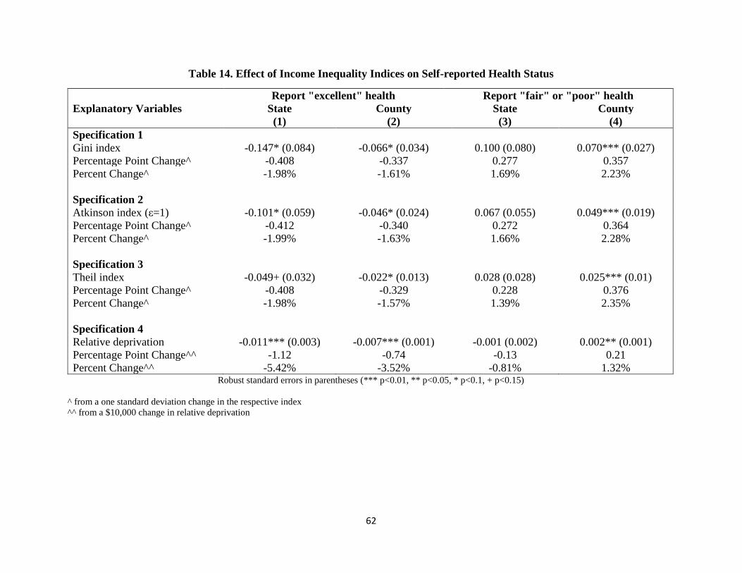
62
Table 14. Effect of Income Inequality Indices on Self-reported Health Status
Report "excellent" health Report "fair" or "poor" health
Explanatory Variables State County State County
(1) (2) (3) (4)
Specification 1
Gini index -0.147* (0.084) -0.066* (0.034) 0.100 (0.080) 0.070*** (0.027)
Percentage Point Change^ -0.408 -0.337 0.277 0.357
Percent Change^ -1.98% -1.61% 1.69% 2.23%
Specification 2
Atkinson index (ε=1) -0.101* (0.059) -0.046* (0.024) 0.067 (0.055) 0.049*** (0.019)
Percentage Point Change^ -0.412 -0.340 0.272 0.364
Percent Change^ -1.99% -1.63% 1.66% 2.28%
Specification 3
Theil index -0.049+ (0.032) -0.022* (0.013) 0.028 (0.028) 0.025*** (0.01)
Percentage Point Change^ -0.408 -0.329 0.228 0.376
Percent Change^ -1.98% -1.57% 1.39% 2.35%
Specification 4
Relative deprivation -0.011*** (0.003) -0.007*** (0.001) -0.001 (0.002) 0.002** (0.001)
Percentage Point Change^^ -1.12 -0.74 -0.13 0.21
Percent Change^^ -5.42% -3.52% -0.81% 1.32% Robust standard errors in parentheses (*** p<0.01, ** p<0.05, * p<0.1, + p<0.15)
^ from a one standard deviation change in the respective index
^^ from a $10,000 change in relative deprivation

63
Table 15. Effect of Income Inequality Indices on Physically and Mentally Unhealthy Days
Physically Unhealthy Days Mentally Unhealthy Days
Explanatory Variables State County State County
(1) (2) (3) (4)
Specification 1
Gini index 2.753 (2.085) 1.003* (0.571) 0.784 (1.712) 1.311** (0.646)
Percent Change^ 2.10% 1.41% 0.62% 1.90%
Specification 2
Atkinson index (ε=1) 1.971 (1.412) 0.745* (0.406) 0.592 (1.178) 0.963** (0.461)
Percent Change^ 2.22% 1.52% 0.69% 2.02%
Specification 3
Theil index 1.177* (0.681) 0.471** (0.213) 0.399 (0.635) 0.580** (0.246)
Percent Change^ 2.69% 1.95% 0.94% 2.47%
Specification 4
Relative deprivation -0.076 (0.058) 0.037** (0.018) 0.086* (0.047) 0.081*** (0.024)
Percent Change^^ -2.09% 1.03% 2.46% 2.31% Robust standard errors in parentheses (*** p<0.01, ** p<0.05, * p<0.1, + p<0.15)
^ from a one standard deviation change in the respective index
^^ from a $10,000 change in relative deprivation

64
Table 16. Effect of Income Inequality Indices on BMI or Obesity
Body Mass Index Being Obese
Explanatory Variables State County State County
(1) (2) (3) (4)
Specification 1
Gini index 6.412*** (2.247) 1.988*** (0.53) 0.388*** (0.140) 0.127*** (0.038)
Percentage Point Change^ - - 1.076 0.645
Percent Change^ 0.65% 0.37% 4.24% 2.54%
Specification 2
Atkinson index (ε=1) 4.406*** (1.528) 1.429*** (0.376) 0.265*** (0.096) 0.091*** (0.027)
Percentage Point Change^ - - 1.084 0.667
Percent Change^ 0.66% 0.39% 4.27% 2.63%
Specification 3
Theil index 2.207*** (0.747) 0.733*** (0.204) 0.129*** (0.047) 0.045*** (0.015)
Percentage Point Change^ - - 1.065 0.672
Percent Change^ 0.67% 0.40% 4.20% 2.65%
Specification 4
Relative deprivation 0.062 (0.050) 0.066*** (0.018) 0.006** (0.003) 0.005*** (0.001)
Percentage Point Change^^ - - 0.64 0.50
Percent Change^^ 0.23% 0.24% 2.51% 1.95% Robust standard errors in parentheses (*** p<0.01, ** p<0.05, * p<0.1, + p<0.15)
^ from a one standard deviation change in the respective index
^^ from a $10,000 change in relative deprivation

65
Table 17. Effect of Income Inequality Indices on Exercise
Exercise
Explanatory Variables State County
(1) (2)
Specification 1
Gini index -0.529*** (0.14) -0.111** (0.049)
Percentage Point Change^ -1.465 -0.564
Percent Change^ -1.94% -0.74%
Specification 2
Atkinson index (ε=1) -0.353*** (0.096) -0.075** (0.035)
Percentage Point Change^ -1.442 -0.551
Percent Change^ -1.91% -0.72%
Specification 3
Theil index -0.154*** (0.048) -0.027+ (0.017)
Percentage Point Change^ -1.273 -0.401
Percent Change^ -1.69% -0.53%
Specification 4
Relative deprivation 0.001 (0.005) -0.005*** (0.001)
Percentage Point Change^^ 0.07 -0.45
Percent Change^^ 0.09% -0.60% Robust standard errors in parentheses (*** p<0.01, ** p<0.05, * p<0.1, + p<0.15)
^ from a one standard deviation change in the respective index
^^ from a $10,000 change in relative deprivation
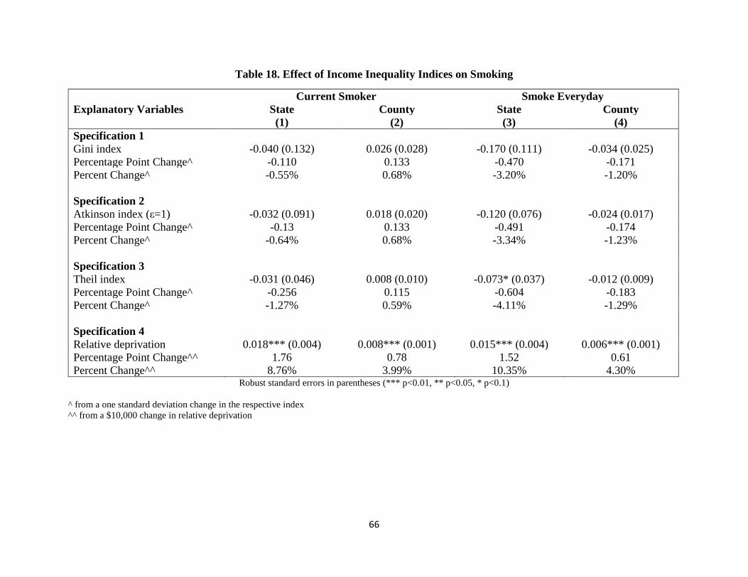
66
Table 18. Effect of Income Inequality Indices on Smoking
Current Smoker Smoke Everyday
Explanatory Variables State County State County
(1) (2) (3) (4)
Specification 1
Gini index -0.040 (0.132) 0.026 (0.028) -0.170 (0.111) -0.034 (0.025)
Percentage Point Change^ -0.110 0.133 -0.470 -0.171
Percent Change^ -0.55% 0.68% -3.20% -1.20%
Specification 2
Atkinson index (ε=1) -0.032 (0.091) 0.018 (0.020) -0.120 (0.076) -0.024 (0.017)
Percentage Point Change^ -0.13 0.133 -0.491 -0.174
Percent Change^ -0.64% 0.68% -3.34% -1.23%
Specification 3
Theil index -0.031 (0.046) 0.008 (0.010) -0.073* (0.037) -0.012 (0.009)
Percentage Point Change^ -0.256 0.115 -0.604 -0.183
Percent Change^ -1.27% 0.59% -4.11% -1.29%
Specification 4
Relative deprivation 0.018*** (0.004) 0.008*** (0.001) 0.015*** (0.004) 0.006*** (0.001)
Percentage Point Change^^ 1.76 0.78 1.52 0.61
Percent Change^^ 8.76% 3.99% 10.35% 4.30% Robust standard errors in parentheses (*** p<0.01, ** p<0.05, * p<0.1)
^ from a one standard deviation change in the respective index
^^ from a $10,000 change in relative deprivation
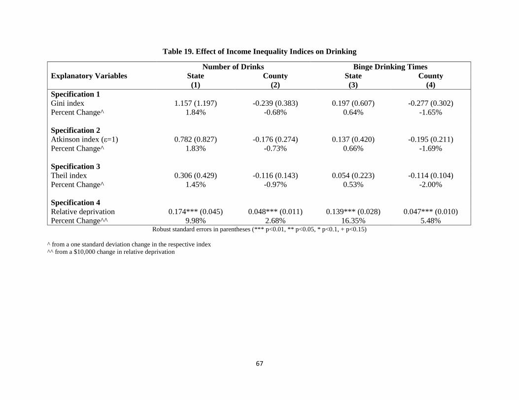
67
Table 19. Effect of Income Inequality Indices on Drinking
Number of Drinks Binge Drinking Times
Explanatory Variables State County State County
(1) (2) (3) (4)
Specification 1
Gini index 1.157 (1.197) -0.239 (0.383) 0.197 (0.607) -0.277 (0.302)
Percent Change^ 1.84% -0.68% 0.64% -1.65%
Specification 2
Atkinson index (ε=1) 0.782 (0.827) -0.176 (0.274) 0.137 (0.420) -0.195 (0.211)
Percent Change^ 1.83% -0.73% 0.66% -1.69%
Specification 3
Theil index 0.306 (0.429) -0.116 (0.143) 0.054 (0.223) -0.114 (0.104)
Percent Change^ 1.45% -0.97% 0.53% -2.00%
Specification 4
Relative deprivation 0.174*** (0.045) 0.048*** (0.011) 0.139*** (0.028) 0.047*** (0.010)
Percent Change^^ 9.98% 2.68% 16.35% 5.48% Robust standard errors in parentheses (*** p<0.01, ** p<0.05, * p<0.1, + p<0.15)
^ from a one standard deviation change in the respective index
^^ from a $10,000 change in relative deprivation

68
Table 20. Effect of Income Inequality Indices on Health Insurance and Unaffordability of Seeing Doctors
Has Health Insurance Unable to Afford Doctors
Explanatory Variables State County State County
(1) (2) (3) (4)
Specification 1
Gini index -0.386*** (0.087) -0.107*** (0.036) 0.153* (0.082) 0.015 (0.029)
Percentage Point Change^ -1.069 -0.543 0.423 0.076
Percent Change^ -1.27% -0.64% 3.09% 0.56%
Specification 2
Atkinson index (ε=1) -0.264*** (0.060) -0.076*** (0.026) 0.107* (0.058) 0.011 (0.020)
Percentage Point Change^ -1.077 -0.557 0.437 0.077
Percent Change^ -1.28% -0.66% 3.19% 0.57%
Specification 3
Theil index -0.130*** (0.033) -0.039*** (0.013) 0.058* (0.032) 0.007 (0.011)
Percentage Point Change^ -1.074 -0.583 0.478 0.105
Percent Change^ -1.28% -0.69% 3.49% 0.77%
Specification 4
Relative deprivation -0.010** (0.005) -0.011*** (0.001) 0.004 (0.003) 0.007*** (0.001)
Percentage Point Change^^ -1.00 -1.06 0.42 0.74
Percent Change^^ -1.18% -1.25% 3.03% 5.45% Robust standard errors in parentheses (*** p<0.01, ** p<0.05, * p<0.1, + p<0.15)
^ from a one standard deviation change in the respective index
^^ from a $10,000 change in relative deprivation

69
Table 21. Lagged Effect of Gini Index on Self-reported Health Status
Report "excellent" health Report "fair" or "poor" health
Explanatory Variables State County State County
(1) (2) (3) (4)
Specification 5
Gini index -0.107 (0.085) -0.023 (0.037) 0.052 (0.071) 0.035 (0.028)
Gini index lag 1 year -0.066 (0.059) -0.083** (0.034) 0.078+ (0.047) 0.067** (0.028)
Total effect of Gini index -0.172* (0.090) -0.106*** (0.039) 0.129 (0.092) 0.102*** (0.032)
Percentage Point Change^ -0.478 -0.537 0.358 0.519
Percent Change^ -2.31% -2.57% 2.19% 3.24%
Specification 6
Gini index -0.085 (0.090) -0.020 (0.037) 0.019 (0.068) 0.034 (0.028)
Gini index lag 1 year 0.010 (0.061) -0.047 (0.038) -0.005 (0.049) 0.062** (0.030)
Gini index lag 2 year -0.036 (0.089) -0.061 (0.04) 0.152* (0.086) 0.021 (0.031)
Gini index lag 3 year -0.163 (0.127) -0.021 (0.037) 0.039 (0.092) -0.016 (0.033)
Total effect of Gini index -0.273*** (0.099) -0.149*** (0.050) 0.205* (0.110) 0.101** (0.042)
Percentage Point Change^ -0.756 -0.755 0.568 0.511
Percent Change^ -3.66% -3.61% 3.47% 3.19%
Specification 7
Gini index -0.086 (0.086) -0.018 (0.037) 0.019 (0.068) 0.033 (0.028)
Gini index lag 1 year 0.003 (0.062) -0.046 (0.039) -0.005 (0.048) 0.061** (0.030)
Gini index lag 2 year -0.011 (0.096) -0.057 (0.040) 0.148+ (0.092) 0.020 (0.031)
Gini index lag 3 year -0.098 (0.116) 0.005 (0.040) 0.030 (0.081) -0.030 (0.034)
Gini index lag 4 year -0.116 (0.080) -0.023 (0.040) 0.026 (0.081) 0.048 (0.031)
Gini index lag 5 year -0.053 (0.075) -0.039 (0.025) -0.005 (0.047) -0.004 (0.022)
Total effect of Gini index -0.360*** (0.115) -0.178*** (0.058) 0.213* (0.126) 0.127** (0.051)
Percentage Point Change^ -0.998 -0.904 0.590 0.646
Percent Change^ -4.84% -4.33% 3.61% 4.04% Robust standard errors in parentheses (*** p<0.01, ** p<0.05, * p<0.1, + p<0.15)
^ from a long run one standard deviation change in the respective index

70
Table 22. Lagged Effect of Gini Index on Physically or Mentally Unhealthy Days
Physically Unhealthy Days Mentally Unhealthy Days
Explanatory Variables State County State County
(1) (2) (3) (4)
Specification 5
Gini index 0.315 (1.790) 0.282 (0.641) -3.399* (1.853) 0.901 (0.697)
Gini index lag 1 year 3.966*** (1.381) 1.393** (0.640) 6.805*** (1.806) 0.792 (0.638)
Total effect of Gini index 4.281* (2.259) 1.674** (0.667) 3.406* (1.784) 1.694** (0.740)
Percent Change^ 3.27% 2.36% 2.69% 2.45%
Specification 6
Gini index -0.136 (1.855) 0.220 (0.641) -4.208** (1.963) 0.813 (0.695)
Gini index lag 1 year 2.582* (1.408) 0.836 (0.660) 4.246** (2.112) -0.045 (0.693)
Gini index lag 2 year 2.212 (2.353) 1.243* (0.693) 3.660* (1.899) 1.761** (0.697)
Gini index lag 3 year 0.991 (1.699) -0.117 (0.676) 2.377* (1.264) 0.011 (0.703)
Total effect of Gini index 5.650** (2.538) 2.181*** (0.809) 6.075*** (2.240) 2.540*** (0.949)
Percent Change^ 4.32% 3.08% 4.81% 3.68%
Specification 7
Gini index -0.096 (1.859) 0.199 (0.646) -4.180** (1.959) 0.868 (0.696)
Gini index lag 1 year 2.785* (1.449) 0.876 (0.662) 4.397** (2.132) -0.009 (0.693)
Gini index lag 2 year 1.764 (2.267) 1.159* (0.698) 3.358* (1.760) 1.701** (0.700)
Gini index lag 3 year -0.149 (1.664) -0.205 (0.745) 1.587 (1.293) -0.533 (0.770)
Gini index lag 4 year 1.384 (1.128) 0.471 (0.685) 0.768 (1.516) 1.023 (0.734)
Gini index lag 5 year 1.827 (1.577) 0.167 (0.367) 1.519 (1.627) 0.187 (0.489)
Total effect of Gini index 7.514*** (2.776) 2.667*** (0.941) 7.450** (2.920) 3.237*** (1.063)
Percent Change^ 5.74% 3.76% 5.89% 4.69% Robust standard errors in parentheses (*** p<0.01, ** p<0.05, * p<0.1, + p<0.15)
^ from a long run one standard deviation change in the respective index

71
Table 23. Lagged Effect of Gini Index on BMI or Obesity
Body Mass Index Being Obese
Explanatory Variables State County State County
(1) (2) (3) (4)
Specification 5
Gini index 3.697** (1.774) 1.437*** (0.516) 0.203* (0.115) 0.077** (0.037)
Gini index lag 1 year 4.369*** (1.210) 1.048** (0.459) 0.299*** (0.075) 0.095*** (0.036)
Total effect of Gini index 8.066*** (2.389) 2.485*** (0.620) 0.501*** (0.146) 0.172*** (0.046)
Percentage Point Change^ - - 1.389 0.874
Percent Change^ 0.82% 0.46% 5.48% 3.45%
Specification 6
Gini index 2.747 (1.789) 1.39*** (0.512) 0.141 (0.115) 0.072* (0.037)
Gini index lag 1 year 1.612* (0.892) 0.322 (0.502) 0.113* (0.065) 0.036 (0.039)
Gini index lag 2 year 3.288*** (0.949) 0.817 (0.540) 0.199** (0.081) 0.094** (0.039)
Gini index lag 3 year 3.467*** (0.753) 1.143** (0.578) 0.262*** (0.056) 0.048 (0.041)
Total effect of Gini index 11.114*** (2.307) 3.672*** (0.745) 0.714*** (0.142) 0.250*** (0.057)
Percentage Point Change^ - - 1.977 1.267
Percent Change^ 1.13% 0.68% 7.80% 5.00%
Specification 7
Gini index 2.769 (1.826) 1.457*** (0.503) 0.142 (0.117) 0.077** (0.036)
Gini index lag 1 year 1.735* (0.931) 0.383 (0.506) 0.119* (0.066) 0.039 (0.039)
Gini index lag 2 year 2.882*** (0.980) 0.816 (0.539) 0.181*** (0.082) 0.097** (0.039)
Gini index lag 3 year 2.365*** (0.651) -0.057 (0.650) 0.212*** (0.067) -0.023 (0.045)
Gini index lag 4 year 1.798** (0.776) 1.384*** (0.516) 0.073 (0.067) 0.045 (0.039)
Gini index lag 5 year 1.134* (0.598) 0.953*** (0.359) 0.063+ (0.038) 0.090*** (0.035)
Total effect of Gini index 12.683*** (2.246) 4.936*** (0.788) 0.789*** (0.140) 0.325*** (0.063)
Percentage Point Change^ - - 2.185 1.65
Percent Change^ 1.29% 0.92% 8.61% 6.51% Robust standard errors in parentheses (*** p<0.01, ** p<0.05, * p<0.1, + p<0.15)
^ from a long run one standard deviation change in the respective index

72
Essay 3: Does More Public Health Spending Buy Better health?
1. Introduction
According to Winslow (1920) the field of public health is concerned with the prevention
of disease, prolonging life, and promoting population health through organized community
efforts. These community efforts involve sanitation, the control of communicable diseases,
health education, and the organization of medical services for the early diagnosis and preventive
treatment of disease. In the United States, public health expenditures are supported through a
variety of funding sources and financial arrangements that vary across states and communities
(Bernet (2007)).
A recent focus in the literature on public health financing is on return to investment. In
other words, does more public health spending lead to better health outcomes? As is discussed
in Mays and Smith (2011), there is little credible empirical evidence regarding the extent to
which differences in spending contribute to differences in health. A common approach taken in
the literature is to use a cross-section of data for various countries to regress spending on public
health outcomes. One issue with such an approach is the "unobservables" problem. There may
be unobservable country specific characteristics that could bias an estimate of spending on
outcomes. For example, a country with a stronger "taste" for public health may spend more and
have better outcomes than others. There may also be an important endogeneity problem inherent
in such an approach. Countries with poor public health outcomes may be compelled to spend
more on public health. Such an allocation system could potentially lead to negative estimated
effect of per capita public health spending on public health outcomes. Given these two concerns,
it may not be surprising that Mays and Smith (2011) conclude that this literature finds no

73
consistent evidence on the health impact of public health spending. Filmer and Pritchett (1999),
Rivera (2001), and Ghobarah, Huth, and Russett (2004) provide further discussion. Only a
handful of recent papers attempt to address these challenging issues, with varying degrees of
success.
In this paper, we take advantage of the unique way in which public health is funded in the
state of Georgia to provide new evidence on the relationship between public health spending and
public health outcomes. Using a twelve year panel of county-level data in Georgia, we estimate
models that include county and year fixed effects in an attempt to address the "unobservables"
problem. We are able to overcome the endogeneity problem inherent in this literature by
exploiting the fact that between 1970 and 2011 Georgia counties were allocated public health
general grant-in-aid dollars on the basis of their land value and population as measured in 1970.
As long as recent county health outcomes are not strongly tied to these 1970 county
characteristics, we can make the case that in our analysis county per capita public health
spending (as measured by per capita general grant-in-aid dollars) is exogenous to county health
outcomes. In addition, we allow for public health spending to influence health outcomes both
contemporaneously and with a lag.
We find that increases in public health spending lead to increases in mortality by several
different causes, including early deaths, heart disease deaths, and cancer deaths. We also find
that increases in such spending leads to increases in morbidity from cancer, heart disease,
diabetes, and asthma. We do not find much evidence of the longer run impacts attenuating or
amplifying the short run impact once we control for the endogeneity of lagged public health
spending. Additionally, we stratify Georgia counties by income and find that most of this
harmful impact of public health spending falls on low and middle income counties, whereas

74
there is some suggestive evidence of potential improvements associated with cancer and diabetes
in high income counties. This may imply that low and middle income counties counter increases
in public health spending with reductions in private health spending (which would be a form of
moral hazard). Another possible explanation is that high income counties are somehow better
able to harness increased public health spending to improve their health outcomes in a way that
other counties cannot.
The rest of the paper is organized as follows: section II provides a literature review and
section III some background on public health funding in Georgia. Section IV describes the
Georgia county data used in the analysis, section V describes the methods utilized in this paper,
and section VI discusses our main results. Section VII offers conclusions and policy
implications.
2. Literature Review
We restrict our attention in this review of the large literature on public health spending
impacts to the few papers that have used panel data to attempt to address the endogenous
relationship between public health spending and public health outcomes or the challenge
associated with unobserved regional characteristics correlated with public health spending or
both. We present summaries of each paper in order of increasing methodological rigor.
Erwin et al. (2012) use national data from 1993-2005 to study the impact of changes in
local health department (LHD) expenditures on a broad set of health outcomes that include both
measures of morbidity (smoking, infectious disease, and obesity prevalence) and mortality
(infant, cardiovascular, and premature deaths). The authors use state fixed effects to address the
“unobservables” problem, but do not model lagged public health spending or attempt to address
the endogeneity problem mentioned above in order to produce causal estimates. They find that

75
an increase in LHD expenditures is associated with a statistically significant decline in infectious
disease and in years of potential life lost (YPLL).
Brown (2014) estimates the causal effect of California county public health department
expenditures on all-cause mortality rates. Unlike many other papers in the previous literature, he
attempts to explicitly model the lagged effect of public health spending by adopting a Koyck
distributed lag model. In addition, he uses a Lewbel Instrumental Variables (IV) approach to
deal with the endogeneity problem mentioned above. Using data from 2001-2008, he estimates
that an extra 10 dollars per capita of public health spending decreases all-cause mortality by 9.1
deaths per 100,000 and that the long run effect of public health spending on mortality is stronger
than the short run effect. Brown et al. (2014) use the same dataset and a similar approach to
estimate the causal impact of public health spending in California on self-reported health and
find that a $10 long-term increase in per capita public health expenditures would increase the
percentage of the population reporting good, very good, or excellent health by 0.065 percentage
points.
Two other studies also use IV estimation strategies to attempt to causally estimate the
impact of public health spending. First, Rajkumar and Swaroop (2008) examine the impact of
the interaction of public health spending and governance quality on health outcomes using a
sample of 91 developed and developing countries over three years. Rajkumar and Swaroop
(2008) use as instruments dummy variables representing different degrees of “state orientation”
among each country in their sample. The authors find that OLS estimation without an index of
governance showed that a one percentage point increase in the share of public health expenditure
in a country’s GDP is associated with a 0.18 percent decline in child mortality. However, when
an index of governance is included in the model, the estimated coefficient of public health

76
spending becomes positive and statistically insignificant, thus suggesting no impact of spending.
Second, Mays and Smith (2011) use a similar dataset as used in Erwin et al. (2012) and employ
an IV estimation strategy to estimate the impact of U.S. local public health spending. Mays and
Smith (2011) use measures of local public health decision-making structures as instruments,
including whether the public health agency is governed by a local board of health with policy
making authority and whether the agency operates under the centralized administrative control of
their respective state government. They find that mortality rates fell between 1.1 percent and 6.9
percent for each 10 percent increase in local public health spending. Two other studies,
Bekemeier et al. (2014) and Grembowski et al. (2010), unsuccessfully attempt IV estimation.
To summarize, only three studies in the literature successfully use an IV approach to
estimate the causal impact of public health spending on mortality and one estimates the impact
on self-reported health status. In terms of mortality, two find that increases in public health
spending lead to mortality reductions, while the other finds a null result. The final study finds
that increases in public health spending lead to increases in self-reported health.
3. Background on Public Health Funding in Georgia
3.1 Administrative Structure Overview
The Georgia Department of Public Health (DPH) is a department of the Georgia state
government whose commissioner reports directly to the Governor. The mission of the DPH is to
prevent disease, injury and disability, promote health and wellbeing, and prepare for and respond
to disasters. Responsibility for the provision of public health is shared by the DPH and each of
the 159 Georgia counties, through their County Boards of Health. In this system with over 6,000
employees, County Boards of Health exercise local control, while district and state level
leadership, coordination and oversight ensure that statewide public health goals are met. Further

77
background is provided in the following sources: Sweeney (2009), Parker (2009), and Georgia
Office of Planning and Budget (2008).
3.2 General Grant-in-Aid Overview
General Grant-in-Aid (GGIA) funds were originally established in the late 1930s to
provide Georgia county health departments with the opportunity to address public health
priorities based on community level needs. Consequently, GGIA funds are not earmarked for
specific programs or services. In this paper we focus on the allocation of GGIA funds to
counties and how this allocation impacts county public health outcomes, such as disease-specific
mortality and morbidity rates.
The reason for the focus on GGIA funds (rather than earmarked programmatic GIA
funds) is because the allocation of GGIA funds to Georgia counties is not tied to the current
health status of the citizens of these counties. According to a program evaluation produced by
the Governor’s Office of Planning and Budget (OPB), a funding formula to allocate GGIA
dollars to individual Georgia counties was developed in 1966 and first used in 1967. This
formula is given below:
Allocation Share to County =
(Tax base share + County Population share) / Σ (Tax base share + County Population
share)
(1)
Where:
• Tax base share = (County Pop2 / Gross Digest) / (Σ County Pop2 / Σ Gross Digest)
• County Population share = (County Population / State Population)
Thus GGIA receipt was based on county population and relative wealth. This formula
was never completely successful in dealing with issues relating to population growth and

78
disparities relating to county wealth, so 1970 was the last year in which county characteristics
served as an input into this funding formula. The decision was made to freeze the proportion of
funding going to each county at the 1970 level, subject to some minor year to year modifications.
In other words, if a county had population and relative wealth such that they received
four percent of the total state allotment of GGIA dollars in 1970, then they would continue to
receive four percent in the future, regardless of any changes in county population or relative
wealth. Although the percentage of GGIA dollars going to each county remains constant, the
total number of GGIA dollars going to each county varies from year to year, depending on the
total state allotment of GGIA dollars. Table 24 lists the total state allotment of GGIA dollars for
fiscal years 2000-2011 in the first row. The funding formula was finally updated in fiscal year
2012. For this reason, our analysis does not include any post-2011 data.
4. Data
Data from each of Georgia’s 159 counties was compiled for twelve years (2000-2011)
from two main sources. Our primary data source is the Georgia Department of Community
Health’s Online Analytical Statistical Information System (OASIS). OASIS is a suite of
interactive tools used to access Georgia’s standardized health data repository. It includes
multiple county level measures of morbidity and mortality. Our second data source is the
Georgia County Guide (GCC), various annual editions. The GCC is a reference source for
researchers and policymakers in need of agricultural, economic, and demographic data for the
state. Finally unemployment rate data was taken from the Bureau of Labor Statistics (BLS)
website and other supplemental data was taken from the Area Resource File (ARF).

79
Table 24 also presents descriptive statistics for the Georgia counties in each of the twelve
years. As in Mays and Smith (2011), we selected mortality outcome measures that were
routinely collected, available at the county level, and were expected to potentially be sensitive to
public health expenditures. Several of the mortality measures show improvement between 2000
and 2011, with reductions in the number of infant deaths, early deaths, and heart disease deaths
per 1,000 residents. In addition to the mortality measures, we also analyzed a set of morbidity
measures (the number of cancer, heart disease, asthma, and diabetes cases per 1,000 residents).
We also see decreases in most of these morbidity measures over time.
The key independent variable in our analysis is the level of general grant-in-aid dollars
(measured in 2009 dollars) allocated to each county according to the funding formula described
above. Table 24 shows that the average amount allocated to a county fell from just over $14 per
person in 2000 to just under $10 per person in 2011. In order to isolate the impact of the general
grant-in-aid dollars, we also control for real per capita income at the county level, the county
unemployment rate, and the number of physicians per capita. As will be described in more detail
below, we exploit the panel nature of the data to include a full set of county and year fixed
effects. These fixed effects will control for time-invariant county-level unobserved
characteristics as well as general temporal trends over the 2000-2011 time period.
5. Methods
As discussed in Erwin et al. (2012), the literature on the impact of public health spending
on health outcomes has primarily relied on cross-sectional or pooled panel data to estimate
associations rather than a causal relationship. Equation (1) below represents such a regression
model, where y represents a typical public health outcome measured at the county-level, 𝑖 is an
index of counties, 𝑡 is an index of time periods, x represents county i public health expenditure at
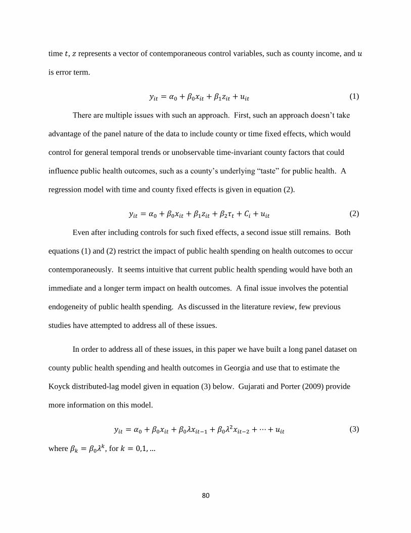
80
time 𝑡, 𝑧 represents a vector of contemporaneous control variables, such as county income, and 𝑢
is error term.
𝑦𝑖𝑡 = 𝛼0 + 𝛽0𝑥𝑖𝑡 + 𝛽1𝑧𝑖𝑡 + 𝑢𝑖𝑡 (1)
There are multiple issues with such an approach. First, such an approach doesn’t take
advantage of the panel nature of the data to include county or time fixed effects, which would
control for general temporal trends or unobservable time-invariant county factors that could
influence public health outcomes, such as a county’s underlying “taste” for public health. A
regression model with time and county fixed effects is given in equation (2).
𝑦𝑖𝑡 = 𝛼0 + 𝛽0𝑥𝑖𝑡 + 𝛽1𝑧𝑖𝑡 + 𝛽2𝜏𝑡 + 𝐶𝑖 + 𝑢𝑖𝑡 (2)
Even after including controls for such fixed effects, a second issue still remains. Both
equations (1) and (2) restrict the impact of public health spending on health outcomes to occur
contemporaneously. It seems intuitive that current public health spending would have both an
immediate and a longer term impact on health outcomes. A final issue involves the potential
endogeneity of public health spending. As discussed in the literature review, few previous
studies have attempted to address all of these issues.
In order to address all of these issues, in this paper we have built a long panel dataset on
county public health spending and health outcomes in Georgia and use that to estimate the
Koyck distributed-lag model given in equation (3) below. Gujarati and Porter (2009) provide
more information on this model.
𝑦𝑖𝑡 = 𝛼0 + 𝛽0𝑥𝑖𝑡 + 𝛽0𝜆𝑥𝑖𝑡−1 + 𝛽0𝜆2𝑥𝑖𝑡−2 +⋯+ 𝑢𝑖𝑡 (3)
where 𝛽𝑘 = 𝛽0𝜆𝑘, for 𝑘 = 0,1, …

81
Here 𝜆 denotes the change rate of the distributed lag. Public health spending would only
impact public health outcomes contemporaneously if 𝜆 = 0, which almost all of the previous
literature implicitly assumes. Brown (2014) and Brown et al. (2014) impose the assumption that
𝜆 is positive, which implies that the long run effect of public health spending always amplifies
the short run effect. We do not impose such an assumption in our analysis, as we allow for the
possibility that 𝜆 could be negative. This would imply that the long run effect of public health
spending could attenuate the short run effect.
Under what circumstances could the long run effect of public health spending attenuate
the short run effect? Suppose an increase in today’s public health spending improves today’s
health outcomes, but it also leads to the perhaps unintended consequence of crowding out future
private health care spending. This crowd out could potentially attenuate the long run effect of
this public health spending increase. One could think of this as a type of moral hazard problem
that we will discuss further below.
In order to derive the regression model we estimate in this paper, we first take equation
(3) and lag it by one period. This one period lagged model is given in equation (4).
𝑦𝑖𝑡−1 = 𝛼0 + 𝛽0𝑥𝑖𝑡−1 + 𝛽0𝜆𝑥𝑖𝑡−2 + 𝛽0𝜆2𝑥𝑖𝑡−3 +⋯+ 𝑢𝑖𝑡−1 (4)
Next we multiply (4) by 𝜆 and subtract this from (3). This gives us equation (5) below.
𝑦𝑖𝑡 = 𝛼0 + 𝛽0𝑥𝑖𝑡 + 𝜆𝑦𝑖𝑡−1 + 𝜈𝑖𝑡 (5)
where 𝛼0 = 𝛼(1 − 𝜆) , 𝜈𝑖𝑡 = 𝑢𝑖𝑡 − 𝜆𝑢𝑖𝑡−1.
Here the short-run impact of public health spending (SR) is given by 𝛽0 and, if −1 < 𝜆 <
1, the long-run impact of public health spending (LR) is given by
1
0 (where
1
0
0k
k

82
since kfork
k ,0 0, 1, …) Finally, we include a vector z of additional control variables
(county income, unemployment rate, and number of physicians per capita), a vector τ of year
fixed effects, and a vector C of county fixed effects to arrive at equation (6).
𝑦𝑖𝑡 = 𝛼0 + 𝜆𝑦𝑖𝑡−1 + 𝛽0𝑥𝑖𝑡 + 𝛽1𝑧𝑖𝑡 + 𝛽2𝜏𝑡 + 𝐶𝑖 + 𝜈𝑖𝑡 (6)
There are two sources on endogeneity that could bias estimates of this model. First, it
may be the case that public health outcomes may factor into the determination of public health
budgets in a given county. For example, a state may provide counties with the worst health
outcomes more public health dollars than counties with the best health outcomes. Second, there
is a mechanical source of endogeneity inherent in all distributed-lag models due to the
relationship between the error term and the lagged dependent variable. This can be formally
expressed as follows:
𝐶𝑂𝑉(𝑦𝑖𝑡−1, 𝜈𝑖𝑡) = 𝐶𝑂𝑉(𝑦𝑖𝑡−1, 𝑢𝑖𝑡 − 𝜆𝑢𝑖𝑡−1) = −𝜆𝜎𝑖𝑡2 ≠ 0 (7)
Brown (2014) and Brown et al. (2014) use the Lewbel instrumental variables approach to
addresses these endogeneity problems. This approach is used when standard instruments are
weak or not available (Lewbel (2012)). In our paper, we exploit the fact that Georgia counties
are allocated general grant-in-aid dollars on the basis of their land value and population from the
early 1970's. As long as current county health outcomes are not strongly tied to these county
characteristics from the early 1970's, we can make the case that in our analysis county per capita
public health spending (as measured by per capita general grant-in-aid-dollars) is exogenous to
county health outcomes. Therefore, we can use a standard two stage least squares estimation
approach, with the predicted value of a one period lag of our dependent variable serving as our
instrument. Gujarati and Porter (2009) describes how to implement two stage least squares with

83
exogenous independent variables in distributed-lag models. First, we regress ity on itx and itz
using OLS and get predicted value of ity ,it
y
. Next, we replace 1ity with 1
ity in equation (6),
giving us equation (8), which we then estimate using OLS.
𝑦𝑖𝑡 = 𝛼0 + 𝜆�̂�𝑖𝑡−1 + 𝛽0𝑥𝑖𝑡 + 𝛽1𝑧𝑖𝑡 + 𝛽2𝜏𝑡 + 𝐶𝑖 + 𝜈𝑖𝑡 (8)
where 𝐶𝑂𝑉(�̂�𝑖𝑡−1, 𝜈𝑖𝑡)=0.
In this equation we sort and cluster our data by county. Therefore, standard errors will be
robust to heteroskedasticity and serial correlation.
6. Results
We start this section with a description of our primary results in which we estimate four
different specifications. The first represents the standard cross-sectional approach taken in the
literature. Next we add county and time fixed effects, then add lagged expenditures to the
model. Finally, we employ a two stage least squares approach to address the inherent
endogeneity associated with including lagged spending in the model. Following a discussion of
these primary results, we then stratify the sample by county income to test for heterogeneous
impacts of public health spending.
6.1 Primary Results
Table 25 shows the results for four different regressions estimating the impact of public
health spending on each of ten different mortality and morbidity outcomes, using 12 years of
county level data in Georgia. The first column represents estimates of equation (1), which
mimics most of the literature in that it doesn’t include county or year fixed effects and doesn’t
allow for public health spending to have a lagged effect on health outcomes. The coefficient
estimates suggest a statistically significant and positive relationship between local public health

84
expenditures and all the health outcomes being considered. For example, this model predicts that
a $1,000 increase in contemporaneous real general grant-in-aid per capita leads to an increase of
0.009 early deaths per capita or 9 early deaths per 1,000 county residents. These results are
perhaps counter-intuitive in that we would expect more public health spending to lead to better
health outcomes. One could potentially explain this finding if Georgia allocated more public
health funding to counties with worse health outcomes, but as we discussed, Georgia has a
unique system for allocating its GGIA funds to county health departments that is arguable
independent of current health outcomes in each county.
Given that unobserved, time-invariant county characteristics or general temporal trends
could be driving this result, column (2) reports estimates of equation (2), which extends the
previous model by including county and year fixed effects. The inclusion of these fixed effects
in many cases increases the estimated impact of public health spending on our outcomes of
interest. The same $1,000 increase in contemporaneous real general grant-in-aid per capita is
now estimated to lead to an increase of 0.020 early deaths per capita or 20 early deaths per 1,000
county residents.
One potential explanation could be that some counties have a stronger “taste” for health
than others and estimates of equation (2) control for that, while estimates of equation (1) do not.
In other words, if we don’t control for a county’s taste for health, it appears as though the
hypothetical increase in public health spending leads to 9 additional early deaths per 1,000. This
is an aggregate of the “pure” negative impact of public health spending on health and the positive
impact of the county’s preference for health and general temporal trends. When we control for
county health preferences and general temporal trends in equation (2), we isolate the “pure”
impact of public health spending, which is predicted to lead to 20 early deaths per 1,000.

85
As mentioned, few previous studies allow for lagged impacts of public health spending or
attempt to address the potential endogeneity of such spending. Column (3) of table 25 addresses
the first issue by presenting the results of estimates of equation (6), which allows public health
spending to have a lagged impact. The left side of column (3) reports estimates of β0 which
gives the current or “short run” impact of public health spending, while the right side reports
estimates of λ which represents the “long run” influence of public health spending over and
above the short run impact. In general one can think of the contemporaneous effect given in
column (2) as the aggregate of the short and long run effects reported in column (3). Continuing
our discussion of early deaths, column (3) suggests that the short run impact of a $1,000 per
capita increase in public health spending leads to an additional 26 early deaths per 1,000 in the
short run. The negative estimated value of λ associated with early deaths suggests an attenuation
of this short run effect in the long run. The long run impact is estimated to be: (0.0255) / (1 - -
0.0841) = 0.02352 or 24 additional early deaths per 1,000.
While we argued above that contemporaneous public health spending in Georgia is
arguably independent of contemporaneous county health status, and thus exogenous, the
inclusion of lagged public health spending in the model presented in column (3) creates a new
endogeneity problem because 0),( 1 itit vyCOV . In other words, the stochastic explanatory
variable representing lagged spending (yit-1) is correlated with the error term (vit) in equation (6)
by definition. This implies that estimates of equation (6) reported in column (3) of table 25 are
biased since we do not address this issue in that specification.
In order to address this particular endogeneity problem, we adopt two stage least squares
(2SLS) approach as described in equation (8) and present the results in column (4) of table 25.
According to column (4), addressing the endogeneity of lagged public health spending leads to

86
short run coefficient estimates that are mostly larger in magnitude than those reported in column
(3). In addition, the estimates of λ are mostly negative and typically not statistically significant.
Thus correcting for the endogeneity of lagged spending implies the potential for some
attenuation, but in most cases no statistically significant difference between the short run and
long run impact of public health spending for many of the health outcomes we consider.
There are a few possible explanations for our perhaps somewhat counter-intuitive finding
of an adverse effect of public health spending on health outcomes. First, an increase in public
health spending could lead to a moral hazard effect in which private health spending is crowded
out. Such crowd out could potentially lead to reductions in health status. As a somewhat related
example, Dave and Kaestner (2009) investigate the ex-ante moral hazard effect of gaining
Medicare coverage and estimate that Medicare coverage leads to reductions in exercise and
increases in smoking and drinking among the elderly. Second, as found in Rajkumar and
Swaroop (2008), inefficient administration of public health dollars could also lead to a failure to
improve health. Our results suggest the potential for a negative impact of public health funding.
Even though the unique institutional structure regarding the allocation of GGIA in
Georgia mitigates concerns about reverse causality, we also employ the Lewbel IV approach
with our data as a robustness check. Our motivation for this approach comes from Brown (2014)
and Brown et al. (2014), two papers interested in estimating the causal impact of county public
health expenditures in California. As mentioned, these papers employ the Lewbel (2012) IV
approach because reverse causality is a major issue in any analysis of California public health
spending, as counties with worse health outcomes are explicitly allocated more public health
funding. In our case, if reverse causality was driving our results, we would expect the Lewbel IV
coefficient estimates to differ widely from our 2SLS coefficient estimates. In fact, they are quite

87
similar (results available upon request). This gives us additional confidence that our results are
not being driven by reverse causality.
6.2 Stratification by County Income
In order to investigate whether or not public health spending has differential impacts on
counties with different income levels, we follow Bekemeier et al. (2014) and classify Georgia
counties into three categories based on income. Low income counties represent those with the
lowest 20 percent of county income and high income counties represent those with the highest 20
percent of county income. Middle income counties represent all others. Table 26 gives the
stratified results based on equation (8), using two stage least squares to account for the
endogeneity of lagged public health spending.
One of the key results presented in table 26 is that the adverse short run impact of public
health spending on health outcomes we previously estimated for all counties is actually
concentrated on low and middle income counties. For example, column (4) of table 25 suggests
that the short run impact of a $1,000 increase in contemporaneous public health spending per
capita leads to an increase in cancer deaths by 0.0752 per capita, or 75 cancer deaths per 1,000
county residents. When we stratify by income in table 3, we see that this is a weighted average
of an increase of 3 cancer deaths per 1,000 residents in low income counties (column (1)), an
increase of 101 cancer deaths per 1,000 residents in middle income counties (column (2)), and a
decrease of 4 cancer deaths per 1,000 residents in high income counties (column (3)). Note that
the estimates for low income counties and high income counties are not statistically significant,
so that in this case the effect is concentrated on middle income counties.
A second key result is that the handful of negative short run coefficient estimates among
the high income counties fits more neatly with the conventional wisdom that increases in public
88
health spending lead to improvements in health, though these coefficient estimates are not
statistically significant, though this could be due in part to sample size limitations. This is true
for cancer and diabetes deaths per capita, as well as diabetes cases per capita. Finally, as in table
2, we don’t see much of a differential long run effect when we stratify by county income.
7. Conclusion
This paper contributes to the literature on the health impacts of public health spending by
combining the unique way in which general grant-in-aid dollars are allocated to county health
departments in Georgia with an empirical strategy that addresses important modeling issues
ignored in most of the previous literature. As mentioned, only three previous studies have
successfully used an instrumental variables approach to estimate the causal impact of public
health spending on mortality. One uses data from California (Brown (2014)), another from all
U.S. states (Mays and Smith (2011)), and the third is a cross-country comparison (Rajkumar and
Swaroop (2008)).
We find that increases in public health spending lead to increases in mortality by several
different causes, including early deaths, heart disease deaths, and cancer deaths. We also find
that increases in such spending leads to increases in morbidity associated with cancer, heart
disease, diabetes, and asthma. Though we allow for differences between the short run and the
long run impact of such spending, we do not find much evidence of the longer run impacts
attenuating or amplifying the short run impact once we control for the endogeneity of lagged
public health spending.
In an initial attempt at uncovering the mechanisms that drive these results, we stratify
Georgia counties by income and find that most of this negative impact of public health spending
falls on low and middle income counties, whereas there is some suggestive evidence of potential

89
positive impacts associated with cancer and diabetes in high income counties. This may imply
that low and middle income counties counter increases in public health spending with reductions
in private health spending (which would be a form of moral hazard). Another possible
explanation is that high income counties are somehow better able to harness increased public
health spending to improve their health outcomes in a way that other counties cannot.
Given the unique way in which general grant-in-aid dollars are allocated to county health
departments in Georgia, we are not concerned that our results are being caused by counties with
worse health outcomes getting more general grant-in-aid dollars. It is rare to find a naturally
occurring situation in which current public health dollars are allocated through a mechanism that
is plausibly independent of current health outcomes. That being said, the benefit that comes
from exploiting this unique situation comes at the potential cost of external validity. For
example, we would not necessarily expect the same results from public health funding streams
that were earmarked for specific services (i.e. programmatic grant-in-aid), such as HIV
prevention. This suggests the need for more rigorous studies of the impact of public health
spending that use data on different types of public health funding mechanisms (such as
programmatic grant-in-aid) from other data sources and / or other states. In addition, more work
needs to better understand the mechanisms or pathways through which public health spending
impacts health outcomes. The fact that our impact estimates conflict with some of the previous
literature highlights the need for these additional studies. A final avenue for future research
would be to attempt to measure health outcomes at a finer level of geography than at county
level, which may mask important within-county heterogeneity in health outcomes. The OASIS
website documents any measurement issues associated with their mortality and morbidity counts
on their website: https://oasis.state.ga.us/oasis/oasis/help/DischargeDataReportingIssues.html.

90
Table 24: Descriptive Statistics for Georgia Counties
2000 2001 2002 2003 2004 2005 2006 2007 2008 2009 2010 2011
Georgia General Grant-in-Aid
Nominal Dollars 2000-2011 (in
millions):
70 74 74 71 67 64 64 66 72 80 61 66
Health Outcomes - Mortality:
# infant deaths per 1,000 0.14 0.14 0.13 0.14 0.14 0.14 0.14 0.12 0.12 0.11 0.09 0.09
# early deaths (age <= 44) per 1,000 0.79 0.80 0.81 0.82 0.78 0.72 0.71 0.90 0.80 0.78 0.72 0.69
# heart disease deaths per 1,000 n/a 2.74 2.76 2.66 2.54 2.42 2.37 2.32 n/a n/a n/a n/a
# cancer deaths per 1,000 2.04 2.02 2.06 2.08 2.05 2.01 1.93 2.02 1.98 2.03 1.95 2.04
# diabetes deaths per 1000 0.26 0.23 0.24 0.27 0.26 0.28 0.24 0.24 0.24 0.24 0.27 0.32
# asthma deaths per 1,000 0.02 0.02 0.02 0.02 0.02 0.01 0.01 0.01 0.01 0.01 0.02 0.01
Health Outcomes - Morbidity:
# cancer cases per 1,000 2.75 3.03 2.98 2.90 2.90 2.81 2.84 2.84 2.82 2.69 2.53 2.55
# heart disease cases per 1,000 15.18 16.39 16.34 16.12 16.18 15.84 15.54 15.21 14.88 13.99 13.84 13.50
# diabetic cases per 1,000 1.55 1.69 1.69 1.69 1.73 1.68 1.68 1.65 1.63 1.62 1.63 1.67
# asthma cases per 1,000 1.33 1.58 1.69 1.70 1.56 1.73 1.46 1.39 1.33 1.36 1.26 1.14
Explanatory Variables:
General Grant-in-Aid PC (real 2009$) 14.37 14.70 14.37 13.41 12.18 11.23 10.81 10.63 11.29 12.40 9.34 9.92
Income PC (real 2009$, unit:1,000$) 26.31 26.60 26.33 26.37 26.47 26.73 26.88 27.02 28.77 28.58 28.10 28.78
County Unemployment Rate (%) 4.23 4.85 5.24 5.11 5.07 5.53 4.91 5.12 6.94 10.65 11.10 10.82
# MDs per 1,000 1.10 1.11 1.13 1.15 1.16 1.17 1.19 1.17 1.17 1.16 1.15 1.15 Notes: Counts of infant deaths, early deaths, cancer deaths, diabetes deaths, and asthma deaths come from OASIS, the Online Analytical Statistical Information
System (http://oasis.state.ga.us/index.asp). Counts of cancer, heart disease, diabetes, and asthma cases come from OASIS as well. Counts of heart disease deaths
and county income come from the Georgia County Guide (http://www.georgiastats.uga.edu/oldsets.html). General grant-in-aid dollars come from author
calculations based on total general grant-in-aid dollars allocated in each year by the state from the Georgia Department of Community Health (Georgia Office of
Planning and Budget (2008)). The county unemployment rate data comes from the Bureau of Labor Statistics (http://www.bls.gov/). The number of physicians
in each county comes from the Area Resource File (http://arf.hrsa.gov/).

91
Table 25: Regressions of OLS, OLS with FE, OLS with FE and lags, and 2SLS
Impact of an extra
$1,000 GGIA PC on:
(1) OLS (2) OLS w FE (3) OLS with FE and lags (4) Two Stage Least Squares
β0
(s.e.)
β0
(s.e.)
β0 λ β0 λ
(s.e.) (s.e.) (s.e.) (s.e.)
infant deaths PC 0.0025*** 0.0054** 0.0066** -0.1255*** 0.0070* -0.2050
(0.0003) (0.0024) (0.0028) (0.0344) (0.0039) (0.6888)
early deaths PC 0.0085*** 0.0196*** 0.0255*** -0.0841*** 0.0305*** -0.3396
(0.0009) (0.0049) (0.0050) (0.0197) (0.0067) (0.4022)
heart disease deaths PC 0.0499*** 0.1202*** 0.1441*** -0.1138*** 0.1511*** -0.5670***
(0.0035) (0.0164) (0.0198) (0.0275) (0.0140) (0.1427)
cancer deaths PC 0.0400*** 0.0458*** 0.0549*** -0.0273 0.0752*** -0.7262
(0.002) (0.0144) (0.0172) (0.0377) (0.0243) (0.4404)
diabetes deaths PC 0.0080*** 0.0067 0.0044 -0.0783 0.0053 -0.1025
(0.0006) (0.0064) (0.0067) (0.0605) (0.0058) (0.3318)
asthma deaths PC 0.0011*** -0.00006 0.0002 -0.0994*** -0.00001 -0.6795
(0.0001) (0.0012) (0.0013) (0.0323) (0.0012) (0.4661)
cancer PC 0.0235*** 0.0464*** 0.0618*** 0.0274 0.0697*** -0.3129
(0.0029) (0.0114) (0.0112) (0.0323) (0.0188) (0.5196)
heart disease PC 0.0837*** 0.3096*** 0.3178*** 0.3649*** 0.3709*** -0.1005
(0.0174) (0.1006) (0.0562) (0.0375) (0.0719) (0.2223)
diabetes PC 0.0254*** 0.0261 0.0308* 0.1823*** 0.0366** -0.4525
(0.0022) (0.0178) (0.0164) (0.0531) (0.0181) (0.4385)
asthma PC 0.0134*** 0.0497*** 0.0527*** 0.2224*** 0.0484*** 0.3083
(0.0029) (0.0153) (0.0160) (0.0377) (0.0179) (0.2236)
county FE No Yes Yes Yes
Year FE No Yes Yes Yes
lags No No Yes Yes
IV No No No Yes
Notes: The data used in this analysis come from Georgia's 159 counties from 2000 to 2011 (N=159, T=12). Standard errors, clustered by county, are in
parentheses. Income per capita, number of medical doctors per 1,000, and unemployment rates are included in each model. The impact of an extra $1,000 GGIA
PC on health outcomes are estimated and dollar figures are adjusted for inflation and expressed in constant 2009 dollars.
*** represents statistical significance at the 1% level.
** represents statistical significance at the 5% level.
* represents statistical significance at the 10% level.

92
Table 26: Two Stage Least Squares Regressions Stratified by Income
Two Stage Least Squares
Low Income Counties Middle Income Counties High Income Counties
β0 λ β0 λ β0 λ
(s.e.) (s.e.) (s.e.) (s.e.) (s.e.) (s.e.)
infant deaths PC 0.0091 -1.0077 0.0055 -0.2457 0.0082 0.3592
(0.0085) (1.5672) (0.0056) (1.0734) (0.0052) (0.8008)
early deaths PC 0.0318* 0.1576 0.0271*** -0.4747 0.0236 -0.3007
(0.0159) (0.6805) (0.0099) (0.4385) (0.0216) (0.6887)
heart disease deaths PC 0.0974** -0.4869 0.1494*** -0.6822*** 0.0124 0.2502
(0.0431) (0.5061) (0.0119) (0.1312) (0.0530) (0.3955)
cancer deaths PC 0.0025 0.4862 0.1010*** -0.7760** -0.0038 0.1352
(0.0378) (0.5777) (0.0288) (0.3336) (0.0418) (0.6171)
diabetes deaths PC 0.0082 0.1934 0.0039 0.1225 -0.0013 -0.7305*
(0.0132) (0.6934) (0.0075) (0.4244) (0.0086) (0.3912)
asthma deaths PC 0.0040** -0.1410 -0.0021 -1.1814 0.0055 2.1235
(0.0017) (0.2617) (0.0023) (1.0341) (0.0044) (7.7954)
cancer PC 0.0280 1.0220** 0.0872*** -0.9716** 0.1163** -0.9670*
(0.0566) (0.4907) (0.0220) (0.4561) (0.0522) (0.5426)
heart disease PC 0.2642* 0.4021** 0.3503*** -0.2647 0.0638 0.2429
(0.1464) (0.1632) (0.1097) (0.1802) (0.1506) (0.4795)
diabetes PC 0.0729** -0.3388 0.0326 -0.3074 -0.0003 0.0963
(0.0362) (0.5112) (0.0213) (0.3219) (0.0288) (0.5536)
asthma PC 0.0264 1.1934* 0.0409** 0.1797 0.0066 0.4008
(0.0553) (0.6742) (0.0171) (0.2366) (0.0358) (1.0910)
Notes: The data used in this analysis come from Georgia's 159 counties from 2000 to 2011 (N=159, T=12). Standard errors, clustered by county, are in
parentheses. Income per capita, number of medical doctors per 1,000, and unemployment rates are included in each model. The impact of an extra $1,000 GGIA
PC on health outcomes are estimated and dollar figures are adjusted for inflation and expressed in constant 2009 dollars. All specifications in this table include
county and year fixed effects as well as lagged values of public health spending.
*** represents statistical significance at the 1% level.
** represents statistical significance at the 5% level.
* represents statistical significance at the 10% level.

93
Appendix A: Additional Tables and Figures for Essay 1
Table 27. Impact of changes in house prices on health status of homeowners
in a specification controlling for individual income
Health Outcomes Predicted effect
(1 unit change in
FMHPI)
Percent change
(1 unit change in
FMHPI)
Percent change
(1% change in
FMHPI)
Self-reported health (OProbit)
Excellent -0.000051 (0.000054) -0.0219% -0.0313%
Very good -0.000018 (0.000019) -0.0050% -0.0072%
Good 0.000037 (0.000039) 0.0133% 0.0189%
Fair 0.000024 (0.000025) 0.0252% 0.0359%
Poor 0.000009 (0.000009) 0.0261% 0.0373%
# Physically Unhealthy Days (NB) -0.001116 (0.001263) -0.0343% -0.0490%
# Mentally Unhealthy Days (NB) -0.001887* (0.000985) -0.0628% -0.0897%
BMI (OLS) 0.000687 (0.000810) 0.0025% 0.0036%
Obese (Probit) 0.000074 (0.000073) 0.0300% 0.0428%
Abbreviations: OProbit, ordered probit; NB, negative binomial; OLS, ordinary least squares; Probit, binary probit;
# Physically (Mentally) Unhealthy Days, number of physically (mentally) unhealthy days during the past 30 days;
BMI, body mass index.
Note: Standard errors, clustered by MSA, are in parenthesis.
*** represents statistical significance at the 1% level.
** represents statistical significance at the 5% level.
* represents statistical significance at the 10% level.
Table 28. Impact of changes in house prices on health status of tenants
in a specification controlling for individual income
Health Outcomes Predicted effect
(1 unit change in
FMHPI)
Percent change
(1 unit change in
FMHPI)
Percent change
(1% change in
FMHPI)
Self-reported health (OProbit)
Excellent -0.000147* (0.000078) -0.0776% -0.1140%
Very good -0.000092* (0.000049) -0.0325% -0.0477%
Good 0.000088* (0.000047) 0.0265% 0.0390%
Fair 0.000114* (0.000062) 0.0752% 0.1104%
Poor 0.000037** (0.000019) 0.0840% 0.1234%
# Physically Unhealthy Days (NB) 0.000358 (0.002071) 0.0096% 0.0142%
# Mentally Unhealthy Days (NB) 0.006770** (0.002950) 0.1472% 0.2162%
BMI (OLS) -0.002892 (0.002276) -0.0106% -0.0156%
Obese (Probit) 0.000066 (0.000092) 0.0255% 0.0375%
Abbreviations: OProbit, ordered probit; NB, negative binomial; OLS, ordinary least squares; Probit, binary probit;
# Physically (Mentally) Unhealthy Days, number of physically (mentally) unhealthy days during the past 30 days;
BMI, body mass index.
Note: Standard errors, clustered by MSA, are in parenthesis.
*** represents statistical significance at the 1% level.
** represents statistical significance at the 5% level.
* represents statistical significance at the 10% level.

94
Table 29. Impact of changes in house prices on health status of high income homeowners
Health Outcomes Predicted effect
(1 unit change in
FMHPI)
Percent change
(1 unit change in
FMHPI)
Percent change
(1% change in
FMHPI)
Self-reported health (OProbit)
Excellent -0.000050 (0.000102) -0.0168% -0.0240%
Very good -0.000000 (0.000000) -0.0000% -0.0000%
Good 0.000034 (0.000070) 0.0144% 0.0206%
Fair 0.000013 (0.000026) 0.0261% 0.0373%
Poor 0.000004 (0.000007) 0.0356% 0.0508%
# Physically Unhealthy Days (NB) 0.000006 (0.000859) 0.0003% 0.0004%
# Mentally Unhealthy Days (NB) -0.000354 (0.001275) -0.0150% -0.0215%
BMI (OLS) -0.000021 (0.001168) -0.0001% -0.0001%
Obese (Probit) -0.000001 (0.000099) -0.0005% -0.0006%
Abbreviations: OProbit, ordered probit; NB, negative binomial; OLS, ordinary least squares; Probit, binary probit;
# Physically (Mentally) Unhealthy Days, number of physically (mentally) unhealthy days during the past 30 days;
BMI, body mass index.
Note: Standard errors, clustered by MSA, are in parenthesis.
*** represents statistical significance at the 1% level.
** represents statistical significance at the 5% level.
* represents statistical significance at the 10% level.
Table 30. Impact of changes in house prices on health status of low income homeowners
Health Outcomes Predicted effect
(1 unit change in
FMHPI)
Percent change
(1 unit change in
FMHPI)
Percent change
(1% change in
FMHPI)
Self-reported health (OProbit)
Excellent -0.000033 (0.000059) -0.0210% -0.0300%
Very good -0.000026 (0.000046) -0.0085% -0.0122%
Good 0.000018 (0.000033) 0.0055% 0.0078%
Fair 0.000026 (0.000046) 0.0175% 0.0250%
Poor 0.000015 (0.000027) 0.0244% 0.0349%
# Physically Unhealthy Days (NB) -0.002022 (0.002504) -0.0442% -0.0630%
# Mentally Unhealthy Days (NB) -0.004453** (0.001782) -0.1183% -0.1687%
BMI (OLS) 0.001384 (0.001125) 0.0050% 0.0071%
Obese (Probit) 0.000147* (0.000075) 0.0528% 0.0754%
Abbreviations: OProbit, ordered probit; NB, negative binomial; OLS, ordinary least squares; Probit, binary probit;
# Physically (Mentally) Unhealthy Days, number of physically (mentally) unhealthy days during the past 30 days;
BMI, body mass index.
Note: Standard errors, clustered by MSA, are in parenthesis.
*** represents statistical significance at the 1% level.
** represents statistical significance at the 5% level.
* represents statistical significance at the 10% level.

95
Table 31. Impact of changes in house prices on health status of high income tenants
Health Outcomes Predicted effect
(1 unit change in
FMHPI)
Percent change
(1 unit change in
FMHPI)
Percent change
(1% change in
FMHPI)
Self-reported health (OProbit)
Excellent 0.000081 (0.000282) 0.0253% 0.0375%
Very good -0.000006 (0.000020) -0.0015% -0.0022%
Good -0.000054 (0.000188) -0.0242% -0.0359%
Fair -0.000018 (0.000062) -0.0409% -0.0606%
Poor -0.000003 (0.000012) -0.0418% -0.0621%
# Physically Unhealthy Days (NB) 0.002514 (0.002807) 0.1376% 0.2041%
# Mentally Unhealthy Days (NB) 0.005970 (0.005115) 0.2059% 0.3055%
BMI (OLS) -0.000009 (0.003634) -0.0000% -0.0001%
Obese (Probit) 0.000272 (0.000311) 0.1493% 0.2215%
Abbreviations: OProbit, ordered probit; NB, negative binomial; OLS, ordinary least squares; Probit, binary probit;
# Physically (Mentally) Unhealthy Days, number of physically (mentally) unhealthy days during the past 30 days;
BMI, body mass index.
Note: Standard errors, clustered by MSA, are in parenthesis.
*** represents statistical significance at the 1% level.
** represents statistical significance at the 5% level.
* represents statistical significance at the 10% level.
Table 32. Impact of changes in house prices on health status of low income tenants
Health Outcomes Predicted effect
(1 unit change in
FMHPI)
Percent change
(1 unit change in
FMHPI)
Percent change
(1% change in
FMHPI)
Self-reported health (OProbit)
Excellent -0.000199** (0.000079) -0.1154% -0.1693%
Very good -0.000135** (0.000053) -0.0504% -0.0739%
Good 0.000101** (0.000040) 0.0292% 0.0429%
Fair 0.000169** (0.000069) 0.1021% 0.1497%
Poor 0.000064*** (0.000024) 0.1312% 0.1924%
# Physically Unhealthy Days (NB) 0.001132 (0.002843) 0.0286% 0.0419%
# Mentally Unhealthy Days (NB) 0.007806** (0.003521) 0.1619% 0.2375%
BMI (OLS) -0.003071 (0.002604) -0.0112% -0.0164%
Obese (Probit) 0.000044 (0.000109) 0.0164% 0.0240%
Abbreviations: OProbit, ordered probit; NB, negative binomial; OLS, ordinary least squares; Probit, binary probit;
# Physically (Mentally) Unhealthy Days, number of physically (mentally) unhealthy days during the past 30 days;
BMI, body mass index.
Note: Standard errors, clustered by MSA, are in parenthesis.
*** represents statistical significance at the 1% level.
** represents statistical significance at the 5% level.
* represents statistical significance at the 10% level.

96
Table 33. Impact of changes in house prices on lifestyle behaviors of low income tenants
Lifestyles Predicted effect
(1 unit change in
FMHPI)
Percent change
(1 unit change in
FMHPI)
Percent change
(1% change in
FMHPI)
Exercise (Probit)
Any exercise -0.000615*** (0.000210) -0.0868% -0.1272%
Moderate Exercise -0.000367** (0.000176) -0.0443% -0.0650%
Vigorous Exercise -0.000269 (0.000227) -0.0614% -0.0901%
Smoking (Probit)
Current Smoker 0.000360*** (0.000127) 0.1415% 0.2075%
Smoke Everyday -0.000123 (0.000224) -0.0181% -0.0265%
Drinking
# Average Drinks (OLS) 0.005632*** (0.002118) 0.1792% 0.2628%
# Times Binge Drinking (OLS) 0.001996 (0.001457) 0.1215% 0.1782%
Binge drinking (Probit) 0.000211* (0.000120) 0.1092% 0.1601%
Other Risky Behaviors
Health Insurance (Probit) -0.000556*** (0.000123) -0.0826% -0.1212%
Flu Shot (Probit) -0.000037 (0.000172) -0.0152% -0.0222%
Always Seatbelt (Probit) -0.000142 (0.000120) -0.0169% -0.0248%
# Times Drunken Driving (OLS) 0.000106 (0.000384) 0.0567% 0.0831%
Doctor Unaffordability (Probit) 0.000352** (0.000152) 0.1305% 0.1914%
Abbreviations: Probit, binary probit; OLS, ordinary least squares; Any exercise, any exercise in the past 30 days;
Moderate (Vigorous) Exercise, any moderate (vigorous) physical activity for more than 10 minutes in a week; #
Average Drinks, number of drinks on average on the days of drink; # Times Binge Drinking, number of times of binge
drinking in the past 30 days; Doctor Unaffordability, inability to afford seeing a doctor in the past 12 months.
Note: Standard errors, clustered by MSA, are in parenthesis.
*** represents statistical significance at the 1% level.
** represents statistical significance at the 5% level.
* represents statistical significance at the 10% level.

97
Table 34. Long-term impact of changes in house prices on health status of homeowners and tenants
Health Outcomes Homeowners Tenants
Contemporaneous 36 months Contemporaneous 36 months
Predicted effect
(1 unit change
in FMHPI)
Percent change
(1% change in
FMHPI)
Predicted effect
(1 unit change
in FMHPI)
Percent change
(1% change in
FMHPI)
Predicted effect
(1 unit change
in FMHPI)
Percent change
(1% change in
FMHPI)
Predicted effect
(1 unit change
in FMHPI)
Percent change
(1% change in
FMHPI)
Self-reported health (OProbit)
Excellent -0.000058
(0.000056)
-0.0356% -0.000232**
(0.000096)
-0.1424% -0.000147*
(0.000077)
-0.1140% -0.000083
(0.000179)
-0.0644%
Very good -0.000019
(0.000019)
-0.0076% -0.000081**
(0.000034)
-0.0324% -0.000088*
(0.000046)
-0.0456% -0.000051
(0.000110)
-0.0264%
Good 0.000040
(0.000039)
0.0205% 0.000161**
(0.000067)
0.0825% 0.000085*
(0.000044)
0.0376% 0.000047
(0.000101)
0.0208%
Fair 0.000026
(0.000026)
0.0389% 0.000108**
(0.000045)
0.1616% 0.000111*
(0.000059)
0.1075% 0.000065
(0.000138)
0.0630%
Poor 0.000011
(0.000010)
0.0456% 0.000044**
(0.000018)
0.1824% 0.000039**
(0.000020)
0.1301% 0.000023
(0.000050)
0.0767%
# Physically Unhealthy Days
(NB)
-0.000943
(0.001275)
-0.0414% 0.003707
(0.002303)
0.1627% 0.001065
(0.002193)
0.0421% -0.005291
(0.004909)
-0.2092%
# Mentally Unhealthy Days
(NB)
-0.002234**
(0.000950)
-0.1062% 0.000557
(0.002085)
0.0265% 0.007098**
(0.003046)
0.2267% 0.001549
(0.008808)
0.0495%
BMI (OLS) 0.000812
(0.000800)
0.0043% 0.001629
(0.001350)
0.0086% -0.002591
(0.002368)
-0.0140% -0.000051
(0.003312)
-0.0003%
Obese (Probit) 0.000080
(0.000072)
0.0463% 0.000125
(0.000089)
0.0723% 0.000066
(0.000092)
0.0375% -0.000048
(0.000245)
-0.0273%
Obese (Probit) – 24 months
0.000198**
(0.000095)
0.1146% 0.000031
(0.000182)
0.0176%
Abbreviations: OProbit, ordered probit; NB, negative binomial; OLS, ordinary least squares; Probit, binary probit; # Physically (Mentally) Unhealthy Days, number of physically
(mentally) unhealthy days during the past 30 days; BMI, body mass index.
Note: Standard errors, clustered by MSA, are in parenthesis.
*** represents statistical significance at the 1% level.
** represents statistical significance at the 5% level.
* represents statistical significance at the 10% level.

98
Table 35. Impact of changes in house prices on health status of homeowners
based on a specification adding MSA-specific linear time trends
Health Outcomes Predicted effect
(1 unit change in
FMHPI)
Percent change
(1 unit change in
FMHPI)
Percent change
(1% change in
FMHPI)
Self-reported health (OProbit)
Excellent -0.000040 (0.000081) -0.0172% -0.0246%
Very good -0.000013 (0.000027) -0.0036% -0.0052%
Good 0.000027 (0.000056) 0.0097% 0.0138%
Fair 0.000018 (0.000037) 0.0189% 0.0269%
Poor 0.000007 (0.000015) 0.0203% 0.0290%
# Physically Unhealthy Days (NB) -0.001487 (0.001295) -0.0457% -0.0653%
# Mentally Unhealthy Days (NB) -0.002588** (0.001059) -0.0862% -0.1230%
BMI (OLS) 0.000756 (0.008709) 0.0028% 0.0040%
Obese (Probit) 0.000095 (0.000079) 0.0385% 0.0549%
Abbreviations: OProbit, ordered probit; NB, negative binomial; OLS, ordinary least squares; Probit, binary probit;
# Physically (Mentally) Unhealthy Days, number of physically (mentally) unhealthy days during the past 30 days;
BMI, body mass index.
Note: Standard errors, clustered by MSA, are in parenthesis.
*** represents statistical significance at the 1% level.
** represents statistical significance at the 5% level.
* represents statistical significance at the 10% level.
Table 36. Impact of changes in house prices on health status of tenants
based on a specification adding MSA-specific linear time trends
Health Outcomes Predicted effect
(1 unit change in
FMHPI)
Percent change
(1 unit change in
FMHPI)
Percent change
(1% change in
FMHPI)
Self-reported health (OProbit)
Excellent -0.000193** (0.000096) -0.1019% -0.1497%
Very good -0.000116** (0.000058) -0.0409% -0.0601%
Good 0.000111** (0.000055) 0.0335% 0.0492%
Fair 0.000146* (0.000075) 0.0963% 0.1414%
Poor 0.000051** (0.000024) 0.1158% 0.1701%
# Physically Unhealthy Days (NB) 0.000997 (0.001721) 0.0268% 0.0394%
# Mentally Unhealthy Days (NB) 0.007073** (0.003474) 0.1538% 0.2259%
BMI (OLS) -0.003525 (0.002468) -0.0129% -0.0190%
Obese (Probit) 0.000073 (0.000086) 0.0282% 0.0415%
Abbreviations: OProbit, ordered probit; NB, negative binomial; OLS, ordinary least squares; Probit, binary probit;
# Physically (Mentally) Unhealthy Days, number of physically (mentally) unhealthy days during the past 30 days;
BMI, body mass index.
Note: Standard errors, clustered by MSA, are in parenthesis.
*** represents statistical significance at the 1% level.
** represents statistical significance at the 5% level.
* represents statistical significance at the 10% level.

99
Table 37. Impact of changes in house prices on health status of homeowners
based on 75:25 ratio of homeownership indicator
Health Outcomes Predicted effect
(1 unit change in
FMHPI)
Percent change
(1 unit change in
FMHPI)
Percent change
(1% change in
FMHPI)
Self-reported health (OProbit)
Excellent -0.000054 (0.000053) -0.0235% -0.0336%
Very good -0.000019 (0.000019) -0.0053% -0.0076%
Good 0.000037 (0.000037) 0.0132% 0.0188%
Fair 0.000025 (0.000025) 0.0255% 0.0364%
Poor 0.000010 (0.000010) 0.0284% 0.0406%
# Physically Unhealthy Days (NB) -0.000747 (0.001174) -0.0227% -0.0325%
# Mentally Unhealthy Days (NB) -0.002554*** (0.000927) -0.0827% -0.1183%
BMI (OLS) 0.000612 (0.000765) 0.0022% 0.0032%
Obese (Probit) 0.000091 (0.000065) 0.0367% 0.0525%
Abbreviations: OProbit, ordered probit; NB, negative binomial; OLS, ordinary least squares; Probit, binary probit;
# Physically (Mentally) Unhealthy Days, number of physically (mentally) unhealthy days during the past 30 days;
BMI, body mass index.
Note: Standard errors, clustered by MSA, are in parenthesis.
*** represents statistical significance at the 1% level.
** represents statistical significance at the 5% level.
* represents statistical significance at the 10% level.
Table 38. Impact of changes in house prices on health status of tenants
based on 75:25 ratio of homeownership indicator
Health Outcomes Predicted effect
(1 unit change in
FMHPI)
Percent change
(1 unit change in
FMHPI)
Percent change
(1% change in
FMHPI)
Self-reported health (OProbit)
Excellent -0.000191* (0.000098) -0.1018% -0.1493%
Very good -0.000116* (0.000060) -0.0415% -0.0609%
Good 0.000109* (0.000056) 0.0325% 0.0478%
Fair 0.000148* (0.000078) 0.0958% 0.1406%
Poor 0.000050** (0.000024) 0.1152% 0.1690%
# Physically Unhealthy Days (NB) 0.000749 (0.002348) 0.0203% 0.0298%
# Mentally Unhealthy Days (NB) 0.009715*** (0.003312) 0.2084% 0.3058%
BMI (OLS) -0.002749 (0.003089) -0.0101% -0.0148%
Obese (Probit) 0.000042 (0.000132) 0.0163% 0.0239%
Abbreviations: OProbit, ordered probit; NB, negative binomial; OLS, ordinary least squares; Probit, binary probit;
# Physically (Mentally) Unhealthy Days, number of physically (mentally) unhealthy days during the past 30 days;
BMI, body mass index.
Note: Standard errors, clustered by MSA, are in parenthesis.
*** represents statistical significance at the 1% level.
** represents statistical significance at the 5% level.
* represents statistical significance at the 10% level.

100
Table 39. Impact of changes in house prices on health status of homeowners
based on 65:35 ratio of homeownership indicator
Health Outcomes Predicted effect
(1 unit change in
FMHPI)
Percent change
(1 unit change in
FMHPI)
Percent change
(1% change in
FMHPI)
Self-reported health (OProbit)
Excellent -0.000044 (0.000066) -0.0187% -0.0266%
Very good -0.000014 (0.000021) -0.0039% -0.0055%
Good 0.000031 (0.000046) 0.0112% 0.0160%
Fair 0.000020 (0.000029) 0.0216% 0.0307%
Poor 0.000008 (0.000012) 0.0241% 0.0343%
# Physically Unhealthy Days (NB) -0.001504 (0.001295) -0.0472% -0.0671%
# Mentally Unhealthy Days (NB) -0.002244** (0.000931) -0.0770% -0.1096%
BMI (OLS) 0.000357 (0.000853) 0.0013% 0.0019%
Obese (Probit) 0.000072 (0.000074) 0.0293% 0.0417%
Abbreviations: OProbit, ordered probit; NB, negative binomial; OLS, ordinary least squares; Probit, binary probit;
# Physically (Mentally) Unhealthy Days, number of physically (mentally) unhealthy days during the past 30 days;
BMI, body mass index.
Note: Standard errors, clustered by MSA, are in parenthesis.
*** represents statistical significance at the 1% level.
** represents statistical significance at the 5% level.
* represents statistical significance at the 10% level.
Table 40. Impact of changes in house prices on health status of tenants
based on 65:35 ratio of homeownership indicator
Health Outcomes Predicted effect
(1 unit change in
FMHPI)
Percent change
(1 unit change in
FMHPI)
Percent change
(1% change in
FMHPI)
Self-reported health (OProbit)
Excellent -0.000125** (0.000060) -0.0658% -0.0968%
Very good -0.000075** (0.000036) -0.0261% -0.0385%
Good 0.000073** (0.000035) 0.0222% 0.0326%
Fair 0.000093** (0.000045) 0.0625% 0.0920%
Poor 0.000034** (0.000016) 0.0755% 0.1110%
# Physically Unhealthy Days (NB) 0.001385 (0.002094) 0.0368% 0.0542%
# Mentally Unhealthy Days (NB) 0.005375* (0.002845) 0.1185% 0.1743%
BMI (OLS) -0.001738 (0.002225) -0.0064% -0.0094%
Obese (Probit) 0.000063 (0.000090) 0.0243% 0.0358%
Abbreviations: OProbit, ordered probit; NB, negative binomial; OLS, ordinary least squares; Probit, binary probit;
# Physically (Mentally) Unhealthy Days, number of physically (mentally) unhealthy days during the past 30 days;
BMI, body mass index.
Note: Standard errors, clustered by MSA, are in parenthesis.
*** represents statistical significance at the 1% level.
** represents statistical significance at the 5% level.
* represents statistical significance at the 10% level.

101
Figure 5. Fluctuations in Average Home Values across All Counties VS. Fluctuations in Average Home Values in the Counties
of the Lowest Quartile of Time-Average Home Values
Source: Zillow Home Value Index (ZHVI)
-2
-1.5
-1
-0.5
0
0.5
1
1.5
2
2001 2002 2003 2004 2005 2006 2007 2008 2009 2010 2011 2012
Z-Scores of Home Values
National Counties of Lowest Price Quartile
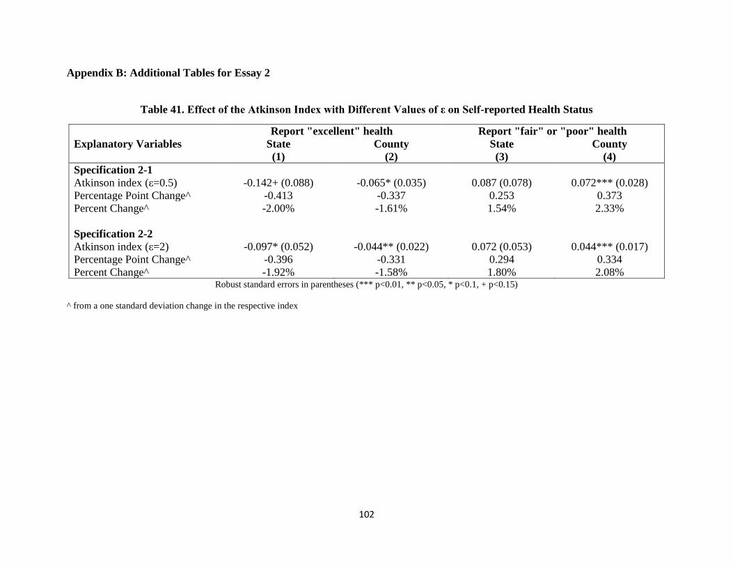
102
Appendix B: Additional Tables for Essay 2
Table 41. Effect of the Atkinson Index with Different Values of ε on Self-reported Health Status
Report "excellent" health Report "fair" or "poor" health
Explanatory Variables State County State County (1) (2) (3) (4)
Specification 2-1
Atkinson index (ε=0.5) -0.142+ (0.088) -0.065* (0.035) 0.087 (0.078) 0.072*** (0.028)
Percentage Point Change^ -0.413 -0.337 0.253 0.373
Percent Change^ -2.00% -1.61% 1.54% 2.33%
Specification 2-2
Atkinson index (ε=2) -0.097* (0.052) -0.044** (0.022) 0.072 (0.053) 0.044*** (0.017)
Percentage Point Change^ -0.396 -0.331 0.294 0.334
Percent Change^ -1.92% -1.58% 1.80% 2.08% Robust standard errors in parentheses (*** p<0.01, ** p<0.05, * p<0.1, + p<0.15)
^ from a one standard deviation change in the respective index

103
Table 42. Effect of the Atkinson Index with Different Values of ε on Physically or Mentally Unhealthy Days
Physically Unhealthy Days Mentally Unhealthy Days
Explanatory Variables State County State County (1) (2) (3) (4)
Specification 2-1
Atkinson index (ε=0.5) 3.074 (1.970) 1.208** (0.595) 0.989 (1.725) 1.515** (0.682)
Percent Change^ 2.46% 1.75% 0.82% 2.25%
Specification 2-2
Atkinson index (ε=2) 1.543 (1.412) 0.514 (0.359) 0.373 (1.119) 0.720* (0.401)
Percent Change^ 1.73% 1.08% 0.43% 1.55% Robust standard errors in parentheses (*** p<0.01, ** p<0.05, * p<0.1, + p<0.15)
^ from a one standard deviation change in the respective index
Table 43. Effect of the Atkinson Index with Different Values of ε on BMI or Obesity
Body Mass Index Being Obese
Explanatory Variables State County State County (1) (2) (3) (4)
Specification 2-1
Atkinson index (ε=0.5) 6.283*** (2.149) 2.081*** (0.559) 0.373*** (0.135) 0.130*** (0.040)
Percentage Point Change^ - - 1.082 0.678
Percent Change^ 0.67% 0.40% 4.27% 2.67%
Specification 2-2
Atkinson index (ε=2) 4.172*** (1.502) 1.235*** (0.327) 0.258*** (0.093) 0.081*** (0.024)
Percentage Point Change^ - - 1.048 0.61
Percent Change^ 0.62% 0.34% 4.13% 2.41% Robust standard errors in parentheses (*** p<0.01, ** p<0.05, * p<0.1, + p<0.15)
^ from a one standard deviation change in the respective index

104
Table 44. Effect of Relative Deprivation on Self-reported Health
Report "excellent" health Report "fair" or "poor" health
Explanatory Variables State County State County
(1) (2) (3) (4)
Specification 4-1: Group Avg. RD
Relative deprivation -0.011*** (0.003) -0.007*** (0.001) -0.001 (0.002) 0.002** (0.001)
Percentage Point Change^^ -1.12 -0.74 -0.13 0.21
Percent Change^^ -5.42% -3.52% -0.81% 1.32%
Specification 4-2: Individual RD
Relative deprivation -0.030*** (0.001) -0.028*** (0.001) 0.041*** (0.002) 0.036*** (0.001)
Percentage Point Change^^ -2.99 -2.75 4.12 3.55
Percent Change^^ -14.48% -13.16% 25.19% 22.18% Robust standard errors in parentheses (*** p<0.01, ** p<0.05, * p<0.1, + p<0.15)
^^ from a $10,000 change in relative deprivation
Table 45. Effect of Relative Deprivation on Physically and Mentally Unhealthy Days
Physically Unhealthy Days Mentally Unhealthy Days
Explanatory Variables State County State County
(1) (2) (3) (4)
Specification 4-1: Group Avg. RD
Relative deprivation -0.076 (0.058) 0.037** (0.018) 0.086* (0.047) 0.081*** (0.024)
Percent Change^^ -2.09% 1.03% 2.46% 2.31%
Specification 4-2: Individual RD
Relative deprivation 0.766*** (0.046) 0.674*** (0.019) 0.620*** (0.039) 0.568*** (0.017)
Percent Change^^ 21.13% 18.72% 17.71% 16.20% Robust standard errors in parentheses (*** p<0.01, ** p<0.05, * p<0.1, + p<0.15)
^^ from a $10,000 change in relative deprivation

105
Table 46. Effect of Relative Deprivation on BMI and Obesity
Body Mass Index Being Obese
Explanatory Variables State County State County
(1) (2) (3) (4)
Specification 4-1: Group Avg. RD
Relative deprivation 0.062 (0.050) 0.066*** (0.018) 0.006** (0.003) 0.005*** (0.001)
Percentage Point Change^^ - - 0.64 0.50
Percent Change^^ 0.23% 0.24% 2.51% 1.95%
Specification 4-2: Individual RD
Relative deprivation 0.223*** (0.021) 0.178*** (0.010) 0.014*** (0.001) 0.012*** (0.001)
Percentage Point Change^^ - - 1.44 1.16
Percent Change^^ 0.82% 0.65% 5.68% 4.58% Robust standard errors in parentheses (*** p<0.01, ** p<0.05, * p<0.1, + p<0.15)
^^ from a $10,000 change in relative deprivation

106
Appendix C: Derivation for Measures of Income Inequality
In this paper, we use four measures of income inequality: the Gini index, the Atkinson index, the
Theil index, and the Relative Deprivation index. We approximate the Gini index following
Aitchison and Brown (1957) and Kelly (2000), and derive the other three indices using a similar
idea.64
Common Notation
We start by laying out the common notation we use below when stating each measure of income
inequality. First, we denote individual household income by 𝑦𝑖, which in our paper is assumed to
follow a log-Normal distribution within the reference group:
𝑦𝑖~ln𝑁(𝜇, 𝜎2) (A1)
Second, we define 𝑚𝑒𝑎𝑛_𝐻𝐻_𝑖𝑛𝑐𝑜𝑚𝑒 as the mean household income within the reference
group. Equation (A1) thus implies:
𝑚𝑒𝑎𝑛_𝐻𝐻_𝑖𝑛𝑐𝑜𝑚𝑒 = 𝑒𝜇+12𝜎2
(A2)
Third, we define 𝑚𝑒𝑑𝑖𝑎𝑛_𝐻𝐻_𝑖𝑛𝑐𝑜𝑚𝑒 as the median household income within the reference
group. Similarly, equation (A1) also implies:
𝑚𝑒𝑑𝑖𝑎𝑛_𝐻𝐻_𝑖𝑛𝑐𝑜𝑚𝑒 = 𝑒𝜇 (A3)
Therefore, solving equation (A2) and (A3) for 𝜇 and 𝜎2 gives us:
𝜇 = ln(𝑚𝑒𝑑𝑖𝑎𝑛_𝐻𝐻_𝑖𝑛𝑐𝑜𝑚𝑒) (A4)
𝜎2 = 2 ln (𝑚𝑒𝑎𝑛_𝐻𝐻_𝑖𝑛𝑐𝑜𝑚𝑒
𝑚𝑒𝑑𝑖𝑎𝑛_𝐻𝐻_𝑖𝑛𝑐𝑜𝑚𝑒) (A5)
Gini Index
The Gini index is one of the most commonly used measures of inequality. It is defined
mathematically based on the Lorenz curve, which plots the proportion of the income
cumulatively earned by the bottom 𝑋 percent of the population. The Gini index theoretically
64 We derive the Atkinson index, the Theil index and the relative deprivation index independently, on our own. The
resulting equations (A10), (A12) and (A14) are logically consistent with Lubrano et al. (2013), Dikhanov (1996) and
Reagan et al. (2006).

107
ranges from 0 (complete equality) to 1 (complete inequality). A commonly used formulation of
the Gini Index based on Sen (1973) used with discrete micro-data is given in equation (A6):
𝐺 =
1
𝑛[𝑛 + 1 − 2(
∑ (𝑛 + 1 − 𝑖)𝑦𝑖𝑛𝑖=1
∑ 𝑦𝑖𝑛𝑖=1
)] 𝑓𝑜𝑟 y1 ≤ 𝑦2 ≤ ⋯ ≤ 𝑦𝑛 (A6)
In this paper, we don’t calculate the index using micro-data. Instead, we approximate the Gini
index following an equation adopted by Aitchison and Brown (1957) and Kelly (2000), using
merely the mean household income and median household income of the reference group.
Specifically, by assuming the individual household income follows the log-Normal distribution,
we have:
𝐺 ≈ 2Φ(𝜎
√2) − 1 (A7)
where Φ(. ) denotes the cumulative density function of the standard normal distribution.
Plugging in equation (A5), we have:
𝐺 ≈ 2Φ(√ln (𝑚𝑒𝑎𝑛_𝐻𝐻_𝑖𝑛𝑐𝑜𝑚𝑒
𝑚𝑒𝑑𝑖𝑎𝑛_𝐻𝐻_𝑖𝑛𝑐𝑜𝑚𝑒)) − 1 (A8)
Atkinson Index
The Atkinson (1970) index is originally based on the concept of “equally distributed equivalent
income”, denoted by 𝑦𝐸𝐷𝐸. A population of 𝑛 individuals with income 𝑦1, 𝑦2, …, 𝑦𝑛 could yield
the same social welfare if they all otherwise receive the equally distributed equivalent income
𝑦𝐸𝐷𝐸. Intuitively, the Atkinson index measures the social utility that can be gained by total
redistribution from current income distribution to equality. The Atkinson index is given as:
𝐴 =
{
1 −
1
𝑚𝑒𝑎𝑛_𝐻𝐻_𝑖𝑛𝑐𝑜𝑚𝑒(1
𝑛∑𝑦𝑖
1−𝜀
𝑛
𝑖=1
)
11−𝜀
𝑓𝑜𝑟 0 ≤ 휀 ≠ 1
1 −1
𝑚𝑒𝑎𝑛_𝐻𝐻_𝑖𝑛𝑐𝑜𝑚𝑒(∏𝑦𝑖
𝑛
𝑖=1
)
1𝑛
𝑓𝑜𝑟 휀 = 1
(A9)
where 휀 is the “inequality aversion parameter.” The higher the value of 휀 is, the higher level of
the society’s aversion toward inequality. In other words, the value of 휀 is positively associated
with the gain by redistribution from inequality to equality, which by definition is the Atkinson

108
index.65 Moreover, the higher the value of 휀, the more sensitive the Atkinson index becomes to
inequalities at the bottom of the income distribution (De Maio, 2007). In practice, 휀 values of
0.5, 1, 1.5 or 2 are used commonly. The Atkinson index ranges from 0 (complete equality) to 1
(complete inequality).
Note that:
𝑙𝑖𝑚𝜀→1
(1 −1
𝑚𝑒𝑎𝑛_𝐻𝐻_𝑖𝑛𝑐𝑜𝑚𝑒(1
𝑛∑𝑦𝑖
1−𝜀
𝑛
𝑖=1
)
11−𝜀
) = 1 −1
𝑚𝑒𝑎𝑛_𝐻𝐻_𝑖𝑛𝑐𝑜𝑚𝑒(∏𝑦𝑖
𝑛
𝑖=1
)
1𝑛
Thus, based on the general case of 휀 ≥ 0, we approximate the Atkinson index starting with the
formula:
𝐴 = 1 −1
𝑚𝑒𝑎𝑛_𝐻𝐻_𝑖𝑛𝑐𝑜𝑚𝑒(1
𝑛∑𝑦𝑖
1−𝜀
𝑛
𝑖=1
)
11−𝜀
Since:
𝑙𝑖𝑚𝑛→∞
1
𝑛∑𝑦𝑖
1−𝜀
𝑛
𝑖=1
≈ 𝐸(𝑦𝑖1−𝜀) = 𝑀𝑦(1 − 휀) = 𝑒
𝜇(1−𝜀)+12𝜎2(1−𝜀)2
Therefore:
𝐴 = 1 −1
𝑚𝑒𝑎𝑛_𝐻𝐻_𝑖𝑛𝑐𝑜𝑚𝑒 (1𝑛∑ 𝑦𝑖
1−𝜀𝑛𝑖=1 )
11−휀
≈ 1 −1
𝑚𝑒𝑎𝑛_𝐻𝐻_𝑖𝑛𝑐𝑜𝑚𝑒 (𝑒𝜇(1−𝜀)+
12𝜎2(1−𝜀)2
)
11−휀
= 1 −1
𝑚𝑒𝑎𝑛_𝐻𝐻_𝑖𝑛𝑐𝑜𝑚𝑒𝑒𝜇+12𝜎2(1−𝜀)
= 1 −1
𝑚𝑒𝑎𝑛_𝐻𝐻_𝑖𝑛𝑐𝑜𝑚𝑒𝑒𝜇+12𝜎2∗ 𝑒−
12𝜎2휀
65 For instance, if 휀 = 0, which means there’s no aversion against inequality, so that there’s no gain from income redistribution
toward equality, then:
𝐴 = 1 −1
𝑚𝑒𝑎𝑛_𝐻𝐻_𝑖𝑛𝑐𝑜𝑚𝑒(1
𝑛∑ 𝑦𝑖
1𝑛𝑖=1 )
1= 1 −
1
𝑚𝑒𝑎𝑛_𝐻𝐻_𝑖𝑛𝑐𝑜𝑚𝑒∗𝑚𝑒𝑎𝑛_𝐻𝐻_𝑖𝑛𝑐𝑜𝑚𝑒 = 1 − 1 = 0
If 휀 → ∞, which means there’s infinite aversion against inequality, so that there’s infinite gain from income redistribution toward
equality, then:
𝐴 = 1 −1
𝑚𝑒𝑎𝑛_𝐻𝐻_𝑖𝑛𝑐𝑜𝑚𝑒∗ lim𝜀→∞
(1
𝑛∑ 𝑦𝑖
1−𝜀𝑛𝑖=1 )
1
1−𝜀= 1 −
1
𝑚𝑒𝑎𝑛_𝐻𝐻_𝑖𝑛𝑐𝑜𝑚𝑒min𝑖(1
𝑛𝑦𝑖) = 1 −
1
𝑚𝑒𝑎𝑛_𝐻𝐻_𝑖𝑛𝑐𝑜𝑚𝑒∗ 0 = 1
Note: min𝑖(𝑦𝑖) = 0 for a general population.

109
= 1 −1
𝑚𝑒𝑎𝑛_𝐻𝐻_𝑖𝑛𝑐𝑜𝑚𝑒 ∗ 𝑚𝑒𝑎𝑛_𝐻𝐻_𝑖𝑛𝑐𝑜𝑚𝑒 ∗ 𝑒−12𝜎2휀
= 1 − 𝑒−12𝜎2휀
= 1 − (𝑒ln( 𝑚𝑒𝑎𝑛_𝐻𝐻_𝑖𝑛𝑐𝑜𝑚𝑒𝑚𝑒𝑑𝑖𝑎𝑛_𝐻𝐻_𝑖𝑛𝑐𝑜𝑚𝑒
))
−𝜀
= 1 − (𝑚𝑒𝑎𝑛_𝐻𝐻_𝑖𝑛𝑐𝑜𝑚𝑒𝑚𝑒𝑑𝑖𝑎𝑛_𝐻𝐻_𝑖𝑛𝑐𝑜𝑚𝑒
)−𝜀
Thus, we have:
𝐴 ≈ 1 − (
𝑚𝑒𝑑𝑖𝑎𝑛_𝐻𝐻_𝑖𝑛𝑐𝑜𝑚𝑒
𝑚𝑒𝑎𝑛_𝐻𝐻_𝑖𝑛𝑐𝑜𝑚𝑒)𝜀
(A10)
Theil Index
The Theil index measures the entropic “distance” the population is away from the “complete
equality.” Entropy is a concept in information theory, measuring the expected value of
information content across the distribution. Entropy distance is the difference between the
entropy of “complete equality” and the entropy of current income distribution. More intuitively,
the Theil index can be explained as “the logarithmic distance between the incomes of each
individual with the mean income of the population” (Bechtel et al., 2012). The index is given by:
𝑇 =
1
𝑛∑(
𝑦𝑖
𝑚𝑒𝑎𝑛_𝐻𝐻_𝑖𝑛𝑐𝑜𝑚𝑒ln (
𝑦𝑖
𝑚𝑒𝑎𝑛_𝐻𝐻_𝑖𝑛𝑐𝑜𝑚𝑒))
𝑛
𝑖=1
(A11)
The value of Theil index ranges from 0 (complete equality) to ln(𝑛) (complete inequality), in
which case one individual gets all the income and others get zero. The Theil index conquers the
problem embedded in other common measures of inequality, such as the Gini index, that the
bounds of the measure are independent of the population size of the reference group (Bechtel et
al., 2012).
We derive our Theil index as follows:
𝑇 =1𝑛∑ (
𝑦𝑖𝑚𝑒𝑎𝑛_𝐻𝐻_𝑖𝑛𝑐𝑜𝑚𝑒
ln (𝑦𝑖
𝑚𝑒𝑎𝑛_𝐻𝐻_𝑖𝑛𝑐𝑜𝑚𝑒))𝑛
𝑖=1
=1
𝑛∗𝑚𝑒𝑎𝑛_𝐻𝐻_𝑖𝑛𝑐𝑜𝑚𝑒∑ (𝑦
𝑖(ln𝑦
𝑖− ln(𝑚𝑒𝑎𝑛_𝐻𝐻_𝑖𝑛𝑐𝑜𝑚𝑒)))𝑛
𝑖=1

110
=1
𝑛∗𝑚𝑒𝑎𝑛_𝐻𝐻_𝑖𝑛𝑐𝑜𝑚𝑒∑ 𝑦
𝑖ln𝑦
𝑖𝑛𝑖=1 −
1𝑛∗𝑚𝑒𝑎𝑛_𝐻𝐻_𝑖𝑛𝑐𝑜𝑚𝑒
∑ 𝑦𝑖ln(𝑚𝑒𝑎𝑛_𝐻𝐻_𝑖𝑛𝑐𝑜𝑚𝑒)𝑛
𝑖=1
=1
𝑚𝑒𝑎𝑛_𝐻𝐻_𝑖𝑛𝑐𝑜𝑚𝑒 ∗1𝑛∑ 𝑦
𝑖ln𝑦
𝑖𝑛𝑖=1 −
ln(𝑚𝑒𝑎𝑛_𝐻𝐻_𝑖𝑛𝑐𝑜𝑚𝑒)𝑚𝑒𝑎𝑛_𝐻𝐻_𝑖𝑛𝑐𝑜𝑚𝑒 ∗
1𝑛∑ 𝑦
𝑖𝑛𝑖=1
=1
𝑚𝑒𝑎𝑛_𝐻𝐻_𝑖𝑛𝑐𝑜𝑚𝑒 ∗1𝑛∑ 𝑦
𝑖ln𝑦
𝑖𝑛𝑖=1 −
ln(𝑚𝑒𝑎𝑛_𝐻𝐻_𝑖𝑛𝑐𝑜𝑚𝑒)𝑚𝑒𝑎𝑛_𝐻𝐻_𝑖𝑛𝑐𝑜𝑚𝑒 ∗ 𝑚𝑒𝑎𝑛_𝐻𝐻_𝑖𝑛𝑐𝑜𝑚𝑒
=1
𝑚𝑒𝑎𝑛_𝐻𝐻_𝑖𝑛𝑐𝑜𝑚𝑒 ∗1𝑛∑ 𝑦
𝑖ln𝑦
𝑖𝑛𝑖=1 − ln(𝑚𝑒𝑎𝑛_𝐻𝐻_𝑖𝑛𝑐𝑜𝑚𝑒)
Let 𝑧𝑖 =ln𝑦
𝑖−𝜇
𝜎~𝑁(0,1), and let 𝑢𝑖 = 𝑦𝑖ln𝑦𝑖 = 𝑒
𝜎𝑧𝑖+𝜇(𝜎𝑧𝑖 + 𝜇), thus:
lim𝑛→∞
1
𝑛∑𝑦𝑖ln𝑦𝑖
𝑛
𝑖=1
= lim𝑛→∞
1
𝑛∑𝑢𝑖
𝑛
𝑖=1
≈ 𝐸(𝑢𝑖)
Hence:
𝑇 =1
𝑚𝑒𝑎𝑛_𝐻𝐻_𝑖𝑛𝑐𝑜𝑚𝑒∗ 𝐸(𝑢𝑖) − ln(𝑚𝑒𝑎𝑛_𝐻𝐻_𝑖𝑛𝑐𝑜𝑚𝑒)
=1
𝑚𝑒𝑎𝑛_𝐻𝐻_𝑖𝑛𝑐𝑜𝑚𝑒∗ 𝐸 (𝑒𝜎𝑧𝑖+𝜇(𝜎𝑧𝑖+𝜇))− ln(𝑚𝑒𝑎𝑛_𝐻𝐻_𝑖𝑛𝑐𝑜𝑚𝑒)
=𝑒𝜇
𝑚𝑒𝑎𝑛_𝐻𝐻_𝑖𝑛𝑐𝑜𝑚𝑒 ∗ (𝜎𝐸(𝑒𝜎𝑧𝑖𝑧𝑖)+𝜇𝐸(𝑒𝜎𝑧𝑖))− ln(𝑚𝑒𝑎𝑛_𝐻𝐻_𝑖𝑛𝑐𝑜𝑚𝑒)
Since:
𝐸(𝑒𝜎𝑧𝑖) = 𝑀𝑧(𝜎) = 𝑒1
2𝜎2 , 66
and:
𝐸(𝑒𝜎𝑧𝑖𝑧𝑖) = lim
𝑛→∞
1
𝑛∑ 𝑒𝜎𝑧𝑖𝑧𝑖𝑛𝑖=1 = lim
𝑛→∞
1
𝑛∑
𝑑𝑒𝜎𝑧𝑖𝑑𝜎
=lim𝑛→∞
1
𝑛∑ 𝑑𝑒𝜎𝑧𝑖𝑛𝑖=1
𝑑𝜎=𝑑 lim𝑛→∞
1
𝑛∑ 𝑒𝜎𝑧𝑖𝑛𝑖=1
𝑑𝜎𝑛𝑖=1
66 This is the 𝜎th moment function of 𝑧~𝑁(0,1).

111
≈𝑑𝐸(𝑒𝜎𝑧𝑖)𝑑𝜎
=𝑑𝑒
12𝜎2
𝑑𝜎= 𝜎𝑒
1
2𝜎2
Hence,
𝑇 ≈
𝑒𝜇
𝑚𝑒𝑎𝑛_𝐻𝐻_𝑖𝑛𝑐𝑜𝑚𝑒∗ (𝜎2𝑒
1
2𝜎2 +𝜇𝑒
1
2𝜎2) − ln(𝑚𝑒𝑎𝑛_𝐻𝐻_𝑖𝑛𝑐𝑜𝑚𝑒)
=𝑒𝜇+
12𝜎2
𝑚𝑒𝑎𝑛_𝐻𝐻_𝑖𝑛𝑐𝑜𝑚𝑒 ∗ (𝜎2+𝜇)− ln(𝑚𝑒𝑎𝑛_𝐻𝐻_𝑖𝑛𝑐𝑜𝑚𝑒)
=𝑚𝑒𝑎𝑛_𝐻𝐻_𝑖𝑛𝑐𝑜𝑚𝑒𝑚𝑒𝑎𝑛_𝐻𝐻_𝑖𝑛𝑐𝑜𝑚𝑒 ∗ (𝜎
2+𝜇)− ln(𝑚𝑒𝑎𝑛_𝐻𝐻_𝑖𝑛𝑐𝑜𝑚𝑒)
= (𝜎2+𝜇)− ln(𝑚𝑒𝑎𝑛_𝐻𝐻_𝑖𝑛𝑐𝑜𝑚𝑒)
= 2 ln (𝑚𝑒𝑎𝑛_𝐻𝐻_𝑖𝑛𝑐𝑜𝑚𝑒𝑚𝑒𝑑𝑖𝑎𝑛_𝐻𝐻_𝑖𝑛𝑐𝑜𝑚𝑒
)+ ln(𝑚𝑒𝑑𝑖𝑎𝑛_𝐻𝐻_𝑖𝑛𝑐𝑜𝑚𝑒)−
ln(𝑚𝑒𝑎𝑛_𝐻𝐻_𝑖𝑛𝑐𝑜𝑚𝑒)
= 2 ln (𝑚𝑒𝑎𝑛_𝐻𝐻_𝑖𝑛𝑐𝑜𝑚𝑒𝑚𝑒𝑑𝑖𝑎𝑛_𝐻𝐻_𝑖𝑛𝑐𝑜𝑚𝑒
)− ln (𝑚𝑒𝑎𝑛_𝐻𝐻_𝑖𝑛𝑐𝑜𝑚𝑒𝑚𝑒𝑑𝑖𝑎𝑛_𝐻𝐻_𝑖𝑛𝑐𝑜𝑚𝑒
)
= ln (𝑚𝑒𝑎𝑛_𝐻𝐻_𝑖𝑛𝑐𝑜𝑚𝑒𝑚𝑒𝑑𝑖𝑎𝑛_𝐻𝐻_𝑖𝑛𝑐𝑜𝑚𝑒
)
Thus,
𝑇 ≈ ln (
𝑚𝑒𝑎𝑛_𝐻𝐻_𝑖𝑛𝑐𝑜𝑚𝑒
𝑚𝑒𝑑𝑖𝑎𝑛_𝐻𝐻_𝑖𝑛𝑐𝑜𝑚𝑒) (A12)
Relative Deprivation Index
The relative deprivation index (RD) is an individual level measure of income inequality rather
than an aggregate level index. As defined in Yitzhaki (1979), for an individual with income 𝑦𝑖,
his RD is “the gap between the total income of those with more than 𝑦𝑖 and their total income if
they had 𝑦𝑖.” According to his definition, the RDI can be calculated as:
𝑅𝐷(𝑦𝑖) = 𝑚𝑒𝑎𝑛_𝐻𝐻_𝑖𝑛𝑐𝑜𝑚𝑒 ∗ (1 − 𝐿(𝑦𝑖)) − 𝑦𝑖(1 − 𝐹(𝑦𝑖)) (A13)

112
where 𝐿(𝑦𝑖) is the value of the Lorenz curve, which is the proportion of total income received by
those whose income is less than or equal to 𝑦𝑖; and 𝐹(𝑦𝑖) = ∫ 𝑓(𝑧)𝑑𝑧𝑦𝑖0
= Φ(ln𝑦
𝑖−𝜇
𝜎) is the
cumulative density function of income at 𝑦𝑖.
Next, by definition:
𝐿(𝑦𝑖) =∫ 𝑓(𝑧)𝑧𝑑𝑧𝑦𝑖0
∫ 𝑓(𝑧)𝑧𝑑𝑧∞
0
=∫ 𝑓(𝑧|𝑧 ≤ 𝑦𝑖)𝑧𝑑𝑧 ∗ Pr(𝑦 ≤ 𝑦𝑖)𝑦𝑖0
𝑚𝑒𝑎𝑛_𝐻𝐻_𝑖𝑛𝑐𝑜𝑚𝑒=𝐸(𝑦|𝑦 ≤ 𝑦𝑖) ∗ 𝐹(𝑦𝑖)
𝑚𝑒𝑎𝑛_𝐻𝐻_𝑖𝑛𝑐𝑜𝑚𝑒
By the moment solution of truncated log-normal distribution (Johnson et al., 1951; Greene,
1954):
𝐸(𝑦|𝑦 ≤ 𝑦𝑖) = 𝐸(𝑦) ∗Φ(
ln𝑦𝑖 − 𝜇𝜎 − 𝜎)
Φ(ln𝑦𝑖 − 𝜇
𝜎 ) = 𝑚𝑒𝑎𝑛_𝐻𝐻_𝑖𝑛𝑐𝑜𝑚𝑒 ∗
Φ(ln𝑦𝑖 − 𝜇
𝜎 − 𝜎)
𝐹(𝑦𝑖)
So,
𝐿(𝑦𝑖) =
𝑚𝑒𝑎𝑛_𝐻𝐻_𝑖𝑛𝑐𝑜𝑚𝑒 ∗Φ (
ln𝑦𝑖 − 𝜇𝜎 − 𝜎)
𝐹(𝑦𝑖) ∗ 𝐹(𝑦𝑖)
𝑚𝑒𝑎𝑛_𝐻𝐻_𝑖𝑛𝑐𝑜𝑚𝑒= Φ(
ln𝑦𝑖 − 𝜇
𝜎− 𝜎)
Thus, 67
𝑅𝐷(𝑦𝑖) = 𝑚𝑒𝑎𝑛_𝐻𝐻_𝑖𝑛𝑐𝑜𝑚𝑒 ∗ (1 − Φ(ln𝑦
𝑖−𝜇𝜎
− 𝜎)) − 𝑦𝑖 ∗ (1 − Φ(ln𝑦
𝑖−𝜇𝜎
))
= 𝑚𝑒𝑎𝑛_𝐻𝐻_𝑖𝑛𝑐𝑜𝑚𝑒 ∗ (1 −
Φ(ln𝑦
𝑖−ln (𝑚𝑒𝑑𝑖𝑎𝑛_𝐻𝐻_𝑖𝑛𝑐𝑜𝑚𝑒)−2 ln( 𝑚𝑒𝑎𝑛_𝐻𝐻_𝑖𝑛𝑐𝑜𝑚𝑒
𝑚𝑒𝑑𝑖𝑎𝑛_𝐻𝐻_𝑖𝑛𝑐𝑜𝑚𝑒)
√2 ln( 𝑚𝑒𝑎𝑛_𝐻𝐻_𝑖𝑛𝑐𝑜𝑚𝑒𝑚𝑒𝑑𝑖𝑎𝑛_𝐻𝐻_𝑖𝑛𝑐𝑜𝑚𝑒
)
))
67 This result equation is consistent with the derivation result of an unpublished seminar paper by Reagan et al.
(2006). Our detailed derivation, however, differs because we start our derivation by adopting Yitzhaki (1979)’s
formula directly.

113
− 𝑦𝑖 ∗(1 − Φ(ln𝑦
𝑖−ln (𝑚𝑒𝑑𝑖𝑎𝑛_𝐻𝐻_𝑖𝑛𝑐𝑜𝑚𝑒)
√2 ln( 𝑚𝑒𝑎𝑛_𝐻𝐻_𝑖𝑛𝑐𝑜𝑚𝑒𝑚𝑒𝑑𝑖𝑎𝑛_𝐻𝐻_𝑖𝑛𝑐𝑜𝑚𝑒
)
))
Therefore, we have:
𝑅𝐷(𝑦𝑖) = 𝑚𝑒𝑎𝑛_𝐻𝐻_𝑖𝑛𝑐𝑜𝑚𝑒 ∗ (1 − Φ(ln(
𝑦𝑖∗𝑚𝑒𝑑𝑖𝑎𝑛_𝐻𝐻_𝑖𝑛𝑐𝑜𝑚𝑒
𝑚𝑒𝑎𝑛_𝐻𝐻_𝑖𝑛𝑐𝑜𝑚𝑒2 )
√2 ln( 𝑚𝑒𝑎𝑛_𝐻𝐻_𝑖𝑛𝑐𝑜𝑚𝑒𝑚𝑒𝑑𝑖𝑎𝑛_𝐻𝐻_𝑖𝑛𝑐𝑜𝑚𝑒
)
))
− 𝑦𝑖 ∗(1 − Φ(ln(
𝑦𝑖𝑚𝑒𝑑𝑖𝑎𝑛_𝐻𝐻_𝑖𝑛𝑐𝑜𝑚𝑒
)
√2 ln( 𝑚𝑒𝑎𝑛_𝐻𝐻_𝑖𝑛𝑐𝑜𝑚𝑒𝑚𝑒𝑑𝑖𝑎𝑛_𝐻𝐻_𝑖𝑛𝑐𝑜𝑚𝑒
)
))
(A14)
Note that, in our paper, we use inflation-adjusted BRFSS individual household income (the mid-
point of income category range) as 𝑦𝑖 to calculate the RD for each individual observation.

114
Bibliography
Aitchison, J. and J. A. C. Brown (1957). "The lognormal distribution." Ch. 2 Cambridge.
Alvaredo, F., A. B. Atkinson, T. Piketty and E. Saez (2013). The top 1 percent in international
and historical perspective. The Journal of Economic Perspectives, 27(3), 3-20.
Apouey, B., & Clark, A. E. (2015). Winning big but feeling no better? The effect of lottery prizes
on physical and mental health. Health Economics, 24(5), 516-538.
Atkinson, A. B. (1970). On the measurement of inequality. Journal of Economic Theory, 2(3),
244-263.
Atkinson, A. B., T. Piketty and E. Saez (2011). Top incomes in the long run of history. Journal
of Economic Literature, 49(1), 3-71.
Bechtel, L., G. Lordan and D. Rao (2012). Income inequality and mental health—empirical
evidence from Australia. Health Economics, 21(S1), 4-17.
Bekemeier, B., Yang, Y., Dunbar, M.D., Pantazis, A., and D.E. Grembowski. (2014). Targeted
Health Department Expenditures Benefit Birth Outcomes at the County Level. American
Journal of Preventive Medicine, 46(6), 569-577.
Bernet, P.M. (2007). Local Public Health Agency Funding: Money Begets Money. Journal of
Public Health Management Practice, 13(2), 188–193.
Blakely, T. A., K. Lochner and I. Kawachi (2002). Metropolitan area income inequality and self-
rated health—a multi-level study. Social Science and Medicine, 54(1), 65-77.
Bostic, R., Gabriel, S., & Painter, G. (2009). Housing wealth, financial wealth, and consumption:
New evidence from micro data. Regional Science and Urban Economics, 39(1), 79-89.
Boustan, L., F. Ferreira, H. Winkler and E. M. Zolt (2013). The effect of rising income
inequality on taxation and public expenditures: evidence from US municipalities and
school districts, 1970–2000. Review of Economics and Statistics, 95(4), 1291-1302.
Brown, T.T. (2014). How Effective Are Public Health Departments at Preventing Mortality?
Economics and Human Biology, 13, 34-45.
Brown, T.T., Martinez-Gutierrez, M.S., and B. Navab. (2014). The Impact of Changes in County
Public Health Expenditures on General Health in the Population. Health Economics,
Policy and Law, 9(3), 251-269.
Calomiris, C., Longhofer, S. D., & Miles, W. (2009). The (mythical?) housing wealth effect.
National Bureau of Economic Research (No. w15075).
Campbell, J. Y., & Cocco, J. F. (2007). How do house prices affect consumption? Evidence from
micro data. Journal of Monetary Economics, 54(3), 591-621.
Carroll, C. D., Otsuka, M., & Slacalek., J. (2010). How large are housing and financial wealth
effects? A new approach. ECB Working Paper (No. 1283).

115
Case, K. E., Quigley, J. M., & Shiller, R. J. (2005). Comparing wealth effects: The stock market
versus the housing market. Advances in Macroeconomics,5(1).
Case, K. E., Quigley, J. M., & Shiller, R. J. (2011). Wealth effects revisited 1978-2009. National
Bureau of Economic Research (No. w16848).
Cawley, J. (2004). The impact of obesity on wages. Journal of Human Resources, 39(2), 451-
474.
Chang, V. W. and N. A. Christakis (2005). Income inequality and weight status in US
metropolitan areas. Social Science and Medicine, 61(1), 83-96.
Charles, K. K., & DeCicca, P. (2008). Local labor market fluctuations and health: Is there a
connection and for whom? Journal of Health Economics, 27(6), 1532-1550.
Chen, Z. and C. A. G. Crawford (2012). The role of geographic scale in testing the income
inequality hypothesis as an explanation of health disparities. Social Science and
Medicine, 75(6), 1022-1031.
Chen, Z. and D. Meltzer (2008). Beefing up with the Chans: Evidence for the effects of relative
income and income inequality on health from the China Health and Nutrition Survey.
Social Science and Medicine, 66(11), 2206-2217.
Cooper, D (2013). House price fluctuations: The role of housing wealth as borrowing collateral.
Review of Economics and Statistics, 95(4), 1183-1197.
Cotti, C., Dunn, R. A., & Tefft, N. (2015). The Dow is killing me: Risky health behaviors and the
stock market. Health Economics, 24(7), 803-821.
Courtemanche, C. (2011). A silver lining? The connection between gasoline prices and
obesity. Economic Inquiry, 49(3), 935-957.
Crow, E. L. and K. Shimizu (1988). Lognormal distributions: Theory and applications, M.
Dekker New York.
Currie, J., & Tekin, E. (2015). Is there a link between foreclosure and health? American Economic
Journal: Economic Policy, 7(1), 63-94.
Dave, D. and R. Kaestner. (2009). Health Insurance and Ex Ante Moral Hazard: Evidence from
Medicare. International Journal of Health Care Finance and Economics, 9(4), 367-390.
De Maio, F. G. (2007). Income inequality measures. Journal of epidemiology and community
health, 61(10), 849-852.
Deaton, A. (2003). Health, inequality, and economic development. Journal of Economic
Literature, 41(1), 113-158.
Dikhanov, Y. (1996). Decomposition of inequality based on incomplete information. A
contributed paper to the IARIW 24th General Conference, Lille'hammer, Norway,
August. Vol. 18. No. 24. 1996.

116
Eibner, C. and W. N. Evans (2005). Relative deprivation, poor health habits, and mortality.
Journal of Human Resources, 40(3), 591-620.
Ellen, I. G., & Dastrup, S. (2012). Housing and the Great Recession. Policy Brief.
Erwin, P.C., Mays, G.P. and W.J. Riley. (2012). Resources That May Matter: The Impact of
Local Health Department Expenditures on Health Status. Public Health Reports, 127, 89-
95.
Fichera, E., & Gathergood, J. (2016). Do wealth shocks affect health? New evidence from the
housing boom. Health Economics, 25(S2), 57-69.
Filmer, D. and L. Pritchett. (1999). The Impact of Public Spending on Health: Does Money
Matter? Social Science and Medicine, 49(10), 1309-1323.
Fiuzat, M., Shaw, L. K., Thomas, L., Felker, G. M., & O'Connor, C. M. (2010). United States stock
market performance and acute myocardial infarction rates in 2008–2009 (from the Duke
Databank for Cardiovascular Disease). The American Journal of Cardiology, 106(11),
1545-1549.
Frank, L. D., Andresen, M. A., & Schmid, T. L. (2004). Obesity relationships with community
design, physical activity, and time spent in cars. American Journal of Preventive
Medicine, 27(2), 87-96.
Georgia Office of Planning and Budget. (2008). Division of Public Health: Governance and
General Grant-in-Aid. State of Georgia Report.
Gerdtham, U. G. and M. Johannesson (2004). Absolute income, relative income, income
inequality, and mortality. Journal of Human Resources, 39(1), 228-247.
Ghobarah, H.A., P. Huth, and B. Russett. (2004). Comparative Public Health: the Political
Economy of Human Misery and Well-Being. International Studies Quarterly, 48, 73-94.
Golberstein, E., Gonzales, G., & Meara, E. (2016). Economic Conditions and Children's Mental
Health. National Bureau of Economic Research (No. w22459).
Goodhart, C., & Hofmann, B. (2008). House prices, money, credit, and the macroeconomy. Oxford
Review of Economic Policy, 24(1), 180-205.
Gravelle, H. and M. Sutton (2009). Income, relative income, and self‐reported health in Britain
1979–2000. Health Economics, 18(2), 125-145.
Grembowski, D., Bekemeier, B., Conrad, D., and W. Kreuter. (2010). Are Local Heath
Department Expenditures Related to Racial Disparities in Mortality? Social Science and
Medicine, 71(12), 2057-2065.
Griffith, R., O’Connell, M., & Smith, K. (2013). Food expenditure and nutritional quality over the
Great Recession. Institute for Fiscal Studies (BN143).
Grönqvist, H., P. Johansson and S. Niknami (2012). Income inequality and health: Lessons from
a refugee residential assignment program. Journal of Health Economics, 31(4), 617-629.
117
Gujarati, D.N. and D.C. Porter. (2009). Basic Econometrics, Fifth Edition. The McGraw-Hill
Companies, Inc., NY.
Hamoudi, A., & Dowd, J. B. (2014). Housing wealth, psychological well-being, and cognitive
functioning of older Americans. The Journals of Gerontology Series B: Psychological
Sciences and Social Sciences, 69(2), 253-262.
Iacoviello, M. (2011). Housing wealth and consumption. FRB International Finance Discussion
Paper, (No. 1027).
Ifcher, J., H. Zarghamee and C. Graham (2017). Local neighbors as positives, regional neighbors
as negatives: Competing channels in the relationship between others’ income, health, and
happiness. Journal of Health Economics.
Jones, A. M. and J. Wildman (2008). Health, income and relative deprivation: Evidence from the
BHPS. Journal of Health Economics, 27(2), 308-324.
Joshi, N. K. (2016). Local house prices and mental health. International Journal of Health
Economics and Management, 16(1), 89-102.
Kaplan, G. A., E. R. Pamuk, J. W. Lynch, R. D. Cohen and J. L. Balfour (1996). Inequality in
income and mortality in the United States: analysis of mortality and potential pathways.
British Medical Journal, 312(7037), 999-1003.
Kawachi, I. and B. P. Kennedy (1997). Health and social cohesion: why care about income
inequality? British Medical Journal, 314(7086), 1037.
Kawachi, I., B. P. Kennedy, K. Lochner and D. Prothrow-Stith (1997). Social capital, income
inequality, and mortality. American Journal of Public Health, 87(9), 1491-1498.
Kearney, M. S. and P. B. Levine (2014). Income inequality and early nonmarital childbearing.
Journal of Human Resources, 49(1), 1-31.
Kelly, M. (2000). Inequality and crime. Review of Economics and Statistics, 82(4), 530-539.
Kennedy, B. P., I. Kawachi and D. Prothrow-Stith (1996). Income distribution and mortality:
cross sectional ecological study of the Robin Hood index in the United States. British
Medical Journal, 312(7037), 1004-1007.
Kim, B., & Ruhm, C. J. (2012). Inheritances, health and death. Health Economics, 21(2), 127-144.
Kopczuk, W., E. Saez and J. Song (2010). Earnings inequality and mobility in the United States:
evidence from social security data since 1937. The Quarterly Journal of Economics,
125(1), 91-128.
Krieger, N. (2006). A century of census tracts: health and the body politic (1906–2006). Journal
of Urban Health, 83(3), 355-361.
Laporte, A. (2002). A note on the use of a single inequality index in testing the effect of income
distribution on mortality. Social Science and Medicine, 55(9), 1561-1570.

118
Leigh, A. (2007). How closely do top income shares track other measures of inequality? The
Economic Journal, 117(524), F619-F633.
Lewbel, A. (2012). Using Heteroscedasticity to Identify and Estimate Mismeasured and
Endogenous Regressor Models. Journal of Business & Economic Statistics, 30, 67-80.
Li, H. and Y. Zhu (2006). Income, income inequality, and health: Evidence from China. Journal
of Comparative Economics, 34(4), 668-693.
Lopez, R. (2004). Income inequality and self-rated health in US metropolitan areas: a multi-level
analysis. Social Science and Medicine, 59(12): 2409-2419.
Lorgelly, P. K. and J. Lindley (2008). What is the relationship between income inequality and
health? Evidence from the BHPS. Health Economics, 17(2): 249-265.
Lubrano, M. (2013). The econometrics of inequality and poverty. Lecture 4: Lorenz curves, the
Gini Coefficient and parametric distributions. Manuscript available online at
http://www.vcharite.univ-mrs.fr/PP/lubrano/poverty.htm
Lynch, J. W., G. D. Smith, G. A. Kaplan and J. S. House (2000). Income inequality and
mortality: importance to health of individual income, psychosocial environment, or
material conditions. British Medical Journal, 320(7243): 1200.
Lynch, J., G. D. Smith, S. A. Harper, M. Hillemeier, N. Ross, G. A. Kaplan and M. Wolfson
(2004). Is income inequality a determinant of population health? Part 1. A systematic
review. Milbank Quarterly, 82(1): 5-99.
Mangyo, E. and A. Park (2011). Relative deprivation and health which reference groups matter?
Journal of Human Resources, 46(3): 459-481.
Mankiw, N. G., & Ball, L. M. (2011). Macroeconomics and the financial system. 2nd ed. NY:
Worth Publishers.
Marmot, M. and R. G. Wilkinson (2001). Psychosocial and material pathways in the relation
between income and health: a response to Lynch et al. British Medical Journal,
322(7296): 1233.
Marton, J. and D. E. Wildasin (2007). Medicaid expenditures and state budgets: Past, present,
and future. National Tax Journal, 279-304.
Mays, G.P. and S.A. Smith. (2011). Evidence Links Increases In Public Health Spending To
Declines in Preventable Deaths, Health Affairs, 30 (8), 1585-1593.
McCormack, G. R., & Virk, J. S. (2014). Driving towards obesity: a systematized literature review
on the association between motor vehicle travel time and distance and weight status in
adults. Preventive Medicine, 66, 49-55.
Meer, J., Miller, D. L., & Rosen, H. S. (2003). Exploring the health–wealth nexus. Journal of
Health Economics, 22(5), 713-730.
Mellor, J. M. and J. Milyo (2002). Income inequality and health status in the United States:
evidence from the current population survey. Journal of Human Resources, 510-539.

119
Mian, A., & Sufi, A. (2014). House price gains and US household spending from 2002 to 2006.
National Bureau of Economic Research (No. w20152).
Mian, A., Rao, K., & Sufi, A. (2013). Household Balance Sheets, Consumption, and the Economic
Slump. Quarterly Journal of Economics, 128(4).
Miller, D. L. and C. Paxson (2006). Relative income, race, and mortality. Journal of Health
Economics, 25(5), 979-1003.
Online Analytical Statistical Information System (OASIS) Georgia Department of Community
Health, Division of Public Health, Office of Health Information and Policy.
http://oasis.state.ga.us/
Parker, C. (2009). Funding Formula Use in Georgia’s Public Health System: Setting the Context,
Georgia Health Policy Center Working Paper.
Pickett, K. E. and R. G. Wilkinson (2015). Income inequality and health: a causal review. Social
Science and Medicine, 128, 316-326.
Piketty, T. and E. Saez (2003). Income Inequality in the United States, 1913-1998. The Quarterly
Journal of Economics, 1-39.
Piketty, T., E. Saez and G. Zucman (2016). Distributional national accounts: Methods and
estimates for the united states. National Bureau of Economic Research (No. w22945).
Rajkumar, A.S. and V. Swaroop. (2008). Public Spending and Outcomes: Does Governance
Matter? Journal of Development Economics, 86, 96-111.
Reagan, P. B., P. J. Salsberry and R. J. Olsen (2006). Cumulative Relative Deprivation,
Race/Ethnicity and Birth Weight. University of Wisconsin, Madison. Fall 2006 Public
Economics seminar paper.
Rivera, B. (2001). The Effects of Public Health Spending on Self-Assessed Health Status: an
Ordered Probit Model. Applied Economics, 33, 1313-1319.
Rudolph, L., Caplan, J., Ben-Moshe, K., & Dillon, L. (2013). Health in All Policies: A guide for
state and local governments. American Public Health Association.
Ruhm, C. J. (2000). Are Recessions Good for Your Health? Quarterly Journal of
Economics, 115(2), 617-650.
Ruhm, C. J. (2003). Good times make you sick. Journal of Health Economics, 22(4), 637-658.
Ruhm, C. J. (2005). Healthy living in hard times. Journal of Health Economics, 24(2), 341-363.
Ruhm, C. J. (2015). Recessions, healthy no more? Journal of Health Economics, 42, 17-28.
Sen, A. (1973). On economic inequality, Oxford University Press.
Smeeding, T. M. (2004). Twenty years of research on income inequality, poverty, and
redistribution in the developed world: Introduction and overview. Socio-Economic
Review, 2(2): 149-163.

120
Sung, J., Qiu, Q., & Marton, J. (2016). New evidence on the relationship between inequality and
health. Working Paper.
Sweeney, T. (2009). Overview of Georgia’s Public Health Budget & Activities. Georgia Budget
and Policy Institute Brief.
Tekin, E., McClellan, C., & Minyard, K. J. (2013). Health and health behaviors during the worst
of times: evidence from the Great Recession. National Bureau of Economic Research (No.
w19234).
Theil, H. (1967). Economics and information theory. Amsterdam: North-Holland.
Todd, J. E. (2014). Changes in eating patterns and diet quality among working-age adults, 2005-
2010. Economic Research Report (No. 161).
US Census (2015). Census Bureau reports nearly 1 in 5 movers relocate to a different metro area,
U.S. Census Bureau News (CB15-145)
Wagstaff, A. and E. Van Doorslaer (2000). Income inequality and health: what does the literature
tell us? Annual Review of Public Health, 21(1), 543-567.
Waldmann, R. J. (1992). Income distribution and infant mortality. The Quarterly Journal of
Economics, 1283-1302.
Weich, S., G. Lewis and S. Jenkins (2002). Income inequality and self rated health in Britain.
Journal of Epidemiology and Community Health, 56(6), 436-441.
Wilkinson, R. G. and K. E. Pickett (2006). Income inequality and population health: a review
and explanation of the evidence. Social Science and Medicine, 62(7), 1768-1784.
Winslow, C.E.A. (1920). The Untilled Field of Public Health. Modern Medicine, 2, 183-191.
Yilmazer, T., Babiarz, P., & Liu, F. (2015). The impact of diminished housing wealth on health in
the United States: Evidence from the Great Recession. Social Science & Medicine, 130,
234-241.
Yitzhaki, S. (1979). Relative deprivation and the Gini coefficient. The Quarterly Journal of
Economics, 321-324.

121
Vita
Jaesang Sung entered the Department of Economics at Georgia State University for his
doctorate degree study in August 2012. His current research interests cover a variety of research
fields such as health economics, public policy, inequality, urban economics, applied
econometrics and applied microeconomics. His current research agenda has three goals: (1)
contribute to our understanding of how economic conditions and psychosocial factors influence
both individual behaviors and health outcomes, combining the broad sub-fields of urban
economics, inequality and epidemiology, (2) investigate the impacts of various public policies on
risky behaviors, health status and medical care utilization, and (3) design and apply advanced
methodologies on a wide variety of topics in economics.