Embed Size (px)
Citation preview
Evaluating a Modified Google User Interface Via Screen
Reader
Barbara Leporini( )
CNR-ISTI via Moruzzi 1, 56124 Pisa, Italy
e-mail: [email protected]
Patrizia Andronico, Marina Buzzi
CNR-IIT via Moruzzi 1, 56124 Pisa, Italy
e-mail: [email protected], [email protected]
Carlos Castillo
Università la Sapienza Roma
e-mail: [email protected] Abstract: This paper describes the progress of a research project aimed at improving the usability of web search tools for blind users who interact via screen readers and voice synthesizers. In the first stage of research, specific guidelines were proposed for simplifying the interaction with search engines for the blind. To evaluate these criteria, they were applied to Google user interfaces, by re-implementing the search form as well as the results page. Finally, the redesigned interfaces were evaluated through remote testing with 12 totally blind users. The results highlighted how Google, although already accessible, may be further improved in order to simplify interaction for people with impaired vision.
Keywords: accessibility, usability, user interface, blind users, search engine
1 Introduction
Search engines have now become an indispensable tool for retrieving information. Simple and effective interaction is important for all, and especially for blind individuals who encounter more difficulties navigating the Internet via a screen reader. Although recent legislation in Europe aims to ensure accessibility to public on-line Web sites and services, many difficulties remain. Web pages still contain images without alternative descriptions, tables used inappropriately as layout, unclear links or context-dependent contents, etc. Besides, page layout is increasingly being designed for graceful visual rendering, without considering the needs of users who are obliged to interact through special devices. Globally, in 2002 more than 161 million people were visually impaired, of whom 124 million people had low vision and 37 million were blind1 [29]. In Italy there are 352,000 visually-impaired people (these data include totally blind persons and users with vision reduced to less than 1/20 of normal sight) [15]. Hence, making websites and service accessible for all is an important issue that deserves greater attention. User interface (UI) design is a crucial element for improving accessibility and usability; thus, targeted criteria and guidelines to simplify Web navigation through special devices should be considered at the beginning of the design process. For this reason, in a previous phase of research, a set of specific criteria was proposed for improving interaction with search engine by the blind [18], based on international standard guidelines and on the personal experience of one of the authors (who has been totally blind since childhood). To evaluate the validity and concrete impact of those criteria on user interaction, thay have been applied to Google (http://www.google.com/), a popular search engine which offers simple interfaces and effectiveness in search. The underlying goal was to show that it is possible to have a an aesthetically pleasing UI “look&feel” offering satisfaction and efficiency of use by both sighted and non-sighted users. Therefore, it was decided to improve interaction for blind users while
1 Blindness is defined as visual acuity of less than 3/60, or corresponding visual field loss to less than 10 degrees, in the better eye with best possible correction.
1

maintaining the original graphical layout of the Google interface. In [2] the interface implementation is described in detail (source code), discussing how the proposed guidelines could be technically applied to Google. However, once the prototype was tested by the blind author of this paper, it was found that the implementation could be further improved by rearranging parts of XHTML code of the interface, while applying specific style sheets for preserving the original graphical layout. Specifically, the iterative design-implementation-testing cycle led to move the query results to the top of the result page (i.e., at the beginning of the body content in the XHTML file). For this reason, a new empirical guideline was added: Place the most important elements of the interface at the top of the source file. This guideline is very important for anyone using basic screen reader commands and moving sequentially via Tab key. In a subsequent step, these changes were applied to both the Google simple search and the results page UIs. In order to give an idea about how the user interaction changes between the original and the modified interfaces, in the following a scenario-based example is reported showing how a blind user perceives the search process. Lastly, it was decided to measure “concrete” results against the set goals. Therefore, user testing was conducted concerning the original and modified Google interfaces, to collect feedback and to evaluate the real impact of the proposed criteria. This paper is actually an extension of [2] where an initial implementation of the proposed solution was described. The novel contributions of this paper are 1) optimization of source code of the new Google UIs, 2) remote testing and 3) comparison of the proposed solution with Google Web Search. The work is structured as follows: the next section introduces the problem and related work. Section 3 summarizes the design approach and the guidelines that were applied to the modified UIs. In section 4, a scenario of use is presented in order to better understand the concrete impact of proposed changes on the user interface. For reader convenience, section 5 summarizes the main features of design and implementation. Section 6 describes the user testing and discusses the results, while section 7 compares the proposed approach with recent improvements in Google Web Search services, including Accessible Search. Finally, conclusions and plans for future work are presented.
2 Background
2.1 Related Work
Digital information technologies have greatly aided the visually impaired since the digital medium allows more control over how contents are presented than, for instance, a book. However, Web navigation is still quite difficult for blind persons using a screen reader, as pages are read sequentially one line at a time, starting from the top left corner of the page, losing all layout, style and font information [7]. In particular, search engine interaction is even more difficult, due to the complexity of their interfaces and functions and the time needed to perform even a simple action. The Manchester Metropolitan University [5] highlighted issues of non-visual access by performing experiments on a sample of blind and visually-impaired users who carried out four information-seeking tasks, including the use of search engines. Visually-impaired users searching the Web for a specific piece of information took an average of 2.5 times longer than sighted users. The efficiency gap was further quantified in [16], where blind participants executed a set of tasks; they took twice as long as sighted users to explore search results and three times as long to explore the corresponding web pages. Visually-impaired persons in fact must decide whether to scan more query results or to follow the link of one specific result. In most cases, participants expressed a desire for additional page features, which varied depending on their visual ability and their expertise. Interestingly, visually-impaired users expressed the need to specify criteria for controlling ranking, since relevance for them should also include ease in reading the result. The World Wide Web Consortium, which promotes accessibility on the Web through its Web Accessibility Initiative (WAI), has produced a set of accessibility guidelines, the first one dated 1999 (Web Content Accessibility Guidelines - WCAG 1.0)2 [30]. Over the years, numerous tools for automatic checking of conformance to the WCAG 1.0 have been developed and made available to the public by the Consortium and third parties. However, in practice there has been no consequent wide-scale qualitative improvement. Automatic checking might help developers to 2 W3C Working Draft version 2.0 is available at http://www.w3.org/TR/WCAG20/
2
detect accessibility problems, but, unfortunately, the available accessibility guidelines do not necessarily guarantee usable web sites, especially when specific groups of disabled users are considered. Accessibility is an essential technical precondition [19], but it is not sufficient. Indeed, being able to access information is not enough. A service may be accessible but not sufficiently usable to certain user groups (such as the blind). Consequently, accessibility alone (without usability) does not guarantee actual information availability. Specifically, the ISO 9241 standard [14] defines usability as “The effectiveness, efficiency and satisfaction with which specified users achieve specified goals in particular environments”. Therefore, the design of a user interface should consider both such features in order to effectively simplify user interaction. For this reason, several initiatives have been proposed in the literature. Takagi et al. [27] suggest spending more time on the practical aspects of usability that help improve productivity, such as measuring the time needed to reach the important parts on Web pages, rather than focusing on the syntactic checking of Web pages. The authors designed and implemented a tool that allows loading a page and moving the mouse over sections to see the “reaching-time”, i.e., the time needed for the screen reader to announce this content. Besides “time-oriented” usability factors, such as the rapidity of reaching target content or completing a certain task, there are other aspects that are difficult to evaluate automatically, such as ease of understanding page structure, and interface navigability. Concerning SW design, different approaches may be applied for transforming on-fly web pages in order to improve interface usability and content accessibility, such as using an intermediary proxy server or specific client-side solutions (e.g., modified browser, plug-in, etc.). Hanson et al. [11] developed a system that could rapidly transform any Web page to make it more usable for people with visual impairments. Initially, they had developed a prototype system in which a proxy server was used to adapt Web pages to meet the needs of older adults and people with disabilities. Since tests conducted on that proxy prototype revealed many problems, the authors decided to modify the system’s architecture [10]. The new software was created for making adaptations on the client machine by transforming Web pages "on the fly", without requiring all Web content to be re-written. Such a system requires a particular browser specifically built for transforming Web pages at client-side. Another example of a client-side approach is shown in [33]. A content-aware Web browser plug-in was developed, which allows users to actively navigate on a Web page using a combination of audio and haptic tools. Indeed, the main purpose of that approach is to increase spatial awareness, by using a combination of interactive devices, allowing users to construct a mental spatial map of a Web page. As described in detail in the following, the SW reported in this paper was developed using the Google SOAP search APIs3[8]. This choice was based on transforming XML output generated by a query to the Google APIs. Extracting data from an XML file and building the interface is easier than extracting data from the HTML format, since, in XML format, data are tagged and cleaner. In contrast, an approach that transforms the answer of the Google server might create a dependency of the application from the specific HTML code of the result page. Thus, if such layout changes, it would be necessary to update the developed SW, in order to avoid faults or errors in the application. This consideration applies to the proxy server as well as to client-side solutions, which interact directly with the Google server. For this reason, it was decided to interact with the search APIs -- as suggested by Google -- instead of using a proxy server. In the second half of 2006, Google improved the accessibility of most of its services, including web search. All main accessibility features of Google services are listed in an overview by Ravan [26]. When the solution reported in this paper was designed and developed, this new version was not available. For this reason, the UIs considered in this study do not include the latest features. Furthermore, Google activated a new search service named Accessible Search which aims at promoting accessible results [9]. Actually, the solution presented here totally differs from Accessible Search, since it only focuses on the accessibility of UIs, and do not evaluate result quality (accessibility, ranking, etc.). Section 7 presents a detailed comparison between the approach of this paper and the Google solutions. Regarding other search engines, two initiatives established in 2004, Speegle and YouSearched, aim at making two accessible search engines available to the general public. Speegle (www.speegle.co.uk) is an experimental search engine created by a Scottish firm; it takes Google results via the Google APIs, and includes its own system to read aloud the results found. Although the site itself has no other accessibility enhancements, there is a 5-second advertising
3 From December 2006 Google no longer issued new SOAP Search APIs suggesting programmers to use instead s
(http://code.google.com/apis/ajaxsearch/). However, developers with existing SOAP Search API keys are not affected by this choice.
AJAX Search API
3
speech at the beginning of each page, and in general the quality of the embedded reader is not comparable to standard screen reading software. YouSearched (www.yousearched.com) is an independent search engine with its own crawling and ranking algorithms, which features access keys and section headers to enhance usability. The site conforms to accessibility guidelines established by the Royal National Institute for the Blind and to W3C's WAI accessibility guidelines. Their index is smaller than Google's, and the search engine's owners have neither published results of usability testing nor comparisons of usability with standard search engines. For testing usability there are many evaluation methods that include heuristics evaluation, cognitive walkthroughs, guideline evaluation, and usability testing. In the study reported in this paper, remote user testing was conducted with a group of blind people in order to evaluate the design criteria and their impact on user experiencing a search task. Remote evaluation considerably reduces the cost of usability testing: it is a usability evaluation wherein the evaluator, performing observation and analysis, is located far from the user [13]. Different technologies for monitoring user behavior and capturing data can be applied, as shown in [25], [12] and [13], including videoconferencing, automatic logging of user paths and tasks, or specific tools. Recent studies have carried out a comparative analysis showing that during remote testing, users take a bit longer to complete tasks due to the communication overhead, but that the results are as effective as, if not better than, traditional testing executed in the laboratory [28]. In contrast, Petrie et al. [24] conducted two case studies with disabled users (including totally blind and visually-impaired persons) for exploring asynchronous remote evaluation techniques, showing that while quantitative data was comparable, local evaluations have collected richer qualitative data. However, these authors also argued that experienced specialists often lack detailed understanding of how people with disabilities use their assistive technologies; thus perhaps the proposed questionnaire did not sufficiently reflect their needs and problems.
2.2 Screen Reader
A screen reader is an assistive technology used by the visually impaired to interact with a computer or other electronic devices, such as mobile phones. The screen reader mediates between the user and the operating system (including its applications), assisting individuals by interpreting the user interface which is read aloud sequentially by means of a voice synthesizer, or written by using a Braille display. However, Braille output is extremely slow while working with the Internet. For this reason, the screen reader has become the most appreciated tool for blind people, even if it requires a certain amount of effort by the user to learn how to use it proficiently (advanced commands). Several screen readers have been developed over the last few years, including: Jaws for Windows (http://www.freedomscientific.com/) [6], Windows Bridge (http://www.synthavoice.on.ca/), Windows eyes (http://www.gwmicro.com/) and Hal for Windows (http://www.dolphincomputeraccess.com/). This paper refers only to Jaws for Windows, because it is the most preferred and frequently used by blind users in Italy [1]. Henceforth, the term “screen reader” is used to indicate a screen reader with voice synthesizer.
2.3 The Search Process through Screen Reader
According to Nielsen [22], users know exactly what to expect when exploring search engine interfaces. People, in fact, are looking for three main components: a box, where the search is performed, a “search” button to click on for carrying out the query, and a list of search results -- appearing in a new page -- that Nielsen calls the “search engine result page” (SERP). However, these three components may not be clear for a blind person, since interacting via screen reader is quite different from operating with a visual layout. As previously mentioned, the screen reader announces every word on a page, line by line, sequentially. Concerning web pages, the last generation of screen reader software interprets the HTML code as it is structured, considering all the different tags. In contrast, the previous version of the screen reader software was capable of reading only a continuous line of information without any kind of separation, thus requiring noticeable cognitive effort by a blind person to understand the page content. With the possibility of recognizing different tags in a page (such as tables, headings, lists, etc) still some common problems occur, usually related to the overall design aspects of an interface, such as "lack of context", "information overload", "excessive sequencing in reading the information". Other specific search interface features may affect the page usability,
4

such as interaction with form elements, formulation of an expressive query, selection of search criteria and aggregation of the results. The level of expertise needed for using advanced screen reader and browser commands, as well as orientation within the page itself, increase the effort required by the end user. Because of that, most blind users employ only basic commands, and often consider web navigation and search to be a time-consuming, boring and stressful experience.
3 Design approach and guidelines
This study aims to show that it is possible to have a pleasant UI “look & feel” while assuring satisfaction and efficiency of use for all, particularly for the blind. It was chosen to work with Google first because is the most widely used search engine in the world, and second to demonstrate that UI interactions may be improved while maintaining the original graphical layout, in spite of its clarity and simplicity. The analysis was restricted to interfaces for Web page retrieval, not considering other search services, such as news, images, and directory exploration. The adopted user-centered approach helped in taking into consideration the needs and requirements of blind users by interacting with them from the early stages of the project. Specifically, the HTML source code of Google simple search and results pages was modified. Without any knowledge of the structure of an interface, which a sighted person can obtain at a glance, blind people may spend a great deal of time exploring, in order to arrive at the important elements in the page. For this reason, the most important parts of the interface were grouped and repositioned in a more appropriate way in the source file. Furthermore shortcuts to make navigation faster and sounds for alerting on important events were introduced. The Google UIs were re-implemented by building code with XSL Transformations (Extensible Stylesheet Language Family) using the Google APIs. For the reader’s convenience, the proposed guidelines are recalled as follows: General: 1. Place the most important elements of the interface at the top of the source file. For search
engines the most important elements are the search box and button and the query results. To place an object in a specific position of the visual layout, use the position property in the style sheet. Be careful to correctly match <label for> with input elements, and place labels above or to the left of the input element, rather than below.
2. Navigating faster. Assign a scale of importance (i.e., by the tab index attribute) to most important elements, so that users can reach the most important parts quickly. On the search page, higher values should be assigned to edit field and search options, whereas, in the result page, the higher values should be given to result links. A lower value should be assigned to secondary links if present (such as “cached” or “similar pages”). Furthermore, shortcuts may be associated with search elements (text box, buttons) and with links to pages of results (e.g., access key=”1” for the first page, or “2” for the second, etc.).
3. Alerting by sound. When using interactive elements, different sounds should be associated with different events in order to rapidly provide feedback to blind users. For instance, two different tones may be used to indicate the success (at least one result) or failure (no result) of the search.
4. Using standards, such as XHTML and CSS (Cascading Style Sheets v.2) to separate content from rendering and structure the page. Web designers should use aural style sheets provided by CSS2 specification for making web contents more usable by and accessible to blind people. At the same time, browsers and screen readers must be able to interpret aural CSS.
Simple search interface: 5. Easy location and labelling of edit field and search options. Avoid secondary elements (links,
texts, banner frames, etc.) Result page: 6. Highlighting the search result. Use a heading level (i.e., <h1> or <h2>…<h6>) at the
beginning of the result list. If a table is used to format results, a summary attribute, such as “Results of the research: xxx results found” or “No results found”, should be assigned. In addition, the number of the current page vs. the total number of pages should be clearly indicated (e.g., x of y found).
5

7. Arranging the results in numbered lists. Put the list of the result links with their summary, just after the search result notification (nothing else should be located in the middle). Create a list by applying <ul> or <ol> elements; each item on the list must be a single result; it is possible to make the numbering invisible by utilizing hidden labels. With this feature, the screen reader informs the user of the number of items; the user is then able to skip quickly from item to item. Besides, the page should not contain too many results; an appropriate number would be ten items.
8. Recognizing sponsored links. Keep sponsored links separate from the other results in the HTML code, not only in the visual layout. Put them in a clearly labelled table (e.g., “sponsored links” summary attribute), and insert the table code after the results list in the page source; in order to locate sponsored links on the right side – or in another specific place – use the CSS properties.
9. Adding navigation and help links. Place links pointing to result pages at the end of the list (not before). This allows users to read the current results (summaries and links) first and then read the pointers to the next group of results; this is important when users move by arrow keys (i.e., in a sequential manner). Furthermore, it would be useful to add help or navigation links (in this case hidden links) for moving around the page, such as “skip to results”, “go to search edit field”, and “go to result page”.
Although empirical, these guidelines in a previous, informal test, also conducted by one of the authors who is totally blind, revealed a significant improvement in the interface. For the reader’s convenience, Table 1 lists the main differences between the OGIs and MGIs; benefits gained from the application of the above criteria, which are further discussed in the following, are reported in the third column.
Original Google UIs Modified Google UIs Impact on user interaction HTML +css XHTML+css -- -- logical sections (headers) Getting an overview of the main parts of the
page (e.g., search box, sponsored links, next pages, etc.)
-- Positioning of the relevant content at the top of UI
Focusing faster the main part related to the main goal to be accomplished (e.g., searching or reading the results)
-- Focus on the search box Easier search setting -- Shortcuts Quicker navigation (e.g., next or previous
page) Visiting order according to
importance elements Visiting results more rapidly by avoiding "accessory links" (e.g., cached pages)
-- Aural feedback Immediate perception about search success or failure
-- Numbering results Better user orientation among results -- Invisible link to Help page A non-intrusive page help on accessibility
features
Table 1 – Comparison between OGIs and MGIs features
The next phase of the conducted study was the implementation of the defined guidelines, re-designing Google UIs without changing the visual rendering. In particular the “Home Page” and the “Result Page” (HTML source files) were re-written as described in section 5. The following section describes a scenario which shows the interaction via screen reader.
4 Scenario-Based Design
This section describes a scenario to illustrate the user's experience when navigating the Google Interfaces by means of the screen reader Jaws, with the main objective of pointing out the possible benefits offered by screen readers when interacting with the new user interface. A user-interaction scenario is a descriptive story about the individuals’ experience and interaction with a particular system or application. Scenarios may have different level of detail, and in a finer specification can also take into consideration hardware, software and user interface elements [4]. In the adopted design process, a scenario description was used to understand the problems of interaction via screen reader and the specific difficulties a person may encounter during a query.
6

The following scenario is based on the personal experience of one of the authors when navigating via the Jaws screen reader for Windows.
4.1 Interacting with OGIs
Roberto is a blind boy who is not particularly skilled at using computer applications. He needs to look up information about the airport in Rome. Roberto has never flown out of Rome before, and now he is going to take a trip to Amsterdam where he will attend a European meeting. Figure 1 depicts all the steps of the Jaws interpretation during the exploration of the Google HomePage. The part on the left is produced by the original code, while the right part is produced by the modified code. Parts in italics are announced by Jaws but not “explicitly” rendered on the screen (e.g., link, button, table, etc.). They are just announced to inform users about features that are perceived from a visual rendering. Parts in bold refer to the content added in the modified interface. Roberto connects his computer to the Internet, opens IE, and types in the Google URL. As soon as the browser starts loading the Home Page, the screen reader begins to read the page content, from the very first line. Roberto stops it because he wants to quickly reach the edit field and insert his query. He presses the Tab key and the screen reader virtual focus takes him immediately to each link (i.e., “Images”, “Groups”, “News”, “Froogle”, “more”, as shown in lines 5, 6, 7, 8 and 9 in the left-hand side of Fig. 1) until he finds the “edit field”. Here Roberto stops, but he is unsure whether he is over the search box (the screen reader just announced “edit field”) and he decides to move up and down with the arrow keys to look for an associated label. Unfortunately there is no associated label, but only a “Google Search” button, so Robert guesses that the “edit field” encountered before was the right place to start his query, after all. Roberto then activates the “form mode on” function of the screen reader -- in order to switch from reading to editing status -- and writes his query: airport Rome. Again Roberto is not sure that he has written all the words correctly and checks again using a special reading command from Jaws (Insert+Up Arrow). Finally, he presses the Enter key to start the search process. When the results page is loaded, Jaws starts again to automatically read the entire contents line by line, from the top to the bottom of the page. Roberto once again halts the process; too much information is provided and it is too hard to follow, due to the overload perceived by the user . At this point, Roberto decides to explore the page manually skipping line by line, link by link, until reaching the group of results. After pressing the Tab key many times (Fig. 2, left side), Roberto understands he made an error: he typed the string “air portrome” instead of “airport rome”; thus the query had produced no results. Roberto corrects the keywords and restarts the query. Once again, he stops the screen reading and pressing the Tab key repeatedly, he perceives a “new” link, which is probably a link pointing to one of the results found. Again exploring around the link with the up and down arrow keys, Roberto understands that it is a sponsored link. After pressing Tab keys several times and exploring each link encountered (see the left part of Figure 4) Roberto must decide whether the result is a sponsored link or not. The entire procedure has been tedious and time-consuming. Finally, Roberto encounters the first non-sponsored result, as well as another problem: there are three more links for each result (“Translate this page”, “Cached” and “Similar pages”) that make the exploration even more annoying, that is, one link “to be read” and three “to be skipped”. This link is in Italian so Roberto continue his exploration. In the end, Roberto finds what he was seeking (line 49 in Fig. 4), but has also encountered even more annoying difficulties.
1 2 3 4 5 6 7 8 9 10 11 12 13 14
Google Graphic Google Web Link Images Link Groups Link News Link Froogle Link more » Edit Google Search Button I'm Feeling Lucky Button
1 2 3 4 5 6 7 8 9 1011121314
Modified google.uk Graphic Google Logo Heading level 1 Search: Edit alt+c Google Search Button I'm Feeling Lucky Button Search: Radio button checked the Web alt+w Radio button not checked pages from the UK alt+p Heading level 2 Advanced Search: Link Advanced Search alt+a
7

15 16 17 18 19 20 21 22 23 24 25 26 27 28 29 30
Link Advanced Search Link Preferences Link Language Tools Search: Radio button checked the web Radio button not checked pages from the UK Link Advertising Programs - Link Business Solutions - Link About Google - Link Go to Google Com ©2006 Google
1516171819202122232425262728293031
Link Preferences Link Language Tools alt+l Heading level 2 navigation bar: Link Navigation help alt+h Web Link Images Link Groups Link News alt+n Heading level 2 Google links: Link Advertising Programs - Link Business Solutions - Link About Google - Link Go to Google Com Modified Google Interface
Fig. 1: Google home page read by Jaws: on the left using OGIs, on the right using MGIs
4.2 Interacting with MGIs
This subsection describes how user interaction changes when using the modified Google interfaces. When the Google Home Page is loaded, a short tone alerts the user that the page has been loaded and the screen reader is about to start reading. The user can stop Jaws reading and can immediately move the virtual focus onto the search edit field by simply pressing the Tab key. The screen reader announces the sentence “Searching for”, which is the "hidden label" assigned to the search input field. Then, while writing the search keywords, a very brief tone is heard as a feedback for each typed letter. This very short sound assures that the user is writing within the correct search edit box. When the result page related to the incorrect query is loaded, a hollow sound is reproduced. This sound alerts the user that the query produced no results and points out that some mistakes were probably made in the query string. Furthermore, when exploring the page via arrow keys, the search failure is encountered immediately; Jaws reads “No results found” at line 5 (See Fig. 2 on the right) with respect to the 24st line when interacting with the OGIs (See Fig. 2 on the left). Whereas, when the result page of a successful search query is loaded, a short triple ascendent sound informs Roberto that search has succeeded. This kind of aural feedback is especially useful when a search fails, since the user can immediately retype the query without having to read the search response. 1 2 3 4 5 6 7 8 9 10 11 12 13 14 15 16 17 18 19 20 21 22 23 24 25
Air portrome - Google Search Link Google homepage Web Link Images Link Groups Link News Link Froogle Link more » Edit air portrome Search Button Link Advanced search Link Preferences Search: Radio button checked the Web Radio button not checked pages from the UK Web Your search – air portrome - did not match any documents.
1 2 3 4 5 6 7 8 9 10111213141516171819202122232425
No results - Modified google.uk Web Heading level 1 No results: Your search - - air portrome - did not match any documents. Suggestions: Block quote start - Make sure all words are spelled correctly. - Try different keywords. - Try more general keywords. Block quote end Heading level 2 Search: Edit air portrome alt+c Search Button Search: Radio button checked the Web alt+w Radio button not checked pages from the UK alt+p Heading level 2 Advanced Search: Link Advanced Search alt+a
8

26 27 28 29 30 31 32 33 34 35 36
Suggestions: Block quote start - Make sure all words are spelled correctly. - Try different keywords. - Try more general keywords. Block quote end copy2006 Google
262728293031323334353637
Link Preferences Heading level 2 Navigation bar: Link Google Homepage alt+g Web Link Images Link Groups Link News alt+n Link Froogle Link more Modified Google Interface
Fig. 2 – “No result” page read by Jaws: the original version on the left, the modified one on the right
To read the results, by just pressing the Tab key once, the focus moves immediately onto the label “Results 1 - 10 of about...", at the beginning of the Result section (see line 6 of Fig. 4 on the right). By simply pressing the Tab key, the focus immediately visits the first result (line 10); by pressing the Tab key again, the focus moves onto the next result (line 17), and so forth. The links “translate this page”, “Cached” and “Similar pages” available for each result link are skipped. If the user wants to read the text fragment and reach the "accessory" links (e.g., cached page), may use the arrow keys. All the results are numbered: this is useful for better orientation among results. Furthermore, the sponsored links are only encountered after all results. Also, to facilitate interaction, several shortcuts are available. By pressing "Alt+Plus" and "Alt+Minus" the next and previous page links are immediately reached by the virtual focus; at this point, the enter key activates those links and the next or previous result page is opened. Moreover, thanks to the <Hn> tags assigned to main page sections, it is possible to skip directly to the “result page” section by simply pressing the “h” key (a Jaws specific command); alternatively, the section name ("Results”) can be chosen from the heading list generated by Insert+F6 (another Jaws specific command). In particular, adding heading levels with hidden labels allows the user to get a rapid overview of the page structure and the relative sections. In summary, when interacting with the MGIs, the new page structure makes a user's experience with the application easier than the original one. Various alternative interaction modalities can be used according to the user's skill and habits: for instance, the command "h" rather "Insert+F6". Last, even if the user does not use specific and advanced Jaws commands, the reading is simplified in the same way. By reading line by line, the screen reader immediately announces the search box or the query results respectively; practically speaking, the user encounters at once the main parts (i.e., search box or results). This behavior is due to the change of positioning inside the HTML code described in detail in section 5. Moreover, since nothing has changed in the visual interface, a sighted reader perceives nothing unusual (Fig.3).
Fig. 3: Google result page: the original page on the left, the modified one on the right
1 2 3 4 5 6 7 8 9 10 11
airport rome - Google Search Link Go to Google Home Web Link Images Link Group Link News Link Froogle Link More
1 2 3 4 5 6 7 8 9 10 11
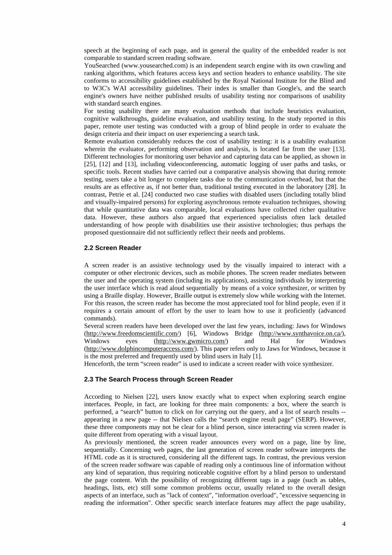
Result page for airport rome - Modified google.uk Web Heading level 1 Results: Results 1 - 10 of about 950000 for airport rome. (0.0324 seconds) 1 Link ADR - Sito ufficiale Aeroporti di Roma Aeroporto Intercontinentale Leonardo da Vinci [...]
9
12 13 14 15 16 17 18 19 20 21 22 23 24 25 26 27 28 29 30 31 32 33 34 35 36 37 38 39 40 41 42 43 44 45 46 47 48 49 50 51 52 53 54 55 56 57 58 59 60 61 62 63 64 65 66 67 68 69 70 71 72 73 74 75 76 77 78 79
Edit airport rome Search Button Link Advanced Search Link Preferences Search: Radio button checked the Web Radio button not checked pages from the UK Web Results 1 - 10 of about 950000 for airport rome. (0.033591 seconds) Table with 4 columns and 5 rows Sponsored links Link Transfers Limousine Rome A flat price to transfer in first class in Rome. Select your service http://www.touring-car.it Link Airport shuttle in Rome Door to door connection between the airports and rome hotels. http://www.rome-airport-shuttle.com table end Link ADR - Sito ufficiale Aeroporti di Roma Aeroporto Intercontinentale Leonardo da [...]http://www.adr.it/ - 43k - Link Cached - Link Similar pages Link ADR - Aeroporti di Roma Official Site The company controlling Rome's two airports - Fiumicino [...] http://www.adr.it/default.asp?L=3 - 42k - Link Cached - Link Similar pages Link ADR - Sito ufficiale Aeroporti di Roma - Sito ufficiale della Società Aeroporti di Roma. [...] http://www.adr.it/0 - 19k - Link Cached - Link Similar pages … [other results] Result page: First 1 Link 2 Link 3 Link 4 Link 5 Link 6 Link 7 Link 8 Link 9 Link 10 Link Next
12 13 14 15 16 17 18 19 20 21 22 23 24 25 26 27 28 29 30 31 32 33 34 35 36 37 38 39 40 41 42 43 44 45 46 47 48 49 50 51 52 53 54 55 56 57 58 59 60 61 62 63 64 65 66 67 68 69 70 71 72 73 74 75 76 77 78 79
http://www.adr.it/ - 43k - Link Cached - Link Similar pages 2 Link ADR - Aeroporti di Roma Official Site - The company controlling Rome's two airports - [...] http://www.adr.it/default.asp?L=3 - 42k - Link Cached - Link Similar pages 3 Link ADR - Sito ufficiale Aeroporti di Roma - Sito ufficiale della Società Aeroporti di Roma. Informazioni, [...] http://www.adr.it/ - 19k - Link Cached - Link Similar pages ... [other results] Heading level 3 Sponsored Links: Link Transfers Limousine Rome A flat price to transfer in first class in Rome. Select your service http://www.touring-car.it Link Airport shuttle in Rome Door to door connection between the airports and rome hotels. http://www.rome-airport-shuttle.com Heading level 2 Result Page: 1 Link 2 Link 3 Link 4 Link 5 Link 6 Link 7 Link 8 Link 9 Link 10 Link Next alt++ Heading level 2 Search: Edit airport rome alt+c Search Button Search: Radio button checked the Web alt+w Radio button not checked pages from the UK alt+p Heading level 2 Advanced search: Link Advanced search alt+a Link Preferences Heading level 2 Navigation bar: Link Navigation help alt+h Link Google Homepage alt+g Web Link Images Link Groups Link News alt+n Link Froogle Link more
10

80 81 82 83 84 85 86 87 88 89 90 91 92 93
Edit airport rome Search Button Link Search within results | Link Language Tools | Link Search Tips Link Google Home - Link Advertising Programmes - Link About Google copy2006 Google - Searching 8,168,684,336 web pages
80 81 82 83 84 85 86 87 88 89 90 91 92 93
Search: Edit airport rome Search Button Heading level 2 Search Tools: Link Search within results | Link Language Tools alt+t| Link Search Tips Link Google Home - Link Advertising Programmes - Link About Google Modified Google Interface - Searching 8,168,684,336 web pages
Fig. 4: Google result page read by Jaws: the original page on the left, the modified one on the right
5 Implementation
In the performed work, it was necessary to deal with two aspects of implementation: 1) how to effectively modify the interface source, and 2) how to set up interaction with Google to carry out a query.
5.1 Interface design
To design and implement the modified Google Interface, a user-centered cyclic process was applied. First of all, and analysis of users needs was carried out, considering as the target user group totally blind persons who do not interact with mouse or other pointing devices, but perceive the page content vocally and navigate only via keyboard. The Model Human Processor is composed of the perceptual system, the motor system and the cognitive system [3]. When a user navigates an interface, all these systems are involved in the interaction. With reduced physical perception, as in totally blind individuals, less information is communicated to the brain. Therefore, the cognitive part of the interaction is very important, since a blind person may develop a different mental model of both the interaction and the learning processes. This depends on the age at which an individual lost his/her sight, and on whether the person has experienced visual knowledge of the real world or has only figured it out (i.e., blind since birth). Thus, when designing a UI for the blind, it is crucial to: 1. provide alternative ways to deliver the same content; 2. reduce the user’s cognitive effort (i.e., to provide an overview of the system and contents); 3. provide ways for accessing important contents rapidly. Summarizing, information should be complete, quick to reach, and easy to understand for everyone. As previously mentioned, a screen reader reads the contents sequentially, as they appear in the HTML code, and also announces the most important interface elements such as links, image and windows objects. This process can be time-consuming and annoying, especially when part of the interface, such as the menu and/or the navigation bar, are repeated in all website pages. For these reasons, blind users often stop the screen reading at the beginning, preferring to navigate by Tab Keys jumping link by link, or to explore contents via arrow keys. The first problem to address is that the blind person does not perceive the overall structure of the interface, so they can navigate for a long time without finding the most relevant contents. To reduce this gap, the HTML source code was structured defining logical sections of the interface. Specifically, sets of homogenous text and elements were grouped and structured by heading levels, in order to give the user an immediate idea of the interface, and allow him/her to be able to skip rapidly from one section to another. The home page was structured in four sections which enable users to carry out different actions, as shown in Table 2. The order of the table’s first column reflects the order of the sections in the original Google Interfaces. The number associated with each section indicates the new positioning into the XHTML code in the Modified Google UIs: the search box and button are located at the beginning of the body, followed by Advanced Search and Preferences, Navigation bar and Google info.
11

Navigation bar 3 Search box and options 1 Advanced Search and Preferences 2 Google info and other links 4
Table 2 – Home Page: in the left column the interface elements ordered as in the original Google, while the second column shows the new order
Similarly, the result page was structured in seven logical sections, as shown in Table 3. Results are located in the first position followed by Sponsored links, Result Pages, Search box and options, Advanced search and Preference links, Navigation bar and Google links.
Navigation bar 6 Search box and options 4 Advanced search and preference links 5 Sponsored links 2 Results 1 Result Pages (previous, next, numbered pages) 3 Google links (Google home, advertising programs, etc.). 7
Table 3 – Results page: Home Page: in the left column the interface elements ordered as in the original Google, while the second column shows the new order
Each section was associated with a particular heading level that permits to get on-the-fly a “page index” users can generate through the Jaws command “Insert+F6”, available only in Internet Explorer and Jaws version 4.5 or higher. With the “page index”, users can see the interface content at glance, as well as move quickly from one section to another. Since nothing has changed in the visual interface, a sighted person perceives nothing unusual. Instead, the new code offers an easier way for blind users to navigate around the page (see Fig. 5).
Fig. 5: Logical sections of the modified UIs: a) home page and b) results page (generated by a specific Jaws
command)
Due to the new structure of the page, blind users can jump to a specific part of the interface using three different Jaws commands:
1. By pressing the “Insert+F6” key, the user obtains the entire list of the headings used. With the arrow keys, s/he can select the desired section just by pushing the Enter key.
2. The “h” and “shift+h” commands of Jaws permit users to move to the next or previous heading in the list (at any level), so that page sections can be explored sequentially.
3. By pressing the “1”, “2” … “6” keys, users jump directly to the next Heading at Level (or to the previous heading if shift key is also associated). For instance, if the user presses the “1” key when the results page is loaded, the current focus moves to the “search result section”, since a tag <h1> has been associated with this section. In any case, other specific commands for skipping to the first or last heading are available.
12
Furthermore, alternative options for rapid navigation have been provided for final users: 1. The most important interface elements were equipped with access keys, which, if pressed,
offer a simple shortcut to the desired point. 2. Tab keys were associated with relevant objects, such as the search box, results, links to
“next” and “previous” result pages. A navigation help page on interface features– reachable by a hidden-link (with the shortcut alt+h) --was added as support for beginner users. In any case, because shortcuts need to be remembered and can change from one UI to another, blind persons often navigate via Tab Key. For this reason, a finer granularity was applied in order to facilitate the navigation by Tab key, according to the following order:
1. Search results status (i.e., Results 1 - 10 of about... or no results); 2. First result, Second result, etc. At this level, cached and similar links are skipped. User
can access these secondary links of the result explored with the arrow keys; 3. Result pages (Prev, 1, 2,…, Next); 4. Search Tools (i.e., "Search within results" and "Search Tips"); 5. Sponsored Links; 6. Searching for (simple search box and options); 7. Advanced Search and preferences; 8. Navigation bar; 9. Google Info and other links; 10. Cached and similar page links.
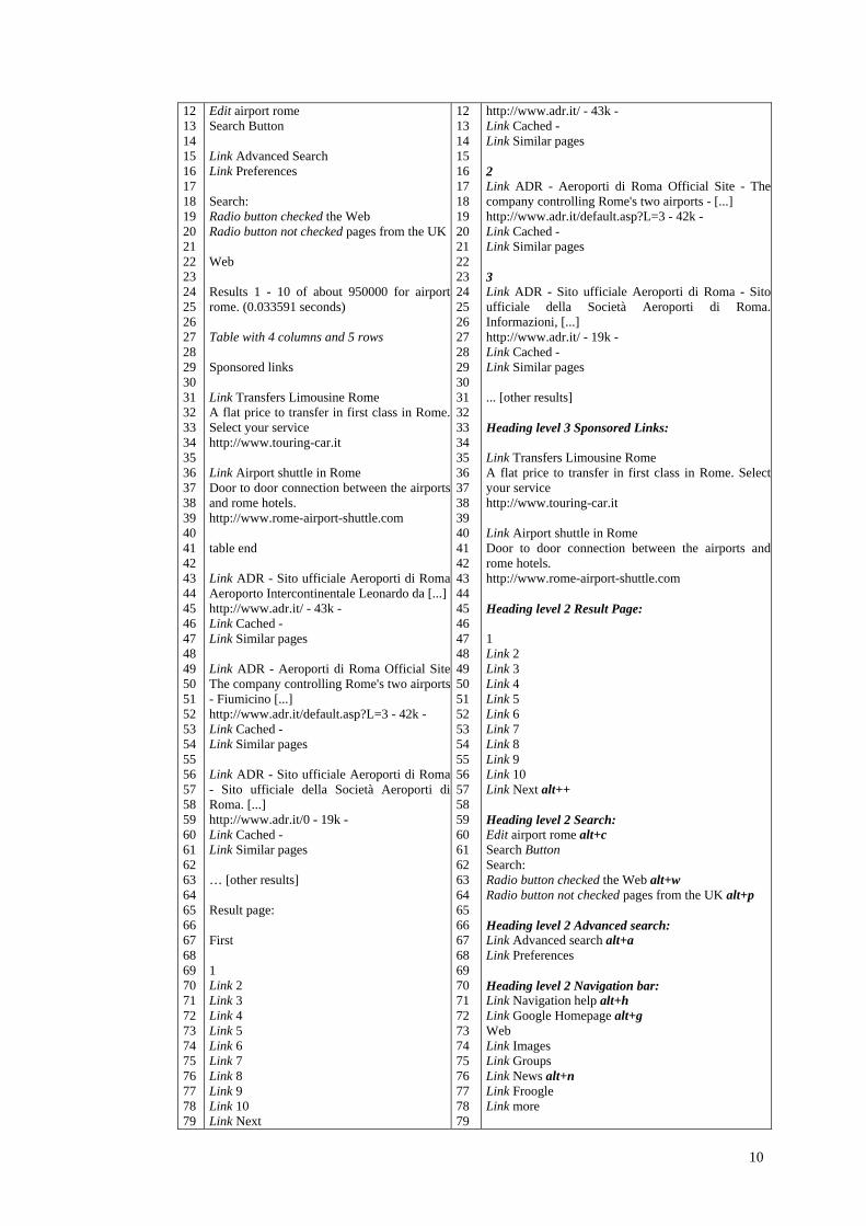
The order of “importance” associated with each element of the interface “drives” the user’s navigation. Additional features such as hidden labels and result numbering were added as well to further simplify user interaction and orientation. Furthermore, some sounds were associated with the most relevant events, such as the focus on the search box and the status of the search outcome. In this last case, two different sounds indicate “results found” and “no results”. The above choices were aimed at optimizing user interaction, especially when navigating by keyboard, considering user preferences. Search engine companies obviously may choose a different order in which to visit elements and logical sections, according to their needs. For instance, sponsored links may be announced by the screen reader before query results. Regarding the code, XHTML and CSS properties were used for separating the content from its rendering. Tables used for layout were replaced by <DIV> elements arranged in specific areas into the graphical interface using CSS positioning4. Fig. 6 and Fig. 7 show the original and modified Google Interfaces (respectively home pages and result pages). They look almost the same, even if the page source changed significantly.
Fig. 6 – a) Google UK home page (2006 Sept. 28) – b) Modified Google UK Home page
4 For details concerning the implementation of the modified interfaces and examples, the reader may refer to (Andronico et al., 2006).
13
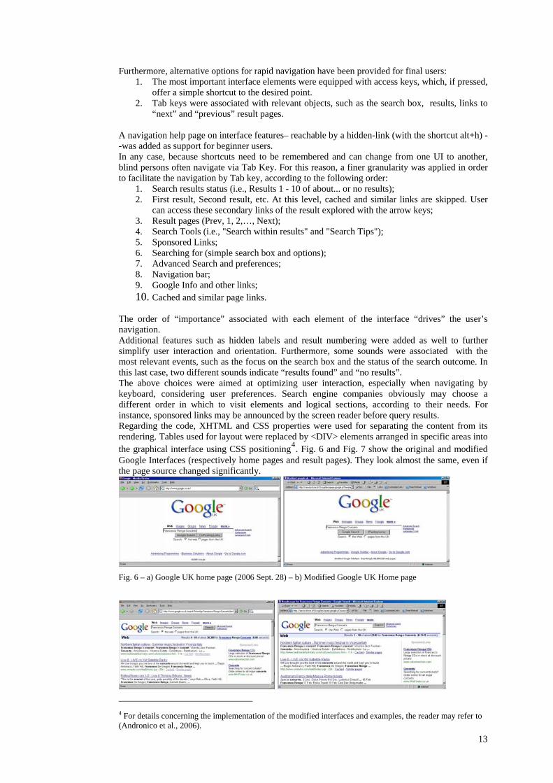
Fig. 7 – a) Google UK Result Page (2006 Sept. 28) - b) Modified Google UK Result Page
Table 4 shows the screen reader’s interpretation of the original (left) and the modified (right) result page. Parts in italics refer to words/sentences inserted by the screen reader, which inform the user about interface elements (link, button, edit field, heading level and so on). New parts, added during the re-design of the interfaces, are highlighted in boldface. It can be easily seen how the different order of the sections in the code has changed the screen reader’s sequential reading. In the modified UIs the results are the first elements announced. Each result is numbered and separated by a blank line from the subsequent one, while in the original UIs there is no clear separation between results, which may confuse an inexperienced user.
Original Google interface Francesco Renga Concerts - Google Search Link Go to Google Home Web Link Images Link Groups Link News Link Froogle Link more » Edit Francesco Renga Concerts Search Button Link Advanced Search Link Preferences Search: Radio button checked the web Radio button not checked pages from the UK Web Results 1 - 10 of about 30,900 for Link Francesco renga Link concerts. (0.17 seconds) Table with 4 columns and 6 rows Sponsored Links Link Francesco Renga CDs Large selection of Francesco Renga CDs in stock at discount prices! http://www.cdconnection.com […] table end […]
Modified Google interface Results for Francesco Renga Concerts - Google Search Web Heading level 1 Results: Results 1 - 10 of about 2150 for Francesco Renga Concerts. (0.072713 seconds) 1 Link Northern Italian culture - Summer music festival in Vicenza Italy. Francesco Renga in concert.... http://www.bed-breakfast-italy.com/culture/outdoors.htm - 11k - Link Cached – Link Similar pages 2 Link Live 8 - LIVE on XM Satellite Radio XM Live brought you the best of ... Francesco Renga ... http://www.xmradio.com/live8/index.jsp - 23k - Link Cached – Link Similar pages […] Heading level 3 Sponsored Links Link Francesco Renga CDs Large selection of Francesco Renga CDs in stock at discount prices! http://www.cdconnection.com […] Heading level 1 Result Page: 1 Link 2 Link 3 Link 4 […]
Table 4– Screen Reader reading of: a) Google UK Result Page (2006 Sept. 28) - b) Modified Google UK Result Page
Table 4 highlights how the query supplies different results: 30,900 from Google.UK and 2,150 items in the modified UIs, due to the fact that the Google APIs results are different than the results in the Google search engine. The ranking of results is also different. Therefore, in order to make the usability test significant, the original, unmodified, Google Interfaces were also re-implemented using the Google APIs. Two XLS transformations were defined: one template for the original Google Interfaces, and one for the modified Google Interfaces. Furthermore, the Italian Google interfaces were modified in order to carry out the usability test with Italian users. Note that the Italian version presents minor differences with respect to the English (UK) Google interfaces:
14
- The search box has three radio buttons: search the web, pages in Italian, pages from IT; - Each result has an additional link, i.e. [Translate this page]; - The results bar (where the number of results is specified) has no links to the search keywords
(Google UK presents links to http://www.answers.com/, see Fig. 7). Last, since the Google APIs does not include the sponsored links, for the test (via XSLT template) two fixed sponsored links concerning SW for the blind were inserted.
5.2 Dynamic generation of the interfaces
There are several alternatives for modifying the layout of a search engine's results before presenting them to the users: - Capturing the results of the search engine as static HTML pages, and then elaborating those
pages. The disadvantage is that the entire experience of querying, browsing, and retrieving is not represented by the experiment.
- Modifying the HTML pages returned by the search engine, by using parsing to locate elements and re-write the page on-the-fly (e.g., proxy server). This modality is typically discouraged by search engine administrators, since it can generate too many requests, and may result in the application being banned from using the search engine. In fact, all the queries to the Google system should be generated from a single point (IP address of the server where the application runs) and offering a service based on Google is forbidden by the company’s copyright policy.
- Directly accessing a machine-readable version of the search engine's result that is re-elaborated to build the new UI on-the-fly. This last option was used. As mentioned in section 2.1, the use of programmatic interfaces produce SW that is stable over time, and which does not require updating the application in case the Google UIs changes (SW maintenance and reliability).
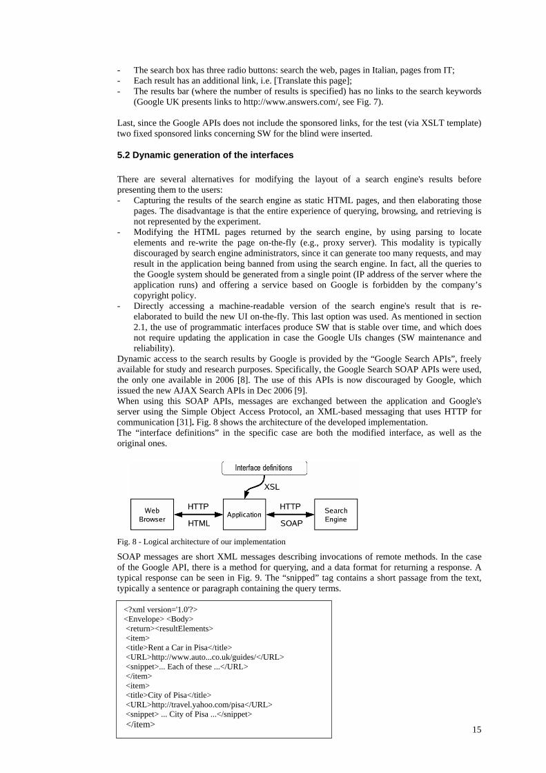
Dynamic access to the search results by Google is provided by the “Google Search APIs”, freely available for study and research purposes. Specifically, the Google Search SOAP APIs were used, the only one available in 2006 [8]. The use of this APIs is now discouraged by Google, which issued the new AJAX Search APIs in Dec 2006 [9]. When using this SOAP APIs, messages are exchanged between the application and Google's server using the Simple Object Access Protocol, an XML-based messaging that uses HTTP for communication [31]. Fig. 8 shows the architecture of the developed implementation. The “interface definitions” in the specific case are both the modified interface, as well as the original ones.
Fig. 8 - Logical architecture of our implementation
SOAP messages are short XML messages describing invocations of remote methods. In the case of the Google API, there is a method for querying, and a data format for returning a response. A typical response can be seen in Fig. 9. The “snipped” tag contains a short passage from the text, typically a sentence or paragraph containing the query terms.
<?xml version='1.0'?> <Envelope> <Body> <return><resultElements> <item> <title>Rent a Car in Pisa</title> <URL>http://www.auto...co.uk/guides/</URL> <snippet>... Each of these ...</URL> </item> <item> <title>City of Pisa</title> <URL>http://travel.yahoo.com/pisa</URL> <snippet> ... City of Pisa ...</snippet> </item>
15
Fig. 9 - Short example of a SOAP response from the Google API, re-formatted for clarity
By manual inspection, it was found out that sometimes the responses from the API are not exactly the same as the results returned either by Google.it or Google.com; they may correspond to a slightly older, or smaller, version of the index. This would be a problem if the quality of the responses differed too greatly from the usual responses, but this was not the case (e.g., the snippets may have different positions in the result). The APIs were utilized to develop both the original and the modified Google UIs, in order to ensure that the results explored by users were exactly the same. Since the experiment did not analyze the satisfaction of users related to quality of results provides by Google (i.e, ranking, pertinence of results), but rather the satisfaction when exploring the result page, the use of Google search APIs instead of Google.com does not impact the significance of the results. The XML response is not suitable for being shown directly to end-users, and must be modified. Fortunately, there is a simple language for expressing the transformation of an XML document, called XSLT (eXtensible Stylesheet Language Transformations) [32]. Using XSLT, a small program (a “stylesheet”) was written describing how to format each of the elements on the response (title, URL, and text snippet) to display it according to the guidelines stated above. Basically, the XSL Transformation takes as input a XML document and, based on the rules defined in the template, returns an HTML or XHTML file. Two templates were defined: one in order to recreate the original HTML UIs of Google and the other for generating the new UIs to conform to the set design criteria. The total delays from both the SOAP request and the XSLT transformation were not noticeable, as the Google API request is sometimes faster than the normal Google Web site since the size of what is transmitted is smaller. The Sablotron engine (http://www.gingerall.com/), a fast XML parser and XSLT transformation engine written in C language, , was used for the XSLT transformation, and the parsing speed was always less than 0.1 seconds, even when displaying a complex page.
6 User test
6.1 Purpose In order to evaluate the developed solution in terms of the real impact on end users, a group of blind people was involved. The main goal of the conducted usability testing was to compare the user experience while performing a query and navigating through the original and the modified Google UIs. More specifically, the evaluation was targeted to answer the following questions: - Is the navigation effectively simplified? - Does the user perceive the search task faster? - Is the presentation of interface elements clearer? - Which elements added for new features (i.e., shortcuts, different visiting order, sounds, etc)
have more value for users? Usability issues were analyzed based on the effectiveness and efficiency in carrying out a given set of search tasks by blind users, without measuring the time spent. However, in a usability test, very often the time required to perform a task is one of the most important measures [21], together with (1) the success rate, which measures whether users can perform the task at all, (2) the error rate, and (3) the users' subjective satisfaction. Other specific metrics can be applied for monitoring user behavior, such as the percentage of time that users spend following a navigation path, or the number of times they need to backtrack, which can help in discovering popular paths and the existence of any bottleneck.
6.2 Experiment design
6.2.1 Method
The conducted test consisted of three parts, each part prepared in electronic format to be sent to the participants by email or, where possible, made available via web. In detail, the tests comprised:
16

1) A preliminary questionnaire to obtain information about the participants, investigating their technical expertise, age, educational background, habits within a computer environment, and use of search tools as well as of screen readers. With the information collected, a unique ID code was set up for each person in the group, that was used for the real test and for combining the two questionnaires. The ID code allowed all participants to be as anonymous as possible, which was really appreciated by the test subjects, who preferred not to be identified.
2) Remote testing with a set of tasks to be performed, available online at a specific URL and containing only two links: one to the original Google Homepage and the other to the modified Google Homepage.
3) A post-test questionnaire, consisting of 22 questions divided into three separate sections: the first requesting information about the subject’s experience performing the assigned tasks (and the navigation strategy adopted), the second about difficulties in making the required queries, and the last one concerning navigation issues.
Before carrying out the tasks assigned for the test, participants undertook a remote “mini-training” (four exploration tasks) in order to understand the features provided by the UIs and familiarize themselves with the page structure. The goal of this training was to allow users to get an overview of specific Jaws commands (e.g., the key “h” for heading levels). For example, users were asked to perform a sequential and a structured exploration (i.e., by heading levels). In this way users would gain knowledge of particular screen reader commands, which are probably not much used. The following sections --6.3, 6.4 and 6.5 -- analyze the results gathered from the three parts of the test.
6.2.2 Participants
A total of 12 blind users were recruited for testing. All of them have been blind since birth. The partcipants were contacted through the Italian Association for the Blind, of which one of authors is also member. During one of the Association meetings, she talked about the project and the intention to test the new interfaces. In this way, several email addresses were collected for potential participants; but in the end only 12 persons participated in the entire test, while 18 took part only in the first phase by filling out the preliminary questionnaire. Probably, some difficulties in participating in the test arose from the specific technological skills required of the users. Although in the beginning it appeared that 12 people would not be enough for a valid usability test, after further analysis it was finally decided that the number would be sufficient for two main reasons: i) the level of involvement of the participants, who devoted considerable time to testing different aspects; ii) the fact that this test should be followed by a more specific one, redefined from the results obtained. The test was directly carried out with blind people, even if [20] observed that working with sighted persons with a certain expertise in computing and in using a screen reader could be one of the most effective methods for testing accessibility problems. However, the perspective was adopted that a user interface developed for improving interaction by screen reader requires feedback from users who really interact with that assistive technology. Anyone who regularly uses an assistive technology and perceives the content in a particular manner is able to really appreciate differences and specific features. In addition, the interface evaluation by usability experts may not be adequate, since blind users use the interface by responding to a different set of stimuli and criteria. For example, aural perception by a blind person is probably better than by a sighted user, since evaluation of sounds and tones could be more accurate. Therefore, it is necessary to have the evaluation performed by a group of blind users who actually interact with assistive technologies. Characteristics of the users involved in the test were gathered through a preliminary questionnaire. Details on these data are reported in section 6.3.
6.2.3 Why remote testing?
As previously mentioned, the community to be involved in the test was formed of totally blind people. Due to the specific nature of the sample, it was not possible to find a significant number of blind persons living close to the researchers’ laboratory, and, above all, one of the lessons learned from a previous interview was that blind individuals usually prefer to use their own computer, keyboard, and screen reader configuration. Any new set-up or changes in software version could dramatically increase difficulties and navigation time. Furthermore, most of the subjects
17
participating in the remote testing told they did not feel comfortable and free to work if they were observed or monitored in any way during the test phase – e.g., measuring the time needed to perform a task through automatic log methods. Thus, it was decided to set up a test where the tester and users were not co-located, i.e., remote testing as defined in [17]. According to Petrie et al. [24] classification, the remote testing was carried out a asynchronously (i.e., the participant and the evaluator do not participate at the same time) guaranteeing participant independence (i.e., users undertake the evaluation independently). No kind of automation to collect data was used during the test; users were free to interact with the environment developed for the test. All the qualitative data collected was anonymized. The validity of remote testing, in comparison to the classic laboratory usability testing, is a topic widely discussed in literature. Both techniques have advantages and disadvantages, as discussed in [23] where the authors also suggest a “mixed” solution. In the test reported here, it was opted for qualitative information instead of the quantitative measure of each proposed task, as the main objective was to collect feedback about the effective improvements in the new interfaces. Therefore, knowing how much time it took any of the participants to finish the test was not relevant. It is fundamental to observe that the test is based on the repetition by each user of the same task in both the UIs (the original and the modified) and on its evaluation. This entails that, although executed in different environments (O.S. and screen reader version), the result of every task reported by the user is significant, since each comparison and evaluation is carried out in the same navigation environment, thus it is consistent. In fact, in contrast with performance measures, where the homogeneity of the user SW configuration and full control over user actions is mandatory for test feasibility and result validity, qualitative testing is conceived for understanding user satisfaction and highlighting any problem. Furthermore, as shown in the scenario described in section 4, by reducing the activities needed to reach the results --in terms of Tab key pressed or availability of shortcuts-- the effort and the time needed to accomplish the search task also decreases. In addition, by simplifying page comprehension and navigation, the user's frustration is further reduced.
6.3 The preliminary questionnaire
Data from the preliminary questionnaire provided a characterization of the sample. The 12 blind subjects comprised 2 women and 10 men, with age ranging from 25 to more than 55 years. The educational level of all the participants was quite high: 8 of them had a secondary school degree, while 4 people had university education. Nearly all users had been using the computer for more than 5 years, one of them for 3-5 years and another one for only 1-2 years. Concerning the use of Internet and web services, the sample comprised 5 users with basic knowledge, 5 intermediate and 2 with advanced skills. The entire sample was using JAWS on Windows (7 WINXP, 1 WIN2000, 4 WIN98) ranging from 3.1 to 5.1 versions, both at home and work. In addition, one user also utilizes Dos and Linux (with the Lynx browser), and another sometimes interacts with MAC OS. It is obvious that different screen readers, as well as different versions of the same screen reader, may have different features, but their basic behaviors are similar. Furthermore, since the evaluation of both the original and modified UIs is performed by each user in the same environment, the results are comparable and the subjective evaluation has significance. The minimum experience using JAWS was 2 years (1 user), 3-5 years (6 users) and more than 5 years (5 users). All users were using the Internet Explorer client for http usage. In addition, a user decided to also test the prototype with another screen reader (called Parla5), and with the text browser Lynx on Unix and MS-DOS environments, in order to observe how another browser as well as screen reader dealt with the prototype. One of the questions in the preliminary questionnaire was about the subjects’ degree of knowledge of Google interfaces, but the term “interfaces” was perceived to be somewhat ambiguous (actually all participants had used Google). Answers highlighted that 3 users utilize Google every day, 4 once a week, 5 rarely.
5 Parla is an Italian screen reader developed in the 1980s by CNR. This screen reader works with applications in Dos Operating System.
18

6.4 The Test
To complete the test, each participant needed to connect to a special URL where they could find the two links to the original Google interface and the modified one. The test itself consisted of 7 steps. Both the UIs used in the test derived from the Google APIs, to let the user compare exactly the same results during the exploration (as discussed in section 5.2). Both the original and the modified interfaces were reproduced from an XSL transformation, but in the latter the proposed guidelines were applied. The graphical appearance was unchanged. Ideally, usability testing should include a method by which one may know the user’s goal(s) at any one time. In most cases, this can be determined either by instructing the user to perform certain tasks with specific goals, or by asking users what they are trying to do and infer the goals from this. To this end, a set of tasks was prepared aimed at simulating various cases related to search activities and page navigation issues. The tasks were the same for both the original and the modified Google UI. The task list was split in two parts: (I) explorations of the original and modified Google UIs; and (II) search process. Table 5 contains the seven tasks assigned to the users for both the interfaces.
Exploration tasks
T1 Sequential reading (using arrow keys);
T2 Use of specific Jaws command (Insert+F6) to obtain page structure; T3 Reading of the help page (only available in the modified interface) for a
summary of shortcuts and Jaws commands; T4 One free search and exploration of results in order to familiarize the user
with the new interfaces.
Search tasks T5 A predefined query that generates many results (cinema movies April) and exploration looking for a specific result;
T6 Looking for dates and places of a Francesco Renga (an Italian singer) concert;
T7 A predefined query that produces no results (FoscoliPascoli instead of Foscoli Pascoli).
Table 5 - List of assigned tasks for both interfaces
The first two tasks of the test were about a preliminary exploration of the original and the modified Google interfaces. In this way, the (more frequently used) sequential exploration and the “Insert+F6” JAWS command "revealed" to the users the structure of the modified Google UIs one at glance. The third task was about going into the Help page created in the modified Google interface, which specifies access keys. The fourth task consisted of a free query that any participant could perform in both the interfaces. In the last three tasks, the participants were asked to type three specific queries and to explore the results with both the interfaces. The search tasks were balanced between users: 6 persons were asked to utilize first the OGIs and then the MGI interfaces; for the other 6 ones it was vice-versa. Without any temporal constraint users were able to perform the test comfortably and without stressFreedom to write any comment or observation, in addition to the multiple-choice answers of our questionnaire, added very useful information to the analysis. After preparing the test, it was decided to perform a pilot test set up by the blind author of this paper. Thus, misunderstandings or difficulties that might occur while performing the test were able identified. The pilot test was an iterative process leading to the appropriate modifications to create an easier version of the test in relation to comprehension, set up and on-line access. The last part of the entire test, the post-test questionnaire, included comments and evaluation of the two interfaces as well as the test evaluation itself, and is discussed in the next section.
6.5 Post-questionnaires
Data from the post-questionnaires allowed collecting qualitative results on the test. Those results revealed that all users appreciated the simplified interaction and especially the immediate positioning on the search box and results. In particular, all participants declared that the modified interface of the home page simplified the search set-up compared to the original one, and 11 of 12 thought that the result interface was clearer and easier to use, as shown in Fig. 10.
19
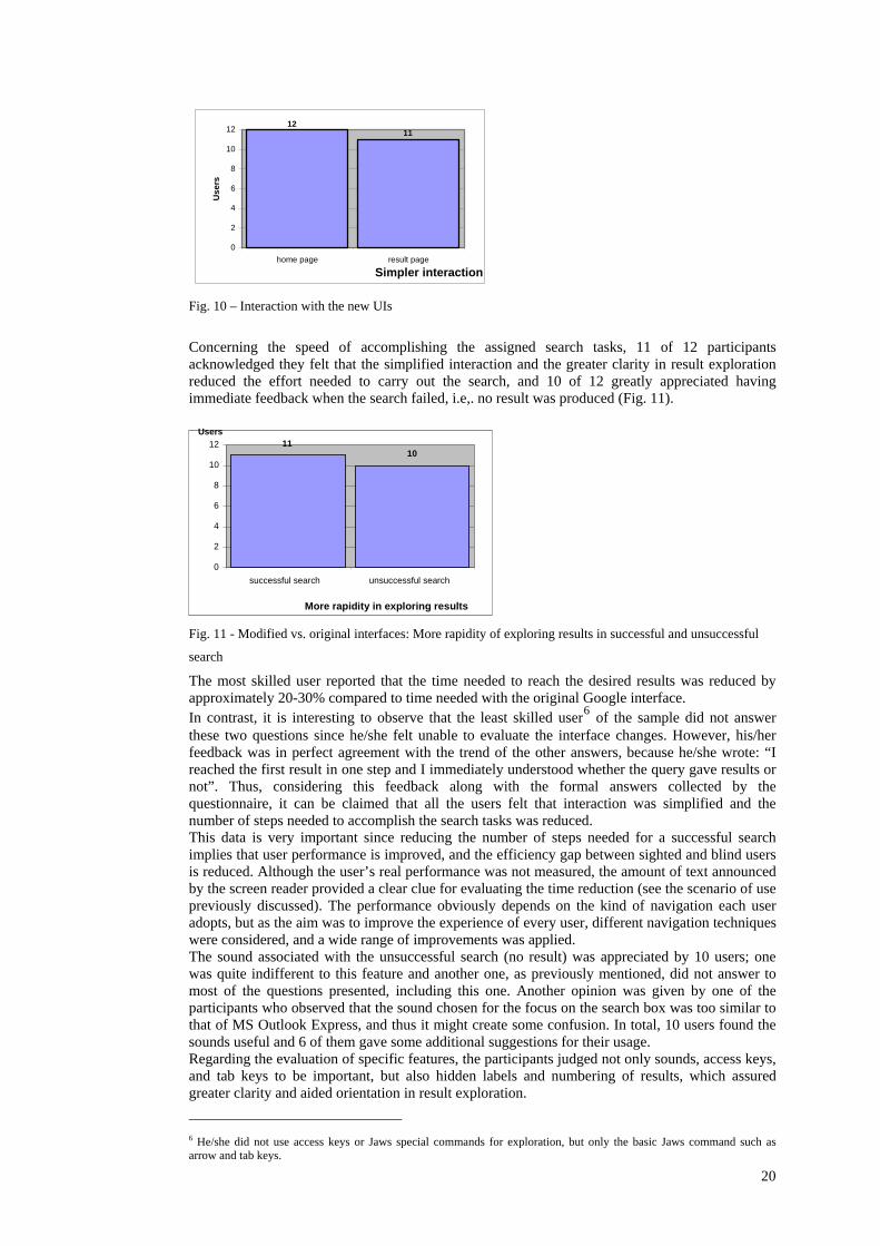
Simpler interaction
1211
0
2
4
6
8
10
12
home page result page
Use
rs
Fig. 10 – Interaction with the new UIs
Concerning the speed of accomplishing the assigned search tasks, 11 of 12 participants acknowledged they felt that the simplified interaction and the greater clarity in result exploration reduced the effort needed to carry out the search, and 10 of 12 greatly appreciated having immediate feedback when the search failed, i.e,. no result was produced (Fig. 11).
More rapidity in exploring results
11 10
0 2 4 6 8
10 12
successful search unsuccessful search
Users
Fig. 11 - Modified vs. original interfaces: More rapidity of exploring results in successful and unsuccessful
search
The most skilled user reported that the time needed to reach the desired results was reduced by approximately 20-30% compared to time needed with the original Google interface. In contrast, it is interesting to observe that the least skilled user6 of the sample did not answer these two questions since he/she felt unable to evaluate the interface changes. However, his/her feedback was in perfect agreement with the trend of the other answers, because he/she wrote: “I reached the first result in one step and I immediately understood whether the query gave results or not”. Thus, considering this feedback along with the formal answers collected by the questionnaire, it can be claimed that all the users felt that interaction was simplified and the number of steps needed to accomplish the search tasks was reduced. This data is very important since reducing the number of steps needed for a successful search implies that user performance is improved, and the efficiency gap between sighted and blind users is reduced. Although the user’s real performance was not measured, the amount of text announced by the screen reader provided a clear clue for evaluating the time reduction (see the scenario of use previously discussed). The performance obviously depends on the kind of navigation each user adopts, but as the aim was to improve the experience of every user, different navigation techniques were considered, and a wide range of improvements was applied. The sound associated with the unsuccessful search (no result) was appreciated by 10 users; one was quite indifferent to this feature and another one, as previously mentioned, did not answer to most of the questions presented, including this one. Another opinion was given by one of the participants who observed that the sound chosen for the focus on the search box was too similar to that of MS Outlook Express, and thus it might create some confusion. In total, 10 users found the sounds useful and 6 of them gave some additional suggestions for their usage. Regarding the evaluation of specific features, the participants judged not only sounds, access keys, and tab keys to be important, but also hidden labels and numbering of results, which assured greater clarity and aided orientation in result exploration.
6 He/she did not use access keys or Jaws special commands for exploration, but only the basic Jaws command such as arrow and tab keys.
20

The skilled user who also executed the test in the Dos and Unix environments, as an additional free comment, acknowledged that the modified version of Google UIs ran better than the original one with Lynx, although the textual browser does not take advantage of shortcuts, sounds, and Tab keys. He reported that the new arrangement of the information is rational and favors both input specification and results navigation. The main advantage was having moved all the accessory links to the bottom of the page, in order to have the cursor immediately positioned on the more useful information. This confirms that the adopted solution is not only valuable with JAWS and IE, but also with other browsers and screen readers. All users found differences between the original and modified interfaces, and suggested that Google adopt all (9 users) or some (2 users) of the proposed changes. Other spontaneous comments showed great appreciation for the project, and they expressed considerable interest in applying the same solutions to other services offered both by Google (Froogle, News, and Scholar) and by e-commerce websites as well.
6.6 Discussion
Although the adopted approach focused as much as possible on the demands of the users considered, certain parts of the test could have been developed in more detail, in order to point out other aspects that did not emerge. For example, it was expected to receive more feedback on the logical subdivision and structuring in sections, which in the authors’ opinion is one of the fundamental aspects of accessible and usable design. The order of the blocks of code was certainly appreciated, especially in the results page, but the general reorganization of the entire page was not the most appreciated feature. In fact, can be seen from the post-questionnaires, the most relevant aspect for the user was finding the most interesting element in the very first position; that is, the search box on the home page and the query results on the results page. Perhaps this observation can be generalized to claim that for other groups of users as well, the basic aspects of interacting with a search engine are the same, as shown in [22]. This result also confirms that when exploring a new UI, blind people utilize the sequential access in order to grasp the entire overview of the page while, once familiarized with the page structure and content, the preferred navigation way is via Tab Keys, Access Key, or special screen reader command (i.e., “h” Key). Even though work was conducted in an iterative manner in the design and execution of all phases of the test, involving the blind author of this study, her expertise and participation in the interface redesign may have led to over-estimate the level of the average user. In fact, besides her advanced knowledge of computer tools, this author has also a specific knowledge of UI design problems, as well as those aspects related to accessibility for the disabled users. These factors led to take for granted certain elements that should have been considered, such as the general concept of structuring a document both from a textual and logical point of view. In fact, the test results showed that the goals for improving usability and accessibility of the modified Google interface were already achieved with only a small part of the overall work performed. Just moving the page contents in the source file and defining the visit order by degrees of importance assigned via Tab Key, can provide the user with a simple way of navigating in order to carry out a search task more efficiently and with a real satisfaction. For instance, these features could be added by Google to the web search UIs, to further improve the search experience of blind users regardless of his/her navigation modality or habits.
7 Google Accessible Search
Accessible Search is a Google Labs product designed to identify and prioritize search results that are more easily usable by blind and visually impaired users. Google does not filter content in the Accessible Search, but simply re-orders the top results by their level of accessibility, taking into account several factors, including a given page simplicity, how much visual imagery it carries and whether or not its primary purpose is immediately viable with keyboard navigation [9]. In practice, Google Accessible Search helps users to find the most accessible pages in the result set obtained by the regular Google Web Search. In this sense, Accessible Google acts as a meta-search which rearrange on-the-fly the results of Google Web Search, promoting accessible contents in the first positions. This kind of service gives an answer to what users requested in the survey conducted by Ivory et al. [16] (see section 2.1). The approach reported in this paper totally differs from such a service, as it does not deal with the results, but considers accessibility and usability of the user interfaces, and do not analyze content
21

accessibility of the search results at all. Therefore, this paper can just make a comparison based on the features offered by the two UIs. Recently, some changes have also been made in the Google Web Search UIs. On the home page, the screen reader immediately captures the focus in the search box, once the page is loaded. Thus, the user may immediately specify the keywords and send the query. However, the most relevant improvement can be found in the Results page, including headers to delineate logical sections. This change provides the possibility of jumping immediately from one result to another, provided that users are familiar with the special Jaws commands "h" or "Insert+F6". The solution described in this paper differs from this, since it aims to simplify various user interaction modalities. The impact of the adopted criteria addresses different interaction aspects, as summarized in the third column of Table 1. Regarding logical sections, heading levels is applied not to single results, but to the main page parts (including the result section). In these terms the main principle is very similar. However, the proposed solution is aimed at providing the user with a mechanism to get an overview of the page structure and at the same time another way to easily read the results found (i.e., through the Tab key and result numbering). In addition, if the user is not familiar with the special screen reader commands, or if he/she is navigating in a textual environment such as the Lynx browser, the important benefit from heading levels may not be exploited. The proposed approach aims at simplifying navigation for users interacting in different ways, in order to improve the experience without requiring additional effort. For this reason, an alternative solution based on a different block ordering was also implemented: thanks to the initial position of the results in the page code, even users who navigate in a sequential way via the arrow keys are able to immediately and effortless read the results. Moreover, the MGIs include other different features that can improve interaction by a blind user. Table 1 (column 2) listed the main features introduced. By comparison with Google Accessible Search, it can be noted that the main differences are related to aural feedback, visiting ordering through the Tab key, Shortcuts and hidden labels. The MGI solution differs from this since, as it has been highlighted in this paper, it aims to simplify various user interaction modalities.
8 Conclusion
The research reported in this paper has applied specific usability criteria to Google UIs in order to improve interaction for the blind. Results of a test carried out with 12 blind users confirmed the value of the adopted design guidelines, and indicated that the application of these criteria ensures better experiences for a large target of users interacting via screen reader in different ways such as sequential reading, arrow keys, Tab Key or Access Key navigation and advanced commands. In conclusion, it is believed that in order to significantly improve usability for the blind it is important to consider their needs from the early stages of design, considering the diverse interaction modalities via screen reader that can be adopted by users. The adopted guidelines, although specific for a search engine, highlight the various factors which can affect the simplicity, comprehension and rapid navigation for any UI. The experiment performed on the reorganization of Google UIs may be generalized, and an analogous redesign may be applied to websites, organizing their UIs in logical sections easily reachable by the blind. For instance, an e-commerce site could highlight its products and a news website could highlight new blogs or topics of interest for the reader (based on the user profile). In the future, it is planned to investigate these new fields. Furthermore, an interesting point concerning the proposed solution is that new generation Web browsers (Mozilla, Firefox, Internet Explorer, Opera) already include their own XSLT transformation engines. They are included to be used by applications like the one proposed here, in which the Web server transmits the data and the formatting separately, and the Web browser merges both and displays the results. Although at present these technologies are not widely used, it is expected that large search engines will start providing pages that are structured differently for different users in the next few years. This study proves that this would be simple to implement, and helpful for final users.
Acknowledgements
We thank all the participants in our user testing who made an enthusiastic effort to help us in our research, and the reviewers of this paper for their very useful comments.
22
References
1. Andronico, P., Buzzi, M., Leporini, B., 2005. Increasing usability of search engine interfaces for the blind. Proceedings of HCI International 2005 (Las Vegas, July 2005), Lea.
2. Andronico, P., Buzzi, M., Castillo, C., Leporini B., 2006. Improving search engine interfaces for blind users: a case study. International Journal Universal Access in the Information Society, 2006 Springer.
3. Card, S. K., Moran, A., Newell, T. P.: The Psychology of Human-Computer Interaction, Lawrence Erlbaum Associates Inc, New Jersey (1983)
4. Carroll John M. (1995) Scenario-Based Design, John Wiley and Son, USA 5. Craven, J., Brophy, P., 2003. Non-visual access to the digital library: the use of digital library interfaces
by blind and visually impaired people. Technical report, Manchester: Centre for Research in Library and Information Management, CERLIM.(http://www.cerlim.ac.uk/pubs/index.php)
6. Damery E., 2003. Jaws for Windows version 4.51. New features and accessing the Internet. In Proceedings of CSUN 2003 (Los Angeles, 2003).
7. Goble C., Harper S., Stevens R., 2000. The Travails of Visually impaired Web Travellers. In Proceedings of Hypertext 2000 (San Antonio, June 2000), ACM, 1-10.
8. Google, 2006. Google Search API. http://code.google.com/apis/soapsearch/ 9. Google, 2007. Accessible Search FAQ, http://labs.google.com/accessible/faq.html 10. Hanson, V.L., 2004. A Web Accessibility Service: An Update and Findings. Proceedings of the Sixth
International ACM Conference on Assistive Technologies, ASSETS 2004, pp 169-176. 11. Hanson, V.L., Brezin, J. P., Crayne, S., Keates, S., Kjeldsen, R., Richards, J. T., Swart, C., Trewin, S.,
2005. Improving Web accessibility through an enhanced open-source browser. IBM Systems Journal, 44 (3), 2005, pp.573-588.
12. Hartson, H. R., Castillo, J. C., Kelso, J, Neale, W. C., 1996. Remote evaluation: the network as an extension of the usability laboratory. Proceedings of CHI 1996 (Vancouver, April 1996), ACM, 228-235.
13. Hartson, H. R., Castillo, J. C., 1998. Remote evaluation for post-deployment usability improvement. Proceedings of CHI 98, (Los Angeles, April 1998), ACM, pp. 22-29.
14. ISO 9241-11, 1998. Ergonomic Requirements for Office Work with Visual Display Terminals (VDTs), Part 11: Guidance on Usability, 1st ed., 1998-03-15, International Organization for Standardization, Geneva.
15. ISTAT, Disabilità in cifre, Quante sono le persone con disabilità in Italia? http://www.disabilitaincifre.it/index.asp 2004-2005 (in italian).
16. Ivory, M. Y., Yu, S., Gronemyer, K., 2004. Search result exploration: a preliminary study of blind and sighted users' decision making and performance. In Proceedings of Extended abstracts of CHI 2004 (Vienna, April 2004), ACM, 1453-1456.
17. Ivory, M. Y., Hearst, M. A., 2004. The state of the art in automating usability evaluation of user interfaces. Computing Surveys, Vol. 2001, N.4, (December 2004), ACM, 470-516.
18. Leporini, B., Andronico P., Buzzi, M., 2004. Designing search engine user interfaces for the visually impaired. Proceedings of International Cross-Disciplinary Workshop on Web Accessibility (NY, May 2004), ACM, pp. 57-66.
19. Leporini, B., Paternò, F., 2004. Increasing Usability when Interacting through Screen Readers. Springer International Journal Universal Access in the Information Society (UAIS) Volume 3, Number 1, Special Issue on "Guidelines, Standards, Methods and Processes for Software Accessibility", pp. 57-70.
20. Mankoff J., Fait H., Tran T., 2005. Is your Web page accessible? A comparative study of methods for assessing Web page accessibility for the blind. In Proceedings of CHI2005 (Portland, April 2005), 899-908.
21. Nielsen, J., 2001. Alertbox January 21, 2001. Usability Metrics. Available at http://www.useit.com/alertbox/20010121.html.
22. Nielsen, J. 2005. Alertbox May 9, 2005. Mental models for search are getting firmer. http://www.useit.com/alertbox/20050509.html.
23. Norman, K. L., Panizzi, E., 2006. Levels of automation and user participation in usability testing. Interacting with Computers, Vol. 18, Issue: 2, March, 2006, Elsevier Science, pp. 246-264.
24. Petrie, H, Hamilton, F., King, N., Pavan, P. Remote Usability Evaluations with Disabled People, Proceedings of CHI 2006, Montréal, Canada, (April 22-27, 2006), pp. 1133-1141.
25. Scholtz, J., 2001. Adaptation of traditional usability testing methods for remote testing. In Proceedings of HICSS 2001 (Hawaii, January 2001), IEEE, 1-9.
26. Raman, T.V., 2007. Overview Of Accessible Solutions From Google, http://labs.google.com/accessible/overview.html
27. Takagi, H., Asakawa, C., Fukuda, K., Maeda, J., 2004. Accessibility designer: visualizing usability for the blind. Proceedings of SIGACCESS 2004 (Atlanta, October 2004), ACM, 177-184.
28. Thompson, K. E., Rozanski, E. P., Haake, A. R., 2004. Here, there, anywhere: remote usability testing That works. Proceedings of SIGITE 2004, Salt Lake City, October 2004, pp. 132-137.
29. WHO. Magnitude and causes of visual impairment. Fact Sheet N°282, November 2004, http://www.who.int/mediacentre/factsheets/fs282/en/
30. W3C. Web Content Accessibility Guidelines 1.0. http://www.w3.org/TR/WCAG10/, 5 May 1999.
23

31. W3C. SOAP Version 1.2 Part 0: Primer. W3C Recommendation 24 June 2003. http://www.w3.org/TR/soap12-part0/
32. W3C. XSL Transformations (XSLT). http://www.w3.org/TR/xslt, 16 Nov 1999. 33. Yu, W., McAllister, G., Kuber, R., Murphy, E. & Strain, P., 2005. Improving Web Accessibility Using
Content-Aware Plug-ins. In Extended Abstracts of CHI'05, Portland, USA, pp. 1893-1896.
24