Embed Size (px)
Citation preview
EVALUATION 5: HOW DID YOU ATTRACT/ADDRESS
YOUR AUDIENCE?
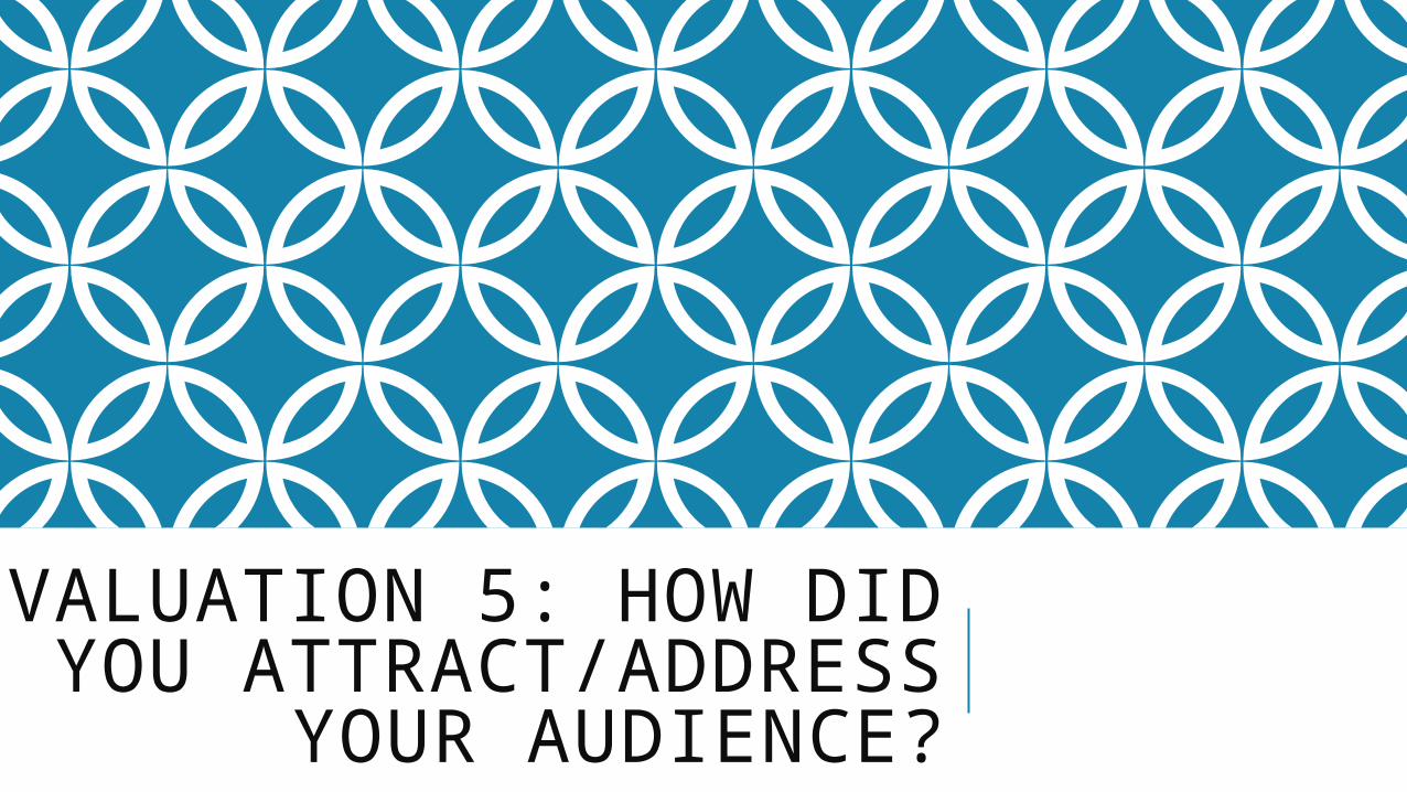
Front CoverBy using the large font for the head line on my front cover, this attracts my target audience as it is bold and stands out. The font that I have used is simple because I did not want to use anything that may put my target audience off of looking at my magazine, as well as I did not want it to be boring. By using a bold, modern font it attracts my audience. Additionally the picture that I have on my front cover also attracts my target audience. I have not used a girl who is wearing too much make-up or who is under dressed. She is wearing appropriate clothing and the image on the front cover is not provocative. Women from the age of 16+ do not want to look at other women wearing hardly any clothes; they are more interested in fashion and make-up. The cover lines that I have used are all of a similar font and the use of colours. I stuck to a colour scheme on the front cover because I did not want there to be a clash of different colours all over, as this would not look professional and would not attract my target audience. Lots of different colours looks messy on a front cover and due to my mature target audience it means that the colours have to match because they will then become disinterested if they look too bright or too dull compared to the rest of the front cover.
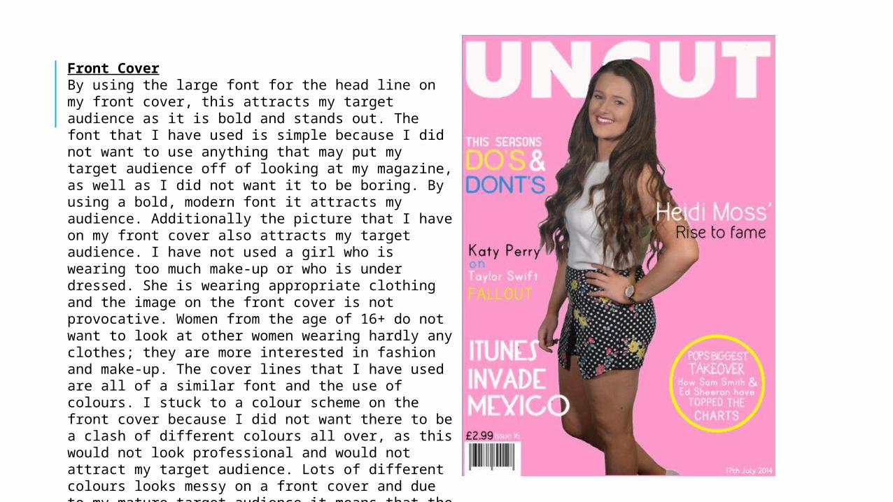
Contents page On the contents page I have stuck to a modern design and colour scheme. I did not want to stick to a colour scheme throughout the whole thing. This is why I used orange and black as a colour scheme. This still fits in with the summer theme as it is relevant to summer. Additionally I did not want to use pink blue and yellow all the way through because my audience may become bored. As they are an older more mature target audience they would like to see a variety of different colours. I have included different headlines for the sections of the magazine. This allows the people who are looking at the magazine to skip right to the page that they want to look at. I have included images in the photo roll because I thought it made the page look more fun and professional. The colour that is used for the photo frame also fits in well with my over all colour scheme. Finally I have included a picture of another Uncut magazine. This makes it look more professional as it shows that there are other editions of this magazine for people to read.
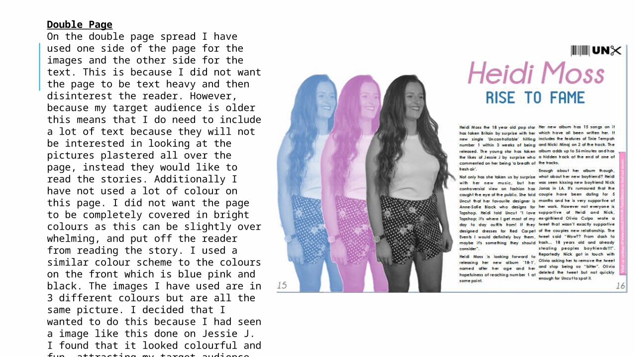
Double PageOn the double page spread I have used one side of the page for the images and the other side for the text. This is because I did not want the page to be text heavy and then disinterest the reader. However, because my target audience is older this means that I do need to include a lot of text because they will not be interested in looking at the pictures plastered all over the page, instead they would like to read the stories. Additionally I have not used a lot of colour on this page. I did not want the page to be completely covered in bright colours as this can be slightly over whelming, and put off the reader from reading the story. I used a similar colour scheme to the colours on the front which is blue pink and black. The images I have used are in 3 different colours but are all the same picture. I decided that I wanted to do this because I had seen a image like this done on Jessie J. I found that it looked colourful and fun, attracting my target audience. It is not a boring page to look at as well as it gives a good effect attracting my target audience, who would be interested in looking at this sort of thing.