Embed Size (px)
Citation preview

Evaluation
Larissa NascimentoMusic Magazine

Conventions on music magazine
my music magazine
NMF’s music magazine

How is my magazine different form the others!
• I think my magazine is fairly different from other rock magazines out there, the one thing that I was focused the most would be that I didn’t want my rock magazine to be dark and harsh, most magazines out there is like that now, which again is one of the conventions of a rock magazine. I used the colour red which again in one of the convention of a rock magazine (RED= DEATH) it is a very strong colour so I thought it would go well with my magazine.
How does my magazine represents in particular social
groups• I think when people look at my magazine they will be
a bit more open minded because its not dark and scary like the other rock magazine, but in the other hand I think people that are really into hard rock would really enjoy reading the magazine, some of the rocks magazine can come across as really gothic , so I wanted to kind of change that convention, a rock magazine doesn’t need to be aggressive to be able to sell well. I know many people that their parents wouldn’t let them buy a rock magazine because it can be very aggressive and it can sometimes have unpleasant words, but overall I think my magazine fits into all social group, even because the magazine its not all about rock, it also has information for people that are interested in R&B.

What kind of media institution might distribute your media
product and why ?• I think IPC media would be a great distribute
for my magazine, with more than 60 iconic media brands, I think it would be a great deal also because IPC media is committed to working in partnership with its consumer.
• Also sitting alongside the publishing divisions is IPC advertising, which would allowed me as a client and the agencies to purchase bespoke advertising solutions across all of their brands
• As the UK’s leading consumer magazine publisher IPC engage with 26m UK adults.

Audience for my magazine
• I think my main audience would be teenagers and young adults, because they are the ones that are more into rock, and they are the ones that have more spare money to spend on things like magazines, I think girls would be also the main audience because the main image on the front cover is a girl and colour of it is red, so I would think the females would connect more to the magazine than the boys.
How did I attract my audience
• I focused it on my front page a lot, because that is what attracts people to buy it, so I wanted to make sure that it wasn’t too plain so I made the front page quite bright so it would get peoples attention.
• I made sure that the picture was the main attraction on the front page, because I think the main image is one of the first thing that people look at.
• I also made sure that it had a Facebook link so people on Facebook could find us and get more people to know about the ‘R’ magazine.
• I also used quotations, so it would link to the questionnaire on the double page spread.
• I also made sure that the letter ‘R’ really stood out so people would recognize the magazine when they see it.

What I have learned about technology
• When I started using Photoshop I didn’t know a single thing, it was my first time, at the beginning I was a bit worried but after I started experimenting with different types of things I got use to it very quickly and I really enjoyed myself using it.
This is the first image that I fixed on Photoshop (the one on the right), after I started practising even more I got to know even more different things that I could do by using Photoshop.

Difference between my magazines.
This is my college magazine, the first magazine that I have ever done.
this is my music magazine, my second magazine.

Changes I would make on my front cover
• If I could change anything about my front cover I would probably change the colour, and instead of red I would probably use a darker colour so it would be more suitable for boys as well, and also try different fronts with the letter ‘R’, other than that I am happy with the results.

Changes I would make on my content page
If I could change anything about my content page I would probably add more picture instead of just one, I would try to put one picture for each topic, but I really like how the background looks, it looks very clear and easy to understand, also I would have a darker colour, because the current colour is quite simple and doll.
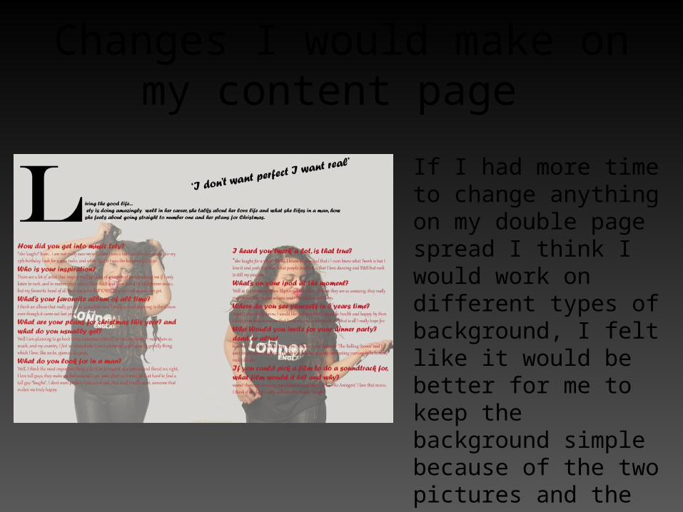
Changes I would make on my content page
If I had more time to change anything on my double page spread I think I would work on different types of background, I felt like it would be better for me to keep the background simple because of the two pictures and the red writing I didn’t want to over do it, so I kept it simple and easy to understand. I think the double page spread is the one that enjoyed doing the most, I had a great time taking the pictures.
Final evaluation • At the beginning I wasn’t really sure about my ideas, I was also
very worried about working with Photoshop because I never worked with it before, but as soon as I started working with it I learned a lot of different things what I could do and change.
• I took my pictures in the studio and I had a great time, it didn’t take much time to get the shots that I wanted, so I was really happy about that.
• The reason that I chose to do my magazine based on rock is because I am into different types of music so I focused my main aim on rock because I felt like I could learn different things that I didn’t know.
• Overall I really enjoyed myself doing the music magazine. I learned a lot that you have to be carful with the picture you take and the colour you use because it really does affect on the target audience,
• If I could do this project all over again I think I would organize myself more, and maybe do a video of what people thing of my magazine instead of the questionnaire.