Embed Size (px)
Citation preview
The Pennsylvania State University
The Graduate School
College of Earth and Mineral Sciences
EVALUATION OF THE COLORBREWER COLOR SCHEMES FOR
ACCOMMODATION OF MAP READERS WITH IMPAIRED COLOR VISION
A Thesis in
Geography
by
Steven D. Gardner
© 2005 Steven D. Gardner
Submitted in Partial Fulfillment of the Requirements
for the Degree of
Master of Science
August 2005
I grant The Pennsylvania State University the nonexclusive right to use this work for the University's own purposes and to make single copies of the work available to the public on a not-for-profit basis if copies are not otherwise available.
Steven D. Gardner

The thesis of Steven D. Gardner was reviewed and approved* by the following:
Cynthia A. Brewer Associate Professor of Geography Thesis Advisor
Lorraine Dowler Associate Professor of Geography
Roger M. Downs Professor of Geography Head of the Department of Geography
*Signatures are on file in the Graduate School
iii
ABSTRACT
Color-vision impairment, or “colorblindness,” affects over four percent of the population. Depending on the type and extent of abnormality, colors that look different to people with normal color vision may look the same to the color-vision impaired. This can lead to problems understanding maps in which color schemes are used to represent data. Thus, map design benefits from knowledge of which color schemes inhibit map reading ability for this group. In this thesis I will describe the methods and results of an experiment testing the color schemes of an online Flash-based tool called ColorBrewer (http://www.colorbrewer.org). This tool aids thematic map design by providing users with color scheme options and specifications based on data type and number of classes. In this study, each color scheme was tested for accommodation of red-green color-vision impairment through a concurrent mixed-method experiment collecting both quantitative and qualitative data. Choropleth maps were presented on an LCD computer screen to both an experimental group of the color-vision impaired and a control group of normal color vision individuals. Multiple-choice map reading questions were asked, followed by a semi-structured interview on perception of the scheme. These answers allow for an evaluation of the effectiveness of each scheme. Quantitative results show that subjects could generally answer the multiple-choice questions correctly, but interview responses reveal the level of difficulty that they had with certain schemes. The sequential schemes all accommodate the color-vision impaired due to their change in lightness. Diverging schemes also accommodate when using a hue pair that is differentiable. The diverging schemes that do not accommodate use reds/oranges and greens on opposite ends of the scheme which lead to confusion. Variations of the qualitative schemes, which use many different hues, were found to be either possibly confusing or definitely confusing to the color-vision impaired based on subjects’ responses. Blue/purple and green/orange pairs commonly caused difficulty in differentiation. Also, the lighter, pastel colors were found to be much more confusing to the color-vision impaired than darker colors. These findings will help refine the ColorBrewer tool while improving graphic communication by enhancing knowledge of accommodating color schemes.
iv
TABLE OF CONTENTS
LIST OF FIGURES .....................................................................................................vi
LIST OF TABLES.......................................................................................................viii
ACKNOWLEDGEMENTS......................................................................................... ix
Chapter 1 Introduction ................................................................................................1
ColorBrewer ..................................................................................................2
Chapter 2 Review of Literature...................................................................................8
Color-vision...................................................................................................8 Color-vision Impairment ...............................................................................10 Color in Cartography.....................................................................................15 Accessibility and Design ...............................................................................18
Chapter 3 Methods......................................................................................................23
Subject Sample and Recruiting .....................................................................24 Subject Groups and Map Order .....................................................................27 Map Production .............................................................................................29 Experimental Materials .................................................................................33 Experimental Procedure ................................................................................36 Analysis .........................................................................................................41
Chapter 4 Results and Discussion...............................................................................44
Quantitative Results.......................................................................................44 Qualitative Results.........................................................................................49
Sequential Schemes.........................................................................49 Diverging Schemes .........................................................................56 Qualitative Schemes........................................................................60 General Results ...............................................................................66
Discussion......................................................................................................69 Recommendations for ColorBrewer..............................................................74
Chapter 5 Conclusion..................................................................................................88
Bibliography ................................................................................................................94
Appendix A Informed Consent Form .........................................................................97
v
Appendix B Experimental Maps.................................................................................100
Appendix C Test Form................................................................................................136
Appendix D Interview Guide......................................................................................148
Appendix E Recruitment Flyers..................................................................................149
vi
LIST OF FIGURES
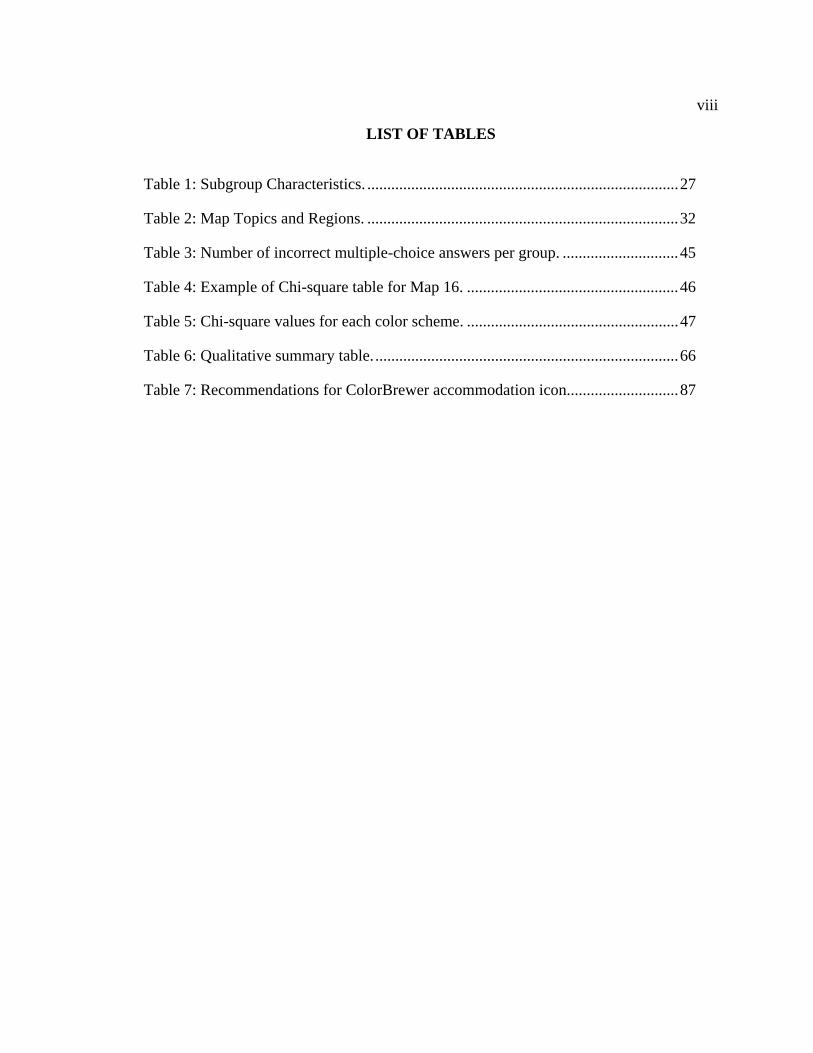
Figure 1: Screenshot of ColorBrewer (http://www.colorbrewer.org).........................3
Figure 2: Sequential (left), diverging (center), and qualitative (right) ColorBrewer color schemes in the five class format. .................................................................4
Figure 3: ColorBrewer usability icons (left) and examples of suitability ratings for one icon (right). ....................................................................................................5
Figure 4: Electromagnetic Spectrum. ..........................................................................9
Figure 5: CIE 1931 xy color system chromaticity diagram; wavelengths in nanometers. ...........................................................................................................13
Figure 6: Confusion lines for protanopes (left) and deuteranopes (right), on the 1931 CIE color system chromaticity diagram.. ....................................................14
Figure 7: Group A color schemes with names and associated map number. ..............28
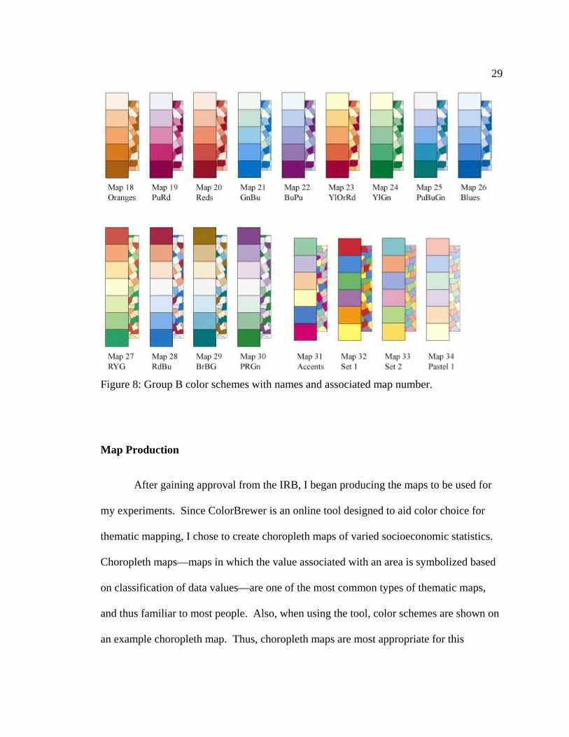
Figure 8: Group B color schemes with names and associated map number................29
Figure 9: Example of cut out color ramps showing all class variations of a color scheme. .................................................................................................................36
Figure 10: Example of an Ishihara Plate......................................................................38
Figure 11: Yellow-Orange-Brown and Yellow-Orange-Red sequential schemes in five class formats. .................................................................................................50
Figure 12: Red-Purple, Blue-Green, Orange-Red, Red, and Green-Blue sequential schemes in five class formats. ..............................................................................51
Figure 13: Purple, Yellow-Green-Blue, Orange, Purple-Red, and Blue-Purple sequential schemes in five class formats. .............................................................52
Figure 14: Green, Yellow-Green, and Purple-Blue-Green sequential schemes in five class formats. .................................................................................................54
Figure 15: Purple-Blue and Blue sequential schemes in five class formats. ...............55
Figure 16: Red-Yellow-Blue, Orange-Purple, Red-Gray, Red-Blue, Brown-BlueGreen, and Purple-Green diverging schemes in seven class formats............56
Figure 17: Pink-Green diverging scheme in seven class format..................................58

vii
Figure 18: Spectral and Red-Yellow-Green diverging schemes in seven class formats. .................................................................................................................59
Figure 19: Paired and Accents qualitative schemes in six class formats.....................61
Figure 20: Dark 2 and Set 1 qualitative schemes in six class formats. ........................62
Figure 21: Set 3 and Set 2 qualitative schemes in six class formats............................63
Figure 22: Pastel 2 and Pastel 1 qualitative schemes in six class formats. ..................64
Figure 23: Spectral (top) and Red-Yellow-Green diverging schemes showing the full range of class variations with suggested symbolization in ColorBrewer. .....76
Figure 24: Red-Gray diverging scheme showing the full range of class variations with suggested symbolization in ColorBrewer.....................................................77
Figure 25: Paired scheme showing all eleven classes and suggested symbolization in ColorBrewer as each color is added. ................................................................78
Figure 26: Accents scheme showing all eight classes and suggested symbolization in ColorBrewer as each color is added. ................................................................79
Figure 27: Dark 2 scheme showing all eight classes and suggested symbolization in ColorBrewer as each color is added. ................................................................80
Figure 28: Set 2 scheme showing all eight classes and suggested symbolization in ColorBrewer as each color is added. ....................................................................81
Figure 29: Set 1 scheme showing all nine classes and suggested symbolization in ColorBrewer as each color is added. ....................................................................82
Figure 30: Set 3 scheme showing all twelve classes and suggested symbolization in ColorBrewer as each color is added. ................................................................83
Figure 31: Pastel 1 scheme showing all nine classes and suggested symbolization in ColorBrewer as each color is added. ................................................................84
Figure 32: Pastel 2 scheme showing all eight classes and suggested symbolization in ColorBrewer as each color is added. ................................................................85
viii
LIST OF TABLES
Table 1: Subgroup Characteristics. ..............................................................................27
Table 2: Map Topics and Regions. ..............................................................................32
Table 3: Number of incorrect multiple-choice answers per group. .............................45
Table 4: Example of Chi-square table for Map 16. .....................................................46
Table 5: Chi-square values for each color scheme. .....................................................47
Table 6: Qualitative summary table. ............................................................................66
Table 7: Recommendations for ColorBrewer accommodation icon............................87

ix
ACKNOWLEDGEMENTS
I would like to thank Dr. Cindy Brewer for her guidance as advisor for this
research project, Dr. Lorraine Dowler for her recommendations as a committee member
and second reader, and Dr. Alan MacEachren for his assistance as a committee member.
Thank you also to the Association of American Geographers Cartography Specialty
Group for providing me with a Master’s Thesis Research Grant which aided in
compensation of research subjects, and to the Penn State Department of Geography Ruby
Miller Fund for additional financial assistance to aid subject compensation.

Chapter 1
Introduction
Color-vision impairment, more commonly known as colorblindness, affects
nearly eight percent of the male population and less than one percent of the female
population (Sharpe et al., 1999). This impairment alters the way in which colors are
perceived; it is due to abnormalities in the color-sensitive photoreceptors in the retina
known as cones. Depending on the type and extent of cone abnormality, colors that are
differentiable to those with normal color vision may appear similar or the same to the
color-vision impaired. This can lead to problems understanding maps which use a color
scheme containing colors similar in perception, such as a choropleth map showing
various shades of red and green. A poor color scheme will limit a map’s ability to
communicate. When you consider that most maps are produced to be read by a large
number of people and that in a group as small as 25 at least one individual will likely
have abnormal color vision, it becomes apparent that this problem needs to be addressed
during map design.
Color choice on maps is an important, and often overlooked, aspect of map
design. Use of color on maps can be traced back to Ancient Egyptian maps produced
around 1250 BC (Ehrensvard, 1987), and color has always been an integral part of the
field of cartography. Two of Bertin’s (1983) primary visual variables, or ways of
graphically symbolizing difference between entities, involve color. Both hue (what we
commonly know as color, e.g., yellow or blue) and value (the lightness or darkness of a

2
color) were described by Bertin as possibilities for distinguishing the different data values
to be represented on a map. This use of color as way to symbolize data gives the map
reader a quick, clear visual impression and is intuitively appropriate for giving a pictorial
description of Earth’s surface (Ehrensvard, 1987). This communication of spatial
information is the essence of cartography. Thus, to communicate effectively with those
individuals with color-vision impairment, an understanding of this condition is needed
when designing a map.
ColorBrewer
For the average map designer, who most likely is not going to have a thorough
understanding of color space, choosing an appropriate color scheme for a map can be a
difficult task, let alone trying to find one that accommodates the color-vision impaired.
This is why Mark Harrower and Cynthia Brewer (2003) have developed an online tool
called ColorBrewer (http://www.colorbrewer.org) to help thematic map designers choose
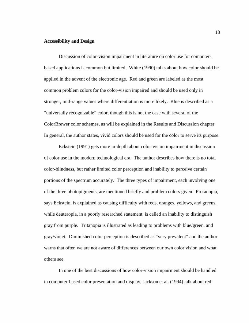
color schemes that are appropriate to their needs. A screen shot of the ColorBrewer
interface can be seen in Figure 1.
This tool, developed in Flash, allows users to enter the number of classes of data
to be mapped and the nature of the data (sequential, diverging, or qualitative) and
presents the user with a series of appropriate color schemes from which to choose. The
tool, designed with federal agencies in mind, was funded through the NSF’s Digital
Government Program. These agencies collect spatial data and communicate these data in
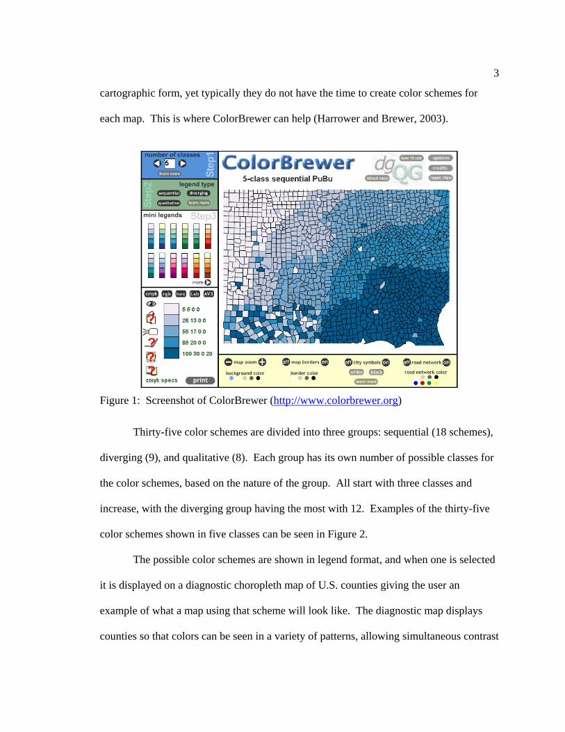
3
cartographic form, yet typically they do not have the time to create color schemes for
each map. This is where ColorBrewer can help (Harrower and Brewer, 2003).
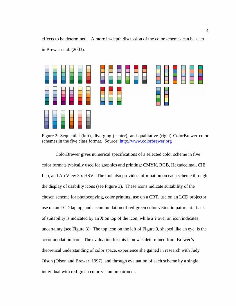
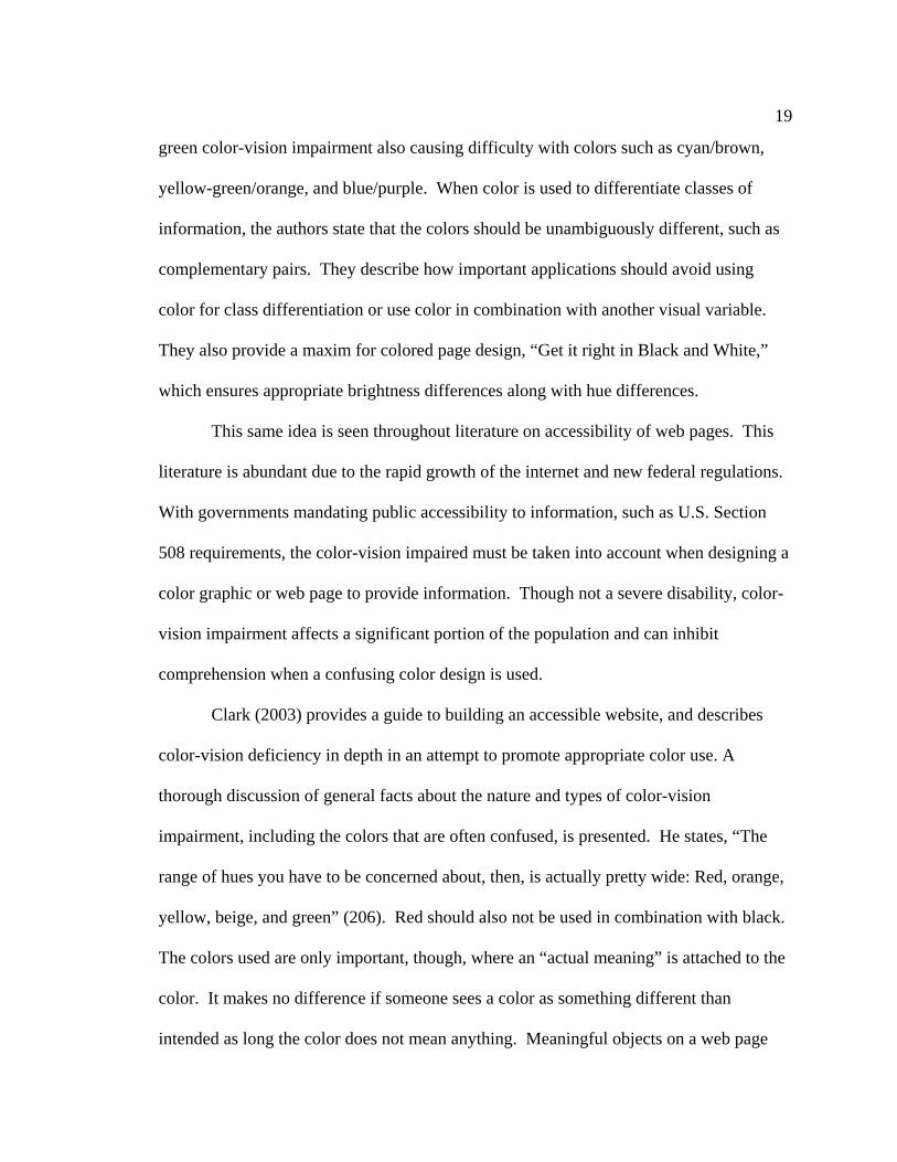
Thirty-five color schemes are divided into three groups: sequential (18 schemes),
diverging (9), and qualitative (8). Each group has its own number of possible classes for
the color schemes, based on the nature of the group. All start with three classes and
increase, with the diverging group having the most with 12. Examples of the thirty-five
color schemes shown in five classes can be seen in Figure 2.
The possible color schemes are shown in legend format, and when one is selected
it is displayed on a diagnostic choropleth map of U.S. counties giving the user an
example of what a map using that scheme will look like. The diagnostic map displays
counties so that colors can be seen in a variety of patterns, allowing simultaneous contrast
Figure 1: Screenshot of ColorBrewer (http://www.colorbrewer.org)
4
effects to be determined. A more in-depth discussion of the color schemes can be seen
in Brewer et al. (2003).
ColorBrewer gives numerical specifications of a selected color scheme in five
color formats typically used for graphics and printing: CMYK, RGB, Hexadecimal, CIE
Lab, and ArcView 3.x HSV. The tool also provides information on each scheme through
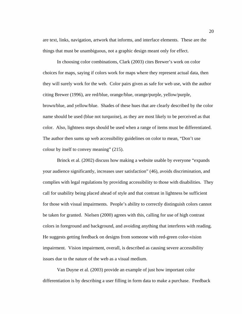
the display of usability icons (see Figure 3). These icons indicate suitability of the
chosen scheme for photocopying, color printing, use on a CRT, use on an LCD projector,
use on an LCD laptop, and accommodation of red-green color-vision impairment. Lack
of suitability is indicated by an X on top of the icon, while a ? over an icon indicates
uncertainty (see Figure 3). The top icon on the left of Figure 3, shaped like an eye, is the
accommodation icon. The evaluation for this icon was determined from Brewer’s
theoretical understanding of color space, experience she gained in research with Judy
Olson (Olson and Brewer, 1997), and through evaluation of each scheme by a single
individual with red-green color-vision impairment.
Figure 2: Sequential (left), diverging (center), and qualitative (right) ColorBrewer colorschemes in the five class format. Source: http://www.colorbrewer.org

5
A majority of the diverging schemes were chosen to potentially accommodate
color-vision impaired readers. Sequential schemes use changes in lightness to
accommodate all users. Qualitative schemes, on the other hand, use primarily change in
hue and are potentially confusing for the color-vision impaired reader. Thorough testing
of these color schemes with a group of red-green color-vision impaired individuals is
necessary to ensure the reliability of the accommodation icon in ColorBrewer, and to
increase knowledge of map reading by and perceptions of this portion of the population.
To address this, I have conducted experimental testing of each individual color
scheme with the color-vision impaired, with the purpose of better understanding the map
reading and perception abilities of individuals with red-green color-vision impairment
when using the various ColorBrewer color schemes. Through advertising and offer of
compensation, I gathered a group of twenty volunteers with impaired color-vision and a
group of twenty volunteers with normal color vision to take part in my experiment. Ten
individuals from each group tested seventeen of the ColorBrewer color schemes. During
Figure 3: ColorBrewer usability icons (left) and examples of suitability ratings for one icon (right). The eye icon (top left) indicates suitability for color-vision impaired readers.
6
these experimental sessions, I gathered both quantitative and qualitative data. Multiple-
choice map reading questions, on both overall map patterns and individual unit values,
were used to measure the relationship between map color scheme and the map reading
ability of individuals with color-vision impairment as compared to individuals with
normal color vision. At the same time, the usefulness of the various color schemes was
explored using a semi-structured interviewing technique in which participants were asked
questions after they had experience with each color scheme.
The following are questions I address in this research:
• For each individual ColorBrewer color scheme, can color-vision impaired users
read and understand maps using the selected scheme as accurately and efficiently as normal vision users?
• What color schemes pose the most problems for the color-vision impaired
• Among the color-vision impaired, is there a difference in their ability to perceive the various colors of the ColorBrewer tool?
• Which color schemes are best at accommodating the color-vision impaired? • Is there a difference in perception between viewing the color schemes on screen
versus on paper?
• How does a change in the number of classes used in each scheme affect a map’s readability?
The results gained through triangulation of both quantitative and qualitative data
can be used to refine the ColorBrewer tool, and will improve map communication by
enabling maps to be produced that use color schemes that accommodate the color-vision
impaired. The findings will validate or correct the information displayed in the
accommodation usability icon for each of the ColorBrewer color schemes tested, telling
7
the user whether the chosen scheme will be appropriate for those with impaired color
vision. The study will also improve understanding of the map reading ability of the
color-vision impaired compared to the ability of normal color vision individuals.
The accommodation of this group of individuals is not only an effort
cartographers should make in good conscience, but also is a standard that must be upheld
by all federal agencies. Section 508 of the 1998 Amendment to the Workforce
Rehabilitation Act requires that all electronic and information technology used by federal
agencies must be accessible to people with disabilities, including both employees and the
general public (U.S. Department of Justice, 2004). Even though it is not a severe
disability, color-vision impairment must be accommodated under these Federal 508
Standards. Thus, an improved ColorBrewer tool can play a more important role to
federal agencies.
Enhanced knowledge of appropriate color schemes for the color-vision impaired
will benefit the cartographic community, while also increasing the limited amount of
literature that has previously been written on this topic. The results of this study, along
with a more reliable ColorBrewer tool, will also be important to non-cartographic
communities, such as graphic design and web development, in which it is essential to
communicate effectively with color to large populations.
Chapter 2
Review of Literature
In this section I discuss the existing literature on the topics of color and its use in
graphic communication. First I will give an overview of color vision, followed by
impaired color vision. I will then discuss the use of color in cartography, and lastly how
color plays an important role in accessible graphic and web design.
Color-vision
The history of color-vision research is long and elaborate. Sir Isaac Newton was
the first to propose the received view (Thompson, 1995), which states that things in and
of themselves do not have color, but have color by virtue of how they appear to us. Since
we perceive different wavelengths of light as different colors, an object reflecting a
certain range of wavelengths of light more than others leads us to perceive this reflection
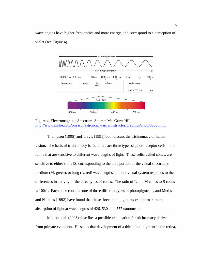
as the object’s color. The portion of the electromagnetic spectrum visible to humans
includes light with wavelengths ranging from just under 400 nanometers to slightly above
700 nanometers (nm). This light is essentially “photons vibrating at energies that allow
them to interact with” our retina (Purves and Lotto, 2003, 17). Lights at the end of the
visible spectrum with the longest wavelengths, corresponding to a perception of red, have
lower frequencies, and thus the least amount of energy. Lights with the shortest
9
wavelengths have higher frequencies and more energy, and correspond to a perception of
violet (see Figure 4).
Thompson (1995) and Travis (1991) both discuss the trichromacy of human
vision. The basis of trichromacy is that there are three types of photoreceptor cells in the
retina that are sensitive to different wavelengths of light. These cells, called cones, are
sensitive to either short (S, corresponding to the blue portion of the visual spectrum),
medium (M, green), or long (L, red) wavelengths, and our visual system responds to the
differences in activity of the three types of cones. The ratio of L and M cones to S cones
is 100:1. Each cone contains one of three different types of photopigments, and Merbs
and Nathans (1992) have found that these three photopigments exhibit maximum
absorption of light at wavelengths of 426, 530, and 557 nanometers.
Mollon et al. (2003) describes a possible explanation for trichromacy derived
from primate evolution. He states that development of a third photopigment in the retina,
Figure 4: Electromagnetic Spectrum. Source: MacGraw-Hill, http://www.mhhe.com/physsci/astronomy/arny/instructor/graphics/ch03/0305.html
10
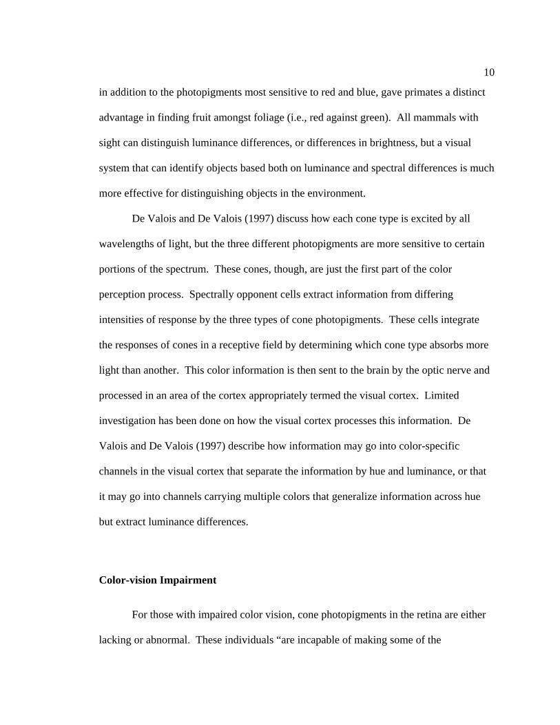
in addition to the photopigments most sensitive to red and blue, gave primates a distinct
advantage in finding fruit amongst foliage (i.e., red against green). All mammals with
sight can distinguish luminance differences, or differences in brightness, but a visual
system that can identify objects based both on luminance and spectral differences is much
more effective for distinguishing objects in the environment.
De Valois and De Valois (1997) discuss how each cone type is excited by all
wavelengths of light, but the three different photopigments are more sensitive to certain
portions of the spectrum. These cones, though, are just the first part of the color
perception process. Spectrally opponent cells extract information from differing
intensities of response by the three types of cone photopigments. These cells integrate
the responses of cones in a receptive field by determining which cone type absorbs more
light than another. This color information is then sent to the brain by the optic nerve and
processed in an area of the cortex appropriately termed the visual cortex. Limited
investigation has been done on how the visual cortex processes this information. De
Valois and De Valois (1997) describe how information may go into color-specific
channels in the visual cortex that separate the information by hue and luminance, or that
it may go into channels carrying multiple colors that generalize information across hue
but extract luminance differences.
Color-vision Impairment
For those with impaired color vision, cone photopigments in the retina are either
lacking or abnormal. These individuals “are incapable of making some of the

11
comparisons of cone activity needed to generate the full range of color sensation” (Purves
and Lotto, 2003, 104). They are at a disadvantage in distinguishing objects based on their
spectral qualities because they do not have the full use of three photopigments. Thus,
their neurological responses to different wavelengths of light may be similar, while the
responses for someone with all three cone photopigments would be perception of
different hues.
Sharpe et al. (1999) and Rushton (1975) explain how this is commonly a sex-
linked recessive genetic characteristic. The genes determining cone structure are held in
the X chromosome. Thus, women, with two X chromosomes, have two chances of
receiving the proper genes, while men have only one chance with one X chromosome.
This explains the great disparity in proportions of men and women with color-vision
deficiency.
Sharpe et al. (1999) give an in-depth discussion of the different types of color-
vision impairment. The three types are anomalous trichromacy, dichromacy, and
monochromacy. While normal color vision uses three primary cone photopigments to
match colors, anomalous trichromats are individuals who have all three cone primaries
but have weakness in sensitivity in one of them, leading to abnormal color perception.
The types of anomalous trichromat are protanomalous (with long wavelength cone
weakness), deuteranomalous (medium wavelength weakness), and tritanomalous (short
wavelength weakness). Dichromats are individuals who have only two primary cone
photopigments with which to match colors. The three types of dichromat are protanopes,
deuteranopes, and tritanopes. Protanopes lack the long wavelength (red) cones,
deuteranopes lack medium wavelength (green) cones, and tritanopes lack short
12
wavelength (blue) cones. Monochromats are extremely rare individuals who have only
one type of cone, leading to truly colorblind (black and white) vision. The previous
types, though, make up virtually all of the cases of impairment. They are not colorblind,
but rather simply do not see the full range of colors that are seen in normal color vision.
Thus, I am using the term proposed in Olson and Brewer (1997) of “color-vision
impaired” to describe this group.
In a more philosophical view on color-vision impairment, Broackes (1997)
describes his own red-green color deficiency. He describes how he confuses these two
colors in certain situations yet after being told of his mistake he can often “come to see
the object as having its true color” (216). To him the object will look different even
though the visual circumstances may be the same. For this reason, the author describes
how color deficients may just be individuals who are not as good at viewing how an
object reflects specific wavelengths, or “changes the light,” from just one viewing. He
believes this ambiguity can be cleared up by more viewings.
The CIE 1931 color system, which is well described in Wyszecki and Stiles
(1982), shows how combinations of three primaries can describe perceptions of all of the
millions of different hues that we see. The French Commission Internationale de
l’Eclairage (CIE) recommended this as the first color system. This system, represented
by a horseshoe shaped diagram (see Figure 5), shows the relative amounts of each
primary needed to specify all colors. Values of lowercase x, y, and z, correspond to the
percentage of each primary. As described in MacAdam (1997), these values always add
up to one, and can be mapped on the two-dimensional diagram using only two values (in
this case x and y), one for each axis. The third is simply one minus x minus y.

13
As can be seen in Figure 5, an x value near 0.5 and a y value near 0.5 corresponds
to a yellowish-orange hue. The solid curve on the outside represents the entire spectrum
of hues at full saturation. A central point represents neutral (gray or white), where each
value is near one-third. Luminance is often represented as a capital Y, creating a third
dimension. Chromaticity xy coordinates for the three primaries are x=1, y=0; x=0, y=1;
and x=0, y=0. This system can be misleading, though, because the values do not directly
correspond to the underlying cone responses (Luo, 1999).
Figure 5: CIE 1931 xy color system chromaticity diagram; wavelengths in nanometers. Source: http://groups.csail.mit.edu/graphics/classes/6.837/F01/Lecture02/CIE1931.gif
14
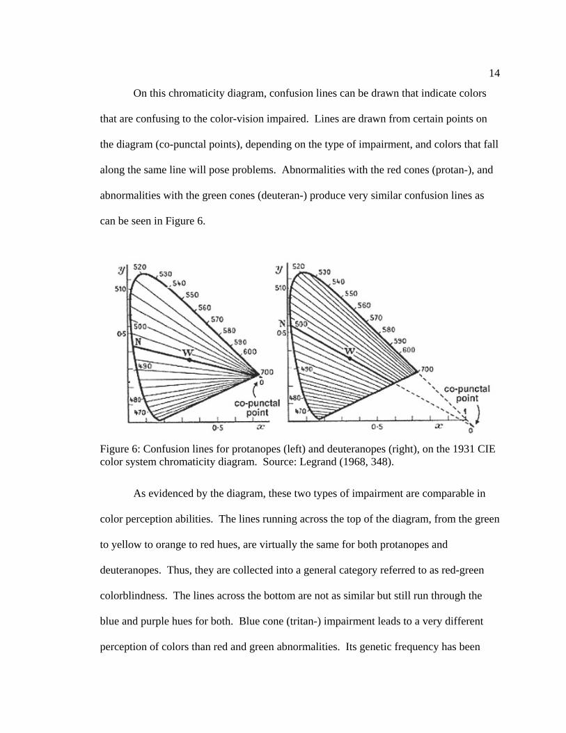
On this chromaticity diagram, confusion lines can be drawn that indicate colors
that are confusing to the color-vision impaired. Lines are drawn from certain points on
the diagram (co-punctal points), depending on the type of impairment, and colors that fall
along the same line will pose problems. Abnormalities with the red cones (protan-), and
abnormalities with the green cones (deuteran-) produce very similar confusion lines as
can be seen in Figure 6.
As evidenced by the diagram, these two types of impairment are comparable in
color perception abilities. The lines running across the top of the diagram, from the green
to yellow to orange to red hues, are virtually the same for both protanopes and
deuteranopes. Thus, they are collected into a general category referred to as red-green
colorblindness. The lines across the bottom are not as similar but still run through the
blue and purple hues for both. Blue cone (tritan-) impairment leads to a very different
perception of colors than red and green abnormalities. Its genetic frequency has been
Figure 6: Confusion lines for protanopes (left) and deuteranopes (right), on the 1931 CIE color system chromaticity diagram. Source: Legrand (1968, 348).
15
estimated as low as 1:65,000 (Kalmus, 1965), yet it is more commonly an acquired
deficiency. ColorBrewer color schemes are identified as accommodating those with red-
green impairment, so I will consider them together in this proposed study.
A good online resource for color-vision impairment is Vischeck
(http://www.vischeck.com). Vischeck allows you to upload your own graphic and
choose a type of color-vision impairment. It returns a simulation of how someone with
that type of impairment would perceive the graphic. This simulation takes into account
all phases of human vision, from physical display properties to retinal transformation and
cortical processing. The Vischeck simulation, developed by Dr. Robert Dougherty and
Dr. Alex Wade, incorporates S-CIELAB (created at Stanford University from spatial-
color measurements gathered in Poirson and Wandell (1993)) and a dichromat simulation
algorithm presented in Brettel et al. (1997). After seeing their graphic simulation, the site
then gives users the opportunity to utilize an algorithm which will correct their graphic
for color-vision impairment. The site also provides users with helpful information about
color-vision impairment and examples of simulated graphics.
Color in Cartography
Literature on color use in cartography has increased greatly as technological
advancements have allowed for the automated production of maps and improved printing
abilities for large ranges of colors. The literature includes color usage discussion in
cartography textbooks (Dent, 1999; Robinson et al., 1995), importance of color scheme
selection in choropleth map design and communication (Mersey, 1990), evaluation of

16
color choice for bivariate mapping (Wainer and Francolini, 1980; Olson, 1981; Trumbo,
1981), color printing of maps (Kimerling, 1980), surround-induced change on color maps
(Brewer, 1991; 1992; 1997b), color use for maps on computer (Olson, 1987; Meyer and
Greenberg, 1988), color use in visualization (Brewer, 1994a; Maxwell, 2000), and color
selection in a GIS environment (Olson, 2001).
Olson and Brewer (1997) provide the primary work in the area of map color
selection to accommodate the color-vision impaired. They found that color schemes can
be chosen for maps that allow those without a full range of color-vision ability to read the
map accurately. Their experiment tested seven pairs of maps, with each pair consisting
of the same base map with two different color schemes. One was a scheme that was
chosen to potentially be confusing to those with red-green color-vision impairment based
on color-vision theory, and the other scheme was chosen to potentially accommodate this
group. The colors used were also selected in an attempt to be representative of the types
of color schemes commonly used in thematic mapping.
In Olson and Brewer’s (1997) study, all pairs of maps were tested with a sample
of people with red-green color-vision impairment and a sample with normal color vision.
Map reading questions were asked of the subjects and response times were collected. For
the potentially accommodating color schemes, the group with red-green color-vision
impairment responded as accurately as the control group and found them significantly
easier to read than the potentially confusing schemes. The impaired tended to take longer
than the control group on both versions of the seven maps, perhaps due to lack of trust in
past color perceptions. Thus the authors concluded that color schemes can be chosen,

17
based on the theory of confusion lines in the CIE 1931 diagram, to accommodate this
group and that this effort is necessary for a map to communicate effectively.
An evaluation of color schemes for use on choropleth maps representing health
statistics was produced in Brewer et al. (1997) that applied the theory from Olson and
Brewer (1997). Though they did not test subjects with color-vision impairment,
sequential and diverging color schemes were chosen in an attempt to accommodate the
color-vision impaired. These schemes, along with diverging spectral color schemes, were
tested for accuracy in map reading ability. Sequential schemes are used for showing
ordered data by using changes in lightness, with dark representing more. Diverging
schemes are used to show difference from a midpoint value (i.e., zero or the mean) using
change in lightness of two hues with darker colors on the ends representing greater
difference. Spectral schemes are those that use the full range of hues through the
spectrum. The authors found through testing a general audience of normal color vision
individuals that the schemes chosen were used effectively, and that spectral schemes
were preferred. These spectral schemes can be designed to accommodate the color-vision
impaired with diverging steps of lightness and with hues not located on the same
confusion line. Other discussion of the use of spectral schemes on maps can be seen in
Brewer (1997a) and Kumler and Groop (1990).
Both Olson and Brewer (1997) and Brewer et al. (1997) use the idea that selecting
color schemes along logical paths through perceptual color space will best reveal the
patterns and relationships within mapped data (Brewer, 1994b). A systematic
understanding of color space leads to selection of colors that communicate most
effectively and accommodate the color-vision impaired.
18
Accessibility and Design
Discussion of color-vision impairment in literature on color use for computer-
based applications is common but limited. White (1990) talks about how color should be
applied in the advent of the electronic age. Red and green are labeled as the most
common problem colors for the color-vision impaired and should be used only in
stronger, mid-range values where differentiation is more likely. Blue is described as a
“universally recognizable” color, though this is not the case with several of the
ColorBrewer color schemes, as will be explained in the Results and Discussion chapter.
In general, the author states, vivid colors should be used for the color to serve its purpose.
Eckstein (1991) gets more in-depth about color-vision impairment in discussion
of color use in the modern technological era. The author describes how there is no total
color-blindness, but rather limited color perception and inability to perceive certain
portions of the spectrum accurately. The three types of impairment, each involving one
of the three photopigments, are mentioned briefly and problem colors given. Protanopia,
says Eckstein, is explained as causing difficulty with reds, oranges, yellows, and greens,
while deuteropia, in a poorly researched statement, is called an inability to distinguish
gray from purple. Tritanopia is illustrated as leading to problems with blue/green, and
gray/violet. Diminished color perception is described as “very prevalent” and the author
warns that often we are not aware of differences between our own color vision and what
others see.
In one of the best discussions of how color-vision impairment should be handled
in computer-based color presentation and display, Jackson et al. (1994) talk about red-
19
green color-vision impairment also causing difficulty with colors such as cyan/brown,
yellow-green/orange, and blue/purple. When color is used to differentiate classes of
information, the authors state that the colors should be unambiguously different, such as
complementary pairs. They describe how important applications should avoid using
color for class differentiation or use color in combination with another visual variable.
They also provide a maxim for colored page design, “Get it right in Black and White,”
which ensures appropriate brightness differences along with hue differences.
This same idea is seen throughout literature on accessibility of web pages. This
literature is abundant due to the rapid growth of the internet and new federal regulations.
With governments mandating public accessibility to information, such as U.S. Section
508 requirements, the color-vision impaired must be taken into account when designing a
color graphic or web page to provide information. Though not a severe disability, color-
vision impairment affects a significant portion of the population and can inhibit
comprehension when a confusing color design is used.
Clark (2003) provides a guide to building an accessible website, and describes
color-vision deficiency in depth in an attempt to promote appropriate color use. A
thorough discussion of general facts about the nature and types of color-vision
impairment, including the colors that are often confused, is presented. He states, “The
range of hues you have to be concerned about, then, is actually pretty wide: Red, orange,
yellow, beige, and green” (206). Red should also not be used in combination with black.
The colors used are only important, though, where an “actual meaning” is attached to the
color. It makes no difference if someone sees a color as something different than
intended as long the color does not mean anything. Meaningful objects on a web page
20
are text, links, navigation, artwork that informs, and interface elements. These are the
things that must be unambiguous, not a graphic design meant only for effect.
In choosing color combinations, Clark (2003) cites Brewer’s work on color
choices for maps, saying if colors work for maps where they represent actual data, then
they will surely work for the web. Color pairs given as safe for web use, with the author
citing Brewer (1996), are red/blue, orange/blue, orange/purple, yellow/purple,
brown/blue, and yellow/blue. Shades of these hues that are clearly described by the color
name should be used (blue not turquoise), as they are most likely to be perceived as that
color. Also, lightness steps should be used when a range of items must be differentiated.
The author then sums up web accessibility guidelines on color to mean, “Don’t use
colour by itself to convey meaning” (215).
Brinck et al. (2002) discuss how making a website usable by everyone “expands
your audience significantly, increases user satisfaction” (46), avoids discrimination, and
complies with legal regulations by providing accessibility to those with disabilities. They
call for usability being placed ahead of style and that contrast in lightness be sufficient
for those with visual impairments. People’s ability to correctly distinguish colors cannot
be taken for granted. Nielsen (2000) agrees with this, calling for use of high contrast
colors in foreground and background, and avoiding anything that interferes with reading.
He suggests getting feedback on designs from someone with red-green color-vision
impairment. Vision impairment, overall, is described as causing severe accessibility
issues due to the nature of the web as a visual medium.
Van Duyne et al. (2003) provide an example of just how important color
differentiation is by describing a user filling in form data to make a purchase. Feedback
21
was then given by showing missing information marked in red while the remaining spots
on the form were green. This color-deficient user could not understand what he did
wrong and ended up giving up on a purchase at this stage.
In Mueller’s (2003) book on understanding accessibility requirements of the
Section 508 amendment to the Americans with Disabilities Act, he describes how this
amendment ensures that all U.S. citizens have access to information technology
distributed by U.S. government agencies and anyone associated with them. He says that
we should “consider color one of the more problematic issues” (57) as visual perception
is less reliable than most people think. It is also explained how the statistics show that an
application will eventually be used by a color-vision impaired individual. He describes
how accessibility can be achieved by not using color to indicate content, using high
contrast color settings, and using a color-blindness checker. By doing this, the author
claims that federal requirements will be met, productivity will increase, and more clients
will be attracted. Mueller, along with Pring (2000), describe how use of color as a source
of information also may not make sense due to aesthetic and cultural differences.
Both Mueller (2003) and Pring (2000) also discuss the use of Vischeck
(http://www.vischeck.com) as a means of informal color vision testing and verifying
compatibility with the design needs of the color-vision impaired. Mueller also provides
his own desktop application for use in ensuring that an application is “colorblind
friendly.”
These suggestions on accessibility are echoed in Slatin and Rush (2003) who
discuss how color can be an important tool in web design but must be used in a way to
avoid unintended accessibility barriers. They cite Arditi (1997) who talks about how the
22
color-vision impaired are more likely to experience diminished perception across all three
dimensions of color (hue, saturation, and lightness). Thus, the most effective pages are
those where colors “differ dramatically” in all three dimensions.
Overall there has been a lack of research into the perception abilities of the color-
vision impaired, especially related to cartographic design. Color vision research and
research into the physiological nature of color-vision impairment are numerous, yet there
have been few empirical studies evaluating difficulty of color differentiation for those
with impaired color vision. This can be seen by the simplistic nature of the discussion in
graphic and web design communities, where the advice focuses on staying away from red
and green. These communities have recently become more interested in color-vision
impairment due to accessibility requirements, but the conversation, for the most part, is
very limited. Designers have not been provided with a full realization of how color
perception ability can differ among individuals and what ranges of colors can be
confused. More research on this topic is necessary, not only in cartography, but in the
field of communication in general.
Chapter 3
Methods
In this chapter I discuss the methods used for this thesis research experiment. I
first describe the subject gathering process followed by subject groups and map order,
thematic map creation, production of materials needed for the experiment, the
experimental procedure, and analysis of the data. This research uses a concurrent mixed
method strategy involving quantitative and qualitative analysis of map reading and
perception abilities of the color-vision impaired. Utilizing this strategy, I have collected
subjects’ responses to multiple-choice map reading questions and gathered subjects’
answers to semi-structured interview questions concerning color scheme perception.
The experiments were conducted in 208 Walker Building on the Pennsylvania
State University, University Park campus. Each subject was seated in front of a
computer. A map using one of the ColorBrewer color schemes was shown to the subject
as part of a PowerPoint slideshow. The subject then answered three multiple-choice map
reading questions followed by a brief interview concerning on-screen and on-paper
perception of the color scheme. This procedure was repeated until the subject had tested
17 of the ColorBrewer color schemes. With the subject’s authorization, audio tape
recording of interview responses was collected. Ten dollars compensation was used as
motivation for subjects to participate and was given to subjects at the completion of the
experiment. Prior to beginning experiments, I received a $300 Masters Thesis Research
Grant from the Association of American Geographers Cartography Specialty group to be

24
used for subject compensation. The remaining $100 needed for compensation was
provided by the Penn State University Department of Geography with money from the
Ruby Miller Fund.
Subject Sample and Recruiting
An experimental group of 20 subjects with color-vision impairment was used,
while 20 subjects with normal color vision made up the control group. The twenty
subjects were split up into two groups of 10, with each testing 17 of 34 ColorBrewer
color schemes. Twenty was chosen since it a manageable number for a thesis project
given available funding.
Before beginning research, I gained Institutional Review Board (IRB) approval
for the use of human subjects in this study, following the appropriate university
procedures. I completed the IRB online training module, then provided the Social
Science IRB with the Application for Use of Human Participants, an abstract of my
proposed study, the informed consent form, and examples of advertising and other
materials used during my research. See Appendix A for the Informed Consent form.
For my primary method of collecting participants, I posted flyers around campus
(see Appendix E). The focus of these flyers was on the term “Colorblind” even though
this term is not used in discussing my research. This is the term most commonly used by
the general public, even though these individuals are not blind to color. The flyers ask
for colorblind volunteers to participate in a Penn State Department of Geography
experiment testing color schemes for map reading ability among the colorblind. The
25
experiment is open to any adults with no restrictions other than color-vision impairment
for my experimental group and normal color vision for my control group. The offer of
$10 compensation is set off to grab their attention. My phone number and email are
provided for potential subjects. Initially only flyers looking for color-vision impaired
subjects were posted. Flyers looking for individuals with normal color vision were
posted after the majority of color-vision impaired subjects had been found. This was to
decrease the confusion about which flyer a potential participant was responding.
Flyers were printed out on plain white paper and posted around Walker Building,
Deike Building, Hammond Building, Earth and Engineering Sciences Building, Rec Hall,
Intramural Building, dining commons, Pattee Library study areas, and the HUB-Robeson
Center. An effort was made to place flyers in areas where men congregated, due to the
prevalence of color-vision impairment in men. This method was successful. A large
majority of my color-vision impaired subjects learned of this research through flyers
around campus. Word of mouth to friends and acquaintances along with posting ads on
http://psu.dailyjolt.com were also used to recruit subjects.
Flyers were also sent to optometrists’ offices in the State College area along with
a letter explaining my experiment and asking the optometrist to please post the flyer in
their waiting area where it could be seen by patients. I did not gain any subjects who
heard of the experiment through these postings, and only heard from one optometrist who
agreed to post the flyer in his office. This method was unsuccessful.
To gather the subjects with normal color vision, the flyers were basically the same
except looking for males with normal color vision. Word of mouth to friends and
acquaintances was also used to recruit normal color vision males. I found one female

26
with color-vision impairment who agreed to take part in my experiment, so I only needed
one female with normal color vision. That female was a personal contact, thus only
males were needed and the advertising was geared as such. The large discrepancy in
number of male and female participants was expected due to the very small number of
women who are color-vision impaired.
The majority of individuals showing interest in this study contacted me by email
after seeing a flyer. Fewer chose to contact me by phone. For email respondents, I sent
them a reply that included information about the study, purpose, procedure to be
followed, length of time, and compensation. I also told them to please contact me if
interested so that I could answer any questions they have and set up a time to conduct the
experiment. For those individuals who contacted me by phone, I provided them with all
the same information as in emails, and asked them if they were interested. If so, I
informed them of my schedule and worked out a time to meet for the experiment, making
sure they knew that they could contact me at any time with questions or concerns.
For most of the email respondents who showed interest in setting up a time to
meet, I emailed them a proposed weekend schedule of when I planned on conducting
interviews, informing them of when I had open times. They then got to choose, on a first
come-first served basis, the time slot that they wanted. Being at the National Geographic
Society on an internship during the week limited my availability, but nearly all
respondents were open to coming in on a weekend. The only information I collected
from volunteers who agreed to set up a time to conduct the experiment was their name,
phone number or email address, and whether or not they were color-vision impaired.
27
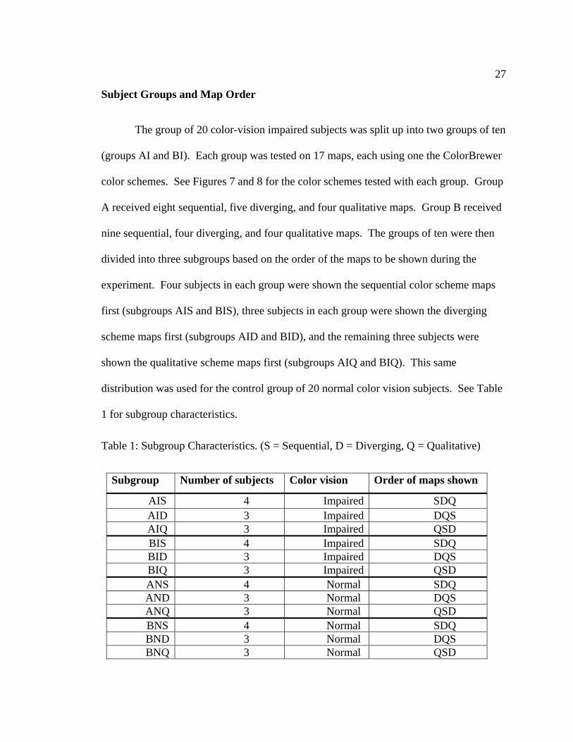
Subject Groups and Map Order
The group of 20 color-vision impaired subjects was split up into two groups of ten
(groups AI and BI). Each group was tested on 17 maps, each using one the ColorBrewer
color schemes. See Figures 7 and 8 for the color schemes tested with each group. Group
A received eight sequential, five diverging, and four qualitative maps. Group B received
nine sequential, four diverging, and four qualitative maps. The groups of ten were then
divided into three subgroups based on the order of the maps to be shown during the
experiment. Four subjects in each group were shown the sequential color scheme maps
first (subgroups AIS and BIS), three subjects in each group were shown the diverging
scheme maps first (subgroups AID and BID), and the remaining three subjects were
shown the qualitative scheme maps first (subgroups AIQ and BIQ). This same
distribution was used for the control group of 20 normal color vision subjects. See Table
1 for subgroup characteristics.
Table 1: Subgroup Characteristics. (S = Sequential, D = Diverging, Q = Qualitative)
Subgroup Number of subjects Color vision Order of maps shown
AIS 4 Impaired SDQ AID 3 Impaired DQS AIQ 3 Impaired QSD BIS 4 Impaired SDQ BID 3 Impaired DQS BIQ 3 Impaired QSD ANS 4 Normal SDQ AND 3 Normal DQS ANQ 3 Normal QSD BNS 4 Normal SDQ BND 3 Normal DQS BNQ 3 Normal QSD

28
Figure 7: Group A color schemes with names and associated map number.
29
Map Production
After gaining approval from the IRB, I began producing the maps to be used for
my experiments. Since ColorBrewer is an online tool designed to aid color choice for
thematic mapping, I chose to create choropleth maps of varied socioeconomic statistics.
Choropleth maps—maps in which the value associated with an area is symbolized based
on classification of data values—are one of the most common types of thematic maps,
and thus familiar to most people. Also, when using the tool, color schemes are shown on
an example choropleth map. Thus, choropleth maps are most appropriate for this
Figure 8: Group B color schemes with names and associated map number.
30
research. Socioeconomic data, primarily from the US Census Bureau, were used to
create the maps. These data had already been collected for previous work at Penn State
with the National Park Service on their developing Socioeconomic Atlas series, and were
readily available.
Maps were created using the ArcMap tool of ArcGIS 9. Data were classified into
a different number of classes based on the type of data I was going to show. The maps
showing sequential schemes used five classes, diverging schemes used seven classes, and
qualitative schemes used six classes. These numbers of classes were chosen to represent
the entire set of schemes due to their location in the lower to middle portion of the range
of options for number of classes. My goal was to provide an overall feel for the scheme
while not overwhelming the user. The five class sequential and seven class diverging are
also common numbers of classes to be used for their specific data type. For the
qualitative schemes six classes were chosen because I felt seven would be more
complicated due to the larger number of different hues covering the map. Also with four
of the eight qualitative schemes only going up to eight classes, six as a mid-range number
seemed appropriate.
I chose to use choropleth maps of states or multi-state regions of the United States
with counties as enumeration units. This was due to ready availability of Census data and
ArcGIS shapefiles for US counties prepared for the National Park Service atlas project.
This also allowed for creation of maps with similar size enumeration units which would
eliminate scale as a factor affecting map reading ability. I chose to include US counties
outside the specific region of interest but inside the neatline to provide a wider extent to
symbolize in color.
31
Data were classified in ArcMap to the selected number of classes using the
Natural Breaks (Jenks) Method of classification. This method uses an algorithm to find
the natural breaks in a histogram of data, providing groups of like values. When data
values were large and the Natural Breaks method provided numerically detailed class
breaks, these break values were rounded to a number which would be easier to read and
interpret but retained the overall pattern of the original natural breaks. For diverging
choropleth maps, the Natural Breaks method was used initially, and then values were
adjusted to include the US average value or a zero value as the break for the fourth
(middle) class. This then provided a classification of values that diverged from the US
average or zero, and could be appropriately symbolized with a diverging color scheme.
After the classification of the data and symbolizing the counties with one of the
appropriate ColorBrewer color schemes, I searched for a state or region of the United
States and its surroundings where counties were sized to be easily seen but were not too
large, that contained a clear trend in values across the region, and that contained at least
one county in all of the classes being mapped. I then created the proper size map
focusing on that region and its surrounding counties and added a legend in a space that
would not obscure the selected area. This was repeated with other socioeconomic
statistics, attempting to keep sizes of counties as similar as possible, until 18 maps were
created. These eighteen maps include nine sequential maps, five diverging maps, and
four qualitative maps. See Table 2 for a listing of map topics and associated map regions.
Eight of the sequential maps were used with two different color schemes, four of
the diverging maps were used with two different color schemes, and all four qualitative
maps were used with two different color schemes. This provided me with 34 maps with

32
which to test the 34 ColorBrewer color schemes. Each experimental group, testing 17 of
the color schemes, received only one version of the same map. Group A tested Maps 1
through 17 while group B tested Maps 18 through 34. One final map was created, using
the sequential gray ColorBrewer color scheme, to be used as an example map.
Following creation in ArcMap, maps were exported to Adobe Illustrator for
editing. Each map was given a title based on the state or region and the socioeconomic
statistic being mapped and given a unique number to be used during experimental testing.
For the three multiple-choice map reading questions, I chose to ask the subject
two questions on specific areal unit values, and one question on a general trend across the
region. For each map I then added the text “X” to one county and the text “Y” to one
county. These are the counties about which specific areal unit questions were asked, i.e.,
Table 2: Map Topics and Regions. (S = Sequential, D = Diverging, Q = Qualitative)
Maps Data Topic Region of the U.S. Example S Rural Population Wisconsin 1 & 18 S Educational Attainment Virginia 2 & 19 S Elderly Population Louisiana 3 & 20 S Median Age California 4 & 21 S Median Household Income Nebraska 5 & 22 S Population Density Kansas 6 & 23 S Poverty Ohio 7 & 24 S Total Population Pacific Northwest 8 & 25 S Civilian Labor Force Michigan
26 S Urban Population Mid-Atlantic Coast 9 & 27 D Average Family Size Idaho 10 & 28 D Racial Diversity Georgia 11 & 29 D Recent Population Change Arkansas 12 & 30 D Unemployment Alabama
13 D Domestic Migration Central Texas 14 & 31 Q Foreign-born Place of Birth Northern Plains 15 & 32 Q Industry Colorado 16 & 33 Q European Ancestry Lower New England 17 & 34 Q Language Spoken at Home (excl. English) Iowa
33
“the value of county X is between.” Also a line was added to the map along the general
trend present in the region mapped, such as high values on one side to low values on the
other. The text “R” was added to one end of the line while the text “S” was added to the
other end. These letters were used for trend questions, i.e., “which of the following most
closely describes the general trend in values across the region from R to S.” Specific
counties and the trend line were the same on repeating maps with different color
schemes, since only one of the maps would be shown to each group. All maps are
included at the back of this thesis (Appendix B).
Experimental Materials
When all the maps had been created and subject groups had been established, I
then developed the multiple-choice questions to be included in the experimental test. I
created each question so that the answer options included those colors/classes and trend
determinations most likely to be confused by the color-vision impaired according to CIE
1931 confusion line theory and similar lightness. Each multiple-choice question
contained four answer options, one of which was “cannot determine with the given
colors” in case a subject could not distinguish between colors on the map and did not
want to make a guess. The format for the questions is as follows:
i) The percentage of the population that is over 24 years old with some college or a college degree in county X is between
a. 13.9 – 27.3 b. 27.4 – 34.5 c. 34.6 – 41.5 d. cannot determine with the given colors
34
Correct answers were placed in choices a, b, and c randomly. To eliminate order
effects, the order of questions was changed and the type of map (sequential, diverging, or
qualitative) shown first was changed for different subgroups. One of three subgroups
received the question concerning county X first, one subgroup received the question
concerning county Y first, and the remaining subgroup received the question concerning
the regional trend first. This order then also changed from question to question. These
multiple-choice questions were presented in a set order for specific groups, creating six
different test forms, one for each sub-group with the normal and impaired subjects using
the same test form (e.g., AIS and ANS used the same test form; see Appendix C).
For the first page of my experimental test form, I created a form for conducting
the Ishihara color vision test. More information on the Ishihara test will be provided later
in this chapter. On this page I included twelve blanks for the subject to write in a number
that they see for each of the twelve plates in the book to be shown. Also on the first page
of the form were blanks for the subject number (a number assigned by myself to keep
track of each subjects’ data), the date, and the subject’s group.
After completing the test form, I then created JPEG format images of all of my
maps by exporting out of Adobe Illustrator. These JPEGs were added to successive
slides in a PowerPoint slide show. I then edited the Powerpoint file to create six files,
one for each combination of group and starting data type. The first slide of each file was
the example map shown in the gray ColorBrewer color scheme. This scheme was not
tested but rather used to explain the experimental procedure to subjects and for them to
become familiar with the map format.

35
For the remaining experimental materials, I created an Interview Guide (see
Appendix D) to use when conducting the semi-structured interview for each color
scheme. These questions were typed out on a sheet of paper for my own personal use.
The questions were not asked word for word from the paper and were not all asked for
every color scheme, but rather used to guide the interview. This allowed me to follow up
with other questions while being able to skip questions deemed unnecessary for the
specific color scheme. A benefit of this semi-structured type of interview is the
flexibility that it gives the interviewer while having more of a personal feel.
I also created an Interview Field Notes form used for note taking during the semi-
structured interview. This form contained simply a series of blanks to fill in
corresponding to the specific map (color scheme) number for which a subject was
providing his or her thoughts. A space below each blank was left open for taking notes
during the interview.
Then the paper versions of each color scheme were created. I had numerous
offprints of “ColorBrewer in print: A catalog of color schemes for maps” (Brewer et al.,
2003). I cut out each of the individual class variation ramps for each ColorBrewer color
scheme from the offprints. I then pasted each of the class variations on the same paper in
order from least number of classes to the greatest. This resulted in one sheet of paper
with all of the ColorBrewer versions of the same color scheme. I did this for all of the
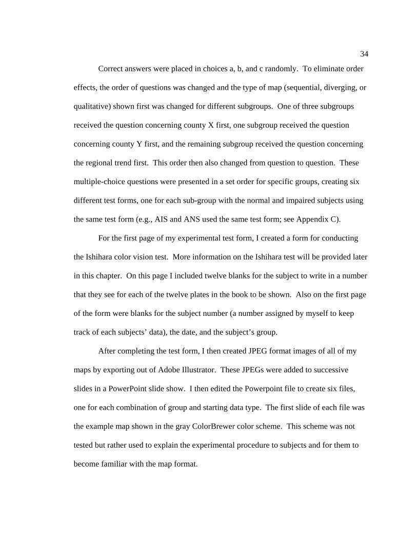
color schemes; producing 34 sheets with the pasted cut out color ramps (see Figure 9 for
an example). Finally, a tape recorder and audio tapes were acquired for use during the
experiments, completing the needed materials for use during the experimental sessions.
36
Experimental Procedure
Each experimental session was held in 208 Walker Building, a Geography
Department computer lab on the University Park campus of Pennsylvania State
University. The computers in the lab are all Dell Optiplex GX270 with a Dell LCD flat-
screen monitor, Model No. 1901FP. Since nearly all of the experiments were conducted
on weekends, I was able to use the same computer for nearly every experiment. Other
experiments were conducted on other computers in the same lab. The color settings of
the screen were set to the normal preset specifications of R 95, G 100, B 92, and the
brightness was set to 70. This was determined after discussion with my advisor about
which settings most closely approximated the color schemes on paper. When unable to
Figure 9: Example of cut out color ramps showing all class variations of a color scheme.

37
use the same computer, I adjusted the screen to match those same specifications, so that
all subjects were viewing the same exact on-screen colors. The first ten subjects to take
part were placed in group A while the last ten were placed in group B.
Upon the subject’s arrival, I introduced myself and had the subject sit down at the
computer. I sat down in the chair next to the subject. First, I thanked the subject for
taking part and asked where they found out about this research. Then I briefly explained
the research I am conducting and the procedure to be followed. I then had the subject
read over the Informed Consent form, including marking whether or not they agreed to
have their responses audio taped. This form also informed the subject of the purpose and
procedure of the experiment, subject’s rights, duration, and compensation. I made it clear
that the subject was welcome to ask questions at any time. If the subject consented to this
research, he or she then signed the second page of the form. I then signed below as the
person obtaining consent. The same was done for a second copy of the form which was
the subject’s copy to keep.
After consent was obtained, the subject was given the experimental test form, and
the color-vision test was completed. This was done through the Ishihara test for color
vision (Ishihara, 1980). This book contains a series of plates with a circular image
composed of small dots of different colors. Inside each circle, the dots of different colors
form a number. For the majority of the plates, one number can be distinguished by
individuals with normal color vision and a different number (or no number at all) is seen
by individuals with color-vision impairment. These plates give a good determination of
whether the individual taking the test is color-vision impaired. They also can show the
type (red or green deficient) and severity (by number of questions missed) of color-vision

38
impairment. An example of an Ishihara plate can be seen in Figure 10. In this plate, an
eight is seen by individuals with normal color vision, while a three is seen by individuals
with red-green color-vision impairment.
After the Ishihara plates were explained, the subject was told to write down the
number that he or she sees inside the circle, and if no number is seen then to leave it
blank. This test was designed to be used with natural light, so I had the subject follow me
to an area near a window where outdoor light was shining in. I then held up the book for
the subject to see, beginning with the first plate, and turning the pages until each plate
had been answered. I then examined the subject’s answers quickly to determine if he or
she was color-vision impaired, which was easily done due to the way the plates are set up
in that normals will read one number while the impaired will read another number or
nothing at all. If the subject’s color-vision test results differed from his or her stated
condition, the subject was informed at the end of the experiment. This happened for two
Figure 10: Example of an Ishihara Plate. Taken from http://www.digitalexposure.ca/BlindTest.html
39
individuals who contacted me saying that they thought they were colorblind but were not
and one individual who said he had normal color vision but test results showed that he
was color-vision impaired. This latter individual was guided to seek verification from an
eye care professional.
When the color-vision test had been completed, I led the subject back to the
computer where the remainder of the experiment would take place. The lab was
primarily lit from the ceiling using fluorescent light bulbs (Philips Econ-o-watt
F40LW/RS/EW 34-watt bulbs), though some indirect sunlight was usually coming in the
window between the blinds. After being seated, the PowerPoint slideshow was started,
bringing up the example map in the gray color scheme. I then described how a
choropleth map works, told the subject that each map would be similar in structure to the
example, and explained the different letters on the map and how they relate to the
multiple-choice questions to be asked. Then I discussed how after the three questions
had been answered I would briefly ask the subject some questions on his or her
perception of the color scheme, then have them view the scheme on paper and describe
perception of the cut-out color scheme ramps.
After making sure the subject was clear on how each map would represent data
and the procedure to be followed, I had the subject flip to the next page of the test form
while I moved to the next slide. This was the first map to be tested. I had the subject
examine the map and answer the three multiple-choice map reading questions. While the
subject was doing this, I began the audio tape if the subject had agreed to be taped. I
started the tape by saying the subject number, date, and group. The tape then ran
continuously throughout the experiment.
40
When the subject had answered the three multiple-choice questions on the test
form, I then began the semi-structured interview for this specific color scheme. I used
the Interview Guide to gather thoughts from the subject on using this particular color
scheme on screen. When I felt I had a complete answer, I then showed the subject the
paper version of the color scheme by presenting the sheet of paper with all of the cut-outs
of the same scheme. This allowed the subject to see all of the different variations of the
scheme based on number of classes to be shown. I initially had the subject compare the
same number of classes on paper to on screen (i.e. the five class scheme for sequential
maps), describing any differences that were seen. Then the subject was asked to describe
at which number of classes he or she started to have difficulty distinguishing the colors
within the ramp and would have difficulty using them on a map. For example, the six
class color scheme would cause problems because the second and third colors appear too
similar causing difficulty differentiating them on a map.
While the subject was providing his or her thoughts, I was taking notes on my
Interview Field Notes form. These notes captured most of the major thoughts of the
subject, the number of the color and class variation where the subject had problems, and
any quote-worthy phrases. I did not worry about writing down everything since I was
using a tape recorder. On only one occasion did a subject not agree to be tape recorded,
and for this subject I attempted to write down a summary of everything he said during the
interview sessions.
This process was then repeated for the remaining sixteen maps, each using a
different ColorBrewer color scheme. I would give a verbal signal that we were moving
on and switch to the next slide of the PowerPoint presentation after I was satisfied with
41
the semi-structured interview. The subject turned the pages of his or her test form when
necessary. As maps changed to a different type, I made sure to explain the new type and
confirm that the subject understood the differences and how they pertained to the
multiple-choice questions. No time limit was imposed for answering questions or for
giving thoughts during the interview. Most experiments lasted between 45 minutes and
one hour.
Upon completion of the final map, I gave the subject the opportunity to provide
any overall comments or ask questions on the experimental process. I then stopped the
audio recording, thanked the subject for their participation, made sure they had their copy
of the informed consent form, and gave them the 10 dollars compensation. I marked on
the audio tape the subject number and group. I used each tape for two subjects, one per
side. For the Ruby Miller fund money, subjects needed to print their name and sign a
sheet stating that they received the 10 dollars compensation. So I had my first ten
subjects do this, and turned in this form to the Geography Department verifying that the
$100 had been used for subject compensation.
Analysis
When grading the test forms, I first compared the subject’s answers for the color-
vision test to the key provided in the back cover of the book. This told me whether or not
the subject can be included in the impaired group. I then graded the responses to the
multiple-choice questions by using two keys that I had created, one for group A and one
for group B. I went through each question, marking the answer if it was incorrect. To

42
keep track of questions missed, I created an Excel table of subjects and questions.
Questions were labeled by map number and X, Y, or R, corresponding to the X value, Y
value, and trend questions, respectively. So for each subject, I went through each of their
51 questions and put a check in the box for each question that was missed. Thus I had
four different tables, group A impaired, group A normal, group B impaired, and group B
normal. I added up all of the missed questions per map number (combining X, Y, and R)
to come up with the total number of questions missed per color scheme for the impaired
group and for the normal group.
This allowed me to do a Chi-Square Test of Significance for each color scheme
based on the number of correct and incorrect answers. Each scheme had a total of thirty
responses from impaired subjects and thirty responses from normal subjects. My
independent variables were whether the group was color-vision impaired or had normal
color vision, and my dependent variables were the total number of correct and incorrect
answers to multiple-choice questions for a given scheme. This test for significance was
done in Excel by entering the formula for finding the chi square value from cells
containing the number of correct and incorrect answers for both the color-vision impaired
and normal groups. These values were then compared to a Critical Values of Chi-square
table (http://www.statsoft.com/textbook/sttable.html) for one degree of freedom and a
probability of 0.05. Thus, I could say for each color scheme whether there was a
statistically significant difference in ability to answer multiple-choice map reading
questions between the color-vision impaired subjects and the normal color vision
subjects.
43
A very important part of my data collection was the interview responses. These
notes taken on the Interview Field Notes form were then enhanced by reviewing the
audio tape of the entire experiment. When these notes were completed, they were then
coded by color scheme (or map number). For each color scheme I looked at each of my
notes for subjects with color-vision impairment. I then wrote down common themes,
how common they were, and any unique thoughts or comments from individual subjects.
This provided an overall view of the perception of the color-vision impaired on using that
color scheme. This was then done for the same color scheme with the normal color
vision group. The two were then compared and can be used along with the results of the
chi square test to give a thorough understanding of the differences between the two
groups in reading a map with one of the ColorBrewer color schemes. The same process
was used for all 34 color schemes.
Chapter 4
Results and Discussion
In this chapter I will describe the results of my thesis research, discuss the
meaning behind them, and give my recommendations for the accommodation icon in the
ColorBrewer tool. The results are divided into quantitative and qualitative sections, with
the qualitative results examined by data type and by overall themes. In the discussion
section, I focus on integrating the quantitative and qualitative data into triangulated
results. Finally, I take those results and use them to make recommendations for the class
variations of each ColorBrewer color scheme, deciding whether each accommodates,
possibly confuses, or definitely confuses the color-vision impaired.
Quantitative Results
The number of incorrect answers, out of thirty, recorded for the two vision
groups, color-vision impaired and normal, are given in Table 3 for each specific color
scheme. These numbers were then analyzed using a Chi-Square test of significance. The
number of right and wrong answers for the impaired and normal groups produced a two-
by-two chi-square table for each map and its associated color scheme. An example of the
chi-square table can be seen in Table 4.
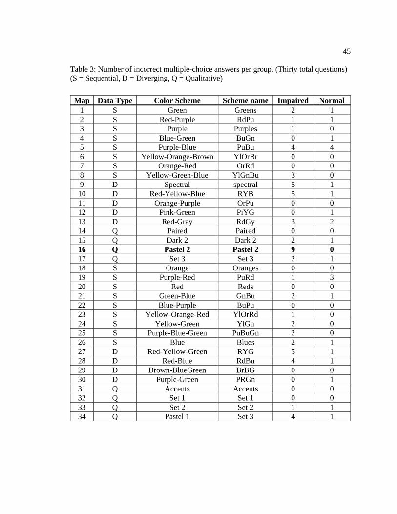
45
Table 3: Number of incorrect multiple-choice answers per group. (Thirty total questions) (S = Sequential, D = Diverging, Q = Qualitative)
Map Data Type Color Scheme Scheme name Impaired Normal
1 S Green Greens 2 1 2 S Red-Purple RdPu 1 1 3 S Purple Purples 1 0 4 S Blue-Green BuGn 0 1 5 S Purple-Blue PuBu 4 4 6 S Yellow-Orange-Brown YlOrBr 0 0 7 S Orange-Red OrRd 0 0 8 S Yellow-Green-Blue YlGnBu 3 0 9 D Spectral spectral 5 1 10 D Red-Yellow-Blue RYB 5 1 11 D Orange-Purple OrPu 0 0 12 D Pink-Green PiYG 0 1 13 D Red-Gray RdGy 3 2 14 Q Paired Paired 0 0 15 Q Dark 2 Dark 2 2 1 16 Q Pastel 2 Pastel 2 9 0 17 Q Set 3 Set 3 2 1 18 S Orange Oranges 0 0 19 S Purple-Red PuRd 1 3 20 S Red Reds 0 0 21 S Green-Blue GnBu 2 1 22 S Blue-Purple BuPu 0 0 23 S Yellow-Orange-Red YlOrRd 1 0 24 S Yellow-Green YlGn 2 0 25 S Purple-Blue-Green PuBuGn 2 0 26 S Blue Blues 2 1 27 D Red-Yellow-Green RYG 5 1 28 D Red-Blue RdBu 4 1 29 D Brown-BlueGreen BrBG 0 0 30 D Purple-Green PRGn 0 1 31 Q Accents Accents 0 0 32 Q Set 1 Set 1 0 0 33 Q Set 2 Set 2 1 1 34 Q Pastel 1 Set 3 4 1

46
The formula for finding the chi-square value from this type of two-by-two table
was entered into an Excel spreadsheet referencing cells that contained the numbers of
correct and incorrect responses by each group for each color scheme. The resulting chi-
square values describe the relationship between the normal and color-vision impaired
groups. The chi-square values for each of the color schemes are listed in Table 5. To be
statistically significant at the 0.05 level using one degree of freedom (two rows and two
columns in the table), values must be greater than 3.84. This means that the odds of this
difference between vision groups happening by chance are less than 5 percent. The only
color scheme that produced a significant difference between the color-vision impaired
and normal groups was Pastel 2 (Map 16). This scheme produced all 30 correct answers
from the normal group, while the color-vision impaired answered only 21 correct. This
led to a chi-square value of 10.588 which is statistically significant beyond the 0.005
level (odds of chance are less than five out of one thousand).
Table 4: Example of Chi-square table for Map 16.
Group Impaired Normal Outcome Correct 21 30 Incorrect 9 0

47
Table 5: Chi-square values for each color scheme. (S = Sequential, D = Diverging, Q = Qualitative)
Map Data Type Color Scheme Scheme name Chi-square value
1 S Green Greens 0.351 2 S Red-Purple RdPu 0.000 3 S Purple Purples 1.017 4 S Blue-Green BuGn 1.017 5 S Purple-Blue PuBu 0.000 6 S Yellow-Orange-Brown YlOrBr 0.000 7 S Orange-Red OrRd 0.000 8 S Yellow-Green-Blue YlGnBu 3.158 9 D Spectral spectral 2.963 10 D Red-Yellow-Blue RYB 2.963 11 D Orange-Purple OrPu 0.000 12 D Pink-Green PiYG 1.017 13 D Red-Gray RdGy 0.218 14 Q Paired Paired 0.000 15 Q Dark 2 Dark 2 0.351 16 Q Pastel 2 Pastel 2 10.588 17 Q Set 3 Set 3 0.351 18 S Orange Oranges 0.000 19 S Purple-Red PuRd 1.071 20 S Red Reds 0.000 21 S Green-Blue GnBu 0.351 22 S Blue-Purple BuPu 0.000 23 S Yellow-Orange-Red YlOrRd 1.017 24 S Yellow-Green YlGn 2.069 25 S Purple-Blue-Green PuBuGn 2.069 26 S Blue Blues 0.351 27 D Red-Yellow-Green RYG 2.963 28 D Red-Blue RdBu 1.964 29 D Brown-BlueGreen BrBG 0.000 30 D Purple-Green PRGn 1.017 31 Q Accents Accents 0.000 32 Q Set 1 Set 1 0.000 33 Q Set 2 Set 2 0.000 34 Q Pastel 1 Set 3 1.964
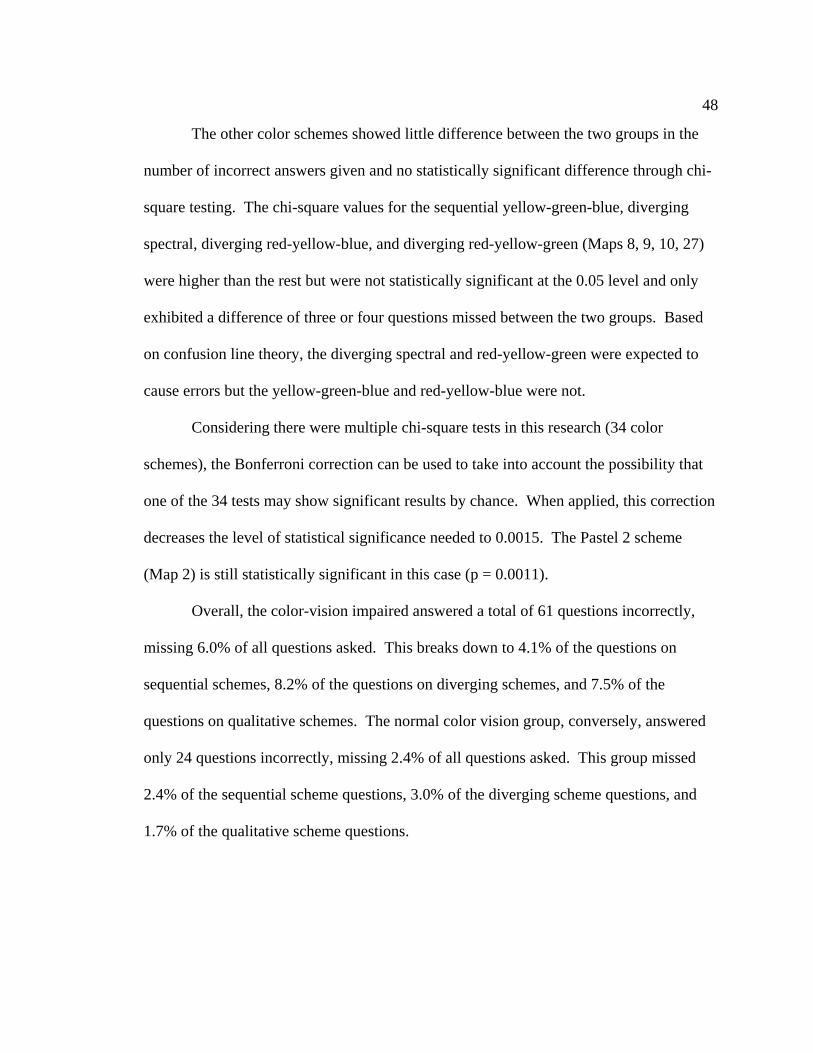
48
The other color schemes showed little difference between the two groups in the
number of incorrect answers given and no statistically significant difference through chi-
square testing. The chi-square values for the sequential yellow-green-blue, diverging
spectral, diverging red-yellow-blue, and diverging red-yellow-green (Maps 8, 9, 10, 27)
were higher than the rest but were not statistically significant at the 0.05 level and only
exhibited a difference of three or four questions missed between the two groups. Based
on confusion line theory, the diverging spectral and red-yellow-green were expected to
cause errors but the yellow-green-blue and red-yellow-blue were not.
Considering there were multiple chi-square tests in this research (34 color
schemes), the Bonferroni correction can be used to take into account the possibility that
one of the 34 tests may show significant results by chance. When applied, this correction
decreases the level of statistical significance needed to 0.0015. The Pastel 2 scheme
(Map 2) is still statistically significant in this case (p = 0.0011).
Overall, the color-vision impaired answered a total of 61 questions incorrectly,
missing 6.0% of all questions asked. This breaks down to 4.1% of the questions on
sequential schemes, 8.2% of the questions on diverging schemes, and 7.5% of the
questions on qualitative schemes. The normal color vision group, conversely, answered
only 24 questions incorrectly, missing 2.4% of all questions asked. This group missed
2.4% of the sequential scheme questions, 3.0% of the diverging scheme questions, and
1.7% of the qualitative scheme questions.
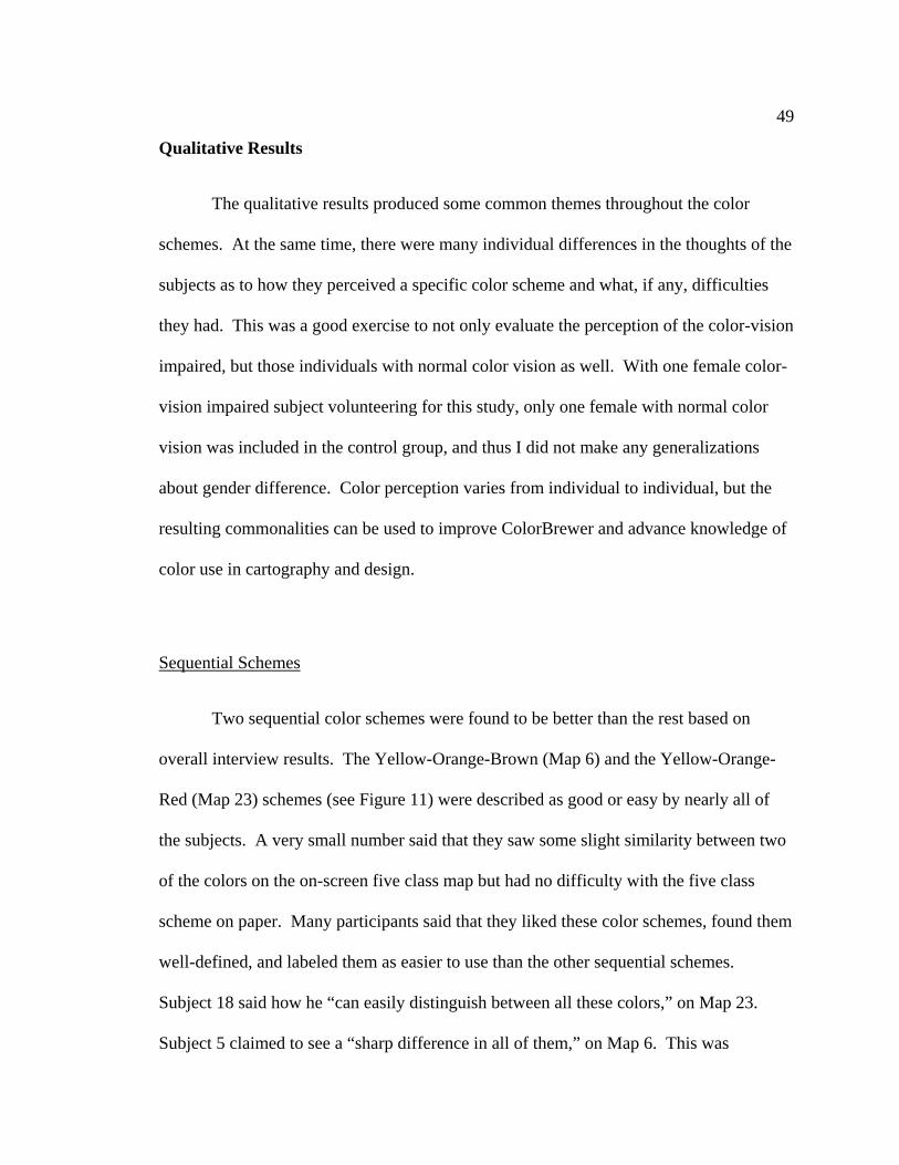
49
Qualitative Results
The qualitative results produced some common themes throughout the color
schemes. At the same time, there were many individual differences in the thoughts of the
subjects as to how they perceived a specific color scheme and what, if any, difficulties
they had. This was a good exercise to not only evaluate the perception of the color-vision
impaired, but those individuals with normal color vision as well. With one female color-
vision impaired subject volunteering for this study, only one female with normal color
vision was included in the control group, and thus I did not make any generalizations
about gender difference. Color perception varies from individual to individual, but the
resulting commonalities can be used to improve ColorBrewer and advance knowledge of
color use in cartography and design.
Sequential Schemes
Two sequential color schemes were found to be better than the rest based on
overall interview results. The Yellow-Orange-Brown (Map 6) and the Yellow-Orange-
Red (Map 23) schemes (see Figure 11) were described as good or easy by nearly all of
the subjects. A very small number said that they saw some slight similarity between two
of the colors on the on-screen five class map but had no difficulty with the five class
scheme on paper. Many participants said that they liked these color schemes, found them
well-defined, and labeled them as easier to use than the other sequential schemes.
Subject 18 said how he “can easily distinguish between all these colors,” on Map 23.
Subject 5 claimed to see a “sharp difference in all of them,” on Map 6. This was
50
consistent throughout the sample. When examining the different class variations on
paper, the lighter end into the middle caused some difficulty with similarity of adjacent
colors, but the dark end was fine. The two-three-four range of the seven and eight class
variations is where participants most often said colors started to become close. Many,
though, found the scheme accommodating through all nine classes. No difference in
results was found between the color-vision impaired group and the normal group. These
findings were consistent throughout both groups. These two schemes were clearly
favored over the rest as most participants found them quick and easy, especially with the
five class schemes.
The next group of sequential color schemes to show similarities are those where
most subjects found the map “okay” with no difficulty in perception while some had
minor difficulty differentiating adjacent colors on the map. These schemes include the
Red-Purple (Map 2), Blue-Green (Map 4), Orange-Red (Map 7), Red (Map 20), and
Green-Blue (Map 21). See Figure 12. These schemes are similar to the two previously
discussed except that there were more individuals mentioning some closeness or
Figure 11: Yellow-Orange-Brown and Yellow-Orange-Red sequential schemes in five class formats.
51
confusion between colors on the on-screen five class map. Still, the great majority of
participants described them as good or okay to use. The phrase from subject 6 when
asked about how the colors of Map 4 were perceived, “pretty well different,” can be
applied for many subjects. Some subjects found similarity between pairs of middle
colors, either the second and third or third and fourth, but could still distinguish them.
When this similarity was seen, it caused subjects to do double-checking from map to
legend until they were sure they had the right color. Thus it took the subject slightly
longer to read the map and answer the multiple-choice questions.
These schemes were slightly more difficult for some subjects, but overall these
schemes were good with few problems being mentioned in the semi-structured
interviewing. The responses about where in the range of class variations the subject
started to have difficulty varied quite a bit, but the six class scheme in the second-third-
fourth region was a common answer for these color schemes. Again, no difference was
seen between the color-vision impaired group and the normal group, as was expected
Figure 12: Red-Purple, Blue-Green, Orange-Red, Red, and Green-Blue sequential schemes in five class formats.

52
because the sequential schemes use change in lightness from top to bottom. These
findings were consistent for both groups.
Five of the sequential schemes showed the common theme of being nearly equal
in the number of participants who had no difficulty with the five class on-screen map and
those who described some slight difficulty due to similarity of colors on the same map.
These five colors schemes are the Purple (Map 3), Yellow-Green-Blue (Map 8), Orange
(Map 18), Purple-Red (Map 19), and Blue-Purple (Map 22). See Figure 13. These were
hard to evaluate because of this discrepancy in responses of subjects. For the most part,
those who said that they had some difficulty declared that colors were close but still
distinguishable. Several, though, had more difficulty. Subject 14, when asked if he
could distinguish the colors of Map 14 said, “not always.” The Purple scheme had a
couple of subjects who mentioned confusing colors, and others took longer with close
colors that were distinguishable but needed to be double-checked. The Purple, Orange,
Purple-Red, and Blue-Purple schemes showed closeness between the second-third-fourth
colors of the five class map. This was described by nearly half of the subjects.
Figure 13: Purple, Yellow-Green-Blue, Orange, Purple-Red, and Blue-Purple sequential schemes in five class formats.

53
The Yellow-Green-Blue scheme showed similarity with nearly half of the
participants in the on-screen five class map between the third and fourth colors. The
Yellow-Green-Blue scheme was the only one of these five color schemes to be
accommodating up to the eight and nine class variations, while the other four commonly
start to show some difficulty in the lighter end of the six to seven class variations. The
Yellow-Green-Blue scheme was much easier for subjects to use on paper than on screen.
The Orange and Purple schemes show no difference between the color-vision
impaired and normal groups, but the others do show a difference. These three have a
very small number of normal subjects who discussed any sort of difficulty with colors on
screen looking similar, while nearly half of the color-vision impaired mention closeness
or similarity of colors on screen though they can still distinguish them. Overall, all five
of these color schemes worked for nearly all subjects involved, but about half of them
took a little longer to distinguish pairs of colors in the middle ranges.
The next three sequential color schemes all show a majority of subjects describing
some difficulty resulting from adjacent colors of the five class scheme looking similar but
distinguishable. These schemes are the Green (Map 1), Yellow-Green (Map 24), and
Purple-Blue-Green (Map 25). See Figure 14. On these, a large number of subjects were
like subject 17 who said he was “not comfortable” with the colors on Map 25. The
second to third and third to fourth both were mentioned as giving subjects difficulty when
trying to match up colors on the map to the legend. The responses of those mentioning
difficulty varied. Some said that two colors were slightly close or close with a little
trouble distinguishing them, while others said certain pairs were “hard” (subject 14) and
that they could “only tell a difference after staring for a while” (subject 25). The point on

54
paper where subjects started having trouble and would not be able to use a map with a
certain class variation was wide-ranging. The five, six, and seven class schemes in the
light to middle range were the most common responses as to where the schemes started to
break down. Overall, the schemes were slightly easier to distinguish on paper than on
screen, and also easier to distinguish on the map than on the legend. These
characteristics were seen in both the normal and color-vision impaired groups, though the
normal group had a moderately easier time with the Purple-Blue-Green.
The last two sequential color schemes produced responses that showed the most
difficulty for schemes of this data type. These two color schemes are the Purple-Blue
(Map 5) and Blue (Map 26). See Figure 15. All of the color-vision impaired and a
majority of the normal group described one or more pairs of colors of the on-screen five
class map that caused problems to some degree. Again, the second, third, and fourth
colors in the range were the ones that caused difficulty. The first and fifth were fine and
distinguishable from the others. Subject 5 when looking at Map 5 said he was “not a fan
Figure 14: Green, Yellow-Green, and Purple-Blue-Green sequential schemes in five class formats.
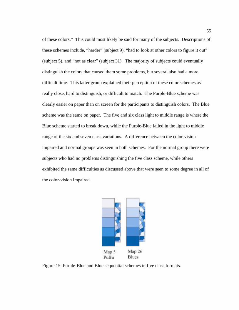
55
of these colors.” This could most likely be said for many of the subjects. Descriptions of
these schemes include, “harder” (subject 9), “had to look at other colors to figure it out”
(subject 5), and “not as clear” (subject 31). The majority of subjects could eventually
distinguish the colors that caused them some problems, but several also had a more
difficult time. This latter group explained their perception of these color schemes as
really close, hard to distinguish, or difficult to match. The Purple-Blue scheme was
clearly easier on paper than on screen for the participants to distinguish colors. The Blue
scheme was the same on paper. The five and six class light to middle range is where the
Blue scheme started to break down, while the Purple-Blue failed in the light to middle
range of the six and seven class variations. A difference between the color-vision
impaired and normal groups was seen in both schemes. For the normal group there were
subjects who had no problems distinguishing the five class scheme, while others
exhibited the same difficulties as discussed above that were seen to some degree in all of
the color-vision impaired.
Figure 15: Purple-Blue and Blue sequential schemes in five class formats.
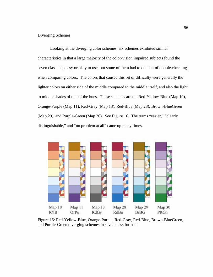
56
Diverging Schemes
Looking at the diverging color schemes, six schemes exhibited similar
characteristics in that a large majority of the color-vision impaired subjects found the
seven class map easy or okay to use, but some of them had to do a bit of double checking
when comparing colors. The colors that caused this bit of difficulty were generally the
lighter colors on either side of the middle compared to the middle itself, and also the light
to middle shades of one of the hues. These schemes are the Red-Yellow-Blue (Map 10),
Orange-Purple (Map 11), Red-Gray (Map 13), Red-Blue (Map 28), Brown-BlueGreen
(Map 29), and Purple-Green (Map 30). See Figure 16. The terms “easier,” “clearly
distinguishable,” and “no problem at all” came up many times.
Figure 16: Red-Yellow-Blue, Orange-Purple, Red-Gray, Red-Blue, Brown-BlueGreen, and Purple-Green diverging schemes in seven class formats.

57
A few subjects took a little longer and had some difficulty distinguishing the
third-fourth and fourth-fifth colors, specifically three-four on the Red-Yellow-Blue, four-
five on the Orange-Purple, four-five on the Red-Blue, four-five on the Brown-BlueGreen,
and three-four on the Purple-Green. Some subjects also mentioned closeness in the light
and middle shades of the blue and purple ends of these schemes. Subject 5 said the
purples on Map 11 were “way too close,” but this was not the norm. This subject also
had difficulty distinguishing the two darker hues on either end of the Red-Gray scheme,
saying “the extremes are too bloody close” leading to a double-take. This response is
typical for protan- impairment, yet subject 5 was determined to be deuteran- impaired
based on the color-vision test results. The others, many of whom also were determined to
be deuteran-, thought this scheme contrasted very well.
Even fewer normal subjects had difficulty with these six schemes, but those that
did described the same problems as seen in the color-vision impaired. The paper versions
in general were a slight improvement over the on-screen map. The schemes commonly
started to break down in nine, ten, and eleven class variations on the blue, purple, or gray
side, though many subjects evaluated the schemes as distinguishable through eleven.
The Pink-Green diverging scheme (Map 12) (see Figure 17) was similar to the
previous six but with a majority of color-vision impaired subjects describing some
difficulty with adjacent colors. The lighter pinks into the middle were the most
commonly given culprits that caused some similarity in perception for this group. The
“two colors contrasted enough” as subject 6 declared about the pink and green, but the
“pinks are more difficult.” This one was a “little bit harder” (subject 12) than the
diverging schemes previously discussed. On paper, the third and fourth colors (light pink
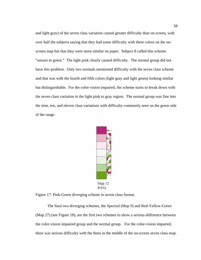
58
and light gray) of the seven class variation caused greater difficulty than on screen, with
over half the subjects saying that they had some difficulty with these colors on the on-
screen map but that they were more similar on paper. Subject 8 called this scheme
“unsure to green.” The light pink clearly caused difficulty. The normal group did not
have this problem. Only two normals mentioned difficulty with the seven class scheme
and that was with the fourth and fifth colors (light gray and light green) looking similar
but distinguishable. For the color-vision impaired, the scheme starts to break down with
the seven class variation in the light pink to gray region. The normal group was fine into
the nine, ten, and eleven class variations with difficulty commonly seen on the green side
of the range.
The final two diverging schemes, the Spectral (Map 9) and Red-Yellow-Green
(Map 27) (see Figure 18), are the first two schemes to show a serious difference between
the color-vision impaired group and the normal group. For the color-vision impaired,
there was serious difficulty with the three in the middle of the on-screen seven class map.
Figure 17: Pink-Green diverging scheme in seven class format.
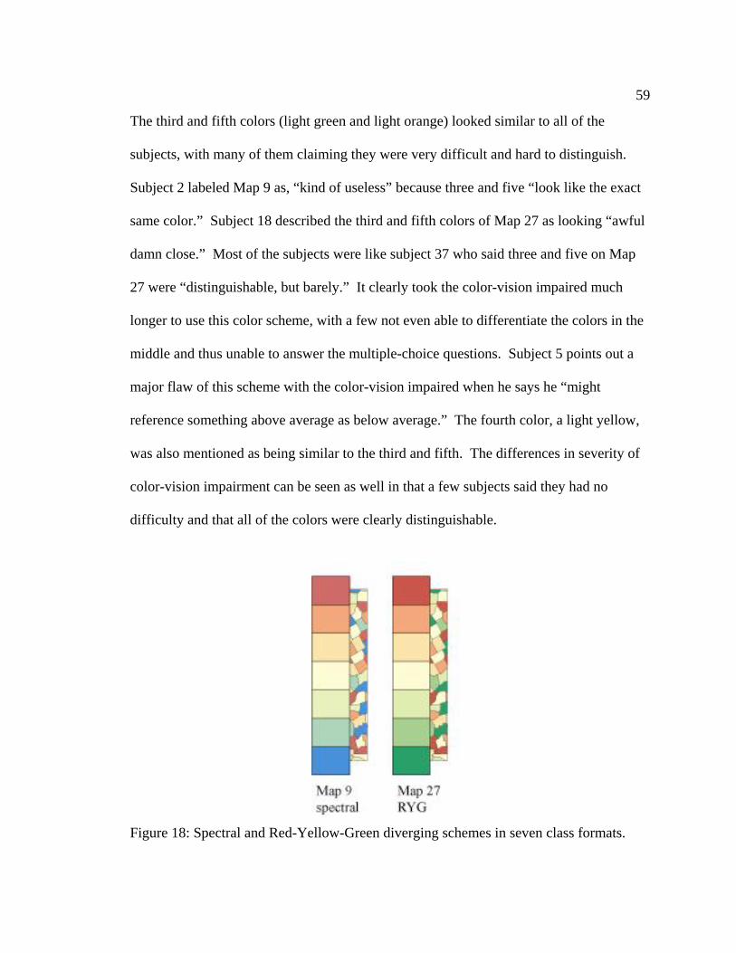
59
The third and fifth colors (light green and light orange) looked similar to all of the
subjects, with many of them claiming they were very difficult and hard to distinguish.
Subject 2 labeled Map 9 as, “kind of useless” because three and five “look like the exact
same color.” Subject 18 described the third and fifth colors of Map 27 as looking “awful
damn close.” Most of the subjects were like subject 37 who said three and five on Map
27 were “distinguishable, but barely.” It clearly took the color-vision impaired much
longer to use this color scheme, with a few not even able to differentiate the colors in the
middle and thus unable to answer the multiple-choice questions. Subject 5 points out a
major flaw of this scheme with the color-vision impaired when he says he “might
reference something above average as below average.” The fourth color, a light yellow,
was also mentioned as being similar to the third and fifth. The differences in severity of
color-vision impairment can be seen as well in that a few subjects said they had no
difficulty and that all of the colors were clearly distinguishable.
Figure 18: Spectral and Red-Yellow-Green diverging schemes in seven class formats.

60
Overall, for the color-vision impaired these two schemes, as subject 16 put it,
“would cause serious problems.” The scheme on paper only works up to the five class
variation, then with six classes there starts to be serious difficulty with the third and
fourth colors. These are then the third and fifth colors in the seven class variation. The
normal color vision group had no difficulty at all with these schemes saying they were
good or fine on screen with no problems at all. They were okay with the scheme up to
the ten and eleven class variations where some of the lighter green colors started to
appear similar, though several of them said that the schemes were good through eleven.
Qualitative Schemes
Two of the qualitative schemes found to be better at accommodating color-vision
impaired subjects were Paired (Map 14) and Accents (Map 31). See Figure 19. A large
percentage of the color-vision impaired subjects stated that the on-screen six class maps
were good or okay with no problems resulting from colors appearing similar. One
subject had some difficulty with the third and fifth colors of the Paired scheme on Map
14, but the rest of the subjects were fine. For Map 31 there were several subjects who
had problems with the first and third colors (green and light orange) of the Accents, with
one individual saying they looked “exactly the same” (subject 25). Most though did not
have this problem or said they were close but distinguishable, and those that did declared
one and three more distinguishable on paper. One subject even declared Map 31
“probably the easiest so far” (subject 20). The first and third colors were the only ones
that caused some difficulty on paper. The rest of the colors in the full range of the

61
scheme were fine. For Map 14 several subjects could distinguish the light and dark pairs
of hues all the way through the full range, but for half of them it started to break down
with the seven class variation where they mentioned similarity between the third and
seventh colors (light green and light orange). The light blue and light purple (first and
ninth) were also mentioned by a couple subjects. With their use of many different hues,
these schemes, as with all of the qualitative schemes, posed no problems for the normal
color vision group with a large majority declaring the schemes as easy and
accommodating up through the full range of the scheme.
The Dark 2 color scheme (Map 15) and the Set 1 color scheme (Map 32) (see
Figure 20) are darker, more saturated schemes which led to an easier time distinguishing
colors for the color-vision impaired, though there were still many subjects who
mentioned some slight difficulty with specific pairs of colors in the schemes. For the
Dark 2 scheme, many subjects discussed how two of the colors looked close but that they
could distinguish them. Various combinations of the first, second, fourth, fifth, and sixth
Figure 19: Paired and Accents qualitative schemes in six class formats.
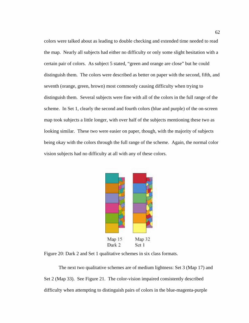
62
colors were talked about as leading to double checking and extended time needed to read
the map. Nearly all subjects had either no difficulty or only some slight hesitation with a
certain pair of colors. As subject 5 stated, “green and orange are close” but he could
distinguish them. The colors were described as better on paper with the second, fifth, and
seventh (orange, green, brown) most commonly causing difficulty when trying to
distinguish them. Several subjects were fine with all of the colors in the full range of the
scheme. In Set 1, clearly the second and fourth colors (blue and purple) of the on-screen
map took subjects a little longer, with over half of the subjects mentioning these two as
looking similar. These two were easier on paper, though, with the majority of subjects
being okay with the colors through the full range of the scheme. Again, the normal color
vision subjects had no difficulty at all with any of these colors.
The next two qualitative schemes are of medium lightness: Set 3 (Map 17) and
Set 2 (Map 33). See Figure 21. The color-vision impaired consistently described
difficulty when attempting to distinguish pairs of colors in the blue-magenta-purple
Figure 20: Dark 2 and Set 1 qualitative schemes in six class formats.
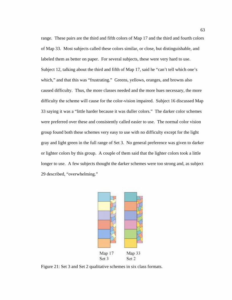
63
range. These pairs are the third and fifth colors of Map 17 and the third and fourth colors
of Map 33. Most subjects called these colors similar, or close, but distinguishable, and
labeled them as better on paper. For several subjects, these were very hard to use.
Subject 12, talking about the third and fifth of Map 17, said he “can’t tell which one’s
which,” and that this was “frustrating.” Greens, yellows, oranges, and browns also
caused difficulty. Thus, the more classes needed and the more hues necessary, the more
difficulty the scheme will cause for the color-vision impaired. Subject 16 discussed Map
33 saying it was a “little harder because it was duller colors.” The darker color schemes
were preferred over these and consistently called easier to use. The normal color vision
group found both these schemes very easy to use with no difficulty except for the light
gray and light green in the full range of Set 3. No general preference was given to darker
or lighter colors by this group. A couple of them said that the lighter colors took a little
longer to use. A few subjects thought the darker schemes were too strong and, as subject
29 described, “overwhelming.”
Figure 21: Set 3 and Set 2 qualitative schemes in six class formats.
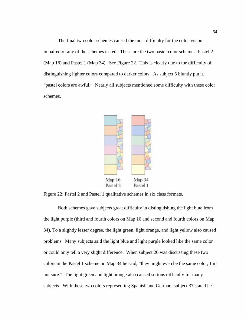
64
The final two color schemes caused the most difficulty for the color-vision
impaired of any of the schemes tested. These are the two pastel color schemes: Pastel 2
(Map 16) and Pastel 1 (Map 34). See Figure 22. This is clearly due to the difficulty of
distinguishing lighter colors compared to darker colors. As subject 5 bluntly put it,
“pastel colors are awful.” Nearly all subjects mentioned some difficulty with these color
schemes.
Both schemes gave subjects great difficulty in distinguishing the light blue from
the light purple (third and fourth colors on Map 16 and second and fourth colors on Map
34). To a slightly lesser degree, the light green, light orange, and light yellow also caused
problems. Many subjects said the light blue and light purple looked like the same color
or could only tell a very slight difference. When subject 20 was discussing these two
colors in the Pastel 1 scheme on Map 34 he said, “they might even be the same color, I’m
not sure.” The light green and light orange also caused serious difficulty for many
subjects. With these two colors representing Spanish and German, subject 37 stated he
Figure 22: Pastel 2 and Pastel 1 qualitative schemes in six class formats.
65
“can’t tell on this map if there is any Spanish, or for that matter, any German.” The
problem that this difficulty in color differentiation produces is exemplified in subject 25
who errantly determined that on Map 34, Iowa was consistently German based on his
“prior knowledge” that Iowa is predominately of German heritage even though the
answer for most common language spoken at home (excluding English) was consistently
Spanish. On Map 16, subject 12 felt the same about the Pastel 2 scheme saying about
the light blue and light purple, “I’m guessing these two are different,” while subject 2
“can’t even tell a difference.” For subject 5, the German and Irish (light blue and light
purple) are “way too close.” The light green, light yellow, and light brown (fifth, sixth,
and seventh) also caused subjects confusion. Again, with a larger number of classes,
many more confusions were described due to the use of many different hues.
It was obvious that the majority of subjects did not like these colors schemes and
experiencing more confusion with these than other schemes. The blue and purple were
the most difficult, but overall the lighter colors made it much harder to use for the color-
vision impaired. Subject 6 described Map 16 as more difficult than the last one “because
they are all light colors,” which “make it difficult to read.” Subjects 7 and 16 echoed this
thought which was consistent among all subjects, when they said, respectively, “mild
tones are harder to tell” and “brighter is way easier.” While a few subjects had little or
no difficulty in differentiation for these two schemes, generally the subjects agreed with
subject 25 who labeled the pastel Map 34 as “terrible.” These problems were only seen
in the color-vision impaired, as the normal color vision group had an easy time with the
pastel schemes and no difficulty in differentiating colors, though the much lighter colors
did cause them to take slightly longer. See Table 6 for a qualitative summary table.

66
Table 6: Qualitative summary table listing general amounts of subjects in each group who encountered problems with the color scheme of each on-screen map.
Map Data Type Color Scheme Scheme name Impaired Normal 1 S Green Greens Many Half 2 S Red-Purple RdPu Few Few 3 S Purple Purples Half Half 4 S Blue-Green BuGn Few Few 5 S Purple-Blue PuBu All Half 6 S Yellow-Orange-Brown YlOrBr Few Few 7 S Orange-Red OrRd Few Few 8 S Yellow-Green-Blue YlGnBu Half Few 9 D Spectral spectral Many Few 10 D Red-Yellow-Blue RYB Few Few 11 D Orange-Purple OrPu Few Few 12 D Pink-Green PiYG Many Few 13 D Red-Gray RdGy Few Few 14 Q Paired Paired Few None 15 Q Dark 2 Dark 2 Many Few 16 Q Pastel 2 Pastel 2 Many Few 17 Q Set 3 Set 3 Many None 18 S Orange Oranges Half Half 19 S Purple-Red PuRd Half Few 20 S Red Reds Few Few 21 S Green-Blue GnBu Few Few 22 S Blue-Purple BuPu Half Few 23 S Yellow-Orange-Red YlOrRd Few Few 24 S Yellow-Green YlGn Many Many 25 S Purple-Blue-Green PuBuGn Many Few 26 S Blue Blues All Many 27 D Red-Yellow-Green RYG Many None 28 D Red-Blue RdBu Few Few 29 D Brown-BlueGreen BrBG Few Few 30 D Purple-Green PRGn Few Few 31 Q Accents Accents Half None 32 Q Set 1 Set 1 Many None 33 Q Set 2 Set 2 Many None 34 Q Pastel 1 Set 3 Many Few
67
General Results
Many general themes ran through interview responses of both the color-vision
impaired and the normal color vision groups. First, subjects consistently said that they
preferred the map to the legend because the colors were easier to distinguish on the map.
This was due to the format of the legend as showing the blocks of color with white space
in between each. This space made it more difficult to differentiate colors that were
similar in appearance by keeping them separate. On the map they were often right next
to each other, only separated by a thin gray line, and could more easily be compared to
each other. Subject 9 looking at Map 17 with a pastel scheme said he “had a hard time
going map to legend” and that colors were “easier on the map where they are next to each
other.” Subject 2 similarly stated that it’s “easier to judge one against another with no
space in between.” This was brought up more on schemes where there was a lot of
similarity between colors.
When the subjects were comparing the sequential color schemes, those schemes
that used a change in lightness through various hues were generally preferred and
described as easier than those schemes that used simply a change in lightness of one hue
(i.e., light green to dark green). Thus the schemes with different hues on either end and
the schemes that progress through three different hues in their change from light to dark
provided subjects with more difference between adjacent colors and subsequently an
easier and quicker time reading the map. Subject 5 stated when describing why he likes
the Yellow-Green-Blue scheme, “it incorporates greens and blues, not just shades of one
specific color.”
68
When looking at the schemes where colors were becoming close, as in the middle
ranges of many of the sequential schemes, subjects described their method of determining
the right color as looking for various shades that they could easily distinguish and
working their way up or down from there. For example, they would look for the lightest
color on the map, then look around it for the next lightest color, and work their way up to
the specific color that they were interested in, such as the color for county X when
answering the questions. So when they found the lightest color and found that county X
was the third color in the lightness sequence by comparing county colors to each other,
they would then find the third color in the legend and know that it was the correct answer.
This definitely takes more time than looking at the map and seeing county X and its
color, then looking to the legend and picking out that color. When colors were similar
and the correct color could not clearly be distinguished on the legend, the subjects went
through this process to make sure they had the right map-legend match. Many subjects of
both the normal group and the color-vision impaired group described a similar process.
Finally, it was common for a slight difference to be seen in the color scheme on
screen versus on paper. More often than not, the schemes on paper were either described
as similar to or slightly easier than the on-screen scheme. The colors on screen were
described as brighter and more vivid, while the on-paper versions were labeled duller and
“washed out” yet slightly darker which led to an easier time distinguishing between
adjacent colors. The five class schemes were much more commonly described as easier
on paper than on screen. This could be due to the differences of perceiving emitted light
versus reflected light, variations in computer monitors, and the difficulty of matching
69
print CMYK colors with on-screen RGB colors, though I verified that the maps used the
RGB color values given for each scheme in ColorBrewer.
Discussion
By looking at the quantitative results, I can definitively say that there is a
significant difference in the map reading ability of the color-vision impaired versus the
normal color vision group when reading a map that uses the Pastel 2 color scheme. The
chi-square test shows a statistically significant difference for this scheme in the number
of incorrect multiple-choice responses from the two groups. The interview responses
clearly support this finding by showing the difficulty that the color-vision impaired have
when using schemes with lighter colors, especially the light blue and light purple.
For the other schemes no significant difference is seen in the accuracy of answers
to multiple-choice questions. This tells us that in general, the color-vision impaired could
distinguish the colors of the different ColorBrewer color schemes, match colors on the
map to the legend, and correctly answer the map reading questions. This does not mean,
though, that all these schemes are accommodating to the color-vision impaired.
Qualitative data collected from subjects show that even though there is minimal
difference in the number of multiple-choice questions missed there are still many
schemes where the impaired describe difficulty in differentiation of colors and would not
want to use a map with those problematic colors. It is clear that many of the schemes
(besides the Pastel 2) caused impaired subjects to take longer when differentiating colors,
needing to check back and forth from map to legend to make sure they had the correct
70
color and the correct answer. Though no time data was collected, for schemes where
interview responses reveal difficulty, the impaired took anywhere from a few seconds to
a few minutes longer than the normal color vision group to answer the multiple-choice
questions. So while a very slight difference in perception and no time limit given often
allowed subjects to come up with the correct answer, the qualitative data explain just how
much difficulty this group had in performing these map reading tasks.
Another possible explanation for the minimal differences is subjects guessing the
correct answers even though they may have had difficulty with matching colors to the
legend. The subjects may have felt uneasy about selecting the answer option “cannot
determine with the given colors.” Also, the questions may not have been worded as
clearly as possible or multiple-choice answers as definitive as they should have been, but
this would apply to both the color-vision impaired group and the normal color vision
group, therefore controlling the effect of this problem on response accuracy.
Looking at answers to multiple-choice map reading questions can be part of
understanding a scheme’s ability to accommodate, thus I chose to include it as part of this
experiment. Yet, these data were only gathered as part of an effort to understand the
overall map reading abilities of the color-vision impaired versus subjects with normal
color vision. These quantitative results clearly tell us that the subjects, for the most part,
could come up with the correct answer, but they do not take into account how the user
arrived at the correct answer and any difficulties that came up in the process.
As cartographers our goal is communication, and it is evident through the
interview responses that several of these schemes do not adequately communicate spatial
data to the color-vision impaired. When pairs of colors are used that are too similar, not

71
only for the impaired but for everyone, we limit our communication capability by
increasing the effort needed to understand the information being presented and by
introducing the possibility of miscommunication if the reader incorrectly matches data on
the map to the legend. Thus, I feel that the subjects’ responses on their perception and
use of the color scheme outweigh the quantitative data collected in this research study.
These interview results should be given primary focus in an evaluation of whether the
color scheme can be defined as accommodating for the color-vision impaired.
The sequential color schemes do not show a major difference between the color-
vision impaired and the normal color vision group. The characteristics that are problems
for these schemes are seen for both groups. All subjects could distinguish the colors of
the on-screen five class map for all sequential schemes, though some contained pairs of
colors in the middle of the range that were described as close, causing subjects to take
longer reading the map and double-check to verify colors. The only difference found
between the two groups was that, on average, the color-vision impaired started to
describe difficulty with colors being similar at a slightly lower number of classes than did
the normal group. With the sequential schemes being simply a change in lightness from
light to dark, these schemes were not expected to show a difference between the two
groups. Color-vision impairment primarily affects an individual’s ability to differentiate
hues while being able to distinguish shades of light and dark of whatever hues are being
perceived. So the changes in lightness of these schemes allow the color-vision impaired
to have the same ability to differentiate colors in the scheme even though they may not be
seeing the same hue as someone with normal color vision.
72
The sequential schemes that worked well were the schemes that used two or three
different hues in their change in lightness, such as the Yellow-Orange-Brown. This
scheme starts with a light yellow then works it way to a medium orange and into a darker
brown. Schemes such as this produce adjacent colors with more of a difference in
perception than schemes that use only one hue for the entire range of the light to dark
scheme. The subjects clearly favored this due to the easier time differentiating between
colors, and thus less time needed to read the map. These schemes worked well for
subjects when using a higher number of classes, commonly up to the seven or eight class
variation. The schemes using only one hue commonly started causing difficulty in the
five or six class variation. The lighter end of the scheme was more often described as
becoming close than the darker end of the scheme.
The diverging schemes are similar to the sequential schemes in that they use a
change in lightness, but they use a dark to light to dark change. These schemes are used
when trying to show change from a central value. This value is placed in the middle with
the lightest color and as values move away from the center, the colors become darker.
These schemes, like the sequential, use the cartographic fundamental that dark is more.
Thus, the two ends of the diverging schemes being darker represent more change from
the central value, either above or below.
For these, the majority of schemes were like the sequential showing little if any
difference between the color-vision impaired and the normal group. This is due to the
change in lightness above and below the middle and clearly differentiable hues on either
end. Again, the color-vision impaired started to describe difficulty with colors becoming
close at a slightly lower number of classes than the normal group, but this was not
73
enough to declare a difference between the groups. The characteristics seen for the
majority of the diverging schemes were seen for both groups.
Two diverging color schemes did show a major difference between the two
groups. These are the schemes that used a change in hue from red to yellow to green:
Spectral (Map 9) and Red-Yellow-Green (Map 27). These caused serious difficulty for
the color-vision impaired in the middle of the range between the lightest color and the
ones on either side. For both these schemes, a light orange and a light green are on either
side of light yellow middle. This light orange and light green pair could not be
differentiated, or could barely be differentiated. They also caused some difficulty when
comparing these two to the light yellow. The medium oranges and medium greens were
also similar but not to the extent of the lighter colors. These two schemes started to break
down with the six class scheme where the third and fourth colors looked the same. The
normal group had no difficulty with either of these schemes in differentiating the oranges,
yellow, and greens, and generally preferred the many hues of the spectral scheme.
The qualitative schemes all showed a difference between the color-vision
impaired and the normal group, though to varying degrees. Their use of many different
hues led to greater difficulty for the color-vision impaired. These clearly caused more
problems with colors looking similar than with the sequential and diverging schemes.
Overall, the lighter the color scheme, the more difficulty the color-vision impaired
had differentiating colors. Thus, the two Pastel schemes, Pastel 1 (Map 34) and Pastel 2
(Map 16), caused a great amount of difficulty. The light blue and light purple colors of
these schemes led to serious confusion as many subjects could not distinguish them. The
same was seen for the light green and light orange. In general, the color-vision impaired
74
described their displeasure for lighter, pastel colors, and said that they would not want to
use a map that used these colors.
For the same reason, the darker qualitative colors schemes worked much better
for this group. The blue and purple, and green and orange, still caused some slight
confusion though the majority of subjects had an easy time with them or only described
them as somewhat close. The darker colors were much easier for the color-vision
impaired to distinguish from each other and a clear preference was given to these over the
pastels. The Paired (Map 14) and Accents (Map 31) schemes also worked well because
of their use of both light and dark colors and staying away from blues and purples of
similar shades and greens and oranges of similar shades. The Accents scheme (one
planned for accommodating the color-vision impaired and used in an atlas for the U.S.
Census Bureau (Brewer and Suchan, 2001)) saw some similarity with the green and light
orange, but they were different enough in lightness for many subjects to differentiate
easily. When more classes are added to the Paired scheme, these color combinations
eventually show up, and thus cause more difficulty. Yet for the on-screen six class map
these two schemes worked well. The normal color vision group showed no difficulty at
all with any of the qualitative schemes. They sped right through them, easily
differentiating all of the various hues.
Recommendations for ColorBrewer
With the similarities in responses from both groups concerning the sequential
color schemes, and the inherent change in lightness that can be perceived by the color-
75
vision impaired, I recommend that all of the sequential schemes be identified as
accommodating to the color-vision impaired. Currently, and possibly erroneously, the
nine class Purple-Blue scheme is identified with an X over the ColorBrewer eye icon as
not accommodating. I suggest this be removed.
All of the diverging color schemes except two—the Spectral (Map 9) and Red-
Yellow-Green (Map 27)—also show similarity in responses between the two groups. For
the other two schemes, which both use a red-orange-yellow-green progression, the
difference between the color-vision impaired and the normal group is clear. The
difficulty of distinguishing the light orange from the light green was regularly described
as beginning with the six class variation with the third and fourth colors. Thus I
recommend that for these two schemes, the six class variation and above be identified as
definitely confusing for the color-vision impaired and have an X placed over the eye icon
in ColorBrewer. A small number of individuals, who exhibited more severe impairment,
described some difficulty with the reds and greens in the three through five class
variations. Being unsure if any subjects were protan- impaired, and the fact that reds and
greens of similar lightness fall on the same confusion lines for both types of impairment,
I suggest these first three class variations be labeled as possibly confusing and have a ?
placed over the eye icon. See Figure 23 for a diagram of these schemes in their full range
of class variations with the suggested symbols for ColorBrewer. This is a change from
the current ColorBrewer configurations of accommodating for the first three variations of
both of these schemes.
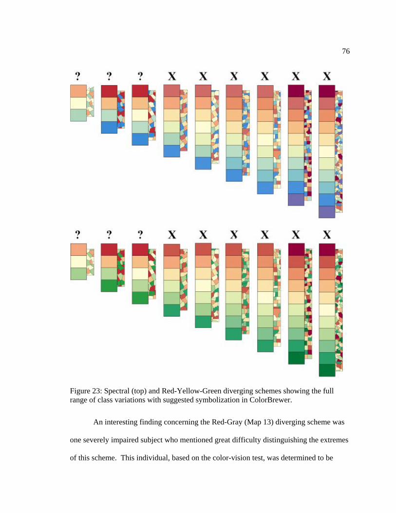
76
An interesting finding concerning the Red-Gray (Map 13) diverging scheme was
one severely impaired subject who mentioned great difficulty distinguishing the extremes
of this scheme. This individual, based on the color-vision test, was determined to be
Figure 23: Spectral (top) and Red-Yellow-Green diverging schemes showing the full range of class variations with suggested symbolization in ColorBrewer.
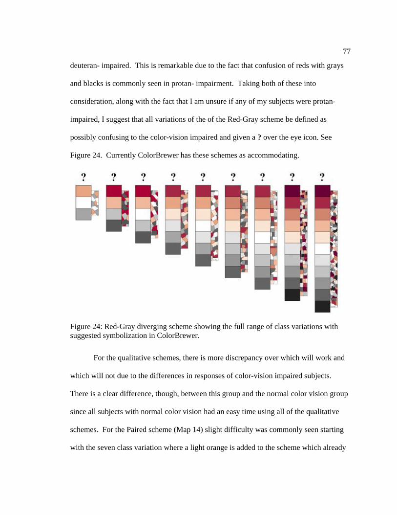
77
deuteran- impaired. This is remarkable due to the fact that confusion of reds with grays
and blacks is commonly seen in protan- impairment. Taking both of these into
consideration, along with the fact that I am unsure if any of my subjects were protan-
impaired, I suggest that all variations of the of the Red-Gray scheme be defined as
possibly confusing to the color-vision impaired and given a ? over the eye icon. See
Figure 24. Currently ColorBrewer has these schemes as accommodating.
For the qualitative schemes, there is more discrepancy over which will work and
which will not due to the differences in responses of color-vision impaired subjects.
There is a clear difference, though, between this group and the normal color vision group
since all subjects with normal color vision had an easy time using all of the qualitative
schemes. For the Paired scheme (Map 14) slight difficulty was commonly seen starting
with the seven class variation where a light orange is added to the scheme which already
Figure 24: Red-Gray diverging scheme showing the full range of class variations with suggested symbolization in ColorBrewer.
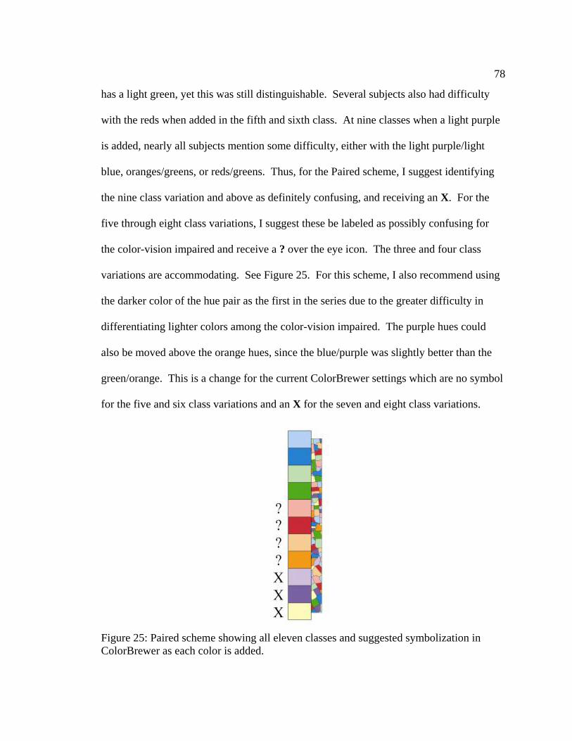
78
has a light green, yet this was still distinguishable. Several subjects also had difficulty
with the reds when added in the fifth and sixth class. At nine classes when a light purple
is added, nearly all subjects mention some difficulty, either with the light purple/light
blue, oranges/greens, or reds/greens. Thus, for the Paired scheme, I suggest identifying
the nine class variation and above as definitely confusing, and receiving an X. For the
five through eight class variations, I suggest these be labeled as possibly confusing for
the color-vision impaired and receive a ? over the eye icon. The three and four class
variations are accommodating. See Figure 25. For this scheme, I also recommend using
the darker color of the hue pair as the first in the series due to the greater difficulty in
differentiating lighter colors among the color-vision impaired. The purple hues could
also be moved above the orange hues, since the blue/purple was slightly better than the
green/orange. This is a change for the current ColorBrewer settings which are no symbol
for the five and six class variations and an X for the seven and eight class variations.
Figure 25: Paired scheme showing all eleven classes and suggested symbolization in ColorBrewer as each color is added.
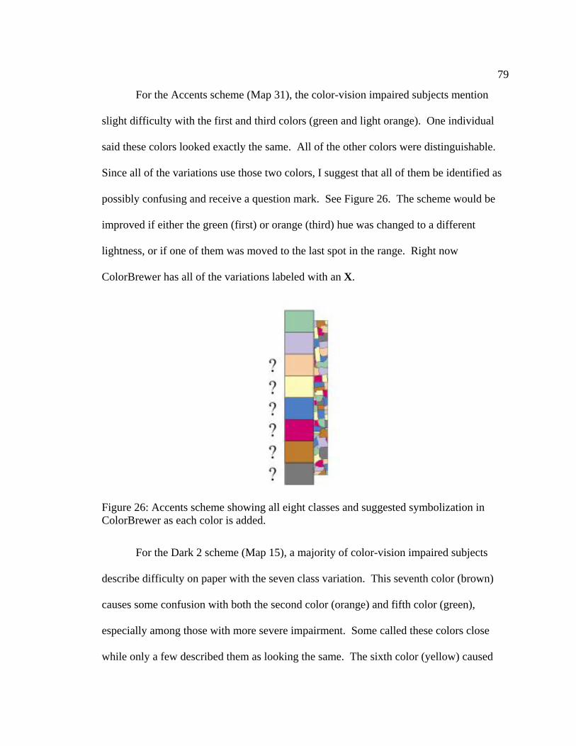
79
For the Accents scheme (Map 31), the color-vision impaired subjects mention
slight difficulty with the first and third colors (green and light orange). One individual
said these colors looked exactly the same. All of the other colors were distinguishable.
Since all of the variations use those two colors, I suggest that all of them be identified as
possibly confusing and receive a question mark. See Figure 26. The scheme would be
improved if either the green (first) or orange (third) hue was changed to a different
lightness, or if one of them was moved to the last spot in the range. Right now
ColorBrewer has all of the variations labeled with an X.
For the Dark 2 scheme (Map 15), a majority of color-vision impaired subjects
describe difficulty on paper with the seven class variation. This seventh color (brown)
causes some confusion with both the second color (orange) and fifth color (green),
especially among those with more severe impairment. Some called these colors close
while only a few described them as looking the same. The sixth color (yellow) caused
Figure 26: Accents scheme showing all eight classes and suggested symbolization in ColorBrewer as each color is added.
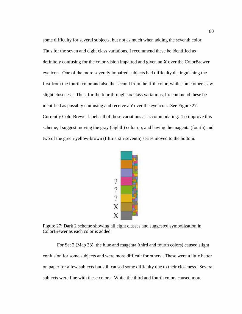
80
some difficulty for several subjects, but not as much when adding the seventh color.
Thus for the seven and eight class variations, I recommend these be identified as
definitely confusing for the color-vision impaired and given an X over the ColorBrewer
eye icon. One of the more severely impaired subjects had difficulty distinguishing the
first from the fourth color and also the second from the fifth color, while some others saw
slight closeness. Thus, for the four through six class variations, I recommend these be
identified as possibly confusing and receive a ? over the eye icon. See Figure 27.
Currently ColorBrewer labels all of these variations as accommodating. To improve this
scheme, I suggest moving the gray (eighth) color up, and having the magenta (fourth) and
two of the green-yellow-brown (fifth-sixth-seventh) series moved to the bottom.
For Set 2 (Map 33), the blue and magenta (third and fourth colors) caused slight
confusion for some subjects and were more difficult for others. These were a little better
on paper for a few subjects but still caused some difficulty due to their closeness. Several
subjects were fine with these colors. While the third and fourth colors caused more
Figure 27: Dark 2 scheme showing all eight classes and suggested symbolization in ColorBrewer as each color is added.
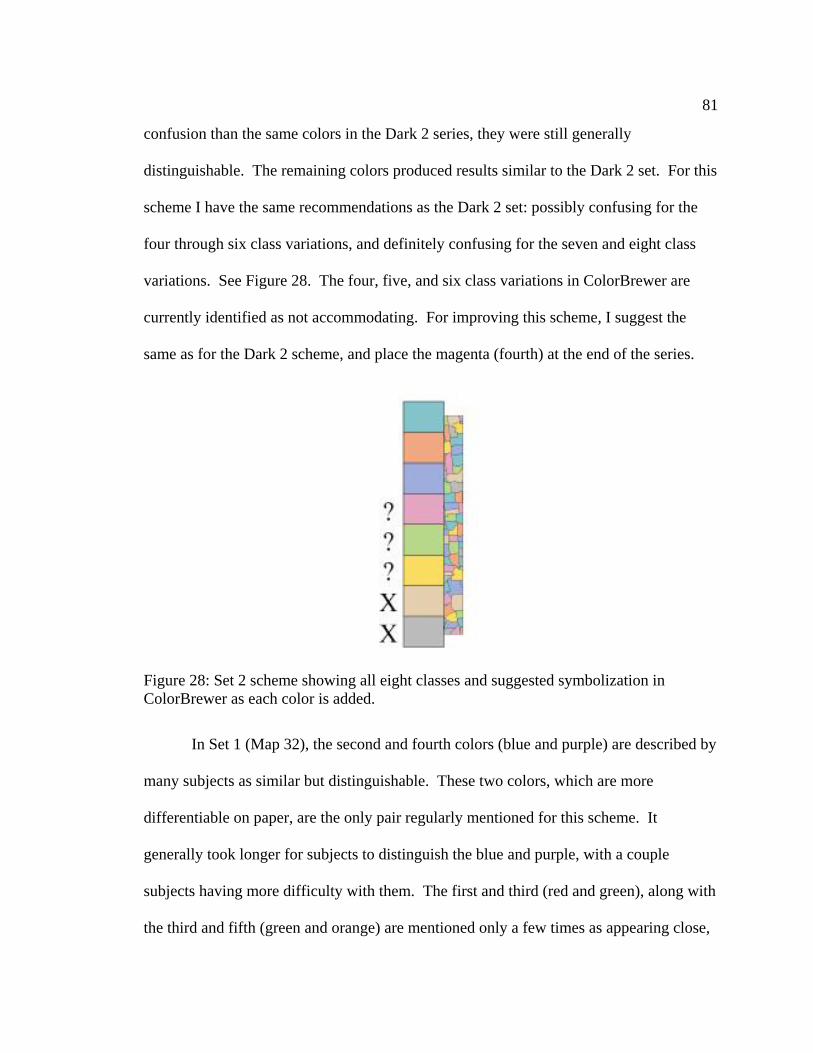
81
confusion than the same colors in the Dark 2 series, they were still generally
distinguishable. The remaining colors produced results similar to the Dark 2 set. For this
scheme I have the same recommendations as the Dark 2 set: possibly confusing for the
four through six class variations, and definitely confusing for the seven and eight class
variations. See Figure 28. The four, five, and six class variations in ColorBrewer are
currently identified as not accommodating. For improving this scheme, I suggest the
same as for the Dark 2 scheme, and place the magenta (fourth) at the end of the series.
In Set 1 (Map 32), the second and fourth colors (blue and purple) are described by
many subjects as similar but distinguishable. These two colors, which are more
differentiable on paper, are the only pair regularly mentioned for this scheme. It
generally took longer for subjects to distinguish the blue and purple, with a couple
subjects having more difficulty with them. The first and third (red and green), along with
the third and fifth (green and orange) are mentioned only a few times as appearing close,
Figure 28: Set 2 scheme showing all eight classes and suggested symbolization in ColorBrewer as each color is added.

82
yet these are likely to cause more difficulty for individuals with more severe impairment.
Thus, I recommend that all of the class variations be labeled as possibly confusing and
given a ? over the eye icon. See Figure 29. This is contrary to the current settings which
are that all variations accommodate. I suggest moving the green, purple, and orange
(third, fourth, and fifth) colors to the end to allow for more accommodating variations.
Similarly for Set 3 (Map 17) the blue and purple colors (third and fifth colors)
caused some degree of difficulty for nearly all of the color-vision impaired with many of
them having great difficulty. These were slightly better on paper, though still close. A
small number of the more severely impaired subjects also had difficulty distinguishing
the first and third colors, especially on paper. Taking this into consideration, I
recommend that the three and four class variations of the scheme be identified as possibly
confusing for the color-vision impaired, and the five class variation and above be
Figure 29: Set 1 scheme showing all nine classes and suggested symbolization in ColorBrewer as each color is added.
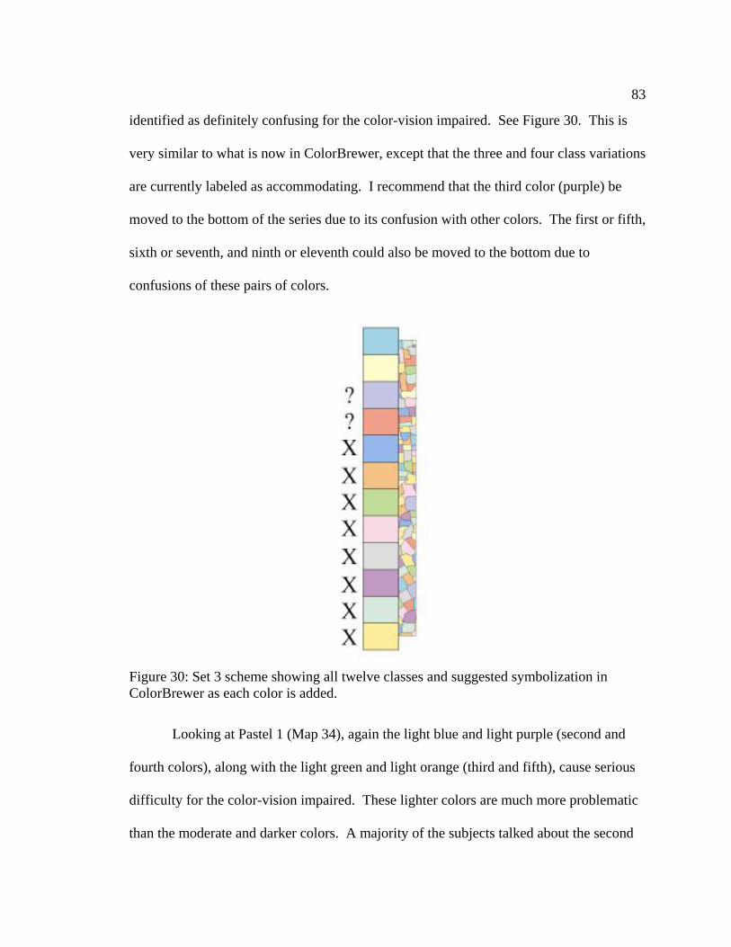
83
identified as definitely confusing for the color-vision impaired. See Figure 30. This is
very similar to what is now in ColorBrewer, except that the three and four class variations
are currently labeled as accommodating. I recommend that the third color (purple) be
moved to the bottom of the series due to its confusion with other colors. The first or fifth,
sixth or seventh, and ninth or eleventh could also be moved to the bottom due to
confusions of these pairs of colors.
Looking at Pastel 1 (Map 34), again the light blue and light purple (second and
fourth colors), along with the light green and light orange (third and fifth), cause serious
difficulty for the color-vision impaired. These lighter colors are much more problematic
than the moderate and darker colors. A majority of the subjects talked about the second
Figure 30: Set 3 scheme showing all twelve classes and suggested symbolization in ColorBrewer as each color is added.
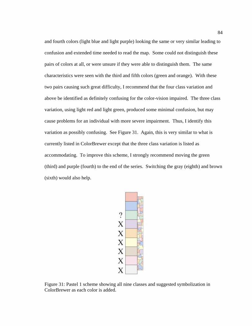
84
and fourth colors (light blue and light purple) looking the same or very similar leading to
confusion and extended time needed to read the map. Some could not distinguish these
pairs of colors at all, or were unsure if they were able to distinguish them. The same
characteristics were seen with the third and fifth colors (green and orange). With these
two pairs causing such great difficulty, I recommend that the four class variation and
above be identified as definitely confusing for the color-vision impaired. The three class
variation, using light red and light green, produced some minimal confusion, but may
cause problems for an individual with more severe impairment. Thus, I identify this
variation as possibly confusing. See Figure 31. Again, this is very similar to what is
currently listed in ColorBrewer except that the three class variation is listed as
accommodating. To improve this scheme, I strongly recommend moving the green
(third) and purple (fourth) to the end of the series. Switching the gray (eighth) and brown
(sixth) would also help.
Figure 31: Pastel 1 scheme showing all nine classes and suggested symbolization in ColorBrewer as each color is added.
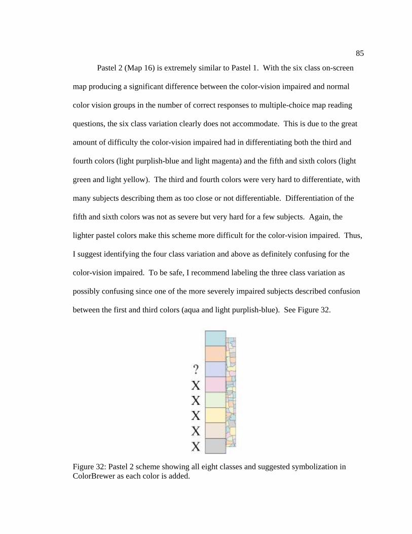
85
Pastel 2 (Map 16) is extremely similar to Pastel 1. With the six class on-screen
map producing a significant difference between the color-vision impaired and normal
color vision groups in the number of correct responses to multiple-choice map reading
questions, the six class variation clearly does not accommodate. This is due to the great
amount of difficulty the color-vision impaired had in differentiating both the third and
fourth colors (light purplish-blue and light magenta) and the fifth and sixth colors (light
green and light yellow). The third and fourth colors were very hard to differentiate, with
many subjects describing them as too close or not differentiable. Differentiation of the
fifth and sixth colors was not as severe but very hard for a few subjects. Again, the
lighter pastel colors make this scheme more difficult for the color-vision impaired. Thus,
I suggest identifying the four class variation and above as definitely confusing for the
color-vision impaired. To be safe, I recommend labeling the three class variation as
possibly confusing since one of the more severely impaired subjects described confusion
between the first and third colors (aqua and light purplish-blue). See Figure 32.
Figure 32: Pastel 2 scheme showing all eight classes and suggested symbolization in ColorBrewer as each color is added.
86
These recommendations for the Pastel 2 scheme are the same as what is currently
listed in ColorBrewer except for the three-class variation which is currently labeled as
accommodating. To improve this scheme, I recommend moving one of the colors in the
third/fourth pair (light purplish blue and light magenta) to the end. The first and fifth
colors (light aqua and light green) could also be moved to the end since these were
occasionally confused with other colors. See Table 7 for an overview of each scheme
and its accommodation recommendations.
I have tried to separate those schemes and variations where there were differences
between colors being described as slightly close from those where there was serious
difficulty among a majority of the subjects. I have recommended the current
ColorBrewer use of the ? and the X as the difference between these two types, though the
question mark could give the impression that the scheme has not been tested and we are
unsure of results. The question mark in this context means that the scheme may
accommodate some color-vision impaired individuals but not others. Many of these
recommendations are the same as what is currently displayed over the eye icon in the
ColorBrewer tool, yet some of them are different. These differences are primarily due to
the suggestion of using the ? symbol for certain class variations since that symbol is not
currently used for the accommodation icon. Now, though, there are recommendations for
ColorBrewer which are based on experimentally tested results, looking at the thoughts
and abilities of a group of color-vision impaired individuals.

87
Table 7: Recommendations for ColorBrewer accommodation icon.
Map Data Color Scheme Name Number of Classes
3 4 5 6 7 8 9 10 11 121 S Green Greens 2 S Red-Purple RdPu 3 S Purple Purples 4 S Blue-Green BuGn 5 S Purple-Blue PuBu 6 S Yel-Orange-Brown YlOrBr 7 S Orange-Red OrRd 8 S Yellow-Green-Blue YlGnBu 9 D Spectral spectral ? ? ? X X X X X X 10 D Red-Yellow-Blue RYB 11 D Orange-Purple OrPu 12 D Pink-Green PiYG 13 D Red-Gray RdGy ? ? ? ? ? ? ? ? ? 14 Q Paired Paired ? ? ? ? X X X 15 Q Dark 2 Dark 2 ? ? ? X X 16 Q Pastel 2 Pastel 2 ? X X X X X 17 Q Set 3 Set 3 ? ? X X X X X X X X 18 S Orange Oranges 19 S Purple-Red PuRd 20 S Red Reds 21 S Green-Blue GnBu 22 S Blue-Purple BuPu 23 S Yel-Orange-Red YlOrRd 24 S Yellow-Green YlGn 25 S Purple-Blue-Green PuBuGn 26 S Blue Blues 27 D Red-Yellow-Green RYG ? ? ? X X X X X X 28 D Red-Blue RdBu 29 D Brown-BlueGreen BrBG 30 D Purple-Green PRGn 31 Q Accents Accents ? ? ? ? ? ? 32 Q Set 1 Set 1 ? ? ? ? ? ? ? 33 Q Set 2 Set 2 ? ? ? X X 34 Q Pastel 1 Pastel 1 ? X X X X X X
Chapter 5
Conclusion
This study examined the differences in map reading ability and color perception
between individuals with impaired color vision and individuals with normal color vision
when reading thematic maps using the ColorBrewer color schemes. Results show that
the majority of the ColorBrewer color schemes use colors that accommodate map reading
by the color-vision impaired. Some of the color-vision-impaired subjects had little
difficulty with a scheme while others had a much harder time distinguishing those same
colors. The nature of color-vision impairment, as a condition with varying levels of
deficiency based on lack of or weakness in types of cones in the retina, makes it difficult
to predict accommodation for all of the impaired, yet consistencies in subjects’ responses
allow recommendations to be made for this group overall.
Generally, the quantitative portion of the experiment did not produce significantly
different results in the ability of the two groups to answer multiple-choice map reading
questions. Only Map 16 with the Pastel 2 color scheme exhibited a significant difference
(beyond the 0.005 level). For this scheme, the group of ten color-vision impaired
subjects missed nine of 30 multiple-choice questions, while the group of ten normal color
vision subjects answered all questions correctly. The remaining 33 schemes all produced
five or fewer incorrect answers by the color-vision impaired group and this level of
accuracy was much closer to that of the normal color vision group. This leads to the
conclusion that most color-vision impaired individuals can differentiate between the
89
colors enough to answer the multiple-choice questions that were asked. Yet this does not
take into account the amount of difficulty a subject had when attempting to differentiate
colors on the map in order to answer the questions.
The semi-structured interviewing session after each set of multiple-choice
questions provided some intriguing responses regarding subjects’ experiences using each
of the ColorBrewer color schemes. Based on interview responses, qualitative color
schemes and the diverging schemes that used a red-green range clearly caused problems.
I have concluded that for five schemes, three qualitative and two diverging, the majority
of the variations would definitely not accommodate map reading among the color-vision
impaired: Pastel 1 (Map 34), Pastel 2 (Map 16), Set 3 (Map 17), Spectral (Map 9), and
Red-Yellow-Green (Map 27). These schemes all caused serious difficulty when subjects
were attempting to differentiate colors of the scheme. All subjects mentioned some
difficulty, while many of them could barely differentiate certain pairs of colors or could
not differentiate them at all. This led to increased time needed when using the map, and
great uncertainty when answering the questions. The two diverging schemes both use a
red to orange to yellow to green color ramp. This caused great difficulty in
differentiating the light green and light orange on either side of the center.
The remaining five qualitative schemes also have colors similar in perception for
this group, causing problems and leading to more time being needed when reading the
maps. There was a difference, though, between these and the first three qualitative
schemes in that the numbers of subjects mentioning difficulty were fewer and the degree
of difficulty mentioned for differentiating colors was lower. In general, these schemes
have colors that were described as close but distinguishable. The Paired (Map 14), Dark
90
2 (Map 15), and Set 2 (Map 33) schemes, were determined to be possibly confusing to
the color-vision impaired in most class variations, except for the higher numbers of
classes which become definitely confusing. The final two qualitative schemes, Accents
(Map 31) and Set 1 (Map 32), were determined to be possibly confusing in all class
variations. In addition, all variations of the Red-Gray diverging scheme were determined
to be possibly confusing. I have suggested using the same convention currently in
ColorBrewer by placing an X over the eye icon for class variations that are definitely
confusing and question mark over the eye icon for those variations that are possibly
confusing.
For all of the sequential schemes and the diverging schemes not using a red-to-
green ramp, there was no difference between the color-vision impaired and the normal
color vision groups. Schemes using a blue or purple generally seemed to cause slightly
more difficulty in differentiation. The sequential schemes that use more than one hue in
their transition from light to dark are generally preferred over those that simply use light
to dark of one hue because of the greater contrast between adjacent colors. These
allowed for differentiation of colors through a higher number of classes than the single
hue schemes which regularly caused difficulty in the six class variation.
Responses from subjects in both groups included describing how, for close pairs
of colors, they had to go back and forth from map to legend several times to make sure
they were correct. They used a process of working their way from shade to shade starting
at the lightest or darkest and comparing colors until they were sure of which color in the
range they were looking at. Also, they had a much easier time differentiating colors on
the map as opposed to the legend. The legends were created using the ArcGIS 9 ArcMap

91
default of having space in between the colors of the legend. This white space gave
subjects more difficulty with similar colors in the legend than on the map where the
counties were right next to each other only separated by a thin line. They would have
preferred a legend with colors right next to each other, making colors easier to
differentiate. In general, this white space making a difference means that the colors are
likely too similar in the first place.
Another common theme was the greater difficulty color-vision impaired subjects
had when using maps with lighter, pastel color schemes. This group definitely preferred
darker, brighter colors. For pairs of hues that were confusing, seeing them in a lighter
shade amplified the amount of difficulty. Thus, the two Pastel color schemes are ones
that clearly do not accommodate. In general, the lighter shades of all of the schemes
were more difficult for subjects from both groups. When subjects were evaluating the
different variations of the scheme on paper, the lighter end was regularly described as the
point where subjects started to have difficulty with colors becoming similar. Also, as can
be expected, as more classes are added there is greater difficulty in differentiation for
both the color-vision impaired and normal color vision individuals. This is caused by the
decreased difference between adjacent colors when using a greater number of classes to
move through the same range of color.
The length of time needed to read the map by differentiating colors is an
important part of how well a color scheme accommodates an individual. Yet, this
experimental research did not time subjects when answering the multiple-choice
questions. For those schemes in which pairs of colors looked similar or the same,
increased time was needed to compare the map to the legend, going back and forth and

92
double-checking to make sure an answer was correct. This extra time needed by subjects
was not recorded and would have been a useful indicator in determining a scheme’s
accommodation ability in comparison to other schemes. Though in this mixed method
experiment, it may have been difficult to collect accurate response times due to the
conversational nature of the testing. Thus, in the future, the ColorBrewer color schemes
could be tested for length of time needed for subjects of all capabilities to read the map
by timing them when answering multiple-choice questions.
Also, the color-vision test did not provide an adequate determination of the type
of color-vision impairment (deuteranope, deuteranomalous, protanope, or
protanomalous). The last two Ishihara plates use two numbers each, one confusing to
protan- and one confusing to deuteran- types of impairment. This test, though, does not
determine whether an individual is a dichromat or an anomalous trichromat. Answers for
many of the subjects showed them to be deuteran-, which was expected since
deuteranomaly is the most common form of impairment, but the remaining subjects all
showed inconclusive results. I was unsure if I had any protanopic or protanomalous
subjects in my sample. It is possible that all of the color-vision impaired subjects in the
sample were deuteran- impaired. Had the type of impairment for each subject been
clearly known, comparisons of responses for the different types would have produced a
more thorough understanding of what colors are confused by what type of impairment.
This knowledge would have made it easier to make recommendations for ColorBrewer if
the one subject who had difficulty with one of the schemes had a different type of color-
vision impairment. With more time and funding I would have recruited a larger sample
of subjects and found a more rigorous test for color-vision impairment.

93
Clearly, through this research, seven, eight, and nine classes of the sequential
schemes using one hue were found to cause serious difficulty for subjects when
attempting to distinguish adjacent colors. Further study could be done, focusing on
where different types of color schemes commonly start to cause difficulty for the
majority of the population when used for an increasing number of classes. The
differences between schemes could be studied in more depth to determine which are
better than others for communicating larger numbers of classes
The findings of this research now give ColorBrewer an experimentally tested
basis for the information provided on whether a specific color scheme accommodates
red-green color-vision impairments. The recommendations given can be integrated into
the “colorblind friendly” usability icon of the online ColorBrewer tool, giving users
confidence about the accommodation ability of their chosen scheme. This research also
adds to the limited amount of literature on the topic of use of color for accessibility in
cartography, thus improving communication by disseminating knowledge of which color
schemes work for the greatest number of people. Nearly eight percent of men have some
degree of color-vision impairment. Too often this group may be disregarded as
insignificant, but if a map or graphic is to be distributed to a large number of people, the
number of color-vision impaired who may have a difficult time reading it can become
significant. With the Federal government now requiring that public information be
accessible to all people, an understanding of color-vision impairment is imperative. In
addition, a more thorough understanding of thematic map reading processes and
appropriate color scheme use for the portion of the population with normal color vision
has been collected.
Bibliography
Arditi, A. 1997. Effective color contrast: Designing for people with partial sight and color deficiencies. Lighthouse International. http://www.lighthouse.org/ color_contrast.htm (last accessed 7 June 2005).
Bertin, J. 1983. Semiology of graphics: Diagrams, networks, maps. Translation by J. W. Berg. Madison, WI: University of Wisconsin-Madison Press. Brettel, H., F. Vienot, and J. Mollon. 1997. Computerized simulation of color appearance for dichromats. Journal of the Optical Society of America 14(10): 2647-55. Brewer, C. A. 1991. The prediction of surround-induced changes in map color appearance. Ph.D. dissertation, Department of Geography, Michigan State University. ———. 1992. Review of colour terms and simultaneous contrast research for cartography. Cartographica 29(3/4): 20-30. ———. 1994a. Color use guidelines for mapping and visualization. In Visualization in modern cartography, ed. A. M. MacEachren and D. R. F. Taylor, 123-47. New York: Pergamon Press. ———. 1994b. Guidelines for use of the perceptual dimensions of color for mapping and visualization. In Color hard copy and graphic arts III, ed. J. Bares, Proceedings volume 2171, 54-63. Bellingham, WA: International Society for Optical Engineering. ———. 1996. Guidelines for selecting colors for diverging schemes on maps. The Cartographic Journal 33(2): 79-86. ———. 1997a. Spectral schemes: Controversial color use on maps. Cartography and Geographic Information Systems 24(4): 203-20. ———. 1997b. Evaluation of a model for predicting simultaneous contrast on colour maps. The Professional Geographer 49: 280-94. Brewer, C. A., G. W. Hatchard, and M.A. Harrower. 2003. ColorBrewer in print: A catalog of color schemes for maps. Cartography and Geographic Information Science 30(1): 5-32. Brewer, C. A., A. M. MacEachren, L. W. Pickle, and D. J. Herrmann. 1997. Mapping
mortality: Evaluating color schemes for choropleth maps. Annals of the Association of American Geographers 87(3): 411-38.
Brewer, C. A. and T. A. Suchan. 2001. Mapping census 2000: The geography of U.S. diversity. Census special report, Series CENSR/01-1. Washington, DC: U.S. Government Printing Office. Brinck, T., D. Gergle, and S. D. Wood. 2002. Usability for the web: Designing websites that work. San Diego, CA: Academic Press. Broackes, J. 1997. The autonomy of colour. In Readings on color: The philosophy of color, eds. A. Byrne and D. R. Hilbert, 191-225. Cambridge, MA: MIT Press. Clark, J. 2003. Building accessible websites. Indianapolis, IN: New Riders Publishing.
95
De Valois, R. L. and K. K. De Valois. 1997. Neural coding of color. In Readings on color: The science of color, eds. A. Byrne and D. R. Hilbert, 93-140. Cambridge, MA: MIT Press. Dent, B. D. 1999. Cartography: Thematic map design, 5th ed. Boston, MA: WCB/ MacGraw-Hill. Eckstein, H. W. 1991. Color in the 21st century. New York: Watson-Guptill Publications. Ehrensvard, U. 1987. Color in cartography: A historical survey. In Art and cartography: Six historical essays, ed. D. Woodward, 123-46. Chicago: Univ of Chicago Press. Harrower, M. A. and C. A. Brewer. 2003. ColorBrewer.org: An online tool for selecting colour schemes for maps. The Cartographic Journal 40(1): 27-37. Ishihara, S. 1980. Ishihara’s tests for colour-blindness: Concise edition. Tokyo: Kanahara & Co., Ltd. Jackson, R., L. MacDonald, and K. Freeman. 1994. Computer generated colour: A practical guide to presentation and display. New York: John Wiley and Sons. Kalmus, H. 1965. Diagnosis and genetics of defective colour vision. New York: Pergamon Press. Kimerling, A. J. 1980. Color specification in cartography. The American Cartographer 7: 139-54. Kumler, M. P. and R. E. Groop. 1990. Continuous-tone mapping of smooth surfaces. Cartography and Geographic Information Systems 17(4): 279-89. Legrand, Y. 1968. Light, Color and Vision, 2nd ed. London: Chapman and Hall. Luo, M. R. 1999. Colour science: Past, present, and future. In Colour imaging: Vision and technology, eds. L. W. MacDonald and M. R. Luo, 383-404. New York: John Wiley and Sons. MacAdam, D. L. 1997. The physical basis of color specification. In Readings on color: The science of color, eds. A. Byrne and D. R. Hilbert, 33-63. Cambridge, MA: MIT Press. Maxwell, B. 2000. Visualizing geographic classification using color. The Cartographic Journal 37(2): 93-99. Merbs, S. L. and J. Nathans. 1992. Absorption spectra of human cone pigments. Nature 356: 433-35. Mersey, J. E. 1990. Colour and thematic map design: The role of colour scheme and map complexity in choropleth map communication. Cartographica 27(3). Meyer, G. W. and D. P. Greenberg. 1988. Color-defective vision and computer graphics displays. IEEE Computer Graphics and Applications 8: 28-40. Mollon, J. D., J. Pokorny, and K. Knoblauch. 2003. Normal and defective colour vision. New York: Oxford University Press. Mueller, J. P. 2003. Accessibility for everybody: Understanding the section 508 accessibility requirements. New York: Springer-Verlag. Nielsen, J. 2000. Designing web usability. Indianapolis, IN: New Riders Publishing. Olson, J. M. 1981. An evaluation of spectrally encoded two-variable maps. Annals of the Association of American Geographers 71: 259-76. ———. 1987. Color and the computer in cartography. In Color and the computer, ed. H. J. Durrett, 205-20. Orlando, FL: Academic Press.
96
———. 2001. Strategies for map colour selection in the age of GIS. In Proceedings of the 97th Annual Meeting of the Association of American Geographers, 27 Feb-3 Mar 2001, New York. Olson, J. M. and C. A. Brewer. 1997. An evaluation of color selections to accommodate map users with color-vision impairments. Annals of the Association of American Geographers 87(1): 103-34. Poirson, A. and B. Wandell. 1993. Appearance of colored patterns: Pattern-color separability. Journal of the Optical Society of America 10(12): 2458-70. Pring, R. 2000. Www.color: Effective use of color in web page design. New York: Watson-Guptill Publications. Purves, D. and R. B. Lotto. 2003. Why we see what we do: An empirical theory of vision. Sunderland, MA: Sinauer Associates, Inc. Robinson, A. H., R. D. Sale, J. Morrison, and P. C. Muehrcke. 1995. Elements of cartography, 6th ed. New York: John Wiley & Sons. Rushton, W. A. H. 1975. Visual pigments and color blindness. Scientific American 232: 64-74. Sharpe, L. T., A. Stockman, H. Jagle, and J. Nathans. 1999. Opsin genes, cone photopigments, color vision, and color blindness. In Color vision: From genes to perception, eds. K. R. Gegenfurtner and L. T. Sharpe, 3-51. Cambridge, UK: Cambridge University Press. Slatin, J. M. and S. Rush. 2003. Maximum accessibility: Making your web site more usable for everyone. Boston, MA: Addison-Wesley. Thompson, E. 1995. Colour vision: A study in cognitive science and the philosophy of perception. New York: Routledge. Travis, D. 1991. Effective color displays: Theory and practice. San Diego, CA: Academic Press. Trumbo, B. E. 1981. A theory for coloring bivariate statistical maps. The American Statistician 35: 220-26. U.S. Department of Justice. 2004. Section 508 Home Page. U.S. Department of Justice, Washington, DC. http://www.usdoj.gov/crt/508/508home.html (last accessed 13 September 2004). Van Duyne, D. K., J. A. Landay, and J. I. Hong. 2003. The design of sites: Patterns, principles, and processes for crafting a customer-centered web experience. Boston, MA: Addison-Wesley. Wainer, H. and C. M. Francolini. 1980. An empirical inquiry concerning human understanding of two-variable color maps. The American Statistician 34: 81-93. White, J. V. 1990. Color for the electronic age. New York: Watson-Guptill Publications. Wyszecki, G. and W. S. Stiles. 1982. Color science: Concepts and methods, quantitative data and formulae, 2nd ed. New York: John Wiley & Sons.
Appendix A
Informed Consent Form
INFORMED CONSENT FORM FOR SOCIAL SCIENCE RESEARCH
The Pennsylvania State University
Title of Project: Map-Use Testing of the ColorBrewer Color Schemes for Accommodation of the Color-Vision Impaired Principal Investigator: Steven D. Gardner, Graduate Student
302 Walker Building University Park, PA 16802 (814) 441-1647; [email protected]
Advisor: Dr. Cynthia Brewer 302 Walker Building University Park, PA 16802 (814) 865-5072; [email protected]
1. Purpose of the Study: The purpose of this research study is to learn more about color use on thematic maps and which color schemes communicate effectively by accommodating map reading ability in that portion of the population which is color-vision impaired. This study will evaluate the color scheme options offered in ColorBrewer <http://www.colorbrewer.org>, an online tool designed to aid color selection for maps and graphics.
2. Procedures to be followed: You will be seated in front of a computer with an LCD
computer screen. You will be asked to initially take a color-vision test, then examine and
ORP USE ONLY: The Pennsylvania State University Office for Research Protections Approval Date: 12/10/04 M. Becker
Expiration Date: 11/29/05 M. Becker Social Science Institutional Review Board
98
answer questions on a series of PowerPoint slides showing thematic maps, each using a different color scheme. A first thematic map will be shown using one of the ColorBrewer color schemes. You will then be asked to answer three multiple-choice questions about areas and patterns on the map. This will be followed by interview questions in which you will be asked about your ability to read the map and perceive the given color scheme. This procedure will then be repeated for sixteen other ColorBrewer color schemes. In the event that abnormal color-vision test results are obtained based on your previously stated condition, you will be made aware of the results immediately after the experiment and recommended to contact your private medical care provider for follow up.
3. Audio Recording: Your responses to interview questions will be recorded on audio tape.
Tapes will be stored in the Principal Investigator’s office (337 Walker Building) through December 2005, after which time the tapes will be destroyed. Only the Principal Investigator and Advisor will have access to the tapes. If you do not wish to have your responses taped, please inform the person conducting the experiment and check the appropriate space below.
______ I give my permission to be (audio) taped. ______ I do not give my permission to be (audio) taped.
4. Discomforts and Risks: There are no risks in participating in this research beyond those experienced in everyday life.
5. Benefits: You may benefit by learning about spatial data patterns of various U.S. regions
through reading the maps. Society will benefit from the knowledge of appropriate color schemes for accommodating the color-vision impaired leading to improved cartographic design and effective map communication.
6. Duration: It will take about one hour to complete the experiment.
7. Statement of Confidentiality: Only the person in charge, and his/her assistants, will
know your identity. Your name or signature will not be associated with your multiple-choice answers or verbal interview responses. The data will be stored and secured in 337 Walker Building, a locked graduate student office, or on the Geography Department server in a password protected user account assigned to the PI. The Office for Research Protections and the Social Science Institutional Review Board may review records related to this project. In the event of a publication or presentation resulting from the research, no personally identifiable information will be shared.
8. Right to Ask Questions: You can ask questions about this research. Contact Steven
Gardner at (814) 441-1647 with questions. If you have questions about your rights as a research participant, contact The Pennsylvania State University’s Office for Research Protections at (814) 865-1775.
99
9. Compensation: Participants will receive 10 dollars in cash as compensation for participating in the experiment.
10. Voluntary Participation: Your decision to be in this research is voluntary. You can
stop at any time. You do not have to answer any questions you do not want to answer.
You must be 18 years of age or older to take part in this research study. If you agree to take part in this research study and the information outlined above, please sign your name and indicate the date below.
You will be given a copy of this signed and dated consent for your records.
______________________________________________ ________________ Participant Signature Date
______________________________________________ _________________ Person Obtaining Consent Date

Appendix B
Experimental Maps
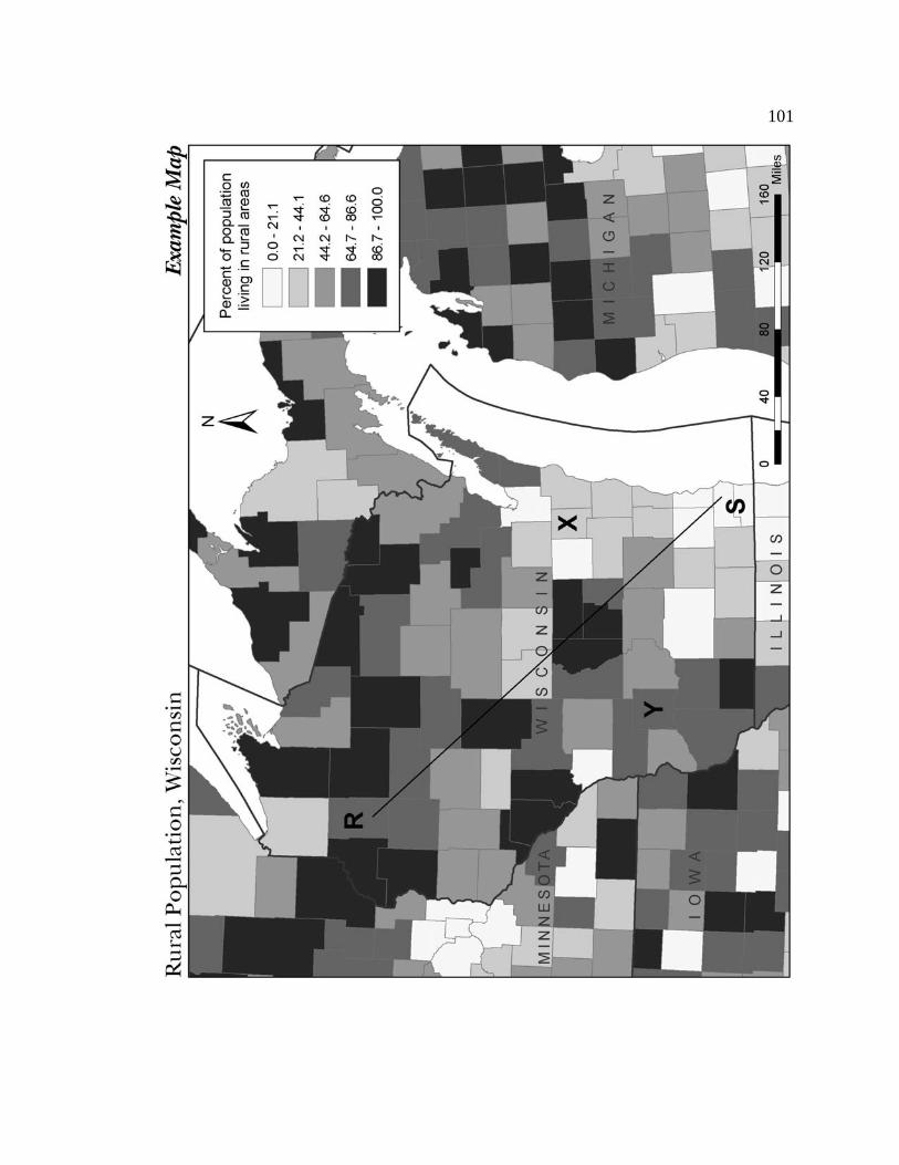
101
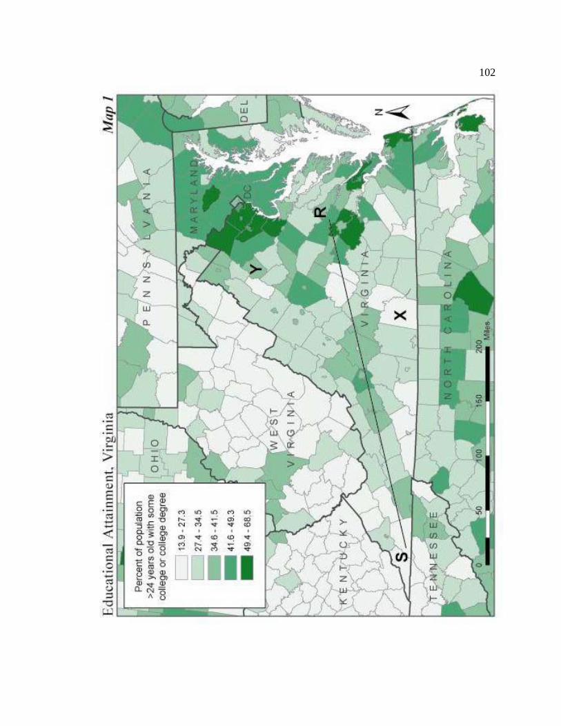
102
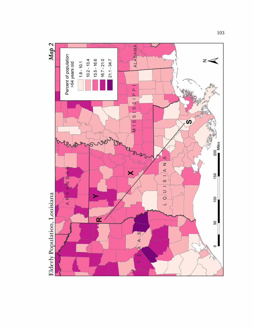
103
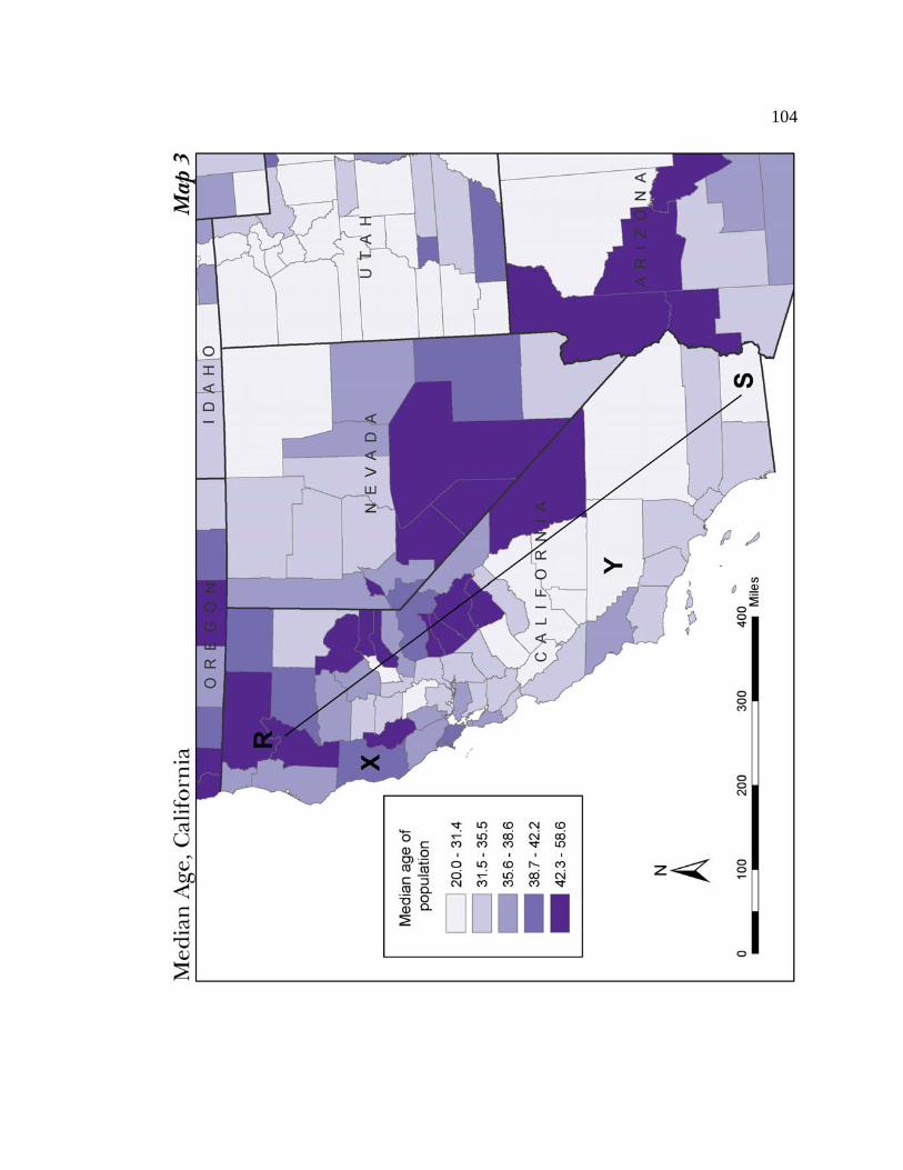
104
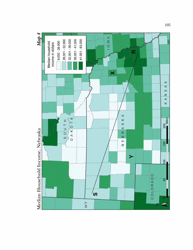
105

106
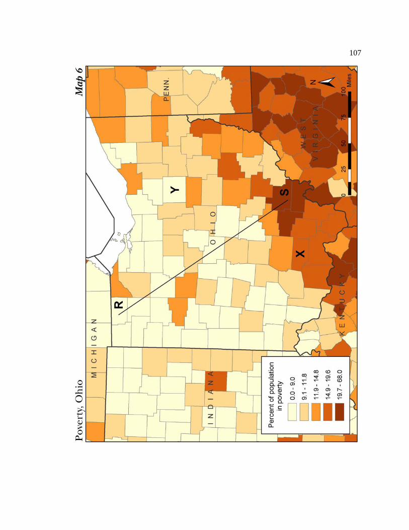
107

108

109
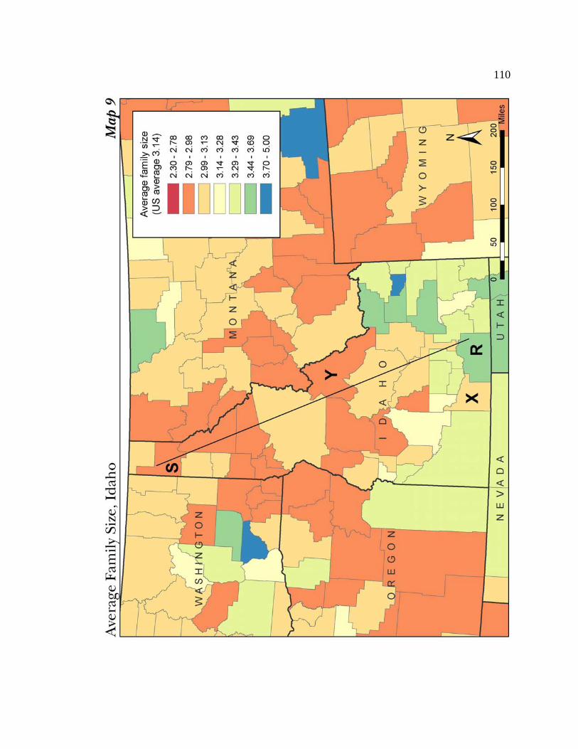
110
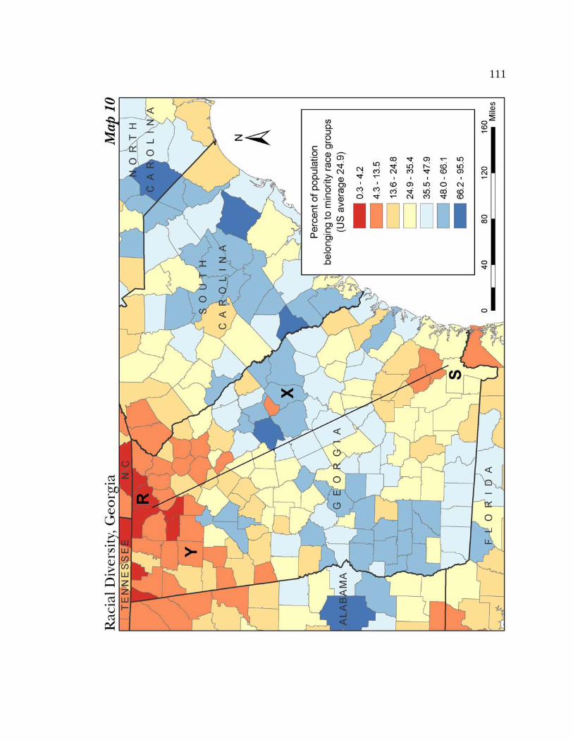
111
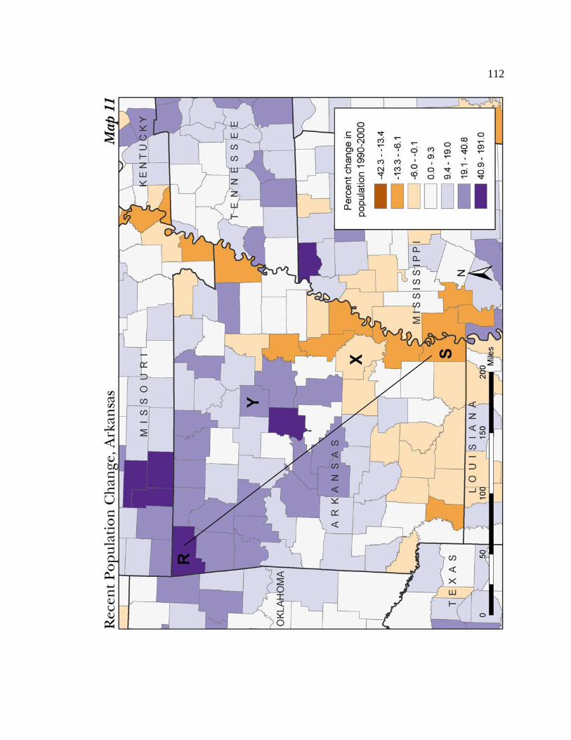
112

113
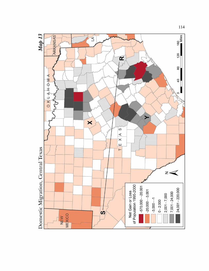
114
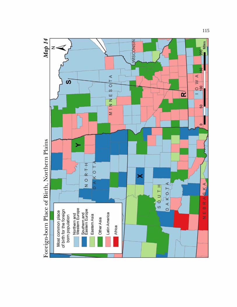
115
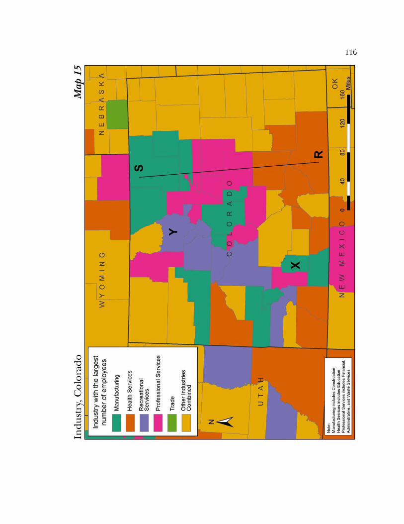
116
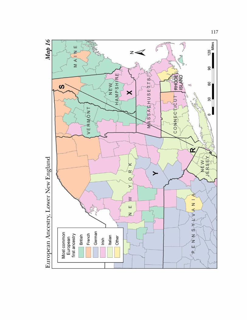
117
118
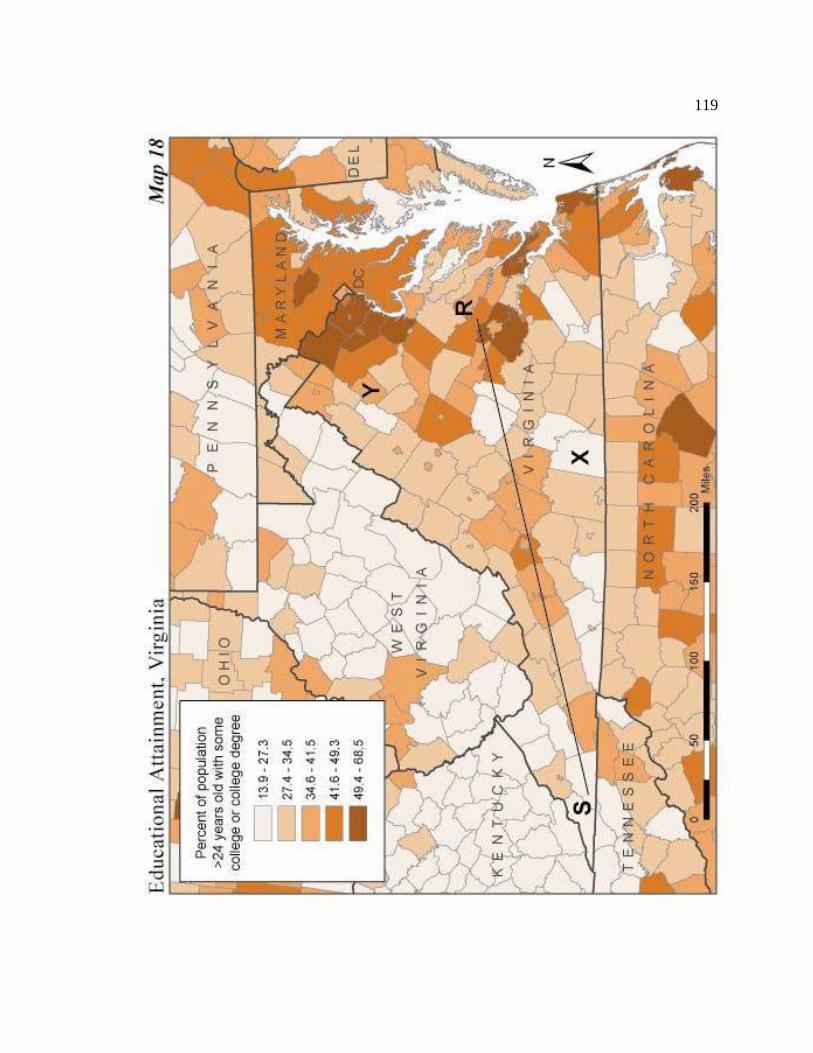
119
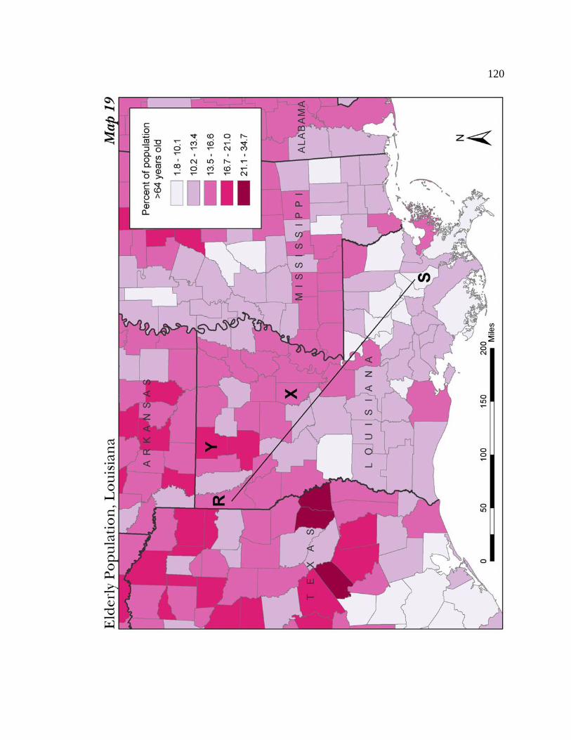
120

121
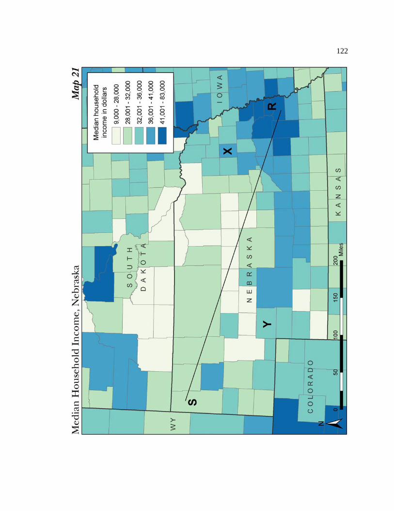
122

123
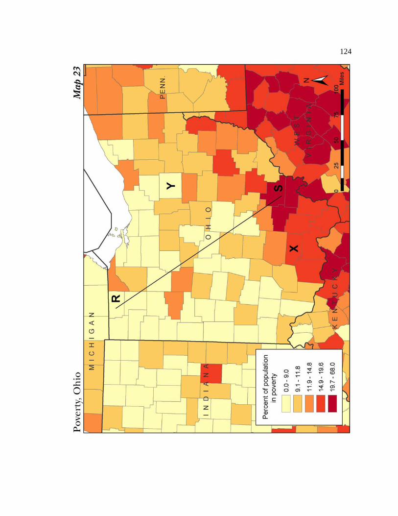
124
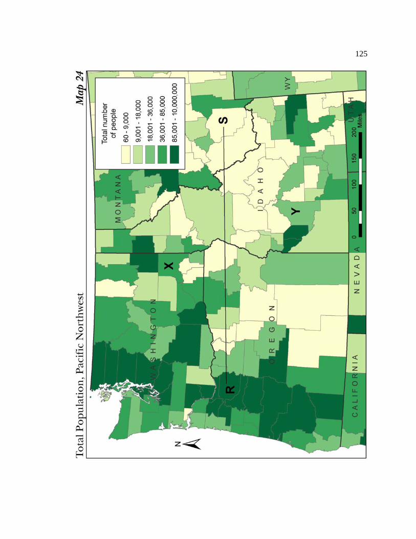
125
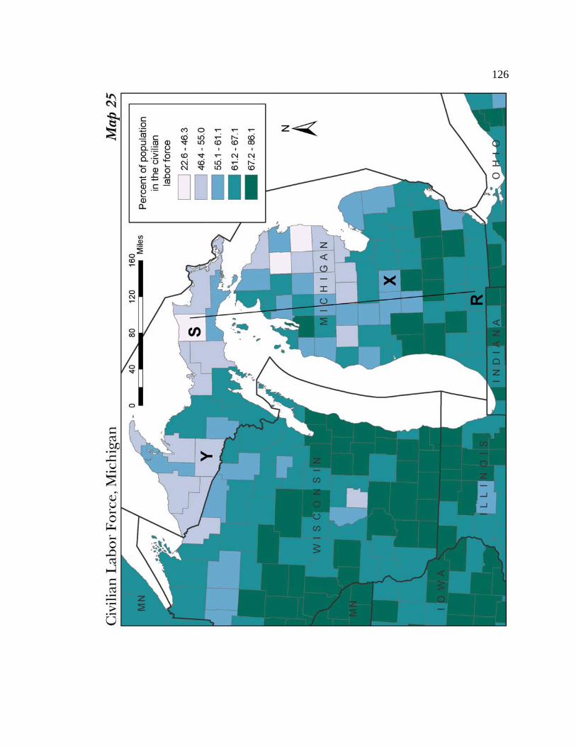
126
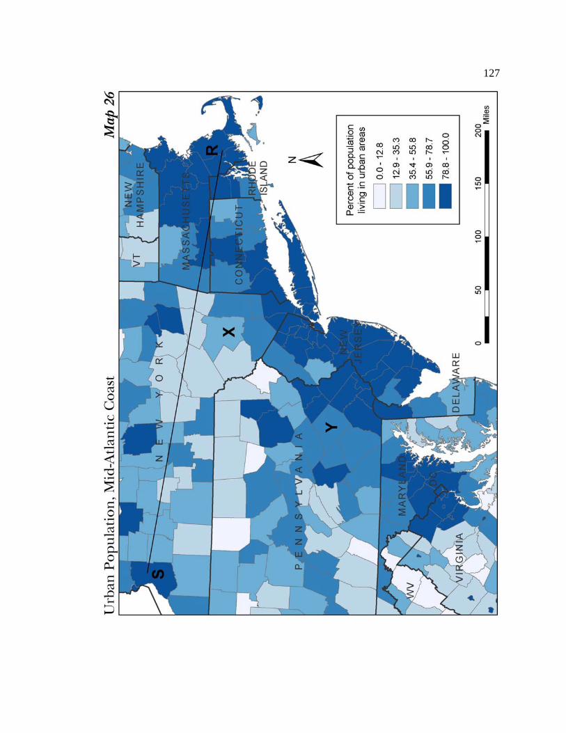
127
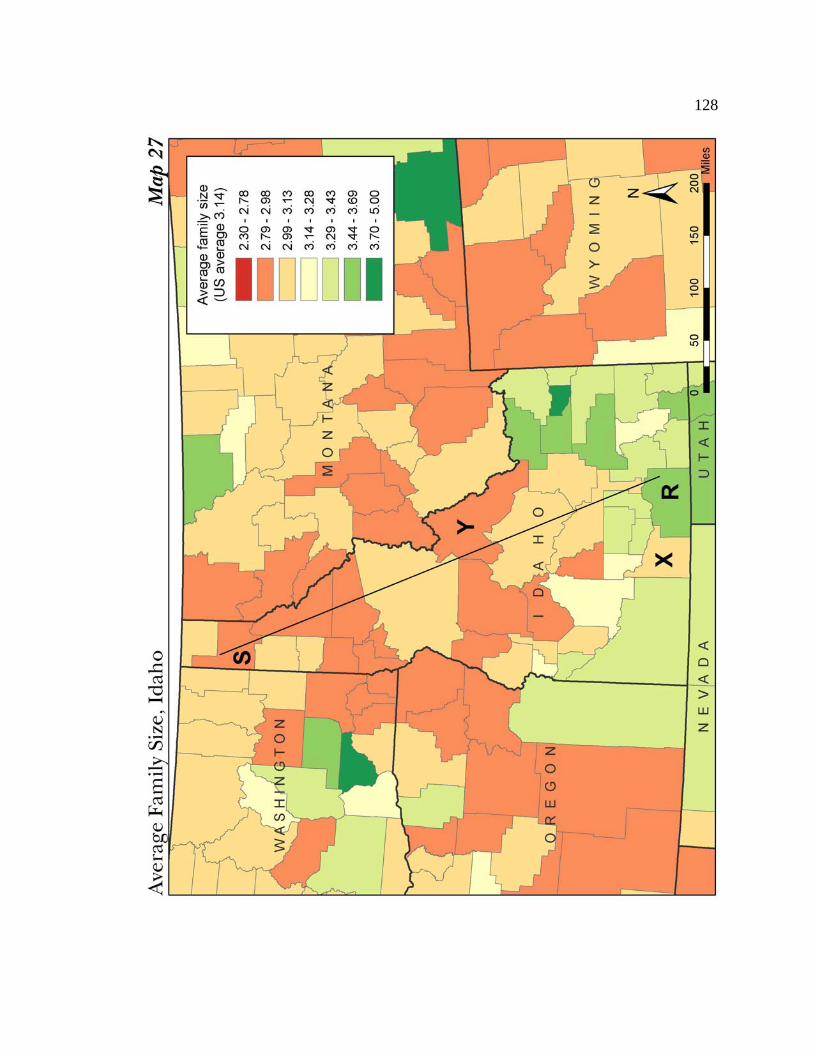
128
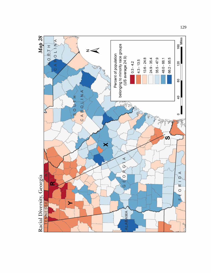
129
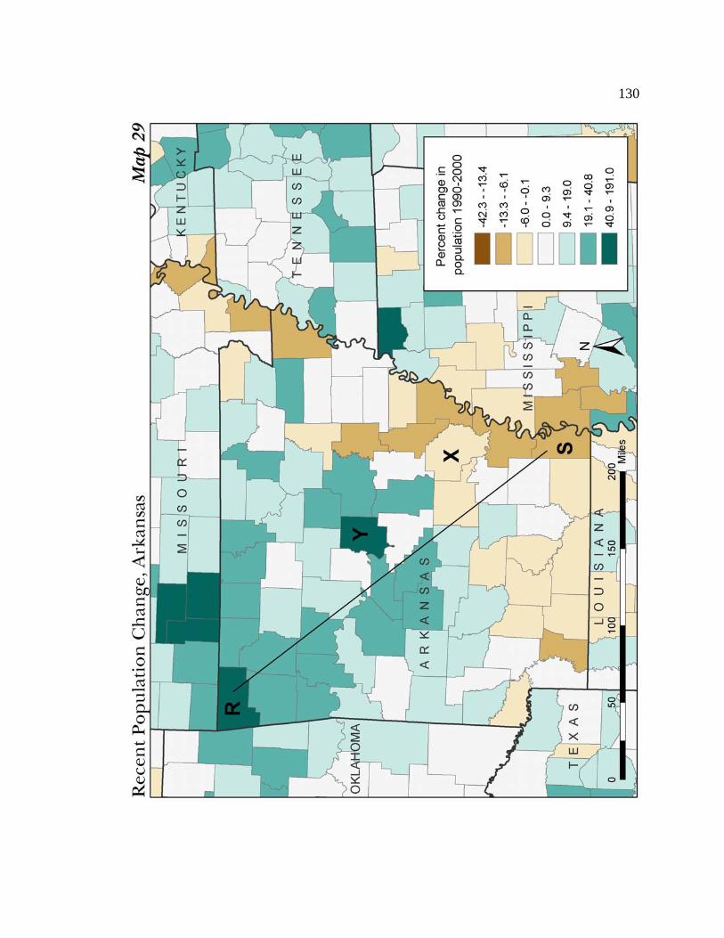
130
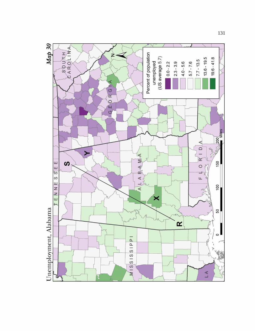
131
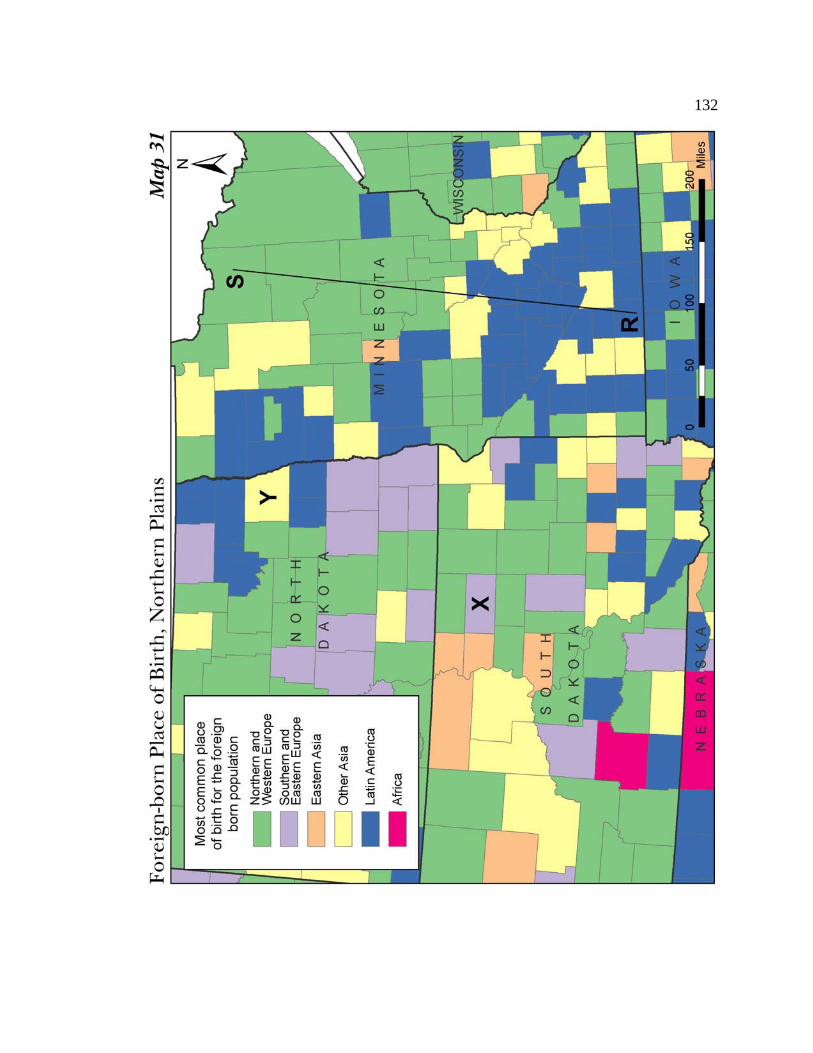
132

133
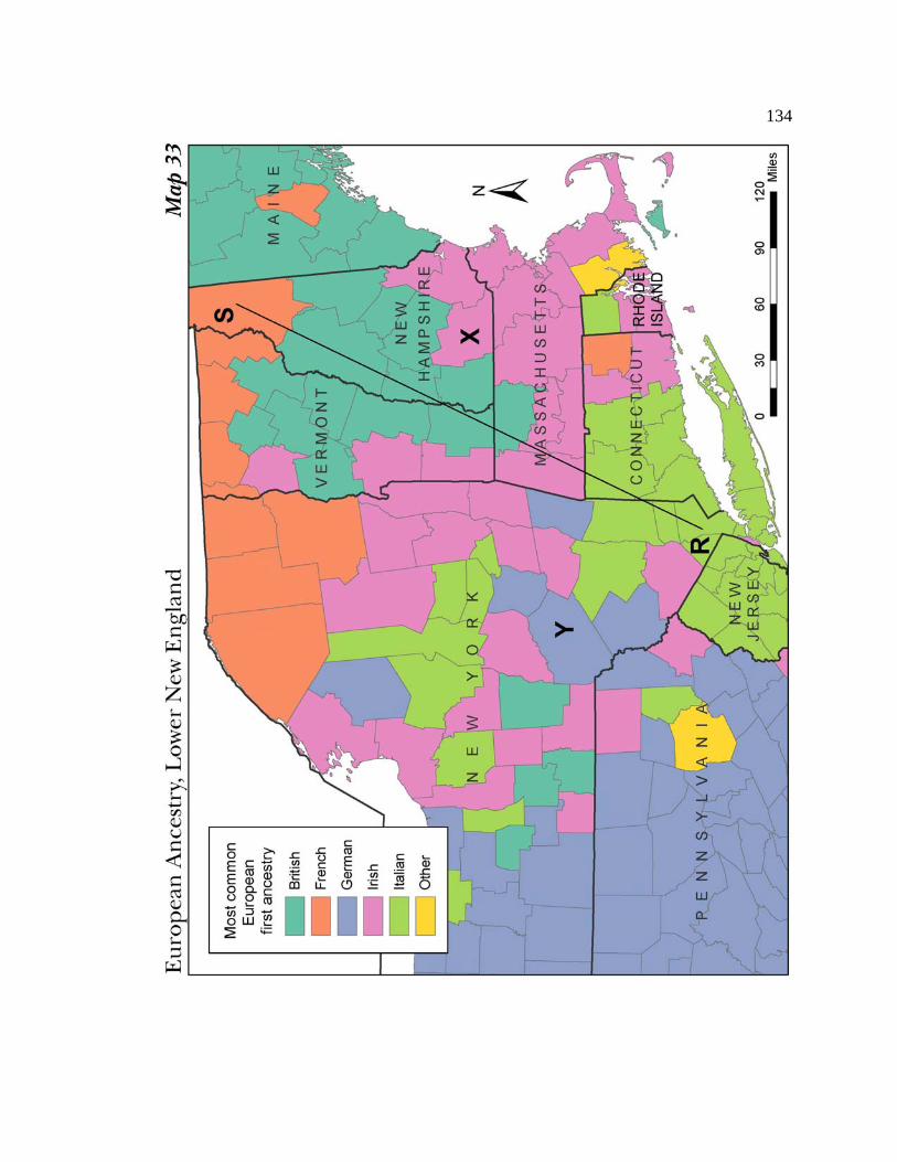
134
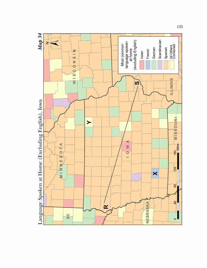
135

Appendix C
Test Form
Subject No.____________
Group___A___S___ Date____________
What number (if any) do you see on the following Ishihara plates?
Plate 1_________
Plate 2_________
Plate 3_________
Plate 4_________
Plate 5_________
Plate 6_________
Plate 7_________
Plate 8_________
Plate 9_________
Plate 10________
Plate 12________
Plate 13________
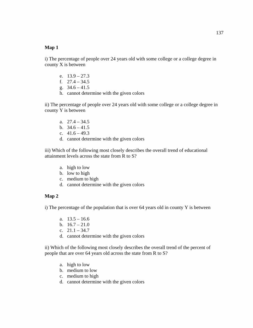
137
Map 1
i) The percentage of people over 24 years old with some college or a college degree in county X is between
e. 13.9 – 27.3 f. 27.4 – 34.5 g. 34.6 – 41.5 h. cannot determine with the given colors
ii) The percentage of people over 24 years old with some college or a college degree in county Y is between
a. 27.4 – 34.5 b. 34.6 – 41.5 c. 41.6 – 49.3 d. cannot determine with the given colors
iii) Which of the following most closely describes the overall trend of educational attainment levels across the state from R to S?
a. high to low b. low to high c. medium to high d. cannot determine with the given colors
Map 2
i) The percentage of the population that is over 64 years old in county Y is between a. 13.5 – 16.6 b. 16.7 – 21.0 c. 21.1 – 34.7 d. cannot determine with the given colors
ii) Which of the following most closely describes the overall trend of the percent of people that are over 64 years old across the state from R to S?
a. high to low b. medium to low c. medium to high d. cannot determine with the given colors

138
iii) The percentage of the population that is over 64 years old in county X is between
a. 1.8 – 10.1 b. 10.2 – 13.4 c. 13.5 – 16.6 d. cannot determine with the given colors
Map 3 i) Which of the following most closely describes the overall trend in median age across the state from R to S?
a. high to low b. medium to low c. low to high d. cannot determine with the given colors
ii) The median age of the population in county X is between
a. 42.3 – 58.6 b. 38.7 – 42.2 c. 35.6 – 38.6 d. cannot determine with the given colors
iii) The median age of the population in county Y is between
a. 31.5 – 35.5 b. 35.6 – 38.6 c. 20.0 – 31.4 d. cannot determine with the given colors
Map 4 i) The median household income in county X is between
a. 41,001 – 83,000 b. 32,001 – 36,000 c. 36,001 – 41,000 d. cannot determine with the given colors

139
ii) The median household income in county Y is between
a. 32,001 – 36,000 b. 28,001 – 32,000 c. 36,001 – 41,000 d. cannot determine with the given colors
iii) Which of the following most closely describes the overall trend of median household income across the state from R to S?
a. high to medium to low b. high to low to medium c. medium to low to high d. cannot determine with the given colors
Map 5 i) The number of people per square mile in county Y is between
a. 30.1 – 60.0 b. 10.1 – 30.0 c. 0.0 – 10.0 d. cannot determine with the given colors
ii) Which of the following most closely describes the overall trend of population density across the state from R to S?
a. low to high b. medium to high c. low to medium d. cannot determine with the given colors
iii) The number of people per square mile in county X is between
a. 30.1 – 60.0 b. 60.1 – 150.0 c. 150.1 – 1,100.0 d. cannot determine with the given colors
140
Map 6 i) Which of the following most closely describes the overall trend in poverty across the state from R to S?
a. low to high b. medium to high c. high to low d. cannot determine with the given colors
ii) The percent of people in poverty in county X is between a. 11.9 – 14.8 b. 14.9 – 19.6 c. 19.7 – 68.0 d. cannot determine with the given colors
iii) The percent of people in poverty in county Y is between a. 0.0 – 9.0 b. 9.1 – 11.8 c. 11.9 – 14.8 d. cannot determine with the given colors
Map 7
i) The total number of people in county X is between a. 85,001 – 10,000,000 b. 36,001 – 85,000 c. 18,001 – 36,000 d. cannot determine with the given colors
ii) The total number of people in county Y is between a. 18,001 – 36,000 b. 9,001 – 18,000 c. 60 – 9,000 d. cannot determine with the given colors
141
iii) Which of the following most closely describes the overall trend in total number of people in counties across the region from R to S?
a. low to high b. high to low c. consistently high d. cannot determine with the given colors
Map 8 i) The percent of people in the civilian labor force in county Y is between
a. 61.2 – 67.1 b. 46.4 – 55.0 c. 55.1 – 61.1 d. cannot determine with the given colors
ii) Which of the following most closely describes the overall trend of the percent of people in the civilian labor force across the state from R to S?
a. low to medium b. medium to high c. high to low d. cannot determine with the given colors
iii) The percent of people in the civilian labor force in county X is between
a. 61.2 – 67.1 b. 46.4 – 55.0 c. 55.1 – 61.1 d. cannot determine with the given colors
Map 9 i) The average number of people per family in county Y is between
a. 3.44 – 3.69 b. 2.79 – 2.98 c. 2.30 – 2.78 d. cannot determine with the given colors
142
ii) Which of the following most closely describes the overall trend of average family size across the state from R to S as compared to the U.S. average?
a. above average with an abrupt change to below average b. below average with a gradual change to above average c. consistently below average d. cannot determine with the given colors
iii) The average number of people per family in county X is between
a. 2.99 – 3.13 b. 3.29 – 3.43 c. 3.14 – 3.28 d. cannot determine with the given colors
Map 10 i) Which of the following most closely describes the overall trend in the percent of the population belonging to minority groups across the state from R to S as compared to the U.S. average?
a. greatly below average to above average to below average b. above average to average to greatly above average c. below average to above average d. cannot determine with the given colors
ii) The percent of the population belonging to minority groups in county X is between
a. 35.5 – 47.9 b. 4.3 – 13.5 c. 48.0 – 66.1 d. cannot determine with the given colors
iii) The percent of the population belonging to minority groups in county Y is between
a. 13.6 – 24.8 b. 4.3 – 13.5 c. 48.0 – 66.1 d. cannot determine with the given colors
143
Map 11 i) The percent change in population from 1990 – 2000 in county X is between
a. -6.0 – -0.1 b. 9.4 – 19.0 c. 19.1 – 40.8 d. cannot determine with the given colors
ii) The percent change in population from 1990 – 2000 in county Y is between
a. -13.3 – -6.1 b. 19.1 – 40.8 c. 40.9 – 191.0 d. cannot determine with the given colors
iii) Which of the following most closely describes the overall trend in population change from 1990 – 2000 across the state from R to S?
a. very low to high to very high b. very high to high to low c. high to low to very high d. cannot determine with the given colors
Map 12 i) The percent of the population that is unemployed in county Y is between
a. 0.0 – 2.2 b. 2.3 – 3.9 c. 19.6 – 41.8 d. cannot determine with the given colors
ii) Which of the following most closely describes the overall trend in unemployment across the state from R to S?
a. greatly below average to greatly above average b. slightly above average to slightly below average c. slightly below average to slightly above average d. cannot determine with the given colors
144
iii) The percent of the population that is unemployed in county X is between a. 2.3 – 3.9 b. 19.6 – 41.8 c. 13.6 – 19.5 d. cannot determine with the given colors
Map 13 i) Which of the following most closely describes the overall trend in net gain or loss of population across the state from R to S?
a. major losses to minor gains b. moderate gains to minor losses c. minor gains to major losses d. cannot determine with the given colors
ii) The net gain or loss of population in county X is between
a. 7,001 – 24,000 b. 0 – 2,000 c. -3,000 – -1 d. cannot determine with the given colors
iii) The net gain or loss of population in county Y is between
a. 7,001 – 24,000 b. 24,001 – 220,000 c. -20,000 – -3,001 d. cannot determine with the given colors
Map 14 i) Which of the following most closely describes the overall trend across the region from R to S of the most common place of birth for foreign born people?
a. Africa to Northern and Western Europe b. Latin America to Northern and Western Europe c. Other Asia to Latin America d. cannot determine with the given colors

145
ii) The most common place of birth for the foreign born population in county X is a. Latin America b. Northern and Western Europe c. Southern and Eastern Europe d. cannot determine with the given colors
iii) The most common place of birth for the foreign born population in county Y is
a. Eastern Asia b. Other Asia c. Africa d. cannot determine with the given colors
Map 15 i) The industry with the largest number of employees in county X is
a. Manufacturing b. Health Services c. Trade d. cannot determine with the given colors
ii) The industry with the largest number of employees in county Y is
a. Professional Services b. Recreational Services c. Other Industries combined d. cannot determine with the given colors
iii) Which of the following most closely describes the overall trend across the state from R to S of industries with the largest number of employees
a. Health Services to Professional Services to Manufacturing b. Trade to Recreational Services to Manufacturing c. Health Services to Professional Services to Recreational Services d. cannot determine with the given colors

146
Map 16 i) The most common European ancestry in county Y is
a. British b. Italian c. German d. cannot determine with the given colors
ii) Which of the following most closely describes the overall trend across the region from R to S of most common European ancestry?
a. Italian to German to British b. Other to German to British c. Italian to British to French d. cannot determine with the given colors
iii) The most common European ancestry in county X is
a. French b. Irish c. German d. cannot determine with the given colors
Map 17 i) Which of the following most closely describes the overall trend in most common household language other than English across the state from R to S?
a. Spanish to German b. Consistently Spanish c. Consistently German d. cannot determine with the given colors
ii) The most common non-English language spoken at home in county X is
a. German b. Scandinavian c. French d. cannot determine with the given colors
147
iii) The most common non-English language spoken at home in county Y is a. Spanish b. German c. All others combined d. cannot determine with the given colors
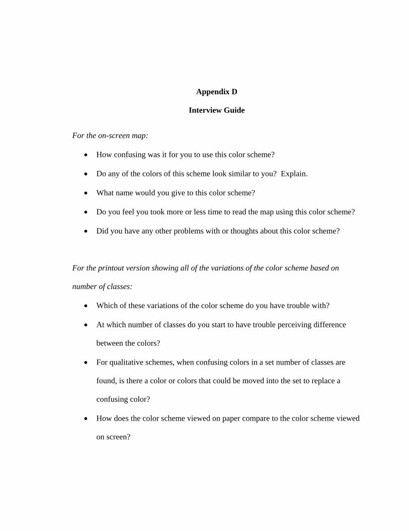
Appendix D
Interview Guide
For the on-screen map:
• How confusing was it for you to use this color scheme?
• Do any of the colors of this scheme look similar to you? Explain.
• What name would you give to this color scheme?
• Do you feel you took more or less time to read the map using this color scheme?
• Did you have any other problems with or thoughts about this color scheme?
For the printout version showing all of the variations of the color scheme based on
number of classes:
• Which of these variations of the color scheme do you have trouble with?
• At which number of classes do you start to have trouble perceiving difference
between the colors?
• For qualitative schemes, when confusing colors in a set number of classes are
found, is there a color or colors that could be moved into the set to replace a
confusing color?
• How does the color scheme viewed on paper compare to the color scheme viewed
on screen?

Appendix E
Recruitment Flyers

150
Are You Colorblind???
Colorblind volunteers are needed for a Penn State research experiment testing color schemes for map reading ability
$10 compensation provided
for one hour of your time
If interested please contact
Mr. Steven Gardner Department of Geography,
Pennsylvania State University phone: (814) 441-1647 email: [email protected]
151
Men with normal color vision
Make an easy $10
Male volunteers are needed for a Penn State Geography research
experiment testing color schemes for map reading ability.
$10 provided for 45 minutes of your time.
For more information, please contact
Mr. Steven Gardner
Department of Geography, Pennsylvania State University
phone: (814) 441-1647


![ArcGIS Colors - Color Schemes€¦ · arcgis colors - color schemes +hdw0ds 1hxwudo%urq]h](https://img.pdfslide.net/doc/110x75/5f3d5448b1f7df07363ee10f/arcgis-colors-color-schemes-arcgis-colors-color-schemes-hdw0ds-1hxwudourqh.jpg)