Embed Size (px)
Citation preview
ByFrancesca Bottomley
BA (Hons) Contemporary Art & IllustrationUniversity of Huddersfield
2016Exploring and identifying representation in narrative illustration
Francesca Bottomley
Contents
Introduction
Pg. 2
Chapter 1: How do practitioners use representation?
Pg. 4 – 17
Chapter 2: What is Semiotics?
Pg. 18, 19
Chapter 3: Studio practice: How does representation relate to my work?
Pg. 20
Conclusion
Pg. 21
Bibliography
Pg. 23, 24
Illustrations
Pg. 25
pg. 1
Francesca Bottomley
Introduction
For this essay I will be looking at representation and how it is used in narrative
illustration using critical analysis. I will be exploring what is representation and
various types of representation including depiction and portrayal whilst explaining
how these are represented in narrative artwork. I am also going to carry out research
in to how artists represent subjects such as themes, emotions and people in their
work through imagery and colour and so forth to relate to the chosen subjects.
A few areas I will be looking at specifically is how artists represent subjects and even
people using symbolism and portrayal to help promote and get the narrative across.
Other areas I will look at is how artists use colour to represent, how do artists use
imagery to represent subjects, themes and how does materials help with
representation. What I will be exploring is are you able to know what the illustration is
trying to represent without the image being supported by text; can you understand
what is happening in the story by only looking at the illustration proving that
representation is important in illustration.
Representation is about using signs to symbolize or portray something or even
some one and produce meanings which people can make sense of. Representation
in artwork symbolises many subjects including capturing something interesting or a
study, giving an interpretation of a subject to influence or inform an audience. An
illustrator uses imagination and colour to help support what they are trying to portray.
It is likely illustrators respond to text so they need to create artwork to represent the
narrative in every way from imagination to aesthetics. To represent something is
describing or depicting it and use description and portrayal to unleash the
imagination of the audience.
Images and visual signs, even if they closely resemble to something they refer to,
are still signs to carry meaning and to be interpreted. There are different types of
signs. Visual signs are called iconic signs; they bear a resemblance to an object,
place, or person and even an event.
The purpose of book illustration is to help support a story. The illustrations
themselves need to tell a story so they need to be clear and accurate with details
mentioned in the story of the book so the reader can look at the illustrations and
know what the story is generally about.
pg. 2
Francesca Bottomley
Being a form of visual arts, an illustration of a fairy tale is categorised as surrealistic
fantasy regarding the painting style of the illustration as well as the light colours used
and simplified perspectives. Fairy tale illustrations also have romantic elements to
represent a fantasy world and resembles of escapism. Illustrations from fairy tale
books not only help the audiences understand what the story is about and what is
happening in the story but illustrations also stimulate the audience’s imagination
referring back to the idea of escapism.
The area of narrative illustration I will be focusing on is book illustration, specifically
fairy tale books with the audience of children from the age of eight. The type of book
genre I have chosen to focus on fairy tale stories so I will look at illustrations based
on fairy tale stories.
pg. 3

Francesca Bottomley
Chapter 1
How do practitioners use representation?
I will be looking at artists whose work has been included in fairy tale books which are
aimed at children because of their ‘childlike’ form of telling a story. However, adults
also enjoy reading fairy tales to be able to relive their childhood. Particularly, I will be
focusing on illustrations that have substantial amount of detail that include the use of
line and I will also be looking at illustrations with use of colour. I will explore and
compare illustrations by their use of portrayal and depiction and how each illustration
is seen including what can be assumed from the illustration.
Illustrator Julian de Narvaez, an illustrator from South America has had a number of
clients from around the world including Sunday Times, The Agency Creative and
Penguin Books. Narvaez studied Graphic Design and started his illustration practice
after getting the Graphic Design degree. With his practice he has developed his own
visual language “I see a bridge between illustration and contemporary art.” With his
illustrations Narvaez has aimed to produce visual solutions and bring ideas to life
“My philosophy when approaching a challenge is that no matter what the project,
there is always room to give it a unique character” (Narvaez). Narvaez have a great
number of recognitions including First National Exhibition of Illustrations by the
Colombian Chamber Books in 2008 and Honourable Mention: Latino Book Awards
2012. His work includes oil paintings [figure 1] and prints that have a fantasy and
surrealism style to them. Narvaez uses soft colours in his paintings which help
compliment his style of drawing in a surrealist way (Narvaez, N.D.).
pg. 4
Francesca Bottomley
Because of Narvaez’s style of work he has was the illustrator of the book ‘The Green
Fairy Book’ which contains classic fairy tales such as ‘The Three Bears’, his fantasy
style illustrations compliment the stories allowing them to come alive. One of the
illustrations ‘The Three Bears’ [figure 2], depicts three bears which looks like to be a
family. This is represented by the use of the bears being different sizes, one small
which seems to be the child, one medium which seems to be the mother or daughter
pg. 5
[figure 1] Narvaez, J. (N.D.). Custodians and Thieves. [Oil]. Retrieved from
http://www.juliandenarvaez.com/portfolio/#/new-gallery-41/.
Three Bears. Retrieved from http://www.foliosociety.com/book/GF
B/green-fairy-book

Francesca Bottomley
and one big sized bear which seems to be the father. The family is also represented
with their appearance, the child like bear is holding a ball and a cookie which can be
related to a child, the mother or daughter bear is wearing a bow on her head and has
a blushed cheek with is associated with females and the biggest bear wearing a type
of blue top hat that can signify a male. Looking at the illustration without knowing the
story you instantly know that the story includes three bears and with their
appearance it suggests that the story is about a family of bears.
For the background it appears to be wood panels placed in a way that could
represent a wood cabin with a door and window along with clothes hung on a line
which could be the male and female bears clothing by the way the colours match
their bow and hat, this suggests that the wood cabin is the family bears home. All of
these elements are part of depiction and are part of what Narvaez is trying to get
across which is suggested is a portrayal of a family of bears. The colours used in the
illustration are light and expresses the feeling of the fairy tale being positive and
cheerful. Looking at this illustration there is quite a lot of signs to represent the
storyline.
pg. 6
[figure 3] Narvaez J, (N.D.) The Blue Bird. Retrieved from
http://www.foliosociety.com/book/GFB/green-fairy-book
Francesca Bottomley
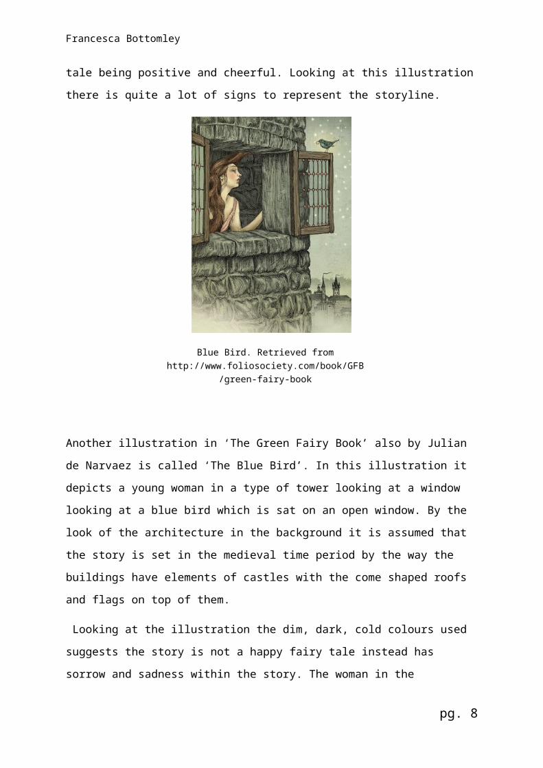
Another illustration in ‘The Green Fairy Book’ also by Julian de Narvaez is called
‘The Blue Bird’. In this illustration it depicts a young woman in a type of tower looking
at a window looking at a blue bird which is sat on an open window. By the look of the
architecture in the background it is assumed that the story is set in the medieval time
period by the way the buildings have elements of castles with the come shaped roofs
and flags on top of them.
Looking at the illustration the dim, dark, cold colours used suggests the story is not
a happy fairy tale instead has sorrow and sadness within the story. The woman in
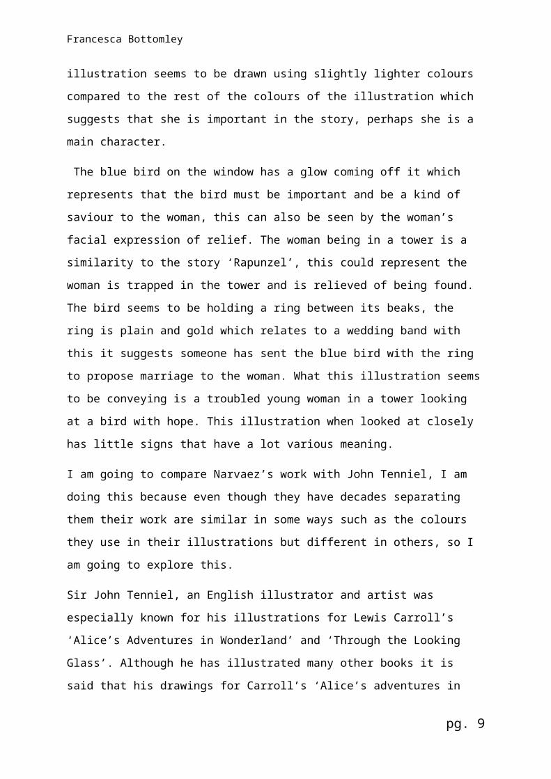
the illustration seems to be drawn using slightly lighter colours compared to the rest
of the colours of the illustration which suggests that she is important in the story,
perhaps she is a main character.
The blue bird on the window has a glow coming off it which represents that the bird
must be important and be a kind of saviour to the woman, this can also be seen by
the woman’s facial expression of relief. The woman being in a tower is a similarity to
the story ‘Rapunzel’, this could represent the woman is trapped in the tower and is
relieved of being found. The bird seems to be holding a ring between its beaks, the
ring is plain and gold which relates to a wedding band with this it suggests someone
has sent the blue bird with the ring to propose marriage to the woman. What this
illustration seems to be conveying is a troubled young woman in a tower looking at a
bird with hope. This illustration when looked at closely has little signs that have a lot
various meaning.
I am going to compare Narvaez’s work with John Tenniel, I am doing this because
even though they have decades separating them their work are similar in some ways
such as the colours they use in their illustrations but different in others, so I am going
to explore this.
Sir John Tenniel, an English illustrator and artist was especially known for his
illustrations for Lewis Carroll’s ‘Alice’s Adventures in Wonderland’ and ‘Through the
Looking Glass’. Although he has illustrated many other books it is said that his
drawings for Carroll’s ‘Alice’s adventures in Wonderland’ and ‘Through the Looking
Glass are clever, subtle and well suited for the text. It is these illustrations that made
him popular and won him a worldwide reputation. Tenniel’s practice began when he
sent his first drawing to the society of British Artists exhibition. In 1845 he went on to
pg. 7
Francesca Bottomley
contribute to a competition of designs for a mural decoration for Palace of
Westminster where he created a 16-foot cartoon and received a commission to be
included in the House of Lords. By 1850 he joined John Leech as joint cartoonists
the weekly paper ‘Punch’, a periodical that Tenniel worked on most of his life. In
1893 Tenniel was knighted for his artistic achievements and retired from ‘Punch’
(2014).
John Tenniel’s eye for detail allowed him to include much more detail for figures and
in backgrounds. Tenniel had an interest in expression, human types and
representation which was included in his illustrations of ‘Alice in Wonderland’. His
stylised drawings are best described as linear by the way he uses line to create
detail and shadow with shaded lines and vigorous horizontal lines that intensifies the
dark areas. Tenniel’s grotesque approach to his illustrations exaggerates the fantasy
of creatures used in the drawings. Grotesqueness is also found in illustrations that
portrays deformities of a person such as the illustration that shows Alice being as big
as a house after drinking a potion [figure 4]. Even though Alice in Wonderland is
considered more as a story rather than a fairy tale, according to Oxford dictionary a
fairy tale is defined as a traditional story written for children, a fable, fantasy and
magical story including magical creatures which ‘Alice in Wonderland’ does have
such as the Chester cat that can apparate in thin air along with the magical potions
that disproportion Alice. Therefore, I am considering Wonderland as a fairy tale for
the purpose of comparing artists work.
[figure 4] Tenniel, J. (2003). Alice in Wonderland. [Wood engraving]. Retrieved from
http://www.victorianweb.org/art/illustration/tenniel/alice/gallery1.html
pg. 8
Francesca Bottomley
In figure 5 we can see a setting being depicted where the character Alice is in a
room with some other characters. It can also be seen that the illustration is created
entirely of lines that are going in different directions including diagonal and
horizontal. With the use of the lines, Tenniel has created negative space that forms
the drawing, also the use of cross hatching lines creates a deeper depth of shadows
and darkness making the illustration seem more dramatic especially with the
absence of colour. The best element of Tenniel’s drawing is the clever way he
portrays the scene so that the audience can easily recognise what is depicted. In
figure 5 it can be seen that there are five characters; Alice, Duchess, cook, baby and
Chester cat. The scene seems not to be a happy setting by the way the facial
expressions of some of the characters. The frown on the Duchess’ and cooks face is
Tenniel’s way of expressing perhaps annoyance because of the crying baby. The
illustration overall is very detailed and helps the audience understand what is
happening within the setting in the story.
pg. 9
Figure 5 Alice with the Duchess, cook and baby. [Pen/Ink]. Retrieved from http://www.alice-in-
wonderland.net/resources/pictures/alices-adventures-in-wonderland/.
Francesca Bottomley
[figure 6] Tenniel, J. (2003). Alice in Wonderland. [Wood engraving]. Retrieved from
http://www.victorianweb.org/art/illustration/tenniel/alice/gallery1.html
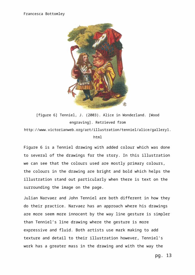
Figure 6 is a Tenniel drawing with added colour which was done to several of the
drawings for the story. In this illustration we can see that the colours used are mostly
primary colours, the colours in the drawing are bright and bold which helps the
illustration stand out particularly when there is text on the surrounding the image on
the page.
Julian Narvaez and John Tenniel are both different in how they do their practice.
Narvaez has an approach where his drawings are more seem more innocent by the
way line gesture is simpler than Tenniel’s line drawing where the gesture is more
expressive and fluid. Both artists use mark making to add texture and detail to their
illustration however, Tenniel’s work has a greater mass in the drawing and with the
way the lines overlap it creates an effect of a value scale where it seems there is
gradual change from black to grey and to white even when Tenniel has not used
colour in a drawing. With Tenniel’s drawing which have colour are seen that they
have a different effect compared to Narvaez’s illustrations. The colours seem softer
yet the primary colours make the illustrations bolder but Narvaez’s illustrations have
brighter colours which are not necessarily bold like the primary colours however,
Narvaez uses a good balance of primary and secondly colours.
pg. 10

Francesca Bottomley
Another artist who I am going talk about is Madalina Andronic, who is a Romanian
illustrator based in Bucharest. Madalina earned a Masters degree in Illustration from
Camberwell College of Arts in London and went on to creating illustrations inspired
by traditional fairy tales and Slavic folklore. From 2010, Madalina’s freelance practice
has allowed her to work with clients from all over the world including editorial,
advertising and porcelain work, she has also published books in Romania and UK
and is co-founder of the brand ‘The Awesome Project’ with designer Claudiu Stefan.
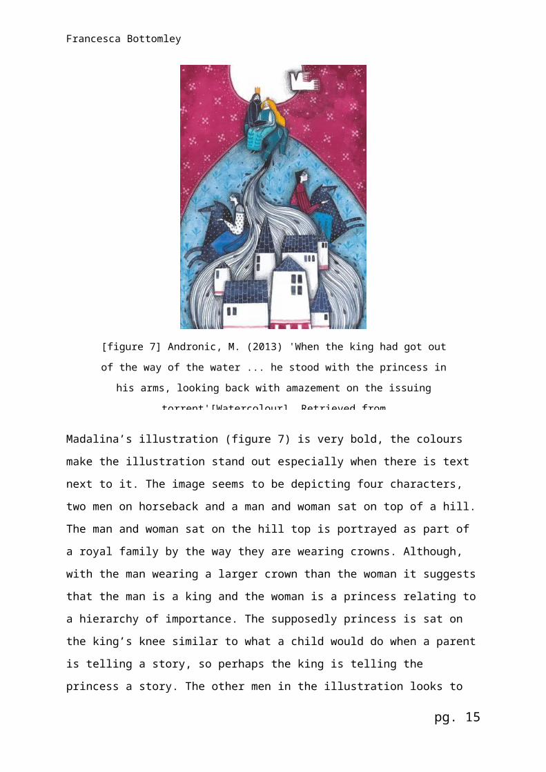
Madalina’s illustration (figure 7) is very bold, the colours make the illustration stand
out especially when there is text next to it. The image seems to be depicting four
characters, two men on horseback and a man and woman sat on top of a hill. The
man and woman sat on the hill top is portrayed as part of a royal family by the way
they are wearing crowns. Although, with the man wearing a larger crown than the
woman it suggests that the man is a king and the woman is a princess relating to a
hierarchy of importance. The supposedly princess is sat on the king’s knee similar to
pg. 11
[figure 7] Andronic, M. (2013) 'When the king had got out of the way of the water ... he
stood with the princess in his arms, looking back with amazement on the issuing
torrent'[Watercolour]. Retrieved from http://www.vam.ac.uk/b/va-illustration-awards-
2014/published/book-illustrations/princess-and-goblin-illustrated-madalina
Francesca Bottomley
what a child would do when a parent is telling a story, so perhaps the king is telling
the princess a story. The other men in the illustration looks to be guards by the way
they are looking out on each side of the hill which suggests they are being on guard,
guarding the king and princess.
With the buildings at the bottom of the image in the foreground it seems that the
building is a castle, this can be seen with the architecture of the buildings, typically a
castle have towers with cone shaped roofs. The wave shape behind the buildings
that is made up of line making looks to be a symbol of a river with the way the lines
flow from the top of the hill to the bottom of the image gradually becoming larger.
Also there seems to be water drop shapes coming off the lines which helps suggests
it is water.
The colours in this illustration symbolises that the setting could be at night fall with
the dark sky, the white full moon in the background along with abstract shapes that
resembles stars. The shapes used to form objects and figures are disproportionate
making the feel of the illustration as being abstract. This can be seen clearly with the
horses, how the body of the horses are significantly bigger and unrealistic and the
heads of the figures being smaller than the rest of the body.
Overall, this illustration suggests to be portraying a king telling the princess a bed
time story with horsemen and a castle, perhaps the image is depicting a story being
told or tragedy has happened where the water has flooded the castle and the king
and princess has taken refuge at the hill top. This is expressed by the way the eyes
of the king and princess are closed almost like it is for sadness which could be
expressed by the dark colours Madalina has used and with the white bird in the sky
that resembles a dove, a symbol of hope that can be linked to tragedy. From this
illustration you can analyse the different elements and narrow down what the
illustration is about which means there is a lot of representation in this one image.
pg. 12
Francesca Bottomley
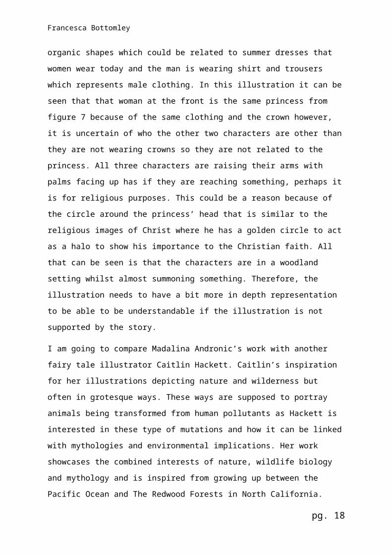
[figure 8] Andronic, M. (2013) 'They went on, walking pretty fast, but taking care not to run a step'.
[Watercolour]. Retrieved from
http://www.vam.ac.uk/b/va-illustration-awards-2014/published/book-illustrations/princess-and-
goblin-illustrated-madalina
Figure 8 depicts three characters being portrayed as two women and a man. This
can be seen with the clothing of the characters; the characters at the front and in the
middle are both wearing long garment that are long and decorated with organic
shapes which could be related to summer dresses that women wear today and the
man is wearing shirt and trousers which represents male clothing. In this illustration it
can be seen that that woman at the front is the same princess from figure 7 because
of the same clothing and the crown however, it is uncertain of who the other two
characters are other than they are not wearing crowns so they are not related to the
princess. All three characters are raising their arms with palms facing up has if they
are reaching something, perhaps it is for religious purposes. This could be a reason
because of the circle around the princess’ head that is similar to the religious images
of Christ where he has a golden circle to act as a halo to show his importance to the
Christian faith. All that can be seen is that the characters are in a woodland setting
whilst almost summoning something. Therefore, the illustration needs to have a bit
pg. 13

Francesca Bottomley
more in depth representation to be able to be understandable if the illustration is not
supported by the story.
I am going to compare Madalina Andronic’s work with another fairy tale illustrator
Caitlin Hackett. Caitlin’s inspiration for her illustrations depicting nature and
wilderness but often in grotesque ways. These ways are supposed to portray
animals being transformed from human pollutants as Hackett is interested in these
type of mutations and how it can be linked with mythologies and environmental
implications. Her work showcases the combined interests of nature, wildlife biology
and mythology and is inspired from growing up between the Pacific Ocean and The
Redwood Forests in North California. Hackett primarily uses ball point pens to
finalise illustrations from pencil sketches however, she also uses graphite, coloured
pencil and watercolour on paper. Her work can be seen in story books including ‘The
Lilac Fairy Book’.
pg. 14
[figure 9] Hackett, C. (2015). Illustration from The Brown Bear of Norway. [Pen and
Watercolour]. Retrieved from https://caitlinhackett.carbonmade.com/project
s/4549867
Francesca Bottomley
The illustration for the fairy tale ‘The Brown Bear of Norway’ (figure 9) from ‘The Lilac
Fairy Book’ depicts two young women in the woods or a forest that looks to be
withering away because there is no greenery amongst the trees. The line making of
the trees also helps promote the concept of the trees dying because the texture it
gives makes them look dry, fragile and unhealthy. The main focus of this illustration
is the two characters, the colours used for the characters are brighter than the
woodland and the edge of the illustration is darker highlighting the two women and
making the image look more dramatic which has the expression of gloominess. The
illustration itself does not provide much clue as to what the story is about however,
the characters themselves have signs of representation when closely explored.
Looking at the characters it can be seen that they have different appearances to
each other. The woman on the left consists of white and blues which suggests the
character has a cold personality whereas the woman on the right is coloured with
natural and warm colours which could suggest she has a humble personality.
The dresses can also signify the basics of the story. The woman in the yellow dress
looks to be a worker, this can be seen by the way the woman is wearing an apron
round her waist and the patches in her dress which indicates she is too poor to buy
another dress or her employers will not provide another one. The blue dress
compared to the yellow dress is elegant resembling a ball gown that someone of
importance would wear as well as the gold jewellery, perhaps she is workers
employer. Looking at the small details of the illustration it can be seen that the
woman in the yellow dress has a hand in her hair which has bright sparkles on it and
she is also holding a comb which is sparkling in the same way as her hair which
suggests that the comb could be magical to make the woman’s hair sparkle.
Looking at the woman on the left the saying ‘cold as ice’ comes to mind because of
her white hair and blue dress which can relate to ice. When examining the blue dress
small eyes can be seen along the edge of a layer of the skirt which could be a
meaning that the woman has eyes every; that she knows what is happening
everywhere. This idea can be seen by the way the woman on the right is looking
down with her arms slightly crossed and bearing an ashamed or guilty expression
has the woman in the blue dress is holding her hand out towards her as if she is
reaching out for something.
pg. 15
Francesca Bottomley
Perhaps the woman on the right is ashamed because she got caught using the comb
after she possibly stole it. It could be thought that the owner of the comb is the
woman on the left, this can be seen as the comb is the same gold colour of her
bracelets however, the woman in blue does not appear to have an angry expression
instead she looks calm. With the magical comb and eyes on her dress the woman in
blue could be a witch and the other woman works for her.
Another illustration from ‘The Lilac Fairy Book’ by Hackett is from the story ‘The
Castle of Kerglas’ (figure 10). The setting of illustration looks to be in a flourishing
woodland with greenery and flowers. The animal in the center of the image is a lion
but with the lion’s mane being made out of small snakes. This concept can be linked
to the mythology of Medusa; the story of a woman who were obsessed with her own
beauty Athena punished Medusa for stating she was more beautiful than Athena, the
goddess of beauty and wisdom, that she turned Medusa in to a monster with hair
made of snakes with her body turned in to a snakes body. This idea of a lion with
pg. 16
[figure 10] Hackett, C. (2015). Illustration from The Castle of Kerglas. [Pen and Watercolour]. Retrieved
from https://caitlinhackett.carbonmade.com/projects/4
Francesca Bottomley
hair of snake’s links with Hackett’s interests of mythology and wildlife and it well be
that Hackett wanted to use the story of Medusa to base one of her illustrations on. In
the background there are garden flowers including red roses which is a symbol of
beauty and a tall red pansy where the colour of the flower means passion and the
meaning of the pansy is love or thinking of someone.
With all of these meanings perhaps the concept of the illustration is the lion cared
more about beauty much like Medusa that his mane got turned in to snakes or the
lion might well have been a person who got transformed in to a lion similar to
Medusa whose body turned in to a snake’s body. Therefore the lion had to live with
being a creature with beauty surrounding him.
In comparison both Andronic and Hackett use line making to add detail to their work
and they also use an outline around each object to help make the illustration stand
out. The artists approach are different with Andronic having a more abstract style
with the use of colours and shapes whereas Hackett is more contemporary where
she uses elements of mythology and nature to create a realistic drawing but her style
of drawing allows the illustration to be childish but realistic at the same time.
Andronic’s illustrations are bold with the use of colours whereas Hackett’s colour
scheme is softer and have more tone to them such as highlights and shadows. This
helps the artists create their own signature so their work is recognisable and that the
illustrations are different in how suitable they are for children’s book for example
Hackett’s illustrations are more suited for books with the audience of towards young
adults because of their grotesque style and realistic.
pg. 17
Francesca Bottomley
Chapter 2
What is Semiotics?
A theorist I will be looking at is Charles Sanders Peirce, an innovative and
accomplished logician whose ideas focuses on logic and representation (logic and
semiotics). Another theorist I will research into is Ferdinand de Saussure whose
study of semiotics examines the signs and types of representation. Because these
theorists are about semiotics I will be looking briefly at semiotics to help understand
the topic of representation.
Charles Sanders Peirce born in 1839, was a philosopher and logician who explored
representation through semiotics and logic. Pierce is usually quoted on his
distinctions between types of sign: iconic, arbitrary, indexical and symbolic.
According to Peirce there are three ways that signs represents objects, these are
icon, index and symbol. Icon refers to a sign that represents by resembling, for
example a photograph and a life painting. Peirce explains an index is a connection of
fact for example if we see smoke we assume there is a fire. Symbols can be natural,
abstract or cultural. Symbols or signs depends on how they were interpreted or
resemblance of their represented object.
Semiotician Ferdinand de Saussure was considered as one of two significant
fathers, other one being Peirce, of semiotics. Saussure focused on language
patterns and functions instead of the origins and historical aspects although
Saussure’s theory is still used today. It has previously been pointed out that
Saussure did not come up with the idea of Semiotics, instead he added to the
knowledge from the Middle Ages of Aristotelian and Neoplatonist. Saussure was
more focused about the linguistic signs and speech and Saussure’s model of the
sign refers to a concept not a thing. For example, the signifier is the word ‘open’ and
the signified is that the shop is open.
Semiotics also called semiology is defined as the study of signs. Semiotics uses the
term signs to describe meanings. There are several characteristics of signs. First
being a sign having a physical form called the signifier. This can be anything from a
neon light to a tree or it could even be a word. Secondly, a sign is referred to
something else rather than itself which is called the signified. Semiotics emphasises
the distinction between the separate sounds of a word for example ‘rose’ and the
pg. 18

Francesca Bottomley
concept of the word. This leads to the referent, which refers to both signifier and
signified: real roses come in different shapes and sizes but every time we hear the
word ‘rose’ we picture the same rose in our heads.
The third characteristic is semiotics emphasises our perception reality is shaped and
constructed by signs and words which we use in various contexts. Language
determines our sense things for example snow where in English nouns snow, sleet
and slush describe different snow conditions. Whereas, in Inuit (Eskimo) have subtle
different types of snow which English describe with as ‘soft’, ‘waterlogged’ and so on.
Indexical is the term used to describe signifiers which act as kinds of evidence such
smoke of a fire (2003).
The term symbolic is the use of visual signs that are linked to referents. An example
of this is road signs have to warn drivers such as near a school so around thirty
years ago the image of torch of learning, figure 11 was used; it meant to be a symbol
of the place of learning. However, this meaning was socially agreed to have become
unfamiliar so it became obsolete and was gradually changed to a more iconic sign
that is used today of a symbol portraying a woman and child in a triangle shape
(2005).
pg. 19
[figure 11] Hands, S. (2005). Torch of
Learning. [Photograph]. In S.Hands
Road Signs, (12). Buckinghamshire:
Shire Publications Ltd.
Francesca Bottomley
Chapter 3
Studio practice: How does representation relate to my work?
My studio practice is illustration and I prefer to create illustrations traditionally so using materials such as charcoal, watercolour, pen, ink however, I do some digital work from time to time as I consider being able to use various materials and media is key to be a good illustrator with flexible skills. My approach is to create illustrations that are colourful and use line making, this steered the research of illustrators who have similar style to myself to see how they use representation in their own work.
Most of my projects including my current project are about book illustration as I enjoy creating illustrations that respond to text so I am always determined to create images that suit the text I am focusing on.
When I am working on an illustration I prefer to include a lot of detail not only for the drawing but what is included in the illustration that makes the audience know what is happening in the story by only looking at the image much like Madalina Andronic where there are signs within the illustration that gives information of what the story is about.
I consider it to be important that the illustration can tell a story by itself. Therefore representation is vital for illustrations to be understandable and have meaning and to portray a story. Without representation illustrations are not understandable and have no sense of meaning.
pg. 20

Francesca Bottomley
Conclusion
Creating an illustration is easy enough but creating an illustration for a book is a test for any illustrator. It is important that the illustration matches the text and is relevant to the story as well as the illustration needing to include details from the story such as characters clothing that are described in the story.
Representation is thought to be key for narrative illustration because it allows the illustrator to include various levels of meaning. Without representation illustrations would more than likely be unnecessary in story books because they would not have any relation with the text by being unable to show what a setting or character would look like and overall an illustration without representation would be meaningless.
To explain this in figures 2 and 3, the illustrations by Narvaez, the way Narvaez has used the small detail of the different coloured hats and sizes of the bears in figure 2 which are all part of portrayal and depiction, it can be worked out by the signs that the characters are a family. With figure 3 there are not as many signs within the illustration yet with the small clues such as the glowing blue bird the audience can use the signs to find out what the meaning are and what the illustration is depicting.
Narvaez’s way of using representation in his illustrations are advanced and complex therefore perhaps his illustrations should be used in stories aimed at a higher age group because of the complexity and subtly of representation in his work.
Tenniel’s approach is more literal in a sense that he takes the description of the story and draws in great detail that it is clear what is being depicted for example the facial expression of the characters as well as the portrayal of the characters. This technique of using representation is the most appropriate for illustrations aimed at young children because they will be able to look at the illustration and know what is happening in the story.
The representation in Madalina Andronic’s illustrations have the most layers to them compared the other artists. The more the illustrations are analysed the more ideas and meanings are revealed such as the dove of hope and a reference to the Christianity faith. Although figures 7 and 8 have an abstract style to them it is still clear to see what is being depicted and portrayed through the use of fluid shapes and characters.
Hackett’s use of depiction and portrayal are based in her interests of nature and mythology yet with the representation of the two areas it is still clear as to what the illustrations are supposed to depict for example roses meaning beauty however Hackett’s approach of including mythology in her illustrations could make it confusing for young children because they may not know the stories that are related to the image such as the lion’s mane being made out of snakes, to understand what the illustrations are trying to depict and portray the audience would need to have knowledge of the area or have to research in to it.
From all of this it is considered that representation is important in narrative illustration. As stated previously the illustrations would have no meaning on their own and within a fairy tale book. The purpose of the illustrations is to support the text, if
pg. 21

Francesca Bottomley
they do not support the text then the purpose of including them in the books would be pointless. However, particularly in fairy tale books which are aimed at children from the ages of eight so to keep the audience’s attention images are included to get the reader’s interested in to the story. Overall without representation an illustration is meaningless, not only in book illustration but with all types of illustrations.
pg. 22

Francesca Bottomley
Bibliography
Andronic, M. (N.D.). Madalina Andronic. Retrieved from http://www.madiandronic.com/4949/about.
Branston, G. & Stafford, R. (1996). The Media Student's Book. London: Routledge.
Branston, G. & Stafford, R. (2003). the media student's book (3rd ed.). London: Routledge.
Encyclopedia Britannica . (2014). Sir John Tenniel. Retrieved from http://www.britannica.com/biography/John-Tenniel.
Flower meaning. (N.D.). The Pansy Flower: Its Meaning & Symbolism. Retrieved from http://www.flowermeaning.com/pansy-flower-meaning/.
Gaiman, N. (2007). Happily Ever After. Retrieved from http://www.theguardian.com/books/2007/oct/13/film.fiction
Garcia, B. (2013). Medusa. Retrieved from http://www.ancient.eu/Medusa/.
Hackett, C. (2015). Fine Art and Illustration. Retrieved from https://caitlinhackett.carbonmade.com/about.
Hall, S. (1997). Representation: cultural representations and signifying practices, London: SAGE Publications Ltd.
Harris, R. (1987). Reading Saussure. London: Duckworth.
Heckel, J. (2014). Been There Done That: Why We Keep Retelling Fairy Tales. Retrieved from http://www.tor.com/2014/08/11/been-there-done-that-why-we-keep-retelling-fairytales/
Holdcroft, D. (1991). Saussure: Signs, System, and Arbitrariness. Cambridge University Press.
Honderich, T. (2005). The Oxford Companion to Philosophy. Retrieved from http://www.oxfordreference.com.libaccess.hud.ac.uk/view/10.1093/acref/9780199264797.001.0001/acref-9780199264797-e-147
Joseph, J. E. (2012). Saussure. Oxford University Press.
Londonist, . (2005). See Beautiful Fairy Tale Illustrations In A Free Pop-Up Exhibition. Retrieved from http://londonist.com/2015/04/see-beautiful-fairy-tale-illustrations-in-a-free-exhibition#gallery=606252,606257.
Nadel, D. (2005). Pictures & Words: New Comic Art and Narrative Illustration. Retrieved from http://search.proquest.com.libaccess.hud.ac.uk/docview/231080788/flltextPDF?accountid=11526
Narvaez, J.D. (N.D.). Julian De Narvaez. Retrieved from http://www.juliandenarvaez.com/read-me/.
pg. 23
Francesca Bottomley
Oxford Dictionaries . (N.D.). Fairy Tale. Retrieved from www.oxforddictionaries.com/definition/english/fairy-tale.
Sun Yatsen University, (N.D.). Visual Grammar: Social Semiotic Perspectives on the Modality of Fairy Tale Illustrations. Journal of Sun Yatsen University (Social Science Edition). Retrieved from http://en.cnki.com.cn/Article_en/CJFDTOTAL-ZSDS200705010.htm.
The Folio Society. (N.D.). The Green Fairy Book. Retrieved from http://www.foliosociety.com/book/GFB/green-fairy-book.
University of Chicago. (N.D.). Representation. Retrieved from http://csmt.uchicago.edu/glossary2004/representation.htm.
Willats, J. (1997). Art and Representation. Princeton, NJ: Princeton University Press.
Woodard, K. (1997). Identify And Difference. London: SAGE Publications Ltd.
pg. 24
Francesca Bottomley
Illustrations
Fig. 1, Narvaez, J. (N.D.). Custodians and Thieves. [Oil]. Retrieved from http://www.juliandenarvaez.com/portfolio/#/new-gallery-41/.
Fig. 2, Narvaez J, (N.D.) The Three Bears. Retrieved from http://www.foliosociety.com/book/GFB/green-fairy-book
Fig. 3, Narvaez J, (N.D.) The Blue Bird. Retrieved from http://www.foliosociety.com/book/GFB/green-fairy-book.
Fig. 4, Tenniel, J. (2003). Alice in Wonderland. [Wood engraving]. Retrieved from http://www.victorianweb.org/art/illustration/tenniel/alice/gallery1.html
Fig. 5, Tenniel, J. (2003). Alice with the Duchess, Cook and Baby. [Pen/Ink]. Retrieved from http://www.alice-in-wonderland.net/resources/pictures/alices-adventures-in-wonderland/.7
Fig. 6, Tenniel, J. (2003). Alice in Wonderland. [Wood engraving]. Retrieved from http://www.victorianweb.org/art/illustration/tenniel/alice/gallery1.html
Fig. 7, Andronic, M. (2013) 'When the king had got out of the way of the water ... he stood with the princess in his arms, looking back with amazement on the issuing torrent'. [Watercolour]. Retrieved from http://www.vam.ac.uk/b/va-illustration-awards-2014/published/book-illustrations/princess-and-goblin-illustrated-madalina
Fig. 8, Andronic, M. (2013) 'They went on, walking pretty fast, but taking care not to run a step'. [Watercolour]. Retrieved from http://www.vam.ac.uk/b/va-illustration-awards-2014/published/book-illustrations/princess-and-goblin-illustrated-madalina
Fig. 9, Hackett, C. (2015). Illustration from The Brown Bear of Norway. [Pen and Watercolour]. Retrieved from https://caitlinhackett.carbonmade.com/projects/4549867.
Fig. 10, Hackett, C. (2015). Illustration from The Castle of Kerglas. [Pen and Watercolour]. Retrieved from https://caitlinhackett.carbonmade.com/projects/4549867.
Fig. 11, Hands, S. (2005). Torch of Learning. [Photograph]. In S.Hands Road Signs, (12). Buckinghamshire: Shire Publications Ltd.
pg. 25