Embed Size (px)
Citation preview
Exploring Consumer Understanding and Use of Electronic Hospital Quality Information
Supported by The Robert Wood Johnson Foundation
Advancing Measurement of Equity and Patient-Centered Care to Improve Health Care Quality
Grant 63838FNR
Exploring Consumer Understanding and Use of Electronic Hospital Quality Information Page 2
Exploring Consumer Understanding and Use of Electronic Hospital Quality Information Supported by The Robert Wood Johnson Foundation Advancing Measurement of Equity and Patient-Centered Care to Improve Health Care Quality Grant 63838FNR Independent Review Consulting (IRB) #08-002-01 This document was produced as part of a research study entitled “Exploring Consumer Understanding and Use of Electronic Hospital Quality Information” and funded by the Robert Wood Johnson Foundation. The Robert Wood Johnson Foundation had no involvement in the design, implementation, analysis, results, or review of publications from the project. The project staff members are solely responsible for the contents of this document. We have worked to ensure that this document contains useful information, but it is not intended to be a comprehensive source of all relevant information. We are not responsible for any claims or losses arising from the use of this document, or from any errors or omissions in it. The Joint Commission Mission The mission of The Joint Commission is to continuously improve health care for the public, in collaboration with other stakeholders, by evaluating health care organizations and inspiring them to excel in providing safe and effective care of the highest quality and value. © 2012 The Joint Commission Permission to reproduce this guide for noncommercial, educational purposes with displays of attribution is granted. For other requests regarding permission to reprint, please call Nancy Kupka at 630-792-5947. For more information about The Joint Commission, please visit http://www.jointcommission.org.

Exploring Consumer Understanding and Use of Electronic Hospital Quality Information Page 3
Technical Advisory Panel (Partial List)
Judith Hibbard, DrPH Professor Emerita of Health Policy, University of Oregon
Shoshanna Sofaer DrPH
Robert P. Luciano Professor of Health Care Policy School of Public Affairs, Baruch College
Project Staff
Nancy Kupka, PhD, MS, MPH, RN Project Director
Department of Health Services Research Division of Healthcare Quality Evaluation
The Joint Commission
Lauren Richie, MA Associate Project Director
Department of Health Services Research Division of Healthcare Quality Evaluation
The Joint Commission
Scott Williams, PsyD Associate Director
Division of Healthcare Quality Evaluation The Joint Commission
Richard Koss, MA
Director Department of Health Services Research
Division of Healthcare Quality Evaluation The Joint Commission
Jerod Loeb, PhD
Executive Vice President Division of Healthcare Quality Evaluation
The Joint Commission
Exploring Consumer Understanding and Use of Electronic Hospital Quality Information Page 4
Introduction Consumers frequently turn to the internet for information about health conditions, treatment options, healthcare providers and healthcare facilities1. As more consumers of varying internet skills and knowledge about health related issues seek information, it becomes imperative that information is relevant, readable and easy to understand. 2, 3, 4
Since 2004, the Centers for Medicare and Medicaid Services’ (CMS) Hospital Compare website (www.hospitalcompare.hhs.gov) and The Joint Commission’s Quality Check website (http://www.qualitycheck.org) have publicly reported hospital quality data. 5, 6, 7
These websites allow users to search for organizations by geographic location, type of service provided, setting of care or patient population and to compare hospitals using a wide number of quality measures.7 These reports are compiled from data supplied by healthcare organizations either directly or through an intermediary reporting agency.
Measure data is often difficult for consumers to comprehend and balancing data from multiple process measures increases the cognitive effort required to make use of the information. 4, 8, 9 Clearly, different types of consumers have different informational needs. While consumers are reportedly interested in hospital performance quality information, the type and amount of hospital quality information consumers consider relevant to their healthcare decisions remains unclear.10, 11 Presenting hospital quality data to consumers in a way that they find helpful has proven to be a challenge for producers of comparative hospital data.9, 11, 12, 13
Producers of electronic quality reports have explored various approaches to display data that can both fairly and credibly represent differences in performance between hospitals.
This study sought to determine if consumers, when presented with various displays of hospital quality data, could consistently and correctly interpret data that compares hospital performance. Methods Prototype development A total of 24 prototype reports were created from existing elements of Hospital Compare® and Quality Check® to evaluate how differing presentations of data influence the interpretations of consumers. To help inform prototype development a Technical Advisory Panel (TAP) was assembled, consisting of four nationally recognized experts in the areas of consumer use of quality information, adult learning, health literacy and health media, as well as individuals who are currently responsible for the display of existing hospital quality reports. Various formats of hospital performance data were designed to reflect realistic and meaningful differences or similarities between organizations. In addition, some prototypes incorporated summary data that allowed the user to access more detailed views of the data. This “drill-down path” which provides the user with options to get more detailed information has been commonly used by sites reporting quality measures.14
Ultimately, all prototypes were designed to discern if consumers could interpret the meaning of different views of information from nationally standardized performance measure data.
Description of focus groups Consumer focus groups were used to assess the comprehension of various prototypes created from existing hospital quality reports. Focus groups participants were recruited through random digit dialing from the greater Chicago metropolitan area. Participation was limited to individuals who
Exploring Consumer Understanding and Use of Electronic Hospital Quality Information Page 5
regularly conduct internet searches, were between the ages of 30 and 75, and were likely to make health care decisions for themselves or others. Frequent users of the internet tend to be literate and educated15
, reducing variability on those factors. For this reason, we did not attempt to stratify by education level. Participants from a range of racial and ethnic backgrounds, occupations, income levels and educational experiences were sought.
A total of seven focus groups were conducted in two rounds at a research facility in downtown Chicago, Illinois. The first round of focus groups occurred in September of 2008 and the second round in April of 2009. Each focus group lasted for 90 minutes. In the first round, three focus groups (a total of 20 participants) examined nine prototype reports. Participants were asked to interpret the data presented in the prototypes, register their concerns about the ease of using the reports and assess their likelihood of using them. Two approaches were used to gather feedback from the focus group participants. Participants were first asked to complete a written questionnaire with mostly close-ended questions. These questions assessed the participants’ interpretations and opinions of the prototypes without influence from the group. For nearly all of the prototypes presented, the participants were asked to rank the performance of three hospitals from “Best” to “Worse”. Using Likert scales they were also asked how useful this information was in selecting a hospital, and how easy it was to understand the information presented. After the participants completed the questionnaire, a moderator used a semi-scripted guide to direct focus group discussion. The moderator explored the participant’s interpretation of the prototypes, asked them to explain their thought processes as they came to conclusions about hospital performance, and solicited their perceptions related to the usefulness of the information presented. Some of the scripted questions were duplicated from the written questionnaires. The discussion process was repeated for each prototype presented. All focus groups were video-recorded and transcripts were produced for analysis. The written questionnaire responses were also compared to the transcripts to help validate the participants’ level of comprehension regardless of whether their interpretations were correct or not. During the second round, four focus groups (a total of 49 participants) examined 15 prototype reports. Fourteen new prototypes were prepared and one of the original nine prototypes was also included. This prototype was modified to address comments raised by several participants in the first round of focus groups. One of the four focus groups (n= 12) was composed of participants from the initial focus groups. All four focus groups were asked to view the 15 second round prototypes (the one original prototype that was modified and the fourteen new prototypes) and then discuss the same subject areas explored by the initial focus groups. The same format, involving the written questionnaire and group discussion, was used with the second round focus groups. NVivo 7 (QSR International) was used to conduct thematic analyses of the transcripts. Thematic analysis involves reading through data (e.g. transcripts) and breaking text down into meaningful segments that contain, represent, or explain a concept. Codes (e.g. short phrases or single words) are used to identify and categorize these segments of text. Using codes in this manner, project staff
Exploring Consumer Understanding and Use of Electronic Hospital Quality Information Page 6
identified and categorized themes, trends, concept-to-concept relationships, and concept relationships with demographic variables. Two project staff with experience in qualitative analysis coded transcripts from the first focus group independently and then discussed key concepts that should be captured because they were central to the research question, were interesting or were unexpected, developing an initial coding scheme. Once an initial coding scheme was agreed upon, the same two project staff independently recoded the first focus group transcripts and transcripts from subsequent focus groups. The coders met periodically to review the transcripts and reconcile discrepancies in coding, including emergent and redundant codes. 16
In addition, participant discussions about the meaning of data were compared against results on the written questionnaires and discrepancies noted by the same project staff.
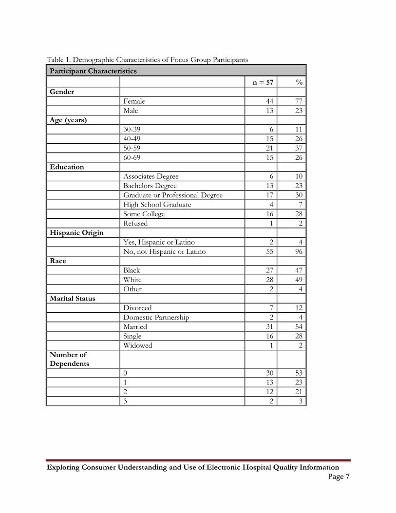
Results A diverse mix of healthcare consumers was recruited to provide a wide range of demographic backgrounds (see Table 1). Seventy-seven percent of the participants were female. Eighty-nine percent of the participants were over age 40. Eighty-one percent of the participants either had some college, graduated college or had a graduate degree, consistent with educational backgrounds of users of the internet cited in the literature.17
.
Exploring Consumer Understanding and Use of Electronic Hospital Quality Information Page 7
Table 1. Demographic Characteristics of Focus Group Participants Participant Characteristics n = 57 % Gender Female 44 77 Male 13 23 Age (years) 30-39 6 11 40-49 15 26 50-59 21 37 60-69 15 26 Education Associates Degree 6 10 Bachelors Degree 13 23 Graduate or Professional Degree 17 30 High School Graduate 4 7 Some College 16 28 Refused 1 2 Hispanic Origin Yes, Hispanic or Latino 2 4 No, not Hispanic or Latino 55 96 Race Black 27 47 White 28 49 Other 2 4 Marital Status Divorced 7 12 Domestic Partnership 2 4 Married 31 54 Single 16 28 Widowed 1 2 Number of Dependents 0 30 53 1 13 23 2 12 21 3 2 3
Exploring Consumer Understanding and Use of Electronic Hospital Quality Information Page 8
General Findings Although 24 prototypes were reviewed by focus group participants, only seven prototypes revealed novel findings. In general, responses to the prototypes were consistent with findings in the existing literature on the presentation of electronic hospital data for consumer use. These include:
• Consumers consistently ask to see all information that they believe is related to the quality of their care, including assessments of the performance of clinicians, hospitals and other health care venues.18
• All prototypes displayed clinical performance data and two displayed patient perception of care data 1,8. Respondents consistently opined that they wanted all of this data, but would like data specific to their particular medical condition as well.
• Consumers prefer to see numbers presented in a direction that is consistent with a number line where “higher is better”.19
• Consumers are more likely to accurately interpret reports as the volume of information that they must cognitively process is reduced.
Although only one display illustrated this concept explicitly, participants found the display easy to understand and consistently chose the top performer.
20
Simpler data presentations, especially with data labels indicting percentages or whether the data point met or did not meet a threshold, were consistently preferred.
Novel Findings: Results Reported by Prototype Each of the seven prototypes that elicited novel findings are presented below with an explanation of their purpose, the desired interpretation, an analysis of the responses and a final summary. Using data from the participant’s written questionnaires, we report on the percentage and number of respondents who correctly interpreted the data. The “focus group comments” refer to remarks from the participants that were gathered during the group discussion.
Exploring Consumer Understanding and Use of Electronic Hospital Quality Information Page 9
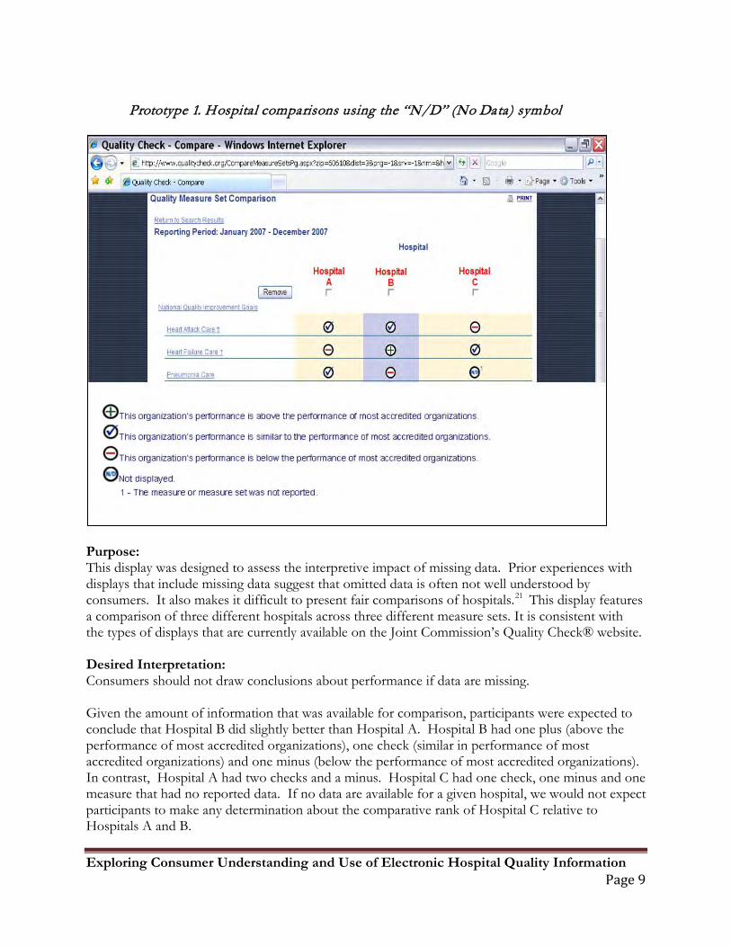
Prototype 1. Hospital comparisons using the “N/D” (No Data) symbol
Purpose: This display was designed to assess the interpretive impact of missing data. Prior experiences with displays that include missing data suggest that omitted data is often not well understood by consumers. It also makes it difficult to present fair comparisons of hospitals.21
This display features a comparison of three different hospitals across three different measure sets. It is consistent with the types of displays that are currently available on the Joint Commission’s Quality Check® website.
Desired Interpretation: Consumers should not draw conclusions about performance if data are missing. Given the amount of information that was available for comparison, participants were expected to conclude that Hospital B did slightly better than Hospital A. Hospital B had one plus (above the performance of most accredited organizations), one check (similar in performance of most accredited organizations) and one minus (below the performance of most accredited organizations). In contrast, Hospital A had two checks and a minus. Hospital C had one check, one minus and one measure that had no reported data. If no data are available for a given hospital, we would not expect participants to make any determination about the comparative rank of Hospital C relative to Hospitals A and B.
Exploring Consumer Understanding and Use of Electronic Hospital Quality Information Page 10
Results: Written questionnaire: All 20 of the Round 1 focus group participants responded to questions about this display. Seventeen (85%) of the participants chose the desired interpretation and three (15%) did not choose the desired interpretation. Focus Group Comments: In general, participants understood the limitations of the information that was being presented and made their decisions accordingly. One participant summarized the findings nicely, “…there is no information for that category. I have nothing to base my decision on; I can only use the other two categories. You couldn’t really tell if they did a good [job] or not.” Discussion: In this instance, this was an effective display of the use of the “N/D” (no data) symbol. Contrary to previously published findings2, participants had little trouble interpreting the intended message of this prototype.
Exploring Consumer Understanding and Use of Electronic Hospital Quality Information Page 11
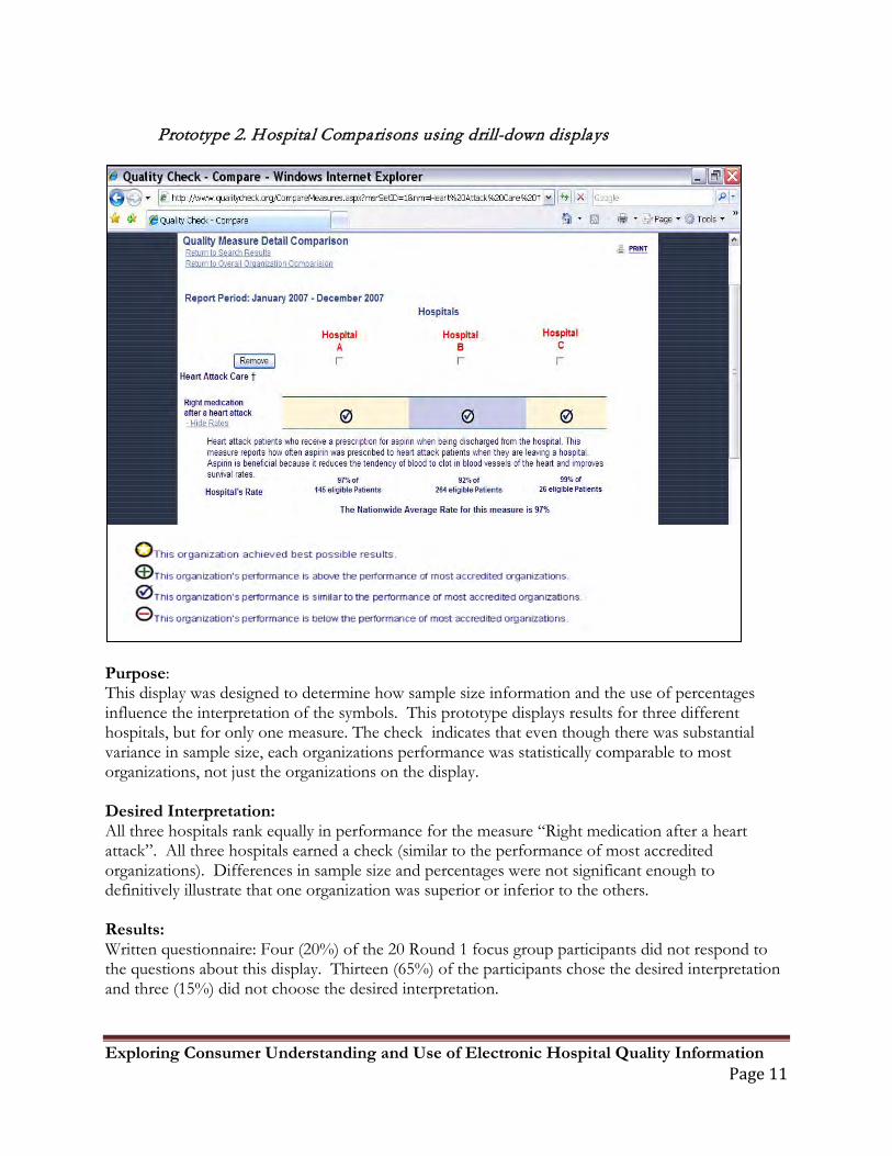
Prototype 2. Hospital Comparisons using drill-down displays
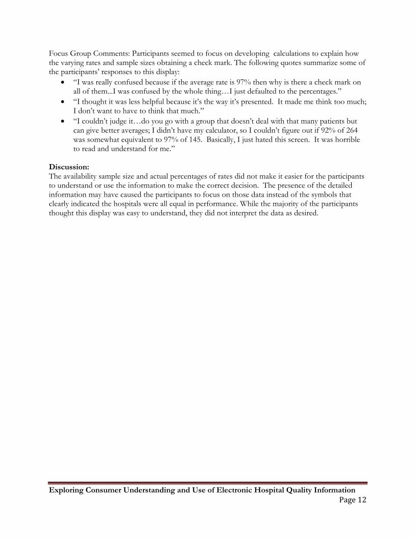
Purpose: This display was designed to determine how sample size information and the use of percentages influence the interpretation of the symbols. This prototype displays results for three different hospitals, but for only one measure. The check indicates that even though there was substantial variance in sample size, each organizations performance was statistically comparable to most organizations, not just the organizations on the display. Desired Interpretation: All three hospitals rank equally in performance for the measure “Right medication after a heart attack”. All three hospitals earned a check (similar to the performance of most accredited organizations). Differences in sample size and percentages were not significant enough to definitively illustrate that one organization was superior or inferior to the others. Results: Written questionnaire: Four (20%) of the 20 Round 1 focus group participants did not respond to the questions about this display. Thirteen (65%) of the participants chose the desired interpretation and three (15%) did not choose the desired interpretation.
Exploring Consumer Understanding and Use of Electronic Hospital Quality Information Page 12
Focus Group Comments: Participants seemed to focus on developing calculations to explain how the varying rates and sample sizes obtaining a check mark. The following quotes summarize some of the participants’ responses to this display:
• “I was really confused because if the average rate is 97% then why is there a check mark on all of them...I was confused by the whole thing…I just defaulted to the percentages.”
• “I thought it was less helpful because it’s the way it’s presented. It made me think too much; I don’t want to have to think that much.”
• “I couldn’t judge it…do you go with a group that doesn’t deal with that many patients but can give better averages; I didn’t have my calculator, so I couldn’t figure out if 92% of 264 was somewhat equivalent to 97% of 145. Basically, I just hated this screen. It was horrible to read and understand for me.”
Discussion: The availability sample size and actual percentages of rates did not make it easier for the participants to understand or use the information to make the correct decision. The presence of the detailed information may have caused the participants to focus on those data instead of the symbols that clearly indicated the hospitals were all equal in performance. While the majority of the participants thought this display was easy to understand, they did not interpret the data as desired.
Exploring Consumer Understanding and Use of Electronic Hospital Quality Information Page 13
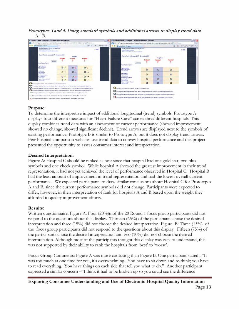
Prototypes 3 and 4. Using standard symbols and additional arrows to display trend data A. B.
Purpose: To determine the interpretive impact of additional longitudinal (trend) symbols. Prototype A displays four different measures for “Heart Failure Care” across three different hospitals. This display combines trend data with an assessment of current performance (showed improvement, showed no change, showed significant decline). Trend arrows are displayed next to the symbols of existing performance. Prototype B is similar to Prototype A, but it does not display trend arrows. Few hospital comparison websites use trend data to convey hospital performance and this project presented the opportunity to assess consumer interest and interpretation. Desired Interpretation: Figure A: Hospital C should be ranked as best since that hospital had one gold star, two plus symbols and one check symbol. While hospital A showed the greatest improvement in their trend representation, it had not yet achieved the level of performance observed in Hospital C. Hospital B had the least amount of improvement in trend representation and had the lowest overall current performance. We expected participants to draw similar conclusions about Hospital C for Prototypes A and B, since the current performance symbols did not change. Participants were expected to differ, however, in their interpretation of rank for hospitals A and B based upon the weight they afforded to quality improvement efforts. Results: Written questionnaire: Figure A: Four (20%)mof the 20 Round 1 focus group participants did not respond to the questions about this display. Thirteen (65%) of the participants chose the desired interpretation and three (15%) did not choose the desired interpretation. Figure B: Three (15%) of the focus group participants did not respond to the questions about this display. Fifteen (75%) of the participants chose the desired interpretation and two (10%) did not choose the desired interpretation. Although most of the participants thought this display was easy to understand, this was not supported by their ability to rank the hospitals from ‘best’ to ‘worse’. Focus Group Comments: Figure A was more confusing than Figure B. One participant stated , “It was too much at one time for you, it’s overwhelming. You have to sit down and re-think; you have to read everything. You have things on each side that tell you what to do.” Another participant expressed a similar concern –“I think it had to be broken up so you could see the difference
Exploring Consumer Understanding and Use of Electronic Hospital Quality Information Page 14
between one symbol and the next because with them being side by side, you have to really take time to focus and read what each one declined. They’re so close together it throws you.” Discussion: The presence of the additional trend symbols negatively influenced the participants’ ability to correctly interpret the intended meaning of the report. The trend arrows were given more “weight” than the current performance symbols. While trend data may be relevant, it appeared to distract users from paying attention to the more traditional representation of performance data. The presence of too many symbols with various meanings lead to confusion or caused the consumers to miss the primary message of the report.
Exploring Consumer Understanding and Use of Electronic Hospital Quality Information Page 15
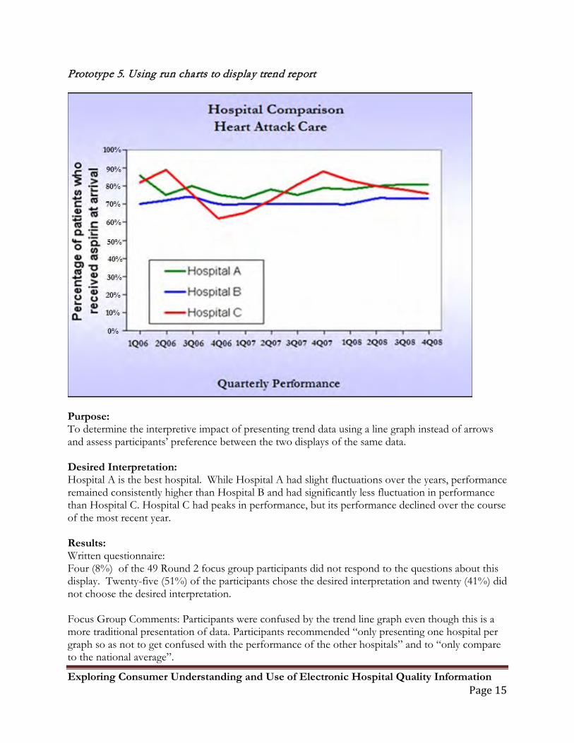
Prototype 5. Using run charts to display trend report
Purpose: To determine the interpretive impact of presenting trend data using a line graph instead of arrows and assess participants’ preference between the two displays of the same data. Desired Interpretation: Hospital A is the best hospital. While Hospital A had slight fluctuations over the years, performance remained consistently higher than Hospital B and had significantly less fluctuation in performance than Hospital C. Hospital C had peaks in performance, but its performance declined over the course of the most recent year. Results: Written questionnaire: Four (8%) of the 49 Round 2 focus group participants did not respond to the questions about this display. Twenty-five (51%) of the participants chose the desired interpretation and twenty (41%) did not choose the desired interpretation. Focus Group Comments: Participants were confused by the trend line graph even though this is a more traditional presentation of data. Participants recommended “only presenting one hospital per graph so as not to get confused with the performance of the other hospitals” and to “only compare to the national average”.
Exploring Consumer Understanding and Use of Electronic Hospital Quality Information Page 16
Discussion: The use of the line graph to depict trend performance between hospitals was not very effective in communicating the overall intended message of the report and may not be the best way to depict trend performance.
Exploring Consumer Understanding and Use of Electronic Hospital Quality Information Page 17
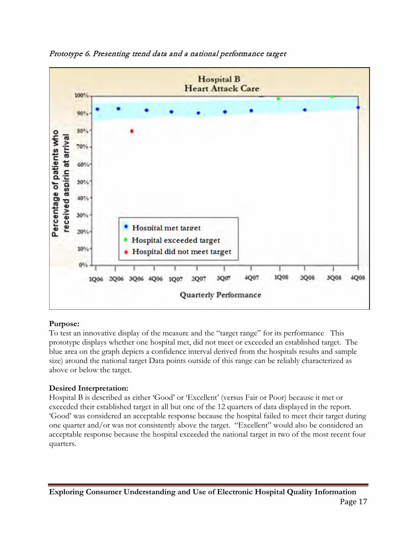
Prototype 6. Presenting trend data and a national performance target
Purpose: To test an innovative display of the measure and the “target range” for its performance This prototype displays whether one hospital met, did not meet or exceeded an established target. The blue area on the graph depicts a confidence interval derived from the hospitals results and sample size) around the national target Data points outside of this range can be reliably characterized as above or below the target. Desired Interpretation: Hospital B is described as either ‘Good’ or ‘Excellent’ (versus Fair or Poor) because it met or exceeded their established target in all but one of the 12 quarters of data displayed in the report. ‘Good’ was considered an acceptable response because the hospital failed to meet their target during one quarter and/or was not consistently above the target. “Excellent” would also be considered an acceptable response because the hospital exceeded the national target in two of the most recent four quarters.
Exploring Consumer Understanding and Use of Electronic Hospital Quality Information Page 18
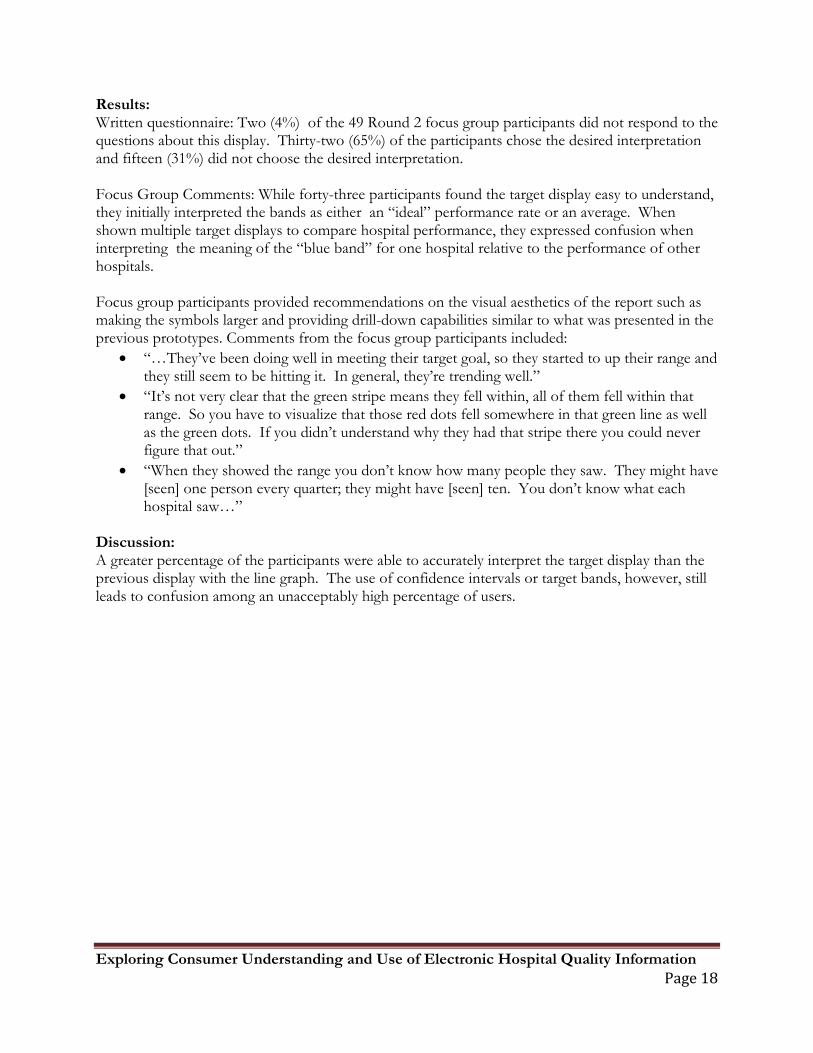
Results: Written questionnaire: Two (4%) of the 49 Round 2 focus group participants did not respond to the questions about this display. Thirty-two (65%) of the participants chose the desired interpretation and fifteen (31%) did not choose the desired interpretation. Focus Group Comments: While forty-three participants found the target display easy to understand, they initially interpreted the bands as either an “ideal” performance rate or an average. When shown multiple target displays to compare hospital performance, they expressed confusion when interpreting the meaning of the “blue band” for one hospital relative to the performance of other hospitals. Focus group participants provided recommendations on the visual aesthetics of the report such as making the symbols larger and providing drill-down capabilities similar to what was presented in the previous prototypes. Comments from the focus group participants included:
• “…They’ve been doing well in meeting their target goal, so they started to up their range and they still seem to be hitting it. In general, they’re trending well.”
• “It’s not very clear that the green stripe means they fell within, all of them fell within that range. So you have to visualize that those red dots fell somewhere in that green line as well as the green dots. If you didn’t understand why they had that stripe there you could never figure that out.”
• “When they showed the range you don’t know how many people they saw. They might have [seen] one person every quarter; they might have [seen] ten. You don’t know what each hospital saw…”
Discussion: A greater percentage of the participants were able to accurately interpret the target display than the previous display with the line graph. The use of confidence intervals or target bands, however, still leads to confusion among an unacceptably high percentage of users.
Exploring Consumer Understanding and Use of Electronic Hospital Quality Information Page 19
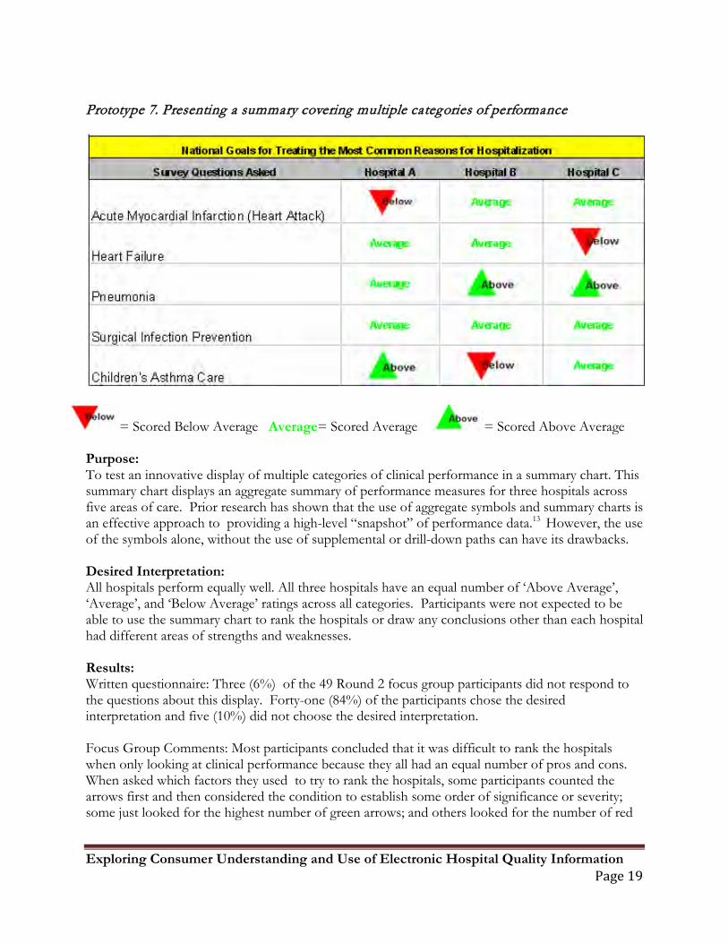
Prototype 7. Presenting a summary covering multiple categories of performance
= Scored Below Average Average= Scored Average = Scored Above Average Purpose: To test an innovative display of multiple categories of clinical performance in a summary chart. This summary chart displays an aggregate summary of performance measures for three hospitals across five areas of care. Prior research has shown that the use of aggregate symbols and summary charts is an effective approach to providing a high-level “snapshot” of performance data.13 However, the use of the symbols alone, without the use of supplemental or drill-down paths can have its drawbacks. Desired Interpretation: All hospitals perform equally well. All three hospitals have an equal number of ‘Above Average’, ‘Average’, and ‘Below Average’ ratings across all categories. Participants were not expected to be able to use the summary chart to rank the hospitals or draw any conclusions other than each hospital had different areas of strengths and weaknesses. Results: Written questionnaire: Three (6%) of the 49 Round 2 focus group participants did not respond to the questions about this display. Forty-one (84%) of the participants chose the desired interpretation and five (10%) did not choose the desired interpretation. Focus Group Comments: Most participants concluded that it was difficult to rank the hospitals when only looking at clinical performance because they all had an equal number of pros and cons. When asked which factors they used to try to rank the hospitals, some participants counted the arrows first and then considered the condition to establish some order of significance or severity; some just looked for the highest number of green arrows; and others looked for the number of red
Exploring Consumer Understanding and Use of Electronic Hospital Quality Information Page 20
arrows to identify a deficiency. There was confusion as to the exact meaning of “average” and for those considering the condition. The summary information as presented while helpful, would not convince the participants to use any of the hospitals listed. Comments included: “I wouldn’t base the decisions solely around this information. It would also be based on conversations with your doctor and family and people who maybe you know have been to that hospital or had that procedure or something” and “I also think we have to compare apples to apples and oranges to oranges. I don’t want to compare Northwestern (large urban teaching hospital) with a community hospital”. Discussion: We know from prior research that consumers often say they want as much detail as possible to inform their decisions, and our experience was no different. In this instance, although understood by most, summary charts containing multiple levels of information were deemed more useful to eliminate hospitals from consideration than to choose the best.
Exploring Consumer Understanding and Use of Electronic Hospital Quality Information Page 21
Conclusions The existing elements of hospital comparison websites (i.e. Hospital Compare® and Quality Check®) proved to be generally effective in conveying hospital performance data in a way that the average consumer can understand. This was apparent in nearly all of the prototypes that were presented. While, many of our findings were consistent with the established guidelines for consumer reporting of electronic hospital data (see The NQF guidelines for consumer-focused public reporting), the study provided some novel findings.
1. Contrary to the previously published findings2, participants had little trouble interpreting the meaning of “No Data”.
2. When presented with a combination of symbol-based data that indicated no statistical differences among organizations and numerical data that presented differences in sample size and actual percentages, consumers tended to be confused and over-interpret or over-value the numerical data.
3. The use of trend symbols in combination with current performance symbols negatively influenced participants’ ability to correctly interpret the intended meaning of the report.
4. The use of national targets (as opposed to national averages) may be an effective tool to display hospital performance data for consumer use, but additional work should be done to investigate better displays of target data.
5. Summary charts, containing multiple levels of information, were deemed more useful to eliminate hospitals from consideration than to choose the best. Contrary to consumer desires for as much information as possible, the presence of detailed data may be confusing and may interfere with more global interpretations of comparison reports.
Finally, when asked what information they would like to see listed on a summary display, participants listed the following factors in order of preference. disease specific information mortality rates # of patients displayed on charts/graphs hospital specialty (if any) infection rates medical errors definition of “national average” hospital ranking/success rate hospital location and size procedural volume stats specific hospital department statistics staff and physician qualifications length of average hospital stay office and appointment wait times type of technological equipment type of hospital (community, teaching, etc.) more specific diseases/conditions physician gender and age patient comment section on website/blog
Exploring Consumer Understanding and Use of Electronic Hospital Quality Information Page 22
As with any qualitative study, there is always the concern for reliability. Focus group methods are especially helpful in assessing participant’s satisfaction or their perceptions of the value of different services,22
but participants may express information differently in focus groups than they would in private. To compensate for this, both written (individual) and verbal (group) responses to the prototypes were obtained. It is difficult, however, to interpret inconsistencies found between the individual and group responses. The extent to which group discussions may have helped to clarify a participant’s individual written response, or the degree to which the group discussion may have positively or negatively influenced a participant’s original interpretation, is unknown.
The small number of participants, drawn from a small geographic area, limits the generalizability of findings. Similarly, focus group participants are ultimately self-selected, which may have biased the sample toward those who were more interested in quality and health related information. We were also limited by our ability to quantify and control for factors that may have influenced perceptions and reactions to quality reports. These factors include how useful consumers view the underlying data and how much choice they believe they have in selecting a hospital. Not all hospital performance data may be relevant to the needs of each consumer. Highlighting differences in performance data may not be as meaningful for some as it is for others. Thus, the perceived value of this information may have limited the participants’ ability to fairly critique the reports. As more electronic hospital comparison data for consumer use becomes available, the need to make this information relevant and easy to understand will continue to evolve.
Exploring Consumer Understanding and Use of Electronic Hospital Quality Information Page 23
References
1 Cline, R.J.W., and K.M. Haynes. "Consumer health information seeking on the Internet: the state of the art." Health Education Research 16, no. 6 (2001): 671-692.
2 vanDeursen, A.J. . "Internet skill-related problems in accessing online health information." Int J Med Infor 81, no. 1 (2012): 61-72.
3 Zeng-Treitler, Qing , Sergey Gorayachev, Tony Tse, Alla Keselman, and Aziz Boxwala. "Estimating Consumer Familiarity with Health Terminology: A Context-based Approach." J Am Med Inform Assoc. 15 (2008): 349-356.
4 Keselman, Alla, Tony Tse, Jon Crowell, Allen Browne, Long Ngo, and Qing Zeng. "Assessing Consumer Health Vocabulary Familiarity: An Exploratory Study." J Med Internet Res 9, no. 1 (2007): e5.
5 The Joint Commission. Quality Check. http://www.qualitycheck.org. Accessed October 30, 2009.
6 De Biasi and Associates. Joint Commission on Accreditation of Health Care Organizations Quality Report Concept: Report of Research Findings. 2003. Unpublished.
7 United States Department of Health and Human Services. Hospital Compare: A quality tool for adults, including people with Medicare. http://www.hospitalcompare.hhs.gov. Accessed October 30, 2009.
8 Peters EM, Dieckmann N, Dixon A, Hibbard JH, Mertz CK. Less is More in Presenting Quality Information to Consumers. Medical Care Research and Review 2007;64(2):169-90.
9 Edgman-Levitan S, Cleary P. What Information Do Consumers Want and Need? Health Affairs 1996; 15(4):42-56
10 Lubalin J, Harris-Kojetin. What do Consumers Want and Need to Know in Making Health Care Choices? Medical Care Research and Review 1999; 56(1): 67-102
11 Henry J. Kaiser Family Foundation. National Survey on Consumers’ Experiences with Patient Safety and Quality Information. 2004
12 Isaacs S. Consumers’ Information Needs: Results of a National Survey. Health Affairs 1996; 15(4):31-41.
13 Hibbard J, Jewett J. What Type of Information Do Consumers Want in a Health Care Report Card? Medical Care Research and Review 1996; 53(1):29-47.
14 Damman, Olga, Ylva van den Hengel, Jeanne van Loon, and Jany Rademakers. "A national Comparison of Web-based Reporting About Health Care Quality: Content Analysis." J Med Internet Res. 12, no. 2 (2010): e8.
Exploring Consumer Understanding and Use of Electronic Hospital Quality Information Page 24
15 Horrigan J. A Typology of Information and Communication Technology Users. Washington, DC: Pew Internet and American Life Project; 2007. 16 Miles MB, Huberman AM. Qualitative Data Analysis: An Expanded Sourcebook. 2nd ed. Thousand Oaks, CA: Sage Publications; 1994.
17 The Pew Research Center's Internet & American Life Project." Pew Research Center. pewinternet.org. (accessed November 11, 2009).
18 Shaller D, Sofaer S, Findlay S, et al. Consumers and Quality-Driven Health Care: A Call to Action. Health Affairs 2003; 22(2): 95-101 19 Peters EM, Dieckmann N, Dixon A, Hibbard JH, Mertz CK. Less is More in Presenting Quality Information to Consumers. Medical Care Research and Review 2007; 64(2):169-90.
20 Edgman-Levitan S, Cleary P. What Information Do Consumers Want and Need? Health Affairs 1996; 15(4):42-56.
21 De Biasi and Associates. Joint Commission on Accreditation of Health Care Organizations Quality Report Concept: Report of Research Findings. 2003. Unpublished.
22 Pope, C, P van Royen, and R Baker. "Qualitative methods n research on healthcare quality." Qual Saf Health Care 11 (2002): 148-152.