Embed Size (px)
DESCRIPTION
Statistics 111 - Lecture 4. Exploring Data. Graphics for Relationships between Variables. Administrative Notes. HW1 due right now HW2 is on the website Due Monday, June 8 th. Course Overview. Collecting Data. Exploring Data. Probability Intro. Inference. Comparing Variables. - PowerPoint PPT Presentation
Citation preview
June 2, 2008 Stat 111 - Lecture 4 - Graphs 1
Exploring Data
Graphics for Relationships
between Variables
Statistics 111 - Lecture 4

June 2, 2008 Stat 111 - Lecture 4 - Graphs 2
Administrative Notes
• HW1 due right now
• HW2 is on the website
• Due Monday, June 8th
June 2, 2008 Stat 111 - Lecture 4 - Introduction 3
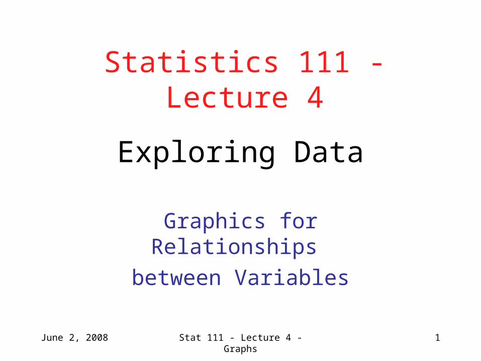
Course Overview
Collecting Data
Exploring DataProbability Intro.
Inference
Comparing Variables Relationships between Variables
Means Proportions Regression Contingency Tables
June 2, 2008 Stat 111 - Lecture 4 - Graphs 4
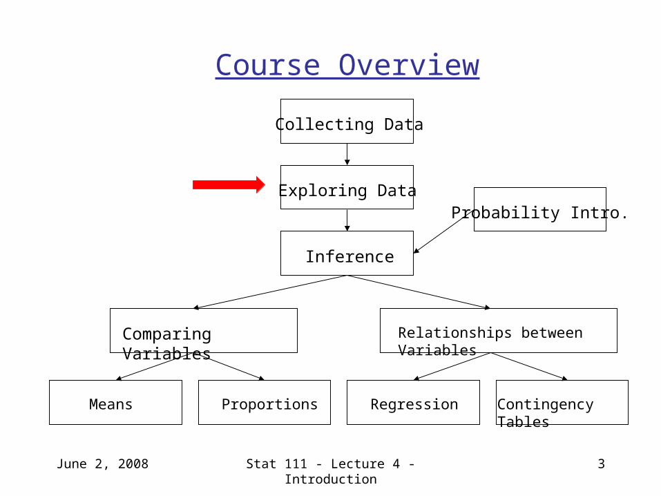
Outline of First Half of Lecture
• Scatterplots: relationships between two continuous variables• Interpreting scatterplots• Adding categorical variables to scatterplot
• Comparison Boxplots: relationship between categorical and continuous variables
• Contingency Tables: relationship between two categorical variables
June 2, 2008 Stat 111 - Lecture 4 - Graphs 5
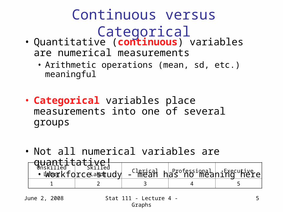
Continuous versus Categorical• Quantitative (continuous) variables are
numerical measurements • Arithmetic operations (mean, sd, etc.) meaningful
• Categorical variables place measurements into one of several groups
• Not all numerical variables are quantitative! • Workforce study - mean has no meaning here
Unskilled Labor Skilled Labor Clerical Professional Executive
1 2 3 4 5
June 2, 2008 Stat 111 - Lecture 4 - Graphs 6
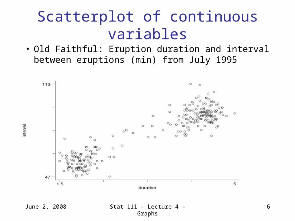
Scatterplot of continuous variables
• Old Faithful: Eruption duration and interval between eruptions (min) from July 1995
June 2, 2008 Stat 111 - Lecture 4 - Graphs 7
Associations between Variables
• Positively associated if increased values of one variable tend to occur with increased values of the other
• Negatively associated if increased values of one variable occur with decreased values of the other
• Old Faithful: eruption duration is positively associated with interval between durations
• Remember that association is not proof of causation!
June 2, 2008 Stat 111 - Lecture 4 - Graphs 8
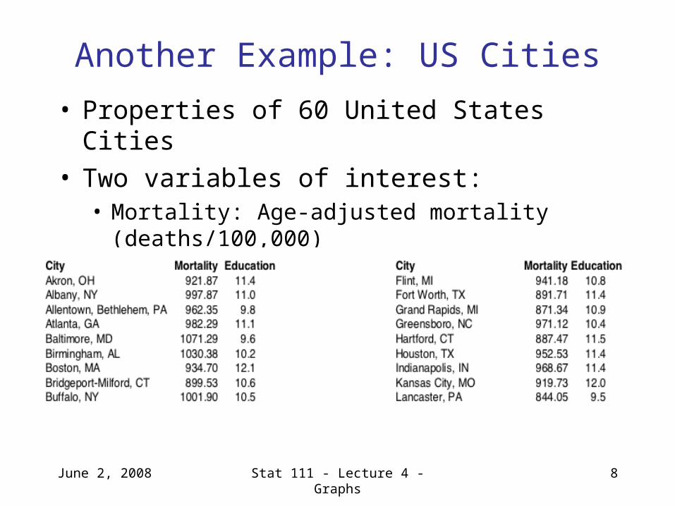
Another Example: US Cities
• Properties of 60 United States Cities• Two variables of interest:• Mortality: Age-adjusted mortality (deaths/100,000) • Education: Median education (years)
June 2, 2008 Stat 111 - Lecture 4 - Graphs 9
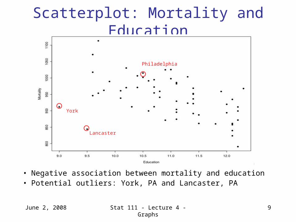
Scatterplot: Mortality and Education
• Negative association between mortality and education• Potential outliers: York, PA and Lancaster, PA
Philadelphia
Lancaster
York
June 2, 2008 Stat 111 - Lecture 4 - Graphs 10
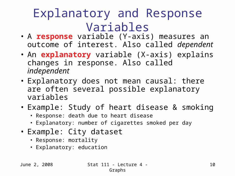
Explanatory and Response Variables• A response variable (Y-axis) measures an
outcome of interest. Also called dependent• An explanatory variable (X-axis) explains
changes in response. Also called independent • Explanatory does not mean causal: there are
often several possible explanatory variables• Example: Study of heart disease & smoking
• Response: death due to heart disease• Explanatory: number of cigarettes smoked per day
• Example: City dataset• Response: mortality• Explanatory: education
June 2, 2008 Stat 111 - Lecture 4 - Graphs 11
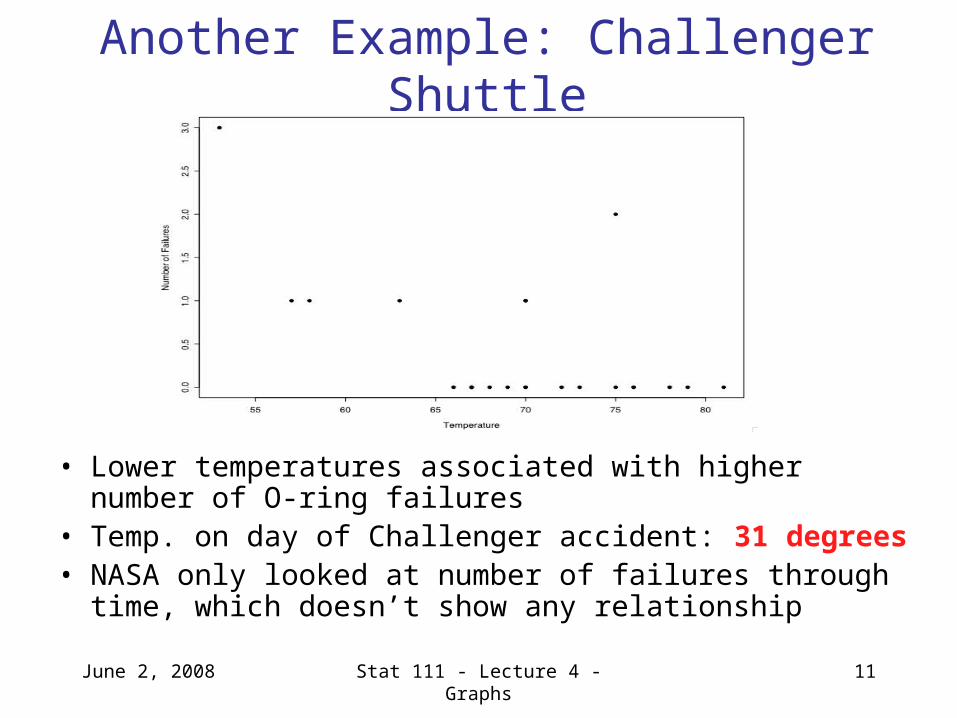
Another Example: Challenger Shuttle
• Lower temperatures associated with higher number of O-ring failures
• Temp. on day of Challenger accident: 31 degrees• NASA only looked at number of failures through time, which
doesn’t show any relationship
June 2, 2008 Stat 111 - Lecture 4 - Graphs 12
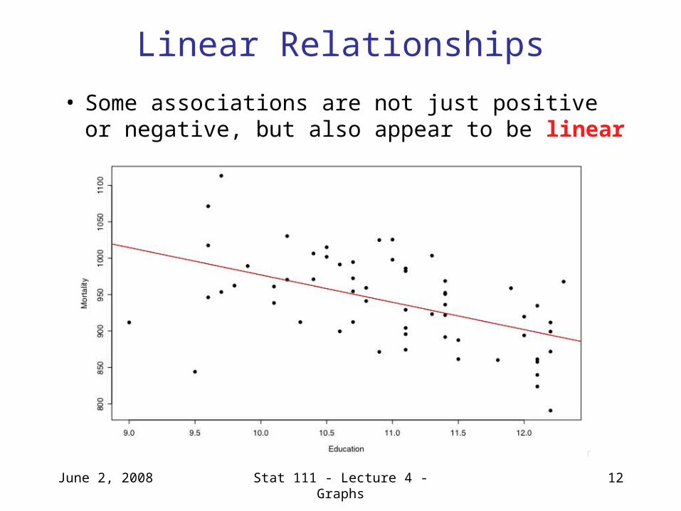
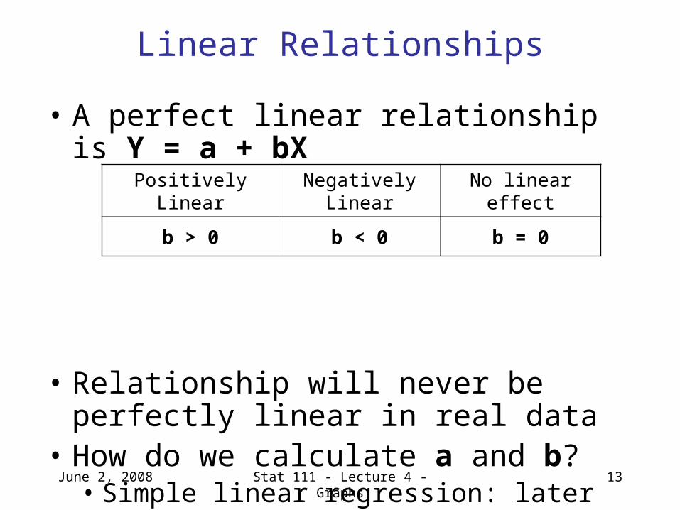
Linear Relationships
• Some associations are not just positive or negative, but also appear to be linear
June 2, 2008 Stat 111 - Lecture 4 - Graphs 13
Linear Relationships
• A perfect linear relationship is Y = a + bX
• Relationship will never be perfectly linear in real data
• How do we calculate a and b? • Simple linear regression: later in this course
Positively Linear Negatively Linear No linear effect
b > 0 b < 0 b = 0
June 2, 2008 Stat 111 - Lecture 4 - Graphs 14
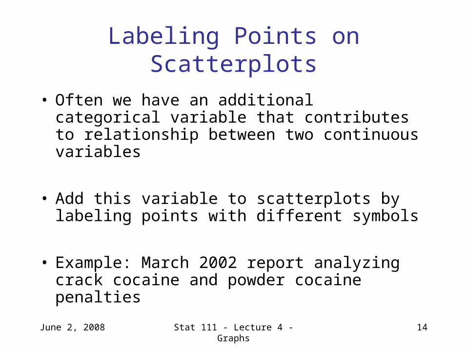
Labeling Points on Scatterplots
• Often we have an additional categorical variable that contributes to relationship between two continuous variables
• Add this variable to scatterplots by labeling points with different symbols
• Example: March 2002 report analyzing crack cocaine and powder cocaine penalties
June 2, 2008 Stat 111 - Lecture 4 - Graphs 15
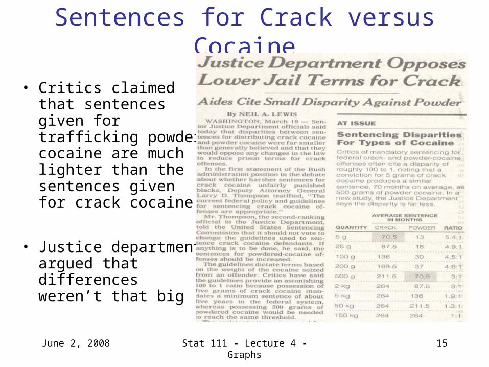
Sentences for Crack versus Cocaine
• Critics claimed that sentences given for trafficking powder cocaine are much lighter than the sentences given for crack cocaine
• Justice department argued that differences weren’t that big
June 2, 2008 Stat 111 - Lecture 4 - Graphs 16
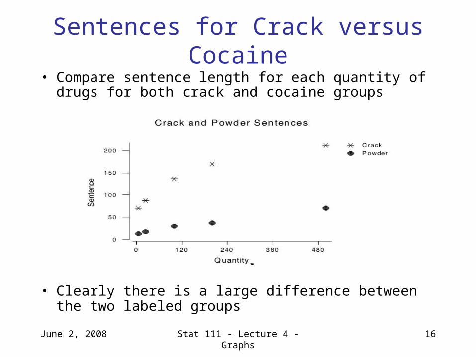
Sentences for Crack versus Cocaine
• Compare sentence length for each quantity of drugs for both crack and cocaine groups
• Clearly there is a large difference between the two labeled groups

June 2, 2008 Stat 111 - Lecture 4 - Graphs 17
Comparison Boxplots
• How does the distribution of a quantitative variable change between categories?
• Divide quantitative variable into each category and construct separate boxplots
• Eg. home runs for B. Ruth vs. M. McGwire
June 2, 2008 Stat 111 - Lecture 4 - Graphs 18
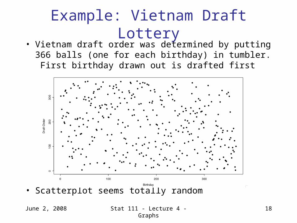
Example: Vietnam Draft Lottery• Vietnam draft order was determined by putting 366
balls (one for each birthday) in tumbler. First birthday drawn out is drafted first
• Scatterplot seems totally random
June 2, 2008 Stat 111 - Lecture 4 - Graphs 19
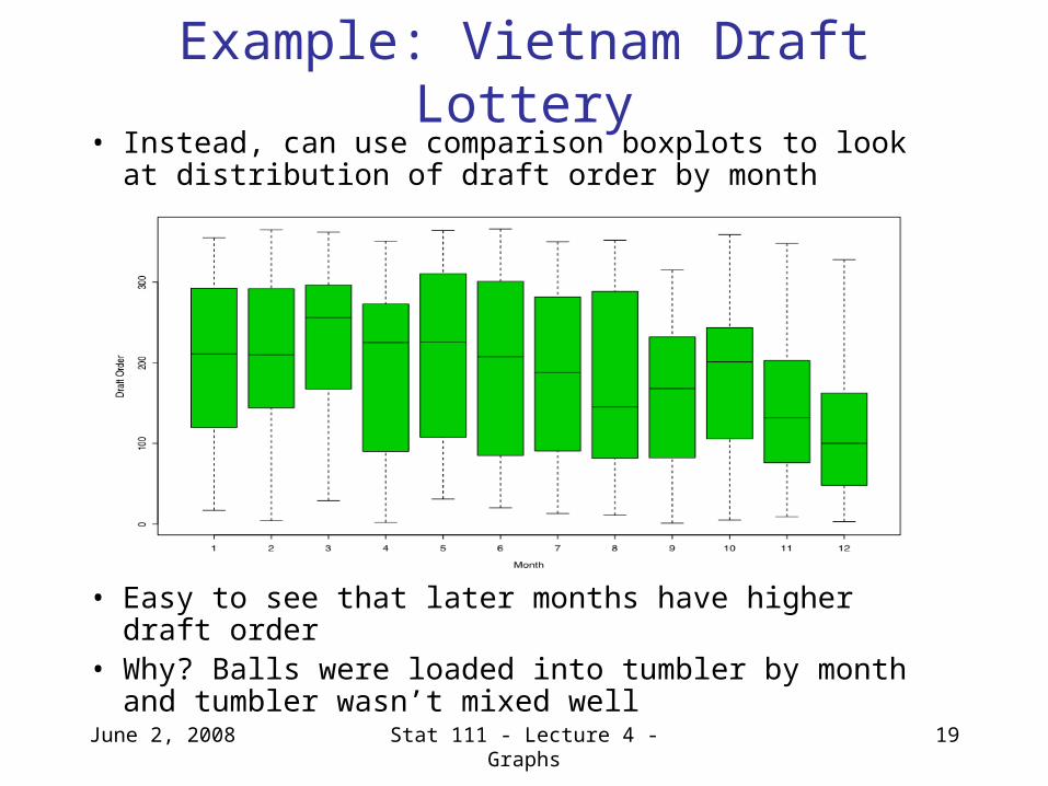
Example: Vietnam Draft Lottery• Instead, can use comparison boxplots to look at
distribution of draft order by month
• Easy to see that later months have higher draft order• Why? Balls were loaded into tumbler by month and
tumbler wasn’t mixed well
June 2, 2008 Stat 111 - Lecture 4 - Graphs 20
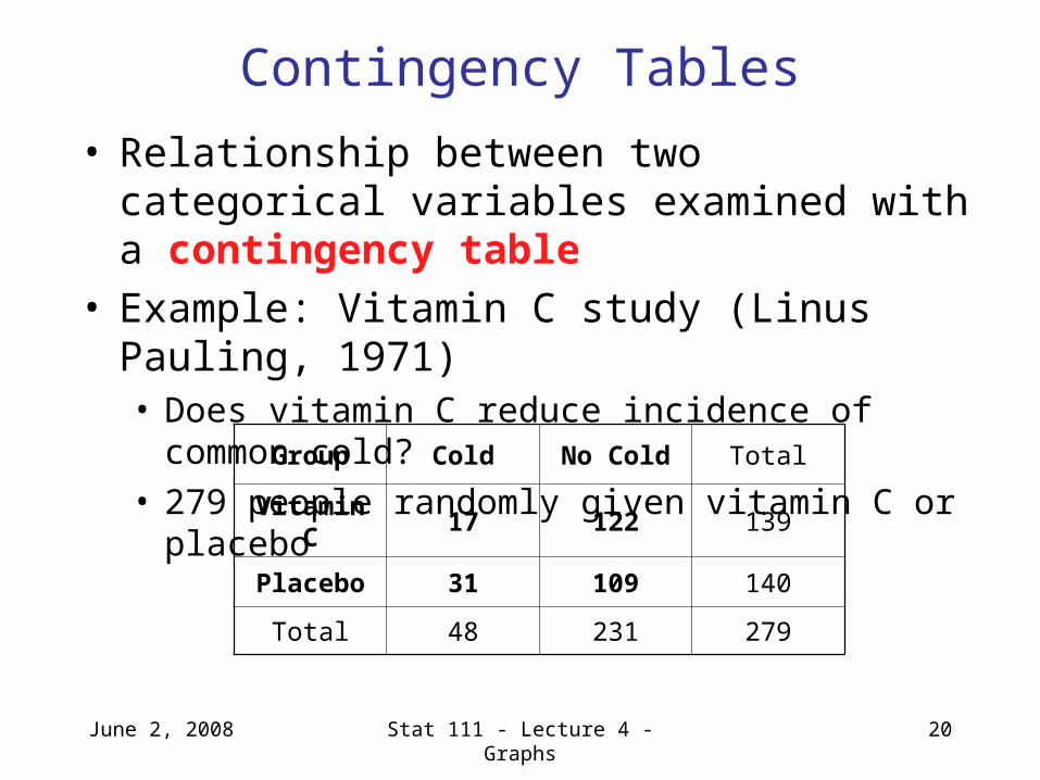
Contingency Tables
• Relationship between two categorical variables examined with a contingency table
• Example: Vitamin C study (Linus Pauling, 1971)• Does vitamin C reduce incidence of common cold? • 279 people randomly given vitamin C or placebo
Group Cold No Cold Total
Vitamin C 17 122 139
Placebo 31 109 140
Total 48 231 279
June 2, 2008 Stat 111 - Lecture 4 - Graphs 21
Next Lecture
• Exploring Data: Numerical summaries of the relationship between variables
• Moore, McCabe and Craig: Section 2.2
Questions about homework?
• Open to questions
June 2, 2008 Stat 111 - Lecture 4 - Graphs 22