Embed Size (px)
DESCRIPTION
external postioning
Citation preview

Iain BudgenExternal Postioning
EGRD 3013

Studio Job Freelance
Independent
Studio Job Freelance
Independent
I believe that in order to develop and improve my current practice I need to work within a studio sys-tem to discover more about what my work repre-sents. In particular I would like to go into the advertising side. I feel like I would be able to express myself greater with advertising and be able to explore new creative outlets. My personality I think would also lend quite well.My current independent practice is rather deep and confusing with explaination so I feel like I need to explore and refine that further. Working under a regid regime can only improve my work.One company I like the ethos of is thinkingjuice, who work on advertising campaigns for a variety of com-panies. Their general tag lines are rather blunt and to the point, something that creatively I get some-thing out of. They also work outside of London, something which I would prefer to do, at least early in my career.However, once I finish university I plan on finding the first job in graphics sector that I can find. I am not too fussy, I just want to enter that world and work my way up through it.
Studio Job Freelance
IndependentWhen looking towards the future, to be in a position like Kate Moross (Below) would be good. In control of your work, getting comissioned on the basis of your independent practice and running your own business. I want that ressaurance of being commissioned be-cause the company in question likes what you have done previously, as opposed to having to tailor your style to each client.It is an ambition of mine to be recognised off the back of your own work rather than the company you work for.
The future...
1.
2.
3.

I was asked by my employers to create a poster for a charity raffle. I was essentially given a free reign to do what I want-ed with it. With no restrictions, I was free to show my skills to the best of my ability.With this poster I kind of went head first into the project with-out a second thought. Literally started working on illustrator. The original concept was to make it eye catching and simply informative, hence the bold orange and block text. The first thing that came to mind was western style wanted posters, hence the font choice. The layout was simple but it does not look professionally made, and it was only when taking a step back and evaluat-ing the design did I realise how basic it looked. The final version was just an attempt really at trying to make it look my sophisticated and give it all a bit more character.The Sainsbury’s logo featured in these versions of the post-er was an attempt to show a corporate identity and brand association. The change from raffle to prize draw is as a result of look-ing into the licensing of raffles and lotteries and learning that there is certain guidelines you have to follow legally. It turns out it is more difficult to run a raffle or tombola than originally thought. I understand that as an advertising agency that kind of logis-tics and legal stuff would be taken care of prior to the brief being handed down, but it has been an important learning curve that wording can have legal ramifications.
Charity Poster

After re-evaluating the poster design I de-cided that it look too ametuerish. The thing that always irritates me about local charity promotion is that it always looks like it has been made on Publisher, and as a graphic designer, I should strive for more.I began researching old boxing posters and the general imagery. In particular it was the rigid geometic layout that interested me, taking into account the general style, paying close attention to the font. This is the first time to be honest that I have taken so much time in researching and indentiftying a font for the right look and feel of my work. In this instance I settled for News gothic bold, used in various boxing posters and logos, including the ABBA logo. I also fo-cused on the letter and word spacing, paying really close attention to make it all consistant, legible and visually stimulating. The removal of the Sainsbury’s logo was because the poster would only be on show instore, so people entering the draw would already be aware of who was running the draw.I suppose what this all shows is I can adapt my style of work and make it functional and work in a commercial environment. It also shows that I know how to structure a poster and can show information informitively.
Charity Poster
Intial redevelpment took a bit more of a pictogram approach. I still had the aim of making the image as simple as poosible. Personally I did not think that all the information would be clear to the audience, and that was the reason for the development. The grid structure was something that was a focus from the beginning. Later toyed with the idea of a tabloid style poster but the idea did not stick because I felt it would be too cheesy.The image bottom left was me toying with the idea of use of nega-tive colour in my work. This later became the part of the work once I started making the work on illustrator. I like having a core idea down on paper but it very rarely stays the same once made.In honesty, I am much more a doer than a thinker. I feel it is much more proactive. For that reason I am probably best suited to a com-pany with a quick turnaround.

Charity Poster
Deciding it was not quite finished, I delved further into the imagery of boxing posters, mimicing the colours very closely. The result is something I feel stands out more than the average charity poster and something which could lure people in. What this whole process shows to potential employers is that I can constantly review my work and strive for the finished product. It also gives me an impression on commis-sioned work. And although every commission won’t be the same, I have learnt about being considerate and intelligent with the information given.

To get some critique on my work about ten months ago I uploaded my work onto kanyetothe.com. Whilst not a traditonal art or graphics forum I admired the work of others there and thought it was a great opportunity to have my work viewed from an external perspective. It has helped steer the course of my projects with the comments given. As shown in the image above (2), it has helped steer the course of my active research. I have also recieved several offers of promotion or work as a result of this thread including the one to the right (3). This was posted as a general thread but I thought as he was looking for something pattern focused it would play to my strengths.
Externalisation
After collecting a little more information on the project (below), the work above was my first stab at it. It was more a release from my independent practice but afterwards he said he wanted something a little more like the B&W stuff I had just produced (1.).This was me really discovering when a client sets an open brief that is not always the case. Fortunately it was not too much effort to match what was wanted.
These were the results, playing off what he wanted. At present he has not got back to me despite numerous emails. The work does fit into what I had been doing in my independent practice and I suppose this is what I wanted. I want to be sought after on the basis of my independent practice. On top of that I really like the work I have made for this, particuarly the B&W ones.
2.
3.

Penguin Cover
When doing this book cover I re-alised that one skill I never seem to be able to grasp is the ability to step back, think carefully about the brief and produce meaningful work. Research and sketches go out the window because I want to just jump into the work. Work-ing independently it would not be a problem as I could do as I wished, with a set brief it is a dif-ferent matter. The first pieces (1,2 & 3) were just an attempt to get a feel for the work, trying to get inspired. I have to admit, I have not read the book nor seen the film, but I was aware of the plot but also the rhyme from where the title origi-nates. I think maybe not a com-plete understanding of the plot is a hinderance. The other efforts were an attempt to bring more of my own style into it, thinking about light streaming through a window creating dis-tinct shadow. I wanted capture a sense of being in the asaylum.It is also a distinct look that has been a theme of work this year. In a plan for my career, I imagine that it will be distinct styles like this that would get me commis-sions off the back of my inde-pendent work.
Above - tried to make it slightly more noirish by blur-ring it all a bit. This is probably my favourite cover of them all, it has the feel I was going for. 4 & 5 were created as a result of a suggestion by peo-ple critiquing my work on kanyetothe.com. Although I like them visually I do not think it translates what I would want to say about the content of the book. Left was some sketches thinking about taking the cover of the book back to the rhyme. Thiniking specifi-cally about the lines ‘One flew east, one flew west and one flew over the cuckoo’s nest.’ Again I am not sure people are going to get the mes-sage I am trying to put out because I think it needs to relate closer to the themes and plot of the book.
1. 2.
3.
4. 5.

SEGA
Development for the campaign, The ideas were largely disregarded because I did not feel that the crown was fitting. I did not think it would communicate the message of a 20th anniversary very well. I did some research into commemorative t-shirts and stuff sold on football club web-sites celebrating success. I love the pas-sion fans have for thier club and I thought about applying this to the love people have for Sports Interactive and their games. This was the basis of my work, transfering that passion into the world of video games.Left is some more sketches to get a feel for the project. Some of these things were intergrated into the project, but seperately they did not work. The one idea that I liked was the idea of a the logo being stitched on a football shirt, but I still do not think it would convey the right message.
The basis for taking the project on was my love of the games Sports Interactive have created down the years. It is something I wanted to do justice. My first thought was that fans of the game will be aware of the company so referencing the game is not nessarily important. The caption ‘Still top of the league,’ was the first thing that came to my head upon reading the brief and I could never top it. It struck a cord because of all the competition that they have had down the years, they remain the most popular.I like arrogant statements like that, it comes across as com-manding, powerful and most of all, simple. That functional mes-sage fits the ethos laid out by Thinkingjuice.A lot of research was spent looking into the font used on the back of Premier League. Obviously the league cannot be refer-enced and the font as it turns out appears to be exclusively cre-ated for them. But I found a similar alternative, optima, which gives the same look. I wanted an audience to be able to have a rough idea what the piece is in relation to even without prior knowledge of Sports Interactive. If I was looking to position this poster anywhere I see it at bus shelters or billboards. I don’t feel it needs to reference the Foot-ball Manager series in any way because the games fanbase are going to recognise the logo and associate with it.
YEARSSTILL TOPOF THELEAGUE
20YEARSSTILL TOPOF THELEAGUE
20

SEGA
Thinking about branching out with communtication, I thought about just a simple promotional piece with just a 20 on the back of a foot-ball shirt and the related logos of SEGA and SI. Visually it is effective and striking and most fans of football will recognise and associate the brand. It could be featured with a QR code that when scanned took the viewer to more information about Football Manager. I think it would be a cool billboard advertisement, striking and in-triguing enough to draw a viewer in.
This is a recreation of Manchester United flag. As just a quick mock up to see what it looks like. I would see this as a billboard poster, As opposed to going with the traditional league struc-ture (Eg. 1992-1993), I decided to go with just the year of the games re-lease. It makes things a little clearer to a viewer who knows little about football league structure. The colour sheme was directly inspired by the Sports Interactive logo.

YEARSSTILL TOPOF THELEAGUE
20 YEARSSTILL TOPOF THELEAGUE
20Est. 1992
As part of the final plan, I would be looking for SEGA to take over a website like gamesradar or gamespot with a promotional spot focusing on the 20th anniversary. As with other promo-tions the other websites have run, clicking on the advertising would take you to the SI web-site. The same promotional material could also be put on the companies twitter and facebook. It would put a cohesive message across all plat-forms of media.
Image 1 would be a promotional poster given out in a magazine like Gamesmaster. They have a circu-lation of around 30,000 and often focus on sports ganes. Although they have a younger readership than more sophisticated magazines such as EDGE it would be a good way to expand the brand and knowledge of SI and SEGA. It would make them aware of the brand when they come of age. It could also be used as a bridge to the main SI website, with a similar level of awareness on the main page.
SEGA
YEARSSTILL TOPOF THELEAGUE
20The images 2 & 3 could be used on billboards or or advertising boards at bus stops. These would encorportate a QR code to send the viewer to the SI website. It would be a simple way to use 20st century technology to give ac-cess to a wide range of information.
Est. 1992Image 4 would directly target football fans in the terraces in much the same way other sports games such as Fifa 12 do. An ideal place would be somewhere like AFC Wimbledon where they are shirt sponsors. They could also extend this to Pre-mier League teams. It buys into the idea of establishing a brand in much the same way as a football team. I think that this offers quite a complete marketing approach, targeting not just po-tential and existing fans, but also football fans as a whole. I think it shows that I am senstitive to the target market and can offer a consistant branding message.
1.
2.
3.
4.
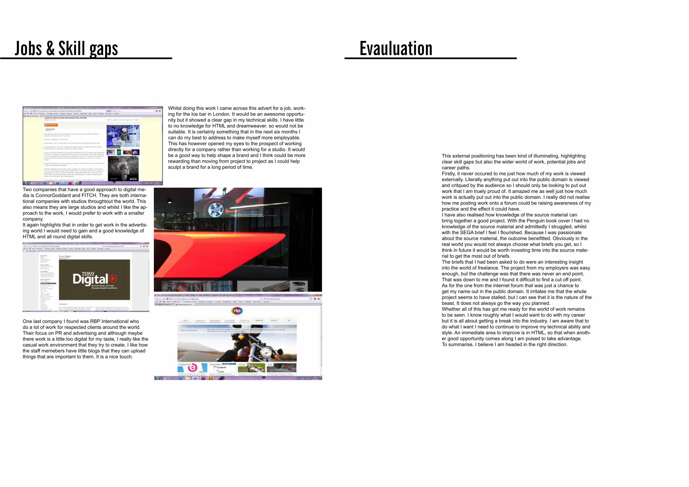
Whilst doing this work I came across this advert for a job, work-ing for the Ice bar in London. It would be an awesome opportu-nity but it showed a clear gap in my technical skills. I have little to no knowledge for HTML and dreamweaver. so would not be suitable. It is certainly something that in the next six months I can do my best to address to make myself more employable. This has however opened my eyes to the prospect of working directly for a company rather than working for a studio. It would be a good way to help shape a brand and I think could be more rewarding than moving from project to project as I could help sculpt a brand for a long period of time.
Two companies that have a good approach to digital me-dia is ConnorGoddard and FITCH. They are both interna-tional companies with studios throughtout the world. This also means they are large studios and whilst I like the ap-proach to the work, I would prefer to work with a smaller company.It again highlights that in order to get work in the advertis-ing world I would need to gain and a good knowledge of HTML and all round digital skills.
Jobs & Skill gaps
This external positioning has been kind of illuminating, highlighting clear skill gaps but also the wider world of work, potential jobs and career paths. Firstly, it never occured to me just how much of my work is viewed externally. Literally anything put out into the public domain is viewed and critqued by the audience so I should only be looking to put out work that I am truely proud of. It amazed me as well just how much work is actually put out into the public domain. I really did not realise how me posting work onto a forum could be raising awareness of my practice and the effect it could have. I have also realised how knowledge of the source material can bring together a good project. With the Penguin book cover I had no knowledge of the source material and admittedly I struggled, whilst with the SEGA brief I feel I flourished. Because I was passionate about the source material, the outcome benefitted. Obviously in the real world you would not always choose what briefs you get, so I think in future it would be worth investing time into the source mate-rial to get the most out of briefs. The briefs that I had been asked to do were an interesting insight into the world of freelance. The project from my employers was easy enough, but the challenge was that there was never an end point. That was down to me and I found it difficult to find a cut off point. As for the one from the internet forum that was just a chance to get my name out in the public domain. It irritates me that the whole project seems to have stalled, but I can see that it is the nature of the beast. It does not always go the way you planned. Whether all of this has got me ready for the world of work remains to be seen. I know roughly what I would want to do with my career but it is all about getting a break into the industry. I am aware that to do what I want I need to continue to improve my technical ability and style. An immediate area to improve is in HTML, so that when anoth-er good opportunity comes along I am poised to take advantage. To summarise, I believe I am headed in the right direction.
Evauluation
One last company I found was RBP International who do a lot of work for respected clients around the world. Their focus on PR and advertising and although maybe there work is a little too digital for my taste, I really like the casual work environment that they try to create. I like how the staff memebers have little blogs that they can upload things that are important to them. It is a nice touch.

References
ConnorGoddard, 2011, ConnorGoddard [online] Available at: www.connorgoddard.com/ [Accessed 25th November]
Liverpool FC, 2011, Liverpool FC [online] Available at: www.store.liverpoolfc.tv/products/mens/menstshirts/fab-five-tee/pid-35741 [Accessed 20th November]
MUFC Shop, 2011, MUFC [online] Available at: http://store.manutd.com/stores/manutd/products/product_details.aspx?pid=93832&cid=24609 [Accessed 20th November]
Kate Moross, 2011, Kate Moross [online] Available at: www.katemoross.com [Accessed 30th October]
Thinkingjuice, 2011, Thinkingjuice [online] Available at: www.thinkingjuice.co.uk [Accessed 30th November]
Gamesmaster Circulation, 2011, Magazinesabout [online] Available at: www.magazinesabout.co.uk/magazines/view/Gamesmaster [Accessed 1st December]
Poster design, 2011, Poster Design tips [online] Available at: www.poster-designers.com/tips-for-poster-design.html [Accessed 5th November]
FITCH, 2011, FITCH [online] Available at: www.fitch.com [Accessed 25th November]
RBP, 2011, RBP international [online] Available at: www.rbpinternational.com {Accessed 15th December]
One that flew over the cuckoo’s nest, 2011, One that flew over the cuckoo’s nest wiki [online] Available at: http://en.wikipedia.org/wiki/One_Flew_Over_the_Cuckoo%27s_Nest_(novel) {Accessed 30th October]
Targetjobs advertising, 2011, Target Jobs [online] Available at: http://targetjobs.co.uk/career-sectors/advertising-and-pr/special-features/advertising-probably-the-best-graduate-career-in- {Accessed 20th October]