Embed Size (px)
Citation preview

SaskenBrand manual
A handbook to Sasken logo usage and implementation

OurBrand

NEED FOR A BRAND
A brand is a valuable corporate asset that allows us to differentiate ourselves from the competition and create a connection with our customers and partners. It represents our identity and expresses the way we wish to be perceived by our customers.
A well-defined and effectively expressed brand creates demand, helps retain customers, and provides a framework within which to conduct business.
Thats why we view our brand as an integral component of our marketing efforts. It is a promise we make to our customers, our partners and ourselves.
In order to fulfill this promise, our brand must be expressed consistently across all forms of internal and external communications.
WHY?
Sasken has embarked on a new journey as outlined in our 5 x 5 vision. We are on a voyage to build a robust organization, achieve profitable growth and catapult to a leadership position in Product Engineering & Digital Transformation Services.
The new identity provides positivity, motivation and inspiration to achieve our goals. It is a time to energize and invigorate all stakeholders to believe and invest in our 5 x 5 journey.
SASKEN IDENTITY
Key words that define us • World Class• Intellectual Integrity• Tech First
Strongest element that relates to us -Air - related to communication, wisdom / powers of the mind. Carries positive thoughts and carries away troubles. It is symbolized by a triangle.
New IdentityThe new logo is an amalgamation of the symbol for wind and the three distinct values that define Sasken. A single beam within the triangle breaks into a burst of energy, signifying the diversification and the march forward. The geometry of the logo and choice of colors have been carefully chosen to reflect our heritage and dependability that spans 3 decades.
BasicStandards

BRAND SIGNATURE
The Sasken brand consists of 2 units - The Signature Type and the Prismatic Symbol. Together, these two elements comprise the new Sasken identity.
Our identity is our brand signature. It represents everything we are and everything we aspire to be. Altering the logo in any way dilutes our identity and deprives us of an opportunity to stand out in the competitive economy.
Used correctly, as described on the following pages, our logo accrues meaning and power.
Symbol
Logo type

PADDING
To ensure clear legibility and prominence of logo, it is imperative to maintain a defined clear space around the logo. The diagram on the right defines the prescribed spacing around the logo.
The height of ‘x’ and parts thereof represent the clear space requirement around the logo.This space is flat and unpatterened, free of other design elements.
Spacing around the logois 11/2 times the height of the logo type
X
X
X

LOGO SPACING
For signage purposes and physical logo reproductions, the following specifications should be followed to ensure correct spacing between symbol and logo type.
The distance between the symbol and the type is the exact height of the logo type as shown in the diagram on the right.

IDENTITY USAGE
In case of reverse usage of logo, the following options must be used.
These units are to be applied or used only on specific collaterals with permission from the Sasken brand management team.
1. Full color logo against white background 2. Logo usage with Sasken Purple background
3. Single primary color background 4. Black and white

BRAND INCORRECT USAGES
Following are some incorrect ways of reproducing the logo.
- Do not use an outline version of the logo- Do not change the colors of the logo- Do not use the symbol alone- Do not use the logo typeface alone- Do not displace or discolor the symbol- Do not change the font of the logo type- Do not encircle the logo in any shapes or graphic elements- Do not create new marks using any or all elements of the identity SASKEN
1
2
3
4
5
6
7
8

In case of co-branding that involves the logos being next to each other, it is imperative that the ‘padding’ (refer to page for Sasken’s logo padding guidelines) of each logo is maintained. This will ensure visual balance. Also, logos should be on the same baseline.
CO-BRANDING SPECIFICATIONS
Co-branding refers to any partnership Sasken shares with another company, sharing visibility in campaigns or product promotions. In such cases the weightage may be either Sasken-focused or partner-focused.
The Sasken co-branding specifications utilize a simple structure that incorporates partner logo arrangements. This format helps to support and extend Sasken’s brand into additional print and electronic media with our partners. 1. Sasken-focused co-branding
2. Partner-focused co-branding

1. Sasken-focused co-branding
In case of co-branding that involves the logos being separated from each other, it is imperative that the ‘padding’ (refer to page for Sasken’s logo padding guidelines) of each logo is maintained over and above the spacing between them. This will ensure visual balance. Also, logos should be maintained on the same baseline.
CO-BRANDING SPECIFICATIONS
Co-branding refers to any partnership Sasken shares with another company, sharing visibility in campaigns or product promotions. In such cases the weightage may be either Sasken-focused or partner-focused.
The Sasken co-branding specifications utilize a simple structure that incorporates partner logo arrangements. This format helps to support and extend Sasken’s brand into additional print and electronic media with our partners.
2. Partner-focused co-branding

Color &Typography

CorporateColors-Primary & Secondary Color System

PRIMARY CO LOURS (FOR PRINT)
Colors play a vital role in embodying the spirit and values of the brand. The Sasken color palette consists of Sasken Orange and Sasken Purple. They are the primary colors for all generic corporate and marketing material.
These colors represent our spirit and help define our image in the technology realm.
ORANGEEvokes vibrancy and energy that align with the logo form that signifies a burst of it. It resonates with sparks and brightness.
PURPLESignifies stability and a long standing relationship. It also evokes a sense of understated leadership.
-
* (Whenever possible use Pantone colors to accurately reproduce the colors. When not possible, use the CMYK values that have been selected to produce the closest color value.)
Pantone Violet C
Pantone 7417 C
PRIMARY COLOUR PURPLE-Color CodesC 90M 99 Y 0K 0
100% 80% 60% 40% 20%
100% 80% 60% 40% 20%
PRIMARY COLOUR ORANGE-Color CodesC 1M 83Y 85K 0

PRIMARY COLOURS (FOR WEB)
Colors play a vital role in embodying the spirit and values of the brand. The Sasken color palette consists of Sasken Orange and Sasken Purple. They are the primary colors for all generic corporate and marketing material.
While Pantone and CMYK shades are necessary for print based media, the colors illustrated on the right are crucial for screen and web interfaces.
Please ensure the correct RGB values are used to translate the brand and its core values on web based media.
PRIMARILY COLOURPURPLE- R 52G 0B 95
PRIMARILY COLOURORANGE- R 249G 76B 48

SECONDARY COLOURS
The secondary color palette compliment the primary color palette. They are selected to be used as accent colors and should never replace the primary colors.
-
* (Whenever possible use Pantone colors to accurately reproduce the colors. When not possible, use the CMYK values that have been selected to produce the closest color value.)
Pantone 2304 C
Pantone 1365 C
Color CodesC 39M 28Y 100K 4
Color CodesC 0M 29Y 71K 0
Pantone 4685 C
Pantone 7622 C
Color CodesC 0M 12Y 23K 12
Color CodesC 27M 98Y 98K 20
Pantone 7688 C
Color CodesC 67M 26Y 0K 15
Typography

CORPORATE TYPE (PRIMARY FONT)
Two typefaces have been selected for the Sasken brand identity - Freight Sans and Trebuchet.
Freight Sans has been designed for clear readability and legibility. It can be scaled up and down with no break in clarity. It is readily available in various weights and styles. The current set of print collaterals have been designed using various weights of Freight Sans.
Freight Sans Light
ABCDEFGHIJKLMNOPQRSTUVWXYZ | abcdefghijklmnopqrstuvwxyz1234567890 | . , : “” ? ! / \ [ ] { } ( ) #$%*
Freight Sans Book
ABCDEFGHIJKLMNOPQRSTUVWXYZ | abcdefghijklmnopqrstuvwxyz1234567890 | . , : “” ? ! / \ [ ] { } ( ) #$%*
Freight Sans Semibold
ABCDEFGHIJKLMNOPQRSTUVWXYZ | abcdefghijklmnopqrstuvwxyz 1234567890 | . , : “” ? ! / \ [ ] { } ( ) #$%*
‘The five boxing wizards jump quickly.’

CORPORATE TYPE (WEB & DIGITAL FONT)
Two typefaces have been selected for the Sasken brand identity - Freight Sans and Trebuchet.
Trebuchet MS is a pre-loaded font on most computers and should be used for only digital documents to ensure standardization.
Trebuchet Regular
ABCDEFGHIJKLMNOPQRSTUVWXYZ | abcdefghijklmnopqrstuvwxyz1234567890 | . , : “” ? ! / \ [ ] { } ( ) #$%*
Trebuchet Bold
ABCDEFGHIJKLMNOPQRSTUVWXYZ | abcdefghijklmnopqrstuvwxyz1234567890 | . , : “” ? ! / \ [ ] { } ( ) #$%*
‘The quick brown fox jumps over the lazy dog.’

Stationery

.8 cm
1.8 cm
( text to be centre-alignedvertically to the page )
5 cm
.9 cm
2.5 cm
9 cm
VISITING CARD
Visiting card size: 9 cm x 5 cm
Freight Sans Medium - 13 ptFreight Sans Medium - 9 pt
Freight Sans Semibold - 9 ptFreight Sans Book - 9 pt
Freight Sans Semibold - 9 ptFreight Sans Semibold - 9 pt
FRONT
BACK
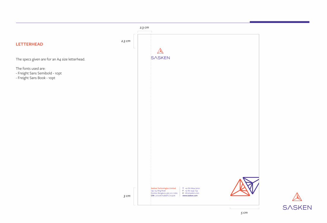
LETTERHEAD
The specs given are for an A4 size letterhead.
The fonts used are:- Freight Sans Semibold - 10pt - Freight Sans Book - 10pt
2.3 cm
2.3 cm
3 cm
5 cm

CONTINUATION SHEET
The specs given are for an A4 size letterhead.
The fonts used are:- Freight Sans Semibold - 10pt - Freight Sans Book - 10pt
2.3 cm
2.3 cm
5 cm
1.6 cm

1.4 cm
1.8 cm 1.8 cm
1.65 cm .5 cm 4.2 cm
ENVELOPE (SMALL)
The specs given are for a standard A4 size small envelope.
The fonts used are:- Freight Sans Semibold - 10pt - Freight Sans Book - 10pt

1.4 cm
1.4 cm
1.4 cm 5.5 cm
ENVELOPE (LARGE)
The specs given are for a standard A4 size large envelope.
The fonts used are:- Freight Sans Semibold - 10pt - Freight Sans Book - 10pt

EmployeeArtefacts

EMPLOYEE ID CARD
8.5
cm
3.5
cm
5.2
cm
5.4 cm
Freight Sans Bold - 14 pt
Freight Sans Semibold - 10 pt
Freight Sans Bold - 12 pt
Swami Krishnan206233 | Blood Group: O+
Image(4.5 cm x 4.5 cm)

VISITOR( V-001 )
VISITOR ID CARD
8.5
cm
6.4
cm
5.4 cm
Freight Sans Semibold - 26 pt
Freight Sans Semibold - 16 pt

GUEST( V-001 )
GUEST / TRAINEE / SECURITY / MAINTENANCE / GARDENER / HOUSEKEEPING ID CARD
8.5
cm
6.4
cm
5.4 cm
Freight Sans Semibold - 26 pt
Freight Sans Semibold - 16 pt
HOUSEKEEPING
( V-001 )
Freight Sans Semibold - 18 pt
Freight Sans Semibold - 16 pt

1 inc
h
Freight Sans Semibold
LANYARD
The Sasken lanyard, should encapsulate the values along with the logo. An alternate pattern of logo with a value is the desired design for it. The three values - World-Class, Intellectual-Integrity and Tech-First, should appear on the lanyard.
The text for the values is in the house font - Freight Sans. The logo appears in full white and the text in the Sasken Orange - Pantone 7417 C. The width of the lanyard is a standard 1 inch.

CORPORATE SHIRT
The Sasken logo is embroidered on a classic white shirt. The logo appears right above the pocket and is 8 cm in width.
Logo - 8 cm (width)

MUG
Sasken mugs should have logo printed on the side facing themselves and a slogan, in this case - ‘SAS-CAN BECAUSE I CAN!’ on the side facing the audience.
The Sasken logo mark should be retained on both sides to evoke the brand.

NOTEPAD
The specs given are for a 22cm x 14.5cm standard notepad size.
22 c
m
18 c
m
3 cm 1 cm
14.5 cm

Miller Display Regular- 53 pt
Miller DisplayRegular - 14 pt
Miller DisplayItalic - 34 pt
Freight Sans ProSemibold - 14 pt
Freight Sans ProMedium - 11 pt
Freight Sans ProSemibold - 10 pt
Freight Sans Pro - 12 pt
25 c
m
26 cm
CERTIFICATES
The specs given are for a 26 cm x 25 cm certificate design. This design can be adapted for various recognition awards. The sample design is given for - ‘Team of the Quarter’.
Team of the QuarterQ0 FY 2017 - 18
member of for
We at Sasken appreciate the efforts of
Rajiv C. ModyChairman, MD & CEO
SASKEN TECHNOLOGIES LTD.Ring Road, Domlur, Bangalore 560 071, India | www.sasken.com
“ “
Additional Comment - Lorem ipsum set dolor...
John DoeTeam Name
People

4.5 in
4.5 inLAPTOP STICKERS
The specs given are for a 4.5 in x 4.5 intriangular sticker.

DigitalArtefacts

WORD TEMPLATE (COVER PAGE)
The specs given are for standard A4 size word template.
Default font for a word document in Calibri.
CORPORATE DOCUMENTS
Lead Generation ProcessDocument ID: HRMPL22
• Effective Date: 01 April 2017• Version 12.0• Approved by: VP & Head, Employee Engagement& Development
www.sasken.com | Sasken Confidential
DOCUMENT CONTROLThe authorized version of this document is an electronic master stored in the Document Repository (https://kenpoint.sasken.com/OE/SMS/default.aspx). Be aware that if you are reading a hard copy of this document, it is to be considered an uncontrolled. It is advised that the version of the document in the repository be matched with the hard copy before using it.
The information contained in this document is proprietary to Sasken Technologies Ltd.
©All rights to this information are reserved. Disclosure without authorizing is prohibited.
2.2 cm
.5 cm
.6 cm
.6 cm
.9 cm1.3 cm
8 cm
5.5 cm
24.4 cm
1 cm
1.1 cm3.7 cm

WORD TEMPLATE (INNER PAGE)
The specs given are for standard A4 size word template.
Default font for a word document is Calibri.
www.sasken.com | Sasken Confidential1.5 cm
2.2 cm
1.3 cm
1 cm
3.9 cm16.6 cm
2.5 cm
1.1 cm3.7 cm

POWERPOINT PRESENTATION TEMPLATE (COVER PAGE)
The specs given are for standard 16.9 size presentation template.
Default font for a powerpoint presentation is Trebuchet.
TITLEby Name Surname (Designation)
(DD - MM - YYYY)
www.sasken.com | Copyright 2004 Sasken Technologies Ltd. | Sasken Confidential
3.7 cm
4.9 cm
12.4 cm
9.1 cm
5 cm
1.4 cm1.4 cm
3.7 cm8.2 cm
42.7 cm2.1 cm

POWERPOINT PRESENTATION TEMPLATE (INNER PAGE)
The specs given are for standard 16.9 size presentation template.
Default font for a powerpoint presentation is Trebuchet.
2.8 cm www.sasken.com | Copyright 2004 Sasken Technologies Ltd. | Sasken Confidential
Headingby Name Surname (Designation)
2.5 cm
1.6 cm
7.6 cm59.5 cm
5 cm
2.1 cm

POWERPOINT PRESENTATION TEMPLATE (SEPARATOR PAGE)
The specs given are for standard 16.9 size presentation template.
Default font for a powerpoint presentation is Trebuchet.
2.1 cm 3.7 cm8.2 cm
3.7 cm
4.9 cm
SEPERATOR SLIDESubtitle
www.sasken.com | Copyright 2004 Sasken Technologies Ltd. | Sasken Confidential
17.4 cm
6.5 cm

EMAIL SIGNATURE
The specs given are for standard email signature.
Name Surname(Designation)
Sasken Technologies LimitedAddress+91 XXXXX XXXXX | [email protected] | www.sasken.com
1 cm
Font- Calibri, size - 9
Font- Calibri (Bold), size - 14
2.1 cm
Name Surname(Designation)
Sasken Technologies LimitedAddress+91 XXXXX XXXXX | [email protected] | www.sasken.com
0.5 pt
Font- Calibri, size - 9Font- Calibri, size - 9Font- Calibri, size - 9
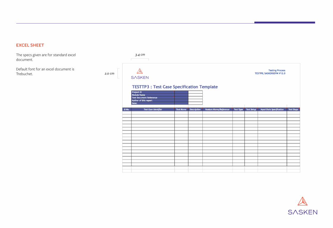
EXCEL SHEET
The specs given are for standard excel document.
Default font for an excel document is Trebuchet. 2.0 cm
3.4 cm

Image & Logo Usage

IMAGE TREATMENT 1.
To call attention to Sasken involvement in a product or industry, the triangle of the logo-form can be isolated and wrapped around the image. In case of such creatives, ensure the rest of the image is not cluttered with additional graphics. This is to draw focus to the graphic and to avoid user confusion.
While using the logo element in this manner, ensure the triangle is used proportionately and not blown up to overpower the image.
Application development for smart devices

ADDITIONAL EXAMPLES OF TREATMENT 1.
Helping connect withhardware solutions

IMAGE TREATMENT 2.
A secondary graphic can also be applied which involves a tessellation of the logo. This graphic can be applied to more generic images.

ADDITIONAL EXAMPLES OF TREATMENT 2.

LOGO USAGE ON IMAGES
In case of dark, busy or saturated backgrounds, use the Sasken logo in complete white to ensure clarity.
Incorrect Correct

EXAMPLES OF LOGO USAGE ON IMAGES

Thank YouSasken Technologies Limited139 / 25, Ring RoadDomlur, Bengaluru 560 071, IndiaCIN L72100KA1989PLC014226
T +91 80 6694 3000F +91 80 2535 1133E [email protected] www.sasken.com