Embed Size (px)
Citation preview
San Jose State University San Jose State University
SJSU ScholarWorks SJSU ScholarWorks
Master's Projects Master's Theses and Graduate Research
Fall 12-18-2014
FINANCIAL RATIO ANALYSIS FOR STOCK PRICE MOVEMENT FINANCIAL RATIO ANALYSIS FOR STOCK PRICE MOVEMENT
PREDICTION USING HYBRID CLUSTERING PREDICTION USING HYBRID CLUSTERING
Tom Tupe San Jose State University
Follow this and additional works at: https://scholarworks.sjsu.edu/etd_projects
Part of the Artificial Intelligence and Robotics Commons
Recommended Citation Recommended Citation Tupe, Tom, "FINANCIAL RATIO ANALYSIS FOR STOCK PRICE MOVEMENT PREDICTION USING HYBRID CLUSTERING" (2014). Master's Projects. 377. DOI: https://doi.org/10.31979/etd.afcs-484s https://scholarworks.sjsu.edu/etd_projects/377
This Master's Project is brought to you for free and open access by the Master's Theses and Graduate Research at SJSU ScholarWorks. It has been accepted for inclusion in Master's Projects by an authorized administrator of SJSU ScholarWorks. For more information, please contact [email protected].
i
FINANCIAL RATIO ANALYSIS FOR STOCK PRICE MOVEMENT PREDICTION
USING HYBRID CLUSTERING
A Writing Report
Presented to
The Faculty of Department of Computer Science
San Jose State University
In Partial Fulfillment of
The Requirements for the Degree
Master of Science
By
Tomas Tupy
Dec 2014

ii
© 2014
Tomas Tupy
iii
ALL RIGHT RESERVED
SAN JOSE STATE UNIVERSITY
The Undersigned Project Committee Approves the Project Titled
FINANCIAL RATIO ANALYSIS FOR STOCK PRICE MOVEMENT PREDICTION
USING HYBRID CLUSTERING
by
Tomas Tupy
APPROVED FOR THE DEPARTMENT OF COMPUTER SCIENCE
____________________________________________________________________________
Dr. Robert Chun, Department of Computer Science Date
____________________________________________________________________________
Dr. Chris Pollett, Department of Computer Science Date
____________________________________________________________________________
Nikolay Varbanets, B.A. Economics UCSD 2010, Wealth Advisory Associate, Morgan Stanley
Date
APPROVED FOR THE UNIVERSITY
____________________________________________________________________________ Associate Dean Office of Graduate Studies and Research Date
iv
ABSTRACT
FINANCIAL RATIO ANALYSIS FOR STOCK PRICE MOVEMENT PREDICTION
USING HYBRID CLUSTERING
We have gathered over 3100 annual financial reports for 500 companies listed on the
S&P 500 index, where the main goal was to select and give proper weights to the various pieces
of quantitative data to maximize clustering results and improve prediction results over previous
work by [Lin et al. 2011]. Various financial ratios, including earnings per share surprise
percentages were gathered and analyzed. We proposed and used two types, correlation based
ratios and causality based ratios. An extension to the classification scheme used by [Lin et al.
2011] was proposed to more accurately classify financial reports, together with a more outlier-
tolerant normalization technique. We proved that our proposed data scaling/normalization
method is superior to the method used by [Lin et al. 2011]. We heavily focused on the relative
importance of various financial ratios. We proposed a new method for determining the relative
importance of the various financial ratios, and showed that the resulting weights aligned with
theoretical expectations. Using this new weighing scheme, we were able to achieve superior
cluster purities as compared to the method proposed by [Lin et al. 2011]. Achieving higher
cluster purity in initial stages of analysis lead to minimized over-fitting by a modified version of
K-Means, and overall better prediction accuracy on average.

v
ACKNOWLEDGEMENTS
I would like to take this opportunity to express my sincere gratitude to Dr. Robert Chun
for being my advisor and guiding me throughout my project, and also my committee members,
Dr. Chris Pollett and Nikolay Varbanets, for their time and effort. I would like to thank my wife,
Jessica Tupy, for her encouragement and constant support.
Finally, I would also like to convey my special thanks to my family and friends for their
help and support.

1
TABLE OF CONTENTS LIST OF FIGURES ............................................................................................................................... 2
LIST OF TABLES ................................................................................................................................. 3
LIST OF EQUATIONS ......................................................................................................................... 3
1. INTRODUCTION ........................................................................................................................ 4
2. BACKGROUND .......................................................................................................................... 6
2.1. Use of A.I./Data Mining for Market Prediction in the Field ............................................. 6
2.2. Earnings Reports and their Release ................................................................................. 7
2.2.1. Earnings Per Share ................................................................................................... 8
2.2.2. Financial Ratios ...................................................................................................... 10
3. LITERATURE REVIEW AND SUMMARY OF PROPOSED METHOD ........................................... 10
4. PRELIMINARY WORK .............................................................................................................. 15
4.1. Choosing Relevant Stocks .............................................................................................. 15
4.2. Data Acquisition ............................................................................................................. 15
4.2.1. Obtaining Historical Price Data .............................................................................. 17
4.2.2. Obtaining Historical Earnings Data ........................................................................ 19
4.2.3. Obtaining Financial Reports and Ratios ................................................................. 22
4.2.4. Data Storage ........................................................................................................... 23
4.3. Feature Extraction & Feature Vector Creation .............................................................. 24
4.3.1. Feature Vector Classification ................................................................................. 25
4.3.2. Feature Vector Values ............................................................................................ 26
4.3.3. Data Normalization/Scaling ................................................................................... 28
5. DATA ANALYSIS ...................................................................................................................... 33
5.1. Financial Ratios Explained .............................................................................................. 34
5.2. Hierarchical Agglomerative Clustering and Financial Ratio Weighing Method ............. 37
5.2.1. Hierarchical Agglomerative Clustering Time Complexity Analysis ......................... 42
5.3. Modified K-Means Clustering ........................................................................................ 43
5.4. Predicting Stock Price Movement .................................................................................. 44
6. EXPERIMENTAL RESULTS ........................................................................................................ 44
6.1. Financial Ratio Weights .................................................................................................. 46
6.2. Prediction Accuracy and Cluster Purity Evaluation ........................................................ 48

2
6.3. Data Normalization/Scaling Evaluation ......................................................................... 49
6.4. Hierarchical Agglomerative Clustering Performance Investigation ............................... 50
7. CONCLUSIONS AND FUTURE WORK ...................................................................................... 52
8. REFERENCES ........................................................................................................................... 53
LIST OF FIGURES
Figure 1 ............................................................................................................................................ 9
Figure 2 ............................................................................................................................................ 9
Figure 3 .......................................................................................................................................... 13
Figure 4 .......................................................................................................................................... 16
Figure 5 .......................................................................................................................................... 18
Figure 6 .......................................................................................................................................... 18
Figure 7 .......................................................................................................................................... 20
Figure 8 .......................................................................................................................................... 21
Figure 9 .......................................................................................................................................... 22
Figure 10 ........................................................................................................................................ 23
Figure 11 ........................................................................................................................................ 24
Figure 12 ........................................................................................................................................ 25
Figure 13 ........................................................................................................................................ 32
Figure 14 ........................................................................................................................................ 33
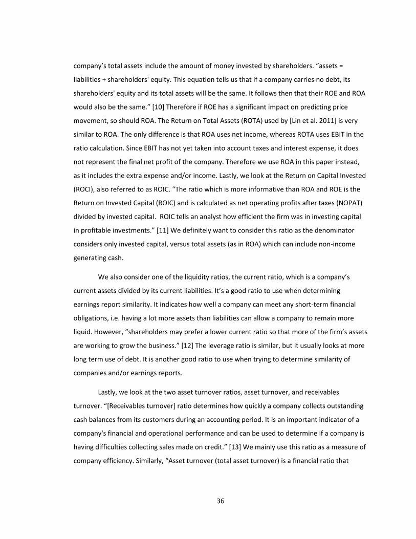
Figure 15 ........................................................................................................................................ 39
Figure 16 ........................................................................................................................................ 39
Figure 17 ........................................................................................................................................ 41
Figure 18 ........................................................................................................................................ 51

3
LIST OF TABLES
Table 1 ............................................................................................................................................ 27
Table 2 ............................................................................................................................................ 28
Table 3 ............................................................................................................................................ 29
Table 4 ............................................................................................................................................ 31
Table 5 ............................................................................................................................................ 38
Table 6 ............................................................................................................................................ 40
Table 7 ............................................................................................................................................ 42
Table 8 ............................................................................................................................................ 45
Table 9 ............................................................................................................................................ 45
Table 10 .......................................................................................................................................... 46
Table 11 .......................................................................................................................................... 47
Table 12 .......................................................................................................................................... 48
Table 13 .......................................................................................................................................... 49
Table 14 .......................................................................................................................................... 50
Table 15 .......................................................................................................................................... 51
LIST OF EQUATIONS
Equation 1 ...................................................................................................................................... 25
Equation 2 ...................................................................................................................................... 26
Equation 3 ...................................................................................................................................... 29
Equation 4 ...................................................................................................................................... 30
Equation 5 ...................................................................................................................................... 30
Equation 6 ...................................................................................................................................... 32
Equation 7 ...................................................................................................................................... 34
4
1. INTRODUCTION
An economist colleague of mine, Nikolay Varbanets, once said, "The exact timing and
value of the market cannot be predicted but there are certain economic events, news, and
sentiment that often drive the markets or stocks in short term.” This is especially true during
earnings report releases of publicly traded companies.
Every year, more and more economic and stock market information becomes available
online. Therefore it comes as no surprise that data mining and analysis have really taken off in
places like Wall Street. There are many analyst firms out there that constantly publish ratings
about the many publicly traded companies. These ratings become especially important to
investors when a company is about to publish their quarterly or yearly reports. As a company’s
fiscal quarter draws to a close, many earnings estimates are published. These are in the form of
earnings per share, and sometimes projected revenue. Since many analyst firms publish their
own numbers, investors usually see one aggregated value called the earnings per share
consensus. It is basically the dollar amount earned per share expected of the company by all
forms of investors. Therefore, in the days nearing the company’s earnings announcement, the
trading volume increases as investors and banks prepare for the announcement. It could be
small-time investors placing their bets, or hedge funds preparing for a large price move.
When the company finally releases their yearly or quarterly report, they give the outside
world insight into what’s been going on over the past three months. These reports include items
such as a performance summary, future outlook, and most importantly, hard numbers for
investors to digest. Many parties act on the new information provided in the report. The
company could have had a great quarter/year and beat the earnings per share consensus,
prompting investors to invest more money. It can also go the other direction, and create a
negative sentiment. Either way, the stock price tends to move quite a bit during these report
releases.
This project looks more closely at these events, more specifically at the driving factors
behind large price movements following the release of earnings reports. Since these financial
reports provide a large amount of quantitative data about the company’s operations, they can
5
potentially serve as a predictor of the stock price movement following the report’s release to
the public.
The analysis done in this project uses a hybrid clustering model. We utilize an
unsupervised clustering method to look at the correlation of various pieces of quantitative data
from annual earnings reports and subsequent short-term price movement. Once various
correlation strengths are determined, a combination of unsupervised and supervised learning
methods is used to predict short term price movement following the release of an annual
earnings report. Hierarchical agglomerative clustering is the unsupervised method used to do
correlation analysis and the initial clustering to break up dissimilar reports into respective
clusters. Each report is assigned a class based on whether it caused a dramatic movement in
price during the day following the release. The goal of initial the clustering step is to obtain a
high degree of cluster purity. A modified version of K-Means then further processes these
clusters, and creates the prediction model by outputting a series of centroids which represent a
generalized type of report with an associated price action. New earnings reports are then
compared to these pre-computed centroids, and the closest match gives the predicted class
which determines price action. Refer to Section 3 for a high level overview of this model.
In essence, this project analyzes various pieces of quantitative data and their relative
importance in predicting the stock price movement, with the goal of outperforming and/or
improving on previous works. A lot of this work is based on a previously published project [Lin et
al. 2011], which tried to predict stock price movements following earnings reports releases
based on some quantitative data along with textual analysis of the report itself. However, many
of the methods used were open to improvement. This includes classification, normalization,
scaling, and other areas. This project tries to optimize some of the financial metrics previously
used. The main metric in question involves the use of five financial ratios used to determine
similarity of the reports which are classified into three sets based on the price movement. The
goal of this project is to utilize better forms of quantitative data, find and apply proper weights,
apply better normalization, scaling, and classification techniques to more efficiently determine
similarity between the reports and the price action their release to the public causes.

6
Over 3000 reports and their resulting price action were analyzed as part of this project,
along with data regarding earnings estimates. Eighteen pieces of quantitative data were
employed, proper weights were found, and several improvements were applied to the hybrid
clustering model, including a sigmoid based normalization/scaling scheme which proved to
outperform other techniques used previously. Improvements were proposed to both the
classification scheme and distance function also used previously. In the end, the method
described in this paper outperformed the work done by [Lin et al. 2011]. This included better
cluster purity and more accurate prediction results. Section 6 contains the experimental results.
2. BACKGROUND
2.1. Use of A.I./Data Mining for Market Prediction in the Field
With the constantly growing wealth of stock related information now freely available on
the internet, new opportunities arise in terms of data mining and data analysis in order to
predict certain portions of the stock market. "Today, such methods [e.g. discovering subtle
relationships between stocks] have achieved a widespread use unimaginable just five years ago.
The Internet has put almost every data source within easy reach." [6] Google, Yahoo, and other
internet companies have enabled the non-institutional investor access to a wealth of very useful
data, such as detailed market trends, access to millions of minable news articles, and much
more.
Using artificial intelligence for stock market analysis is nothing new. '"Artificial
intelligence is becoming so deeply integrated into our economic ecostructure that some day
computers will exceed human intelligence," Kurzweil tells a room of investors who oversee
enormous pools of capital. "Machines can observe billions of market transactions to see
patterns we could never see."' [6] Ever since financial institutions have had access to computing
power, AI was seen as the "magic bullet". This goes back to the 60's and 70's. However, due to
the complexity of the financial/economic system, these techniques were very hit-and-miss.
"Despite the fact that computers can beat humans at chess and fly planes better than us, we
believe that we are better stockpickers. Human beings can’t beat the market because we are the
7
market." [7] Nevertheless, in recent times, many have been able to harness computing power to
their financial advantage. '"John Fallon’s program uses Hidden Markov Models to analyze the
stock market and predict future prices of a given stock. “My program used ten different stocks
during the years 2009 to 2011 for the training data and 2011 to 2012 for the test data,” says
Fallon. “My investment yielded a 25 percent profit.”' [8] John Fallon, a student at UMass, is an
example of how academia is applying these techniques in the real world.
However, it is the big profit-driven financial institutions, such as hedge funds, which
invest a lot of money into using AI techniques to generate greater returns for themselves and
their investors. "Kara launched the sinAI – “stock market investing Artificial Intelligence” – fund
in June, based on a proprietary system he had spent the past decade developing. The strategy
uses computers to scan for patterns in the US equity markets, looking for long and short
positions. It is “soft coded”, rather than “hard coded”, said Kara. This means that “there are no
hard and fast human rules, the computer builds rules from the data. It is like a newborn baby
that is learning and evolving”. The strategy seeks to be market neutral, that is, make money
regardless of whether the markets are going up or down." [7]
2.2. Earnings Reports and their Release
When a company goes public, it is required by law to file periodic financial reports with
the Securities and Exchange Commission. This is required by Section 13 and 15(d) of the
Securities and Exchange Act of 1934. The Securities and Exchange Commission allows the public
to access all financial reports filed by any public company through their EDGAR database. The
average public company will publish a financial report every three months. These three months
represent a fiscal quarter, and twelve months represent a fiscal year. Every fiscal year, a public
company must publish an annual report commonly referred to as “Form 10-K”. It includes a
comprehensive summary of the company’s financial performance. It also includes information
such as organizational structure, outlook for the next quarter and year, and things like litigation
the company may be involved in. The company has 90 days from the end of its fiscal year to
compile and file this report with the S.E.C.

8
Meanwhile, the company will release an often less detailed version of the Form 10-K,
called an “Annual Report to Shareholders”, or simply an “earnings report”. This report is
released shortly after the end of the company’s fiscal year, and announces to the public its
performance for the last year. This release usually causes a lot of trading volume as everyone
from banks, hedge funds to individual investors react to the content in the report. A bad report
can cause investors to sell their equity in the company, as they no longer see it as a good or safe
investment. Given that these decisions are made in large numbers due to the fact that the
earnings report release is a major event, it can cause a very large volume of trading to occur.
2.2.1. Earnings Per Share
The most popular accounting item is the earnings per share value. It is the monetary
value of earnings per each share issued to the public. It is basically a measure of how much
money the company generated for each share it issued to the public. It is usually in the best
interest of the stockholder to invest in a company which will earn a good amount of profit on
each share purchased. Some companies pay dividends to the stockholders, so having good
earnings per share will translate to a good payout to the investor for every share owned. Before
the release of this report, there are many analyst firms which will attempt to estimate the
earnings per share the company is likely to attain. Therefore, most investors will see an
aggregated value called the earnings per share consensus. It is a good measure of what to
expect when the company announces their earnings. A lot of the trading volume leading up to
the earnings release is caused by speculation regarding the performance of the company, and
the consensus value is one of the driving factors. This in many cases means that a company’s
stock price will fall if this consensus values is not met. It can also have the opposite effect, where
if a company surpasses the consensus value, it will send the stock price higher. This is called an
earnings surprise, in other words, the financial community can be surprised by the earnings
report.
One can almost always observe unusually high trading volume and price volatility
following the release of a quarterly earnings report. Take Netflix Inc. (NFLX) on April 21st, 2014
as an example. As seen in Figure 1, their earnings report was released on April 21st right after
the market closed. Weeks before the release, analysts estimated that the earnings per share

9
would be $0.81 and revenue would be $1.27 billion. The report turned out to be very favorable,
with $0.86 per share, beating the analysts’ estimates.
Figure 1
What shouldn’t be surprising is what happens in Figure 2, which shows three trading days of
NFLX, starting with April 20th, April 21st in the center, and April 22nd on the right. The chart is
divided horizontally into two chart areas, with the top one showing price action, and the bottom
one showing trading volume at two minute intervals.
Figure 2
In the top chart area, the line graph with the blue area is the active trading day, 9:30AM EST to
4:00PM EST. The gray line represents pre and after hours trading, which occurs from 4:00AM
EST to 9:30AM EST before the market opens, and then from 4:00PM EST to 8:00PM EST. We see
three days in the graph in Figure 2. The earnings report was released shortly after 4pm PST on
April 21st, and we see two major events happen. One, we see very large trading volume after
4pm EST, and second, the price shoots up in the after-hours trading. Both of these occurrences
coincide with the release of the earnings report. Note the small trading volume on April 20th,
barely anything happens after the market closes. Comparing this with the day after the earnings
report is released, April 22nd, there is the huge spike in trading volume as the rest of the
institutions and investors react to the previous day’s earnings release. The reason why there is
so much trading volume after the market opens on the 22nd is because many Wall Street firms
and investors do not want to buy or sell when the market is officially closed, even though the
quarterly earnings report was released. This is because during extended hours, the market can
be very volatile. This is due to the lack of a large number of willing buyers and sellers. This
10
means that someone trying to buy shares of NFLX after hours might have to settle for a higher
price because the lack of other offers (which would normally be available during regular market
hours). Hence we see a lot of trading activity the next day immediately after the market opens.
From this example we can see the significant impact earnings report releases can have on stock
price.
The price and volume behavior seen in Figure 2 brings up another very important fact.
Companies can release their earnings reports either after the market closes, or right before the
market opens. Each company usually sticks to their choice of release time. However from the
point of analysis, this plays a huge role. How would the NFLX chart look if the company released
their earnings report before the market opens? Therefore, it is also useful to take the earnings
report release time into account.
2.2.2. Financial Ratios
Aside from the earnings per share metric, investors look at various accounting items in
the report to determine whether or not to invest in the company. Some obvious items include
the amount of revenue the company has generated and how much of it was profit. Then there
are accounting items pertaining to how well the company is utilizing its debt, including shares
issued to the public. All in all, the company is responsible for rewarding its investors for taking
on risk. The various financial ratios are explained later in Section 5.1.
3. LITERATURE REVIEW AND SUMMARY OF PROPOSED METHOD
Before describing the proposed method used in this paper, we consider some of the
results and conclusions reached by previous studies. We combine the literature review section
with our proposed method in order to address the perceived weaknesses of previous studies.
There are many papers which try to predict stock price movement using financial data
along with financial report text, [Back et al. 2000], [Kloptchenko et al. 2004], and [Lin et al.
2011]. [Back et al. 2000] and [Kloptchenko et al. 2004] attempt to use self-organizing maps to

11
find correlations between company performance and quantitative and qualitative features. Both
of those studies focus heavily on textual content of the reports, and don’t say too much about
the quantitative portion, i.e., the financial ratios. [Kloptchenko et al. 2004] did however
conclude that clusters from qualitative and quantitative analysis did not coincide. This means
that the results from the textual analysis did not match up with the results of the financial ratio
analysis. They attributed this disparity to the fact that the quantitative part of a report only
reflects the past performance of the company by stating past facts. While [Lin et al. 2011] used a
different method for stock price prediction, they also relied heavily on textual content of the
reports. Overall, they acknowledge that there is some value in the language used in financial
reports. [Kloptchenko et al. 2004] however concedes that the availability of computerized
solutions can reduce the usefulness of the text, as writing style can be purposefully
manipulated.
The aforementioned papers do not consider changes in quantitative data from a
previous period to the next. Instead they place heavy emphasis on textual analysis, and use this
as a price movement metric. In this project, we will only consider quantitative data as a
predictor of short-term price movement.
One piece of data neither [Kloptchenko et al. 2004], [Back et al. 2000], nor [Lin et al.
2011] mention is earnings surprise. This is an important piece of quantitative data that should
be included when trying to predict price movement after the release of an earnings report. This
item is explored by [Johnson and Zhao 2012], where they look at share price reactions to
earnings surprises. Using their earnings surprise benchmark, they unfortunately found that in
40% of their samples the price went in the opposite direction of the earnings surprise. In other
words, if a company beat their predicted earnings, their stock actually went down, and
conversely if predicted earnings were missed, share price went up. While this data might be
discouraging in considering using this metric, we argue that this metric must be considered in
the proper context. Their work did not take into account other quantitative data, such as
financial ratios, and their change from the previous period.
While [Lin et al. 2011] and [Johnson and Zhao 2012] look at quarterly reports along with
annual reports, we will only consider annual reports. It is common knowledge that annual
12
reports play a much larger role in the analysis of a company’s performance. Many companies
can have a bad quarter, but still show strong performance on an annual basis. Therefore, since
we are including percentage changes in quantitative data from a previous period, it makes most
sense to do this with annual reports only. We would expect a lot of noise associated with using
percentage changes in quantitative data in a quarter-to-quarter context.
Since [Lin et al. 2011] incorporates some of the findings by [Kloptchenko et al. 2004] and
[Back et al. 2000], we will use the work done by [Lin et al. 2011] as a baseline to which to
compare our findings. In this project we apply a slightly modified version of the hybrid clustering
method used by [Lin et al. 2011], which they refer to as HRK (Hierarchical Agglomerative and
Recursive K-Means clustering). We propose an improved classification scheme, which more
accurately classifies financial reports based on price movement. We also discount qualitative
data used by [Lin et al. 2011], and focus solely on various kinds of quantitative data. This
includes a wider selection of standard financial ratios, the change in these ratios from the
previous period, and the earnings surprise percentage. As part of trying to achieve better cluster
purity and improved prediction accuracy, we propose a method for obtaining relative weights of
the various items in our quantitative dataset. This results in a very different clustering distance
function as compared to the one used by [Lin et al. 2011]. We use a more sophisticated
weighing system when comparing the distance between quantitative data vectors. We expect
the proposed quantitative data clustering scheme to perform better than the quantitative data
scheme used by [Lin et al. 2011] in terms of both cluster purity and prediction accuracy.
Interestingly, during the initial clustering step, using hierarchical agglomerative
clustering, [Lin et al. 2011] attained best results when using a certain cluster proximity metric,
called single-link. Several sources recommend against using this metric. [Tan et al. 2006] says
that the technique is sensitive to noise and outliers. [Crawford et al. 1990] also recommend
against this metric, saying “Single-link methods have, however, been criticized because of their
susceptibility to ‘chaining’ – phenomenon in which clusters are joined too early because of the
proximity of a single pair of observations in two clusters.” Since it is important for initial
clustering stage to separate the most dissimilar clusters, we want to avoid these kinds of
13
weaknesses. While we will try the single-link metric, we will mostly focus on using a better
metric.
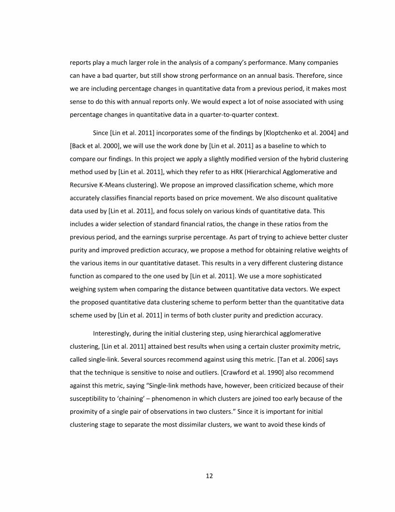
The diagram shown in Figure 3 lays out the workflow of the proposed method. It also
highlights the differences from the method used by [Lin et al. 2011].
Figure 3
In Figure 3, the various parts, or modules, have been numbered 1 through 9 for
reference. Starting with item/module 1, we collect all the necessary historical price data. This
process is the same as done by [Lin et al. 2011], and is described in more detail in Section 4.2.1.
Item 2, “Qualitative” Financial Reports data, has been crossed out to reflect the fact that we do
not consider Term Frequency-Inverse Document Frequency analysis as a part of this work, as it
wasn’t seen as very valuable. For item 3, we expand greatly on the quantitative data used by
[Lin et al. 2011]. Many more financial ratios are used along with percentage change in those
ratios year-over-year. The data acquisition for the module is described in Section 4.2.3. Item 4
consists of an important addition to the quantitative dataset. This addition allows us to compute
1) Stock
Quotes
2) Financial
Reports
(Qualitative)
3) Financial
Reports
(Quantitative)
4) EPS
Consensus
5) Extract feature vector for
each financial report using
improved classification and
normalization schemes
6) Calculate weight for each
feature using HAC. These
weights will become constants
in the distance function
7) Use HAC to divide
training feature vectors
into 20-22 clusters
8) Use modified K-Means
to create representative
centroids
9) Use representative
centroids to predict
stock price movement
14
the percentage surprise in the earnings per share value which tends to have great impact on
short-to-medium-term price movements. Acquisition of this data is described in more detail in
Section 4.2.2.
Item 5 in Figure 3 is the most involved module. We start by pulling in all the data from
items 1, 3, and 4. This module creates our feature vectors by performing classification,
normalization and scaling. Here, as described in Section 4.3.1, we improve upon the
classification scheme used by [Lin et al. 2011]. We incorporate 18 pieces of quantitative data,
versus the five financial ratios used by [Lin et al. 2011], including 60 day performance of the
entire sector, earnings per share surprise percentage, and percentage changes in certain
financial ratios year-to-year. A superior normalization/scaling scheme is introduced to properly
condition the quantitative data to be used in the feature vectors. This new scheme allows for
the optimal performance of the weighted Euclidian distance function (i.e. bias reduction).
Item 6 in Figure 3 serves to calculate the proper weights for each piece of quantitative
data. These weights are then used in the weighted Euclidian distance function, shown in
Equation 7. The process by which these weights are determined is described in Section 5.2.
These weights become constants for the distance function. Therefore, after this module has
performed its task, we are ready to train the system. Before we execute modules 7 and 8 in
sequence, we perform hierarchical agglomerative clustering in module 7 using the financial
ratios and weights found in module 6. This allows us to obtain cluster purity values which
represent how effectively the HAC algorithm grouped reports with same the classification. We
re-run the HAC algorithm using the quantitative data and distance function used by [Lin et al.
2011] in order to show that our method improves cluster purity.
Finally, we mark 10% of the dataset as the test-set, and we run module 7 and 8 in
sequence to obtain class-labeled representative prototypes. These are essentially averaged
feature vectors, which can then be used to predict stock price movement. In module 9, we
iterate over the financial reports in our test-set, extract feature vectors and make a prediction
for each item based on which representative prototype the feature vector is most similar to. We
define achieved accuracy as the number of correctly predicted price movements over the total
number of reports tested. Many iterations are run, where during each iteration, we randomly

15
mark 10% of the original dataset for testing. We then do this again using the quantitative data
and distance function used by [Lin et al. 2011] to allow us to compare accuracy. All of the results
are described in Section 6.
4. PRELIMINARY WORK
4.1. Choosing Relevant Stocks
One of the first tasks was to choose a set of stocks from which to build the data set. The
natural choice was to go with the S&P 500 which is an American stock market index consisting of
500 of the largest companies listed on the NYSE and NASDAQ. This decision was also influenced
by a previous paper [Lin et al. 2011]. We wanted our datasets to be as similar as possible since
this paper tries to improve the financial ratio selection and weighing. Nevertheless, the stocks
used in this paper differ slightly from the set used by [Lin et al. 2011]. Their list was based on
companies listed on the S&P 500 index as of September 30, 2008. Since companies can be
enlisted and delisted over time, the index may be slightly different.
The New York Stock Exchange (NYSE) is the world’s biggest stock exchange based on the
market capitalization of its listed companies. The National Association of Securities Dealers
Automated Quotations (NASDAQ) is the second largest stock exchange in the world. Sticking to
these two stock exchanges ensures reporting consistency among the stocks. That is to say,
smaller exchanges may have different rules and regulations. Also, two of the world’s largest
stock exchanges list some of the most globally recognized companies such as Apple Inc. and
Microsoft Inc. Given that these exchanges are among the biggest in the world, this gives the
listed stocks global exposure, which leads to more trading volume during earnings report release
season.
4.2. Data Acquisition
One of the other major requirements for this project, and the most time consuming,
consisted of acquiring three sets of data. Luckily, for one of the sets, historical end-of-day data is
widely available, and sufficient for this paper. Many websites list a comprehensive set of
16
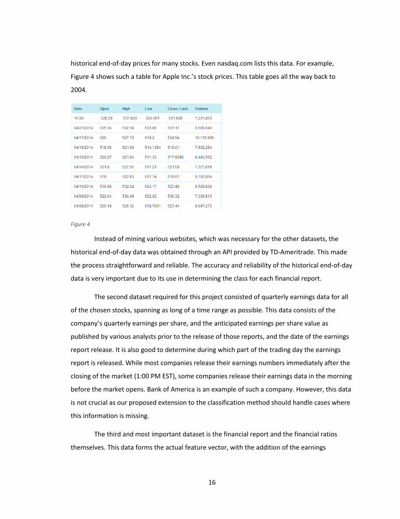
historical end-of-day prices for many stocks. Even nasdaq.com lists this data. For example,
Figure 4 shows such a table for Apple Inc.’s stock prices. This table goes all the way back to
2004.
Figure 4
Instead of mining various websites, which was necessary for the other datasets, the
historical end-of-day data was obtained through an API provided by TD-Ameritrade. This made
the process straightforward and reliable. The accuracy and reliability of the historical end-of-day
data is very important due to its use in determining the class for each financial report.
The second dataset required for this project consisted of quarterly earnings data for all
of the chosen stocks, spanning as long of a time range as possible. This data consists of the
company’s quarterly earnings per share, and the anticipated earnings per share value as
published by various analysts prior to the release of those reports, and the date of the earnings
report release. It is also good to determine during which part of the trading day the earnings
report is released. While most companies release their earnings numbers immediately after the
closing of the market (1:00 PM EST), some companies release their earnings data in the morning
before the market opens. Bank of America is an example of such a company. However, this data
is not crucial as our proposed extension to the classification method should handle cases where
this information is missing.
The third and most important dataset is the financial report and the financial ratios
themselves. This data forms the actual feature vector, with the addition of the earnings
17
percentage surprise acquired from the second dataset, plus a classification determined from the
first dataset. The United States Securities and Exchange Commission conveniently maintains a
publicly accessible database containing all of these reports.
4.2.1. Obtaining Historical Price Data
As mentioned earlier, we need historical open, high, low and close price data in order to
determine the class for each financial report. We also use price data to determine the previous
60 day performance of the entire industry sector (these sectors are shown in Table 8). Luckily,
within the last few years, many brokerage firms provide an API which enables an end user to
query for various types of data. In this case, the TD Ameritrade brokerage firm was used to
obtain our historical price data, going back as far as 1995 for the appropriate companies. TD
Ameritrade’s API is reliable and with very few limits. They not only provide historical end-of-day
data, but also per-minute intra-day historical price data going back many years, streaming news,
Level 1 and Level 2 data. Their documentation is complete and comprehensive.
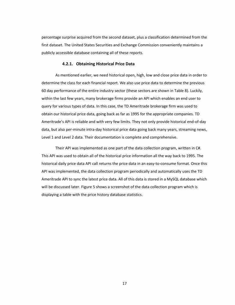
Their API was implemented as one part of the data collection program, written in C#.
This API was used to obtain all of the historical price information all the way back to 1995. The
historical daily price data API call returns the price data in an easy-to-consume format. Once this
API was implemented, the data collection program periodically and automatically uses the TD
Ameritrade API to sync the latest price data. All of this data is stored in a MySQL database which
will be discussed later. Figure 5 shows a screenshot of the data collection program which is
displaying a table with the price history database statistics.
18
Figure 5
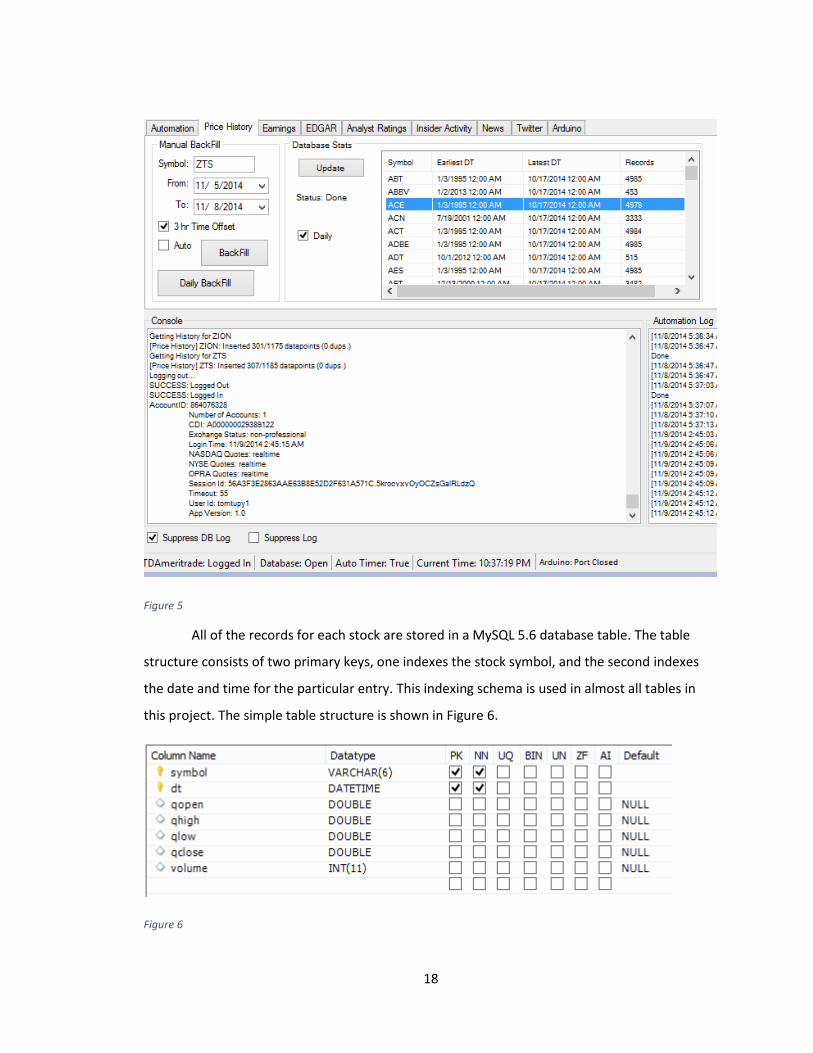
All of the records for each stock are stored in a MySQL 5.6 database table. The table
structure consists of two primary keys, one indexes the stock symbol, and the second indexes
the date and time for the particular entry. This indexing schema is used in almost all tables in
this project. The simple table structure is shown in Figure 6.
Figure 6
19
The database provides quick access to the data during the analysis portion of the project, and
same keys allow for things like table joins for quicker queries.
4.2.2. Obtaining Historical Earnings Data
Obtaining historical earnings data was probably the most difficult. This is because there
is no need for most places to store a long history of speculative data. In order to determine the
earnings surprise percentage, we not only need the earnings per share number (which can be
found in the report itself), but we need the Wall Street consensus earnings per share value. This
is the number that investors are expecting to see before the report gets released.
There are three major components to this data. First, one needs to know the exact date
the earnings report was released. Aside from the date, the release time can either be
immediately after the close of the stock market (1:00PM EST) or right before the marked opens
(9:30AM EST). Again, as mentioned earlier, we can handle the case where this data is missing.
The second piece of critical data is the estimated earnings per share for the respective year. This
estimation is done by large analyst firms, and published weeks in advance of the actual release.
This estimate has a heavy influence on the expectations of large Wall Street trading firms.
Therefore if a company misses the estimated target, it usually has a very negative effect on the
stock price, as it can trigger a lot of selling by large institutions. The actual quantitative results
released by the company make up the third component of the earnings data.
For this data set, a couple of different sources had to be used due to the lack of history
and missing information. If one is trying to look back just a few years, this data isn’t that hard to
find. However, we are trying to look back as far as possible, at least 10 years.
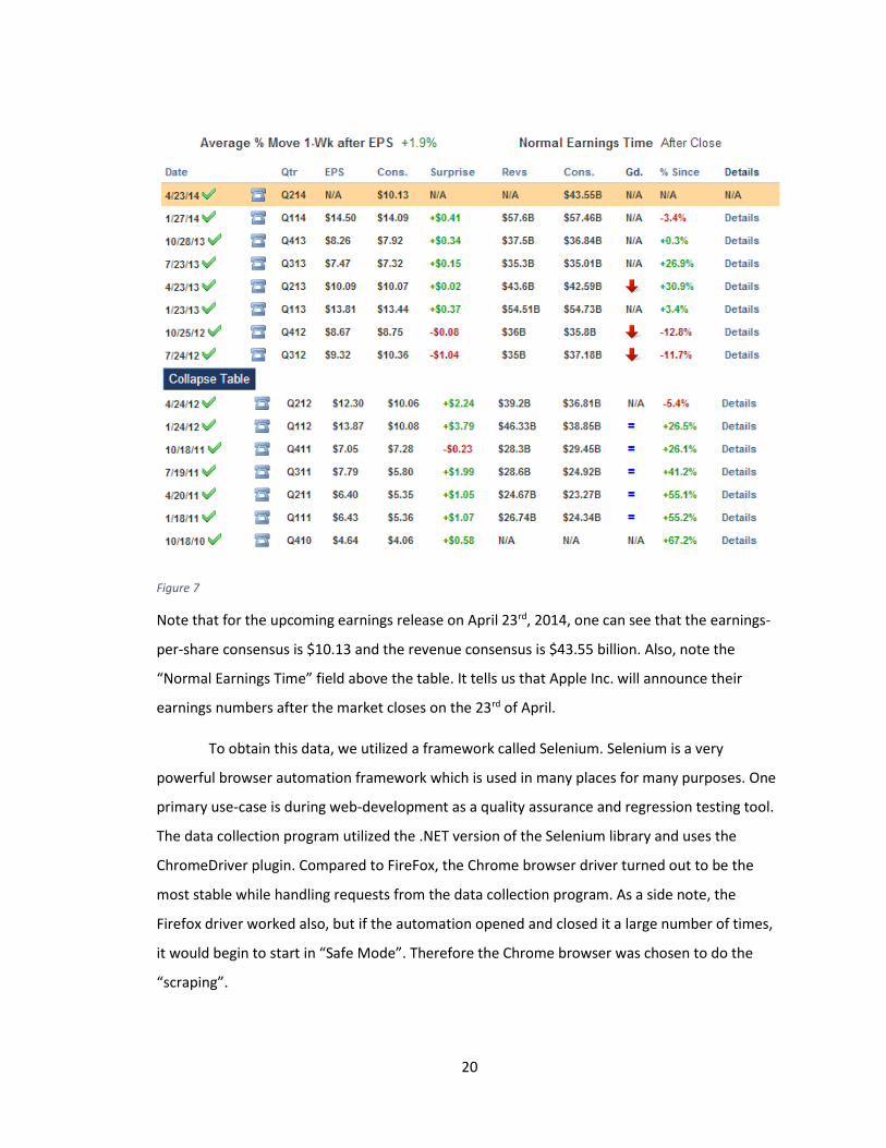
We start with a reliable website with a fairly short history of information,
StreetInsider.com. They usually have at least three and a half years of data for a particular stock.
However, they do not have information for all the stocks we are looking for. Nonetheless, we
will gather what we can from this source. Figure 7 shows a table containing earnings data for
Apple Inc. all the way back to October of 2010.
20
Figure 7
Note that for the upcoming earnings release on April 23rd, 2014, one can see that the earnings-
per-share consensus is $10.13 and the revenue consensus is $43.55 billion. Also, note the
“Normal Earnings Time” field above the table. It tells us that Apple Inc. will announce their
earnings numbers after the market closes on the 23rd of April.
To obtain this data, we utilized a framework called Selenium. Selenium is a very
powerful browser automation framework which is used in many places for many purposes. One
primary use-case is during web-development as a quality assurance and regression testing tool.
The data collection program utilized the .NET version of the Selenium library and uses the
ChromeDriver plugin. Compared to FireFox, the Chrome browser driver turned out to be the
most stable while handling requests from the data collection program. As a side note, the
Firefox driver worked also, but if the automation opened and closed it a large number of times,
it would begin to start in “Safe Mode”. Therefore the Chrome browser was chosen to do the
“scraping”.
21
Selenium is so powerful that any JavaScript handler on the site can be triggered,
including advertisement close buttons, and the scrolling of the webpage (necessary on some
fancy “infinite scrolling” pages). Therefore, we easily get all of our necessary data from
StreetInsider.com.
This is not sufficient for our dataset. A second website, EarningsWhispers.com, is used
to fill in most of the gaps still left open by using just one website. EarningsWhispers.com
specializes in earnings report expectation numbers and we were able to get a good amount
history for pretty much all of our stocks. It goes back as far as 2004, which is starting to satisfy
our requirement for this paper. Again, we use Selenium to retrieve information from the one or
two tables on the site.
Lastly we turned to Yahoo! for the remainder of the information. Getting historical
information from Yahoo! is an interesting task as there is a different HTML page for every week,
sometimes for each day. There are two sections of the Yahoo! finance site we scrape. One is the
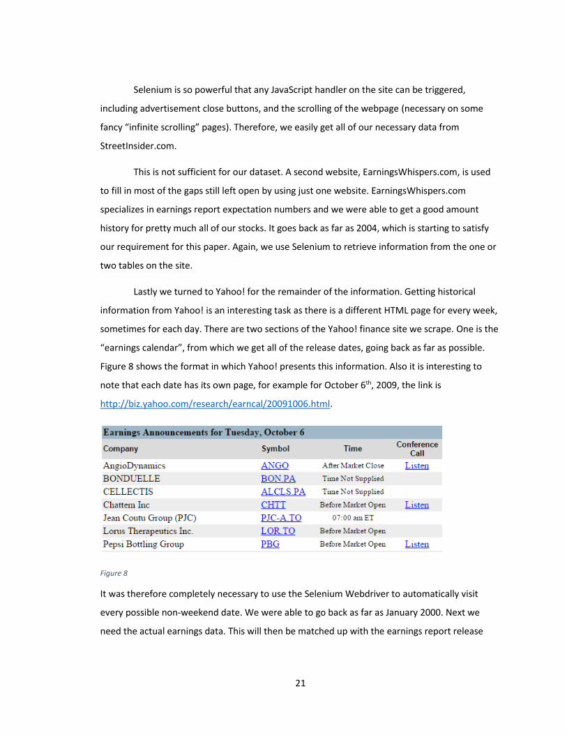
“earnings calendar”, from which we get all of the release dates, going back as far as possible.
Figure 8 shows the format in which Yahoo! presents this information. Also it is interesting to
note that each date has its own page, for example for October 6th, 2009, the link is
http://biz.yahoo.com/research/earncal/20091006.html.
Figure 8
It was therefore completely necessary to use the Selenium Webdriver to automatically visit
every possible non-weekend date. We were able to go back as far as January 2000. Next we
need the actual earnings data. This will then be matched up with the earnings report release
22
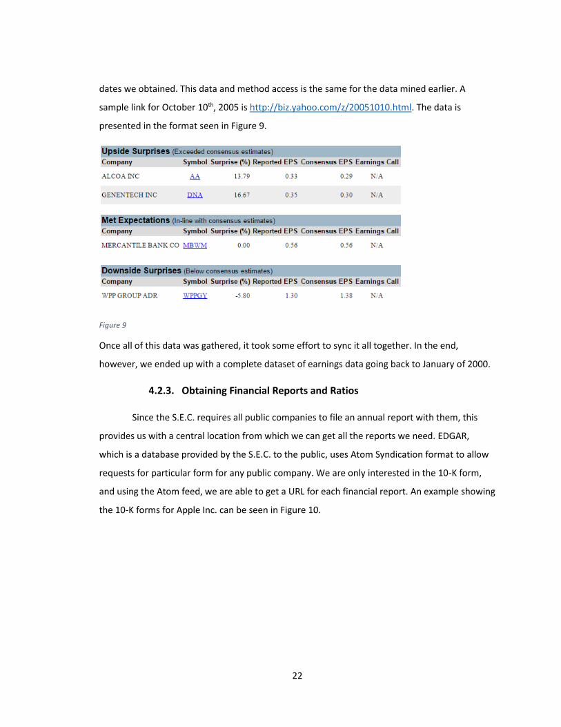
dates we obtained. This data and method access is the same for the data mined earlier. A
sample link for October 10th, 2005 is http://biz.yahoo.com/z/20051010.html. The data is
presented in the format seen in Figure 9.
Figure 9
Once all of this data was gathered, it took some effort to sync it all together. In the end,
however, we ended up with a complete dataset of earnings data going back to January of 2000.
4.2.3. Obtaining Financial Reports and Ratios
Since the S.E.C. requires all public companies to file an annual report with them, this
provides us with a central location from which we can get all the reports we need. EDGAR,
which is a database provided by the S.E.C. to the public, uses Atom Syndication format to allow
requests for particular form for any public company. We are only interested in the 10-K form,
and using the Atom feed, we are able to get a URL for each financial report. An example showing
the 10-K forms for Apple Inc. can be seen in Figure 10.
23
Figure 10
Once we have the URL, we download the content to our database. Next, we need to somehow
extract the quantitative data out of these reports. Starting in 2009, most companies file their
reports with the S.E.C. along with several XML files which make up the XBRL (eXtensible
Business Reporting Language) portion of the filing. XBRL is an XML based language used to
exchange business information in a computer-friendlier format. A .NET based library called
Gepsio was used to access and extract various quantitative data. Since XBRL has only been used
since 2009, various financial websites, mainly ADVFN.com, were mined to fill in data for the
previous years.
4.2.4. Data Storage
All of the acquired data is stored in a MySQL 5.6.17 database, which resides on a LAN
connected, low-power, Intel Atom based netbook which is up 24/7. This is very convenient
during development as the database is accessible from any local machine, and even WAN. The
Atom netbook runs an instance of the data collection program and syncs data periodically. This
is accomplished with a timer triggered process which first asserts that we have a database
connection and a TD Ameritrade connection, before syncing any new data.

24
It is worth mentioning that at the start of the development of this project, a database,
served by the Microsoft SQL Server CE, was used. The database was in the form of a *.sdf file
which was fairly convenient and no setup/configuration was required. A path to the *.sdf file
was specified, and it functioned like a normal database. Figure 11 shows the various files used at
the start of development.
Figure 11
There were three major problems with using the Microsoft SQL file-based database.
First, each file has a 4GB size limitation, so one file was eventually not big enough. This
prompted a split to another file, but in the end, this would not scale either. The second problem
was development on multiple machines. The database files either had to be copied to the target
machine, or they had to be accessed over the LAN. Neither approach was efficient. The third
issue that occurred multiple times was a corruption of one of the files. The root cause was never
determined, but a third party *.sdf file explorer was a possible culprit.
After migrating to the MySQL database, no issues whatsoever, have been observed.
Even replication to another local machine was set up as additional backup.
4.3. Feature Extraction & Feature Vector Creation
Feature extraction consists of creating feature vectors which represent each financial
report, along with an assigned class based on price action. We propose a more outlier-tolerant
normalization/scaling scheme which we use to create the majority of the feature vector. The
classification scheme used in this project is an extended version of a scheme used by [Lin et al.
2011]. This was done so that results of this paper could be comparable.
25
4.3.1. Feature Vector Classification
As mentioned earlier, the classification scheme for this project is very similar to what
was done by [Lin et al. 2011]. A slight variation is made to the peak rise and maximum drop
criteria. The limit was increased from 3% to 3.5% in order to capture slightly more extreme price
swings. This results in the Equation 1.
𝑥𝑐𝑙𝑎𝑠𝑠 =
{
1, 𝑖𝑓
𝑝𝑒𝑎𝑘 − 𝑜𝑝𝑒𝑛𝑠𝑜𝑝𝑒𝑛𝑠
> 0.035 𝑎𝑛𝑑 𝑎𝑣𝑒𝑟𝑎𝑔𝑒 − 𝑜𝑝𝑒𝑛𝑠
𝑜𝑝𝑒𝑛𝑠> 0.02
−1, 𝑖𝑓 𝑜𝑝𝑒𝑛𝑠 − 𝑑𝑟𝑜𝑝
𝑜𝑝𝑒𝑛𝑠> 0.035 𝑎𝑛𝑑
𝑜𝑝𝑒𝑛𝑠 − 𝑎𝑣𝑒𝑟𝑎𝑔𝑒
𝑜𝑝𝑒𝑛𝑠> 0.02
0, 𝑜𝑡ℎ𝑒𝑟𝑤𝑖𝑠𝑒
Equation 1
This classification scheme assigns a value of 1 to a rise in price, -1 to a drop, and 0 when there is
only a small amount of movement. We classify a feature vector as 1 if there is at least a 3.5%
peak in price, and the shift in average price is at least 2%. The opposite is done for a price drop
classification. In Equation 1, opens represents the opening price on the day of the earnings
report release. We call this day, s. The peak variable represents the MAX price value of closes,
opens+1, closes+1, and highs+1. Conversely, the drop variable is the MIN price value of closes,
opens+1, closes+1, and lows+1.
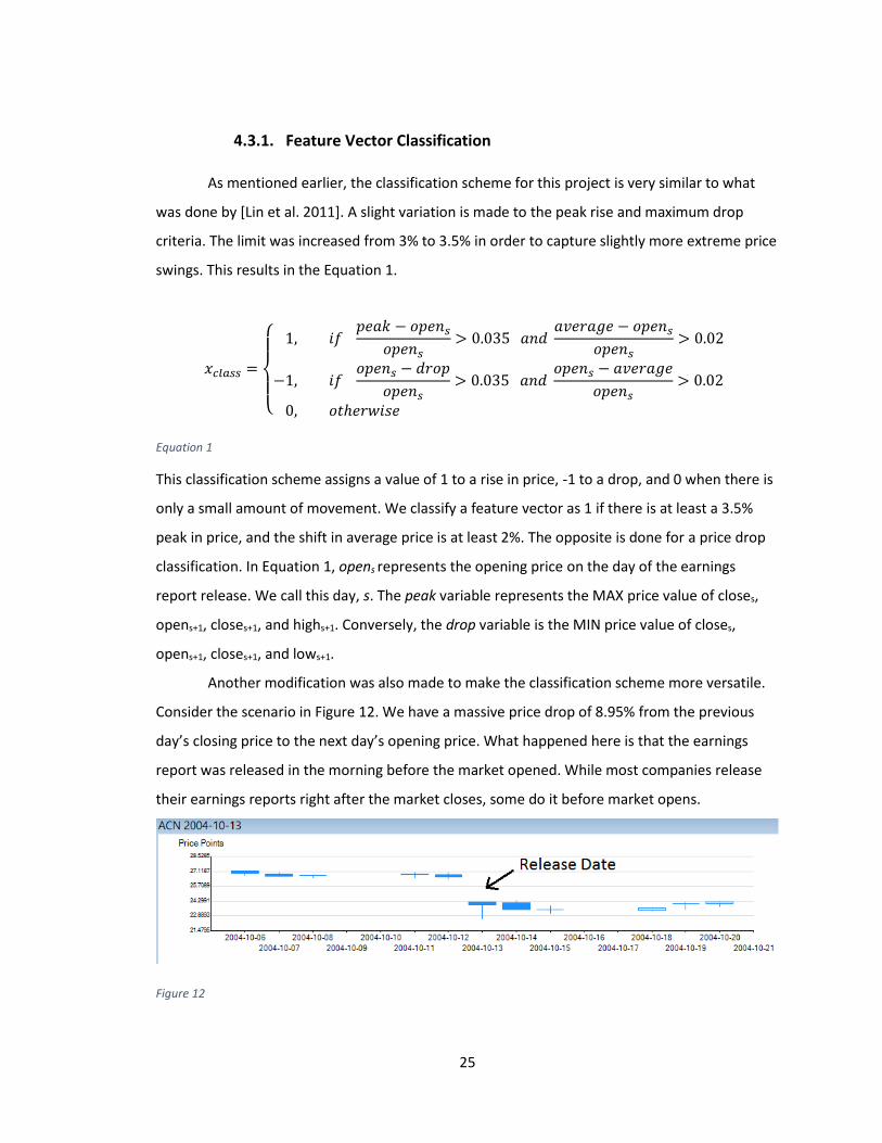
Another modification was also made to make the classification scheme more versatile.
Consider the scenario in Figure 12. We have a massive price drop of 8.95% from the previous
day’s closing price to the next day’s opening price. What happened here is that the earnings
report was released in the morning before the market opened. While most companies release
their earnings reports right after the market closes, some do it before market opens.
Figure 12
26
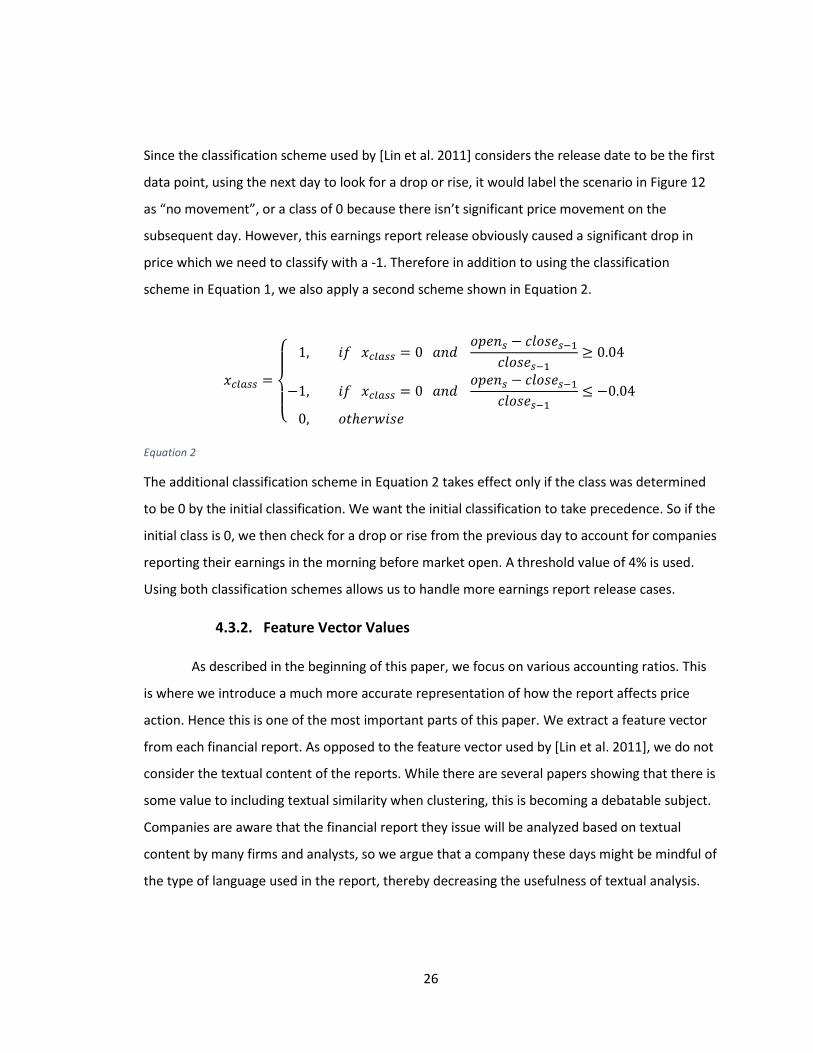
Since the classification scheme used by [Lin et al. 2011] considers the release date to be the first
data point, using the next day to look for a drop or rise, it would label the scenario in Figure 12
as “no movement”, or a class of 0 because there isn’t significant price movement on the
subsequent day. However, this earnings report release obviously caused a significant drop in
price which we need to classify with a -1. Therefore in addition to using the classification
scheme in Equation 1, we also apply a second scheme shown in Equation 2.
𝑥𝑐𝑙𝑎𝑠𝑠 =
{
1, 𝑖𝑓 𝑥𝑐𝑙𝑎𝑠𝑠 = 0 𝑎𝑛𝑑
𝑜𝑝𝑒𝑛𝑠 − 𝑐𝑙𝑜𝑠𝑒𝑠−1𝑐𝑙𝑜𝑠𝑒𝑠−1
≥ 0.04
−1, 𝑖𝑓 𝑥𝑐𝑙𝑎𝑠𝑠 = 0 𝑎𝑛𝑑 𝑜𝑝𝑒𝑛𝑠 − 𝑐𝑙𝑜𝑠𝑒𝑠−1
𝑐𝑙𝑜𝑠𝑒𝑠−1≤ −0.04
0, 𝑜𝑡ℎ𝑒𝑟𝑤𝑖𝑠𝑒
Equation 2
The additional classification scheme in Equation 2 takes effect only if the class was determined
to be 0 by the initial classification. We want the initial classification to take precedence. So if the
initial class is 0, we then check for a drop or rise from the previous day to account for companies
reporting their earnings in the morning before market open. A threshold value of 4% is used.
Using both classification schemes allows us to handle more earnings report release cases.
4.3.2. Feature Vector Values
As described in the beginning of this paper, we focus on various accounting ratios. This
is where we introduce a much more accurate representation of how the report affects price
action. Hence this is one of the most important parts of this paper. We extract a feature vector
from each financial report. As opposed to the feature vector used by [Lin et al. 2011], we do not
consider the textual content of the reports. While there are several papers showing that there is
some value to including textual similarity when clustering, this is becoming a debatable subject.
Companies are aware that the financial report they issue will be analyzed based on textual
content by many firms and analysts, so we argue that a company these days might be mindful of
the type of language used in the report, thereby decreasing the usefulness of textual analysis.
27
Also, since this paper is mainly concerned with financial ratios, we have purposely chosen not to
include textual analysis.
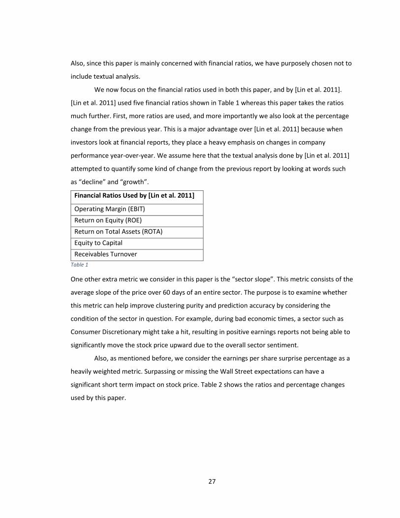
We now focus on the financial ratios used in both this paper, and by [Lin et al. 2011].
[Lin et al. 2011] used five financial ratios shown in Table 1 whereas this paper takes the ratios
much further. First, more ratios are used, and more importantly we also look at the percentage
change from the previous year. This is a major advantage over [Lin et al. 2011] because when
investors look at financial reports, they place a heavy emphasis on changes in company
performance year-over-year. We assume here that the textual analysis done by [Lin et al. 2011]
attempted to quantify some kind of change from the previous report by looking at words such
as “decline” and “growth”.
Financial Ratios Used by [Lin et al. 2011]
Operating Margin (EBIT)
Return on Equity (ROE)
Return on Total Assets (ROTA)
Equity to Capital
Receivables Turnover
Table 1
One other extra metric we consider in this paper is the “sector slope”. This metric consists of the
average slope of the price over 60 days of an entire sector. The purpose is to examine whether
this metric can help improve clustering purity and prediction accuracy by considering the
condition of the sector in question. For example, during bad economic times, a sector such as
Consumer Discretionary might take a hit, resulting in positive earnings reports not being able to
significantly move the stock price upward due to the overall sector sentiment.
Also, as mentioned before, we consider the earnings per share surprise percentage as a
heavily weighted metric. Surpassing or missing the Wall Street expectations can have a
significant short term impact on stock price. Table 2 shows the ratios and percentage changes
used by this paper.
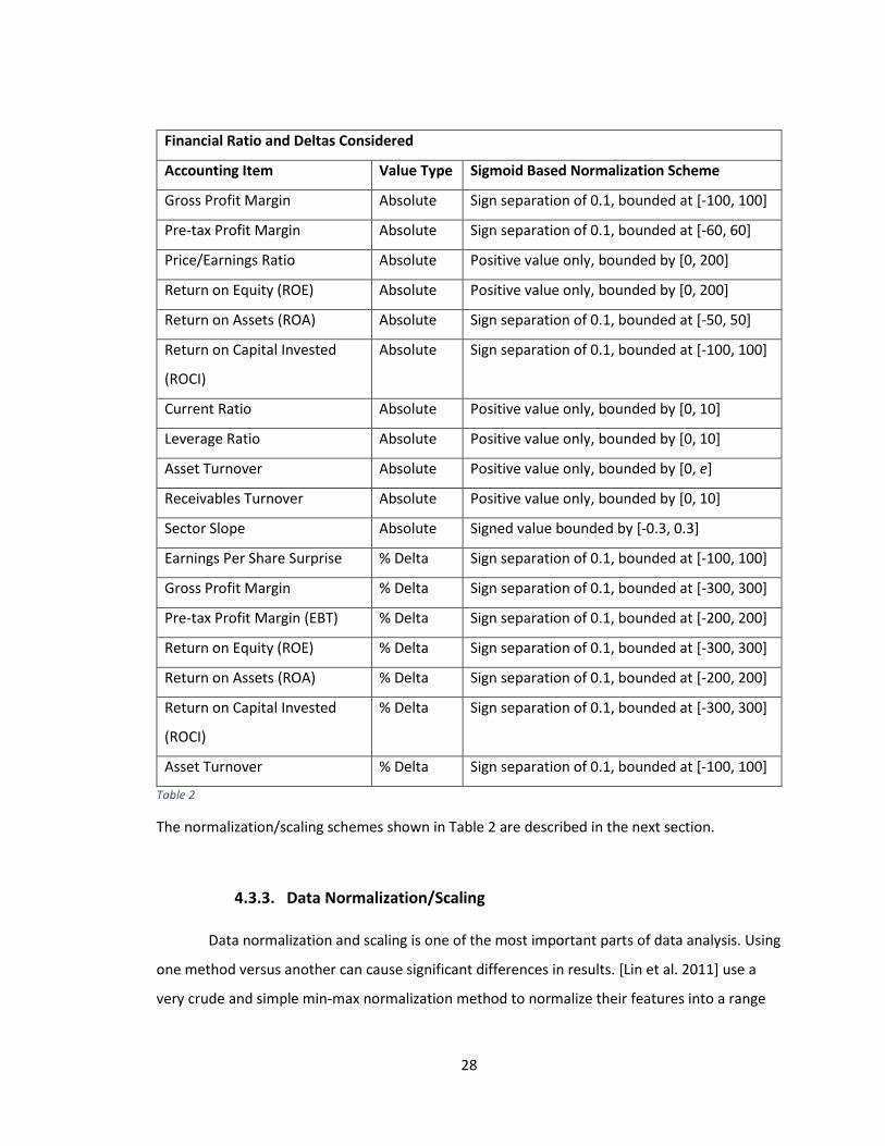
28
Financial Ratio and Deltas Considered
Accounting Item Value Type Sigmoid Based Normalization Scheme
Gross Profit Margin Absolute Sign separation of 0.1, bounded at [-100, 100]
Pre-tax Profit Margin Absolute Sign separation of 0.1, bounded at [-60, 60]
Price/Earnings Ratio Absolute Positive value only, bounded by [0, 200]
Return on Equity (ROE) Absolute Positive value only, bounded by [0, 200]
Return on Assets (ROA) Absolute Sign separation of 0.1, bounded at [-50, 50]
Return on Capital Invested
(ROCI)
Absolute Sign separation of 0.1, bounded at [-100, 100]
Current Ratio Absolute Positive value only, bounded by [0, 10]
Leverage Ratio Absolute Positive value only, bounded by [0, 10]
Asset Turnover Absolute Positive value only, bounded by [0, e]
Receivables Turnover Absolute Positive value only, bounded by [0, 10]
Sector Slope Absolute Signed value bounded by [-0.3, 0.3]
Earnings Per Share Surprise % Delta Sign separation of 0.1, bounded at [-100, 100]
Gross Profit Margin % Delta Sign separation of 0.1, bounded at [-300, 300]
Pre-tax Profit Margin (EBT) % Delta Sign separation of 0.1, bounded at [-200, 200]
Return on Equity (ROE) % Delta Sign separation of 0.1, bounded at [-300, 300]
Return on Assets (ROA) % Delta Sign separation of 0.1, bounded at [-200, 200]
Return on Capital Invested
(ROCI)
% Delta Sign separation of 0.1, bounded at [-300, 300]
Asset Turnover % Delta Sign separation of 0.1, bounded at [-100, 100]
Table 2
The normalization/scaling schemes shown in Table 2 are described in the next section.
4.3.3. Data Normalization/Scaling
Data normalization and scaling is one of the most important parts of data analysis. Using
one method versus another can cause significant differences in results. [Lin et al. 2011] use a
very crude and simple min-max normalization method to normalize their features into a range
29
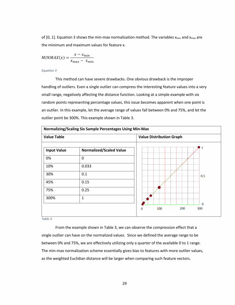
of [0, 1]. Equation 3 shows the min-max normalization method. The variables xmin and xmax are
the minimum and maximum values for feature x.
𝑀𝐼𝑁𝑀𝐴𝑋(𝑥) =𝑥 − 𝑥𝑚𝑖𝑛
𝑥𝑚𝑎𝑥 − 𝑥𝑚𝑖𝑛
Equation 3
This method can have severe drawbacks. One obvious drawback is the improper
handling of outliers. Even a single outlier can compress the interesting feature values into a very
small range, negatively affecting the distance function. Looking at a simple example with six
random points representing percentage values, this issue becomes apparent when one point is
an outlier. In this example, let the average range of values fall between 0% and 75%, and let the
outlier point be 300%. This example shown in Table 3.
Normalizing/Scaling Six Sample Percentages Using Min-Max
Value Table Value Distribution Graph
Input Value Normalized/Scaled Value
0% 0
10% 0.033
30% 0.1
45% 0.15
75% 0.25
300% 1
Table 3
From the example shown in Table 3, we can observe the compression effect that a
single outlier can have on the normalized values. Since we defined the average range to be
between 0% and 75%, we are effectively utilizing only a quarter of the available 0 to 1 range.
The min-max normalization scheme essentially gives bias to features with more outlier values,
as the weighted Euclidian distance will be larger when comparing such feature vectors.
30
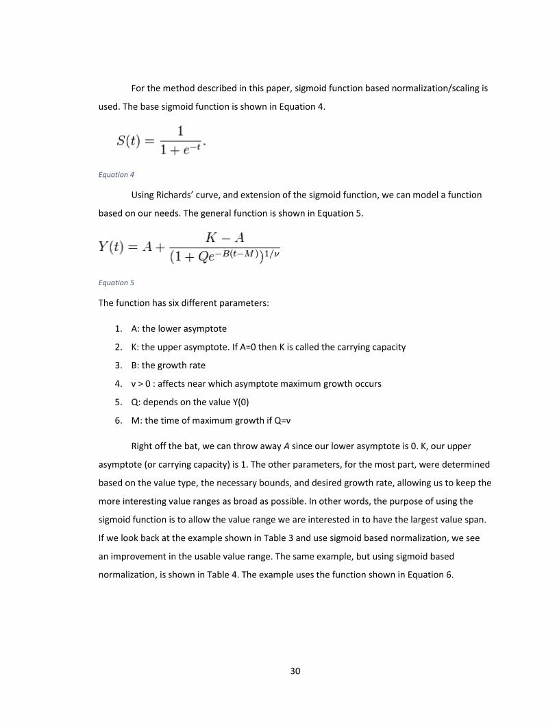
For the method described in this paper, sigmoid function based normalization/scaling is
used. The base sigmoid function is shown in Equation 4.
Equation 4
Using Richards’ curve, and extension of the sigmoid function, we can model a function
based on our needs. The general function is shown in Equation 5.
Equation 5
The function has six different parameters:
1. A: the lower asymptote
2. K: the upper asymptote. If A=0 then K is called the carrying capacity
3. B: the growth rate
4. ν > 0 : affects near which asymptote maximum growth occurs
5. Q: depends on the value Y(0)
6. M: the time of maximum growth if Q=ν
Right off the bat, we can throw away A since our lower asymptote is 0. K, our upper
asymptote (or carrying capacity) is 1. The other parameters, for the most part, were determined
based on the value type, the necessary bounds, and desired growth rate, allowing us to keep the
more interesting value ranges as broad as possible. In other words, the purpose of using the
sigmoid function is to allow the value range we are interested in to have the largest value span.
If we look back at the example shown in Table 3 and use sigmoid based normalization, we see
an improvement in the usable value range. The same example, but using sigmoid based
normalization, is shown in Table 4. The example uses the function shown in Equation 6.
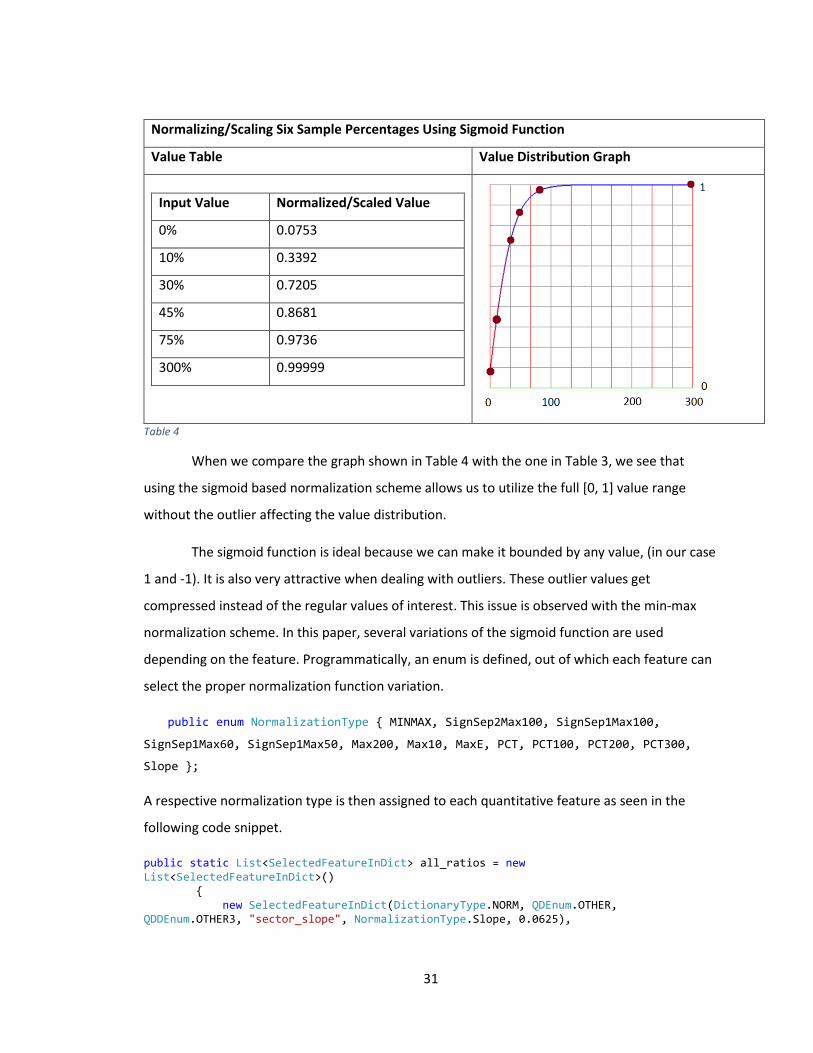
31
Normalizing/Scaling Six Sample Percentages Using Sigmoid Function
Value Table Value Distribution Graph
Input Value Normalized/Scaled Value
0% 0.0753
10% 0.3392
30% 0.7205
45% 0.8681
75% 0.9736
300% 0.99999
Table 4
When we compare the graph shown in Table 4 with the one in Table 3, we see that
using the sigmoid based normalization scheme allows us to utilize the full [0, 1] value range
without the outlier affecting the value distribution.
The sigmoid function is ideal because we can make it bounded by any value, (in our case
1 and -1). It is also very attractive when dealing with outliers. These outlier values get
compressed instead of the regular values of interest. This issue is observed with the min-max
normalization scheme. In this paper, several variations of the sigmoid function are used
depending on the feature. Programmatically, an enum is defined, out of which each feature can
select the proper normalization function variation.
public enum NormalizationType { MINMAX, SignSep2Max100, SignSep1Max100,
SignSep1Max60, SignSep1Max50, Max200, Max10, MaxE, PCT, PCT100, PCT200, PCT300,
Slope };
A respective normalization type is then assigned to each quantitative feature as seen in the
following code snippet.
public static List<SelectedFeatureInDict> all_ratios = new List<SelectedFeatureInDict>() { new SelectedFeatureInDict(DictionaryType.NORM, QDEnum.OTHER, QDDEnum.OTHER3, "sector_slope", NormalizationType.Slope, 0.0625),
32
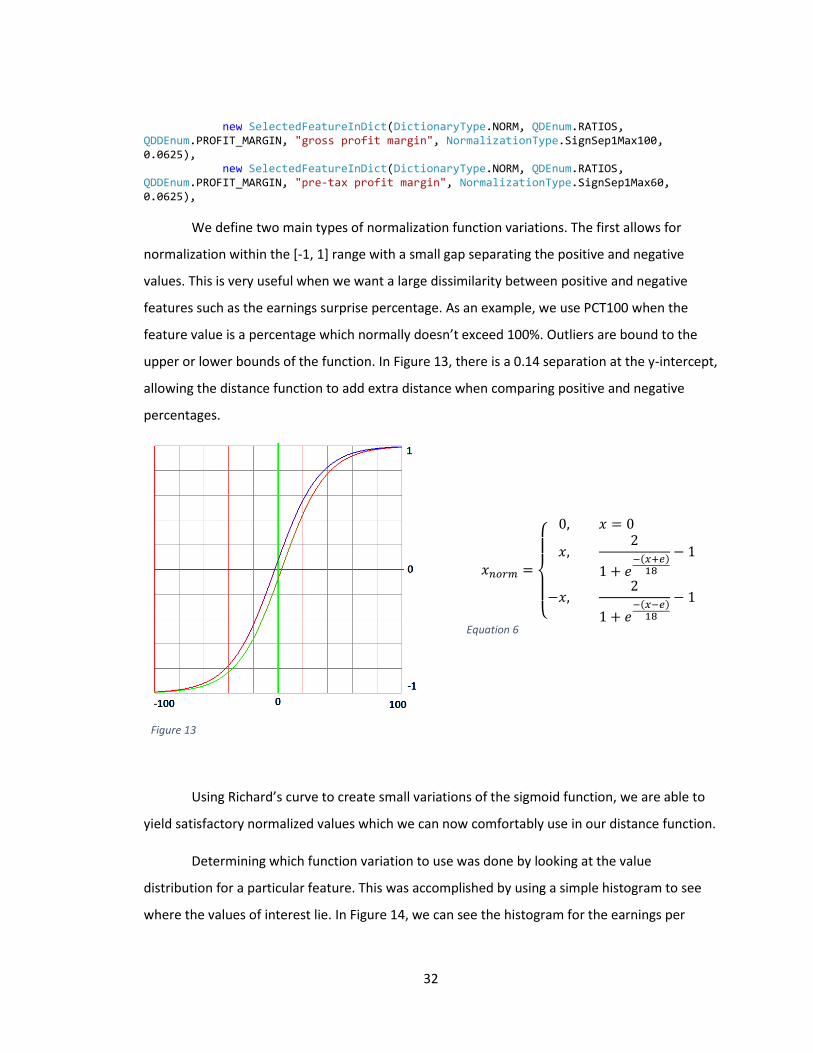
new SelectedFeatureInDict(DictionaryType.NORM, QDEnum.RATIOS, QDDEnum.PROFIT_MARGIN, "gross profit margin", NormalizationType.SignSep1Max100, 0.0625), new SelectedFeatureInDict(DictionaryType.NORM, QDEnum.RATIOS, QDDEnum.PROFIT_MARGIN, "pre-tax profit margin", NormalizationType.SignSep1Max60, 0.0625),
We define two main types of normalization function variations. The first allows for
normalization within the [-1, 1] range with a small gap separating the positive and negative
values. This is very useful when we want a large dissimilarity between positive and negative
features such as the earnings surprise percentage. As an example, we use PCT100 when the
feature value is a percentage which normally doesn’t exceed 100%. Outliers are bound to the
upper or lower bounds of the function. In Figure 13, there is a 0.14 separation at the y-intercept,
allowing the distance function to add extra distance when comparing positive and negative
percentages.
Figure 13
𝑥𝑛𝑜𝑟𝑚 =
{
0, 𝑥 = 0
𝑥,2
1 + 𝑒−(𝑥+𝑒)18
− 1
−𝑥,2
1 + 𝑒−(𝑥−𝑒)18
− 1
Equation 6
Using Richard’s curve to create small variations of the sigmoid function, we are able to
yield satisfactory normalized values which we can now comfortably use in our distance function.
Determining which function variation to use was done by looking at the value
distribution for a particular feature. This was accomplished by using a simple histogram to see
where the values of interest lie. In Figure 14, we can see the histogram for the earnings per
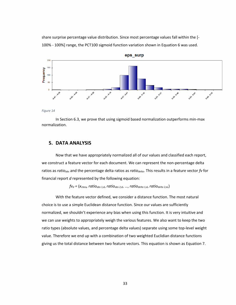
33
share surprise percentage value distribution. Since most percentage values fall within the [-
100% - 100%] range, the PCT100 sigmoid function variation shown in Equation 6 was used.
Figure 14
In Section 6.3, we prove that using sigmoid based normalization outperforms min-max
normalization.
5. DATA ANALYSIS
Now that we have appropriately normalized all of our values and classified each report,
we construct a feature vector for each document. We can represent the non-percentage delta
ratios as ratioabs and the percentage delta ratios as ratiodelta. This results in a feature vector fv for
financial report d represented by the following equation:
fvd = (xclass, ratioabs 1,d, ratioabs 2,d, …, ratiodelta 1,d, ratiodelta 2,d,)
With the feature vector defined, we consider a distance function. The most natural
choice is to use a simple Euclidean distance function. Since our values are sufficiently
normalized, we shouldn’t experience any bias when using this function. It is very intuitive and
we can use weights to appropriately weigh the various features. We also want to keep the two
ratio types (absolute values, and percentage delta values) separate using some top-level weight
value. Therefore we end up with a combination of two weighted Euclidian distance functions
giving us the total distance between two feature vectors. This equation is shown as Equation 7.

34
𝑑𝑖𝑠𝑡(𝑓𝑣1, 𝑓𝑣2) = 𝑤𝑚(∑ 𝑤𝑖 ∗ (𝑟𝑎𝑡𝑖𝑜𝑑𝑒𝑙𝑡𝑎 𝑖,𝑑1 − 𝑟𝑎𝑡𝑖𝑜𝑑𝑒𝑙𝑡𝑎 𝑖,𝑑2)2)
𝑚
𝑖=1
12
+ (1 − 𝑤𝑚)(∑ 𝑤𝑗 ∗ (𝑟𝑎𝑡𝑖𝑜𝑎𝑏𝑠 𝑗,𝑑1 − 𝑟𝑎𝑡𝑖𝑜𝑎𝑏𝑠 𝑗,𝑑2)2)
𝑛
𝑗=1
12
Equation 7
We use weight wm to set the relative importance of the percentage delta features versus the
absolute value features. Weights wi and wj determine the relative importance of a feature in its
respective feature set. We use m “delta” features and n “absolute/correlation” features.
Following the hybrid clustering approach used by [Lin et al. 2011], we utilize Hierarchical
Agglomerative clustering followed by a modified version of K-means to obtain centroids which
will be representative prototypes for classifying new incoming financial reports.
5.1. Financial Ratios Explained
In order to assign the appropriate weights to the various features, it is important to
understand each financial ratio, and how they are looked at by the analyst community and
individual investors.
We start with the three profit margins used in both this paper and by [Lin et al. 2011].
All three are useful in determining the performance of a company, but the Gross Profit margin is
often less useful than the operating profit margin or the pre-tax profit margin. This is because a
company can show very high gross profit, but it could be at the expense of a lot of marketing
cost, which isn’t included in this profit ratio. Gross profit margin is a simple ratio where gross
profit is divided by total revenue. Gross profit is the amount of money left over after subtracting
the cost of goods sold, which is mainly the cost of labor and materials. Next, when we subtract
other operating expenses, items such as cost of research and development, marketing, and
other business operations, we end up with operating profit, usually called EBIT (earnings before
interest and taxes). Since a company usually has either debt, cash holdings, and/or sometimes
investments, this accounts for more expenses or income. If a company has a lot of debt, interest
must be paid on that debt. Other companies may have investments which bring extra income.
After adding these items to the operating profit, we end up with pre-tax profit, usually called
EBT (earnings before taxes). “Because EBT includes interest but excludes income taxes in its

35
calculation, you can use it to compare your profitability to companies with similar financing
structures but in different tax jurisdictions. For example, you might measure your EBT against
that of a similarly funded competitor that is located in a different state.” [9] Since we do analysis
on the different industry sectors separately (discussed in the beginning of Section 6), we use
pre-tax profit margin, and the percentage change from the previous year in this paper as one of
the measures of similarity. We do the same with gross profit margin. “It's important to
remember that gross profit margins can vary drastically from business to business and from
industry to industry. For instance, the airline industry has a gross margin of about 5%, while the
software industry has a gross margin of about 90%.” [9]. Using the appropriate normalization
scheme, we also want to make sure that we separate financial reports showing a negative profit
margin (usually pre-tax profit margin) from ones showing a positive profit margin.
Price to Earnings ratio (P/E ratio) is probably the most recognized financial ratio. It is
often included when one retrieves a stock quote. It is the only company valuation ratio in our
set. Since company valuation isn’t an exact science, this ratio is often synonymous with the
market sentiment about that company. “The P/E is sometimes referred to as the "multiple",
because it shows how much investors are willing to pay per dollar of earnings. If a company
were currently trading at a multiple (P/E) of 20, the interpretation is that an investor is willing to
pay $20 for $1 of current earnings.” [14] Given that investor sentiment is usually important,
especially in the short term, we want to at least consider this ratio in our analysis.
Next, we look at the four profitability ratios, ROE, ROA, ROTA, and ROCI. “Of all the
fundamental ratios that investors look at, one of the most important is return on equity [ROE].
It's a basic test of how effectively a company's management uses investors' money - ROE shows
whether management is growing the company's value at an acceptable rate.” [10] Since this
ratio is a measure of how much profit a company generates on every dollar invested by the
shareholders, this ratio is bound to be an important predictor of price movement following the
release of the earnings report. Even more so when we look at the change in this ratio from the
previous year. The Return on Assets ratio is similar to ROE in some ways, it looks at how much
profit a company generates on every dollar of its assets. “Assets include things like cash in the
bank, accounts receivable, property, equipment, inventory and furniture.” [10] In fact, a
36
company’s total assets include the amount of money invested by shareholders. “assets =
liabilities + shareholders' equity. This equation tells us that if a company carries no debt, its
shareholders' equity and its total assets will be the same. It follows then that their ROE and ROA
would also be the same.” [10] Therefore if ROE has a significant impact on predicting price
movement, so should ROA. The Return on Total Assets (ROTA) used by [Lin et al. 2011] is very
similar to ROA. The only difference is that ROA uses net income, whereas ROTA uses EBIT in the
ratio calculation. Since EBIT has not yet taken into account taxes and interest expense, it does
not represent the final net profit of the company. Therefore we use ROA in this paper instead,
as it includes the extra expense and/or income. Lastly, we look at the Return on Capital Invested
(ROCI), also referred to as ROIC. “The ratio which is more informative than ROA and ROE is the
Return on Invested Capital (ROIC) and is calculated as net operating profits after taxes (NOPAT)
divided by invested capital. ROIC tells an analyst how efficient the firm was in investing capital
in profitable investments.” [11] We definitely want to consider this ratio as the denominator
considers only invested capital, versus total assets (as in ROA) which can include non-income
generating cash.
We also consider one of the liquidity ratios, the current ratio, which is a company’s
current assets divided by its current liabilities. It’s a good ratio to use when determining
earnings report similarity. It indicates how well a company can meet any short-term financial
obligations, i.e. having a lot more assets than liabilities can allow a company to remain more
liquid. However, “shareholders may prefer a lower current ratio so that more of the firm’s assets
are working to grow the business.” [12] The leverage ratio is similar, but it usually looks at more
long term use of debt. It is another good ratio to use when trying to determine similarity of
companies and/or earnings reports.
Lastly, we look at the two asset turnover ratios, asset turnover, and receivables
turnover. “[Receivables turnover] ratio determines how quickly a company collects outstanding
cash balances from its customers during an accounting period. It is an important indicator of a
company's financial and operational performance and can be used to determine if a company is
having difficulties collecting sales made on credit.” [13] We mainly use this ratio as a measure of
company efficiency. Similarly, “Asset turnover (total asset turnover) is a financial ratio that

37
measures the efficiency of a company's use of its assets to product sales. It is a measure of how
efficiently management is using the assets at its disposal to promote sales. The ratio helps to
measure the productivity of a company's assets.” [13]
5.2. Hierarchical Agglomerative Clustering and Financial Ratio
Weighing Method
As mentioned in the previous section, certain ratios may be more important that others
in determining price movement following the earnings report release. Therefore, before we
attempt price movement prediction, we must look at assigning appropriate weights to the
various ratios since the main goal of this paper is to improve prediction results by using better
weights for the financial ratios. In order to achieve this, we must first attempt to make the initial
clustering method produce purer clusters.
Just like [Lin et al. 2011] used hierarchical agglomerative clustering to do an initial
clustering step, we do the same. We also use hierarchical agglomerative clustering to analyze
the importance of each feature in price movement prediction.
The HAC algorithm is an unsupervised classification method used to build a hierarchy of
clusters. We start out with each report being its own cluster, and we successively merge the two
closest clusters until we reach a stopping criteria. One approach is to allow cluster merging to
proceed until only one cluster remains. [Lin et al. 2011] use this approach, followed by the
removal of g - 1 longest links, where g is the target number of clusters. The reasoning for
removing the longest links is that they must merge the most dissimilar clusters. Another
approach is to use a distance value as a stopping criteria. For example, as clusters are being
merged, the algorithm calculates the distance from the current cluster to all other clusters, and
once we reach a certain distance threshold, the algorithm can stop. There are a couple different
ways to define the distance between clusters. The two major distance metrics are single link and
complete link. Single link, also called minimum distance and/or nearest neighbor clustering,
defines cluster proximity as the distance between the two closest points in two separate
clusters. As previously mentioned in Section 3, this distance metric is known to be sensitive to
noise and outliers, and susceptible to “chaining” which refers to the growth of a single cluster as
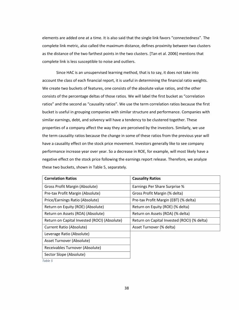
38
elements are added one at a time. It is also said that the single link favors “connectedness”. The
complete link metric, also called the maximum distance, defines proximity between two clusters
as the distance of the two farthest points in the two clusters. [Tan et al. 2006] mentions that
complete link is less susceptible to noise and outliers.
Since HAC is an unsupervised learning method, that is to say, it does not take into
account the class of each financial report, it is useful in determining the financial ratio weights.
We create two buckets of features, one consists of the absolute value ratios, and the other
consists of the percentage deltas of those ratios. We will label the first bucket as “correlation
ratios” and the second as “causality ratios”. We use the term correlation ratios because the first
bucket is useful in grouping companies with similar structure and performance. Companies with
similar earnings, debt, and solvency will have a tendency to be clustered together. These
properties of a company affect the way they are perceived by the investors. Similarly, we use
the term causality ratios because the change in some of these ratios from the previous year will
have a causality effect on the stock price movement. Investors generally like to see company
performance increase year over year. So a decrease in ROE, for example, will most likely have a
negative effect on the stock price following the earnings report release. Therefore, we analyze
these two buckets, shown in Table 5, separately.
Correlation Ratios Causality Ratios
Gross Profit Margin (Absolute) Earnings Per Share Surprise %
Pre-tax Profit Margin (Absolute) Gross Profit Margin (% delta)
Price/Earnings Ratio (Absolute) Pre-tax Profit Margin (EBT) (% delta)
Return on Equity (ROE) (Absolute) Return on Equity (ROE) (% delta)
Return on Assets (ROA) (Absolute) Return on Assets (ROA) (% delta)
Return on Capital Invested (ROCI) (Absolute) Return on Capital Invested (ROCI) (% delta)
Current Ratio (Absolute) Asset Turnover (% delta)
Leverage Ratio (Absolute)
Asset Turnover (Absolute)
Receivables Turnover (Absolute)
Sector Slope (Absolute)
Table 5
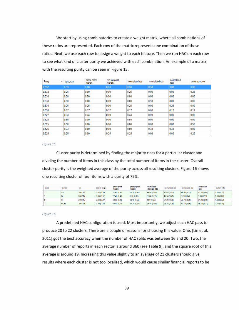
39
We start by using combinatorics to create a weight matrix, where all combinations of
these ratios are represented. Each row of the matrix represents one combination of these
ratios. Next, we use each row to assign a weight to each feature. Then we run HAC on each row
to see what kind of cluster purity we achieved with each combination. An example of a matrix
with the resulting purity can be seen in Figure 15.
Figure 15
Cluster purity is determined by finding the majority class for a particular cluster and
dividing the number of items in this class by the total number of items in the cluster. Overall
cluster purity is the weighted average of the purity across all resulting clusters. Figure 16 shows
one resulting cluster of four items with a purity of 75%.
Figure 16
A predefined HAC configuration is used. Most importantly, we adjust each HAC pass to
produce 20 to 22 clusters. There are a couple of reasons for choosing this value. One, [Lin et al.
2011] got the best accuracy when the number of HAC splits was between 16 and 20. Two, the
average number of reports in each sector is around 360 (see Table 9), and the square root of this
average is around 19. Increasing this value slightly to an average of 21 clusters should give
results where each cluster is not too localized, which would cause similar financial reports to be
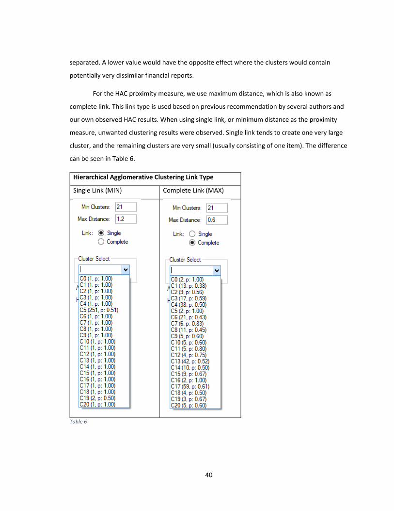
40
separated. A lower value would have the opposite effect where the clusters would contain
potentially very dissimilar financial reports.
For the HAC proximity measure, we use maximum distance, which is also known as
complete link. This link type is used based on previous recommendation by several authors and
our own observed HAC results. When using single link, or minimum distance as the proximity
measure, unwanted clustering results were observed. Single link tends to create one very large
cluster, and the remaining clusters are very small (usually consisting of one item). The difference
can be seen in Table 6.
Hierarchical Agglomerative Clustering Link Type
Single Link (MIN) Complete Link (MAX)
Table 6

41
Table 6 shows that when using Single Link, we end up with 21 clusters where one cluster
contains 251 items, and the rest of the clusters contain one item (with the exception of one
cluster that has two items). This is exactly what [Crawford et al. 1990] were referring to when
they mentioned the “chaining” phenomenon, where one cluster gradually grows as items are
added one by one. Using Complete Link, we can see in Table 6 that the item distribution within
each cluster is much more acceptable. Therefore we commit to using Complete Link. When
using Complete Link, the algorithm does not use a minimum number of clusters metric, instead,
it uses a maximum distance metric, where the algorithm stops if the distance of all clusters from
each other is greater than the maximum distance specified. This creates a problem for us as we
go through each row in our ratio weight combination matrix, as the output of the distance
function will be different for each row (varying number of resulting clusters). Therefore the
maximum distance metric is automatically adjusted by the program as it performs HAC on the
row. If the number of clusters to too high, the distance metric is increased by a randomly
selected value in the range of [0.1 to 0.5]. Conversely, when the number of clusters is less than
20, the distance metric is reduced using the same method. HAC is then re-tried on the same row
until we get within a range of 20 to 22 clusters. This method in action can be seen in Figure 17.
Figure 17
The dynamic maximum HAC distance metric method shown in Figure 17 is not only used when
determining the feature weights in the current step, but is also used in the final testing phase
where accuracy of price movement prediction is determined.
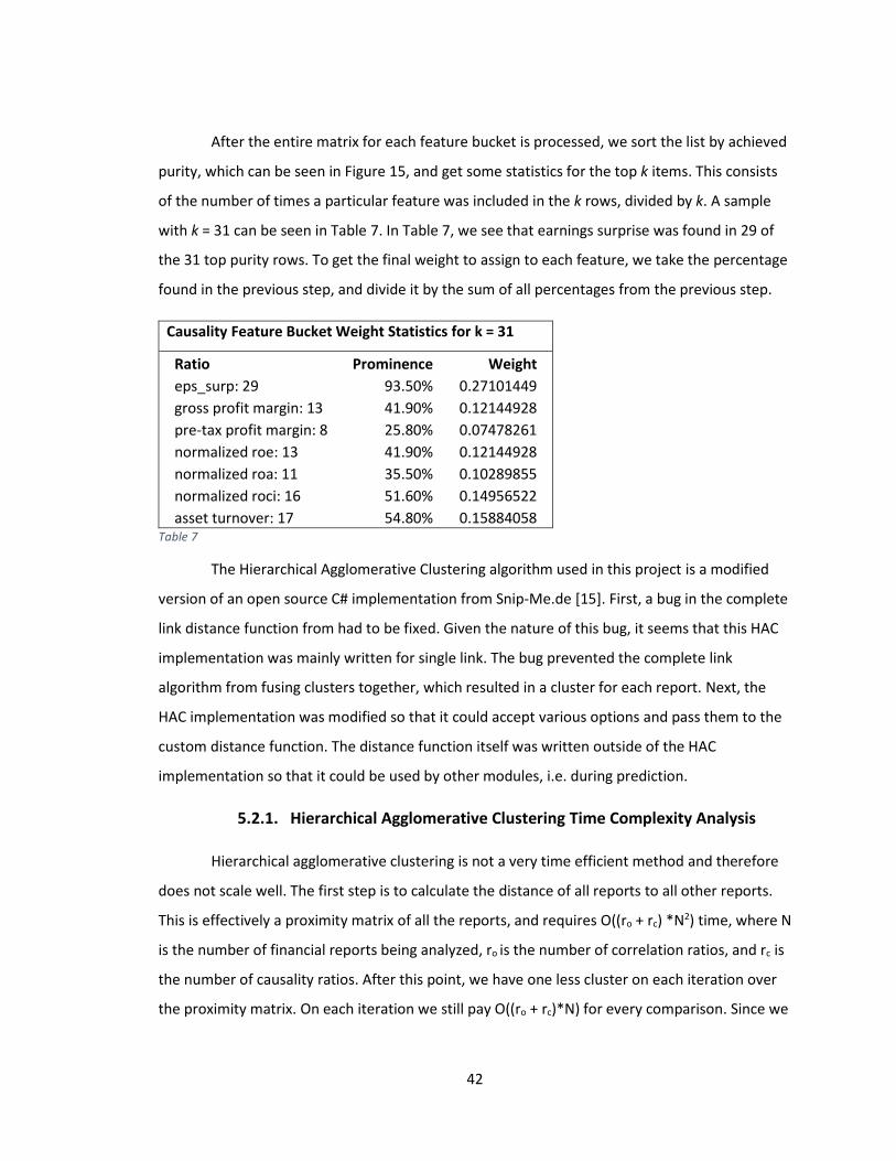
42
After the entire matrix for each feature bucket is processed, we sort the list by achieved
purity, which can be seen in Figure 15, and get some statistics for the top k items. This consists
of the number of times a particular feature was included in the k rows, divided by k. A sample
with k = 31 can be seen in Table 7. In Table 7, we see that earnings surprise was found in 29 of
the 31 top purity rows. To get the final weight to assign to each feature, we take the percentage
found in the previous step, and divide it by the sum of all percentages from the previous step.
Causality Feature Bucket Weight Statistics for k = 31
Ratio Prominence Weight
eps_surp: 29 93.50% 0.27101449
gross profit margin: 13 41.90% 0.12144928
pre-tax profit margin: 8 25.80% 0.07478261
normalized roe: 13 41.90% 0.12144928
normalized roa: 11 35.50% 0.10289855
normalized roci: 16 51.60% 0.14956522
asset turnover: 17 54.80% 0.15884058
Table 7
The Hierarchical Agglomerative Clustering algorithm used in this project is a modified
version of an open source C# implementation from Snip-Me.de [15]. First, a bug in the complete
link distance function from had to be fixed. Given the nature of this bug, it seems that this HAC
implementation was mainly written for single link. The bug prevented the complete link
algorithm from fusing clusters together, which resulted in a cluster for each report. Next, the
HAC implementation was modified so that it could accept various options and pass them to the
custom distance function. The distance function itself was written outside of the HAC
implementation so that it could be used by other modules, i.e. during prediction.
5.2.1. Hierarchical Agglomerative Clustering Time Complexity Analysis
Hierarchical agglomerative clustering is not a very time efficient method and therefore
does not scale well. The first step is to calculate the distance of all reports to all other reports.
This is effectively a proximity matrix of all the reports, and requires O((ro + rc) *N2) time, where N
is the number of financial reports being analyzed, ro is the number of correlation ratios, and rc is
the number of causality ratios. After this point, we have one less cluster on each iteration over
the proximity matrix. On each iteration we still pay O((ro + rc)*N) for every comparison. Since we

43
stop once we reach a specified maximum distance between all the feature vectors, let k be the
number of iterations. Therefore in the end, the time complexity of the HAC algorithm is
O((ro + rc) *N2 + k*(ro + rc)*N).
5.3. Modified K-Means Clustering
After using hierarchical agglomerative clustering to create 20 or so clusters, we can now
use a supervised machine learning method to create representative prototypes of financial
reports. For this we use a modified version of K-Means as described by [Lin et al. 2011]. In their
paper, they modify K-Means in two ways. One, the number of sub-clusters is equal to the
number of different classes found within the cluster. This will be at most three in our case. Two,
the centroid of each sub-cluster is the mean of the feature vectors belonging to the same class.
This allows the K-Means algorithm to have a much friendlier time complexity.
This variation of K-Means was implemented from scratch due to its custom nature. Our
implementation is iterative instead of recursive due to simpler object and queue management.
Within the code, we maintain a list of impure cluster objects The resulting clusters from the
previous HAC stage all get en-queued onto this list. On every iteration of K-Means, we go
through each of these impure clusters. For each impure cluster, we calculate a centroid for each
class present by averaging together feature vectors with that same class. Next, we compare the
distance of each feature vector (irrespective of class) to each of the pre-computed centroids.
We create a cluster based around each centroid, consisting of its nearest neighbors. Cluster
purity is now calculated, and if it’s higher than a pre-defined threshold, the cluster is moved to a
separate list which holds pure clusters. Clusters deemed impure get en-queued onto the impure
cluster list, which then enters the next iteration of K-Means. We continue this process until the
impure cluster list is empty. After K-Means is done, we go through each cluster on the pure list,
find the majority class, and then compute a centroid by averaging together all feature vectors
belonging to the majority class. We end up with a list of these class-labeled centroids which are
our representative prototypes. These prototypes are all that is kept at the end of the learning
process.
44
Since we obtain our centroids in linear time, this K-Means variation is very time
efficient. We end up doing at least one distance comparison for every report to a maximum of
three centroids on the first iteration of K-Means. Hence we get O((ro + rc)*N*3) for the first
iteration. On each subsequent iteration of K-Means we iterate over the impure cluster list, say
an average of p times. Then let k be the number of K-Means iterations. We end up with time
complexity of O((ro + rc)*N*p*k). This makes the modified version of K-Means fairly scalable,
especially since HAC already performed the initial clustering, which should make p and k more
manageable.
5.4. Predicting Stock Price Movement
Using the representative prototypes found by using the modified version of K-Means,
we can now predict the stock price movement for a new financial report. Since we want to be
able to compare our weighing scheme with previously established results, this method is the
same as the method used by [Lin et al. 2011]. We take a newly released financial report,
perform the feature extraction and normalization as described in previous sections, and create a
feature vector. We then use our distance function to find the closest centroid (from the learning
stage), and we predict the direction of the price movement based on the class label of this
closest centroid.
6. EXPERIMENTAL RESULTS
We have gathered over 3100 annual financial reports for 500 companies listed on the
S&P 500 index as of April 2014. On average we have about 10 years of annual reports for each
company. Daily open, high, low, and close prices were also gathered, going back to 1995 if
possible. From these prices we computed a class label and a 60 day sector slope for each report.
Percentage deltas were computed between each subsequent report in order to get the causality
ratios defined in Table 6. Earnings expectation numbers were also gathered. These are
necessary for us to compute the earnings surprise percentage. Each company was classified into
one of the ten sectors as defined by the Global Industry Classification Standard taxonomy, which
can be seen in Table 8.
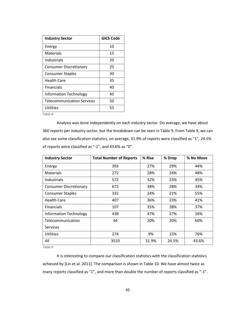
45
Industry Sector GICS Code
Energy 10
Materials 15
Industrials 20
Consumer Discretionary 25
Consumer Staples 30
Health Care 35
Financials 40
Information Technology 45
Telecommunication Services 50
Utilities 55
Table 8
Analysis was done independently on each industry sector. On average, we have about
360 reports per industry sector, but the breakdown can be seen in Table 9. From Table 9, we can
also see some classification statistics, on average, 31.9% of reports were classified as “1”, 24.5%
of reports were classified as “-1”, and 43.6% as “0”.
Industry Sector Total Number of Reports % Rise % Drop % No Move
Energy 393 27% 29% 44%
Materials 272 28% 24% 48%
Industrials 572 32% 23% 45%
Consumer Discretionary 672 38% 28% 34%
Consumer Staples 331 24% 21% 55%
Health Care 407 36% 23% 41%
Financials 107 35% 28% 37%
Information Technology 438 47% 27% 26%
Telecommunication
Services
44 20% 20% 60%
Utilities 274 9% 15% 76%
All 3510 31.9% 24.5% 43.6%
Table 9
It is interesting to compare our classification statistics with the classification statistics
achieved by [Lin et al. 2011]. The comparison is shown in Table 10. We have almost twice as
many reports classified as “1”, and more than double the number of reports classified as “-1”.
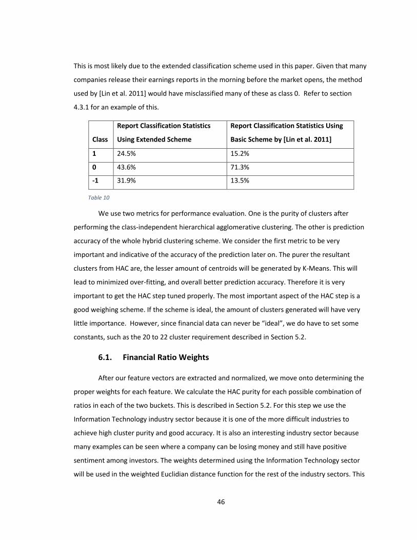
46
This is most likely due to the extended classification scheme used in this paper. Given that many
companies release their earnings reports in the morning before the market opens, the method
used by [Lin et al. 2011] would have misclassified many of these as class 0. Refer to section
4.3.1 for an example of this.
We use two metrics for performance evaluation. One is the purity of clusters after
performing the class-independent hierarchical agglomerative clustering. The other is prediction
accuracy of the whole hybrid clustering scheme. We consider the first metric to be very
important and indicative of the accuracy of the prediction later on. The purer the resultant
clusters from HAC are, the lesser amount of centroids will be generated by K-Means. This will
lead to minimized over-fitting, and overall better prediction accuracy. Therefore it is very
important to get the HAC step tuned properly. The most important aspect of the HAC step is a
good weighing scheme. If the scheme is ideal, the amount of clusters generated will have very
little importance. However, since financial data can never be “ideal”, we do have to set some
constants, such as the 20 to 22 cluster requirement described in Section 5.2.
6.1. Financial Ratio Weights
After our feature vectors are extracted and normalized, we move onto determining the
proper weights for each feature. We calculate the HAC purity for each possible combination of
ratios in each of the two buckets. This is described in Section 5.2. For this step we use the
Information Technology industry sector because it is one of the more difficult industries to
achieve high cluster purity and good accuracy. It is also an interesting industry sector because
many examples can be seen where a company can be losing money and still have positive
sentiment among investors. The weights determined using the Information Technology sector
will be used in the weighted Euclidian distance function for the rest of the industry sectors. This
Class
Report Classification Statistics
Using Extended Scheme
Report Classification Statistics Using
Basic Scheme by [Lin et al. 2011]
1 24.5% 15.2%
0 43.6% 71.3%
-1 31.9% 13.5%
Table 10
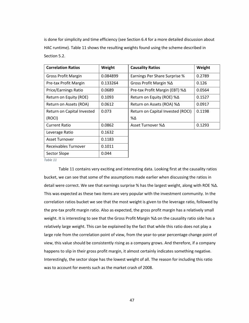
47
is done for simplicity and time efficiency (see Section 6.4 for a more detailed discussion about
HAC runtime). Table 11 shows the resulting weights found using the scheme described in
Section 5.2.
Correlation Ratios Weight Causality Ratios Weight
Gross Profit Margin 0.084899 Earnings Per Share Surprise % 0.2789
Pre-tax Profit Margin 0.133264 Gross Profit Margin %Δ 0.126
Price/Earnings Ratio 0.0689 Pre-tax Profit Margin (EBT) %Δ 0.0564
Return on Equity (ROE) 0.1093 Return on Equity (ROE) %Δ 0.1527
Return on Assets (ROA) 0.0612 Return on Assets (ROA) %Δ 0.0917
Return on Capital Invested
(ROCI)
0.073 Return on Capital Invested (ROCI)
%Δ
0.1198
Current Ratio 0.0862 Asset Turnover %Δ 0.1293
Leverage Ratio 0.1632
Asset Turnover 0.1183
Receivables Turnover 0.1011
Sector Slope 0.044
Table 11
Table 11 contains very exciting and interesting data. Looking first at the causality ratios
bucket, we can see that some of the assumptions made earlier when discussing the ratios in
detail were correct. We see that earnings surprise % has the largest weight, along with ROE %Δ.
This was expected as these two items are very popular with the investment community. In the
correlation ratios bucket we see that the most weight is given to the leverage ratio, followed by
the pre-tax profit margin ratio. Also as expected, the gross profit margin has a relatively small
weight. It is interesting to see that the Gross Profit Margin %Δ on the causality ratio side has a
relatively large weight. This can be explained by the fact that while this ratio does not play a
large role from the correlation point of view, from the year-to-year percentage change point of
view, this value should be consistently rising as a company grows. And therefore, if a company
happens to slip in their gross profit margin, it almost certainly indicates something negative.
Interestingly, the sector slope has the lowest weight of all. The reason for including this ratio
was to account for events such as the market crash of 2008.
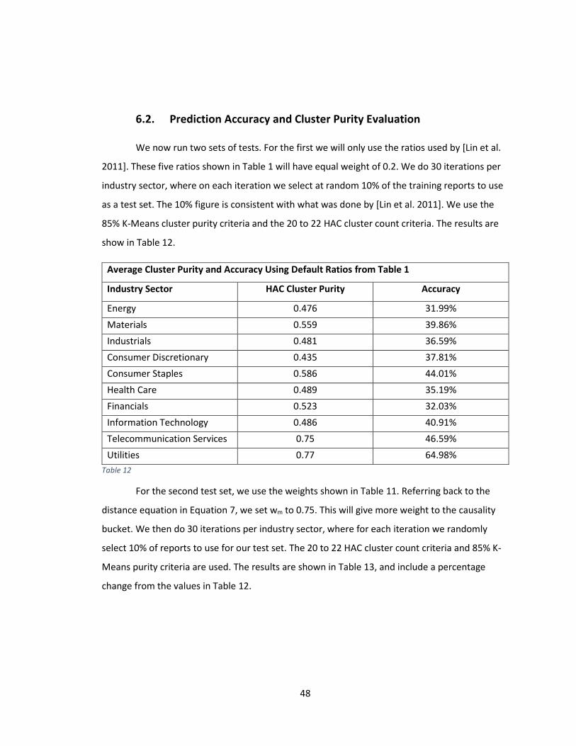
48
6.2. Prediction Accuracy and Cluster Purity Evaluation
We now run two sets of tests. For the first we will only use the ratios used by [Lin et al.
2011]. These five ratios shown in Table 1 will have equal weight of 0.2. We do 30 iterations per
industry sector, where on each iteration we select at random 10% of the training reports to use
as a test set. The 10% figure is consistent with what was done by [Lin et al. 2011]. We use the
85% K-Means cluster purity criteria and the 20 to 22 HAC cluster count criteria. The results are
show in Table 12.
Average Cluster Purity and Accuracy Using Default Ratios from Table 1
Industry Sector HAC Cluster Purity Accuracy
Energy 0.476 31.99%
Materials 0.559 39.86%
Industrials 0.481 36.59%
Consumer Discretionary 0.435 37.81%
Consumer Staples 0.586 44.01%
Health Care 0.489 35.19%
Financials 0.523 32.03%
Information Technology 0.486 40.91%
Telecommunication Services 0.75 46.59%
Utilities 0.77 64.98%
Table 12
For the second test set, we use the weights shown in Table 11. Referring back to the
distance equation in Equation 7, we set wm to 0.75. This will give more weight to the causality
bucket. We then do 30 iterations per industry sector, where for each iteration we randomly
select 10% of reports to use for our test set. The 20 to 22 HAC cluster count criteria and 85% K-
Means purity criteria are used. The results are shown in Table 13, and include a percentage
change from the values in Table 12.
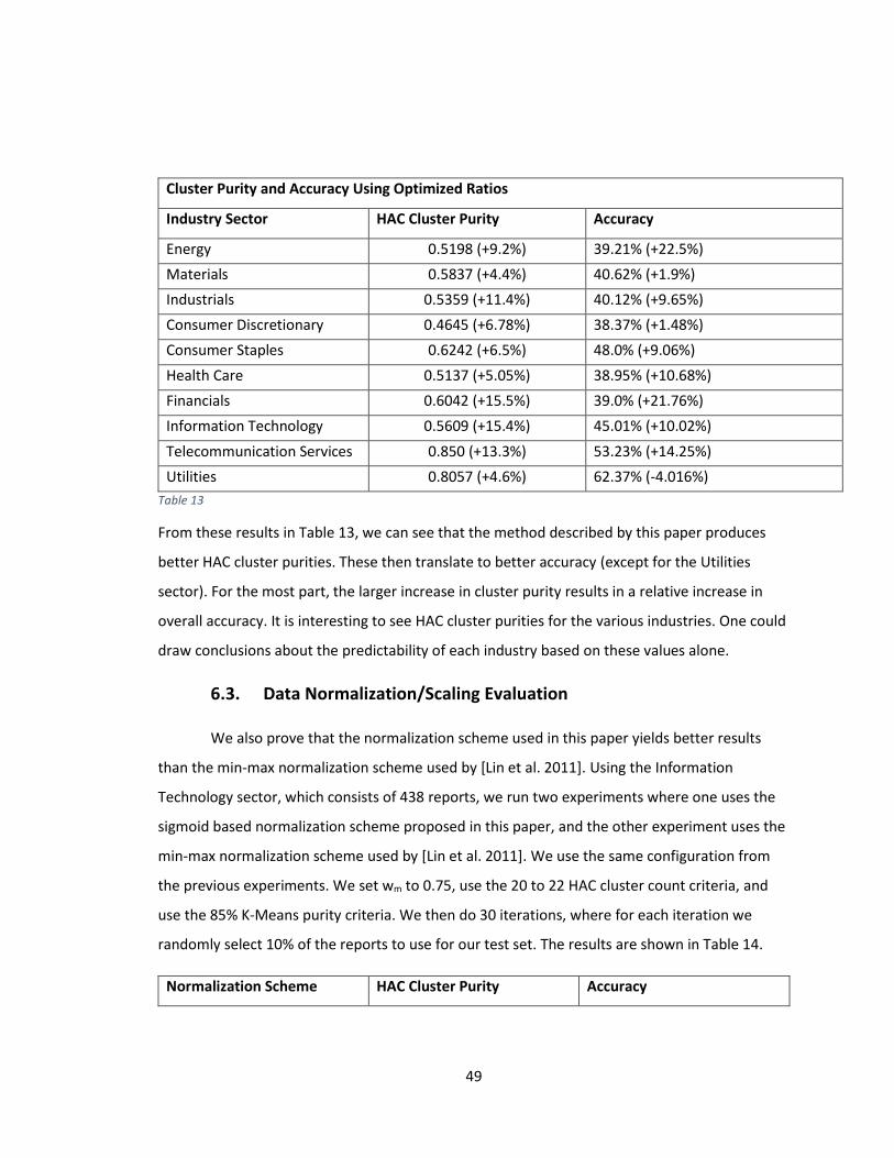
49
Cluster Purity and Accuracy Using Optimized Ratios
Industry Sector HAC Cluster Purity Accuracy
Energy 0.5198 (+9.2%) 39.21% (+22.5%)
Materials 0.5837 (+4.4%) 40.62% (+1.9%)
Industrials 0.5359 (+11.4%) 40.12% (+9.65%)
Consumer Discretionary 0.4645 (+6.78%) 38.37% (+1.48%)
Consumer Staples 0.6242 (+6.5%) 48.0% (+9.06%)
Health Care 0.5137 (+5.05%) 38.95% (+10.68%)
Financials 0.6042 (+15.5%) 39.0% (+21.76%)
Information Technology 0.5609 (+15.4%) 45.01% (+10.02%)
Telecommunication Services 0.850 (+13.3%) 53.23% (+14.25%)
Utilities 0.8057 (+4.6%) 62.37% (-4.016%)
Table 13
From these results in Table 13, we can see that the method described by this paper produces
better HAC cluster purities. These then translate to better accuracy (except for the Utilities
sector). For the most part, the larger increase in cluster purity results in a relative increase in
overall accuracy. It is interesting to see HAC cluster purities for the various industries. One could
draw conclusions about the predictability of each industry based on these values alone.
6.3. Data Normalization/Scaling Evaluation
We also prove that the normalization scheme used in this paper yields better results
than the min-max normalization scheme used by [Lin et al. 2011]. Using the Information
Technology sector, which consists of 438 reports, we run two experiments where one uses the
sigmoid based normalization scheme proposed in this paper, and the other experiment uses the
min-max normalization scheme used by [Lin et al. 2011]. We use the same configuration from
the previous experiments. We set wm to 0.75, use the 20 to 22 HAC cluster count criteria, and
use the 85% K-Means purity criteria. We then do 30 iterations, where for each iteration we
randomly select 10% of the reports to use for our test set. The results are shown in Table 14.
Normalization Scheme HAC Cluster Purity Accuracy
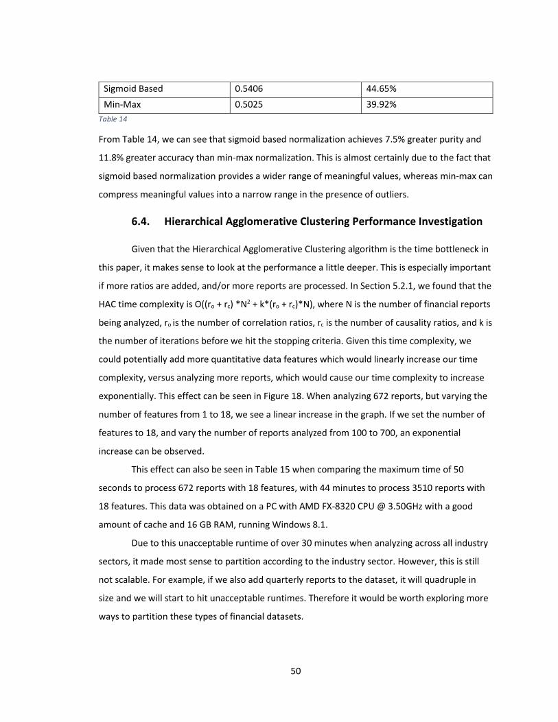
50
Sigmoid Based 0.5406 44.65%
Min-Max 0.5025 39.92%
Table 14
From Table 14, we can see that sigmoid based normalization achieves 7.5% greater purity and
11.8% greater accuracy than min-max normalization. This is almost certainly due to the fact that
sigmoid based normalization provides a wider range of meaningful values, whereas min-max can
compress meaningful values into a narrow range in the presence of outliers.
6.4. Hierarchical Agglomerative Clustering Performance Investigation
Given that the Hierarchical Agglomerative Clustering algorithm is the time bottleneck in
this paper, it makes sense to look at the performance a little deeper. This is especially important
if more ratios are added, and/or more reports are processed. In Section 5.2.1, we found that the
HAC time complexity is O((ro + rc) *N2 + k*(ro + rc)*N), where N is the number of financial reports
being analyzed, ro is the number of correlation ratios, rc is the number of causality ratios, and k is
the number of iterations before we hit the stopping criteria. Given this time complexity, we
could potentially add more quantitative data features which would linearly increase our time
complexity, versus analyzing more reports, which would cause our time complexity to increase
exponentially. This effect can be seen in Figure 18. When analyzing 672 reports, but varying the
number of features from 1 to 18, we see a linear increase in the graph. If we set the number of
features to 18, and vary the number of reports analyzed from 100 to 700, an exponential
increase can be observed.
This effect can also be seen in Table 15 when comparing the maximum time of 50
seconds to process 672 reports with 18 features, with 44 minutes to process 3510 reports with
18 features. This data was obtained on a PC with AMD FX-8320 CPU @ 3.50GHz with a good
amount of cache and 16 GB RAM, running Windows 8.1.
Due to this unacceptable runtime of over 30 minutes when analyzing across all industry
sectors, it made most sense to partition according to the industry sector. However, this is still
not scalable. For example, if we also add quarterly reports to the dataset, it will quadruple in
size and we will start to hit unacceptable runtimes. Therefore it would be worth exploring more
ways to partition these types of financial datasets.
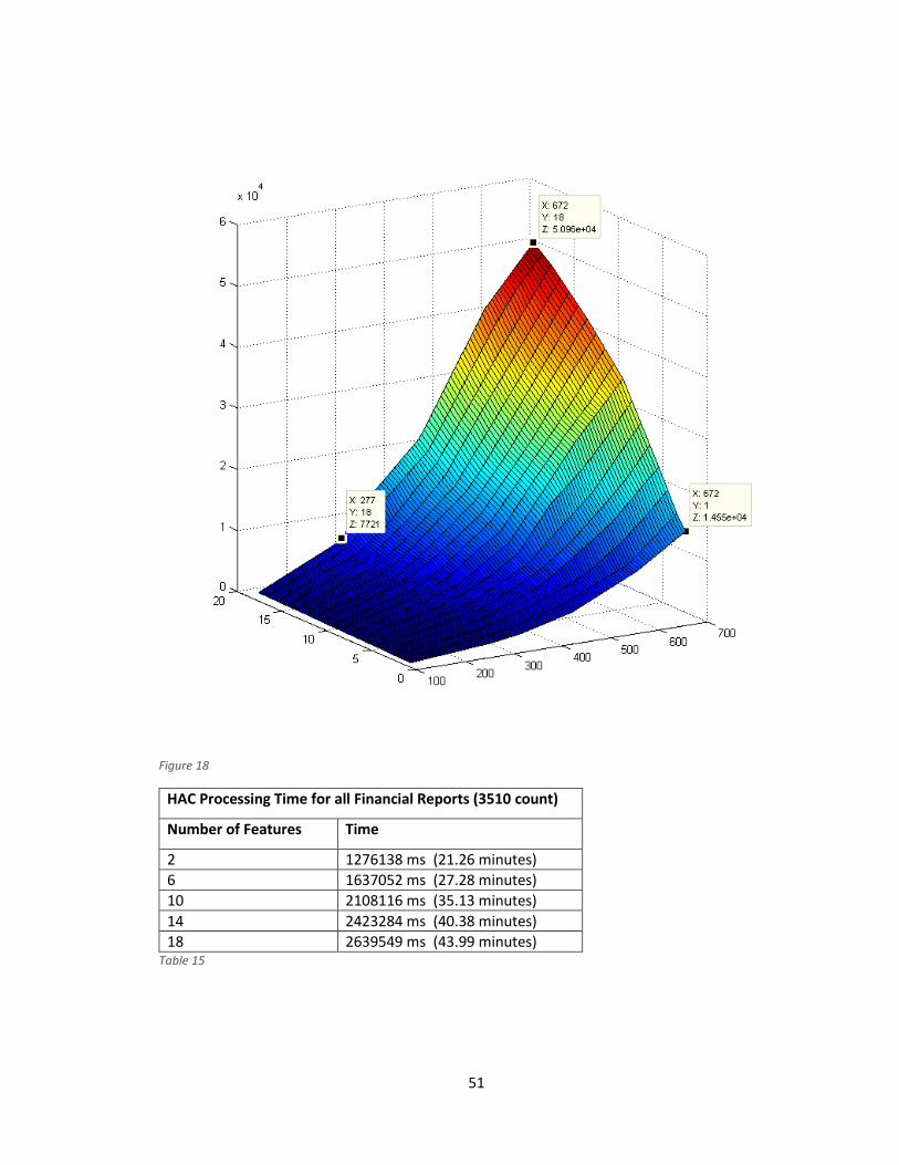
51
Figure 18
HAC Processing Time for all Financial Reports (3510 count)
Number of Features Time
2 1276138 ms (21.26 minutes)
6 1637052 ms (27.28 minutes)
10 2108116 ms (35.13 minutes)
14 2423284 ms (40.38 minutes)
18 2639549 ms (43.99 minutes) Table 15
52
7. CONCLUSIONS AND FUTURE WORK
In this work, we looked at various financial ratios, including earnings per share surprise
percentage, and applied them to a hybrid clustering method used by [Lin et al. 2011], hoping to
achieve superior results. We also extended the classification scheme used by [Lin et al. 2011] to
more accurately classify financial reports. Next, we proposed more outlier-tolerant
normalization techniques versus the primitive min-max normalization used by [Lin et al. 2011].
We were able to show that our normalization/scaling scheme outperforms min-max. This paper
did not focus on textual analysis like some of the previous works had, instead we focused on the
relative importance of various financial ratios. Two types of ratios were proposed, correlation
based ratios and causality based ratios. We proposed a new method for determining the relative
importance of these various financial ratios, and showed that the resulting weights aligned with
theoretical expectations. These weights were then used during the class-independent
hierarchical agglomerative clustering stage, achieving superior cluster purities as compared to
the weighing method proposed by [Lin et al. 2011]. Achieving higher HAC cluster purity led to
minimized over-fitting by a modified version of K-Means, and therefore overall better prediction
accuracy on average.
There were a couple of major challenges faced during this project. The main one was
the difficulty in obtaining some of the data. This consisted mainly of trying to find historical
earnings expectation numbers, and in the end, three sources had to be combined to get a
proper dataset. Historical earnings report release dates were also fairly challenging to obtain, as
these dates can vary wildly from the easily obtainable filing dates with the SEC. Also, there were
about 20% more financial reports that were mined, but since there were missing or invalid
values, they had to be tossed. The data acquisition and normalization accounted for about 70%
of the work (which after conferring with some colleagues, is normal).
For future research, there are a couple of things that would be valuable to explore. One
would be to determine financial ratio weights separately for each industry sector. This would
likely further increase cluster purity and overall prediction accuracy. It would also be of some
value to test various values for wm, which determines the relative importance of the causality
ratios versus the correlation ratios. Overall there are a lot of variables that could be explored.
53
8. REFERENCES
[1] M.-C. Lin, A. Lee, R.-T. Kao and K.-T. Chen, "Stock price movement prediction using representative prototypes of financial reports," ACM Transactions on Management Information Systems (TMIS), vol. 2, no. 3, pp. Article 19, 18 pages, October 2011.
[2] Chen, Peter F. and Zhang, Guochang, How Do Accounting Variables Explain Stock Price Movements? Theory and Evidence. Journal of Accounting and Economics, 2007; HKUST Business School Research Paper No. 07-02. Available at SSRN: http://ssrn.com/abstract=977678
[3] Barbro Back, J. Toivonen, Hannu Vanharanta, A. Visa, Comparing Numerical Data and Text Information from Annual Reports Using Self-Organizing Maps. In: Proceedings of International Symposium on Accounting Information Systems, 2000.
[4] Kloptchenko, A., Eklund, T., Back, B., Karlsson, J., Vanharanta, H., and Visa, A. 2004. Combining data and text mining techniques for analyzing financial reports. Intell. Syst. Account. Finance Manag. 12, 1, 29–41.
[5] Johnson, W. B., & Zhao, R. (2012). Contrarian Share Price Reactions to Earnings Surprises. Journal Of Accounting, Auditing & Finance, 27(2), 236-266.
[6] C. Duhigg, "Artificial intelligence applied heavily to picking stocks - Business - International Herald Tribune," 23 November 2006. [Online]. Available: http://www.nytimes.com/2006/11/23/business/worldbusiness/23iht-trading.3647885.html. [Accessed 2 May 2013].
[7] H. Agnew, "New artificial intelligence fund can ‘learn’," Financial News, 8 October 2012. [Online]. Available: http://www.efinancialnews.com/story/2012-10-08/new-artificial-intelligence-fund-can- learn. [Accessed 2 May 2013].
[8] E. L. Aguirre, "Students Create Cool Projects Using Artificial Intelligence," University of Massachusetts, 18 December 2012. [Online]. Available: http://www.uml.edu/News/stories/2011- 12/Artificial-Intelligence-class.aspx. [Accessed 2 May 2013].
[9] "A Look At Corporate Profit Margins." Investopedia. N.p., n.d. Web. 03 Dec. 2014. http://www.investopedia.com/articles/fundamental/04/042804.asp
[10] "ROA And ROE Give Clear Picture Of Corporate Health." Investopedia. N.p., n.d. Web. 03 Dec. 2014. http://www.investopedia.com/articles/basics/05/052005.asp?rp=i
[11] "The Johns Hopkins Carey Business School Equity Analyst Team." : ROA vs. ROE vs. ROIC. N.p., n.d. Web. 03 Dec. 2014. http://jhuanalystteam.blogspot.com/2011/07/roa-vs-roe-vs-roic.html

54
[12] "Financial Ratios." Financial Ratios. N.p., n.d. Web. 03 Dec. 2014. http://www.netmba.com/finance/financial/ratios/
[13] "Asset Management Ratios." Financial Analysis and Accounting Book of Reference: Statement of Financial Position. N.p., n.d. Web. 03 Dec. 2014. http://www.readyratios.com/reference/asset/
[14] "Price-Earnings Ratio (P/E Ratio) Definition | Investopedia." Investopedia. N.p., n.d. Web. 02
Dec. 2014. http://www.investopedia.com/terms/p/price-earningsratio.asp
[15] "Hierarchical Agglomerative Clustering Algorithm in C#." Free. N.p., n.d. Web. 03 Dec. 2014.
http://www.snip-me.de/hierarchical-agglomerative-clustering-c-sharp.aspx
[16] Stuart L. Crawford and Steven K. Souders (1990) A Comparison of Two New Techniques for
Conceptual Clustering. Advances in Artificial Intelligence: pp. 105-124.
[17] P.-N. Tan, M. Steinbach, and V. Kumar. Introduction to Data Mining. AddisonWesley, 2006.