Embed Size (px)
Citation preview
Fitgers Brewery and Grille
Visual Identity SystemApril 2011
Table of Contents
1 Introduction 1-1 Mission Statement
2 Logo Structure 2-1 Logo Structure 2-2 Color Options 2-4 Logo Specifications
2-5 Improper Usage
3 Color 3-1 Color Palette
4 Typography 4-1 Typography Options
5 Usage Options 5-1 Official Documents 5-3 Official Mail 5-4 Buisness Cards 5-5 Company Invoices 5-6 Clothing Applications 5-7 Vehicle Applications 5-8 Bar Applicaions
Mission Statement
Fitgers Brewery and Grille has introduced an updated company-wide Visual Identity Program designed to standardize and more uniformly represent and promote Our company and the services it provides. A distinctive yet consistent company-branding program is critical in helping Fitgers represent its timless brew of beer and one-of-a-kind atmosphere to its diverse audience.
Careful consideration was invested in the creation of these new logos, with input from the marketing department and collaboration with a professional marketing and design firm.
This Fitgers Visual Identity Standards Manual is designed to assist everyone in proper use of the company’s corporate marks.
All Fitgers identity marks are the property of Fitgets, Inc. Federal trademark law requires that the use of any trademark be monitored in order to maintain legal claim to that mark. The rules outlined in this publication are necessary to protect and oversee those identity marks.
These visual identity rules apply to anyone who might use a Fitgers identity mark: all divisions, offices, printers and any outside vendors. If you have questions regarding company logo usage, contact Kent Vanderport, director of internal affairs.
Thank you for your assistance
Kent VanderperportDirector of Internal and Exterior Affairs
1-1
Logo Structure
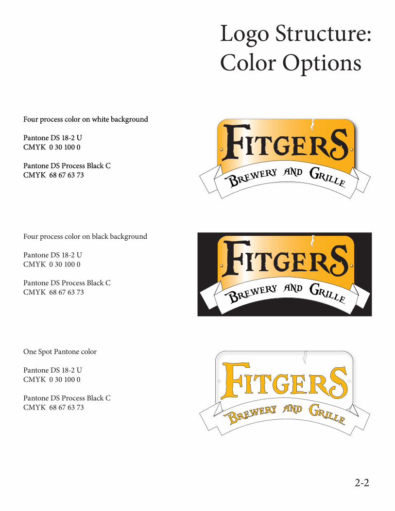
When using the logo, the four process colors should be used whenever it is posible for the producing parties. This is an effort to correctly display the logo and for the audiances to recieve the full effect of it. If the Producing party concludes that using the 4 process color is not an option for them the flat black of single spot color may be used in its place.
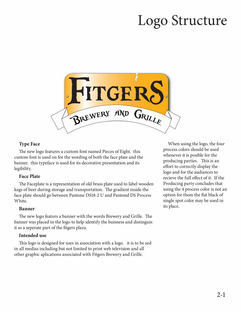
Type FaceThe new logo features a cuztom font named Pieces of Eight. this
custom font is used on for the wording of both the face plate and the banner. this typeface is used for its decorative presentation and its legibility.
Face PlateThe Faceplate is a representation of old brass plate used to label wooden
kegs of beer during storage and transportation. The gradient inside the face plate should go between Pantone DS18-2 U and Pantond DS Process White.
BannerThe new logo featurs a banner with the words Brewery and Grille. The
banner was placed in the logo to help identify the buisness and distinguis it as a seperate part of the fitgers plaza.
Intended useThis logo is designed for uses in association with a logo. it is to be sed
in all medias including but not limited to print web television and all other graphic aplications associated with Fitgers Brewery and Grille.
2-1
Logo Structure: Color Options
Four process color on white background
Pantone DS 18-2 U CMYK 0 30 100 0
Pantone DS Process Black CCMYK 68 67 63 73
Four process color on white background
Pantone DS 18-2 U CMYK 0 30 100 0
Pantone DS Process Black CCMYK 68 67 63 73
Four process color on black background
Pantone DS 18-2 U CMYK 0 30 100 0
Pantone DS Process Black CCMYK 68 67 63 73
One Spot Pantone color
Pantone DS 18-2 U CMYK 0 30 100 0
Pantone DS Process Black CCMYK 68 67 63 73
Pantone DS 18-2 U
2-1 2-2
Logo Structure: Color Options
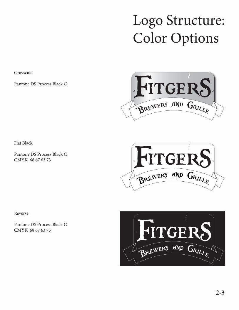
Grayscale
Pantone DS Process Black C
Flat Black
Pantone DS Process Black CCMYK 68 67 63 73
Reverse
Pantone DS Process Black CCMYK 68 67 63 73
2-3
Logo Structure: Logo Specifications
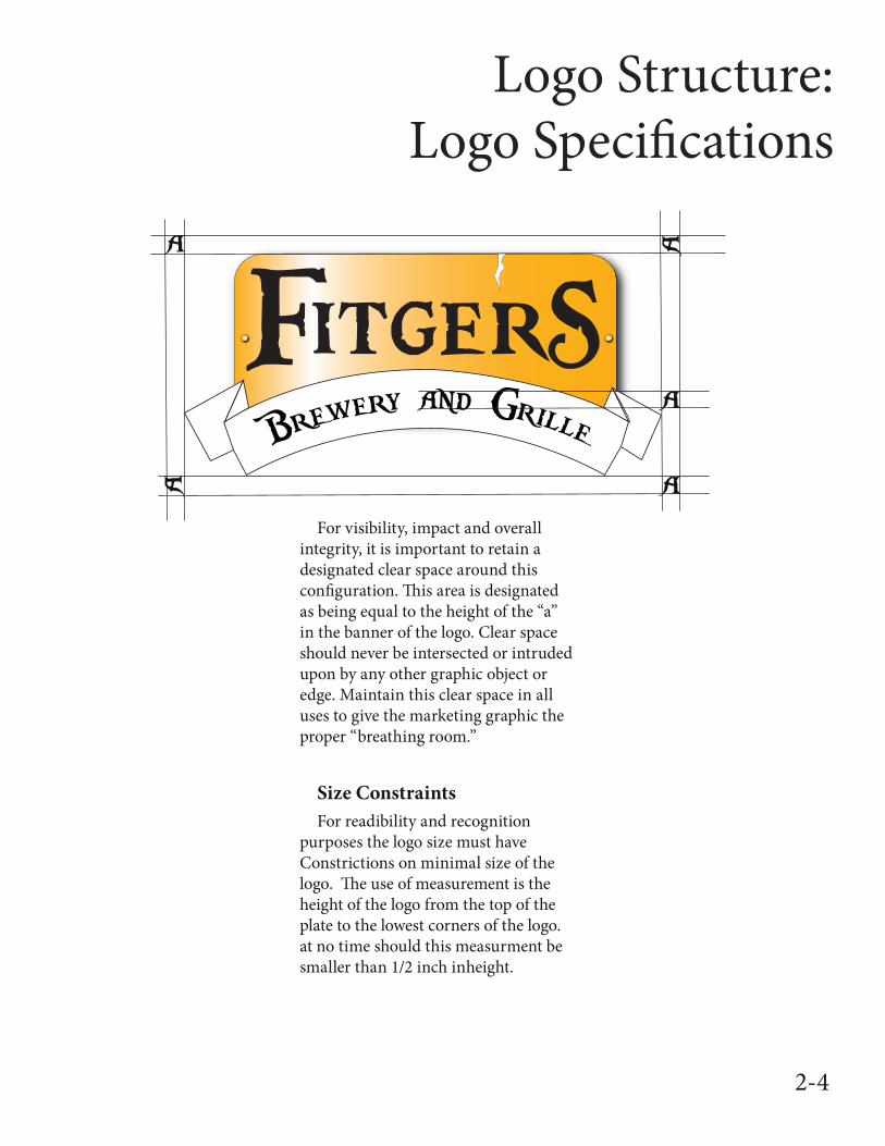
For visibility, impact and overall integrity, it is important to retain a designated clear space around this configuration. This area is designated as being equal to the height of the “a” in the banner of the logo. Clear space should never be intersected or intruded upon by any other graphic object or edge. Maintain this clear space in all uses to give the marketing graphic the proper “breathing room.”
Size ConstraintsFor readibility and recognition
purposes the logo size must have Constrictions on minimal size of the logo. The use of measurement is the height of the logo from the top of the plate to the lowest corners of the logo. at no time should this measurment be smaller than 1/2 inch inheight.
2-4
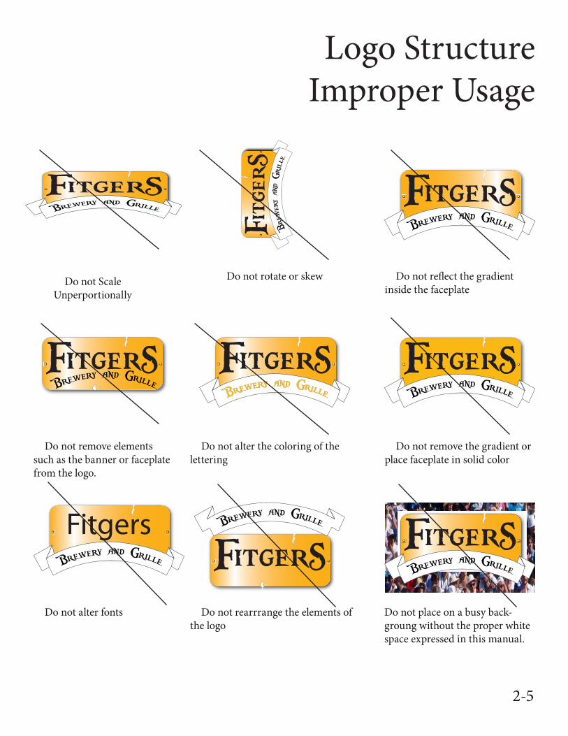
Logo StructureImproper Usage
Do not Scale Unperportionally
Do not rotate or skew Do not reflect the gradient inside the faceplate
Do not remove elements such as the banner or faceplate from the logo.
Do not alter the coloring of the lettering
Do not remove the gradient or place faceplate in solid color
Do not alter fonts Do not rearrrange the elements of the logo
Do not place on a busy back-groung without the proper white space expressed in this manual.
2-5
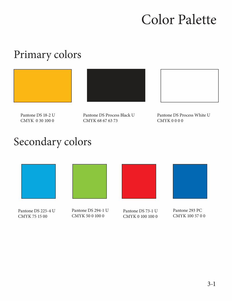
Color Palette
Pantone DS 18-2 U CMYK 0 30 100 0
Pantone DS Process Black UCMYK 68 67 63 73
Pantone DS Process White UCMYK 0 0 0 0
Primary colors
Secondary colors
Pantone DS 225-4 UCMYK 75 15 00
Pantone DS 294-1 UCMYK 50 0 100 0
Pantone DS 73-1 UCMYK 0 100 100 0
Pantone 293 PCCMYK 100 57 0 0
3-1
Typography Options
ABCDEFGHIJKLMNOPQRSTUVWXYZ abcdefghi-jklmnopqrstuvwxyz 1234567890ABCDEFGHIJKLMNOPQRSTUVWXYZ abcdefghi-jklmnopqrstuvwxyz 1234567890
ABCDEFGHIJKLMNOPQRSTUVWXYZ abcdef-ghijklmnopqrstuvwxyz 1234567890
ABCDEFGHIJKLMNOPQRSTUVWXYZ abcdef-ghijklmnopqrstuvwxyz 1234567890
ABCDEFGHIJKLMNOPQRSTUVWXYZ abcdef-ghijklmnopqrstuvwxyz 1234567890
ABCDEFGHIJKLMNOPQRSTUVWXYZ abcdefghi-jklmnopqrstuvwxyz 1234567890
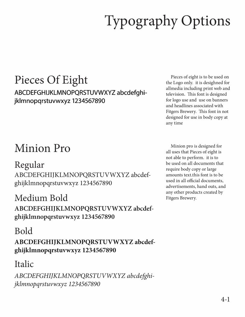
Pieces Of Eight
Minion Pro
Pieces of eight is to be used on the Logo only. it is desighned for allmedia including print web and television. This font is designed for logo use and use on banners and headlines associated with Fitgers Brewery. This font in not designed for use in body copy at any time
Regular
Medium Bold
Bold
Italic
Minion pro is designed for all uses that Pieces of eight is not able to perform. it is to be used on all documents that require body copy or large amounts text.this font is to be used in all official documents, advertisements, hand outs, and any other products created by Fitgers Brewery.
4-1
Logo Usage:Official Documents
Brewery and Grille
600 East Superior StreetDuluth, MN 55802
(218) 722-8826Fitgersbrewery.com
1”
1”
1/2”
1 1/2”
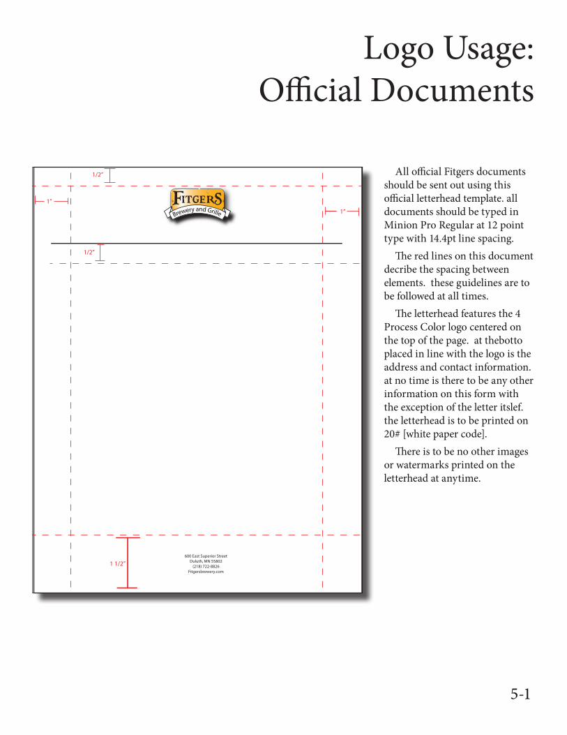
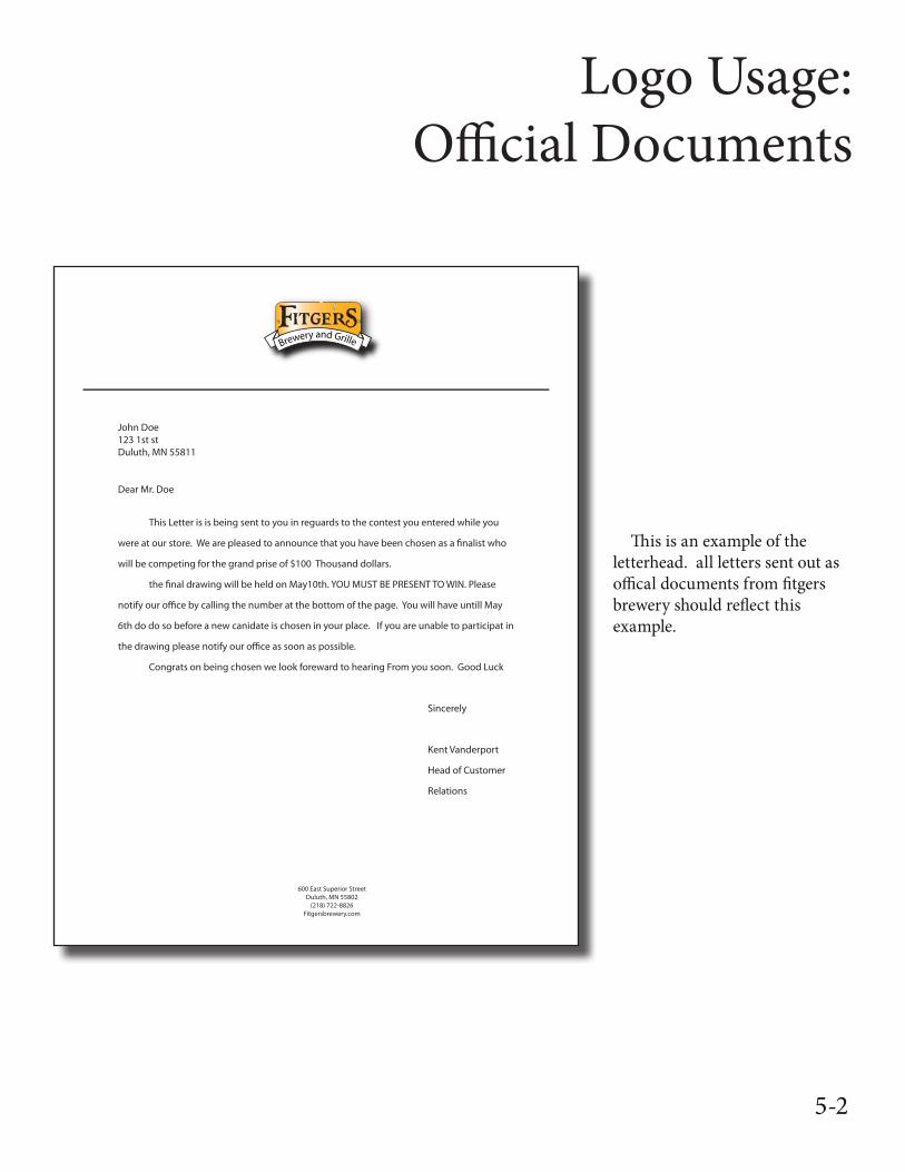
1/2” All official Fitgers documents should be sent out using this official letterhead template. all documents should be typed in Minion Pro Regular at 12 point type with 14.4pt line spacing.
The red lines on this document decribe the spacing between elements. these guidelines are to be followed at all times.
The letterhead features the 4 Process Color logo centered on the top of the page. at thebotto placed in line with the logo is the address and contact information. at no time is there to be any other information on this form with the exception of the letter itslef. the letterhead is to be printed on 20# [white paper code].
There is to be no other images or watermarks printed on the letterhead at anytime.
4-1 5-1
Logo Usage:Official Documents
Brewery and Grille
600 East Superior StreetDuluth, MN 55802
(218) 722-8826Fitgersbrewery.com
John Doe123 1st st Duluth, MN 55811
Dear Mr. Doe
This Letter is is being sent to you in reguards to the contest you entered while you
were at our store. We are pleased to announce that you have been chosen as a �nalist who
will be competing for the grand prise of $100 Thousand dollars.
the �nal drawing will be held on May10th. YOU MUST BE PRESENT TO WIN. Please
notify our o�ce by calling the number at the bottom of the page. You will have untill May
6th do do so before a new canidate is chosen in your place. If you are unable to participat in
the drawing please notify our o�ce as soon as possible.
Congrats on being chosen we look foreward to hearing From you soon. Good Luck
Sincerely
Kent Vanderport
Head of Customer
Relations
This is an example of the letterhead. all letters sent out as offical documents from fitgers brewery should reflect this example.
5-2
Brewery and Grille
Fitgers Brewery and Grille600 East Superior StreetDuluth, MN 55802
John Doe123 Sample StreetDuluth MN, 55811
4”
2”
2 3/8”
1/4”
1/4”
1/2”
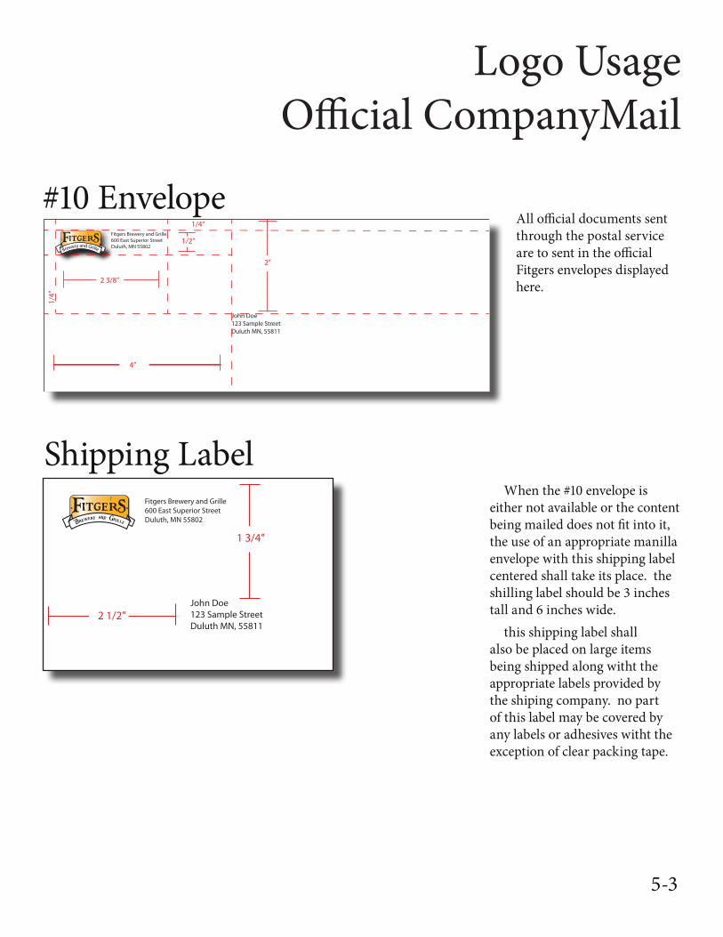
Logo UsageOfficial CompanyMail
All official documents sent through the postal service are to sent in the official Fitgers envelopes displayed here.
#10 Envelope
Shipping LabelFitgers Brewery and Grille600 East Superior StreetDuluth, MN 55802
John Doe123 Sample StreetDuluth MN, 55811
2 1/2”
1 3/4”
When the #10 envelope is either not available or the content being mailed does not fit into it, the use of an appropriate manilla envelope with this shipping label centered shall take its place. the shilling label should be 3 inches tall and 6 inches wide.
this shipping label shall also be placed on large items being shipped along witht the appropriate labels provided by the shiping company. no part of this label may be covered by any labels or adhesives witht the exception of clear packing tape.
5-3
Logo Usage:Buisness Cards
Kent VanderportDirector of Interiorand Exterior A�airs
600 East Superior StreetDuluth, MN 55802
(218) 723.7762 (O�ce)(218) 213.2682 (Mobile)
Kvanderport@�tgers.comwww.Fitgers.com/kvanderport
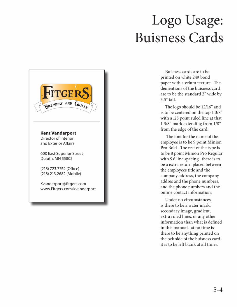
Buisness cards are to be printed on white 24# bond paper with a velum texture. The dementions of the buisness card are to be the standard 2” wide by 3.5” tall.
The logo should be 12/16” and is to be centered on the top 1 3/8” with a .25 point ruled line at that 1 3/8” mark extending from 1/8” from the edge of the card.
The font for the name of the employee is to be 9 point Minion Pro Bold. The rest of the type is to be 8 point Minion Pro Regular with 9.6 line spacing. there is to be a extra return placed between the employees title and the company address, the company addres and the phone numbers, and the phone numbers and the online contact information.
Under no circumstances is there to be a water mark, secondary image, gradient, extra ruled lines, or any other information than what is defined in this manual. at no time is there to be anything printed on the bck side of the buisness card. it is to be left blank at all times.
5-4
Logo Usage:Company Invoices
Fitgers Brewery and GrilleFitgers Brewery and Grille600 East Superior StreetDuluth, MN 55802
Shipping and RecievingFitgers Brewery and Grille600 East Superior StreetDuluth, MN 55802
Date: XX-XX-XXXXInvoice # XXXXXXXXX
Bill To
Company NameCompany AddressCompany Address Line 2City, State Zip
Make Payment To
Sub TotalTaxShippingOther
Total Due
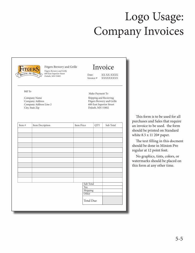
Item # Item Decription Item Price QTY Sub Total
This form is to be used for all purchases and Sales that require an invoice to be used. the form should be printed on Standard white 8.5 x 11 20# paper.
The text filling in this docment should be done in Minion Pro regular at 12 point font.
No graphics, tints, colors, or watermarks should be placed on this form at any other time.
5-5
Logo Usage:Clothing Applications
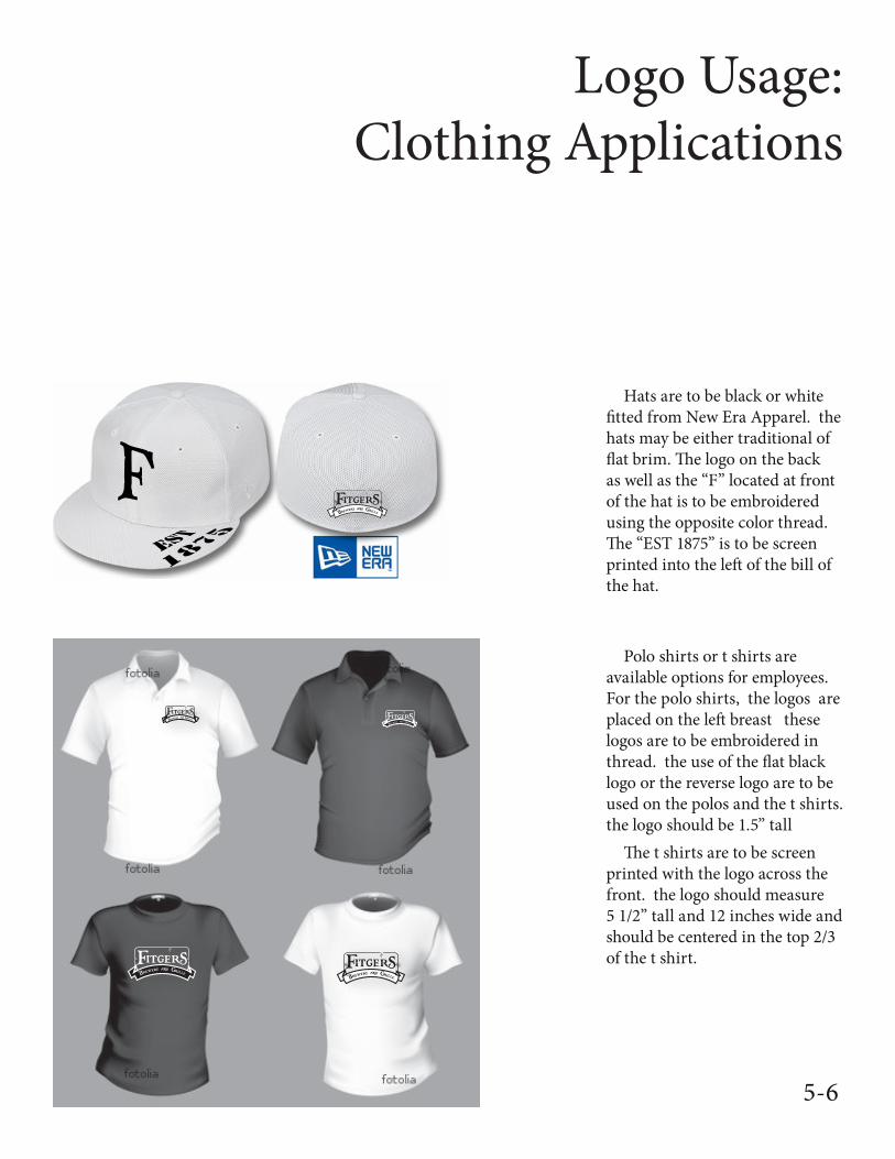
Hats are to be black or white fitted from New Era Apparel. the hats may be either traditional of flat brim. The logo on the back as well as the “F” located at front of the hat is to be embroidered using the opposite color thread. The “EST 1875” is to be screen printed into the left of the bill of the hat.
Polo shirts or t shirts are available options for employees. For the polo shirts, the logos are placed on the left breast these logos are to be embroidered in thread. the use of the flat black logo or the reverse logo are to be used on the polos and the t shirts. the logo should be 1.5” tall
The t shirts are to be screen printed with the logo across the front. the logo should measure 5 1/2” tall and 12 inches wide and should be centered in the top 2/3 of the t shirt.
5-6
Logo Usage:Vehicle Applications
Brewery and Grille
Brewery and Grille
34
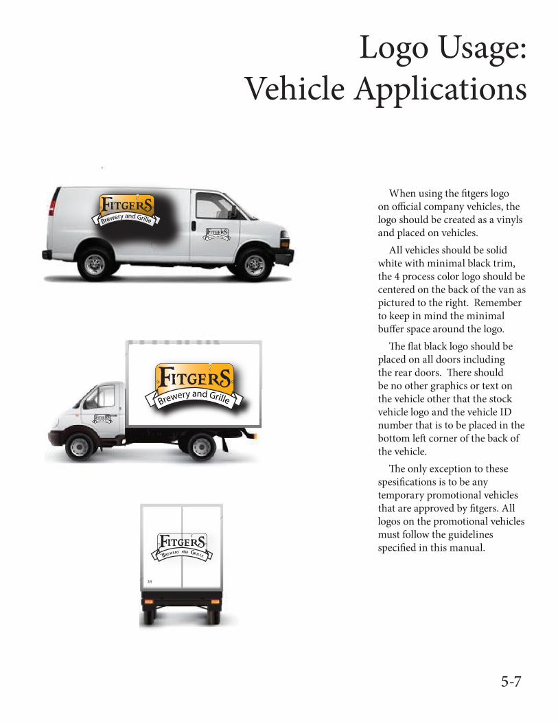
When using the fitgers logo on official company vehicles, the logo should be created as a vinyls and placed on vehicles.
All vehicles should be solid white with minimal black trim, the 4 process color logo should be centered on the back of the van as pictured to the right. Remember to keep in mind the minimal buffer space around the logo.
The flat black logo should be placed on all doors including the rear doors. There should be no other graphics or text on the vehicle other that the stock vehicle logo and the vehicle ID number that is to be placed in the bottom left corner of the back of the vehicle.
The only exception to these spesifications is to be any temporary promotional vehicles that are approved by fitgers. All logos on the promotional vehicles must follow the guidelines specified in this manual.
5-7
Logo Usage:Bar Applications
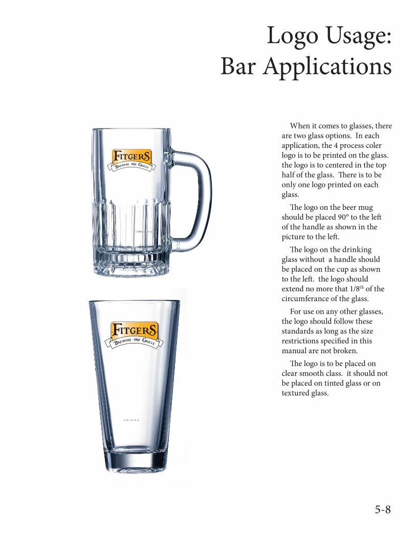
When it comes to glasses, there are two glass options. In each application, the 4 process coler logo is to be printed on the glass. the logo is to centered in the top half of the glass. There is to be only one logo printed on each glass.
The logo on the beer mug should be placed 90° to the left of the handle as shown in the picture to the left.
The logo on the drinking glass without a handle should be placed on the cup as shown to the left. the logo should extend no more that 1/8th of the circumferance of the glass.
For use on any other glasses, the logo should follow these standards as long as the size restrictions specified in this manual are not broken.
The logo is to be placed on clear smooth class. it should not be placed on tinted glass or on textured glass.
5-8