Embed Size (px)
Citation preview
Flex 4 - Spark ContainersRyan FrishbergSoftware Consultant, Lab49http://www.frishy.com
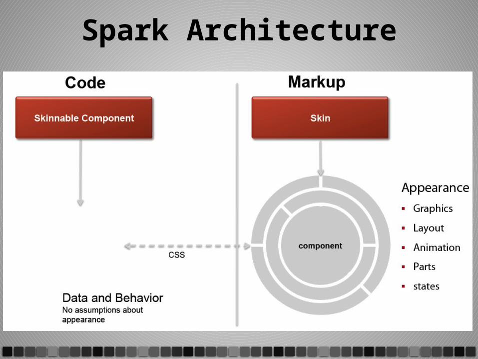
Spark Architecture
From MX to Spark• MX
– Rich, styleable components– Heavy components => Easy to use (most of the
time)
• Spark introduces new component model– Declarative Skins - rich, toolable, extremely
customizable but heavier than MX– Lightweight graphic primitives (MXML Graphics)– Lighter-weight modularized components
Spark Containers• A container is a component used to size and
position other components• What’s different in Spark?
– More container classes– Assignable layouts– Supports non-UIComponent children
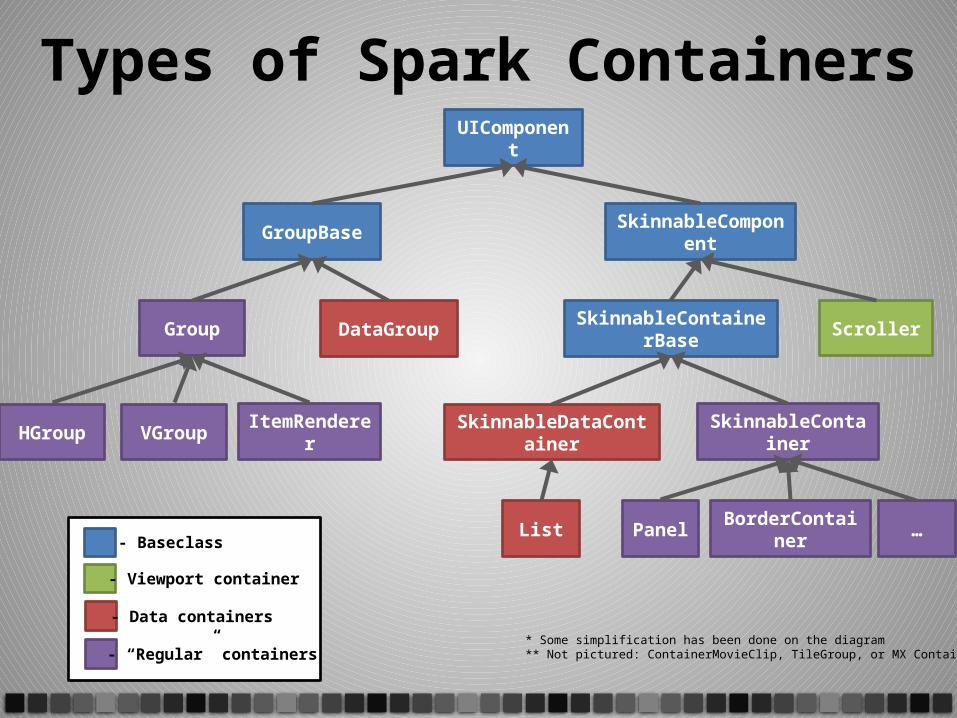
Types of Spark Containers
- Baseclass
- Viewport container
- Data containers
- “Regular” containers* Some simplification has been done on the diagram** Not pictured: ContainerMovieClip, TileGroup, or MX Containers
UIComponent
GroupBase SkinnableComponent
SkinnableContainerBase
SkinnableDataContainer SkinnableContainer
Panel BorderContainer …List
ScrollerGroup DataGroup
HGroup VGroup ItemRenderer
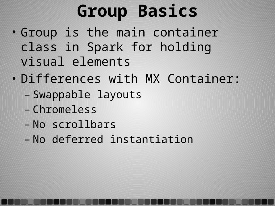
Group Basics• Group is the main container class in Spark for
holding visual elements• Differences with MX Container:
– Swappable layouts– Chromeless– No scrollbars – No deferred instantiation
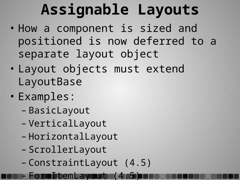
Assignable Layouts• How a component is sized and positioned is
now deferred to a separate layout object• Layout objects must extend LayoutBase• Examples:
– BasicLayout– VerticalLayout– HorizontalLayout– ScrollerLayout– ConstraintLayout (4.5)– FormItemLayout (4.5)– ….
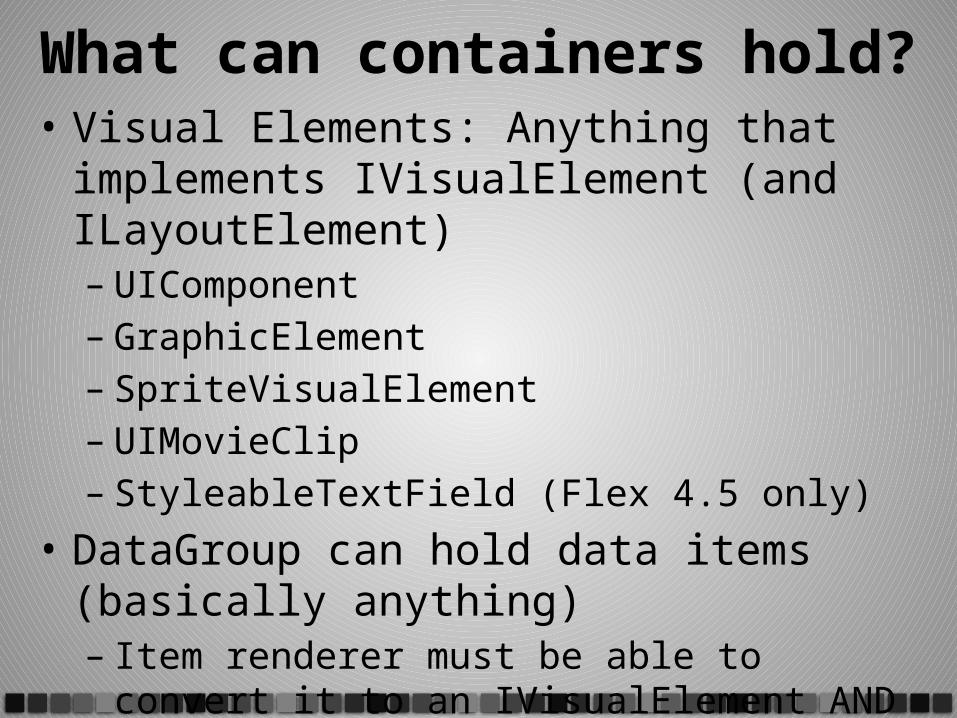
What can containers hold?• Visual Elements: Anything that implements
IVisualElement (and ILayoutElement)– UIComponent– GraphicElement– SpriteVisualElement– UIMovieClip– StyleableTextField (Flex 4.5 only)
• DataGroup can hold data items (basically anything)– Item renderer must be able to convert it to an
IVisualElement AND a DisplayObject
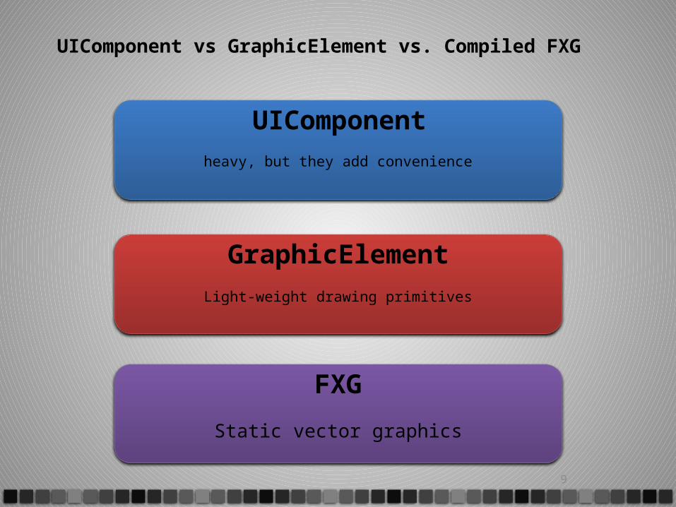
UIComponent vs GraphicElement vs. Compiled FXG
9
UIComponent
heavy, but they add convenience
GraphicElement
Light-weight drawing primitives
FXG
Static vector graphics
<s:Application xmlns:fx="http://ns.adobe.com/mxml/2009" xmlns:s="library://ns.adobe.com/flex/spark"> <s:Button label="Hello World" x="150"/> <s:Rect id="myRect1" width="100" height="100"> <s:fill><s:SolidColor color="#FF0000" /></s:fill> </s:Rect> <s:Rect id="myRect2" width="100" height="100" x="20" y="20"> <s:fill><s:SolidColor color="#00FF00" /></s:fill> </s:Rect> <s:Rect id="myRect3" width="100" height="100" x=”40" y=”40"> <s:fill><s:SolidColor color="#0000FF" /></s:fill> </s:Rect> </s:Application>
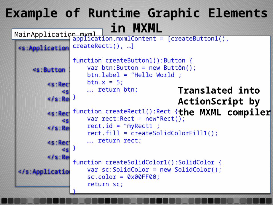
MainApplication.mxml
Example of Runtime Graphic Elements in MXMLapplication.mxmlContent = [createButton1(), createRect1(), …]
function createButton1():Button { var btn:Button = new Button(); btn.label = “Hello World”; btn.x = 5; …. return btn;}
function createRect1():Rect { var rect:Rect = new Rect(); rect.id = “myRect1”; rect.fill = createSolidColorFill1(); …. return rect;}
function createSolidColor1():SolidColor { var sc:SolidColor = new SolidColor(); sc.color = 0x00FF00; return sc;}
Translated into ActionScript by the MXML compiler
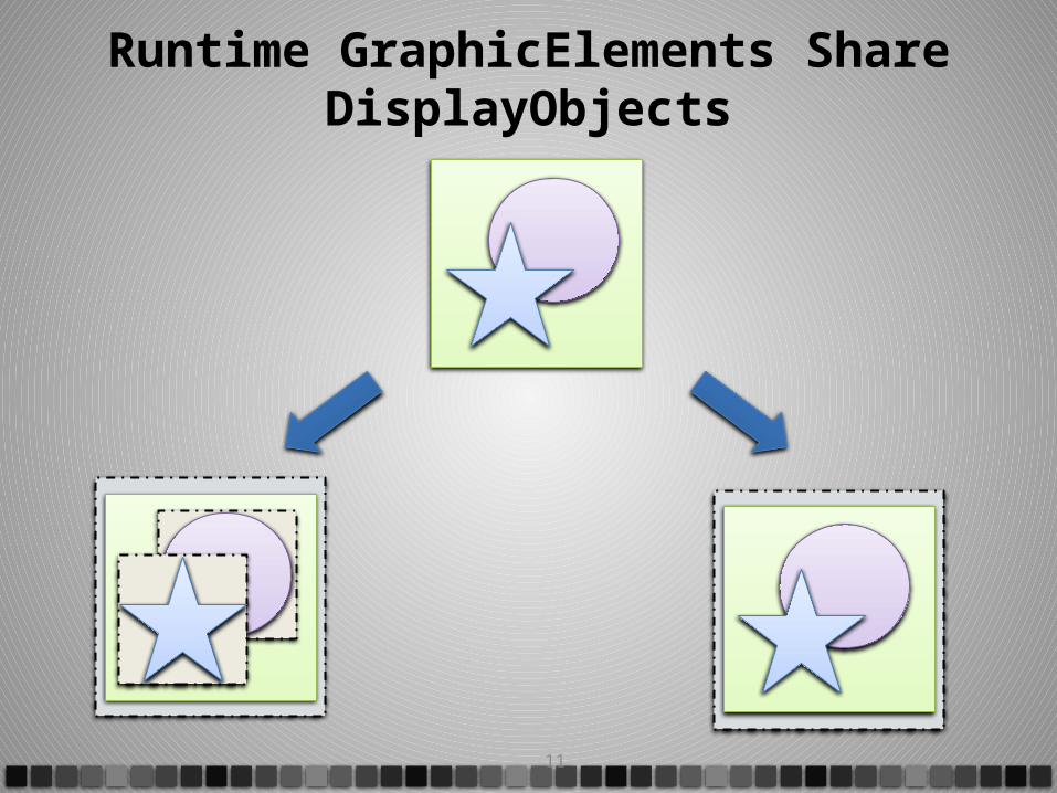
Runtime GraphicElements Share DisplayObjects
11
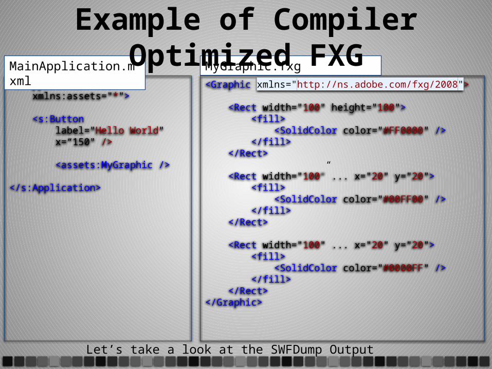
<s:Application ... xmlns:assets="*"> <s:Button label="Hello World" x=“150" /> <assets:MyGraphic /> </s:Application>
MainApplication.mxml<Graphic xmlns="http://ns.adobe.com/fxg/2008"> <Rect width="100" height="100"> <fill> <SolidColor color="#FF0000" /> </fill> </Rect> <Rect width="100” ... x="20" y="20"> <fill> <SolidColor color="#00FF00" /> </fill> </Rect> <Rect width="100" ... x="20" y="20"> <fill> <SolidColor color="#0000FF" /> </fill> </Rect></Graphic>
MyGraphic.fxg
Example of Compiler Optimized FXG
Let’s take a look at the SWFDump Output
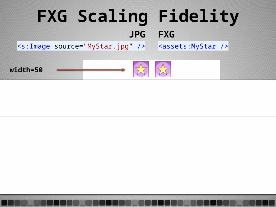
JPG<s:Image source="MyStar.jpg" />
width=50
width=100
width=200
FXG<assets:MyStar />
FXG Scaling Fidelity
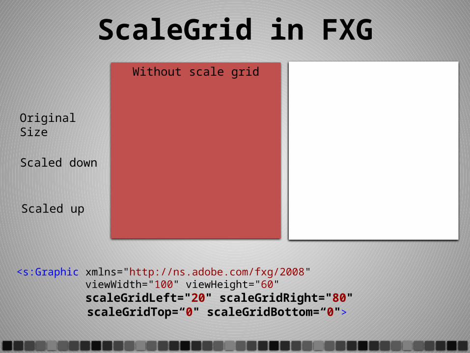
<s:Graphic xmlns="http://ns.adobe.com/fxg/2008" viewWidth="100" viewHeight="60" scaleGridLeft="20" scaleGridRight="80" scaleGridTop=“0" scaleGridBottom=“0">
Original Size
Scaled down
Scaled up
Without scale grid With scale grid
ScaleGrid in FXG
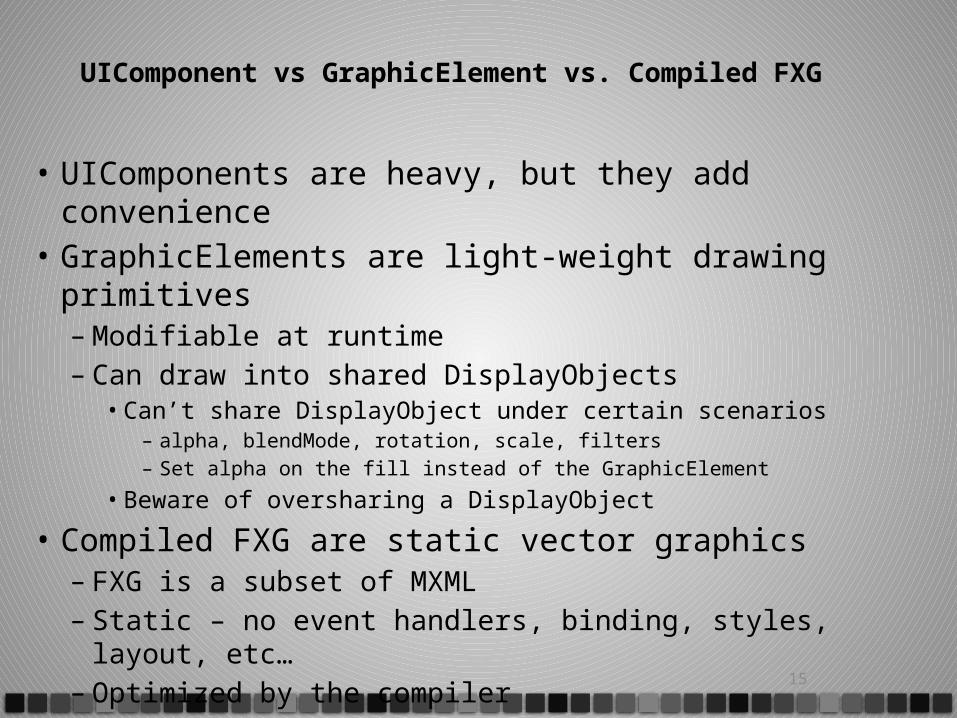
UIComponent vs GraphicElement vs. Compiled FXG
• UIComponents are heavy, but they add convenience• GraphicElements are light-weight drawing primitives
– Modifiable at runtime– Can draw into shared DisplayObjects
• Can’t share DisplayObject under certain scenarios– alpha, blendMode, rotation, scale, filters– Set alpha on the fill instead of the GraphicElement
• Beware of oversharing a DisplayObject
• Compiled FXG are static vector graphics– FXG is a subset of MXML– Static – no event handlers, binding, styles, layout, etc…– Optimized by the compiler 15
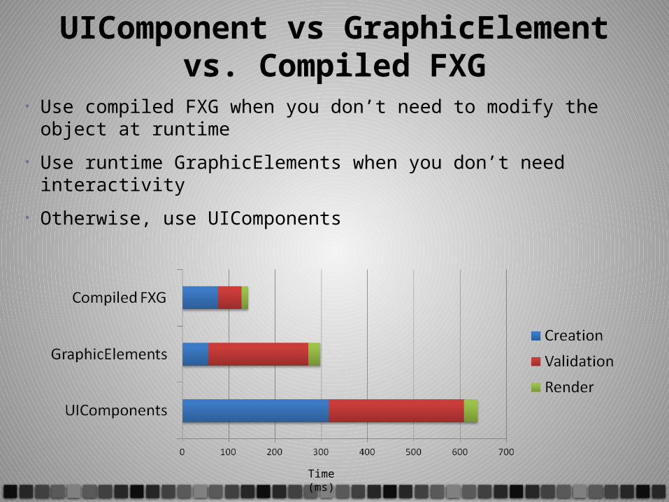
UIComponent vs GraphicElement vs. Compiled FXG
• Use compiled FXG when you don’t need to modify the object at runtime
• Use runtime GraphicElements when you don’t need interactivity
• Otherwise, use UIComponents
Time (ms)
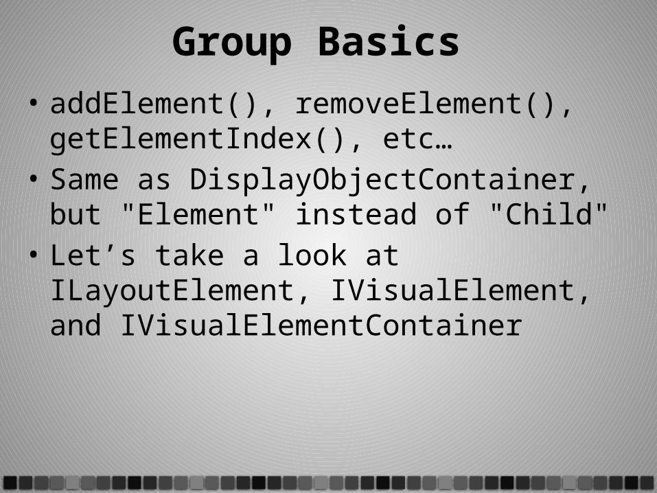
Group Basics • addElement(), removeElement(),
getElementIndex(), etc…• Same as DisplayObjectContainer, but "Element"
instead of "Child"• Let’s take a look at ILayoutElement,
IVisualElement, and IVisualElementContainer
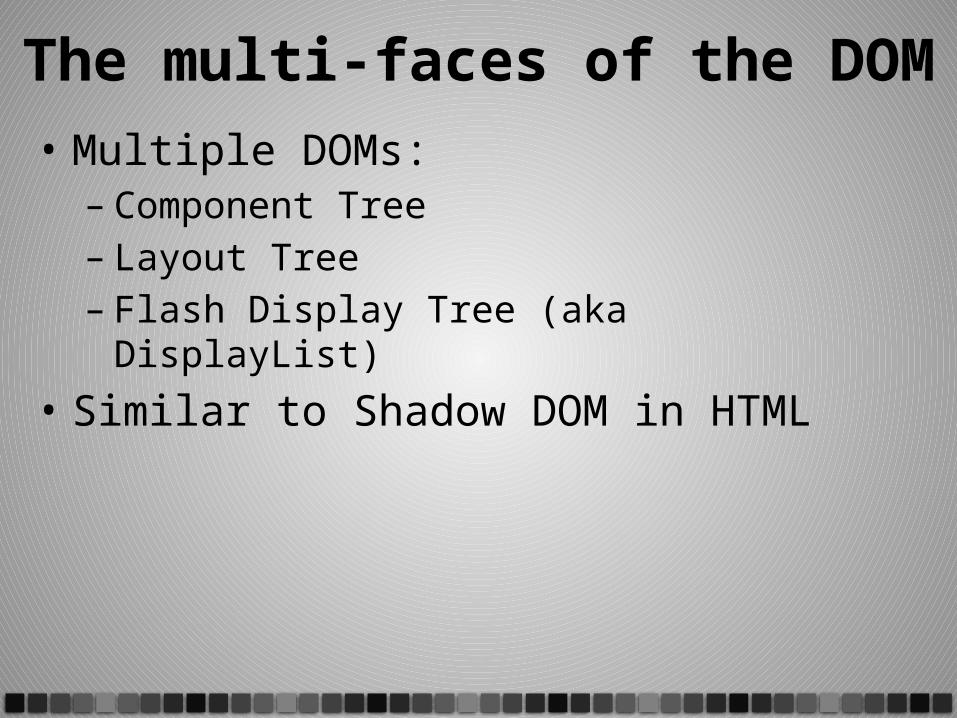
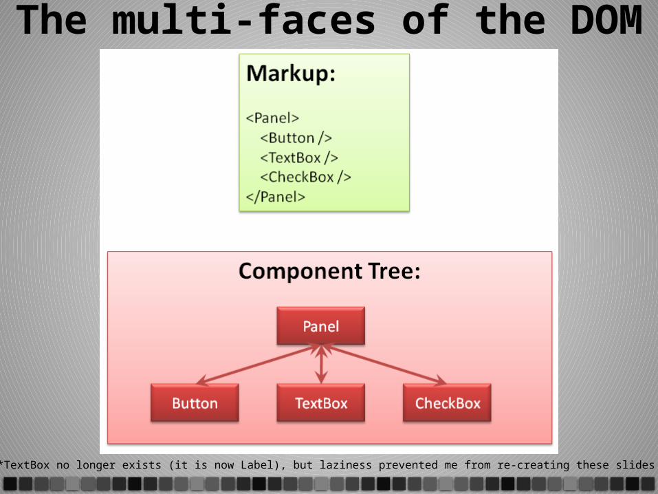
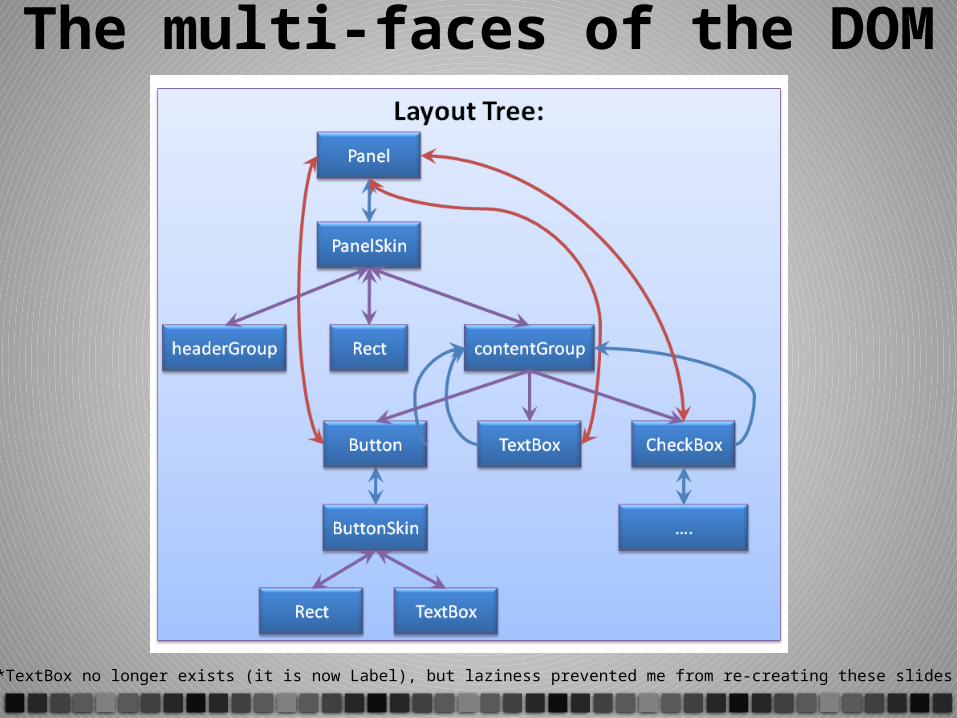
The multi-faces of the DOM• Multiple DOMs:
– Component Tree– Layout Tree– Flash Display Tree (aka DisplayList)
• Similar to Shadow DOM in HTML
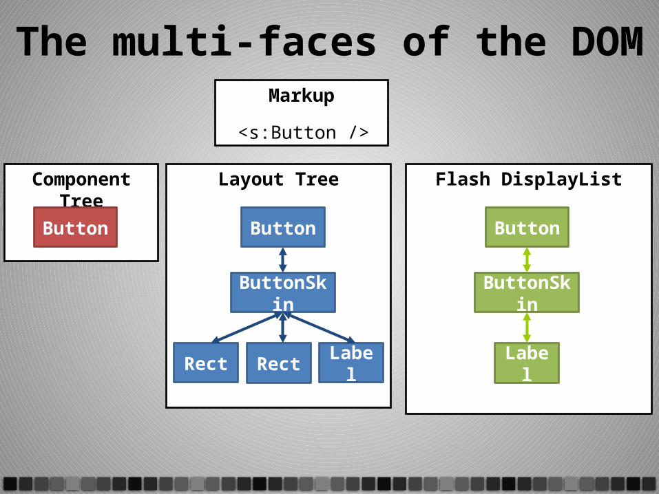
The multi-faces of the DOMMarkup
<s:Button />
Component Tree
Button
Layout Tree
Button
ButtonSkin
Rect Rect Label
Flash DisplayList
ButtonSkin
Label
Button
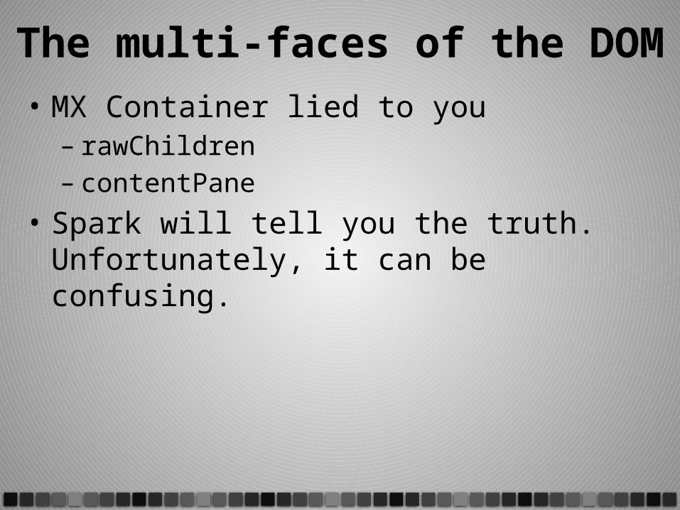
The multi-faces of the DOM• MX Container lied to you
– rawChildren– contentPane
• Spark will tell you the truth. Unfortunately, it can be confusing.
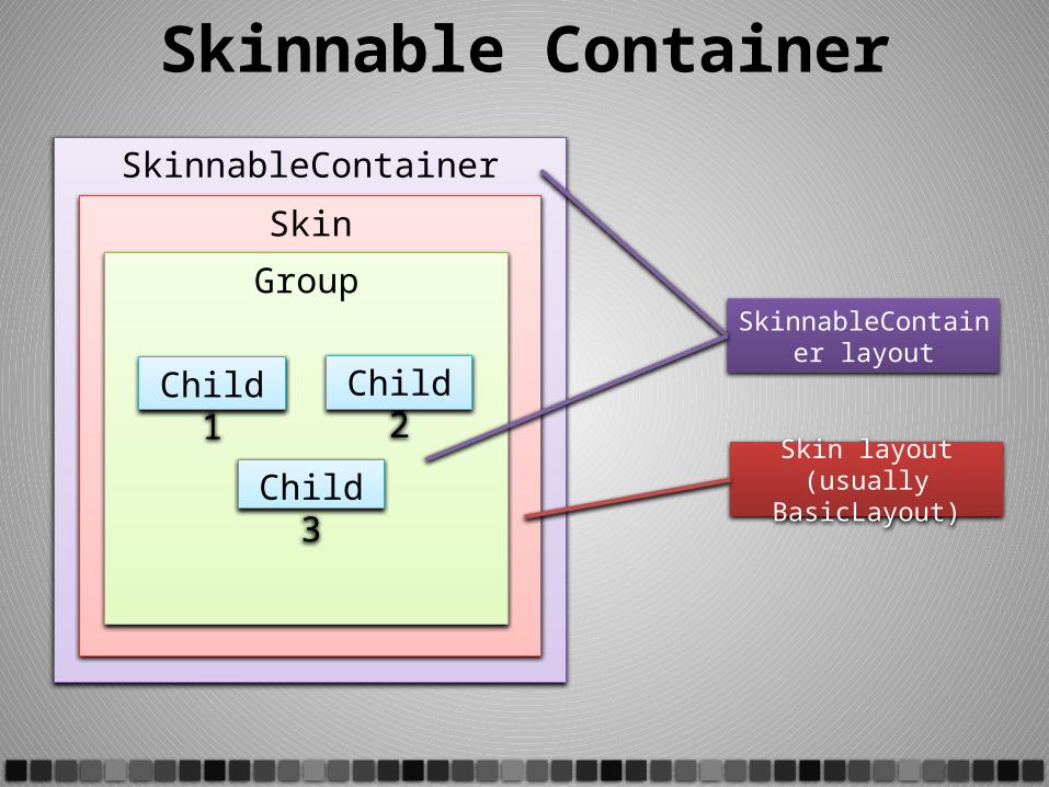
Skinnable Container
SkinnableContainer
Skin
Group
Child1 Child2
Child3
SkinnableContainer layout
Skin layout(usually BasicLayout)
The multi-faces of the DOM
*TextBox no longer exists (it is now Label), but laziness prevented me from re-creating these slides
The multi-faces of the DOM
*TextBox no longer exists (it is now Label), but laziness prevented me from re-creating these slides
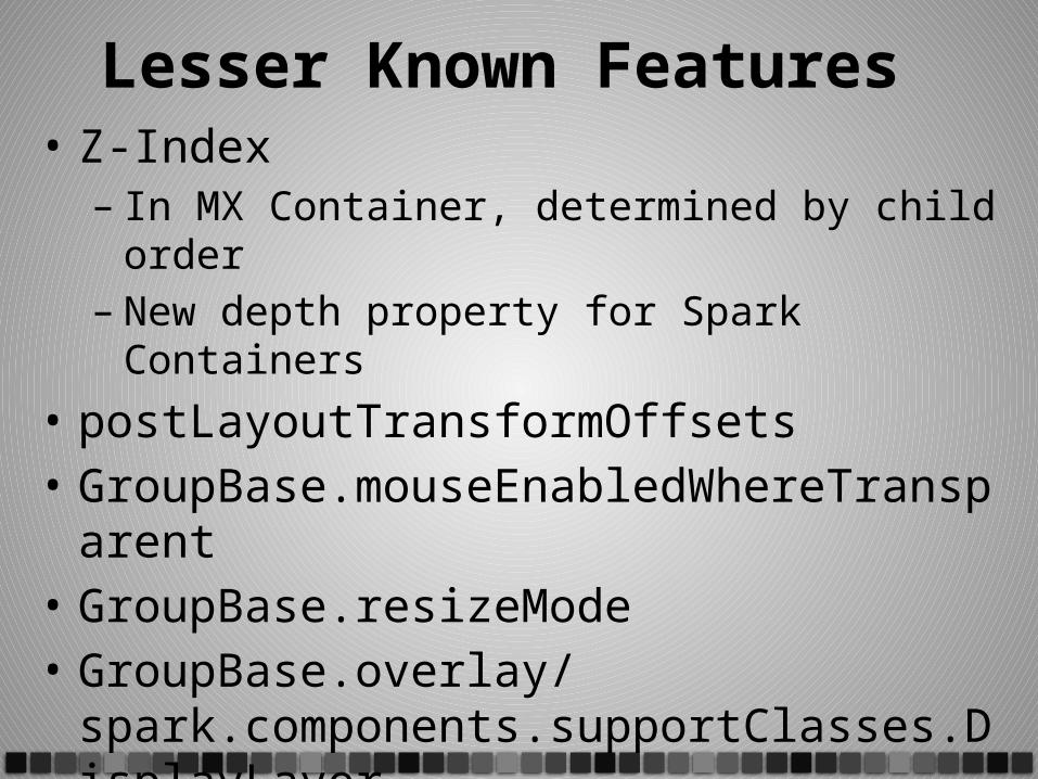
Lesser Known Features • Z-Index
– In MX Container, determined by child order– New depth property for Spark Containers
• postLayoutTransformOffsets• GroupBase.mouseEnabledWhereTransparent• GroupBase.resizeMode• GroupBase.overlay/
spark.components.supportClasses.DisplayLayer
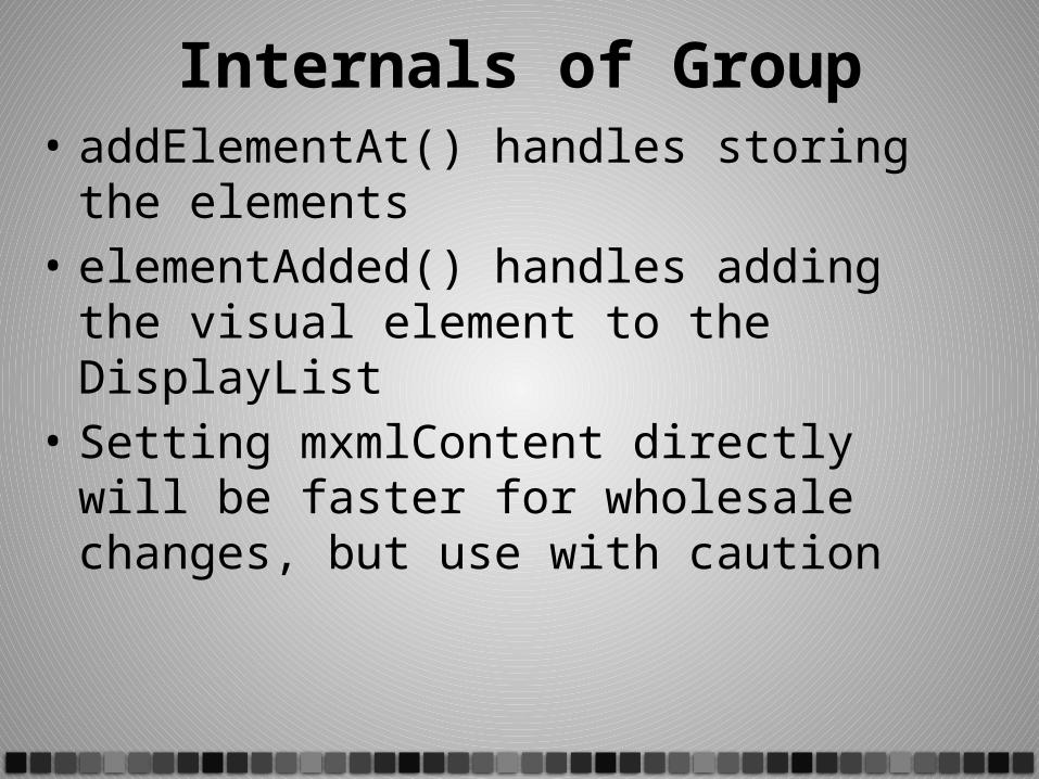
Internals of Group• addElementAt() handles storing the elements• elementAdded() handles adding the visual
element to the DisplayList• Setting mxmlContent directly will be faster for
wholesale changes, but use with caution
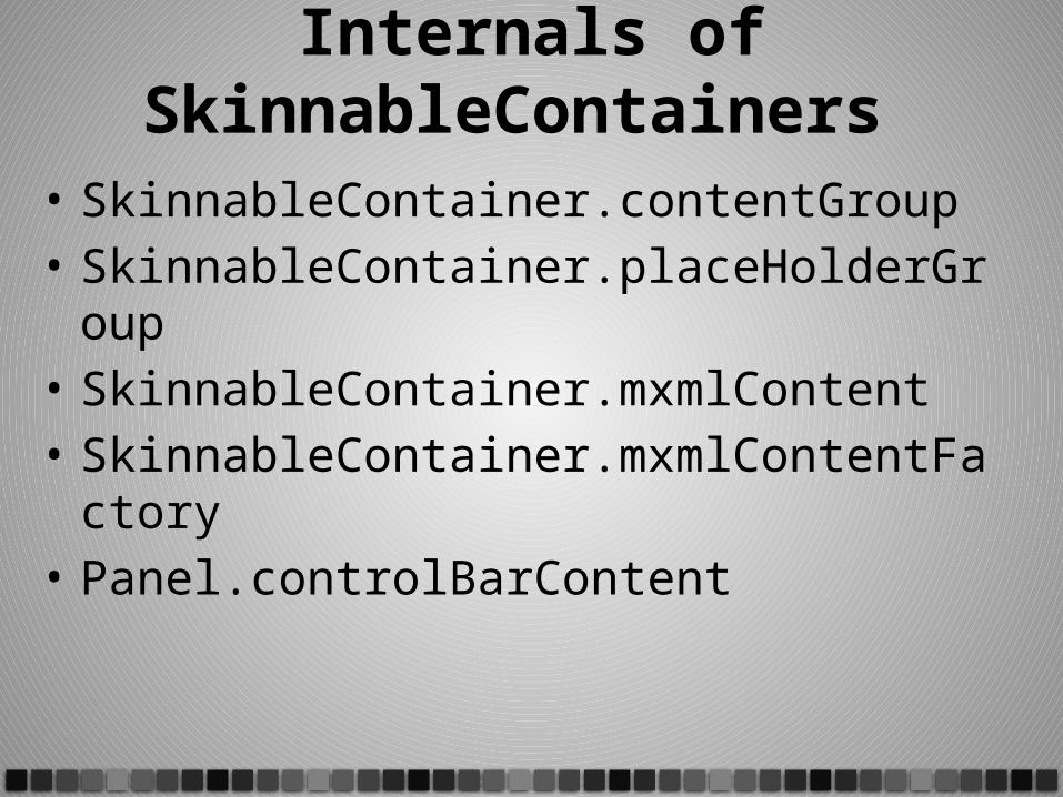
Internals of SkinnableContainers
• SkinnableContainer.contentGroup• SkinnableContainer.placeHolderGroup• SkinnableContainer.mxmlContent• SkinnableContainer.mxmlContentFactory• Panel.controlBarContent
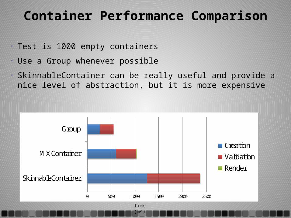
Container Performance Comparison
• Test is 1000 empty containers
• Use a Group whenever possible
• SkinnableContainer can be really useful and provide a nice level of abstraction, but it is more expensive
0 500 1000 1500 2000 2500
SkinnableContainer
MX Container
Group
Creation
Validation
Render
Time (ms)
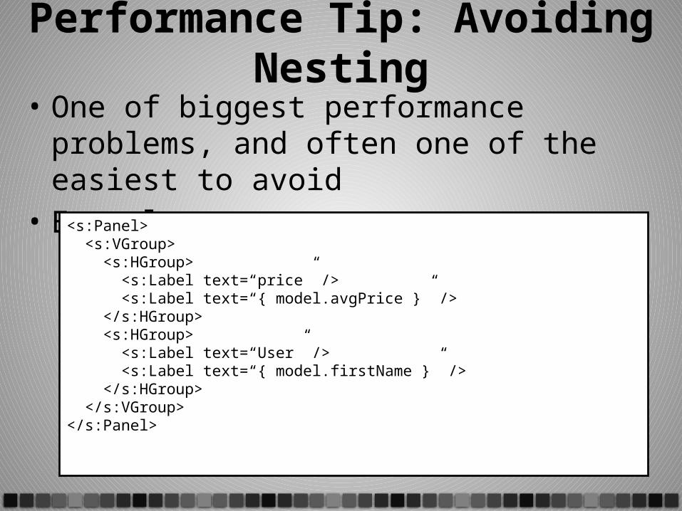
Performance Tip: Avoiding Nesting• One of biggest performance problems, and
often one of the easiest to avoid• Example:
<s:Panel> <s:VGroup> <s:HGroup> <s:Label text=“price” /> <s:Label text=“{ model.avgPrice }” /> </s:HGroup> <s:HGroup> <s:Label text=“User” /> <s:Label text=“{ model.firstName }” /> </s:HGroup> </s:VGroup></s:Panel>
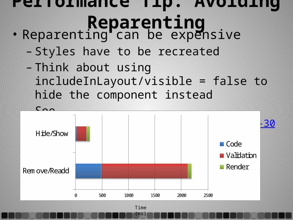
Performance Tip: Avoiding Reparenting• Reparenting can be expensive
– Styles have to be recreated– Think about using includeInLayout/visible = false to
hide the component instead– See https://bugs.adobe.com/jira/browse/SDK-30875
0 500 1000 1500 2000 2500
Remove/Readd
Hide/ShowCode
Validation
Render
Time (ms)

Questions