Embed Size (px)
Citation preview
FORECASTING FOR THE ORDERING AND STOCK-
HOLDING OF CONSUMABLE SPARE PARTS
Andrew Howard Charles Eaves, MCom
A thesis submitted in accordance with the regulations
concerning admission to the degree of Doctor of Philosophy.
Department of Management Science
The Management School, Lancaster University
July 2002

ii
ABSTRACT
Author: Andrew Howard Charles Eaves, Master of Commerce, University of Canterbury, New Zealand
Title: Forecasting for the Ordering and Stock-Holding of Consumable Spare Parts
Degree: Doctor of Philosophy
Date: July 2002
A modern military organisation like the Royal Air Force (RAF) is dependent on readily
available spare parts for in-service aircraft and ground systems in order to maximise
operational capability. Parts consumed in use, or otherwise not economically repaired,
are classified as consumable, comprising nearly 700 thousand stock-keeping units. A
large proportion of parts with erratic or slow-moving demand present particular
problems as far as forecasting and inventory control are concerned. This research uses
extensive demand and replenishment lead-time data to assess the practical value of
models put forward in the academic literature for addressing these problems.
An analytical method for classifying parts by demand pattern is extended and applied to
the RAF consumable inventory. This classification allows an evaluation of subsequent
results across a range of identified demand patterns, including smooth, slow-moving and
erratic. For a model to be considered useful it should measurably improve forecasting
and inventory control and, given the large inventory, should not be overly complex as to
require excessive processing. In addition, a model should not be too specialised in case
it has a detrimental effect when demand does not adhere to a specific pattern.
Recent forecasting developments are compared against more commonly used, albeit less
sophisticated, forecasting methods with the performance assessed using traditional
measures of accuracy, such as MAD, RMSE and MAPE. The results are not considered
ideal in this instance, as the measures themselves are open to questions of validity and
different conclusions arise depending on which measure is utilised. As an alternative
the implied stock-holdings, resulting from the use of each method, are compared. One
recently developed method, a modification to Croston’s method referred to as the
approximation method, is observed to provide significant reductions in the value of the
stock-holdings required to attain a specified service level for all demand patterns.

iii
TABLE OF CONTENTS
1. INTRODUCTION .................................................................................................... 1
1.1 Business Context ..................................................................................................... 1
1.2 Aims and Objectives ............................................................................................... 2
1.3 Contribution of Research ........................................................................................ 4
1.4 Thesis Structure ....................................................................................................... 8
2. DEMAND FOR CONSUMABLE SPARE PARTS............................................ 16
2.1 Erratic Demand...................................................................................................... 16
2.1.1 Causes of Erratic Demand ........................................................................ 16
2.1.2 Alternative Handling of Erratic Demand ................................................. 20
2.1.3 Identifying Erratic Demand ...................................................................... 20
2.2 Slow-Moving Demand .......................................................................................... 22
2.3 Demand Classifications......................................................................................... 24
2.4 Concluding Remarks ............................................................................................. 25
3. REVIEW OF THE LITERATURE...................................................................... 28
3.1 Historical Summary............................................................................................... 28
3.1.1 Erratic Demand ......................................................................................... 28
3.1.2 Slow-Moving Demand.............................................................................. 31
3.2 Further Developments ........................................................................................... 34
3.2.1 Forecasting Demand ................................................................................. 34
3.2.2 Service Level Considerations ................................................................... 37
3.2.3 Probability Models.................................................................................... 41
3.3 Practical Applications............................................................................................ 43
3.4 Concluding Remarks ............................................................................................. 47
4. CHARACTERISTICS OF THE RAF INVENTORY ....................................... 51
4.1 Initial Provisioning Date ....................................................................................... 52
4.2 Replenishment Order Quantity ............................................................................. 53
4.3 Replenishment Lead-Time.................................................................................... 55
4.4 Stock-Holdings ...................................................................................................... 57

iv
4.5 RAF Demand Analysis.......................................................................................... 59
4.5.1 Annual Usage-Value................................................................................. 59
4.5.2 Demand Patterns ....................................................................................... 62
4.5.3 Demand Size ............................................................................................. 64
4.5.4 Interval Between Transactions ................................................................. 68
4.5.5 Demand Size and Interval Between Transactions.................................... 71
4.5.6 Autocorrelation and Crosscorrelation Summary...................................... 76
4.6 Concluding Remarks ............................................................................................. 78
5. LEAD-TIME ANALYSIS...................................................................................... 81
5.1 RAF Lead-Time Analysis ..................................................................................... 81
5.1.1 Goodness-of-Fit Test ................................................................................ 83
5.1.2 Modified Chi-Square Goodness-of-Fit Test............................................. 86
5.2 Lead-Time Grouping Analysis.............................................................................. 90
5.2.1 Analysis of Variation ................................................................................ 92
5.2.2 Diagnostics - Item Price............................................................................ 95
5.2.3 Diagnostics - Item Activity.....................................................................101
5.2.4 Diagnostics - Purchasing Lead-Time .....................................................102
5.2.5 Diagnostics - Manufacturer ....................................................................106
5.2.6 Diagnostics - Supply Management Branch............................................107
5.2.7 Diagnostics - NATO Supply Classification ...........................................108
5.2.8 Specification of Effects...........................................................................109
5.3 Lead-Time Grouping Methodology....................................................................111
5.3.1 Clustering - Purchasing Lead-Time........................................................113
5.3.2 Clustering - Manufacturer.......................................................................117
5.3.3 Clustering - Range Manager...................................................................120
5.3.4 Lead-Time Grouping ..............................................................................122
5.4 Concluding Remarks ...........................................................................................124
6. DEMAND CLASSIFICATION ..........................................................................126
6.1 RAF Demand Classification ...............................................................................126
6.2 Demand Pattern Fragmentation ..........................................................................132
6.2.1 Lead-Time...............................................................................................132
6.2.2 Cluster Grouping.....................................................................................134

v
6.2.3 Demand Frequency and Size ..................................................................141
6.2.4 Unit Price ................................................................................................146
6.2.5 Comparison With Initial Demand Classification ...................................146
6.2.6 Autocorrelation and Crosscorrelation ....................................................148
6.3 Fitting Distributions to RAF Data.......................................................................150
6.3.1 Demand Size Distribution.......................................................................151
6.3.2 Interval Between Transactions Distribution...........................................151
6.3.3 Lead-Time Distribution ..........................................................................153
6.3.4 Probability Models..................................................................................156
6.4 Concluding Remarks ...........................................................................................157
7. FORECASTING ERRATIC DEMAND............................................................159
7.1 Croston’s Forecasting Method............................................................................159
7.2 Validation and Limitations of Croston’s Method...............................................162
7.3 Forecasting Model...............................................................................................165
7.3.1 Measurement of Accuracy......................................................................165
7.3.2 Forecast Implementation ........................................................................169
7.3.3 Selecting Smoothing Parameters............................................................174
7.3.4 Optimal Smoothing Parameters..............................................................181
7.4 Forecast Results...................................................................................................187
7.4.1 Frequency of Over and Under Forecasting ............................................188
7.4.2 Forecasting Performance ........................................................................191
7.4.3 Forecasting Performance by Demand Pattern........................................201
7.5 Concluding Remarks ...........................................................................................206
8. ALTERNATIVE FORECASTING METHODS..............................................208
8.1 Eliminating Forecasting Bias ..............................................................................208
8.1.1 Revised Croston’s Method .....................................................................211
8.1.2 Bias Reduction Method ..........................................................................212
8.1.3 Approximation Method ..........................................................................212
8.2 Forecasting Performance.....................................................................................212
8.3 Effect of Autocorrelation and Crosscorrelation..................................................220
8.4 Effect of Smoothing Parameters .........................................................................224
8.4.1 Smoothing Parameters by Demand Pattern - Exponential Smoothing..225

vi
8.4.2 Smoothing Parameters by Demand Pattern - Croston’s Method...........227
8.5 Concluding Remarks ...........................................................................................230
9. FORECAST PERFORMANCE BY IMPLIED STOCK-HOLDING ...........232
9.1 Forecasting and Stock Reprovisioning ...............................................................232
9.2 Inventory Management .......................................................................................237
9.3 Modelling Parameters .........................................................................................241
9.3.1 Simulation Period Selection ...................................................................241
9.3.2 Demand Aggregation..............................................................................243
9.3.3 Aggregation Bias ....................................................................................244
9.3.4 Measurement Interval .............................................................................249
9.3.5 Forecast Interval......................................................................................250
9.3.6 Reorder Interval ......................................................................................251
9.3.7 Forecast and Reorder Interval Review ...................................................254
9.3.8 Smoothing Parameters ............................................................................256
9.4 Optimal Smoothing Parameters ..........................................................................260
9.5 Determining Safety Margins ...............................................................................263
9.6 Forecasting Performance by Implied Stock-Holdings .......................................266
9.7 Implied Stock-Holdings by Demand Pattern......................................................272
9.8 Concluding Remarks ...........................................................................................277
10. CONCLUSIONS................................................................................................280
10.1 Properties of a Spare Parts Inventory..................................................................280
10.2 Classifying Demand Patterns ..............................................................................285
10.3 Reviewing the Performance of Croston’s Method .............................................288
10.4 Measuring Performance by Implied Stock-Holding...........................................293
10.5 Areas for Further Research .................................................................................295
REFERENCES...............................................................................................................299
APPENDICES................................................................................................................310
Appendix A - Data Usage Summary...............................................................................311
Appendix B - Hypothesis Testing ...................................................................................315
Appendix C - Investigating Autocorrelation in Demand Data .......................................317

vii
Appendix D - The Friedman Test....................................................................................329
Appendix E - Measurement of Accuracy........................................................................330
Appendix F - Median Absolute Percentage Error by Demand Pattern ..........................333
Appendix G - Syntetos and Boylan’s Modifications to Croston’s Method ...................335
Appendix H - Measurement of Accuracy - Croston’s and Variants...............................337
Appendix I - MdAPE by Demand Pattern - Croston’s and Variants .............................340
Appendix J - Effect of Autocorrelation on Forecasting Performance ............................342
Appendix K - Effect of Smoothing Parameters by Demand Pattern..............................346
Appendix L - Best Forecasting Methods According to MdAPE....................................351
Appendix M - Average Implied Stock-Holdings by Demand Pattern ...........................352

viii
LIST OF TABLES
Table 2.1: Classification of Lead-Time Demand. ............................................................. 25
Table 4.1: Summary Statistics for Unit Value and Demand............................................. 60
Table 4.2: Demand Statistics by Transaction Frequency................................................. 63
Table 4.3: Transactions by Weekday. ............................................................................... 68
Table 4.4: Example Interval Between Transaction Calculations..................................... 72
Table 4.5: Autocorrelation Summary Statistics (Log Transform Series). ........................ 77
Table 5.1: Monthly Demand Frequencies......................................................................... 85
Table 5.2: Cumulative Poisson Probabilities. .................................................................. 86
Table 5.3: Sample Goodness-of-Fit Test Results. ............................................................. 87
Table 5.4: Goodness-of-Fit Test Results - Individual Lead-Time Observations.............. 89
Table 5.5: Analysis of Actual Lead-Time Data................................................................. 94
Table 5.6: Analysis of Item Price Data. ............................................................................ 95
Table 5.7: Critical Values for the Kolmogorov-Smirnov Test for Normality. ................. 97
Table 5.8: Analysis of Item Price Regression Errors. ...................................................... 98
Table 5.9: Item Price Regression Analysis. ....................................................................100
Table 5.10: Analysis of Transformed Item Price. ...........................................................100
Table 5.11: Analysis of Item Activity Data. ....................................................................101
Table 5.12: Item Activity Regression Analysis................................................................101
Table 5.13: Analysis of Transformed Item Activity.........................................................102
Table 5.14: Analysis of Set Purchasing Lead-Time (PLT) Data. ...................................102
Table 5.15: Set PLT Regression Analysis. ......................................................................103
Table 5.16: Analysis of Transformed Set PLT. ...............................................................104
Table 5.17: Test for Significant Trend. ...........................................................................105
Table 5.18: Supply Management Branch (SMB) Nested Effects. ...................................107
Table 5.19: NATO Supply Classification (NSC) Nested Effects.....................................109
Table 5.20: Interaction Effects. .......................................................................................110
Table 5.21: Replenishment Lead-Time Statistics for Set PLT. .......................................114
Table 5.22: Lead-Time Clustering by PLT......................................................................116
Table 5.23: Replenishment Lead-Time Statistics for Manufacturer. .............................117
Table 5.24: Lead-Time Clustering by Manufacturer......................................................119
Table 5.25: Lead-Time Clustering by Range Manager. .................................................121
Table 5.26: Lead-Time Grouping Table. ........................................................................123

ix
Table 6.1: Revised Classification of Demand. ................................................................127
Table 6.2: Summary Statistics for Monthly Demand. .....................................................128
Table 6.3: Lead-Time by Demand Pattern......................................................................132
Table 6.4: Grouping Percentages. ..................................................................................134
Table 6.5: Cluster / Demand Pattern Independency Test...............................................141
Table 6.6: Percentage of Periods with Positive Demand...............................................143
Table 6.7: Demand Frequency and Size by Demand Pattern. .......................................145
Table 6.8: Summary Statistics for Unit Price. ................................................................146
Table 6.9: Correlation by Demand Pattern. ...................................................................149
Table 6.10: Goodness-of-Fit Test Results - Demand Size. .............................................151
Table 6.11: Goodness-of-Fit Test Results - Interval Between Transactions..................152
Table 6.12: Analysis of Sample Lead-Time Data. ..........................................................154
Table 6.13: Goodness-of-Fit Test Results - Grouped Lead-Time Observations............156
Table 7.1: Example Croston’s Method Forecast Calculations. .....................................161
Table 7.2: Example Control Indicators for Croston’s Method. .....................................163
Table 7.3: Example Measures for Croston’s Method (5 Quarter Lead-Time). .............172
Table 7.4: Comparative MAPE for Lead-Time Demand (Demand Only). ....................181
Table 7.5: Optimal Smoothing Constant Values for MAPE. ..........................................182
Table 7.6: Optimal Smoothing Constant Values for MAPE - Croston’s Method. .........185
Table 7.7: Forecast Results from Alternative Samples of 500 Line Items. ....................187
Table 7.8: Forecasting Method Rankings - Quarterly Data. .........................................192
Table 7.9: Forecasting Method Rankings - Monthly Data.............................................195
Table 7.10: Forecasting Method Rankings - Weekly Data.............................................196
Table 7.11: Mean Absolute Percentage Error by Demand Pattern - Quarterly Data. .202
Table 7.12: Mean Absolute Percentage Error by Demand Pattern - Monthly Data.....203
Table 7.13: Mean Absolute Percentage Error by Demand Pattern - Weekly Data.......204
Table 8.1: MAPE by Demand Pattern - Quarterly Data (Croston’s and Variants). .....215
Table 8.2: MAPE by Demand Pattern - Monthly Data (Croston’s and Variants). .......216
Table 8.3: MAPE by Demand Pattern - Weekly Data (Croston’s and Variants). .........217
Table 8.4: Sample Demand Size Autocorrelation Comparison......................................222
Table 8.5: Sample Demand Size Autocorrelation ANOVA Test. ....................................223
Table 8.6: Autocorrelation ANOVA Results - F Values. ................................................223
Table 8.7: Best Forecasting Method by Demand Pattern (Using MAPE).....................231
Table 9.1: Example Simulation of a Periodic Review Inventory System. ......................235

x
Table 9.2: Inventory Management - Exponential Smoothing (Quarterly Data). ...........238
Table 9.3: Inventory Management - Croston’s Method (Quarterly Data).....................240
Table 9.4: Sample Aggregation Bias...............................................................................246
Table 9.5: Average Stock-Holdings by Update Interval.................................................253
Table 9.6: Average Stock-Holdings for Selected Individual Line Items. .......................255
Table 9.7: Implied Stock-Holdings from MAPE Constants (Updating Every Period). .258
Table 9.8: Implied Stock-Holdings from MAPE Constants (Quarterly Reordering). ...259
Table 9.9: Optimal Smoothing Values for Implied Stock-Holdings. ..............................261
Table 9.10: Implied Stock-Holdings for Averaged Optimal Smoothing Values. ...........262
Table 9.11: Average Implied Stock-Holdings - Updating Every Period........................266
Table 9.12: Average Implied Stock-Holdings - Quarterly Reordering. .........................268
Table 9.13: Average Stock-Holdings - Updating Every Period (Crost. and Variants). 270
Table 9.14: Average Stock-Holdings - Quarterly Reordering (Croston and Variants). 270
Table 9.15: Additional Investment in Stock-Holdings Above the Best System...............271
Table 9.16: Average Stock-Holdings by Demand Pattern..............................................273
Table 9.17: Improvement in Stock-Holdings of Croston’s Method Over ES. ................274
Table 9.18: Average Stock-Holdings (Croston’s and Variants).....................................274
Table 9.19: Improvement in Stock-Holdings of Approximation Method. ......................275
Table 9.20: Additional Investment in Stock-Holdings by Demand Pattern. ..................276
Appendices
Table A.1: RAF Data Usage............................................................................................311 . Table B.1: Hypothesis Test Errors. .................................................................................316 . Table C.1: Demand Size Observed and Expected High-Low Observations. .................324
Table C.2: Autocorrelation Summary Statistics - Demand Size.....................................326
Table C.3: Autocorrelation Method Conformity.............................................................327 . Table E.1: Measurement of Accuracy - Forecast Comparisons. ...................................331 . Table F.1: Median Absolute Percentage Error (MdAPE) by Demand Pattern.............333 . Table H.1: Measurement of Accuracy - Croston’s and Variants. ..................................338 . Table I.1: MdAPE by Demand Pattern - Croston’s and Variants..................................340 Table J.1: Demand Size Autocorrelation. .......................................................................343
Table J.2: Transaction Interval Autocorrelation. ...........................................................344
Table J.3: Size and Interval Crosscorrelation. ...............................................................345

xi
Table K.1: Optimal Smoothing Constant by Demand Pattern - Expon. Smoothing......346
Table K.2: Optimal Smoothing Constants by Demand Pattern - Croston’s Method.....348 Table L.1: Best Forecasting Methods by Demand Pattern (Using MdAPE). ................351 Table M.1: Average Implied Stock-Holdings - Smooth Demand. ..................................352
Table M.2: Average Implied Stock-Holdings - Irregular Demand. ...............................353
Table M.3: Average Implied Stock-Holdings - Slow-Moving Demand..........................353
Table M.4: Average Implied Stock-Holdings - Mildly Erratic Demand. .......................354
Table M.5: Average Implied Stock-Holdings - Highly Erratic Demand........................354

xii
LIST OF FIGURES
Figure 2.1: Customer Demand Patterns. .......................................................................... 19
Figure 4.1: Initial Provisioning Date for Consumable Line Items. ................................. 52
Figure 4.2: Total RAF Consumable Inventory. ................................................................ 53
Figure 4.3: Assigned CMBQ and PPQ Frequencies. ....................................................... 54
Figure 4.4: Assigned Contractor’s Minimum Batch Quantity (CMBQ) Values.............. 54
Figure 4.5: Assigned Primary Packaged Quantity (PPQ) Values. .................................. 55
Figure 4.6: Administrative Lead-Time (ALT). .................................................................. 56
Figure 4.7: Purchasing Lead-Time (PLT). ....................................................................... 57
Figure 4.8: Months of Stock Remaining (MOSR). ............................................................ 58
Figure 4.9: Distribution of Annual Usage-Value. ............................................................ 60
Figure 4.10: Number of Demand Transactions over a Six-Year Period.......................... 63
Figure 4.11: Coefficient of Variation - Demand Size. ...................................................... 65
Figure 4.12: Sample Correlogram - Demand Size. .......................................................... 66
Figure 4.13: Lag of Significant Autocorrelation Coefficients - Demand Size. ................ 68
Figure 4.14: Coefficient of Variation - Interval Between Transactions. ......................... 69
Figure 4.15: Sample Correlogram - Interval Between Transactions (Log Transform). .70
Figure 4.16: Lag of Significant Autoc’n Coef’s - Interval Between Transactions. ......... 71
Figure 4.17: Sample Correlogram - Demand Size and Interval Crosscorrelation. ........ 73
Figure 4.18: Lag of Significant Crosscorrelation Coefficients. ....................................... 74
Figure 4.19: Sample Correlogram - Demand Size and Interval Ratio. ........................... 75
Figure 4.20: Lag of Significant Autocorrelation Ratio Coefficients. ............................... 76
Figure 4.21: Box and Whisker Plots for Significant Autocorrelations. ........................... 77
Figure 5.1: Lead-Time Observations for All Consumable Line Items. ............................ 82
Figure 5.2: GOODFIT Statistics Screen. ............................................................................ 88
Figure 5.3: Comparing the Replenishment Lead-Time and the Set PLT. ......................104
Figure 5.4: SAS-Generated Three-Way ANOVA Table..................................................111
Figure 5.5: Replenishment Lead-Time by Set PLT. ........................................................115
Figure 5.6: Lead-Time Clustering by Set PLT................................................................116
Figure 5.7: Lead-Time Frequencies by PLT Cluster......................................................117
Figure 5.8: Replenishment Lead-Time by Manufacturer. ..............................................118
Figure 5.9: Lead-Time Clustering by Manufacturer. .....................................................120
Figure 5.10: Lead-Time Frequencies by Manufacturer Cluster. ...................................120

xiii
Figure 5.11: Replenishment Lead-Time by Range Manager..........................................121
Figure 5.12: Lead-Time Clustering by Range Manager. ...............................................122
Figure 5.13: Lead-Time Frequencies by RM Cluster.....................................................122
Figure 5.14: Lead-Time Grouping Cube. .......................................................................123
Figure 6.1: Classification of RAF Demand. ...................................................................130
Figure 6.2: Sample Demand Patterns.............................................................................131
Figure 6.3: Erratic Demand Lead-Time Variation.........................................................133
Figure 6.4: Lead-Time by Demand Pattern. ...................................................................133
Figure 6.5: Cobweb Plot for Smooth Demand................................................................136
Figure 6.6: Cobweb Plot for Irregular Demand.............................................................138
Figure 6.7: Cobweb Plot for Slow-Moving Demand. .....................................................138
Figure 6.8: Cobweb Plot for Mildly Erratic Demand. ...................................................139
Figure 6.9: Cobweb Plot for Highly Erratic Demand....................................................140
Figure 6.10: Transaction Frequency by Demand Pattern. ............................................142
Figure 6.11: Demand Size by Demand Pattern. .............................................................143
Figure 6.12: Demand Rate by Demand Pattern. ............................................................144
Figure 6.13: Initial Erratic Demand Classification. ......................................................147
Figure 6.14: Actual Lead-Times for a Sample Grouping (Group B-D-E). ....................154
Figure 6.15: Fitting Probability Distributions to Lead-Time Data. ..............................155
Figure 7.1: Effect of Smoothing Constant - One-Period Ahead (All Periods)...............176
Figure 7.2: Effect of Smoothing Constant - Lead-Time Demand (All Periods).............176
Figure 7.3: Effect of Smoothing Constant - Lead-Time Demand (Demand Only). .......177
Figure 7.4: Comparative MAPE for Lead-Time Demand (Demand Only)....................178
Figure 7.5: Example Forecasts for Erratic Demand......................................................179
Figure 7.6: Effect of Smoothing Constants - Croston’s Method (Quarterly Data). ......184
Figure 7.7: Effect of Smoothing Constants - Croston’s Method (Weekly Data)............184
Figure 7.8: Effect of Smoothing Constant on Alternative Samples of 500 Line Items...186
Figure 7.9: One-Period Ahead Demand Over and Under Forecasting - All Periods...189
Figure 7.10: Lead-Time Demand Over and Under Forecasting - All Periods..............190
Figure 7.11: Lead-Time Demand Over and Under Forecasting - Demand Only. ........191
Figure 8.1: Effect of Smoothing Constant - One-Period Ahead (All Periods)...............225
Figure 8.2: Effect of Smoothing Constant - Lead-Time Demand (All Periods).............226
Figure 8.3: Effect of Smoothing Constant - Lead-Time Demand (Demand Only). .......227
Figure 8.4: Effect of Smoothing Constants - Croston’s Method (Smooth Demand). ....228

xiv
Figure 8.5: Effect of Smoothing Const. - Croston’s Method (Slow-Moving Demand)..228
Figure 8.6: Effect of Smoothing Const. - Croston’s (Mildly Erratic Demand)..............229
Figure 9.1: Flow Diagram for Inventory System............................................................233
Figure 9.2: Closing Stock-Holdings - Exponential Smoothing. .....................................239
Figure 9.3: Average Stock-Holdings - Exponential Smoothing. ....................................239
Figure 9.4: Quarterly Inventory Levels (Simulation Period Effect)...............................242
Figure 9.5: Comparative Inventory Levels (Aggregation Bias Effect). .........................244
Figure 9.6: Comparative Inventory Levels (Resized). ....................................................245
Figure 9.7: Aggregated Weekly Demand for 18,750 Line Items....................................247
Figure 9.8: Quarterly Aggregated Demand by Week.....................................................248
Figure 9.9: Comparative Inventory Levels (Measurement Interval Effect). ..................249
Figure 9.10: Comparative Inventory Levels (Forecast Interval Effect).........................250
Figure 9.11: Comparative Inventory Levels (Reorder Interval Effect)..........................252
Figure 9.12: Example Order Levels and Average Stock - Weekly Data. .......................253
Figure 9.13: Comparative Inventory Levels (Smoothing Parameter Effect). ................257
Figure 9.14: Comparative Stock-Holdings by Demand Aggregation. ...........................263
Appendices
Figure C.1: Sample Correlogram - Demand Size (Log Transform). .............................319
Figure C.2: Sample Correlogram - Demand Size (Spearman Rank-Order)..................320
Figure C.3: Sample Correlogram - Demand Size (High-Low Succession). ..................321
Figure C.4: Sample Chi-Square - Demand Size (High-Low Frequency).......................325

xv
ACKNOWLEDGMENTS
I would like to thank a number of people who have helped and supported me throughout
the course of my part-time studies. Initial thanks must be given to Group Captain David
Kendrick and Wing Commander Jeff Pike, and latterly Wing Commander Peter
Flippant, of the Royal Air Force, for allowing me the opportunity to undertake these
studies alongside my regular day-to-day employment. I am also grateful to Major Steve
Reynolds, an exchange officer from the United States Air Force, for providing
motivation and inspiration with his requests for updates on my progress.
Special thanks are given to Aris Syntetos, formerly a doctoral student at Buckingham-
shire University College, for providing me with details of his forecasting methods which
became a vital component of my own research. I am grateful to Elizabeth Ayres, an
English teacher who is also my partner, for undertaking the unenviable task of proof-
reading my entire thesis.
Finally, I would especially like to thank Professor Brian Kingsman, my supervisor at
Lancaster University, for his invaluable advice and wisdom throughout the course of my
studies.

xvi
DECLARATION
I declare that this thesis comprises entirely my own work and has not been submitted for
the award of a higher degree elsewhere, nor have any sections been published
elsewhere.
Andrew Eaves

xvii
“For want of a nail the shoe was lost;
for want of a shoe the horse was lost;
and for want of a horse the rider was lost.”
Benjamin Franklin (1706-1790)

1
1. INTRODUCTION
This introductory chapter describes the motivation behind my research by placing the
study in a business context and continues by defining the purpose of the analysis with
my aims and objectives. The third section describes the contribution of my research and
the final section outlines the thesis structure.
1.1 Business Context
A modern military organisation like the Royal Air Force (RAF) is dependent on readily
available spare parts for in-service aircraft and ground systems in order to maximise
operational capability. The RAF has one of the largest and most diverse inventories in
the western world, probably second only to the United States Air Force in size.
Within the RAF, those line items consumed in use or otherwise not economically
repaired, such as resistors, screws and canopies, are classed as consumable, while the
generally more expensive line items, such as airframes, panels and gearboxes, are
classed as repairable. At the beginning of 2000 the RAF managed approximately
684,000 consumable line items or stock-keeping units, leading to 145 million units of
stock with a total value of £2.1 billion.
With reductions in defence budgets and the necessity for cost-efficiencies as directed by
measures such as the Strategic Defence Review, the large investment in consumable
stock makes inventory management a prime candidate for perceived cost savings. Thus,
there is a requirement for a reasoned and scientific analysis of the properties of the RAF
consumable inventory as an aid to obtaining efficiencies in the supply environment.
Due to their requirement primarily as spare parts only 48 percent of consumable line
items have been required in the previous 24-month period, and are therefore formally

2
defined as active. Furthermore, a large proportion of the inventory is described as
having an erratic or intermittent demand pattern, which is characterised by infrequent
transactions with variable demand sizes. This erratic demand can create significant
problems as far as forecasting and inventory control are concerned.
The RAF is fortunate in having long demand transaction histories for all line items in a
readily accessible format. Each line has electronic records providing at least 8 years of
individual demand transactions (though less if the line has been introduced more
recently). Each record, along with the line identifier, provides the demand date, the
quantity of units required, details of the RAF station placing the demand, a code for the
urgency of the requirement, and a code as to how the demand was satisfied - whether it
be off the shelf, a diversion order or an inability that must be back-ordered.
This extensive demand information, often uncommon in industry, provides an
opportunity for a full and detailed analysis across a range of demand patterns. The
primary focus of this study is the examination of forecasting methods suitable for the
ordering and stock-holding of spare parts, with reference to the RAF consumable
inventory. Particular emphasis is placed on line items with erratic demand.
1.2 Aims and Objectives
The aim of this research is to identify and assess the practical value of models designed
to improve demand forecasting with regards to the ordering and stock-holding of
consumable spare parts. This has led to a review of existing models put forward in the
literature as suitable for the task, including some recent developments. The recent
models are compared with more general models that have proved popular in the demand
forecasting environment, including exponential smoothing. All appraisals are
undertaken using actual demand data.

3
For the models to be considered useful they should measurably improve forecasting and
inventory control, and satisfy two further criteria:
(i) They should not be overly complex and require unrealistic processing
power. This is an important consideration when dealing with an inventory as
large as that held by the RAF.
(ii) The models should not be too specialised that they have a detrimental effect
when demand does not adhere to a specific pattern. Ideally the models would be
applicable to a broad band of demand patterns across a range of industries.
The large number of line items with complete demand histories in the RAF inventory
allows a detailed analysis across a range of demand patterns including smooth, slow-
moving, irregular and erratic. Armstrong and Collopy [4] make a general observation
that, “the accuracy of various forecasting methods typically require comparisons across
many time series. However, it is often difficult to obtain a large number of series. This
is particularly a problem when trying to specify the best method for a well-defined set of
conditions; the more specific the conditions, the greater the difficulty in obtaining many
series.” Therefore, it is often the case that the small quantities of demand data available
to the researcher are insufficient to yield conclusive results. This is particularly the case
where the analysis is performed on a specific demand pattern, such as erratic or slow-
moving demand. A major contribution of this research stems from the fact that a large
quantity of realistic demand data has been used in the analysis and there is little need to
generate simulated data.
A further beneficial aspect concerning the information held by the RAF lies in the
disaggregated nature of the data. The recorded demand transactions allow a full analysis

4
at the individual demand level, or at any aggregation level such as daily, weekly,
monthly or quarterly. Comparing the models at differing levels of aggregation allows a
comparison of their performance under various scenarios, which may assist other
organisations in selecting the model that best suits the format of their data. Greater
storage availability is allowing many organisations to maintain more detailed demand
information, thus allowing more options for implementation.
One aim of my research is to produce results that are meaningful in the real world.
Therefore, the effectiveness of the models is measured by a means appropriate to their
actual implementation. For example, given that the purpose behind demand forecasting
is to determine requirements over a replenishment lead-time, the performance of the
various forecasting methods is measured over the lead-time period, alongside the more
conventional one-period ahead comparison.
An over-riding aim, however, is to identify a means for increasing the performance of
the RAF inventory at a constant or even reduced cost and in doing so provide an
opportunity to increase aircraft availability. An important part of this research focuses
on establishing the additional value of the implied stock-holding requirements under
each forecasting model.
1.3 Contribution of Research
In the course of my research I have developed a number of techniques and models, some
of which are applicable only to the RAF and others that have a wider application. The
RAF has a unique operating environment, albeit with some similarities to other military
organisations, and the large consumable inventory, both in terms of the number of stock-
keeping units and the units of stock on-hand, provides scope for a valuable research
contribution from a large scale analysis.

5
An over-riding contribution arises through the analysis of large quantities of real-world
spare parts related data. The methodical collection and retention of data by the RAF
allows a detailed analysis of the factors affecting the management of consumable line
items. For instance, demand data is maintained at the individual transaction level,
thereby allowing an analysis at any aggregation level including quarterly, monthly and
weekly. As different demand aggregations lead to different performance results, the
comparative performance is investigated and commented upon. Actual replenishment
lead-time data, which is rarely available in significant quantities for spare parts, is
analysed and incorporated within this research.
One model developed with widespread application is a modified chi-square goodness-
of-fit testing method, called GOODFIT, within Microsoft Excel. Problems often arise
with the standard chi-square test due to the requirement for data to be grouped to ensure
each category contains at least five observations. As groupings are somewhat arbitrary
it is frequently observed that one grouping methodology will accept the null hypothesis,
whereas another grouping will not. GOODFIT differs in that boundaries are specified by
forming categories with similar theoretical frequencies throughout, rather than
combining groups just at the margins. Under the modified rules, the sum of the
probabilities within each grouping will be equalised to the greatest extent possible. The
aim is to provide a consistently fair method of automatically grouping observations
across a range of probability distributions. Most published models for the management
of spare parts assume each of the components of interest, including demand size,
transaction interval and lead-time, follow specified probability distributions. The
GOODFIT model allows complete testing of the validity of these assumptions using
actual data.

6
Less frequent usage of erratic demand items means that, in general, few replenishment
orders are placed and, combined with long lead-times in the defence industry, very little
lead-time data is available. The few actual lead-time observations for each line item
restricts the usefulness of the data on an individual item basis. To overcome this
problem I have developed a methodology for combining line items likely to have a
similar lead-time pattern and calculated aggregate statistics that apply to the entire
grouping. ANOVA analysis was used initially to select three of the seven candidates
identified as potential categorisation variables, a cluster analysis then placed the lead-
time observations into six groupings for each variable. Any line item, regardless of
whether or not it has a replenishment history, can now be assigned parameter values
according to its lead-time grouping location.
A published analytical method for classifying demand as smooth, slow-moving, erratic
or erratic with a highly variable lead-time has been tailored and extended for the RAF
consumable inventory. The method decomposes the variance of the lead-time demand
into its constituent causal parts and defines boundaries between the demand patterns.
Classifying demand in this manner allows all further analysis to be compared between
the identified demand patterns.
I have written a model called FORESTOC using SAS® software to compare the accuracy
of various forecasting methods with RAF demand data. Individual demand transactions
have been combined to give quarterly, monthly and weekly demand totals over a six-
year period. A one year period is used to initialise the forecasts, beyond which point the
forecast value is compared with the actual demand over a series of forward-looking
lead-time periods. This is a methodology rarely used, with one-period ahead forecast

7
comparisons being the norm. In a real setting it is the demand over a lead-time period
that must be catered for, and therefore the forecast methods are measured against this.
One of the selected forecasting methods is the relatively well-known Croston’s method,
which separately applies exponential smoothing to the interval between demands and
the size of the demands. All observed implementations to date use the same smoothing
value for both series, although the two series themselves are assumed to be independent.
This research identifies and uses two different smoothing values, which, in combination,
provide optimal results across a hold-out sample. The effect of the selected smoothing
constants is also examined.
A range of standard statistics for measuring forecast errors are calculated and contrasts
are made between the identified demand patterns. Two methods of implementing the
forecast measures are utilised:
(i) Measuring the errors observed at every point in time.
(ii) Only measuring immediately after a demand has occurred.
The first implementation is perhaps the more traditional measure, although the second
implementation also has a case for consideration, as it is only after a demand has
occurred that it would be necessary to initiate a new replenishment order. Thus, it is of
greater importance that a particular forecasting method be accurate after a demand has
occurred, rather than at every point in time and, therefore, the methods are assessed on
this basis.
Weaknesses are identified in using the traditional measures of forecasting accuracy,
such as Mean Absolute Deviation and Mean Absolute Percentage Error, and an

8
alternative measure is investigated. The FORESTOC model has been extended to allow a
comparison of the implied stock-holdings between the methods using back-simulation.
A common basis is achieved by calculating the precise safety margin that provides a
maximum stock-out quantity of zero for each method. The safety margin is calculated
by iteratively adding the maximum stock-out quantity to the order-up-to level until no
further stock-outs occur. Difficulties arise on occasions where the initial stock is too
high, such that no reorders are required over the forecasting horizon, or the initial stock
is not enough to prevent a stock-out before the first delivery, and restrictions are
required. Again, the stock-holdings and safety margins can be compared across the
previously identified range of demand patterns.
1.4 Thesis Structure
The thesis is divided into nine further chapters, namely:
(i) Demand for Consumable Spare Parts.
(ii) Review of the Literature.
(iii) Characteristics of the RAF Inventory.
(iv) Lead-Time Analysis.
(v) Demand Classification.
(vi) Forecasting Erratic Demand.
(vii) Alternative Forecasting Methods.
(viii) Forecast Performance by Implied Stock-Holding.
(ix) Conclusions.
Given the large quantity of data used throughout this research, Appendix A provides a
data usage summary that describes the creation and usage of each dataset, together with
the number of line items used for each part of the analysis.

9
1.4.1 Demand for Consumable Spare Parts
Demand for consumable spare parts tends to be divided into two categories, namely
erratic and slow-moving. Both patterns are characterised by infrequent demand
transactions. While an erratic demand pattern is determined by variable demand sizes, a
slow-moving demand pattern is distinguished by low demand sizes.
This chapter introduces the notion of erratic demand and slow-moving demand and
examines the causes behind these patterns. Formal means for identifying whether
erratic and slow-moving demand patterns are present within an inventory are also
investigated.
A published method for classifying demand as smooth, slow-moving, or sporadic (yet
another term for erratic) is introduced in this chapter. The method decomposes the
variance of the lead-time demand into its constituent causal parts and defines boundaries
between the demand patterns. Classifying demand in this manner allows subsequent
analyses to be compared between the identified patterns.
1.4.2 Review of the Literature
In this chapter a review of the academic literature focusing on the forecasting, ordering
and stock-holding of consumable spare parts is undertaken. This review explores the
development of techniques for managing erratic and slow-moving demand in particular,
and examines the practical application of these techniques.
1.4.3 Characteristics of the RAF Inventory
This chapter describes the characteristics of the RAF inventory and introduces system
parameters that affect the management of consumable spare parts. Like many
organisations, the RAF operates a classical periodic review inventory management

10
system, whereby the replenishment level and the replenishment quantity are calculated
on a monthly basis using central system parameters for each line item.
However, there are a number of considerations within the RAF environment, such as the
need to maintain adequate stock-holdings in case of war, which differentiate the supply
system from most organisations. This chapter provides an outline of the RAF inventory
characteristics as a means of scene-setting, thereby allowing subsequent analysis to be
put into context and, perhaps more importantly, to provide a means for assessing
whether assumptions made by the published models are appropriate.
Through an examination of actual demand data, an initial attempt is made to ascertain
the extent to which erratic and slow-moving demand patterns exist within the RAF. As
these demand patterns are characterised by infrequent transactions with either variable
or low demand sizes, it is necessary to consider the transaction rate in unison with the
demand size.
Most research on erratic demand assumes independence between successive demand
sizes and successive demand intervals, and independence between sizes and intervals. A
large-scale analysis of the demand size and the interval between transactions, including
autocorrelations and crosscorrelations, is undertaken in this chapter using RAF data.
Identifying the demand pattern is most appropriately done using lead-time demand.
Therefore, it is necessary to determine lead-time distributions and associated parameter
values through a lead-time analysis, which becomes the focus of the next chapter.
1.4.4 Lead-Time Analysis
Although the replenishment lead-time is a fundamental component of any inventory
management system, it often occurs that the lead-time distribution and associated

11
parameter values have to be assumed due to a lack of observations. At first glance this
would appear to be the case for the RAF where every line item in the inventory has a set
lead-time value of a fixed and questionable nature. Fortunately another source of data is
available to the RAF from which actual lead-time observations can be derived. This
data is not currently used for setting the lead-time parameter values but it provides
valuable information for the task of inventory management.
A detailed analysis of the actual lead-time observations is undertaken in this chapter and
an initial attempt is made to fit distributions to these observations using a chi-square
goodness-of-fit test.
The infrequent usage of many line items in the RAF inventory means that in general few
replenishment orders are placed and, when combined with the long lead-times in the
defence industry, in reality the lead-time data is incomplete. As a result, this chapter
includes a methodology for grouping line items that are likely to have a similar lead-
time distribution and calculates summary statistics that apply to the entire grouping.
The first stage of this procedure is to identify predictors that provide the best means for
grouping similar line items; the second stage groups the line items according to these
predictors.
1.4.5 Demand Classification
The previously introduced method for classifying demand is tailored and extended for
the RAF inventory in this chapter. All line items are classified through variance
partition whereby the variance of the lead-time demand is decomposed into its
constituent causal parts. Each line item is then assigned to one of the following demand
patterns:
(i) Smooth.

12
(ii) Irregular.
(iii) Slow-moving.
(iv) Mildly Erratic.
(v) Highly Erratic.
An analytical classification of line items in this manner prompts an investigation of
whether there are any shared characteristics between the line items within each
classification. Such an investigation, termed demand fragmentation, is undertaken
across a number of different factors; for example, by cluster grouping in accordance
with each of the lead-time predictor variables, by transaction frequency and demand
size, and by the level of autocorrelation and crosscorrelation.
The grouping of lead-time observations with the associated increase in sample size
allows a more conclusive goodness-of-fit test on the lead-time observations over the one
conducted in the previous chapter. In addition, goodness-of-fit tests are performed on
the demand size distribution and the demand interval distribution in an attempt to
determine whether assumptions made in the literature are valid.
1.4.6 Forecasting Erratic Demand
Traditional forecasting methods are often based on assumptions that are deemed
inappropriate for items with an erratic demand pattern. This chapter introduces a
forecasting model that compares Croston’s method, which was developed specifically
for forecasting erratic demand, with more conventional methods including exponential
smoothing and moving average.
Optimal values for the smoothing parameters are determined using a hold-out sample of
500 RAF line items with the resultant parameters used across a larger sample of 18,750

13
line items. The selected line items comprise a random sample with equal representation
between the five identified demand patterns. Forecasts are made using various demand
aggregations with the measuring of forecast errors at every point in time as well as only
after a demand has occurred. Analysing the demand for differing aggregation periods,
or rebucketing, may lead to demand levelling over the longer periods and differences in
relative forecasting performance may emerge.
A distinguishing feature of the comparisons is to recognise the purpose for which
demand forecasts are made in reality and rather than just simply compare the forecast
value with the actual one-period ahead value, the model compares the forecast value
with the demand over a forward-looking lead-time period. If the purpose of the forecast
is to supply data for inventory replenishment systems, consistency becomes more
important, and accuracy at a single point is not so valuable.
1.4.7 Alternative Forecasting Methods
Alternatives to Croston’s method have been proposed in the literature that seek to
correct a mistake in the original derivation of the demand estimate and further improve
forecasting performance. Results from these methods, collectively referred to as the
modification methods, are compared with Croston’s method in this chapter. Once again,
the forecasting performance is analysed by demand pattern and aggregation level.
Also examined in this chapter is the effect of autocorrelation and crosscorrelation on the
forecasting performance of exponential smoothing and Croston’s method. Most
research on erratic demand assumes independence between successive demand intervals
and successive demand sizes, yet a growing body of research indicates such
independence is not always present. Finally, consideration is given to the effect of

14
smoothing parameters on forecasting performance by comparing optimal values across
the identified demand patterns.
Comparing the performance of the forecasting methods using the traditional measures of
accuracy is not considered ideal. The measures themselves are open to questions of
validity and different conclusions can arise depending on which measure is utilised. As
an alternative method for assessing forecasting performance, the implied stock
reprovisioning performance for each method is examined in the next chapter.
1.4.8 Forecast Performance by Implied Stock-Holding
Stock reprovisioning performance is monitored for each forecasting method by an
extension to the forecasting model. This extension allows a comparison of the implied
stock-holdings for each method by calculating the exact safety margin that provides a
maximum stock-out quantity of zero. The safety margin is calculated by iteratively
adding the maximum stock-out quantity to the order-up-to level until no further stock-
outs occur. In this manner the average stock-holdings for each method can be compared
using a common service level of 100 percent.
A number of factors outside of the forecasting methods affect the stock-holding
calculations, including the selected simulation period, the demand aggregation or
periodicity of the data, the measurement interval, and the forecast and reorder update
intervals. In order to ensure unbiased comparisons between the forecasting methods,
each factor is examined in turn to assess the impact on the final calculations.
The selected smoothing parameters determine the forecast values and hence the order-
up-to level, which in turn affects the implied stock-holdings. As an indication of the
variability due to the smoothing parameter values, comparative stock-holdings are

15
calculated for a sample of 500 line items using the range of optimal smoothing constants
in terms of MAPE, as generated in a previous chapter. As it transpires, the optimal
values for MAPE need not be the same as those which provide minimum stock-holdings
overall, prompting the determination of a new set of optimal values.
Optimal smoothing parameter values that minimise the implied stock-holdings are
calculated from the hold-out sample and applied to the same sample of 18,750 line items
considered previously. Comparisons are made between the forecasting methods at
different demand aggregations and between the five identified demand patterns. The
monetary values of the additional stock-holdings above that of the best case are also
determined.
1.4.9 Conclusions
In the final chapter of the thesis, the main conclusions are summarised, the contributions
from this research are identified and areas for further research are outlined.
One of the main conclusions of the research is that a modification to Croston’s method,
known as the approximation method, offers a suitable alternative to exponential
smoothing for demand forecasting. Using this method to provide more accurate
forecasts, the RAF could realise substantial cost savings by reducing inventory levels
while still maintaining the required service levels. Although RAF data is used
exclusively in this research, there is little reason to believe the results would not be
applicable to other holders and users of spare parts.

16
2. DEMAND FOR CONSUMABLE SPARE PARTS
Demand for consumable spare parts tends to be divided into two categories. Firstly,
erratic or intermittent demand patterns are characterised by infrequent transactions with
variable demand sizes, and secondly, slow-moving demand patterns which are also
characterised by infrequent transactions but in this case the demand sizes are always
low. It is generally accepted that slow-moving items differ from erratic items and a
simplifying assumption has often been that the reorder quantity is equal to one for slow-
moving items.
This chapter describes erratic demand and slow-moving demand in turn, and examines
the processes that lead to such patterns. An analytical method for classifying demand as
erratic or slow-moving is also introduced.
2.1 Erratic Demand
Under erratic demand, when a transaction occurs, the request may be for more than a
single unit resulting in so-called lumpy demand. Such demand patterns frequently arise
in parts and supplies inventory systems. Erratic demand can create significant problems
in the manufacturing and supply environment as far as forecasting and inventory control
are concerned. This section examines the causes of erratic demand, and the demand for
a sample line item illustrates the consequences of one such cause. Alternatively, an
actual occasion in which an erratic demand pattern need not be a problem is also
considered. Finally, statistical means for assessing erratic demand are introduced.
2.1.1 Causes of Erratic Demand
The demand pattern for an erratic item has so much random variation that in general no
trend or seasonal pattern can be discerned. Silver [66] identifies two factors leading to
an erratic demand pattern:

17
(i) There may simply be a large number of small customers and a few large
customers. Most of the transactions will be small in magnitude as they will be
generated by the small customers, although occasionally one of the large
customers will place a large demand.
(ii) In a multi-echelon system a non-erratic demand pattern at the consumer
level may be transformed into a highly erratic demand pattern by inventory
decisions made at higher levels. This phenomenon, known as the bull-whip effect,
arises when small variations in demand are magnified along the supply chain.
Additional causes of erratic demand are identified by Bartezzaghi et al. [7]:
(iii) In considering the numerousness of potential customers, and in particular
the frequency of customer requests, lumpiness increases as the frequency of each
customer order decreases. In fact, the lower the frequency of orders, the lower the
number of different customers placing an order in a given time period.
(iv) If there is correlation between customer requests lumpiness may occur even
if there are a large number of customers. Correlation may be due to imitation and
fashion, for example, which will lead to sudden peaks in demand. In the case of
the RAF, periodic exercises and operations are often correlated between aircraft.
Through examining a forecasting system similar to that operated by the RAF, Foote [28]
identifies a further cause of erratic demand:
(v) In large repair facilities there is a tendency to repair a component once a
quarter or once a year owing to the long lead-times for spare parts or to reduce
costs by minimising the number of set-ups.
18
In considering demand for spare parts as being generated by a failure process,
Beckmann [9] suggests a further cause:
(vi) Multiple demands may occur through sympathetic replacement, whereby
maintenance personnel discover a defective part on one aircraft and, as a result,
inspect that item on other aircraft, replacing incipient failures.
Analysis undertaken in the course of this research has identified another situation in
which an erratic demand pattern can emerge:
(vii) The aggregation of demand, or bucketing, pre-determines the level of
intermittency in a given time series. What appears to be a smooth demand series
at a quarterly aggregation may become decidedly erratic at a monthly or weekly
aggregation.
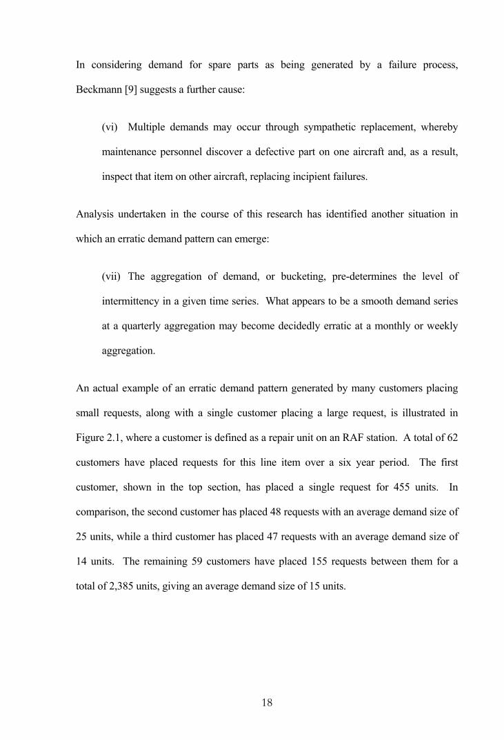
An actual example of an erratic demand pattern generated by many customers placing
small requests, along with a single customer placing a large request, is illustrated in
Figure 2.1, where a customer is defined as a repair unit on an RAF station. A total of 62
customers have placed requests for this line item over a six year period. The first
customer, shown in the top section, has placed a single request for 455 units. In
comparison, the second customer has placed 48 requests with an average demand size of
25 units, while a third customer has placed 47 requests with an average demand size of
14 units. The remaining 59 customers have placed 155 requests between them for a
total of 2,385 units, giving an average demand size of 15 units.

19
Figure 2.1: Customer Demand Patterns.
1994 1995 1996 1997 1998 1999
Cus
tom
er D
eman
d Pr
ofile
s
The bottom section presents the demand profile for all 62 customers combined. It is
seen that the single large demand dominates the profile and what might otherwise be
considered a smooth demand pattern is turned into an erratic demand pattern by the
inclusion of this customer.
The demand profiles of Figure 2.1 may also show some correlation between customer
requests which can contribute to an erratic demand pattern. No requests are observed by
the first or third customers in the 12 months preceding the large single demand. The
second customer and the remaining 59 customers also have few requests during this
period, although many recommence their requests at a similar point to the large single
request.
Customer 1
Customer 2
Other Customers (n=59)
Customer 3
All Customers (n=62)

20
2.1.2 Alternative Handling of Erratic Demand
Some items that appear to have a lumpy history need not be treated as erratic. For
example, the lumps may be due to occasional extraordinary requirements from
customers, as Brown [14] discovered in the case of an O-ring used in the boiler tubes of
an aircraft carrier in the US Navy. The demand history for the O-ring showed single
digit demands with an occasional demand for over 300 units interspersed by zeros; a
classic erratic demand pattern. However, a closer examination revealed that 307 units
were required for overhauls carried out in shipyards and these were scheduled up to two
years in advance.
Alternatively, a pre-determined array of spare parts may be required as fly-away packs
to accompany a squadron of aircraft on planned exercises. In such cases it may be
possible to include the requirements as scheduled demand, rather than having to
forecast; all that would be necessary is an improvement in the flow of information.
2.1.3 Identifying Erratic Demand
An item is said to have an erratic demand pattern if the variability is large relative to the
mean. After early research into erratic demand, Brown [14] suggested an item should be
classed as erratic if the standard deviation of the errors from the best-fitted forecast
model is greater than the standard deviation of the original series. Under such
circumstances he recommends setting the forecast model as a simple average of the
historic observations.
Straightforward statistical tests were more recently used by Willemain et al. [88] on
actual data to gauge the level of intermittency, including:

21
(i) The mean interval between transactions, or equivalently, the percentage of
periods with positive demand.
(ii) The degree of randomness in the data. Forecasting requirements are
lowered if the demands are a fixed size or the transactions occur at fixed intervals.
Thus, the coefficient of variation (CV), which expresses the standard deviation as
a proportion of the mean, for the demand size and interval length are useful
statistics.
(iii) Autocorrelations and crosscorrelations. Most research on erratic demand
assumes independence between successive demand sizes and successive demand
intervals, as well as independence between the sizes and intervals. In fact some
substantial positive and negative autocorrelations and crosscorrelations were
found in their data.
The authors commented that the sparseness of their data made it difficult to estimate
correlations and only two out of their fifty-four demand series reached statistical
significance at the 5 percent level. They considered the question of independence to be
unanswered rather than interpreting their limited results as justifying the assumptions
made in the literature. The large quantity of data available in this study allows a detailed
analysis of autocorrelations and crosscorrelations and this is an area considered
extensively in a later chapter.
The next section examines the second demand pattern often encountered in spare parts
inventories, namely that of slow-moving spares.

22
2.2 Slow-Moving Demand
Slow-moving spares are mainly held as insurance against the very high costs that might
otherwise be incurred if the item failed in use when a spare was not available. Any
inventory control policy for slow-moving spares must take into account the run-out or
shortage cost. The run-out cost for a particular spare is defined as the average difference
between the cost of a breakdown where a spare is required but is not available and the
cost of a similar breakdown when a spare is available.
Mitchell [53] indicates that a major problem associated with forecasting and inventory
control of slow-moving spares is the lack of past records for giving reliable estimates of
historic consumption and failure characteristics. Slow-moving spares often have zero
consumption over a long period that would normally be more than adequate for analysis.
A further difficulty with slow-moving spares is their inflexibility regarding over-
stocking. Whereas over-stocking of fast-moving spares is quickly remedied by natural
consumption, this is not the case for slow-moving spares. Initial over-ordering is not the
only cause of excess stock; an increase in stocks to allow for a short-term lengthening of
lead-time may lead to serious over-stocking when the lead-time returns to normal. In
any case, this leads to a greater chance that the over-stock will never be used and
become obsolete.
A simplifying point for slow-moving spares is that the possible decisions are few in
number. Rarely is it necessary to hold more than two spares so the decisions are
essentially whether to hold zero, one or two. True insurance or stand-by spares are held
because it is considered less costly to hold them rather than suffer the extra cost of a
breakdown with them unavailable. However, in an analysis of slow-moving spares held

23
by the National Coal Board, Mitchell [53] identified several groups, not peculiar to the
coal industry, which could immediately be declared as excess stock:
(i) Overhaul items. These are bought for use on a specified date in preparation
for a major overhaul, much like the O-rings used in the US Navy. Provided the
manufacturer is given adequate notice of the requirement, there is no reason why
overhaul items should be held in stock for longer than the time taken to examine
them prior to use.
(ii) Adequate warning items. These either have a minor breakdown but can be
economically patched-up for a period longer than the lead-time, or their wear
indicates, by a period longer than the lead-time, their impending breakdown.
(iii) Wear items. These items wear out and have a failure rate that increases with
their life. It may be economical to defer the purchase of a replacement spare until
the current item is used.
Alternatively, the optimum stock-holding of random failure items does not vary, in
which case the sole consideration is the run out cost. An examination of the value of
slow-moving spares held at a particular colliery revealed overhaul items comprised 10
percent, adequate warning items 20 percent, wear items 20 percent and random failure
items 50 percent. Thus, a significant portion of the stock can be considered as excess.
The causes behind both erratic and slow-moving demand patterns have been considered.
Attention is now given to classifying line items according to their observed demand
patterns. Such a process is necessary as the more commonly used methods for
forecasting and stock-holding are not as effective if the demand is not smooth and
continuous and alternative methods should be sought.
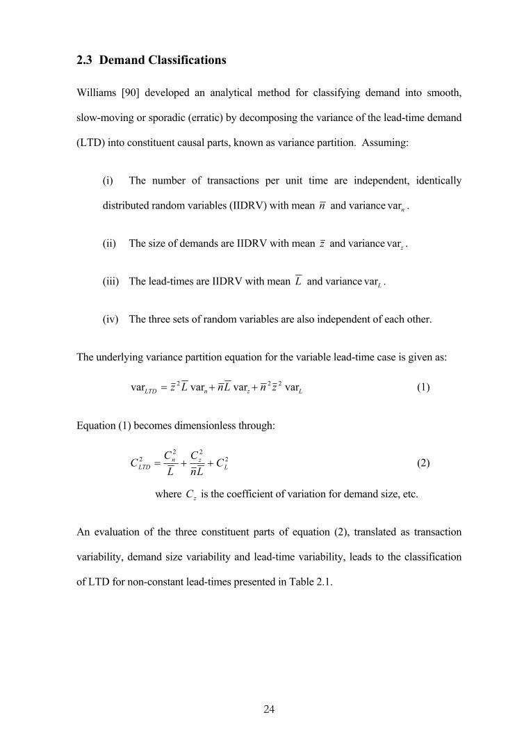
24
2.3 Demand Classifications
Williams [90] developed an analytical method for classifying demand into smooth,
slow-moving or sporadic (erratic) by decomposing the variance of the lead-time demand
(LTD) into constituent causal parts, known as variance partition. Assuming:
(i) The number of transactions per unit time are independent, identically
distributed random variables (IIDRV) with mean n and variance nvar .
(ii) The size of demands are IIDRV with mean z and variance zvar .
(iii) The lead-times are IIDRV with mean L and variance Lvar .
(iv) The three sets of random variables are also independent of each other.
The underlying variance partition equation for the variable lead-time case is given as:
LznLTD znLnLz varvarvarvar 222 ++= (1)
Equation (1) becomes dimensionless through:
222
2L
znLTD C
LnC
LC
C ++= (2)
where zC is the coefficient of variation for demand size, etc.
An evaluation of the three constituent parts of equation (2), translated as transaction
variability, demand size variability and lead-time variability, leads to the classification
of LTD for non-constant lead-times presented in Table 2.1.

25
Table 2.1: Classification of Lead-Time Demand.
Lead-Time Demand Component
Transaction Variability
Demand Size Variability
Lead-Time Variability
Type of Demand Pattern
Low Smooth
High Low Slow-moving
High High Low Erratic
High High High Erratic with highly variable lead-time
It is observed that a slow-moving demand pattern is distinguished from an erratic
demand pattern according to the level of demand size variability. The choice of
boundaries between each of the categories is essentially a management decision. An
item will change category as parameter values move from one region to another,
therefore items may continually change if the parameters are borderline. This sensitivity
is overcome by defining buffer zones around each boundary.
Classifying LTD by this means allows further analysis to be compared between the
patterns and an investigation can be undertaken as to whether the models put forward
have a detrimental effect when demand does not adhere to a specific pattern. This
means of classifying demand is revisited and extended for RAF data in Chapter 6 once
the constituent parts have been obtained and examined.
2.4 Concluding Remarks
Demand which is not smooth and continuous has traditionally presented difficulties in
forecasting and inventory control. Two such demand patterns that tend to arise in a
spare parts inventory are erratic demand and slow-moving demand. Both patterns are
characterised by infrequent transactions, although while an erratic demand pattern has
variable demand sizes, a slow-moving demand pattern always has low demand sizes.

26
Erratic demand occurs when there are a few large customers and many small customers,
or when the frequency of many customer requests varies. Inventory control decisions
made at progressively higher levels of a multi-echelon system can also transform a non-
erratic demand pattern into a highly erratic demand pattern. In addition, correlation
between customer requests can lead to an erratic pattern, which in the case of the RAF
may occur through sympathetic replacement, periodic operations and exercises, or the
tendency to repair a component infrequently in order to minimise the number of set-ups.
Alternatively, slow-moving demand occurs simply when there are few customers and
little demand for an item. Such items in a spare parts inventory are mainly held as
insurance against the immense costs that would otherwise occur if an item was required
and a spare was not immediately available. The lack of past records of historic
consumption and failure characteristics is a major problem associated with slow-moving
spare parts.
The forecasting and holding requirement of erratic and slow-moving spare parts can be
reduced if the items are required for a major overhaul or a planned exercise on a
specified date, provided, of course, that the requirement is cascaded. Forecasting
requirements are also lowered if the demands are fixed in size or the transactions occur
at fixed intervals. Repairing a jet engine may require a fixed number of turbine blades,
for example. Finally, an item may give warning longer than the lead-time of impending
breakdown and spares can be procured at such time.
As the commonly used methods for forecasting and stock-holding are generally not as
effective when demand is erratic or slow-moving, it is useful to classify line items
according to their observed demand pattern. An analytical method described in the
literature, which decomposes the variance of lead-time demand into constituent causal

27
parts for classification purposes, has been introduced. Classification by this means will
enable subsequent analysis to be assessed by demand pattern and allow an exploration
of whether particular methods better suit specific patterns.
At this stage it is useful to review the large and growing body of academic literature that
offer solutions to the problems faced by a spare parts inventory. The next chapter traces
the development of techniques for managing line items with erratic and slow-moving
demand in the form of a literature review.

28
3. REVIEW OF THE LITERATURE
This review of the academic literature focuses on considerations given to the
forecasting, ordering and stock-holding for consumable spare parts. Such research tends
to concentrate on erratic and slow-moving demand patterns as opposed to demand that is
smooth and continuous. Widely published inventory control policies developed for
smooth demand are considered inefficient when applied to items with erratic or slow-
moving demand and alternatives are investigated.
The first section provides an historical summary of inventory policies put forward as
suitable for managing erratic demand and slow-moving demand in turn. The second
section examines more recent developments in demand forecasting, service level
considerations, and the application of probability models. In each case an assumption of
normally distributed lead-time demand is not suitable. The final section of this literature
review provides examples of the practical application of the various methods.
3.1 Historical Summary
An inventory control policy for low demand was possibly considered first by Whitin and
Youngs [86] in 1955, for a simple Poisson situation, and developed slightly by Heyvaert
and Hurt [34] in 1956. Since this time, the study of erratic and slow-moving demand
patterns have mostly progressed separately, and each will be reviewed in turn.
3.1.1 Erratic Demand
In cases of continuous review with convex holding costs and fixed replenishment costs,
Beckmann [8] in 1962 proved the optimality of an (s,S) inventory policy, whereby an
order is placed to raise the available stock (on hand plus on order minus backorders) to
an order-up-to level S when the stock level falls to or below reorder point s. The model
considered an arbitrary distribution for the intervals between demands and a distribution

29
for the demand sizes that is independent of the previous demand size but may depend on
the elapsed time since the last demand.
An important paper on erratic demand is the 1972 paper of Croston [19] who
demonstrated that using simple exponential smoothing forecasts to set inventory levels
could lead to excessive stock levels. He argues that exponential smoothing places most
weight on the more recent data and therefore gives estimates that are highest just after a
demand, and lowest just before a demand. The replenishment quantity is likely to be
determined by the biased estimates that immediately follow a demand as a consequence.
By way of solution, Croston suggested that unbiased forecasts are needed for stock
replenishment decisions immediately after a transaction occurs, and should be based on
separate forecasts of the demand size and the interval between transactions. The method
proposed by Croston is seen to reduce the bias associated with exponential smoothing.
Other authors have assumed particular demand distributions, usually a compound
distribution arising from combining distributions for transaction occurrence and demand
size. In this manner, the total number of units demanded over a lead-time can be
considered as the sum of a random number of demands, each generating a random
demand size. The compound Poisson distribution where transactions are assumed to
arrive in accordance with a stationary Poisson process, as developed by Adelson [1] in
1966, has frequently found favour in the literature.
An (s,S) policy is normally superior to a (Q,r) policy where a fixed quantity Q is ordered
when the stock level falls to or below reorder point r, in terms of reduced total holding
and replenishment costs. In fact, as the demand pattern becomes more erratic in nature,
an (s,S) system increases in superiority and this tends to be the preferred method for
consideration. An order-up-to level is intuitively appealing for an erratic demand item

30
as the amount by which the reorder point is passed may vary widely between one
replenishment requirement and the next. However, the computational complexity of
determining the optimal order-up-to value sometimes restricts its use in favour of a fixed
order quantity.
Recursive expressions for determining optimal parameters for an (s,S) policy under
periodic review with discrete compound Poisson demand and constant lead-time were
provided by Veinott and Wagner [81] in 1965 and improved by Bell [10] in 1970, while
Archibald and Silver [3] consider the analogous case of continuous review in 1978.
A compound Poisson demand process with stochastic lead-time is considered in 1977 by
Dirickx and Koevoets [22] who use Markov renewal theory to give very complex
formulae for an (s,S) policy. Markov renewal theory was previously used in 1975 by
Kao [42], although his methodology assumed zero lead-time while allowing arbitrary
demand size and interval distributions.
Also in 1977, Bott [11] considered three compound Poisson distributions where the
selected demand size distribution depended on the variability in the historical data. Bott
suggests that as the negative binomial distribution has a variance-to-mean ratio (VMR)
greater than unity for any choice of parameters, the demand size may be modelled by
such a distribution if the sample data has a VMR greater than one. Similarly, the
Poisson distribution may be suitable if the sample VMR is equal to one and the binomial
distribution if it is less than one.
When combined with Poisson transaction arrivals, demand sizes with a geometric
probability distribution provides a demand distribution referred to as stuttering Poisson
(sP), as described by Sherbrooke [64] in 1966. As a special type of compound Poisson
31
distribution the sP distribution has remained a popular choice in the erratic demand
environment. Silver et al. [67] in their paper of 1971 considered an sP demand pattern
for an (s,S) inventory policy with continuous review.
In his paper of 1978, Ward [82] used an approximate regression model to calculate
reorder points based on a fixed service level, although no attempt is made to minimise
the total operating cost. A (Q,r) inventory policy with continuous review is utilised.
The model assumes constant lead-times and demand is modelled by the sP distribution.
A regression model was also used by Mak and Hung [50] in 1986 for computing optimal
(s,S) policies where the lead-time demand is modelled by an sP distribution and the
lead-time itself is assumed constant.
In their paper of 1971, Foster et al. [30] studied the effect of demand distributions on
optimal decisions and costs for a (Q,r) inventory policy. Using an (s,S) policy Naddor
[56] in 1978 also examined how optimal decisions and costs are affected by different
demand distributions, different shortage costs and different lead-times. Numerical
solutions imply that the precise form of the distribution of demand is not essential for
the determination of optimal decisions in the system. Where the standard deviation is
relatively small compared to the mean, the decisions are hardly affected by the form of
the distribution because of the relative flatness of the total cost around the optimum.
However, when the standard deviation is relatively large compared to the mean, the
decisions and costs are more sensitive to the form of the distribution.
3.1.2 Slow-Moving Demand
An (S-1,S) inventory policy is often adopted for slow-moving demand such that
whenever the stock level falls less than or equal to S-1 an order is placed to raise the
available stock to the order-up-to level S. Such a system is reasonable when the lead-

32
times are small relative to the average interval between orders or the cost of reordering
is small relative to the cost of holding stock.
Karush [43] in 1957 utilised a queueing model where customer arrivals are given by a
Poisson process with demand sizes of a single unit. Replenishment is initiated upon a
demand request leading to an (S-1,S) policy and the lead-time is treated as random. The
problem of allocating inventory investment among competing line items to minimise the
value of total lost sales is considered.
Under an (S-1,S) policy with continuous review, whenever a demand for an arbitrary
number of units occurs, a reorder is placed immediately for that number of units. This
observation allows Feeney and Sherbrooke [25] in their paper of 1966 to utilise Palm’s
theorem which states, in inventory terms, that if demand is Poisson then in the steady
state the number of units on order is also Poisson for any lead-time distribution. The
authors show Palm’s theorem can be generalised to any compound Poisson distribution.
Steady state probability distributions for stock on-hand and backorders are obtained
from the steady state distribution for the number of units on order by translating the
origin of the distribution S units.
Sivazlian [70] in 1974 considered a continuous review inventory system operating under
an (s,S) policy where demand occurs as one unit at a time. With instantaneous delivery
of orders, the model is equivalent to a piece of equipment consisting of Q=S-s elements
subject to failure, where, upon failure of the last element, all Q elements are
immediately replaced. Silver and Smith [69] in their paper of 1977 provided a
methodology for constructing indifference curves that determine the optimal inventory
level.

33
Again, an important paper in this area is by Croston [20] in 1974 discussing whether or
not to stock a product. Significant savings can be obtained by deciding not to stock
particular items, but to either provide an acceptable substitute, for which there is higher
total demand, or to supply to order only. Tavares and Almeida [79] in 1983 also
consider whether it is economic to have zero or one item in stock.
A frequent problem with slow-moving spares is that there is little or no historic data for
forecasting demand. One approach is Bayesian forecasting; this was proposed by Silver
[65] in 1965 for selecting a reorder point based on a stock-out probability or service
level with uncertain lead-time. Smith and Vemuganti [71] in 1969 also use a Bayesian
approach to update the demand distribution parameters as the available information
increases over time.
Brown and Rogers [15] in 1973 also considered a Bayesian approach that incorporates
usage estimates developed at initial provisioning and provides for progressive updating
as data becomes available. The authors indicate that an adequate spare parts inventory
for ensuring high system reliability early in a system life will be very costly and
extremely wasteful. The inventory required will be large but very little of it will
actually be used. Therefore, one course of action is to accept low reliability in the early
life of the system and procure spares as needed until sufficient data allows a more
economical inventory policy. Similar ideas are used by Burton and Jaquette [16], also in
1973, to establish initial provisioning procedures for slow-moving repair items.
Through the consideration of spare parts usage on submarine systems, Haber and
Sitgreaves [32] in 1970 pool usage data for common design items. They assume
demand for each product is Poisson distributed, while mean demand for the items in a
particular class have a gamma distribution. The model allows estimates for spare parts

34
usage regardless of whether or not a particular spare has been used in the past, while
also making possible the estimation of usage rates for new items.
Williams [89] in 1982 derived approximate expressions for the optimum reorder point r
in a (Q,r) model while assuming the lead-time is short enough that only zero or one
demand can occur in a lead-time. In the case of slow-moving demand this is frequently
a reasonable assumption to make. The method uses an iterative procedure with
stochastic transaction arrivals and gamma-distributed demand sizes.
Schultz [62] in 1987 considered an (S-1,S) policy with periodic review, constant lead-
time and arbitrary demand size and interval distributions. The usual implementation
places an order immediately after each transaction and thus ignores the frequency with
which transactions occur. It is shown by Schultz that introducing a delay in placing the
order can lead to significant holding cost reductions with little additional risk or cost of
stock-outs if the average number of periods between demands is large relative to the
lead-time plus the delay.
3.2 Further Developments
Methods that assume lead-time demand can adequately be approximated by the normal
distribution, in general, cannot be utilised for erratic and slow-moving line items and
alternatives are required. A particular problem in the case of erratic demand is that the
actual stock level when reordering takes place will not be r but some level below r as
one transaction may cause the stock level to fall significantly.
3.2.1 Forecasting Demand
In 1972 Croston [19] demonstrated his forecasting method to be superior to exponential
smoothing (ES) when assuming the intervals between transactions follow the geometric

35
distribution (demand occurs as a Bernoulli process), their size is normally distributed,
and the intervals and sizes are independent of each other. Willemain et al. [88] in 1994
violated these assumptions in generating a comparative evaluation between Croston’s
method and ES. Various simulated scenarios covered a log normal distribution of
demand size, and both positive and negative autocorrelations and crosscorrelations in
the intervals and sizes. Through making comparisons only at times of positive demand,
in all cases Croston’s method was found to provide more accurate estimates of the true
demand. The authors concluded that Croston’s method is quite robust and has practical
value beyond that claimed in Croston’s original paper. However, an important
observation was the fact that results from industrial data showed very modest benefits as
compared to the simulation results.
The usefulness of Croston’s method was also investigated by Johnston and Boylan
[39,40] in 1996. A simulation analysis was conducted to determine the minimum
interval between transactions that was required for a modification of Croston’s method
to outperform ES. Using a Poisson arrival process and a number of demand size
distributions, comparisons were made between the errors observed at every point in time
and only after a demand occurred. It was observed that the modified method
outperformed ES when the average interval between demands is greater than 1.25
periods and the greater the interval the more marked the improvement. In addition,
longer forecasting horizons were seen to improve the relative performance of the
method while any variability in the demand size has only a small effect on the
improvement.
Syntetos and Boylan [76] in 1998 quantified the bias associated with Croston’s method
through simulation, while in a second paper [77] of 1998 the same authors provided
36
three modifications to Croston’s method that attempt to give unbiased estimates of the
demand per period. They indicate that Croston’s estimates of the demand size and the
interval between transactions are determined to be correct; it is an error in their
combining which fails to produce accurate estimates of the demand per period.
Wright [91] in 1986 provided an extension to Holt’s two-parameter smoothing method
for the case of intermittent data. Consideration is given to time series which naturally
occur at irregular time intervals, such as the inventory applications covered in this
research, as well as cases where the frequency of reporting changes from annual to
quarterly, for example, or where occasional data observations are simply unavailable in
an otherwise regularly spaced series. In many applications the extended procedure
requires only about twice the resources of the regular Holt’s method.
Sani and Kingsman [60] in 1997 compared periodic inventory control policies and
demand forecasting methods in an attempt to determine which are best for slow-moving
and erratic demand items. Periodic systems are put forward as preferred by stock
controllers due to the convenience of regular ordering days for the stockist, as well as
for the supplier who can plan efficient delivery routes. Ten periodic inventory policies
are compared using real-world data from a spare parts depot and in each case five
demand forecasting methods are used to determine values for s and S. The comparisons
include simple rules developed by practising stock controllers which relate alternative
sets of (s,S) values to ranges of annual demands and the value or criticality of the item.
Using two performance measures, namely annual inventory cost and the proportion of
demands satisfied immediately from stock, the authors conclude that a 52-week moving
average forecasting method is best, followed closely by Croston’s method.

37
A bootstrap approach as a means of forecasting lead-time demand is considered by
Willemain et al. [87] in 2000. The bootstrap method utilises samples of historic demand
data to repeatedly create realistic scenarios that show the evolution of the lead-time
demand distribution.
With respect solely to slow-moving line items, Ritchie and Wilcox [59] in 1977
considered renewal theory from the point of view of the supplier to forecast all-time
future demand for spares where demand is declining or is about to decline in the
immediate future due to the phasing out of the equipment to which the spares are fitted.
At a point in time the spares will not be produced as part of a normal production run but
must instead be produced during special production runs and will therefore be expensive
to produce. For some items the costs of setting up a special run may be so great that it is
worthwhile producing enough spares during the last production run to satisfy all future
demand.
In their paper of 1997, Bradford and Sugrue [13] presented a methodology for
estimating the demand pattern of slow-moving line items using an aggregation-by-items
approach, assuming demand follows an arbitrarily mixed, heterogeneous Poisson
distribution. The consideration of demand heterogeneity arises due to the low annual
usage-value of some slow-moving items and hence, for planning and control purposes, it
is often expedient to treat them as a group and estimate the aggregate distribution of
demand.
3.2.2 Service Level Considerations
Silver [66] suggests there are a number of different ways of measuring customer service,
although none is universally acceptable. Four commonly used measures are:
38
(i) Item availability as the fraction of time stock on-hand is greater than zero.
(ii) Fraction of demand satisfied without backorder.
(iii) Average amount on backorder, which may be time-weighted or at a random
point in time.
(iv) Delay time as the average number of days that a customer request is
backordered before it can be delivered.
Stock replenishment rules based on customer service levels should be linked to the
current estimates of demand along with a measure of the forecast variability. Although
demand forecasting is a prerequisite to inventory control decisions, in practice
forecasting and ordering systems have traditionally been considered independent of each
other.
A variance calculation given by Croston [19] in 1972 was only an approximation to the
variance of the demand per period and the suggested replenishment rules did not
consider the observed demand pattern. Such a stocking methodology would guard
against only one transaction during a lead-time and lead to exceptionally low
replenishments. In the study of a spare parts depot conducted by Sani and Kingsman
[60] in 1997, Croston’s suggestion was, not surprisingly, seen to result in poor service
levels.
More recent authors have considered the joint impact of forecasting and ordering
systems on customer service levels. In unison with Croston’s method, Silver and
Peterson [68] in 1985 use MAD(z), the mean absolute deviation of non-zero sized
transactions, to establish safety stock parameters. Alternative methods for directly

39
estimating the variance of the demand were suggested by Johnston and Boylan [39] in
1996, and also by Sani and Kingsman [60].
A simple model to include the service level effect from the reorder quantity in both
smooth and erratic demand contexts was developed by Etienne [24] in 1987. He argued
safety stock decisions should not be made independently of reorder quantity decisions,
as substantial reductions in safety stock are permitted while still achieving target service
levels. A reorder is observed to act as a buffer against variations in demand for every
period except the last.
Also in 1987, the interactions between forecasting and reordering with respect to service
level and inventory cost were examined by Watson [83]. Large fluctuations in the
forecast parameters for line items with erratic demand are shown by simulation to lead
to a significant discrepancy between the target service level and that actually achieved.
Assuming a stuttering Poisson demand pattern, the discrepancies were found to vary
between positive and negative, depending on the parameters of the line item and the
reorder model. It was concluded that attempts to accurately achieve a target service
level by using an elaborate reorder formula when forecast fluctuations are large might be
futile.
In discussing the presence of forecast errors in an ordering system not solely limited to
erratic or slow-moving demand, Wemmerlöv [84] in 1989 examined the effect of
introducing adequate safety stocks to counter the effects of demand uncertainty. In
order to avoid estimating the cost of stock-outs, safety stocks were introduced so that the
service levels from each simulation run were the same and gave a common service level
of 100 percent. Thus, once the safety stocks necessary to completely eliminate stock-
outs were determined, performance could be calculated as the sum of the holding and

40
ordering costs only. By enforcing a service level of 100 percent the methodology of
Wemmerlöv’s is removed from reality but it does give a relatively impartial means for
comparing simulated ordering and stock-holding results.
Dunsmuir and Snyder [23] in 1989 emphasised that erratic demand items typically
possess positively skewed frequency profiles with a large spike at zero. By including a
component to explicitly model the chance of positive demand, and assuming a gamma
distribution for demand size, they attempted to determine a reorder level consistent with
a specified customer service level under a periodic review system. Snyder [73] in 1999
replaced the gamma probability distribution with simulated lead-time demand
parameters using a parametric bootstrap approach.
The method presented by Dunsmuir and Snyder is extended by Janssen et al. [36] in
1998 to allow for an undershoot with a periodic (R,s,Q) inventory model. Under this
policy the inventory position is monitored every R time units and when the inventory
position falls below s, a quantity of Q units are ordered such that the inventory position
is raised to a value between s and s+Q. When demand is not unit sized, and particularly
when there is a high probability that demand is zero during the lead-time, the undershoot
of the inventory position below the reorder point can have a significant impact on
service levels.
Janssen et al. [37] consider an (R,s,Q) model again in 1999, when they seek to determine
the reorder point s given a service level constraint. An approximation method is derived
for calculating the reorder point such that a target service level is achieved. The
underlying demand process is assumed to be a compound renewal process where data is
not collected per unit of time, but instead interarrival times and demand sizes are
collected for individual customers.

41
Gardner [31] in 1990 developed trade-off curves between inventory investment and
customer service levels for alternative forecasting models. As forecast errors are the
primary determinant of safety stock calculations, the better the forecast accuracy, the
smaller the inventory investment required to achieve a specified customer service level.
Alternatively, increased customer service can be achieved from a fixed inventory
investment.
3.2.3 Probability Models
Many inventory models rely upon the probability distribution of lead-time demand
(LTD) as this knowledge is essential for determining inventory decision variables, such
as expected backorders, lost sales, and stock-out risk. Determining the LTD distribution
requires taking the distributions of both the demand per unit time and the lead-time into
account. A common assumption is that the LTD is normal, although in circumstances of
erratic or slow-moving demand the normality assumption may be inappropriate. In
1970, Silver [66] indicated that the majority of inventory control methods were based
upon assumptions about the demand distribution that were invalid for items with erratic
demand. In such cases, “the procedures tend to be computationally intractable”.
Empirical evidence that the normal distribution does not provide a reasonable model for
LTD for erratic demand items is provided by Mitchell et al. [54] in 1983. Since LTD is
generally the sum of several demands, the normal distribution would only be suitable
when a large number of transactions occur during the lead-time. In the case of erratic
demand, the central limit theorem cannot reasonably be expected to apply.
With the normal distribution not normally able to satisfactorily model LTD for an erratic
demand item, alternative distributions are required. Often compound distributions are
chosen as they allow the total demand over a lead-time to be considered as the sum of a

42
random number of transactions, each generating a random demand. The compound
Poisson distribution has frequently found favour. Under this distribution, the
transactions arrive in accordance with a stationary Poisson process and to adequately
represent demand, the distribution for demand size will depend on the variability in the
historical data.
Although the uncertainty of the lead-time in practical settings is well documented, the
scarcity of lead-time data often restricts the modelling to constant lead-times. In any
case, realistic constant lead-time models can be obtained from both a constant-Poisson
distribution and a stuttering Poisson (sP) distribution. The constant-Poisson distribution
models the situation where each demand has a fixed quantity and the number of
transactions arriving within any interval of time follows a Poisson distribution.
Alternatively, under the stuttering Poisson, or geometric-Poisson distribution, when a
transaction occurs, the request is for one or more units of the item, with the quantity
given by the geometric distribution.
During an analysis of USAF data, Mitchell et al. [54] used the stuttering Poisson and
constant-Poisson distributions to describe the demand patterns with constant lead-time.
Demand histories were analysed for 6,529 line items, arranged in six categories ranging
from inexpensive nuts and bolts to expensive electronic parts. To assess the
appropriateness of the Poisson distribution the authors compared the observations to the
expectations and employed the Poisson dispersion goodness-of-fit test due to ease of
implementation; the test statistic involves only the sample variance to mean ratio. The
Poisson distribution was seen to provide a reasonable fit to almost all the weekly arrival
patterns at the 5 percent significance level. When testing the geometric distribution
against the demand sizes, the small number of customer demands precluded an objective

43
goodness-of-fit test. However, other characteristics of the data, such as constant demand
size for a large percentage of items, were found to be consistent with the geometric
assumption. A decisive test of how well the geometric-Poisson model works in an
operational sense was conducted by measuring its effectiveness in predicting demand
during a lead-time using a hold-out sample.
Variable lead-time models also appear in the literature. In 1982 Nahmias and Demmy
[57] considered an inventory system in which demand occurrences arise according to a
Poisson process, demand sizes follow a logarithmic distribution, and lead-times are
gamma distributed. Both the exact and approximate distributions for lead-time demand
are derived. Bagchi et al. [6] in 1983 examined the Poisson-like Hermite distribution,
where demand per unit time is Poisson and lead-time is normally distributed, as a model
for slow-moving line items. Bagchi [5] in 1987 introduced two analytical lead-time
demand models for stuttering Poisson demand and variable lead-time, with the first
model utilising the normal distribution and the second the gamma distribution to
represent the lead-time distribution.
Probability models tend to be complicated and not very useful for determining demand
in a practical setting. The models require a large number of recursive calculations in
order to obtain the probability density function of lead-time demand. As a result,
models of this type contravene the requirement of this research that they should not be
overly complex and require unrealistic processing power. The large inventory held by
the RAF dictates such a requirement.
3.3 Practical Applications
Schuster and Finch [63] in their paper of 1990 provided a non-technical description of
their implementation of a spreadsheet model for production scheduling at Welch’s, a US

44
producer of fruit juices, drinks and spreads, when demand is erratic. Demand for
Welch’s products is not typically seasonal, but product promotions lead to pronounced
peaks and demand during a promotion period can be several times greater than non-
promotional demand. The model uses the forecast of demand during a lead-time in a
reorder point calculation and safety stock is based on the forecast mean absolute
deviation. It was found that the forecasts were often negatively biased such that actual
demand was less than forecast demand resulting in excess inventory. By way of
solution the authors utilise a suppression factor to link the safety stock level to the
forecast bias in recent periods.
Material requirements planning (MRP) for production scheduling under the situation of
erratic demand is considered by Ho [35] in 1995. The author examines the impact of
various degrees of demand lumpiness on the performance of MRP systems through a
simulation study. Although it is intuitively expected that the MRP performance will
deteriorate as the demand pattern becomes more erratic, it was observed that the system
actually improves to a certain extent. This is because the number of set-ups, and hence
the set-up costs, decrease while the carrying cost increases to a lesser extent within
certain ranges.
As an extension to a continuous review (s,S) inventory policy with sP demand, Mak [49]
in 1996 incorporated a cut-off point such that customer orders with transaction sizes
greater than cut-off point w are satisfied by placing a special replenishment order rather
than satisfying from stock. In addition, it is specified that if the stock level is below
order-up-to level S when a special replenishment order is placed, the stock will be
replenished jointly to raise the available stock to S. In 1999 Mak et al. [51] extended the
model to include a genetic search algorithm for determining the optimal solution. The
45
concept of a cut-off point was suggested by Silver [66] in 1970 as a means of improving
the performance of the inventory system.
Coordination of replenishment for slow-moving items is considered by Thompstone and
Silver [80] in 1975. An (S,c,s) inventory policy with compound Poisson demand,
continuous review and zero lead-time is utilised. Under such a policy, whenever
available stock for item i falls to or below is an order is placed to raise it to iS . At the
same time any other item j within the associated family with available stock at or
below the can-order point jc is included in the order to raise the level to jS . Cost
savings are realised if the cost of replenishing two or more items at the same time is less
than the total cost of replenishing each of the items separately.
Bartezzaghi et al. [7] in 1999 examined the behaviour of forecasting methods when
dealing with erratic demand at the master production scheduling level. They argue
demand lumpiness is a consequence of different market dynamics, including
numerousness of customers, heterogeneity of customers, frequency and variety of
customer requests, and correlations in customer behaviour. Subsequently, they use
simulation experiments to compare the performance of three forecasting methods with
differing parameter values for the sources of lumpiness.
In their paper of 1980, Muckstadt and Thomas [55] examined a two-echelon inventory
system where most line items are slow-moving. Using an (S-1,S) policy with
continuous review the authors found that a multi-echelon inventory method designed to
take advantage of the system structure was able to achieve the same average level of
performance as an individually stocked single-location method with a significantly
lower investment. Results indicated it was efficient to centralise safety stock for

46
relatively high cost, slow-moving items and the larger the number of slow-moving items
the more important a multi-echelon system will be.
In an examination of a spare parts system in a production plant of Mars confectionary,
Strijbosch et al. [75] in 2000 compared the performance of a simple (Q,r) inventory
model, used to approximate the current system which is based on intuition and
experience, to one which is more advanced and likely to provide a better performance in
terms of service and costs. Demand for spare parts is found to be slow-moving with 40
percent of all spares having no demand over a three year period. The simple model does
not take the undershoot of the reorder level into account and the normal distribution is
used as the distribution of demand during lead-time. On the other hand, the advanced
model takes undershoots into account and utilises the gamma distribution for lead-time
demand. The authors show the advanced approach yields service levels close to the
desired level under most circumstances, and even with an increase in computer time and
less intuitive decision rules for the users, the manufacturer has decided to implement this
new approach.
Fortuin and Martin [29] in 1999 observed that the electronic industry, the automotive
industry and airline operators tend to increasingly outsource spare parts management. In
addition, in these industries there is a tendency towards co-operation, such as the joint
exploitation of spare parts inventories, together with joint acquisition and collective
maintenance. Such actions serve to reduce the problems associated with the
management of spare parts for the individual organisations. For the most part, the RAF
is precluded from these actions due to reasons of security or being sole users of parts
that prohibits such co-operation. However, the joint development and operation of an
aircraft type, such as the tri-national Eurofighter, allows co-operation in the

47
management of spare parts. The current system of parts identification by NATO Stock
Number (NSN) assists in this respect.
3.4 Concluding Remarks
Forecasting and inventory control policies developed for smooth and continuous
demand are generally inefficient when dealing with a spare parts inventory. Instead, the
academic research has concentrated on developing alternative models suitable for erratic
and slow-moving demand patterns.
Many authors have assumed specific demand distributions when considering erratic and
slow-moving demand, often incorporating compound distributions obtained from
combining distributions for the interval between demands and the size of the demands.
The usage of a compound Poisson distribution as a model for demand per unit time often
finds favour in the literature. The selected models have strived to become more realistic
over the years and lead-times that were first restricted to being constant, and then
approximated by the normal distribution, have since taken the form of a gamma
distribution among others. Probability models for lead-time demand have commonly
been constructed without published justification for the choice of distributions, nor have
practicality issues been considered.
Mitchell et al. [54] do, however, examine the appropriateness of compound Poisson
distributions for describing demand within the United States Air Force, which would be
expected to have similar demand patterns to the RAF. It is most likely that the lack of
actual data available to other researchers has prevented the validation of their selected
distributions. The large quantity of actual data available in this instance could make a
valuable contribution as far as the reasonableness of fit is concerned.

48
Irrespective of the appropriateness of the distributions that have been put forward by
authors such as Bagchi et al. [5] and Nahmias and Demmy [57], my preliminary
analysis with spreadsheet models has shown probability models are not very useful in
practice. Large numbers of increasingly more complicated recursive calculations are
required to obtain probability density functions, and the large RAF inventory
discourages their actual usage.
An alternative avenue for investigation, and the focus selected for this research, is the
performance of forecasting methods put forward as suitable for implementation in a
spare parts environment. A paper on forecasting erratic demand written by Croston [19]
in 1972 has received widespread recognition. The idea of separately forecasting the
interval between demands and the size of the demands when demand is erratic or slow-
moving holds intuitive appeal.
Croston theoretically demonstrated the superiority of his method over exponential
smoothing when assuming particular distributions for the arrival and size of demands.
Willemain et al. [88] subsequently reported the forecasting method proposed by Croston
offered significant improvements in performance even when these assumptions were
violated. The authors created simulated demand data and also used real-world data from
industrial sources for their comparisons with smoothing constants ranging between 0.01
and 0.9. Interestingly they remarked that they placed their emphasis “on the MAPE for
one-step-ahead forecasts, comparing forecasted values per period with actual values
(both zero and nonzero)” although they do not specify how they managed to calculate
MAPE when the actual values are zero.
Despite the initial praise given to Croston’s method, the results from the industrial data
showed only modest benefits compared to the results from the simulation data. An

49
analysis using large quantities of actual data would provide a useful comparison as far as
the practitioner is concerned. In an inventory modelling context it would also be useful
to make the analysis over a lead-time period rather than just the one-period ahead, which
is reported in the vast majority of the literature.
The modest performance of Croston’s method with real data recently prompted Syntetos
and Boylan [76,77] to examine Croston’s methodology. They found a mistake was
made in Croston’s mathematical derivation and as a result the method fails to produce
accurate estimates of the demand per period. After quantifying the bias associated with
Croston’s method the authors provide three modifications which attempt to improve the
performance. The three modified methods are only slightly more complex than
Croston’s method and may provide useful alternatives should the original prove
unsatisfactory with actual RAF data.
An investigation of the forecasting literature reveals that there is no general agreement
on the best measure of forecasting accuracy. Each measure has its advantages as well as
disadvantages and it is necessary to examine the forecasting context in order to
determine which measure is the most suitable. In an inventory context the methodology
of Wemmerlöv’s [84] which compares stock-holding and ordering costs given a 100
percent service level, may provide a useful means for comparing forecast performance
and is therefore worthy of further consideration.
In my view there is a requirement for a reasoned assessment as to which forecasting
method offers the best all-round performance in a spare parts inventory setting, or
indeed, in any environment where slow-moving and erratic demand is observed.
Exponential smoothing is probably the most commonly used method in practice despite
its widely publicised short-comings in the academic literature. In the thirty years since

50
first being published, Croston’s method has attained a lot of recognition although it has
not attained a matching level of implementation. Despite the theoretical attractiveness
of Croston’s method it would appear the method does not provide an improvement in
forecasting performance that warrants its implementation in reality. Recent researchers
have identified an error in Croston’s formulation and alternative methods have been
proposed although their comparative performance with sufficient real demand data has
not yet been examined.
The research that follows aims to make a contribution by using large quantities of actual
demand data to compare commonly used forecasting models against those more recently
proposed in the literature. Wemmerlöv’s methodology will be developed as an
additional performance measure which is more appropriate in an inventory context,
thereby alleviating weaknesses of the traditional measures of accuracy.
The next chapter outlines some of the inventory characteristics facing the RAF. An
examination of these characteristics allows the subsequent analysis to be put into context
while also providing a means for assessing whether assumptions made by the published
models are appropriate.
51
4. CHARACTERISTICS OF THE RAF INVENTORY
The RAF maintains central system parameters that combine to form a unique
forecasting, ordering and stock-holding system. A classical periodic review inventory
management system is operated, whereby replenishment levels and replenishment
quantities are calculated for each line item based upon item parameters. A monthly
review period is operated and the demand forecast is provided by the exponential
smoothing of historical demand using aircraft fleet sizes as a driving factor. The
replenishment level is based on a fixed lead-time parameter and safety stock is directly
proportional to the mean level of the forecast demand. The replenishment quantity is
calculated as a constrained economic order quantity (EOQ) which may be modified to
accommodate policy-based minimum and maximum replenishment quantities. In effect,
the RAF operates an (s,S,T) policy which is approximated by a (Q+r,r,T) policy where T
is the review period of one month in both cases. Thus, at the time of review if the stock
level for a line is less than or equal to Q + r - minimum replenishment then a quantity is
ordered; otherwise no order is placed.
Each line item has up to 60 fields of information that affect the manner in which stock is
held and reprovisioned. These fields, for example, determine whether stock can be
reprovisioned automatically, whether the line item is obsolete, the minimum stocks to be
held in case of war, as well as several parameters for calculating the replenishment level
and replenishment quantity.
This chapter describes those parameters that affect the consumable line items considered
by this study. Not only is it important to know which parameters play a role but also the
scale of their involvement. In this manner it is possible to assess whether assumptions
made by the published models are appropriate in the RAF context.

52
4.1 Initial Provisioning Date
Within the RAF individual demand histories will only extend as far back as the date of
initial provisioning (IP) for each line item. An IP date generally comes into effect when
the aircraft, or major assembly to which the item is fitted, comes into service. Although
some 28 percent of current line items do not have a recorded IP date, the rate at which
the remaining line items have entered service over the years is illustrated in Figure 4.1.
Figure 4.1: Initial Provisioning Date for Consumable Line Items.
0
10
20
30
40
50
60
Pre
1973
1973
1974
1975
1976
1977
1978
1979
1980
1981
1982
1983
1984
1985
1986
1987
1988
1989
1990
1991
1992
1993
1994
1995
1996
1997
1998
1999
Num
ber o
f Li
ne It
ems
('000
s)
An initial surge in IP requirements can be seen in 1973 with the introduction of the
Jaguar, the RAF’s longest serving combat aircraft. A larger surge in IP requirements
followed in 1980 with the introduction of the Tornado, another combat aircraft. The
date of introduction of other aircraft can also be identified, such as AWACS, an airborne
command and control system, in 1991.
As new aircraft types enter service, others reach the end of their planned life cycle and
each year a number of line items become obsolete. The RAF consumable inventory has
undergone significant reductions in recent years as illustrated by the stock quantities of
Figure 4.2, where on average there is a net decrease of 62,000 line items each year.
Mature Line Items

53
Figure 4.2: Total RAF Consumable Inventory.
0.0
0.2
0.4
0.6
0.8
1.0
1.2
1.4
1990 1991 1992 1993 1994 1995 1996 1997 1998 1999 2000
Line
s of
Sto
ck (m
illio
ns)
Given the continual evolution of the RAF inventory, any demand analysis will need to
consider whether a line item is mature, whereby the IP date is greater than six years, so
as to provide sufficient data. The removal of non-mature line items from the current
inventory leaves some 376,000 for which complete demand histories are available.
4.2 Replenishment Order Quantity
A replenishment order quantity placed by the RAF may be constrained by the supplier in
two ways:
(i) The contractor’s minimum batch quantity (CMBQ). The CMBQ is the
minimum quantity of a line item that a manufacturer is prepared to supply and is
therefore the minimum size of a replenishment order.
(ii) A primary packaged quantity (PPQ). The PPQ indicates the quantity of a
line item contained within a single package and therefore the replenishment order
must be a multiple of this.

54
Figure 4.3 presents the frequency in which CMBQ and PPQ restrictions apply to
consumable line items. The majority do not have any restrictions, although 24 percent
of line items are constrained by a CMBQ and/or a PPQ.
Figure 4.3: Assigned CMBQ and PPQ Frequencies.
3%7%
14%
76%
CMBQ > 1, PPQ > 1CMBQ > 1, PPQ = 1CMBQ = 1, PPQ > 1CMBQ = 1, PPQ = 1
For those line items where a CMBQ acts as a constraint on the minimum replenishment
order quantity the effect is likely to be significant. Figure 4.4 presents the frequency at
which a CMBQ value is active.
Figure 4.4: Assigned Contractor’s Minimum Batch Quantity (CMBQ) Values.
0
5
10
15
20
25
30
35
40
45
2 to 9 10 + 50 + 100 + 250 + 500 + 1,000 + 5,000 +Contractor's Minimum Batch Quantity
Num
ber o
f Lin
e Ite
ms
('000
s)

55
Similarly, the PPQ can have a significant influence on the size of the replenishment
quantity as illustrated in Figure 4.5, which presents the frequency at which a PPQ value
is active.
Figure 4.5: Assigned Primary Packaged Quantity (PPQ) Values.
0
5
10
15
20
25
30
35
40
45
2 to 4 5 + 10 + 20 + 50 + 100 + 500 +Primary Packaged Quantity
Num
ber o
f Lin
e Ite
ms
('000
s)
As a result, the CMBQ and PPQ quantities need to be considered when developing
replenishment parameters.
4.3 Replenishment Lead-Time
The replenishment lead-time is a fundamental component of any inventory management
system. Each line item in the RAF inventory is assigned two lead-time parameter values
which combine to give a total lead-time value. The two components of the lead-time
are:
(i) The administrative lead-time (ALT). The ALT is the number of months
taken to process a stock replenishment request through to the point where a
contract is placed with the manufacturer.
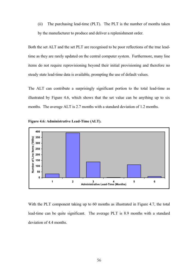
56
(ii) The purchasing lead-time (PLT). The PLT is the number of months taken
by the manufacturer to produce and deliver a replenishment order.
Both the set ALT and the set PLT are recognised to be poor reflections of the true lead-
time as they are rarely updated on the central computer system. Furthermore, many line
items do not require reprovisioning beyond their initial provisioning and therefore no
steady state lead-time data is available, prompting the use of default values.
The ALT can contribute a surprisingly significant portion to the total lead-time as
illustrated by Figure 4.6, which shows that the set value can be anything up to six
months. The average ALT is 2.7 months with a standard deviation of 1.2 months.
Figure 4.6: Administrative Lead-Time (ALT).
0
50
100
150
200
250
300
350
400
1 2 3 4 5 6Administrative Lead-Time (Months)
Num
ber o
f Lin
e Ite
ms
('000
s)
With the PLT component taking up to 60 months as illustrated in Figure 4.7, the total
lead-time can be quite significant. The average PLT is 8.9 months with a standard
deviation of 4.4 months.

57
Figure 4.7: Purchasing Lead-Time (PLT).
020406080
100120140160180200
1 to 3 4 to 6 7 to 9 10 to 12 13 to 24 25 to 60Purchasing Lead-Time (Months)
Num
ber o
f Lin
e Ite
ms
('000
s)
Combining ALT and PLT gives an average and standard deviation for the total lead-
time of 11.6 and 4.7 months respectively.
4.4 Stock-Holdings
As a matter of policy, and due to difficulties in forecasting actual requirements, the RAF
has traditionally maintained stock-holdings that may be considered excessive in other
industries. Reasons behind the large stock-holdings can be summarised as:
(i) The necessity to maintain adequate stocks in case of war and the likely
increase in usage combined with a disruption to the supply chain.
(ii) The long and variable replenishment lead-times in the defence industry and
the subsequent high cost and risk of stock-out.
(iii) The relatively high cost of procurement beyond initial provisioning due to
the RAF being the sole user of many components. This tends to lead to large
quantities of stock being procured at the time of initial provisioning.

58
(iv) The exceptionally high cost of procuring new stock as opposed to holding
stock, meaning near-obsolete line items are retained rather than disposed of.
(v) The fact that any item can be crucial and a stock-out may ground an aircraft.
(vi) The wide geographic dispersal of RAF stations and the necessity for each to
maintain stocks of what are in fact common user spares.
Figure 4.8 summarises the stock-holding status of current line items that have been in
existence for six years or more. The unit of measurement is the number of months of
stock remaining (MOSR) in the system, assuming future usage is equal to the historic
average monthly usage.
Figure 4.8: Months of Stock Remaining (MOSR).
0
40
80
120
160
Infinite Nil 1 + 6 + 12 + 24 + 48 + 72 + 120 + 240 +Number of Months of Stock
Num
ber o
f Lin
e Ite
ms
('000
s)
The first bar represents those line items for which there have been no demand
requirements in the past six years and therefore an infinite number of months of stock
remains, while the second bar represents those line items for which total demand
requirements have exceeded the available stock. The remaining bars show the number
of months of stock that remain for all other line items.

59
With a median MOSR of 85 months, or about 7 years, the implication for any stock
replenishment policy based upon stocks currently held is that many line items will not
require a reprovisioning action for a substantial period.
4.5 RAF Demand Analysis
The large quantity of unprocessed demand data available to the RAF allows a detailed
analysis of the demand patterns for consumable spare parts. This section initially
examines the annual usage-value of the consumable inventory, and continues with a
large scale analysis of both the demand sizes and the intervals between transactions in
the RAF data.
4.5.1 Annual Usage-Value
In terms of practical inventory control, the potential monetary savings that can be
achieved by the use of mathematical models on an individual line item basis are
relatively small. For slow-moving or low value items the net benefits of a sophisticated
inventory control model may in fact be negative and it is therefore important to identify
a suitable level of control. One commonly used classification method is the usage-value
criterion, which in this case utilises the annual monetary value of demand.
Over the 72 month period from January 1994 to December 1999 some 59.5 percent of
RAF line items with an IP date greater than six years recorded positive demand. Table
4.1 provides a summary of the unit value and annual demand for these line items, as
well as the annual usage-value calculated as the average annual demand multiplied by
the unit value on an individual line item basis. The RAF records unit values to the
nearest penny as seen in the table.

60
Table 4.1: Summary Statistics for Unit Value and Demand.
Statistic Unit Value (£)
Annual Demand (Units)
Annual Usage-Value (£)
Mean 246.07 90.7 2,120.97
Maximum 654,938.27 380,955.5 7,830,902.81
Upper Quartile 112.99 12.0 371.07
Median 22.09 2.5 62.22
Lower Quartile 3.53 0.6 10.39
Minimum 0.01 0.2 0.02
It is observed that all three data series are heavily skewed to the right as the means far
exceed their respective medians. This suggests a large number of line items with a low
usage-value, and that is without even considering the 40.5 percent of line items with
zero usage-value.
Figure 4.9: Distribution of Annual Usage-Value.
0
20
40
60
80
100
0 20 40 60 80 100
Percentage of Line Items
Perc
enta
ge o
f Ann
ual U
sage
-Val
ue
RAF Consumable Inventory
Typical Industrial Products
Typical Consumer Products

61
The suggestion of a large number of line items with a low usage-value is confirmed by
the plot of Figure 4.9. This figure presents the cumulative percentage of the annual
value of demand in descending rank against the cumulative percentage of line items
from actual RAF data. Once again, the 40.5 percent of line items with zero usage-value
are excluded. Also shown in the figure are similar plots for typical industrial products
and typical consumer products.
In the case of the RAF consumable inventory it is seen that just 8.5 percent of line items
account for 90 percent of the annual value of demand. By way of contrast, Daellenbach
et al. [21] suggest that in the case of typical industrial products some 25 percent of line
items account for 90 percent of the annual value, and, in the case of typical consumer
products, some 40 percent of line items account for 90 percent of the annual value. The
RAF usage-value is therefore considered far from typical.
An analysis of an inventory by usage-value can help identify a suitable level and type of
control for each line item stocked. Potential savings that can be achieved with inventory
control models are relatively low on an individual item basis, while the cost of such
control models, including demand forecasting, may be relatively high. The net benefits
of a sophisticated inventory control system may actually be negative for slow-moving or
low value items, while the control offered by a computerised system may not be tight
enough for expensive or high volume items.
Classifying line items based on their usage-value into at least three groups, referred to as
the ABC classification, may be desirable. Daellenbach et al. [21] suggest the exact
percentage breakdown appropriate for a given organisation will vary anywhere between
5-10-85 and 10-30-60. Thus, the first 5 to 10 percent of line items (as ranked by their
usage-value) are designated as A items, accounting for about 50 percent of the total

62
value; the next 10 to 30 percent of the ranked line items, accounting for about 40 percent
of the total value, are designated as B items; while the remaining 60 to 85 percent of line
items, accounting for the remaining 10 percent of the total value, form the C class of
items.
The degree of control exercised over each line item is tailored according to the ABC
classification, with class A items receiving the highest degree of individual attention.
Demand for class A items is forecasted for each line item individually, considerable
effort is made to keep tight control over replenishment lead-times, and safety stocks can
be kept relatively small, thereby allowing savings in inventory investment since stock
control is tight. Since they cover no more than 10 percent of all line items, the cost of
the extra effort in maintaining tight control is kept within strict limits.
At the other end of the scale are the C items where the objective is to maintain adequate
control in an inexpensive manner. C items are often group controlled with items
classified into subgroups with similar characteristics. It should be borne in mind that
any one of the large number of C class items has the potential to have serious
consequences for aircraft availability if shortages occur. For instance, stock-outs of
inexpensive rivets or diodes may keep an aircraft grounded just the same as a more
expensive electronic item, and therefore, large safety stocks are kept to ensure minimal
shortages.
4.5.2 Demand Patterns
A glance at Figure 4.10, which presents the frequency of demand transactions over a
six-year period, suggests that a large proportion of line items in the RAF inventory are
slow-moving; approximately 40.5 percent of line items had no demand over six years,
while 37.3 percent experienced fewer than 10 transactions.

63
Figure 4.10: Number of Demand Transactions over a Six-Year Period.
0
20
40
60
80
100
120
140
160
180
0 1 to 9 10 + 20 + 30 + 40 + 50 + 60 + 70 + 80 + 90 + 100 +Number of Demand Transactions
Num
ber o
f Lin
e Ite
ms
('000
s)
Table 4.2 presents demand size statistics for specific transaction frequency groupings.
Line items experiencing between 1 and 9 transactions over the six-year period have an
average demand size of 7.6 units. At the other end of the scale, 3.5 percent of line items
experienced 100 or more transactions with an average demand size of 19.6 units. Such
line items are more likely to have a smooth demand pattern.
Table 4.2: Demand Statistics by Transaction Frequency.
Demand Size Number of Demand Transactions
Percentage of Line Items Average Average CV
0 40.5% - -
1 to 9 37.3% 7.6 44.0%
10 to 99 18.6% 10.9 77.2%
100 + 3.5% 19.6 127.9%
In between the slow-moving line items, and the line items considered to have a smooth
demand, lie a significant number that have infrequent transactions and are therefore
likely to have an erratic demand pattern. Some 70,000 line items, or 18.6 percent,
recorded between 10 and 99 demand transactions with an average demand size of 10.9
units.

64
In determining whether these line items do in fact experience erratic demand it is also
necessary to examine the variability of the demand size. The average coefficient of
variation (CV) across each line item is 77.2 percent in this case. Such a high value
appears to confirm the notion of erratic demand in the RAF inventory.
Over a 72 month period some 12,644 line items in the RAF inventory recorded between
50 and 99 demand transactions, or equivalently, between 0.69 and 1.38 transactions per
month on average. These are considered arbitrary boundaries for erratic demand at this
stage. It is likely that the lower bound is too high for capturing erratic demand in this
instance, but an important consideration is that there are enough observations for the
analysis that follows.
The next section involves a more detailed examination of the demand size and interval
between transactions for those line items initially considered to have an erratic demand
pattern. In all cases individual transactions are analysed such that there is no
aggregation of demand.
4.5.3 Demand Size
The CV of the demand size has been calculated as a measure of randomness and the plot
of Figure 4.11 suggests the demand sizes are moderately variable with the majority of
line items having a CV greater than 50 percent and a significant proportion having a CV
greater than 100 percent. Of particular interest is the fact that nearly 400 line items had
a constant demand size, and in all such cases the demand was for one unit. The average
CV is 96.8 percent for line items with a non-constant demand size.

65
Figure 4.11: Coefficient of Variation - Demand Size.
0.0
0.5
1.0
1.5
2.0
2.5
3.0
Nil 25% 50% 75% 100% 125% 150% 175% 200% +Coefficient of Variation (Midpoint)
Num
ber o
f Lin
e Ite
ms
('000
s)
Autocorrelation can be used to determine whether a given series is random by
measuring the extent to which a variable measured over time is correlated with itself
when lagged by one or more periods. Pearson’s autocorrelation sample estimate at lag
k is calculated as:
∑
∑
=
+=−
−
−−= N
nn
N
knknn
k
xx
xxxxr
1
2
1
)(
))(( (3)
where N is the total number of observations.
A plot of autocorrelations against their lags, referred to as a correlogram, is illustrated in
Figure 4.12 for a sample line item. In the case of demand size, positive autocorrelations
occur when a high demand is matched with another high demand or a low demand is
matched with a low demand. On the other hand, negative autocorrelations occur when a
high demand is matched with a low demand or vice-versa.

66
Figure 4.12: Sample Correlogram - Demand Size.
-0.098
-0.143
-0.141
-0.124
0.108
0.406
0.133
0.135
-0.071
0.014
0.044
0.048
-0.5 -0.4 -0.3 -0.2 -0.1 0.0 0.1 0.2 0.3 0.4 0.5
12
11
10
9
8
7
6
5
4
3
2
1
Lag
Inte
rval
Autocorrelation Coefficient
If the series is random, Box and Pierce [12] show that autocorrelation coefficients from
equation (3) are approximately normal with mean zero and variance ))2(()( +− nnkn
at lag k . The coefficients are examined to see if any are significantly different from
zero using an acceptance region of:
+−
±)2(nn
knZ (4)
For the sample data with =n 82, the confidence limits from equation (4) at the 5 percent
significance level are shown in Figure 4.12 as the two near-vertical dotted lines. Twelve
lags are examined and one autocorrelation, =4r 0.406, is identified as significant,
indicating a pattern in the demand size based on lags of four. The interpretation of the
significance level for hypothesis testing is presented in Appendix B.
0 20 40 60 80
100 Demand Size Profile

67
Inset in Figure 4.12 is the demand profile for the sample line item showing the size of
successive demand requests over a 72 month period. The plot is dominated by two large
requests that are four transactions apart, strongly contributing to the significant
autocorrelation at lag 4. This observation illustrates a weakness of Pearson’s method for
determining the presence of autocorrelation in demand data; the method assumes the
data is normally distributed and is therefore not a practical measure when the data is
skewed, as in this example.
An investigation of alternative methods for determining whether there is autocorrelation
in demand data that is more than likely skewed is presented in Appendix C. For
purposes of convenience it is necessary to perform the autocorrelation analysis using
only one of the identified methods. A natural logarithm transformation method was
selected mainly because it examines the demand sizes rather than ranks or comparisons
against the median. The method was also found to be effective in removing the
variability from skewed data while being easy to implement.
Using a logarithm transformation on successive demand sizes, it was observed in
Appendix C that 3,129 or 25.5 percent of the 12,251 selected line items with a non-
constant demand size are significantly autocorrelated as a whole. Some 9.2 percent of
autocorrelation coefficients are individually significant, of which 84.0 are positively
correlated and the remaining 16.0 percent are negatively correlated.
Figure 4.13 summarises the lag interval in which individually significant autocorrelation
coefficients occur. It is seen that positive autocorrelations dominate the results, with the
early lags arising more frequently. On the other hand, in the case of significant negative
autocorrelations, there is a pattern of increasing frequency as the lag interval increases.

68
Figure 4.13: Lag of Significant Autocorrelation Coefficients - Demand Size.
0.0
0.5
1.0
1.5
2.0
2.5
3.0
1 2 3 4 5 6 7 8 9 10 11 12Lag Interval
Num
ber o
f Obs
erva
tions
('00
0s)
Positive Autocorrelations Negative Autocorrelations
The next section provides a similar analysis of the interval between transactions, prior to
a combined analysis of demand sizes and intervals.
4.5.4 Interval Between Transactions
Although defence is quite obviously a 7-day a week operation, the spread of demand
transactions during the week for the line items under consideration, as presented in
Table 4.3, suggests transactions should be reassigned to weekdays only. Thus, in this
analysis the few demand transactions placed on a Sunday have been moved forward by
one day and those placed on a Saturday have been moved back by one day.
Table 4.3: Transactions by Weekday.
Day of Week
Percentage of Transactions
Sunday 0.65%
Monday 19.56%
Tuesday 21.41%
Wednesday 21.63%
Thursday 20.55%
Friday 14.53%
Saturday 1.67%

69
The CV for the interval between transactions reveals the interval is highly variable, as
seen in the plot of Figure 4.14, where the majority of line items have a CV greater than
100 percent. The average CV is 121.9 percent in this instance.
Figure 4.14: Coefficient of Variation - Interval Between Transactions.
0
1
2
3
4
5
6
50% 75% 100% 125% 150% 175% 200% +Coefficient of Variation (Midpoint)
Num
ber o
f Lin
e Ite
ms
('000
s)
A correlogram for the interval between transactions for the previously considered
sample line item with a logarithm transformation is presented in Figure 4.15, while the
profile inset presents the non-transformed series. As logarithms are undefined for zero
values, it was necessary to transform the data into daily demand to eliminate intervals of
zero duration. In this case, positive autocorrelations occur when a long interval is
matched with another long interval or a short interval is matched with a short interval.
On the other hand, negative autocorrelations occur when a long interval is matched with
a short interval or vice-versa. In this instance, none of the autocorrelation coefficients
are significant at the 5 percent significance level. The calculated Q -statistic of 11.287
is less than the tabulated 2χ value of 18.307 and therefore the intervals between
transactions are considered random as a whole.

70
Figure 4.15: Sample Correlogram - Interval Between Transactions (Log Transform).
0.089
0.004
-0.171
-0.09
0.133
0.089
-0.058
-0.071
-0.201
-0.146
0.134
-0.022
-0.5 -0.4 -0.3 -0.2 -0.1 0.0 0.1 0.2 0.3 0.4 0.5
12
11
10
9
8
7
6
5
4
3
2
1
Lag
Inte
rval
Autocorrelation Coefficient
An examination of the autocorrelation coefficients for the interval between transactions
for all sample line items reveals that 7.0 percent of coefficients are individually
significant, of which 67.3 percent are positively correlated with the remaining 32.7
percent negatively correlated. Some 49.0 percent of line items contain individually
significant autocorrelation coefficients, although only 19.2 percent of line items are
significantly autocorrelated as a whole at the 5 percent level.
The lag intervals in which the individually significant autocorrelation coefficients occur
are summarised in Figure 4.16. The results show that positive autocorrelations again
dominate, with the early lags occurring more frequently. The significant negative
autocorrelations again show a pattern of increasing frequency as the lag interval
increases, and in this case the negative autocorrelations are more frequent than the
positive autocorrelations at the higher lags.
0
20
40
60
80
100
120Interval Profile
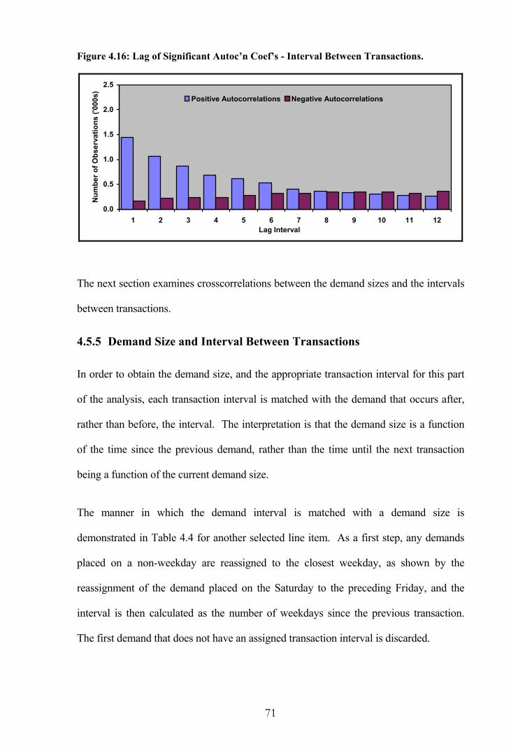
71
Figure 4.16: Lag of Significant Autoc’n Coef’s - Interval Between Transactions.
0.0
0.5
1.0
1.5
2.0
2.5
1 2 3 4 5 6 7 8 9 10 11 12Lag Interval
Num
ber o
f Obs
erva
tions
('00
0s)
Positive Autocorrelations Negative Autocorrelations
The next section examines crosscorrelations between the demand sizes and the intervals
between transactions.
4.5.5 Demand Size and Interval Between Transactions
In order to obtain the demand size, and the appropriate transaction interval for this part
of the analysis, each transaction interval is matched with the demand that occurs after,
rather than before, the interval. The interpretation is that the demand size is a function
of the time since the previous demand, rather than the time until the next transaction
being a function of the current demand size.
The manner in which the demand interval is matched with a demand size is
demonstrated in Table 4.4 for another selected line item. As a first step, any demands
placed on a non-weekday are reassigned to the closest weekday, as shown by the
reassignment of the demand placed on the Saturday to the preceding Friday, and the
interval is then calculated as the number of weekdays since the previous transaction.
The first demand that does not have an assigned transaction interval is discarded.

72
Table 4.4: Example Interval Between Transaction Calculations.
Actual Demand Date
Weekday Assigned Demand Date
Transaction Interval (days)
Demand Size
Wednesday March 20, 1996 Wednesday March 20, 1996 - 44
Wednesday March 20, 1996 Wednesday March 20, 1996 0 16
Tuesday March 26, 1996 Tuesday March 26, 1996 4 100
Saturday March 29, 1996 Friday March 28, 1996 3 20
Wednesday April 3, 1996 Wednesday April 3, 1996 3 14 . . . . . . . . . . . .
Crosscorrelation measures the extent to which a variable measured over time is
correlated with another variable when lagged by one or more periods. The sample
crosscorrelation between x and y at lag k is given by:
22
)()(
yx
xyxy
kckr
σσ=
where
−−−−=−−
−=−−
=
∑
∑
−=+
−
=+
)1(,...,2,1))((
)1(,...,1,0))((
)(
1
1
NkN
yyxx
NkN
yyxx
kcN
knknn
kN
nknn
xy
is the sample cross covariance function, and 2xσ and 2
yσ are the
population variances for observations on nx and ny respectively.
Positive crosscorrelations occur when a high demand is matched with a long interval or
a low demand is matched with a short interval. On the other hand, negative
crosscorrelations occur when a high demand is matched with a short interval or a low
demand is matched with a long interval.
Crosscorrelation coefficients for the logarithms of demand size and intervals between
transactions are illustrated in Figure 4.17. The correlogram presents the negative lags

73
(demand size leading), the positive lags (transaction interval leading) and the zero lag
for pairwise combinations. No coefficients are deemed individually significant at the 5
percent level. In considering the crosscorrelations as a whole, the calculated Q -statistic
of 23.052 is less than the tabulated 2χ value of 35.173 at the 5 percent level with 23
degrees of freedom, therefore the two series are considered independent of each other.
Figure 4.17: Sample Correlogram - Demand Size and Interval Crosscorrelation.
-0.103
-0.089
0.068
-0.077
-0.126
0.149
-0.159
-0.134
0.139
0.052
-0.048
0.043
-0.066
-0.042
-0.219
-0.133
0.158
0.016
-0.153
-0.058
0.107
0.013
-0.131
0.191
-0.015
-0.5 -0.4 -0.3 -0.2 -0.1 0.0 0.1 0.2 0.3 0.4 0.5
-12
-11
-10
-9
-8
-7
-6
-5
-4
-3
-2
-1
0
1
2
3
4
5
6
7
8
9
10
11
12
Lag
Inte
rval
Crosscorrelation Coefficient

74
Examining the crosscorrelations for all sample line items reveals 6.5 percent of
coefficients are individually significant, of which 56.7 percent are positive with the
remaining 43.3 percent negative. Some 76.0 percent of line items contain individually
significant crosscorrelation coefficients, although only 17.8 percent of line items are
significantly crosscorrelated as a whole at the 5 percent level.
Figure 4.18 summarises the lags and leads, as negative (demand size leading), zero, and
positive (transaction interval leading), in which individually significant crosscorrelation
coefficients occur. Significant positive crosscorrelations are more frequent than
negative crosscorrelations overall and show a clear dominance at the shorter lags. A
small majority of positive crosscorrelations lie to the right of the peak at lag zero,
indicating a tendency for shorter intervals to be followed by a lower demand or longer
intervals to be followed by a higher demand. On the other hand, negative
crosscorrelations tend to be more evenly spread across the range of lag intervals.
Figure 4.18: Lag of Significant Crosscorrelation Coefficients.
0.0
0.2
0.4
0.6
0.8
1.0
1.2
1.4
-12 -11 -10 -9 -8 -7 -6 -5 -4 -3 -2 -1 0 1 2 3 4 5 6 7 8 9 10 11 12Lag Interval
Num
ber o
f Obs
erva
tions
('00
0s)
Positive Crosscorrelations Negative Crosscorrelations
An alternative means of examining the relationship between the demand size and the
interval between demands is to consider the autocorrelation of their ratio. A ratio can

75
only be calculated when the logarithm of the interval between demands is greater than
zero, implying an interval greater than one, otherwise remaining undefined. Figure 4.19
presents the correlogram for the sample line item for the ratio of the demand size and
interval. Again, none of the autocorrelation coefficients are deemed significant at the 5
percent level. The calculated Q -statistic of 6.451 is less than the tabulated 2χ value,
therefore successive demand size and interval ratio values are considered random.
Figure 4.19: Sample Correlogram - Demand Size and Interval Ratio.
-0.147
0.084
-0.088
-0.137
0.044
-0.088
0.122
-0.079
-0.011
-0.032
0.070
-0.017
-0.5 -0.4 -0.3 -0.2 -0.1 0.0 0.1 0.2 0.3 0.4 0.5
12
11
10
9
8
7
6
5
4
3
2
1
Lag
Inte
rval
Autocorrelation Coefficient
An examination of the autocorrelation coefficients for the demand size and interval ratio
for all sample line items, indicates that 4.4 percent of coefficients are individually
significant, of which 83.1 percent are positively correlated with the remaining 16.9
percent negatively correlated. Some 35.4 percent of line items contain individually
significant autocorrelation coefficients, although only 10.1 percent of line items are
significantly autocorrelated as a whole at the 5 percent level.
0
1
2
3
4
5Ratio Profile

76
Figure 4.20 summarises the lag of significant autocorrelation ratio coefficients. Once
again positive autocorrelations dominate the plot and show a decline in frequency as the
lag interval increases. The significant negative autocorrelations marginally increase in
frequency as the lag interval increases.
Figure 4.20: Lag of Significant Autocorrelation Ratio Coefficients.
0.0
0.5
1.0
1.5
2.0
2.5
1 2 3 4 5 6 7 8 9 10 11 12Lag Interval
Num
ber o
f Obs
erva
tions
('00
0s)
Positive Autocorrelations Negative Autocorrelations
The observed autocorrelation and crosscorrelation results from the RAF sample data are
summarised in the next section.
4.5.6 Autocorrelation and Crosscorrelation Summary
To summarise the autocorrelation and crosscorrelation coefficients for the logarithm-
transformed series considered in this chapter, Table 4.5 presents statistics for
individually significant lags, as well as line items that have significant correlations as a
whole. The percentages of individually significant lags are only slightly more than
would arise naturally given a significance level of 5 percent. However, more
compelling evidence of the presence of autocorrelation is the percentage of line items
significant as a whole. This measure determines whether a cluster of coefficients are

77
significantly different from zero and therefore provides a more powerful test. A
moderate proportion of line items are observed to be autocorrelated via this means.
Table 4.5: Autocorrelation Summary Statistics (Log Transform Series).
Percentage of Individually Significant Lags
Percentage of Line Items (n = 12,251)
Proportion Autocorrelation / Crosscorrelation
Total Negative Positive
With Signif Lags
Signif as a Whole
Demand Size 9.2 16.0 84.0 55.1 25.5
Interval Between Demands 7.0 32.7 67.3 49.0 19.2
Demand Size and Interval 6.5 43.3 56.7 76.0 17.8
Demand Size and Interval Ratio 4.4 16.9 83.1 35.4 10.1
Figure 4.21 presents the size of individually significant coefficients as box and whisker
plots as produced by SAS/STAT software [61] using the BOXPLOT procedure.
Figure 4.21: Box and Whisker Plots for Significant Autocorrelations.
-1.0
-0.6
-0.2
0.2
0.6
1.0
Demand Size
TransactionInterval
Size and Interval
Size OverInterval
Cor
rela
tion
Coe
ffici
ent

78
Two plots are presented, one for significant positive correlation coefficients and one for
significant negative correlation coefficients, for the demand size, the interval between
transactions, the demand size and interval crosscorrelations, and the ratio of demand size
and interval autocorrelations. The bottom and top edges of the boxes are located at the
sample twenty-fifth and seventy-fifth percentiles. The centre horizontal line is drawn at
the median, while the whiskers extend from each box as far as the maximum and
minimum values, and the mean for each series is displayed by a marker symbol. The
percentages assigned to each plot indicate the overall proportion of coefficients that are
significant.
The plots show some large positive and negative autocorrelation and crosscorrelation
coefficients in the data. There is more variability in the positive correlation coefficients
with the greater length of the boxes indicating a higher interquartile range and the
greater length of the whiskers also indicating a higher range. As was previously
observed, a higher proportion of significant correlation coefficients are positive in nature
as indicated by the percentage values. Although the total percentage of significant
coefficients appears low, they are spread among the line items such that up to a quarter
are significantly autocorrelated and/or crosscorrelated.
4.6 Concluding Remarks
The particular manner in which the RAF operates leads to unique characteristics in the
management of the inventory. A large inventory of reserve stocks is maintained in case
of war when stock-outs can have severe repercussions. Replenishment lead-times are
considerably longer than those faced by most organisations. Also contributing to the
high stock-holdings is the fact that the RAF is the sole user of many parts and it is more
economical to procure large quantities of stock at the time of initial provisioning. Other

79
factors also lead to stock-holdings that would be considered excessive in other
industries, such as the wide geographic dispersal of RAF stations.
An analysis of the annual usage-value indicates that the RAF has a large number of line
items with low usage and/or low value. Just 8.5 percent of line items account for 90
percent of the annual value of demand, whereas with typical industrial products it is
more like some 25 percent of line items that account for 90 percent of the annual value.
Given the large number of C class items, it is sensible to maintain adequate control at
the lowest possible cost, which, for the most part, entails keeping large safety stocks to
ensure minimal stock-outs.
An ABC inventory analysis generally receives widespread support in the academic
literature. However, the costs of maintaining tailored levels of control for the different
classifications can prove prohibitive in reality. With a large inventory such as that
maintained by the RAF, it is more realistic to use universal policies which provide good
results in an uncomplicated manner for all line items. This is particularly the case where
the people tasked with monitoring and procuring a specific range of line items are in a
post for a period often less than two years.
The large amount of demand data maintained by the RAF has allowed thorough testing
for the presence of autocorrelation in both the demand size and the interval between
transactions. For most organisations the sparseness of data does not allow a detailed
estimate of the level of autocorrelation and questions of independence are left
unanswered. The results from the large-scale analysis undertaken in this chapter should
have wide application and they raise questions about the validity of published models
for erratic and slow-moving demand that assume independence between successive

80
demand sizes, independence between successive demand intervals, and independence
between the demand sizes and intervals.
The results have shown some large positive and negative autocorrelation and cross-
correlation coefficients in the data. A higher proportion of significant correlation
coefficients were positive in nature and they tended to have more variability and higher
values than the negative coefficients. Approximately a quarter of line items were found
to be significantly autocorrelated and/or crosscorrelated, which suggests many models in
the literature are too simplistic with their assumptions. A later chapter will investigate
the effect of this on forecasting performance.
An important characteristic of the RAF inventory that has only been touched upon in
this chapter is the consideration of the replenishment lead-time. As a fundamental
component of any inventory management system, the next chapter provides an in-depth
lead-time analysis.
81
5. LEAD-TIME ANALYSIS
The replenishment lead-time is the elapsed time between placing a replenishment order
and receiving the items in stock. If the lead-times and demands during these periods are
both known with certainty, then inventory replenishments can be timed such that items
arrive in stock at the exact time that the last unit is withdrawn. The critical inventory
level that triggers a replenishment order will be equal to the lead-time demand. If the
replenishment order is placed earlier, some items in stock will not be used; if placed
later, some demand requests will go unsatisfied until new stock arrives.
For the vast majority of items in the RAF inventory, the demand is subject to a high
degree of uncertainty, and similarly the lead-times are variable. In such cases, the
demand during the lead-time can no longer be predicted exactly, and it becomes
impossible to time replenishments such that idle stock or stock shortages are avoided. A
detailed analysis of actual RAF lead-time observations is undertaken in this chapter.
5.1 RAF Lead-Time Analysis
Every line item in the RAF inventory has a set administrative lead-time (ALT) and a set
purchasing lead-time (PLT) which combine to provide an overall lead-time value.
Unfortunately, the fixed nature of this value along with the recognised inaccuracies in
both parameters prevents a complete analysis of lead-time demand and another source of
lead-time data has been investigated. This secondary data contains monthly updates of
the quantity outstanding against individual procurement contracts. The replenishment
lead-time can be calculated as the elapsed time between the date a contract is placed
with a manufacturer and the date on which the delivery against that contract is received.
In this instance, the lead-time only comprises the PLT component and does not include
the time to recognise the requirement for replenishment nor set up the required contract.
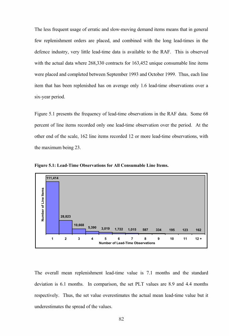
82
The less frequent usage of erratic and slow-moving demand items means that in general
few replenishment orders are placed, and combined with the long lead-times in the
defence industry, very little lead-time data is available to the RAF. This is observed
with the actual data where 268,330 contracts for 163,452 unique consumable line items
were placed and completed between September 1993 and October 1999. Thus, each line
item that has been replenished has on average only 1.6 lead-time observations over a
six-year period.
Figure 5.1 presents the frequency of lead-time observations in the RAF data. Some 68
percent of line items recorded only one lead-time observation over the period. At the
other end of the scale, 162 line items recorded 12 or more lead-time observations, with
the maximum being 23.
Figure 5.1: Lead-Time Observations for All Consumable Line Items.
28,823
10,6685,390 3,019 1,722 1,015 587 334 195 123 162
111,414
1 2 3 4 5 6 7 8 9 10 11 12 +Number of Lead-Time Observations
Num
ber o
f Lin
e Ite
ms
The overall mean replenishment lead-time value is 7.1 months and the standard
deviation is 6.1 months. In comparison, the set PLT values are 8.9 and 4.4 months
respectively. Thus, the set value overestimates the actual mean lead-time value but it
underestimates the spread of the values.

83
By their very nature, the 162 line items with 12 or more observations are likely to be the
higher usage items with a smoother demand pattern. In fact, the average number of
demand transactions for these items over the period from January 1994 to December
1999 is 396 and the average demand quantity is 25 units. In comparison, the average
number of demand transactions and the average demand quantity for line items with
fewer than 12 lead-time observations is only 76 and 20 respectively. This suggests that
the line items for which a full lead-time analysis is possible may not provide a truly
representative picture.
Although most models in the literature assume lead-times are normally distributed, data
available to the RAF indicates that the geometric or negative exponential distributions
provide a better lead-time representation. The following section provides details of a
modified chi-square goodness-of-fit test that has been used for this analysis.
5.1.1 Goodness-of-Fit Test
A goodness-of-fit test tests the null hypothesis that a random sample was drawn from a
population with a specified distribution. A common form of this test is the chi-square
goodness-of-fit test which measures the degree of fit between observed ( iO ) and
expected ( iE ) frequencies within each category. A chi-square statistic is calculated as:
( )∑
=
−=
k
i i
ii
EEO
1
22χ (5)
where k is the final number of categories.
A calculated chi-square statistic less than a tabulated value at the appropriate degrees of
freedom indicates a good fit. The general rule for finding the number of degrees of
freedom when using this test is to subtract the number of estimated parameters,
including the total expected frequency, from the total number of categories. Thus, the

84
number of degrees of freedom for the Poisson distribution would be the final number of
categories less two, one for the total expected frequency and one for the sample mean.
Problems often arise with the standard chi-square test through the requirement for data
to be grouped together to ensure that each group has an expected frequency of at least
five observations. However, there is not complete agreement on this matter; Allen [2]
indicates that, “It has been found, empirically, that the chi-square test works best when
all the iE are at least 5, for if iE is small, the division by iE in the term iii EEO 2)( −
can cause a large error in the value of 2χ ”, whereas Snedecor and Cochran [72] are
less strict in suggesting that, “A working rule is that no class expectation should be
below 1; two extreme expectations may be close to 1 provided that most of the other
expected values exceed 5”, and Chatfield [17] goes further by suggesting that, “If the
expected number in any category is too small, the category should be combined with one
or more neighbouring categories. (If there are more than about ten categories, then the
approximation is valid provided that less than 20 per cent of the values of iE are less
than five, and provided that none is less than one)”.
Groupings are therefore somewhat arbitrary and questions may arise as to what
constitutes suitable boundaries for combining neighbouring categories. It is frequently
observed that one grouping will accept the null hypothesis whereas another grouping
will not, as illustrated by the following example.
Monthly demands over a 72-month period are compiled in a frequency table for a single
line item as presented in the first two columns of Table 5.1.

85
Table 5.1: Monthly Demand Frequencies.
Frequency Demands Per Month Observed Expected
0 2 1.17
1 8 4.80
2 12 9.90
3 12 13.62
4 10 14.04
5 5 11.58
6 8 7.96
7 8 4.69
8 3 2.42
9 4 1.82
Total 72 72.00
We want to know whether the monthly demand arrivals follow a Poisson distribution
with a mean of λ . First, we determine an estimate of the monthly arrival rate, which
turns out to be 4.13 demands per month. Expected frequencies for this distribution can
then be determined as shown in the third column. Now the question is how to combine
those categories with the low expected frequencies.
As it turns out, if the demands are grouped into eight categories as {0-1, 2, 3, 4, 5, 6, 7,
8-9} giving a minimum expected category frequency of 4.24, then the null hypothesis is
not rejected at the 5 percent significance level as the computed 2χ of 12.394 is less than
the tabulated value of 12.592 with 6 degrees of freedom. However, if the demands are
grouped into seven categories as {0-1, 2, 3, 4, 5, 6, 7-9} giving a minimum expected
category frequency of 5.97, then the null hypothesis is rejected with a computed 2χ of
12.387 and a tabulated value of 11.070 with 5 degrees of freedom.
The first grouping method marginally falls short of the five observations rule, although
it meets the requirements specified by Snedecor and Cochran as well as Chatfield. On

86
the other hand, the second method meets all requirements for the number of
observations but it might be considered unfair to reject the null hypothesis in this
instance. We require a methodology that can be applied automatically to large
quantities of data while providing consistently fair groupings of observations across a
range of probability distributions.
5.1.2 Modified Chi-Square Goodness-of-Fit Test
In the course of my research I have developed a modified chi-square goodness-of-fit
testing method called GOODFIT within Microsoft Excel. GOODFIT differs in that
boundaries are specified by forming categories with similar theoretical frequencies
throughout, rather than combining groups just at the margins. Under the modified rules
the sum of the probabilities within each grouping will be equalised to a high degree.
Continuing with the sample data presented previously, cumulative Poisson probabilities
for =λ 4.13 are presented in Table 5.2.
Table 5.2: Cumulative Poisson Probabilities.
Demands Per Month (i)
Cumulative Probability
Demands Per Month (i)
Cumulative Probability
0 0.01616 9 0.99008
1 0.08284 10 0.99643
2 0.22035 11 0.99882
3 0.40944 12 0.99964
4 0.60443 13 0.99990
5 0.76530 14 0.99997
6 0.87590 15 0.99999
7 0.94107 16 1.00000
8 0.97468
The upper boundary for each category is determined as the maximum i with a
cumulative probability less than or equal to the category number divided by the number

87
of categories. The upper bound for the last category is the maximum i . Thus, if there
are five categories the groupings will be calculated as:
Category 1 - max{ i } where F( i ) ≤ 1/5 ⇒ 0, 1
Category 2 - max{ i } where F( i ) ≤ 2/5 ⇒ 2
Category 3 - max{ i } where F( i ) ≤ 3/5 ⇒ 3
Category 4 - max{ i } where F( i ) ≤ 4/5 ⇒ 4, 5
Category 5 - max{ i } ⇒ 6 - 16
In this case the computed 2χ of 9.974 exceeds the tabulated value of 7.815 at the 5
percent significance level and the null hypothesis of fitting a Poisson distribution is
rejected. The null hypothesis fluctuates between being rejected or accepted depending
on the number of categories considered, as illustrated in Table 5.3. The minimum
number of categories for the Poisson distribution is three, allowing for two degrees of
freedom. The null hypothesis is accepted for 3 and 4 categories and also for 8, 9 and 10
categories, although the five observations rule is broken for the latter three results.
Table 5.3: Sample Goodness-of-Fit Test Results.
Number of Categories
(n)
Computed Chi-Square
Value
Tabulated 2
2,05.0 −nχ Minimum Expected
Frequency in a Category
Accept or Reject
Hypothesis
3 3.536 3.841 15.87 Accept
4 3.374 5.991 13.61 Accept
5 9.974 7.815 5.97 Reject
6 10.473 9.488 5.97 Reject
7 12.387 11.070 5.97 Reject
8 12.394 12.592 4.24 Accept
9 13.340 14.067 1.82 Accept
10 13.342 15.507 1.17 Accept

88
For each distribution being tested, GOODFIT will iterate the number of categories from
the minimum determined by the degrees of freedom up to a maximum of either a set
number or when the theoretical frequency in a group drops below a specified limit. If
for any number of categories the null hypothesis is not rejected, the data is assumed to
fit the distribution being tested and another distribution can then be considered. Figure
5.2 presents a sample of the GOODFIT statistics output screen.
Figure 5.2: GOODFIT Statistics Screen.
The GOODFIT methodology could be further enhanced by offering softer rules on the
boundaries such that the sum of the probabilities within each grouping would be
equalised to the greatest extent possible. Thus, in the case of the sample line item the
upper bound for the first category need not be exactly 1/5 but rather approximately 1/5.
Looking at Table 5.2, this would allow an initial grouping of {0-2} with an expected
probability of 0.22035, which is close to 1/5. Continuing in this manner the five

89
categories would be defined as {0-2,3,4,5,6-16}. In this case the computed 2χ of 9.670
still exceeds the tabulated value of 7.815 at the 5 percent significance level and the null
hypothesis is again rejected.
A modified goodness-of-fit test without the soft boundary enhancement was conducted
on all 162 individual line items with 12 or more lead-time observations (less one with a
constant lead-time). As shown in Table 5.4, the low number of lead-time observations
prevents a complete description of the lead-time distribution and a range of theoretical
distributions are candidates given their high fitment rate. The sample sizes available at
this stage of the analysis are too small for determining which distribution best fits the
lead-time data. It is seen that each of the geometric, negative exponential, negative
binomial and gamma distributions all fit over 85 percent of the lead-time data at the 5
percent significance level.
Table 5.4: Goodness-of-Fit Test Results - Individual Lead-Time Observations.
Goodness-of-Fit Statistics (n = 161)
Alpha 0.10 Alpha 0.05 Alpha 0.01 Probability Distribution
Count Percent Count Percent Count Percent
Geometric 138 85.7% 150 93.2% 158 98.1%
Negative Exponential 131 81.4% 149 92.5% 155 96.3%
Negative Binomial 131 81.4% 140 87.0% 147 91.3%
Gamma 127 78.9% 137 85.1% 145 90.1%
Poisson 119 73.9% 132 82.0% 152 94.4%
Normal 120 74.5% 128 79.5% 143 88.8%
Laplace 112 69.6% 126 78.3% 139 86.3%
Log Normal 115 71.4% 121 75.2% 133 82.6%
Logarithmic 89 55.3% 101 62.7% 136 84.5%
The hypothesis testing description in Appendix B indicates the alpha value, also known
as the significance level of the test, determines the probability of rejecting the null

90
hypothesis ( 0H ) when it is true, thus committing a Type I error. As alpha moves from
0.10 to 0.05 and on to 0.01, the probability of committing a Type I error decreases,
although the probability of committing a Type II error, whereby a false 0H is not
rejected, increases. The risk of committing either type of error can be reduced by
increasing the number of lead-time observations for each line item, a consideration
investigated in a later chapter.
5.2 Lead-Time Grouping Analysis
The low number of actual lead-time observations for each line item, which more often
than not equals zero, restricts the usefulness of this data on an individual item basis.
Therefore, it is necessary to group line items that may have a similar lead-time pattern
and calculate summary statistics that apply to the entire grouping. Groupings could be
based on the following predictors:
(i) Item price - The higher the price, the greater the complexity of the item and
possibly the longer the lead-time.
(ii) Item activity - There may be a relationship between the lead-time and the
frequency of reprovisioning. In the absence of comprehensive reprovisioning
data, an alternative is to examine the frequency with which demand occurs.
(iii) Set PLT - The set parameter value may in fact bear some resemblance to the
true lead-time value.
(iv) The manufacturer - A given manufacturer is likely to produce line items
with similar characteristics and apply similar manufacturing procedures.
(v) Supply Management Branch (SMB) - The SMB has two hierarchical levels:

91
(a) SMB Level 1 (SMB L1) - The management team responsible for a
defined range of equipment comprising an aircraft-based, a technology-
based, or a commodity-based range of items. For example, SMB21 is
responsible for the avionics, electrical and weapons systems for the Harrier.
(b) SMB Level 2 (SMB L2) - Identifies range managers (RM) within an
SMB tasked with monitoring and procuring specific line items. RM21b is
responsible for mission display components for the Harrier, for example
(vi) NATO Supply Classification (NSC) - The NSC defines the commodity
grouping of a line item and has three hierarchical levels:
(a) NSC Level 1 (NSC L1) - Classifies commodity groupings under a
broad categorisation such as weapons.
(b) NSC Level 2 (NSC L2) - A refinement of NSC L1 into additional
commodity groupings. For example, weapons at NSC L2 consist of
missiles, guns, armament equipment, ammunition and explosives.
(c) NSC Level 3 (NSC L3) - A further refinement upon NSC L2.
SAS software has been used to measure the degree to which each predictor, or
independent variable, explains the variation in the dependent variable, that is the
variation in the replenishment lead-time across the line items. By matching the lead-
time observations with the mature line items currently in the RAF inventory a total of
72,712 unique line items are available for a lead-time analysis, representing 19.3 percent
of the inventory. In this analysis the replenishment lead-time for an individual line item
is taken as the average of all lead-time observations for that item.

92
5.2.1 Analysis of Variation
Three separate SAS procedures have been used in an exploratory analysis of the
variation in the lead-time, namely PROC REG, PROC ANOVA and PROC GLM, depending
on the nature of the predictor.
PROC REG is a general-purpose regression procedure suitable for identifying a linear
relationship between the dependent variable and an independent variable with a numeric
measurement, such as item price in this instance. The procedure determines the linear
equation that minimises the sum of the squared errors (SSE) between the actual lead-
time values and the values predicted by the equation. In effect, the SSE is a measure of
the amount of variation in the independent variable that remains unexplained by the
variation in the dependent variable. Alternatively, the sum of squares for regression
(SSR) measures the amount of explained variation.
An indication of how much variation is explained by the fitted model is provided by the
coefficient of determination, denoted 2r and defined as:
TSSSSEr −= 12
where TSS is the total sum of squares which measures the variation in
the dependent variable.
It follows that 2r measures the proportion of the variation in the replenishment lead-
time that is explained by the variation in the dependent variable. Whether a given 2r is
considered large or small depends on the context of the analysis. As the replenishment
lead-time is likely to depend on a range of factors and be quite unpredictable, an 2r of
say 0.3 may be considered large in this instance.
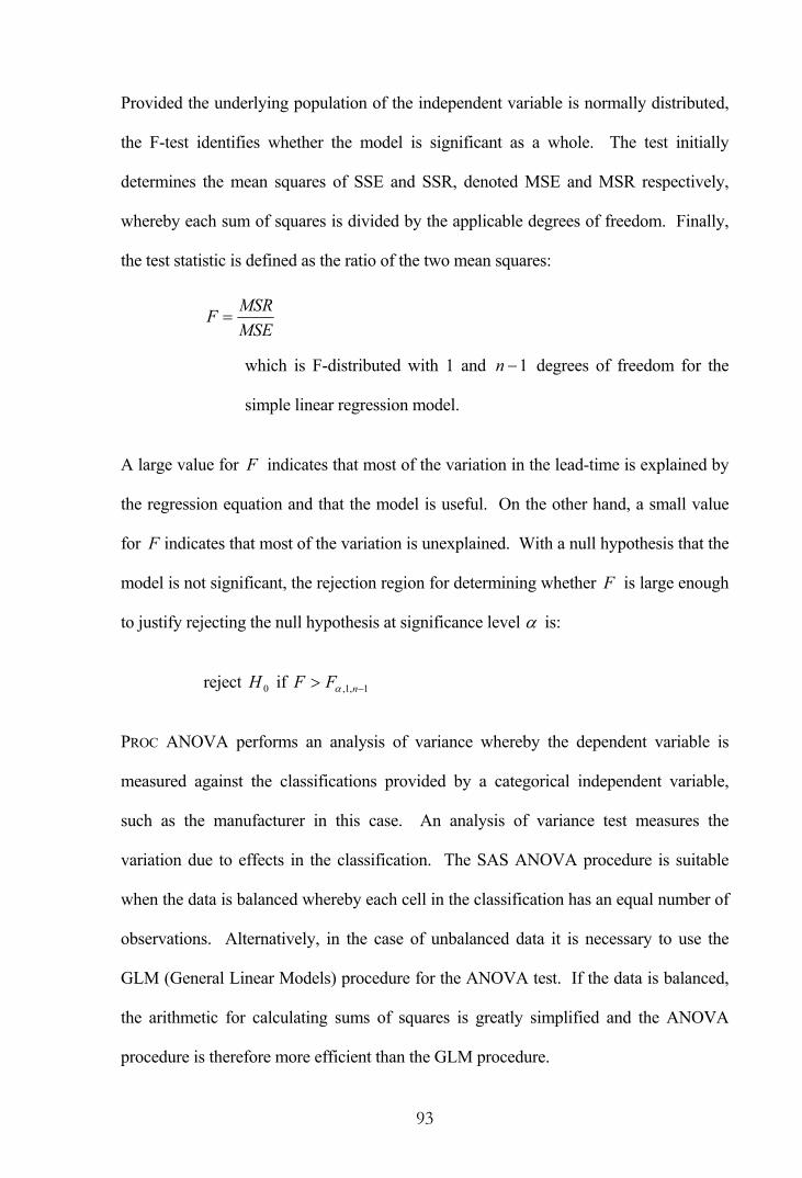
93
Provided the underlying population of the independent variable is normally distributed,
the F-test identifies whether the model is significant as a whole. The test initially
determines the mean squares of SSE and SSR, denoted MSE and MSR respectively,
whereby each sum of squares is divided by the applicable degrees of freedom. Finally,
the test statistic is defined as the ratio of the two mean squares:
MSEMSRF =
which is F-distributed with 1 and 1−n degrees of freedom for the
simple linear regression model.
A large value for F indicates that most of the variation in the lead-time is explained by
the regression equation and that the model is useful. On the other hand, a small value
for F indicates that most of the variation is unexplained. With a null hypothesis that the
model is not significant, the rejection region for determining whether F is large enough
to justify rejecting the null hypothesis at significance level α is:
reject 0H if 1,1, −> nFF α
PROC ANOVA performs an analysis of variance whereby the dependent variable is
measured against the classifications provided by a categorical independent variable,
such as the manufacturer in this case. An analysis of variance test measures the
variation due to effects in the classification. The SAS ANOVA procedure is suitable
when the data is balanced whereby each cell in the classification has an equal number of
observations. Alternatively, in the case of unbalanced data it is necessary to use the
GLM (General Linear Models) procedure for the ANOVA test. If the data is balanced,
the arithmetic for calculating sums of squares is greatly simplified and the ANOVA
procedure is therefore more efficient than the GLM procedure.

94
The coefficient of determination ( 2r ) has the same interpretation for the ANOVA and
GLM procedures as it does for the REG procedure, in that it measures how much
variation in the dependent variable can be accounted for by the model. Similarly, the
F ratio has the same interpretation, although the test statistic is F-distributed with 1−k
and kn − degrees of freedom, where k is the number of categories, provided the
independent variable is normally distributed and population variances are equal. The F-
test is a test of the null hypothesis that there are no differences among the population
means.
Results from individual models for ascertaining how well the predictor variables explain
the variation in the actual lead-times are presented in Table 5.5. Assuming each
predictor variable is normally distributed, the F-test suggests that the models are
significant overall. The possibility of violating the assumptions is examined in a later
section. Suffice to say the 2r value will still be legitimate.
Table 5.5: Analysis of Actual Lead-Time Data.
Test Statistics Indep’t Variable
SAS® Test Applied r 2 F Ratio dfn dfd
F0.01 Value
Model Significant
Price Reg 0.017 1,233.87 1 72,710 6.64 Yes
Activity Reg 0.000 12.45 1 68,571 6.64 Yes
Set PLT Reg 0.092 7,319.82 1 72,710 6.64 Yes
Manuf’r GLM 0.240 11.86 1,593 59,750 1.09 Yes
SMB L1 GLM 0.160 130.78 106 72,605 1.35 Yes
SMB L2 GLM 0.196 43.75 403 72,308 1.17 Yes
NSC L1 GLM 0.034 506.54 5 72,706 3.02 Yes
NSC L2 GLM 0.050 212.28 18 72,693 1.93 Yes
NSC L3 GLM 0.093 61.25 122 72,589 1.32 Yes
The analysis of the variation in the actual lead-times indicates that the manufacturer with
the highest 2r explains the variation to the greatest extent. Next are the range managers

95
at SMB L2 who, with additional information, explain more variation than SMB L1. At
the other end of the scale the item price and item activity explain very little of the lead-
time variation.
5.2.2 Diagnostics - Item Price
The results of the analysis suggest there is virtually no linear relationship between the
price of an item and the lead-time as indicated by the low 2r value. This unexpectedly
poor result prompted further analysis of the price data using PROC UNIVARIATE to
generate descriptive statistics. Selected sample statistics, including the mean, median
and standard deviation, the skewness and kurtosis as measures of shape, and the
Kolmogorov-Smirnov (K-S) D statistic as a test for normality, are shown in Table 5.6.
Table 5.6: Analysis of Item Price Data.
n Mean ( x ) Median Std Dev (s) Skewness Kurtosis D Statistic
72,712 226.82 24.21 900.15 14.52 372.93 0.401
Skewness is a measure of the tendency of the deviations from the mean to be larger in
one direction than the other, calculated as:
∑=
−−−
n
i
i
sxx
nnn
1
3
)2)(1(
If the sample comes from a normal population and n exceeds 150, the skewness is
approximately normally distributed with mean zero and a standard deviation of n/6
or 0.009 in this case (Snedecor and Cochran [72]). Since skewness is positive and far in
excess of its standard deviation, the value indicates the distribution is heavily skewed to
the right.

96
In addition, the heaviness of the tail can be measured by the kurtosis calculated as:
∑= −−
−−
−−−−
+ n
i
i
nnn
sxx
nnnnn
1
24
)3)(2()1(3
)3)(2)(1()1(
For sample sizes from the normal distribution in excess of 1000, kurtosis is normally
distributed with mean zero and a standard deviation of n/24 , or 0.018 in this case.
Again, the kurtosis value is far in excess of its standard deviation indicating a very
heavy tail.
With the measures of skewness and kurtosis suggesting the presence of a small
proportion of relatively large prices, the population distribution is likely to be far from
normal. Confirmation of a rejection of the null hypothesis that the price data was drawn
from a population with a normal distribution is provided by the K-S goodness-of-fit test.
The D statistic (obtained from PROC UNIVARIATE using the NORMAL option) is
calculated as the maximum absolute difference between the cumulative distribution
function (CDF) of the hypothesised distribution )(xF and the CDF of the sample
)(xSn , as:
−
−−= )(1,)(maxmax jjjn tF
njtF
njD
where jt is the thj smallest observation.
Critical regions for determining whether D is large enough to justify rejecting the null
hypothesis are of the form:
ValueTabulatedDn ≥
where the tabulated value comes from a table such as Lilliefors [47].

97
In this instance, the sample size is far beyond the range of any tabulated values and an
extrapolated critical value is obtained from Table 5.7. This table caters for situations
where the parameters of the hypothesised distribution are unknown and have to be
estimated from the sample.
Table 5.7: Critical Values for the Kolmogorov-Smirnov Test for Normality.
Level of Significance Sample Size (n) 0.10 0.05 0.02 0.01
Over 100 n
8255.0 n
8993.0 n
9885.0 n
0500.1
The maximum observed deviation of 712,72D = 0.401 is far in excess of the critical value
of 0.004 at the 1 percent significance level, providing strong evidence that price is not
normally distributed. Such an observation suggests transforming the price data in an
attempt to remedy the non-normality and improve upon the observed coefficient of
determination.
The type of transformation depends on the form of the error values from the regression
equation. The most commonly used transformations include:
(i) The log transformation - used when either (a) the variance of the error
increases as the predicted value increases, or (b) the distribution of the errors is
positively skewed.
(ii) The square transformation - used when either (a) the variance is
proportional to the predicted value, or (b) the error distribution is negatively
skewed.
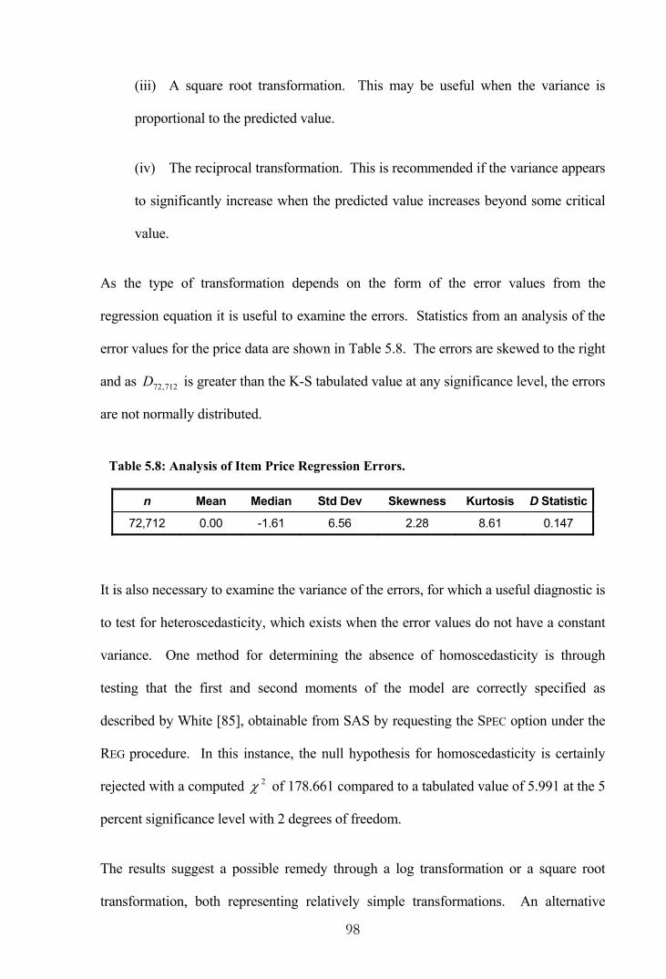
98
(iii) A square root transformation. This may be useful when the variance is
proportional to the predicted value.
(iv) The reciprocal transformation. This is recommended if the variance appears
to significantly increase when the predicted value increases beyond some critical
value.
As the type of transformation depends on the form of the error values from the
regression equation it is useful to examine the errors. Statistics from an analysis of the
error values for the price data are shown in Table 5.8. The errors are skewed to the right
and as 712,72D is greater than the K-S tabulated value at any significance level, the errors
are not normally distributed.
Table 5.8: Analysis of Item Price Regression Errors.
n Mean Median Std Dev Skewness Kurtosis D Statistic
72,712 0.00 -1.61 6.56 2.28 8.61 0.147
It is also necessary to examine the variance of the errors, for which a useful diagnostic is
to test for heteroscedasticity, which exists when the error values do not have a constant
variance. One method for determining the absence of homoscedasticity is through
testing that the first and second moments of the model are correctly specified as
described by White [85], obtainable from SAS by requesting the SPEC option under the
REG procedure. In this instance, the null hypothesis for homoscedasticity is certainly
rejected with a computed 2χ of 178.661 compared to a tabulated value of 5.991 at the 5
percent significance level with 2 degrees of freedom.
The results suggest a possible remedy through a log transformation or a square root
transformation, both representing relatively simple transformations. An alternative

99
means for transforming data is available through the TRANSREG (transformation
regression) procedure. This procedure iteratively derives an optimal variable
transformation using the method of alternating least squares.
An ordinary regression model assumes the variables are measured on an equal interval
scale and can therefore be geometrically represented as vectors in an n dimensional
space. On the other hand, the alternating least squares algorithm allows variables whose
full representation is a matrix consisting of more than one vector to be represented by a
single vector, which is an optimal linear combination of the columns of the matrix.
As a rule, the transformed data from PROC TRANSREG should not be used in hypothesis
testing but rather as an exploratory data analysis procedure because the usual
assumptions are violated when variables are optimally transformed by this means. The
test statistics reported by the REG and GLM procedures are no longer truly valid, except
possibly .2r However, in this study the sample size is so large that the fact that degrees
of freedom are lost by the transformation procedure bears little relevance.
The impact upon the regression analysis from the transformations to item price is
illustrated in Table 5.9. The log transformation improves the 2r value over the default
value to a greater extent than the square root transformation, although the result is still
somewhat poor in both cases. An optimal cubic spline transformation with fifty knots
was applied separately to the item price and the log of the item price. Splines are
defined as piecewise polynomials of degree n whose function values and 1−n
derivatives agree at the points where they join. Knots give the fitted curve freedom to
bend and are the abscissa values, or vertical distance to the y-axis, of the join points.
Again, both transformations produce an improved, but still somewhat poor, result
according to the 2r value.

100
Table 5.9: Item Price Regression Analysis.
Test Statistics Item Price Transformation r 2 F Ratio dfn dfd
F0.01 Value
Model Significant
Default 0.017 1,233.87 1 72,710 6.64 Yes
Log 0.055 4,192.98 1 72,710 6.64 Yes
Square Root 0.046 3,519.85 1 72,710 6.64 Yes
Cubic Spline 0.061 4,701.86 1 72,710 6.64 Yes
Log C. Spline 0.061 4,702.39 1 72,710 6.64 Yes
Descriptive statistics for the transformed prices and the resultant regression errors are
shown in Table 5.10. It is seen from the K-S D statistic that none of the transformed
series or their regression errors attain normality and in all cases the error values maintain
a high degree of heteroscedasticity as shown by the last column.
Table 5.10: Analysis of Transformed Item Price.
Transf’n Series n Mean Std Dev Skewness Kurtosis D Stat H Stat
Default Actual 72,712 226.82 900.15 14.52 372.93 0.401 -
Errors 72,712 0.00 6.56 2.28 8.61 0.147 178.7
Log Actual 72,712 3.04 2.47 -0.26 -0.17 0.026 -
Errors 72,712 0.00 6.43 2.36 9.30 0.127 216.2
Square Root Actual 72,712 9.00 12.08 3.72 22.78 0.230 -
Errors 72,712 0.00 6.46 2.32 9.04 0.127 290.7
Cubic Spline Actual 72,712 226.82 900.15 0.82 0.30 0.098 -
Errors 72,712 0.00 6.41 2.35 9.31 0.128 246.2
Log C. Spline Actual 72,712 3.04 2.47 0.82 0.29 0.103 -
Errors 72,712 0.00 6.41 2.35 9.31 0.128 246.7
All of these diagnostics suggest the item price represents a poor predictor and should be
discarded from further consideration.

101
5.2.3 Diagnostics - Item Activity
Overall results from Table 5.5 indicated that an insignificant portion of the variation in
the actual lead-time could be accounted for by item activity, in fact 2r equals 0.000 to
three decimal places. Further descriptive statistics for the activity data, as generated by
PROC UNIVARIATE, are shown in Table 5.11.
Table 5.11: Analysis of Item Activity Data.
Series n Mean Median Std Dev Skewness Kurtosis D Stat H Stat
Actual 68,573 47.11 13.00 161.76 28.54 1,895.20 0.388 -
Errors 68,573 0.00 -1.52 6.49 2.29 8.44 0.153 20.9
The item activity statistics are widely dispersed about the mean, as demonstrated by the
high standard deviation. The high values for skewness, kurtosis and the K-S D statistic
all suggest the data points are not normally distributed. The impact upon the regression
analysis from various transformations to item activity is shown in Table 5.12. None of
the transformations improve the 2r value to any great extent.
Table 5.12: Item Activity Regression Analysis.
Test Statistics Item Activity Transformation r 2 F Ratio dfn dfd
F0.01 Value
Model Significant
Default 0.000 12.45 1 68,571 6.64 Yes
Log 0.003 174.23 1 68,571 6.64 Yes
Square Root 0.002 111.34 1 68,571 6.64 Yes
Cubic Spline 0.095 7,597.91 1 72,710 6.64 Yes
Log C. Spline 0.095 7,597.26 1 72,710 6.64 Yes
Table 5.13 presents some descriptive statistics for each of the transformed series and the
regression errors that result. None of the transformations have achieved normality and
the error values remain highly heteroscedastic.

102
Table 5.13: Analysis of Transformed Item Activity.
Transf’n Series n Mean Std Dev Skewness Kurtosis D Stat H Stat
Default Actual 68,573 47.11 161.76 28.54 1,895.20 0.388 -
Errors 68,573 0.00 6.49 2.29 8.44 0.153 20.9
Log Actual 68,573 2.60 1.52 0.29 -0.29 0.044 -
Errors 68,573 0.00 6.49 2.31 8.57 0.139 39.2
Square Root Actual 68,573 4.97 4.74 3.73 29.93 0.201 -
Errors 68,573 0.00 6.49 2.30 8.52 0.144 38.5
Cubic Spline Actual 72,712 47.11 161.76 9.49 157.60 0.366 -
Errors 72,712 0.00 6.30 2.38 9.27 0.148 471.2
Log C. Spline Actual 72,712 2.60 1.52 9.50 157.62 0.366 -
Errors 72,712 0.00 6.30 2.38 9.27 0.148 470.9
All the above diagnostics suggest that item activity is a poor predictor and should also
be discarded from any further consideration.
5.2.4 Diagnostics - Purchasing Lead-Time
With a coefficient of determination of only 0.092, the regression analysis also suggests
there is virtually no linear relationship between the set PLT and the replenishment lead-
time. Additional descriptive statistics for the set PLT and regression errors are
presented in Table 5.14.
Table 5.14: Analysis of Set Purchasing Lead-Time (PLT) Data.
Series n Mean Median Std Dev Skewness Kurtosis D Stat H Stat
Actual 72,712 8.33 8.00 4.30 0.92 1.39 0.166 -
Errors 72,712 0.00 -1.49 6.31 2.41 9.87 0.137 384.8
With relatively low values for both the skewness and kurtosis and the median close to
the mean, the actual series would at first glance appear somewhat normal. However, as
the K-S D statistic is greater than the critical value of 0.003 at the 1 percent

103
significance level, the null hypothesis is rejected. The error values from the regression
model are also not normally distributed and are skewed to the right. The computed 2χ
of 384.8 far exceeds the tabulated value of 5.991 at the 5 percent significance level
indicating heteroscedasticity.
Transforming the set PLT data with a log transformation, a square root transformation,
and a cubic spline on both the actual and the log of the series, produces the regression
statistics presented in Table 5.15. Each of the transformations failed to significantly
improve upon the coefficient of determination, with the log transformation actually
reducing the value of 2r .
Table 5.15: Set PLT Regression Analysis.
Test Statistics Set PLT Transformation r 2 F Ratio dfn dfd
F0.01 Value
Model Significant
Default 0.092 7,319.82 1 72,710 6.64 Yes
Log 0.085 6,788.82 1 72,710 6.64 Yes
Square Root 0.092 7,329.73 1 72,710 6.64 Yes
Cubic Spline 0.099 7,954.22 1 72,710 6.64 Yes
Log C. Spline 0.099 7,953.97 1 72,710 6.64 Yes
Table 5.16 presents some descriptive statistics for each of the transformed series and the
regression errors that result. Not surprisingly, none of the transformations achieved
normality and the errors remain highly heteroscedastic.

104
Table 5.16: Analysis of Transformed Set PLT.
Transf’n Series n Mean Std Dev Skewness Kurtosis D Stat H Stat
Default Actual 72,712 8.33 4.30 0.92 1.39 0.166 -
Errors 72,712 0.00 6.31 2.41 9.87 0.137 384.8
Log Actual 72,712 1.98 0.56 -0.44 -0.19 0.154 -
Errors 72,712 0.00 6.33 2.41 9.71 0.142 338.1
Square Root Actual 72,712 2.79 0.74 0.22 -0.24 0.137 -
Errors 72,712 0.00 6.31 2.41 9.84 0.141 350.0
Cubic Spline Actual 72,712 8.33 4.30 0.40 -0.37 0.175 -
Errors 72,712 0.00 6.28 2.44 10.03 0.143 368.7
Log C. Spline Actual 72,712 1.98 0.56 0.40 -0.37 0.175 -
Errors 72,712 0.00 6.28 2.44 10.03 0.143 368.7
Despite the previous diagnosis suggesting the set PLT would also make a poor predictor
for the replenishment lead-time, it would be premature to dismiss such a prospective
variable out of hand. After all, the set PLT is such a fundamental component of the
RAF inventory management system that one would expect some conscious effort to
attain a degree of accuracy.
Further analysis of the set PLT is illustrated in Figure 5.3. The vertical bars of this chart
show the average replenishment lead-time for each set PLT value.
Figure 5.3: Comparing the Replenishment Lead-Time and the Set PLT.
0
5
10
15
20
25
30
1 4 7 10 13 16 19 22 25 28 31 34 37 40Set PLT (Months)
Mea
n R
eple
nish
men
tLe
ad-T
ime
(Mon
ths)
0
20
40
60
80
100
Perc
enta
ge o
f Tot
al
Obs
erva
tions
Mean Lead-TimeCumulative Percentage of Observations

105
It is observed that there is initially some measure of a linear relationship between the
two variables; in fact the coefficient of determination is equal to 0.93 for PLT values up
to 20 months, dropping to 0.73 at 30 months, and 0.28 at 35 months.
The result of a t -test for the significance of a linear trend in the set PLT data up to 20
months is shown in Table 5.17. As the calculated t statistic of 14.89 is greater than the
tabulated value of 2.10 at the 95 percent confidence level with 2−n degrees of
freedom, the slope of the line up to 20 months is considered significant.
Table 5.17: Test for Significant Trend.
Regression Statistics
R Square 0.93
Standard Error 0.71
Observations 20
Intercept 4.70
Slope 0.41
Significance Test
t Statistic 14.89
Tabulated Value ( 18,05.0t ) 2.10
Conclusion Trend Significant
In addition, over 98.5 percent of the observations have a set PLT of no more than 20
months as shown by the plotted cumulative percentage of observations. This suggests
the vast majority of set PLT values do in fact have a strong correlation with the
replenishment lead-time.
However, the set PLT does not appear to be an accurate predictor of the true value of the
actual lead-time. The line of best fit for the first 20 observations is determined as:
Mean Replenishment Lead-Time = 0.41 × Set PLT + 4.70
106
The mean lead-time is seen to be in excess of 5 months when the set PLT is actually
only one month, therefore the set PLT initially under-estimates the lead-time values. As
the average lead-time increases at less than half the rate of the set PLT there soon comes
a point where the lead-time is severely over-estimated. A glance at Figure 5.3 suggests
that beyond 20 months the small sample sizes prevent the formation of a definitive
relationship and no significant pattern emerges.
The conclusion drawn from this part of the analysis is that the set PLT may be an
acceptable predictor on condition that a PLT value in the proximity of 20 months
becomes the cut-off, whereby values below are either utilised as predictors in their own
right or combined, but all values above are certainly part of one group.
5.2.5 Diagnostics - Manufacturer
The remaining variables, including the manufacturer, the SMB and the NSC, represent
categorical factors and it was therefore necessary to use an analysis of variance test
(ANOVA) to measure the variation due to effects in the classification.
There are some 1,594 unique manufacturers with recorded replenishment lead-time
values. As the manufacturers supply the RAF with differing numbers of line items and
therefore have differing numbers of lead-time observations, the manufacturer presents
unbalanced data classifications for which the SAS general linear models (GLM)
procedure is appropriate.
The highest resultant 2r value of 0.240 suggests the variation in the lead-times is
moderately explained by the manufacturer and with the F ratio exceeding the tabulated
value the model is considered significant as a whole. The manufacturer is therefore
considered a prime candidate to act as a predictor.

107
5.2.6 Diagnostics - Supply Management Branch
With SMB Level 1 selected as the first factor, SMB Level 2 is a second factor nested
within the first. The RAF data identifies 107 supply management teams at SMB L1,
comprising 404 range managers at SMB L2 with recorded replenishment lead-times.
The number of range managers within an SMB varies from as low as one to as high as
fifteen. In addition, the range managers are responsible for differing numbers of line
items, leading to differing numbers of lead-time observations at both levels. Thus the
classification of the data is far from balanced prompting the use of the GLM procedure.
It was seen in Table 5.5 of Section 5.2.1 that, as one-way classifications, SMB L1 and
SMB L2 have coefficients of determination of 0.160 and 0.196 respectively. In
considering some of the very low 2r values shown in the table, these results would
appear to be quite important to this analysis.
The hierarchical classification of the SMB predictors provides scope for additional
ANOVA analysis through the specification of nested effects, as demonstrated by Steel
and Torrie [74]. The results from a two-factor nested model are shown in Table 5.18,
where the notation b(a) indicates predictor b is nested within predictor a.
Table 5.18: Supply Management Branch (SMB) Nested Effects.
Type I SS Test Statistics Source of Variation F Ratio dfn dfd
F0.01 Value
Factor Significant
SMB L1 136.03 106 72,308 1.35 Yes
SMB L2(SMB L1) 10.82 297 72,308 1.20 Yes
Type I SS, referred to as sequential sum of squares, is used to measure the incremental
sum of squares as each source of variation is added to the model. Test statistics are
determined such that the preceding predictor variables are already in the model. This

108
means the variance common to both the main effect and the nested effect is attributed to
the first predictor, namely SMB Level 1. The results indicate there is significant
variation between each supply management team at SMB Level 1, as well as between
range managers within a supply management team.
A two-factor SMB model without nesting has also been considered and the Type III SS,
or partial sums of squares, whereby the test statistics are corrected for all other variables
in the model, have been examined. The F Ratio for SMB Level 1 is observed to be
undefined as all the explained variation is attributed to SMB Level 2. This means it is
only necessary to select one of the SMB levels as a predictor. SMB L2 explains more of
the variation than SMB L1, while only adding slightly to the complexity, and is
therefore selected to act as a predictor.
5.2.7 Diagnostics - NATO Supply Classification
In a similar manner to the SMB, the NSC presents a hierarchical structure with NSC
Level 3 nested within NSC Level 2, which is itself nested within NSC Level 1. There
are 6 categories at NSC L1, 19 categories at NSC L2 and 123 categories at NSC L3. As
one-way classifications, NSC L1, NSC L2 and NSC L3 have coefficients of
determination of 0.034, 0.050 and 0.093 respectively. On the face of this analysis, the
NSC at all levels would appear to be a poor predictor.
For completeness, the Type I results from a three-factor nested model for the NSC are
presented in Table 5.19. The large F Ratios indicate there is significant variation
between the NSC at Level 1, also at Level 2 within the higher level NSC, and between
the NSC at Level 3.

109
Table 5.19: NATO Supply Classification (NSC) Nested Effects.
Type I SS Test Statistics Source of Variation F Ratio dfn dfd
F0.01 Value
Factor Significant
NSC L1 539.01 5 72,589 3.02 Yes
NSC L2(NSC L1) 100.24 13 72,589 2.13 Yes
NSC L3(NSC L2)(NSC L1) 33.40 104 72,589 1.35 Yes
Furthermore, the Type III SS from a three-factor model without nesting indicates all the
explainable variation is attributed to NSC Level 3 and the F Ratios for Level 1 and
Level 2 are undefined. However, this observation is purely academic as the NSC
remains a poor predictor at all levels and is therefore discarded.
5.2.8 Specification of Effects
In considering the previous results, the lead-time observations are best grouped on the
basis of the manufacturer, the range manager (RM) at SMB Level 2 and the set PLT.
At this stage we are interested in the combined effect of the three factors on the
replenishment lead-time. An important consideration is the crossed effects or
interactions that occur when the simple main effects of one predictor are not the same at
different levels of the other predictors. The GLM procedure allows the inclusion of an
interaction term to test the hypothesis that the effect of one predictor does not depend on
the levels of the other predictors in the interaction. The results of a full factorial model,
including two and three-way interactions, are presented in Table 5.20, where predictors
joined by asterisks denote interaction effects. The Type III SS provide corrected F
Ratios given the multiple terms in the model.

110
Table 5.20: Interaction Effects.
Type III SS Test Statistics Source of Variation F Ratio dfn dfd
F0.01 Value
Factor Significant
Manufacturer 3.17 1,236 29,132 1.10 Yes
SMB L2 1.36 208 34,669 1.24 Yes
Set PLT 4.36 33 34,669 1.66 Yes
Manuf’r ∗ SMB L2 0.90 262 4,851 1.22 No
Manuf’r ∗ Set PLT 1.21 109 4,851 1.35 No
SMB L2 ∗ Set PLT 1.05 1,771 34,669 1.08 No
Manuf’r ∗ SMB L2 ∗ Set PLT 1.32 118 4,851 1.33 No
The complete specification of effects using all variables simultaneously required
excessive computational resources in this case. Two alternative means of gaining
reductions in time and memory requirements were used to obtain full interaction effects:
(i) Limiting the raw data to only include a sample of line items.
(ii) The GLM absorption technique allows the effect of one or more predictors
to be adjusted out before the construction and solution of the rest of the model.
One and two-way classifications have been obtained by absorbing the additional
predictors, while the three-way interaction has been obtained by limiting the raw data to
only include line items which have four or more lead-time observations.
The analysis shows there are significant differences among the manufacturers, the range
managers, as well as among the set PLT values. However, there are no differences
among the crossed effects of the predictors so the null hypothesis of no interaction is not
rejected. As there are no interactions, the crossed effects term is dropped from the
analysis and a new ANOVA model with only main effects is generated, as presented in
the SAS output of Figure 5.4.

111
Figure 5.4: SAS-Generated Three-Way ANOVA Table.
General Linear Models Procedure Dependent Variable: ACTPLT Source DF Sum of Squares F Value Pr > F Model 2011 813656.391129 12.26 0.0001 Error 59332 1958067.832932 Corrected Total 61343 2771724.224021 R-Square C.V. ACTPLT Mean 0.293556 71.87658 7.99248723 Source DF Type III SS F Value Pr > F MANUF’R 1583 224235.040055 4.29 0.0001 SMB_L2 384 84329.073038 6.65 0.0001 SET_PLT 34 34275.980811 30.55 0.0001
With the calculated F value for the manufacturer of 4.29 greater than the tabulated
value of 1.09 at the 1 percent significance level, the manufacturer is considered a
significant predictor. The calculated values of 6.65 and 30.55 for the range manager and
set PLT are also greater than the tabulated values of 1.18 and 1.65 respectively.
Therefore, these two predictors are likewise considered significant.
As the calculated F ratio of 12.26 exceeds the tabulated F value of 1.08 at the 1
percent level with 2,011 and 59,332 degrees of freedom, the main effects model itself is
considered significant as a whole. The coefficient of determination indicates that 29.4
percent of the variation in the replenishment lead-time is explained by a combination of
the manufacturer, the range manager and the set PLT.
5.3 Lead-Time Grouping Methodology
The next stage of the lead-time grouping procedure is to perform a cluster analysis and
place the 72,712 lead-time observations into groups as suggested by the data, not
defined a priori, such that observations in a given group tend to be similar to each other,

112
and observations in different groups tend to be dissimilar. Again SAS software was
utilised for forming disjoint clusters such that each lead-time observation is placed in
one and only one cluster. The clustering was obtained through two methods, namely
PROC CLUSTER, using PROC TREE to derive the tree diagrams, or dendrograms, with the
required number of clusters, and PROC FASTCLUS.
PROC CLUSTER performs hierarchical clustering using a choice of agglomerative
methods whereby each observation begins in a cluster by itself and the two closest
clusters are merged to form a new cluster that replaces the two existing ones. Merging
of the two closest clusters is repeated until only one cluster is left. The various methods
differ in how the distance between two clusters is computed. PROC TREE uses the output
from the CLUSTER procedure to obtain the resulting cluster membership at the desired
level. This method is not practical for very large data sets due to the CPU time varying
as the square or even cube of the number of observations.
As an alternative, PROC FASTCLUS is a non-hierarchical procedure that finds an initially
specified number of disjoint clusters using a k-means method. A set of points referred to
as cluster seeds are selected as a first guess of the means of the clusters. Each
observation is assigned to the nearest seed to form temporary clusters. The seeds are
then replaced by the means of the temporary clusters and the process is repeated until no
further changes occur. This procedure tends to produce similarly sized clusters although
the method is sensitive to outliers that may appear as clusters with only one member.
The FASTCLUS procedure requires CPU time proportional to the number of observations
and is particularly suitable for large data sets. With small data sets the results may be
highly sensitive to the initial ordering of the observations.

113
The mean and standard deviation of the replenishment lead-times have been calculated
for each category of the selected variables. For example, a mean and standard deviation
are calculated from all lead-time observations with a set PLT of one month as the first
category, all observations with a set PLT of two months as another, and so on. The
clustering procedure then groups the categories on the basis of this mean and standard
deviation. The standard deviation was chosen as opposed to the variance because the
variance tended to dominate the clustering and result in elongated clusters.
As will be illustrated in subsequent sections, the mean and standard deviation do not
provide well separated clusters, particularly in the case of the large number of categories
for both the manufacturer and the range manager. The aim is therefore to find clusters
comprising roughly the same number of observations. In this instance, PROC FASTCLUS
has the advantage of being biased toward identifying compact clusters of equal size once
outliers have been removed. In the interest of succinctness, it is desirable to limit the
number of clusters for each predictor to six similarly sized groupings.
5.3.1 Clustering - Purchasing Lead-Time
The first predictor for which a cluster analysis has been undertaken is the purchasing
lead-time. Statistics for each set PLT value, comprising the number of observations, the
mean and the standard deviation of the replenishment lead-times, are presented in Table
5.21. It is seen that there were no lead-time observations for set PLT values at 34, 38,
39 or above 40 months, while other high-end PLT values had only one observation.

114
Table 5.21: Replenishment Lead-Time Statistics for Set PLT.
Set PLT n Mean Std Dev Set PLT n Mean Std Dev
1 298 6.304 6.037 21 196 14.186 7.474
2 908 5.577 6.389 22 66 11.647 8.914
3 11,077 4.633 4.748 23 35 11.316 7.275
4 2,608 6.382 6.122 24 342 13.293 7.569
5 806 7.134 6.056 25 22 13.877 10.018
6 17,781 6.100 6.115 26 31 13.513 6.263
7 1,081 7.447 6.092 27 34 18.010 10.273
8 1,875 7.388 5.642 28 14 17.315 12.853
9 14,779 8.525 6.047 29 5 25.150 6.763
10 1,445 8.863 6.696 30 16 11.369 8.028
11 673 9.323 6.486 31 3 11.111 8.566
12 11,106 9.048 7.060 32 4 8.938 7.072
13 641 11.308 7.463 33 1 14.000 -
14 646 11.261 7.179 34 - - -
15 3,138 10.512 8.011 35 1 14.000 -
16 277 11.910 6.915 36 18 11.380 8.930
17 188 10.861 7.188 37 1 15.000 -
18 2,297 11.819 7.603 38 - - -
19 90 12.232 8.033 39 - - -
20 208 12.713 7.743 40 1 12.000 -
Figure 5.5 presents the lead-time mean plotted against the standard deviation. Outliers
are illustrated as points that have only one lead-time observation and therefore do not
have a standard deviation, along with other points generally detached from the
remainder. Such outliers have been removed prior to performing any cluster analysis.

115
Figure 5.5: Replenishment Lead-Time by Set PLT.
0
2
4
6
8
10
12
14
0 2 4 6 8 10 12 14 16 18 20 22 24 26
Mean Lead-Time (Months)
Stan
dard
Dev
iatio
n
Obs
Outliers
The CLUSTER procedure with the two-stage density linkage option has been used for
grouping by set PLT. This algorithm is similar to the single linkage algorithm ordinarily
used with density linkage, where the distance between two clusters is the minimum
distance between an observation in one cluster and an observation in another cluster.
The two-stage option differs by ensuring all points are assigned to modal clusters before
the modal clusters themselves are allowed to join. The advantage is that a minimum
number of observations in a cluster can be obtained by specifying that when two clusters
are joined, the result must have at least n members to be designated as a modal cluster.
PROC TREE is used to generate the 6-cluster solution and the resulting cluster
membership is illustrated in Figure 5.6. The groupings are identified by the different
colours and it is seen, for example, that all line items with a PLT value of 1 to 3 months
form a grouping. One interesting occurrence, as indicated in the plot, refers to a set PLT
value of 34 months. Due to its locality it was grouped with the 10 to 12 category by the
SAS clustering procedure. However, as this point lies beyond the cut-off of 20 months,

116
and the parameters were generated from a small sample size, such a point would be
better placed in a 13 to 60 category as discussed previously in Section 5.2.4.
Figure 5.6: Lead-Time Clustering by Set PLT.
4
6
8
10
12
14
4 6 8 10 12 14 16 18 20
Mean Lead-Time (Months)
Stan
dard
Dev
iatio
n
Set PLT1 - 34 - 567 - 910 - 1213 - 60
By using the two-stage option of the clustering procedure, the methodology considers
the number of lead-time observations within each category and ensures that a final
grouping contains a specified minimum number. Specifying a minimum cluster size of
2,500 produces the aggregate lead-time statistics presented in Table 5.22.
Table 5.22: Lead-Time Clustering by PLT.
Lead-Time Statistics Set PLT Group
Number ofCategories n Mean Std Dev
A: 1 – 3 3 12,283 4.745 4.937
B: 4 – 5 2 3,414 6.500 6.050
C: 6 1 17,781 6.100 6.115
D: 7 – 9 3 17,735 8.339 6.022
E: 10 – 12 3 13,224 9.041 6.993
F: 13 – 60 48 8,275 11.414 7.793
Observation requiring
reclassification (see text).
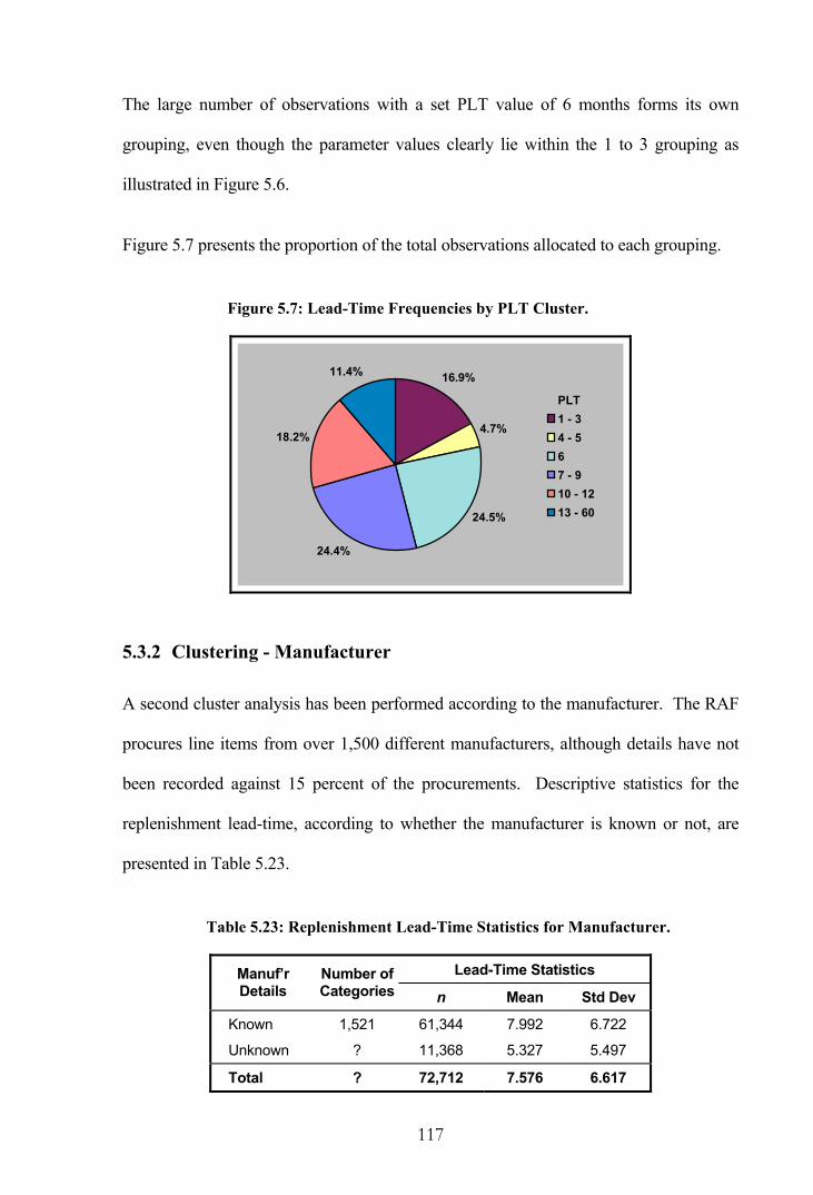
117
The large number of observations with a set PLT value of 6 months forms its own
grouping, even though the parameter values clearly lie within the 1 to 3 grouping as
illustrated in Figure 5.6.
Figure 5.7 presents the proportion of the total observations allocated to each grouping.
Figure 5.7: Lead-Time Frequencies by PLT Cluster.
16.9%
4.7%
24.5%
24.4%
18.2%
11.4%
PLT1 - 34 - 567 - 910 - 1213 - 60
5.3.2 Clustering - Manufacturer
A second cluster analysis has been performed according to the manufacturer. The RAF
procures line items from over 1,500 different manufacturers, although details have not
been recorded against 15 percent of the procurements. Descriptive statistics for the
replenishment lead-time, according to whether the manufacturer is known or not, are
presented in Table 5.23.
Table 5.23: Replenishment Lead-Time Statistics for Manufacturer.
Lead-Time Statistics Manuf’r Details
Number ofCategories n Mean Std Dev
Known 1,521 61,344 7.992 6.722
Unknown ? 11,368 5.327 5.497
Total ? 72,712 7.576 6.617

118
For the purpose of this analysis, those manufacturers with only one procurement
observation are not considered for the clustering procedure. It is felt that the limited
data for such one-off contracts would not provide representative lead-time parameters,
and certainly there is no standard deviation to cluster upon. On the other hand, a large
number of observations are without a known manufacturer and to exclude such a large
pool of data may be imprudent. In this case, all observations without a known
manufacturer will be grouped together and treated as one cluster.
The lead-time mean by manufacturer is plotted against the standard deviation in Figure
5.8. Manufacturers with only one procurement observation, as well as other points
generally detached from the remainder, are illustrated as outliers. The group of lead-
time observations without known manufacturers can be located in this plot.
Figure 5.8: Replenishment Lead-Time by Manufacturer.
0
5
10
15
20
25
30
35
40
0 20 40 60 80
Mean Lead-Time (Months)
Stan
dard
Dev
iatio
n
ObsOutliersUnknownManuf'r
The large number of manufacturers necessitates the use of the FASTCLUS procedure to
perform the clustering. Once again, a total of six groups are required. However, as the
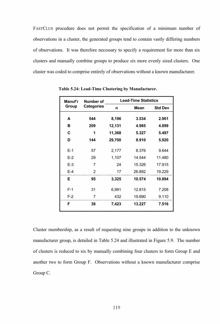
119
FASTCLUS procedure does not permit the specification of a minimum number of
observations in a cluster, the generated groups tend to contain vastly differing numbers
of observations. It was therefore necessary to specify a requirement for more than six
clusters and manually combine groups to produce six more evenly sized clusters. One
cluster was coded to comprise entirely of observations without a known manufacturer.
Table 5.24: Lead-Time Clustering by Manufacturer.
Lead-Time Statistics Manuf’r Group
Number ofCategories n Mean Std Dev
A 544 8,196 3.534 2.901
B 209 12,131 4.985 4.899
C 1 11,368 5.327 5.497
D 144 29,700 8.910 5.920
E-1 57 2,177 8.376 9.644
E-2 29 1,107 14.544 11.480
E-3 7 24 15.326 17.915
E-4 2 17 26.892 19.229
E 95 3,325 10.574 10.894
F-1 31 6,991 12.815 7.208
F-2 7 432 19.890 9.110
F 38 7,423 13.227 7.516
Cluster membership, as a result of requesting nine groups in addition to the unknown
manufacturer group, is detailed in Table 5.24 and illustrated in Figure 5.9. The number
of clusters is reduced to six by manually combining four clusters to form Group E and
another two to form Group F. Observations without a known manufacturer comprise
Group C.

120
Figure 5.9: Lead-Time Clustering by Manufacturer.
0
5
10
15
20
25
0 5 10 15 20 25 30 35
Mean Lead-Time (Months)
Stan
dard
Dev
iatio
n
GroupABCDE-1E-2E-3E-4F-1F-2
Figure 5.10 presents the proportion of lead-time observations within each grouping.
Figure 5.10: Lead-Time Frequencies by Manufacturer Cluster.
11.4%
16.8%
15.8%41.2%
4.6%
10.3%
GroupABCDEF
5.3.3 Clustering - Range Manager
A final cluster analysis has been performed using the 404 RM categories. Figure 5.11
presents the lead-time mean plotted against the standard deviation, with the outliers
distinguished from the remaining observations.

121
Figure 5.11: Replenishment Lead-Time by Range Manager.
0
5
10
15
20
25
0 2 4 6 8 10 12 14 16 18 20 22 24 26 28
Mean Lead-Time (Months)
Stan
dard
Dev
iatio
n
ObsOutliers
Observations have been grouped into nine clusters using the FASTCLUS procedure. The
resultant cluster membership is presented in Table 5.25 and illustrated in Figure 5.12.
Table 5.25: Lead-Time Clustering by Range Manager.
Lead-Time Statistics Group Number of
Categories n Mean Std Dev
A 47 3,304 3.451 2.853
B 86 21,886 4.782 4.825
C 53 11,172 7.224 4.975
D 45 7,545 6.640 7.375
E-1 86 21,752 9.702 6.412
E-2 11 525 11.718 4.961
E 97 22,277 9.750 6.388
F-1 14 935 10.638 10.890
F-2 21 4814 13.367 7.509
F-3 7 741 16.414 11.479
F 42 6,490 13.321 8.720

122
Figure 5.12: Lead-Time Clustering by Range Manager.
0
2
4
6
8
10
12
14
16
18
0 2 4 6 8 10 12 14 16 18
Mean Lead-Time (Months)
Stan
dard
Dev
iatio
n
GroupABCDE-1E-2F-1F-2F-3
In this instance, Group E is formed by combining two clusters and Group F combines
three clusters. Figure 5.13 presents the proportion of observations within each grouping.
Figure 5.13: Lead-Time Frequencies by RM Cluster.
4.5%
30.1%
15.4%10.4%
30.7%
8.9%
GroupABCDEF
5.3.4 Lead-Time Grouping
At this stage, the groupings from each variable are combined to form a 6×6×6 matrix as
illustrated by the lead-time grouping cube in Figure 5.14. Each of the 216 cells is

123
assigned a lead-time mean and variance calculated from all lead-time observations
falling within that cell.
Figure 5.14: Lead-Time Grouping Cube.
Table 5.26 illustrates the manner in which lead-time parameters are assigned to each
grouping based on the observations within that group. As an example, all line items
falling within the first group are given the lead-time mean and variance calculated from
all 673 observations in this group.
Table 5.26: Lead-Time Grouping Table.
Grouping Variable Lead-Time Observations Group Number Set PLT Manuf’r RM n Mean Variance
1 A A A 673 3.060 7.384
2 A A B 521 3.028 6.122
3 A A C 19 3.725 5.543
4 A A D 94 3.848 18.206
5 A A E 57 3.681 4.607
6 A A F 15 3.100 2.757
7 A B A 147 3.180 7.414 . . . . . . . . . . . . . . . . . . . . .
216 F F F 810 15.290 74.633
124
As a result of this analysis, all line items can be assigned lead-time parameters
regardless of whether they have any actual historic lead-time observations or not. This
is a useful feature for new line items entering service.
5.4 Concluding Remarks
Despite being a fundamental component of any inventory management system, the
replenishment lead-time distribution is difficult to quantify. This is particularly the case
for the RAF where the less frequent usage of erratic and slow-moving demand items
means that few replenishment orders are placed. The long lead-times in the defence
industry also means there is little lead-time data available.
A modified chi-square goodness-of-fit testing method was developed during the course
of this research and several lead-time distributions have been investigated. This
modified methodology provides automatic distribution fitting to large quantities of data
across a range of probability distributions. Unfortunately the low number of lead-time
observations per line item prevents the generation of definitive results on an individual
basis and a range of theoretical distributions are identified as candidates. Results from
the limited data at this stage of the analysis indicate each of the geometric, negative
exponential, negative binomial and gamma distributions provide a reasonable fit.
However, the analysis suggests that the normal distribution, which frequently finds
favour in the literature, is somewhat removed from reality.
When a large number of line items do not have any lead-time observations it is
appropriate to group line items which have a similar lead-time pattern and calculate
summary statistics applicable to the entire grouping. In this research, suitable variables
for grouping were investigated using regression and ANOVA analysis. The selected
variables in this instance were the set purchasing lead-time, the manufacturer and the

125
range manager. Groupings within each variable were determined through a cluster
analysis such that observations in a group are similar to each other, and observations in
different groups are dissimilar. A lead-time grouping cube containing some 216 cells
was created and aggregated statistics from all observations within each cell were
generated. An important feature resulting from the use of this methodology is the ability
to assign lead-time parameters to all line items according to their location within the
lead-time grouping cube.
Chapters 4 and 5 have provided a detailed examination of the constituent parts for a
demand classification scheme. The next chapter attempts to classify the observed
demand based on the transaction variability, the demand size variability and the lead-
time variability.

126
6. DEMAND CLASSIFICATION
This chapter examines demand over a lead-time and classifies the entire RAF inventory
by demand pattern. A more formal means of identifying erratic demand is utilised, in
contrast to the somewhat naive approach of Section 4.5.2 which only considered the
demand frequency. On this occasion, the lead-time demand is decomposed into the
constituent causal parts of demand frequency, demand size, and lead-time.
6.1 RAF Demand Classification
With all line items assigned lead-time parameters from the previous chapter, each line in
the RAF inventory can be classified by the observed lead-time demand in accordance
with equation (2) as introduced in Chapter 2. The underlying variance partition equation
for the variable lead-time case was defined as:
222
2L
znLTD C
LnC
LC
C ++=
where n is the mean number of transactions per unit time,
L is the mean replenishment lead-time, and
zC is the coefficient of variation for the demand size, etc.
An evaluation of the three constituent parts, previously translated as transaction
variability, demand size variability and lead-time variability, led Williams [90] to
propose a demand classification with four demand patterns, namely smooth, slow-
moving, erratic and erratic with highly variable lead-time.
Through an initial analysis of RAF data, it was perceived that the Williams’
classifications did not adequately describe the observed demand structure. In particular,
it was not considered sufficient to distinguish a smooth demand pattern from the
remainder simply on the basis of the transaction variability. Consequently, a revised

127
classification scheme sub-divides line items with low transaction variability into smooth
and irregular, according to the demand size variability. As an aid to simplification the
erratic demand pattern, and the erratic with highly variable lead-time demand pattern,
have been re-designated as mildly erratic and highly erratic respectively. The revised
classifications are presented in Table 6.1.
Table 6.1: Revised Classification of Demand.
Lead-Time Demand Component
Transaction Variability
Demand Size Variability
Lead-Time Variability
Type of Demand Pattern
Low Low Smooth
Low High Irregular
High Low Slow-moving
High High Low Mildly Erratic
High High High Highly Erratic
In allocating a line item to a particular demand pattern, each of the components are
considered sequentially in this analysis. Thus, line items are classified by transaction
variability first and then the two resultant groups are further divided according to a
common demand size variability parameter. Finally, the erratic demand classifications
are divided according to a lead-time variability parameter. As a result, a high value for
one of the components will not dominate the final classification. With each of the
variability measures being continuous variables there are unlikely to be distinct break-
points that would naturally separate the demand patterns. At the extremes it is easier to
identify the demand patterns while in the middle there is a considerable grey area.
Under a parts and supplies inventory system, such as required for aircraft maintenance, a
smooth demand pattern may be interpreted as resulting from a full replacement of items
under a planned maintenance schedule; an irregular pattern as a result of replacing only
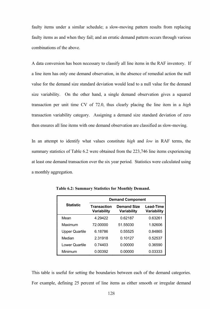
128
faulty items under a similar schedule; a slow-moving pattern results from replacing
faulty items as and when they fail; and an erratic demand pattern occurs through various
combinations of the above.
A data conversion has been necessary to classify all line items in the RAF inventory. If
a line item has only one demand observation, in the absence of remedial action the null
value for the demand size standard deviation would lead to a null value for the demand
size variability. On the other hand, a single demand observation gives a squared
transaction per unit time CV of 72.0, thus clearly placing the line item in a high
transaction variability category. Assigning a demand size standard deviation of zero
then ensures all line items with one demand observation are classified as slow-moving.
In an attempt to identify what values constitute high and low in RAF terms, the
summary statistics of Table 6.2 were obtained from the 223,746 line items experiencing
at least one demand transaction over the six year period. Statistics were calculated using
a monthly aggregation.
Table 6.2: Summary Statistics for Monthly Demand.
Demand Component Statistic Transaction
Variability Demand Size
Variability Lead-Time Variability
Mean 4.29422 0.62187 0.63261
Maximum 72.00000 51.55030 1.92606
Upper Quartile 6.18786 0.55525 0.84865
Median 2.31918 0.10127 0.52537
Lower Quartile 0.74403 0.00000 0.36590
Minimum 0.00392 0.00000 0.03333
This table is useful for setting the boundaries between each of the demand categories.
For example, defining 25 percent of line items as either smooth or irregular demand

129
simply requires setting the boundary for transaction variability to the lower quartile.
Boundaries for demand size variability and lead-time variability can also be individually
set at management’s discretion.
For the purpose of analysis it is useful to have a similar proportion of line items within
each category in order to provide an adequate sample size. Firstly, this would mean
setting the boundary for transaction variability to the fortieth percentile to ensure two-
fifths of the line items have a low transaction variability, thereby being classed as either
smooth or irregular. Then setting the demand size variability boundary to the median
would ensure approximately half of the low transaction variability line items would be
classed as smooth with the remainder classed as irregular. However, with the demand
size variability boundary set at the overall median, approximately half of the high
transaction variability line items would be classed as slow-moving with the mildly
erratic and highly erratic line items comprising the remainder between them. The
boundary for the demand size variability would therefore need to be set at the thirty-
third percentile to ensure one-fifth of the total line items are classed as slow-moving,
although in the process this would mean that the smooth and irregular line items are no
longer evenly split if the same boundary was used. A precisely even categorisation
would require establishing two demand size variability boundaries once line items have
been split according to the transaction variability. Finally, an equal categorisation
between the two erratic demand patterns could be obtained by setting the lead-time
variability boundary to equal the median.
Rather than placing an exactly equal proportion of line items in each category, this
research has adopted a simpler approach of setting the boundary for transaction
variability to the lower quartile and singular boundaries for each of demand size

130
variability and lead-time variability at their respective medians. Most organisations
would view the majority of RAF demand as slow-moving or erratic and therefore it is
reasonable to classify only 25 percent of the inventory as smooth or irregular, while still
giving a sufficient sample size. About half of the remainder are classified as slow-
moving with the same proportion classed as erratic, either mildly erratic or highly
erratic.
The final proportion of RAF line items falling within each demand pattern is illustrated
in Figure 6.1. Taken as a whole, the demand classifications are achieved in an objective
manner with the patterns being identified through an analysis of the data.
Figure 6.1: Classification of RAF Demand.
12.7%
12.3%
37.3%
15.5%
22.2%
Demand Pattern
Smooth
Irregular
Slow-moving
Mildy Erratic
Highly Erratic
Examples of actual fitted demand patterns are illustrated in Figure 6.2 for monthly data,
noting the differing scales on the vertical axis. The smooth demand pattern is
characterised by frequent transactions of a not too dissimilar size and few months have
zero demand. In contrast, an irregular demand pattern has a somewhat consistent
transaction frequency but the demand size is seen to vary with many zero demands
occurring, though not to the scale of the erratic demand patterns.

131
Figure 6.2: Sample Demand Patterns.
0
10
20
30
40
94 95 96 97 98 99Period
Mon
thly
Dem
and
0
2
4
6
8
10
12
14
94 95 96 97 98 99Period
Mon
thly
Dem
and
0
1
2
3
4
5
6
7
8
94 95 96 97 98 99Period
Mon
thly
Dem
and
0
20
40
60
80
100
120
94 95 96 97 98 99Period
Mon
thly
Dem
and
0
200
400
600
800
1000
1200
94 95 96 97 98 99Period
Mon
thly
Dem
and
The slow-moving demand pattern is seen to have infrequent transactions with low
demand sizes. The two erratic demand patterns will appear similar in this context, each
exhibiting infrequent transactions with variable demand sizes, but they are differentiated
by the lead-time variability as described in a later section.
Smooth Demand Irregular Demand
Highly Erratic Demand Mildly Erratic Demand
Slow-moving Demand

132
6.2 Demand Pattern Fragmentation
This section investigates the common traits among line items within each demand
pattern and seeks to determine whether differences exist between the patterns using a
number of factors, including lead-time, cluster grouping, and demand frequency and
demand size. The determination of common traits within a grouping would allow the
categorisation of new line items in a straight-forward manner.
6.2.1 Lead-Time
As far as the demand patterns are concerned, the lead-time is only a factor in
differentiating the two erratic patterns. As shown in Table 6.3, the mildly erratic
demand pattern has an average lead-time mean and standard deviation of 8.95 and 5.26
respectively, while the highly erratic demand pattern has a smaller mean of 5.70 months,
although the standard deviation of 5.43 does not differ substantially.
Table 6.3: Lead-Time by Demand Pattern.
Lead-Time Statistics (months) Demand Pattern n Mean Std Dev
Smooth 28,372 10.21 6.33
Irregular 27,565 8.46 5.74
Slow-moving 83,501 8.22 5.84
Mildly Erratic 34,603 8.95 5.26
Highly Erratic 49,705 5.70 5.43
Overall 223,746 8.05 5.71
In practice, however, it is the coefficient of variation for the lead-time that provides the
distinction between the two erratic demand groupings. Thus, if the standard deviation as
a proportion of the mean, all squared, is in excess of the overall median of 0.52537
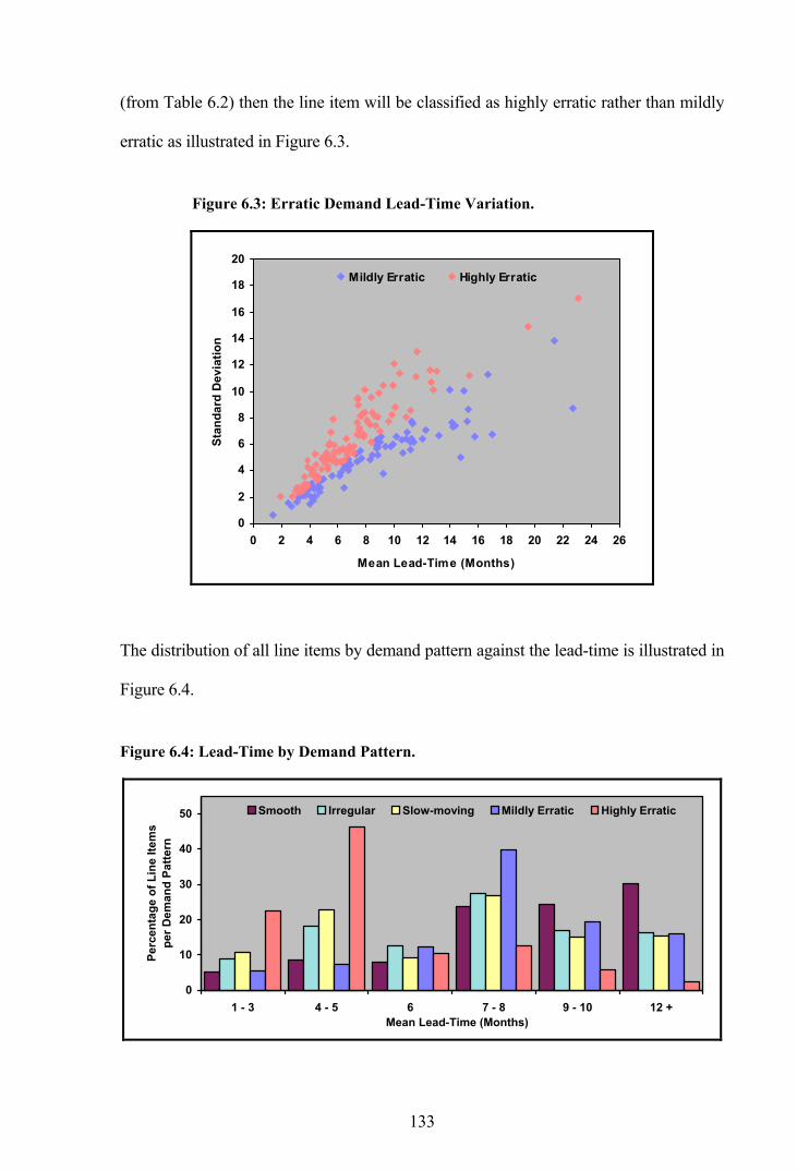
133
(from Table 6.2) then the line item will be classified as highly erratic rather than mildly
erratic as illustrated in Figure 6.3.
Figure 6.3: Erratic Demand Lead-Time Variation.
0
2
4
6
8
10
12
14
16
18
20
0 2 4 6 8 10 12 14 16 18 20 22 24 26
Mean Lead-Time (Months)
Stan
dard
Dev
iatio
n
Mildly Erratic Highly Erratic
The distribution of all line items by demand pattern against the lead-time is illustrated in
Figure 6.4.
Figure 6.4: Lead-Time by Demand Pattern.
0
10
20
30
40
50
1 - 3 4 - 5 6 7 - 8 9 - 10 12 +Mean Lead-Time (Months)
Perc
enta
ge o
f Lin
e Ite
ms
per D
eman
d Pa
ttern
Smooth Irregular Slow-moving Mildly Erratic Highly Erratic

134
The plot indicates the frequency of a mildly erratic demand pattern peaks at a higher
lead-time value than does the highly erratic demand pattern. This is because the shorter
the mean lead-time the more likely the standard deviation will be high in comparison, as
it is starting from a lower base level, hence a higher lead-time CV. The other three
demand patterns, including smooth, irregular and slow-moving, show similar
proportions of line items under each lead-time period, although the smooth demand
pattern has a higher proportion with longer lead-times through sheer chance alone.
6.2.2 Cluster Grouping
The fragmentation of groupings by predictor variable, comprising set PLT, manufacturer
and range manager at SMB Level 2, allows further comparisons between demand
patterns. A starting point is provided by Table 6.4, which presents the observed
proportion of RAF line items falling within each grouping, as previously shown in the
pie charts of Figures 5.7, 5.10 and 5.13.
Table 6.4: Grouping Percentages.
Predictor Grouping
Set PLT Manuf’r SMB L2
A 16.9% 11.4% 4.5%
B 4.7% 16.8% 30.1%
C 24.5% 15.8% 15.4%
D 24.4% 41.2% 10.4%
E 18.2% 4.6% 30.7%
F 11.4% 10.3% 8.9%
In this form, the tabulated values can be used as expected frequencies in a three-variable
contingency table for testing the hypothesis that the data classification methods are

135
independent. Under the null hypothesis, independence of classification exists between
the groupings for each predictor and the final demand pattern.
Once the line items have been allocated a grouping, placed in the lead-time grouping
cube, and finally identified with a demand pattern, a fragmentation by cluster grouping
may provide insight into how the groupings lead to a particular demand classification.
In effect, this examines the demand pattern breakdown of each of the rows in Table 5.26
on page 123. A total of 72,712 line items are included, which represents all mature line
items currently in the RAF inventory for which lead-time observations are available.
Using a presentational technique similar to that used by Cooke [18] for dependence
modelling and risk management with UNICORN software, a cobweb plot is used in this
instance to graphically illustrate the relationships that lead to a demand pattern
classification. A cobweb plot usually compares the joint distribution of the percentiles
from rank correlations of a set of variables, such that when percentiles are shown on the
vertical axis in a cobweb plot with x and y adjacent and having rank correlation
),( yxτ :
(i) If 1=τ , then all lines between x and y are horizontal,
(ii) If 0=τ , then the lines criss-cross in such a manner that the density of
crossings between x and y is triangular, and
(iii) If 1−=τ , then all lines cross in one point.
A cobweb plot, such as the one shown for smooth demand in Figure 6.5, illustrates the
observed pathways that lead to a particular demand pattern classification. The pathway
density allocates the traversing observations to one of three frequency classifications,

136
with the heaviest lines portraying in excess of 250 lead-time observations (accounting
for approximately 5 to 10 percent of the flows), the intermediary lines portraying
between 51 and 250 observations (25 to 45 percent of the flows), and the lightest lines
portraying 50 or fewer observations (45 to 70 percent of the flows). The percentages on
the nodes indicate the proportion of observations that fall into each cluster grouping.
These percentages can be compared with those of Table 6.4 for significant differences.
Figure 6.5: Cobweb Plot for Smooth Demand.
Set PLT Manufacturer SMB L2
Clu
ster
Gro
upin
g
F
E
D
C
B
A
7.9%
4.5%
13.9%
31.7%
20.9%
21.1%
2.5%
7.3%
6.8%
54.6%
5.0%
23.9%
1.4%
8.0%
17.7%
6.2%
48.1%
18.7%
A preliminary examination of the cobweb plot indicates that 31.7 percent of the
observations share a common set PLT grouping in group D (7 to 9 months), while a
large number of observations share a common manufacturer grouping with 54.6 percent
of observations similarly in group D. The observations also tend to be unevenly spread
amongst the range manager groupings at SMB Level 2 with the fifth grouping
comprising 48.1 percent of the observations.
However, as the observations are in fact unevenly spread amongst the cluster groupings
as a whole, it is necessary to examine how the observed frequencies for each demand

137
pattern differ from the expected frequencies. This can be done using a chi-square
contingency table test, which will test the null hypothesis that the grouping for each
predictor and the demand pattern classification are independent. Under this test a 2χ
value is calculated and compared with a tabulated value with ( 1−r )( 1−c ) degrees of
freedom, where r is the number of rows in the contingency table and c is the number of
columns.
Calculating a chi-square statistic for each predictor for the smooth demand pattern gives
values of 20.23, 39.82 and 41.16 for the set PLT, the manufacturer and SMB L2
respectively. With ten degrees of freedom the tabulated 2χ value is 18.31 at the 5
percent significance level. As the calculated value for the set PLT is greater than the
tabulated value, we conclude that the smooth demand pattern is dependent upon the set
PLT value. The below expected percentages in the lower PLT categories, combined
with the higher than expected percentages in the upper categories, leads to the rejection
of the null hypothesis. Therefore, a higher set PLT value, without further consideration,
may predispose a smooth demand classification.
Similarly, as the calculated values for both the manufacturer and SMB L2 are greater
than the tabulated value the demand pattern is not independent of either of these
predictors. A higher than expected percentage of items fall in category F for the
manufacturer and category B for SMB L2, although the interpretation with these
categories is not immediately obvious.
Figure 6.6 presents a cobweb plot for the irregular demand classification. The
calculated 2χ statistics are 3.00, 4.97 and 8.14 in this instance. As each of these are in
fact less than the tabulated 2χ value of 18.31, the conclusion is that the attainment of an

138
irregular demand pattern is not dependent upon the groupings of any of the three
predictor variables.
Figure 6.6: Cobweb Plot for Irregular Demand.
Set PLT Manufacturer SMB L2
Clu
ster
Gro
upin
g
F
E
D
C
B
A
16.6% 6.2% 21.2% 30.5% 15.7% 9.8%
6.7% 12.9% 14.3% 50.1% 5.0% 11.0%
3.2% 21.0% 23.8% 9.2% 33.0% 9.7%
A cobweb plot for slow-moving demand is shown in Figure 6.7. With calculated 2χ
statistics of 1.80, 0.43 and 2.90 in this case, the slow-moving demand pattern is also not
dependent upon the groupings of any of the predictor variables.
Figure 6.7: Cobweb Plot for Slow-Moving Demand.
Set PLT Manufacturer SMB L2
Clu
ster
Gro
upin
g
F
E
D
C
B
A
16.4%
3.2%
22.6%
22.7%
21.3%
13.7%
11.6%
17.6%
17.0%
39.8%
5.1%
8.9%
5.0%
31.5%
9.3%
11.3%
33.7%
9.1%

139
Figure 6.8 presents a cobweb plot for line items classified with a mildly erratic demand
pattern. With chi-square values calculated as 25.88, 63.79 and 53.77, the mildly erratic
demand classification depends on each of the set PLT, manufacturer and range manager
groupings respectively.
Figure 6.8: Cobweb Plot for Mildly Erratic Demand.
Set PLT Manufacturer SMB L2
Clu
ster
Gro
upin
g
F
E
D
C
B
A
2.1%
4.9%
18.5%
40.6%
20.3%
13.6%
6.6%
3.1%
1.1%
78.4%
0.6%
10.1%
3.0%
6.1%
30.7%
2.8%
50.6%
6.8%
In this case the main contributor to the calculated value for the set PLT is the lower than
expected percentage of low PLT observations. For the manufacturer and the range
manager it is the higher than expected number of observations in category D and
category C respectively, and likewise lower than expected observations in category C
and category B that led to a rejection of the null hypothesis.
Finally, the cobweb plot for line items classified as having a highly erratic demand
pattern is shown in Figure 6.9. The diagram indicates that the observations are not
universally spread amongst the cluster groupings with few observations in the category
F groupings in all instances. This coincides with a previous observation that line items

140
classified as highly erratic tend to have lower lead-time values and this would restrict
their placement in the naturally high lead-time category F groupings.
Figure 6.9: Cobweb Plot for Highly Erratic Demand.
Set PLT Manufacturer SMB L2
Clu
ster
Gro
upin
g
F
E
D
C
B
A
33.0%
5.3%
38.7%
7.8%
12.2%
2.9%
6.7%
12.9%
14.3%
50.1%
5.0%
11.0%
3.2%
21.0%
23.8%
9.2%
33.0%
9.7%
Calculated chi-square values in this instance are 43.38, 94.11 and 86.86, indicating the
demand pattern classification is not independent of any of the predictor classifications.
Not surprisingly, the distribution of observations among the cluster groupings tends to
be the opposite of what is seen with the previous erratic demand pattern, as it is the lead-
time CV that provides the distinction between the two patterns and it is the lead-time
parameters that determine the original cluster groupings. Hence, the highly erratic
demand pattern tends to be over-represented in the low PLT groupings, while in the case
of the manufacturer there are fewer than expected observations in category D and more
than expected in category C. Similarly, in the case of SMB L2 there are fewer than
expected observations in category C and more than expected in category B.
To summarise these observations, Table 6.5 presents the calculated chi-square values
against the predictors for each demand pattern. With a tabulated 2χ value of 18.31 it is

141
seen that for smooth, mildly erratic, and highly erratic demand patterns all calculated
values exceed the tabulated value. Therefore, the attainment of these three patterns is
dependent on the predictors. On the other hand, all calculated values for irregular and
slow-moving demand patterns are less than the tabulated value, and therefore the
attainment of these patterns is independent of the predictors.
Table 6.5: Cluster / Demand Pattern Independency Test.
Chi-Square Values Demand Pattern Set PLT Manuf’r SMB L2
Smooth 20.23 39.82 41.16
Irregular 3.00 4.97 8.14
Slow-moving 1.80 0.43 2.90
Mildly Erratic 25.88 63.79 53.77
Highly Erratic 43.38 94.11 86.86
One conclusion drawn from the demand fragmentation is that although, the lead-time
demand pattern is not wholly independent of the set PLT, the manufacturer and the
range manager, there tends to be no clear-cut influence from the predictors that would
assist in determining the demand pattern. On this basis, it appears necessary to consider
the other factors of demand frequency and size.
6.2.3 Demand Frequency and Size
This section further investigates the demand pattern classifications, this time in respect
of demand frequency and size. The proportion of line items falling within each
classification over a range of monthly transaction rates is presented in Figure 6.10. All
line items with a transaction rate of less then 0.02 per month, or alternatively one
observation over a six year period, are naturally classed as slow-moving. Once the
transaction rate exceeds 0.50 per month, the slow-moving classification is no longer
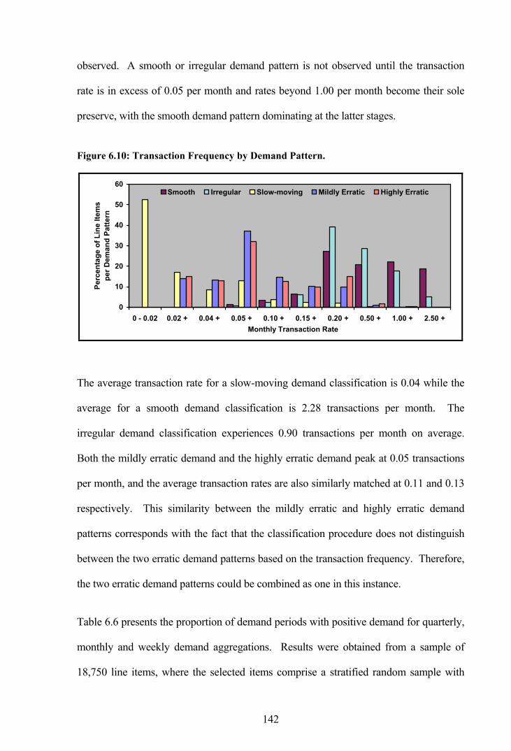
142
observed. A smooth or irregular demand pattern is not observed until the transaction
rate is in excess of 0.05 per month and rates beyond 1.00 per month become their sole
preserve, with the smooth demand pattern dominating at the latter stages.
Figure 6.10: Transaction Frequency by Demand Pattern.
0
10
20
30
40
50
60
0 - 0.02 0.02 + 0.04 + 0.05 + 0.10 + 0.15 + 0.20 + 0.50 + 1.00 + 2.50 +Monthly Transaction Rate
Perc
enta
ge o
f Lin
e Ite
ms
per D
eman
d Pa
ttern
Smooth Irregular Slow-moving Mildly Erratic Highly Erratic
The average transaction rate for a slow-moving demand classification is 0.04 while the
average for a smooth demand classification is 2.28 transactions per month. The
irregular demand classification experiences 0.90 transactions per month on average.
Both the mildly erratic demand and the highly erratic demand peak at 0.05 transactions
per month, and the average transaction rates are also similarly matched at 0.11 and 0.13
respectively. This similarity between the mildly erratic and highly erratic demand
patterns corresponds with the fact that the classification procedure does not distinguish
between the two erratic demand patterns based on the transaction frequency. Therefore,
the two erratic demand patterns could be combined as one in this instance.
Table 6.6 presents the proportion of demand periods with positive demand for quarterly,
monthly and weekly demand aggregations. Results were obtained from a sample of
18,750 line items, where the selected items comprise a stratified random sample with
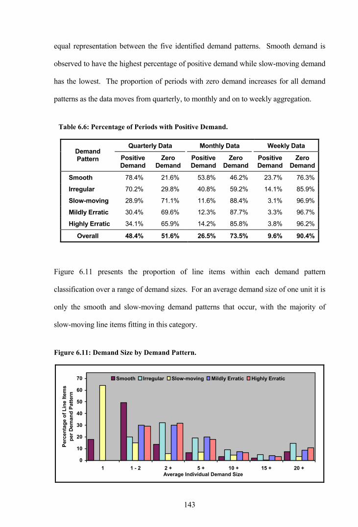
143
equal representation between the five identified demand patterns. Smooth demand is
observed to have the highest percentage of positive demand while slow-moving demand
has the lowest. The proportion of periods with zero demand increases for all demand
patterns as the data moves from quarterly, to monthly and on to weekly aggregation.
Table 6.6: Percentage of Periods with Positive Demand.
Quarterly Data Monthly Data Weekly Data Demand Pattern Positive
Demand Zero
Demand Positive Demand
Zero Demand
Positive Demand
Zero Demand
Smooth 78.4% 21.6% 53.8% 46.2% 23.7% 76.3%
Irregular 70.2% 29.8% 40.8% 59.2% 14.1% 85.9%
Slow-moving 28.9% 71.1% 11.6% 88.4% 3.1% 96.9%
Mildly Erratic 30.4% 69.6% 12.3% 87.7% 3.3% 96.7%
Highly Erratic 34.1% 65.9% 14.2% 85.8% 3.8% 96.2%
Overall 48.4% 51.6% 26.5% 73.5% 9.6% 90.4%
Figure 6.11 presents the proportion of line items within each demand pattern
classification over a range of demand sizes. For an average demand size of one unit it is
only the smooth and slow-moving demand patterns that occur, with the majority of
slow-moving line items fitting in this category.
Figure 6.11: Demand Size by Demand Pattern.
0
10
20
30
40
50
60
70
1 1 - 2 2 + 5 + 10 + 15 + 20 +Average Individual Demand Size
Perc
enta
ge o
f Lin
e Ite
ms
per D
eman
d Pa
ttern
Smooth Irregular Slow-moving Mildly Erratic Highly Erratic

144
The percentage of slow-moving items quickly decreases as the average demand size
increases, although the average demand size across all line items with this pattern is 4.44
and the pattern still arises when the average demand size exceeds 20 units. The smooth
demand pattern is most frequent when the average demand size is between one and two
units although this distribution is also skewed to the right as the average demand size is
7.00 units. The majority of irregular and erratic demand line items have an average
demand size between one and five units, although the overall average demand size is
somewhat higher at 14.34, 9.32 and 12.31 for irregular, mildly erratic and highly erratic
demand patterns respectively.
The demand pattern cannot satisfactorily be explained by examining the demand size
and frequency in isolation, but rather through their joint consideration. Figure 6.12
presents the proportion of line items falling within each demand classification according
to the monthly demand rate.
Figure 6.12: Demand Rate by Demand Pattern.
0
10
20
30
40
50
60
0 - 0.02 0.02 + 0.04 + 0.05 + 0.10 + 0.15 + 0.20 + 0.50 + 1.00 + 2.50 +Monthly Demand Rate
Perc
enta
ge o
f Lin
e Ite
ms
per D
eman
d Pa
ttern
Smooth Irregular Slow-moving Mildly Erratic Highly Erratic
Demand rates of less than 0.04 units per month lead to a slow-moving demand
classification, although this classification is still observed when the demand rate is in

145
excess of 2.50, the average being 0.15 units per month. An erratic demand classification
peaks at 0.20 units per month, with the mildly erratic demand classification having a
mean of 1.20 and the highly erratic demand pattern having a mean of 1.85 units per
month. The average demand rate for a smooth demand classification is 38.45 units per
month, and the average is 16.51 for an irregular demand pattern.
The demand frequency and size is summarised for each demand pattern in Table 6.7. It
is seen that the smooth demand pattern experiences the highest transaction rate on
average followed by the irregular demand pattern, while, as expected, the slow-moving
demand pattern experiences the lowest. In terms of demand size, it is the irregular
demand pattern that has the highest average and again the slow-moving demand has the
lowest. The monthly demand rate presents the same ordering of the demand patterns as
the monthly transaction rate.
Table 6.7: Demand Frequency and Size by Demand Pattern.
Demand Pattern
Mean Monthly Transaction Rate
Mean Individual Demand Size
Mean Monthly Demand Rate
Smooth 2.28 7.00 38.45
Irregular 0.90 14.34 16.51
Slow-moving 0.04 4.44 0.15
Mildly Erratic 0.11 9.32 1.20
Highly Erratic 0.13 12.31 1.85
Overall 0.46 8.49 7.56
Though not suitable for allowing any categorisation of new line items, the unit price by
demand pattern is worthy of examination; the subject of the next section.

146
6.2.4 Unit Price
Summary statistics for the unit price are presented in Table 6.8 for each demand pattern.
It is observed that line items with a smooth demand pattern have the highest average
unit value. Such items are fast-movers by definition, so it is surprising they are the high-
value items, although the slow-moving line items also have a high average value as well
as the highest maximum value, as would be expected.
Table 6.8: Summary Statistics for Unit Price.
Demand Pattern Statistic
Smooth Irregular Slow-Moving Mildly Erratic Highly Erratic
n 28,372 27,565 83,501 34,603 49,705
Mean (£) 460.83 115.84 343.75 137.02 107.52
Standard Dev 1,792.44 571.16 3,015.80 756.04 804.88
Maximum 102,837.54 25,581.95 654,938.27 53,211.37 87,299.31
Upper Quartile 279.11 49.34 183.08 69.07 42.93
Median 62.68 9.14 41.29 14.90 9.14
Lower Quartile 10.29 1.72 8.09 2.85 1.53
Minimum 0.01 0.01 0.01 0.01 0.01
Both the smooth demand pattern and the slow-moving demand pattern have a high
standard deviation, indicating wide variation in the individual unit prices. Values for the
quartiles and median for these two patterns are also substantially higher than those for
the other demand patterns, which suggests that higher values occur throughout. Thus,
the high average values are not governed simply by a small number of extreme values.
6.2.5 Comparison With Initial Demand Classification
Section 4.5.2 provided an analysis of 12,644 RAF line items initially considered to have
an erratic demand pattern. On that occasion, arbitrary boundaries of between 50 and 99
demand transactions over a 72 month period, or equivalently between 0.69 and 1.38

147
transactions per month on average, were used to identify line items as erratic. At that
time it was recognised that the transaction rates were likely to be too high to capture the
erratic demand, but it was necessary to ensure that there were enough observations for
the analysis.
It is now possible to ascertain whether the demand classification methodology utilised in
this chapter has defined the same line items as erratic. A cursory glance at Table 6.7
would suggest otherwise, as the mean monthly transaction rate for the mildly erratic
demand pattern is 0.11 and for the highly erratic demand pattern it is 0.13, both very
much less than the selected boundaries. In addition, Figure 6.10 indicated previously
that very few line items classified as erratic have a transaction rate in excess of 0.5 per
month.
Therefore, it is expected that only a small proportion of the 12,644 line items, arbitrarily
selected as erratic in Section 4.5.2, would in fact have an erratic demand pattern.
Confirmation is provided by Figure 6.13, which indicates only 4.1 percent (1.4 + 2.7) of
the line items are in fact classified as erratic.
Figure 6.13: Initial Erratic Demand Classification.
44.9%
50.4%
0.6%1.4%
2.7%
Demand Pattern
Smooth
Irregular
Slow-moving
Mildy Erratic
Highly Erratic

148
The observations made in this chapter are derived solely from RAF demand data. It is
likely that data from other non-military industries would differ significantly. On the
whole, it would be expected that lead-times would be considerably shorter elsewhere,
and the overall demand is likely to be higher. What has been classified as smooth
demand in this instance could well be considered as erratic in other industries.
However, the methods employed in both clustering lead-time observations and
classifying the line items by demand pattern are certainly applicable elsewhere.
6.2.6 Autocorrelation and Crosscorrelation
This section returns to the issue of autocorrelation and crosscorrelation in the demand
data, and considers the wider sample of 18,750 line items used previously. Line items
have been classified according to the significance of their autocorrelations and
crosscorrelations of the logarithmic transformation:
(i) If the correlations are not significant on the whole a not signif classification
is given, otherwise
(ii) If the sum of the individually significant correlations is less than zero a
negative classification is given, or
(iii) If the sum of the individually significant correlations is greater than zero a
positive classification is given, alternatively
(iv) If the correlations are significant on the whole but there are no individually
significant correlations a no sign classification is given.
Table 6.9 presents the proportions classed as not significantly correlated, negatively
correlated and positively correlated, as well as the percentage for which no sign was

149
determined. Statistics are shown for the demand size, the interval between transactions
and the combined size and interval correlations. In each case the correlation statistics
are divided into the five equally represented demand patterns.
Table 6.9: Correlation by Demand Pattern.
Percentage of Line Items Statistic Demand
Pattern Negative Not Signif Positive No Sign
Smooth 4.99 86.19 7.17 1.65
Irregular 6.19 83.41 8.32 2.08
Slow-moving 6.83 84.13 6.27 2.77
Mildly Erratic 4.27 87.36 7.25 1.12
Highly Erratic 4.72 85.79 7.76 1.73
Demand Size Autocorrelation
Overall 5.40 85.38 7.35 1.87
Smooth 8.83 81.57 7.28 2.32
Irregular 9.17 79.12 9.36 2.35
Slow-moving 9.47 81.04 5.92 3.57
Mildly Erratic 7.57 81.92 7.97 2.53
Highly Erratic 8.19 81.55 7.81 2.45
Interval Between Demands Autocorrelation
Overall 8.65 81.04 7.67 2.65
Smooth 11.63 77.65 10.40 0.32
Irregular 13.15 74.61 11.89 0.35
Slow-moving 13.23 73.55 12.67 0.56
Mildly Erratic 11.73 79.25 8.77 0.24
Highly Erratic 12.05 75.79 11.84 0.32
Demand Size and Interval Crosscorrelation
Overall 12.36 76.17 11.11 0.36
In the case of demand size, some 85.4 percent of line items are not significantly
autocorrelated as a whole at the 5 percent significance level, while 5.4 percent are
negatively autocorrelated and 7.4 percent are positively autocorrelated. No sign was
determined for 1.9 percent of the line items. When considering the interval between
demands some 81.0 percent are not significantly autocorrelated, while 8.7 percent are
negatively autocorrelated, 7.7 percent are positively autocorrelated, and no sign was

150
determined for 2.7 percent. The percentage of line items not significantly
crosscorrelated falls to 76.2 percent, with 12.4 percent negatively crosscorrelated and
11.1 percent positively crosscorrelated, with no sign determined for 0.4 percent.
These results are reasonably consistent with the autocorrelation and crosscorrelation
results of Section 4.5.6 where the correlations among 12,251 line items were analysed.
In the previous analysis some 74.5 percent of line items did not have statistically
significant demand size autocorrelations compared with 85.4 percent on this occasion.
Similarly, some 80.8 percent did not have autocorrelation in the interval between
demands and 82.2 percent did not have significant crosscorrelation compared with 81.0
and 76.2 percent respectively on this occasion.
6.3 Fitting Distributions to RAF Data
In this section, goodness-of-fit tests are performed on the demand size distribution, the
demand interval distribution and the lead-time distribution using large quantities of data.
Individual line items are utilised in fitting distributions to the demand size and demand
interval data, although line items have been grouped to provide sufficient data for fitting
lead-time distributions.
The purpose of this section is not an exact test of a particular hypothesis, but rather to
determine the reasonableness of models put forward in the literature. It should be borne
in mind that the nature of the chi-square statistic itself means that relatively small
differences between observed and expected frequencies will lead to large chi-square
values if the sample is large.

151
6.3.1 Demand Size Distribution
A goodness-of-fit test was conducted on the demand sizes of the 18,750 line items
utilised in previous chapters. However, as these line items comprise a range of demand
patterns, including slow-moving, some of the sample sizes are inadequate for analysis
purposes. A total of 6,795 line items with over 20 demand transactions during the six
year period were selected from the data set and a maximum of 200 demand size
observations were randomly selected for each line item.
The results presented in Table 6.10 show that the geometric distribution provides the
most frequent fit, with 63 percent of line items fitting at the 5 percent significance level.
The logarithmic distribution closely follows with 61 percent.
Table 6.10: Goodness-of-Fit Test Results - Demand Size.
Goodness-of-Fit Statistics (n = 6,795)
Alpha 0.10 Alpha 0.05 Alpha 0.01 Probability Distribution
Count Percent Count Percent Count Percent
Geometric 3,858 56.8% 4,249 62.5% 4,908 72.2%
Logarithmic 3,795 55.8% 4,126 60.7% 4,730 69.6%
Log Normal 2,432 35.8% 2,861 42.1% 3,584 52.7%
Negative Exponential 2,040 30.0% 2,487 36.6% 3,195 47.0%
Gamma 2,068 30.4% 2,408 35.4% 2,968 43.7%
Laplace 1,142 16.8% 1,371 20.2% 1,917 28.2%
Negative Binomial 925 13.6% 1,176 17.3% 1,697 25.0%
Normal 789 11.6% 1,006 14.8% 1,425 21.0%
Poisson 663 9.8% 837 12.3% 1,327 19.5%
6.3.2 Interval Between Transactions Distribution
Using the same 6,795 line items considered in the previous section, Table 6.11 presents
the results of a goodness-of-fit test on the interval between transactions. Once again, a
maximum of 200 observations were randomly selected for each line item. The results of

152
the analysis indicate that the log normal distribution provides a very good fit with 93
percent of line items at the 5 percent significance level, followed closely by the
geometric distribution with a 91 percent fit.
Table 6.11: Goodness-of-Fit Test Results - Interval Between Transactions.
Goodness-of-Fit Statistics (n = 6,795)
Alpha 0.10 Alpha 0.05 Alpha 0.01 Probability Distribution
Count Percent Count Percent Count Percent
Log Normal 6,131 90.2% 6,330 93.2% 6,570 96.7%
Geometric 6,001 88.3% 6,189 91.1% 6,421 94.5%
Negative Exponential 5,769 84.9% 5,983 88.1% 6,244 91.9%
Gamma 5,109 75.2% 5,326 78.4% 5,648 83.1%
Negative Binomial 4,820 70.9% 5,071 74.6% 5,436 80.0%
Logarithmic 2,996 44.1% 3,625 53.3% 4,743 69.8%
Normal 1,136 16.7% 1,588 23.4% 2,421 35.6%
Laplace 915 13.5% 1,407 20.7% 2,609 38.4%
Poisson 1 0.0% 3 0.0% 41 0.6%
The results of this goodness-of-fit test reveal that the Poisson distribution provides a
very poor fit for the interval between transactions. At first glance this result undermines
the choice of the compound Poisson distribution that has found widespread usage in the
erratic demand environment. However, some clarification is required at this point;
Table 6.11 has been generated using the interval between transactions rather than the
number of arrivals in a fixed interval, which would be required of a Poisson arrival
process.
There is a close connection between the negative exponential distribution and the
Poisson distribution. If the interval between transactions has a negative exponential
distribution with parameter λ , then the number of arrivals in one unit of time has a

153
Poisson distribution also with parameter λ . Therefore, some 88 percent of observations
would be expected to fit a Poisson process at the 5 percent level.
6.3.3 Lead-Time Distribution
In examining the lead-time distribution, this section revisits the lead-time grouping cube
created in the previous chapter. On that occasion, RAF lead-time observations were
combined to form 216 groupings on the basis of the set PLT, the manufacturer and the
range manager. The grouping of lead-time observations, and an associated increase in
sample size, allows a more conclusive goodness-of-fit test on the lead-time observations
over the one conducted in Section 5.1. Previously 161 individual line items with twelve
or more lead-time observations were analysed, although the low number of observations
per line item meant a range of theoretical distributions were candidates.
Actual lead-times from a sample grouping combination (PLT group B, manufacturer
group D and range manager group E from Table 5.26) are illustrated as a histogram in
Figure 6.14, where the lead-times for five line items with more than ten lead-time
observations each are shown individually while the remaining 231 line items are
combined. On average, the combined line items experience 2.1 lead-time observations
each. It is observed that the line items shown individually encompass the range of lead-
time values and therefore there is no evidence to suggest the observations should not be
grouped in this manner. In total, there are 546 lead-time observations in the sample.

154
Figure 6.14: Actual Lead-Times for a Sample Grouping (Group B-D-E).
0
10
20
30
40
50
60
70
1 3 5 7 9 11 13 15 17 19 21 23 25 27 29 31 33 35 37 39 41 43 45Actual Lead-Time (Months)
Num
ber o
f Lea
d-Ti
me
Obs
erva
tions
Item 1 Item 2 Item 3 Item 4 Item 5 Other Items (n=231)
The shape of the plot in Figure 6.14 appears somewhat removed from a normal
distribution. In fact, the summary results presented in Table 6.12 confirm non-normality
with the relatively high values for skewness and kurtosis, as well as a Kolmogorov-
Smirnov D statistic of 0.146 which is in excess of the critical value of 0.038 at the 5
percent significance level.
Table 6.12: Analysis of Sample Lead-Time Data.
n Mean Median Std Dev Variance Skewness Kurtosis D Statistic
546 8.24 7.00 5.86 34.38 1.61 4.34 0.146
The plots presented in Figure 6.15 all compare the actual lead-time sample histogram of
Figure 6.14 against a range of possible probability distributions. Conducting a chi-
square goodness-of-fit test using the GOODFIT methodology indicates that the gamma
distribution fits at the 5 percent significance level, the negative binomial distribution fits
at the 1 percent level, while the remaining distributions do not fit at all.

155
Figure 6.15: Fitting Probability Distributions to Lead-Time Data.
0.00
0.15
1 45Lead-Time (Months)
Prob
abili
tyActualGammaNegative BinomialLog Normal
0.00
0.15
1 45Lead-Time (Months)
Prob
abili
ty
ActualNormalLaplacePoisson
0.00
0.15
1 45Lead-Time (Months)
Prob
abili
ty
ActualGeometricLogarithmicNegative Exponential
It is observed that the log normal distribution provides a similar shape to the actual data
although the positioning of the peaks differ. This distribution may provide a good fit
against other sample groupings, particularly if an adjustment to the mean is introduced.
A goodness-of-fit test was conducted on a sample of 82 groupings from the 216
corresponding to the lead-time grouping cube. The groupings were selected as those
with 200 or more lead-time observations such that there was sufficient data for analysis.
Exactly 200 observations were randomly selected from each grouping.

156
Results presented in Table 6.13 indicate that none of the distributions offer a complete
description of the replenishment lead-time. The log normal is seen to be suitable in 52
percent of cases at the 5 percent significance level (without any adjustment to the mean)
and provides the best fit more frequently than any other distribution. The geometric
distribution provides the next best fit with 37 percent. On the other hand, the normal
distribution fits in only 11 percent of cases, providing strong evidence that lead-times
are not normal in reality.
Table 6.13: Goodness-of-Fit Test Results - Grouped Lead-Time Observations.
Goodness-of-Fit Statistics (n = 82)
Alpha 0.10 Alpha 0.05 Alpha 0.01 Probability Distribution
Count Percent Count Percent Count Percent
Log Normal 30 36.6% 43 52.4% 57 69.5%
Geometric 25 30.5% 30 36.6% 44 53.7%
Gamma 18 22.0% 24 29.3% 34 41.5%
Negative Binomial 18 22.0% 21 25.6% 30 36.6%
Logarithmic 14 17.1% 15 18.3% 17 20.7%
Normal 8 9.8% 9 11.0% 12 14.6%
Negative Exponential 5 6.1% 7 8.5% 14 17.1%
Laplace 3 3.7% 5 6.1% 8 9.8%
Poisson 0 0.0% 1 1.2% 2 2.4%
6.3.4 Probability Models
The results from fitting probability distributions to RAF data provides empirical
evidence to support the models in the literature to some degree. The popular stuttering
Poisson distribution, where demand arrivals follow a Poisson process and demand sizes
are given by a geometric distribution, is applicable in many cases. There is also some
support for a logarithmic-Poisson compound distribution as utilised by Nahmias and
Demmy [57]. However, what the results do not support are normally distributed lead-
157
times. A more suitable candidate in this case is the log normal distribution, which
applies when the log values of the observations are normally distributed.
6.4 Concluding Remarks
A demand classification methodology has been applied to the entire RAF inventory.
Line items have been classed as smooth, irregular, slow-moving, mildly erratic or highly
erratic. The particular numerical values for the boundaries between the demand patterns
are likely to be specific to the RAF inventory although the method itself is applicable
elsewhere. What is classed as a smooth demand pattern in this instance may well be
considered erratic in another industry.
Despite investigating whether there are common traits among line items within one
demand pattern, which differentiate them from line items within another demand
pattern, no single factors emerge to assist in categorising a new item. Therefore,
evaluating the three constituent parts of the lead-time demand remains a necessary part
of the categorisation procedure. New items can be assigned lead-time parameter values
using the methodology provided, although demand parameters will have to be based on
similar items or obtained by other means.
Although the normal distribution is frequently used for modelling the lead-time
distribution, analysis in this chapter has shown it provides a poor representation of
reality. The log normal distribution provides a better fit and may be better suited for use
within probability models. On the other hand, a Poisson arrival process with demand
sizes following a geometric distribution, which results in the popular stuttering Poisson
distribution, does provide a reasonable representation of reality. Alternatively, the
logarithmic is suitable for modelling the demand sizes and the log normal distribution is
suitable for modelling the interval between demands.

158
The following two chapters compare the accuracy of a range of forecasting methods in
toto and by demand pattern. The methods include Croston’s method, which was put
forward as particularly suitable for forecasting erratic demand, as well as three
variations on this method which sought to further improve the performance. More
traditional forecasting methods, including exponential smoothing and moving average,
are also included in the analysis.
159
7. FORECASTING ERRATIC DEMAND
Traditional forecasting methods are often based on assumptions that are deemed
inappropriate for items with erratic demand. Croston [19] identifies the inadequacy of
exponential smoothing (ES) for estimating the underlying erratic demand pattern. With
erratic items, the observed demand during many periods is zero interspersed by
occasional periods with irregular non-zero demand. ES places most weight on the more
recent data, giving estimates that are highest just after a demand and lowest just before a
demand. Since the replenishment level will be broken by a demand occurrence, the
replenishment quantity is likely to be determined by the biased estimates that
immediately follow a demand as a consequence. This tends to lead to unnecessarily
high stocks. Johnston [38] suggests the inadequacies of ES on erratic data become
apparent when the mean interval between transactions is greater than two time periods.
Under a situation of infrequent transactions, it is often preferable to forecast two
separate components of the demand process:
(i) The interval between consecutive transactions.
(ii) The magnitude of individual transactions.
The aim being to estimate the mean demand per period as ρµ , where µ is the mean
demand size and ρ is the mean interval between transactions.
7.1 Croston’s Forecasting Method
The method developed by Croston [19], and corrected by Rao [58], separately applies
exponential smoothing to the interval between demands and the size of the demands.
When the demand is stable, the aim of this method is to estimate the mean demand per
period. Updating only occurs at moments of positive demand; if a period has no

160
demand, the method simply increments the count of time periods since the last demand.
Let:
ty = demand for an item at time t
tp = Croston’s estimate of mean interval between transactions
tz = Croston’s estimate of mean demand size
ty = Croston’s estimate of mean demand per period
q = time interval since last demand
α = smoothing parameter between 0 and 1
If ty = 0,
tp = 1−tp
tz = 1−tz
q = 1+q
Else,
tp = )( 11 −− −+ tt pqp α
tz = )( 11 −− −+ ttt zyz α
q =1
Combining the estimates of size and interval provides an estimate of the mean demand
per period of ttt pzy =ˆ . When demand occurs every period, Croston’s method is
identical to conventional ES. In his original paper, Croston used the same smoothing
value for updating the mean interval between transactions and the mean demand size.
Subsequent researchers have also tended to follow this convention, although there is no
necessity to do so.
Example calculations for Croston’s method are presented in Table 7.1 using a quarterly
demand series from a sample line item.

161
Table 7.1: Example Croston’s Method Forecast Calculations.
Croston’s Mean Estimates
Quarter Actual
Demand ( ty )
Interval Between
Transactions ( q )
Demand Size ( tz )
Interval ( tp )
Demand Per Period ( ty )
1 37
2 5 1
3 0
4 14 2 18.667 1.500 12.444
5 5 1 17.300 1.450 11.931
6 0 17.300 1.450 11.931
7 10 2 16.570 1.505 11.010
8 10 1 15.913 1.455 10.941
9 0 15.913 1.455 10.941
10 0 15.913 1.455 10.941
11 6 3 14.922 1.609 9.274
12 20 1 15.430 1.548 9.966
13 32 1 17.087 1.493 11.442
14 5 1 15.878 1.444 10.996
15 25 1 16.790 1.400 11.996
16 38 1 18.911 1.360 13.909
17 15 1 18.520 1.324 13.991
18 6 1 17.268 1.291 13.373
19 70 1 22.541 1.262 17.859
20 0 22.541 1.262 17.859
21 0 22.541 1.262 17.859
22 0 22.541 1.262 17.859
23 10 4 21.287 1.536 13.859
24 0 21.287 1.536 13.859
A number of periods are required for initialising the forecast parameters and one year, or
four quarters, is used for this purpose. The initial mean demand size is calculated from
the positive actual demands in the first year, and an initial mean interval is also
calculated from the individual intervals between transactions. Beyond period 4, the
mean demand size and the mean interval are updated using a smoothing parameter of
0.1 in each case. It can be seen that updating only occurs in periods of positive demand,
162
otherwise the previous values just roll forward. The mean demand per period is then
calculated as the mean demand size divided by the mean interval.
7.2 Validation and Limitations of Croston’s Method
Given that the infrequent updating of this method can introduce a significant lag in
response to actual changes in the underlying parameters, Croston stresses the importance
of control signals to identify forecast deviations. He suggests a number of indicators to
use before updating:
(i) If 1)11( kp qt <− , for all values of t , with 1k say 0.01, then the time
interval since the last transaction is significantly greater than expected.
(ii) If 2kpq t < , for all non-zero demands, with 2k say 0.2, then the
transaction occurred earlier than expected.
(iii) With forecasting errors 1ˆ −−= ttt yye and mean absolute deviation (MAD)
||)1( 1 ttt emm αα +−= − ; if tt mke 3|| > , for all non-zero demands, with 3k say
3.0 to 5.0, then the size of the demand is out of control.
(iv) With smoothed errors ttt ess αα +−= −1)1( and tracking signal ttt ms=γ ;
if 4|| kt >γ , for all non-zero demands, with 4k say 0.5 to 0.7, then the model is
inadequate or there is bias in the data.
In such situations, it is probable either that the demand pattern has suddenly changed or
the forecasts are not responding fast enough to recent values of demand and corrective
action may be to increase the value of α .
The suggested control indicators, presented as Test (i) to Test (iv), are implemented for
the sample line item in Table 7.2 alongside the quarterly demand series and Croston’s

163
estimate of mean demand per period. Indicators are calculated prior to the forecast
updates.
Table 7.2: Example Control Indicators for Croston’s Method.
Control Indicators
Qtr Actual
Demand( ty )
Croston’s Forecast
( ty ) Test (i)
Test (ii)
Error ( te )
MAD ( tm )
Test (iii)
SMER ( ts )
Test (iv)
1 37
2 5
3 0
4 14 12.444 14.000 7.000
5 5 11.931 0.310 0.690 -7.444 13.344 0.558 5.556 0.416
6 0 11.931 0.096 1.379 -11.931 13.203 0.904 3.807 0.288
7 10 11.010 0.336 0.664 -1.931 12.076 0.160 3.233 0.268
8 10 10.941 0.312 0.688 -1.010 10.969 0.092 2.809 0.256
9 0 10.941 0.098 1.375 -10.941 10.966 0.998 1.434 0.131
10 0 10.941 0.031 2.063 -10.941 10.964 0.998 0.196 0.018
11 6 9.274 0.379 0.621 -4.941 10.362 0.477 -0.317 -0.031
12 20 9.966 0.354 0.646 10.726 10.398 1.032 0.787 0.076
13 32 11.442 0.330 0.670 22.034 11.562 1.906 2.912 0.252
14 5 10.996 0.307 0.693 -6.442 11.050 0.583 1.976 0.179
15 25 11.996 0.286 0.714 14.004 11.345 1.234 3.179 0.280
16 38 13.909 0.265 0.735 26.004 12.811 2.030 5.462 0.426
17 15 13.991 0.245 0.755 1.091 11.639 0.094 5.025 0.432
18 6 13.373 0.226 0.774 -7.991 11.274 0.709 3.723 0.330
19 70 17.859 0.208 0.792 56.627 15.809 3.582 * 9.013 0.570 *
20 0 17.859 0.043 1.585 -17.859 16.014 1.115 6.326 0.395
21 0 17.859 0.009 * 2.377 -17.859 16.199 1.102 3.908 0.241
22 0 17.859 0.002 * 3.169 -17.859 16.365 1.091 1.731 0.106
23 10 13.859 0.349 0.651 -7.859 15.514 0.507 0.772 0.050
24 0 13.859 0.122 1.302 -13.859 15.349 0.903 -0.691 -0.045
Test (i) indicates whether the interval since the last demand is greater than expected, and
it is not until period 21 that the measure has fallen below 0.01, suggesting a demand was
expected and one did not occur. In fact, a demand did not occur until period 23.

164
Alternatively, Test (ii) indicates whether a transaction occurs earlier than expected and,
on this occasion, none of the values are less than 0.2, thus no early demands are
indicated.
Test (iii), which indicates whether the size of the demand is out of control, requires the
calculation of the error value, as the actual minus the forecast from the previous period,
as well as the mean absolute deviation (MAD). The initial MAD in this case has been
calculated simply as the average demand from the first year (quarters 1 to 4). With an
error value more than three times greater than MAD, Test (iii) indicates the demand for
70 units in period 19 is larger than expected. Such an observation offers an explanation
for the results from Test (i), where a long transaction interval was indicated following
this same demand. It would appear that extra units were ordered in period 19 such that
no further units were required in the subsequent periods.
Test (iv) indicates whether the model is inadequate or there is bias in the data, and
requires a smoothed errors (SMER) calculation along with MAD. The two combine to
produce tracking signal tγ . SMER has been initialised as half the value of MAD. With
a value for || tγ in excess of 0.5 in period 19, there is an overall suggestion that the
model is inadequate. However, in the analysis, both Test (iii) and Test (iv) have been
interpreted using the tightest specifications prescribed by Croston. Under his more
relaxed specifications, neither test indicates any lack of control in the forecasting
procedure.
An examination of the results from the tests in unison with the actual demand does not
indicate any serious inadequacy in the forecasting model. An interval greater than what
was expected was identified in period 21, arising after a second consecutive zero
demand. However, two consecutive periods of zero demand had been observed

165
previously (periods 9 and 10). The fact that there are three consecutive zero demands in
periods 20 to 22 is not cause for concern, particularly as a large demand occurs in period
19. The request for 70 units could have been used to satisfy demand over a number of
future periods and a demand of this size is not exceptional under these circumstances.
The identification of forecast deviations need not concern the forecaster in this instance
and no adjustments are required. The results from this sample line item illustrate the
usefulness of the methodology for drawing the forecaster’s attention to demand pattern
changes and particular attention can be given to this item if the tests are triggered again.
7.3 Forecasting Model
The development of a forecasting model for comparing the performance of the various
methods is introduced in this section. Firstly, the individual performance of the methods
needs to be gauged and several measures of accuracy are investigated. A second
consideration is the forecast implementation in terms of when the comparisons are
made; whether it is at every point in time or only after a demand has occurred. Finally,
smoothing parameters are required for the smoothing methods and a method of selecting
optimal parameter values is investigated.
This research focuses exclusively on smoothing methods, representing relatively simple
means of forecasting. This is primarily due to the fact that most time series contain
large numbers of zero demands. Under this situation it is not possible to identify any
trend or seasonality in the data and the standard tools for time series analysis, such as
first differences and autocorrelation analysis, do not identify any actionable patterns.
7.3.1 Measurement of Accuracy
In order to compare the performance of each of the forecasting methods various
measures of accuracy are utilised. One measure commonly used in inventory control is
166
the mean absolute deviation (MAD), calculated simply as the average of the absolute
forecast errors:
n
eMAD
n
tt∑
== 1
A desirable feature of MAD is that it is less affected by outliers than other measures,
which Wright et al. [92] noted as being of particular importance in practical forecasting
situations where outliers are a frequent occurrence.
Kling and Bessler [44] suggest that if large errors do in fact have a greater than
proportional cost compared to small errors then a measure that places a heavier penalty
on large errors is more appropriate. The mean square error (MSE) and the root mean
square error (RMSE) place more weight on large errors:
n
eMSE
n
tt∑
== 1
2
MSERMSE =
Mean square error measures have often been criticised as unreliable and sensitive to
outliers. In addressing the reliability of these measures, Armstrong and Collopy [4]
examined the extent to which the RMSE produces the same accuracy rankings when
applied to different samples taken from a set of data series, including quarterly and
annual observations with differing periods looking ahead. They found that rankings
based on the RMSE were highly unreliable except where the comparisons involved
many series.
None of these measures allow comparison across time series as they are all absolute
measures related to the specific series. To objectively compare forecasts from different

167
series with widely differing sizes Makridakis and Hibon [52] suggest a unit free metric
such as the mean absolute percentage error (MAPE) which relates the size of the error to
the actual observation on a proportional basis:
n
ye
MAPE
n
t t
t∑=
×= 1
100
MAPE also finds favour with Lawrence et al. [46] for several reasons, “First, being less
affected than squared measures by extreme errors, it becomes a good relative measure
for comparisons among techniques. Secondly, the metric is independent of scale,
enabling a comparison to be made between different time series. Additionally, it is a
common measure used to assess relative accuracy”. This measure also has its
disadvantages. Armstrong and Collopy [4] indicate that MAPE is only relevant for
ratio-scale data whereby the data has an absolute zero, as is the case for most economic
data, and, as the method puts a heavier penalty on forecasts that exceed the actual value
than those that are less, it is biased in favour of low forecasts. A further disadvantage of
MAPE is identified by Gardner [31] for time series similar to those encountered in this
study; it is often left undefined due to zero observations in the series and is therefore
sensitive to errors in such cases.
All the measures mentioned thus far, except perhaps MAD, offer poor protection against
outliers and a single observation may dominate the analysis because it has a much larger
or smaller error than the other observations in the series. Armstrong and Collopy
suggest the effect of outliers can be reduced by trimming so as to discard high and low
errors and an extreme way to trim is to use medians to remove all values higher and
lower than the middle value. They recommend the median absolute percentage error
(MdAPE) as a means for comparing methods when many series are available:

168
=MdAPE Observation 2
1+n if n is odd, or the mean of observations 2n
and 12+
n if n is even, where observations are ordered by APE.
The MdAPE reduces the bias in favour of low forecasts and therefore offers an
additional advantage over MAPE.
In the early part of this study the four measures of MAD, RMSE, MAPE and MdAPE
are utilised for all forecast comparisons and, as there is some justification for each
measure, the consistency of results between the measures is examined.
All of the suggested measures have their advantages and disadvantages in the context of
this research. MAPE is a widely utilised metric and being independent of scale it
enables comparisons between different time series. The measure is less affected by
extreme errors than squared measures although a single observation with a much larger
or smaller error may still dominate the results. The most common MAPE formulation
cannot be defined in periods when the actual observation is zero, which tends to happen
frequently in a spare parts environment. However, when comparing over multiple
periods, such as over a lead-time duration, this problem diminishes.
A disadvantage of MAPE is that it penalises an equivalent absolute error associated with
a low demand more than a correspondingly high demand. This will have implications in
an inventory control environment in particular. As MAPE is biased in favour of
reducing the percentage errors for the low demands, a 10 percent error say, with a high
demand leads to higher excess stock or more units out of stock than a 10 percent error
with a low demand. With a bias towards the improved forecasting of the low demands
rather than the high demands this could result in higher absolute levels of inventory.
MAPE, however, complements a percentage of demand satisfied criterion with respect

169
to customer service. As selecting a certain percentage of demand to be satisfied is
equivalent to fixing a cost per unit out of stock, we may conclude that MAPE is
probably satisfactory for the type of customer service measures most commonly
encountered.
Stock-holding is normally measured in terms of the costs incurred, related directly to the
absolute level of stock carried. Chapter 9 introduces an alternative means for comparing
forecasts which will seek to alleviate the problems associated with the traditional
measures in an inventory context. This measure takes into account the levels of safety
stock necessary to give an equivalent customer service.
There is no singularly correct measure of accuracy that can be used for comparing
forecasting methods. MAPE is frequently reported in the literature and from a purely
forecasting perspective it is considered to strike a favourable balance between the
advantages and the disadvantages. Thus MAPE has been selected for establishing
optimal smoothing parameters and making comparisons in the latter part of the study.
However, whilst this chapter utilises MAPE for the most part it also simultaneously
presents results for MAD, RMSE and MdAPE for comparative purposes.
7.3.2 Forecast Implementation
As well as numerous measures for making comparisons between forecast accuracy,
there are also two methods of implementation for consideration:
(i) Measuring the errors observed at every point in time, or
(ii) Only measuring the errors immediately after a demand has occurred.

170
The first implementation is suitable for stock replenishment systems employing a
periodic review approach or product group review with a forecasting method that
updates every period as a reorder could occur at any stage in the inventory cycle, either
before or after a demand, based on the forecasted value at that time. On the other hand,
the second implementation may be more applicable to a continuous review approach
where a reorder will only be placed after a demand occurs. This implementation only
considers the forecast accuracy in periods where an order might be placed and excludes
those periods where an order will not be placed. Such an implementation would also be
suitable under a periodic review approach if the forecasting method is only updated after
a demand occurrence, as occurs with Croston’s method.
The RAF utilises a periodic review system where the period between reviews is equal to
one month, in which case it would seem appropriate to measure the forecast errors at
every point in time. However, it may be argued that so few months record any demand
(only 8 percent of line items experience a demand rate in excess of one per month) that
the RAF operates something akin to a continuous review system. As the two
implementations for measuring the forecast errors have their merits in reality, they will
both be considered in this research.
A model has been written with SAS software, called FORESTOC, which compares
various forecasting methods using RAF demand data covering the six year period from
January 1994 to December 1999. The model caters for a number of options for
comparative purposes:
(i) Aggregation of individual demand transactions can be performed over three
time spans - quarterly, monthly and weekly aggregation.
171
(ii) Forecast errors are generated for every point in time, as well as only after a
demand has occurred.
(iii) As well as comparing the forecast value with the traditional one-period
ahead actual value, the FORESTOC methodology recognises the purpose for which
forecasts are made and compares the forecast value with the actual demand over a
forward-looking lead-time period.
Using the same sample line item from Section 7.1 for demonstrating Croston’s method,
Table 7.3 illustrates the manner in which the errors are measured. The measuring is
done using the mean absolute percentage error (MAPE) and the median absolute
percentage error (MdAPE) in this example. By necessity, the absolute percentage error
for the one-period ahead comparison can only be calculated after a demand has
occurred, as the actual demand value must be greater than zero.
The selected line item has a lead-time period of 5 quarters, comprising set ALT and PLT
plus one period for review. Comparisons between the actual value and the forecast
value are not made until quarter 5 as the first year is used for initialisation. The last
lead-time period is also not available for any comparisons as it is required in calculating
the forward-looking lead-time demand. Actual demand for each quarter is shown in
column (2), while the one-period ahead demand shown in column (3), is simply the
actual demand from the next period. Cumulative demand over a forward lead-time
period is shown in column (4), thus the first value for five quarters ahead is equal to (0 +
10 + 10 + 0 + 0). The average lead-time demand of column (5) is the average demand
for the five quarters. Column (6) provides Croston’s estimate of mean demand per
period, taken from Table 7.1.
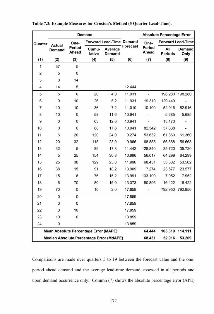
172
Table 7.3: Example Measures for Croston’s Method (5 Quarter Lead-Time).
Demand Absolute Percentage Error
Forward Lead-Time Forward Lead-TimeQuarter Actual Demand
One-Period Ahead
Cumu-lative
Average Demand
Demand Forecast
One-Period Ahead
All Periods
Demand Only
(1) (2) (3) (4) (5) (6) (7) (8) (9)
1 37 5
2 5 0
3 0 14
4 14 5 12.444
5 5 0 20 4.0 11.931 - 198.280 198.280
6 0 10 26 5.2 11.931 19.310 129.440 -
7 10 10 36 7.2 11.010 10.100 52.916 52.916
8 10 0 58 11.6 10.941 - 5.685 5.685
9 0 0 63 12.6 10.941 - 13.170 -
10 0 6 88 17.6 10.941 82.342 37.838 -
11 6 20 120 24.0 9.274 53.632 61.360 61.360
12 20 32 115 23.0 9.966 68.855 56.668 56.668
13 32 5 89 17.8 11.442 128.840 35.720 35.720
14 5 25 154 30.8 10.996 56.017 64.299 64.299
15 25 38 129 25.8 11.996 68.431 53.502 53.502
16 38 15 91 18.2 13.909 7.274 23.577 23.577
17 15 6 76 15.2 13.991 133.190 7.952 7.952
18 6 70 80 16.0 13.373 80.896 16.422 16.422
19 70 0 10 2.0 17.859 - 792.950 792.950
20 0 0 17.859
21 0 0 17.859
22 0 10 17.859
23 10 0 13.859
24 0 13.859
Mean Absolute Percentage Error (MAPE) 64.444 103.319 114.111
Median Absolute Percentage Error (MdAPE) 68.431 52.916 53.209
Comparisons are made over quarters 5 to 19 between the forecast value and the one-
period ahead demand and the average lead-time demand, assessed in all periods and
upon demand occurrence only. Column (7) shows the absolute percentage error (APE)

173
for the one-period ahead forecast, calculated from column (3) as the actual and column
(6) as the forecast. As previously mentioned, APE can only be calculated when the
actual observation is greater than zero and, therefore, some periods have a missing
value. Columns (8) and (9) show the APE for the forward lead-time forecasts; firstly for
all periods and secondly on occasions of positive demand only as determined by column
(2). In both cases, the forecast of column (6) is compared with the average lead-time
demand of column (5). Finally, the respective mean absolute percentage errors and
median absolute percentage errors are calculated from the non-missing values for the
last three columns.
The MAPE values in Table 7.3 are observed to differ substantially depending on
whether comparisons are made with the one-period ahead demand or the lead-time
demand, either in all periods or in periods of demand only. It is observed that the
relatively poor performance for MAPE when comparing the forecast with lead-time
demand is mostly due to the large percentage error occurring in quarter 19. As the
demand in quarter 20 was zero the one-period ahead comparison receives a null value on
this occasion. This raises questions as to which implementation should be used for
conveying the results and, indeed, which periods should be included in the calculations.
If the calculations only went as far as quarter 18 the results would be quite different.
In addition, the rankings of the forecast implementations differ between MAPE and
MdAPE, which now raises the question of which performance measure should be used
as well as which forecast implementation should be used. Different researchers may
well report different results given a situation like this depending on which methodology
they choose.

174
As a starting point, the implementation to be considered should depend on the purpose
of the comparisons. If it is purely a forecasting accuracy issue then the traditional one-
period ahead comparison may be satisfactory. Alternatively, if the forecasting is part of
an inventory management system, and would be used for making replenishment
decisions, it would be sensible to consider one of the lead-time comparisons. In
addition, as replenishments will only be made after a demand occurs, it would be
sensible to only measure the forecast performance after a demand occurrence. As for
which measure to report it is not possible to say, as both measures are valid and they
both have their merits, so perhaps they should both be considered.
Such observations illustrate weaknesses of the traditional measures of accuracy, such as
MAPE and MdAPE, when considering an inventory management system. A problem
arises as there is no singularly correct method for applying the measures and, as the
results differ depending on the method of application, there is no confirmation of the
results through any consensus.
This chapter continues to examine the forecast performance according to the identified
measures of accuracy and the results are examined for general trends. A later chapter
suggests an alternative approach to measuring performance. First, however, it is
necessary to determine smoothing parameter values that provide the best results for the
smoothing methods.
7.3.3 Selecting Smoothing Parameters
Through an analysis of the widely available M-Competition time series data, Fildes et
al. [27] suggest the forecasting performance of smoothing methods is dependent on how
the smoothing parameters are estimated. Rather than using fixed arbitrary values
suggested in the forecasting literature, improvements in performance can be obtained by

175
using information drawn from the time series themselves. Fixed optimal smoothing
parameters from a cross-sectional study of the time series were found to perform well
across other series, and this is the selection methodology used in this analysis. Using a
hold-out sample of 500 line items from the RAF consumable inventory with equal
representation between the five identified demand patterns from Chapter 6, average
MAPEs across all line items for a range of smoothing constant values are computed.
The smoothing constant in which the average MAPE is at a minimum is taken as the
optimal value.
The effect of the smoothing constant on the forecasting performance of exponential
smoothing (ES) and Croston’s method is examined in the following figures. Results are
shown for weekly, monthly and quarterly aggregations for both forecasting methods. In
the case of Croston’s method, the smoothing parameters for the demand size and the
interval between transactions are set at the same value. The average forecasting
performance has been monitored for 500 sample line items using increments of 0.01 in
the smoothing constant.
Figure 7.1 presents the results from comparing the forecast value with the one-period
ahead demand, where three general patterns are observed. Firstly, it is observed that for
both methods the forecasting performance deteriorates as the demand moves from
weekly (W) to monthly (M) and on to quarterly (Q) aggregation. Secondly, after initial
rapid improvements in forecasting performance as the smoothing constant increases,
once a minimum MAPE is obtained the deterioration in performance is less severe.
Finally, Croston’s method provides better results than ES at most parameter values,
although ES is initially significantly better when considering quarterly data and does in
fact provide the lower MAPE in this case.

176
Figure 7.1: Effect of Smoothing Constant - One-Period Ahead (All Periods).
80
90
100
110
120
130
140
150
160
0.0 0.1 0.2 0.3 0.4 0.5 0.6 0.7 0.8 0.9 1.0Smoothing Constant
MAP
E
The same observations do not hold true when comparing the forecast value with the
lead-time demand for all periods as shown by Figure 7.2. A major difference in this
instance is that ES now provides consistently better results than Croston’s method. In
addition, the quarterly data provides lower MAPE values in most instances. The weekly
data provides a better performance than monthly data for very low smoothing constant
values, although the weekly performance quickly deteriorates.
Figure 7.2: Effect of Smoothing Constant - Lead-Time Demand (All Periods).
0
100
200
300
400
500
600
700
0.0 0.1 0.2 0.3 0.4 0.5 0.6 0.7 0.8 0.9 1.0Smoothing Constant
MAP
E
Exponential Smoothing
Croston’s Method
W
Q
M
W
M
Q
Exponential Smoothing
Croston’s Method
W W
Q
M M
Q

177
A different set of observations occur when comparing the forecast value with the lead-
time demand in periods with positive demand only as shown by Figure 7.3.
Figure 7.3: Effect of Smoothing Constant - Lead-Time Demand (Demand Only).
0
100
200
300
400
500
600
700
0.0 0.1 0.2 0.3 0.4 0.5 0.6 0.7 0.8 0.9 1.0Smoothing Constant
MAP
E
In this instance, quarterly data tends to provide better results than weekly or monthly
data, and Croston’s method tends to be better than ES. Furthermore, ES is very
sensitive to changes in the value of the smoothing constant and deterioration in
performance occurs rapidly with weekly and monthly data in particular.
The reason behind the severe deterioration in the forecasting performance for ES is
initially explored in Figure 7.4. The calculated MAPEs for each of the 500 line items in
the sample are presented (in no particular order within a demand pattern) for both ES
and Croston’s method, where the first 100 line items were classified as having a smooth
demand pattern, the second an irregular demand pattern, etc.
Exponential Smoothing
Croston’s MethodW M
Q
W
M
Q

178
Figure 7.4: Comparative MAPE for Lead-Time Demand (Demand Only).
0
1000
2000
3000
4000
5000
6000
7000
8000
9000
10000
Smooth
Irreg
ular
Slow-movin
g
Mildly
Erratic
Highly Erra
tic
MAP
E by
Lin
e Ite
m
0
100
200
300
400
500
600
700
Cum
mul
ativ
e Av
erag
e M
APE
A smoothing constant of 0.15 was used with weekly data for this analysis (a value where
the forecast was particularly poor) and comparisons were made with lead-time demand
in periods with positive demand. It is observed that the individual MAPEs for the
smooth demand pattern are considerably less than those for the erratic demand patterns
in particular.
Also shown in Figure 7.4 are the cumulative average MAPEs obtained by successively
including individual MAPE results. The cumulative average MAPEs initially fluctuate,
although they settle with a continuous increase as more line items are considered. A
continual increase occurs as the individual MAPEs tend to increase as the demand
pattern changes from smooth to highly erratic. Gaps in both lines occur when MAPEs
for individual line items could not be calculated. The average cumulative MAPEs
Exponential Smoothing
Croston’s Method

179
conclude at values of 678 and 211 for ES and Croston’s method respectively, which
correspond with the values shown for weekly data in Figure 7.3 at the 0.15 point.
It was observed that the comparatively poor MAPE performance of ES occurs for the
most part when forecasting erratic demand. In examining this issue further, the
forecasting of one individual line item is now examined in greater detail. The selected
line item is that which provided the highest individual MAPE in Figure 7.4, namely
observation 500 with a MAPE of 9,454 for ES. In comparison, the corresponding
MAPE is 3,009 for Croston’s method.
Figure 7.5 illustrates demand circumstances that lead to high values for MAPE. Over
the six year period, weekly demand occurs as 80, 80, 30 and 50 units, interspersed by a
few demands of one, two or three units and a large number of zeros. Forecasts are made
using ES and Croston’s method (with a smoothing constant of 0.15 in all cases) and
compared with the average forward-looking lead-time demand. In this instance, the
lead-time is exactly one year, as shown in the figure.
Figure 7.5: Example Forecasts for Erratic Demand.
-2
0
2
4
6
8
10
1994 1995 1996 1997 1998 1999
Wee
kly
Dem
and
(Uni
ts)
Average Lead-Time DemandActual Weekly DemandExponential SmoothingCroston's Method
80 80 30 50
Lead-Time

180
As specified by the FORESTOC forecasting model, the first lead-time period is used for
initialising the parameters. Successive demands of 80, 1, 80 and 3 units occur in the
first year, giving an average of 3.15 units per week to initialise the ES forecast at the
start of 1995. Likewise, the average demand size and average demand interval combine
to initialise Croston’s method at 2.51 units per week. With successive demands of 1, 1
and 30 units during 1995, the initial forward-looking lead-time demand is 0.62 units per
week.
Beyond initialisation, the ES forecast continues to decrease until a demand of a single
unit occurs, while Croston’s forecast maintains the same level until the same demand
occurrence. The average lead-time demand first increases when the demand for 30 units
enters the moving one-year horizon and then marginally decreases when the first single
unit demand exits the horizon. As a demand has occurred, a MAPE is calculated
comparing each of the forecast values against the reduced average lead-time demand. In
this manner, comparisons are made with the average lead-time demand commencing
one-period ahead.
The calculated MAPEs for the selected line item are presented in Table 7.4. Absolute
percentage errors compare the average lead-time demand and the forecasts only when a
demand occurs. A substantial APE results for ES, in particular, in week 110 when a
demand for 50 units occurs. This demand significantly increases the ES forecast value,
as previously illustrated in Figure 7.5, while the average lead-time demand falls
significantly as the 50 unit demand is no longer included in the calculation and only
minor demands subsequently occur. On the other hand, Croston’s forecast does not
increase to such an extent as the ES forecast, and therefore the associated APE is not as
large.

181
Table 7.4: Comparative MAPE for Lead-Time Demand (Demand Only).
Exponential Smoothing Croston’s Method Week of Demand
Actual Demand
Average Lead-Time Demand Forecast APE Forecast APE
82 1 1.558 0.174 88.83 1.873 20.26
85 1 1.538 0.257 83.30 1.831 19.01
103 30 0.981 4.514 360.23 1.804 83.95
110 50 0.019 8.947 46,424.00 2.174 11,206.00
152 1 0.038 0.160 315.25 1.468 3,715.90
176 2 0.000 0.303 - 1.217 -
Mean Absolute Percentage Error 9,454.32 3,009.02
The observations of this section have confirmed in reality the inadequacy of ES when
forecasts are made from an erratic demand series as first identified by Croston [19]. As
ES places most weight on the more recent data, the forecast estimates are highest just
after a demand, leading to substantial errors in the periods in which replenishment
orders are placed. Thus, there is a tendency for the holding of unnecessarily high stocks
when this method is used for inventory management.
The next section concludes the search for optimal smoothing parameters. It is expected
that the selected values would largely be determined by the results from forecasting the
erratic demand patterns as they tend to produce the greatest errors.
7.3.4 Optimal Smoothing Parameters
The optimal values of the smoothing constants for the sample data are presented in
Table 7.5. At this stage of the analysis, the values for MAPE are considered provisional
and will be recalculated in a later section using a significantly larger sample size. In
terms of the smoothing constants, it is observed that the optimal values decrease as the
demand moves from quarterly to monthly and down to weekly aggregation. In addition,
the optimal values for Croston’s method are seen to be higher than those for ES.

182
Table 7.5: Optimal Smoothing Constant Values for MAPE.
Exponential Smoothing Croston’s Method Type of
Forecast Demand
Aggregation Smoothing Constant
Provisional MAPE
Smoothing Constant
Provisional MAPE
Quarterly 0.18 118.71 0.32 122.33
Monthly 0.05 103.20 0.13 95.77 One-Period Ahead Demand - All Periods Weekly 0.01 94.96 0.03 90.62
Quarterly 0.43 155.71 0.48 258.33
Monthly 0.16 158.65 0.30 274.34 Lead-Time Demand - All Periods Weekly 0.04 156.40 0.24 269.17
Quarterly 0.19 208.94 0.57 180.73
Monthly 0.06 225.48 0.38 200.17 Lead-Time Demand - Demand Only Weekly 0.01 216.34 0.32 191.59
Some of the smoothing parameters are observed to be very low while others are very
high (ranging between 0.01 and 0.57). Smoothing methods form a new estimate of
demand by taking a weighted average of the current demand and the previous smoothed
estimate. With the smoothed estimate being a linear combination of all historic
demands, the selected smoothing parameters can have a considerable impact on the
forecast values. When the smoothing constant α is large, the most recent observations
are given more weight and therefore have a stronger influence on the smoothed estimate.
Conversely, when α is small the new observations have little influence. Thus, a large
α provides little smoothing whereas a small α gives considerable smoothing. When
the smoothing constant for ES is equal to one, this is equivalent to using the last
observation as the forecast value, referred to as naïve forecasting.
Also, the initialisation methodology plays a more prominent role for a smaller α than it
does for a larger α . If the smoothing parameter is close to one, the influence of the
initialisation process rapidly becomes less significant. However, if α is close to zero
the initialisation process can play a significant role for many time periods ahead.

183
In this analysis, forecasts with weekly data have lower optimal smoothing constants and
therefore they tend to give the more recent observations less influence than the quarterly
forecasts do. As a result the weekly forecasts are smoothed to a greater degree by the
smoothing process. This is likely to occur because the quarterly data is pre-smoothed by
aggregation and requires less smoothing when forecasting. The weekly forecasts are
also more significantly affected by the initialisation values. This may be due to the fact
that the weekly data has a higher proportion of zero demands throughout and if the
initialisation procedure has provided a starting value close to zero through the choice of
α then this value would likely be maintained. It will be of interest to observe how the
forecasts with low smoothing parameters compare with outright averaging methods.
The optimal smoothing constants for ES presented in Table 7.5 are suitable for
implementation with the full sample of line items. However, with Croston’s method, it
is likely the forecasting performance can be improved by allowing the two constituent
smoothing constants to vary independently. All the academic research observed to date
utilise the same smoothing value for both components of Croston’s method, although, as
they represent independent processes, the values should be allowed to differ.
The two-dimensional surface map in Figure 7.6 illustrates the variability in the
performance of Croston’s method when the two smoothing constants are allowed to
vary. MAPE is again used as the performance measure and in this example the results
come from comparing the forecast value with the one-period ahead demand using
quarterly demand data. The red dot indicates the minimum value for MAPE, where the
demand size smoothing constant and interval between transactions smoothing constant
are set to 0.39 and 0.28 respectively. From this minimum point, MAPE increases in a
circular manner as illustrated by the surrounding contour lines.

184
Figure 7.6: Effect of Smoothing Constants - Croston’s Method (Quarterly Data).
0.0 0.1 0.2 0.3 0.4 0.5 0.6 0.7 0.8 0.9 1.0
0 .0
0 .1
0 .2
0 .3
0 .4
0 .5
0 .6
0 .7
0 .8
0 .9
1 .0
Interval Between TransactionsSmoothing Constant
Dem
and
Size
Sm
ooth
ing
Con
stan
t
MAPE for One Period Ahead Demand (All Periods)
120-125125-130130-135135-140140-145145-150150-155
An altogether different pattern is shown by Figure 7.7 where the one-period ahead
demand is again considered but this time using weekly demand data.
Figure 7.7: Effect of Smoothing Constants - Croston’s Method (Weekly Data).
0.0 0.1 0.2 0.3 0.4 0.5 0.6 0.7 0.8 0.9 1.0
0 .0
0 .1
0 .2
0 .3
0 .4
0 .5
0 .6
0 .7
0 .8
0 .9
1 .0
Interval Between TransactionsSmoothing Constant
Dem
and
Size
Sm
ooth
ing
Con
stan
t
MAPE for One Period Ahead Demand (All Periods)
88-9191-9494-9797-100100-103103-106106-109
MAPE Range
MAPE Range

185
In this instance the optimal smoothing constant for the interval between transactions
falls close to zero and the surrounding contour lines are seen to be less circular with a
sharp gully along the 0.1 demand size smoothing constant value.
The optimal smoothing constant values for the three forecast implementations under the
various demand aggregations are presented in Table 7.6. Some of the smoothing values
are again very low while others are very high (ranging between 0.01 and 0.92). When
the smoothing constants are low there is greater smoothing and the smoothed values will
be close to the average value provided by the initialisation procedure. Alternatively,
when the smoothing constants are high there is little smoothing and the smoothed values
will be close to the demand from the previous period.
Table 7.6: Optimal Smoothing Constant Values for MAPE - Croston’s Method.
Smoothing Constants Type of Forecast
Demand Aggregation Demand Size Demand Interval
Provisional MAPE
Quarterly 0.39 0.28 122.11
Monthly 0.18 0.08 95.45 One-Period Ahead Demand - All Periods Weekly 0.10 0.01 89.86
Quarterly 0.92 0.40 252.56
Monthly 0.10 0.34 272.31 Lead-Time Demand - All Periods Weekly 0.02 0.25 263.53
Quarterly 0.92 0.46 174.56
Monthly 0.50 0.36 199.67 Lead-Time Demand - Demand Only
Weekly 0.58 0.30 190.16
Once again it is observed that the optimal values decrease as the demand moves from
quarterly to monthly and down to weekly aggregation. In general the optimal demand
size smoothing constants are greater than the optimal interval between transactions
smoothing constants.

186
In order to gauge whether the calculated optimal smoothing constants have any
prescriptive power, alternative optimal values for exponential smoothing have been
calculated using additional samples of 500 line items. MAPE results from comparing
the monthly forecast value with the lead-time demand in all periods are illustrated in
Figure 7.8 for five different random samples of 500 line items each. Results from the
original 500 line items are identified as Sample 1. It is observed that the five samples all
share a similar optimal value (ranging between 0.16 and 0.22) and they all have similar
MAPE values throughout. This suggests the predictive powers of the selected
smoothing constants are very good.
Figure 7.8: Effect of Smoothing Constant on Alternative Samples of 500 Line Items.
0
50
100
150
200
250
300
350
400
0.0 0.1 0.2 0.3 0.4 0.5 0.6 0.7 0.8 0.9 1.0Smoothing Constant (ES)
MA
PE
Sample 1 Sample 2 Sample 3 Sample 4 Sample 5
Confirmation of the high-quality predictive powers of the original smoothing constants
is provided by Table 7.7. In this instance the optimal smoothing constants for ES and
the associated MAPE values are presented for the five samples by forecast measurement
type. The original 500 line items are again identified as Sample 1. The optimal
smoothing constants under each forecast measurement type are closely matched as are
the corresponding MAPE values.

187
Table 7.7: Forecast Results from Alternative Samples of 500 Line Items.
Type of Forecast Measurement Exponential Smoothing Statistics
Monthly Demand Series
One-Period Ahead Demand
- All Periods
Lead-Time Demand
- All Periods
Lead-Time Demand
- Demand Only
Sample 1 0.05 0.16 0.06 Sample 2 0.08 0.20 0.08 Sample 3 0.09 0.21 0.06 Sample 4 0.04 0.17 0.05
Optimal Smoothing Constants
Sample 5 0.09 0.22 0.08
Sample 1 103.20 158.65 225.48 Sample 2 95.19 162.68 256.78 Sample 3 100.51 169.53 239.18 Sample 4 97.14 165.37 260.50
Calculated MAPEs
Sample 5 96.19 154.92 218.29
The original optimal smoothing values are deemed suitable for implementation with the
full sample of line items from which definitive performance measures will be
determined. In the next section, the smoothing constants for ES presented in Table 7.5
and the smoothing constants for Croston’s method presented in Table 7.6, which were
both optimally obtained from the original hold-out sample of 500 line items, will be
applied across a substantially larger sample.
7.4 Forecast Results
Forecast comparisons have been made using the FORESTOC forecasting model described
in Section 7.3.2 on the sample of 18,750 line items considered previously. The selected
items comprise a random sample with equal representation from the five identified
demand patterns. Each line item has a different lead-time, taken as the set purchasing
lead-time (PLT) value. Initially four forecasting methods have been included in the
study: exponential smoothing, Croston’s method, a one year moving average, and a
simple previous year average.

188
Comparative evaluations between the methods are illustrated in the following sections,
starting with the frequency of over and under forecasting followed by measures of
forecasting accuracy.
7.4.1 Frequency of Over and Under Forecasting
Over and under forecasting have differing consequences to the RAF. The affect of over-
forecasting demand is the holding of too much stock with the associated purchasing,
handling and holding costs, together with increased risks of wastage, pilferage and
obsolescence. On the other hand, under-forecasting demand leads to the holding of too
little stock and items are not available when required, incurring stock-out or shortage
costs. As with most parts and supplies inventory systems, the shortage costs to the RAF
take the form of backorder costs. The lack of available parts can cause aircraft to be
grounded, thus reducing operational capability, while other costs are incurred through
expediting and cannibalisation. Stock shortages are usually more costly than idle stock.
Figure 7.9 presents the percentage of occasions on which each of the forecasting
methods over-estimates, under-estimates and approximately matches (forecast within ±
5.0 percent of actual) the one-period ahead demand. Measurements are taken across all
periods regardless of whether a demand was recorded in a period or not. All of the
forecasting methods tend to over-estimate rather than under-estimate the one-period
ahead demand, with less frequent over-estimation as the demand period lengthens. ES
and Croston’s method over-estimate demand to a similar degree. The moving average
and the previous year average methods over-estimate less frequently. They also
approximately match the actual demand substantially more often, with the proportion
being constant between quarterly, monthly and weekly aggregations.

189
Figure 7.9: One-Period Ahead Demand Over and Under Forecasting - All Periods.
0
10
20
30
40
50
60
70
80
90
100
Perc
enta
ge o
f Obs
erva
tions
Over-Forecasting Within ± 5.0 Percent Under-Forecasting
Such observations are understandable given the fact that sixty percent of line items are
classed as erratic or slow-moving, and therefore contain many periods with zero
demand. In such cases, if the predicted demand is not similarly zero, then the only
alternative is over-estimation. By their very nature, ES and Croston’s method tend to
decay towards zero over a number of periods of zero demand and will therefore not
match a series of zeros as often as the two averaging methods that drop to zero more
readily. In Croston’s case, the forecasts will not actually reach zero since they are only
updated by a demand observation, thus neither the average demand interval nor the
average demand size will equal zero. As the demand period lengthens from weekly
aggregation through to monthly and on to quarterly aggregation, the relative frequency
of periods with zero demand decreases and therefore there is less over-estimation.
Comparing the forecasting methods, using the demand over a forward lead-time, results
in a different pattern, as illustrated by Figure 7.10. Croston’s method over-estimates the
QuarterlyMonthly
Weekly Exponential Smoothing
Croston’s Method
Moving Average
Previous Year Average

190
demand the most frequently, though, like each of the other methods, at a lower rate than
the one-period ahead demand comparison. In this instance, the actual demand is
aggregated from a number of periods and the likelihood of zero actual demand is
reduced, therefore there tends to be less over-estimation.
Figure 7.10: Lead-Time Demand Over and Under Forecasting - All Periods.
0
10
20
30
40
50
60
70
80
90
100
Perc
enta
ge o
f Obs
erva
tions
Over-Forecasting Within ± 5.0 Percent Under-Forecasting
ExponentialSmoothing
Previous YearAverage
MovingAverage
Croston'sMethod
Quarterly
WeeklyMonthly
Once again the moving average and previous year average methods over-estimate less
frequently. On the whole ES tends to over-estimate less than Croston’s method as ES
reduces to zero quicker than Croston’s method, which only changes in periods of
positive demand. Although there are less zeros in the average lead-time demand, any
series of zeros serves to reduce the actual demand, as well as the forecast, and over-
estimation still occurs.
Figure 7.11 presents the results of comparing the forecasts with the demand over a
forward lead-time, but only after a demand has occurred. The results show a reversal of

191
a previous observation that, as the demand period lengthened, there was proportionally
less over-estimation. In this instance, it is observed that as the demand period lengthens,
from weekly aggregation through monthly and on to quarterly aggregation, the relative
frequency of over-estimation generally increases.
Figure 7.11: Lead-Time Demand Over and Under Forecasting - Demand Only.
0
10
20
30
40
50
60
70
80
90
100
Perc
enta
ge o
f Obs
erva
tions
Over-Forecasting Within ± 5.0 Percent Under-Forecasting
ExponentialSmoothing
Previous YearAverage
MovingAverage
Croston'sMethod
Quarterly
WeeklyMonthly
Using the frequency of over-estimation as a rather simplistic forecasting performance
measure, Croston’s method would appear to fall short of the other three methods.
Alternatively, consideration should be given to the scale to which each method either
over-forecasts or under-forecasts using the previously mentioned measures of accuracy.
7.4.2 Forecasting Performance
The first set of performance comparisons examines the percentage of occasions on
which each of the four forecasting methods attains a particular ranking. A rank of 1 is
given to the best performing method down to a rank of 4 to the worst, with any tied

192
results sharing the lower ranking of the group. As ties frequently occur, the sum of a
row of ranks need not necessarily equal 100 percent.
Table 7.8 presents MAPE and MdAPE results for quarterly data: firstly for comparisons
with the one-period ahead demand, secondly for comparisons with lead-time demand for
all periods, and finally for comparisons with lead-time demand for periods with positive
demand. Although, by definition, MAPE and MdAPE can only be calculated for
periods with positive demand when considering only one period, the forecast type is
sub-titled “All Periods” to remain consistent with tables in the appendices that also
present MAD and RMSE, which can both be calculated when the actual demand is zero.
In the case of the forward lead-time demand, the actual demand is the sum of many
periods and the chance of having zero actual demand is very much lessened. Under this
situation the actual demand in a particular period can be zero and it will still be possible
to calculate a MAPE value.
Table 7.8: Forecasting Method Rankings - Quarterly Data.
Type of Forecast
Error Measure
Rank Percent
Exponential Smoothing
Croston’s Method
Moving Average
Prev Year Average
MAPE 1 26.1 42.9 15.3 16.9
2 40.7 21.1 19.6 20.9
3 21.4 16.7 36.0 34.1
4 11.8 19.4 29.2 28.1
Friedman’s Test Statistic: 5,231.11
MdAPE 1 24.2 47.3 14.5 17.1
2 39.5 23.8 18.6 20.7
3 22.8 15.2 38.7 35.6
4 13.5 13.7 28.2 26.6
One-Period Ahead Demand - All Periods
Friedman’s Test Statistic: 7,538.83

193
Type of Forecast
Error Measure
Rank Percent
Exponential Smoothing
Croston’s Method
Moving Average
Prev Year Average
MAPE 1 33.8 21.6 19.1 26.5
2 29.3 10.3 44.2 19.2
3 25.3 13.6 28.6 29.7
4 11.5 54.4 8.1 24.6
Friedman’s Test Statistic: 4,863.52
MdAPE 1 35.2 29.8 16.0 21.9
2 31.5 14.0 38.2 28.0
3 22.0 14.3 33.3 26.3
4 11.4 41.9 12.5 23.8
Lead-Time Demand - All Periods
Friedman’s Test Statistic: 2,599.54
MAPE 1 26.4 29.1 18.4 28.7
2 29.2 19.0 32.4 19.3
3 22.7 18.0 32.5 26.1
4 21.7 33.8 16.7 25.9
Friedman’s Test Statistic: 151.37
MdAPE 1 28.1 29.0 21.2 26.1
2 24.8 22.0 33.5 21.2
3 22.3 22.0 29.2 24.8
4 24.9 27.0 16.1 28.0
Lead-Time Demand - Demand Only
Friedman’s Test Statistic: 184.16
In the first instance, Croston’s method with 42.9 percent of line items in rank 1 attains
the lowest MAPE value the most frequently. Next is ES with 26.1 percent with the
highest ranking and 40.7 percent with the second ranking. The moving average method
and the previous year average method share a similar spread amongst the rankings. The
rankings for MdAPE tend to display a similar pattern as those for MAPE.
A suitable statistical test for determining whether k related samples of an ordinal nature
have been drawn from the same population is the non-parametric Friedman test, as
described in Appendix D. Under this test the null hypothesis is rejected if the test
statistic is greater than the tabulated chi-square value with 1−k degrees of freedom.
The calculated statistics from the SAS FREQ procedure are presented. In each case the

194
calculated statistics are substantially greater than the tabulated value of 7.81 at the 5
percent significance level and, therefore, there are differences in the forecasting
performance between the methods.
With consideration given to the forecasting performance over a lead-time when
measured at all periods, the ranking results change significantly. In this instance, ES
attains the highest ranking more frequently when looking at both MAPE and MdAPE,
while Croston’s method now attains the lowest ranking substantially more often.
When the forecast value is compared with the lead-time demand when a demand has
occurred, the spread of the rankings has diminished markedly and no method dominates
to the extent observed previously. This observation is reflected by the calculated
Friedman statistics, 151.37 and 184.16 for MAPE and MdAPE respectively, which are
substantially reduced. However, these values are still greater than the tabulated value
and differences in the rankings do exist. Croston’s method attains the highest ranking
marginally more frequently than the previous year average method in terms of MAPE.
Attention is now given to the comparisons when using monthly data and the
performance results are presented in Table 7.9. In this case, Croston’s method increases
its dominance of the higher rankings when looking at the one-period ahead demand for
both MAPE and MdAPE, while ES maintains a second place positioning. Once again,
the Friedman statistics are all significant and they continue to suggest greater differences
in the forecasting methods when forecasting one-period ahead, as opposed to lead-time
demand forecasting, particularly when measured at periods of demand only.

195
Table 7.9: Forecasting Method Rankings - Monthly Data.
Type of Forecast
Error Measure
Rank Percent
Exponential Smoothing
Croston’s Method
Moving Average
Prev Year Average
MAPE 1 17.4 58.0 13.2 11.9
2 45.9 16.5 15.7 23.0
3 25.7 12.2 32.9 37.5
4 11.0 13.3 38.2 27.6
Friedman’s Test Statistic: 10,448.66
MdAPE 1 14.5 62.8 11.8 12.5
2 47.9 17.5 14.8 21.5
3 25.6 11.4 38.2 37.5
4 11.9 8.4 35.2 28.5
One-Period Ahead Demand - All Periods
Friedman’s Test Statistic: 14,157.96
MAPE 1 36.6 22.0 19.1 22.7
2 27.6 15.2 40.4 19.0
3 19.3 15.9 28.7 34.2
4 16.5 46.9 11.8 24.1
Friedman’s Test Statistic: 3,337.34
MdAPE 1 34.9 30.4 17.0 20.4
2 32.0 14.8 37.1 28.4
3 21.0 13.3 31.5 28.1
4 12.1 41.5 14.4 23.2
Lead-Time Demand - All Periods
Friedman’s Test Statistic: 2,490.82
MAPE 1 22.3 26.4 19.0 33.6
2 30.1 26.3 25.0 18.2
3 25.0 21.8 31.6 21.6
4 22.6 25.5 24.4 26.6
Friedman’s Test Statistic: 233.87
MdAPE 1 25.8 25.4 23.3 27.9
2 25.5 29.8 26.1 18.4
3 23.9 25.7 29.6 20.9
4 24.8 19.1 21.0 32.8
Lead-Time Demand - Demand Only
Friedman’s Test Statistic: 281.95
ES is viewed as the best performer when considering the lead-time demand across all
periods but its positioning is curtailed when the forecast is compared at times of demand

196
only. In the first instance, Croston’s method results in comparatively poor results with a
large proportion of low rankings. In the case of demand only comparisons, the results
again show less differentiation among the forecasting methods. The previous year
average method attains the highest rankings for both MAPE and MdAPE.
When looking at weekly data, Croston’s method displays an overwhelming domination
with regards to the one-period ahead demand, as shown by Table 7.10. Again,
Friedman’s statistics indicate significant differences in the performance rankings. When
considering the lead-time forecasts measured across all periods, ES continues as the best
performing method. Croston’s method has a substantial proportion of the lowest
rankings. In the case of demand only measurements, the spread of the rankings is more
evenly balanced between the methods, although the previous year average method
obtains the highest rankings.
Table 7.10: Forecasting Method Rankings - Weekly Data.
Type of Forecast
Error Measure
Rank Percent
Exponential Smoothing
Croston’s Method
Moving Average
Prev Year Average
MAPE 1 9.3 69.6 13.0 8.3
2 52.3 9.8 15.1 23.5
3 27.7 7.4 30.6 42.3
4 10.6 13.2 41.4 26.0
Friedman’s Test Statistic: 13,866.78
MdAPE 1 9.3 72.6 10.1 8.9
2 55.5 11.1 14.4 20.9
3 26.0 8.1 37.4 40.9
4 9.2 8.2 38.0 29.3
One-Period Ahead Demand - All Periods
Friedman’s Test Statistic: 18,694.12

197
Type of Forecast
Error Measure
Rank Percent
Exponential Smoothing
Croston’s Method
Moving Average
Prev Year Average
MAPE 1 34.8 24.4 19.0 21.9
2 29.8 11.0 40.5 20.5
3 20.1 12.6 29.9 36.1
4 15.4 52.0 10.6 21.5
Friedman’s Test Statistic: 3,718.95
MdAPE 1 34.9 29.8 17.2 20.9
2 32.9 12.5 38.1 28.8
3 21.3 12.0 31.3 29.3
4 10.9 45.7 13.5 21.0
Lead-Time Demand - All Periods
Friedman’s Test Statistic: 2,920.55
MAPE 1 25.5 22.4 18.8 34.0
2 31.2 23.4 23.5 21.8
3 20.7 21.8 33.8 23.6
4 22.7 32.4 23.9 20.6
Friedman’s Test Statistic: 810.74
MdAPE 1 27.2 23.2 23.5 27.7
2 26.2 27.3 26.3 19.9
3 21.3 25.6 30.1 22.9
4 25.3 23.9 20.0 29.5
Lead-Time Demand - Demand Only
Friedman’s Test Statistic: 71.11
Overall results from the rankings indicate that Croston’s method is the best performing
forecasting method when considering the one-period ahead demand. Under this
situation, the dominance of Croston’s method increases as the demand aggregation
moves from quarterly through monthly and down to weekly aggregation. Thus,
Croston’s method provides a relative improvement as the demand series tend towards a
higher proportion of periods with zero demand.
In the case of lead-time demand with comparisons made in all periods, ES emerges with
the best performance when considering either quarterly, monthly or weekly data.
Meanwhile, Croston’s method provides the worst performance by obtaining the lowest

198
ranking the most frequently. The simpler methods, particularly the moving average
method, provide a better overall performance than Croston’s method in this case.
When the lead-time demand is compared at periods of demand only, the methods are
more similar in the range of rankings obtained. Croston’s method provides the best
performance when considering quarterly data, closely followed by the previous year
average method. In the case of monthly and weekly data, the previous year average
method emerges as the best.
Additional measures of forecasting accuracy, including MAD and RMSE, are presented
in Appendix E. Also shown are the MADs for forecast errors which exceed 5.0 percent
above the actual value (referred to as MAD+) and the MAD for forecast errors more
than 5.0 percent below the actual value (referred to as MAD-). In all cases the MAD+
value is greater than the MAD- value, indicating that each method tends to over-forecast
rather than under-forecast the actual demand. This observation coincides with the
results of Section 7.4.1 where it was noted that over-forecasting tends to occur more
frequently.
When considering the one-period ahead comparisons, the moving average method
provides the lowest MAD and lowest MAD+ for all demand aggregations, as well as the
lowest RMSE for monthly and weekly data. Despite Croston’s method providing the
lowest MAPE and MdAPE values the most frequently for quarterly data as shown in
Table 7.8, ES provides the lowest average values for both these measures, as well as for
RMSE. This result is possible as Croston’s method was also observed to provide the
highest MAPE and MdAPE values the most frequently, demonstrating extremes in
performance. Croston’s method does however provide the lowest values for MAPE and

199
MdAPE for monthly and weekly data and the lowest value for MAD- throughout. The
previous year average method fails to achieve the best result in all cases.
ES completely dominates the error measures when comparisons are made against lead-
time demand for all periods. It is only in the case of MAD- for monthly and weekly data
that another forecasting method provides the best result, and these are provided by
Croston’s method on both occasions.
The results are far more varied when the lead-time demand is compared only in periods
with positive demand. The moving average method once again provides the best MAD
results for all demand aggregations, and ES provides the best MAD- and RMSE results
throughout. The best MAPE and MdAPE results are shared by Croston’s method and
the previous year average method. Croston’s method provides the best MAPE and
MdAPE for quarterly data and the best MdAPE for weekly data, while the previous year
average method provides the best results on the other occasions.
The overall results across the range of error measures show a similar pattern as the
ranking results. Croston’s method performs well for the one-period ahead demand,
particularly for monthly and weekly data, while ES performs well with quarterly data.
ES provides the best performance in the majority of cases for lead-time demand
comparisons made in all periods. When the lead-time demand is compared in periods of
demand only the results are somewhat varied with no particular method dominating.
In Section 7.3.4 it was noted that some of the optimal smoothing constants had very low
values and others had very high values. For both exponential smoothing and Croston’s
method it was with weekly data that the optimal values tended to be lowest, although
Croston’s method did not have any low values when considering lead-time demand in

200
periods of demand only. When the smoothing values are low there will be greater
smoothing of demand and the initialisation value will have the greatest impact on the
forecasts.
It would be expected that when the smoothing methods have low optimal values that the
previous year average method and the moving average method would be at their most
competitive as all the methods would essentially be averaging methods in such cases.
The overall results do not support this hypothesis, however, as a comparison of Table
7.8 with quarterly results against Table 7.10 with weekly results suggests the moving
average method and the previous year average method have the same likelihood of
giving the best results when demand is weekly as they do when it is quarterly. In
general, ES and Croston’s method provide better results than averaging methods even
when the smoothing constants are low. That is not to say, however, that the averaging
methods are not capable of producing the best results when conditions suit them.
A fundamental observation, given the results presented in Appendix E, is that all
forecasts are rather abysmal. Extremely high values for the measurements of accuracy
throughout the table indicate that none of the forecasting methods are good in the
traditional sense. However, when faced with demand of this nature, the usage of ES or
Croston’s method is still preferable to the alternative of using a simple average of the
historic demand. The earlier suggestion by Brown [14], that if demand is identified as
erratic then the forecast be set simply to the historic average is unlikely to be appropriate
in this case. ES is observed to provide the best results more frequently than both the
moving average method and the previous year average method.
It should be borne in mind that none of the comparisons between methods has yet
considered any demand pattern categorisation. As Croston’s method was put forward as

201
a method for providing improved forecasts under the situation of erratic demand, it is
worthwhile to consider the performance across the range of demand patterns. The
comparative forecasting performance by demand pattern is examined in the next section.
7.4.3 Forecasting Performance by Demand Pattern
In this section comparisons are made between the four forecasting methods across the
range of identified demand patterns. Once again a total of 18,750 line items are
considered, but in this section the performance measures are calculated for each of the
five identified demand patterns. The optimal smoothing parameters, as used previously,
were produced from a hold-out sample of 500 line items for the group as a whole,
although each demand pattern was equally represented.
Using the mean absolute percentage error (MAPE) as the selected performance measure,
comparative results for quarterly, monthly and weekly series are shown in the following
three tables respectively. In each case the comparisons are made for the one-period
ahead demand over all periods, the lead-time demand over all periods and the lead-time
demand measured at periods of demand only. The lowest MAPE for each demand
pattern is shown in bold-type.
Table 7.11 presents average MAPE results for quarterly data. Croston’s method
provides the best results for the smooth and slow-moving demand patterns when
comparing the forecast value with the one-period ahead demand, while the moving
average method provides the best results for the irregular and mildly erratic demand
patterns, and ES provides the best result for the highly erratic demand pattern.

202
Table 7.11: Mean Absolute Percentage Error by Demand Pattern - Quarterly Data.
Type of Forecast
Demand Pattern
Expon’l Smooth.
Croston’s Method
Moving Average
Prev Year Average
Friedman Statistic
Smooth 90.20 87.68 89.33 94.81 547.52
Irregular 200.42 207.63 194.43 202.56 229.13
Slow-moving 70.98 54.22 81.14 78.89 4,524.21
Mildly Erratic 113.21 146.60 111.83 118.66 1,249.60
One-Period Ahead Demand - All Periods
Highly Erratic 111.34 138.33 117.85 119.47 1,186.77
Smooth 86.75 106.51 88.97 101.50 1,315.63
Irregular 197.99 286.56 204.29 228.98 791.70
Slow-moving 109.92 201.26 118.26 135.28 1,092.86
Mildly Erratic 232.93 478.74 239.28 278.71 817.87
Lead-Time Demand - All Periods
Highly Erratic 239.24 449.38 255.02 279.28 951.75
Smooth 101.07 96.33 95.35 99.87 868.86
Irregular 239.58 221.29 225.08 220.37 369.21
Slow-moving 151.88 125.56 143.68 142.58 193.83
Mildly Erratic 412.60 330.87 365.61 322.44 69.15
Lead-Time Demand - Demand Only
Highly Erratic 399.00 330.85 368.38 331.46 81.64
In the case of lead-time demand comparisons at all periods, ES provides the best results
for all five demand patterns and Croston’s method performs particularly poorly with the
two erratic patterns. However, in the case of lead-time demand comparisons at times of
demand only, ES does not provide the best result for any demand pattern, while
Croston’s method provides the best results for the slow-moving demand pattern and the
highly erratic demand pattern. The moving average method once again provides the
best result for the smooth demand pattern, and the previous year average method
provides the best results for the irregular and mildly erratic demand patterns.
When it comes to monthly data the results are somewhat different, as shown by Table
7.12. In this instance Croston’s method provides the best results for the smooth demand
pattern, as well as the slow-moving demand pattern for the one-period ahead demand
comparison, while ES provides the best results for the erratic demand patterns.

203
Table 7.12: Mean Absolute Percentage Error by Demand Pattern - Monthly Data.
Type of Forecast
Demand Pattern
Expon’l Smooth.
Croston’s Method
Moving Average
Prev Year Average
Friedman Statistic
Smooth 99.88 94.93 98.77 101.73 894.01
Irregular 143.18 142.97 139.82 145.86 562.02
Slow-moving 84.38 69.79 88.82 87.15 5,634.30
Mildly Erratic 90.90 96.80 94.32 95.34 2,714.08
One-Period Ahead Demand - All Periods
Highly Erratic 86.74 87.56 92.89 92.26 2,956.88
Smooth 94.45 117.79 94.26 104.55 304.28
Irregular 206.49 295.14 211.53 243.30 162.32
Slow-moving 110.89 237.11 118.93 140.90 1,612.16
Mildly Erratic 239.64 566.66 248.16 293.88 810.73
Lead-Time Demand - All Periods
Highly Erratic 222.21 496.15 239.42 279.73 1,303.38
Smooth 105.28 105.87 101.42 97.50 543.09
Irregular 246.83 230.76 231.66 219.03 208.31
Slow-moving 158.16 133.41 148.16 144.46 391.41
Mildly Erratic 422.29 349.63 374.31 313.58 276.26
Lead-Time Demand - Demand Only
Highly Erratic 380.30 311.69 335.31 300.45 264.51
In the case of lead-time demand comparisons at all periods, ES no longer has complete
dominance for all demand patterns, as the moving average method provides a
marginally better result for the smooth demand pattern, although Croston’s method still
performs particularly poorly with the two erratic patterns. The previous year average
method, which has not previously shown much promise, now provides the best results
for four of the demand patterns when the lead-time demand is compared at periods of
demand only, and it is only Croston’s method that provides a better result for slow-
moving demand.
Results from the weekly data, as presented in Table 7.13, show Croston’s method to be
the best for all demand patterns for the one-period ahead demand, while ES is the best
for all demand patterns when lead-time demand is compared at all periods, and
Croston’s method is again poor for the two erratic patterns.

204
Table 7.13: Mean Absolute Percentage Error by Demand Pattern - Weekly Data.
Type of Forecast
Demand Pattern
Expon’l Smooth.
Croston’s Method
Moving Average
Prev Year Average
Friedman Statistic
Smooth 97.60 94.38 97.14 98.16 802.38
Irregular 94.87 94.03 96.04 96.83 1,008.62
Slow-moving 95.22 89.62 96.52 96.06 5,611.02
Mildly Erratic 92.26 88.47 94.67 94.33 4,074.61
One-Period Ahead Demand - All Periods
Highly Erratic 91.04 85.57 94.01 93.29 4,407.47
Smooth 93.14 119.51 93.98 103.08 732.01
Irregular 209.06 299.75 213.17 247.65 103.77
Slow-moving 106.38 239.26 113.94 132.75 1,585.26
Mildly Erratic 232.31 577.27 242.44 290.43 698.92
Lead-Time Demand - All Periods
Highly Erratic 215.55 507.36 232.70 281.70 1,166.12
Smooth 100.77 108.01 97.34 92.69 1,188.12
Irregular 258.88 252.33 244.60 228.22 577.29
Slow-moving 146.52 133.00 141.81 134.27 199.53
Mildly Erratic 409.12 354.73 359.15 320.80 212.21
Lead-Time Demand - Demand Only
Highly Erratic 370.22 295.73 314.80 319.44 178.24
In the case of lead-time demand when comparing at periods of demand only, the
previous year average method provides the best results for the smooth, irregular and
mildly erratic demand patterns, while Croston’s method is best for the slow-moving and
highly erratic demand patterns.
For each demand aggregation it is observed that the results for the one-period ahead are
often substantially lower than those from the lead-time comparisons. This is particularly
the case for the slow-moving and erratic demand patterns. The reason for this is that
MAPE cannot be calculated when the actual demand is zero, which occurs more
frequently when considering the one-period ahead demand as opposed to the lead-time
demand. Therefore, some large errors are not included in calculations under the first
implementation. In addition, the slow-moving and erratic demand patterns contain more
zeros, leading to greater differences between the results for these patterns.

205
Prior to commenting on the overall performance of the forecasting methods by demand
pattern, it is worthwhile examining another performance measure along with MAPE.
Different measures are likely to provide different results, although it is hoped that
general patterns will emerge. Equivalent statistics to those shown for MAPE in this
section are presented in Appendix F for the median absolute percentage error (MdAPE),
and the joint consideration of both sets of statistics provide the observations that follow.
Croston’s method is observed to increasingly provide the best results for the one-period
ahead demand as the data moves from quarterly to monthly and on to weekly
aggregation. Initially it is only the smooth and slow-moving demand patterns for which
Croston’s method provides the best results, but once weekly data is considered the
method is the best across the full range of demand patterns. ES provides the best results
for the erratic demand patterns when considering quarterly data.
ES provides the best results across the range of demand patterns for each aggregation
when comparing the forecast value with the lead-time demand in all periods. Very
infrequently will another method better the results from ES under this situation, and it is
only the moving average method that manages to do so. When it comes to lead-time
demand compared at times of demand only, ES wholly loses the dominance it had for
the lead-time demand in all periods. It is Croston’s method that for the most part now
provides the best results, particularly when considering MdAPE, although the previous
year average method also provides good results.
Results from the analysis undertaken in this section indicate Croston’s method is not as
effective at forecasting erratic demand as suggested by particular sections of the
academic literature. The method performs relatively better when considering weekly
data, which contains proportionally more zero observations than monthly or quarterly

206
data, although for the most part the better performance is limited to forecast
comparisons with the one-period ahead demand. When it comes to forecasting lead-
time demand, Croston’s method comes a poor second to ES when comparisons are made
at all periods, and the method shares the honours with the previous year average method
when lead-time demand comparisons are made at periods of demand only.
7.5 Concluding Remarks
ES is commonly used for demand forecasting in an inventory control environment.
However, this method has been shown to be unsuitable for items with erratic demand as
it tends to lead to unnecessarily high stocks. An alternative method was developed by
Croston in 1972 to separately smooth the interval between demands and the size of the
demands in order to reduce the inherent bias. Since this time much of the academic
literature has commented upon the desirability of this method. Forecasting methods
based on a Box-Jenkins approach are not suitable as trends and seasonality cannot be
discerned when demand is erratic or slow-moving.
The large scale comparative analysis undertaken in this chapter utilised 18,750 line
items with equal demand pattern representation. Four forecasting methods were
compared using various measures of accuracy, including MAD, RMSE, MAPE and
MdAPE, with errors measured at every point in time as well as only after a demand has
occurred. In recognising the purpose for which demand forecasts are made in reality,
the forecast value is compared with the actual demand over a forward-looking lead-time
period, in addition to comparisons with the more traditional one-period ahead demand.
Optimal smoothing constant values were obtained from a hold-out sample of 500 line
items with equal demand pattern representation.
207
All the forecasting methods tend to over-estimate, rather than under-estimate, the actual
demand. With many zero observations in the data, if the forecasts are not likewise zero,
then over-estimation occurs. Both ES and Croston’s method over-estimate demand to a
greater degree than the moving average method and the previous year average method.
This is due to ES and Croston’s method decaying towards zero over a number of periods
of zero demand and therefore not matching a series of zeros as often as the two
averaging methods that drop to zero more readily.
When comparing the overall forecasting performance using the standard measures of
accuracy, the results vary and no single method emerges as the best. Croston’s method
performs well when comparing the forecast with the one-period ahead demand,
particularly with monthly and weekly data. Alternatively, ES completely dominates
when comparing against lead-time demand in all periods irrespective of the demand
aggregation. With lead-time demand comparisons in periods of demand only, Croston’s
method performs well with quarterly data, while the previous year average method
provides the best results with monthly and weekly data.
Although Croston’s method was put forward as suitable for forecasting when facing
erratic demand, the results using RAF data do not wholly reflect this. The method is
often bettered by simpler methods when demand is erratic, as well as when demand
follows any of the other identified patterns, including smooth, irregular and slow-
moving. Syntetos and Boylan [78] recently observed similar findings in the course of
their research. They made the conclusion that the method proposed by Croston reduced
the bias associated with ES although it did not eliminate it completely.
The next chapter examines a recognised weakness of Croston’s method and introduces
various alternative methods that all seek to further reduce the inherent bias.

208
8. ALTERNATIVE FORECASTING METHODS
Croston’s method has been claimed to have practical tangible benefits, although results
on real data often show very modest benefits (Willemain et al. [88]). Moreover, inferior
performance has recently been reported in the literature when the method is compared
with less sophisticated methods, such as exponential smoothing (ES) or simple moving
averages (Sani and Kingsman [60]). In fact, previous observations using industrial data
prompted Syntetos and Boylan [76] to conduct a simulation experiment comparing
Croston’s method and ES. Their results indicate the estimates of demand per period are
not unbiased in either method. This bias stems from the observation that the forecast is
highest just after a demand and lowest just before a demand.
In an effort to identify the cause of the modest performance of Croston’s method,
Syntetos and Boylan [78] found a mistake was made in Croston’s mathematical
derivation of the demand estimate. Croston’s method accurately estimates the expected
interval between transactions, as well as the expected demand size, although, with them
erroneously combined, the method fails to produce accurate estimates of the demand per
period. The implementation of Croston’s method reduces the bias of ES but it does not
eliminate it completely. Subsequently, the authors developed modifications to Croston’s
method that theoretically eliminate the forecast bias.
8.1 Eliminating Forecasting Bias
Croston demonstrated that when demand estimates are updated every period using ES
the expected demand per period is ρµ , where µ is the mean demand size and ρ is
the mean interval between transactions, with variance:
+
−
−= 2
22
2
12
varρσµ
ρρ
αα

209
When demand estimates are only updated at moments of positive demand, as specified
by Croston’s forecasting method, such calculations introduce bias. This was adequately
recognised by Croston in the case of the variance with an approximation given as:
( )
+
−
−≈ 2
22
4
212
varρσµ
ρρ
αα
However, if tz is an estimate of mean demand size, updated only after demand occurs
with ES, and tp is an estimate of the mean interval between transactions updated in the
same manner then, according to Croston, the expected demand in the period
immediately following one with demand is given by:
)()(
)ˆ(t
t
t
tt pE
zEpz
EyE =
=
If it is assumed that demand sizes and intervals are independent, then
=
tt
t
t
pEzE
pz
E 1)(
However
)(
11
tt pEpE ≠
Syntetos and Boylan [76] showed that (Part A of Appendix G) an unbiased expected
demand per period for a smoothing constant of unity is:
−
−=ρρ
µ 1log1
1)ˆ(yE
If, for example, the average size of demand when it occurs is 6=µ , and the average
interval between transactions is 3=ρ , then the average estimated demand per period
210
using Croston’s method is 236 ==ρµ , whereas it should be 295.3549.06 =× (a
64.75 percent bias implicitly incorporated in Croston’s estimate).
The maximum bias is given by:
ρµ
ρρµ −
−
−1log
11
for α =1, while for α values less than 1 the magnitude of the bias is much smaller
depending on the value of the smoothing constant.
Using an artificial data simulation the authors sought to quantify the bias implicitly
incorporated into Croston’s method. Apart from the fact that the bias increases as the
value of α increases and is independent of the interval between transactions, no specific
relationship could be determined. For all smoothing parameter values used (ranging
between 0.1 and 1.0), Croston’s method is recommended only for low values of α , as
values above 0.3 show considerable bias in all simulation runs.
Syntetos and Boylan [77] show the bias can be approximated by:
2
)1(2 ρ
ρµα
α −−
although the accuracy of the approximation deteriorates as α increases. However, for
3.0≤α , it is accurate to within 10 percent.
Fildes and Beard [26] indicate that methods that are consistently biased have the
potential for improvement by simply subtracting the historical bias from the forecast.
Given the limitations of Croston’s method, Syntetos and Boylan [77,78] have developed
three alternative methods that attempt to account for the historical bias in this manner.

211
The three methods are:
(i) Revised Croston’s method.
(ii) Bias reduction method.
(iii) Approximation method.
The revised Croston’s method updates the demand size in the usual manner while the
updating of the interval is modified. Alternatively, the latter two methods update the
parameters and generate a forecast according to the original method while introducing a
factor to depress the result. Subsequent analysis will compare the performance of these
modifications against Croston’s original method, but first, the methods are introduced.
8.1.1 Revised Croston’s Method
Under the first alternative, from Part B of Appendix G, an expectation for obtaining
unbiased demand is given as:
{ } ( )ρµ
ρ ρ ≈
= −1
1ˆc
EzEyE
where c is an arbitrarily large constant.
Theoretically, c has to be infinitely large, although the result is a good approximation,
as determined by Syntetos and Boylan [78], if c is sufficiently large, say 100>c . This
method is exactly unbiased for c set at infinity. Hence, for any finite value of c the
method is expected to have a very small bias.
The revised Croston’s method updates the demand size and ( )11 −ρρc instead of the
actual interval between transactions after demand occurs with ES. The results are
combined as:

212
1
1ˆ−=
tpt
tt cpzy
in order to produce estimates of the future demand per period. As in Croston’s method
if no demand occurs the estimates remain the same. An approximation of the variance is
given as:
( )
++
−
−≈
ρσσµ
ρρ
αα 2
222
12
)ˆvar( ty
With Croston’s method observed to over-forecast, the other two modifications
incorporate a deflator to remove the bias.
8.1.2 Bias Reduction Method
With the bias associated with Croston’s method known, the bias reduction method
subtracts the expected bias from Croston’s calculation of the mean demand per period:
−−
−= 2
)1(2
ˆt
tt
t
tt p
pz
pz
yα
α
8.1.3 Approximation Method
The third method takes the smoothing parameter into consideration and is reported to
provide a reasonable approximation of the actual demand per period, especially for very
low values of α and large intervals between transactions. Under this method the
estimates of size and interval are combined as:
t
tt p
zy
−=
21ˆ α
8.2 Forecasting Performance
This section examines the forecasting performance of the methods put forward as
suitable when considering erratic demand, including Croston’s method, the revised

213
Croston’s method, the bias reduction method and the approximation method.
Comparisons across a range of forecasting measures are presented in Appendix H where
the results were obtained from the previously utilised sample of 18,750 line items. The
results are directly comparable to those presented for the more traditional forecasting
methods in Appendix E. The same smoothing constant values are used for each method,
previously derived as optimal for Croston’s method from the hold-out sample of 500
line items. In the case of the revised Croston’s method, constant c is given the value of
100 and the ratio ( )11 −ρρc is updated using the demand interval smoothing constant.
For both the bias reduction method and the approximation method the value of the
smoothing constant applying to the bias is taken as the average of the demand size
constant and the demand interval constant. Johnston et al. [41] have recently suggested
the smoothing constant should be taken as that applying to the demand interval.
The overall pattern is remarkably consistent whether considering quarterly, monthly or
weekly data series, or whether comparing the forecast with the one-period ahead
demand, or the lead-time demand, either in all periods or at times of positive demand
only. In the vast majority of cases the approximation method provides the best results,
with only the MAD- result being consistently bettered, where for the most part
Croston’s method is best.
In considering the specifics of the one-period ahead demand, while the approximation
method performs the best with respect to most measures, Croston’s method provides the
lowest MdAPE observation for the monthly data, with the revised Croston’s method
providing the lowest MdAPE observation for the weekly data. The bias reduction
method does not provide the best result for any measure, although it frequently provides
the second best result after the approximation method.

214
A clear pattern is displayed when comparing the forecast value with the lead-time
demand for all periods. In this case the approximation method provides the best results
throughout with the exception of MAD- where Croston’s method is best for all demand
aggregations. The bias reduction method again comes second in the majority of cases.
A similar pattern arises when comparing the forecast value with the lead-time demand
only in periods with positive demand. Again, the approximation method dominates the
results with the revised Croston’s method providing the best results for MAD- in all
cases. However, in the case of weekly data the bias reduction method provides the best
results for both MAPE and MdAPE, with the approximation method now coming
second.
In general, both the bias reduction method and the approximation method provide an
improvement over Croston’s method, with the approximation method providing the
greatest improvement. Alternatively, the revised Croston’s method rarely outperforms
Croston’s method. Comparative results between the variations on Croston’s method and
the more traditional forecasting methods indicate that the approximation method often
provides the best overall result, particularly in the case of MAPE and MdAPE.
However, the method only performs best when considering the one-period ahead
demand or lead-time demand comparisons in periods of positive demand. In the case of
lead-time demand comparisons in all periods, ES maintains complete dominance and it
is still only in the case of MAD- for monthly and weekly data that another method
provides the best result.
Attention is now given to Croston’s method and the variations on this method across the
range of previously identified demand patterns. The following three tables present
comparative MAPE results for quarterly, monthly and weekly series respectively.

215
Again, a total of 18,750 equally represented line items are considered and the results are
comparable to those presented for the more traditional forecasting methods in Section
7.4.3. Comparisons are made for the one-period ahead demand, as well as for the lead-
time demand over all periods and at times of positive demand only.
Considering each demand aggregation period in turn, Table 8.1 presents average MAPE
results for quarterly data. The approximation method dominates the results by providing
the lowest MAPE in nearly all cases. It is only under the one-period ahead demand
comparison, in the case of the slow-moving demand pattern, that another method
provides the best result, and in this case it is the revised Croston’s method that does so.
Table 8.1: MAPE by Demand Pattern - Quarterly Data (Croston’s and Variants).
Type of Forecast
Demand Pattern
Croston’s Method
Revised Croston’s
Bias Reduction
Approxi-mation
Friedman Statistic
Smooth 87.68 87.94 87.25 75.81 3,115.88
Irregular 207.63 207.49 201.79 173.52 5,275.87
Slow-moving 54.22 53.34 56.57 56.20 1,999.50
Mildly Erratic 146.60 154.71 141.19 127.21 214.50
One-Period Ahead Demand - All Periods
Highly Erratic 138.33 140.76 133.16 119.18 708.91
Smooth 106.51 106.22 100.32 77.30 3,345.63
Irregular 286.56 274.02 261.46 196.66 6,359.50
Slow-moving 201.26 205.85 170.47 122.03 6,168.81
Mildly Erratic 478.74 491.88 408.17 312.95 5,648.07
Lead-Time Demand - All Periods
Highly Erratic 449.38 450.07 388.52 293.49 6,195.49
Smooth 96.33 96.33 90.37 70.67 2,910.24
Irregular 221.29 209.22 195.54 151.19 5,467.44
Slow-moving 125.56 136.08 97.97 80.08 2,097.44
Mildly Erratic 330.87 350.89 252.97 215.89 2,170.23
Lead-Time Demand - Demand Only
Highly Erratic 330.85 326.96 264.38 215.42 2,807.97
In comparing these results with those of Table 7.11 for the traditional forecasting
methods, it is observed that the approximation method provides the best overall results

216
for the smooth and irregular demand patterns under all forecast situations. However,
when it comes to the two erratic demand patterns it is only when comparing the lead-
time demand at periods of demand only in which the approximation method provides
better results than ES. In the case of slow-moving demand the revised Croston’s
method is the best when comparing with the one-period ahead demand, ES is best for
lead-time demand compared in all periods, and the approximation method is best for
lead-time demand compared in periods of demand only.
Results for the erratic forecasting methods with monthly data, as presented in Table 8.2,
show a similar pattern. The approximation method again dominates by providing the
lowest MAPE in all cases, except for the one-period ahead demand comparison where
the revised Croston’s method provides the best result for slow-moving demand.
Table 8.2: MAPE by Demand Pattern - Monthly Data (Croston’s and Variants).
Type of Forecast
Demand Pattern
Croston’s Method
Revised Croston’s
Bias Reduction
Approxi-mation
Friedman Statistic
Smooth 94.93 95.08 94.91 91.58 140.41
Irregular 142.97 149.30 140.45 135.71 1,577.68
Slow-moving 69.79 67.75 71.01 71.40 6,915.85
Mildly Erratic 96.80 103.28 95.83 94.79 987.06
One-Period Ahead Demand - All Periods
Highly Erratic 87.56 92.30 86.94 85.99 732.03
Smooth 117.79 125.36 111.18 103.14 3,871.61
Irregular 295.14 305.49 277.19 260.34 5,011.68
Slow-moving 237.11 266.88 215.02 204.61 5,639.68
Mildly Erratic 566.66 628.25 519.45 499.50 4,759.90
Lead-Time Demand - All Periods
Highly Erratic 496.15 546.33 456.15 436.50 4,853.49
Smooth 105.87 117.18 93.84 84.01 4,488.58
Irregular 230.76 246.56 196.77 181.05 5,880.10
Slow-moving 133.41 186.97 101.48 98.61 2,328.59
Mildly Erratic 349.63 455.15 274.28 269.52 2,385.05
Lead-Time Demand - Demand Only
Highly Erratic 311.69 392.82 246.15 239.37 2,742.31

217
In comparing the results with the traditional forecasting methods it is observed that the
approximation method provides the best overall results for the smooth, irregular and
highly erratic demand patterns when comparing the one-period ahead demand, while the
revised Croston’s method is best for slow-moving demand, and ES is best for mildly
erratic demand. When it comes to comparisons with the lead-time demand at all
periods, it is ES which provides the best results for all demand patterns, except for
smooth demand where the moving average method marginally provides the best result.
Alternatively, when the lead-time demand is compared in periods of demand only it is
the approximation method which provides the best results for all patterns.
The approximation method no longer dominates the results when considering weekly
data, as presented in Table 8.3.
Table 8.3: MAPE by Demand Pattern - Weekly Data (Croston’s and Variants).
Type of Forecast
Demand Pattern
Croston’s Method
Revised Croston’s
Bias Reduction
Approxi-mation
Friedman Statistic
Smooth 94.38 94.49 94.41 93.93 1,903.06
Irregular 94.03 95.53 93.80 93.50 913.74
Slow-moving 89.62 89.16 89.86 89.89 9,298.51
Mildly Erratic 88.47 88.97 88.56 88.54 6,004.24
One-Period Ahead Demand - All Periods
Highly Erratic 85.57 85.64 85.75 85.75 6,071.34
Smooth 119.51 160.39 112.14 110.05 5,266.77
Irregular 299.75 361.32 281.43 278.00 4,376.23
Slow-moving 239.26 325.24 220.55 219.02 4,472.17
Mildly Erratic 577.27 777.08 537.93 535.40 3,601.69
Lead-Time Demand - All Periods
Highly Erratic 507.36 667.67 472.51 470.02 3,655.85
Smooth 108.01 143.92 86.47 84.89 6,331.13
Irregular 252.33 315.84 194.18 197.18 5,144.60
Slow-moving 133.00 264.61 92.26 97.33 2,815.01
Mildly Erratic 354.73 611.64 258.42 271.93 2,854.26
Lead-Time Demand - Demand Only
Highly Erratic 295.73 494.28 214.85 225.93 2,959.48
218
Although the approximation method provides the best results for the smooth and
irregular demand patterns when comparing with the one-period ahead demand,
Croston’s method provides the best results for the two erratic demand patterns, and the
revised Croston’s method is best once again for the slow-moving demand. The
approximation method still provides the best results for all five demand patterns when
comparing the lead-time demand in all periods, while it is only with smooth demand that
this method provides the best result with the lead-time demand comparison in periods of
demand only. The rarely top-performing bias reduction method provides the best results
for the remaining four demand patterns under this situation.
In comparing the erratic demand forecasting methods with the traditional methods under
weekly data, Croston’s method, the revised Croston’s method and the approximation
method between them provide the best overall results when considering with the one-
period ahead demand. However, in the case of lead-time demand compared at all
periods, it is ES that maintains the best results across all demand patterns. When it
comes to comparing lead-time demand in periods of demand only, the approximation
method, along with the bias reduction method, provide the best results.
Confirmation of the forecasting performance of the variations on Croston’s method is
sought through an examination of the median absolute percentage error (MdAPE) by
demand pattern, as presented in Appendix I. The MdAPE results for the most part
mirror the corresponding MAPE results, with some exceptions. The revised Croston’s
method provides the best MdAPE result for the smooth demand pattern when comparing
the one-period ahead demand using monthly data, whereas the approximation method
provides the best MAPE result. In addition, the revised Croston’s method provides the
best MdAPE results for all demand patterns when comparing the one-period ahead

219
demand using weekly data rather than just for slow-moving demand, as was the case
with MAPE.
In comparing the MdAPE results for the variations on Croston’s method with those of
the more traditional methods, previously presented in Appendix F, it is observed that,
when considering the one-period ahead demand, the approximation method and the
revised Croston’s method alternately provide the majority of the best results. However,
ES provides the best MdAPE results for the two erratic demand patterns with quarterly
data. ES is consistently the best method when comparing lead-time demand in all
periods by providing the best results for each of the smooth, slow-moving and two
erratic demand patterns for all aggregation periods. The moving average method
provides the best results for the irregular demand pattern. When it comes to comparing
lead-time demand in periods of positive demand only, the approximation method
provides the best results for quarterly and monthly aggregations for all demand patterns,
and for the smooth demand pattern for weekly data. The bias reduction method
provides the best MdAPE results for the remaining demand patterns for weekly data.
This analysis has examined whether particular forecasting methods are suitable when
demand follows a specified pattern. It was observed that the approximation method for
the most part was the best of the methods put forward as suitable for erratic demand and
consistently bettered the performance of Croston’s method. Overall, however, it could
be argued that it is the manner in which the forecasts are compared with the actual
demand that, for the most part, determines which method performs the best. ES clearly
dominates the results when the lead-time demand is compared at all periods and the
approximation method similarly dominates the results when the lead-time demand is
compared at periods of demand only. In the case of the one-period ahead demand, it

220
would appear that the demand pattern bears greater influence, with the approximation
method best for smooth and irregular demand, the revised method best for the slow-
moving demand, and either ES or Croston’s method best for the erratic demand.
Further comments on the performance of the selected forecasting methods when faced
by particular demand patterns will be put forward in the concluding remarks to this
chapter, but first it is worthwhile to examine the effect of autocorrelation on forecasting
performance and also re-examine the effect of the smoothing constant by considering
the impact for each demand pattern.
8.3 Effect of Autocorrelation and Crosscorrelation
This section examines the effect of autocorrelation and crosscorrelation on the
forecasting performance of two of the previously considered forecasting methods,
namely ES and Croston’s method. Although most research on erratic demand assumes
independence between successive demand intervals and successive demand sizes, it was
observed in Section 4.5.6 that up to a quarter of the demand profiles are significantly
autocorrelated and/or crosscorrelated. The analysis undertaken in this section
determines whether the forecasting performance is affected by the absence of such
independence.
Autocorrelation amongst a particular demand pattern indicates that peaks of demand
may last for more than one time period and it is generally expected that such an effect
would improve the forecasting performance. The presence of significant autocorrelation
in demand data has been tested for, with classifications of nil, positive or negative given
to each of the 18,750 sample line items. MAPE and MdAPE results for the line items
within these autocorrelation classifications for each of demand size autocorrelation,
transaction interval autocorrelation and size and interval crosscorrelation are presented

221
in Appendix J. In each case the results are given for the one-period ahead demand, the
lead-time demand compared at all periods, as well as in periods of demand only, for
quarterly, monthly and weekly demand aggregations for both ES and Croston’s method.
On the whole, the MAPE results and the MdAPE results are in agreement as to which
forecasting method is best for each autocorrelation classification and therefore the rest
of the comments and analysis in this section only refer to MAPE.
It is observed that the forecasting method with the best MAPE result under each
autocorrelation classification in all cases precisely matches the method with the best
corresponding overall MAPE result, as presented in Appendix E. For example, ES has a
better overall MAPE result when comparing the one-period ahead demand for quarterly
data, and similarly the corresponding ES has the best result for MAPE regardless of
whether there is nil, negative or positive autocorrelation in any of the demand size,
transaction interval or size and interval. In this manner it is observed that the two
forecasting methods do not change their comparative rankings with respect to the
presence or absence of autocorrelation. This leaves the sole consideration as to whether
the individual performance of either method is affected by autocorrelation.
An assessment of whether autocorrelation has an effect on forecasting performance is
provided by an analysis of variance (ANOVA) test. As previously described in Section
5.2.1, ANOVA tests the hypothesis that the means of three or more populations are
equal. In this instance the test is whether the mean of the selected performance measure
is the same for nil, negative or positive autocorrelation. An illustration of the ANOVA
test now follows.
Table 8.4 provides sample MAPE results, taken from Appendix J, for the one-period
ahead demand comparison using quarterly data, with consideration given to

222
autocorrelation in the demand size. Some of the 18,750 line items are lost as the
correlations were significant as a whole although, with no individually significant
correlations, no sign could be given. It is observed that for both ES and Croston’s
method the lowest average MAPE occurs when there is negative autocorrelation (shown
in bold type) and the highest average MAPE occurs when there is positive
autocorrelation. However, in all cases the standard deviation of the MAPE values are
extraordinarily large, indicating considerable overlap between each autocorrelation
classification.
Table 8.4: Sample Demand Size Autocorrelation Comparison.
Autocorrelation Classification Statistic
Negative Nil Positive
Sample Size (n) 993 15,730 1,359
Exponential Smoothing
- Average MAPE 110.90 116.94 125.99
- Standard Deviation of MAPE 243.81 260.89 227.65
Croston’s Method
- Average MAPE 117.13 126.75 135.20
- Standard Deviation of MAPE 264.79 325.57 254.03
The null hypothesis under examination is that the three average MAPEs under each
forecasting method are not significantly different. The SAS GLM (General Linear
Models) procedure is used as the different number of observations in each category
leads to unbalanced data. Results from an ANOVA test, as presented in Table 8.5,
indicate the calculated F values of 1.10 and 0.94 for ES and Croston’s Method
respectively, are both less than the tabulated values at the 1 percent and 5 percent
significance levels. Thus, the null hypothesis is not rejected and the average MAPEs are
the same for each autocorrelation classification within each forecasting method.

223
Table 8.5: Sample Demand Size Autocorrelation ANOVA Test.
Test Statistics Forecasting Method F Ratio dfn dfd
F0.01 Value
F0.05 Value
Model Significant
Exponential Smoothing 1.10 2 18,079 4.61 3.00 No
Croston’s Method 0.94 2 18,079 4.61 3.00 No
Conducting ANOVA tests in this manner, for all MAPE comparisons with quarterly,
monthly and weekly data, provides a series of F values as presented in Table 8.6,
where it is seen that the values range between 0.06 and 3.63. With no values greater
than the tabulated value of 4.61 at the 1 percent significance level, the null hypothesis is
not rejected. However, two values (shown in bold type) are greater than the tabulated
value of 3.00 at the 5 percent significance level, both of which occur with ES with
quarterly data.
Table 8.6: Autocorrelation ANOVA Results - F Values.
One-Period Ahead Demand - All Periods
Lead-Time Demand - All Periods
Lead-Time Demand - Demand Only Demand
Aggreg’n Expon’l Smooth.
Croston’s Method
Expon’l Smooth.
Croston’s Method
Expon’l Smooth.
Croston’s Method
Demand Size Autocorrelation
Quarterly 1.10 0.94 3.63 0.40 2.09 1.79
Monthly 1.44 1.45 0.26 0.19 1.36 0.81
Weekly 0.81 1.00 0.11 0.12 1.46 0.84
Transaction Interval Autocorrelation
Quarterly 1.72 2.36 3.60 1.01 0.86 2.35
Monthly 1.52 1.24 0.97 0.78 0.52 0.35
Weekly 1.83 2.96 0.73 0.91 1.06 0.14
Size and Interval Crosscorrelation
Quarterly 0.31 1.05 1.32 0.43 0.88 1.58
Monthly 1.79 0.33 0.77 0.65 2.54 2.36
Weekly 0.43 0.06 0.43 0.63 1.44 1.37

224
In determining whether autocorrelation affects forecasting performance the results are
somewhat inconclusive. With only two significant F values at the 5 percent level there
is only a marginal suggestion that autocorrelation has an effect. There is so much
variation in the MAPE values across the autocorrelation classifications that it is not
possible to conclude there is an effect using ANOVA.
Perhaps what is more compelling is that when considering autocorrelation in the
transaction interval, in 15 out of 18 cases for both ES and Croston’s method across all
demand aggregations and all forecast comparisons, the lowest MAPE occurs when
negative autocorrelation has been identified (from Table J.2, Appendix J). On the other
hand, in 12 out of 18 cases, when considering demand size autocorrelation, the lowest
MAPE occurs when there is no autocorrelation (from Table J.1). When considering size
and interval crosscorrelation the lowest MAPE similarly occurs in 10 out of 18 cases
when there is no crosscorrelation (Table J.3).
Overall, any effect of autocorrelation is difficult to quantify. The presence of
statistically significant autocorrelation can itself be difficult to identify with the methods
presented in Appendix C not being in full agreement. Furthermore, with no clear
distinction as to what constitutes negative, positive or nil autocorrelation for a line item
there is a danger that miss-classification occurs, leading to contamination of the results.
If autocorrelation is present, it would suggest forecast improvements could be obtained
by introducing model terms which take advantage of this aspect of the data. As it
stands, however, autocorrelation is difficult to identify and its effect is mostly unknown.
8.4 Effect of Smoothing Parameters
Consideration is given to the effect of smoothing parameters on forecasting performance
by comparing optimal values across the demand patterns. Forecasting results for ES and

225
Croston’s method presented previously were produced using optimal smoothing
parameters from a hold-out sample of 500 line items. Although the sample was
composed of equally represented demand patterns, the optimal values were produced for
the group as a whole and did not take the demand patterns into consideration. This
section explores the effect of the smoothing parameters by comparing the optimal values
across the demand patterns, firstly for ES and then for Croston’s method.
8.4.1 Smoothing Parameters by Demand Pattern - Exponential Smoothing
As an illustrative example, the forecasting performance by demand pattern, when
comparing the one-period ahead demand using quarterly data, is presented in Figure 8.1,
where MAPE has been recorded for increments of 0.01 in the smoothing constant. The
overall MAPE from the full set of observations is also shown.
Figure 8.1: Effect of Smoothing Constant - One-Period Ahead (All Periods).
Exponential Smoothing - Quarterly Data
0
50
100
150
200
250
300
350
400
0.0 0.1 0.2 0.3 0.4 0.5 0.6 0.7 0.8 0.9 1.0Smoothing Constant
MAP
E
Smooth Irregular Slow-movingMildly Erratic Highly Erratic Overall
It is observed that the irregular demand pattern produces the highest MAPE in general
and the slow-moving demand produces the lowest. In addition, the optimal smoothing
constant for the slow-moving demand pattern is close to zero (0.01), while the optimal

226
smoothing constant for the highly erratic demand pattern (0.74) is substantially further
along the axis.
In a similar manner, Figure 8.2 presents the resultant MAPEs when lead-time demand is
compared at all periods. In this instance it is the highly erratic demand pattern that
produces the highest MAPE overall, while the smooth demand pattern produces the
lowest. Once again, the slow-moving demand pattern has the lowest value for the
optimal smoothing constant, while the mildly erratic demand pattern has the highest.
Figure 8.2: Effect of Smoothing Constant - Lead-Time Demand (All Periods).
Exponential Smoothing - Quarterly Data
0
100
200
300
400
500
600
0.0 0.1 0.2 0.3 0.4 0.5 0.6 0.7 0.8 0.9 1.0Smoothing Constant
MA
PE
Smooth Irregular Slow-movingMildly Erratic Highly Erratic Overall
Figure 8.3 presents comparative MAPEs by demand pattern when the lead-time demand
is compared in periods of demand only. Once again, the highly erratic demand pattern
produces the highest MAPE and the smooth demand pattern produces the lowest. The
optimal smoothing constant values are more similar in this case, ranging from 0.13 for
the mildly erratic demand pattern to 0.27 for the irregular demand pattern.

227
Figure 8.3: Effect of Smoothing Constant - Lead-Time Demand (Demand Only).
Exponential Smoothing - Quarterly Data
0
100
200
300
400
500
600
700
0.0 0.1 0.2 0.3 0.4 0.5 0.6 0.7 0.8 0.9 1.0Smoothing Constant
MA
PE
Smooth Irregular Slow-movingMildly Erratic Highly Erratic Overall
The optimal smoothing constant values by demand pattern are presented in Appendix K,
where the resultant MAPEs are compared with those derived from optimal values as a
whole. It is observed that the overall MAPE improves when the smoothing constants
are allowed to vary by demand pattern, with the greatest improvements occurring with
quarterly data, and particularly in the case of slow-moving demand. In general, the
optimal values for the slow-moving demand are the lowest and it is this demand pattern
that experiences the greatest benefit when the smoothing constants are allowed to vary.
8.4.2 Smoothing Parameters by Demand Pattern - Croston’s Method
The two-dimensional surface maps presented in the following figures illustrate the
variation in MAPE that occurs between demand patterns when the smoothing constants
are allowed to vary under Croston’s method. Figure 8.4 illustrates the results for the
smooth demand pattern, with the red dot indicating the minimum MAPE. The optimal
smoothing constants for both the demand size and the interval between transactions have
moderate values of 0.4 and 0.2 respectively.
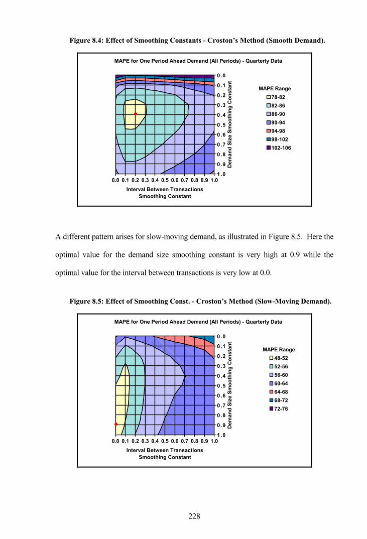
228
Figure 8.4: Effect of Smoothing Constants - Croston’s Method (Smooth Demand).
0.0 0.1 0.2 0.3 0.4 0.5 0.6 0.7 0.8 0.9 1.0
0 .0
0 .1
0 .2
0 .3
0 .4
0 .5
0 .6
0 .7
0 .8
0 .9
1 .0
Interval Between TransactionsSmoothing Constant
Dem
and
Size
Sm
ooth
ing
Con
stan
t
MAPE for One Period Ahead Demand (All Periods) - Quarterly Data
78-8282-8686-9090-9494-9898-102102-106
A different pattern arises for slow-moving demand, as illustrated in Figure 8.5. Here the
optimal value for the demand size smoothing constant is very high at 0.9 while the
optimal value for the interval between transactions is very low at 0.0.
Figure 8.5: Effect of Smoothing Const. - Croston’s Method (Slow-Moving Demand).
0.0 0.1 0.2 0.3 0.4 0.5 0.6 0.7 0.8 0.9 1.0
0 .0
0 .1
0 .2
0 .3
0 .4
0 .5
0 .6
0 .7
0 .8
0 .9
1 .0
Interval Between TransactionsSmoothing Constant
Dem
and
Size
Sm
ooth
ing
Con
stan
t
MAPE for One Period Ahead Demand (All Periods) - Quarterly Data
48-5252-5656-6060-6464-6868-7272-76
MAPE Range
MAPE Range

229
A further variation occurs with the mildly erratic demand as illustrated in Figure 8.6.
Figure 8.6: Effect of Smoothing Const. - Croston’s (Mildly Erratic Demand).
0.0 0.1 0.2 0.3 0.4 0.5 0.6 0.7 0.8 0.9 1.0
0 .0
0 .1
0 .2
0 .3
0 .4
0 .5
0 .6
0 .7
0 .8
0 .9
1 .0
Interval Between TransactionsSmoothing Constant
Dem
and
Size
Sm
ooth
ing
Con
stan
t
MAPE for One Period Ahead Demand (All Periods) - Quarterly Data
92-9797-102102-107107-112112-117117-122122-127
Optimal smoothing constant values by demand pattern for Croston’s method are also
presented in Appendix K. In this case the greatest overall improvements are not
necessarily experienced with quarterly data, but rather that quarterly data improves the
most when considering one-period ahead demand, monthly data improves the most
when considering lead-time demand in all periods, and weekly data improves the most
when considering lead-time demand in periods of demand only.
For the most part, the slow-moving demand pattern experiences the greatest
improvement when considering the one-period ahead demand and the smooth demand
pattern experiences the greatest improvement when considering the lead-time demand,
both in all periods and in periods of demand only.
MAPE Range
230
8.5 Concluding Remarks
A mathematical error in the manner in which Croston calculates the expected demand
per period contributes to his forecasting method providing only modest improvements in
performance over simpler methods. Croston’s method reduces the forecast bias of
exponential smoothing, although it does not completely eliminate it. Consequently,
modifications to Croston’s method have themselves recently been put forward in the
literature as alternatives. Three modified methods, identified as the revised Croston’s
method, the bias reduction method and the approximation method, have been developed
in order to remove the bias.
Of the proposed alternatives to Croston’s method, the approximation method was
observed to provide the best results overall and consistently bettered the results of the
original method. The bias reduction method also betters Croston’s method in most
cases, albeit to a lesser extent than the approximation method, while the revised
Croston’s method rarely performs better than the original.
Less sophisticated forecasting methods were still found to provide the best results under
specific conditions, as shown by the summary results for MAPE presented in Table 8.7.
It is observed that the approximation method is the best forecasting method overall
when considering the one-period ahead demand, although other methods provide the
best results for various individual demand patterns. ES still very much dominates the
results when comparing against lead-time demand in all periods, while the
approximation method is best for quarterly and monthly data when comparing against
lead-time demand in periods of demand only, and the bias reduction method is best for
weekly data under this situation.

231
Table 8.7: Best Forecasting Method by Demand Pattern (Using MAPE).
Type of Forecast
One-Period Ahead Demand
- All Periods
Lead-Time Demand
- All Periods
Lead-Time Demand
- Demand Only
Demand Aggregation
Demand Pattern
Method MAPE Method MAPE Method MAPE
Smooth Approx 75.81 Approx 77.30 Approx 70.67
Irregular Approx 173.52 Approx 196.66 Approx 151.19
Slow-moving Revised 53.34 ES 109.92 Approx 80.08
Mildly Erratic MA 111.83 ES 232.93 Approx 215.89
Highly Erratic ES 111.34 MA 239.24 Approx 215.42
Quarterly
Overall Approx 110.68 ES 173.29 Approx 144.40
Smooth Approx 91.58 MA 94.26 Approx 84.01
Irregular Approx 135.71 ES 206.49 Approx 181.05
Slow-moving Revised 67.75 ES 110.89 Approx 98.61
Mildly Erratic ES 90.90 ES 239.64 Approx 269.52
Highly Erratic Approx 85.99 ES 222.21 Approx 239.37
Monthly
Overall Approx 95.94 ES 174.76 Approx 172.05
Smooth Approx 93.93 ES 93.14 Approx 84.89
Irregular Approx 93.50 ES 209.06 Bias Red 194.18
Slow-moving Revised 89.16 ES 106.38 Bias Red 92.26
Mildly Erratic Croston’s 88.47 ES 232.31 Bias Red 258.42
Highly Erratic Croston’s 85.57 ES 215.55 Bias Red 214.85
Weekly
Overall Approx 90.32 ES 171.29 Bias Red 168.03
Comparing the performance of forecasting methods through the use of measures of
accuracy, as demonstrated in this chapter, is not considered ideal. The measures
themselves are open to questions of validity and different conclusions arise depending
on which measure is utilised. An alternative method for assessing forecasting
performance is to compare the implied stock reprovisioning performance resulting from
each method, as suggested in the next chapter.

232
9. FORECAST PERFORMANCE BY IMPLIED STOCK-HOLDING
A practical solution to problems arising from using the measures of forecasting
accuracy, such as MAPE and MdAPE, is to measure the forecast performance according
to the implied stock-holdings. In this chapter, stock reprovisioning performance is
monitored for each forecasting method using an extension to the FORESTOC model. This
extension, based on a method employed by Wemmerlöv [84], allows a comparison of
the implied stock-holdings by calculating the exact safety margin that provides a
maximum stock-out quantity of zero. The safety margin is calculated by iteratively
adding the maximum stock-out quantity to the order-up-to level until no further stock-
outs occur. In this manner the average stock-holdings for each method can be calculated
and compared using a common service level of 100 percent.
9.1 Forecasting and Stock Reprovisioning
Stock-outs naturally occur when lead-times are non-zero and forecasts are incorrect. In
considering the impact of forecast errors on the performance of a reprovisioning system,
Wemmerlöv observes that, as the errors increase in size, greater stock-outs occur and
service levels decline, while inventories increase and reprovisioning activities also
increase. This leads to a paradoxical result where the service level declines while, at the
same time, the average inventory increases. In order to avoid estimating the cost of
stock-outs, Wemmerlöv introduced safety stocks so that the service levels for all
reprovisioning methods were set at 100 percent. The performance of the methods was
compared in terms of the sum of the resultant holding and ordering costs only.
A methodology similar to Wemmerlöv’s is utilised in this research, ultimately using the
previous sample of 18,750 RAF line items. An inventory system with continuous
review is simulated in this chapter based on the flow diagram presented in Figure 9.1.

233
Figure 9.1: Flow Diagram for Inventory System.
Startperiod n
Any replenish-
ments to be received this
period ?On-hand inventory
i d i + Q ; Outstanding
replenishments y d y - Q
Demand d in period n > on-hand
inventory i ?
Generate forecast quantity f ;
Order-up-to level R = f % (lead-time +
review period)
Issue d ; On-hand inventory
i d i - d
Issue i ; Stock-out d - i ;
On-hand inventory i d i - d (<0)
Is on-hand inventory i + outstanding replenish-
ments y [ R ?
Advance periodn d n + 1
Place a replenish- ment Q = R - (i + y) ;
Outstanding replenishments
y d y + Q
To start
YesNo
No Yes
YesNo

234
Any stock replenishments arrive at the start of a period, and are therefore available to
satisfy demand during that period. A demand will be satisfied in full if there is
sufficient stock on-hand, otherwise the demand will be partially fulfilled with the
remainder back-ordered. Forecasted demand per period is calculated at the end of a
period and an order-up-to level R is derived as the product of the forecast and lead-time,
plus the review period rounded up to a whole unit. A replenishment quantity is ordered
if the closing inventory position, including any outstanding orders, is at or below the
order-up-to level. Such a replenishment quantity is calculated as the difference between
R and the closing inventory level, plus any outstanding orders. The replenishment
quantity is rounded up to become a multiple of the primary packaged quantity (PPQ)
and if this quantity is less than the contractor’s minimum batch quantity (CMBQ) then
no order is placed.
A simulation of a periodic review inventory system, with a review every period, is
illustrated using a sample line item in Table 9.1. In this instance, the system utilises an
exponential smoothing (ES) forecasting model using a quarterly demand series, where
the smoothing constant takes the optimal value (0.18) for comparisons with the one-
period ahead demand from Table 7.5. System parameters are initialised using values
from the first four quarters or one complete year. The simulation starts with the current
stock and any outstanding orders are assumed to arrive in the first simulation period for
ease of modelling, while any subsequent orders are delivered in a full lead-time.
With one complete year used for initialising the model, the simulation starts in quarter 5
with an opening stock balance of 7 units and a delivery of 2 units. The minimum size
and multiple for the replenishment are both set at one unit as specified by the CMBQ
and the PPQ respectively.
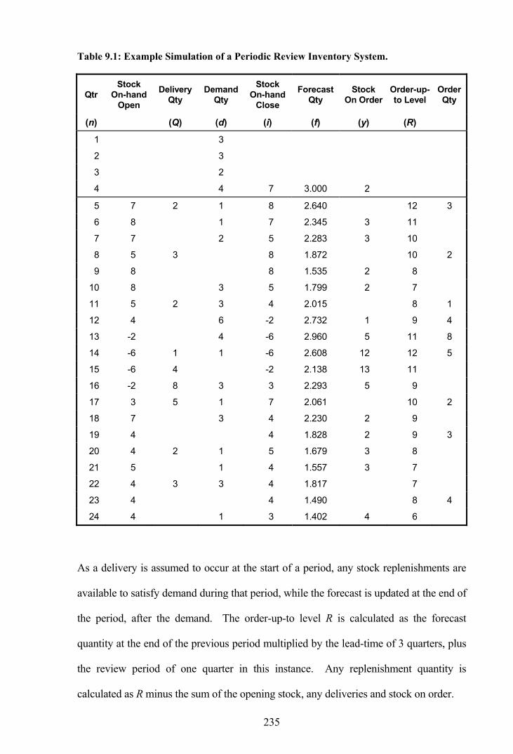
235
Table 9.1: Example Simulation of a Periodic Review Inventory System.
Qtr Stock
On-hand Open
Delivery Qty
Demand Qty
Stock On-hand
Close
Forecast Qty
Stock On Order
Order-up-to Level
Order Qty
(n) (Q) (d) (i) (f) (y) (R)
1 3
2 3
3 2
4 4 7 3.000 2
5 7 2 1 8 2.640 12 3
6 8 1 7 2.345 3 11
7 7 2 5 2.283 3 10
8 5 3 8 1.872 10 2
9 8 8 1.535 2 8
10 8 3 5 1.799 2 7
11 5 2 3 4 2.015 8 1
12 4 6 -2 2.732 1 9 4
13 -2 4 -6 2.960 5 11 8
14 -6 1 1 -6 2.608 12 12 5
15 -6 4 -2 2.138 13 11
16 -2 8 3 3 2.293 5 9
17 3 5 1 7 2.061 10 2
18 7 3 4 2.230 2 9
19 4 4 1.828 2 9 3
20 4 2 1 5 1.679 3 8
21 5 1 4 1.557 3 7
22 4 3 3 4 1.817 7
23 4 4 1.490 8 4
24 4 1 3 1.402 4 6
As a delivery is assumed to occur at the start of a period, any stock replenishments are
available to satisfy demand during that period, while the forecast is updated at the end of
the period, after the demand. The order-up-to level R is calculated as the forecast
quantity at the end of the previous period multiplied by the lead-time of 3 quarters, plus
the review period of one quarter in this instance. Any replenishment quantity is
calculated as R minus the sum of the opening stock, any deliveries and stock on order.
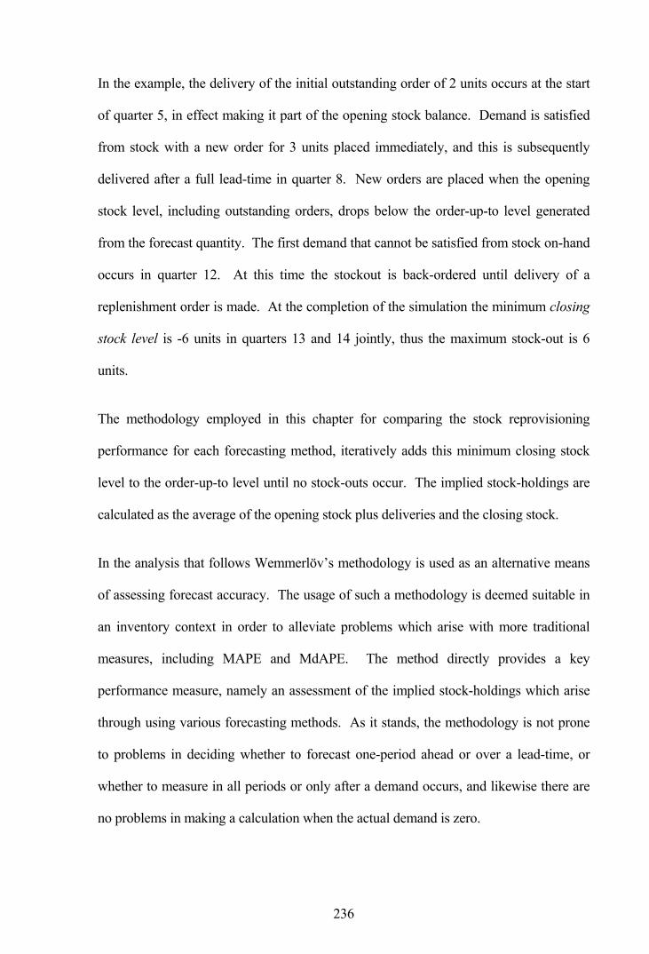
236
In the example, the delivery of the initial outstanding order of 2 units occurs at the start
of quarter 5, in effect making it part of the opening stock balance. Demand is satisfied
from stock with a new order for 3 units placed immediately, and this is subsequently
delivered after a full lead-time in quarter 8. New orders are placed when the opening
stock level, including outstanding orders, drops below the order-up-to level generated
from the forecast quantity. The first demand that cannot be satisfied from stock on-hand
occurs in quarter 12. At this time the stockout is back-ordered until delivery of a
replenishment order is made. At the completion of the simulation the minimum closing
stock level is -6 units in quarters 13 and 14 jointly, thus the maximum stock-out is 6
units.
The methodology employed in this chapter for comparing the stock reprovisioning
performance for each forecasting method, iteratively adds this minimum closing stock
level to the order-up-to level until no stock-outs occur. The implied stock-holdings are
calculated as the average of the opening stock plus deliveries and the closing stock.
In the analysis that follows Wemmerlöv’s methodology is used as an alternative means
of assessing forecast accuracy. The usage of such a methodology is deemed suitable in
an inventory context in order to alleviate problems which arise with more traditional
measures, including MAPE and MdAPE. The method directly provides a key
performance measure, namely an assessment of the implied stock-holdings which arise
through using various forecasting methods. As it stands, the methodology is not prone
to problems in deciding whether to forecast one-period ahead or over a lead-time, or
whether to measure in all periods or only after a demand occurs, and likewise there are
no problems in making a calculation when the actual demand is zero.

237
The methodology as implemented does not give guidance on stocks to hold. The
backward-looking simulation requires perfect information and is therefore not put
forward as a model of reality. Service levels of 100 percent are nigh on impossible to
achieve although in this instance they are utilised in order to give an impartial means of
comparing forecast accuracy. A major disadvantage of this methodology is the
additional processing that is required to obtain the results. After calculating forecast
values, an average of ten iterations are required for determining the safety stock levels at
which no stock-outs occur.
The next section illustrates the methodology by comparing the implied performance of
ES with Croston’s method using the example simulation. The principle behind the
methodology is to provide an alternative forecasting measure which can be utilised in an
inventory context.
9.2 Inventory Management
Continuing with the example line item from the previous section, an analysis of the
reprovisioning performance is illustrated in the following two tables. Table 9.2 presents
calculations for an ES forecasting model, while Table 9.3 presents comparable
calculations for Croston’s method. In each case the inventory system is modelled
according to the methodology introduced previously, although the tables only show the
principal calculations, firstly for Iteration 1, where there is no safety stock, and secondly
for Iteration 2, where safety stock is added to ensure no stock-outs.
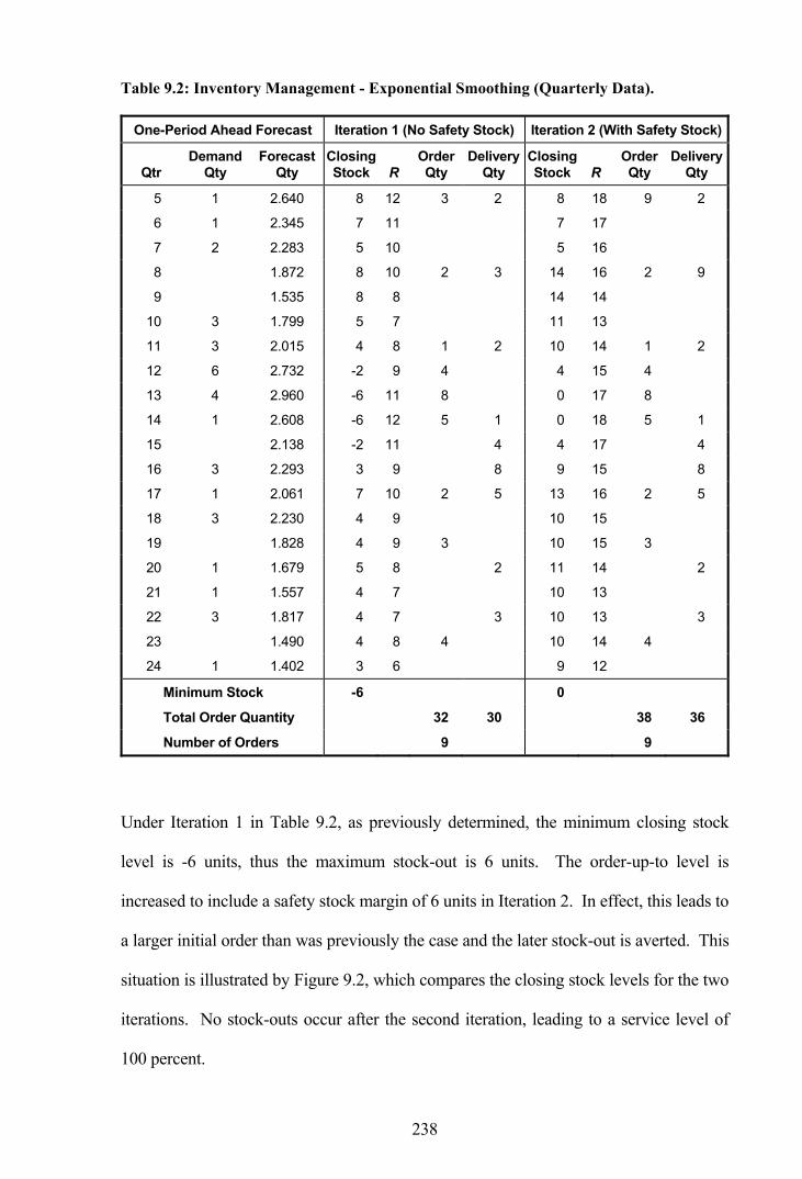
238
Table 9.2: Inventory Management - Exponential Smoothing (Quarterly Data).
One-Period Ahead Forecast Iteration 1 (No Safety Stock) Iteration 2 (With Safety Stock)
Qtr Demand
Qty Forecast
Qty Closing Stock R
Order Qty
Delivery Qty
Closing Stock R
Order Qty
Delivery Qty
5 1 2.640 8 12 3 2 8 18 9 2
6 1 2.345 7 11 7 17
7 2 2.283 5 10 5 16
8 1.872 8 10 2 3 14 16 2 9
9 1.535 8 8 14 14
10 3 1.799 5 7 11 13
11 3 2.015 4 8 1 2 10 14 1 2
12 6 2.732 -2 9 4 4 15 4
13 4 2.960 -6 11 8 0 17 8
14 1 2.608 -6 12 5 1 0 18 5 1
15 2.138 -2 11 4 4 17 4
16 3 2.293 3 9 8 9 15 8
17 1 2.061 7 10 2 5 13 16 2 5
18 3 2.230 4 9 10 15
19 1.828 4 9 3 10 15 3
20 1 1.679 5 8 2 11 14 2
21 1 1.557 4 7 10 13
22 3 1.817 4 7 3 10 13 3
23 1.490 4 8 4 10 14 4
24 1 1.402 3 6 9 12
Minimum Stock -6 0
Total Order Quantity 32 30 38 36
Number of Orders 9 9
Under Iteration 1 in Table 9.2, as previously determined, the minimum closing stock
level is -6 units, thus the maximum stock-out is 6 units. The order-up-to level is
increased to include a safety stock margin of 6 units in Iteration 2. In effect, this leads to
a larger initial order than was previously the case and the later stock-out is averted. This
situation is illustrated by Figure 9.2, which compares the closing stock levels for the two
iterations. No stock-outs occur after the second iteration, leading to a service level of
100 percent.

239
Figure 9.2: Closing Stock-Holdings - Exponential Smoothing.
-10
-5
0
5
10
15
20
5 6 7 8 9 10 11 12 13 14 15 16 17 18 19 20 21 22 23 24Quarter
Stoc
k Le
vel (
units
)Iteration 1 Iteration 2
Implied stock-holdings are calculated as the average of the opening stock plus deliveries
and the closing stock. The average stock-holdings for the sample line item using ES is
9.30 units, as illustrated by the horizontal line in Figure 9.3.
Figure 9.3: Average Stock-Holdings - Exponential Smoothing.
0
3
6
9
12
15
5 6 7 8 9 10 11 12 13 14 15 16 17 18 19 20 21 22 23 24Quarter
Stoc
k Le
vel (
units
)
Opening Stock + DeliveriesClosing StockImplied Stock-HoldingsAverage Stock-HoldingsDemand
The implied stock-holdings are calculated as the average of the opening stock plus
deliveries and the closing stock, and the closing stock itself is determined as the opening
stock plus deliveries minus the demand for each period. Thus, in periods where demand
is equal to zero, the closing stock equals the opening stock plus deliveries, so the stock-
6 Units

240
holding is simply the closing stock. Average stock-holdings are taken as the overall
average across all periods.
Table 9.3: Inventory Management - Croston’s Method (Quarterly Data).
One-Period Ahead Forecast Iteration 1 (No Safety Stock) Iteration 2 (With Safety Stock)
Qtr Demand
Qty Forecast
Qty Closing Stock R
Order Qty
Delivery Qty
Closing Stock R
Order Qty
Delivery Qty
5 1 2.220 8 12 3 2 8 20 11 2
6 1 1.744 7 9 7 17
7 2 1.844 5 7 5 15
8 1.844 8 8 3 16 16 11
9 1.844 8 8 16 16
10 3 1.471 5 8 13 16
11 3 1.831 2 6 1 10 14 1
12 6 3.028 -4 8 5 4 16 5
13 4 3.262 -8 13 11 0 21 11
14 1 2.430 -8 14 5 1 0 22 5 1
15 2.430 -3 10 5 5 18 5
16 3 2.071 5 10 11 13 18 11
17 1 1.675 9 9 5 17 17 5
18 3 2.063 6 7 14 15
19 2.063 6 9 3 14 17 3
20 1 1.334 5 9 13 17
21 1 1.187 4 6 12 14
22 3 1.734 4 5 3 12 13 3
23 1.734 4 7 3 12 15 3
24 1 1.168 3 7 11 15
Minimum Stock -8 0
Total Order Quantity 31 30 39 38
Number of Orders 7 7
Table 9.3 presents comparative calculations for an inventory management system based
on Croston’s method, where the smoothing constants take the optimal values (0.39 and
0.28) for comparisons with the one-period ahead demand from Table 7.6. In this
instance the maximum stockout is 8 units in quarters 13 and 14 of Iteration 1, thus the

241
safety margin is set to 8 units for the next iteration. Increasing the order-up-to level for
the second iteration leads to average stock-holdings of 10.95 units, some 1.65 units more
than required by ES.
Once the safety stocks necessary to completely eliminate stock-outs are determined, the
simulations are re-run across the sample line items and the performance of each
forecasting method can be compared in terms of average stock-holdings. First,
however, it is necessary to define the modelling parameters used in this analysis.
9.3 Modelling Parameters
There are factors outside of the forecasting methods which affect the average stock-
holding calculations, including the simulation period, the demand aggregation, the
measurement, forecast and reorder intervals, and the smoothing parameters. Each of
these factors are defined, and their effects commented upon, in this section.
9.3.1 Simulation Period Selection
Comparisons between stock-holdings should only be made after the first replenishment
delivery has occurred. Prior to this time the stock-holdings are governed by the opening
stock level and outstanding orders and, as a result, do not reflect the actual demand
forecasting. Continuing with the same sample line item and exponential smoothing,
observations that arise before the first delivery occurrence, as shown in Figure 9.4,
should be discarded. The figure shows the comparative stock-levels for quarterly data
when the opening stock is 7 units and when it is 14 units.
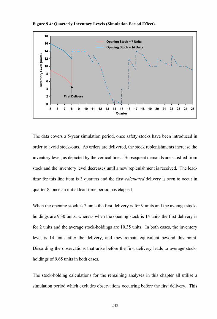
242
Figure 9.4: Quarterly Inventory Levels (Simulation Period Effect).
0
2
4
6
8
10
12
14
16
18
5 6 7 8 9 10 11 12 13 14 15 16 17 18 19 20 21 22 23 24 25Quarter
Inve
ntor
y Le
vel (
units
)
The data covers a 5-year simulation period, once safety stocks have been introduced in
order to avoid stock-outs. As orders are delivered, the stock replenishments increase the
inventory level, as depicted by the vertical lines. Subsequent demands are satisfied from
stock and the inventory level decreases until a new replenishment is received. The lead-
time for this line item is 3 quarters and the first calculated delivery is seen to occur in
quarter 8, once an initial lead-time period has elapsed.
When the opening stock is 7 units the first delivery is for 9 units and the average stock-
holdings are 9.30 units, whereas when the opening stock is 14 units the first delivery is
for 2 units and the average stock-holdings are 10.35 units. In both cases, the inventory
level is 14 units after the delivery, and they remain equivalent beyond this point.
Discarding the observations that arise before the first delivery leads to average stock-
holdings of 9.65 units in both cases.
The stock-holding calculations for the remaining analyses in this chapter all utilise a
simulation period which excludes observations occurring before the first delivery. This
First Delivery
Opening Stock = 7 Units
Opening Stock = 14 Units

243
will ensure the calculated values are not affected by the initialisation, therefore wholly
reflecting the model under consideration.
Furthermore, in the actual modelling, the opening stock is set to equal the first lead-time
demand plus one unit and the initial stock on order is set to zero. This has the effect of
ensuring a delivery is made at the earliest opportunity for the vast majority of line items
irrespective of the forecast. The next section examines the effect that the various
demand aggregations have on the comparative stock-holdings.
9.3.2 Demand Aggregation
Demand aggregation refers to the bucketing of individual demand observations into time
periods. The data used in this chapter, and the previous two chapters, comprises
quarterly, monthly and weekly demand aggregations. A quarter contains three calendar
months, a month is taken as a calendar month, and a week is a seven-day period starting
on a Sunday and ending on a Saturday. The periods are not entirely compatible for
dissection; a calendar month contains a non-integer number of weeks and while a
quarter is equivalent to 13 weeks, the periods of coverage are not exactly the same. For
example, a demand occurrence on Tuesday the 28th of September, 1999 falls in the third
quarter of the year but occurs in week 40. This can lead to minor variations in the
comparative stock-holdings, with all other factors held constant. An actual demand of 5
units falling on the example date, with total demand of 247 units over a five-year
simulation period, was observed to lead to a stock-holding discrepancy of 0.52 percent
between quarterly and weekly data using exponential smoothing.
Discrepancies through differences in bucket coverage arise infrequently and tend to
cancel out over a large number of series. A potentially more serious issue with regards
to demand aggregation, referred to as aggregation bias, is examined in the next section.

244
9.3.3 Aggregation Bias
The purpose of aggregating demand in this instance is to allow comparison of the
implied stock-holding performance between the different aggregations and forecasting
methods. However, in comparing the average stock-holdings for quarterly, monthly and
weekly data, a bias is introduced, termed aggregation bias, which can either increase or
decrease the relative average performance.
The circumstance in which bias occurs is illustrated in Figure 9.5, which compares
inventory levels resulting from quarterly and weekly demand data. Inventory levels are
presented on a weekly basis, with the quarterly levels linearly depleted over 13-week
intervals. All forecasts are made at quarterly intervals and there is a quarterly review
period in this instance, allowing both series to have the same order-up-to level, leading
to replenishments of the same size arriving at the same time.
Figure 9.5: Comparative Inventory Levels (Aggregation Bias Effect).
0
2
4
6
8
10
12
14
16
90 115 140 165 190 215 240 265 290 315Week Number
Inve
ntor
y Le
vel (
units
)
The inventory levels display differences over time between the demand aggregations;
sometimes the quarterly data has the lowest inventory while at other times the weekly
Quarterly Data
Weekly Data

245
data has the lowest. This is clearly observed in Figure 9.6, which resizes the dashed area
of the previous figure. The extract covers a 28-week period divided into weekly
intervals, and includes a stock replenishment in week 209. A demand of one unit occurs
in week 214 and reduces the inventory level from 14 to 13 units. This reduction occurs
immediately for the weekly data, although the reduction must be averaged over the
appropriate weeks for the quarterly data.
Figure 9.6: Comparative Inventory Levels (Resized).
8
9
10
11
12
13
14
15
208 213 218 223 228 233Week Number
Inve
ntor
y Le
vel (
units
)
The result is that the average stock-holdings vary in each case, and the aggregation bias
can be positive or negative. The bias is at a minimum when weekly demands are evenly
distributed across a quarterly period. Although this is not likely to be the case when
demand is erratic, as there will be many zero demands, it is expected that the bias would
cancel out over a simulation period, and even more so over many series.
Quarterly Data
Weekly Data

246
In the case of the sample line item considered in this section, the average stock-holdings
are 9.65, 9.61 and 9.65 for quarterly, monthly and weekly data respectively. Therefore,
the maximum deviation of 0.04 provides a bias of 0.41 percent. The maximum bias
calculated from a sample of five line items is presented in Table 9.4, where the sample
comprises one line item from each demand pattern. Demand patterns for each of these
line items were previously illustrated on page 131.
Table 9.4: Sample Aggregation Bias.
Average Stock-Holdings Sample Item
Demand Pattern Quarterly Monthly Weekly
Maximum Bias
1 Smooth 44.67 44.91 45.50 1.86%
2 Irregular 20.05 19.02 19.35 5.42%
3 Slow-moving 2.74 2.75 2.76 0.73%
4 Mildly Erratic 30.10 30.10 32.65 8.47%
5 Highly Erratic 942.47 940.68 931.19 1.21%
Overall Average 208.01 207.49 206.29 0.83%
The average stock-holdings are seen to vary across the three demand aggregations and
the aggregation with the lowest stock-holdings also varies (as shown in bold type). This
suggests the bias for the most part would be cancelled out over many series. The
maximum bias over the five sample line items is seen to range between 0.73 and 8.47
percent, while the overall average is relatively low at 0.83 percent.
As previously noted, the aggregation bias is minimised for a large sample when the
weekly demands are evenly distributed across the corresponding quarterly periods.
Consideration is given to this aspect using the previously utilised sample of 18,750 line
items. Figure 9.7 presents the total demand aggregated by week over a six year period.
Apart from the decrease in demand over the years, a key feature is the low demand
occurrences in the first and last week of each year. The decrease in demand over the
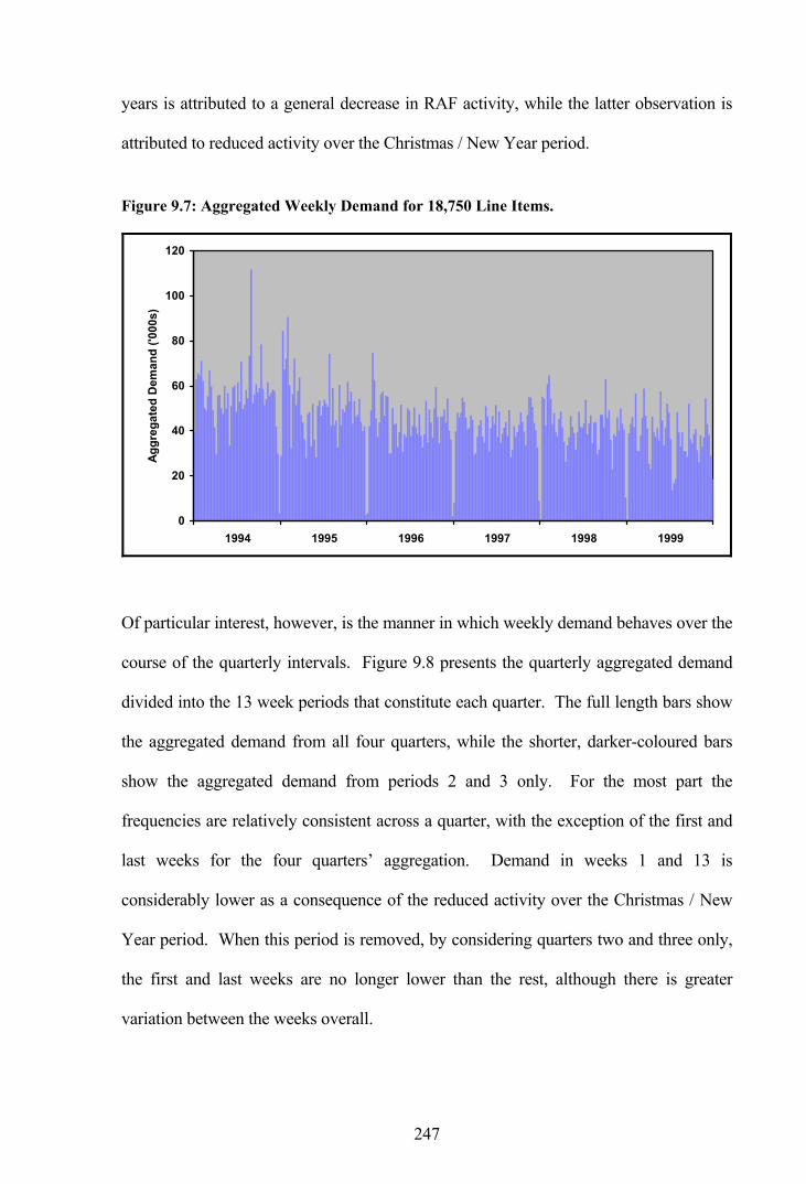
247
years is attributed to a general decrease in RAF activity, while the latter observation is
attributed to reduced activity over the Christmas / New Year period.
Figure 9.7: Aggregated Weekly Demand for 18,750 Line Items.
0
20
40
60
80
100
120
1994 1995 1996 1997 1998 1999
Aggr
egat
ed D
eman
d ('0
00s)
Of particular interest, however, is the manner in which weekly demand behaves over the
course of the quarterly intervals. Figure 9.8 presents the quarterly aggregated demand
divided into the 13 week periods that constitute each quarter. The full length bars show
the aggregated demand from all four quarters, while the shorter, darker-coloured bars
show the aggregated demand from periods 2 and 3 only. For the most part the
frequencies are relatively consistent across a quarter, with the exception of the first and
last weeks for the four quarters’ aggregation. Demand in weeks 1 and 13 is
considerably lower as a consequence of the reduced activity over the Christmas / New
Year period. When this period is removed, by considering quarters two and three only,
the first and last weeks are no longer lower than the rest, although there is greater
variation between the weeks overall.

248
Figure 9.8: Quarterly Aggregated Demand by Week.
0.0
0.2
0.4
0.6
0.8
1.0
1.2
1.4
1 2 3 4 5 6 7 8 9 10 11 12 13Week of Quarter
Aggr
egat
ed D
eman
d (m
illio
ns)
Four Quarters Quarters 2 and 3
In considering the four quarters aggregation, the weekly demand is balanced over a
quarter and the bias between weekly and quarterly aggregations is minimised; lower
demand in the week at the beginning of the first quarter (and therefore higher average
weekly stock-holdings) is cancelled out by lower demand in the week at the end of the
last quarter (demand is higher during the first part of this quarter and therefore lower
average weekly stock-holdings result).
The analysis from this section raises an awareness of the inherent bias in average stock-
holdings due to demand aggregation, although the effect is minimal when considering
the large sample sizes of this research. Apart from reduced activity at the start and end
of each year, there is no evidence to suggest spare parts are withdrawn at particular
times during a quarter.
A method of completely removing the aggregation bias is to measure the stock-holdings
at a common time interval, which would be quarterly in this case as it provides the

249
lowest common denominator. The effect of the measurement interval on the stock-
holding calculations is investigated in the next section.
9.3.4 Measurement Interval
Only measuring the stock-holdings at quarterly intervals removes the incremental steps
of the monthly and weekly data and no averaging across time periods is required. This
has the effect of eliminating the aggregation bias, as illustrated by Figure 9.9, which
compares inventory levels resulting from using quarterly, monthly and weekly
aggregated demand data for the sample line item. At the quarterly intervals the stock-
holdings are all equal under each aggregation.
Figure 9.9: Comparative Inventory Levels (Measurement Interval Effect).
0
2
4
6
8
10
12
14
16
Quarterly Interval
Inve
ntor
y Le
vel (
units
)
Inventory levels are reviewed weekly with linear apportionment for the two non-weekly
series (allowances have to be made for illustrative purposes as one month equals a non-
integer 4.3 weeks in reality; a quarter, however, is equal to exactly 13 weeks). In this
case, all forecast updates and reordering occurs on a quarterly basis leading to
replenishments of the same size arriving at the same time for each demand aggregation.
Quarterly Data
Monthly Data
Weekly Data

250
With forecast updates and reordering occurring quarterly, the inventory levels are equal
at the end of each quarter. With a quarterly measurement interval, all demand
aggregations have average stock-holdings of 9.65 units and there is no aggregation bias.
Alternatively, with stock-holdings measured every period, the average values are 9.65,
9.61 and 9.65 for quarterly, monthly and weekly data respectively, giving a maximum
bias of 0.41 percent as observed previously in Section 9.3.3. It is purely a matter of
coincidence that the stock-holdings for quarterly and weekly data are the same when
measured every period.
9.3.5 Forecast Interval
Another factor which affects the stock-holdings is the forecast interval, or periodicity of
forecasting. The example inventory simulations considered thus far have all used
quarterly forecasting. When demand is captured and formatted more frequently, such as
monthly or weekly, the forecast interval can likewise be more frequent. This situation is
illustrated in Figure 9.10, where forecasts are made every period for each demand
aggregation, although reordering is still undertaken quarterly in all cases.
Figure 9.10: Comparative Inventory Levels (Forecast Interval Effect).
0
5
10
15
20
25
30
90 115 140 165 190 215 240 265 290 315Week Number
Inve
ntor
y Le
vel (
units
)
Quarterly Forecast
Monthly Forecast
Weekly Forecast

251
As the forecast quantities differ between the demand aggregations, the order-up-to levels
also differ leading to differing stock-holdings. With stock-holdings measured every
quarter the averages are 9.65, 12.65 and 16.06 for quarterly, monthly and weekly
forecasting respectively. Alternatively, with stock-holdings measured every period the
corresponding averages are 9.65, 12.61 and 16.06 respectively. The quarterly result is
of course the same in both cases although the fact that the weekly data provides the
same stock-holdings in each case is a matter of coincidence.
Surprisingly, the comparative results for this line item illustrate an effect of the forecast
update interval that is not immediately intuitive. The calculated average stock-holdings
suggest the more frequent forecasting provided by the weekly data is inferior to that
provided by the quarterly data. This issue is examined further in the next section, once
the reorder interval has been considered.
9.3.6 Reorder Interval
In a similar manner to the forecast interval, the reorder interval can also match the
frequency of the demand data in practice. Thus far, the example simulations have all
used a quarterly replenishment cycle, whereby orders are only placed on a quarterly
basis. This section considers the effect of the selected reorder interval.
The reorder interval has an impact on the calculated stock-holdings, as demonstrated in
Figure 9.11. This figure presents comparative inventory levels for a range of
combinations of the forecast interval and reorder interval. The solid lines representing
quarterly, monthly and weekly forecast intervals, each with quarterly reorder intervals,
were observed in the previous figure. At that time it was noted that the quarterly
forecast provided the best performance.

252
Figure 9.11: Comparative Inventory Levels (Reorder Interval Effect).
0
5
10
15
20
25
30
35
90 115 140 165 190 215 240 265 290 315Week Number
Inve
ntor
y Le
vel (
units
)Quarterly Forecast & Quarterly Reorder (1)Monthy Forecast & Quarterly Reorder (2)Monthly Forecast & Monthly Reorder (3)Weekly Forecast & Quarterly Reorder (4)Weekly Forecast & Weekly Reorder (5)
Also shown in this figure are the results for monthly forecasting with monthly
reordering, and weekly forecasting with weekly reordering. In the case of the monthly
data, the inventory level is seen to moderately change, sometimes higher and sometimes
lower. However, in the case of the weekly data, the inventory level increases
substantially throughout the latter periods. Under periodic reordering the average stock-
holdings measured every quarter are 9.65, 12.62 and 19.12 for quarterly, monthly and
weekly forecasting respectively. Alternatively, with stock-holdings measured every
period the corresponding averages are 9.65, 12.67 and 19.50 respectively.
Henceforth, where the reorder interval is the same as the forecast interval, this will be
referred to as the review period. Thus, monthly forecasting with monthly reordering
will more conveniently be referred to as monthly review.

253
The calculated average stock-holdings from this section are summarised in Table 9.5,
where the observation numbers refer to the previous figure. It is observed that quarterly
review provides the best performance overall, while weekly review provides the worst.
Furthermore, quarterly reordering with both monthly and weekly forecasting tends to
provide better results than the corresponding monthly and weekly reordering.
Table 9.5: Average Stock-Holdings by Update Interval.
Measurement Interval Obs Forecast
Interval Reorder Interval
Safety Stock Every Quarter Every Period
(1) Quarterly Quarterly 6 9.65 9.65
(2) Monthly Quarterly 8 12.65 12.61
(3) Monthly Monthly 9 12.62 12.67
(4) Weekly Quarterly 8 16.06 16.06
(5) Weekly Weekly 4 19.12 19.50
Examining the weekly data, in order to determine the reasoning behind the poor
performance, indicates a large delivery in week 186 and hence a high inventory level
thereafter, as illustrated in Figure 9.12.
Figure 9.12: Example Order Levels and Average Stock - Weekly Data.
0
5
10
15
20
25
30
35
40
45
90 115 140 165 190 215 240 265 290 315Week Number
Uni
ts
Weekly DemandDemand ForecastOrder Up-to LevelStock On-orderAverage Stock
Lead-Time

254
A relatively high demand at the time of ordering raised the order-up-to level
substantially. At the time of ordering the demand forecast was 0.897 per week whereas
after the delivery arrived the actual demand was only 0.102 per week, therefore leaving
a large quantity of stock in the system. As it happens, when reordering is performed on
a quarterly basis the timing of the replenishment cycle avoids the highest order-up-to
level by chance and a number of smaller replenishments are initiated instead. Allowing
an opportunity to reorder every week increases the risk of encountering the highest
order-up-to level to 100 percent.
Prior to examining the final factor which affects the stock-holding calculations, namely
the smoothing parameters, it is useful to review the combined effects of the forecast and
reorder intervals.
9.3.7 Forecast and Reorder Interval Review
The results obtained from the sample line item indicate that the lowest implied stock-
holdings arise under a quarterly review model, as opposed to monthly or weekly review.
It is worth examining whether this is the case more generally. Table 9.6 presents the
average stock-holdings for the sample line item across a range of demand aggregations,
forecast intervals and reorder intervals. Also shown are similar results for five further
line items, one from each demand pattern, and the average stock-holdings from these
items. Stock-holdings are presented when measured every quarter as well as every
period and, in the case of the weekly aggregation, also as the average of 4 and 5 weeks
to approximate a monthly measurement interval. Under each demand aggregation, a
quarterly review with a quarterly measurement interval, as shown by rows 1, 2 and 8,
produces the same results, as required by definition.

255
Table 9.6: Average Stock-Holdings for Selected Individual Line Items.
Implied Stock-Holdings
Sample Demand Pattern Items O
bser
vatio
n
Dem
and
Agg
rega
tion
Fore
cast
In
terv
al
Reo
rder
In
terv
al
Mea
sure
men
t In
terv
al
Sam
ple
Line
Item
Smoo
th
Irreg
ular
Slow
-M
ovin
g
Mild
ly
Erra
tic
Hig
hly
Erra
tic
Dem
and
Patte
rn
Ave
rage
1 Q Q Q Q 9.65 44.67 20.05 2.74 30.10 942.47 208.01
2 M Q Q Q 9.65 44.67 20.05 2.74 30.10 942.47 208.01
3 M Q Q M 9.61 44.91 19.02 2.75 30.10 940.68 207.49
4 M M Q Q 12.65 45.93 21.68 3.15 15.70 1,004.28 218.15
5 M M Q M 12.61 46.18 20.65 3.17 15.70 1,002.49 217.64
6 M M M Q 12.62 42.89 18.50 3.18 31.70 1,070.81 233.42
7 M M M M 12.67 43.45 18.56 3.21 29.10 1,037.41 226.35
8 W Q Q Q 9.65 44.67 20.05 2.74 30.10 942.47 208.01
9 W Q Q 4/5w 9.67 45.75 18.89 2.76 29.79 921.80 203.80
10 W Q Q W 9.65 45.50 19.35 2.76 32.65 931.19 206.29
11 W W Q Q 16.06 51.87 15.86 4.50 8.30 1,056.78 227.46
12 W W Q 4/5w 16.02 53.44 14.72 4.51 8.21 1,031.20 222.42
13 W W Q W 16.06 52.70 15.17 4.52 8.30 1,045.50 225.24
14 W W W Q 19.12 66.47 24.77 5.85 10.85 2,067.27 435.04
15 W W W 4/5w 19.51 68.58 24.55 5.89 11.27 2,049.57 431.97
16 W W W W 19.50 68.87 25.08 5.90 11.95 2,097.98 441.96
Q = quarterly, M = monthly, W = weekly and 4/5w = average of 4 and 5 weeks (monthly approximation).
For the most part the stock-holdings, when measured every quarter, are approximately
the same as when measured every period, with any differences due to the aggregation
bias. In considering the overall results, the following observations are made without
reference to the measurement interval:
(i) Quarterly review on the whole produces the lowest stock-holdings and
weekly review produces the highest.
(ii) In terms of monthly data, monthly forecasting, with quarterly reordering,
results in lower stock-holdings than monthly reordering.

256
(iii) Similarly, in terms of weekly data, weekly forecasting with quarterly
reordering results in lower stock-holdings than weekly reordering.
These observations mostly hold true for all the sample line items except for the mildly
erratic item where weekly forecasting clearly provides the best results. In this case, the
opening stock was so high that the first delivery was not received until a substantial
portion of the simulation had elapsed, leaving only a small sample of periods for
generating results. As previously mentioned, this situation is avoided in the actual study
by setting the opening stock to equal the demand over the first lead-time plus one unit.
The results of this section illustrate a weakness of ES for establishing stock levels when
demand is erratic and reviews occur every period. As ES places most weight on the
more recent data, the forecast estimates are highest just after a demand. This leads to
over-estimation in the periods in which replenishment orders are placed, and therefore
there is a tendency to hold unnecessarily high stocks. The problem is exacerbated by the
large proportion of zero demands in the weekly data as compared with the monthly and
quarterly data. With reviews every period the chance of encountering an unnecessarily
high order-up-to level is maximised. On the other hand, the bucketing of demand into
quarterly aggregations pre-smoothes the forecast series and tends to lead to a better
stock-holding performance. The performance of other forecasting methods under these
conditions will be examined in a later section.
9.3.8 Smoothing Parameters
In the case of smoothing methods, such as ES and Croston’s method, different
smoothing constants will provide differing demand forecasts and therefore differing
implied stock-holdings. This situation is illustrated by the comparative inventory levels
presented in Figure 9.13, where three different constants are utilised under ES.

257
Figure 9.13: Comparative Inventory Levels (Smoothing Parameter Effect).
0
5
10
15
20
25
30
90 115 140 165 190 215 240 265 290 315Week Number
Inve
ntor
y Le
vel (
units
)
Weekly forecasting is modelled with a quarterly reordering interval and the average
stock-holdings are measured in all periods. The previously utilised smoothing constant
of 0.18 provides average stock-holdings of 16.06 units. In comparison, a smoothing
constant of 0.1 below this provides the lowest average stock-holdings of 14.12 units,
while a smoothing constant of 0.1 above provides the highest at 18.00 units.
Attention is turned to a wider sample of line items in order to determine what constitutes
suitable smoothing parameter values in terms of minimum average stock-holdings for
both ES and Croston’s method. As calculated from the hold-out sample of 500 line
items, the following two tables present average implied stock-holdings using the optimal
smoothing values according to MAPE, as generated in Chapter 7. The first table
considers the effect of updating both the forecast and the order quantity every period,
while the second table considers the effect of allowing a reorder only every quarter.
Table 9.7 presents implied stock-holdings where the forecast interval is equal to one and
the reorder interval is also equal to one for each demand aggregation. Thus, in each
Smoothing 0.08
Smoothing 0.18
Smoothing 0.28

258
case, the forecasts, the order-up-to levels and the orders themselves are updated each
and every period, whether that be quarterly, monthly or weekly. For both ES and
Croston’s method, the implied stock-holdings are seen to differ across the range of
selected smoothing constant values.
Table 9.7: Implied Stock-Holdings from MAPE Constants (Updating Every Period).
Expon. Smoothing Croston’s Method
Smooth. Constants Demand Aggregation
Type of Forecast Providing
Smoothing Constants
Smoothing Constant
Implied Stock-
Holdings Demand
Size Demand Interval
Implied Stock-
Holdings
Measuring Every Period
Quarterly 0.18 37.46 0.39 0.28 41.37
Monthly 0.05 35.22 0.18 0.08 38.40
Weekly
One-Period Ahead Demand - All Periods
0.01 34.48 0.10 0.01 36.29
Quarterly 0.43 46.11 0.92 0.40 54.29
Monthly 0.16 45.60 0.10 0.34 37.04
Weekly
Lead-Time Demand - All Periods
0.04 45.94 0.02 0.25 38.78
Quarterly 0.19 37.81 0.92 0.46 54.58
Monthly 0.06 36.17 0.50 0.36 53.26
Weekly
Lead-Time Demand - Demand Only
0.01 34.48 0.58 0.30 80.09
Measuring Every Quarter
Quarterly 0.18 37.46 0.39 0.28 41.37
Monthly 0.05 35.26 0.18 0.08 38.42
Weekly
One-Period Ahead Demand - All Periods
0.01 34.71 0.10 0.01 36.48
Quarterly 0.43 46.11 0.92 0.40 54.29
Monthly 0.16 45.57 0.10 0.34 37.11
Weekly
Lead-Time Demand - All Periods
0.04 46.20 0.02 0.25 39.01
Quarterly 0.19 37.81 0.92 0.46 54.58
Monthly 0.06 36.21 0.50 0.36 53.17
Weekly
Lead-Time Demand - Demand Only
0.01 34.71 0.58 0.30 79.84
With the minimum stock-holdings shown in bold type for each demand aggregation, it is
observed that ES provides the best results for quarterly, monthly and weekly data, in this
instance. The same general patterns emerge regardless of whether the stock-holdings
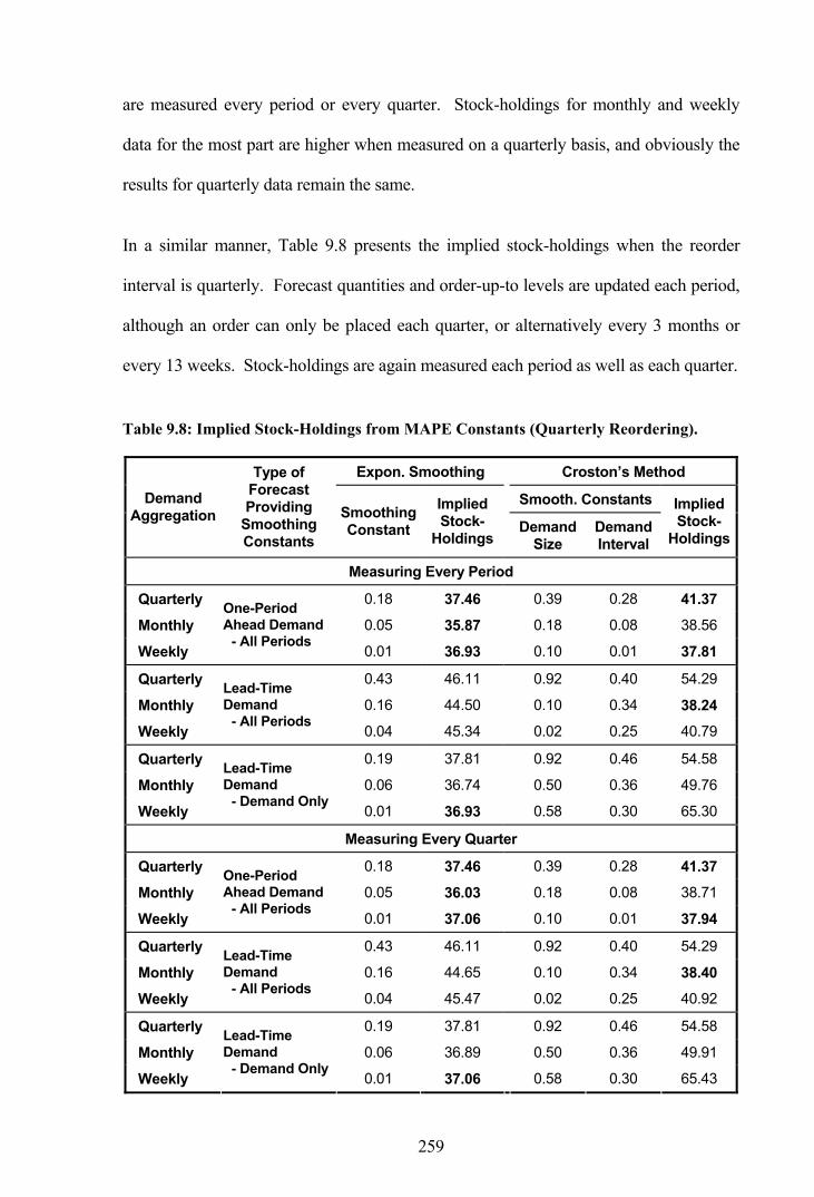
259
are measured every period or every quarter. Stock-holdings for monthly and weekly
data for the most part are higher when measured on a quarterly basis, and obviously the
results for quarterly data remain the same.
In a similar manner, Table 9.8 presents the implied stock-holdings when the reorder
interval is quarterly. Forecast quantities and order-up-to levels are updated each period,
although an order can only be placed each quarter, or alternatively every 3 months or
every 13 weeks. Stock-holdings are again measured each period as well as each quarter.
Table 9.8: Implied Stock-Holdings from MAPE Constants (Quarterly Reordering).
Expon. Smoothing Croston’s Method
Smooth. Constants Demand Aggregation
Type of Forecast Providing
Smoothing Constants
Smoothing Constant
Implied Stock-
Holdings Demand
Size Demand Interval
Implied Stock-
Holdings
Measuring Every Period
Quarterly 0.18 37.46 0.39 0.28 41.37
Monthly 0.05 35.87 0.18 0.08 38.56
Weekly
One-Period Ahead Demand - All Periods
0.01 36.93 0.10 0.01 37.81
Quarterly 0.43 46.11 0.92 0.40 54.29
Monthly 0.16 44.50 0.10 0.34 38.24
Weekly
Lead-Time Demand - All Periods
0.04 45.34 0.02 0.25 40.79
Quarterly 0.19 37.81 0.92 0.46 54.58
Monthly 0.06 36.74 0.50 0.36 49.76
Weekly
Lead-Time Demand - Demand Only
0.01 36.93 0.58 0.30 65.30
Measuring Every Quarter
Quarterly 0.18 37.46 0.39 0.28 41.37
Monthly 0.05 36.03 0.18 0.08 38.71
Weekly
One-Period Ahead Demand - All Periods
0.01 37.06 0.10 0.01 37.94
Quarterly 0.43 46.11 0.92 0.40 54.29
Monthly 0.16 44.65 0.10 0.34 38.40
Weekly
Lead-Time Demand - All Periods
0.04 45.47 0.02 0.25 40.92
Quarterly 0.19 37.81 0.92 0.46 54.58
Monthly 0.06 36.89 0.50 0.36 49.91
Weekly
Lead-Time Demand - Demand Only
0.01 37.06 0.58 0.30 65.43

260
Once again, the stock-holdings are generally higher when measured every quarter rather
than every period. In comparing the results between updating every period and
quarterly reordering, the results are mixed. For the corresponding smoothing constant
values, on some occasions updating every period provides the lowest stock-holdings
while on other occasions quarterly reordering provides the lowest.
In practice, implied stock-holdings cannot actually be calculated for all line items for a
number of reasons, such as there not being enough initial stock in the system to satisfy
demand during the first lead-time; an issue considered further in Section 9.5. Differing
forecasts, either from using different forecast methods or different smoothing parameters
with the same method, will not allow the calculation of implied stock-holdings for
precisely the same line items from a particular sample. Therefore, the results presented
in this section were only obtained from line items where the implied stock-holdings
could be resolved in all cases, which amounts to 274 of the 500 line items under
consideration.
Optimal values, in terms of MAPE, are not the same as those which provide minimum
stock-holdings overall. For all intents and purposes, the current smoothing constants are
practically random when applied in this manner. It is therefore not reasonable to
compare the results between the forecasting methods in this instance. The next section
seeks to determine optimal smoothing constant values for ES and Croston’s method to
allow robust comparisons between the methods.
9.4 Optimal Smoothing Parameters
Optimal smoothing constant values have been calculated for minimising the stock-
holdings using the same hold-out sample, with the results presented in Table 9.9. Only
one set of smoothing values are calculated for each demand aggregation in this instance,
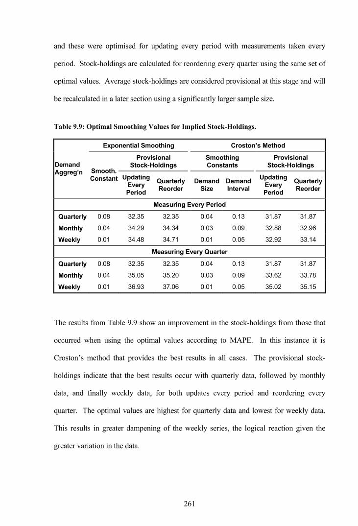
261
and these were optimised for updating every period with measurements taken every
period. Stock-holdings are calculated for reordering every quarter using the same set of
optimal values. Average stock-holdings are considered provisional at this stage and will
be recalculated in a later section using a significantly larger sample size.
Table 9.9: Optimal Smoothing Values for Implied Stock-Holdings.
Exponential Smoothing Croston’s Method
Provisional Stock-Holdings
Smoothing Constants
Provisional Stock-Holdings Demand
Aggreg’n Smooth. Constant Updating
Every Period
Quarterly Reorder
Demand Size
Demand Interval
Updating Every Period
Quarterly Reorder
Measuring Every Period
Quarterly 0.08 32.35 32.35 0.04 0.13 31.87 31.87
Monthly 0.04 34.29 34.34 0.03 0.09 32.88 32.96
Weekly 0.01 34.48 34.71 0.01 0.05 32.92 33.14
Measuring Every Quarter
Quarterly 0.08 32.35 32.35 0.04 0.13 31.87 31.87
Monthly 0.04 35.05 35.20 0.03 0.09 33.62 33.78
Weekly 0.01 36.93 37.06 0.01 0.05 35.02 35.15
The results from Table 9.9 show an improvement in the stock-holdings from those that
occurred when using the optimal values according to MAPE. In this instance it is
Croston’s method that provides the best results in all cases. The provisional stock-
holdings indicate that the best results occur with quarterly data, followed by monthly
data, and finally weekly data, for both updates every period and reordering every
quarter. The optimal values are highest for quarterly data and lowest for weekly data.
This results in greater dampening of the weekly series, the logical reaction given the
greater variation in the data.

262
The variation in the results between the demand aggregations may be due to the
differing smoothing constant values. In examining this issue, representative smoothing
constant values were selected for each demand aggregation, as the average of the
optimal values from Table 9.9; that is, 0.04 for ES, and 0.03 for the demand size and
0.09 for the demand interval for Croston’s Method. The implied stock-holdings for
these values are presented in Table 9.10, where there are substantial changes to the
implied stock-holdings. Weekly data is the most affected, while quarterly data
continues to provide the lowest stock-holdings. The implication from these results is
that you should not use the same smoothing values across the range of demand
aggregations. Quarterly data is pre-smoothed by the aggregation procedure, whereas
weekly data requires additional dampening through the use of lower value smoothing
constants.
Table 9.10: Implied Stock-Holdings for Averaged Optimal Smoothing Values.
Exponential Smoothing Croston’s Method
Provisional Stock-Holdings
Smoothing Constants
Provisional Stock-Holdings Demand
Aggreg’n Smooth. Constant Updating
Every Period
Quarterly Reorder
Demand Size
Demand Interval
Updating Every Period
Quarterly Reorder
Measuring Every Period
Quarterly 0.04 33.95 33.95 0.03 0.09 32.25 32.25
Monthly 0.04 34.29 34.34 0.03 0.09 32.88 32.96
Weekly 0.04 45.94 46.20 0.03 0.09 35.03 35.26
Measuring Every Quarter
Quarterly 0.04 33.95 33.95 0.03 0.09 32.25 32.25
Monthly 0.04 35.05 35.20 0.03 0.09 33.62 33.78
Weekly 0.04 45.34 45.47 0.03 0.09 37.45 37.58
Overall, the provisional stock-holdings indicate that the best results occur with quarterly
data, followed by monthly data, and finally weekly data. This observation is graphically
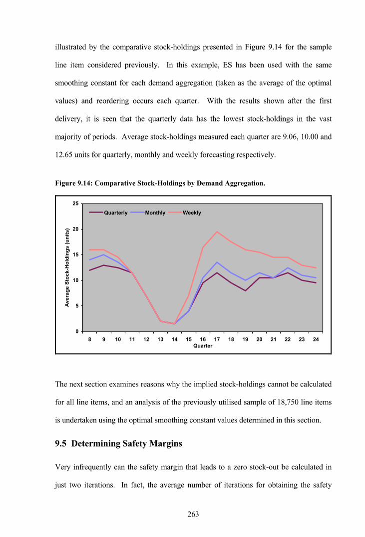
263
illustrated by the comparative stock-holdings presented in Figure 9.14 for the sample
line item considered previously. In this example, ES has been used with the same
smoothing constant for each demand aggregation (taken as the average of the optimal
values) and reordering occurs each quarter. With the results shown after the first
delivery, it is seen that the quarterly data has the lowest stock-holdings in the vast
majority of periods. Average stock-holdings measured each quarter are 9.06, 10.00 and
12.65 units for quarterly, monthly and weekly forecasting respectively.
Figure 9.14: Comparative Stock-Holdings by Demand Aggregation.
0
5
10
15
20
25
8 9 10 11 12 13 14 15 16 17 18 19 20 21 22 23 24Quarter
Aver
age
Stoc
k-H
oldi
ngs
(uni
ts)
Quarterly Monthly Weekly
The next section examines reasons why the implied stock-holdings cannot be calculated
for all line items, and an analysis of the previously utilised sample of 18,750 line items
is undertaken using the optimal smoothing constant values determined in this section.
9.5 Determining Safety Margins
Very infrequently can the safety margin that leads to a zero stock-out be calculated in
just two iterations. In fact, the average number of iterations for obtaining the safety

264
margin, when it is possible to do so, is 3.4 for quarterly data, 3.5 for monthly data and
4.4 for weekly data. While the methodology for calculating the implied safety margins
for each forecasting method is described in Section 9.2, the example is too simplistic, as
there are a number of situations where it is not possible to calculate the safety margin:
(i) Situation A: With high stock-holdings maintained by the RAF, it is very
often the case that the initial stock, including outstanding orders, is in excess of
the total demand over the entire simulation period and no further orders are
required. In fact, this situation arises for 58.2 percent of line items using a
quarterly series, 57.6 percent using a monthly series, and 56.8 percent using a
weekly series.
(ii) Situation B: It can also be the case that there is not enough initial stock to
satisfy demand. A stock-out will occur if the combined initial stock and
outstanding orders are not enough to satisfy demand over the first lead-time period
before any new orders can be delivered. From the remaining line items not
affected by Situation A, this situation arises for 16.3 percent of the total using a
quarterly series, 15.8 percent using a monthly series, and 15.1 percent using a
weekly series.
(iii) Situation C: There may not be enough iterations available for resolution.
Although 99 iterations have been allowed for each line item, the safety margin
must be calculated across all forecasting methods to ensure that fair and accurate
comparisons are made. In some circumstances it is not possible to obtain safety
margins for all methods within the allotted number of iterations.

265
(iv) Situation D: The restrictions imposed by a non-unitary CMBQ or PPQ may
prevent the demand from being met exactly. In fact, this situation arises for 8.9
percent of line items using a quarterly series, 7.8 percent using a monthly series,
and 9.8 percent using a weekly series.
Each of the identified situations are not mutually exclusive and a particular line item
may be affected by more than one of them. The percentage of line-items that do not fall
within the four situations, and are therefore available for comparison, is only 16.6, 18.8
and 18.3 percent for quarterly, monthly and weekly series respectively. This means that
the sample sizes are somewhat inadequate for a detailed analysis and adjustments are
required to increase the number of line items available.
It is possible to guarantee there will neither be too much stock, nor too little, by setting
the opening stock balance to match the total demand exactly over the first lead-time
duration and by setting the outstanding orders to zero. This means that the stock balance
will reach zero at the end of the first lead-time and, since a reorder placed in the first
period will arrive at this time, the stock balance will subsequently increase again.
However, in this situation a realistic safety margin cannot be determined, as the stock-
outs are artificially set at zero and no safety stock will be required. This problem is
overcome by setting the opening stock to equal the total demand plus one extra unit over
the first lead-time period. As a trade-off, adding this one unit also means there may be
too much stock in the system and it may not be possible to calculate a safety margin.
Overall, a total of 11,203 of the 18,750 line items, or 59.7 percent, have been resolved
for all forecasting methods across all demand aggregations. The vast majority of cases
where implied stock-holdings could not be resolved are due to non-unitary CMBQ or

266
PPQ values. As a point of interest, the average number of iterations required for
resolution has increased to around ten. The next section compares the implied stock-
holdings from each forecasting method, where a common service level of 100 percent
has been determined.
9.6 Forecasting Performance by Implied Stock-Holdings
The average implied stock-holdings for Croston’s method and the simple forecasting
methods (including ES, a one year moving average and a previous year average) are
compared in the following tables. Table 9.11 presents results where forecast updating
and reordering occurs every period, while Table 9.12 presents results where reordering
occurs quarterly. An individual line item is only included if a service level of 100
percent could be obtained for each and every forecasting method, including the
variations on Croston’s method, where results are presented in subsequent tables.
Table 9.11: Average Implied Stock-Holdings - Updating Every Period.
Demand Aggregation
Nomen-clature
Expon’l Smooth.
Croston’s Method
Moving Average
Prev Year Average
Friedman Statistic by
Method
Quarterly (Q,Q,Q) 50.41 49.88 63.31 59.42 4,168.62
Monthly (M,M,M) 52.36 49.63 60.98 57.54 3,858.87
Weekly (W,W,W) 51.83 48.62 59.94 56.20 4,020.91
Friedman Statistic by Aggregation 2,627.18 353.84 840.10 903.88 -
Quarterly (Q,Q,Q) 50.41 49.88 63.31 59.42 4,168.62
Monthly (M,M,Q) 52.53 49.80 61.27 57.31 4,292.43
Weekly (W,W,Q) 51.90 48.72 60.08 55.26 4,646.17
Friedman Statistic by Aggregation 2,210.82 398.43 529.20 105.63 -
A nomenclature is used to signify the demand aggregation, update/reorder interval, and
measurement interval combinations. These take the form (D,U,M) where D signifies the

267
demand aggregation, U signifies the update interval and M signifies the measurement
interval. Thus, (M,M,Q) refers to a monthly demand aggregation, with a monthly
update interval and a quarterly measurement interval.
The results for updating every period indicate that Croston’s method consistently
provides the lowest stock-holdings regardless of whether measuring occurs every period
or every quarter. However, unlike the provisional results for ES and Croston’s method
from the hold-out sample of 500 line items presented in Section 9.4, the results from this
larger sample of 11,203 line items do not show a clear pattern of quarterly updating
providing the best results and weekly updating the worst. The best results for ES still
occur with quarterly updating, while the best results for Croston’s method now occur
with weekly updating. The best results for both the moving average method and the
previous year average method also occur with weekly updating, although these results
are substantially worse than any of those from ES and Croston’s method.
The percentage improvement of Croston’s method over ES is observed to increase as the
data moves from quarterly to monthly and on to weekly aggregation. With the stock-
holdings measured every period, the improvements are 1.05, 5.21 and 6.19 percent for
quarterly, monthly and weekly data respectively. The results are very similar when
measuring every period and when measuring every quarter.
Two sets of Friedman statistics are presented. These test whether a series of related
samples have been drawn from the same population, such that test values less than a
tabulated value indicate little difference between the samples, while large test values
indicate significant differences. Friedman statistics are shown firstly by forecasting
method in the vertical direction and secondly by demand aggregation in the horizontal
direction. In the first instance, all the Friedman statistics are substantially greater than

268
the tabulated value of 7.81 at the 5 percent significance level with 3 degrees of freedom,
indicating that there are significant differences in the average stock-holdings between
the methods. In the second instance, all the Friedman statistics are substantially greater
than the tabulated value of 5.99 at the 5 percent significance level with 2 degrees of
freedom, indicating that there are significant differences between the average stock-
holdings for quarterly, monthly and weekly data.
The three Friedman statistics by method are all of a similar magnitude, indicating that
the differences in stock-holdings are similar, irrespective of the demand aggregation.
Alternatively, the Friedman statistics by aggregation show greater variation. The high
value for ES suggests that the differences between demand aggregations are greater for
this method than they are for Croston’s method, which has a comparatively low
Friedman statistic. The implication is that ES is more affected by the choice of demand
aggregation, while results from Croston’s method are less dependent on the aggregation.
Similar results are presented in Table 9.12 for quarterly reordering, where it is observed
that the implied stock-holdings for monthly and weekly data tend to increase. As a
result, quarterly data generally provides the best results for each method. The Friedman
statistics are once again all significant.
Table 9.12: Average Implied Stock-Holdings - Quarterly Reordering.
Demand Aggregation
Nomen-clature
Expon’l Smooth.
Croston’s Method
Moving Average
Prev Year Average
Friedman Statistic by
Method
Quarterly (Q,Q,Q) 50.41 49.88 63.31 59.42 4,168.62
Monthly (M,Q,M) 54.20 51.39 64.84 59.20 4,433.69
Weekly (W,Q,W) 54.71 51.18 64.80 59.31 5,081.62
Friedman Statistic by Aggregation 3,804.13 290.52 2,902.26 1,777.98 -

269
Demand Aggregation
Nomen-clature
Expon’l Smooth.
Croston’s Method
Moving Average
Prev Year Average
Friedman Statistic by
Method
Quarterly (Q,Q,Q) 50.41 49.88 63.31 59.42 4,168.62
Monthly (M,Q,Q) 54.42 51.61 65.06 59.42 4,430.52
Weekly (W,Q,Q) 54.82 51.29 64.90 59.41 5,079.26
Friedman Statistic by Aggregation 3,907.43 519.26 3,092.87 2,171.02 -
With little difference between measuring the stock-holdings every period and measuring
every quarter, only results for measuring every period are presented in the remaining
analysis.
Attention is now turned to the variations on Croston’s method, with comparative results
presented in the following two tables. In this analysis all the forecasting methods use
the two smoothing constant values determined as optimal for Croston’s method. Where
a single value for α is applied to the bias, as required by the bias reduction method and
the approximation method, this is taken as the average of the demand size constant and
the demand interval constant, previously presented in Table 9.9.
Table 9.13 presents implied stock-holdings with forecasting and reordering every
period. The approximation method consistently provides the lowest stock-holdings for
each demand aggregation. The bias reduction method also shows an improvement over
Croston’s method, while the revised Croston’s method is consistently worse. Weekly
data generally provides the best results, although quarterly data does so under the
revised Croston’s method. Despite each of the methods appearing to give very similar
results, the Friedman statistics indicate that there are significant differences in the
average stock-holdings between the methods, as well as significant differences between
the demand aggregations.

270
Table 9.13: Average Stock-Holdings - Updating Every Period (Crost. and Variants).
Demand Aggregation
Nomen-clature
Croston’s Method
Revised Croston’s
Bias Reduction
Approxi-mation
Friedman Statistic by
Method
Quarterly (Q,Q,Q) 49.88 49.89 49.87 49.80 588.77
Monthly (M,M,M) 49.63 50.15 49.61 49.50 999.62
Weekly (W,W,W) 48.62 50.84 48.59 48.56 1,400.82
Friedman Statistic by Aggregation 353.84 700.61 316.32 353.65 -
The Friedman statistics are substantially reduced from those shown previously,
indicating less variation in the stock-holdings between these four methods. With the
performance of the revised Croston’s method deteriorating as the updating interval
moves from quarterly to weekly while the other methods improve, the Friedman statistic
between the methods is relatively high for weekly data in this case.
Similar results emerge when reordering occurs every quarter as presented in Table 9.14,
although in this case the stock-holdings from monthly and weekly updating tend to
increase under each method, allowing the quarterly updating to provide the lowest
stock-holdings in all cases.
Table 9.14: Average Stock-Holdings - Quarterly Reordering (Croston and Variants).
Demand Aggregation
Nomen-clature
Croston’s Method
Revised Croston’s
Bias Reduction
Approxi-mation
Friedman Statistic by
Method
Quarterly (Q,Q,Q) 49.88 49.89 49.87 49.80 588.77
Monthly (M,Q,M) 51.39 51.95 51.37 51.25 837.23
Weekly (W,Q,W) 51.18 53.55 51.16 51.12 1,013.34
Friedman Statistic by Aggregation 290.52 603.69 300.91 308.70 -
With the approximation method providing an improvement on Croston’s method, it is
this method which gives the best results overall. A later section will examine whether

271
this is the case across all demand patterns, but firstly consideration is given to the value
of the implied stock-holdings from each forecasting method.
Table 9.15 presents the value of the additional stock-holdings, where the figures
represent the additional value (in millions of pounds) from a base value provided by the
best system. The minimum investment was obtained by the approximation method
using weekly updating, where the value of the stock-holdings was £63.90m for the
11,203 line items when measuring every period. The same base value is used with both
updating every period and quarterly updating. It should be borne in mind that these
savings are obtained from using a backward simulation with perfect information. The
same savings may not be achieved with a standard prescriptive stock control method
based on the mean and variance of a lead-time forecast.
Table 9.15: Additional Investment in Stock-Holdings Above the Best System.
Demand Aggregation
Expon’l Smooth.
Croston’s Method
Moving Average
Prev Year Average
Revised Croston’s
Bias Reduction
Approxi-mation
Updating Every Period (Base = £63.90m; 11,203 Line Items)
Quarterly £2.40m £1.12m £23.32m £17.42m £1.65m £1.07m £0.97m
Monthly £5.37m £0.38m £20.14m £13.67m £1.87m £0.42m £0.23m
Weekly £4.67m £0.10m £19.10m £11.86m £5.34m £0.03m £0.00m
Quarterly Reordering (Base = £63.90m; 11,203 Line Items)
Quarterly £2.40m £1.12m £23.32m £17.42m £1.65m £1.07m £0.97m
Monthly £8.31m £3.75m £24.46m £17.15m £5.21m £3.68m £3.50m
Weekly £9.00m £4.25m £24.72m £17.39m £10.13m £4.18m £4.08m
Differences in the values of the stock-holdings between the methods and demand
aggregations can be quite substantial. For example, ES leads to an additional £4.67m
investment over the approximation method for the 11,203 line items when considering
weekly updating. When translated to the entire consumable inventory of 684,000 line

272
items, this represents an additional investment of £285m or 13.6 percent of the total
value of the consumable inventory.
When measuring the stock-holding value every quarter, the base figure is £64.15m for
the approximation method with weekly updating. This difference in base figures of
approximately £0.25m defines the range of significance, such that values within ±
£0.25m are not significantly different. Thus, for example, the implied investments from
using Croston’s method, the bias reduction method and the approximation method with
weekly updating do not differ significantly.
Overall, Croston’s method provides a favourable comparison with ES when stock levels
are assessed by the additional investment. However, it is the approximation method
which provides the best performance, with lower investment than ES and Croston’s
method on all occasions. The moving average and previous year average methods are
observed to perform particularly poorly in comparison.
This section has considered the implied stock-holdings for all line items combined.
Once again it is of interest to compare results by demand pattern and ascertain whether
individual methods are better suited to particular demand patterns.
9.7 Implied Stock-Holdings by Demand Pattern
Average stock-holdings by demand pattern for Croston’s method and the traditional
forecasting methods are compared in Table 9.16. These results portray the almost
complete dominance of Croston’s method over the simpler forecasting methods for all
demand patterns. It is only with the mildly erratic demand pattern under a weekly
aggregation that another method gives lower implied stock-holdings and, in this
instance, it is ES that provides the better result. ES tends to provide lower stock-

273
holdings through quarterly updating and it is only the smooth demand pattern that has a
better result with weekly updating. Alternatively, Croston’s method and the moving
average and previous year average methods all have lower stock-holdings from weekly
updating across all demand patterns.
Table 9.16: Average Stock-Holdings by Demand Pattern.
Demand Aggregation
Demand Pattern
Expon’l Smooth.
Croston’s Method
Moving Average
Prev Year Average
Friedman Statistic
Updating Every Period and Measuring Every Period
Smooth 68.81 68.20 88.88 78.68 2,032.16
Irregular 128.72 127.59 157.30 154.42 1,583.13
Slow-moving 5.76 5.69 7.35 6.65 390.16
Mildly Erratic 23.75 24.01 31.35 28.88 366.61
Quarterly (Q,Q,Q)
Highly Erratic 24.51 23.48 30.45 28.64 440.91
Smooth 68.66 66.42 82.11 74.47 1,795.36
Irregular 135.73 130.49 154.50 150.79 1,275.60
Slow-moving 6.06 5.63 7.22 6.49 336.69
Mildly Erratic 26.14 22.94 31.41 28.83 417.46
Monthly (M,M,M)
Highly Erratic 25.55 22.64 29.51 27.81 540.06
Smooth 66.61 65.48 78.90 72.73 1,604.61
Irregular 135.59 127.46 153.40 146.28 1,429.14
Slow-moving 6.04 5.53 7.08 6.44 331.87
Mildly Erratic 26.01 22.18 31.14 28.56 531.75
Weekly (W,W,W)
Highly Erratic 25.61 22.28 29.53 27.65 578.03
Percentage improvements of Croston’s method over ES by demand pattern are presented
in Table 9.17. In the first instance, like with like comparisons are made where the
demand aggregations for each method are the same. Alternatively, in the last column
best with best comparisons are made where the best result from ES is compared with the
best result from Croston’s method irrespective of the demand aggregation. It is
observed that, in general, the greatest improvements occur with the two erratic demand
patterns where the improvements are as high as 14.7 percent for the mildly erratic

274
demand under a weekly aggregation. The slow-moving demand pattern also
experiences a large improvement through the use of Croston’s method. Weekly data
experiences the greatest improvements while the quarterly data experiences the least,
such that in the case of the mildly erratic demand pattern the improvement is negative
for the quarterly data.
Table 9.17: Improvement in Stock-Holdings of Croston’s Method Over ES.
Comparing Like with Like Demand Pattern Quarterly Monthly Weekly
Comparing Best with Best
Smooth 0.89% 3.26% 1.70% 1.70%
Irregular 0.88% 3.86% 6.00% 0.98%
Slow-moving 1.22% 7.10% 8.44% 3.99%
Mildly Erratic -1.09% 12.24% 14.73% 6.61%
Highly Erratic 4.20% 11.39% 13.00% 9.10%
Overall 1.05% 5.21% 6.19% 3.55%
In considering the results for the variations on Croston’s method, Table 9.18 presents
average stock-holdings by demand pattern. It is observed that the approximation
method provides the best results in all cases, though sometimes equalled by Croston’s
method and the bias reduction method. The differences between Croston’s method and
the approximation method are reduced for weekly data as the selected smoothing
constant value, which acts to remove the bias, is itself very small at only 0.03.
Table 9.18: Average Stock-Holdings (Croston’s and Variants).
Demand Aggregation
Demand Pattern
Croston’s Method
Revised Croston’s
Bias Reduction
Approxi-mation
Friedman Statistic
Smooth 68.20 68.17 68.21 68.13 233.21
Irregular 127.59 127.54 127.58 127.38 162.20
Slow-moving 5.69 5.67 5.68 5.66 91.78
Mildly Erratic 24.01 24.26 23.98 23.93 114.70
Quarterly (Q,Q,Q)
Highly Erratic 23.48 23.42 23.45 23.46 131.33

275
Demand Aggregation
Demand Pattern
Croston’s Method
Revised Croston’s
Bias Reduction
Approxi-mation
Friedman Statistic
Smooth 66.42 66.61 66.43 66.20 447.10
Irregular 130.49 131.49 130.45 130.19 213.58
Slow-moving 5.63 5.73 5.63 5.62 111.94
Mildly Erratic 22.94 23.62 22.90 22.89 124.92
Monthly (M,M,M)
Highly Erratic 22.64 23.44 22.60 22.60 200.96
Smooth 65.48 68.28 65.45 65.33 805.40
Irregular 127.46 131.86 127.39 127.34 319.68
Slow-moving 5.53 5.96 5.53 5.53 102.16
Mildly Erratic 22.18 24.31 22.18 22.18 134.28
Weekly (W,W,W)
Highly Erratic 22.28 23.68 22.27 22.26 193.41
The improvements in reduced stock-holdings from the approximation method compared
to ES and Croston’s method are presented in Table 9.19. Again, comparisons are made
for like with like demand aggregations as well as best with best, irrespective of the
aggregation. In virtually all cases the approximation method improves substantially
upon the results of ES, with ES only providing a better performance for the mildly
erratic demand pattern under quarterly updating. The approximation method performs
at least as well or better than Croston’s method for all demand patterns.
Table 9.19: Improvement in Stock-Holdings of Approximation Method.
Comparing Like with Like
Quarterly Monthly Weekly Comparing
Best with Best
Method Improved Upon Demand Pattern
ES Croston ES Croston ES Croston ES Croston
Smooth 0.99% 0.10% 3.58% 0.33% 1.92% 0.23% 1.92% 0.23%
Irregular 1.04% 0.16% 4.08% 0.23% 6.08% 0.09% 1.07% 0.09%
Slow-moving 1.74% 0.53% 7.26% 0.18% 8.44% 0.00% 3.99% 0.00%
Mildly Erratic -0.76% 0.33% 12.43% 0.22% 14.73% 0.00% 6.61% 0.00%
Highly Erratic 4.28% 0.09% 11.55% 0.18% 13.04% 0.04% 9.14% 0.04%
Overall 1.21% 0.16% 5.46% 0.26% 6.31% 0.12% 3.67% 0.12%

276
Implied stock-holdings by demand pattern are presented in greater detail along with
additional Friedman statistics in Appendix M. Comparisons are made between ES,
Croston’s method, the previous year average method as the best of the two averaging
methods, and the approximation method as the best method overall. With a smooth
demand pattern all four methods are observed to perform better with weekly updating.
However, for the remaining demand patterns ES provides better results with quarterly
updating while the other three methods continue to perform better with weekly updating.
With reference to the Friedman statistics by demand aggregation, it is observed that ES
provides significantly larger values than Croston’s method and the approximation
method for all demand patterns. This indicates that ES is more affected by the choice of
the demand aggregation, irrespective of the demand pattern.
The investment in additional stock-holdings for each demand pattern is presented in
Table 9.20, where updating occurs every period and measuring also occurs every period.
As determined in Section 6.2.4, the smooth demand pattern has the highest average unit
value and this is reflected in the comparatively high investment base.
Table 9.20: Additional Investment in Stock-Holdings by Demand Pattern.
Demand Aggregation
Expon’l Smooth.
Croston’s Method
Moving Average
Prev Year Average
Revised Croston’s
Bias Reduction
Approxi-mation
Smooth Demand (Base = £34.27m; 2,662 Line Items)
Quarterly £0.67m £0.21m £12.70m £9.79m £0.19m £0.21m £0.17m
Monthly £1.60m £0.11m £10.70m £7.08m £0.51m £0.14m £0.00m
Weekly £1.14m £0.15m £9.69m £5.76m £2.65m £0.11m £0.07m
Irregular Demand (Base = £14.26m; 2,077 Line Items)
Quarterly £0.45m £0.23m £4.19m £3.24m £0.26m £0.21m £0.20m
Monthly £1.23m £0.25m £3.70m £2.57m £0.68m £0.24m £0.21m
Weekly £1.12m £0.03m £3.80m £2.42m £1.37m £0.00m £0.00m

277
Demand Aggregation
Expon’l Smooth.
Croston’s Method
Moving Average
Prev Year Average
Revised Croston’s
Bias Reduction
Approxi-mation
Slow-Moving Demand (Base = £7.67m; 2,281 Line Items)
Quarterly £0.91m £0.61m £4.13m £2.68m £1.07m £0.58m £0.54m
Monthly £1.64m £0.02m £3.40m £2.46m £0.39m £0.04m £0.04m
Weekly £1.44m £0.01m £3.19m £2.10m £0.89m £0.00m £0.00m
Mildly Erratic Demand (Base = £4.28m; 1,975 Line Items)
Quarterly £0.20m £0.04m £1.49m £1.10m £0.07m £0.03m £0.03m
Monthly £0.64m £0.07m £1.58m £1.11m £0.22m £0.06m £0.05m
Weekly £0.70m £0.00m £1.65m £1.13m £0.32m £0.01m £0.02m
Highly Erratic Demand (Base = £3.32m; 2,208 Line Items)
Quarterly £0.27m £0.14m £0.91m £0.72m £0.16m £0.14m £0.13m
Monthly £0.37m £0.04m £0.86m £0.56m £0.18m £0.04m £0.04m
Weekly £0.36m £0.00m £0.86m £0.55m £0.22m £0.00m £0.01m
An examination of the additional investment in stock-holdings by demand pattern
reveals results which remain consistent with previous observations. ES tends to provide
better results with quarterly updating for all demand patterns while Croston’s method,
and the variations on this method, tend to provide better results with weekly updating
throughout. The approximation method gives the best results in virtually all cases.
9.8 Concluding Remarks
Calculating average implied stock-holdings to assess forecasting performance in an
inventory control environment is a reasonable alternative to the traditional measures of
accuracy. This measure avoids the validity issues of the other measures whilst
preventing the generation of conflicting results. Calculating the implied stock-holdings
also allows the attribution of monetary costs to differences in accuracy between the
methods. A disadvantage of this measure is the substantial additional processing, as 10
iterations are required on average.

278
While it is clear that the approximation method provides an improvement over and
above Croston’s method, which is itself an improvement upon ES, it is unclear which
review period provides the best results. Quarterly updating consistently provides the
best results when using ES. Quarterly updating also provides the best results when
using Croston’s method and variations on this method, with the optimal smoothing
constants determined from the same dataset. However, results from the larger
independent sample indicate weekly updating generally provides the best results when
using these latter methods. This apparent change could be the result of using smoothing
constants that were not optimal across the larger sample. As Croston’s method and the
variations on this method require the independent optimisation of two smoothing
constants, the processing would prove prohibitive across a large sample and would not
be justified within this particular study.
The RAF currently uses a monthly review period with demand forecasting provided by
an ES methodology which is unlikely to be using optimal parameters. Results from a
large sample of line items indicate that the approximation method provides an
improvement in stock-holdings of 5.5 percent over ES under monthly review with both
methods using optimal parameters. The improvement is higher for slow-moving and
erratic demand items, ranging between 7.0 and 12.4 percent. Croston’s method and the
variations on this method require additional processing over ES as two series require
smoothing, but this is hardly a concern with the computing power now available. The
improvement of the approximation method over Croston’s method may only be 0.3
percent with monthly updating but, as the additional processing is inconsequential, this
method is superior overall.

279
Results from this chapter provide a more conclusive assessment of the performance of
the various forecasting methods than was provided by the performance measures in the
previous chapter. On that occasion none of the methods were viewed as having overall
superiority. However, by considering the implied stock-holdings as an alternative
measure, the approximation method stands out as having a clear advantage over the
other methods.
An interesting phenomenon arising from this research is that less frequent reordering
may not suffer from spikes in the forecasts over the short term. With reordering every
period the system is susceptible to unnecessarily high order-up-to levels. This was
observed when weekly forecasting with quarterly reordering led to lower stock-holdings
than weekly forecasting with weekly reordering. Over an infinite time horizon the
results would tend to be the same, but for an inventory system time is not infinite and
the methods are properly assessed over a shorter horizon. This observation supports the
use of longer review intervals. However, shortening the time span has the advantage of
reducing the reaction time when a sudden change in the demand pattern occurs.
With the research into forecasting for the ordering and stock-holding of consumable
spare parts now complete, the final chapter presents the main conclusions.
280
10. CONCLUSIONS
This chapter presents the main conclusions from this research. The properties of a spare
parts inventory are initially examined using the Royal Air Force (RAF) consumable
inventory as an example. A methodology for demand pattern classification using RAF
demand and replenishment lead-time data is reviewed in the second section. The third
section reviews the forecasting performance of Croston’s method, as well as three
recently developed modifications to this method, using traditional measures of forecast
accuracy, while the fourth section reviews the performance by implied stock-holdings.
The fifth and final section describes some future issues for consideration.
The purpose of this research was to identify and assess the usefulness of models put
forward in the academic literature for improving the forecasting for the ordering and
stock-holding of consumable spare parts. The cost-effective management of spare parts
is a problem faced by many organisations across a range of industries, and it is an area
that has received increasing attention over the years. New models have not been
developed in the course of this research, but instead existing models have been assessed
using large volumes of actual data. A key part of the assessment was to examine the
properties of a spare parts inventory and determine the applicability of the proposed
models in a practical setting.
10.1 Properties of a Spare Parts Inventory
The RAF is dependent on readily available spare parts for in-service aircraft and ground
systems in order to maximise operational capability. However, as with any
organisation, maintaining a large and diverse inventory capable of meeting all customer
demands as they arise requires a substantial investment. The RAF manages a large
consumable inventory with approximately 700 thousand stock-keeping units with a total

281
value of £2.1 billion. Cut-backs in defence budgets in recent years have led to a
requirement for a reasoned and scientific analysis of the RAF inventory as an aid to
obtaining cost-efficiencies in the supply environment.
The RAF is fortunate in having long demand transaction histories for all line items in a
readily accessible format. Over 375,000 line items have at least six years of individual
demand transactions. This extensive demand information, together with a source of
accurate replenishment lead-time data, allows a full and extensive analysis of practical
models across a range of demand patterns. For a model to be considered useful in this
instance, it should measurably improve forecasting and inventory control, and should
not be overly complex so as to require excessive processing. This is a key requirement
given the large inventory under consideration.
A large proportion of the inventory is described as having an erratic or intermittent
demand pattern, which is characterised by infrequent transactions with variable demand
sizes. A further large proportion has a slow-moving demand pattern, which is also
characterised by infrequent transactions, although in this case demand sizes are always
low. Both erratic demand and slow-moving demand can create significant problems as
far as forecasting and inventory control are concerned. The management of spare parts
is a problem faced by many organisations across a range of industries.
An erratic demand pattern may occur when there is a large number of small customers
and a few large customers, or when the frequency of customer requests varies. Small
variations in demand magnified along a supply chain can also lead to erratic demand, as
can correlation between customer requests, which may itself be due to sympathetic
replacement. In large repair facilities erratic demand may arise through the pooling of
repair items in order to minimise the number of set-ups.

282
Spare parts with an apparent lumpy demand history need not always be treated as
erratic. Most often overhauls of large items of equipment are scheduled far in advance
of the time at which the spare parts are required. An improvement in the flow of
information will allow the requirements to be included as scheduled demand, removing
the need for forecasting. Forecasting requirements are also reduced if the demands are
fixed in size or the transactions occur at fixed intervals.
Slow-moving spare parts are often held as insurance against the high costs that would
otherwise be incurred if an item fails and a spare part is not available. The forecasting
and control of slow-moving line items is made more difficult by having few historical
demand recordings. A further difficulty is their inflexibility, as far as over-stocking is
concerned. Excess spares may well become obsolete before they are required. On the
other hand, a simplification for slow-moving line items is that rarely is it necessary to
hold more than two spares, so the possible decisions are few in number.
Once again, the forecasting of slow-moving spare parts need not always be an issue, if,
for example, they are required for an overhaul that is scheduled in advance.
Alternatively, they may give adequate warning through wear of the need for future
replacement and a spare can be provisioned at such time.
The RAF utilises a classical periodic review inventory management system, although
there are a number of factors within the operating environment that combine to form a
unique forecasting, ordering and stock-holding system. Large stock-holdings have
traditionally been maintained for reasons not normally faced by other industries, such as
the necessity to maintain stocks in case of war, the relatively high cost of procurement
beyond initial provisioning, and the high costs of stock-out.

283
The less frequent usage of slow-moving and erratic demand items leads to few
replenishment orders being placed. Therefore, there is very little actual lead-time data
available to the RAF. Over a six year period, only 19 percent of the current inventory
has at least one lead-time observation. Lead-times are comparatively long at 12 months
on average, although they can be anything up to 60 months. A replenishment order
quantity can be constrained by the supplier, either as a minimum order quantity or as a
multiple of the packaged quantity, and 24 percent of line items are restricted in this
manner.
A modified chi-square goodness-of-fit test was used to test whether lead-time
observations for individual line items fitted a range of probability distributions. Results
from 161 line items, with 12 or more lead-time observations, indicated several
distributions were candidates. The sample sizes available in the early stages of the
analysis were too small for determining the best fitting distribution, with the geometric,
negative exponential, negative binomial and gamma distributions all fitting over 85
percent of line items at the 5 percent significance level.
Previous research has not adequately examined and commented upon the existence of
autocorrelation in demand data due to a lack of data series suitable for testing. Many of
the published models assume independence between successive demand sizes,
independence between successive demand intervals and independence between the
demand sizes and intervals. However, an analysis of RAF data indicated large positive
and negative autocorrelation and crosscorrelation coefficients in the data. With the
demand data being severely skewed, the commonly used Pearson’s method was found to
be inappropriate for measuring correlation and alternative methods for reducing the
variation were investigated. Using a natural logarithm transformation, approximately a

284
quarter of the line items were found to be significantly autocorrelated and/or
crosscorrelated, suggesting many models in the literature are too simplistic with their
assumptions.
Knowledge of the replenishment lead-time is a primary requirement of any inventory
management system, however, in reality it is often the case that the lead-time
distribution and associated parameter values have to be assumed due to a lack of
recorded observations. With few, or more likely zero, lead-time observations for each
line item, the usefulness of the data available to the RAF is restricted on an individual
item basis. Therefore, line items likely to have similar lead-time patterns were grouped
together with the resultant summary statistics applying to the entire group. Several
predictors for grouping line items were considered, with ANOVA tests and regression
analysis indicating the manufacturer, the range manager and the set lead-time value
explained the most variation. Cluster analysis was used to place the lead-time
observations into groups suggested by the data. The grouping procedure allows all line
items to be assigned lead-time parameter values, regardless of whether or not they have
any actual lead-time observations.
The grouping of line items, and the subsequent combining of actual lead-time
observations, also allows a more conclusive goodness-of-fit test over the one conducted
using individual line items. With the larger sample size it is observed that the normal
distribution, which is often used by probability models, provides a poor representation
of lead-time demand and a better choice is provided by the log normal distribution. On
the other hand, a Poisson arrival process with demand sizes following a geometric
distribution, thus forming the commonly used stuttering Poisson distribution, provides a

285
reasonable representation of reality. The logarithmic distribution is also suitable for
modelling the demand sizes.
With lead-time parameter values assigned to each line item, demand classifications
could then be applied to the observed lead-time demand patterns. A particular
forecasting model, for instance, may not perform as well if demand does not adhere to a
specific pattern, thus demand classifications are a useful part of the analysis. Assigning
demand classifications to the RAF inventory is reviewed in the next section.
10.2 Classifying Demand Patterns
An analytical demand classification methodology from the literature has been extended
and applied to the RAF inventory. The method decomposes the lead-time demand into
the constituent causal parts of demand frequency, demand size and lead-time. In this
instance, RAF line items are classified into smooth, irregular, slow-moving, mildly
erratic or highly erratic demand patterns. The irregular demand pattern has been added,
as the original classifications did not differentiate the observed patterns adequately.
Demand classifications are made on the basis of statistics generated from the data series
themselves, with boundaries between classifications set at management’s discretion.
The selected boundaries in this research led to some 13 percent of the inventory being
classed as smooth, 12 percent as irregular, 37 percent as slow-moving, 16 percent as
mildly erratic and 22 percent as highly erratic. Boundaries defining a particular pattern
apply to the inventory under examination and are not immediately transferable between
organisations, such that a demand pattern classed as smooth in this instance may be
viewed as slow-moving elsewhere. The classification methodology itself, however, is
readily transferable.

286
The classification methodology requires a long demand history for each line item.
Problems obviously arise when a new part is introduced and the demand is initially
unknown. Therefore, the classifications were examined to determine whether there
were common traits among the line items within each demand pattern, beyond the
classification criteria, which could be used to pre-classify new parts. By definition, the
two erratic demand patterns are differentiated by lead-time only, with the highly erratic
demand pattern having a higher coefficient of variation in the lead-time than the mildly
erratic demand pattern. Alternatively, the smooth, irregular and slow-moving demand
patterns follow similar lead-time distributions, as the lead-time is not a determining
factor for any of these patterns.
The demand patterns were also compared using the three previously identified grouping
variables, namely the manufacturer, the range manager and the set lead-time value. A
three-variable contingency table tested the hypothesis that the demand classifications
were independent of the lead-time groupings within each variable. It was observed that
the attainment of a smooth, mildly erratic or highly erratic demand pattern was in fact
dependent on the predictors, while the attainment of an irregular or slow-moving
demand pattern was not. Although the demand pattern is not wholly independent of the
predictors, there tends to be no clear-cut influence that would assist the prior
determination of the demand pattern by this means.
With consideration given to the transaction frequency, the slow-moving demand pattern
has a low transaction rate with over 50 percent of line items within this category
experiencing only one demand over a 72 month period. On average, these line items
experience about 3 transactions overall, although such a demand pattern is still observed
when there are in excess of 14 transactions. An erratic demand pattern, either mildly

287
erratic or highly erratic, also experiences a low transaction frequency, albeit at a higher
rate of 8 transactions on average. The irregular demand pattern has a transaction rate of
about 1 per month while the smooth demand pattern has a transaction rate in excess of 2
per month.
Looking at the individual demand sizes, the majority of slow-moving line items
experience demands of one unit, although the average demand size for this classification
is 4 units. The average demand size for the smooth demand pattern is 7 units, while the
highly erratic demand pattern has a higher average demand size of 12 units compared to
9 units for the mildly erratic demand pattern. Overall, it is the irregular demand pattern
that has the highest average demand size of 14 units.
For the most part, there is considerable overlap with the demand pattern classifications
for both the transaction frequency and the demand size, with few clear boundaries in
either case. The same situation arises with their joint consideration. It is only when the
demand rate is less than 0.04 units per month that only one demand pattern occurs, in
which case it is slow-moving demand. An irregular demand pattern is not observed
until the demand rate is in excess of 0.10 units per month, although it is the smooth
demand pattern that has the highest average demand rate.
All of these observations suggest that there is no relatively simple way to categorise a
line item without considering the demand frequency, demand size and lead-time, thus
requiring a long demand history. In cases where a demand history does not exist, it is
necessary to match the new part with one it is replacing or one that it is most similar to.
Many of the observed characteristics of the RAF inventory are likely to be found in
other spare parts inventories. A large proportion of demand will be slow-moving or

288
erratic and lead-time observations will be scarce or non-existent, leading to similar
difficulties in forecasting and inventory control. The particular characteristics which
differentiate the RAF inventory from other organisations are the sheer size of the
inventory, the large stock-holdings for individual line items and the long lead-times of
anything up to 5 years. Despite such differences, the observations from this research are
generally applicable to other organisations. The numerical results may differ elsewhere
but the methodologies used in this research could still be applied, including the method
for assigning lead-time observations when they are unknown and the method for
classifying the demand pattern. The results, with regard to the fitting of probability
distributions, are also likely to find wider application.
The next section reviews the performance of several forecasting methods specifically
put forward as suitable for erratic demand using traditional measures of forecasting
accuracy.
10.3 Reviewing the Performance of Croston’s Method
Forecasting erratic demand is problematical due to variability in the demand size and
variability in the transaction interval. Exponential smoothing (ES) is often used for
demand forecasting in a spare parts inventory. The inadequacy of ES for handling time
series with many periods of zero demand is well documented, although the comparative
accuracy of the method depends on the performance measure used and the manner in
which it is implemented.
Overall results, in terms of forecasting performance, indicate that all forecasting
methods produce very poor results in the traditional sense. The MAD, RMSE and
MAPE results are observed to be horrendous in many cases. This is predominantly a

289
reflection of the fact that real data from a spare parts inventory has been used for all
analyses.
An important contribution of this research stems from generating results that are
meaningful in the real world, such that models are assessed by a means appropriate to
their actual implementation. For example, in recognising that the purpose behind
demand forecasting is to determine usage over a replenishment lead-time, the
forecasting performance is similarly assessed over the lead-time period. Forecast
comparisons are made using quarterly, monthly and weekly demand aggregations as
some organisations may have a choice in the format of their data and would therefore be
interested in the comparative results. In addition, forecast comparisons are made only
after a demand has occurred, as well as in every period, as it is only after a demand has
occurred that it would be necessary to initiate a new replenishment order.
The comparative performance of four forecasting methods, namely ES, Croston’s
method, a one year moving average, and a simple previous year average, was initially
assessed. Croston’s method, which derives a demand forecast by separately smoothing
the size of the demands and the interval between demands, has been put forward in the
literature as a more suitable alternative to ES when demand is erratic. However, in
using real RAF data from 18,750 line items, the results are somewhat mixed and the
theoretical superiority of this method does not always show through in practice.
In considering the forecasting performance using the standard measures of accuracy,
including MAD, RMSE, MAPE and MdAPE, the results are varied with no forecasting
method consistently performing the best. However, patterns do emerge which suggests
that some methods are better than others under particular situations. For instance,
Croston’s method performs well when comparing the forecast value with the one-period

290
ahead demand, particularly in the case of monthly and weekly data. On the other hand,
ES completely dominates regardless of the demand aggregation when comparing against
lead-time demand and measuring in all periods. When it comes to lead-time demand
comparisons in periods of demand only, Croston’s method performs well with quarterly
data, while the simple previous year average method provides the best results with
monthly and weekly data.
ES and the moving average methods are observed to have an advantage over Croston’s
method when measuring the accuracy in all periods, as these methods are themselves
updated every period. On the other hand, Croston’s method is updated in periods of
demand only and will therefore tend to over-forecast to a greater degree when faced
with a series of zero demands. When forecasting demand for spare parts in general, all
forecasting methods tend to more frequently over-estimate, rather than under-estimate,
the actual demand. With many periods having zero demand, if the predicted demand is
not similarly zero then over-forecasting occurs. Smoothing methods tend to over-
estimate demand more frequently than moving average methods as the forecasts from
smoothing methods decay towards zero over a number of periods of zero demand,
whereas averaging methods drop to zero more readily.
The forecasting performance of smoothing methods is dependent on the values of the
smoothing parameters, with the best values often obtained by using information drawn
from the time series themselves. In accordance with a technique used elsewhere, the
smoothing values in this analysis were obtained by determining the optimum values
from a representative hold-out sample of 500 line items. The forecasting performance,
as measured by MAPE, was observed to vary markedly depending on the value of the

291
smoothing constants. The optimal values tend to decrease as the demand aggregation
moves from quarterly to monthly and down to weekly.
In considering the forecast performance by demand pattern, Croston’s method performs
well with the smooth and slow-moving demand patterns when comparing against the
one-period ahead demand at all aggregation levels. It is only with weekly data under
this situation that Croston’s method performs the best for the erratic demand patterns as
well, otherwise ES is the best for erratic demand. ES provides the best performance for
all demand patterns when comparing against lead-time demand in all periods. However,
when comparing in periods of demand only, ES is not the best method for any pattern.
Instead, Croston’s method is the best for slow-moving demand at all aggregation levels,
and the best for erratic demand with quarterly data, while the previous year average
method is best for smooth and irregular demand under all aggregations.
Overall, this research has shown that Croston’s method performs well when comparing
the forecast against the one-period ahead demand. Support for Croston’s method in
early studies was obtained from comparisons of this type and therefore tended to show
the method in the best light. In this research, as well as recent results from the literature,
Croston’s method is not always observed to be the best method for erratic demand. Less
sophisticated, and in fact very simple, methods can provide better results.
Although Croston’s method has been described in the literature as having practical
tangible benefit, in common with the findings of this research, the method often
produced only modest benefits when using real data. Recent research has identified an
error in Croston’s mathematical derivation of the demand estimate. The method was
observed to reduce the inherent forecast bias of ES but it failed to eliminate it
completely. Modifications to Croston’s method have been suggested in the literature

292
which seek to further eliminate the bias. These alternative methods are known as the
revised Croston’s method, the bias reduction method and the approximation method.
This research continued with comparisons between Croston’s method and the three
alternative methods using the traditional measure of forecasting accuracy across the
same 18,750 line items. The results are remarkably consistent with the approximation
method providing the best results for most measures irrespective of the demand
aggregation or whether comparing the one-period ahead or lead-time demand. The bias
reduction method similarly tends to provide better results than Croston’s method, while
the results from the revised Croston’s method tend to be worse than the original method.
In considering the performance of all of the forecasting methods, comparative results
using MAPE indicate ES still dominates when comparing against lead-time demand in
all periods. The approximation method is the best overall when considering the one-
period ahead demand, and also when comparing against lead-time demand in periods of
demand only when using quarterly and monthly data, with the bias reduction method
providing the best results for weekly data.
An important observation from this research is that identifying the best forecasting
method in an inventory control environment is not entirely objective when using the
traditional measures of accuracy. The measures themselves are subject to questions of
validity and different conclusions arise depending on which measure is utilised. In
addition, the appropriate type of forecast comparison, whether it be with the one-period
ahead demand, the lead-time demand in all periods or the lead-time demand in periods
of demand only, is also a matter open for debate.

293
10.4 Measuring Performance by Implied Stock-Holding
This research has highlighted some of the weaknesses of the traditional measures of
forecasting accuracy when applied to inventory control. A more appropriate measure in
this case is to calculate the implied stock-holdings resulting from each method and
compare the additional investment required. In order to establish a common basis for
comparison, exact safety margins are determined which provide service levels of 100
percent under each forecasting method.
The implied stock-holding methodology removes the need to select from conflicting
measures of accuracy and the different means of implementation by directly measuring a
key performance indicator. This measure allows the stock-holding requirements of each
forecasting method to be presented in immediately comparable monetary terms. The
disadvantages of this methodology are that the calculations are more complicated and
time-consuming, with an average of 10 iterations required for each line item, and not all
line items can be resolved in this manner.
A number of factors outside the forecasting methods affect the calculated stock-holdings
and these need to be considered to ensure comparable results. Firstly, the simulation
period should be selected so as to discard observations prior to the first delivery,
otherwise the calculations are affected by the opening stock level and are not wholly
dependent on the forecast values. Other factors for consideration arise from bucketing
individual demand observations into quarterly, monthly and weekly aggregations.
Minor calculation differences occur due to an incomplete overlap between the
aggregations. For example, a quarter comprises three months or thirteen weeks, but a
week starts on a Sunday while a quarter may not. Fortunately, any differences in period
coverage tend to cancel out over many series.

294
A potentially more serious issue arises when comparing results between the various
demand aggregations due to an aggregation bias. The bias can either increase or
decrease the relative average performance resulting from a particular aggregation. This
occurs through greater averaging of the stock-holdings as the updating period lengthens.
The bias is at a minimum when weekly demands are evenly distributed over a quarterly
period. Although the bias would tend to cancel out over many series, it can be
completely eliminated by measuring the stock-holdings at a common time interval. A
quarterly interval provides the lowest common denominator in this instance.
Calculated stock-holdings are also obviously affected by the selected smoothing
parameters when smoothing methods are used. Optimal parameters for minimising the
implied stock-holdings need not be the same as those that provide the lowest MAPE
values. A new set of smoothing constant values were determined for ES and Croston’s
method using the hold-out sample of 500 line items, although it is not possible to resolve
the stock-holdings for all line items due to excess stock in the system etc., and a total of
274 line items provided the results. The optimal values were found to decrease as the
data moved from quarterly to monthly and on to weekly aggregation, allowing greater
damping of the weekly data. Provisional results from this small sample size indicated
that quarterly updating provided the best results for both ES and Croston’s method,
while weekly updating provided the worst.
However, when the sample was extended to 18,750 line items (11,203 resolved), the
best results for ES continue to be obtained with quarterly updating, while the best results
for Croston’s method are now obtained with weekly updating. Croston’s method does,
however, provide better results than ES for all demand aggregations. There is a

295
possibility that the selected smoothing values are far from optimal when applied to the
larger sample and alternative values would lead to different conclusions.
Overall, the best forecasting method for a spare parts inventory is deemed to be the
approximation method. This method allows the lowest stock-holdings across all
demand patterns, with the greatest improvements occurring with erratic and slow-
moving demand. Extrapolating sample results across the whole of the RAF consumable
inventory indicates an additional investment in stock-holdings of £314m is required by
ES over and above that required by the approximation method when using monthly
updating. This represents 15.0 percent of the total value of the inventory. This research,
in general, suggests that the RAF tends to carry excessive safety stock. Significant
savings can be made by using more accurate forecasting methods and cutting safety
stock with no appreciable reduction in service levels.
The analyses undertaken in the course of this research have used data obtained from the
RAF. However, it is likely that the findings are applicable in any environment where a
spare parts inventory is maintained and, indeed, many of the findings are applicable
where demand follows an erratic demand pattern.
10.5 Areas for Further Research
This research has provided a practical assessment of a number of models designed to
improve the management of a spare parts inventory system. However, other questions
have been raised in the course of this research which could be addressed by further
analysis. Principal areas in which further research would prove beneficial are explored
in this final section of the thesis.

296
Overall findings indicate that the approximation method provides the best results in
terms of the lowest implied stock-holdings. These results were obtained using the two
optimal smoothing values derived from a hold-out sample for Croston’s method. As the
selected smoothing values were found to have a major effect on the forecasting
performance of all smoothing methods, it is likely that the results for the approximation
method could be improved by deriving values that are optimal for the method itself.
Furthermore, the approximation method has a third parameter which acts as a deflator to
remove the bias. This value could also be optimised. In this analysis the third
parameter was simply the average of the two smoothing constants, although another
value may prove more appropriate.
Forecasting methods which remove the bias have been shown to be useful by this
research. Croston’s method provides only limited improvements in performance over
ES, while the modifications to Croston’s method provide further improvements. All of
these methods continue to utilise a smoothing approach, although improved
performance may be possible by using a more complicated model to generate the
demand size in unison with the demand interval. The methods which seek to remove
additional bias over Croston’s method have only recently been developed and their
continued development may prove beneficial.
Croston identified four tests for monitoring the performance of his method, as described
in Section 7.2. These tests were provided as control indicators to check that the demand
pattern had not suddenly changed. An area for further research would be to examine the
impact on forecasting performance when the tests were triggered, and in which
combination this occurred, for example Test (i), Test (i) and Test (ii), Test (i) and Test

297
(iii), etc. The tests could also be applied when using the variations on Croston’s
method.
Although the implied stock-holdings provide a better performance measure than the
traditional measures of accuracy, there is a substantial increase in the calculations
required. Determining optimal values is a major task for Croston’s method and the
modifications to this method, as two separate values are required. In this research,
global optimal values were derived from a hold-out sample. However, it may be
beneficial to determine optimal values by demand pattern to enable further
improvements in performance. Optimal smoothing values were determined by demand
pattern using MAPE and improvements to this measure of up to 15 percent were
realised. Taking this a stage further, there may be additional benefit in determining
optimal values for each individual line item. Further research is required to evaluate
whether onerous simulation runs are worthwhile as they are not easily automated.
MAPE, which has often been reported in this analysis, is perhaps not the most
appropriate of the traditional measures of accuracy for making comparisons between
forecasting methods when demand is slow-moving or erratic. Percentage errors cannot
be calculated when the actual value is zero and therefore MAPE does not fully describe
the results. One measure which is receiving widespread acceptance in such cases is the
relative geometric root mean square error (RGRMSE), calculated as the ratio of the
geometric mean RMSE between one forecasting method and another. Subsequent
research in this area may be better served by the use of this alternative measure.
This research has not conclusively determined the best review interval for inventory
control. Results differ between the hold-out sample used for setting the optimal
smoothing values and the larger independent sample. In some cases quarterly updating

298
provides the lowest stock-holdings, while in other cases the lowest stock-holdings are
provided by weekly updating. Very rarely does monthly updating provide the lowest.
There is a possibility that the smoothing values are far from optimal when applied to the
larger sample, and different values would lead to different conclusions. There are other
factors which should also be considered when recommending an update interval, such as
the format of the available data and the ease of transforming the aggregation level.
Weekly updating might require an excessive work-load, while quarterly updating may
not react to changes quickly enough. Further research would be useful in aiding any
such recommendations.
An area in which additional research would prove most beneficial lies in the setting of
safety stock levels for operational purposes. The safety stock levels that were
determined in this study, to give a 100 percent service level when demand is known,
may provide the basis of a reasonable approach in determining safety stock for a given
service level when demand is uncertain. Safety stock is normally determined by
examining demand over a lead-time and relating this to a service level performance by
assuming some lead-time demand distribution. This has been a subject of considerable
research in the past but to date no satisfactory method has been proposed which is easily
implementable and has practical application. A simulation methodology that increments
the order-up-to level until a specified service level is reached offers a fresh approach.

299
REFERENCES
[1] Adelson, R., (1966) “Compound Poisson Distributions”, Operational Research
Quarterly, 17, 73-75.
[2] Allen, A., Probability, Statistics and Queueing Theory with Computer Science
Applications. Academic Press, New York (1978), 307-310.
[3] Archibald, B., and E. Silver, (1978) “(s,S) Policies Under Continuous Review and
Discrete Compound Poisson Demand”, Management Science, 24, 899-909.
[4] Armstrong, J., and F. Collopy, (1992) “Error Measures for Generalizing About
Forecasting Methods: Empirical Comparisons”, International Journal of Forecasting, 8,
69-80.
[5] Bagchi, U., (1987) “Modeling Lead-Time Demand for Lumpy Demand and Variable
Lead Time”, Naval Research Logistics, 34, 687-704.
[6] Bagchi, U., J. Hayya, and J. Ord, (1983) “The Hermite Distribution as a Model of
Demand During Lead Time for Slow-Moving Items”, Decision Science, 14, 447-466.
[7] Bartezzaghi, E., R. Verganti, and G. Zotteri, (1999) “A Simulation Framework for
Forecasting Uncertain Lumpy Demand”, International Journal of Production
Economics, 59, 499-510.
[8] Beckmann, M., (1962) “An Inventory Model for Arbitrary Interval and Quantity
Distributions of Demand”, Management Science, 8, 35-57.
[9] Beckmann, M., (1964) “Dynamic Programming and Inventory Control”,
Operational Research Quarterly, 15, 389-400.

300
[10] Bell, C., (1970) “Improved Algorithms for Inventory and Replacement-Stocking
Problems”, SIAM Journal of Applied Mathematics, 18, 558-566.
[11] Bott, D., (1977) “Compound Distributions with Efficient Computation in Inventory
Model Applications”, Naval Research Logistics Quarterly, 24, 407-416.
[12] Box, G., and D. Pierce, (1970) “Distribution of Residual Autocorrelations in
Autoregressive-Integrated Moving Average Time Series Models”, Journal of the
American Statistical Association, 65, 1509-1526.
[13] Bradford, J., and P. Sugrue, (1997) “Estimating the Demand Pattern for C Category
Items”, Journal of the Operational Research Society, 48, 530-532.
[14] Brown, R., Materials Management Systems. John Wiley and Sons, New York
(1977), 245-250.
[15] Brown, G., and W. Rogers, (1973) “A Bayesian Approach to Demand Estimation
and Inventory Provisioning”, Naval Research Logistics Quarterly, 20, 607-624.
[16] Burton, R., and S. Jaquette, (1973) “The Initial Provisioning Decision for Insurance
Type Items”, Naval Research Logistics Quarterly, 20, 123-146.
[17] Chatfield, C., Statistics for Technology: A Course in Applied Statistics (Third
Edition). Chapman and Hall, London (1983), 148-151.
[18] Cooke, R., UNICORN: Methods and Code for Uncertainty Analysis. Published by
AEA Technology for the European Safety and Reliability Association (1995).
[19] Croston, J., (1972) “Forecasting and Stock Control for Intermittent Demands”,
Operational Research Quarterly, 23, 289-304.
301
[20] Croston, J., (1974) “Stock Control for Slow-Moving Items”, Operational Research
Quarterly, 25, 123-130.
[21] Daellenbach, H., J. George, and D. McNickle, Introduction to Operations Research
Techniques (Second Edition). Allen and Bacon, Inc., Massachusetts (1983), 347-352.
[22] Dirickx, Y., and D. Koevoets, (1977) “A Continuous Review Inventory Model with
Compound Poisson Demand Processes and Stochastic Lead Time”, Naval Research
Logistics Quarterly, 24, 577-586.
[23] Dunsmuir, W., and R. Snyder, (1989) “Control of Inventories with Intermittent
Demand”, European Journal of Operational Research, 40, 16-21.
[24] Etienne, E., (1987) “A Simple and Robust Model for Computing the Service Level
Impact of Lot Sizes in Continuous and Lumpy Demand Contexts”, Journal of
Operations Management, 7, 1-9.
[25] Feeney, G., and C. Sherbrooke, (1966) “The (s-1,s) Inventory Policy Under
Compound Poisson Demand”, Management Science, 12, 391-411.
[26] Fildes, R., and C. Beard, (1992) “Forecasting Systems for Production and Inventory
Control”, International Journal of Operations and Production Management, 12, 4-27.
[27] Fildes, R., M. Hibon, S. Makridakis, and N. Meade, (1998) “Generalising About
Univariate Forecasting Methods: Further Empirical Evidence”, International Journal of
Forecasting, 14, 339-358.
[28] Foote, B., (1995) “On the Implementation of a Control-Based Forecasting System
for Aircraft Spare Parts Procurement”, IIE Transactions, 27, 210-216.

302
[29] Fortuin, L. and H. Martin, (1999) “Control of Service Parts”, International Journal
of Operations and Production Management, 19, 950-971.
[30] Foster, F., J. Rosenhead, and V. Siskind, (1971) “The Effect of the Demand
Distribution in Inventory Models Combining Holding, Stockout and Re-order Costs”,
Journal of the Royal Statistical Society Series B, 33, 312-325.
[31] Gardner, E., (1990) “Evaluating Forecast Performance in an Inventory Control
System”, Management Science, 36, 490-499.
[32] Haber, S., and S. Sitgreaves, (1970) “A Methodology for Estimating Expected
Usage of Repair Parts with Application to Parts with No Usage History”, Naval
Research Logistics Quarterly, 17, 535-546.
[33] Hanke, J., A. Reitsch, and J. Dickson, Statistical Decision Models for Management.
Allen and Bacon, Inc. Massachusetts (1984), 102-104.
[34] Heyvaert, A., and A. Hurt, (1956) “Inventory Management of Slow-Moving Parts”,
Operations Research, 4, 572-580.
[35] Ho, C., (1995) “Examining the Impact of Demand Lumpiness on the Lot-Sizing
Performance in MRP Systems”, International Journal of Production Research, 33,
2579-2599.
[36] Janssen, F., R. Heuts, and T. de Kok, (1998) “On the (R,s,Q) Inventory Model
When Demand is Modelled as a Compound Bernoulli Process”, European Journal of
Operational Research, 104, 423-436.

303
[37] Janssen, F., R. Heuts, and T. de Kok, (1999) “The Impact of Data Collection on Fill
Rate Performance in the (R,s,Q) Inventory Model”, Journal of the Operational Research
Society, 50, 75-84.
[38] Johnston, F., (1980) “An Interactive Stock Control System with a Strategic
Management Role”, Journal of the Operational Research Society, 31, 1069-1084.
[39] Johnston, F., and J. Boylan, (1996) “Forecasting for Items with Intermittent
Demand”, Journal of the Operational Research Society, 47, 113-121.
[40] Johnston, F., and J. Boylan, (1996) “Forecasting Intermittent Demand: A
Comparative Evaluation of Croston’s Method. Comment”, International Journal of
Forecasting, 12, 297-298.
[41] Johnston, F., J. Boylan, and E. Shale, “The Forecasting and Inventory Management
of Slow Moving Items”, 22nd International Symposium on Forecasting, Dublin, Ireland
(2002).
[42] Kao, E., (1975) “A Discrete Time Inventory Model with Arbitrary Interval and
Quantity Distributions of Demand”, Operations Research, 23, 1131-1142.
[43] Karush, W., (1957) “A Queuing Model for an Inventory Problem”, Operations
Research, 5, 693-703.
[44] Kling, J., and D. Bessler, (1985) “A Comparison of Multivariate Forecasting
Procedures for Economic Time Series”, International Journal of Forecasting, 1, 5-24.

304
[45] Kvanli, A., C. Guynes, and R. Pavur, Introduction to Business Statistics: A
Computer Integrated Approach (Third Edition). West Publishing Company, St. Paul,
Minnesota (1992), 894-896.
[46] Lawrence, M., R. Edmundson, and M. O’Connor, (1985) “An Examination of the
Accuracy of Judgemental Extrapolation of Time Series”, International Journal of
Forecasting, 1, 25-35.
[47] Lilliefors, H., (1967) “On the Kolmogorov-Smirnov Test for Normality with Mean
and Variance Unknown”, Journal of the American Statistical Association, 62, 399-402.
[48] Ljung, G., and G. Box, (1978) “On a Measure of Lack of Fit in Time Series
Models”, Biometrika, 65, 297-303.
[49] Mak, K., (1996) “Synthesis of Joint Replenishment Policies for Inventory Systems
when Demand is Lumpy”, Engineering Optimization, 26, 207-225.
[50] Mak, K., and C. Hung, (1986) “A Simple Model for Computing (s,S) Inventory
Policies when Demand is Lumpy”, International Journal of Operations and Production
Management, 6, 62-68.
[51] Mak, K., Y. Wong, and G. Huang, (1999) “Optimal Inventory Control of Lumpy
Demand Items Using Genetic Algorithms”, Computers and Industrial Engineering, 37,
273-276.
[52] Makridakis, S., and M. Hibon, (1979) “Accuracy of Forecasting: An Empirical
Investigation’, Journal of the Royal Statistical Society, 142, 97-125.

305
[53] Mitchell, G., (1962) “Problems of Controlling Slow-Moving Engineering Spares”,
Operational Research Quarterly, 13, 23-39.
[54] Mitchell, C., R. Rappold, and W. Faulkner, (1983) “An Analysis of Air Force EOQ
Data with an Application to Reorder Point Calculation”, Management Science, 29, 440-
446.
[55] Muckstadt, J., and L. Thomas, (1980) “Are Multi-Echelon Inventory Methods
Worth Implementing in Systems with Low-Demand-Rate Items?”, Management
Science, 26, 483-494.
[56] Naddor, E., (1978) “Sensitivity to Distributions in Inventory Systems”,
Management Science, 24, 1769-1772.
[57] Nahmias, S., and W. Demmy, (1982) “The Logarithmic Poisson Gamma
Distribution: A Model for Leadtime Demand”, Naval Research Logistics Quarterly, 29,
667-677.
[58] Rao, A., (1973) “A Comment on: Forecasting and Stock Control for Intermittent
Demands”, Operational Research Quarterly, 24, 639-640.
[59] Ritchie, E., and P. Wilcox, (1977) “Renewal Theory Forecasting for Stock
Control”, European Journal of Operational Research, 1, 90-93.
[60] Sani, B., and B. Kingsman, (1997) “Selecting the Best Periodic Inventory Control
and Demand Forecasting Methods for Low Demand Items”, Journal of the Operational
Research Society, 48, 700-713.

306
[61] SAS Institute Inc., SAS/STAT® User’s Guide, Version 6, Fourth Edition, Volume 1.
Cary, NC: SAS Institute Inc., (1989).
[62] Schultz, C., (1987) “Forecasting and Inventory Control for Sporadic Demand
Under Periodic Review”, Journal of the Operational Research Society, 38, 453-458.
[63] Schuster, E., and B. Finch, (1990) “A Deterministic Spreadsheet Simulation Model
for Production Scheduling in a Lumpy Demand Environment”, Production and
Inventory Management, 31, 39-43.
[64] Sherbrooke, C., Discrete Compound Poisson Processes and Tables of the
Geometric Poisson Distribution. Memorandum RM-4831-PR, RAND Corporation,
Santa Monica, (1966).
[65] Silver, E., (1965) “Bayesian Determination of the Reorder Point of a Slow Moving
Item”, Operations Research, 13, 989-997.
[66] Silver, E., (1970) “Some Ideas Related to the Inventory Control of Items Having
Erratic Demand Patterns”, Canadian Operational Research Journal, 8, 87-100.
[67] Silver, E., C. Ho, and R. Deemer, (1971) “Cost-Minimizing Inventory Control of
Items Having a Special Type of Erratic Demand Pattern”, INFOR, 9, 198-219.
[68] Silver, E., and R. Peterson, Decision Systems for Inventory Management and
Production Planning (Second Edition). John Wiley and Sons, New York (1985), 144-
149.
[69] Silver, E., and S. Smith, (1977) “A Graphical Aid for Determining Optimal Inven-
tories in a Unit Replenishment Inventory System”, Management Science, 24, 358-359.

307
[70] Sivazlian, B., (1974) “A Continuous-Review (s,S) Inventory System with Arbitrary
Interarrival Distribution between Unit Demand”, Operations Research, 22, 65-71.
[71] Smith, B., and R. Vemuganti, (1969) “A Learning Model for Inventory of Slow-
Moving Items”, AIIE Transactions, 1, 274-277.
[72] Snedecor, G., and W. Cochran, Statistical Methods (Seventh Edition). Iowa State
University Press (1980), 75-81.
[73] Snyder, R., (2002) “Forecasting Sales of Slow and Fast Moving Inventories”,
European Journal of Operational Research, 140, 684-699.
[74] Steel, R., and J. Torrie, Principles and Procedures of Statistics. McCraw-Hill
Book Co., New York (1980), 153-159.
[75] Strijbosch, L., R. Heuts, and E. van der Schoot, (2000) “A Combined Forecast-
Inventory Control Procedure for Spare Parts”, Journal of the Operational Research
Society, 51, 1184-1192.
[76] Syntetos, A., and J. Boylan, “Estimating the Bias in Forecasts of Intermittent
Demand”, 18th International Symposium on Forecasting, Edinburgh, Scotland (1998).
[77] Syntetos, A., and J. Boylan, (1998) “Forecasting and Inventory Control for
Intermittent Demand Items”, Unpublished Paper.
[78] Syntetos, A., and J. Boylan, (2001) “On the Bias of Intermittent Demand
Estimates”, International Journal of Production Economics, 71, 457-466.

308
[79] Tavares, L., and L. Almeida, (1983) “A Binary Decision Model for the Stock
Control of Very Slow Moving Items”, Journal of the Operational Research Society, 34,
249-252.
[80] Thompstone, R., and E. Silver, (1975) “A Coordinated Inventory Control System
for Compound Poisson Demand and Zero Lead Time”, International Journal of
Production Research, 13, 581-602.
[81] Veinott, A., and H. Wagner, (1965) “Computing Optimal (s,S) Inventory Policies”,
Management Science, 11, 525-552.
[82] Ward, J., (1978) “Determining Reorder Points When Demand is Lumpy”,
Management Science, 24, 623-632.
[83] Watson, R., (1987) “The Effects of Demand-Forecast Fluctuations on Customer
Service and Inventory Cost when Demand is Lumpy”, Journal of the Operational
Research Society, 38, 75-82.
[84] Wemmerlöv, U., (1989) “The Behavior of Lot-Sizing Procedures in the Presence of
Forecast Errors”, Journal of Operations Management, 8, 37-47.
[85] White, H., (1980) “A Heteroskedasticity-Consistent Covariance Matrix Estimator
and a Direct Test for Heteroskedasticity”, Econometrica, 48, 817-838.
[86] Whitin, T., and J. Youngs, (1955) “A Method for Calculating Optimal Inventory
Levels and Delivery Time”, Naval Research Logistics Quarterly, 2, 157-173.
[87] Willemain, T., C. Smart, and H. Schwarz, “Forecasts of Intermittent Demand Using
the Bootstrap”, OR 42 - UK OR National Conference, Swansea, Wales (2000).
309
[88] Willemain, T., C. Smart, J. Shockor, and P. DeSautels, (1994) “Forecasting
Intermittent Demand in Manufacturing: A Comparative Evaluation of Croston’s
Method”, International Journal of Forecasting, 10, 529-538.
[89] Williams, T., (1982) “Reorder Levels for Lumpy Demand”, Journal of the
Operational Research Society, 33, 185-189.
[90] Williams, T., (1984) “Stock Control with Sporadic and Slow-Moving Demand”,
Journal of the Operational Research Society, 35, 939-948.
[91] Wright, D., (1986) “Forecasting Data Published at Irregular Time Intervals Using
an Extension of Holt’s Method”, Management Science, 32, 499-510.
[92] Wright, D., G. Capon, R. Pagé, J. Quiroga, A. Taseen, and F. Tomasin, (1986)
“Evaluation of Forecasting Methods for Decision Support”, International Journal of
Forecasting, 2, 139-152.
310
APPENDICES
Appendix A - Data Usage Summary................................................................................311
Appendix B - Hypothesis Testing.....................................................................................315
Appendix C - Investigating Autocorrelation in Demand Data .......................................317
Appendix D - The Friedman Test ....................................................................................329
Appendix E - Measurement of Accuracy.........................................................................330
Appendix F - Median Absolute Percentage Error by Demand Pattern .........................333
Appendix G - Syntetos and Boylan’s Modifications to Croston’s Method.....................335
Appendix H - Measurement of Accuracy - Croston’s and Variants...............................337
Appendix I - MdAPE by Demand Pattern - Croston’s and Variants .............................340
Appendix J - Effect of Autocorrelation on Forecasting Performance............................342
Appendix K - Effect of Smoothing Parameters by Demand Pattern ..............................346
Appendix L - Best Forecasting Methods According to MdAPE .....................................351
Appendix M - Average Implied Stock-Holdings by Demand Pattern.............................352
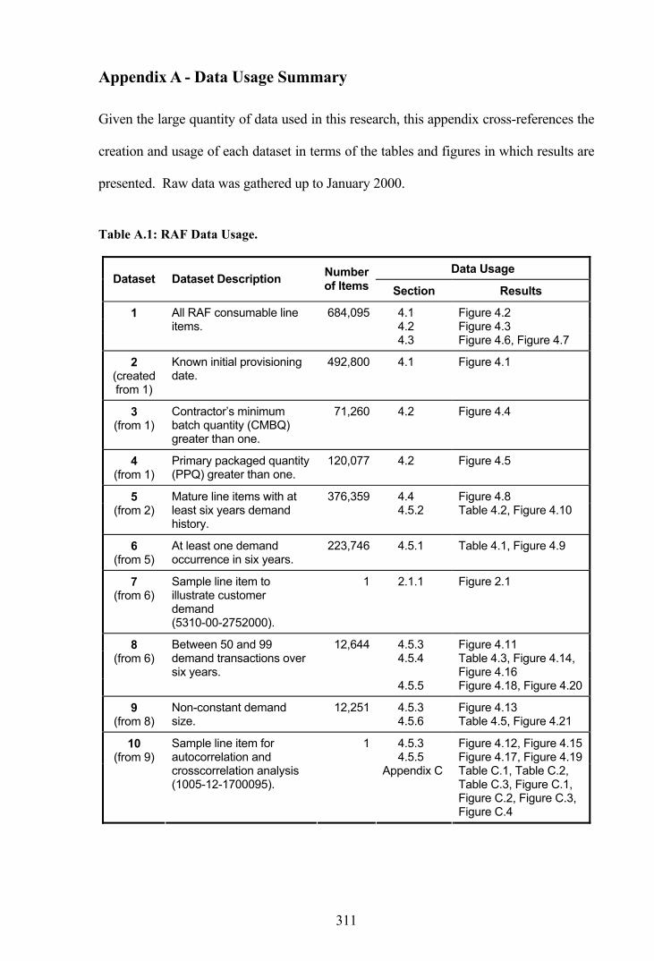
311
Appendix A - Data Usage Summary
Given the large quantity of data used in this research, this appendix cross-references the
creation and usage of each dataset in terms of the tables and figures in which results are
presented. Raw data was gathered up to January 2000.
Table A.1: RAF Data Usage.
Data Usage Dataset Dataset Description Number
of Items Section Results
4.1 Figure 4.2 4.2 Figure 4.3
1 All RAF consumable line items.
684,095
4.3 Figure 4.6, Figure 4.7
2 (created from 1)
Known initial provisioning date.
492,800 4.1 Figure 4.1
3 (from 1)
Contractor’s minimum batch quantity (CMBQ) greater than one.
71,260 4.2 Figure 4.4
4 (from 1)
Primary packaged quantity (PPQ) greater than one.
120,077 4.2 Figure 4.5
4.4 Figure 4.8 5 (from 2)
Mature line items with at least six years demand history.
376,3594.5.2 Table 4.2, Figure 4.10
6 (from 5)
At least one demand occurrence in six years.
223,746 4.5.1 Table 4.1, Figure 4.9
7 (from 6)
Sample line item to illustrate customer demand (5310-00-2752000).
1 2.1.1 Figure 2.1
4.5.3 Figure 4.11 4.5.4 Table 4.3, Figure 4.14,
Figure 4.16
8 (from 6)
Between 50 and 99 demand transactions over six years.
12,644
4.5.5 Figure 4.18, Figure 4.20
4.5.3 Figure 4.13 9 (from 8)
Non-constant demand size.
12,2514.5.6 Table 4.5, Figure 4.21
4.5.3 Figure 4.12, Figure 4.15 4.5.5 Figure 4.17, Figure 4.19
10 (from 9)
Sample line item for autocorrelation and crosscorrelation analysis (1005-12-1700095).
1
Appendix C Table C.1, Table C.2, Table C.3, Figure C.1, Figure C.2, Figure C.3, Figure C.4

312
Data Usage Dataset Dataset Description Number
of Items Section Results
11 (created from 8)
Sample line item to illustrate interval between transactions’ calculations (1005-12-1823955).
1 4.5.5 Table 4.4
12 Replenishment contracts placed and completed between Sept 1993 and Oct 1999 (representing 163,452 line items).
268,330 5.1 Figure 5.1
13 (from 12)
Line items with 12 or more non-constant lead-time observations.
161 5.1.2 Table 5.4
5.2.1 Table 5.5 5.2.2 Table 5.6, Table 5.8,
Table 5.9, Table 5.10 5.2.3 Table 5.11, Table 5.12,
Table 5.13 5.2.4 Table 5.14, Table 5.15,
Table 5.16, Figure 5.3 5.2.6 Table 5.18 5.2.7 Table 5.19 5.2.8 Table 5.20, Figure 5.4 5.3.1 Table 5.21, Table 5.22,
Figure 5.5, Figure 5.6, Figure 5.7
5.3.2 Table 5.23, Table 5.24, Figure 5.8, Figure 5.9, Figure 5.10
5.3.3 Table 5.25, Figure 5.11, Figure 5.12, Figure 5.13
14 (from 5 and 12)
Current line items with at least one lead-time observation.
72,712
5.3.4 Table 5.26
15 (from 14)
Set purchasing lead-time (PLT) up to 20 months.
71,922 5.2.4 Table 5.17
6.1 Table 6.2, Figure 6.1 6.2.1 Table 6.3, Figure 6.4 6.2.2 Table 6.4, Table 6.5,
Figure 6.5, Figure 6.6, Figure 6.7, Figure 6.8, Figure 6.9
6.2.3 Table 6.7, Figure 6.10, Figure 6.11, Figure 6.12
16 (same as 6)
Mature line items with positive demand, and lead-time allocated from the lead-time grouping cube and classification by demand pattern.
223,746
6.2.4 Table 6.8
6.1 Figure 6.2 9.3.3 Table 9.4
17 (from 16)
Sample line items to illustrate the identified demand patterns, and test the aggregation bias. (037F-99-6082626, 5306-00-8076329, 1560-99-7978970, 1005-12-1706156, 1560-00-733993).
5
9.3.7 Table 9.6

313
Data Usage Dataset Dataset Description Number
of Items Section Results
18 (created from 16)
Mildly erratic and highly erratic demand items.
84,308 6.2.1 Figure 6.3
19 (from 8 and 16)
Comparison of initially selected line items and their later classification.
12,644 6.2.5 Figure 6.13
20 (from 14)
Five line items with at least 10 lead-time observations (1650-99-7648229, 1680-99-6546054, 5330-99-8161994, 5985-99-6383805, 5985-99-6462883), plus 231 others within the B-D-E cluster grouping.
236 6.3.3 Table 6.12, Figure 6.14, Figure 6.15
21 (from 14)
Line items from groupings with at least 200 lead-time observations.
82 6.3.3 Table 6.13
6.2.3 Table 6.6 6.2.6 Table 6.9 7.4.1 Figure 7.9, Figure 7.10,
Figure 7.11 7.4.2 Table 7.8, Table 7.9,
Table 7.10 7.4.3 Table 7.11, Table 7.12,
Table 7.13 8.2 Table 8.1, Table 8.2,
Table 8.3 8.3 Table 8.4, Table 8.5,
Table 8.6 8.5 Table 8.7 9.3.3 Figure 9.7, Figure 9.8
Appendix E Table E.1 Appendix F Table F.1 Appendix H Table H.1 Appendix I Table I.1 Appendix J Table J.1, Table J.2,
Table J.3
22 (from 16)
Sample line items with equal representation by demand pattern (3,750 of each pattern).
18,750
Appendix L Table L.1
6.3.1 Table 6.10 23 (from 22)
Line items with at least 20 demand transactions and non-constant demand sizes.
6,7956.3.2 Table 6.11
7.1 Table 7.1 7.2 Table 7.2
24 (from 22)
Sample line item for illustrating Croston’s method (1005-12-1706162).
1
7.3.2 Table 7.3
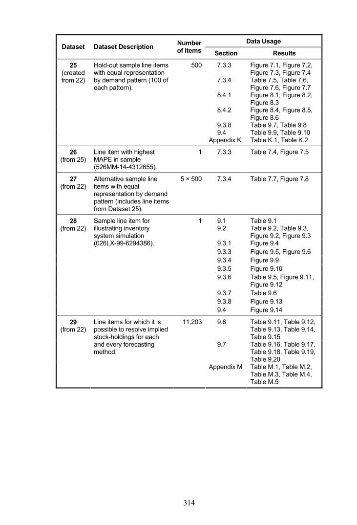
314
Data Usage Dataset Dataset Description Number
of Items Section Results
7.3.3 Figure 7.1, Figure 7.2, Figure 7.3, Figure 7.4
7.3.4 Table 7.5, Table 7.6, Figure 7.6, Figure 7.7
8.4.1 Figure 8.1, Figure 8.2, Figure 8.3
8.4.2 Figure 8.4, Figure 8.5, Figure 8.6
9.3.8 Table 9.7, Table 9.8 9.4 Table 9.9, Table 9.10
25 (created from 22)
Hold-out sample line items with equal representation by demand pattern (100 of each pattern).
500
Appendix K Table K.1, Table K.2
26 (from 25)
Line item with highest MAPE in sample (526MM-14-4312655).
1 7.3.3 Table 7.4, Figure 7.5
27 (from 22)
Alternative sample line items with equal representation by demand pattern (includes line items from Dataset 25).
5 × 500 7.3.4 Table 7.7, Figure 7.8
9.1 Table 9.1 9.2 Table 9.2, Table 9.3,
Figure 9.2, Figure 9.3 9.3.1 Figure 9.4 9.3.3 Figure 9.5, Figure 9.6 9.3.4 Figure 9.9 9.3.5 Figure 9.10 9.3.6 Table 9.5, Figure 9.11,
Figure 9.12 9.3.7 Table 9.6 9.3.8 Figure 9.13
28 (from 22)
Sample line item for illustrating inventory system simulation (026LX-99-6294386).
1
9.4 Figure 9.14
9.6 Table 9.11, Table 9.12, Table 9.13, Table 9.14, Table 9.15
9.7 Table 9.16, Table 9.17, Table 9.18, Table 9.19, Table 9.20
29 (from 22)
Line items for which it is possible to resolve implied stock-holdings for each and every forecasting method.
11,203
Appendix M Table M.1, Table M.2, Table M.3, Table M.4, Table M.5

315
Appendix B - Hypothesis Testing
When testing some claim about population parameters at some level of significance the
procedure is called hypothesis testing. Hanke et al. [33] outline the steps required to
conduct a hypothesis test:
(i) State the hypothesis being tested (the null hypothesis - denoted 0H ) and
state the alternative hypothesis (the one accepted if 0H is rejected - denoted 1H ).
(ii) Collect a random sample from the population and compute the appropriate
sample statistic.
(iii) Assume the null hypothesis is true and consult the sampling distribution
from which the sample statistic is drawn.
(iv) Compute the probability that such a sample statistic could be drawn from
the sampling distribution.
(v) If this probability is high do not reject the null hypothesis or if the
probability is low reject the null hypothesis, with low chance of error.
When hypothesis testing two types of errors can occur, as shown by Table B.1. It is
always hoped that the correct decision concerning the null hypothesis will be reached,
but there is the possibility of rejecting a true 0H and failing to reject a false 0H . The
probabilities of these events are alpha (α ) and beta ( β ) respectively, with alpha also
known as the significance level of the test.
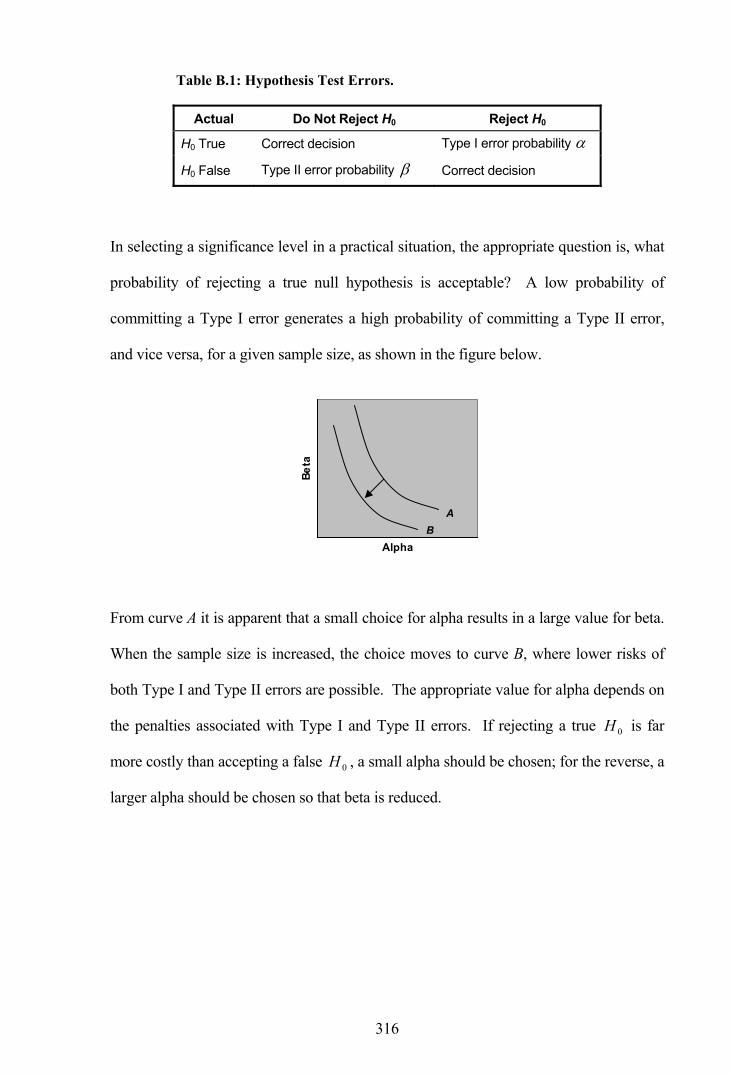
316
Table B.1: Hypothesis Test Errors.
Actual Do Not Reject H0 Reject H0
H0 True Correct decision Type I error probability α
H0 False Type II error probability β Correct decision
In selecting a significance level in a practical situation, the appropriate question is, what
probability of rejecting a true null hypothesis is acceptable? A low probability of
committing a Type I error generates a high probability of committing a Type II error,
and vice versa, for a given sample size, as shown in the figure below.
Alpha
Beta
From curve A it is apparent that a small choice for alpha results in a large value for beta.
When the sample size is increased, the choice moves to curve B, where lower risks of
both Type I and Type II errors are possible. The appropriate value for alpha depends on
the penalties associated with Type I and Type II errors. If rejecting a true 0H is far
more costly than accepting a false 0H , a small alpha should be chosen; for the reverse, a
larger alpha should be chosen so that beta is reduced.
A B

317
Appendix C - Investigating Autocorrelation in Demand Data
There are several alternative methods for determining whether there is autocorrelation
present in demand data that is more than likely to be skewed. Each method aims to
reduce the variation among the observed data and in particular remove the impact of
extreme values. The methods considered in this analysis include:
(i) Autocorrelation coefficients as a whole.
(ii) Natural logarithm transformations.
(iii) Spearman rank-order correlation.
(iv) Correlation of successive high-low observations.
(v) Frequency of high-low observations.
The effectiveness of each method will be considered in turn using the observed demand
sizes for the same sample line item for illustrative purposes throughout.
Autocorrelation Coefficients as a Whole
The first method for determining whether a skewed series is autocorrelated involves
examining the Pearson correlation coefficients as a whole. Often a few of the
coefficients will be significant while the majority are not, in which case an overall test of
significance is provided by a modified Box-Pierce Q -statistic described by Ljung and
Box [48]. Based on the 2χ (chi-square) distribution of the autocorrelation coefficients,
this test is capable of determining whether several coefficients are significantly different
from zero. The Q -statistic is computed as:

318
∑= −
+=K
k
kK kn
rnnQ
1
2
)2( (1)
where K is the largest lag included.
If the computed value is less than the tabulated 2χ value the autocorrelations are
deemed not significantly different from zero on the whole, indicating that the data is
random, whereas a computed value larger than the tabulated value indicates the
existence of some pattern.
From equation (1), the Q -statistic for autocorrelations of the sample line item is
=12Q 25.758, which is greater than the tabulated 2χ value of 18.307 at the 5 percent
level with 10 degrees of freedom. Therefore, the autocorrelations are significantly
different from zero and the demand sizes in this instance are not considered random as a
whole.
An analysis of the autocorrelations by this means reveals that 2,320, or 18.9 percent, of
the 12,251 selected line items with a non-constant demand size are statistically
significant as a whole. If the demand size is constant, the autocorrelation coefficients
remain undefined.
Natural Logarithm Transformations
The second method for examining autocorrelations if the normality assumption is not
satisfied is to take natural logarithms (base e) of the data series. Figure C.1 presents the
correlogram for the sample line item when this transformation is made. The profile of
the transformed data shows considerably less variation than that shown by the original
series. In this instance there are three autocorrelation coefficients which are individually
significant ( 2r , 7r and 9r ), while lag 4r is not amongst these. The non-significance of
lag 4r indicates that the previously identified problem of skewed data has been

319
overcome. When considering the significance of the autocorrelations as a whole by
using equation (1), the calculated Q -statistic with a value of 18.339 is marginally
greater than the tabulated 2χ value of 18.307, which again suggests that the demand
sizes are not random as a whole.
Figure C.1: Sample Correlogram - Demand Size (Log Transform).
-0.102
-0.101
-0.205
0.121
-0.214
0.239
0.047
0.039
-0.111
-0.046
0.001
0.059
-0.5 -0.4 -0.3 -0.2 -0.1 0.0 0.1 0.2 0.3 0.4 0.5
12
11
10
9
8
7
6
5
4
3
2
1
Lag
Inte
rval
Autocorrelation Coefficient
Calculating a Q -statistic for all selected line items indicates that 3,129, or 25.5 percent,
are statistically significant as a whole when a logarithmic transformation is used.
Spearman Rank-Order Correlation
The next method considered is the Spearman rank-order correlation. This is a non-
parametric measure of association based on the rank of the data values and is given by:
0
1
2
3
4
5Logarithmic Profile

320
∑ ∑∑
−−
−−=
22 )()(
))((
yyxx
yyxxr
ii
ii (2)
where ix is the rank of the thi x value, iy is the rank of the thi y
value and, in case of ties, the averaged ranks are used.
The correlogram of rank-order autocorrelation coefficients from equation (2) is shown
for the sample line item in Figure C.2. Once again, the variation in the profile is
considerably reduced and there are no extreme values. On this occasion only one
coefficient ( 9r ) is individually significant with another ( 7r ) very close to significance.
Again, 4r is not significant. With a calculated Q -statistic of 18.419 marginally greater
than the tabulated 2χ value of 18.307, the demand sizes are again not random as a
whole. Computing a Q -statistic for all 12,251 line items with a non-constant demand
size indicates that 5,042, or 41.2 percent, have statistically significant autocorrelations as
a whole using this method.
Figure C.2: Sample Correlogram - Demand Size (Spearman Rank-Order).
-0.077
-0.203
0.069
0.097
0.182
-0.014
-0.219
0.046
-0.186
-0.099
0.038
0.107
-0.5 -0.4 -0.3 -0.2 -0.1 0.0 0.1 0.2 0.3 0.4 0.5
12
11
10
9
8
7
6
5
4
3
2
1
Lag
Inte
rval
Autocorrelation Coefficient
0
20
40
60
80
100Rank Profile

321
Correlation of Successive High-Low Observations
A fourth method for determining the significance of autocorrelations in a skewed series
is to consider the correlation of successive high and low observations. Under this
method, successive observations are categorised as one or zero to signify that the
observation is either above or below the median value for the entire series. A Boolean
value is assigned to successive demand sizes based on a comparison against the median
for the sample line item. The calculated autocorrelations for this transformed series
produce the correlogram shown in Figure C.3.
Figure C.3: Sample Correlogram - Demand Size (High-Low Succession).
0.087
-0.150
0.129
0.075
0.087
-0.042
-0.025-0.252
-0.220
-0.114
-0.053
0.139
-0.5 -0.4 -0.3 -0.2 -0.1 0.0 0.1 0.2 0.3 0.4 0.5
12
11
10
9
8
7
6
5
4
3
2
1
Lag
Inte
rval
Autocorrelation Coefficient
The bar-code appearance of the generating profile, where the black bars comprise a
sequence of high observations and the grey bars a sequence of low observations,
portrays an extreme removal of the variation in the original series. Two autocorrelation
coefficients ( 5r and 7r ) are deemed to be individually significant on this occasion, while
0
1High-Low Profile

322
4r is again not significant. The calculated Q -statistic of 19.068 is greater than the
tabulated 2χ value of 18.307, which suggests the demand sizes are not random as a
whole. An analysis of the 12,251 selected line items by this means reveals that 4,769, or
38.9 percent, have statistically significant autocorrelations as a whole.
The analysis of RAF data using this method suggested that it was preferable to place any
observations that were equal to the median in the below median category rather than
placing them in the above median category. This is due to the fact that a series
containing a majority of values equal to unity and the remainder greater than unity will
have a median value of 1.0, which occurs often in reality. If values equal to the median
are placed in the above median category, the transformed series will comprise entirely
the same Boolean value and correlation coefficients will therefore remain undefined. If
all values are equal to unity or are constant at any level, as occurs with 400 line items,
the coefficients will remain undefined regardless.
Frequency of High-Low Observations
Although the fifth method considered in this analysis uses the same transformed data
series as the previous method, this final method differs from the others by the fact that
no correlation coefficients are computed. Instead, the method simply measures the
observed frequency of pairwise high-low observations from a 2×2 matrix and compares
the results with the expected frequency for each lag. Thus, the method considers the
frequency with which combinations of high and low values separated by incremental
lags are observed. For example, the following matrix presents the observed frequencies
of the lag 1 series of demand size for the sample line item:

323
First Obs
High Low
High 22 19
Seco
nd O
bs
Low 18 22
The matrix indicates that on 22 occasions a value greater than the median was
subsequently followed by a second value greater than the median and, similarly, a value
lower then the median was subsequently followed by a second value lower than the
median on 22 occasions also. Likewise a low value was followed by a high value on 19
occasions and a high value was followed by a low value on the remaining 18 occasions.
Any values equal to the median are once again placed in the below median category.
If the series was truly random and did not contain any autocorrelations, the expected
frequency for each of the cells of the matrix would closely equal the average value,
which is 20.25 in this case. A chi-square test is undertaken to determine whether the
observed ( iO ) and expected ( iE ) frequencies for each lag interval differ significantly
through the calculation of a chi-square statistic:
( )∑
=
−=
k
i i
ii
EEO
1
22χ (3)
where k is the number of cells.
Table C.1 presents the observed pairwise frequencies for each lag interval. A proxy
method for determining whether any autocorrelations are positive or negative involves
comparing the combined high-high and low-low frequency (shown as +’ve total in the
table) with the combined high-low and low-high frequency (shown as -’ve total). The
autocorrelation is then defined as positive or negative depending on which total is

324
highest. For example, in the case of lag 1, the positive total of 44 is greater than the
negative total of 37 so the autocorrelation is defined as positive.
Table C.1: Demand Size Observed and Expected High-Low Observations.
Lag Interval Pairwise Pattern 1 2 3 4 5 6 7 8 9 10 11 12
High-High 22 21 17 22 15 18 14 17 15 20 17 19
Low-Low 22 22 18 22 15 19 14 18 16 21 17 19
+’ve total 44 43 35 44 30 37 28 35 31 41 34 38
High-Low 19 19 23 18 25 21 25 21 22 16 19 17
Low-High 18 18 21 16 22 18 22 18 20 15 18 15
-’ve total 37 37 44 34 47 39 47 39 42 31 37 32
+’ve / -’ve + + - + - - - - - + - +
iE 20.25 20.00 19.75 19.50 19.25 19.00 18.75 18.50 18.25 18.00 17.75 17.50
2χ 0.63 0.50 1.15 1.38 3.99 0.32 5.05 0.49 1.79 1.44 0.15 0.63
Also shown in the table are the expected frequencies ( iE ), which are simply the average
of the four pairwise frequencies for each lag interval. The average decreases as an
additional observation is lost with each lag. A chi-square statistic 2χ is calculated for
each lag interval using equation (3), with each pairwise frequency representing an
observed frequency.
The results are compared with the tabulated value at 1−k degrees of freedom, as
presented in Figure C.4 where the bars indicate the calculated chi-square statistics for
each lag interval and the horizontal dotted line indicates the tabulated value at the 5 per
cent significance level with 3 degrees of freedom. As none of the calculated statistics
exceed the tabulated value, this method suggests that there are no significant
autocorrelations in the sample data. However, as with the previous method, lags 5 and 7

325
show the greatest signs of autocorrelation and, as with all the methods in this analysis,
lag 4 presents little sign of autocorrelation.
Figure C.4: Sample Chi-Square - Demand Size (High-Low Frequency).
0
2
4
6
8
10
1 2 3 4 5 6 7 8 9 10 11 12Lag Interval
Cal
clua
ted
and
Tabu
late
dC
hi-S
quar
e Va
lues
This method does not readily lend itself to calculating whether the autocorrelations are
significant as a whole, although statistics that make this method comparable with the
other methods are presented in the next section.
Autocorrelation Methods Compared
This section compares the results generated by the five autocorrelation methods
examined previously. The results are obtained from 12,251 line items in the RAF
inventory with a non-constant demand size. Each data series contains between 50 and
99 observations.
Table C.2 presents summary statistics for individually significant lags, as well as line
items that have significant autocorrelations as a whole. Through the use of the chi-
square test, the high-low frequency method identifies substantially more individually
significant lags than the other four methods that utilise correlation coefficients (58.8
percent against 6.9 to 13.4 percent). When considering the sign of the significant lags,

326
the original data series and the high-low frequency method tend to have a low
proportion of negative autocorrelations compared with the other three methods. The
original data series has fewer line items that contain at least one significant lag (48.5
percent) while the high-low frequency method has the most (72.0 percent).
Table C.2: Autocorrelation Summary Statistics - Demand Size.
Percentage of Individually Significant Lags
Percentage of Line Items (n = 12,251)
Proportion Autocorrelation
Method Total
Negative Positive With Signif
Lags Signif as a Whole
Original Data Series 6.9 7.9 92.1 48.5 18.9
Log Transform 9.2 16.0 84.0 55.1 25.5
Spearman Rank-Order 13.4 22.0 78.0 68.6 41.2
High-Low Correlation 12.8 21.4 78.6 66.5 38.9
High-Low Frequency 58.8 5.1 94.9 72.0 ≈45.0
As determined by a regression analysis upon the results of the first four methods, there
is a very strong linear relationship ( 2r = 0.999) between the percentage of line items
with at least one significant lag and the percentage of line items with autocorrelations
that are significant as a whole. Therefore, it is possible to determine an approximate
percentage of line items that have significant autocorrelations as a whole for the high-
low frequency method based on the observed percentage of line items with at least one
significant lag.
As shown in the last column of Table C.2, the methods differ substantially in the number
of line items they identify as significantly autocorrelated as a whole. Interestingly, each
of the alternative methods identify a higher percentage (25.5 to about 45.0 percent) of
line items with significant autocorrelations as a whole, compared with that obtained by
the original data series (18.9 percent).

327
Attention is now given to the level of conformity as to which line items are actually
identified as having autocorrelation. Table C.3 provides Venn diagram-type statistics
for the level of conformity between four correlation coefficient methods, where a
indicates autocorrelation is identified and a indicates autocorrelation has not been
identified. It is not possible to include the high-low frequency method, as this method
cannot consider autocorrelations as a whole in the same manner.
Table C.3: Autocorrelation Method Conformity.
Original Series
Log Transform
Spearman Rank-Order
High-Low Correlation
Percentage of Observations
48.0%
11.8%
2.1%
0.1%
1.2%
7.6%
0.6%
0.6%
0.5%
2.7%
0.1%
10.6%
2.0%
0.5%
4.6%
7.0%
The results indicate that all four methods agree on 48.0 percent of line items which do
not have autocorrelations that are significant as a whole and, similarly they agree on a
further 11.8 percent, which do. Beyond that there are a further 11.0 percent (2.1 + 0.1 +

328
1.2 + 7.6) where three methods agree there are autocorrelations, leaving a total of 29.2
percent of line items where less than three methods agree there are autocorrelations.
Concluding Remarks
Determining the significance of autocorrelations when the data is skewed can lead to
erroneous interpretations and for this reason alternative methods of identifying
autocorrelations were investigated. While excluding the original data series from
consideration, each alternative method identifies a varying level of autocorrelation in the
demand size, ranging from 25.5 percent of line items to about 45 percent.
The rank-order method and the two high-low methods tend to indicate higher levels of
autocorrelation than does the logarithm transformation method. However, the latter
method examines the demand sizes, rather than ranks or comparisons against the
median, and is therefore considered the more useful method as stock control methods
themselves require knowledge about the demand sizes. The logarithm transformation
method has been selected as the sole method for further autocorrelation analysis on this
basis. In addition, this method benefits from the ease and simplicity of generating
results, as well as the ability to produce the required statistics, including the
identification of significant autocorrelations as a whole.

329
Appendix D - The Friedman Test
The nonparametric Friedman test provides a method for testing whether k related
samples have been drawn from the same population of ordinal sample data, which is
data consisting of rankings. Under this test the null and alternative hypotheses are:
0H : the k populations have identical probability distributions, and
1H : at least two of the populations differ in location.
Kvanli et al. [45] describe the assumptions and procedure. It is assumed that the factor
levels are applied in a random manner within each block, the number of blocks (b) or the
number of factor levels (k) exceeds five, and the values within each block can be ranked.
The k observations within each block are rank ordered, assigning the average of the tied
positions in the event of ties within a block. Define iT as the total of the ranks for the
thi population. The test statistic for the Friedman test is defined as:
∑=
+−+
=k
ii kbT
kbkFR
1
2 )1(3)1(
12
The distribution of the FR statistic approximately follows a chi-square distribution with
1−k degrees of freedom. The Friedman test procedure is to reject the null hypothesis if
FR lies in the right-tail of the chi-square distribution, that is
reject 0H if 21, −> kFR αχ
The SAS FREQ procedure produces Friedman’s statistic as the Row Mean Scores Differ
value by specifying the CMH2 option with SCORES=RANK and stratification by
block.

330
Appendix E - Measurement of Accuracy
This appendix presents a range of error measures comparing Croston’s method with
more traditional means of forecasting, including exponential smoothing, a one year
moving average and a simple previous year average. In each case the statistics are
averaged across a total of 18,750 sample line items. Optimal smoothing constants from
a hold-out sample of 500 line items were used throughout.
Error measures are presented in Table E.1, firstly when comparing the forecast value
with the one-period ahead demand, secondly when comparing the forecast value with
the lead-time demand in all periods and finally when comparing the lead-time demand
in periods of positive demand only. The minimum observation for each statistic is
shown in bold-type.
In each case, the respective averages are provided for the mean absolute deviation
(MAD), the MAD for forecast errors which exceed 5.0 percent above the actual value
(denoted MAD+), the MAD for forecast errors more than 5.0 percent below the actual
value (denoted MAD-), as well as the root mean square error (RMSE), the mean
absolute percentage error (MAPE) and the median absolute percentage error (MdAPE).
With values substantially greater than the tabulated chi-square value of 7.81 at the 5
percent significance level, Friedman’s statistic indicates that there are differences in the
forecasting performance in all cases, although the differences are not as prominent when
considering lead-time demand in periods with positive demand only.

331
Table E.1: Measurement of Accuracy - Forecast Comparisons.
Demand Aggreg’n
Error Measure
Expon’l Smooth.
Croston’s Method
Moving Average
Prev Year Average
Friedman Statistic
One-Period Ahead Demand (All Periods)
MAD 20.08 20.79 19.37 20.83 8,047.62
MAD + 11.66 12.47 10.47 11.69 14,505.91
MAD - 8.38 8.26 8.84 9.09 17,906.56
RMSE 26.96 27.62 27.15 28.83 4,926.94
MAPE 117.62 127.30 119.25 123.25 5,231.11
Quarterly
MdAPE 73.87 74.92 75.76 77.08 7,538.83
MAD 9.22 9.81 8.71 9.20 16,564.56
MAD + 5.25 5.90 4.63 5.05 18,391.88
MAD - 3.95 3.90 4.07 4.13 18,044.35
RMSE 14.04 14.38 13.92 14.41 6,686.86
MAPE 101.06 98.46 102.96 104.51 10,448.66
Monthly
MdAPE 76.58 70.09 79.95 80.03 14,157.96
MAD 3.11 3.52 2.94 3.04 19,246.92
MAD + 1.71 2.14 1.53 1.62 19,070.22
MAD - 1.39 1.38 1.41 1.42 16,747.47
RMSE 6.28 6.46 6.24 6.32 9,172.85
MAPE 94.20 90.42 95.68 95.74 13,866.78
Weekly
MdAPE 87.33 82.20 89.71 89.47 18,694.12
Lead-Time Demand (All Periods)
MAD 14.88 18.60 15.29 16.66 8,359.42
MAD + 8.55 11.31 8.82 10.00 13,977.09
MAD - 6.27 7.24 6.40 6.60 5,319.75
RMSE 19.56 25.16 19.86 21.45 7,961.72
MAPE 173.29 303.95 181.07 204.63 4,863.52
Quarterly
MdAPE 91.02 202.02 98.64 112.21 2,599.54
MAD 5.00 5.77 5.18 5.69 3,936.33
MAD + 2.89 3.93 3.00 3.44 10,806.45
MAD - 2.09 1.81 2.16 2.23 21,698.94
RMSE 6.63 7.16 6.79 7.36 1,436.55
MAPE 174.76 342.52 182.48 212.49 3,337.34
Monthly
MdAPE 86.99 245.56 94.85 113.27 2,490.82

332
Demand Aggreg’n
Error Measure
Expon’l Smooth.
Croston’s Method
Moving Average
Prev Year Average
Friedman Statistic
Lead-Time Demand (All Periods) - continued
MAD 1.17 1.45 1.21 1.33 5,163.07
MAD + 0.67 1.00 0.70 0.80 10,631.45
MAD - 0.49 0.44 0.50 0.53 17,445.13
RMSE 1.56 1.81 1.59 1.73 2,557.83
MAPE 171.29 348.63 179.25 211.12 3,718.95
Weekly
MdAPE 84.08 242.09 92.25 109.78 2,920.55
Lead-Time Demand (Demand Only)
MAD 16.46 18.00 16.43 17.32 580.53
MAD + 10.98 10.64 10.45 10.76 2,825.87
MAD - 5.41 7.31 5.92 6.50 13,477.78
RMSE 19.95 24.42 20.69 21.71 2,041.30
MAPE 254.14 216.74 233.80 218.81 151.37
Quarterly
MdAPE 174.06 128.27 145.42 137.81 184.16
MAD 5.71 6.02 5.66 5.87 946.18
MAD + 3.87 3.73 3.67 3.60 6,602.67
MAD - 1.82 2.28 1.97 2.25 13,152.85
RMSE 6.93 8.24 7.16 7.39 1,566.38
MAPE 256.78 222.70 233.42 211.27 233.87
Monthly
MdAPE 169.18 132.54 137.33 130.44 281.95
MAD 1.38 1.79 1.34 1.38 2,682.78
MAD + 0.93 1.13 0.88 0.83 9,386.47
MAD - 0.44 0.66 0.46 0.54 12,530.58
RMSE 1.66 2.76 1.70 1.74 3,910.61
MAPE 252.72 226.30 228.12 215.83 810.74
Weekly
MdAPE 164.97 126.53 128.44 133.06 71.11

333
Appendix F - Median Absolute Percentage Error by Demand Pattern
In this appendix comparisons are made between the five identified demand patterns
using the median absolute percentage error (MdAPE). The forecasting methods
included in the analysis are exponential smoothing, Croston’s method, a one year
moving average and a simple previous year average. For each demand pattern the
MdAPE is averaged across 3,750 sample line items, where optimal smoothing constants
were obtained from hold-out samples of 100 line items for each pattern. Results are
shown in Table F.1 for forecast comparisons with the one-period ahead demand, with
the lead-time demand in all periods, and also with the lead-time demand in periods of
positive demand only. The minimum observation in each instance is shown in bold-
type.
Table F.1: Median Absolute Percentage Error (MdAPE) by Demand Pattern.
Demand Aggreg’n
Demand Pattern
Expon’l Smooth.
Croston’s Method
Moving Average
Prev Year Average
Friedman Statistic
One-Period Ahead Demand (All Periods)
Smooth 50.53 47.76 51.29 53.50 492.86
Irregular 83.41 77.92 73.45 79.37 325.86
Slow-moving 67.39 49.26 77.69 74.43 4,517.36
Mildly Erratic 86.05 103.52 88.41 90.70 2,126.64
Quarterly
Highly Erratic 82.18 96.31 88.56 87.84 2,055.99
Smooth 58.37 54.15 59.99 61.03 1,067.97
Irregular 77.79 71.67 74.33 78.15 935.67
Slow-moving 83.60 68.56 88.76 86.73 6,120.73
Mildly Erratic 83.48 81.48 89.73 89.13 3,983.87
Monthly
Highly Erratic 79.76 74.66 87.04 85.22 4,068.97
Smooth 76.09 73.59 77.43 77.77 1,379.48
Irregular 81.23 77.00 83.85 83.83 2,241.26
Slow-moving 95.22 89.44 96.64 96.31 5,892.41
Mildly Erratic 92.63 86.57 95.69 95.23 5,192.18
Weekly
Highly Erratic 91.49 84.39 94.94 94.21 5,464.52

334
Demand Aggreg’n
Demand Pattern
Expon’l Smooth.
Croston’s Method
Moving Average
Prev Year Average
Friedman Statistic
Lead-Time Demand (All Periods)
Smooth 52.15 64.20 53.34 60.34 592.82
Irregular 82.67 165.64 81.55 95.86 264.00
Slow-moving 82.73 168.28 94.57 103.02 728.60
Mildly Erratic 116.89 320.16 130.33 151.79 791.34
Quarterly
Highly Erratic 121.35 294.54 134.40 151.13 633.73
Smooth 51.22 71.51 52.60 60.47 229.17
Irregular 80.58 174.04 78.25 93.18 139.77
Slow-moving 82.58 202.67 94.26 108.40 1,031.48
Mildly Erratic 114.55 413.28 128.53 155.31 932.80
Monthly
Highly Erratic 106.11 366.72 120.71 149.14 973.31
Smooth 50.01 71.68 51.32 58.57 330.99
Irregular 76.15 141.77 75.63 88.66 168.93
Slow-moving 80.08 201.40 91.31 101.71 1,033.40
Mildly Erratic 108.87 424.43 125.00 152.65 881.01
Weekly
Highly Erratic 105.28 371.18 117.98 147.31 986.14
Lead-Time Demand (Demand Only)
Smooth 65.33 57.87 58.98 62.46 413.27
Irregular 124.74 88.03 97.25 101.95 182.81
Slow-moving 126.10 96.93 113.76 111.68 249.54
Mildly Erratic 313.17 224.41 265.18 236.47 117.05
Quarterly
Highly Erratic 277.05 199.58 223.62 202.65 118.52
Smooth 63.72 57.10 57.14 60.47 271.08
Irregular 119.48 92.60 92.16 94.01 90.75
Slow-moving 129.66 105.10 114.58 114.58 269.40
Mildly Erratic 307.32 240.05 251.69 223.26 129.51
Monthly
Highly Erratic 258.05 192.19 198.13 183.02 197.47
Smooth 62.31 57.81 54.67 58.50 530.99
Irregular 122.85 89.89 91.79 93.31 82.32
Slow-moving 119.05 102.01 107.34 106.07 148.51
Mildly Erratic 290.56 227.62 226.98 221.80 60.18
Weekly
Highly Erratic 256.24 175.34 182.58 206.81 102.10

335
Appendix G - Syntetos and Boylan’s Modifications to Croston’s Method
Part A: Expectation of the Inter-Demand Interval
Presented in Syntetos and Boylan [78].
(Assume that 1=α so that tt pp =′+1 )
If we denote by tp the inter demand interval that follows the geometric distribution,
including the first success (i.e. demand occurring period), and by tp1 the probability of
demand occurrence at period t , we then have:
tpE 1
1
1
1111−∞
=
−= ∑
x
x ppx
1
1
111−∞
=∑
−=
x
x pp
xp
for 1>p (i.e. demand does not occur in every single time period)
∑∞
= −−
=1
1))1(())1((11
x
x
pppp
xp
x
x pp
xppp ∑∞
=
−−
=1
11))1((
11
+
−+
−+
−−
= ...1311
211
11
32
pp
pp
pp
p
−
−=pp1log
11

336
Part B: An Expectation for Giving Unbiased Estimates
Presented in Syntetos and Boylan [78].
−1
1tp
t cpE ∑
∞
=
−
−
−=
1
1
1
11111x
x
x pcpx
∑∞
=
−
−=
1
11111
x
x
cpcxp
∑∞
=
−
−=
1
1111
x
x
cpp
xp
−+= ∑
∞
=
−
2
11111
x
x
cpp
xp
As pcp
Ectp
t
11, 1 →
∞→ −

337
Appendix H - Measurement of Accuracy - Croston’s and Variants
This appendix compares error measure statistics for the forecasting methods classed as
variations on Croston’s method, including Croston’s method itself, the revised Croston’s
method, the bias reduction method and the approximation method. The statistics shown
in each case are the average MAD, the average MAD for forecast errors which exceed
5.0 percent above the actual value (denoted MAD+), the average MAD for forecast
errors more than 5.0 percent below the actual value (denoted MAD-), as well as the
average RMSE, the average MAPE and the average MdAPE, taken across 18,750
sample line items. Optimal smoothing constants for Croston’s method were obtained
from a hold-out sample of 500 line items and the other three methods utilise the same
parameters.
Error measures are presented in Table H.1 comparing the forecast value, firstly with the
one-period ahead demand, secondly with the lead-time demand in all periods and finally
with the lead-time demand in periods of positive demand only. The minimum
observation for each statistic is shown in bold-type. These results are comparable with
those of the more traditional forecasting methods presented in Appendix E.
Once again, the Friedman’s statistics are substantially greater than the tabulated chi-
square value of 7.81 at the 5 percent significance level, indicating that there are
differences in the forecasting performance in all cases.
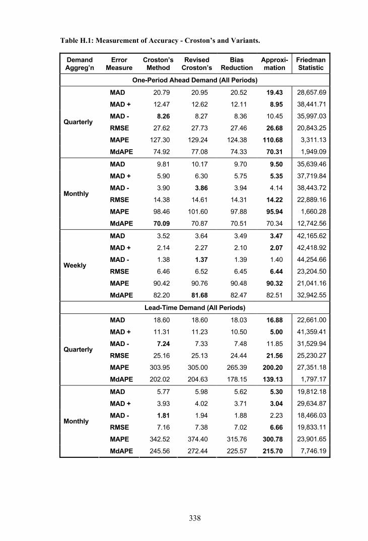
338
Table H.1: Measurement of Accuracy - Croston’s and Variants.
Demand Aggreg’n
Error Measure
Croston’s Method
Revised Croston’s
Bias Reduction
Approxi-mation
Friedman Statistic
One-Period Ahead Demand (All Periods)
MAD 20.79 20.95 20.52 19.43 28,657.69
MAD + 12.47 12.62 12.11 8.95 38,441.71
MAD - 8.26 8.27 8.36 10.45 35,997.03
RMSE 27.62 27.73 27.46 26.68 20,843.25
MAPE 127.30 129.24 124.38 110.68 3,311.13
Quarterly
MdAPE 74.92 77.08 74.33 70.31 1,949.09
MAD 9.81 10.17 9.70 9.50 35,639.46
MAD + 5.90 6.30 5.75 5.35 37,719.84
MAD - 3.90 3.86 3.94 4.14 38,443.72
RMSE 14.38 14.61 14.31 14.22 22,889.16
MAPE 98.46 101.60 97.88 95.94 1,660.28
Monthly
MdAPE 70.09 70.87 70.51 70.34 12,742.56
MAD 3.52 3.64 3.49 3.47 42,165.62
MAD + 2.14 2.27 2.10 2.07 42,418.92
MAD - 1.38 1.37 1.39 1.40 44,254.66
RMSE 6.46 6.52 6.45 6.44 23,204.50
MAPE 90.42 90.76 90.48 90.32 21,041.16
Weekly
MdAPE 82.20 81.68 82.47 82.51 32,942.55
Lead-Time Demand (All Periods)
MAD 18.60 18.60 18.03 16.88 22,661.00
MAD + 11.31 11.23 10.50 5.00 41,359.41
MAD - 7.24 7.33 7.48 11.85 31,529.94
RMSE 25.16 25.13 24.44 21.56 25,230.27
MAPE 303.95 305.00 265.39 200.20 27,351.18
Quarterly
MdAPE 202.02 204.63 178.15 139.13 1,797.17
MAD 5.77 5.98 5.62 5.30 19,812.18
MAD + 3.93 4.02 3.71 3.04 29,634.87
MAD - 1.81 1.94 1.88 2.23 18,466.03
RMSE 7.16 7.38 7.02 6.66 19,833.11
MAPE 342.52 374.40 315.76 300.78 23,901.65
Monthly
MdAPE 245.56 272.44 225.57 215.70 7,746.19

339
Demand Aggreg’n
Error Measure
Croston’s Method
Revised Croston’s
Bias Reduction
Approxi-mation
Friedman Statistic
Lead-Time Demand (All Periods) - continued
MAD 1.45 1.76 1.40 1.36 18,178.57
MAD + 1.00 1.23 0.93 0.87 22,504.78
MAD - 0.44 0.52 0.46 0.49 14,234.34
RMSE 1.81 2.17 1.77 1.72 17,968.26
MAPE 348.63 458.34 324.91 322.50 20,488.69
Weekly
MdAPE 242.09 323.18 225.05 223.82 9,061.46
Lead-Time Demand (Demand Only)
MAD 18.00 18.11 17.42 16.61 18,266.50
MAD + 10.64 10.63 9.77 4.37 35,210.71
MAD - 7.31 7.44 7.59 12.21 24,775.78
RMSE 24.42 24.52 23.62 21.09 21,057.67
MAPE 216.74 218.63 178.14 144.40 14,981.29
Quarterly
MdAPE 128.27 135.32 105.94 94.13 544.67
MAD 6.02 6.33 5.76 5.46 20,101.97
MAD + 3.73 3.91 3.31 2.23 28,170.94
MAD - 2.28 2.40 2.43 3.21 17,242.74
RMSE 8.24 8.64 7.88 7.19 23,017.33
MAPE 222.70 272.77 180.52 172.05 16,939.61
Monthly
MdAPE 132.54 173.61 107.10 105.60 3,681.15
MAD 1.79 2.15 1.64 1.57 24,980.43
MAD + 1.13 1.40 0.88 0.72 28,417.92
MAD - 0.66 0.75 0.75 0.85 18,421.12
RMSE 2.76 3.30 2.49 2.27 26,041.85
MAPE 226.30 356.94 168.03 173.84 18,624.13
Weekly
MdAPE 126.53 216.48 97.20 101.13 8,318.53

340
Appendix I - MdAPE by Demand Pattern - Croston’s and Variants
This appendix presents median absolute percentage error (MdAPE) results for the
forecasting methods presented as suitable for erratic demand patterns. The results are
comparable with those of the traditional forecasting methods presented in Appendix F.
Table I.1: MdAPE by Demand Pattern - Croston’s and Variants.
Demand Aggregation
Demand Pattern
Croston’s Method
Revised Croston’s
Bias Reduction
Approxi-mation
Friedman Statistic
One-Period Ahead Demand (All Periods)
Smooth 47.76 48.14 48.15 47.11 163.40
Irregular 77.92 78.93 76.63 71.39 49.15
Slow-moving 49.26 49.18 51.99 52.83 2,694.77
Mildly Erratic 103.52 111.06 100.89 93.55 394.25
Quarterly
Highly Erratic 96.31 98.35 94.21 86.93 196.15
Smooth 54.15 53.45 54.83 54.83 1,241.72
Irregular 71.67 73.40 71.57 70.90 634.79
Slow-moving 68.56 65.71 69.88 70.35 7,229.87
Mildly Erratic 81.48 85.43 81.39 81.01 3,118.60
Monthly
Highly Erratic 74.66 76.41 74.93 74.64 2,864.10
Smooth 73.59 72.81 73.95 74.02 4,723.02
Irregular 77.00 76.45 77.30 77.31 4,381.26
Slow-moving 89.44 88.86 89.69 89.72 9,245.24
Mildly Erratic 86.57 86.43 86.76 86.78 7,755.85
Weekly
Highly Erratic 84.39 83.88 84.67 84.69 7,666.26
Lead-Time Demand (All Periods)
Smooth 64.20 65.02 61.58 56.90 157.35
Irregular 165.64 160.63 157.25 127.87 119.67
Slow-moving 168.28 172.39 141.95 103.59 2,153.94
Mildly Erratic 320.16 329.12 273.13 212.16 1,014.98
Quarterly
Highly Erratic 294.54 298.91 258.86 196.43 998.74
Smooth 71.51 80.43 67.45 63.77 955.58
Irregular 174.04 187.62 164.36 154.68 927.95
Slow-moving 202.67 229.87 182.86 174.60 2,920.40
Mildly Erratic 413.28 458.61 377.42 363.69 1,750.02
Monthly
Highly Erratic 366.72 406.16 336.11 322.07 1,910.38

341
Demand Aggregation
Demand Pattern
Croston’s Method
Revised Croston’s
Bias Reduction
Approxi-mation
Friedman Statistic
Lead-Time Demand (All Periods) - continued
Smooth 71.68 107.57 67.50 66.53 2,863.49
Irregular 141.77 184.61 132.91 131.79 1,607.88
Slow-moving 201.40 283.92 184.90 183.95 2,681.71
Mildly Erratic 424.43 567.86 394.94 393.33 1,419.93
Weekly
Highly Erratic 371.18 471.92 345.02 343.49 1,476.46
Lead-Time Demand (Demand Only)
Smooth 57.87 59.39 55.95 53.76 247.11
Irregular 88.03 88.35 81.24 76.25 167.26
Slow-moving 96.93 107.88 76.40 65.71 647.78
Mildly Erratic 224.41 240.92 172.03 151.48 364.43
Quarterly
Highly Erratic 199.58 209.02 160.46 135.86 394.75
Smooth 57.10 65.05 52.70 51.32 525.72
Irregular 92.60 104.79 81.95 79.88 629.77
Slow-moving 105.10 152.69 79.77 78.63 1,197.01
Mildly Erratic 240.05 327.15 186.78 185.77 1,026.68
Monthly
Highly Erratic 192.19 257.39 150.49 148.72 1,029.57
Smooth 57.81 84.72 52.24 52.23 3,045.74
Irregular 89.89 123.57 78.23 79.13 2,634.72
Slow-moving 102.01 209.66 71.67 75.67 1,488.57
Mildly Erratic 227.62 403.59 166.37 175.77 1,283.46
Weekly
Highly Erratic 175.34 306.61 128.88 135.67 1,228.89

342
Appendix J - Effect of Autocorrelation on Forecasting Performance
This appendix considers the effect of autocorrelation and crosscorrelation on forecasting
performance. The analysis compares the performance of exponential smoothing and
Croston’s method at various levels of autocorrelation and crosscorrelation. In each case
the line items have been classified according to the significance of their autocorrelations
of the logarithmic transformation on the individual transaction data:
(i) If the correlations are not significant on the whole a not signif classification
is given, otherwise
(ii) If the sum of the individually significant correlations is less than zero a
negative classification is given, or
(iii) If the sum of the individually significant correlations is greater than zero, a
positive classification is given, alternatively
(iv) If the correlations are significant on the whole, but there are no individually
significant correlations, then these line items are not considered.
Based on a sample size of 18,750 line items, the tables in this appendix present the
average MAPE and the average MdAPE. Results are presented for autocorrelations in
the demand size, autocorrelations in the interval between transactions and
crosscorrelations between the demand size and interval respectively. Bold type
indicates the best forecasting method under each negative, nil and positive
autocorrelation classification.

343
Table J.1: Demand Size Autocorrelation.
Negative Nil Positive Demand Aggreg’n
Error Measure Expon’l
Smooth. Croston’s Method
Expon’l Smooth.
Croston’s Method
Expon’l Smooth.
Croston’s Method
One-Period Ahead Demand (All Periods)
MAPE 110.90 117.13 116.94 126.75 125.99 135.20 Quarterly
MdAPE 72.33 73.34 73.67 74.86 78.24 79.59
MAPE 105.90 102.91 100.33 97.67 105.91 104.33 Monthly
MdAPE 81.88 75.50 76.15 69.59 77.93 72.86
MAPE 95.31 91.65 94.08 90.25 96.05 92.71 Weekly
MdAPE 87.50 82.31 87.31 82.15 87.55 82.70
Lead-Time Demand (All Periods)
MAPE 170.25 275.24 170.07 305.27 215.92 327.98 Quarterly
MdAPE 91.56 186.38 87.79 202.39 130.10 222.08
MAPE 172.52 361.75 174.47 341.79 183.90 352.66 Monthly
MdAPE 88.75 263.25 87.08 246.04 86.72 235.48
MAPE 168.47 359.25 171.38 348.22 176.64 361.86 Weekly
MdAPE 82.96 244.69 84.40 243.02 83.12 237.80
Lead-Time Demand (Demand Only)
MAPE 283.24 240.87 248.70 211.55 294.29 262.86 Quarterly
MdAPE 219.75 174.53 168.02 121.64 209.77 175.70
MAPE 293.73 251.71 252.62 220.06 272.89 230.70 Monthly
MdAPE 218.54 181.83 164.49 128.37 186.21 145.93
MAPE 289.99 257.87 248.43 224.60 270.27 224.37 Weekly
MdAPE 205.86 176.74 161.50 123.94 173.59 121.41

344
Table J.2: Transaction Interval Autocorrelation.
Negative Nil Positive Demand Aggreg’n
Error Measure Expon’l
Smooth. Croston’s Method
Expon’l Smooth.
Croston’s Method
Expon’l Smooth.
Croston’s Method
One-Period Ahead Demand (All Periods)
MAPE 109.25 114.66 116.91 126.40 126.65 139.81 Quarterly
MdAPE 71.68 71.55 73.73 74.72 77.30 80.11
MAPE 102.05 97.14 100.18 97.88 107.27 104.82 Monthly
MdAPE 76.05 68.89 76.66 70.20 75.93 70.15
MAPE 93.04 89.02 93.86 90.01 96.80 94.22 Weekly
MdAPE 87.34 82.06 87.32 82.11 87.12 82.24
Lead-Time Demand (All Periods)
MAPE 166.98 276.58 170.15 302.72 214.54 348.65 Quarterly
MdAPE 88.77 180.02 87.96 202.46 125.16 219.85
MAPE 173.20 311.53 173.15 343.99 191.15 360.34 Monthly
MdAPE 92.24 238.15 86.34 246.79 85.50 235.45
MAPE 168.82 315.64 170.29 349.82 184.88 371.07 Weekly
MdAPE 89.75 238.71 83.50 241.72 81.02 243.40
Lead-Time Demand (Demand Only)
MAPE 245.13 231.89 252.87 210.93 284.62 271.91 Quarterly
MdAPE 176.43 149.79 171.81 121.51 204.84 185.72
MAPE 243.37 217.28 256.65 221.95 274.87 239.02 Monthly
MdAPE 158.40 129.10 169.83 132.15 185.01 149.80
MAPE 230.21 217.45 253.90 227.92 275.07 230.67 Weekly
MdAPE 148.59 120.12 166.52 127.78 169.56 122.76

345
Table J.3: Size and Interval Crosscorrelation.
Negative Nil Positive Demand Aggreg’n
Error Measure Expon’l
Smooth. Croston’s Method
Expon’l Smooth.
Croston’s Method
Expon’l Smooth.
Croston’s Method
One-Period Ahead Demand (All Periods)
MAPE 121.46 128.14 117.27 128.69 115.67 117.26 Quarterly
MdAPE 73.01 73.50 73.77 75.46 75.37 73.10
MAPE 105.92 100.98 99.93 98.16 102.90 97.56 Monthly
MdAPE 77.11 69.43 76.15 70.18 78.81 70.35
MAPE 95.17 90.81 93.95 90.32 94.43 90.24 Weekly
MdAPE 87.83 82.24 87.08 82.11 88.54 82.81
Lead-Time Demand (All Periods)
MAPE 169.59 281.18 170.88 309.05 193.39 295.64 Quarterly
MdAPE 93.07 195.93 87.61 203.24 111.27 199.47
MAPE 177.76 322.39 172.49 347.74 185.69 329.02 Monthly
MdAPE 94.64 234.67 86.38 250.38 82.43 225.81
MAPE 172.85 324.92 169.77 353.54 179.21 341.52 Weekly
MdAPE 90.62 232.33 83.59 244.65 80.21 237.42
Lead-Time Demand (Demand Only)
MAPE 262.17 224.22 249.25 210.09 276.26 252.98 Quarterly
MdAPE 181.87 136.45 169.92 122.22 191.67 159.61
MAPE 277.76 232.87 248.35 216.00 285.49 254.89 Monthly
MdAPE 188.22 145.09 164.78 129.39 175.46 138.43
MAPE 277.05 249.87 246.74 221.37 262.86 231.99 Weekly
MdAPE 187.05 153.71 162.43 123.67 155.47 113.82

346
Appendix K - Effect of Smoothing Parameters by Demand Pattern
Optimal smoothing constant values by demand pattern are presented in this appendix,
firstly for exponential smoothing and then for Croston’s method. Using MAPE as the
performance measure, the optimal smoothing constant values by demand pattern are
compared with the optimal values as a whole. The optimal values were produced from a
hold-out sample of 500 line items composed of equally represented demand patterns.
Optimal smoothing constant values for exponential smoothing by demand pattern are
presented in Table K.1. MAPE was calculated for increments of 0.01 in each case.
Table K.1: Optimal Smoothing Constant by Demand Pattern - Expon. Smoothing.
Overall Demand Pattern Demand
Aggregation Demand Pattern Smooth
Const. MAPE
(a) Smooth Const.
MAPE (b)
MAPE Improvement Percentage
(a to b)
One-Period Ahead Demand (All Periods)
Smooth 0.18 82.39 0.22 82.24 0.18%
Irregular 0.18 229.69 0.23 228.77 0.40%
Slow-moving 0.18 68.46 0.01 60.07 12.26%
Mildly Erratic 0.18 93.08 0.07 89.67 3.66%
Highly Erratic 0.18 115.83 0.74 106.97 7.65%
Quarterly
Overall - 118.71 - 114.45 3.59%
Smooth 0.05 115.78 0.14 111.50 3.70%
Irregular 0.05 134.12 0.08 132.38 1.30%
Slow-moving 0.05 83.33 0.01 75.27 9.67%
Mildly Erratic 0.05 84.53 0.01 80.79 4.42%
Highly Erratic 0.05 97.83 0.02 96.26 1.60%
Monthly
Overall - 103.20 - 99.71 3.38%

347
Overall Demand Pattern Demand
Aggregation Demand Pattern Smooth
Const. MAPE
(a) Smooth Const.
MAPE (b)
MAPE Improvement Percentage
(a to b)
One-Period Ahead Demand (All Periods) - continued
Smooth 0.01 103.52 0.03 102.54 0.95%
Irregular 0.01 89.51 0.02 89.15 0.40%
Slow-moving 0.01 95.34 0.01 95.34 0.00%
Mildly Erratic 0.01 93.61 0.01 93.61 0.00%
Highly Erratic 0.01 92.80 0.01 92.80 0.00%
Weekly
Overall - 94.96 - 94.69 0.28%
Lead-Time Demand (All periods)
Smooth 0.43 70.37 0.29 68.86 5.15%
Irregular 0.43 190.69 0.56 188.74 1.02%
Slow-moving 0.43 101.23 0.26 94.29 6.86%
Mildly Erratic 0.43 191.66 0.66 190.13 0.80%
Highly Erratic 0.43 224.53 0.50 223.46 0.48%
Quarterly
Overall - 155.71 - 153.14 1.65%
Smooth 0.16 68.86 0.11 67.74 1.63%
Irregular 0.16 198.55 0.20 197.62 0.47%
Slow-moving 0.16 99.87 0.09 94.58 5.30%
Mildly Erratic 0.16 197.39 0.18 197.27 0.06%
Highly Erratic 0.16 227.98 0.20 226.80 0.52%
Monthly
Overall - 158.65 - 156.93 1.08%
Smooth 0.04 71.11 0.03 69.66 2.04%
Irregular 0.04 195.64 0.05 194.72 0.47%
Slow-moving 0.04 102.37 0.02 95.43 6.78%
Mildly Erratic 0.04 187.59 0.05 187.57 0.01%
Highly Erratic 0.04 225.28 0.05 223.90 0.61%
Weekly
Overall - 156.40 - 154.26 1.37%
Lead-Time Demand (Demand Only)
Smooth 0.19 83.27 0.22 83.05 0.26%
Irregular 0.19 232.33 0.27 229.53 1.21%
Slow-moving 0.19 127.18 0.15 125.26 1.51%
Mildly Erratic 0.19 272.11 0.13 267.08 1.85%
Highly Erratic 0.19 361.84 0.22 360.75 0.30%
Quarterly
Overall - 208.94 - 206.81 1.02%

348
Overall Demand Pattern
Demand Aggregation
Demand Pattern Smooth
Const. MAPE
(a) Smooth Const.
MAPE (b)
MAPE Improvement Percentage
(a to b)
Lead-Time Demand (Demand Only) - continued
Smooth 0.06 86.10 0.06 86.10 0.00%
Irregular 0.06 244.50 0.06 244.50 0.00%
Slow-moving 0.06 131.73 0.05 131.61 0.09%
Mildly Erratic 0.06 331.63 0.05 330.19 0.43%
Highly Erratic 0.06 369.67 0.07 367.27 0.65%
Monthly
Overall - 225.48 - 224.77 0.31%
Smooth 0.01 83.87 0.01 83.87 0.00%
Irregular 0.01 226.87 0.01 226.87 0.00%
Slow-moving 0.01 133.11 0.01 133.11 0.00%
Mildly Erratic 0.01 289.64 0.01 289.64 0.00%
Highly Erratic 0.01 377.90 0.02 366.16 3.11%
Weekly
Overall - 216.34 - 214.18 1.00%
Optimal smoothing constant values for Croston’s method by demand pattern are
presented in Table K.2. MAPE was calculated for increments of 0.1 on this occasion.
Table K.2: Optimal Smoothing Constants by Demand Pattern - Croston’s Method.
Overall Demand Pattern
Smooth Const’s Smooth Const’s Demand Pattern
Demand Size
Demand Interval
MAPE (a) Demand
Size Demand Interval
MAPE (b)
MAPE Improvement Percentage
(a to b)
One-Period Ahead Demand (All Periods)
Quarterly
Smooth 0.4 0.3 81.90 0.4 0.2 81.11 0.96%
Irregular 0.4 0.3 236.48 0.3 0.2 235.33 0.49%
Slow-moving 0.4 0.3 56.02 0.9 0.0 50.15 10.48%
Mildly Erratic 0.4 0.3 100.14 0.0 0.5 94.76 5.37%
Highly Erratic 0.4 0.3 131.50 0.9 0.3 126.91 3.49%
Overall - - 122.11 - - 118.66 2.87%

349
Overall Demand Pattern
Smooth Const’s Smooth Const’s Demand Pattern
Demand Size
Demand Interval
MAPE (a) Demand
Size Demand Interval
MAPE (b)
MAPE Improvement Percentage
(a to b)
One-Period Ahead Demand (All Periods) - continued
Monthly
Smooth 0.2 0.1 105.77 0.2 0.0 105.18 0.56%
Irregular 0.2 0.1 128.42 0.2 0.1 128.42 0.00%
Slow-moving 0.2 0.1 71.24 0.5 0.0 64.20 9.88%
Mildly Erratic 0.2 0.1 75.85 0.1 0.1 75.45 0.53%
Highly Erratic 0.2 0.1 95.77 0.0 0.2 93.40 2.47%
Overall - - 95.45 - - 93.45 2.16%
Weekly
Smooth 0.1 0.0 102.98 0.1 0.1 101.44 1.50%
Irregular 0.1 0.0 87.16 0.1 0.1 86.75 0.47%
Slow-moving 0.1 0.0 88.49 0.1 1.0 87.82 0.76%
Mildly Erratic 0.1 0.0 86.33 0.1 0.0 86.33 0.00%
Highly Erratic 0.1 0.0 86.03 0.0 0.0 85.98 0.06%
Overall - - 89.86 - - 89.67 0.59%
Lead-Time Demand (All Periods)
Quarterly
Smooth 0.9 0.4 87.45 0.3 0.4 80.05 8.46%
Irregular 0.9 0.4 216.10 0.9 0.4 216.10 0.00%
Slow-moving 0.9 0.4 199.70 0.8 0.4 199.62 0.04%
Mildly Erratic 0.9 0.4 388.19 0.0 0.5 356.94 8.05%
Highly Erratic 0.9 0.4 374.50 1.0 0.4 373.38 0.30%
Overall - - 252.56 - - 244.61 3.16%
Monthly
Smooth 0.1 0.3 83.23 0.2 0.3 83.11 0.14%
Irregular 0.1 0.3 241.59 0.7 0.3 240.83 0.31%
Slow-moving 0.1 0.3 212.32 0.5 0.4 205.32 3.30%
Mildly Erratic 0.1 0.3 375.90 0.0 0.4 352.08 6.34%
Highly Erratic 0.1 0.3 449.98 0.3 0.3 436.74 2.94%
Overall - - 272.31 - - 263.73 3.30%

350
Overall Demand Pattern
Smooth Const’s Smooth Const’s Demand Pattern
Demand Size
Demand Interval
MAPE (a) Demand
Size Demand Interval
MAPE (b)
MAPE Improvement Percentage
(a to b)
Lead-Time Demand (All Periods) - continued
Weekly
Smooth 0.0 0.3 99.23 0.1 0.2 88.40 10.91%
Irregular 0.0 0.3 246.51 0.1 0.2 234.62 4.82%
Slow-moving 0.0 0.3 219.38 0.6 0.3 207.28 5.52%
Mildly Erratic 0.0 0.3 340.73 0.0 0.4 340.32 0.12%
Highly Erratic 0.0 0.3 422.40 0.2 0.3 417.85 1.08%
Overall - - 263.53 - - 257.69 3.00%
Lead-Time Demand (Demand Only)
Quarterly
Smooth 0.9 0.5 84.97 0.4 0.4 78.48 7.64%
Irregular 0.9 0.5 205.52 0.9 0.3 202.62 1.41%
Slow-moving 0.9 0.5 102.78 1.0 0.4 102.29 0.48%
Mildly Erratic 0.9 0.5 232.72 0.8 0.5 232.48 0.10%
Highly Erratic 0.9 0.5 266.59 1.0 0.5 261.65 1.85%
Overall - - 174.56 - - 171.60 1.84%
Monthly
Smooth 0.5 0.4 88.66 0.2 0.3 82.13 7.37%
Irregular 0.5 0.4 228.48 0.1 0.2 221.40 3.10%
Slow-moving 0.5 0.4 108.44 1.0 0.4 102.43 5.54%
Mildly Erratic 0.5 0.4 281.86 0.0 0.5 262.94 6.71%
Highly Erratic 0.5 0.4 318.42 0.5 0.4 318.42 0.00%
Overall - - 199.67 - - 192.60 3.90%
Weekly
Smooth 0.6 0.3 96.70 0.1 0.2 82.51 14.67%
Irregular 0.6 0.3 219.00 0.1 0.2 199.31 8.99%
Slow-moving 0.6 0.3 112.57 1.0 0.3 111.19 1.23%
Mildly Erratic 0.6 0.3 239.70 0.8 0.4 232.41 3.04%
Highly Erratic 0.6 0.3 298.72 1.0 0.3 290.32 2.81%
Overall - - 190.16 - - 179.38 5.67%

351
Appendix L - Best Forecasting Methods According to MdAPE
Table L.1 provides a summary of the best forecasting methods by demand pattern and
type of forecast according to the median absolute percentage error (MdAPE). These
results were generated from a sample of 18,750 line items with equal representation by
demand pattern.
Table L.1: Best Forecasting Methods by Demand Pattern (Using MdAPE).
Type of Forecast
One-Period Ahead Demand
- All Periods
Lead-Time Demand
- All Periods
Lead-Time Demand
- Demand Only
Demand Aggreg’n
Demand Pattern
Method MdAPE Method MdAPE Method MdAPE
Smooth Approx 47.11 ES 52.15 Approx 53.76
Irregular Approx 71.39 MA 81.55 Approx 76.25
Slow-moving Revised 49.18 ES 82.73 Approx 65.71
Mildly Erratic ES 86.05 ES 116.89 Approx 151.48
Highly Erratic ES 82.18 ES 121.35 Approx 135.86
Quarterly
Overall Approx 70.31 ES 91.02 Approx 94.13
Smooth Revised 53.45 ES 51.22 Approx 51.32
Irregular Approx 70.79 MA 78.25 Approx 79.88
Slow-moving Revised 65.71 ES 82.58 Approx 78.63
Mildly Erratic Approx 81.01 ES 114.55 Approx 185.71
Highly Erratic Approx 74.64 ES 106.11 Approx 148.72
Monthly
Overall Croston 70.09 ES 86.99 Approx 105.60
Smooth Revised 72.81 ES 50.01 Approx 52.23
Irregular Revised 76.45 ES 75.63 Bias Red 78.23
Slow-moving Revised 88.86 ES 80.08 Bias Red 71.67
Mildly Erratic Revised 86.43 ES 108.87 Bias Red 166.37
Highly Erratic Revised 83.88 ES 105.28 Bias Red 128.88
Weekly
Overall Revised 81.68 ES 84.08 Bias Red 97.20

352
Appendix M - Average Implied Stock-Holdings by Demand Pattern
The tables in this appendix present the calculated implied stock-holdings from 11,203
line items in total. Results are compared between exponential smoothing, Croston’s
method, the previous year average method and the approximation method, with updating
every period as well as reordering every quarter. Stock-holding measurements are made
every period.
In the tables which follow, a nomenclature is used to signify the various demand
aggregation, update/reorder interval and measurement interval combinations. These
take the form (D,U,M) where D signifies the demand aggregation, U signifies the update
interval and M signifies the measurement interval. Thus, (M,M,Q) refers to a monthly
demand aggregation with a monthly update interval and a quarterly measurement
interval.
Table M.1: Average Implied Stock-Holdings - Smooth Demand.
Demand Aggregation
Nomen-clature
Expon’l Smooth.
Croston’s Method
Prev Year Average
Approxi-mation
Friedman Statistic by
Method
Quarterly (Q,Q,Q) 68.81 68.20 78.68 68.13 1,183.22
Monthly (M,M,M) 68.66 66.42 74.47 66.20 933.48
Weekly (W,W,W) 66.61 65.48 72.73 65.33 713.99
Friedman Statistic by Aggregation 233.50 31.38 173.16 27.11 -
Quarterly (Q,Q,Q) 68.81 68.20 78.68 68.13 1,183.22
Monthly (M,Q,M) 74.10 71.89 78.43 71.66 847.43
Weekly (W,Q,W) 74.86 73.46 78.61 73.31 663.68
Friedman Statistic by Aggregation 1536.19 484.85 790.22 492.43 -

353
Table M.2: Average Implied Stock-Holdings - Irregular Demand.
Demand Aggregation
Nomen-clature
Expon’l Smooth.
Croston’s Method
Prev Year Average
Approxi-mation
Friedman Statistic by
Method
Quarterly (Q,Q,Q) 128.72 127.59 154.42 127.38 978.66
Monthly (M,M,M) 135.73 130.49 150.79 130.19 845.90
Weekly (W,W,W) 135.59 127.46 146.28 127.34 989.31
Friedman Statistic by Aggregation 746.69 151.56 32.18 149.20 -
Quarterly (Q,Q,Q) 128.72 127.59 154.42 127.38 978.66
Monthly (M,Q,M) 137.55 132.30 153.64 131.95 823.59
Weekly (W,Q,W) 138.86 130.36 153.96 130.23 960.22
Friedman Statistic by Aggregation 1,487.68 217.29 425.91 229.94 -
Table M.3: Average Implied Stock-Holdings - Slow-Moving Demand.
Demand Aggregation
Nomen-clature
Expon’l Smooth.
Croston’s Method
Prev Year Average
Approxi-mation
Friedman Statistic by
Method
Quarterly (Q,Q,Q) 5.76 5.69 6.65 5.66 92.78
Monthly (M,M,M) 6.06 5.63 6.49 5.62 131.71
Weekly (W,W,W) 6.04 5.53 6.44 5.53 132.38
Friedman Statistic by Aggregation 527.11 152.86 770.89 149.62 -
Quarterly (Q,Q,Q) 5.76 5.69 6.65 5.66 92.78
Monthly (M,Q,M) 6.23 5.78 6.64 5.76 98.64
Weekly (W,Q,W) 6.28 5.71 6.64 5.71 163.44
Friedman Statistic by Aggregation 325.06 43.85 260.14 43.88 -

354
Table M.4: Average Implied Stock-Holdings - Mildly Erratic Demand.
Demand Aggregation
Nomen-clature
Expon’l Smooth.
Croston’s Method
Prev Year Average
Approxi-mation
Friedman Statistic by
Method
Quarterly (Q,Q,Q) 23.75 24.01 28.88 23.93 158.96
Monthly (M,M,M) 26.14 22.94 28.83 22.89 238.42
Weekly (W,W,W) 26.01 22.18 28.56 22.18 271.39
Friedman Statistic by Aggregation 811.92 141.31 573.92 151.20 -
Quarterly (Q,Q,Q) 23.75 24.01 28.88 23.93 158.96
Monthly (M,Q,M) 26.24 22.90 28.83 22.85 247.11
Weekly (W,Q,W) 26.56 22.26 28.91 22.26 308.68
Friedman Statistic by Aggregation 444.84 2.06 162.03 1.99 -
Table M.5: Average Implied Stock-Holdings - Highly Erratic Demand.
Demand Aggregation
Nomen-clature
Expon’l Smooth.
Croston’s Method
Prev Year Average
Approxi-mation
Friedman Statistic by
Method
Quarterly (Q,Q,Q) 24.51 23.48 28.64 23.46 224.72
Monthly (M,M,M) 25.55 22.64 27.81 22.60 326.33
Weekly (W,W,W) 25.61 22.28 27.65 22.27 350.83
Friedman Statistic by Aggregation 573.62 111.05 401.78 109.95 -
Quarterly (Q,Q,Q) 24.51 23.48 28.64 23.46 224.72
Monthly (M,Q,M) 26.37 23.15 28.65 23.14 325.93
Weekly (W,Q,W) 26.47 22.69 28.58 22.69 350.07
Friedman Statistic by Aggregation 436.57 0.00 241.80 0.41 -
355
Pages for separate colour printing. This page is for information only and not intended
for printing. Some pages contain more than one figure.
Page for
Printing
Number on Page Item
Page for
Printing
Number on Page Item
Page for
Printing
Number on Page Item
36 19 Figure 2.1 138 121 Figure 5.11 208 191 Figure 7.11
69 52 Figure 4.1 139 122 Figure 5.12 242 225 Figure 8.1
70 53 Figure 4.2 139 122 Figure 5.13 243 226 Figure 8.2
71 54 Figure 4.3 140 123 Figure 5.14 244 227 Figure 8.3
71 54 Figure 4.4 147 130 Figure 6.1 245 228 Figure 8.4
72 55 Figure 4.5 148 131 Figure 6.2 245 228 Figure 8.5
73 56 Figure 4.6 148 131 End of Figure 6.2 246 229 Figure 8.6
74 57 Figure 4.7 150 133 Figure 6.3 250 233 Figure 9.1
75 58 Figure 4.8 150 133 Figure 6.4 256 239 Figure 9.2
77 60 Figure 4.9 153 136 Figure 6.5 256 239 Figure 9.3
80 63 Figure 4.10 155 138 Figure 6.6 259 242 Figure 9.4
82 65 Figure 4.11 155 138 Figure 6.7 261 244 Figure 9.5
83 66 Figure 4.12 156 139 Figure 6.8 262 245 Figure 9.6
85 68 Figure 4.13 157 140 Figure 6.9 264 247 Figure 9.7
86 69 Figure 4.14 159 142 Figure 6.10 265 248 Figure 9.8
87 70 Figure 4.15 160 143 Figure 6.11 266 249 Figure 9.9
88 71 Figure 4.16 161 144 Figure 6.12 267 250 Figure 9.10
90 73 Figure 4.17 164 147 Figure 6.13 269 252 Figure 9.11
91 74 Figure 4.18 171 154 Figure 6.14 270 253 Figure 9.12
92 75 Figure 4.19 172 155 Figure 6.15 274 257 Figure 9.13
93 76 Figure 4.20 172 155 End of Figure 6.15 280 263 Figure 9.14
94 77 Figure 4.21 180 163 Table 7.2 333 316 Graph
99 82 Figure 5.1 193 176 Figure 7.1 336 319 Figure C.1
105 88 Figure 5.2 193 176 Figure 7.2 337 320 Figure C.2
121 104 Figure 5.3 194 177 Figure 7.3 338 321 Figure C.3
128 111 Figure 5.4 195 178 Figure 7.4 340 323 High-Low
132 115 Figure 5.5 196 179 Figure 7.5 342 325 Figure C.4
133 116 Figure 5.6 201 184 Figure 7.6
134 117 Figure 5.7 201 184 Figure 7.7
135 118 Figure 5.8 203 186 Figure 7.8 Colour Pages
137 120 Figure 5.9 206 189 Figure 7.9 B & W Pages
137 120 Figure 5.10 207 190 Figure 7.10 Total Pages 372 - 1