Embed Size (px)
DESCRIPTION
Photographs with reflection
Citation preview

Emily Cressey
FOUNDATION
PROJECT

The foundation project as a whole I feel was a success, it was eye opening to learn the different ways in which the environment controls us in the way of photographs aswell as vice versa, with the ways in which we ourselves conrol the environment through images in publications etc. For the first week of photos entitled ‘controlled by the environment’ I wanted to produce a timeline of events through my images, focusing on one persons brush with the law and the different stages he goes through. The first been the CCTV images, I took these photos with my phone camera to give the distorted appearance commonly seen on cctv images. I followed my subject around the hallways of my accomadation capturing his actions in a one hour period, the final shot been him commiting the crime in this case breaking into someones appartment. I took the photos from a high angle to appear as though it was a camera looking down and capturing the events.
The next stage in the timeline of images is of the culprit been part of a police identity parade after being suspected of the crime we saw in the CCTV image. I positioned all
my subjects next to one another against a white wall in my flat, I attempted to use black tape in the behind them but found it difficult to get the measurments right so I
decided to add them in later on photoshop. I used a strong flash in order to illumi-nate the subjects faces so their features would be seen distinctivley and clearly also he
bright light makes the line up seem more vunerable as they are in the spotlight and have nowhere to hide.
WEEK 1
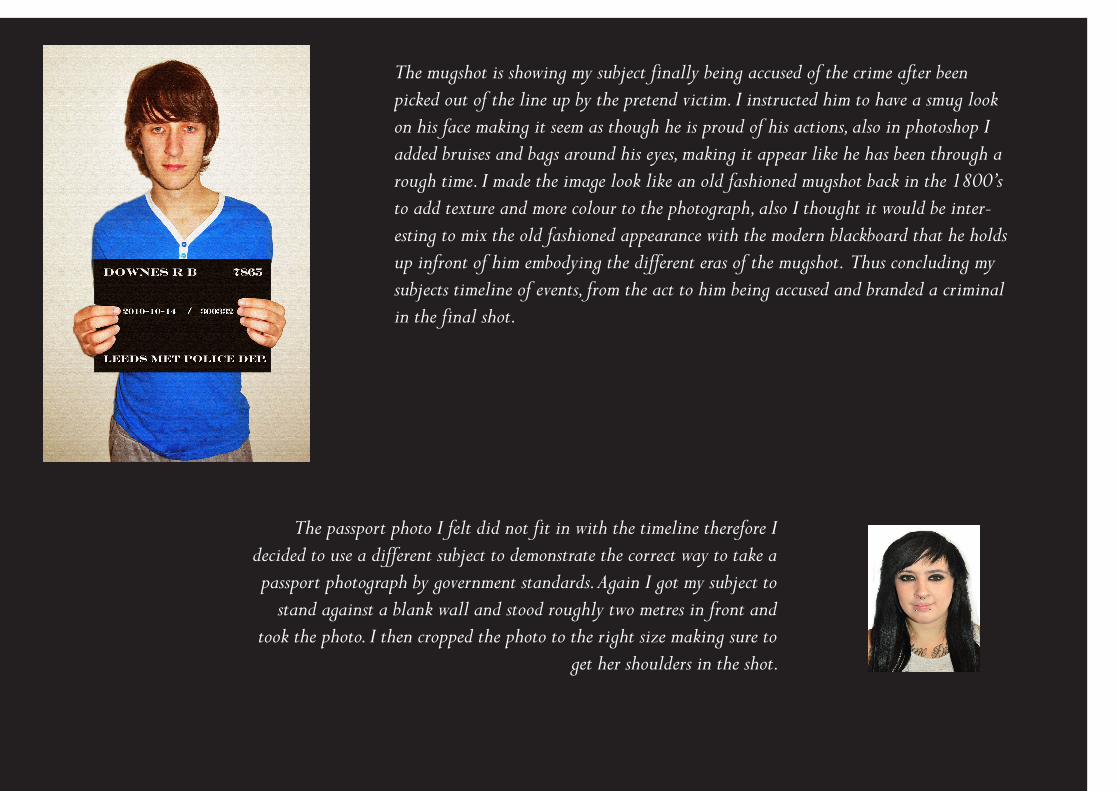
The mugshot is showing my subject finally being accused of the crime after been picked out of the line up by the pretend victim. I instructed him to have a smug look on his face making it seem as though he is proud of his actions, also in photoshop I added bruises and bags around his eyes, making it appear like he has been through a rough time. I made the image look like an old fashioned mugshot back in the 1800’s to add texture and more colour to the photograph, also I thought it would be inter-esting to mix the old fashioned appearance with the modern blackboard that he holds up infront of him embodying the different eras of the mugshot. Thus concluding my subjects timeline of events, from the act to him being accused and branded a criminal in the final shot.
The passport photo I felt did not fit in with the timeline therefore I decided to use a different subject to demonstrate the correct way to take a passport photograph by government standards. Again I got my subject to
stand against a blank wall and stood roughly two metres in front and took the photo. I then cropped the photo to the right size making sure to
get her shoulders in the shot.

The second week of photos was the most enoyable I found. For the fashion shoot I chose to base my shoot on the style of
‘VOGUE’ magazine. I did my photoshoot in a proffesional studio to get the best possible results. My idea for the shoot was trying to create a classic beauty shot with a quirky edge much like the style of vogue. I instructed my model to pose in a range of different ways, for example, strong shots with a her hands on her hips, standing straight while looking over her shoulder and straight on headshots. I chose the headshot however as I think it was a good composition that was simple and focused on the idea
of classic beauty with the element of the mask as one of the main focal points. The hands placed softly on the face and the
nude shoulders make the pose more feminine which I think Vougue really focuses on more than other fashion magazine. I layed out the front page as close to the Vogue style as possible,
coopying the fonts and placement from an actual front cover. I chose the hot pink for the colour scheme as I felt it reflected the femininity of the shot, and because my model has quite a sultry look on her face I decided to use this tone of pink rather than a
lighter more subtle one.
WEEK 2

From the research I did on Hello magazine I realised that the images are extremely posed. It was for this reason I wanted to use a couple on the front page looking happy together. I used my parents as models and posed them outside in my garden to get the natural lighting just right, instead of it looking too
staged with flash indoors. I wanted them to pose quite closely and lovingly so having them sitting down relaxed seemed the best idea. I used photoshop to edit their faces a little bit for the fact magazines these days don’t leave one person un-
photoshopped, also wanting to highlight the media’s attention to perfection. The inset in the bottom corner I took at my cous-ins wedding, I thought this was perfect for the style of Hello magazine as they like to cover large scale celebrity events and are quite big on weddings. The logo I found on the internet and inserted it in as an extra layer. As with the Vogue front
cover I tried to copy the layout and fonts as precise as possible and changed the names to make them seem more celebrity
like.
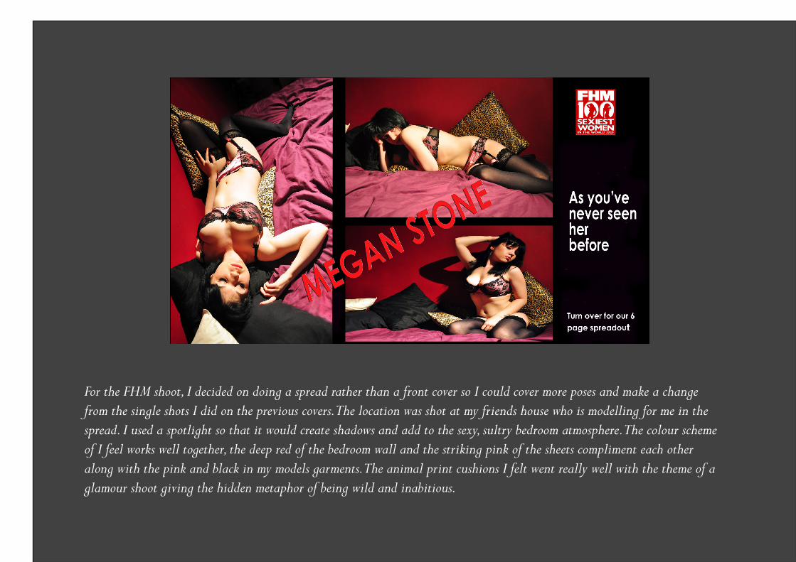
For the FHM shoot, I decided on doing a spread rather than a front cover so I could cover more poses and make a change from the single shots I did on the previous covers. The location was shot at my friends house who is modelling for me in the spread. I used a spotlight so that it would create shadows and add to the sexy, sultry bedroom atmosphere. The colour scheme of I feel works well together, the deep red of the bedroom wall and the striking pink of the sheets compliment each other along with the pink and black in my models garments. The animal print cushions I felt went really well with the theme of a glamour shoot giving the hidden metaphor of being wild and inabitious.

The idea behind the papparazzi shoot was to pose as though unaware there was someone photographing us. The location was at my friends accomadation and we took it in turns to capture each other walking and talking on our blackberries, we used the sunglasses to help hide our identities to make us look like celebri-ties not wanting to be spotted. In the bottom right photo I used my mum again, this time taking out the bins. I took the photo from a bedroom window and instructed her to walk and act as though no one was watching her. The effect of using my mum again was that it linked in with the Hello front cover, acting like an feature in the same magazine. I chose to add bold shapes just like most papparazzi spreads do, the effect being it adds an air of humour to the page the opposite to most of the posed shots we see.
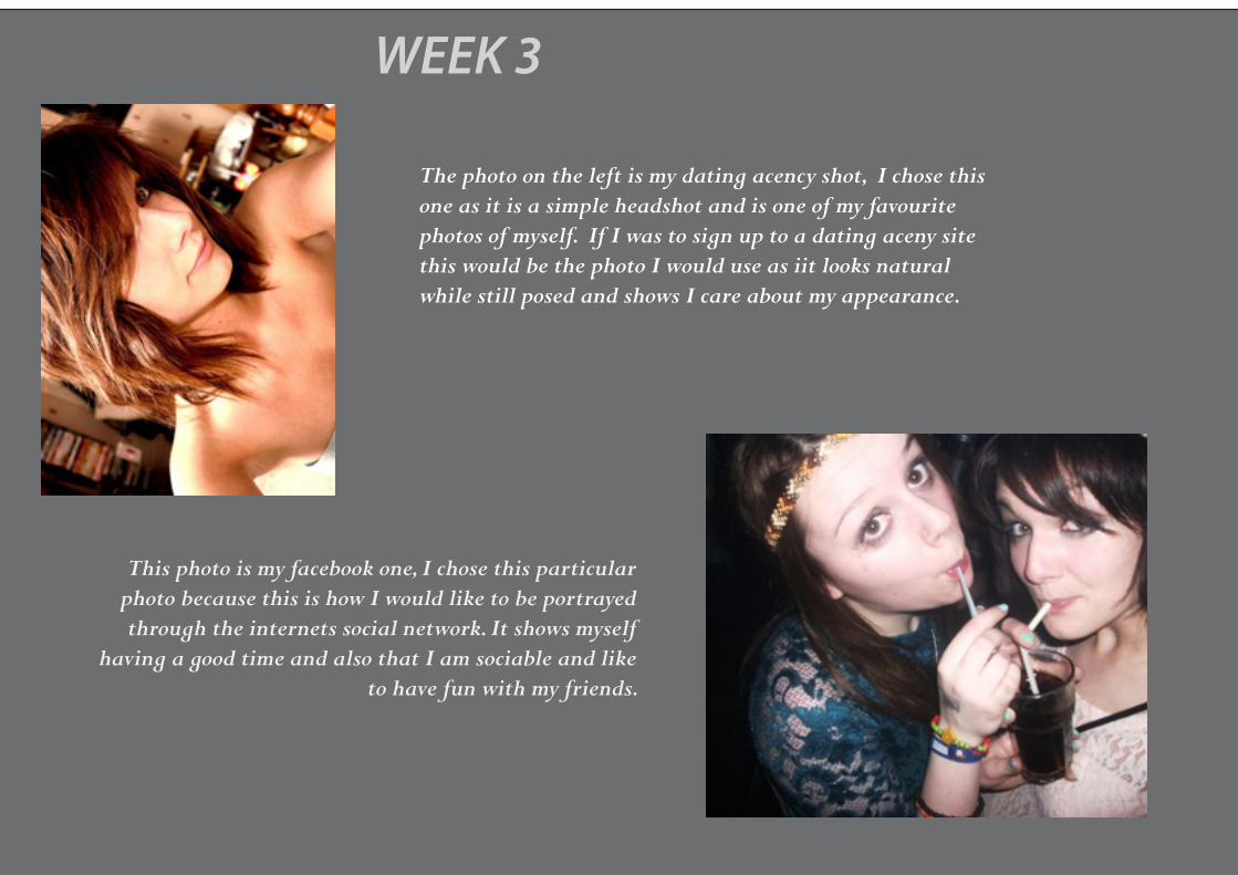
WEEK 3
The photo on the left is my dating acency shot, I chose this one as it is a simple headshot and is one of my favourite photos of myself. If I was to sign up to a dating aceny site this would be the photo I would use as iit looks natural while still posed and shows I care about my appearance.
This photo is my facebook one, I chose this particular photo because this is how I would like to be portrayed through the internets social network. It shows myself
having a good time and also that I am sociable and like to have fun with my friends.

The next photo on the left is a holiday snap from a family holi-day in Portugal 4 years ago. I liked the composition of the photo and mine and my brothers smiling faces, also the fact we are in a pool which is the most typical holiday activity.
This is my face in history photograph, I chose this particular photo to insert into the historic image as I feel it reflects the horror of the event and my expression matches well to the others involved in
the photo. The orginal image was in colour so I simply edited it into black and white and added a texturizer o match the graininess of the photo.