Embed Size (px)
Citation preview
STYLE GUIDE
Introduction
Fresh Tradition
The visual identity is simply one element of the brand. Yet, it’s your introduction to the community. Use it thoughtfully to expose a long-standing tradition of excellence, engaging students to meet today’s challenges in fresh new ways.
“Ivy-league learning, with a backyard commute”
Brilliant.
1
STYLE G
UID
E
STYLE GUIDE
STYLE GUIDE
Signature
2
3
Signature Specifications
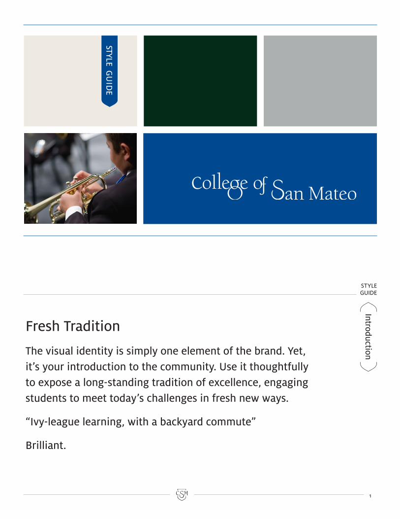
The signature appears on the front cover of all publicly-available collateral. Do not alter the shapes or baseline of the signature and do not rearrange the words. The signature format cannot be altered in any way. The signature can
appear in all black, all white or all blue (Pantone 287U for uncoated stock or Pantone 280C for uncoated stock). It cannot appear in any other colors or more than one color. When layering the signature over photographs position it
Classic letterforms reflect a long-standing tradition of academic excellence. The bold geometry and cantilevered arrangement represent the unique journey and character of every student.
on a solid portion of the photo. Use the signature full strength. Do not apply transparency to it or use it as a wa-termark. Use the monogram for these subtle graphic treatments.
There are several ways to keep the im-pact of the signature high.
Clear space is the area around the signature that should be kept free from competing graphics and text. Maintain a margin at least equal to measurement “x” shown at right.
Size adequacy gives the signature significance, as well as better legibility and press results. Do not reduce the signature smaller than 1.5 inches wide. Consider using the monogram for tight spaces.
High contrast can be achieved by setting the signature in black on light backgrounds or reversing it to white on dark backgrounds. If contrast is problem-atic, consider changing the background or simplifying the photo it’s overlaying.
xx
xx
STYLE GUIDE
STYLE GUIDE
SealSeal Specifications
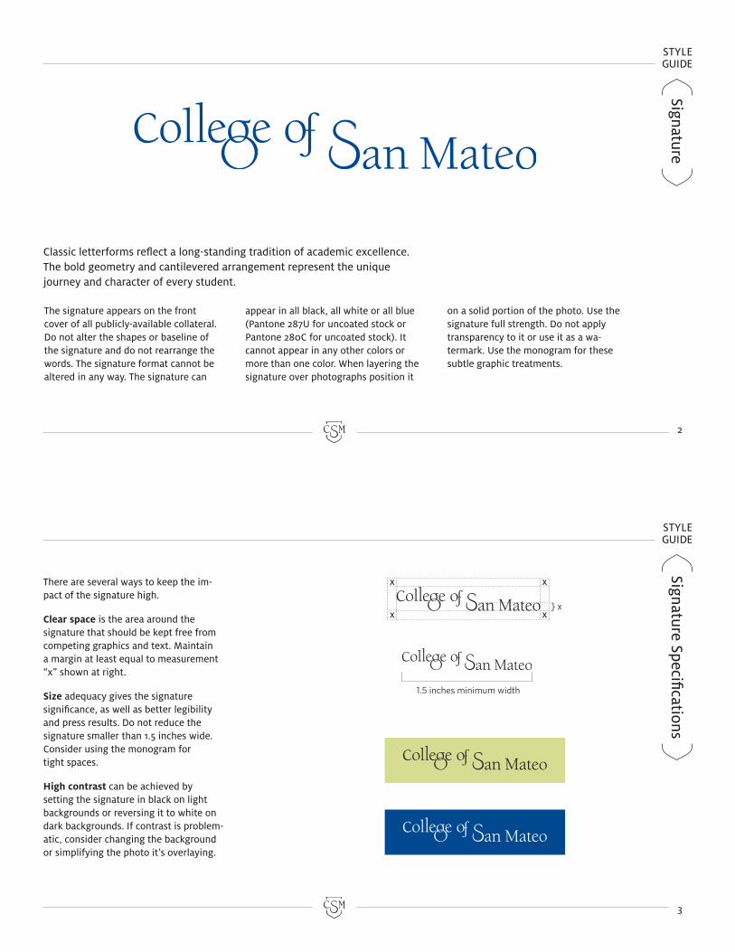
Use the seal to communicate a tradition of exacting excellence. It’s orientation should be conservative and formal. Do not bleed the seal off the edge of the page, rotate it, or apply transparency to it. However, it may be used as a water-mark on stationery or embossed.
The seal can appear in any one color that creates moderate to high contrast with the background. It’s recommended that one of the approved palette colors be used if it complements the design.
Do not set different parts of the seal in different colors. It must appear in a single color only.
Do not change the type, remove, or alter the elements in any way. Do not add additional flourishes or borders.
When using the seal and signature together position them an adequate distance apart. They must be used as separate graphics, not together as a single graphic unit.
The seal represents CSM’s long, successful history of service to the Peninsula and beyond. As with the signature, use it full strength as an integral part of the identity system.
Although an important element to the visual identity, the seal should not over-power the signature.
Clear space is the area around the seal that should be kept free from competing graphics and text. Maintain a margin at least equal to measurement “x” shown at right.
Size of the seal is important to maintain legibility. Do not reduce the seal smaller than 1.5 inches in width and height.
Contrast should be high enough to be legible. To keep the signature as the primary focus in a composition you may decide to use moderate contrast on the seal to maintain the proper hierarchy.
4
5
xx
x
x
x
}
1.5 inches minimum width
STYLE GUIDE
STYLE GUIDE
6
7
Monogram
Monogram
Specifications
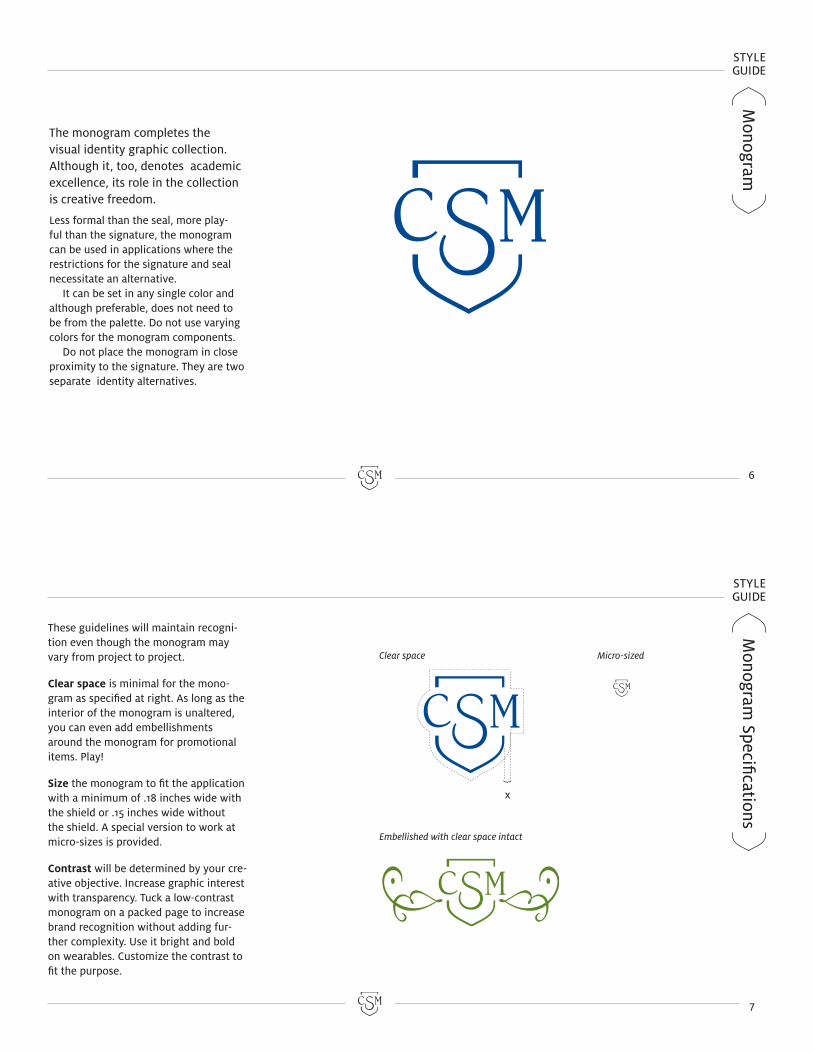
The monogram completes the visual identity graphic collection. Although it, too, denotes academic excellence, its role in the collection is creative freedom.
Less formal than the seal, more play-ful than the signature, the monogram can be used in applications where the restrictions for the signature and seal necessitate an alternative.
It can be set in any single color and although preferable, does not need to be from the palette. Do not use varying colors for the monogram components.
Do not place the monogram in close proximity to the signature. They are two separate identity alternatives.
These guidelines will maintain recogni-tion even though the monogram may vary from project to project.
Clear space is minimal for the mono-gram as specified at right. As long as the interior of the monogram is unaltered, you can even add embellishments around the monogram for promotional items. Play!
Size the monogram to fit the application with a minimum of .18 inches wide with the shield or .15 inches wide without the shield. A special version to work at micro-sizes is provided.
Contrast will be determined by your cre-ative objective. Increase graphic interest with transparency. Tuck a low-contrast monogram on a packed page to increase brand recognition without adding fur-ther complexity. Use it bright and bold on wearables. Customize the contrast to fit the purpose.
x
Clear space Micro-sized
Embellished with clear space intact
STYLE GUIDE
STYLE GUIDE
Graphics U
sageTypography
8
9
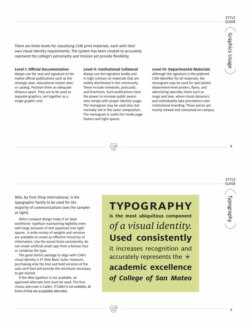
Milo, by Font Shop International, is the typographic family to be used for the majority of communications (see the sampler at right).
Milo’s compact design make it an ideal workhorse typeface maintaining legibility even with large amounts of text squeezed into tight spaces. A wide variety of weights and versions are available to create an effective hierarchy of information. Use the actual fonts consistently, do not create artificial small caps from a Roman face or condense the type.
The good starter package to align with CSM’s visual identity is FF Milo Basic Suite. However, purchasing only the text and bold versions of the sans serif font will provide the minimum necessary to get started.
If the Milo typeface is not available, an approved alternate font must be used. The first-choice alternate is Calibri. If Calibri is not available, all forms of Arial are acceptable alternates.
Level I: Official Documentation Always use the seal and signature to for-malize official publications such as the strategic plan, educational master plan, or catalog. Position them an adequate distance apart. They are to be used as separate graphics, not together as a single graphic unit.
There are three levels for classifying CSM print materials, each with their own visual identity requirements. The system has been created to accurately represent the college’s personality and mission yet provide flexibility.
Level II: Institutional CollateralAlways use the signature boldly and in high contrast on materials that are widely distributed in the community. These include schedules, postcards, and brochures. Such publications have the power to increase public aware-ness simply with proper identity usage. The monogram may be used also, but normally not in the same composition. The monogram is useful for inside page footers and tight spaces.
Level III: Departmental Materials Although the signature is the preferred CSM-identifier for all materials, the monogram may be used for specialized department-level posters, flyers, and advertising specialty items such as mugs and tees, where visual dynamics and individuality take precedence over institutional branding. These pieces are mainly viewed and consumed on-campus.
STYLE GUIDE
STYLE GUIDE
10
11
Color PaletteColor Com
binations
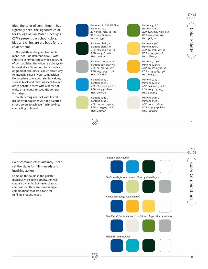
Pantone 280 C (CSM Blue) Pantone 287 U 4CP: c100, m72, y0, k18RGB: r0, g73, b144Hex: 004990
Pantone black 3 C Pantone black 3 U 4CP: c60, m0, y60, k91RGB: r0, g46, b26Hex: 002E1A
Pantone cool gray 7 C Pantone cool gray 7 U 4CP: c0, m0, y0, k37RGB: r173, g175, b178Hex: ADAFB2
Pantone 2925 C Pantone 2925 U 4CP: c85, m24, y0, k0RGB: r0, g150, b214Hex: 0096D6
Pantone 7492 C Pantone 7492 U 4CP: c12, m0, y50, k7RGB: r219 g215 b186Hex: DBD7BA
Pantone 576 C Pantone 576 U 4CP: c49, m0, y100, k39RGB: r92, g135, b39Hex: 5C8727
Pantone 129 C Pantone 129 U 4CP: c0, m16, y77, k0RGB: r255, g212, b87Hex: FFD457
Pantone 7409 C Pantone 7409 U 4CP: c0, m30, y95, k0RGB: r253, g185, b36Hex: FDB924
Pantone 7467 C Pantone 7467 U 4CP: c95, m0, y25, k0RGB: r0, g174, b197Hex: 00AEC5
Pantone 7527 C Pantone 7527 U 4CP: c0, m2, y6, k7RGB: r237, g231, b221Hex: EDE7DD
Blue, the color of commitment, has rightfully been the signature color for College of San Mateo since 1922. CSM’s present-day school colors, blue and white, are the basis for the color scheme.
The palette is designed to comple-ment CSM Blue (Pantone 280C), with colors to communicate a wide spectrum of personalities. The colors are always to be used at 100% without tints, shades, or gradient fills. Black is an effective way to intensify color in your composition. Do not place colors with similar values, such as black and blue, adjacent to each other. Separate them with a border of white or a neutral to keep the composi-tion crisp.
Create strong contrast with liberal use of white together with the palette’s strong colors to achieve fresh-looking, compelling collateral.
Color communicates instantly. It can set the stage for filling needs and inspiring action.
Combine the colors in the palette judiciously. Selective application will create a dynamic, but never chaotic, composition. Here are some sample combinations that set a tone for fulfilling student needs.
Signature combination
You’re ready for what’s next. We’re right beside you.
Create the change you dream of.
Together, define tomorrow. Your future is bigger than you know.
What will you explore?