Embed Size (px)
Citation preview
Fun with Numbers: Disclosing Risk to Individual Investors
Christian E. Weller, PhD
Associate Professor, Department of Public Policy and Public Affairs, McCormack Graduate School of Policy and Global Studies,
University of Massachusetts Boston, and Senior Fellow, Center for American Progress, Washington, DC.
February 2011
_________________________________________________ This working paper has been published as a report with the Post Partisan Foundation’s economic security project (www.economicsecurityproject.org).
2
Fun with Numbers: Disclosing Risk to Individual Investors
Christian E. Weller, Associate Professor, Department of Public Policy and Public Affairs, University of Massachusetts Boston, and Senior Fellow, Center for American Progress, Washington, DC.
I. Introduction
“Life is risky” is one of those casual conversation lines that is too general to be meaningful. People, in fact, often have little appreciation for the magnitude of important risks, such as financial market risk, even when they know that investing in certain products – say, stocks – is fraught with a lot of uncertainty about the possible gains and losses. It is one thing to know that risk exists, but quite another thing to know what precisely risk can do to and for your investments.
People generally don’t like risk, but they tolerate it. They often try to protect themselves from economic risk as much as possible. They buy insurance, where possible, but insurance is not available when it comes to investing. Instead, they try to weigh the financial rewards against the risks of investing in specific products, such as stocks or bonds.
This implies that individual investors know what they are getting into. Many investment decisions, though, are often based on an incomplete understanding of the risk that an investment carries with it. Knowing that GM stocks are risky is not all that meaningful if people don’t know how this risk compares to that of bonds issued by Orange County, CA. And, individual investors do not fully understand the risks involved in particular investments because the information is either not relevant, too complex, inaccessible, or a combination of these characteristics. A lot of people invested in AIG, Bear Stearns, Lehman Brothers, Merrill Lynch, or WashingtonMutual during the heydays of the mortgage boom, just to learn about undisclosed risks the hard way –by losing much of their hard earned money.
Many people, on the other hand, may be spooked by the ups and downs of financial investments and avoid them all together, leaving “money on the table.” They may not reap potential financial rewards that come with accepting some risk or, if they don’t invest at all, they may forego available tax breaks. A large share of Americans – typically more than one‐third – do not save enough and need every help that they can get to build up enough wealth for retirement. This includes accepting some risk exposure in exchange for potentially higher rewards. Some risk exposure is hence often unavoidable to meet savings goals, but too much risk can be detrimental to one’s financial health.
It is likely that people can achieve better investment outcomes – more savings and fewer headaches – if they have better information about risk. Financial service firms already disclose risk in very general terms, but information is either too scarce or buried too deeply in legal disclosures to be useful to consumers. Policymakers and regulators are consequently starting to look at better ways to keep individual
3
investors informed about risk. Better information on risk – more relevant, more concise, and more accessible—could help individual investors make better informed choices and become better savers.
Regulators should thus study the best ways to present information on risk. This paper discusses three numerical and three visual presentations of investment risk that span the range of risk presentation in ways that could be relevant, concise, and accessible to individual investors. The discussion also highlights which depictions are more likely to improve risk disclosure to individual investors. The discussion shows that there is still a fair amount of uncertainty on how best to present risk. Additional research on the accessibility of a number of risk presentation methods will thus have to be part and parcel of the policy development process in the future.
II. The need for more and better risk disclosure
Retirement savings can also be thought of as future income. Economic risk means that the exact level of future income is unpredictable since there is potential for investment gains and losses. A bull market will generate, all else equal, much higher retirement savings and thus, much higher future income than a bear market. And, a well performing specific investment, e.g. a company’s stock, will generate much higher retirement savings than a poorly performing investment. But nobody knows beforehand which investments will do well and which ones won’t. This unpredictability of the future performance of investments is what is known as investment risk.
Investment risk is an economically unavoidable cost. It is true that people tolerate risk, but they don’t love it: they mostly view it as an economic cost, not an economic benefit. Where possible, individuals even try to seek out insurance to protect themselves from risk. But, there is no insurance to guarantee performance for most investments. Instead, investors will seek higher investment returns for riskier investments. Economists and financial advisors know more risk should go along with the potential for greater rewards – the risk‐return tradeoff. Stocks are riskier than bonds, for instance, but investors also hope to earn higher rates of return on stocks than with bonds.
It is generally not enough for investors to know that one investment is riskier than another. They need more specific information to tailor their investment strategy to their future income needs. Individual investors need to know how high the chance of a substantial gain or loss is to make an informed decision that fits their investment needs.
The right information on investment risk can go a long way in improving retirement savings and financial decisions. There are significant costs to having too much or too little risk exposure with one’s investment choices. Too much risk could mean outsized losses when things go wrong, e.g. markets crash. The cost of too little risk, on the other hand, is that an individual investor may forego rewards associated with risky investment. Individual investors may then save too little, requiring more years
4
of work or lower retirement living standards. An increase in the rate of return by one percentage point, say from 5% to 6%, which will carry more risk with it, will increase future income by more than one third over a 30‐year career.
Many Americans will need all the help that they can get to build more savings to maintain their standard of living in retirement. More than 40% of Americans did not have enough money saved to generate enough income to maintain their standard of living in 2004 or 2007 and more than 50% of Americans did not have enough money saved for a secure retirement in in 2009.1 Accepting a little more risk may be one way for some households to increase their future income. Striking the right balance of risk is not easy, however. Individual investors indeed seem to incur too little or too much risk. One of the enduring puzzles in economics, for instance, is why many individuals have no investments in stocks2 and instead put most of their money in their homes or in cash3. At least some stock investments probably make sense for most investors. Yet, typically more than half of all American households have no investments in the stock market, either directly through a broker or indirectly through mutual funds or retirement savings accounts. But then again, many investors who invest in stocks follow a “buy and hold” strategy, i.e. they do not rebalance their portfolio to get out of stocks when stock prices increase and they do not buy more stocks after prices decline.4 Individual investors may thus oscillate between too much or too little risk. Too much risk occurs after stock prices have increased for some time and too little risk may occur after stock prices have been low for some time.
It is possible then, that better risk disclosure could result in better investment outcomes. Individuals are prone to regularly making mistakes in complex decisions, such as investment decisions. For one, complex decisions involve complicated information. This information is often not presented in a way that facilitates decision making. Crucial details are hidden in fine print. There is also no standard set of details that is provided for all investments by all banks, which could facilitate comparison shopping between investments and between banks. And, there is often no feedback of information to the investors on their past decisions, which could enable investors to learn from their past mistakes. Information that is easily 1 Munnell, A., Webb., A. & Golub-Sass, F., 2009, The National Retirement Risk Index: After the Crash, CRR Issue Brief No. 9-22, Boston, MA: Center for Retirement Research at Boston College. 2 There are other risky assets, such as derivatives, but stocks are more wide spread and more easily purchased. Economists hence use stocks as the archetypical risky investment. If we cannot explain why and how individuals invest in stocks, we probably cannot explain why and how they invest in pork belly futures. 3 This is known as the equity premium puzzle. It has been widely studied in modern economics, but can trace its roots back to Mehra, R. & Prescott, E., 1985, The Equity Premium: A Puzzle, Journal of Monetary Economics 15: 145‐161. See also Bernartzi, R. & Thaler, R., 1995, Myopic Loss Aversion and the Equity Premium Puzzle, The Quarterly Journal of Economics 110, 1: 73‐92 and Kocherlakota, N.R., 1996, The Equity Premium: It’s Still a Puzzle, Journal of Economic Literature 34(1): 42‐71. 4 Mitchell, O., Mottola, G.R. & Utkus, S., 2005, The Inattentive Participant: Portfolio Trading Behavior in 401(k) Behavior, Pension Research Council Working Paper 2006-5, Philadelphia, PA: Pension Research Council, Wharton School, University of Pennsylvania.
5
understood by investors and that offers feedback could ultimately result in better investment decisions.
III. Numerical and visual options for better risk disclosure
Risk is the uncertainty of future outcomes. An investment may gain money, but it may also lose money, depending on how the money is invested. The gains and losses may also be relatively small or comparatively large, depending again on the investment. A gain or loss of 10% in a year with a money market mutual fund is a lot less likely than with a mutual fund invested in emerging market stocks.
Investment companies should hence be required to disclose relevant, concise, and accessible information on the risk of particular investments to their clients.
First, the information needs to be relevant. Individuals perceive risk as a game of chance. There is the probability of winning and losing. Any risk measure that seeks to inform investors of the risk associated with a particular investment will have to reflect this uncertainty of future outcomes.
Second, the information should be concise. The risk information, for instance, should not be a lengthy table that lists all past annual rates of return for a particular investment and the probability that each rate of return occurred during the past decade or century. Such a “data dump” would only serve to confuse consumers and would not lead to more informed decision making, even though it provides relevant information.
Third, the information needs to be accessible. A concept such as standard error, which refers to how widely dispersed rates of return on a particular investment have been in the past, may be a common depiction of risk, but it is not something that many investors will find intuitively understandable. The information, although relevant and concise, is inaccessible and thus does not reach all of the intended target audience.
All information for complex decision making needs to provide individuals with an opportunity to receive feedback. How well would their investments have done if they had chosen a different investment, for instance? All ways to describe risk that I discuss in this section offer the possibility for feedback, as I discuss at the end of this section.
The discussion here presents six ways of describing risk. Three examples are numerical descriptions and three are visual presentations of risk. They all have a few things in common:
First, they show risk as potential variations of investment outcomes. They all show the possibility of gains and losses associated with a particular investment. All six measures thus provide relevant information.
6
Second, all measures are concise. They condense a lot of information – decades’ worth of financial rates of return into a few numbers or a single figure.
Third, as I discuss below, all measures are accessible since they use common reference points for individual investors. They speak to investors’ common understanding of risk, but do so with a fair amount of precision. Investors will thus not have to learn new terms, but they will gain additional insights.
All risk measures rely on the past performance of an investment. Consider the information we have from the past performance of an investment. There is a minimum rate of return – smallest increase or largest decline – a maximum rate of return, the average rate of return, the variation of the annual rate of return over the years, and the probability of a particular outcome during the past years.
Risk in numbers
We can use these data to show risk numerically in three different ways – as depicted in Table 1. The first risk disclosure (MaximumMinimum) shows the full range of possible outcomes by showing the range from the lowest possible to the highest possible past rate of return. The second example (Typical Range) shows how widely the annual rate of return typically swings by presenting the range in which 95% of all past rates of return have fallen. The third example (Benchmark) shows the likelihood of losing or gaining a fixed percentage of an investment, here of 10% of the investment, in any given year.5 The table shows how the complete information of an investment could look with the disclosure of the average rate of return, fees, and risk for an investment, such as a mutual fund invested in stocks or Treasury bonds.
These three measures already meet two of our three criteria. They are relevant and concise. They depict uncertainty of outcomes and hence reflect people’s general understanding of risk. All three measures are also concise, describing risk with two figures.
This leaves us with accessibility. All three measures are accessible – investors will intuitively know what they mean. Consider the data in Table 1. All three risk calculations show that stocks vary much more widely than bonds. The historical maximum for stocks, for instance, is more than four times larger than that for bonds, the relative variation in stocks is almost three times as large as that of bonds, and the potential of a 10% gain is almost seven times larger for stocks than for bonds. The bad news, though, is that stock investors have substantial chances of losing money, while this is not the case if one holds a Treasury bond to maturity. The information in Table 1 hence reflects what people already know – stocks are riskier than bonds. These measures are thus relatively accessible to individual investors since they rely to some degree on common understandings of what investment risk looks like. They just offer more precision on the magnitude of risk in specific 5 The calculations raise a few technical issues, which are addressed in the Technical Appendix.
7
investments, which allows individual investors to compare investment options with each other.
Table 1 Examples of numerical depictions of risk as part of complete investment
information
Name of investment
Average rate of return
Total fees Net rate of return (minus fees)
Risk
MaximumMinimum
S&P 500 12.4% 0.5% 11.9% ‐39.5%/62.7% Long‐term Treasury bonds
6.1% 0.3% 5.8% 2.0%/15.1%
Typical Range (95% of cases)
S&P 500 12.4% 0.5% 11.9% ‐18.3%/43.1% Long‐term Treasury bonds
6.1% 0.3% 5.8% 0.6%/11.6%
Benchmark (Probabilities of 10% loss vs. 10% gain)
S&P 500 12.4% 0.5% 11.9% 7.6%/56.2% Long‐term Treasury bonds
6.1% 0.3% 5.8% 0.0%/8.3%
Notes: Rate of return and risk figures are author’s calculations based on actual S&P 500 and Treasury bond data from 1946 to 2007. They reflect data on the gross total return, the sum of capital appreciation and dividends, excluding fees. Fees are only shown for illustrative purposes and do not reflect any actual data for particular mutual funds. See the Technical Appendix for additional information.
Picking a winning number
Which measure is the best then? All three measures have their own advantages and disadvantages. The MaximumMinimum range, for instance, shows the largest possible variation since it presents the historical end points of uncertain outcomes. It has the advantage of showing investors everything that could possibly happen, but it has the disadvantage of presenting only the extremes, which have a very low probability of actually occurring.
The Typical Range of 95% of all cases shows a more realistic band of possibilities. It ignores the rare occurrences of the top and bottom 2.5% of potential outcomes. It has the problem, though, that it makes it seem that all possible outcomes within the 95% range were equally likely of occurring, which is not the case. There is no distinction between outcomes that have a much higher probability of occurring and those that have a much lower probability of occurring within that Typical Range.
8
The Benchmark – probability of a 10% loss or gain – addresses the main concern with the first two measures – their lack of precision of what happens within the range of all possible or typical outcomes. Some outcomes in those ranges will be more likely than others. The probability associated with a specific gain or loss provides the missing piece of information. This measure raises the concern, though, of which benchmark to choose. A 10% stock market gain, for instance, is a rather frequent occurrence as the numbers show, while it is unlikely, but still possible for Treasury bonds. A 10% loss, though, is a meaningless comparison between stocks and bonds since any loss is impossible for Treasury bonds in this example. A lower loss number, e.g. of 5%, would still show a figure of zero percent for Treasuries, but would be too large to be meaningful for stocks – such losses can happen frequently in a given year. There is no objective way of identifying a Benchmark that is meaningful for all investments.
The Typical Range measure is theoretically the most attractive measure. It is concise, yet meaningful. It gives investors a sense of where a typical outcome will fall. In combination with the average rate of return, investors can thus gauge how widely around the average annual rates of return are typically dispersed. The investor won’t mistakenly hope for an extreme maximum rate of return to occur during her lifetime or fear that an extreme minimum will happen while she is saving for retirement, but rather, she will make her investment decisions on what are more regular recurring events. At the same time, the investor won’t rely on a performance comparison between investment options that is based on an arbitrarily chosen benchmark.
The last question is then whether the Typical Range measure is as accessible as the other two measures. The Typical range measure uses a widely employed tool called “anchoring.” It anchors investors’ expectations by telling them where almost all possible rates of return in the past have fallen. The investor is essentially being told what a reasonable expectation for future rates of return are and what are unreasonable expectations. The measure creates its own accessibility. Other insights on human psychology suggest that the Typical Range measure is thus at least as accessible as the MaximumMinimum measure. Individuals tend to have difficulties discerning the meaning of extremes. A phenomenon called “loss aversion” leads humans to overestimate the probability of extreme positive events (gains) and underestimate the chance of extreme losses.6 A measure based on extreme rates of returns – maximum gain and minimum loss – could consequently serve to confuse investors’ decisions, such that they will invest too much or too little in particular investments.
The comparison between the Typical Range and the Benchmark with respect to accessibility is a little less clear. The Benchmark also uses anchoring, but it essentially tells the investor that the chosen benchmark is the most relevant one. It
6 Kahneman, D. & Tversky, A., 1979, Prospect Theory: An Analysis of Decisions Under Risk, Econometrica 47: 263‐291.
9
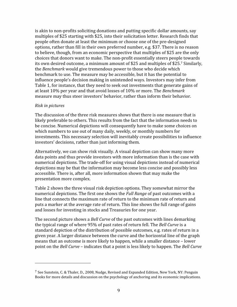
is akin to non‐profits soliciting donations and putting specific dollar amounts, say multiples of $25 starting with $25, into their solicitation letter. Research finds that people often donate at least the minimum or choose one of the pre‐designed options, rather than fill in their own preferred number, e.g. $37. There is no reason to believe, though, from an economic perspective that multiples of $25 are the only choices that donors want to make. The non‐profit essentially steers people towards its own desired outcome, a minimum amount of $25 and multiples of $25.7 Similarly, the Benchmark would give tremendous power to those who decide which benchmark to use. The measure may be accessible, but it has the potential to influence people’s decision making in unintended ways. Investors may infer from Table 1, for instance, that they need to seek out investments that generate gains of at least 10% per year and that avoid losses of 10% or more. The Benchmark measure may thus steer investors’ behavior, rather than inform their behavior.
Risk in pictures
The discussion of the three risk measures shows that there is one measure that is likely preferable to others. This results from the fact that the information needs to be concise. Numerical depictions will consequently have to make some choices on which numbers to use out of many daily, weekly, or monthly numbers for investments. This necessary selection will inevitably create possibilities to influence investors’ decisions, rather than just informing them.
Alternatively, we can show risk visually. A visual depiction can show many more data points and thus provide investors with more information than is the case with numerical depictions. The trade‐off for using visual depictions instead of numerical depictions may be that the information may become less concise and possibly less accessible. There is, after all, more information shown that may make the presentation more complex.
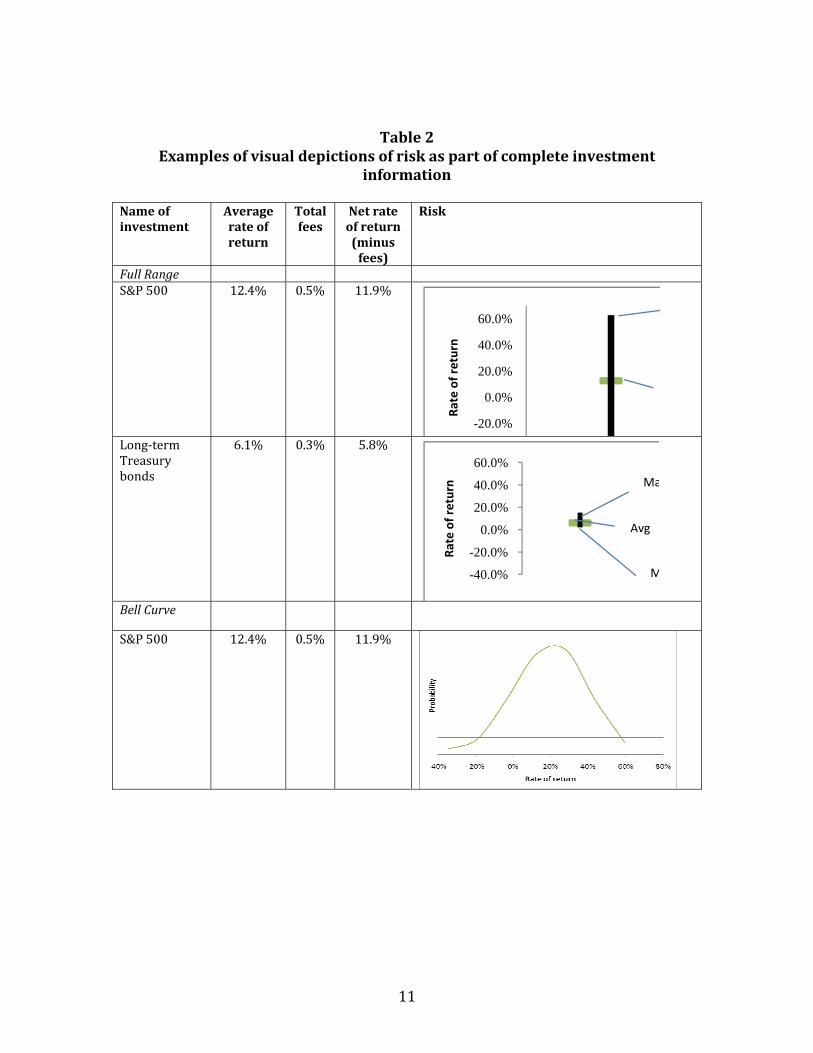
Table 2 shows the three visual risk depiction options. They somewhat mirror the numerical depictions. The first one shows the Full Range of past outcomes with a line that connects the maximum rate of return to the minimum rate of return and puts a marker at the average rate of return. This line shows the full range of gains and losses for investing in stocks and Treasuries for one year.
The second picture shows a Bell Curve of the past outcomes with lines demarking the typical range of where 95% of past rates of return fell. The Bell Curve is a standard depiction of the distribution of possible outcomes, e.g. rates of return in a given year. A larger distance between the curve and the horizontal line of the graph means that an outcome is more likely to happen, while a smaller distance – lower point on the Bell Curve – indicates that a point is less likely to happen. The Bell Curve
7 See Sunstein, C. & Thaler, D., 2008, Nudge, Revised and Expanded Edition, New York, NY: Penguin Books for more details and discussion on the psychology of anchoring and its economic implications.
10
shows the likelihood of all potential gains and losses from investing in stocks and Treasuries for one year.
The third picture shows Fan Graphs. Each line in the Fan Graphs is associated with a particular probability. It shows the cumulative rates of return that have at most a 10%, 30%, 50%, 70% and 90% chance of occurring. The bottom line, for instance, shows the cumulative annual rates of return that an investment will exceed in 90% of all cases after one year, five years, 10 years, and 15 years of investing in stocks and Treasuries. The top line, in comparison shows the cumulative rates of return that an investment will only exceed in 10% of all cases. The color of the lines gradually fades as the probability of the total gains or total losses moves away from the middle (median) to illustrate the dispersion of gains and losses.8 The Fan Graphs picture consequently provides more information than the other two graphs, as I discuss below.9
8 Varying the thickness of the lines may be an alternative visual aid to graphically accentuate dispersion. 9 There are alternative possibilities of using Fan Graphs, which are shown in the Technical Appendix.
11
Table 2 Examples of visual depictions of risk as part of complete investment
information
Name of investment
Average rate of return
Total fees
Net rate of return (minus fees)
Risk
Full Range S&P 500 12.4% 0.5% 11.9%
-20.0%
0.0%
20.0%
40.0%
60.0%
Rate of return
Long‐term Treasury bonds
6.1% 0.3% 5.8%
-40.0%
-20.0%
0.0%
20.0%
40.0%
60.0%Ra
te of return Ma
M
Avg
Bell Curve
S&P 500 12.4% 0.5% 11.9%
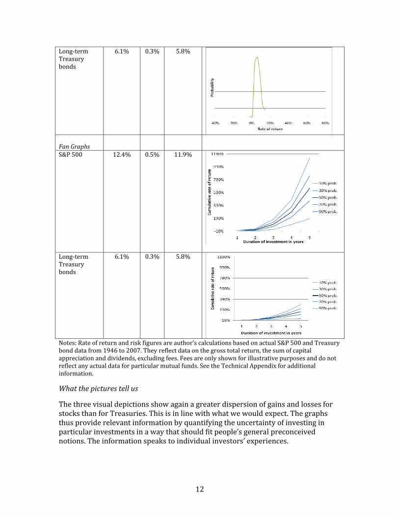
12
Long‐term Treasury bonds
6.1% 0.3% 5.8%
Fan Graphs
S&P 500 12.4% 0.5% 11.9%
Long‐term Treasury bonds
6.1% 0.3% 5.8%
Notes: Rate of return and risk figures are author’s calculations based on actual S&P 500 and Treasury bond data from 1946 to 2007. They reflect data on the gross total return, the sum of capital appreciation and dividends, excluding fees. Fees are only shown for illustrative purposes and do not reflect any actual data for particular mutual funds. See the Technical Appendix for additional information.
What the pictures tell us
The three visual depictions show again a greater dispersion of gains and losses for stocks than for Treasuries. This is in line with what we would expect. The graphs thus provide relevant information by quantifying the uncertainty of investing in particular investments in a way that should fit people’s general preconceived notions. The information speaks to individual investors’ experiences.
13
The primary advantage of the visual display is that it offers the possibility of presenting more information than with numerical representations. Consider the example of the Full Range line since it offers the least amount of information out of the three visual displays.10 It shows the end points – the minimum and maximum rates of return – for stocks and bonds. It also shows the average rate of return. And, it shows if the potential outcomes are more spread out above or below the average. An individual investor would thus be able to gauge whether the maximum or minimum rate of return is further away from the average – and thus potentially infer how much more likely it is to get close to the maximum than to the minimum, or the other way around. The Full Range, for instance for Treasuries, shows that the maximum is a lot further away from the average than the minimum, which could imply that the maximum (or rates of return close to the maximum) are harder to reach than rates of return close to the minimum. This is a lot more information than just knowing the two end points of the line, as Table 1 shows with the MaximumMinimum.
The Bell Curve offers even more information than the Full Range. It shows not only the range of possible gains and losses, but it also offers a measure of the likelihood of those gains and losses. A higher point on the curve, for instance, suggests a greater likelihood of that particular investment outcome than a lower point. The likelihood of an outcome is marked on the vertical axis. A gain of 20% with stocks in a given year is thus much more likely than a gain of 40%, although both gains fall into the Typical Range of 95% of potential gains and losses shown in Table 1. The additional information contained in the Bell Curve thus offers a qualification of the numerical depiction of the Typical Range.
The Fan Graphs contain the most information. The vertical comparisons between the lines of the Fan Graphs show the dispersion of total cumulative gains and cumulative losses after investing for one year, five years, 10 years, and 15 years of investing in stocks or Treasuries. This comparison shows that gains and losses of stocks are more widely dispersed than gains and losses of Treasuries. A horizontal comparison shows how the dispersion of gains and losses changes with holding stocks or Treasuries for longer periods of time. The visual displays are generally as concise as the numerical displays. There is one picture with one line for both the Full Range and the Bell Curve. The Fan Graphs use five lines each in the example in Table 2, but can do with as little as two lines. These are thus rather brief depictions of a lot of data.
The visual displays, however, may be less accessible than the numerical depictions. The inclusion of additional information makes it harder for those providing the information, financial firms, to steer individual investors’ decisions, but this may come at a cost. Each visual depiction may require some additional explanation of
10 The Full Line should ideally run horizontally, not vertically to facilitate the comparison between investment options. The line is shown vertically here only because of graphic limitations of the software used.

14
what the graph shows. We cannot assume that individual investors will be familiar with Bell Curves, Fan Graphs, or Full Range lines. A visual display will thus require a legend that explains its meaning. This adds to the information that financial service providers have to show individual investors and thus may make the information more complex. More research needs to be done to determine how much complexity will still allow individual investors to make optimal financial decisions.
There is no clear way to determine which visual depiction is preferable to the others, unlike the case for numerical depictions. There are, however, two reasons that may suggest that the Full Range depiction is preferable to the Bell Curve or Fan Graphs. The Full Range offers more possibilities to use common, easily understandable visual aids that could potentially make risk more comprehensible with the Full Range than with the Bell Curve and the Fan Graphs. Consider the following example:
whereby the ruler would run again from minimum to maximum and the arrow would point to the average rate of return. Instead of an arrow, one could, for instance, also use a pendulum to illustrate the swinging motion – uncertainty – of financial rates of return:
The possibility for such insertion of more visual aids exists only with the Full Range line since Bell Curves and Fan Graphs contain more and more complex information that does not easily lend itself to additional visual aids without making the depiction more complex.
Another consideration is that the Full Range presentation may allow for more precise comparisons than the Bell Curve or Fan Graphs. It is presumably easier for individuals to compare the lengths of different lines, rather than how skewed, wide, and high a Bell Curve is or how dispersed Fan Graphs are. A Bell Curve for one stock, for instance, may look fairly similar to that of another stock, particularly when the visual depiction is relatively small, as in Table 2. It is unclear, though, if the possibility of using more visual aids and greater precision in the comparison of visual depictions is enough to make one visual depiction preferable to the others, which include more data.
We are thus left with four possible risk depictions. One numerical depiction – Typical Range – that is superior to the other two numerical descriptions and three
15
visual options. Regulators will have to further investigate how much information individual investors can digest without making the information dissemination inaccessible to the average individual investor.
The need for feedback
The literature on the psychology of complex decision making indicates that individuals can improve their decisions if there is room for feedback on their decisions. They need to be able to learn from their mistakes in short order, before it is too late. It is not necessarily helpful to investors to learn, after retirement, that their investment strategy for the past three or four decades should have been different. The feedback needs to happen regularly and close to the original decision, so that investors can take corrective measures, e.g. take fewer or more financial risks.
Financial service firms can provide feedback on risk and decisions involving risk, for instance, by showing the risk for the entire market, either stocks or bonds, or the average risk for the type of mutual fund that an individual investor is considering.11 This comparison can be presented at the top of a page or web site, so that investors can easily compare the risk information for their investments with the benchmark information. Additional feedback comes in the form of regular financial statements that allows individual investors to compare how their investments performed over relevant time periods relative to other investments with similar characteristics.
IV. Key stakeholders already think about risk disclosure
There is a need to inform individual investors about the risk associated with their investment choices. Many investors take on too much or too little risk in their investments. The discussion in the previous section shows that there are options to show information on investment risk that is relevant, concise, and accessible and that offers the possibility for feedback. This discussion could advance the discussion on how to improve individual investment decisions. The relevant stakeholders – financial service firms, policymakers, and researchers – already consider ways to better inform investors. And individuals already show a remarkable ability to process a range of data points, when the information is relevant, concise, and accessible. The discussion of the previous section may consequently contribute to an ongoing, important policy debate.
Financial service firms already consider risk in matching investments and investors
Financial service providers already try to match individual investors’ risk preferences with their investment choices. Banks need to make sure that the investments that they offer to their clients are suitable to their clients needs and
11 Tables 1 and 2 only show risk for the entire stock market and for the typical bond portfolio for bonds with specific maturity, so that this additional information is not included there.
16
abilities. An investor who shies away from risk should not be sold an investment that has a substantial chance of losing (and gaining) a lot of money.
Security brokers, for instance, have to apply a “suitability” standard in their investment recommendations. They have to consider an investor’s risk tolerance, among other items, when they recommend an investment.12
Mutual funds similarly consider the risk tolerance of their investors in making investment recommendations. They often ask their clients to classify their attitude towards risk. Are investors, for instance, looking for a conservative, balanced, or aggressive investment strategy, whereby conservative includes the least risk exposure and aggressive includes the most risk exposure? Financial service providers then match individual investors with specific recommendations based on the investors’ answer.
This approach of letting financial service providers match risk tolerance with investment recommendations poses a threefold challenge. First, the risk classifications tend to be rather crude – giving investors approximately three to five choices to self classify their risk tolerance. What about somebody who self‐identifies, for instance, as a conservative investor, but who has leanings towards a balanced portfolio? There is no middle ground in these classifications. Second, investors will classify risk tolerance differently. One investor may self‐identify as conservative, while another may self‐identify as a balanced investor, yet both would be happiest with a balanced portfolio. The correlation between self‐identified risk tolerance and the amount of financial risk that people actually tolerate can vary widely and is biased towards underestimating one’s own actual risk tolerance.13 Financial service providers relying on subjective risk assessments may thus guide individual investors to investments that are overly conservative. Third, the approach of matching risk preferences and investment recommendations deliberately takes away some choice from the investor. Financial service providers are required to steer the choices of investors towards the most suitable investments. But, individual investors often do not have the necessary tools to explore alternatives, if they so desire.
The approach of requiring relevant, concise, and accessible disclosure of investment risks of all investment options is a supplement to having financial service providers match investors’ risk preferences and investment recommendations. First, offering risk information relies on objective criteria, rather than subjective self‐identification. Both are valid and necessary tools to ensure that investors make optimal choices, but the objective information has been largely absent. Second, the 12 U.S. Securities and Exchange Commission, 2010, Suitability, Washington, DC: SEC. accessed on October 26, 2010. http://www.sec.gov/answers/suitability.htm 13 Hallahan, T.A., Faff, R.W. & M.D. Mckenzie, 2004, An empirical investigation of personal financial risk tolerance, Financial Services Review, 13: 57‐78; Snelbecker, G.E., Roszkowski, M.J. & N. E. Cutler, 1990, Investors’ risk tolerance and return aspirations and financial advisors' interpretations: A conceptual model and exploratory data, Journal of Behavioral Economics, 19(4): 337‐393.
17
investor can use the information to fine tune the match of her investments to her risk preferences based on the additional information. A financial service provider, for instance, may recommend a range of options based on risk classification and an individual investor may then decide to choose from a menu of investment options based on the objective information on average rates of returns, fees, and risk. Third, individual investors can use the information to comparison shop between investment options and financial service providers. An individual investor may decide to compare her investments to alternatives offered either by the same financial service provider or by a competitor to ensure that her investments optimally meet her needs.
Policymakers already consider means to improve risk disclosure
Some lawmakers have already started to consider improving risk disclosure to provide information and better choices to individual investors. A number of members of Congress proposed to include legislative language to improve fee disclosure on retirement investments in H.R. 4213 (Unemployment Compensation Extension Act of 2010).14 The provisions would have required that retirement plan sponsors, typically employers and financial service firms, inform individual investors about the fees and the level of risk, among other items, associated with specific investments. The proposed legislation did not specify how risk should be disclosed. That level of specificity is typically left to the proper regulatory body, in this case the Department of Labor’s Employment Benefit Security Administration. The discussion of this paper thus contributes to a legislative desire to help investors make better informed investment choices.
Economists already study ways to improve disclosure of information
Regulators and legislators have taken note of the risk exposure of individual investors and the need to improve risk information. Economic research has, in recent years, generated a fair amount of evidence on the type of information that is useful to improve individual decision making, particularly when it comes to complex markets, such as financial markets.
The burgeoning field of behavioral economics has integrated insights from psychology into economics.15 The basic insight that is relevant for this discussion is
14 Kittredge, B. M., 2010, 401(k) Fee Disclosure and Pension Funding Provisions of H.R. 4213, Chairman George Miller (D-CA), Committee on Education and Labor, U.S. House of Representatives, Washington, DC., May 21, accessed October 26, 2010 http://edlabor.house.gov/blog/2010/05/401k-fee-disclosure-and-pensio.shtml. 15 DellaVigna, S., 2009, Psychology and Economics: Evidence from the Field, Journal of Economic Literature 47(2): 315‐372 offers a detailed summary of the academic literature in this field with a particular emphasis on the insights of behavioral economics for retirement savings. Sunstein, C. & Thaler, D., 2008, Nudge, Revised and Expanded Edition, New York, NY: Penguin Books provide a popularized discussion of the insights of behavioral economics and their implications for public policy design. Bernheim, D. & Rangel, A., 2005, Behavioral Public Economics: Welfare and Policy Analysis with Non‐Standard Decision Makers, NBER Working Paper No. 11518, Cambridge, MA:
18
that individuals are prone to making costly errors when making complex decisions. Individuals who save with 401(k) type plans hold too much cash or do not diversify their assets optimally, incurring too much or too little risk.16 Individual investors, for example, often tend to invest large shares of savings in their employer’s stock, which exposes them to large risks in their current and future incomes if their employers encounter financial difficulties. Enron’s employees would have been much better off if their 401(k) plans had not been invested as heavily in employer stock.17 Individual investors also only infrequently rebalance their portfolios, i.e. they hold more and more stocks as stock prices rise and fewer and fewer stocks as stock prices fall.18 This describes a “buy high, sell low” investment strategy that can make a serious dent in one’s retirement savings.
These systematic errors are related to psychological characteristics of individuals. One key lesson is that individuals can be systematically misled in judging complex information. Public policy will thus have to establish processes that provide guidance to individuals in processing complex information.19 This can happen by making information more accessible than it currently is. Accessibility arises from presenting complex information in a concise fashion so that individual investors can easily compare prices (or risk in this case) between different products and firms. Information also needs to relate to people’s experience. And, it needs to allow for feedback, so that individuals can learn from their mistakes in time to correct them.20
Individuals already process complex information on a regular basis
National Bureau of Economic Analysis, discuss how behavioral economics relates to traditional neoclassical models and the normative implications of behavioral economics. And, Benartzi, S. & Thaler, R., 2007, Heuristics and Biases in Retirement Savings Behavior, Journal of Economic Perspectives 21(3):81‐104 provide an insightful discussion of systematic biases in retirement savings. 16 Benartzi, S. & Thaler, R., 2007, Heuristics and Biases in Retirement Savings Behavior, Journal of Economic Perspectives 21(3):81‐104; Huberman, G. & Jiang, W., 2006, Offering versus Choice in 401(K) Plans: Equity Exposure and Number of Funds, Journal of Finance 61(2): 763 – 801. Iyengar, S. & Kamenica, E., 2006, Choice Overload and Simplicity Seeking, Working paper, Columbia University. 17 Benartzi, S. & Thaler, R., 2007, Heuristics and Biases in Retirement Savings Behavior, Journal of Economic Perspectives 21(3):81‐104; Holden, S., VanDerhei, J., Alonso, L. & Copeland, C., 2008, 401(k) Plan Asset Allocation, Account Balances, and Loan Activity in 2007, Research Perspective, 14(3), Washington: Investment Company Institute. Fidelity Investments, 2009, Fidelity Reports on 2008 Trends in 401(k) Plans, Boston. 18 Mitchell, O., Mottola, G.R. & Utkus, S., 2005, The Inattentive Participant: Portfolio Trading Behavior in 401(k) Behavior, Pension Research Council Working Paper 2006‐5, Philadelphia, PA: Pension Research Council, Wharton School, University of Pennsylvania. Reid, B. & Holden, S., 2008, Retirement Saving in Wake of Financial Market Volatility, Washington: Investment Company Institute. 19 See Sunstein, C. & Thaler, D., 2008, Nudge, Revised and Expanded Edition, New York, NY: Penguin Books for their proposal, for instance, to develop better disclosure tools or what they call “Record, Evaluate, and Compare Alternative Prices (RECAP)”. 20 See Sunstein, C. & Thaler, D., 2008, Nudge, Revised and Expanded Edition, New York, NY: Penguin Books for a discussion of the relevant psychological insights and lessons for the presentation of complex information.

19
Accessibility of risk information is one of the criteria laid out here for the selection of a risk disclosure method. This raises the larger question of whether the inclusion of risk information per se will overwhelm investors and hence make financial information inaccessible. After all, investors already receive information on the average rate of return of an investment in the past, typically for the past year. They also receive information on the fees charged on an investment. Adding risk information to this mix may overwhelm individual investors with too much information.
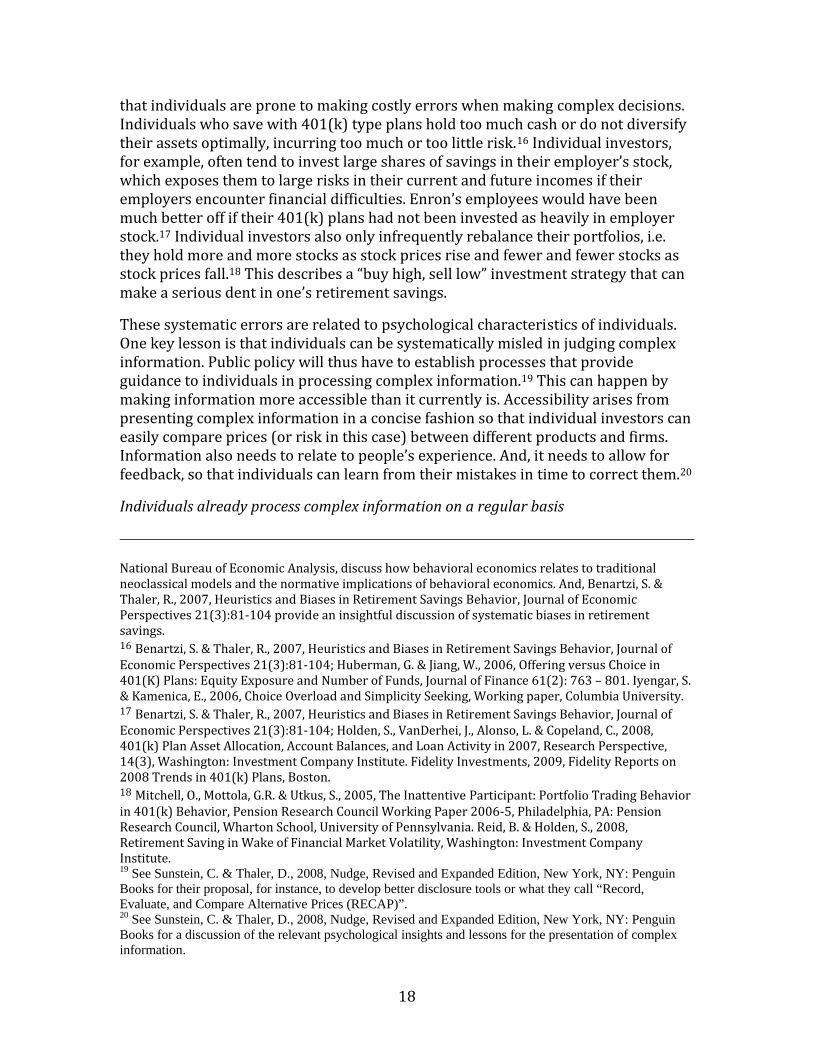
Individuals, though, can handle a fair amount of data if it is presented concisely, which the forms of risk disclosure discussed above do. Consider Table 3 as an example.21 It shows the pitching and hitting statistics for Stephen Strasburg of the Washington Nationals for the 2010 MLB season. There are a total of 26 statistics displayed for just one year for just one player. Sports fans can digest multiples of this level of data to figure out, for instance, whether Stephen Strasburg’s injury and operation in late summer of 2010 may hurt their team in the following season.
Moreover, the table shows that the typical sports fan is well aware of averages and ratios, often as a result of relatively complex calculations. An example is the ERA – earned runs average. This is the number of runs that did not occur as a result of errors or passed balls multiplied by nine and divided by the innings that a player pitched. The ERA tells us how good a pitcher is at shutting out the other team. A low ERA, such as Strasburg’s 2.91, indicates, for instance, a successful pitcher.
Baseball statistics also include measures of uncertainty. The ERA is again a good example. It shows the risk (or opportunity) for the opposing team to score a run against a particular pitcher by providing the (scaled) chance that a pitcher will let the other team score a run. It thus allows sports fans to easily compare players’ pitching strength with each other. It seems reasonable to assume that individual investors will be able to understand the meaning of two numbers defining investment risk if the typical sports fan can interpret the ERA for a pitcher.
Table 3 Pitching and Hitting Statistics, Stephen Strasburg, 2010 MLB Regular Season
Pitching Statistics Year Tea
m W L Sv
‐OP
G GS
CG
IP H R ER
HR
BB
IBB K ERA
2010 Was 5 3 0‐0
12
12
0 68.0
56 25
22
5 17
0 92 2.91
21 Credit goes to Edward D. Tufte, who with his presentations and books on the visual presentations of data, convincingly argues that individuals can process more quantitative information than scientists often give them credit for, when the information is properly presented. He regularly uses the example of sports statistics to show that individuals can easily process multitudes of complex information. Tufte, E.D., 2001, The Visual Display of Quantitative Information, 2nd Edition, Cheshire, CT: Graphics Press.
20
Hitting Statistics
Year Team
G AB
R H 2B
3B
HR RBI
BB
K SB CS AVG OBP SLG
2010 Was 12
20
0 1 0 0 0 1 0 7 0 0 0.050
0.050
0.050
V. Conclusion
This paper discusses the need for better information on investment risks. The information should be relevant, concise, and accessible to individual investors. More and better information on factors that are likely to influence an investment’s performance and investors’ decisions should eventually lead to better investment decisions – more savings and higher retirement incomes.
This paper presents a number of ways to disclose risk to individual investors. There are three numerical and three visual representations to risk. The discussion centers on the pros and cons of each risk representation. All risk descriptions show relevant information, are concise, and more or less accessible.
There is a clear tradeoff between numerical and visual displays of risk. Visual displays generally contain more information than numerical displays, but the added information may make them less accessible.
There is no clear winner that emerges from this discussion, although one numerical representation is likely to be better than the other two. It is not possible, though, to equally order the visual presentation from better to worse. Policymakers will thus have to sponsor more research on which risk depictions is best suited to the needs of individual investors.
There is a possibility that even the best information on risk will result in regular mistakes by investors. Even the best informed investors may take on too much or too little risk in their investments. Better education for investors may be one way to address this concern. The presentation of risk information should thus give the possibility of feedback. Investors need to be able to regularly learn from their mistakes or find affirmation of their past decisions. Banks, for instance, should inform investors how risky alternative investments have been, while investors held their investments, e.g. by showing the risk for the entire market or for the average for similar investment products such as mutual funds invested in stocks or bonds.

21
Technical Appendix
The risk presentations in the body of this paper raise a few technical issues that are addressed in this Technical Appendix.
Data
The examples in the paper use historical, weekly data for the S&P 500 and for long‐term Treasury bonds, specifically the interest rate on 20‐year Treasury bonds.
The examples first use the data to calculate the average rate of return and the standard deviation of the rate of return for each asset – stocks or Treasury bonds. The total rate of return on stocks is the sum of capital appreciation and dividend yield. The capital appreciation for stocks is calculated as year‐over‐year changes. The average dividend yield during the preceding year is added to arrive at the total rate of return for stocks. The total rate of return for bonds is the average interest rate for a bond with that maturity over the course of one year.
The reality of average rates of return looks different. Typically disclosures will present the average rate of return for the past year, for the past five years, and for the past ten years. When an investment is younger than, say, five years, the information is not provided and the investor will know that the investment is a rather novel product.
It will be a critical policy decision to set the rules for the risk presentation, so that it matches the typical average rate of return calculation. This will include a decision over which period financial risk should be measured. Should risk be calculated for the past year, for the past five years, and for the past ten years? The risk information should ideally match the rate of return information, as it does in the body of the paper, but there may ultimately be too much information to be useful. It may thus make sense to only provide the risk information for the past decade to give investors relatively comprehensive data on risk. The calculation should be conducted for the longest time period possible, if data for a whole decade are not available. Another question is whether the risk calculation should be based on daily, weekly, or monthly data. Daily data will offer a more reliable and more realistic calculation since it provides the most data points and since investors will, in fact, buy or sell their investments at any given day.
Probability calculations
The probabilities of losses and gains and the range of “typical” outcomes are derived by assuming a normal distribution. Financial market returns can often follow a log normal distribution. If this is the case, the probabilities of gains in this paper are underestimated and the probabilities of losses are overstated. The illustrative differences between stocks and bonds in the paper are unaffected by the assumed

22
distribution of the returns. Stock returns will still be higher and their fluctuations larger than those of bonds.
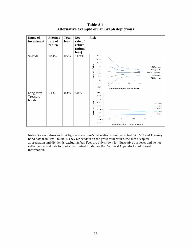
Alternative Fan Graphs
The Fan Graphs in the text show the dispersion of total gains and total losses if an individual investor invests in stocks and Treasuries for one year, five years, 10 years, or 15 years. The alternative depiction of Fan Graphs in Table A‐1 shows the average rate of return of investing in stocks or Treasuries for given time periods. The depiction shows similar information as the Fan Graphs in Table 2. Those Fan Graphs showed the cumulative effect of investing for one year, five years, 10 years, or 15 years. The Fan Graphs in Table A‐1 show the average rate of return during the same time periods, based on the same data. The cumulative rates of return in Table 2 show a wide dispersion of outcomes for stocks over time, while the average rates of return in Table A‐1 show a narrowing of the average rates of return over time.22 The average rates of return on stocks, though, are still much more dispersed than those of Treasuries, even after investing in stocks for 15 years, for example. The calculation of the average rate of return may be misleading since individual investors will presumably care more how their total investments will grow over time than how the average rate of return may change over time.
The alternative Fan Graphs are shown here only for completeness sake. They show what Fan Graphs would look like if they were comparable to the other visual depictions of risk in Table 2, i.e. the risk of investing in stocks and bonds for one year.
22 This simply reflects the fact that stocks go back (revert) to their mean over the medium term. That is, periods of large gains are followed with some regularity by periods of lower gains or even losses and periods of losses are followed by periods of smaller losses or even gains. The same is not necessarily true for bonds, which is also reflected in the Fan Graphs for Treasuries, which essentially shows no narrowing between the lines. Large gains and large losses, relatively speaking are thus as likely if an investor holds Treasuries for just one year or for 15 years.
23
Table A1 Alternative example of Fan Graph depictions
Name of investment
Average rate of return
Total fees
Net rate of return (minus fees)
Risk
S&P 500 12.4% 0.5% 11.9%
Long‐term Treasury bonds
6.1% 0.3% 5.8%
Notes: Rate of return and risk figures are author’s calculations based on actual S&P 500 and Treasury bond data from 1946 to 2007. They reflect data on the gross total return, the sum of capital appreciation and dividends, excluding fees. Fees are only shown for illustrative purposes and do not reflect any actual data for particular mutual funds. See the Technical Appendix for additional information.