Embed Size (px)
Citation preview
Running head: GAME REVIEW #5: THE VISUALS OF POKÉMON X and Y 1
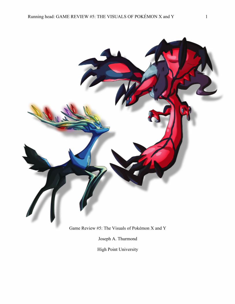
Game Review #5: The Visuals of Pokémon X and Y
Joseph A. Thurmond
High Point University
GAME REVIEW #5: THE VISUALS OF POKÉMON X and Y 2
Abstract
In this game review, I will be studying Pokémon X and Y’s visuals and will dissect them
into three categories for critical analysis. Firstly, I will define the art style, see how it has evolved
over time, explain why it is an integral part of the franchise’s success, and determine whether or
not it is effective in matching the game’s tone/themes. Secondly, I will see if the aesthetics of the
characters, environments, and – generally speaking – everything else are effectively utilized so
that the appearances and “personality” behind everything carry different weight and meanings
(this is best defined by Gamusatra). Lastly, I will examine how well the graphical fidelity
translates the art style and aesthetics to the Nintendo 3DS hardware by looking at the lighting,
detail, scope, 3D effects, etc.
GAME REVIEW #5: THE VISUALS OF POKÉMON X and Y 3
Game Review #5: The Visuals of Pokémon X and Y
Just as Pokémon has evolved over time with developer Game Freak expanding upon,
improving, and perfecting its classic game formula, the visuals of every title have increased in
quality as well, adequately showing off the power of Nintendo’s handheld consoles over time.
From 1996 to 2012, We’ve played from an overhead perspective with 8-bit, black and white,
pixelated graphics to a pseudo-3D perspective with colored graphics that have a higher pixel
density, making way for fully animated Pokémon (versus the static sprites used in the past), more
environmental scope, some visual effects, and so forth. The franchise has come a long way and
continues to perform well in the market. This claim holds true because 2013’s Pokémon X and Y
have recently become the Nintendo 3DS’s best selling games, with over 12 million sold
worldwide as of the time of this writing (Gaston, 2014).
What keeps the franchise going? Why is it so compelling to come back to if the core
mechanics and gameplay have largely remained unchanged for over 18 years? I argue that the
visuals – the art style, aesthetics, and graphical fidelity – play a big role in this. While they have
always played an important part in the series’ success, Game Freak took them a step further with
X and Y by making a leaping bound from pixelated graphics and sprites to an astonishing 3D
world that is immensely more detailed and on par with the best that handheld games have to
offer today. Being a devout fan of the franchise, I noticed that the visuals were what everyone
was most surprised and excited about before the games were released because they take full
advantage of the 3DS hardware; that is what sets them apart from their predecessors. In the end,
Game Freak played a bit on the safe side by not changing the main formula too much, but this
does not matter. The developer smartly and reasonably innovated in some areas more than
others, especially with the visuals. Therefore, I would like to discuss why they are specifically
GAME REVIEW #5: THE VISUALS OF POKÉMON X and Y 4
integral to the X and Y experiences by discerning the appeal and qualities of the art style, the
importance and clever work behind the aesthetics, and how the graphical fidelity makes such a
positively vast difference this time around.
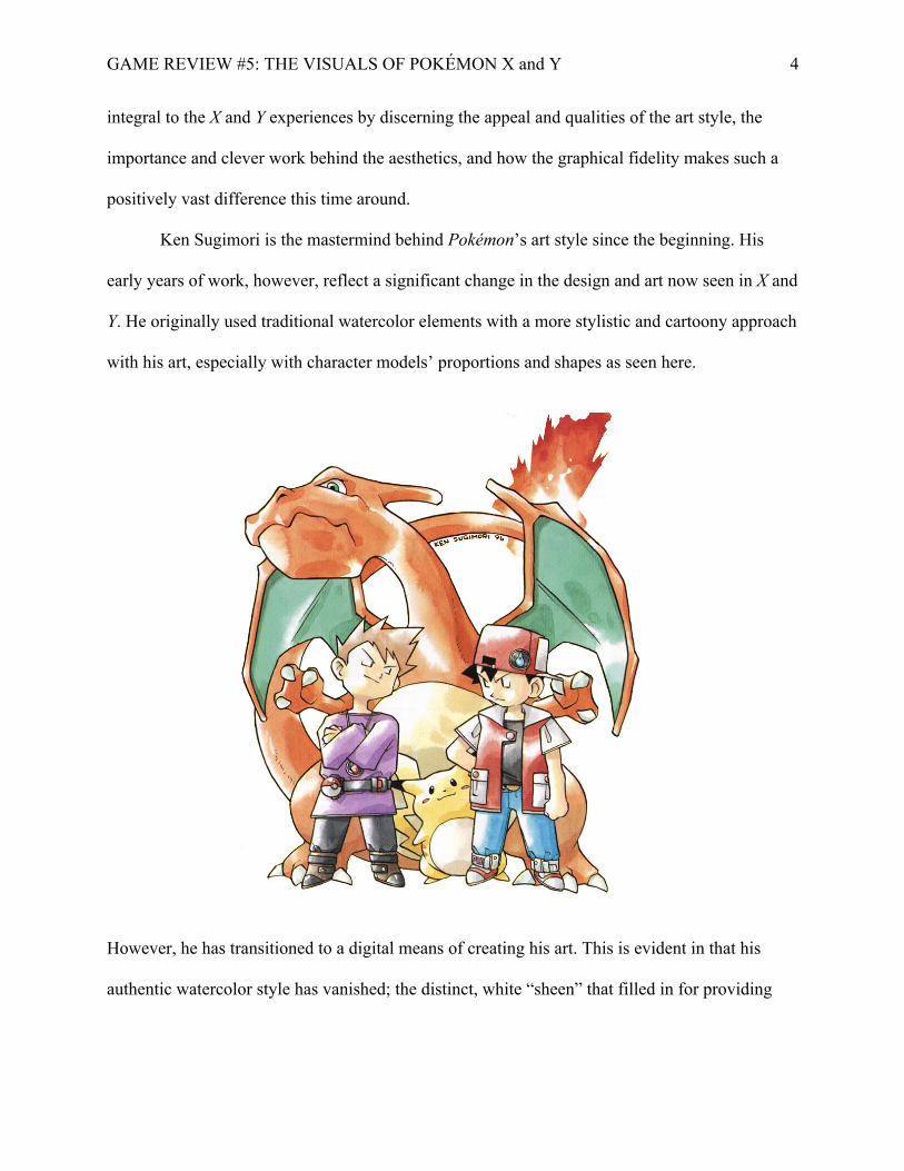
Ken Sugimori is the mastermind behind Pokémon’s art style since the beginning. His
early years of work, however, reflect a significant change in the design and art now seen in X and
Y. He originally used traditional watercolor elements with a more stylistic and cartoony approach
with his art, especially with character models’ proportions and shapes as seen here.
However, he has transitioned to a digital means of creating his art. This is evident in that his
authentic watercolor style has vanished; the distinct, white “sheen” that filled in for providing
GAME REVIEW #5: THE VISUALS OF POKÉMON X and Y 5
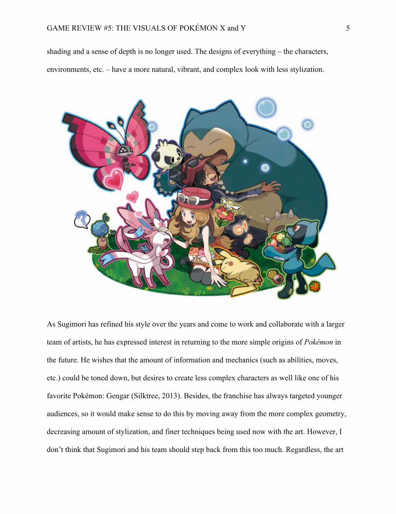
shading and a sense of depth is no longer used. The designs of everything – the characters,
environments, etc. – have a more natural, vibrant, and complex look with less stylization.
As Sugimori has refined his style over the years and come to work and collaborate with a larger
team of artists, he has expressed interest in returning to the more simple origins of Pokémon in
the future. He wishes that the amount of information and mechanics (such as abilities, moves,
etc.) could be toned down, but desires to create less complex characters as well like one of his
favorite Pokémon: Gengar (Silktree, 2013). Besides, the franchise has always targeted younger
audiences, so it would make sense to do this by moving away from the more complex geometry,
decreasing amount of stylization, and finer techniques being used now with the art. However, I
don’t think that Sugimori and his team should step back from this too much. Regardless, the art
GAME REVIEW #5: THE VISUALS OF POKÉMON X and Y 6
style from the beginning to the present has remained irresistibly charming, with beautiful worlds
to explore and a diverse set of Pokémon ranging from being adorable and innocent to fearsome
and imposing. The medium in which the art has been made has changed, but the simple yet
precise use of color balance and each line are carefully placed, giving unique and instantly
recognizable appearances to anything Pokémon. The art style present in X and Y is just more
mature and developed with more techniques (such as shading) being utilized.
The previous paragraph, however, is not fully supported without discussing the
aesthetics, and they are expertly implemented with the art style throughout X and Y, especially
with the power of the 3DS. To provide some illustrations, items with different attributes have
fitting shapes, with Potions having a rounded, full appearance to indicate their positive
usefulness and importance. However, something like the Reaper Cloth has a devilish appearance
with its pointy, frayed edges and uneven surface (looking itchy and dirty), which give visual
reinforcement to its item description of being “imbued with horrifyingly strong spiritual energy.”
The circular arches and thick, curved brick walls and roofs of Vaniville Town – the
player’s hometown – feels appropriately welcoming and secure, whereas the Pokémon League’s
headquarters is a towering, regal castle decorated in angular spires and ornate architecture,
housing a giant, spacey interior with uniform, solid supports/columns. Unlike Vaniville Town –
where the player’s human character seems perfectly fitting in the folksy environment – the
Pokémon League is inspiring and mystical, yet has an intimidating, authoritative design that
foreshadows the great challenges a player is about to face here. There’s a great, logical sense of
aesthetic dissonance happening here.
Most importantly and evidently, the shapes and themed appearances of Pokémon vary
greatly, which opens up the opportunity for players with different interests to connect with
GAME REVIEW #5: THE VISUALS OF POKÉMON X and Y 7
certain Pokémon. This is something that Sugimori says is one of the goals of designing these
Pocket Monsters. “[There are] always some Pokémon you like. That's the reason it's very popular
and the reason it's liked all over the world” (East, 2011). For example, someone who adores cute,
little animals will automatically be inclined to catch Ralts, Litleo, or Flabebé in X or Y due to
their rounded bodies and soft, smooth appearance, which convey innocence, playfulness, and
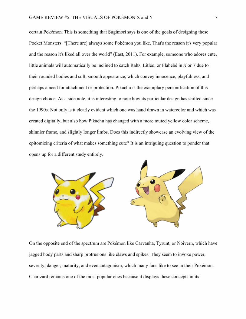
perhaps a need for attachment or protection. Pikachu is the exemplary personification of this
design choice. As a side note, it is interesting to note how its particular design has shifted since
the 1990s. Not only is it clearly evident which one was hand drawn in watercolor and which was
created digitally, but also how Pikachu has changed with a more muted yellow color scheme,
skinnier frame, and slightly longer limbs. Does this indirectly showcase an evolving view of the
epitomizing criteria of what makes something cute? It is an intriguing question to ponder that
opens up for a different study entirely.
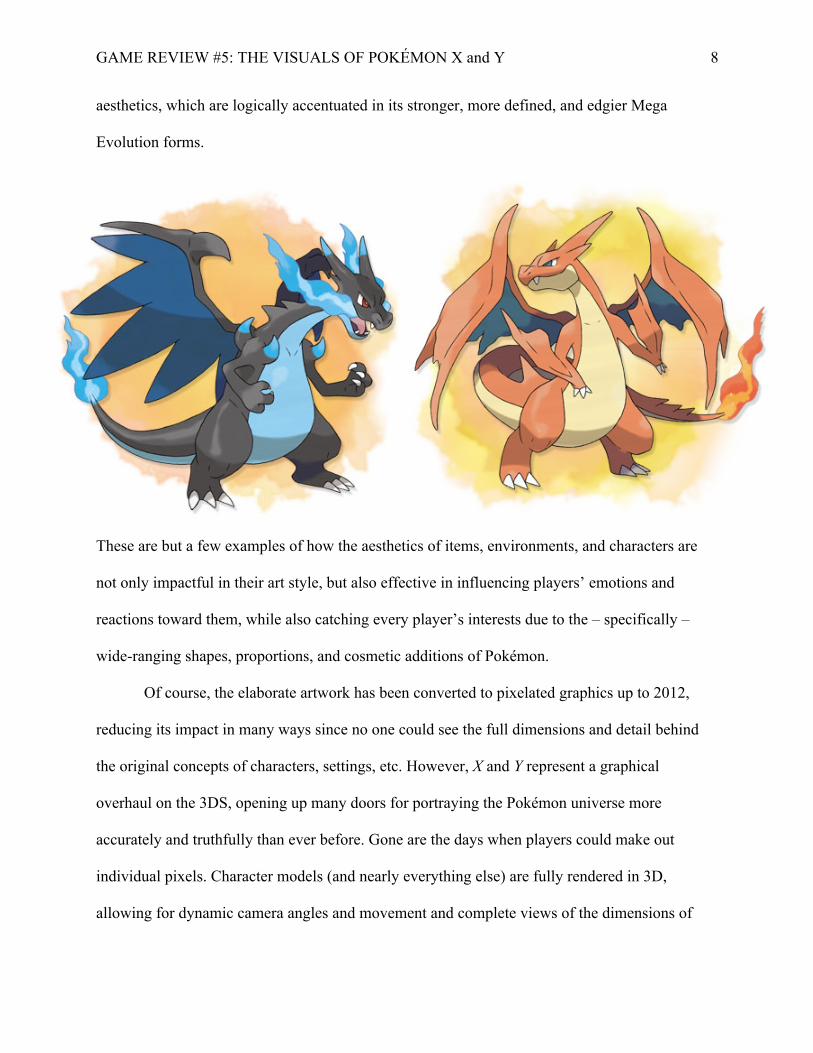
On the opposite end of the spectrum are Pokémon like Carvanha, Tyrunt, or Noivern, which have
jagged body parts and sharp protrusions like claws and spikes. They seem to invoke power,
severity, danger, maturity, and even antagonism, which many fans like to see in their Pokémon.
Charizard remains one of the most popular ones because it displays these concepts in its
GAME REVIEW #5: THE VISUALS OF POKÉMON X and Y 8
aesthetics, which are logically accentuated in its stronger, more defined, and edgier Mega
Evolution forms.
These are but a few examples of how the aesthetics of items, environments, and characters are
not only impactful in their art style, but also effective in influencing players’ emotions and
reactions toward them, while also catching every player’s interests due to the – specifically –
wide-ranging shapes, proportions, and cosmetic additions of Pokémon.
Of course, the elaborate artwork has been converted to pixelated graphics up to 2012,
reducing its impact in many ways since no one could see the full dimensions and detail behind
the original concepts of characters, settings, etc. However, X and Y represent a graphical
overhaul on the 3DS, opening up many doors for portraying the Pokémon universe more
accurately and truthfully than ever before. Gone are the days when players could make out
individual pixels. Character models (and nearly everything else) are fully rendered in 3D,
allowing for dynamic camera angles and movement and complete views of the dimensions of
GAME REVIEW #5: THE VISUALS OF POKÉMON X and Y 9
Pokémon, buildings, and more. Visual effects are more possible and far more convincing, such
as light shining through a stain glass window or the shadows of objects reflecting on the ground,
and weather effects like wind flowing through the grass and water reflection add a sense of
realism to the world. Human characters are more diverse and discernable since they have a wider
range of heights and appearances, and they – including Pokémon – now display emotion with
facial expressions and body gestures, which were extremely limited in the previous games. The
latter point is actually immersive when a player can interact with his/her Pokémon in the
“Pokémon-Amie” mode. Whether s/he pets, feeds, or plays with them, the player can actually see
their emotional reactions to these things, which is especially interesting in a little minigame
where a player must copy their Pokémon’s facial expressions successfully, helping to reinforce
the real yet strange bonds formed with these fake creatures. Overall, these graphical
improvements in X and Y portray the Pokémon universe even closer to how it is beautifully and
completely realized in the official anime. While the actual 3D effects in the games are minimal
and barely noticeable, it hardly matters in the grand scheme of the impressive graphical fidelity.
What Game Freak has accomplished with X and Y is more than commendable in this
category. With these games, Sugimori and his art team have refined the original, infectiously
appealing art style; the smart aesthetic design is more noticeable and influential in providing an
improved, visually immersive experience; and the graphics are a technological marvel compared
to Black 2 and White 2 (only released a year before) in further distinguishing the Pokémon
universe as one of the most joyous, beautiful, and whimsical places one can escape to. Pokémon
is all about evolution, and it will suffice to say that the visuals have done more than that in X and
Y: they have Mega Evolved.
GAME REVIEW #5: THE VISUALS OF POKÉMON X and Y 10
References
Gaston, M. (2014, April 07). Pokemon x and y are the best-selling 3ds games to date . Retrieved
from http://www.gamespot.com/articles/pokemon-x-and-y-are-the-best-selling-3ds-
games-to-date
Silktree. (2013, November 01). Ken sugimori hints at reverting to simplicity in generation vii.
Retrieved from http://bmgf.bulbagarden.net/f323/ken-sugimori-hints-reverting-
simplicity-generation-vii-158276/
East, T. (2011, March 1). Pokémon black and white: 'we've gone back to basics'. Retrieved from
http://www.officialnintendomagazine.co.uk/24223/features/pokmon-black-and-white-
weve-gone-back-to-basics/?page=2