Embed Size (px)
Citation preview

Authors’ version of the paper accepted to IEEE VIS 2021; to appear in IEEE Transactions on Visualization & Computer Graphics.
Generative Design Inspiration for Glyphs with Diatoms
Matthew Brehmer, Robert Kosara, and Carmen Hull
CATEGORICAL
SCAFFOLD SHAPES
MARK SHAPES
ENCODING CHANNELS A A
B B
alpha
scale
rotation
NUMERICAL
color
square
circle
triangle
cross
hexagon
star
houndstooth
drop
POLYGONS
LINES
wave
frequency
amplitude
length
LINEAR
vertical
horizontal
POLYGONAL
square
circle
triangle
hexagon
octagon
sprial
Fig. 1. Sampling from palettes of mark shapes, encoding channels, and scaffold shapes (left), the Diatoms technique generated 20alternative glyph designs for an urban mobility dataset [9] (center), displayed as small permutables, in which we show a single datapoint (New York City) drawn according to each of the 20 designs. We highlight two of these designs as small multiples, where everydata point is drawn the same way (right). In these two designs, a city’s region, area, and population correspond respectively with thedrop’s fill color, size, and rotation in A and with the hexagon’s fill color, rotation, and alpha level in B ; a city’s bike, transit, and walkscores correspond respectively with the purple, brown, and pink waves’ amplitudes in A and with the stars’ rotations in B .
Abstract—We introduce Diatoms, a technique that generates design inspiration for glyphs by sampling from palettes of mark shapes,encoding channels, and glyph scaffold shapes. Diatoms allows for a degree of randomness while respecting constraints imposed bycolumns in a data table: their data types and domains as well as semantic associations between columns as specified by the designer.We pair this generative design process with two forms of interactive design externalization that enable comparison and critique of thedesign alternatives. First, we incorporate a familiar small multiples configuration in which every data point is drawn according to a singleglyph design, coupled with the ability to page between alternative glyph designs. Second, we propose a small permutables designgallery, in which a single data point is drawn according to each alternative glyph design, coupled with the ability to page between datapoints. We demonstrate an implementation of our technique as an extension to Tableau featuring three example palettes, and to betterunderstand how Diatoms could fit into existing design workflows, we conducted interviews and chauffeured demos with 12 designers.Finally, we reflect on our process and the designers’ reactions, discussing the potential of our technique in the context of visualizationauthoring systems. Ultimately, our approach to glyph design and comparison can kickstart and inspire visualization design, allowing forthe serendipitous discovery of shape and channel combinations that would have otherwise been overlooked.
Index Terms—Glyphs, multidimensional data, generative design, communicative visualization, small multiples, qualitative evaluation.
1 INTRODUCTION
Inspiration for novel visualization design can come from many sources.In this paper, we present a novel technique for drawing inspiration fromthe data itself, revealed through the use of a generative design processin combination with interactive design externalization.
We concentrate on design inspiration for glyphs: small visual objectscomprised of multiple marks, where the visual properties of a mark
• Matthew Brehmer and Robert Kosara are with Tableau Research. E-mail:{mbrehmer,rkosara}@tableau.com.
• Carmen Hull is with the University of Calgary. E-mail:[email protected].
Manuscript received 31 Mar. 2021; accepted 15 Jul. 2021. Date of Publicationxx xxx. 202x; date of current version 15 Jul. 2021. For information onobtaining reprints of this article, please send e-mail to: [email protected] Object Identifier: xx.xxxx/TVCG.201x.xxxxxxx
correspond with values from a single data point [11, 25]. Our work ismotivated by the prevalence of glyphs in communicative visualizationand the lack of support in existing tools for designing and construct-ing glyphs. Their design involves choices about the number of distinctmarks, the relative positioning of said marks, and the encoding channelsused to convey data values, choices that impact how viewers visuallydiscriminate the glyphs. However, glyph design is not solely aboutperceptual concerns. Designers also consider aspects such as visualsymmetry, the presence of emergent patterns and figurative associa-tions, as well as how these aspects interact with the semantics of theunderlying data. These aspects of glyph design are difficult to specify apriori. In light of these difficulties, we allocate glyph generation to aconstrained sampling process, one capable of producing a continuoussequence of candidate glyph designs, whereupon the designer becomesa curator [30], tasked with identifying promising designs and excludingless promising ones based on their own abstract and ineffable criteria.
Our primary contribution is Diatoms, a technique that encapsulates
1
arX
iv:2
107.
0901
5v1
[cs
.HC
] 1
9 Ju
l 202
1

the defining characteristics of generative design [30] (repetition, ran-domness, and logic) to provide glyph design inspiration by samplingfrom palettes of mark shapes, encoding channels, and glyph scaffoldshapes (Figure 1-left). To review and navigate between alternativeglyph designs, our sampling process is supported by two modes ofinteractive design externalization. The first is a familiar small mul-tiples configuration in which every data point is drawn according tothe same design specification (Figure 1-right), coupled with the abilityto page between alternative glyph designs. The second mode is whatwe refer to as a small permutables design gallery, in which a singledata point is drawn according to each of the generated glyph designs(Figure 1-center), coupled with the ability to page between data points.Our secondary contributions include observations from interviews with12 designers, to whom we demonstrated an implementation of our tech-nique as an extension to Tableau that featured three example palettes.Finally, we discuss the potential of our technique in terms of how itmight be integrated into interactive authoring systems, so as to con-nect the process of inspiration gathering with bespoke visualizationconstruction.
2 BACKGROUND AND PRIOR RESEARCH
We draw upon visualization research and practice as well as adjacentdomains’ incorporation of design externalization and generative design.
2.1 Inspiration for Visualization Design
Recent interactive visualization construction tools allow people to craftbespoke visualization beyond conventional statistical charts. Thesetools include Lyra [64], Data Illustrator [47], Charticulator [59], andmost recently StructGraphics [80]. Whether the goal is to realizemash-ups of existing chart types or to draw xenographics (“weird but(sometimes) useful charts” [45]), the output of these authoring toolstypically serves a specific communicative intent [42], where transfer-ability of the output to other datasets is not as critical as novelty andmemorability [12]. This communicative intent stands in contrast tothose of other visualization construction environments [29] where theoutput is to be used for analyzing data and should generalize acrossdatasets and use cases. A common critique of bespoke visualizationconstruction tools [65] is that they are authoring tools, not design tools,in that they do not provide any design inspiration or support. Thesetools assume that people already have a particular design in mind whenapproaching these tools; absent a preconceived design, they face a blankcanvas. With Diatoms, we address this missing step in visualizationconstruction by providing design inspiration via a sampling-based pro-cess coupled with a comparative display of design alternatives, albeitwith a focus on glyph-based visualization. We distinguish inspirationfrom recommendation, in that we associate the former with a desire toproduce a novel visualization to support a communicative intent whilethe latter addresses analytical intents, exemplified by projects like ShowMe [51] and Voyager [87].Inspiration from others. Sources of visualization design inspirationvary across individuals and communities of practice. The public-facingwork of others is one such source, particularly given the volume of workappearing in news media, at practitioner conferences, within visualiza-tion communities on Twitter and Reddit, or on the #share-inspirationchannel of the Data Visualization Society’s Slack [20]. Some seekinspiration among others working with the same tools or languages.For example, D3.js developers can find inspiration on indexed reposi-tories such as Bl.ock Builder [36] or bl.ocksplorer [61], while amongthe Tableau community, people seek out inspiration on Tableau Pub-lic [75]. While it is possible to download or fork specific exampleimplementations from these repositories or extract elements from pub-lished vector-based charts with tools like SVG Crowbar [79], two issuesarise: first, differences between the dataset used in an example imple-mentation and the dataset at hand can hinder the use of the example asa starting point for design; second, the new design can be derivative ofthe original on which it was based.Visual metaphors. Another source for visualization design inspirationare visual languages used in other media, from abstract art to musical
notation and engineering diagrams [50]. The natural world is alsoa boundless source for visualization design inspiration: we point toexamples of botanical motifs evoking trees [19, 41] and flowers [72],geological motifs evoking sedimentary layers [83], celestial motifsevoking constellations [14], or biomimetic motifs [23] evoking thebehavior of flocks or swarms [6]. Even the human face [17] andbody [32] have served as inspiration for visualization design. However,whether drawing inspiration from other visual media or from the naturalworld, the structure and distributions of values in the dataset at handmay not be congruent with a particular visual metaphor. In light ofthis, our approach attempts to generate visualization design inspirationindependent of external influences.
As we discuss in Sections 4 and 5.5, oursampling-based approach does not precludethe serendipitous recognition of visual mo-tifs found in nature or other media. In ourcase, the naming of the Diatoms techniquecame about when our approach generated
patterns reminiscent of the eponymous microscopic algae, such as thosedepicted in the inset image at left [62].
2.2 Glyph-Based Visualization
While new techniques and sources for design inspiration are neededfor all forms of visualization, we restrict our scope to glyph-basedvisualization. In a 2013 survey, Borgo et al. [11] describe a glyph asa small visual object that depicts attributes of a data record. Fuchs etal. [25] elaborated upon this definition, describing glyphs as instanceswhere single data points are encoded individually by assigning theirdimensions to one or more marks and their visual variables.
The use of glyphs in practice. Our scope reflects the prevalence ofglyphs in bespoke communicative visualization by practitioners; wepoint to examples in information design award showcases [4, 71], invisualization trade journals [39, 63], in celebrated collections likeDear Data [49] or Data Sketches [13, 88], or in featured collectionson Tableau Public [38, 43]. We are also motivated by the versatility ofglyphs. Though often arranged in grid configurations, glyphs also ap-pear in variants of other charts, with examples appearing in embellishedbar charts [72], maps [86], tile maps [89], and node-link diagrams [2].The opportunity for higher information density with glyphs also allowsfor their use in compact arrangements in tables [58], as inline word-scale elements in bodies of text [8, 27], or in small display contexts,such as the popular iOS Activity app [5] and its glyphs comprised ofthree concentric ring marks.
Drawing glyphs. Despite their prevalence and versatility, glyphs are te-dious to construct using interactive tools. For instance, Tableau expertshave described how they iterate between multiple tools [68], echoingfindings from prior interview studies [10, 57]; they draw mark shapesin applications like Illustrator [3] or Procreate [66], transform vectorgraphics with tools like coordinator [7], and impute and densify datawith spreadsheet or scripting tools. The tedium and difficulty of glyphconstruction persists among bespoke visualization authoring tools; tocreate a small multiples arrangement of glyphs in Charticulator [59],one must undergo a recursive process of exporting a single glyph andimporting this nested chart in a new Charticulator instance [65].
Difficulties associated with constructing glyphs also reflects the im-mensity of their design space. Beyond the initial selection of markshapes and encoding channels, designers must be conscious of how theperception of mark shape, fill color, and mark size can interact [70],and they must weigh the effects of juxtaposing or superimposingmarks on Gestalt perception within and between glyphs. Accordingly,there are varying approaches to glyph design, including experimentingwith visual metaphors from nature or other media [49], appropriatingsemantically-related figurative elements and frames [16, 40], and con-structing taxonomies of abstract mark arrangements [52]. With oursample-based approach to glyph design, we relieve designers of thesedecisions, at least early in the design process, asking them to insteadact as a curator of generated designs.
2
Authors’ version of the paper accepted to IEEE VIS 2021; to appear in IEEE Transactions on Visualization & Computer Graphics.
2.3 Design ExternalizationSpatially juxtaposing alternative designs is common across visual disci-plines. Scholars studying the history of design employ this technique tostudy variations across designers, historical periods, and geography, fa-cilitating conversation among collaborators and inspiring new researchquestions [22]. Meanwhile, designers collect and visually juxtaposedesign inspiration produced by others, whether on physical walls orvirtual whiteboards. In this paper, we are concerned with designersemploying this technique to discuss and critique their own designs.Automating design externalization. While it is possible to arrangedesign variants manually, automated design externalization can fa-cilitate in-the-moment comparison of variants as they are produced.This automation is well-suited for drawing and photo editing applica-tions [46, 53, 78], where an interactive parameter space can quicklyproduce many variants. Interactive design externalization can facilitatebrowsing and presenting design alternatives [15] as well as a sequentialexploration of a parameter space [44], either by individuals or by teamsof designers engaged in a process of collaborative critique [55].Externalization for visualization design. In the context of visualiza-tion, there are precedents for juxtaposing a sequence of visualizationartifacts in analysis tools for the purpose of analytical provenance andauditing [31], but examples of externalization in visualization designare less common. One precedent is the process undertaken by the newsgraphics team of the The New York Times [18], where an automatedscript generates a screenshot with every git commit to a project, ap-pending this screenshot to a thumbnail gallery of visualization designvariants. While this approach may not easily afford quick compar-isons of designs with minute differences or of charts that are ideallysuited for full-screen viewing, it may be appropriate for comparingalternative designs of small glyphs. Another precedent for external-ization in visualization design can be found in Schroeder and Keefe’sVisualization-by-Sketching interface [67], wherein a designer can vet acandidate mark design by interactively generating a gallery that illus-trates how the mark may manifest in different conditions, such as byvarying mark density and size. We incorporate ideas similar to bothprecedents in Diatoms, from comparing across glyph design choices tocomparing alternative sizes and positions of a particular glyph design.
2.4 Generative DesignA common characteristic of conventional design is the step-by-stepand often manual process of realizing a new idea. In visualizationdesign, this captures the trial-and-error process of associating visualencoding channels to attributes of data, which could be informed by anunderstanding of graphical perception or by domain conventions. Incontrast, generative design suggests an alternative approach that fixateson the identification of configurable parameters and the refinementof rules for generating many ideas and especially those that exhibitemergent yet desirable traits that cannot be easily specified beforehand.With respect to glyph-based visualization, these traits could includestrong Gestalt associations or memorable figurative associations. Ingenerative design, Groß et al. [30] describes how traditional crafts-manship recedes into the background, and abstraction and informationbecome the new principal elements. The formalization of abstract rulestypically involves elements of repetition, logic, and randomness. Artistsand designers have applied generative processes in many domains; wepoint to examples in interface design [74], architecture [28], urbanplanning [69], industrial design [54], and even music [24]. Despiteits prevalence in these fields, generative design is under-utilized invisualization research.Generative design for visualization. Data art and data visualizationare ideal application scenarios for generative design [34]. The visualnature of the artifacts produced allow for repetition to manifest bothtemporally and spatially, the latter being conducive to externalizationof alternative designs in design galleries [46, 53]. Designers and artistsmust consider how to balance randomness with logical decisions thatbind data types and values with visual properties.
One noteworthy recent example of interactive design externalizationcoupled with a generative process is Morph [21], a tool for generating
visual art from tabular data; Morph seeds the design space with a fa-miliar statistical chart and applies random mutations to visual encodingchannels, resulting in a visual branching of increasingly mutated de-signs, which fans outward with additional selections. Like Morph, wealso embrace randomness to an extent with Diatoms, sampling fromencoding channel palettes for each mark in a glyph.
3 THE DIATOMS TECHNIQUE
The purpose of Diatoms is to quickly generate design inspiration forglyphs, and this generation process is coupled with interactive designexternalization for comparing promising designs. We break down theDiatoms technique into a process of designating conjunction and repeatassociations in the data, sampling from shape and channel palettes togenerate alternative glyph designs, and finally comparing and curatingthese designs in small multiples and small permutables viewing modes.Throughout this section, we refer to Figure 2 and an example featuringan urban mobility dataset [9] to explain aspects of the technique, whilethe supplemental video [1] illustrates its interactive aspects.
We assume tabular data expressed in wide format such as in Fig-ure 2.1. Given such a table, Diatoms will draw a glyph for each row.We first decide which columns to include in the glyph designs, and weoptionally group columns that share semantic associations into columnsets. Otherwise, each set contains a single column.
3.1 Sampling from Shape and Encoding PalettesWe assign mark shapes and encoding channels via a constrained randomsampling process. The example shape and channel palettes featured inFigures 1 - 5 represent one possible starting point in the glyph designspace, others are certainly possible and should be left to the discretionof the designer. In Section 4, we reflect on our experimentation withpalette options that preceded those featured in this section.Mark shape palette. We assign a unique shape to each column set,and each shape can only be assigned once within a single glyph design.Our example shape palette shown in Figure 2.3 contains eight polygonshapes and one wave shape, meaning that a single glyph design cancontain at most nine unique mark shapes. Our inclusion of the waveserves as a counterpoint to the more salient filled polygons. We chose asine wave following experimentation with straight line marks, wherewe determined there to be an insufficient number of salient encodingchannels compatible with the latter, whereas the former provided uswith frequency and amplitude in addition to length. Other wave shapesare worth considering for future palettes, such as square and sawtoothwaves. Most of the polygon shapes in this palette are symmetric andfamiliar, reminiscent of the mark shape palettes in Tableau. Sincewe include mark rotation in our example encoding channel palette,we introduced asymmetry to this mark shape palette in two ways:by including houndstooth ( ) and drop ( ) shapes and by adding adirectional pip to all marks: a small white circle to indicate the rotationof a shape, akin to a level indicator on a physical dial.Encoding channel palette. We also assign encoding channels tocolumns via sampling. Given the small number of options in thisexample palette (shown in Figure 2.4), we allow for channels to besampled by more than one column set. We include one categoricalchannel (mark color) and an equal number of quantitative channelsfor polygons (alpha, size, rotation) and waves (frequency, amplitude,length). In Section 4, we discuss our prior experimentation with severalother encoding channels (e.g., position, distortion, stroke properties),along with rationale for why we omitted them from this palette.Scaffold shape palette. Finally, each glyph design is randomly as-signed a scaffold shape. Our example palette (Figure 2.5) has twolinear and six polygon shapes; the latter includes a spiral as a con-trast to the simple and symmetric shapes that fill out the rest of thepalette. Scaffolds are organizing principles for marks, which are placedat equally-spaced intervals along a scaffold following column set order.We additionally randomize the distance of marks from the peripheryof the scaffold, which we refer to as a scaffold’s gravity (Figure 2.6).Design A has a spiral scaffold with weak gravity, while design B hasa triangle scaffold with medium gravity.
3

SCAFFOLD SHAPEPALETTE
ENCODINGCHANNELPALETTE
MARKSHAPEPALETTE
ScaffoldGravity
LABEL COLUMN--this column is not encodedas a mark
COLUMN SET #1:DESCRIPTIVE ATTRIBUTES OF CITIES--These columns do not share data type; a conjunction designation will assign three encoding channels to a single mark.
COLUMN SET #2:MOBILITY SCORES FOR CITIES--These columns share a data type and domain; a repeat designation will result in three marks that share an encoding channel.
A
B
REGION
REGIO
N
SCORE
B
REPEAT
B
CONJUNCTION
A
CONJUNCTION
AREPEAT
SCOREPOPULATIONAREA
POPULATIONAREA
2
3
4
5
6
1
A
DROPREGION: Northeast (blue)POPULATION: 8.5M (rotation)AREA: 1213 sq. km (scale)
DROPREGION: Southwest (green)POPULATION: 2.6M (rotation)AREA: 993 sq. km (scale)
BROWN WAVE (amplitude)TRANSIT SCORE: 85
BROWN WAVE (amplitude)TRANSIT SCORE: 40
PURPLE WAVE (amplitude)BIKE SCORE: 65
PURPLE WAVE (amplitude)BIKE SCORE: 44
HEXAGON REGION: Northeast (blue)POPULATION: 8.5M (alpha)AREA: 1213 sq. km (rotation)
HEXAGONREGION: Southwest (green)POPULATION: 2.6M (alpha)AREA: 993 sq. km (rotation)
BROWN STAR (rotation)TRANSIT SCORE: 85
BROWN STAR (rotation)TRANSIT SCORE: 40
PINK STAR (rotation)WALK SCORE: 89
PINK STAR (rotation)WALK SCORE: 61
PINK WAVE (amplitude)WALK SCORE: 89
PINK WAVE (amplitude)WALK SCORE: 61
PURPLE STAR (rotation)BIKE SCORE: 65
PURPLE STAR (rotation)BIKE SCORE: 44
Fig. 2. This diagram depicts a column set designation (2) for a data table [9] (1), as well as sampling outcomes with respect to mark shape (3),encoding channel (4), scaffold shape (5), and scaffold gravity (6) for alternative glyph designs A and B . On the right, we added the red annotationsto cropped sections of the corresponding small multiples configurations from Figure 1 (right) to highlight the encodings and underlying values.
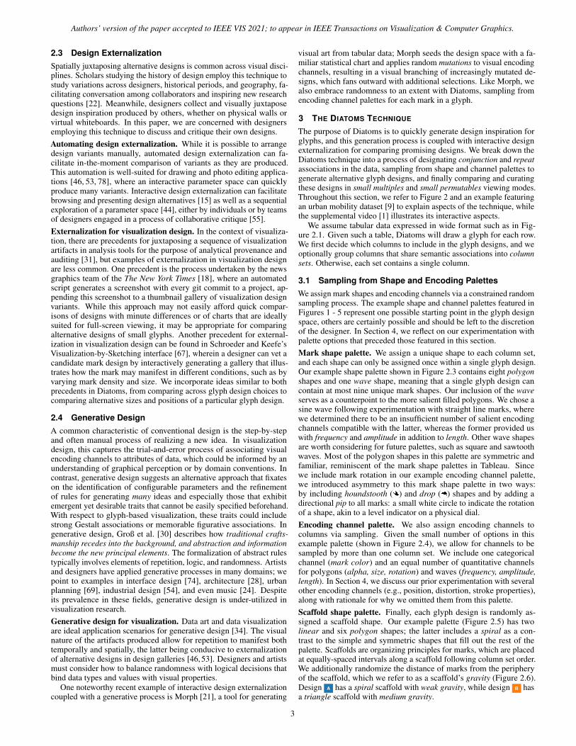
Column sets. The cardinality and type of a column set determinesthe number and appearance of marks that get drawn. Figure 3 showsvariations on a column set designation, with four alternative glyphdesigns produced for each. Designating one column per set may notyield interpretable designs after more than a few columns, such as inthe example of Figure 3.1. While one solution is to use only a subset ofcolumns, such as in Figure 3.2, we can also combine columns into sets.The example designation in Figure 2.2 features two columns sets, andthese sets represent two types of associations between columns.
Column sets with conjunction designations. The first column set con-tains descriptive aspects of cities: REGION, AREA, and POPULATION.This set will correspond with a single mark exhibiting a conjunctionencoding [84], where each column corresponds with a unique encodingchannel. In glyph design A , this set is assigned a drop shape, while itis assigned a hexagon shape in glyph design B . For the drop mark inglyph design A , REGION, AREA, and POPULATION are respectivelyassigned to color, size, and rotation. For the hexagon mark in glyphdesign B , these columns are assigned to color, rotation, and alphalevel. The blue marks in Figures 3.3 and 3.4 are alternative outcomesof this designation.
Column sets with repeat designations. BIKE SCORE, TRANSIT SCORE,and WALK SCORE share a common numerical domain from 0 to 100;combining them in a column set with a repeat designation means thateach column will be assigned a unique mark, but each mark will repeata shared shape and channel combination, so as to promote a direct
comparison of values following the Gestalt principle of similarity. Fora column set with a repeat designation, we distinguish the set’s columnsusing color. Unlike the colors corresponding with REGION in the firstcolumn set, these colors do not reflect categorical values appearingin table cells. This repeat designation could be thought of as a pivottransformation on these columns, from a wide data format to a long one,where column names become categorical values amenable to encodingwith a channel such as color. Color assignments are unique, meaningthat the combined sum of categories across categorical columns andthe number of columns appearing in sets with repeat designationsshould be fewer than the number of distinguishable colors. In glyphdesign A , the amplitude of the purple, brown, and pink wave markscorrespond with the three mobility scores, while in glyph design B ,they correspond with the rotation of the star marks. The grey marks inFigure 3.3 and the repeated marks in Figure 3.4 illustrate the differencebetween a conjunction and repeat designation for these columns, withthe latter being the same designation used in Figure 2.
3.2 Small Multiples and Small Permutables
Given a column set designation, sampling across the three palettescan generate many possible glyph designs, and the number of possiblepermutations of mark shape, channel, and scaffold shape grow asdesignations include more columns. We therefore propose two ways toview and navigate between alternative designs. The first viewing modeis a familiar small multiples grid configuration in which a glyph foreach data point is drawn according to the same glyph design, such as in
4
Authors’ version of the paper accepted to IEEE VIS 2021; to appear in IEEE Transactions on Visualization & Computer Graphics.
Default column set designation:Unique mark for each column: Region (blue mark), Area, Population, Bike Score, Transit Score, & Walk Score
Curated column set designation:Region, Area, & Population columns only.Unique mark for each column.
Two column sets with conjunction encoding:1. Region, Area, & Population (blue mark)2. Bike, Transit, & Walk Score (grey mark)
Conjunction for Set #1, repeat for set #2:1. Region, Area, & Population (blue mark)2. Bike, Transit, & Walk Score (repeated shape mark)
1 2 3 4
Fig. 3. Variations on a column set designation with the urban mobility dataset [9], with four glyph designs shown for each designation in a smallpermutables configuration Variant 4 uses the column set designation used in Figure 2.
the two grids of 12 glyphs for designs A and B in Figure 1 (right). Inour implementation of Diatoms, we provide the means to page betweensmall multiples configurations of alternative glyph designs. The secondmode is a design gallery of glyph alternatives which we refer to asa small permutables grid configuration, in which one data point isdrawn multiple times, once for each alternative glyph design, such asin Figure 1 (center).
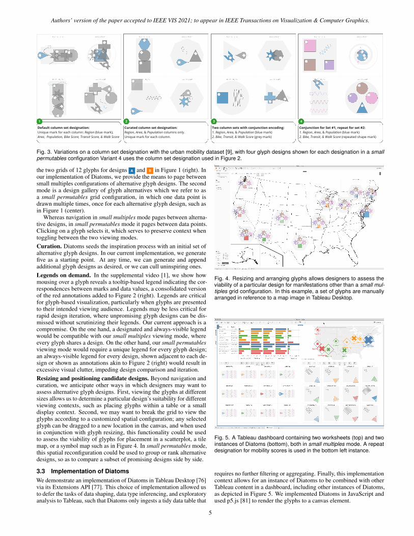
Whereas navigation in small multiples mode pages between alterna-tive designs, in small permutables mode it pages between data points.Clicking on a glyph selects it, which serves to preserve context whentoggling between the two viewing modes.Curation. Diatoms seeds the inspiration process with an initial set ofalternative glyph designs. In our current implementation, we generatefive as a starting point. At any time, we can generate and appendadditional glyph designs as desired, or we can cull uninspiring ones.Legends on demand. In the supplemental video [1], we show howmousing over a glyph reveals a tooltip-based legend indicating the cor-respondences between marks and data values, a consolidated versionof the red annotations added to Figure 2 (right). Legends are criticalfor glyph-based visualization, particularly when glyphs are presentedto their intended viewing audience. Legends may be less critical forrapid design iteration, where unpromising glyph designs can be dis-missed without scrutinizing their legends. Our current approach is acompromise. On the one hand, a designated and always-visible legendwould be compatible with our small multiples viewing mode, whereevery glyph shares a design. On the other hand, our small permutablesviewing mode would require a unique legend for every glyph design;an always-visible legend for every design, shown adjacent to each de-sign or shown as annotations akin to Figure 2 (right) would result inexcessive visual clutter, impeding design comparison and iteration.Resizing and positioning candidate designs. Beyond navigation andcuration, we anticipate other ways in which designers may want toassess alternative glyph designs. First, viewing the glyphs at differentsizes allows us to determine a particular design’s suitability for differentviewing contexts, such as placing glyphs within a table or a smalldisplay context. Second, we may want to break the grid to view theglyphs according to a customized spatial configuration; any selectedglyph can be dragged to a new location in the canvas, and when usedin conjunction with glyph resizing, this functionality could be usedto assess the viability of glyphs for placement in a scatterplot, a tilemap, or a symbol map such as in Figure 4. In small permutables mode,this spatial reconfiguration could be used to group or rank alternativedesigns, so as to compare a subset of promising designs side by side.
3.3 Implementation of DiatomsWe demonstrate an implementation of Diatoms in Tableau Desktop [76]via its Extensions API [77]. This choice of implementation allowed usto defer the tasks of data shaping, data type inferencing, and exploratoryanalysis to Tableau, such that Diatoms only ingests a tidy data table that
Fig. 4. Resizing and arranging glyphs allows designers to assess theviability of a particular design for manifestations other than a small mul-tiples grid configuration. In this example, a set of glyphs are manuallyarranged in reference to a map image in Tableau Desktop.
Fig. 5. A Tableau dashboard containing two worksheets (top) and twoinstances of Diatoms (bottom), both in small multiples mode. A repeatdesignation for mobility scores is used in the bottom left instance.
requires no further filtering or aggregating. Finally, this implementationcontext allows for an instance of Diatoms to be combined with otherTableau content in a dashboard, including other instances of Diatoms,as depicted in Figure 5. We implemented Diatoms in JavaScript andused p5.js [81] to render the glyphs to a canvas element.
5
1 2 3
4 5 6
Fig. 6. The evolution of the Diatoms technique, including experiments with: scaffold and mark permutations (1); position- and repetition-basedencodings with a small palette of mark shapes (2); parameterized shape encodings (3); mark shape palettes comprised predominantly of asymmetricshapes (4); mark stroke color and weight encodings (5); and colored pips for marks corresponding with column sets having repeat designations (6).
4 TECHNIQUE EVOLUTION AND PALETTE EXPERIMENTATION
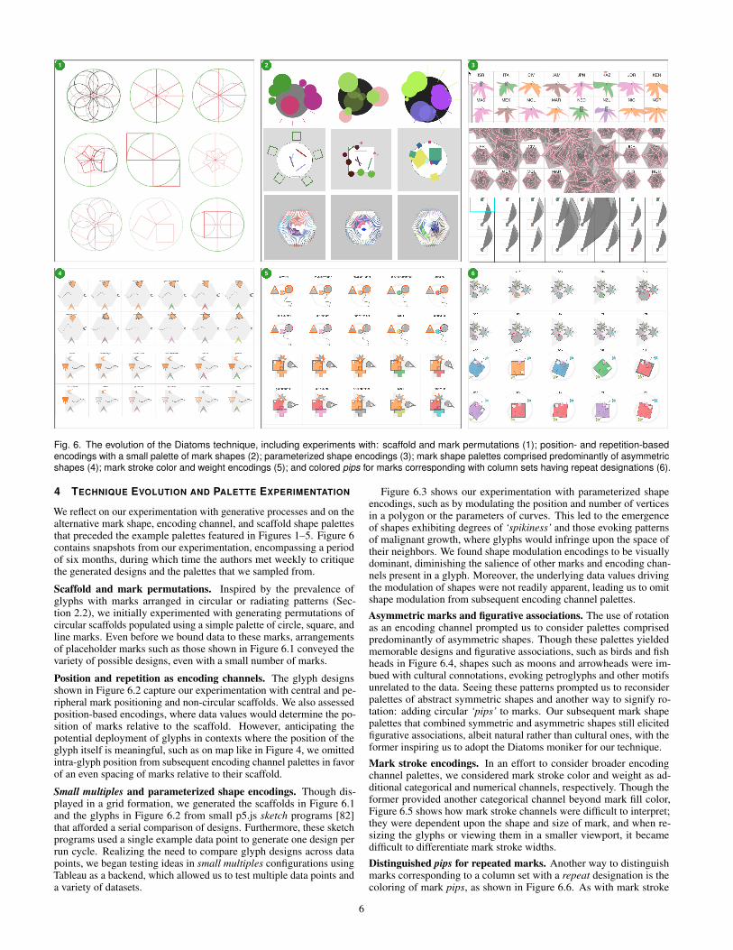
We reflect on our experimentation with generative processes and on thealternative mark shape, encoding channel, and scaffold shape palettesthat preceded the example palettes featured in Figures 1–5. Figure 6contains snapshots from our experimentation, encompassing a periodof six months, during which time the authors met weekly to critiquethe generated designs and the palettes that we sampled from.
Scaffold and mark permutations. Inspired by the prevalence ofglyphs with marks arranged in circular or radiating patterns (Sec-tion 2.2), we initially experimented with generating permutations ofcircular scaffolds populated using a simple palette of circle, square, andline marks. Even before we bound data to these marks, arrangementsof placeholder marks such as those shown in Figure 6.1 conveyed thevariety of possible designs, even with a small number of marks.
Position and repetition as encoding channels. The glyph designsshown in Figure 6.2 capture our experimentation with central and pe-ripheral mark positioning and non-circular scaffolds. We also assessedposition-based encodings, where data values would determine the po-sition of marks relative to the scaffold. However, anticipating thepotential deployment of glyphs in contexts where the position of theglyph itself is meaningful, such as on map like in Figure 4, we omittedintra-glyph position from subsequent encoding channel palettes in favorof an even spacing of marks relative to their scaffold.
Small multiples and parameterized shape encodings. Though dis-played in a grid formation, we generated the scaffolds in Figure 6.1and the glyphs in Figure 6.2 from small p5.js sketch programs [82]that afforded a serial comparison of designs. Furthermore, these sketchprograms used a single example data point to generate one design perrun cycle. Realizing the need to compare glyph designs across datapoints, we began testing ideas in small multiples configurations usingTableau as a backend, which allowed us to test multiple data points anda variety of datasets.
Figure 6.3 shows our experimentation with parameterized shapeencodings, such as by modulating the position and number of verticesin a polygon or the parameters of curves. This led to the emergenceof shapes exhibiting degrees of ‘spikiness’ and those evoking patternsof malignant growth, where glyphs would infringe upon the space oftheir neighbors. We found shape modulation encodings to be visuallydominant, diminishing the salience of other marks and encoding chan-nels present in a glyph. Moreover, the underlying data values drivingthe modulation of shapes were not readily apparent, leading us to omitshape modulation from subsequent encoding channel palettes.
Asymmetric marks and figurative associations. The use of rotationas an encoding channel prompted us to consider palettes comprisedpredominantly of asymmetric shapes. Though these palettes yieldedmemorable designs and figurative associations, such as birds and fishheads in Figure 6.4, shapes such as moons and arrowheads were im-bued with cultural connotations, evoking petroglyphs and other motifsunrelated to the data. Seeing these patterns prompted us to reconsiderpalettes of abstract symmetric shapes and another way to signify ro-tation: adding circular ‘pips’ to marks. Our subsequent mark shapepalettes that combined symmetric and asymmetric shapes still elicitedfigurative associations, albeit natural rather than cultural ones, with theformer inspiring us to adopt the Diatoms moniker for our technique.
Mark stroke encodings. In an effort to consider broader encodingchannel palettes, we considered mark stroke color and weight as ad-ditional categorical and numerical channels, respectively. Though theformer provided another categorical channel beyond mark fill color,Figure 6.5 shows how mark stroke channels were difficult to interpret;they were dependent upon the shape and size of mark, and when re-sizing the glyphs or viewing them in a smaller viewport, it becamedifficult to differentiate mark stroke widths.
Distinguished pips for repeated marks. Another way to distinguishmarks corresponding to a column set with a repeat designation is thecoloring of mark pips, as shown in Figure 6.6. As with mark stroke
6

Authors’ version of the paper accepted to IEEE VIS 2021; to appear in IEEE Transactions on Visualization & Computer Graphics.
encodings, colored pips were insufficiently salient, leading us to colorthe marks themselves, as described in Section 3.1. Since color is theonly categorical encoding channel in the palette featured in Figures1–5, this design choice means that repeated marks can only encodenumerical values. To encode multiple categorical values, a palettewould require additional categorical channels, such as textured fillpatterns or stroke styles.
5 INTERVIEW STUDY
To better understand how Diatoms might integrate into design work-flows, we conducted open-ended interviews and chauffeured de-mos [48] with twelve designers. These hour-long interviews focusedon the potential utility of generative design processes and what ad-ditional functionality designers would require for connecting designinspiration with visualization authoring. Our approach represents aneffort to collect candid reactions from designers in the absence of anestablished evaluation methodology; between previous experimentsassessing the perceptual efficacy of particular glyph designs [25] anddesign reproduction studies assessing the potential of interactive visual-ization authoring tools [60], we argue that existing methods cannot beused to study the early and divergent stages of visualization design.Participants. We recruited seven design students (P1–P7: 6 ♀, 1 {)and five experienced designers (P8–P12: 1 ♀, 4 {) who work withvisualization. The former group were enrolled in a graduate course ininformation design and visual cognition, and we interviewed them asthey were completing an assignment in glyph design.Format. We introduced the Diatoms concept and implementation toall interviewees prior to speaking with them. For the students, thistook place during a guest lecture, while we sent an extended versionof our supplemental video [1] to the professional designers. We beganthe interviews by discussing the interviewees’ experience with designand visualization tools, their sources of inspiration, and their currentworkflows. We then provided a choice of three small datasets (citymobility data [9], film metadata from IMDb [35], or socioeconomicdata from Gapminder [26]). After giving the interviewees an oppor-tunity to ask us clarifying questions about their chosen dataset or theconcept underlying Diatoms, we began a chauffeured demo to elicittheir observations and questions about Diatoms’ output. For each demo,we used the same palettes as those featured throughout Figures 1–5.We initially constrained the range of possible outputs by demonstratingthe technique with fewer data columns and no set designations (such asin Figure 3.2). After discussing this initial output, we added more datacolumns and introduced repeat and conjunction set designations (suchas in Figure 3.3–3.4). Our interviews were seeded with a set of ques-tions that probed into why interviewees found some glyph designs to bepromising and others not, as well as how they would further refine themore promising glyph designs. As all interviews took place via videochat and screen-sharing, the first author ‘drove’ Diatoms in responseto interviewees’ observations and critiques of specific glyph designsor their requests to generate new ones; the other authors observed andtook notes. We recorded screen capture video and audio from theseinterviews; the following discussion reflects our thematic analysis ofthe transcripts and notes from these interviews.
5.1 General ImpressionsOverall, designers and students alike were generally receptive to ourtechnique. P10’s comments capture this sentiment: “conceptually,[Diatoms] is an awesome idea, it speaks to more of the playful elementsthat people like experimenting with.”
Diatoms could “speed up the process of generating ideas” [P1],allowing designers to “do some rapid sketching, [. . . with] differentsizes, shapes and colors right off the bat” [P2]. P9 explained that thetime typically required to experiment with encodings meant that hewould not be able to assess multiple options; he saw Diatoms generatealternatives in seconds that would otherwise take hours.
Beyond accelerating the early design phase, P3 suggested that Di-atoms could also help novice designers: “this is good for someone whoisn’t as creative, [. . . ] they can generate something easily and not put
much thought into it”. As one who does not visualize data program-matically, P3 also saw Diatoms as a way of providing designers withcreative alternatives that would have previously required coding.
Finally, two interviewees described the unlikeliness of discovering aparticular glyph design independent of Diatoms. Some mark, encodingchannel, and mark placement combinations would have been otherwiseoverlooked because the combination suggested a violation of visual-ization design convention. For instance, a glyph with strong gravitywill bunch the marks together in the center of a scaffold and can resultin partial mark occlusion; despite this, P6 noted how one such glyphdesign generated using the urban mobility dataset appropriately evokedthe density of cities. Even if the first impressions of a design suggesta violation of convention or a lack of perceptual clarity, P11 saw theadvantage in giving these imprecise designs an opportunity to inspire.Many designs are “often not clear or straightforward ideas, [and] eventhough 99 are wrong; the messiness can be a virtue;” he later addedthat “there are a lot of bad hits, but once in a while you stumble uponsomething that really works.”
5.2 Comparing and Winnowing Glyph DesignsIn each interview, we asked about the utility of our two modes forcomparing glyph designs. The concept of small permutables resonatedwith designer P8 in particular, who saw a parallel in his side practiceof brand logo design, where he would arrange alternative logos tosee which ones register and which ones should be discarded. Upondemonstrating the ability to page through data points, he stated that thisviewing mode “makes it clear how the [values] are changing”. He sawsmall permutables as a starting point for narrowing down one’s scope,before toggling to a small multiples mode to see all of the data pointsdrawn according to the selected glyph design.First impressions can be deceiving. We found that reactions to par-ticular glyph designs depended on the viewing mode in which theywere first encountered. As only one instance of each glyph design isshown in small permutables mode at any one time, a single design mayshow promise until it is applied to every row of data in small multiplesmode. This happened multiple times to P7, who changed her mindabout a design immediately upon switching modes, citing an inability todiscriminate between glyphs corresponding to different data points. Wealso observed the converse reaction, where P4 did not react positivelyto glyph designs first seen in small permutables mode until he saw allof the data points represented in a small multiples configuration.The best of both modes. Upon demonstrating both viewing modesand the ability to toggle between them, we received suggestions on howwe could integrate the two modes within a single display. While onesolution could be to spatially juxtapose the two viewing modes (suchas in Figure 1), P11 suggested a hybrid viewing mode in which a smallsubset of data points are shown for each design; he specifically pointedto a section of our explanatory video in which we arranged four smallmultiples screenshots within a single display, each featuring the same12 data points drawn according to a different glyph design. Similarly,P8 suggested a way to select a shortlist of three or four glyph designsfrom the existing small permutables mode, and this selection wouldallow designers to ‘dial in’ to a more focused comparison mode, suchas the one described by P11.
5.3 Observations on Mark Shape and Channel SamplingEvery interviewee commented on our example palettes of mark shapesand encoding channels. When discussing the various combinationsassigned via sampling, some conversations turned to steering or over-riding the results of this sampling process. For instance, P10 expresseda desire to “play around with the palettes,” meaning a way to modu-late the amount of variance in subsequently generated glyph designs,such as by weighting the sampling in favor of certain mark shapes andencoding channels.Balancing symmetry, familiarity, and salience. A recurring topic ofdiscussion pertained to the asymmetric shapes in our example markshape palette. For instance, P7 indicated that the drop ( ) shape evokedlocation pins in mapping applications, particularly when rotated such
7

that its tapered end points downwards, and this association could bemisleading depending on the underlying data. Meanwhile, P1 rightfullypointed out that the houndstooth shape ( ) “is not a common shapethat people are familiar with,” and due to its unique geometry, P2 notedthat it “seems to have more meaning” than other shapes.
The wave shape also drew comments. As the sole non-polygonshape in our example mark shape palette, both P1 and P4 remarked thatthey were difficult to interpret in situations where they were partiallyoccluded by polygon marks due to a strong scaffold gravity. However,both saw this shape as novel and promising; P1 suggested using it morejudiciously, such as in glyph designs comprised only of wave marks.
Though we deliberately included a mix of asymmetric and unusualshapes in our example mark shape palette, these comments suggest aneed to exclude or reduce the likelihood that certain shapes get assignedto marks, or to preclude specific combinations of shape and encodingchannel. On the other hand, other interviewees [P3, P4, P5, P6, P8, P9]supported the idea of designer-designed mark shape palettes, comprisedof shapes that could evoke semantic associations with the underlyingdata or shapes that are merely ‘extravagant’ and ‘fun’ [P3].
Adding options to the channel palette. Of the numerical encodingchannels for polygons in our example palette, size differentiation ismost salient. Commentary on other channels in our example paletterecalled our earlier experimentation described in Section 4, such asP1’s suggestion that we could encode values into marks’ stroke weightsor, in reference to the star shape, we could map values to the number ofpolygon vertices. Beyond channels that we had previously considered,P11 urged us to consider other channels, such as the fullness of a mark’sfill and the inclusion of textured fill patterns.
The mark rotation channel continues to be a challenge, as our use ofa circular pip elicited some confusion. P2 and P3 both commented thatthe default position of pips varied across mark shapes, and while markswith different shapes correspond with unique column sets whose valuesare not directly comparable, this is not evident at first glance. Anotherrecurring source of confusion was the inclusion of pips irrespective ofwhether the rotation channel was assigned to the mark. Our rationalefor the universality of pips was consistency: while shapes and encodingchannel combinations may differ across marks, each would exhibit thiscommon defining characteristic, akin to how all biological diatoms havea nucleus. P2 and P3’s comments would suggest that this uniformityconflicts with the occasional use of the pip to signify mark rotation.
Post-sampling mark and channel overrides. After demonstratingthe sample-based assignment of mark shapes and encoding channels,we asked our interviewees to select a promising glyph design and tell usif and how they would refine it. Both P10 and P11 offered suggestionsrelating to an ability to override specific assignments. P10 suggestedthe ability to select a mark within a single glyph design and swap outits shape or its encoding channels without affecting the rest of thedesign. He further suggested the ability to modify the output range ofa selected encoding channel, such as constraining the minimum andmaximum sizes of a mark or the range of possible mark fill colors. Thishypothetical override control for a single mark suggests the need foron-demand widgets such as in-context sliders as described by Webb etal. [85]. Alternatively, P11 suggested a shelf and pill interface similarto Tableau [73], in which assignments to a selected mark could beoverwritten by dragging alternative mark or channel pills to a shelf.
5.4 Observations on Scaffolds and Mark Arrangements
We explained the concept of a glyph scaffold and a scaffold’s gravity,indicating that both were randomly determined. In general, we notedthat glyph designs with either extremely strong or extremely weak grav-ities tended to be ignored or dismissed as unpromising by interviewees;an exception was P4, who expressed an appreciation for designs withstrong gravities: “I like that all of the shapes are drawn in the center; Istart seeing them as a whole, that everything has its center”.
Opinions varied in terms of what a desirable set of options shouldbe for a scaffold shape palette. For instance, P9 expressed a preferencefor polygon scaffolds that exhibited mark placement symmetry, whileP3 and P8 expressed a preference for simple scaffold shapes over
hexagons and spirals. The former noted that “it’s easier to registerthe differences when the spatial organization is basic” and the latterindicated a preference for the simplicity of a vertical linear scaffold.Refining the scaffolds. As with mark and channel assignments, inter-viewees suggested ways to refine the scaffolds after they are assigned,such as modifying their colors [P2, P6, P11] or sizes relative to themarks superimposed on them [P5, P6, P9]. P4 and P5 both expressedan interest in reining in randomness associated with a scaffold, suchas by binding its color to a value from the corresponding data point.Similarly, when we suggested the possibility of binding the gravityof a scaffold to a data value, so that glyphs could be differentiated bythe proximity of their marks, P8 agreed that this too would be worthexperimenting with.Mark arrangement hierarchies. P5 and P10 asked us about the place-ment and ordering of marks relative to a scaffold. Upon explaining thisprocess (Section 3.1), it was evident that both wanted to manipulatethese initial placements. P10’s suggestion was the ability to estab-lish a visual hierarchy of marks, such that one mark is more salientthan the others; this mark could be noticeably larger than the othersor placed more centrally within the scaffold while other marks orbitaround the scaffold’s periphery. Creating this visual hierarchy neednot take place after sampling; in discussion with P5, we realized thatthis assignment of focal and peripheral marks could take place duringcolumn set assignment. Once a hierarchy is defined, we could assignless salient encoding channels to peripheral marks; for instance, bothP2 and P4 commented on the relative subtlety of the alpha level channelrelative to the more salient size channel, with P4 indicating that shewould relegate the former channel to marks that were less central tothe visual hierarchy. Finally, the incorporation of a visual hierarchycould add clarity to the use of the rotation channel for peripheral marks;P10 suggested that rather than rotate these marks relative to absolutecardinal directions, they could be rotated toward or away from someother point of reference, such as a central focal mark.
5.5 Semantic and Figurative AssociationsAssociating the visual properties of a glyph with the semantics of theunderlying data or with figurative motifs was another line of questioningthat we pursued. We suggested that some associations could be plannedprior to sampling, while other associations occur serendipitously aftersampling: a post-hoc recognition of emergent visual phenomena.Associations by design. P6, P8, and P11 offered several examples ofhow designer-defined palettes of shape and channel options could evokeaspects of the dataset. As a designer who has worked on map-basedvisualization projects, P8 suggested the use of Diatoms for generatingweather-related glyphs, so that incorporating color palettes that areconventional in weather maps could result in glyphs that trigger mete-orological associations. Similarly, P11 mentioned his preference forwhat he referred to as the ‘visceral meanings’ of soft color palettes andorganic shapes, particularly when drawing glyphs that represent people.Considering the urban mobility dataset, P6 suggested incorporating theshape of a city’s geographic footprint into the glyph’s scaffold, so asto reinforce the association with intra-city travel. A contrasting viewcame from P9, who saw planned semantic relationships as a bonus.Upon seeing the output of Diatoms, he remarked that “you can get a lotof inspiration from what is already here, [although] importing shapeswould work in certain situations.”Emergent associations. On several occasions, interviewees serendip-itously recognized certain shape, channel, and scaffold combinationsthat evoked figurative elements that aligned nicely with the underly-ing data. Examining glyphs generated for the film dataset, P3 notedhow certain combinations of shapes along a horizontal scaffold werereminiscent of film cameras. Similarly, P4 spotted a design where thelength of a wave mark corresponded with a film’s runtime, evoking aphysical filmstrip; in another design, a rotated circle mark and its pipsuggested an analog clock, which was deemed appropriate for convey-ing a time-related value. Some associations were less overt, such as inthe context of the urban mobility dataset, where P7 spotted skyscraperscomprised of square marks arranged in vertical scaffolds, or where P5
8
Authors’ version of the paper accepted to IEEE VIS 2021; to appear in IEEE Transactions on Visualization & Computer Graphics.
saw frequency-varying wave marks superimposed over square marks, acombination that evoked either the density or frenetic activity of a city.
Some emergent figurative associations areunrelated to the data. After using the term
‘personality’ to describe a particular design,P12 explained that with Diatoms, “you arecreating a new entity, a new organism,” cit-ing the project’s biological namesake. Laterin the interview, she would refer to herfavourite glyph design as ‘Bob,’ noted forhis eyes and wavy limbs (see inset at left).
5.6 Study LimitationsWhile our study provided us with designers’ impressions of our tech-nique and how it might be incorporated into their workflows, we can-not make any claims regarding the efficacy of the glyph designs thatDiatoms ultimately inspires. Diatoms can provide alternative glyphdesigns as starting points for designers, who may in turn incorporateselective aspects of these designs into their final visualization design.For instance, they may iteratively adjust the glyph design and augmentit with helpful annotations and legends, while simultaneously integrat-ing other sources of design inspiration. A longitudinal diary study ofdesigners who incorporate Diatoms into their workflow could cast lighton the efficacy of the technique, such as by capturing the lineage of aDiatoms-inspired glyph design. When designers publish or disseminatetheir work, we can additionally assess the efficacy of their final glyphdesigns among their intended viewing audiences.
Ultimately, our experience suggests that this area of research is ripefor methodological innovation, one in need of new methods and metricsfor evaluating visualization design inspiration techniques.
6 DISCUSSION
We see Diatoms as being part of a larger effort aimed at expanding thevocabulary of visualization design choices and combinations. EchoingJohnson et al. [37], we see this effort as a way to avoid convergingon a local maximum, a point where most programmatically-generatedvisualization exhibits a common aesthetic, one with a limited potentialto evoke a range of affective responses from viewers.Randomness and designer agency. To paraphrase P11 from our study,random sampling from palettes of marks and channels can at timesresult in the serendipitous discovery of a promising design; however,in many cases, it will not lead to a useful expansion of the vocabularyfor visualization design choices. Consequently, we must temper ran-domness and provide designers with the agency to curate and constrainthe output of a technique such as Diatoms, such as by providing theability to cull unpromising designs or the ability to incrementally adddata columns or column set designations to a glyph design specification.Beyond assuming the role of a curator, another potential way to restoredesigner agency is to assign them the role of a breeder: as inspiringprecedents, we look to how Morph [21] mutates an encoding, or howHouse et al. [33] incorporated genetic algorithms into flow visualizationdesign, and we envision similar approaches being applied to explorespecific paths through the glyph design space.Designer-defined palettes. We see the ability to define project-specificpalettes of shapes and encoding channels as a way to promote de-signer agency with a sample-based technique such as Diatoms. Be-yond palettes of custom polygons, paths, and colors, we envision theincorporation of external sources of visual imagery. For instance,DataQuilt [90] allows visualization designers to extract mark shapesand fills from regions of photographs, while artifact-based render-ing [37] involves appropriating the visual texture and shape from 3Dscans of small objects, such as small clay sculptures. These techniquescould serve as a potential precursor to the palette sampling that Diatomsperforms, wherein a designer provides palettes of shapes, colors, andtextures extracted or scanned from images that are semantically relatedto the dataset at hand.From design inspiration to visualization authoring. Diatoms takesus closer to uniting the processes of visualization design and visualiza-
tion authoring. As existing visualization construction tools assume thatpeople already have a design in mind prior to using them [65], Diatomscould inform these designs as a part of these tools.
We see different possible trajectories for integrating Diatoms intovisualization construction workflows. Our proof-of-concept implemen-tation of Diatoms in Tableau represents one possible pipeline, from datashaping and exploratory data analysis to publishing communicativeglyph-based information graphics on Tableau Public [75]. However,to complete this pipeline, designers would require the ability to refine,position, and format glyphs before publishing them.
Alternatively, we envision the integration of Diatoms’ shape andchannel sampling process into recent bespoke construction tools [65]as an alternative to drag-and-drop data binding interactions. Moreover,these tools could benefit from the addition of interactive design exter-nalization and of small permutables in particular: the ability to see thesame data point visualized many different ways across a single display.For example, this externalization could manifest as a peripheral or col-lapsible view akin to StructGraphics’ gallery of saved templates [80].This automated externalization could reduce the need to manually cap-ture and arrange design artifacts in external tools.
Finally, we also foresee a use for Diatoms in multi-tool work-flows [10], whereby a standalone Diatoms implementation could exportpromising yet incomplete glyph designs as vector images that could befurther refined using illustration tools or visualization libraries.
7 CONCLUSION AND FUTURE WORK
In this paper, we introduced Diatoms, a technique for inspiring glyphdesign through the use of a sample-based generative process combinedwith interactive design externalization. We demonstrated the techniquevia an extension to Tableau, which featured three example palettes tosample from: one for mark shapes, one for encoding channels, and onefor glyph scaffold shapes. We also reflected on the evolution of thetechnique and our experimentation with palettes that preceded thoseused in the study and featured in Figures 1–5. Finally, we collectedresponses to the technique from a group of information design studentsand professional designers, which suggested ways by which they couldincorporate it into visualization design workflows.
Looking to the future, we hope that our research motivates othersin our research community to consider the use of generative designprocesses and interactive design externalization into visualization con-struction workflows. We also encourage designers and researchers toexperiment with mark shape, encoding channel, and scaffold shapepalettes beyond those featured in this paper.
Our interviewing of information design students led us to considerthe pedagogical potential of Diatoms. A collaborative review of glyphsgenerated by this technique could complement existing activities thatencourage divergent thinking about visual encoding, such as sketchingtwo quantities in as many ways as one can think of [56]. Diatomscould be used to introduce concepts like conjunction encoding, therelative effectiveness of integral and separable visual channels [84], andGestalt principles of perceptual grouping. Beyond visual perception, thetechnique could also be used to explore the impedance match betweenthe semantics of a data column and its visual representation within aglyph. Finally, we hypothesize that an interactive small permutablesviewing mode could facilitate both types of pedagogical discussion.
Beyond design inspiration, we pose a speculative question that looksbeyond the scope of this paper: could the Diatoms technique be usedas a tool for exploratory data analysis? In our study, we did not askinterviewees about any new insights into the data that they realizedduring our brief chauffeured demonstration, as our focus was on thepotential utility of the technique for inspiring early glyph design. Wetherefore leave it to future work to ask whether the combination of aconstrained random sampling of marks and channels with the ability torapidly page between alternative glyph designs could reveal patterns inthe data that were previously overlooked.
ACKNOWLEDGMENTS
We thank Lyn Bartram, Vidya Setlur, Maureen Stone, Mieka West, andWesley Willett for their feedback on this work.
9
REFERENCES
[1] Diatoms: Supplemental video, 2021. https://vimeo.com/576815038.[2] Accurat Studio. Brain Drain, 2013.
https://flickr.com/photos/accurat/8423908166.[3] Adobe Illustrator, 2021. https://adobe.com/products/illustrator.html.[4] R. J. Andrews. Creative Routines, 2014.
https://infowetrust.com/project/routines.[5] Apple Activity iOS app, 2020. https://tinyurl.com/iosactivity.[6] B. Aseniero, C. Perin, M. Eggermont, and S. Carpendale. Fireflies: Expres-
sive infovis inspired by biomimicry. In IEEE VIS Arts Program Exhibit,2016.
[7] A. Aufrichtig. coordinator, 2018. https://spotify.github.io/coordinator.[8] F. Beck and D. Weiskopf. Word-sized graphics for scientific texts. IEEE
Transactions on Visualization and Computer Graphics (TVCG), 23(6),2017. DOI: 10.1109/TVCG.2017.2674958
[9] Big Cities Health Coalition, National Association of County and CityHealth Officials. Big Cities Health Inventory Data Platform, 2019.http://bigcitieshealth.org/city-data.
[10] A. Bigelow, S. Drucker, D. Fisher, and M. Meyer. Iterating betweentools to create and edit visualizations. IEEE Transactions on Visualizationand Computer Graphics (Proceedings of InfoVis), 23(1), 2017. DOI: 10.1109/TVCG.2016.2598609
[11] R. Borgo, J. Kehrer, D. H. Chung, E. Maguire, R. S. Laramee, H. Hauser,M. Ward, and M. Chen. Glyph-based visualization: Foundations, designguidelines, techniques and applications. In Eurographics State-of-the-ArtReports (STARs), 2013. DOI: 10.2312/conf/EG2013/stars/039-063
[12] M. A. Borkin, A. A. Vo, Z. Bylinskii, P. Isola, S. Sunkavalli, A. Oliva, andH. Pfister. What makes a visualization memorable? IEEE Transactionson Visualization and Computer Graphics (Proceedings of InfoVis), 19(12),2013. DOI: 10.1109/TVCG.2013.234
[13] N. Bremer. My Life in Vacations. In Data Sketches. CRC Press, 2021.https://vacations.visualcinnamon.com.
[14] N. Bremer. Royal Constellations. In Data Sketches. CRC Press, 2021.https://royalconstellations.visualcinnamon.com.
[15] W. Buxton, G. Fitzmaurice, R. Balakrishnan, and G. Kurtenbach. Largedisplays in automotive design. IEEE Computer Graphics and Applications(CG&A), 20(4), 2000. DOI: 10.1109/38.851753
[16] L. Byrne, D. Angus, and J. Wiles. Figurative frames: A critical vocabularyfor images in information visualization. Information Visualization, 18(1),2019. DOI: 10.1177/1473871617724212
[17] H. Chernoff. The use of faces to represent points in k-dimensional spacegraphically. Journal of the American statistical Association, 68(342),1973. DOI: 10.1080/01621459.1973.10482434
[18] J. Corum. See, Think, Design Produce 2, 2014. Public lecture; slides &transcript: http://style.org/stdp2.
[19] P. Cruz, J. Wihbey, A. Ghael, F. Shibuya, and S. Costa. Dendrochronologyof US immigration. Information Design Journal, 25(1), 2019. DOI: 10.1075/idj.25.1.01cru
[20] The Data Visualization Society, 2021. https://datavisualizationsociety.com.[21] Datavized. Morph, 2018. https://github.com/datavized/morph.[22] S. B. Davis and O. Vane. Design as externalization: Enabling research.
Information Design Journal, 25(1), 2019. DOI: 10.1075/idj.25.1.03van[23] M. J. Eggermont. Bio-inspired Design and Information
Visualization. PhD thesis, University of Calgary, 2018.https://prism.ucalgary.ca/handle/1880/106543.
[24] B. Eno. Generative music. In Motion Magazine, 1996.https://inmotionmagazine.com/eno1.html.
[25] J. Fuchs, P. Isenberg, A. Bezerianos, and D. Keim. A systematic review ofexperimental studies on data glyphs. IEEE Transactions on Visualizationand Computer Graphics (TVCG), 23(7), 2016. DOI: 10.1109/TVCG.2016.2549018
[26] Gapminder. Free data from World Bank via gapminder.org, 2021.cb https://gapminder.org/data.
[27] P. Goffin, W. Willett, J.-D. Fekete, and P. Isenberg. Exploring the place-ment and design of word-scale visualizations. IEEE Transactions onVisualization and Computer Graphics (Proceedings of InfoVis), 20(12),2014. DOI: 10.1109/TVCG.2014.2346435
[28] R. Goldstein, S. Breslav, K. Walmsley, and A. Khan. SpaceAnalysis:A tool for pathfinding, visibility, and acoustics analyses in generativedesign workflows. In Proceedings of the Symposium on Simulation forArchitecture and Urban Design (SIMAUD), 2017. DOI: 10.22360/simaud.2017.simaud.007
[29] L. Grammel, C. Bennett, M. Tory, and M.-A. D. Storey. A survey ofvisualization construction user interfaces. In Short Paper Proceedings ofthe Eurographics Conference on Visualization (EuroVis), 2013. DOI: 10.2312/PE.EuroVisShort.EuroVisShort2013.019-023
[30] B. Groß, H. Bohnacker, J. Laub, and C. Lazzeroni. Generative Design:Visualize, Program, and Create with Javascript in p5.js. Princeton Archi-tectural Press, 2018. http://www.generative-gestaltung.de/2.
[31] J. Heer, J. Mackinlay, C. Stolte, and M. Agrawala. Graphical histories forvisualization: Supporting analysis, communication, and evaluation. IEEETransactions on Visualization and Computer Graphics (Proceedings ofInfoVis), 14(6), 2008. DOI: 10.1109/TVCG.2008.137
[32] W. Horn, C. Popow, and L. Unterasinger. Metaphor graphics to visualizeicu data over time. Intelligent Data Analysis in Medicine and Pharmacol-ogy (IDAMAP), 1998. https://tinyurl.com/horn2018.
[33] D. H. House, A. S. Bair, and C. Ware. An approach to the perceptual opti-mization of complex visualizations. IEEE Transactions on Visualizationand Computer Graphics (TVCG), 12(4), 2006. DOI: 10.1109/TVCG.2006.58
[34] M. Ignac, E. Bertini, and M. Stefaner. Data Art and Visual Programmingwith Marcin Ignac from Variable, 2019. Data Stories podcast episode#153: https://tinyurl.com/datastories153.
[35] IMDb Datasets, 2021. https://imdb.com/interfaces.[36] I. Johnson. Bl.ock builder, 2015. https://blockbuilder.org.[37] S. Johnson, F. Samsel, G. Abram, D. Olson, A. J. Solis, B. Herman,
P. J. Wolfram, C. Lenglet, and D. F. Keefe. Artifact-based rendering:Harnessing natural and traditional visual media for more expressive andengaging 3D visualizations. IEEE Transactions on Visualization andComputer Graphics (Proceedings of SciVis), 26(1), 2019. DOI: 10.1109/TVCG.2019.2934260
[38] A. Jones. Take My Breath Away, 2020. Tableau Public.https://tinyurl.com/jonestc2020.
[39] R. Juhnja. Putting three meals on the table. Nightingale, 2021.https://tinyurl.com/jhunja2021.
[40] N. W. Kim, E. Schweickart, Z. Liu, M. Dontcheva, W. Li, J. Popovic,and H. Pfister. Data-driven guides: Supporting expressive design forinformation graphics. IEEE Transactions on Visualization and ComputerGraphics (Proceedings of InfoVis), 23(1), 2017. DOI: 10.1109/TVCG.2016.2598620
[41] E. Kleiberg, H. van De Wetering, and J. J. van Wijk. Botanical visualiza-tion of huge hierarchies. In IEEE Symposium on Information Visualization(InfoVis), 2001. DOI: 10.1109/INFVIS.2001.963285
[42] R. Kosara. Presentation-oriented visualization techniques. IEEE ComputerGraphics and Applications (CG&A), 36(1), 2016. DOI: 10.1109/MCG.2016.2
[43] I. Kovacs. Gender & Ethnic Disparities in Tech Companies, 2018. TableauPublic. https://tinyurl.com/kovacs2018.
[44] Y. Koyama, I. Sato, and M. Goto. Sequential gallery for interactive visualdesign optimization. ACM Transactions on Graphics (Proceedings ofSIGGRAPH), 39(4), 2020. DOI: 10.1145/3386569.3392444
[45] M. Lambrechts. Xenographics: Weird but (sometimes) useful charts, 2021.https://xeno.graphics.
[46] B. Lee, S. Srivastava, R. Kumar, R. Brafman, and S. R. Klemmer. De-signing with interactive example galleries. In Proceedings of the ACMConference on Human Factors in Computing Systems (CHI), 2010. DOI:10.1145/1753326.1753667
[47] Z. Liu, J. Thompson, A. Wilson, M. Dontcheva, J. Delorey, S. Grigg,B. Kerr, and J. Stasko. Data Illustrator: Augmenting vector design toolswith lazy data binding for expressive visualization authoring. In Proceed-ings of the ACM Conference on Human Factors in Computing Systems(CHI), 2018. DOI: 10.1145/3173574.3173697
[48] D. Lloyd and J. Dykes. Human-centered approaches in geovisualizationdesign: Investigating multiple methods through a long-term case study.IEEE Transactions on Visualization and Computer Graphics (Proceedingsof InfoVis), 17(12), 2011. DOI: 10.1109/TVCG.2011.209
[49] G. Lupi and S. Posavec. Dear Data. Princeton Architectural Press, 2016.[50] G. Lupi and S. Posavec. Observe, Collect, Draw!: A Visual Journal.
Princeton Architectural Press, 2018.[51] J. Mackinlay, P. Hanrahan, and C. Stolte. Show Me: Automatic presenta-
tion for visual analysis. IEEE Transactions on Visualization and ComputerGraphics (TVCG), 13(6), 2007. DOI: 10.1109/TVCG.2007.70594
[52] E. Maguire, P. Rocca-Serra, S.-A. Sansone, J. Davies, and M. Chen.Taxonomy-based glyph design—with a case study on visualizing work-flows of biological experiments. IEEE Transactions on Visualization
10

Authors’ version of the paper accepted to IEEE VIS 2021; to appear in IEEE Transactions on Visualization & Computer Graphics.
and Computer Graphics (Proceedings of InfoVis), 18(12), 2012. DOI: 10.1109/TVCG.2012.271
[53] J. Marks, B. Andalman, P. A. Beardsley, W. Freeman, S. Gibson, J. Hod-gins, T. Kang, B. Mirtich, H. Pfister, W. Ruml, et al. Design galleries:A general approach to setting parameters for computer graphics and ani-mation. In Proceedings of the ACM Conference on Computer Graphicsand Interactive Techniques (SIGGRAPH), 1997. DOI: 10.1145/258734.258887
[54] J. Matejka, M. Glueck, E. Bradner, A. Hashemi, T. Grossman, and G. Fitz-maurice. Dream lens: Exploration and visualization of large-scale gen-erative design datasets. In Proceedings of the ACM Conference on Hu-man Factors in Computing Systems (CHI), 2018. DOI: 10.1145/3173574.3173943
[55] Y. Okuya, O. Gladin, N. Ladeveze, C. Fleury, and P. Bourdot. Investigatingcollaborative exploration of design alternatives on a wall-sized display.In Proceedings of the ACM Conference on Human Factors in ComputingSystems (CHI), 2020. DOI: 10.1145/3313831.3376736
[56] S. Ortiz. 45 ways to communicate two quantities. visual.ly, 2012.http://blog.visual.ly/45-ways-to-communicate-two-quantities/.
[57] P. Parsons, C. M. Gray, A. Baigelenov, and I. Carr. Design judgment indata visualization practice. In In Short Paper Proceedings of the IEEEConference on Visualization (VIS), 2020. DOI: 10.1109/VIS47514.2020.00042
[58] C. Perin, P. Dragicevic, and J.-D. Fekete. Revisiting Bertin matrices: Newinteractions for crafting tabular visualizations. IEEE Transactions onVisualization and Computer Graphics (Proceedings of InfoVis), 20(12),2014. DOI: 10.1109/TVCG.2014.2346279
[59] D. Ren, B. Lee, and M. Brehmer. Charticulator: Interactive construction ofbespoke chart layouts. IEEE Transactions on Visualization and ComputerGraphics (Proceedings of InfoVis), 25(1), 2019. DOI: 10.1109/TVCG.2018.2865158
[60] D. Ren, B. Lee, M. Brehmer, and N. Henry Riche. Reflecting on theevaluation of visualization authoring systems. In Workshop Proceedingsof Evaluation and Beyond - Methodological Approaches for Visualization(BELIV), 2018. https://aka.ms/renbeliv18.
[61] I. Ros. bl.ocksplorer, 2015. https://bl.ocksplorer.org.[62] Rovag. Diatoms, 2009. cb 3.0 via Wikimedia Commons:
https://commons.wikimedia.org/wiki/File:Diatoms.jpg.[63] E. Ruzicka. Socializing in a world of social distance: A COVID-19 data
journey. Nightingale, 2020. https://tinyurl.com/ruzicka2020.[64] A. Satyanarayan and J. Heer. Lyra: An interactive visualization design
environment. Computer Graphics Forum (Proceedings of EuroVis), 33(3),2014. DOI: 10.1111/cgf.12391
[65] A. Satyanarayan, B. Lee, D. Ren, J. Heer, J. Stasko, J. Thompson,M. Brehmer, and Z. Liu. Critical reflections on visualization author-ing systems. IEEE Transactions on Visualization and Computer Graph-ics (Proceedings of InfoVis), 26(1), 2020. DOI: 10.1109/TVCG.2019.2934281
[66] Savage Interactive Pty Ltd. Procreate, 2019. https://procreate.art/ipad.[67] D. Schroeder and D. F. Keefe. Visualization-by-sketching: An artist’s
interface for creating multivariate time-varying data visualizations. IEEETransactions on Visualization and Computer Graphics (Proceedings ofSciVis), 22(1), 2016. DOI: 10.1109/TVCG.2015.2467153
[68] K. Schulte and I. Kovacs. “Surprise Me”: Creating advancedand unique charts, 2019. Tableau Conference presentation; video:https://youtu.be/AZ3tGb5t8KE.
[69] Sidewalk Labs. Delve, 2021. https://hello.delve.sidewalklabs.com.[70] S. Smart and D. A. Szafir. Measuring the separability of shape, size,
and color in scatterplots. In Proceedings of the ACM Conference on Hu-man Factors in Computing Systems (CHI), 2019. DOI: 10.1145/3290605.3300899
[71] M. Stefaner and D. Baur. OECD Regional Well-Being, 2014. https://truth-and-beauty.net/projects/oecd-regional-wellbeing.
[72] M. Stefaner, F. Rausch, J. Leist, M. Paeschke, D. Baur, and T. Kekeritz.OECD Better Life Index, 2017. https://truth-and-beauty.net/projects/oecd-better-life-index.
[73] C. Stolte, D. Tang, and P. Hanrahan. Polaris: A system for query, analysis,and visualization of multidimensional relational databases. IEEE Transac-tions on Visualization and Computer Graphics (TVCG), 8(1), 2002. DOI:10.1109/2945.981851
[74] A. Swearngin, C. Wang, A. Oleson, J. Fogarty, and A. J. Ko. Scout:Rapid exploration of interface layout alternatives through high-level designconstraints. In Proceedings of the ACM Conference on Human Factors in
Computing Systems (CHI), 2020. DOI: 10.1145/3313831.3376593[75] Tableau Public, 2021. https://public.tableau.com/s.[76] Tableau Desktop, 2021. https://www.tableau.com/products/desktop.[77] Tableau Extensions API, 2021. https://tableau.com/developer/extensions.[78] M. Terry and E. D. Mynatt. Side views: persistent, on-demand previews
for open-ended tasks. In Proceedings of the ACM Symposium on UserInterface Software and Technology (UIST), 2002. DOI: 10.1145/571985.571996
[79] The New York Times. SVG Crowbar, 2017. https://nytimes.github.io/svg-crowbar.
[80] T. Tsandilas. StructGraphics: Flexible visualization design through data-agnostic and reusable graphical structures. IEEE Transactions on Visu-alization and Computer Graphics (Proceedings of InfoVis), 27(2), 2021.DOI: 10.1109/TVCG.2020.3030476
[81] M. Turner and L. L. McCarthy. p5.js, 2021. https://p5js.org.[82] M. Turner and L. L. McCarthy. p5.js Web Editor, 2021.
https://editor.p5js.org.[83] F. B. Viegas, E. Perry, E. Howe, and J. Donath. Artifacts of the presence
era: Using information visualization to create an evocative souvenir. InIEEE Symposium on Information Visualization (InfoVis), 2004. DOI: 10.1109/INFVIS.2004.8
[84] C. Ware. Information Visualization: Perception for Design. MorganKaufmann Publishers Inc., 2004.
[85] A. Webb and A. Kerne. The in-context slider: a fluid interface componentfor visualization and adjustment of values while authoring. In Proceedingsof the ACM Conference on Advanced Visual Interfaces (AVI), 2008. DOI:10.1145/1385569.1385586
[86] H. Wickham, H. Hofmann, C. Wickham, and D. Cook. Glyph-maps forvisually exploring temporal patterns in climate data and models. Environ-metrics, 23(5), 2012. DOI: 10.1002/env.2152
[87] K. Wongsuphasawat, Z. Qu, D. Moritz, R. Chang, F. Ouk, A. Anand,J. Mackinlay, B. Howe, and J. Heer. Voyager 2: Augmenting visualanalysis with partial view specifications. In Proceedings of the ACMConference on Human Factors in Computing Systems (CHI), 2017. DOI:10.1145/3025453.3025768
[88] S. Wu. Film Flowers. In Data Sketches. CRC Press, 2021.https://shirleywu.studio/filmflowers.
[89] R. Yeip, S. A. Thompson, and W. Welch. A Field Guideto Red and Blue America, 2016. The Wall Street Journal.http://graphics.wsj.com/elections/2016/field-guide-red-blue-america.
[90] J. E. Zhang, N. Sultanum, A. Bezerianos, and F. Chevalier. DataQuilt:Extracting visual elements from images to craft pictorial visualizations.In Proceedings of the ACM Conference on Human Factors in ComputingSystems (CHI), 2020. DOI: 10.1145/3313831.3376172
11