Embed Size (px)
Citation preview
Report No: AUS0001903
.
Ghana
Poverty Assessment
.
November 2020
.
PoPoverty and Equity Global Practice Africa Region
.
.
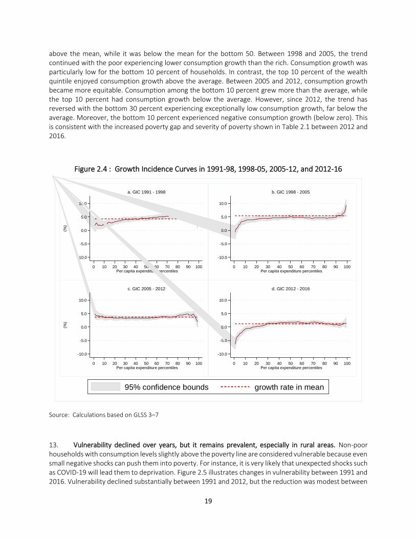
Pub
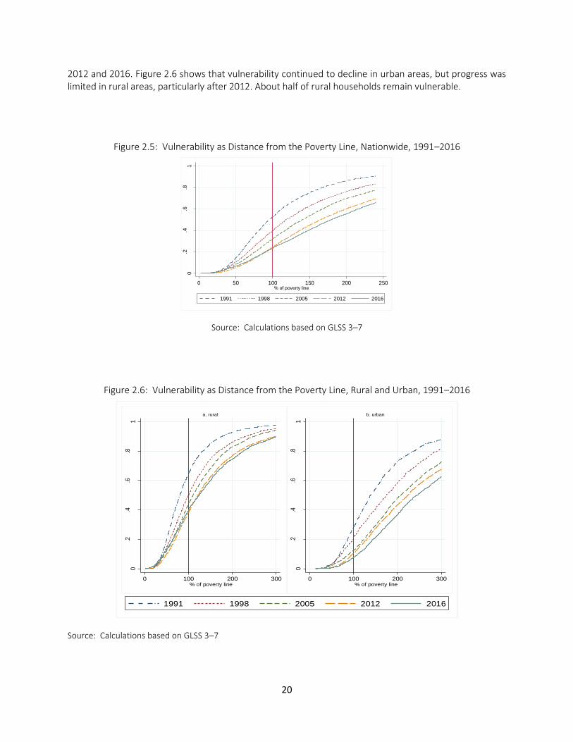
lic D
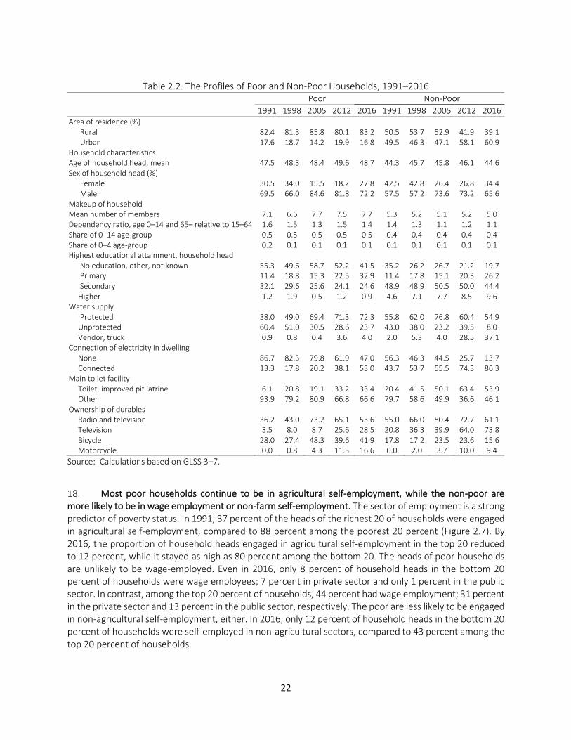
iscl
osur
e A
utho
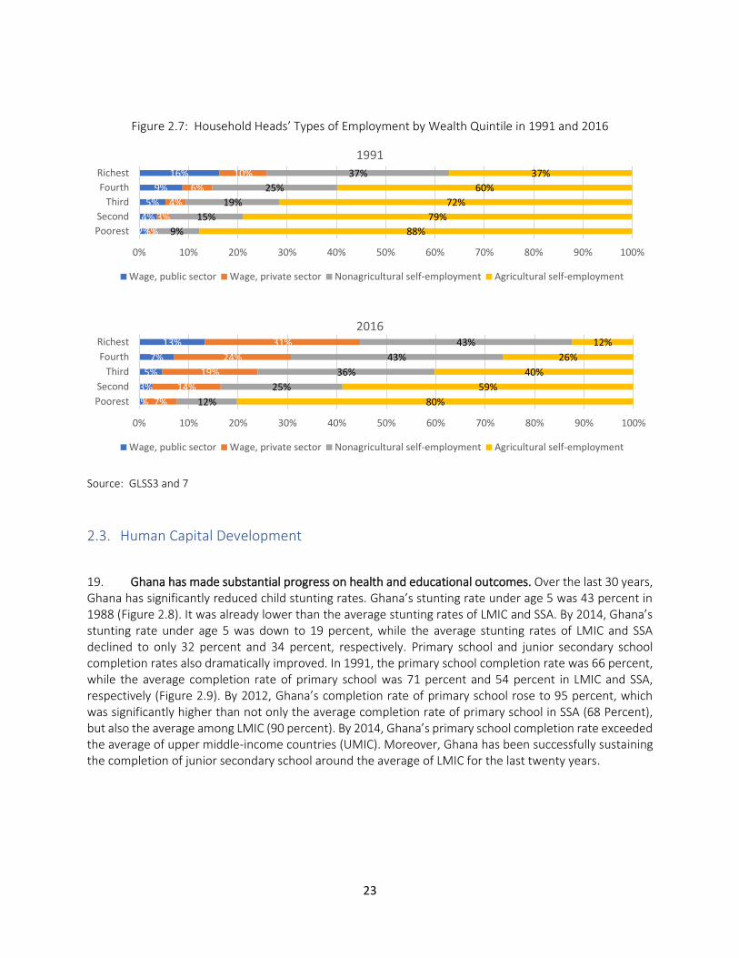
rized
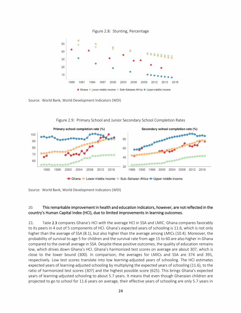
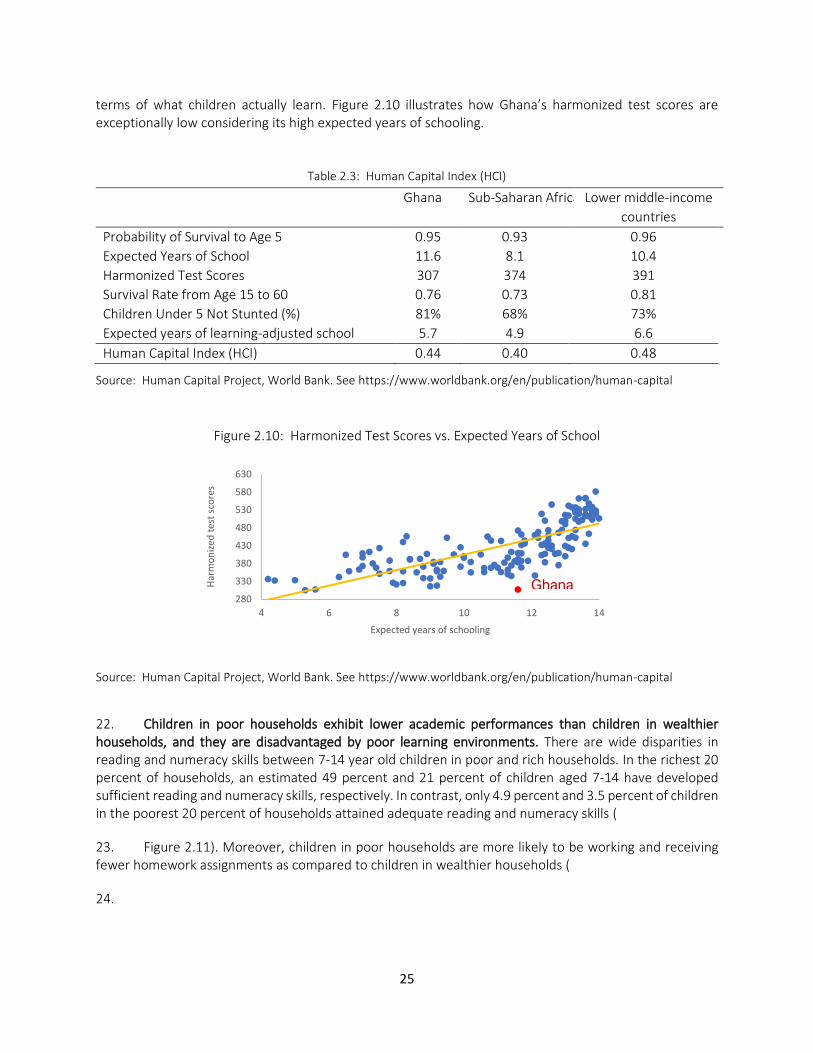
Pub
lic D
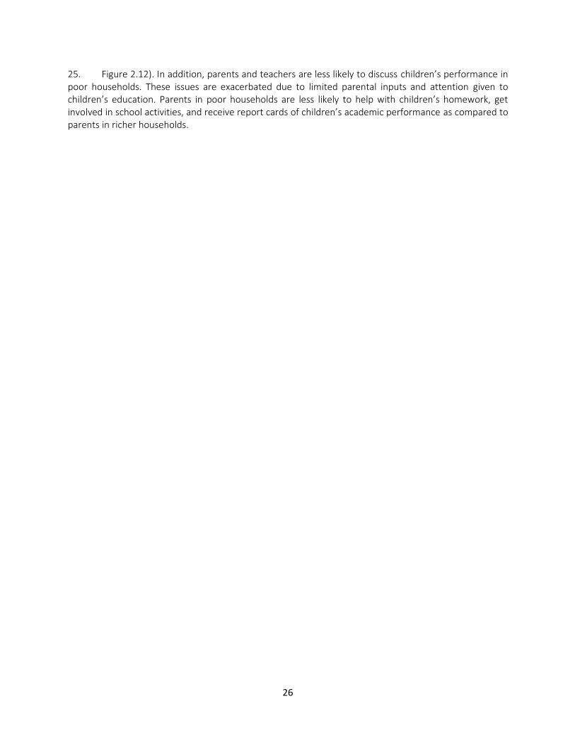
iscl
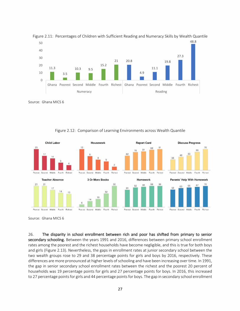
osur
e A
utho
rized
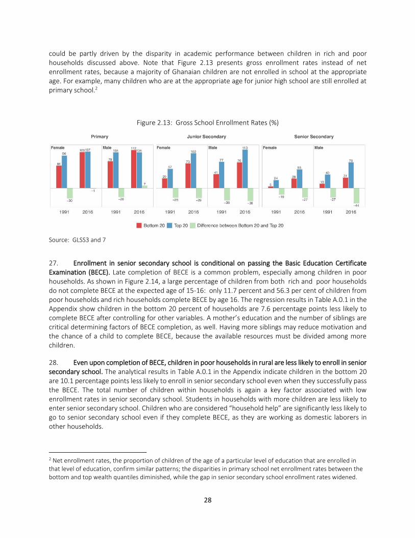
Pub
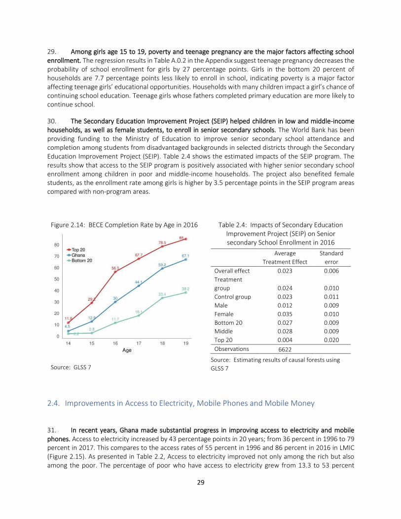
lic D
iscl
osur
e A
utho
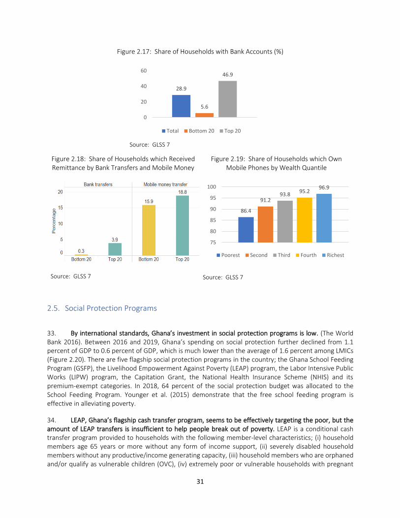
rized
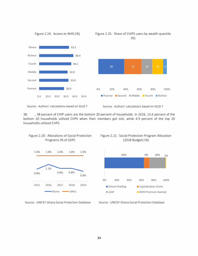
Pub
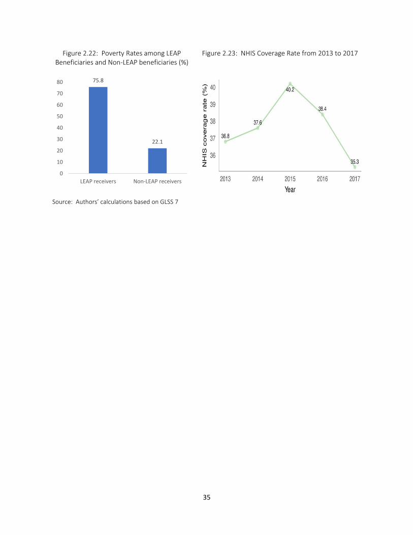
lic D
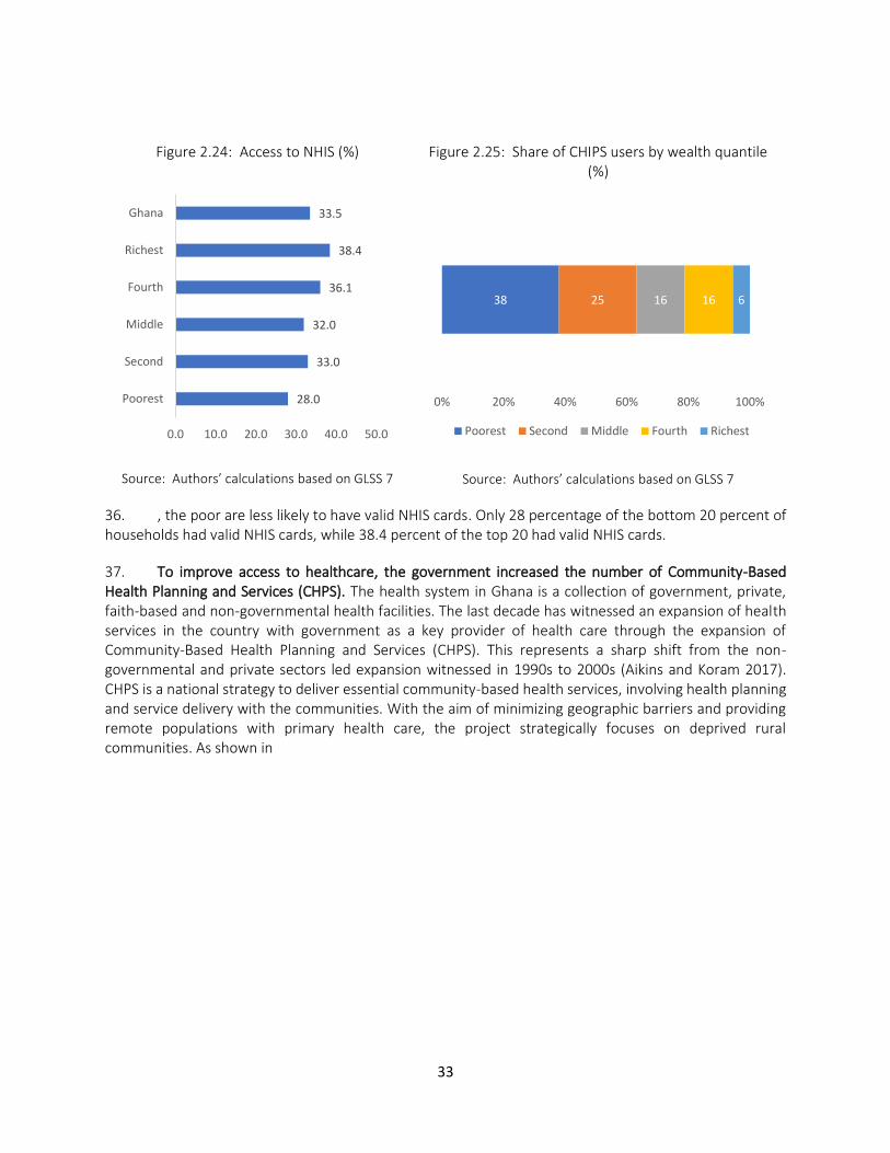
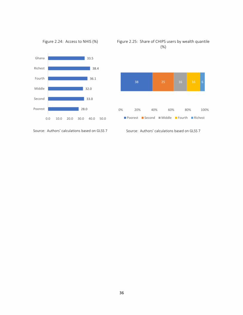
iscl
osur
e A
utho
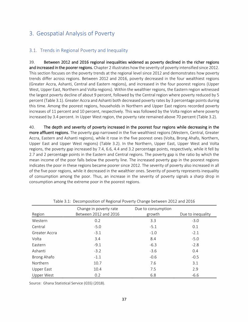
rized
© 2020 The World Bank 1818 H Street NW, Washington DC 20433
Telephone: 202-473-1000; Internet: www.worldbank.org
Some rights reserved
This work is a product of the staff of The World Bank. The findings, interpretations, and conclusions expressed in this work do not necessarily reflect the views of the Executive Directors of The World Bank or the governments they represent. The World Bank does not guarantee the accuracy of the data included in this work. The boundaries, colors, denominations, and other information shown on any map in this work do not imply any judgment on the part of The World Bank concerning the legal status of any territory or the endorsement or acceptance of such boundaries. Rights and Permissions The material in this work is subject to copyright. Because The World Bank encourages dissemination of its knowledge, this work may be reproduced, in whole or in part, for noncommercial purposes as long as full attribution to this work is given.
Attribution—World Bank.2020. Ghana Poverty Assessment. © World Bank.”
All queries on rights and licenses, including subsidiary rights, should be addressed to World Bank Publications, The World Bank Group, 1818 H Street NW, Washington, DC 20433, USA; fax: 202-522-2625; e-mail: [email protected].
GOVERNMENT FISCAL YEAR January 1 – December 31
CURRENCY EQUIVALENTS
Official Exchange Rate Average for 2019 Currency Unit = Ghanaian Cedi (GHS)
USD$1 = GH₵ 5.22
WEIGHTS AND MEASURES Metric System
ACRONYMS and ABBREVIATIONS
BECE Basic Education Certificate Examination CHPS Community-based Health Planning and Services GDP Gross Domestic Product GHC Ghana Cedi GLSS Ghana Living Standards Survey GSS Ghana Statistical Services HCI Human Capital Index ICT Information and Communications Technology LEAP Livelihood Empowerment Against Poverty LIPW Labor Intensive Public Works LMIC Lower middle-income countries MICS Multiple Indicator Cluster Surveys NHIS National Health Insurance Scheme OVC Orphans and Vulnerable Children PPP Purchasing Power Parity SEIP Secondary Education Improvement Project SSNIT Social Security and National Insurance Trust
Vice President: Ousmane Diagana Country Director: Pierre Laporte
Practice Manager: Pierella Paci Task Team Leader: Tomomi Tanaka
4
Contents
Executive Summary ....................................................................................................................................... 9 1. Introduction ........................................................................................................................................ 11
2. Poverty and Inequality ........................................................................................................................ 16
2.1. Trends in Poverty and Inequality ................................................................................................ 16
2.2. Profiles of the Poor ..................................................................................................................... 20
2.3. Human Capital Development ...................................................................................................... 22
2.4. mprovements in Access to Electricity, Mobile Phones and Mobile Money ............................... 27
2.5. Social Protection Programs ......................................................................................................... 29
3. Geospatial Analysis of Poverty ............................................................................................................ 33
3.1. Trends in Regional Poverty and Inequality ................................................................................. 33
3.2. Human Capital Development ...................................................................................................... 38
3.3. Access to Services and Infrastructure ......................................................................................... 40
3.4. Climate Change and Disasters ..................................................................................................... 41
3.5. Determinants of Regional Inequality .......................................................................................... 43
4. Structural Transformation, Jobs and Skills .......................................................................................... 45
4.1. Structural Transformation and Growth ...................................................................................... 45
4.2. Welfare Impacts of Oil Production.............................................................................................. 48
4.3. Wage Employment and Return to Schooling .............................................................................. 49
4.4. ICT Skills ....................................................................................................................................... 52
4.5. Non-Farm Enterprises ................................................................................................................. 54
5. Drivers of Poverty Dynamics ............................................................................................................... 56
5.1. Poverty Dynamics........................................................................................................................ 56
5.2. Comparison between Poor Regions and Wealthy Regions ......................................................... 59
6. Conclusion and Road Map for Policy Action ....................................................................................... 61
6.1. Summary of Findings ................................................................................................................... 61
6.2. Pathways Toward Pro-Poor Growth ........................................................................................... 63
6.3. Investing on Education ................................................................................................................ 64
6.4. Identifying the Drivers of Regional Inequality ............................................................................ 65
6.5. Investing in Digital Technology ................................................................................................... 66
References .................................................................................................................................................. 67
5
Appendix: .................................................................................................................................................... 69
A. 1. Regional Poverty Measurements under Alternative Methods ....................................................... 69
A. 2. Synthetic Panel Methods ................................................................................................................ 69
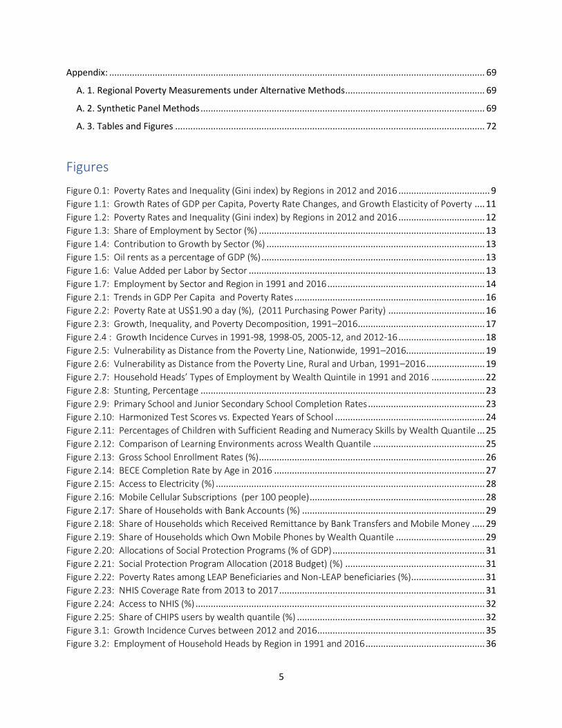
A. 3. Tables and Figures .......................................................................................................................... 72
Figures
Figure 0.1: Poverty Rates and Inequality (Gini index) by Regions in 2012 and 2016 .................................... 9
Figure 1.1: Growth Rates of GDP per Capita, Poverty Rate Changes, and Growth Elasticity of Poverty .... 11
Figure 1.2: Poverty Rates and Inequality (Gini index) by Regions in 2012 and 2016 .................................. 12
Figure 1.3: Share of Employment by Sector (%) ......................................................................................... 13
Figure 1.4: Contribution to Growth by Sector (%) ...................................................................................... 13
Figure 1.5: Oil rents as a percentage of GDP (%) ........................................................................................ 13
Figure 1.6: Value Added per Labor by Sector ............................................................................................. 13
Figure 1.7: Employment by Sector and Region in 1991 and 2016 .............................................................. 14
Figure 2.1: Trends in GDP Per Capita and Poverty Rates ........................................................................... 16
Figure 2.2: Poverty Rate at US$1.90 a day (%), (2011 Purchasing Power Parity) ...................................... 16
Figure 2.3: Growth, Inequality, and Poverty Decomposition, 1991–2016 .................................................. 17
Figure 2.4 : Growth Incidence Curves in 1991-98, 1998-05, 2005-12, and 2012-16 .................................. 18
Figure 2.5: Vulnerability as Distance from the Poverty Line, Nationwide, 1991–2016............................... 19
Figure 2.6: Vulnerability as Distance from the Poverty Line, Rural and Urban, 1991–2016 ....................... 19
Figure 2.7: Household Heads’ Types of Employment by Wealth Quintile in 1991 and 2016 ..................... 22
Figure 2.8: Stunting, Percentage ................................................................................................................ 23
Figure 2.9: Primary School and Junior Secondary School Completion Rates .............................................. 23
Figure 2.10: Harmonized Test Scores vs. Expected Years of School ........................................................... 24
Figure 2.11: Percentages of Children with Sufficient Reading and Numeracy Skills by Wealth Quantile ... 25
Figure 2.12: Comparison of Learning Environments across Wealth Quantile ............................................ 25
Figure 2.13: Gross School Enrollment Rates (%) ......................................................................................... 26
Figure 2.14: BECE Completion Rate by Age in 2016 ................................................................................... 27
Figure 2.15: Access to Electricity (%) .......................................................................................................... 28
Figure 2.16: Mobile Cellular Subscriptions (per 100 people) ..................................................................... 28
Figure 2.17: Share of Households with Bank Accounts (%) ........................................................................ 29
Figure 2.18: Share of Households which Received Remittance by Bank Transfers and Mobile Money ..... 29
Figure 2.19: Share of Households which Own Mobile Phones by Wealth Quantile ................................... 29
Figure 2.20: Allocations of Social Protection Programs (% of GDP) ............................................................ 31
Figure 2.21: Social Protection Program Allocation (2018 Budget) (%) ....................................................... 31
Figure 2.22: Poverty Rates among LEAP Beneficiaries and Non-LEAP beneficiaries (%) ............................. 31
Figure 2.23: NHIS Coverage Rate from 2013 to 2017 ................................................................................. 31
Figure 2.24: Access to NHIS (%) .................................................................................................................. 32
Figure 2.25: Share of CHIPS users by wealth quantile (%) .......................................................................... 32
Figure 3.1: Growth Incidence Curves between 2012 and 2016 .................................................................. 35
Figure 3.2: Employment of Household Heads by Region in 1991 and 2016 ............................................... 36
6
Figure 3.3: Changes in Stunting Rates Under Age Three Across Regions ................................................... 38
Figure 3.4: Net Enrollment Rates by Region in 2017/18 ............................................................................. 39
Figure 3.5: Percentages of Children under Age 5 who are Developmentally on Track by Region in 2017/18
.................................................................................................................................................................... 40
Figure 3.6: Percentages of Children with Reading and Numeracy Skills by Region in 2017/18 .................. 40
Figure 3.7: Access to Roads and Markets ................................................................................................... 41
Figure 3.8: Percentage of Households Using Electricity by Region (%) ....................................................... 41
Figure 3.9: Flood Occurrence and Drought Severity ................................................................................... 42
Figure 3.10: Temperature and Soil Erosion ................................................................................................ 42
Figure 3.11: Poverty Maps in 2000, 2010 and 2016 ................................................................................... 43
Figure 3.12: Contributing Indicators in Constructing the 2016 Poverty Map ............................................. 44
Figure 4.1: Types of Employment by Educational Attainments in 1991 and 2016 ..................................... 50
Figure 4.2: ICT Skills by Wealth, Educational Level and Region .................................................................. 53
Figure 4.3: Sectors of Employment by ICT Skills ......................................................................................... 53
Figure 4.4: ICT Skills by Gender (%) ............................................................................................................ 54
Figure 5.1: Correlation between market access, electricity rate, temperature and drought, and
(conditional) probability a poor household in 2012/13 becomes non-poor in 2016/17 ............................. 59
Figure 6.1: SSS Placements and Enrollment in Ghana (2013-17)................................................................ 65
Figure 6.2: Poverty Rate and Share of DACF and Share of Need Based DACF 2017 ................................... 66
Figure 6.3: Active Facebook Users in SSA ................................................................................................... 66
Figure 6.4: 2G, 3G, 4G or Wi-Fi Network .................................................................................................... 66
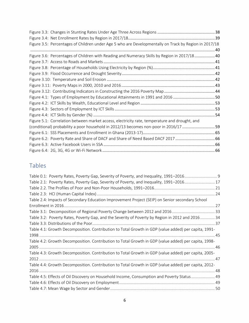
Tables
Table 0.1: Poverty Rates, Poverty Gap, Severity of Poverty, and Inequality, 1991–2016 ............................. 9
Table 2.1: Poverty Rates, Poverty Gap, Severity of Poverty, and Inequality, 1991–2016 ........................... 17
Table 2.2. The Profiles of Poor and Non-Poor Households, 1991–2016...................................................... 21
Table 2.3: HCI (Human Capital Index) ......................................................................................................... 24
Table 2.4: Impacts of Secondary Education Improvement Project (SEIP) on Senior secondary School
Enrollment in 2016 ...................................................................................................................................... 27
Table 3.1: Decomposition of Regional Poverty Change between 2012 and 2016 ...................................... 33
Table 3.2: Poverty Rates, Poverty Gap, and the Severity of Poverty by Region in 2012 and 2016 ............. 34
Table 3.3: Distributions of the Poor ............................................................................................................. 37
Table 4.1: Growth Decomposition. Contribution to Total Growth in GDP (value added) per capita, 1991-
1998 ............................................................................................................................................................ 45
Table 4.2: Growth Decomposition. Contribution to Total Growth in GDP (value added) per capita, 1998-
2005 ............................................................................................................................................................ 46
Table 4.3: Growth Decomposition. Contribution to Total Growth in GDP (value added) per capita, 2005-
2012 ............................................................................................................................................................ 47
Table 4.4: Growth Decomposition. Contribution to Total Growth in GDP (value added) per capita, 2012-
2016 ............................................................................................................................................................ 48
Table 4.5: Effects of Oil Discovery on Household Income, Consumption and Poverty Status ..................... 49
Table 4.6: Effects of Oil Discovery on Employment ..................................................................................... 49
Table 4.7: Mean Wage by Sector and Gender ............................................................................................. 50
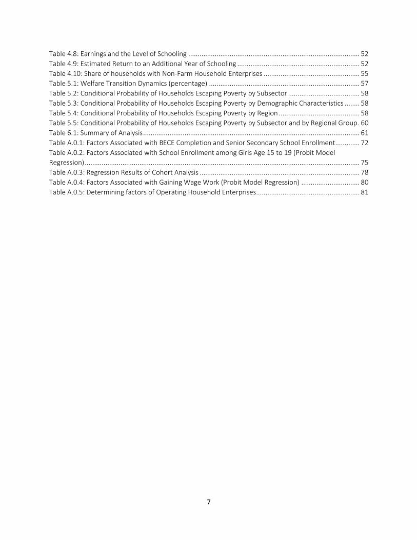
7
Table 4.8: Earnings and the Level of Schooling ........................................................................................... 52
Table 4.9: Estimated Return to an Additional Year of Schooling ................................................................. 52
Table 4.10: Share of households with Non-Farm Household Enterprises ................................................... 55
Table 5.1: Welfare Transition Dynamics (percentage) ................................................................................ 57
Table 5.2: Conditional Probability of Households Escaping Poverty by Subsector ...................................... 58
Table 5.3: Conditional Probability of Households Escaping Poverty by Demographic Characteristics ........ 58
Table 5.4: Conditional Probability of Households Escaping Poverty by Region ........................................... 58
Table 5.5: Conditional Probability of Households Escaping Poverty by Subsector and by Regional Group . 60
Table 6.1: Summary of Analysis ................................................................................................................... 61
Table A.0.1: Factors Associated with BECE Completion and Senior Secondary School Enrollment............. 72
Table A.0.2: Factors Associated with School Enrollment among Girls Age 15 to 19 (Probit Model
Regression) .................................................................................................................................................. 75
Table A.0.3: Regression Results of Cohort Analysis ..................................................................................... 78
Table A.0.4: Factors Associated with Gaining Wage Work (Probit Model Regression) ............................... 80
Table A.0.5: Determining factors of Operating Household Enterprises....................................................... 81
8
Acknowledgements
This report was prepared under the leadership of Tomomi Tanaka (Senior Economist, World Bank). The team included Hai-Anh H. Dang (Economist, DECAT), Keita Shimmei (JPO, EA1PV), Benjamin P. Stewart (Geographer, DECAT), Freeha Fatima (Economist, EA1PV), Dan Pavelesku (Consultant, EA1PV), Ksenia Abanokova (Consultant DECAT), and Kwadwo Opoku (Research Fellow, Centre for Social Policy Studies, University of Ghana, Legon). The report benefited from comments provided by Pierella Paci (Practice Manager) and peer reviewers, Antonino Giuffrida (Program Leader, HAFD2) and Aly Sanoh (Senior Economist, EA2PV). Sarosh Sattar (Senior Economist, World Bank) helped with its finalization. Administrative assistance was provided by Etsehiwot Berhanu Albert (Program Assistant).
9
Executive Summary
E.1. In the first two decades after the return to democracy in 1992, Ghana achieved significant economic growth and poverty reduction. During 1992-2012, GDP per capita growth was robust increasing from US$410 to US$1588. Real GDP per capita growth was an impressive 3.1 percent per annum (as measured in constant cedi). During this period, there was substantial improvement in the population’s living standards accompanied by a decline in poverty. The share of the population living below the national poverty line fell from 52.7 percent to 24.2 percent. Other indicators of monetary welfare such as the poverty gap, poverty severity and inequality all improved as well. In 2013, Ghana advanced to middle income status becoming one of the few countries in Sub-Saharan Africa to achieve this classification.
E.2. By 2016, poverty had fallen only marginally, and 23.4 percent of the population lived in poverty. During 2012-2016, real GDP per capita growth decelerated to 1.6 percent per annum, with adverse implications for the poor. Though poverty fell during this period by 0.8 percentage points (see Table 0.1), the poverty gap and poverty severity indicators exhibited a slight deterioration raising the possibility of a reversal in the earlier trend of successful poverty reduction. Since the latest available household survey data, the Ghana Living Standards Survey (GLSS) 7, was conducted in 2016, little is known about changes in monetary poverty since then, including the period of the onset of the COVID-19 pandemic.
Table 0.1: Poverty Rates, Poverty Gap, Severity of Poverty, and Inequality, 1991–2016
Year Poverty rates Poverty gap Severity of poverty Inequality (Gini) 1991 52.7 19.0 9.0 0.38 1998 39.5 13.8 6.5 0.38 2005 31.9 11.0 5.4 0.42 2012 24.2 7.7 3.5 0.42 2016 23.4 8.4 4.3 0.43
Source: Calculations based on GLSS 3–7
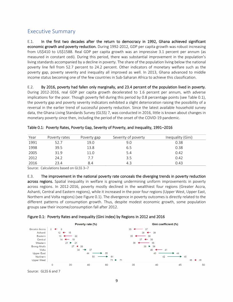
E.3. The improvement in the national poverty rate conceals the diverging trends in poverty reduction across regions. Spatial inequality in welfare is growing undermining uniform improvements in poverty across regions. In 2012-2016, poverty mostly declined in the wealthiest four regions (Greater Accra, Ashanti, Central and Eastern regions), while it increased in the poor four regions (Upper West, Upper East, Northern and Volta regions) (see Figure 0.1). The divergence in poverty outcomes is directly related to the different patterns of consumption growth. Thus, despite modest economic growth, some population groups saw their income/consumption fall after 2012.
Figure 0.1: Poverty Rates and Inequality (Gini index) by Regions in 2012 and 2016
Source: GLSS 6 and 7
10
E.4. The economy and labor market experienced structural transformation during 1991-2016 with the decline in the importance of the agriculture sector and growing significance of the industry sector. Between 1991 and 2005, industry contributed a greater share of value-added rising from 17 percent to 25 percent of GDP in this period. This shift in the economic structure was accompanied by the movement of labor from low productivity (agriculture) to high productivity sectors (manufacturing and services) positively contributing to growth. In 2005, the discovery of oil has led to industry replaced services as the main driver of economic growth. As the importance of the industry sector grew, the opportunities it created affected the affluent and the poor differently. The more affluent households experienced a growth in income and employment opportunities, while this highly capital-intensive sector did not increase consumption or create economic opportunities for the poor.
E.5. Lagging regions with high levels of poverty experienced fewer improvements in employment, reflecting weaker economic transformation. Regions experiencing large poverty reduction had employment shifts from traditional sectors to wage employment and non-agricultural self-employment. However, in poorer regions, especially in northern Ghana, most people are still engaged in agricultural production. In Greater Accra, Ashanti and Central regions, a significant proportion of workers moved into non-agricultural self-employment and wage employment in the private sector between 1991 and 2016. In contrast, although overall employment in the agricultural sector slightly declined in the Upper East, Upper West and Northern regions between 1991 and 2016, a majority of the households continued to engage in agricultural production.
E.6. The analysis of poverty dynamics suggests that households transition into and out of poverty was largely determined by location of residence as well as the sector of employment and education. Households in the three northern regions (Northern, Upper East and Upper West) and Volta region had fewer chances of breaking out of poverty, regardless of the sector of employment. Poor households are less likely to transition out of poverty if they live in areas with poor access to public services, electricity and markets and experience severe droughts. An especially vulnerable group are subsistence farmers in Northern regions. Between 2012 and 2016, poverty deepened among this group. Their major challenges are low productivity and a long dry season. High prices of input, low educational attainment, and low access to agricultural extension services, good roads and credit were identified as major factors hindering agricultural productivity growth. Furthermore, farmers face a long eight-month dry season. During the dry season, most of them are jobless due to lack of opportunities.
E.7. Key pathways for accelerating poverty reduction are job creation, human and physical capital development, and higher agriculture productivity, especially in lagging regions. Improving employment opportunities and raising productivity of the poor in lagging regions (Northern, Upper East, Upper West and Volta) will have the largest impact on accelerating poverty reduction. Human capital and infrastructure development are key elements contributing to productivity growth and narrowing disparities across regions. One possibility for closing the gap between rich and poor regions is to identify ways to increase economic opportunities such as through (1) higher investments in infrastructure to facilitate access to markets and electricity, (2) effective measures to mitigate the impact of climate change especially on farmers, including through better irrigation and (3) improving human capital through a greater focus on raising learning outcomes, especially among children in poor households in underserved areas.

11
1. Introduction
1. After the return to democracy, Ghana achieved significant economic growth and poverty reduction. However, in recent years, the rate of poverty reduction has slowed, becoming insignificant after 2012. The largest reduction in poverty, 2 percent per year, was reached from 1991–1998. Subsequently, the rate of decline fell to 1.4 percent in 1998–2005, 1.1 percent in 2005–2012, and dropped to 0.2 percent per year between 2012 and 2016. The slowdown in poverty reduction was not due to a reduction in GDP per capita growth, which peaked between 2005 and 2012 and remained high between 2012 and 2016 (Figure 1.1) Rather, it was due to a drop in the rate to which economic growth translated into poverty reduction. The growth elasticity of poverty (percentage reduction in poverty associated for every one percentage change in GDP per capita) was 1.2 between 1991 and 1998 but declined to less than 0.1 between 2012 and 2016, indicating a 1 percent increase in GDP per capita led to less than 0.1 percent reduction in poverty.
Figure 1.1: Growth Rates of GDP per Capita, Poverty Rate Changes, and Growth Elasticity of Poverty
Source: GLSS3-7 and WDI
2. Regional inequality widened, as poor regions experienced rising poverty and increased inequality, while wealthy regions achieved further poverty reduction. As shown in
12
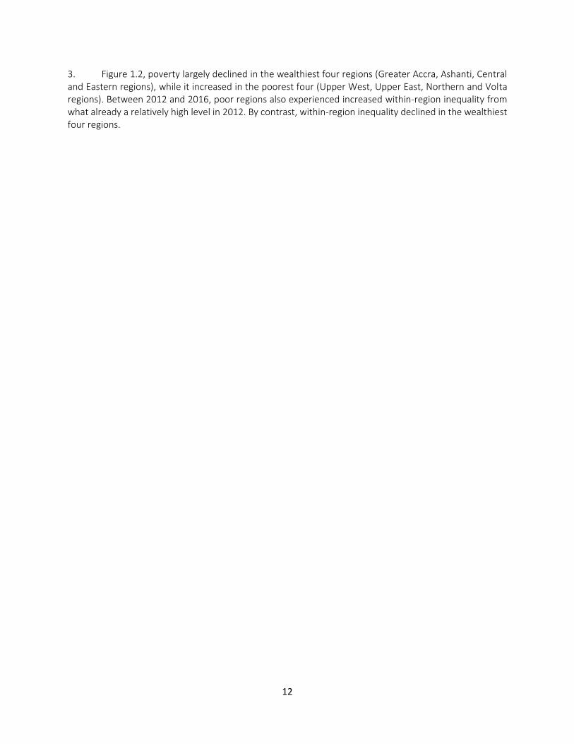
3. Figure 1.2, poverty largely declined in the wealthiest four regions (Greater Accra, Ashanti, Central and Eastern regions), while it increased in the poorest four (Upper West, Upper East, Northern and Volta regions). Between 2012 and 2016, poor regions also experienced increased within-region inequality from what already a relatively high level in 2012. By contrast, within-region inequality declined in the wealthiest four regions.

13
Figure 1.2: Poverty Rates and Inequality (Gini index) by Regions in 2012 and 2016
Source: GLSS 6 and 7
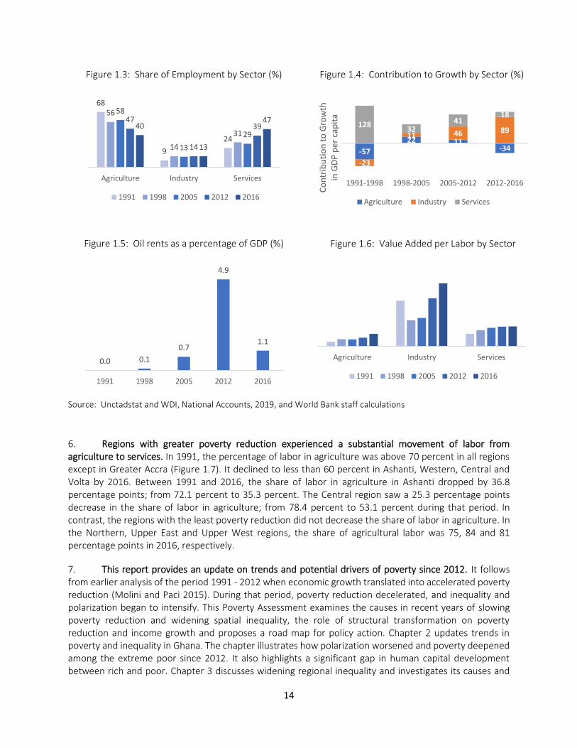
4. Ghana experienced dramatic shifts in labor from agriculture to services, but the contribution of the service sector to economic growth slowed down. Figure 1.3 shows changes in the share of employment by sector between 1991 and 2016. The share of labor in the agricultural sector declined from 68 to 40 percent, while the share of labor in the service sector increased from 24 percentage points to 47 percentage points during this time. Figure 1.4 summarizes the contributions to economic growth by sector. Between 1991 and 1998, economic growth was largely driven by the service sector. The service sector contributed 128 percentage points to an increase in GDP growth between 1991-1998, while the contributions from agriculture and industry were negative 23 and 57 percentage points, respectively. The contribution of the service sector, however, diminished over time. Between 2012 and 2016, the contribution of services to growth was down to 18 percentage points. When it makes sense, dates should come at the beginning of the sentence, not at the end. This last sentence you wrote is a good example.
5. Industry replaced services as the biggest contributor to growth, partly due to the discovery in 2007 of 1.5 billion barrels of oil. Crude oil was found in the Western region in 2007, and production for exportation began in 2010. Oil became one of the top commodities of Ghana’s exports since 2010 and has substantially contributed to GDP growth and increased value added per worker. Industry became the main contributing sector to GDP growth in 2005-2012 and continued to be the top contributing sector in 2012-2016 (Figure 1.4). In 2012, oil rent accounted for about 5 percent of total GDP (Figure 1.5). Figure 1.6 shows value added per worker by sector between 1991 and 2016. The value-added per worker in industry continued to grow, while the value-added per worker in services stagnated. A large inflow of oil revenues could have led to exchange rate appreciation, which could, in turn, have detrimental effects on the competitiveness of non-oil sectors. However, the latest real exchange rate estimates suggest that Ghana was able to mitigate the effects of Dutch disease (World Bank 2018). Again, dates should come first when possible. This is the case throughout the whole report.
14
Figure 1.3: Share of Employment by Sector (%)
Figure 1.4: Contribution to Growth by Sector (%)
Figure 1.5: Oil rents as a percentage of GDP (%)
Figure 1.6: Value Added per Labor by Sector
Source: Unctadstat and WDI, National Accounts, 2019, and World Bank staff calculations
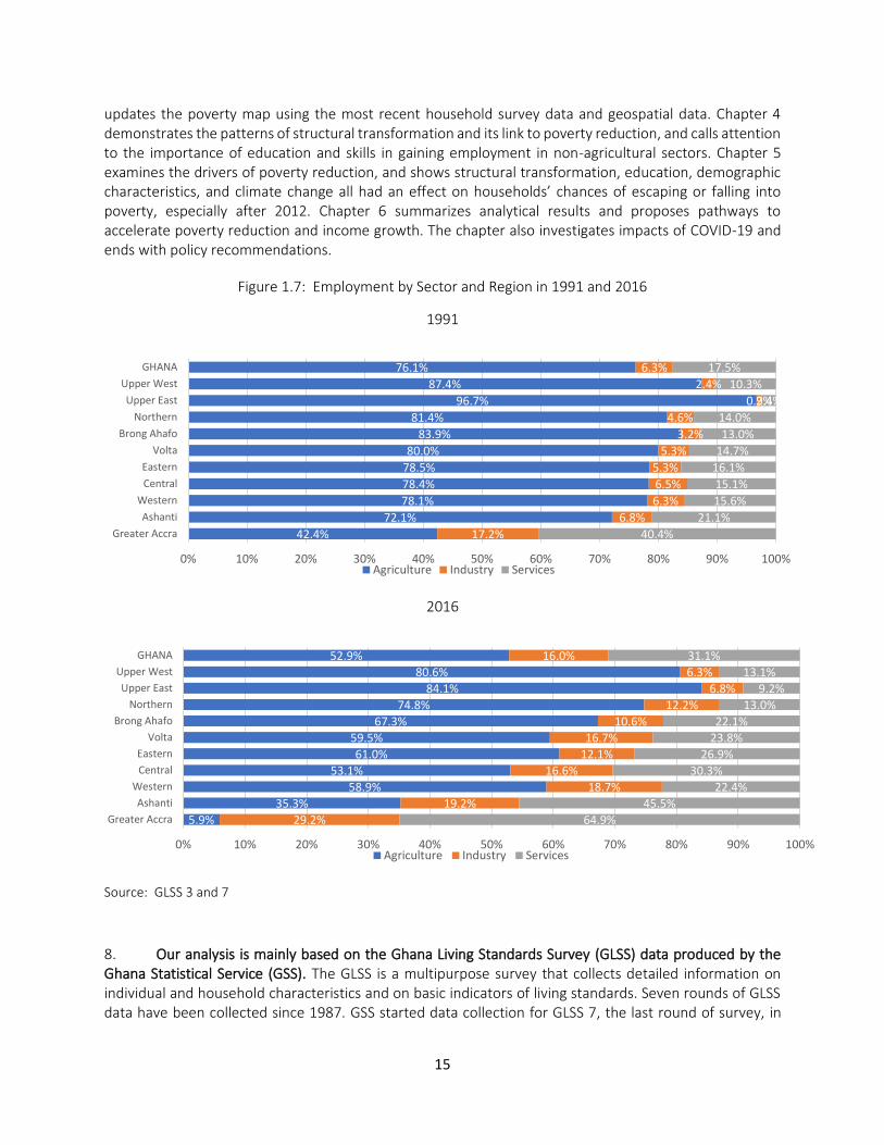
6. Regions with greater poverty reduction experienced a substantial movement of labor from agriculture to services. In 1991, the percentage of labor in agriculture was above 70 percent in all regions except in Greater Accra (Figure 1.7). It declined to less than 60 percent in Ashanti, Western, Central and Volta by 2016. Between 1991 and 2016, the share of labor in agriculture in Ashanti dropped by 36.8 percentage points; from 72.1 percent to 35.3 percent. The Central region saw a 25.3 percentage points decrease in the share of labor in agriculture; from 78.4 percent to 53.1 percent during that period. In contrast, the regions with the least poverty reduction did not decrease the share of labor in agriculture. In the Northern, Upper East and Upper West regions, the share of agricultural labor was 75, 84 and 81 percentage points in 2016, respectively.
7. This report provides an update on trends and potential drivers of poverty since 2012. It follows from earlier analysis of the period 1991 - 2012 when economic growth translated into accelerated poverty reduction (Molini and Paci 2015). During that period, poverty reduction decelerated, and inequality and polarization began to intensify. This Poverty Assessment examines the causes in recent years of slowing poverty reduction and widening spatial inequality, the role of structural transformation on poverty reduction and income growth and proposes a road map for policy action. Chapter 2 updates trends in poverty and inequality in Ghana. The chapter illustrates how polarization worsened and poverty deepened among the extreme poor since 2012. It also highlights a significant gap in human capital development between rich and poor. Chapter 3 discusses widening regional inequality and investigates its causes and
68
9
24
56
14
31
58
13
29
47
14
3940
13
47
Agriculture Industry Services
1991 1998 2005 2012 2016
-57
22 11-34
-23
11 46 89128
3241
18
1991-1998 1998-2005 2005-2012 2012-2016
Co
ntr
ibu
tio
n t
o G
row
th
in G
DP
per
cap
ita
Agriculture Industry Services
0.0 0.1
0.7
4.9
1.1
1991 1998 2005 2012 2016
Agriculture Industry Services
1991 1998 2005 2012 2016
15
updates the poverty map using the most recent household survey data and geospatial data. Chapter 4 demonstrates the patterns of structural transformation and its link to poverty reduction, and calls attention to the importance of education and skills in gaining employment in non-agricultural sectors. Chapter 5 examines the drivers of poverty reduction, and shows structural transformation, education, demographic characteristics, and climate change all had an effect on households’ chances of escaping or falling into poverty, especially after 2012. Chapter 6 summarizes analytical results and proposes pathways to accelerate poverty reduction and income growth. The chapter also investigates impacts of COVID-19 and ends with policy recommendations.
Figure 1.7: Employment by Sector and Region in 1991 and 2016
1991
2016
Source: GLSS 3 and 7
8. Our analysis is mainly based on the Ghana Living Standards Survey (GLSS) data produced by the Ghana Statistical Service (GSS). The GLSS is a multipurpose survey that collects detailed information on individual and household characteristics and on basic indicators of living standards. Seven rounds of GLSS data have been collected since 1987. GSS started data collection for GLSS 7, the last round of survey, in
42.4%
72.1%
78.1%
78.4%
78.5%
80.0%
83.9%
81.4%
96.7%
87.4%
76.1%
17.2%
6.8%
6.3%
6.5%
5.3%
5.3%
3.2%
4.6%
0.9%
2.4%
6.3%
40.4%
21.1%
15.6%
15.1%
16.1%
14.7%
13.0%
14.0%
2.4%
10.3%
17.5%
0% 10% 20% 30% 40% 50% 60% 70% 80% 90% 100%
Greater Accra
Ashanti
Western
Central
Eastern
Volta
Brong Ahafo
Northern
Upper East
Upper West
GHANA
Agriculture Industry Services
5.9%
35.3%
58.9%
53.1%
61.0%
59.5%
67.3%
74.8%
84.1%
80.6%
52.9%
29.2%
19.2%
18.7%
16.6%
12.1%
16.7%
10.6%
12.2%
6.8%
6.3%
16.0%
64.9%
45.5%
22.4%
30.3%
26.9%
23.8%
22.1%
13.0%
9.2%
13.1%
31.1%
0% 10% 20% 30% 40% 50% 60% 70% 80% 90% 100%
Greater Accra
Ashanti
Western
Central
Eastern
Volta
Brong Ahafo
Northern
Upper East
Upper West
GHANA
Agriculture Industry Services
16
October 2016, and completed it in October 2017. For this Poverty Assessment, changes in poverty and welfare are mainly analyzed from 1991 to 2016, taking into account the compatibility of poverty measures and questionnaires. The report also utilized the data from the Multiple Indicator Cluster Surveys (MICS), for which the GSS conducted the data collection in 2017 and 2018. MICS provides detailed data on children, including their cognitive skills and learning environments.
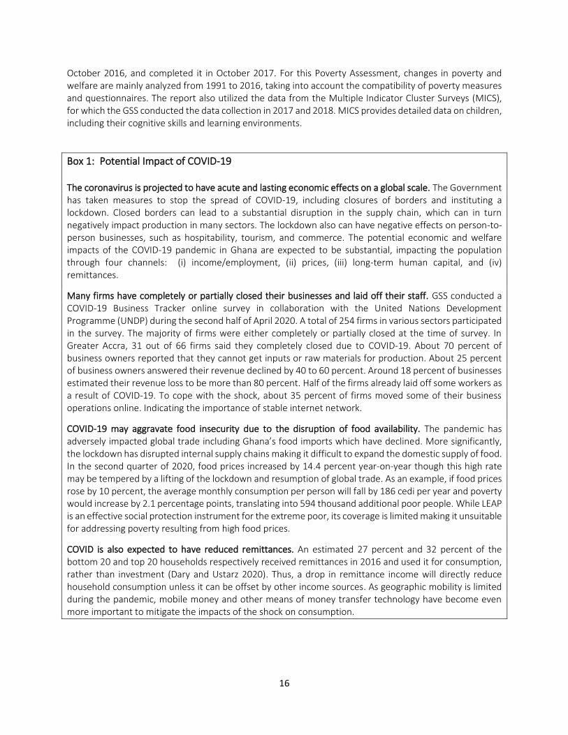
Box 1: Potential Impact of COVID-19 The coronavirus is projected to have acute and lasting economic effects on a global scale. The Government has taken measures to stop the spread of COVID-19, including closures of borders and instituting a lockdown. Closed borders can lead to a substantial disruption in the supply chain, which can in turn negatively impact production in many sectors. The lockdown also can have negative effects on person-to-person businesses, such as hospitability, tourism, and commerce. The potential economic and welfare impacts of the COVID-19 pandemic in Ghana are expected to be substantial, impacting the population through four channels: (i) income/employment, (ii) prices, (iii) long-term human capital, and (iv) remittances.
Many firms have completely or partially closed their businesses and laid off their staff. GSS conducted a COVID-19 Business Tracker online survey in collaboration with the United Nations Development Programme (UNDP) during the second half of April 2020. A total of 254 firms in various sectors participated in the survey. The majority of firms were either completely or partially closed at the time of survey. In Greater Accra, 31 out of 66 firms said they completely closed due to COVID-19. About 70 percent of business owners reported that they cannot get inputs or raw materials for production. About 25 percent of business owners answered their revenue declined by 40 to 60 percent. Around 18 percent of businesses estimated their revenue loss to be more than 80 percent. Half of the firms already laid off some workers as a result of COVID-19. To cope with the shock, about 35 percent of firms moved some of their business operations online. Indicating the importance of stable internet network.
COVID-19 may aggravate food insecurity due to the disruption of food availability. The pandemic has adversely impacted global trade including Ghana’s food imports which have declined. More significantly, the lockdown has disrupted internal supply chains making it difficult to expand the domestic supply of food. In the second quarter of 2020, food prices increased by 14.4 percent year-on-year though this high rate may be tempered by a lifting of the lockdown and resumption of global trade. As an example, if food prices rose by 10 percent, the average monthly consumption per person will fall by 186 cedi per year and poverty would increase by 2.1 percentage points, translating into 594 thousand additional poor people. While LEAP is an effective social protection instrument for the extreme poor, its coverage is limited making it unsuitable for addressing poverty resulting from high food prices.
COVID is also expected to have reduced remittances. An estimated 27 percent and 32 percent of the bottom 20 and top 20 households respectively received remittances in 2016 and used it for consumption, rather than investment (Dary and Ustarz 2020). Thus, a drop in remittance income will directly reduce household consumption unless it can be offset by other income sources. As geographic mobility is limited during the pandemic, mobile money and other means of money transfer technology have become even more important to mitigate the impacts of the shock on consumption.
17
2. Poverty and Inequality
2.1. Trends in Poverty and Inequality
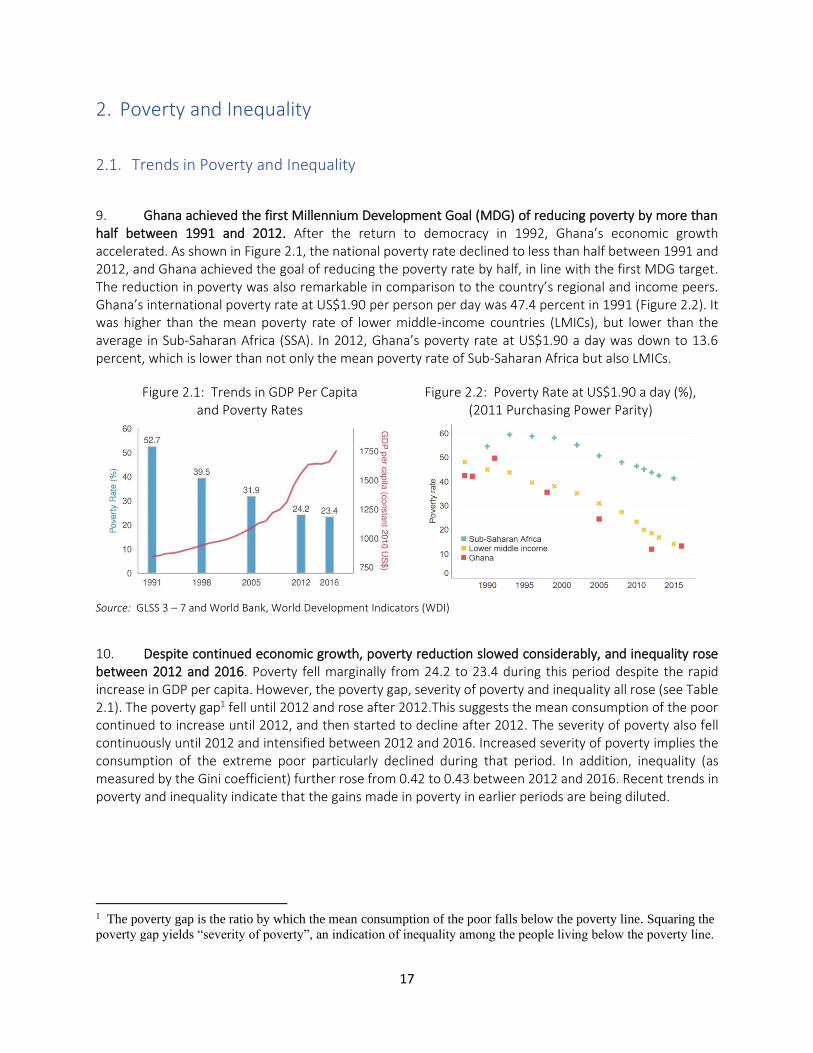
9. Ghana achieved the first Millennium Development Goal (MDG) of reducing poverty by more than half between 1991 and 2012. After the return to democracy in 1992, Ghana’s economic growth accelerated. As shown in Figure 2.1, the national poverty rate declined to less than half between 1991 and 2012, and Ghana achieved the goal of reducing the poverty rate by half, in line with the first MDG target. The reduction in poverty was also remarkable in comparison to the country’s regional and income peers. Ghana’s international poverty rate at US$1.90 per person per day was 47.4 percent in 1991 (Figure 2.2). It was higher than the mean poverty rate of lower middle-income countries (LMICs), but lower than the average in Sub-Saharan Africa (SSA). In 2012, Ghana’s poverty rate at US$1.90 a day was down to 13.6 percent, which is lower than not only the mean poverty rate of Sub-Saharan Africa but also LMICs.
Figure 2.1: Trends in GDP Per Capita and Poverty Rates
Figure 2.2: Poverty Rate at US$1.90 a day (%), (2011 Purchasing Power Parity)
Source: GLSS 3 – 7 and World Bank, World Development Indicators (WDI)
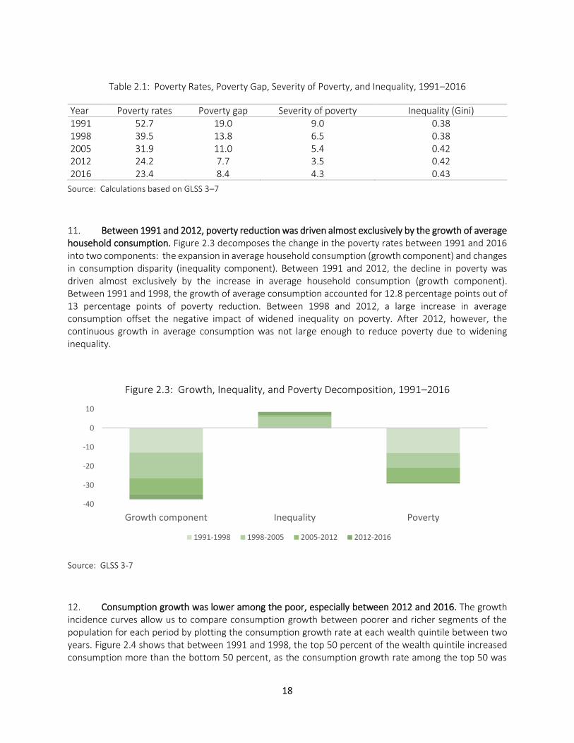
10. Despite continued economic growth, poverty reduction slowed considerably, and inequality rose between 2012 and 2016. Poverty fell marginally from 24.2 to 23.4 during this period despite the rapid increase in GDP per capita. However, the poverty gap, severity of poverty and inequality all rose (see Table 2.1). The poverty gap1 fell until 2012 and rose after 2012.This suggests the mean consumption of the poor continued to increase until 2012, and then started to decline after 2012. The severity of poverty also fell continuously until 2012 and intensified between 2012 and 2016. Increased severity of poverty implies the consumption of the extreme poor particularly declined during that period. In addition, inequality (as measured by the Gini coefficient) further rose from 0.42 to 0.43 between 2012 and 2016. Recent trends in poverty and inequality indicate that the gains made in poverty in earlier periods are being diluted.
1 The poverty gap is the ratio by which the mean consumption of the poor falls below the poverty line. Squaring the
poverty gap yields “severity of poverty”, an indication of inequality among the people living below the poverty line.
18
Table 2.1: Poverty Rates, Poverty Gap, Severity of Poverty, and Inequality, 1991–2016
Year Poverty rates Poverty gap Severity of poverty Inequality (Gini) 1991 52.7 19.0 9.0 0.38 1998 39.5 13.8 6.5 0.38 2005 31.9 11.0 5.4 0.42 2012 24.2 7.7 3.5 0.42 2016 23.4 8.4 4.3 0.43
Source: Calculations based on GLSS 3–7
11. Between 1991 and 2012, poverty reduction was driven almost exclusively by the growth of average household consumption. Figure 2.3 decomposes the change in the poverty rates between 1991 and 2016 into two components: the expansion in average household consumption (growth component) and changes in consumption disparity (inequality component). Between 1991 and 2012, the decline in poverty was driven almost exclusively by the increase in average household consumption (growth component). Between 1991 and 1998, the growth of average consumption accounted for 12.8 percentage points out of 13 percentage points of poverty reduction. Between 1998 and 2012, a large increase in average consumption offset the negative impact of widened inequality on poverty. After 2012, however, the continuous growth in average consumption was not large enough to reduce poverty due to widening inequality.
Figure 2.3: Growth, Inequality, and Poverty Decomposition, 1991–2016
Source: GLSS 3-7
12. Consumption growth was lower among the poor, especially between 2012 and 2016. The growth incidence curves allow us to compare consumption growth between poorer and richer segments of the population for each period by plotting the consumption growth rate at each wealth quintile between two years. Figure 2.4 shows that between 1991 and 1998, the top 50 percent of the wealth quintile increased consumption more than the bottom 50 percent, as the consumption growth rate among the top 50 was
-40
-30
-20
-10
0
10
Growth component Inequality Poverty
1991-1998 1998-2005 2005-2012 2012-2016
19
above the mean, while it was below the mean for the bottom 50. Between 1998 and 2005, the trend continued with the poor experiencing lower consumption growth than the rich. Consumption growth was particularly low for the bottom 10 percent of households. In contrast, the top 10 percent of the wealth quintile enjoyed consumption growth above the average. Between 2005 and 2012, consumption growth became more equitable. Consumption among the bottom 10 percent grew more than the average, while the top 10 percent had consumption growth below the average. However, since 2012, the trend has reversed with the bottom 30 percent experiencing exceptionally low consumption growth, far below the average. Moreover, the bottom 10 percent experienced negative consumption growth (below zero). This is consistent with the increased poverty gap and severity of poverty shown in Table 2.1 between 2012 and 2016.
Figure 2.4 : Growth Incidence Curves in 1991-98, 1998-05, 2005-12, and 2012-16
Source: Calculations based on GLSS 3–7
13. Vulnerability declined over years, but it remains prevalent, especially in rural areas. Non-poor households with consumption levels slightly above the poverty line are considered vulnerable because even small negative shocks can push them into poverty. For instance, it is very likely that unexpected shocks such as COVID-19 will lead them to deprivation. Figure 2.5 illustrates changes in vulnerability between 1991 and 2016. Vulnerability declined substantially between 1991 and 2012, but the reduction was modest between
-10.0
-5.0
0.0
5.0
10.0
Annual gro
wth
rate
(%)
0 10 20 30 40 50 60 70 80 90 100Per capita expenditure percentiles
a. GIC 1991 - 1998
-10.0
-5.0
0.0
5.0
10.0
0 10 20 30 40 50 60 70 80 90 100Per capita expenditure percentiles
b. GIC 1998 - 2005
-10.0
-5.0
0.0
5.0
10.0
Annual gro
wth
rate
(%)
0 10 20 30 40 50 60 70 80 90 100Per capita expenditure percentiles
c. GIC 2005 - 2012
-10.0
-5.0
0.0
5.0
10.0
0 10 20 30 40 50 60 70 80 90 100Per capita expenditure percentiles
d. GIC 2012 - 2016
95% confidence bounds growth rate in mean
20
2012 and 2016. Figure 2.6 shows that vulnerability continued to decline in urban areas, but progress was limited in rural areas, particularly after 2012. About half of rural households remain vulnerable.
Figure 2.5: Vulnerability as Distance from the Poverty Line, Nationwide, 1991–2016
Source: Calculations based on GLSS 3–7
Figure 2.6: Vulnerability as Distance from the Poverty Line, Rural and Urban, 1991–2016
Source: Calculations based on GLSS 3–7
0.2
.4.6
.81
0 50 100 150 200 250% of poverty line
1991 1998 2005 2012 2016
0.2
.4.6
.81
0 100 200 300% of poverty line
a. rural
0.2
.4.6
.81
0 100 200 300% of poverty line
b. urban
1991 1998 2005 2012 2016

21
2.2. Profiles of the Poor 14. Poor households are larger in size, with more dependents, are more likely to live in rural areas, and be headed by older males. Between 1991 and 2016, the proportion of the poor living in rural areas increased from 82.4 percent to 83.2 percent. In 2016, household heads in poor households were on average 4 years older as compared to non-poor households. Moreover, 72 percent of poor households were headed by males, while 66 percent of non-poor households were male-headed. More importantly, poor households had on average 2.7 more household members as compared to non-poor households in 2016. The household size increased from 7.1 to 7.7 members among poor households between 1991 and 2016, while it declined from 5.3 to 5 members among non-poor households. Larger household sizes are partly due to a higher dependency ratio among poor households. The dependency ratio among poor households was measured at 1.4, as compared to 1.1 among non-poor households in 2016.
15. The heads of poor households tend to be less educated. Between 1991 and 2016, the proportion of household heads with no education declined by 15.5 percentage points from 35.2 to 19.7 percent among the non-poor. During the same period, the share of household heads with no education dropped by only 13.8 percentage points; from 55.3 to 41.5 percent among the poor. In 2016, the proportion of household heads with secondary education or higher was only 25.5 percent among the poor, while it was 54 percentage points among the non-poor.
16. Even though there are still significant gaps, access to services significantly improved for the poor. The proportion of the poor using unprotected water fell by 37 percentage points; from 60.4 percent to 24 percent between 1991 and 2016. During the same period, the percentage of the non-poor using unprotected water declined slightly less, by 35 percentage points. The share of the poor who have electricity connection at home rose from 13 percent to 53 percent between 1991 and 2016. Even though access to electricity is better among non-poor, it is still a substantial improvement. In 2016, 33 percent of the poor had access to improved toilet facilities, compared with 6.1 percent in 1991. Although access to toilet facilities is lower among the poor than non-poor, it is significant progress.
17. It has become more common for the poor to own bicycles and motorbikes. The proportion of the poor who own bicycles increased from 28 to 42 percent between 1991 and 2016. The share of the poor who own motorbikes also rose dramatically during the same period. By 2016, the percentages of households which own bicycles and motorcycles became higher among the poor than non-poor, suggesting bicycles and motorcycles became a more common means of transportation among the poor.
22
Table 2.2. The Profiles of Poor and Non-Poor Households, 1991–2016
Poor Non-Poor
1991 1998 2005 2012 2016 1991 1998 2005 2012 2016 Area of residence (%) Rural 82.4 81.3 85.8 80.1 83.2 50.5 53.7 52.9 41.9 39.1 Urban 17.6 18.7 14.2 19.9 16.8 49.5 46.3 47.1 58.1 60.9 Household characteristics Age of household head, mean 47.5 48.3 48.4 49.6 48.7 44.3 45.7 45.8 46.1 44.6 Sex of household head (%) Female 30.5 34.0 15.5 18.2 27.8 42.5 42.8 26.4 26.8 34.4 Male 69.5 66.0 84.6 81.8 72.2 57.5 57.2 73.6 73.2 65.6 Makeup of household Mean number of members 7.1 6.6 7.7 7.5 7.7 5.3 5.2 5.1 5.2 5.0 Dependency ratio, age 0–14 and 65– relative to 15–64 1.6 1.5 1.3 1.5 1.4 1.4 1.3 1.1 1.2 1.1 Share of 0–14 age-group 0.5 0.5 0.5 0.5 0.5 0.4 0.4 0.4 0.4 0.4 Share of 0–4 age-group 0.2 0.1 0.1 0.1 0.1 0.1 0.1 0.1 0.1 0.1 Highest educational attainment, household head No education, other, not known 55.3 49.6 58.7 52.2 41.5 35.2 26.2 26.7 21.2 19.7 Primary 11.4 18.8 15.3 22.5 32.9 11.4 17.8 15.1 20.3 26.2 Secondary 32.1 29.6 25.6 24.1 24.6 48.9 48.9 50.5 50.0 44.4 Higher 1.2 1.9 0.5 1.2 0.9 4.6 7.1 7.7 8.5 9.6 Water supply Protected 38.0 49.0 69.4 71.3 72.3 55.8 62.0 76.8 60.4 54.9 Unprotected 60.4 51.0 30.5 28.6 23.7 43.0 38.0 23.2 39.5 8.0 Vendor, truck 0.9 0.8 0.4 3.6 4.0 2.0 5.3 4.0 28.5 37.1 Connection of electricity in dwelling None 86.7 82.3 79.8 61.9 47.0 56.3 46.3 44.5 25.7 13.7 Connected 13.3 17.8 20.2 38.1 53.0 43.7 53.7 55.5 74.3 86.3 Main toilet facility Toilet, improved pit latrine 6.1 20.8 19.1 33.2 33.4 20.4 41.5 50.1 63.4 53.9 Other 93.9 79.2 80.9 66.8 66.6 79.7 58.6 49.9 36.6 46.1 Ownership of durables Radio and television 36.2 43.0 73.2 65.1 53.6 55.0 66.0 80.4 72.7 61.1 Television 3.5 8.0 8.7 25.6 28.5 20.8 36.3 39.9 64.0 73.8 Bicycle 28.0 27.4 48.3 39.6 41.9 17.8 17.2 23.5 23.6 15.6 Motorcycle 0.0 0.8 4.3 11.3 16.6 0.0 2.0 3.7 10.0 9.4
Source: Calculations based on GLSS 3–7.
18. Most poor households continue to be in agricultural self-employment, while the non-poor are more likely to be in wage employment or non-farm self-employment. The sector of employment is a strong predictor of poverty status. In 1991, 37 percent of the heads of the richest 20 of households were engaged in agricultural self-employment, compared to 88 percent among the poorest 20 percent (Figure 2.7). By 2016, the proportion of household heads engaged in agricultural self-employment in the top 20 reduced to 12 percent, while it stayed as high as 80 percent among the bottom 20. The heads of poor households are unlikely to be wage-employed. Even in 2016, only 8 percent of household heads in the bottom 20 percent of households were wage employees; 7 percent in private sector and only 1 percent in the public sector. In contrast, among the top 20 percent of households, 44 percent had wage employment; 31 percent in the private sector and 13 percent in the public sector, respectively. The poor are less likely to be engaged in non-agricultural self-employment, either. In 2016, only 12 percent of household heads in the bottom 20 percent of households were self-employed in non-agricultural sectors, compared to 43 percent among the top 20 percent of households.
23
Figure 2.7: Household Heads’ Types of Employment by Wealth Quintile in 1991 and 2016
Source: GLSS3 and 7
2.3. Human Capital Development
19. Ghana has made substantial progress on health and educational outcomes. Over the last 30 years, Ghana has significantly reduced child stunting rates. Ghana’s stunting rate under age 5 was 43 percent in 1988 (Figure 2.8). It was already lower than the average stunting rates of LMIC and SSA. By 2014, Ghana’s stunting rate under age 5 was down to 19 percent, while the average stunting rates of LMIC and SSA declined to only 32 percent and 34 percent, respectively. Primary school and junior secondary school completion rates also dramatically improved. In 1991, the primary school completion rate was 66 percent, while the average completion rate of primary school was 71 percent and 54 percent in LMIC and SSA, respectively (Figure 2.9). By 2012, Ghana’s completion rate of primary school rose to 95 percent, which was significantly higher than not only the average completion rate of primary school in SSA (68 Percent), but also the average among LMIC (90 percent). By 2014, Ghana’s primary school completion rate exceeded the average of upper middle-income countries (UMIC). Moreover, Ghana has been successfully sustaining the completion of junior secondary school around the average of LMIC for the last twenty years.
2%
4%
5%
9%
16%
1%
3%
4%
6%
10%
9%
15%
19%
25%
37%
88%
79%
72%
60%
37%
0% 10% 20% 30% 40% 50% 60% 70% 80% 90% 100%
Poorest
Second
Third
Fourth
Richest
1991
Wage, public sector Wage, private sector Nonagricultural self-employment Agricultural self-employment
1%
3%
5%
7%
13%
7%
14%
19%
24%
31%
12%
25%
36%
43%
43%
80%
59%
40%
26%
12%
0% 10% 20% 30% 40% 50% 60% 70% 80% 90% 100%
Poorest
Second
Third
Fourth
Richest
2016
Wage, public sector Wage, private sector Nonagricultural self-employment Agricultural self-employment
24
Figure 2.8: Stunting, Percentage
Source: World Bank, World Development Indicators (WDI)
Figure 2.9: Primary School and Junior Secondary School Completion Rates
Source: World Bank, World Development Indicators (WDI)
20. This remarkable improvement in health and education indicators, however, are not reflected in the country’s Human Capital Index (HCI), due to limited improvements in learning outcomes.
21. Table 2.3 compares Ghana’s HCI with the average HCI in SSA and LMIC. Ghana compares favorably to its peers in 4 out of 5 components of HCI. Ghana’s expected years of schooling is 11.6, which is not only higher than the average of SSA (8.1), but also higher than the average among LMICs (10.4). Moreover, the probability of survival to age 5 for children and the survival rate from age 15 to 60 are also higher in Ghana compared to the overall average in SSA. Despite these positive outcomes, the quality of education remains low, which drives down Ghana’s HCI. Ghana’s harmonized test scores on average are about 307, which is close to the lower bound (300). In comparison, the averages for LMICs and SSA are 374 and 391, respectively. Low test scores translate into low learning-adjusted years of schooling. The HCI estimates expected years of learning-adjusted schooling by multiplying the expected years of schooling (11.6), to the ratio of harmonized test scores (307) and the highest possible score (625). This brings Ghana’s expected years of learning-adjusted schooling to about 5.7 years. It means that even though Ghanaian children are projected to go to school for 11.6 years on average, their effective years of schooling are only 5.7 years in
25
terms of what children actually learn. Figure 2.10 illustrates how Ghana’s harmonized test scores are exceptionally low considering its high expected years of schooling.
Table 2.3: Human Capital Index (HCI)
Ghana Sub-Saharan Africa Lower middle-income
countries
Probability of Survival to Age 5 0.95 0.93 0.96
Expected Years of School 11.6 8.1 10.4
Harmonized Test Scores 307 374 391
Survival Rate from Age 15 to 60 0.76 0.73 0.81
Children Under 5 Not Stunted (%) 81% 68% 73%
Expected years of learning-adjusted school 5.7 4.9 6.6
Human Capital Index (HCI) 0.44 0.40 0.48
Source: Human Capital Project, World Bank. See https://www.worldbank.org/en/publication/human-capital
Figure 2.10: Harmonized Test Scores vs. Expected Years of School
Source: Human Capital Project, World Bank. See https://www.worldbank.org/en/publication/human-capital
22. Children in poor households exhibit lower academic performances than children in wealthier households, and they are disadvantaged by poor learning environments. There are wide disparities in reading and numeracy skills between 7-14 year old children in poor and rich households. In the richest 20 percent of households, an estimated 49 percent and 21 percent of children aged 7-14 have developed sufficient reading and numeracy skills, respectively. In contrast, only 4.9 percent and 3.5 percent of children in the poorest 20 percent of households attained adequate reading and numeracy skills (
23. Figure 2.11). Moreover, children in poor households are more likely to be working and receiving fewer homework assignments as compared to children in wealthier households (
24.
280
330
380
430
480
530
580
630
4 6 8 10 12 14
Har
mo
niz
ed t
est
sco
res
Expected years of schooling
Ghana
26
25. Figure 2.12). In addition, parents and teachers are less likely to discuss children’s performance in poor households. These issues are exacerbated due to limited parental inputs and attention given to children’s education. Parents in poor households are less likely to help with children’s homework, get involved in school activities, and receive report cards of children’s academic performance as compared to parents in richer households.
27
Figure 2.11: Percentages of Children with Sufficient Reading and Numeracy Skills by Wealth Quantile
Source: Ghana MICS 6
Figure 2.12: Comparison of Learning Environments across Wealth Quantile
Source: Ghana MICS 6
26. The disparity in school enrollment between rich and poor has shifted from primary to senior secondary schooling. Between the years 1991 and 2016, differences between primary school enrollment rates among the poorest and the richest households have become negligible, and this is true for both boys and girls (Figure 2.13). Nevertheless, the gaps in enrollment rates at junior secondary school between the two wealth groups rose to 29 and 38 percentage points for girls and boys by 2016, respectively. These differences are more pronounced at higher levels of schooling and have been increasing over time. In 1991, the gap in senior secondary school enrollment rates between the richest and the poorest 20 percent of households was 19 percentage points for girls and 27 percentage points for boys. In 2016, this increased to 27 percentage points for girls and 44 percentage points for boys. The gap in secondary school enrollment
11.3
3.5
10.3 9.515.2
21 20.8
4.9
11.1
19.8
27.3
48.8
0
10
20
30
40
50
Ghana Poorest Second Middle Fourth Richest Ghana Poorest Second Middle Fourth Richest
Numeracy Reading
28
could be partly driven by the disparity in academic performance between children in rich and poor households discussed above. Note that Figure 2.13 presents gross enrollment rates instead of net enrollment rates, because a majority of Ghanaian children are not enrolled in school at the appropriate age. For example, many children who are at the appropriate age for junior high school are still enrolled at primary school.2
Figure 2.13: Gross School Enrollment Rates (%)
Source: GLSS3 and 7
27. Enrollment in senior secondary school is conditional on passing the Basic Education Certificate Examination (BECE). Late completion of BECE is a common problem, especially among children in poor households. As shown in Figure 2.14, a large percentage of children from both rich and poor households do not complete BECE at the expected age of 15-16: only 11.7 percent and 56.3 per cent of children from poor households and rich households complete BECE by age 16. The regression results in Table A.0.1 in the Appendix show children in the bottom 20 percent of households are 7.6 percentage points less likely to complete BECE after controlling for other variables. A mother’s education and the number of siblings are critical determining factors of BECE completion, as well. Having more siblings may reduce motivation and the chance of a child to complete BECE, because the available resources must be divided among more children.
28. Even upon completion of BECE, children in poor households in rural are less likely to enroll in senior secondary school. The analytical results in Table A.0.1 in the Appendix indicate children in the bottom 20 are 10.1 percentage points less likely to enroll in senior secondary school even when they successfully pass the BECE. The total number of children within households is again a key factor associated with low enrollment rates in senior secondary school. Students in households with more children are less likely to enter senior secondary school. Children who are considered “household help” are significantly less likely to go to senior secondary school even if they complete BECE, as they are working as domestic laborers in other households.
2 Net enrollment rates, the proportion of children of the age of a particular level of education that are enrolled in that level of education, confirm similar patterns; the disparities in primary school net enrollment rates between the bottom and top wealth quantiles diminished, while the gap in senior secondary school enrollment rates widened.
29
29. Among girls age 15 to 19, poverty and teenage pregnancy are the major factors affecting school enrollment. The regression results in Table A.0.2 in the Appendix suggest teenage pregnancy decreases the probability of school enrollment for girls by 27 percentage points. Girls in the bottom 20 percent of households are 7.7 percentage points less likely to enroll in school, indicating poverty is a major factor affecting teenage girls’ educational opportunities. Households with many children impact a girl’s chance of continuing school education. Teenage girls whose fathers completed primary education are more likely to continue school.
30. The Secondary Education Improvement Project (SEIP) helped children in low and middle-income households, as well as female students, to enroll in senior secondary schools. The World Bank has been providing funding to the Ministry of Education to improve senior secondary school attendance and completion among students from disadvantaged backgrounds in selected districts through the Secondary Education Improvement Project (SEIP). Table 2.4 shows the estimated impacts of the SEIP program. The results show that access to the SEIP program is positively associated with higher senior secondary school enrollment among children in poor and middle-income households. The project also benefited female students, as the enrollment rate among girls is higher by 3.5 percentage points in the SEIP program areas compared with non-program areas.
Figure 2.14: BECE Completion Rate by Age in 2016
Source: GLSS 7
Table 2.4: Impacts of Secondary Education Improvement Project (SEIP) on Senior secondary School Enrollment in 2016
Average
Treatment Effect
Standard
error
Overall effect 0.023 0.006
Treatment
group 0.024 0.010
Control group 0.023 0.011
Male 0.012 0.009
Female 0.035 0.010
Bottom 20 0.027 0.009
Middle 0.028 0.009
Top 20 0.004 0.020
Observations 6622
Source: Estimating results of causal forests using
GLSS 7
2.4. Improvements in Access to Electricity, Mobile Phones and Mobile Money
31. In recent years, Ghana made substantial progress in improving access to electricity and mobile phones. Access to electricity increased by 43 percentage points in 20 years; from 36 percent in 1996 to 79 percent in 2017. This compares to the access rates of 55 percent in 1996 and 86 percent in 2016 in LMIC (Figure 2.15). As presented in Table 2.2, Access to electricity improved not only among the rich but also among the poor. The percentage of poor who have access to electricity grew from 13.3 to 53 percent

30
between 1991 and 2016. As shown in Chapter 5, access to electricity was one of the key factors affecting a chance of breaking out of poverty among poor households. Increases in mobile phone penetration in Ghana have also been remarkable. Between 2008 and 2018, the number of mobile phone subscribers increased from 49 to 138 per 100 people in Ghana, while it increased from 42 to only 95 per 100 people on average in LMICs. By 2018, the mobile phone penetration rate in Ghana surpassed the average of high income countries--which was about 126 per 100 people (Figure 2.16).
Figure 2.15: Access to Electricity (%)
Figure 2.16: Mobile Cellular Subscriptions (per 100 people)
Source: World Bank, World Development Indicators (WDI)
32. Among poor households mobile phone ownership and the use of mobile money increased. Remittance is a significant source of income in Ghana. 27 percent and 31.5 percent of the bottom 20 and top 20 households received remittances in 2016. Studies demonstrate households which receive remittance are more likely to save (Quartey et al. 2019), and invest more on children’s education (Abdul-Mumuni and Koomson 2019). Improvement in access to finance is important for conducting smooth transfers. Ghana has significant disparities in access to finance across income groups and regions (Figure 2.17). Although 47 percent of households in the top 20 have bank accounts, only 5.6 percent of poor households have bank accounts. This largely explains why only 0.3 percent of the poorest 20 percent of households receive remittances via bank accounts. Mobile money is a lower-cost way of digitally transacting money, especially in economies where the formal financial system has limited reach and adoption. In recent years, SSA has made considerable headway in the use of mobile money accounts and a majority of the poor rely on mobile money agents for public and private transfers (GSMA 2019). This is also the case in Ghana, where a high proportion of poor households now receive private transfers via mobile money (Figure 2.18). In 2016, about 16 percent of the households in the bottom quintile received remittances through mobile money accounts, which has potentially been helped by high rates of mobile phone ownership. Even in the bottom quintile, 86 percent of households owned a mobile phone in 2016 (Figure 2.19).
20.0
40.0
60.0
80.0
100.0
1996 2001 2006 2011 2016
GhanaSub-Saharan AfricaLower middle income
0.0
20.0
40.0
60.0
80.0
100.0
120.0
140.0
160.0
180.0
2000 2005 2010 2015
Ghana
Sub-Saharan Africa
Lower middle income
High income
31
Figure 2.17: Share of Households with Bank Accounts (%)
Source: GLSS 7
Figure 2.18: Share of Households which Received Remittance by Bank Transfers and Mobile Money
Source: GLSS 7
Figure 2.19: Share of Households which Own Mobile Phones by Wealth Quantile
Source: GLSS 7
2.5. Social Protection Programs
33. By international standards, Ghana’s investment in social protection programs is low. (The World Bank 2016). Between 2016 and 2019, Ghana’s spending on social protection further declined from 1.1 percent of GDP to 0.6 percent of GDP, which is much lower than the average of 1.6 percent among LMICs (Figure 2.20). There are five flagship social protection programs in the country; the Ghana School Feeding Program (GSFP), the Livelihood Empowerment Against Poverty (LEAP) program, the Labor Intensive Public Works (LIPW) program, the Capitation Grant, the National Health Insurance Scheme (NHIS) and its premium-exempt categories. In 2018, 64 percent of the social protection budget was allocated to the School Feeding Program. Younger et al. (2015) demonstrate that the free school feeding program is effective in alleviating poverty.
34. LEAP, Ghana’s flagship cash transfer program, seems to be effectively targeting the poor, but the amount of LEAP transfers is insufficient to help people break out of poverty. LEAP is a conditional cash transfer program provided to households with the following member-level characteristics; (i) household members age 65 years or more without any form of income support, (ii) severely disabled household members without any productive/income generating capacity, (iii) household members who are orphaned and/or qualify as vulnerable children (OVC), (iv) extremely poor or vulnerable households with pregnant
28.9
5.6
46.9
0
20
40
60
Total Bottom 20 Top 20
86.4
91.293.8
95.296.9
75
80
85
90
95
100
Poorest Second Third Fourth Richest
32
women and mothers with infants. Program benefits include bi-monthly cash transfers and free enrollment in the NHIS, with exemption from premium payments. Figure 2.22 shows that LEAP is reasonably effective in targeting the poor. More than three quarters of the poor are LEAP beneficiaries, while 22 percent of the non-poor are LEAP beneficiaries. The amount of the transfer is low – it is only 12.4 percent of per capita consumption. Thus, LEAP provides modest support to households without raising them above the poverty line.
35. Enrollment remains low in the National Health Insurance Scheme (NHIS). In 2003, the government made a commitment to universal health coverage. However, many eligible individuals remain uninsured by National Health Insurance Scheme (NHIS) and therefore do not benefit from fully subsidized health care. The NHIS and Community-based Health Planning and Services (CHPS) were established to promote universal health coverage and universal access. The NHIS’ main policy objective is to provide equitable and universal access for the entire population of Ghana to an acceptable quality package of healthcare (Wang 2017). The benefit package of the NHIS is comprehensive, covering about 95 percent of health conditions affecting the population. The benefit package includes most necessary outpatient diagnostic and curative services, inpatient services, emergency care, maternity care, and oral health. For equity and redistribution purposes, certain categories of people are exempted from premium payments. About 66 percent of all beneficiaries of the insurance scheme have been in the exempt category since its inception. The exempt population groups include Social Security and National Insurance Trust (SSNIT) contributors3, people aged above 70, retirees who contributed to SSNIT scheme, all children under 18 years of age, pregnant women, people with mental disorders, and disabled people. However, the exempt population groups are required to enroll. Despite opportunities offered by the NHIS to these exempt groups, many individuals within these groups remain uncovered by the NHIS and therefore do not benefit from fully subsidized health care. Figure 2.23 presents NHIS coverage rates from 2013 to 2017. The coverage of NHIS has been stagnant over the last 7 years, hovering between 35.3 percent and 40.0 percent of Ghana’s population. In 2016, only 33.5 percent of households possessed valid NHIS cards. As shown in
3 Technically, SSNIT contributors are not exempt as they make mandatory premium payments every month.
33
Figure 2.24: Access to NHIS (%)
Source: Authors’ calculations based on GLSS 7
Figure 2.25: Share of CHIPS users by wealth quantile (%)
Source: Authors’ calculations based on GLSS 7
36. , the poor are less likely to have valid NHIS cards. Only 28 percentage of the bottom 20 percent of households had valid NHIS cards, while 38.4 percent of the top 20 had valid NHIS cards.
37. To improve access to healthcare, the government increased the number of Community-Based Health Planning and Services (CHPS). The health system in Ghana is a collection of government, private, faith-based and non-governmental health facilities. The last decade has witnessed an expansion of health services in the country with government as a key provider of health care through the expansion of Community-Based Health Planning and Services (CHPS). This represents a sharp shift from the non-governmental and private sectors led expansion witnessed in 1990s to 2000s (Aikins and Koram 2017). CHPS is a national strategy to deliver essential community-based health services, involving health planning and service delivery with the communities. With the aim of minimizing geographic barriers and providing remote populations with primary health care, the project strategically focuses on deprived rural communities. As shown in
28.0
33.0
32.0
36.1
38.4
33.5
0.0 10.0 20.0 30.0 40.0 50.0
Poorest
Second
Middle
Fourth
Richest
Ghana
38 25 16 16 6
0% 20% 40% 60% 80% 100%
Poorest Second Middle Fourth Richest
34
Figure 2.24: Access to NHIS (%)
Source: Authors’ calculations based on GLSS 7
Figure 2.25: Share of CHIPS users by wealth quantile (%)
Source: Authors’ calculations based on GLSS 7
38. , 38 percent of CHIP users are the bottom 20 percent of households. In 2016, 15.6 percent of the bottom 20 households utilized CHPS when their members got sick, while 4.9 percent of the top 20 households utilized CHPS.
Figure 2.20: Allocations of Social Protection
Programs (% of GDP)
Source: UNICEF Ghana Social Protection Database
Figure 2.21: Social Protection Program Allocation (2018 Budget) (%)
Source: UNICEF Ghana Social Protection Database
28.0
33.0
32.0
36.1
38.4
33.5
0.0 10.0 20.0 30.0 40.0 50.0
Poorest
Second
Middle
Fourth
Richest
Ghana
38 25 16 16 6
0% 20% 40% 60% 80% 100%
Poorest Second Middle Fourth Richest
0.8%
1.1%
0.8% 0.8%0.6%
1.6% 1.6% 1.6% 1.6% 1.6%
2015 2016 2017 2018 2019
Ghana LMICs
64% 9% 26% 1%
0% 20% 40% 60% 80% 100%
School Feeding Capitalization Grant
LEAP NHIS Premium-Exempt
35
Figure 2.22: Poverty Rates among LEAP Beneficiaries and Non-LEAP beneficiaries (%)
Source: Authors’ calculations based on GLSS 7
Figure 2.23: NHIS Coverage Rate from 2013 to 2017
75.8
22.1
0
10
20
30
40
50
60
70
80
LEAP receivers Non-LEAP receivers
36
Figure 2.24: Access to NHIS (%)
Source: Authors’ calculations based on GLSS 7
Figure 2.25: Share of CHIPS users by wealth quantile (%)
Source: Authors’ calculations based on GLSS 7
28.0
33.0
32.0
36.1
38.4
33.5
0.0 10.0 20.0 30.0 40.0 50.0
Poorest
Second
Middle
Fourth
Richest
Ghana
38 25 16 16 6
0% 20% 40% 60% 80% 100%
Poorest Second Middle Fourth Richest
37
3. Geospatial Analysis of Poverty
3.1. Trends in Regional Poverty and Inequality 39. Between 2012 and 2016 regional inequalities widened as poverty declined in the richer regions and increased in the poorer regions. Chapter 2 illustrates how the severity of poverty intensified since 2012. This section focuses on the poverty trends at the regional level since 2012 and demonstrates how poverty trends differ across regions. Between 2012 and 2016, poverty decreased in the four wealthiest regions (Greater Accra, Ashanti, Central and Eastern regions), and increased in the four poorest regions (Upper West, Upper East, Northern and Volta regions). Within the wealthier regions, the Eastern region witnessed the largest poverty decline of about 9 percent, followed by the Central region where poverty reduced by 5 percent (Table 3.1). Greater Accra and Ashanti both decreased poverty rates by 3 percentage points during this time. Among the poorest regions, households in Northern and Upper East regions recorded poverty increases of 11 percent and 10 percent, respectively. This was followed by the Volta region where poverty increased by 3.4 percent. In Upper West region, the poverty rate remained above 70 percent (Table 3.2).
40. The depth and severity of poverty increased in the poorest four regions while decreasing in the more affluent regions. The poverty gap narrowed in the five wealthiest regions (Western, Central, Greater Accra, Eastern and Ashanti regions), while it rose in the five poorest ones (Volta, Brong Ahafo, Northern, Upper East and Upper West regions) (Table 3.2). In the Northern, Upper East, Upper West and Volta regions, the poverty gap increased by 7.4, 6.6, 4.4 and 3.2 percentage points, respectively, while it fell by 2.7 and 2 percentage points in the Eastern and Central regions. The poverty gap is the ratio by which the mean income of the poor falls below the poverty line. The increased poverty gap in the poorest regions indicates the poor in these regions became poorer since 2012. The severity of poverty also increased in all of the five poor regions, while it decreased in the wealthier ones. Severity of poverty represents inequality of consumption among the poor. Thus, an increase in the severity of poverty signals a sharp drop in consumption among the extreme poor in the poorest regions.
Table 3.1: Decomposition of Regional Poverty Change between 2012 and 2016
Region Change in poverty rate
Between 2012 and 2016 Due to consumption
growth Due to inequality
Western 0.2 3.3 -3.0
Central -5.0 -5.1 0.1
Greater Accra -3.1 -1.0 -2.1
Volta 3.4 8.4 -5.0
Eastern -9.1 -6.3 -2.8
Ashanti -3.2 -3.6 0.4
Brong Ahafo -1.1 -0.6 -0.5
Northern 10.7 7.6 3.1
Upper East 10.4 7.5 2.9
Upper West 0.2 6.8 -6.6
Source: Ghana Statistical Service (GSS) (2018).
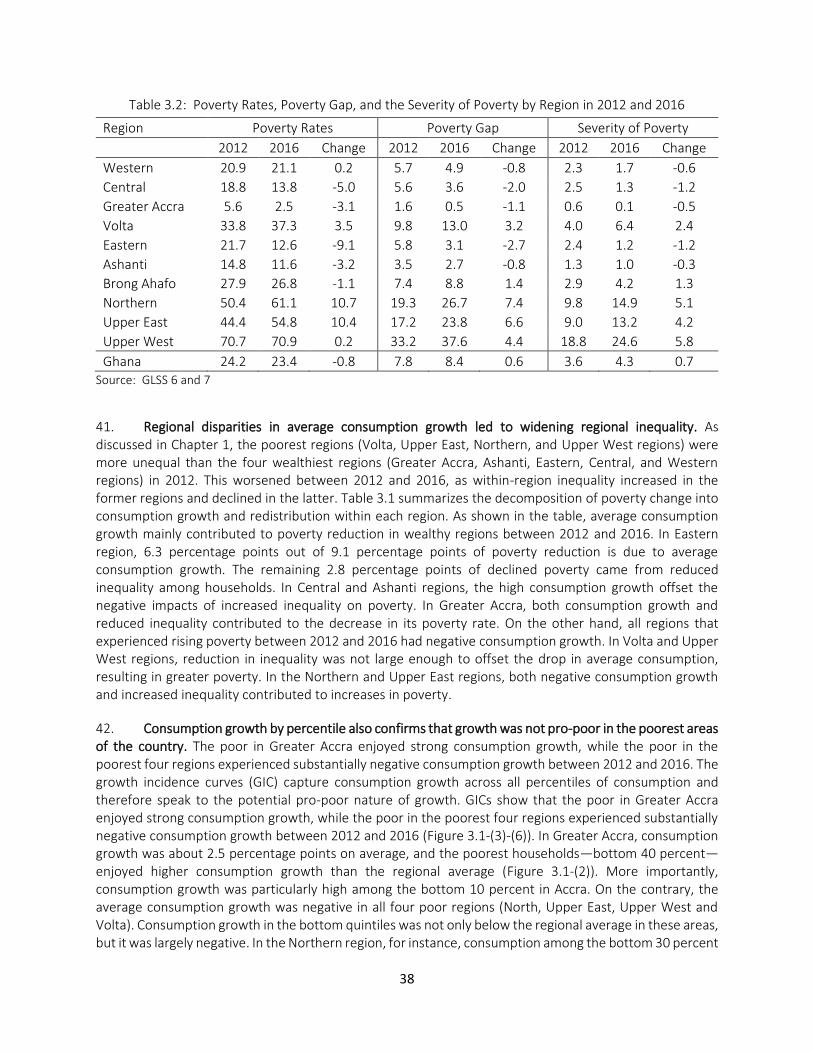
38
Table 3.2: Poverty Rates, Poverty Gap, and the Severity of Poverty by Region in 2012 and 2016
Region Poverty Rates Poverty Gap Severity of Poverty 2012 2016 Change 2012 2016 Change 2012 2016 Change
Western 20.9 21.1 0.2 5.7 4.9 -0.8 2.3 1.7 -0.6
Central 18.8 13.8 -5.0 5.6 3.6 -2.0 2.5 1.3 -1.2
Greater Accra 5.6 2.5 -3.1 1.6 0.5 -1.1 0.6 0.1 -0.5
Volta 33.8 37.3 3.5 9.8 13.0 3.2 4.0 6.4 2.4
Eastern 21.7 12.6 -9.1 5.8 3.1 -2.7 2.4 1.2 -1.2
Ashanti 14.8 11.6 -3.2 3.5 2.7 -0.8 1.3 1.0 -0.3
Brong Ahafo 27.9 26.8 -1.1 7.4 8.8 1.4 2.9 4.2 1.3
Northern 50.4 61.1 10.7 19.3 26.7 7.4 9.8 14.9 5.1
Upper East 44.4 54.8 10.4 17.2 23.8 6.6 9.0 13.2 4.2
Upper West 70.7 70.9 0.2 33.2 37.6 4.4 18.8 24.6 5.8
Ghana 24.2 23.4 -0.8 7.8 8.4 0.6 3.6 4.3 0.7 Source: GLSS 6 and 7
41. Regional disparities in average consumption growth led to widening regional inequality. As discussed in Chapter 1, the poorest regions (Volta, Upper East, Northern, and Upper West regions) were more unequal than the four wealthiest regions (Greater Accra, Ashanti, Eastern, Central, and Western regions) in 2012. This worsened between 2012 and 2016, as within-region inequality increased in the former regions and declined in the latter. Table 3.1 summarizes the decomposition of poverty change into consumption growth and redistribution within each region. As shown in the table, average consumption growth mainly contributed to poverty reduction in wealthy regions between 2012 and 2016. In Eastern region, 6.3 percentage points out of 9.1 percentage points of poverty reduction is due to average consumption growth. The remaining 2.8 percentage points of declined poverty came from reduced inequality among households. In Central and Ashanti regions, the high consumption growth offset the negative impacts of increased inequality on poverty. In Greater Accra, both consumption growth and reduced inequality contributed to the decrease in its poverty rate. On the other hand, all regions that experienced rising poverty between 2012 and 2016 had negative consumption growth. In Volta and Upper West regions, reduction in inequality was not large enough to offset the drop in average consumption, resulting in greater poverty. In the Northern and Upper East regions, both negative consumption growth and increased inequality contributed to increases in poverty.
42. Consumption growth by percentile also confirms that growth was not pro-poor in the poorest areas of the country. The poor in Greater Accra enjoyed strong consumption growth, while the poor in the poorest four regions experienced substantially negative consumption growth between 2012 and 2016. The growth incidence curves (GIC) capture consumption growth across all percentiles of consumption and therefore speak to the potential pro-poor nature of growth. GICs show that the poor in Greater Accra enjoyed strong consumption growth, while the poor in the poorest four regions experienced substantially negative consumption growth between 2012 and 2016 (Figure 3.1-(3)-(6)). In Greater Accra, consumption growth was about 2.5 percentage points on average, and the poorest households—bottom 40 percent—enjoyed higher consumption growth than the regional average (Figure 3.1-(2)). More importantly, consumption growth was particularly high among the bottom 10 percent in Accra. On the contrary, the average consumption growth was negative in all four poor regions (North, Upper East, Upper West and Volta). Consumption growth in the bottom quintiles was not only below the regional average in these areas, but it was largely negative. In the Northern region, for instance, consumption among the bottom 30 percent
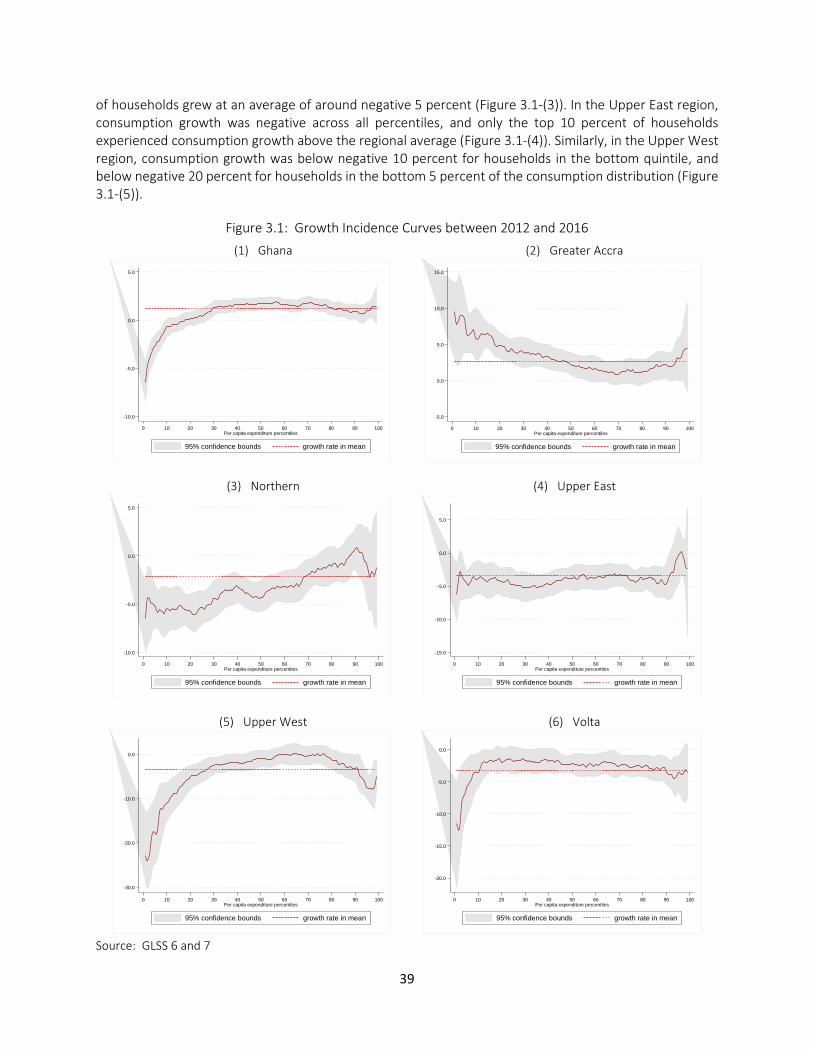
39
of households grew at an average of around negative 5 percent (Figure 3.1-(3)). In the Upper East region, consumption growth was negative across all percentiles, and only the top 10 percent of households experienced consumption growth above the regional average (Figure 3.1-(4)). Similarly, in the Upper West region, consumption growth was below negative 10 percent for households in the bottom quintile, and below negative 20 percent for households in the bottom 5 percent of the consumption distribution (Figure 3.1-(5)).
Figure 3.1: Growth Incidence Curves between 2012 and 2016
(1) Ghana
(2) Greater Accra
(3) Northern
(4) Upper East
(5) Upper West
(6) Volta
Source: GLSS 6 and 7
-10.0
-5.0
0.0
5.0
0 10 20 30 40 50 60 70 80 90 100Per capita expenditure percentiles
95% confidence bounds growth rate in mean
-5.0
0.0
5.0
10.0
15.0
0 10 20 30 40 50 60 70 80 90 100Per capita expenditure percentiles
95% confidence bounds growth rate in mean
-10.0
-5.0
0.0
5.0
0 10 20 30 40 50 60 70 80 90 100Per capita expenditure percentiles
95% confidence bounds growth rate in mean
-15.0
-10.0
-5.0
0.0
5.0
0 10 20 30 40 50 60 70 80 90 100Per capita expenditure percentiles
95% confidence bounds growth rate in mean
-30.0
-20.0
-10.0
0.0
0 10 20 30 40 50 60 70 80 90 100Per capita expenditure percentiles
95% confidence bounds growth rate in mean
-20.0
-15.0
-10.0
-5.0
0.0
0 10 20 30 40 50 60 70 80 90 100Per capita expenditure percentiles
95% confidence bounds growth rate in mean
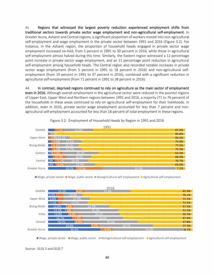
40
43. Regions that witnessed the largest poverty reduction experienced employment shifts from traditional sectors towards private sector wage employment and non-agricultural self-employment. In Greater Accra, Ashanti and Central regions, a significant proportion of workers moved into non-agricultural self-employment and wage employment in the private sector between 1991 and 2016 (Figure 3.2). For instance, in the Ashanti region, the proportion of household heads engaged in private sector wage employment increased six-fold; from 5 percent in 1991 to 30 percent in 2016, while those in agricultural self-employment almost halved during this time. Similarly, the Eastern region witnessed a 12 percentage point increase in private sector wage employment, and an 11 percentage point reduction in agricultural self-employment among household heads. The Central region also recorded notable increases in private sector wage employment (from 5 percent in 1991 to 18 percent in 2016) and non-agricultural self-employment (from 19 percent in 1991 to 37 percent in 2016), combined with a significant reduction in agricultural self-employment (from 71 percent in 1991 to 38 percent in 2016).
44. In contrast, deprived regions continued to rely on agriculture as the main sector of employment even in 2016. Although overall employment in the agricultural sector were reduced in the poorest regions of Upper East, Upper West and Northern regions between 1991 and 2016, a majority (71 to 76 percent) of the households in these areas continued to rely on agricultural self-employment for their livelihoods. In addition, even in 2016, private sector wage employment accounted for less than 7 percent and non-agricultural self-employment accounted for less than 18 percent of total employment in these regions.
Figure 3.2: Employment of Household Heads by Region in 1991 and 2016
Source: GLSS 3 and GLSS 7
20.2%5.4%5.2%
2.7%
19.5%6.9%5.2%
10.3%7.9%4.4%6.1%4.9%
3.2%1.1%
7.2%
53.3%22.1%
19.0%18.0%26.1%
17.7%14.1%17.5%
12.1%
21.0%
7.1%65.6%70.7%68.3%63.3%75.3%77.5%75.4%84.1%95.6%67.2%
Greater Accra
Central
Eastern
Brong Ahafo
Upper West
GHANA1991
Wage, private sector Wage, public sector Nonagricultural self-employment Agricultural self-employment
36.4%29.8%
18.4%16.7%
13.8%13.1%12.6%
7.1%6.8%
5.6%19.3%
8.4%6.1%
6.4%7.4%
6.8%4.2%5.2%
6.0%
50.4%36.7%
37.4%28.0%
29.1%31.2%
24.7%17.5%
17.9%13.0%
31.9%
4.7%27.3%37.8%47.9%50.3%51.5%57.5%72.5%71.1%76.1%42.9%
Greater Accra
Central
Volta
Brong Ahafo
Upper West
GHANA2016
Wage, private sector Wage, public sector Nonagricultural self-employment Agricultural self-employment
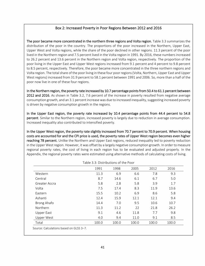
41
Box 2: Increased Poverty in Poor Regions Between 2012 and 2016
The poor became more concentrated in the northern three regions and Volta region. Table 3.3 summarizes the distribution of the poor in the country. The proportions of the poor increased in the Northern, Upper East, Upper West and Volta regions, while the share of the poor declined in other regions. 11.3 percent of the poor lived in the Northern region and 7.5 percent lived in the Volta region in 1991. By 2016, these numbers increased to 26.2 percent and 13.6 percent in the Northern region and Volta region, respectively. The proportion of the poor living in the Upper East and Upper West regions increased from 9.1 percent and 4 percent to 9.8 percent to 8.5 percent, respectively. Therefore, the poor became more concentrated in the three northern regions and Volta region. The total share of the poor living in these four poor regions (Volta, Northern, Upper East and Upper West regions) increased from 31.9 percent to 58.1 percent between 1991 and 2006. So, more than a half of the poor now live in one of these four regions. In the Northern region, the poverty rate increased by 10.7 percentage points from 50.4 to 61.1 percent between 2012 and 2016. As shown in Table 3.2, 7.6 percent of the increase in poverty resulted from negative average consumption growth, and an 3.1 percent increase was due to increased inequality, suggesting increased poverty is driven by negative consumption growth in the regions. In the Upper East region, the poverty rate increased by 10.4 percentage points from 44.4 percent to 54.8 percent. Similar to the Northern region, increased poverty is largely due to reduction in average consumption. Increased inequality also contributed to intensified poverty. In the Upper West region, the poverty rate slightly increased from 70.7 percent to 70.9 percent. When housing costs are accounted for and the CPI price is used, the poverty rates of Upper West region becomes even higher reaching 78 percent. Unlike the Northern and Upper East regions, reduced inequality led to poverty reduction in the Upper West region. However, it was offset by a largely negative consumption growth. In order to measure regional poverty rates, the cost of living in each region has to be evaluated and adjusted properly. In the Appendix, the regional poverty rates were estimated using alternative methods of calculating costs of living.
Table 3.3: Distributions of the Poor
1991 1998 2005 2012 2016
Western 11.3 6.9 6.6 7.8 9.3
Central 8.7 14.6 6.1 6.7 5.0
Greater Accra 5.8 2.8 5.8 3.9 1.7
Volta 7.5 17.4 8.3 11.9 13.6
Eastern 15.5 10.2 6.9 8.6 5.8
Ashanti 12.4 15.9 12.1 12.1 9.4
Brong Ahafo 14.4 7.0 9.5 10.6 10.7
Northern 11.3 11.2 22 21.8 26.2
Upper East 9.1 4.6 11.8 7.7 9.8
Upper West 4.0 9.4 11.0 9.1 8.5
Total 100.0 100.0 100.0 100.0 100.0
Source: Calculations based on GLSS 3–7.
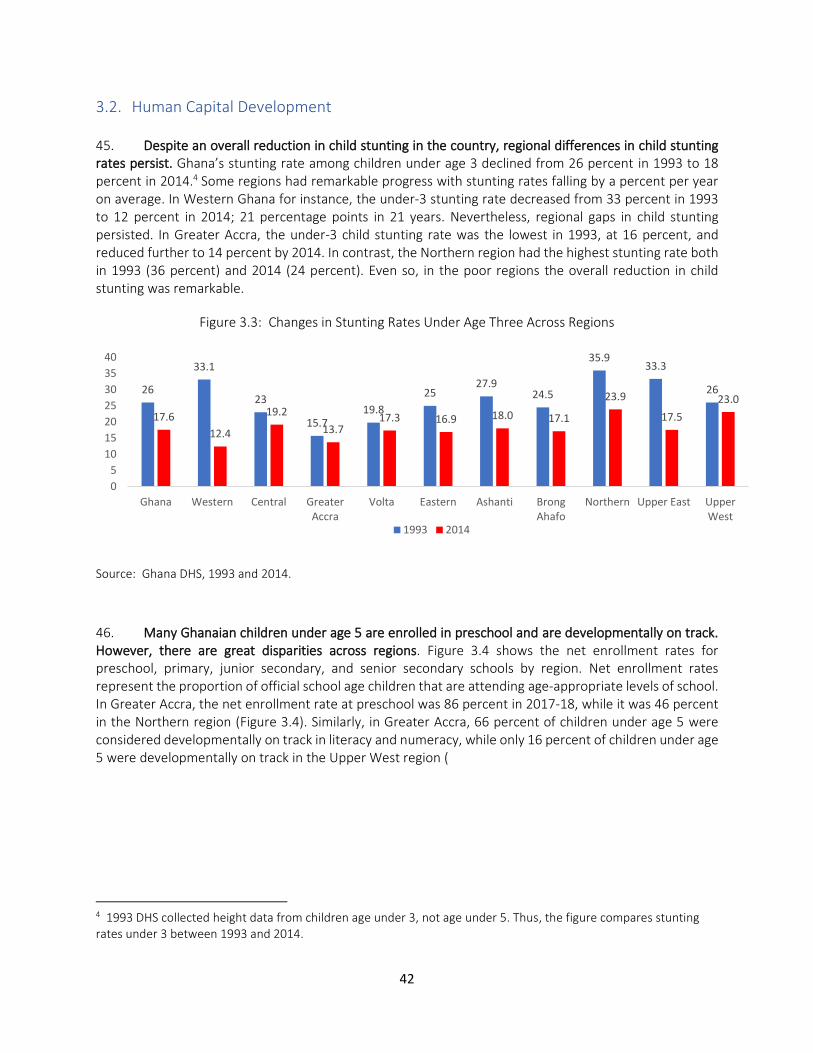
42
3.2. Human Capital Development 45. Despite an overall reduction in child stunting in the country, regional differences in child stunting rates persist. Ghana’s stunting rate among children under age 3 declined from 26 percent in 1993 to 18 percent in 2014.4 Some regions had remarkable progress with stunting rates falling by a percent per year on average. In Western Ghana for instance, the under-3 stunting rate decreased from 33 percent in 1993 to 12 percent in 2014; 21 percentage points in 21 years. Nevertheless, regional gaps in child stunting persisted. In Greater Accra, the under-3 child stunting rate was the lowest in 1993, at 16 percent, and reduced further to 14 percent by 2014. In contrast, the Northern region had the highest stunting rate both in 1993 (36 percent) and 2014 (24 percent). Even so, in the poor regions the overall reduction in child stunting was remarkable.
Figure 3.3: Changes in Stunting Rates Under Age Three Across Regions
Source: Ghana DHS, 1993 and 2014.
46. Many Ghanaian children under age 5 are enrolled in preschool and are developmentally on track. However, there are great disparities across regions. Figure 3.4 shows the net enrollment rates for preschool, primary, junior secondary, and senior secondary schools by region. Net enrollment rates represent the proportion of official school age children that are attending age-appropriate levels of school. In Greater Accra, the net enrollment rate at preschool was 86 percent in 2017-18, while it was 46 percent in the Northern region (Figure 3.4). Similarly, in Greater Accra, 66 percent of children under age 5 were considered developmentally on track in literacy and numeracy, while only 16 percent of children under age 5 were developmentally on track in the Upper West region (
4 1993 DHS collected height data from children age under 3, not age under 5. Thus, the figure compares stunting rates under 3 between 1993 and 2014.
26
33.1
23
15.719.8
2527.9
24.5
35.933.3
26
17.6
12.4
19.2
13.717.3 16.9 18.0 17.1
23.9
17.5
23.0
0
5
10
15
20
25
30
35
40
Ghana Western Central GreaterAccra
Volta Eastern Ashanti BrongAhafo
Northern Upper East UpperWest
1993 2014
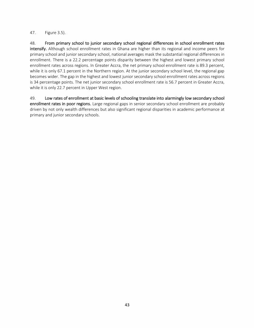
43
47. Figure 3.5).
48. From primary school to junior secondary school regional differences in school enrollment rates intensify. Although school enrollment rates in Ghana are higher than its regional and income peers for primary school and junior secondary school, national averages mask the substantial regional differences in enrollment. There is a 22.2 percentage points disparity between the highest and lowest primary school enrollment rates across regions. In Greater Accra, the net primary school enrollment rate is 89.3 percent, while it is only 67.1 percent in the Northern region. At the junior secondary school level, the regional gap becomes wider. The gap in the highest and lowest junior secondary school enrollment rates across regions is 34 percentage points. The net junior secondary school enrollment rate is 56.7 percent in Greater Accra, while it is only 22.7 percent in Upper West region.
49. Low rates of enrollment at basic levels of schooling translate into alarmingly low secondary school enrollment rates in poor regions. Large regional gaps in senior secondary school enrollment are probably driven by not only wealth differences but also significant regional disparities in academic performance at primary and junior secondary schools.
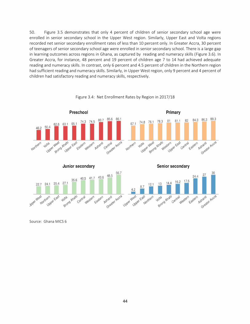
44
50. Figure 3.5 demonstrates that only 4 percent of children of senior secondary school age were enrolled in senior secondary school in the Upper West region. Similarly, Upper East and Volta regions recorded net senior secondary enrollment rates of less than 10 percent only. In Greater Accra, 30 percent of teenagers of senior secondary school age were enrolled in senior secondary school. There is a large gap in learning outcomes across regions in Ghana, as captured by reading and numeracy skills (Figure 3.6). In Greater Accra, for instance, 48 percent and 19 percent of children age 7 to 14 had achieved adequate reading and numeracy skills. In contrast, only 6 percent and 4.5 percent of children in the Northern region had sufficient reading and numeracy skills. Similarly, in Upper West region, only 9 percent and 4 percent of children had satisfactory reading and numeracy skills, respectively.
Figure 3.4: Net Enrollment Rates by Region in 2017/18
Source: Ghana MICS 6
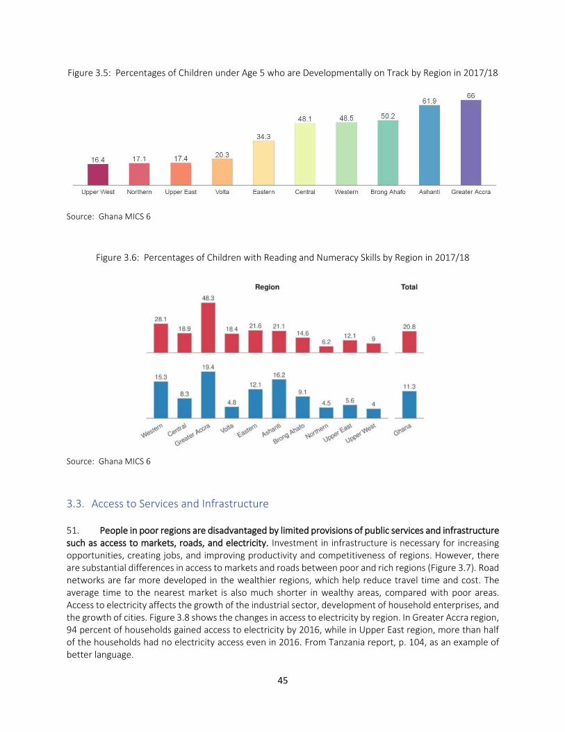
45
Figure 3.5: Percentages of Children under Age 5 who are Developmentally on Track by Region in 2017/18
Source: Ghana MICS 6
Figure 3.6: Percentages of Children with Reading and Numeracy Skills by Region in 2017/18
Source: Ghana MICS 6
3.3. Access to Services and Infrastructure 51. People in poor regions are disadvantaged by limited provisions of public services and infrastructure such as access to markets, roads, and electricity. Investment in infrastructure is necessary for increasing opportunities, creating jobs, and improving productivity and competitiveness of regions. However, there are substantial differences in access to markets and roads between poor and rich regions (Figure 3.7). Road networks are far more developed in the wealthier regions, which help reduce travel time and cost. The average time to the nearest market is also much shorter in wealthy areas, compared with poor areas. Access to electricity affects the growth of the industrial sector, development of household enterprises, and the growth of cities. Figure 3.8 shows the changes in access to electricity by region. In Greater Accra region, 94 percent of households gained access to electricity by 2016, while in Upper East region, more than half of the households had no electricity access even in 2016. From Tanzania report, p. 104, as an example of better language.
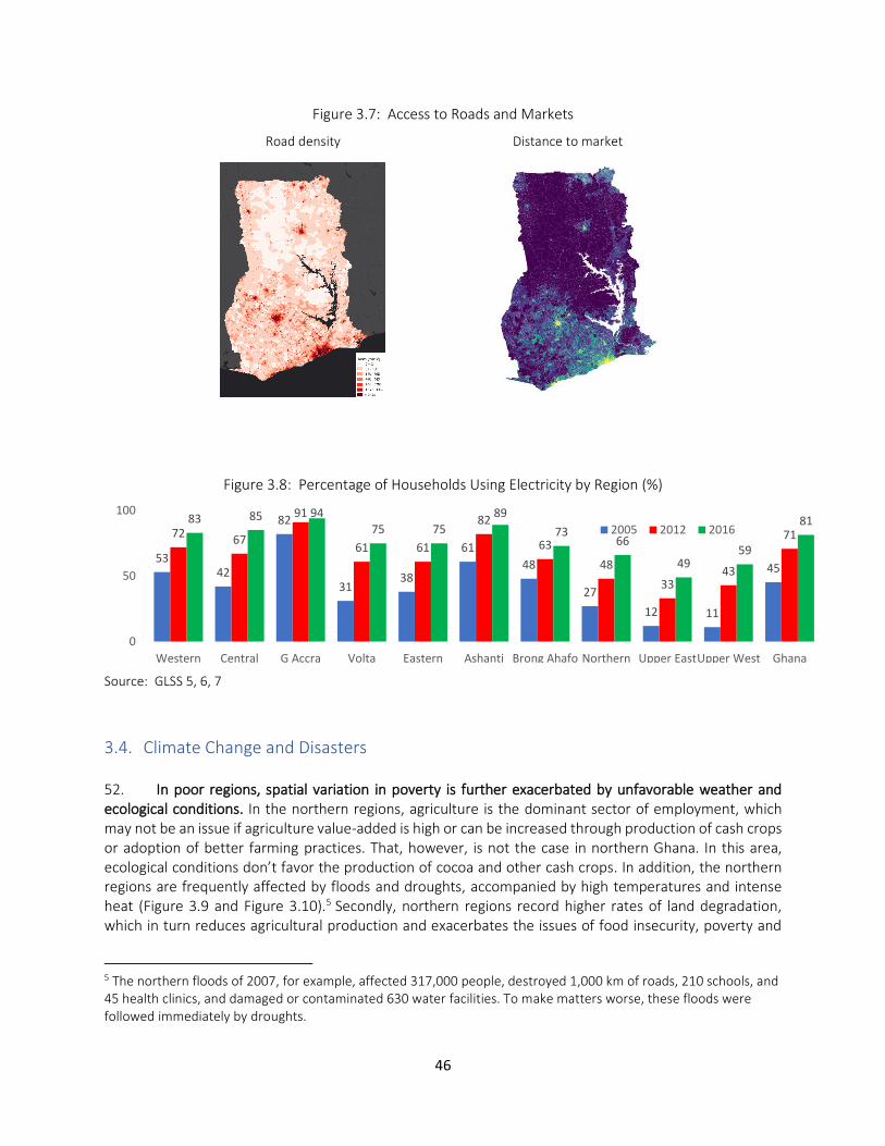
46
Figure 3.7: Access to Roads and Markets
Road density Distance to market
Figure 3.8: Percentage of Households Using Electricity by Region (%)
Source: GLSS 5, 6, 7
3.4. Climate Change and Disasters 52. In poor regions, spatial variation in poverty is further exacerbated by unfavorable weather and ecological conditions. In the northern regions, agriculture is the dominant sector of employment, which may not be an issue if agriculture value-added is high or can be increased through production of cash crops or adoption of better farming practices. That, however, is not the case in northern Ghana. In this area, ecological conditions don’t favor the production of cocoa and other cash crops. In addition, the northern regions are frequently affected by floods and droughts, accompanied by high temperatures and intense heat (Figure 3.9 and Figure 3.10).5 Secondly, northern regions record higher rates of land degradation, which in turn reduces agricultural production and exacerbates the issues of food insecurity, poverty and
5 The northern floods of 2007, for example, affected 317,000 people, destroyed 1,000 km of roads, 210 schools, and 45 health clinics, and damaged or contaminated 630 water facilities. To make matters worse, these floods were followed immediately by droughts.
5342
82
3138
61
48
27
12 11
45
7267
91
61 61
82
63
48
3343
7183 85 94
75 75
89
7366
4959
81
0
50
100
Western Central G Accra Volta Eastern Ashanti Brong Ahafo Northern Upper EastUpper West Ghana
2005 2012 2016
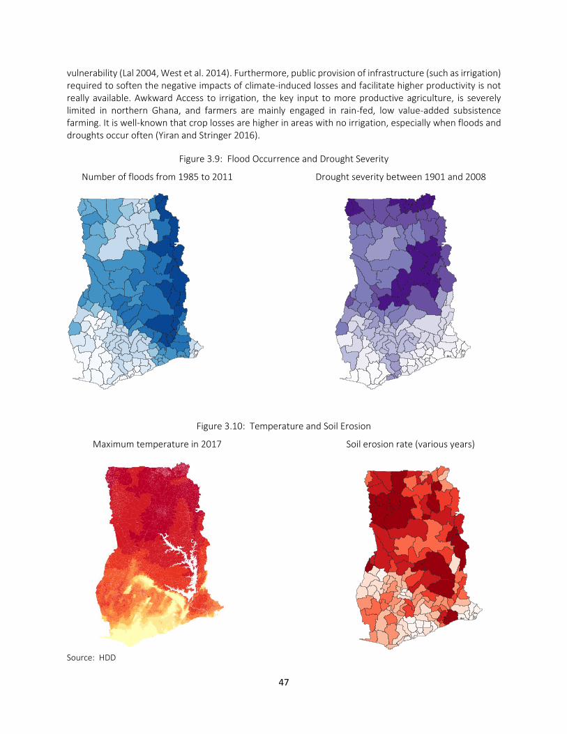
47
vulnerability (Lal 2004, West et al. 2014). Furthermore, public provision of infrastructure (such as irrigation) required to soften the negative impacts of climate-induced losses and facilitate higher productivity is not really available. Awkward Access to irrigation, the key input to more productive agriculture, is severely limited in northern Ghana, and farmers are mainly engaged in rain-fed, low value-added subsistence farming. It is well-known that crop losses are higher in areas with no irrigation, especially when floods and droughts occur often (Yiran and Stringer 2016).
Figure 3.9: Flood Occurrence and Drought Severity
Number of floods from 1985 to 2011 Drought severity between 1901 and 2008
Figure 3.10: Temperature and Soil Erosion
Maximum temperature in 2017 Soil erosion rate (various years)
Source: HDD
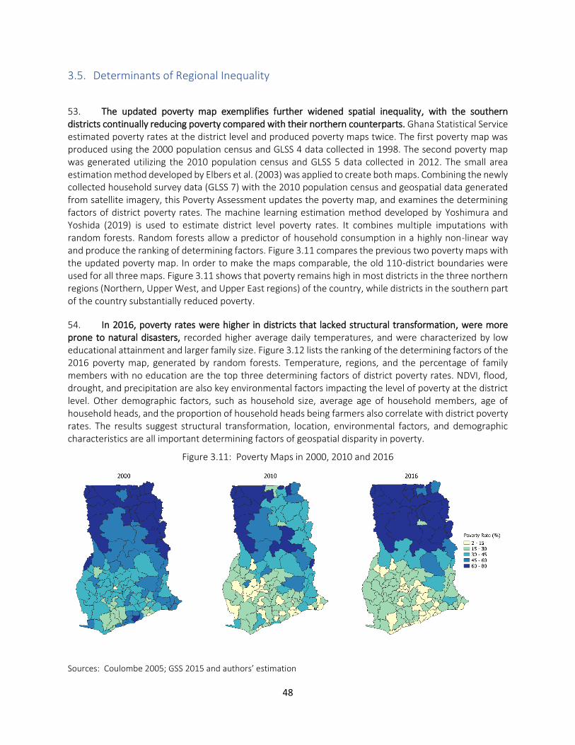
48
3.5. Determinants of Regional Inequality
53. The updated poverty map exemplifies further widened spatial inequality, with the southern districts continually reducing poverty compared with their northern counterparts. Ghana Statistical Service estimated poverty rates at the district level and produced poverty maps twice. The first poverty map was produced using the 2000 population census and GLSS 4 data collected in 1998. The second poverty map was generated utilizing the 2010 population census and GLSS 5 data collected in 2012. The small area estimation method developed by Elbers et al. (2003) was applied to create both maps. Combining the newly collected household survey data (GLSS 7) with the 2010 population census and geospatial data generated from satellite imagery, this Poverty Assessment updates the poverty map, and examines the determining factors of district poverty rates. The machine learning estimation method developed by Yoshimura and Yoshida (2019) is used to estimate district level poverty rates. It combines multiple imputations with random forests. Random forests allow a predictor of household consumption in a highly non-linear way and produce the ranking of determining factors. Figure 3.11 compares the previous two poverty maps with the updated poverty map. In order to make the maps comparable, the old 110-district boundaries were used for all three maps. Figure 3.11 shows that poverty remains high in most districts in the three northern regions (Northern, Upper West, and Upper East regions) of the country, while districts in the southern part of the country substantially reduced poverty.
54. In 2016, poverty rates were higher in districts that lacked structural transformation, were more prone to natural disasters, recorded higher average daily temperatures, and were characterized by low educational attainment and larger family size. Figure 3.12 lists the ranking of the determining factors of the 2016 poverty map, generated by random forests. Temperature, regions, and the percentage of family members with no education are the top three determining factors of district poverty rates. NDVI, flood, drought, and precipitation are also key environmental factors impacting the level of poverty at the district level. Other demographic factors, such as household size, average age of household members, age of household heads, and the proportion of household heads being farmers also correlate with district poverty rates. The results suggest structural transformation, location, environmental factors, and demographic characteristics are all important determining factors of geospatial disparity in poverty.
Figure 3.11: Poverty Maps in 2000, 2010 and 2016
Sources: Coulombe 2005; GSS 2015 and authors’ estimation
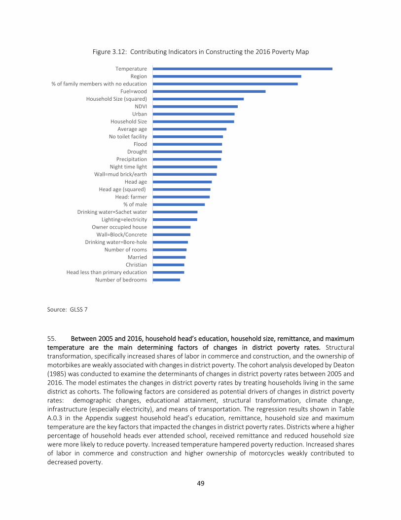
49
Figure 3.12: Contributing Indicators in Constructing the 2016 Poverty Map
Source: GLSS 7
55. Between 2005 and 2016, household head’s education, household size, remittance, and maximum temperature are the main determining factors of changes in district poverty rates. Structural transformation, specifically increased shares of labor in commerce and construction, and the ownership of motorbikes are weakly associated with changes in district poverty. The cohort analysis developed by Deaton (1985) was conducted to examine the determinants of changes in district poverty rates between 2005 and 2016. The model estimates the changes in district poverty rates by treating households living in the same district as cohorts. The following factors are considered as potential drivers of changes in district poverty rates: demographic changes, educational attainment, structural transformation, climate change, infrastructure (especially electricity), and means of transportation. The regression results shown in Table A.0.3 in the Appendix suggest household head’s education, remittance, household size and maximum temperature are the key factors that impacted the changes in district poverty rates. Districts where a higher percentage of household heads ever attended school, received remittance and reduced household size were more likely to reduce poverty. Increased temperature hampered poverty reduction. Increased shares of labor in commerce and construction and higher ownership of motorcycles weakly contributed to decreased poverty.
Number of bedrooms
Head less than primary education
Christian
Married
Number of rooms
Drinking water=Bore-hole
Wall=Block/Concrete
Owner occupied house
Lighting=electricity
Drinking water=Sachet water
% of male
Head: farmer
Head age (squared)
Head age
Wall=mud brick/earth
Night time light
Precipitation
Drought
Flood
No toilet facility
Average age
Household Size
Urban
NDVI
Household Size (squared)
Fuel=wood
% of family members with no education
Region
Temperature
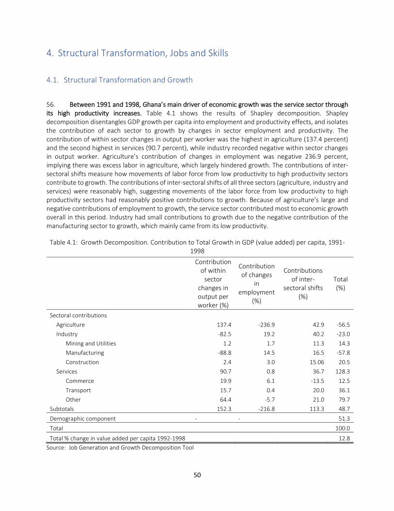
50
4. Structural Transformation, Jobs and Skills
4.1. Structural Transformation and Growth
56. Between 1991 and 1998, Ghana’s main driver of economic growth was the service sector through its high productivity increases. Table 4.1 shows the results of Shapley decomposition. Shapley decomposition disentangles GDP growth per capita into employment and productivity effects, and isolates the contribution of each sector to growth by changes in sector employment and productivity. The contribution of within sector changes in output per worker was the highest in agriculture (137.4 percent) and the second highest in services (90.7 percent), while industry recorded negative within sector changes in output worker. Agriculture’s contribution of changes in employment was negative 236.9 percent, implying there was excess labor in agriculture, which largely hindered growth. The contributions of inter-sectoral shifts measure how movements of labor force from low productivity to high productivity sectors contribute to growth. The contributions of inter-sectoral shifts of all three sectors (agriculture, industry and services) were reasonably high, suggesting movements of the labor force from low productivity to high productivity sectors had reasonably positive contributions to growth. Because of agriculture’s large and negative contributions of employment to growth, the service sector contributed most to economic growth overall in this period. Industry had small contributions to growth due to the negative contribution of the manufacturing sector to growth, which mainly came from its low productivity.
Table 4.1: Growth Decomposition. Contribution to Total Growth in GDP (value added) per capita, 1991-1998
Contribution of within
sector changes in output per worker (%)
Contribution of changes
in employment
(%)
Contributions of inter-
sectoral shifts (%)
Total (%)
Sectoral contributions Agriculture 137.4 -236.9 42.9 -56.5
Industry -82.5 19.2 40.2 -23.0
Mining and Utilities 1.2 1.7 11.3 14.3
Manufacturing -88.8 14.5 16.5 -57.8
Construction 2.4 3.0 15.06 20.5
Services 90.7 0.8 36.7 128.3
Commerce 19.9 6.1 -13.5 12.5
Transport 15.7 0.4 20.0 36.1
Other 64.4 -5.7 21.0 79.7
Subtotals 152.3 -216.8 113.3 48.7
Demographic component - - 51.3
Total 100.0
Total % change in value added per capita 1992-1998 12.8
Source: Job Generation and Growth Decomposition Tool
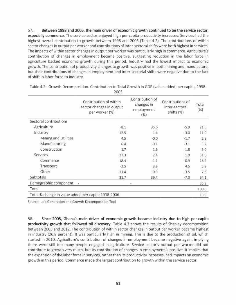
51
57. Between 1998 and 2005, the main driver of economic growth continued to be the service sector, especially commerce. The service sector enjoyed high per capita productivity increases. Services had the highest overall contribution to growth between 1998 and 2005 (Table 4.2). The contributions of within sector changes in output per worker and contributions of inter-sectoral shifts were both highest in services. The impacts of within sector changes in output per worker was particularly high in commerce. Agriculture’s contribution of changes in employment became positive, suggesting reduction in the labor force in agriculture backed economic growth during this period. Industry had the lowest impact to economic growth. The contribution of productivity changes to growth was positive in both mining and manufacture, but their contributions of changes in employment and inter-sectorial shifts were negative due to the lack of shift in labor force to industry.
Table 4.2: Growth Decomposition. Contribution to Total Growth in GDP (value added) per capita, 1998-2005
Contribution of within sector changes in output
per worker (%)
Contribution of changes in
employment (%)
Contributions of inter-sectoral
shifts (%)
Total (%)
Sectoral contributions Agriculture -8.1 35.6 -5.9 21.6
Industry 12.5 1.4 -3.0 11.0
Mining and Utilities 4.5 -0.0 -1.7 2.8
Manufacturing 6.4 -0.1 -3.1 3.2
Construction 1.7 1.6 1.8 5.0
Services 27.3 2.4 1.9 31.6
Commerce 18.4 -1.1 0.9 18.2
Transport -2.5 3.8 4.5 5.8
Other 11.4 -0.3 -3.5 7.6
Subtotals 31.7 39.4 -7.0 64.1
Demographic component - - 35.9
Total 100.0
Total % change in value added per capita 1998-2006 18.9
Source: Job Generation and Growth Decomposition Tool
58. Since 2005, Ghana’s main driver of economic growth became industry due to high per-capita productivity growth that followed oil discovery. Table 4.3 shows the results of Shapley decomposition between 2005 and 2012. The contribution of within sector changes in output per worker became highest in industry (26.8 percent). It was particularly high in mining. This is due to the production of oil, which started in 2010. Agriculture’s contribution of changes in employment became negative again, implying there were still too many people engaged in agriculture. Service sector’s output per worker did not contribute to growth very much, but its contribution of changes in employment is positive. It implies that the expansion of the labor force in services, rather than its productivity increases, had impacts on economic growth in this period. Commerce made the largest contribution to growth within the service sector.
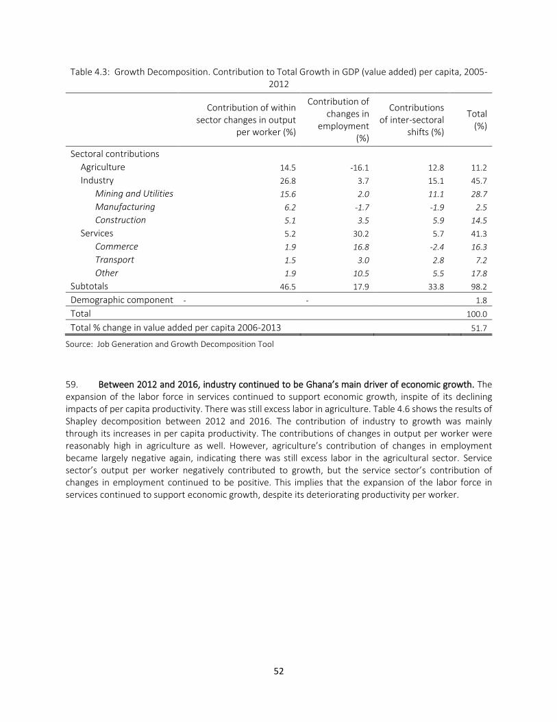
52
Table 4.3: Growth Decomposition. Contribution to Total Growth in GDP (value added) per capita, 2005-2012
Contribution of within sector changes in output
per worker (%)
Contribution of changes in
employment (%)
Contributions of inter-sectoral
shifts (%)
Total (%)
Sectoral contributions Agriculture 14.5 -16.1 12.8 11.2
Industry 26.8 3.7 15.1 45.7
Mining and Utilities 15.6 2.0 11.1 28.7
Manufacturing 6.2 -1.7 -1.9 2.5
Construction 5.1 3.5 5.9 14.5
Services 5.2 30.2 5.7 41.3
Commerce 1.9 16.8 -2.4 16.3
Transport 1.5 3.0 2.8 7.2
Other 1.9 10.5 5.5 17.8
Subtotals 46.5 17.9 33.8 98.2
Demographic component - - 1.8
Total 100.0
Total % change in value added per capita 2006-2013 51.7
Source: Job Generation and Growth Decomposition Tool
59. Between 2012 and 2016, industry continued to be Ghana’s main driver of economic growth. The expansion of the labor force in services continued to support economic growth, inspite of its declining impacts of per capita productivity. There was still excess labor in agriculture. Table 4.6 shows the results of Shapley decomposition between 2012 and 2016. The contribution of industry to growth was mainly through its increases in per capita productivity. The contributions of changes in output per worker were reasonably high in agriculture as well. However, agriculture’s contribution of changes in employment became largely negative again, indicating there was still excess labor in the agricultural sector. Service sector’s output per worker negatively contributed to growth, but the service sector’s contribution of changes in employment continued to be positive. This implies that the expansion of the labor force in services continued to support economic growth, despite its deteriorating productivity per worker.
53
Table 4.4: Growth Decomposition. Contribution to Total Growth in GDP (value added) per capita, 2012-2016
Contribution of within sector changes in output per
worker (%)
Contribution of changes in
employment (%)
Contributions of inter-sectoral
shifts (%)
Total (%)
Sectoral contributions Agriculture 93.2 -172.0 44.5 -34.3
Industry 97.0 -25.5 18.1 89.5
Mining and Utilities 36.5 -1.6 11.0 45.9
Manufacturing 49.9 -24.7 -5.0 20.2
Construction 10.5 0.8 12.1 23.4
Services -3.1 13.1 7.5 17.6
Commerce 45.8 -59.1 5.15 -8.1
Transport 38.1 -11.4 -5.6 21.1
Other -87.0 83.6 7.9 4.6
Subtotals 187.0 -184.4 70.1 72.7
Demographic component - - 27.3
Total 100.0
Total % change in value added per capita 2012-2016 9.1
Source: Job Generation and Growth Decomposition Tool
4.2. Welfare Impacts of Oil Production
60. Oil production brought substantial increases in income and employment opportunities for wealthy households, but it neither increased consumption nor created opportunities for the poor. As discussed in Section 4.1, Ghana’s economic growth was led by the oil sector since the commencement of offshore oil production in 2010. The question arises whether the growth led by oil contributed to poverty reduction.
54
61. Table 4.5 shows the regressions results investigating the impacts of oil production on income, consumption, and poverty status in coastal areas where oil was discovered. The income effects were positive and significant, but oil production neither increased consumption nor reduced poverty. In general, oil production increased employment rates, especially in the manufacturing and construction sectors. However, there was no significant impact of oil production on employment in the agricultural and service sectors where a large proportion of poor are engaged (Table 4.6). This explains why oil production did not lead to poverty reduction.
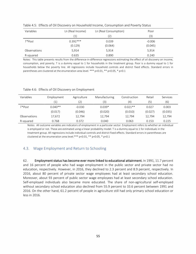
55
Table 4.5: Effects of Oil Discovery on Household Income, Consumption and Poverty Status
Variables Ln (Real Income) Ln (Real Consumption) Poor
(1) (2) (3)
T*Post 0.391*** 0.039 -0.006
(0.129) (0.064) (0.045)
Observations 5,914 5,914 5,914
R-squared 0.635 0.890 0.240
Notes: This table presents results from the difference-in-difference regressions estimating the effect of oil discovery on income,
consumption, and poverty. T is a dummy equal to 1 for households in the treatment group. Poor is a dummy equal to 1 for
households below the poverty line. All regressions include household controls and district fixed effects. Standard errors in
parentheses are clustered at the enumeration area level. *** p<0.01, ** p<0.05, * p<0.1
Table 4.6: Effects of Oil Discovery on Employment
Variables Employment Agriculture Manufacturing Construction Retail Services
(1) (2) (3) (4) (5) (6)
T*Post 0.040** -0.030 0.039* 0.021** 0.027 0.003
(0.017) (0.046) (0.020) (0.010) (0.027) (0.035)
Observations 17,672 12,794 12,794 12,794 12,794 12,794
R-squared 0.768 0.372 0.040 0.063 0.153 0.225
Notes: All outcome variables are indicators of employment in a particular sector. Employment refers to whether an individual
is employed or not. These are estimated using a linear probability model. T is a dummy equal to 1 for individuals in the
treatment group. All regressions include individual controls and district fixed effects. Standard errors in parentheses are
clustered at the enumeration area level.*** p<0.01, ** p<0.05, * p<0.1
4.3. Wage Employment and Return to Schooling
62. Employment status has become ever more linked to educational attainment. In 1991, 11.7 percent and 16 percent of people who had wage employment in the public sector and private sector had no education, respectively. However, in 2016, they declined to 2.3 percent and 8.9 percent, respectively. In 2016, about 80 percent of private sector wage employees had at least secondary school education. Moreover, about 93 percent of public sector wage employees had at least secondary school education. Self-employed individuals also became more educated. The share of non-agricultural self-employed without secondary school education also declined from 55.9 percent to 33.6 percent between 1991 and 2016. On the other hand, 61.2 percent of people in agriculture still had only primary school education or less in 2016.
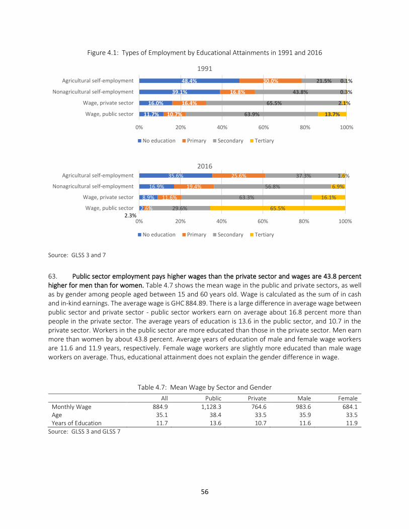
56
Figure 4.1: Types of Employment by Educational Attainments in 1991 and 2016
Source: GLSS 3 and 7
63. Public sector employment pays higher wages than the private sector and wages are 43.8 percent higher for men than for women. Table 4.7 shows the mean wage in the public and private sectors, as well as by gender among people aged between 15 and 60 years old. Wage is calculated as the sum of in cash and in-kind earnings. The average wage is GHC 884.89. There is a large difference in average wage between public sector and private sector - public sector workers earn on average about 16.8 percent more than people in the private sector. The average years of education is 13.6 in the public sector, and 10.7 in the private sector. Workers in the public sector are more educated than those in the private sector. Men earn more than women by about 43.8 percent. Average years of education of male and female wage workers are 11.6 and 11.9 years, respectively. Female wage workers are slightly more educated than male wage workers on average. Thus, educational attainment does not explain the gender difference in wage.
Table 4.7: Mean Wage by Sector and Gender
All Public Private Male Female
Monthly Wage 884.9 1,128.3 764.6 983.6 684.1 Age 35.1 38.4 33.5 35.9 33.5 Years of Education 11.7 13.6 10.7 11.6 11.9
Source: GLSS 3 and GLSS 7
11.7%
16.0%
39.1%
48.4%
10.7%
16.4%
16.8%
30.0%
63.9%
65.5%
43.8%
21.5%
13.7%
2.1%
0.3%
0.1%
0% 20% 40% 60% 80% 100%
Wage, public sector
Wage, private sector
Nonagricultural self-employment
Agricultural self-employment
1991
No education Primary Secondary Tertiary
2.3%
8.9%
16.9%
35.6%
2.6%
11.6%
19.4%
25.6%
29.6%
63.3%
56.8%
37.3%
65.5%
16.1%
6.9%
1.6%
0% 20% 40% 60% 80% 100%
Wage, public sector
Wage, private sector
Nonagricultural self-employment
Agricultural self-employment
2016
No education Primary Secondary Tertiary
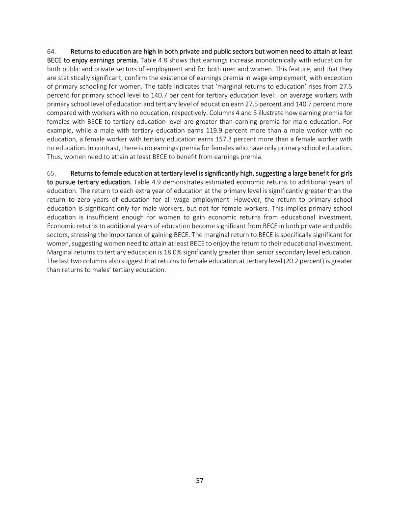
57
64. Returns to education are high in both private and public sectors but women need to attain at least BECE to enjoy earnings premia. Table 4.8 shows that earnings increase monotonically with education for both public and private sectors of employment and for both men and women. This feature, and that they are statistically significant, confirm the existence of earnings premia in wage employment, with exception of primary schooling for women. The table indicates that ‘marginal returns to education’ rises from 27.5 percent for primary school level to 140.7 per cent for tertiary education level: on average workers with primary school level of education and tertiary level of education earn 27.5 percent and 140.7 percent more compared with workers with no education, respectively. Columns 4 and 5 illustrate how earning premia for females with BECE to tertiary education level are greater than earning premia for male education. For example, while a male with tertiary education earns 119.9 percent more than a male worker with no education, a female worker with tertiary education earns 157.3 percent more than a female worker with no education. In contrast, there is no earnings premia for females who have only primary school education. Thus, women need to attain at least BECE to benefit from earnings premia.
65. Returns to female education at tertiary level is significantly high, suggesting a large benefit for girls to pursue tertiary education. Table 4.9 demonstrates estimated economic returns to additional years of education. The return to each extra year of education at the primary level is significantly greater than the return to zero years of education for all wage employment. However, the return to primary school education is significant only for male workers, but not for female workers. This implies primary school education is insufficient enough for women to gain economic returns from educational investment. Economic returns to additional years of education become significant from BECE in both private and public sectors, stressing the importance of gaining BECE. The marginal return to BECE is specifically significant for women, suggesting women need to attain at least BECE to enjoy the return to their educational investment. Marginal returns to tertiary education is 18.0% significantly greater than senior secondary level education. The last two columns also suggest that returns to female education at tertiary level (20.2 percent) is greater than returns to males’ tertiary education.
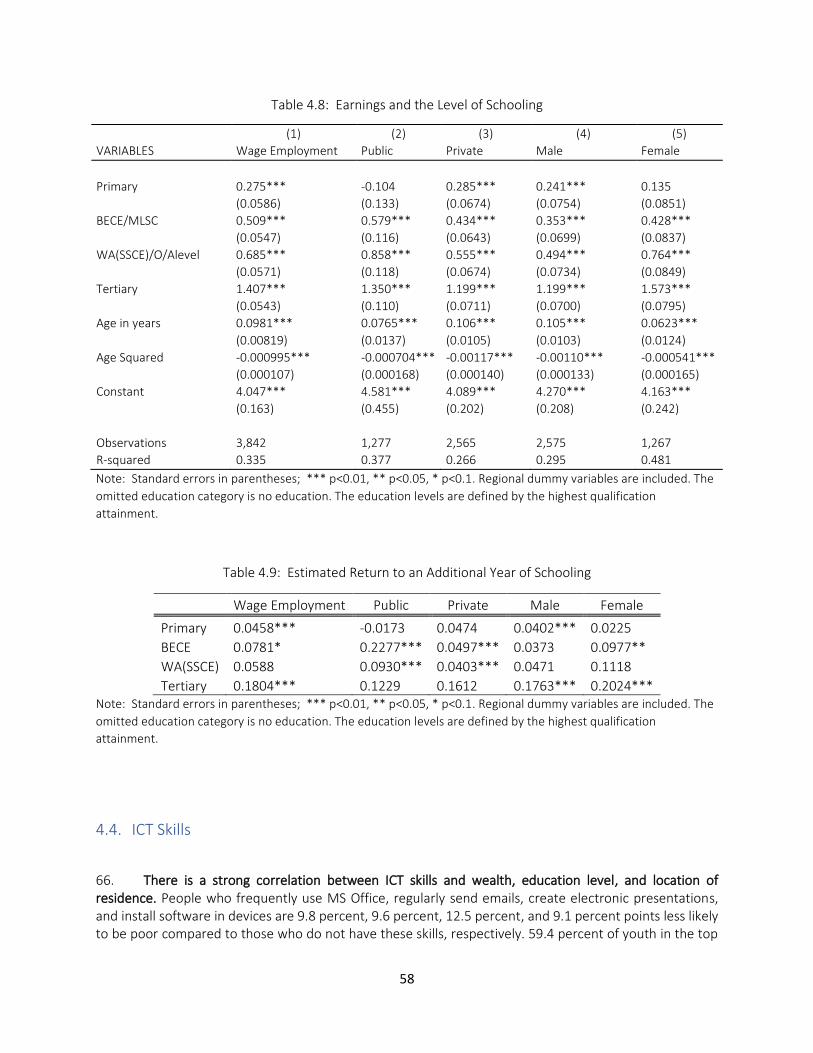
58
Table 4.8: Earnings and the Level of Schooling
(1) (2) (3) (4) (5)
VARIABLES Wage Employment Public Private Male Female
Primary 0.275*** -0.104 0.285*** 0.241*** 0.135
(0.0586) (0.133) (0.0674) (0.0754) (0.0851)
BECE/MLSC 0.509*** 0.579*** 0.434*** 0.353*** 0.428***
(0.0547) (0.116) (0.0643) (0.0699) (0.0837)
WA(SSCE)/O/Alevel 0.685*** 0.858*** 0.555*** 0.494*** 0.764***
(0.0571) (0.118) (0.0674) (0.0734) (0.0849)
Tertiary 1.407*** 1.350*** 1.199*** 1.199*** 1.573***
(0.0543) (0.110) (0.0711) (0.0700) (0.0795)
Age in years 0.0981*** 0.0765*** 0.106*** 0.105*** 0.0623***
(0.00819) (0.0137) (0.0105) (0.0103) (0.0124)
Age Squared -0.000995*** -0.000704*** -0.00117*** -0.00110*** -0.000541***
(0.000107) (0.000168) (0.000140) (0.000133) (0.000165)
Constant 4.047*** 4.581*** 4.089*** 4.270*** 4.163***
(0.163) (0.455) (0.202) (0.208) (0.242)
Observations 3,842 1,277 2,565 2,575 1,267
R-squared 0.335 0.377 0.266 0.295 0.481
Note: Standard errors in parentheses; *** p<0.01, ** p<0.05, * p<0.1. Regional dummy variables are included. The
omitted education category is no education. The education levels are defined by the highest qualification
attainment.
Table 4.9: Estimated Return to an Additional Year of Schooling
Wage Employment Public Private Male Female
Primary 0.0458*** -0.0173 0.0474 0.0402*** 0.0225
BECE 0.0781* 0.2277*** 0.0497*** 0.0373 0.0977**
WA(SSCE) 0.0588 0.0930*** 0.0403*** 0.0471 0.1118
Tertiary 0.1804*** 0.1229 0.1612 0.1763*** 0.2024*** Note: Standard errors in parentheses; *** p<0.01, ** p<0.05, * p<0.1. Regional dummy variables are included. The
omitted education category is no education. The education levels are defined by the highest qualification
attainment.
4.4. ICT Skills
66. There is a strong correlation between ICT skills and wealth, education level, and location of residence. People who frequently use MS Office, regularly send emails, create electronic presentations, and install software in devices are 9.8 percent, 9.6 percent, 12.5 percent, and 9.1 percent points less likely to be poor compared to those who do not have these skills, respectively. 59.4 percent of youth in the top
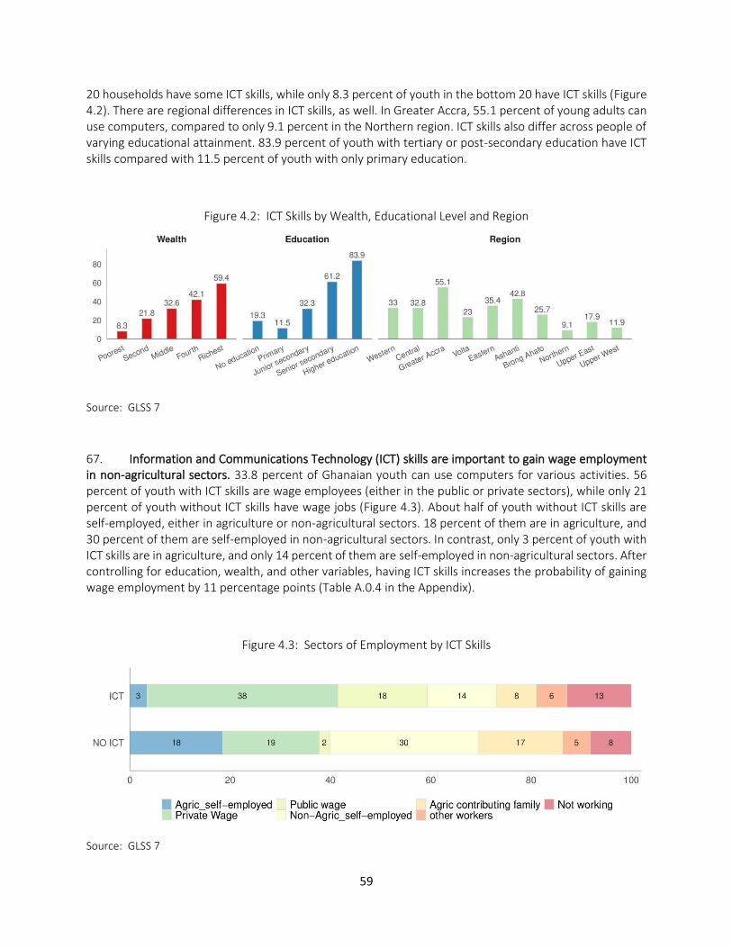
59
20 households have some ICT skills, while only 8.3 percent of youth in the bottom 20 have ICT skills (Figure 4.2). There are regional differences in ICT skills, as well. In Greater Accra, 55.1 percent of young adults can use computers, compared to only 9.1 percent in the Northern region. ICT skills also differ across people of varying educational attainment. 83.9 percent of youth with tertiary or post-secondary education have ICT skills compared with 11.5 percent of youth with only primary education.
Figure 4.2: ICT Skills by Wealth, Educational Level and Region
Source: GLSS 7
67. Information and Communications Technology (ICT) skills are important to gain wage employment in non-agricultural sectors. 33.8 percent of Ghanaian youth can use computers for various activities. 56 percent of youth with ICT skills are wage employees (either in the public or private sectors), while only 21 percent of youth without ICT skills have wage jobs (Figure 4.3). About half of youth without ICT skills are self-employed, either in agriculture or non-agricultural sectors. 18 percent of them are in agriculture, and 30 percent of them are self-employed in non-agricultural sectors. In contrast, only 3 percent of youth with ICT skills are in agriculture, and only 14 percent of them are self-employed in non-agricultural sectors. After controlling for education, wealth, and other variables, having ICT skills increases the probability of gaining wage employment by 11 percentage points (Table A.0.4 in the Appendix).
Figure 4.3: Sectors of Employment by ICT Skills
Source: GLSS 7
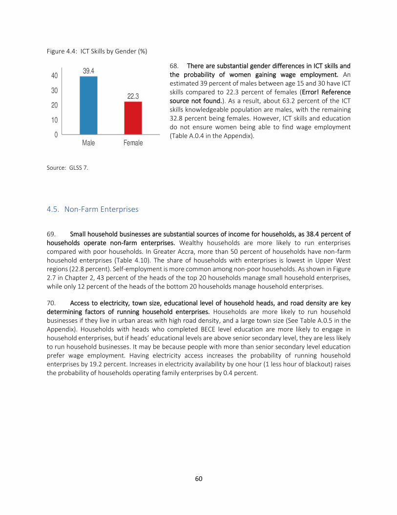
60
Figure 4.4: ICT Skills by Gender (%)
68. There are substantial gender differences in ICT skills and the probability of women gaining wage employment. An estimated 39 percent of males between age 15 and 30 have ICT skills compared to 22.3 percent of females (Error! Reference source not found.). As a result, about 63.2 percent of the ICT skills knowledgeable population are males, with the remaining 32.8 percent being females. However, ICT skills and education do not ensure women being able to find wage employment (Table A.0.4 in the Appendix).
Source: GLSS 7.
4.5. Non-Farm Enterprises
69. Small household businesses are substantial sources of income for households, as 38.4 percent of households operate non-farm enterprises. Wealthy households are more likely to run enterprises compared with poor households. In Greater Accra, more than 50 percent of households have non-farm household enterprises (Table 4.10). The share of households with enterprises is lowest in Upper West regions (22.8 percent). Self-employment is more common among non-poor households. As shown in Figure 2.7 in Chapter 2, 43 percent of the heads of the top 20 households manage small household enterprises, while only 12 percent of the heads of the bottom 20 households manage household enterprises.
70. Access to electricity, town size, educational level of household heads, and road density are key determining factors of running household enterprises. Households are more likely to run household businesses if they live in urban areas with high road density, and a large town size (See Table A.0.5 in the Appendix). Households with heads who completed BECE level education are more likely to engage in household enterprises, but if heads’ educational levels are above senior secondary level, they are less likely to run household businesses. It may be because people with more than senior secondary level education prefer wage employment. Having electricity access increases the probability of running household enterprises by 19.2 percent. Increases in electricity availability by one hour (1 less hour of blackout) raises the probability of households operating family enterprises by 0.4 percent.
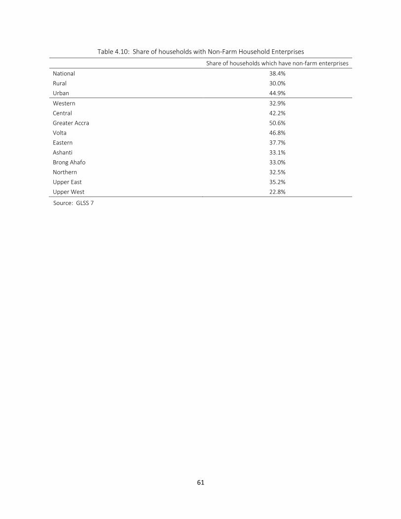
61
Table 4.10: Share of households with Non-Farm Household Enterprises
Share of households which have non-farm enterprises
National 38.4%
Rural 30.0%
Urban 44.9%
Western 32.9%
Central 42.2%
Greater Accra 50.6%
Volta 46.8%
Eastern 37.7%
Ashanti 33.1%
Brong Ahafo 33.0%
Northern 32.5%
Upper East 35.2%
Upper West 22.8%
Source: GLSS 7
62
5. Drivers of Poverty Dynamics
71. This chapter examines key factors that determined household’s chance of escaping poverty, and changes in their importance before and after 2012.
5.1. Poverty Dynamics
72. A slightly higher percentage of poor households escaped poverty between 2005 and 2012, compared with the period between 2012 and 2016. Synthetic panel data analysis is conducted to understand the factors that helped households escape poverty between 2005 and 2012, and 2012-2016 (Dang and Lanjouw 2013, Dang et al. 2014, Dang and Lanjouw 2015, Dang and Ianchovichina 2018).
73.
74. Table 5.1 shows higher percentages of the poor escaping poverty between 2005 and 2012, compared with the period between 2012 and 2016. Between 2005 and 2012, 39 percent of the poor escaped from poverty (
75.
76. Table 5.1). Between 2012 and 2016, 37 percent of the poor escaped poverty while 63 percent of the poor stayed poor. This suggests there was slightly higher mobility (higher probability of transition from poor to non-poor) between before 2012. The following factors are considered as potential determinants of household’s transition into and out of poverty: structural transformation, demographic changes, educational attainment, location, and climate change.
77. The sector of employment of the poor has a significant influence on the probability of escaping poverty. The chance of breaking out of poverty declined from 36.2 percentage points to 30.2 percentage points among farming households after 2012. Table 5.2 summarizes the probability of escaping poverty among poor households by sector. The likelihood of escaping poverty decreased among agricultural households after 2012. For the people engaged in manufacturing, the chance of escaping poverty increased from 45 to 48 percent after 2012.
78. The likelihood of escaping poverty dropped among households with heads with no education or less than primary school education after 2012. Table 5.3 shows that if household heads have no education, then the chance of breaking out of poverty declined from 30.5 percentage points to 23.2 percentage points after 2012. If household heads received less than primary school education, the probability of escaping poverty also declined.
79. The probability of poor households breaking out of poverty increased in all four wealthiest regions, while it decreased in all four poorest regions after 2012. In the Northern, Upper East, Upper West and Volta regions, the chance of escaping poverty declined. In the Upper East region, it declined by 15.9 percentage points from 35.3 percent to 19.4 percent. Similarly, the chance of escaping poverty decreased by 11.9 percentage points in the Northern region. In contrast, the probability of escaping poverty increased in all
63
four wealthiest regions; Greater Accra, Ashanti, Central and Eastern regions. In Eastern region, it increased by 9.3 percentage points.
Poor households are less likely to transition out of poverty if they live in areas with poor access to
electricity, market, severe droughts and high temperatures. Ecological conditions also impact the likelihood
of poor households escaping poverty.
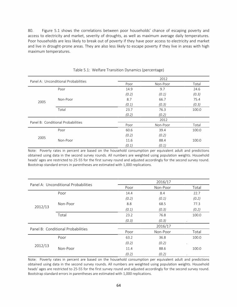
64
80. Figure 5.1 shows the correlations between poor households’ chance of escaping poverty and access to electricity and market, severity of droughts, as well as maximum average daily temperatures. Poor households are less likely to break out of poverty if they have poor access to electricity and market and live in drought-prone areas. They are also less likely to escape poverty if they live in areas with high maximum temperatures.
Table 5.1: Welfare Transition Dynamics (percentage)
Panel A: Unconditional Probabilities 2012
Poor Non-Poor Total
2005
Poor 14.9 9.7 24.6
(0.2) (0.1) (0.3)
Non-Poor 8.7 66.7 75.4
(0.1) (0.3) (0.3)
Total 23.7 76.3 100.0
(0.2) (0.2)
Panel B: Conditional Probabilities 2012
Poor Non-Poor Total
2005
Poor 60.6 39.4 100.0
(0.2) (0.2)
Non-Poor 11.6 88.4 100.0
(0.1) (0.1)
Note: Poverty rates in percent are based on the household consumption per equivalent adult and predictions obtained using data in the second survey rounds. All numbers are weighted using population weights. Household heads' ages are restricted to 25-55 for the first survey round and adjusted accordingly for the second survey round. Bootstrap standard errors in parentheses are estimated with 1,000 replications.
Panel A: Unconditional Probabilities 2016/17
Poor Non-Poor Total
2012/13
Poor 14.4 8.4 22.7
(0.2) (0.1) (0.2)
Non-Poor 8.8 68.5 77.3
(0.1) (0.3) (0.2)
Total 23.2 76.8 100.0
(0.3) (0.3) .
Panel B: Conditional Probabilities 2016/17
Poor Non-Poor Total
2012/13
Poor 63.2 36.8 100.0
(0.2) (0.2) .
Non-Poor 11.4 88.6 100.0
(0.2) (0.2) .
Note: Poverty rates in percent are based on the household consumption per equivalent adult and predictions obtained using data in the second survey rounds. All numbers are weighted using population weights. Household heads' ages are restricted to 25-55 for the first survey round and adjusted accordingly for the second survey round. Bootstrap standard errors in parentheses are estimated with 1,000 replications.

65
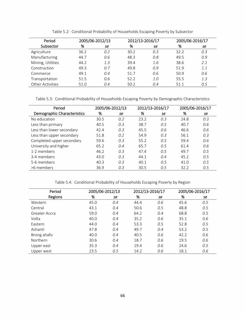
66
Table 5.2: Conditional Probability of Households Escaping Poverty by Subsector
Period 2005/06-2012/13 2012/13-2016/17 2005/06-2016/17 Subsector % se % se % se
Agriculture 36.2 0.2 30.2 0.3 32.2 0.3 Manufacturing 44.7 0.6 48.3 0.8 49.5 0.9 Mining, Utilities 44.2 1.3 39.4 1.6 38.6 2.1 Construction 49.3 0.7 49.8 0.9 51.9 1.1 Commerce 49.1 0.4 51.7 0.6 50.9 0.6 Transportation 51.5 0.6 52.2 1.0 55.5 1.3 Other Activities 51.0 0.4 50.2 0.4 51.1 0.5
Table 5.3: Conditional Probability of Households Escaping Poverty by Demographic Characteristics
Period 2005/06-2012/13 2012/13-2016/17 2005/06-2016/17 Demographic Characteristics % se % se % se
No education 30.5 0.2 23.2 0.3 24.8 0.3 Less than primary 40.5 0.3 38.7 0.5 40.7 0.6 Less than lower secondary 42.4 0.3 45.5 0.6 46.6 0.6 Less than upper secondary 51.8 0.2 54.9 0.3 56.1 0.3 Completed upper secondary 59.6 0.3 55.2 0.5 59.4 0.6 University and higher 65.2 0.4 65.7 0.5 61.4 0.6 1-2 members 46.2 0.3 47.4 0.5 49.7 0.5 3-4 members 43.0 0.3 44.1 0.4 45.2 0.5 5-6 members 40.3 0.3 40.1 0.5 41.0 0.5 >6 members 36.9 0.3 30.5 0.5 32.2 0.5
Table 5.4: Conditional Probability of Households Escaping Poverty by Region
Period 2005/06-2012/13 2012/13-2016/17 2005/06-2016/17 Regions % se % se % se
Western 45.0 0.4 44.4 0.6 45.6 0.5 Central 43.1 0.4 50.6 0.5 48.8 0.5 Greater Accra 59.0 0.4 64.2 0.4 68.8 0.5 Volta 40.0 0.4 35.2 0.6 35.1 0.6 Eastern 44.0 0.4 53.3 0.5 52.8 0.5 Ashanti 47.8 0.4 49.7 0.4 53.2 0.5 Brong ahafo 40.0 0.4 40.5 0.6 42.2 0.6 Northern 30.6 0.4 18.7 0.6 19.5 0.6 Upper east 35.3 0.4 19.4 0.6 24.6 0.5 Upper west 23.5 0.5 14.2 0.6 18.1 0.6
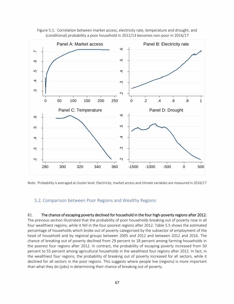
67
Figure 5.1: Correlation between market access, electricity rate, temperature and drought, and (conditional) probability a poor household in 2012/13 becomes non-poor in 2016/17
Note: Probability is averaged at cluster level. Electricity, market access and climate variables are measured in 2016/17
5.2. Comparison between Poor Regions and Wealthy Regions
81. The chance of escaping poverty declined for household in the four high-poverty regions after 2012. The previous section illustrated that the probability of poor households breaking out of poverty rose in all four wealthiest regions, while it fell in the four poorest regions after 2012. Table 5.5 shows the estimated percentage of households which broke out of poverty categorized by the subsector of employment of the head of household and by regional groups between 2005 and 2012 and between 2012 and 2016. The chance of breaking out of poverty declined from 29 percent to 18 percent among farming households in the poorest four regions after 2012. In contract, the probability of escaping poverty increased from 50 percent to 55 percent among agricultural households in the wealthiest four regions after 2012. In fact, in the wealthiest four regions, the probability of breaking out of poverty increased for all sectors, while it declined for all sectors in the poor regions. This suggests where people live (regions) is more important than what they do (jobs) in determining their chance of breaking out of poverty.
.3.4
.5.6
.7
Pro
bab
ility
of
exitin
g p
overt
y
0 50 100 150 200 250
Panel A: Market access
.2.3
.4.5
.6
0 .2 .4 .6 .8 1
Panel B: Electricity rate
.2.3
.4.5
.6
Pro
bab
ility
of
exitin
g p
overt
y
280 300 320 340 360
Panel C: Temperature
.2.3
.4.5
.6
-1500 -1000 -500 0 500
Panel D: Drought
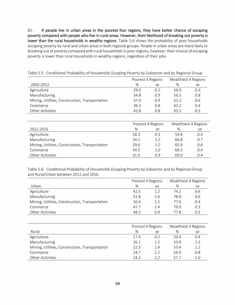
68
82. If people live in urban areas in the poorest four regions, they have better chance of escaping poverty compared with people who live in rural areas. However, their likelihood of breaking out poverty is lower than the rural households in wealthy regions. Table 5.6 shows the probability of poor households escaping poverty by rural and urban areas in both regional groups. People in urban areas are more likely to breaking out of poverty compared with rural households in poor regions, however, their chance of escaping poverty is lower than rural households in wealthy regions, regardless of their jobs.
Table 5.5: Conditional Probability of Households Escaping Poverty by Subsector and by Regional Group
Poorest 4 Regions Wealthiest 4 Regions 2005-2012 % se % se
Agriculture 29.0 0.2 50.0 0.3 Manufacturing 34.8 0.9 56.5 0.8 Mining, Utilities, Construction, Transportation 37.0 0.9 61.2 0.6 Commerce 36.3 0.8 63.2 0.4 Other Activities 42.8 0.8 65.5 0.5
Poorest 4 Regions Wealthiest 4 Regions 2012-2016 % se % se
Agriculture 18.3 0.3 54.8 0.4 Manufacturing 34.1 1.2 66.8 0.7 Mining, Utilities, Construction, Transportation 29.6 1.2 65.9 0.6 Commerce 34.5 1.0 69.3 0.4 Other Activities 31.5 0.9 69.0 0.4
Table 5.6: Conditional Probability of Households Escaping Poverty by Subsector and by Regional Group and Rural/Urban between 2012 and 2016
Poorest 4 Regions Wealthiest 4 Regions Urban % se % se
Agriculture 42.5 1.2 74.2 0.6 Manufacturing 51.8 1.6 78.9 0.6 Mining, Utilities, Construction, Transportation 50.4 1.5 77.6 0.4 Commerce 47.7 1.4 79.0 0.3 Other Activities 48.3 0.9 77.8 0.3
Poorest 4 Regions Wealthiest 4 Regions Rural % se % se
Agriculture 17.4 0.2 50.4 0.4 Manufacturing 26.1 1.5 53.9 1.5 Mining, Utilities, Construction, Transportation 22.3 1.4 53.4 1.1 Commerce 24.7 1.1 56.9 0.8 Other Activities 24.2 1.2 57.7 1.0
69
6. Conclusion and Road Map for Policy Action
6.1. Summary of Findings
83. Since 2012, poverty deepened in lagging regions and spatial inequality widened, possibly due to the lack of structural transformation, low educational attainment, climate change, and natural disasters. Table 6.1 summarizes the results of analysis in each chapter. Regions that experienced large poverty reduction have went through employment shift from traditional sectors towards wage employment and non-agricultural self-employment. People engaged in manufacturing, construction, commerce, transportation and other service activities had a higher probability of breaking out of poverty, especially after 2012, while agricultural households had a low chance of escaping poverty. Educational attainment and small household size brought a better prospect of escaping poverty to households. Educational attainment is particularly important for women who suffer from gender discrimination in wages. Poor households are less likely to transition out of poverty if they live in areas with severe droughts and high temperatures.
84. In rural areas of the poor four regions, farming population increased, and the poverty rates among farmers rose between 2012 and 2016. Agricultural population in rural areas in four poor regions comprise a large proportion of the poor in the country. Agricultural population increased and non-farming population declined in rural areas in these poor four regions. The poverty rate among farmers increased by 9 percent, 16 percent, 12 percent and 2 percent in rural Volta, Northern, Upper East and Upper West regions, respectively between 2012 and 2016. This is consistent with the observations that poverty deepened in these regions, and within-regional inequality widened.
85. The most critical factor seems to be lack of jobs in non-agricultural sectors and economic opportunities for the poor, low farming income, and inadequate infrastructure and quality of services, including education, in deprived regions. The next sections propose pathways toward pro-poor growth through creation of opportunities for the poor in the deprived regions, increased agricultural production, reallocation of government resources to poor regions, and investment on human capital development and digital economy. The last section discusses the importance of reforming the social protection programs to meet the new challenges arising from the COVID-19 outbreak.
Table 6.1: Summary of Analysis
Chapter 1. Introduction
Ghana achieved significant economic growth and poverty reduction, but the rate of poverty reduction slowed in recent years and became insignificant after 2012.
Regional inequality widened, as poor regions experienced rising poverty, while wealthy regions achieved further poverty reduction. In addition, inequality within regions intensified in deprived areas.
Ghana experienced dramatic shifts in labor from agriculture to services, especially in regions which experienced greater poverty reduction.
Industry has become the key driver of economic growth since the discovery of oil in late 2000s.
70
Chapter 2. Poverty and Inequality
Ghana achieved the first Millennium Development Goal (MDG) of reducing poverty by more than half between 1991 and 2012. However, poverty declined by only 0.8 percent and inequality increased between 2012 and 2016.
The severity of poverty intensified as consumption among the extreme poor sharply declined. Between 2012 and 2016, the bottom 30 percent experienced exceptionally low consumption growth, and the bottom 10 percent suffered from negative consumption growth.
Most poor households continue to be in agricultural self-employment, while the non-poor are more likely to be engaged in non-agricultural self-employment or wage employment.
The quality of education is extremely low, particularly among the poor. Children in poor households have lower academic performance, and are more disadvantaged by poor learning environments.
The disparity in school enrollment between rich and poor has shifted from primary to senior secondary school.
Among teenage girls, poverty and pregnancy are the major factors lowering school enrollment.
Ghana made substantial progress in improving access to electricity and mobile phones, and the use of mobile money among poor households increased.
Ghana’s investment in social protection programs is low. LEAP, Ghana’s flagship cash transfer program, seems to be well targeting the poor, but the amount of transfers is not enough to help people break out of poverty.
Chapter 3. Geospatial Analysis of Poverty
Regional differences in average consumption growth led to widening regional inequality.
The extreme poor in poor regions experienced a sharp drop in consumption since 2012.
The disparity in school enrollment between rich and poor regions is particularly large at junior and senior secondary school. Large gaps in senior secondary school enrollment across regions are partly driven by significant regional differences in academic performance.
People in deprived regions are disadvantaged by the limited provision of public services and infrastructure, such as access to markets, roads, and electricity.
Spatial variation in poverty is further exacerbated by unfavorable weather and ecological conditions in poor regions.
Lack of structural transformation, natural disasters, low educational attainment, and large household size slowed poverty reduction in underprivileged areas.
Chapter 4. Structural Transformation, Jobs and Skills
71
Between 1991 and 2005, Ghana’s main driver of economic growth was the service sector through its high productivity increases.
Overemployment in agriculture continued to drive down economic growth.
Ghana’s main driver of economic growth became industry due to oil discovery in 2007. Industry’s high per-capita productivity growth, rather than changes in employment, had positive impacts on growth.
There were substantial increases in income and employment due to oil production for wealthy households, but it neither increased consumption nor created economic opportunities for the poor.
Education and ICT skills are key determining factors for gaining wage jobs. However, women need to attain at least BECE to benefit from educational investment. Returns to tertiary education is substantively high for women, suggesting a large benefit for girls to pursue tertiary education.
There are substantial gender differences in ICT skills and the probability of women gaining wage employment.
Access to electricity, town size, educational level of household heads, and road density are key determining factors of operating household enterprises.
Chapter 5. Drivers of Poverty Dynamics
Households with heads engaged in manufacturing, construction, commerce, transportation, and other service activities were more likely to have broken out of poverty, especially before 2012.
Households with heads with higher education and small household size had a higher chance of getting out of poverty.
The probability of poor households breaking out of poverty rose in all four wealthiest regions, while it reduced in all four poorest regions after 2012.
Poor households are less likely to transition out of poverty if they live in areas with poor access to electricity and market, severe droughts and high temperatures.
6.2. Pathways Toward Pro-Poor Growth
86. The recent oil sector-driven growth did not benefit the poor. Between 1991 and 2005, Ghana’s main driver of economic growth was the service sector. The service sector continued to raise its share of labor in the economy, as many workers moved into the service sector from agriculture. However, due to the launch of oil production in 2010, industry became Ghana’s main driver of economic growth. In contrast to the service sector, which raised its labor share in the economy, the labor share in industry did not rise while the sector increased per capita productivity. There were substantial surges in income and employment due to oil production for wealthy households, but it neither improved consumption nor created opportunities for the poor.
72
87. Improvement in agricultural productivity is a key pathway to reducing poverty, especially given the large portion of the poor engaged in subsistence agriculture. Poverty deepened in the northern three regions and Volta region, and the majority of the poor are engaged in agriculture. Studies suggest that high prices of input, education of farmers, access to agricultural extensions, good roads and credit are major factors hindering agricultural productivity growth in northern regions (Wongnaa and Awunyo-Vitor 2018, Wongnaa et al. 2019). Due to poor road infrastructure, farmers are often not able to acquire farm inputs like fertilizer and agrochemicals, making it difficult for them to control disease infection (Adams 2017). Moreover, farmers face a long dry season of about eight months. During the dry season, most of them are jobless due to lack of opportunities. People who participate in the labor market in search of income opportunities are not necessarily better off compared with the people who engage in agriculture only (Tsiboe et al. 2016). Therefore, investment on irrigation is critical for the northern farmers to be able to continue agricultural production during the dry season. A study suggests that if farmers can engage in agricultural production during the dry season, their consumption can dramatically improve (Adams 2017). Investment on road is also critical to improve access to market and inputs for production.
88. Even though structural transformation did not occur in poor northern regions, there was significant poverty reduction among people employed in services and manufacturing in urban areas. The share of people engaged in commerce and other service sectors increased, and their poverty rates declined in urban areas except in the four poor regions (Northern, Upper East, Upper West and Volta regions). In these regions, the share of people engaged in non-agricultural sectors declined. However, the poverty rates among people engaged in services and manufacturing dramatically dropped in urban areas in the Upper East and Upper West regions. It suggests structural transformation can potentially alleviate poverty if more jobs in services and manufacturing are created in targeted urban areas in these deprived regions.
6.3. Investing on Education
89. Improving the quality and attainment of higher levels of education of poor children and youth will improve their opportunities in the labor market. The analytical results presented in Chapters 4 and 5 indicate educational attainment and ICT skills are key determining factors for gaining jobs in non-agricultural sectors. There is a high education premium, especially for girls who complete BECE and tertiary education. However, as discussed in Chapter 2, children in poor households have lower academic performance than children in wealthier households and are more disadvantaged by poor learning environments. This does not only lower their chance of completing BECE and entering senior secondary school, but also can have consequences for the next generation. The Government can have a large impact on the trajectory of poverty by adopting policies that improve educational and learning outcomes for children in poor households and in lagging regions as well as for girls. International experience suggests that effective measures include supplemental instruction to children falling behind and improvement in school governance and teacher accountability are effective measures to enhance the quality of education (Glewwe and Muralidharan 2016).
90. The Free Senior Secondary School (SSS) program is expected to improve senior secondary school enrollment. The government of Ghana recognizes that it is through education that knowledge and skills are acquired to build the human capital necessary for poverty alleviation and shared prosperity. The Free Senior Secondary School (SSS) program, one of its flagship programs and initiatives of the current government, was launched in September 2017. As the data collection for GLSS 7 took place before the introduction of
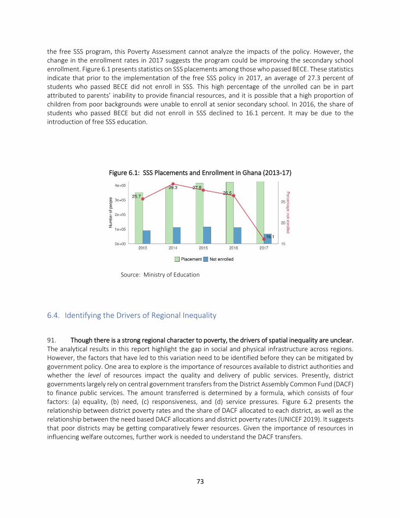
73
the free SSS program, this Poverty Assessment cannot analyze the impacts of the policy. However, the change in the enrollment rates in 2017 suggests the program could be improving the secondary school enrollment. Figure 6.1 presents statistics on SSS placements among those who passed BECE. These statistics indicate that prior to the implementation of the free SSS policy in 2017, an average of 27.3 percent of students who passed BECE did not enroll in SSS. This high percentage of the unrolled can be in part attributed to parents’ inability to provide financial resources, and it is possible that a high proportion of children from poor backgrounds were unable to enroll at senior secondary school. In 2016, the share of students who passed BECE but did not enroll in SSS declined to 16.1 percent. It may be due to the introduction of free SSS education.
Figure 6.1: SSS Placements and Enrollment in Ghana (2013-17)
Source: Ministry of Education
6.4. Identifying the Drivers of Regional Inequality
91. Though there is a strong regional character to poverty, the drivers of spatial inequality are unclear. The analytical results in this report highlight the gap in social and physical infrastructure across regions. However, the factors that have led to this variation need to be identified before they can be mitigated by government policy. One area to explore is the importance of resources available to district authorities and whether the level of resources impact the quality and delivery of public services. Presently, district governments largely rely on central government transfers from the District Assembly Common Fund (DACF) to finance public services. The amount transferred is determined by a formula, which consists of four factors: (a) equality, (b) need, (c) responsiveness, and (d) service pressures. Figure 6.2 presents the relationship between district poverty rates and the share of DACF allocated to each district, as well as the relationship between the need based DACF allocations and district poverty rates (UNICEF 2019). It suggests that poor districts may be getting comparatively fewer resources. Given the importance of resources in influencing welfare outcomes, further work is needed to understand the DACF transfers.
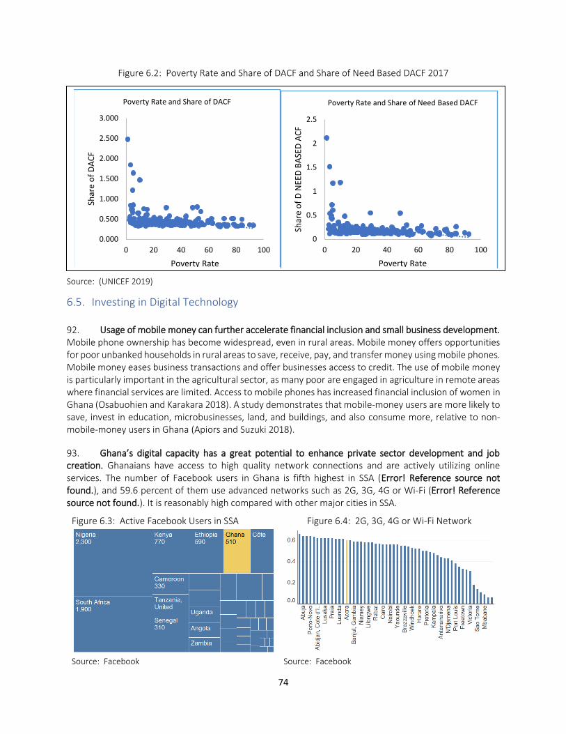
74
Figure 6.2: Poverty Rate and Share of DACF and Share of Need Based DACF 2017
Source: (UNICEF 2019)
6.5. Investing in Digital Technology
92. Usage of mobile money can further accelerate financial inclusion and small business development. Mobile phone ownership has become widespread, even in rural areas. Mobile money offers opportunities for poor unbanked households in rural areas to save, receive, pay, and transfer money using mobile phones. Mobile money eases business transactions and offer businesses access to credit. The use of mobile money is particularly important in the agricultural sector, as many poor are engaged in agriculture in remote areas where financial services are limited. Access to mobile phones has increased financial inclusion of women in Ghana (Osabuohien and Karakara 2018). A study demonstrates that mobile-money users are more likely to save, invest in education, microbusinesses, land, and buildings, and also consume more, relative to non-mobile-money users in Ghana (Apiors and Suzuki 2018).
93. Ghana’s digital capacity has a great potential to enhance private sector development and job creation. Ghanaians have access to high quality network connections and are actively utilizing online services. The number of Facebook users in Ghana is fifth highest in SSA (Error! Reference source not found.), and 59.6 percent of them use advanced networks such as 2G, 3G, 4G or Wi-Fi (Error! Reference source not found.). It is reasonably high compared with other major cities in SSA.
Figure 6.3: Active Facebook Users in SSA Figure 6.4: 2G, 3G, 4G or Wi-Fi Network
Source: Facebook
Source: Facebook
0.000
0.500
1.000
1.500
2.000
2.500
3.000
0 20 40 60 80 100
Shar
e o
f D
AC
F
Poverty Rate
Poverty Rate and Share of DACF
0
0.5
1
1.5
2
2.5
0 20 40 60 80 100
Shar
e o
f D
NEE
D B
ASE
D A
CF
Poverty Rate
Poverty Rate and Share of Need Based DACF
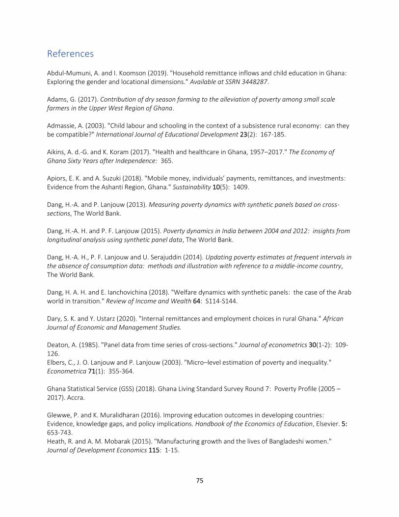
75
References
Abdul-Mumuni, A. and I. Koomson (2019). "Household remittance inflows and child education in Ghana: Exploring the gender and locational dimensions." Available at SSRN 3448287. Adams, G. (2017). Contribution of dry season farming to the alleviation of poverty among small scale farmers in the Upper West Region of Ghana. Admassie, A. (2003). "Child labour and schooling in the context of a subsistence rural economy: can they be compatible?" International Journal of Educational Development 23(2): 167-185. Aikins, A. d.-G. and K. Koram (2017). "Health and healthcare in Ghana, 1957–2017." The Economy of Ghana Sixty Years after Independence: 365. Apiors, E. K. and A. Suzuki (2018). "Mobile money, individuals’ payments, remittances, and investments: Evidence from the Ashanti Region, Ghana." Sustainability 10(5): 1409. Dang, H.-A. and P. Lanjouw (2013). Measuring poverty dynamics with synthetic panels based on cross-sections, The World Bank. Dang, H.-A. H. and P. F. Lanjouw (2015). Poverty dynamics in India between 2004 and 2012: insights from longitudinal analysis using synthetic panel data, The World Bank. Dang, H.-A. H., P. F. Lanjouw and U. Serajuddin (2014). Updating poverty estimates at frequent intervals in the absence of consumption data: methods and illustration with reference to a middle-income country, The World Bank. Dang, H. A. H. and E. Ianchovichina (2018). "Welfare dynamics with synthetic panels: the case of the Arab world in transition." Review of Income and Wealth 64: S114-S144. Dary, S. K. and Y. Ustarz (2020). "Internal remittances and employment choices in rural Ghana." African Journal of Economic and Management Studies. Deaton, A. (1985). "Panel data from time series of cross-sections." Journal of econometrics 30(1-2): 109-126. Elbers, C., J. O. Lanjouw and P. Lanjouw (2003). "Micro–level estimation of poverty and inequality." Econometrica 71(1): 355-364. Ghana Statistical Service (GSS) (2018). Ghana Living Standard Survey Round 7: Poverty Profile (2005 – 2017). Accra. Glewwe, P. and K. Muralidharan (2016). Improving education outcomes in developing countries: Evidence, knowledge gaps, and policy implications. Handbook of the Economics of Education, Elsevier. 5: 653-743. Heath, R. and A. M. Mobarak (2015). "Manufacturing growth and the lives of Bangladeshi women." Journal of Development Economics 115: 1-15.
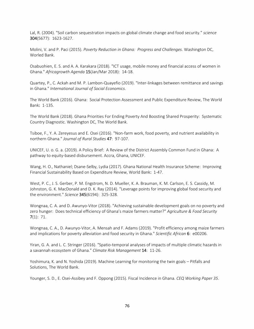
76
Lal, R. (2004). "Soil carbon sequestration impacts on global climate change and food security." science 304(5677): 1623-1627. Molini, V. and P. Paci (2015). Poverty Reduction in Ghana: Progress and Challenges. Washington DC, Worled Bank. Osabuohien, E. S. and A. A. Karakara (2018). "ICT usage, mobile money and financial access of women in Ghana." Africagrowth Agenda 15(Jan/Mar 2018): 14-18. Quartey, P., C. Ackah and M. P. Lambon-Quayefio (2019). "Inter-linkages between remittance and savings in Ghana." International Journal of Social Economics. The World Bank (2016). Ghana: Social Protection Assessment and Public Expenditure Review, The World Bank: 1-135. The World Bank (2018). Ghana Priorities For Ending Poverty And Boosting Shared Prosperity: Systematic Country Diagnostic. Washington DC, The World Bank. Tsiboe, F., Y. A. Zereyesus and E. Osei (2016). "Non-farm work, food poverty, and nutrient availability in northern Ghana." Journal of Rural Studies 47: 97-107. UNICEF, U. o. G. a. (2019). A Policy Brief: A Review of the District Assembly Common Fund in Ghana: A pathway to equity-based disbursement. Accra, Ghana, UNICEF. Wang, H. O., Nathaniel; Dsane-Selby, Lydia (2017). Ghana National Health Insurance Scheme: Improving Financial Sustainability Based on Expenditure Review, World Bank: 1-47. West, P. C., J. S. Gerber, P. M. Engstrom, N. D. Mueller, K. A. Brauman, K. M. Carlson, E. S. Cassidy, M. Johnston, G. K. MacDonald and D. K. Ray (2014). "Leverage points for improving global food security and the environment." Science 345(6194): 325-328. Wongnaa, C. A. and D. Awunyo-Vitor (2018). "Achieving sustainable development goals on no poverty and zero hunger: Does technical efficiency of Ghana’s maize farmers matter?" Agriculture & Food Security 7(1): 71. Wongnaa, C. A., D. Awunyo-Vitor, A. Mensah and F. Adams (2019). "Profit efficiency among maize farmers and implications for poverty alleviation and food security in Ghana." Scientific African 6: e00206. Yiran, G. A. and L. C. Stringer (2016). "Spatio-temporal analyses of impacts of multiple climatic hazards in a savannah ecosystem of Ghana." Climate Risk Management 14: 11-26. Yoshimura, K. and N. Yoshida (2019). Machine Learning for monitoring the twin goals – Pitfalls and Solutions, The World Bank. Younger, S. D., E. Osei-Assibey and F. Oppong (2015). Fiscal Incidence in Ghana. CEQ Working Paper 35.
77
Appendix
A. 1. Regional Poverty Measurements under Alternative Methods
Following the methodologies used for GLSS 5 and 6, the consumption expenditure for the food backset of
2900 calories for adult equivalent was defined as the extreme poverty line (GH792.2 cedi in 2012 prices).
The national poverty line was constructed taking into account the basic expenditure of non-food items
(GH1,314 cedi in 2012 prices). Using a mixed deflator which combines the CPI for both food and non-food
items as well as weights for consumption items, an updated poverty line of GH1,760.8 cedi per adult
equivalent was estimated as the national poverty line in 2016. It is equivalent to GH1,314 cedi in 2012
prices.
The regional cost of living index was used to adjust relative costs of living across regions. The index reflects
the differences in the prices of goods and services with reference to the Greater Accra region in January
2017. The index allows for variation in prices over time as it uses January 2017 as a reference.
Housing cost is not included in the basic expenditure of non-food items, even though it is one of the
essential components of a household budget. Chen et al. (2020) shows that when the CPI price data is
used and housing costs are properly included as the basic household expenditure, the poverty rates in the
Upper East and Upper West regions are 61.1 percent and 78 percent, respectively. These alternative
estimated are higher than the national poverty rates by 6.3 percentage points and 7.1 percentage points,
respectively.
A. 2. Synthetic Panel Methods
This section provides an overview of the methods that construct synthetic panels developed by Dang et al. (2014) and Dang and Lanjouw (2013) in this appendix. Recent applications and further validations of the synthetic panel methods have been implemented for data from various countries in sub-Saharan African, as well as in the East Asia and Pacific, Europe and Central Asia, Latin America, South Asia, and Middle East and North Africa region (see Dang, Jolliffe, and Carletto (2019) and Dang (2020) for recent reviews).
Let xij be a vector of household characteristics observed in survey round j (j= 1 or 2) that are also observed in the other survey round for household i, i= 1,…, N. These household characteristics can include such time-invariant variables as ethnicity, religion, language, place of birth, parental education, and other time-varying household characteristics if retrospective questions about the round-1 values of such characteristics are asked in the second-round survey. To reduce spurious changes due to changes in household composition over time, we usually restrict the estimation samples to household heads in a certain age range, say 25 to 55, in the first cross section and adjust this age range accordingly in the second cross section. This restriction also helps ensure certain variables such as heads’ education attainment remains relatively stable over time (assuming most heads are finished with their schooling).6 This age range is usually used in traditional pseudo-panel analysis but can vary depending on the cultural and economic
6 While household heads may still increase their education achievement in theory, this rarely happens in practice.
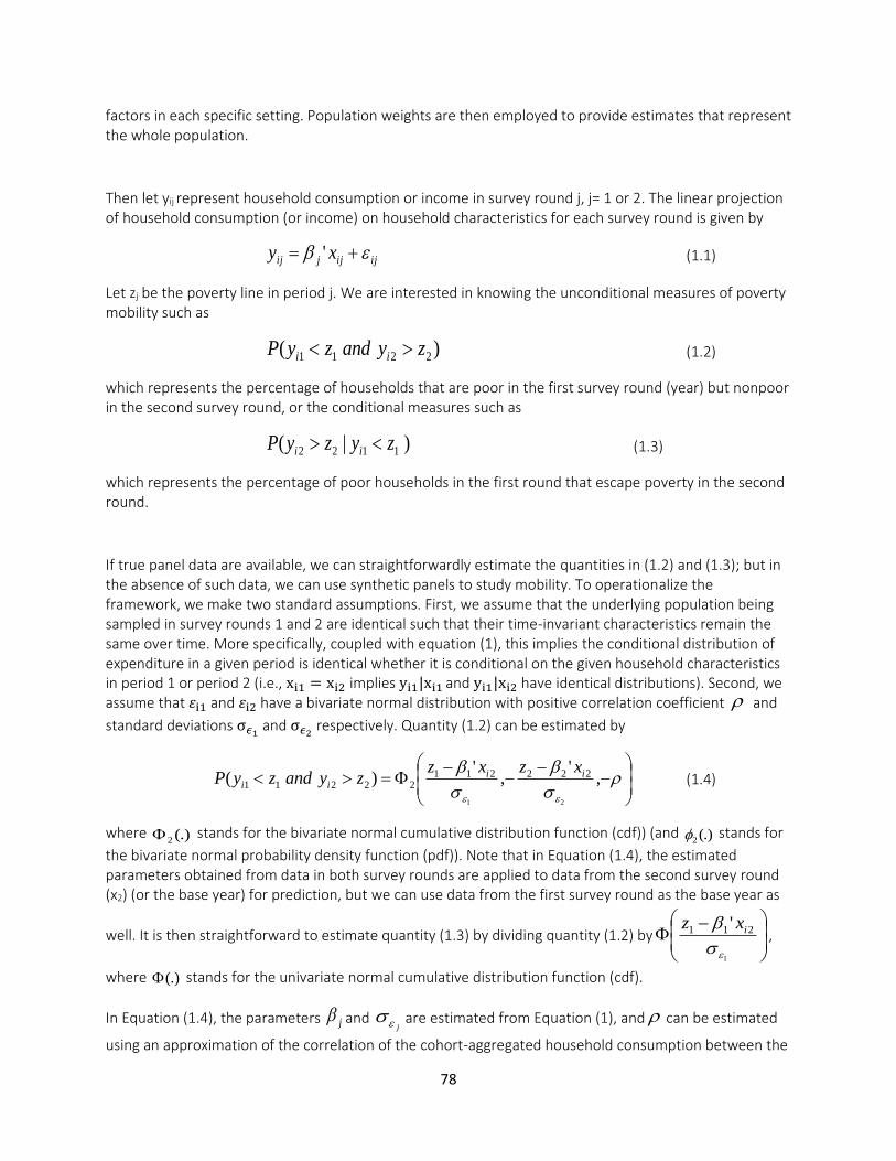
78
factors in each specific setting. Population weights are then employed to provide estimates that represent the whole population.
Then let yij represent household consumption or income in survey round j, j= 1 or 2. The linear projection of household consumption (or income) on household characteristics for each survey round is given by
ijijjij xy += ' (1.1)
Let zj be the poverty line in period j. We are interested in knowing the unconditional measures of poverty mobility such as
)( 2211 zyandzyP ii (1.2)
which represents the percentage of households that are poor in the first survey round (year) but nonpoor in the second survey round, or the conditional measures such as
)|( 1122 zyzyP ii (1.3)
which represents the percentage of poor households in the first round that escape poverty in the second round.
If true panel data are available, we can straightforwardly estimate the quantities in (1.2) and (1.3); but in the absence of such data, we can use synthetic panels to study mobility. To operationalize the framework, we make two standard assumptions. First, we assume that the underlying population being sampled in survey rounds 1 and 2 are identical such that their time-invariant characteristics remain the same over time. More specifically, coupled with equation (1), this implies the conditional distribution of expenditure in a given period is identical whether it is conditional on the given household characteristics in period 1 or period 2 (i.e., xi1 = xi2 implies yi1|xi1 and yi1|xi2 have identical distributions). Second, we assume that 𝜀i1 and 𝜀i2 have a bivariate normal distribution with positive correlation coefficient and
standard deviations σ𝜖1 and σ𝜖2
respectively. Quantity (1.2) can be estimated by
−
−−
−=
,'
,'
)(
21
22221122211
iiii
xzxzzyandzyP (1.4)
where (.)2 stands for the bivariate normal cumulative distribution function (cdf)) (and (.)2 stands for
the bivariate normal probability density function (pdf)). Note that in Equation (1.4), the estimated parameters obtained from data in both survey rounds are applied to data from the second survey round (x2) (or the base year) for prediction, but we can use data from the first survey round as the base year as
well. It is then straightforward to estimate quantity (1.3) by dividing quantity (1.2) by
−
1
211 '
ixz,
where (.) stands for the univariate normal cumulative distribution function (cdf).
In Equation (1.4), the parameters j and j
are estimated from Equation (1), and can be estimated
using an approximation of the correlation of the cohort-aggregated household consumption between the
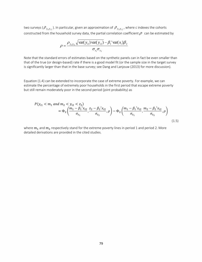
79
two surveys (21 cc yy ). In particular, given an approximation of
21 cc yy , where c indexes the cohorts
constructed from the household survey data, the partial correlation coefficient can be estimated by
21
21 2121 )var(')var()var(
iiiyy xyyii
−=
Note that the standard errors of estimates based on the synthetic panels can in fact be even smaller than that of the true (or design-based) rate if there is a good model fit (or the sample size in the target survey is significantly larger than that in the base survey; see Dang and Lanjouw (2013) for more discussion).
Equation (1.4) can be extended to incorporate the case of extreme poverty. For example, we can estimate the percentage of extremely poor households in the first period that escape extreme poverty but still remain moderately poor in the second period (joint probability) as
𝑃(𝑦𝑖1 < 𝑚1 𝑎𝑛𝑑 𝑚2 < 𝑦𝑖2 < 𝑧2)
= 2 (𝑚1 − 𝛽1′𝑥𝑖2
𝜎𝜀1
,𝑧2 − 𝛽2′𝑥𝑖2
𝜎𝜀2
, 𝜌) − 2 (𝑚1 − 𝛽1′𝑥𝑖2
𝜎𝜀1
,𝑚2 − 𝛽2′𝑥𝑖2
𝜎𝜀2
, 𝜌)
(1.5)
where 𝑚1 and 𝑚2 respectively stand for the extreme poverty lines in period 1 and period 2. More detailed derivations are provided in the cited studies.
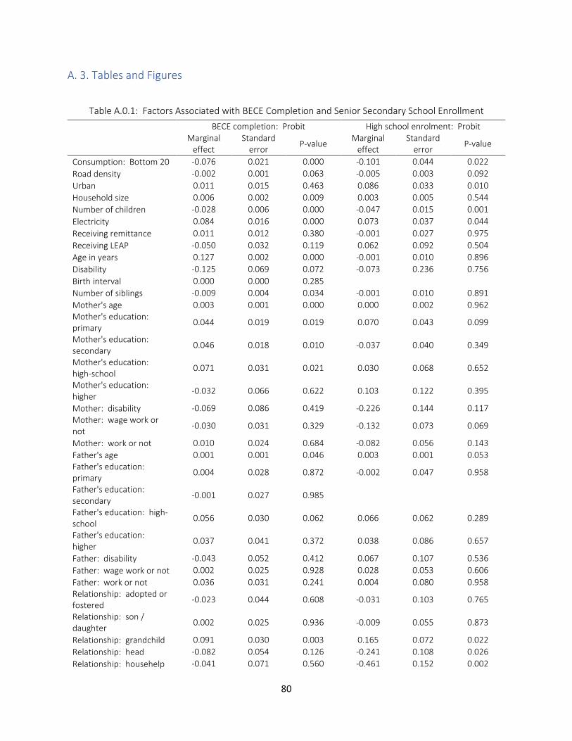
80
A. 3. Tables and Figures
Table A.0.1: Factors Associated with BECE Completion and Senior Secondary School Enrollment
BECE completion: Probit High school enrolment: Probit
Marginal effect
Standard error
P-value Marginal
effect Standard
error P-value
Consumption: Bottom 20 -0.076 0.021 0.000 -0.101 0.044 0.022
Road density -0.002 0.001 0.063 -0.005 0.003 0.092
Urban 0.011 0.015 0.463 0.086 0.033 0.010
Household size 0.006 0.002 0.009 0.003 0.005 0.544
Number of children -0.028 0.006 0.000 -0.047 0.015 0.001
Electricity 0.084 0.016 0.000 0.073 0.037 0.044
Receiving remittance 0.011 0.012 0.380 -0.001 0.027 0.975
Receiving LEAP -0.050 0.032 0.119 0.062 0.092 0.504
Age in years 0.127 0.002 0.000 -0.001 0.010 0.896
Disability -0.125 0.069 0.072 -0.073 0.236 0.756
Birth interval 0.000 0.000 0.285
Number of siblings -0.009 0.004 0.034 -0.001 0.010 0.891
Mother's age 0.003 0.001 0.000 0.000 0.002 0.962
Mother's education: primary
0.044 0.019 0.019 0.070 0.043 0.099
Mother's education: secondary
0.046 0.018 0.010 -0.037 0.040 0.349
Mother's education: high-school
0.071 0.031 0.021 0.030 0.068 0.652
Mother's education: higher
-0.032 0.066 0.622 0.103 0.122 0.395
Mother: disability -0.069 0.086 0.419 -0.226 0.144 0.117
Mother: wage work or not
-0.030 0.031 0.329 -0.132 0.073 0.069
Mother: work or not 0.010 0.024 0.684 -0.082 0.056 0.143
Father's age 0.001 0.001 0.046 0.003 0.001 0.053
Father's education: primary
0.004 0.028 0.872 -0.002 0.047 0.958
Father's education: secondary
-0.001 0.027 0.985
Father's education: high-school
0.056 0.030 0.062 0.066 0.062 0.289
Father's education: higher
0.037 0.041 0.372 0.038 0.086 0.657
Father: disability -0.043 0.052 0.412 0.067 0.107 0.536
Father: wage work or not 0.002 0.025 0.928 0.028 0.053 0.606
Father: work or not 0.036 0.031 0.241 0.004 0.080 0.958
Relationship: adopted or fostered
-0.023 0.044 0.608 -0.031 0.103 0.765
Relationship: son / daughter
0.002 0.025 0.936 -0.009 0.055 0.873
Relationship: grandchild 0.091 0.030 0.003 0.165 0.072 0.022
Relationship: head -0.082 0.054 0.126 -0.241 0.108 0.026
Relationship: househelp -0.041 0.071 0.560 -0.461 0.152 0.002
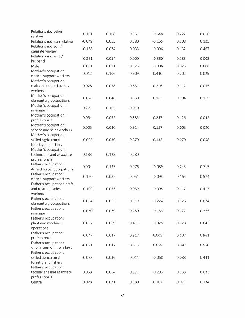
81
Relationship: other relative
-0.101 0.108 0.351 -0.548 0.227 0.016
Relationship: non relative -0.049 0.055 0.380 -0.165 0.108 0.125
Relationship: son / daughter-in-law
-0.158 0.074 0.033 -0.096 0.132 0.467
Relationship: wife / husband
-0.231 0.054 0.000 -0.560 0.185 0.003
Male -0.001 0.011 0.925 -0.006 0.025 0.806
Mother's occupation: clerical support workers
0.012 0.106 0.909 0.440 0.202 0.029
Mother's occupation: craft and related trades workers
0.028 0.058 0.631 0.216 0.112 0.055
Mother's occupation: elementary occupations
-0.028 0.048 0.560 0.163 0.104 0.115
Mother's occupation: managers
0.271 0.105 0.010
Mother's occupation: professionals
0.054 0.062 0.385 0.257 0.126 0.042
Mother's occupation: service and sales workers
0.003 0.030 0.914 0.157 0.068 0.020
Mother's occupation: skilled agricultural forestry and fishery
-0.005 0.030 0.870 0.133 0.070 0.058
Mother's occupation: technicians and associate professionals
0.133 0.123 0.280
Father's occupation: Armed forces occupations
0.004 0.135 0.976 -0.089 0.243 0.715
Father's occupation: clerical support workers
-0.160 0.082 0.051 -0.093 0.165 0.574
Father's occupation: craft and related trades workers
-0.109 0.053 0.039 -0.095 0.117 0.417
Father's occupation: elementary occupations
-0.054 0.055 0.319 -0.224 0.126 0.074
Father's occupation: managers
-0.060 0.079 0.450 -0.153 0.172 0.375
Father's occupation: plant and machine operations
-0.057 0.069 0.411 -0.025 0.128 0.843
Father's occupation: professionals
-0.047 0.047 0.317 0.005 0.107 0.961
Father's occupation: service and sales workers
-0.021 0.042 0.615 0.058 0.097 0.550
Father's occupation: skilled agricultural forestry and fishery
-0.088 0.036 0.014 -0.068 0.088 0.441
Father's occupation: technicians and associate professionals
0.058 0.064 0.371 -0.293 0.138 0.033
Central 0.028 0.031 0.380 0.107 0.071 0.134
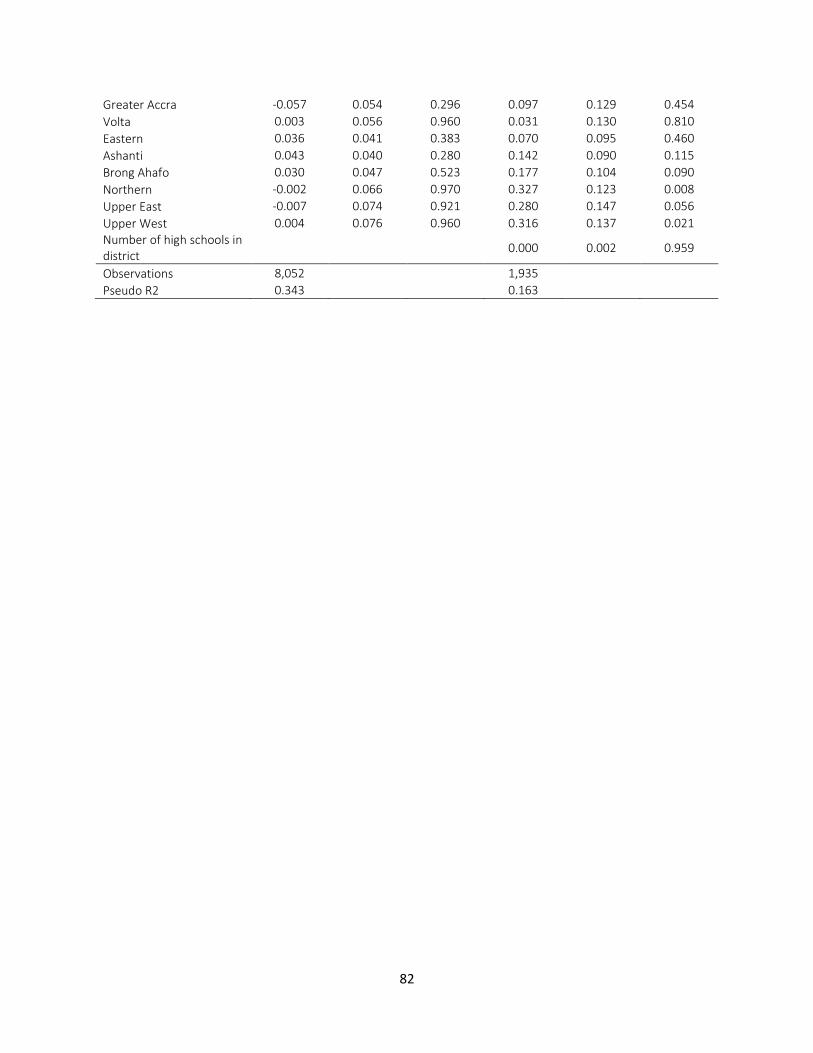
82
Greater Accra -0.057 0.054 0.296 0.097 0.129 0.454
Volta 0.003 0.056 0.960 0.031 0.130 0.810
Eastern 0.036 0.041 0.383 0.070 0.095 0.460
Ashanti 0.043 0.040 0.280 0.142 0.090 0.115
Brong Ahafo 0.030 0.047 0.523 0.177 0.104 0.090
Northern -0.002 0.066 0.970 0.327 0.123 0.008
Upper East -0.007 0.074 0.921 0.280 0.147 0.056
Upper West 0.004 0.076 0.960 0.316 0.137 0.021
Number of high schools in district
0.000 0.002 0.959
Observations 8,052 1,935
Pseudo R2 0.343 0.163
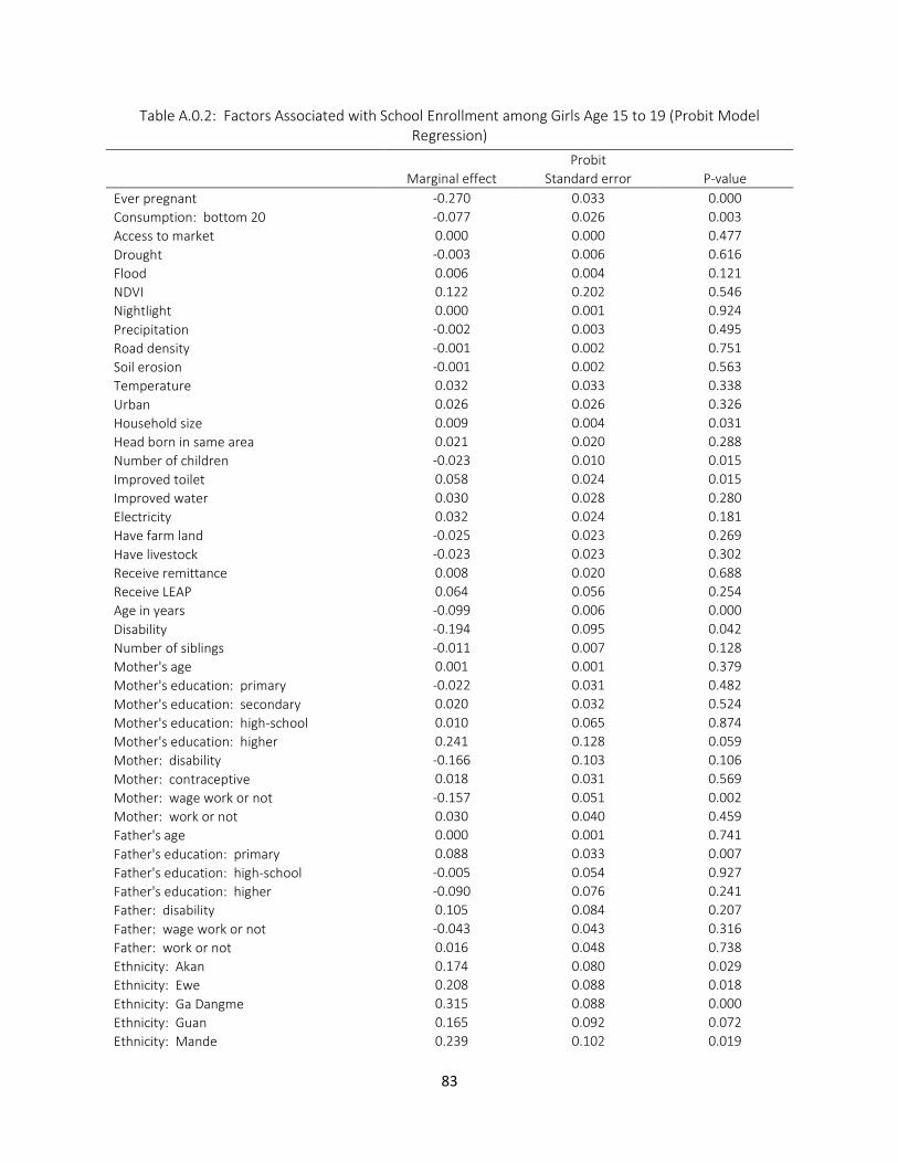
83
Table A.0.2: Factors Associated with School Enrollment among Girls Age 15 to 19 (Probit Model Regression)
Probit
Marginal effect Standard error P-value
Ever pregnant -0.270 0.033 0.000
Consumption: bottom 20 -0.077 0.026 0.003
Access to market 0.000 0.000 0.477
Drought -0.003 0.006 0.616
Flood 0.006 0.004 0.121
NDVI 0.122 0.202 0.546
Nightlight 0.000 0.001 0.924
Precipitation -0.002 0.003 0.495
Road density -0.001 0.002 0.751
Soil erosion -0.001 0.002 0.563
Temperature 0.032 0.033 0.338
Urban 0.026 0.026 0.326
Household size 0.009 0.004 0.031
Head born in same area 0.021 0.020 0.288
Number of children -0.023 0.010 0.015
Improved toilet 0.058 0.024 0.015
Improved water 0.030 0.028 0.280
Electricity 0.032 0.024 0.181
Have farm land -0.025 0.023 0.269
Have livestock -0.023 0.023 0.302
Receive remittance 0.008 0.020 0.688
Receive LEAP 0.064 0.056 0.254
Age in years -0.099 0.006 0.000
Disability -0.194 0.095 0.042
Number of siblings -0.011 0.007 0.128
Mother's age 0.001 0.001 0.379
Mother's education: primary -0.022 0.031 0.482
Mother's education: secondary 0.020 0.032 0.524
Mother's education: high-school 0.010 0.065 0.874
Mother's education: higher 0.241 0.128 0.059
Mother: disability -0.166 0.103 0.106
Mother: contraceptive 0.018 0.031 0.569
Mother: wage work or not -0.157 0.051 0.002
Mother: work or not 0.030 0.040 0.459
Father's age 0.000 0.001 0.741
Father's education: primary 0.088 0.033 0.007
Father's education: high-school -0.005 0.054 0.927
Father's education: higher -0.090 0.076 0.241
Father: disability 0.105 0.084 0.207
Father: wage work or not -0.043 0.043 0.316
Father: work or not 0.016 0.048 0.738
Ethnicity: Akan 0.174 0.080 0.029
Ethnicity: Ewe 0.208 0.088 0.018
Ethnicity: Ga Dangme 0.315 0.088 0.000
Ethnicity: Guan 0.165 0.092 0.072
Ethnicity: Mande 0.239 0.102 0.019
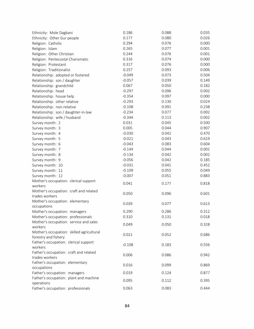
84
Ethnicity: Mole Dagbani 0.186 0.088 0.035
Ethnicity: Other Gur people 0.177 0.080 0.026
Religion: Catholic 0.294 0.076 0.000
Religion: Islam 0.265 0.077 0.001
Religion: Other Christian 0.244 0.076 0.001
Religion: Pentecostal Charismatic 0.316 0.074 0.000
Religion: Protestant 0.317 0.076 0.000
Religion: Traditionalist 0.257 0.093 0.006
Relationship: adopted or fostered -0.049 0.073 0.504
Relationship: son / daughter -0.057 0.039 0.149
Relationship: grandchild 0.067 0.050 0.182
Relationship: head -0.297 0.096 0.002
Relationship: house help -0.354 0.097 0.000
Relationship: other relative -0.293 0.130 0.024
Relationship: non-relative -0.108 0.091 0.238
Relationship: son / daughter-in-law -0.234 0.077 0.002
Relationship: wife / husband -0.344 0.113 0.002
Survey month: 2 0.031 0.045 0.500
Survey month: 3 0.005 0.044 0.907
Survey month: 4 -0.030 0.042 0.470
Survey month: 5 -0.021 0.043 0.619
Survey month: 6 -0.043 0.083 0.604
Survey month: 7 -0.144 0.044 0.001
Survey month: 8 -0.134 0.042 0.002
Survey month: 9 -0.056 0.042 0.185
Survey month: 10 -0.031 0.041 0.452
Survey month: 11 -0.109 0.055 0.049
Survey month: 12 -0.007 0.051 0.883
Mother's occupation: clerical support workers
0.041 0.177 0.818
Mother's occupation: craft and related trades workers
0.050 0.096 0.601
Mother's occupation: elementary occupations
0.039 0.077 0.613
Mother's occupation: managers 0.290 0.286 0.312
Mother's occupation: professionals 0.310 0.131 0.018
Mother's occupation: service and sales workers
0.049 0.050 0.328
Mother's occupation: skilled agricultural forestry and fishery
0.021 0.052 0.686
Father's occupation: clerical support workers
-0.108 0.183 0.556
Father's occupation: craft and related trades workers
0.006 0.086 0.942
Father's occupation: elementary occupations
0.016 0.099 0.869
Father's occupation: managers 0.019 0.124 0.877
Father's occupation: plant and machine operations
0.095 0.112 0.395
Father's occupation: professionals 0.063 0.083 0.444
85
Father's occupation: service and sales workers
-0.060 0.071 0.396
Father's occupation: skilled agricultural forestry and fishery
-0.025 0.059 0.678
Father's occupation: technicians and associate professionals
-0.183 0.106 0.085
Central -0.014 0.052 0.790
Greater Accra -0.160 0.094 0.088
Volta -0.049 0.090 0.591
Eastern -0.073 0.068 0.282
Ashanti -0.009 0.067 0.889
Brong Ahafo -0.032 0.075 0.671
Northern -0.005 0.097 0.959
Upper East 0.038 0.101 0.707
Upper West 0.105 0.096 0.270
Observations 3,183
Pseudo R2 0.238
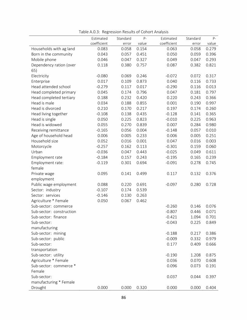
86
Table A.0.3: Regression Results of Cohort Analysis
Estimated coefficient
Standard error
P-value
Estimated coefficient
Standard error
P-value
Households with ag land 0.083 0.058 0.154 0.063 0.058 0.279 Born in the community 0.043 0.057 0.451 0.050 0.059 0.396 Mobile phone 0.046 0.047 0.327 0.049 0.047 0.293 Dependency ration (over 65)
0.118 0.380 0.757 0.087 0.382 0.821
Electricity -0.080 0.069 0.246 -0.072 0.072 0.317 Enterprise 0.017 0.109 0.873 0.040 0.116 0.733 Head attended school -0.279 0.117 0.017 -0.290 0.116 0.013 Head completed primary 0.045 0.174 0.796 0.047 0.181 0.797 Head completed tertiary 0.188 0.232 0.420 0.220 0.243 0.366 Head is male 0.034 0.188 0.855 0.001 0.190 0.997 Head is divorced 0.210 0.170 0.217 0.197 0.174 0.260 Head living together -0.108 0.138 0.435 -0.128 0.141 0.365 Head is single 0.050 0.225 0.823 -0.010 0.225 0.963 Head is widowed 0.055 0.270 0.839 0.007 0.284 0.980 Receiving remittance -0.165 0.056 0.004 -0.148 0.057 0.010 Age of household head 0.006 0.005 0.233 0.006 0.005 0.251 Household size 0.052 0.016 0.001 0.047 0.016 0.003 Motorcycle -0.257 0.162 0.113 -0.301 0.159 0.060 Urban -0.036 0.047 0.443 -0.025 0.049 0.611 Employment rate -0.184 0.157 0.243 -0.195 0.165 0.239 Employment rate: female
-0.119 0.301 0.694 -0.091 0.278 0.745
Private wage employment
0.095 0.141 0.499 0.117 0.132 0.376
Public wage employment 0.088 0.220 0.691 -0.097 0.280 0.728 Sector: industry -0.107 0.174 0.539
Sector: services -0.146 0.130 0.263
Agriculture * Female 0.050 0.067 0.462
Sub-sector: commerce
-0.260 0.146 0.076 Sub-sector: construction
-0.807 0.446 0.071
Sub-sector: finance
-0.421 1.094 0.701 Sub-sector: manufacturing
-0.043 0.225 0.849
Sub-sector: mining
-0.188 0.217 0.386 Sub-sector: public
-0.009 0.332 0.979
Sub-sector: transportation
0.177 0.409 0.666
Sub-sector: utility
-0.190 1.208 0.875 Agriculture * Female
0.036 0.070 0.608
Sub-sector: commerce * Female
0.096 0.073 0.191
Sub-sector: manufacturing * Female
0.037 0.044 0.397
Drought 0.000 0.000 0.320 0.000 0.000 0.404
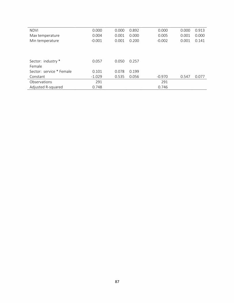
87
NDVI 0.000 0.000 0.892 0.000 0.000 0.913 Max temperature 0.004 0.001 0.000 0.005 0.001 0.000 Min temperature -0.001 0.001 0.200 -0.002 0.001 0.141
Sector: industry * Female
0.057 0.050 0.257
Sector: service * Female 0.101 0.078 0.199
Constant -1.029 0.535 0.056 -0.970 0.547 0.077
Observations 291
291
Adjusted R-squared 0.748 0.746
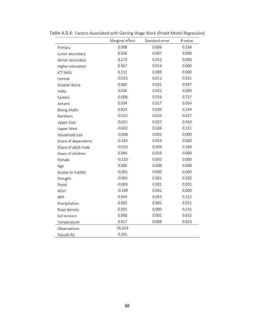
88
Table A.0.4: Factors Associated with Gaining Wage Work (Probit Model Regression)
Marginal effect Standard error P-value
Primary 0.008 0.006 0.234
Junior secondary 0.056 0.007 0.000
Senior secondary 0.173 0.011 0.000
Higher education 0.367 0.014 0.000
ICT Skills 0.111 0.009 0.000
Central -0.025 0.012 0.031
Greater Accra 0.002 0.021 0.937
Volta 0.036 0.022 0.099
Eastern -0.006 0.016 0.727
Ashanti 0.034 0.017 0.054
Brong Ahafo 0.023 0.020 0.244
Northern -0.012 0.025 0.627
Upper East -0.021 0.027 0.450
Upper West -0.032 0.026 0.221
Household size -0.008 0.001 0.000
Share of dependents -0.165 0.014 0.000
Share of adult male -0.013 0.009 0.160
Share of children 0.094 0.016 0.000
Female -0.110 0.005 0.000
Age 0.000 0.000 0.008
Access to market -0.001 0.000 0.000
Drought -0.001 0.001 0.502
Flood -0.003 0.001 0.001
NDVI -0.199 0.041 0.000
NPP 0.044 0.043 0.312
Precipitation 0.002 0.001 0.021
Road density 0.001 0.000 0.235
Soil erosion 0.000 0.001 0.632
Temperature 0.017 0.008 0.023
Observations 26,324
Pseudo R2 0.265
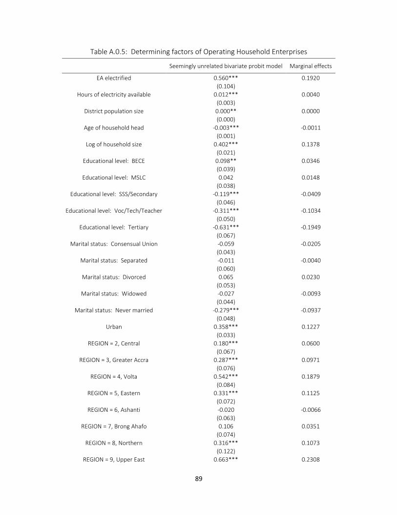
89
Table A.0.5: Determining factors of Operating Household Enterprises
Seemingly unrelated bivariate probit model Marginal effects
EA electrified 0.560*** 0.1920
(0.104) Hours of electricity available 0.012*** 0.0040
(0.003) District population size 0.000** 0.0000
(0.000) Age of household head -0.003*** -0.0011
(0.001) Log of household size 0.402*** 0.1378
(0.021) Educational level: BECE 0.098** 0.0346
(0.039) Educational level: MSLC 0.042 0.0148
(0.038) Educational level: SSS/Secondary -0.119*** -0.0409
(0.046) Educational level: Voc/Tech/Teacher -0.311*** -0.1034
(0.050) Educational level: Tertiary -0.631*** -0.1949
(0.067) Marital status: Consensual Union -0.059 -0.0205
(0.043) Marital status: Separated -0.011 -0.0040
(0.060) Marital status: Divorced 0.065 0.0230
(0.053) Marital status: Widowed -0.027 -0.0093
(0.044) Marital status: Never married -0.279*** -0.0937
(0.048) Urban 0.358*** 0.1227
(0.033) REGION = 2, Central 0.180*** 0.0600
(0.067) REGION = 3, Greater Accra 0.287*** 0.0971
(0.076) REGION = 4, Volta 0.542*** 0.1879
(0.084) REGION = 5, Eastern 0.331*** 0.1125
(0.072) REGION = 6, Ashanti -0.020 -0.0066
(0.063) REGION = 7, Brong Ahafo 0.106 0.0351
(0.074) REGION = 8, Northern 0.316*** 0.1073
(0.122) REGION = 9, Upper East 0.663*** 0.2308
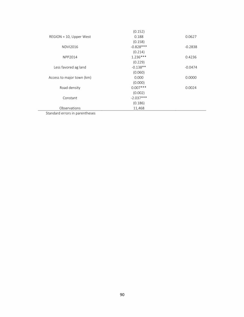
90
(0.152) REGION = 10, Upper West 0.188 0.0627
(0.158) NDVI2016 -0.828*** -0.2838
(0.214) NPP2014 1.236*** 0.4236
(0.229) Less favored ag land -0.138** -0.0474
(0.060) Access to major town (km) 0.000 0.0000
(0.000) Road density 0.007*** 0.0024
(0.002) Constant -2.037***
(0.186) Observations 11,468
Standard errors in parentheses