Embed Size (px)
Citation preview

GLOBAL COLOUR DIRECTION SPRING/SUMMER 2016
Past, present and future entwine to give us a new understanding of archived collections. Refined neutrals, muted pastels and summer darks are enlivened by warm orange and mid-purple, and highlighted with metallics of whitened copper and silver for an elegant transitional mood.
S/S 16 GLOBAL COLOUR DIRECTION
PASTMODERN

S/S 16 GLOBAL COLOUR DIRECTION
PASTMODERN
Wrapped and layered textiles are shown in a palette of ‘archive’ neutrals: flint and limestone mix with tinted whites of jasmine, magnolia and buttermilk.

S/S 16 GLOBAL COLOUR DIRECTION
PASTMODERN
An ethereal palette sees fawn, fresco and jasmine blend with touches of soft orange and a sheen of green mist and petal pink.

S/S 16 GLOBAL COLOUR DIRECTION
PASTMODERN
Whitened silver adds a level of refined luxury to tonal monochromes of pewter, jasmine and flint.

S/S 16 GLOBAL COLOUR DIRECTION
PASTMODERN
Shadowy summer darks of soil and pewter are used to frame warm and cool greys, with whitened copper providing an uplifting highlight.
PAN
TON
E ®
11-0
601
PAN
TON
E ®
17-1
610
PAN
TON
E ®
18-3
812
PAN
TON
E ®
18-5
203
PAN
TON
E ®
14-4
203
PAN
TON
E ®
17-1
610
S/S 16 GLOBAL COLOUR DIRECTION
PASTMODERN
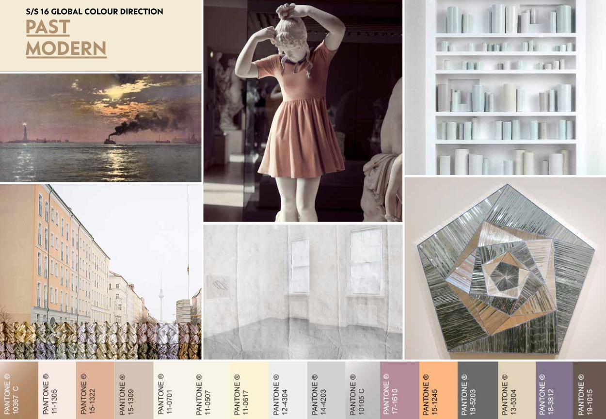
Fragmented shades of pewter, blue plum, allium and flint are reflected on a glassy surface.

PANTONE ® 10367 C
PANTONE ® 11-0701 PANTONE ® 11-0507
PANTONE ® 11-0617
PANTONE ® 18-5203
PANTONE ® 17-1610
PANTONE ® 14-4203
PANTONE ® 10105 C
PANTONE ® 18-3812
PANTONE ® 12-4304
PANTONE ® 13-5304
PANTONE ® 15-1245
PANTONE ® 19-1015
PANTONE ® 11-1305
PANTONE ® 15-1322
PANTONE ® 15-1309
PANTONE ®
S/S 16 GLOBAL COLOUR DIRECTION
PASTMODERN

CW-1100808 (91/12R) CW-0701510 (75/5R)
CW-0201500 (17/35)
CW-0801543 (78/29C)CW-1200065 (67/27)CW-1200071 (67/16)
CW-1200065 (67/27) CW-1100339 (94B/27)CW-1100800 (84/24)
CW-1100808 (91/12R)
CW-1100816 (86/30R)
CW-0402121 (63C/5B) CW-0200193 (16/34) CW-0401932 (58/7R)
COLORWALL™S/S 16 GLOBAL COLOUR DIRECTION
PASTMODERN

TINTED BLENDED
WhITENED SILvER REfINED NEUTRALS
REfRACTED PASTELS ARChIvAL COLOUR
Diane Meyer combines photography with carefully stitched, gently tinted embroidery.dianemeyer.net
Atelier Biagetti’s Bonjour Milàn collection ingeniously mixes materials – ranging from copper to plastic laminates and discarded elements – that both conceal and reveal objects and the mysteries they may hide.biagetti.net
Monir Farmanfarmaian combines a modern, metallic palette with ancient Islamic geometrics. qagoma.qld.gov.au
Design duo Asnate Bockis and Rogier Arents, winners of an award from Amsterdam’s Rijksmuseum, have developed beauty palettes inspired by portraits of five women from the museum’s collection.trendtablet.com
Carly Waito instils a sense of wonder into realistic portraits of natural crystals, often painted in a muted pastel palette.carlywaito.com
A hand-painted book on watercolour, created by Dutch artist A Boogert more than 300 years ago, provides a unique reference guide to colour. thisiscolossal.com
RESEARCh & REfERENCES/S 16 GLOBAL COLOUR DIRECTION
PAST MODERN

‘Archive’ neutrals are warm and tinted, bringing to mind architectural materials. These complement the coloured whites, including key colours jasmine and buttermilk.
An edited selection of pale pastels indicates a new mature direction for this dominant colour level.
Allium, soft orange and blue plum add colour into an otherwise muted transitional palette.
Shadowy summer darks pewter and soil add depth and contrast to the pastels and neutrals.
Refined, whitened metallics continue the message of luxury from A/W 15/16’s Flawless colour direction.
KEYTAKEAWAYS